I present this summary of the Earthquake Reports and Interpretive Posters I prepared for earthquakes during the year 2021.
There are 6 Earthquake Reports and a number of Earthquake Report “Lites.” I also prepared a several rapid tweet maps.
There are some significant events I missed, but life is short and I have only so much available free time.
This is my 9th annual summary. I used to break out Cascadia.
- Here are all the annual summaries:
- Here are the annual summaries for the Cascadia region.
- Here is a table that lists the 2023 earthquakes with magnitudes M ≥ 6.5. I use these earthquakes to plot the cumulative energy release for earthquakes below.
- I did not prepare a poster/report for all of these events and I prepared some reports/posters for events not on this table.
- This is a plot showing the cumulative energy release (in Joules) for the earthquakes listed in the above table. Ask yourself if M 6.5 is a reasonable threshold to be able to visualize variations in seismic energy release during the year.
- Note that the vertical axis is scaled differently on each plot, so the energy released in 2017 is about twice the energy released in 2022. Why do you think this is, is there a single earthquake in 2017 that controls this difference?
- I plot below the 2022 & 2023 data for a comparison.
- Here is another view of the cumulative energy release from earthquakes for the time period 2017-2023. All data are on the same vertical scale, in joules.
2023 Earthquake Reports
- 2023.01.08 M 7.0 Vanuatu Islands
- 2022.02.06 M 7.8 Turkey/Syria
- 2023.03.16 M 7.0 Kermadec
- 2023.03.18 M 6.8 Ecuador
- 2023.04.02 M 7.0 Papua New Guinea
- 2023.04.24 M 7.1 Kermadec
- 2023.04.24 M 7.1 Sumatra
- 2023.05.11 M 5.5 Lake Almanor
- 2023.05.19 M 7.7 Loyalty Islands
- 2023.07.16 M 7.2 Alaska
- 2023.08.28 M 7.1 Lombok & Bali, Indonesia
- 2023.09.08 M 6.8 Morocco
- 2023.10.07 M 6.9 Papua New Guinea
- 2023.11.08 M 7.1 Banda Sea
- 2023.12.02 M 7.6 Philippines
Annual Summary Poster
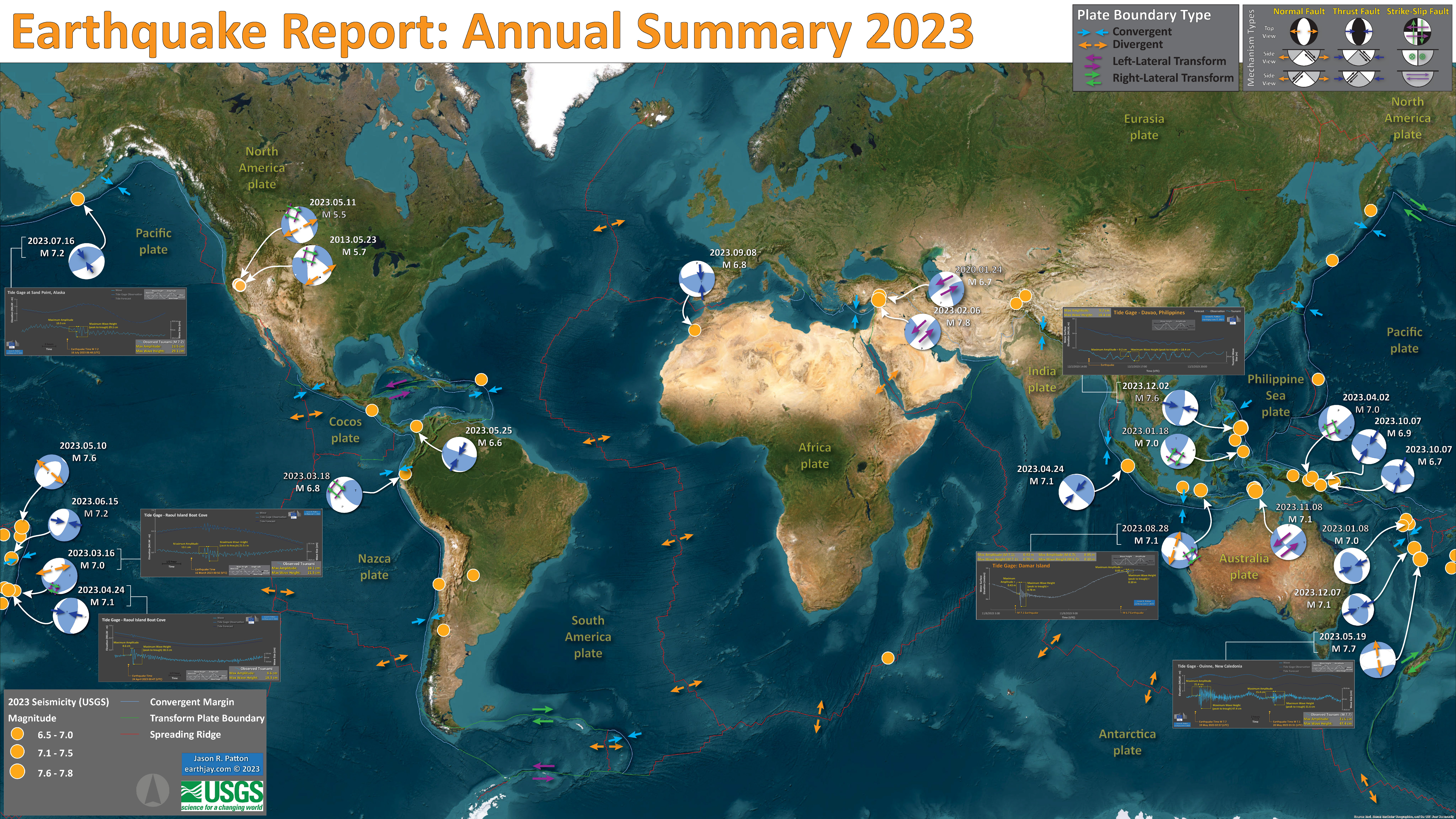
- I plot the earthquake mechanisms and epicenters for all earthquake events for which I have created interpretive posters below.
- Click on this map, or any map or figure, to see a larger and higher resolution version of the map or figure. These files are larger in file size.
- If anyone wants me to add their summary, just send me an email to quakejay at gmail.com
Other Annual Summaries
Return to the Earthquake Reports page.
- Sorted by Magnitude
- Sorted by Year
- Sorted by Day of the Year
- Sorted By Region
Interpretive Poster Background
These Interpretive Posters all contain slightly different types and amounts of information. Below is a general guidance to what this information is. Earthquake Report pages can provide additional information about each individual interpretive interrogation.
- I plot the seismicity from the past month, with diameter representing magnitude (see legend). I may include historic earthquake epicenters with magnitudes M ≥ some magnitude threshold.
- I include background information from published papers as inset figures on the interpretive posters. Learn more about these figures in their associated Earthquake Report.
- I plot the USGS fault plane solutions (moment tensors in blue and focal mechanisms in orange), possibly in addition to some relevant historic earthquakes.
- A review of the basic base map variations and data that I use for the interpretive posters can be found on the Earthquake Reports page.
- Some basic fundamentals of earthquake geology and plate tectonics can be found on the Earthquake Plate Tectonic Fundamentals page.
See all 2023 Earthquake Reports
Click on the name of the earthquake to go to the Earthquake Report.
E.g., click here >>> (2023.01.08 M 7.0 Vanuatu Islands) to go to the report for This earthquake.
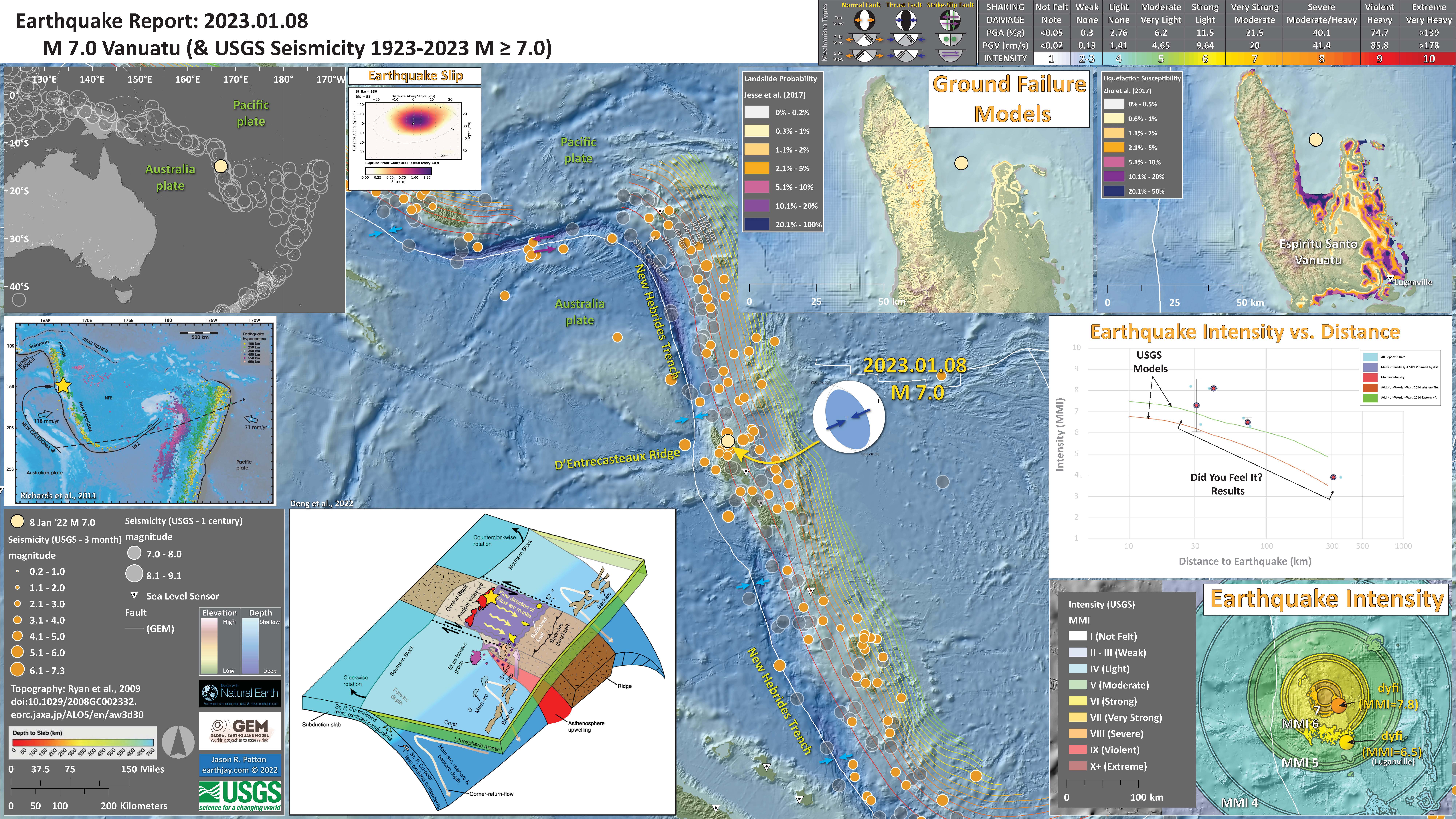
2023.01.08 M 7.0 Vanuatu Islands
https://earthquake.usgs.gov/earthquakes/eventpage/us7000j2yw/executive
I include some inset figures.
- Here is the map with 3 month’s seismicity plotted.
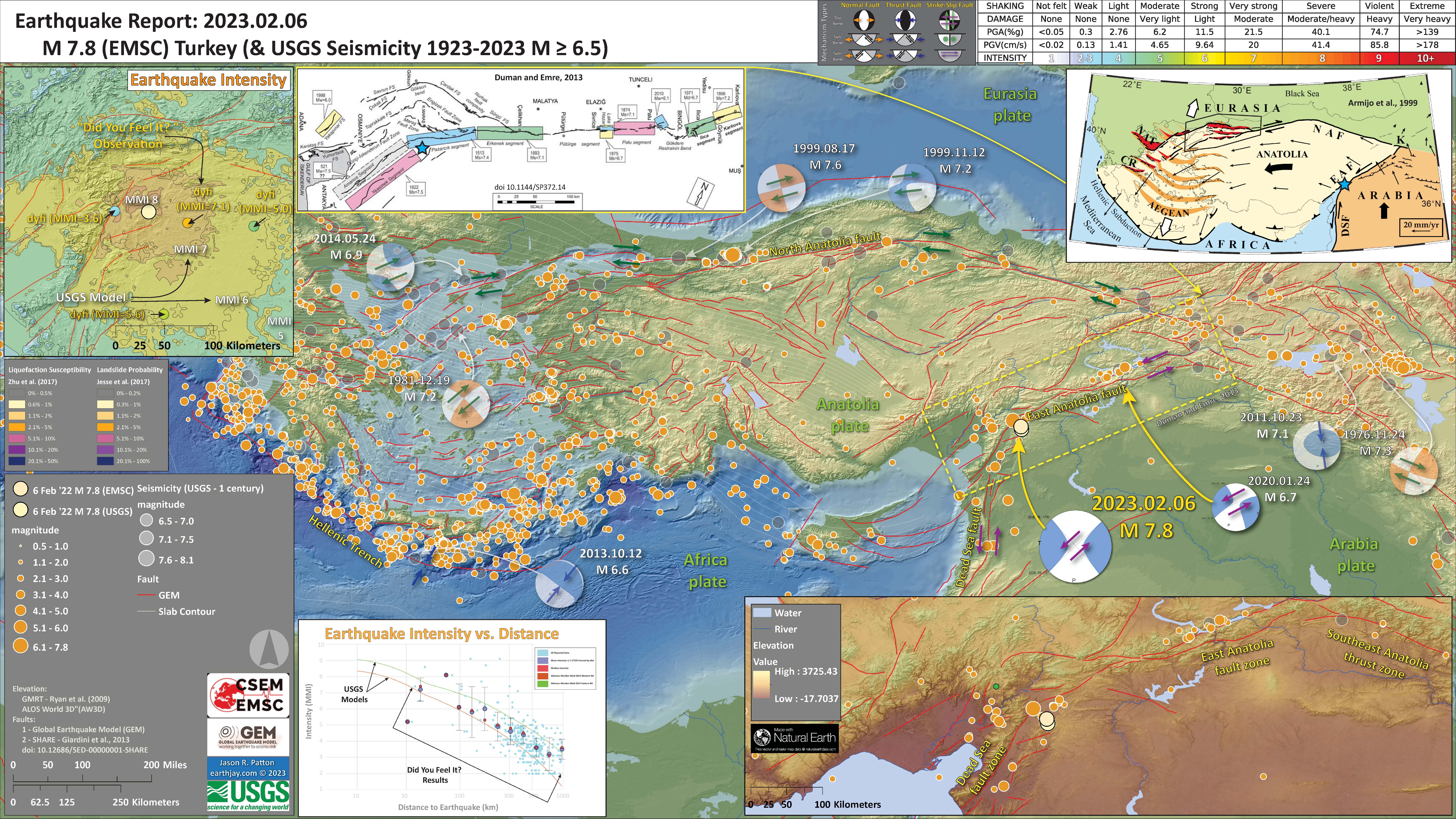
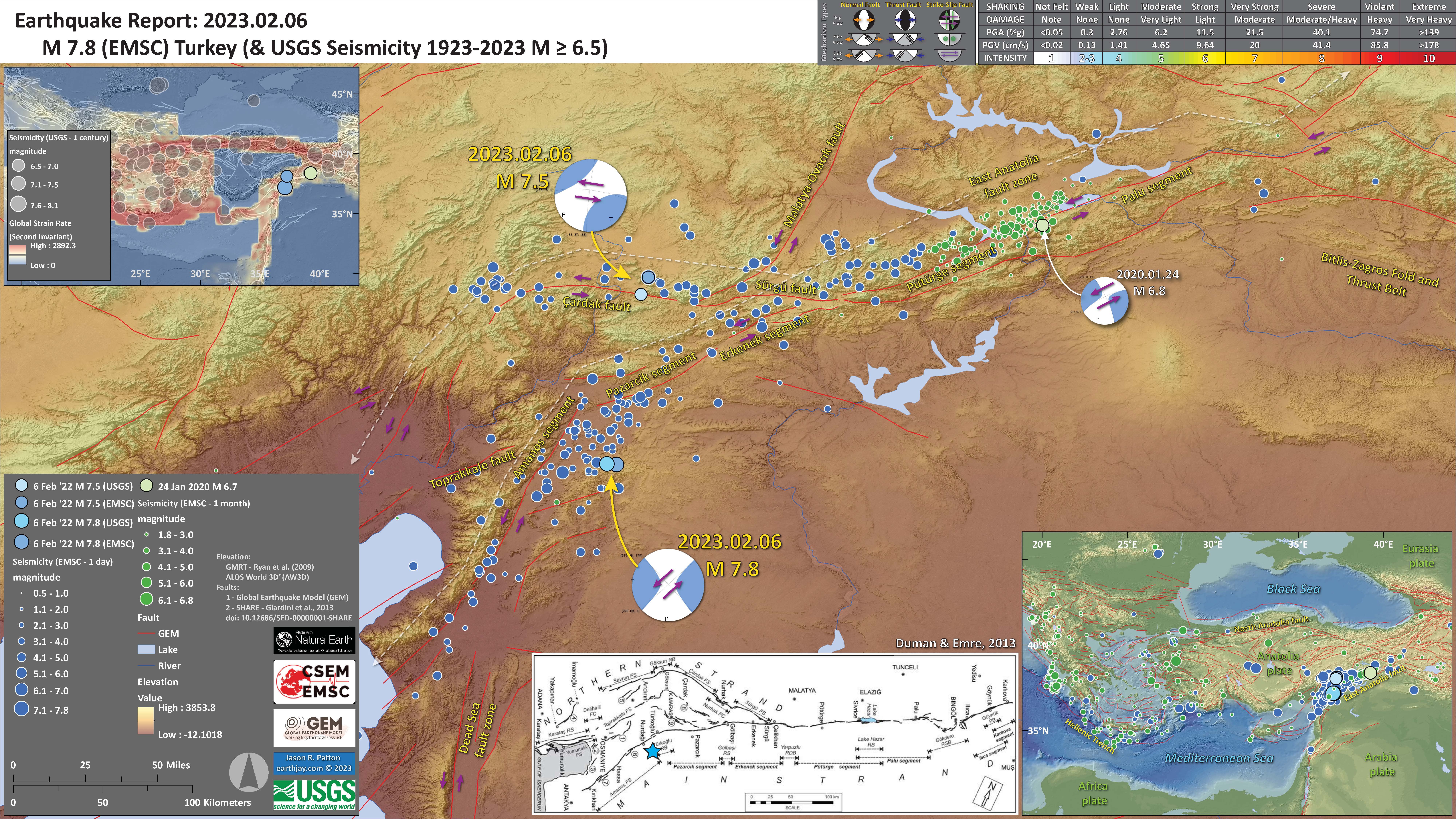
2022.02.06 M 7.8 Turkey/Syria
https://earthquake.usgs.gov/earthquakes/eventpage/us6000jllz/executive
- In the upper right corner is a map from Armijo et al. (1999) that shows the plate boundary faults and tectonic plates in the region. This M 6.7 earthquake, denoted by the blue star, is along the East Anatolia fault, a left-lateral strike-slip plate boundary fault.
- In the upper left corner is a comparison of the shaking intensity modeled by the USGS and the shaking intensity based on peoples’ “boots on the ground” observations. People felt intensities exceeding MMI 7.
- To the right of the intensity map is a figure from Duman and Emre (2013). This shows the historic earthquakes along the EAF.
- In the lower right corner is a map that shows the faults in the region. Note how the topography reflects the tectonics.
- In the lower center lerft is a plot that shows how the shaking intensity models and reports relate to each other. The horizontal axis is distance from the earthquake and the vertical axis is shaking intensity (using the MMI scale, just like in the map to the right: these are the same datasets).
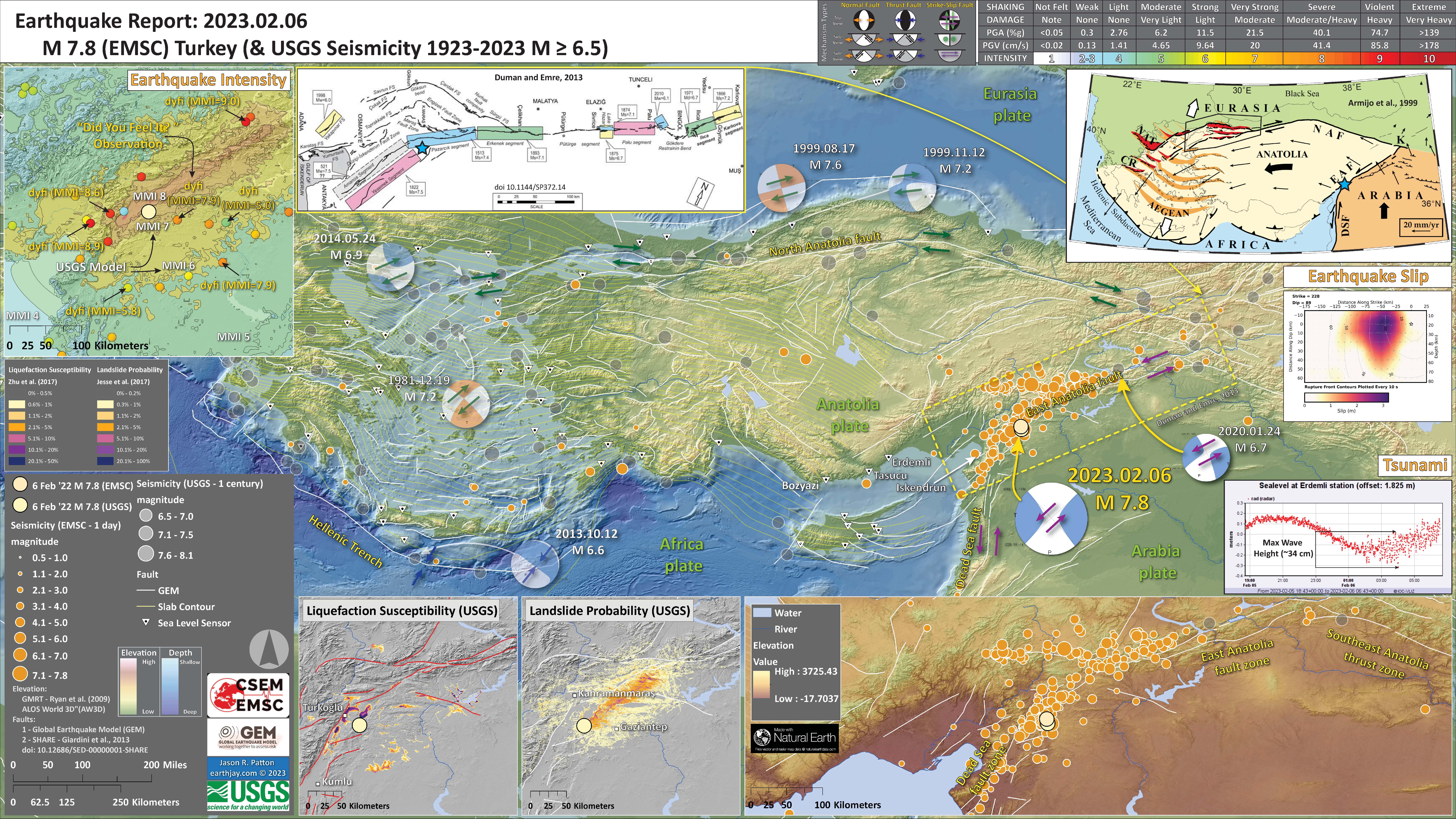
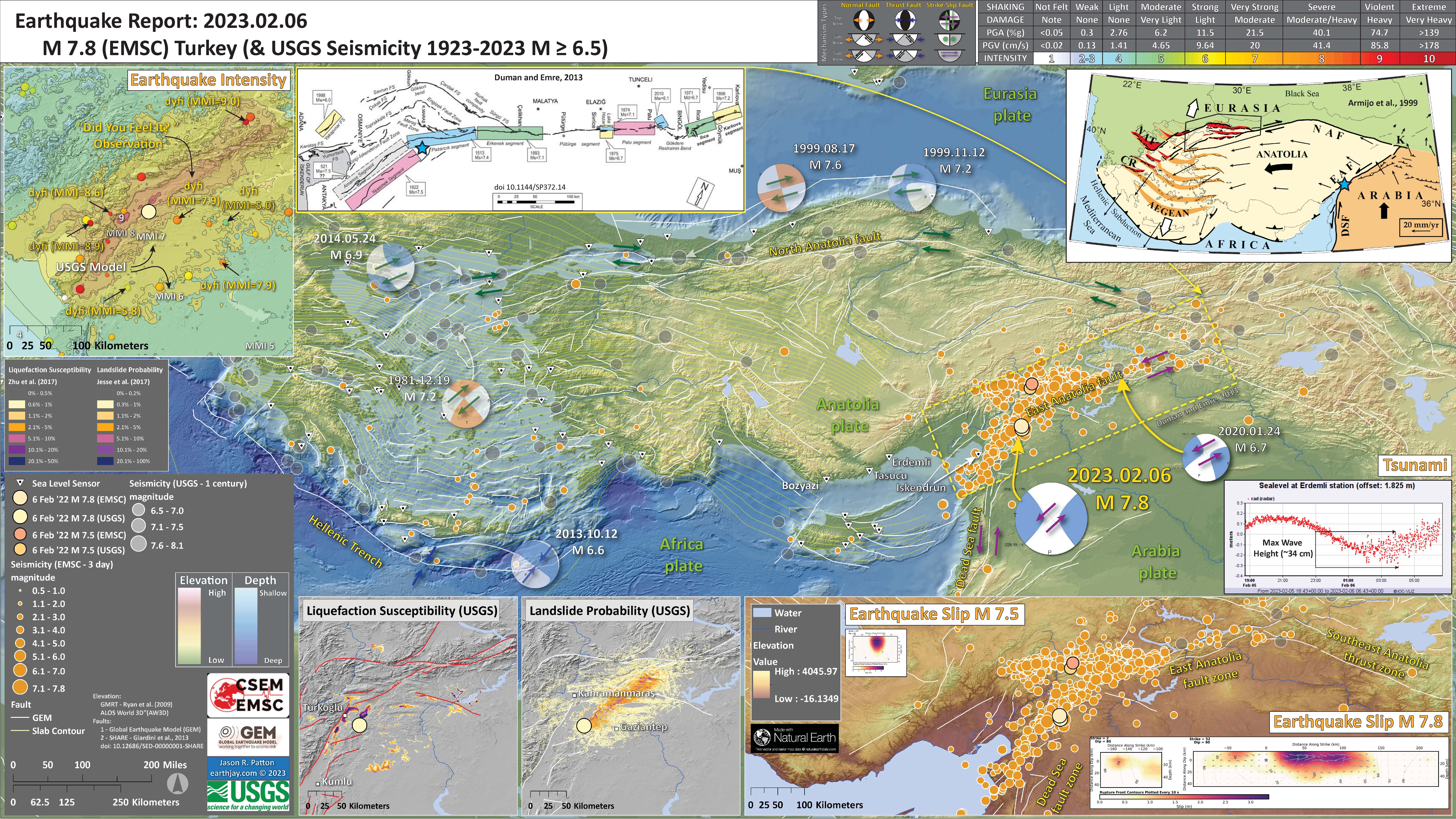
I include some inset figures. Some of the same figures are located in different places on the larger scale map below.
- Here is the map with a month’s seismicity plotted.
- Here is the map with a day’s seismicity plotted (prepared a few hours after the main shock).
- There are some additional inset figures here:
- The USGS Finite Fault Model (FFM) is shown on center right. This graphic shows how much the USGS model suggests that the fault slipped during this earthquake. Learn more about the USGS Finite Fault Models here.
- To the right of the legend are two maps that show (left) liquefaction susceptibility and (right) landslide probability. These are based on empirical models from the USGS that show the chance an area may have experienced these processes that may have happened as a result of the ground shaking from the earthquake. I spend more time explaining these types of models and what they represent in this Earthquake Report for the recent event in Albania.
- I include a plot of the tide gage data from Erdemli.
- Here is the map with about a day’s seismicity plotted.
- I plot the 2023 earthquakes in blue and the 2020 earthquakes in green.
- Here is the same two maps with about 3 day’s seismicity plotted. There are other modest changes.
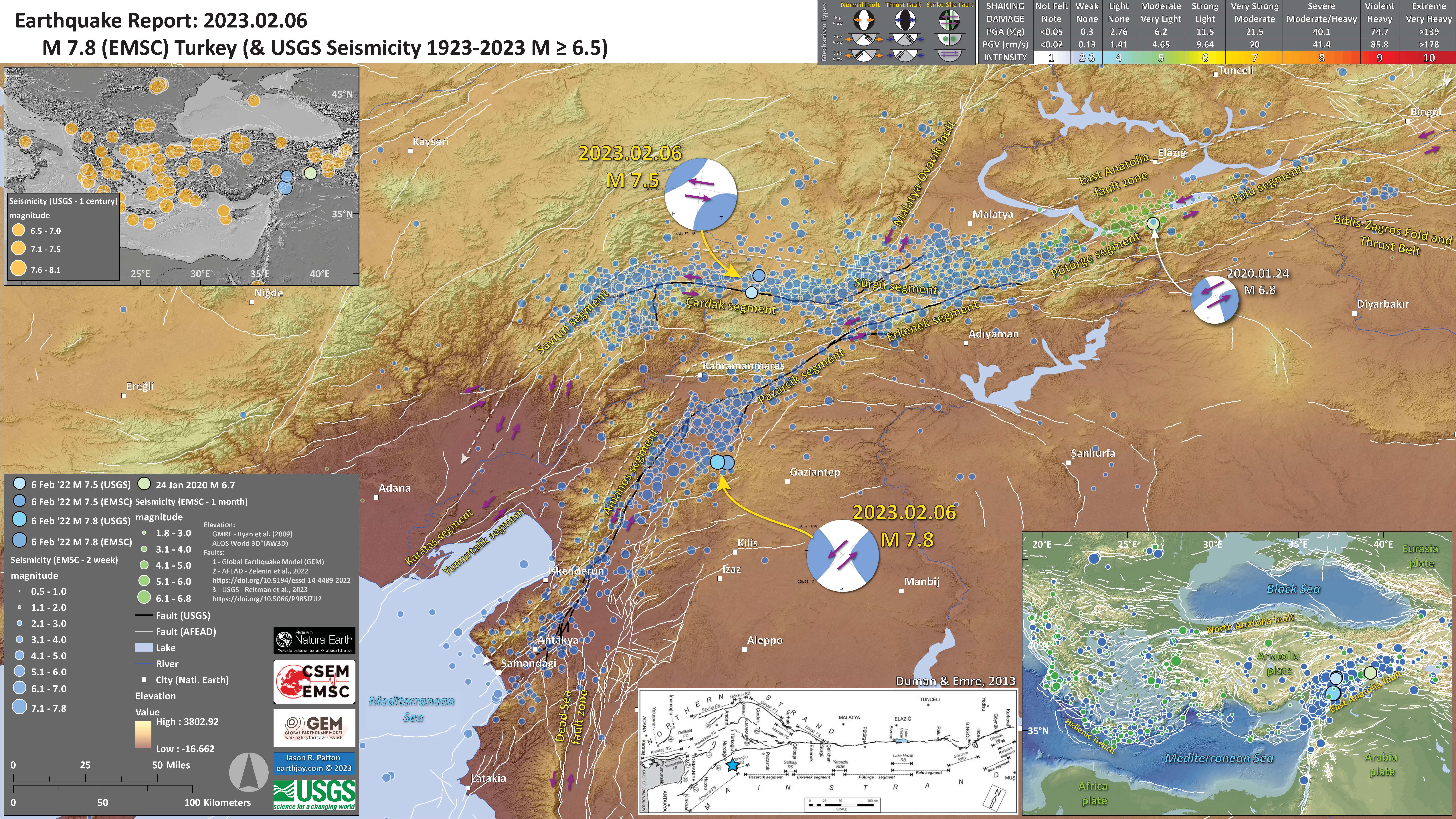
- I updated the aftershock map that now includes about 2 weeks of aftershocks from CSEM-EMSC.
- This also includes the faults mapped by the USGS (Reitman et a., 2023).
- Below I also added a comparison of the USGS ground failure and intensity data between the ’20 M 6.7 and the ’22 M 7.5 & M 7.8 earthquakes.
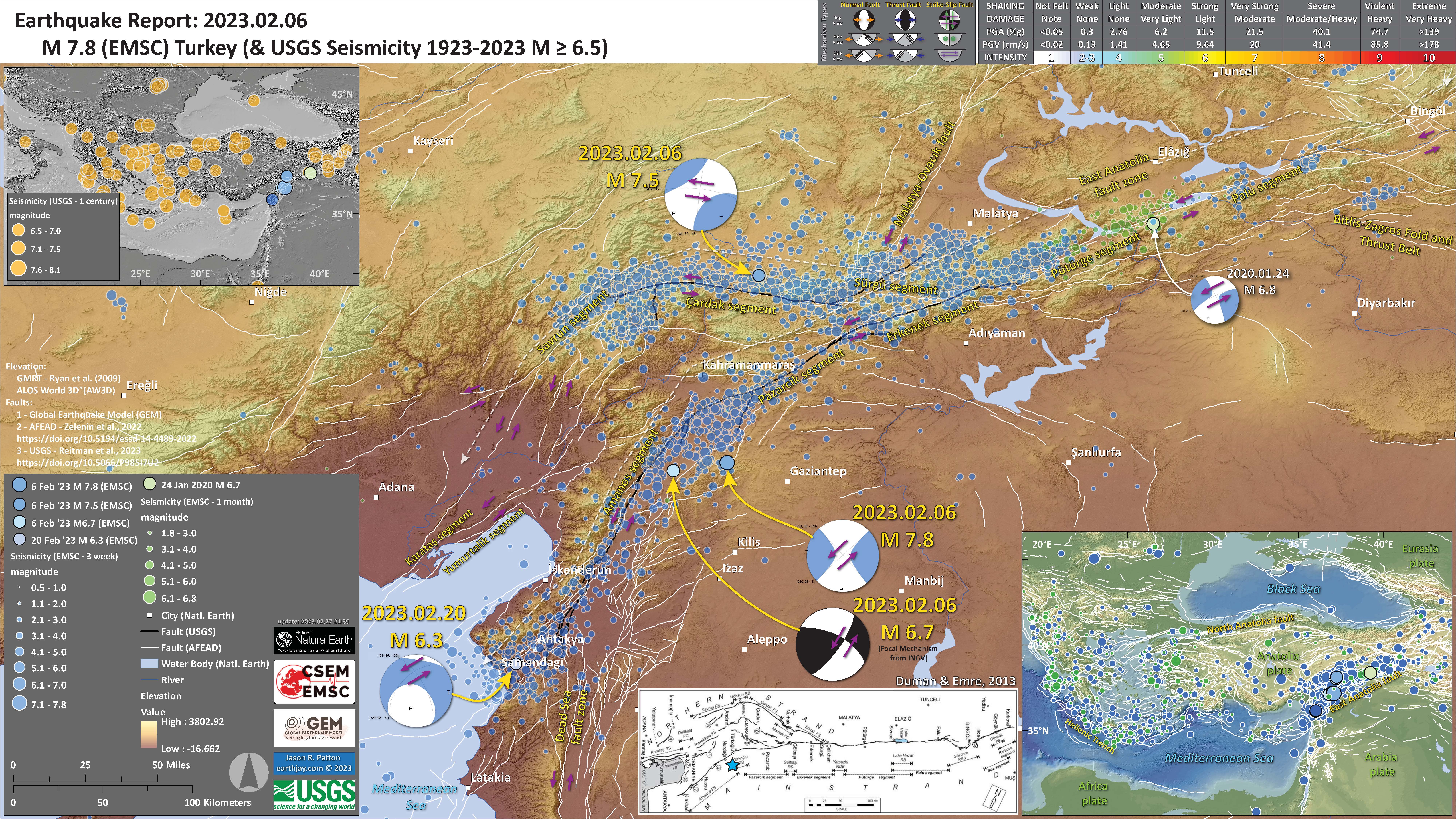
- I updated the aftershock map that now includes about 3 weeks of aftershocks from CSEM-EMSC.
- This also includes the faults mapped by the USGS (Reitman et a., 2023).
- The USGS does not have a mechanism for the M 6.7, so I am using the INGV focal mechanism from here: https://www.emsc-csem.org/Earthquake/earthquake.php?id=1218449
UPDATE: 6 February 2023
UPDATE: 8 February 2023

UPDATE: 14 February 2023
I updated some of the content below including slip rate estimates, probabilistic seismic hazard assessment for the EAF, stress modeling following the 2020 M 6.7 earthquake, and information about the Dead Sea fault.
UPDATE: 15 February 2023
UPDATE: 27 February 2023
Shaking Intensity
- Here is a figure that shows a more detailed comparison between the modeled intensity and the reported intensity. Both data use the same color scale, the Modified Mercalli Intensity Scale (MMI). More about this can be found here. The colors and contours on the map are results from the USGS modeled intensity. The DYFI data are plotted as colored dots (color = MMI, diameter = number of reports). In addition to what I write below, the data on the left are from the M 7.5 and the data on the right are from the M 7.8.
- In the upper panel is the USGS Did You Feel It reports map, showing reports as colored dots using the MMI color scale. Underlain on this map are colored areas showing the USGS modeled estimate for shaking intensity (MMI scale).
- In the lower panel is a plot showing MMI intensity (vertical axis) relative to distance from the earthquake (horizontal axis). The models are represented by the green and orange lines. The DYFI data are plotted as light blue dots. The mean and median (different types of “average”) are plotted as orange and purple dots. Note how well the reports fit the green line, the orange line, or neither line. What reasons can you think that may be explain these real observation deviations from the models.
- Below the lower plot is the USGS MMI Intensity scale, which lists the level of damage for each level of intensity, along with approximate measures of how strongly the ground shakes at these intensities, showing levels in acceleration (Peak Ground Acceleration, PGA) and velocity (Peak Ground Velocity, PGV).
- Here is a comparison between these three earthquakes from 2020 and 2022.
- The scale and spatial extent for each map is the same.
- Here is an excellent educational video from IRIS and a variety of organizations. The video helps us learn about how earthquake intensity gets smaller with distance from an earthquake. The concept of liquefaction is reviewed and we learn how different types of bedrock and underlying earth materials can affect the severity of ground shaking in a given location. The intensity map above is based on a model that relates intensity with distance to the earthquake, but does not incorporate changes in material properties as the video below mentions is an important factor that can increase intensity in places.
- If we look at the map at the top of this report, we might imagine that because the areas close to the fault shake more strongly, there may be more landslides in those areas. This is probably true at first order, but the variation in material properties and water content also control where landslides might occur.
- There are landslide slope stability and liquefaction susceptibility models based on empirical data from past earthquakes. The USGS has recently incorporated these types of analyses into their earthquake event pages. More about these USGS models can be found on this page.
- Below is a figure that shows both landslide probability and liquefaction susceptibility maps for this M 7.8 earthquake.
- Below is a figure that compares both landslide probability and liquefaction susceptibility maps for these three earthquakes.
- The scale for each map is the same.
Earthquake Triggered Landslides
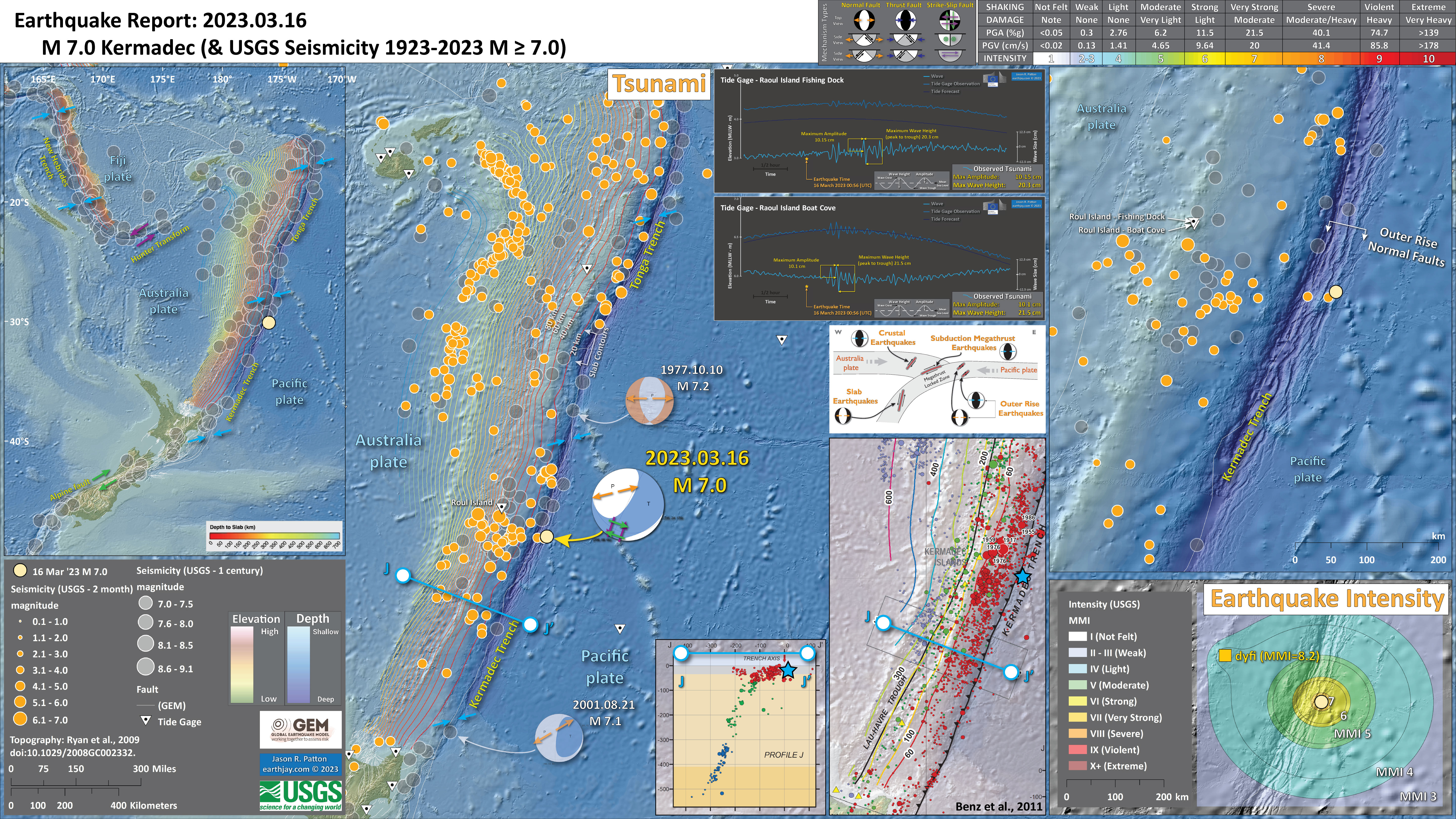
2023.03.16 M 7.0 Kermadec
https://earthquake.usgs.gov/earthquakes/eventpage/us7000jkbd/executive
- In the upper left corner is a map that shows the major plate tectonic boundaries.
- In the lower right corner is a map that shows the ground shaking from the earthquake, with color representing intensity using the Modified Mercalli Intensity (MMI) scale. The closer to the earthquake, the stronger the ground shaking. The colors on the map represent the USGS model of ground shaking. The colored circles represent reports from people who posted information on the USGS Did You Feel It? part of the website for this earthquake. There are things that affect the strength of ground shaking other than distance, which is why the reported intensities are different from the modeled intensities.
- In the upper right corner is a larger scale map that shows the crustal faults in the Pacific plate. Today’s M 7.0 was in the Pacific plate. It appears tensional oblique (strike-slip and tensional). There are two other historic examples of outer rise earthquakes in 1977 and 2001.
- To the left are tide gage plots from the tide gages on Raoul Island (shown on map).
- In the lower right center is a map from Benz et al. (2011) that shows earthquakes with circles that represent magnitude (diameter) and depth (color). Deeper = blue & shallower = red. There is a cross section (cut into the earth) profile through this seismicity (the blue line J-J’). I plot the M 7.0 as a blue star.
- To the left of the map is cross section J-J’ that shows earthquake hypocenters (3-D locations) in the region of the M 7.0 earthquake.
- Above the Benz map, there is a cross section of the Kermadec trench that shows different places where there could be earthquakes along this plate boundary.
I include some inset figures. Some of the same figures are located in different places on the larger scale map below.
- Here is the map with 2 month’s seismicity M ≥ 0 plotted.
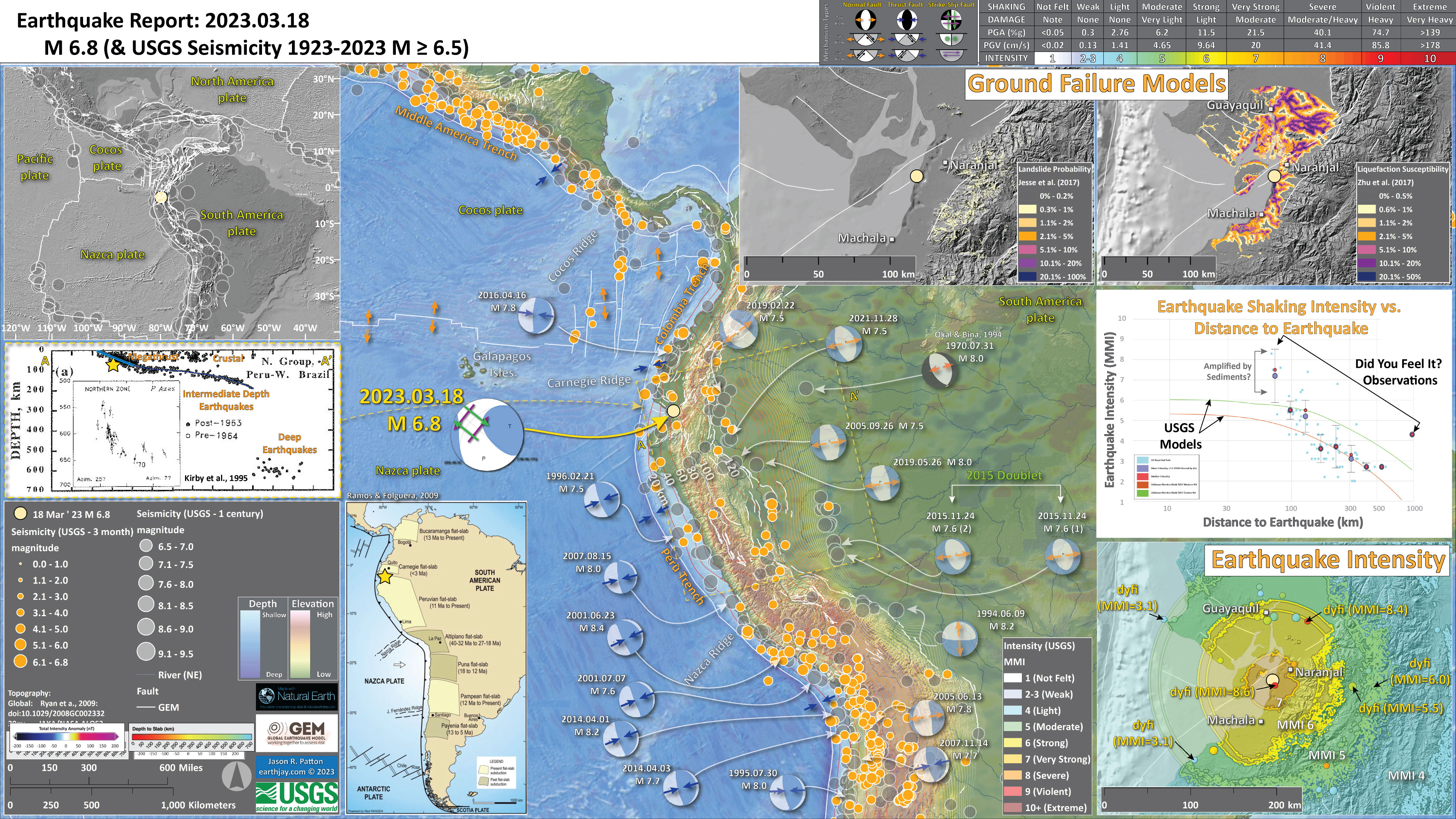
https://earthquake.usgs.gov/earthquakes/eventpage/pt23077000/executive
- In the upper left corner is a large scale plate tectonic map showing the major plate boundary faults.
- In the lower left center is a map showing how the Nazca slab is configured in different locations (Ramos and Folguera, 2009).
- In the left center is a cross section showing seismicity in this region (Kirby et al., 1995). The source area for this plot is designated by a dashed yellow box on the map.
- In the upper right corner is a pair of maps that show the landslide probability (left) and the liquefaction susceptibility (right) for this M 6.8 earthquake. I spend more time describing these types of data here. Read more about these maps here.
- In the lower right corner I plot the USGS modeled intensity (Modified Mercalli Intensity scale, MMI) and the USGS “Did You Feel It?” observations (labeled in yellow). Above the map is a plot showing these same data plotted relative to distance from the earthquake. Read more about what these data sets are and what they represent in the report here.
I include some inset figures.
- Here is the map with 3 month’s seismicity plotted.
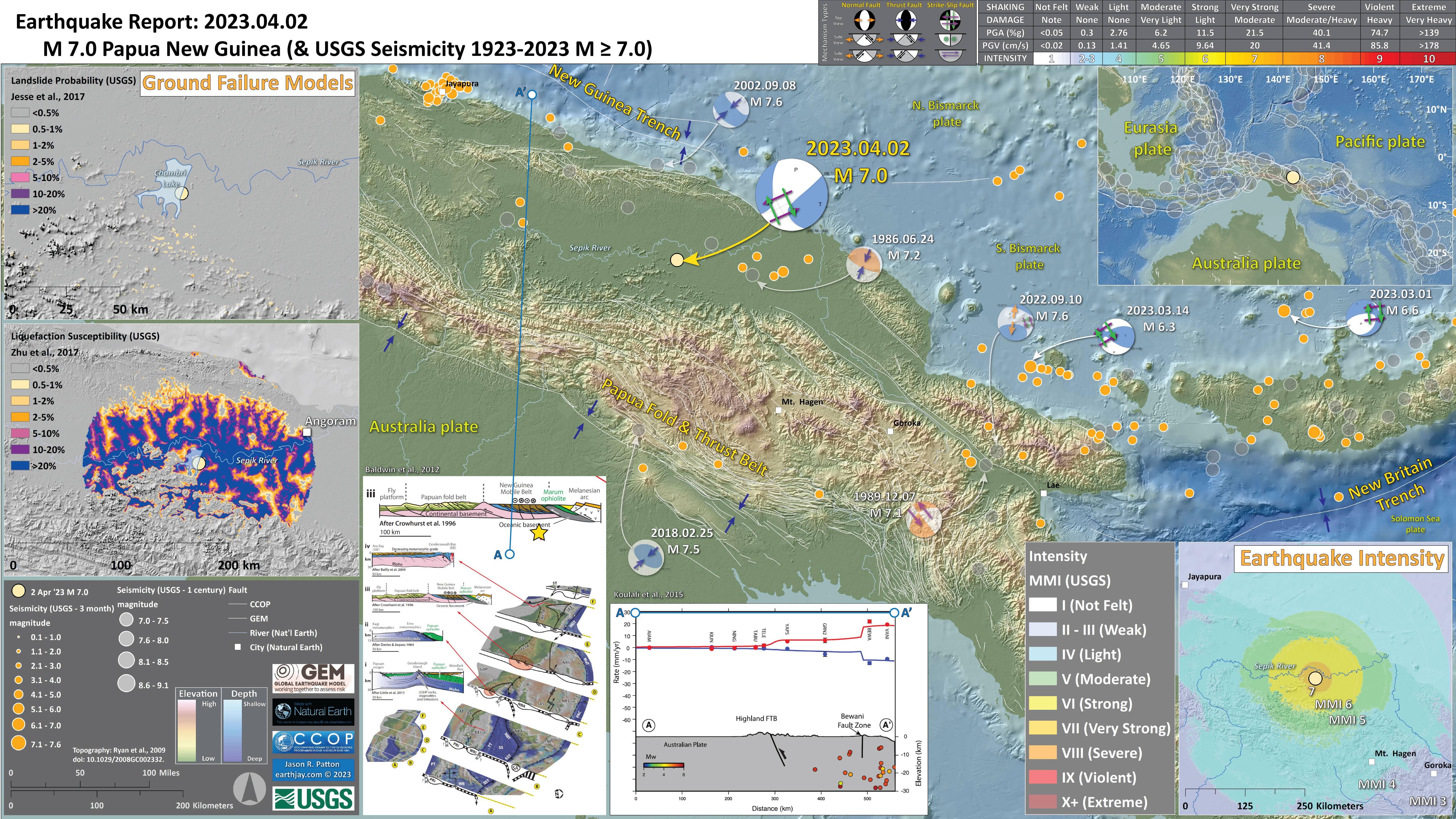
2023.04.02 M 7.0 Papua New Guinea
https://earthquake.usgs.gov/earthquakes/eventpage/at00rsi26z/executive
- In the upper right corner is a map showing the plate tectonic boundaries (from the GEM) and seismicity from the past century (from the USGS).
- In the lower right corner is a map that shows the earthquake intensity using the modified Mercalli intensity scale. Earthquake intensity is a measure of how strongly the Earth shakes during an earthquake, so gets smaller the further away one is from the earthquake epicenter. The map colors represent a model of what the intensity may be. The USGS has a system called “Did You Feel It?” (DYFI) where people enter their observations from the earthquake and the USGS calculates what the intensity was for that person. The dots with yellow labels show what people actually felt in those different locations.
- In the upper left corner are two maps showing the probability of earthquake triggered landslides and possibility of earthquake induced liquefaction. I will describe these phenomena below.
- In the lower left center is a figure from Baldwin et al. (2012). This figure shows a series of cross sections along this convergent plate boundary from the Solomon Islands in the east to Papua New Guinea in the west. Cross section ‘D’ is the most representative for the earthquakes today. I present the map and this figure again below, with their original captions. Above the map is cross section D-D’ that shows the PFTB to the south of today’s earthquake. I placed the yellow star marking today’s M 7.0 below the cross section. The faults are actually quite complex, so this schematic illustration may not be a perfect representation of the faults here.
- In the bottom center is a profile showing the GPS velocities across the two main fault systems that profile A-A’ crosses (also shown on map). The M 7.0 is somewhere between these two fault systems (possibly along a fault that leads up to the Fold and Thrust Belt(?).
I include some inset figures. Some of the same figures are located in different places on the larger scale map below.
- Here is the map with 3 month’s seismicity plotted.
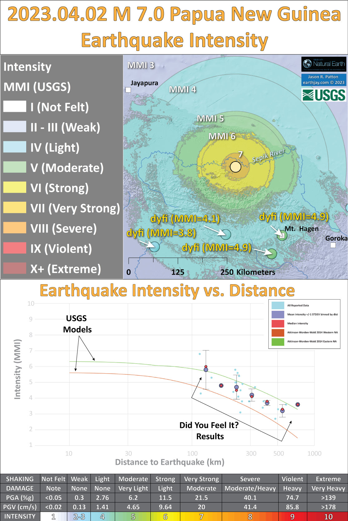
Shaking Intensity
- Here is a figure that shows a more detailed comparison between the modeled intensity and the reported intensity. Both data use the same color scale, the Modified Mercalli Intensity Scale (MMI). More about this can be found here. The colors and contours on the map are results from the USGS modeled intensity. The DYFI data are plotted as colored dots (color = MMI, diameter = number of reports).
- In the upper panel is the USGS Did You Feel It reports map, showing reports as colored dots using the MMI color scale. Underlain on this map are colored areas showing the USGS modeled estimate for shaking intensity (MMI scale).
- In the lower panel is a plot showing MMI intensity (vertical axis) relative to distance from the earthquake (horizontal axis). The models are represented by the green and orange lines. The DYFI data are plotted as light blue dots. The mean and median (different types of “average”) are plotted as orange and purple dots. Note how well the reports fit the green line (the model that represents how MMI works based on quakes in California).
- Below the lower plot is the USGS MMI Intensity scale, which lists the level of damage for each level of intensity, along with approximate measures of how strongly the ground shakes at these intensities, showing levels in acceleration (Peak Ground Acceleration, PGA) and velocity (Peak Ground Velocity, PGV).
Potential for Ground Failure
- Below is the liquefaction susceptibility and landslide probability map (Jessee et al., 2017; Zhu et al., 2017). Please head over to that report for more information about the USGS Ground Failure products (landslides and liquefaction). Basically, earthquakes shake the ground and this ground shaking can cause landslides.
- I use the same color scheme that the USGS uses on their website. Note how the areas that are more likely to have experienced earthquake induced liquefaction are in the valleys. Learn more about how the USGS prepares these model results here.
2023.04.24 M 7.1 Kermadec
https://earthquake.usgs.gov/earthquakes/eventpage/us6000k6mg/executive
- In the upper left corner is a map that shows the major plate tectonic boundaries.
- In the lower right corner is a map that shows the ground shaking from the earthquake, with color representing intensity using the Modified Mercalli Intensity (MMI) scale. The closer to the earthquake, the stronger the ground shaking. The colors on the map represent the USGS model of ground shaking. There is one location with a report from people who posted information on the USGS Did You Feel It? part of the website for this earthquake. There are things that affect the strength of ground shaking other than distance, which is why the reported intensities are different from the modeled intensities.
- In the upper right corner is a plot that includes the 2021 M 8.1 & M 7.4 and 2023 M 7.0 earthquakes. I include the aftershocks from about one week after the M 8.1 and outline these aftershocks to show how yesterday’s M 7.1 is within this area.
- To the left of the aftershock map I include the USGS earthquake fault slip model. The colors represent the amount of slip that this fault experienced during the earthquake. We can see that they think the fault slipped up to about 1.25 meters (about 4 feet).
- To the left are tide gage plots from the tide gages on Raoul Island (shown on map). Anthony Lomax and I debated on Twitter about whether these signals were tsunami or seismic waves. We concluded that these are most likely tsunami waves because of their arrival time (seismic waves would have arrived sooner), their duration (seismic waves would not have lasted as long in time), and their amplitude & wave heights (seismic waves would have been smaller in size). Twitter is such a helpful place to discuss our observations in real time! I learn so much from my colleagues. It really is such a wonderful community that we have developed over the years!
- In the lower right center is a map from Benz et al. (2011) that shows earthquakes with circles that represent magnitude (diameter) and depth (color). Deeper = blue & shallower = red. There is a cross section (cut into the earth) profile through this seismicity (the blue line J-J’). I plot the M 7.0 as a blue star.
- To the left of the map is cross section J-J’ that shows earthquake hypocenters (3-D locations) in the region of the M 7.0 earthquake.
I include some inset figures. Some of the same figures are located in different places on the larger scale map below.
- Here is the map with a month’s seismicity plotted.
Tsunami
- Here I present the tide gage data from this earthquake and tsunami.
- These two gages are located on opposite sides of Raoul Island. Can you tell which is on the north side and which is on the south side? Go to the tide gage websites I link to above to see if you are correct.
- The size of the wave is similar for both of these gages (about 20 cm wave height).
- In the legend, one may learn the difference between wave height and amplitude. Wave height is the vertical distance between the peak wave and the trough of the wave. The amplitude is the height of the wave peak above the ambient water surface (the ambient tide level).
2023.04.24 M 7.1 Sumatra
https://earthquake.usgs.gov/earthquakes/eventpage/us7000jvl3/executive
- In the upper left corner is a map showing the tectonic plates and their boundaries.
- In the lower right corner is a map that shows the earthquake intensity using the modified Mercalli intensity scale. Earthquake intensity is a measure of how strongly the Earth shakes during an earthquake, so gets smaller the further away one is from the earthquake epicenter. The map colors represent a model of what the intensity may be. The USGS has a system called “Did You Feel It?” (DYFI) where people enter their observations from the earthquake and the USGS calculates what the intensity was for that person. The dots with yellow labels show what people actually felt in those different locations.
- In the lower left corner is a plot that shows the same intensity (both modeled and reported) data as displayed on the map. Note how the intensity gets smaller with distance from the earthquake.
- In the upper right corner are two maps showing the probability of earthquake triggered landslides and possibility of earthquake induced liquefaction. I will describe these phenomena below
I include some inset figures. Some of the same figures are located in different places on the larger scale map below.
- Here is the map with 3 month’s seismicity plotted.
Shaking Intensity
- Here is a figure that shows a more detailed comparison between the modeled intensity and the reported intensity. Both data use the same color scale, the Modified Mercalli Intensity Scale (MMI). More about this can be found here. The colors and contours on the map are results from the USGS modeled intensity. The DYFI data are plotted as colored dots (color = MMI, diameter = number of reports).
- In the upper panel is the USGS Did You Feel It reports map, showing reports as colored dots using the MMI color scale. Underlain on this map are colored areas showing the USGS modeled estimate for shaking intensity (MMI scale).
- In the lower panel is a plot showing MMI intensity (vertical axis) relative to distance from the earthquake (horizontal axis). The models are represented by the green and orange lines. The DYFI data are plotted as light blue dots. The mean and median (different types of “average”) are plotted as orange and purple dots. Note how well the reports fit the green line (the model that represents how MMI works based on quakes in California).
- Below the lower plot is the USGS MMI Intensity scale, which lists the level of damage for each level of intensity, along with approximate measures of how strongly the ground shakes at these intensities, showing levels in acceleration (Peak Ground Acceleration, PGA) and velocity (Peak Ground Velocity, PGV).
Potential for Ground Failure
- Below is the liquefaction susceptibility and landslide probability map (Jessee et al., 2017; Zhu et al., 2017). Please head over to that report for more information about the USGS Ground Failure products (landslides and liquefaction). Basically, earthquakes shake the ground and this ground shaking can cause landslides.
- I use the same color scheme that the USGS uses on their website. Note how the areas that are more likely to have experienced earthquake induced liquefaction are in the valleys. Learn more about how the USGS prepares these model results here.
2023.05.11 M 5.5 Lake Almanor
https://earthquake.usgs.gov/earthquakes/eventpage/ew1683847190/executive
- In the upper left corner is a map that shows the main tectonic boundaries, crustal faults, and a century of seismicity.
- In the lower right corner is a map that shows the earthquake intensity using the modified Mercalli intensity scale. Earthquake intensity is a measure of how strongly the Earth shakes during an earthquake, so gets smaller the further away one is from the earthquake epicenter. The map colors represent a model of what the intensity may be. The USGS has a system called “Did You Feel It?” (DYFI) where people enter their observations from the earthquake and the USGS calculates what the intensity was for that person. The transparent colors with yellow labels show what people actually felt in those different locations.
- Above the map is a plot that shows the same intensity (both modeled and reported) data as displayed on the map. Note how the intensity gets smaller with distance from the earthquake.
I include some inset figures. Some of the same figures are located in different places on the larger scale map below.
- Here is the map with 2 week’s seismicity plotted.
- Here is the map with aftershocks plotted and comparisons with the 2013 M 5.7 Earthquake Sequence.
- Note the large number of triggered and aftershock earthquakes from 2013. This represents a month of time and there were about 770 earthquakes, with four M>4 events.
- When I put the aftershock poster (less than 24 hours later), there were 50 aftershocks (with one M>5). There have only been a handful since then so it looks like the aftershock decay is winding down.
- Though the USGS is setting up a seismic array to detect more aftershocks as a local network will be able to detect events of smaller magnitudes. Events like this provide an opportunity to study the subsurface structures as this “microseismicity” can align with the faults and people can visualize these.
- In the lower right corner is a comparison of the modeled and reported intensity (using MMI scale) for these two earthquakes.
2023.05.19 M 7.7 Loyalty Islands
https://earthquake.usgs.gov/earthquakes/eventpage/at00ruvxj7/executive
This M 7.7 earthquake is having lots of aftershocks and the largest was a M 7.1.
https://earthquake.usgs.gov/earthquakes/eventpage/us6000kdce/executive
- In the lower center is a tectonic map from Patriat et al. (2019). I place a yellow star in the general location of this M 7.7 earthquake.
- In the upper left corner shows the tectonic plates and seismicity from the past century for events with magnitudes larger than M 7.5.
- Below this map is a figure from the USGS that shows their estimate of how much the fault slipped during this M 7.7 earthquake. Dark red shows where the fault may have slipped as much as 3 meters.
- In the lower right corner is a map that shows the earthquake intensity using the modified Mercalli intensity scale. Earthquake intensity is a measure of how strongly the Earth shakes during an earthquake, so gets smaller the further away one is from the earthquake epicenter. The map colors represent a model of what the intensity may be. The USGS has a system called “Did You Feel It?” (DYFI) where people enter their observations from the earthquake and the USGS calculates what the intensity was for that person. The transparent colors with yellow labels show what people actually felt in those different locations.
- in the lower left is the tide gage plot from Ouinne, New Caledonia (location shown on the map).
- In the upper right is a map that shows earthquakes and their aftershock sequences for three events in the past 3 years. There is some overlap, but mostly, these three sequences have aftershocks in different areas. The 2021 and 2022 earthquakes are probably (?) subduction zone earthquakes based on their mechanisms. it sure seems like these two events may have changed the stresses in the Australia plate (i.e., they may have triggered the 2023 earthquake).
- 2021 M 7.7 (green)
- 2022 M 7.0 (blue)
- 2023 M 7.7 (orange)
- Here is the map with a month’s seismicity plotted.
I include some inset figures. Some of the same figures are located in different places on the larger scale map below.
Not only did the M 7.7 generate a tsunami but so did the M 7.1 earthquake. The plot below shows both earthquake times relative to the tsunami produced by those events.
These tsunami were recorded on other gages as well but this was the best record I saw.
2023.07.16 M 7.2 Alaska
https://earthquake.usgs.gov/earthquakes/eventpage/us7000kg30/executive
- Here is the map with a month’s seismicity plotted.
2023.08.28 M 7.1 Lombok & Bali, Indonesia
https://earthquake.usgs.gov/earthquakes/eventpage/us7000krjx/executive
- In the upper right corner is a map showing historic seismicity and tectonic plate boundaries.
- Below that map is a low angle oblique view of a cut away of the Earth along the subduction zone in Java, Indonesia from EOS.
- In the upper left corner are maps that show the seismic hazard and seismic risk for Indonesia. I spend more time explaining this below.
- To the right of these hazard and risk maps is a map that shows earthquake intensity using the Modified Mercalli Intensity (MMI) Scale.
- Above the map is a plot that shows the same intensity (both modeled and reported) data as displayed on the map. Note how the intensity gets smaller with distance from the earthquake.
- In the lower right corner is a cross section showing earthquake hypocenters (3-D locations) from Darman et a. (2012).
- To the left of the Darman (2012) plot is a cross section of seismicity presented by Hengresh and Whitney (2016).
- In the lower center I plot USGS seismicity from the past century. I describe this further below.
I include some inset figures. Some of the same figures are located in different places on the larger scale map below. In some of these inset figures I place a blue star to locate the M 7.1 earthquake on these figures.
- Here is the map with a month’s seismicity plotted.
- Here is the plot with a century’s seismicity plotted.
- These data are limited to within the region shown on the map and i highlight the M 7.1 in orange.
- These are USGS hypocenters and epicenters for earthquakes between 1923 and 2023 for magnitudes M≥5.
- One may observe the seismicity within the Australia plate as the plate subducts downwards. The top of the crust is above these seismicity trends.
- If one looks closely, they will notice a horizontal line of earthquakes at about 30km. These are all with a default depth of 33 km. There is also a row of seismicity with a default depth of 10km. These are depths assigned to events prior to a location assigned with greater certainty. It is highly likely that the depths for these events is different than 10 or 33 km.
2023.09.08 M 6.8 Morocco
https://earthquake.usgs.gov/earthquakes/eventpage/us7000kufc/executive
- In the upper left corner is a map that shows the tectonic plates and seismicity for northwestern Africa.
- In the upper right corner is a map that shows the earthquake intensity using the modified Mercalli intensity scale. Earthquake intensity is a measure of how strongly the Earth shakes during an earthquake, so gets smaller the further away one is from the earthquake epicenter. The map colors represent a model of what the intensity may be.
- Below the intensity map is a plot that shows the same intensity (both modeled and reported) data as displayed on the map. Note how the intensity gets smaller with distance from the earthquake.
- In the lower left center are two maps showing the probability of earthquake triggered landslides and possibility of earthquake induced liquefaction. I will describe these phenomena below.
- In the lower right corner is a larger scale map showing the Atlas Mountains and the North and South Atlas faults.
- To the left of this large scale map is a map from Beauchamp et al., 1999. This map is for the Atlas Mtns to the east of where this earthquake happened. Note the tectonic folds associated with the underlying reverse faults.
- In the upper left is a map from TEixel et al. (1999) that includes cross section locations. Cross section C is displayed to the right. The location of this cross section is also shown on the main map with the green line.
- To the left of the intensity map is a map from Banault et al. (2023) that includes a yellow star where the M 6.8 earthquake occurred.
I include some inset figures. Some of the same figures are located in different places on the larger scale map below.
- Here is the map with a month’s seismicity plotted.
- This is an updated poster with COMET InSAR analytical results. I also figured out how to download the EMSC seismicity data (they changed their website, so had to learn something new. Here is where one may download data from their catalog.
- The USGS earthquake catalog (aka ComCat) is a global network, so a global catalog. The EMSC catalog relies, in places, on a more local network, so has more events in the catalog than in ComCat.
- However, ComCat usually has all the major events and spans a longer time period.
- SO, the 3 month seismicity I use here is from EMSC and the century dataset is based on the ComCat catalog.
Shaking Intensity
- Here is a figure that shows a more detailed comparison between the modeled intensity and the reported intensity. Both data use the same color scale, the Modified Mercalli Intensity Scale (MMI). More about this can be found here. The colors and contours on the map are results from the USGS modeled intensity. The DYFI data are plotted as colored dots (color = MMI, diameter = number of reports).
- In the upper panel is the USGS Did You Feel It reports map, showing reports as colored dots using the MMI color scale. Underlain on this map are colored areas showing the USGS modeled estimate for shaking intensity (MMI scale).
- In the lower panel is a plot showing MMI intensity (vertical axis) relative to distance from the earthquake (horizontal axis). The models are represented by the green and orange lines. The DYFI data are plotted as light blue dots. The mean and median (different types of “average”) are plotted as orange and purple dots. Note how well the reports fit the green line (the model that represents how MMI works based on quakes in California).
- Below the lower plot is the USGS MMI Intensity scale, which lists the level of damage for each level of intensity, along with approximate measures of how strongly the ground shakes at these intensities, showing levels in acceleration (Peak Ground Acceleration, PGA) and velocity (Peak Ground Velocity, PGV).
Potential for Ground Failure
- Below is the liquefaction susceptibility and landslide probability map (Jessee et al., 2017; Zhu et al., 2017). Please head over to that report for more information about the USGS Ground Failure products (landslides and liquefaction). Basically, earthquakes shake the ground and this ground shaking can cause landslides.
- I use the same color scheme that the USGS uses on their website. Note how the areas that are more likely to have experienced earthquake induced liquefaction are in the valleys. Learn more about how the USGS prepares these model results here.
2023.10.07 M 6.9 Papua New Guinea
The two main earthquakes are magnitude M 6.7 and 6.9.
2023.10.07 M 6.7: https://earthquake.usgs.gov/earthquakes/eventpage/us6000ldqd/executive
2023.10.07 M 6.9: https://earthquake.usgs.gov/earthquakes/eventpage/us6000ldqf/executive
- In the upper right corner is a map showing the plate tectonic boundaries (from the GEM) and seismicity from the past century (from the USGS).
- To the left of the plate tectonic boundary map is a great figure showing the generalized plate tectonic boundaries in this region of the equatorial Pacific Ocean (Holm et al., 2016). I place a yellow star in the general location of the M 6.9 earthquake (also plotted in other inset figures).
- In the lower right corner are two maps that show the M 6.7 and M 6.9 earthquake intensity using the modified Mercalli intensity scale. Earthquake intensity is a measure of how strongly the Earth shakes during an earthquake, so gets smaller the further away one is from the earthquake epicenter. The map colors represent a model of what the intensity may be. The USGS has a system called “Did You Feel It?” (DYFI) where people enter their observations from the earthquake and the USGS calculates what the intensity was for that person. The dots with yellow labels show what people actually felt in those different locations.
- In the upper left corner are two maps showing the possibility of earthquake induced liquefaction for these two earthquakes.
- In the lower left center is a figure from Baldwin et al. (2012). This figure shows a series of cross sections along this convergent plate boundary from the Solomon Islands in the east to Papua New Guinea in the west. Cross section ‘C’ is the most representative for the earthquakes today. I present the map and this figure again below, with their original captions. Above the map is cross sections C-C’ and D-D’ that shows the slabs and the crustal structures in the region. I placed the yellow star marking today’s M 6.9. The earthquake actually is closer to cross section D-D’ but that cross section does not include a view of the slabs.
- In the bottom center is the Holm and Richards (2013) cross section B-B.’ Note the yellow stars that show the 6.9 is deeper and to the north of the 6.7.
I include some inset figures. Some of the same figures are located in different places on the larger scale map below.
- Here is the map with 1 week’s seismicity plotted.
2023.11.08 M 7.1 Banda Sea
-
Here are the these three earthquakes:
- 2023-11-08 04:52:51 (UTC) M 6.7: https://earthquake.usgs.gov/earthquakes/eventpage/us7000l9h2/executive
- 2023-11-08 04:53:50 (UTC) M 7.1: https://earthquake.usgs.gov/earthquakes/eventpage/us7000l9h4/executive
- 2023-11-08 13:02:06 (UTC) M 6.7: https://earthquake.usgs.gov/earthquakes/eventpage/us7000l9ku/executive
- In the upper right corner is a map showing plate boundary fault lines and the major tectonic plates.
- To the left of the plate tectonic map is an inset, larger scale map, showing the aftershocks from a couple days. I outline what may be the main fault rupture area, plus a secondary rupture for triggered earthquakes. Based on Wells and Coppersmith (1994), the aftershocks span a region larger in size than expected for a 7.1. So, there may be several faults involved here. Perhaps the second M 6.7 was also a triggered earthquake (on a different fault), not an aftershock(?).
- In the center right is a low angle oblique view of the tectonic plate configuration (Pownall et al., 2014). The previous earthquakes in the poster that have mechanisms plotted all appear to be in the subducted Australia plate, shown here diving downwards.
- In the lower right corner is a view of the tectonic plate configuration (Koulali et al., 2014). I place a blue star in the location of the M 7.1 earthquake. Note that there is an earthquake from 1763 with a magnitude 7 located along the strike-slip fault mapped on this map. This earthquake generated a tsunami.
- In the upper left corner are maps that show the seismic hazard and seismic risk for Indonesia. I spend more time explaining this below.
- In the center top-left is a map that shows earthquake intensity using the Modified Mercalli Intensity (MMI) Scale.
- In the bottom center I plot the tide gage data from Damar Island.
I include some inset figures. Some of the same figures are located in different places on the larger scale map below.
- Here is the map with a month’s seismicity plotted.
Tsunami Hazard
- Here are two tide gage records that include observations from the M 7.1 and M 6.7 earthquakes. There were a couple other gages in the region that include the tsunami but the tsunami was very small and difficult to accurately measure.
2023.12.02 M 7.6 Philippines
https://earthquake.usgs.gov/earthquakes/eventpage/us7000lff4/executive
- In the upper left corner is a map showing the plate tectonic boundaries (from the GEM).
- Below the tectonic map is a low angle oblique view of the plate boundaries showing the subsurface geometry of the subduction zones (Hall, 2011). I placed an orange star in the location of the M 7.6.
- In the lower right corner is a map that shows the M 7.4 earthquake intensity using the modified Mercalli intensity scale. Earthquake intensity is a measure of how strongly the Earth shakes during an earthquake, so gets smaller the further away one is from the earthquake epicenter. The map colors represent a model of what the intensity may be. The USGS has a system called “Did You Feel It?” (DYFI) where people enter their observations from the earthquake and the USGS calculates what the intensity was for that person. The dots with yellow labels show what people actually felt in those different locations.
- In the lower left center is a plot that shows the same intensity (both modeled and reported) data as displayed on the map. Note how the intensity gets smaller with distance from the earthquake.
- In the upper right corner are two maps showing the possibility of earthquake induced liquefaction for these two earthquakes.
- To the left of the ground failure maps is a plot of the tide gage data from Davao.
- Above the intensity plot is the USGS fault slip model for this M 7.4 earthquake.
I include some inset figures. Some of the same figures are located in different places on the larger scale map below.
- Here is the map with a month’s seismicity plotted.
The tsunami is evident in these tide gage data. I plot these data below:
Shaking Intensity
- Here is a figure that shows a more detailed comparison between the modeled intensity and the reported intensity. Both data use the same color scale, the Modified Mercalli Intensity Scale (MMI). More about this can be found here. The colors and contours on the map are results from the USGS modeled intensity. The DYFI data are plotted as colored dots (color = MMI, diameter = number of reports).
- In the upper panel is the USGS Did You Feel It reports map, showing reports as colored dots using the MMI color scale. Underlain on this map are colored areas showing the USGS modeled estimate for shaking intensity (MMI scale).
- In the lower panel is a plot showing MMI intensity (vertical axis) relative to distance from the earthquake (horizontal axis). The models are represented by the green and orange lines. The DYFI data are plotted as light blue dots. The mean and median (different types of “average”) are plotted as orange and purple dots. Note how well the reports fit the green line (the model that represents how MMI works based on quakes in California).
- Below the map and the lower plot is the USGS MMI Intensity scale, which lists the level of damage for each level of intensity, along with approximate measures of how strongly the ground shakes at these intensities, showing levels in acceleration (Peak Ground Acceleration, PGA) and velocity (Peak Ground Velocity, PGV).
Potential for Ground Failure
- Below is the liquefaction susceptibility and landslide probability map (Jessee et al., 2017; Zhu et al., 2017). Please head over to that report for more information about the USGS Ground Failure products (landslides and liquefaction). Basically, earthquakes shake the ground and this ground shaking can cause landslides.
- I use the same color scheme that the USGS uses on their website. Note how the areas that are more likely to have experienced earthquake induced liquefaction are in the valleys. Learn more about how the USGS prepares these model results here.
Social Media:
#EarthquakeReport 2023 Annual Summary
This is a map showing '23 #Earthquakes & #Tsunami with Earthquake Reports
read annual review here:https://t.co/D16553uHms pic.twitter.com/kbFh1QSqCp
— Jason "Jay" R. Patton (@patton_cascadia) December 31, 2023
#EarthquakeReport 2023 Annual Summary
This is a table for '23 #Earthquakes magnitude M>6.5
read annual review here:https://t.co/D16553uHms pic.twitter.com/cBt7SNPIJU
— Jason "Jay" R. Patton (@patton_cascadia) December 31, 2023
#EarthquakeReport 2023 Annual Summary
This is a plot showing cumulative energy release for '17-'23 #Earthquakes magnitude M>6.5
'23 released slightly more energy than '22
largest magnitude M 7.8 in #Turkiyeread annual review here:https://t.co/D16553uHms pic.twitter.com/3JwoCA0gU5
— Jason "Jay" R. Patton (@patton_cascadia) December 31, 2023
Canada's Quakes of 2023
Eastern #Ontario and western #Québec – another seismic hotspot in eastern Canada. 206 #earthquakes (M0.6-3.9) were located here in 2023 (including yesterday's M3.6). Nine were felt.
This area also has a history of large earthquakeshttps://t.co/DDxAn78sF9 pic.twitter.com/pmAJxebYnb— John Cassidy (@earthquakeguy) December 31, 2023
Canada's Quakes of 2023
The Haida Gwaii region is one of Canada's seismic hotspots. During 2023, 1195 #earthquakes (M0.0-4.7) were located here (several were felt). It's worth noting that several M7-8 earthquakes have occurred here during the past centuryhttps://t.co/otE0lIvsJ2 pic.twitter.com/URoBIe8B5F— John Cassidy (@earthquakeguy) December 31, 2023
Canada's Quakes of 2023
Next up – the Charlevoix region of #Québec – the seismic hotspot of eastern Canada.
During 2023, 442 #earthquakes (M0.0-3.2) were located here. Several were felt, and it is worth noting the history of large (M~7) earthquakes here:https://t.co/OVdO4HBdeW pic.twitter.com/ywIljMbG5T— John Cassidy (@earthquakeguy) December 31, 2023
Canada's Quakes of 2023
If you are trying to dodge #earthquakes in Canada, either #Saskatchewan or #Manitoba is the place to be. With only 2 earthquakes (of M2-2.1) located here during 2023, this one of the most seismically quiet parts of the country.https://t.co/nfTfa9SqDe pic.twitter.com/PV6DDWkFFw— John Cassidy (@earthquakeguy) December 31, 2023
Canada's Quakes of 2023
Next up – #Alberta and southeast #BritishColumbia. During 2023, 151 #earthquakes of M1.4-4.9 were located in this region. Seven were felt. In some areas some/many of the events were induced. For details see the AER earthquake sitehttps://t.co/BjAM05c9NM pic.twitter.com/DgQIONmPQ0— John Cassidy (@earthquakeguy) December 30, 2023
— Jason "Jay" R. Patton (@patton_cascadia) December 31, 2023
Canada's Quakes of 2023 #NewBrunswick and #NovaScotia are (most of the time) seismically quiet. During 2023, 130 #earthquakes (only a few were felt) were located in these Atlantic provinces. The largest was M3.6 just to the south in Maine.
See zones 4/5:https://t.co/qrzZQPlRxV pic.twitter.com/k3fXvqMvV2— John Cassidy (@earthquakeguy) December 29, 2023
Canada's Quakes of 2023
The #Yukon and western Northwest Territories (close to a region of active plate tectonics) are some of the most seismically active regions of #Canada. During 2023, 1182 #earthquakes (17 of M>4 and two of M>5) were located here. Only a few were felt. pic.twitter.com/5TQKZ7STW3— John Cassidy (@earthquakeguy) December 29, 2023
Two earthquakes were widely felt across southern #Ontario in 2023:
6 February – https://t.co/Elkc3zJGzY
27 August – https://t.co/Xz4oEMwypZ
The most recent felt earthquake in southern Ontario was the tiny (M2.5) event on December 27, felt near #Sarnia:https://t.co/4v52Zw3flo pic.twitter.com/OecLwgiQFX— John Cassidy (@earthquakeguy) December 28, 2023
Return to the Earthquake Reports page.
- Sorted by Magnitude
- Sorted by Year
- Sorted by Day of the Year
- Sorted By Region