I present this summary of the Earthquake Reports and Interpretive Posters I prepared for earthquakes during the year 2020.
There are 16 Reports and 21 posters that don’t have an associated report. I also prepared a half dozen rapid tweet maps, but am not displaying those here.
There are some significant events I missed, but life is short and I have only so much available free time.
This is my 6th annual summary. I used to break out Cascadia.
- Here are all the annual summaries:
- Here are the annual summaries for the Cascadia region.
- Here is a table that lists the 2020 earthquakes with magnitudes M ≥ 6.5. I use these earthquakes to plot the cumulative energy release for earthquakes below.
- I did not prepare a poster/report for all of these events and I prepared some reports/posters for events not on this table.
- This is a plot showing the cumulative energy release (in Joules) for the earthquakes listed in the above table. Ask yourself if M 6.5 is a reasonable threshold to be able to visualize variations in seismic energy release during the year.
- Note that the vertical axis is scaled differently on each plot, so the energy released in 2017 is about twice the energy released in 2020. Why do you think this is, is there a single earthquake in 2017 that controls this difference?
2020 Earthquake Reports
- 2020.12.30 M 6.4 Croatia
- 2020.10.30 M 7.0 Turkey
- 2020.09.19 M 4.5 El Monte
- 2020.06.24 M 5.8 Lone Pine
- 2020.06.23 M 7.4 Mexico
- 2020.05.18 M 5.5 Gorda Rise
- 2020.05.15 M 6.5 Nevada
- 2020.05.06 M 6.8 Banda Sea
- 2020.05.02 M 6.6 Crete, Greece
- 2020.03.31 M 6.5 Idaho
- 2020.03.18 M 5.2 Petrolia
- 2020.03.18 M 5.7 Salt Lake City, Utah
- 2020.03.09 M 5.8 Mendocino fault
- 2020.01.28 M 7.7 Cayman Islands
- 2020.01.24 M 6.7 Turkey
- 2020.01.07 M 6.4 Puerto Rico
Annual Summary Poster
- I plot the earthquake mechanisms and epicenters for all earthquake events for which I have created interpretive posters below.
- Click on this map, or any map or figure, to see a larger and higher resolution version of the map or figure. These files are larger in file size.
- If anyone wants me to add their summary, just send me an email to quakejay at gmail.com

Other Annual Summaries
Some data still need verification but this is the preliminary map of all 283 damaging #earthquakes in 2020. #Turkey and #Croatia were the most affected countries with the five most destructive quakes of the year happening there. @LastQuake @CATnewsDE #EarthquakeImpactDatabase pic.twitter.com/HvhoeFTMGc
— Erdbebennews (@Erdbebennews) December 31, 2020
3,329 earthquakes were located in/near #Canada during 2020 (so far).
57 were felt, the largest was M5.3 and most earthquakes occurred along the west coast.
M5-5.9: 5
M4-4.9: 77
M3-3.9: 494
M<3: 2753
Search for earthquakes in your neighbourhood:https://t.co/YAlYdmpNb3 pic.twitter.com/j5Ap1odU7a— John Cassidy (@earthquakeguy) December 31, 2020
The 2020 global #earthquake catalog has been laid to rest. Whatever else might be said about the year, it was quite kind to us all, earthquake-wise. pic.twitter.com/BTBJqEZKYD
— Dr. Susan Hough 🦖 (@SeismoSue) January 1, 2021
1-Sisam Fayı'ndaki 30 Ekim 2020 depremi sonrası
-Tuzla fayı
-Seferihisar fayı
-Gülbahçe fayı
-Gümüldür fayı
-İzmir fayı
-Kuşadası fayı
-Ikeria fayı
-Aydın-Nazilli fayı
üzerinde #deprem etkileşimi, tetiklenmesi, stres yüklemesi olduğu ve büyük depremler olabileceğinden bahsedildi. pic.twitter.com/PcHd5xmfMW— Dr. Ramazan Demirtaş (@Paleosismolog) January 1, 2021
A 2020 earthquake summary for New Zealand. @geonet located more than 20 600 earthquakes in New Zealand and the offshore region, including the Kermadec region to the north. pic.twitter.com/bX6P2DGaX0
— John Ristau 🇨🇦 🇳🇿 (@SinistralSeismo) January 1, 2021
Return to the Earthquake Reports page.
- Sorted by Magnitude
- Sorted by Year
- Sorted by Day of the Year
- Sorted By Region
Interpretive Poster Background
These Interpretive Posters all contain slightly different types and amounts of information. Below is a general guidance to what this information is. Earthquake Report pages can provide additional information about each individual interpretive interrogation.
- I plot the seismicity from the past month, with diameter representing magnitude (see legend). I may include historic earthquake epicenters with magnitudes M ≥ some magnitude threshold.
- I include background information from published papers as inset figures on the interpretive posters. Learn more about these figures in their associated Earthquake Report.
- I plot the USGS fault plane solutions (moment tensors in blue and focal mechanisms in orange), possibly in addition to some relevant historic earthquakes.
- A review of the basic base map variations and data that I use for the interpretive posters can be found on the Earthquake Reports page.
- Some basic fundamentals of earthquake geology and plate tectonics can be found on the Earthquake Plate Tectonic Fundamentals page.
See all 2020 Earthquake Reports and Interpretive Posters sorted by time:
If there is an existing Earthquake Report Page, the magnitude and earthquake location will be a link in light green. Click on that link to go to the Earthquake Report Page.
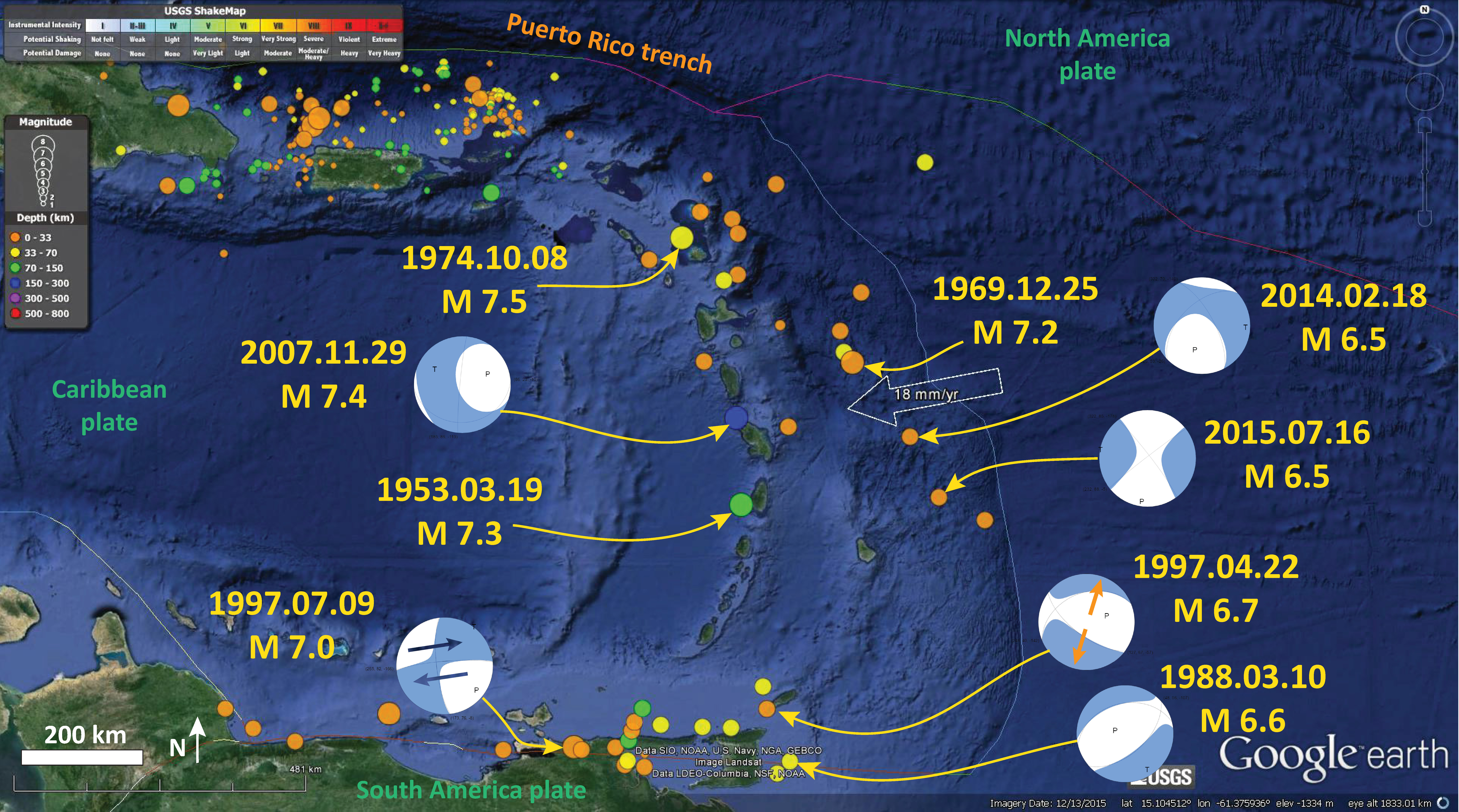
- 2020.01.06 M 5.8 Puerto Rico
https://earthquake.usgs.gov/earthquakes/eventpage/pr2020006006/executive
- In the upper left corner is a tectonic overview map from Symithe et al. (2015). I placed a blue star where the M 6.4 is located.
- In the upper right corner is a regional-scale earthquake fault map from Bruna et al. (2015). The blue star appears again.
- In the lower right corner I show the Bruna map with seismicity plotted. I georeferenced the Bruna map and labeled some of the faults mapped by Bruna et al. (2015).

- 2020.01.07 M 6.4 Puerto Rico
Since late December, southwestern Puerto Rico has seen a sequence of smaller (M3-5) earthquakes, culminating with the 29 Dec 2019 M 5 which later turned out to be a foreshock (there was also a M 4.7 that was a foreshock to the M5). Then on 6 Jan, there was a M 5.8, which was now the mainshock. Then, on the following day, there was the real mainshock, the M 6.4. Lots of other earthquakes too. The largest aftershock was the M 5.9 on 11 Jan. Below I include some comparisons for the M 6.4 and M 5.9 quakes.
Here is a plot showing the cumulative energy release from this sequence. I used the USGS NEIC earthquake catalog for events M≥0. Time is on the horizontal axis and energy release (in joules) on the vertical axis. For every earthquake, the plot steps up relative to the energy released by that quake.

These earthquakes in Puerto Rico have been deadly and damaging. Many structures there are constructed with soft stories on the ground level (the buildings are uplifted to mitigate hurricane flood hazards). Unfortunately, these soft story structures don’t perform well when subjected to earthquake shaking. Thus, there have been many structure collapses. Luckily, there have been only a few deaths. While we may all agree that having no deaths is best, there could have been more.
The M 6.4 even generated a small tsunami. This was localized and was observed clearly on only one tide gage (The Magueyes Island gage).
Here is the tsunami record, along with a map showing the location of the tide gage in southwestern Puerto Rico. These data are from a site that is my “go-to” website for looking for tsunami in tide gage data. I generally look here first.

- Here is the map with 2 month’s seismicity plotted.
- I digitized Bruna et al. (2015) fault lines. To the southeast of the M 6.4 there is mapped a northeast striking (trending) normal fault that dips to the northwest. This seemed to be the best candidate as a source for the M 6.4 earthquake. The earliest earthquakes were strike-slip oblique-normal events, so initially I thought this was a strike-slip sequence. But, as quakes kept happening, they had more extensional mechanisms.
- To the east of the hypothetical M 6.4 source normal fault there are 2 pairs of opposing normal faults. These look typical of a transtension configuration (a strike-slip fault setting with fault geometry that includes extension parallel to the strike-slip faults). These 2 pairs of faults appear to be forming tectonic basins. The M 6.4 hypothetical source fault does not have a mapped counterpart, but the location of that hypothetical counterpart would be close to the shoreline (so could have been missed by the marine geologists who mapped the other faults further offshore).
- Below these interpretive posters, I include an animation from Dr. Anthony Lomax below that shows a better view of this hypothetical fault geometry.

- 2020.01.08 M 5.1 Dominica
https://earthquake.usgs.gov/earthquakes/eventpage/us70006wc3/executive
- The Lesser Antilles is a convergent plate boundary, where the North America and South America plates are subducting westawrdly beneath the Caribbean plate.
- This M 5.1 (now a M 4.8 magnitude) earthquake happened within the South America plate and, based on the moment tensor, is a strike-slip earthquake. Without more information, we cannot tell if this fault is oriented ~north-south or ~east-west. However, the fracture zones to the east of the subduction zone trench are oriented ~east-west. Thus, an east-west left-lateral strike-slip interpretation is slightly favvored.
- Below is a summary of historic earthquakes in the region of the Lesser Antilles.
- 2020.01.11 M 5.9 Puerto Rico
- There are a great many earthquake faults mapped offshore and onshore of Puerto Rico. In the region of this M 5.9 earthquake are mapped several normal (extensional) faults.
- The earthquake mechanisms for this event supports the hypothesis that this earthquake is on one of these extensional faults.
https://earthquake.usgs.gov/earthquakes/eventpage/pr2020011010/executive
- Here is the main interpretiave poster, with an inset figure showing the cumulative seismic energy release over time in this region.
- This figure shows how tectonic strain varies across this region.
- I also show two views of seismic hazard in the Puerto Rico region.

- This figure shows a comparison of the earthquake intensity modeled and felt for the 7 Jan ’20 M 6..4 and this 11 Jan ’20 M 5.9 earthquake.
- I include plots showing how intensity (vertical axis) decays with distance from the earthquake (horizontal axis).

- This figure displays a comparison for liquefaction susceptibility for these same two earthquakes.

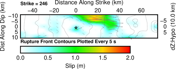
- 2020.01.24 M 6.7 Turkey
This M 6.7 earthquake was the result of slip probably along a left-lateral strike-slip fault associated with the East Anatolia fault zone (EAF). The event was shallow and produced strong ground shaking in the region.
https://earthquake.usgs.gov/earthquakes/eventpage/us60007ewc/executive
Geologists have studied the EAF and subdivided the fault into segments based on their mapping efforts. This M 6.7 is within the Pütürge segment of the EAF. If we look at the historic record of the EAF here, we find that the M 6.7 happened in a part of the fault that does not have an historic rupture. There was an earthquake in 1875 that appears to end to the north of the M 6.7 and there is an earthquake in 1893 that appears to terminate just to the south of the M 6.7.
- In the upper right corner is a map from Armijo et al. (1999) that shows the plate boundary faults and tectonic plates in the region. This M 6.7 earthquake, denoted by the blue star, is along the East Anatolia fault, a left-lateral strike-slip plate boundary fault.
- In the upper left corner is a comparison of the shaking intensity modeled by the USGS and the shaking intensity based on peoples’ “boots on the ground” observations. People felt intensities exceeding MMI 7.
- To the right of the intensity map is a figure from Duman and Emre (2013). This shows the historic earthquakes along the EAF.
- In the lower right corner is a larger scale map showing the tectonic geomorphology of the region (how the landscape is sculpted by tectonic forces).
- To the right of the legend are two maps that show (left) liquefaction susceptibility and (right) landslide probability. These are based on empirical models from the USGS that show the chance an area may have experienced these processes that may have happened as a result of the ground shaking from the earthquake. I spend more time explaining these types of models and what they represent in this Earthquake Report for the recent event in Albania.
I include some inset figures. Some of the same figures are located in different places on the larger scale map below.
- Here is the map with a month’s (ESMC catalog) and a century’s seismicity plotted (USGS NEIC catalog).

- Here is the map with a month’s and a year’s seismicity plotted (CSEM EMSC catalog).
- In the upper left corner is a map that shows the tectonic strain in the region. Areas of red are deforming more from tectonic motion than are areas that are blue. Learn more about the Global Strain Rate Map project here.
- I also show a figure from Wells and Coppersmith (1994). These authors used a global dataset of earthquakes to develop an empirical relation between earthquakes and various parameters. They found relations between the physical size of an earthquake versus earthquake magnitude. These plots show how the magnitude of an earthquake relates to the “surface rupture length in km.” The surface rupture length is the length of the fault that actually caused the ground surface to be offset during the earthquake.
- The table shows calculated magnitudes based on surface rupture lengths of different length. Given the formula in the Wells and Coppersmith (1994) plot shown, an earthquake with a surface rupture length of 35 km would have a magnitude of M 6.8. Note how the aftershock zone is about 75 km long. We will see in the coming week or two if there is a potential for finding surface rupture. Geologists will use satellite data to measure ground offset. This type of remote sensing analysis can help people locate field observations of surface rupture. This kind of analysis was very helpful for our mapping following the July 2019 Ridgecrest Earthquake Sequence.
- Let’s take a look at the USGS fault slip model. USGS seismologists analyze seismologic data (from broadband seismometers) to model the distribution of slip for this earthquake. Below is their model that is based on a southwest-northeast striking (trending) fault (parallel to the EAF). Maximum slip is less than 2 meters.
- Note the coincidence between the estimated length of surface rupture length in the table above (35 km) and this slip model. The slip model shows slip on the fault at or near the surface for about 40 km or so.

- 2020.01.28 M 7.7 Cayman Islands
Contrary to what some people spread around on the internets (some of them major earthquake experts), strike-slip earthquakes can and do generate tsunami (just like this one). More on this below.
https://earthquake.usgs.gov/earthquakes/eventpage/us60007idc/executive
This M 7.7 earthquake happened along the Oriente fault, which is the Septentrional fault further to the east. This fault is one of the boundaries between the North America plate to the north and the Caribbean plate to the south in a region called the Greater Antilles.
Further to the east, this plate boundary changes into a subduction zone along the Lesser Antilles. This subduction zone is the source of a great amount of research. There is some evidence that the megathrust subduction zone fault is not locked, so it is slipping and not capable of generating Great (M>8) earthquakes. However, I was on a team of French geologists aboard the Pourquoi Pas? in 2016. We were coring the deep sea to investigate the sedimentary record of Great earthquakes. Based on our analysis, it appears that the fault is capable of producing these large earthquakes, but the average time between earthquakes (the recurrence interval) is on he order of several millenia.
To the west of the M 7.7 earthquake, there is an oceanic spreading ridge where crust is created, forming the Cayman Trough. As the boundary steps to the south, the relative plate motion is focused on another left-lateral strike-slip fault, the Swan Island fault. This fault extends further to the west into Central America and turns into the Motagua Polochic fault system (there are actually multiple faults hypothesized to be the active part of this plate boundary here). I discuss this more in an Earthquake Report here.
- In the lower right corner is a map from Pindell and Kennan (2009) that shows the major plate tectonic faults in the Caribbean. I place a yellow star in the general location of today’s M 7.7 earthquake.
- In the upper right corner is a map from Symithe et al. (2015). I have used this figure in many of my reports because it is so awesome!!! This map includes the faults of the region, but also includes earthquake mechanisms (e.g. focal mechanisms).
- To the left of the Symithe map is the USGS model for the earthquake fault that slipped during this earthquake. The color represents the amount of slip. I placed a red line with circles at the end on the map where this fault model is located. Don’t forget, this is just a model (but it matches the data that the USGS uses to constrain the model).
- In the upper left corner is a map that shows a comparison of the USGS model for shaking intensity (using the Modified Mercalli Intensity (MMI) scale) and the USGS “Did You Feel It?” observations.
- The shaking intensity model is based on the results of analyzing thousands of earthquakes and using these earthquakes to develop a relation between earthquake size (e.g. magnitude) and how strongly it shakes based on the distance to the earthquake.
- The “DYFI” observations are based on the results of surveys that people submit to the USGS website. The questions people answer are about their observations of the earthquake. Here are some basic facts about this DYFI program and here is some scientific background behind the DYFI program.
- To the right of the intensity map is a plot of the data from the map. The vertical axis represents intensity (MMI) and the horizontal axis represents the distance from the earthquake. The solid lines represent the model results from the USGS. These are the models that the USGS used to create the color on the map to the left. The DYFI observations are the blue dots (the brown dots show averages ofthe blue dots). There is a decent match, but it is far from perfect.
I include some inset figures. Some of the same figures are located in different places on the larger scale map below.
- Here is the map with 3 month’s seismicity plotted.

- Here is the tsunami observation posted by the PTWC. A few years ago, it was conventional wisdom (at least, in my mind) that strike-slip earthquakes were not a producer of tsunami. In the past few years, however, most every large strike-slip submarine earthquake has generated a tsunami. We need to break this old way of viewing this.
- The main difference for tsunami from strike-slip earthquakes is that they are smaller than from subduction or thrust faults. BUT, even a tsunami with a size of about 2-3 meters can cause millions of dollars of damage. These are still dangerous events, even though they are not as dangerous as larger tsunami.
- Here is a figure that includes a map showing the location of these two tide gages.

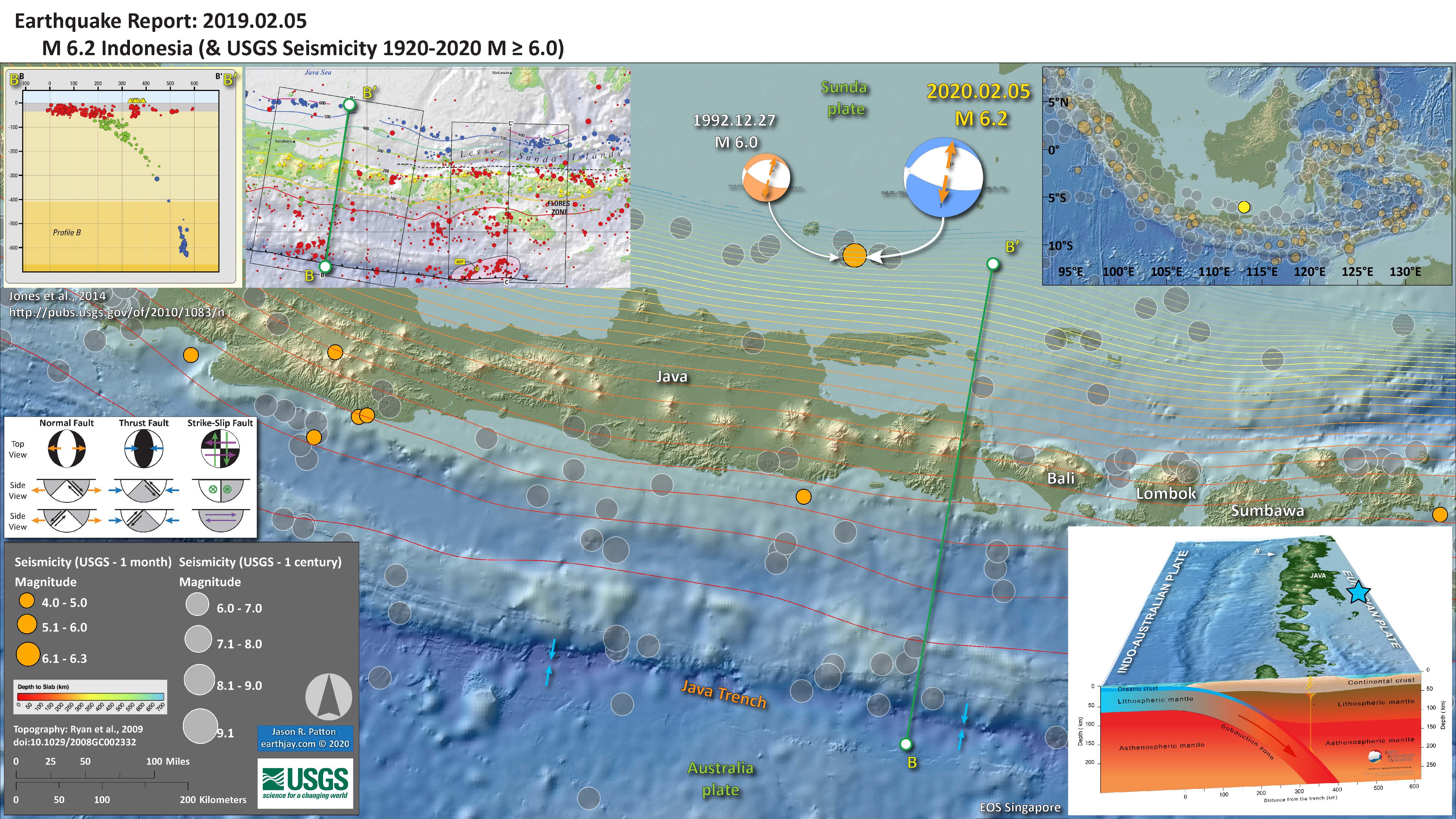
- 2020.02.05 M 6.2 Indonesia
- The plate boundary offshore the coast of Java, Indonesia is a convergent plate boundary called a subduction zone. Here the Autralia plate dives northwards beneath the Sunda plate (part of Eurasia).
- As the Australia plate goes down, it bends and extends for a variety of reasons. Read more about this for the earthquake report for an event in a similar area here offshore of Lombok.
https://earthquake.usgs.gov/earthquakes/eventpage/us70007j6z/executive
There was another event further to the west on 6 July ’20. These may be related.
https://earthquake.usgs.gov/earthquakes/eventpage/us7000aj3w/executive
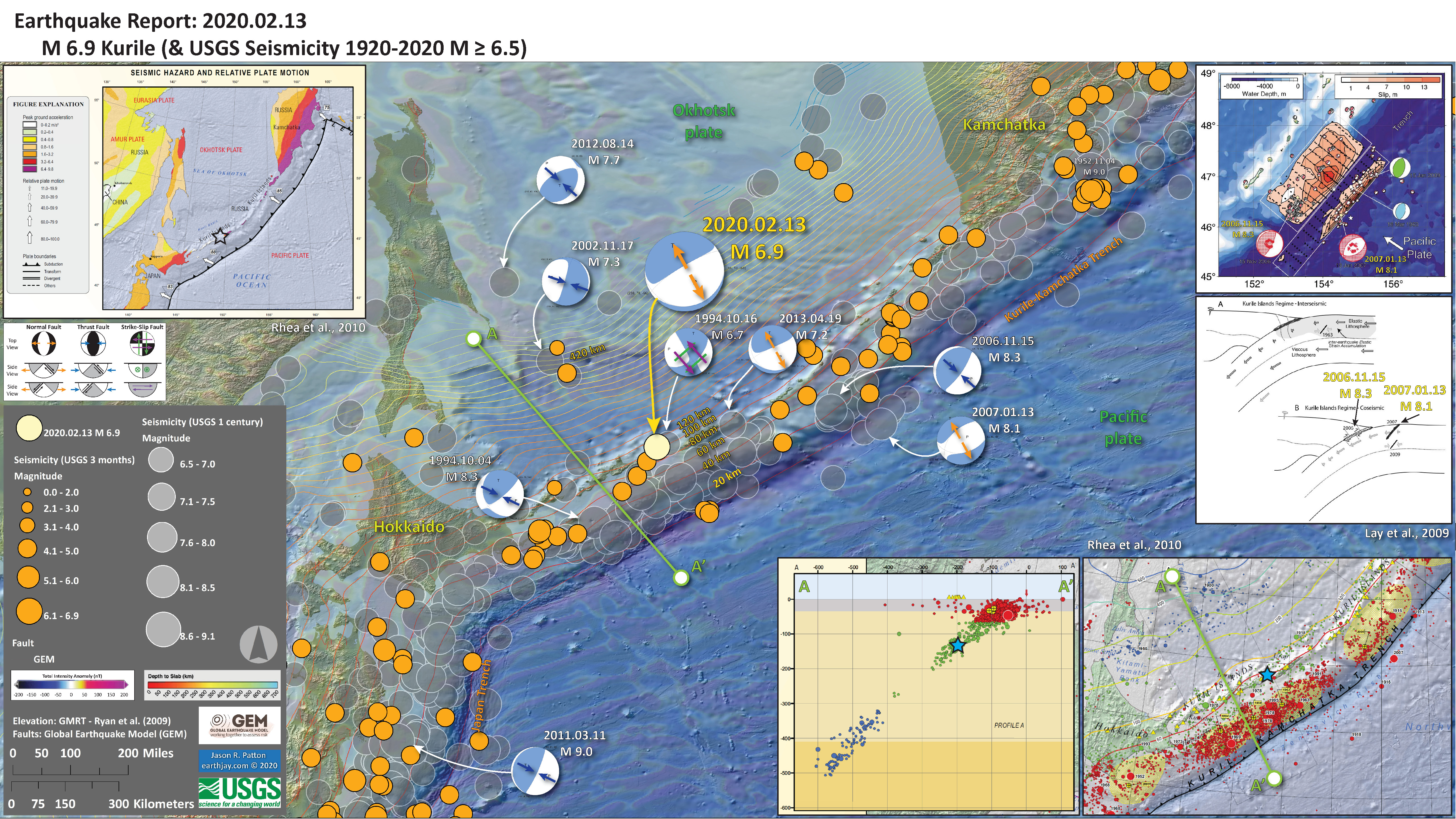
- 2020.02.13 M 6.9 Kurile
- The plate boundary in this region is a subduction zone.
- This M 6.9 (now 7.0) earthquake is a normal fault event in the downgoing Pacific plate.
https://earthquake.usgs.gov/earthquakes/eventpage/us70007pa9/executive
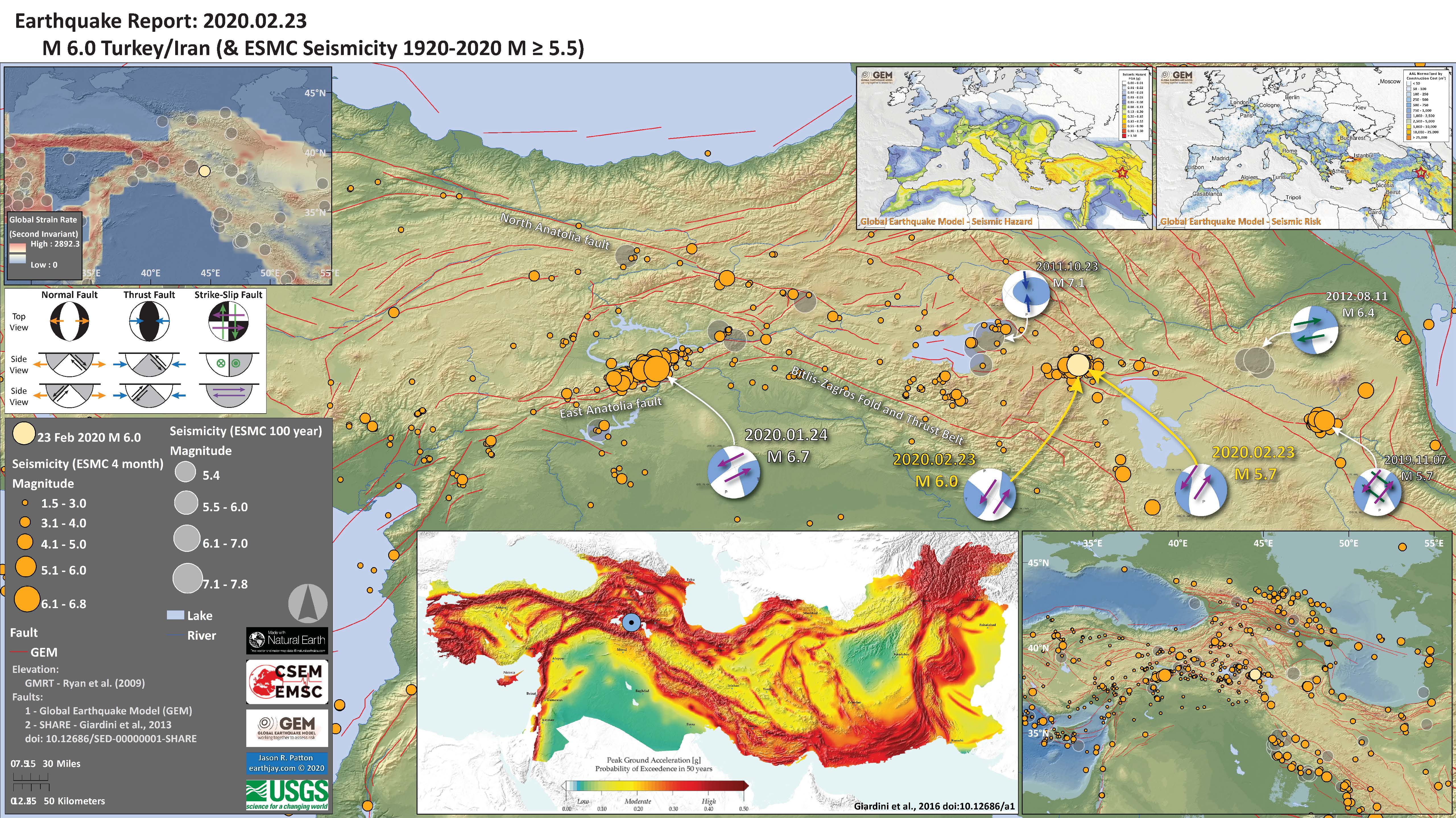
- 2020.02.23 M 6.0 Turkey
- Based on the faults mapped in the SHARE fault database, and the aftershocks from this earthquake sequence, I interpret this earthquake as a left-lateral strike-slip earthquake.
https://earthquake.usgs.gov/earthquakes/eventpage/us70007v9g/executive
- 2020.03.09 M 5.8 Mendocino fault
I was in Humboldt County last week for the Redwood Coast Tsunami Work Group meeting. I stayed there working on my house that a previous tenant had left in quite a destroyed state (they moved in as friends of mine).
As I was grabbing a bite at Taqueria Bravo in Willits, I checked in on social media and noticed my friend Dave Bazard had posted moments earlier about an earthquake there. I had missed it by about 2 hours or so.
https://earthquake.usgs.gov/earthquakes/eventpage/nc73351710/executive
Yesterday’s earthquake was a right-lateral strike-slip earthquake on the Mendocino fault system. The Mendocino fault is a strike-slip fault formed by the eastward motion of the Gorda plate relative to the westward motion of the Pacific plate. The last major damaging earthquake on the MF was in 1994.
Interestingly, this was the 6 year commemoration of the 2014 M 6.8 Gorda plate earthquake (the last large earthquake in the region).
Also, there was a similarly sized event on the MF in 2018.
-
Big “take-aways” from this:
- This earthquake did not affect the Cascadia megathrust subduction zone fault (too small of magnitude and too far away).
- This earthquake did not generate an observable tsunami.
- This earthquake changed the stress in the surrounding crust, but a very very small amount (in some places it increased stress on faults and in other places it decreased stresses on faults). However, the magnitude was small and this change in stress is probably short lived. I discuss this about a previous MF earthquake here. I spend more time on this topic for a Gorda plate earthquake here.
- In the lower left corner is a legend, but to the right is an inset map of the Cascadia subduction zone (modified from Nelson et al., 2006). I place a blue star in the location of yesterday’s earthquake.
- In the upper left corner is a small scale map showing the entire pacific northwest with some historic seismicity (up to central Oregon; I forgot to download the data from the entire region; there are other examples of this).
- To the right of that is a map showing the USGS Did You Feel It observation results showing how broadly this earthquake was felt. My friend in Redding told me that they felt it. This made sense since the Mendocino fault points right at Redding, but it was also felt in southern California (probably from site amplification from sedimentary basins). The color is the same scale as in the legend for shaking intensity (MMI).
I include some inset figures. Some of the same figures are located in different places on the larger scale map below.
- Here is the map with a week’s and century’s seismicity plotted. I include the USGS model for shaking intensity as a transparent overlay (with MMI intensities up to M 5 near the epicenter).

- 2020.03.18 M 5.7 Salt Lake City, Utah
As I was waking up this morning, I rolled over to check my social media feed and moments earlier there was a good sized shaker in Salt Lake City, Utah. I immediately thought of my good friend Jennifer G. who lives there with her children. I immediately started looking into this earthquake.
https://earthquake.usgs.gov/earthquakes/eventpage/uu60363602/executive
The west coast of the United States and Mexico is dominated by the plate boundary between the Pacific and North America plates. Many are familiar with the big players in this system:
- The right-lateral transform fault zone called the San Andreas fault (SAF) where the North America plate on the east moves south relative to the Pacific plate. They are both moving north-ish, but the Pacific plate is moving “North” faster than the North America plate.
- The convergent plate boundary called the Cascadia subduction zone (CSZ) where the Gorda, Juan de Fuca, and Explorer plates are diving beneath the North America plate, forming a megathrust subduction fault system.
There are many other faults that are also part of this plate boundary system. The San Andreas fault zone “proper” accommodates about 85% of the relative plate motion. The rest of the relative plate motion (15%) is accounted for by slip on other strike-slip fault systems.
There are “sibling” faults to the SAF near the SAF (like the Hayward fault in the San Francisco Bay Area) and further away (like the Eastern California shear zone, the Owens Valley fault, and the Walker Lane fault systems).
Just like Dr. Steve Wesnousky showed us, the crust in the Walker Lane is moving around like a layer of solid wax floating around on a tray of melted wax. So, there are faults in lots of different kinds of directions, and different kinds of faults too.
The easternmost right-lateral strike slip fault is the Wasatch fault.
East of Sierra Nevada. in Nevada and western Utah, there is lots of East-West oriented extension (i.e. the Basin and Range) where the crust in western Nevada is moving west compared to the crust in Salt Lake City, Utah.
The Wasatch is also one of these extensional faults we call Normal faults.
In Salt Lake City, the Wasatch fault is oriented roughly north-south and is generally located on the eastern side of the valley, near the base of the mountains. The Crust on the western side of the fault is moving west relative to the mountains.
The fault then dips down towards the west. Because the motion is east-west, and the fault dips at an angle, the valley goes down over time relative to the mountains (thus forming the valley).
Today’s earthquake happened in the middle of the valley, where the Wasatch fault is deep beneath. The earthquake was a “normal” fault earthquake with east-west extension. So, the earthquake and aftershocks are on a fault related to the Wasatch (or we are wrong about the precise location of the fault, the earthquake, or both).
- In the lower right corner is a map of the western USA with USGS seismicity from the past century for earthquakes M 5.5+. Note all the north-south oriented lines in Nevada and Utah. These are formed by all the normal faults from the east-west extension in the basin and range.
- In the upper right corner is a map of the Salt Lake City (SLC) area. The Great Salt Lake is the large light blue bleb in the upper right. We can see the mountains to the east of SLC, the Wasatch Range. The Earthquake Intensity uses the MMI scale (the colors), read more about this here. This map represents an estimate of ground shaking from the M 5.7 based on a statistical model using the results of tens of thousands of earthquakes.
- In the upper left corner is a plot showing how these USGS models “predict” the ground shaking intensity will be relative to distance from the earthquake. These models are represented by the broan and green lines. People can fill out an online form to enter their observations and these “Did You Feel It?” observations are converted into an intensity number and these are plotted as dots in this figure.
- In the left-center is a map from DuRoss et al. (2016) that shows the Wasatch fault along the base of the Wasatch Range. Note that the fault is subdivided into different segments. We think that sometimes these different segments may rupture at different times and sometimes some of them may rupture at the same time.I placed a blue star in the location of today’s earthquake (projected onto the surface).
I include some inset figures. Some of the same figures are located in different places on the larger scale map below.
- Here is the map with 1 year’s and 1 century’s seismicity plotted.

- Two great resources for information about the tectonics of Utah are here:
- Emily Kleber fromt he Utah Geological Survey put together this excellent overview.
- Here is a Handbook for earthquakes in Utah. This is a pdf and can be printed out for the use in lesson plans for a variety of age groups. I particularly like the artwork on the cover.
- Here is a clearinghouse of photos of damage from the earthquake (h/t to Nick Graehl, my coworker, for pointing this out).
- 2020.03.18 M 5.2 Petrolia
Well, it was a big mag 5 day today, two magnitude 5+ earthquakes in the western USA on faults related to the same plate boundary! Crazy, right? The same plate boundary, about 800 miles away from each other, and their coincident occurrence was in no way related to each other.
In the past 9 months it was also a big mag 5 MTJ year. There have been 3 mag 5+ earthquakes in the Mendocino triple junction (MTJ) region. The first one in June of 2019, at the time, appeared to be related to the Mendocino fault. The 9 March M 5.8 event was clearly associated with the right lateral Mendocino transform fault. The latest in this series of unrelated earthquakes is possibly associated with NW striking faults in the Gorda plate. I will discuss this below and include background about all the different faults in the region.
- 2019.06.23 M 5.6 Petrolia (USGS Page) (EarthJay Page)
- 2020.03.09 M 5.8 Mendocino fault (USGS Page) (EarthJay Page)
- 2020.03.18 M 5.2 Petrolia (USGS Page) (EarthJay Page – this one, lol)
- In the upper left corner are a map of the tectonic plates and their boundary faults (Chaytor et al., 2006; Nelson et al., 2006). To the right is a and cross section cutting into the Earth from West (left) to East (right) that shows the downgoing (subducting) Gorda plate beneath the North America plate (Plafker, 1972).
- In the upper right corner is a map of the MTJ area. The Great Salt Lake is the large light blue bleb in the upper right. We can see the mountains to the east of SLC, the Wasatch Range. The Earthquake Intensity uses the MMI scale (the colors), read more about this here. This map represents an estimate of ground shaking from the M 5.7 based on a statistical model using the results of tens of thousands of earthquakes.
- In the lower left corner to the right of the legend is a plot showing how these USGS models “predict” the ground shaking intensity will be relative to distance from the earthquake. These models are represented by the broan and green lines. People can fill out an online form to enter their observations and these “Did You Feel It?” observations are converted into an intensity number and these are plotted as dots in this figure.
- There are several sources of seismicity on this map, but i tried to make it easier to interpret using color choices. I recognize this poster does not satisfy Access and Functional Needs. I will work on that.
- The three main earthquakes are plotted in pastel yellow and orange-yellow colors.
- Earthquakes from the past 3 months are light green.
- The earthquakes from the past century are faint gray.
- The earthquakes located using a double differenced locating method are colored relative to depth.
- Look at the westernmost NW trend in seismicity. How does the depth of the earthquakes change along that transect?
- Yes! The earthquakes deepen to the southeast. These earthquakes are revealing to us the location (e.g. depth) of the Gorda plate as it dives deeper to the east.
I include some inset figures. Some of the same figures are located in different places on the larger scale map below.
- Here is the map with 3 month’s (in green) and 1 century’s (in gray, mislabeled) seismicity plotted. I also include seismicity from a catalog with events relocated using the Double Differencing method.

I also outlined the two main northwest trends in seismicity with dashed white line polygons. The 18 March event is in the southern end of the western seismicity trend.
There is a nice northeast trend in seismicity that I also outlined. This is probably representative of one of the typical left-lateral Strike-slip Gorda plate earthquakes.
- This poster includes seismicity from the past ~5 decades, for temblors M > 3.0. I also include the map and cross section as explained above. On the left is a map that shows the possible shaking intensity from a future CSZ earthquake.
- More about the materials on this poster can be found on this page.
- 2020.03.25 M 7.5 Kuril
- This M 7.5 earthquake is along the convergent plate boundary that forms the Kuril trench. Just like the event earlier this year, this earthquake is in the Pacific plate.
- However, while the earlier event was extensional, this is compressional (thrust or reverse). This M 7.5 is deep in the crust, where the bending of the plate experiences compression.
https://earthquake.usgs.gov/earthquakes/eventpage/us70008fi4/executive
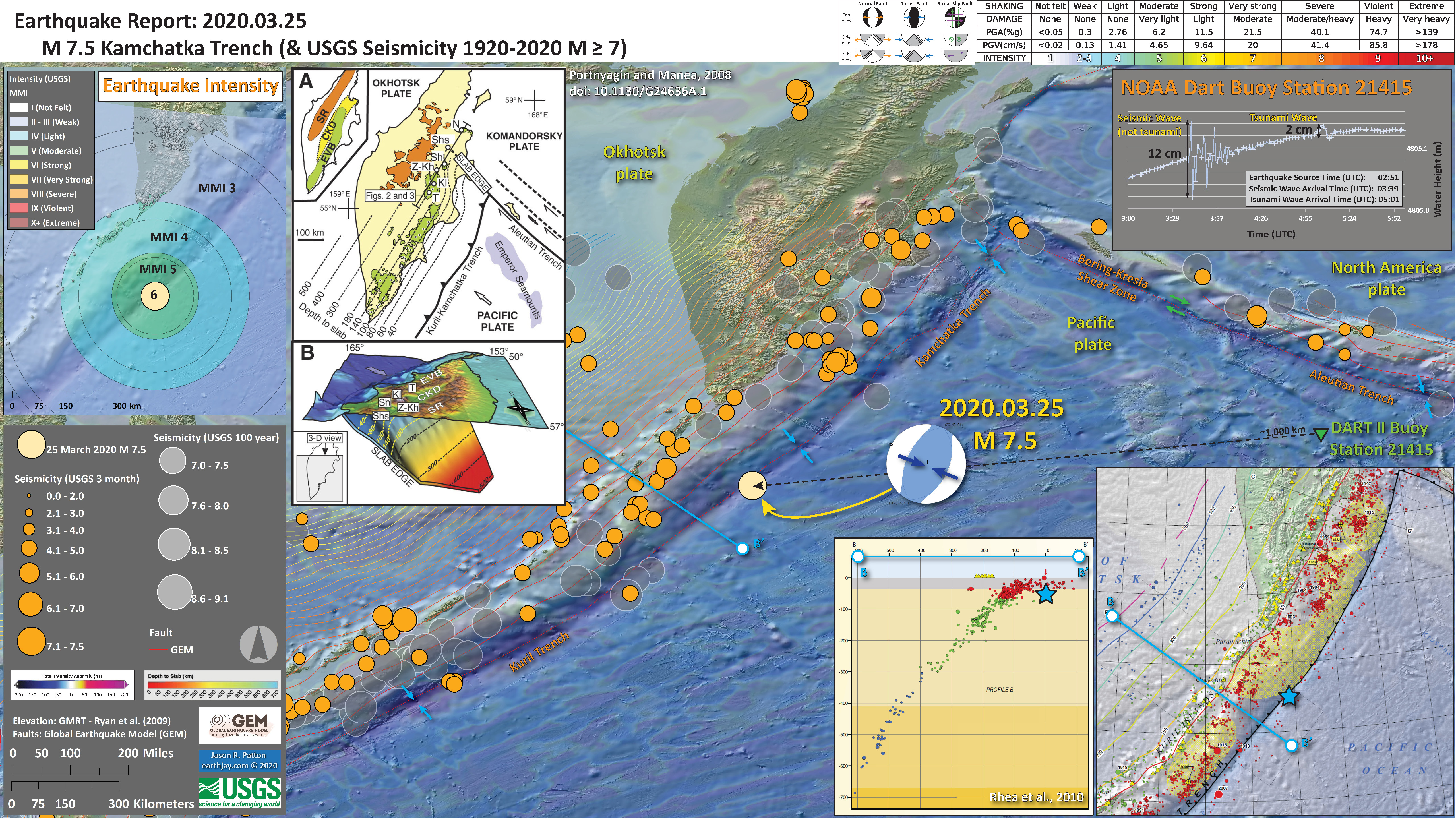
- This earthquake event generated a tsunami as evidenced by the Crescent City, California tide gage.

- 2020.03.31 M 6.5 Idaho
Yesterday there was a very interesting magnitude M 6.5 earthquake that ruptured in central Idaho, near the Sawtooth fault.
https://earthquake.usgs.gov/earthquakes/eventpage/us70008jr5/executive
The M 6.5 earthquake yesterday happened in an area where a Basin & Range (B&R) fault ends near one of these older Eocene aged faults. Most of us saw the earthquake notification and probably thought that the quake would have been a B&R normal (extensional) fault. However, when the mechanism was posted online, the earthquake mechanism was instead a strike-slip earthquake. This was really interesting. I love when things happen that are unexpected. This is what makes life exciting.
The mechanism is not a purely strike-slip earthquake as it is not a 100% double-couple earthquake (a double couple is the type of force that is associated with the crust moving in one direction on one side of the fault and in the other direction on the other side of the fault). Someone has hypothesized that the M 6.5 earthquake may have been complicated and involved both normal and strike-slip faulting. I like this hypothesis as it fits my idea of an older fault being reactivated under a newer (modern = today) tectonic regime.
- In the lower left corner is a map of the western USA showing the topography and seismicity for the past 3 months. Note the M 6.5 event in yellow and the recent earthquake in Utah near the Great Salt Lake.
- In the upper left corner I include a map from Bennett (1986) that shows some of the major faults in Idaho. I placed a blue star in the location of the M 6.5 and labeled the Trans-Challis fault zone.
- In the upper right corner I include a map showing the region impacted by this earthquake. The Earthquake Intensity uses the MMI scale (the colors), read more about this here. This map represents an estimate of ground shaking from the M 6.5 based on a statistical model using the results of tens of thousands of earthquakes.
- To the right of the Bennet map is a plot showing how these USGS models “predict” the ground shaking intensity will be relative to distance from the earthquake. These models are represented by the broan and green lines. People can fill out an online form to enter their observations and these “Did You Feel It?” observations are converted into an intensity number and these are plotted as dots in this figure.
- In the lower center is a map from the U.S. Geological Survey National Seismic Hazard Map (Petersen et al., 2019). This map shows the chance that any region may experience strong ground shaking from an earthquake in the next 100 years. The M 6.5 happened in an area thought to have a 36-74% chance of shaking at least MMI VI. Looking at the other plots on this poster, we can see that this map held true. What is the highest MMI in the upper right inset map? What is the highest ground shaking intensity in the plot in the upper center? Most of the observed intensities are less than MMI 6, but there were some.
I include some inset figures. Some of the same figures are located in different places on the larger scale map below.
- Here is the map with 3 month’s seismicity plotted.

- After I worked for the day, I thought to put together an updated map with aftershocks plotted, at a larger scale. I had downloaded the 10m digital elevation model data for Idaho about a year ago, so it was easy to load it up as a base map.
- I annotated the Bennet (1986) tectonic map to highlight the different faults (older faults in light orange, younger B&R faults in darker orange). I encircled the area of the M 6.5 sequence.
- These seismicity data are sourced from IRIS’ earthquake browser. The USGS earthquakes website was not working, so I needed to go elsewhere to obtain seismicity data. This has become a problem in the past few years as more and more people find the excellent services from he USGS to be useful to them. This is good and bad. It makes it difficult to get data. Another problem is that the “Did You Feel It” website does not work (the M 7.1 Ridgecrest Earthquake has many fewer DYFI observations due to this problem).

One thing we might do is estimate what the surface rupture length might it take to generate a M 6.5 earthquake. According to the Wells and Coppersmith (1994) empirical relations, there may be a surface rupture length of about 20 km. If we look at the aftershock sequence in the poster below, we might observe that the fault length may be about 24 km. So, while these are not the same thing, they are of about the same scale. (I used the relations in their figure 9)
There are landslide slope stability and liquefaction susceptibility models based on empirical data from past earthquakes. The USGS has recently incorporated these types of analyses into their earthquake event pages. More about these USGS models can be found on this page.
I prepared some maps that compare the USGS landslide probability maps for the 2020 M 6.5 and 1959 M 7.3 Hebgen Lake earthquakes.
- Here is the landslide probability map (Jessee et al., 2018). Below the poster I include the text from the USGS website that describes how this model is prepared.
- Note that they are at different scales.

Nowicki Jessee and others (2018) is the preferred model for earthquake-triggered landslide hazard. Our primary landslide model is the empirical model of Nowicki Jessee and others (2018). The model was developed by relating 23 inventories of landslides triggered by past earthquakes with different combinations of predictor variables using logistic regression. The output resolution is ~250 m. The model inputs are described below. More details about the model can be found in the original publication. We modify the published model by excluding areas with slopes <5° and changing the coefficient for the lithology layer "unconsolidated sediments" from -3.22 to -1.36, the coefficient for "mixed sedimentary rocks" to better reflect that this unit is expected to be weak (more negative coefficient indicates stronger rock).To exclude areas of insignificantly small probabilities in the computation of aggregate statistics for this model, we use a probability threshold of 0.002.
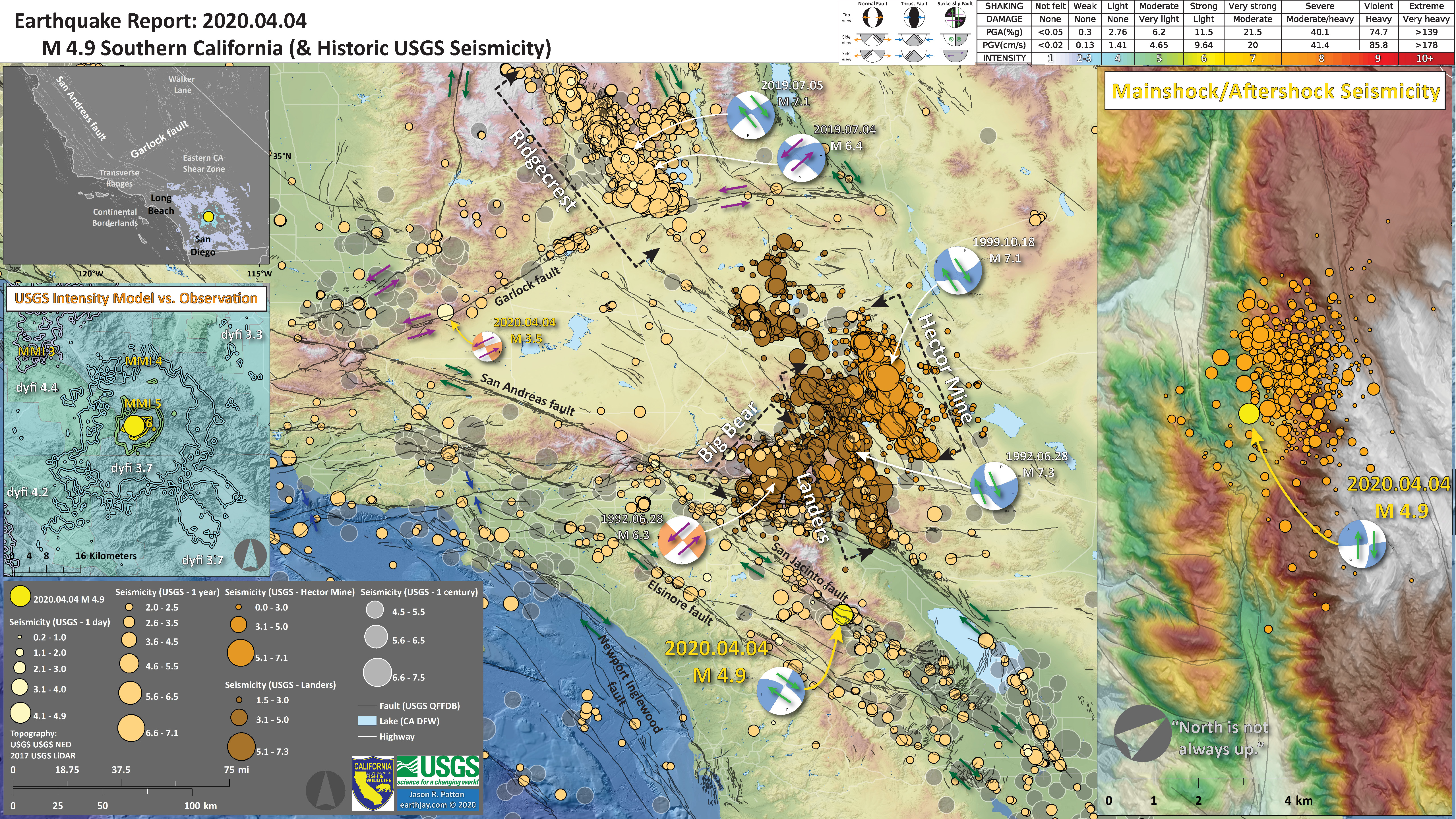
- 2020.04.04 M 4.9 Soouthern California
- The plate boundary that dominates the western USA is the Pacific-North America plate boundary localized along the right-lateral strike-slip San Andreas fault.
- The San Andreas fault has “sibing” faults that share a smaller proportion of the relative plate motion. They are also right-lateral strike-slip faults (generally).
- This M 4.9 earthquake occurred on the Anza Section of the San Jacinto fault zone, one of these sibling faults. So, I interpret this M 4.9 as a right-lateral strike-slip earthquake. There are several excellent historical analogue earthquakes.
https://earthquake.usgs.gov/earthquakes/eventpage/ci39126079/executive
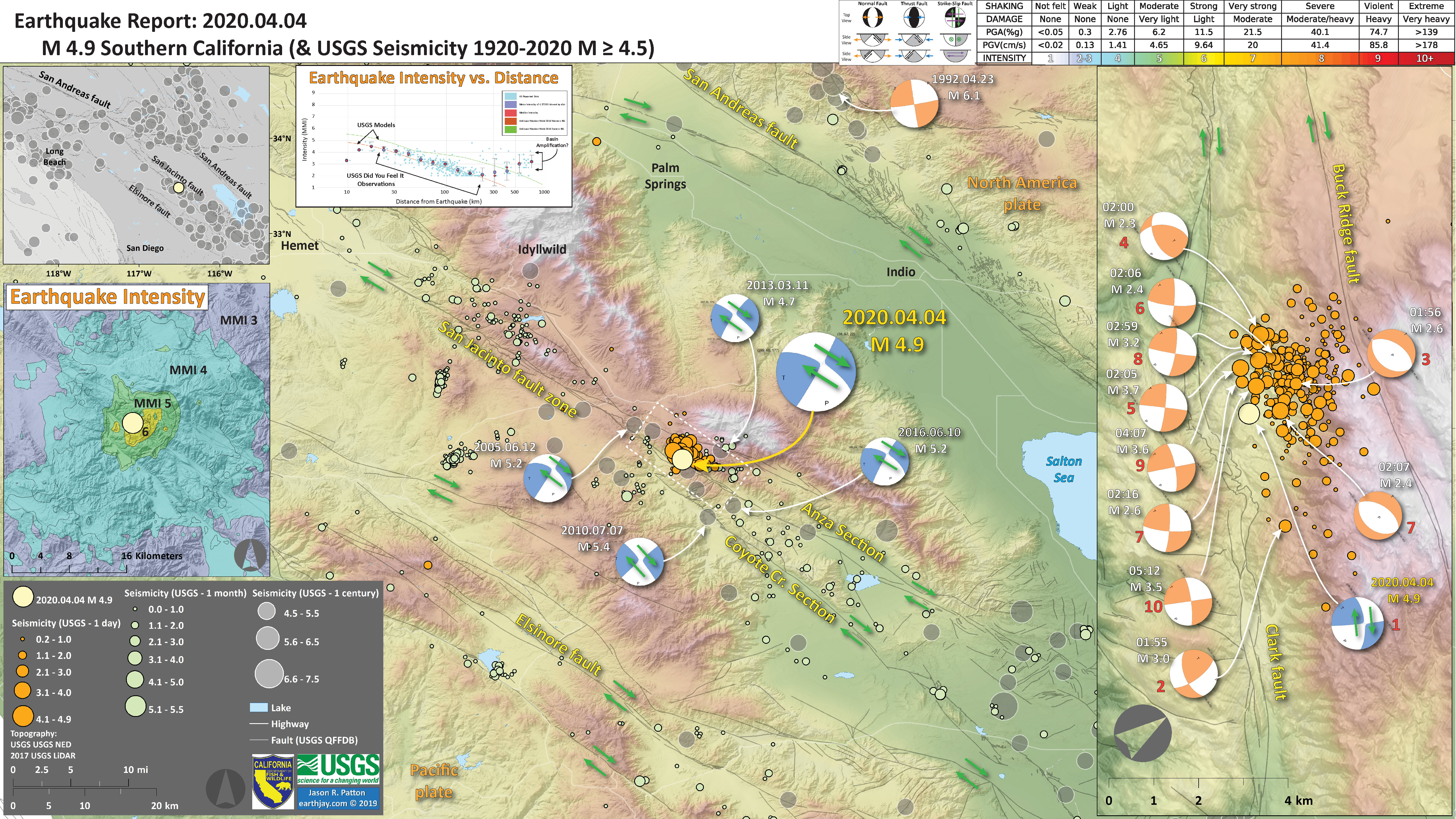
- In this poster I present some of the historic earthquakes in southern California.
- 2020.04.11 M 5.2 Mono Basin, California
- This M 5.2 earthquake is part of the Mina deflection, a part of the plate boundary on the east side of the Sierra. Based on mapped faults and the aftershock pattern, I interpret this earthquake as a left-lateral strike-slip earthquake.
- Read more about this tectonic region in the report for the 15 May ’20 M 6.5 earthquake in Nevada (below).
https://earthquake.usgs.gov/earthquakes/eventpage/nc73367270/executive

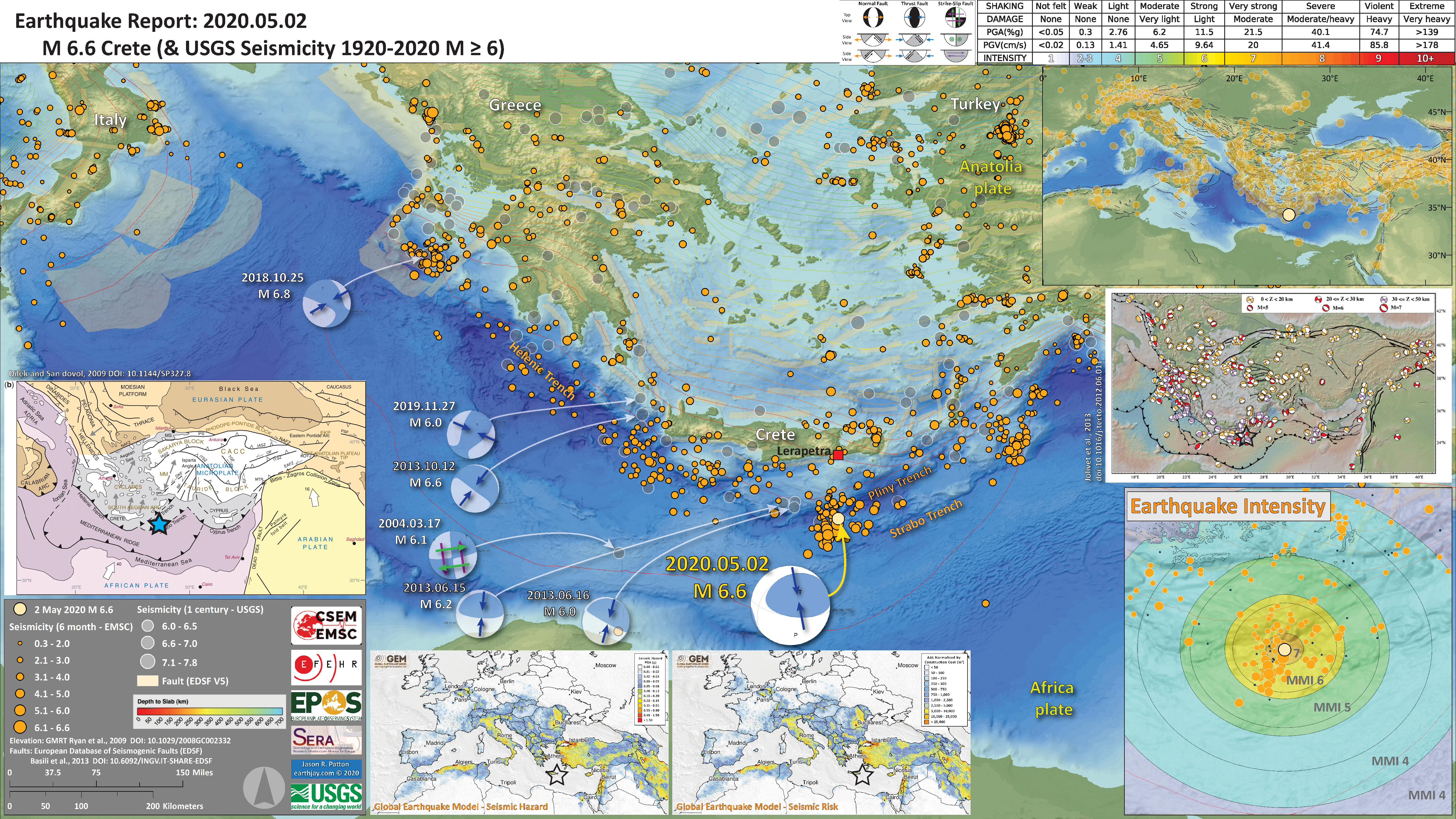
- 2020.05.02 M 6.6 Crete, Greece
Well, last weekend I was working on a house, so did not have the time to write this up until now.
https://earthquake.usgs.gov/earthquakes/eventpage/us700098qd/dyfi/intensity
The eastern Mediterranean Sea region is dominated by plate tectonics (no surprise, right?). The plate boundary fault system that is responsible for this earthquake near Crete is a convergent plate boundary called a subduction zone.
Convergent means that one plate is moving towards another plate. One of the largest plate boundary systems in the world is a convergent plate boundary that extends from between the north side of Australia and Indonesia, through southern Asia forming the Himalayan Mountains, through the Middle East, into Europe and west past the Mediterranean.
Near Crete the Africa plate is diving (northwards) beneath the Anatolia plate (a sliver of the Eurasia plate). The 2 May magnitude M 6.6 earthquake appears to have been an earthquake on the subduction zone megathrust fault interface (a subduction zone earthquake).
The earthquake was felt across the region with intensity as high as MMI 6 in Crete, to around MMI 4 in Cairo, Egypt.
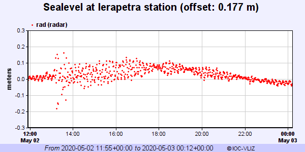
The earthquake even caused a tsunami that was recorded at teh Lerapetra tide gage in Crete, Greece. The wave was small at about 40 cm peak to trough (measured vertically from the highest part of the wave, the peak, to the lowest part of the wave, the trough).
Here are the tide gage data downloaded from the IOC website here. The tsunami starts at around 13:00 hours.
- In the center left is an inset map from Dilek and Sandovol (2009) that shows the tectonic plates and the plate boundary faults in the region. There is a blue star in the general location of the M 6.6 earthquake.
- In the upper right corner is a smaller scale view of the region with 6 months of seismicity plotted.
- In the lower right corner is a map that shows a model estimate of the shaking intensity from this M 6.6 earthquake.
- Above the intensity map is a map that shows earthquake mechanisms for historic earthquakes in the region.
- In the bottom center are seismic hazard and seismic risk maps for the European area. There is more about hazard and risk later in this report.
I include some inset figures. Some of the same figures are located in different places on the larger scale map below.
- Here is the map with 6 month’s seismicity plotted.
- 2020.05.06 M 6.8 Banda Sea
Early morning (my time) there was an intermediate depth earthquake in the Banda Sea.
https://earthquake.usgs.gov/earthquakes/eventpage/us70009b14/executive
This earthquake was a strike-slip earthquake in the Australia plate. There are analogical earthquakes in the same area in 1963, 1987, 2005, and 2012 that appear to have occurred on the same fault.
In June 2019 there was an earthquake nearby with a similar mechanism.
- In a map below, I include a transparent overlay of the Global Strain Rate Map (Kreemer et al., 2014).
- The mission of the Global Strain Rate Map (GSRM) project is to determine a globally self-consistent strain rate and velocity field model, consistent with geodetic and geologic field observations. The overall mission also includes:
- contributions of global, regional, and local models by individual researchers
- archive existing data sets of geologic, geodetic, and seismic information that can contribute toward a greater understanding of strain phenomena
- archive existing methods for modeling strain rates and strain transients
- The completed global strain rate map will provide a large amount of information that is vital for our understanding of continental dynamics and for the quantification of seismic hazards.
- The version used in the poster(s) below is an update to the original 2004 map (Kreemer et al., 2000, 2003; Holt et al., 2005).
Global Strain
- In the upper right corner is a map showing historic seismicity, fault lines, and the global strain rate map (red shows area of higher tectonic strain).
- In the lower right corner is a low angle oblique view of the tectonic plate configuration (Pownall et al., 2014).
- In the upper left corner are maps that show the seismic hazard and seismic risk for Indonesia. I spend more time explaining this below.
- In the center top-left is a map that shows earthquake intensity using the Modified Mercalli Intensity (MMI) Scale.
I include some inset figures. Some of the same figures are located in different places on the larger scale map below.
- Here is the map with a month’s seismicity plotted.
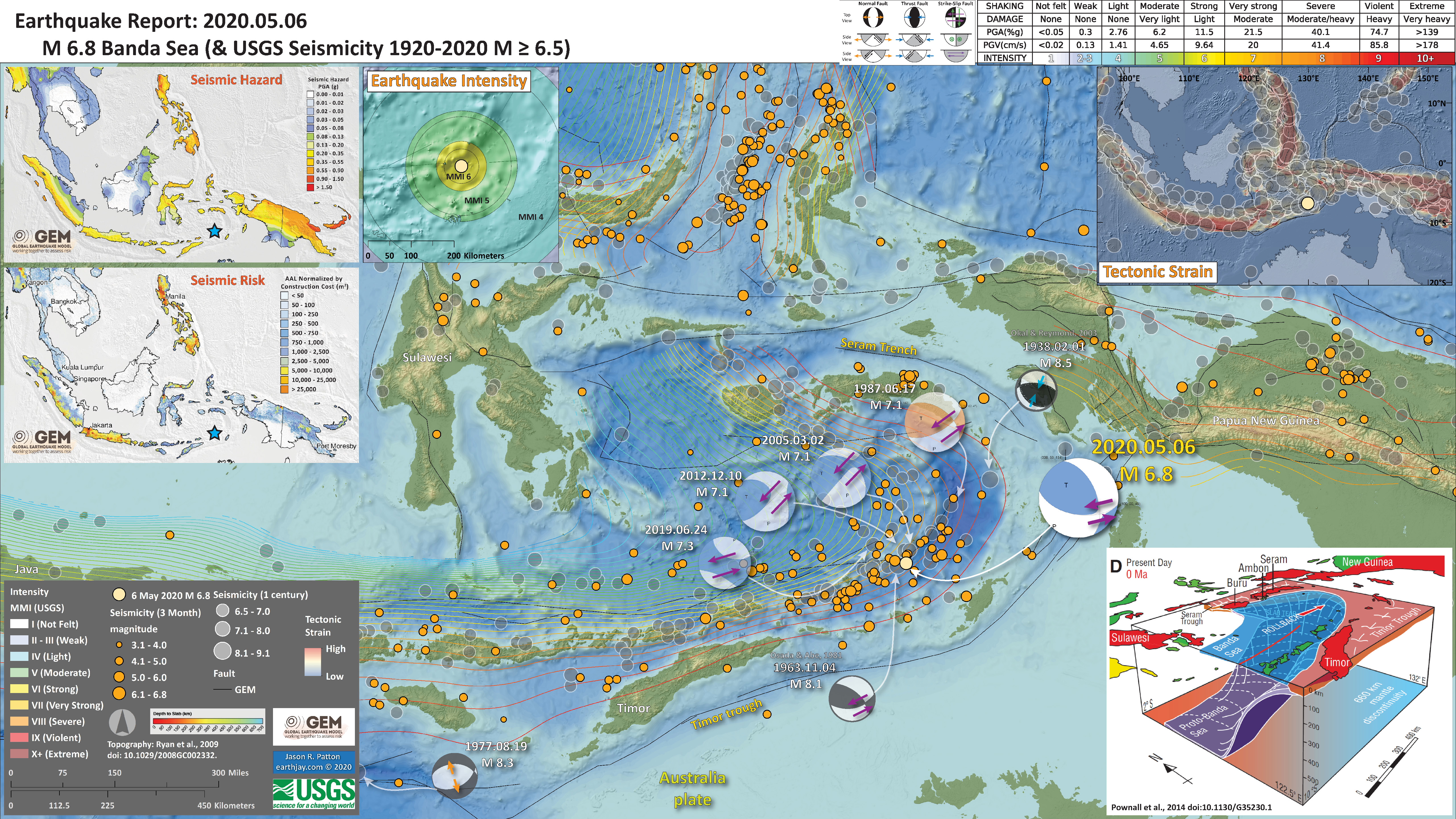
- Here is the poster from the nearby earthquake in June of 2019.

- 2020.05.15 M 6.5 Nevada
I was slowly waking up while looking at my social media feed. moments before (maybe minutes) Anthony Lomax had posted his first motion earthquake mechanism for a M 6.4 near the CA/NV border. I leaped out of bed and got off a map before i had the time to put any clothes on (one benefit of teleworking that i won’t go into too many details).
https://earthquake.usgs.gov/earthquakes/eventpage/nn00725272/executive
There was a swarm of earthquakes east of Mono Lake in April along the Huntoon Valley fault zone. These events are aligned with faults that trend east-northeast. The plate boundary relative plate motion is generally aligned with the San Andreas fault system (north-northwest trending right-lateral strike-slip faulting). To the east, tectonics are dominated by ~east-west extension in the Basin and Range geomorphic province.
As the plate boundary organizes itself along the east side of the Sierra Nevada, it has some disruptions, with blocks that are rotating in ways (within this right-lateral shear) that lead to these northeast trending faults.
As the blocks rotate, the faults that bound these blocks (the east-northeast faults) are left-lateral strike-slip faults. More on this below.
- In the upper left corner is a small scale (zoomed out) view of the western USA showing the major tectonic faults (from the Global Earthquake Model). I show USGS seismicity from the past century.
- In the lower right corner is a map showing the earthquake intensity using the Modified Mercalli Intensity Scale (MMI) as modeled by the USGS.
- In the upper right corner is a map that shows the earthquakes from the past month. Note how the April sequence is related to today’s ongoing sequence.
- In the center right is a map that shows the liquefaction susceptibility model from the USGS. This is a model and not based on direct observation, however, it could be used to help direct field teams to search for this type of effect.
- In the lower center is a plot showing how shaking intensity lowers with distance from the earthquake. The models that were used to produce the Earthquake Intensity map to the right are the same model results represented by the orange and green lines. However, on this plot, there are also observations from real people! The USGS Did You Feel It? questionnaire lets people report their observations from the earthquake and these data are plotted here. We can then compare the model with the observations.
I include some inset figures. Some of the same figures are located in different places on the larger scale map below.
- Here is the map with 3 month’s seismicity plotted.
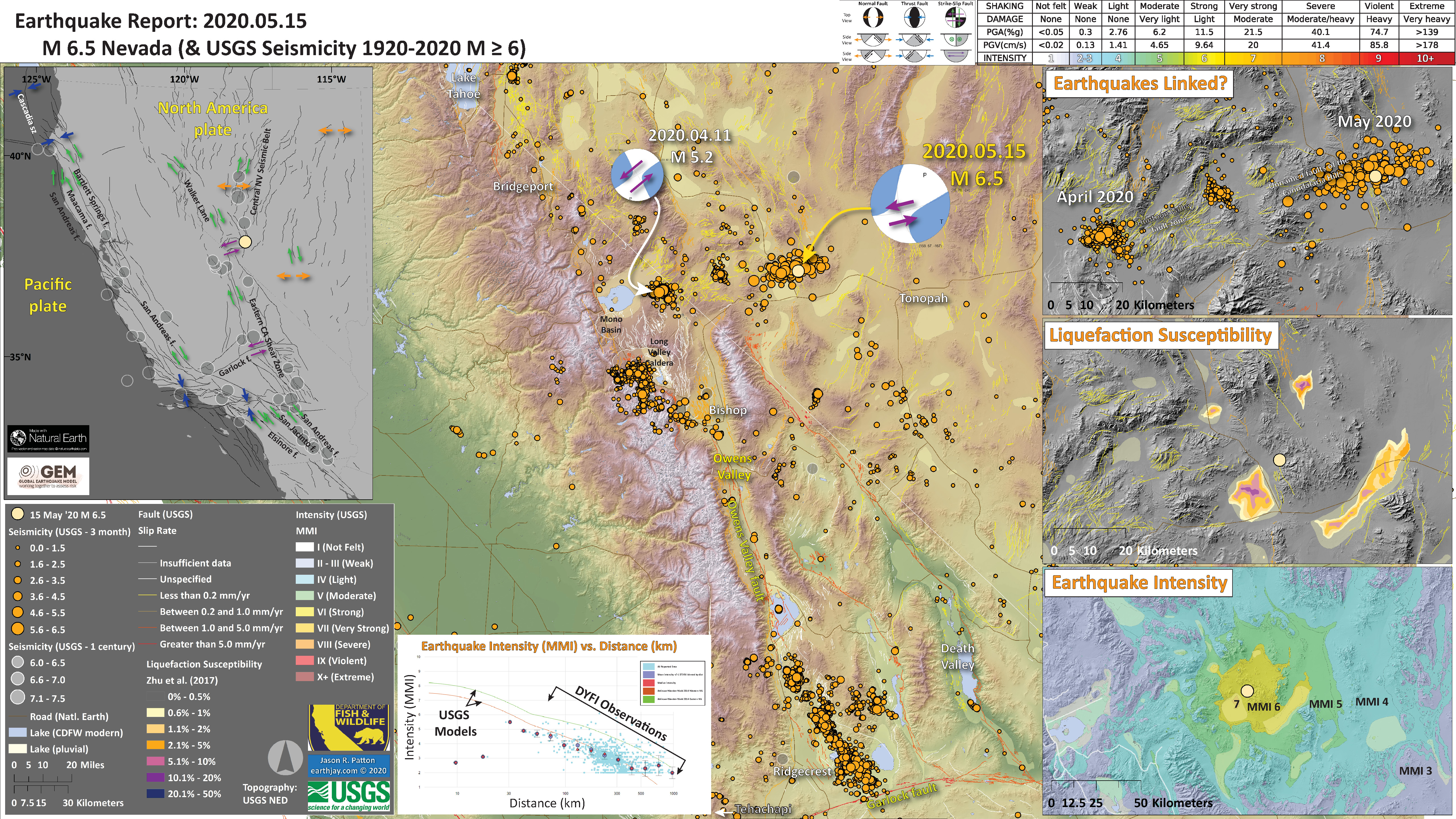
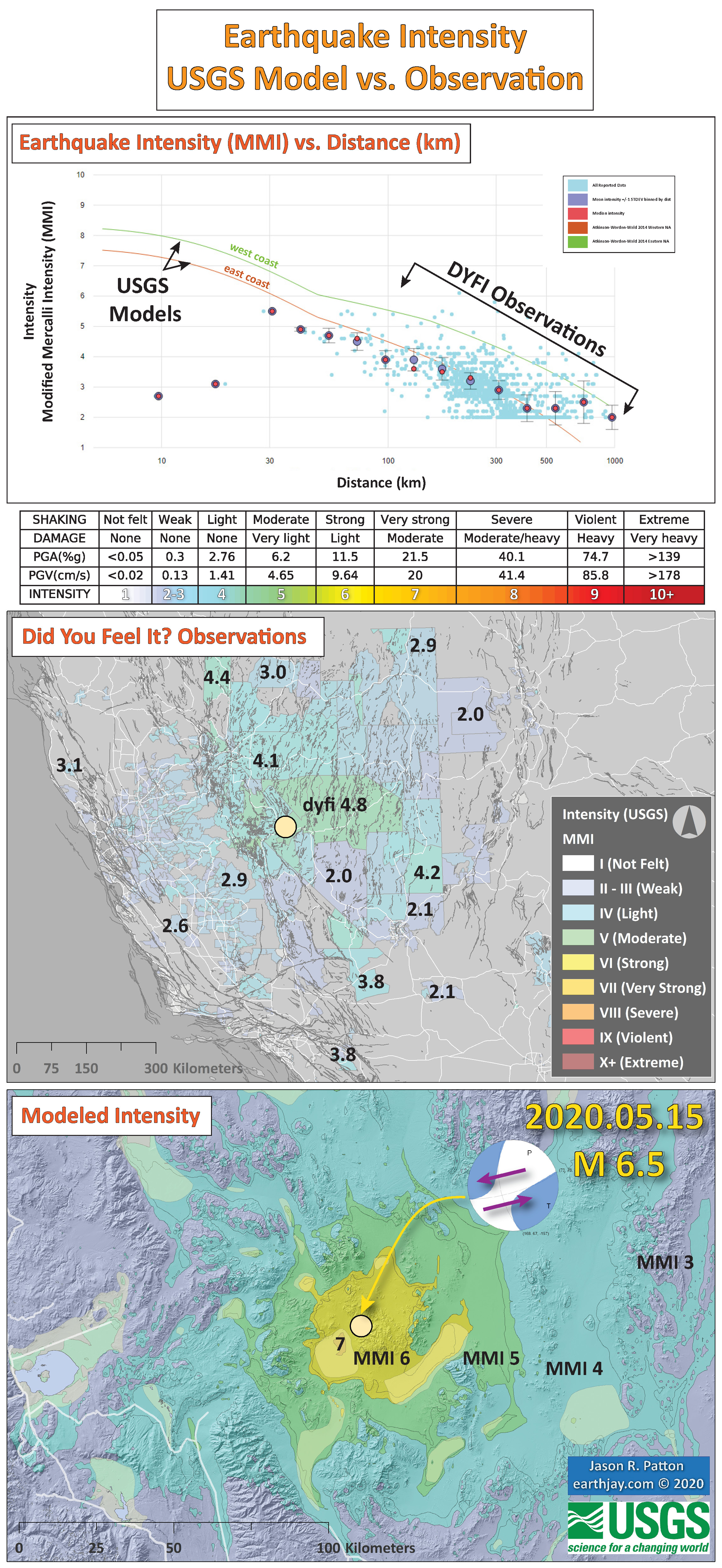
- Here is a figure that shows a more detailed comparison between the modeled intensity and the reported intensity. Both data use the same color scale, the Modified Mercalli Intensity Scale (MMI). More about this can be found here. The colors and contours on the map are results from the USGS modeled intensity. The DYFI data are plotted as colored dots (color = MMI, diameter = number of reports).
- In the upper panel is a plot showing MMI intensity (vertical axis) relative to distance from the earthquake (horizontal axis). The models are represented by the green and orange lines. The DYFI data are plotted as light blue dots. The mean and median (different types of “average”) are plotted as orange and purple dots. Note how well the reports fit the green line (the model that represents how MMI works based on quakes in California).
- Below the upper panel plot is the USGS MMI Intensity scale, which lists the level of damage for each level of intensity, along with approximate measures of how strongly the ground shakes at these intensities, showing levels in acceleration (Peak Ground Acceleration, PGA) and velocity (Peak Ground Velocity, PGV).
- In the center panel is the USGS Did You Feel It reports map, showing reports as colored dots using the MMI color scale.
- In the lower panel is the map that shows the modeled intensity using the same model that is plotted in the upper panel.
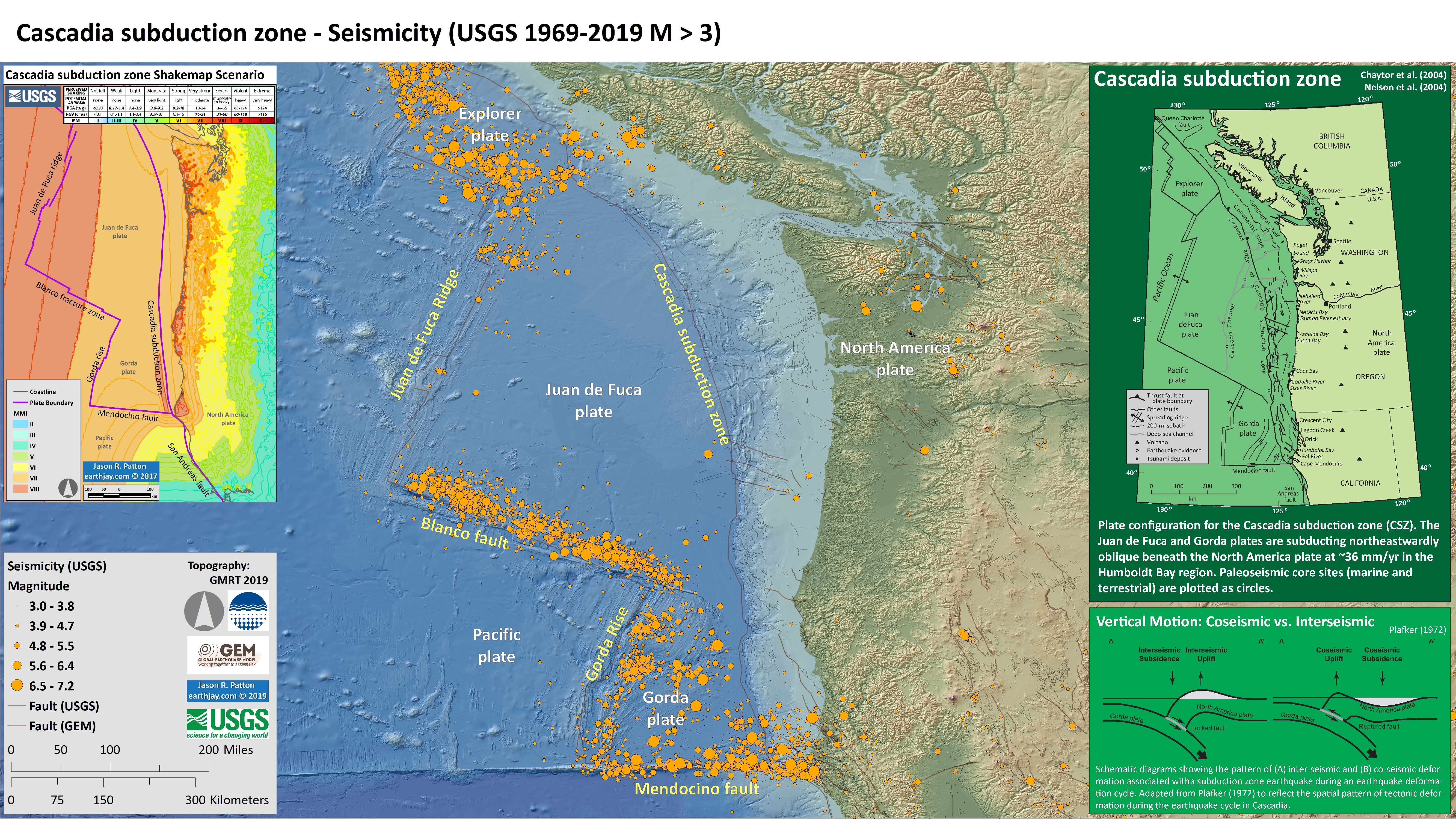
- 2020.05.18 M 5.5 Gorda Rise
On 18 May 2020 there was a magnitude M 5.5 extensional earthquake located near the Gorda Rise, an oceanic spreading ridge where oceanic crust is formed to create (love using the word create in science) the Gorda and Pacific plates.
https://earthquake.usgs.gov/earthquakes/eventpage/us70009jgy/executive
There are three types of plate boundaries and three types of earthquake faults (this is not a coincidence because plate boundaries are generally in the form of earthquake faults).
- Some plates move side-by-side to form transform plate boundaries (in the form of strike-slip faults, like the San Andreas fault).
- Some plates move towards each other to form convergent plate boundaries (in the form of subduction zone megathrust faults (like the Cascadia subduction zone), or collision zones(like the fault system that forms the uplift that created the Himalayas).
- Some plates move away from each other to form divergent plate boundaries (in the form of oceanic spreading ridges, or spreading centers, like the Mid Atlantic Ridge or the Gorda Rise; in these locations “normal” faults are formed).
The 18 May 2020 M 5.5 earthquake happened near the Gorda Rise and was an extensional earthquake. As the Gorda plate moves away from the spreading ridge, the normal faults formed at the ridge don’t disappear. The Gorda plate is a strange plate as it gets internally deformed, so as the plate moves towards the subduction zone, these normal faults get reactivated as strike-slip faults. These strike-slip faults have been responsible for some of the most damaging earthquakes to impact coastal northern California. More about these left-lateral strike-slip Gorda plate earthquakes can be found in a report here.
The M 5.5 earthquake happened along one of these normal faults, before that fault turns into a strike-slip fault. There is a good history of earthquakes just like this one. Here is a report for a similar event further to the north, also slightly east of the Gorda Rise.
One of the most common questions people have is, “does this earthquake change our chances for a CSZ earthquake?” The answer is no. The reason is because the stress changes from earthquakes extends for a limited distance from those earthquakes. I spend more time discussing this limitation for the Blanco fault here. Basically, this M 5.5 event was too small and too far away from the CSZ to change the chance that the CSZ will slip. Today is not different from a couple weeks ago: we always need to be ready for an earthquake when we live in earthquake country.
- In the upper right corner is a map and cross section for the Cascadia subduction zone. I spend more time describing these figures below.
- In the upper left corner is a map showing this entire region with historic seismicity plotted. I also include the plate boundaries (USGS) and include the magnetic anomalies too. Read more about magnetic anomalies here. Notice how the magnetic anomaly bands are parallel to the spreading ridges. Why do you think this might be?
- Yes, you are correct! The magnetic anomalies are parallel to the spreading ridges because they are formed when the crust cools along these spreading ridges.
- The Gorda plate is being crushed between all the other plates in the area. This causes the plate to deform internally. The figure in the lower right corner (Chaytor et al., 2004) shows some different models to explain the faults formed from this internal deformation. The map in the upper right center, also from Chaytor et al. (2004) shows how they interpret some of these normal faults to be reactivated as strike-slip faults.
I include some inset figures. Some of the same figures are located in different places on the larger scale map below.
- Here is the map with a month’s seismicity plotted.

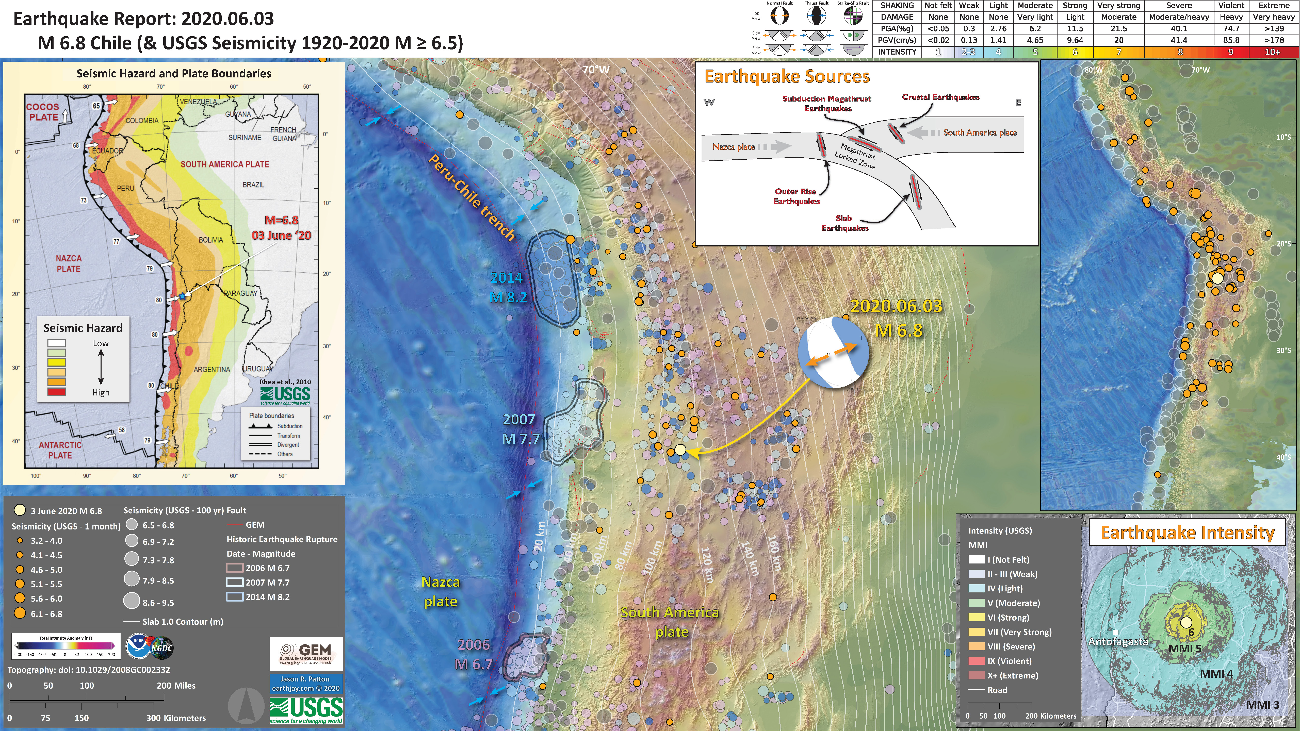
- 2020.06.03 M 6.8 Chile
- This earthquake happened along the plate boundary the forms the Peru-Chile trench and the Andes mountains.
- The earthquake slipped on an extensional fault in the downgoing Nazca plate deep beneath the Atacama Desert, possibly the driest region on Earth.
https://earthquake.usgs.gov/earthquakes/eventpage/us6000a4yi/executive
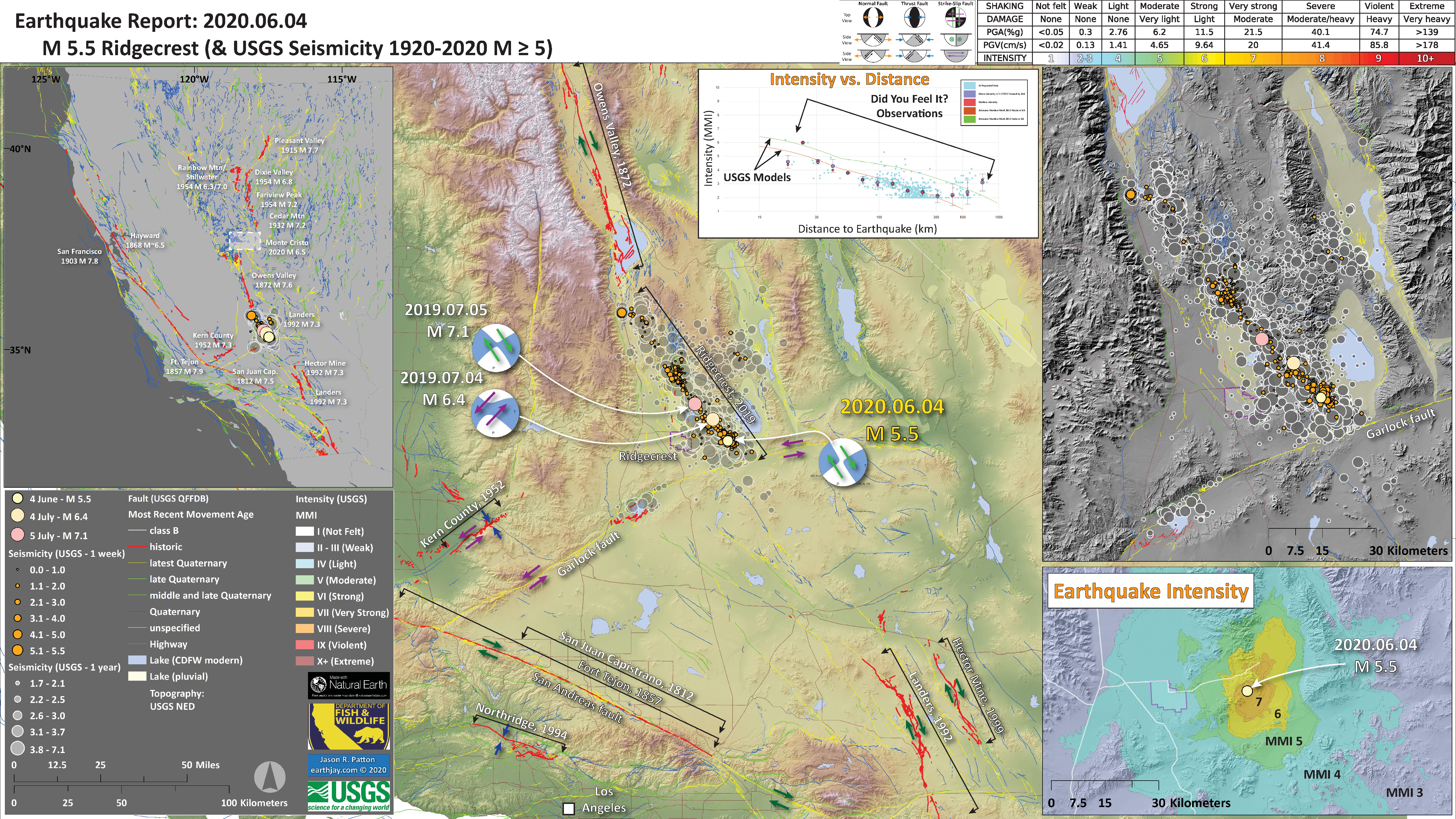
- 2020.06.03 M 5.5 Ridgecrest, California
- This earthquake is in the aftershock region of the July 2019 Ridgecrest Earthquake Sequence.
- Read more about the tectonics of this area here.
https://earthquake.usgs.gov/earthquakes/eventpage/ci39462536/executive
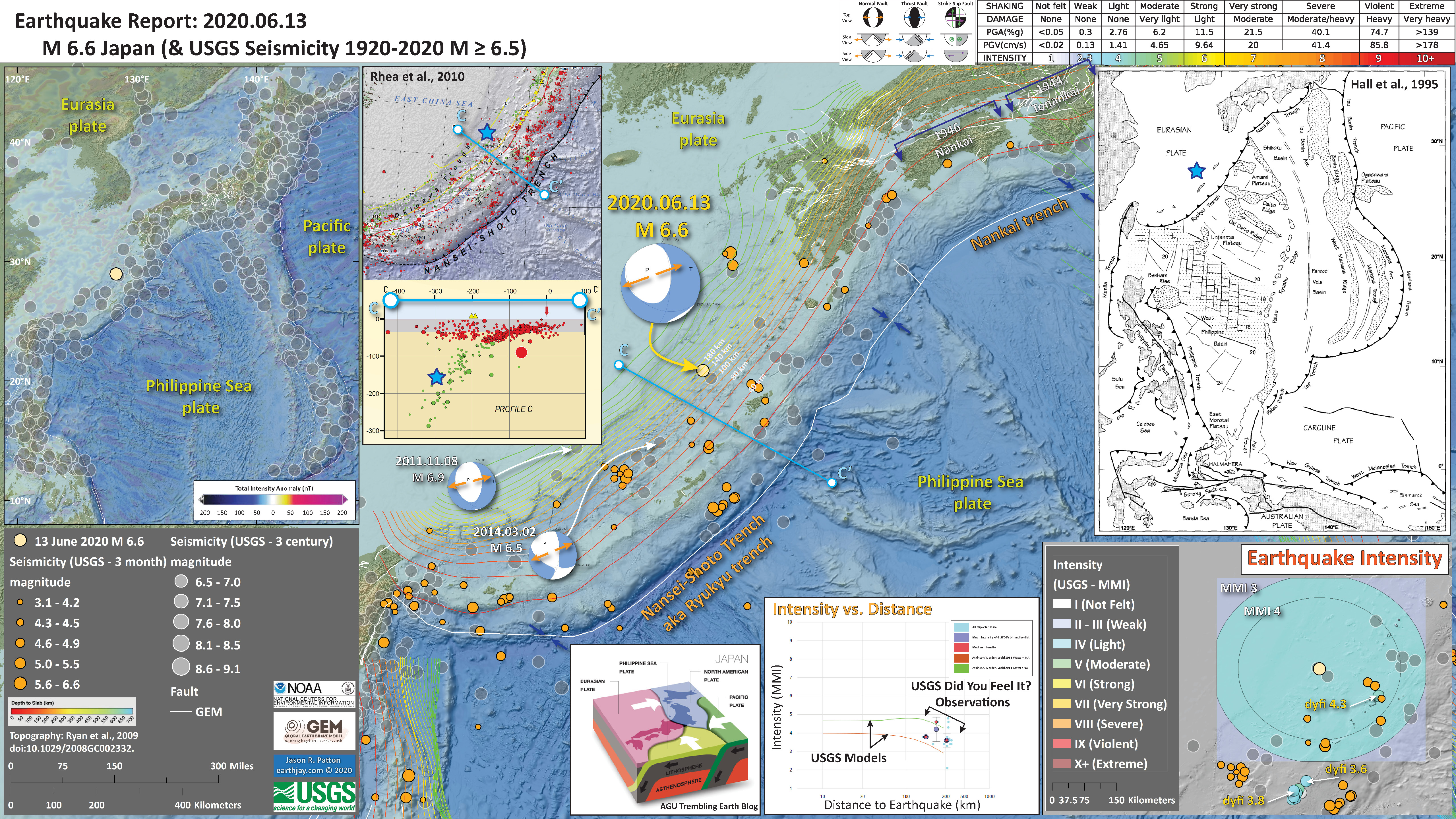
- 2020.06.13 M 6.6 Japan
- Much like the Kuril event earlier this year, this M 6.6 earthquake is in a downgoing (subducting) oceanic plate (the Pilippine Sea plate).
- This earthquake is interesting because it is not oriented relative to the direction of subduction. Because of this, I interpret this event to possibly be along a reactivated fault (maybe a fracture zone fault) that is oriented oblique to the orientation of the modern subduction zone here.
https://earthquake.usgs.gov/earthquakes/eventpage/us6000abcq/executive
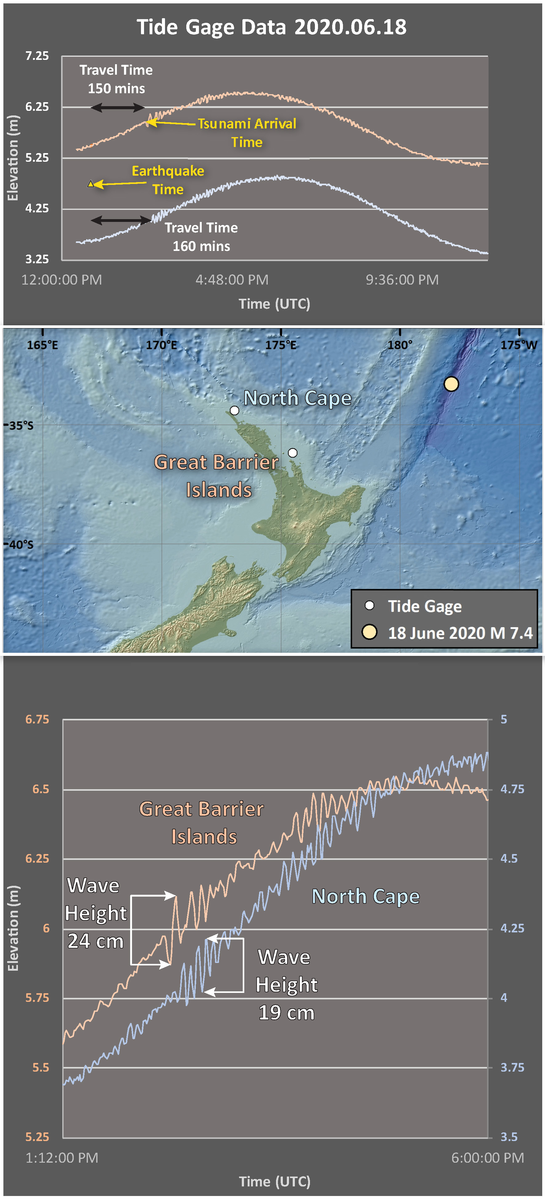
- 2020.06.18 M 7.4 Kermadec
- In this region is the Kermadec subduction zone where the Pacific plate subducts westardly beneath the Australia plate to the west.
- This earthquake is a strike-slip event, but we can’t rapidly tell which “nodal plane” the fault is oriented (so, it could be either a ~north-south oriented left-lateral strike-slip quake, or an ~east-west oriented right-lateral strike-slip earthquake.
- Many are familiar with tsunami generated along subduction zones by subduction zone earthquakes. However, strike-slip earthquakes can generate tsunami too (they are just smaller in size).
- This earthquake generated tsunami that were recorded on tide gages along the coast of the North Island, New Zealand.
https://earthquake.usgs.gov/earthquakes/eventpage/us6000ae4n/executive
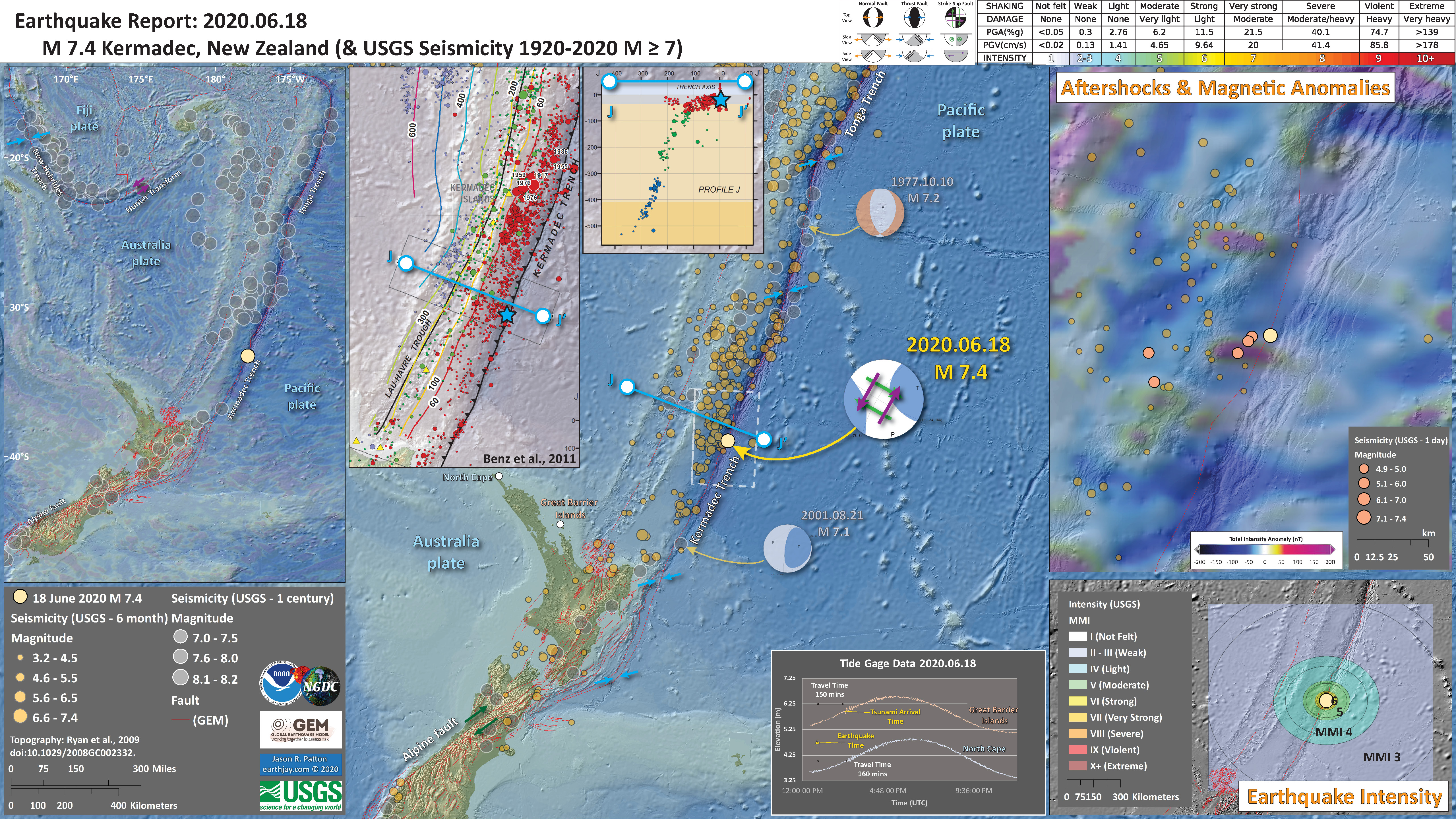
We can see that these tsunami are not very large (19-24 cm wave height).
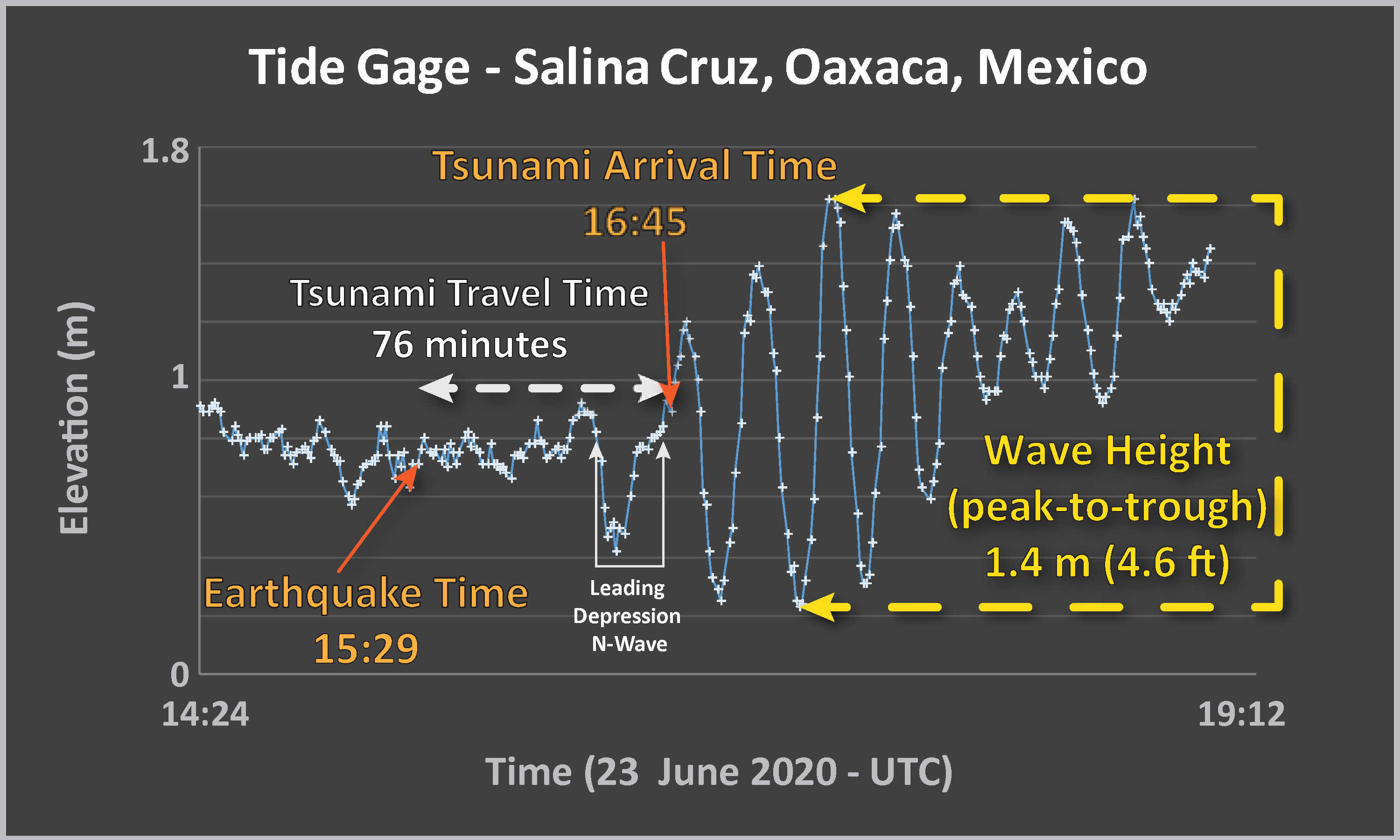
- 2020.06.23 M 7.4 Mexico
On 23 June (Tuesday my time), right before work started, there was an earthquake in Oaxaca, Mexico.
https://earthquake.usgs.gov/earthquakes/eventpage/us6000ah9t/executive
The M 7.4 Oaxaca, Mexico Earthquake occurred along the megathrust fault interface (an “interplate” earthquake) based on our knowledge of the location of the fault, our calculation of the earthquake location, and the earthquake mechanisms prepared by seismologists (i.e. focal mechanisms or moment tensors).
This M 7.4 earthquake generated a tsunami that was recorded along the coastline, but not at all tide gage stations. The Salina Cruz station has a great record of this tsunami and is located >80 km from the epicenter. The Acapulco station also recorded a tsunami, but those data were not uploaded to the IOC website (they are working this out now). It appeared that the Acapulco data were being streamed in real time, but I noticed that they were the same data as posted for the Salina Cruz station.
Here I plot the water surface elevations observed at the Salina Cruz tide gage. I mark the earthquake event time and the tsunami arrival time, then calculate the tsunami travel time.
The Wave Height of the tsunami is the vertical distance measured between the peak and the trough. These data show a Maximum Wave Height of 1.4 meters.
- In the upper left corner is a global scale map showing the major plate boundary faults and arrows show relative plate motions for these fault systems. The spreading ridge (orange arrows) between the Pacific and Cocos plates interacts with a flipping magnetic pole to form these magnetic anomalies. Because of this, they form parallel to the spreading ridge. Note how the anomalies are parallel to the East Pacific Rise spreading center (not labelled on this map, but look at figures lower in this report).
- In the lower right corner is a map showing the earthquake intensity using the Modified Mercalli Intensity Scale (MMI) as modeled by the California Integrated Seismic Network (CISN). I also include observations from the USGS “Did You Feel It?” observations (these are from reports from the public).
- To the left of this map is a plot showing how shaking intensity lowers with distance from the earthquake. The models that were used to produce the Earthquake Intensity map to the right are the same model results represented by the orange and green lines. However, on this plot, there are also observations from real people! The USGS Did You Feel It? questionnaire lets people report their observations from the earthquake and these data are plotted here. We can then compare the model with the observations.
- In the upper and center right are maps that shows the liquefaction susceptibility and landslide probability models from the USGS. These are models and not based on direct observation, however, they could be used to help direct field teams to search for this type of effect.
- To the left of these slope failure maps is a map and cross section from Benz et al. (2011). The circles represent earthquake locations and the diameter represents earthquake magnitude. The cross section B-B’ location in shown on this inset map and the main map as blue lines.
- To the right of the main legend is the tide gage record from Salina Cruz.
I include some inset figures. Some of the same figures are located in different places on the larger scale map below.
- Here is the map with 3 month’s seismicity plotted.

- 2020.06.24 M 5.8 Lone Pine
Well, the east side of the Sierra lives up to its reputation for being in earthquake country. From the July 2019 Ridgecrest Earthquake Sequence (reports here)to some shakers east of Mono Lake, to the May 2020 Monte Cristo Earthquake Sequence (report here) to some earthquakes in the Owens Lake area of California. Residents of Olancha, Lone Pine, and Keeler felt strong shaking from a magnitude M 5.8 earthquake, also preceded by about 2 days with a M 4.6 temblor.
https://earthquake.usgs.gov/earthquakes/eventpage/ci39493944/executive
The plate tectonics in the western US is overwhelmingly dominated by the plate boundary between the North America and Pacific plate. The North America plate moves south “relative” to the Pacific plate. Standing on the Pacific plate, looking across the fault, the North America plate moves to your right (a right-lateral strike-slip fault).
- In the upper left corner is a map that shows the earthquake faults and historic earthquake locations (epicenters) in the western US. Historic earthquake fault ruptures are mapped as red lines and labeled with their year and magnitude.
- In the lower right corner is a map that shows a comparison of the California Geological Survey Shakemap (a model of how strong the ground might shake during the M 5.8 earthquake) and results from online web surveys from peoples’ real observations (i.e. “Did You Feel It?” reports. The colored lines show the boundary between different levels of intensity using the Modified Mercalli Intensity (NNI) scale. The areas are colored relative to the DYFI reports, using the same MMI scale and colors shown on the legend).
- In the lower center is an illustration showing how earthquake intensity is higher closer to the earthquake. With distance, the intensity goes down. This is another comparison between the Shakemap models and the DYFI observations.
- In the upper right corner is a map that shows the liquefaction susceptibility, or the chance that an area may experience liquefaction during the earthquake. I present a map that also shows the chance that there will be landslides triggered by the earthquake lower in this report. Also, check out social media section to see videos of evidence of these landslides.
I include some inset figures. Some of the same figures are located in different places on the larger scale map below.
- Here is the map with a year’s seismicity plotted (and a century in the overview map).
- Something to note is that these Owens Lake earthquakes follow some triggered earthquakes that have been going on in the Coso Mountains and to the west of the reservoirs along the Owens River. Following the Ridgecrest Earthquake Sequence, the crust near the fault that slipped flexed like our elastic waist bands. This flexing caused the forces acting on faults withing the crust to increase and decrease in different places. These changes are called changes in static coulomb stress.
- According to some studies (see tweets and the Temblor reports related to Ridgecrest), the area to the northwest of Ridgecrest have increased static coulomb stress changes, which increases the chance that faults might slip in those areas.
- Guess where these Owens Valley earthquakes are happening? Yup, in an area tha has possibly experienced an increase in stress.
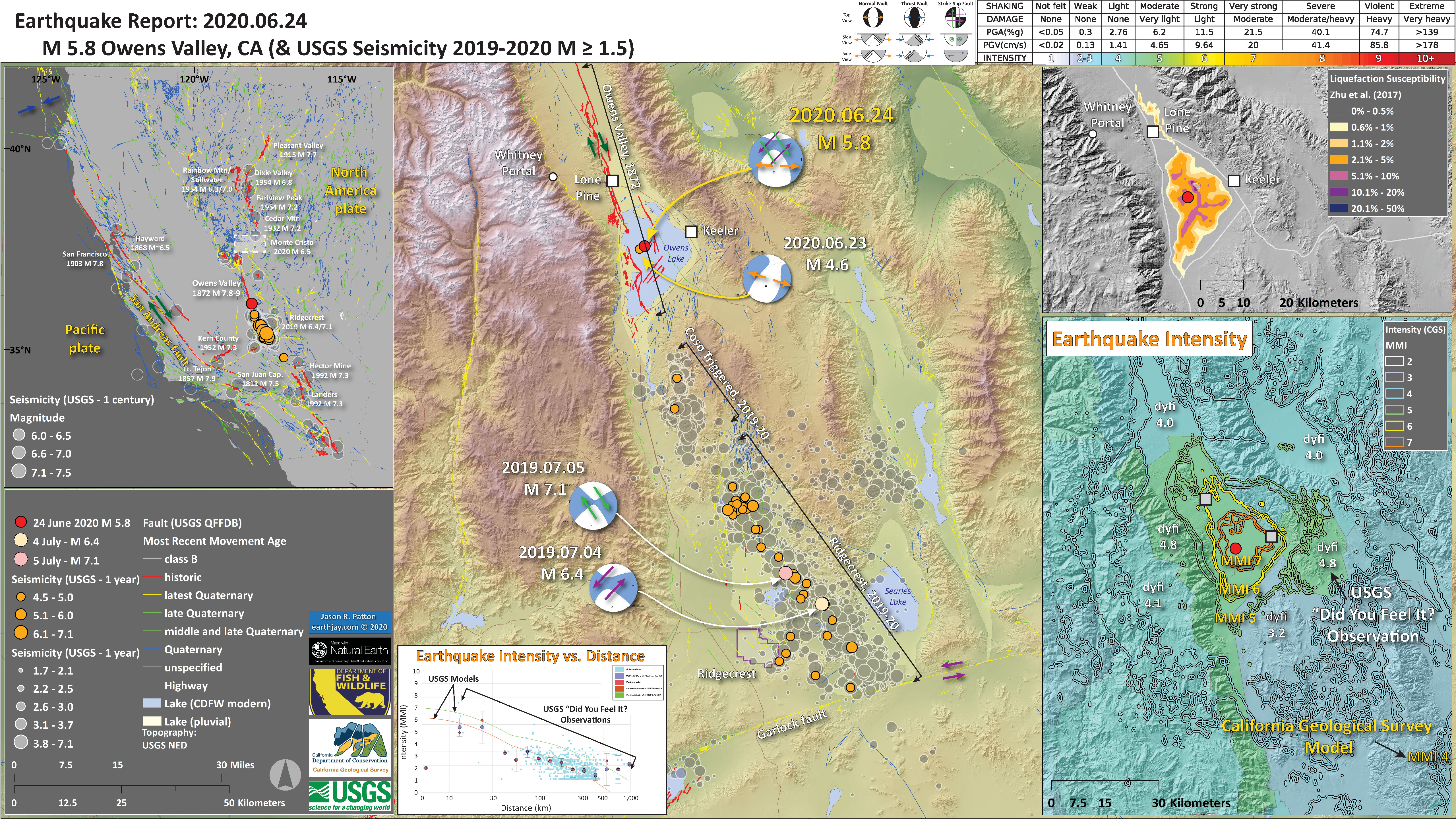
- Below is an updated map that shows the aftershocks (and foreshocks) related to the M 5.8 earthquake.
- There have only been two earthquakes in the past century that have magnitudes M ≥ 5. Some earthquakes can have aftershocks that last centuries (like the 1872 central Washington earthquake, which is still popping off aftershocks today). Because of the paucity of seismicity in this area, we may not be able to know if these two events in 2009 are aftershocks from 1872. The same is true for the M 5.8 sectence that is ongoing right now in Owens Valley. I suspect that these are unrelated to 1872 and are directly related to the Ridgecrest Earthquakes.
- This part of the OVF is at the end of the fault, where it is less organized, so fault lengths are shorter and misaligned. Based on the work of Haddon et al. (2013), the slip on these faults in 1872 was low. So, maybe these faults had more accumulated strain than the rest of the OVF faults, so we would not expect more earthquakes on the OVF system (?). Hard to really know…
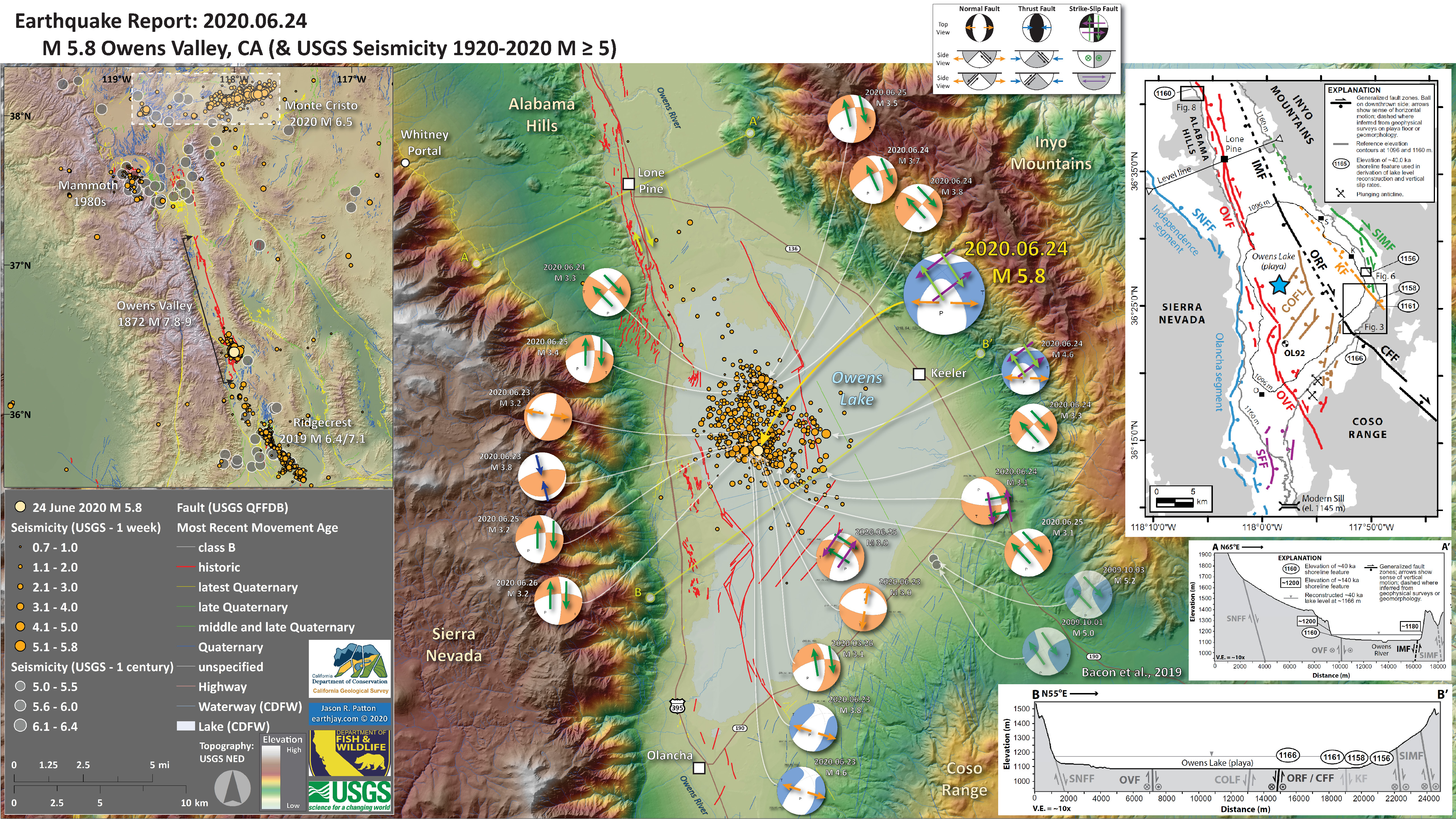
- In the upper left corner is a map that shows historic earthquake locations (a century M ≥ 2 and a week M ≥ 0). I highlight areas of recent seismic unrest.
- In the upper right corner is a map from Bacon et al. (2019) that shows the different faults that they studied in this area. Each different fault is colored and labeled, along with symbology showing what type of relative motion is accommodated on those faults. These authors mapped and dated prehistoric shorelines, then used their location to evaluate slip rates for these faults over a very long time span.
- In the lower right corner are some cross sections showing how Bacon et al/ (20219) interpret how the tectonic structures are oriented in the subsurface beneath the Owens Valley. The locations for section A-A’ and B-B’ are shown on the main map as yellow-green lines.
I include some inset figures. Some of the same figures are located in different places on the larger scale map below.
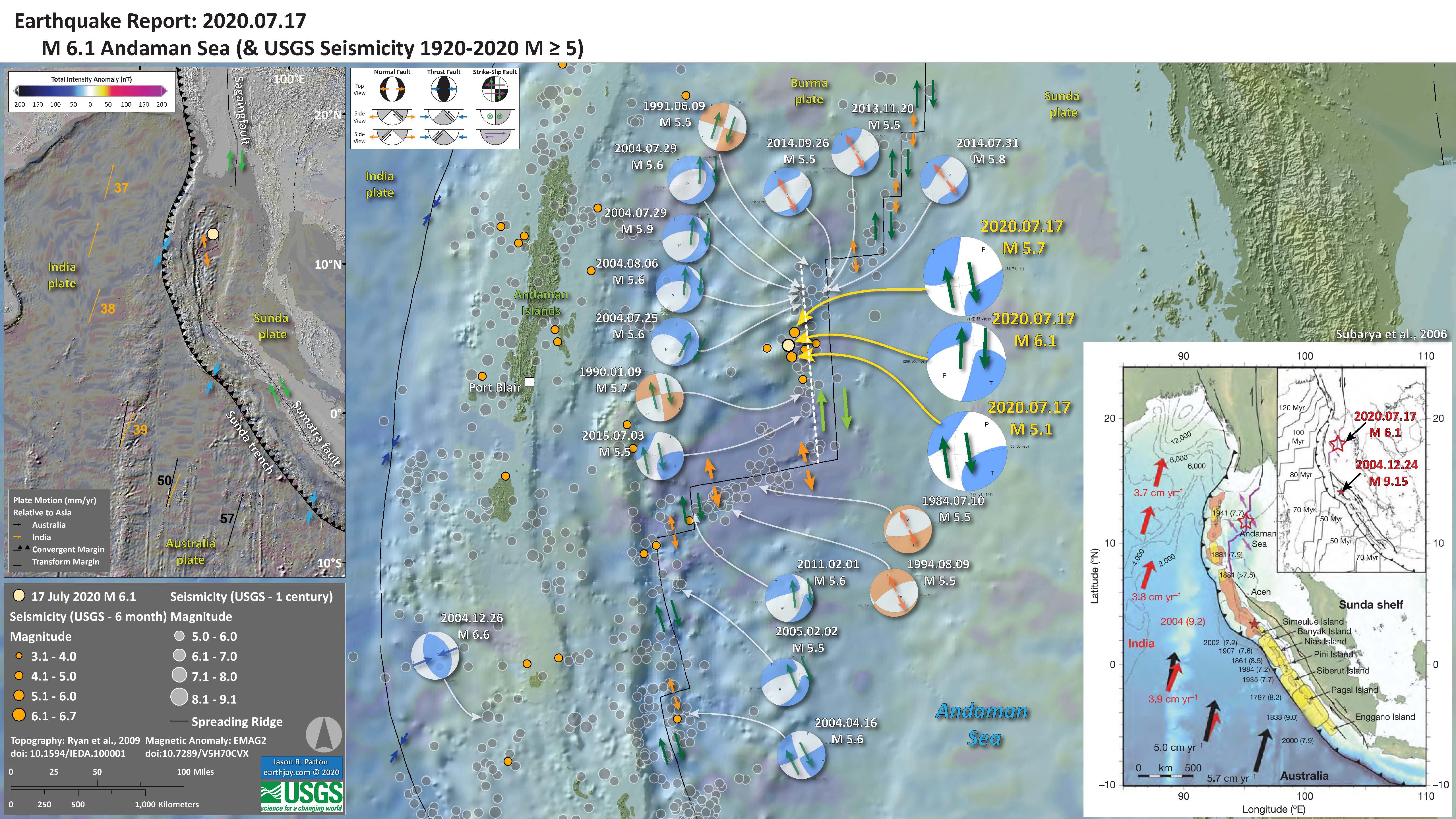
- 2020.07.17 M 6.1 Andaman Sea
- This M 6.1 earthquake happened in the Andaman Sea, an oceanic basin formed by extension along a spreading ridge/transform fault system associated with the Sumatra-Andaman subduction zone.
- Read more about the tectonics of this plate boundary here.
- This M 6.1 earthquake and analogical historic earthquakes show how the fault system is a series of spreading ridges (extensional plate boundary) and strike-slip (transform plate boundary).
https://earthquake.usgs.gov/earthquakes/eventpage/us7000aqaw/executive
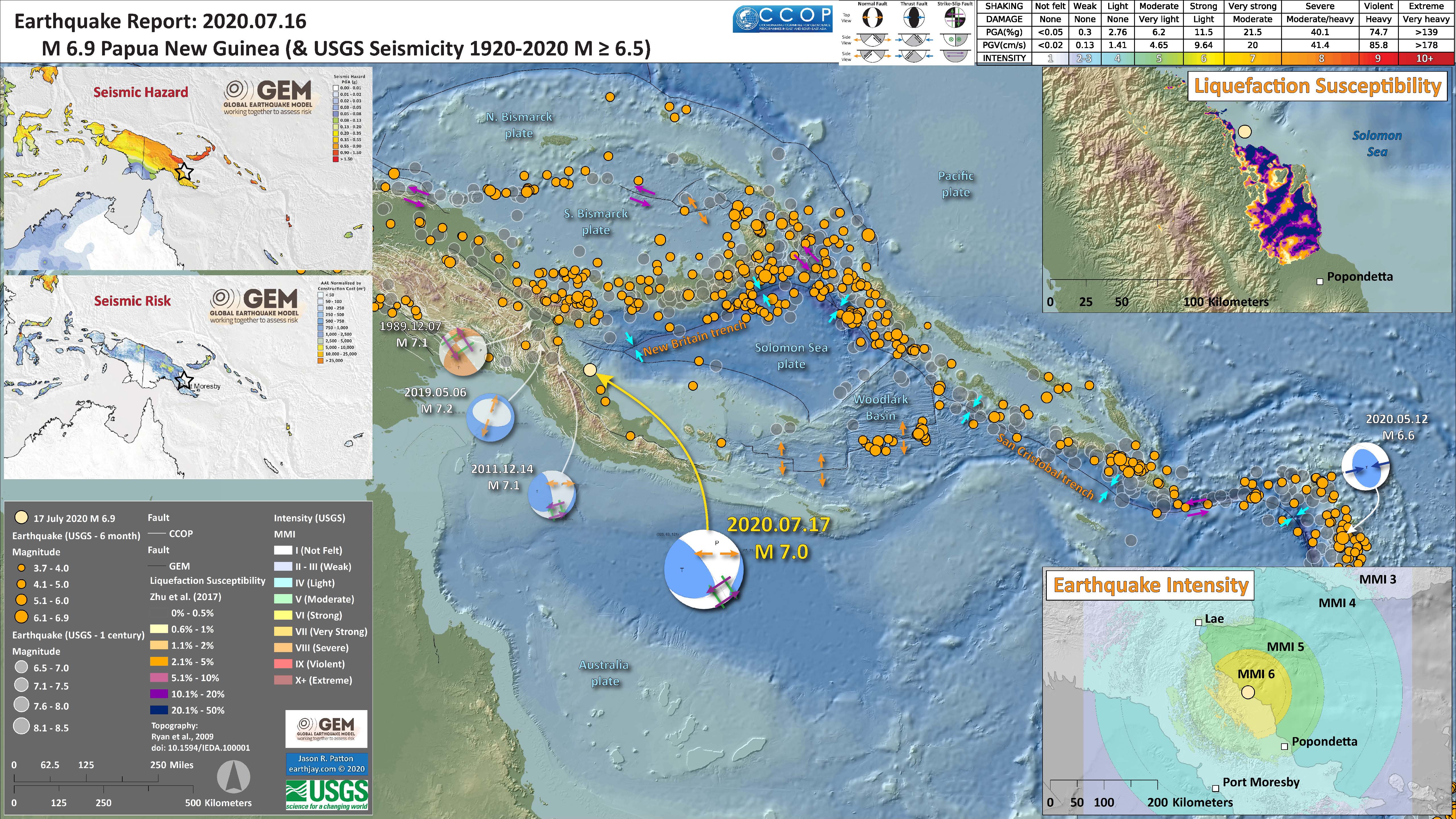
- 2020.07.17 M 7.0 Papua New Guinea
- This M 7.0 earthquake is in a complicated region of the world. A deeper event (73 km) and is an oblique strike-slip event within the Australia plate.
https://earthquake.usgs.gov/earthquakes/eventpage/us7000aq3e/executive
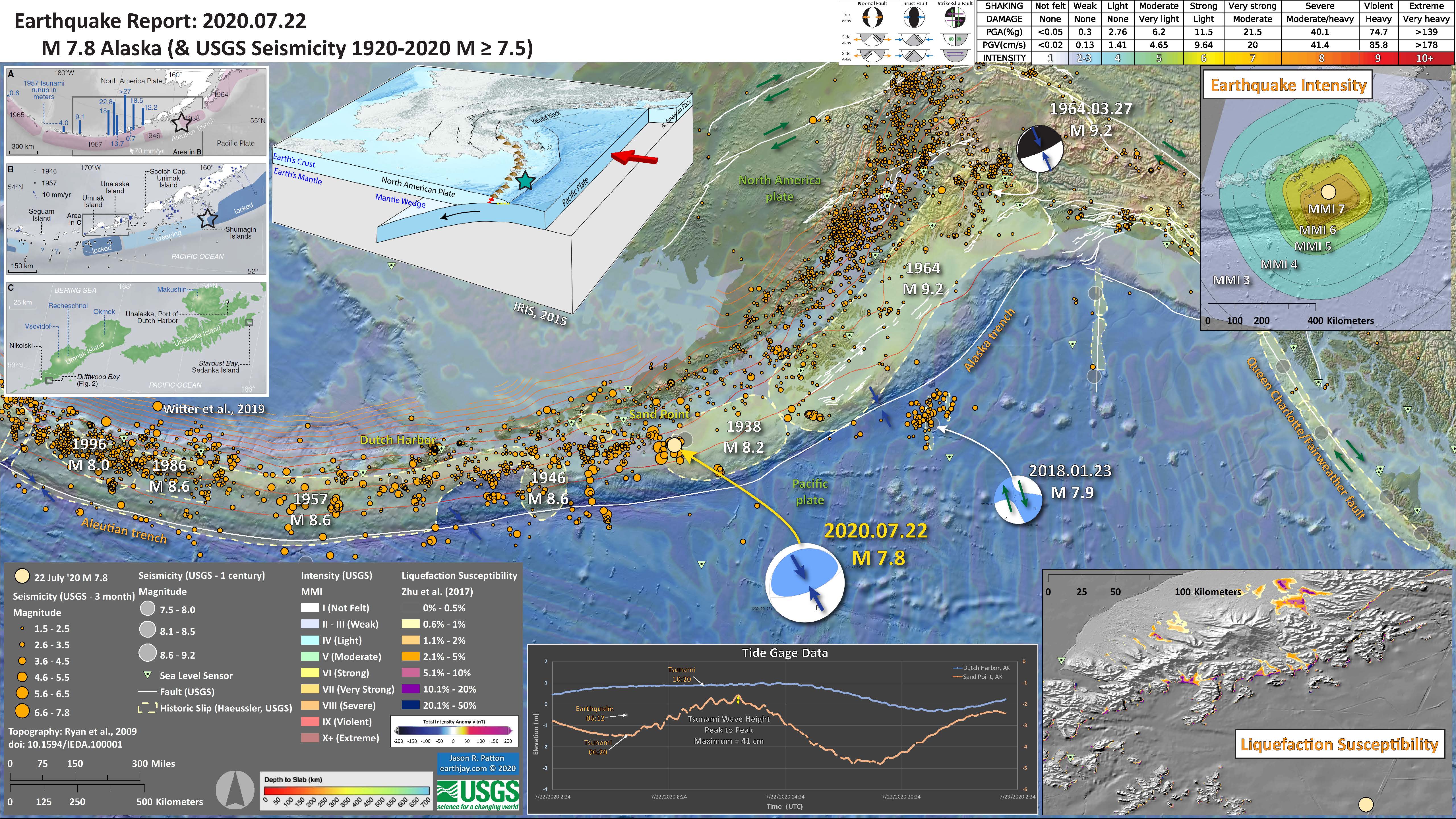
- 2020.07.22 M 7.8 Alaska
- I am surprised that I did not write this up in a report, but I remember spending lots of time at work preparing to respond and responding to this event (to make sure people in California knew if they needed to respond to a tsunami event).
- There was no trans Pacific tsunami (so no threat to California), but there was a small tsunami recorded on tide gages in the area.
- This earthquake happened along the megathrust subduction zone fault that forms the Alaska and Aluetian trench at the edge of the 1938 M 8.2 earthquake.
- There is strong evidence that the region between the 1938 and 1957 tsunamigenic quakes is slipping/creeping aseismically (which means it is not accumulating tectonic strain to be released during megathrust earthquakes. This region is called the Shumagin Gap (there is a gap in historic earthquakes in this area).
https://earthquake.usgs.gov/earthquakes/eventpage/us7000asvb/executive
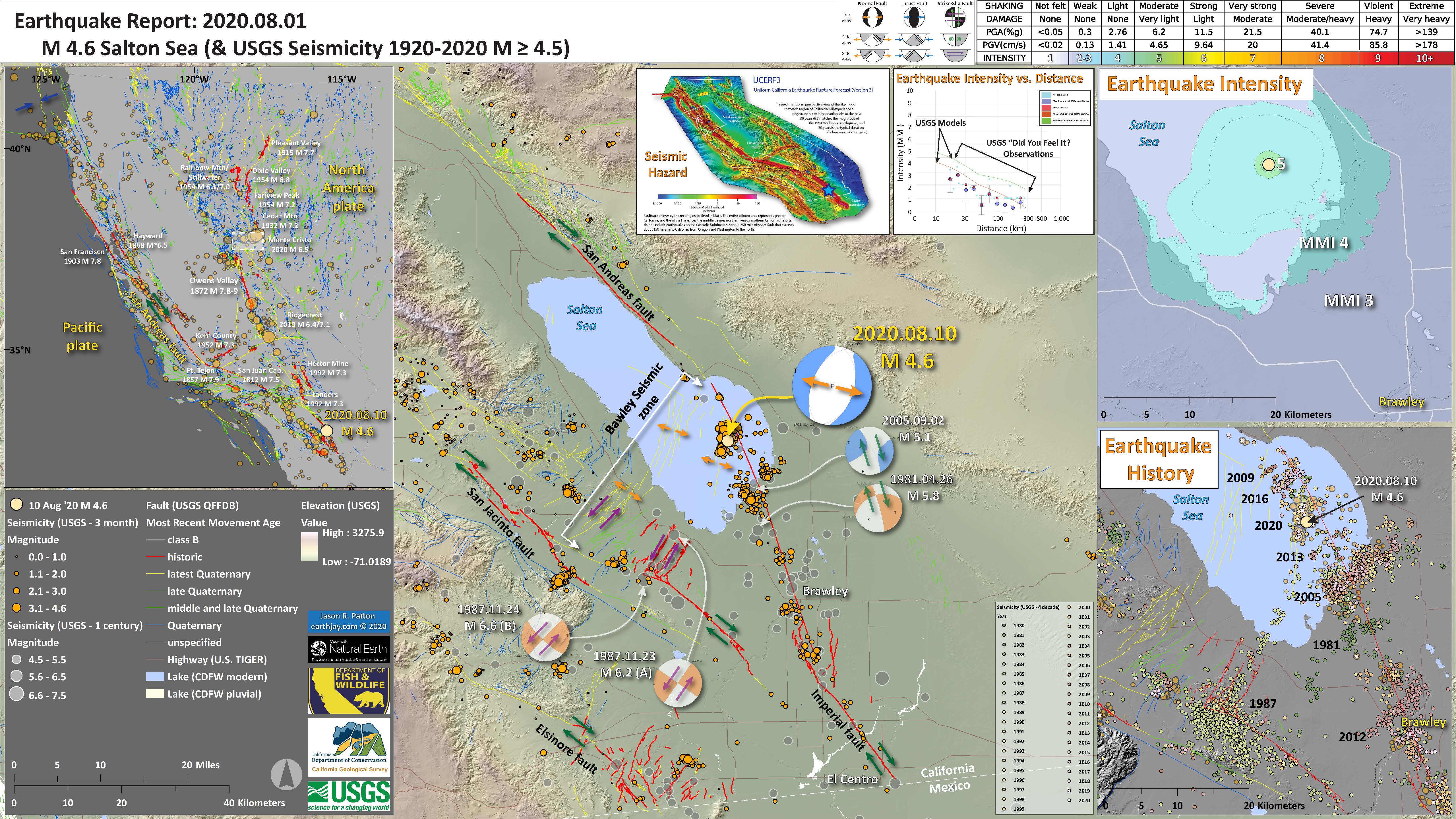
- 2020.08.10 M 4.6 Southern California
- As the San Andreas fault ends near teh Salton Sea, the relative plate motion steps over to the Imperial fault. Because of the orientation of the faults in this region, there are northeast oriented faults that are both left-lateral strike-slip and normal faults.
- This M 4.6 quake is an extensional event/ There is a history of these events (see history map in the lower right corner).
- These earthquake swarms are not thought to change the chance of an earthquake on the San Andreas, Imperial, or San Jacinto faults.
https://earthquake.usgs.gov/earthquakes/eventpage/ci39338407/executive
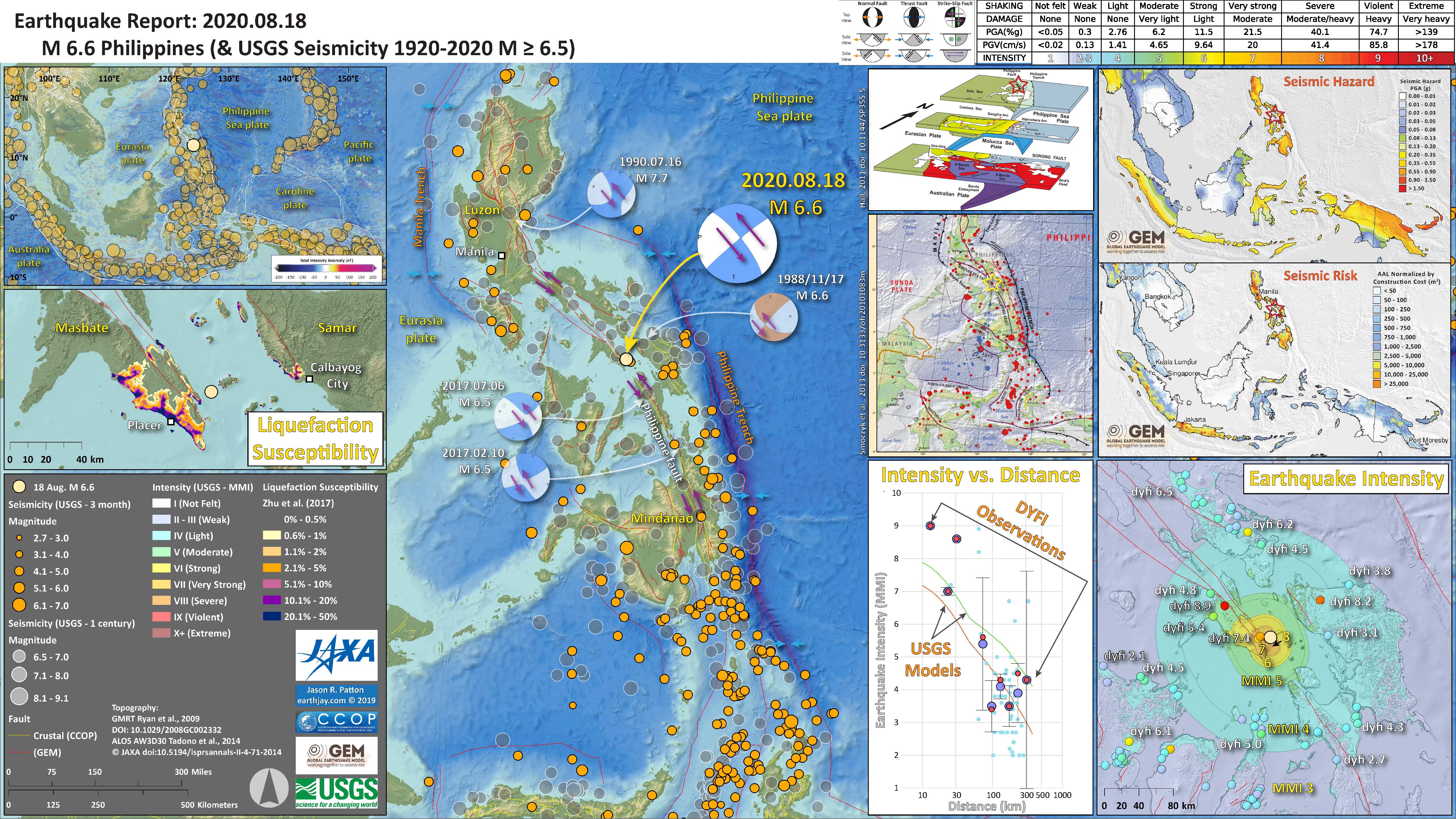
- 2020.08.18 M 6.6 Philippines
- The Philippines straddles many different plate boundary faults. In the region of this M 6.6 earthquake is a left-lateral strike-slip Philippines fault (which forms the basis of my interepretation for the type of earthquake this was).
- This event was felt widely and probably caused some liquefaction based on the USGS liquefaction susceptibility model resutlts.
https://earthquake.usgs.gov/earthquakes/eventpage/us6000bgbr/executive
- 2020.09.19 M 4.5 El Monte
Late last night there was a sequence of earthquakes in southern California. The mainshock is a M 4.5 earthquake.
https://earthquake.usgs.gov/earthquakes/eventpage/ci38695658/executive
This temblor was widely felt across the southland (including by my mom, who was warned by earthquake early warning). This sequence happened in the same area as the 1987 Whittier Narrows Earthquake Sequence (which I felt as a child, growing up in Long Beach, CA).
https://earthquake.usgs.gov/earthquakes/eventpage/ci731691/executive
The tectonics of southern CA are dominated by the San Andreas fault (SAF) system. The SAF system is a right-lateral strike-slip plate boundary fault marking the boundary between the Pacific and North America plates.
Basically, the Pacific plate is moving northwest relative to the North America plate. Both plates are moving northwest relative to an Earth reference frame, but the Pacific plate is moving faster.
The SAF system goes through a bend in southern CA, which causes things to get complicated. There are sibling faults to the SAF, also right-lateral strike-slip (e.g. the San Jacinto and Elsinore faults).
- In the upper left corner I include a map that shows the USGS tectonic faults and the USGS seismicity from the past 3 months. I highlight the North America and Pacific plates and their relative motion along the San Andreas fault system.
- In the lower right corner I plot the epicenters related to this sequence. The topographic data here are high resolution LiDAR data from 2016 (publically available).
- In the lower center left is a low-angle oblique block diagram from Daout at al. (2016) that shows the geometry of the major faults in this area (along with estimates of the slip rates for these faults).
- Between the aftershock map and the oblique block diagram are two panels from Rollins et al. (2018). On the left is a map that shows the major fault systems, some historic earthquake mechanisms, and GPS derived plate motion vectors (the direction of relative motion is the orientation of the arrow and the velocity is the length of the arrow). I placed a blue star in the location of last night’s M 4.5. On the right are some cross sections through the subsurface (the location of these cross sections is shown as a dashed gray line on the map). The M 4.5 hypocentral depth is 16.9 km, which clearly plots on the Lower Elysian Park ramp (part of the Puente Hills fault system). Note how the Whittier fault, a strike-slip fault at the surface, soles into the Peunte Hills thrus.
- In the upper right corner is a map where I plot a comparison of the CSIN intensity model results (using the MMI Intensity scale, read more about that here) and the USGS “Did You Feel It?” (dyfi) reports. The intensity map is based on a model of how intensity diminishes with distance from the earthquake. The dyfi results are from real observations from real people. See the plot below the map to check out how these data compare, but in a plot not a map.
- To the left of the intensity comparisons is another map from Rollins et al. (2018) that shows how much these thrust fault systems are accumulating energy over time. Basically, the warmer colors (e.g. red) shows an area of the fault that is storing more energy per year relative to part of the fault that have less warm colors (e.g. yellow). The Sierra Madre fault system is storing the most energy, per year, of all thrust faults that Rollins and his colleagues studied.
I include some inset figures. Some of the same figures are located in different places on the larger scale map below.
- Here is the map with a month’s seismicity plotted.

- Two of the most notable historic earthquakes in southern CA are the 1971 Sylmar and 1994 Northridge earthquakes. Both earthquakes had a significant impact on the growth of knowledge about earthquake hazards in southern CA (and elsewhere), but they also resulted in major changes in how seismic hazards are recognized, codified, and mitigated throughout the state (with impacts nationwide and worldwide). And, both of these earthquakes also happened on blind thrust faults, just like last night’s M 4.5!
- The 1906 San Francisco and 1933 Long Beach earthquakes led to major changes in the state too. 1933 Long Beach particularly led to changes in how schools are built and resulted in the strongest building code (relative to earthquakes) in the country as the time. These changes were eventually adopted statewide, nationwide, and globally (via the universal building code). Check out the Field Act to learn more about this.
- The 1971 Sylmar Earthquake happened on a previously unrecognized fault (because it is blind) and caused lots of damage and many casualties. Perhaps most notably was the veterans hospital which was built across a fault. This fault slipped during the earthquake (triggered by the mainshock). Because the fault slipped beneath the hospital, the hospital was cut in half.
- This was quite educational, to learn that when an earthquake fault slips beneath a building, the building does not (generally) perform well. After this earthquake, state senators Alquist and Priolo wrote and helped to get passed the Alquist-Priolo Act. This act required the state (via the California Geological Survey (CGS), where I work) to identify all active faults in the state. The Board of Mines and Geology (BMG) prepared regulations that help manage development (i.e. construction of buildings) in AP zones. Read more about the AP Act here.
- The 1994 Northridge Earthquake, with a similar magnitude as the 1971 Sylmar quake, caused extensive damage throughout the San Fernando Valley (like, totally dude) and beyond. There are famous photos of the damage to bridges of the 5 and 14 interchange (interstate 5 and state route 14). The 1994 Northridge Earthquake led to the development of the Seismic Hazards Mapping Act. The CGS and the BMG both have mandates related to the SHMA (I work as part of the Seismic Hazards Mapping Program at CGS). Read more about the SHMA here.
- Read more about the 1971 Sylmar Earthquake here.
- Read more about the 1994 Northridge Earthquake here.
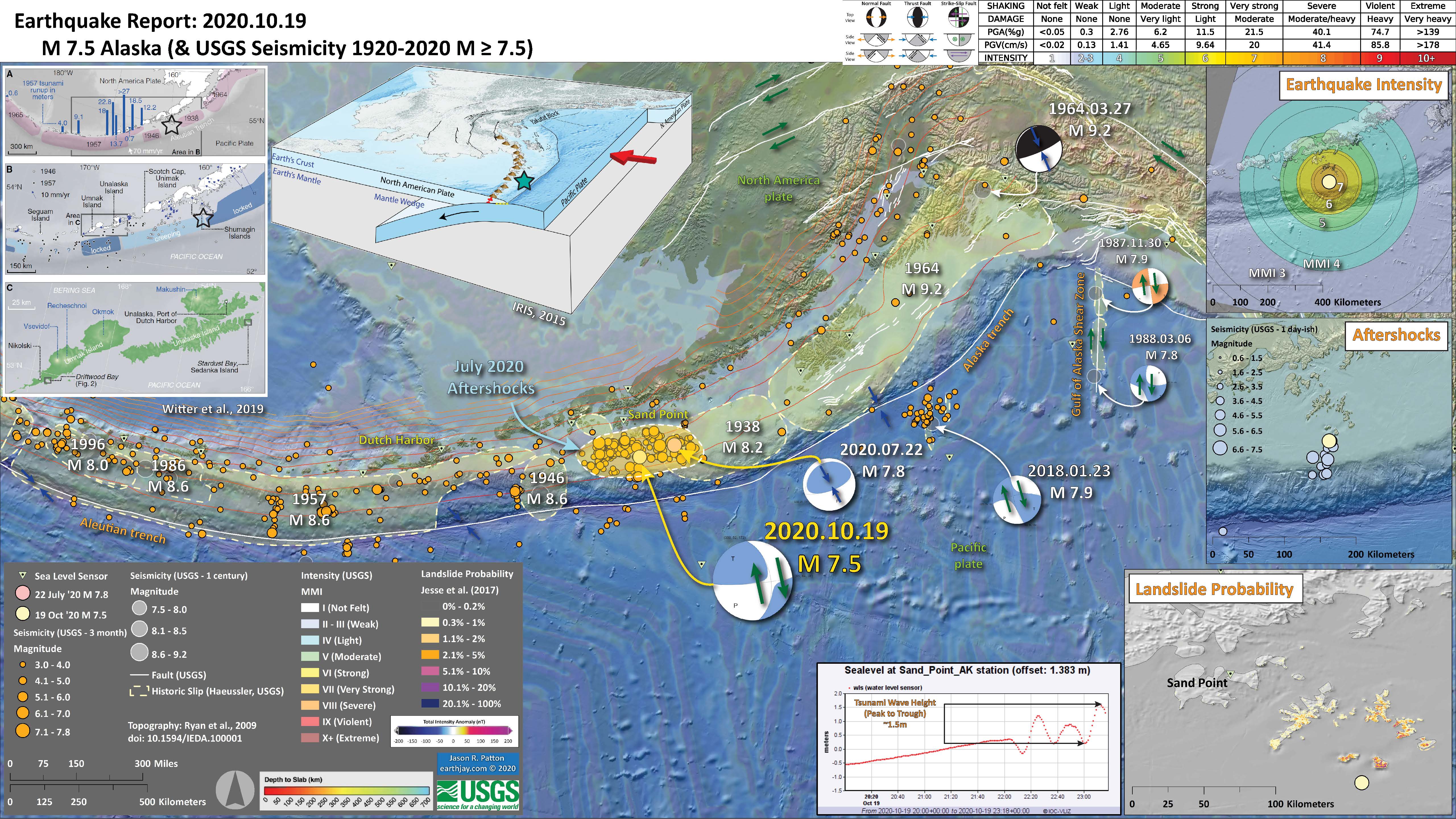
- 2020.10.19 M 7.5 Alaska
- This M 7.9 earthquake is one of the most interesting events in all of 2020. Given the aftershock region from the 22 July ’20 M 7.8 subduction zone earthquake, I interpret this M 7.9 earthquake to have been triggered by the M 7.8 event.
- This M 7.9 earthquake was not a subduciton zone event, but in the downgoing Pacific plate. Based on the moment tensor and the aftershock pattern from teh M 7.9, I interpret this M 7.9 event to be along a ~north-south right-lateral strike-slip earthquake.
- I include the magnetic anomaly data on the main map, these lines form parallel to spreading ridges, but can be used to visualize internal deformation within oceanic plates (e.g. faults can be seen to offset these anomaly data).
- This earthquake generated a tsunami just like the M 7.9 event. However, the tsunami was larger in size and travelled across the Pacific. This is interesting because, compared to the M 7.8, the M 7.9 was deeper and strike-slip. So it is a mystery (at least in my mind) why this tsunami was larger than the July tsunami.
- The tsunami actually was pretty large when it was observed in Hawai’i.
https://earthquake.usgs.gov/earthquakes/eventpage/us6000c9hg/executive
- 2020.10.30 M 7.0 Turkey
I awakened to be late to attending the GSA meeting today. I had not checked the time. 7am is too early, but i understand the time differences…
As i was logging into Zoom, my coworker emailed our Tsunami Unit group about a M7 in the eastern Mediterranean. So, I shifted gears a bit. But i had my poster to present, so i had to stay somewhat focused on that.
https://earthquake.usgs.gov/earthquakes/eventpage/us7000c7y0/executive
Today, in the wee hours (my time in California), there was a M 7.0 earthquake offshore of western Turkey in the Icarian Sea. The earthquake mechanism (i.e. focal mechanism or moment tensor) was for an extensional type of an earthquake, slip along a normal fault.
To the north is a strike-slip plate boundary localized along the North Anatolia fault system. This is a right lateral fault system, where the plates move side by side, relative to each other. See the introductory information links below to learn more about different types of faults.
To the south is a convergent plate boundary (plates are moving towards each other) related to (1) the Alpide Belt, a convergent plate boundary formed in the Cenozoic that extends from Australia to Morocco. On the southern side of Greece and western Turkey, there are subduction zones where the Africa plate dives northward beneath the Eurasia and Anatolia plates.
The region of today’s earthquake is in a zone of north-south oriented extension. This extension appears to be in part due to gravitational collapse of uplifted metamorphic core complexes.
- On the left is a map from Armijo et al. (1999) that shows the plate boundary faults and tectonic plates in the region. This M 7.0 earthquake, denoted by the blue circle.
- In the upper left corner is a map that shows the tectonic strain in the region. Areas of red are deforming more from tectonic motion than are areas that are blue. Learn more about the Global Strain Rate Map project here.
- To the right of the strain map is a comparison of the shaking intensity modeled by the USGS and the shaking intensity based on peoples’ “boots on the ground” observations. A modeled estimate of intensity is shown by the color overlay and labels MMI 4, 5, 6, 7. The USGS Did You Feel It observations are the colored circles (color = intensity) and labeled dyfi 6.2 for example.
- On the upper right and right center are two maps that show (bottom) liquefaction susceptibility and (top) landslide probability. These are based on empirical models from the USGS that show the chance an area may have experienced these processes that may have happened as a result of the ground shaking from the earthquake. I spend more time explaining these types of models and what they represent in this Earthquake Report for the recent event in Albania.
- Faults shown on these maps come from the DISS fault database from INGV and their collaborators. These data have been incorporated into the Global Earthquake Model. The red lines represent the top of the fault plane and the green shapes represent the fault planes as they dip into the Earth. Note how the North Anatolia fault, which is a vertically dipping strike-slip fault, appears to not have fault planes. Why do you think that is?
- In the lower right corner is a map showing epicenters for earthquakes since 30 July 2020 (from EMSC).
- Along the bottom of the poster are several tsunami plots from the region. The Bodrum tide gage is on a south facing shoreline, so the waves are not directed directly at this gage. The Kos Marina and Hrakleio gages are more directly facing the earthquake. Note which gages have larger waves. Why do you think this is so?
I include some inset figures. Some of the same figures are located in different places on the larger scale map below.
- Here is the map with a month’s seismicity plotted.
- For the century record of M>7 earthquakes I use the USGS National Earthquake Information Center as a source of data.
- However, there is a local network of earthquake records from CSEM EMSC here.

- Here are the main tide gages that have decent tsunami records in the Aegean region. I offset these records vertically a modest amount for the plot, so disregard the absolute elevation values.
- I made a crude measurements for the wave height of these tsunami records (neglecting to take into account changes in tide). The locations are shown in the map.
- 2020.12.06 M 4.4 Northern California
- One of the sibling faults to the San Andreas is the Maacama fault, also a right-lateral strike-slip fault system.
- This M 4.4 earthquake and the aftershocks are aligned with the mapped Maacama fault.
- Further to the southeast is the Geysers Geothermal Field where electricity is generated using geothermal energy. As a result of this activity there is a long history of induced seismicity (people caused earthquakes). However, the magnitudes of these events are not dangerous.
https://earthquake.usgs.gov/earthquakes/eventpage/nc73494405/executive
- 2020.12.30 M 6.4 Croatia
Yesterday as I was signing into work, my colleague Jackie Bott (a seismologist, seismic hazard/geology mapper, and on my tsunami team at CGS) mentioned the outer rise earthquake offshore of Chile that caused a small tsunami.
https://earthquake.usgs.gov/earthquakes/eventpage/us6000d3zh/executive
Yesterday’s M 6.4 is a strike-slip earthquake (look at the earthquake mechanism legend on the top center of the poster) and appears to have slipped along the Petrinja fault. This fault has different names in different papers (which is common), but this name comes from the European Database of Seismogenic Faults.
According to the database, the Petrinja fault is capable of a M 6.5 earthquake.
- In the upper right corner is a map showing the crustal and plate boundary tectonic faults in the eastern Mediterranean region. Note the seismicity (1 century M≥6) dominates the area to the southeast of today’s earthquake.
- In the lower left corner is the legend. Above the legend is a map from Woudlopper (2009) that shows the Alpide belt in Europe and the Middle East. This “belt” is a convergent plate boundary (plates pushing together) that extends from Australia/Indonesia, through Miyanmar and India, across Iraq and Iran, through Europe, and possibly extending as far as offshore west of Portugal. The tectonics in the eastern Mediterranean is dominated by this north-south oriented compression and how this tectonic strain interacts with existing tectonic structures.
- In the right center top is a geologic map from Schmid et al. (2019) that shows the main crustal faults and geologic units in the region. These geologic units all reflect the tectonic history of this region.
- In the center left bottom is a plot that shows earthquake intensity (vertical axis) as it decreases with distance from the earthquake (horizontal axis with the earthquake source at 0km distance). Two types of data are plotted here:
- The USGS uses a model that uses seismometer (accelerometer) observations from thousands of earthquakes to estimate the intensity of the earthquake based on its magnitude (generally). The USGS uses the Modified Mercalli Intensity (MMI)scale. The green and brown lines show the average intensity for models based on earthquakes in the western USA (brown) and the eastern USA (green). These models are used to create the intensity map in the lower right corner.
- The USGS has a webpage for each earthquake where people can enter their location and observations. These observations are used to estimate the MMI at the location of the person. These Did You Feel It? results are plotted individually as blue dots and statistically as orange and larger blue dots.
- In the lower right corner is a map that shows the earthquake intensity as derived from the USGS models. I also placed the Did You Feel It? results as colored dots (some are labeled).
- In the right middle is a map that shows the liquefaction susceptibility from this earthquake. This is generated from a model that relates earthquake size and the potential for an area to experience liquefaction.
- In the upper left corner are two maps: seismic hazard and seismic risk. I review this type of information below. I labeled the range in ground shaking (pga) and normalized construction costs (millions of dollars) for the area of the M 6.4 earthquake.
I include some inset figures. Some of the same figures are located in different places on the larger scale map below.
- Here is the map with a years’ (EMSC) and century’s (USGS) seismicity plotted.
- Note that there have been very few earthquakes in the past century M≥6. But there are some along the eastern Adriatic Sea that show this to be a region of northeast-southwest oriented compression. The 1979 doublet and 1996 M 6.
- Also, check out the M 5.3 from earlier this year. This is a thrust (compressional/convergent) fault earthquake that happened on a fault that exists to the north of Zagreb. This region has a complicated tectonic history, but the 5.3 matches the overall north-south convergence of the Alpide belt (the Africa plate moving relatively north and the Eurasia plate moving relatively south).
- Bewcause these thrust faults are oblique to the relative plate motion, the tectonic strain is partitioned onto different faults. The thrust faults accommodate some of the convergence, while strike-slip faults accommodate other portions of the convergence. This M 6.4 earthquake has accommodated some of the strike-slip motion.

- Below is the liquefaction susceptibility and landslide probability map (Jessee et al., 2017; Zhu et al., 2017). Please head over to that report for more information about the USGS Ground Failure products (landslides and liquefaction). Basically, earthquakes shake the ground and this ground shaking can cause landslides. We can see that there is a low probability for landslides. However, we have already seen photographic evidence for landslides and the lower limit for earthquake triggered landslides is magnitude M 5.5 (from Keefer 1984)
- I use the same color scheme that the USGS uses on their website. Note how the areas that are more likely to have experienced earthquake induced liquefaction are in the valleys. Learn more about how the USGS prepares these model results here.
