Just a moment ago, there was an intermediate depth Great Earthquake (magnitude M≥8.0) beneath Peru. I was heading to bed at about 1:10 local time (Sacramento, CA) when I noticed a tweet from Dr. Anthony Lomax (presenting his first motion mechanism for this earthquake). I realized that I was no longer heading to bed. I put together the interpretive posters and tweeted out to social media, but put off completing the report until today.
https://earthquake.usgs.gov/earthquakes/eventpage/us60003sc0/executive
The major plate boundary in this region of the world is the subduction zone that forms the Peru-Chile Trench, where the Nazca plate dives eastwards beneath the South America plate.
This magnitude M = 8.0 Great earthquake is extensional (normal) and in the downgoing Nazca plate at a depth of about 110 km. Earthquakes M ≥ 8 are generally considered “Great” earthquakes.
In the past few years, there have been some good examples of deep earthquakes, depths ≥ 300 km or so. For example an M 7.6 on 2015.11.24, an M 6.8 on 2018.04.02, an M 7.1 on 2018.08.24, an M 7.5 on 2019.02.22, and a M 7.0 on 2019.03.01. Today’s temblor happened ~500 km from the 2 February 2019 M 7.5 quake. It seems that the M 8 may be related to this earlier M 7.5, though someone would need to conduct coulomb modeling to get a better gauge of this possibility.
At first take, this event was deep, so some would consider this to lead to lesser damage had the quake been closer to the surface. While this is true, the size of the quake and the fact that it was not deep (but intermediate in depth, at about 110 km), the damage has shown to be quite extensive. The USGS PAGER alert, along with the USGS liquefaction and landslide probability maps, also suggested that this event would be deadly and damaging (unfortunately). Luckily, the areas hardest hit have low population exposure. Though Iquitos is still pretty close. The MMI contours show MMI VII (very strong shaking) near the epicenter.
Below I present the standard interpretive posters, as well as maps that show the USGS Ground Failure products.
Today’s earthquake appears to have occurred where the downgoing Nazca plate is changing the steepness of dip (the angle measured from the horizontal plane). To the west of the quake, the subducting slab is less steeply dipping (flat slab subduction), and to the east, the slab is dipping more steeply. As the plate bends downwards, there is extension in the upper part of the subducting slab (like when one bends a finger, the wrinkles in their knuckles stretch out and disappear due to the extension in the upper part of the finger).
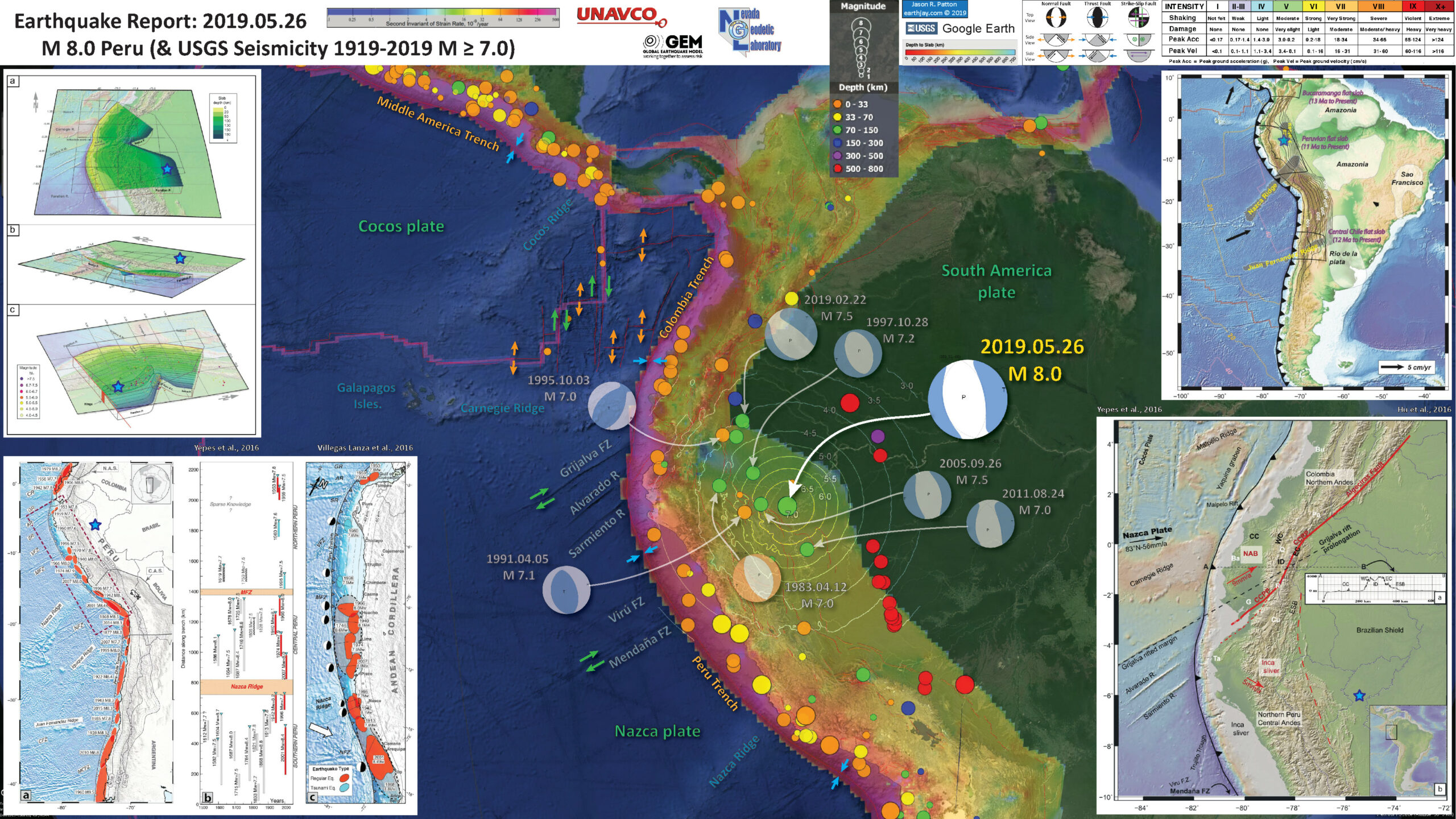
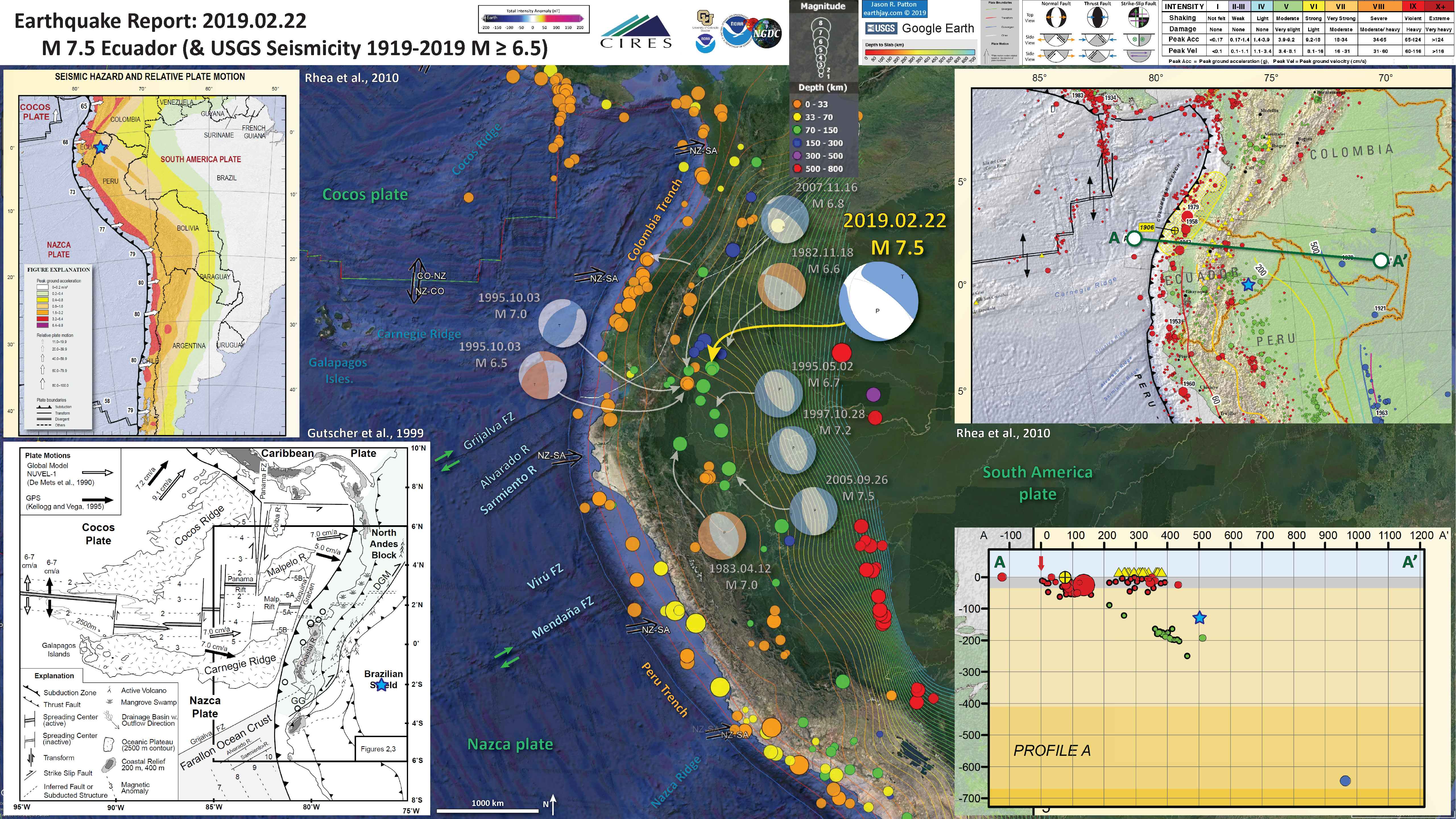
Below is my interpretive poster for this earthquake
I plot the seismicity from the past month, with color representing depth and diameter representing magnitude (see legend). I include earthquake epicenters from 1918-2018 with magnitudes M ≥ 3.0 in one version.
I plot the USGS fault plane solutions (moment tensors in blue and focal mechanisms in orange), possibly in addition to some relevant historic earthquakes.
- I placed a moment tensor / focal mechanism legend on the poster. There is more material from the USGS web sites about moment tensors and focal mechanisms (the beach ball symbols). Both moment tensors and focal mechanisms are solutions to seismologic data that reveal two possible interpretations for fault orientation and sense of motion. One must use other information, like the regional tectonics, to interpret which of the two possibilities is more likely.
- I also include the shaking intensity contours on the map. These use the Modified Mercalli Intensity Scale (MMI; see the legend on the map). This is based upon a computer model estimate of ground motions, different from the “Did You Feel It?” estimate of ground motions that is actually based on real observations. The MMI is a qualitative measure of shaking intensity. More on the MMI scale can be found here and here. This is based upon a computer model estimate of ground motions, different from the “Did You Feel It?” estimate of ground motions that is actually based on real observations.
- I include the slab 2.0 contours plotted (Hayes, 2018), which are contours that represent the depth to the subduction zone fault. These are mostly based upon seismicity. The depths of the earthquakes have considerable error and do not all occur along the subduction zone faults, so these slab contours are simply the best estimate for the location of the fault.
- In the map below, I include a transparent overlay of the magnetic anomaly data from EMAG2 (Meyer et al., 2017). As oceanic crust is formed, it inherits the magnetic field at the time. At different points through time, the magnetic polarity (north vs. south) flips, the north pole becomes the south pole. These changes in polarity can be seen when measuring the magnetic field above oceanic plates. This is one of the fundamental evidences for plate spreading at oceanic spreading ridges (like the Gorda rise).
- Regions with magnetic fields aligned like today’s magnetic polarity are colored red in the EMAG2 data, while reversed polarity regions are colored blue. Regions of intermediate magnetic field are colored light purple.
- We can see the roughly east-west trends of these red and blue stripes. These lines are parallel to the ocean spreading ridges from where they were formed. The stripes disappear at the subduction zone because the oceanic crust with these anomalies is diving deep beneath the Sunda plate (part of Eurasia), so the magnetic anomalies from the overlying Sunda plate mask the evidence for the Australia plate.
Magnetic Anomalies
- In the upper right corner is a generalized plate tectonic map showing the major plate boundaries (Hu et al., 2016).
- In the lower right corner is a larger scale map with more details about how the relative plate motions and crustal structures in the South America plate relate to each other (Hu et al., 2016).
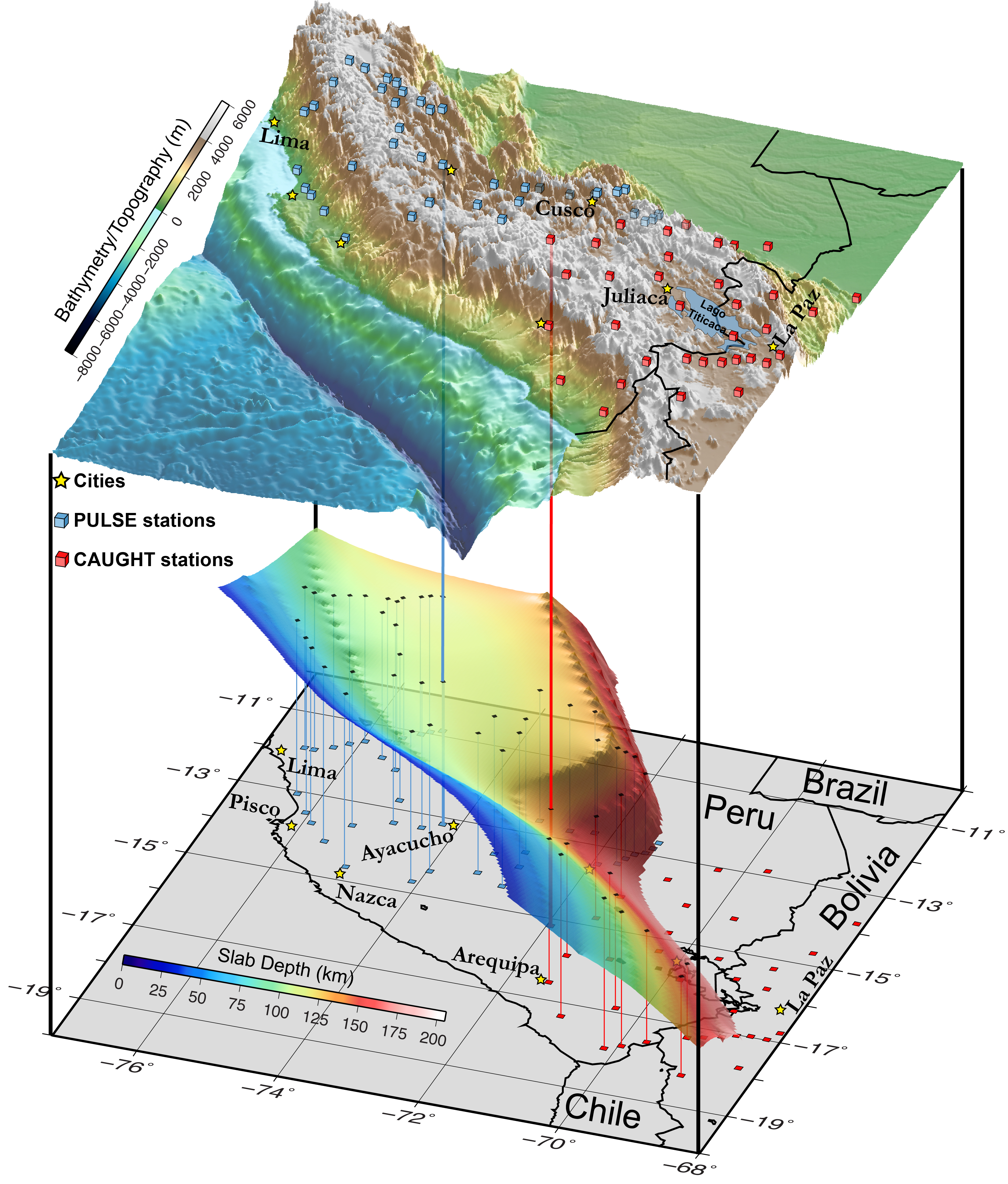
- In the upper right corner is a low angle oblique view of the subducting slab beneath South America (Wagner and Okal, 2019). I place a blue star in the general location of the M 8.0 temblor both on the map and on the 3-D view of the slab.
- In the lower left corner is a map and seismicity cross sections from Wagner and Okal (2019). Note how the M 8.0 is at the edge of the flat slab, where the slab starts to dip more steeply to the east..
I include some inset figures. Some of the same figures are located in different places on the larger scale map below.
- Here is the map with a month’s seismicity plotted.

- Here is the map with a century’s seismicity plotted. Note that I include 2 thrust earthquakes. What are the depths for these temblors? (use the color of the circle to help)

- Here is the map with a century’s seismicity plotted, but also includes the GEM strain data.

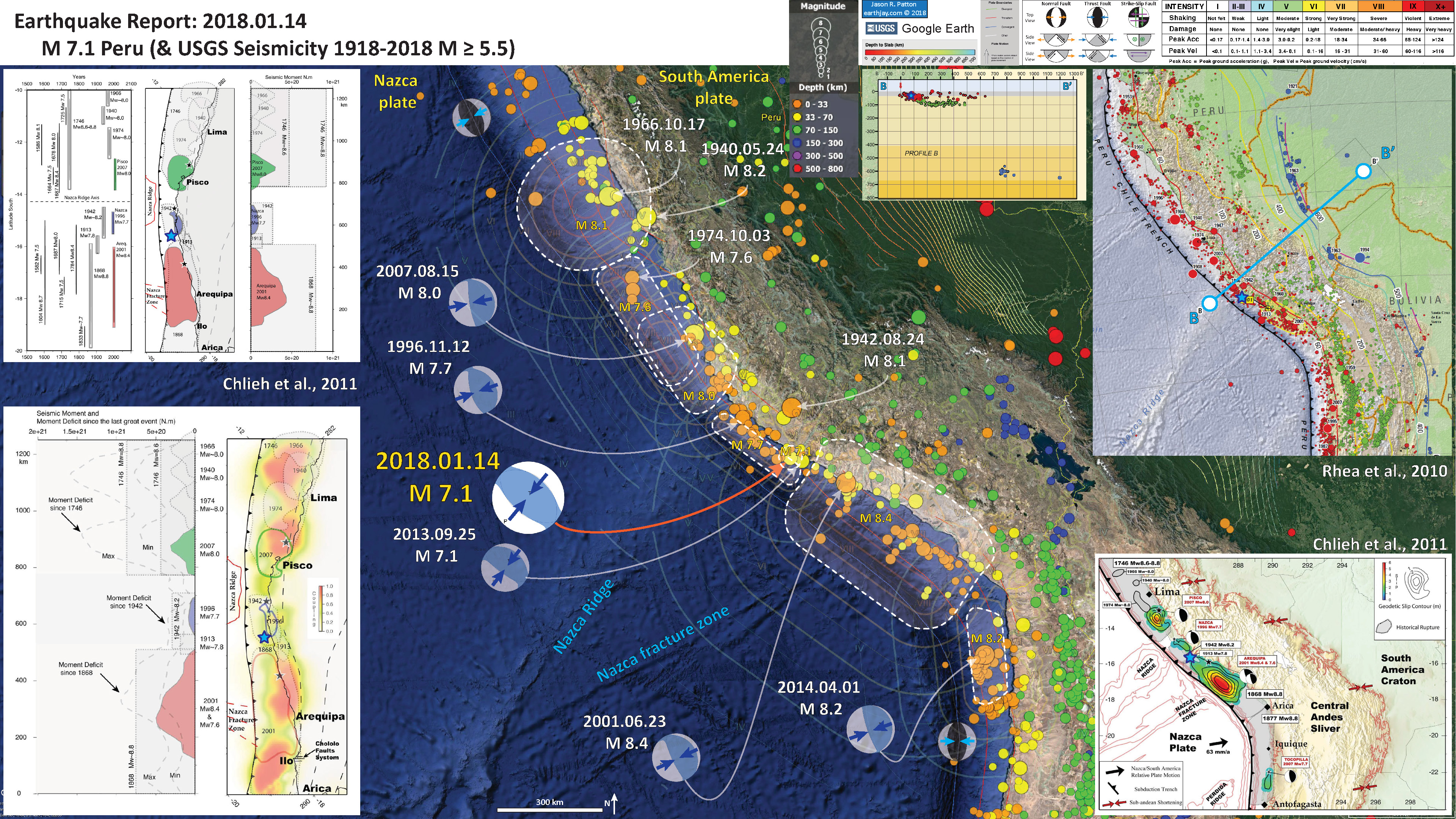
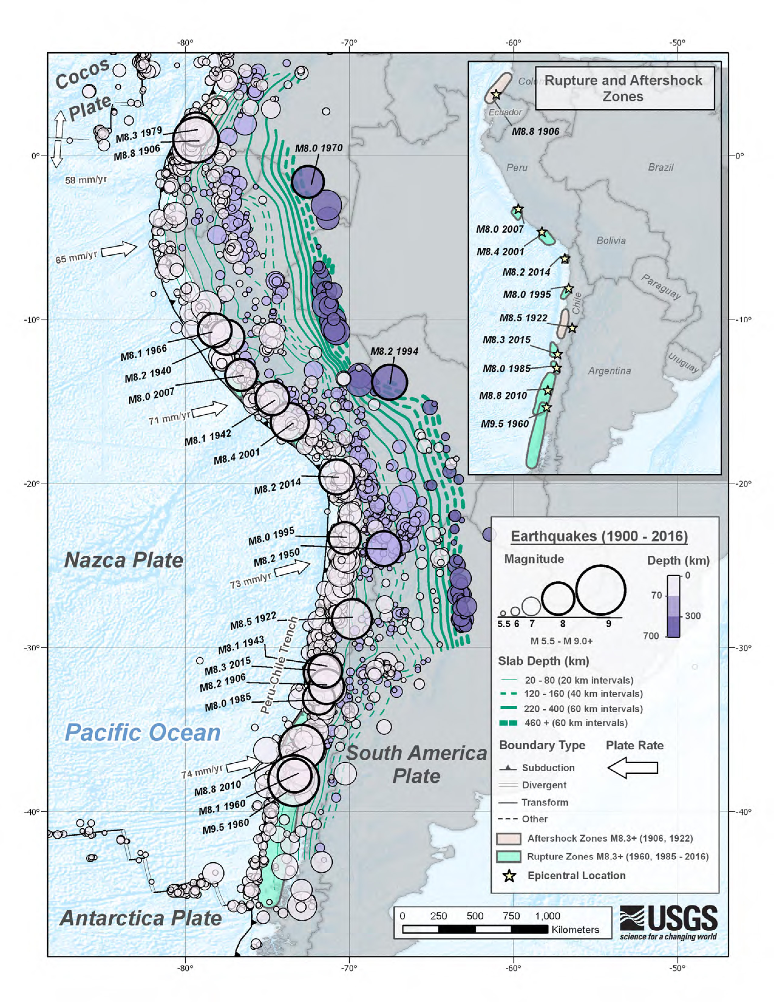
- While today’s M 8.0 was extensional and along this plate boundary system, there are some good examples of subduction zone earthquakes in the region as well. Here is a poster that has a summary of subduction zone earthquakes presented in this report for an earthquake on 2018.01.18.
- Below are some key posters that show additional recent and additional historic earthquakes in the region.
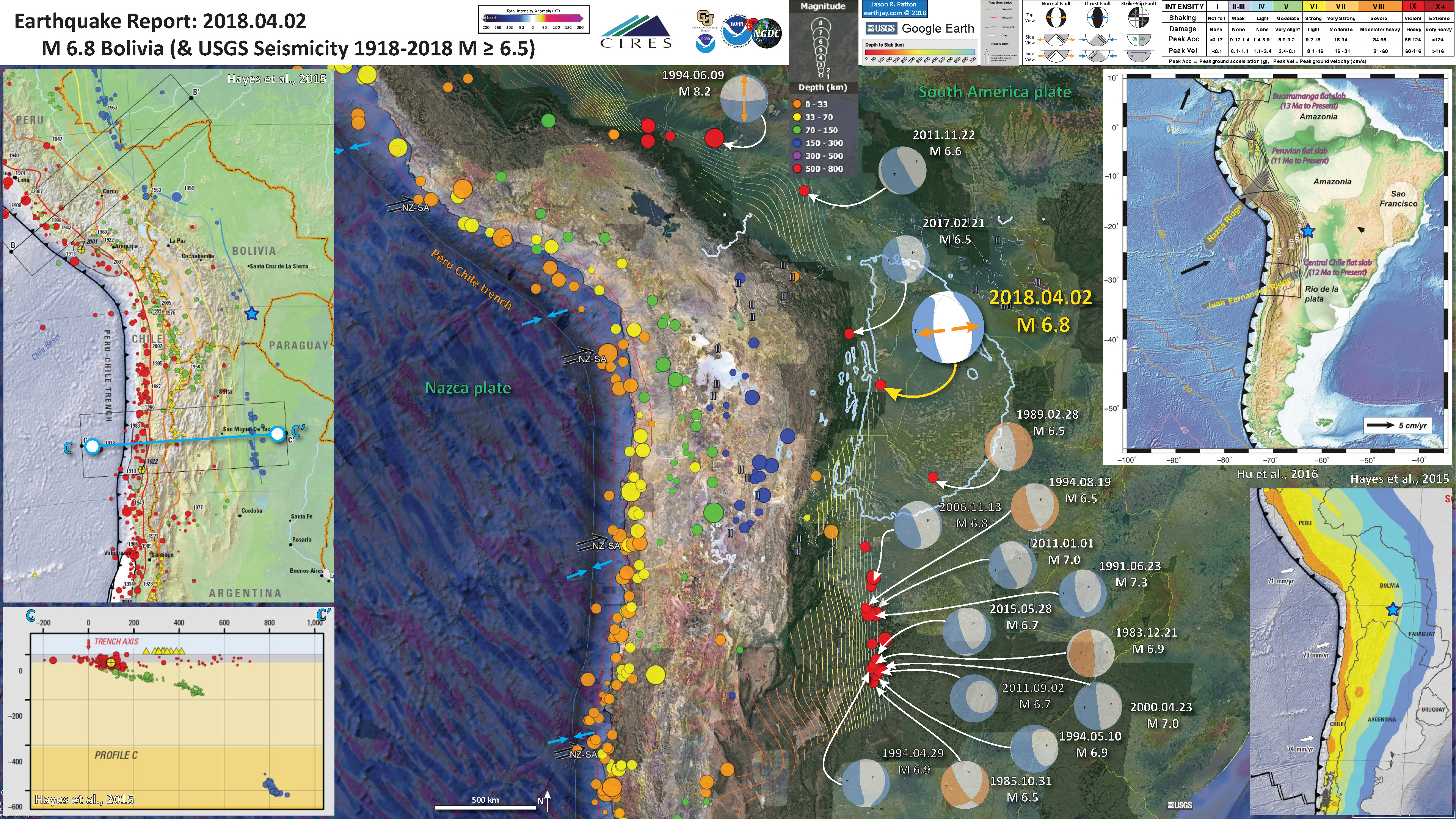
- 2018.04.02 M 6.8 Bolivia
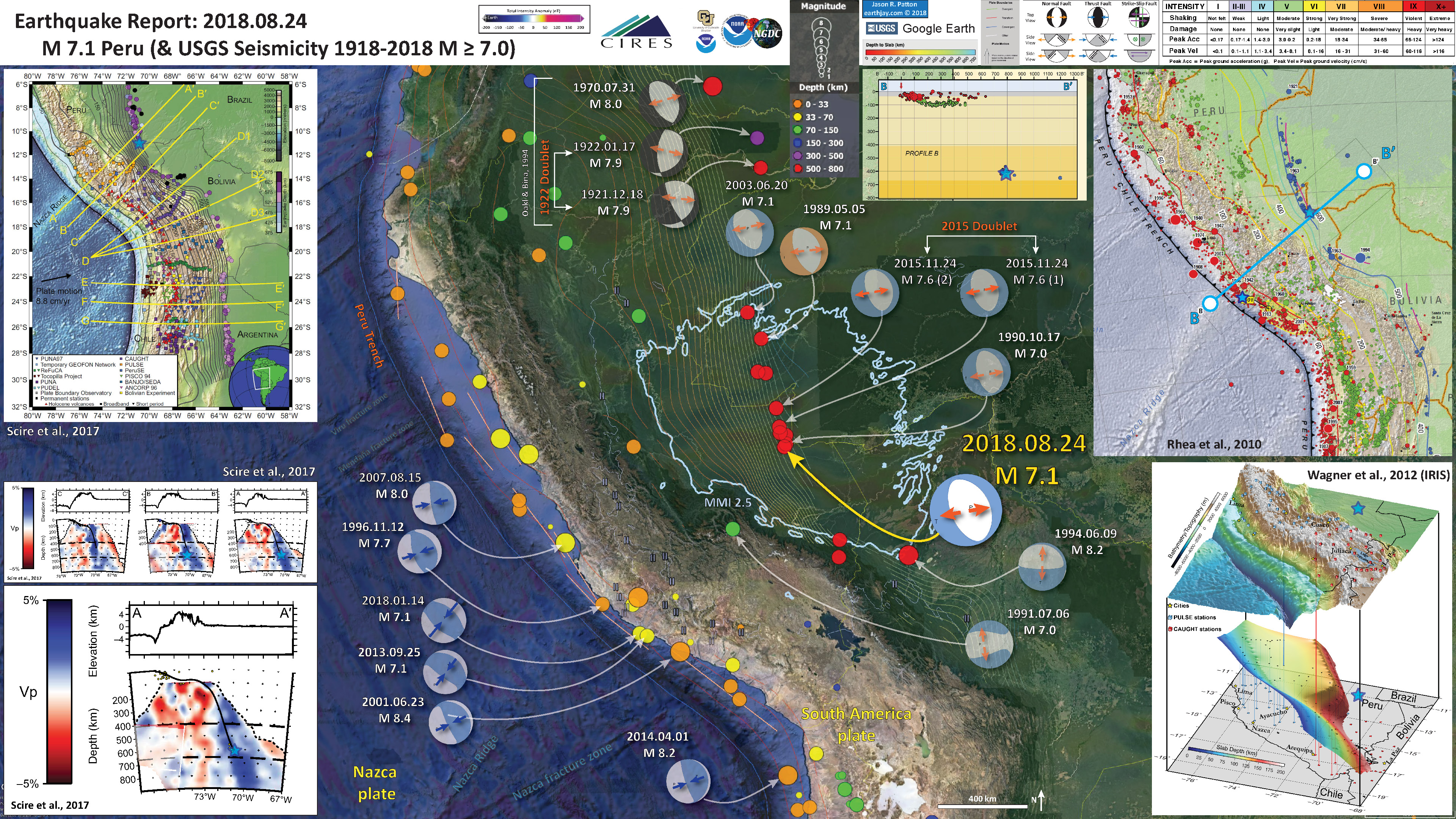
- 2018.08.24 M 7.1 Peru
- 2019.02.23 M 7.5 Ecuador. This earthquake was only a couple months ago and was at a similar depth.
- This M 7.5 quake was also near the bend in the subduction zone, so possibly caused by the tension in the upper plate (just like today’s eq). If one looks closely, the strike of the slab near the M 7.5 is oriented counterclockwise compared to the slab near today’s M 8, The M 7.5 earthquake mechanism (e.g. moment tensor) is also rotated counterclockwise (northwest strike). It may not be possible to know if either (or both) of these quakes are due to bending moment extension, or down-dip slab tension.
- Also, these two earthquakes are separated by 500 km. Earthquakes this size can slip large amounts of the fault. For example, the USGS slip model suggests a fault length of about 250 km or so, with a width of 120 km or so. Given the high rate of large earthquakes (an earthquake magnitude M 7 or greater every 7 years for the past 36 years), it is reasonable to link these earthquakes using our knowledge of static triggering of earthquakes.
USGS Landslide and Liquefaction Ground Failure data products
- Below I present a series of maps that are intended to address the excellent ‘new’ products included in the USGS earthquake pages: landslide probability and liquefaction susceptibility (a.k.a. the Ground Failure data products).
- First I present the landslide probability model. This is a GIS data product that relates a variety of factors to the probability (the chance of) landslides as triggered by this earthquake. There are a number of assumptions that are made in order to be able to produce this model across such a large region, though this is still of great value (like other aspects from teh USGS, e.g. the PAGER alert). Learn more about all of these Ground Failure products here.
- There are many different ways in which a landslide can be triggered. The first order relations behind slope failure (landslides) is that the “resisting” forces that are preventing slope failure (e.g. the strength of the bedrock or soil) are overcome by the “driving” forces that are pushing this land downwards (e.g. gravity). I spend more time discussing landslides and liquefaction in this recent earthquake report.
- This model, like all landslide computer models, uses similar inputs. I review these here:
- Some information about ground shaking. Often, people use Peak Ground Acceleration, though in the past decade+, it has been recognized that the parameter “Arias Intensity” is a better measure of the energy imparted by the earthquake across the land and seascape. Instead of simply accounting for the peak accelerations, AI integrates the entire energy (duration) during the earthquake. That being said, PGA is a more common parameter that is available for people to use. For example, when I was modeling slope stability for the 2004 Sumatra-Andaman subduction zone earthquake, the only model that was calibrated to observational data were in units of PGA. The first order control to shaking intensity (energy observed at any particular location) is distance to the earthquake fault that slipped.
- Some information about the strength of the materials (e.g. angle of internal friction (the strength) and cohesion (the resistance).
- Information about the slope. Steeper slopes, with all other things being equal, are more likely to fail than are shallower slopes. Think about skiing. Beginners (like me) often choose shallower slopes to ski because they will go down the slope slower, while experts choose steeper slopes.
- Areas that are red are more likely to experience landslides than areas that are colored blue. I include a coarse resolution topographic/bathymetric dataset to help us identify where the mountains are relative to the coastal plain and continental shelf (submarine). Note the blue line is the shoreline and that North is to the left. The M=7.5 epicenter is the green dot to the east of the mountains.
- Landslide ground shaking can change the Factor of Safety in several ways that might increase the driving force or decrease the resisting force. Keefer (1984) studied a global data set of earthquake triggered landslides and found that larger earthquakes trigger larger and more numerous landslides across a larger area than do smaller earthquakes. Earthquakes can cause landslides because the seismic waves can cause the driving force to increase (the earthquake motions can “push” the land downwards), leading to a landslide. In addition, ground shaking can change the strength of these earth materials (a form of resisting force) with a process called liquefaction.
- Sediment or soil strength is based upon the ability for sediment particles to push against each other without moving. This is a combination of friction and the forces exerted between these particles. This is loosely what we call the “angle of internal friction.” Liquefaction is a process by which pore pressure increases cause water to push out against the sediment particles so that they are no longer touching.
- An analogy that some may be familiar with relates to a visit to the beach. When one is walking on the wet sand near the shoreline, the sand may hold the weight of our body generally pretty well. However, if we stop and vibrate our feet back and forth, this causes pore pressure to increase and we sink into the sand as the sand liquefies. Or, at least our feet sink into the sand.
- Below is the liquefaction susceptibility map. I discuss liquefaction more in my earthquake report on the 28 September 20018 Sulawesi, Indonesia earthquake, landslide, and tsunami here.
- Something else that is cool about the liquefaction map is we can see where the river valleys are. These regions have a higher liq. susc. because they are (1) closer to the earthquake and (2) they are composed of materials that are more susceptible to liquefaction (e.g. sediment rather than bedrock).
- Here is a map that shows shaking intensity using the MMI scale (mentioned and plotted in the main earthquake poster maps). I present this here in the same format as the ground failure model maps so we can compare these other maps with the ground shaking model (which is a first order control on slope failure).
- Let’s compare the MMI map below with the liquefaction susc. map. What might we conclude may be the largest factor for the landscape being susceptible to liquefaction?
- Check out how the liquefaction map more directly resembles this MMI map, than the landslide map. In this case, my interpretation is that for the landslide model, slope is a larger controlling factor than ground shaking (though still a major factor).
- And to answer my question, you were correct, liquefaction appears to be more highly controlled by ground shaking intensity.


UPDATE: 2019.05.27
- I prepared an interpretive poster that shows a comparison of the impact for two similar and different earthquakes in the region. I compare the ground shaking from the 2019.02.22 M 7.5 and the 2019.05.26 M 8.0 earthquakes.
- Both quakes are in a similar position along the Nazca plate, with extensional mechanisms near the hingeline between flat subduction and steeper dipping subduction.
- The M 7.5 temblor is deeper at 145 km, compared tot he M 8.0 with a depth of 110 km.
- I provide map and attenuation relation comparisons on the left and map view comparisons on the right.
- The maps on the left show the results of intensity modeling done by the USGS, called shakemaps. These models are based on the knowledge we have about how shaking intensity decreases with distance from the earthquake. These attenuation relations are often called “Ground Motion Prediction Equations” (GMPE for short).
- Below the maps are the plots that show these GMPE models used to make the shakemaps above. The orange and green lines are the predictive lines for ground shaking in sedimentary bedrock (e.g. California, green) and crystalline bedrock (e.g. central and eastern USA, orange).
- The dots are intensity values as reported by people who submitted their observations via the USGS “did you feel it?” website. Green dots are individual values, and teh larger dots and whisker bars are the average values, with 1 sigma uncertainty (the error bars).
- I placed a gray rectangle showing the range of MMI reported for the M 7.5 to allow us to easily compare with the M 8.
- The maps on the right include DYFI reported data (the circles, with diameters representing the number of reports) as well as the USGS model of shaking intensity (the transparent polygons and lines, labeled relative to their MMI value).
- Note how much farther DYFI reports were sourced (both on the maps and the plots on the left). The M 8.0 was felt over 2,000 km away from teh quake.

- Here is a map that shows the impact from this event. This is from Copernicus at the European Union. This map was tweeted in a tweet linked below.

- IRIS prepares excellent visualizations for earthquakes such as this M 8.0.
- Below is a visualization that shows how seismic waves were transmitted through the Earth following the M 8.0 earthquake.
- Here is an updated interpretive poster, still with a century’s seismicity plotted. However, I added more historic earthquakes (including 2 notable megathrust quakes in 2001 and 2007). I added different inset figures, listed below.
- In the upper right corner is a map that shows an interpretation of different subducting slabs beneath the South America plate (Ramos & Folguera, 2009).
- In the lower right corner is a map that shows the age of the oceanic lithosphere for the Nazca plate (Capitanio et al., 2011).
- On the left margin is a series of figures from Kirby et al., 1995. The upper panel is a map showing historic seismicity and some representative earthquake mechanisms. Their paper focused on the deep earthquakes in the northern, western jog, and southern groups. Yesterday’s M 8.0 was up-dip of the northern group.
- In the two lower panels are plots of seismicity in cross-sectional view (east-west on top and north-south on bottom). I label the locations for different types of earthquakes (megathrust subduction zone, crustal, intermediate depth, and deep earthquakes). The 1921-22 and 1970 quakes are labeled here (as well as the 1994 M 8.2).
- There have been a series of couplets, large magnitude earthquakes closely spaced in place and time, in this region. About a month spanned a doublet in 1921-22, and less than a day for quakes in 2015. One might consider a pair of M~7 quakes in 1989/90. It seems possible that either yesterday’s M 8.0 was in a region of increased static stress (??) following the 2019.02.22 M 7.5. It also seems possible that there may be an additional earthquake in this region. We won’t know until it happens.
- I also included the USGS slip models for these 2 2019 temblors. These are placed roughly relative to the online USGS maps for these slip models. Note the large difference in fault size for these 2 quakes; the M 8 slipped a much larger fault than the M 7.5 slipped.

Some Relevant Discussion and Figures
- This is the Hu et al. (2016) tectonic map. Note the slab contours and how they help us understand the shape of the downgoing Nazca plate.

Geological setting of South America with depth contours of slab 1.0 (Hayes et al., 2012)indicated by thin black lines, subducting oceanic plateaus translucent gray and continental cratons translucent white. The major flat slabs in South America are outlined with thick black lines. The locations of oceanic plateaus, cratons and flat slabs are modified from Gutscher et al.(2000), Loewy et al.(2004)and Ramos and Folguera (2009), respectively. The present-day plate motion is shown as black arrows. Tooth-shaped line represents the South American trench. Seafloor ages to the west of South America are shown with colorful lines with numbers indicating the age in Ma.
- Here is a more detailed tectonic map from Wagner and Okal (2019) that shows seismicity plotted relative to depth (color). The slab contours are also plotted.

Map of South American seismicity and Holocene volcanism. Red triangles indicate Holocene volcanism from the Global Volcanism Project (2013). Circles indicate earthquakes from Jan 1990 to Jan 2015 listed in the Reviewed International Seismological Centre On-line Bulletin (2015) with magnitudes > 4 and depths > 70 km. Orange box shows Pucallpa nest described in this study. Yellow boxes show other nests: the Bucaramanga nest in Colombia and the Pipanaco nest in Argentina. The faded black lines show slab contours from Slab 2.0 (Hayes et al., 2018). The faded blue lines show slab contours from Cahill and Isacks (1992). The black arrow offshore shows relative Nazca-South America plate motion from Altamimi et al. (2016).
- Here is an animation from IRIS that reviews the tectonics of the Peru-Chile subduction zone. For the animation, first is a screen shot and below that is the embedded video. This animation is from IRIS. Written and directed by Robert F. Butler, University of Portland. Animation and Graphics: Jenda Johnson, geologist. Consultant: Susan Beck, University or Arizona. Narration: Elayne Shapiro, University of Portland.
- Here is a download link for the embedded video below (34 MB mp4)

- The Rhea et al. (2016) document is excellent and can be downloaded here. The USGS prepared another cool poster that shows the seismicity for this region (though there does not seem to be a reference for this).
- This is a great visualization from Dr. Laura Wagner. This shows how the downgoing Nazca plate is shaped, based upon their modeling.
- Here are some cross sections that show the geometry of the slab, as modeled by Hu et al. (2016). Cross section C is almost exactly where the 01 March 2019 M 7.0 and 9 June 1994 M 8.2 earthquakes are.

Cross sections of the best-fit model from 5◦to 30◦S at an interval of 5◦. Orange arrows mark the location of these cross sections. In each cross section, background color represents the temperature field with the yellow lines indicating the interpolated Benioff zone from slab 1.0(Hayes et al., 2012). Gray circles represent the locations of earthquakes with magnitude >4.0 from IRIS earthquake catalog for years from 1970 to 2015. Black lines above each cross section delineate the topography, with the vertical scale amplified by 20 times. Note the overall match of the slab geometry to both individual seismicity and slab 1.0 contour.
- Here is an alternate view of the Nazca slab from Yepes et al. (2016).
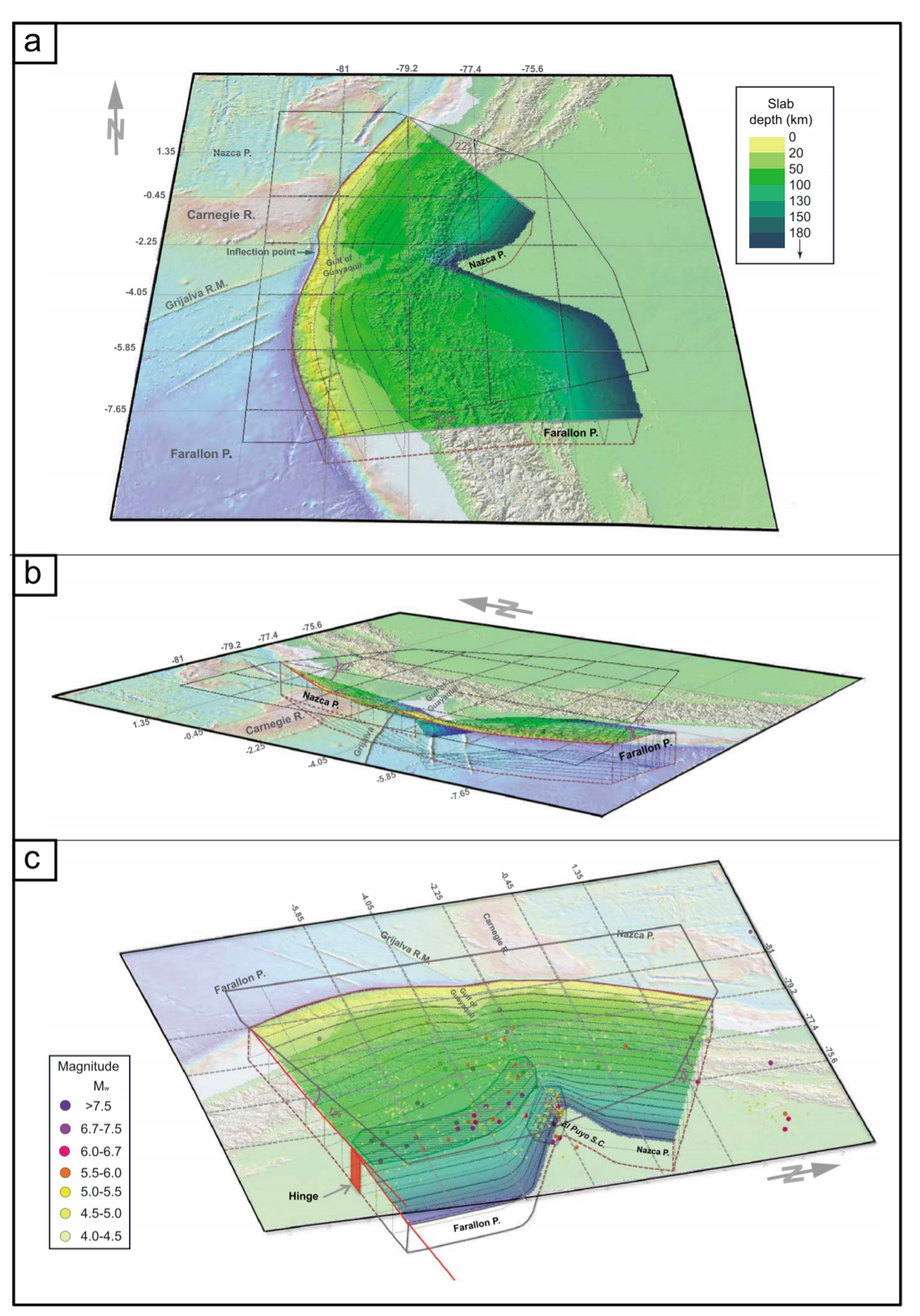
Slab bending depicted as a hypothetical contorted surface. The drawings represent the subduction and bending of Farallon and Nazca plates from three different perspectives. The margin convexity (concavity from the perspective of the continental plate) forces the slab to flex and shorten at depth which accumulates stresses in most strained areas. Present-day position of the Grijalva rifted margin at the trench coincides with a noticeable inflection point of the trench axis (in red). A horizontal grid has been added to help visualize the plates dipping angles. A transparent 100 km thick volume has been added below the contorted surface to simulate the plate, but at intermediate depths the depicted surface should be representing the plate inner section. (a) South to north perspective showing the different dipping angles of Farallon and Nazca plates. The slab depth color scale is valid for the three drawings. (b) West to east oblique perspective at approximately the same angle as Nazca plate’s dip. The contortion of the Farallon plate at depth south of the Grijalva rifted margin is clearly noticeable from this perspective. (c) East to west perspective. Intermediate depth seismicity (50–300 km) from the instrumental catalog [Beauval et al., 2013] is drawn at the reported hypocentral depth. Two areas of maximum strain in the Farallon plate are shown (hachured): the El Puyo seismic cluster (SC) and the 100–130 km depth stretch of high moment release seismicity related to a potential hinge in the subducting plate. Lack of seismicity in the Nazca plate is explained due to the fact that this young plate, even though it is also strained, is too hot for brittle rupture.
- Here are the seismicity cross sections from Wagner and Okal (2019). Today’s M 8.0 (as plotted in the interpretive posters) is at the location in the Nazca slab where it bends. The M 8 is in the upper slab, where there would be extension from this bending.

Map of Pucallpa Nest with focal mechanisms and cross sections. Top: map view: circles show seismicity (same as Fig. 2) along with focal mechanisms from the Global CMT catalog (Dziewonski et al., 1981; Ekström et al., 2012). The red contours are our proposed slab geometry in 50 km increments. Teal outlined shape is the projected location of the subducted Nazca Ridge based on its conjugate Tuamotu Plateau on the Pacific plate (Hampel, 2002). The dark blue outlined shape is the subducted Inca Plateau based on the location of its conjugate, the Marquesas Plateau (Rosenbaum et al., 2005). The pink shaded region shows the location of the Shira Mountains (Hermoza et al., 2006). Cross sections have earthquakes and focal mechanisms projected onto the transect from within the boxes outlined on the map. For all cross sections, the red line is the proposed slab geometry shown in red contours and in Fig. 7 – the solid red line indicates the slab geometry determined from PULSE studies (e.g. Antonijevic et al., 2015, 2016; Kumar et al., 2016; Bishop et al., 2017) and the dashed red line indicates the slab geometry inferred in the present study. The dashed black line is the slab from Cahill and Isacks (1992). The blue line is the slab from Slab2.0 (Hayes et al., 2018). The black line above the depth profiles on each cross section shows topography/bathymetry in km. Middle: Cross-section A–A′ through the NNW-SSE trending arm of the Pucallpa Nest. T-axes are uniformly down-dip, roughly parallel to the dip of the proposed slab geometry. Bottom: Cross-section B–B′ is parallel to the WSW-ENE arm of the Pucallpa Nest. Focal mechanisms on this segment are more variable. The inverted red triangle on the topography profile shows the location of the Agua Caliente Oil Field and Boiling River. Cross-section C–C′ is parallel to the NNW-SSE arm of the Pucallpa Nest.
- This is the updated 3-D view of the slab from Wagner and Okal (2019).

3D image of slab seismicity and possible slab geometry surrounding the Pucallpa Nest. Cubes show event location for seismicity>70 km depth from the RISC 1990–2015. Squares on underlying and overlying topographic maps show projections of the same events. Slab geometry south of ~9°S is constrained by seismic stations of the PULSE deployment (see Fig. 2). Slab geometry proposed here for areas further north is based on RISC event locations and focal mechanisms.
Geologic Fundamentals
- For more on the graphical representation of moment tensors and focal mechnisms, check this IRIS video out:
- Here is a fantastic infographic from Frisch et al. (2011). This figure shows some examples of earthquakes in different plate tectonic settings, and what their fault plane solutions are. There is a cross section showing these focal mechanisms for a thrust or reverse earthquake. The upper right corner includes my favorite figure of all time. This shows the first motion (up or down) for each of the four quadrants. This figure also shows how the amplitude of the seismic waves are greatest (generally) in the middle of the quadrant and decrease to zero at the nodal planes (the boundary of each quadrant).
- Here is another way to look at these beach balls.
The two beach balls show the stike-slip fault motions for the M6.4 (left) and M6.0 (right) earthquakes. Helena Buurman's primer on reading those symbols is here. pic.twitter.com/aWrrb8I9tj
— AK Earthquake Center (@AKearthquake) August 15, 2018
- There are three types of earthquakes, strike-slip, compressional (reverse or thrust, depending upon the dip of the fault), and extensional (normal). Here is are some animations of these three types of earthquake faults. The following three animations are from IRIS.
Strike Slip:
Compressional:
Extensional:
- This is an image from the USGS that shows how, when an oceanic plate moves over a hotspot, the volcanoes formed over the hotspot form a series of volcanoes that increase in age in the direction of plate motion. The presumption is that the hotspot is stable and stays in one location. Torsvik et al. (2017) use various methods to evaluate why this is a false presumption for the Hawaii Hotspot.
- Here is a map from Torsvik et al. (2017) that shows the age of volcanic rocks at different locations along the Hawaii-Emperor Seamount Chain.
- Here is a great tweet that discusses the different parts of a seismogram and how the internal structures of the Earth help control seismic waves as they propagate in the Earth.
A cutaway view along the Hawaiian island chain showing the inferred mantle plume that has fed the Hawaiian hot spot on the overriding Pacific Plate. The geologic ages of the oldest volcano on each island (Ma = millions of years ago) are progressively older to the northwest, consistent with the hot spot model for the origin of the Hawaiian Ridge-Emperor Seamount Chain. (Modified from image of Joel E. Robinson, USGS, in “This Dynamic Planet” map of Simkin and others, 2006.)
Hawaiian-Emperor Chain. White dots are the locations of radiometrically dated seamounts, atolls and islands, based on compilations of Doubrovine et al. and O’Connor et al. Features encircled with larger white circles are discussed in the text and Fig. 2. Marine gravity anomaly map is from Sandwell and Smith.
Today, on #SeismogramSaturday: what are all those strangely-named seismic phases described in seismograms from distant earthquakes? And what do they tell us about Earth’s interior? pic.twitter.com/VJ9pXJFdCy
— Jackie Caplan-Auerbach (@geophysichick) February 23, 2019
- 2010.02.27 M 8.8 Earthquake Review
- 2019.05.26 M 8.0 Peru
- 2019.05.12 M 6.1 Panama
- 2019.03.01 M 7.0 Peru
- 2019.02.22 M 7.5 Ecuador
- 2019.01.20 M 6.7 Chile
- 2018.08.21 M 7.3 Venezuela
- 2018.08.24 M 7.1 Peru
- 2018.04.02 M 6.8 Bolivia
- 2018.01.14 M 7.1 Peru
- 2018.01.15 M 7.1 Peru Update #1
- 2017.06.30 M 6.0 Ecuador
- 2017.04.24 M 6.9 Chile
- 2017.04.23 M 5.9 Chile
- 2016.12.25 M 7.6 Chile
- 2016.11.24 M 7.0 El Salvador
- 2016.11.04 M 6.4 Maule, Chile
- 2016.04.16 M 7.8 Ecuador
- 2016.04.16 M 7.8 Ecuador Update #1
- 2015.11.29 M 5.9 Argentina
- 2015.11.11 M 6.9 Chile
- 2015.11.24 M 7.6 Peru
- 2015.11.26 M 7.6 Peru Update
- 2015.09.16 M 8.3 Chile
- 2014.04.01 M 8.2 Chile
- 2010.02.27 M 8.8 Chile
- 1960.05.22 M 9.5 Chile
Chile | South America
General Overview
Earthquake Reports
Social Media
— Jason "Jay" R. Patton (@patton_cascadia) May 26, 2019
— Jason "Jay" R. Patton (@patton_cascadia) May 26, 2019
— Jason "Jay" R. Patton (@patton_cascadia) May 26, 2019
— Jason "Jay" R. Patton (@patton_cascadia) May 26, 2019
— Jason "Jay" R. Patton (@patton_cascadia) May 26, 2019
interesting… pic.twitter.com/VPiB0bLbCQ
— Cenk YALTIRAK (@CYaltirak) May 26, 2019
— Jason "Jay" R. Patton (@patton_cascadia) May 27, 2019
— Jason "Jay" R. Patton (@patton_cascadia) May 27, 2019
UPDATE 2019.05.27
#ERCC #DailyMap: 2019-05-27 ⦙ Peru | 8.0 M Earthquake of 26 May 2019 ▸https://t.co/MQ0fKG8FDW pic.twitter.com/34UGFWqo1D
— Copernicus EMS (@CopernicusEMS) May 27, 2019
— Jason "Jay" R. Patton (@patton_cascadia) May 27, 2019
#SismoEnLoreto: La clave es la profundidad <– con la participación de @DocTerremoto https://t.co/ohqaAX8zLx vía @elcomercio_peru
— Bruno Ortiz B. (Blogdenotas) (@blogdenotas) May 27, 2019
Self-reactivated rupture during the 2019 Mw = 8 northern Peru intraslab earthquake https://t.co/gpGCv0CMS7
— Baoning Wu (@BaoningWu) November 12, 2022
- Antonijevic, S.K., et a;l., 2015. The role of ridges in the formation and longevity of flat slabs in Nature, v. 524, p. 212-215, doi:10.1038/nature14648
- Bishop, B.T., Beck, S.L., Zandt, G., Wagner, L., Long, M., Knezevic Antonijevic, S., Kumar, A., and Tavera, H., 2017, Causes and consequences of flat-slab subduction in southern Peru: Geosphere, v. 13, no. 5, p. 1392–1407, doi:10.1130/GES01440.1.
- Chlieh, M. Mothes, P.A>, Nocquet, J-M., Jarrin, P., Charvis, P., Cisneros, D., Font, Y., Color, J-Y., Villegas-Lanza, J-C., Rolandone, F., Vallée, M., Regnier, M., Sogovia, M., Martin, X., and Yepes, H., 2014. Distribution of discrete seismic asperities and aseismic slip along the Ecuadorian megathrust in Earth and Planetary Science Letters, v. 400, p. 292–301
- Frisch, W., Meschede, M., Blakey, R., 2011. Plate Tectonics, Springer-Verlag, London, 213 pp.
- Hayes, G., 2018, Slab2 – A Comprehensive Subduction Zone Geometry Model: U.S. Geological Survey data release, https://doi.org/10.5066/F7PV6JNV.
- Kumar, A., et al., 2016. Seismicity and state of stress in the central and southern Peruvian flat slab in EPSL, v. 441, p. 71-80. http://dx.doi.org/10.1016/j.epsl.2016.02.023
- Meyer, B., Saltus, R., Chulliat, a., 2017. EMAG2: Earth Magnetic Anomaly Grid (2-arc-minute resolution) Version 3. National Centers for Environmental Information, NOAA. Model. doi:10.7289/V5H70CVX
- Meyer, B., Saltus, R., Chulliat, a., 2017. EMAG2: Earth Magnetic Anomaly Grid (2-arc-minute resolution) Version 3. National Centers for Environmental Information, NOAA. Model. doi:10.7289/V5H70CVX
- Müller, R.D., Sdrolias, M., Gaina, C. and Roest, W.R., 2008, Age spreading rates and spreading asymmetry of the world’s ocean crust in Geochemistry, Geophysics, Geosystems, 9, Q04006, doi:10.1029/2007GC001743
- Rhea, S., Hayes, G., Villaseñor, A., Furlong, K.P., Tarr, A.C., and Benz, H.M., 2010. Seismicity of the earth 1900–2007, Nazca Plate and South America: U.S. Geological Survey Open-File Report 2010–1083-E, 1 sheet, scale 1:12,000,000.
- Villegas-Lanza, J. C., M. Chlieh, O. Cavalié, H. Tavera, P. Baby, J. Chire-Chira, and J.-M. Nocquet (2016), Active tectonics of Peru: Heterogeneous interseismic coupling along the Nazca megathrust, rigid motion of the Peruvian Sliver, and Subandean shortening accommodation, J. Geophys. Res. Solid Earth, 121, 7371–7394, https://doi.org/10.1002/2016JB013080.
- Wagner, L.S., and Okal, E.A., 2019. The Pucallpa Nest and its constraints on the geometry of the Peruvian Flat Slab in Tectonophysics, v. 762, p. 97-108, https://doi.org/10.1016/j.tecto.2019.04.021
- Yepes,H., L. Audin, A. Alvarado, C. Beauval, J. Aguilar, Y. Font, and F. Cotton (2016), A new view for the geodynamics of Ecuador: Implication in seismogenic source definition and seismic hazard assessment, Tectonics, 35, 1249–1279, https://doi.org/10.1002/2015TC003941.
References:
https://academic.oup.com/gji/article-abstract/232/1/115/6674205?redirectedFrom=fulltext
Return to the Earthquake Reports page.
This is an old thread so you may not see it, but I’m curious to learn what insights you Igor share about the large event off Chie. I know some sections of the Nazca remain locked, but would today’s primary and aftershocks affect that status?
Thanks
http://temblor.net/earthquake-insights/strong-shaking-from-a-deep-earthquake-in-central-coastal-chile-what-clues-does-it-reveal-about-failure-of-the-megathrust-8225/
https://earthquake.usgs.gov/earthquakes/map/#%7B%22autoUpdate%22%3A%5B%22autoUpdate%22%5D%2C%22basemap%22%3A%22terrain%22%2C%22feed%22%3A%221day_m25%22%2C%22listFormat%22%3A%22default%22%2C%22mapposition%22%3A%5B%5B-31.3348710339506%2C286.556396484375%5D%2C%5B-24.896402266558713%2C291.104736328125%5D%5D%2C%22overlays%22%3A%5B%22plates%22%5D%2C%22restrictListToMap%22%3A%5B%22restrictListToMap%22%5D%2C%22search%22%3Anull%2C%22sort%22%3A%22newest%22%2C%22timezone%22%3A%22utc%22%2C%22viewModes%22%3A%5B%22map%22%5D%2C%22event%22%3Anull%7D
-
i get an email when people comment, so never too late. just don’t include links to sunglasses sales or nike sales (or porn sites) and i will respond!
i will be preparing a report on today’s M 6.4. methinks it is possible that the 20 jan M 6.7 may have changed static coulomb stresses so to trigger today’s sequence of quakes. i’ll look into it more (there actually is a 2006 paper that addresses this at this location!). stay tuned…