I present this summary of the Earthquake Reports and Interpretive Posters I prepared for earthquakes during the year 2021.
There are 6 Earthquake Reports and a number of Earthquake Report “Lites.” I also prepared a several rapid tweet maps.
There are some significant events I missed, but life is short and I have only so much available free time.
This is my 7th annual summary. I used to break out Cascadia.
- Here are all the annual summaries:
- Here are the annual summaries for the Cascadia region.
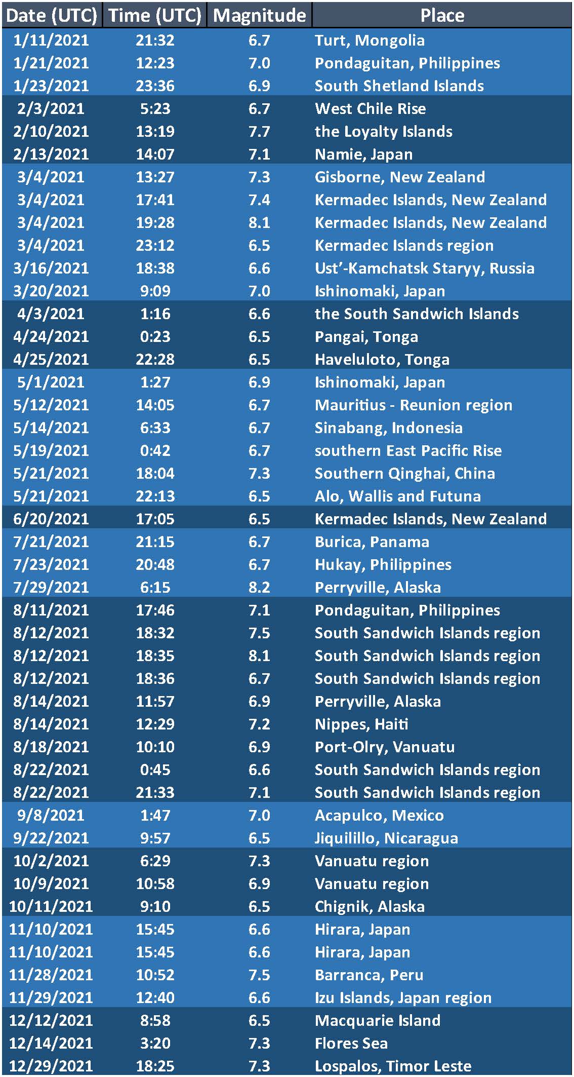
- Here is a table that lists the 2021 earthquakes with magnitudes M ≥ 6.5. I use these earthquakes to plot the cumulative energy release for earthquakes below.
- I did not prepare a poster/report for all of these events and I prepared some reports/posters for events not on this table.
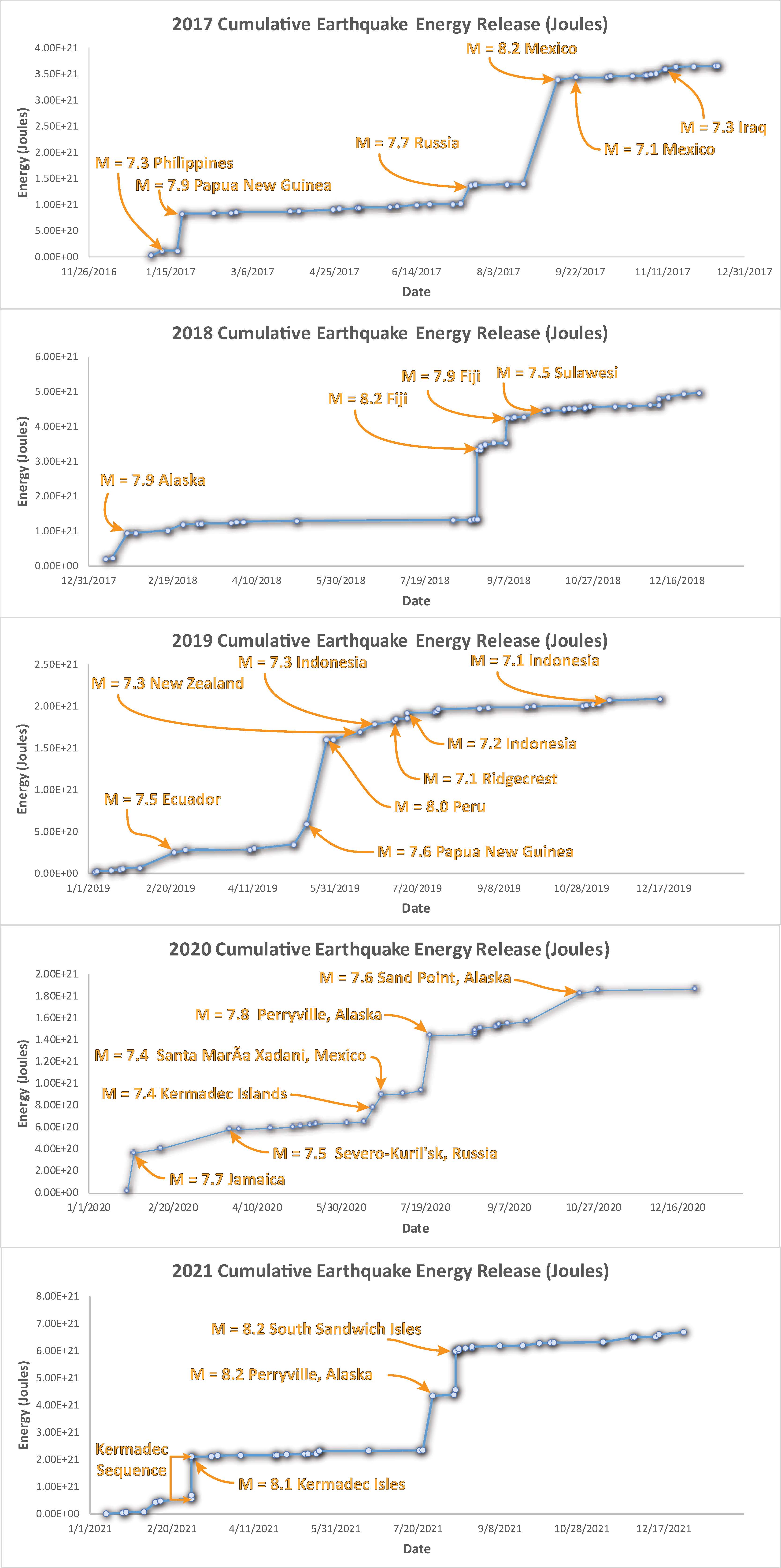
- This is a plot showing the cumulative energy release (in Joules) for the earthquakes listed in the above table. Ask yourself if M 6.5 is a reasonable threshold to be able to visualize variations in seismic energy release during the year.
- Note that the vertical axis is scaled differently on each plot, so the energy released in 2017 is about twice the energy released in 2020. Why do you think this is, is there a single earthquake in 2017 that controls this difference?
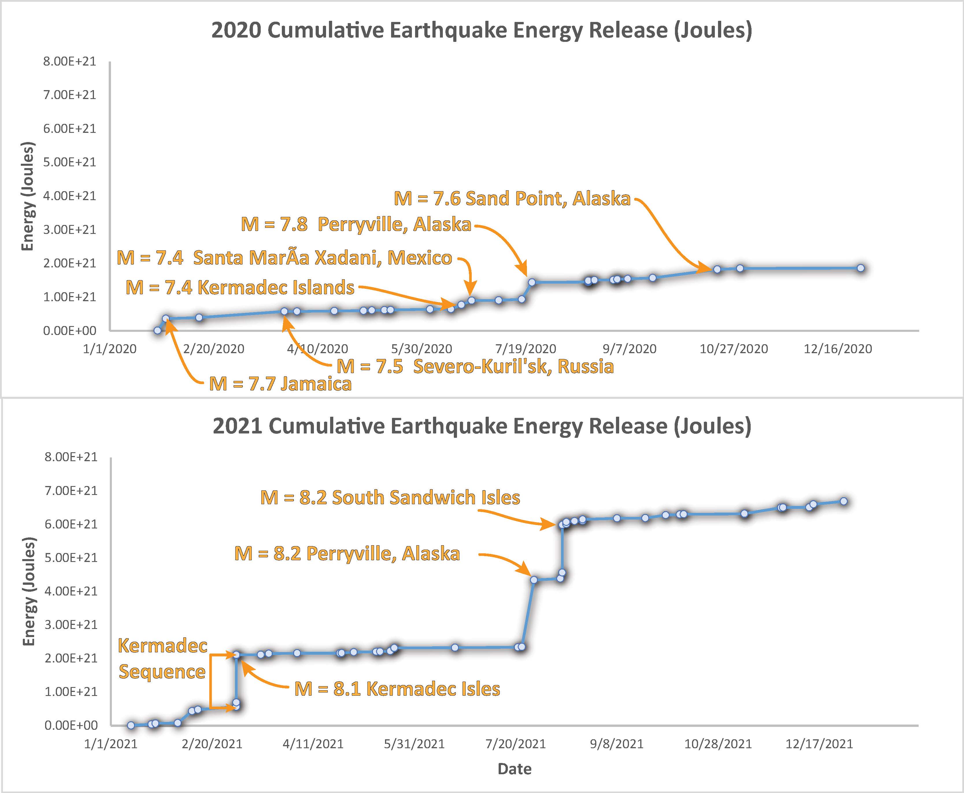
- Because the vertical scale for energy release is different on each of the above plots and the energy release during 2020 was so different than 2021, I plot below the 2020 & 2021 data at the same scale.
2021 Earthquake Reports
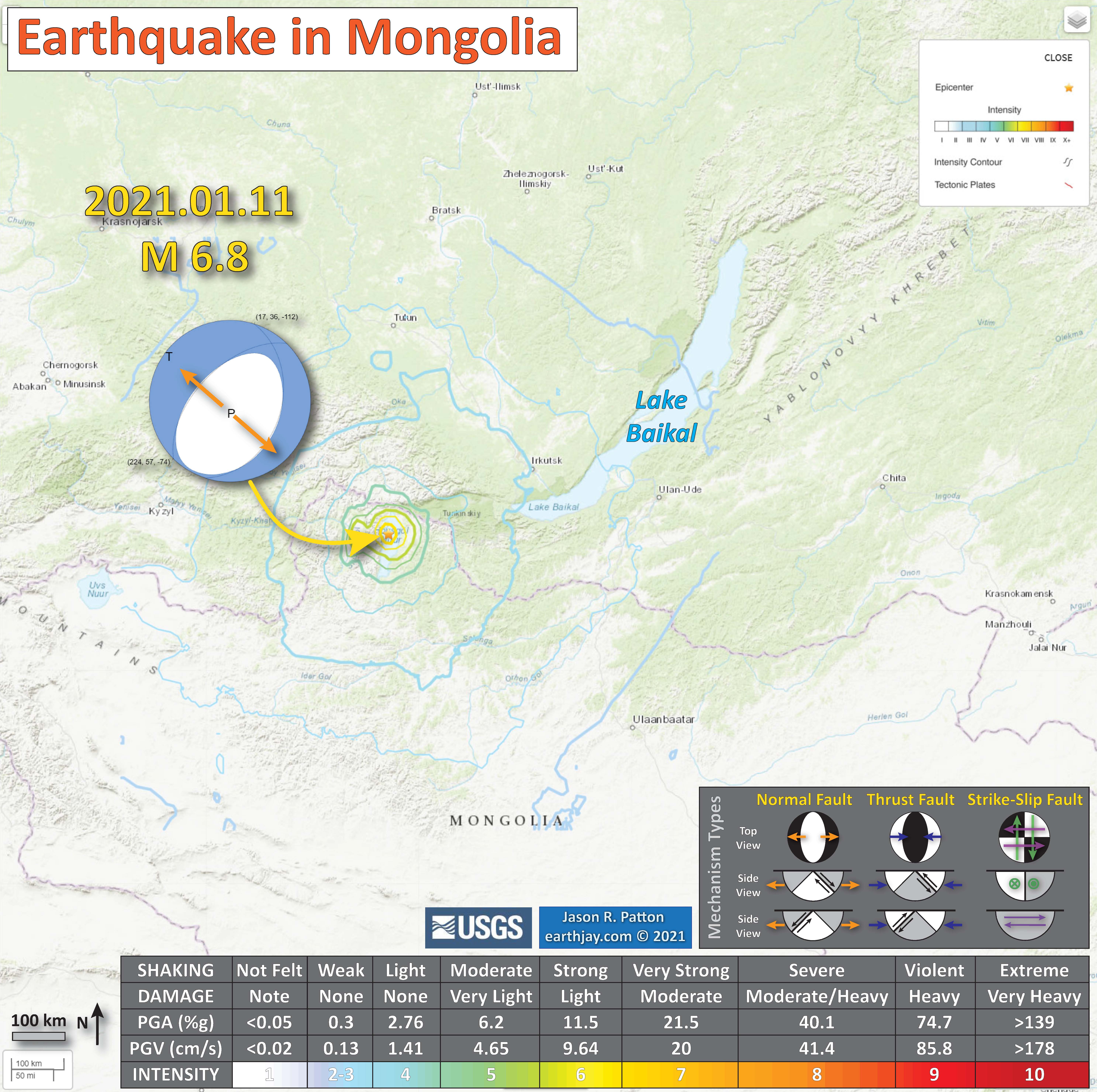
- 2021.01.11 M 6.8 Mongolia
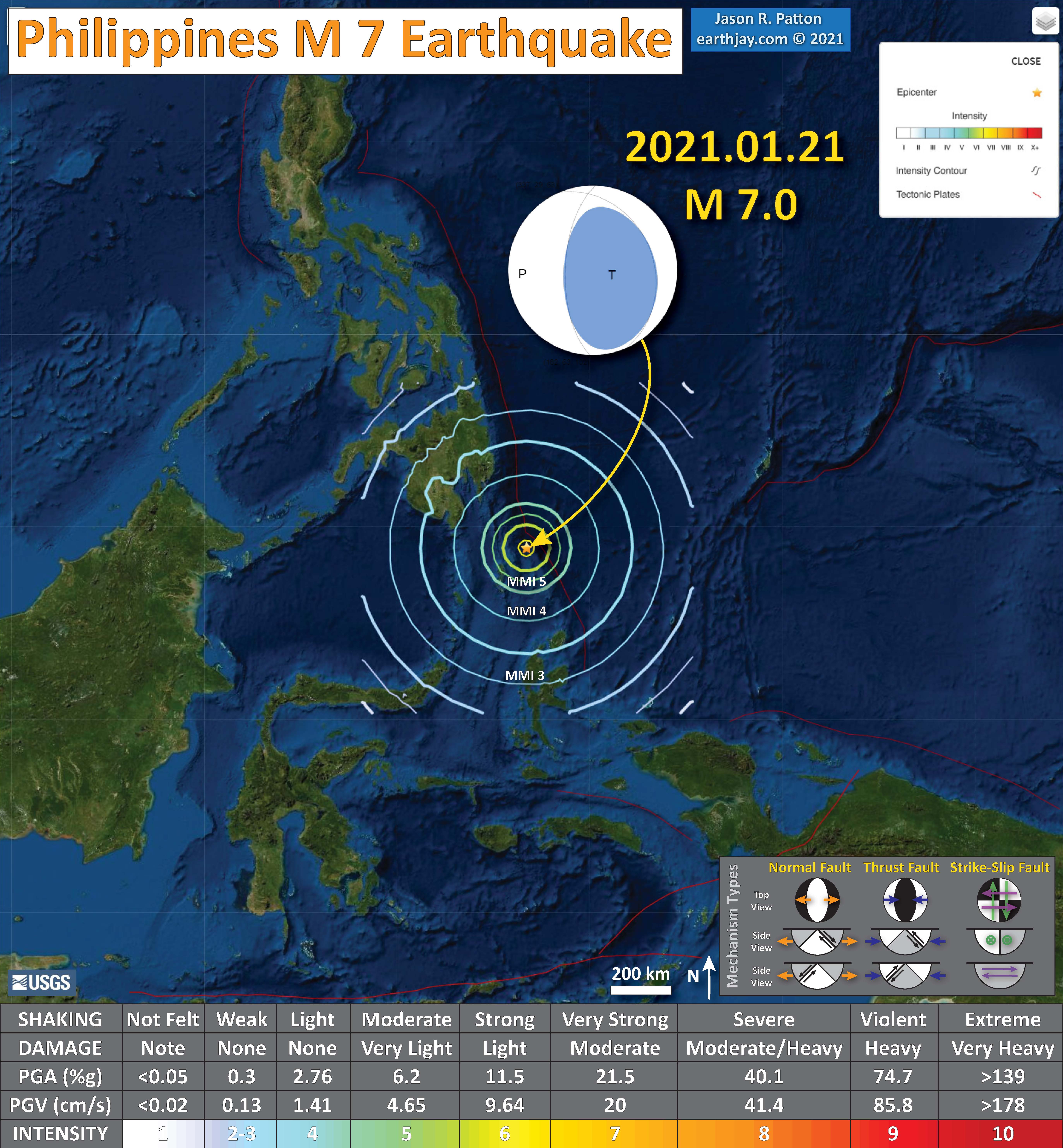
- 2021.01.21 M 7.0 Philippines
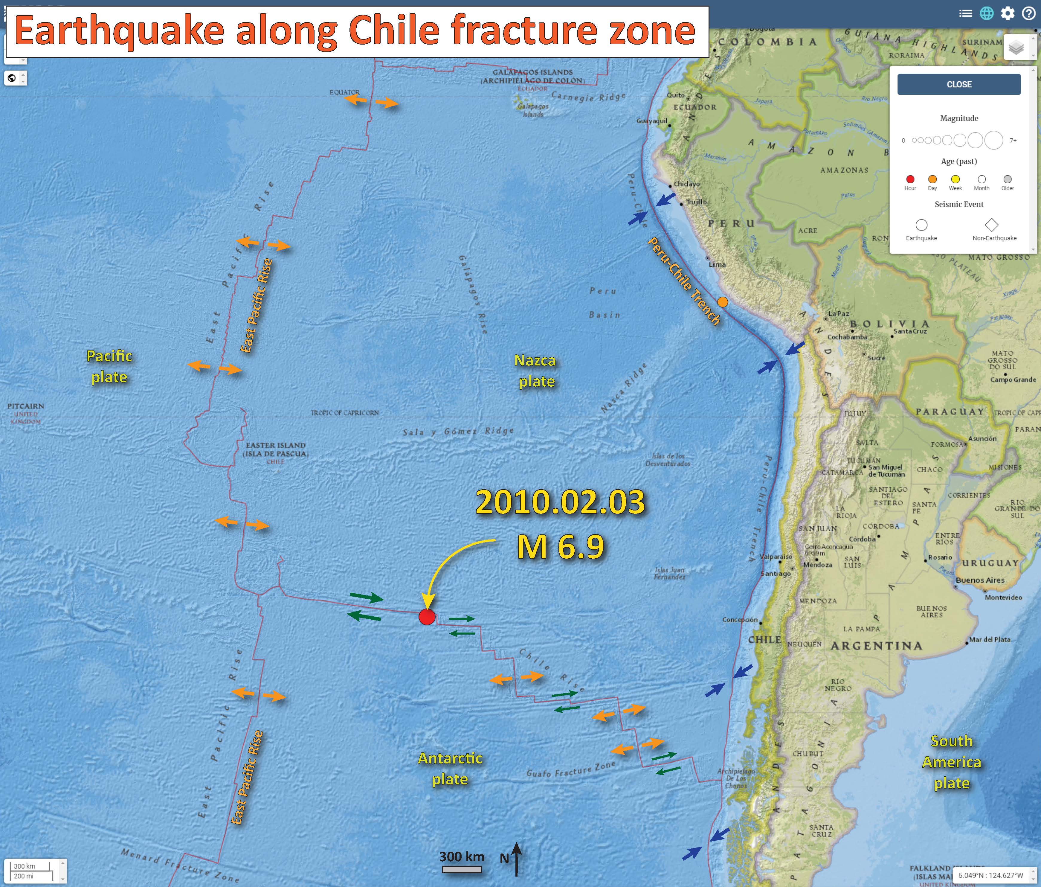
- 2021.02.03 M 6.7 Easter Isle
- 2021.02.10 M 7.7 Loyalty Islands
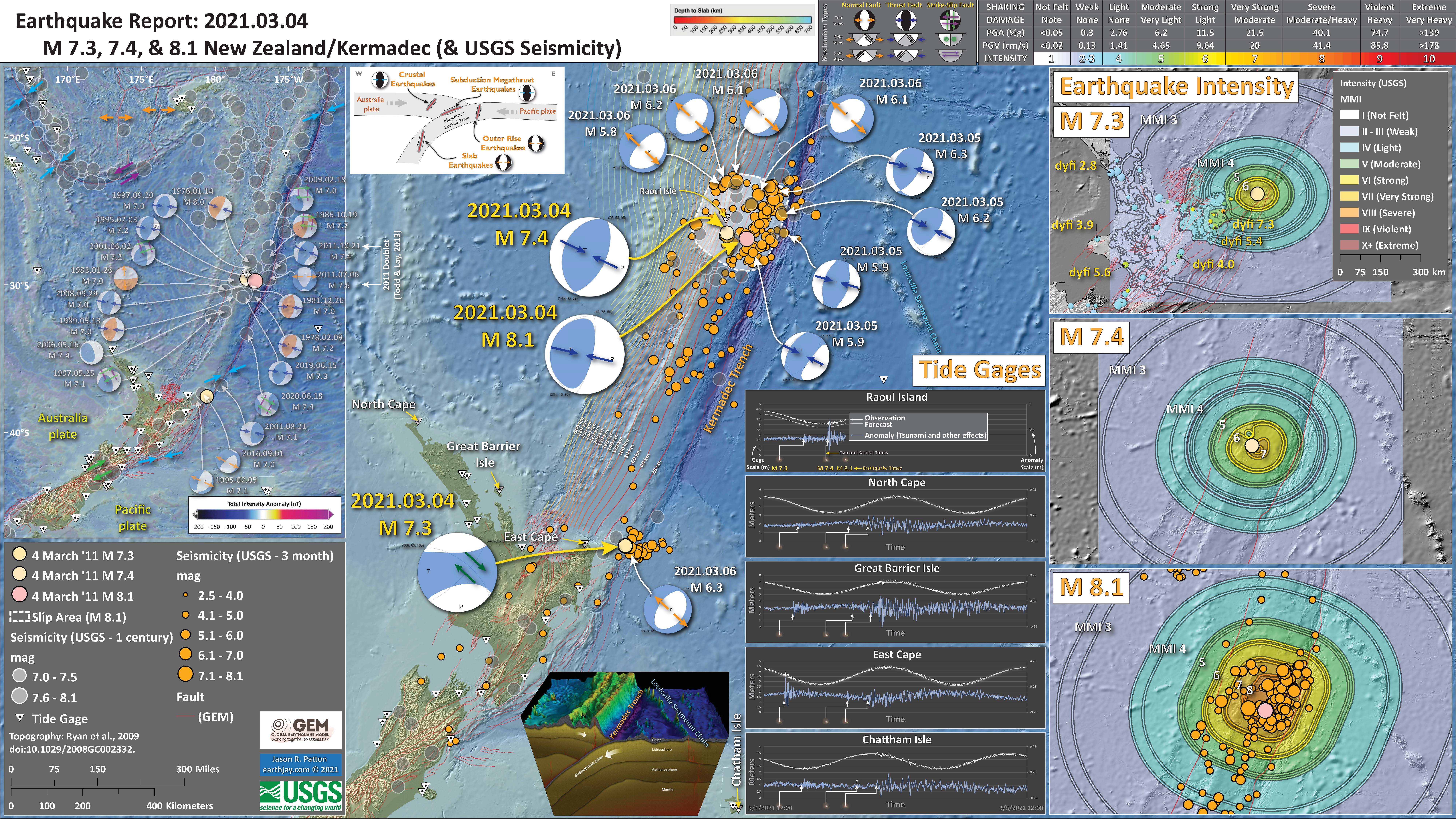
- 2021.03.04 M 8.1 Kermadec
- 2021.05.21 M 7.3 China
- 2021.07.21 M 6.7 Panama
- 2021.07.23 M 6.7 Philippines
- 2021.07.29 M 8.2 Alaska
- 2021.08.11 M 7.1 Philippines
- 2021.08.12 M 8.2 South Sandwich Islands
- 2021.08.14 M 6.9 Alaska
- 2021.08.14 M 7.2 Haiti
- 2021.08.18 M 6.9 Vanuatu
- 2021.09.08 M 7.0 Mexico
- 2021.11.28 M 7.5 Peru
Annual Summary Poster
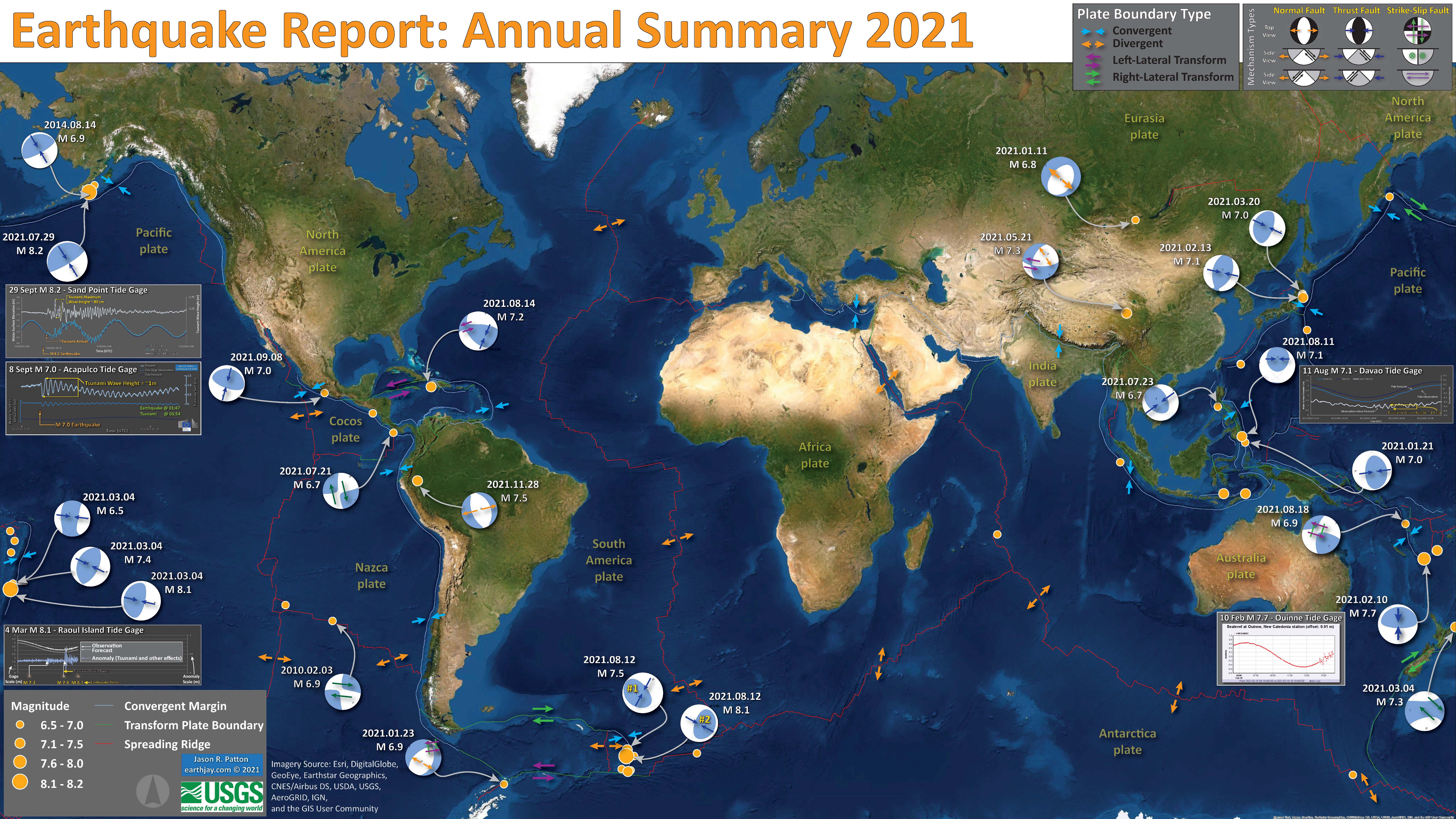
- I plot the earthquake mechanisms and epicenters for all earthquake events for which I have created interpretive posters below.
- Click on this map, or any map or figure, to see a larger and higher resolution version of the map or figure. These files are larger in file size.
- If anyone wants me to add their summary, just send me an email to quakejay at gmail.com
Other Annual Summaries
And that's a wrap. 18 M>7 earthquakes in 2021, 3 of which were M>8. The deadliest quake of 2021: the M7.2 Nippes, Haiti earthquake. Not unusual, for the deadliest quake to be M7ish: moderately large quakes pack quite a punch, and are more common than very large quakes. pic.twitter.com/4bMgjecqM0
— USGS Earthquakes (@USGS_Quakes) December 31, 2021
#EarthquakeImpactDatabase 2021, preliminary final statistics:
295 damaging #earthquakes, 2447 casualties, 21630 injuries, ~1 mio people displaced and ~490,000 buildings damaged. 65 countries affected. @risklayer @CATnewsDE @LukasRentz @CarlosRoblesBNO @robechikito @LastQuake 1/3 pic.twitter.com/qb0nQtrScu— Jens Skapski (@JensSkapski) December 31, 2021
4000+ earthquakes were located across #Canada in 2021 but only ~30 were felt. Including:
14 Feb. M3.9 Banffhttps://t.co/DE4KbEpzJJ
17 May M3.9 Montrealhttps://t.co/hsEyVpa5n5
20 Oct. M4.2 West-central Albertahttps://t.co/Im6Lfss4w5
17 Dec. M3.8 Victoriahttps://t.co/wspEhDcq98 pic.twitter.com/mLZxzeSWMz— John Cassidy (@earthquakeguy) December 30, 2021
List and maps of largest 20 #earthquakes in 2021https://t.co/tOQks1AXrI
— Earthquake Monitor (@EQAlerts) January 1, 2022
Lori Dengler | The global earthquake story of 2021 https://t.co/D33sgJL22F
— Times-Standard (@eurekaTS) January 2, 2022
Return to the Earthquake Reports page.
- Sorted by Magnitude
- Sorted by Year
- Sorted by Day of the Year
- Sorted By Region
Interpretive Poster Background
These Interpretive Posters all contain slightly different types and amounts of information. Below is a general guidance to what this information is. Earthquake Report pages can provide additional information about each individual interpretive interrogation.
- I plot the seismicity from the past month, with diameter representing magnitude (see legend). I may include historic earthquake epicenters with magnitudes M ≥ some magnitude threshold.
- I include background information from published papers as inset figures on the interpretive posters. Learn more about these figures in their associated Earthquake Report.
- I plot the USGS fault plane solutions (moment tensors in blue and focal mechanisms in orange), possibly in addition to some relevant historic earthquakes.
- A review of the basic base map variations and data that I use for the interpretive posters can be found on the Earthquake Reports page.
- Some basic fundamentals of earthquake geology and plate tectonics can be found on the Earthquake Plate Tectonic Fundamentals page.
See all 2021 Earthquake Reports and Interpretive Posters sorted by time:
If there is an existing Earthquake Report Page, the magnitude and earthquake location will be a link in light green. Click on that link to go to the Earthquake Report Page.
-
2021.01.11 M 6.8 Mongolia – tweet map
https://earthquake.usgs.gov/earthquakes/eventpage/us7000d20e/executive
-
2021.01.21 M 7.0 Philippines – tweet map
https://earthquake.usgs.gov/earthquakes/eventpage/us7000d20e/executive
-
2021.02.03 M 6.7 Easter Isle – tweet map
https://earthquake.usgs.gov/earthquakes/eventpage/us6000de34/executive
-
2021.02.10 M 7.7 Loyalty Islands
I don’t always have the time to write a proper Earthquake Report. However, I prepare interpretive posters for these events. This is an example of an Earthquake Report “Lite.”
https://earthquake.usgs.gov/earthquakes/eventpage/us6000dg77/executive
- Here is the map with a month’s seismicity plotted.

-
2021.03.04 M 8.1 Kermadec
Here is another Earthquake Report “Lite.”
- https://earthquake.usgs.gov/earthquakes/eventpage/us7000dffl/executive M 7.3
- https://earthquake.usgs.gov/earthquakes/eventpage/us7000dfk3/executive M 7.4
- https://earthquake.usgs.gov/earthquakes/eventpage/us7000dflf/executive M 8.1
- https://earthquake.usgs.gov/earthquakes/eventpage/us7000dfq2/executive M 6.5
- https://earthquake.usgs.gov/earthquakes/eventpage/us7000eeq4/executive M 6.5
- Here is the map with a month’s seismicity plotted.
-
2021.05.21 M 7.3 China
Wow, we are lucky that a region of central China is sparsely populated because this M 7.3 earthquake could have caused many more to suffer.
https://earthquake.usgs.gov/earthquakes/eventpage/us7000e54r/executive
- In the upper left corner is a plate tectonic map that shows the major faults, plates, and plate boundaries. The Gray arrows show the ways the plates are moving (compare with the Extrusion Tectonics figure).
- Below that tectonic map is the photo of the Tapponier et al. (1982) experiment on the left and a map showing the faults that really exist that match faults from the model.
- On the right is a diagram that shows the evolution of faulting in the region that are the result of changes in driving forces (e.g. broad scale tectonic plate motions and how their relative motions cause different types of faults at different times; also that these older faults remain and may be reactivated as different types of faults later (Staisch et al., 2020).
- In the lower left center is a map that has red and blue arrows (Tayler and Lin, 2009). These arrows represent places that are moving as measured by GPS observations. The orientation of the arrow shows the direction the plate is moving relative to “stable” Eurasia (data are from Zhang et al., 2004). I place a yellow star in the location of the M 7.5 epicenter.
- In the upper left-center there is a map that shows some of the mapping of faults in the area (Chen Xia et al., 2011). The Kunlun fault is the main fault line with a thicker width. I place a yellow star in the location of the M 7.5 epicenter.
- In the upper right corner are maps that display data from the USGS event page. On the left is the modeled landslide probability for this earthquake. On the right is a map that shows the susceptibility (chance of) liquefaction from this M 7.3 earthquake. The headwaters of the Yellow River feed the lakes to the west of the earthquake and this river valley is where the Maduo Grande fault is mapped.
- In the lower right corner is a map that shows the earthquake shaking intensity modeled for this earthquake. The colors use the Modified Mercalli Intensity scale (MMI), which is listed in the upper right margin (compare the numbers on the map with the data in the table). I also plot the aftershocks here to show how they relate to the mapped fault.
I include some inset figures. Some of the same figures are located in different places on the larger scale map below.
- Here is the map with 3 month’s seismicity plotted.

- Below is the liquefaction susceptibility and landslide probability map (Jessee et al., 2017; Zhu et al., 2017). Please head over to that report for more information about the USGS Ground Failure products (landslides and liquefaction). Basically, earthquakes shake the ground and this ground shaking can cause landslides. We can see that there is a low probability for landslides. However, we have already seen photographic evidence for landslides and the lower limit for earthquake triggered landslides is magnitude M 5.5 (from Keefer 1984)
- I use the same color scheme that the USGS uses on their website. Note how the areas that are more likely to have experienced earthquake induced liquefaction are in the valleys. Learn more about how the USGS prepares these model results here.

-
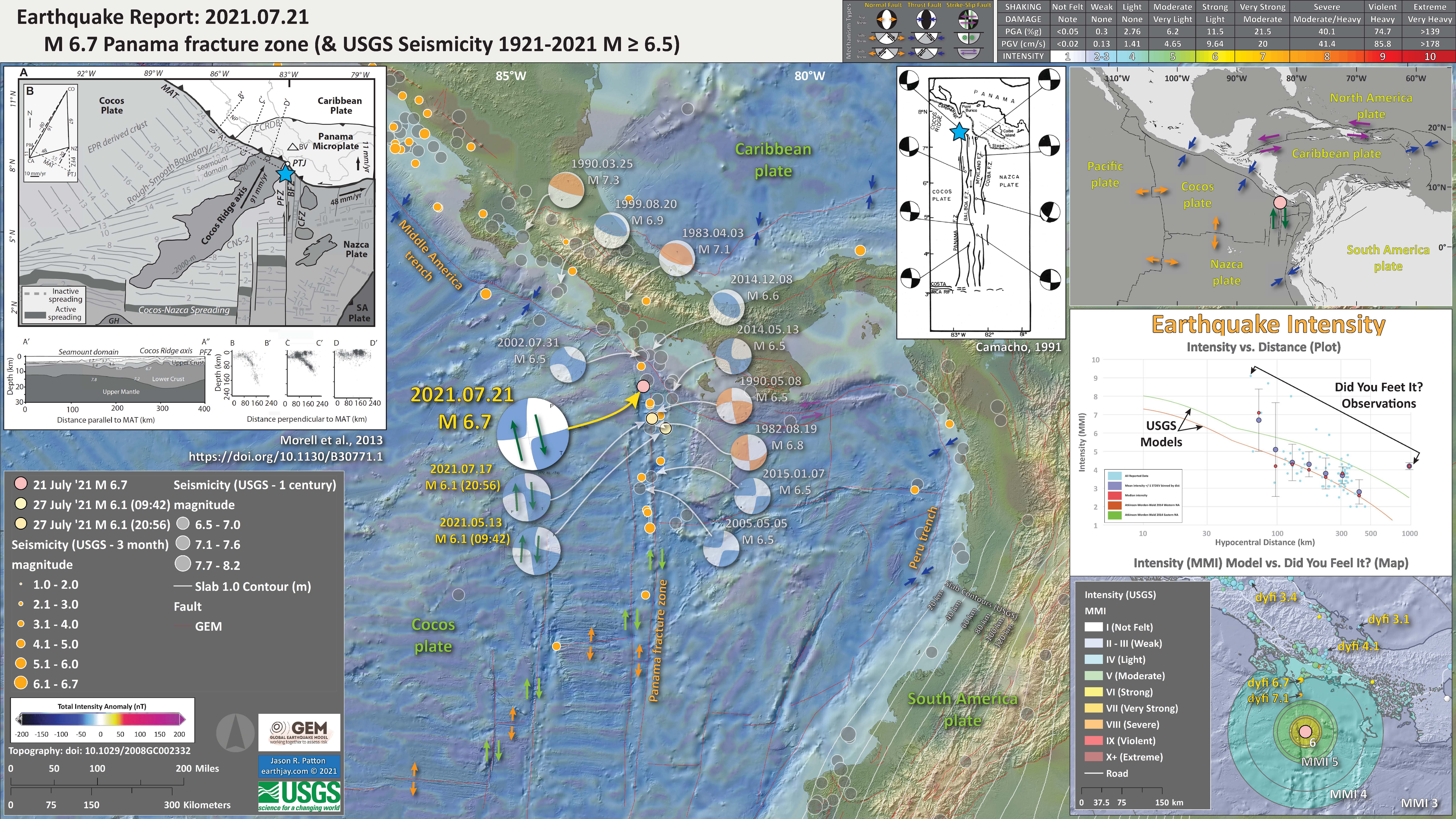
2021.07.21 M 6.7 Panama
Here is another Earthquake Report “Lite.”
https://earthquake.usgs.gov/earthquakes/eventpage/us6000exs5/executive
I include some inset figures.
- Here is the map with a month’s seismicity plotted.
-
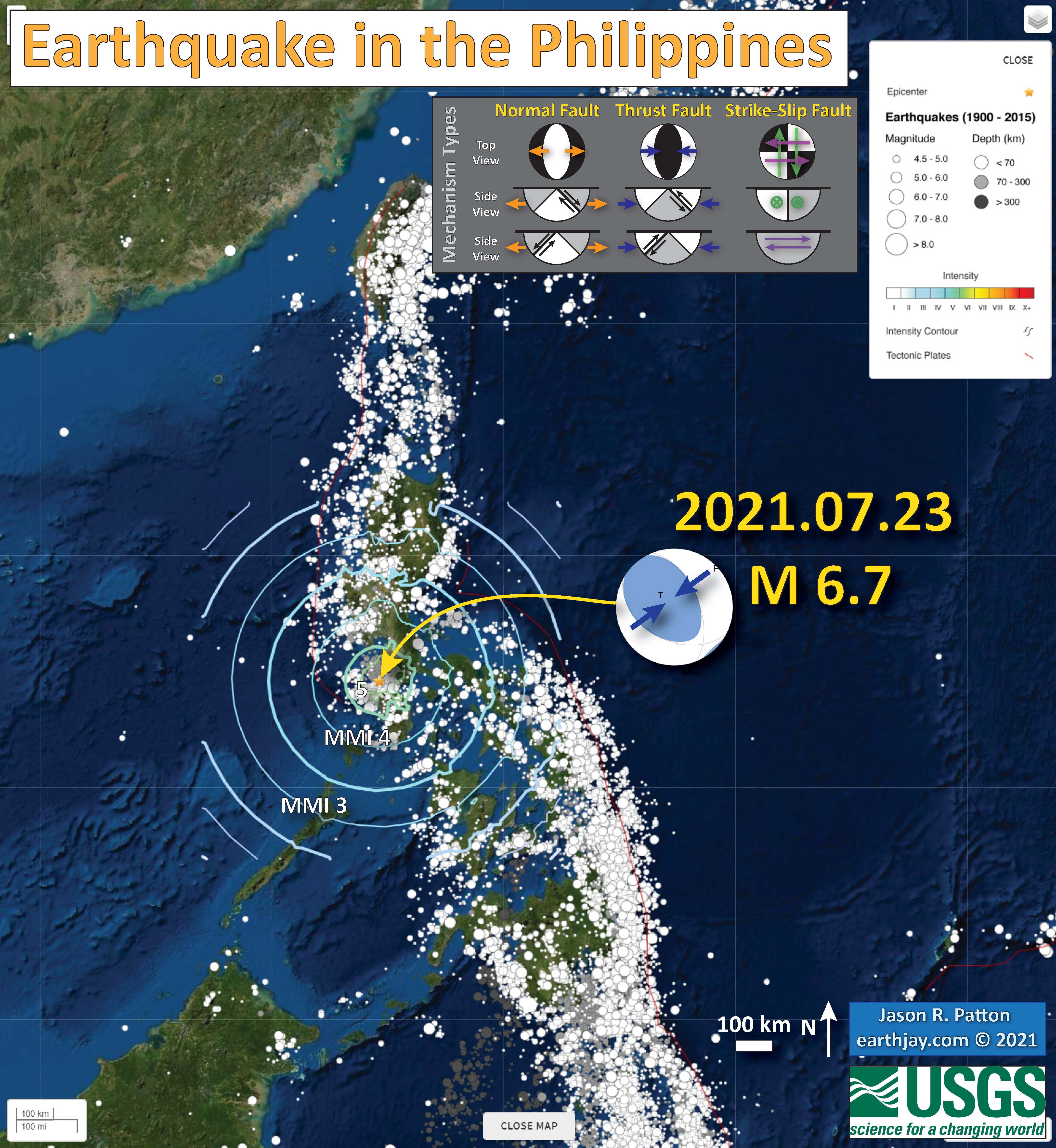
2021.07.23 M 6.7 Philippines – tweet map
https://earthquake.usgs.gov/earthquakes/eventpage/us6000eyfk/executive
-
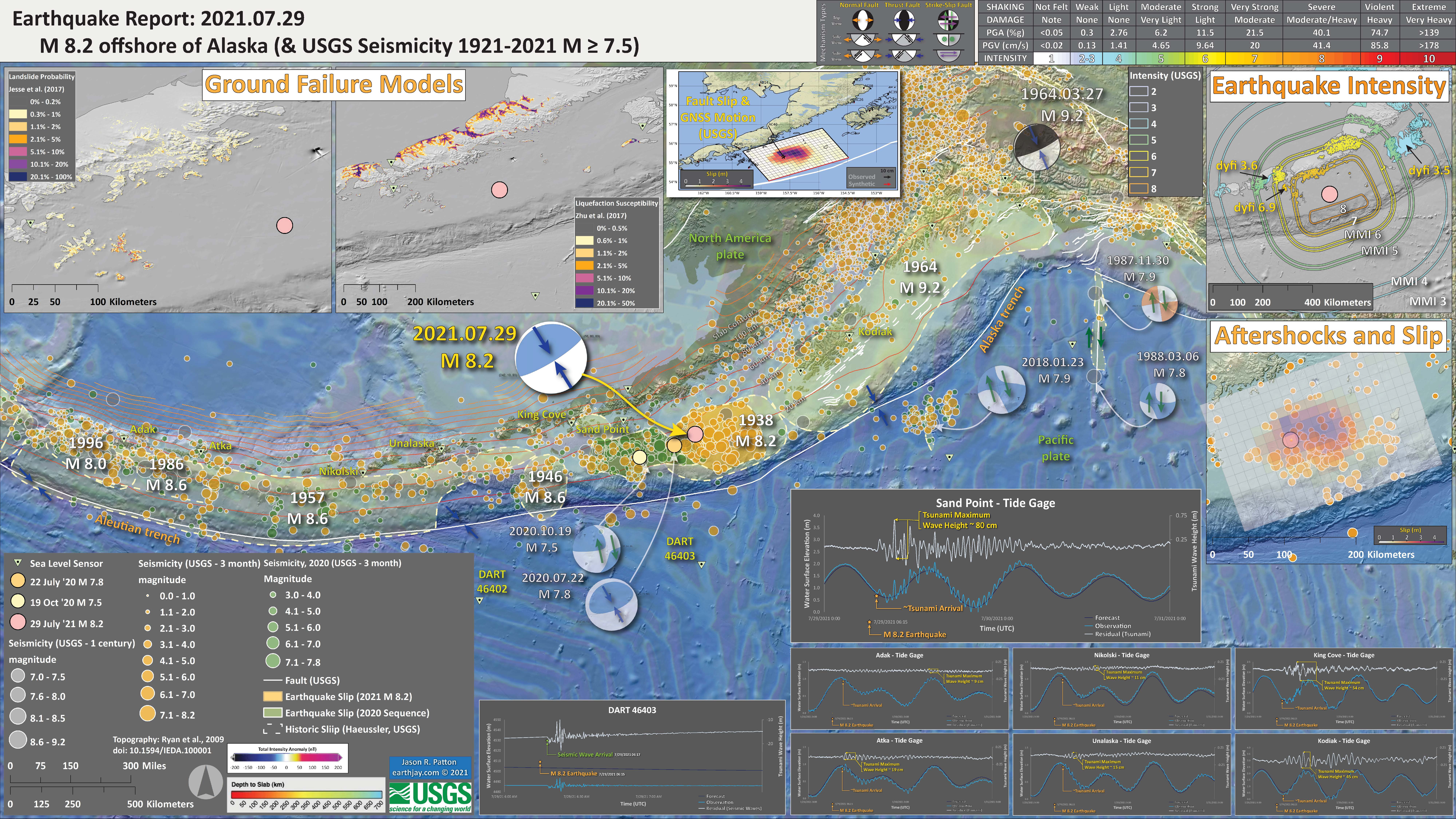
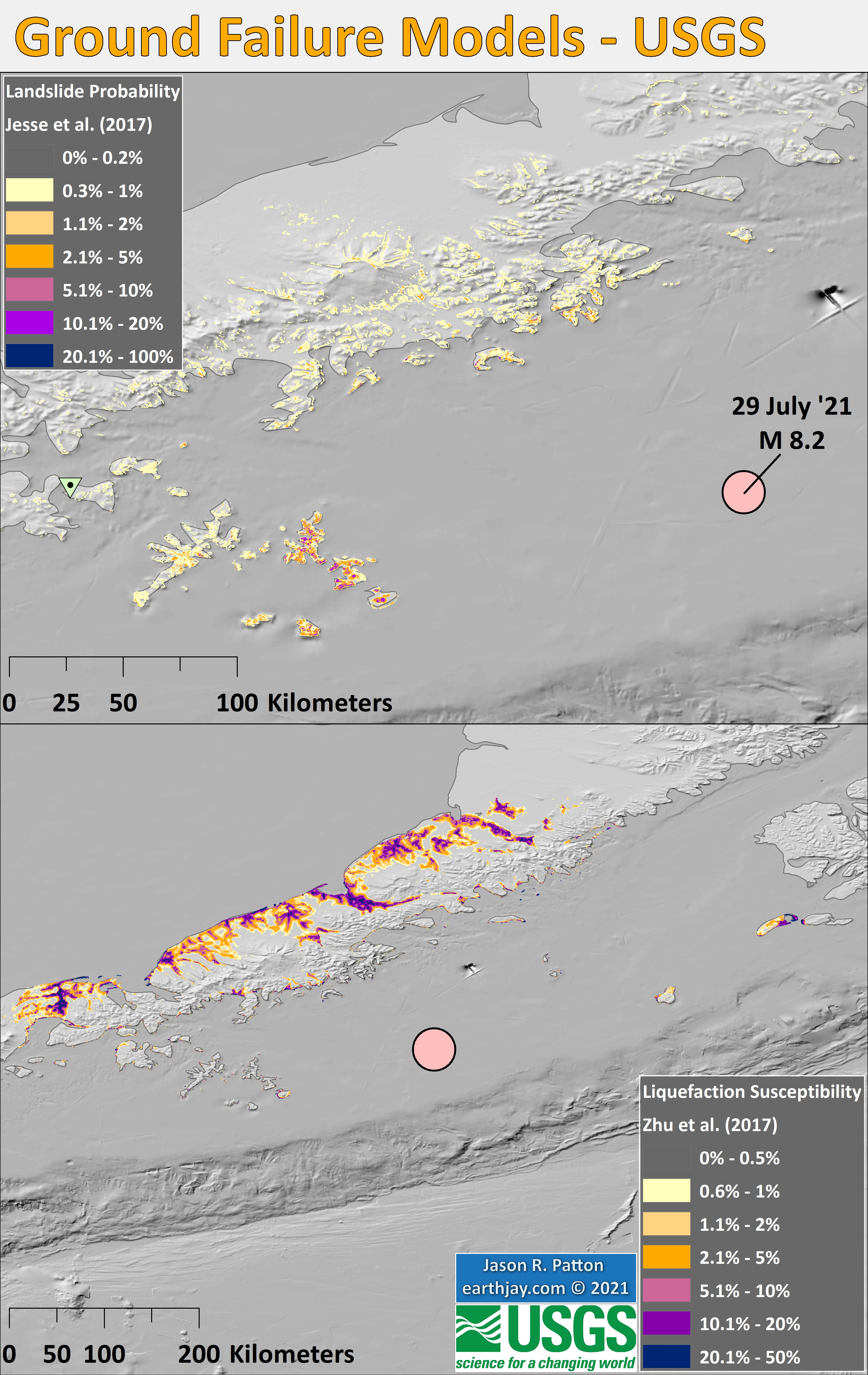
2021.07.29 M 8.2 Alaska
A few days ago, I was passed out on my couch (sleep apnea) and for some reason I awoke and noticed that I had gotten a CSEM notification of a large earthquake offshore of Alaska. Well, after looking into that, I sent my boss, Rick, a text message: “8.2.”
https://earthquake.usgs.gov/earthquakes/eventpage/us6000f02w/executive
- I prepared a 3rd poster, but updated it to this 4th poster.
- In the Intensity Data area, I added USGS “Did You Feel It?” data, which come from reports from real people. Learn more about dyfi here. The model data are the colored lines labeled in white and the dyfi data are colored polygons labeled in yellow.
- In the aftershocks plot, I added epicenters from the several days after the mainshock. I also added a transparent overlay of the USGS finite fault model (the slip model). Compare the overlap, or non-overlap, of the slip region and the aftershocks. Why do you think that they are not completely overlapping?
- In the lower right section are tide gage records from gages in the area included in the poster. I plot the tidal forecast (dark blue), the tide gage observed water surface elevation (medium blue), and the difference between these data (in light blue) which is a record of the tsunami (and other waves, like wind waves). I made a rough approximation estimate of the maximum wave height and labeled this in yellow. The San Point tide gage has a mx wave height of about 0.8 m!
- I also plot the data from the DART buoy 46403, which is the closest DART buoy to the mainshock epicenter. The DART buoy network is used to help calibrate tsunami forecast models during tsunami events. These are basically pressure transducers on the seafloor that measure changes in pressure caused by waves and atmospheric processes. The data plotted here are not tsunami data, but seismic wave data. One reason we know that this is not a tsunami is that the waveform initiated about 3 minutes after the earthquake. A tsunami would take longer to get to the buoy.
- In the upper left corner is a pair of maps that show USGS earthquake induced ground failure models. The map on the right shows what areas have likelihood of having landslides triggered by the 2021 M 8.2 earthquake. The panel on the right shows the possibility that areas might experience liquefaction induced by the earthquake.
- I added aftershocks associated with the 2020 M 7.8/7.5 sequence that filled the Shumagin Gap (green circles) and outlined the aftershock region for both 2020 and 2021 sequences. The 2021 sequence is not yet over. The largest aftershock so far has only been M 6.1. The 1938 M 8.2 event had a M~7 event 5 days after the mainshock. Stay tuned?
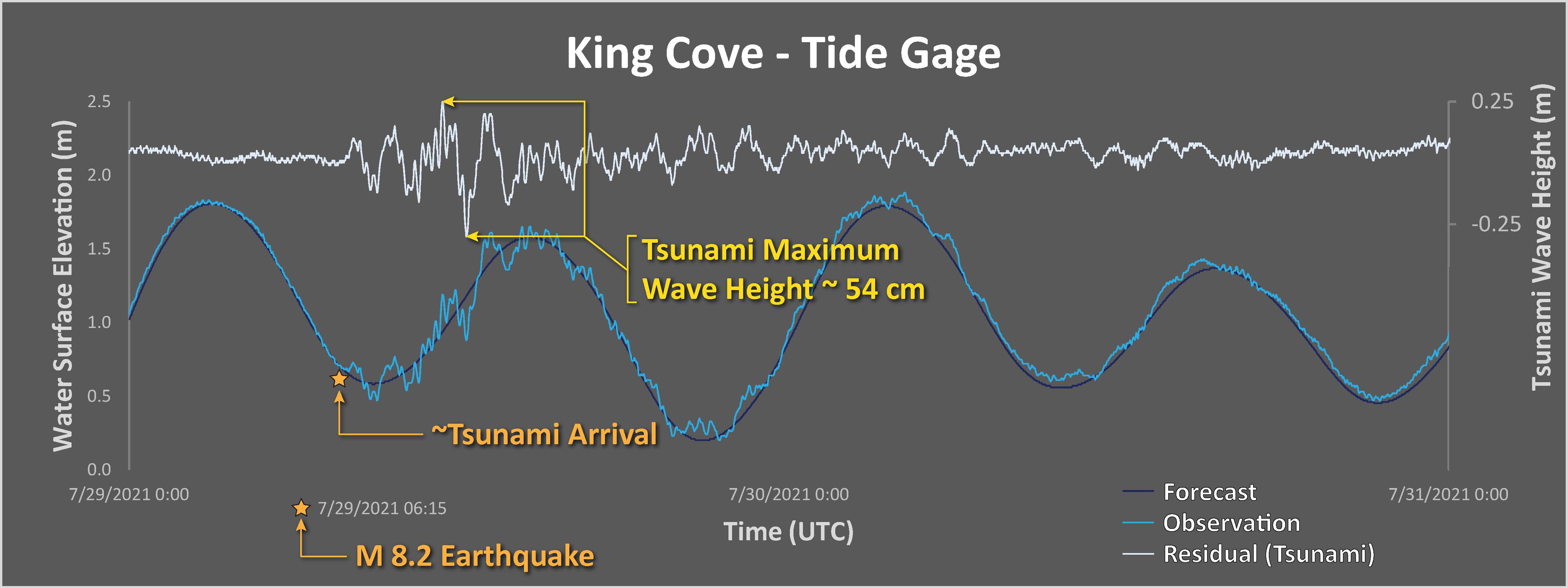
I plot tide gage data for gages in the north and northeast Pacific Ocean. These data are from NOAA Tides and Currents, though are also available via the eu tide gage website here.
-
Each plot includes three datasets:
- The tidal forecasts are shown as a dark blue line.
- The actual observed water surface elevation is plotted in medium blue.
- By removing (subtracting) the tide forecast from the observed data, we get the signal from wind waves, tsunami, and atmospheric phenomena. This residual is plotted in light blue.
The scale for the tsunami wave height is on the right side of the chart.
Note the all tsunami wave height plots are the same vertical scale, except for Sand Point.
I measured the largest wave heights for each site, displayed in yellow.
- Below is the liquefaction susceptibility and landslide probability map (Jessee et al., 2017; Zhu et al., 2017). Please head over to that report for more information about the USGS Ground Failure products (landslides and liquefaction). Basically, earthquakes shake the ground and this ground shaking can cause landslides.
- I use the same color scheme that the USGS uses on their website. Note how the areas that are more likely to have experienced earthquake induced liquefaction are in the valleys. Learn more about how the USGS prepares these model results here.
-
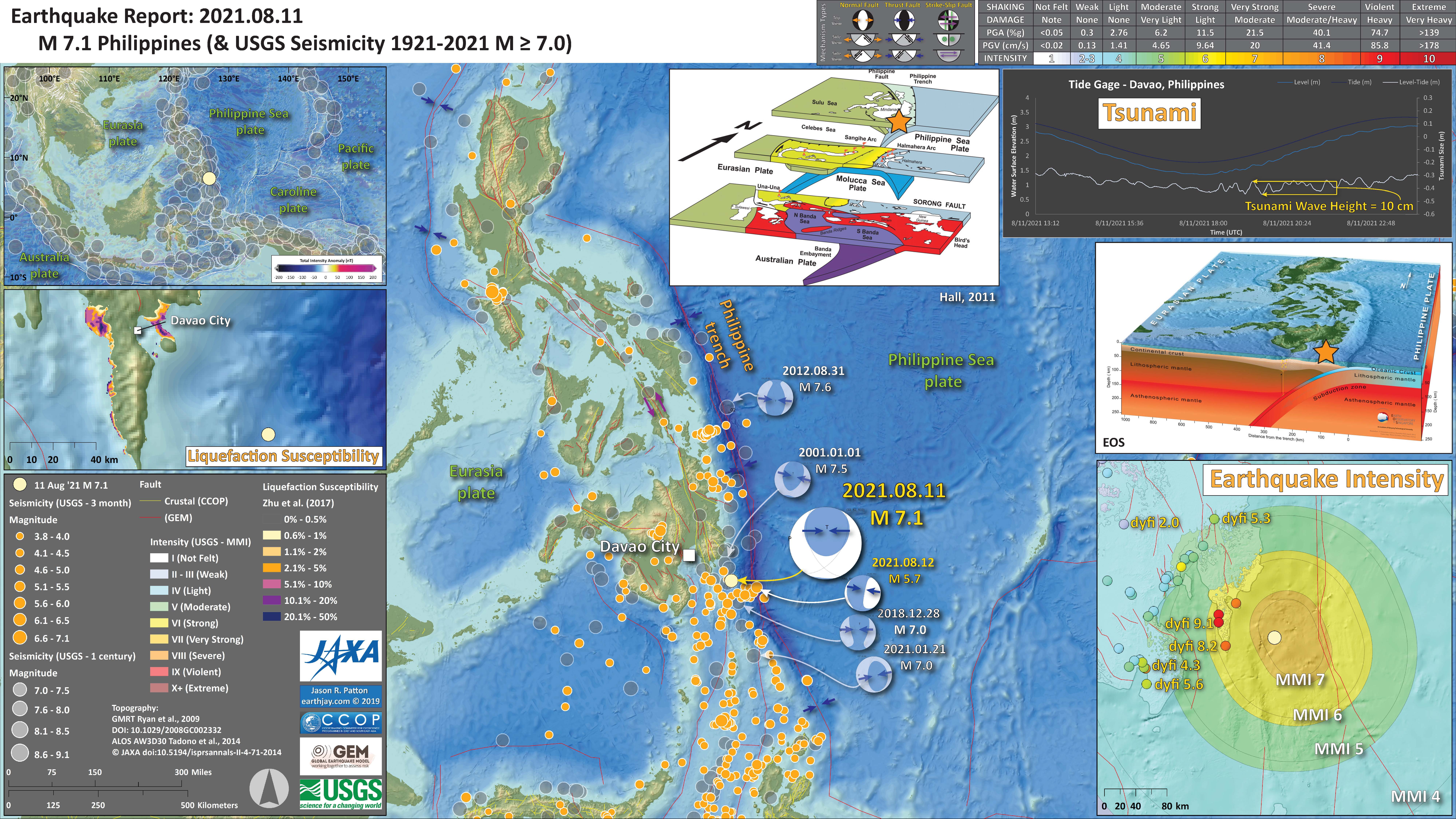
2021.08.11 M 7.1 Philippines
Here is another Earthquake Report “Lite.”
https://earthquake.usgs.gov/earthquakes/eventpage/us6000f48v/executive
I include some inset figures.
- Here is the map with a month’s seismicity plotted.
-
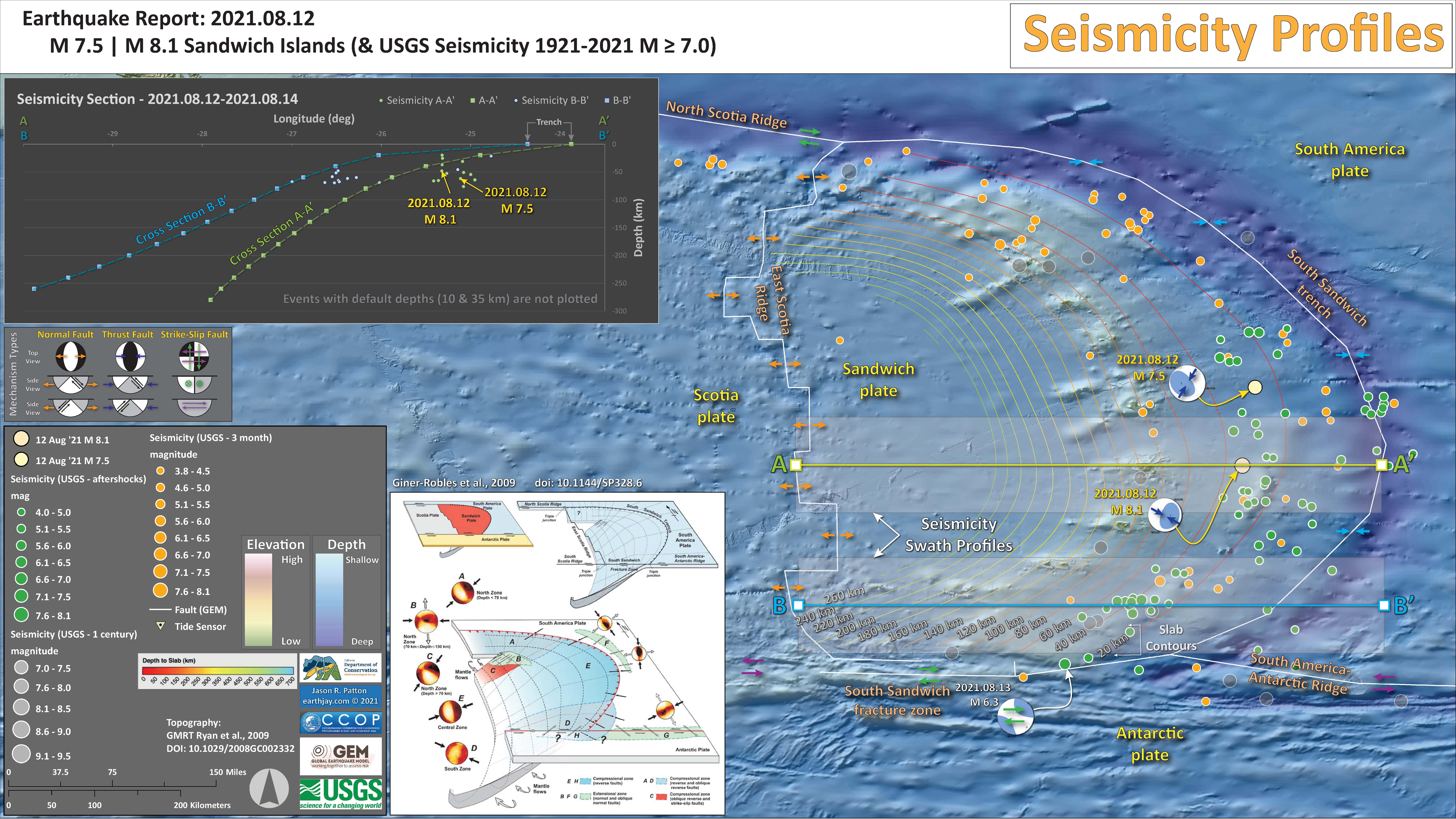
2021.08.12 M 8.2 South Sandwich Islands
Here is another Earthquake Report “Lite.”
https://earthquake.usgs.gov/earthquakes/eventpage/us6000f53e/executive
- In the upper left corner is a small scale plate tectonic map showing the major plate boundaries.
- Here is the map with 3 month’s (and a week’s) seismicity plotted.
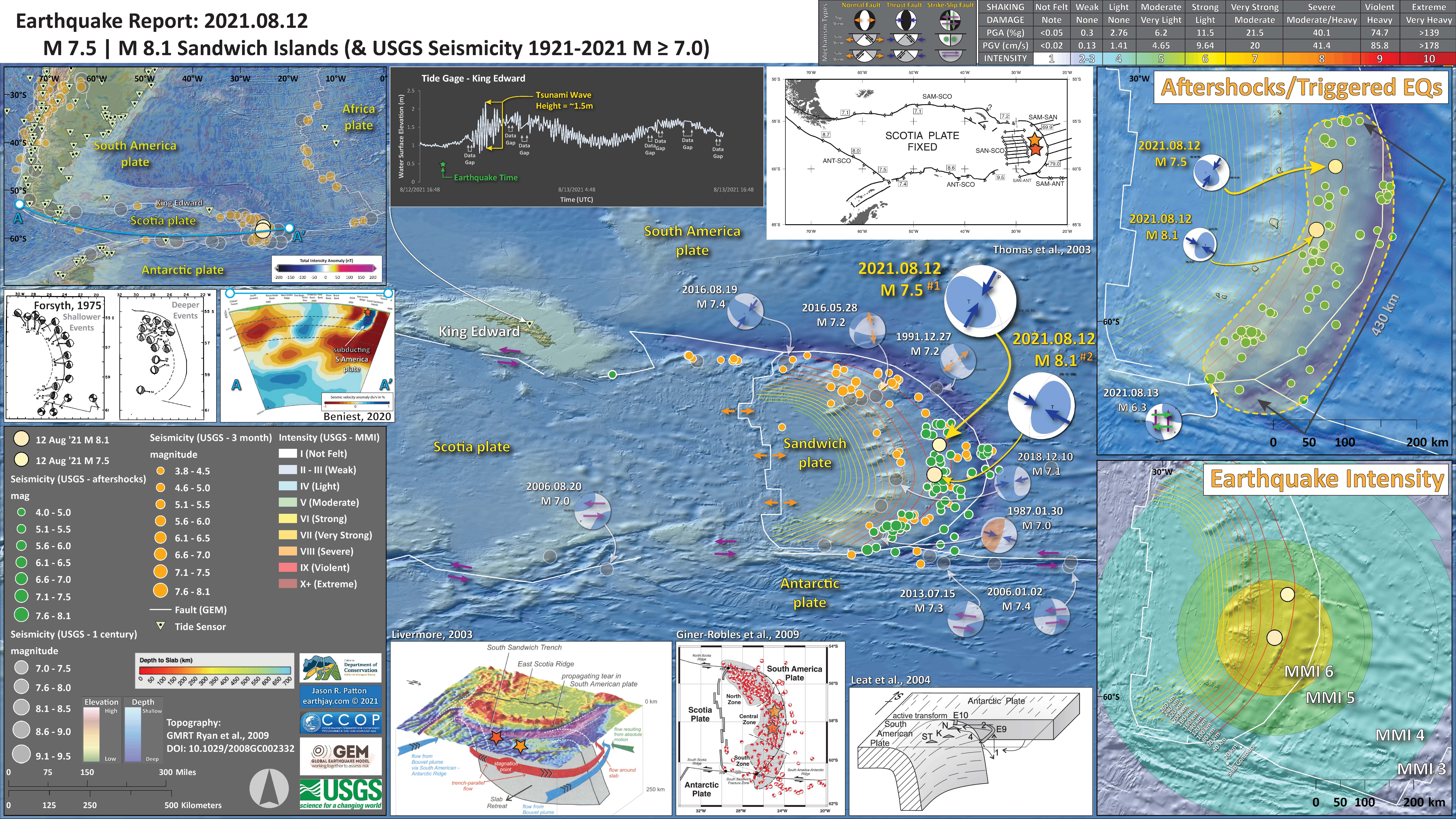
Seismicity Cross Sections
- Here is a map and cross section of the aftershocks.
Tide Gage Data
- Here are plot of the tide gage data from nearby gages.
-
2021.08.14 M 6.9 Alaska – tweet map
https://earthquake.usgs.gov/earthquakes/eventpage/us6000f652/executive
There were actually several large earthquakes over a short period of time.
-
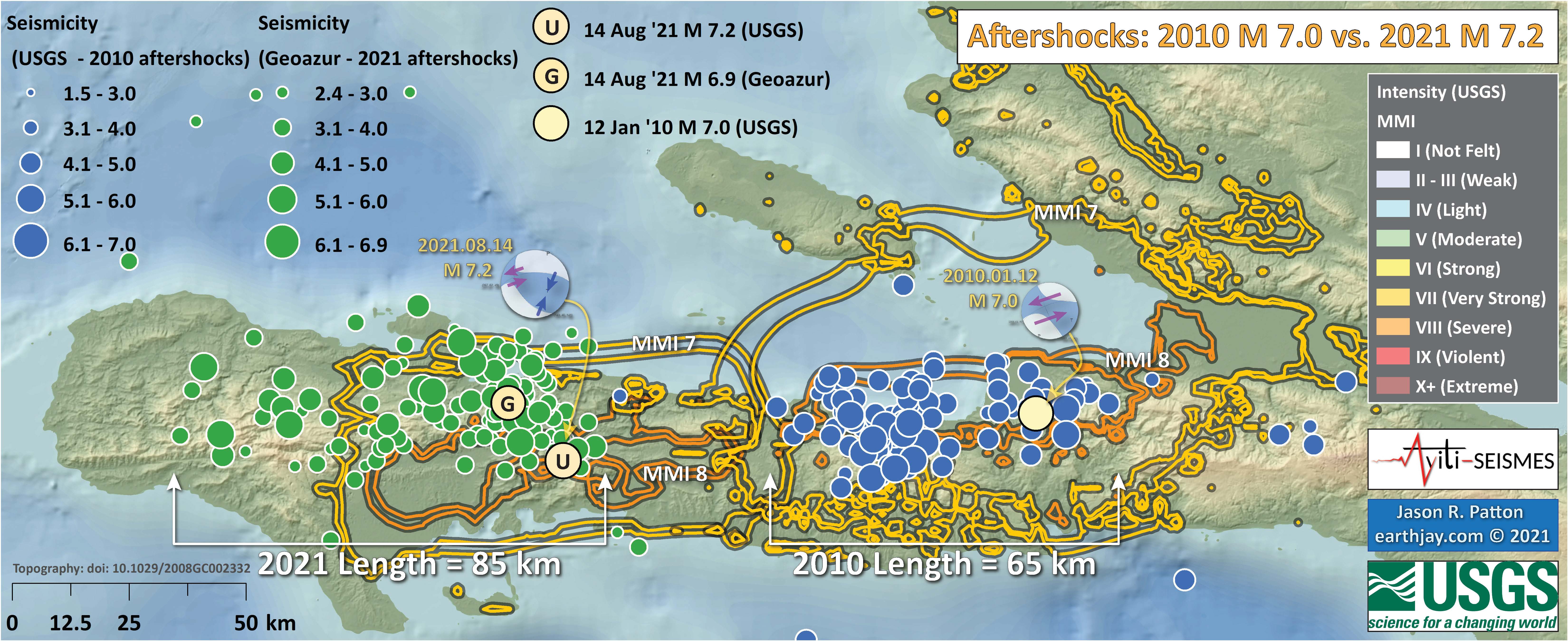
2021.08.14 M 7.2 Haiti
On 14 August ’21 there was a magnitude M 7.2 oblique strike-slip earthquake in Haiti. This earthquake was along the Enriquillo-Plantain Garden fault zone, which also ruptured in 2010. Here is my report for the 2010 Haiti earthquake (see more about the tectonics of this region of the world).
https://earthquake.usgs.gov/earthquakes/eventpage/us6000f65h/executive
- in the lower right corner is a small scale plate tectonic map.
- Above that map is a plot showing the USGS finite fault slip model. This shows the location of the fault and color represents how much the fault slipped during the earthquake.
- In the upper right corner is a map that compares the USGS earthquake intensity models (the contoured lines) with the USGS Did You Feel It? observations from real people.
- In the lower center is a map that shows the aftershocks from the M 7.2 earthquake and from the 2010 M 7.0 earthquake.
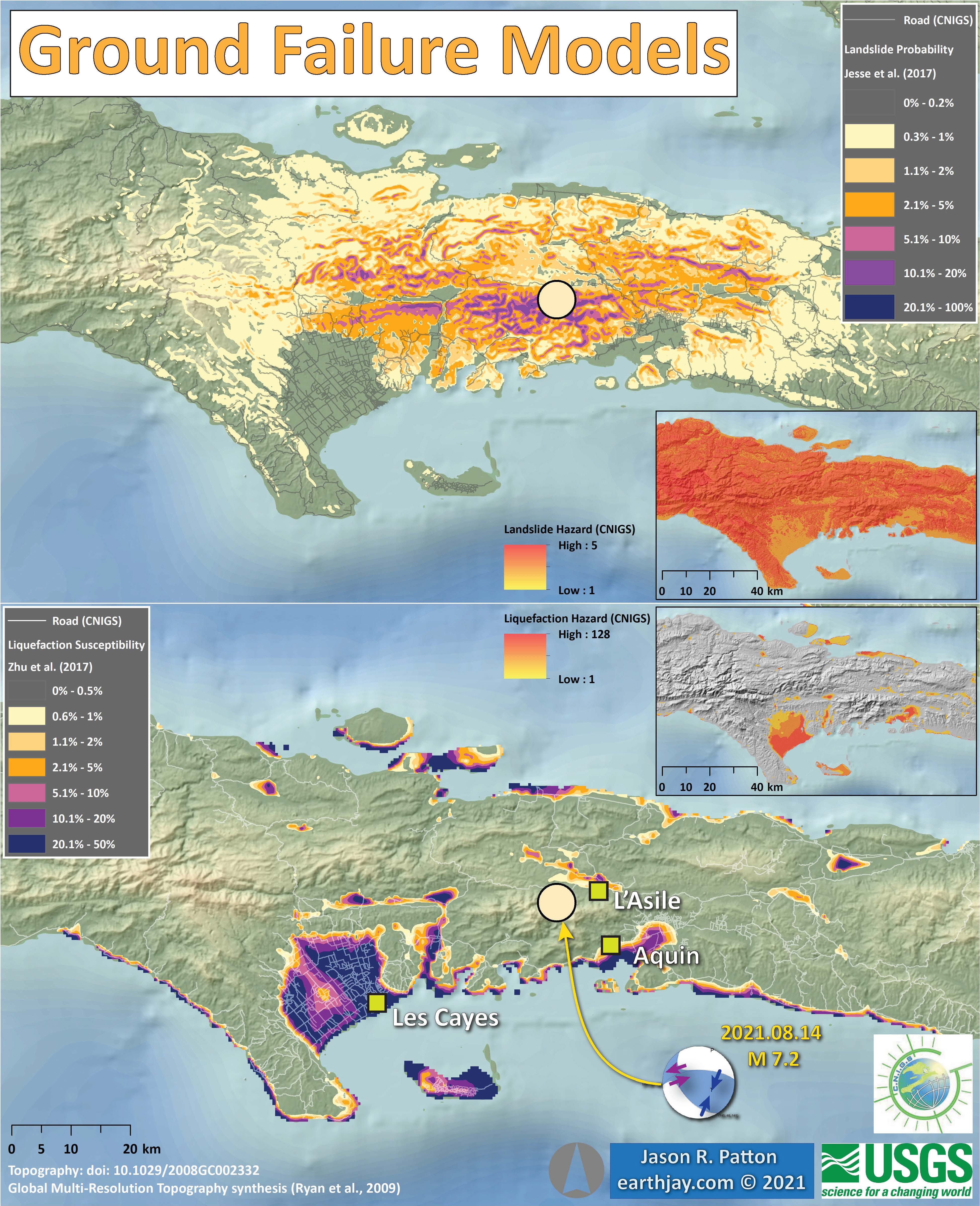
- In the upper left are two maps that show models of earthquake triggered landslides and earthquake induced liquefaction for this M 7.2 event. Read more about these models here.
- Here is the map with 3 month’s seismicity plotted.
- Below a map showing the aftershocks from the 2021 M 7.2 and 2010 M 7.0 Haiti earthquakes.
- Below are maps showing a comparison between the USGS modeled earthquake triggered landslides and liquefaction potential with the Centre Nationale De Information Géospatiale (CNIGS) probabilistic models of ground failure.
-
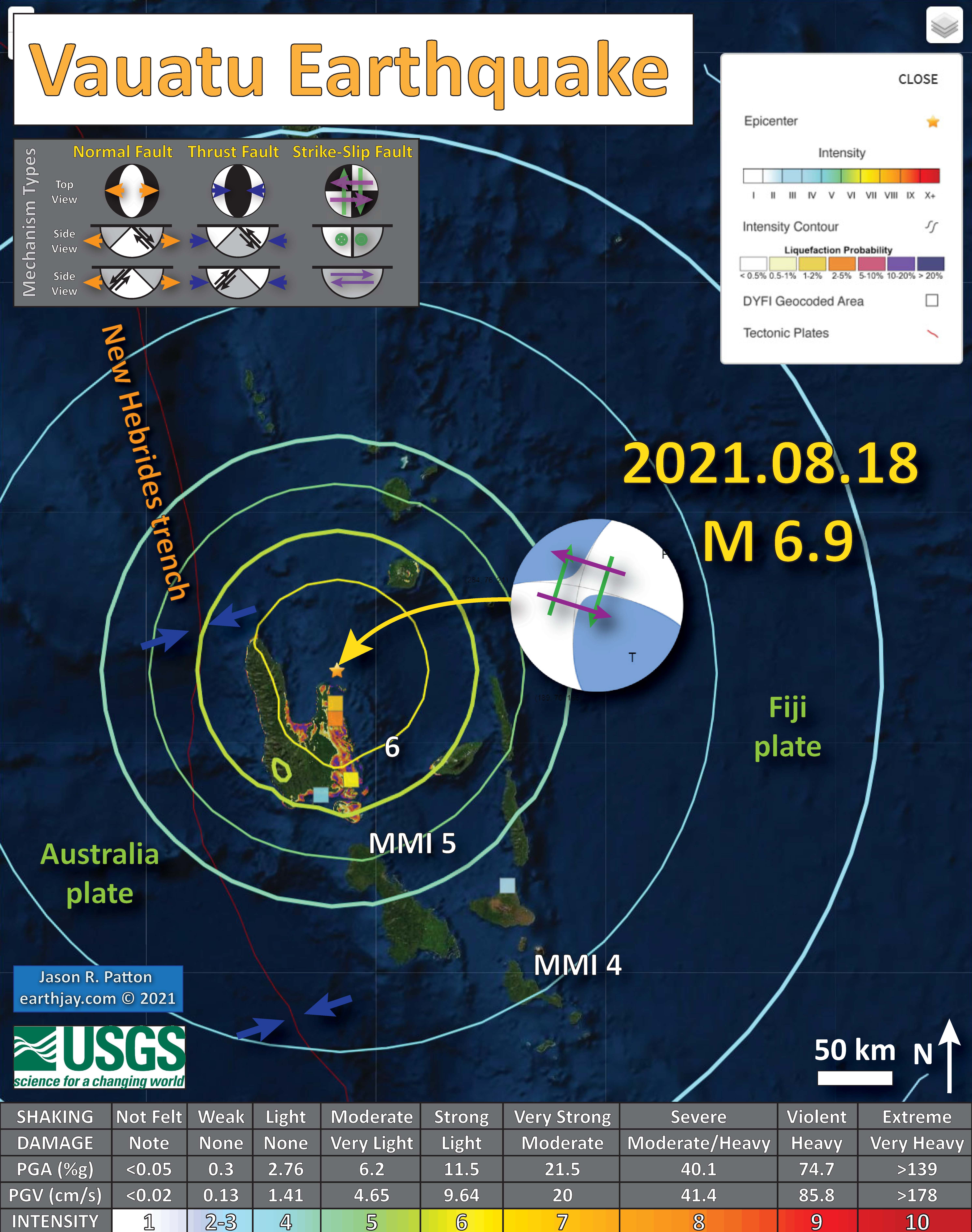
2021.08.18 M 6.9 Vanuatu – tweet map
https://earthquake.usgs.gov/earthquakes/eventpage/us6000f7vg/executive
-
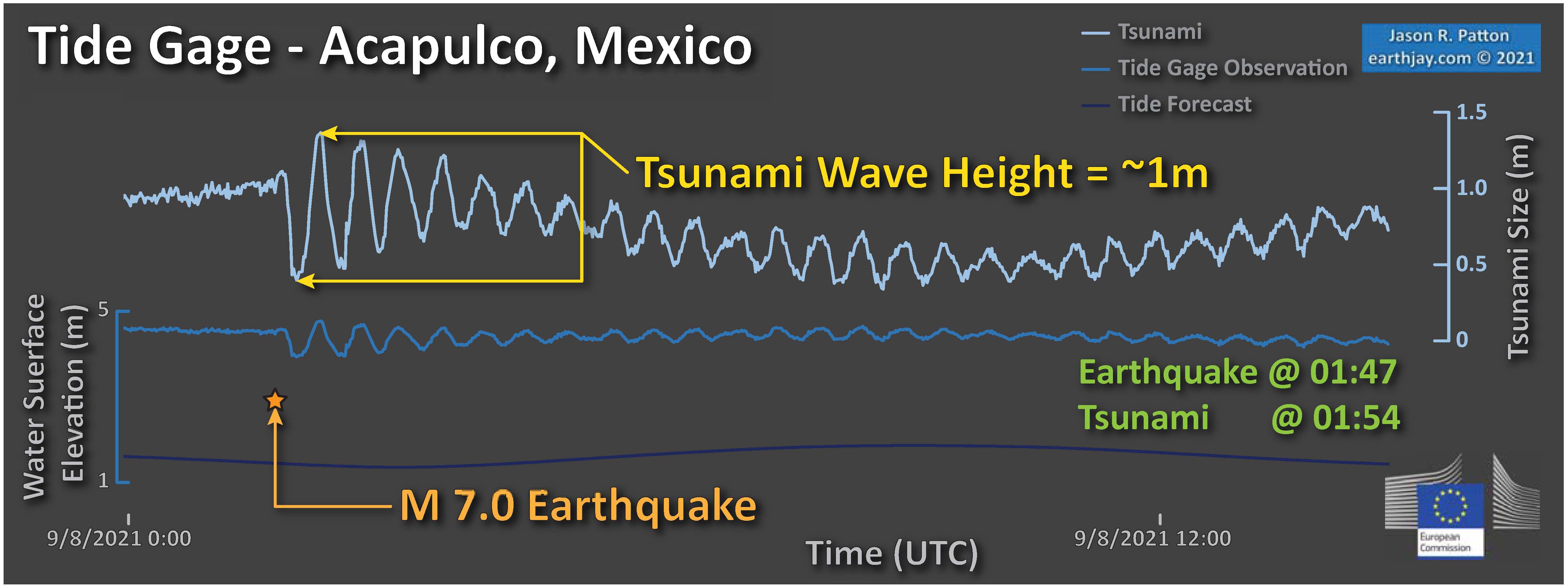
2021.09.08 M 7.0 Mexico
Earthquake Report Lite… (but it is more than just water, like the adult beverage that claims otherwise). I will try to describe the figures included in the poster, but sometimes I will simply post the poster here.
Last afternoon (my time) there was an M 7.0 earthquake near Acapulco, Mexico. This event generated a tsunami, landslides, building damage, casualties (one fatality as I write this), and many emotions.
https://earthquake.usgs.gov/earthquakes/eventpage/us7000f93v/executive
I present my interpretive poster and a few figures. Read more about the tectonics of this region here, in a report for an M 7.4 earthquake in 2020.
- In the upper left corner is a small scale map showing the major plate boundaries.
- Below the plate tectonic map is a plot showing the tide gage data from Acapulco, Mexico. Note the clear tsunami signal.
- To the right of the plate tectonic map is a large scale map showing aftershocks in the region of the M 7.1 mainshock. Note that these aftershocks are from the Servicio Sismológico Nacional (SSN) Catálogo de sismos and that there are two mainshock locations (USGS M 7.0 and SSN M 7.1).
- In the lower right corner is a map that shows a comparison of earthquake intensity between the USGS models and the Did You Feel It observations.
- Above the intensity comparison map is a plot showing these same data, intensity is on the vertical axis an distance from the earthquake [Hypocenter] is on the horizontal axis.
- In the upper right corner is a map that shows the results of an earthquake induced liquefaction model. Read more about this model here.
- Here is the map with a week’s seismicity plotted.

- Here is a plot of the tide gage data from Acapulco, Mexico. Compare these data with the tsunami from the 23 June ’20 M 7.4 earthquake.
- Below is a comparison of earthquake shaking intensity between the USGS Model results and the Did You Feel It observations.

-
2021.11.28 M 7.5 Peru
In the middle of the night (my time) I got a notification from the EMSC earthquake notification service. I encourage everyone to download and use this app.
There was an intermediate depth magnitude M 7.5 earthquake in Peru. The tectonics in this region of the world are dominated by the convergent plate boundary, a subduction zone formed by the convergence of the oceanic Nazca and continental South America plates.
https://earthquake.usgs.gov/earthquakes/eventpage/us7000fxq2/executive
- In the upper left corner is a large scale plate tectonic map showing the major plate boundary faults.
- In the lower left center is a map showing how the Nazca slab is configured in different locations (Ramos and Folguera, 2009).
- In the left center is a cross section showing seismicity in this region (Kirby et al., 1995). The source area for this plot is designated by a dashed yellow box on the map.
- In the upper right corner is a pair of maps that show the landslide probability (left) and the liquefaction susceptibility (right) for this M 7.5 earthquake. I spend more time describing these types of data here. Read more about these maps here.
- In the lower right corner I plot the USGS modeled intensity (Modified Mercalli Intensity scale, MMI) and the USGS “Did You Feel It?” observations (labeled in yellow). Above the map is a plot showing these same data plotted relative to distance from the earthquake. Read more about what these data sets are and what they represent in the report here.
- Here is the map with 3 month’s seismicity plotted.

Social Media:
#EarthquakeReport #TsunamiReport #EarthJay Annual Summary of M>6.5 #Gempa #Lindol #Terremoto #TremblementDeTerre #Sismo #Earthquakes #Tsunami
interpretive posters, tsunami plots, and links to reports for tectonic interpretations
read summary here:https://t.co/gCq9oFA5ET pic.twitter.com/KyMvFdVDbq
— Jason "Jay" R. Patton (@patton_cascadia) January 1, 2022
Return to the Earthquake Reports page.
- Sorted by Magnitude
- Sorted by Year
- Sorted by Day of the Year
- Sorted By Region