I present this summary of the Earthquake Reports and Interpretive Posters I prepared for earthquakes during the year 2024.
There are 14 Earthquake Reports.
There are some significant events I missed, but life is short and I have only so much available free time.
This is my 10th annual summary. I used to break out Cascadia.
- Here are all the annual summaries:
- Here are the annual summaries for the Cascadia region.
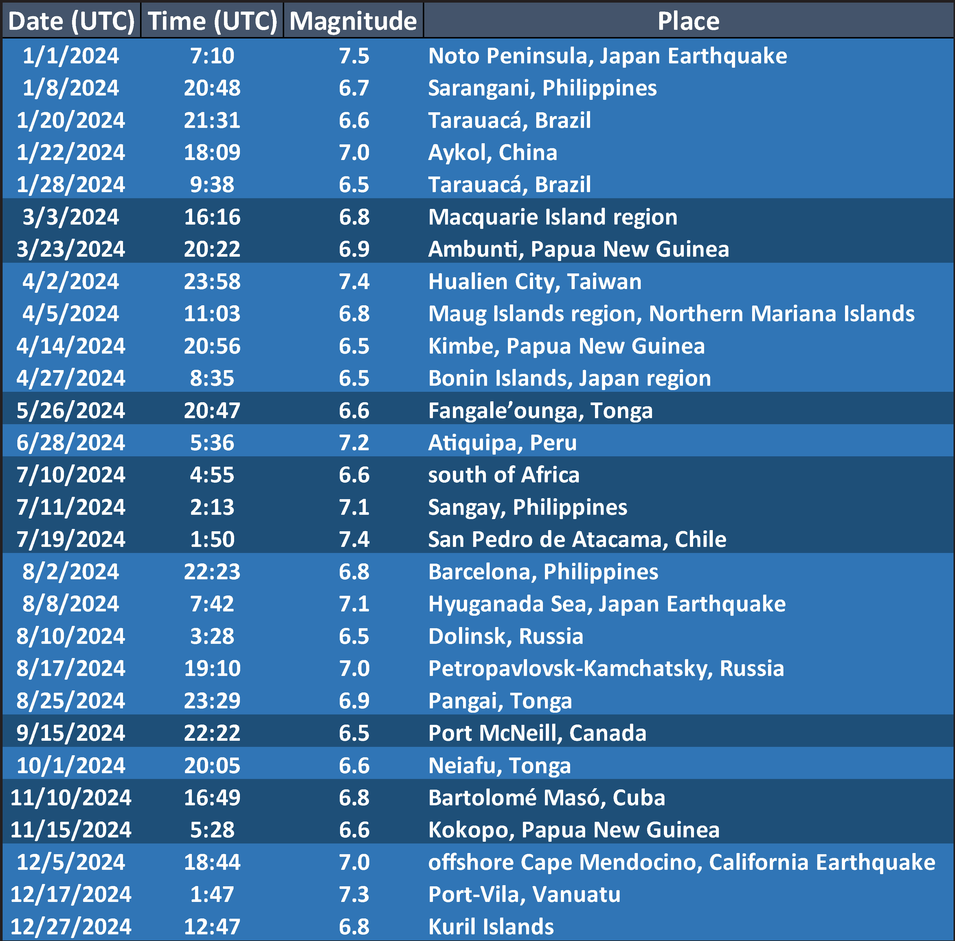
- Here is a table that lists the 2024 earthquakes with magnitudes M ≥ 6.5. I use these earthquakes to plot the cumulative energy release for earthquakes below.
- I did not prepare a poster/report for all of these events and I prepared some reports/posters for events not on this table.
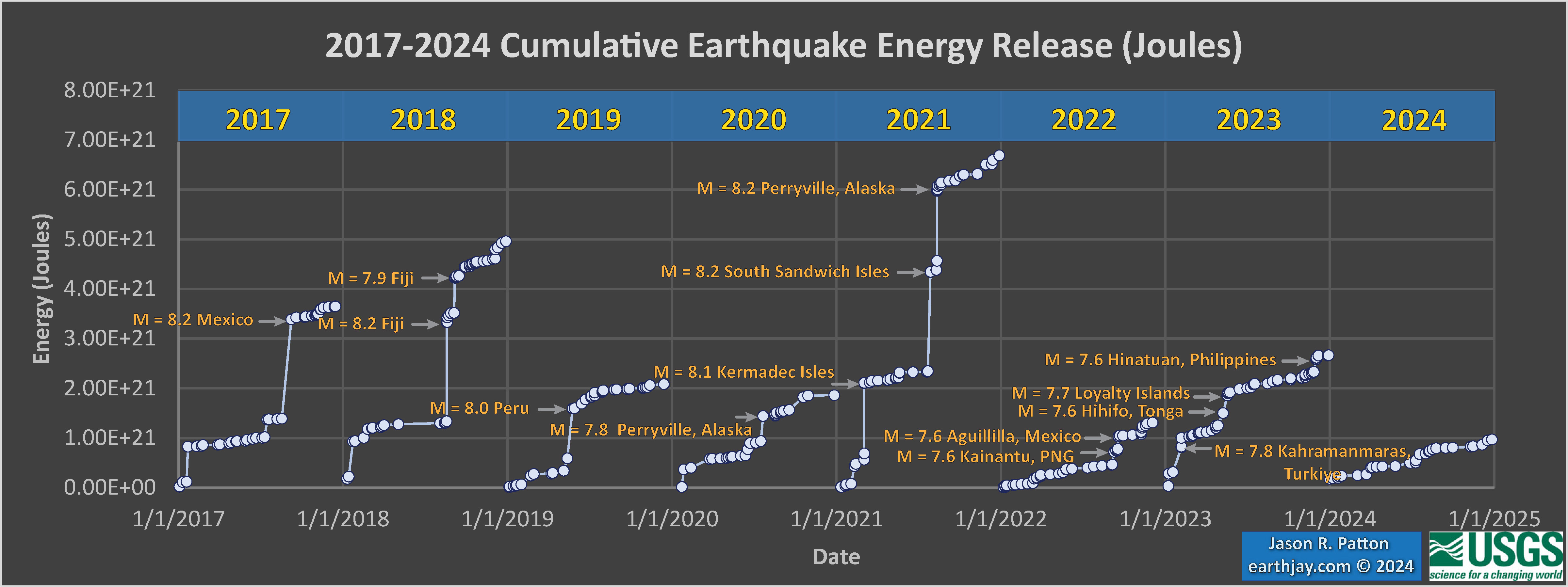
- This is a plot showing the cumulative energy release (in Joules) for the earthquakes listed in the above table. Ask yourself if M 6.5 is a reasonable threshold to be able to visualize variations in seismic energy release during the year.
- Note that the vertical axis is scaled differently on each plot, so the energy released in 2017 is about twice the energy released in 2022. Why do you think this is, is there a single earthquake in 2017 that controls this difference?
- Here is another view of the cumulative energy release from earthquakes for the time period 2017-2024. All data are on the same vertical scale, in joules.
- Note how much less energy was released in the form of earthquakes in 2024 compared to all previous years (in the plot).
- There was so little energy released in 2024 that there is no room to label the largest magnitude earthquakes in this plot (see above plot for some labels).
2024 Earthquake Reports
- 2024.01.01 M 7.5 Japan
- 2024.01.22 M 7.0 China
- 2023.03.23 M 6.9 Papua New Guinea
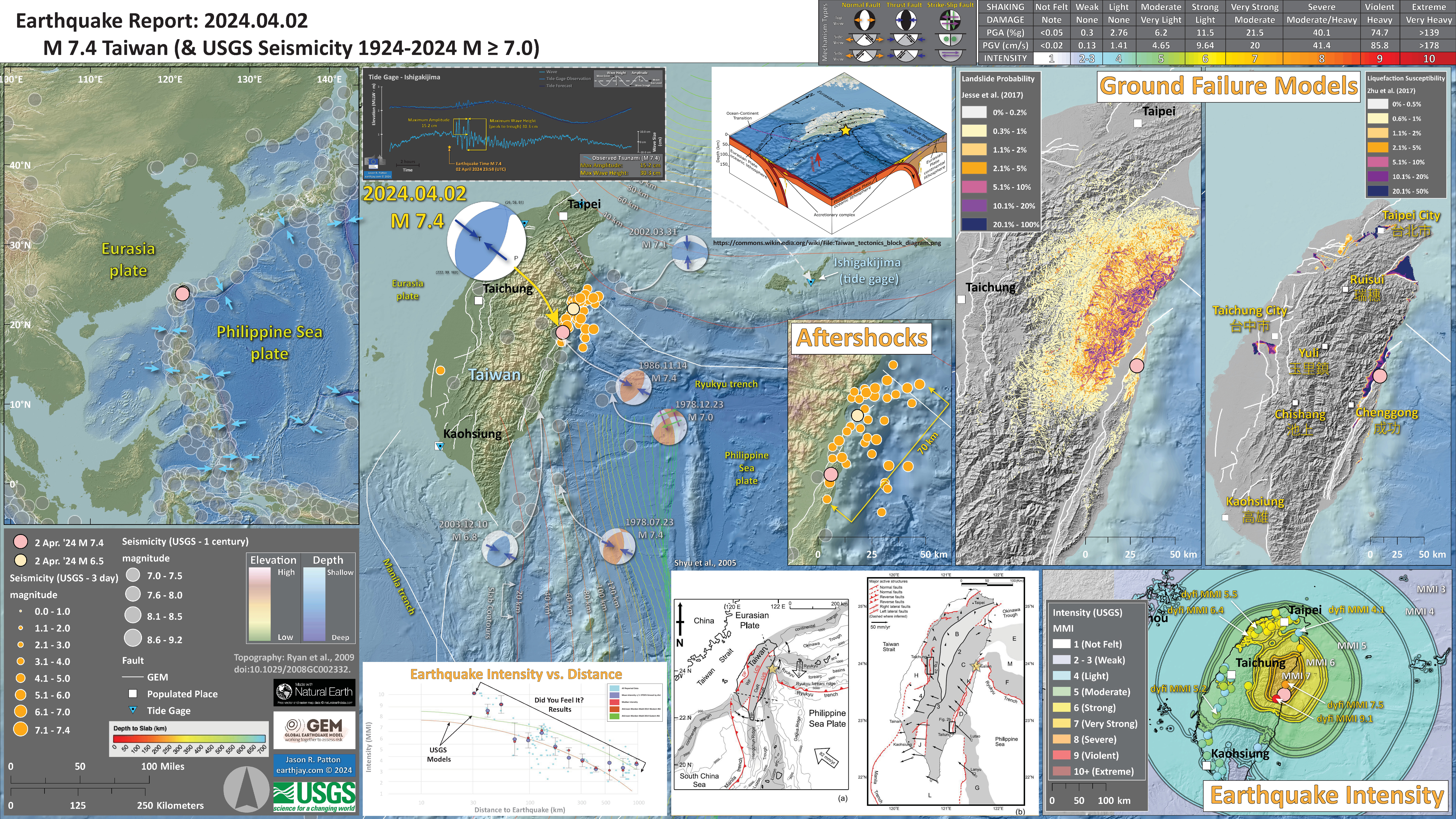
- 2024.04.02 M 7.4 Taiwan
- 2024.07.11 M 7.1 Philippines
- 2024.07.19 M 7.4 Chile/Bolivia
- 2024.07.31 M 4.9 Barstow
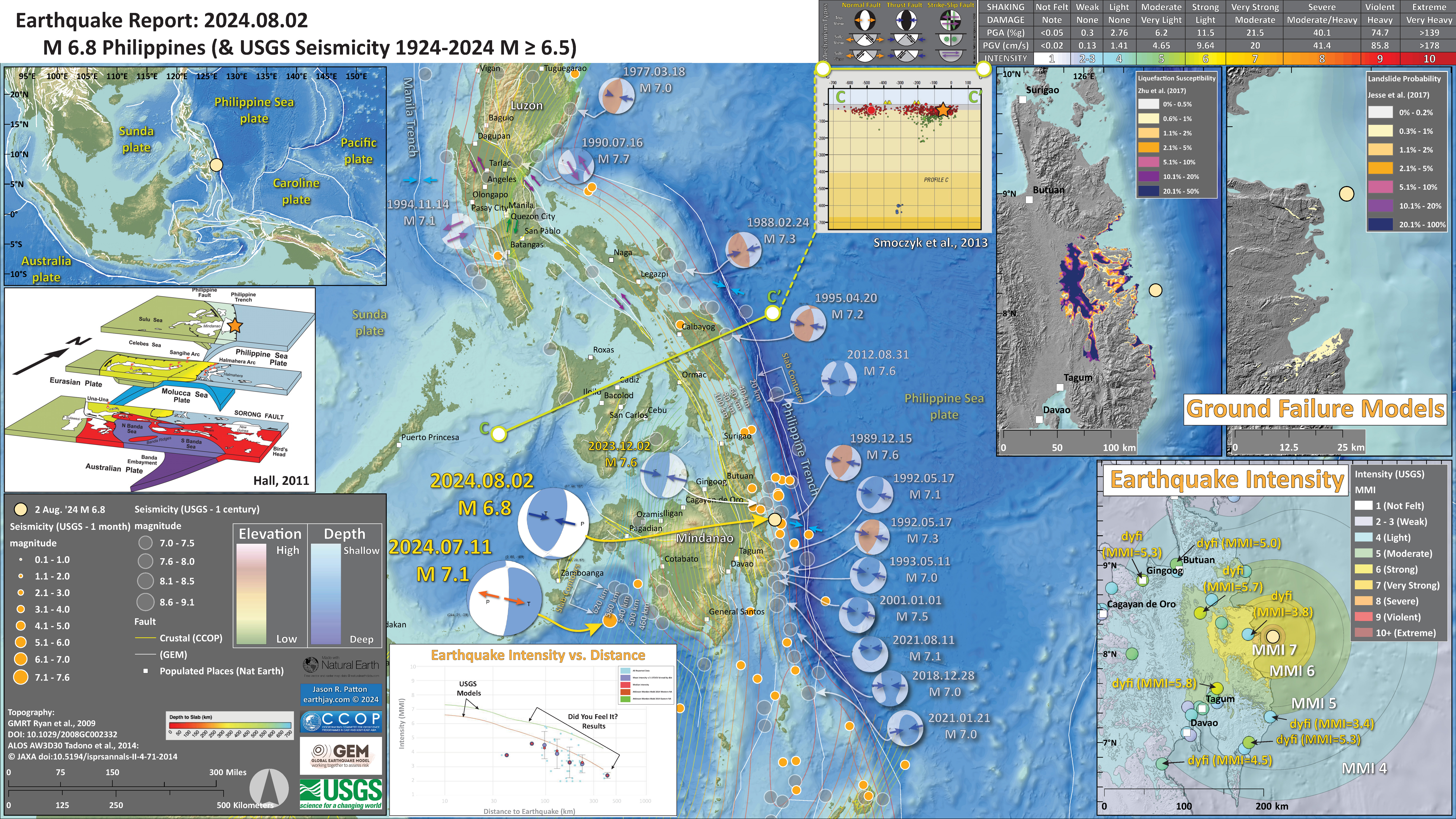
- 2024.08.02 M 6.8 Philippines
- 2024.08.08 M 7.1 Japan
- 2024.08.17 M 7.0 Kamchatka
- 2024.10.24 M 4.4 NAP
- 2024.11.10 M 6.8 Cuba
- 2024.12.05 M 7.0 Mendocino fault
- 2024.12.17 M 7.3 Vanuatu
Annual Summary Poster
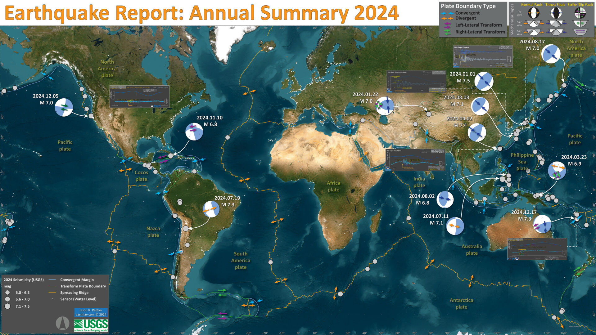
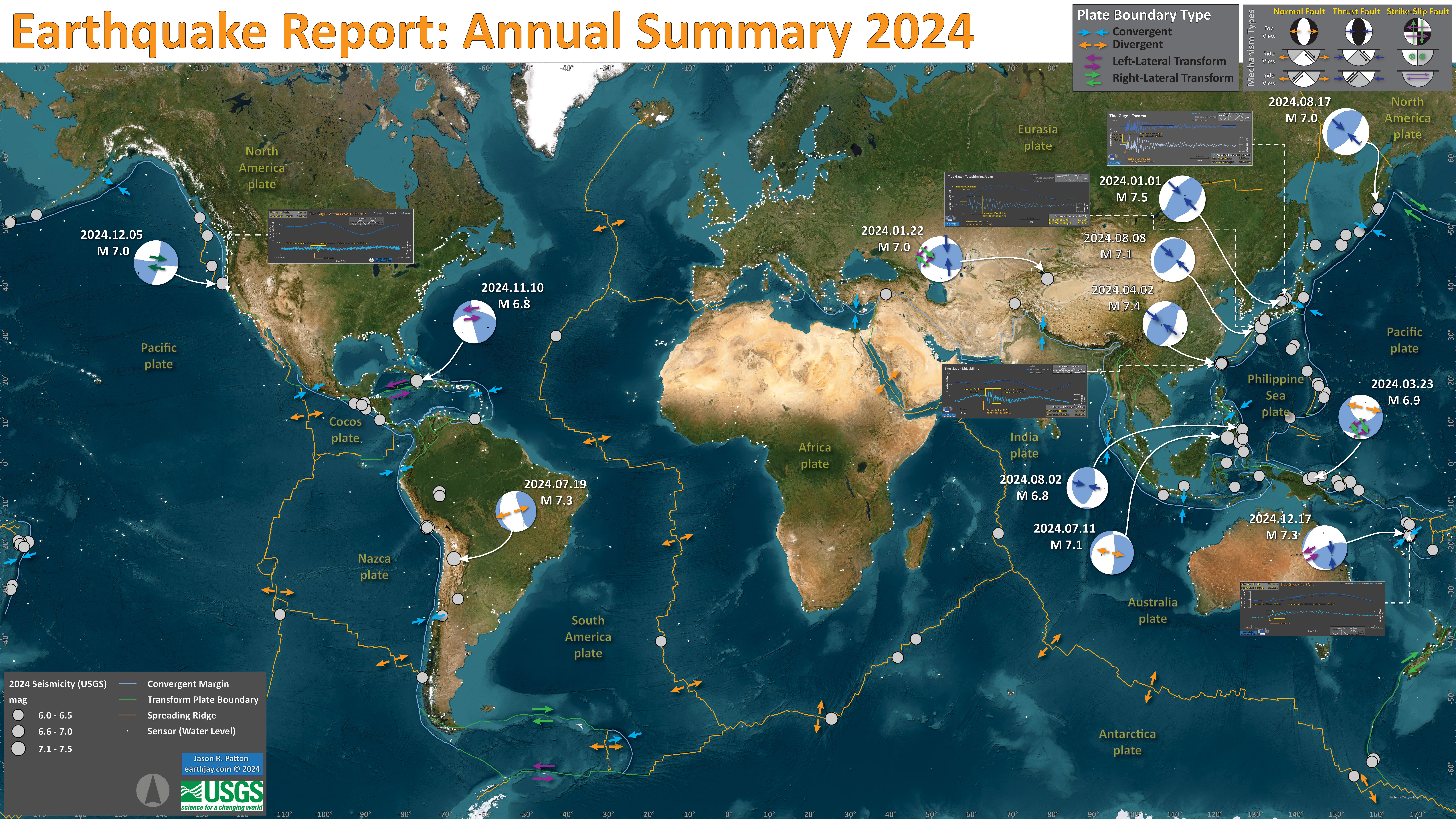
- I plot the earthquake mechanisms and epicenters for all earthquake events for which I have created interpretive posters below.
- Click on this map, or any map or figure, to see a larger and higher resolution version of the map or figure. These files are larger in file size.
- If anyone wants me to add their summary, just send me an email to quakejay at gmail.com
Other Annual Summaries
Return to the Earthquake Reports page.
- Sorted by Magnitude
- Sorted by Year
- Sorted by Day of the Year
- Sorted By Region
Interpretive Poster Background
These Interpretive Posters all contain slightly different types and amounts of information. Below is a general guidance to what this information is. Earthquake Report pages can provide additional information about each individual interpretive interrogation.
- I plot the seismicity from the past month, with diameter representing magnitude (see legend). I may include historic earthquake epicenters with magnitudes M ≥ some magnitude threshold.
- I include background information from published papers as inset figures on the interpretive posters. Learn more about these figures in their associated Earthquake Report.
- I plot the USGS fault plane solutions (moment tensors in blue and focal mechanisms in orange), possibly in addition to some relevant historic earthquakes.
- A review of the basic base map variations and data that I use for the interpretive posters can be found on the Earthquake Reports page.
- Some basic fundamentals of earthquake geology and plate tectonics can be found on the Earthquake Plate Tectonic Fundamentals page.
See all 2024 Earthquake Reports
Click on the name of the earthquake to go to the Earthquake Report.
E.g., click here >>> (2024.01.01 M 7.5 Japan) to go to the report for This earthquake.
2024.01.01 M 7.5 Japan
- 2024.01.01 M 7.5 Japan
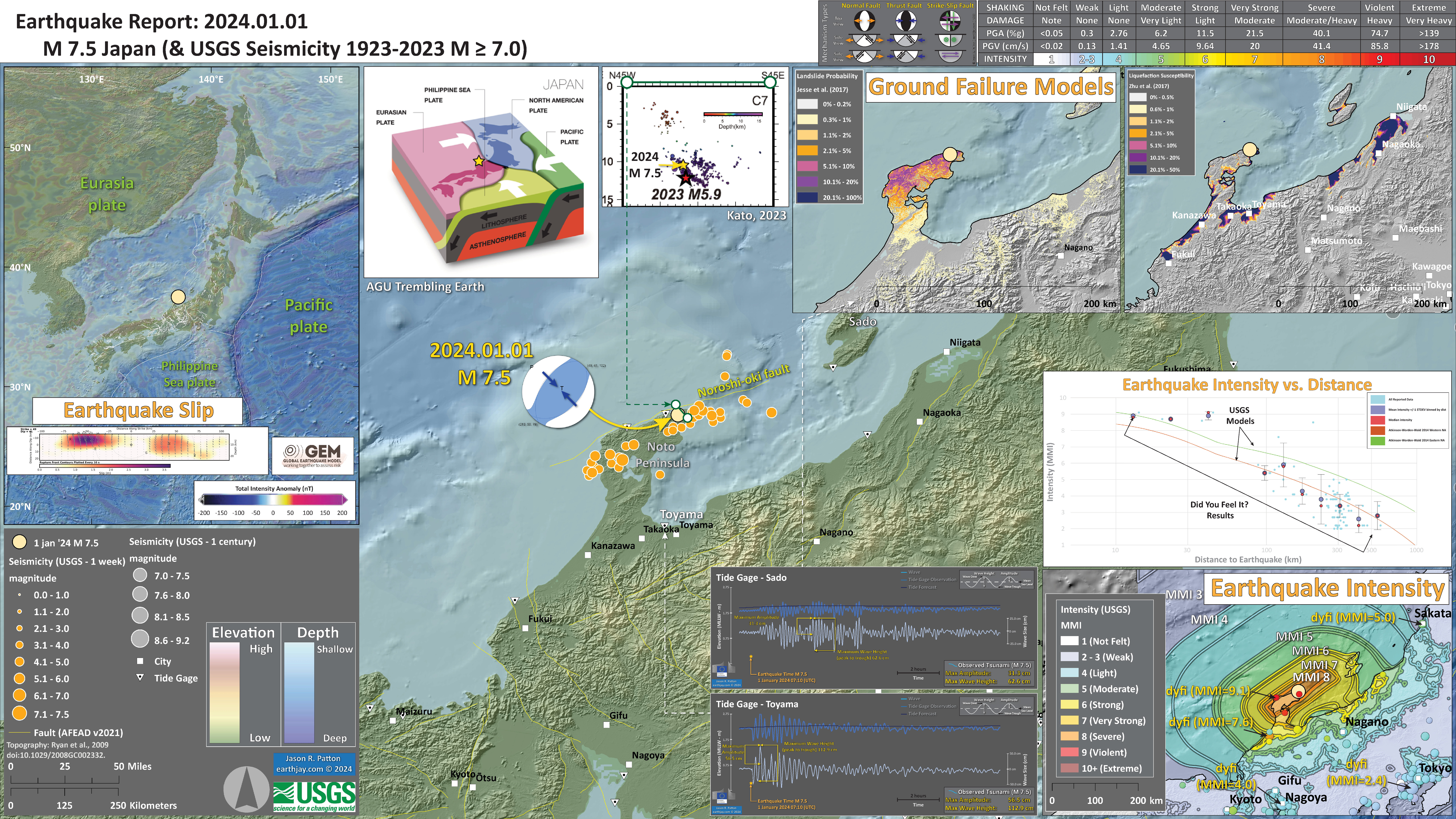
- In the upper left corner is a map that shows the tectonic plates and seismicity for eastern Asia. The USGS fault slip model is displayed.
- To the right of the tectonic overview map is a low angle oblique view of the tectonic configuration showing how the subduction zones (convergent plate boundaries) are oriented.
- In the lower right corner is a map that shows the earthquake intensity using the modified Mercalli intensity scale. Earthquake intensity is a measure of how strongly the Earth shakes during an earthquake, so gets smaller the further away one is from the earthquake epicenter. The map colors represent a model of what the intensity may be.
- Above the intensity map is a plot that shows the same intensity (both modeled and reported) data as displayed on the map. Note how the intensity gets smaller with distance from the earthquake.
- In the upper right corner are two maps showing the probability of earthquake triggered landslides and possibility of earthquake induced liquefaction. I will describe these phenomena below.
USGS Earthquake Event Page
https://earthquake.usgs.gov/earthquakes/eventpage/us6000m0xl/executive
This earthquake was a shallow crustal fault earthquake associated with the Noroshi-oki fault.
This fault is a crustal reverse fault (compressional) that dips to the southeast. Kato (2023) plotted seismicity from a previous sequence and I include the plots from their paper below. These plots reveal the orientation of this fault system.
The aftershock pattern (see poster below) suggests that the entire fault slipped during (or shortly before or after) this M 7.5 mainshock.
I include some inset figures. Some of the same figures are located in different places on the larger scale map below.
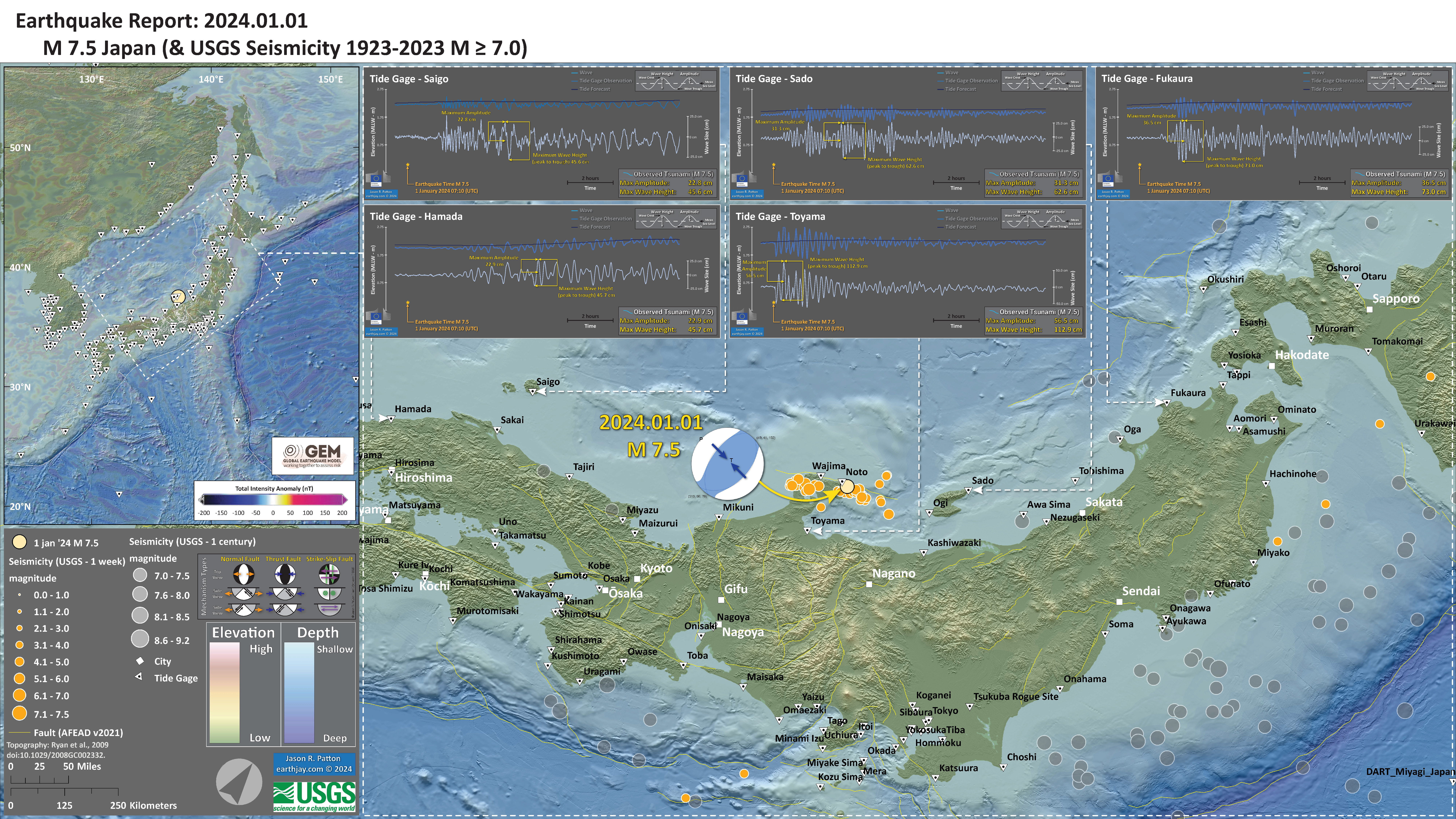
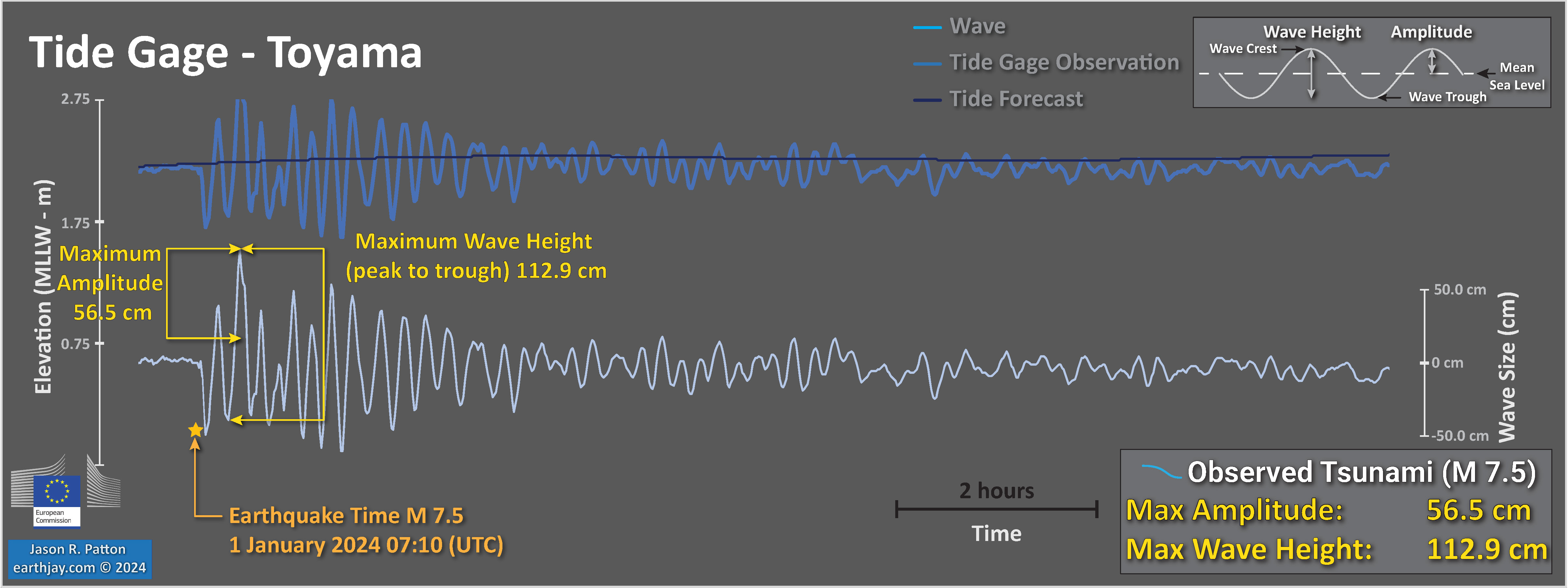
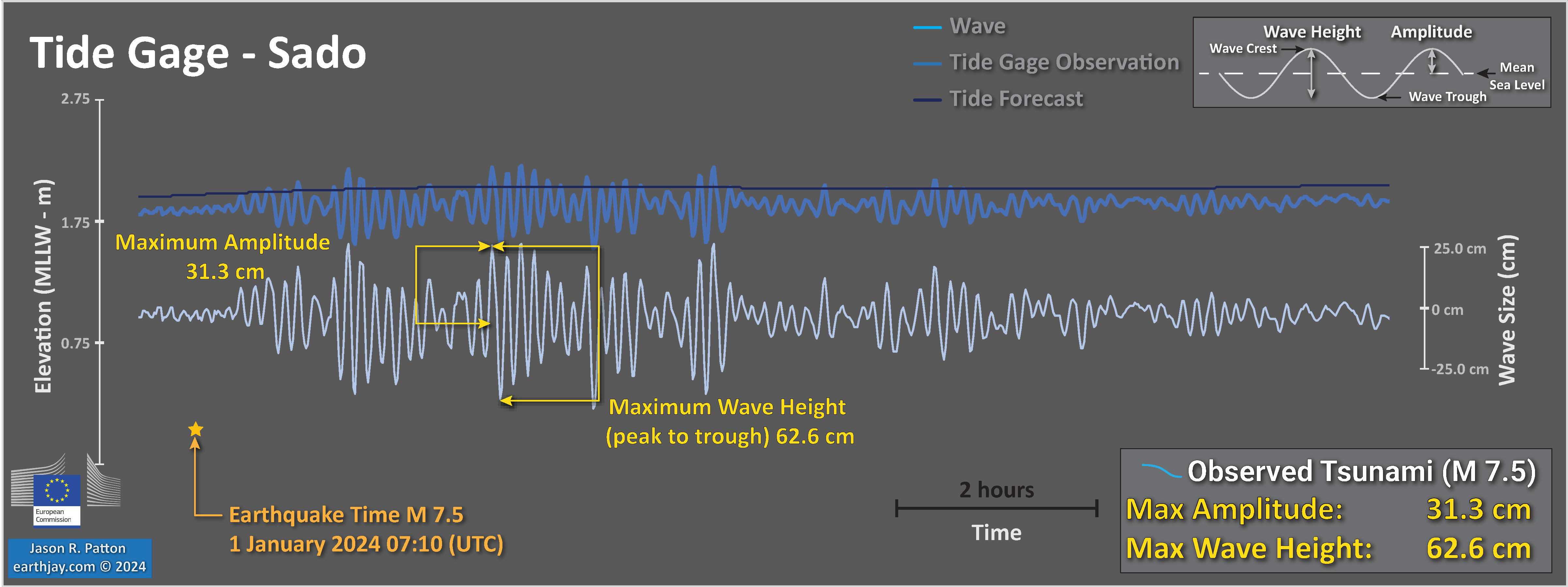
There was a tsunami generated by this earthquake. Below are plots from the gages that have a clear record of the tsunami.
The nearest gage (Noto) is located very close to the epicenter and the data suggest that the gage has been damaged in some way.
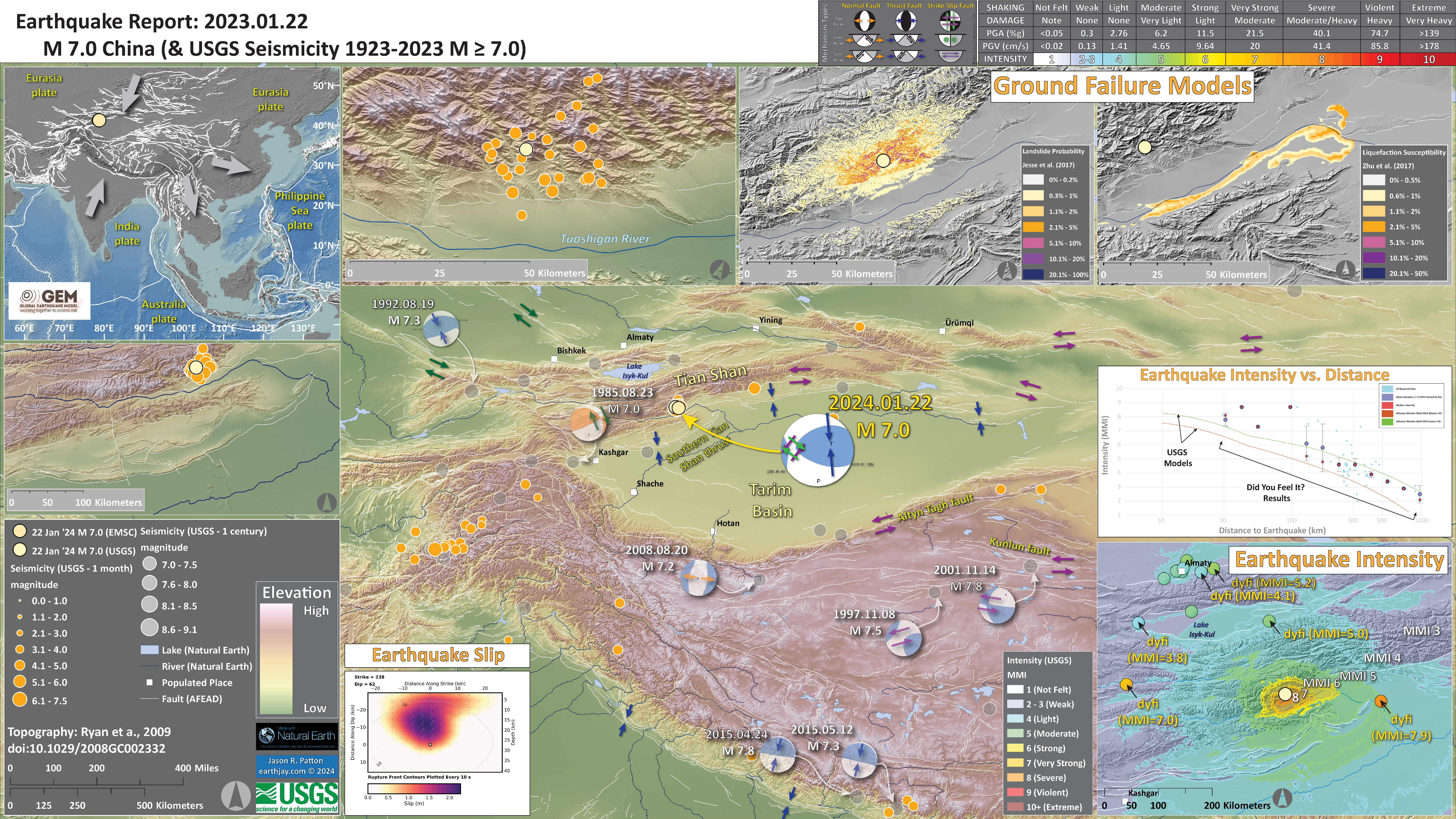
2024.01.22 M 7.0 China
USGS Earthquake Event Page
https://earthquake.usgs.gov/earthquakes/eventpage/us7000lsze/executive
This earthquake happened in a remote area of China with a low population density. While the earthquake was relatively shallow (about 25 km or 15 miles) and generated strong ground shaking.
However, because of the low population density, the U.S. Geological Survey (USGS) PAGER analysis estimated that there may be a low number of casualties. There have been reported about three deaths at the time I am writing this (all deaths are terrible, but this is a low number for such a large earthquake).
The PAGER system provides fatality and economic loss impact estimates following significant earthquakes worldwide.
This earthquake has a reverse mechanism, the result of compression.
This part of the world is dominated by north-south oriented compression from the collision of the India plate from the south and Eurasia plate from the north.
This north-south convergence also results in eastward (and westward) extrusion of the crust. Paul Tapponier used wax models to show how this type of tectonics works.
The M 7.0 earthquake slipped on a fault related to the South Tian Shan Thrust fault.
The USGS use seismic and geodetic (the study of how the Earth deforms) data to construct a fault model. These fault models include the geometry of the fault (the 3-D orientation and size (length and width)) and include an estimate of how much the fault slipped during the earthquake.
This USGS finite fault model shows that the fault length was about 40- to 50-km long and the fault slipped up to about 2.5 meters.
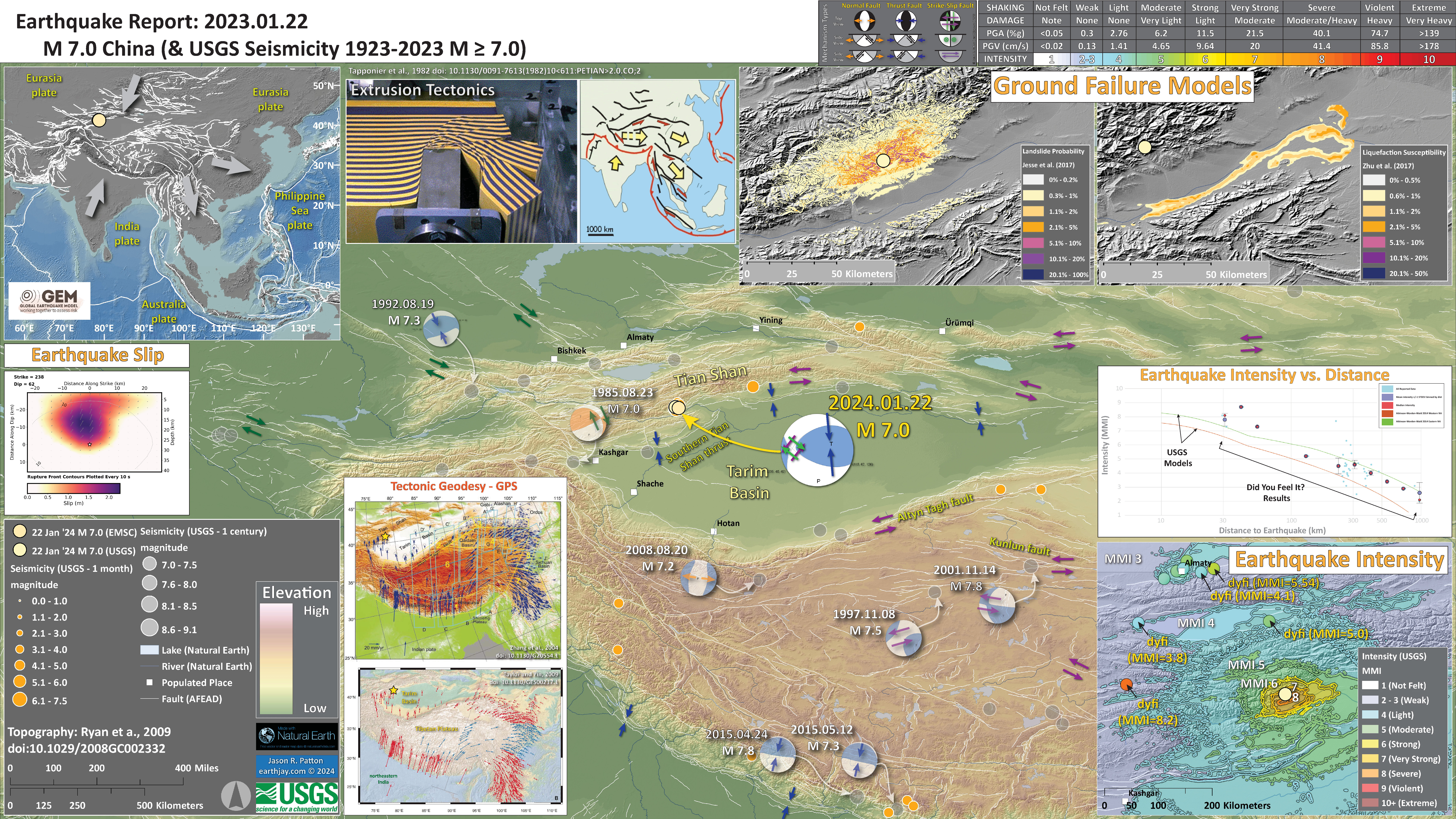
Below I present some interpretive posters, including updated versions showing the aftershocks from the past couple of days.
- In the upper left corner is a map that shows the tectonic plates and seismicity for eastern Asia.
- The USGS fault slip model is displayed below this tectonic overview map.
- To the right of the tectonic overview map is a photo of the Tapponier wax block experiment that demonstrates the physical basis for his extrusion tectonic model (the map on the right shows how the faults accommodate this deformation). I include arrows in the tectonic overview map (to the left) that matches this model.
- In the lower right corner is a map that shows the earthquake intensity using the modified Mercalli intensity scale. Earthquake intensity is a measure of how strongly the Earth shakes during an earthquake, so gets smaller the further away one is from the earthquake epicenter. The map colors represent a model of what the intensity may be.
- Above the intensity map is a plot that shows the same intensity (both modeled and reported) data as displayed on the map. Note how the intensity gets smaller with distance from the earthquake.
- In the upper right corner are two maps showing the probability of earthquake triggered landslides and possibility of earthquake induced liquefaction. I will describe these phenomena below.
- In the lower left are two maps that show the motion of GPS sites (Zhang et al., 2004; Taylor and Yin, 2009). Each arrow shows the direction of motion and the length of the arrow shows the velocity (in mm per year) of the GPS site.
I include some inset figures. Some of the same figures are located in different places on the larger scale map below.
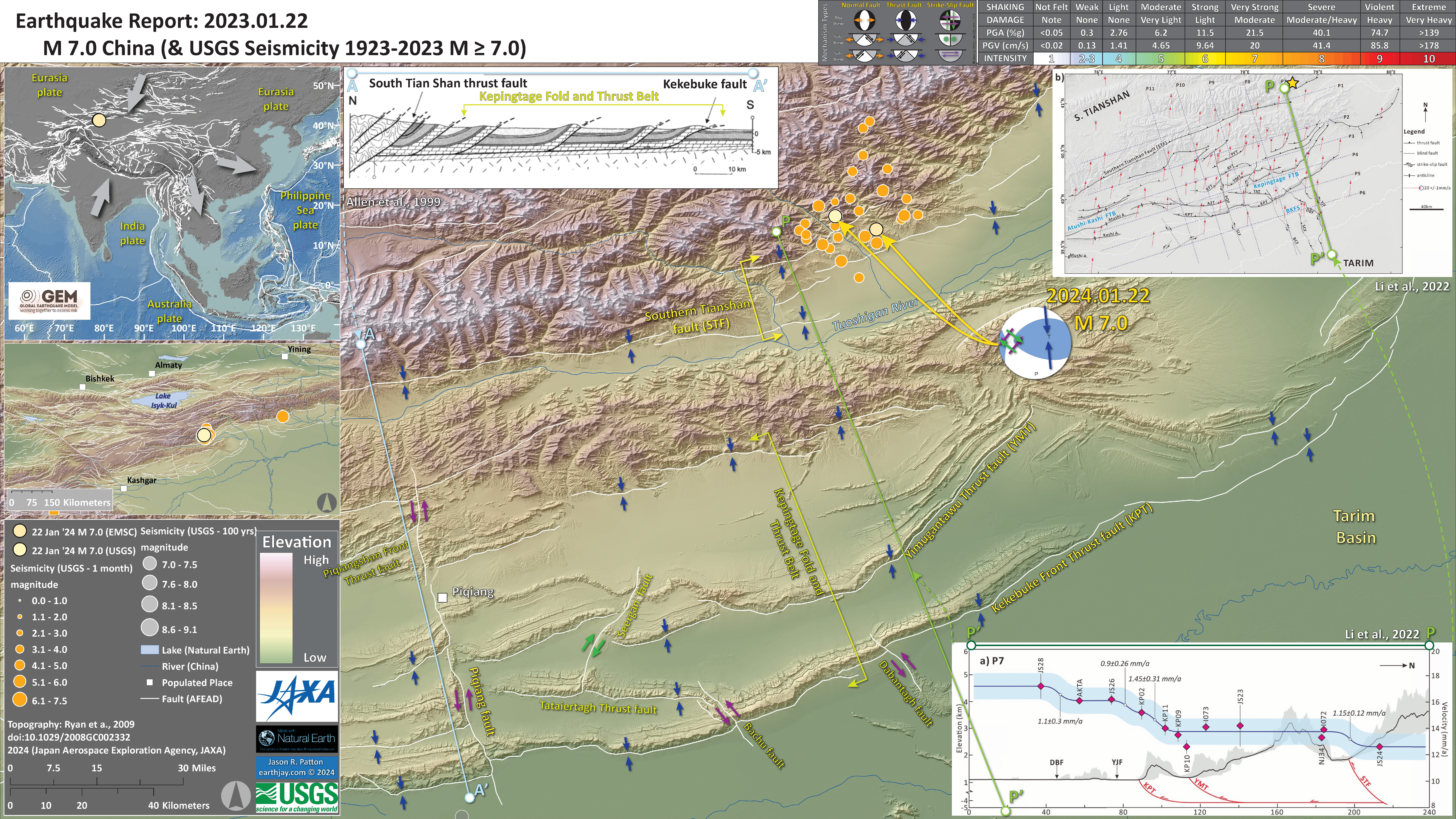
- Here is a larger scale map with aftershocks. Faults are labeled and arrows show relative motion across these faults.
- In the upper left include a cross section from Allen et al. (1999) that shows how these faults are oriented in the subsurface. The cross section (blue line on the map)
- In the lower right corner is a ~north-south profile from Li et al. (2022) that displays the GPS velocities for GPS sites along profile P-P’ (shown on the map as a green line). There is an inset map in the upper right corner that also shows the location of this profile overlain on a fault map.
- The vertical axis of this plot shows the velocity of each GPS site relative to the Eurasia. These data show that there is shortening across these thrust/reverse faults. The velocity increases across the South Tianshan fault (STF) (~12 mm/yr on the north side of the fault and ~14 mm/yr on the south side), across the Yimugantawu thrust fault (YTF), etc.
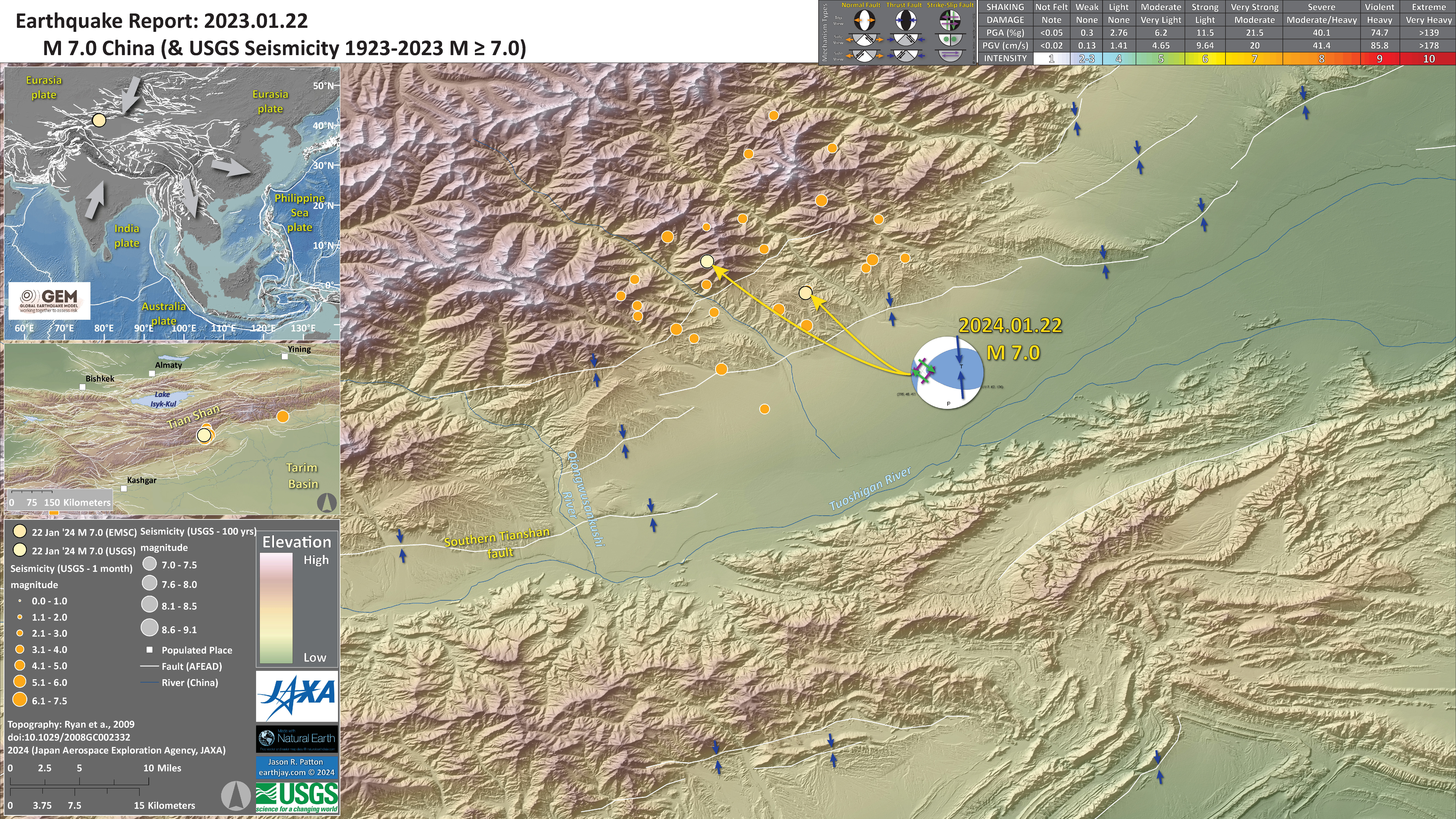
- Here is an even larger scale map with aftershocks. The elevation data here reveal great details about the tectonics.
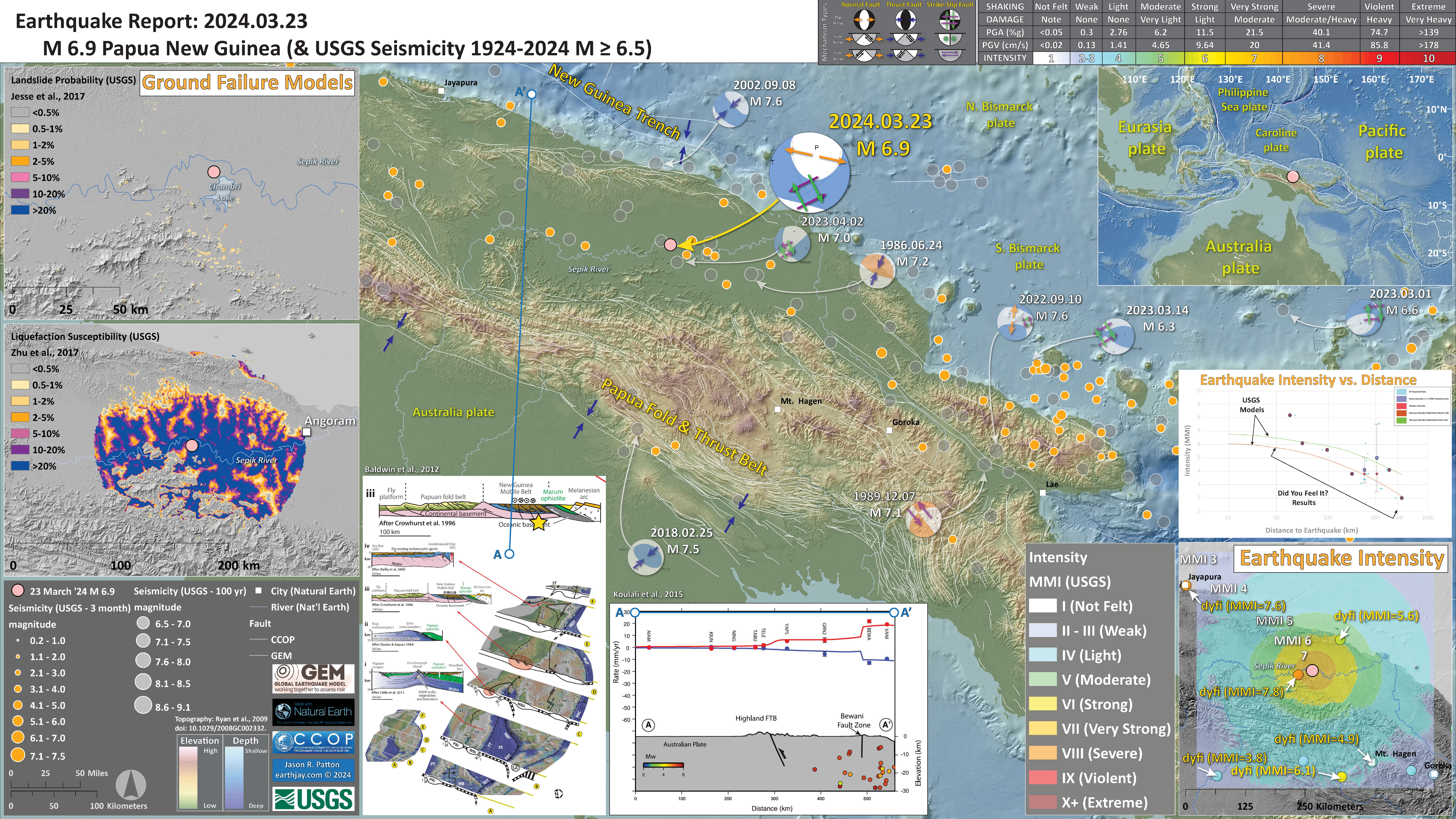
2023.03.23 M 6.9 Papua New Guinea
USGS Earthquake Event Page
https://earthquake.usgs.gov/earthquakes/eventpage/us6000mksx/executive
There was a M 7.0 earthquake in a nearby location (albeit almost twice as deep as today’s M 6.9). Here is the report for that earthquake.
The tectonics of this region of the world is dominated by the convergence of the Australia plate with other tectonic plates to the north (the Caroline and Pacific plates).
This north-south convergence has been going on for tens of millions of years, though has changed which fault or plate boundary where this deformation is localized.
Because of these changes with time, there are a number of different faults that have been identified in the subsurface (more details below). Suffice it to say, there may be several slabs (plates) that are stacked atop each other and these M 6.9 and M 7.0 earthquakes are probably related to more than one of the faults separating these slabs.
The USGS includes many products on their earthquake pages. We can see from their ground failure products that this earthquake likely generated significant liquefaction. I show this on the interpretive poster and include a write up about ground failure generated by earthquakes below.
Something that influences the liquefaction and landslide modeling is the topography. The M 7.0 earthquake happened in an area that is mostly low lying Earth adjacent to the Sepik River system. The ground is probably highly saturated with water.
Also, there is little steep topography in the area, which probably contributes to the low chance for landslides in the USGS model for earthquake triggered landslides.
As always, we hope that there was not much suffering from this earthquake. The shaking intensity was high, so it must have been quite terrifying. The region does not have a high population density, so the USGS PAGER alert estimate reflects this. There were about 133,000 people who may have been exposed to intensity MMI 7 and 333,000 exposed to MMI 6.
- In the upper right corner is a map showing the plate tectonic boundaries (from the GEM) and seismicity from the past century (from the USGS).
- In the lower right corner is a map that shows the earthquake intensity using the modified Mercalli intensity scale. Earthquake intensity is a measure of how strongly the Earth shakes during an earthquake, so gets smaller the further away one is from the earthquake epicenter. The map colors represent a model of what the intensity may be. The USGS has a system called “Did You Feel It?” (DYFI) where people enter their observations from the earthquake and the USGS calculates what the intensity was for that person. The dots with yellow labels show what people actually felt in those different locations.
- Above the intensity map is a plot showing the intensity vs. distance from the earthquake. I explain this further later in the report.
- In the upper left corner are two maps showing the probability of earthquake triggered landslides and possibility of earthquake induced liquefaction. I will describe these phenomena below.
- In the lower left center is a figure from Baldwin et al. (2012). This figure shows a series of cross sections along this convergent plate boundary from the Solomon Islands in the east to Papua New Guinea in the west. Cross section ‘D’ is the most representative for the earthquakes today. I present the map and this figure again below, with their original captions. Above the map is cross section D-D’ that shows the PFTB to the south of today’s earthquake. I placed the yellow star marking today’s M 7.0 below the cross section. The faults are actually quite complex, so this schematic illustration may not be a perfect representation of the faults here.
- In the bottom center is a profile showing the GPS velocities across the two main fault systems that profile A-A’ crosses (also shown on map). The M 7.0 is somewhere between these two fault systems (possibly along a fault that leads up to the Fold and Thrust Belt(?).
I include some inset figures. Some of the same figures are located in different places on the larger scale map below.
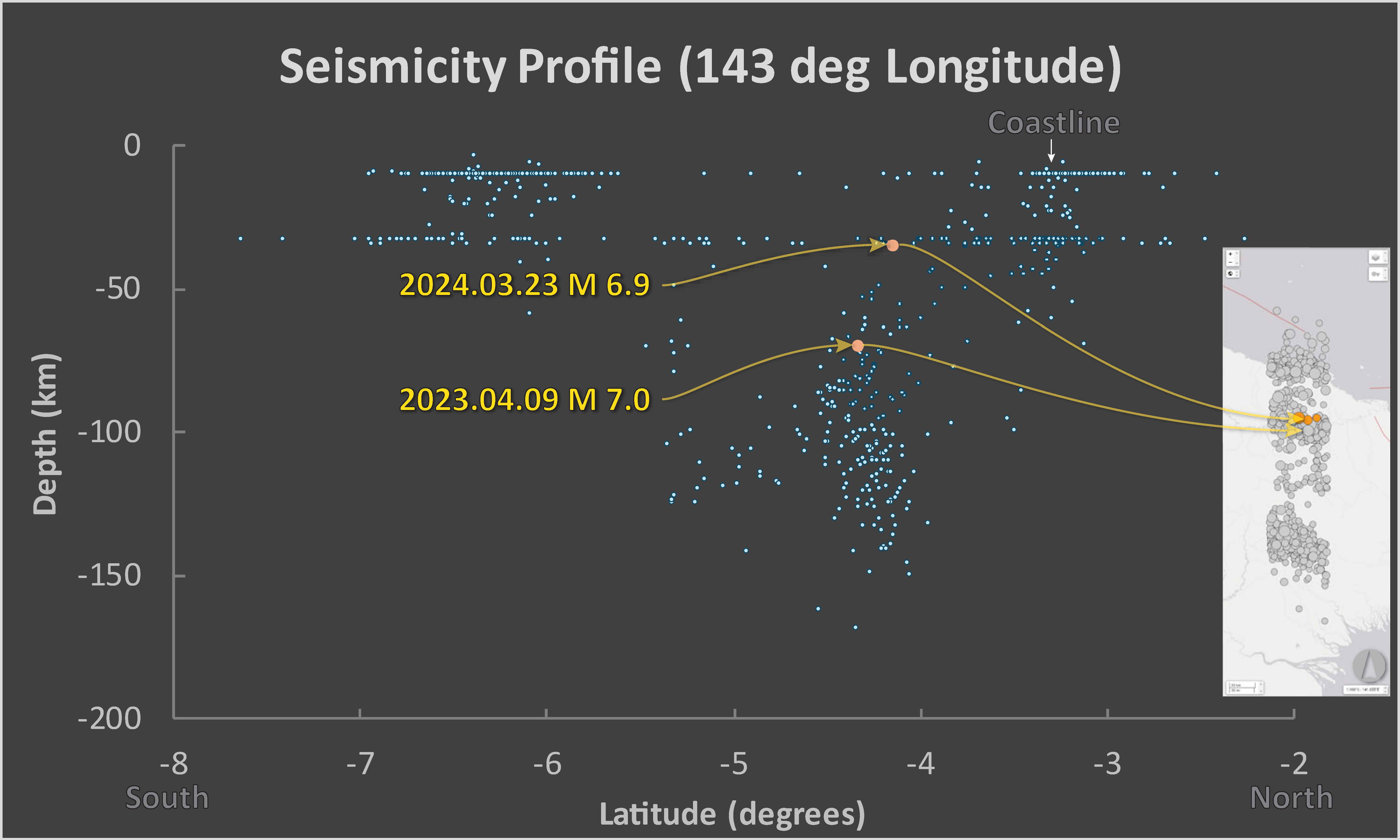
- Here is a plot showing USGS seismicity in profile. Depth on the vertical axis and latitude (North to the right, South to the left) on the horizontal axis.
- I highlight today’s M 6.9 and the M 7.0 from a year ago (deeper).
- It appears that there is a trend in seismicity associated with the slab dipping to the south. The M 7.0 may be related to this. But the M 6.9 does not appear directly related to any trends in seismicity. If we look at the tectonic cross sections later in the report, we see that there remains debate about the configuration of tectonic plates here.
2024.04.02 M 7.4 Taiwan
USGS Earthquake Event Page
https://earthquake.usgs.gov/earthquakes/eventpage/us7000m9gc/executive
In the past few years, there have been a number of significant earthquakes in this region of eastern Taiwan. Notably, events in March and September of 2022.
Today’s M 7.4 earthquake has a reverse earthquake mechanism, the result of compression.
In this part of Taiwan, there are reverse faults that could be responsible for the M 7.4.
The Longitudinal Valley fault (LVF) and the Central Range fault (CRF) are both reverse faults that dip in opposite directions.
The LVF dips to the east and the CRF dips to the west. Both faults daylight (intersect the Earth’s surface) along the main valley along eastern Taiwan (the Longitudinal Valley).
This earthquake sequence seems to be related to the LVF, though the M 7.4 is too deep. Therefore, if the fault is east dipping, the fault tip (where it daylights) must be far to the west of the Longitudinal Valley. Let’s see what people come up with.
Alternatively, perhaps this M 7.4 is related to the Offshore Eastern Taiwan thrust belts (e.g., the Takangkou thrust) from Huang and Wang (2022). See their map below.
Another possibility is that the M 7.4 was on the Milun fault. See the Huang and Wang (2022) cross-section below.
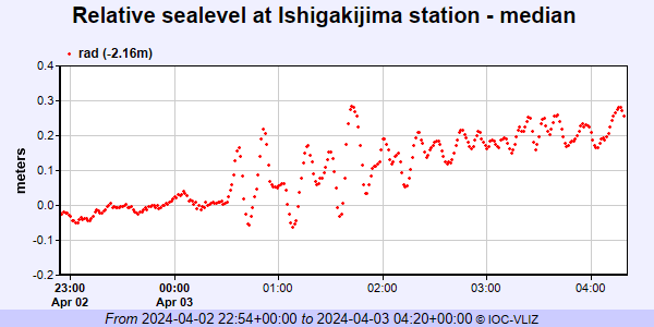
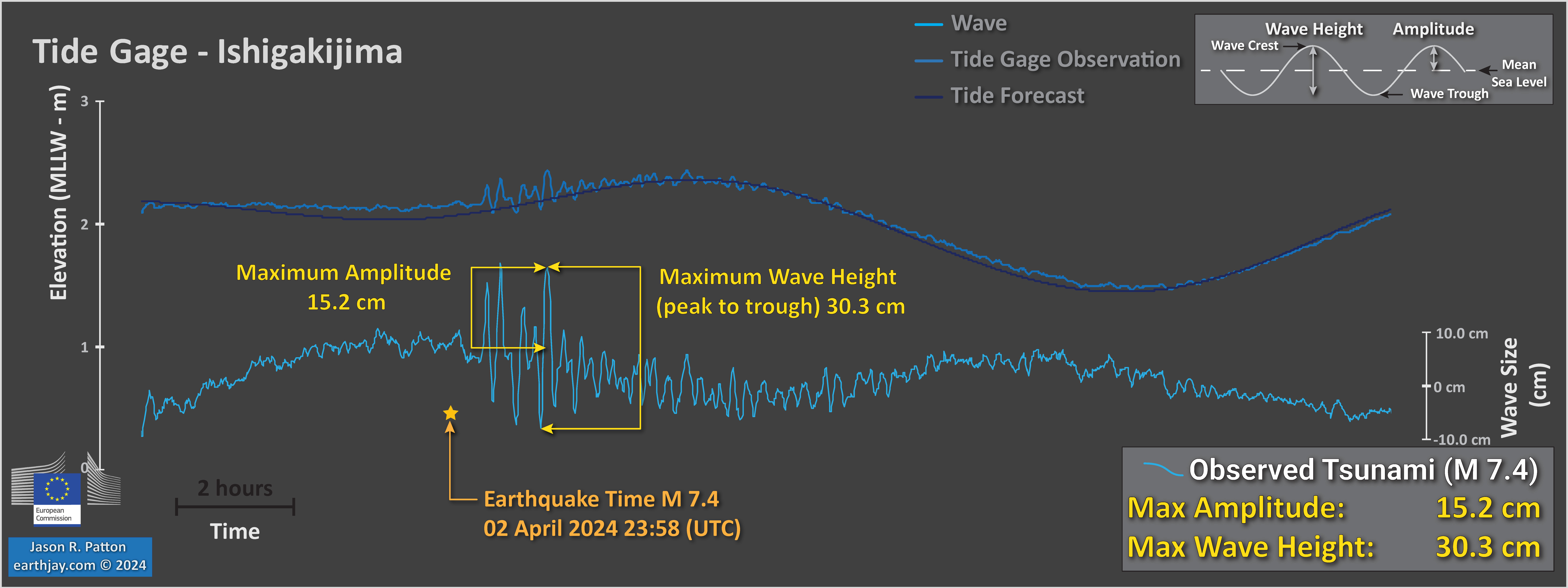
There was a small tsunami observed offshore of Taiwan at Ishigakijima, Japan.
Here is the plot:
And, here are some observations from the National Tsunami Warning Center in Palmer, Alaska:
Here are the data plotted and interpreted.
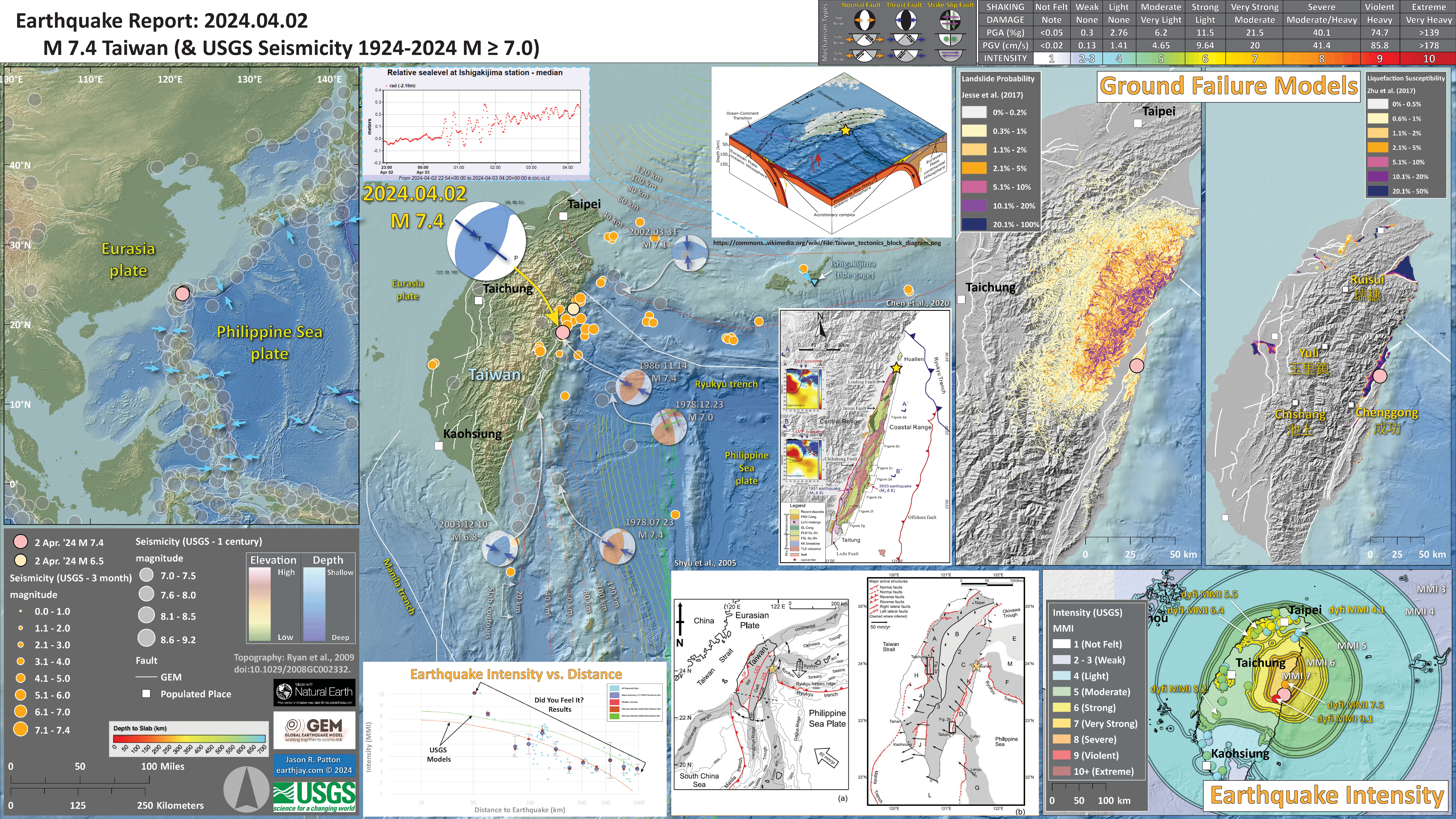
- In the upper left corner is a map that shows the plates, their boundaries, and a century of seismicity.
- In the upper right are two maps that show models of how there may have been landslides or liquefaction because of the earthquake shaking and impacts. Read more about landslides and liquefaction here. I include both the USGS epicenter and the Central Weather Bureau Seismological Center epicenter (which is probably more accurate). However, these ground failure models are based on the USGS epicenter/location.
- To the left of those two maps is a low angle oblique view of the tectonic plates and how they are oriented relative to each other.
- Below that figure, in the center, is a map from Chen at al. (2020) that shows the earthquake fault mapping along eastern Taiwan. I place a yellow star in the location of the M 7.4 epicenter (the location of the earthquake on the ground surface).
- In the lower right corner is a map that shows the ground shaking from the earthquake, with color representing intensity using the Modified Mercalli Intensity (MMI) scale. The closer to the earthquake, the stronger the ground shaking. The colors on the map represent the USGS model of ground shaking. The colored circles represent reports from people who posted information on the USGS Did You Feel It? part of the website for this earthquake. There are things that affect the strength of ground shaking other than distance, which is why the reported intensities are different from the modeled intensities.
- To the left of the intensity map is a map that shows the regional tectonics (Shyu et al., 2005), with a yellow star in the location of the M 7.5.
- To the left of this seismicity map is a plot that shows how the shaking intensity models and reports relate to each other. The horizontal axis is distance from the earthquake and the vertical axis is shaking intensity (using the MMI scale, just like in the map to the right: these are the same datasets).
- In the upper left-center is a figure that shows a tsunami recorded at Ishigakijima, Japan.
I include some inset figures. Some of the same figures are located in different places on the larger scale map below.
2024.07.11 M 7.1 Philippines
USGS Earthquake Event Pages
11 July 2024 M 7.1:
https://earthquake.usgs.gov/earthquakes/eventpage/us7000myfa/executive
2 August 2024 M 6.8:
https://earthquake.usgs.gov/earthquakes/eventpage/us6000nhqc/executive
Here is a view of the tectonic plates in this region.
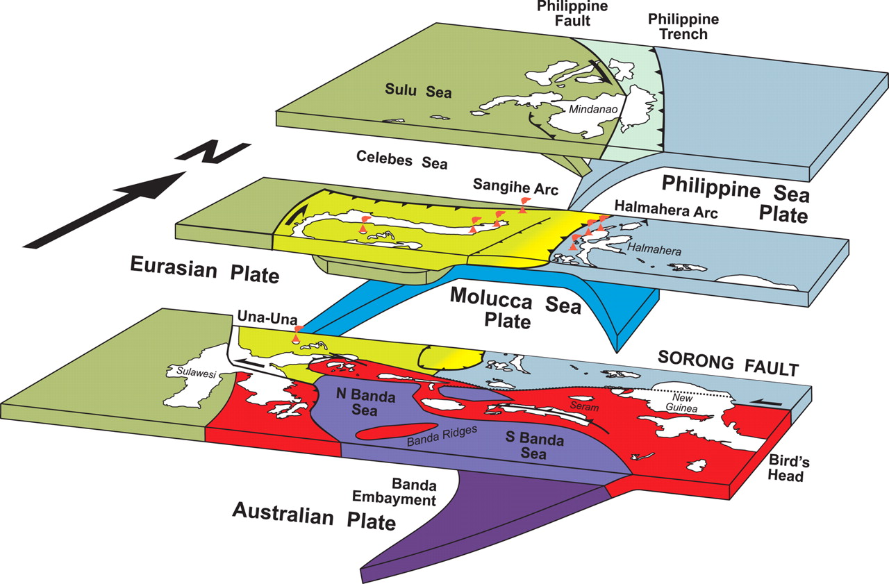
- This is the low-angle oblique view of the region (Hall, 2011).
3D cartoon of plate boundaries in the Molucca Sea region modified from Hall et al. (1995). Although seismicity identifies a number of plates there are no continuous boundaries, and the Cotobato, North Sulawesi and Philippine Trenches are all intraplate features. The apparent distinction between different crust types, such as Australian continental crust and oceanic crust of the Philippine and Molucca Sea, is partly a boundary inactive since the Early Miocene (east Sulawesi) and partly a younger but now probably inactive boundary of the Sorong Fault. The upper crust of this entire region is deforming in a much more continuous way than suggested by this cartoon.
In July there was a deep earthquake offshore of the Philippines.
The M 7.1 earthquake (lindol) has a hypocentral depth of ~630 km. The USGS Slab 2.0 (Hayes et al., 2012) depth at this location is about 570 km.
The earthquake appears to be within the subducted plate. The earthquake has a normal mechanism (the moment tensor) which represents that there is extension in this plate (common for this tectonic setting).
Here is an earthquake that happened in almost the same place: 2017.01.10 M 7.3 Celebes Sea
Learn more about deep earthquakes in this report: 2018.04.02 M 6.8 Bolivia
In this part of the world, there is an oceanic feature called the Halmahera Strait (aka the Molucca Sea), a north-south passageway south of the island of Mindanao, Philippines.
Either side of the strait is lined with islands formed as a part of magmatic arcs (volcanic arcs). These volcanic chains are there because there are subduction zones on either side of Halmahera Strait.
On the western side of the strait, the Molucca Sea plate subducts down to the west beneath the Sunda plate (in the Celebes Sea). Cao et al (2021) may call this the South China Sea plate(?).
On the eastern side of the strait, the same Molucca Sea plate subducts down to the east beneath the Philippine Sea plate (or a small block within this plate).
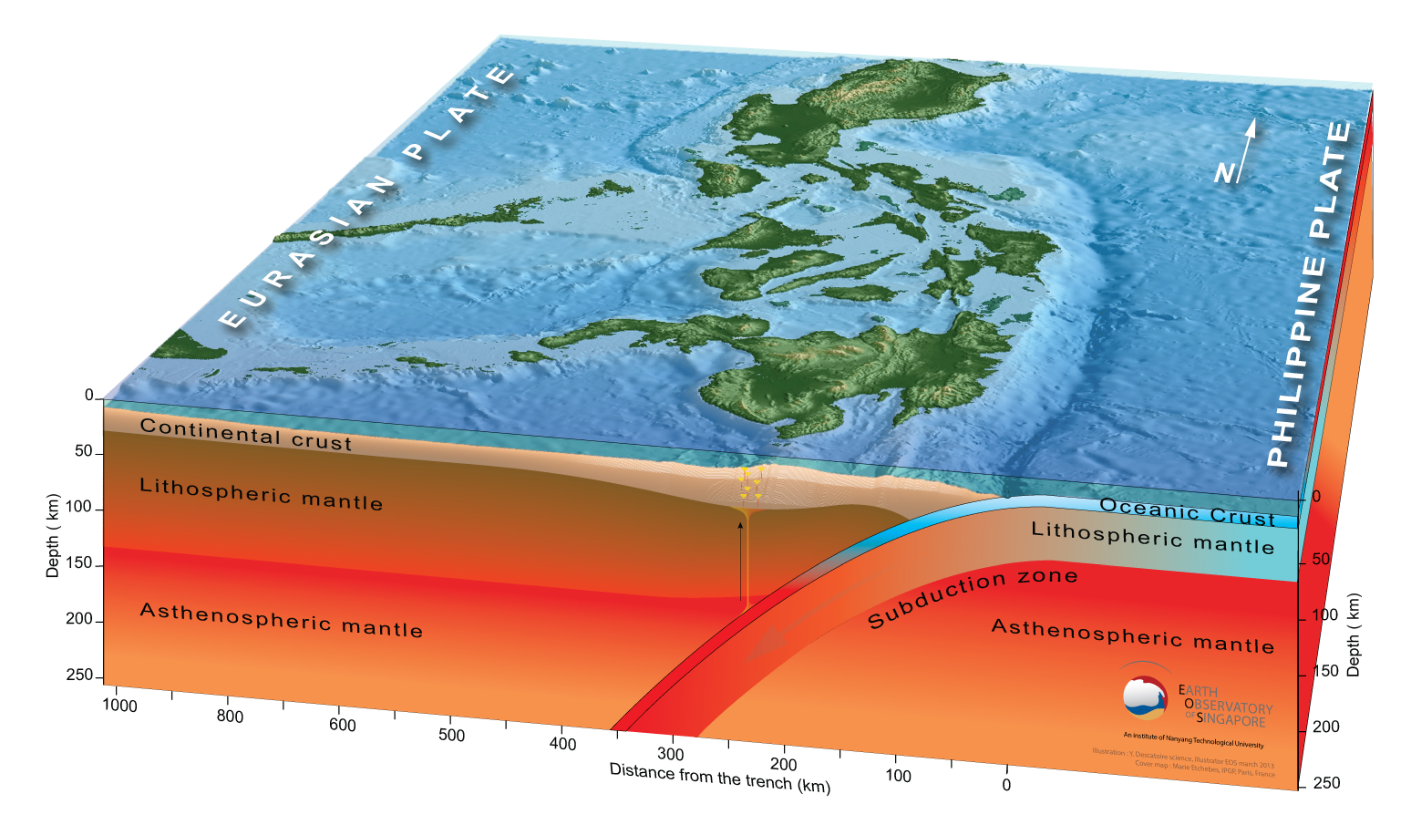
Here is a diagram from Cao et al. (2021) that shows how these two subduction zones are geometrically oriented. I include this and other figures, with their captions, further down in the report.
Today’s M 6.8 earthquake happened in a different tectonic setting.
The 2 August 2024 M 6.8 earthquake has a reverse mechanism, a result of compression.
This part of the Philippines is dominated by the convergent plate margin, a megathrust subduction zone. This subduction zone forms the Philippines trench.
This plate boundary is formed by the subduction of the Philippine Sea plate from the east, downwards beneath the complicated series of plates and microplates that form the archipelago of the Philippines (the main plate to the west is the Sunda plate, part of Eurasia).
On 2 December 2023, there was a M 7.6 earthquake near today’s M 6.8. It is not immediately clear if this M 6.8 was on the megathrust interface. So, it may be that the M 6.8 was within the upper plate (so was triggered by the M 7.6). Some may call the M 6.8 an aftershock, some may consider it a triggered earthquake.
Here is a block diagram showing the tectonic plate boundaries (from Earth Observatory Singapore). Another great illustration is from Hall, further down in the report.
Additional information for this region can be found in the Earthquake Report for the mainshock earthquake in this sequence, the 2 December 2023 magnitude M 7.6 gempa/earthquake.
- In the upper left corner is a map showing the plate tectonic boundaries (from the GEM).
- Below the tectonic map is a low angle oblique view of the plate boundaries showing the subsurface geometry of the subduction zones (Hall, 2011). I placed an orange star in the location of the M 6.8.
- In the lower right corner is a map that shows the M 6.8 earthquake intensity using the modified Mercalli intensity scale. Earthquake intensity is a measure of how strongly the Earth shakes during an earthquake, so gets smaller the further away one is from the earthquake epicenter. The map colors represent a model of what the intensity may be. The USGS has a system called “Did You Feel It?” (DYFI) where people enter their observations from the earthquake and the USGS calculates what the intensity was for that person. The dots with yellow labels show what people actually felt in those different locations.
- In the lower left center is a plot that shows the same intensity (both modeled and reported) data as displayed on the map. Note how the intensity gets smaller with distance from the earthquake.
- In the upper right corner are two maps showing the possibility of earthquake induced liquefaction for these two earthquakes. I discuss these phenomena in more detail later in the report.
- To the left of the ground failure maps is a cross section showing the seismicity of the region along profile C-C’ (Smoczyk et al., 2013). Note how we can see the Philippine Sea plate seismicity diving downwards to the west. The Philippine trench is located at 0 km on the horizontal axis. The M 6.8 earthquake is projected onto this cross section.
I include some inset figures.
2024.07.19 M 7.4 Chile/Bolivia
USGS Earthquake Event Page
https://earthquake.usgs.gov/earthquakes/eventpage/us7000n05d/executive
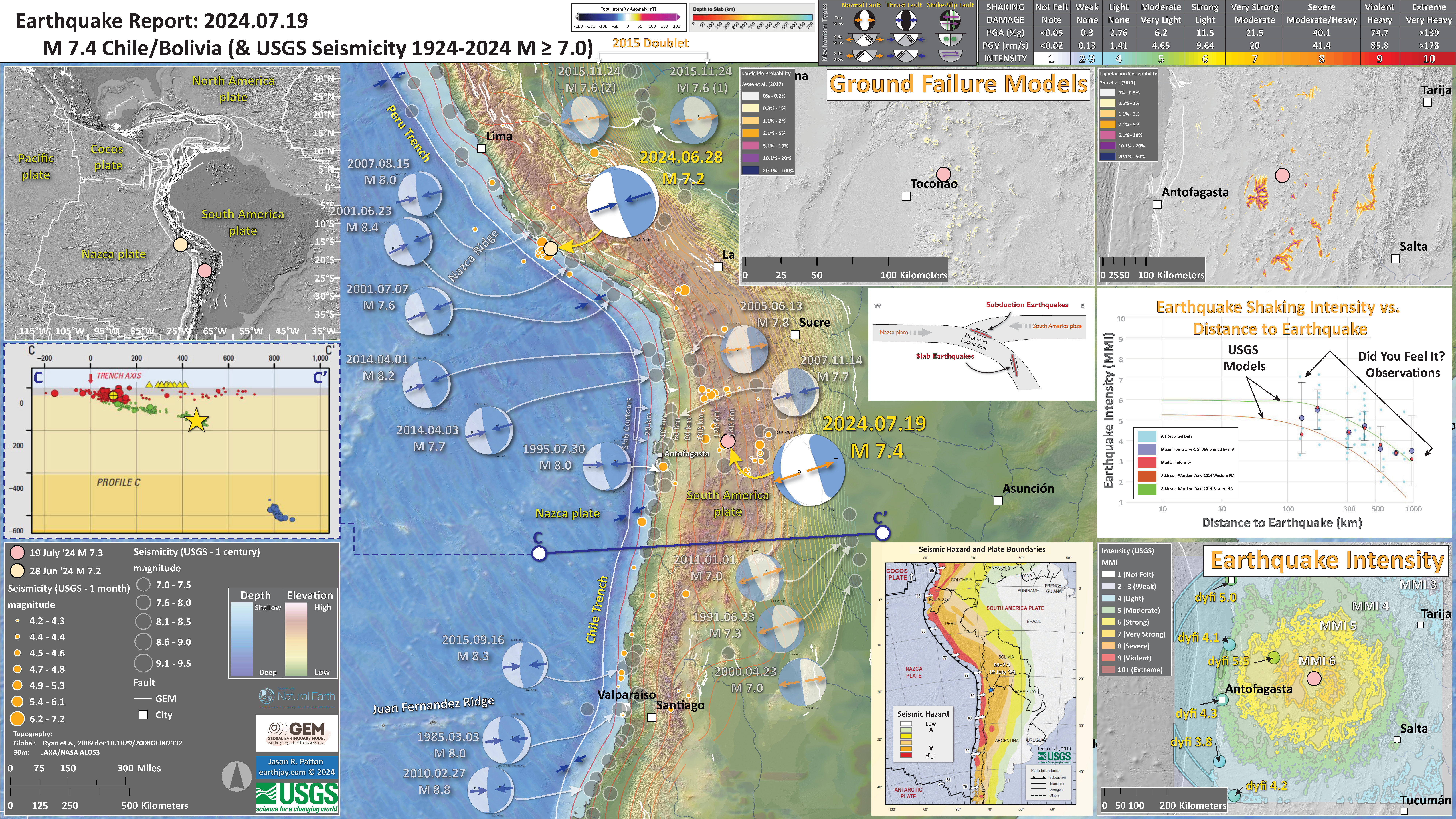
Today’s M 7.4 earthquake was projected by the USGS to have a 30% chance of between 10 and 100 fatalities. Hopefully this is an overestimate.
There is also projected to be significant infrastructural damage. Read the PAGER alert page on the USGS earthquake event page for more information.
This region of Earth is dominated by processes related to a convergent plate boundary, the subduction zone that forms the Peru-Chile deep sea trench.
Here, the megathrust subduction zone is composed of the oceanic Nazca plate diving to the east beneath the continental South America plate.
The largest magnitude earthquakes in the world are along subduction zone earthquakes that slip along the plate interface. The recent earthquake in Peru was such an subduction zone interface event.
Today’s M 7.4 earthquake was, instead, along a fault within the Nazca plate (called a slab earthquake). I present a schematic cross section in the poster and further below in this report, showing where these two types of earthquakes happen.
- In the upper left corner is a large scale plate tectonic map showing the major plate boundary faults.
- To the below is a cross section, cutting into the Earth. Earthquakes that are along the profile C-C’ (in blue on the map) are included in this cross section. I also placed a blue line on the main map in the general location of this cross section. I placed a yellow star in the general location of the M=6.8 earthquake (same for the other inset figures).
- In the center, I include a schematic cross section of the subduction zone. This shows where earthquakes may occur, generally. There are subduction zone megathrust earthquakes (the largest of magnitude), crustal earthquakes, slab earthquakes, and outer rise earthquakes.
- In the upper right corner is a pair of maps that show the landslide probability (left) and the liquefaction susceptibility (right) for this M 7.4 earthquake. I spend more time describing these types of data here. Read more about these maps here.
- In the lower right corner I plot the USGS modeled intensity (Modified Mercalli Intensity scale, MMI) and the USGS “Did You Feel It?” observations (labeled in yellow). Above the map is a plot showing these same data plotted relative to distance from the earthquake. Read more about what these data sets are and what they represent in the report here.
- To the left of the intensity map is a map that shows the relative seismic hazard for this plate boundary (Rhea et al., 2010). I plot the M 7.4 earthquake as a blue star.< The numbers (“80”) indicate the rate at which the Nazca Plate is subducting beneath South America. 80 mm/yr = 3 in/yr.
I include some inset figures. Some of the same figures are located in different places on the larger scale map below.
2024.07.31 M 4.9 Barstow
USGS Earthquake Event Page
https://earthquake.usgs.gov/earthquakes/eventpage/ci40675215/executive
The main fault related to this plate boundary is the San Andreas fault, where the Pacific plate on the west moves north relative to the North America plate on the east.
In southeastern California, there are a bunch of roughly North-South oriented faults that are all right-lateral strike-slip faults (just like the San Andreas fault). These faults in the Mojave Desert are called the Eastern California shear zone (ECSZ). The ECSZ trends from the bend in the San Andreas to the south, northwards, to the east side of the Sierra Nevada, via a tectonic system called the Walker Lane.
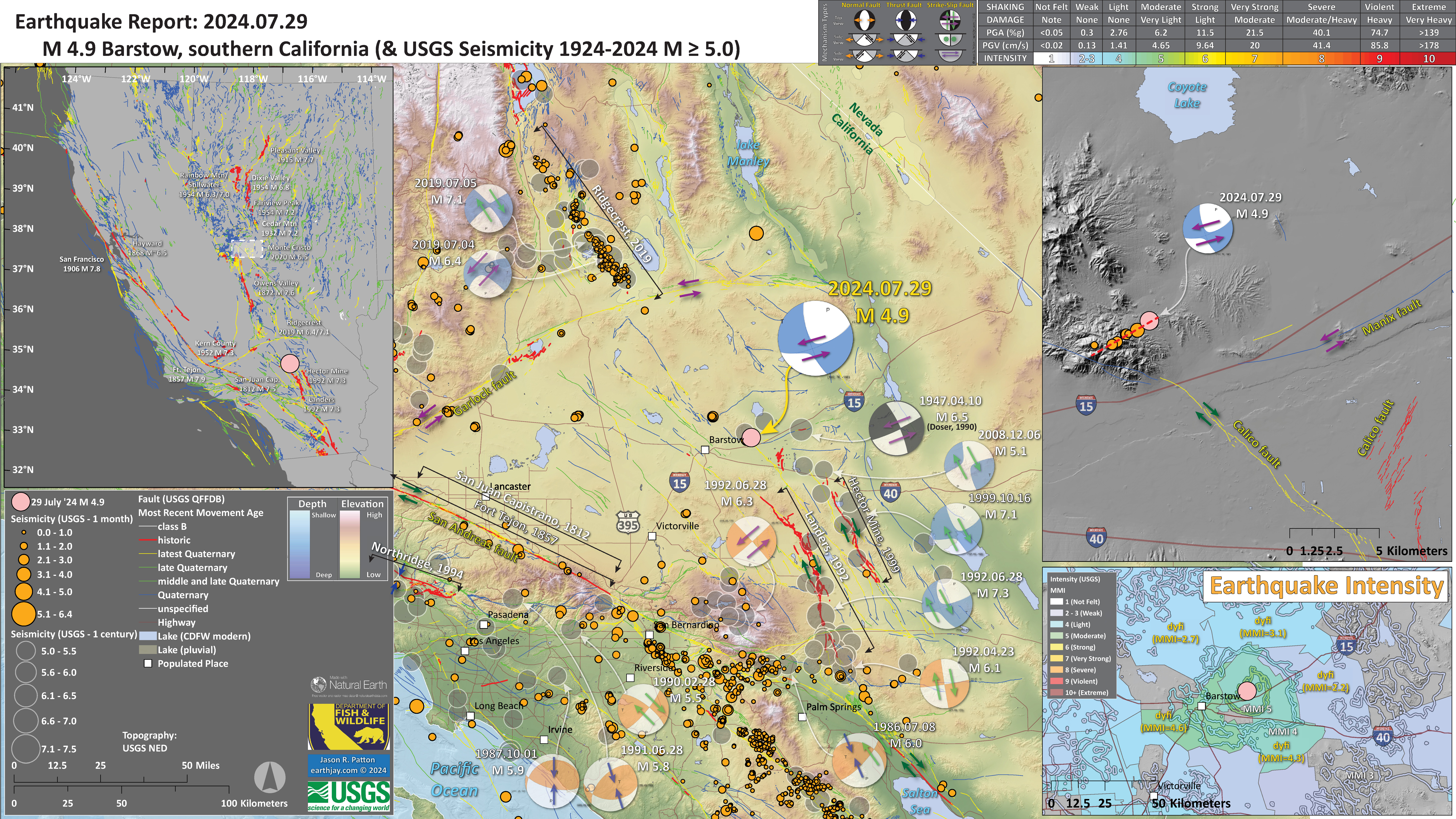
The epicenter (the location of the earthquake on a map) showed that this earthquake happened near the Calico fault. The Calico fault is a right-lateral strike-slip fault, part of the Eastern California shear zone.
These types of faults are where the Earth’s crust moves side by side. Right-lateral means that when one is standing on one side of the fault, the other side of the fault moves to the right.
There is also a major fault system called the Garlock fault (GF). The GF is a roughly East-West oriented left-lateral strike-slip fault. Left-lateral means that when one is standing on one side of the fault, the other side of the fault moves to the left.
The earthquake mechanism (focal mechanism and moment tensor) showed that the M 4.9 earthquake could be a North-South oriented (“striking”) right-lateral strike-slip fault or an East-West oriented left-lateral strike-slip fault.
Given the proximity to the Calico fault (CF), I originally thought this earthquake was on the Calico fault (or nearby fault related to the Calico fault).
But, last night my friend Paul Hancock emailed me with some screenshots of the USGS earthquake page.
Paul noticed that the mainshock and aftershocks aligned with an approximately East-West trend. This was interesting. He asked me what I thought.
I told him that, presuming that the earthquake locations are good (they probably are), then this may be a cross fault. A cross fault is a fault that is about perpendicular (+-) to the main fault system and may connect two other strike-slip faults.
Then I looked at the USGS Quaternary fault and fold database and the CGS fault activity map. There is actually an East-West striking (oriented) strike-slip fault that points right to the M 4.9 earthquake.
The Manix fault is a left-lateral strike-slip fault, similar orientation and fault type as the Garlock fault.
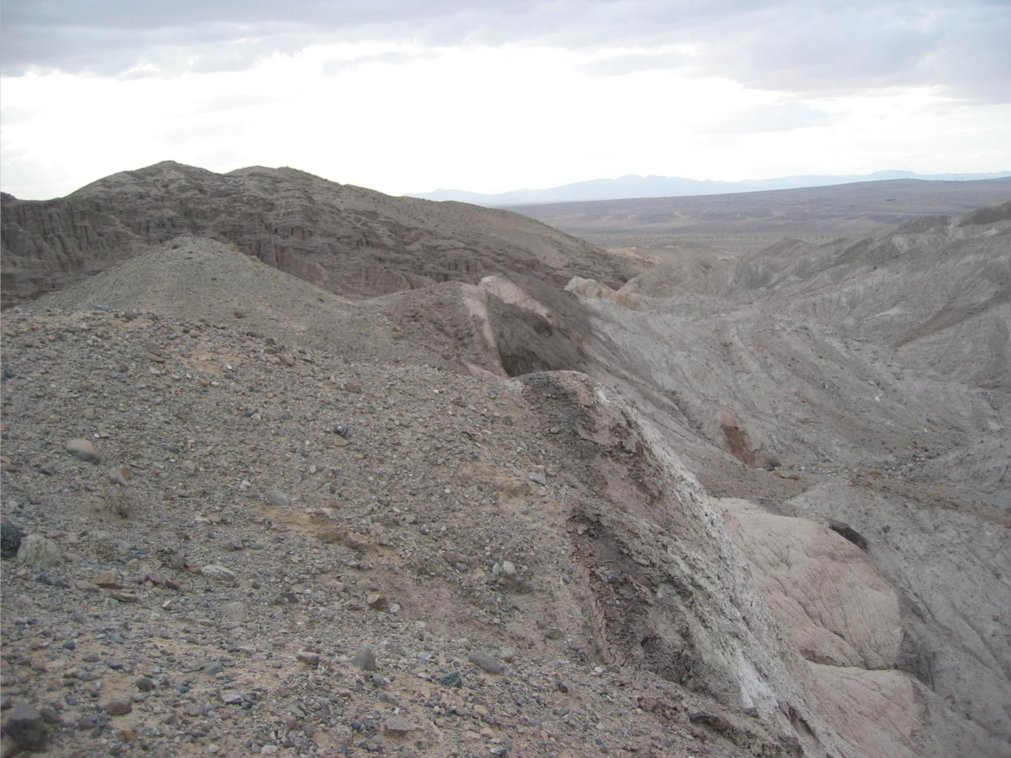
Here is a photo showing the Manix fault (photo credit: Andrew Cyr, USGS).
This made me think of the 2007 Pacific Cell Friends of the Pleistocene field trip, where we reviewed the ongoing research into the Pleistocene (from 2.56 million years ago until about 12 thousand years ago) sedimentary history of the Lake Manix Basin.
Then I looked at the recent papers by people like Marith Reheis and Mike Oskin (as well as some older papers from Richter and Doser). These papers all have different fault maps that show how these faults are quite complex.
Though, after I plotted up the earthquakes, and used the USGS QFFDB, I am sticking with the hypothesis that this M 4.9 earthquake sequence is a left-lateral strike-slip earthquake on a fault related to the Manix fault system.
This is an interesting earthquake sequence, well worthy of an Earthquake Report.
UPDATE
My friend Ken Hudnut sent me a message suggesting I modify this Earthquake Report a bit.
While I wrote that these faults strike in the North-South and East-West directions, they actually strike a little differently.
Most of the San Andreas oriented faults strike north-northwest/south-southeast (N-NW/S-SE) and most of the faults that are similar to the Garlock fault strike east-northeast/west-southwest (E-NE/S-SW).
The orientation of the relative motion between the Pacific and North America plates is close to N35W (35 degrees counterclockwise from North) as determined by DeMets and Merkouriev (2016).
Here is a figure from DeMets and Merkouriev (2016) that shows the relative plate motion rates through time. See the lower panel and look at the blue line, how it plots at 35 degrees.
Pacific–North America interval rates (a) and slip directions (b) since 8 Ma estimated at 36.0◦N, 120.6◦W along the San Andreas Fault of central California (star in insetmap). The best-fitting interval velocitieswere derived from finite rotations in Table 4 as described in Section 4.3.1. Other sources for the interval velocities are listed in the legend. Horizontal dashed lines show the time intervals spanned by the best-fitting interval rates and directions. Where shown, the uncertainties are 1σ and are propagated from the angular velocity covariances. Some uncertainties are omitted for clarity.
- In the upper left corner is a map that shows the earthquake faults and historic earthquake locations (epicenters) in the western US. Historic earthquake fault ruptures are mapped as red lines and labeled with their year and magnitude.
- In the lower right corner is a map that shows a comparison of the US Geological Survey Shakemap (a model of how strong the ground might shake during the M 5.8 earthquake) and results from online web surveys from peoples’ real observations (i.e. “Did You Feel It?” reports. The colored lines show the boundary between different levels of intensity using the Modified Mercalli Intensity (NNI) scale. The areas are colored relative to the DYFI reports, using the same MMI scale and colors shown on the legend).
- In the upper right corner is a map that shows the aftershocks relative to the USGS Quaternary Active Fault and Fold Database.
I include some inset figures. Some of the same figures are located in different places on the larger scale map below.
2024.08.02 M 6.8 Philippines
USGS Earthquake Event Pages
11 July 2024 M 7.1:
https://earthquake.usgs.gov/earthquakes/eventpage/us7000myfa/executive
2 August 2024 M 6.8:
https://earthquake.usgs.gov/earthquakes/eventpage/us6000nhqc/executive
See 11 July 2024 material above ^^^
2024.08.08 M 7.1 Japan
USGS Earthquake Event Pages
https://earthquake.usgs.gov/earthquakes/eventpage/us6000nith/executive
The plate tectonics of Japan is dominated by compressional forces. Convergent plate boundaries are where plates move towards each other.
In Japan, these convergent plate boundaries are called subduction zones (one plate “subducts,” or dives, beneath another plate).
The Japanese invest heavily in earthquake science because there has been a long history of subduction zone earthquakes.
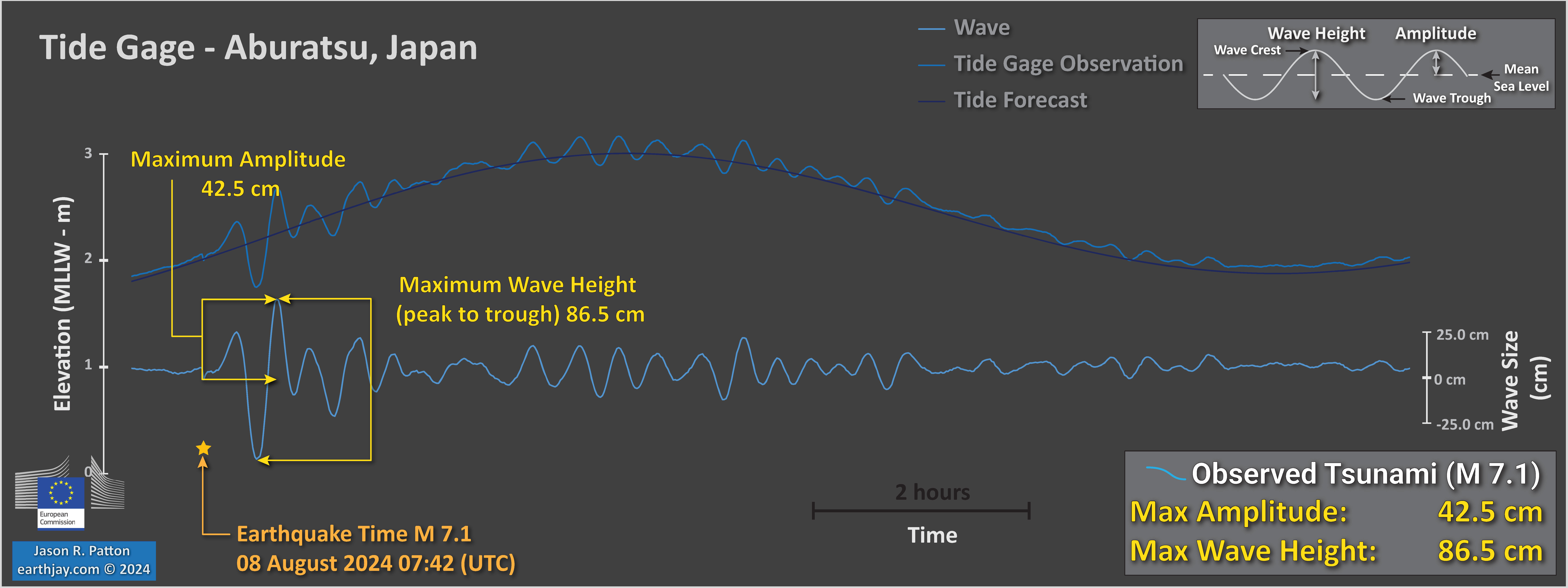
This M 7.1 earthquake generated a tsunami. The tsunami was observed on tide gages along the coast of Japan but was too small to generate a trans-Pacific tsunami.
This is an animated model of the Great East Japan tsunami of 2011. The warmer the colors, the larger the wave. The first surges reached the closest Japan coasts in about 25 minutes. The first surges reached Crescent City in 9.5 hours.
-
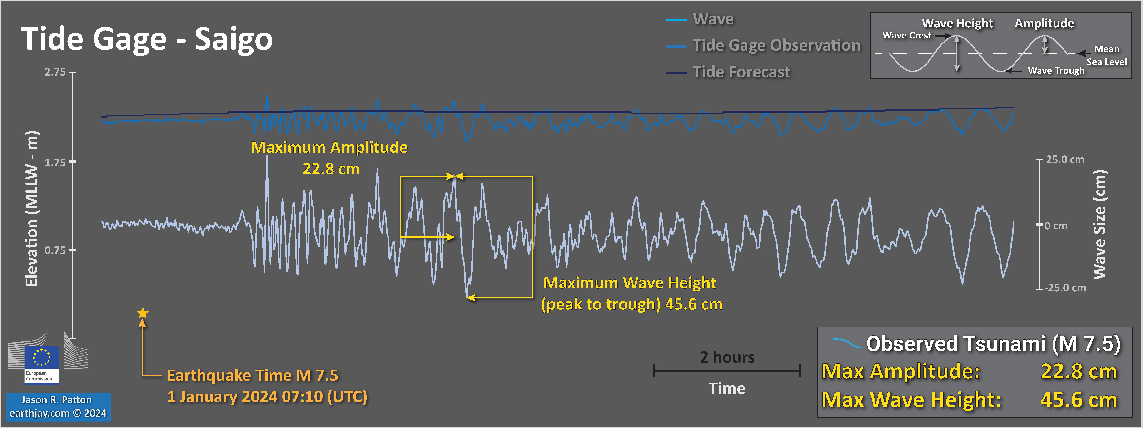
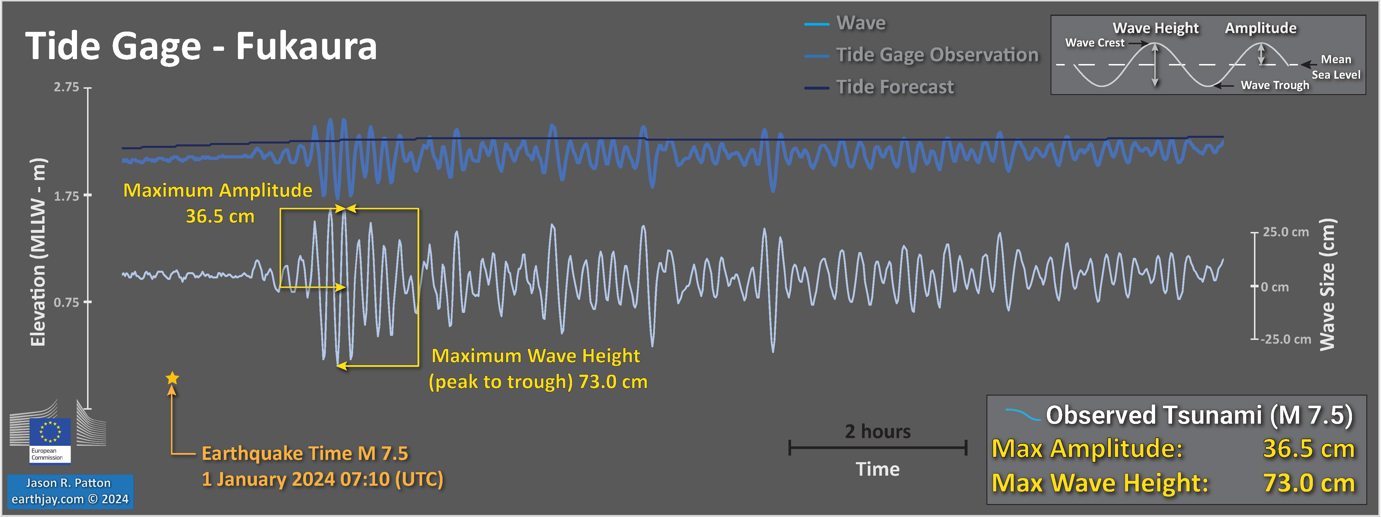
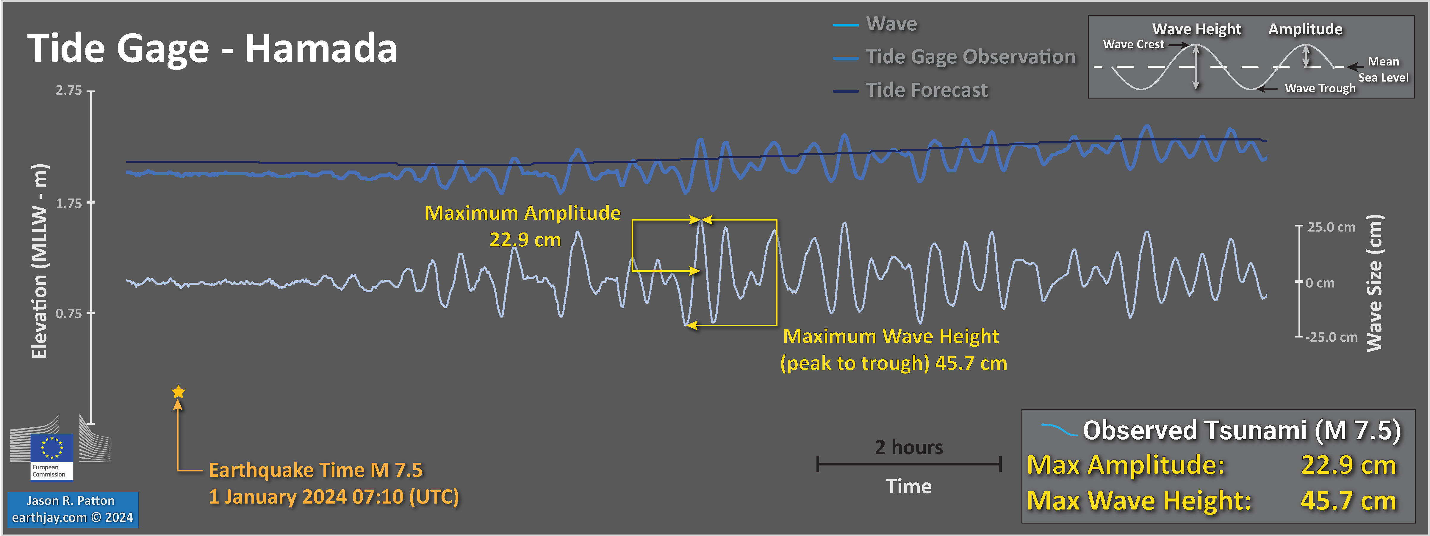
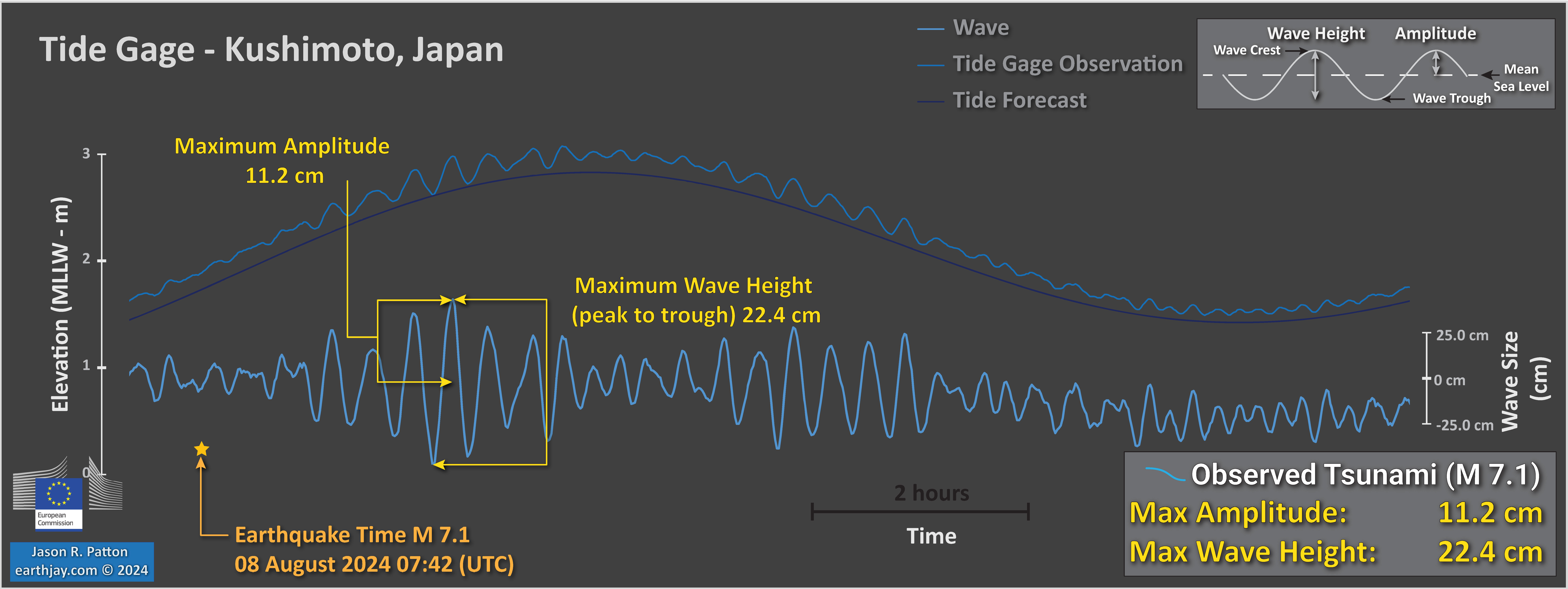
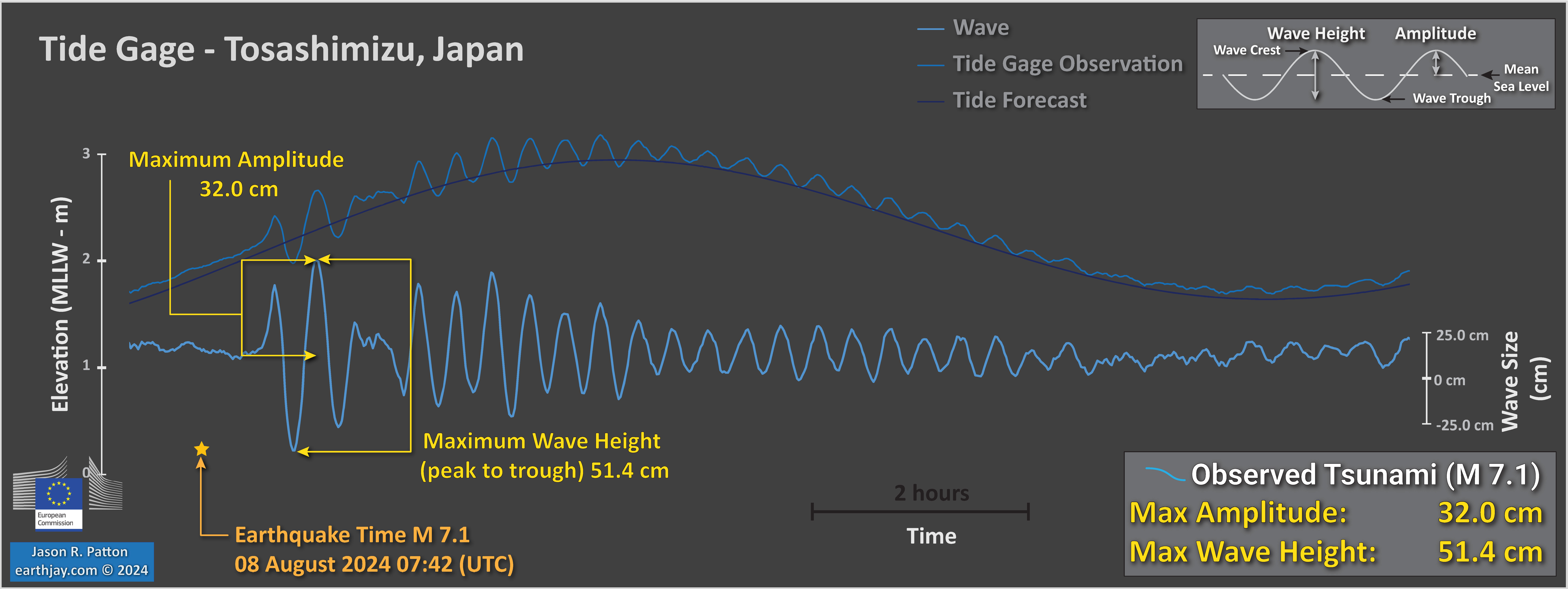
Here are three tide gage records from the coast of Japan.
Time is represented by the horizontal axis and elevation is represented on the vertical axis. The darker blue line in this image represents the tidal forecast. The data recorded by the tide gage are represented by the medium blue colored line. The difference between the prediction and the observation is the tsunami signal (plus any background oceanographic conditions like storm swell or wind waves).
Wave height is the distance measured between the wave crest and trough. Wave amplitude is the level of water above sea level.
These data came from the Eurpoean Union Water Levels website.
The locations of these tide gages are shown on the interpretive poster.
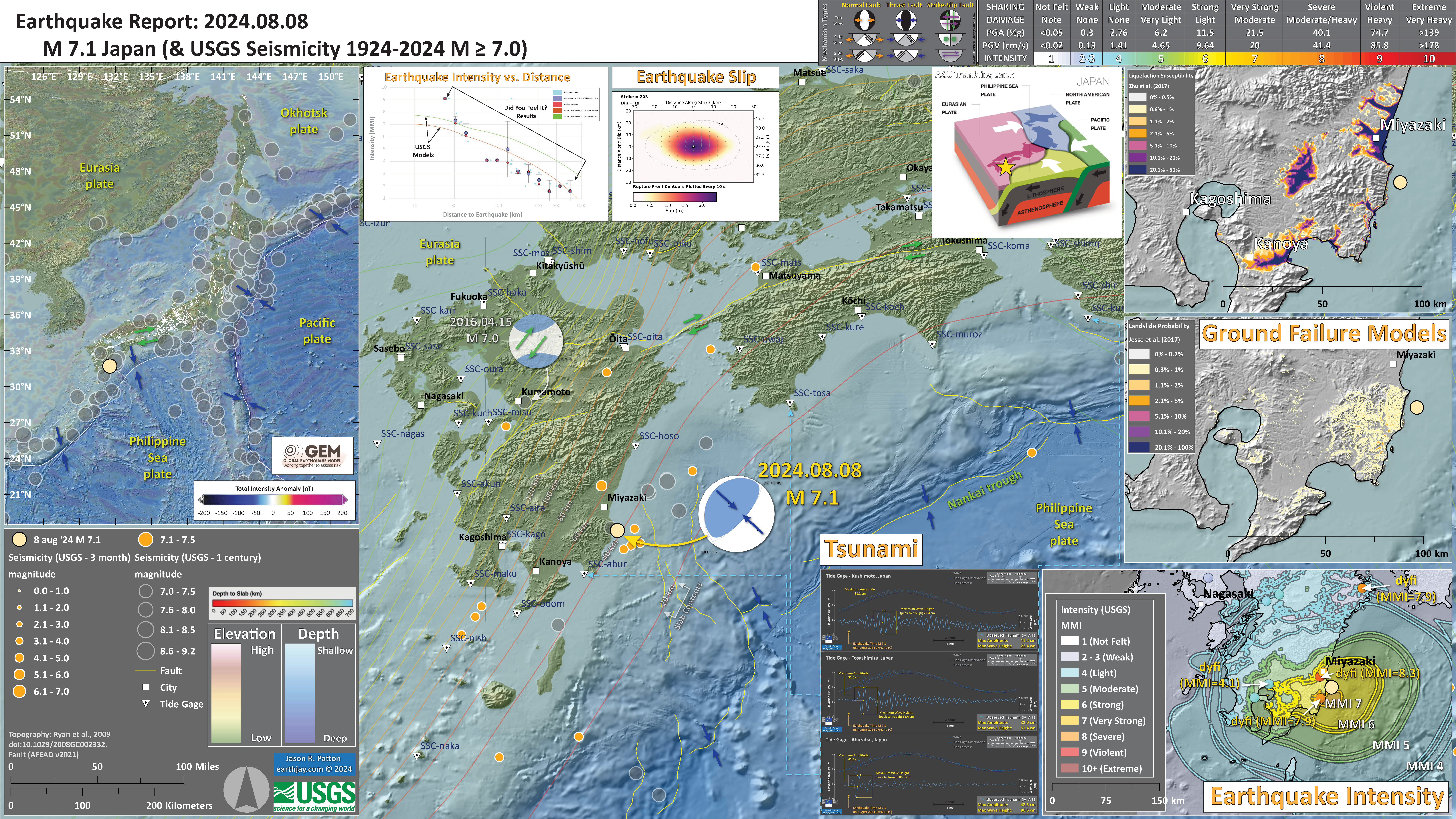
- In the upper left corner is a map showing the plate tectonic boundaries (from the GEM).
- In the lower right corner is a map that shows the M 7.1 earthquake intensity using the modified Mercalli intensity scale. Earthquake intensity is a measure of how strongly the Earth shakes during an earthquake, so gets smaller the further away one is from the earthquake epicenter. The map colors represent a model of what the intensity may be. The USGS has a system called “Did You Feel It?” (DYFI) where people enter their observations from the earthquake and the USGS calculates what the intensity was for that person. The dots with yellow labels show what people actually felt in those different locations.
- In the upper left center is a plot that shows the same intensity (both modeled and reported) data as displayed on the map. Note how the intensity gets smaller with distance from the earthquake.
- To the right of this intensity plot is the USGS finite fault slip model. Colors represent the amount of fault slip that their model calculates.
- In the upper right corner are two maps showing the possibility of earthquake induced liquefaction for these two earthquakes. I discuss these phenomena in more detail later in the report.
- To the left of the ground failure maps is a low angle oblique cross section showing the plate configuration in three dimensions (from AGU Trembling Earth, Austin Elliot). I place a yellow star in the region of the M 7.1 earthquake. Note how we can see the Philippine Sea plate seismicity diving downwards beneath the Eurasia plate.
- In the lower right center are plots from three tide gage locations (shown on the map). These individual plots are included later in the report.
I include some inset figures. Some of the same figures are located in different places on the larger scale map below.
2024.08.17 M 7.0 Kamchatka
USGS Earthquake Event Pages
https://earthquake.usgs.gov/earthquakes/eventpage/us7000n7n8/executive
This region of the world is fascinating. There are two subduction zones in this region (convergent plate boundaries, where plates move towards each other and one dives down beneath the other one).
To the east is the Alaska-Aleutian subduction zone where the Pacific plate subducts northwards below the North America plate. This subduction zone extends from southern Alaska, westwards, along the Aleutian island chain.
The Aleutian Islands are called a magmatic arc, where the subducted plate (which has lots of water in the rocks) leads to the mantle melting. Once the mantle melts, the molten magma rises because it is less dense.
This magma rises to the surface, creating volcanoes (which are the islands we see).
Because of the relative motion between the Pacific and North America plates, where the relative motion is not convergent but side-by-side, the plate boundary turns into a strike-slip plate boundary (called the Bering Kresla fracture zone).
Then in Kamchatka, there is another subduction zone that starts in north-central Kamchatka and extends to southern Japan. The Pacific plate subducts westwards beneath the Okhotsk plate (a plate between Eurasia and North America).
Kamchatka has volcanoes too, and the Kuril Islands to the south of Kamchatka are another magmatic arc island chain.
The M 7.0 Earthquake last weekend has a reverse or thrust mechanism. The depth of the earthquake suggests that this event was either along the megathrust subduction zone fault (called an interface earthquake), or in the upper or lower plate.
This M 7.0 earthquake happened in a place where there are frequent earthquakes of similar magnitude and rare earthquakes of much larger magnitude.
One historic earthquake was the M 8.8-9.0 1952 Kamchatka earthquake that generated a large tsunami that was observed across the Pacific Ocean.
Dr. Breanyn T. MacInnes studied the deposits from this 1952 earthquake and included these and tsunami modeling to produce a slip model for this earthquake (MacInnes et al., 2010). Slip models are models that show us how much the fault slipped during an earthquake. We will look at some examples of this later in the report!
This M 7.0 generated a small local tsunami according to the Pacific Tsunami Warning Center. Though i could not locate any tsunami records on tide gage data (the PTWC used DART buoy data for their conclusion).
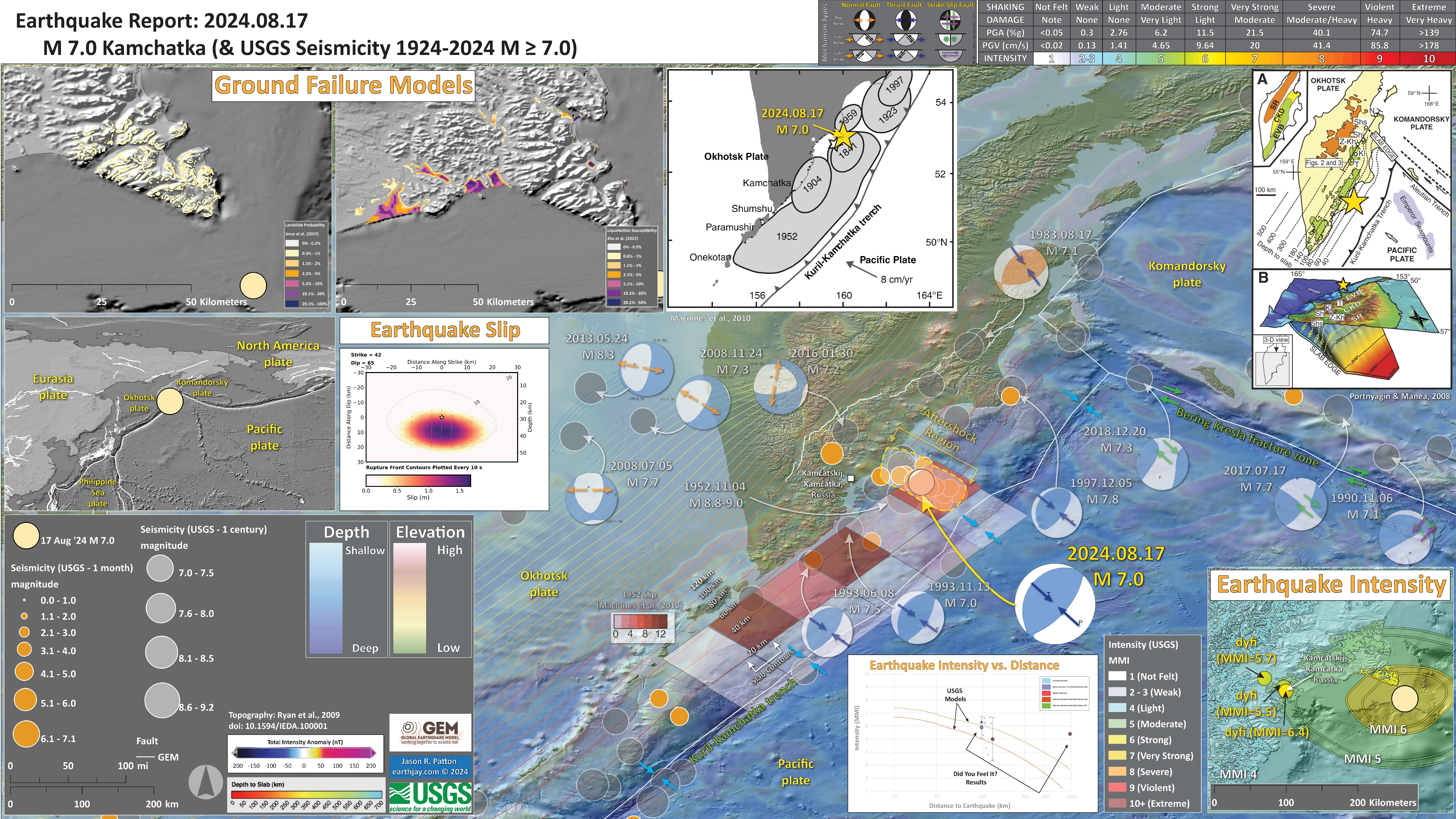
- In the left center is a map showing the plate tectonic boundaries (from the GEM).
- To the right of this intensity plot is the USGS finite fault slip model. Colors represent the amount of fault slip that their model calculates.
- In the lower right corner is a map that shows the M 7.00 earthquake intensity using the modified Mercalli intensity scale. Earthquake intensity is a measure of how strongly the Earth shakes during an earthquake, so gets smaller the further away one is from the earthquake epicenter. The map colors represent a model of what the intensity may be. The USGS has a system called “Did You Feel It?” (DYFI) where people enter their observations from the earthquake and the USGS calculates what the intensity was for that person. The dots with yellow labels show what people actually felt in those different locations.
- To the left of the intensity map is a plot that shows the same intensity (both modeled and reported) data as displayed on the map. Note how the intensity gets smaller with distance from the earthquake.
- In the upper left corner are two maps showing the possibility of earthquake induced liquefaction for these two earthquakes. I discuss these phenomena in more detail later in the report.
- In the upper right corner is a map and a low angle oblique view of the subducted Pacific plate beneath the Okhotsk plate (Portnyagin and Manea, 2008). I place a yellow star in the region of the M 7.1 earthquake.
- In the upper center is a map from MacInnes et al;., 2010 that shows historic earthquake patches.
- I include an overlay from MacInnes et al. (2010) for their slip model of the 1952 earthquake.
I include some inset figures. Some of the same figures are located in different places on the larger scale map below.
2024.10.24 M 4.4 NAP
USGS Earthquake Event Pages
https://earthquake.usgs.gov/earthquakes/eventpage/nc75077996/executive
The M 4.4 sequence earthquake epicenters (the locations on a map) initially plotted in a roughly east-west trend. Because they were in the general location of the right-lateral strike-slip Mendocino fault, I thought they were related to that fault.
I mistakenly interpreted the earthquake mechanisms to be east-west right-lateral strike-slip earthquakes. However, for them to be aligned on an east-west fault, they would have been left-lateral strike-slip earthquakes.
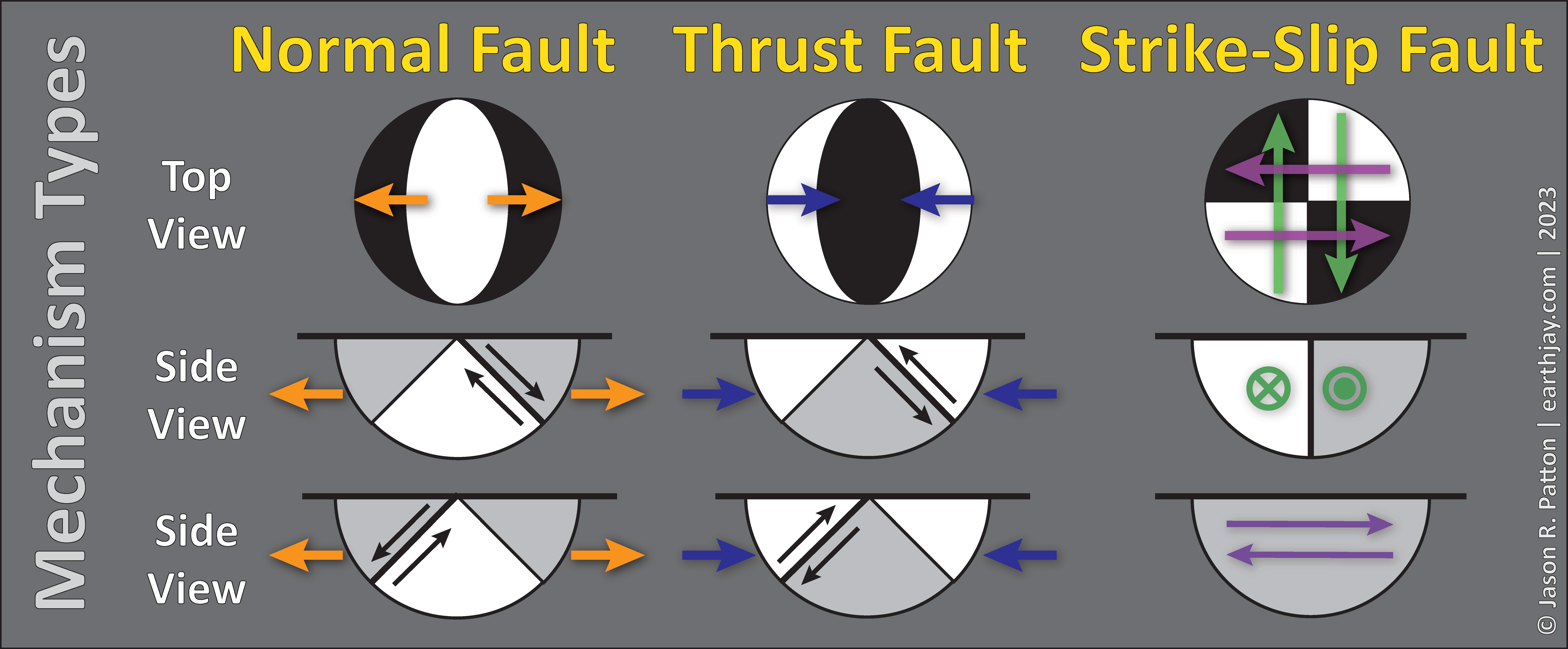
Here is a legend showing earthquake mechanisms and the faults they represent. Don’t worry about how these mechanisms are constructed.
Until someone is more advanced, all one really needs to know is:
- that if the mechanism looks like a checkerboard, it is a strike-slip earthquake (the fault moved side-by-side).
- If the mechanism looks like an Oreo cookie (chocolate cookies with white filling), it is a normal fault earthquake (formed by extension).
- If the mechanism looks like the opposite of an Oreo cookie, it is a reverse or thrust fault earthquake (formed by compression).
I had been ill for a couple weeks (long story) and it was the middle of the night. This, combined with the way the epicenters plotted, probably contributed to my misinterpretation. I have done it before (as have others), i am only human.
In the morning I touched base with my friend Bob McPherson. We discussed these earthquakes. I noticed that they were now aligned in a more north-south trend.
Then I noticed the mechanisms and how my interpretation from the previous night was impossible.
After chatting with Bob, we concluded that these earthquakes were along a north-south trending right-lateral strike-slip fault in the North America plate.
Bob pointed out that these earthquakes may be related to the 1991 Honeydew Earthquake. He and I are working on various interpretations of earthquakes in the Mendocino triple junction area.
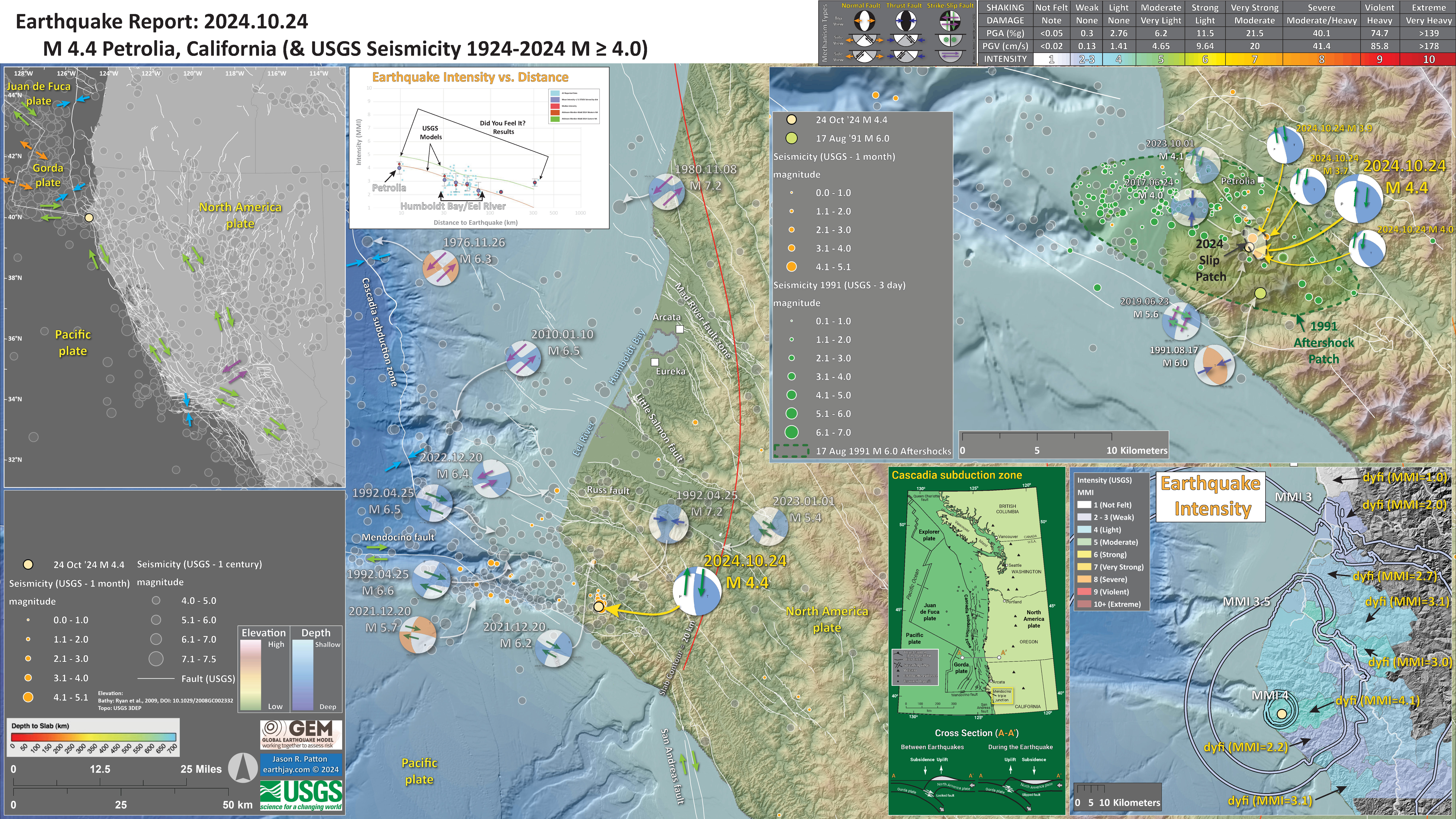
- In the upper left corner is a small scale view of the Mendocino triple junction where the southern Cascadia subduction zone meets the right-lateral Mendocino and San Andreas strike-slip faults.
- In the upper left center is a plot of earthquake intensity (vertical axis) relative to distance from the earthquake (horizontal axis). The blue and orange dots represent USGS Did You Feel It? reports, observations from real people. The green and orange lines show the plots from the USGS [empirical] models of shaking intensity.
- To the lower right corner is a map that shows these same data. The colored areas are the average intensity reported by people (dyfi numbers). The colored lines represent the USGS modeled intensities. Both the plot and the map show that the shaking intensity gets smaller with distance from the earthquake.
- In the upper right corner is a map that shows the aftershocks from the 1991 Honeydew earthquake in green. I label the Oct 2024 earthquakes with yellow arrows/writing. I include the mechanisms from historic earthquakes that are the nearest to the Oct 2024 sequence.
I include some inset figures. Some of the same figures are located in different places on the larger scale map below.
2024.11.10 M 6.8 Cuba
USGS Earthquake Event Pages
https://earthquake.usgs.gov/earthquakes/eventpage/us7000nr0v/executive
The M 6.8 earthquake mechanism was also oriented to be left-lateral strike-slip. Then have been three M 4+ earthquakes and they all align in an east-west trending line.
There is a high likelihood that this earthquake sequence was along the SOF.
I monitored the tide gages in the Caribbean, particularly ones that were closest to the earthquakes. Strike-slip earthquakes can generate tsunami, especially if the seafloor is shaped in a way that displaces seawater during the earthquake.
Tsunami from strike-slip earthquakes simply displace less water than subduction zone earthquakes, so generate smaller tsunami. There was a magnitude M 7.7 left-lateral strike-slip earthquake along the SOF at about 150 km to the west of yesterday’s M 6.8 earthquake.
https://earthquake.usgs.gov/earthquakes/eventpage/us60007idc/executive
Here is the earthquake report for the 2020 M 7.7 earthquake. This M 7.7 earthquake generated a tsunami with an amplitude of about 1 meter (vertical distance between the peak and the trough of the tsunami).
There may have been a tsunami from yesterday’s M 6.8 earthquake but it would have been much smaller than the one from the 2020 M 7.7 earthquake, possibly even undetectable.
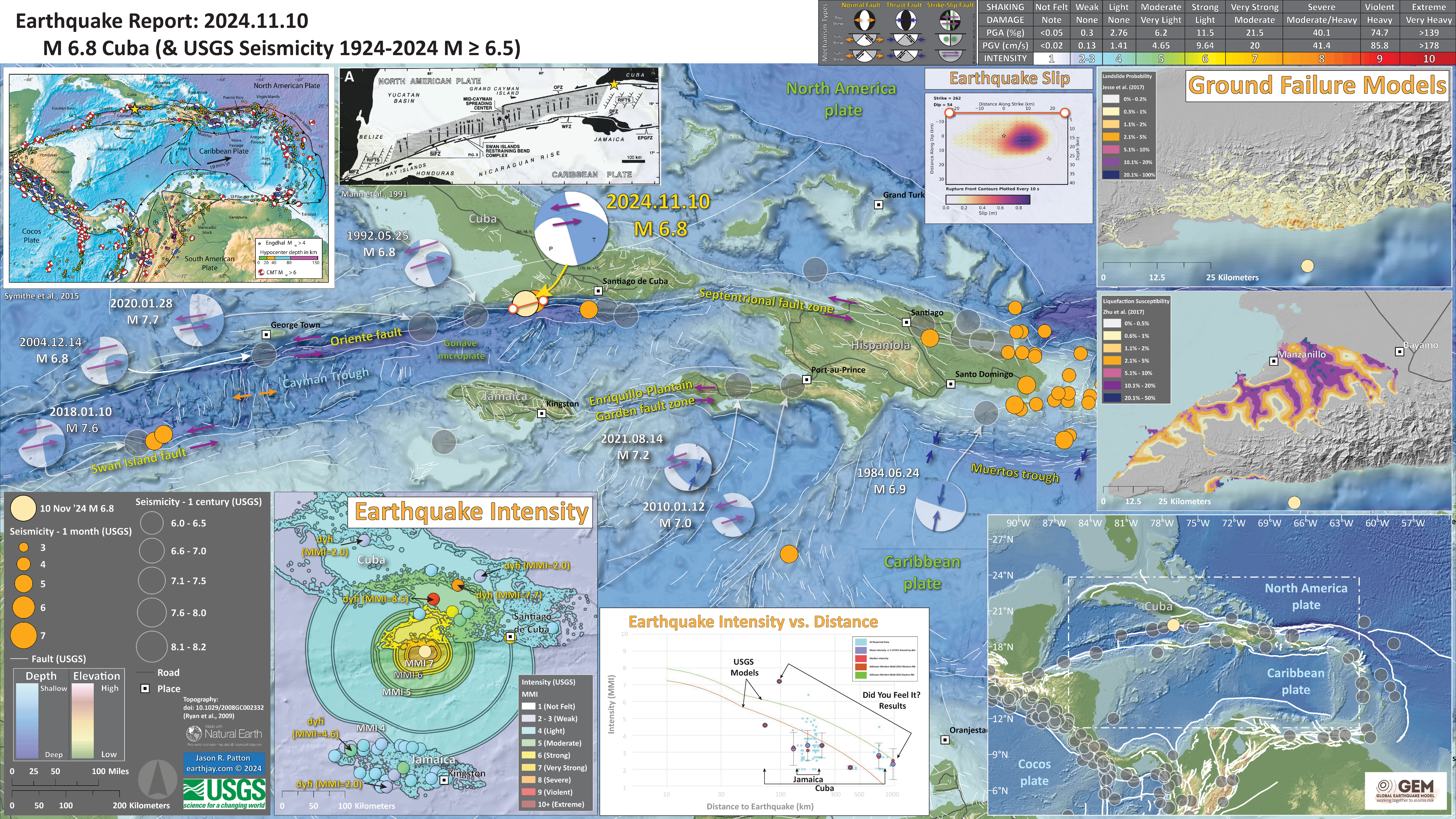
- In the lower right corner is a map showing the plate tectonic boundaries (from the GEM).
- In the lower left corner is a map that shows the M 6.8 earthquake intensity using the modified Mercalli intensity scale. Earthquake intensity is a measure of how strongly the Earth shakes during an earthquake, so gets smaller the further away one is from the earthquake epicenter. The map colors represent a model of what the intensity may be. The USGS has a system called “Did You Feel It?” (DYFI) where people enter their observations from the earthquake and the USGS calculates what the intensity was for that person. The dots with yellow labels show what people actually felt in those different locations.
- To the right of the intensity map is a plot that shows the same intensity (both modeled and reported) data as displayed on the map. Note how the intensity gets smaller with distance from the earthquake.
- In the upper right corner are two maps showing the possibility of earthquake induced liquefaction for these two earthquakes. I discuss these phenomena in more detail later in the report.
- To the left of the ground failure interpretation maps is the USGS finite fault model for the M 6.8 earthquake. They model slip on a rectangular fault and color represents how much the fault moved (up to about 0.9 meters).
- In the upper left corner is a map from Symithe et al. (2015) showing the plates, their boundaries, and earthquake mechanisms for some significant earthquakes. These mechanisms reveal what type of fault is formed at the plate boundaries.
- To the right of the Symithe map is a map from Mann et al. (1991) that shows the faults and magnetic anomalies that are evidence for the oceanic spreading ridge that forms the Cayman trough.
I include some inset figures. Some of the same figures are located in different places on the larger scale map below.
2024.12.05 M 7.0 Mendocino fault
USGS Earthquake Event Pages
https://earthquake.usgs.gov/earthquakes/eventpage/nc75095651/executive
Today’s M 7.0 earthquake has a strike-slip mechanism. Because of the location along the Mendocino fault (MF, a right-lateral strike-slip earthquake fault) and the aftershocks, it is straightforward to interpret this as a right-lateral strike-slip earthquake.
Yesterday morning (early, i remember) there were a couple M 4+ earthquakes also along the MF. They seemed to be east of the last M7+ MF earthquake, a M 7.1 earthquake on 1 September 1994. But upon further inspection, these earthquakes were west of the 1994 earthquake. it is always better to have a second or third look at things.
The MF is a plate boundary fault between the Pacific plate to the south and the Gorda plate (part of the Juan de Fuca plate system).
To the north, the Gorda oceanic plate dives down into the Earth, beneath the North America continental plate. Where these plates meet is called the Cascadia subduction zone, a convergent plate boundary where plates move towards each other.
The Cascadia subduction zone (CSZ) has never had an historic earthquake but there is a history of prehistoric earthquakes (going back about 10,000 years in places). The CSZ is a source of tsunami for the northeast Pacific, from northern California, through Oregon and Washington, up to Canada.
Prehistoric CSZ tsunami have even travelled across the Pacific Basin to inundate in places like Japan!
The MF, that forms the southern boundary of the Gorda plate, follows the Gorda plate beneath North America. Historic seismicity shows where the southern edge of the Gorda plate (aka the MF) is located.
There was a MF earthquake in 1994 that had an epicenter about 50 km to the west of today’s M 7.0. Aftershocks from the 1994 earthquake spanned across the shoreline.
Today’s M 7.0 earthquake spanned the eastern part of the 1994 rupture. Perhaps the 1994 earthquake had less slip in this eastern part of the fault?
Below I explore the ground shaking and ground failure models from the USGS. All the data that i plot in this report is freely available from the USGS.
[NOTE] Mendocino fault:
Earlier studies, from the late 20th century (e.g., Jachens and Griscomb, 1983) used geophysical data to locate the southern edge of the Gorda plate. But there were just as many papers that suggested it was not as far south as the Jachens and Griscomb model.
While there was strong evidence for both interpretations (in the 1980s), most models of the CSZ chose the southern edge, the Jachens and Griscomb southern edge.
It is clear, however, that Jachens and Griscomb are most likely incorrect. There must be other explanations for their crude geophysical observations. (these types of observations are indirect and difficult to interpret in an unequivocal way).
We are trying to get all new updated slab models to abandon the Jachens and Griscom model. All earthquake catalogs with relocated seismicity show a knife edge southern edge of the Gorda plate.
I will write more about this observation. There was a tsunami recorded on the Arena Cove tide gage.
There does not appear to be a tsunami recorded at the North Spit tide gage. But there is a long period (1 hour-ish) wave recorded on that gage. Plus there are observations that the Arcata Bay drained and filled up about 3 times on a uith a 30 minute period. We are working on this. Was it a seiche? (generated by the interaction between seismic surface waves and the geometry of the bay (causing resonance).
Here is the plot from the Arena Cove tide gage.
The water levels before the tsunami show considerable background noise. So, it is difficult to know how much of the wave size is attributable solely to the tsunami.
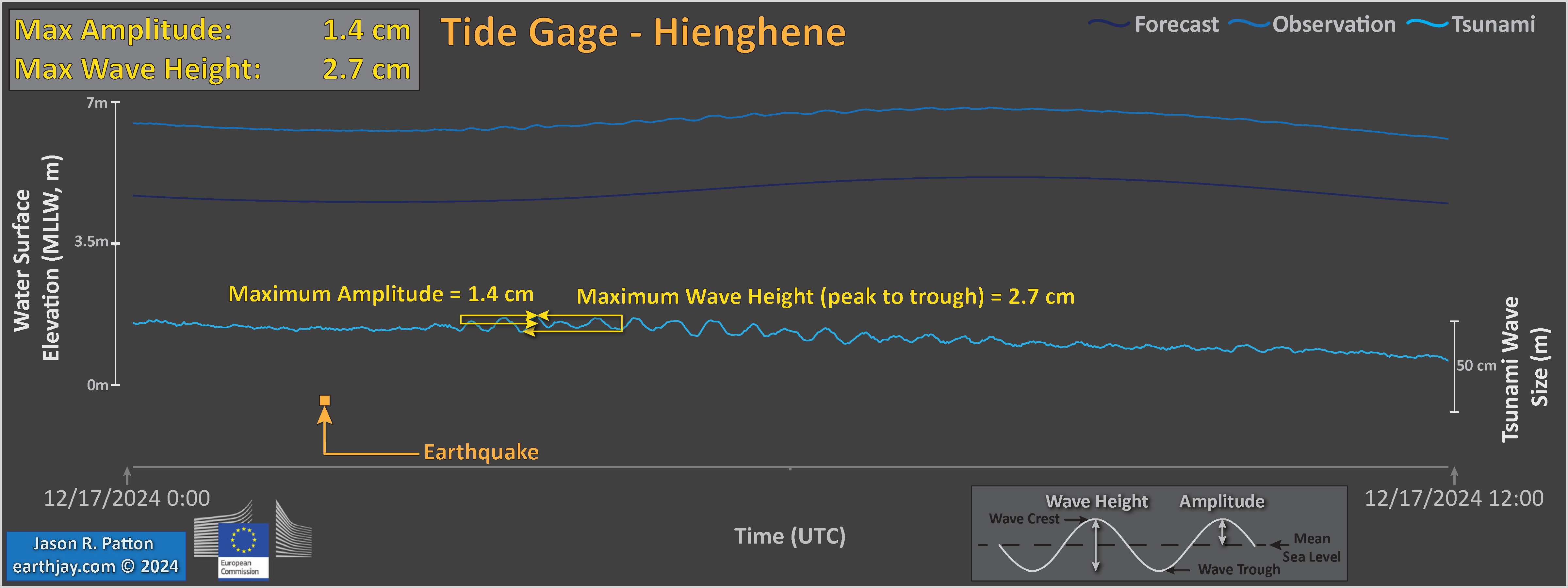
The official wave size is 9 cm. But i get different values.
- In the upper left corner is a map showing the plate tectonic boundaries (from the GEM).
- In the upper right corner is a map that shows the M 6.8 earthquake intensity using the modified Mercalli intensity scale. Earthquake intensity is a measure of how strongly the Earth shakes during an earthquake, so gets smaller the further away one is from the earthquake epicenter. The map colors represent a model of what the intensity may be. The USGS has a system called “Did You Feel It?” (DYFI) where people enter their observations from the earthquake and the USGS calculates what the intensity was for that person. The dots with yellow labels show what people actually felt in those different locations.
- To the left of the intensity map is a plot that shows the same intensity (both modeled and reported) data as displayed on the map. Note how the intensity gets smaller with distance from the earthquake.
- In the upper right corner are two maps showing the possibility of earthquake induced liquefaction for these two earthquakes. I discuss these phenomena in more detail later in the report.
- In the upper left center is a map that shows the displacement of benchmarks as measured by GNSS (used to be called GPS) observations. The displacement is represented by an arrow. The blue arrows show the direction and distance each benchmark moved (the arrow is called a vector). The USGS uses observations from seismometers and from these displacements to model the amount that the fault slipped during the earthquake. The red vectors show how their slip model generates displacement at these benchmark locations. The model is imperfect as we see that the red and blue vectors are all a little different (though they are all very close).
- In the lower left center is the USGS finite fault slip model. This rectangle represents the fault that slipped during the earthquake (see the location of this fault model on the map, the orange line). The color represents the amount of fault slip in different parts of the fault. I used the USGS coordinates to plot the fault slip model on the map, but it is clear that this is incorrect. I will try to update this manually later.
I include some inset figures. Some of the same figures are located in different places on the larger scale map below.
- Here is the map with a month’s seismicity plotted.
- Note that i outlined the regions of the aftershocks for both the 1994 (in green) and the 2024 (in orange/white) earthquake sequence. This interpretation is consistent with the figure from Dengler showing mechanisms for the earthquakes in 1994 (see below).
- The rupture length for the 1994 earthquake was much longer than that for the 2024 earthquake. Why do you think this is?
2024.12.17 M 7.3 Vanuatu
USGS Earthquake Event Pages
https://earthquake.usgs.gov/earthquakes/eventpage/us7000nzf3/executive
The tectonics of Vanuatu is dominated by a subduction zone, a convergent plate boundary.
I include some inset figures. Some of the same figures are located in different places on the larger scale map below.
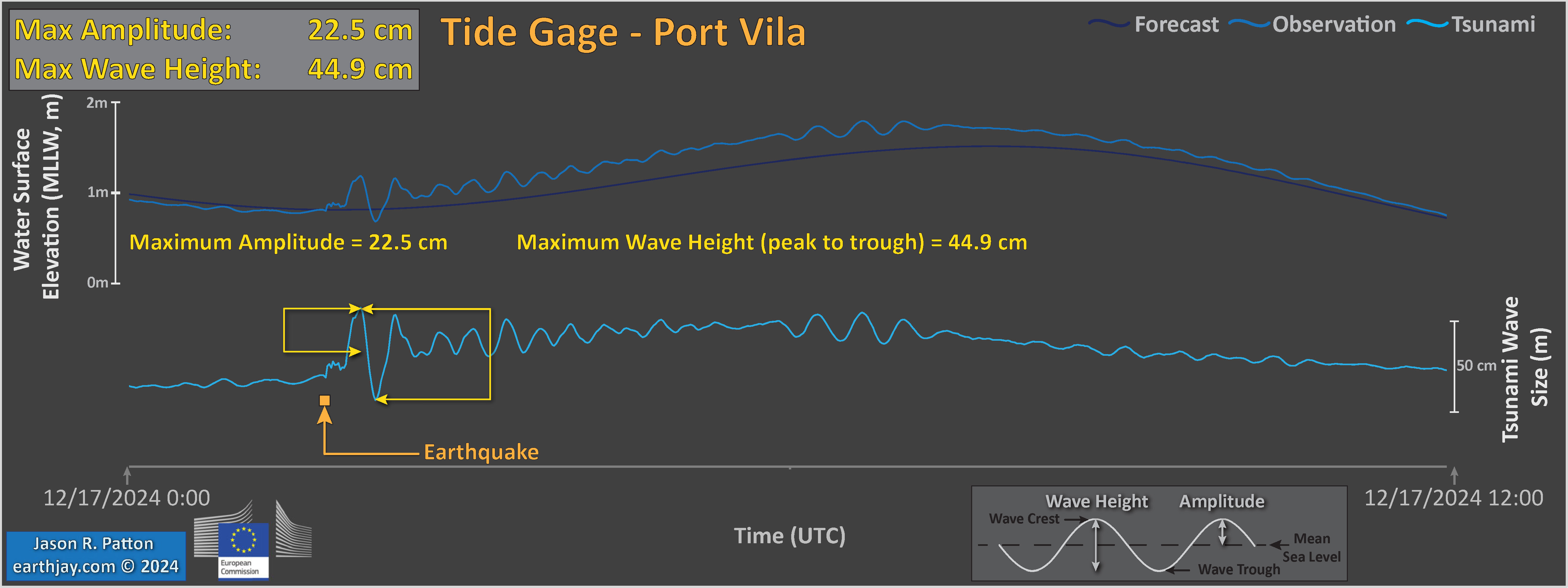
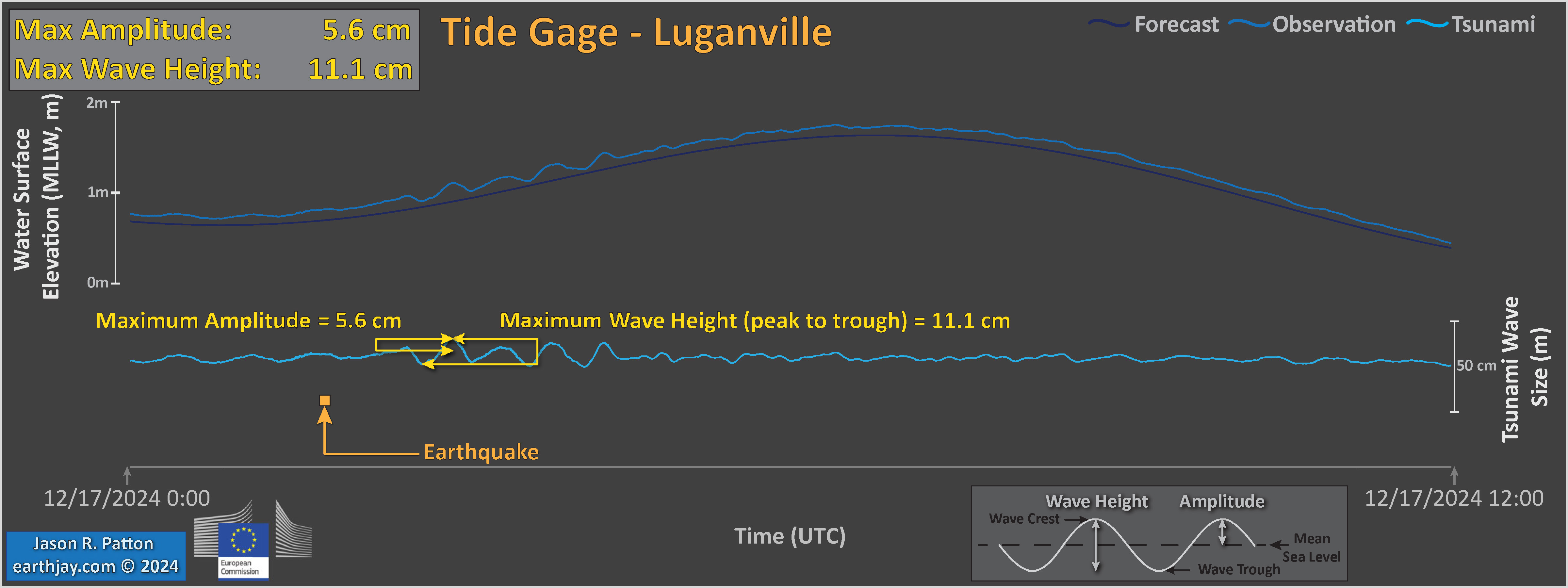
Here are plots i prepared for three tide gages in the region.
Social Media:
#EarthquakeReport #TsunamiReport 2024 Annual Earthquake Report Summary
Tenth annual summary
13 Earthquake Reportssummary report here: https://t.co/hn2kF93WxO pic.twitter.com/mI6jtQvKpS
— Jason "Jay" R. Patton (@patton_cascadia) December 29, 2024
#EarthquakeReport #TsunamiReport 2024 Annual Earthquake Report Summary
Tenth annual summary
13 Earthquake Reportssummary report here: https://t.co/hn2kF93WxO pic.twitter.com/Tersxh68Mv
— Jason "Jay" R. Patton (@patton_cascadia) December 29, 2024
#EarthquakeReport #TsunamiReport 2024 Annual Earthquake Report Summary
Tenth annual summary
Annual Energy Release Annual Comparisonsummary report here: https://t.co/hn2kF93WxO pic.twitter.com/9lmEybPOo1
— Jason "Jay" R. Patton (@patton_cascadia) December 29, 2024
Canada's Quakes of 2024
Starting with a seismically quiet area far from plate boundaries – southern #Ontario. During 2024, 67 #earthquakes (four were felt) were located in/near southern Ontario. Nearly half of those (and all of the M>2.2 events) occurred in Ohio or New York State pic.twitter.com/2plro59yAU— John Cassidy (@earthquakeguy) December 30, 2024
Return to the Earthquake Reports page.
- Sorted by Magnitude
- Sorted by Year
- Sorted by Day of the Year
- Sorted By Region
