Earlier this week, I was wrapping up some work, getting ready to go home to work some more (a pending deadline!).
There was a magnitude M 4.5 earthquake offshore. However, it was too far offshore to meet criteria for reporting, so I got back to my other work.
Then both my phones went off.
There was a magnitude M 8.0 earthquake offshore of Kamchatka, Russia.
https://earthquake.usgs.gov/earthquakes/eventpage/us6000qw60/executive
I immediately thought about two things.
- The 1952 M 9.0 Kamchatka Earthquake
- The 17 August 2024 M 7.0 and 20 July 2025 M 7.4 earthquakes.
For the 2024 M 7, I had prepared an extensive Earthquake Report.
In the report, i discussed various papers that included research about the 1952 earthquake.
The 1952 temblor generated a local and a transpacific tsunami. It generated over a million (1952 dollars) of damage in Hawai’i.
There were impacts around the Pacific and I was concerned that the earthquake magnitude would grow (often it takes a while to get a good estimate for the magnitude).
Regardless, I shifted into gear preparing a statement for the Cal OES. We prepare statements for tsunamigenic earthquakes so that Cal OES can be informed about the potential impact to the coast of California.
I knew we were going to spend many hours responding to this tsunami. We spent over 22-hours responding to the 2022 Tonga tsunami.
It took a while before the USGS had an earthquake mechanism for this earthquake. Needless to say, i had to interpret this as a subduction zone earthquake (for my summary) based on the depth (appeared to be on the megathrust) and based on the apparent foreshock from about 9 days earlier.
It was going to be a long night. And i did not have any food with me.
When the second NTWC Bulletin was released, at 17:19 local time, the magnitude had increased to M 8.7. California was placed into a Tsunami Watch.
Here are the Tsunami Alert Levels.
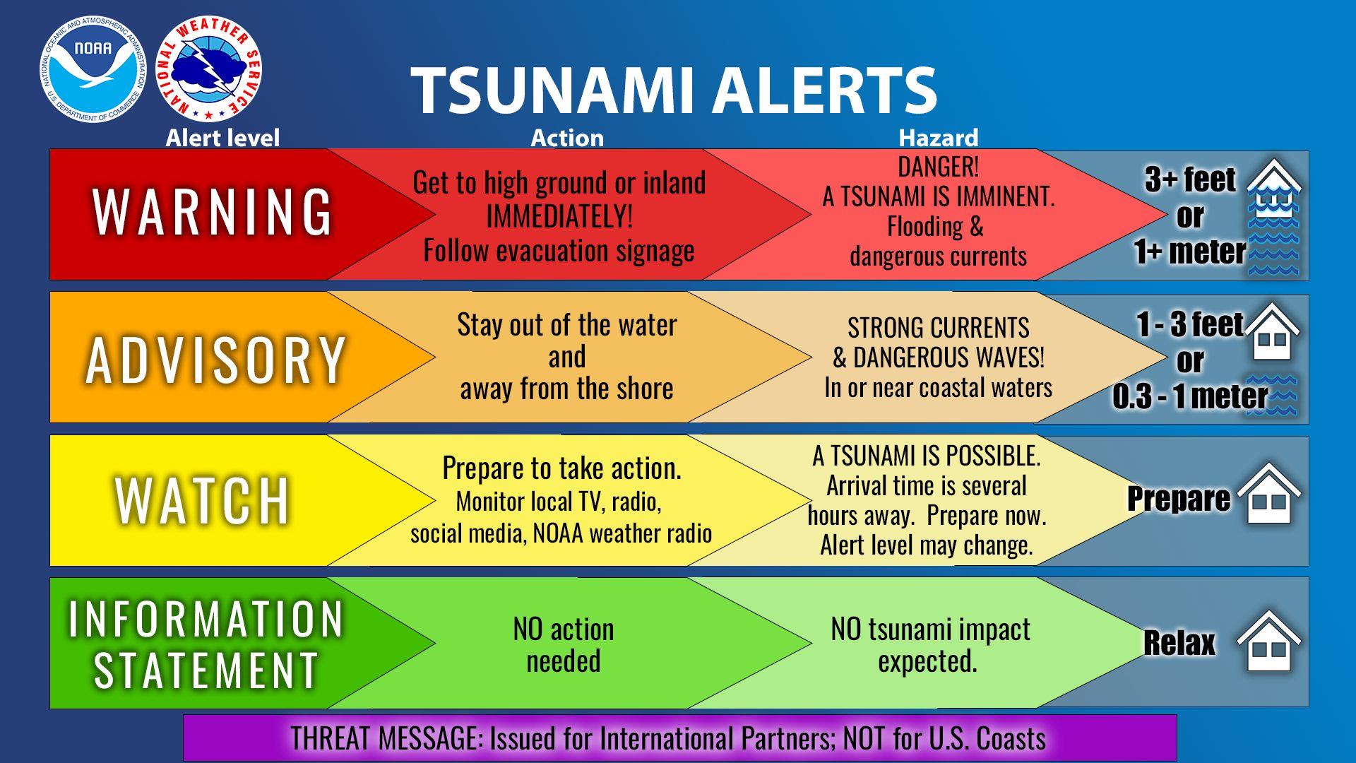
I won’t go through the entire process. We were eventually placed into a Tsunami Watch and other parts of the state were placed into a Tsunami Advisory.
I will add more details over the coming week. I will also add some more literature review I have found over the past week.
I have downloaded a boatload of tide gage data, so will add more marigrams too.
But for now, here is the report:
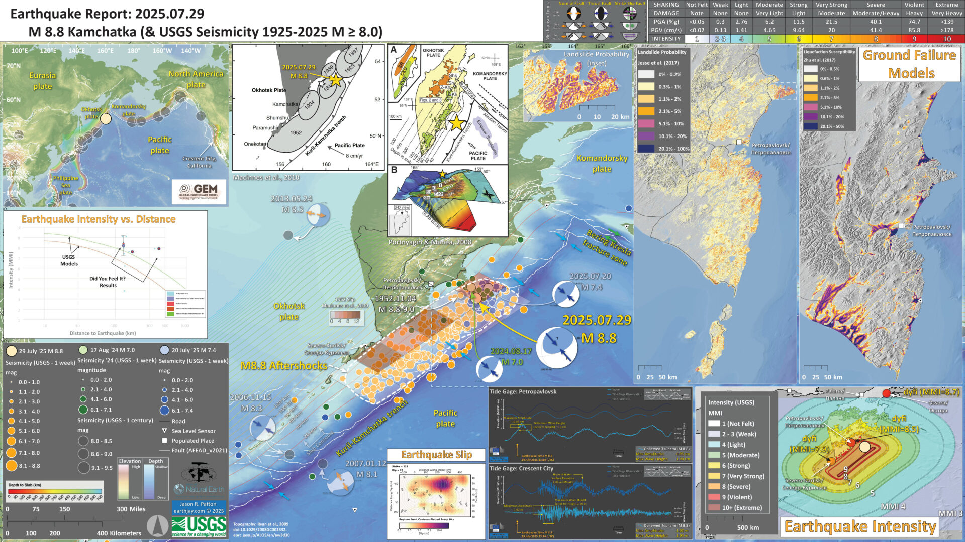
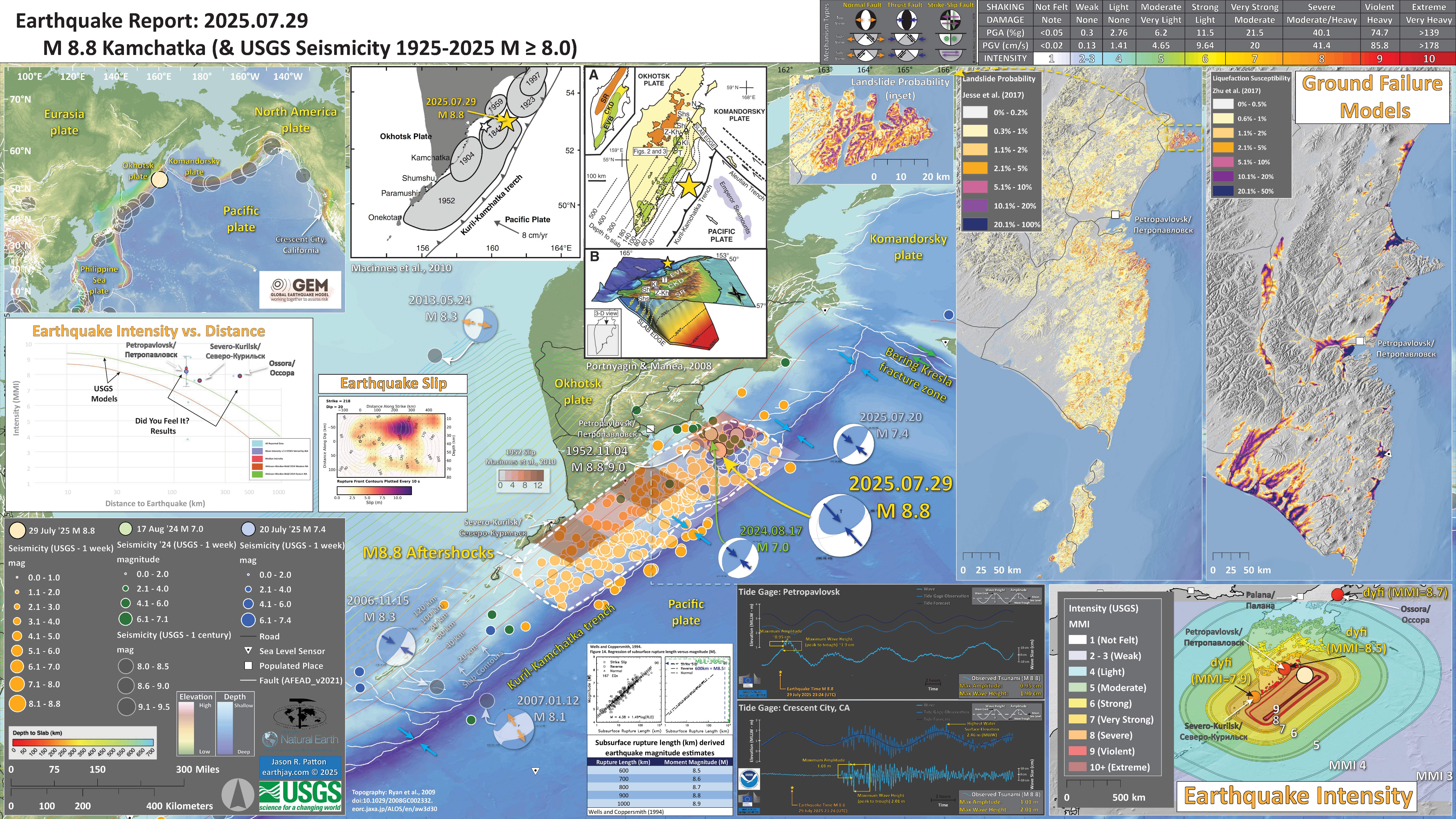
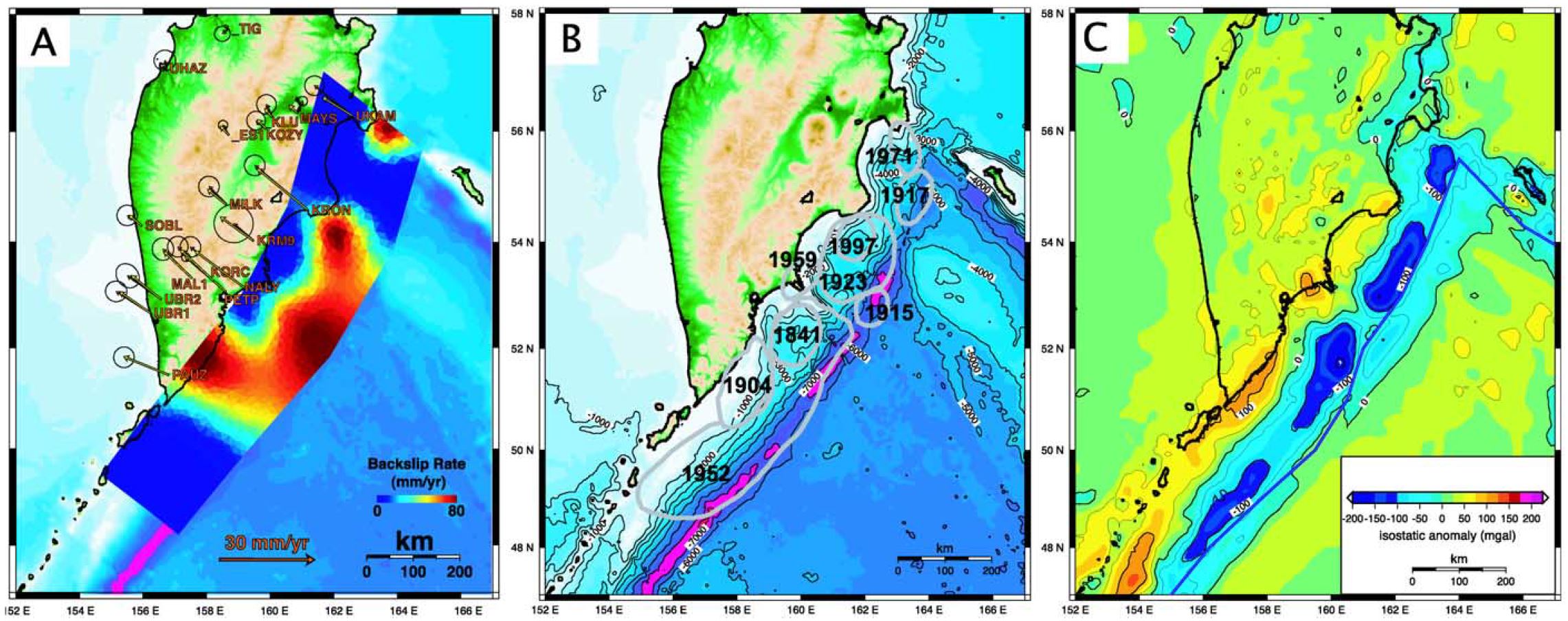
One main observation we can make from the interpretive poster: the M 8.8 Kamchatka Earthquake Sequence aftershock pattern matches perfectly with the MacInnes et al. (2010) slip model for the 1952 earthquake.
UPDATE: 4 Aug 2025
Here is an animation from the USGS showing a visualization of the seismic waves from this M 8.8 earthquake.
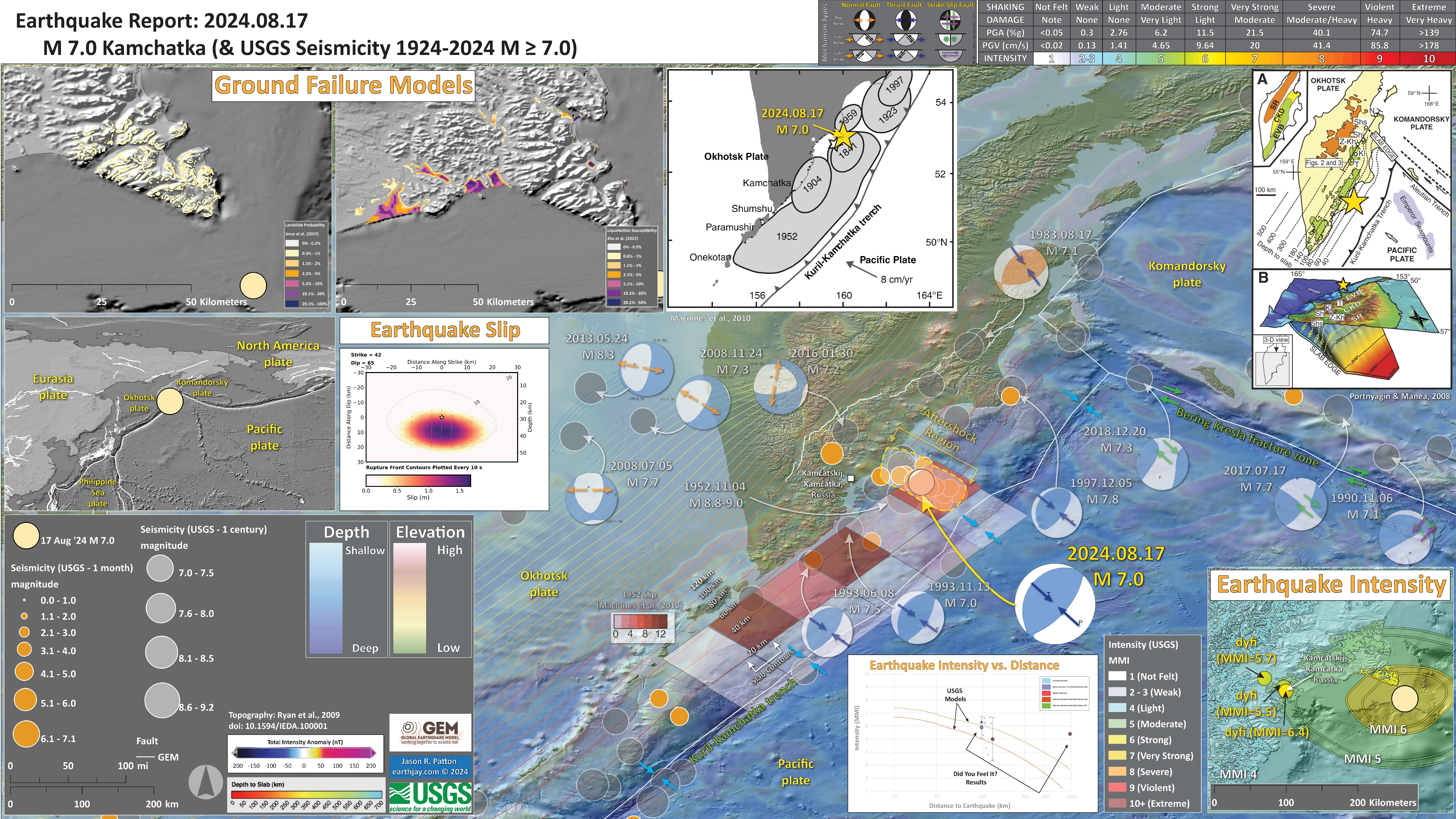
Below is my interpretive poster for this earthquake
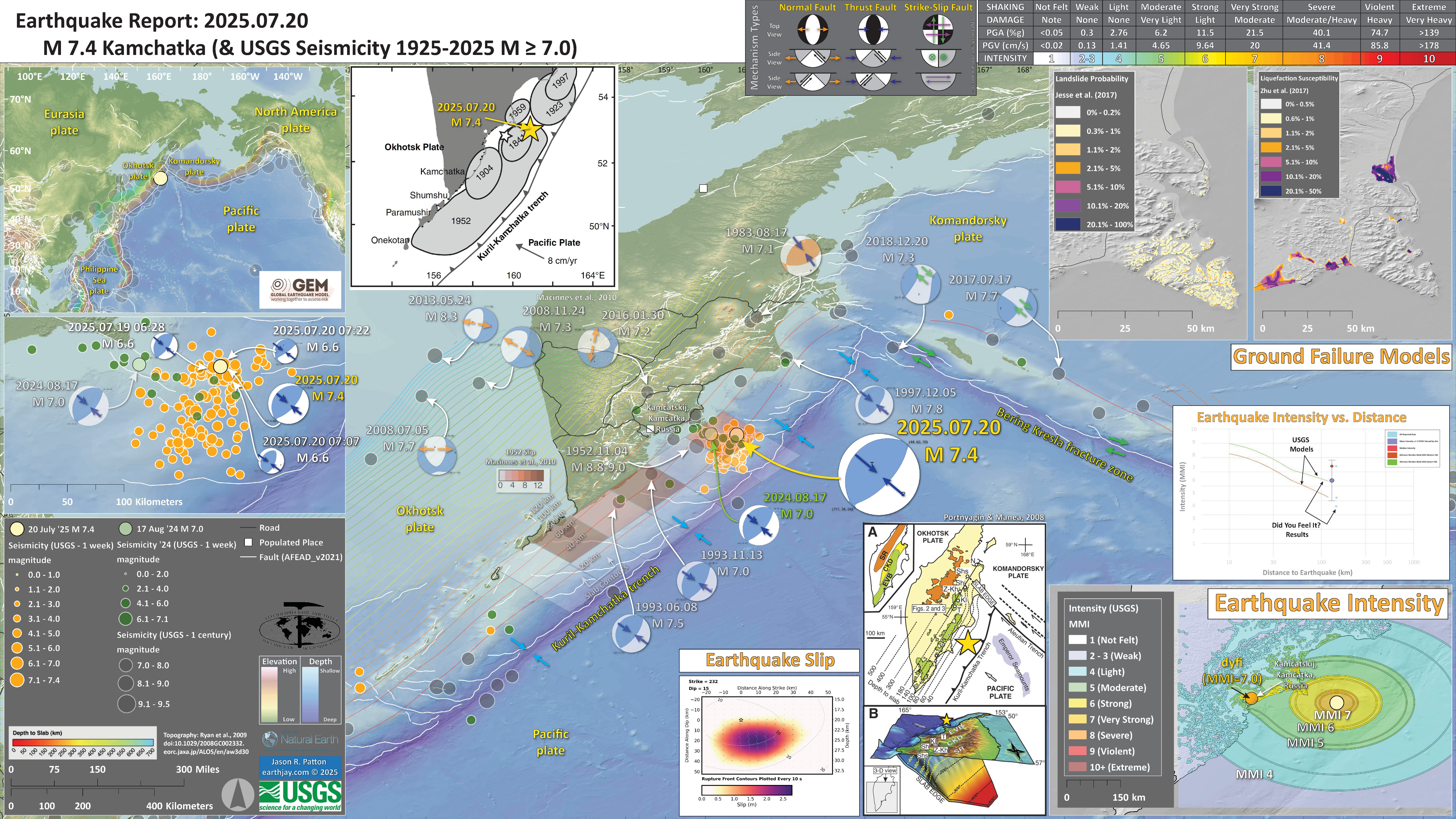
- I plot the seismicity from the past month, with diameter representing magnitude (see legend). I include earthquake epicenters from 1925-2025 with magnitudes M ≥ 3.0 in one version.
- I plot the USGS fault plane solutions (moment tensors in blue and focal mechanisms in orange), possibly in addition to some relevant historic earthquakes.
- A review of the basic base map variations and data that I use for the interpretive posters can be found on the Earthquake Reports page. I have improved these posters over time and some of this background information applies to the older posters.
- Some basic fundamentals of earthquake geology and plate tectonics can be found on the Earthquake Plate Tectonic Fundamentals page.
- In the left center is a map showing the plate tectonic boundaries (from the GEM).
- In the lower right corner is a map that shows the M 7.00 earthquake intensity using the modified Mercalli intensity scale. Earthquake intensity is a measure of how strongly the Earth shakes during an earthquake, so gets smaller the further away one is from the earthquake epicenter. The map colors represent a model of what the intensity may be. The USGS has a system called “Did You Feel It?” (DYFI) where people enter their observations from the earthquake and the USGS calculates what the intensity was for that person. The dots with yellow labels show what people actually felt in those different locations.
- Below the plate tectonic map (on left) map is a plot that shows the same intensity (both modeled and reported) data as displayed on the map. Note how the intensity gets smaller with distance from the earthquake.
- In the upper left corner are two maps showing the possibility of earthquake induced liquefaction for these two earthquakes. I discuss these phenomena in more detail later in the report.
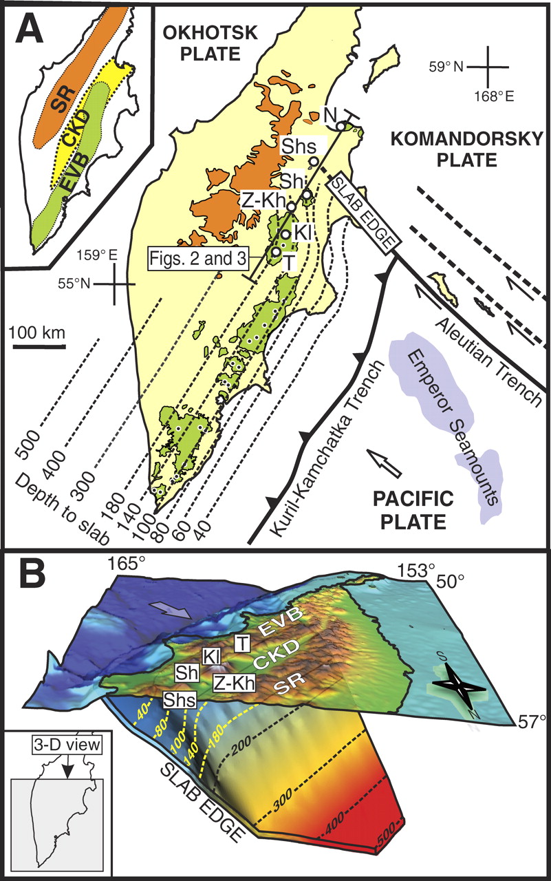
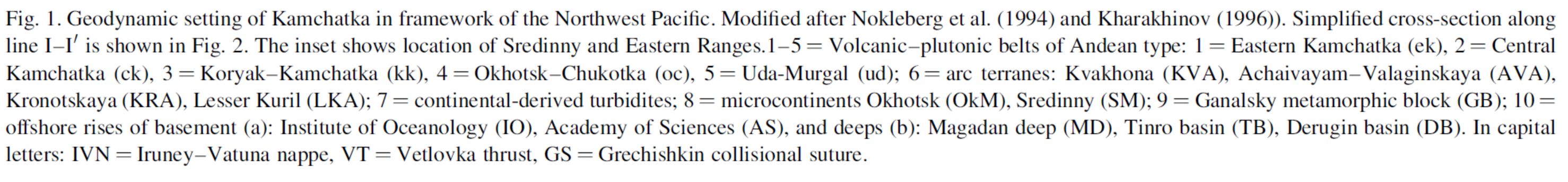
- In the upper center is a map and a low angle oblique view of the subducted Pacific plate beneath the Okhotsk plate (Portnyagin and Manea, 2008). I place a yellow star in the region of the M 7.1 earthquake.
- In the upper center left is a map from MacInnes et al;., 2010 that shows historic earthquake patches.
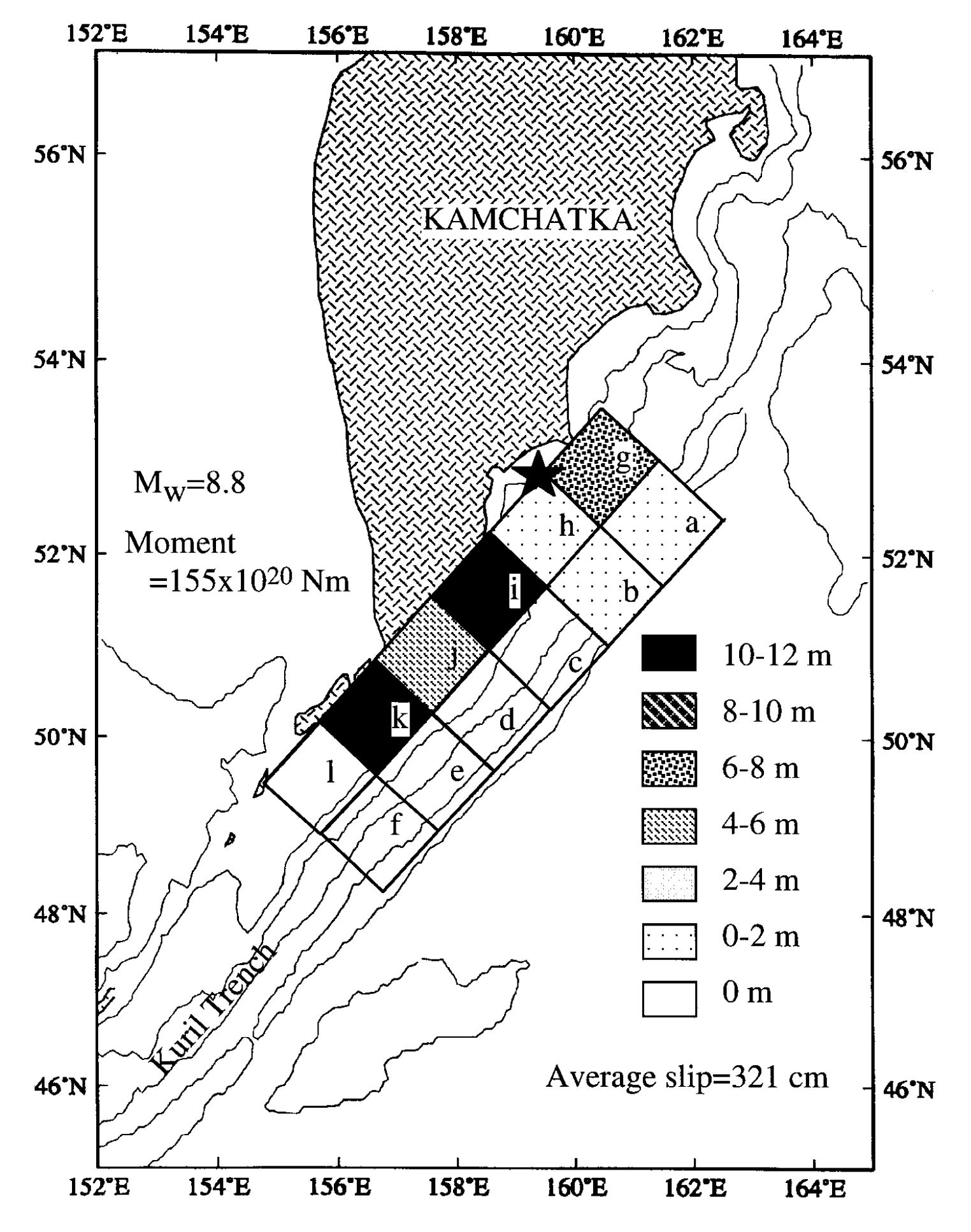
- I include an overlay from MacInnes et al. (2010) for their slip model of the 1952 earthquake.
- To the left of the intensity map are two tide gage plots. The upper one is from Petropavlovsk, Kamchatka, Russia (location shown on main map). The lower one is from Crescent City, California (location shown on plate tectonic map).
- To the right of this intensity plot is the USGS finite fault slip model. Colors represent the amount of fault slip that their model calculates.
I include some inset figures. Some of the same figures are located in different places on the larger scale map below.
- Here is the map with a week’s seismicity plotted.
- Here is the poster for the 20 July 2025 M 7.4 foreshock.
- Here is the poster for the 17 August 2024 M 7.0 foreshock.
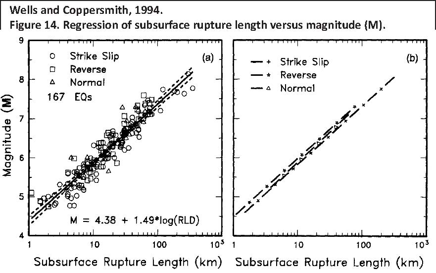
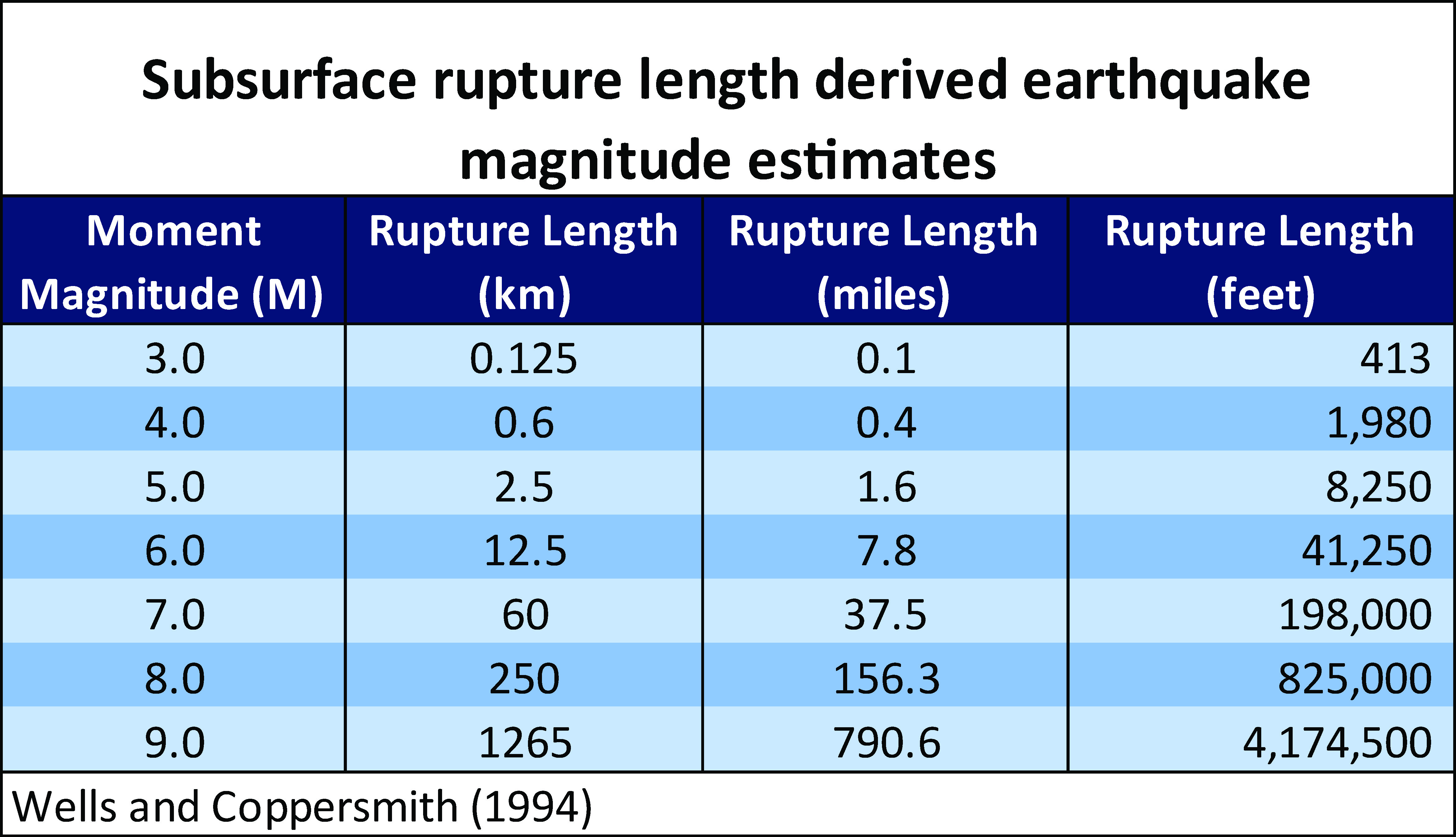
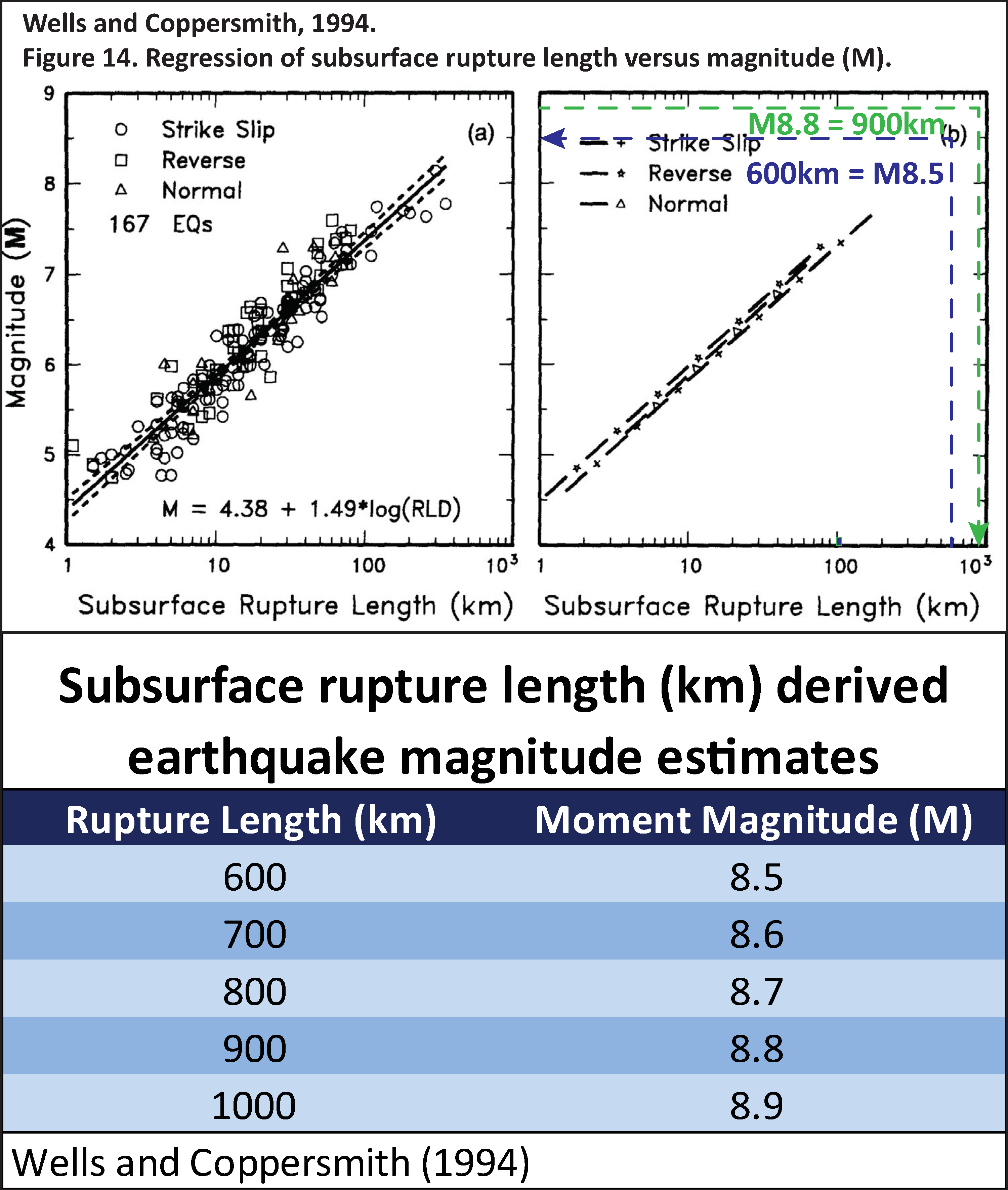
Fault Scaling Relations
- Below is a figure from Wells and Coppersmith (1994) that shows the empirical relations between subsurface rupture length (SSRL, the length of the fault that ruptures in the subsurface) and magnitude. If one knows the SSRL (horizontal axis), they can estimate the magnitude (vertical axis). The left plot shows the earthquake data. The right plot shows how their formulas “predict” these data.
- I used these fault scaling relations to calculate two things.
- To calculate the magnitudes for earthquakes of different subsurface rupture lengths.
- To calculate the subsurface rupture length given the magnitude.
- Then I plotted dashed blue and green lines to show how these two methods result in slightly different answers.
- A magnitude 8.8 earthquake should have a subsurface rupture length of 900-km. (in green)
- A subsurface rupture length of 600-km should have a magnitude of M 8.5. (in blue)
Here is a table showing the various sizes of earthquakes using these scaling relations.
* note, i corrected this caption by changing the word “relationships” to “relations.”
(a) Regression of subsurface rupture length on magnitude (M). Regression line shown for all-slip-type relationship. Short dashed line indicates 95% confidence interval. (b) Regression lines for strike-slip relationships. See Table 2 for regression coefficients. Length of regression lines shows the range of data for each relationship.
Other Report Pages
Shaking Intensity
- Here is a figure that shows a more detailed comparison between the modeled intensity and the reported intensity. Both data use the same color scale, the Modified Mercalli Intensity Scale (MMI). More about this can be found here. The colors and contours on the map are results from the USGS modeled intensity. The DYFI data are plotted as colored dots (color = MMI, diameter = number of reports).
- In the upper panel is the USGS Did You Feel It reports map, showing reports as colored dots using the MMI color scale. Underlain on this map are colored areas showing the USGS modeled estimate for shaking intensity (MMI scale).
- In the lower panel is a plot showing MMI intensity (vertical axis) relative to distance from the earthquake (horizontal axis). The models are represented by the green and orange lines. The DYFI data are plotted as light blue dots. The mean and median (different types of “average”) are plotted as orange and purple dots. Note how well the reports fit the green line (the model that represents how MMI works based on quakes in California).
- Below the map and the lower plot is the USGS MMI Intensity scale, which lists the level of damage for each level of intensity, along with approximate measures of how strongly the ground shakes at these intensities, showing levels in acceleration (Peak Ground Acceleration, PGA) and velocity (Peak Ground Velocity, PGV).
Potential for Ground Failure
- Below are a series of maps that show the potential for landslides and liquefaction. These are all USGS data products.
There are many different ways in which a landslide can be triggered. The first order relations behind slope failure (landslides) is that the “resisting” forces that are preventing slope failure (e.g. the strength of the bedrock or soil) are overcome by the “driving” forces that are pushing this land downwards (e.g. gravity). The ratio of resisting forces to driving forces is called the Factor of Safety (FOS). We can write this ratio like this:FOS = Resisting Force / Driving Force
- When FOS > 1, the slope is stable and when FOS < 1, the slope fails and we get a landslide. The illustration below shows these relations. Note how the slope angle α can take part in this ratio (the steeper the slope, the greater impact of the mass of the slope can contribute to driving forces). The real world is more complicated than the simplified illustration below.
- Landslide ground shaking can change the Factor of Safety in several ways that might increase the driving force or decrease the resisting force. Keefer (1984) studied a global data set of earthquake triggered landslides and found that larger earthquakes trigger larger and more numerous landslides across a larger area than do smaller earthquakes. Earthquakes can cause landslides because the seismic waves can cause the driving force to increase (the earthquake motions can “push” the land downwards), leading to a landslide. In addition, ground shaking can change the strength of these earth materials (a form of resisting force) with a process called liquefaction.
- Sediment or soil strength is based upon the ability for sediment particles to push against each other without moving. This is a combination of friction and the forces exerted between these particles. This is loosely what we call the “angle of internal friction.” Liquefaction is a process by which pore pressure increases cause water to push out against the sediment particles so that they are no longer touching.
- An analogy that some may be familiar with relates to a visit to the beach. When one is walking on the wet sand near the shoreline, the sand may hold the weight of our body generally pretty well. However, if we stop and vibrate our feet back and forth, this causes pore pressure to increase and we sink into the sand as the sand liquefies. Or, at least our feet sink into the sand.
- Below is a diagram showing how an increase in pore pressure can push against the sediment particles so that they are not touching any more. This allows the particles to move around and this is why our feet sink in the sand in the analogy above. This is also what changes the strength of earth materials such that a landslide can be triggered.
- Here Dr. Bohon demonstrates the phenomena of liquefaction.
- And, another video demonstration.
- Below is a diagram based upon a publication designed to educate the public about landslides and the processes that trigger them (USGS, 2004). Additional background information about landslide types can be found in Highland et al. (2008). There was a variety of landslide types that can be observed surrounding the earthquake region. So, this illustration can help people when they observing the landscape response to the earthquake whether they are using aerial imagery, photos in newspaper or website articles, or videos on social media. Will you be able to locate a landslide scarp or the toe of a landslide? This figure shows a rotational landslide, one where the land rotates along a curvilinear failure surface.
- Below is the liquefaction susceptibility and landslide probability map (Jessee et al., 2017; Zhu et al., 2017). Please head over to that report for more information about the USGS Ground Failure products (landslides and liquefaction). Basically, earthquakes shake the ground and this ground shaking can cause landslides.
- I use the same color scheme that the USGS uses on their website. Note how the areas that are more likely to have experienced earthquake induced liquefaction are in the valleys. Learn more about how the USGS prepares these model results here.
@drwendyrocksit #Liquefaction is a process by which water-saturated sediment temporarily loses strength and acts as a fluid. This can happen during #earthquake shaking. #geophysics #geology ♬ Quicksand – Hatchie
This liquefaction experiment conducted by the Tokyo Geological Survey of Japan at the Disaster Prevention Exhibition in 2015, shows the effects of different foundations and how hollow objects such as water pipes come to the surface [source, full video: https://t.co/xYLjPY4IHZ] pic.twitter.com/r8LXtmvrO0
— Massimo (@Rainmaker1973) April 17, 2021
Tsunami
- Tsunami are generated by a variety of methods. The fundamental cause for tsunami is the displacement of water.
- This water displacement can from earthquake deformation, landslides (submarine, subaerial, or both), bolide impacts, meteorological phenomena, etc.
- The most destructive tsunami come from earthquakes. All types of earthquakes that displace water can generate tsunami
- Subduction zone earthquakes can generate the largest seismogenic tsunami.
- Here is a brilliant illustration from Atwater et al. (2005) that describes the earthquake cycle and how subduction zone earthquakes can generate tsunami.
- Many have tried to improve upon this diagram but there really is no need.
- Here is an animation from NOAA PMEL.
- This is NOT the model that the National Tsunami Warning Center used to develop alert levels and their other forecast information. (even tsunami experts sometimes don’t understand this)
- In the coming years, there will be hundreds of tsunami simulations, used to better understand the earthquake and the tsunami. This is but one (each of these models will be different).
- It will probably not be possible to ever know which model is correct. Some will be more correct than others. But they will ALL be incorrect in some way!
- From PMEL:
- Propagation of the July 29, 2025 Kamchatka tsunami was computed with the NOAA forecast method using MOST model via inversion of the source with NOAA’s TFS (Tsunami Forecast System).
- From the NOAA Center for Tsunami Research, located at NOAA PMEL in Seattle, WA. See https://nctr.pmel.noaa.gov/kamchatka2… #TsunamiPropagation
- NOAA NCTR experimental research product. Not an official forecast.
- Here is another animation using the RIFT tsunami modeling software.
- This is based on the USGS Finite Fault Model as a source for the tsunami.
- Dailin Wang and Nathan Becker (Pacific Tsunami Warning Center) made a new tsunami animation with their forecast model using the USGS/NEIC finite fault model as input. RIFT results are very sensitive to the source used, and they’re happy to report that using the finite fault as a source produces good fits to measured values at DARTs and coastal gauges.
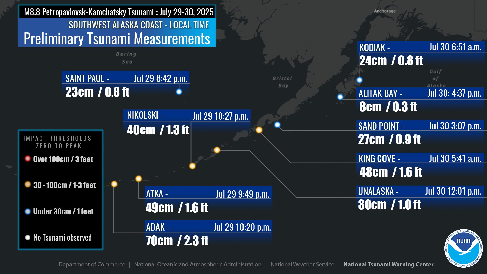
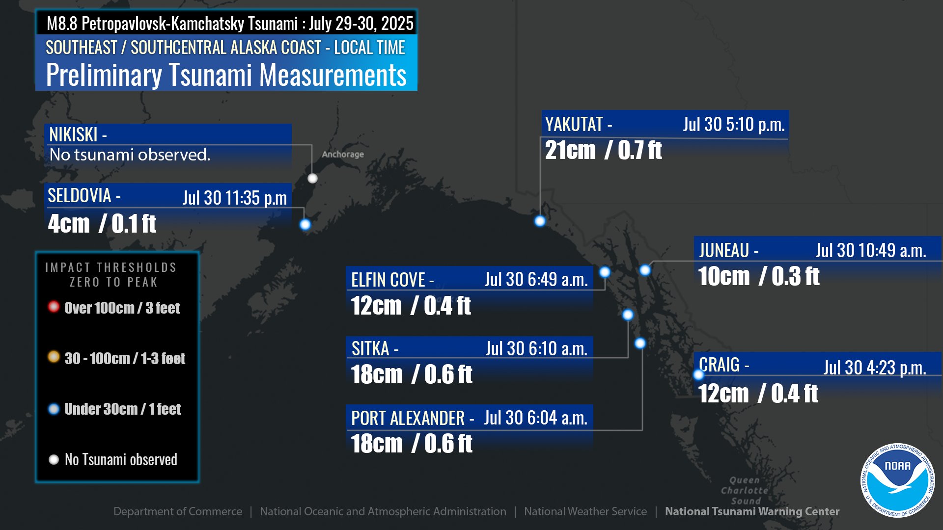
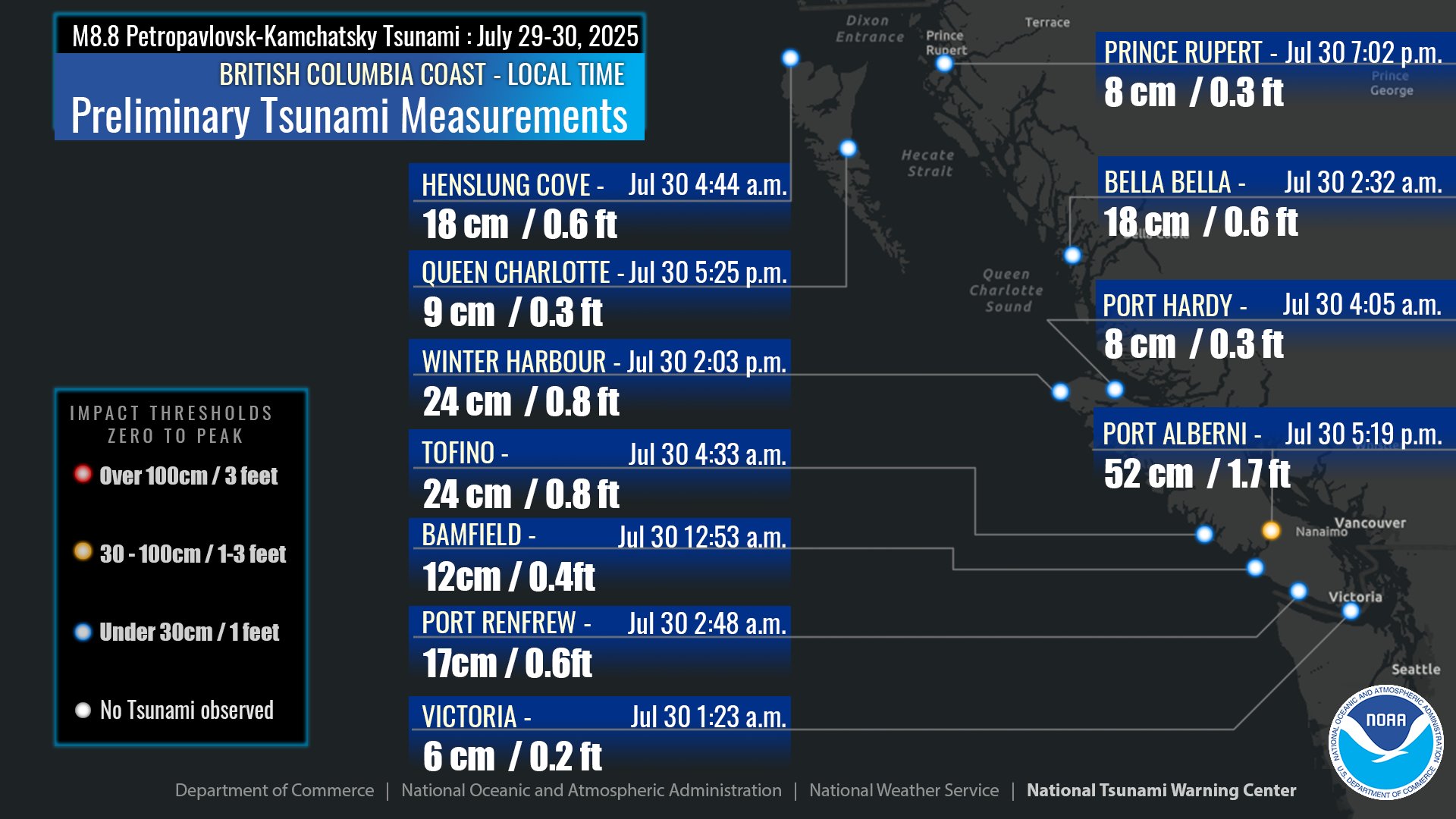
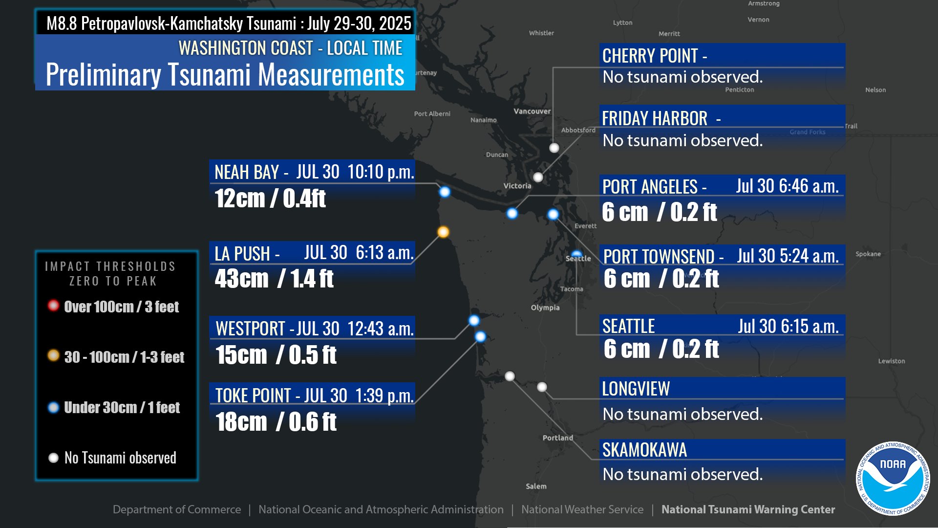
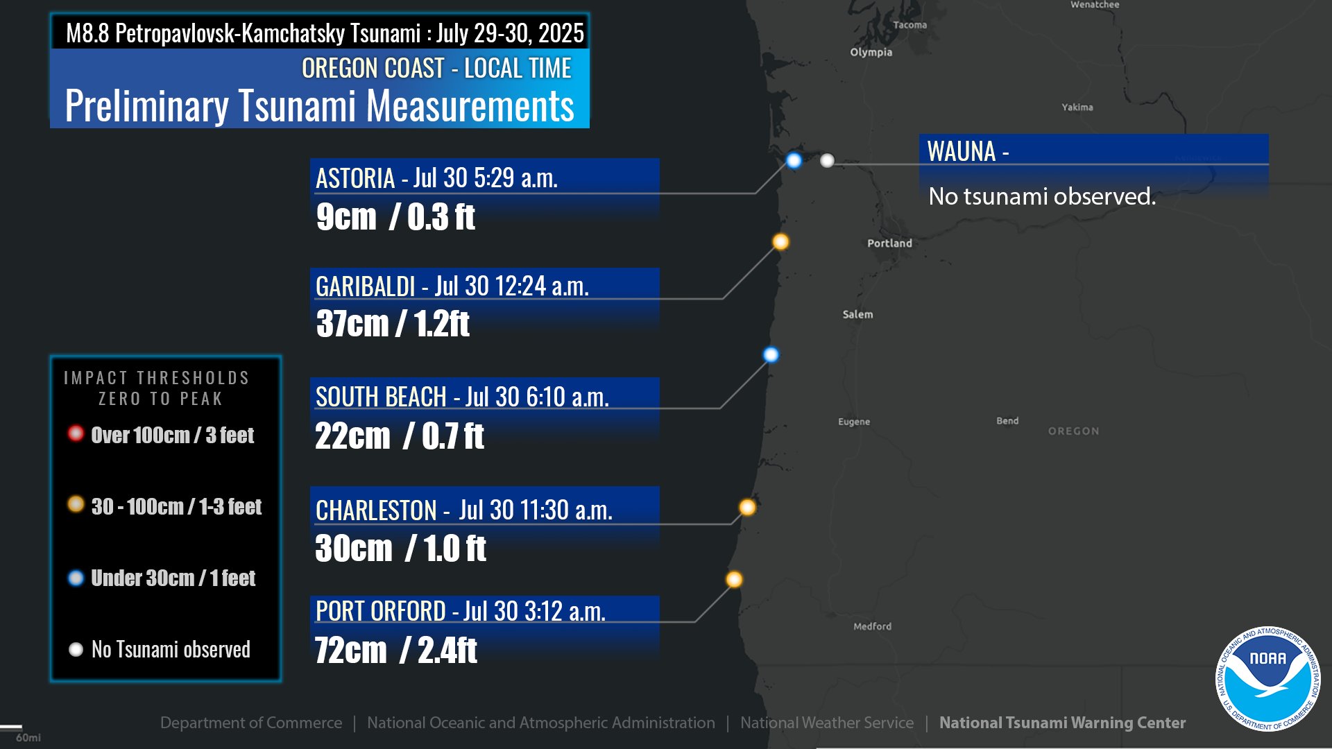
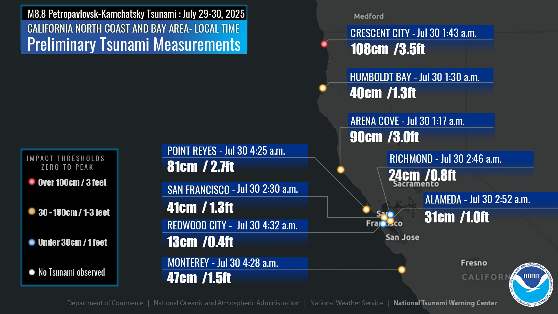
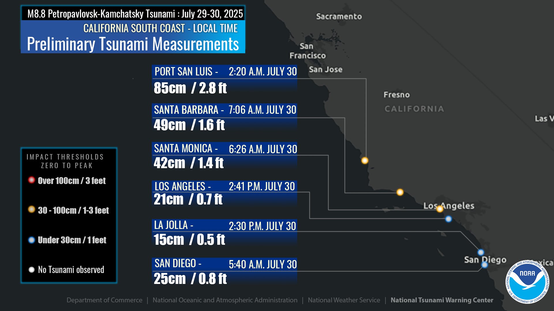
- Here are the observations made by the NTWC as presented in the final bulletin.
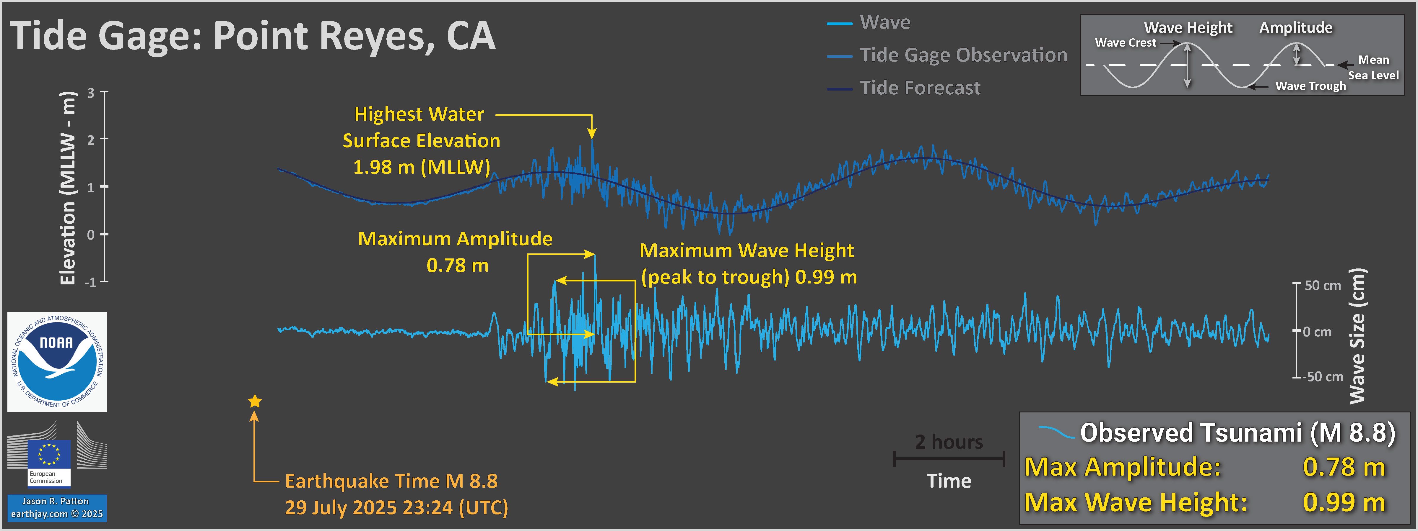
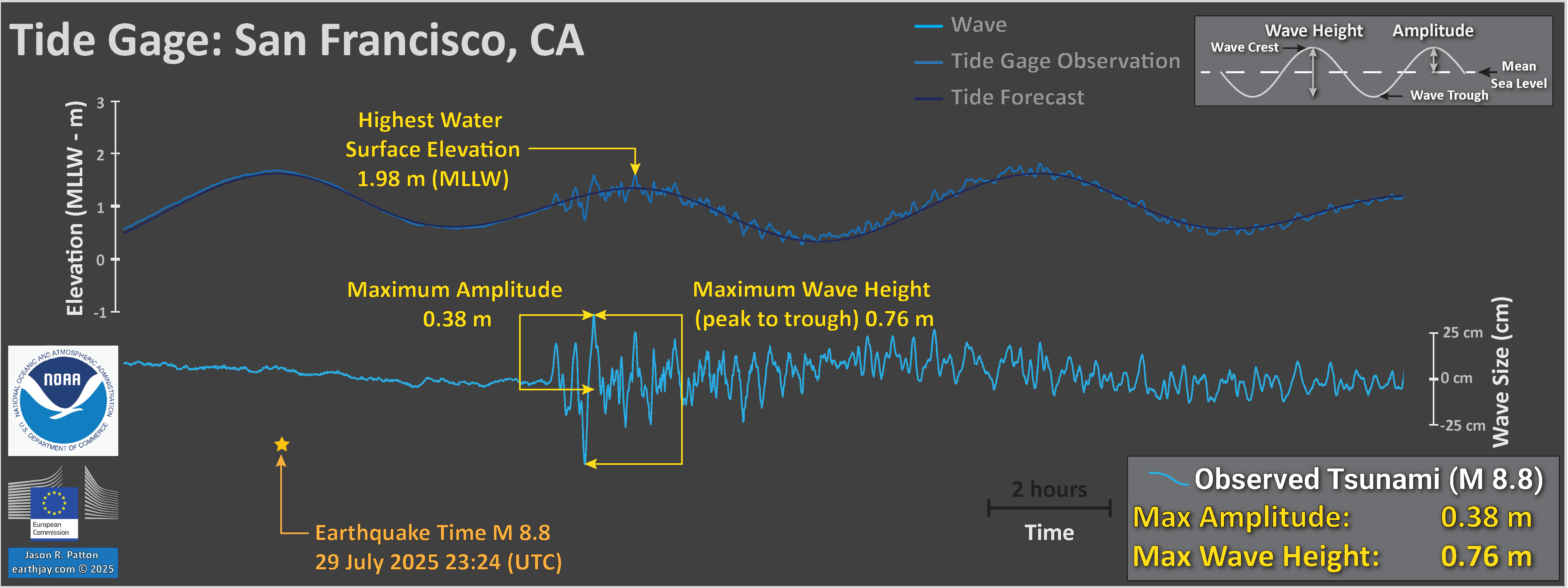
- The wave sizes listed in the column are the maximum amplitudes (not wave height) observed at these locations.
- And, further confusing for me is that the amplitude is listed in feet, not meters.
- Below I present a diagram that shows the difference between wave height and amplitude.
- See the below diagram for more information about the difference between amplitude and wave height.
- Here are the plots i put together.
- The amplitude and wave height data are estimates made from the data published by the World Sea Level or the NOAA Tides and Currents pages. There are more sophisticated ways to estimate the amplitudes and wave heights (see the NTWC plots below).
- Another source of tide gage data is the IOC. i present links for all three services below.
- I prefer the WSL sources for tide gage data because (1) they include tidal forecasts (unlike the IOC source) and (2) they span the globe (while NOAA only posts US asset derived tide gage data).
- Here is an example query for the WSL data: https://webcritech.jrc.ec.europa.eu/SeaLevelsDb/api/Data/Get/851?tMin=2025-07-29%2000:00:00&tMax=2025-08-03%2000:00:00&nRec=10000&mode=CSV
- One simply needs to edit this text to include the correct gage number (in this case, 851 refers to Crescent City), the date range, and maybe the record max (10000 in this case).
- The gage number is found on the web interface i linked above.
- Petropavlovsk, Kamchatka, Russia
- Crescent City, California, USA
- North Spit (Humboldt bay), California, USA
- Arena Cove, California, USA
- Point Reyes, California, USA
- San Francisco, California, USA
- Here are the official observations as published by the NTWC via their social media platforms (e.g.).
- The wave size numbers are the maximum amplitudes (see diagram above). In most cases, they are close to the amplitudes I estimated.
- Here are some videos from Dr. Patrick Lynett (USC) made during his field observations at Crescent City.
- Follow Pat on YT for more on tsunami!
- Time lapse of the tsunami at CC Harbor, capturing the largest wave of the event, running at 60x realtime (one second of video is one minute of actual time) This was the 3rd or 4th wave depending how one counts the earlier waves. The video is looking at a pile on W Dock; you can see the end of H Dock in the background, behind the pile. This wave had a crest to through height of ~7′. While there were strong currents in the harbor with the wave, it did not cause any damage – there was no damage to the harbor at this point. At the end of the video, for scale, you can see people walking on the dock. Also, these piles are massive – 30″ diameter – which you can also use for scale.
Time in CC with PDT is -0700 GMT/UTC. - Regular speed video of the tsunami near the entrance of the small boat basin in CC harbor. At this time, the water is starting to recede from the previous wave, as can be seen by the water rushing out of the harbor. At around the 15 second mark, you will see electrical sparks on H Dock. These dock sections were submerged by the tsunami a few minutes before this video, and the individual sections have disconnected from each other and are now kinked. The wiring has been exposed, and the sparking is the result. At the end of the sparking, you can hear large breakers triggered (the background “thunks”) and power goes out in part of the harbor.
Time in CC with PDT is -0700 GMT/UTC. - Regular speed video of the tsunami near the entrance of the small boat basin in CC harbor, with daylight. With some light, the speed of the currents during the tsunami is more easily seen – the currents in the harbor were likely similar to this for the previous ~ 4 hours. The video starts near the trough of a wave (the ocean is at its lowest point). The (smart) captain rides in front of the incoming surge, which is literally right behind him. The currents go from slack to 6-8 knots over about one minute. This wave has an amplitude of ~3’ (or a crest-to-trough height of ~6’).
At the 3:00 mark of the video, you can see how H Dock, although kinked and stuck under the tsunami due to damage from the wave hours earlier, is acting as a very effective current barrier to the docks behind it. Those docks very likely would have been damaged without this barrier-function of H Dock. Strong currents continued like this for the next few hours, and tsunami currents were noticeable in the harbor for the following two days.
For scale, these piles are massive – 30″ diameter.
Time in CC with PDT is -0700 GMT/UTC. - Time lapse of the tsunami at CC Harbor, capturing the damaging wave of the event with the strongest currents, running at 60x realtime (one second of video is one minute of actual time) This was the 4th or 5th wave depending how one counts the earlier waves. The video is looking at a pile at the end of W Dock; you can see the middle of H Dock in the background, behind the pile. The damaging wave occurs right at the end of the video. If you look closely at H Dock in the background, you can see the dock being over-run and submerged by the tsunami.
For scale, these piles are massive – 30″ diameter.
Time in CC with PDT is -0700 GMT/UTC. - Here is the tectonic map from Bindeman et al., 2002. The original figure caption is below in blockquote.
- This map shows the configuration of the subducting slab. The original figure caption is below in blockquote.
- Here is the more detailed tectonic map from Konstantinovskaia et al. (2001).
- This is the cross section associated with the above map.
- Below are a series of maps that show the tectonic history in the northwest Pacific. This helps us learn how the plate boundary of the westernmost Aleutian trench is very different from the history of the subduction zone further to the east (responsible for the 1964 Good Friday earthquake for example). The time series begins at the beginning of the Tertiary at about 65 million years ago.
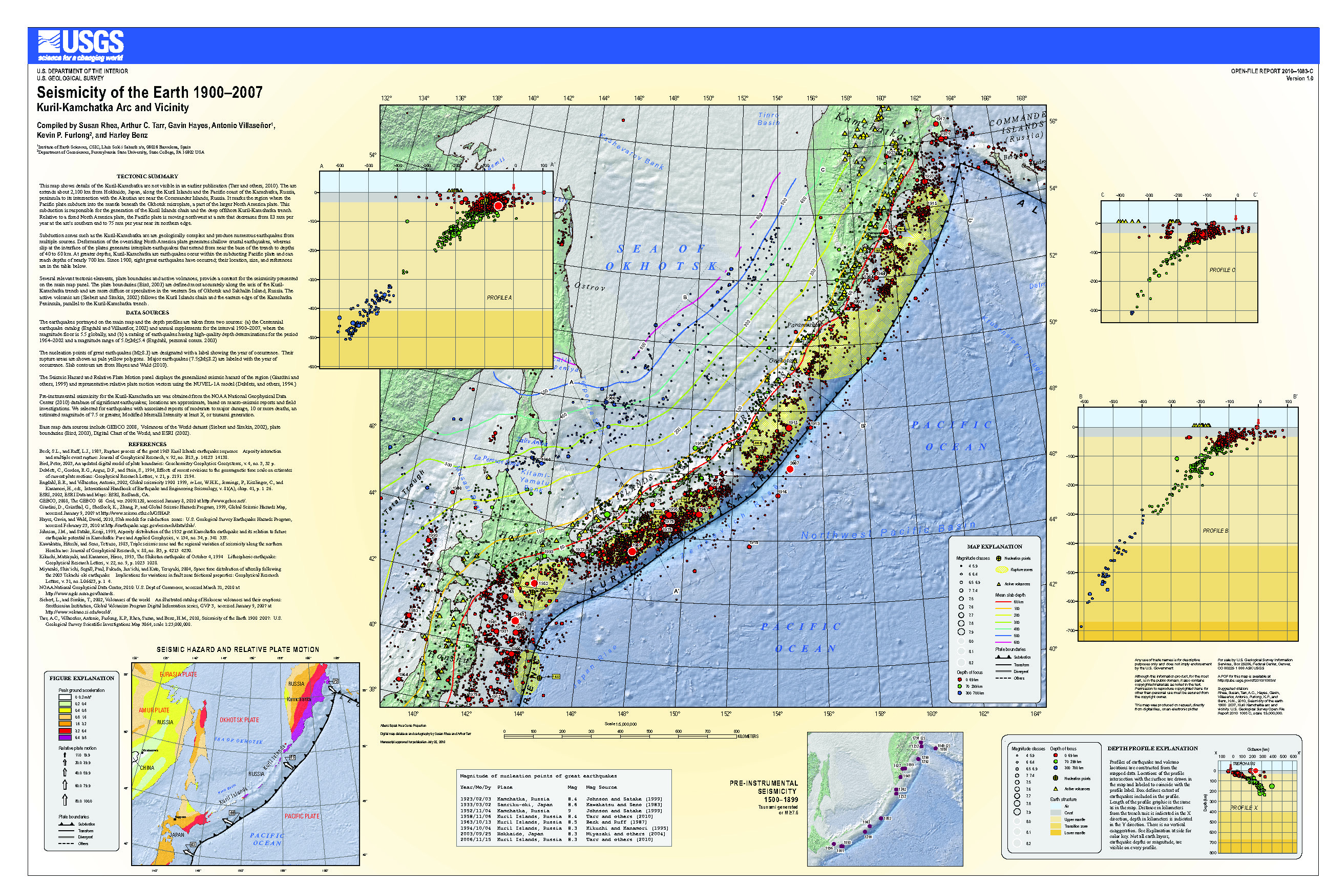
- Here is the Rhea et al. (2010) poster.
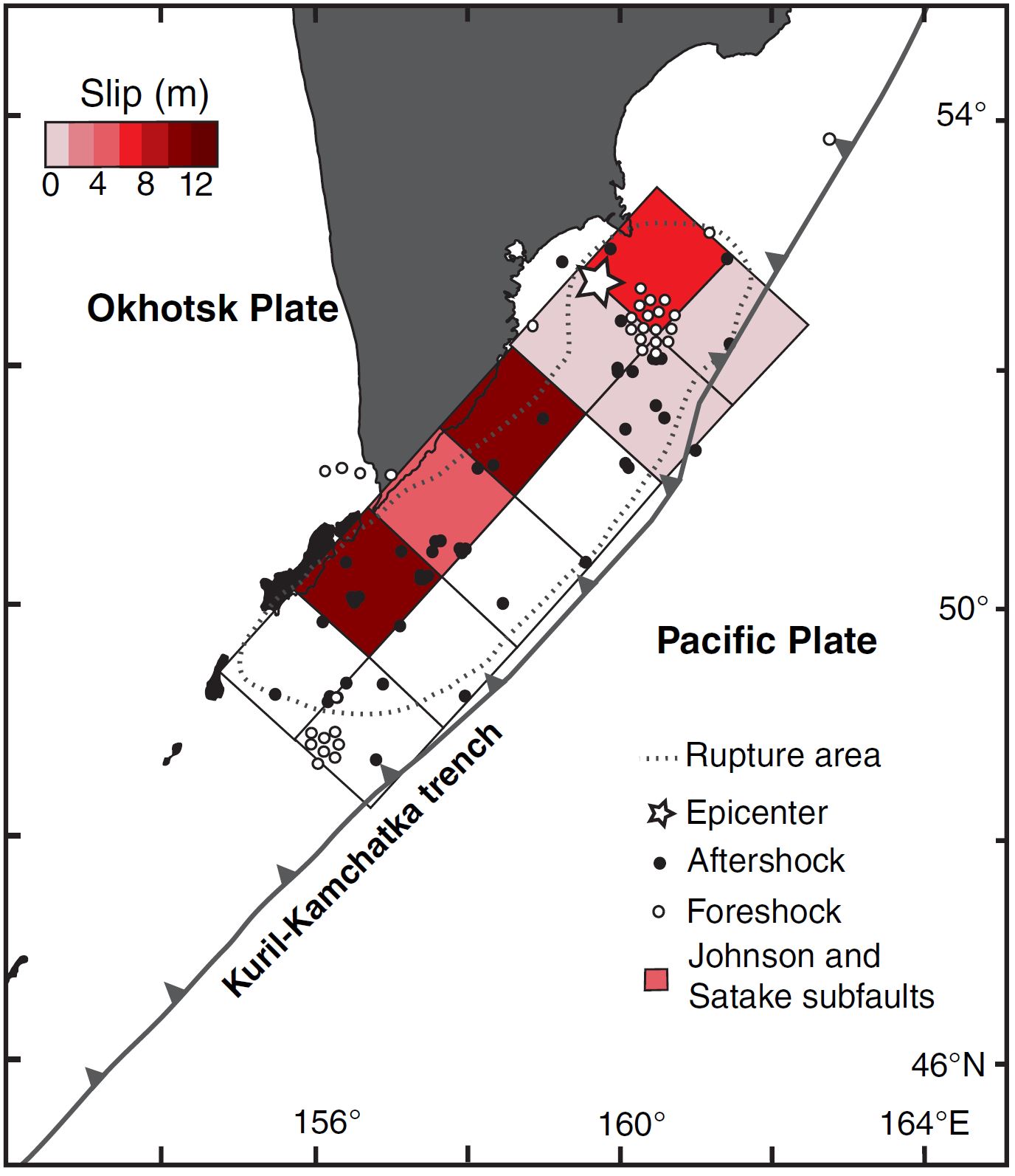
- Johnson and Satake (1999) studied the slip distribution of the 1952 earthquake by using tsunami modeling.
- This map shows the historic earthquake slip patches in the region. The 1952 earthquake was much larger than other historic earthquakes.
- Here is the Johnson and Satake (1999) slip model for the 1952 earthquake.
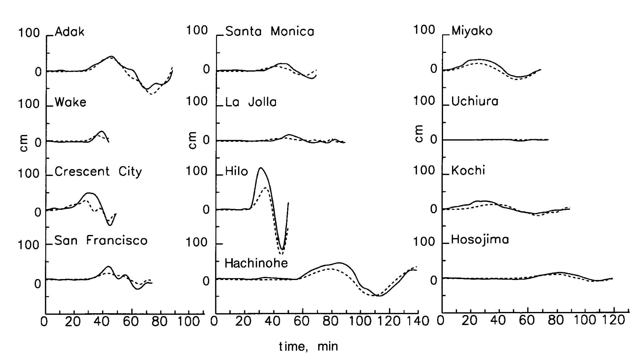
- This shows a comparison between the 1952 Kamchatka tsunami modeled by Johnson and Satake (1999) compared with the direct observations of the tsunami as recorded by tide gages.
- These authors evaluated slip of different amounts on each fault element and compared the results with the observations until they maximized the fit between the model and the observation.
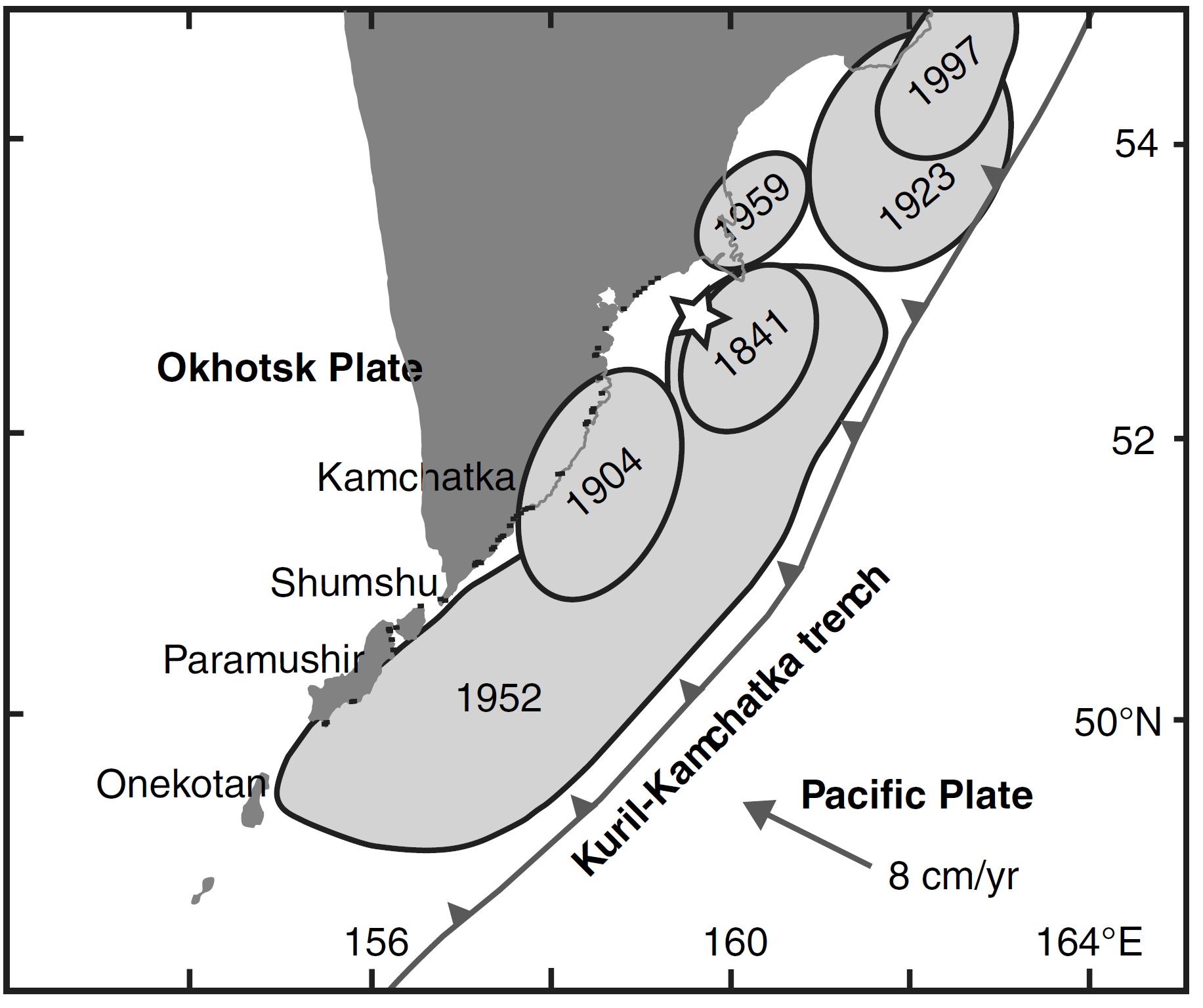
- Here is a map from MacInnes et al. (2010) that shows the historic earthquake slip areas.
- This shows the slip distribution from MacIness et al. (2010) for the 1952 Kamchatka Earthquake (slip distribution from Johnson and Satake, 1999).
- Each fault element (aka subfault) slipped by an amount of meters. The legend shows the amount of slip for each subfault. This is the same slip model as is shown in the interpretive poster.
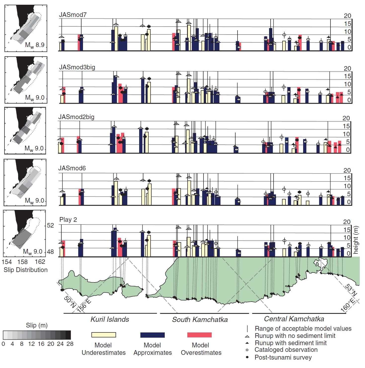
- MacInnes et al. (2010) compared not only the tsunami records (as was done by Johnson and Satake, 1999) but also with tsunami observations made in the field.
- This splot shows a comparison between their model results and these field observations.
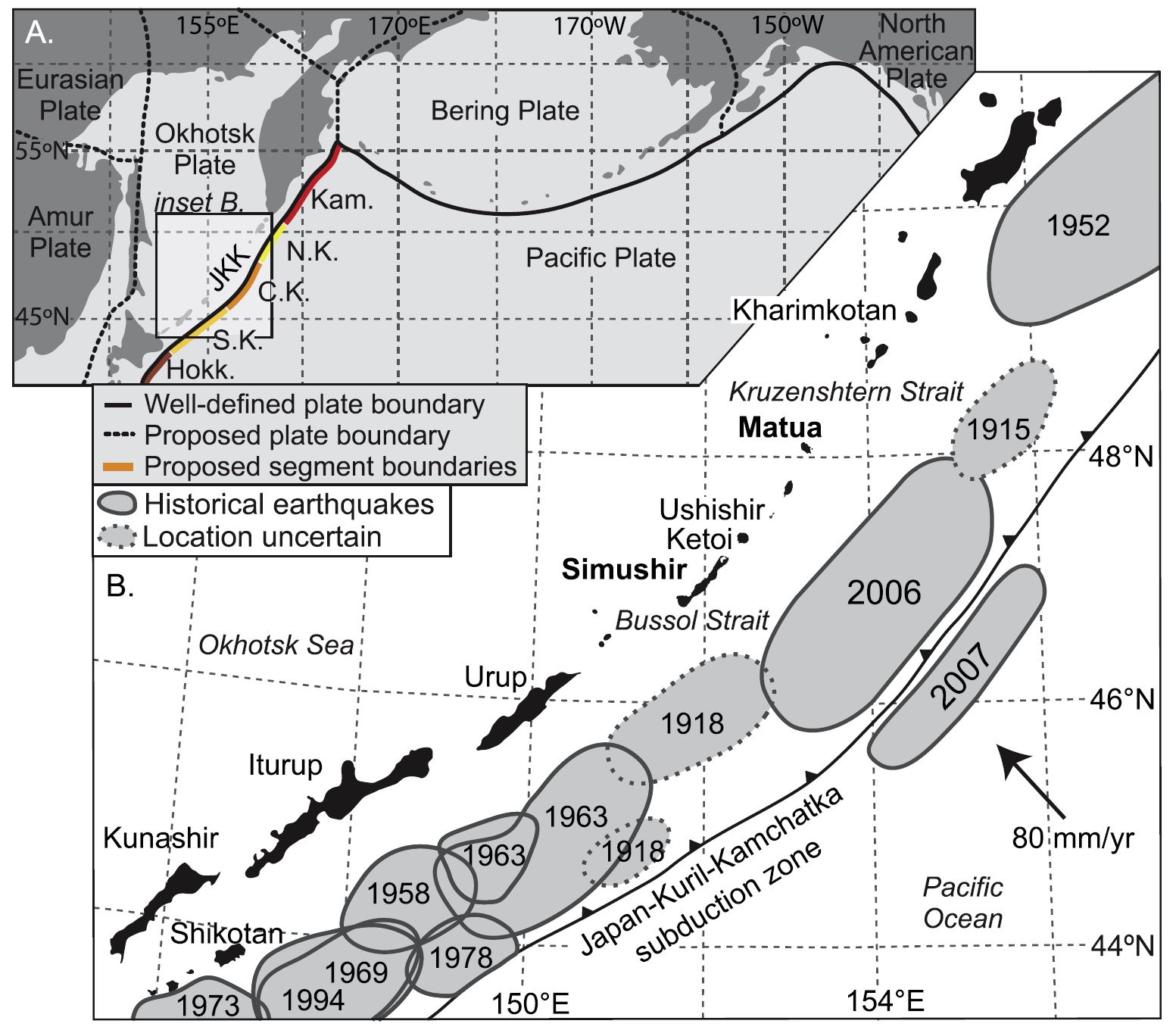
- MacInnes et al. (2016) studied tsunami from south of Kamchatka, along the Kuril Islands.
- This plot is a map that shows some historic earthquake patches along the subduction zone here.
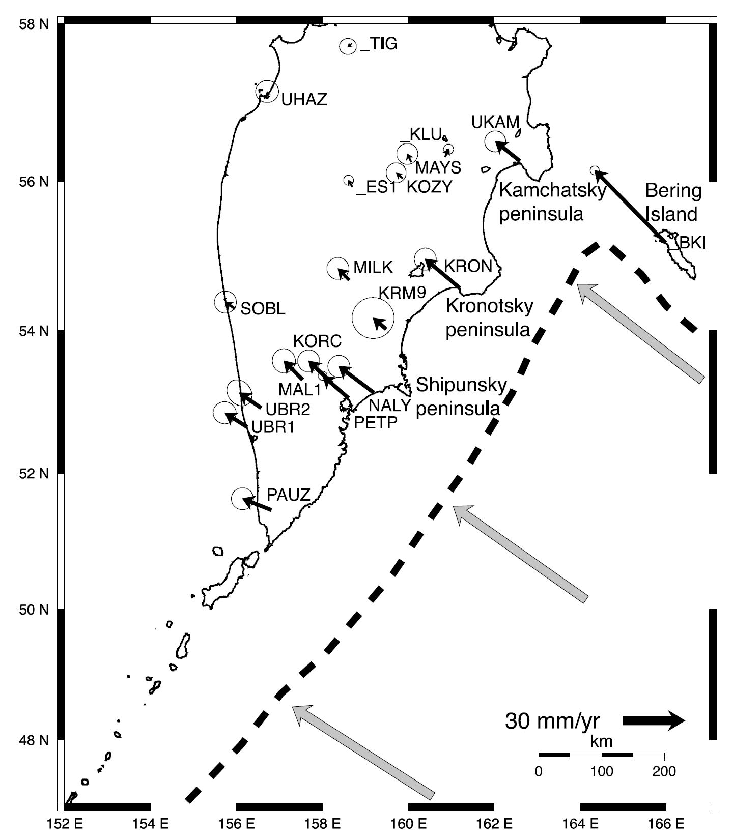
- Bürgmann et al. (2005) used Global Positioning System (GPS) data to evaluate the stresses on the megathrust subduction zone fault that forms the Kamchatka trench.
- GPS sites are installed at locations that are stably connected to the Earth. As the plates move, these GPS sites move. We can use the motions of these GPS sites to measure how the Earth’s crust or lithosphere move with time.
- This type of analysis is called geodesy.
- Bürgmann et al. (2005) used these plate motion rates to study how the stresses on the fault are different in different places. Plate tectonicists suggest that places where the fault is more strongly locked are the places where the faults are most likely to slip in future earthquakes.
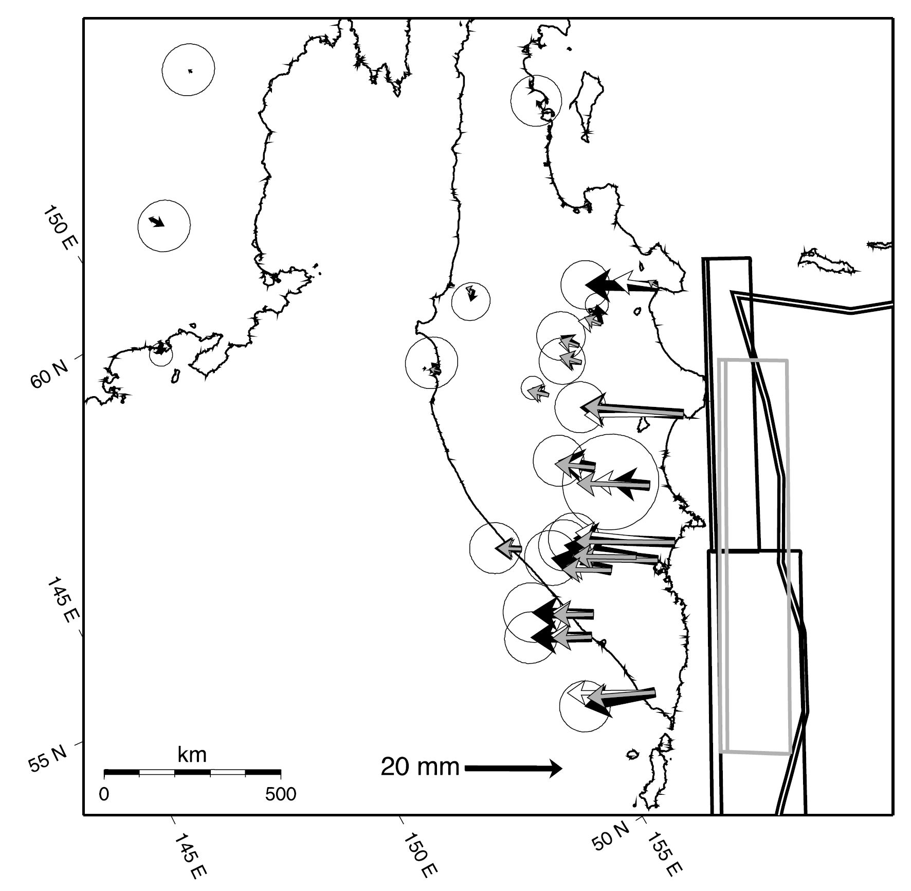
- This map shows the velocities that each GPS site is moving. The length of the arrow shows the velocity and the direction of the arrow represents the direction that the GPS site is moving.
- Bürgmann et al. (2005) used a fault model to deform the Earth for the interseismic time period (the time of the earthquake cycle between earthquakes).
- These authors created a 3-dimensional fault system and used different amounts of slip rates for these faults to deform the Earth.
- Then they compared the observed GPS rates with the rates calculated from their model.
- These authors found the best fault model to explain the ongoing motion at these GPS sites largely due to plate tectonics.
- This map shows the fault model and a comparison between the GPS observations and their model results. Note how the gray, white, and black arrows compare with each other.
- This map shows the fault slip model and a comparison between the GPS observations and their model results.
- Ikuta et al. (2015) conducted a global assessment of strain accumulation along subduction zone faults.
- These authors used seismicity data as a basis for their analyses. They used slip patches from historic earthquakes to estimate how much the fault accumulate strain over time.
Other Report Pages
Some Relevant Discussion and Figures
Plate Tectonics

Tectonic setting of the Sredinny and Ganal Massifs in Kamchatka. Kamchatka/Aleutian junction is modified after Gaedicke et al. (2000). Onland geology is after Bogdanov and Khain (2000). 1, Active volcanoes (a) and Holocene monogenic vents (b). 2, Trench (a) and pull-apart basin in the Aleutian transform zone (b). 3, Thrust (a) and normal (b) faults. 4, Strike-slip faults. 5–6, Sredinny Massif. 5, Amphibolite-grade felsic paragneisses of the Kolpakovskaya series. 6, Allochthonous metasedimentary and metavolcanic rocks of the Malkinskaya series. 7, The Kvakhona arc. 8, Amphibolites and gabbro (solid circle) of the Ganal Massif. Lower inset shows the global position of Kamchatka. Upper inset shows main Cretaceous-Eocene tectonic units (Bogdanov and Khain 2000): Western Kamchatka (WK) composite unit including the Sredinny Massif, the Kvakhona arc, and the thick pile of Upper Cretaceous marine clastic rocks; Eastern Kamchatka (EK) arc, and Eastern Peninsulas terranes (EPT). Eastern Kamchatka is also known as the Olyutorka-Kamchatka arc (Nokleberg et al. 1998) or the Achaivayam-Valaginskaya arc (Konstantinovskaya 2000), while Eastern Peninsulas terranes are also called Kronotskaya arc (Levashova et al. 2000).
Kamchatka subduction zone. A: Major geologic structures at the Kamchatka–Aleutian Arc junction. Thin dashed lines show isodepths to subducting Pacific plate (Gorbatov et al., 1997). Inset illustrates major volcanic zones in Kamchatka: EVB—Eastern Volcanic Belt; CKD—Central
Kamchatka Depression (rift-like tectonic structure, which accommodates the northern end of EVB); SR—Sredinny Range. Distribution of Quaternary volcanic rocks in EVB and SR is shown in orange and green, respectively. Small dots are active vol canoes. Large circles denote CKD volcanoes: T—Tolbachik; K l — K l y u c h e v s k o y ; Z—Zarechny; Kh—Kharchinsky; Sh—Shiveluch; Shs—Shisheisky Complex; N—Nachikinsky. Location of profiles shown in Figures 2 and 3 is indicated. B: Three dimensional visualization of the Kamchatka subduction zone from the north. Surface relief is shown as semi-transparent layer. Labeled dashed lines and color (blue to red) gradation of subducting plate denote depths to the plate from the earth surface (in km). Bold arrow shows direction of Pacific Plate movement.


Slip Distribution and Tsunami Modeling
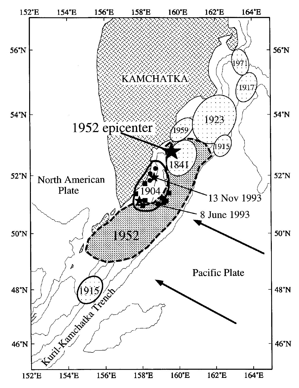
Aftershock zones of large and great earthquakes in the Kamchatka subduction zone as determined by FEDOTOV et al. (1982). Arrows indicate relative direction of Pacific plate motion. The large star indicates the epicenter of the 1952 earthquake; the small stars are the epicenters of the 1993 earthquakes. The small squares are aftershocks of the June 1993 event; small circles are aftershocks of the November 1993 event.
Slip distribution of the 1952 Kamchatka earthquake from nonnegative inversion of tsunami wave forms. The large star indicates the epicenter of the 1952 earthquake.
Observed and synthetic wave forms from nonnegative least-squares inversion for the slip on the 12 subfaults. The solid line is the observed and the dashed line is the synthetic. Each wave form has a different start time.
Tectonic setting and the inferred rupture areas of tsunamigenic subduction-zone earthquakes (locations after Fedotov et al., 1982, 1999). The star represents the 1952 epicenter. The rupture zones and epicenters for two events in the eighteenth century (1737 and 1792) are unknown.
The preferred slip distribution for the 1952 Kamchatka earthquake determined by Johnson and Satake, 1999. Major aftershocks (from Fedotov et al., 1982) and foreshocks (from Balakina, 1992) help define the inferred rupture area.
Best-fit distributions of slip during the 1952 Kamchatka earthquake (as in Table 3). These distributions all have concentrations of high slip off South Kamchatka or the northern Kuril Islands.
(A) Tectonic setting of the Kuril Islands, modified from Mackey et al. (1997) and Apel et al. (2006). Labels are as follows: JKK ¼ Japan-Kuril-Kamchatka subduction zone, Kam. ¼ Kamchatka segment, N.K. ¼ northern Kuril segment, C.K. ¼ central Kuril segment, S.K. ¼ southern Kuril segment, and Hokk. ¼ part of Hokkaido segment. The southernmost (Tohoku) segment of the JKK is not shown. (B) Historical earthquakes that produced tsunamis with recorded heights of at least 0.5 m in the southern, central, and northern Kuril segments of JKK (with the exception of 1915), after Fedotov et al. (1982) and the NGDC/WDS database. Earthquake locations prior to 1915 are too uncertain to map. The 2007 earthquake was an outer-rise event in the Pacific Plate.
Geodesy
GPS velocities in the Kamchatka region shown in a North American plate reference frame and tipped with 95% confidence ellipses. Offshore shaded arrows indicate Pacific plate velocities at the trench computed from the plate rotation parameters that were derived from the GPS velocities of sites located within the plate interior.
Optimal one- and two-dislocation back slip models inverted from the horizontal GPS velocities (solid arrows tipped by 95% confidence ellipses) shown relative to North America. Map is in an oblique Mercator projection about the angular rotation pole of North America–Pacific motion computed by Steblov et al. [2003]. Thus convergence-parallel features or velocities are aligned with the map border. The shaded (single-fault) and solid (two-fault) dislocation planes represent fully locked portions of the subduction thrust leading to the predicted velocity field. Modeled velocities are shown as shaded and open arrows for the one-fault and two-fault models, respectively. Even this simple model allows us to conclude that the degree of coupling and inferred locking width significantly decreases from south to north.
(a) Distributed slip model on modeled fault plane discretized into triangular elements and inverted from the horizontal GPS velocities using a smoothing factor b = 0.05. Observed (red arrows with 95% confidence ellipses) and modeled (yellow arrows) velocities are shown relative to a North American reference frame. The model indicates that the subduction zone is more coupled in the south, where the M = 9, 1952 earthquake and other major ruptures occurred. (b) Topography and bathymetry of the Kamchatka region shown with historic rupture zones from Figure 2. (c) Map of isostatic gravity anomalies over and offshore of Kamchatka. On-land data are from gravimeter measurements [Kogan et al., 1994], and data over oceans are derived from satellite altimetry [Sandwell and Smith, 1997].
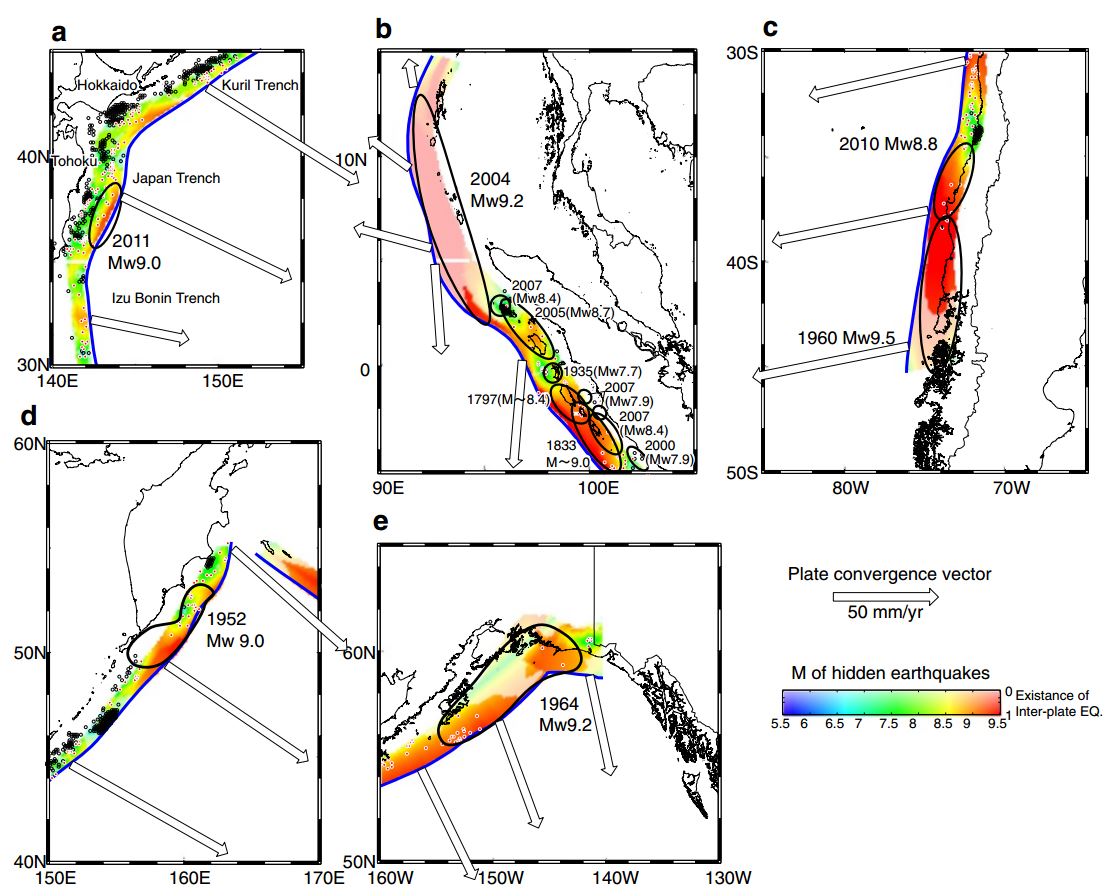
The expected earthquake size around the source areas of actual M9-class events, as estimated using the seismic catalog before (a–c) and after (c–e) the seismic events. Color shows the magnitudes of the potential earthquakes that are estimated from the size of the slip-deficient ellipse for each grid point. Unreliable grid points that have no slip-deficient grid points within their ellipses are shown by translucent colors. a The Kuril, Japan, and Izu–Bonin trenches. The source area of the 2011 Tohoku earthquake (Mw9.0) is enclosed by a solid line, and the trench is shown by a solid blue line. Arrows show the relative motion of the overriding plate with respect to the subducting slab. b The Java trench. The source areas of past earthquakes including the 2004 Sumatra earthquake (Mw9.2) are enclosed by solid lines. The rupture areas of the 2005 (Mw8.7), 2007 (Mw7.9), 2007 (Mw8.4), 2007 (Mw8.4), 1935 (Mw7.7), 1833 (M~9.0), and 1797 (M~8.4) events are modified from Briggs et al. (2006). c The Chile trench. The source areas of the two M9-class events are shown by solid lines (e.g., Barrientos and Ward 1990; Pollitz et al. 2011). d Kamchatka. The source area of the 1952 Kamchatka earthquake (Mw9.0) is enclosed by a solid line. e Alaska. The source area of the 1964 Alaska earthquake (Mw9.2) is enclosed by a solid line. The rupture area is modified from Christensen and Beck (1994). The color scales, legend, and arrow length are the same for a–e
- Summary of the 1964 Earthquake
- 2025.07.29 M 8.8 Kamchatka
- 2025.07.16 M 7.3 Alaska POSTER
- 2024.08.17 M 7.0 Kamchatka
- 2023.07.16 M 7.2 Alaska POSTER
- 2021.07.29 M 8.2 Alaska
- 2020.10.19 M 7.5 Alaska POSTER
- 2020.07.22 M 7.8 Alaska POSTER
- 2019.04.02 M 6.5 Aleutians
- 2019.03.26 M 5.2 Alaska
- 2018.12.20 M 7.4 Bering Kresla
- 2018.12.20 M 7.3 Bering Kresla UPDATE #1
- 2018.11.30 M 7.0 Alaska
- 2018.08.15 M 6.6 Aleutians
- 2018.08.12 M 6.4 North Alaska
- 2018.08.12 M 6.4 North Alaska UPDATE #1
- 2018.01.23 M 7.9 Gulf of Alaska
- 2018.01.23 M 7.9 Gulf of Alaska UPDATE #1
- 2018.01.23 M 7.9 Gulf of Alaska UPDATE #2
- 2017.07.17 M 7.7 Aleutians
- 2017.07.17 M 7.7 Aleutians UPDATE #1
- 2017.06.02 M 6.8 Aleutians
- 2017.05.08 M 6.2 Aleutians
- 2017.05.01 M 6.3 British Columbia
- 2017.03.29 M 6.6 Kamchatka
- 2017.03.02 M 5.5 Alaska
- 2016.09.05 M 6.3 Bering Kresla (west of Aleutians)
- 2016.04.13 M 5.7 & 6.4 Kamchatka
- 2016.04.02 M 6.2 Alaska Peninsula
- 2016.03.27 M 5.7 Aleutians
- 2016.03.12 M 6.3 Aleutians
- 2016.01.29 M 7.2 Kamchatka
- 2016.01.24 M 7.1 Alaska
- 2015.11.09 M 6.2 Aleutians
- 2015.11.02 M 5.9 Aleutians
- 2015.11.02 M 5.9 Aleutians (update)
- 2015.07.27 M 6.9 Aleutians
- 2015.05.29 M 6.7 Alaska Peninsula
- 2015.05.29 M 6.7 Alaska Peninsula (animations)
- 1964.03.27 M 9.2 Good Friday
Alaska | Kamchatka | Kurile
General Overview
Earthquake Reports
Social Media
- Frisch, W., Meschede, M., Blakey, R., 2011. Plate Tectonics, Springer-Verlag, London, 213 pp.
- Hayes, G., 2018, Slab2 – A Comprehensive Subduction Zone Geometry Model: U.S. Geological Survey data release, https://doi.org/10.5066/F7PV6JNV.
- Holt, W. E., C. Kreemer, A. J. Haines, L. Estey, C. Meertens, G. Blewitt, and D. Lavallee (2005), Project helps constrain continental dynamics and seismic hazards, Eos Trans. AGU, 86(41), 383–387, , https://doi.org/10.1029/2005EO410002. /li>
- Jessee, M.A.N., Hamburger, M. W., Allstadt, K., Wald, D. J., Robeson, S. M., Tanyas, H., et al. (2018). A global empirical model for near-real-time assessment of seismically induced landslides. Journal of Geophysical Research: Earth Surface, 123, 1835–1859. https://doi.org/10.1029/2017JF004494
- Kreemer, C., J. Haines, W. Holt, G. Blewitt, and D. Lavallee (2000), On the determination of a global strain rate model, Geophys. J. Int., 52(10), 765–770.
- Kreemer, C., W. E. Holt, and A. J. Haines (2003), An integrated global model of present-day plate motions and plate boundary deformation, Geophys. J. Int., 154(1), 8–34, , https://doi.org/10.1046/j.1365-246X.2003.01917.x.
- Kreemer, C., G. Blewitt, E.C. Klein, 2014. A geodetic plate motion and Global Strain Rate Model in Geochemistry, Geophysics, Geosystems, v. 15, p. 3849-3889, https://doi.org/10.1002/2014GC005407.
- Meyer, B., Saltus, R., Chulliat, a., 2017. EMAG2: Earth Magnetic Anomaly Grid (2-arc-minute resolution) Version 3. National Centers for Environmental Information, NOAA. Model. https://doi.org/10.7289/V5H70CVX
- Müller, R.D., Sdrolias, M., Gaina, C. and Roest, W.R., 2008, Age spreading rates and spreading asymmetry of the world’s ocean crust in Geochemistry, Geophysics, Geosystems, 9, Q04006, https://doi.org/10.1029/2007GC001743
- Pagani,M. , J. Garcia-Pelaez, R. Gee, K. Johnson, V. Poggi, R. Styron, G. Weatherill, M. Simionato, D. Viganò, L. Danciu, D. Monelli (2018). Global Earthquake Model (GEM) Seismic Hazard Map (version 2018.1 – December 2018), DOI: 10.13117/GEM-GLOBAL-SEISMIC-HAZARD-MAP-2018.1
- Silva, V ., D Amo-Oduro, A Calderon, J Dabbeek, V Despotaki, L Martins, A Rao, M Simionato, D Viganò, C Yepes, A Acevedo, N Horspool, H Crowley, K Jaiswal, M Journeay, M Pittore, 2018. Global Earthquake Model (GEM) Seismic Risk Map (version 2018.1). https://doi.org/10.13117/GEM-GLOBAL-SEISMIC-RISK-MAP-2018.1
- Storchak, D. A., D. Di Giacomo, I. Bondár, E. R. Engdahl, J. Harris, W. H. K. Lee, A. Villaseñor, and P. Bormann (2013), Public release of the ISC-GEM global instrumental earthquake catalogue (1900–2009), Seismol. Res. Lett., 84(5), 810–815, doi:10.1785/0220130034.
- Zhu, J., Baise, L. G., Thompson, E. M., 2017, An Updated Geospatial Liquefaction Model for Global Application, Bulletin of the Seismological Society of America, 107, p 1365-1385, https://doi.org/0.1785/0120160198
- Atwater, B.F., Musumi-Rokkaku, S., Satake, K., Tsuju, Y., Eueda, K., and Yamaguchi, D.K., 2005. The Orphan Tsunami of 1700—Japanese Clues to a Parent Earthquake in North America, USGS Professional Paper 1707, USGS, Reston, VA, 144 pp.
- Bassett and Watts, 2015. Gravity anomalies, crustal structure, and seismicity at subduction zones: 1. Seafloor roughness and subducting relief in Geochemistry, Geophysics, Geosystems, v. 16, doi:10.1002/2014GC005684.
- Bindeman, I.N., Vinogradov, V.I., Valley, J.W., Wooden, J.L., and Natal’in, B.A., 2002. Archean Protolith and Accretion of Crust in Kamchatka: SHRIMP Dating of Zircons from Sredinny and Ganal Massifs in The Journal of Geology, v. 110, p. 271-289.
- Bürgmann R. Kogan M. G. Steblov G. M. Hilley G. Levin V. E. Apel E. (2005). Interseismic coupling and asperity distribution along the Kamchatka subduction zone, J. Geophys. Res. 110, no. B07405, doi 10.1029/2005JB003648
- Ikuta, R., Mitsui, Y., Kurokawa, Y. et al. Evaluation of strain accumulation in global subduction zones from seismicity data. Earth Planet Sp 67, 192 (2015). https://doi.org/10.1186/s40623-015-0361-5
- Johnson J. M. Satake K., 1999. Asperity distribution of the 1952 great Kamchatka earthquake and its relation to future earthquake potential in Kamchatka, Pure Appl. Geophys 154, no. 3/4, 541-553
- Konstantinovskaia, E.A., 2001. Arc-continent collision and subduction reversal in the Cenozoic evolution of the Northwest Pacific: and example from Kamchatka (NE Russia) in Tectonophysics, v. 333, p. 75-94.
- Koulakov, I.Y., Dobretsov, N.L., Bushenkova, N.A., and Yakovlev, A.V., 2011. Slab shape in subduction zones beneath the Kurile–Kamchatka and Aleutian arcs based on regional tomography results in Russian Geology and Geophysics, v. 52, p. 650-667.
- Krutikov, L., et al., 2008. Active Tectonics and Seismic Potential of Alaska, Geophysical Monograph Series 179, doi:10.1029/179GM07
- Lay, T., H. Kanamori, C. J. Ammon, A. R. Hutko, K. Furlong, and L. Rivera, 2009. The 2006 – 2007 Kuril Islands great earthquake sequence in J. Geophys. Res., 114, B11308, doi:10.1029/2008JB006280.
- MacInnes, B.T., Robert Weiss, Joanne Bourgeois, Tatiana K. Pinegina, 2010. Slip Distribution of the 1952 Kamchatka Great Earthquake Based on Near-Field Tsunami Deposits and Historical Records in Bulletin of the Seismological Society of America 2010;; 100 (4): 1695–1709. doi: https://doi.org/10.1785/0120090376
- MacInnes B, Kravchunovskaya E, Pinegina T, Bourgeois J. Paleotsunamis from the central Kuril Islands segment of the Japan-Kuril-Kamchatka subduction zone. Quaternary Research. 2016;86(1):54-66. https://doi.org/10.1016/j.yqres.2016.03.005
- Meyer, B., Saltus, R., Chulliat, a., 2017. EMAG2: Earth Magnetic Anomaly Grid (2-arc-minute resolution) Version 3. National Centers for Environmental Information, NOAA. Model. doi:10.7289/V5H70CVX
- Meyer, B., Saltus, R., Chulliat, a., 2017. EMAG2: Earth Magnetic Anomaly Grid (2-arc-minute resolution) Version 3. National Centers for Environmental Information, NOAA. Model. doi:10.7289/V5H70CVX
- Müller, R.D., Sdrolias, M., Gaina, C. and Roest, W.R., 2008, Age spreading rates and spreading asymmetry of the world’s ocean crust in Geochemistry, Geophysics, Geosystems, 9, Q04006, doi:10.1029/2007GC001743
- Portnyagin, M. and Manea, V.C., 2008. Mantle temperature control on composition of arc magmas along the Central Kamchatka Depression in Geology, v. 36, no. 7, p. 519-522.
- Rhea, Susan, Tarr, A.C., Hayes, Gavin, Villaseñor, Antonio, Furlong, K.P., and Benz, H.M., 2010, Seismicity of the earth 1900–2007, Kuril-Kamchatka arc and vicinity: U.S. Geological Survey Open-File Report 2010–1083-C, scale 1:5,000,000.
References:
Basic & General References
Specific References
Return to the Earthquake Reports page.
- Sorted by Magnitude
- Sorted by Year
- Sorted by Day of the Year
- Sorted By Region