What a day. I started by waking up about 5:43 AM (about, heheh), which was 17 minutes before my alarm was set. I had a job interview at 8:30.
I went to the interview for a position working on tsunami geology. During the interview, everyone started getting phone calls and emails, there was an earthquake in Alaska. The main interviewer had to leave the interview to take a few calls. Pretty funny, before they left, they asked me what would I do. Perfect timing.
We all broke out our phones and started reviewing the early reports and hypothesizing. I thought this may be related to the earthquake in 2016, though that was much deeper.
Much has been written about this earthquake and I include tweets to summaries below in the social media section.
Today’s earthquake occurred along the convergent plate boundary in southern Alaska. This subduction zone fault is famous for the 1964 March 27 M = 9.2 megathrust earthquake. I describe this earthquake in more detail here.
During the 1964 earthquake, the downgoing Pacific plate slipped past the North America plate, including slip on “splay faults” (like the Patton fault, no relation, heheh). There was deformation along the seafloor that caused a transoceanic tsunami.
The Pacific plate has pre-existing zones of weakness related to fracture zones and spreading ridges where the plate formed and are offset. There was an earthquake in January 2016 that may have reactivated one of these fracture zones. This earthquake (M = 7.1) was very deep (~130 km), but still caused widespread damage.
There was also an earthquake associated with the faults in the Pacific plate, which is still having asftershocks, earlier this year. Here is my earthquake report for the 2018.01.24 M 7.9 earthquake. I prepared two update reports here and here.
Today’s earthquake was not on the megathrust fault interface and is extensional. I always have fun chatting with people new to subduction zones when we get to see an extensional earthquake at a convergent plate boundary. Because the earthquake was a normal earthquake (extensional) and it was rather deep, the possibility of a tsunami was quite small.
However, there was a possibility that landslides could have triggered tsunami. However, these would be localized near the epicentral region.
The earthquake appears to have a depth of ~40 km and the USGS model for the megathrust fault (slab 2.0) shows the megathrust to be shallower than this earthquake. There are generally 2 ways that may explain the extensional earthquake: slab tension (the downgoing plate is pulling down on the slab, causing extension) or “bending moment” extension (as the plate bends downward, the top of the plate stretches out.
UPDATE – 1 year later
Further down on this page, I include additional materials that were developed in the past year.
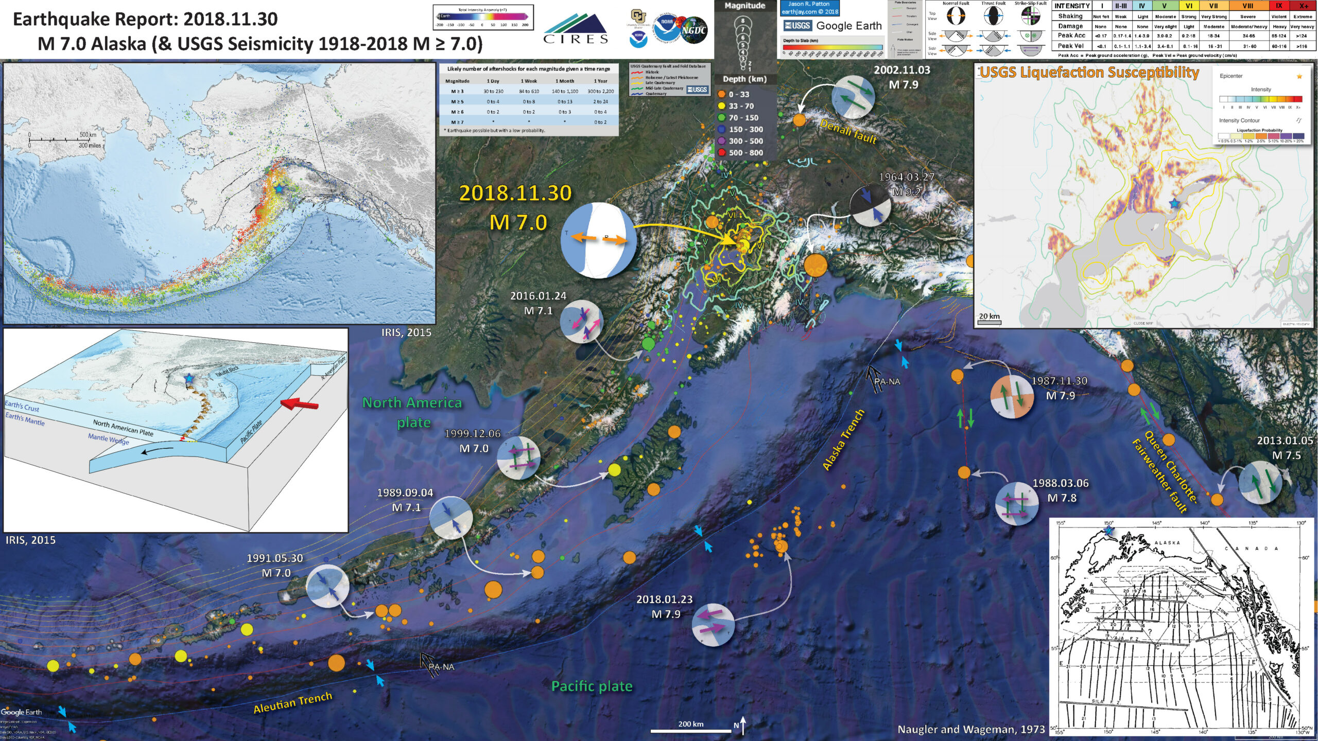
Below is my interpretive poster for this earthquake
I plot the seismicity from the past month, with color representing depth and diameter representing magnitude (see legend). I include earthquake epicenters from 1918-2018 with magnitudes M ≥ 3.0 in one version.
I plot the USGS fault plane solutions (moment tensors in blue and focal mechanisms in orange), possibly in addition to some relevant historic earthquakes.
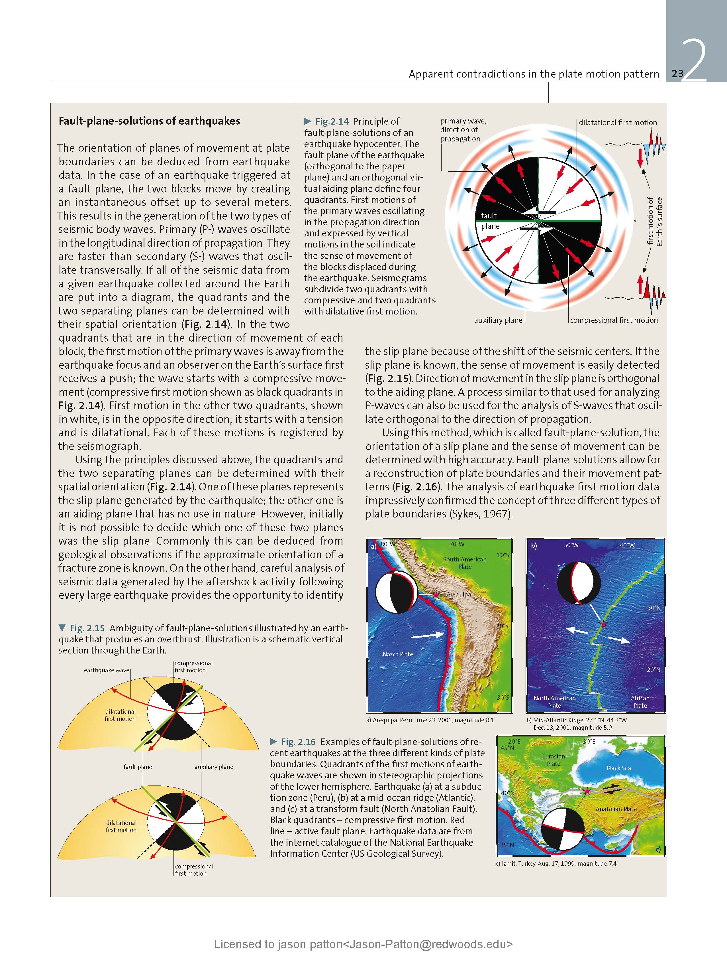
- I placed a moment tensor / focal mechanism legend on the poster. There is more material from the USGS web sites about moment tensors and focal mechanisms (the beach ball symbols). Both moment tensors and focal mechanisms are solutions to seismologic data that reveal two possible interpretations for fault orientation and sense of motion. One must use other information, like the regional tectonics, to interpret which of the two possibilities is more likely.
- I also include the shaking intensity contours on the map. These use the Modified Mercalli Intensity Scale (MMI; see the legend on the map). This is based upon a computer model estimate of ground motions, different from the “Did You Feel It?” estimate of ground motions that is actually based on real observations. The MMI is a qualitative measure of shaking intensity. More on the MMI scale can be found here and here. This is based upon a computer model estimate of ground motions, different from the “Did You Feel It?” estimate of ground motions that is actually based on real observations.
- I include the slab 2.0 contours plotted (Hayes, 2018), which are contours that represent the depth to the subduction zone fault. These are mostly based upon seismicity. The depths of the earthquakes have considerable error and do not all occur along the subduction zone faults, so these slab contours are simply the best estimate for the location of the fault.li>
- In the map below, I include a transparent overlay of the magnetic anomaly data from EMAG2 (Meyer et al., 2017). As oceanic crust is formed, it inherits the magnetic field at the time. At different points through time, the magnetic polarity (north vs. south) flips, the north pole becomes the south pole. These changes in polarity can be seen when measuring the magnetic field above oceanic plates. This is one of the fundamental evidences for plate spreading at oceanic spreading ridges (like the Gorda rise).
- Regions with magnetic fields aligned like today’s magnetic polarity are colored red in the EMAG2 data, while reversed polarity regions are colored blue. Regions of intermediate magnetic field are colored light purple.
- We can see the roughly east-west trends of these red and blue stripes. These lines are parallel to the ocean spreading ridges from where they were formed. The stripes disappear at the subduction zone because the oceanic crust with these anomalies is diving deep beneath the North America plate, so the magnetic anomalies from the overlying North America plate mask the evidence for the Pacific plate.
Magnetic Anomalies
- In the upper left corner is a map of the plate boundary faults from IRIS, which shows seismicity with color representing depth. I place a blue star in the general location of today’s earthquake (same for other inset figures).
- Below this map is a low-angle oblique view of the subduction zone.
- In the lower right corner is a map that shows the isochrons (line of equal age) for the oceanic crust of the Pacific plate (Naugler and Wageman, 1973). Compare these lines with the magnetic anomalies in the main poster.
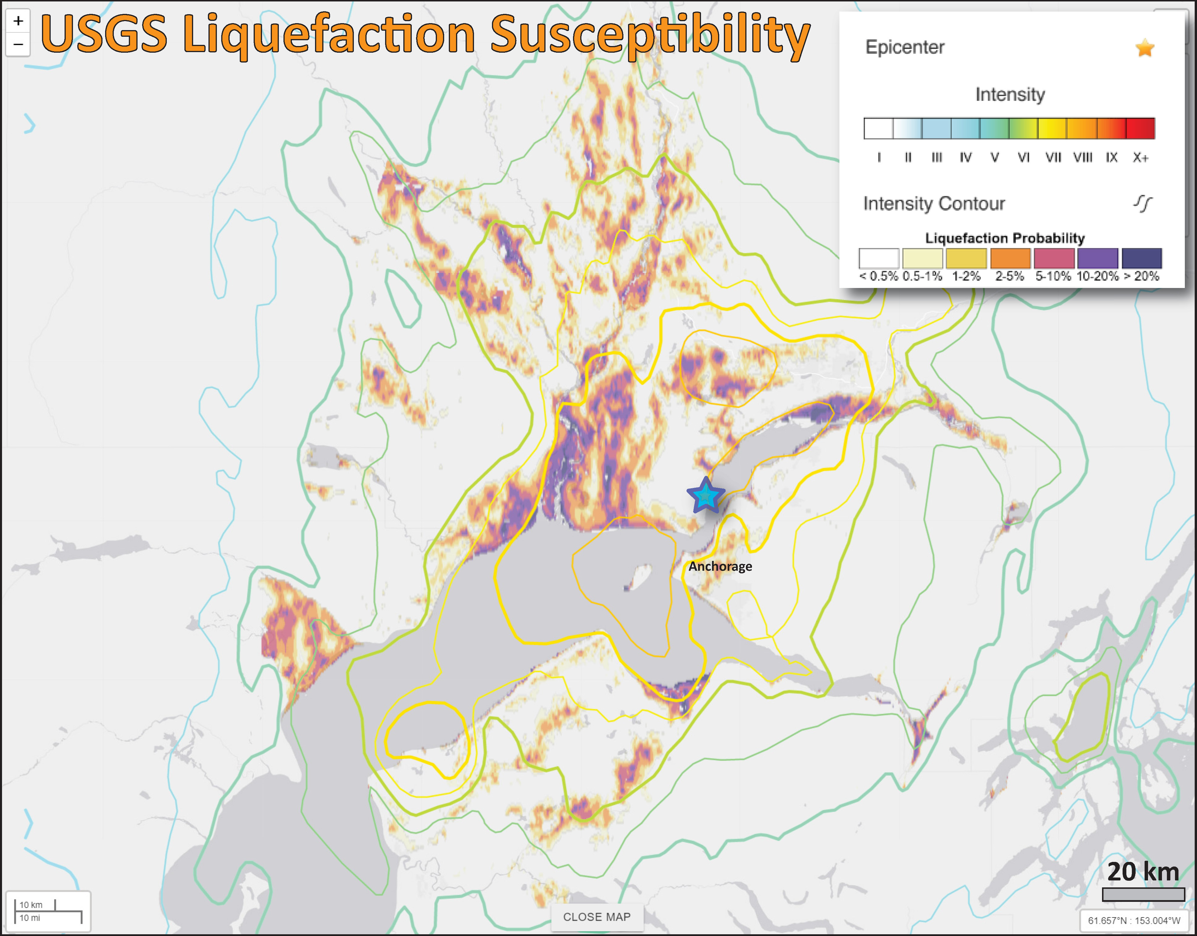
- In the upper right corner is the USGS liquefaction susceptibility map which is now a standard map product for USGS earthquake pages (for earthquakes of sufficient size). There has been photos of road damage that appear to be the result of liquefaction induced slope failures. I presented this map product in my reports for the 2018.09.28 Sulawesi, Indonesia earthquake and tsunami.
- Another new product from the USGS is an aftershock forecast. GNS (New Zealand) has been doing this for a while (I first noticed these following the 2016 Kaikoura earthquake). I prepared a table from their data that lists the potential number of earthquakes for different magnitudes for different time periods. These estimates are basically based on the empirical evidence that aftershock size and number decay with time.
I include some inset figures. Some of the same figures are located in different places on the larger scale map below.
Other Report Pages
Some Relevant Discussion and Figures
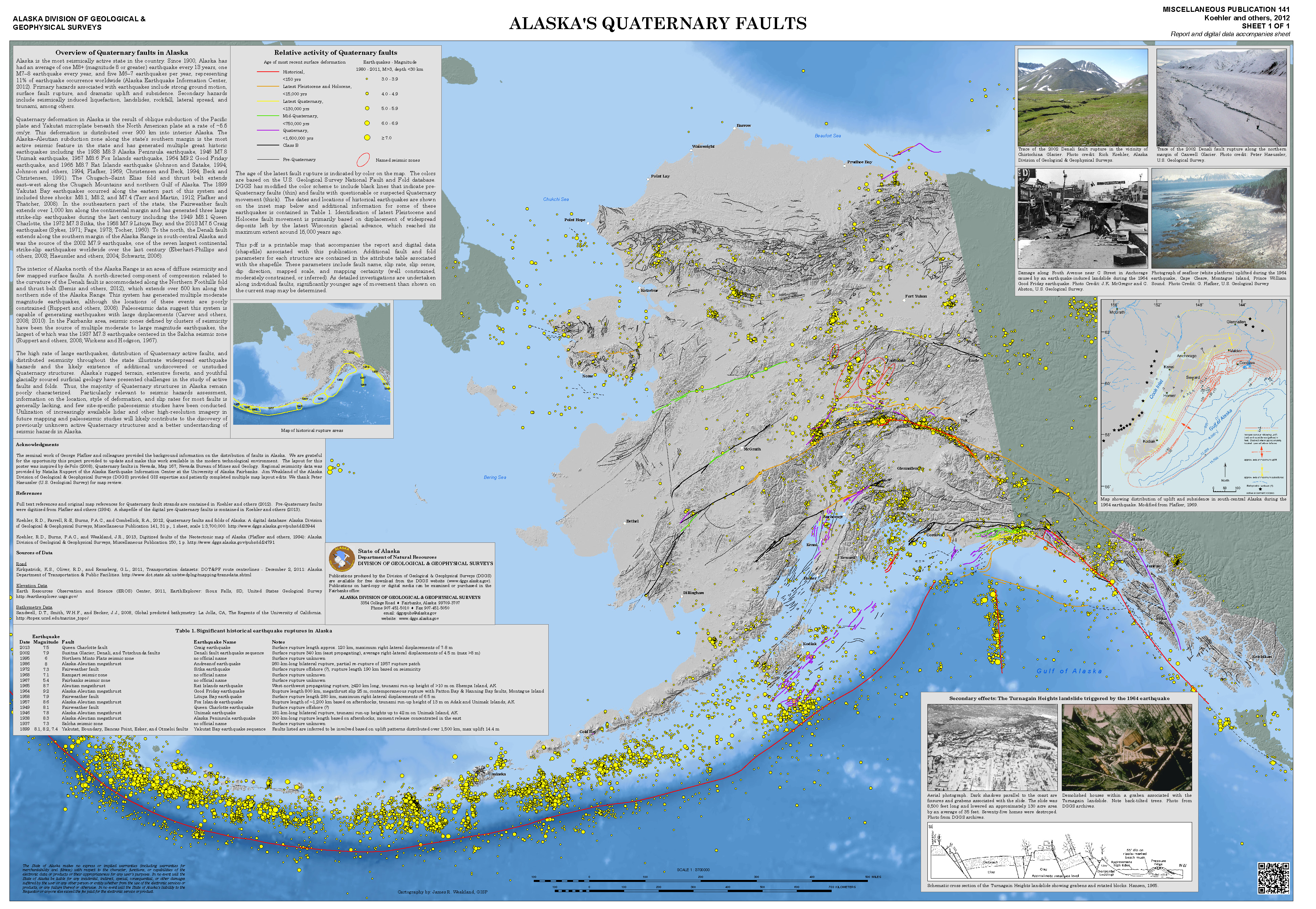
- Here is a map from Michael West at the Alaska Earthquake Center. This shows today’s earthquake in reference to the Quaternary faults and folds in Alaska: A digital database (Koehler et al., 2012). Dr. Rick Koehler is currently at the University of Nevada Reno and The Nevada Bureau of Mines and Geology. This is the map poster from Koehler et al. (2012). The link is to a 63 MB pdf file.
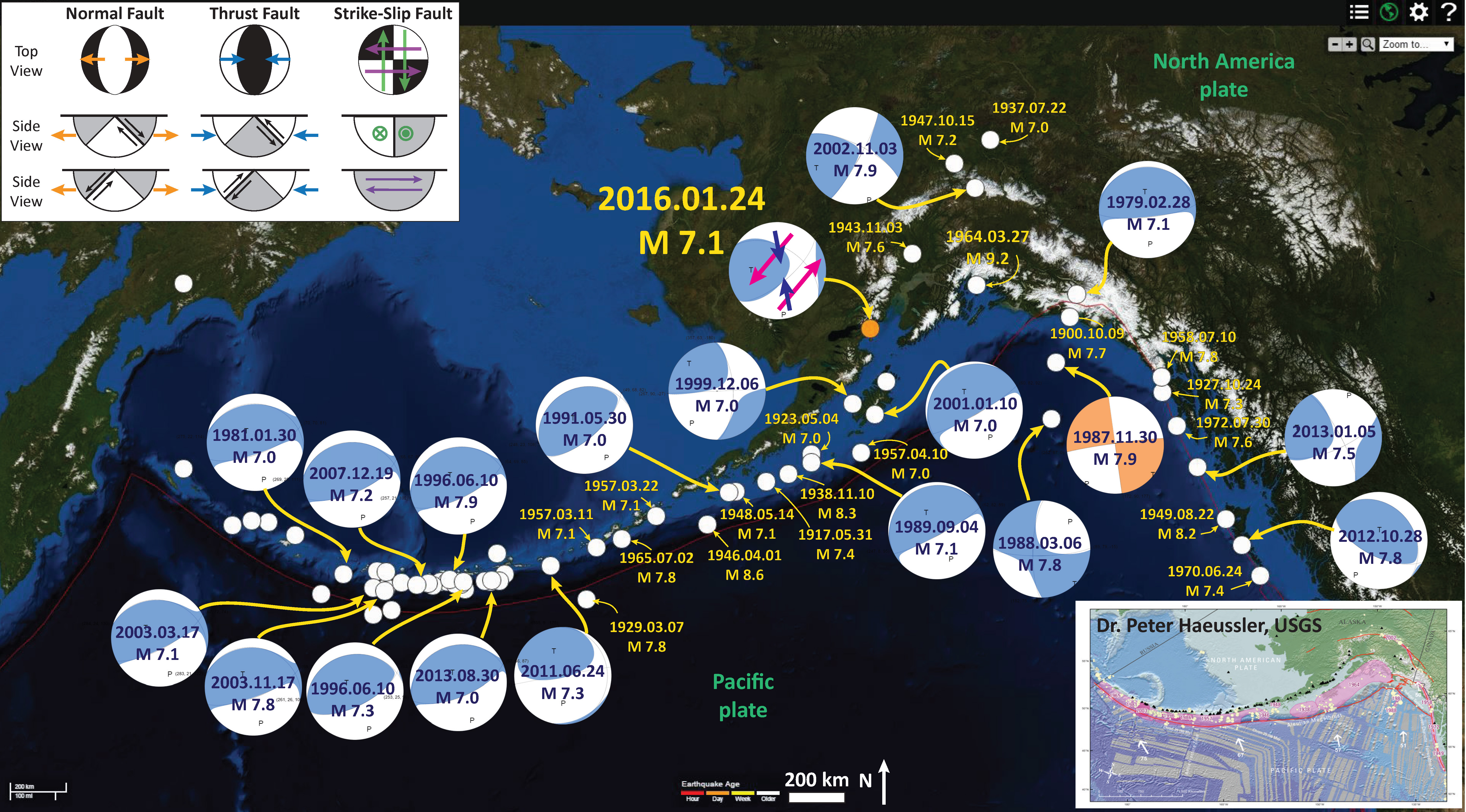
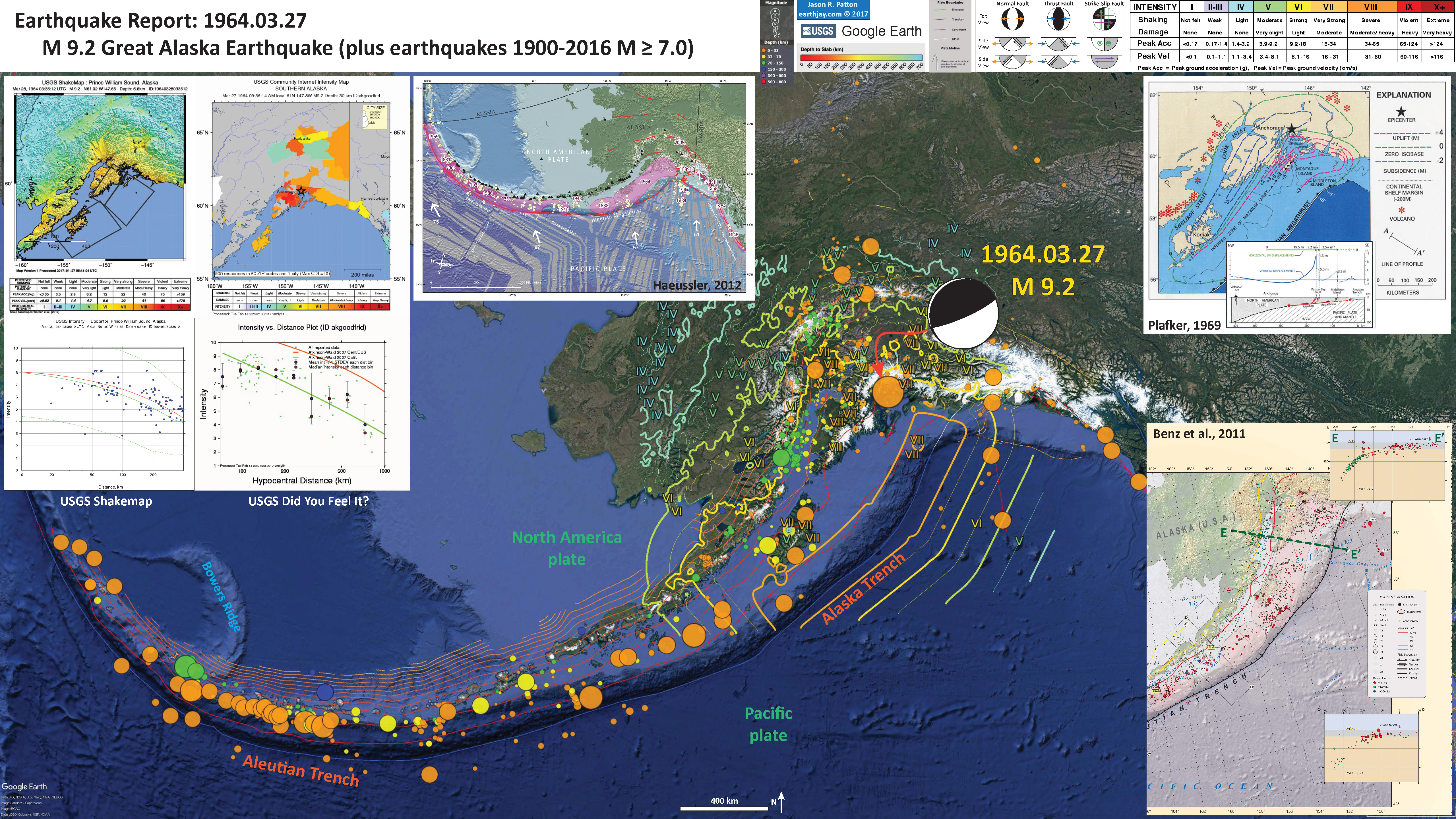
- Here is a map for the earthquakes of magnitude greater than or equal to M 7.0 between 1900 and 2016. This is the USGS query that I used to make this map. One may locate the USGS web pages for all the earthquakes on this map by following that link.
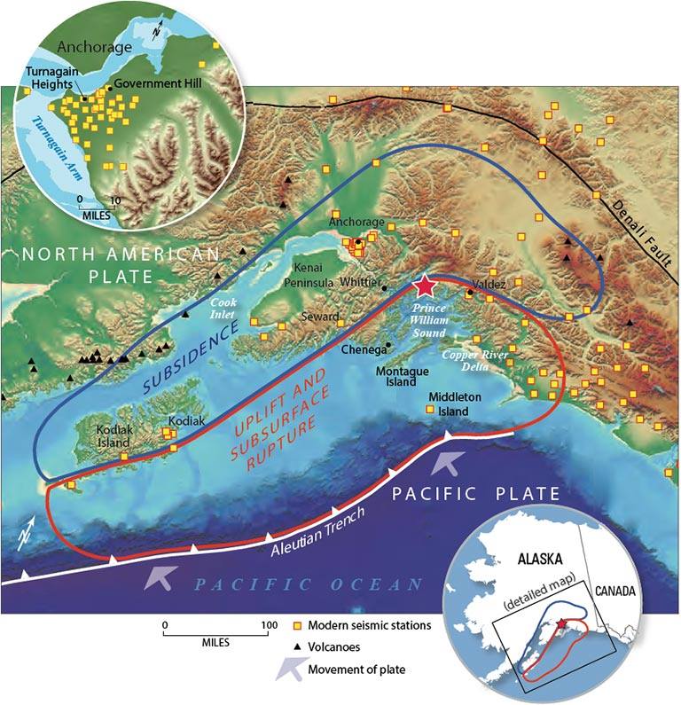
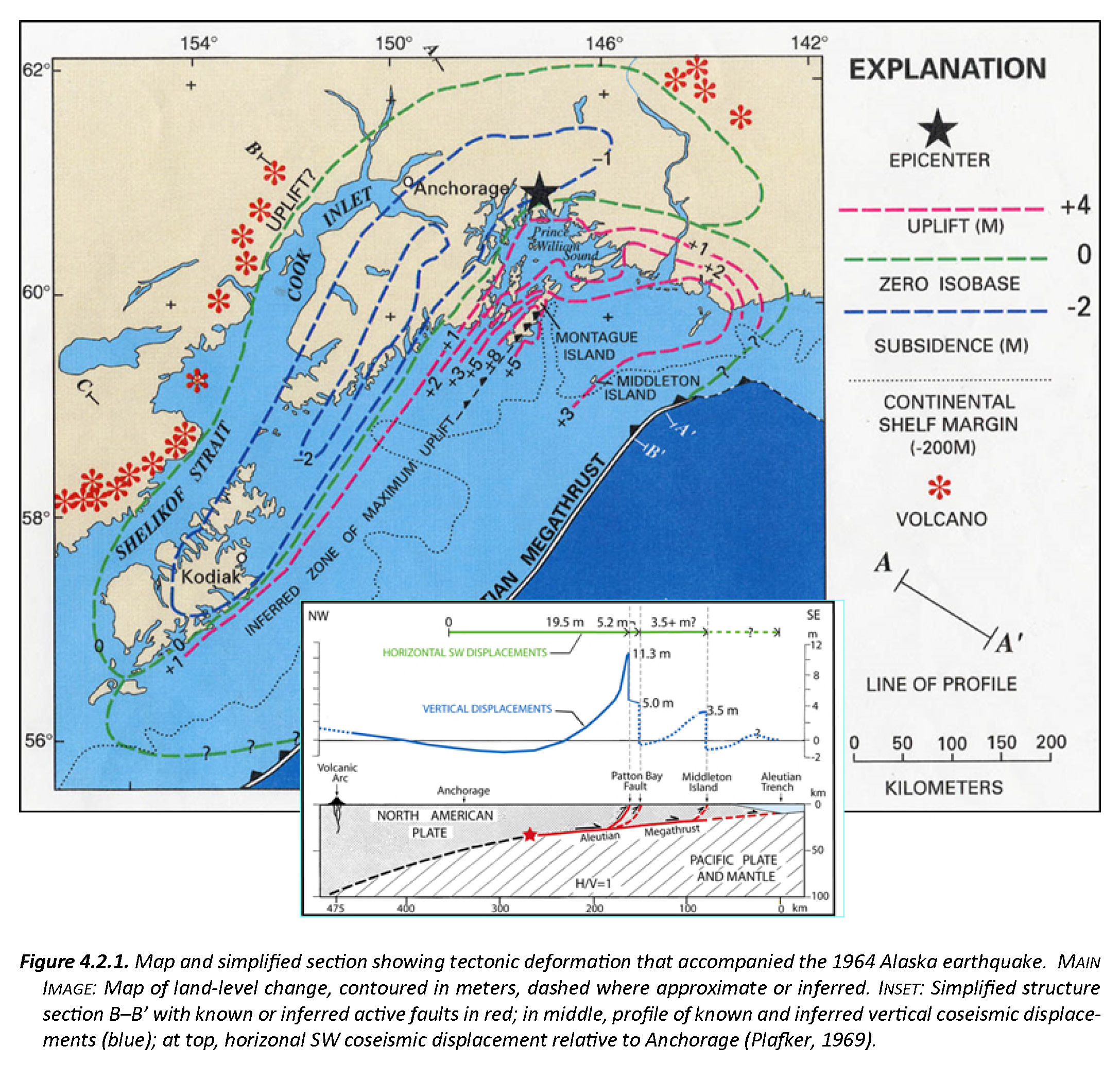
- This is a map from Haeussler et al. (2014). The region in red shows the area that subsided and the area in blue shows the region that uplifted during the earthquake. These regions were originally measured in the field by George Plafker and published in several documents, including this USGS Professional Paper (Plafker, 1969). I present more information about the 1964 Good Friday Earthquake here.
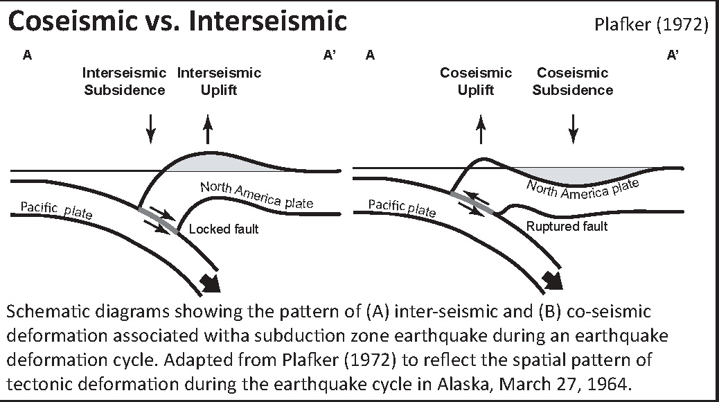
- Here is a cross section showing the differences of vertical deformation between the coseismic (during the earthquake) and interseismic (between earthquakes).
- Here is a figure recently published in the 5th International Conference of IGCP 588 by the Division of Geological and Geophysical Surveys, Dept. of Natural Resources, State of Alaska (State of Alaska, 2015). This is derived from a figure published originally by Plafker (1969). There is a cross section included that shows how the slip was distributed along upper plate faults (e.g. the Patton Bay and Middleton Island faults).
- Here is an animation that shows earthquakes of magnitude > 6.5 for the period from 1900-2016. Above is a map showing the region and below is the animation. This is the URL for the USGS query that I used to make this animation in Google Earth.
- Here is a link to the file for the embedded video below (5 MB mp4)
- Below is my interpretive poster for the Good Friday M 9.2 earthquake. Learn more about the 1964 earthquake here.
Below is an educational video from the USGS that presents material about subduction zones and the 1964 earthquake and tsunami in particular.
Youtube Source IRIS
mp4 file for downloading.
-
Credits:
- Animation & graphics by Jenda Johnson, geologist
- Directed by Robert F. Butler, University of Portland
- U.S. Geological Survey consultants: Robert C. Witter, Alaska Science Center Peter J. Haeussler, Alaska Science Center
- Narrated by Roger Groom, Mount Tabor Middle School
Updated Mapping of Historical Earthquakes and Active Faults
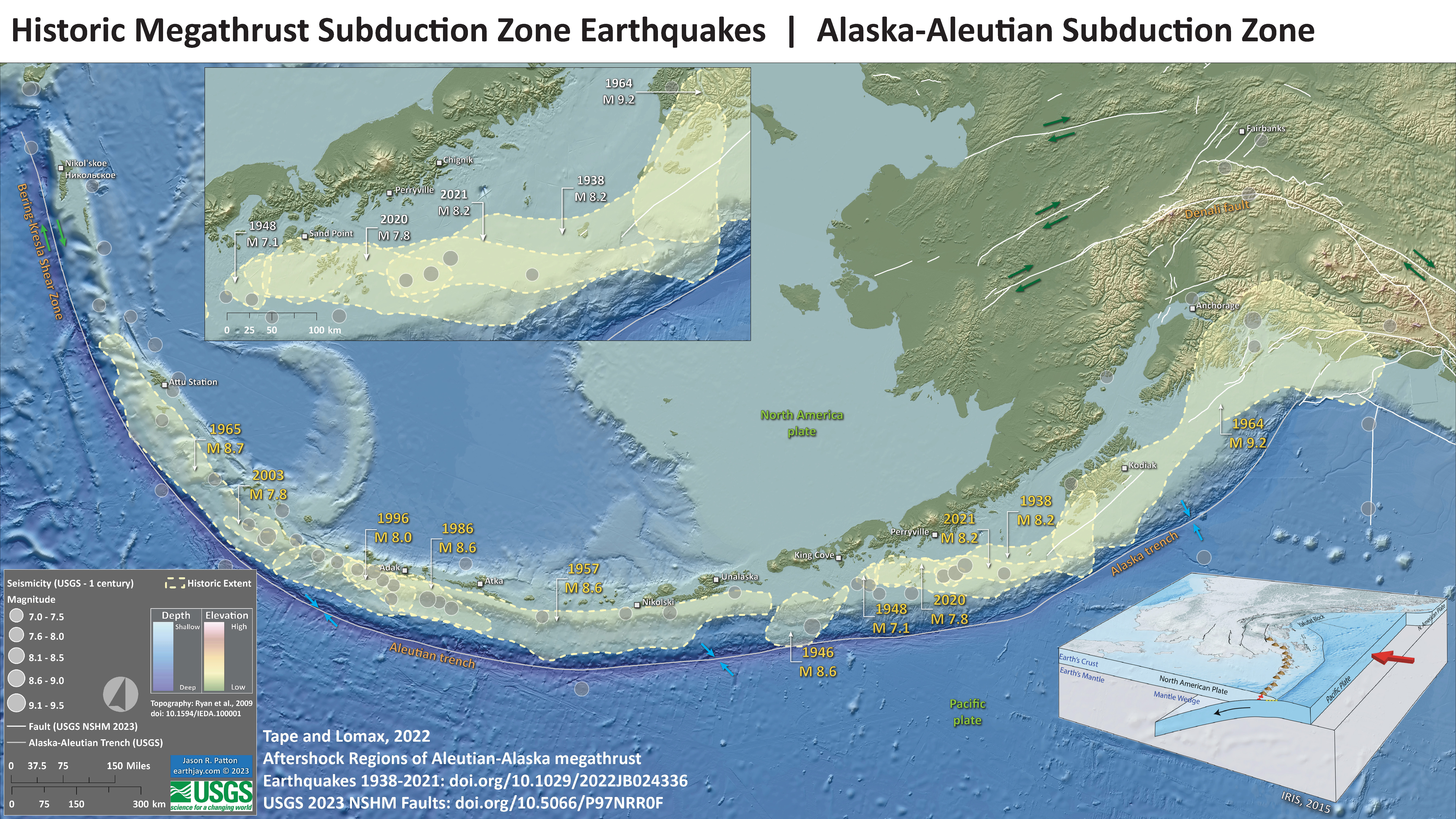
- Here is a map that uses the newly relocated seismicity from Tape and Lomax (2022).
- Tape and Lomax created a catalog of relocated seismicity for five earthquakes and used these relocations to outline aftershock regions for these earthquakes.
- I also include a new fault database, the Alaska’s contribution to the USGS National Seismic Hazard Model (NSHM) 2023 version (Bender et al., 2021).
- I will be using this map in future reports, replacing the classic and well loved Haeussler map with pink polygons.
- Carl Tape, Peter Haeussler, Anthony Lomax, and Rob Witter provided key feedback that vastly improved the composition and content of this interpretive poster. Thank you!
- See references below for links to these datasets. However, not yet peer reviewed, here is a link to the Haeussler et al. preprint for the NSHM fault dataset.
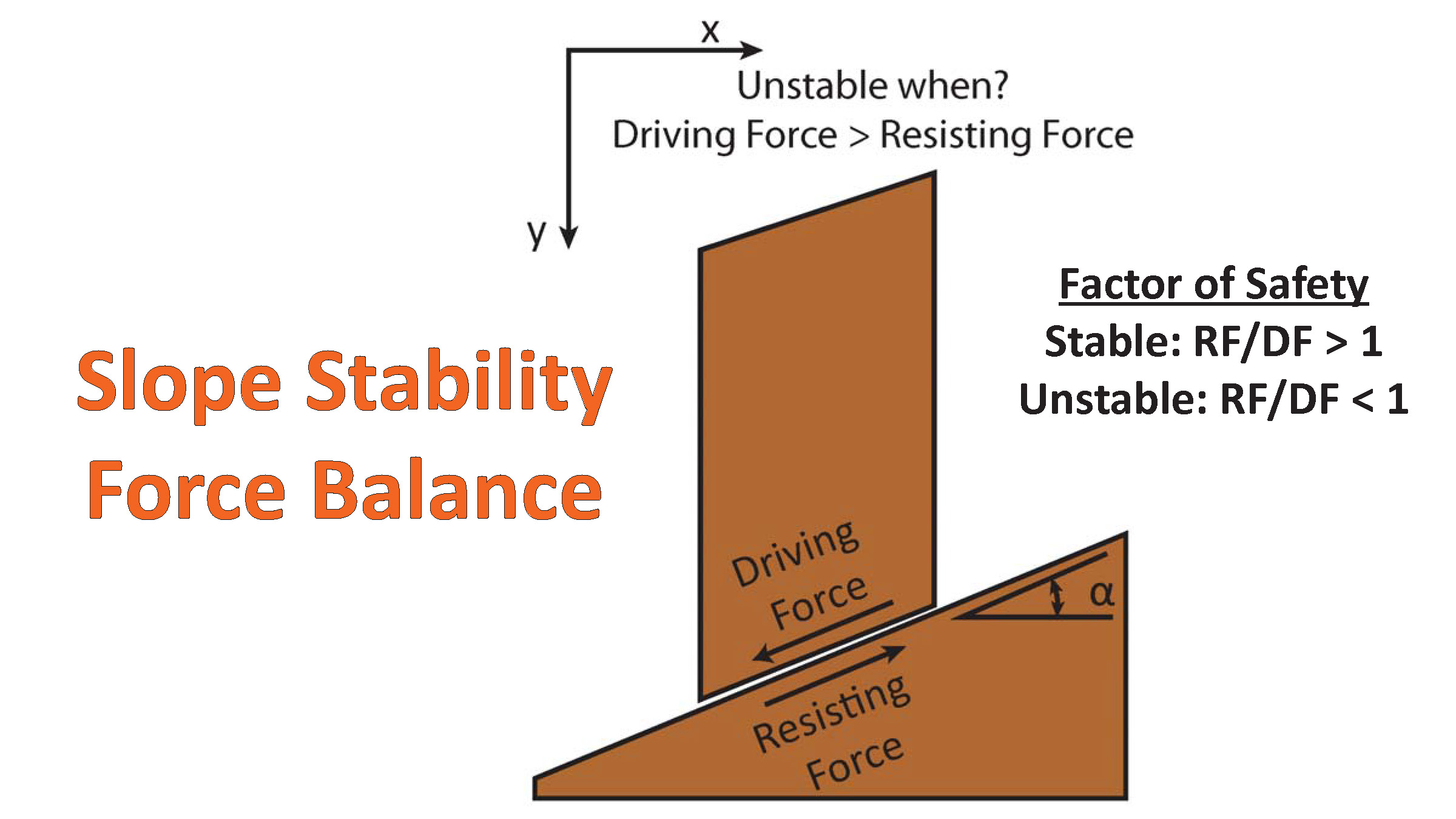
- There are many different ways in which a landslide can be triggered. The first order relations behind slope failure (landslides) is that the “resisting” forces that are preventing slope failure (e.g. the strength of the bedrock or soil) are overcome by the “driving” forces that are pushing this land downwards (e.g. gravity). The ratio of resisting forces to driving forces is called the Factor of Safety (FOS). We can write this ratio like this:
FOS = Resisting Force / Driving Force
- When FOS > 1, the slope is stable and when FOS < 1, the slope fails and we get a landslide. The illustration below shows these relations. Note how the slope angle α can take part in this ratio (the steeper the slope, the greater impact of the mass of the slope can contribute to driving forces). The real world is more complicated than the simplified illustration below.
- Landslide ground shaking can change the Factor of Safety in several ways that might increase the driving force or decrease the resisting force. Keefer (1984) studied a global data set of earthquake triggered landslides and found that larger earthquakes trigger larger and more numerous landslides across a larger area than do smaller earthquakes. Earthquakes can cause landslides because the seismic waves can cause the driving force to increase (the earthquake motions can “push” the land downwards), leading to a landslide. In addition, ground shaking can change the strength of these earth materials (a form of resisting force) with a process called liquefaction.
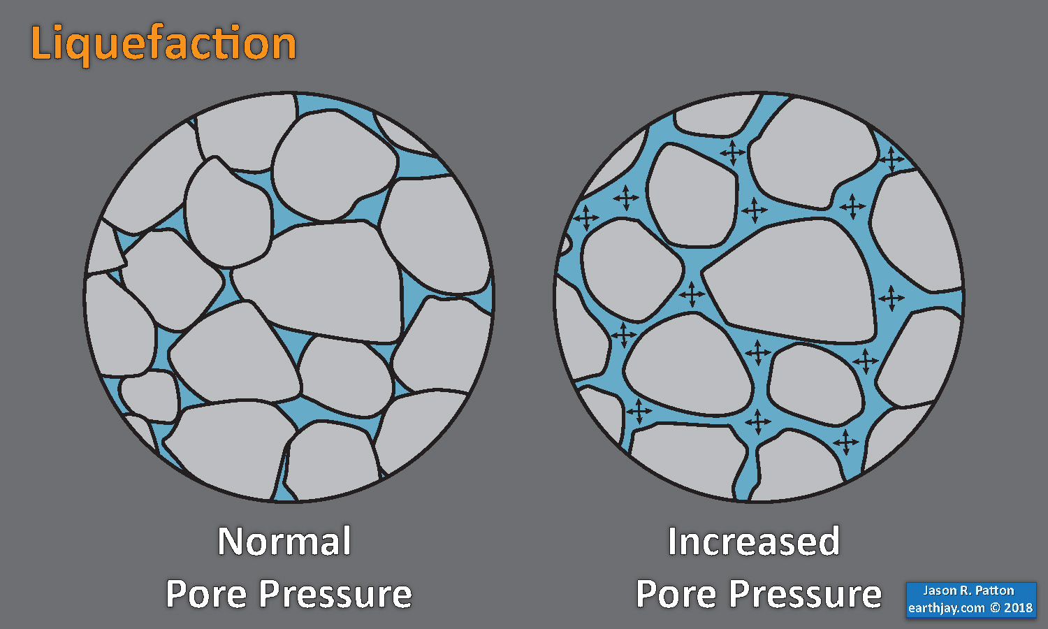
- Sediment or soil strength is based upon the ability for sediment particles to push against each other without moving. This is a combination of friction and the forces exerted between these particles. This is loosely what we call the “angle of internal friction.” Liquefaction is a process by which pore pressure increases cause water to push out against the sediment particles so that they are no longer touching.
- An analogy that some may be familiar with relates to a visit to the beach. When one is walking on the wet sand near the shoreline, the sand may hold the weight of our body generally pretty well. However, if we stop and vibrate our feet back and forth, this causes pore pressure to increase and we sink into the sand as the sand liquefies. Or, at least our feet sink into the sand.
- Below is a diagram showing how an increase in pore pressure can push against the sediment particles so that they are not touching any more. This allows the particles to move around and this is why our feet sink in the sand in the analogy above. This is also what changes the strength of earth materials such that a landslide can be triggered.
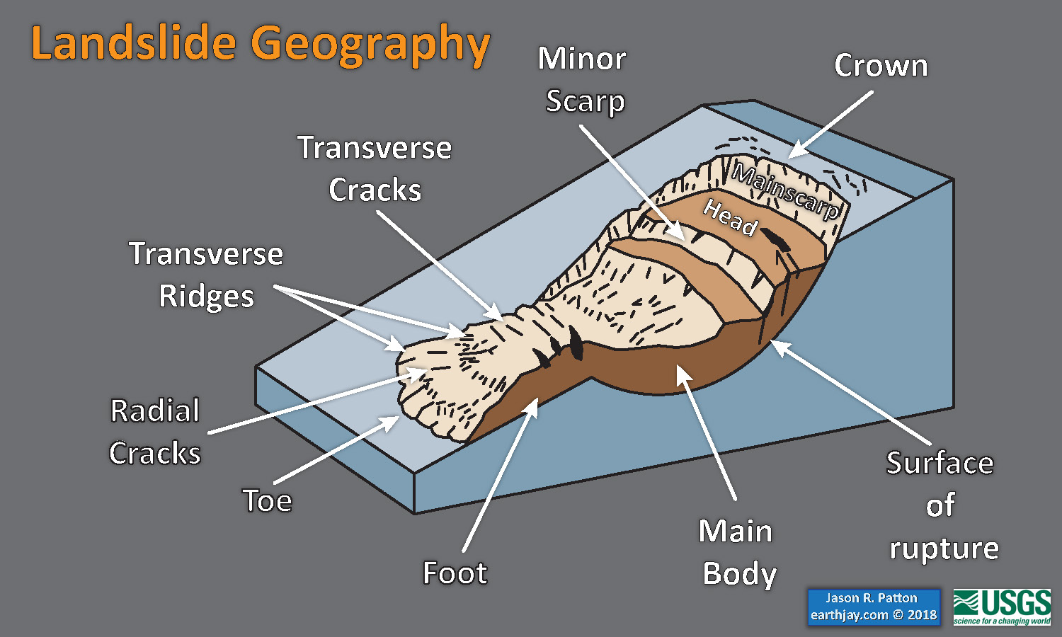
- Below is a diagram based upon a publication designed to educate the public about landslides and the processes that trigger them (USGS, 2004). Additional background information about landslide types can be found in Highland et al. (2008). There was a variety of landslide types that can be observed surrounding the earthquake region. So, this illustration can help people when they observing the landscape response to the earthquake whether they are using aerial imagery, photos in newspaper or website articles, or videos on social media. Will you be able to locate a landslide scarp or the toe of a landslide? This figure shows a rotational landslide, one where the land rotates along a curvilinear failure surface.
- Here is an excellent educational video from IRIS and a variety of organizations. The video helps us learn about how earthquake intensity gets smaller with distance from an earthquake. The concept of liquefaction is reviewed and we learn how different types of bedrock and underlying earth materials can affect the severity of ground shaking in a given location. The intensity map above is based on a model that relates intensity with distance to the earthquake, but does not incorporate changes in material properties as the video below mentions is an important factor that can increase intensity in places.
- If we look at the map at the top of this report, we might imagine that because the areas close to the fault shake more strongly, there may be more landslides in those areas. This is probably true at first order, but the variation in material properties and water content also control where landslides might occur.
- There are landslide slope stability and liquefaction susceptibility models based on empirical data from past earthquakes. The USGS has recently incorporated these types of analyses into their earthquake event pages. More about these USGS models can be found on this page.
- Here is the USGS liquefaction susceptibility map. Learn more about the background behind this map here.
Earthquake Triggered Landslides
UPDATE – 1 year later 2019.11.30
Well, I now have the job that I was being interviewed for one year ago today.
Head over to the University of Alaska Fairbanks, Alaska Earthquake Center, to see a one year review of this earthquake sequence (which is still having aftershocks).
The USGS Alaska Science Center also has an excellent review of this earthquake sequence here.
Some of the material in this update came from the days immediately following the earthquake, but did not get into the Earthquake Report.
There was an Earthquake Symposium about this earthquake sequence earlier this year. Head over there to see the presentations from that symposium.
- Here is a cross section showing historic seismicity. Dr. Peter Haussler (USGS, Anchorage) prepared this figure.
- Here is a Ground Motion Visualization video from IRIS. This visualization shows how seismic waves radiate from the earthquake source. Head over to IRIS to learn more about how this video was created (from the geology to the seismology).
- Here is a map from Dr. Eric Fielding (NASA/JPL-Caltech) that uses Copernicus Sentinel satellite based RADAR data. The process is called interferometric RADAR (InSAR) analysis.
- Here is the Global Positioning System (GPS) analysis done by Dr. Bill Hammond from the Nevada Geodetic Laboratory. The red arrows (vectors, which show direction and magnitude) represent the motion at the GPS sites that happened during the earthquake (the “coseismic” motion). There is a scale in the lower right corner. The ellipses at the end of the arrow represent the uncertainty (error) for those measurements. The GPS sites are at the base of the arrow (the opposite end from the arrowhead).
Geologic Fundamentals
- For more on the graphical representation of moment tensors and focal mechnisms, check this IRIS video out:
- Here is a fantastic infographic from Frisch et al. (2011). This figure shows some examples of earthquakes in different plate tectonic settings, and what their fault plane solutions are. There is a cross section showing these focal mechanisms for a thrust or reverse earthquake. The upper right corner includes my favorite figure of all time. This shows the first motion (up or down) for each of the four quadrants. This figure also shows how the amplitude of the seismic waves are greatest (generally) in the middle of the quadrant and decrease to zero at the nodal planes (the boundary of each quadrant).
- Here is another way to look at these beach balls.
The two beach balls show the stike-slip fault motions for the M6.4 (left) and M6.0 (right) earthquakes. Helena Buurman's primer on reading those symbols is here. pic.twitter.com/aWrrb8I9tj
— AK Earthquake Center (@AKearthquake) August 15, 2018
- There are three types of earthquakes, strike-slip, compressional (reverse or thrust, depending upon the dip of the fault), and extensional (normal). Here is are some animations of these three types of earthquake faults. The following three animations are from IRIS.
Strike Slip:
Compressional:
Extensional:
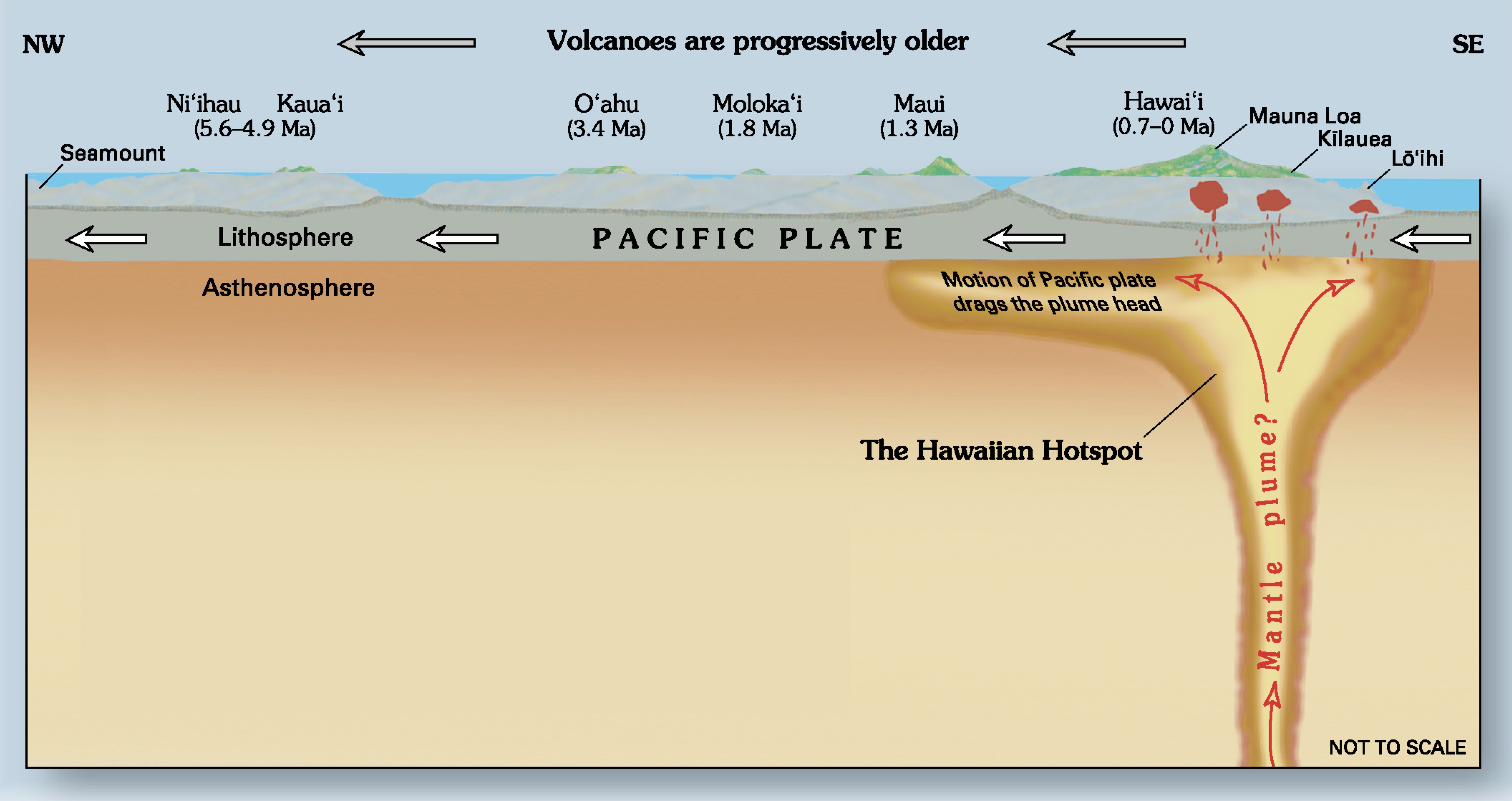
- This is an image from the USGS that shows how, when an oceanic plate moves over a hotspot, the volcanoes formed over the hotspot form a series of volcanoes that increase in age in the direction of plate motion. The presumption is that the hotspot is stable and stays in one location. Torsvik et al. (2017) use various methods to evaluate why this is a false presumption for the Hawaii Hotspot.
- Here is a map from Torsvik et al. (2017) that shows the age of volcanic rocks at different locations along the Hawaii-Emperor Seamount Chain.
A cutaway view along the Hawaiian island chain showing the inferred mantle plume that has fed the Hawaiian hot spot on the overriding Pacific Plate. The geologic ages of the oldest volcano on each island (Ma = millions of years ago) are progressively older to the northwest, consistent with the hot spot model for the origin of the Hawaiian Ridge-Emperor Seamount Chain. (Modified from image of Joel E. Robinson, USGS, in “This Dynamic Planet” map of Simkin and others, 2006.)
Hawaiian-Emperor Chain. White dots are the locations of radiometrically dated seamounts, atolls and islands, based on compilations of Doubrovine et al. and O’Connor et al. Features encircled with larger white circles are discussed in the text and Fig. 2. Marine gravity anomaly map is from Sandwell and Smith.
- Summary of the 1964 Earthquake
- 2018.11.30 M 7.0 Alaska
- 2018.08.15 M 6.6 Aleutians
- 2018.08.12 M 6.4 North Alaska
- 2018.08.12 M 6.4 North Alaska UPDATE #1
- 2018.01.23 M 7.9 Gulf of Alaska
- 2018.01.23 M 7.9 Gulf of Alaska UPDATE #1
- 2018.01.23 M 7.9 Gulf of Alaska UPDATE #2
- 2017.07.17 M 7.7 Aleutians
- 2017.07.17 M 7.7 Aleutians UPDATE #1
- 2017.06.02 M 6.8 Aleutians
- 2017.05.08 M 6.2 Aleutians
- 2017.05.01 M 6.3 British Columbia
- 2017.03.29 M 6.6 Kamchatka
- 2017.03.02 M 5.5 Alaska
- 2016.09.05 M 6.3 Bering Kresla (west of Aleutians)
- 2016.04.13 M 5.7 & 6.4 Kamchatka
- 2016.04.02 M 6.2 Alaska Peninsula
- 2016.03.27 M 5.7 Aleutians
- 2016.03.12 M 6.3 Aleutians
- 2016.01.29 M 7.2 Kamchatka
- 2016.01.24 M 7.1 Alaska
- 2015.11.09 M 6.2 Aleutians
- 2015.11.02 M 5.9 Aleutians
- 2015.11.02 M 5.9 Aleutians (update)
- 2015.07.27 M 6.9 Aleutians
- 2015.05.29 M 6.7 Alaska Peninsula
- 2015.05.29 M 6.7 Alaska Peninsula (animations)
- 1964.03.27 M 9.2 Good Friday
Alaska | Kamchatka | Kurile
General Overview
Earthquake Reports
Social Media
A 7.0 magnitude earthquake hit Anchorage, Alaska. Marty Raney of @HomesteadRescue captured some of the damage nearby. #akearthquake pic.twitter.com/WyQ8qV1VWr
— Discovery (@Discovery) December 1, 2018
Alaska Daily News reporting major ground failure on local roads after M7.0 in Anchorage this morninghttps://t.co/TToLTjplQc
— Rob Witter (@WitterBanter) November 30, 2018
Not well constrained First-motion mechanism: Mwp6.9 #earthquake Southern Alaska https://t.co/kCIw9Vypa6 pic.twitter.com/OLaQslaRJy
— Anthony Lomax 🌍🇪🇺 (@ALomaxNet) November 30, 2018
Okay, now I understand why that section of the road failed. Liquefaction my friends, liquefaction. Photo courtesy Caryn Orvis. pic.twitter.com/vo3rk2Mfrx
— Jackie Caplan-Auerbach (@geophysichick) December 1, 2018
Intermediate depth M7.0 earthquake near Anchorage, Alaska has been followed by numerous aftershocks (in purple), most at similar depths and a few greater than M5 pic.twitter.com/LCFeEkqF5x
— Jascha Polet (@CPPGeophysics) November 30, 2018
"Exotic" M=7.0 earthquake strikes beneath Anchorage, Alaska https://t.co/gNHojFtgzR
— Alison Bird (@alisonlbird) November 30, 2018
For his always excellent Landslide Blog, @davepetley has a post about slope failures from the earthquake, including a roundup of the best road damage photos. https://t.co/WiKP2mcRQI
— AK Earthquake Center (@AKearthquake) December 1, 2018
Great situational awareness for AK slab event from USGS Ground Failure product, now a card on the event pageshttps://t.co/9RsarVGluP
See potential liquefaction map in particular for this one
Great job @KateAllstadt and Jonathan Godt and team! pic.twitter.com/7eFwLYZtMo
— Rich Briggs (@rangefront) November 30, 2018
This is 30 seconds of east-west earthquake shaking across Anchorage, from our strong motion network. The severity of shaking varied based on the location, and some areas experienced shaking exceeding 20%g. pic.twitter.com/CmXKrM8sGh
— AK Earthquake Center (@AKearthquake) December 1, 2018
What did I do with my Friday night? I stayed up to gather the most up-to-date information about the 7.0M quake that just struck Anchorage for @ForbesScience. This explains:
-What caused it
-What the near future might hold
-What you shouldn't believehttps://t.co/6059QWfzfF— Dr Robin George Andrews (@SquigglyVolcano) December 1, 2018
This is another ground motion visualization showing the motion of the ground recorded by the USArray during the Anchorage earthquake (https://t.co/RIcNz4bgWq). #AnchorageEarthquake #earthquake pic.twitter.com/5ZbzvXOj5l
— IRIS Earthquake Sci (@IRIS_EPO) December 1, 2018
Here's a map showing the magnitude 7.0 along with all of the aftershocks we reviewed in the 7 hours after the quake. Most aftershocks have not yet been reviewed and are not on this map, but these precise locations give a good overview of the sequence so far. pic.twitter.com/FM7oZL7t4n
— AK Earthquake Center (@AKearthquake) December 1, 2018
Aerial view of #AlaskaEarthquake damage on the Glenn Highway. pic.twitter.com/UlkMkMLky5
— Governor Bill Walker (@AkGovBillWalker) November 30, 2018
Here’s the islanded car at the wrecked anchorage off ramp. pic.twitter.com/626As53hzF
— Nat Herz (@Nat_Herz) November 30, 2018
Earthquake just happened right now i ’m actually shaking pic.twitter.com/PoZGOlJGWS
— Alyson Petrie (@AlysonPetrie7) November 30, 2018
UPDATE 2019.11.30
Click on this thread to see additional tweets about the 1 year reflection of this earthquake sequence.
#OTD #earthquakeOTD last year there was an #earthquake within the subducting Pacific plate beneath #Anchorage #Alaska
i was also being interviewed for my job i have now
lots of science from @AKearthquake @USGSBigQuakes @uafairbanksmore in report here https://t.co/L4RHgNdex7 pic.twitter.com/TUXTyTQ1Z4
— Jason "Jay" R. Patton (@patton_cascadia) November 30, 2019
UPDATE 2023.11.30
#EarthquakeReport for #OTD in 2018 M7.0 #Earthquake in #Alaska
intraslab (within the subducted Pacific plate) normal (extensional) earthquake
generated ground failures (landslides and liquefaction)
felt widely
also, see new map showing historical eqshttps://t.co/u9etFGPVlF pic.twitter.com/ooAq3dCiaK— Jason "Jay" R. Patton (@patton_cascadia) November 30, 2023
- Atwater, B.F., Yamaguchi, D.K., Bondevik, S., Barnhardt, W.A., Amidon, L.J., Benson, B.E., Skjerdal, G., Shulene, J.A., and Nanalyama ,F., 2001. Rapid resetting of an estuarine recorder of the 1964 Alaska earthquake in Geology, v. 113, no. 9, p. 1193-1204.
- Bender, A.M., Haeussler, P.J., and Powers, P.M., 2021. Geologic Inputs for the 2023 Alaska Update to the U.S. National Seismic Hazard Model (NSHM) (ver. 2.0, February 2023), USGS Data Release. https://doi.org/10.5066/P97NRR0F
- Benz, H.M., Tarr, A.C., Hayes, G.P., Villaseñor, Antonio, Hayes, G.P., Furlong, K.P., Dart, R.L., and Rhea, Susan, 2011. Seismicity of the Earth 1900–2010 Aleutian arc and vicinity: U.S. Geological Survey Open-File Report 2010–1083-B, scale 1:5,000,000.
- Frisch, W., Meschede, M., Blakey, R., 2011. Plate Tectonics, Springer-Verlag, London, 213 pp.
- Hayes, G., 2018, Slab2 – A Comprehensive Subduction Zone Geometry Model: U.S. Geological Survey data release, https://doi.org/10.5066/F7PV6JNV.
- Haeussler, P., Leith, W., Wald, D., Filson, J., Wolfe, C., and Applegate, D., 2014. Geophysical Advances Triggered by the 1964 Great Alaska Earthquake in EOS, Transactions, American Geophysical Union, v. 95, no. 17, p. 141-142.
- Koehler, R.D., Farrell, Rebecca-Ellen, Burns, P.A.C., and Combellick, R.A., 2012. Quaternary faults and folds in Alaska: A digital database, in Koehler, R.D., Quaternary Faults and Folds (QFF): Alaska Division of Geological & Geophysical Surveys Miscellaneous Publication 141, 31 p., 1 sheet, scale 1:3,700,000. doi:10.14509/23944
- Meyer, B., Saltus, R., Chulliat, a., 2017. EMAG2: Earth Magnetic Anomaly Grid (2-arc-minute resolution) Version 3. National Centers for Environmental Information, NOAA. Model. doi:10.7289/V5H70CVX
- Plafker, G., 1969. Tectonics of the March 27, 1964 Alaska earthquake: U.S. Geological Survey Professional Paper 543–I, 74 p., 2 sheets, scales 1:2,000,000 and 1:500,000, http://pubs.usgs.gov/pp/0543i/.
- Plafker, G., 1972. Alaskan earthquake of 1964 and Chilean earthquake of 1960: Implications for arc tectonics in Journal of Geophysical Research, v. 77, p. 901-925.
- Saltus, R.W., and Barnett, A., 2000. Eastern Aleutian Volcanic Arc Digital Model – Version 1.0: U.S. Geological Survey Open-File Report 00
- Tape, C. & Lomax, A., 2022. Aftershock Regions of Aleutian-Alaska Megathrust Earthquakes, 1938–2021 in JGR Solid Earth, v. 127, no. 7, https://doi.org/10.1029/2022JB024336 [Datasets are here: https://zenodo.org/doi/10.5281/zenodo.6274313 and here https://zenodo.org/doi/10.5281/zenodo.6415340
- Zhu, J., Baise, L. G., Thompson, E. M., 2017, An Updated Geospatial Liquefaction Model for Global Application, Bulletin of the Seismological Society of America, 107, p 1365-1385, doi: 0.1785/0120160198
References:
Return to the Earthquake Reports page.
