In March of 1964, plate tectonics was still a hotly debated topic at scientific meetings worldwide. Some people still do not accept this theory (some Russian geologists favor alternative hypotheses; Shevchenko et al., 2006). At the time, there was some debate about whether the M 9.2 earthquake (the 2nd largest earthquake recorded with modern seismometers) was from a strike-slip or from a revers/thrust earthquake. Plafker and his colleagues found the evidence to put that debate to rest (see USGS video below).
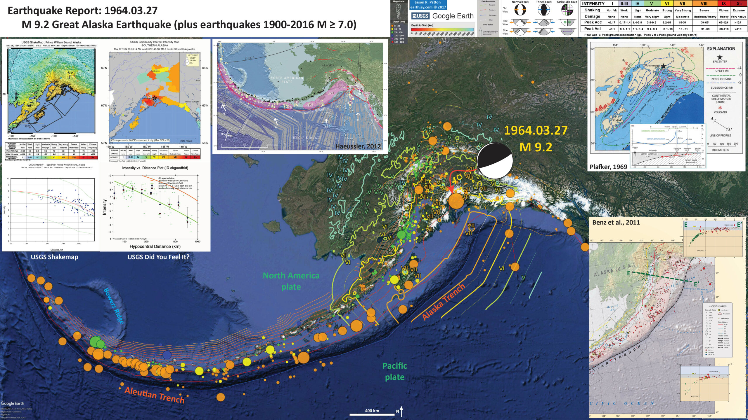
I have prepared a new map showing the 1964 earthquake in context to the plate boundary using the same methods I have been using for my other earthquake reports. I also found a focal mechanism for this M 9.2 earthquake and included this on the map (Stauder and Bollinger, 1966).
- 1964.03.27 M 9.2
Here is the USGS website for this earthquake.
Below is my interpretive poster for this earthquake.
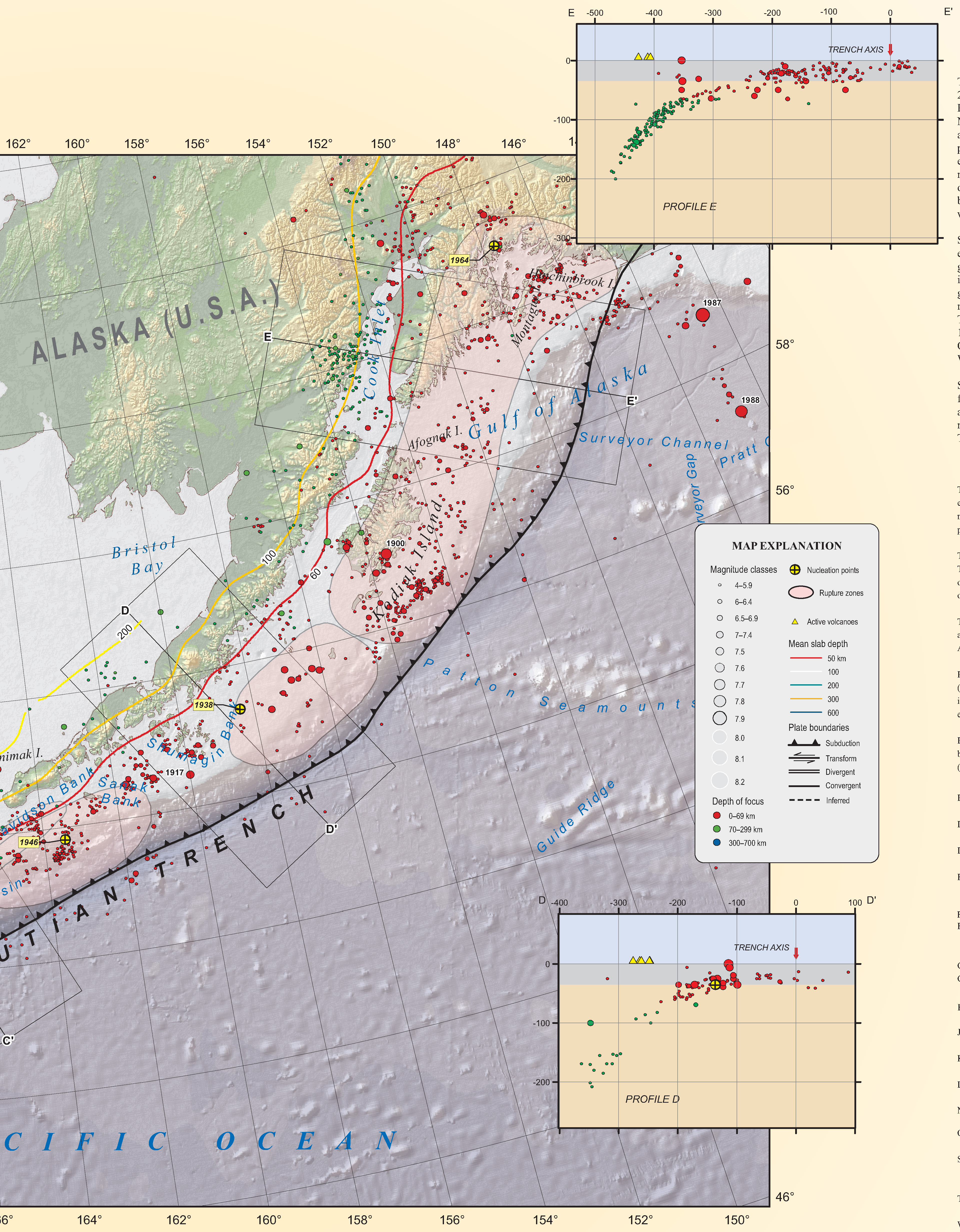
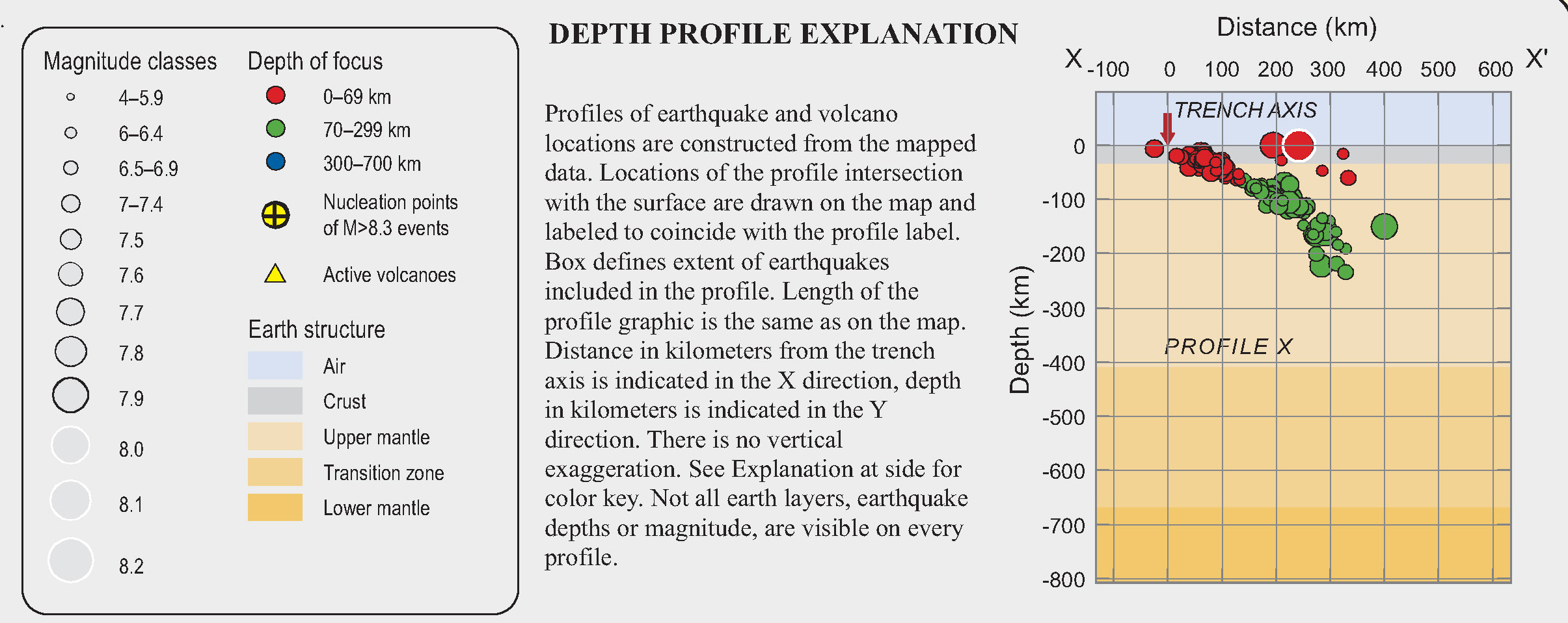
I plot the seismicity from the past month, with color representing depth and diameter representing magnitude (see legend). I include a focal mechanism for the M 9.2 earthquake determined by Stauder and Bollinger (1966). I include the USGS epicenters for earthquakes with magnitudes M ≥ 7.0.
- I placed a moment tensor / focal mechanism legend on the poster. There is more material from the USGS web sites about moment tensors and focal mechanisms (the beach ball symbols). Both moment tensors and focal mechanisms are solutions to seismologic data that reveal two possible interpretations for fault orientation and sense of motion. One must use other information, like the regional tectonics, to interpret which of the two possibilities is more likely.
- I also include the shaking intensity contours on the map. These use the Modified Mercalli Intensity Scale (MMI; see the legend on the map). This is based upon a computer model estimate of ground motions, different from the “Did You Feel It?” estimate of ground motions that is actually based on real observations. The MMI is a qualitative measure of shaking intensity. More on the MMI scale can be found here and here. This is based upon a computer model estimate of ground motions, different from the “Did You Feel It?” estimate of ground motions that is actually based on real observations.
- I include the slab contours plotted (Hayes et al., 2012), which are contours that represent the depth to the subduction zone fault. These are mostly based upon seismicity. The depths of the earthquakes have considerable error and do not all occur along the subduction zone faults, so these slab contours are simply the best estimate for the location of the fault. The hypocentral depth of the M 5.5 plots this close to the location of the fault as mapped by Hayes et al. (2012).
- In the upper left corner I include two maps from the USGS, both using the MMI scale of shaking intensity mentioned above. The map on the left is the USGS Shakemap. This is a map that shows an estimate of how strongly the ground would shake during this earthquake. This is based upon a numerical model using Ground Motion Prediction Equations (GMPE), which are empirical relations between fault types, earthquake magnitude, distance from the fault, and shaking intensity. The map on the right is based upon peoples’ direct observations. Below each map are plots that show how these models demonstrate that the MMI attenuates (diminishes) with distance. The lines are the empirical relations. The dots are the data points.
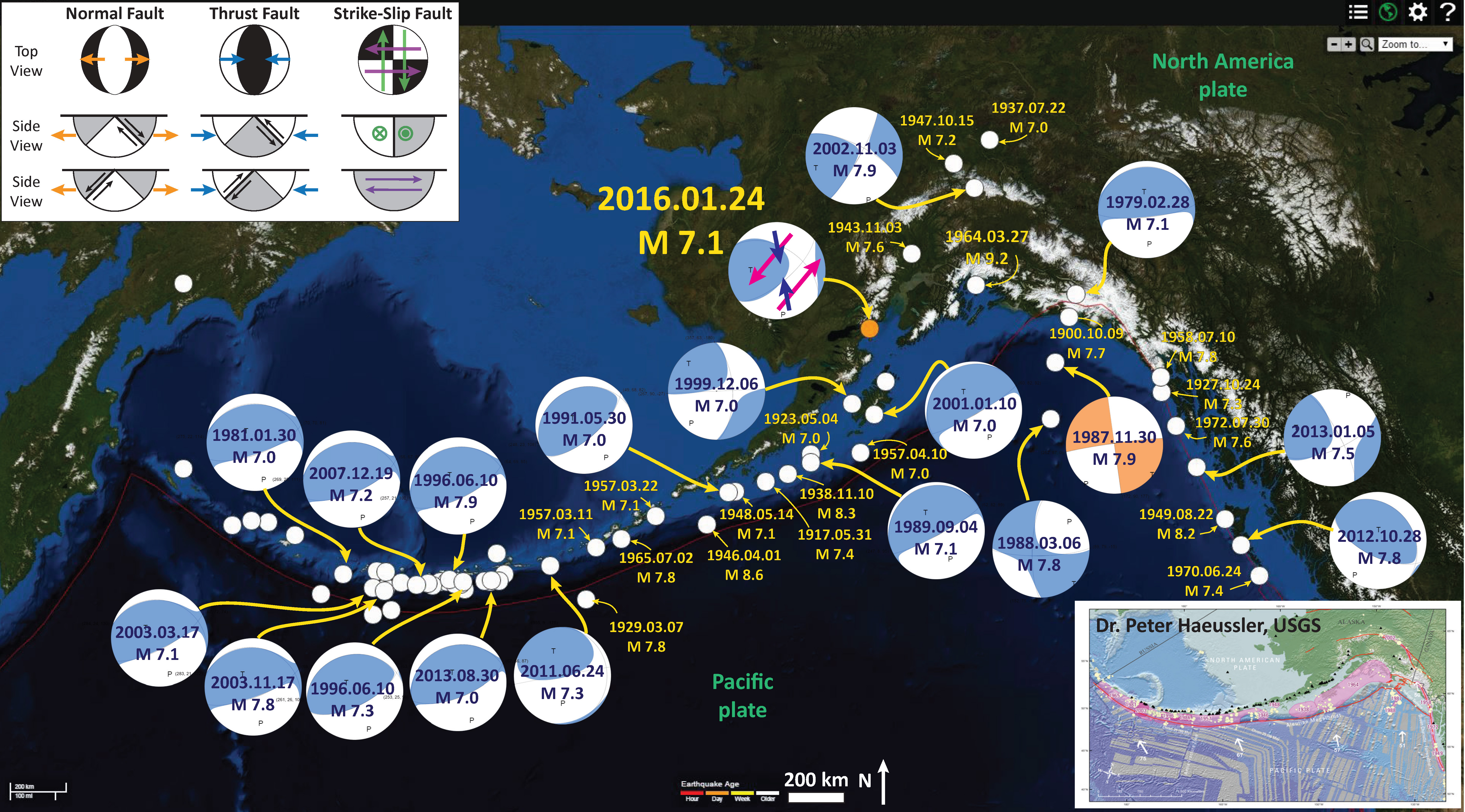
- To the right of those maps and figures is a map produced by Dr. Peter Haeussler from the USGS Alaska Science Center (pheuslr at usgs.gov) that shows the historic earthquakes along the Aleutian-Alaska subduction zone.
- In the lower right corner I include an inset map from the USGS Seismicity History poster for this region (Benz et al., 2011). There is one seismicity cross section with its locations plotted on the map. The USGS plot these hypocenters along this cross section E-E’ (in green).
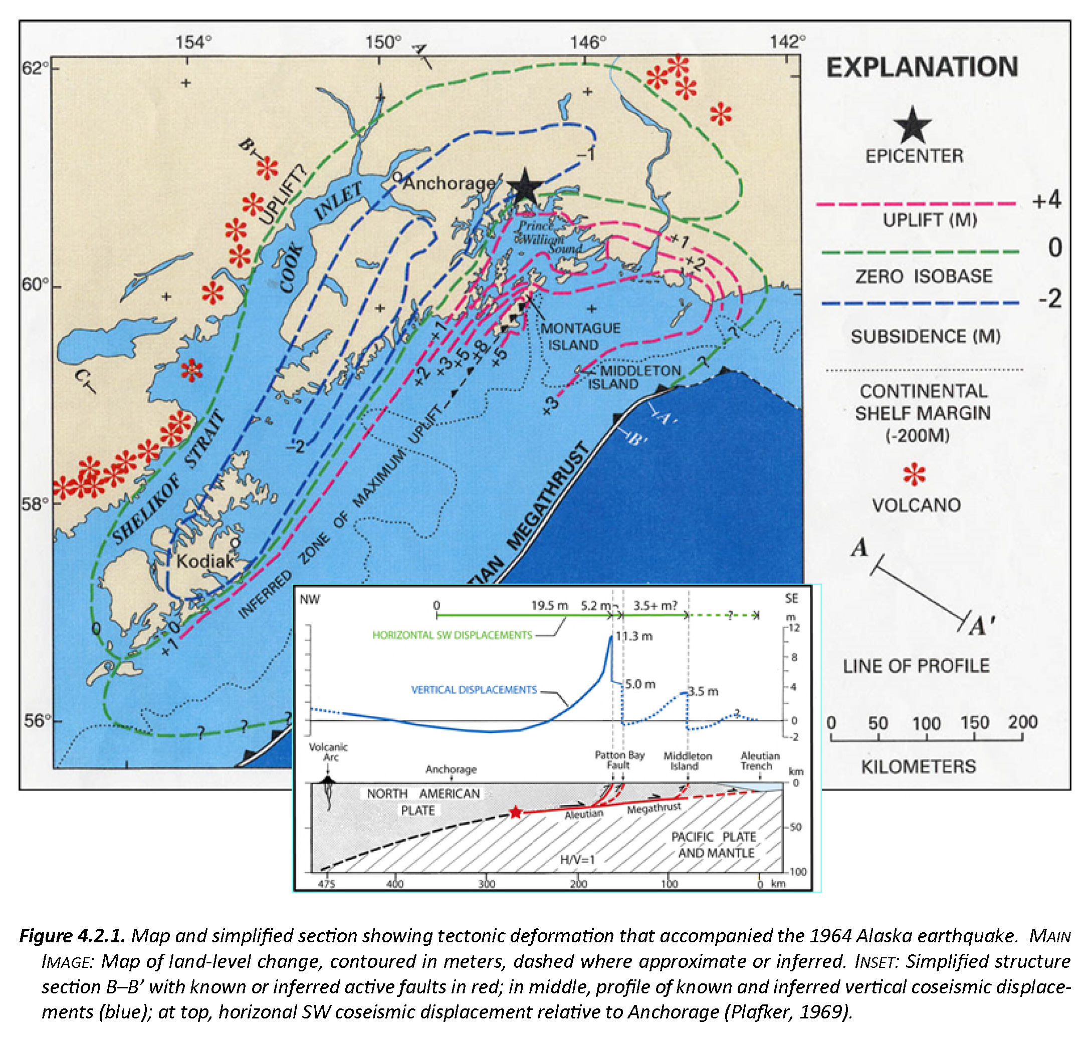
- In the upper right corner, I include a figure that shows the measurements of uplift and subsidence observed by Plafker and his colleagues following the earthquake (Plafker, 1969). This is shown in map view and as a cross section.
I include some inset figures in the poster.

Below is an educational video from the USGS that presents material about subduction zones and the 1964 earthquake and tsunami in particular.
Youtube Source IRIS
mp4 file for downloading.
-
Credits:
- Animation & graphics by Jenda Johnson, geologist
- Directed by Robert F. Butler, University of Portland
- U.S. Geological Survey consultants: Robert C. Witter, Alaska Science Center Peter J. Haeussler, Alaska Science Center
- Narrated by Roger Groom, Mount Tabor Middle School
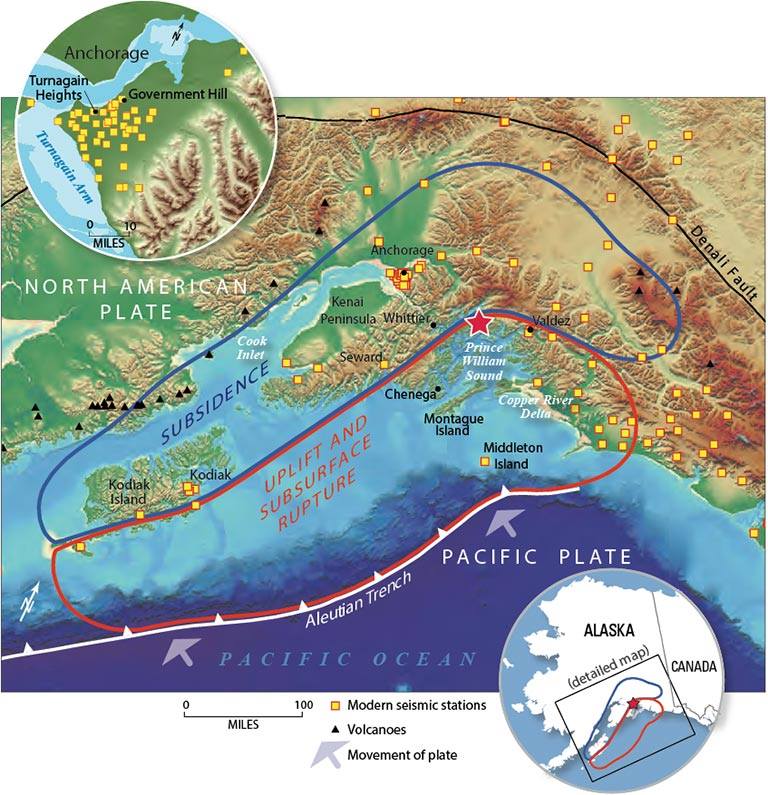
This is a map from Haeussler et al. (2014). The region in red shows the area that subsided and the area in blue shows the region that uplifted during the earthquake. These regions were originally measured in the field by George Plafker and published in several documents, including this USGS Professional Paper (Plafker, 1969).
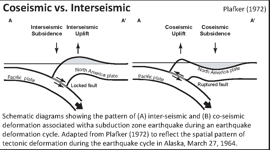
Here is a cross section showing the differences of vertical deformation between the coseismic (during the earthquake) and interseismic (between earthquakes).
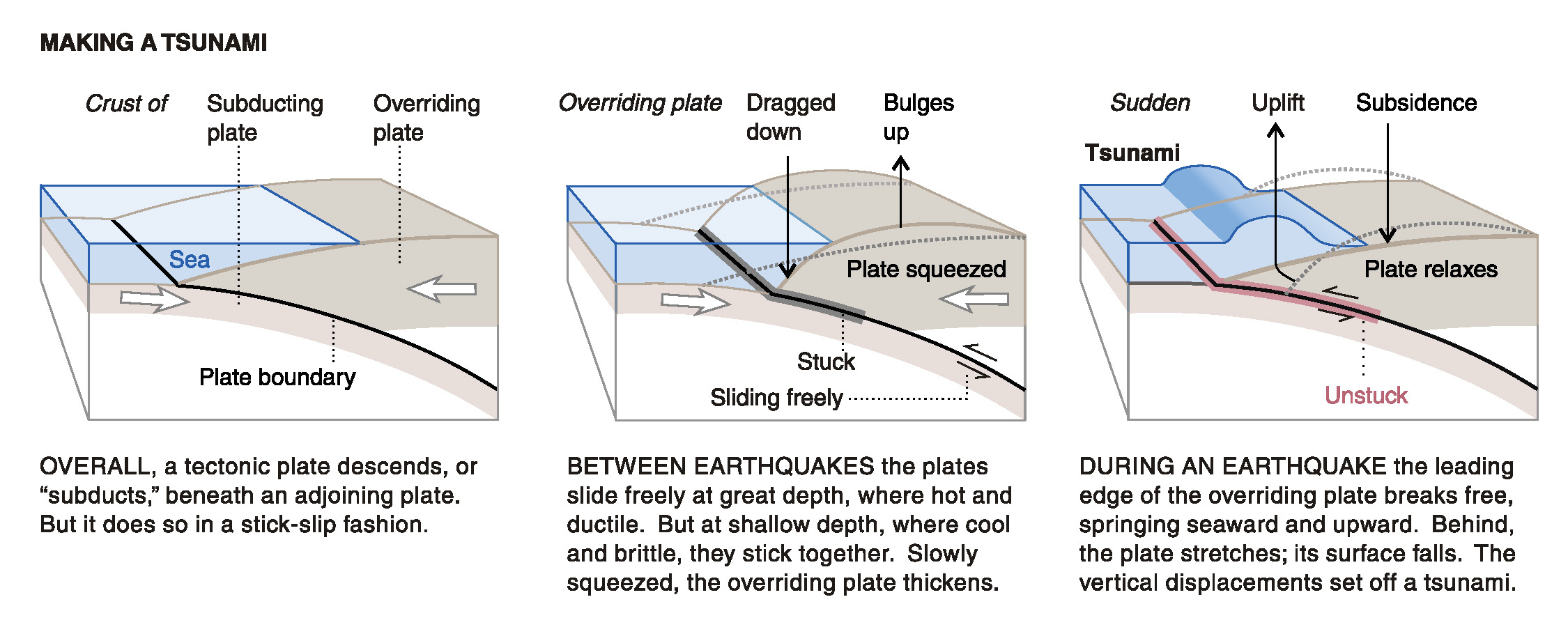
This figure, from Atwater et al. (2005) shows the earthquake deformation cycle and includes the aspect that the uplift deformation of the seafloor can cause a tsunami.
Here is a figure recently published in the 5th International Conference of IGCP 588 by the Division of Geological and Geophysical Surveys, Dept. of Natural Resources, State of Alaska (State of Alaska, 2015). This is derived from a figure published originally by Plafker (1969). There is a cross section included that shows how the slip was distributed along upper plate faults (e.g. the Patton Bay and Middleton Island faults).
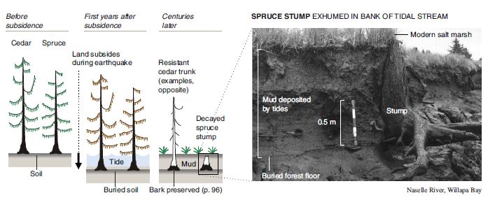
Here is a graphic showing the sediment-stratigraphic evidence of earthquakes in Cascadia, but the analogy works for Alaska also. Atwater et al., 2005. There are 3 panels on the left, showing times of (1) prior to earthquake, (2) several years following the earthquake, and (3) centuries after the earthquake. Before the earthquake, the ground is sufficiently above sea level that trees can grow without fear of being inundated with salt water. During the earthquake, the ground subsides (lowers) so that the area is now inundated during high tides. The salt water kills the trees and other plants. Tidal sediment (like mud) starts to be deposited above the pre-earthquake ground surface. This sediment has organisms within it that reflect the tidal environment. Eventually, the sediment builds up and the crust deforms interseismically until the ground surface is again above sea level. Now plants that can survive in this environment start growing again. There are stumps and tree snags that were rooted in the pre-earthquake soil that can be used to estimate the age of the earthquake using radiocarbon age determinations. The tree snags form “ghost forests.
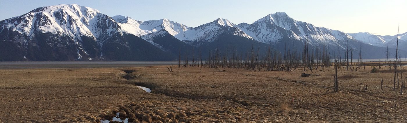
This is a photo that I took along the Seward HWY 1, that runs east of Anchorage along the Turnagain Arm. I attended the 2014 Seismological Society of America Meeting that was located in Anchorage to commemorate the anniversary of the Good Friday Earthquake. This is a ghost forest of trees that perished as a result of coseismic subsidence during the earthquake. Copyright Jason R. Patton (2014). This region subsided coseismically during the 1964 earthquake. Here are some photos from the paleoseismology field trip. (Please contact me for a higher resolution version of this image: quakejay at gmail.com)
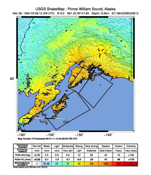
Here is the USGS shakemap for this earthquake. The USGS used a fault model, delineated as black rectangles, to model ground shaking at the surface. The color scale refers to the Modified Mercalli Intensity scale, shown at the bottom.
There is a great USGS Open File Report that summarizes the tectonics of Alaska and the Aleutian Islands (Benz et al., 2011). I include a section of their poster here. Below is the map legend.
Most recently, there was an earthquake along the Alaska Peninsula, a M 7.1 on 2016.01.24. Here is my earthquake report for this earthquake. Here is a map for the earthquakes of magnitude greater than or equal to M 7.0 between 1900 and today. This is the USGS query that I used to make this map. One may locate the USGS web pages for all the earthquakes on this map by following that link.
Here is an interesting map from Atwater et al., 2001. This figure shows how the estuarine setting in Portage, Alaska (along Turnagain Arm, southeast of Anchorage) had recovered its ground surface elevation in a short time following the earthquake. Within a decade, the region that had coseismically subsided was supporting a meadow with shrubs. By 1980, a spruce tree was growing here. This recovery was largely due to sedimentation, but an unreconciled amount of postseismic tectonic uplift contributed also. I include their figure caption as a blockquote.

(A and B) Tectonic setting of the 1964 Alaska earthquake. Subsidence from Plafker (1969). (C) Postearthquake deposits and their geologic setting in the early 1970s. (D–F) Area around Portage outlined in C, showing the landscape two years before the earthquake (D), two years after the earthquake (E), and nine years after the earthquake (F). In F, location of benchmark P 73 is from http://www.ngs.noaa.gov/cgi-bin/ds2.prl and the Seward (D-6) SE 7.5-minute quadrangle, provisional edition of 1984.
-
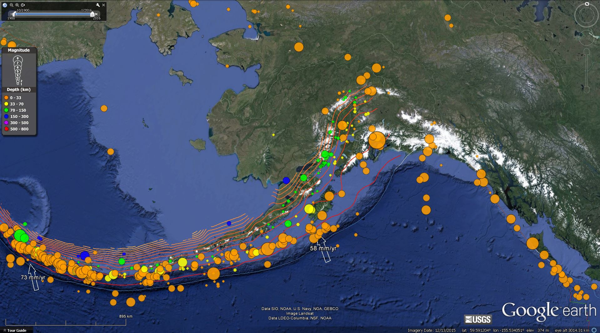
Here is an animation that shows earthquakes of magnitude > 6.5 for the period from 1900-2016. Above is a map showing the region and below is the animation. This is the URL for the USGS query that I used to make this animation in Google Earth.
- Here is a link to the file for the embedded video below (5 MB mp4)
-
Here is an animation that shows the seismic waves propagating from the 1964 earthquake (West et al., 2014).
- Here is a link to the file for the embedded video below (5 MB mp4)
-
Here is the tsunami forecast animation from the National Tsunami Warning Center. Below the animation, I include their caption as a blockquote. This includes information about the earthquake and the formation of the warning center.
- Here is a link to the file for the embedded video below (22 MB 720 mp4)
- Here is a link to the higher resolution file for the embedded video below (44 MB 1080 mp4)
- At 5:36 pm on Friday, March 27, 1964 (28 March, 03:36Z UTC) the largest earthquake ever measured in North America, and the second-largest recorded anywhere, struck 40 miles west of Valdez, Alaska in Prince William Sound with a moment magnitude we now know to be 9.2. Almost an hour and a half later the Honolulu Magnetic and Seismic Observatory (later renamed the Pacific Tsunami Warning Center, or PTWC) was able to issue its first “tidal wave advisory” that noted that a tsunami was possible and that it could arrive in the Hawaiian Islands five hours later. Upon learning of a tsunami observation in Kodiak Island, Alaska, an hour and a half later the Honolulu Observatory issued a formal “tidal wave/seismic sea-wave warning” cautioning that damage was possible in Hawaii and throughout the Pacific Ocean but that it was not possible to predict the intensity of the tsunami. The earthquake did in fact generate a tsunami that killed 124 people (106 in Alaska, 13 in California, and 5 in Oregon) and caused about $2.3 billion (2016 dollars) in property loss all along the Pacific coast of North America from Alaska to southern California and in Hawaii. The greatest wave heights were in Alaska at over 67 m or 220 ft. and waves almost 10 m or 32 ft high struck British Columbia, Canada. In the “lower 48” waves as high as 4.5 m or 15 ft. struck Washington, as high as 3.7 m or 12 ft. struck Oregon, and as high as 4.8 m or over 15 ft. struck California. Waves of similar size struck Hawaii at nearly 5 m or over 16 ft. high. Waves over 1 m or 3 ft. high also struck Mexico, Chile, and even New Zealand.
- As part of its response to this event the United States government created a second tsunami warning facility in 1967 at the Palmer Observatory, Alaska–now called the National Tsunami Warning Center (NTWC, http://ntwc.arh.noaa.gov/ )–to help mitigate future tsunami threats to Alaska, Canada, and the U.S. Mainland.
- Today, more than 50 years since the Great Alaska Earthquake, PTWC and NTWC issue tsunami warnings in minutes, not hours, after a major earthquake occurs, and will also forecast how large any resulting tsunami will be as it is still crossing the ocean. PTWC can also create an animation of a historical tsunami with the same tool that it uses to determine tsunami hazards in real time for any tsunami today: the Real-Time Forecasting of Tsunamis (RIFT) forecast model. The RIFT model takes earthquake information as input and calculates how the waves move through the world’s oceans, predicting their speed, wavelength, and amplitude. This animation shows these values through the simulated motion of the waves and as they travel through the world’s oceans one can also see the distance between successive wave crests (wavelength) as well as their height (half-amplitude) indicated by their color. More importantly, the model also shows what happens when these tsunami waves strike land, the very information that PTWC needs to issue tsunami hazard guidance for impacted coastlines. From the beginning the animation shows all coastlines covered by colored points. These are initially a blue color like the undisturbed ocean to indicate normal sea level, but as the tsunami waves reach them they will change color to represent the height of the waves coming ashore, and often these values are higher than they were in the deeper waters offshore. The color scheme is based on PTWC’s warning criteria, with blue-to-green representing no hazard (less than 30 cm or ~1 ft.), yellow-to-orange indicating low hazard with a stay-off-the-beach recommendation (30 to 100 cm or ~1 to 3 ft.), light red-to-bright red indicating significant hazard requiring evacuation (1 to 3 m or ~3 to 10 ft.), and dark red indicating a severe hazard possibly requiring a second-tier evacuation (greater than 3 m or ~10 ft.).
- Toward the end of this simulated 24 hours of activity the wave animation will transition to the “energy map” of a mathematical surface representing the maximum rise in sea-level on the open ocean caused by the tsunami, a pattern that indicates that the kinetic energy of the tsunami was not distributed evenly across the oceans but instead forms a highly directional “beam” such that the tsunami was far more severe in the middle of the “beam” of energy than on its sides. This pattern also generally correlates to the coastal impacts; note how those coastlines directly in the “beam” are hit by larger waves than those to either side of it.
- 2017.03.02 M 5.5 Alaska
- 2016.09.05 M 6.3 Bering Kresla (west of Aleutians)
- 2016.04.02 M 6.2 Alaska Peninsula
- 2016.03.27 M 5.7 Aleutians
- 2016.03.12 M 6.3 Aleutians
- 2016.01.24 M 7.1 Alaska
- 2015.11.09 M 6.2 Aleutians
- 2015.11.02 M 5.9 Aleutians
- 2015.11.02 M 5.9 Aleutians (update)
- 2015.07.27 M 6.9 Aleutians
- 2015.05.29 M 6.7 Alaska Peninsula
- 2015.05.29 M 6.7 Alaska Peninsula (animations)
- 1964.03.27 M 9.2 Good Friday
Earthquake Reports: Alaska
Earthquake Reports
References:
- Atwater, B.F., Yamaguchi, D.K., Bondevik, S., Barnhardt, W.A., Amidon, L.J., Benson, B.E., Skjerdal, G., Shulene, J.A., and Nanalyama ,F., 2001. Rapid resetting of an estuarine recorder of the 1964 Alaska earthquake in Geology, v. 113, no. 9, p. 1193-1204.
- Benz, H.M., Tarr, A.C., Hayes, G.P., Villaseñor, Antonio, Hayes, G.P., Furlong, K.P., Dart, R.L., and Rhea, Susan, 2011. Seismicity of the Earth 1900–2010 Aleutian arc and vicinity: U.S. Geological Survey Open-File Report 2010–1083-B, scale 1:5,000,000.
- Haeussler, P., Leith, W., Wald, D., Filson, J., Wolfe, C., and Applegate, D., 2014. Geophysical Advances Triggered by the 1964 Great Alaska Earthquake in EOS, Transactions, American Geophysical Union, v. 95, no. 17, p. 141-142.
- Hayes, G. P., Wald, D. J., and Johnson, R. L., 2012. Slab1.0: A three-dimensional model of global subduction zone geometries in J. Geophys. Res., 117, B01302, doi:10.1029/2011JB008524.
- Plafker, G., 1969. Tectonics of the March 27, 1964 Alaska earthquake: U.S. Geological Survey Professional Paper 543–I, 74 p., 2 sheets, scales 1:2,000,000 and 1:500,000, http://pubs.usgs.gov/pp/0543i/.
- Shevchenko, V.I., Lukk, A.A., and Prilepin, M.T., 2006. The Sumatra Earthquake of December 26, 2004, as an Event Unrelated to the Plate-Tectonic Process in the Lithosphere in Physics of the Solid Earth, v. 42, no. 12, p. 1018–1037.
- Stauder. W. and Bollinger, G.A., 1966. The Focal Mechanism of the Alaska Earthquake of March 28, 1964, and of Its Aftershock Sequence in JGR, v. 71, no. 22, p. 5283-5296.
- West, M.E., Haeussler, P.L., Ruppert, N.A., Freymueller, J.T., and the Alaska Seismic Hazards Safety Commission, 2014. Why the 1964 Great Alaska Earthquake Matters 50 Years Later in Seismological Research Letters, v. 85, no. 2, p. 1-7.