A few days ago, I was passed out on my couch (sleep apnea) and for some reason I awoke and noticed that I had gotten a CSEM notification of a large earthquake offshore of Alaska. Well, after looking into that, I sent my boss, Rick, a text message: “8.2.”
https://earthquake.usgs.gov/earthquakes/eventpage/us6000f02w/executive
Rick Wilson runs the tsunami program at the California Geological Survey (CGS) and works with the California Governor’s Office of Emergency Services (Cal OES) to use official forecasts of tsunami size from the National Tsunami Warning Center (NTWC) to alert coastal emergency managers about the level of potential evacuation that they may want to act upon.
More about this process can be found here. Take a look at the CGS Special Report 236 to learn about the Tsunami Playbooks and the “FASTER” approach for tsunami evacuation guidance. Evacuation is something that is done at the local level, so CGS and Cal OES can only provide recommendations.
Needless to say, we were both at the ready to respond. Rick has hourly phone calls with the NTWC and follows up with phone calls and emails to specific interested parties (e.g. the emergency managers). We each went into tsunami response mode. I manage the Tsunami Event Response Team, which may be activated to collect observations of tsunami inundation or ocean currents.
I started looking at tide gage and DART Buoy data to see how large the tsunami was in the epicentral region. The M 8.2 was in the region of the 1938 M 8.2 earthquake which generated a transoceanic tsunami. I also looked into the literature about the 1938 tsunami, to see what size that tsunami was. The 1938 tsunami had a decimeter scale wave height (peak to trough) for gages in Alaska and in California (Johnson and Satake, 1994). Jeff Freymueller et al. (2021) had also recently worked on the 1938 earthquake source area and tsunami modeling as well.
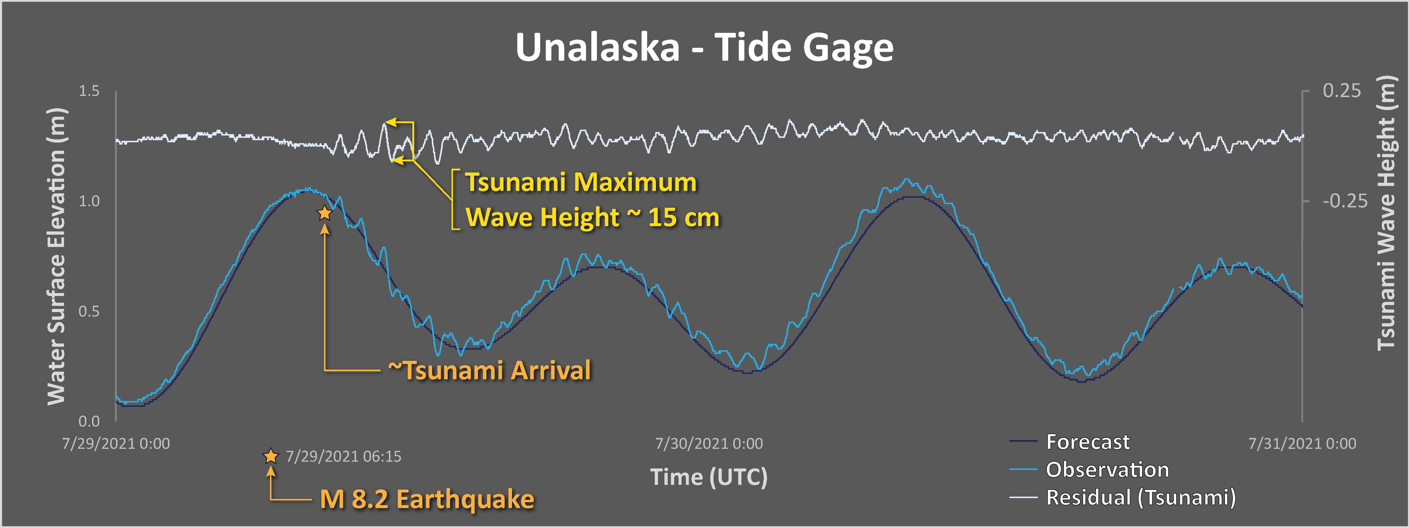
The nearest tide gage for this 2021 event is at Sand Point, but the nearest gage in 1938 was in Unalaska. So, in order to get a modest comparison between 1938 and 2021, I felt a need to wait for the Unalaska data to trickle in. This may give us some idea whether the 1938 tsunami recorded in Crescent City and San Francisco might be a decent analogue. Of course, we need to get the official forecast from the NTWC prior to sending out any information. But, that process can take hours (over 3 hours in this case). So, we need to get our minds wrangled around the possibilities in the absence of more information.
Earthquake and Tectonic Background:
The plate boundary in the north Pacific is a convergent (pushing together) plate boundary where the Pacific plate on the south ‘subducts’ northwards beneath the North America plate on the north. The Alaska-Aleutian subduction zone forms a deep sea trench which can be seen in maps of the region. The subduction zone fault dips into the Earth, getting deeper to the north.
Between earthquakes (the interseismic period), the megathrust fault is seismogenically coupled (i.e. ‘locked’) just like velcro has the ability to hold together one’s wallet. The plates are always moving towards each other. Because the fault is locked, the crust surrounding the fault bends elastically to accommodate this convergent motion.
As the crust bends and flexes, it stores energy (i.e. tectonic strain). The part of the fault closest to the seafloor (the southernmost part of this subduction zone fault) gets pulled downwards, while the part of the crust further to the north flexes upwards.
The materials along the earthquake fault have properties that resist motion (like the velcro). But, as the plates converge and increase the amount of energy stored, the forces on the fault may exceed the strength of the fault. At this time, the fault slips, causing an earthquake.
The part of the fault that was being pulled downwards gets pushed upwards during the earthquake (the coseismic period), while the crust that was being flexed upwards between earthquakes thus subsides downwards during the earthquake.
The Alaska-Aleutian subduction zone has a history of subduction zone earthquakes and tsunami, plus there exists a prehistory of earthquakes and tsunami in some parts of this plate boundary. Geologists are often asked to determine the potential hazard of future earthquakes and tsunami and their answers are based on what we know from the past (using both historic and prehistoric data).
The 2021 M 8.2 earthquake happened in the same location as a 1938 M 8.2 earthquake, just to the east of a sequence of earthquakes from last year (22 July and 19 October 2020).
Tsunami:
When the earthquake fault slips, and the upper plate deforms, the vertical motion of the plate can elevate (or lower) the overlying ocean water. After the water changes position, it seeks to return to sea-level (an equipotential surface). If elevated, the water drops downwards and then oscillates up and down. This is the process that generates waves that radiate from the area with seafloor deformed by the earthquake.
-
Things that make a tsunami larger are [generally]:
- More vertical land motion (possibly from larger slip on the fault, e.g. from a larger magnitude earthquake)
- Deeper water (deeper water = more volume of water moving = more energy to create larger tsunami waves)
So let’s take a look at the things that may have affected the size of the tsunami from this 2021 M 8.2 earthquake.
First of all, based on the earthquake slip models (estimates of how the earthquake slipped, in meters, and how that slip varied along the fault) suggest that a majority of the largest slip happened beneath the continental shelf. The water depth on the shelf is similar to many shelfs worldwide, shallower than about 200 meters. How does this affect the size of the tsunami?
Well, I guess that is the main point, the ground deformation that generated the tsunami was beneath shallow water.
These slip models are based on a variety of data and most of the data are seismic data. Some tsunami are generated by slow slip (not generating seismic waves) on the shallow part of the fault. These are called tsunami earthquakes.
Because tsunami earthquakes may be generated by slip in this way, slip models using seismic data cannot resolve the location of the slip on the fault that created these tsunami. However, the tsunami from this 2021 M 8.2 earthquake were small. Therefore the updip part of the fault probably did not contribute significantly to the tsunamigenic ground deformation.
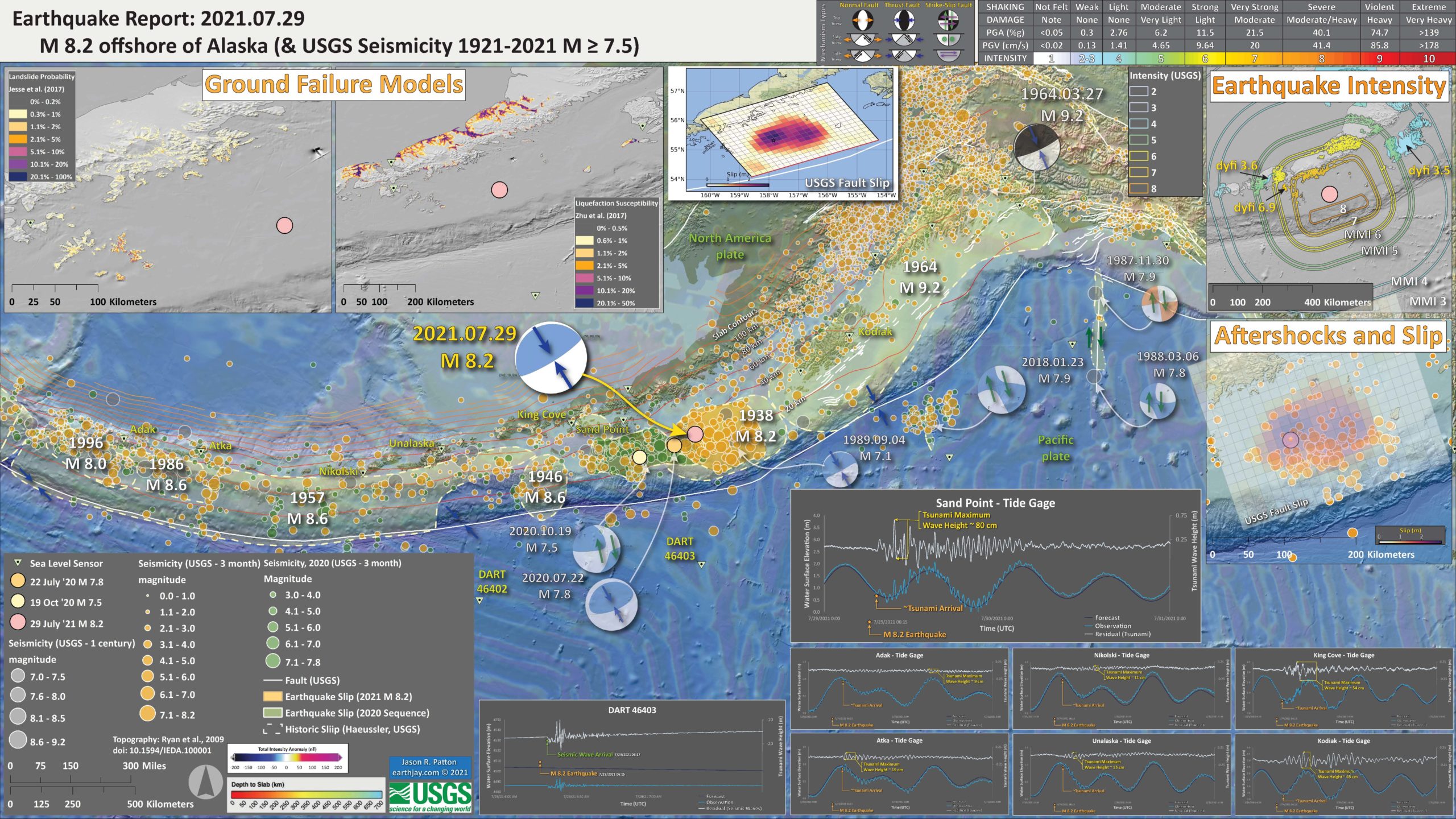
Below is my interpretive poster for this earthquake
- I plot the seismicity from the past 3 months, with diameter representing magnitude (see legend). I also include earthquake epicenters from 1921-2021 with magnitudes M ≥ 7.5.
- I plot the USGS fault plane solutions (moment tensors in blue and focal mechanisms in orange), possibly in addition to some relevant historic earthquakes.
- A review of the basic base map variations and data that I use for the interpretive posters can be found on the Earthquake Reports page. I have improved these posters over time and some of this background information applies to the older posters.
- Some basic fundamentals of earthquake geology and plate tectonics can be found on the Earthquake Plate Tectonic Fundamentals page.
- I include outlines of the historic subduction zone earthquakes as prepared by Peter Haeussler from the USGS in Anchorage. He appears in the video about the 1964 earthquake below.
- Some of the tide gage and DART buoy locations are labeled.
- Note how there are still aftershocks from the 2018 M 7.9 earthquake sequence.
- This is the first poster I prepared.
- In the upper center is a low-angle oblique view of the plate boundary. Note the oceanic Pacific plate is subducting beneath the continental North America plate. As the plate goes down, the water embedded in the rocks and sediment are released into the overlying mantle wedge. This water causes the mantle to melt, which rises, erupts as lava and forms the volcanic chain we call the Aleutian Islands. I place a green star in the “epicentral” location of the 2021 M 8.2 earthquake.
- In the upper left corner is part of a figure from Witter et al. (2019) that shows sections of the megathrust fault relative to how much the fault is thought to be locked. This is called the coupling ratio. For a fault that is fully coupled (or locked), the ratio is 1.0. For a fault that is slipping about 50% and accumulating about 50% of the plate motion rate, the coupling ratio is 0.5. Many subduction zones have low coupling ratios of 0.2-0.6. The region of the fault west of the 1938 and 2021 M 8.2 earthquakes is called the Shumagin Gap, thought to be possibly aseismic (with a coupling ratio closer to 0). But the 2020 sequence of M 7.8 and 7.9 earthquakes filled much of this gap.
- In the upper right corner is a plot showing the earthquake shaking intensity using the Modified Mercalli Intensity Scale (MMI). This is a USGS model based on observations of intensity from thousands of earthquakes. Read more about MMI here.
- In the center right is a plot showing the aftershocks within a couple hours of the mainshock
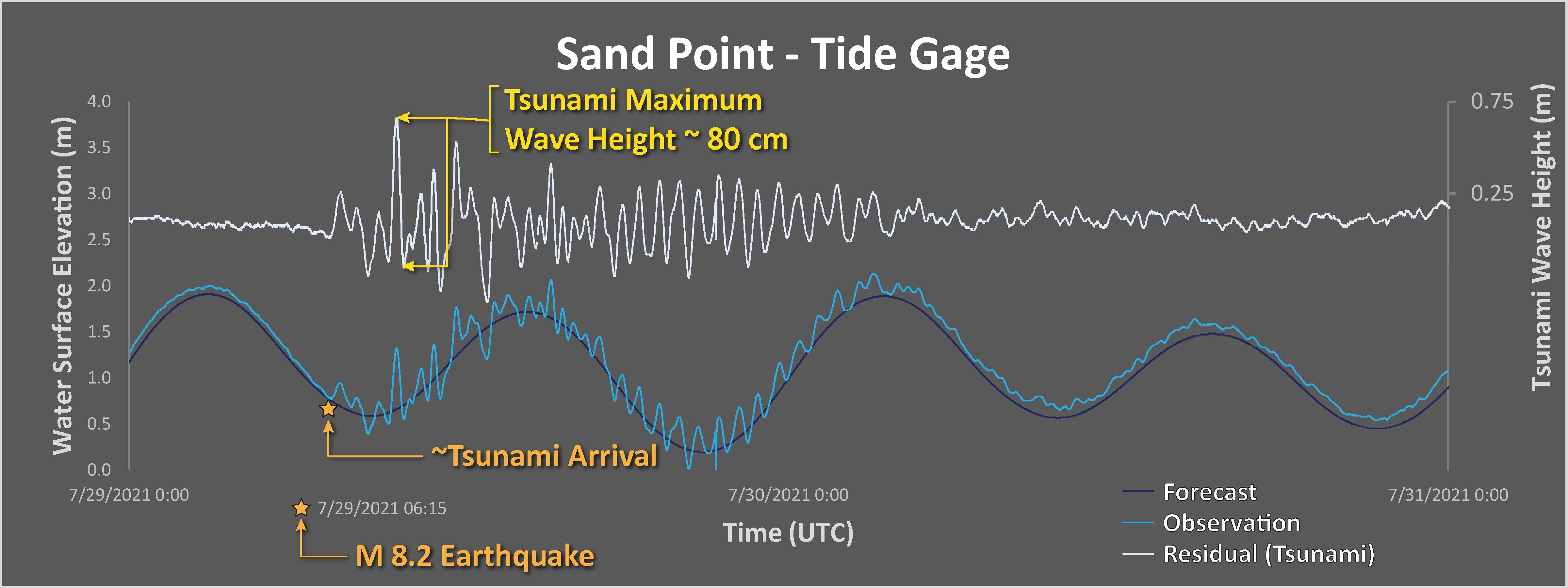
- In the lower right corner is the initial record of the tsunami at the Sand Point tide gage (see map for gage location).
- I labeled the USGS slab 2.0 slab contours (Hayes et al., 2018). These depth contours represent the depth of the megathrust fault at these locations. The M 8.2 hypocentral depth is 32.2 km and the slab2 depth is about 35 km. Nice!
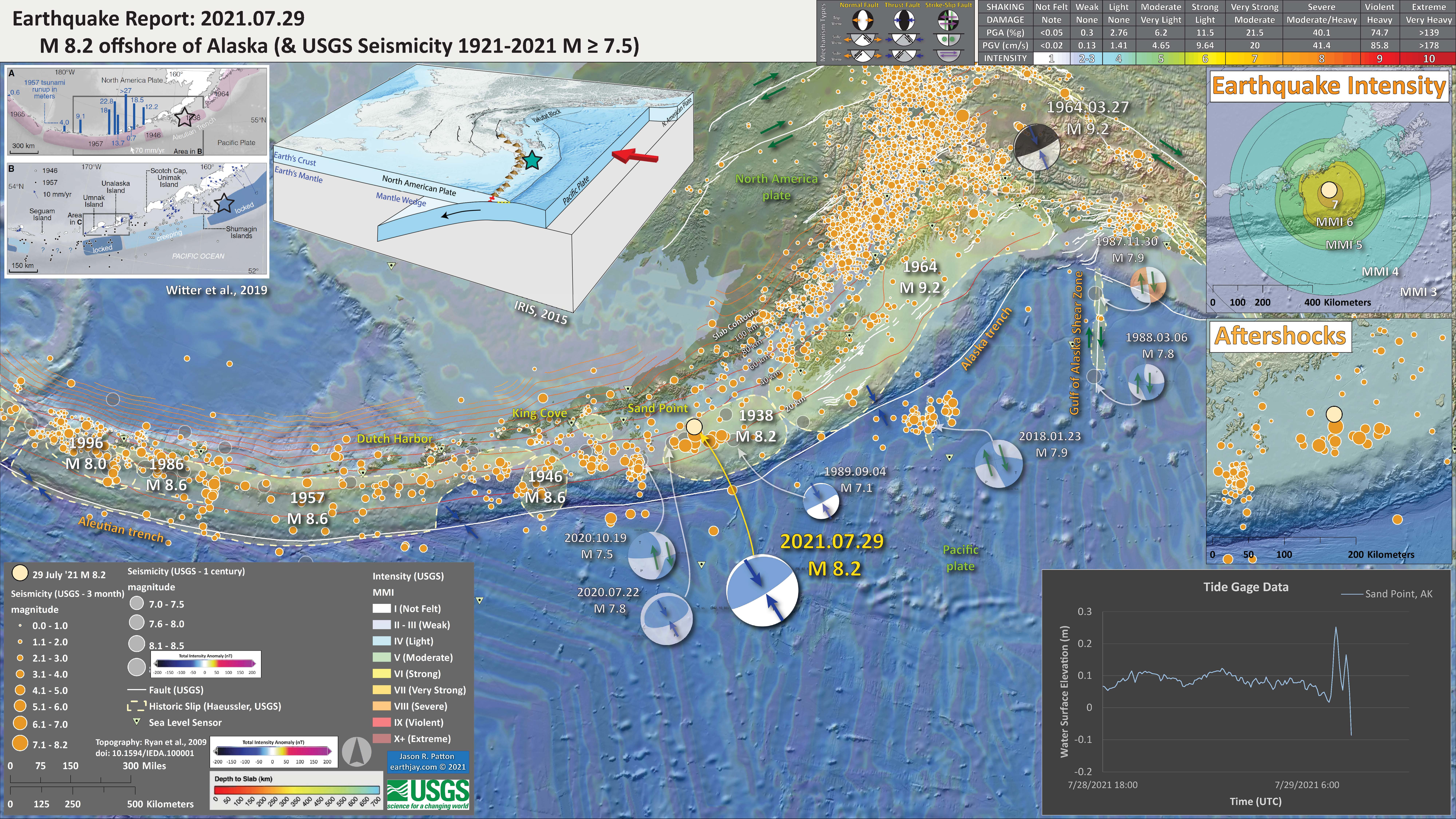
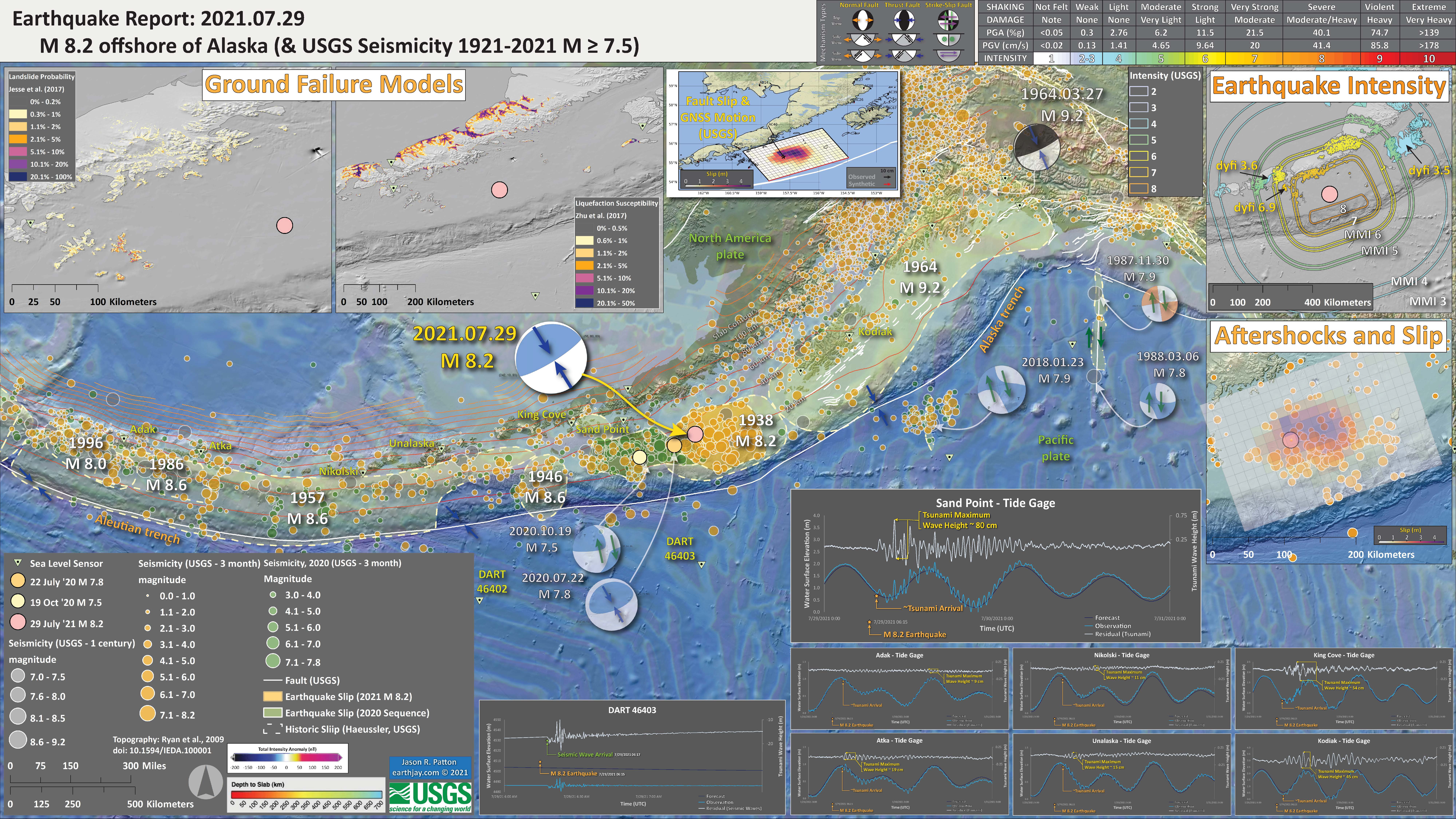
I include some inset figures. Some of the same figures are located in different places on the larger scale map below. I present 3 posters, each with slightly different information.
- Here is the map with 3 month’s seismicity plotted. There are 3 posters. The first one is something I put together around 2 hours after I awoke on the couch (abt 2am my time). I prepared the 2nd poster an hour later, which includes some information about tsunami prehistory. I prepared the 3rd poster late Sunday evening, about 3 days after the earthquake.
- This is the second map I prepared and some figures are the same as in the first poster.
- Below the low-angle oblique map is a slip model from the USGS. The color represents the amount of slip on the fault. Note that the maximum slip is close to the epicenter. This is not always the case, as for the 1938 event, it appears that the maximum slip was not where the mainshock epicenter was.
- In the upper left corner is a map from Nelson et al. (2015). Those authors studied the prehistoric tsunami records at Chrikof Island, an island about 200 km to the east of the 2021 M 8.2 epicenter. The lower map shows GPS derived plate motion rates.
- In the lower right corner is also from Nelson et al. (2015). On this plot, the vertical axis represents time with “today” at the top and over 5000 years ago at the bottom. The horizontal axis is space, west to east from left to right. Each colored symbol represents the time of a prehistoric tsunami. The vertical size of these symbols represents the uncertainty (or “error”) associated with those chronologic data. We can take the number of earthquakes or tsunami over a period of time to estimate how frequently those process happen over time.
- To the left is a more updated version of the Sand Point tide gage, showing a wave height (peak to trough) of about 45 cm. We cannot compare this to the 1938 tsunami as there was not a tide gage at Sand Point in 1938
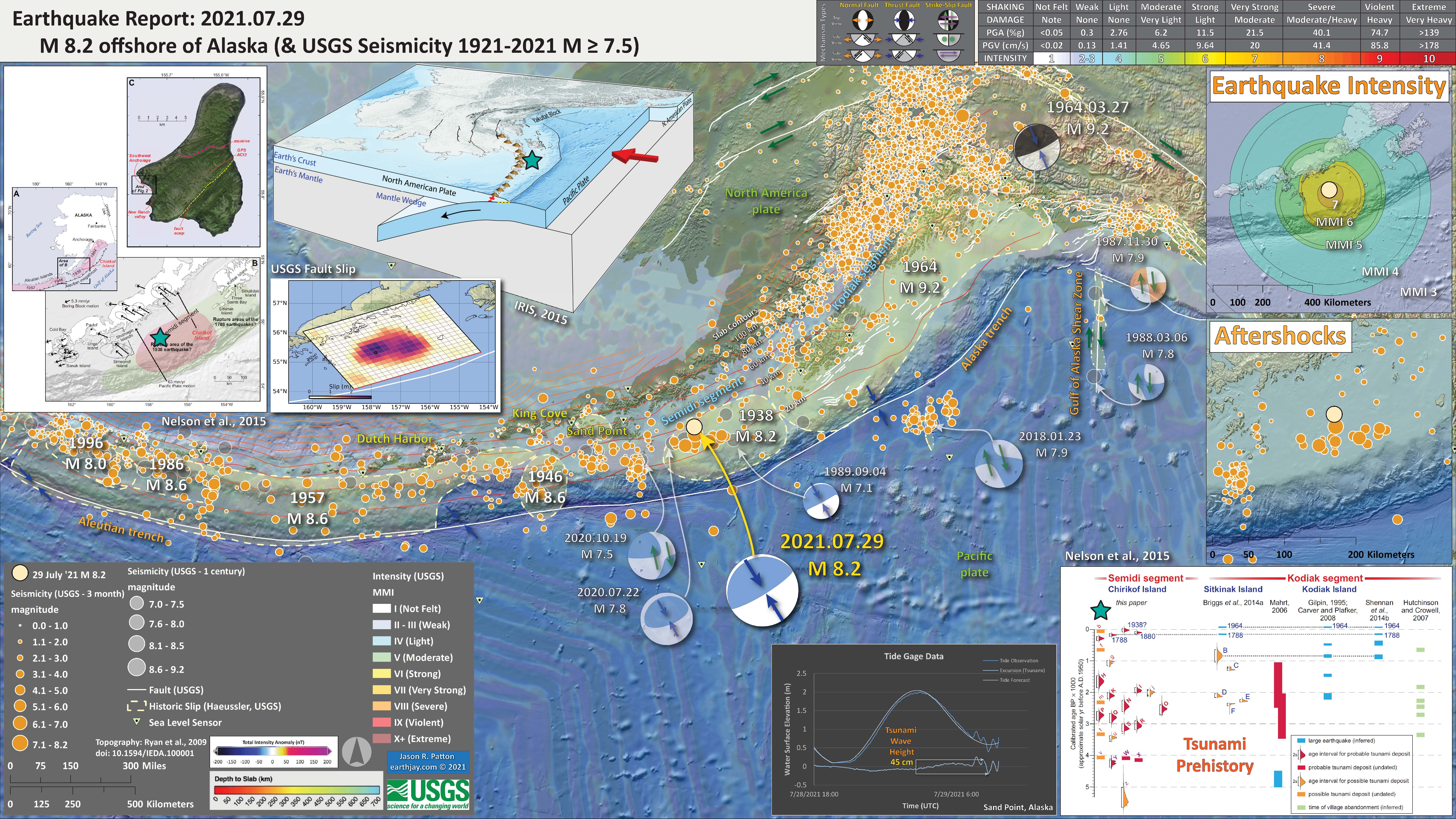
- I prepared a 3rd poster, but updated it to this 4th poster.
- In the Intensity Data area, I added USGS “Did You Feel It?” data, which come from reports from real people. Learn more about dyfi here. The model data are the colored lines labeled in white and the dyfi data are colored polygons labeled in yellow.
- In the aftershocks plot, I added epicenters from the several days after the mainshock. I also added a transparent overlay of the USGS finite fault model (the slip model). Compare the overlap, or non-overlap, of the slip region and the aftershocks. Why do you think that they are not completely overlapping?
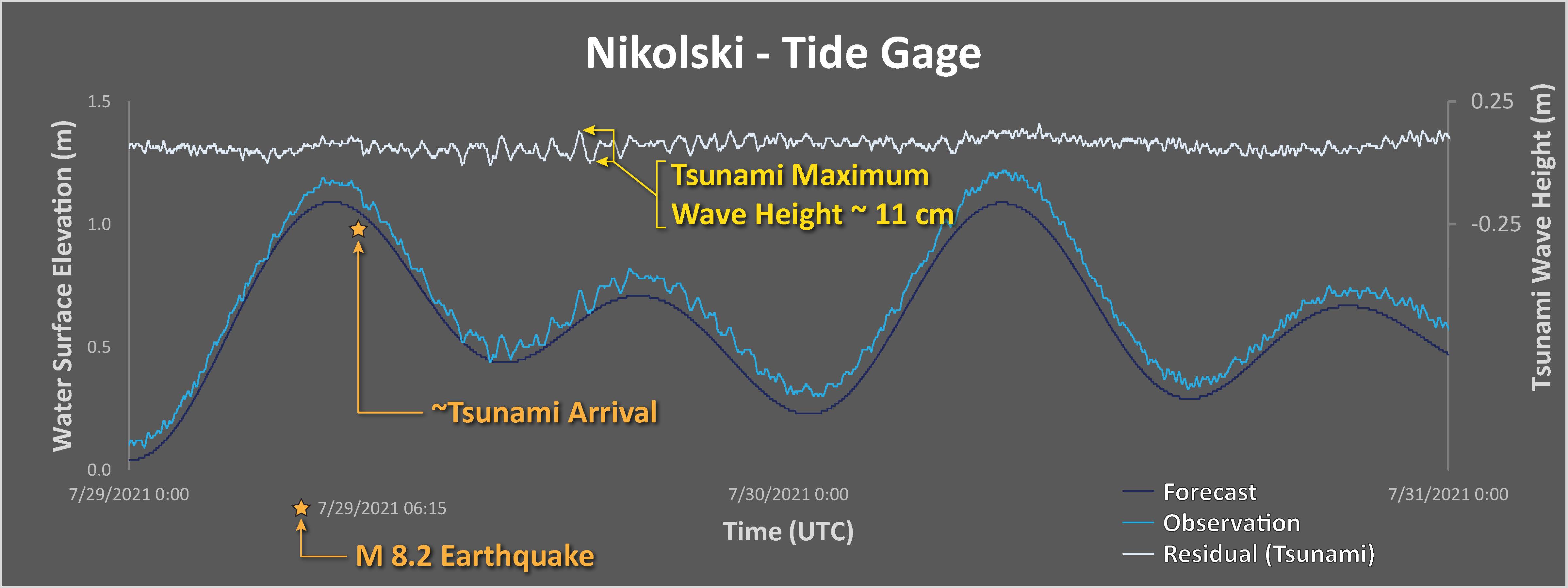
- In the lower right section are tide gage records from gages in the area included in the poster. I plot the tidal forecast (dark blue), the tide gage observed water surface elevation (medium blue), and the difference between these data (in light blue) which is a record of the tsunami (and other waves, like wind waves). I made a rough approximation estimate of the maximum wave height and labeled this in yellow. The San Point tide gage has a mx wave height of about 0.8 m!
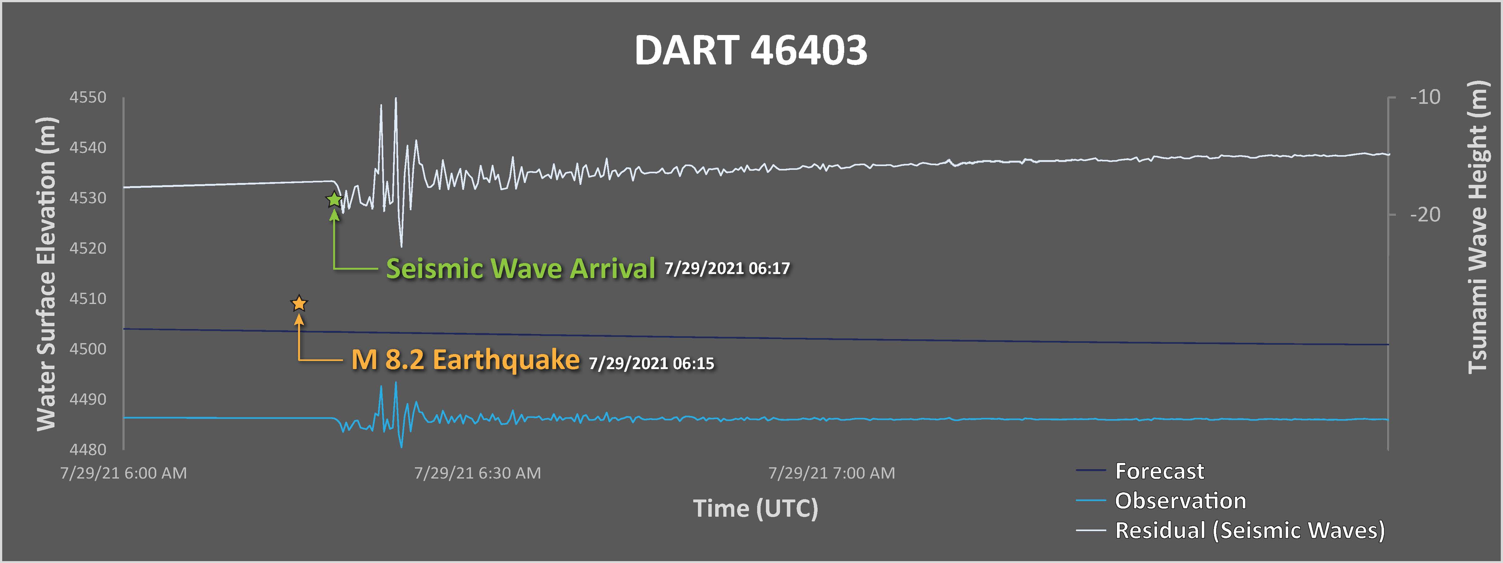
- I also plot the data from the DART buoy 46403, which is the closest DART buoy to the mainshock epicenter. The DART buoy network is used to help calibrate tsunami forecast models during tsunami events. These are basically pressure transducers on the seafloor that measure changes in pressure caused by waves and atmospheric processes. The data plotted here are not tsunami data, but seismic wave data. One reason we know that this is not a tsunami is that the waveform initiated about 3 minutes after the earthquake. A tsunami would take longer to get to the buoy.
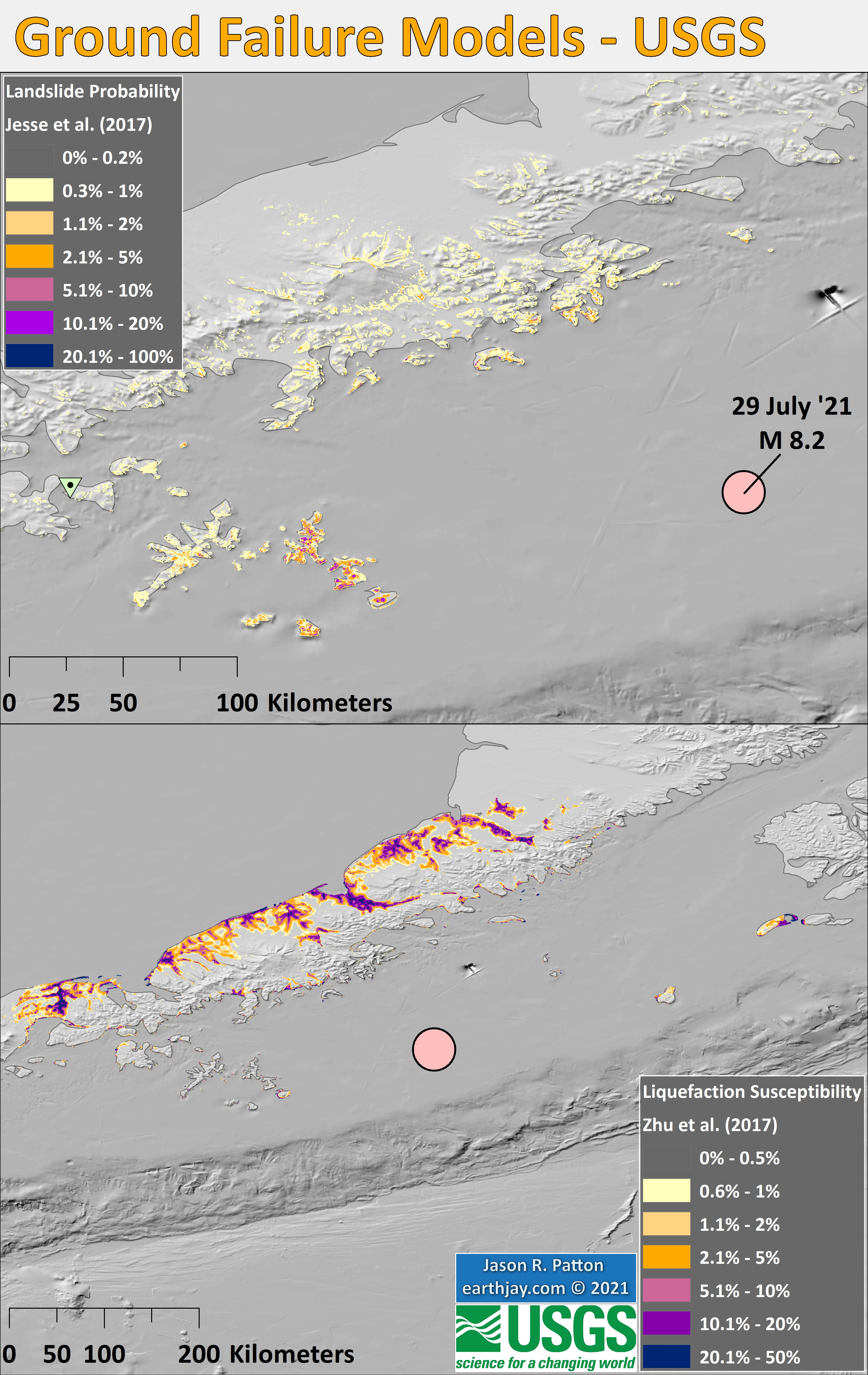
- In the upper left corner is a pair of maps that show USGS earthquake induced ground failure models. The map on the right shows what areas have likelihood of having landslides triggered by the 2021 M 8.2 earthquake. The panel on the right shows the possibility that areas might experience liquefaction induced by the earthquake.
- I added aftershocks associated with the 2020 M 7.8/7.5 sequence that filled the Shumagin Gap (green circles) and outlined the aftershock region for both 2020 and 2021 sequences. The 2021 sequence is not yet over. The largest aftershock so far has only been M 6.1. The 1938 M 8.2 event had a M~7 event 5 days after the mainshock. Stay tuned?
Tectonic Overview
Below is an educational video from the USGS that presents material about subduction zones and the 1964 earthquake and tsunami in particular.
Youtube Source IRIS
mp4 file for downloading.
-
Credits:
- Animation & graphics by Jenda Johnson, geologist
- Directed by Robert F. Butler, University of Portland
- U.S. Geological Survey consultants: Robert C. Witter, Alaska Science Center Peter J. Haeussler, Alaska Science Center
- Narrated by Roger Groom, Mount Tabor Middle School
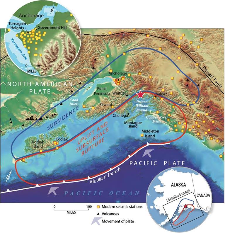
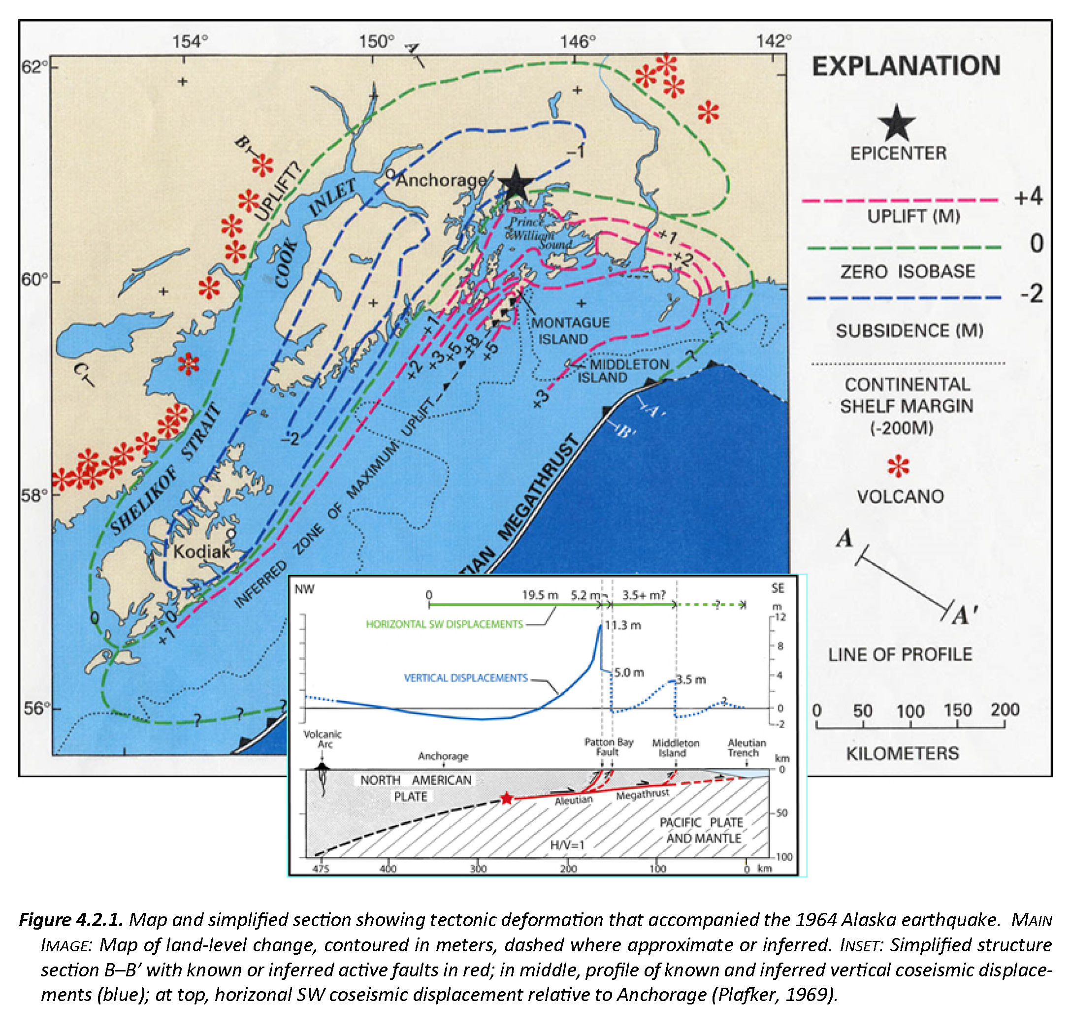
This is a map from Haeussler et al. (2014). The region in red shows the area that subsided and the area in blue shows the region that uplifted during the earthquake. These regions were originally measured in the field by George Plafker and published in several documents, including this USGS Professional Paper (Plafker, 1969).
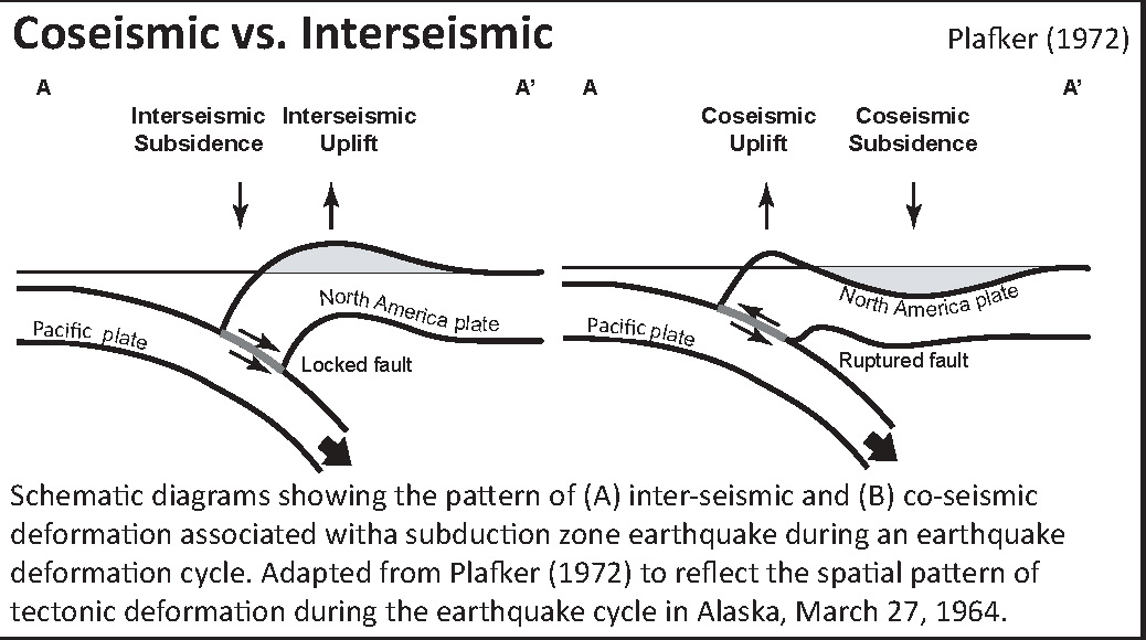
Here is a cross section showing the differences of vertical deformation between the coseismic (during the earthquake) and interseismic (between earthquakes).
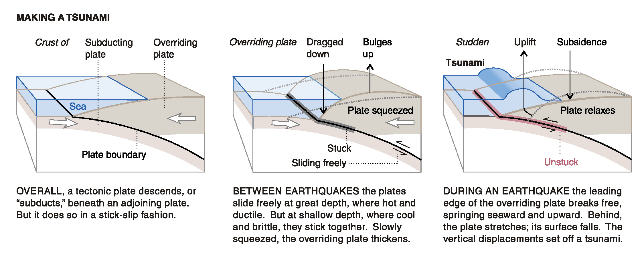
This figure, from Atwater et al. (2005) shows the earthquake deformation cycle and includes the aspect that the uplift deformation of the seafloor can cause a tsunami.
Here is a figure recently published in the 5th International Conference of IGCP 588 by the Division of Geological and Geophysical Surveys, Dept. of Natural Resources, State of Alaska (State of Alaska, 2015). This is derived from a figure published originally by Plafker (1969). There is a cross section included that shows how the slip was distributed along upper plate faults (e.g. the Patton Bay and Middleton Island faults).
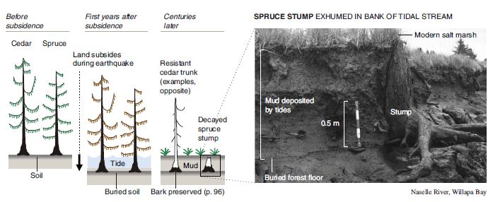
Here is a graphic showing the sediment-stratigraphic evidence of earthquakes in Cascadia, but the analogy works for Alaska also. Atwater et al., 2005. There are 3 panels on the left, showing times of (1) prior to earthquake, (2) several years following the earthquake, and (3) centuries after the earthquake. Before the earthquake, the ground is sufficiently above sea level that trees can grow without fear of being inundated with salt water. During the earthquake, the ground subsides (lowers) so that the area is now inundated during high tides. The salt water kills the trees and other plants. Tidal sediment (like mud) starts to be deposited above the pre-earthquake ground surface. This sediment has organisms within it that reflect the tidal environment. Eventually, the sediment builds up and the crust deforms interseismically until the ground surface is again above sea level. Now plants that can survive in this environment start growing again. There are stumps and tree snags that were rooted in the pre-earthquake soil that can be used to estimate the age of the earthquake using radiocarbon age determinations. The tree snags form “ghost forests.
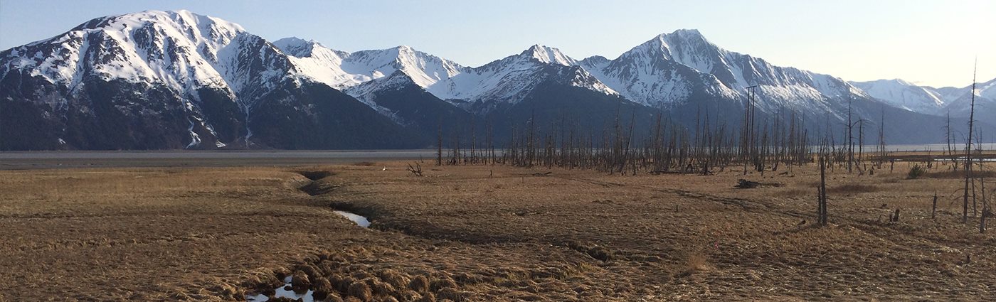
This is a photo that I took along the Seward HWY 1, that runs east of Anchorage along the Turnagain Arm. I attended the 2014 Seismological Society of America Meeting that was located in Anchorage to commemorate the anniversary of the Good Friday Earthquake. This is a ghost forest of trees that perished as a result of coseismic subsidence during the earthquake. Copyright Jason R. Patton (2014). This region subsided coseismically during the 1964 earthquake. Here are some photos from the paleoseismology field trip. (Please contact me for a higher resolution version of this image: quakejay at gmail.com)
This is another video about the 1964 Good Friday Earthquake and how we learned about what happened.
- Here is a map that shows historic earthquake slip regions as pink polygons (Peter Haeussler, USGS). Dr. Haeussler also plotted the magnetic anomalies (grey regions), the arc volcanoes (black diamonds), and the plate motion vectors (mm/yr, NAP vs PP).
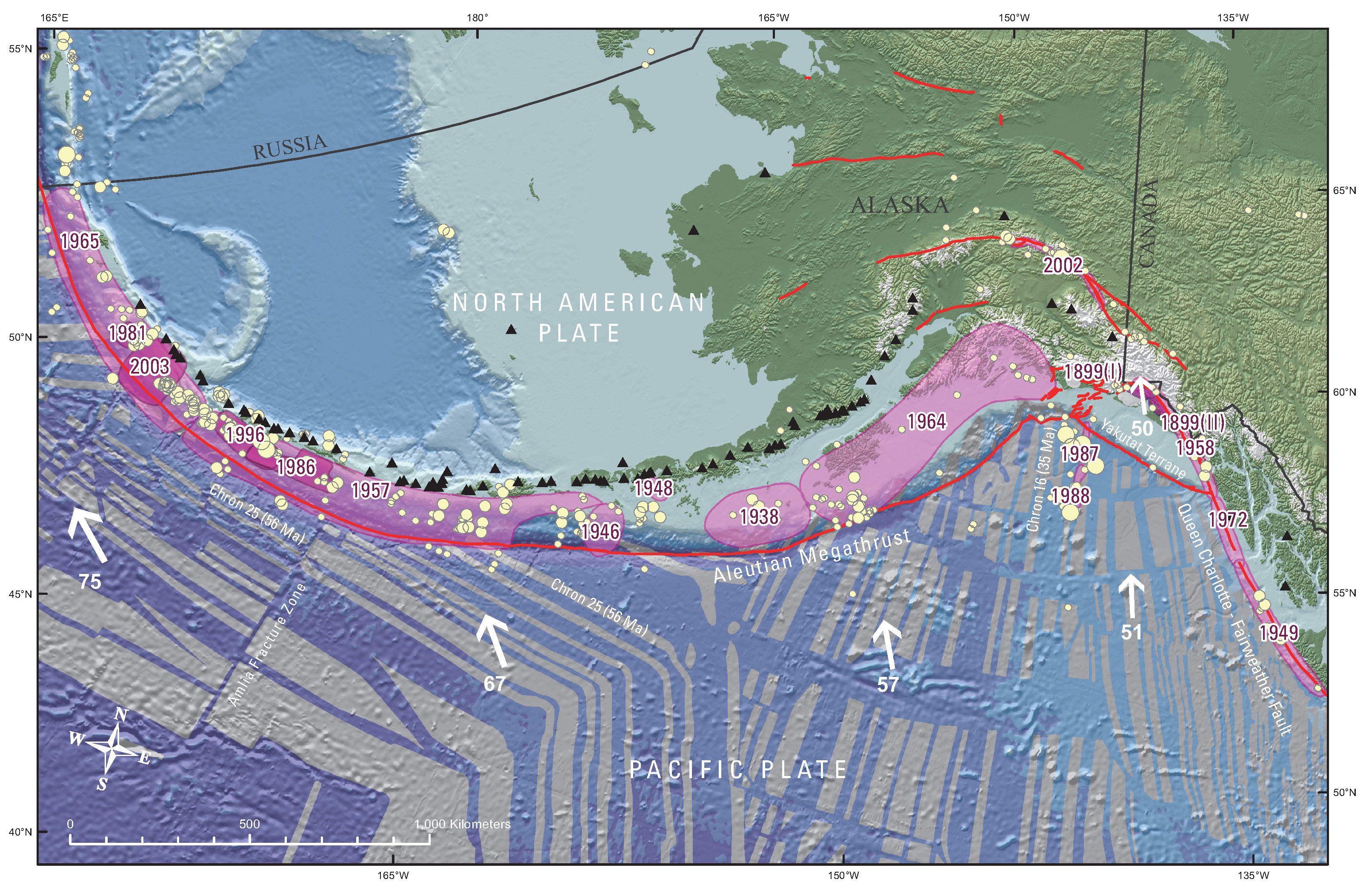
- Here is the figure from Sykes et al. (1980) that shows the space time relations for historic earthquakes in relation to the map.

Above: Rupture zones of earthquakes of magnitude M > 7.4 from 1925-1971 as delineated by their aftershocks along plate boundary in Aleutians, southern Alaska and offshore British Columbia [after Sykes, 1971]. Contours in fathoms. Various symbols denote individual aftershock sequences as follows: crosses, 1949, 1957 and 1964; squares, 1938, 1958 and 1965; open triangles, 1946; solid triangles, 1948; solid circles, 1929, 1972. Larger symbols denote more precise locations. C = Chirikof Island. Below: Space-time diagram showing lengths of rupture zones, magnitudes [Richter, 1958; Kanamori, 1977 b; Kondorskay and Shebalin, 1977; Kanamori and Abe, 1979; Perez and Jacob, 1980] and locations of mainshocks for known events of M > 7.4 from 1784 to 1980. Dashes denote uncertainties in size of rupture zones. Magnitudes pertain to surface wave scale, M unless otherwise indicated. M is ultra-long period magnitude of Kanamori 1977 b; Mt is tsunami magnitude of Abe[ 1979]. Large shocks 1929 and 1965 that involve normal faulting in trench and were not located along plate interface are omitted. Absence of shocks before 1898 along several portions of plate boundary reflects lack of an historic record of earthquakes for those areas.
- Here is a great illustration that shows how forearc sliver faults form due to oblique convergence at a subduction zone (Lange et al., 2008). Strain is partitioned into fault normal faults (the subduction zone) and fault parallel faults (the forearc sliver faults, which are strike-slip). This figure is for southern Chile, but is applicable globally.

Proposed tectonic model for southern Chile. Partitioning of the oblique convergence vector between the Nazca plate and South American plate results in a dextral strike-slip fault zone in the magmatic arc and a northward moving forearc sliver. Modified after Lavenu and Cembrano (1999).
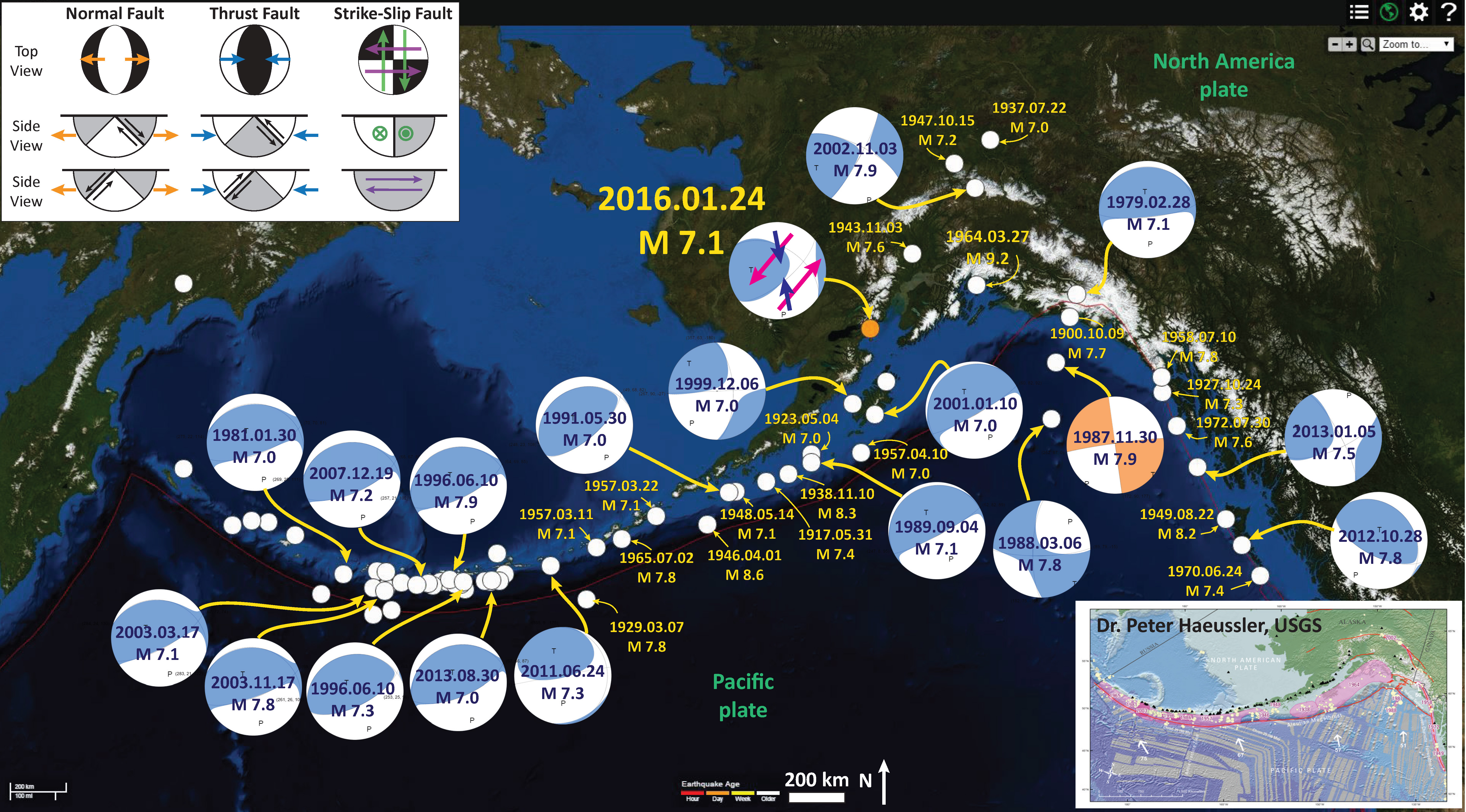
In 2016, there was an earthquake along the Alaska Peninsula, a M 7.1 on 2016.01.24. Here is my earthquake report for this earthquake. Here is a map for the earthquakes of magnitude greater than or equal to M 7.0 between 1900 and today. This is the USGS query that I used to make this map. One may locate the USGS web pages for all the earthquakes on this map by following that link.
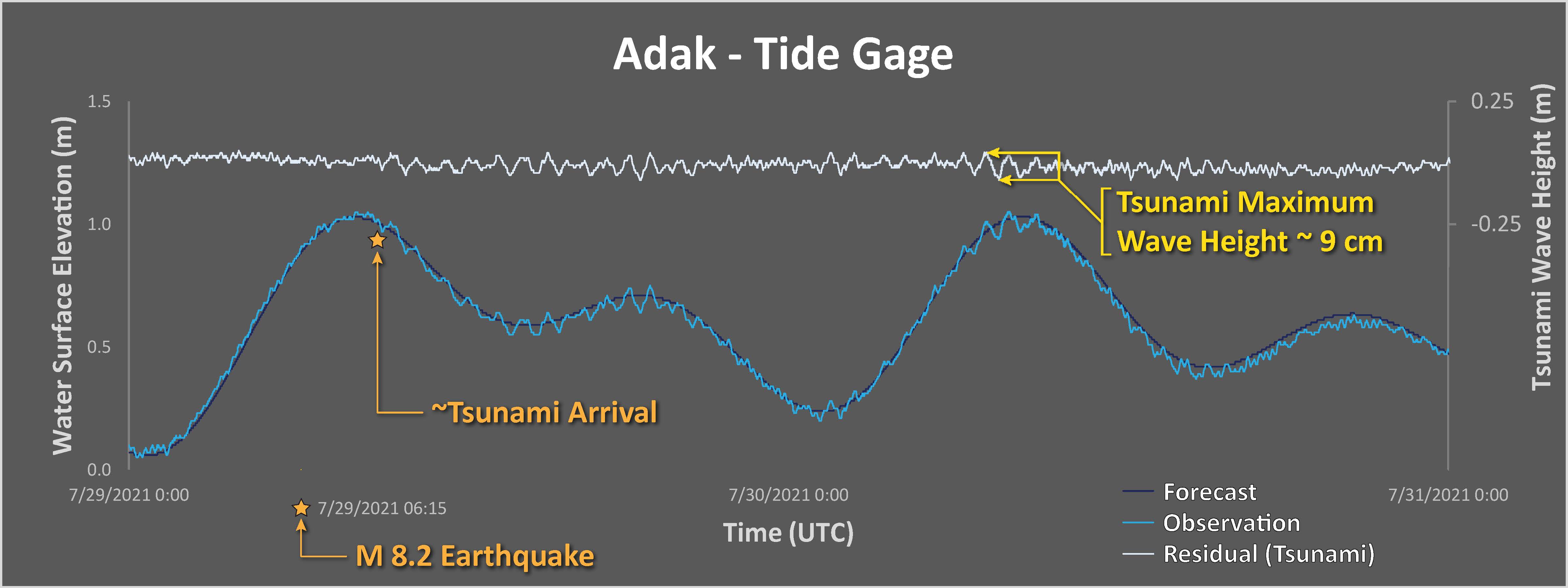
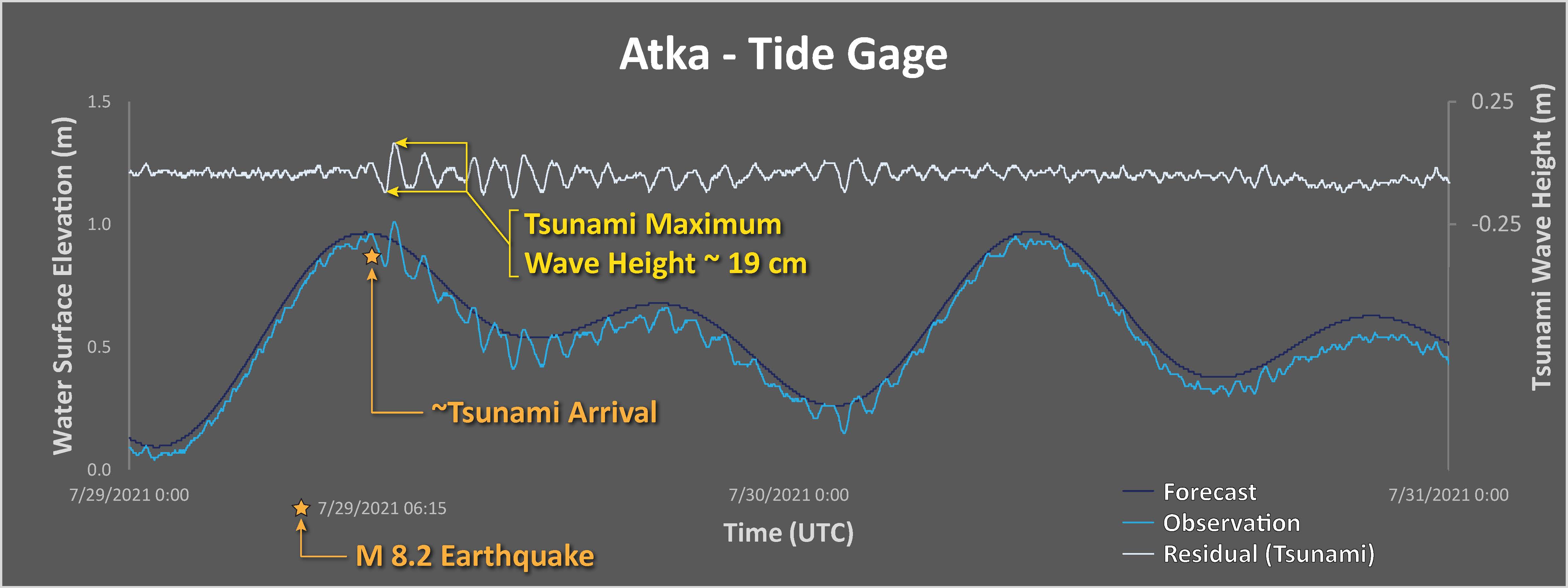
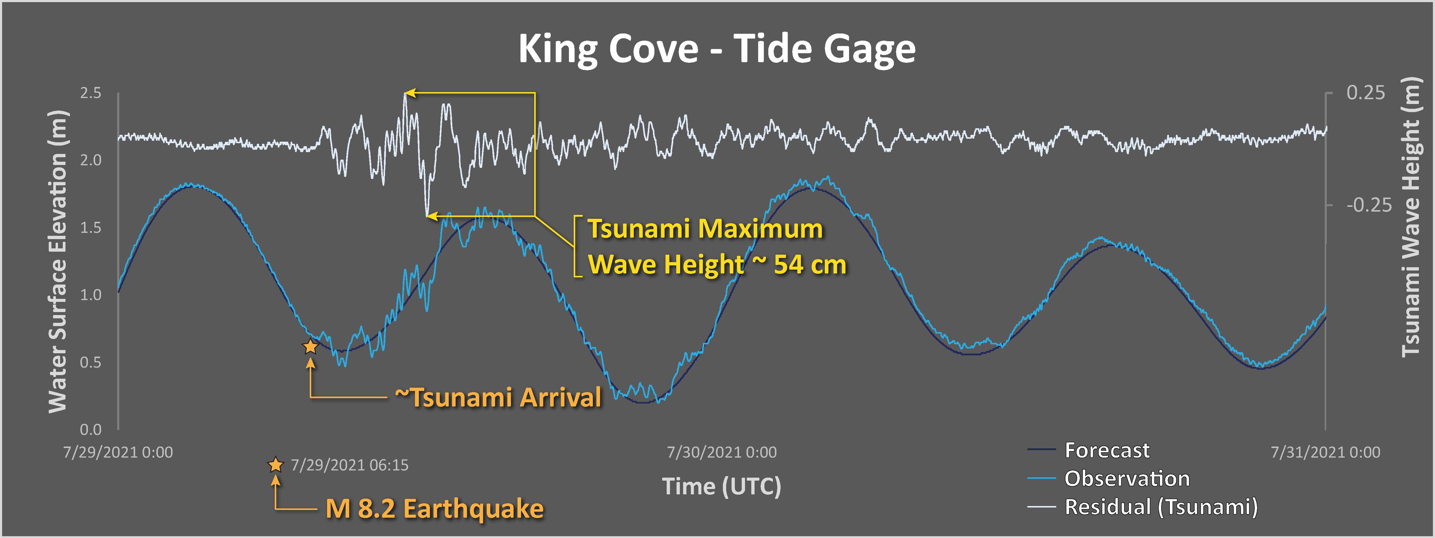
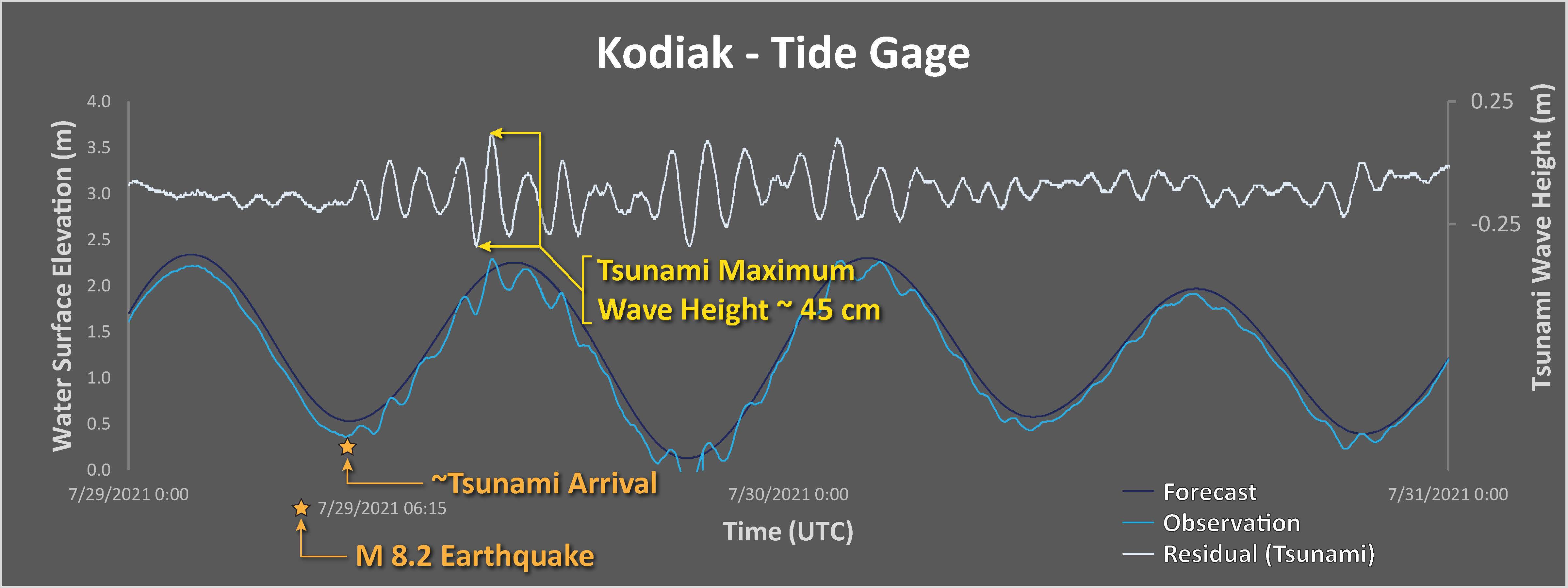
Tsunami Data
I plot tide gage data for gages in the north and northeast Pacific Ocean. These data are from NOAA Tides and Currents, though are also available via the eu tide gage website here.
-
Each plot includes three datasets:
- The tidal forecasts are shown as a dark blue line.
- The actual observed water surface elevation is plotted in medium blue.
- By removing (subtracting) the tide forecast from the observed data, we get the signal from wind waves, tsunami, and atmospheric phenomena. This residual is plotted in light blue.
The scale for the tsunami wave height is on the right side of the chart.
Note the all tsunami wave height plots are the same vertical scale, except for Sand Point.
I measured the largest wave heights for each site, displayed in yellow.
Alaska
Here are the data from the DART buoy nearest the M 8.2. People often mistake these data for tsunami data, but this is generated by seismic waves.
One way to test one’s hypothesis about whether these buoy data are seismic waves or tsunami waves, one simply need to take a look at the time that the wave begins to be recorded by the DART buoy.
Seismic waves travel through water at about 1.5 kms per second. While tsunami wave velocity (based on the shallow water wave equation) for depths ranging from 200-4000 meters is between ~0.02 to 0.2 kms per second, much slower than seismic waves.
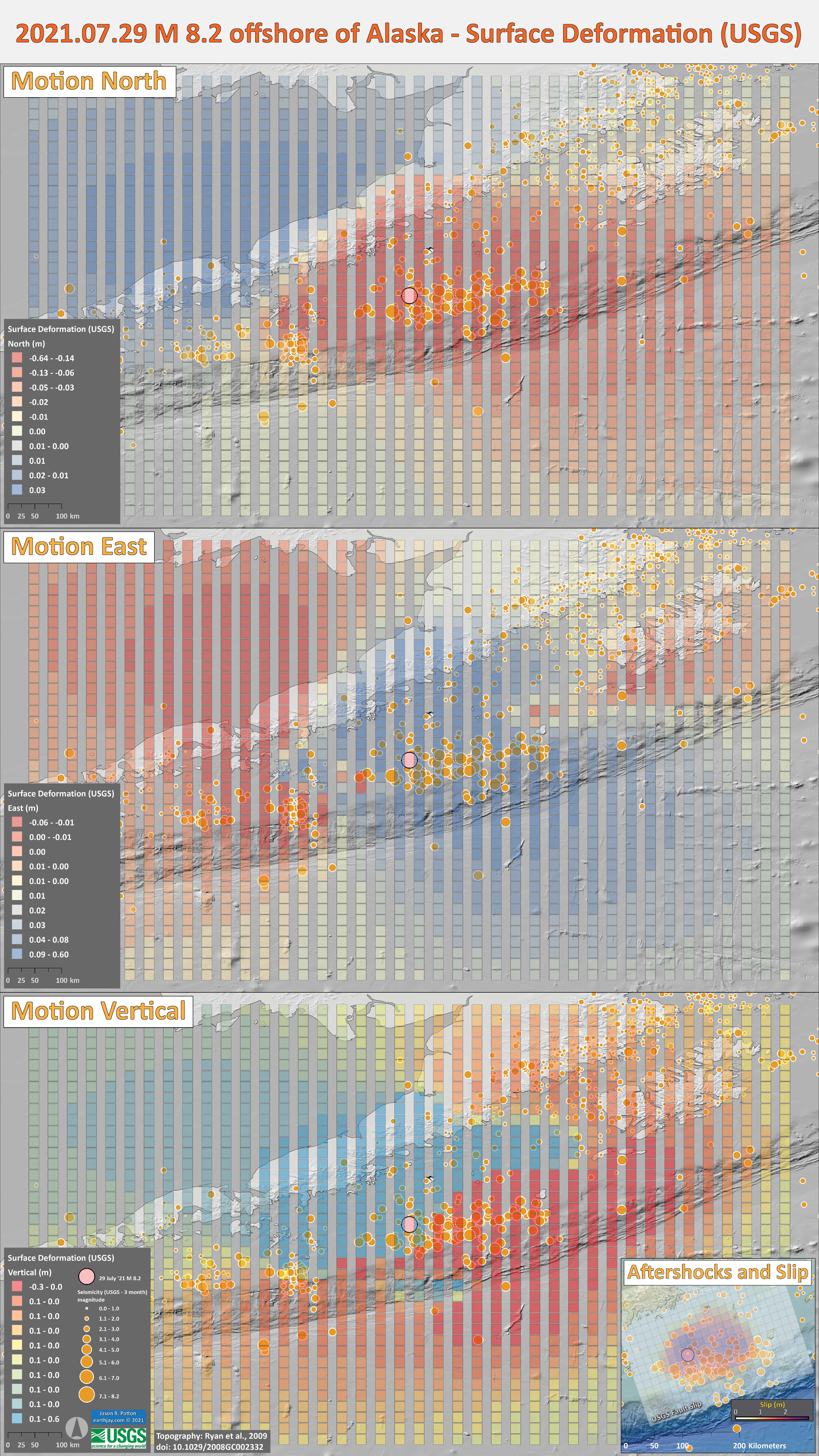
Surface Deformation
Below are surface deformation data generated by the USGS based on their finite fault model. The three panels show surface deformation in the north, east, and vertical directions.
North, East, and Up are positive (blue) while South, West, and Down are negative (red).
Note the upper panel and how the Pacific plate is moving to the north and the North America is moving south. Does this make sense?
The middle panel is interesting too, but skip to the lower panel, vertical. The accretionary prism (forming the continental slope), directly above the aftershocks and mainshock, rises up during the earthquake. The upper North America plate landward of the slip patch subsides. Does this make sense?
Earlier in this report we took a look at the geologic evidence for megathrust subduction zone earthquakes, evidence that records this “coseismic” subsidence.
Shaking Intensity and Potential for Ground Failure
- Below are a series of maps that show the shaking intensity and potential for landslides and liquefaction. These are all USGS data products.
- Below is the liquefaction susceptibility and landslide probability map (Jessee et al., 2017; Zhu et al., 2017). Please head over to that report for more information about the USGS Ground Failure products (landslides and liquefaction). Basically, earthquakes shake the ground and this ground shaking can cause landslides.
- I use the same color scheme that the USGS uses on their website. Note how the areas that are more likely to have experienced earthquake induced liquefaction are in the valleys. Learn more about how the USGS prepares these model results here.
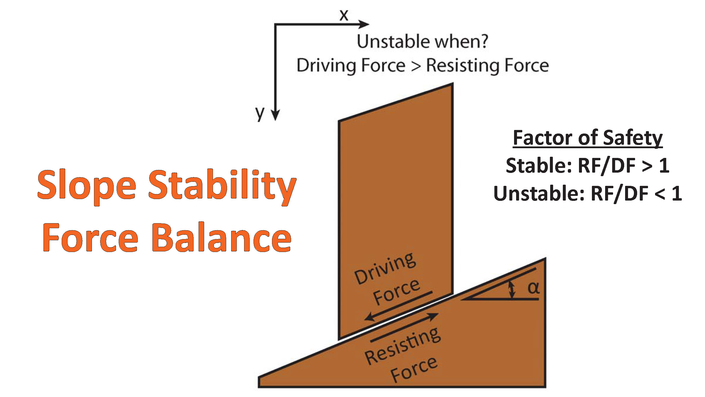
There are many different ways in which a landslide can be triggered. The first order relations behind slope failure (landslides) is that the “resisting” forces that are preventing slope failure (e.g. the strength of the bedrock or soil) are overcome by the “driving” forces that are pushing this land downwards (e.g. gravity). The ratio of resisting forces to driving forces is called the Factor of Safety (FOS). We can write this ratio like this:
FOS = Resisting Force / Driving Force
When FOS > 1, the slope is stable and when FOS < 1, the slope fails and we get a landslide. The illustration below shows these relations. Note how the slope angle α can take part in this ratio (the steeper the slope, the greater impact of the mass of the slope can contribute to driving forces). The real world is more complicated than the simplified illustration below.
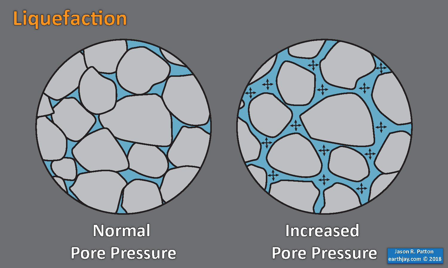
Landslide ground shaking can change the Factor of Safety in several ways that might increase the driving force or decrease the resisting force. Keefer (1984) studied a global data set of earthquake triggered landslides and found that larger earthquakes trigger larger and more numerous landslides across a larger area than do smaller earthquakes. Earthquakes can cause landslides because the seismic waves can cause the driving force to increase (the earthquake motions can “push” the land downwards), leading to a landslide. In addition, ground shaking can change the strength of these earth materials (a form of resisting force) with a process called liquefaction.
Sediment or soil strength is based upon the ability for sediment particles to push against each other without moving. This is a combination of friction and the forces exerted between these particles. This is loosely what we call the “angle of internal friction.” Liquefaction is a process by which pore pressure increases cause water to push out against the sediment particles so that they are no longer touching.
An analogy that some may be familiar with relates to a visit to the beach. When one is walking on the wet sand near the shoreline, the sand may hold the weight of our body generally pretty well. However, if we stop and vibrate our feet back and forth, this causes pore pressure to increase and we sink into the sand as the sand liquefies. Or, at least our feet sink into the sand.
Below is a diagram showing how an increase in pore pressure can push against the sediment particles so that they are not touching any more. This allows the particles to move around and this is why our feet sink in the sand in the analogy above. This is also what changes the strength of earth materials such that a landslide can be triggered.
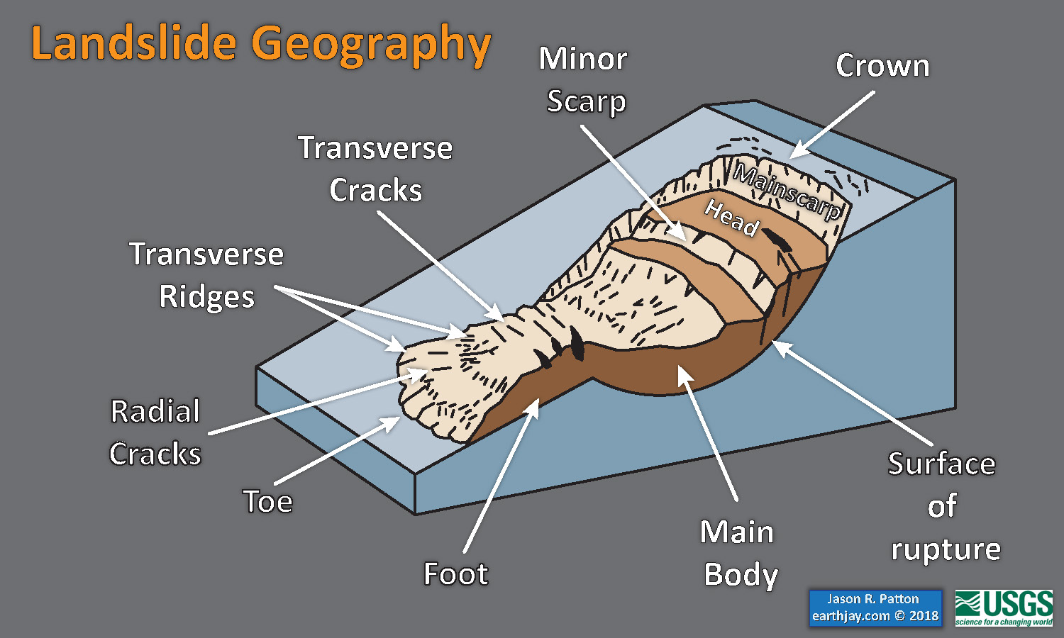
Below is a diagram based upon a publication designed to educate the public about landslides and the processes that trigger them (USGS, 2004). Additional background information about landslide types can be found in Highland et al. (2008). There was a variety of landslide types that can be observed surrounding the earthquake region. So, this illustration can help people when they observing the landscape response to the earthquake whether they are using aerial imagery, photos in newspaper or website articles, or videos on social media. Will you be able to locate a landslide scarp or the toe of a landslide? This figure shows a rotational landslide, one where the land rotates along a curvilinear failure surface.
Some Relevant Discussion and Figures
- Johnson and Satake (1994) studied tsunami waveforms from the 10 November 1938 Alaska M 8.2 earthquake. Their analysis was designed to estimate the source for the tsunami. Below are some figures from their paper, with figure captions beneath each figure.
- This first plot shows the tsunami records from tide gages. This is the plot I used to consider the potential impact to the coast from the 2021 M 8.2 tsunami.
- Here is a map that shows the fault model that they used, as well as the amount of slip that they used for each fault element.
- This is a figure comparing their model results (synthetic = dashed) compared to the tide gage records (solid lines).
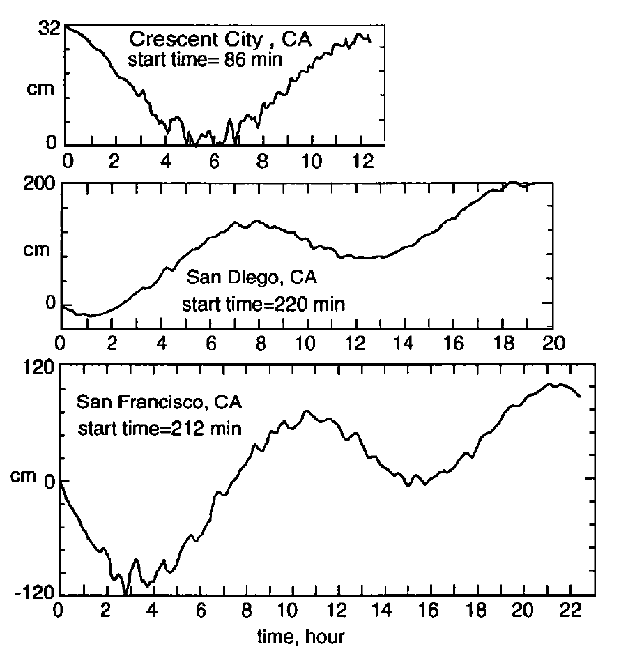
Digitized marigrams from 1938 Alaskan earthquake recorded in Crescent City, San Diego, and San Francisco. The tidal componenht asn ot beenr emoved.S tartt ime listedf or each record is the time in minutes from the origin time of the earthquaketo the startt ime of the digitizedr ecord.
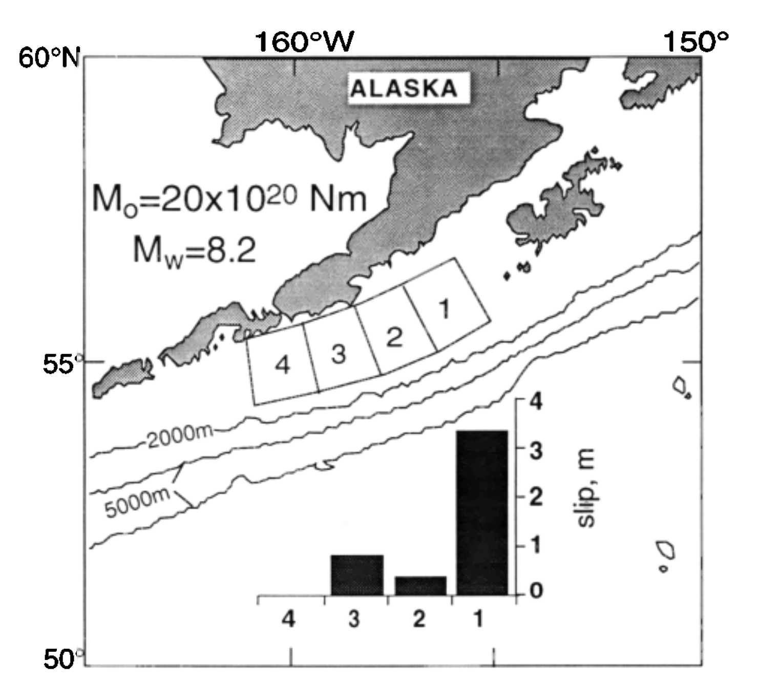
Location of subfaults used in inversion of tsunami waveforms. Graph shows slip distribution in meters.

Observed and synthetic waveforms from inversion for four subfaults. Start time of each record is different. The arrows indicate the parts of the waveforms used for the inversion.
- Freymueller et al. (2021) also studied the 1938 M 8.2 event, seeking to resolve the slip on the fault using tsunami modeling.
- Below are figures with their captions in blockquote.
- Here are some maps showing 2 of the slip distrubutions that they used for their modeling.
- Here are some maps showing vertical seafloor displacements for some of their tsunami scenarios.
- Here are plots that show some results of their modeling. The tide gage data are plotted in black and their simulated waves are plotted with red and blue lines.
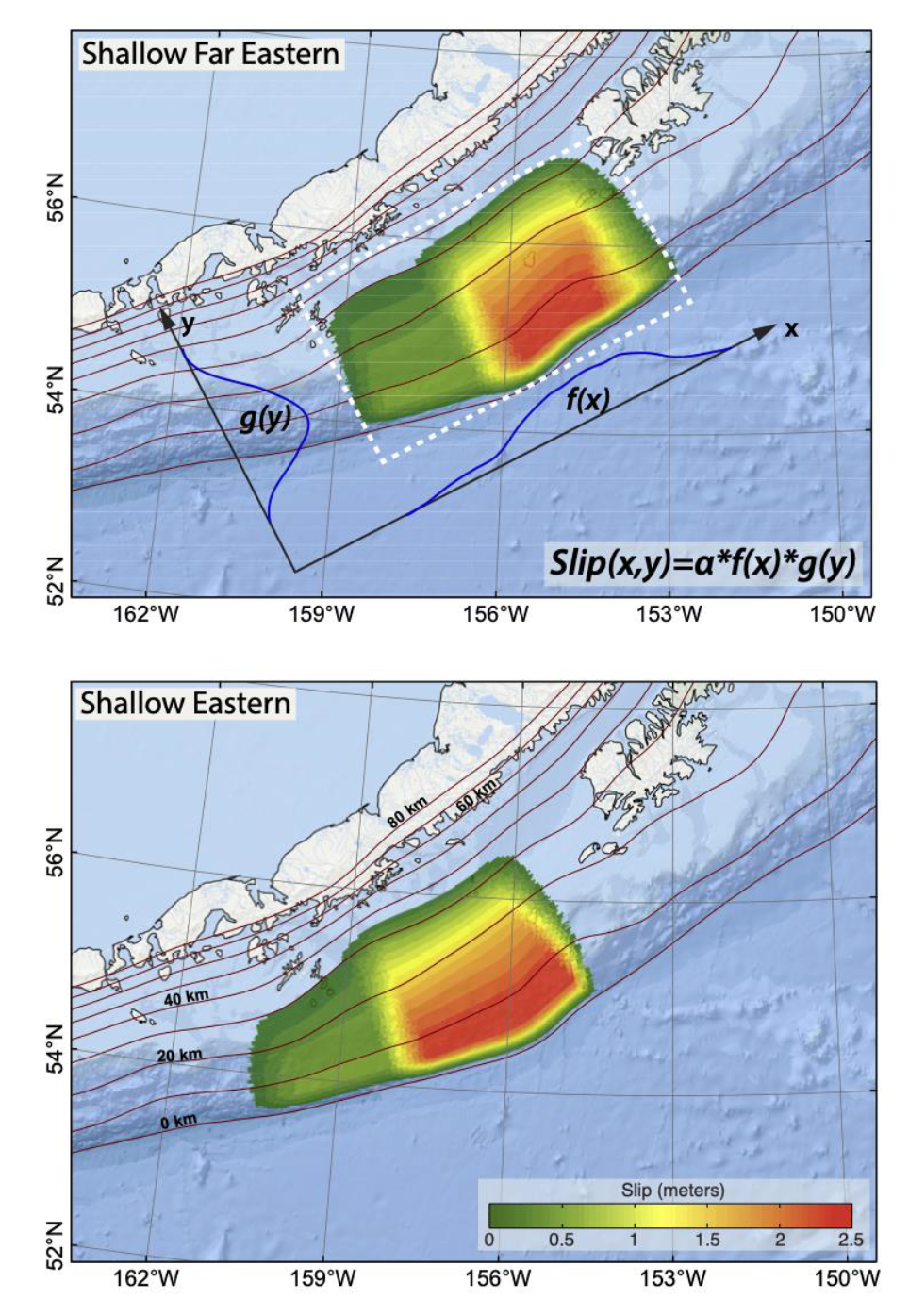
Example slip distributions for two of the slip models, shallow eastern and shallow far eastern. For each model the slip is the product of a function f(x) representing the along-strike variation and g(y) representing the downdip variation, and then scaled to a constant magnitude MW 8.25. The functions f(x) and g(y) are based on relations in Freund and Barnett [1976]. For the central and western models, the rupture area is the same as for the eastern model, but the area of higher slip is shifted to the west. For the mid-depth and deep models, the main area of high slip is shifted downdip.
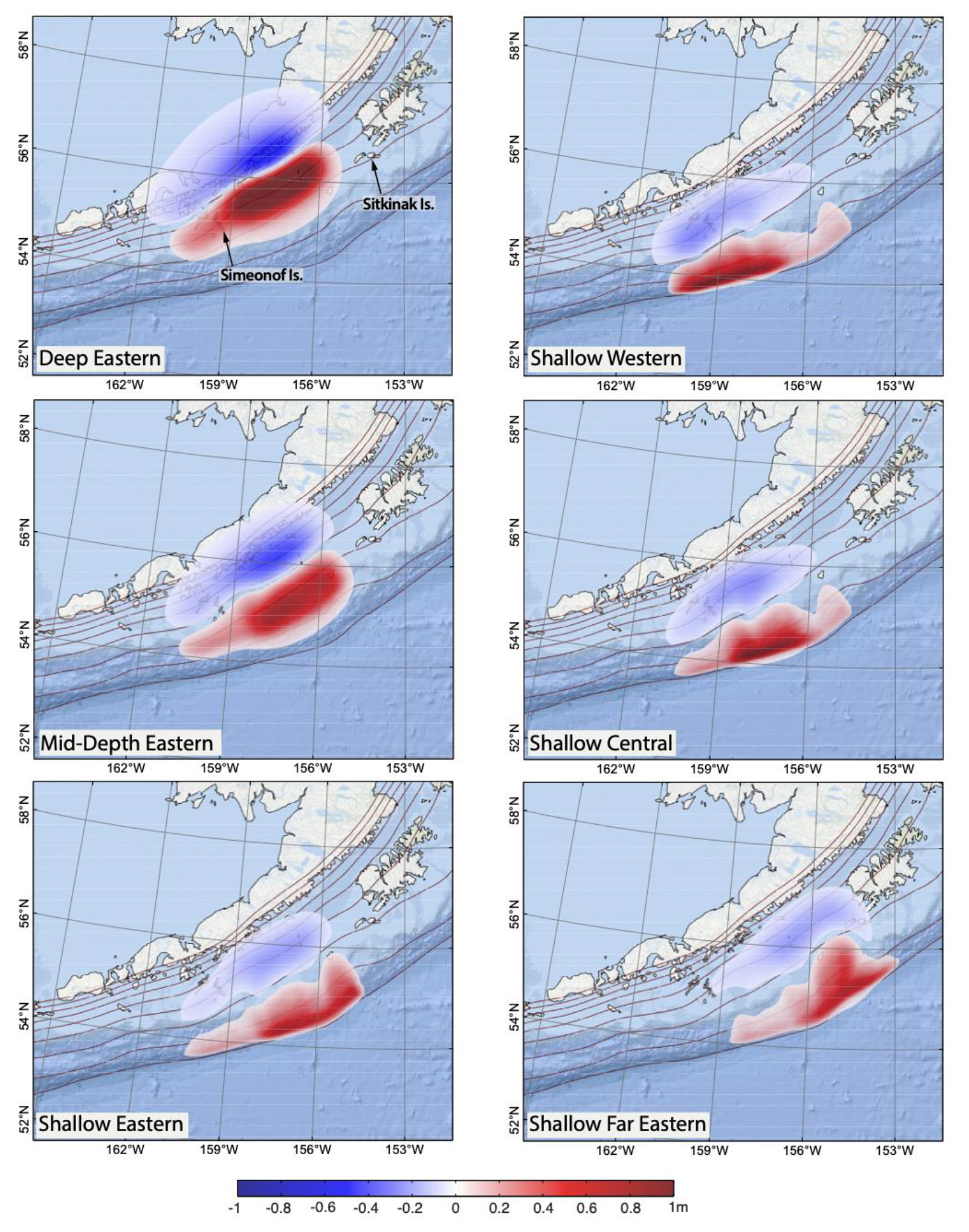
Vertical seafloor displacements caused by representative slip scenarios. On the left side, the slip is concentrated in the east and the deep, mid-depth and shallow slip distribution scenarios are shown. On the right, the Western, Central and Far Eastern slip distribution scenarios are shown assuming the shallow rupture. Displacements are in meters. Red contours show depth to the plate interface from 0 to 80 km with a 10 km increment.
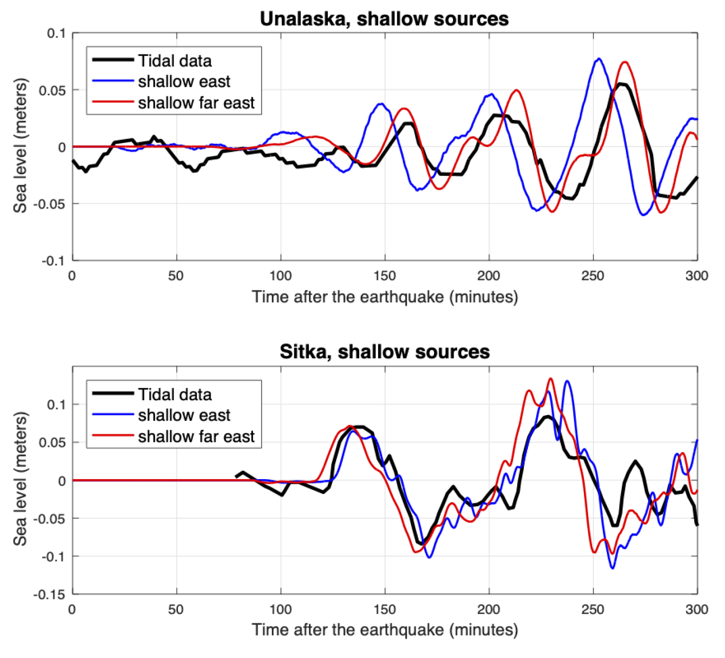
Tide gauge data and model predictions for the eastern and far eastern source models.
Here is an animation from one of the Freymueller et al. (2021) models for the 1938 M 8.2 tsunami.
- Nelson et al. (2015) presented their evidence for prehistoric tsunami on Chirikof Island, an island in the forearc in the eastern part of the 1938 earthquake slip patch.
- They found evidence for many tsunami over a timespan from before 5000 years ago.
- Below are some figures from their paper, with figure captions in blockquote.
- This figure shows the tectonic setting and the area of their field study.
- Here is a plot that shows the timing for the prehistoric tsunami inferred by these authors. The vertical axis is the time scale, with “today” at the top. Each colored pattern represents the age range for a tsunami deposit.
- These data are plotted left to right, west to east, so we can compare tsunami records at different locations along the margin. These comparisons are important so that we can test different hypotheses about how subduciton faults may slip over time. In the 2021 case, the slip area was close to the 1938 earthquake. But, did has this always occured here?
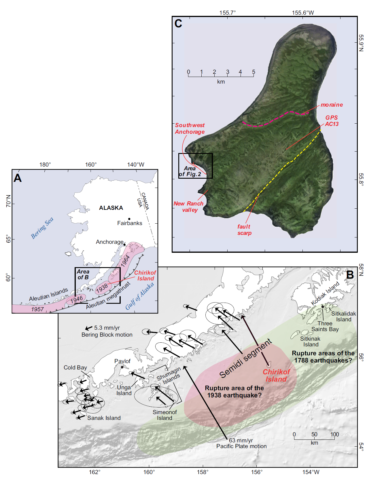
A) Location of Chirikof Island within the plate tectonic setting of the Alaska-Aleutian subduction zone. Rupture areas for great twentieth century earthquakes on the megathrust are in pink. (B) Velocity field of the Alaska Peninsula and the eastern Aleutian Islands observed by global positioning system (GPS) (Fournier and Freymueller, 2007). Colors show inferred rupture areas for earthquakes in 1788 (green) and 1938 (orange). Both A and B are modified from Witter et al. (2014). The section of the megathrust between Kodiak Island and the Shumagin Islands has been referred to as the Semidi segment (e.g., Shennan et al., 2014b). (C) Physiography of Chirikof Island (Google Earth image, 2012) showing the location of our study area at Southwest Anchorage, a prominent moraine, a fault scarp (facing southeast) that probably records the 1880 earthquake, the New Ranch valley reconnaissance core site, and UNAVCO GPS station AC13 (http:// pbo .unavco .org /station /overview /AC13). In the eighteenth and nineteenth centuries, Chirikof Island was known to native Alutiiq and Russians as Ukamuk Island.
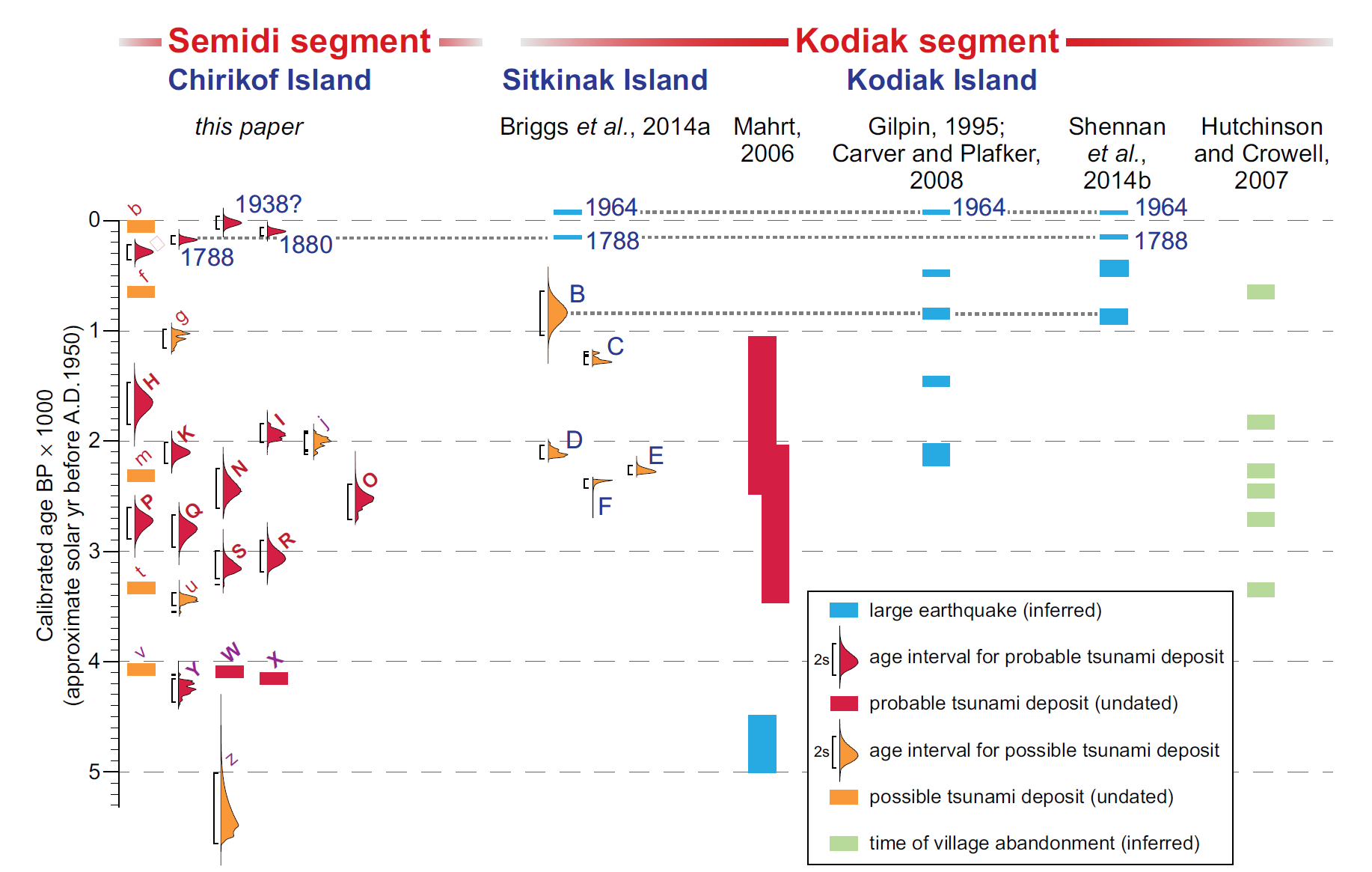
Age probability distributions for probable (red) and possible (orange) tsunami deposits at Southwest Anchorage (labels as in Fig. 11) compared with age distributions for possible tsunami deposits at Sitkinak Island (Briggs et al., 2014a) and with age estimates for great earthquakes and tsunamis on Kodiak Island (from studies referenced on this figure;
Fig. 1). Dotted horizontal lines show our correlation of evidence for some younger earthquakes and tsunamis. Times of great earthquakes inferred from episodes of village abandonment determined from archaeological stratigraphy in the eastern Alaska-Aleutian megathrust region are also shown (Hutchinson and Crowell, 2007).
- Summary of the 1964 Earthquake
- 2021.07.29 M 8.2 Alaska
- 2020.10.19 M 7.5 Alaska POSTER
- 2020.07.22 M 7.8 Alaska POSTER
- 2019.04.02 M 6.5 Aleutians
- 2019.03.26 M 5.2 Alaska
- 2018.12.20 M 7.4 Bering Kresla
- 2018.12.20 M 7.3 Bering Kresla UPDATE #1
- 2018.11.30 M 7.0 Alaska
- 2018.08.15 M 6.6 Aleutians
- 2018.08.12 M 6.4 North Alaska
- 2018.08.12 M 6.4 North Alaska UPDATE #1
- 2018.01.23 M 7.9 Gulf of Alaska
- 2018.01.23 M 7.9 Gulf of Alaska UPDATE #1
- 2018.01.23 M 7.9 Gulf of Alaska UPDATE #2
- 2017.07.17 M 7.7 Aleutians
- 2017.07.17 M 7.7 Aleutians UPDATE #1
- 2017.06.02 M 6.8 Aleutians
- 2017.05.08 M 6.2 Aleutians
- 2017.05.01 M 6.3 British Columbia
- 2017.03.29 M 6.6 Kamchatka
- 2017.03.02 M 5.5 Alaska
- 2016.09.05 M 6.3 Bering Kresla (west of Aleutians)
- 2016.04.13 M 5.7 & 6.4 Kamchatka
- 2016.04.02 M 6.2 Alaska Peninsula
- 2016.03.27 M 5.7 Aleutians
- 2016.03.12 M 6.3 Aleutians
- 2016.01.29 M 7.2 Kamchatka
- 2016.01.24 M 7.1 Alaska
- 2015.11.09 M 6.2 Aleutians
- 2015.11.02 M 5.9 Aleutians
- 2015.11.02 M 5.9 Aleutians (update)
- 2015.07.27 M 6.9 Aleutians
- 2015.05.29 M 6.7 Alaska Peninsula
- 2015.05.29 M 6.7 Alaska Peninsula (animations)
- 1964.03.27 M 9.2 Good Friday
Alaska | Kamchatka | Kurile
General Overview
Earthquake Reports
Social Media
#EarthquakeReport for M8.2 #Earthquake and probable #Tsunami offshore of #Alaskahttps://t.co/mFtEoigFQB
read more about the tectonics herehttps://t.co/L4RHgNdex7 pic.twitter.com/Kgp6HxzSQ6
— Jason "Jay" R. Patton (@patton_cascadia) July 29, 2021
From @BNONews
BREAKING: Tsunami sirens sound in Kodiak, Alaska after a major magnitude 8.2 earthquake struck off the coast; risk being evaluated for the Pacific pic.twitter.com/amxpLGX70s— Desianto F. Wibisono (@TDesiantoFW) July 29, 2021
#EarthquakeReport preliminary interpretive poster for M 8.2 #Earthquake #tsunami offshore of #Alaska
in region 1938 M 8.2 generated #Tsunami with wave hts 5-10cm in #California (Johnson and Satake, '96)https://t.co/mFtEoigFQB
tectonic background:https://t.co/L4RHgNdex7 pic.twitter.com/uQ2ur85EaC— Jason "Jay" R. Patton (@patton_cascadia) July 29, 2021
Watch the waves from the M8.2 earthquake just offshore Alaska roll across the seismic stations in North America.
(Credit @IRIS_EPO) pic.twitter.com/8qQeV4qBZY
— Dr. Kasey Aderhold (@KaseyAderhold) July 29, 2021
Here's the #USGS MT for the recent M 8.2 on Fig. 1 of Freymueller et al. 2021 (https://t.co/FN8owbDqEY). Orange outline is aftershocks of the 1938 M 8.2. Red lines are 1 m contours of 1938 slip models. Grey is slip deficit inferred from geodesy. Obvious similarities 1938 -> 2021! pic.twitter.com/DIUh4YVhXc
— Rich Briggs (@rangefront) July 29, 2021
UPDATE: The timing and form of this signal looks like it is the DART response to the seismic waves directly from the earthquake, NOT to a tsunami wave. pic.twitter.com/bxeF5TPqjv
— Anthony Lomax 😷🇪🇺🌍 (@ALomaxNet) July 29, 2021
Small tsunami waves continue arriving at Sand Point & other coastal areas of Alaska. Tomorrow these waves will create swirly currents in boat harbors up & down the west coast, so tie up your boats real good. pic.twitter.com/nofvKqJoU5
— Brian Olson (@mrbrianolson) July 29, 2021
And since I have a drone workshop to attend tomorrow, I will bow out now and get some sleep.
My initial guess that today's event may have been similar to the 1938 M8.2 earthquake still looks like it has some merit.
Follow https://t.co/A1MNRg1WKF for updates on tsunami warnings. pic.twitter.com/g4qME2w0SI— Jascha Polet (@CPPGeophysics) July 29, 2021
@NOAA Tsunami Warning System has issued a tsunami watch for the West Coast. The warning for Hawaii has been cancelled, because the waves are focused east of Hawaii and the event isn't that large. @NWS_NTWC pic.twitter.com/h2KRBmOKNL
— Dr. Lucy Jones (@DrLucyJones) July 29, 2021
A Tsunami Warning remains in effect. A Tsunami Advisory also remains in effect. pic.twitter.com/QLTiROkiri
— NWS Anchorage (@NWSAnchorage) July 29, 2021
What a tsunami warning sounds like… they tested this earlier today too but this time is for real! M8.2, looks like on the subduction zone interface.
(and look at those pretty peonies! 🌸) pic.twitter.com/1HPy8tBUC2
— Dr. Kasey Aderhold (@KaseyAderhold) July 29, 2021
Records of tsunami deposits show significant tsunamis in 1788, 1880 and 1938 (https://t.co/NsFfTuqigs), indicating recurrence intervals of large earthquakes in the Semidi segment every 58-92 years. We are now 83 years since 1938, so that seems roughly consistent. pic.twitter.com/CGIM40Fv0g
— Dr Stephen Hicks 🇪🇺 (@seismo_steve) July 29, 2021
#EarthquakeReport for M 8.2 #Earthquake and #Tsunami offshore of #Alaska
updated poster with Sand Point tide gage data@USGS_Quakes slip model
tsunami prehistory and history for region doi:10.1130/GES01108.1https://t.co/mFtEoigFQB
more background here https://t.co/L4RHgNdex7 pic.twitter.com/HXpQUVSWFE— Jason "Jay" R. Patton (@patton_cascadia) July 29, 2021
Preliminary finite fault for this morning's M8.2 earthquake is available. Rupture primarily to the NE of the hypocenter, away from the Shumagin Gap.https://t.co/dVkYuR2kPC pic.twitter.com/idGBqxRhbX
— Dr. Dara Goldberg (@dara_berg_) July 29, 2021
All #Tsunami alerts for the #Alaska coastline have been cancelled.
Remember, strong and unusual currents may continue for several hours. If you have damage, please report it to your local officials.
Stay safe, get some rest, and we'll keep the watch for you. Good night. https://t.co/wzUBu4ysK3
— NWS Tsunami Alerts (@NWS_NTWC) July 29, 2021
Tonight's M8.2 event occurred close to the rupture area of the 2020 M7.8 earthquake and was the largest U.S. earthquake in 50 years. We'll continue to update as this sequence unfolds, but here is a short piece on our website with what we know so far. https://t.co/PzHaaQ8Zbl pic.twitter.com/vcM8fq9IV7
— Alaska Earthquake Center (@AKearthquake) July 29, 2021
Some Perryville M 8.2 thoughts: One of the arresting things about Chirikof coastal geology is that the island is clearly sinking like a stone today, evident in geodesy and coastal geology. Figure from Nelson et al. 2015 https://t.co/vGKDp0WYuN
*BUT* that isn't the entire story pic.twitter.com/LAWLqE1Su3
— Rich Briggs (@rangefront) July 29, 2021
The two closest sites to the M8.2 Alaska earthquake today show some decent surface wave signals. There are several other closer sites that should give us better insight. @UNAVCO pic.twitter.com/lN22i7arEP
— Brendan Crowell (@bwcphd) July 29, 2021
8.2 Earthquake is the largest in Alaska since 1965. I was sitting in the upper wheelhouse of my 125' steel schooner ALEUTIAN EXPRESS at Chignik Harbor and the whole boat bounced and vibrated for about a minute. 14' range of gradual Tsunami one foot every 4 minutes both directions pic.twitter.com/IlYox48ejg
— John Clutter (@AleutianExpress) July 29, 2021
Interesting look at the tide gauge in Eureka this morning.
That perturbation over the last couple of hours is likely associated with the small tsunami waves from Alaska.
This is a great reminder that tsunami danger can last well after the specific 'arrival time' #cawx pic.twitter.com/JloflW8aa5
— NWS Eureka (@NWSEureka) July 29, 2021
Additional Information about the M 8.2 earthquake that occurred 50 miles south of the Alaska Peninsula last night. https://t.co/2Jn2DLAV8M #Earthquake #Alaska pic.twitter.com/s1DDPmmaXG
— USGS (@USGS) July 29, 2021
Alaska has a M7 earthquake every 2 years on average. So why the big deal about this M8.2? There is a BIG DIFFERENCE between a M7 and a M8.
Use this “spaghetti magnitude” scale to visualize the difference. #AlaskaQuake pic.twitter.com/DT3tBzRkxs
— Dr. Wendy Bohon (@DrWendyRocks) July 29, 2021
Preliminary Finite Fault Model of the Mw 8.2 Alaska event. @dara_berg_ @geosmx pic.twitter.com/WZNgmu9HWo
— Sebastian Riquelme (@accelerogram) July 29, 2021
Clear NE propagation from the M8.2 in Alaska, but look at 102 sec- action to E way updip by the trench. Early aftershock or where rupture finally expired? It's small amplitude, but coherent and seen by 4 very different arrays. I await better analyses.https://t.co/6hFfZ64Elw pic.twitter.com/hacucSnOil
— Alex Hutko (@alexanderhutko) July 29, 2021
Good morning all! The tsunami waves are still bouncing around the Aleutian Islands in Alaska (max height measured was ~2 feet). The tsunami turned out not to be very big & all @NWS_NTWC alerts for the US west coast are CANCELLED. 🚨NO alerts for CA, OR, WA. #earthquake pic.twitter.com/uEHSdzzvv9
— Brian Olson (@mrbrianolson) July 29, 2021
Waves from the recent M8.2 #Alaska #earthquake rolling through North America. Different colors correspond to different types of seismic waves. @IRIS_EPO pic.twitter.com/RJBlGh7zFg
— UMN Seismology (@UMNseismology) July 29, 2021
Good morning PNW- ICYMI, last night there was a M8.2 earthquake off the Alaska Peninsula. Here, you can see waves from it (bottom) compared to a nearby Alaskan M6.8 (top, similar to our 2001 Nisqually M6.8) at station LEBA near the SW Washington coast. pic.twitter.com/GCCAjbYpII
— PNSN (@PNSN1) July 29, 2021
Here I show the cross-section through the Alaska seismicity with projected mechanisms. The largest two events are yesterday's M8.2 quake and last year's M7.8, both subduction interface events. For reference, a cartoon of the shallow subduction zone from https://t.co/Gces1m71C8 pic.twitter.com/bgchTpPT5n
— Jascha Polet (@CPPGeophysics) July 29, 2021
You may not have felt it, but a groundwater well in Washington County, Maryland did! An 8.2 magnitude earthquake rocked southern Alaska overnight and the water level in our well sloshed almost a foot. https://t.co/kafsMsaaph. For more real-time well data https://t.co/w56ACDNk4h pic.twitter.com/87fVSz0MLz
— @USGS_MD_DE_DC (@USGS_MD_DE_DC) July 29, 2021
15 second sample rate data for AB13 is now available for the M8.2 Alaska earthquake, we see a pretty appreciable SE offset with 10 cm of subsidence. The event started NE of AC12 and ruptured to the NE, so this site is in the middle of it all. @UNAVCO pic.twitter.com/8nTTZstIDX
— Brendan Crowell (@bwcphd) July 30, 2021
The largest earthquake to hit the U.S. in the last few decades took place in Alaska yesterday. The Mw 8.2 quake broke the Aleutian megathrust in the Shumagin seismic gap. The rupture did not propagate to the trench, causing only a minor tsunami. Figure by @QQtecGeodesy pic.twitter.com/02ylFet8P6
— Sylvain Barbot (@quakephysics) July 30, 2021
Recent Earthquake Teachable Moment for the M8.2 #AlaskaEarthquakehttps://t.co/2sFE9QDrNb pic.twitter.com/aLtYLIm61i
— IRIS Earthquake Sci (@IRIS_EPO) July 30, 2021
14+ hours after the #alaska earthquake and there is still a tsunami bouncing around at the closest tide gauge (small tsunami) pic.twitter.com/3xtjS4hhge
— Bill Barnhart (@SeismoSARus) July 29, 2021
There was a bit of confusion and misinformation with the Alaska earthquake last night, so how about us geoscientists put together a thread of seismologists/tsunami experts to follow. I'll start: @CPPGeophysics @SeismoSue @seismo_steve #Earthquake #alaskaearthquake pic.twitter.com/nfbQvfbnQy
— Dr Janine Krippner (@janinekrippner) July 29, 2021
As of 12 hours following the M8.2 we've located ~140 aftershocks. The locations and magnitudes are subject to change upon further review, but look to be occurring to the east of 2020 sequence. The map here shows 2020 in gray and the recent aftershocks in red. pic.twitter.com/hQ93k7HVUZ
— Alaska Earthquake Center (@AKearthquake) July 29, 2021
Last night's magnitude 8.2 earthquake serves as a powerful reminder of the restlessness of our planet's surface—and it presents an exciting opportunity to peer deeper at our planet’s inner workings.
Learn more about Alaska's shakes in my latest @NatGeo https://t.co/gnPANhqWW1
— Dr. Maya Wei-Haas (@WeiPoints) July 29, 2021
Our event page for last night's M8.2 earthquake in Alaska is posted and will be updated as data are made available: https://t.co/XSq1nVyBuU pic.twitter.com/NcUqOKBdGT
— UNAVCO (@UNAVCO) July 29, 2021
Slip contours for the July 2020 and 2021 megathrust #earthquakes One begins where the other ends. @bwcphd @dara_berg_ pic.twitter.com/URdqVX2r2R
— Sean (@tsuphd) July 29, 2021
(1/3) The "Lame Monster": Today's largest US earthquake in >50 years did not make a large tsunami. Why?
B/c most of elastic energy was released deeper in the Earth.These are computer models of the tsunami from the M8.3 earthquake in Alaska#AlaskaQuake #alaskatsunami pic.twitter.com/QlJSWJMaqG
— Amir Salaree (@amirsalaree) July 29, 2021
🌊The entire #California coast is a #tsunami hazard area.
🌊The July 27 M8.2 earthquake in #Alaska generated minor tsunami waves that are still being recorded on tide gages here.
🌊Head to ➡️https://t.co/UUkQsqYcAk to learn more about your tsunami risk. pic.twitter.com/pHjrTeOv5o
— California Department of Conservation (@CalConservation) July 30, 2021
GPS receivers can be used as seismometers. In blue are the 5 Hz velocities recovered on Kodiak Island with the variometric approach for the M8.2 earthquake yesterday. In red, the collocated accelerometer, S19K, downsampled to 5 Hz. pic.twitter.com/jxJR1v7Fj1
— Brendan Crowell (@bwcphd) July 30, 2021
A notable characteristic of the M8.2 Alaska earthquake is that it was relatively deep and doesn’t appear to have ruptured the shallow plate boundary. Could overpressured sediments on the shallow plate boundary inhibited shallow slip? Check out this seismic image updip of event. pic.twitter.com/HRQEPxrAZk
— Donna Shillington (@djshillington) July 30, 2021
We finally have some preliminary coseismic offsets for the M8.2 Alaska earthquake. AB13 has a 43 cm offset to the SE. pic.twitter.com/RSttwW4nBl
— Brendan Crowell (@bwcphd) July 30, 2021
While the M8.2 was the largest earthquake in the U.S. in 50 years, Alaska has experienced some significantly sized events during that time. The plot here shows the largest Alaska earthquake magnitude each year since 1964. Since 2000, we're experienced at least a M6.4 annually. pic.twitter.com/Iq9pFanPqi
— Alaska Earthquake Center (@AKearthquake) July 30, 2021
Whopper M8.2 earthquake in Alaska moved GPS stations, revealing the broad pattern and extent of deformation.
Stations near Denali NP ~900 km moved a few mm… See https://t.co/4zpOW4m1pJ for more info and data. pic.twitter.com/j1GSIazVfJ— Bill Hammond (@BillCHammond) July 30, 2021
(1/6) DART Seismology:
How the tsunami sensors near Alaska picked up the seismic surface waves from the M8.3 Alaska earthquake!
The tails in the records are mixes of surface waves and the tsunami.#alaskaearthquake #alaska_tsunami @NOAAResearch @NWS_PTWC @IRIS_EPO pic.twitter.com/OWI7e47dNq
— Amir Salaree (@amirsalaree) July 31, 2021
#EarthquakeReport and #TsunamiReport for M8.2 #Earthquake offshore of #Alaska
updated interpretive poster
'21 sequence matches '38 sequence for both ~slip patch and ~tsunami size https://t.co/pE3zA9HHFShttps://t.co/mFtEoigFQB
tectonic background here:https://t.co/L4RHgNdex7 pic.twitter.com/iTMmm5u2LQ— Jason "Jay" R. Patton (@patton_cascadia) August 2, 2021
#Sentinel1 co-seismic interferograms (ascending track) over western Alaska, show ground deformation towards the southern coast, above the main M8.2 #earthquake fault rupture. Aftershock epicenters (yellow) from USGS. pic.twitter.com/RtavuJZGSZ
— Sotiris Valkaniotis (@SotisValkan) August 2, 2021
The M 8.2 Chignik earthquake that occurred off the Alaskan Peninsula on July 28 was the largest US earthquake in 50 years. This 2013 simulation from the same region shows how a hypothetical M 9.1 (almost 30x stronger!) earthquake can create a far-reaching tsunami. @USGS_Quakes pic.twitter.com/tLtxWxoal7
— USGS Coastal Change (@USGSCoastChange) July 30, 2021
Updated finite fault model (joint inversion of regional and teleseismic data) is now available: https://t.co/K0kXumE6Pv pic.twitter.com/y7Z9vIF6Lu
— Dr. Dara Goldberg (@dara_berg_) August 3, 2021
#EarthquakeReport & #TsunamiReport for M8.2 Perrysville #Earthquake and transpacific #Tsunami
updated poster including @USGS_Quakes @dara_berg_ updated slip model
also, surface deformation data
I prepared a report and will update morehttps://t.co/y1RwyZjKOA pic.twitter.com/lj8qIk7vQl
— Jason "Jay" R. Patton (@patton_cascadia) August 4, 2021
- Frisch, W., Meschede, M., Blakey, R., 2011. Plate Tectonics, Springer-Verlag, London, 213 pp.
- Hayes, G., 2018, Slab2 – A Comprehensive Subduction Zone Geometry Model: U.S. Geological Survey data release, https://doi.org/10.5066/F7PV6JNV.
- Holt, W. E., C. Kreemer, A. J. Haines, L. Estey, C. Meertens, G. Blewitt, and D. Lavallee (2005), Project helps constrain continental dynamics and seismic hazards, Eos Trans. AGU, 86(41), 383–387, , https://doi.org/10.1029/2005EO410002. /li>
- Jessee, M.A.N., Hamburger, M. W., Allstadt, K., Wald, D. J., Robeson, S. M., Tanyas, H., et al. (2018). A global empirical model for near-real-time assessment of seismically induced landslides. Journal of Geophysical Research: Earth Surface, 123, 1835–1859. https://doi.org/10.1029/2017JF004494
- Kreemer, C., J. Haines, W. Holt, G. Blewitt, and D. Lavallee (2000), On the determination of a global strain rate model, Geophys. J. Int., 52(10), 765–770.
- Kreemer, C., W. E. Holt, and A. J. Haines (2003), An integrated global model of present-day plate motions and plate boundary deformation, Geophys. J. Int., 154(1), 8–34, , https://doi.org/10.1046/j.1365-246X.2003.01917.x.
- Kreemer, C., G. Blewitt, E.C. Klein, 2014. A geodetic plate motion and Global Strain Rate Model in Geochemistry, Geophysics, Geosystems, v. 15, p. 3849-3889, https://doi.org/10.1002/2014GC005407.
- Meyer, B., Saltus, R., Chulliat, a., 2017. EMAG2: Earth Magnetic Anomaly Grid (2-arc-minute resolution) Version 3. National Centers for Environmental Information, NOAA. Model. https://doi.org/10.7289/V5H70CVX
- Müller, R.D., Sdrolias, M., Gaina, C. and Roest, W.R., 2008, Age spreading rates and spreading asymmetry of the world’s ocean crust in Geochemistry, Geophysics, Geosystems, 9, Q04006, https://doi.org/10.1029/2007GC001743
- Pagani,M. , J. Garcia-Pelaez, R. Gee, K. Johnson, V. Poggi, R. Styron, G. Weatherill, M. Simionato, D. Viganò, L. Danciu, D. Monelli (2018). Global Earthquake Model (GEM) Seismic Hazard Map (version 2018.1 – December 2018), DOI: 10.13117/GEM-GLOBAL-SEISMIC-HAZARD-MAP-2018.1
- Silva, V ., D Amo-Oduro, A Calderon, J Dabbeek, V Despotaki, L Martins, A Rao, M Simionato, D Viganò, C Yepes, A Acevedo, N Horspool, H Crowley, K Jaiswal, M Journeay, M Pittore, 2018. Global Earthquake Model (GEM) Seismic Risk Map (version 2018.1). https://doi.org/10.13117/GEM-GLOBAL-SEISMIC-RISK-MAP-2018.1
- Zhu, J., Baise, L. G., Thompson, E. M., 2017, An Updated Geospatial Liquefaction Model for Global Application, Bulletin of the Seismological Society of America, 107, p 1365-1385, https://doi.org/0.1785/0120160198
- Abe, K., 1972. Lithospheric Normal Faulting Beneath the Aleutian Trench in Phys. Earth Planet. Interiors, v. 5, p. 1990-198.
- Atwater, B.F., Yamaguchi, D.K., Bondevik, S., Barnhardt, W.A., Amidon, L.J., Benson, B.E., Skjerdal, G., Shulene, J.A., and Nanalyama ,F., 2001. Rapid resetting of an estuarine recorder of the 1964 Alaska earthquake in Geology, v. 113, no. 9, p. 1193-1204.
- Bassett and Watts, 2015 A. Gravity anomalies, crustal structure, and seismicity at subduction zones: 1. Seafloor roughness and subducting relief in Geochemistry, Geophysics, Geosystems, v. 16, doi:10.1002/2014GC005684.
- Bassett, D. and Watts, A.B., 2015 B. Gravity anomalies, crustal structure, and seismicity at subduction zones: 2. Interrelationships between fore-arc structure and seismogenic behavior in Geochemistry, Geophysics, Geosystems, v. 16, doi:10.1002/2014GC005685.
- Benz, H.M., Tarr, A.C., Hayes, G.P., Villaseñor, Antonio, Hayes, G.P., Furlong, K.P., Dart, R.L., and Rhea, Susan, 2011. Seismicity of the Earth 1900–2010 Aleutian arc and vicinity: U.S. Geological Survey Open-File Report 2010–1083-B, scale 1:5,000,000.
- Brown, J.R., Prejan, S.G., Beroza, G.C., Gomberg, J.S., and Hauessler,m P.J., 2013. Deep low-frequency earthquakes in tectonic tremor along the Alaska-Aleutian subduction zone in JGR Solid Earth, v. 118, p. 1079-1090, doi:10.1029/2012JB009459
- Freymueller, J.T., Suleimani, E.N., and Nocolski, D.J., 2021. Constraints on the Slip Distribution of the 1938 MW 8.3 Alaska Peninsula Earthquake From Tsunami Modeling in GRL, v. 48, no. 9, https://doi.org/10.1029/2021GL092812
- Frisch, W., Meschede, M., Blakey, R., 2011. Plate Tectonics, Springer-Verlag, London, 213 pp.
- Gaedicke, C., Baranov, B., Seliverstov, N., Alexeiev, D., Tsukanov, N., Freitag, R., 2000. Structure of an active arc-continent collision area: the Aleutian-Kamchatka junction. Tectonophysics 325, 63–85
- Haeussler, P., Leith, W., Wald, D., Filson, J., Wolfe, C., and Applegate, D., 2014. Geophysical Advances Triggered by the 1964 Great Alaska Earthquake in EOS, Transactions, American Geophysical Union, v. 95, no. 17, p. 141-142.
- Hayes, G. P., D. J. Wald, and R. L. Johnson, 2012. Slab1.0: A three-dimensional model of global subduction zone geometries, J. Geophys. Res., 117, B01302, doi:10.1029/2011JB008524.
- Ikuta, R., Mitsui, Y., Kurokawa, Y., and Ando, M., 2015. Evaluation of strain accumulation in global subduction zones from seismicity data in Earth, Planets and Space, v. 67, DOI 10.1186/s40623-015-0361-5
- Johnson, J.M. and Satake, K., 1994. Rupture extent of the 1938 Alaskan earthquake as inferred from tsunami waveforms in GRL, v. 21, no. 8, p. 733-736
- Koulakov, I.Y., Dobretsov, N.L., Bushenkova, N.A., and Yakovlev, A.V., 2011. Slab shape in subduction zones beneath the Kurile–Kamchatka and Aleutian arcs based on regional tomography results in Russian Geology and Geophysics, v. 52, p. 650-667.
- Konstantnovskaia, 2001. Arc-continent collision and subduction reversal in the Cenozoic evolution of the Northwest Pacific: an example from Kamchatka (NE Russia) in Tectonophysics, v. 333, p. 75-94.
- Krutikov, L., Stone, D.B., and Minyuk, P., 2008. New Paleomagnetic Data From the Central Aleutian Arc: Evidence and Implications for Block Rotations in Active Tectonics and Seismic Potential of Alaska, Geophysical Monograph Series 179 American Geophysical Union. 10.1029/179GM07
- Lange, D., Cembrano, J., Rietbrock, A., Haberland, C., Dahm, T., and Bataille, K., 2008. First seismic record for intra-arc strike-slip tectonics along the Liquiñe-Ofqui fault zone at the obliquely convergent plate margin of the southern Andes in Tectonophysics, v. 455, p. 14-24
- Lay, T., H. Kanamori, C. J. Ammon, A. R. Hutko, K. Furlong, and L. Rivera, 2009. The 2006 – 2007 Kuril Islands great earthquake sequence in J. Geophys. Res., 114, B11308, doi:10.1029/2008JB006280.
- Lay, T., Ye, L., Bai, Y., Cheung, K. F., Kanamori, H., Freymueller, J., … Kogan, M. G. (2017). Rupture along 400 km of the Bering fracture zone in the Komandorsky Islands earthquake (MW 7.8) of 17 July 2017. Geophysical Research Letters, 44, 12,161–12,169. https://doi.org/10.1002/2017GL076148
- Meyer, B., Saltus, R., Chulliat, a., 2017. EMAG2: Earth Magnetic Anomaly Grid (2-arc-minute resolution) Version 3. National Centers for Environmental Information, NOAA. Model. https://doi.org/10.7289/V5H70CVX
- Müller, R.D., Sdrolias, M., Gaina, C. and Roest, W.R., 2008, Age spreading rates and spreading asymmetry of the world’s ocean crust in Geochemistry, Geophysics, Geosystems, 9, Q04006, https://doi.org/10.1029/2007GC001743
- Nelson, A.R., Briggs, R.W., Dura, T., Engelhart, S.E., Gelfenbaum, G., Bradley, L.-A., Forman, S.L., Vane, C.H., and Kelley, K.A., 2015, Tsunami recurrence in the eastern Alaska-Aleutian arc: A Holocene stratigraphic record from Chirikof Island, Alaska: Geosphere, v. 11, no. 4, p. 1172–1203, doi:10.1130/GES01108.1.
- Plafker, G., 1969. Tectonics of the March 27, 1964 Alaska earthquake: U.S. Geological Survey Professional Paper 543–I, 74 p., 2 sheets, scales 1:2,000,000 and 1:500,000, http://pubs.usgs.gov/pp/0543i/.
- Plafker, G., 1972. Alaskan earthquake of 1964 and Chilean earthquake of 1960: Implications for arc tectonics in Journal of Geophysical Research, v. 77, p. 901-925.
- Portnyagin, M. and Manea, V.C., 2008. Mantle temperature control on composition of arc magmas along the Central Kamchatka Depression in Geology, v. 36, no. 7, p. 519-522.
- Rhea, S., Tarr, A.C., Hayes, G., Villaseñor, A., Furlong, K.P., and Benz, H.M., 2010. Seismicity of the Earth 1900-2007, Kuril-Kamchatka arc and vicinity: U.S. Geological Survey Open-File Report 2010-1083-C, 1 map sheet, scale 1:5,000,000.
- Saltus, R.W., and Barnett, A., 2000. Eastern Aleutian Volcanic Arc Digital Model – Version 1.0: U.S. Geological Survey Open-File Report 00
- Shevchenko, V.I., Lukk, A.A., and Prilepin, M.T., 2006. The Sumatra Earthquake of December 26, 2004, as an Event Unrelated to the Plate-Tectonic Process in the Lithosphere in Physics of the Solid Earth, v. 42, no. 12, p. 1018–1037.
- Stauder, W., 1968. Mechanism of the Rat Island Earthquake Sequence of February 4, 1965, with Relation to Island Arcs and Sea-Floor Spreading in JGR, v. 73, no. 12, p. 3847-3858
- Sykes, L.R., Kissinger, J.B>, House, L., Davies, J.N>, and Jacob, K.H., 1980. Rupture Zones and Repeat Times of Great Earthquakes Along the Alaska-Aleutian Arc, 1784-1980, in Maurice Ewing Series, Earthquake Prediction, An International Review, AGU
- Torsvik, T. H. et al., 2017. Pacific plate motion change caused the Hawaiian-Emperor Bend in Nat. Commun., v. 8, doi: 10.1038/ncomms15660
- Wilson, J. Tuzo, 1963. “A possible origin of the Hawaiian Islands” in Canadian Journal of Physics. v. 41, p. 863–870 doi:10.1139/p63-094.
References:
Basic & General References
Specific References
Return to the Earthquake Reports page.
- Sorted by Magnitude
- Sorted by Year
- Sorted by Day of the Year
- Sorted By Region