I present this summary of the Earthquake Reports and Interpretive Posters I prepared for 13 earthquakes during the year 2025.
This is my 11th annual summary. I used to break out Cascadia.
- Here are all the annual summaries:
- 2015 Earthquake Summary Page
- 2016 Earthquake Summary Page
- 2017 Earthquake Summary Page
- 2018 Earthquake Summary Page
- 2019 Earthquake Summary Page
- 2020 Earthquake Summary Page
- 2021 Earthquake Summary Page
- 2022 Earthquake Summary Page
- 2023 Earthquake Summary Page
- 2024 Earthquake Summary Page
- 2025 Earthquake Summary Page
- Here are the annual summaries for the Cascadia region.
- Here is a table that lists the 2025 earthquakes with magnitudes M ≥ 6.5. I use these earthquakes to plot the cumulative energy release for earthquakes below.
- I did not prepare a poster/report for all of these events and I prepared some reports/posters for events not on this table.
- This is a plot showing the cumulative energy release (in Joules) for the earthquakes listed in the above table. Ask yourself if M 6.5 is a reasonable threshold to be able to visualize variations in seismic energy release during the year.
- Note that the vertical axis is scaled differently on each plot, so the energy released in 2017 is about twice the energy released in 2022. Why do you think this is, is there a single earthquake in 2017 that controls this difference?
- Note how the 2025 M 8.8 Kamchatka Earthquake energy release is so much larger than all other earthquakes for this time period. This earthquake dominates this plot.
- Here is another view of the cumulative energy release from earthquakes for the time period 2017-2025. All data are on the same vertical scale, in joules.
- Note how much less energy was released in the form of earthquakes in 2024 compared to all previous years (in the plot).
- There was so little energy released in 2024 that there is no room to label the largest magnitude earthquakes in this plot (see above plot for some labels).

2025 Earthquake Reports
- 2025.01.07 M 7.1 Tibet 333
- 2025.02.08 M 7.6 Cayman Islands 334
- 2025.03.25 M 6.7 New Zealand 335
- 2025.03.28 M 7.7 Burma 336
- 2025.04.23 M 6.2 Turkey POSTER 337
- 2025.05.02 M 7.4 Drakes Passage 338
- 2025.07.16 M 7.3 Alaska 339
- 2025.07.29 M 8.8 Kamchatka 340
- 2025.08.22 M 7.5 Drakes Passage 341
- 2025.09.18 M 7.4 Kamchatka POSTER 342
- 2025.09.30 M 6.9 Philippines POSTER 343
- 2025.12.05 M 7.0 Yukon Territory/Alaska POSTER 344
- 2025.12.08 M 7.6 Japan POSTER 345
Annual Summary Poster
- I plot the earthquake mechanisms and epicenters for all earthquake events for which I have created interpretive posters below.
- Click on this map, or any map or figure, to see a larger and higher resolution version of the map or figure. These files are larger in file size.
- If anyone wants me to add their summary, just send me an email to quakejay at gmail.com

Other Annual Summaries
Return to the Earthquake Reports page.
- Sorted by Magnitude
- Sorted by Year
- Sorted by Day of the Year
- Sorted By Region
Interpretive Poster Background
These Interpretive Posters all contain slightly different types and amounts of information. Below is a general guidance to what this information is. Earthquake Report pages can provide additional information about each individual interpretive interrogation.
- I plot the seismicity from the past month, with diameter representing magnitude (see legend). I may include historic earthquake epicenters with magnitudes M ≥ some magnitude threshold.
- I include background information from published papers as inset figures on the interpretive posters. Learn more about these figures in their associated Earthquake Report.
- I plot the USGS fault plane solutions (moment tensors in blue and focal mechanisms in orange), possibly in addition to some relevant historic earthquakes.
- A review of the basic base map variations and data that I use for the interpretive posters can be found on the Earthquake Reports page.
- Some basic fundamentals of earthquake geology and plate tectonics can be found on the Earthquake Plate Tectonic Fundamentals page.
See all 2025 Earthquake Reports
Click on the name of the earthquake to go to the Earthquake Report page.
E.g., click here >>> (2024.01.01 M 7.5 Japan) to go to the report for this earthquake.
Below is a basic summary for each earthquake. More details are found on the Earthquake Report pages.
2025.01.07 M 7.1 Tibet
- 2025.01.07 M 7.1 Tibet 333
- In the upper left corner is a map showing the plate tectonic boundaries (from the GEM).
- In the lower right corner is a map that shows the M 7.1 earthquake intensity using the modified Mercalli intensity scale. Earthquake intensity is a measure of how strongly the Earth shakes during an earthquake, so gets smaller the further away one is from the earthquake epicenter. The map colors represent a model of what the intensity may be. The USGS has a system called “Did You Feel It?” (DYFI) where people enter their observations from the earthquake and the USGS calculates what the intensity was for that person. The dots with yellow labels show what people actually felt in those different locations.
- To the left of the intensity map is a plot that shows the same intensity (both modeled and reported) data as displayed on the map. Note how the intensity gets smaller with distance from the earthquake.
- In the upper right corner are two maps showing the possibility of earthquake induced liquefaction for these two earthquakes. I discuss these phenomena in more detail later in the report.
- To the left of the ground failure interpretation maps is the USGS finite fault model for the M 7.1 earthquake. They model slip on a rectangular fault and color represents how much the fault moved (up to about 0.9 meters).
- Here is the map with a month’s seismicity plotted.
As i was travelling to a series of meetings to discuss subduction zones, particularly the Cascadia subduction zone, there was a large magnitude earthquake in TIbet.
https://earthquake.usgs.gov/earthquakes/eventpage/us6000pi9w/executive
The earthquake has a normal faulting earthquake mechanism, the result of extension. The extension is oriented east-west.
I had not expected to see an extensional earthquake in this location, so I learned something about the regional tectonics of the southern Tibet Plateau.
This part of the world is dominated by north-south oriented compression from the collision of the India plate from the south and Eurasia plate from the north.
This north-south convergence also results in eastward (and westward) extrusion of the crust. Paul Tapponier used wax models to show how this type of tectonics works.
The M 7.1 earthquake slipped on a fault related to the Pumqu fault, a north-south striking (oriented) normal fault that dips into the Earth to the west.
In the southern Tibet Plateau, there are a series of north-south striking normal faults. These faults represent east-west extension (a result of the extrusion tectonics of Tapponier).
There are many historical analogies for the M 7.1 earthquake, though most are in the magnitude M 5 – M 6+ range.
The USGS use seismic and geodetic (the study of how the Earth deforms) data to construct a fault model. These fault models include the geometry of the fault (the 3-D orientation and size (length and width)) and include an estimate of how much the fault slipped during the earthquake.
This USGS finite fault model shows that the fault length was about 80-km long and the fault slipped up to about 1.5 meters.
I include some inset figures. Some of the same figures are located in different places on the larger scale map below.

2025.02.08 M 7.6 Cayman Islands
- 2025.02.08 M 7.6 Cayman Islands 334
- In the lower right corner is a map showing the plate tectonic boundaries (from the GEM).
- In the lower left corner is a map that shows the M 7.6 earthquake intensity using the modified Mercalli intensity scale. Earthquake intensity is a measure of how strongly the Earth shakes during an earthquake, so gets smaller the further away one is from the earthquake epicenter. The map colors represent a model of what the intensity may be. The USGS has a system called “Did You Feel It?” (DYFI) where people enter their observations from the earthquake and the USGS calculates what the intensity was for that person. The dots with yellow labels show what people actually felt in those different locations.
- To the right of the intensity map is a plot that shows the same intensity (both modeled and reported) data as displayed on the map. Note how the intensity gets smaller with distance from the earthquake.
- Above the intensity vs. distance plot is the USGS finite fault model for the M 7.6 earthquake. They model slip on a rectangular fault and color represents how much the fault moved (up to about 12 meters).
- In the upper left corner is a map from Symithe et al. (2015) showing the plates, their boundaries, and earthquake mechanisms for some significant earthquakes. These mechanisms reveal what type of fault is formed at the plate boundaries.
- To the right of the Symithe map is a map from Mann et al. (1991) that shows the faults and magnetic anomalies that are evidence for the oceanic spreading ridge that forms the Cayman trough.
- Here is the map with a month’s seismicity plotted.
This afternoon my time, there was a large earthquake in the Caribbean.
https://earthquake.usgs.gov/earthquakes/eventpage/us7000pcdl/executive
This magnitude M 7.6 earthquake happened along a right-lateral transform plate boundary, the Swan Island fault. At transform plate boundaries, the plates moves side-by-side.
The USGS earthquake mechanism shows that the earthquake was a strike-slip earthquake.
Since the Swan Island fault is a right-lateral strike-slip fault, the earthquake mechanism, and the aftershocks align with this mapped fault, i interpret this as a left-lateral strike-slip fault earthquake.
Strike-slip earthquakes can generate tsunami, though they are smaller than for tsunami generated by subduction zone earthquakes. Tsunami are more likely if earthquake fault slip is shallow or if the earthquake ruptured the seafloor.
The USGS finite fault slip model suggests that there was up to about 12 meters of slip, with about 8 meters slip at the seafloor.
There was a tsunami observed at the Isla Mujeres tide gage, a location almost due west of the earthquake. Many of the other tide gages in the region were not operating at the time of the earthquake.
The tsunami appears to have a maximum amplitude of about 6 cm and a wave height of about 10 cm.
See the below diagram for more information about the difference between amplitude and wave height.
I include some inset figures. Some of the same figures are located in different places on the larger scale map below.
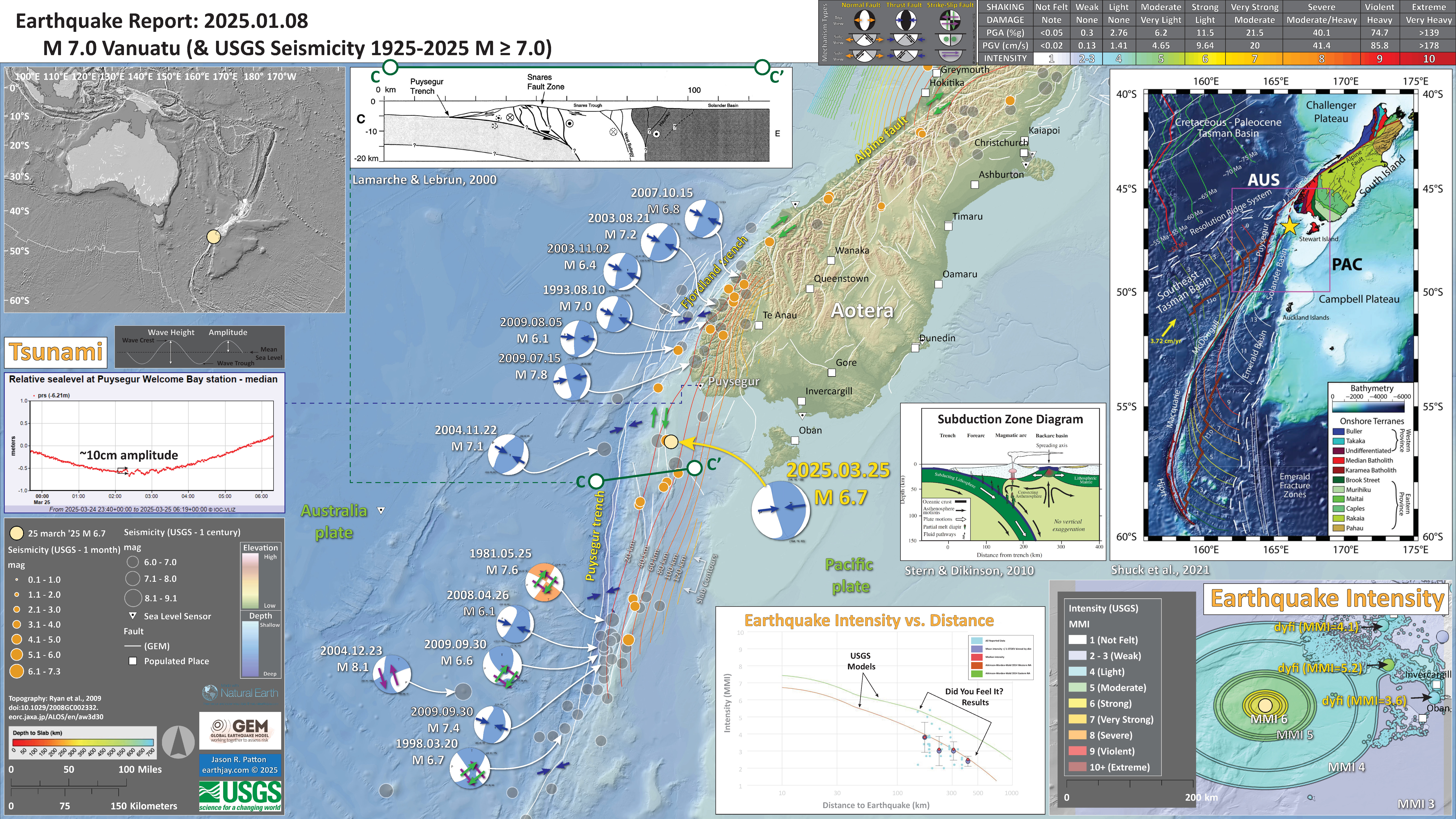
2025.03.25 M 6.7 New Zealand
- 2025.03.25 M 6.7 New Zealand 335
- Here is the map with a month’s seismicity plotted.
As I was working on a report for this M 6.7 earthquake, the 28 March 2025 M 7.7 Sagaing fault earthquake hit.
Here is the USGS page for the M 6.7 earthquake.
https://earthquake.usgs.gov/earthquakes/eventpage/us7000pmem/executiveAs I was working on a report for this M 6.7 earthquake, the 28 March 2025 M 7.7 Sagaing fault earthquake hit.
Here is the USGS page for the M 6.7 earthquake.
https://earthquake.usgs.gov/earthquakes/eventpage/us7000pmem/executive
I include some inset figures.
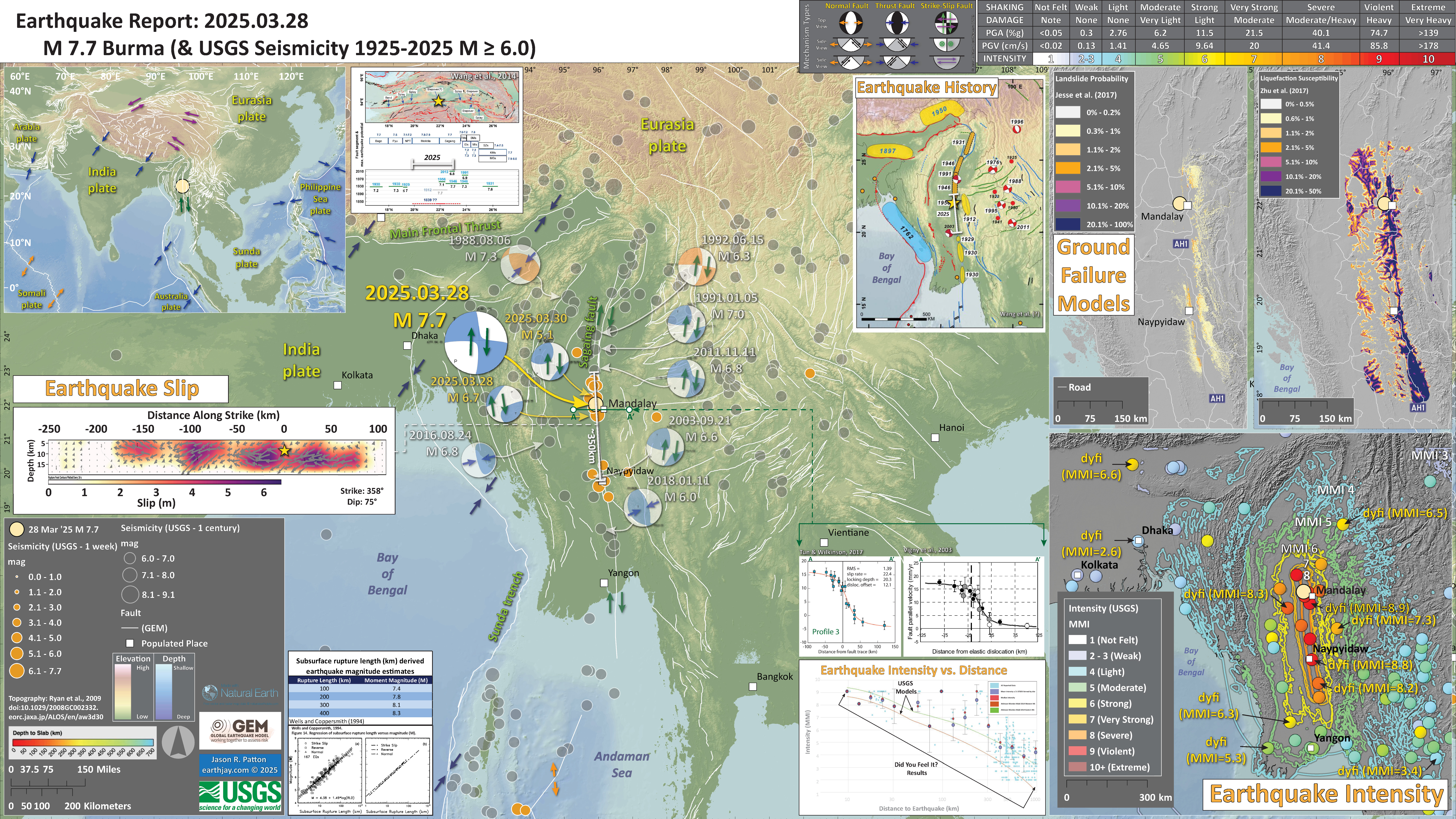
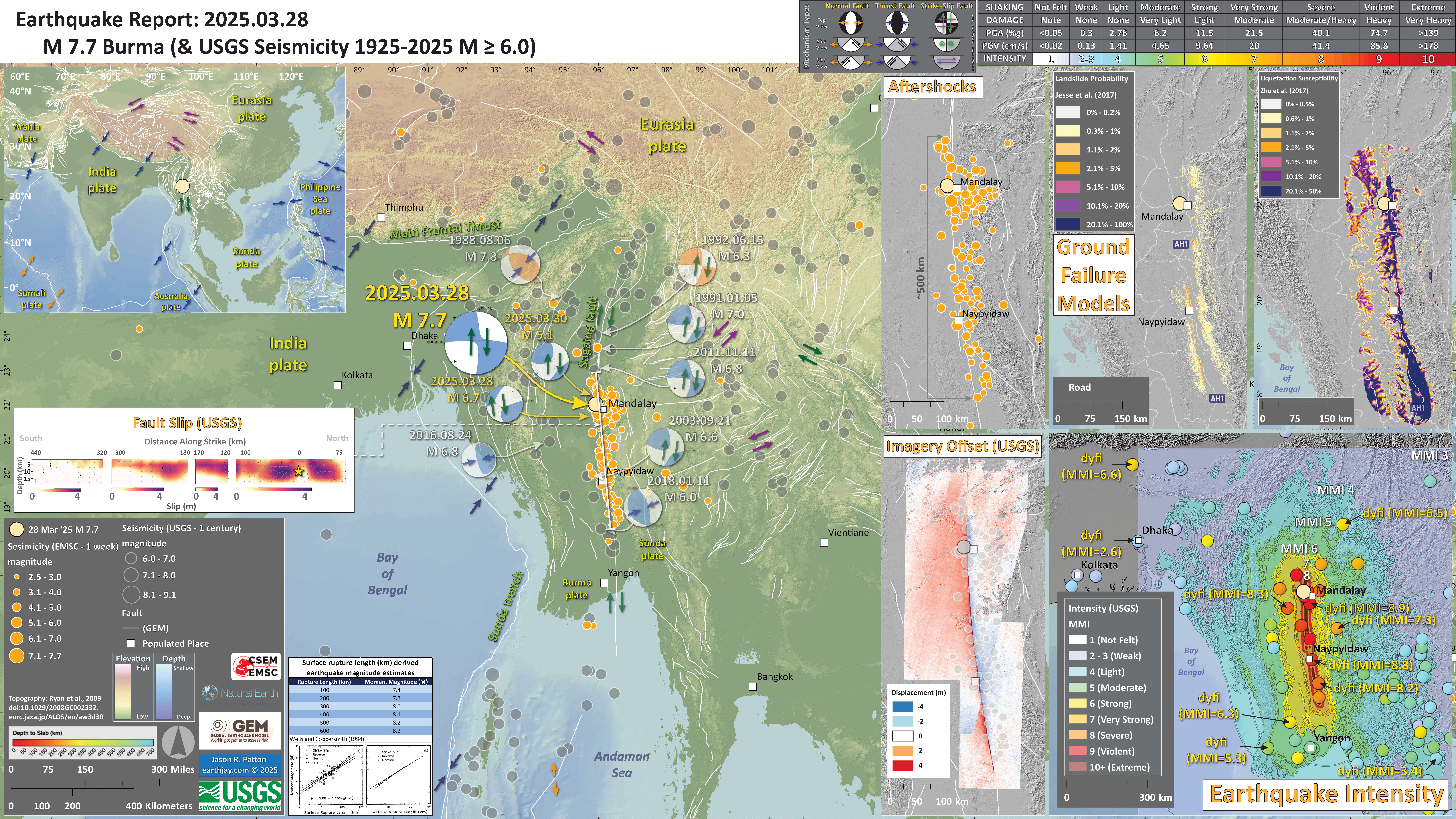
2025.03.28 M 7.7 Burma
- 2025.03.28 M 7.7 Burma 336
- In the upper left corner is a map showing the plate tectonic boundaries (from the GEM).
- In the lower right corner is a map that shows the M 7.7 earthquake intensity using the modified Mercalli intensity scale. Earthquake intensity is a measure of how strongly the Earth shakes during an earthquake, so gets smaller the further away one is from the earthquake epicenter. The map colors represent a model of what the intensity may be. The USGS has a system called “Did You Feel It?” (DYFI) where people enter their observations from the earthquake and the USGS calculates what the intensity was for that person. The dots with yellow labels show what people actually felt in those different locations.
- To the left of the intensity map is a plot that shows the same intensity (both modeled and reported) data as displayed on the map. Note how the intensity gets smaller with distance from the earthquake.
- Above the intensity plot are two profiles that show estimates of the slip rate along the Sagaing fault. The plot on the left shows a 22.4 mm/yr slip rate and the plot on the right shows a 17 mm/yr slip rate.
- In the upper right corner are two maps showing the possibility of earthquake induced liquefaction for these two earthquakes. I discuss these phenomena in more detail later in the report.
- To the left of these ground failure maps is a map showing the earthquake history for the region.
- To the right of the tectonic boundary map is another map showing earthquake faults that are part of the Sagaing fault system, with a space time diagram showing these earthquakes back through time.
- In the middle left is the USGS finite fault model for the M 7.7 earthquake. They model slip on a rectangular fault and color represents how much the fault moved (up to about 6.5 meters).
- In the lower left is a plot from Wells and Coppersmith (1994) showing the empirical relations between subsurface fault rupture length and earthquake magnitude. The USGS fault model is 350 km long, but this corresponds to a M 8.2 earthquake. Something does not match.
- Here is the map with a week’s seismicity plotted.
- I added aftershocks from EMSC and the remote sensing analysis from the USGS.
- The USGS also updated their finite fault slip model, which matches the pattern of aftershocks.
- This earthquake is still a mismatch with fault scaling relations (Wells and Coppersmith, 1994).
Two nights ago as I was falling asleep there was a magnitude M 7.7 earthquake in Burma. I got up and thought about all the potential suffering.
https://earthquake.usgs.gov/earthquakes/eventpage/us7000pn9s/executive
Upon viewing the earthquake location on the map (the epicenter), I knew this was associated with the Sagaing fault. We will learn more about this fault system as we journey through this Earthquake Report.
I had been preparing a report for the M 6.7 earthquake along the Puysegur convergent plate margin in southwest New Zealand. I will get back to that report later as it was an interesting earthquake. Here is the poster for this Puysegur earthquake poster.
This region of Burma (Myanmar) is amidst the fourth year of a civil war and the government has continued to launch attacks in the epicentral region (Sagaing, Mandalay, etc.). Their emergency response efforts were focused in the region to the south (for political reasons) and they were not sending aid into Sagaing/Mandalay.
Though, the govt is now letting China and India to bring aid into these more heavily hit areas.
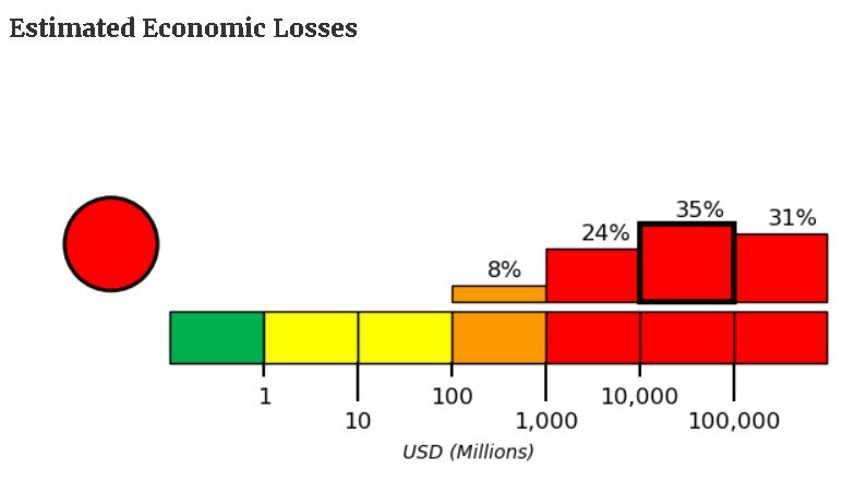
The USGS PAGER alert program (funded by USAID) uses a combination of population density and earthquake ground shaking data to estimate the likelihood of the number of fatalities and the amount of economic impact to physical infrastructure.
Shortly after the temblor, the PAGER alert for this earthquake showed a high probability for large numbers of fatalities and significant economic impact.
The USGS earthquake program produces a suite of products for earthquakes downloadable from the earthquake event page.
These USGS products are initially generated automatically but are updated over time. For large and interesting earthquakes, these products may have many updates. At the time I write this, the USGS version number is 12.
Below is the 12th version of the PAGER estimates for this earthquake.

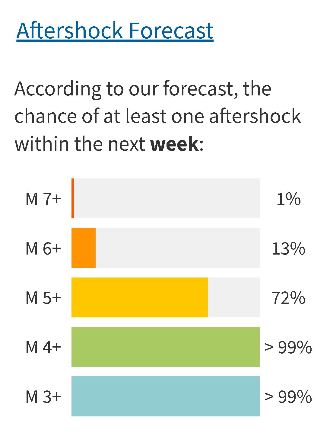
The USGS also use statistics from previous earthquakes (empirical relations between earthquake fault parameters and earthquake magnitude) to drive a computer model that generates an aftershock forecast.
Every fault has a unique parameters (e.g., the “b-value”) and this parameter can change with time. So these aftershock forecasts are heavily dependent upon the parameters the USGS chooses for each forecast. They are pretty good at this.
Here is the aftershock forecast at the time that I write this (3/30 19:00 pacific time). The length of each colored bar stands for the chance of an earthquake for a given magnitude over the next week.
I include some inset figures. Some of the same figures are located in different places on the larger scale map below.
-
Here is the updated interpretive poster using USGS Version 17 data (4 April 2025).
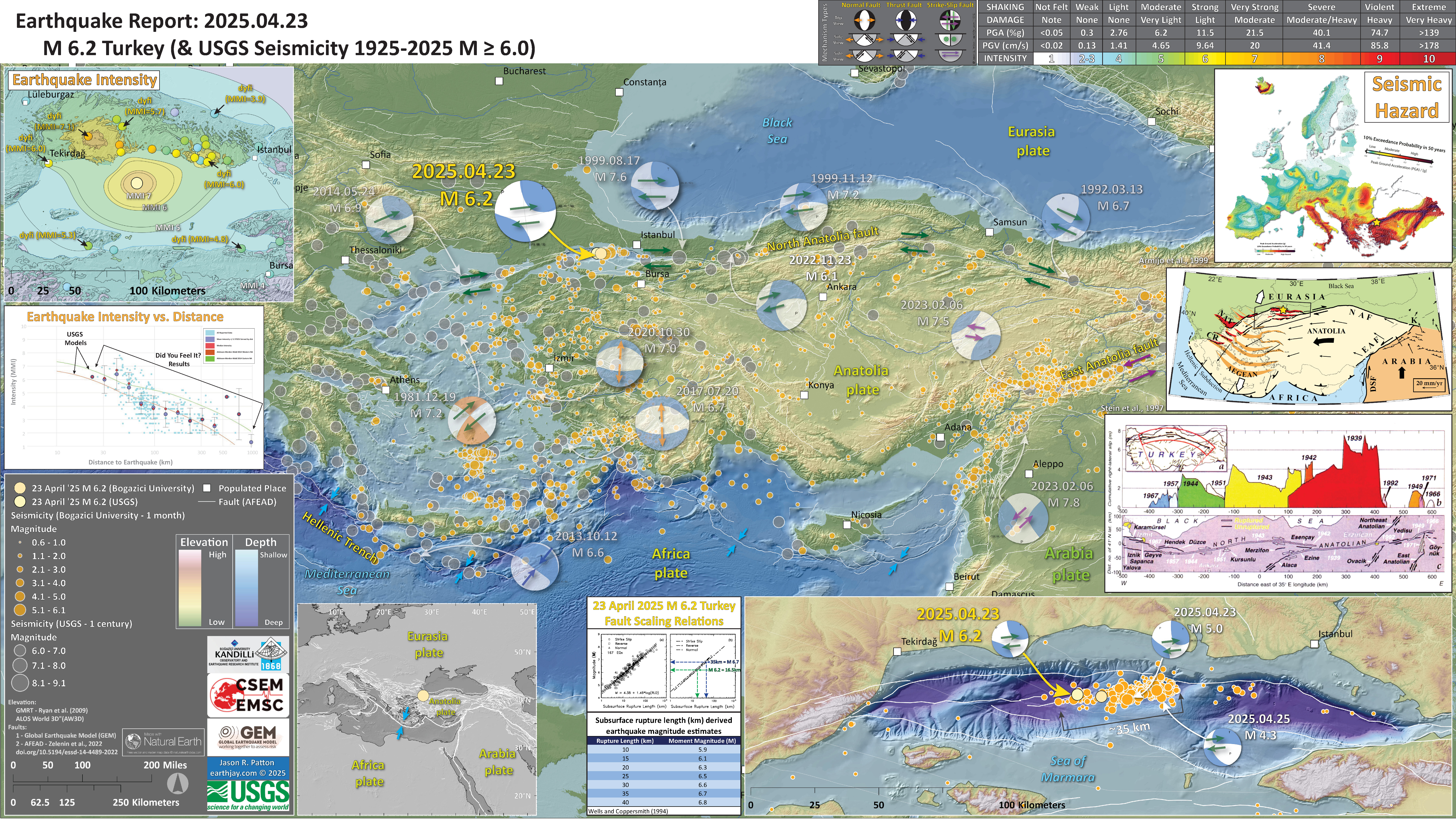
2025.04.23 M 6.2 Turkey
- 2025.04.23 M 6.2 Turkey POSTER 337
- In the lower left is a map showing the plate tectonic boundaries (from the GEM).
- In the upper right corner is a map that shows the seismic hazard for Europe (the color scale shows the 10% chance that ground shaking will exceed a certain level in the next 50-years).
- Below the seismic hazard map is a map from Armijo et al. (1999) that shows the plate tectonic boundaries of the region.
- Below the tectonic map is a figure from Stein et al. (1997) that shows the parts of the NAF that have ruptured in the past century.
- In the upper left corner is a map that shows the M 6.2 earthquake intensity using the modified Mercalli intensity scale. Earthquake intensity is a measure of how strongly the Earth shakes during an earthquake, so gets smaller the further away one is from the earthquake epicenter. The map colors represent a model of what the intensity may be. The USGS has a system called “Did You Feel It?” (DYFI) where people enter their observations from the earthquake and the USGS calculates what the intensity was for that person. The dots with yellow labels show what people actually felt in those different locations.
- Below the intensity map is a plot that shows the same intensity (both modeled and reported) data as displayed on the map. Note how the intensity gets smaller with distance from the earthquake.
- In the lower right corner is a larger scale map showing the aftershocks from this earthquake sequence. The aftershocks span about 35 km.
- In the center is a figure showing the fault scaling relations from Wells and Coppersmith (1994). These relations are based on empirical earthquake data that show the relation between subsurface rupture length and earthquake magnitude. A subsurface rupture of 35 km should generate a M M 6.7. Likewise, a M 6.2 earthquake should generate 16.5 km of subsurface fault slip.
- Here is the map with a month’s seismicity plotted.
Here I present a poster for the M 6.2 earthquake in the Marmara Sea, northwest of Turkey.
https://earthquake.usgs.gov/earthquakes/eventpage/us7000pufs/executive
This earthquake slipped along the North Anatolia fault (NAF), a right-lateral strike-slip fault that trends along the northern part of Turkey.
Most of the NAF has ruptured in the past century and people think that the segment to the west is the next segment that will rupture. This may generate a tsunami in the Marmara Sea and cause lots of damage in Istanbul, Turkey.
I include some inset figures.
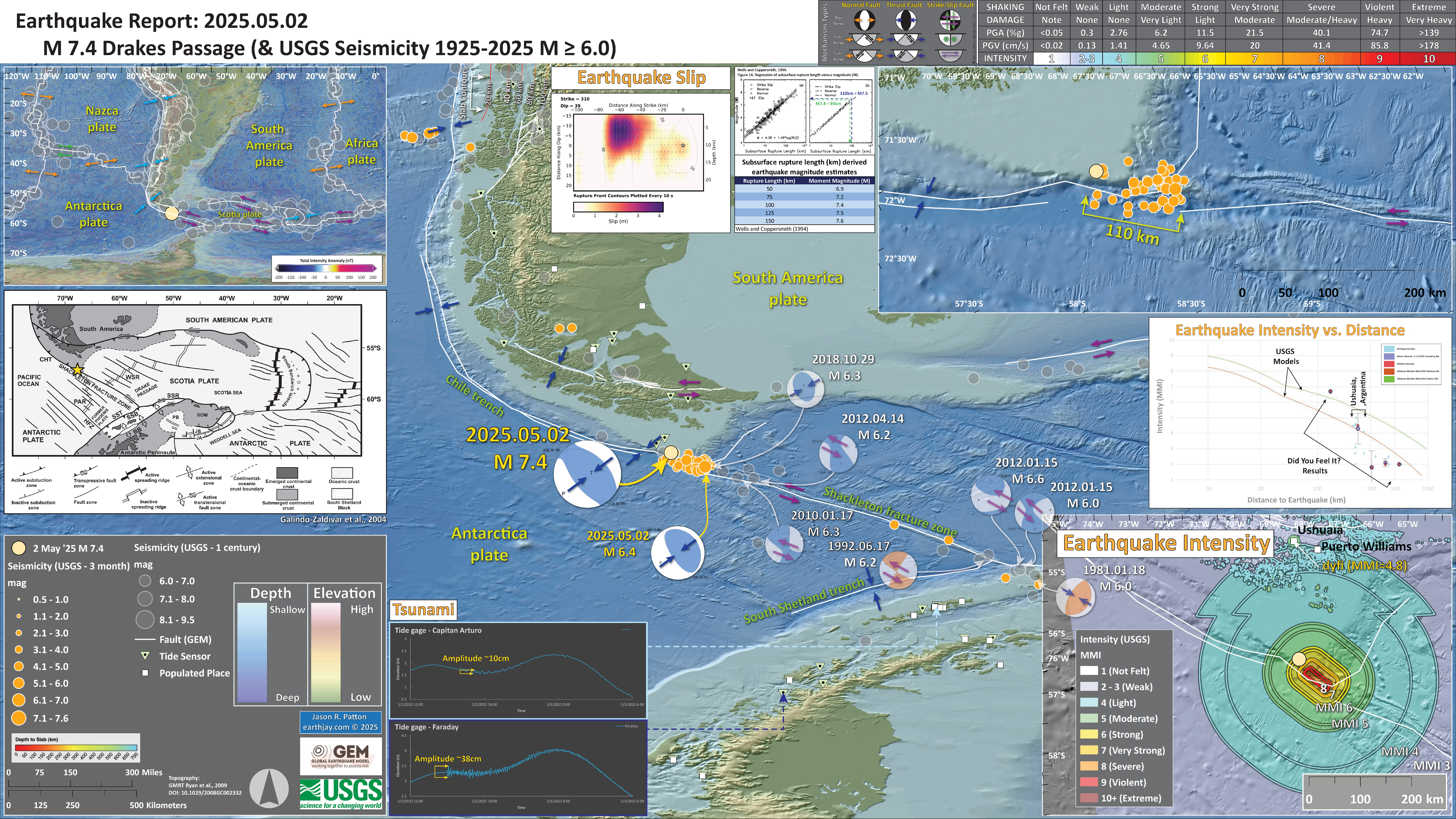
2025.05.02 M 7.4 Drake Passage
- 2025.05.02 M 7.4 Drake Passage 338
- In the upper left corner is a map showing the plate tectonic boundaries (from the GEM).
- In the lower right corner is a map that shows the M 7.7 earthquake intensity using the modified Mercalli intensity scale. Earthquake intensity is a measure of how strongly the Earth shakes during an earthquake, so gets smaller the further away one is from the earthquake epicenter. The map colors represent a model of what the intensity may be. The USGS has a system called “Did You Feel It?” (DYFI) where people enter their observations from the earthquake and the USGS calculates what the intensity was for that person. The dots with yellow labels show what people actually felt in those different locations.
- Above the intensity map is a plot that shows the same intensity (both modeled and reported) data as displayed on the map. Note how the intensity gets smaller with distance from the earthquake.
- In the upper right corner is a larger scale map showing the aftershocks. The rupture length is about 110km.
- To the left of the aftershock map is a plot from Wells and Coppersmith (1994). The plot on the left shows the relations between earthquake subsurface rupture lengths (horizontal axis) relative to the earthquake magnitude (vertical axis). On the right are the correlation lines for these scaling relations. Below the plots is a table based on these rupture length/magnitude scaling relations. The aftershock pattern, the USGS finite fault slip model (shown to the left), and these scaling relations fit each other rather well.
- In the left center is a plate tectonic map from Galindo_Zaldivar et al. (2004).
- Here is the map with a month’s seismicity plotted.
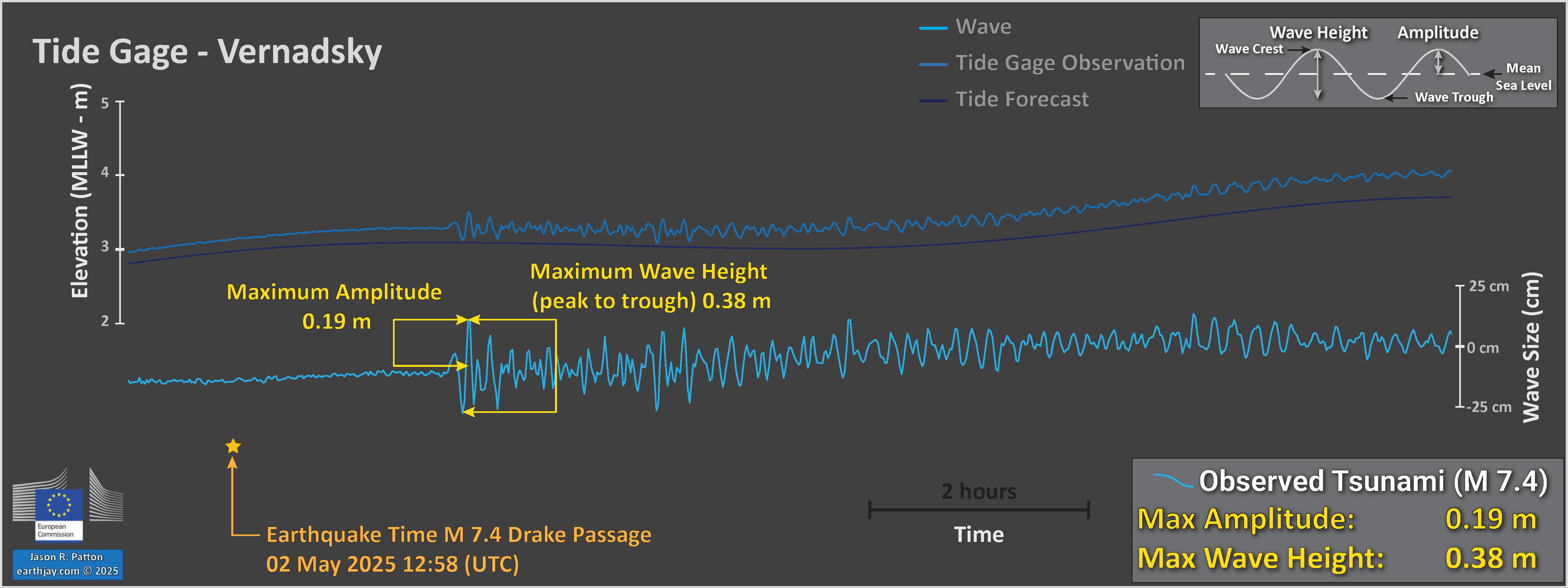
- Here are the Verdansky tide gage data.
So, I awoke the morning of the event to note that there was a M 7.4 earthquake along a plate boundary fault in the Drake Passage, south of the tip of South America.
https://earthquake.usgs.gov/earthquakes/eventpage/us7000pwkn/executive
The southern part of western South America is bordered by a subduction zone, a convergent plate boundary, where the Nazca plate dives below the South America plate. Geologists term this “diving down” as “subducting.”
The largest magnitude earthquake was a M 9.5 earthquake in 1960 along the southern part of this subduction zone.
South of this M 9.5 earthquake, the subduction zone may not continue (my colleague Matias pointed this out to me a year or two ago). But, on many maps, the plate boundary fault here is still shown as a subduction zone.
This plate boundary fault turns into a strike-slip fault (a transform plate boundary) called the Shackleton fracture zone.
The M 7.4 and its aftershock pattern suggests that this plate boundary fault is actually active as a convergent plate boundary. So, I will need to look at the notes that I took while talking to Matias. Perhaps this is not a subduction zone, but simply a reverse/thrust system (a crustal fault, not plate boundary). I will try to update this report with more of this information.
I plotted the tide gage data on the interpretive poster.
Speaking of the transition from convergent to strike-slip, we can look at the historical earthquake mechanisms along this boundary. I plot them on the interpretive poster.
This M 7.4 earthquake and a 2018 M 6.3 earthquake have thrust (compressional) earthquake mechanisms. To the southeast, the mechanisms are all strike-slip.
I include some inset figures. Some of the same figures are located in different places on the larger scale map below.
2025.07.16 M 7.3 Alaska
- 2025.07.16 M 7.3 Alaska 339
- In the upper left corner is a map showing the plate tectonic boundaries (from the USGS). I include an overlay of the global magnetic anomaly data.
- To the right of the plate tectonic map is a low angle oblique map showing the subduction zone, how the Pacific plate subducts beneath the North America plate. This was prepared by IRIS in 2015.
- Below the plate tectonic map is the USGS fininate fault slip model. The colors represent how much the fault slipped. They suggest that the fault slipped up to about 1-meter and the slip length was about 100-km.
- In the upper right corner is a map that shows the M 7.3 earthquake intensity using the modified Mercalli intensity scale. Earthquake intensity is a measure of how strongly the Earth shakes during an earthquake, so gets smaller the further away one is from the earthquake epicenter. The map colors represent a model of what the intensity may be. The USGS has a system called “Did You Feel It?” (DYFI) where people enter their observations from the earthquake and the USGS calculates what the intensity was for that person. The dots with yellow labels show what people actually felt in those different locations.
- Below the intensity map is a plot that shows the same intensity (both modeled and reported) data as displayed on the map. Note how the intensity gets smaller with distance from the earthquake.
- In the lower right corner is a larger scale map showing the aftershocks. I include existing earthquake mechanisms available from the USGS at the time I prepare this poster. I also include the 2023 M 7.2 earthquake and aftershocks in purple.
- In the central bottom is the tide gage record from the Sand Point gage (location shown on the map).
- In the left center is a plate tectonic map from Galindo_Zaldivar et al. (2004).
- Here is the map with a week’s seismicity plotted.
- I include recent seismicity in the same area as the 7.3 earthquake:
- 16 July ’23 M 7.2
- 29 July ’21 M 8.2
- 19 Oct ’21 M 7.5
- 22 July ’20 M 7.8
- This 7.3 and the 2020 M 7.5 (now 7.6) slipped on similarly oriented faults. See the following map from Alaska Earthquake Center
- Here is a map from the Alaska Earthquake Center showing these recent earthquakes and how they compare in space (they could improve their filename in terms of dates; not sure why anyone wants to organize their dates by month).
- The tidal forecasts are shown as a dark blue line.
- The actual observed water surface elevation is plotted in medium blue.
- By removing (subtracting) the tide forecast from the observed data, we get the signal from wind waves, tsunami, and atmospheric phenomena. This residual is plotted in light blue.
- Here are the tide gage data from Sand Point, Alaska.
- Here are the tide gage data from King Cove, Alaska.
- Here is a video from Mike West, the state seismologist for Alaska.
A few days ago there was an earthquake at the beginning of my day. I noticed as I had received a message from the National Tsunami Warning Center.
I went online and found that there was a magnitude 7.2 earthquake near Sand Point, Alaska.
https://earthquake.usgs.gov/earthquakes/eventpage/us7000kg30/executive
I looked at this website and noticed there was a magnitude 7.2 earthquake on the same day in 2023.
The main plate boundary system in this part of the world is the Alaska-Aleutian subduction zone, a convergent plate boundary (where plates move towards each other).
Here, the Pacific oceanic plate is subducting (going beneath) the North America plate. In March 1964 there was a magnitude 9.2 subduction zone earthquake that generated a transpacific tsunami (tsunami that travelled across the Pacific Ocean).
The earthquake was not very large for a transpacific tsunami. As the USGS moment tensor came in, it showed that this was a strike-slip earthquake.
strike-slip earthquakes can generate tsunami and they often do. However, they are smaller in size (generally) than subduction zone generated tsunami.
The magnitude was refined to M 7.3. Though, it was still unlikely to generate a tsunami large enough to impact California, USA (where I live and work).
https://earthquake.usgs.gov/earthquakes/eventpage/us7000qd1y/executive
This 7.3 earthquake happened along a strike-slip fault dipping to the east and there was no really any vertical motion (so it was a pure strike-slip earthquake).
The mechanism shows that this is a high percent double couple, so was probably on a smooth/planar fault with little complexity. If we look at the source time function it shows one main slip patch with low variation in energy release with time.
Due to the obliquity of relative plate motion (the relative direction of plate motion is not perpendicular to the plate boundary, these plate are moving obliquely relative to each other), which increases to the west, slip of earthquakes is partitioned across different types of faults.
The relative motion perpendicular to the plate boundary is accommodated by the subduction zone during subduction zone earthquakes.
The relative motion parallel to the plate boundary is accommodated by strike-slip faults. Often this slip is localized along a “forearc sliver” fault (like the Great Sumatra fault). See this figure from Lange et al. (2008) showing a forearc sliver in Chile, another subduction zone with oblique subduction.

In Alaska, there are crustal blocks formed in the upper plate. These blocks rotate in a counter-clockwise fashion when viewed from outer space.
There are strike-slip faults that form along the boundaries of these blocks. These faults that are perpendicular to the subduction zone are right-lateral strike-slip faults (just like this 7.3 earthquake!).
This map from Krutikov et al. (2008) shows these blocks.

This 7.3 earthquake is far to the east of this Krutikov map and the obliquity of relative plate motion is less in the east. I am not really sure that this 7.3 earthquake is on a fault related to these rotating blocks.
I include some inset figures.
Tsunami Data
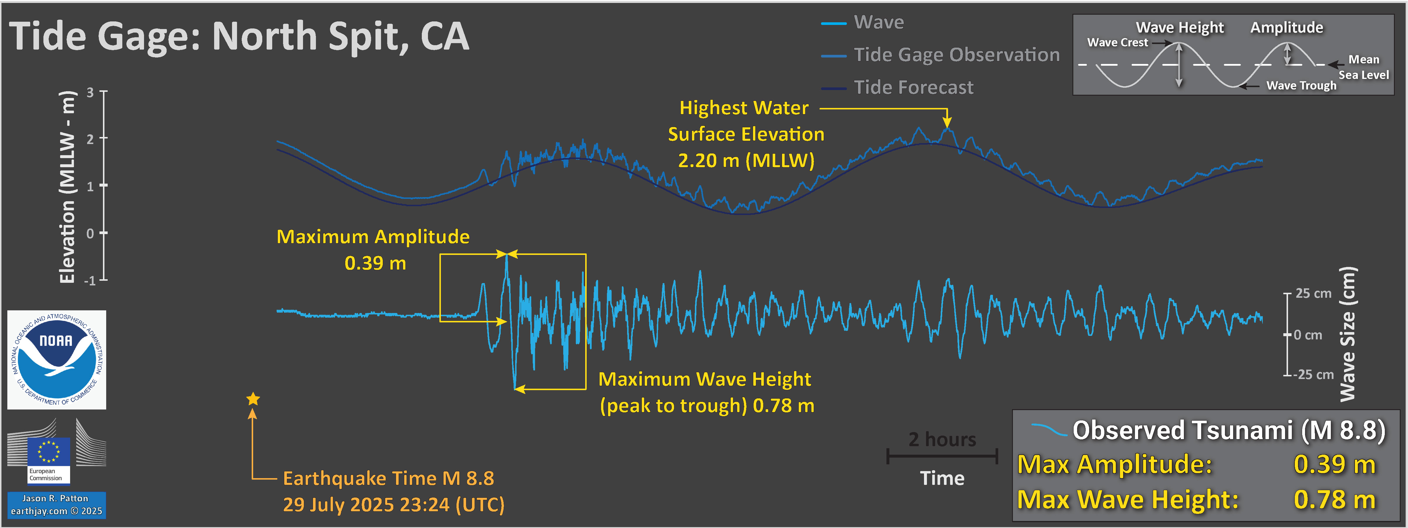
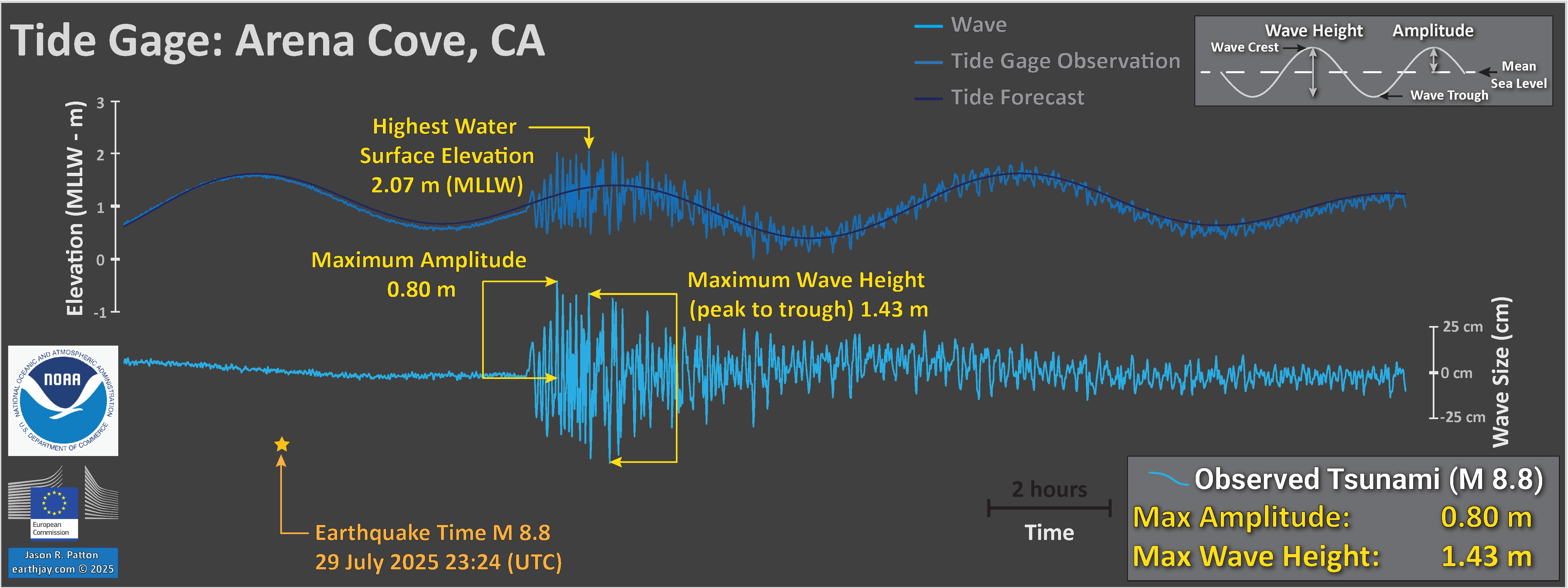
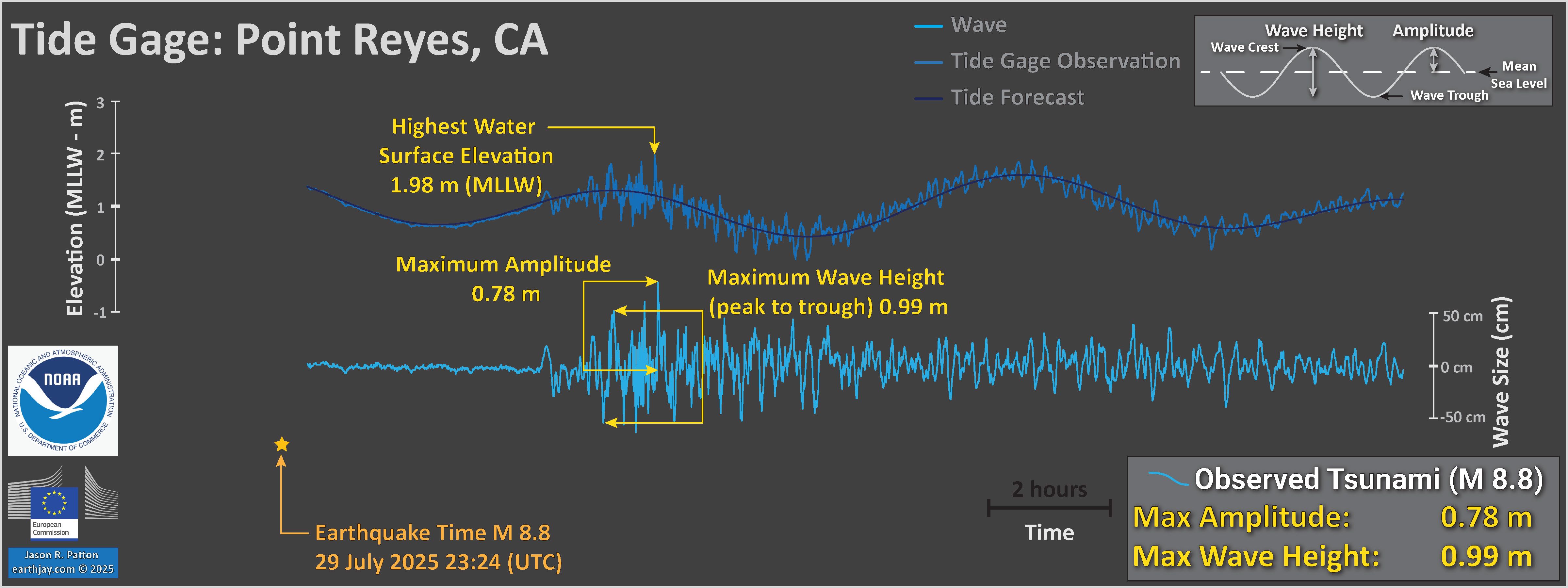
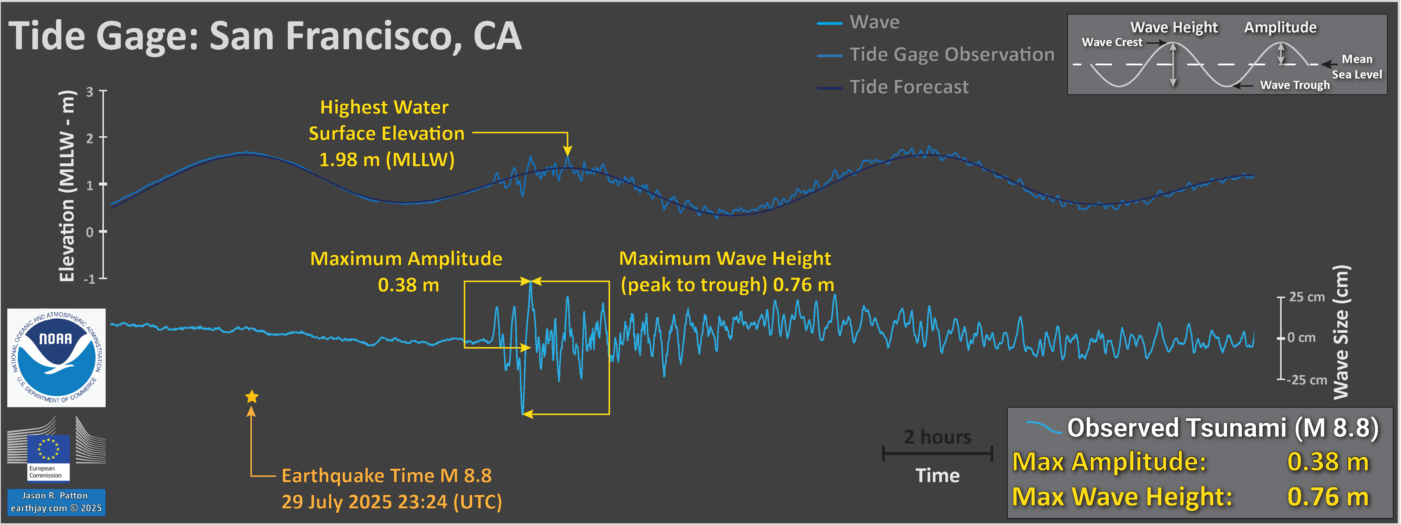
I plot tide gage data for gages in the north and northeast Pacific Ocean. These data are from NOAA Tides and Currents, though are also available via the eu tide gage website here.
-
Each plot includes three datasets:
The scale for the tsunami wave height is on the right side of the chart.
Note the all tsunami wave height plots are the same vertical scale, except for Sand Point.
I measured the largest wave heights for each site, displayed in yellow.
Other Pages on this Earthquake
2025.07.29 M 8.8 Kamchatka
- 2025.07.29 M 8.8 Kamchatka 340
- The 1952 M 9.0 Kamchatka Earthquake
- The 17 August 2024 M 7.0 and 20 July 2025 M 7.4 earthquakes.
- In the left center is a map showing the plate tectonic boundaries (from the GEM).
- In the lower right corner is a map that shows the M 7.00 earthquake intensity using the modified Mercalli intensity scale. Earthquake intensity is a measure of how strongly the Earth shakes during an earthquake, so gets smaller the further away one is from the earthquake epicenter. The map colors represent a model of what the intensity may be. The USGS has a system called “Did You Feel It?” (DYFI) where people enter their observations from the earthquake and the USGS calculates what the intensity was for that person. The dots with yellow labels show what people actually felt in those different locations.
- Below the plate tectonic map (on left) map is a plot that shows the same intensity (both modeled and reported) data as displayed on the map. Note how the intensity gets smaller with distance from the earthquake.
- In the upper left corner are two maps showing the possibility of earthquake induced liquefaction for these two earthquakes. I discuss these phenomena in more detail later in the report.
- In the upper center is a map and a low angle oblique view of the subducted Pacific plate beneath the Okhotsk plate (Portnyagin and Manea, 2008). I place a yellow star in the region of the M 7.1 earthquake.
- In the upper center left is a map from MacInnes et al;., 2010 that shows historic earthquake patches.
- I include an overlay from MacInnes et al. (2010) for their slip model of the 1952 earthquake.
- To the left of the intensity map are two tide gage plots. The upper one is from Petropavlovsk, Kamchatka, Russia (location shown on main map). The lower one is from Crescent City, California (location shown on plate tectonic map).
- To the right of this intensity plot is the USGS finite fault slip model. Colors represent the amount of fault slip that their model calculates.
- Here is the map with a week’s seismicity plotted.
- Here is the poster for the 17 August 2024 M 7.0 foreshock.
- Below is a figure from Wells and Coppersmith (1994) that shows the empirical relations between subsurface rupture length (SSRL, the length of the fault that ruptures in the subsurface) and magnitude. If one knows the SSRL (horizontal axis), they can estimate the magnitude (vertical axis). The left plot shows the earthquake data. The right plot shows how their formulas “predict” these data.
- I used these fault scaling relations to calculate two things.
- To calculate the magnitudes for earthquakes of different subsurface rupture lengths.
- To calculate the subsurface rupture length given the magnitude.
- Then I plotted dashed blue and green lines to show how these two methods result in slightly different answers.
- A magnitude 8.8 earthquake should have a subsurface rupture length of 900-km. (in green)
- A subsurface rupture length of 600-km should have a magnitude of M 8.5. (in blue)
- See the below diagram for more information about the difference between amplitude and wave height.
- Here are the plots i put together.
- The amplitude and wave height data are estimates made from the data published by the World Sea Level or the NOAA Tides and Currents pages. There are more sophisticated ways to estimate the amplitudes and wave heights (see the NTWC plots below).
- Another source of tide gage data is the IOC. i present links for all three services below.
- Petropavlovsk, Kamchatka, Russia
- Crescent City, California, USA
- North Spit (Humboldt bay), California, USA
- Arena Cove, California, USA
- Point Reyes, California, USA
- San Francisco, California, USA
There was a magnitude M 8.0 earthquake offshore of Kamchatka, Russia.
https://earthquake.usgs.gov/earthquakes/eventpage/us6000qw60/executive
I immediately thought about two things.
For the 2024 M 7, I had prepared an extensive Earthquake Report.
In the report, i discussed various papers that included research about the 1952 earthquake.
The 1952 temblor generated a local and a transpacific tsunami. It generated over a million (1952 dollars) of damage in Hawai’i.
There were impacts around the Pacific and I was concerned that the earthquake magnitude would grow (often it takes a while to get a good estimate for the magnitude).
Here is an animation from the USGS showing a visualization of the seismic waves from this M 8.8 earthquake.
I include some inset figures. Some of the same figures are located in different places on the larger scale map below.
Fault Scaling Relations
Here is a table showing the various sizes of earthquakes using these scaling relations.
* note, i corrected this caption by changing the word “relationships” to “relations.”
(a) Regression of subsurface rupture length on magnitude (M). Regression line shown for all-slip-type relationship. Short dashed line indicates 95% confidence interval. (b) Regression lines for strike-slip relationships. See Table 2 for regression coefficients. Length of regression lines shows the range of data for each relationship.
Tsunami
2025.08.22 M 7.5 Drake Passage
- 2025.08.22 M 7.5 Drake Passage 341
- In the upper left corner is a map showing the plate tectonic boundaries (from the GEM).
- In the lower right corner is a map that shows the M 7.7 earthquake intensity using the modified Mercalli intensity scale. Earthquake intensity is a measure of how strongly the Earth shakes during an earthquake, so gets smaller the further away one is from the earthquake epicenter. The map colors represent a model of what the intensity may be. The USGS has a system called “Did You Feel It?” (DYFI) where people enter their observations from the earthquake and the USGS calculates what the intensity was for that person. The dots with yellow labels show what people actually felt in those different locations.
- Above the intensity map is a plot that shows the same intensity (both modeled and reported) data as displayed on the map. Note how the intensity gets smaller with distance from the earthquake.
- In the upper right corner is a larger scale map showing the aftershocks. The rupture length is about 110km.
- To the left of the aftershock map is a plot from Wells and Coppersmith (1994). The plot on the left shows the relations between earthquake subsurface rupture lengths (horizontal axis) relative to the earthquake magnitude (vertical axis). On the right are the correlation lines for these scaling relations. Below the plots is a table based on these rupture length/magnitude scaling relations. The aftershock pattern, the USGS finite fault slip model (shown to the left), and these scaling relations fit each other rather well.
- In the left center is a plate tectonic map from Galindo_Zaldivar et al. (2004).
- Here is the map with a month’s seismicity plotted.
Here is the USGS website for this (now) M 7.6 earthquake in the Drake Passage:
https://earthquake.usgs.gov/earthquakes/eventpage/us6000rgf4/executive
I include some inset figures. Some of the same figures are located in different places on the larger scale map below.
2025.09.18 M 7.4 Kamchatka
- 2025.09.18 M 7.4 Kamchatka POSTER 342
- In the upper left is a map showing the plate tectonic boundaries (from the USGS).
- Below that map inset is a map that shows the aftershocks.
- In the upper left is a map from Macinnes et al. (2010) that shows the region of historic subduction zone earthquakes in this region. I place a yellow star in the location of the M 7.4 earthquake.
- In the lower right corner is a map that shows the M 7.6 earthquake intensity using the modified Mercalli intensity scale. Earthquake intensity is a measure of how strongly the Earth shakes during an earthquake, so gets smaller the further away one is from the earthquake epicenter. The map colors represent a model of what the intensity may be. The USGS has a system called “Did You Feel It?” (DYFI) where people enter their observations from the earthquake and the USGS calculates what the intensity was for that person. The dots with yellow labels show what people actually felt in those different locations.
- Above the intensity map is a plot that shows the same intensity (both modeled and reported) data as displayed on the map. Note how the intensity gets smaller with distance from the earthquake.
- In the upper right corner are two maps showing the possibility of earthquake triggered landslides and earthquake induced liquefaction for these two earthquakes.
- To the left of the intensity map is a pair of figures from Portnyagin and Manea (2008) that shows the plate tectonic boundaries (top) and a low-angle oblique view of the plates (bottom) viewed from the north.
- In the center right is the USGS finite fault model that shows their estimate of the amount that the fault slipped during this earthquake.
- Here is the map with a month’s seismicity plotted.
Here I present a poster for the M 7.4 Kamchatka, Russia Earthquake.
https://earthquake.usgs.gov/earthquakes/eventpage/us7000qdyl/executive
This earthquake slipped along the megathrust subduction zone in the region that slipped during a M 8.8-9.0 earthquake in 1952.
I include some inset figures.
2025.09.30 M 6.9 Philippines
- 2025.09.30 M 6.9 Philippines POSTER 343
- In the left center is a map showing the plate tectonic boundaries (from the USGS).
- In the lower right corner is a map that shows the M 7.0 earthquake intensity using the modified Mercalli intensity scale. Earthquake intensity is a measure of how strongly the Earth shakes during an earthquake, so gets smaller the further away one is from the earthquake epicenter. The map colors represent a model of what the intensity may be. The USGS has a system called “Did You Feel It?” (DYFI) where people enter their observations from the earthquake and the USGS calculates what the intensity was for that person. The dots with yellow labels show what people actually felt in those different locations.
- In the center left is a plot that shows the same intensity (both modeled and reported) data as displayed on the map. Note how the intensity gets smaller with distance from the earthquake.
- In the upper right corner are two maps showing the possibility of earthquake triggered landslides and earthquake induced liquefaction for these two earthquakes.
- To the left of the ground failure maps is a low-angle oblique illustration from Hall (2011) that shows the complicated configuration of tectonic plates in the region.
- In the center left is a map that shows the plate tectonic boundaries (Ringenbach, 1983). I include a yellow star showing the location of this M 6.9 earthquake.
- Here is the map with a month’s seismicity plotted.
Here I present a poster for the M 6.9 Hubbard Glacier Earthquake in Yukon Territory/Alaska.
https://earthquake.usgs.gov/earthquakes/eventpage/us6000rdrz/executive
This earthquake slipped along a fault that may be related to the Philippine fault (a strike-slip fault.
The mechanism is strike-slip and because of the Philippine fault system, I interpret this as a left-lateral strike-slip earthquake.
I include some inset figures.
2025.12.05 M 7.0 Yukon Territory/Alaska
- 2025.12.05 M 7.0 Yukon Territory/Alaska POSTER 344
- In the left center is a map showing the plate tectonic boundaries (from the USGS).
- In the upper right corner is a map that shows the M 7.0 earthquake intensity using the modified Mercalli intensity scale. Earthquake intensity is a measure of how strongly the Earth shakes during an earthquake, so gets smaller the further away one is from the earthquake epicenter. The map colors represent a model of what the intensity may be. The USGS has a system called “Did You Feel It?” (DYFI) where people enter their observations from the earthquake and the USGS calculates what the intensity was for that person. The dots with yellow labels show what people actually felt in those different locations.
- To the left of the intensity map is a plot that shows the same intensity (both modeled and reported) data as displayed on the map. Note how the intensity gets smaller with distance from the earthquake.
- In the upper left corner are two maps showing the possibility of earthquake triggered landslides and earthquake induced liquefaction for these two earthquakes.
- In the center left of the map is a low-angle oblique view of the plate boundary as illustrated by IRIS in 2015 (now called Earthscope). I place a yellow star to designate the location of the earthquake as projected to the Earth’s surface (the epicenter).
- In the center right is a map that shows the aftershock pattern at the time that i prepared this report.
- Here is the map with a month’s seismicity plotted.
Here I present a poster for the M 7.0 Hubbard Glacier Earthquake in Yukon Territory/Alaska.
https://earthquake.usgs.gov/earthquakes/eventpage/us6000rsy1/executive
This earthquake slipped along a fault that connects the Queen Charlotte/Fairweather fault system with the Totschunda fault (that slipped in 2002). This fault is termed the Connector fault.
This earthquake is also at the northern part of a north-south convergent margin (the north part of the Yakutat microplate).
The earthquake mechanism shows a strike-slip oblique solution (combining the north-south compression with the right-lateral strike-slip tectonic setting).
I include some inset figures.
2025.12.08 M 7.6 Japan
- 2025.12.08 M 7.6 Japan POSTER 345
- In the upper left is a map showing the plate tectonic boundaries (from the USGS).
- Below that map inset is a map that shows the aftershocks from the Japan Meteorological Agency.
- In the lower right corner is a map that shows the M 7.6 earthquake intensity using the modified Mercalli intensity scale. Earthquake intensity is a measure of how strongly the Earth shakes during an earthquake, so gets smaller the further away one is from the earthquake epicenter. The map colors represent a model of what the intensity may be. The USGS has a system called “Did You Feel It?” (DYFI) where people enter their observations from the earthquake and the USGS calculates what the intensity was for that person. The dots with yellow labels show what people actually felt in those different locations.
- To the left of the intensity map is a plot that shows the same intensity (both modeled and reported) data as displayed on the map. Note how the intensity gets smaller with distance from the earthquake.
- In the upper right corner are two maps showing the possibility of earthquake triggered landslides and earthquake induced liquefaction for these two earthquakes.
- In the center top of the map are the tide gage data from Kushiro, Japan.
- In the center left is the USGS finite fault model that shows their estimate of the amount that the fault slipped during this earthquake.
- Here is the map with a month’s seismicity plotted.
Here I present a poster for the M 7.6 Aomori Prefecture, Japan Earthquake.
https://earthquake.usgs.gov/earthquakes/eventpage/us6000rtdt/executive
This earthquake slipped along the megathrust subduction zone just north of the region that slipped during the 2011 Tohoku-oki earthquake.
There was a small tsunami observed locally.
Here are the tide gage data from Ofunato, Japan.
I include some inset figures.