Thanks to Jamie Gurney, I took a looksie at the Kaktovik earthquake sequence again. He had interpreted this sequence to possibly represent an extensional step over in a right-lateral (dextral) strike-slip tectonic fault system.
I do not include much background material on the tectonics of this region in this report. However, there is substantial material in my original earthquake report here. I will include some of the material in the report today, but head on over to that original report for more information.
Gurney hypothesized that the sequence was a step over and did not have evidence for conjugate faults. I partially agree with this hypothesis. Their tweet is here:
An analysis of the Kaktovik eqs 9 days on: the reviewed eqs show a WNW-ESE dextral strike-slip system, not 2 orthogonal faults as suggested. A possible extensional stepover nr the 2nd M6 may have arrested the rupture of the 1st quake @AKearthquake @kaseyaderhold @patton_cascadia pic.twitter.com/uYfqwstzkM
— Jamie Gurney (@UKEQ_Bulletin) August 21, 2018
I agree that there is evidence for a step over. Some of this evidence is laid out here:
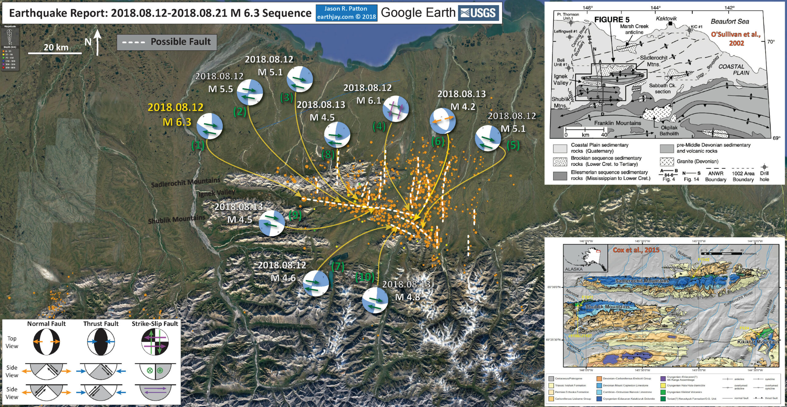
- The larger magnitude earthquakes do not appear to align along a quasi linear feature. They do somewhat align in a curvilinear way, but not really. It appears that there are several faults involved. In the west, there is a more east-west orientation. In the east part of this sequence, the orientation appears more northwest-southeast.
- Between these two potential main faults, there are some extensional earthquakes. Gurney presented 2 normal fault moment tensors (fault mechanisms), but I only found one while searching the USGS database.
- In a dextral strike-slip fault system, if the faults step to the right, they create extension between the faults. This extension leads to the formation of basins.
However, methinks that there is also evidence for a series of ~north-south oriented faults. This is based largely on a series of small earthquakes that appear to be oriented along north-south trends. There are a great number of analogies for this, most remarkably the 2012 Sumatra Outer Rise sequence. I discuss these Sumatra earthquakes more on this page and present some of those figures below.
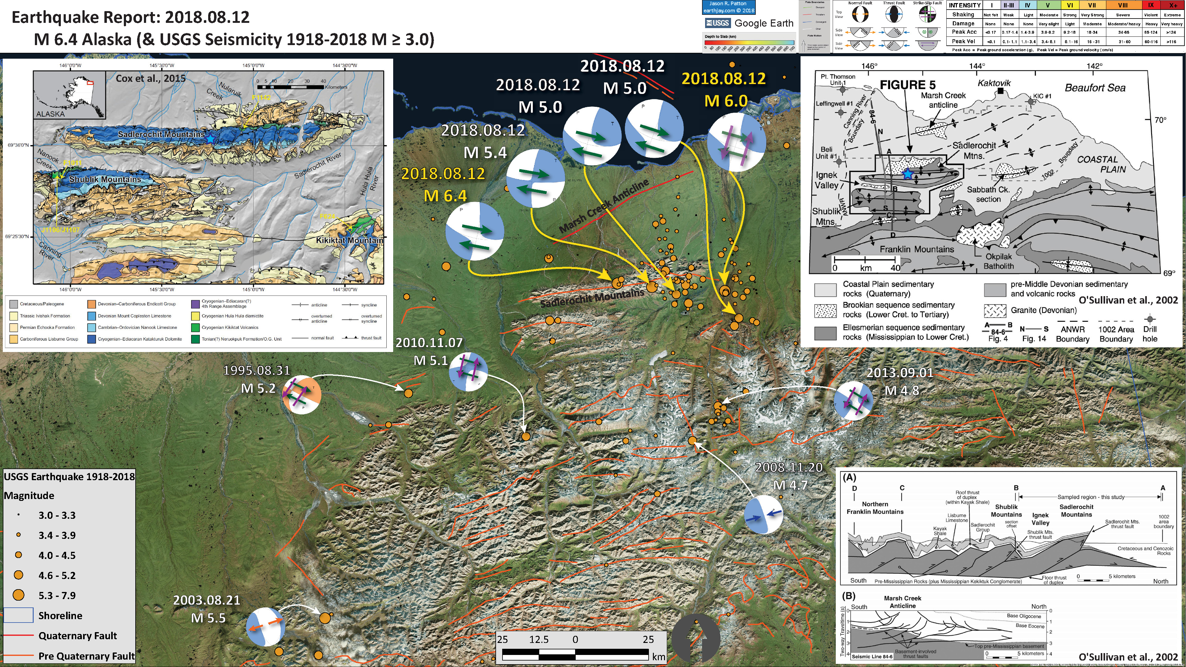
I prepared an animation that shows (1) the earthquakes through time and (2) an interpretation of these earthquakes. I present this interpretive poster below.
Here is the animation (download it here a 10 MB mp4 file).
Below is my interpretive poster for this earthquake
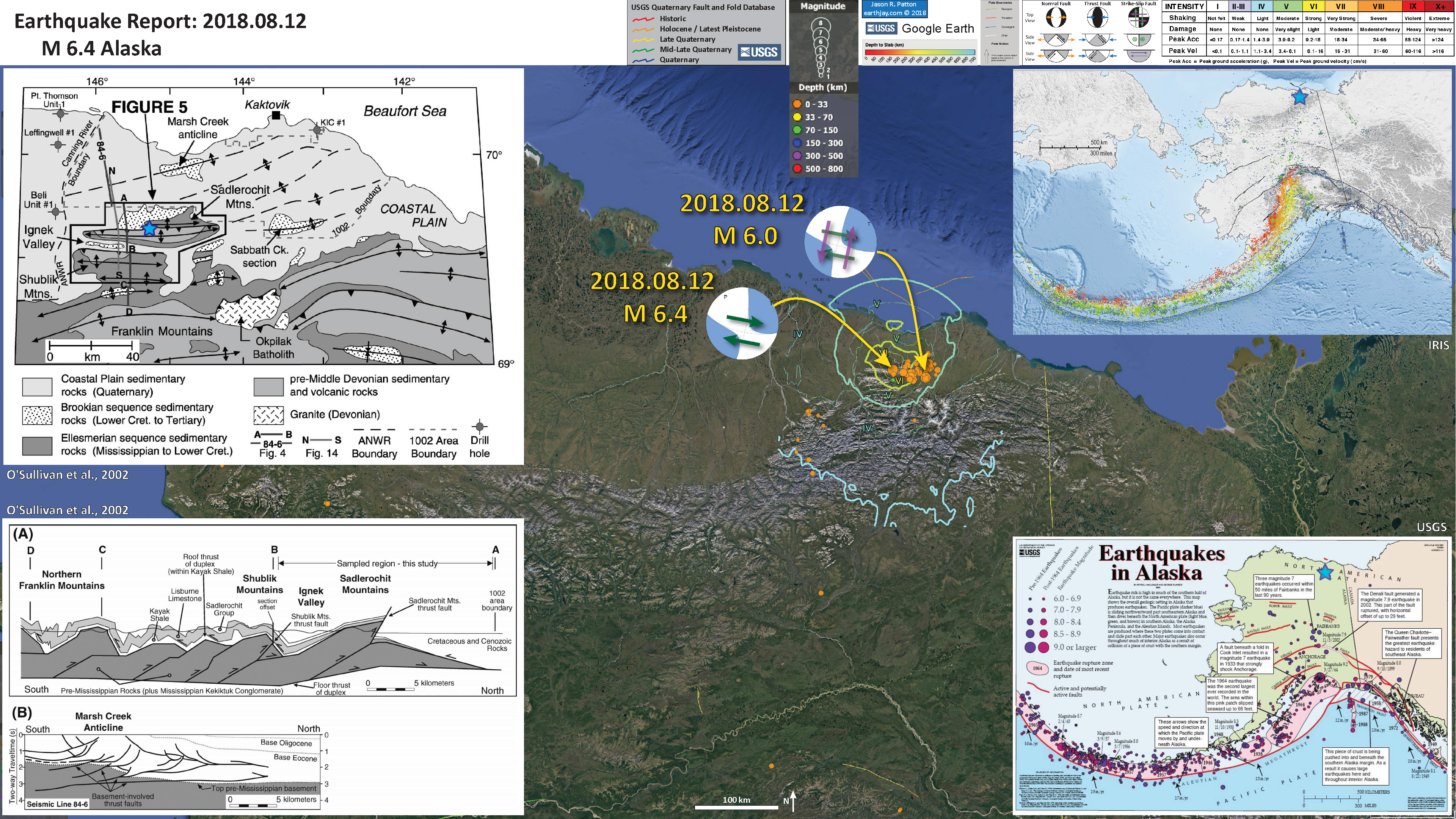
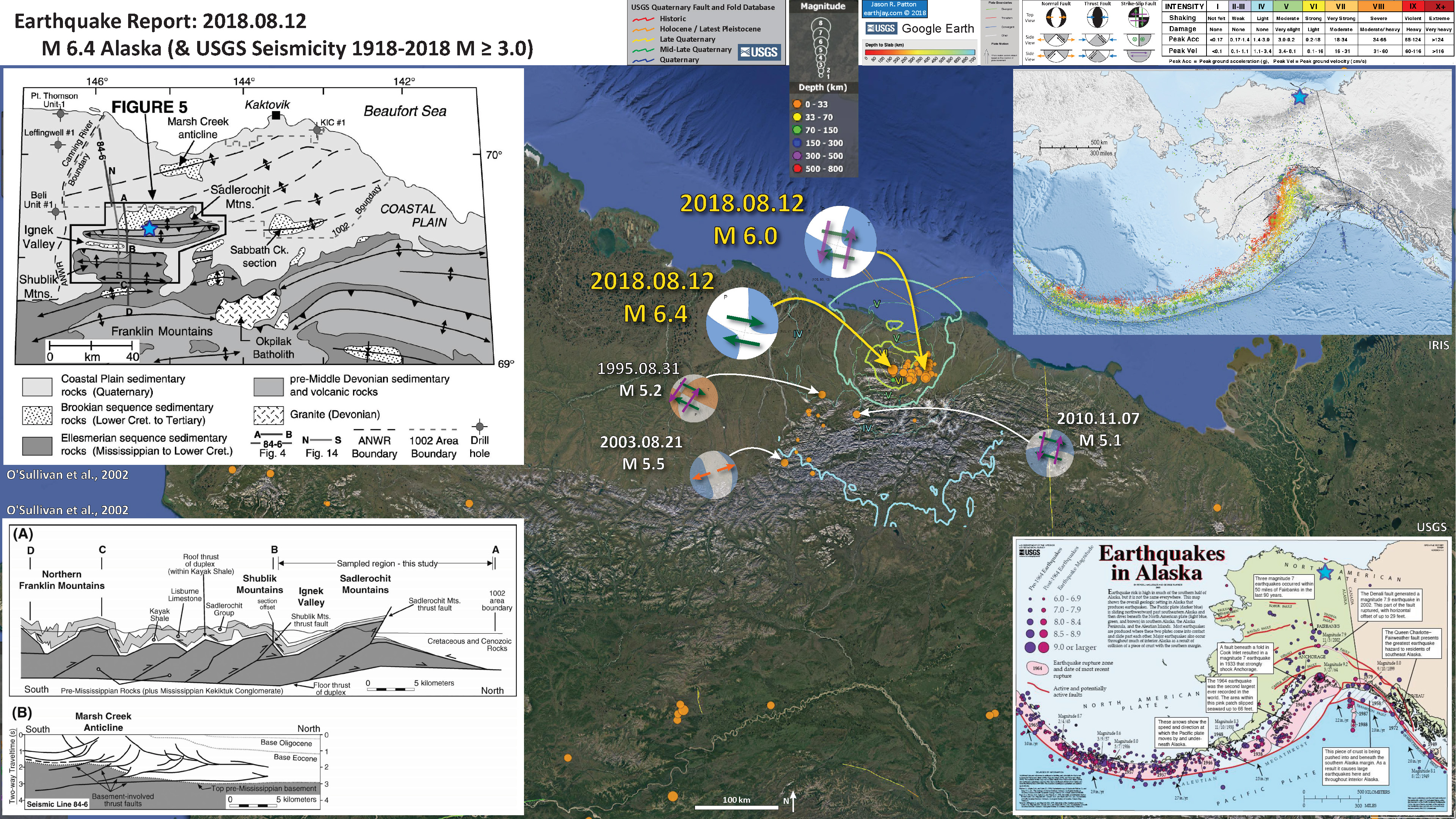
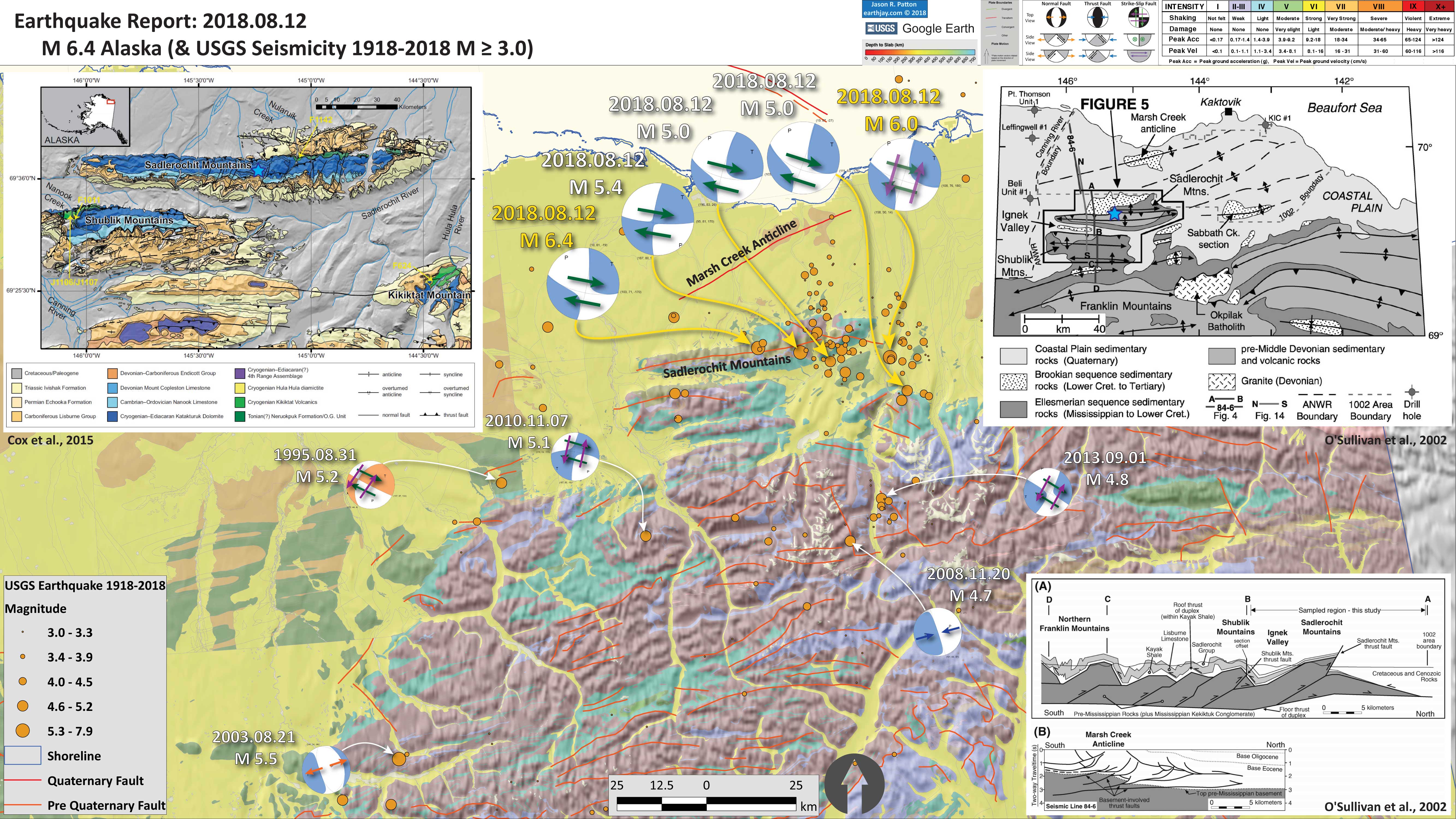
I plot the seismicity from the past month, with color representing depth and diameter representing magnitude (see legend). I include earthquake epicenters from 7/14-8/21 with magnitudes M ≥ 1.0.
I plot the USGS fault plane solutions (moment tensors in blue and focal mechanisms in orange).
I placed white dashed lines where there are linear trends in seismicity, or where larger earthquakes appear to be aligned (and supported by the fault mechanisms). Below I include the same poster without these hypothesized fault lines.
- I placed a moment tensor / focal mechanism legend on the poster. There is more material from the USGS web sites about moment tensors and focal mechanisms (the beach ball symbols). Both moment tensors and focal mechanisms are solutions to seismologic data that reveal two possible interpretations for fault orientation and sense of motion. One must use other information, like the regional tectonics, to interpret which of the two possibilities is more likely.
- In the upper right corner is a large scale map showing the tectonics on the eastern North Slope (O’Sullivan et al., 2012). This map shows the anticlines and thrust faults. Anticlines are folds in the crust that are formed by compression, with the fold being pushed upwards (viewed from the side, it would look like a frown). The thrust fautls are symbolized with triangles pointed in the direction down dip (into the earth). There is a thrust fault on the north flank of the southern of the two anticlines in the Sadlerochit Mountains.
- In the lower right corner is a larger scale map (Cox et al., 2015) that shows more detailed mapping of the geology and faults in this region.
I include some inset figures. Some of the same figures are located in different places on the larger scale map below.

With no fault lines.

Here are some of the interpretive posters from my earlier report here.
- Here is the map with a month’s seismicity plotted.
- Here is the map with a centuries’ seismicity plotted.
- Here is the larger scale map showing more detail. This includes faults from the Alaska QFF (Koehler et al., 2013). I include a shaded relief map as a base map. I also include the state geological map (Wheeler et al., 1997), colored relative to the age of the geologic unit.
- UPDATE This is the same map with ESRI imagery as a basemap.
Sumatra Analogue
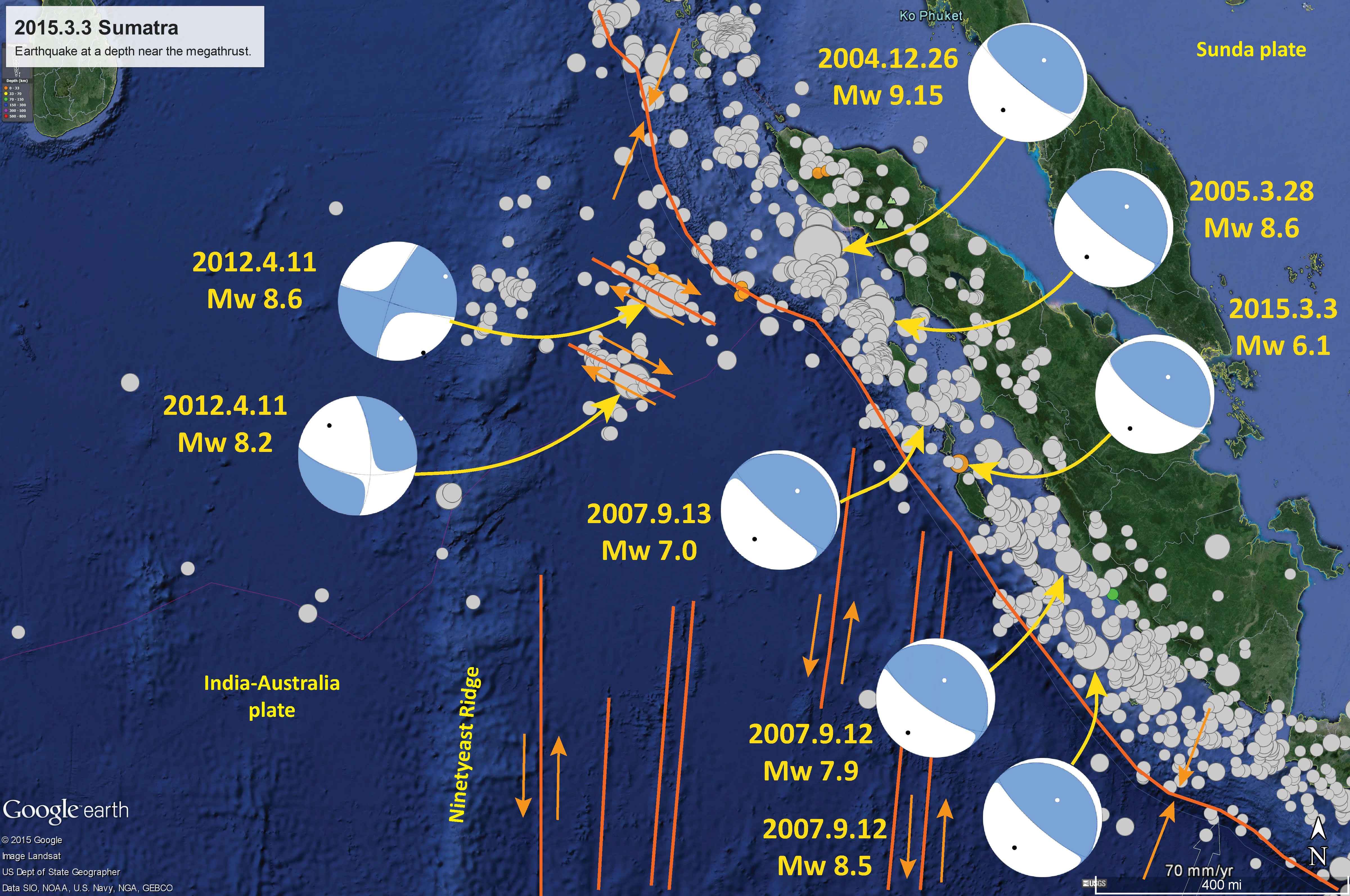
Here are some figures that present the material about the 2012 Outer Rise sequence offshore of Sumatra.
- I have presented materials related to the 2004 Sumatra-Andaman subduction zone earthquake here and more here.
- I include a map in the upper right corner that shows the historic earthquake rupture areas.
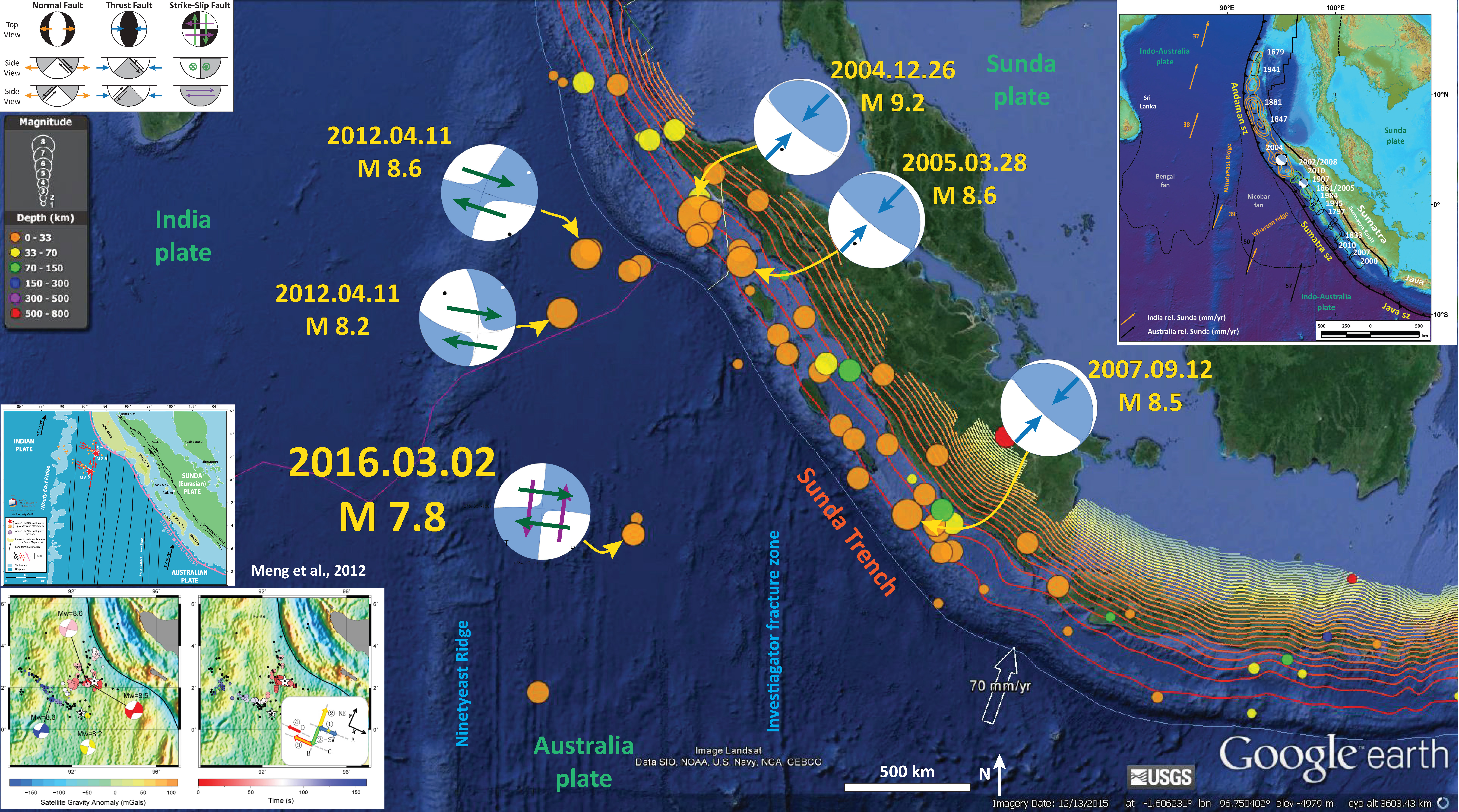
- Here is a poster that shows some earthquakes in the Andaman Sea. This is from my earthquake report from 2015.11.08.
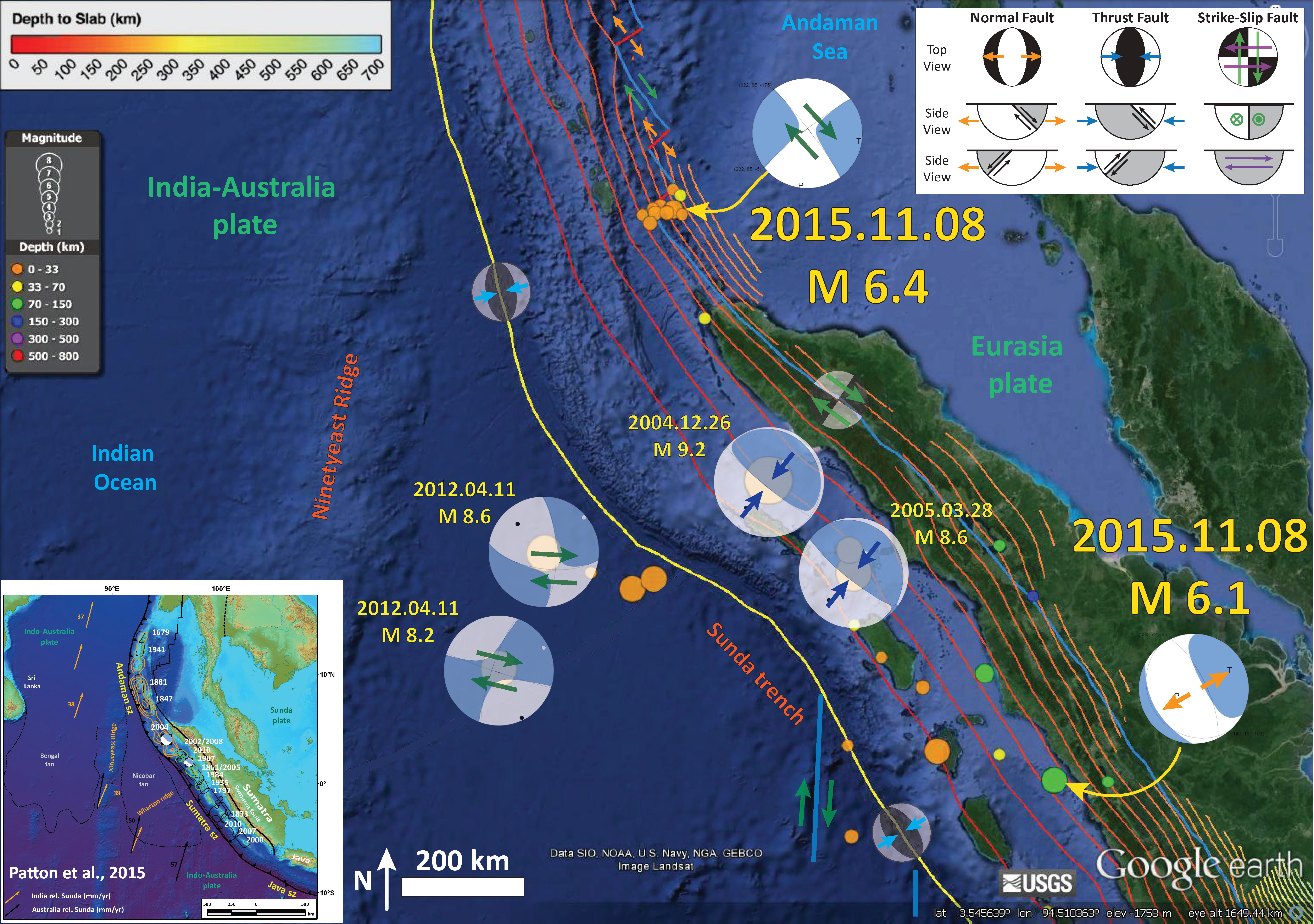
- This map shows the fracture zones in the India-Australia plate.
- Here is the inset figure from Meng et al. (2012) showing their interpretation of the outer rise sequence.

Spatiotemporal distribution of HF radiation imaged by the (left) European and (right) Japanese networks. Colored circles and squares indicate the positions of primary and secondary peak HF radiation (from movies S1 and S2, respectively). Their size is scaled by beamforming amplitude, and their color indicates timing relative to hypocentral time (color scale in center). The secondary peaks of the MUSIC pseudo-spectrum are those at least 50% as large as the main peak in the same frame. The brown shaded circles in the right figure are the HF radiation peaks from the Mw 8.2 aftershock observed from Japan. The colored contours in the Sumatra subduction zone (left) represent the slip model of the 2004 Mw 9.1 Sumatra earthquake (28). The figure background is colored by the satellite gravity anomaly (left) inmilligalileos (mgals) (color scale on bottom left) and the magnetic anomaly (right) in nanoteslas (color scale on bottom right). Black dots are the epicenters of the first day of aftershocks from the U.S. National Earthquake Information Center catalog. The big and small white stars indicate the hypocenter of the mainshock and Mw 8.2 aftershock. The moment tensors of the Mw 8.6 mainshock, Mw 8.2 aftershock, and double CMT solutions of the mainshock are shown as colored pink, yellow, red, and blue beach balls. The red line in the top left inset shows the boundary between the India (IN) and Sundaland (SU) plates (29). The patterned pink area is the diffuse deformation zone between the India and Australia plate. The red rectangular zone indicates the study area. The top right inset shows the interpreted fault planes (gray dashed lines) and rupture directions (colored arrows).
- Here is a figure from Wiseman and Burgmean (2012) that shows the change in stress of the plates following the 2004 Sumatra-Andaman subduction zone earthquake. They used modeling of the crust to show that the outer rise earthquakes happened in a region that saw an increase in stress following the 2004 and 2005 earthquakes.

Recent stress changes in the Indian Ocean. (a) Total stresses induced by the 2004 [Chlieh et al., 2007], 2005 [Konca et al., 2007], and January M7.2 (http://earthquake.usgs.gov/earthquakes/eqinthenews/2012/usc0007ir5/finite_fault. php) earthquakes, resolved at the 20 km hypocentral depth of the mainshock on the orientation of the initial WNW-ESE (red) fault plane [Meng et al., 2012]. Gray circles mark the first 12 days of the aftershock sequence (NEIC catalog). (b) Coseismic stresses induced by the 2004 and 2005 earthquakes. The yellow focal mechanisms highlight the strike-slip earthquakes during the first year following the 2004 earthquake and the blue focal mechanisms depict the remaining strike-slip events before the 2012 mainshock (Global CMT catalog). (c) Cumulative postseismic stresses induced by the 2004 and 2005 earthquakes at the time of the 2012 earthquake.
- Summary of the 1964 Earthquake
- 2018.08.12 M 6.4 North Alaska
- 2018.08.12 M 6.4 North Alaska UPDATE #1
- 2018.01.23 M 7.9 Gulf of Alaska
- 2018.01.23 M 7.9 Gulf of Alaska UPDATE #1
- 2018.01.23 M 7.9 Gulf of Alaska UPDATE #2
- 2017.07.17 M 7.7 Aleutians
- 2017.07.17 M 7.7 Aleutians UPDATE #1
- 2017.06.02 M 6.8 Aleutians
- 2017.05.08 M 6.2 Aleutians
- 2017.05.01 M 6.3 British Columbia
- 2017.03.29 M 6.6 Kamchatka
- 2017.03.02 M 5.5 Alaska
- 2016.09.05 M 6.3 Bering Kresla (west of Aleutians)
- 2016.04.13 M 5.7 & 6.4 Kamchatka
- 2016.04.02 M 6.2 Alaska Peninsula
- 2016.03.27 M 5.7 Aleutians
- 2016.03.12 M 6.3 Aleutians
- 2016.01.29 M 7.2 Kamchatka
- 2016.01.24 M 7.1 Alaska
- 2015.11.09 M 6.2 Aleutians
- 2015.11.02 M 5.9 Aleutians
- 2015.11.02 M 5.9 Aleutians (update)
- 2015.07.27 M 6.9 Aleutians
- 2015.05.29 M 6.7 Alaska Peninsula
- 2015.05.29 M 6.7 Alaska Peninsula (animations)
- 1964.03.27 M 9.2 Good Friday
Alaska | Kamchatka | Kurile Earthquake Reports
General Overview
Earthquake Reports
- 2017.01.08 M 5.8 Arctic
Arctic
General Overview
Earthquake Reports
Social Media
- Cox, G.M., Strauss, J.V>, Hlaverson, G.P., Schmitz, M.D., McClelland, W.C., Stenenson, R.S., and Macdonald, F.A., 2015. Kikiktat volcanics of Arctic Alaska—Melting of harzburgitic mantle associated with the Franklin large igneous province in Lithosphere, v. 7, no. 3, p. 275-295.
- Koehler, R.D., Burns, P.A.C., and Weakland, J.R., 2013. Digitized faults of the Neotectonic map of Alaska (Plafker and others, 1994): Miscellaneous Publication MP 150, Alaska Division of Geological & Geophysical Surveys, Fairbanks, AK, USA.
- Meng, L., Ampuero, J.-P., Stock, J. Duputel, Z., Luo, Y., and Tsai, V.C., 2012. Earthquake in a Maze: Compressional Rupture Branching During the 2012 Mw 8.6 Sumatra Earthquake in Science, v. 337
- O’Sullivan, P.B., and Wallace, W.K., 2012. Out-of-sequence, basement-involved structures in the Sadlerochit Mountains region of the Arctic National Wildlife Refuge, Alaska: Evidence and implications from fission-track thermochronology in GSA Bulletin, v. 114, no. 11, p. 1356-1378
- Wheeler, J.O., Hoffman, P.F., Card, K.D., Davidson, A., Sanford, B.V., Okulitch, A.V., and Roest, W.R. (comp.) 1997. Geological Map of Canada, Geological Survey of Canada, Map D1860A.
- Wisemand, K. and Bürgmann, R., 2012. Stress triggering of the great Indian Ocean strike-slip earthquakes in a diffuse plate boundary zone in GRL, v. 39, L22304, doi:10.1029/2012GL053954