A few days ago (as I write this) there was a magnitude M 7.1 earthquake offshore of Japan.
https://earthquake.usgs.gov/earthquakes/eventpage/us6000nith/executive
The plate tectonics of Japan is dominated by compressional forces. Convergent plate boundaries are where plates move towards each other.
In Japan, these convergent plate boundaries are called subduction zones (one plate “subducts,” or dives, beneath another plate).
The Japanese invest heavily in earthquake science because there has been a long history of subduction zone earthquakes.
Earthquake History
In the 20th century, some are of note. The 1923 Great Kantō Earthquake was a magnitude M~8.0 earthquake that devastated Tokyo and the surrounding region.
In 2011 there was the magnitude M 9.1 Tōhoku-oki subduction zone earthquake in eastern Japan. This is where the Pacific plate subducts westward below the Okhotsk plate, forming the deep sea Japan trench.
This 8 August 2024 M 7.1 earthquake was in southwest Japan, offshore of the Island Kyushu. The Pacific Ocean region offshore of Kyushu is called Hyuga-Nada.
Here, the Philippine Sea oceanic plate subducts beneath the Eurasia plate to form the Nankai deep sea trench.
In 1944 and 1946 there were two large megathrust earthquakes along the Nankai trench. The 1944 M 8.1 earthquake is called a Tokai earthquake. The 1946 M 8.1 earthquake is called a Tonankai earthquake. Earthquakes that rupture these segments are given the same names.
These two earthquakes led to geologists subdividing this subduction zone into segments. Then geologists used prehistoric earthquake data (paleoseismic data) to try to understand if the subduction zone breaks along these segments in any patterns.
Do earthquakes always only rupture one or the other of these two segments? Do both segments sometimes rupture at the same time? This is the same question people ask for most all subduction zones globally.
The reason people ask this question is that the length of the earthquake is a primary factor that controls the magnitude of an earthquake. The width (length times width = area), the amount the fault slips, and properties about the elastic nature of the plates, are the other factors that control earthquake magnitude.
So, if both segments rupture at the same time, the earthquake would be larger (like in 1707 and maybe in 1498).
In 1707 there was the M 8.7 Hōei subduction zone earthquake that ruptured both of the 1944 and 1946 segments. Some have hypothesized that the 1707 earthquake slipped as far south as the 8 August 2024 M 7.1 earthquake.
We also want to use paleoseismic data to get an idea about how often these types of earthquakes happen in a given area. This helps us design buildings so that they can “survive” future earthquakes.
Earthquake Advisory
Before the 2011 earthquake, the largest magnitude earthquake along the Japan trench was in the mid M 8 range. So, the seismic hazard and tsunami hazard was based on this size of an earthquake.
Two years before the 2011 earthquake, Japanese geologists found prehistoric evidence of a tsunami that was caused by a much larger sized earthquake. But, this information had not yet been integrated into the seismic and tsunami hazard analyses for east Japan.
When the 2011 earthquake and tsunami happened, it was larger in size than expected. The mitigation that Japan had used was not sized properly and many people suffered greatly.
Preceding the 2011 M 9.1 earthquake, there was a M 7.3 earthquake. Because of this “precursor” earthquake, Japan planned to place their society into an earthquake advisory when earthquakes of a sufficient size happens along the coast of Japan (Toda et al, 2024).
This plan was particularly important for the region along the Nankai trench. The subduction zone earthquakes in Nankai are much closer to the coastline than for the 2011 earthquake (so tsunami arrive faster here). Placing the coast into an advisory is important particularly because of this shorter tsunami travel time.
Following the 8 August 2024 earthquake, the Japanese government placed this part of the country into an earthquake advisory. The advisory is intended to last for a finite amount of time. However, we do know that sometimes earthquakes that are triggered are triggered following time periods longer than a week.
In the social media section below there are some tweets that have links to stories about this advisory. I encourage everyone to read the Temblor article about this advisory.
Below is my interpretive poster for this earthquake
- I plot the seismicity from the past month, with diameter representing magnitude (see legend). I include earthquake epicenters from 1924-2024 with magnitudes M ≥ 3.0 in one version.
- I plot the USGS fault plane solutions (moment tensors in blue and focal mechanisms in orange), possibly in addition to some relevant historic earthquakes.
- A review of the basic base map variations and data that I use for the interpretive posters can be found on the Earthquake Reports page. I have improved these posters over time and some of this background information applies to the older posters.
- Some basic fundamentals of earthquake geology and plate tectonics can be found on the Earthquake Plate Tectonic Fundamentals page.
- In the upper left corner is a map showing the plate tectonic boundaries (from the GEM).
- In the lower right corner is a map that shows the M 7.1 earthquake intensity using the modified Mercalli intensity scale. Earthquake intensity is a measure of how strongly the Earth shakes during an earthquake, so gets smaller the further away one is from the earthquake epicenter. The map colors represent a model of what the intensity may be. The USGS has a system called “Did You Feel It?” (DYFI) where people enter their observations from the earthquake and the USGS calculates what the intensity was for that person. The dots with yellow labels show what people actually felt in those different locations.
- In the upper left center is a plot that shows the same intensity (both modeled and reported) data as displayed on the map. Note how the intensity gets smaller with distance from the earthquake.
- To the right of this intensity plot is the USGS finite fault slip model. Colors represent the amount of fault slip that their model calculates.
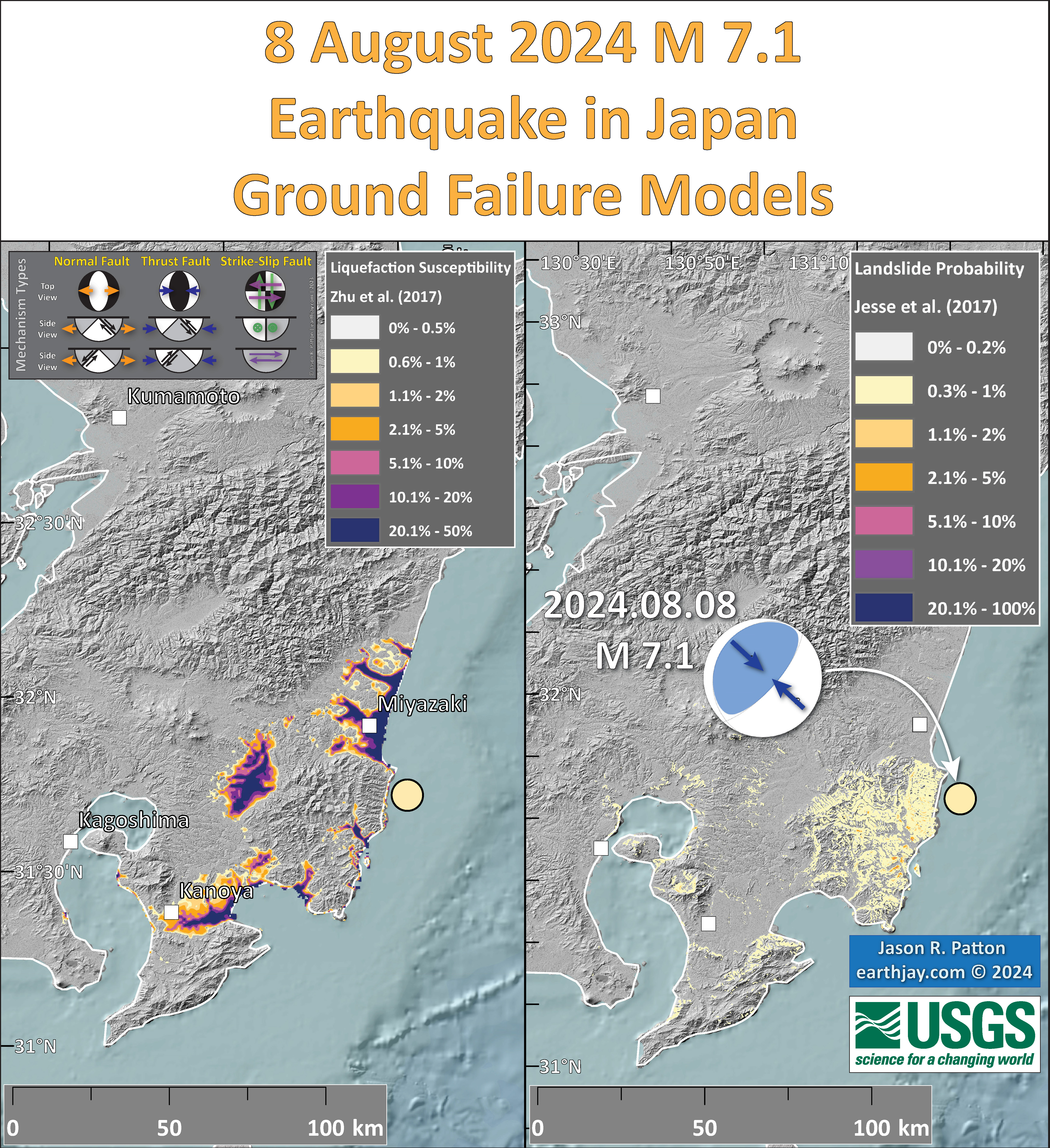
- In the upper right corner are two maps showing the possibility of earthquake induced liquefaction for these two earthquakes. I discuss these phenomena in more detail later in the report.
- To the left of the ground failure maps is a low angle oblique cross section showing the plate configuration in three dimensions (from AGU Trembling Earth, Austin Elliot). I place a yellow star in the region of the M 7.1 earthquake. Note how we can see the Philippine Sea plate seismicity diving downwards beneath the Eurasia plate.
- In the lower right center are plots from three tide gage locations (shown on the map). These individual plots are included later in the report.
I include some inset figures. Some of the same figures are located in different places on the larger scale map below.
- Here is the map with a month’s seismicity plotted.

Other Report Pages
Tsunami
Tsunami can be caused by a variety of processes, including earthquakes, volcanic eruptions, landslides, and meteorological phenomena.
Earthquakes, eruptions, and landslides cause tsunami when these processes displace water in some way.
We may typically associate tsunami with subduction zone earthquakes because these earthquakes are the type that generate vertical land motion along the sea floor.
- Here is a great illustration of how a subduction zone earthquake can generate a tsunami (Atwater et al., 2005).
When the fault slipped, it caused the seafloor to deform and move. This motion also displaced the overlying water column.
As the water column is elevated, it gains potential energy. As this uplifted water expends this energy by oscillating up and down, it radiates energy in the form of tsunami waves.
This M 7.1 earthquake generated a tsunami. The tsunami was observed on tide gages along the coast of Japan but was too small to generate a trans-Pacific tsunami.
This is an animated model of the Great East Japan tsunami of 2011. The warmer the colors, the larger the wave. The first surges reached the closest Japan coasts in about 25 minutes. The first surges reached Crescent City in 9.5 hours.
-
Here are three tide gage records from the coast of Japan.
Time is represented by the horizontal axis and elevation is represented on the vertical axis. The darker blue line in this image represents the tidal forecast. The data recorded by the tide gage are represented by the medium blue colored line. The difference between the prediction and the observation is the tsunami signal (plus any background oceanographic conditions like storm swell or wind waves).
Wave height is the distance measured between the wave crest and trough. Wave amplitude is the level of water above sea level.
These data came from the Eurpoean Union Water Levels website.
The locations of these tide gages are shown on the interpretive poster.
- Aburatsu
- Kushimoto
- Tosashimizu
![]()
![]()
Shaking Intensity
- Here is a figure that shows a more detailed comparison between the modeled intensity and the reported intensity. Both data use the same color scale, the Modified Mercalli Intensity Scale (MMI). More about this can be found here. The colors and contours on the map are results from the USGS modeled intensity. The DYFI data are plotted as colored dots (color = MMI, diameter = number of reports).
- In the upper panel is the USGS Did You Feel It reports map, showing reports as colored dots using the MMI color scale. Underlain on this map are colored areas showing the USGS modeled estimate for shaking intensity (MMI scale).
- In the lower panel is a plot showing MMI intensity (vertical axis) relative to distance from the earthquake (horizontal axis). The models are represented by the green and orange lines. The DYFI data are plotted as light blue dots. The mean and median (different types of “average”) are plotted as orange and purple dots. Note how well the reports fit the green line (the model that represents how MMI works based on quakes in California).
- Below the map and the lower plot is the USGS MMI Intensity scale, which lists the level of damage for each level of intensity, along with approximate measures of how strongly the ground shakes at these intensities, showing levels in acceleration (Peak Ground Acceleration, PGA) and velocity (Peak Ground Velocity, PGV).
Potential for Ground Failure
- Below are a series of maps that show the potential for landslides and liquefaction. These are all USGS data products.
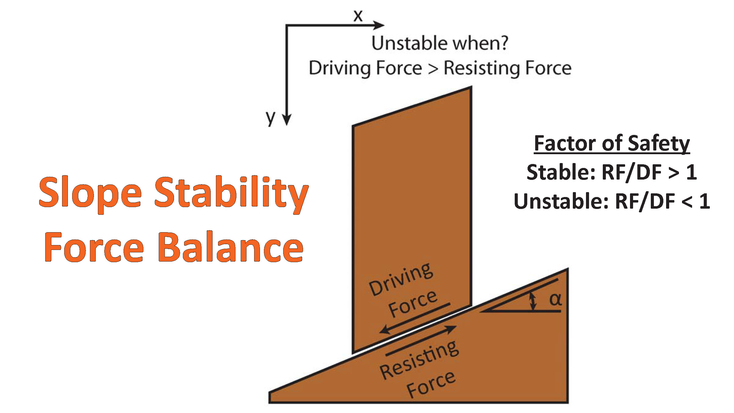
There are many different ways in which a landslide can be triggered. The first order relations behind slope failure (landslides) is that the “resisting” forces that are preventing slope failure (e.g. the strength of the bedrock or soil) are overcome by the “driving” forces that are pushing this land downwards (e.g. gravity). The ratio of resisting forces to driving forces is called the Factor of Safety (FOS). We can write this ratio like this:FOS = Resisting Force / Driving Force
- When FOS > 1, the slope is stable and when FOS < 1, the slope fails and we get a landslide. The illustration below shows these relations. Note how the slope angle α can take part in this ratio (the steeper the slope, the greater impact of the mass of the slope can contribute to driving forces). The real world is more complicated than the simplified illustration below.
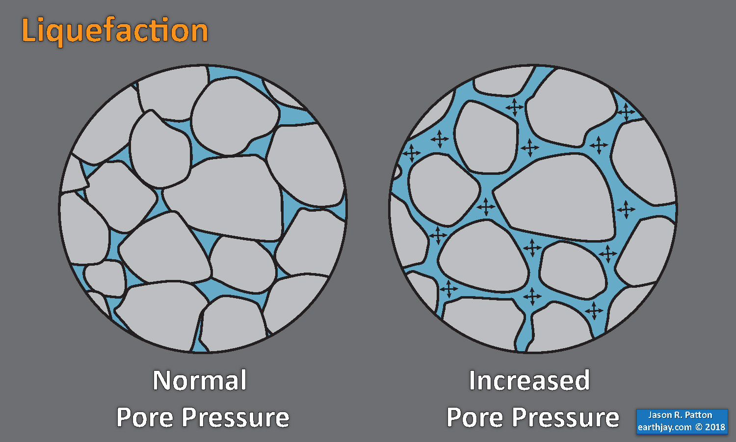
- Landslide ground shaking can change the Factor of Safety in several ways that might increase the driving force or decrease the resisting force. Keefer (1984) studied a global data set of earthquake triggered landslides and found that larger earthquakes trigger larger and more numerous landslides across a larger area than do smaller earthquakes. Earthquakes can cause landslides because the seismic waves can cause the driving force to increase (the earthquake motions can “push” the land downwards), leading to a landslide. In addition, ground shaking can change the strength of these earth materials (a form of resisting force) with a process called liquefaction.
- Sediment or soil strength is based upon the ability for sediment particles to push against each other without moving. This is a combination of friction and the forces exerted between these particles. This is loosely what we call the “angle of internal friction.” Liquefaction is a process by which pore pressure increases cause water to push out against the sediment particles so that they are no longer touching.
- An analogy that some may be familiar with relates to a visit to the beach. When one is walking on the wet sand near the shoreline, the sand may hold the weight of our body generally pretty well. However, if we stop and vibrate our feet back and forth, this causes pore pressure to increase and we sink into the sand as the sand liquefies. Or, at least our feet sink into the sand.
- Below is a diagram showing how an increase in pore pressure can push against the sediment particles so that they are not touching any more. This allows the particles to move around and this is why our feet sink in the sand in the analogy above. This is also what changes the strength of earth materials such that a landslide can be triggered.
- Here Dr. Bohon demonstrates the phenomena of liquefaction.
- And, another video demonstration.
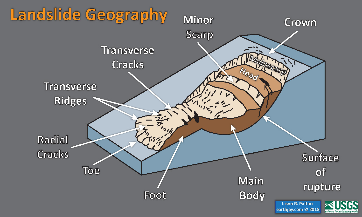
- Below is a diagram based upon a publication designed to educate the public about landslides and the processes that trigger them (USGS, 2004). Additional background information about landslide types can be found in Highland et al. (2008). There was a variety of landslide types that can be observed surrounding the earthquake region. So, this illustration can help people when they observing the landscape response to the earthquake whether they are using aerial imagery, photos in newspaper or website articles, or videos on social media. Will you be able to locate a landslide scarp or the toe of a landslide? This figure shows a rotational landslide, one where the land rotates along a curvilinear failure surface.
- Below is the liquefaction susceptibility and landslide probability map (Jessee et al., 2017; Zhu et al., 2017). Please head over to that report for more information about the USGS Ground Failure products (landslides and liquefaction). Basically, earthquakes shake the ground and this ground shaking can cause landslides.
- I use the same color scheme that the USGS uses on their website. Note how the areas that are more likely to have experienced earthquake induced liquefaction are in the valleys. Learn more about how the USGS prepares these model results here.
Liquefaction in action! This is a short clip of me jumping on water-laden sand at the beach and creating an increase in pore pressure, causing the ground to temporarily behave like a fluid. pic.twitter.com/p8VZNUcrEq
— Wendy Bohon, PhD 🌏 (@DrWendyRocks) April 28, 2021
This liquefaction experiment conducted by the Tokyo Geological Survey of Japan at the Disaster Prevention Exhibition in 2015, shows the effects of different foundations and how hollow objects such as water pipes come to the surface [source, full video: https://t.co/xYLjPY4IHZ] pic.twitter.com/r8LXtmvrO0
— Massimo (@Rainmaker1973) April 17, 2021
- Golz et al. (2024) recently published a paper describing their study of the planning for an earthquake advisory or warning in the Nankai Region. This study was quite timely.
- This is a map showing the region of their study.
- This map shows the intensity distribution for potential future earthquakes in southern Japan.
- This map shows the potential tsunami size from tsunami in this region.
- These are the jurisdictions that would be inundated by a tsunami of at least 30 cm in size.
Earthquake Forecasting
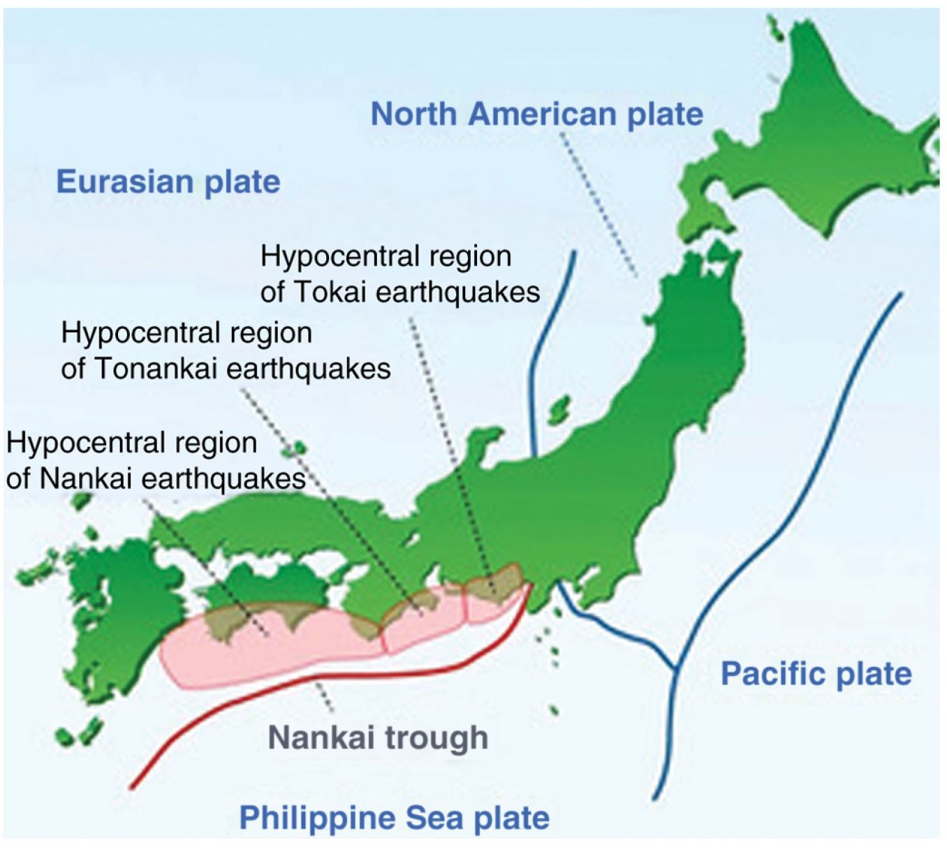
Tokai, Tonankai, and Nankai regions of the Nankai trough. Source: Japan Agency for Marine-Earth Science and technology.
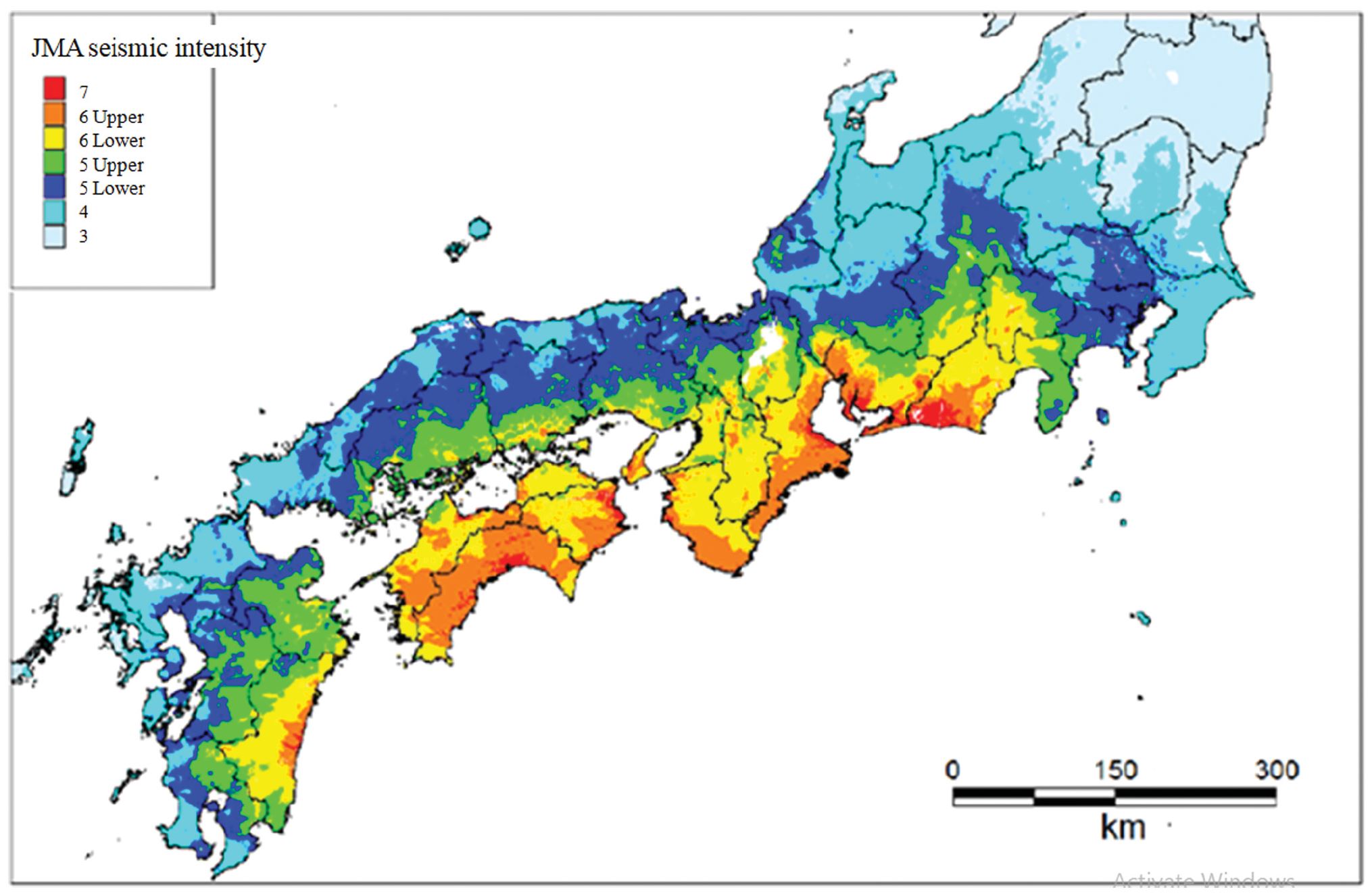
Map of the maximum intensity distribution in the Nankai region. Source: Cabinet Office, Government of Japan, White Paper: Disaster Management in Japan 2015.
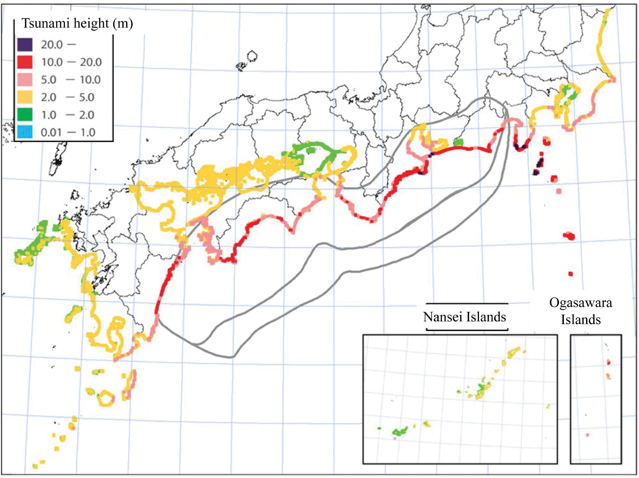
The maximum tsunami height at high tide in the Nankai region. Source: Cabinet Office, Government of Japan, White Paper: Disaster Management in Japan 2015.
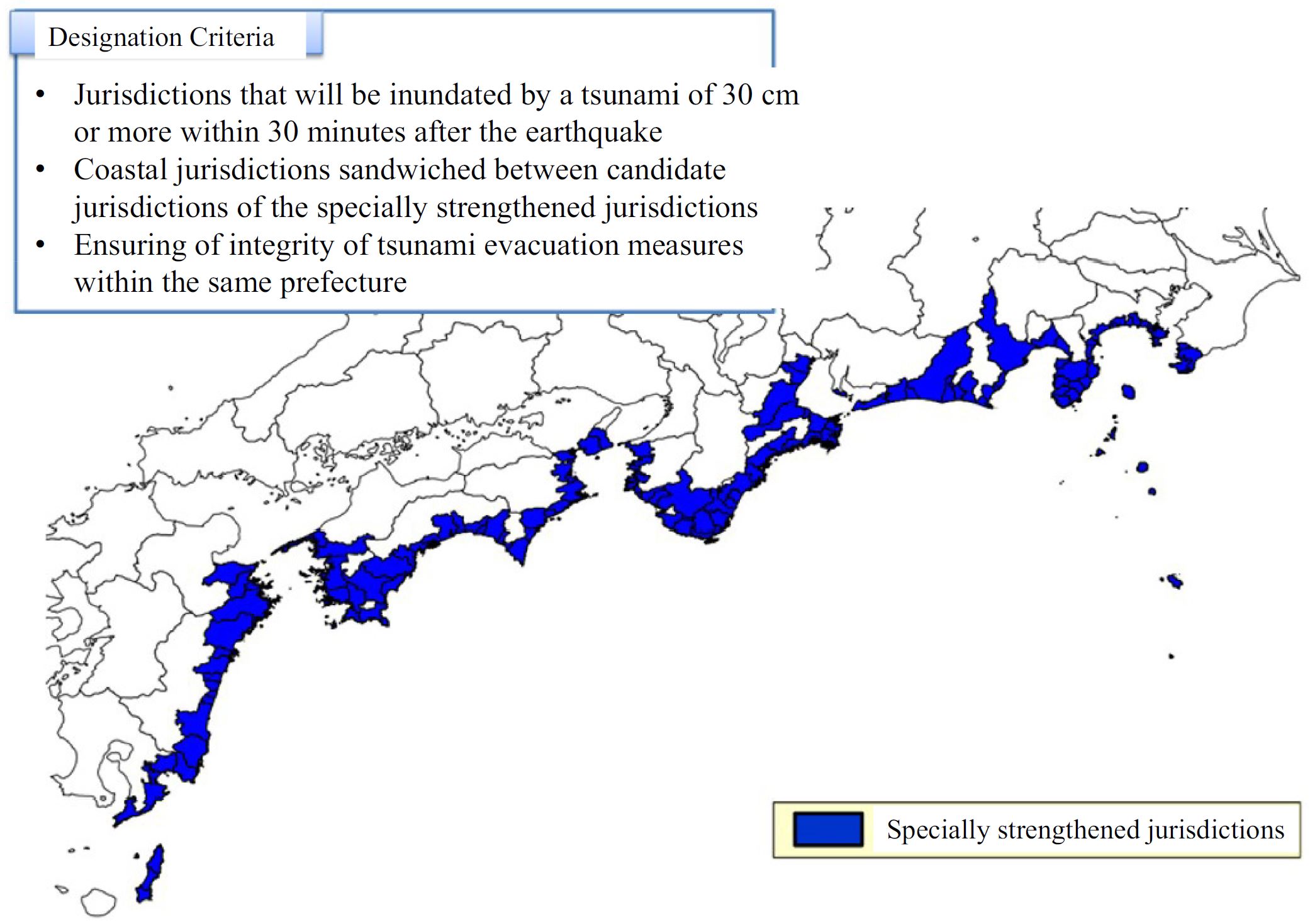
Jurisdictions at risk of tsunami. Source: Cabinet Office, Government of Japan, White Paper, Disaster Management in Japan 2015. The color version of this figure is available only in the electronic edition.
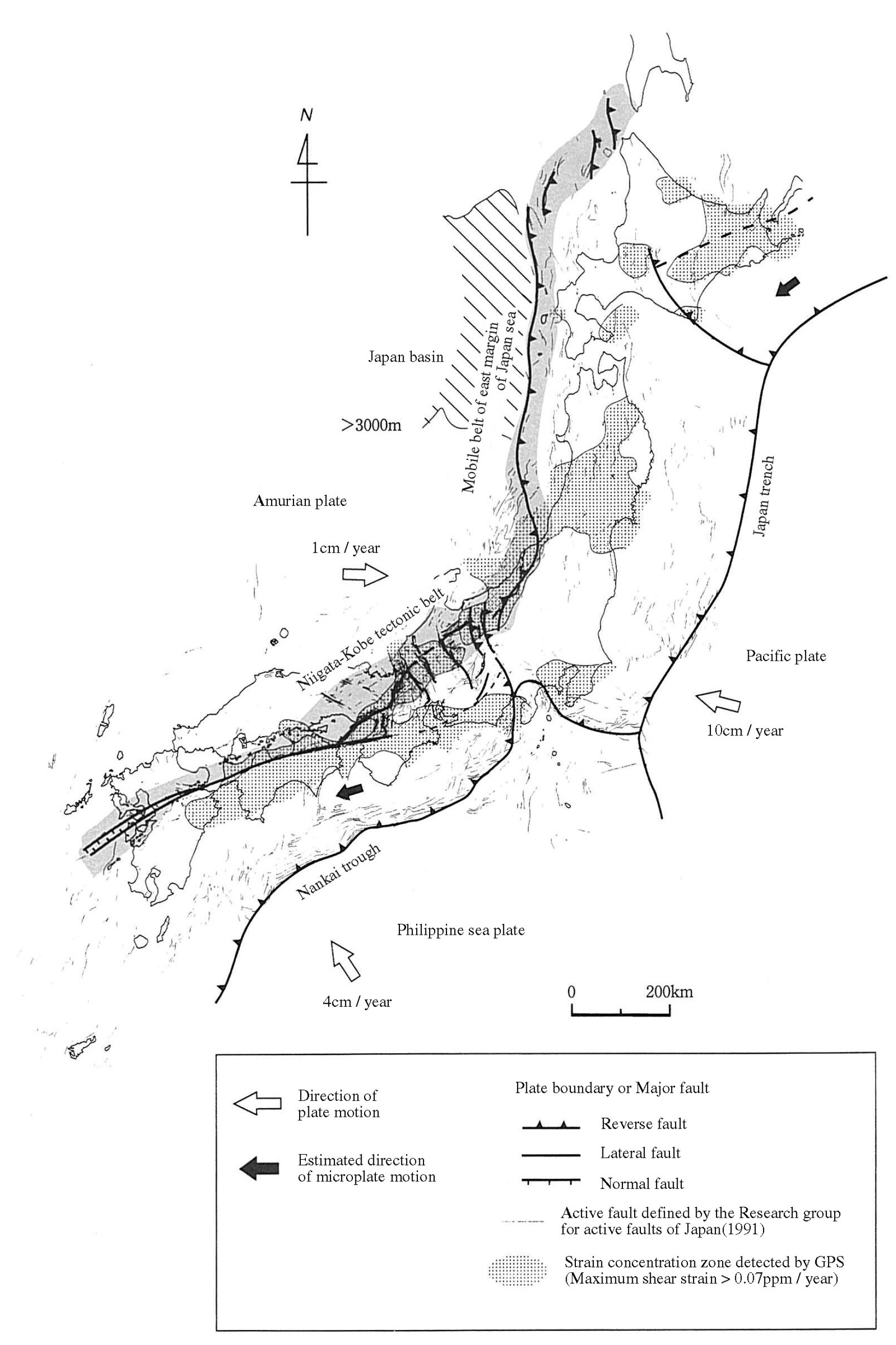
- This map shows the current tectonic configuration of this region, along with some inherited features from the tectonic past (e.g. green lines). This is from NUMO’s report: “Evaluating Site Suitability for a HLW Repository (Scientific Background and Practical Application of NUMO’s Siting Factors), NUMO-TR-04-04.”
- Also from the NUMO report, this shows the Niigata-Kobe fold and thrust belt. In addition, this map shows a northwest striking convergent plate boundary along the southeastern boundary of Hokkaido. However, it cannot explain the interesting orientation of the M 6.2 deep (240 km) earthquake.
- Here is the cool tectonic map from Liu et al. (2013). We all like cool maps! (right?)
- Here is a map from the recent update of the Japan National Seismic Hazard Maps, resulting from knowledge gained following the 2011 M 9.1 earthquake (Fujiwara et al., 2012). The color represents the chance that a region will experience ground shaking at or greater that Japan Meteorological Agency (JMA) seismic intensity 6 in the next 30 years. JMA intensity is a scale of shaking intensity similar to the Modified Mercalli Intensity (MMI) Scale. The numbers are different, so they are difficult to compare. The JMA intensity 6 is similar to MMI X. Today’s earthquakes are in a region of slightly elevated chance of ground shaking (between 6-26%). Today’s M 6.6 earthquake may have reached
- This is a fantastic educational video from IRIS that discusses the plate tectonics and mentions some earthquakes in the region of Japan.
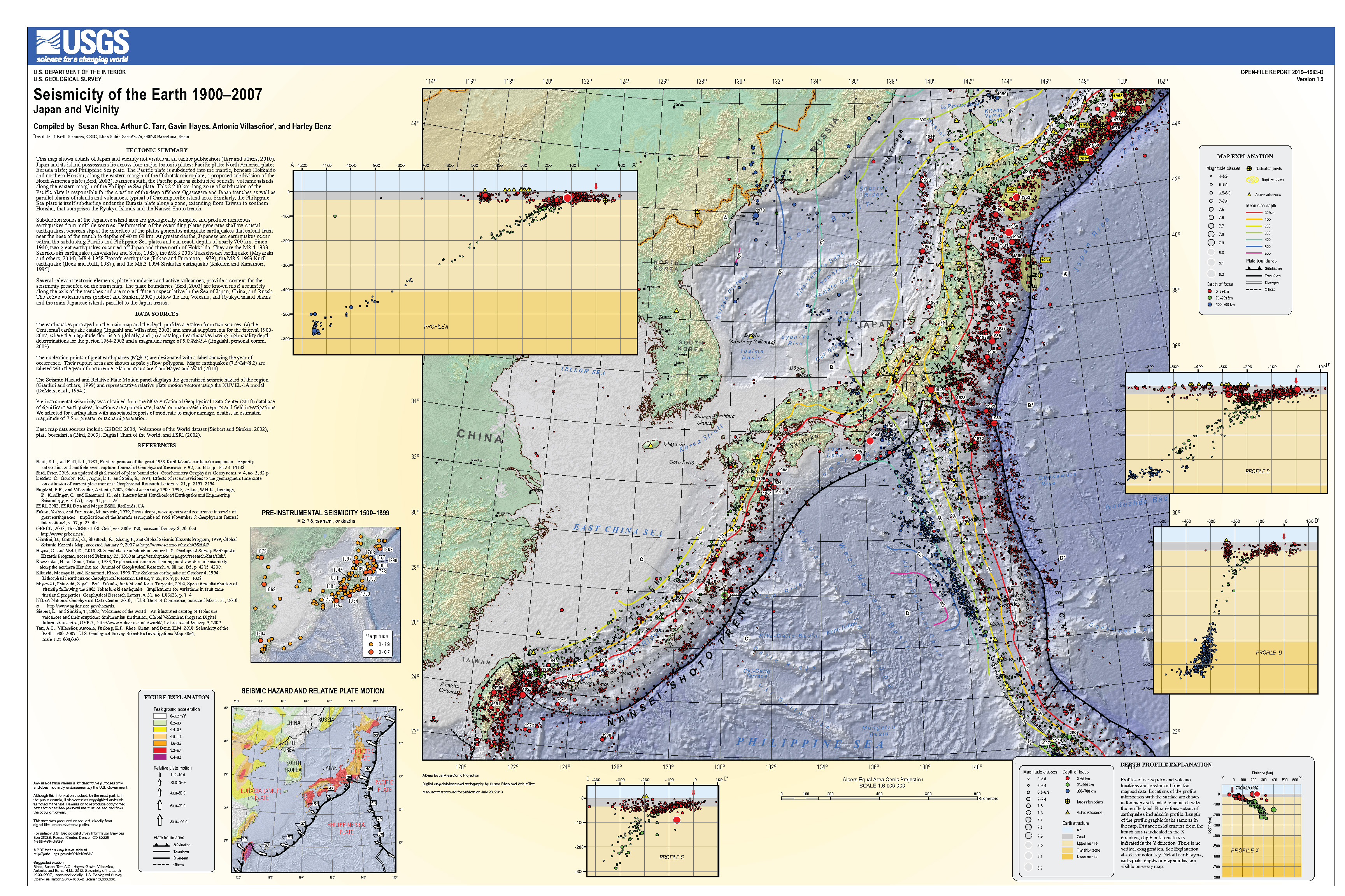
- Here is a USGS poster than summarizes the earthquake history and plate geometry for this region. This is the USGS Open File Report 2010-1083-D (Rhea et al., 2010).
- Here is the figure showing the tectonic setting (Kurikami et al., 2009). I include their figure caption as a blockquote.
- Here is the figure showing the historical moment tensors for this region (Chapman et al., 2009). I include their figure caption as a blockquote.
- Here is an image that shows a 3-D view of the seafloor and seismic data. This comes from Moore et al. (2007). First is a map showing the location of this 3-D seismic survey, then the survey results, then their interpretation of the evolution of this margin. I include their figures caption below as a blockquote.
- This is an image from Jin-Oh Park (University of Tokyo) that shows the Decollement (the megathrust fault) and the seafloor. I include their figure caption below as a blockquote.
- Some think that the 1944 earthquake slipped along a splay fault, a fault that splays off of the megathrust. Here is an image that shows how the megasplay fault is configured. This is the source of this figure. I include their figure caption below as a blockquote.
- This is a downloadable file for the embedded video below. The video may load slowly as it is a large file. One may want to download the file to view from their computer, depending upon one’s internet speed. (~500 MB mp4)
- Moore et al. (2009) presented additional results from their study.
- This is a map showing the faults that they mapped by using their 3-dimensional seismic profiles.
- Here is a “multibeam” bathymetry map (showing the shape of the seafloor) that outlines the region of the 3-dimensional seismic profile from Moore et al. (2009).
- Drill sites are shown as red circles.
- Here are the faults mapped by Moore et al. (2009).
- The profile plot in the next figure is from a cross-section through the 3-dimensional seismic data in the location of the black line labeled Figure F6.
- Further west, offshore of Shikoku Island, in the region of the 1946 M 8.1 earthquake, Park et al. (2000) used seismic profiles to look at the structures of the megathrust there.
- This first figure shows a map of their study region. The above study from Moore et al. was offshore of the Kii Peninsula.
- These authors were interested in documenting the presence, size, and shape of “out-of-sequence” thrust faults (OSTs).
- OSTs are thrust faults (formed by compression in the accretionary prism) that may be faults that activate during megathrust earthquakes.
- We often call these OSTs “splay faults,” especially if there is evidence that subduction earthquake slip along the megathrust fault “splays off” from the main fault, onto these OST faults.
- These splay faults are important to understand because they can have a significant impact on tsunami generation:
- These faults are closer to land than the tip of the megathrust. Tsunami generated along splay faults have the capacity to arrive at the coastline faster than tsunami generated only on the megathrust.
- Splay faults dip at a steeper angle than the main megathrust, so can generate more vertical seafloor motion.4
- This is seismic profile along MS107 (see map for location).
- The upper panel are the uninterpreted data and the lower panel are the interpreted data.
- This is seismic profile along MS105 (see map for location).
- The upper panel are the uninterpreted data and the lower panel are the interpreted data.
- Ichinose et al. (2003) analyzed seismic data to investigate the rupture processes for the 1944 Tonankai Earthquake.
- This magnitude M 8.1 megathrust subduction zone earthquake slipped a patch of the fault offshore of the Kii Peninsula.
- This figure shows a map with historic earthquake extents delineated.
- This map shows earthquake mechanisms for events that were part of the 1944 earthquake.
- Below the figure I include a legend for earthquake mechanisms. This legend works for both focal mechanisms and moment tensors.
- This is the slip distribution based on their inversion of teleseismic data. Teleseismic data are seismic wave data from earthquakes far away.
- A seismic wave inversion uses the seismic waves to estimate the amount that a fault slipped during an earthquake.
- In the map, the rectangles are all shaded relative to the amount that the fault slipped during this earthquake (the distribution of the slip).
- This map shows the vertical and horizontal motion from the earthquake as calculated during their analyses.
- Hyodo et al. (2016) model seismic cycles along the Nankai trough. They try to determine the possibility of earthquakes in one part (segment) of this subduction zone might trigger earthquakes in other segments.
- This first figure shows the spatial extent of historic earthquakes. Note that there are two megaquakes that may have extended the through all segments (1498 and 1707 CE).
- Garrett et al. (2016) presented a summary of the geological evidence for earthquakes and tsunami for the past 12 thousand years (a.k.a., the Holocene).
- This figure shows a tectonic map and a map of the Nankai subduction zone.
- Symbols on this map show the locations where different types of paleoseismic data have been collected. Paleoseismology is the study of prehistoric earthquakes.
- The table shows which subduction zone segment each historic earthquake may have ruptured.
- This is a figure showing the types of physical evidence included in this paper.
- The upper panel is a map that shows the locations of each study plotted in the lower panel.
- The lower is called a space time diagram.
- The horizontal axis is space (south to north, left to right, aligned to the map).
- The vertical axis is time.
- Each colored bar on the plot represents evidence of an historic (marked by arrows on the right margin) or a prehistoric (lower plot) earthquake.
- The vertical size of these colored bars represents the span of time for when we think these earthquakes happened.
- Paleoseismologists can correlate evidence for prehistoric earthquakes between sites based on the coincidence of the timing for these earthquakes.
- Given the uncertainty of the age analytical methods, it is not really possible to know if these earthquakes actually correlate. One way to figure this out is to use turbidites as in Goldfinger et al. (2012, 2017) which can be used to correlate the timing of earthquakes down to tens of minutes to hours (extremely more precise than any other age analysis method).
- These maps show the segments that may have ruptured for some of the earthquakes summarized by Garrett et al. (2016).
- Note how few earthquakes overlap with the southernmost part of the margin (segment Z).
- Furumura et al. (2011) used tsunami modeling to evaluate the slip and size of the 1707 Hoei Earthquake.
- They suggest that there is a regular cycle of 100-150 years for megathrust earthquakes and a cycle of 300- to 500-years for megaquakes like the 1707 event.
- There were direct observations of the tsunami from the 1707 earthquake. These authors compared the results from their tsunami modeling with these observations.
- This first figure shows the spatial extent of some historic earthquakes and locations for which they refer in their paper.
- This map shows the vertical deformation from a tsunami source model from a previous researcher (An’naka et al., 2003).
- Red means the seafloor went up and blue means the seafloor went down. Both types of vertical motion can contribute to tsunami generation.
- This map shows the size of the tsunami at different times (in minutes) after the earthquake.
- This figure shows comparisons of modeled tsunami size and the tsunami size observations from previous researchers.
- The map has dashed lines that separate the extent of each of the plots in the lower panels. These lower panels are plotted south to north, left to right.
- For comparison with the modern movement of the Earth’s surface due to plate tectonics, these authors used Global Positioning System (GPS) observations at different locations.
- The color on the map represents the amount of vertical motion.
- These authors revised their slip models and here are two examples.
- Here are some time steps from their revised tsunami modeling.
- Here are comparisons (as before) for their revised tsunami source model.
Some Relevant Discussion and Figures
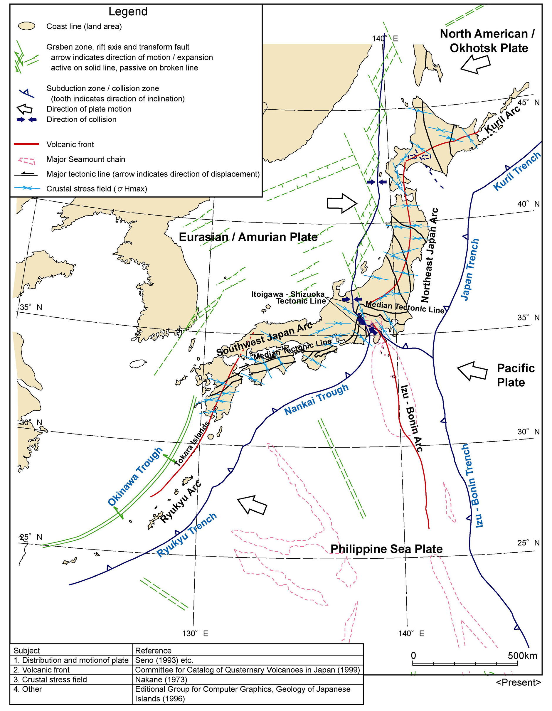

Tectonic settings of the study region (black box). The solid sawtooth lines and the black dashed line denote the plate boundaries (Bird 2003). The red triangles denote the active volcanoes. The blue dashed lines and the pink lines denote the depth contours to the upper boundary of the subducting Pacific slab and that of the subducting Philippine Sea slab, respectively (Hasegawa et al. 2009; Zhao et al. 2012). The topography data are derived from the GEBCO_08 Grid, version 20100927, http://www.gebco.net. The ages of oceanic plates are from M¨uller et al. (2008).

Current tectonic situation of Japan and key tectonic features.
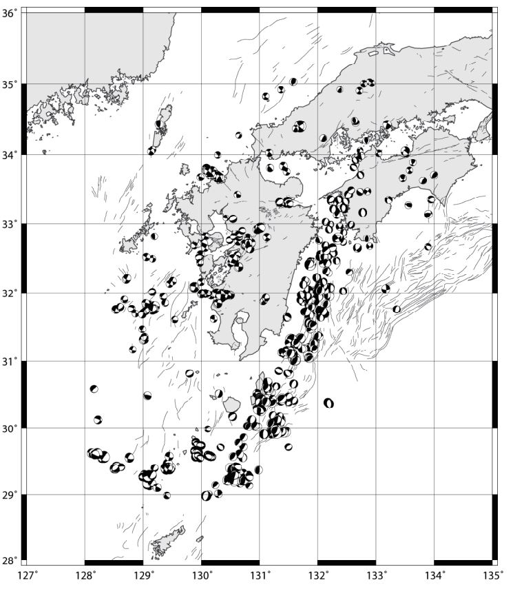
Focal mechanism plots for earthquakes in southwest Japan from 1997-2006. Based on CMT solutions from the JMA catalogue (data from http://www.fnet.bosai.go.jp).
-
There have been many IODP investigations along the Nankai Trough. These investigations include 3-D seismic and scientific drilling in this region. Here are a couple reports from Moore et al. (2009) and Kinoshita, et al. (2007).

Location map showing the regional setting of the Nankai Trough (upper right inset). PSP, Philippine Sea Plate; KPR, Kyushu-Palau Ridge; IBT, Izu-Bonin Trench; KP, Kii Peninsula. Conver gence direction between the Philippine Sea Plate and Japan is shown at the lower right.

3D seismic data volume depicting the location of the megasplay fault (black lines) and its relationship to older in sequence thrusts of the frontal accretionary prism (blue lines). Steep sea-floor topography and numerous slumps above the splay fault are shown.

(A to C) Summary diagram showing the development of the Nankai accretionary prism in the Kumano Basin area. After “normal” in-sequence thrusting and building of an accretionary prism, an out-of-sequence (splay) fault system broke through at the back of the prism, a, b, and c refer to sequential sedimentary sequences.

3-D prestack depth migration images (inline slice, crossline slice, and depth slice) of the Nankai accretionary wedge off Shikoku Island. Miocene to Pliocene Shikoku Basin sediments underthrusts the overlying accretionary prism along a decollement as the Philippine Sea Plate subducts beneath the Eurasian Plate. The oceanic crust of the subducting Philippine Sea Plate (PSP) is traceable over the entire inlines. Several imbricate thrust faults are observed in the overlying accretionary wedge. The Décollement steps down on the top of subducting oceanic crust around ~30 km landward from the deformation front.

A: Tectonic setting of Nankai Trough subduction zone. Large earthquakes (magnitude 8-class) have repeatedly occurred along the Nankai Trough. The orange shaded segment caused the 1944 Tonankai earthquake. The NanTroSEIZE project is underway along the red line B.
B: Cross section (red line in A). Detailed seismic profiles illustrate the plate boundary fault and the megasplay fault.
C: Locations of core samples from Sites C0004 and C0008, taken from hanging wall and the footwall, respectively.
-
Here is a great documentary about slow earthquakes and the Nankai subduction zone. The yt link is here.
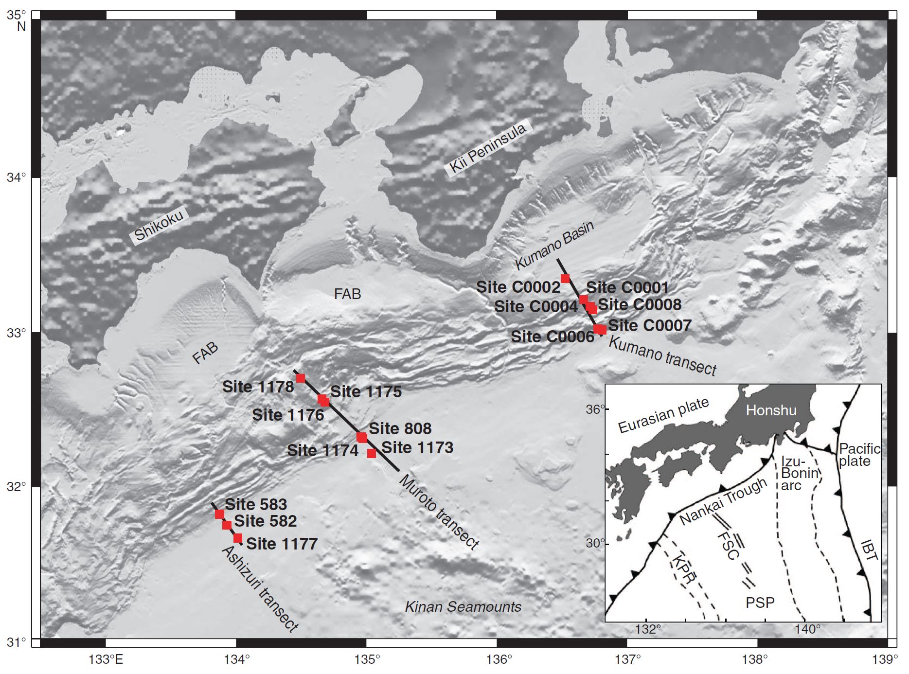
Regional bathymetry of northern Shikoku Basin and Nankai Trough region showing previous DSDP/ODP and current IODP drilling transects. FAB = forearc basin. Inset = tectonic map showing plate tectonic setting of the region. IBT = Izu-Bonin Trench, KPR = Kyushu-Palau Ridge, FSC = fossil spreading center, PSP = Philippine Sea plate.
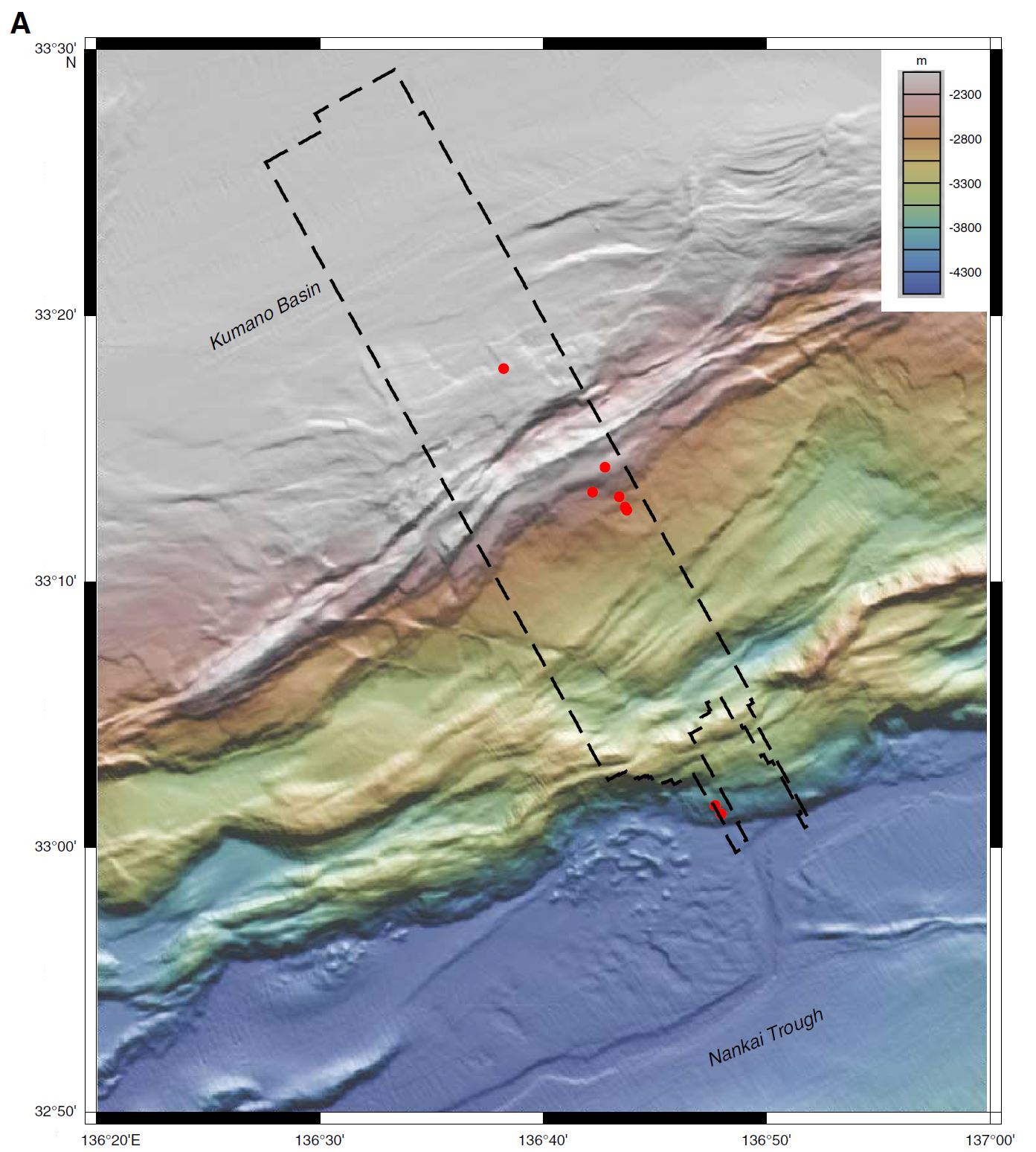
Multibeam bathymetry of the Kumano Basin region. Dashed line = 3-D seismic survey, circles = NanTroSEIZE Stage 1 drill sites. Details of bathymetry data acquisition and processing are summarized in Ike et al. (2008a)
Preliminary geological interpretation of Kumano transect area based on 2-D and 3-D seismic reflection and high-resolution bathymetry data. Solid line = composite seismic line.
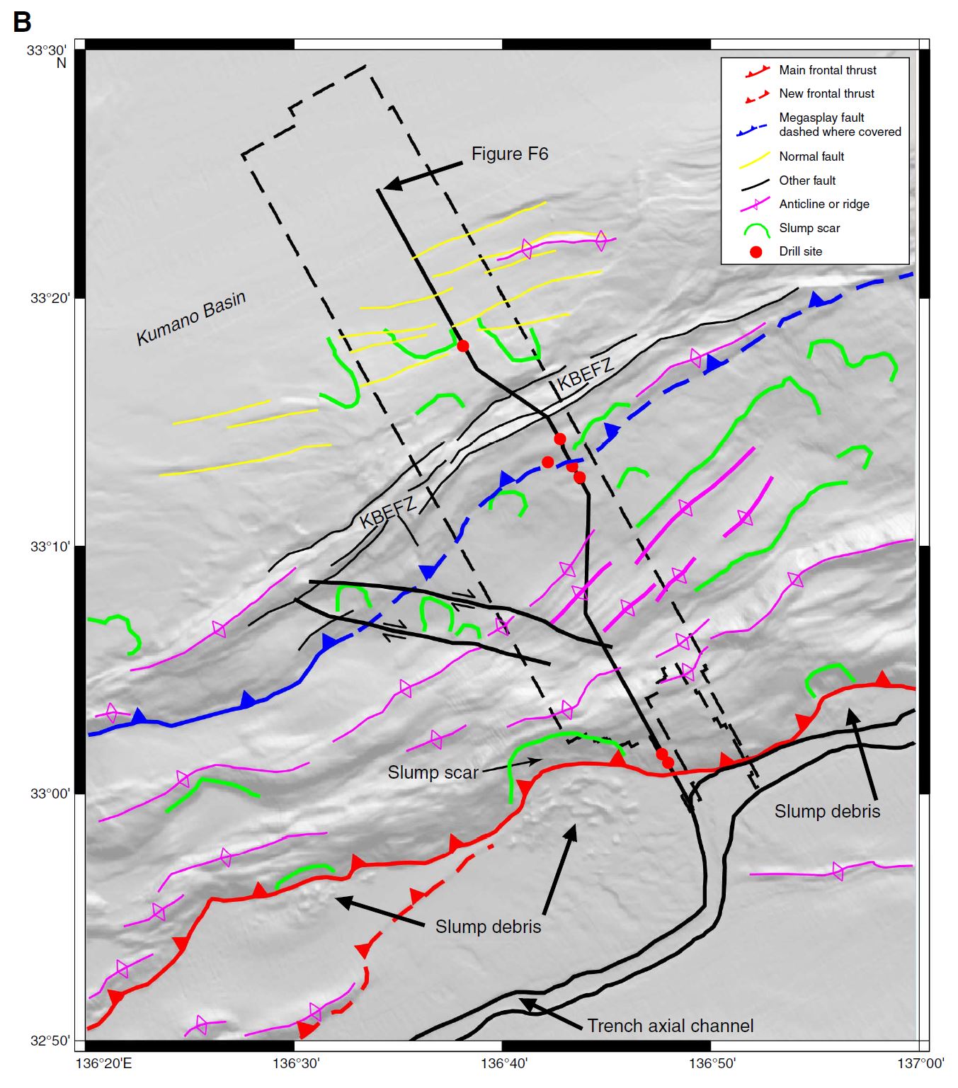
Composite seismic line extracted from 3-D seismic volume. The line crosses through (or near) all Stage 1 drill sites (location shown in Figs. F2 and F4). A. Uninterpreted version. B. Interpreted version. Only a few representative faults are shown. Dashed lines = less certain fault locations. Morphotectonic zones are shown between the two sections. KBEFZ = Kumano Basin edge fault zone, PTZ = protothrust zone. BSR = bottom-simulating reflector. VE = vertical exaggeration.
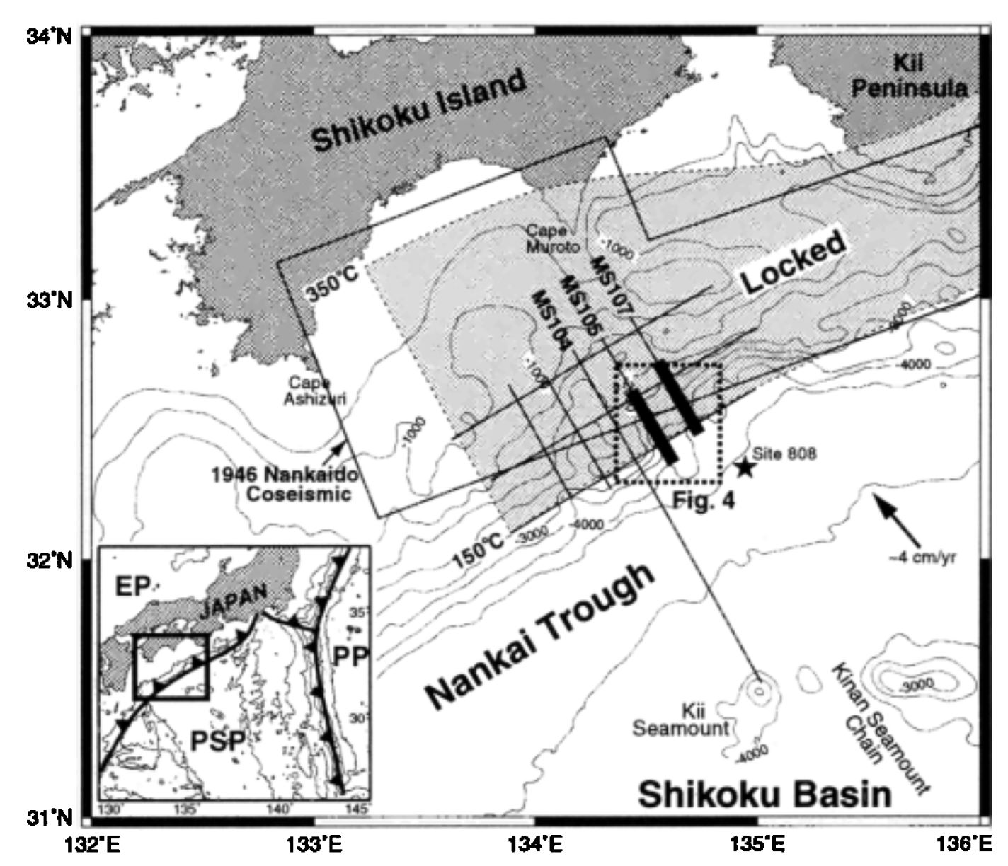
Bathymetry and physiographic features of the Nankai Trough margin off Shikoku. Positions of multi-channel seismic reflection lines are shown. The bold lines indicate the positions of profiles M S 107 and MS 105 displayed in Figures 2 and 3, respectively. The dotted-square is an area of swath-bathymetric data, which is shown on Figure 4. Site 808 of Ocean Drilling Program (ODP) Leg 131 is indicated as a star. The thin-solid rectangle is the coseismic rupture area of the 1946 Nankai earthquake (Aida, 1981; Ando, 1982). The dark shaded area is interseismic locked zone (Hyndman e al., 1995). The convergence rate of the Philippine Sea Plate under the Eurasia Plate is approximately 4 cm/yr (Seno et al., 1993). Water depth contours are in meters. EP=Eurasia Plate. PSP=Philippine Sea Plate. PP=Pacific Plate.
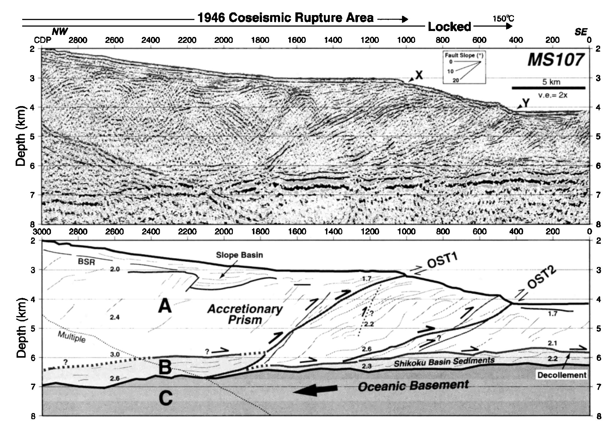
Poststack depth migrated seismic profile (upper section) of line MS107 and its interpretation (lower section), vertical exaggeration about 2:1. A, B, and C indicate Unit A, Unit B, and Unit C, respectively. Numbers within each seismic unit in the interpretation indicate P-wave interval velocity. Note a splay fault system consisting of sigmoid out-of-sequence thrust (OST) faults dipping landward.
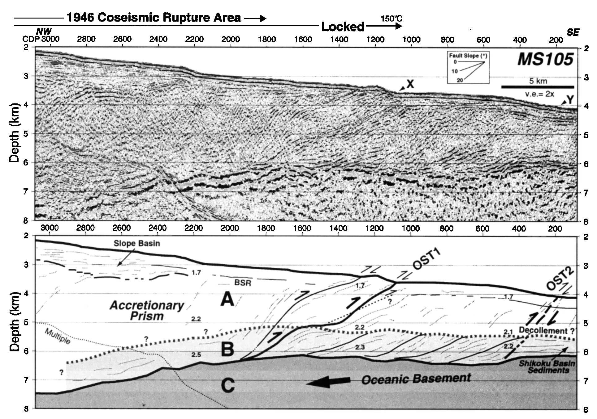
Poststack depth migrated seismic profile (uppers ection) of line MS105 and its interpretation (lower section), vertical exaggeration about 2:1. See Figure 2 caption for explanation of symbols.
Earthquake History
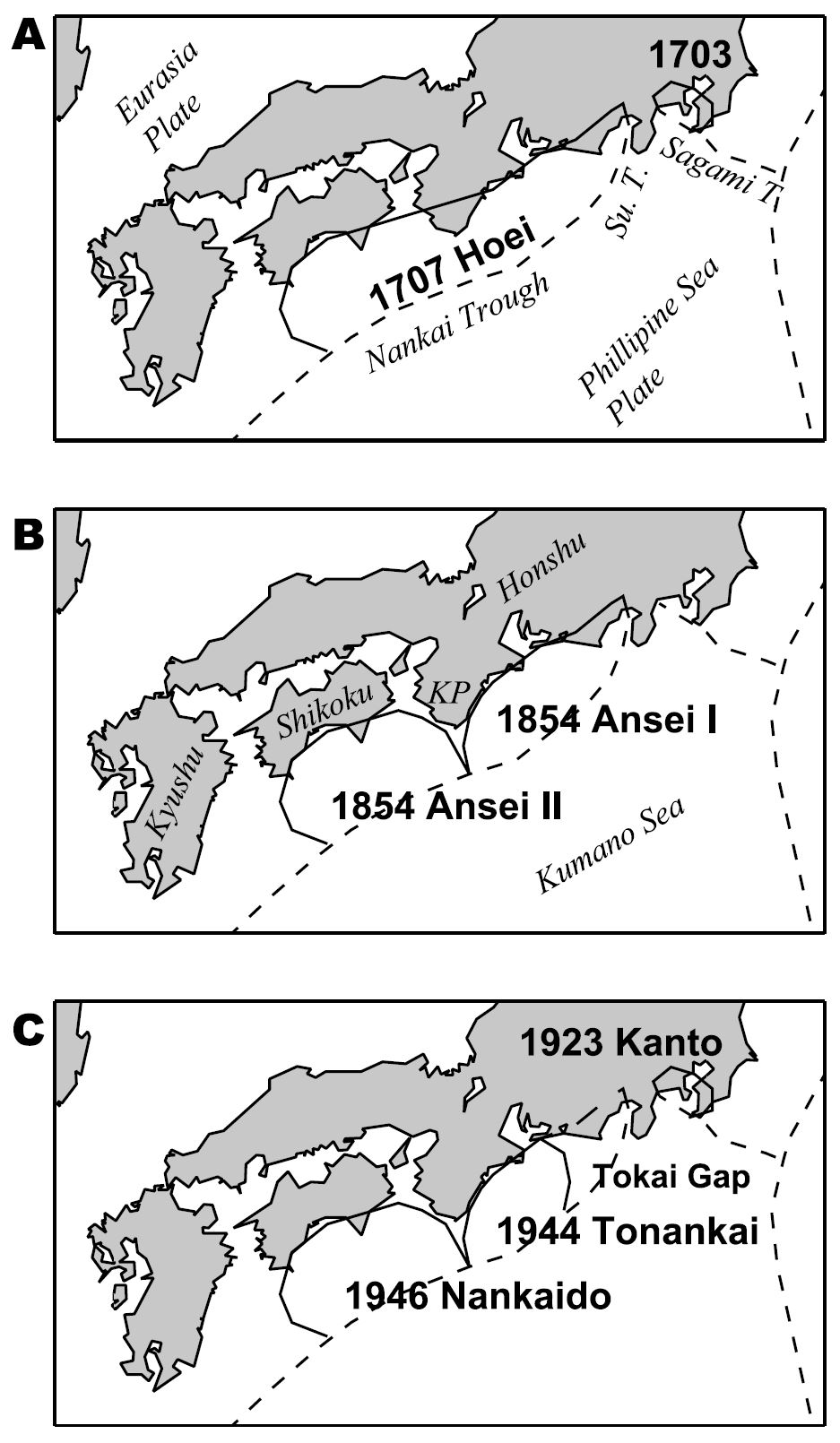
History of large subduction zone earthquakes in western Japan along the Nankai trough since 1703 (after Mogi [1981]). (a) The 1707 Hoei earthquake ruptured the entire Nankai trough including the Suruga trough. (b) The 1854 Ansei I and II earthquakes occurred approximately 1 day apart and ruptured the same area as the 1707 Hoei event. (c) The most recent series of events included the 1944 Tonankai and 1946 Nankaido earthquakes. This cycle did not rupture the region of the Suruga trough called the Tokai gap. Abbreviations: Su. T., Suruga trough; KP, Kii Peninsula.
We examined four recent events (E1 through E4; see Table 1) to calibrate the 1-D layered Earth structure for the computation of synthetic Green’s functions used in the slip inversion. These four earthquakes occurred within the rupture zone of the 1944 Tonankai earthquake, and the F-net broadband seismograph network recorded them. The F-net station locations are shown with the JMA stations that operated in 1944. The F-net station UMJ is an important surrogate in calibrating JMA stations at KOC and MRT. The focal mechanism from Kanamori [1972] is shown with the shaded compressional quadrant. We use a fault model in the slip inversion based on the orientation of the Nankai trough shown as the nodal planes with dashed lines in the focal mechanism.

Slip distribution estimated from the inversion of teleseismic and regional data sets. The origin of the fault plane coordinates is at the northeast corner and the hypocenter is at the opposite corner. The most slip occurs along the accretionary wedge and under the Shima and Atsumi Peninsulas.

Vertical and horizontal sea-bottom and land coseismic displacements computed using the inverted slip model. The observed vertical displacements were surveyed after the 1946 earthquake.

Historical sequence of Nankai Trough earthquakes (after Ishibashi 2004). Upper map shows distribution of six rupture segments along Nankai Trough. Each rupture segment has been broken or unbroken in historical Nankai Trough earthquakes. Areas surrounded by gray dashed and gray dotted lines represent maximum estimates of seismogenic sources and possible tsunamigenic sources for future Nankai Trough earthquakes, respectively (Cabinet Office 2012). Black and white stars indicate hypocenters of the 1944 Tonankai and 1946 Nankai earthquakes, respectively (Kanamori 1972). In the table below, horizontal thick lines indicate segments that ruptured during each historical event in the Japanese eras named in the left column. Thick dashed lines and thin dotted lines indicate probable and possible broken segments, respectively. Roman and italic numerals indicate earthquake occurrence years and time intervals between two successive earthquakes, respectively. Since the 1605 Keicho event (shown by a gray broken line) was obviously a tsunami earthquake, this event is excluded in counting the time intervals between successive events. Among successive earthquakes, the 1707 Ho’ei and 1361 Ko’an earthquakes are considered to be larger earthquakes than ordinary ones from the evidences of uplifts and large tsunamis at the southern tip of the Kii Peninsula (e.g., Shishikura et al. 2011)
Earthquake Prehistory
a) Tectonic setting of Japan, including the location of b) The Nankai-Suruga Trough,with the distribution and classification of sites discussed in this paper. Abbreviations: SB: Suruga Bay, FKFZ: Fujikawa-Kako Fault Zone, ISTL: Itoigawa-Shizuoka Tectonic Line; letters Z, A, B, C,D and E refer to seismic segments. Segment Z is also known as
HyūgaNada”; segments A and B are collectively “Nankai”; segments C and D are collectively “Tōnankai”; segment E is “Tōkai”. Contours of the upper boundary of the subducting Philippine Sea slabmarked with dashed grey lines at 20 km intervals (following Baba et al., 2002; Hirose et al., 2008; Nakajima and Hasegawa, 2007a). c) Summary of historical Nankai-Suruga Trough earthquakes, including calendar year, era name (nengō) and proposed rupture zone segments from historical records (following Ando, 1975b; Ishibashi, 2004).

Representative photographs of different lines of palaeoseismic evidence that have beenemployed along theNankai-Suruga Trough. a)Emerged sessile organisms at Suzushima close to the boundary between segments B and C. Mass mortality of colonies of intertidal annelid worms reflects coseismic uplift during an earthquake approximately 2000 cal. year BP (Shishikura et al., 2008). b) An emerged wave cut platform near Cape Ashizuri. The platform lies at an elevation of approximately 1–1.2 m above present mean sea level and may reflect uplift during the 1946 CE earthquake (M. Shishikura, unpublished data). c) Layers of sand and mud probably left by the 1605 CE tsunami at Shirasuka (Fujiwara et al., 2006a). d) Liquefaction features (sand blows) induced by intense shaking during the 2011 Tōhoku earthquake (O. Fujiwara, unpublished data). e) An abrupt transition from peat to tidal flat mud resulting from coseismic subsidence of the Ukishima-ga-hara Lowlands in segment E (Fujiwara et al., 2016). Peat accumulating on a marsh (i.) is abruptly overlain by inorganic mud (ii.) after a rapid rise in water level, followed by a gradual return to organic sedimentation and the recovery of the marsh (iii. and iv.). f) A lacustrine turbidite from a lake in segment E possibly caused by intense shaking during an earthquake (L. Lamair, unpublished data).

Summary of the spatial and temporal distribution of proposed evidence for past megathrust earthquakes along the Nankai-Suruga Trough. We emphasise that for many of the records summarised here, alternative, non-seismic formation mechanisms are yet to be discounted. Upper panel displays site locations, lower panels give age ranges and limiting dates for proposed palaeoseismic evidence. Site numbers: 1 Ryūjin Pond*; 2 Azono*; 3 Funato*; 4 Tadasu Pond†; 5 Kani Pond*; 6 Cape Muroto; 7 Tosabae Trough‡; 8 Kamoda Lake*; 9 Itanochō*; 10 Shimonaizen*; 11 Kosaka-tei-ato*; 12 Ikeshima Fukumanji*; 13 Iwatsuta Shrine*; 14 Sakai-shi Shimoda*; 15 Tainaka*; 16 Hashio*; 17 Sakafuneishi*; 18 Kawanabe*; 19 Fujinami*; 20 Hidaka Marsh§; 21 Kuchiwabuka†; 22 Ameshima†; 23 Shionomisaki†; 24 Izumozaki†; 25 Arafunezaki†; 26 Ikeshima†; 27 Yamamibana†; 28 Taiji†; 29 Suzushima†; 30 Kii-Sano§; 31 Atawa§; 32 Shihara§; 33 Ōike Pond†‡; 34 Umino Pond§; 35 Suwa Pond†; 36 Katagami Pond§; 37 Kumano Trough W*; 38 Kumano Trough E†‡; 39 IODP core C0004†; 40 Kogare Pond§; 41 Funakoshi Pond§; 42 Shijima Lowlands§; 43 Kō§; 44 Ōsatsu Town‡; 45 Lake Biwa*; 46 Tadokoro*; 47 Nagaya Moto-Yashiki‡; 48 Shirasuka‡; 49 Arai‡; 50 Goten-ato*; 51 Lake Hamana†; 52 Rokken-gawa Lowlands‡; 53 Hamamatsu Lowlands§; 54 Ōtagawa Lowlands†; 55 Fukuroi-juku*; 56 Sakajiri*; 57 Tsurumatsu*; 58 Harakawa*; 59 Yokosuka Lowlands‡; 60 Omaezaki; 61 Yaizu Plain§; 62 Agetsuchi*; 63 Kawai*; 64 Ōya Lowlands†‡; 65 Shimizu Plain‡; 66 Fujikawa-Kako Fault Zone; 67 Ukishima-ga-hara‡; 68 Ita Lowlands†‡; 69 Iruma§; 70 Minami-Izu§; 71 Kisami§; 72 Shimoda†. Sites with calibrated ages taken from original publications marked *, sites with ages recalibrated in this publication marked †, sites with ages modelled in this publication marked ‡ (see also Supplementary info.), sites with no chronological data or where chronological data cannot be related to palaeoseismic evidence marked§. Abbreviations: SB: Suruga Bay, FKFZ: Fujikawa-Kako Fault Zone, letters Z, A, B, C, D and E refer to seismic segments.

Summary of inferred rupture zones of historical great Nankai-Suruga Trough earthquakes and the distribution of associated geological evidence. Question marks indicate uncertainty over the chronology or the origin of evidence at a site. *Rupture zones of the 1946 CE and 1944 earthquakes are approximated from Baba and Cummins (2005) and Tanioka and Satake (2001a,b). †Rupture zone of the 1605 CE earthquake following Ando and Nakamura (2013) and Park et al. (2014).
Tsunami Modeling

Source rupture areas of recent three Nankai Trough earthquake cycles: (a) the 1944 Tonankai and 1946 Nankai earthquakes, (b) the 1854 Ansei Nankai and Tokai earthquakes, and (c) the 1707 Hoei earthquake. (d) An index map illustrating major place names.
Surface displacement for the 1707 Hoei earthquake calculated using the source model of An’naka et al. [2003] with ground surface subsidence (blue) and upheaval (red). The contour interval is 0.5 m. Triangles show locations of the lakes that have tsunami deposits from the Nankai Trough earthquakes.
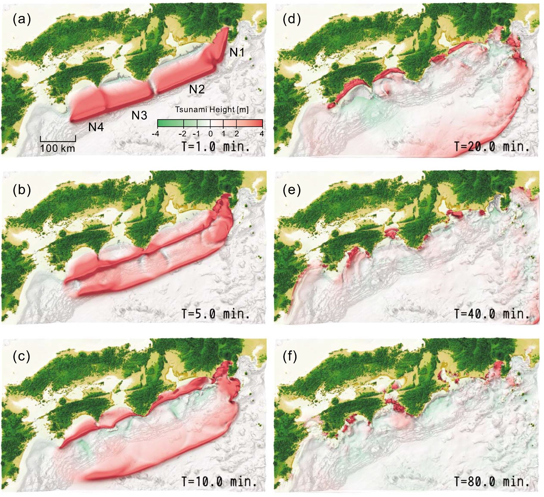
Snapshots of the tsunami associated with the 1707 Hoei earthquake at (a) T = 1.0 min, (b) T = 5.0 min, (c) T = 10.0 min, (d) T = 20.0 min, (e) T = 40.0 min, and (f) T = 80.0 min after the earthquake origin time. Red and blue colors indicate uplift and subsidence of the sea surface, respectively.
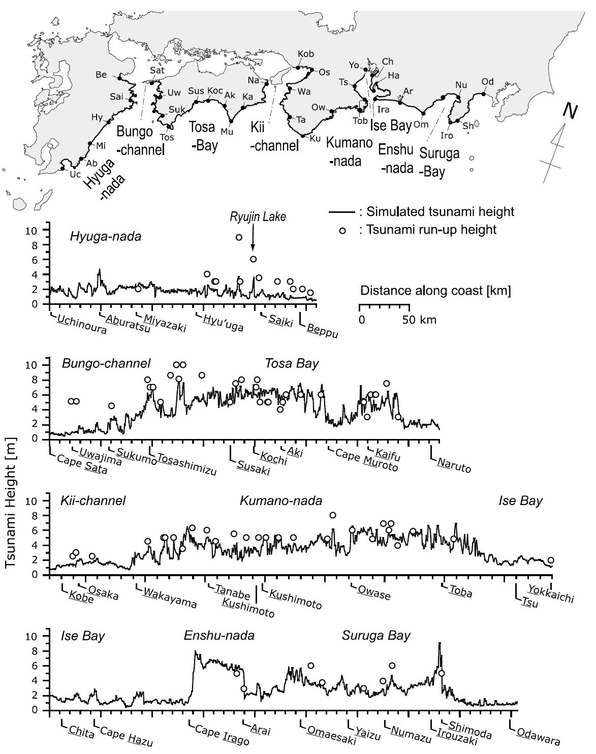
Maximum tsunami height along the Pacific coast of Japan. The map on the top shows the Pacific coastline from Hyuga‐nada to Suruga Bay with representative locations. The bottom four plots show the distribution of maximum tsunami height calculated using the simulation of the Hoei earthquake by An’naka et al. [2003]. Circles denote observed tsunami heights during the earthquake [Hatori, 1974, 1985; Murakami et al., 1996].
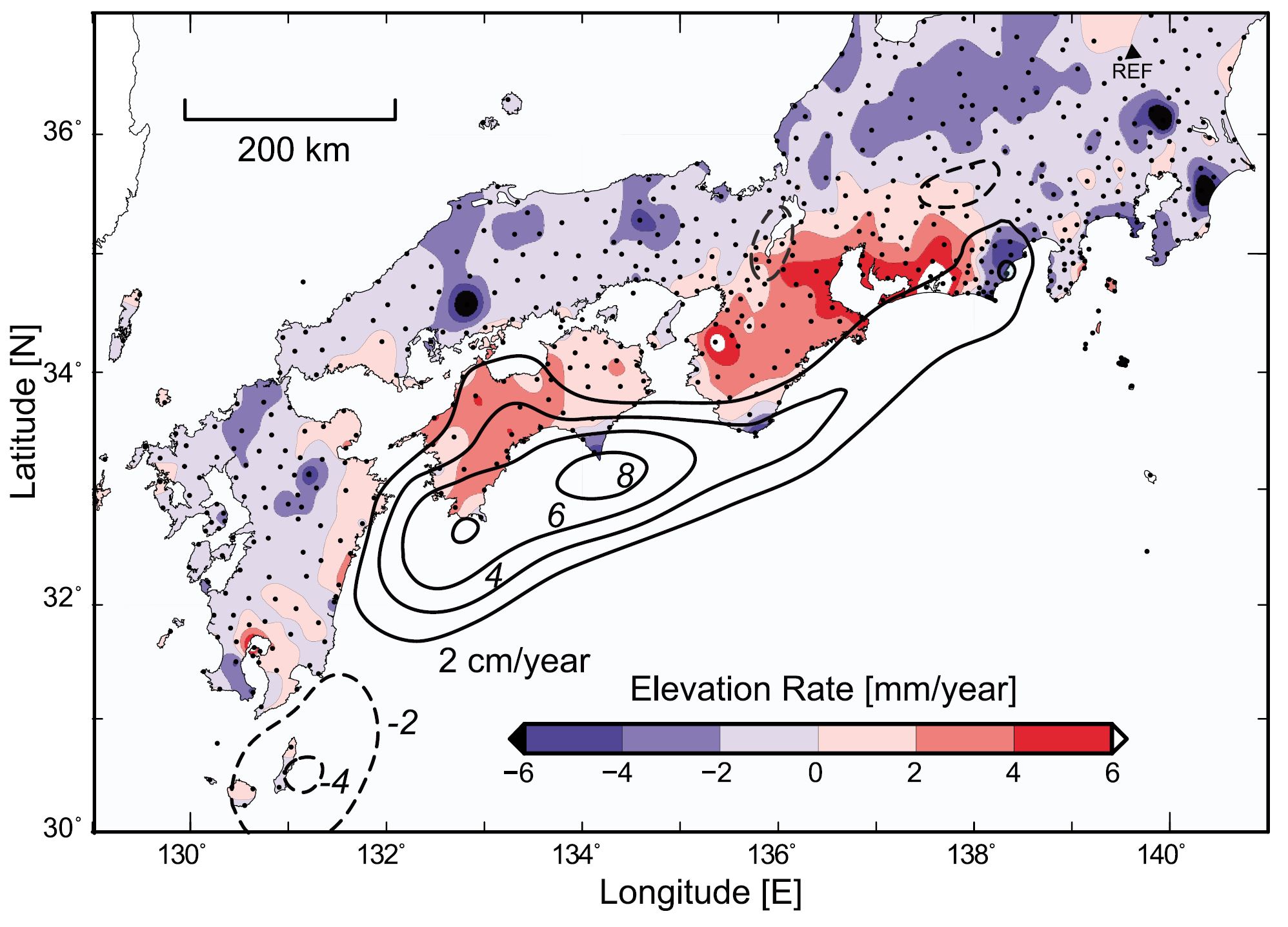
Pattern of average vertical movements of uplift (red) and subsidence (blue) derived using the GEONET GPS data from August 1999 to August 2009 are illustrated by blue‐red color scale. The triangle at the top right indicates the reference point used in this analysis. Thick solid and dashed contour lines illustrate slip delay and advance rate at the plate boundary derived by analysis of GPS data by Hashimoto et al. [2009] with a contour interval of 2 cm/yr.
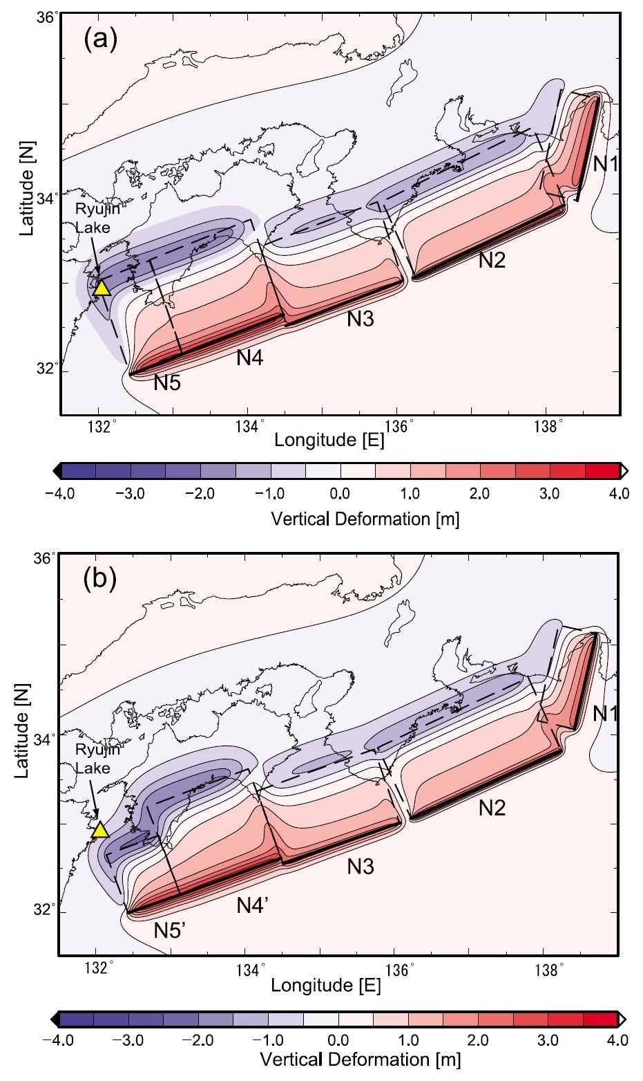
Vertical ground surface deformation derived by the revised 1707 Hoei earthquake source model: (a) an extended source model produced by adding a new N5 subfault segment at the Hyuga‐nada and (b) a subfault model with segment N5′ shortened in the direction perpendicular to the trench. Red and blue denote ground surface upheaval and subsidence, respectively. Location of Ryujin Lake is shown by the triangle.
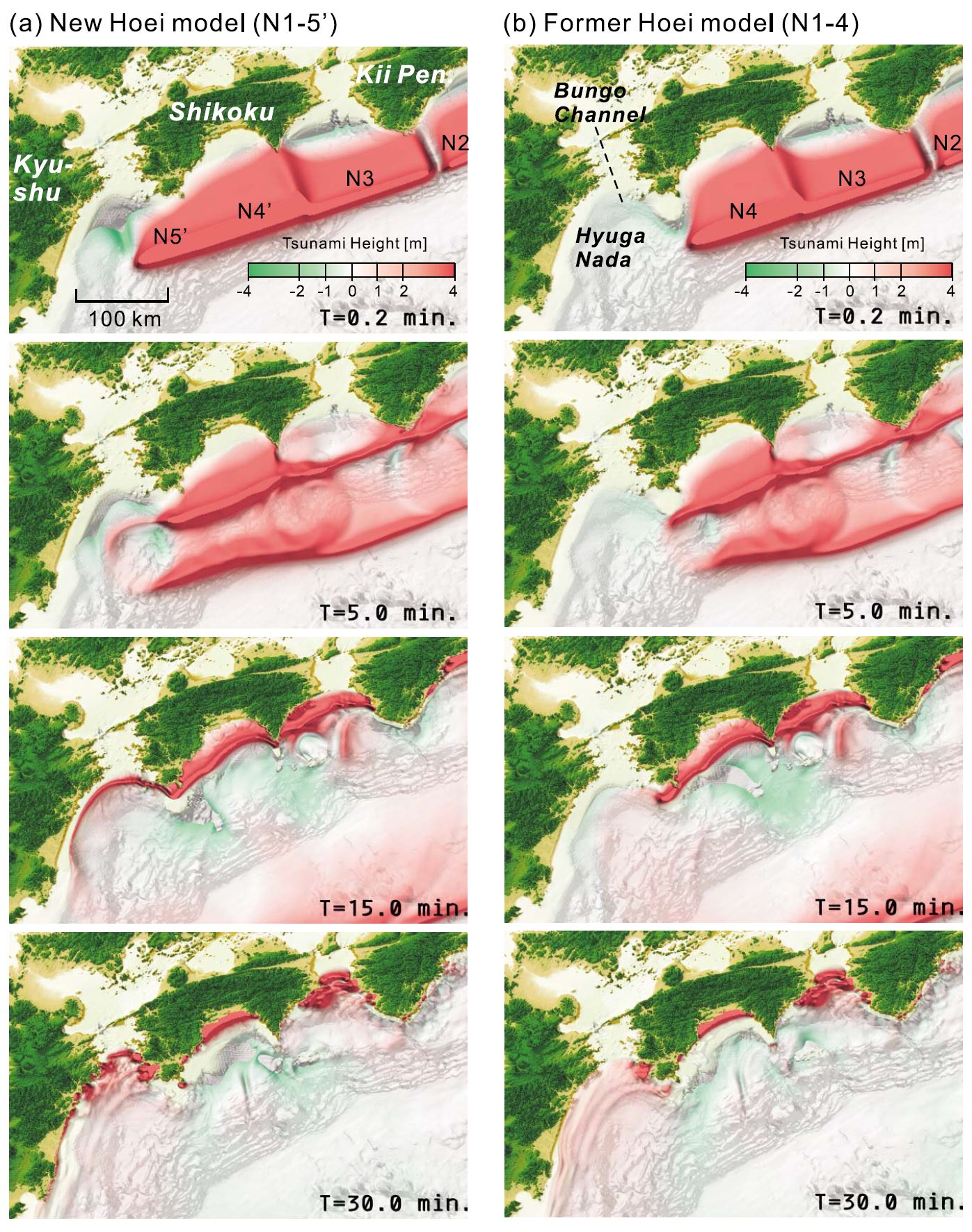
Snapshots of tsunami propagation from the Kii Peninsula to Kyushu derived from simulation at T = 0.2, 5.0, 15.0, and 30.0 min from the earthquake origin time. (a) New Hoei earthquake model with fault segments N1 to N5′ and (b) former Hoei model [after An’naka et al., 2003] with fault segments N1 to N4.
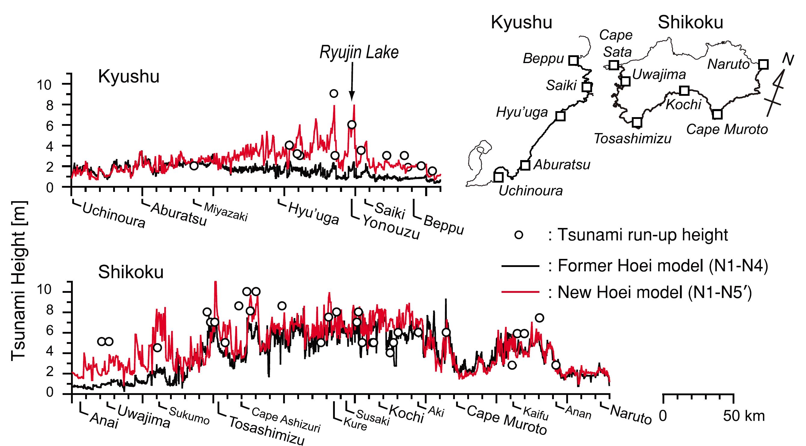
Maximum tsunami height along the Pacific coast of Japan. The map shows the Pacific coastline of Kyushu and Shikoku with representative locations (squares). Also shown are the distributions of maximum tsunami inundation height derived from the simulation of the new Hoei earthquake source model (red lines) and the former Hoei earthquake model (black lines). Circles denote observed maximum tsunami inundation or runup heights during the Hoei earthquake [Hatori, 1974, 1985; Murakami et al., 1996].
- 2011.03.11 Summary of the M 9.0 Japan (Tohoku-Oki)
- 2024.08.08 M 7.1 Japan
- 2024.01.01 M 7.5 Japan
- 2022.03.16 M 7.3 Japan
- 2018.09.05 M 6.6 Hokkaido, Japan
- 2016.07.29 M 7.7 Mariana
- 2016.11.21 M 6.9 Japan
- 2016.10.19 M 6.2 Japan
- 2016.08.20 M 6.0 Japan
- 2016.04.14 M 6.2 Japan
- 2016.04.01 M 6.0 Japan
- 2015.05.30 M 7.8 Izu Bonin
- 2015.05.31 M 7.8 Izu Bonin Update #1: triggered earthquakes
- 2015.05.31 M 7.8 Izu Bonin Update #2: Historic Seismicity
- 2015.06.09 M 7.8 Izu Bonin Update #3: seismic wave animations
- 2015.02.25 M 6.3 Japan (Sanriku Coast Update #5)
- 2015.02.21 M 6.7 Japan (Sanriku Coast Update #4)
- 2015.02.20 M 6.7 Japan (Sanriku Coast Update #3)
- 2015.02.16 M 6.7 Japan (Sanriku Coast Update #2)
- 2015.02.16 M 6.7 Japan (Sanriku Coast Update #1)
- 2015.02.16 M 6.7 Japan (Sanriku Coast)
- 2013.10.25 M 7.1 Japan (Honshu)
- 2011.03.11 M 9.0 Japan (Tohoku-Oki) Main Page
- 2011.03.11 M 9.0 Japan (Tōhoku-oki) Tsunami
- 2011.03.11 M 9.1 Japan (Tōhoku-oki) Decade Remembrance
- 1923.09.01 M 8.0 Kanto, Japan
Japan | Izu-Bonin | Mariana
General Overview
Earthquake Reports
Social Media
#EarthquakeReport #TsunamiReport for M 7.1 #Earthquake offshore of #Japan
megathrust subduction zone event
generated local #Tsunamihttps://t.co/DbHbLzeVZ1learn about tectonics in japan in '24 report https://t.co/cyyvvSv3Tm pic.twitter.com/hJk8l5E7Yv
— Jason "Jay" R. Patton (@patton_cascadia) August 8, 2024
#EarthquakeReport #TsunamiReport for M 7.1 #Earthquake offshore of #Japan
subduction zone eq@USGS_Quakes models suggest modest chance for triggered landslides and high chance for induced liquefactionhttps://t.co/DbHbLzeVZ1
background on liquefaction: https://t.co/cyyvvSv3Tm pic.twitter.com/Q8kn8IwEif
— Jason "Jay" R. Patton (@patton_cascadia) August 8, 2024
#EarthquakeReport #TsunamiReport for M 7.1 #Earthquake offshore of #Japan
megathrust subduction zone earthquake
generated local #Tsunami up to about 40 cm in amplitude
these are three tide gage plotshttps://t.co/DbHbLzeVZ1 pic.twitter.com/kg95zFi2WE— Jason "Jay" R. Patton (@patton_cascadia) August 9, 2024
#EarthquakeReport for the M7.1 #Earthquake and #Tsunami offshore of #Kyushu #Japan
compressional earthquake mechanism
interface earthquake along the megathrust subduction zone fault
generated local tsunami
Japan issued megaquake advisoryread report here https://t.co/EZ1ZncwIBl pic.twitter.com/24KnY66F4L
— Jason "Jay" R. Patton (@patton_cascadia) August 15, 2024
M 7.1 – 20 km NE of Nichinan, Japanhttps://t.co/zG722fjr3i pic.twitter.com/X59e8wWVS1
— Wendy Bohon, PhD 🌏 (@DrWendyRocks) August 8, 2024
Mw=7.1, KYUSHU, JAPAN (Depth: 31 km), 2024/08/08 07:42:55 UTC – Full details here: https://t.co/4h7BWpd8UF pic.twitter.com/qqxmp1lQqo
— Earthquakes (@geoscope_ipgp) August 8, 2024
🇯🇵 The Japanese Meteorological Agency has issued a megaquake advisory, urging people in areas near the #Nankai Trough to take disaster prevention measures, as they state the possibility of a 'mega earthquake' is higher than usual.
The Nankai Trough has historically produced… pic.twitter.com/Rd53VsTqar
— Faytuks Network (@FaytuksNetwork) August 8, 2024
BREAKING: The Meteorological Agency has issued an alert warning about a possible large earthquake around the Nankai Trough – the first ever such alert – following a magnitude 7.1 quake that struck earlier in the day off the coast of Kyushu. https://t.co/B2VAWA5YmB pic.twitter.com/8znmp0iLWT
— The Japan Times (@japantimes) August 8, 2024
Today, 7.1 Mw Southern #JAPAN 🇯🇵, Off Kyushu Island, associated to the Kyushu-Palau Ridge, no important tsunami. pic.twitter.com/IK2RjJQ3y9
— Abel Seism🌏Sánchez (@EQuake_Analysis) August 8, 2024
Tsunami NOT expected; CA,OR,WA,BC,and AK : Information Statement Tsunami Info Stmt: M6.9 Kyushu, Japan 0042PDT Aug 8
— NWS Tsunami Alerts (@NWS_NTWC) August 8, 2024
Energy waves from a magnitude 6.9 just off the coast of southern Japan are crossing our network. pic.twitter.com/8tryuNe75s
— Adam Pascale (@SeisLOLogist) August 8, 2024
#Earthquake (#地震) confirmed by seismic data.⚠Preliminary info: M6.8 || 24 km SE of #Miyazaki-shi (#Japan) || 9 min ago (local time 16:42:57). Follow the thread for the updates👇 pic.twitter.com/iN6FSh5mUv
— EMSC (@LastQuake) August 8, 2024
🚨🇯🇵BREAKING: 6.9 MAGNITUDE EARTHQUAKE HITS JAPAN’S COAST
A tsunami warning was issued after the earthquake occurred in the Hyuga-Nada Sea.
The depth of the epicenter was about 30km.
Source: @UN_NERV pic.twitter.com/YRsZ74QMbx
— Mario Nawfal (@MarioNawfal) August 8, 2024
2024-08-08 M7.1 20 km NE of Nichinan, #Japan #earthquake recorded in #Scotland & #Stornoway + historical seismicity & cross section.
Dist.: 9273.5km
Travel Time: 12m 34.6s
Depth: 25.0km#Python @raspishake @matplotlib #CitizenScienc pic.twitter.com/3QtP4OkhPI— Giuseppe Petricca (@gmrpetricca) August 8, 2024
日向灘では最近100年間で数回M7クラスの地震が発生しているが、今回の地震はその中でも1961年 (Mw7.5)、1996年 (Mw6.7 & 6.7)などが今回の地震の震源に近接している。 pic.twitter.com/TLrtdbY4hF
— JCN 2600 (@JCN_2600) August 8, 2024
This seismic station near Castaic Lake is busy! It’s recording earthquake waves (marked by purple dots) from the ongoing aftershock sequence near Lamont, CA, as well as the seismic waves from the M7.1 earthquake in Japan. See the data for yourself at https://t.co/UGVApJ6xpu pic.twitter.com/vdkG4qCHH1
— Wendy Bohon, PhD 🌏 (@DrWendyRocks) August 8, 2024
Distant long seismic waves (from Japan to Italy after the M7.1 #earthquake this morning) and very local short "tower bell" waves in Oriolo, southern Italy (at 11:15 a.m.) at @INGVterremoti seismic room #INGV pic.twitter.com/4N6zoGTmvm
— alessandro amato (@AlessAmato) August 8, 2024
Ground shaking in Victoria, Canada from today's M7.1 #earthquake across the Pacific in southern #Japan (8400 km away).
USGS: https://t.co/uIZgr3TCMW
There is much to learn for the #Cascadia subduction zone from this earthquake, as southern Japan is a very similar tectonic setting pic.twitter.com/oSr0WDclqa— John Cassidy (@earthquakeguy) August 8, 2024
Due to the radar line-of-sight properties, the best geometry to detect InSAR fringes for the M 7.1 #japanearthquake would be ascending (check the scenario, based on the USGS slip distribution), but only descending is planned with #Sentinel1.
Bad luck or insufficient coverage? pic.twitter.com/Ah5mrPSJul— Simone Atzori (@SimoneAtzori73) August 8, 2024
Updating the preliminary report of the M7.1 Hyuganada EQ in Japan. https://t.co/EwjQgHkIjt pic.twitter.com/0kHekXua1B
— Hiroyuki Goto (@HiroGotoxEQ) August 8, 2024
A M7.1 subduction earthquake struck southern Japan earlier today. It was followed by a megaquake alert from the Japan Meteorological Agency – the first such alert since the system was put in place in 2019. What does that mean?
Read more on our blog; link in my bio. pic.twitter.com/jU0UGt7dfS
— Dr. Judith Hubbard (@JudithGeology) August 8, 2024
Tsunami after the 7.1 magnitude earthquake at #SONDURUM #Japonya #japan #地震 #earthquake #japan #Sismo #deprem #breaking pic.twitter.com/lgTAIOLcBH
— Chaudhary Parvez (@ChaudharyParvez) August 8, 2024
Mw=5.4, KYUSHU, JAPAN (Depth: 40 km), 2024/08/08 19:23:33 UTC – Full details here: https://t.co/kN49nDv9Xh pic.twitter.com/bThJ87rsRV
— Earthquakes (@geoscope_ipgp) August 8, 2024
A M7.1 earthquake recent occurred near Miyazaki, Japan on the east coast of Kyushu. Along central and southern Japan, the Philippine Sea Plate subducts beneath the Eurasian Plate. This shallow 25 km depth earthquake occurred at or near the subduction zone interface. pic.twitter.com/m9CbCQuvvb
— EarthScope Consortium (@EarthScope_sci) August 8, 2024
Japan’s Meteorological Agency issued a megaquake advisory after yesterday’s M7.1 due to a now higher probability of a M8.0+ event. What’s this based on? It’s based on our understanding of how earthquakes behave. Read more about earthquake forecasting here: https://t.co/BVEadvsXpO
— Dr. Dee Ninis (@DeeNinis) August 8, 2024
There are more than 100,000 earthquakes recorded in Japan every year. Of those about 1,500 are strong enough for people to notice.
Over 100 major earthquakes of M7 or larger have occurred in the past century. https://t.co/morAdkT7AP pic.twitter.com/jlCA14Fei5
— Wendy Bohon, PhD 🌏 (@DrWendyRocks) August 8, 2024
🔥📝 Thick slab crust with rough basement weakens interplate coupling in the western Nankai Trough (2024)https://t.co/dTAM1JN5lS pic.twitter.com/eIf19NFhiK
— Abel Seism🌏Sánchez (@EQuake_Analysis) August 9, 2024
Recent Earthquake Teachable Moment for the M7.1 Japan earthquake
Teachable Moment presentations capture the opportunity to bring knowledge, insight, and critical thinking to the classroom following a newsworthy earthquake.
➡️ https://t.co/5A5bQZ4rNq pic.twitter.com/erCKCiin9S
— EarthScope Consortium (@EarthScope_sci) August 10, 2024
Japan’s magnitude 7.1 shock triggers megaquake warning. How likely is this scenario?
Posted on August 13, 2024 by Temblorhttps://t.co/oTbRcSeymE pic.twitter.com/uwxeWqv1KB
— Jason "Jay" R. Patton (@patton_cascadia) August 14, 2024
Following last week's Mw7.1 EQ in Japan, the JMA issued a 'megaquake' warning for the Nankai Trough after experts stated the risk of a major event is higher than normal. Kato et al. (2012) found foreshocks likely triggered the 2011 Tohoku event days prior: https://t.co/GjTPtn96mg
— James Dalziel (@Dalziel_J) August 14, 2024
We discuss Japan's important decision to issue an advisory, and whether the August 8 magnitude 7.1 Kyushu earthquake could cause an earthquake in Alaska. We can't predict the details, but we can guarantee there will be earthquakes every day in Alaska. https://t.co/CspdAQPI6S
— Alaska Earthquake Center (@AKearthquake) August 14, 2024
NEW: Last week, a large earthquake shook Japan, and the government issued a scary-sounding ‘megaquake advisory’.
So: what does this mean? Is it a harbinger of an apocalyptic event? Or is it just scientists grappling with uncertainty?
Me @techreview https://t.co/qJYV2QwrQJ
— Dr Robin George Andrews 🌋☄️ (@SquigglyVolcano) August 15, 2024
朝から晩まで、この表示だと流石に怖いな😨
だが、南海トラフでM7プレート境界大地震なんて、20年に一回くらいだろうし(前回は28年前)、20年に一回、一週間の注意情報なら、許容範囲だと個人的には思うなあ😓
東北は、M7の2日後にM9の超巨大地震が起きてしまったし、、、💦 pic.twitter.com/hVw2Vbn6Dm
— 地震研究ノート (@jishin_lab) August 10, 2024
- Frisch, W., Meschede, M., Blakey, R., 2011. Plate Tectonics, Springer-Verlag, London, 213 pp.
- Hayes, G., 2018, Slab2 – A Comprehensive Subduction Zone Geometry Model: U.S. Geological Survey data release, https://doi.org/10.5066/F7PV6JNV.
- Holt, W. E., C. Kreemer, A. J. Haines, L. Estey, C. Meertens, G. Blewitt, and D. Lavallee (2005), Project helps constrain continental dynamics and seismic hazards, Eos Trans. AGU, 86(41), 383–387, , https://doi.org/10.1029/2005EO410002. /li>
- Jessee, M.A.N., Hamburger, M. W., Allstadt, K., Wald, D. J., Robeson, S. M., Tanyas, H., et al. (2018). A global empirical model for near-real-time assessment of seismically induced landslides. Journal of Geophysical Research: Earth Surface, 123, 1835–1859. https://doi.org/10.1029/2017JF004494
- Kreemer, C., J. Haines, W. Holt, G. Blewitt, and D. Lavallee (2000), On the determination of a global strain rate model, Geophys. J. Int., 52(10), 765–770.
- Kreemer, C., W. E. Holt, and A. J. Haines (2003), An integrated global model of present-day plate motions and plate boundary deformation, Geophys. J. Int., 154(1), 8–34, , https://doi.org/10.1046/j.1365-246X.2003.01917.x.
- Kreemer, C., G. Blewitt, E.C. Klein, 2014. A geodetic plate motion and Global Strain Rate Model in Geochemistry, Geophysics, Geosystems, v. 15, p. 3849-3889, https://doi.org/10.1002/2014GC005407.
- Meyer, B., Saltus, R., Chulliat, a., 2017. EMAG2: Earth Magnetic Anomaly Grid (2-arc-minute resolution) Version 3. National Centers for Environmental Information, NOAA. Model. https://doi.org/10.7289/V5H70CVX
- Müller, R.D., Sdrolias, M., Gaina, C. and Roest, W.R., 2008, Age spreading rates and spreading asymmetry of the world’s ocean crust in Geochemistry, Geophysics, Geosystems, 9, Q04006, https://doi.org/10.1029/2007GC001743
- Pagani,M. , J. Garcia-Pelaez, R. Gee, K. Johnson, V. Poggi, R. Styron, G. Weatherill, M. Simionato, D. Viganò, L. Danciu, D. Monelli (2018). Global Earthquake Model (GEM) Seismic Hazard Map (version 2018.1 – December 2018), DOI: 10.13117/GEM-GLOBAL-SEISMIC-HAZARD-MAP-2018.1
- Silva, V ., D Amo-Oduro, A Calderon, J Dabbeek, V Despotaki, L Martins, A Rao, M Simionato, D Viganò, C Yepes, A Acevedo, N Horspool, H Crowley, K Jaiswal, M Journeay, M Pittore, 2018. Global Earthquake Model (GEM) Seismic Risk Map (version 2018.1). https://doi.org/10.13117/GEM-GLOBAL-SEISMIC-RISK-MAP-2018.1
- Storchak, D. A., D. Di Giacomo, I. Bondár, E. R. Engdahl, J. Harris, W. H. K. Lee, A. Villaseñor, and P. Bormann (2013), Public release of the ISC-GEM global instrumental earthquake catalogue (1900–2009), Seismol. Res. Lett., 84(5), 810–815, doi:10.1785/0220130034.
- Zhu, J., Baise, L. G., Thompson, E. M., 2017, An Updated Geospatial Liquefaction Model for Global Application, Bulletin of the Seismological Society of America, 107, p 1365-1385, https://doi.org/0.1785/0120160198
- An’naka, T., K. Inagaki, H. Tanaka, and K. Yanagisawa (2003), Characteristics of great earthquakes along the Nankai trough based on numerical tsunami simulation, J. Earthquake Eng. [CD‐ROM], 27, article 307.
- Chapman et al., 2009. Development of Methodologies for the Identification of Volcanic and Tectonic Hazards to Potential HLW Repository Sites in Japan –The Kyushu Case Study-, NUMO-TR-09-02, NOv. 2009, 192 pp.
- Furumura, T., K. Imai, and T. Maeda (2011), A revised tsunami source model for the 1707 Hoei earthquake and simulation of tsunami inundation of Ryujin Lake, Kyushu, Japan, J. Geophys. Res., 116, B02308, https://doi.org/10.1029/2010JB007918
- Garrett, E., O. Fujiwara, P. Garrett, V. M. A. Heyvaert, M. Shishikura, Y. Yokoyama, A. Hubert-Ferrari, H. Brückner, A. Nakamura, and M. De Batist, 2016. A systematic review of geological evidence for Holocene earthquakes and tsunamis along the Nankai-Suruga Trough, Japan, Earth-Science Reviews 159, 337–357, doi: 10.1016/j.earscirev.2016.06.011.
- Goltz, J. D., K. Yamori, K. Nakayachi, H. Shiroshita, T. Sugiyama, and Y. Matsubara, 2024. Operational Earthquake Forecasting in Japan: A Study of Municipal Government Planning for an Earthquake Advisory or Warning in the Nankai Region, Seismological Research Letters 95, no. 4, 2251–2265, doi: 10.1785/0220230304.
- Hayes, G.P., Wald, D.J., and Johnson, R.L., 2012. Slab1.0: A three-dimensional model of global subduction zone geometries in, J. Geophys. Res., 117, B01302, doi:10.1029/2011JB008524
- Hyodo, M., T. Hori, and Y. Kaneda, 2016. A possible scenario for earlier occurrence of the next Nankai earthquake due to triggering by an earthquake at Hyuga-nada, off southwest Japan, Earth Planet Sp 68, no. 1, 6, doi: 10.1186/s40623-016-0384-6.
- Ichinose, G. A., H. K. Thio, P. G. Somerville, T. Sato, and T. Ishii, Rupture process of the 1944 Tonankai earthquake (Ms 8.1) from the inversion of teleseismic and regional seismograms, J. Geophys. Res., 108(B10), 2497, doi:10.1029/2003JB002393, 2003.
- Kurikami et al., 2009. Study on strategy and methodology for repository concept development for the Japanese geological disposal project, NUMO-TR-09-04, Sept. 20-09, 101 pp.
- Moore, G.F., Bangs, N.L., Taira, A., Kuramoto, S., Pangborn, E., and Tobin, H.J., 2007. Three-Dimensional Splay Fault Geometry and Implications for Tsunami Generation in Science, v. 318, p. 1128-1131.
- 1Moore, G.F., Park, J.-O., Bangs, N.L., Gulick, S.P., Tobin, H.J., Nakamura, Y., Sato, S., Tsuji, T., Yoro, T., Tanaka, H., Uraki, S., Kido, Y., Sanada, Y., Kuramoto, S., and Taira, A., 2009. Structural and seismic stratigraphic framework of the NanTroSEIZE Stage 1 transect. In Kinoshita, M., Tobin, H., Ashi, J., Kimura, G., Lallemant, S., Screaton, E.J., Curewitz, D., Masago, H., Moe, K.T., and the Expedition 314/315/316 Scientists, Proc. IODP, 314/315/316: Washington, DC (Integrated Ocean Drilling Program Management International, Inc.). doi:10.2204/iodp.proc.314315316.102.2009
- Rhea, S., Tarr, A.C., Hayes, G., Villaseñor, A., and Benz, H.M., 2010. Seismicity of the earth 1900–2007, Japan and vicinity: U.S. Geological Survey Open-File Report 2010–1083-D, scale 1:6,000,000.
- Toda, S., Stein, R. S., and Sevilgen, V., 2024. Japan’s magnitude 7.1 shock triggers megaquake warning. How likely is this scenario?, Temblor, http://doi.org/10.32858/temblor.348
- Van Horne, A., Sato, H., Ishiyama, T., 2017. Evolution of the Sea of Japan back-arc and some unsolved issues in Tectonophysics, v. 710-711, p. 6-20, http://dx.doi.org/10.1016/j.tecto.2016.08.020
- Yagi, Y., M. Kikuchi, S. Yoshida, and T. Sagiya, 1999. Comparison of the coseismic rupture with the aftershock distribution in the Hyuga-nada Earthquakes of 1996, Geophysical Research Letters 26, no. 20, 3161–3164, doi: 10.1029/1999GL005340
References:
Basic & General References
Specific References
Return to the Earthquake Reports page.
- Sorted by Magnitude
- Sorted by Year
- Sorted by Day of the Year
- Sorted By Region