A couple days ago there was a magnitude M 7.0 earthquake in western China.
https://earthquake.usgs.gov/earthquakes/eventpage/us7000lsze/executive
This earthquake happened in a remote area of China with a low population density. While the earthquake was relatively shallow (about 25 km or 15 miles) and generated strong ground shaking.
However, because of the low population density, the U.S. Geological Survey (USGS) PAGER analysis estimated that there may be a low number of casualties. There have been reported about three deaths at the time I am writing this (all deaths are terrible, but this is a low number for such a large earthquake).
The PAGER system provides fatality and economic loss impact estimates following significant earthquakes worldwide.
This earthquake has a reverse mechanism, the result of compression.
This part of the world is dominated by north-south oriented compression from the collision of the India plate from the south and Eurasia plate from the north.
This north-south convergence also results in eastward (and westward) extrusion of the crust. Paul Tapponier used wax models to show how this type of tectonics works.
The M 7.0 earthquake slipped on a fault related to the South Tian Shan Thrust fault.
The USGS use seismic and geodetic (the study of how the Earth deforms) data to construct a fault model. These fault models include the geometry of the fault (the 3-D orientation and size (length and width)) and include an estimate of how much the fault slipped during the earthquake.
This USGS finite fault model shows that the fault length was about 40- to 50-km long and the fault slipped up to about 2.5 meters.
Below I present some interpretive posters, including updated versions showing the aftershocks from the past couple of days.
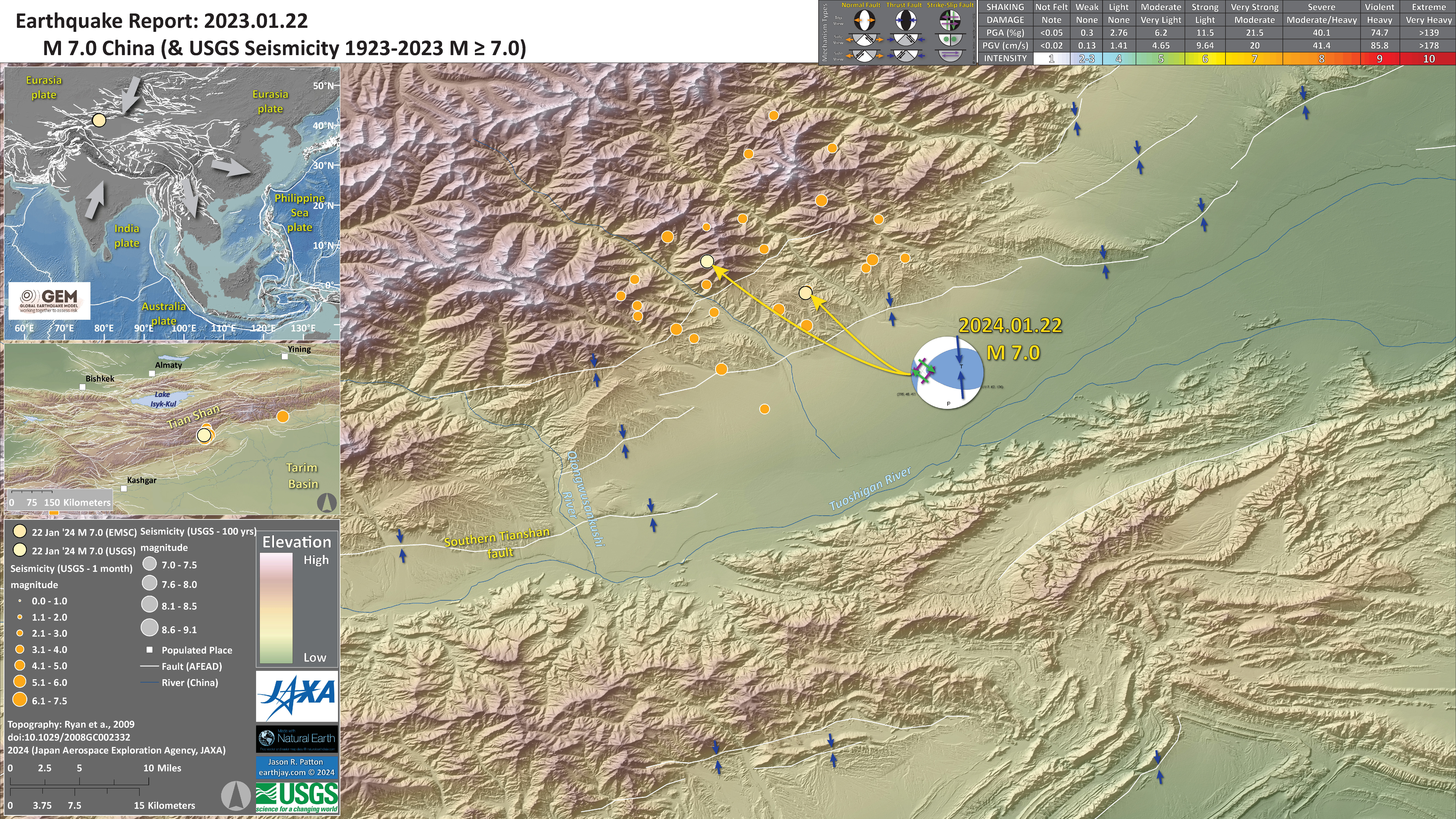
Below is my interpretive poster for this earthquake
- I plot the seismicity from the past month, with diameter representing magnitude (see legend). I include earthquake epicenters from 1924-2024 with magnitudes M ≥ 7.0 in one version. I include both the USGS and the EMSC epicenters for the M 7.0.
- I plot the USGS fault plane solutions (moment tensors in blue and focal mechanisms in orange), possibly in addition to some relevant historic earthquakes.
- A review of the basic base map variations and data that I use for the interpretive posters can be found on the Earthquake Reports page. I have improved these posters over time and some of this background information applies to the older posters.
- Some basic fundamentals of earthquake geology and plate tectonics can be found on the Earthquake Plate Tectonic Fundamentals page.
- In the upper left corner is a map that shows the tectonic plates and seismicity for eastern Asia.
- The USGS fault slip model is displayed below this tectonic overview map.
- To the right of the tectonic overview map is a photo of the Tapponier wax block experiment that demonstrates the physical basis for his extrusion tectonic model (the map on the right shows how the faults accommodate this deformation). I include arrows in the tectonic overview map (to the left) that matches this model.
- In the lower right corner is a map that shows the earthquake intensity using the modified Mercalli intensity scale. Earthquake intensity is a measure of how strongly the Earth shakes during an earthquake, so gets smaller the further away one is from the earthquake epicenter. The map colors represent a model of what the intensity may be.
- Above the intensity map is a plot that shows the same intensity (both modeled and reported) data as displayed on the map. Note how the intensity gets smaller with distance from the earthquake.
- In the upper right corner are two maps showing the probability of earthquake triggered landslides and possibility of earthquake induced liquefaction. I will describe these phenomena below.
- In the lower left are two maps that show the motion of GPS sites (Zhang et al., 2004; Taylor and Yin, 2009). Each arrow shows the direction of motion and the length of the arrow shows the velocity (in mm per year) of the GPS site.
I include some inset figures. Some of the same figures are located in different places on the larger scale map below.
- Here is the map with a month’s seismicity plotted.
- Here is an updated map with a month’s seismicity plotted and inset maps showing aftershock details.
- Here is a larger scale map with aftershocks. Faults are labeled and arrows show relative motion across these faults.
- In the upper left include a cross section from Allen et al. (1999) that shows how these faults are oriented in the subsurface. The cross section (blue line on the map)
- In the lower right corner is a ~north-south profile from Li et al. (2022) that displays the GPS velocities for GPS sites along profile P-P’ (shown on the map as a green line). There is an inset map in the upper right corner that also shows the location of this profile overlain on a fault map.
- The vertical axis of this plot shows the velocity of each GPS site relative to the Eurasia. These data show that there is shortening across these thrust/reverse faults. The velocity increases across the South Tianshan fault (STF) (~12 mm/yr on the north side of the fault and ~14 mm/yr on the south side), across the Yimugantawu thrust fault (YTF), etc.
- Here is an even larger scale map with aftershocks. The elevation data here reveal great details about the tectonics.
Tectonic Background
Western China here is dominated by the plate tectonics and climate.
To the south is the India plate that is moving northwards, pummeling into the southern part of the Eurasia plate, at a rate of about 25 to 50 mm per year, depending upon the reference frame (Pusok and Stegman, 2020). The India plate began moving northward from Antarctica since before 80 million years ago.
The details of the story has changed as more geological information is interpreted. But the general story is that the India plate moved away from Antarctica as an oceanic spreading center formed between these plates. The India plate moved towards Asia.
Prior to about 45-50 Ma, there was oceanic crust between India and Eurasia. But at this time, the continental crust of the India and Eurasia plates collided. This collision would eventually cause uplift of the Himalaya mountain range and the Tibetan Plateau to the north of the Himalaya.
There are marine fossils on the top of the mountains in the Himalaya! (this is how we know there was ocean between these plates in the past)
Here is a time series showing the convergence of these two plates modified from Pusok & Stegman (2020) and the USGS.

A part of the tectonic story is told by one of the rock stars of plate tectonics, Dr. Paul Tapponier. Tapponier conducted experiments that showed how north-south convergence, like that of India and Asia, coupled with a backstop (something that is more difficult to move) from the west, would lead to some crust to squish out to the east.
This is called extrusion tectonics as the crust of eastern Asia is being extruded to the east, like a watermelon seed is extruded from between one’s fingers when they squeeze on the wet seed.
Below is a color version of the results from Tapponier’s experiment. Compare this with maps showing the GPS motion of the crust in this region.
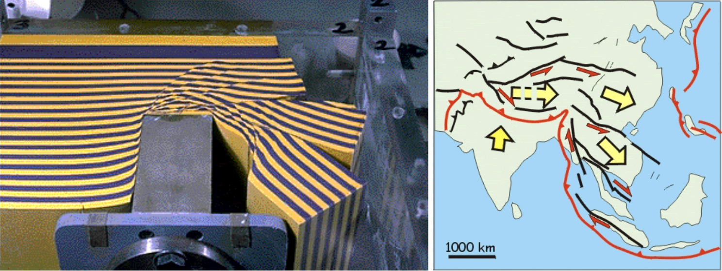
Note that the plastic has numerous faults develop as part of the extrusion. We can see how the blue and yellow lines show lateral offset along these faults.
Many of these faults are left-lateral strike-slip faults. Strike-slip means that the curst moves side-by-side when looking down on the crust from outer space (or an airplane, or Google Earth).
Left-lateral means that, when standing on one side of the fault, looking across the fault at something, that thin one is looking at is moving to the left during an earthquake. More about tectonic fundamentals here.
In the map on the right ^^^ we can see that these left-lateral strike-slip faults that are mapped in the region are just like the faults in the blue-yellow plastic.
One of the major left-lateral strike-slip faults along the Tibetan Plateau is the Kunlun fault, which has been well studied in places. A tectonic history of the region, and how the Kunlun fault fits into this history, is presented by Staisch et al., 2020.
- This is a tectonic map from Molnar and Tapponier (1975).
- “We stand on the shoulders of giants.”
- This is a later map from Tapponier et al. (1982) as part of his paper on extrusion tectonics.
- Here is an excellent overview of the faults in the region from Taylor and Yin (2009).
- I especially like this figure as it helps us understand what the fault patterns mean by looking at the fault types. For example, I thought that the faults in the northwest Tarim Bain would have been strike-slip, but they appear to be predominantly thrust or reverse faults (e.g. the Southern Tian Shan thrust).
- Here is a map that shows some earthquake mechanisms (centroid moment tensors) for earthquakes from 1977 to 2009 (Taylor and Yin, 2009).
- Compare this map with the one above and the mechanisms match pretty well with the types of faults mapped in the above map.
- This map from Turner et al. (2010) shows the faulting in the Keping Shan Thrust Belt. This fold and thrust belt is the leading edge of the South Tien Shan fault.
- This low angle oblique map from Turner et al. (2010) shows aerial imagery with fault lines overlain.
- This is a cross section from Turner et al. (2010) showing how this fold and thrust belt deformed and cut the crust here. Compare this with the cross section on the aftershock poster.
- This shows the geology and the fault mapping on the left and the aerial imagery on the right. This mapping is centered on the Piqiang fault, the left-lateral strike-slip fault that cuts across the fold and thrust belt.
- This map from Allen et al. (1999) shows regional tectonics of the Tarim Basin and Tian Shan.
- This map from Allen et al. (1999) shows regional faulting along the Kepingtage Fold and Thrust Belt.
- earthquake mechanisms from historical earthquakes show how both reverse/thrust faults and strike-slip faults host earthquakes.
- Here is a cross section from Allen et al. (1999) showing the Kepingtage Fold and Thrust Belt.
- Here is a map pair from Li et al. (2020) showing the South Tien Shan fault and the Kepingtage Fold and Thrust Belt (lower panel is a geological map and the upper panel is aerial imagery).
- Here is a cross section from Li et al. (2020) showing the South Tien Shan fault and the Kepingtage Fold and Thrust Belt.
- Here are scarp heights from Li et al. (2020). Mapped terraces are numbered (youngest terrace = T5, oldest = T2). The vertical axis is the height of the scarp in meters.
- To the west of the Piqiang fault we can see that the older terraces are higher than to the east of the Piqiang fault. Why do you think that is?
- Li et al. (2020) used scarp height measurements and age assignments to the offset terraces to calculate slip rates for these faults.
- These are estimates of shortening rate across these faults. They used a statistical approach to make thousands of calculations, each incorporating some variability, and resulting with a distribution of rate estimates (see the bell shaped curves).
- Qiu et al. (2022) present their interpretation of the regional tectonics with this low-angle oblique 3-D block diagram. North is to the right.
- Li et al. (2022 B) study area where they used seismic data from seismometer deployments to model the subsurface.
- They processed the seismic waves using “receiver functions” and “Rayleigh wave dispersions” to estimate the material properties of the crust and mantle.
- They then used these material properties to construct an hypothetical model of the structures within the Earth and how these structures accommodate the plate tectonic forces.
- Here Li et al. (2022 B) show their GPS observations and the subsurface model.
- Here is their hypothetical model of the structures within the Earth and how these structures accommodate the plate tectonic forces.
- Geodesy is the study of the motion of the Earth. The data used to measure how the Earth moves can be from GPS data, tide gage data, benchmark surveys, and satellite remote sensing data (e.g. InSAR, LiDAR, etc.). The motion can be partitioned into different directions (e.g. horizontal, vertical, and rotational).
- The maps below are from Taylor and Yin (2009, lower map) and Zhang et al. (2004, upper map) shows the velocity (speed) of locations where GPS locations (positions) have been collected over a period of time (probably decades). The arrows called vectors represent the direction of motion and the rate of motion (speed or velocity). The GPS sites are where the dots are and the uncertainty (sometimes called error) of the velocity calculation is represented by the ellipse at the tip of the arrow.
- These arrows represent motion relative to stable Eurasia. So, arrows that are pointing to the north tell us that that GPS site is moving north relative to Eurasia. Unfortunately there is no scale, but based on the Zhang et al. (2004) paper (also shown below), the most southwest GPS site (in India) has a velocity of about 25 mm per year (mm/yr)
- We can make some simple observations and interpretations from these data. Look at the lower map with the red and blue arrows (vectors).
- GPS sites in northern India (in the lower left (southwest) part of the map) show that this region is moving north-northeast relative to Eurasia. This matches the long term motion of the India plate we discussed in the introduction to this report above.
- GPS sites in the Tian Basin (the low, green colored area in the central upper left (northwest) part of the map) are also moving north relative to Asia. However, they are moving to the north more slowly than the sites in India
- Because the GPS sites (and the crust in that location) are moving slower in the north, north of the Himalaya and Tibetan Plateau. This tells us that the crust is slowing down between India and the Tarim Basin. Why is this?
- The crust is slowing down because the crust is deforming, either elastically where the deformation of the crust buldges up or flexes sideways, or anelastically where the deformation is accommodated by fault slip on tectonic compressional faults (e.g. reverse or thrust faults).
- Note how these GPS plate motion vectors (the red and blue arrows) change whether they are slightly to the east or slightly to the west of North. In northeast India, the motion is slightly to the northeast and in the Tarim Basin some of them are moving slightly to the west. If this difference is larger than the error ellipses, it would tell us that the crust may also be experiencing changes in lateral motion through this region. This type of lateral motion may be accommodated by strike-slip faults (see the arrow shaped figure from Taylor and Yin (2009) below).
- Caption from Zhang et al., 2004)
- Caption from Taylor and Yin (2009), Figure 4 is the arrow shaped figure below.
- Here is the cross section of the India-Eurasia plate convergence through time from Pusok and Stegman (2020) shown above. They use numerical modeling of the mantle convection to try to interpret the data presented in this cross section.
- Here Pusock and Stegman (2020) present the long term geodetic data (geologic rates) and compare the results of their modeling with these source data.
- Here Pusok and Stegman (2020) present the details from their numerical modeling. What do you think about this?
- This is the map from Li et al. (2022) that shows the tectonic faults, GPS velocities (vectors), and GPS profile locations.
- These are the GPS profiles oriented north-northwest, shown on the map from Li et al. (2022). Profile P7 is on one of the aftershock interpretive posters above.
- This is a map and low angle oblique interpretation from Li et al. (2022). They show how earlier reverse faults oriented NNW are cut by NNE oriented reverse faults (the South Tianshan fault and the Kepingtage Fold and Thrust Belt) and these older faults turn into strike-slip faults.
- Li et al. (2020) plot earthquake mechanisms for historical earthquakes. Most of these earthquakes are reverse (compressional) earthquakes.
- The plots show the horizontal strain (horizontal shortening) based on GPS measurements as blue circles, the InSAR vertical motion rates in yellow, and the topography (elevation) in gray.
- The plots show how the horizontal strain (horizontal shortening) varies along strike of the fold and thrust belt.
Some Relevant Discussion and Figures
Global and Regional Tectonic Faults
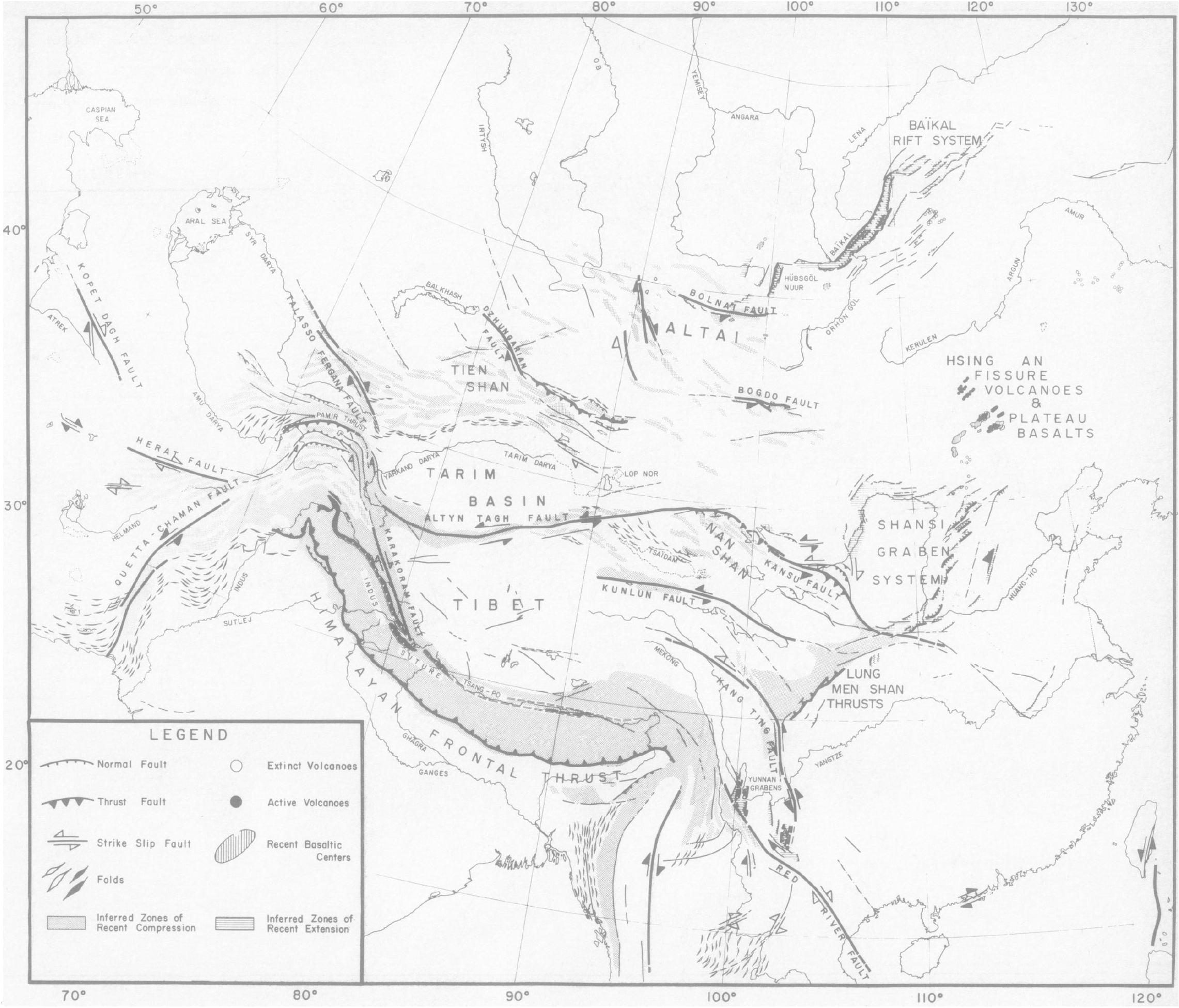
Preliminary map of recent tectonics in Asia. Bold lines represent faults of major importance-usually seismic and with very sharp morphology. Bold arrows indicate sense of motion, corroborated by fault plane solutions or surface faulting of earthquakes (6. 30. 33, 34). Open arrows indicate sense inferred from analysis of photographs. For Tertiary folding bold symbols indicate more prominent, more recent folds. The dotted areas indicate region of inferred recent vertical motion associated with thrust faulting and compressional tectonics. Areas shaded by dashed lines are covered by thick recent alluvial deposits and are dominated by horizontal extension and subsidence (/4). Contours in the northeast China basins and recent volcanic centers. except for the Hsing An fissure basalts, are from Terman (43). This map is preliminary; coverage by ERTS photographs is not complete, and surely many features relevant to the understanding of Asian tectonics have not yet been recognized or were not plotted. The names of faults are not official names but purely for reference in this article.
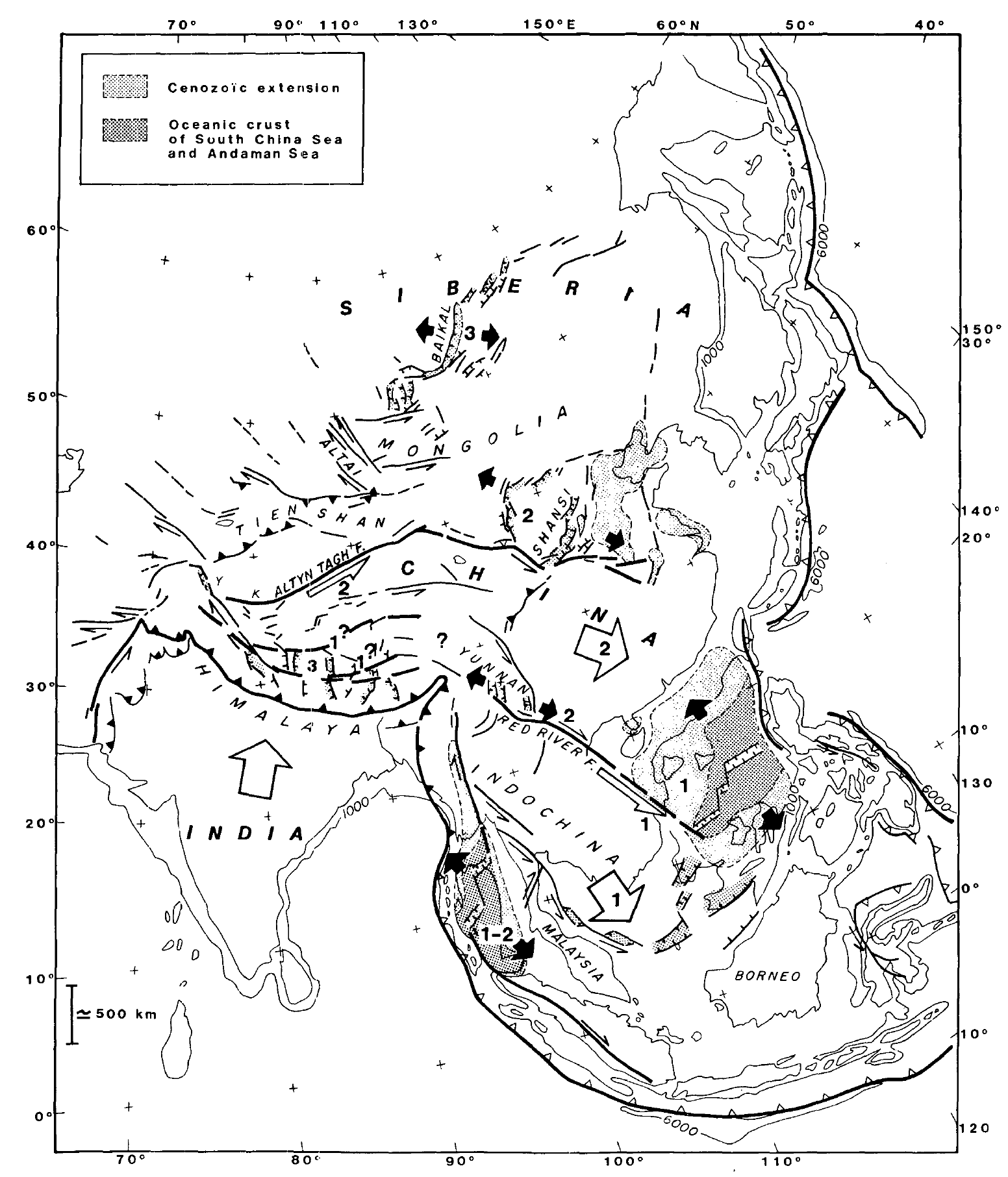
Schematic map of Cenozoic extrusion tectonics and large faults in eastern Asia. Heavy lines = major faults or plate boundaries; thin lines = less important faults. Open barbs indicate subduction; solid barbs indicate intracontinental thrusts. White arrows represent qualitatively major block motions with respect to Siberia (rotations are not represented). Black arrows indicate direction of extrusion-related extension. Numbers refer to extrusion phases: 1 =50 to 20 m.y. B.P.; 2 = 20 to 0 m.y. B.P.; 3 = most recent and future. Arrows on faults in western Malaysia, Gulf of Thailand, and southwestern China Sea (earliest extrusion phase) do not correspond to present-day motions.

A color-shaded relief map with active to recently active faults related to the Indo-Asian collision zone and surrounding regions. (The paper lists the sources of their fault data, but are “augmented by our own kinematic interpretations.”)
Thrust faults have barbs on the upper plate, normal faults have bar and ball on the hanging wall, arrows indicate direction of horizontal motion for strike-slip faults. Dashed white lines are Mesozoic suture zones: IYS—Indus Yalu suture zone; BNS—Bangong Nujiang suture zone; JS—Jinsha suture zone; SSZ—Shyok suture zone; TS—Tanymas suture zone; AMS—Anyimaqen-Kunlun-Muztagh suture zone.

Color-shaded relief map overlain with Harvard centroid moment tensor (CMT) earthquake focal mechanisms from 1 January 1977 to 1 January 2009 and background seismicity from Engdahl and Villasenor (2002) with events >M5.5 for both data sets. Green, purple, and light-blue earthquake focal mechanisms are locations of 2008 western Kunlun, Nima, and Wenchuan events, respectively.
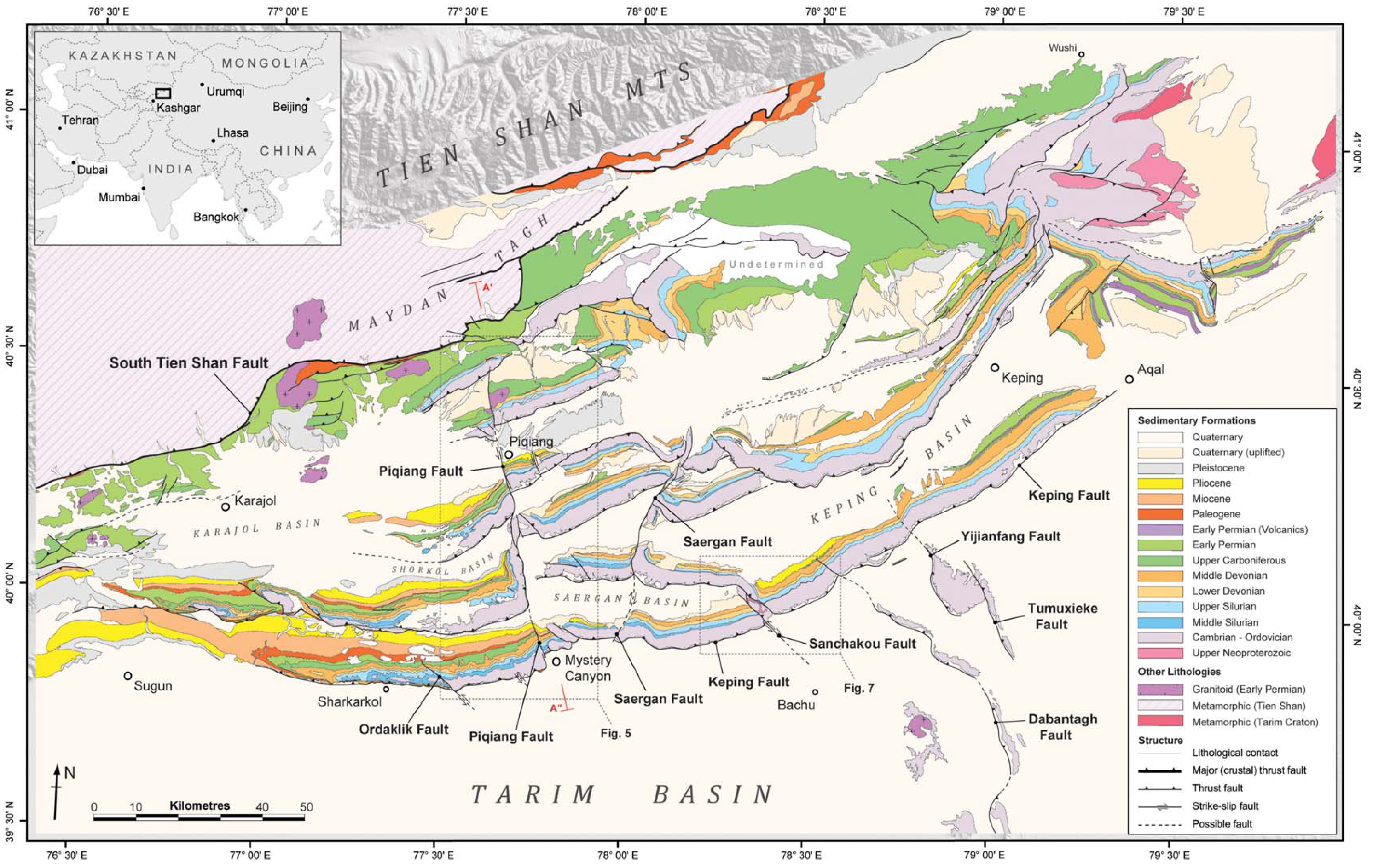
Geological map of the Keping Shan Thrust Belt showing the master structural elements described in this paper. Belt-parallel faults are characterized by east–west to NE–SW trending thrust faults that define a broad, arcuate thrust belt. The belt is partitioned by a series of belt-oblique (strike-slip and oblique-slip) faults that predominantly trend NW–SE. The northern margin of the Keping Shan Thrust Belt is defined by the South Tien Shan Fault, which separates the metamorphic rocks of the Tien Shan from the sedimentary rocks of the Tarim Basin.
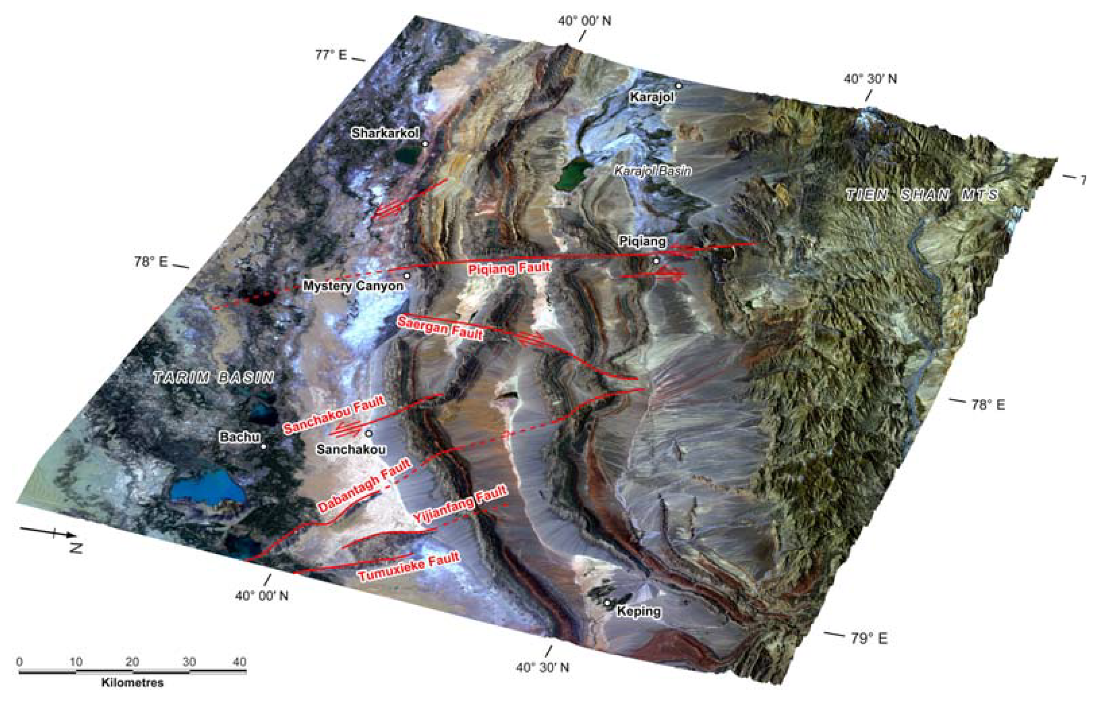
3D perspective view of the Keping Shan Thrust Belt, generated by draping a Landsat ETMþ (bands 321, 30 m resolution) satellite image over a digital elevation model. Major thrusts are identified by the surface expression of their hanging walls, which form long, arcuate ridges that exhume a predominantly Palaeozoic stratigraphic succession. Laterally, thrusts interact with major belt-oblique fault zones (marked) that partition the thrust belt into a series of structural domains.
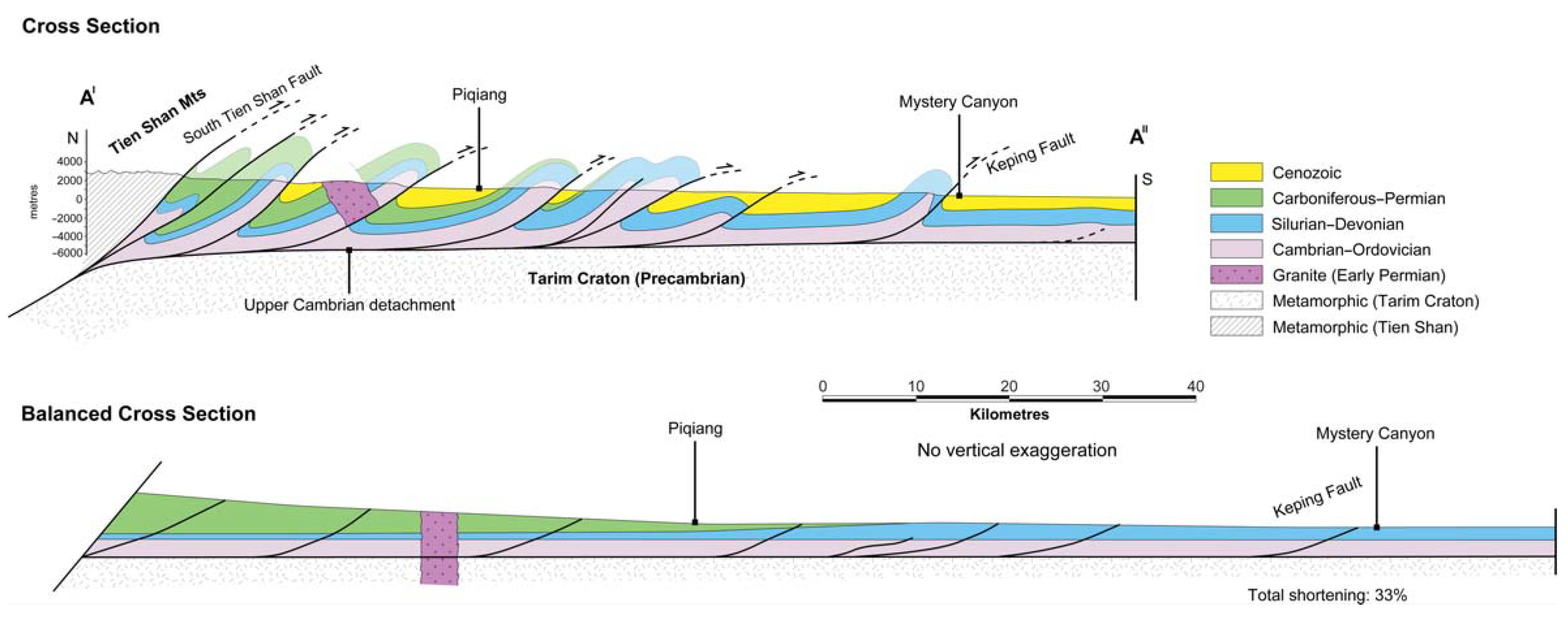
Balanced cross section across the Keping Shan (A0–A00, see Figure 1 for line of section). Major thrusts detach onto a middle Cambrian evaporite surface (sensu Allen et al. 1999), predominantly dipping to the north and verging to the south. Once balanced, the horizontal shortening across the section is 33%. This section assumes that deformation is completely thin-skinned but in the absence of subsurface data we cannot determine whether basement faults are involved.
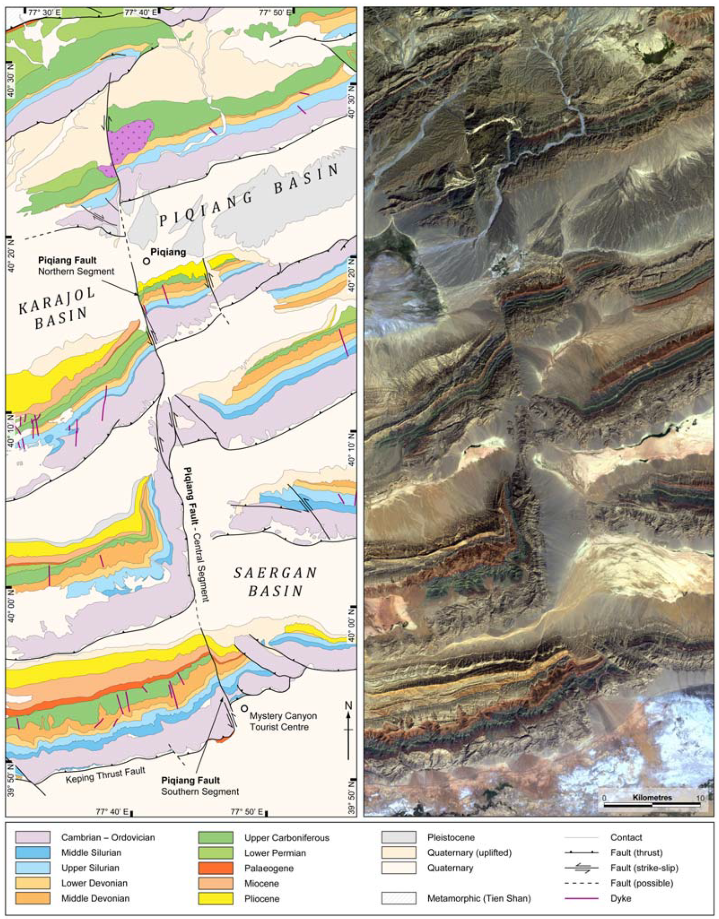
Structure of the Piqiang Fault: (a) Geological map derived from the interpretation of (b), Landsat ETM+ (bands 321, 30 m resolution) satellite image. Along strike, the faulting mechanism appears to change, acting either as a strike-slip fault (southern and northern segments) or as a lateral ramp (central segment).
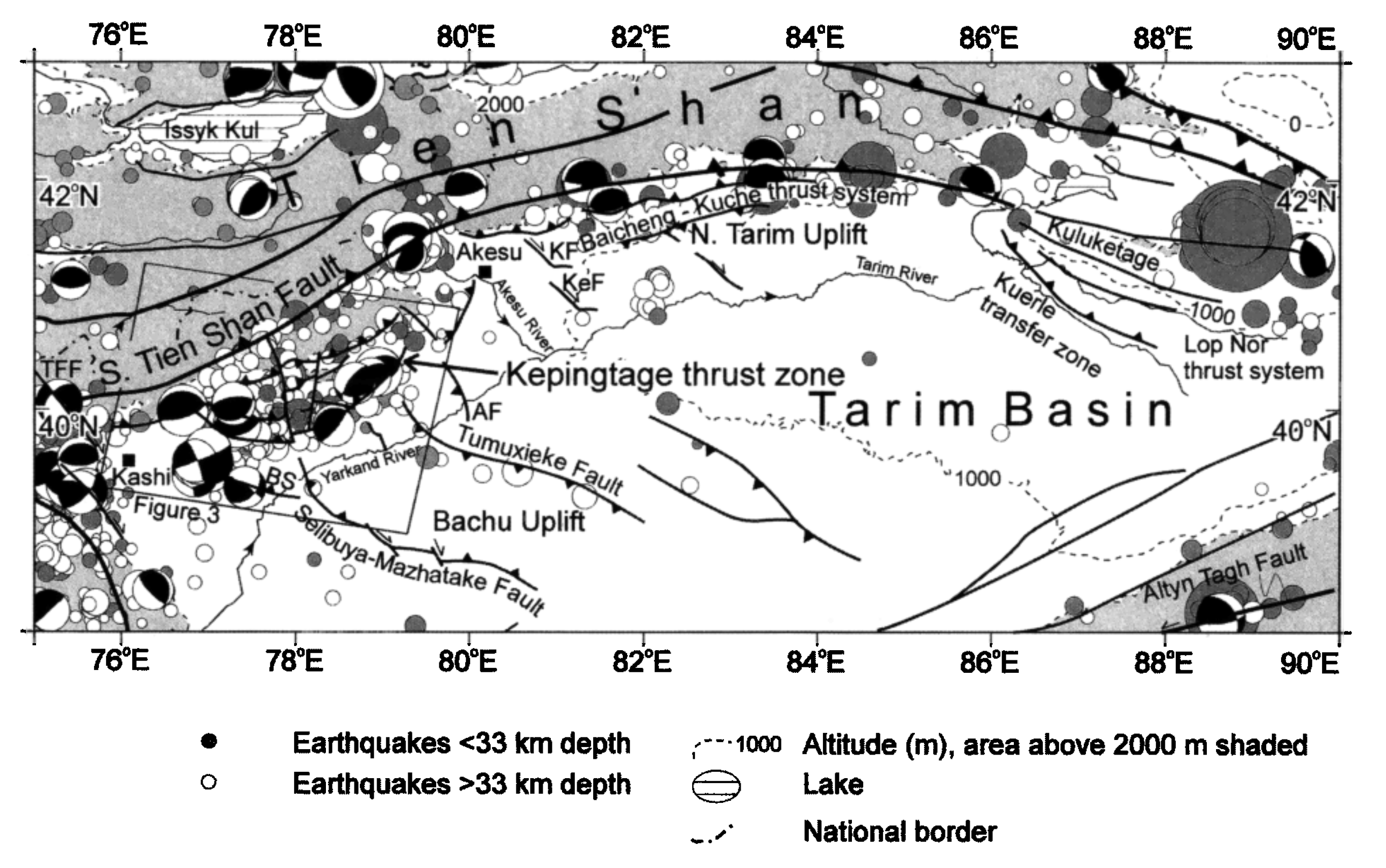
Main Cenozoic structures and seismicity of the Chinese Tien Shan and Tarim. Faults are derived mainly from Afonichev and Vlasov [1981], Xinjiang BGM [ 1993], and Tang Liangjie [ 1996]. Epicenters are from the International Seismological Centre (ISC) (1964 – 1993) and preliminary determination of epicenters (PDE) (1994 to September 1995) catalogues. Fault plane solutions are from the Harvard centroid moment tensor catalogue [e.g. Dziewonski et al., 1988, 1992, 1997]. Epicenter symbols are proportional to magnitude, 4
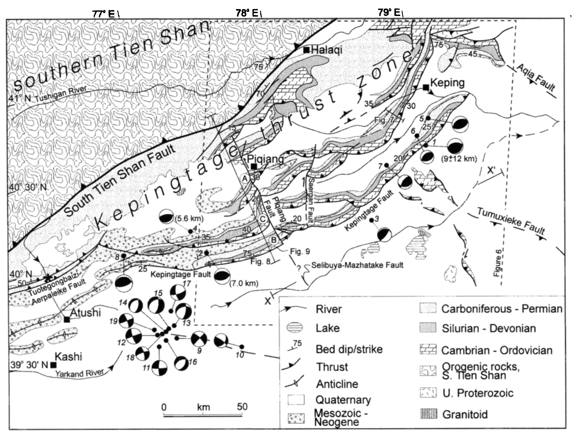
Structure and seismicity of the Kepingtage thrust zone. Geology is derived from Landsat multispectral scanner( MSS) imagery, our fieldwork observations, 1:200,000 geological maps[ Xinjiang BGM, 1967] and the work of Luan Chaoqun et al. [ 1998]. Fault plane solutions are from the Harvard centroid moment tensor (CMT) catalogue, except for solution 1, [Rornanowicz, 1981], solution 2 [Fan et al., 1994], and solution 4 [EkstrOrn and England, 1989]. Numbers in brackets by fault plane solutions are calculated focal depths from these sources. Star symbol is the epicenter of August 22, 1902, magnitude 8.25 earthquake. Structure is not shown north of the South Tien Shan Fault.
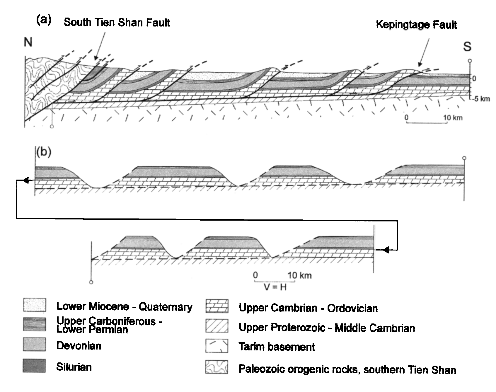
(a) Cross-section through the Kepingtage thrust zone, based on our fieldwork observations, Landsat MSS image interpretations, Norin [1941]; Yin et al. [1998] and Chinese 1:200,000 mapping [e.g. X injiang BGM, 1967]. Location is shown in above map.
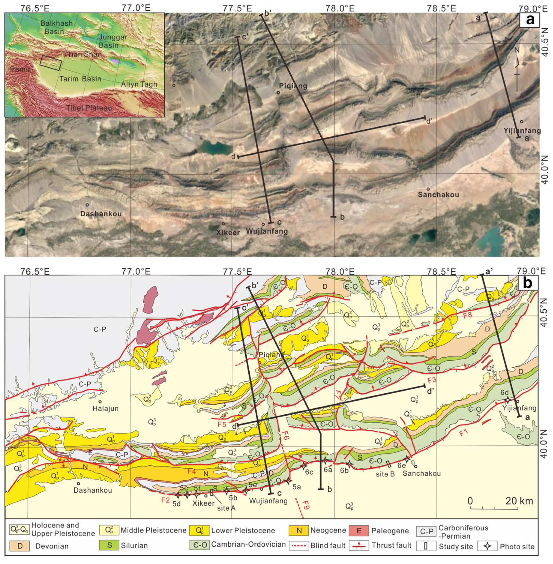
a Satellite image and b geologic map of the southern Tianshan and Kalpin thrust structure. F1: east Kepingtage fault; F2: west Kepingtage fault; F3: Saergantage fault; F4: Aozitage fault; F5: Tuokesan fault; F6: Piqiang fault; F7: Mangute fault; F8: Kalabukesai fault
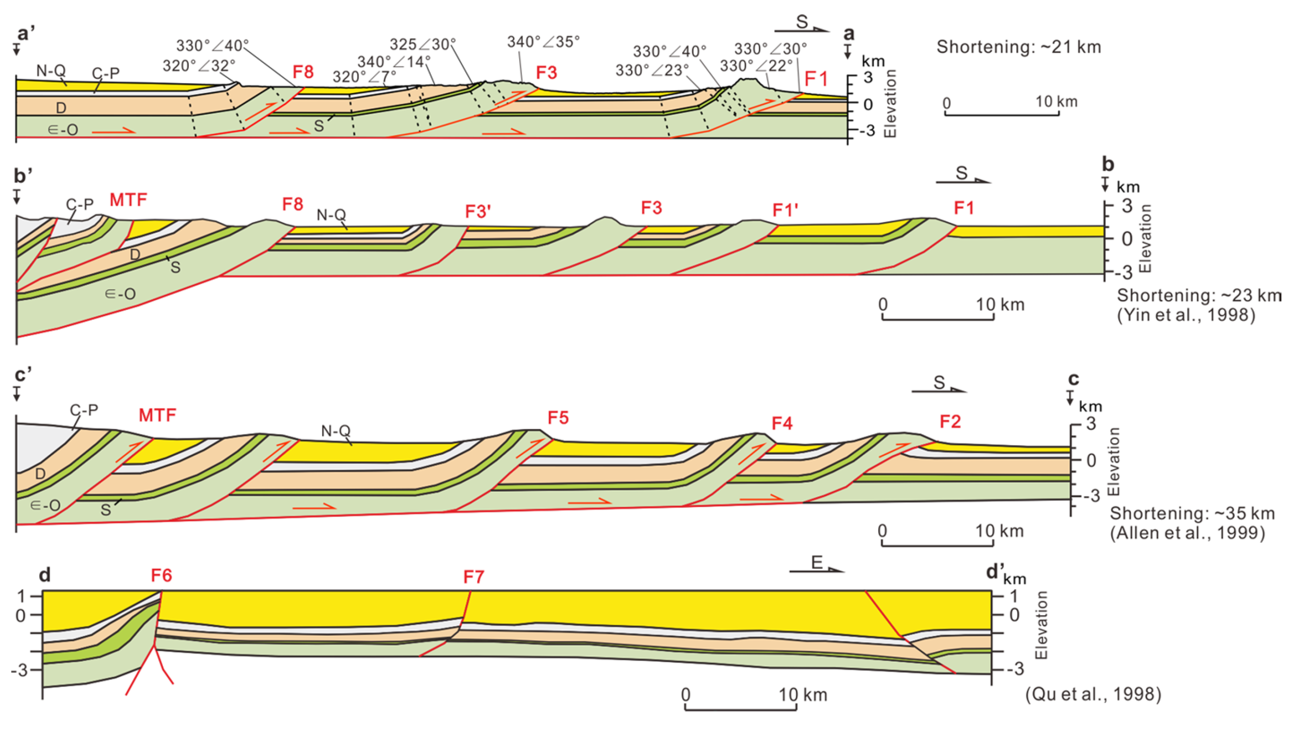
(The three balanced profiles (a, a′, b, b′, and c, c′) were reconstructed by our group, Yin et al. (1998), and Allen et al. (1999). The seismic interpretation profile d-d′ shows the depth features of the Piqiang fault and the Mangute fault (Qu et al. 2003).
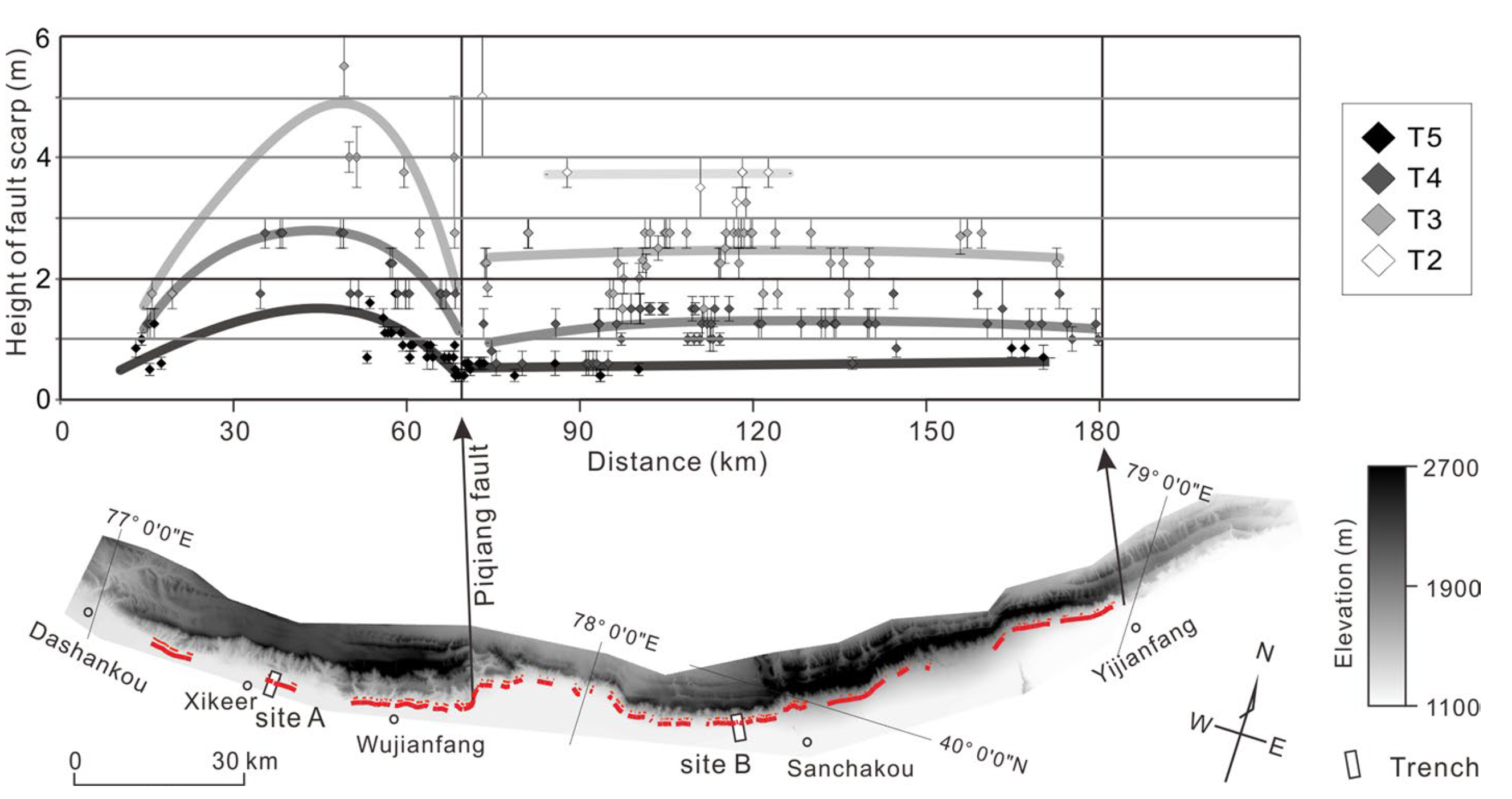
Fault scarp height along the front edge of Kepingtage Mountain. Major scarp heights were measured by using a TruPulse 200 Laser Rangefinder, and minor ones were measured by using the dGPS survey data. Different gray points show the heights of fault scarps on T2–T5 alluvial fans
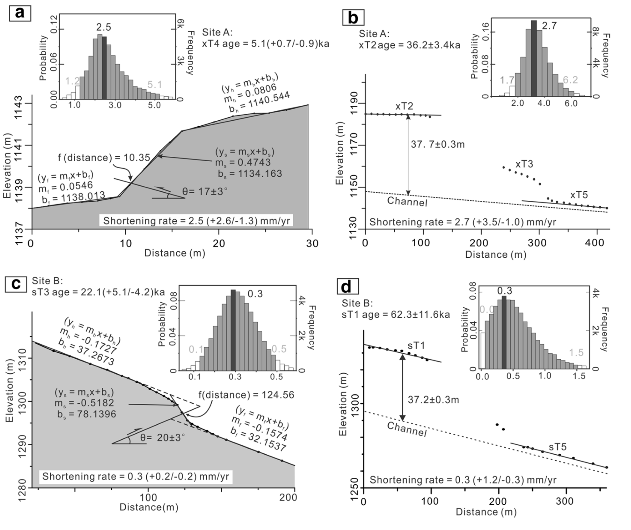
Insets show the results of the Monte Carlo simulations. a Shortening rate of the western Kepingtage fault (Site A) and c shortening rate of the eastern Kepingtage fault (Site B), based on measurements from fault scarps. Average shortening rates based on the height of the oldest alluvial fan above the channel for b Site A and d Site B.
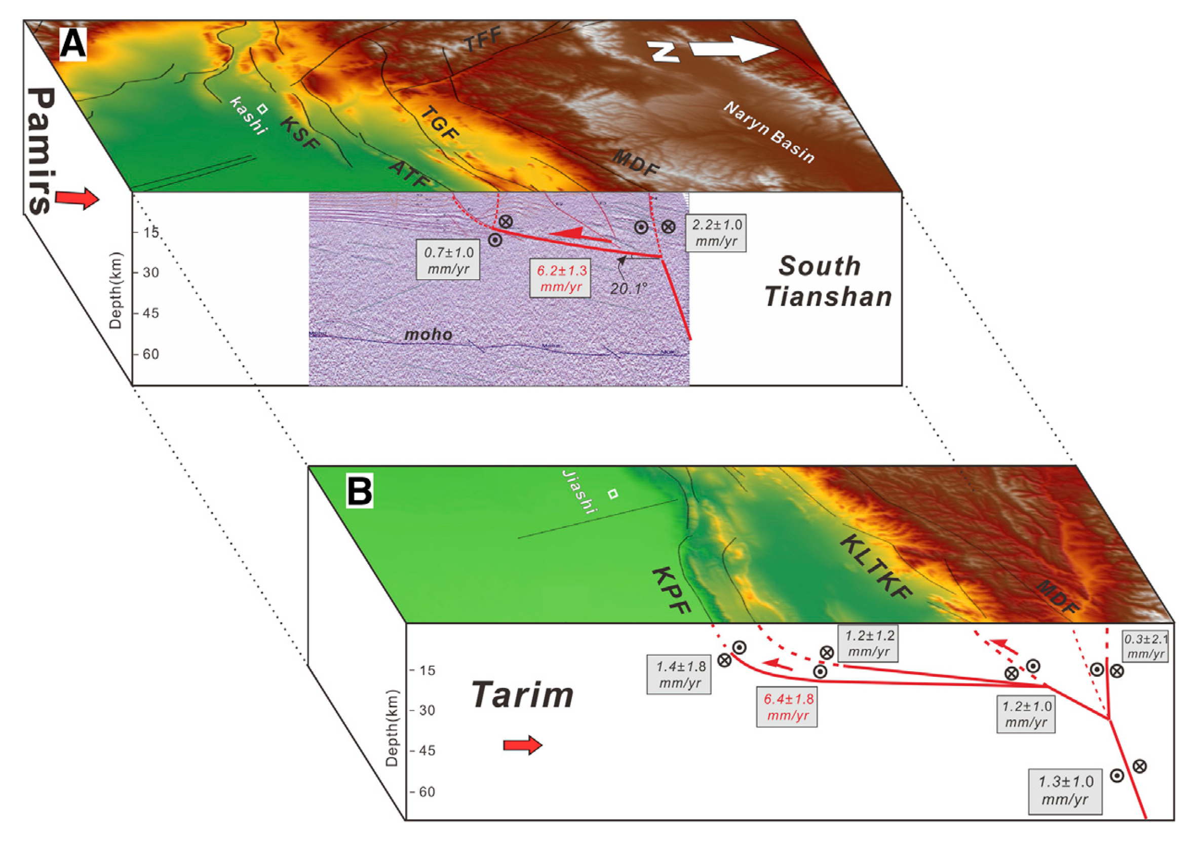
Three-dimensional schematic tectonic model across the South Tianshan-Tarim junction zone (Deep seismic reflection profile is from Liu Jinkai, 2011), and interpreted active faults summarizing the average interseismic strike-slip (back font) and dip-slip (red font) rates extracted from the Bayesian exploration.
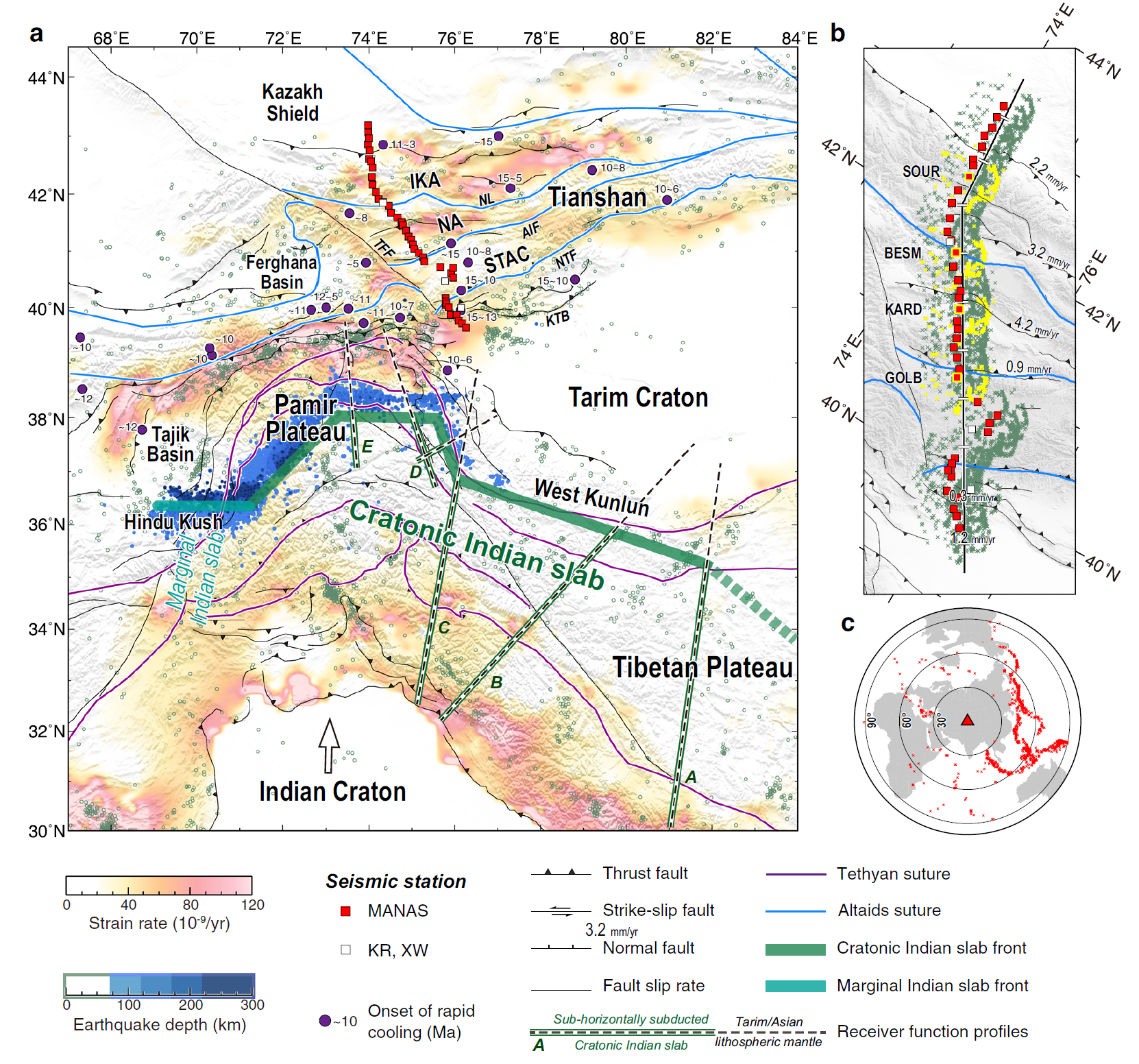
Tectonic setting of the Tianshan and data coverage of the seismic cross-section. a Tectonic map with strain rates inverted from GPS observations37. Squares denote seismic stations used in this study from the Middle AsiaN Active Source project (MANAS) and other networks (KR and XW). Green and blue circles show earthquakes at shallow65 (≤70 km) and intermediate66,67 (70–300 km) depths. The purple points with numbers denote the onset of rapid cooling derived from thermochronological studies13,14. The present-day northern front of the Indian slab31,49,66, including the marginal Indian slab beneath the Hindu Kush and the cratonic Indian slab beneath the Pamir Plateau and the western Tibetan Plateau are together constrained by the interpretations of the previous receiver function profiles29–33 (A: Zhao et al.31, B: Rai et al.30, C: Kumar et al.29, D: Xu et al.33, E: Schneider et al.32). Sutures in the Altaids and the Tethyan tectonic domain are marked with light blue and purple lines, respectively, and major faults are in black lines (Central Asia Fault Database68). AIF Atbashy-Inylchek Fault, IKA Issyk Kul Arc, NA Naryn Arc, NL Nikolaev Line, NTF North Tarim Fault, KTB Kepingtag Thrust Belt, STAC South Tianshan Accretionary Complex, TFF Talas-Ferghana Fault. b Stations and piercing points of the Ps phases at a depth of 60 km along the crosssection are indicated by solid lines with 50-km scale marks. Numbers denote fault slip rates28,69. Sample stations GOLB, KARD, BESM, and SOUR are highlighted by yellow frames, for which inversions are shown in the supplement. c Distribution of events used in this study.
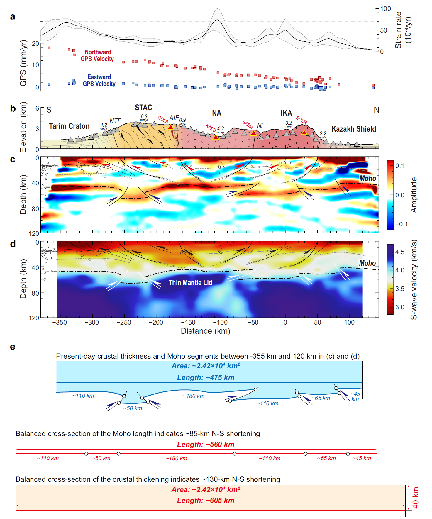
Interpreted seismic images and balanced cross-sections across the central Tianshan. a Strain rates and GPS velocities along the cross-section. The bold black line and gray-filled area indicate the averaged strain rates and corresponding standard deviations within a 1.0-degree width corridor centered by the cross-section. The individual GPS observations within the corridor are projected onto the cross-section as blue squares for eastward components and red squares for northward components. b Schematic geological cross-section across the Tianshan showing major tectonic units (modified after Xiao et al.4) and the slip rates of main faults. Triangles represent stations used in this study, and red ones with marks indicate four stations chosen as examples showing the joint inversion in Supplementary Figs. 4 and 5. AIF Atbashy-Inylchek Fault, IKA Issyk Kul Arc, NA Naryn Arc, NL Nikolaev Line, NTF North Tarim Fault, STAC South Tianshan Accretionary Complex. c, d The CCP stacking image with a Gaussian coefficient of 2.0 and the VS model were obtained from joint inversion in this study. These are plotted with interpreted faults (solid lines), Conrad (dashed thin lines) and Moho (dashed thick lines) discontinuities. Gray circles denote earthquakes located within a 50-km width corridor centered by the cross-section
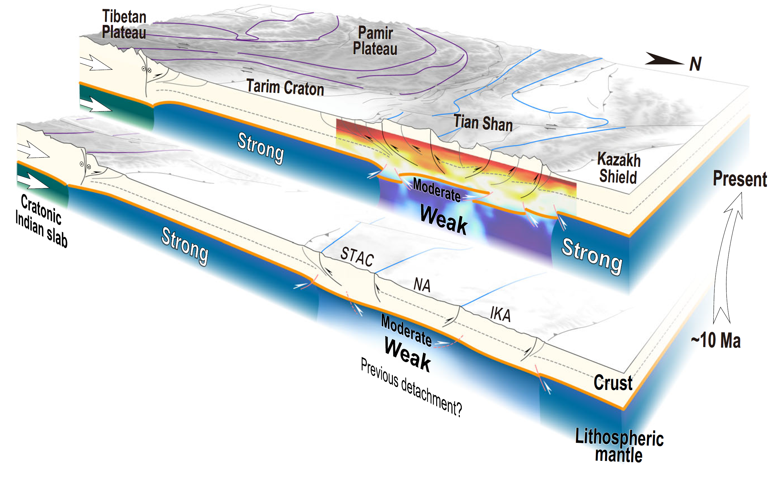
Evolutionary profiles illustrating the rejuvenation of the Tianshan Orogen since ~10 Ma. An earlier detachment of the lithospheric root led to a weaker lithosphere in the Tianshan than in the surroundings. When the cratonic Indian slab directly impinged on the Tarim Craton, the contractional stress from the India-Asia convergence was effectively delivered to the Tianshan. Consequently, the lithosphere of the Tianshan underwent intense deformation, which was accommodated by inherited, structurally controlled brittle deformation in the shallow crust and by plastic deformation close to the Moho. IKA Issyk Kul Arc, NA Naryn Arc, STAC South Tianshan Accretionary Complex.
Geodetic Analyses

Global positioning system (GPS) velocities (mm/yr) in and around Tibetan Plateau with respect to stable Eurasia, plotted on shaded relief map using oblique Mercator projection. Ellipses denote 1s errors. Blue polygons show locations of GPS velocity profiles in Figures 3 and DR1 (see footnote 1). Dashed yellow polygons show regions that we used to calculate dilatational strain rates. Yellow numbers 1–7 represent regions of Himalaya, Altyn Tagh, Qilian Shan, Qaidam Basin, Longmen Shan, Tibet, and Sichuan and Yunnan, respectively.
Color-shaded relief map of the Indo-Asian collision zone with global positioning system (GPS) velocities (arrows) from the Zhang et al. (2004) compilation. Blue arrows indicate data used in Figure 4A and line indicates data used in Figure 4B.

Proposed convergence history between India and Eurasia. (A) Schematic diagram for the evolution of Neo-Tethys Ocean as a sequence of stages with approximate times for important events. (B) Hypothesized convergence rate versus age, with numbered segments corresponding to stages in (A), superimposed on the relative plate motions between India-Africa and India-Antarctica (dotted blue and green lines, respectively) (4).
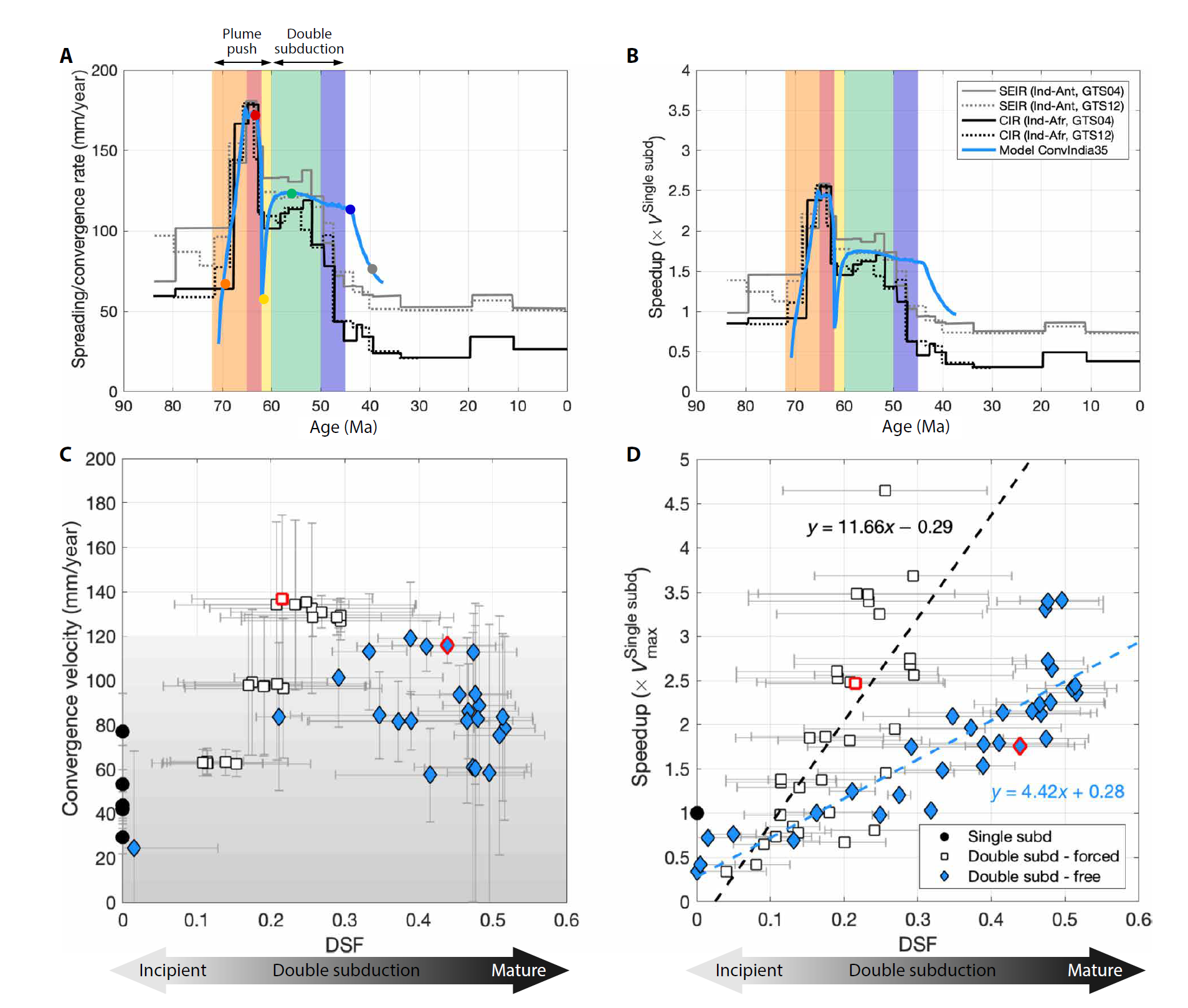
India-Eurasia convergence data and results of numerical models. (A) Observed spreading rates versus age for the CIR (black lines) and SEIR (gray lines). Solid lines use the geomagnetic polarity time scale GTS04 and a three-plate algorithm to calculate Euler rotations (2, 4), while dotted lines use the GTS12 time scale and a two-plate rotation algorithm (17). Blue line shows computed convergence rate between the left plate and the overriding plate in the reference model (ConvIndia35). Colored markers correspond to model snapshots in Fig. 3. (B) Speedup over time: Observational data are scaled to a velocity of 70 mm/year, representative of the present-day global subduction. Numerical data (blue line) are scaled to velocities in single subduction experiments (ConvIndia31). (C) Convergence velocity versus the DSF (see Materials and Methods and the Supplementary Materials) for all simulations. Time-averaged values given for single subduction (black), periods of plume push (white), and periods of free double subduction (blue) including reference model (red). Maximum/minimum values during model evolution shown with gray bars. (D) Speedup versus the DSF for all numerical simulations [colors same as (C)]. Least-squares fit (dashed lines) for periods of forced convergence (white markers) and periods of free double subduction (blue markers).

Time evolution of the reference model ConvIndia35. The system is composed of three plates representing India (left plate), an intraoceanic plate (middle plate), and Eurasia (overriding plate). This model was performed with plume-like influx boundary conditions imposed for 9 Ma (Influx BC06) and a mantle density and viscosity profile (25, RLLB15-Mean_norm; see details in Materials and Methods and the Supplementary Materials). Frames correspond to colored markers in Fig. 2A, and full-time evolution is available in movie S1. The dynamic pressure (background field) indicates when each regime dominates. (A) During the plume push regime, the entire system is dominated by the influx velocity, seen by positive dynamic pressures throughout the domain. (B) During the double subduction regime, the mantle flow and plate convergence are dominated by interaction between the two slabs, as indicated by pressure increasing within the region confined between them. Changes in driving forces are also seen by the mantle velocity field (uniformly spaced arrows). The influx boundary conditions, which mimic the stages of a plume push, gradual arrival (1), peak activity (2), and decline (3), are sufficient to initiate a secondary subduction at a weak zone. As the plume push force wanes, the secondary subduction becomes self-sustaining, transitioning the system into a double subduction–driven system (4). The pull from both slabs drives fast convergence and then slows when the middle plate is consumed during arc-continent collision (5) and continental collision (6). Relative motion between the red markers is used to calculate convergence rates.
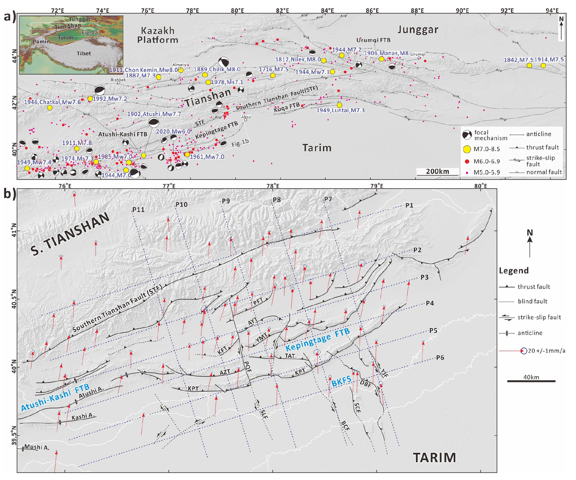
(a) Topography, active structures, and earthquakes (M ≥ 5.0 during 1800–2020) in the Tianshan region. (b) GPS velocity field relative to Eurasia and major Cenozoic structures (after Tunner et al. (2010), Yao et al. (2021), and Lü et al. (2021), and our interpretations) in the Jiashi-Kepingtage and adjacent areas (location shown in Figure 1a). The P1–P11 blue dotted lines represent the GPS profile locations (see Supporting Information S1). BKFS: Bachu-Kepingtage fault system; KPT: Keping Thrust Fault; AZT: Aozigertawu Thrust Fault; KFT: Kekebuke Front Thrust Fault; PQF: Piqiang Fault; TAT: Tataiertagh Thrust Fault; YMT: Yimugantawu Thrust Fault; AYT: Aoyibulake Thrust Fault; PFT: Piqiangshan Front Thrust Fault; SLF: Selibuya Fault; BCF: Bachu Fault; SCF: Sanchakou Fault; DBF: Dabantagh Fault; YJF: Yijianfang Fault.
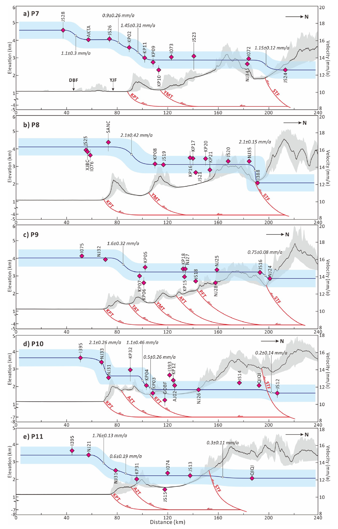
NNW-trending velocity profiles parallel to the Piqiang Fault (PQF). All GPS velocity data in the profile are projected to the NE17° component parallel to PQF. GPS velocities are indicated by violet diamonds. Dark blue line is the best fit line of velocity data. Light blue strips denote acceptable ranges of average velocity components. Topographic profiles (topographic data from the 30-m shuttle radar topography mission (SRTM) DEM, downloaded from the geospatial data cloud) are in the same location and width as the GPS velocity profiles. The geometry of the fault is according to Allen et al. (1999) and Lü et al. (2021).
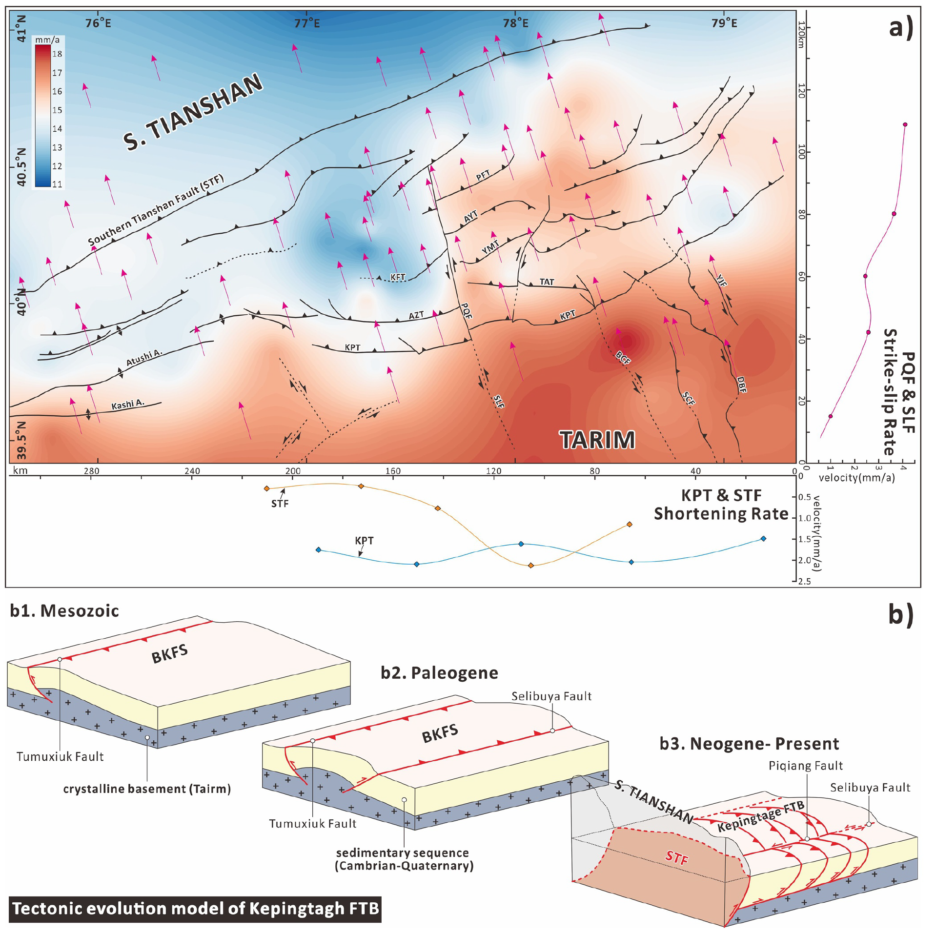
(a) Velocity-field contour map of the Kepingtage fold-and-thrust belt (FTB) and adjacent regions. Red regions represent higher rates (i.e., Tarim Basin); blue regions represent lower rates (i.e., southern Tianshan). The direction of the GPS velocity data is normalized to NNW17° (i.e., parallel to the Piqiang Fault [PQF]). We identify the deformation rate (i.e., strike-slip and shortening) of the PQF, Keping Thrust Fault (KPT), and South Tianshan Fault (STF) along the strike by comparing the rate difference between the two walls of the fault. The violet dots, and orange and blue diamonds represent the geodetic rates of the PQF, STF, and KPT, respectively (data from profiles P1–P11). (b) Tectonic evolution model of the Kepingtage FTB and Bachu–Kepintage fault system (BKFS) revealing the inherited evolution of the Kepingtage FTB and pre-existing structures.
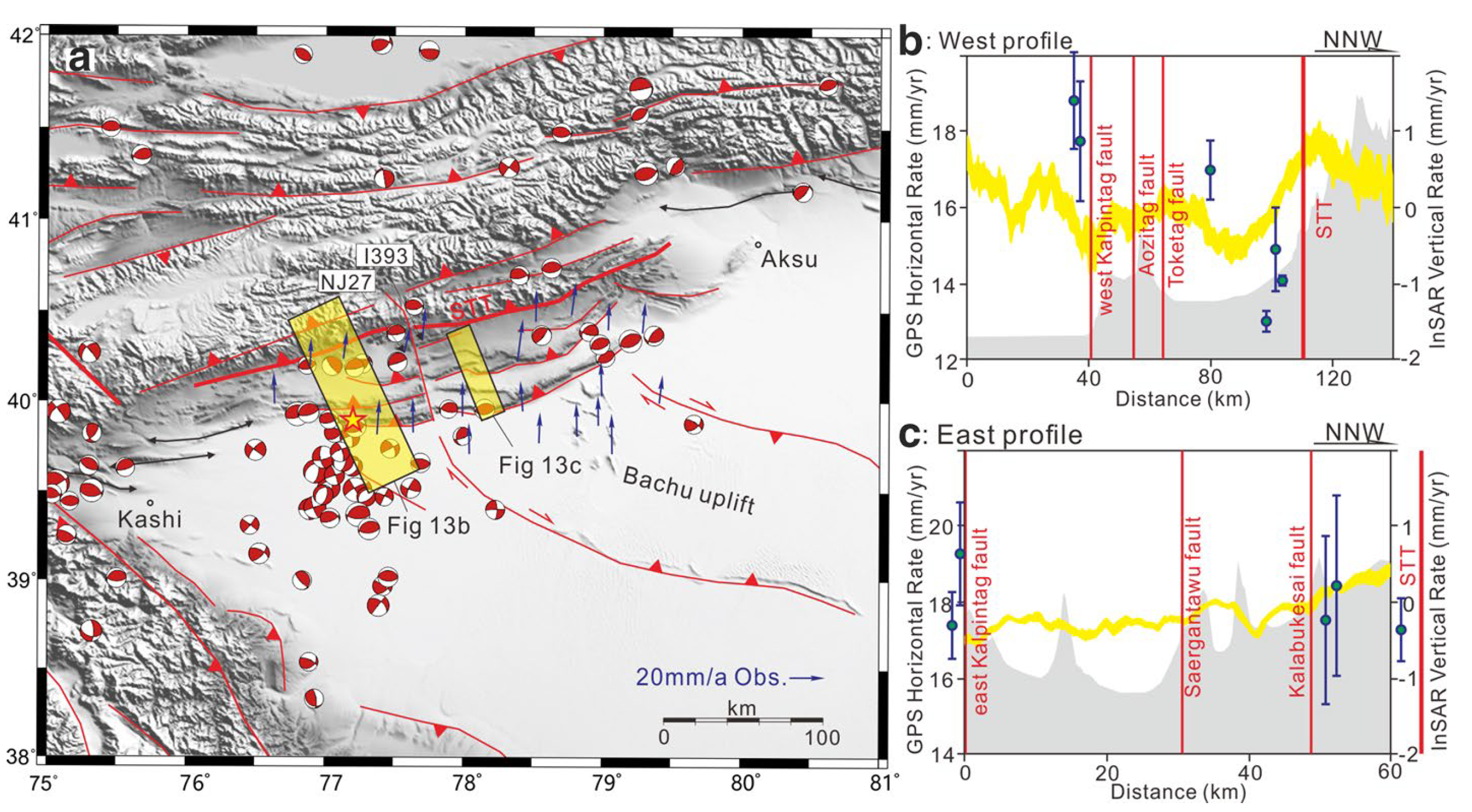
Geodetic data and focal mechanisms near the Kalpin thrust structure. a Earthquake focal mechanisms since 1976 and the GPS velocities near the Kalpin thrust structure. b InSAR vertical rate and the GPS horizontal rate in the 345° direction in the western segment of the Kalpin structure. The location of the transect is shown in (a). c InSAR vertical rate and the GPS horizontal rate in the 345° direction in the eastern segment of the Kalpin structure. The location of the transect is shown in (b). The yellow curve is the vertical rate of the InSAR (Qiao et al. 2017), and blue circles are the GPS horizontal rates. The gray-shaded area in the profiles represents the topography. Profiles b and c were modified based on Qiao et al. (2017) and the GPS results of Yang et al. (2008b), Zubovich et al. (2010), and Ischuk et al. (2013)
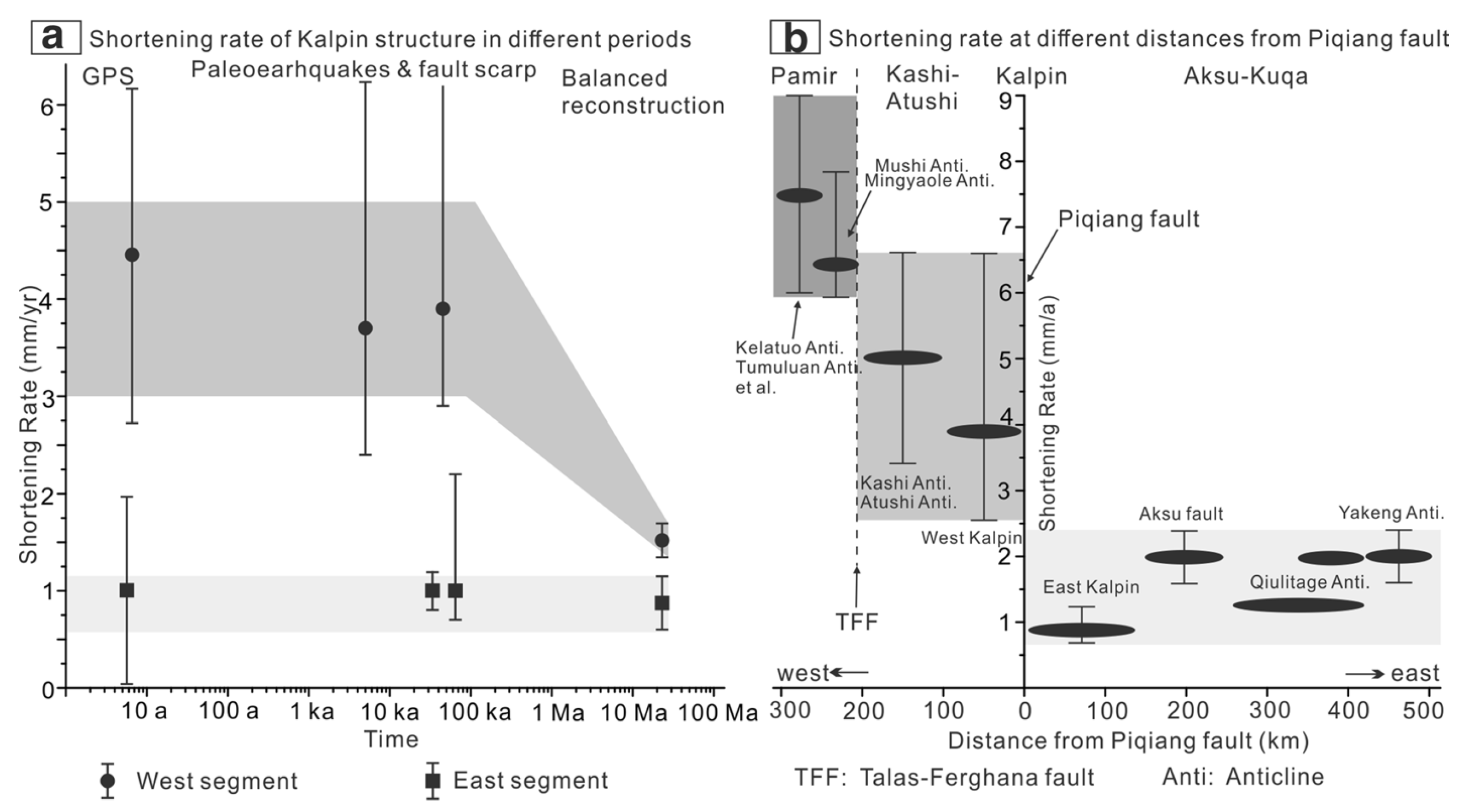
Comparison of the shortening rates on the Kalpin Thrust and along the southern Tianshan. a Shortening rates of the Kalpin structure during different periods based on the current crustal deformation from GPS and InSAR data (Yang et al. 2008b; Zubovich et al. 2010; Ischuk et al. 2013; Qiao et al. 2017), late Quaternary geomorphic data (this study), and balanced structural restorations from the Cenozoic (Yin et al. 1998; Allen et al. 1999). Circles represent the western segment of the Kalpin structure data, and squares represent the eastern segment of the Kalpin structure data. b The shortening rate of the same faults and folds at different distances from the Piqiang fault along the southern Tianshan. Black long ellipses show the shortening rate of the structures in front of the South Tianshan Mountain. Shortening rates from Scharer et al. (2004), Hubert-Ferrari et al. (2005), Li et al. (2013, 2015), Zhang et al. (2014), Saint-Carlier et al. (2016), Tian et al. (2016), Thompson Jobe et al. (2017, 2018)
Shaking Intensity
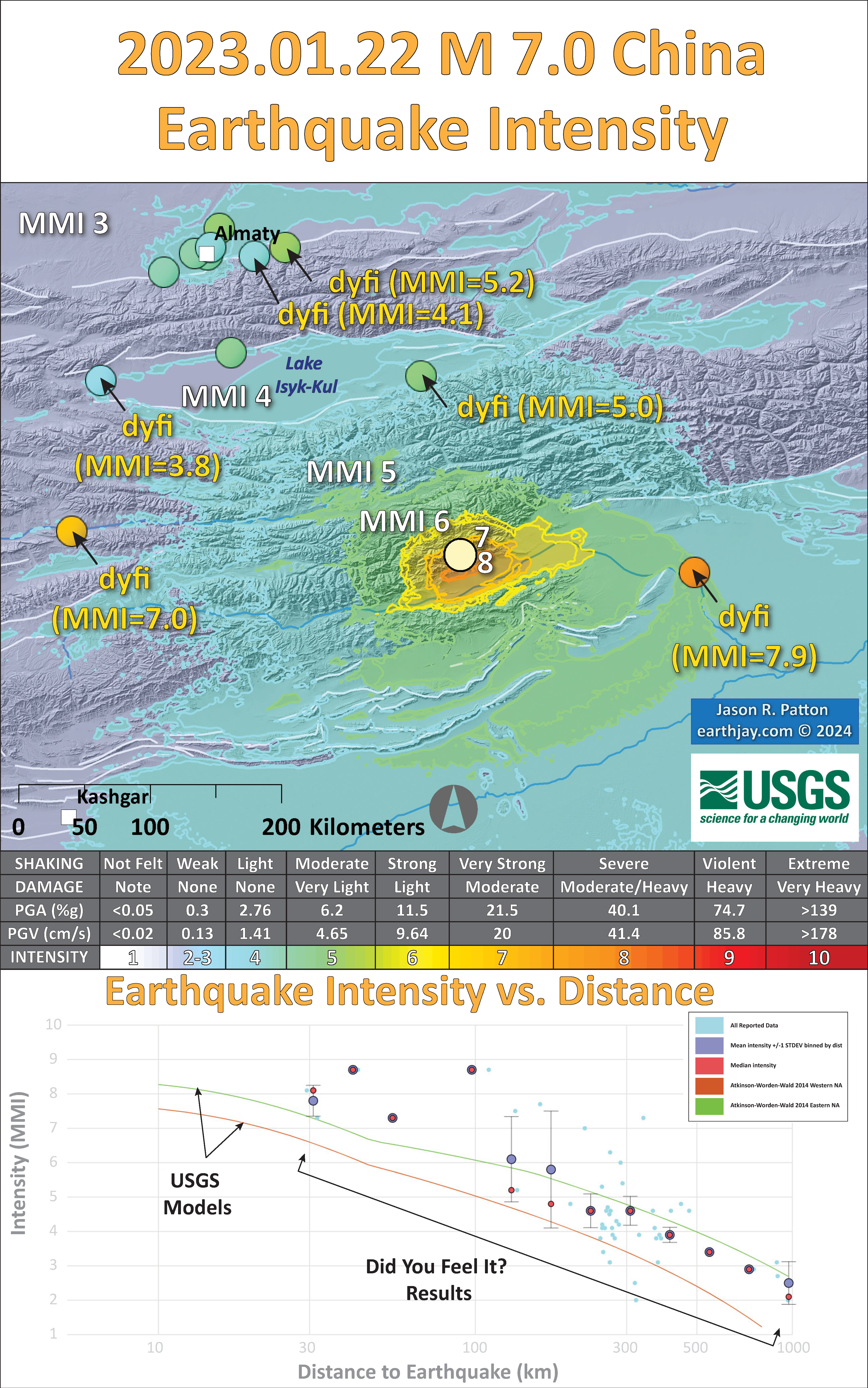
- Here is a figure that shows a more detailed comparison between the modeled intensity and the reported intensity. Both data use the same color scale, the Modified Mercalli Intensity Scale (MMI). More about this can be found here. The colors and contours on the map are results from the USGS modeled intensity. The DYFI data are plotted as colored dots (color = MMI, diameter = number of reports).
- In the upper panel is the USGS Did You Feel It reports map, showing reports as colored dots using the MMI color scale. Underlain on this map are colored areas showing the USGS modeled estimate for shaking intensity (MMI scale).
- In the lower panel is a plot showing MMI intensity (vertical axis) relative to distance from the earthquake (horizontal axis). The models are represented by the green and orange lines. The DYFI data are plotted as light blue dots. The mean and median (different types of “average”) are plotted as orange and purple dots. Note how well the reports fit the green line (the model that represents how MMI works based on quakes in California).
- Below the map and the lower plot is the USGS MMI Intensity scale, which lists the level of damage for each level of intensity, along with approximate measures of how strongly the ground shakes at these intensities, showing levels in acceleration (Peak Ground Acceleration, PGA) and velocity (Peak Ground Velocity, PGV).
Potential for Ground Failure
- Below are a series of maps that show the potential for landslides and liquefaction. These are all USGS data products.
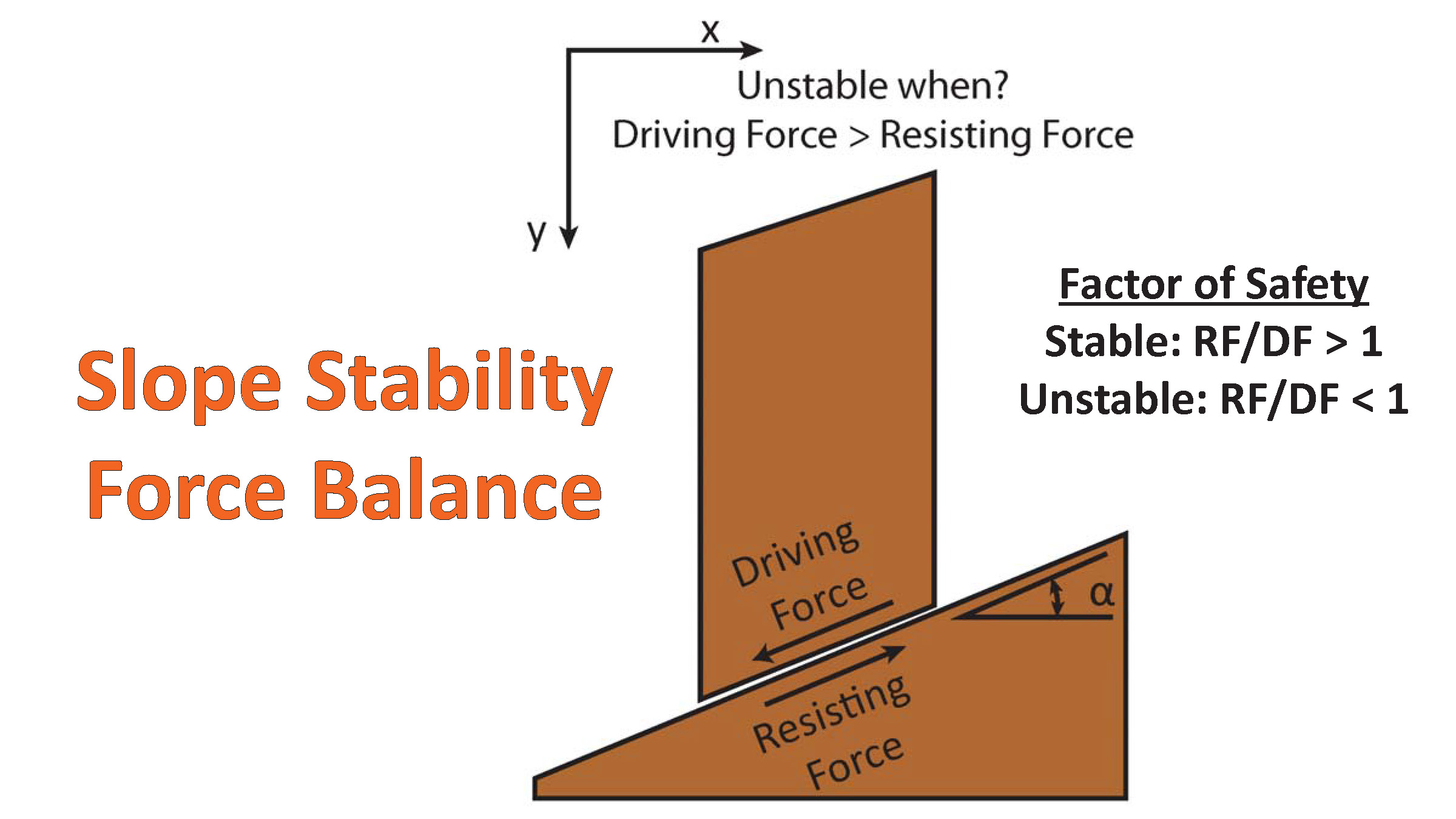
There are many different ways in which a landslide can be triggered. The first order relations behind slope failure (landslides) is that the “resisting” forces that are preventing slope failure (e.g. the strength of the bedrock or soil) are overcome by the “driving” forces that are pushing this land downwards (e.g. gravity). The ratio of resisting forces to driving forces is called the Factor of Safety (FOS). We can write this ratio like this:FOS = Resisting Force / Driving Force
- When FOS > 1, the slope is stable and when FOS < 1, the slope fails and we get a landslide. The illustration below shows these relations. Note how the slope angle α can take part in this ratio (the steeper the slope, the greater impact of the mass of the slope can contribute to driving forces). The real world is more complicated than the simplified illustration below.
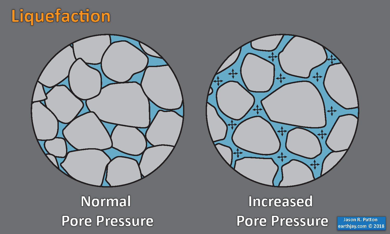
- Landslide ground shaking can change the Factor of Safety in several ways that might increase the driving force or decrease the resisting force. Keefer (1984) studied a global data set of earthquake triggered landslides and found that larger earthquakes trigger larger and more numerous landslides across a larger area than do smaller earthquakes. Earthquakes can cause landslides because the seismic waves can cause the driving force to increase (the earthquake motions can “push” the land downwards), leading to a landslide. In addition, ground shaking can change the strength of these earth materials (a form of resisting force) with a process called liquefaction.
- Sediment or soil strength is based upon the ability for sediment particles to push against each other without moving. This is a combination of friction and the forces exerted between these particles. This is loosely what we call the “angle of internal friction.” Liquefaction is a process by which pore pressure increases cause water to push out against the sediment particles so that they are no longer touching.
- An analogy that some may be familiar with relates to a visit to the beach. When one is walking on the wet sand near the shoreline, the sand may hold the weight of our body generally pretty well. However, if we stop and vibrate our feet back and forth, this causes pore pressure to increase and we sink into the sand as the sand liquefies. Or, at least our feet sink into the sand.
- Below is a diagram showing how an increase in pore pressure can push against the sediment particles so that they are not touching any more. This allows the particles to move around and this is why our feet sink in the sand in the analogy above. This is also what changes the strength of earth materials such that a landslide can be triggered.
- Here Dr. Bohon demonstrates the phenomena of liquefaction.
- And, another video demonstration.
- Below is a diagram based upon a publication designed to educate the public about landslides and the processes that trigger them (USGS, 2004). Additional background information about landslide types can be found in Highland et al. (2008). There was a variety of landslide types that can be observed surrounding the earthquake region. So, this illustration can help people when they observing the landscape response to the earthquake whether they are using aerial imagery, photos in newspaper or website articles, or videos on social media. Will you be able to locate a landslide scarp or the toe of a landslide? This figure shows a rotational landslide, one where the land rotates along a curvilinear failure surface.
- Below is the liquefaction susceptibility and landslide probability map (Jessee et al., 2017; Zhu et al., 2017). Please head over to that report for more information about the USGS Ground Failure products (landslides and liquefaction). Basically, earthquakes shake the ground and this ground shaking can cause landslides.
- I use the same color scheme that the USGS uses on their website. Note how the areas that are more likely to have experienced earthquake induced liquefaction are in the valleys. Learn more about how the USGS prepares these model results here.
Liquefaction in action! This is a short clip of me jumping on water-laden sand at the beach and creating an increase in pore pressure, causing the ground to temporarily behave like a fluid. pic.twitter.com/p8VZNUcrEq
— Wendy Bohon, PhD 🌏 (@DrWendyRocks) April 28, 2021
This liquefaction experiment conducted by the Tokyo Geological Survey of Japan at the Disaster Prevention Exhibition in 2015, shows the effects of different foundations and how hollow objects such as water pipes come to the surface [source, full video: https://t.co/xYLjPY4IHZ] pic.twitter.com/r8LXtmvrO0
— Massimo (@Rainmaker1973) April 17, 2021
- 2024.01.22 M 7.0 China
- 2022.03.22 M 6.7 Taiwan POSTER
- 2022.09.18 M 6.9 Taiwan
- 2021.05.21 M 7.3 China
- 2018.01.11 M 6.0 Burma
- 2017.08.08 M 6.3 China (different)
- 2017.08.08 M 6.5 China
- 2016.08.24 M 6.8 Burma
- 2016.04.13 M 6.9 Burma
- 2016.02.23 M 5.9 Antarctic plate
- 2016.02.05 M 6.4 Taiwan
- 2016.02.05 M 6.4 Taiwan Update #1
- 2015.12.04 M 7.1 SE India Ridge
- 2015.04.24 M 7.8 Nepal
- 2015.04.25 M 7.8 Nepal Update #1
- 2015.04.25 M 7.8 Nepal Update #2
- 2015.04.26 M 7.8 Nepal Update #3
- 2015.04.26 M 7.8 Nepal Update #4
- 2015.04.27 M 7.8 Nepal Update #5
- 2015.04.27 M 7.8 Nepal Update #6
India | Asia
Earthquake Reports
Social Media
#EarthquakeReport for M7.0 #Earthquake in #China
Oblique reverse (Compressional) earthquake mechanism@USGS_Quakes models suggest lots of damage and chance for triggered landslides
Tectonic background here: https://t.co/s4tC9oSK93https://t.co/FFx7J0R0rW pic.twitter.com/RN2cs9C4VW
— Jason "Jay" R. Patton (@patton_cascadia) January 22, 2024
#EarthquakeReport for M7.0 #Earthquake in #China
oblique reverse mechanism@USGS_Quakes models suggest chance for triggered landslides/induced liquefaction
slip ~50km length ~matches fault scaling relationstectonic background: https://t.co/s4tC9oSK93https://t.co/UiFJ0c9ryw pic.twitter.com/ac1JvQNcRf
— Jason "Jay" R. Patton (@patton_cascadia) January 22, 2024
#EarthquakeReport for M 7.0 #Earthquake in western #China
updated posters with aftershocks and detailed fault mapping
tectonic cross section and geodetic profiles
ground failure and intensity interpretive postersfull report here:https://t.co/4ia2jL78fw pic.twitter.com/MWLTjWHQzn
— Jason "Jay" R. Patton (@patton_cascadia) January 25, 2024
About one hour ago, Mw7.0 #earthquake at the Tien Shan Range near the Kyrgyzstan-Sinkiang (China) border. Felt in the neighbouring countries, as far as New Delhi.
Very shallow, damage and landslides are to fear.https://t.co/gww2ep0nlB pic.twitter.com/077CoC1GA0— José R. Ribeiro (@JoseRodRibeiro) January 22, 2024
Whole lotta shaking going on in the Tien Shan Mountains. This recording from a nearby seismic station shows the M7.0 and several aftershocks.
Data from https://t.co/UGVApJ5ZzW https://t.co/E0774jTv6B pic.twitter.com/IM8YnD3MiZ
— Wendy Bohon, PhD 🌏 (@DrWendyRocks) January 22, 2024
M7.0 earthquake on the China-Kyrgyzstan border. USGS expects relatively few fatalities (good), but elevated economic losses (not good). They’ve also already had three M5+ aftershocks in the first hour, which could mean additional damage/injuries. #earthquake pic.twitter.com/48dMnFQBfB
— Brian Olson (@mrbrianolson) January 22, 2024
#Earthquake 127 km W of #Aksu (#China) 33 min ago (local time 00:09:05). Colored dots represent local shaking & damage level reported by eyeswitnesses. Share your experience via:
📱https://t.co/IbUfG7TFOL
🌐https://t.co/i3zjJbMUsz pic.twitter.com/R32NcSTyhI— EMSC (@LastQuake) January 22, 2024
Waves from the M7.0 earthquake near the Kyrgyzstan-Xinjiang border shown using Station Monitor. https://t.co/Tir0KZELXN pic.twitter.com/ZFqVq3408I
— EarthScope Consortium (@EarthScope_sci) January 22, 2024
M7 earthquake on the China-Kyrzgyzstan border a little while ago. Strong shaking expected near the epicenter; some people report feeling shaking more than 1,000 km away. https://t.co/ycMNvOsDHt pic.twitter.com/Gxy2RDbD2A
— Dr. Judith Hubbard (@JudithGeology) January 22, 2024
Preliminary M7.0 #Earthquake
ID: #rs2024bnyizf
133km from #Aksu, #Kyrgyzstan-XinjiangBorderRegion
2024-01-22 18:09 UTC
Source: #GFZ@raspishakeJoin the largest #CitizenScience EQ community ➡ https://t.co/Y5O0dgJqJF
EVENT ➡ https://t.co/y4kCOgmUcD pic.twitter.com/y5fXP9Ignr
— Raspberry Shake Earthquake Channel (@raspishakEQ) January 22, 2024
Auto solution FMNEAR (Géoazur/OCA) with regional records for the M 7.0 – KYRGYZSTAN-XINJIANG CHINA BORDER REG.- 2024-01-22 18:09:04 (UTC) (Loc USGS used to trigger inversion).https://t.co/5CWgdoapKK
Thanks to the seismic records provided by IRIS pic.twitter.com/eYeDIdTFWp— Bertrand Delouis (@BertrandDelouis) January 22, 2024
Shaking recorded in Bishkek from the M7 >350 km on the Kyrgyz-Chinese border area. pic.twitter.com/SZYtggPB6f
— Ian Pierce (@neotectonic) January 22, 2024
The shaking from this #earthquake is strong and the shallow depth is likely to lead to damage in the region.
All plots are made using @obspy and @matplotlib using data from a @raspishake seismometer. pic.twitter.com/58PMnz01kP
— Alex Rutson (@ARutson) January 22, 2024
Today's M7.0 earthquake near the Kyrgyzstan-China border occurred within the Tian Shan mountain range, a seismically active region of intraplate earthquakes due to deformation from collision between the Indian and Eurasian plates. pic.twitter.com/3dszNqnUZG
— EarthScope Consortium (@EarthScope_sci) January 22, 2024
Auto slipmap with regional records (SLIPNEAR method, Géoazur/OCA) M 7.2 – KYRGYZSTAN-XINJIANG 2024-01-22 18:09:04 UTC
Rupture plane not selected. Both slip maps shown.
Rupture length 40 to 50 km and max slip 3 m for both planes. Slight rupture directivity towards the East. pic.twitter.com/baEpdWC464— Bertrand Delouis (@BertrandDelouis) January 22, 2024
2024-01-22 M7.0 129 km WNW of Aykol, #China #earthquake recorded in #Scotland & #Stornoway + historical seismicity & cross section.
Clear P waves for almost all stations.
Dist.: 5898.2km
Travel Time: 9m 19.9s
Depth: 13.0km#Python @raspishake @matplotlib #CitizenScience pic.twitter.com/bhzKkFBocK— Giuseppe Petricca (@gmrpetricca) January 22, 2024
A magnitude 7.0 earthquake struck near the Kyrgyzstan-China border today. https://t.co/k2rEuBTE7F
— AGU's Eos (@AGU_Eos) January 22, 2024
EERI is monitoring the impacts of the destructive M7.0 earthquake that struck near the China/Kyrgyzstan border today. We extend our sympathy to those affected as rescue and response work continues. For more information, visit the EERI website: https://t.co/aPP4kTlDUp pic.twitter.com/jzsJDBNsVM
— EERI (@EERI_tweets) January 22, 2024
Magnitude 7.0 earthquake in China (January 22, 2024), recorded across New England by @raspishake community seismographs.
Maybe not too bad? Low population density. pic.twitter.com/OInOR9ImXh
— Alan Kafka (@Weston_Quakes) January 22, 2024
A M7.0 earthquake struck the China-Kyrgyzstan border just after midnight, in bitter cold. With severe shaking, this event is likely serious.
The quake likely occurred on the South Tien Shan fault, which in the past has produced M8+ events.
Read more on our blog; link in my bio. pic.twitter.com/A1N3uFetFD
— Dr. Judith Hubbard (@JudithGeology) January 23, 2024
Watch the waves from the M7.0 earthquake near the Kyrgyzstan-China border roll across seismic stations around the world. (THREAD 🧵) pic.twitter.com/cz3TF7U1qK
— EarthScope Consortium (@EarthScope_sci) January 23, 2024
Mw=7.1, KYRGYZSTAN-XINJIANG BORDER REG. (Depth: 22 km), 2024/01/22 18:09:06 UTC – Full details here: https://t.co/TRXmxCoArb pic.twitter.com/CgrfXoNxwT
— Earthquakes (@geoscope_ipgp) January 23, 2024
First #Sentinel1 SAR data and #InSAR results for the Jan. 22, M 7.0 #China #earthquake should arrive in two days (Jan 25). Meanwhile, you could give a look to what we expect in terms of fringes, according to the scenarios, here:https://t.co/Vb6Idx3o4L
with @antandre71 pic.twitter.com/1U9pWQUNox
— Simone Atzori (@SimoneAtzori73) January 23, 2024
Today's update on the seismic activity after the 2024-01-22 M7.0 129 km WNW of Aykol, #China #earthquake.
65 shocks were detected in the past 53 hours for this event in the #TianShan mountain range. #Python @matplotlib #CitizenScience pic.twitter.com/5bEr2iD6HL
— Giuseppe Petricca (@gmrpetricca) January 24, 2024
Sentinel-1 data now available from @COMET_database LiCSAR. One track, catches most of the deformation.
Event page: https://t.co/reDE80ll2y
Direct link to track 34D:https://t.co/5ThKywHiAZ
Likely no significant surface rupture, NE-SW fault, dipping to NW https://t.co/faFbX5bq68 pic.twitter.com/5yhZHfQCNc— Tim Wright (@timwright_leeds) January 25, 2024
The #Sentinel1 DInSAR coseismic products for the recent seismic in China with a magnitude of Mw 7.0, are available on @EPOSeu geoportal @CnrIrea @FraxInSAR @claudiodeluca @SimoneAtzori73 @dott109 pic.twitter.com/m2hQQINLK7
— Fernando Monterroso (@maferp_13) January 25, 2024
First distributed slip source for the Jan 22, M 7.1 #China #earthquake, available after the automatic inversion of #InSAR data from @CnrIrea (@EPOSeu #EPOSAR service).
Data and model can be found here:https://t.co/Vb6Idx3o4L@maferp_13 @FraxInSAR @dott109 @antandre71
🧵 https://t.co/F4Ji6LAtRu pic.twitter.com/KFgBtwf6Wu— Simone Atzori (@SimoneAtzori73) January 25, 2024
Today's update on the seismic activity after the 2024-01-22 M7.0 129 km WNW of Aykol, #China #earthquake.
76 shocks were detected in the past ~80 hours for this event in the #TianShan mountain range. #Python @matplotlib #CitizenScience pic.twitter.com/IeBwrPIsZ1
— Giuseppe Petricca (@gmrpetricca) January 25, 2024
- Frisch, W., Meschede, M., Blakey, R., 2011. Plate Tectonics, Springer-Verlag, London, 213 pp.
- Hayes, G., 2018, Slab2 – A Comprehensive Subduction Zone Geometry Model: U.S. Geological Survey data release, https://doi.org/10.5066/F7PV6JNV.
- Holt, W. E., C. Kreemer, A. J. Haines, L. Estey, C. Meertens, G. Blewitt, and D. Lavallee (2005), Project helps constrain continental dynamics and seismic hazards, Eos Trans. AGU, 86(41), 383–387, , https://doi.org/10.1029/2005EO410002. /li>
- Jessee, M.A.N., Hamburger, M. W., Allstadt, K., Wald, D. J., Robeson, S. M., Tanyas, H., et al. (2018). A global empirical model for near-real-time assessment of seismically induced landslides. Journal of Geophysical Research: Earth Surface, 123, 1835–1859. https://doi.org/10.1029/2017JF004494
- Kreemer, C., J. Haines, W. Holt, G. Blewitt, and D. Lavallee (2000), On the determination of a global strain rate model, Geophys. J. Int., 52(10), 765–770.
- Kreemer, C., W. E. Holt, and A. J. Haines (2003), An integrated global model of present-day plate motions and plate boundary deformation, Geophys. J. Int., 154(1), 8–34, , https://doi.org/10.1046/j.1365-246X.2003.01917.x.
- Kreemer, C., G. Blewitt, E.C. Klein, 2014. A geodetic plate motion and Global Strain Rate Model in Geochemistry, Geophysics, Geosystems, v. 15, p. 3849-3889, https://doi.org/10.1002/2014GC005407.
- Meyer, B., Saltus, R., Chulliat, a., 2017. EMAG2: Earth Magnetic Anomaly Grid (2-arc-minute resolution) Version 3. National Centers for Environmental Information, NOAA. Model. https://doi.org/10.7289/V5H70CVX
- Müller, R.D., Sdrolias, M., Gaina, C. and Roest, W.R., 2008, Age spreading rates and spreading asymmetry of the world’s ocean crust in Geochemistry, Geophysics, Geosystems, 9, Q04006, https://doi.org/10.1029/2007GC001743
- Pagani,M. , J. Garcia-Pelaez, R. Gee, K. Johnson, V. Poggi, R. Styron, G. Weatherill, M. Simionato, D. Viganò, L. Danciu, D. Monelli (2018). Global Earthquake Model (GEM) Seismic Hazard Map (version 2018.1 – December 2018), DOI: 10.13117/GEM-GLOBAL-SEISMIC-HAZARD-MAP-2018.1
- Silva, V ., D Amo-Oduro, A Calderon, J Dabbeek, V Despotaki, L Martins, A Rao, M Simionato, D Viganò, C Yepes, A Acevedo, N Horspool, H Crowley, K Jaiswal, M Journeay, M Pittore, 2018. Global Earthquake Model (GEM) Seismic Risk Map (version 2018.1). https://doi.org/10.13117/GEM-GLOBAL-SEISMIC-RISK-MAP-2018.1
- Storchak, D. A., D. Di Giacomo, I. Bondár, E. R. Engdahl, J. Harris, W. H. K. Lee, A. Villaseñor, and P. Bormann (2013), Public release of the ISC-GEM global instrumental earthquake catalogue (1900–2009), Seismol. Res. Lett., 84(5), 810–815, doi:10.1785/0220130034.
- Zhu, J., Baise, L. G., Thompson, E. M., 2017, An Updated Geospatial Liquefaction Model for Global Application, Bulletin of the Seismological Society of America, 107, p 1365-1385, https://doi.org/0.1785/0120160198
- Allen, M.B., Windley, B.F., Zhang, C., 1994. Cenozoic tectonics in the Urumqi-Korla region of the Chinese Tien Shan. In: Giese, P., Behrmann, J. (eds) Active Continental Margins — Present and Past. Springer, Berlin, Heidelberg. https://doi.org/10.1007/978-3-662-38521-0_15
- Allen, M. B., S. J. Vincent, and P. J. Wheeler, 1999. Late Cenozoic tectonics of the Kepingtage thrust zone: Interactions of the Tien Shan and Tarim Basin, northwest China, Tectonics, v. 18, no. 4, p. 639–654, https://doi.org/10.1029/1999TC900019.
- Burchfiel, B. C., E. T. Brown , Deng Qidong , Feng Xianyue , Li Jun , Peter Molnar , Shi Jianbang , Wu Zhangming & You Huichuan, 1999. Crustal Shortening on the Margins of the Tien Shan, Xinjiang, China in International Geology Review, v. 41, no. 8, p. 665-700, https://doi.org/10.1080/00206819909465164
- Harkins, N., Kirby, E., Shi, X., Burbank, D., and Chun, F., 2010. Millennial slip rates along the eastern Kunlun fault: Implications for the dynamics of intracontinental deformation in Asia in Lithosphere, v. 2, no. 4, p. 247-266, doi: 10.1130/L85.1
- Jolivet, M., S. Dominguez, J. Charreau, Y. Chen, Y. Li, and Q. Wang, 2010, Mesozoic and Cenozoic tectonic history of the central Chinese Tian Shan: Reactivated tectonic structures and active deformation, Tectonics, 29, TC6019, https://doi.org/10.1029/2010TC002712.
- Li, A., Ran, Y., Gomez, F. et al., 2020. Segmentation of the Kepingtage thrust fault based on paleoearthquake ruptures, southwestern Tianshan, China. Nat Hazards 103, 1385–1406. https://doi.org/10.1007/s11069-020-04040-6
- Li, J., Yao, Y., Li, R., Yusan, S., Li, G., Freymueller, J. T., & Wang, Q., 2022. Present-day strike-slip faulting and thrusting of the Kepingtage fold-and-thrust belt in southern Tianshan: Constraints from GPS observations. Geophysical Research Letters, 49, e2022GL099105. https://doi.org/10.1029/2022GL099105
- Li, W., Chen, Y., Yuan, X. et al., 2022 B. Intracontinental deformation of the Tianshan Orogen in response to India-Asia collision. Nat Commun 13, 3738 https://doi.org/10.1038/s41467-022-30795-6
- Molinar, P. and Tapponier, P., 1975. Cenozoic Tectonics of Asia: Effects of a Continental Collision: Features of recent continental tectonics in Asia can be interpreted as results of the India-Eurasia collision in Science, v. 189, Issue 4201, p. 419-426
- Pusok, A.E. and Stegman, D.R., 2020. The convergence history of India-Eurasia records multiple subduction dynamics processes in Science Advances, v. 6 : eeaz8681, 8 p.,https://doi.org/10.1126/sciadv.aaz8681
- Qiu J, Ji L, Zhu L and Wang Q (2022. Present-Day Tectonic Deformation Partitioning Across South Tianshan From Satellite Geodetic Imaging. Front. Earth Sci. 9:793890. https://doi.org/10.3389/feart.2021.793890
- Tapponier, P., Peltzer, G., Le Dain, A.Y., Armijo, R., and Cobbold, P., 1982. Propagating extrusion tectonics in Asia: New insights from simple experiments with plasticine in Geology, v. 10, p. 611-616, doi: 10.1130/0091-7613(1982)10<611:PETIAN>2.0.CO;2
- Taylor, M. and Yin, A., 2009. Active structures of the Himalayan-Tibetan orogen and their relationships to earthquake distribution, contemporary strain field, and Cenozoic volcanism in Geosphere, v. 5, no. 3, doi: 10.1130/GES00217.1
- Turner, S.S., Cosgrove, J.W., and Liu, J.G., 2010. Controls on lateral structural variability along the Keping Shan Thrust Belt, SW Tien Shan Foreland, China in Geological Society, London, Special Publications, v. 348, p. 71-85, https://doi.org/10.1144/SP348.5
- Yin, A., S. Nie, P. Craig, T. M. Harrison, F. J. Ryerson, Q. Xianglin, and Y. Geng, 1998. Late Cenozoic tectonic evolution of the southern Chinese Tian Shan in Tectonics, v. 17, no. 1, p. 1–27, https://doi.org/10.1029/97TC03140.
- Zhang, P-Z., Shen, Z., Wang, M., Gan, W., Bürgmann, R., Molnar, P., Wang, Q., Niu, Z., Sun, J., Wu, J., Hanrong, S., Xinzhao, Y, 2004. Continuous deformation of the Tibetan Plateau from global positioning system data in Geology, v. 23, no. 9, p. 809-812, https://doi.org/10.1130/G20554.1
- Zubovich, A. V., Xiao-qiang Wang, Yuri G. Scherba, Gennady G. Schelochkov, Robert Reilinger, Christoph Reigber, Olga I. Mosienko, Peter Molnar, Wasili Michajljow, Vladimir I. Makarov, Jie Li, Sergey I. Kuzikov, Thomas A. Herring, Michael W. Hamburger, Bradford H. Hager, Ya-min Dang, Vitaly D. Bragin, Rinat T. Beisenbaev, 2010. GPS velocity field for the Tien Shan and surrounding regions in Tectonics, v. 29, TC6014, https://doi.org/10.1029/2010TC002772.
References:
Basic & General References
Specific References
Return to the Earthquake Reports page.
- Sorted by Magnitude
- Sorted by Year
- Sorted by Day of the Year
- Sorted By Region