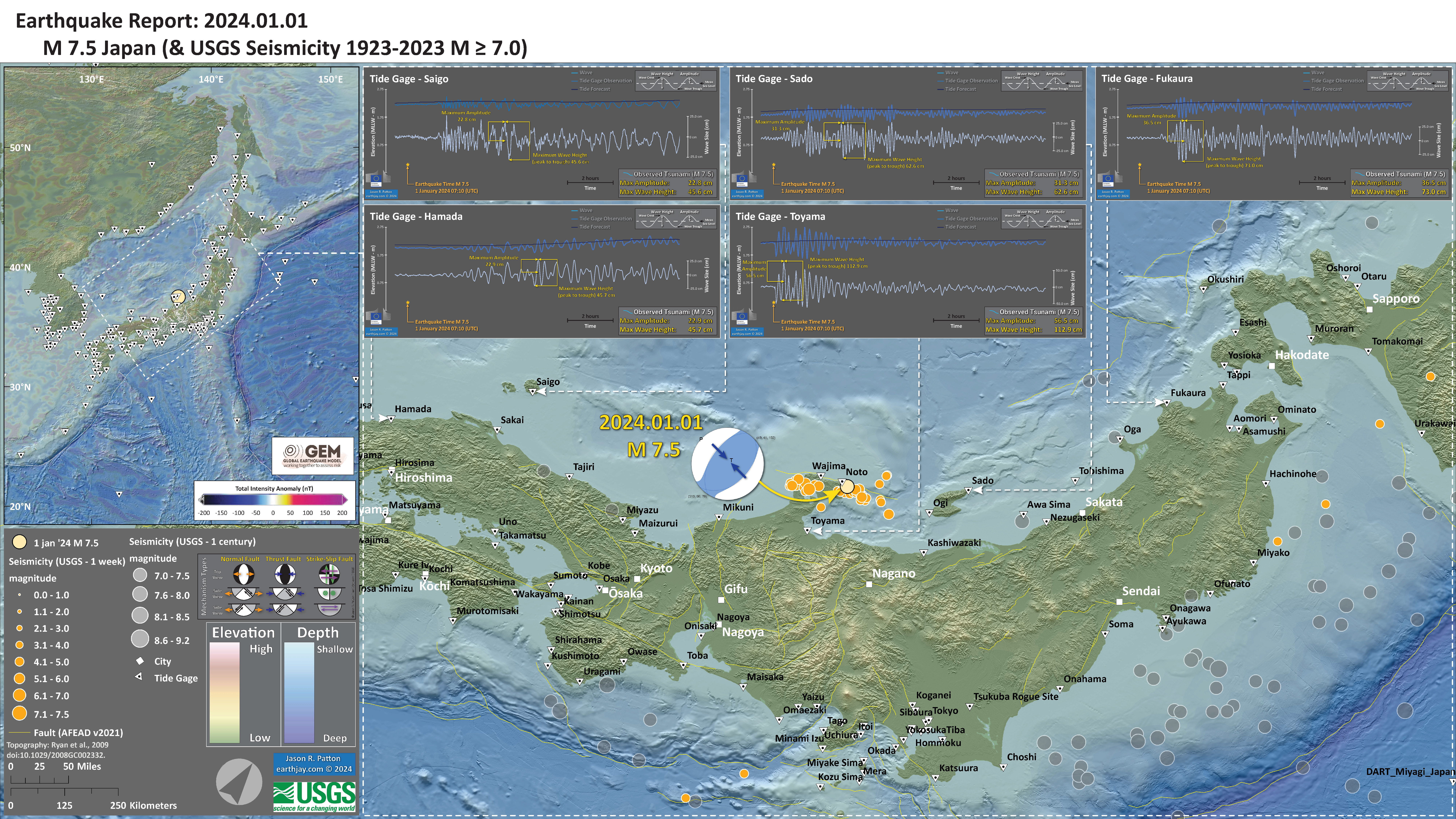
Last night (my time) as I was winding down, I heard my phone go ‘tinggggg.’
A few moments later I got up and learned of a M 7.5 earthquake offshore of the west coast of Japan.
https://earthquake.usgs.gov/earthquakes/eventpage/us6000m0xl/executive
This place has had some recent seismicity (largest magnitude M 6.5; Kato, 2023), though I did not write up a report.
This earthquake was a shallow crustal fault earthquake associated with the Noroshi-oki fault.
This fault is a crustal reverse fault (compressional) that dips to the southeast. Kato (2023) plotted seismicity from a previous sequence and I include the plots from their paper below. These plots reveal the orientation of this fault system.
The aftershock pattern (see poster below) suggests that the entire fault slipped during (or shortly before or after) this M 7.5 mainshock.
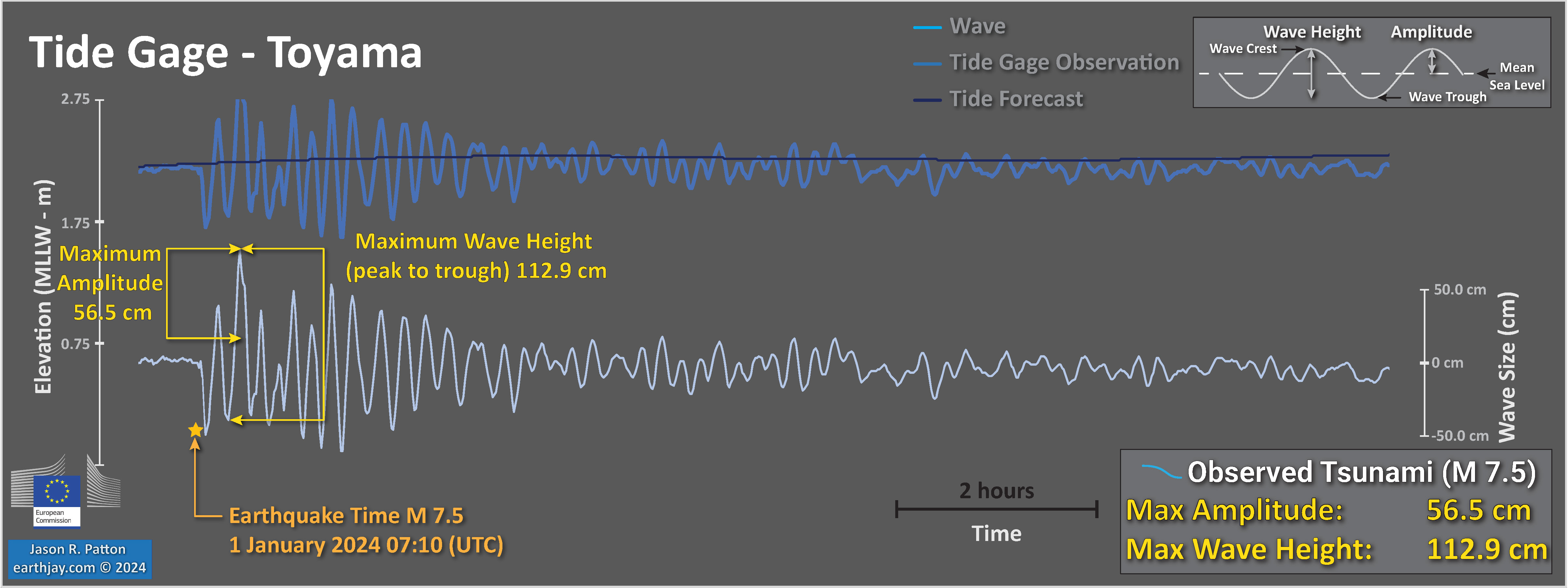
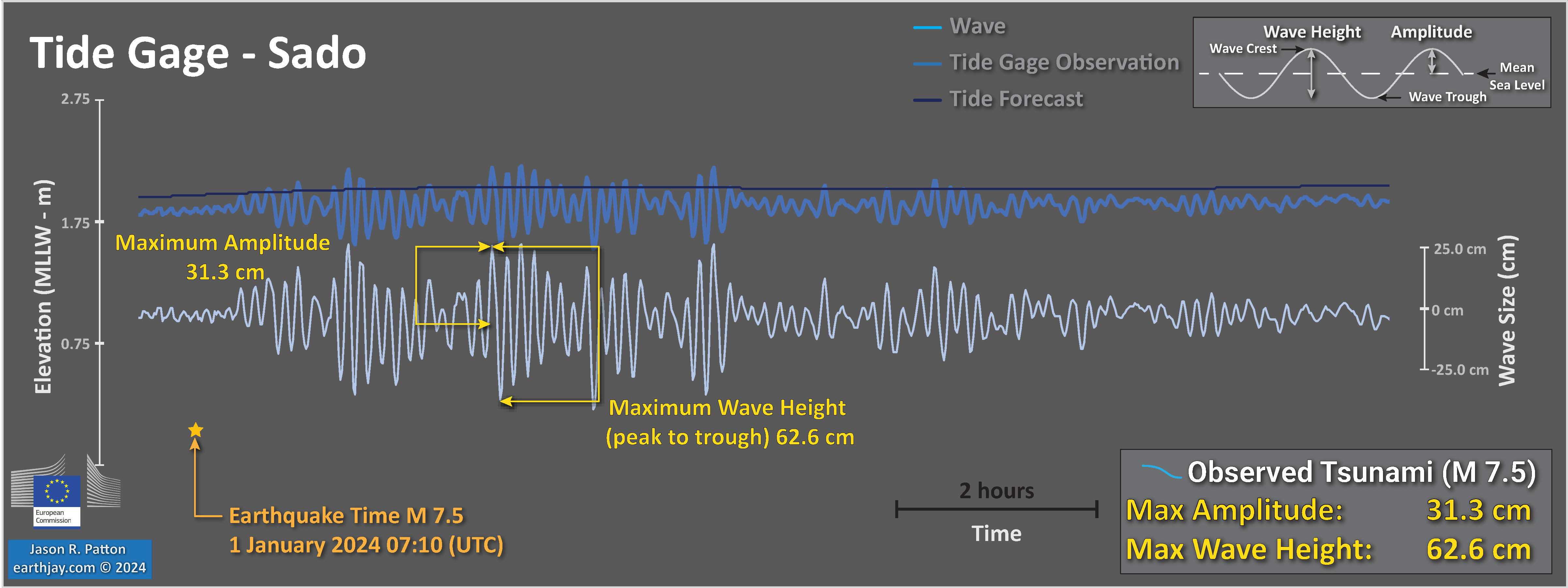
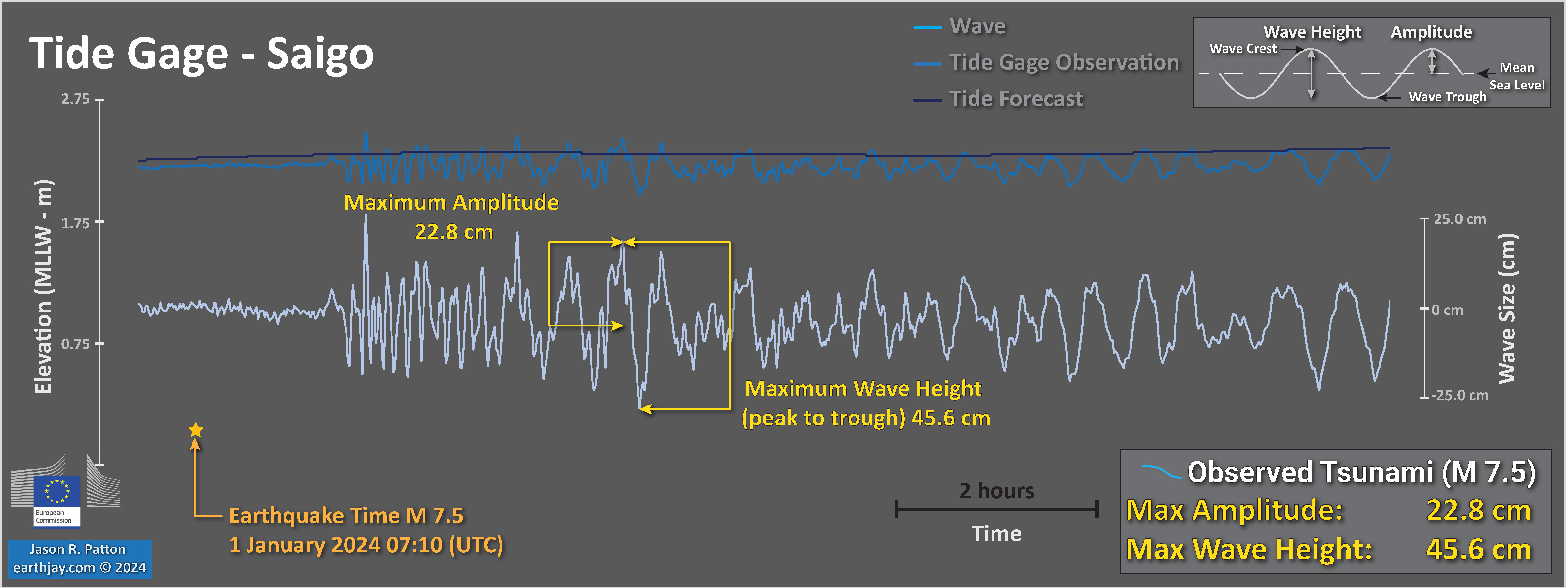
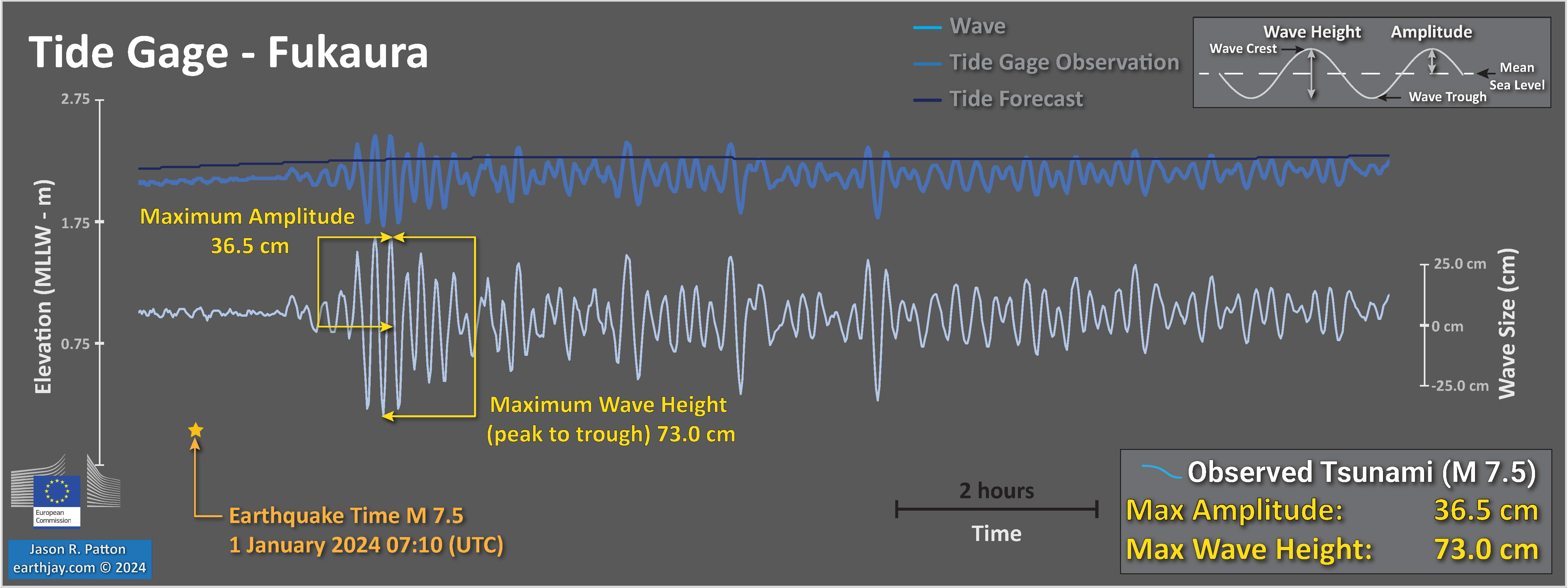
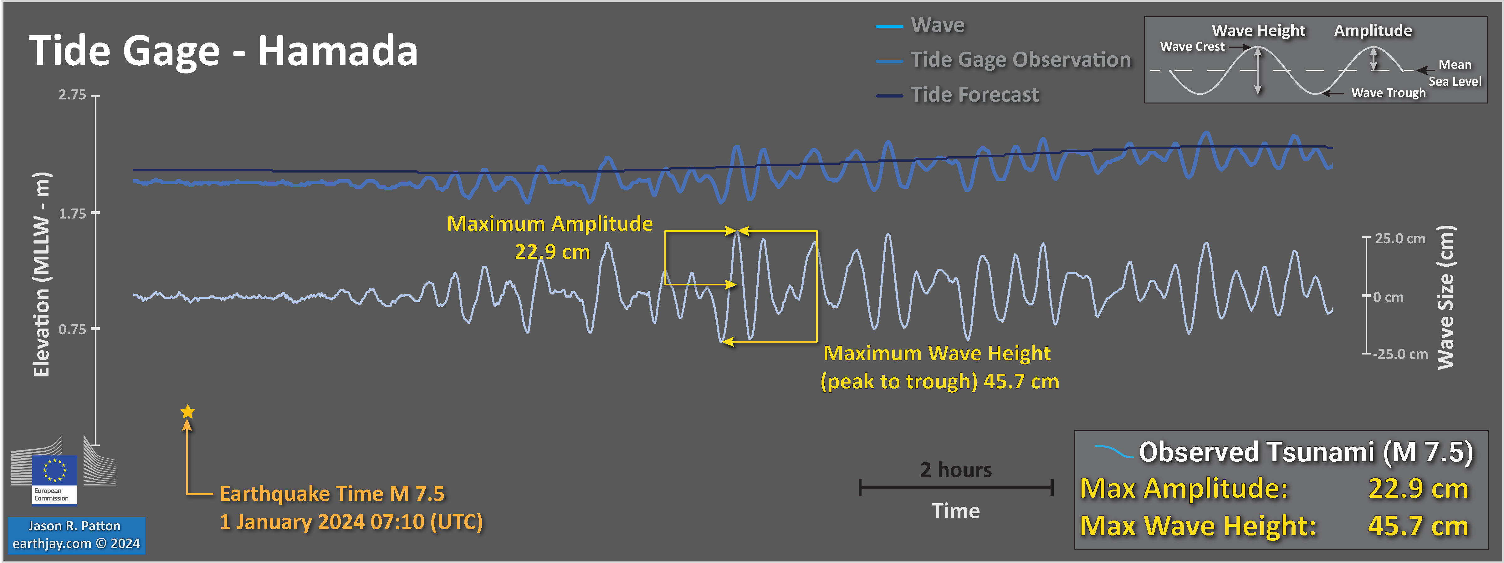
There was a tsunami generated by this earthquake. Below are plots from the gages that have a clear record of the tsunami.
The nearest gage (Noto) is located very close to the epicenter and the data suggest that the gage has been damaged in some way.
- Toyama
- Sado
- Saigo
- Fukaura
- Hamada
Fault Scaling Relations
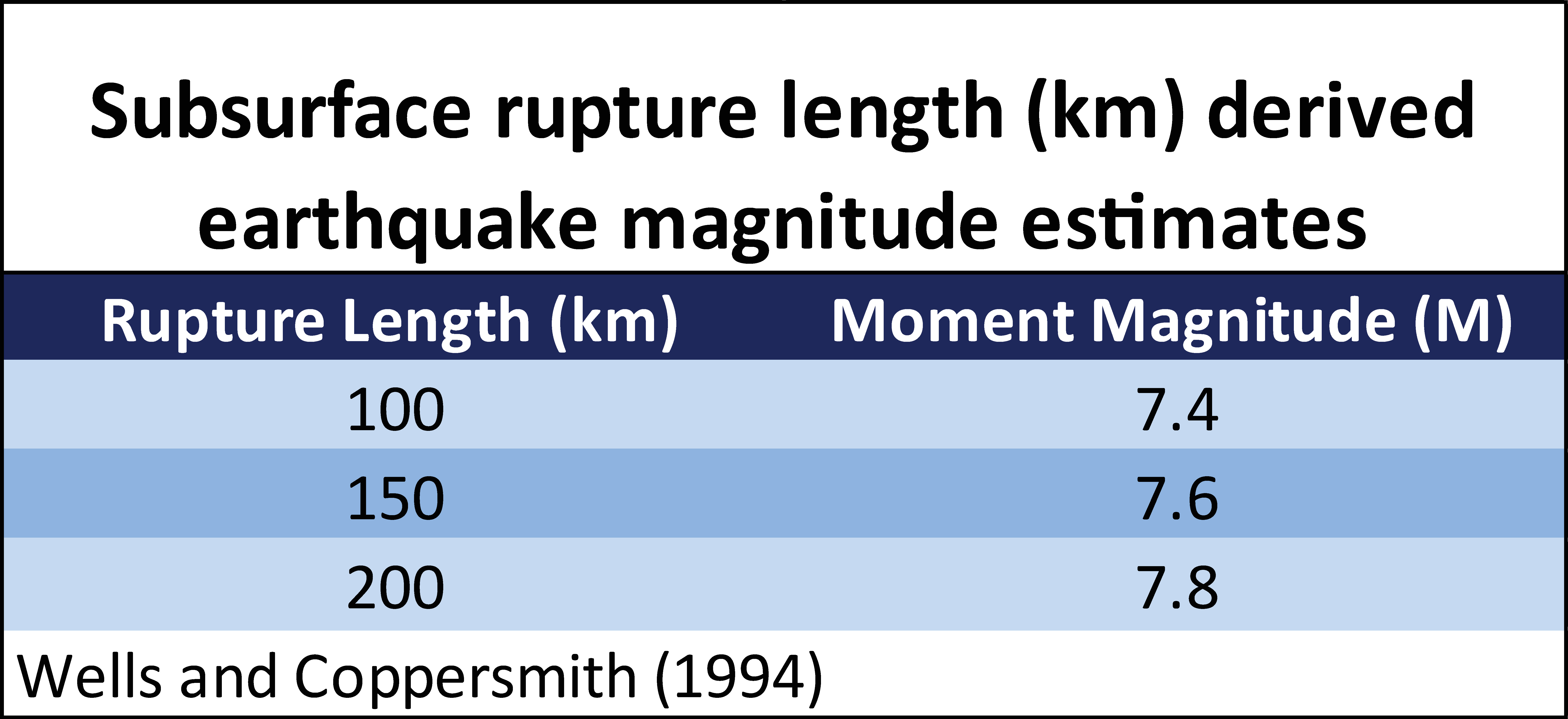
Empirical fault scaling relations are ways that we can compare fault rupture sizes with earthquake magnitudes. One of the most used and well cited empirical fault scaling relations paper is Wells and Coppersmith, 1994.
- Wells and Coppersmith developed relations between earthquake magnitude/moment magnitude and surface rupture length, subsurface rupture length, and rupture area. They also consider the difference between mean and maximum displacement measures.
- The length of fault rupture is the distance that the fault slipped measured parallel to Earth’s surface. When we see fault lines mapped on a map, these lines are representative of the fault length.
- The width of fault rupture is the distance that the fault slipped measured down into the Earth. For a fault that dips straight down into the Earth (perpendicular to the Earth’s surface), the width of the fault rupture is the distance between the Earth’s surface and the depth where the fault slipped. For faults that dip at an angle (like along a subduction zone, or a reverse/thrust fault like the fault that caused this M 7.5 earthquake), the distance measured is measured along this non-perpendicular distance.
- The area of fault slip is basically the fault length times the fault width.
- There have been some updates to these scaling relations that attempt to improve these relations. However, Wells and Coppersmith still work pretty well (the updates are not really that much different).
- There remain certain types of earthquakes where we have small amounts of information to constrain these relations for those types of earthquakes (particularly large magnitude earthquakes, which are more rare than small and medium sized earthquakes). So, there is room for improvement.
- Note that there is lots of variation, so these empirical relations (represented by the lines that are drawn to “fit” these data) have lots of range. So, these empirical relations are not perfect predictors (i.e., fault length does not perfectly predict magnitude).
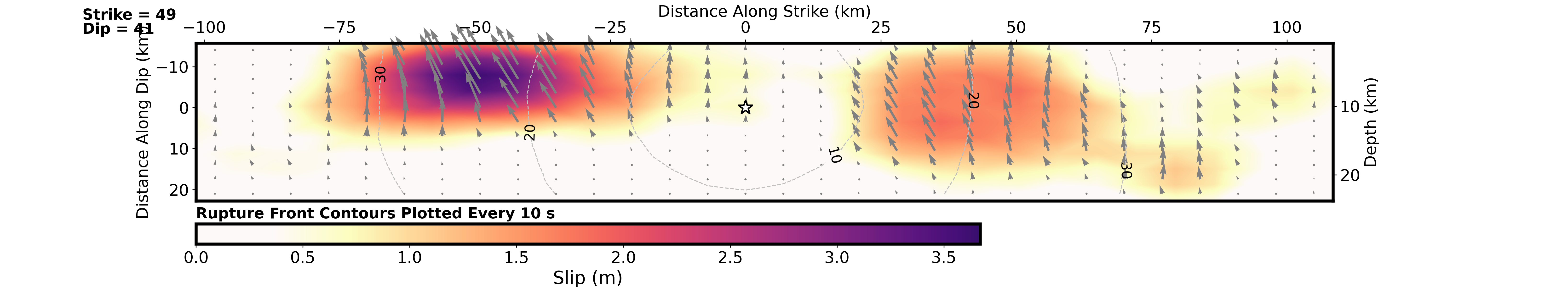
- The M 7.5 USGS earthquake slip model suggests that this earthquake fits well with these subsurface fault scaling relations from Wells and Coppersmith (1994).
Here is the USGS fault slip model for the M 7.5 earthquake. The length of the fault slip figure is about 40 kilometers (km) and the width of the fault is about 45 km. The color represents the amount that the fault slipped (in meters) during the earthquake. So, the slip area does not fill this entire area. Most of the slip length is within ~180 km and width is within ~180km. The maximum slip is ~3.7 meters.
If we look at the spatial extent of aftershocks (which may indicate the slip region of the earthquake), the length is about 150 km. This is slightly shorter than the USGS fault slip model.
Here is a plot from Wells and Coppersmith that shows the data relating magnitude with subsurface rupture length. We can see that there is a positive relation between magnitude and length (as the length is larger, so is the magnitude).
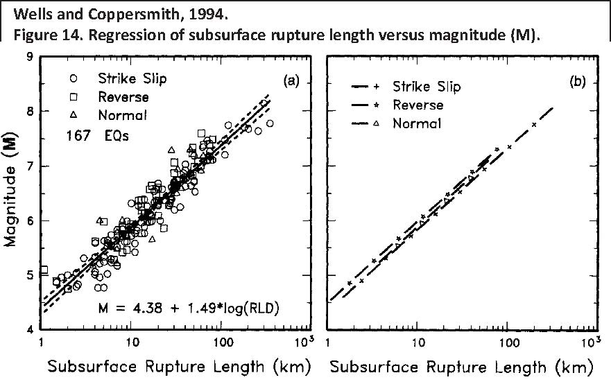
(a) Regression of subsurface rupture length on magnitude (M). Regression line shown for all-slip-type relationship. Short dashed line indicates 95% confidence interval. (b) Regression lines for strike-slip relationships. See
Table 2 for regression coefficients. Length of regression lines shows the range of data for each relation.
So, I used these scaling relations to calculate the magnitude for earthquakes of varying subsurface fault length. Here is a table from those calculations.
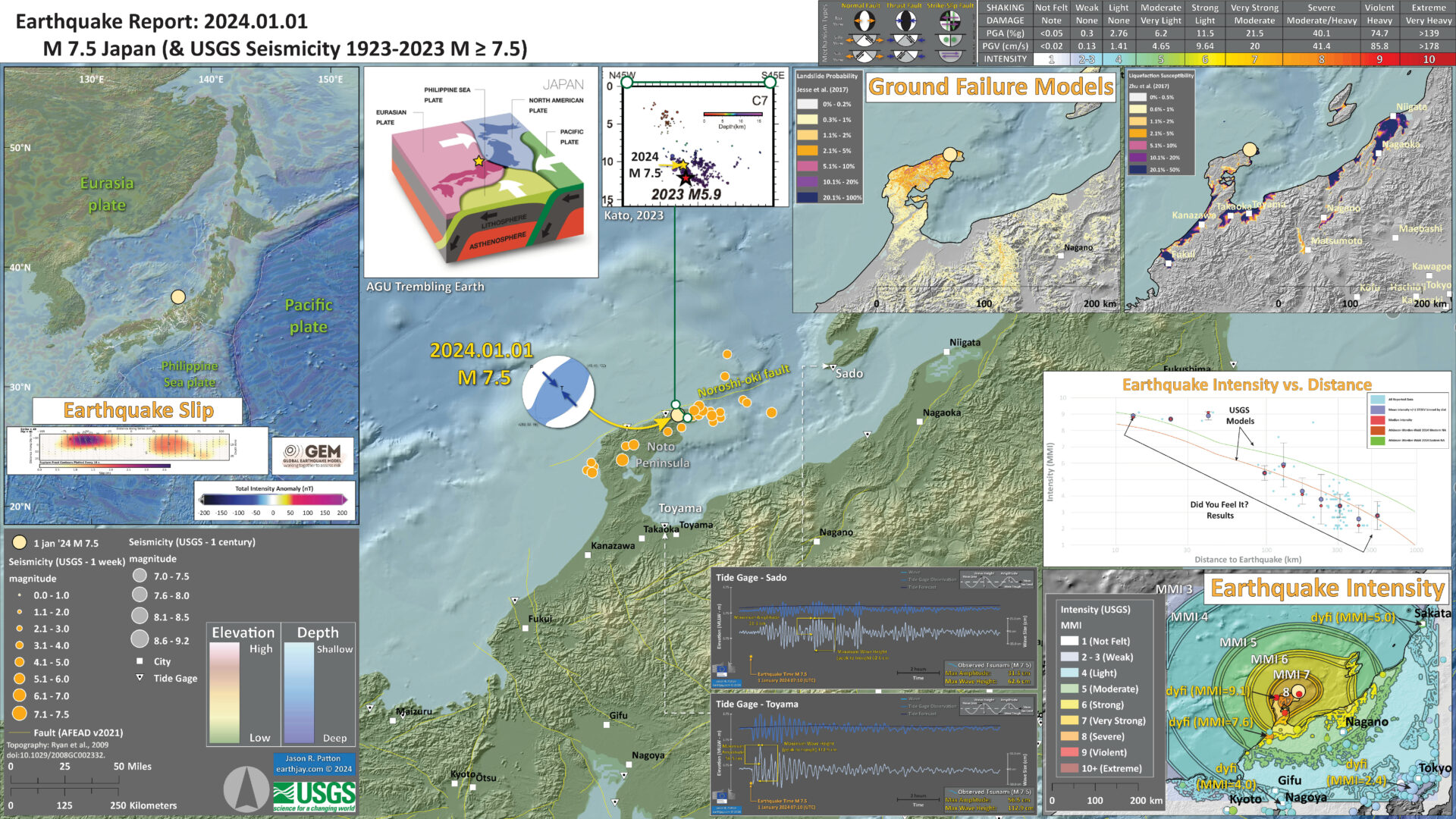
Below is my interpretive poster for this earthquake
- I plot the seismicity from the past month, with diameter representing magnitude (see legend). I include earthquake epicenters from 1922-2022 with magnitudes M ≥ 3.0 in one version.
- I plot the USGS fault plane solutions (moment tensors in blue and focal mechanisms in orange), possibly in addition to some relevant historic earthquakes.
- A review of the basic base map variations and data that I use for the interpretive posters can be found on the Earthquake Reports page. I have improved these posters over time and some of this background information applies to the older posters.
- Some basic fundamentals of earthquake geology and plate tectonics can be found on the Earthquake Plate Tectonic Fundamentals page.
- In the upper left corner is a map that shows the tectonic plates and seismicity for eastern Asia. The USGS fault slip model is displayed.
- To the right of the tectonic overview map is a low angle oblique view of the tectonic configuration showing how the subduction zones (convergent plate boundaries) are oriented.
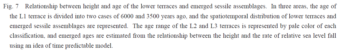
- In the lower right corner is a map that shows the earthquake intensity using the modified Mercalli intensity scale. Earthquake intensity is a measure of how strongly the Earth shakes during an earthquake, so gets smaller the further away one is from the earthquake epicenter. The map colors represent a model of what the intensity may be.
- Above the intensity map is a plot that shows the same intensity (both modeled and reported) data as displayed on the map. Note how the intensity gets smaller with distance from the earthquake.
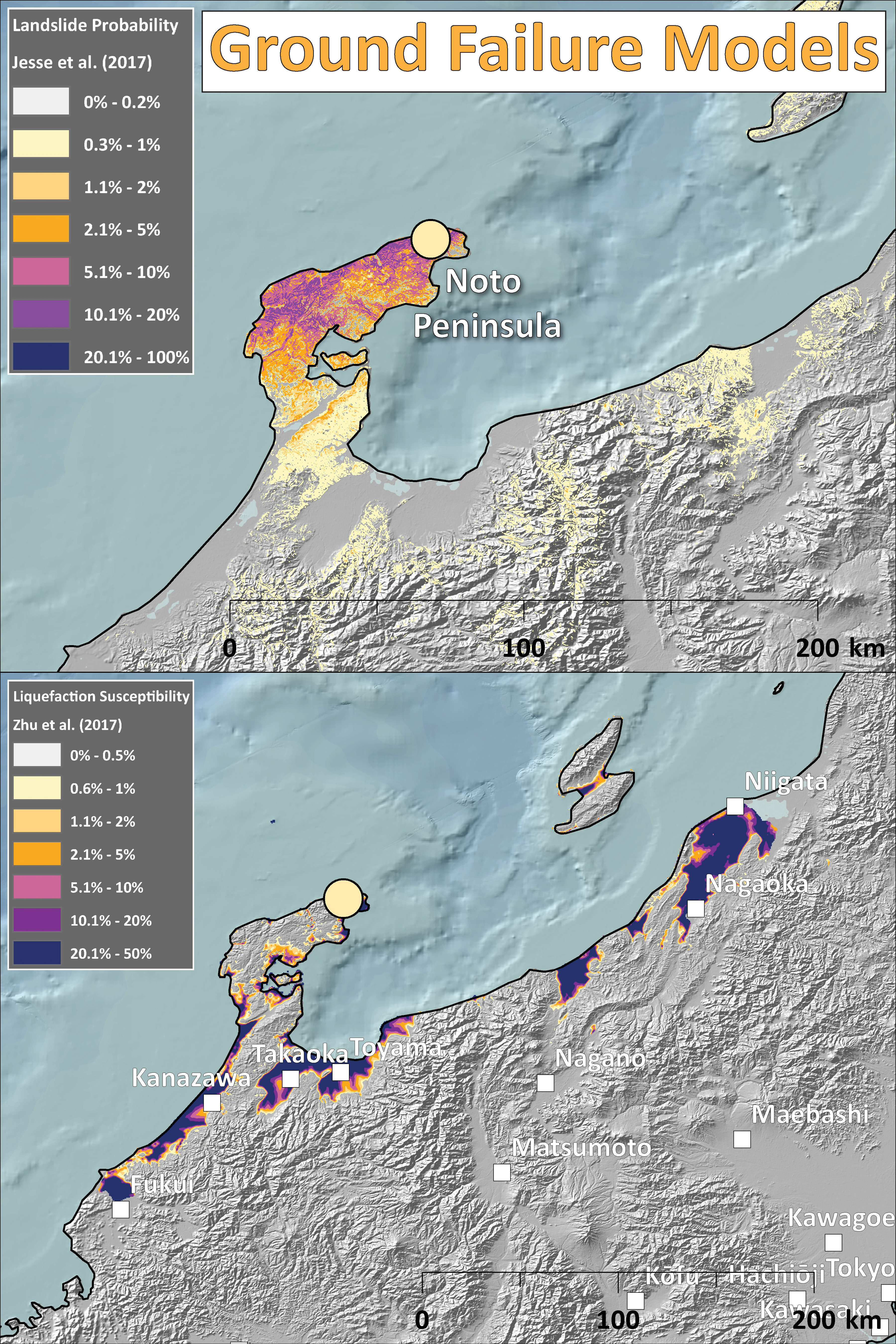
- In the upper right corner are two maps showing the probability of earthquake triggered landslides and possibility of earthquake induced liquefaction. I will describe these phenomena below.
I include some inset figures. Some of the same figures are located in different places on the larger scale map below.
- Here is the map with a week’s seismicity plotted.

- Here is a map with all the tide gages labeled, along with the tsunami plots (marigrams).
Other Report Pages
- This map shows the current tectonic configuration of this region, along with some inherited features from the tectonic past (e.g. green lines). This is from NUMO’s report: “Evaluating Site Suitability for a HLW Repository (Scientific Background and Practical Application of NUMO’s Siting Factors), NUMO-TR-04-04.”
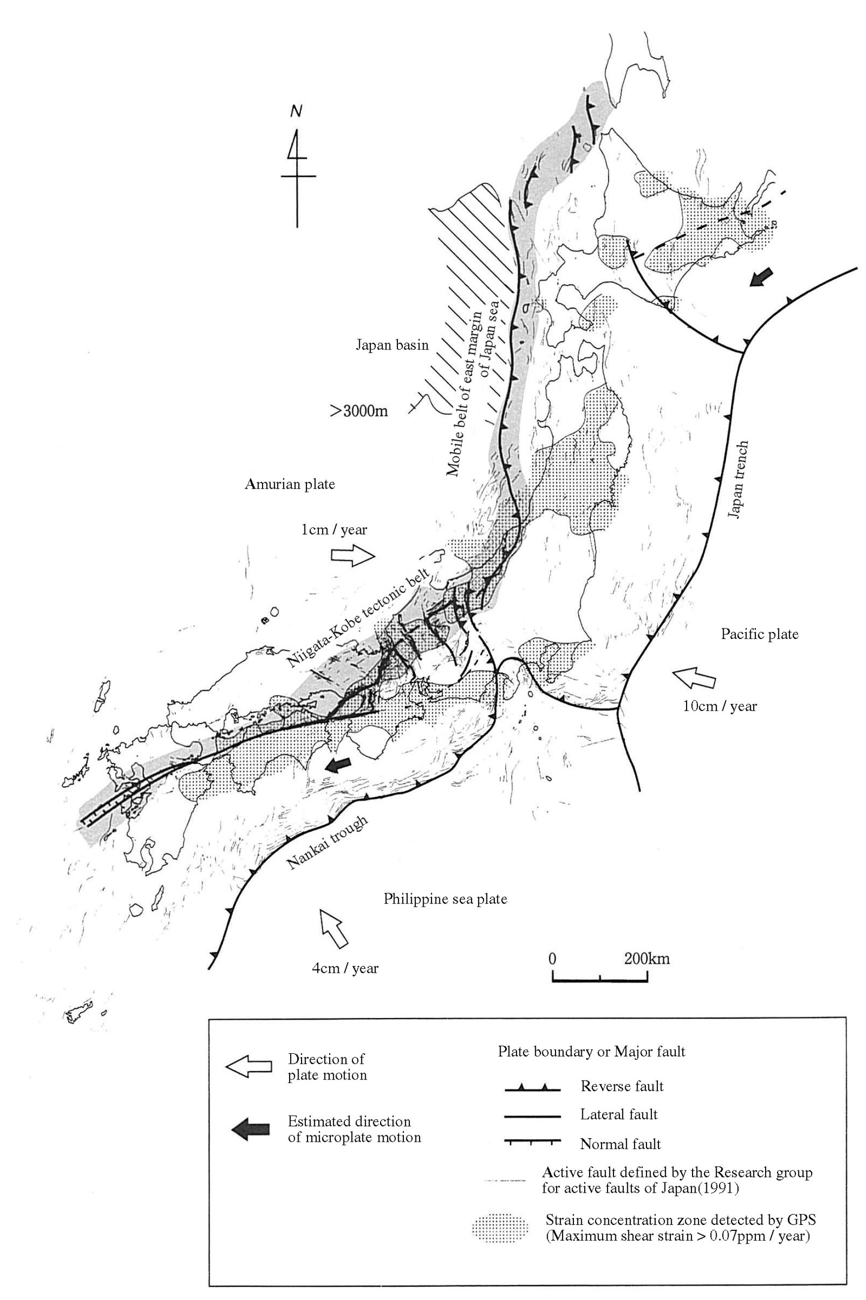
- Also from the NUMO report, this shows the Niigata-Kobe fold and thrust belt. In addition, this map shows a northwest striking convergent plate boundary along the southeastern boundary of Hokkaido. However, it cannot explain the interesting orientation of the M 6.2 deep (240 km) earthquake.
- Here is the cool tectonic map from Liu et al. (2013). We all like cool maps! (right?)
- Here is a map from the recent update of the Japan National Seismic Hazard Maps, resulting from knowledge gained following the 2011 M 9.1 earthquake (Fujiwara et al., 2012). The color represents the chance that a region will experience ground shaking at or greater that Japan Meteorological Agency (JMA) seismic intensity 6 in the next 30 years. JMA intensity is a scale of shaking intensity similar to the Modified Mercalli Intensity (MMI) Scale. The numbers are different, so they are difficult to compare. The JMA intensity 6 is similar to MMI X. Today’s earthquakes are in a region of slightly elevated chance of ground shaking (between 6-26%). Today’s M 6.6 earthquake may have reached
- This is a fantastic educational video from IRIS that discusses the plate tectonics and mentions some earthquakes in the region of Japan.
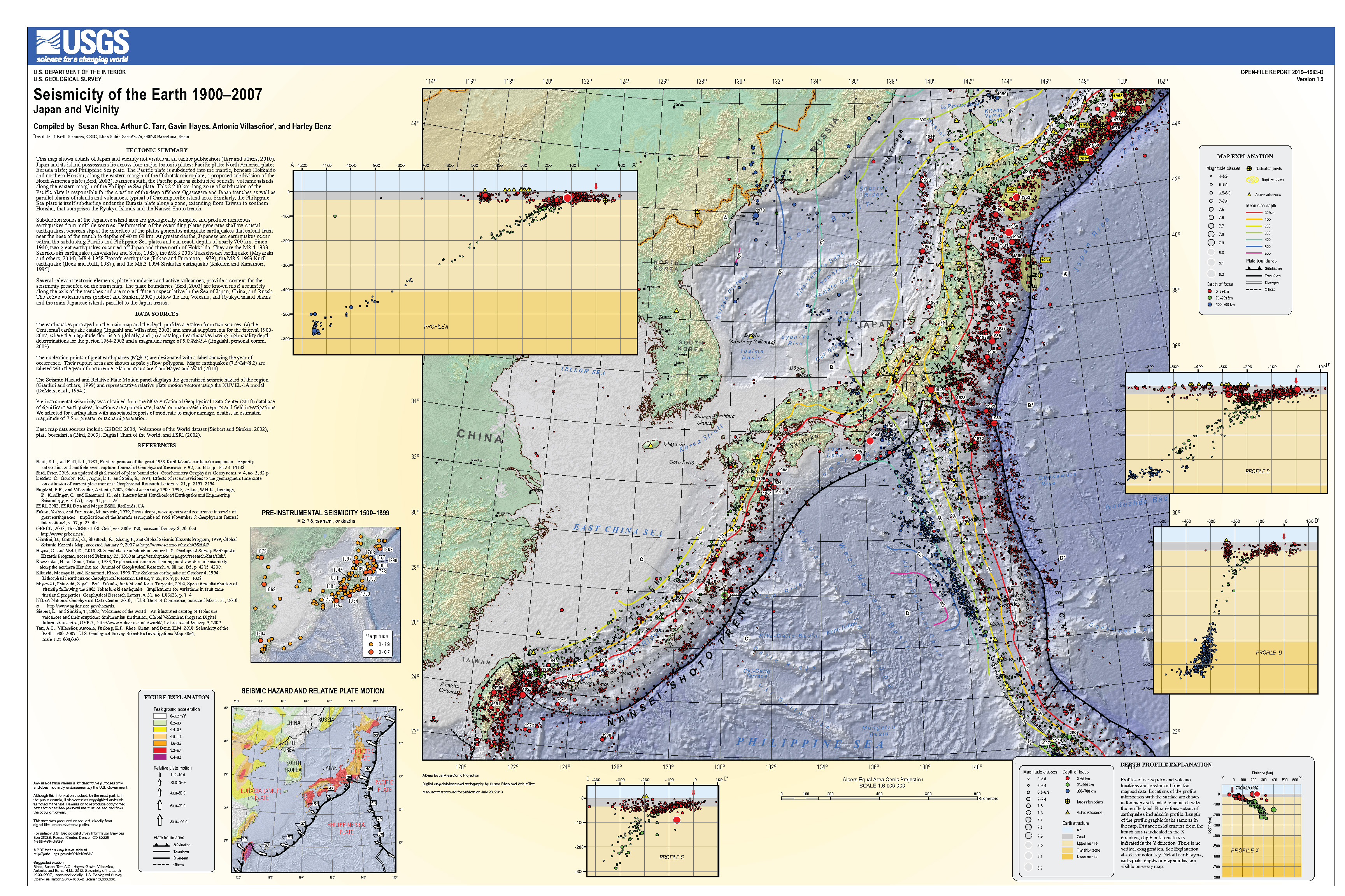
- Here is a USGS poster than summarizes the earthquake history and plate geometry for this region. This is the USGS Open File Report 2010-1083-D (Rhea et al., 2010).
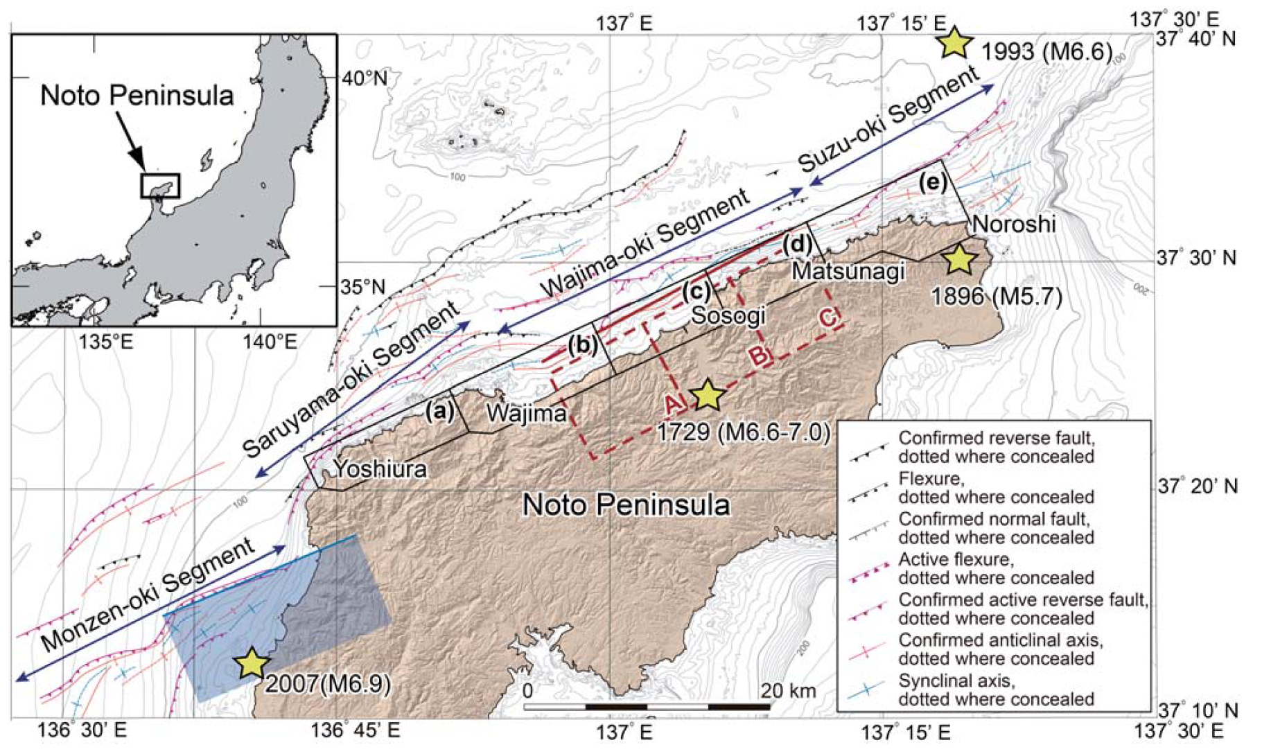
- Kato (2023) reviewed seismicity from the 2022 M 6.5 earthquake sequence along the Noto Peninsula.
- Below I show the map and the cross sections.
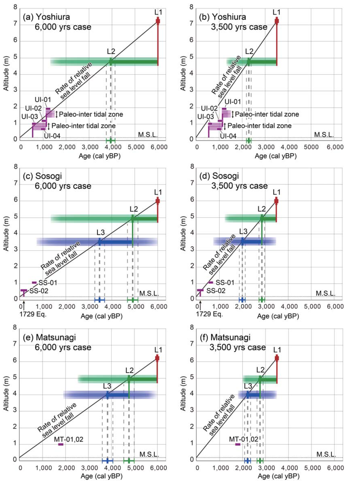
- Shishikura et al. (2020) mapped marine terraces along the Noto Peninsula. Marine terraces are formed by erosion from waves near sea level. This erosion generates a planated surface called an abrasion platform.
- When tectonic forces cause uplift of these abrasion platforms, they are exposed subaerially and then called marine terraces. This uplift can be slow over interseismic (between earthquakes) time or rapid during coseismic (during earthquake) time.
- These abrasion platforms can have nearshore sediments overlying them, and these sediments are part of the marine terraces.
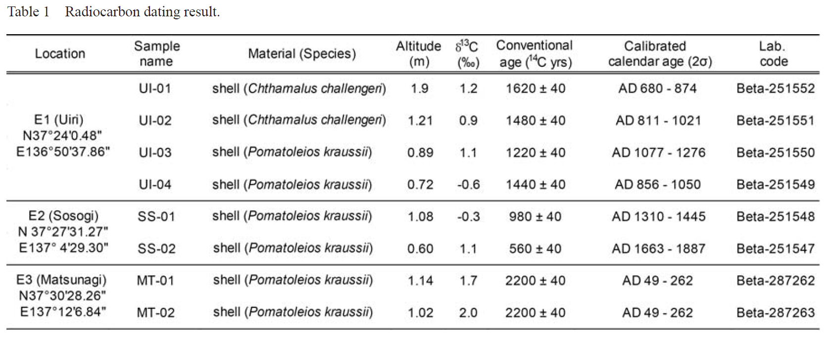
- These authors used radiocarbon ages to constrain the ages of these marine terraces. They used shells from within the sediments overlying the abrasion platforms.
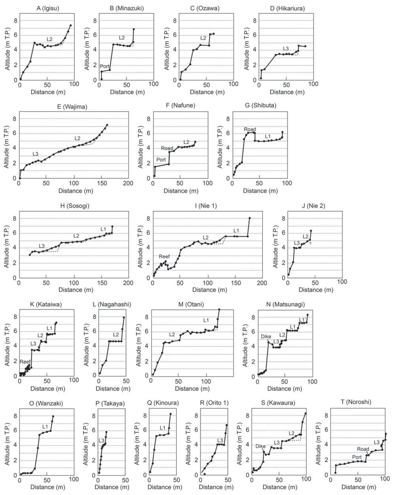
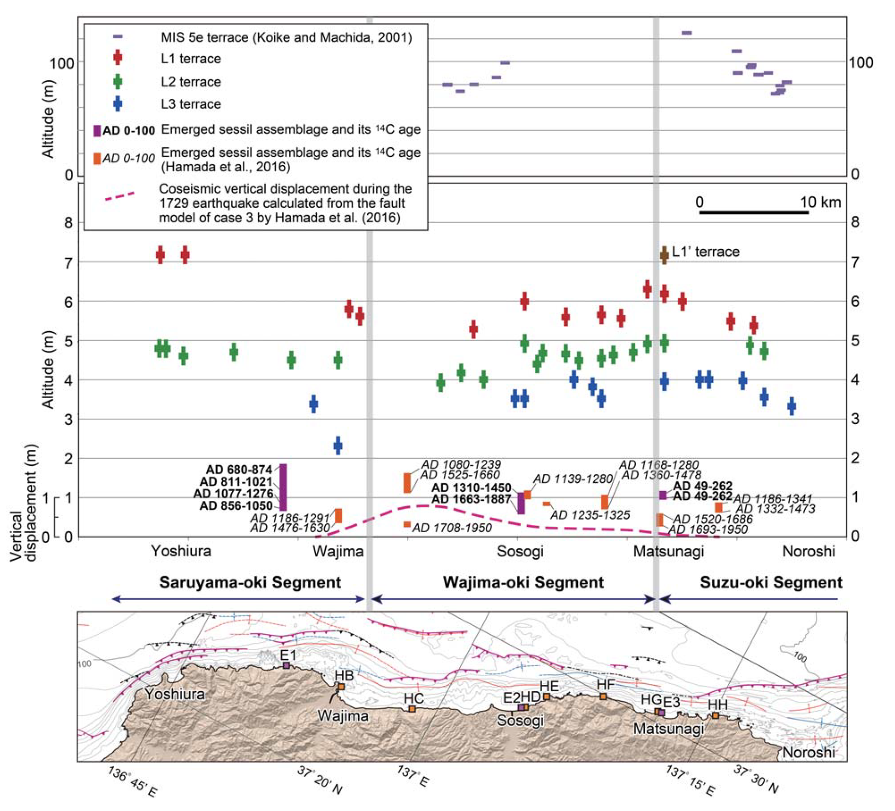
- Using the ages of these terrace sediments, they correlated terraces along the coast. Then they used elevation (topographic) profiles to determine the elevations of these terraces.
- Finally, they used these ages and terrace elevations to estimate the timing of earthquakes. This timing, combined with the relative heights of the terraces, were used to calculate (1) the recurrence interval of earthquakes on the faults that generated the uplift and (2) the slip rates on these faults.
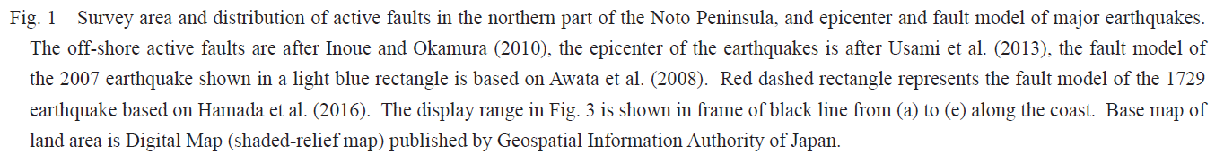
- Here is a map that shows the tectonic mapping and the extent of their analyses.
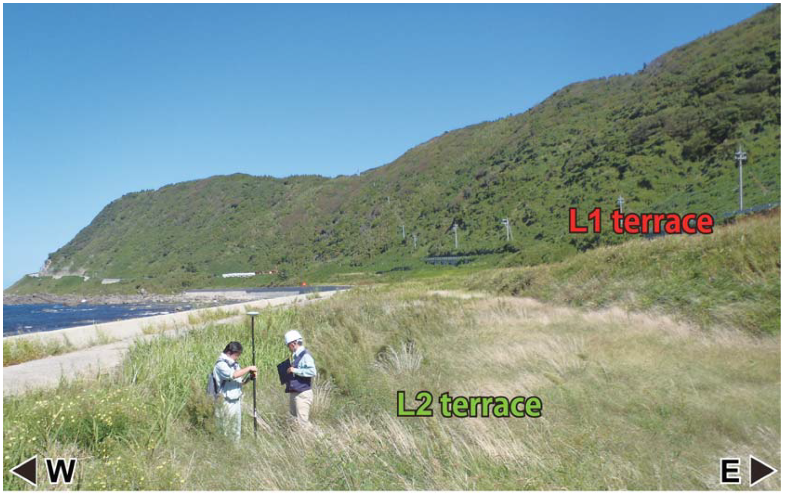
- Here is a photo showing two terraces in the field.
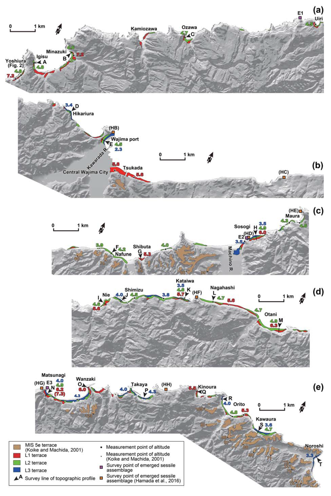
- Here is a map showing the terraces that they mapped.
- These are their elevation (topographic) profiles.
- This is a table listing the radiocarbon ages and the samples.
- This plot shows the elevations of the marine terraces as they vary along the coast.
- The authors use colors to show how they correlate these terraces.
- These plots show their estimates of relative sea-level change as constrained by radiocarbon ages.
Some Relevant Discussion and Figures

Tectonic settings of the study region (black box). The solid sawtooth lines and the black dashed line denote the plate boundaries (Bird 2003). The red triangles denote the active volcanoes. The blue dashed lines and the pink lines denote the depth contours to the upper boundary of the subducting Pacific slab and that of the subducting Philippine Sea slab, respectively (Hasegawa et al. 2009; Zhao et al. 2012). The topography data are derived from the GEBCO_08 Grid, version 20100927, http://www.gebco.net. The ages of oceanic plates are from M¨uller et al. (2008).
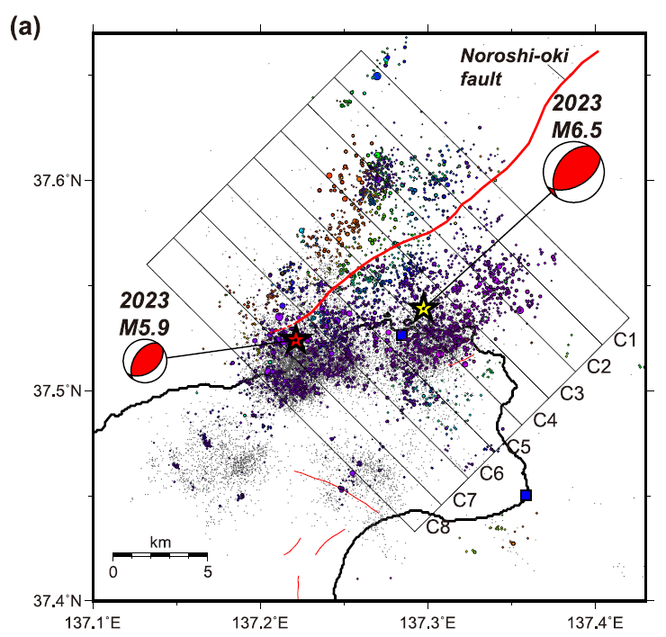
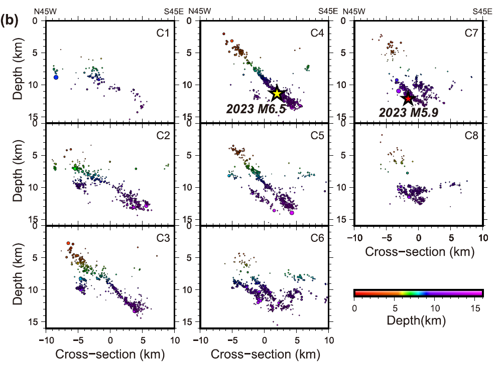
Distribution of the relocated aftershocks following the 2023 Mj6.5 rupture. (a) Epicenters of the relocated aftershocks, which were determined from the differential travel-time data (color coded by depth). Gray dots denote the JMA unified catalog events. Yellow and red stars mark the epicenters of the Mj6.5 mainshock and largest aftershock (Mj5.9), respectively, and beach balls denote their associated moment tensors, which are from the NIED catalog. Red lines represent the surface traces of active faults, both offshore and onshore. Blue squares denote the permanent seismic stations. (b) Depth sections of the relocated hypocenters within each box that were projected onto the N45W–S45E profiles (C1–C8 in (a)).


Shaking Intensity
- Here is a figure that shows a more detailed comparison between the modeled intensity and the reported intensity. Both data use the same color scale, the Modified Mercalli Intensity Scale (MMI). More about this can be found here. The colors and contours on the map are results from the USGS modeled intensity. The DYFI data are plotted as colored dots (color = MMI, diameter = number of reports).
- In the upper panel is the USGS Did You Feel It reports map, showing reports as colored dots using the MMI color scale. Underlain on this map are colored areas showing the USGS modeled estimate for shaking intensity (MMI scale).
- In the lower panel is a plot showing MMI intensity (vertical axis) relative to distance from the earthquake (horizontal axis). The models are represented by the green and orange lines. The DYFI data are plotted as light blue dots. The mean and median (different types of “average”) are plotted as orange and purple dots. Note how well the reports fit the green line (the model that represents how MMI works based on quakes in California).
- Below the map and the lower plot is the USGS MMI Intensity scale, which lists the level of damage for each level of intensity, along with approximate measures of how strongly the ground shakes at these intensities, showing levels in acceleration (Peak Ground Acceleration, PGA) and velocity (Peak Ground Velocity, PGV).
Potential for Ground Failure
- Below are a series of maps that show the potential for landslides and liquefaction. These are all USGS data products.
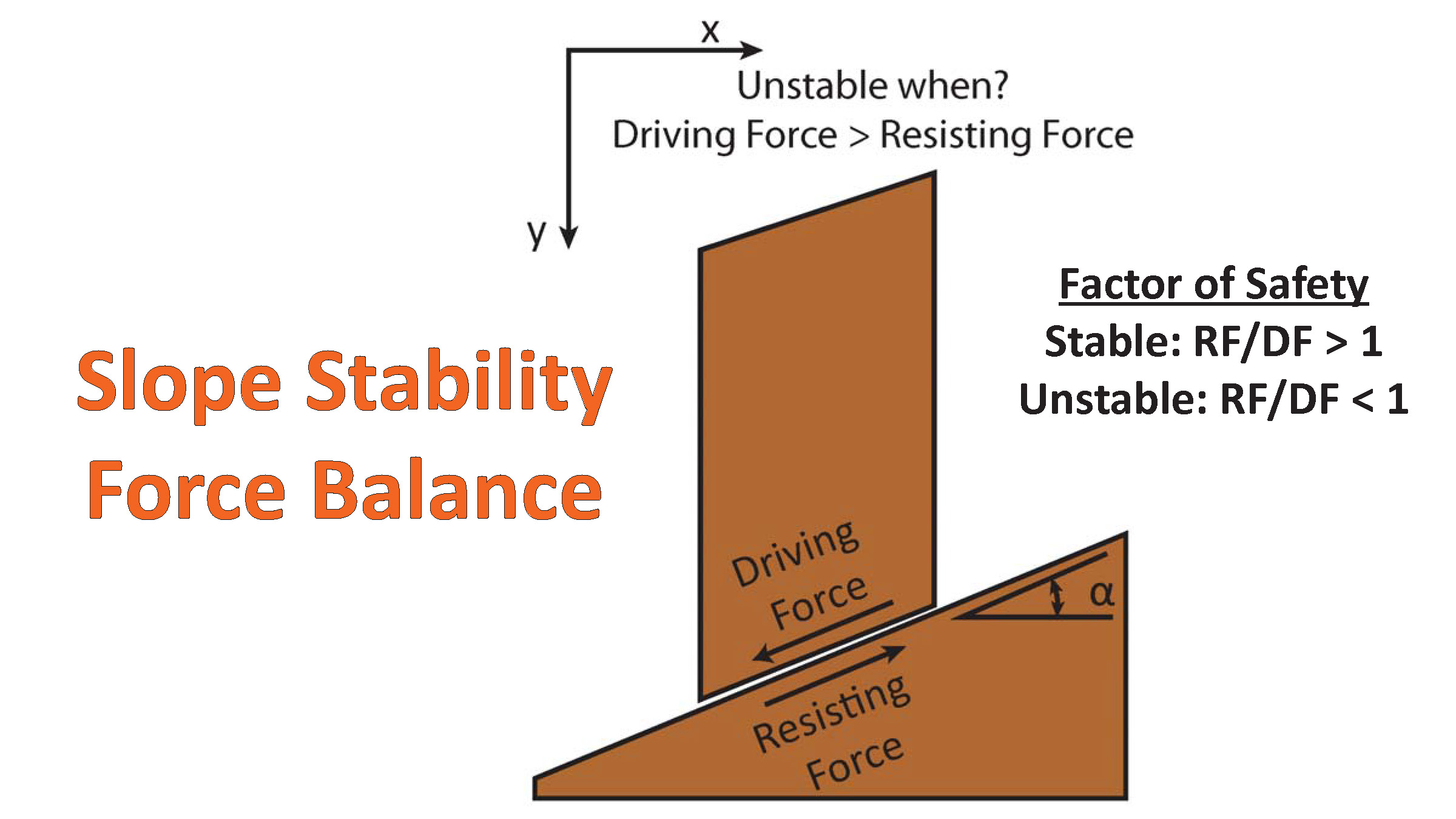
There are many different ways in which a landslide can be triggered. The first order relations behind slope failure (landslides) is that the “resisting” forces that are preventing slope failure (e.g. the strength of the bedrock or soil) are overcome by the “driving” forces that are pushing this land downwards (e.g. gravity). The ratio of resisting forces to driving forces is called the Factor of Safety (FOS). We can write this ratio like this:FOS = Resisting Force / Driving Force
- When FOS > 1, the slope is stable and when FOS < 1, the slope fails and we get a landslide. The illustration below shows these relations. Note how the slope angle α can take part in this ratio (the steeper the slope, the greater impact of the mass of the slope can contribute to driving forces). The real world is more complicated than the simplified illustration below.
- Landslide ground shaking can change the Factor of Safety in several ways that might increase the driving force or decrease the resisting force. Keefer (1984) studied a global data set of earthquake triggered landslides and found that larger earthquakes trigger larger and more numerous landslides across a larger area than do smaller earthquakes. Earthquakes can cause landslides because the seismic waves can cause the driving force to increase (the earthquake motions can “push” the land downwards), leading to a landslide. In addition, ground shaking can change the strength of these earth materials (a form of resisting force) with a process called liquefaction.
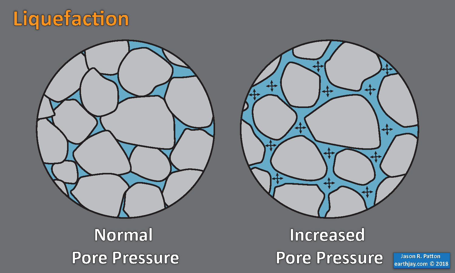
- Sediment or soil strength is based upon the ability for sediment particles to push against each other without moving. This is a combination of friction and the forces exerted between these particles. This is loosely what we call the “angle of internal friction.” Liquefaction is a process by which pore pressure increases cause water to push out against the sediment particles so that they are no longer touching.
- An analogy that some may be familiar with relates to a visit to the beach. When one is walking on the wet sand near the shoreline, the sand may hold the weight of our body generally pretty well. However, if we stop and vibrate our feet back and forth, this causes pore pressure to increase and we sink into the sand as the sand liquefies. Or, at least our feet sink into the sand.
- Below is a diagram showing how an increase in pore pressure can push against the sediment particles so that they are not touching any more. This allows the particles to move around and this is why our feet sink in the sand in the analogy above. This is also what changes the strength of earth materials such that a landslide can be triggered.
- Here Dr. Bohon demonstrates the phenomena of liquefaction.
- And, another video demonstration.
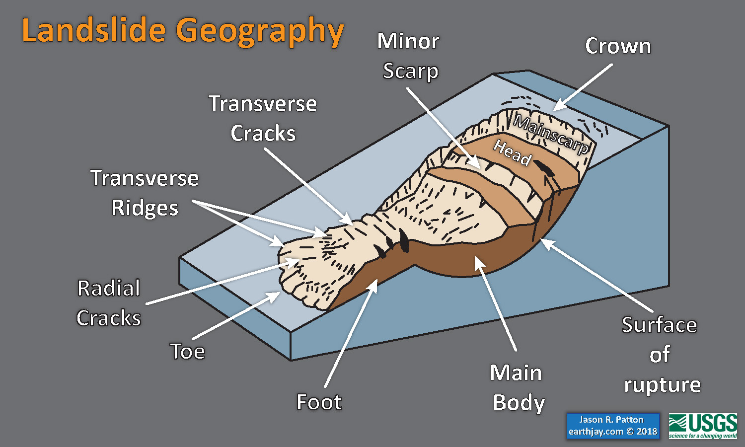
- Below is a diagram based upon a publication designed to educate the public about landslides and the processes that trigger them (USGS, 2004). Additional background information about landslide types can be found in Highland et al. (2008). There was a variety of landslide types that can be observed surrounding the earthquake region. So, this illustration can help people when they observing the landscape response to the earthquake whether they are using aerial imagery, photos in newspaper or website articles, or videos on social media. Will you be able to locate a landslide scarp or the toe of a landslide? This figure shows a rotational landslide, one where the land rotates along a curvilinear failure surface.
- Below is the liquefaction susceptibility and landslide probability map (Jessee et al., 2017; Zhu et al., 2017). Please head over to that report for more information about the USGS Ground Failure products (landslides and liquefaction). Basically, earthquakes shake the ground and this ground shaking can cause landslides.
- I use the same color scheme that the USGS uses on their website. Note how the areas that are more likely to have experienced earthquake induced liquefaction are in the valleys. Learn more about how the USGS prepares these model results here.
Liquefaction in action! This is a short clip of me jumping on water-laden sand at the beach and creating an increase in pore pressure, causing the ground to temporarily behave like a fluid. pic.twitter.com/p8VZNUcrEq
— Wendy Bohon, PhD 🌏 (@DrWendyRocks) April 28, 2021
This liquefaction experiment conducted by the Tokyo Geological Survey of Japan at the Disaster Prevention Exhibition in 2015, shows the effects of different foundations and how hollow objects such as water pipes come to the surface [source, full video: https://t.co/xYLjPY4IHZ] pic.twitter.com/r8LXtmvrO0
— Massimo (@Rainmaker1973) April 17, 2021
- 2011.03.11 Summary of the M 9.0 Japan (Tohoku-Oki)
- 2024.01.01 M 7.5 Japan
- 2022.03.16 M 7.3 Japan
- 2018.09.05 M 6.6 Hokkaido, Japan
- 2016.07.29 M 7.7 Mariana
- 2016.11.21 M 6.9 Japan
- 2016.10.19 M 6.2 Japan
- 2016.08.20 M 6.0 Japan
- 2016.04.14 M 6.2 Japan
- 2016.04.01 M 6.0 Japan
- 2015.05.30 M 7.8 Izu Bonin
- 2015.05.31 M 7.8 Izu Bonin Update #1: triggered earthquakes
- 2015.05.31 M 7.8 Izu Bonin Update #2: Historic Seismicity
- 2015.06.09 M 7.8 Izu Bonin Update #3: seismic wave animations
- 2015.02.25 M 6.3 Japan (Sanriku Coast Update #5)
- 2015.02.21 M 6.7 Japan (Sanriku Coast Update #4)
- 2015.02.20 M 6.7 Japan (Sanriku Coast Update #3)
- 2015.02.16 M 6.7 Japan (Sanriku Coast Update #2)
- 2015.02.16 M 6.7 Japan (Sanriku Coast Update #1)
- 2015.02.16 M 6.7 Japan (Sanriku Coast)
- 2013.10.25 M 7.1 Japan (Honshu)
- 2011.03.11 M 9.0 Japan (Tohoku-Oki) Main Page
- 2011.03.11 M 9.0 Japan (Tōhoku-oki) Tsunami
- 2011.03.11 M 9.1 Japan (Tōhoku-oki) Decade Remembrance
- 1923.09.01 M 8.0 Kanto, Japan
Japan | Izu-Bonin | Mariana
General Overview
Earthquake Reports
Social Media
Earthjay Tweets
Original and Ongoing Thread:
#EarthquakeReport for M 7.5 #Earthquake offshore of #Japan
Felt intensity MMI 6@USGS_Quakes one pager suggest low casualties and modest damage
2018 report has tectonic background https://t.co/8tjqb1p3Trhttps://t.co/qU096aGeW3 pic.twitter.com/CLcmmI5GDt
— Jason "Jay" R. Patton (@patton_cascadia) January 1, 2024
#EarthquakeReport for M 7.5 #Earthquake offshore of #Japan@USGS_Quakes ground failure models suggest moderate chance for triggered landslides % high likelihood for induced liquefaction
2018 report has tectonic background https://t.co/8tjqb1p3Trhttps://t.co/qU096aGeW3 pic.twitter.com/QulWxgogwJ
— Jason "Jay" R. Patton (@patton_cascadia) January 1, 2024
#EarthquakeReport for M7.5 #Earthquake offshore of #Japan
Reverse (Compressional) earthquake mechanism
Read 2018 report for tectonic background https://t.co/8tjqb1p3Trhttps://t.co/qU096aGeW3 pic.twitter.com/sez1aROX2p
— Jason "Jay" R. Patton (@patton_cascadia) January 1, 2024
#EarthquakeReport #TsunamiReport for M 7.5 #Earthquake offshore of #Japan
Tsunami recorded in Toyama, Japan abt 1 meter wave height (peak to Trough)
Tectonic background in 2018 report https://t.co/8tjqb1p3Trhttps://t.co/qU096aGeW3 pic.twitter.com/D2udgayX1p
— Jason "Jay" R. Patton (@patton_cascadia) January 1, 2024
#EarthquakeReport #TsunamiReport for M7.5 #Earthquake offshore of #Japan
Official tsunami observations from https://t.co/rEduVDLBBc https://t.co/k90YAdWoza
2018 report (tectonic background) https://t.co/8tjqb1p3Trhttps://t.co/qU096aGeW3 pic.twitter.com/d1bb0wLOvC
— Jason "Jay" R. Patton (@patton_cascadia) January 1, 2024
#EarthquakeReport #TsunamiReport for M 7.5 #Earthquake along the Noto Peninsula, #Japan
generated #Tsunami observed at tide gages and by video observers@USGS_Quakes ground failure models suggest induced liquefaction and triggered landslides
report here:https://t.co/cyyvvSv3Tm pic.twitter.com/tSrGMHclnQ
— Jason "Jay" R. Patton (@patton_cascadia) January 1, 2024
#EarthquakeReport #TsunamiReport for M 7.5 #Earthquake along the Noto Peninsula, Japan
updated poster and tide gage plots
the Toyama tide gage recorded the largest size tsunamireport: https://t.co/cyyvvSv3Tm pic.twitter.com/XfJOaO41Qa
— Jason "Jay" R. Patton (@patton_cascadia) January 2, 2024
Fast evacuation saved many lives as New Year's tsunami struck Japan https://t.co/PLPwKmIgpT via @NikkeiAsia
— Jason "Jay" R. Patton (@patton_cascadia) March 19, 2024
Earthquake and Tsunami Observations
Mw=7.6, NEAR WEST COAST OF HONSHU, JAPAN (Depth: 12 km), 2024/01/01 07:10:09 UTC – Full details here: https://t.co/bgp5VOuT9Z pic.twitter.com/whd8a0ndIz
— Earthquakes (@geoscope_ipgp) January 1, 2024
Max 1.3m westward deformation caused by the M7.6 Noto Earthquake detected by GNSS (GEONET). The significant deformation area has roughly 200km extent. https://t.co/Z1bQJ90ypo pic.twitter.com/xoM2iUiLg9
— Yu Morishita (@Yu__Morishita) January 1, 2024
Rupture process of the 2024 Jan 1st Magnitude 7.5 Japan earthquake revealed from a preliminary subevent model derived with teleseismic waves. First ruptured to Southwest then bilaterally ruptured to Northeast. Should be refined when better hypocenter and local data available. pic.twitter.com/ZFd3JnUJtn
— Zhe Jia (@jiazhe868) January 2, 2024
A massive earthquake has struck Ishikawa Prefecture, central Japan. A tsunami warning has been issued for Niigata, Toyama, Ishikawa prefectures of the Japan Sea side of the country. People in these area must evacuate immediately.https://t.co/bZpiKm8wIN pic.twitter.com/hl9ERDhF8C
— NHK WORLD News (@NHKWORLD_News) January 1, 2024
WATCH: Tsunami waves observed along the coast of western Japan. People being urged to evacuate pic.twitter.com/sY3bdpVZVc
— BNO News (@BNONews) January 1, 2024
Oof. Hoping that everyone in Japan is OK after the M7.6 – eek. Not a fun way to celebrate New Years Day. 😢❤️ pic.twitter.com/Bu9iVZaXwC
— Danielle Madugo (@DanielleVerdugo) January 1, 2024
A M7.5 earthquake at ~45 km depth near to the west coasts of Toyama, Ishikawa, Niigata Japan as recorded on the @AusQuake seismic network in southeast Australia. There looks to have been a foreshock ~3 mins beforehand, and aftershock ~8 mins later. pic.twitter.com/LaC5GtxaCZ
— Dr. Dee Ninis (@DeeNinis) January 1, 2024
10分の地震で志賀町で震度7とのことですが未入電の震度観測点もありますhttps://t.co/WvFRPIeByF pic.twitter.com/WhEg6t2Lie
— KANO Yasuyuki (@KanoYasuyuki) January 1, 2024
#Earthquake (#地震) confirmed by seismic data.⚠Preliminary info: M7.1 || 67 km NE of #Nanao (#Japan) || 9 min ago (local time 16:10:12). Follow the thread for the updates👇 pic.twitter.com/BmYUkRYtkn
— EMSC (@LastQuake) January 1, 2024
Video: a Japanese driver stopped their car during today's earthquake and observed river water swaying back and forth. pic.twitter.com/uBAqT7mX6b
— Jeffrey J. Hall 🇯🇵🇺🇸 (@mrjeffu) January 1, 2024
High waves can be seen in the sea after the 7.6 earthquake hits #Japan #Japan #tsunami #warning #deprem #sismo #地震 #earthquake pic.twitter.com/70FproHCAU
— Chaudhary Parvez (@ChaudharyParvez) January 1, 2024
今日(2024/01/01)の能登のM7.6の大地震の直前には、M5後半の直前前震以外は、特異な地震活動は見られませんでした。
2023年5月のM6.5大地震の前には地震活動が、4月ごろ活発になっている様子がありましたが。。。 pic.twitter.com/H9VBBto08W
— 地震研究ノート (@jishin_lab) January 1, 2024
Massives und potentiell katastrophales Erdbeben (M7.5) an der Westküste von Japan. Tsunami-Warnungen für das Japanische Meer, einschließlich Nordkorea und Russland https://t.co/YW7exg663Y pic.twitter.com/DV4jZkHhlj
— Erdbebennews (@Erdbebennews) January 1, 2024
あかんやば#金沢#地震 pic.twitter.com/qL9C2lXJvZ
— れいれい@ (@HayateKvem) January 1, 2024
地震!!
石川県珠洲市の津波の到達の様子です。
16時35分頃に津波が到達しました!避難呼びかけてください!! pic.twitter.com/dETdXCSbXt— coa〆公式 ゲーム配信者 (@hanamarukouya) January 1, 2024
1/ A large M 7.5 ~ 25 mile deep earthquake struck the west coast of Japan today 1/1/24 at 0710 UTC. Shaking has been reported (see videos below) and a significant tsunami warning is in place.
A thread 🧵
Map source: https://t.co/IjNYmvlLpp pic.twitter.com/Lm1TtrRJr6
— Alistair Hamill @lcgeography (@lcgeography) January 1, 2024
Por #sismo #temblor M7.4 (USGS) en Noto, prefectura Ishikawaen, informan que dos estaciones de red K-Net NIED observaron aceleraciones mayores a 1g !!
Estaciones TOGI (2828 gal) y OHYA (1469 gal)
Con esa data se entiende mejor la intensidad apreciada en videos en zona epicentral pic.twitter.com/8k8qXLlM5A— Luis Donoso (@Geo_Risk) January 1, 2024
Watch the waves from the M7.5 earthquake off the west coast of Honshu, Japan roll across seismic stations in North America. (THREAD 🧵) pic.twitter.com/y6lEBytlKH
— EarthScope Consortium (@EarthScope_sci) January 1, 2024
A M7.5 earthquake struck western Japan today, collapsing buildings & triggering a tsunami.
Most large earthquakes occur with no warning, but this fault has been noisy for over 3 years: an evolving swarms and a M6.2 in May. And now a M7.5!
Read more on our blog – link in my bio. pic.twitter.com/LqNadx0j0g
— Dr. Judith Hubbard (@JudithGeology) January 1, 2024
Remarkable accelerations reported by @nied_e for the M7.5 earthquake. Recall 1g=980gal. A triumph of Japanese science and engineering, because, while extent of damages is still being assessed, they look relatively "modest". Anywhere else ground motions like these are catastrophic pic.twitter.com/WorLcCBavn
— Prof. Diego Melgar 🌊 (@geosmx) January 1, 2024
Sea level chart at W Japan Noto station, the closest to M7.5 #earthquake shows strange signal: plateau 1.5m below "normal" (or pre-earthquake) sea level.
Due to coseismic uplift of Noto peninsula? Not impossible. Or just due to malfunctioning because of shaking or #tsunami? pic.twitter.com/kaX4ryblFd
— Robin Lacassin – @rlacassin.bsky.social (@RLacassin) January 1, 2024
Today's #tsunami in #Japan, triggered by an M7.5 earthquake, recorded a coastal height of 1.2 m in Toyama and 0.6 m in Sado. Potential tsunami #runup may reach 4-5 m. This event stands as one of Japan's largest tsunamis since the 2011 giant tsunami. pic.twitter.com/KaY90P4KEn
— Dr Mohammad Heidarzadeh (@Mo_Heidarzadeh) January 1, 2024
The waveforms and response spectra of the recording with the largest reported horizontal peak ground acceleration (PGA 2.7g) from the today's #Japan #ishikawaprefecture #earthquake.
(UD is vertical shaking. Spectra are 5% damped.)[@uninaIT | @IUSSpavia | @ConsorzioReLUIS] pic.twitter.com/yT6Zyawnbe
— iunio iervolino (@iuniervo) January 1, 2024
This short video discusses the M7.5 earthquake in Japan and shows an animation of the earthquakes waves sweeping across seismic stations in North America. (Wave animation from @EarthScope_sci) pic.twitter.com/XKDr3irhx6
— Wendy Bohon, PhD 🌏 (@DrWendyRocks) January 1, 2024
This video clip provides a more detailed overview of Japan's complex tectonic setting. (Watch full video on Japan's earthquakes and tectonics here: https://t.co/KGI16Oe2qg) pic.twitter.com/vWYXJ73VSv
— EarthScope Consortium (@EarthScope_sci) January 1, 2024
Major M7.5, shallow, vertical up (reverse) faulting #earthquake at #Japan west-central coast with Japan Sea (tectonic backarc basin). Significant shaking of land surface (incl landslides) and tsunami waves along western coast impacting populated region. #Ishikawa #geohazards https://t.co/0WE8n0o34r pic.twitter.com/z39DJsgWnH
— 🌎 Prof Ben van der Pluijm ⚒️ (@vdpluijm) January 1, 2024
Today's M7.5 earthquake in Japan occurred at the northeast tip of the Noto Peninsula – a location that has been persistently producing earthquakes since 2020, including a M6.2 in May, which we wrote about here:https://t.co/AOKIOZ8pg3
(Working on a new post for this new quake.) pic.twitter.com/DZ2UR3hFDA
— Dr. Judith Hubbard (@JudithGeology) January 1, 2024
2024-01-01 M7.5 42 km NE of Anamizu, Japan #earthquake recorded in #Scotland & #Stornoway + historical seismicity & cross section.
Dist.: 8848.3km
Travel Time: 12m 7.3s
Depth: 10.0km#Python @raspishake @matplotlib #CitizenScience pic.twitter.com/bPGcriOQAB— Giuseppe Petricca (@gmrpetricca) January 1, 2024
The recorded PGA map in the today's M7.6 #earthquake in the #IshikawaPrefecture of #Japan. [1000 gal ≃ 1g]
[Data source: NIED – National Research Institute for Earth Science and Disaster Resilience] pic.twitter.com/OZjERIxOLe
— iunio iervolino (@iuniervo) January 1, 2024
見附島が、、、 pic.twitter.com/StbpD0ZT9n
— 兼好法師 (@kenya_0817) January 1, 2024
2024年1月1日に発生した能登半島沖の地震による津波が新潟県上越市の関川を遡る映像です。自宅二階より撮影。 pic.twitter.com/mjGESliJfd
— RYU-G (@S_Ryu_G) January 1, 2024
今回の地震は日本海における大規模地震に関する調査検討会のF43がほとんどそのまま発生したような地震。
この検討会では、断層長94km、断層幅19.7km、平均滑り量4.5m(量高めのスケーリング式)に設定されていた。https://t.co/yA3ps4fobD pic.twitter.com/Itq216n5NF— JCN 2600 (@JCN_2600) January 1, 2024
Max 1.3m westward deformation caused by the M7.6 Noto Earthquake detected by GNSS (GEONET). The significant deformation area has roughly 200km extent. https://t.co/Z1bQJ90ypo pic.twitter.com/xoM2iUiLg9
— Yu Morishita (@Yu__Morishita) January 1, 2024
余震分布をみると北東側にかなり長くて、もしかしたら南東傾斜の断層(図中NT4,5,6)だけじゃなくて、佐渡側の北西傾斜の断層(図中NT2,3)も動いた(or動いている)のかもしれない。
断層モデル図は以下より引用。https://t.co/i9rd19GZHX
震央分布図は気象庁より。https://t.co/xIQUUatRBg pic.twitter.com/lRL5owObif— JCN 2600 (@JCN_2600) January 1, 2024
The first InSAR and pixel offset result of ALOS-2 from GSI, showing a max 3m LOS displacement.
The data was acquired 7hr after the earthquake and the result was published <1 day. https://t.co/7it3XTDq5m pic.twitter.com/xoS9PtvTVT— Yu Morishita (@Yu__Morishita) January 2, 2024
Parts of Japan have been rocked by a series of powerful and deadly earthquakes. To learn more, @mikeamor7 spoke with the Chief Scientist at the Seismology Research Centre here in Melbourne, @SeisLOLogist. https://t.co/5zYfOfGqUb #7NEWS pic.twitter.com/NZKZs6igKL
— 7NEWS Melbourne (@7NewsMelbourne) January 2, 2024
今回の地震。能登半島北部沿岸域断層帯の珠洲沖セグメントが動いた感じなんですかね? pic.twitter.com/Ck4sIzRhjE
— Pikaia (@pikapikapikaia) January 1, 2024
能登半島地震の余震、Hi-net震源データでM7.6付近の北西・南東断面を作ってみた。気象庁CMT解の横向き震源球も。南東下がりの節面が震源断層に対応するよのだろう。
今日夕方公開されるはずの気象庁暫定震源でもやってみるが、M7.6の深さが16kmなので、全体にもう少し深くなるかも。 pic.twitter.com/lhlqIHP3RO— hacchan9642 (@hacchan9642) January 2, 2024
石川県 輪島市 門前町鵜山
専門家じゃないから何が原因で起こったかわかんないけど、明らかな変化が見られる。 pic.twitter.com/Ktxid8MK4n— AS-22 (@AS_22ws) January 2, 2024
The recorded distance attenuation of horizontal PGA in the M7.6 #earthquake in the #IshikawaPrefecture of #Japan.
[Data source: NIED – National Research Institute for Earth Science and Disaster Resilience of Japan]
[@UninaIT | @IussPavia | @ConsorzioReLUIS] pic.twitter.com/X6zeB3e1Il
— iunio iervolino (@iuniervo) January 2, 2024
←地震前 地震隆起後→
輪島市黒島漁港 pic.twitter.com/OXMWT8zKxv— ほしたろう| 🇮🇹で日本酒 (@SAKETUBER) January 2, 2024
いずれ産総研からコメントがありそうだが、宍倉ほか2020の能登半島北岸の隆起史と地理院のALOS-2地殻変動を重ねると興味深い。https://t.co/KJKcdqon0P https://t.co/jjU5BRAzhD pic.twitter.com/A87mY2Dm3f
— 月野うさはかせ Prof.Lièvre (@usa_hakase) January 3, 2024
令和6年能登半島地震によって形成された海底の段差を撮影(東京大学大気海洋研究所など 3月21日)https://t.co/z1xEvd22S0 pic.twitter.com/3yIiPdMNl4
— 上川瀬名 (@Yokohama_Geo) March 21, 2024
Damage Observations
Footage from the local Shinkansen station in Ishikawa prefecture, extremely powerful shaking! #japan #earthquake
pic.twitter.com/98syIwnGkj— Greg R. Hill (@greghill) January 1, 2024
WATCH: 7.6-magnitude earthquake hits western Japan. Reports of damage coming in pic.twitter.com/g2C1Fxetb4
— BNO News (@BNONews) January 1, 2024
New Video-
A major 7.6-magnitude earthquake occurred in #Japan.
Everything shaking in Japan.A #tsunami warning has also been issued. #deprem #sismo #地震 #earthquake pic.twitter.com/RLOKflbA1V
— Chaudhary Parvez (@ChaudharyParvez) January 1, 2024
小矢部市から金沢市に向かう内山トンネルの近くです。陥没しててとおれませんhttps://t.co/5TSF1I1YTA pic.twitter.com/RhlMaTA6a4
— ふ か け ん ® (@FUKAKENx) January 1, 2024
Fires burning, homes destroyed after 7.6 quake hits western Japan. Extent of damage still unclear pic.twitter.com/xKzU2lqxW7
— BNO News (@BNONews) January 1, 2024
やばかった地震🫨 pic.twitter.com/MqDmH2uSIk
— ♧=こはね=♧@メメントモリW34🍄 (@2BB98NfJwDre0Di) January 1, 2024
もう本当に怖すぎました。
津波の被害は今のところは無く
無事です。
夜勤に向かう途中で
地面がすごい揺れだして、目の前で
割れたりして、恐怖しかなかったです。避難ができる場所もなかなか無いし、
仕事に行かなくちゃで、、
しばらくしてから職場に着きました。動画慌ててたけど撮った pic.twitter.com/ueidzjPWX9
— へっぽこみー🐻❄️無事です! (@mmmin726) January 1, 2024
地震の時は初詣してて危なかった… pic.twitter.com/hSHsDUYCTb
— ゆるっ釣り39🦞🌱 (@yurutturi) January 1, 2024
金沢の北陸道めっちゃゆれてた
地震でめっちゃキシキシいってた pic.twitter.com/DiLhGOxX69
— gurifu (@gurifu2011) January 1, 2024
【能登半島地震・被災地の様子】
「輪島朝市」周辺で200棟焼ける 一夜明け、被害実態が明らかに上空から見た被災地の様子をお伝えします
▼記事・写真はこちらからhttps://t.co/ID9QK7dV75 pic.twitter.com/XqHbXkbuw3
— 中日新聞 (@chunichi_denhen) January 2, 2024
激しい揺れでマンホールが隆起した場所もありました=2日午前7時15分、輪島市河井町#令和6年能登半島地震 #被害情報 pic.twitter.com/8QuvqvC2Bn
— 北國新聞・富山新聞 (@hokkokushimbun) January 2, 2024
日本地震会不会是倒核废水的报应呢?但是千万不要发生核事故。因为一旦发生核泄漏,我们就又得欣赏表演——
"一年后,整个世界一定会惊诧日本重建的速度和勇气"
"地震,海啸,核泄,日本给世界献上一课:高素质的理性公民,快速反应的责任政府,有公信力的自由媒体"#Japan #earthquake #NewYear2024 pic.twitter.com/ylrfY2FALE— 椰汁汁100%!follow back (@Yeye36395198) January 1, 2024
- Frisch, W., Meschede, M., Blakey, R., 2011. Plate Tectonics, Springer-Verlag, London, 213 pp.
- Hayes, G., 2018, Slab2 – A Comprehensive Subduction Zone Geometry Model: U.S. Geological Survey data release, https://doi.org/10.5066/F7PV6JNV.
- Holt, W. E., C. Kreemer, A. J. Haines, L. Estey, C. Meertens, G. Blewitt, and D. Lavallee (2005), Project helps constrain continental dynamics and seismic hazards, Eos Trans. AGU, 86(41), 383–387, , https://doi.org/10.1029/2005EO410002. /li>
- Jessee, M.A.N., Hamburger, M. W., Allstadt, K., Wald, D. J., Robeson, S. M., Tanyas, H., et al. (2018). A global empirical model for near-real-time assessment of seismically induced landslides. Journal of Geophysical Research: Earth Surface, 123, 1835–1859. https://doi.org/10.1029/2017JF004494
- Kreemer, C., J. Haines, W. Holt, G. Blewitt, and D. Lavallee (2000), On the determination of a global strain rate model, Geophys. J. Int., 52(10), 765–770.
- Kreemer, C., W. E. Holt, and A. J. Haines (2003), An integrated global model of present-day plate motions and plate boundary deformation, Geophys. J. Int., 154(1), 8–34, , https://doi.org/10.1046/j.1365-246X.2003.01917.x.
- Kreemer, C., G. Blewitt, E.C. Klein, 2014. A geodetic plate motion and Global Strain Rate Model in Geochemistry, Geophysics, Geosystems, v. 15, p. 3849-3889, https://doi.org/10.1002/2014GC005407.
- Meyer, B., Saltus, R., Chulliat, a., 2017. EMAG2: Earth Magnetic Anomaly Grid (2-arc-minute resolution) Version 3. National Centers for Environmental Information, NOAA. Model. https://doi.org/10.7289/V5H70CVX
- Müller, R.D., Sdrolias, M., Gaina, C. and Roest, W.R., 2008, Age spreading rates and spreading asymmetry of the world’s ocean crust in Geochemistry, Geophysics, Geosystems, 9, Q04006, https://doi.org/10.1029/2007GC001743
- Pagani,M. , J. Garcia-Pelaez, R. Gee, K. Johnson, V. Poggi, R. Styron, G. Weatherill, M. Simionato, D. Viganò, L. Danciu, D. Monelli (2018). Global Earthquake Model (GEM) Seismic Hazard Map (version 2018.1 – December 2018), DOI: 10.13117/GEM-GLOBAL-SEISMIC-HAZARD-MAP-2018.1
- Silva, V ., D Amo-Oduro, A Calderon, J Dabbeek, V Despotaki, L Martins, A Rao, M Simionato, D Viganò, C Yepes, A Acevedo, N Horspool, H Crowley, K Jaiswal, M Journeay, M Pittore, 2018. Global Earthquake Model (GEM) Seismic Risk Map (version 2018.1). https://doi.org/10.13117/GEM-GLOBAL-SEISMIC-RISK-MAP-2018.1
- Storchak, D. A., D. Di Giacomo, I. Bondár, E. R. Engdahl, J. Harris, W. H. K. Lee, A. Villaseñor, and P. Bormann (2013), Public release of the ISC-GEM global instrumental earthquake catalogue (1900–2009), Seismol. Res. Lett., 84(5), 810–815, doi:10.1785/0220130034.
- Zhu, J., Baise, L. G., Thompson, E. M., 2017, An Updated Geospatial Liquefaction Model for Global Application, Bulletin of the Seismological Society of America, 107, p 1365-1385, https://doi.org/0.1785/0120160198
- Chapman et al., 2009. Development of Methodologies for the Identification of Volcanic and Tectonic Hazards to Potential HLW Repository Sites in Japan –The Kyushu Case Study-, NUMO-TR-09-02, NOv. 2009, 192 pp.
- Fujiwara, H., Morikawa, N., Okumura, T., Ishikawa, Y., and Nojima, N., 2012. Revision of Probabilistic Seismic Hazard Assessment for Japan after the 2011 Tohoku-oki Mega-thrust Earthquake (M9.0) in Proceedings of the 15th World Conference on Earthquake Engineering, 15th World Conference on Earthquake Engineering, Lisbon.
- Gorum, T., Fan, X., van Westen, C.J., Huang, R., Xu, Q., Tang, C., Wang, G., 2011. Distribution pattern of earthquake-induced landslides triggered by the 12 May 2008 Wenchuan earthquake in Geomorphology, v. 133, p. 152-167, doi:10.1016/j.geomorph.2010.12.030
- Iwasaki, T., et al., 2004. Upper and middle crustal deformation of an arc–arc collision across Hokkaido, Japan, inferred from seismic refraction/wide-angle reflection experiments in Tectonophysics, v. 388, p. 59-73, doi:10.1016/j.tecto.2004.03.025
- Kato, A. (2024). Implications of fault-valve behavior from immediate aftershocks following the 2023 Mj6.5 earthquake beneath the Noto Peninsula, central Japan. Geophysical Research Letters, 51, e2023GL106444, https://doi.org/10.1029/2023GL106444
- Keefer, D.K., 1984. Landslides caused by earthquakes in Geological Society of America Bulletin, v. 95, p. 406-421, doi: 10.1130/0016-7606(1984)95<406:LCBE>2.0.CO;2
- Kurikami et al., 2009. Study on strategy and methodology for repository concept development for the Japanese geological disposal project, NUMO-TR-09-04, Sept. 20-09, 101 pp.
- Meyer, B., Saltus, R., Chulliat, a., 2017. EMAG2: Earth Magnetic Anomaly Grid (2-arc-minute resolution) Version 3. National Centers for Environmental Information, NOAA. Model. doi:10.7289/V5H70CVX
- Nakajima, J., 2022. Crustal structure beneath earthquake swarm in the Noto peninsula, Japan in Earth, Planets and Space, vol. 74, no. 160, https://doi.org/10.1186/s40623-022-01719-x
- Rhea, S., Tarr, A.C., Hayes, G., Villaseñor, A., Furlong, K.P., and Benz, H.M., 2010. Seismicity of the Earth 1900-2007, Kuril-Kamchatka arc and vicinity: U.S. Geological Survey Open-File Report 2010-1083-C, 1 map sheet, scale 1:5,000,000.
- Van Horne, A., Sato, H., Ishiyama, T., 2017. Evolution of the Sea of Japan back-arc and some unsolved issues in Tectonophysics, v. 710-711, p. 6-20, http://dx.doi.org/10.1016/j.tecto.2016.08.020
References:
Basic & General References
Specific References
Return to the Earthquake Reports page.
- Sorted by Magnitude
- Sorted by Year
- Sorted by Day of the Year
- Sorted By Region