Alright. Lets hope not many people are harmed as a result of this earthquake and likely large tsunami. We all know what to do. Drop, duck, cover, and hold on. Run to high ground. Stay there.
Check back here for updates throughout the night. I am posting information about the tsunami here.
UPDATE: 2023.04.01 See below the original report.
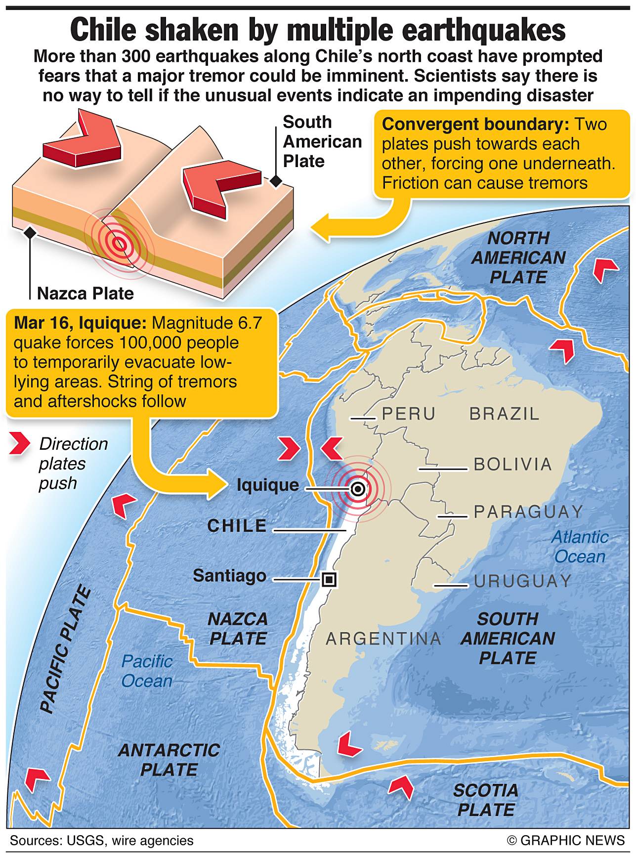
Here is an earthquake that ruptures today in the region of a recent swarm of earthquakes in the northern Chile subduction zone. This is the USGS web page for this earthquake.
Here is the USGS web page for a large aftershock (M 6.2).
Here is a great animation from IRIS that shows the tectonics and seismology associated with this earthquake.
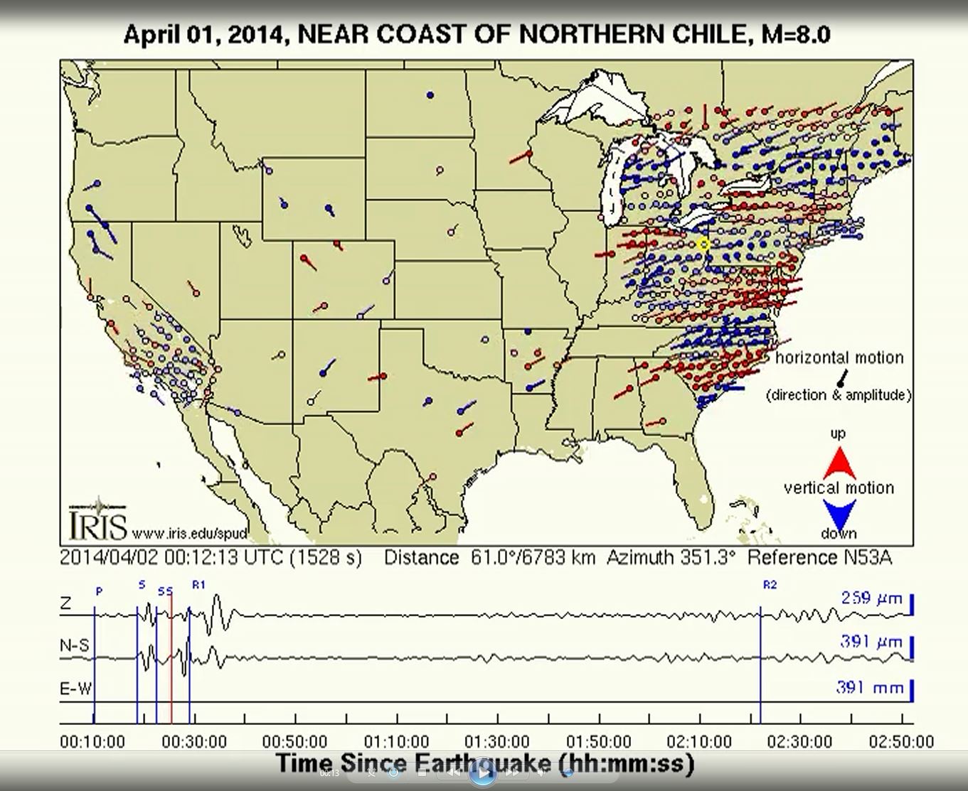
This is a great animation of the seismic waves travelling through the transportable array.
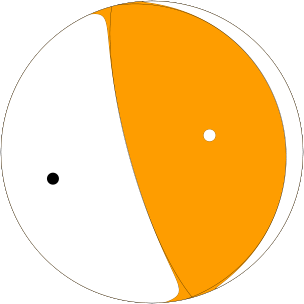
This is the early moment tensor (Mww), which shows a pure thrust/reverse slip.
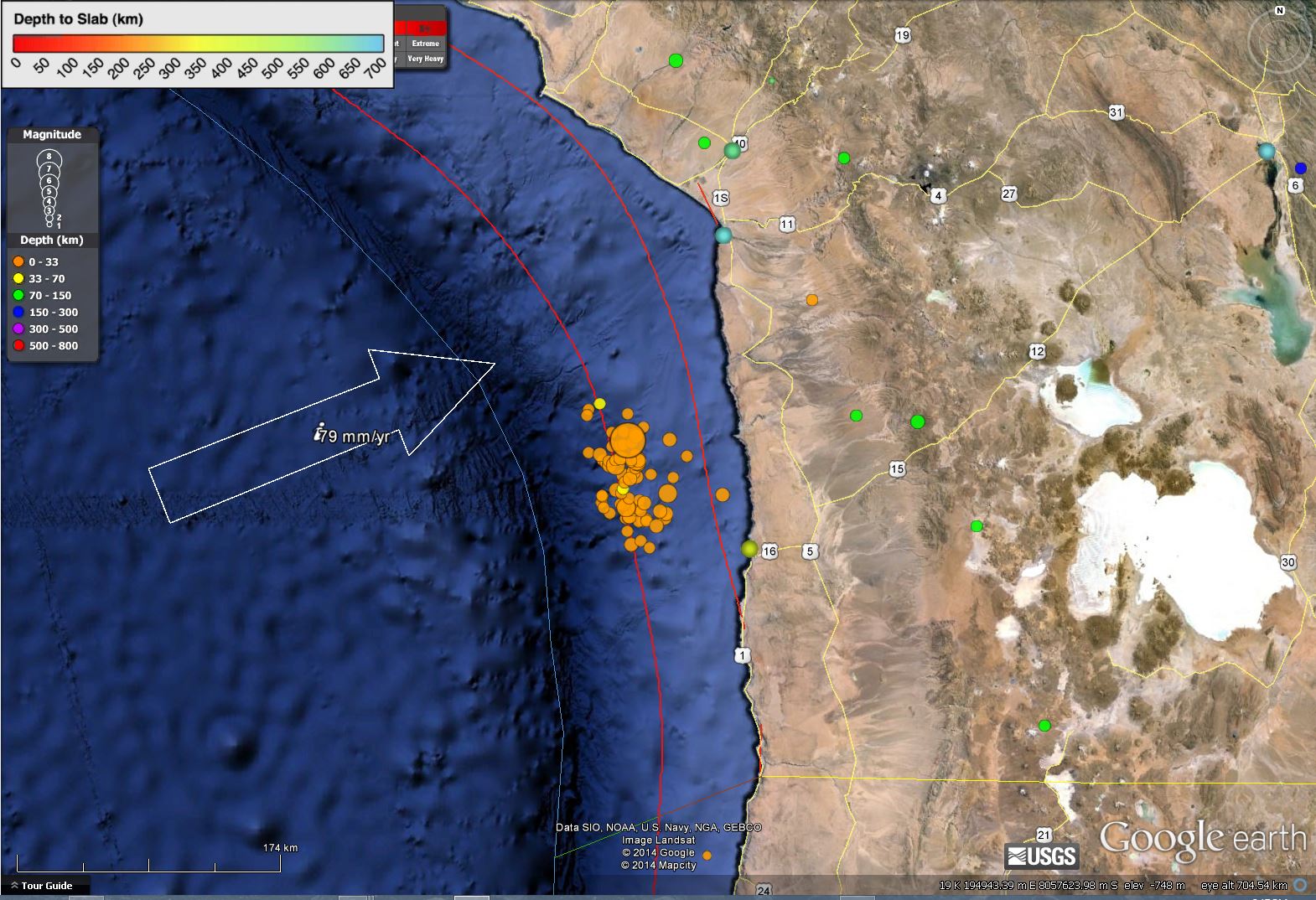
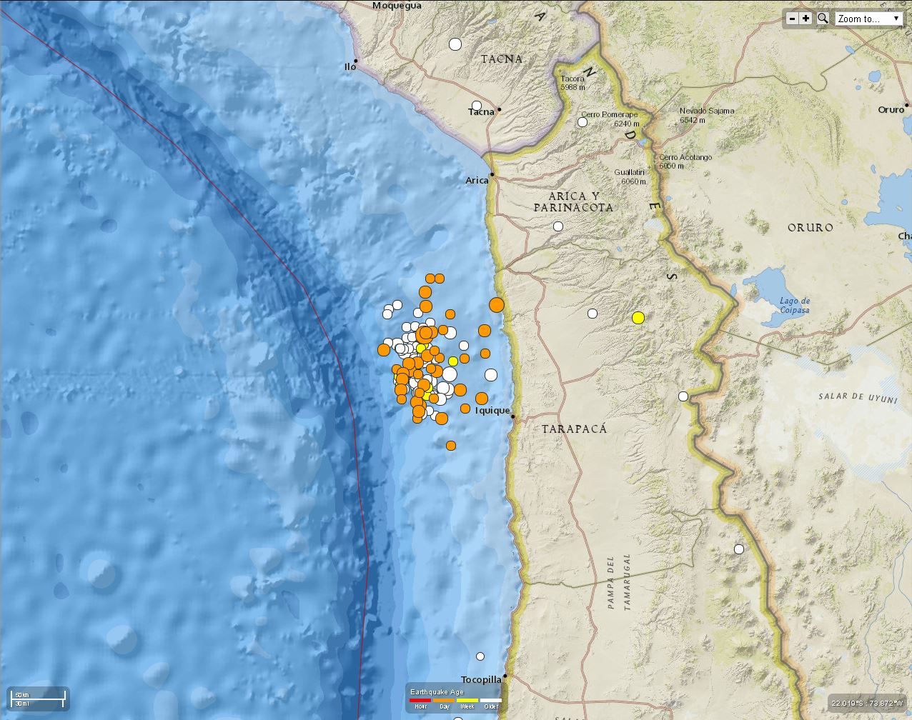
Here is a map showing the region with earthquakes from the last 30 days. The largest dot is today’s great earthquake.
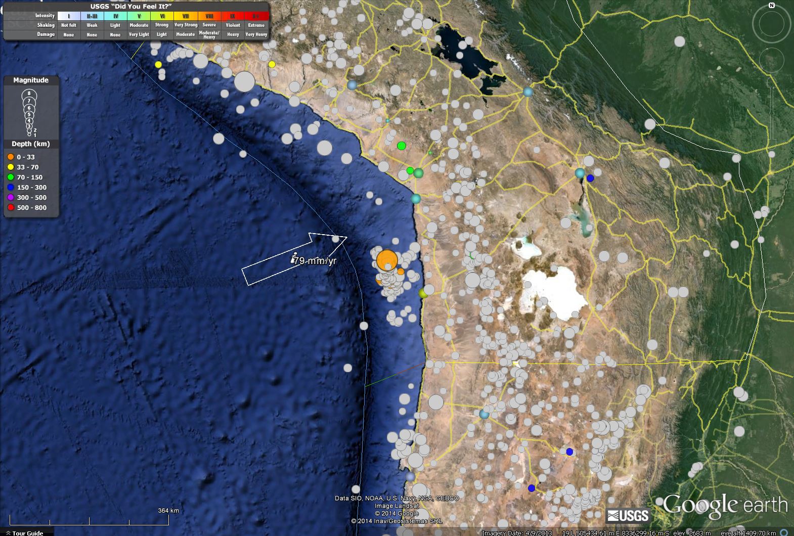
This map is zoomed into the region of the swarm and mainshock. The earthquakes that ruptured prior to the megathrust earthquake may be now considered generally foreshocks. The colored lines represent the depth of the subduction zone fault shown in km. The two main red depth contours are 20 and 40 km respectively.
Here is a map put together by the Belfast Telegraph.
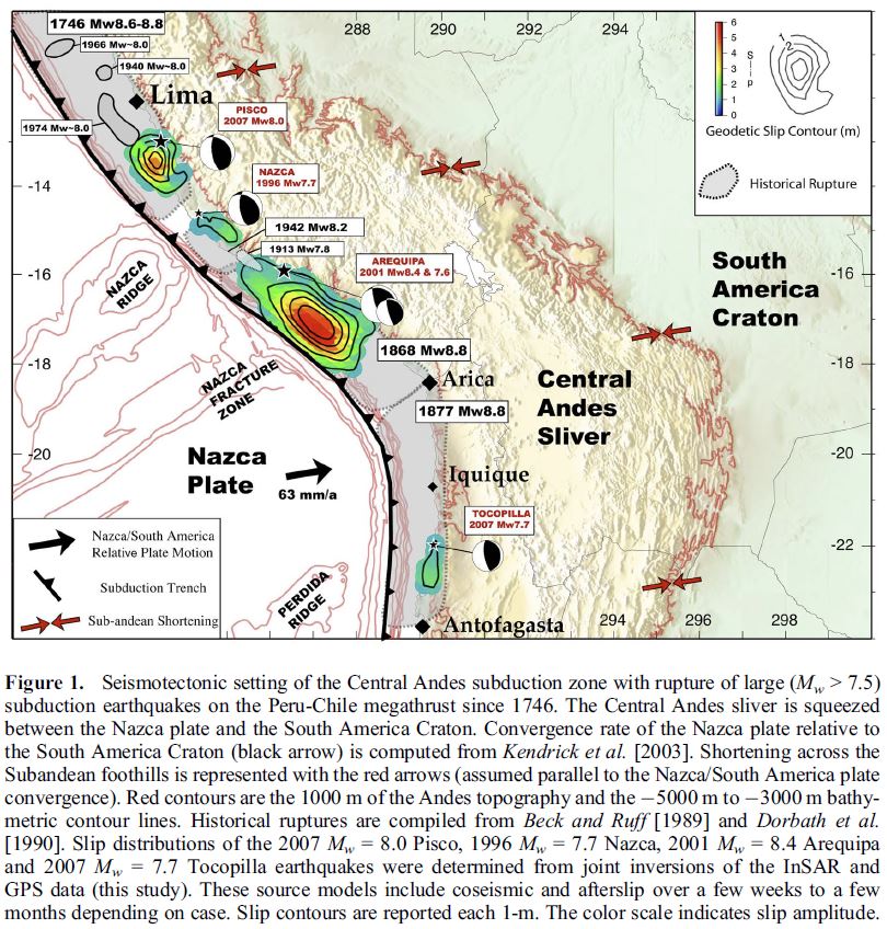
This is a map that shows instrumental and historic earthquake rupture regions. This figure from Chlieh et al. (2011) shows the slip models (earthquake slip in meters) and earthquake slip regions for pre-seimologic (prior to seismometers) earthquakes in grey. The swarm of earthquakes from this March are in the northern region of the 1877 M 8.8 subduction zone earthquake.
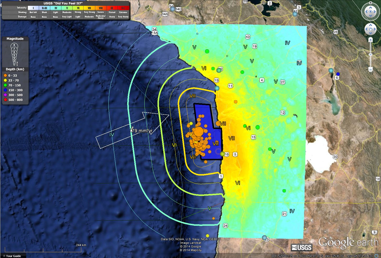
Here is an estimate of ground shaking intensity, with contours offshore and the fault slip region plotted at 21:00 PST:
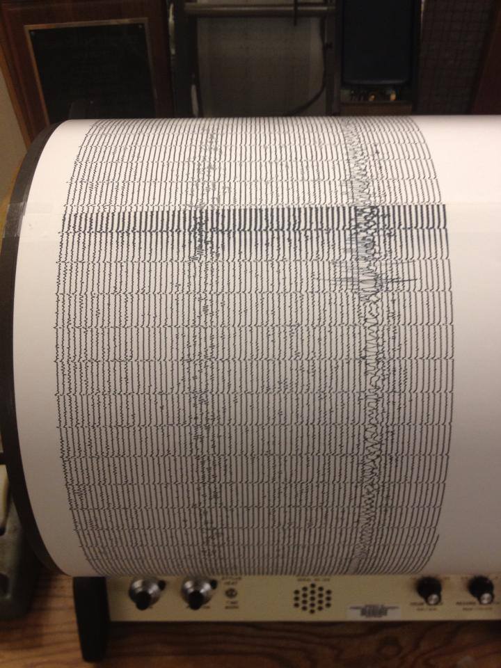
This is the seismograph from the HSU seismometer, thanks to HSU Department of Geology facebook page.
This map shows a large M 6.2 aftershock right near the coastline. Lets hope people are safe from all these earthquakes. There is also a M 5.5 further south.
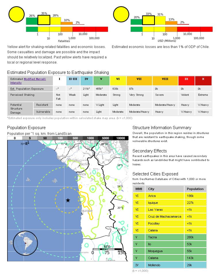
Here is the USGS PAGER page. These plots are generated by overlaying shaking intensity with estimates of population and infrastructure. These overlays are “multiplied” to predict what number of fatalities and amount of economic losses might be (in a probabilistic way). These are just models, but do help international and national efforts that may need to be arisen. Most earthquakes that I have shown these PAGER plots for have had low exposure, but this M 8.2 earthquake has possibly affected up to or over 100 fatalities and up to a hundred to hundreds of millions of USD.
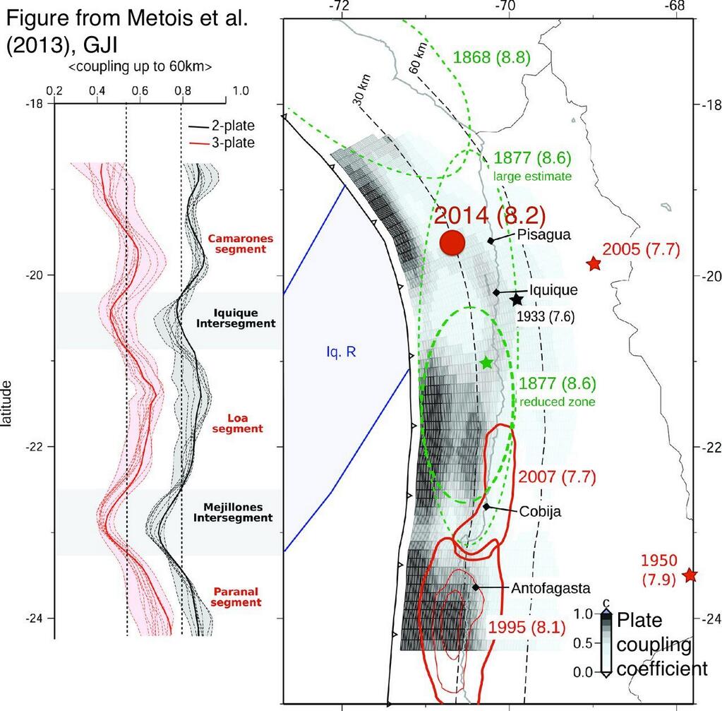
This is an interesting plot, showing the coupling ratio. 0 means that the fault is not locked, or is slipping aseismically. 1 means that the fault is completely locked. The darker the map, the higher their estimate of % locking. This is from Metois et al., 2013.
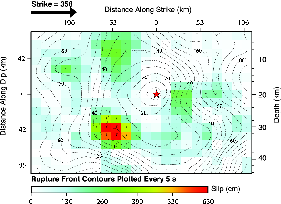
This is the fault slip model just generated by the USGS. The red star represents the hypocenter and the red squares represent regions of higher slip. Notice how the region of highest slip is not collocated with the hypocenter.
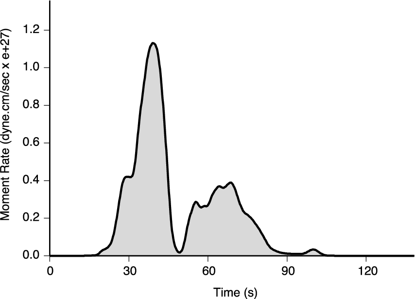
This is the source time function, which tells us how much energy is released over time. This is generated by integrating the energy amplitudes from the seismic waves generated by the earthquake. If we were to go coring in a month, we would possibly find a turbidite with two main pulses.
3
UPDATE: 2023.04.01
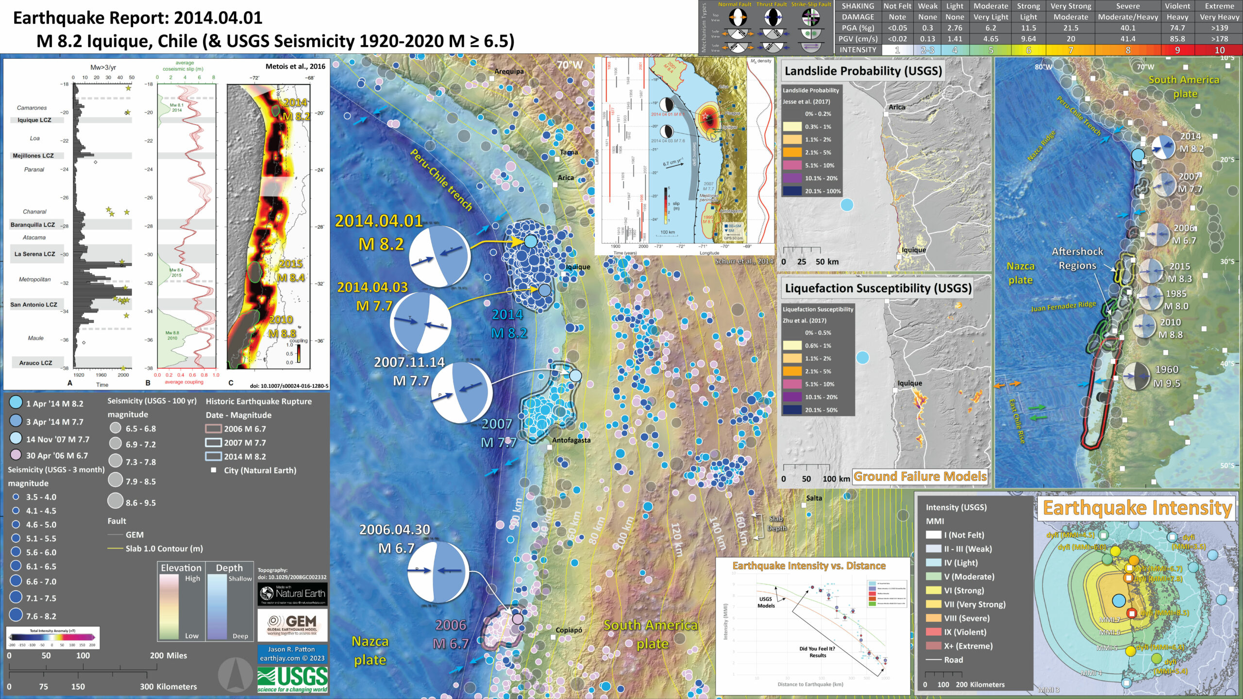
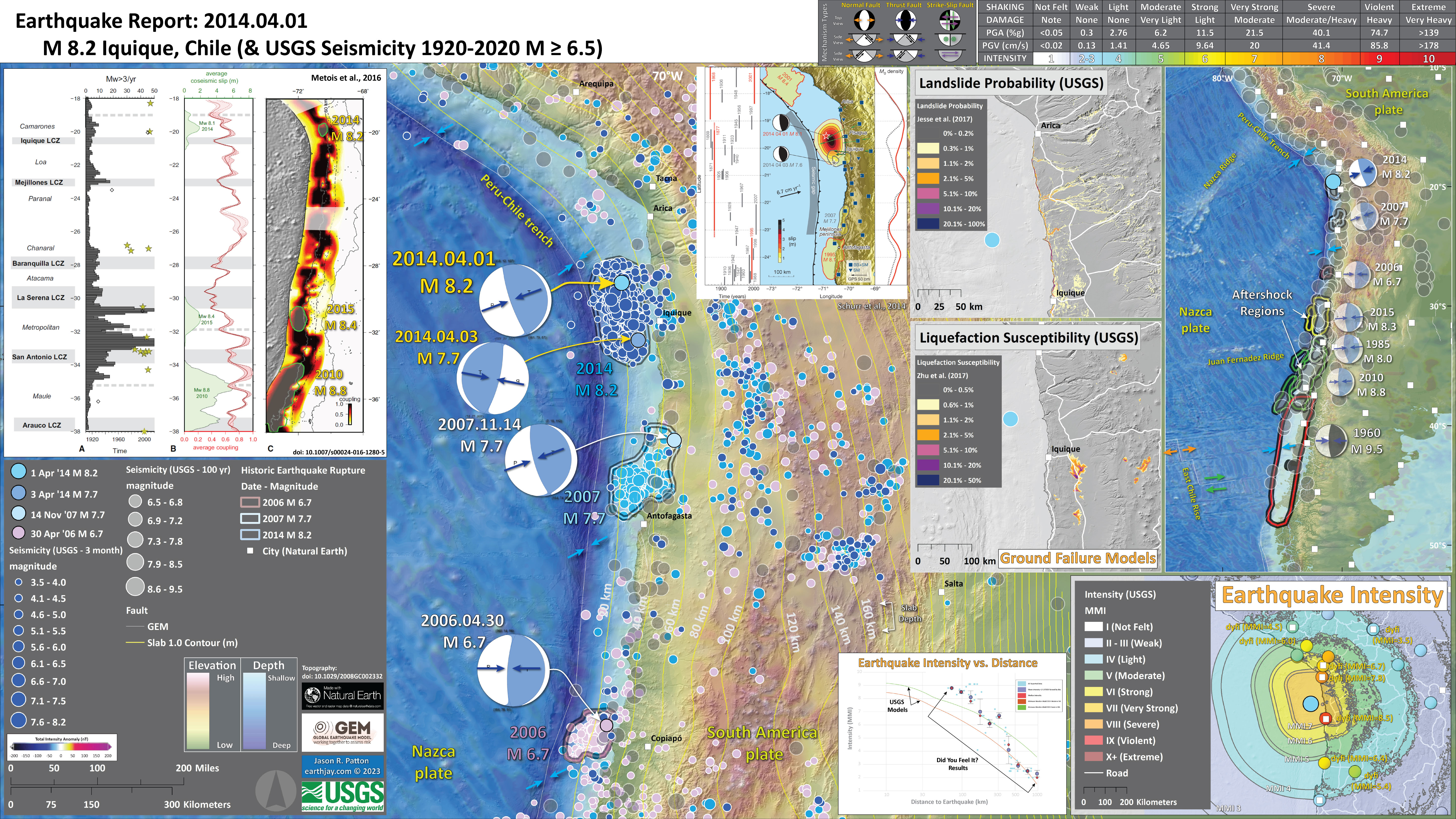
In 2023, I prepared a new interpretive poster. I also add some supportive material. I will further update this report over the next year leading up to the 2024 decadal remembrance.
I remember the earthquake partly because there were two closely spaced earthquakes that slipped the megathrust during a 3 day period.
First was the 1 April 2014 M 8.2 earthquake. This had clearly defined area of aftershocks (I interpreted this area as the area that the fault slipped).
On 3 April there was an M 7.7 earthquake. This caused a sequence of aftershocks that were in a distinct area of the megathrust fault.
I interpreted these two earthquakes to be separate events (in other words, the M 7.7 was not an aftershock of the M 8.2, but a separate (triggered) earthquake (with its own aftershock sequence)).
I remember attending the Seismological Society of America Annual Meeting in Anchorage later in April 2014.
I debated with my esteemed colleague about this pair of earthquakes. They claimed that they thought this was just a single earthquake sequence (i.e., the M 7.7 was an aftershock of the M 8.2).
I discussed the aftershock spatio-temporal pattern, supporting my interpretation. They claimed that the In-SAR results showed that this was a single event.
However, as I was thinking about this later, I realized that the In-SAR data could not distinguish these events as there was no radar acquisition between the 8.2 and the 7.7. So, there was no measurement of the Earth’s surface between the earthquakes.
Needless to say, I tried not to lose sleep that I missed making an excellent point. (there is much more in life to be concerned about, like, is there clean water to drink when I am thirsty.)
I will fill in the gaps for this earthquake over the next year and attempt to do some of this today.
This report is (currently) Chile centric (I will fill in more to the north, in Peru/Ecuador, over the coming year). To learn more about the earthquake history to the north of Arica, Peru, check out the Earthquake Report from early 2023.
I just got back from a USGS Powell Center meeting where we developed the initial basis for Probabilistic Tsunami Hazard Assessment in the Pacific. So, this margin is on my mind right now.
Below is my interpretive poster for this earthquake
- I plot the seismicity from the past month, with diameter representing magnitude (see legend). I include earthquake epicenters from 1922-2022 with magnitudes M ≥ 3.0 in one version.
- I plot the USGS fault plane solutions (moment tensors in blue and focal mechanisms in orange), possibly in addition to some relevant historic earthquakes.
- A review of the basic base map variations and data that I use for the interpretive posters can be found on the Earthquake Reports page. I have improved these posters over time and some of this background information applies to the older posters.
- Some basic fundamentals of earthquake geology and plate tectonics can be found on the Earthquake Plate Tectonic Fundamentals page.
- In the upper right corner is a map that shows the tectonic plates. I outline aftershock patches from most of the larger earthquakes along this margin over the past century. I include the mechanisms from these events.
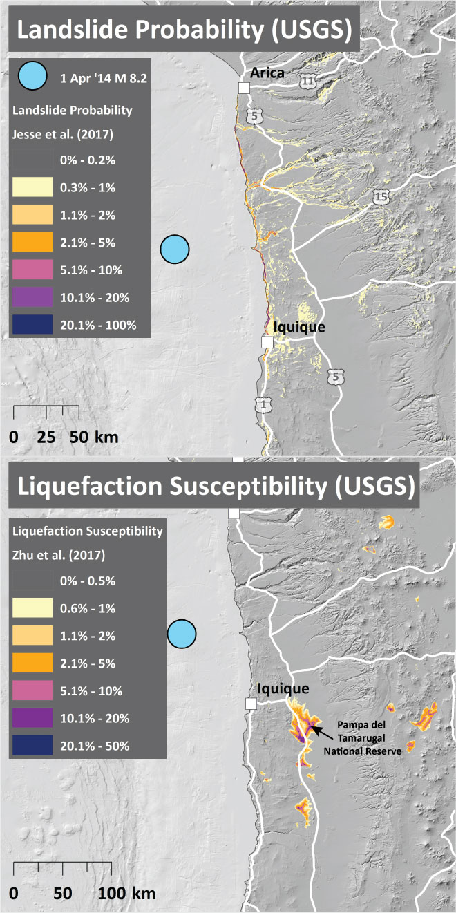
- To the left of the tectonic margin map is a pair of maps that show the landslide probability (left) and the liquefaction susceptibility (right) for this M 6.8 earthquake. I spend more time describing these types of data here. Read more about these maps here.
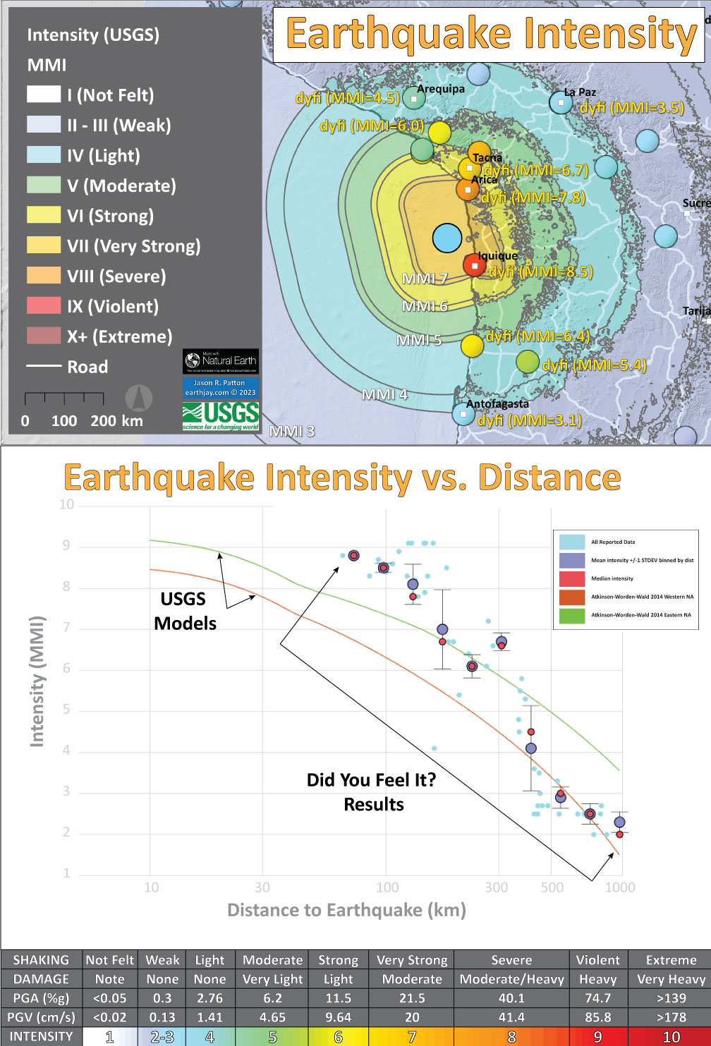
- In the lower right corner I plot the USGS modeled intensity (Modified Mercalli Intensity scale, MMI) and the USGS “Did You Feel It?” observations (labeled in yellow). Above the map is a plot showing these same data plotted relative to distance from the earthquake. Read more about what these data sets are and what they represent in the report here.
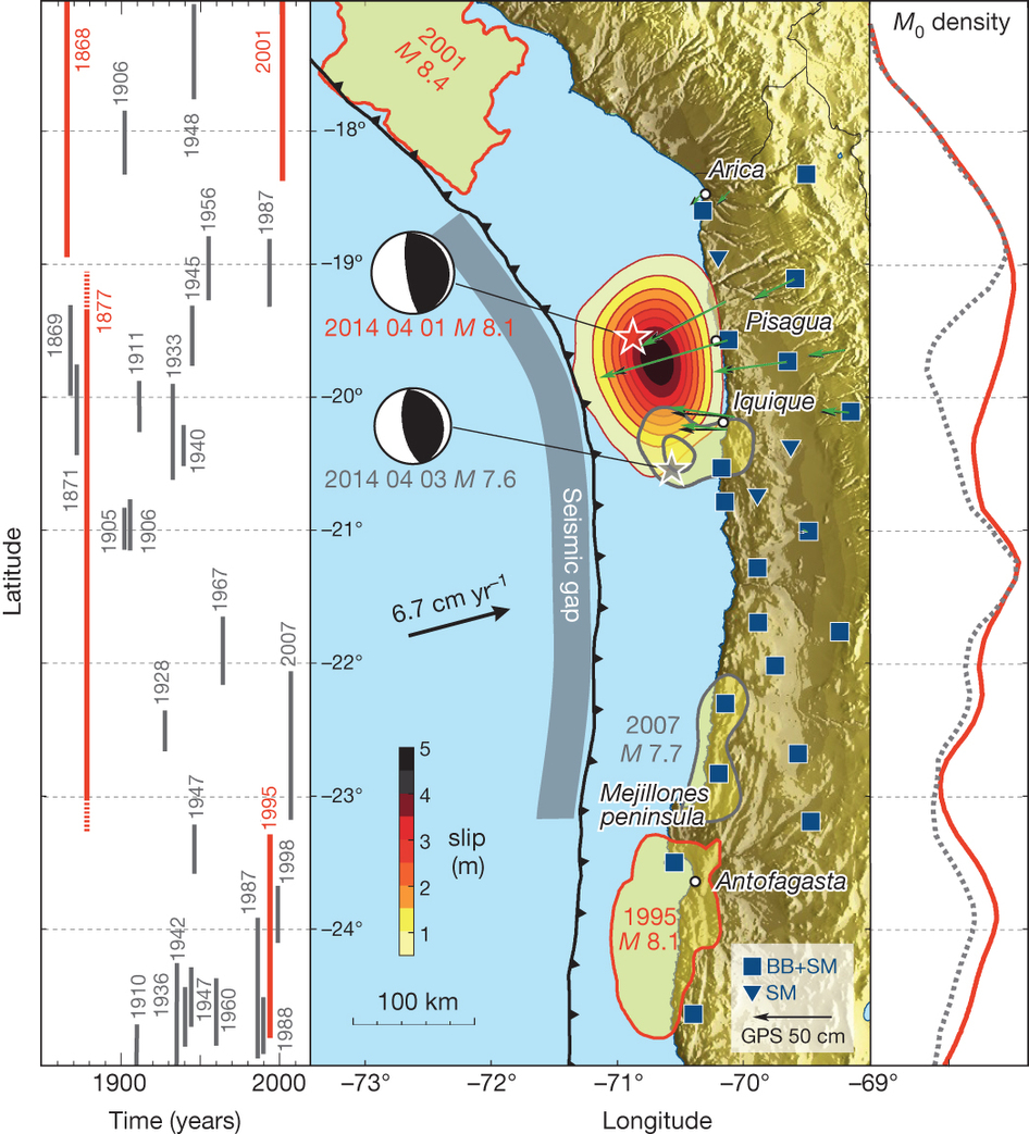
- In the upper center I include a figure from Schurr et al., 2014 that shows the earthquake slip areas for the M 8.2 and M 7.7 2014 Iquique earthquakes. They also include the slip area for the 1995 M 8.1. On the left is a time-space diagram that shows the latitudinal range of prehistoric and historic earthquakes, along with the year that those events happened.
- In the upper left corner is a figure from Metious et al., 2016 that shows (from left to right) the number of earthquakes M>3 per year, the average earthquake slip for 2014, 2015, and 2015, and a map showing the coupling ratio for the megathrust fault.
I include some inset figures. Some of the same figures are located in different places on the larger scale map below.
- Here is the map with 3 month’s seismicity plotted.
Shaking Intensity
- Here is a figure that shows a more detailed comparison between the modeled intensity and the reported intensity. Both data use the same color scale, the Modified Mercalli Intensity Scale (MMI). More about this can be found here. The colors and contours on the map are results from the USGS modeled intensity. The DYFI data are plotted as colored dots (color = MMI, diameter = number of reports).
- In the upper panel is the USGS Did You Feel It reports map, showing reports as colored dots using the MMI color scale. Underlain on this map are colored areas showing the USGS modeled estimate for shaking intensity (MMI scale).
- In the lower panel is a plot showing MMI intensity (vertical axis) relative to distance from the earthquake (horizontal axis). The models are represented by the green and orange lines. The DYFI data are plotted as light blue dots. The mean and median (different types of “average”) are plotted as orange and purple dots. Note how well the reports fit the green line (the model that represents how MMI works based on quakes in California).
- Below the lower plot is the USGS MMI Intensity scale, which lists the level of damage for each level of intensity, along with approximate measures of how strongly the ground shakes at these intensities, showing levels in acceleration (Peak Ground Acceleration, PGA) and velocity (Peak Ground Velocity, PGV).
USGS Historic Seismicity
- Here is a poster that shows the significant earthquakes along this plate boundary. Note how there are earthquakes in the Nazca plate associated with the 2010 and 2015 megathrust subduction zone earthquakes. These are triggered earthquakes along the outer rise, not additional subduction zone earthquakes.
- In the lower right corner is a figure from Beck (1998) that shows the spatial extent of the known earthquakes. I added the extent of the 2015 and 2010 earthquakes as green arrows.
- In the upper right corner is an excellent figure from Horton (2018) that shows the plate tectonic setting for this area.

Tsunami
- The September 2015 earthquake series inspired me to compile some information on the historic tsunami in this region. Here is my report on those tsunami. Below I present my figure and an animation that compares these three tsunami from 1960, 2010, and 2014.
- These three maps use the same color scale. There is not yet a map with this scale for the 2015 tsunami, so we cannot yet make the comparison.
- Below are a series of maps that show the potential for landslides and liquefaction. These are all USGS data products.
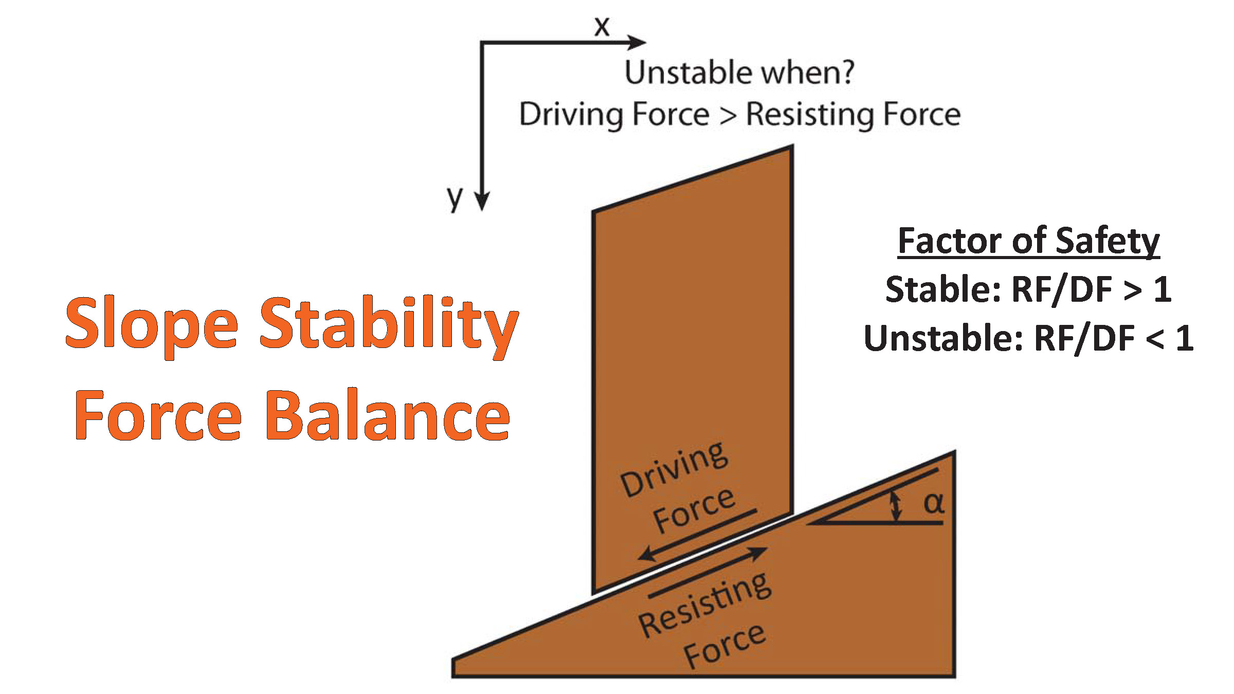
There are many different ways in which a landslide can be triggered. The first order relations behind slope failure (landslides) is that the “resisting” forces that are preventing slope failure (e.g. the strength of the bedrock or soil) are overcome by the “driving” forces that are pushing this land downwards (e.g. gravity). The ratio of resisting forces to driving forces is called the Factor of Safety (FOS). We can write this ratio like this:FOS = Resisting Force / Driving Force
When FOS > 1, the slope is stable and when FOS < 1, the slope fails and we get a landslide. The illustration below shows these relations. Note how the slope angle α can take part in this ratio (the steeper the slope, the greater impact of the mass of the slope can contribute to driving forces). The real world is more complicated than the simplified illustration below.
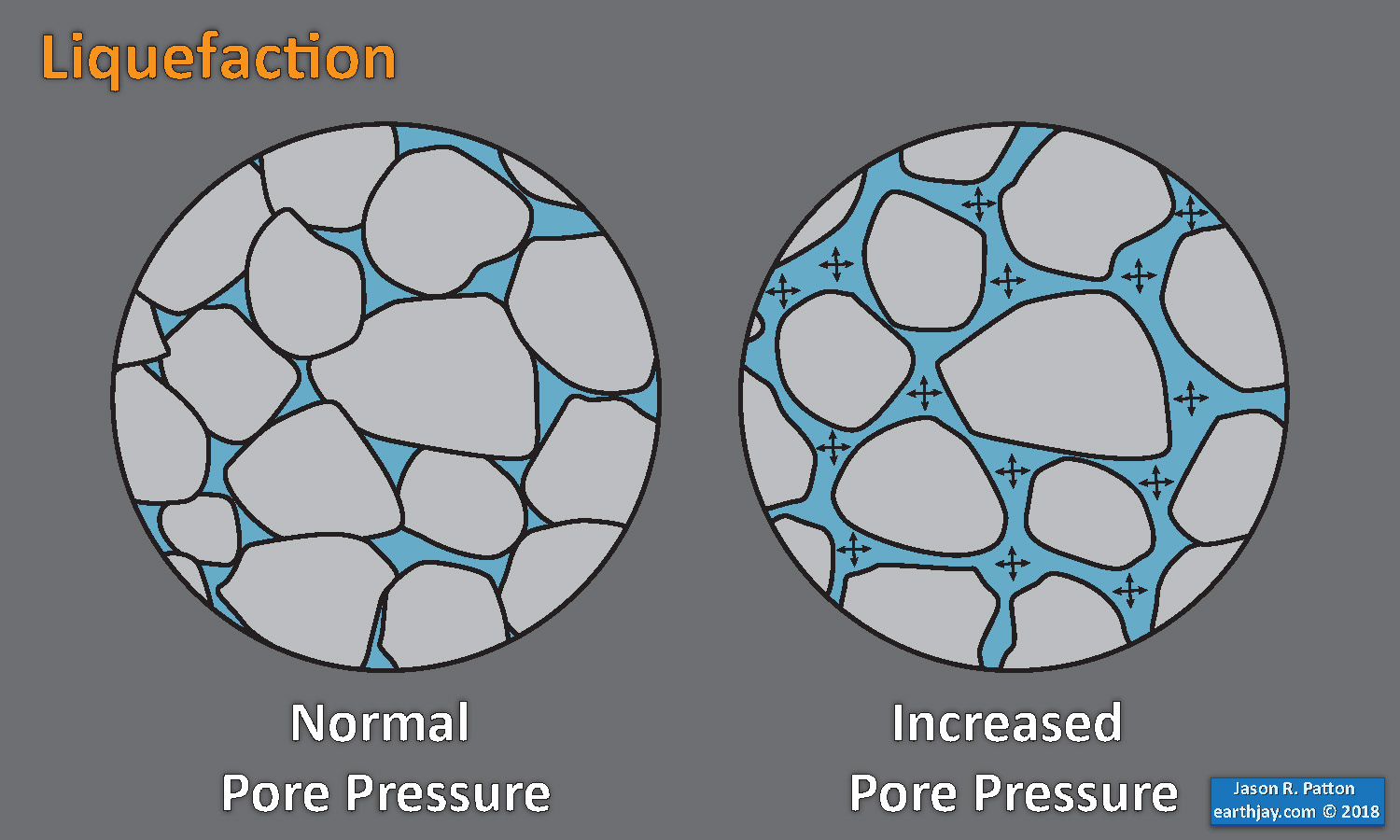
Landslide ground shaking can change the Factor of Safety in several ways that might increase the driving force or decrease the resisting force. Keefer (1984) studied a global data set of earthquake triggered landslides and found that larger earthquakes trigger larger and more numerous landslides across a larger area than do smaller earthquakes. Earthquakes can cause landslides because the seismic waves can cause the driving force to increase (the earthquake motions can “push” the land downwards), leading to a landslide. In addition, ground shaking can change the strength of these earth materials (a form of resisting force) with a process called liquefaction.
Sediment or soil strength is based upon the ability for sediment particles to push against each other without moving. This is a combination of friction and the forces exerted between these particles. This is loosely what we call the “angle of internal friction.” Liquefaction is a process by which pore pressure increases cause water to push out against the sediment particles so that they are no longer touching.An analogy that some may be familiar with relates to a visit to the beach. When one is walking on the wet sand near the shoreline, the sand may hold the weight of our body generally pretty well. However, if we stop and vibrate our feet back and forth, this causes pore pressure to increase and we sink into the sand as the sand liquefies. Or, at least our feet sink into the sand.
Below is a diagram showing how an increase in pore pressure can push against the sediment particles so that they are not touching any more. This allows the particles to move around and this is why our feet sink in the sand in the analogy above. This is also what changes the strength of earth materials such that a landslide can be triggered.
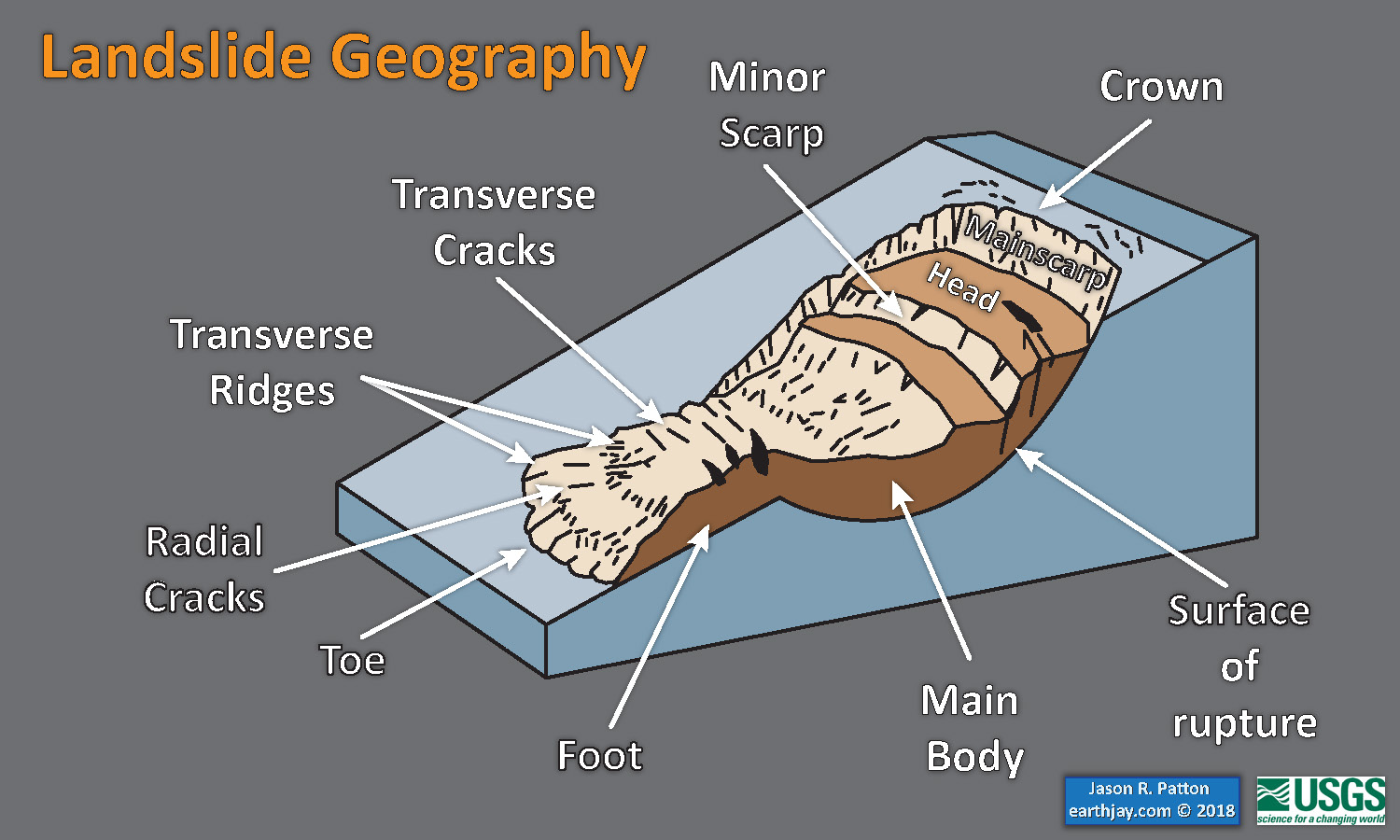
Below is a diagram based upon a publication designed to educate the public about landslides and the processes that trigger them (USGS, 2004). Additional background information about landslide types can be found in Highland et al. (2008). There was a variety of landslide types that can be observed surrounding the earthquake region. So, this illustration can help people when they observing the landscape response to the earthquake whether they are using aerial imagery, photos in newspaper or website articles, or videos on social media. Will you be able to locate a landslide scarp or the toe of a landslide? This figure shows a rotational landslide, one where the land rotates along a curvilinear failure surface.
- Below is the liquefaction susceptibility and landslide probability map (Jessee et al., 2017; Zhu et al., 2017). Please head over to that report for more information about the USGS Ground Failure products (landslides and liquefaction). Basically, earthquakes shake the ground and this ground shaking can cause landslides.
- I use the same color scheme that the USGS uses on their website. Note how the areas that are more likely to have experienced earthquake induced liquefaction are in the valleys. Learn more about how the USGS prepares these model results here.
- Here is the cross section of the subduction zone just to the south of the Sept/Nov 2015 swarm (Melnick et al., 2006). Below I include the text from the Melnick et al. (2006) figure caption as block text.
- Here is the overview figure from Horton, 2018.
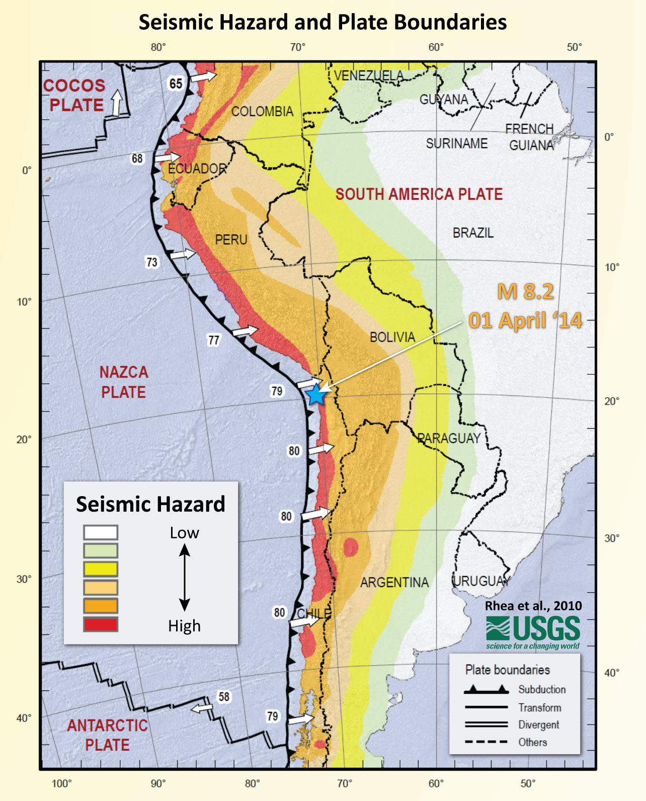
- Here is the seismic hazard map is from Rhea et al. (2010).
- Here is the seismicity map and space time diagram from Métois et al. (2016). The subduction zone fault in the region of Coquimbo, Chile changes geometry, probably because of the Juan Fernandez Ridge (this structure controls the shape of the subduction zone). This figure shows a map and cross section for two parts of the subduction zone (Marot et al., 2014). Note how the subduction zone flattens out with depth here. The M=6.7 quake was shallower than this, but the shape of the downgoing slab does affect the amount of slab pull (tension in the down-dip direction) is exerted along the plate.
- This figure is the 3 panel figure in the interpretive poster showing how seismicity is distributed along the margin, how historic earthquake slip was distributed, and how the fault may be locked (or slipping) along the megathrust fault.
- This is a figure that shows details about the coupling compared to some slip models for the 2010, 2014, and 2015 earthquakes.
- This is the fault locking figure from Saillard et al. (2017), showing the percent coupling (how much of the plate convergence contributes to deformation of the plate boundary, which may tell us places on the fault that might slip during an earthquake. We are still learning about why this is important and what it means.
- Here is the slip patch figure from Schurr et al. (2014).
- The colored areas show the amount that the fault slipped (0-5 meters) for each earthquake.
- To the right of the map is a plot showing the density of earthquake energy (moment) for this region.
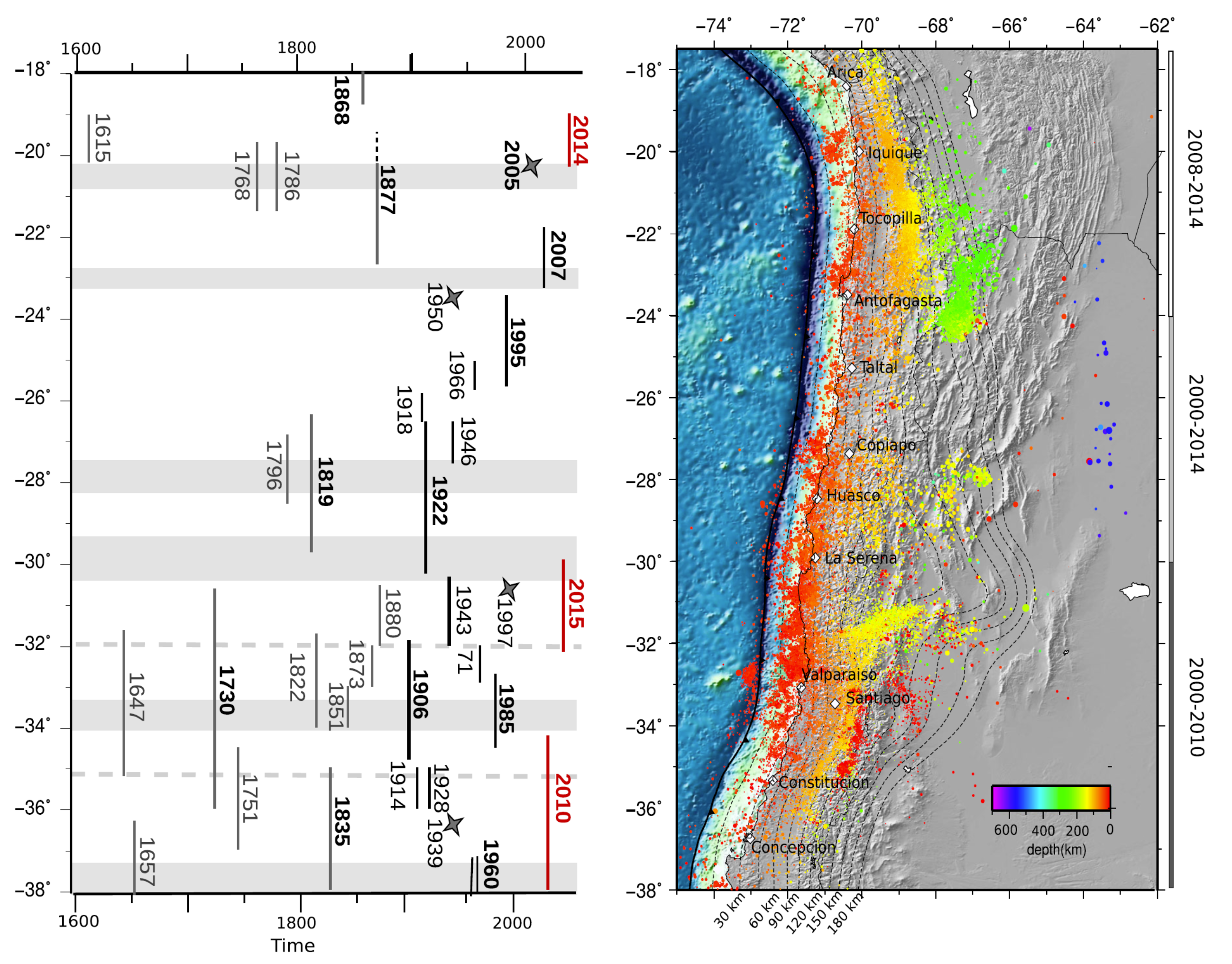
- On the left is the historic record of earthquakes for this part of the subduction zone. The area that each earthquake slipped is represented by a vertical bar (labeled by the year of the earthquake).
- The last time that this part of the subduction zone has had an earthquake that spanned the region of the 2014 event, south to the 1995 earthquake, was in 1877.
- Over the past few years there have been several papers that document a prehistoric earthquake that generated a trans-pacific tsunami (and a very large local tsunami) in the same area. This earthquake/tsunami from about 3,800 years ago was on the order of the size of the 1960 M 9.5 earthquake.
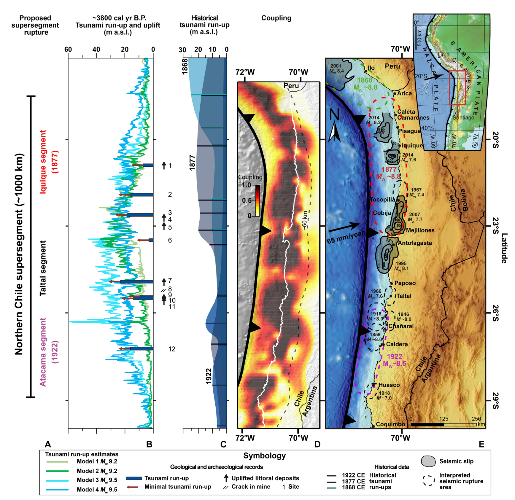
- Here are some figures from Salazar et al. (2022) where they document evidence for an earthquake 3800 years ago in the region of the 2014 earthquake.
- These authors did extensive research to support their interpretations that included field work (both geological and archeological) and numerical modeling of tsunami waves.
- Something that is truly remarkable about this earthquake and tsunami from 3800 years ago is the mere size! This 3800a earthquake spanned the megathrust where there were great earthquakes in 1868, 1877, and 1922. This 3.8ka earthquake was similar in size to the 1960 M 9.5 earthquake.
- This is their map that incudes (from right to left) slip patches from historic earthquakes on the right, coupling ratio to the left of that map, the estimates for tsunami size from historical tsunami, and estimates for local tsunami runup from this 3800 year ago tsunami.
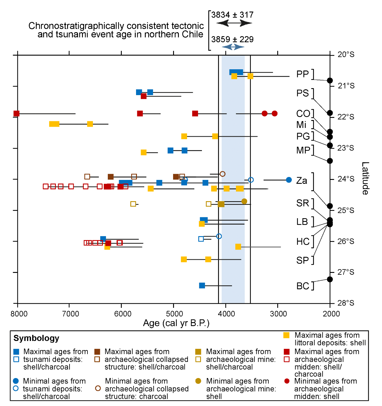
- This figure shows the numerical ages that form the basis for their interpretation of the timing of this earthquake/tsunami (Salazar et al., 2022).
- This figure shows how changes in culture may have responded to this earthquake. The authors show how cemeteries were placed in different locations (distance from the coast and in elevation) following this period of time.
- Here is an animation showing the tsunami modeled for the 3.8ka tsunami
- 2010.02.27 M 8.8 Earthquake Review
- 2023.03.18 M 6.8 Ecuador
- 2021.11.28 M 7.5 Peru
- 2019.08.01 M 6.8 Chile
- 2019.06.14 M 6.4 Chile
- 2019.05.26 M 8.0 Peru
- 2019.05.12 M 6.1 Panama
- 2019.03.01 M 7.0 Peru
- 2019.02.22 M 7.5 Ecuador
- 2019.01.20 M 6.7 Chile
- 2018.08.21 M 7.3 Venezuela
- 2018.08.24 M 7.1 Peru
- 2018.04.02 M 6.8 Bolivia
- 2018.01.14 M 7.1 Peru
- 2018.01.15 M 7.1 Peru Update #1
- 2017.06.30 M 6.0 Ecuador
- 2017.04.24 M 6.9 Chile
- 2017.04.23 M 5.9 Chile
- 2016.12.25 M 7.6 Chile
- 2016.11.24 M 7.0 El Salvador
- 2016.11.04 M 6.4 Maule, Chile
- 2016.04.16 M 7.8 Ecuador
- 2016.04.16 M 7.8 Ecuador Update #1
- 2015.11.29 M 5.9 Argentina
- 2015.11.11 M 6.9 Chile
- 2015.11.24 M 7.6 Peru
- 2015.11.26 M 7.6 Peru Update
- 2015.09.16 M 8.3 Chile
- 2014.04.01 M 8.2 Chile
- 2010.02.27 M 8.8 Chile
- 1960.05.22 M 9.5 Chile
- Frisch, W., Meschede, M., Blakey, R., 2011. Plate Tectonics, Springer-Verlag, London, 213 pp.
- Hayes, G., 2018, Slab2 – A Comprehensive Subduction Zone Geometry Model: U.S. Geological Survey data release, https://doi.org/10.5066/F7PV6JNV.
- Holt, W. E., C. Kreemer, A. J. Haines, L. Estey, C. Meertens, G. Blewitt, and D. Lavallee (2005), Project helps constrain continental dynamics and seismic hazards, Eos Trans. AGU, 86(41), 383–387, , https://doi.org/10.1029/2005EO410002. /li>
- Jessee, M.A.N., Hamburger, M. W., Allstadt, K., Wald, D. J., Robeson, S. M., Tanyas, H., et al. (2018). A global empirical model for near-real-time assessment of seismically induced landslides. Journal of Geophysical Research: Earth Surface, 123, 1835–1859. https://doi.org/10.1029/2017JF004494
- Kreemer, C., J. Haines, W. Holt, G. Blewitt, and D. Lavallee (2000), On the determination of a global strain rate model, Geophys. J. Int., 52(10), 765–770.
- Kreemer, C., W. E. Holt, and A. J. Haines (2003), An integrated global model of present-day plate motions and plate boundary deformation, Geophys. J. Int., 154(1), 8–34, , https://doi.org/10.1046/j.1365-246X.2003.01917.x.
- Kreemer, C., G. Blewitt, E.C. Klein, 2014. A geodetic plate motion and Global Strain Rate Model in Geochemistry, Geophysics, Geosystems, v. 15, p. 3849-3889, https://doi.org/10.1002/2014GC005407.
- Meyer, B., Saltus, R., Chulliat, a., 2017. EMAG2: Earth Magnetic Anomaly Grid (2-arc-minute resolution) Version 3. National Centers for Environmental Information, NOAA. Model. https://doi.org/10.7289/V5H70CVX
- Müller, R.D., Sdrolias, M., Gaina, C. and Roest, W.R., 2008, Age spreading rates and spreading asymmetry of the world’s ocean crust in Geochemistry, Geophysics, Geosystems, 9, Q04006, https://doi.org/10.1029/2007GC001743
- Pagani,M. , J. Garcia-Pelaez, R. Gee, K. Johnson, V. Poggi, R. Styron, G. Weatherill, M. Simionato, D. Viganò, L. Danciu, D. Monelli (2018). Global Earthquake Model (GEM) Seismic Hazard Map (version 2018.1 – December 2018), DOI: 10.13117/GEM-GLOBAL-SEISMIC-HAZARD-MAP-2018.1
- Silva, V ., D Amo-Oduro, A Calderon, J Dabbeek, V Despotaki, L Martins, A Rao, M Simionato, D Viganò, C Yepes, A Acevedo, N Horspool, H Crowley, K Jaiswal, M Journeay, M Pittore, 2018. Global Earthquake Model (GEM) Seismic Risk Map (version 2018.1). https://doi.org/10.13117/GEM-GLOBAL-SEISMIC-RISK-MAP-2018.1
- Zhu, J., Baise, L. G., Thompson, E. M., 2017, An Updated Geospatial Liquefaction Model for Global Application, Bulletin of the Seismological Society of America, 107, p 1365-1385, https://doi.org/0.1785/0120160198
- Beck, S., Barientos, S., Kausel, E., and Reyes, M., 1998. Source Characteristics of Historic Earthquakes along the Central Chile Subduction Zone in Journal of South American Earth Sciences, v. 11, no. 2., p. 115-129.
- Hayes, G.P., Wald, D.J., and Johnson, R.L., 2012. Slab1.0: A three-dimensional model of global subduction zone geometries in, J. Geophys. Res., 117, B01302, doi:10.1029/2011JB008524
- Hayes, G.P., Smoczyk, G.M., Benz, H.M., Villaseñor, Antonio, and Furlong, K.P., 2015. Seismicity of the Earth 1900–2013, Seismotectonics of South America (Nazca Plate Region): U.S. Geological Survey Open-File Report 2015–1031–E, 1 sheet, scale 1:14,000,000, http://dx.doi.org/10.3133/ofr20151031E.
- Lin, Y.N., Slkaden, A., Ortega-Culaciati, F., Simons, M., Avouac, J-P., Fielding, E.J., Brooks,, B.A., Bevis, M., Genrich, J., Rietbrock, A., Vigny, C., Smalley, R., and Socquet, A., 2013. Coseismic and postseismic slip associated with the 2010 Maule Earthquake, Chile: Characterizing the Arauco Peninsula barrier effect in JGR, v. 118, p. 1-18, doi:10.1002/jgrb.50207, 2013
- Melnick, D., Bookhagen, B., Echtler, H.P., and Strecker, M.R., 2006. Coastal deformation and great subduction earthquakes, Isla Santa María, Chile (37°S) in GSA Bulletin, v. 118, no. 11/12, p. 1463-1480.
- Métois, M., Vigny, C. & Socquet, A. Interseismic Coupling, Megathrust Earthquakes and Seismic Swarms Along the Chilean Subduction Zone (38°–18°S). Pure Appl. Geophys. 173, 1431–1449 (2016). https://doi.org/10.1007/s00024-016-1280-5
- Moernaut, J., Batist, M., Haeirman, K., Van Daele, M., Brümmer, R., Urrutia, R., Wolff, C., Brauer, A., Roberts, S., Kilian, R., Pino, M., 2010. Recurrence of 1960-like earthquake shaking in South-Central Chile revealed by lacustrine sedimentary records in proceedings Chapman Conference on Giant Earthquakes and Their Tsunamis Valparaíso, Viña del Mar, and Valdivia, Chile 16–24 May 2010.
- Moreno, M., Rosenau, M., and Oncken, O., 2010. 2010 Maule earthquake slip correlates with pre-seismic locking of Andean subduction zone in Nature, v. 467, p. 198-202
- Moreno, M., Melnick, D., Rosenau, M., Bolte, J., Klotz, J., Echtler, H., Basez, J., Bataille, K., Chen, J., Bevis, M., Hase, H., Oncken, O., 2011. Heterogeneous plate locking in the South–Central Chile subduction zone: Building up the next great earthquake in Earth and Planetary Science Letters, v. 305, p. 413-424.
- Rhea, Susan, Hayes, Gavin, Villaseñor, Antonio, Furlong, K.P., Tarr, A.C., and Benz, H.M., Seismicity of the earth 1900–2007, Nazca Plate and South America: U.S. Geological Survey Open-File Report 2010–1083-E, 1 sheet, scale 1:12,000,000.
- Rodrigo, C. and Lara, L.E., 2014. Plate tectonics and the origin of the Juan Fernández Ridge: analysis of bathymetry and magnetic patterns in Lat. Am. J. Aquat. Res, v. 42, no. 4, p. 907-917
- Salazar, D., et al. (2022). Did a 3800-year-old M w~ 9.5 earthquake trigger major social disruption in the Atacama Desert?. Science advances, 8(14) https://www.science.org/doi/10.1126/sciadv.abm2996.
- Schurr, B., Asch, G., Hainzl, S. et al. Gradual unlocking of plate boundary controlled initiation of the 2014 Iquique earthquake. Nature 512, 299–302 (2014). https://doi.org/10.1038/nature13681
- von Huene, R. et al., 1997. Tectonic control of the subducting Juan Fernandez Ridge on the Andean margin near Valparaiso, Chile in Tectonics, v. 16, no. 3, p. 474-488.
- Sorted by Magnitude
- Sorted by Year
- Sorted by Day of the Year
- Sorted By Region
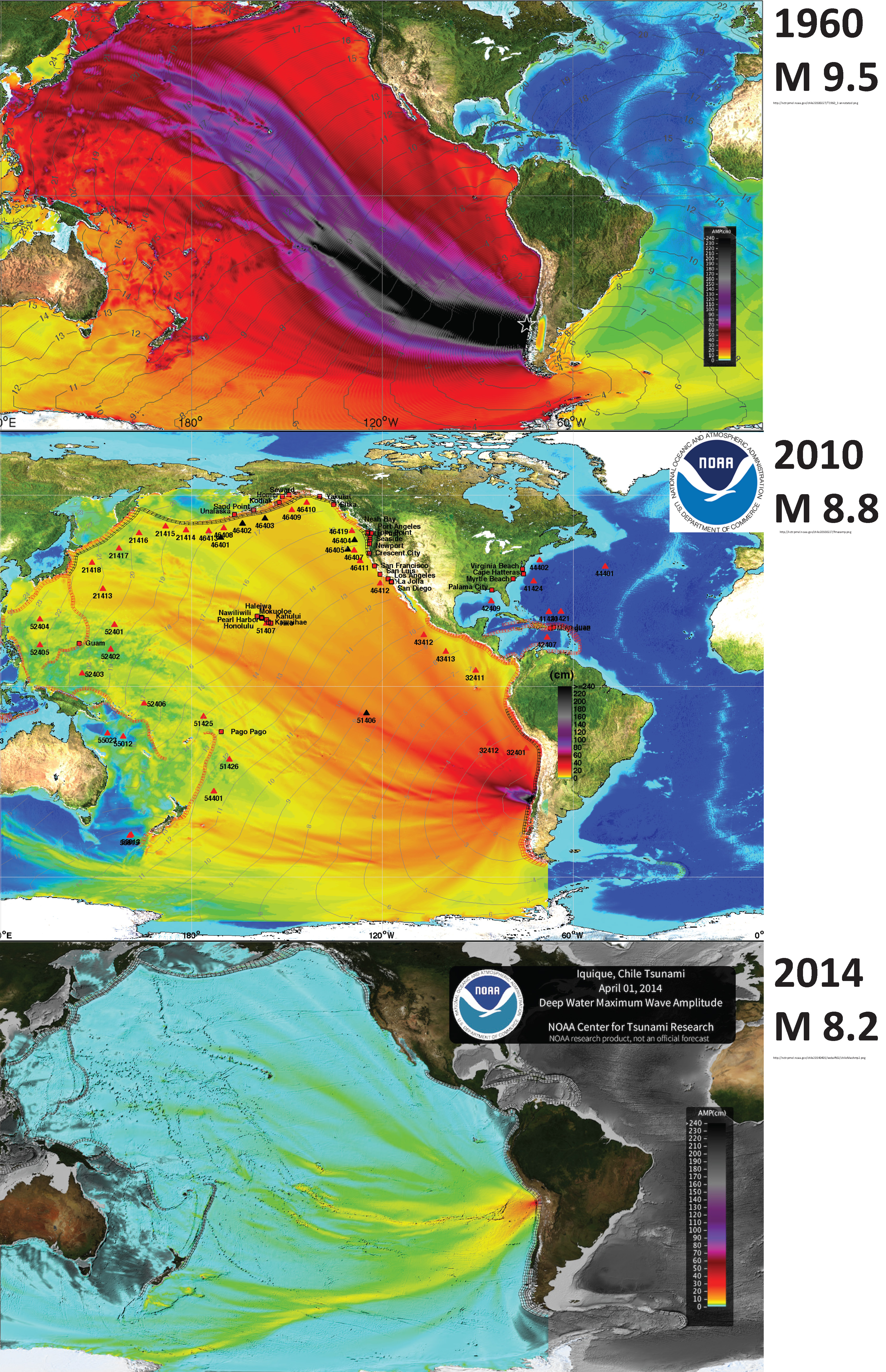
Here is an animation of these three tsunami from the US NWS Pacific Tsunami Warning Center (PTWC). This is the YouTube link.
Potential for Ground Failure
Some Relevant Discussion and Figures
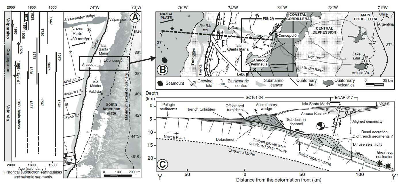
(A) Seismotectonic segments, rupture zones of historical subduction earthquakes, and main tectonic features of the south-central Andean convergent margin. Earthquakes were compiled from Lomnitz (1970, 2004), Kelleher (1972), Comte et al. (1986), Cifuentes (1989), Beck et al. (1998 ), and Campos et al. (2002). Nazca plate and trench are from Bangs and Cande (1997) and Tebbens and Cande (1997). Maximum extension of glaciers is from Rabassa and Clapperton (1990). F.Z.—fracture zone. (B) Regional morphotectonic units, Quaternary faults, and location of the study area. Trench and slope have been interpreted from multibeam bathymetry and seismic-reflection profiles (Reichert et al., 2002). (C) Profile of the offshore Chile margin at ~37°S, indicated by thick stippled line on the map and based on seismic-reflection profiles SO161-24 and ENAP-017. Integrated Seismological experiment in the Southern Andes (ISSA) local network seismicity (Bohm et al., 2002) is shown by dots; focal mechanism is from Bruhn (2003). Updip limit of seismogenic coupling zone from heat-fl ow measurements (Grevemeyer et al., 2003). Basal accretion of trench sediments from sandbox models (Lohrmann, 2002; Glodny et al., 2005). Convergence parameters from Somoza (1998 ).

Maps of (A) tectonic framework, (B) topography, and (C) sedimentary basin configuration of South America. (A) Map of plate boundaries, Andean magmatic arc (including the northern, central, and southern volcanic zones), regions of flat slab subduction, modern stress orientations from earthquake focal mechanisms, eastern front of Andean fold-thrust belt, and key segments of the retroarc foreland basin system. Plate velocities are shown relative to stable South American plate (DeMets et al., 2010). (B) DEM topographic map showing the Andes mountains and adjacent foreland region, including the Amazon, Parana, Orinoco, and Magdalena (Mag) river systems. (C) Map of Andean retroarc basins, showing isopach thicknesses (in km) of Cretaceous-Cenozoic basin fill, forebulge axis (from Chase et al., 2009), and locations of 13 sites (8 foreland basins, 5 hinterland basins) considered in this synthesis
Left estimated extent of large historical or instrumental ruptures along the Chilean margin adapted from ME´ TOIS et al. (2012). Gray stars mark major intra-slab events. The recent Mw[8 earthquakes are indicated in red. Gray shaded areas correspond to LCZs defined in Fig. 3. Right seismicity recorded by the Centro Sismologico Nacional (CSN) during
interseismic period, color-coded depending on the event’s depth. Three zones have been defined to avoid including aftershocks and preshocks associated with major events: (1) in North Chile, we plot the seismicity from 2008 to january 2014, i.e., between the Tocopilla and Iquique earthquakes; (2) in Central Chile, we plot the seismicity on the entire 2000–2014 period; (3) in South-Central Chile, we selected events that occurred between 2000 and 2010, i.e., before the Maule earthquake.

a Histogram depicts the rate of Mw>3 earthquakes registered by the CSN catalog during the interseismic period defined for each zone (see Fig. 2) on the subduction interface, on 0.2° of latitude sliding windows. Stars are swarm-like sequences detected by HOLTKAMP et al. (2011) depending on their occurrence date. Swarms located in the Iquique LCZ and Camarones segment are from RUIZ et al. (2014). Empty squares are significant intraplate earthquakes. b Red curve variations of the average coupling coefficient on the first 60 km of depth calculated on 0.2° of latitude sliding windows for our best model including an Andean sliver motion. Dashed pink curves are alternative models with different smoothing options that fit the data with nRMS better than 2 (see supplementary figure 6): the pink shaded envelope around our best model stands for the variability of the coupling along strike. Green curves coseismic distribution for Maule (VIGNY et al. 2011), Iquique (LAY et al. 2014) and Illapel earthquakes (RUIZ et al. 2016). Gray shaded areas stand for the identified low coupling zones (LCZs). LCZs and high coupling segments are named on the left. The apparent decrease in the average coupling North of 30°S is considered as an artifact of the Andean sliver motion (see Sect. 5.2). c Best coupling distribution obtained inverting for Andean sliver motion and coupling amount simultaneously. The rupture zones for the three major earthquakes are indicated as green ellipses. White shaded areas are zones where we lack resolution.

Left coupling maps (color coded) versus coseismic slip distributions (gray shaded contours in cm) for the last three major Chilean earthquakes (epicenters are marked by white stars). From top to bottom Iquique area, white squares are pre-seismic swarm event in the month before the main shock, green star is the 2005, Tarapaca´ intraslab earthquake epicenter, blue star is the Mw 6.7 Iquique aftershock; Illapel area, green squares show the seismicity associated with the 1997 swarm following the Punitaqui intraslab earthquake (green star); Maule area, green star is the epicenter of the 1939 Chillan intraslab earthquake. Right interseismic background seismicity in the shallow part of the subduction zone (shallower than 60 km depth) for each region (red dots) together with 80 and 90 % coupling contours. White dots are events identified as mainshock after a declustering procedure following GARDNER and KNOPOFF (1974). Yellow areas extent of swarm sequences identified by HOLTKAMP et al. (2011) for South and Central Chile, and RUIZ et al. (2014) for North Chile.

Comparison between the uplift rates, interseismic coupling, major bathymetric features, and peninsulas along the Andean margin (10°S–40°S). (a) Uplift rates of marine terraces reported in the literature (we present the average rate since terrace abandonment; Table S1 in the supporting information [Jara-Muñoz et al., 2015]). Each color corresponds to a marine terrace assigned to a marine isotopic stage (MIS). Gray dots are the uplift rates of the central Andean rasa estimated from a numerical model of landscape evolution [Melnick, 2016]. (b) Major bathymetric features and peninsulas and pattern of interseismic coupling of the Andean margin from GPS data inversion (this study). Gray shaded areas correspond to the areas where the spatial resolution of inversion is low due to the poor density of GPS observations (see text and supporting information for more details). The Peru-Chile trench (thick black line), the coastline (thin black line), and the convergence direction (black arrows) are indicated. We superimposed the curve obtained by shifting the trench geometry eastward by 110 km (trench-coast distance of 110 km; blue line) with the curve reflecting the 40 km isodepth of the subducting slab (red line; Slab1.0 from Hayes and Wald [2009]), a depth which corresponds approximately with the downdip end of the locked portion of the Andean seismogenic zone (±10 km) [Ruff and Tichelaar, 1996; Khazaradze and Klotz, 2003; Chlieh et al., 2011; Ruegg et al., 2009; Moreno et al., 2011; Métois et al., 2012]. The two curves are spatially similar in the erosive part of the Chile margin (north of 34°S), whereas they diverge along the shallower slab geometry in the accretionary part of the Chile margin (south of 34°S), where the downdip end of the locked zone may be shallower (Figure 4b). Red arrows indicate the low interseismic coupling associated with peninsulas and marine terraces and evidence of aseismic afterslip (after Perfettini et al. [2010] below the Pisco-Nazca Peninsula; Pritchard and Simons [2006], Victor et al. [2011], Shirzaei et al. [2012], Bejar-Pizarro et al. [2013], and Métois et al. [2013] for the Mejillones Peninsula; Métois et al. [2012, 2014] below the Tongoy Peninsula; and Métois et al. [2012] and Lin et al. [2013] for the Arauco Peninsula). FZ: Fracture zone. Horizontal blue bands are the areas where coastline is less than 110 km (light blue) or 90 km (dark blue) from the trench (see Figure 1).
Map of Northern Chile and Southern Peru showing historical earthquakes and instrumentally recorded megathrust ruptures. IPOC instruments used in the present study (BB, broadband; SM, strong motion) are shown as blue symbols. Left: historical1,2 and instrumental earthquake record. Centre: rupture length was calculated using the regression suggested in ref. 28, with grey lines for earthquakes M.7 and red lines for Mw.8. The slip distribution of the 2014 Iquique event and its largest aftershock derived in this study are colour coded, with contour intervals of 0.5 m. The green and black vectors are the observed and modelled horizontal surface displacements of the mainshock. The slip areas of the most recent other large ruptures 4,5,7 are also plotted. Right: moment deficit per kilometre along strike left along the plate boundary after the Iquique event for moment accumulated since 1877, assuming current locking (Fig. 3a). The total accumulated moment since 1877 from 17uS to 25u S (red solid line) is 8.97; the remaining moment after subtracting all earthquake events with Mw 7 (grey dotted line) is 8.91 for the entire northern Chile–southern Peru seismic gap.
Tectonic plates setting, major historical tsunamigenic megathrusts, sites, and tsunami modeling results supporting a Mw ~9.5 earthquake scenario ~3800 cal yr B.P. in northern Chile. (A) Proposed ca. 1000-km-long megathrust rupture for a ~3800 cal yr B.P. tsunamigenic earthquake, encompassing three major segments in front of Iquique, Taltal, and Atacama regions. (B) Sites of geological and archaeological observations for coastal uplift and paleotsunami deposits dated to ~3800 cal yr B.P. and tsunami modeling results. 1: Pabellón de Pica; 2: Paquica Sur; 3: Cobija; 4: Michilla; 5: Playa Grande de Mejillones; 6: Mejillones Peninsula; 7: Zapatero; 8: San Ramón-15 mine; 9: Los Bronces; 10: Hornos de Cal; 11: Playa San Pedro; 12: Bahía Cisne, Caldera. (C) Tsunami run-ups associated with the major historical tsunamigenic earthquakes of 1868, 1877, and 1922 CE in northern Chile (from National Hydrographic and Oceanographic Service). (D) Map showing tectonic plates coupling indicating a high potential for large megathrust earthquakes along northern Chile (9). (E) Seismotectonic setting along northern Chile, with the subduction of the Nazca plate beneath the South American plate (8, 9) and historical megathrusts ruptures (11, 12).
Inferred ages for a tsunamigenic megathrust episode occurred during the Late Holocene, deduced from 12 sites located along northern Chile (see location in Fig. 1). Horizontal bars correspond to the minimum and maximum ages for each calibrated age range. PP, Pabellón de Pica; PS, Paquica Sur archaeological site; CO, Cobija; Mi, Michilla; PG, Playa Grande de Mejillones; MP, Mejillones Peninsula; Za, Zapatero archaeological site; SR, San Ramón archaeological site; LB, Los Bronces archaeological site; HC, Hornos de Cal archaeological site; SP, Playa San Pedro; BC, Bahía Cisnes.

Changes in the archaeological record after the 3800 cal yr B.P. event at regional and local scales. (A) Artefactual and ecofactual density from occupations at the Zapatero site. (B) Artefactual and ecofactual density in residential sites of the Taltal-Paposo area. (C) Total site counts for residential occupations and cemeteries from the Taltal-Paposo area. (D) SPDs of available radiocarbon ages for coastal Antofagasta and Tarapacá regions. (E to G) Change in location of cemeteries between the Archaic IV and Archaic VI periods along the coast of the Antofagasta region.
Tsunami modeling for a Mw 9.5 mega-earthquake affecting northern Chile. More information in our new paper: "Did a 3800-year-old Mw ~9.5 earthquake trigger major social disruption in the Atacama Desert?"https://t.co/g5M95qTA1h pic.twitter.com/dxJKg2XFja
— José González-Alfaro (@Josgonal) April 6, 2022
Chile | South America
General Overview
Earthquake Reports
Social Media
#EarthquakeReport for #OTD in 2014 M8.2 & M7.7 #Earthquake #Terremoto #Sismo offshore of northern #Chile
generated a trans-pacific #Tsunami
in part of subduction zone that may host events similar to 1960 M9.5 (e.g., 3.8ka paleotsunami)read more herehttps://t.co/14WSdAHsyg pic.twitter.com/u7SiaBusya
— Jason "Jay" R. Patton (@patton_cascadia) April 2, 2023
1 April 2014 23:47 UT
Mw8.1 megathrust #earthquake hit Tarapaca region, Northern Chile, killing 6 people. The Iquique gap has ruptured last time in 1877 with a Mw8.8 EQ, so a similar event is still awaited.https://t.co/8nfV2aP44ghttps://t.co/h5mmdShjn0https://t.co/4Mpwc16Gu0 pic.twitter.com/WauUzKenXN— José R. Ribeiro (@JoseRodRibeiro) April 1, 2023
Terremoto de Iquique de 2014 | El 1A
Hoy hace 9 años, tras varios días de angustia y ansiedad, ocurrió el mayor terremoto en el Norte Grande de Chile en muchas décadas.
ABRO HILO pic.twitter.com/4tTIFWq7Ib
— Melimoyu (@MeIimoyu) April 1, 2023
What happened on the megathrust offshore Chile in the month preceding the M8.1 2014 Iquique earthquake?
A Bayesian analysis of precursory slow slip and foreshocks: new paper by our @cedtw + @ZachDuputel @klein_emilie https://t.co/4ZEK0AesaJ
Preprint: https://t.co/TWdiYPMG7q pic.twitter.com/xw8U77VAK4— Earthquakes Geoazur (@EQ_Geoazur) November 17, 2022
New paper led by @cedtw out in EPSL! We investigated the time-evolution of slip during the preparation phase of the 2014 Iquique earthquake in northern Chile (Mw=8.1). 50-day free access link here: https://t.co/lQl495BY9I pic.twitter.com/o3hDwMc2ZM
— Zacharie Duputel (@ZachDuputel) November 10, 2022
The main paper from Florent Aden-Antóniow's PhD (which I co-supervised). We show that the Mw 8.1 2014 #Iquique #earthquake (#Chile) was prepared by a months-long seismic quiescence, downdip of the future rupture area. Check it out on #AGUpubs @theAGU JGR: https://t.co/TdlOcEksEf pic.twitter.com/EOOsAWn1qX
— Claudio Satriano (@claudiodsf) August 27, 2020
This week in #earthquake history: the 2014 M8.2 #Iquique earthquake off the coast of #Chile.
The mainshock was preceded by moderate to large shocks and was followed by a large number of #aftershocks, including a M7.7 event. ➡️ https://t.co/UBJmxH0QAy pic.twitter.com/qf198SEZKs
— Raspberry Shake (@raspishake) April 2, 2023
References:
Basic & General References
Specific References
Return to the Earthquake Reports page.
Eeewww not good at all