Earthquake Report: M 7.0 Vanuatu

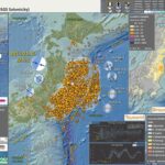
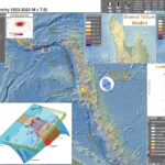
Early this morning (my time) I got a notification from the Pacific Tsunami Warning Center that there was no tsunami threat from an M 7.2 earthquake in the Vanuatu Islands.

Later, as I woke up I checked the USGS website to see that there was an M7.0 earthquake offshore of the Vanuatu Islands.

https://earthquake.usgs.gov/earthquakes/eventpage/us7000j2yw/executive

Based on the depth of the hypocenter (the 3-D location of the earthquake) it appears that this M 7.0 ruptured a thrust fault within the Australia plate. Given the uncertainty of the location of the megathrust fault, it is possible that this actually was on the megathrust subduction zone fault (so is what we call an “interface” event). I don’t think that the USGS finite fault model is correct (it seems unlikely that this earthquake ruptured a fault within the Australia plate and slipped up into the upper plate). But I could be wrong (which is quite common).

I don’t always have the time to write a proper Earthquake Report. However, I prepare interpretive posters for these events.
Because of this, I present Earthquake Report Lite. (but it is more than just water, like the adult beverage that claims otherwise). I will try to describe the figures included in the poster, but sometimes I will simply post the poster here. (UPDATE: I could not resist spending a little time looking at updated papers from this region, so have included some figures below.)

Below is my interpretive poster for this earthquake

  • I plot the seismicity from the past month, with diameter representing magnitude (see legend). I include earthquake epicenters from 1921-2021 with magnitudes M ≥ 3.0 in one version.
  • I plot the USGS fault plane solutions (moment tensors in blue and focal mechanisms in orange), possibly in addition to some relevant historic earthquakes.
  • A review of the basic base map variations and data that I use for the interpretive posters can be found on the Earthquake Reports page. I have improved these posters over time and some of this background information applies to the older posters.
  • Some basic fundamentals of earthquake geology and plate tectonics can be found on the Earthquake Plate Tectonic Fundamentals page.

    I include some inset figures.

  • Here is the map with 3 month’s seismicity plotted.

Some Supporting Information

  • Here is the USGS poster showing the seismicity for this region from 1900-2010 (Benz et al., 2011). Below I include the legend (not the correct scale; click on this link for the entire poster (65 MB pdf)). Note the cross section F-F’ which I plot on the poster above.


  • Here is the cross section F-F’ again, with the legend below.


  • Here are some figures from Bergeot et al., 2009.
  • This first figure shows the tectonic setting and the plate convergence rates (the rates, in mm/year, that the Australia plate is converging relative to the North Fiji Basin.

  • (a) Geodynamic setting of the VSZ, with block motions relative to the North Fiji Basin [from Calmant et al., 2003]. The Vanuatu arc is split into three blocks, with anticlockwise rotation (north), convergence (center), and clockwise rotation (south). Dashed line is the BATB; solid lines are the spreading ridge; bold line is the VSZ. Bathymetry data are from Calmant et al. [2002]. The black rectangle is the central part of the Vanuatu arc. White arrows are velocities (millimeters per year) with respect to the Australian plate (AP); black arrows are block motion with respect to the North Fiji Basin. Dotted line is the cross section of Figure 2b. (b) Schematic of the central part of the VSZ [from Lagabrielle et al., 2003]. The direction of this cross section is west to east, and it intersects the Santo and Maewo Islands (dotted line in Figure 2a). Abbreviations are as follows: IAB, Aoba Intra-arc Basin; BATB, back-arc thrust belt; NFB, North Fiji Basin.

  • This figure shows the horizontal motion rates (in mm/year) for the GPS sites in the region.

  • Horizontal interseismic GPS velocities for the VSZ in an Australia-fixed reference frame. The Australian motion is estimated as a rigid rotation from our GPS results with a least squares inversion. Abbreviations are as follows: WTP, West Torres Plateau; DER, D’Entrecasteaux Ridge. Lines are (1) BATB, (2) spreading ridge, (3) VSZ, (4) discontinuity supposed between TGOA and Epi island, and (5) transition zone.

  • This figure shows a map where they plot, in the next figure, a comparison between their modeled vertical velocities with the observed vertical velocities.

  • Transects and GPS stations used to assess the locked zone parameters in this study. Shaded triangles represent the A-A0 (TNMR, LVMP, LMBU, WLRN, SWBY, VMVS, NSUP, RNSR, and AMBR) transect GPS stations, and solid triangles represent the B-B0 transect GPS stations (LISB, TASM, AVNA, RATA, RATU, SANC, AOBA, PNCT, and MAWO). The bold lines represent the A-A0 and B-B0 transects. The white arrows show the convergence direction. Abbreviations are as follows: DER, D’Entrecasteaux Ridge; WTP, Wet Torres Plateau. The stars indicate the edge of the locked zone as deduced from the GPS velocity interpretation (Figure 12). Lines are (1) BATB and (2) VSZ.

  • This figure shows the comparison between their modeled velocities and the observed velocities.

  • (top) Vertical and (bottom) horizontal (perpendicular to the trench) velocity profiles for the GPS stations of the A-A0 (open circle) and B-B0 (filled circle) transects. Distances are given with respect to the trench. The bold curves represent the best fit of the locked zone and long-term convergence rate model (dip, 20; width, 50 km; slip, 54 mm a1) estimated from observed velocities. Lines 2 and 3 represent the effect of the width variation in the model (45 and 60 km, respectively). See Figure 11 for the transect location.

  • Here are the two figures from Cleveland et al. (2014).
  • Figure 1. I include the figure caption below as a blockquote.

  • (left) Seismicity of the northern Vanuatu subduction zone, displaying all USGS-NEIC earthquake hypocenters since 1973. The Australian plate subducts beneath the Pacific in nearly trench-orthogonal convergence along the Vanuatu subduction zone. The largest events are displayed with dotted outlines of the magnitude-scaled circle. Convergence rates are calculated using the MORVEL model for Australia Plate relative to Pacific Plate [DeMets et al., 2010]. (right) All GCMT moment tensor solutions and centroids for Mw ≥ 5 since 1976, scaled with moment. This region experiences abundant moderate and large earthquakes but lacks any events with Mw >8 since at least 1900.

  • Figure 17. I include the figure caption below as a blockquote.

  • One hundred day aftershock distributions of all earthquakes listed in the ISC catalog for the 1966 sequence and in the USGS-NEIC catalog for the 1980, 1997, 2009, and 2013 sequences in northern Vanuatu. The 1966 main shocks are plotted at locations listed by Tajima et al. [1990]. Events of the 1997 and 2009 sequences were relocated using the double difference method [Waldhauser and Ellsworth, 2000] for P wave first arrivals based on EDR picks. The event symbol areas are scaled relative to the earthquake magnitudes based on a method developed by Utsu and Seki [1954]. Hypocenters of most aftershock events occurred at <50 km depth.

  • Figure 17. I include the figure caption below as a blockquote.

  • (right) Space-time plot of shallow (≤ 70 km) seismicity M ≥ 5.0 in northern Vanuatu recorded in the NEIC catalog as a function of distance south of ~10°N, 165.25°E. (left) The location of the seismicity on a map rotated to orient the trench vertically.

  • Craig et al. (2014) evaluated the historic record of seismicity for subduction zones globally. In particular, the evaluated the relations between upper and lower plate stresses and earthquake types (cogent for the southern New Hebrides trench). Below is a figure from their paper for this part of the world. I include their figure caption below in blockquote.

  • Outer-rise seismicity along the New Hebrides arc. (a) Seismicity and focal mechanisms. Seismicity at the southern end of the arc is dominated by two major outer-rise normal faulting events, and MW 7.6 on 1995 May 16 and an MW 7.1 on 2004 January 3. Earthquakes are included from Chapple & Forsyth (1979); Chinn & Isacks (1983); Liu & McNally (1993). (b) Time versus latitude plot.

  • Here is a summary figure from Craig et al. (2014) that shows different stress configurations possibly existing along subduction zones.

  • Schematic diagram for the factors influencing the depth of the transition from horizontal extension to horizontal compression beneath the outer rise. Slab pull, the interaction of the descending slab with the 660 km discontinuity (or increasing drag from the surround mantle), and variations in the interface stress influence both the bending moment and the in-plane stress. Increases in the angle of slab dip increases the dominance of the bending moment relative to the in-plane stress, and hence moves the depth of transition towards the middle of the mechanical plate from either an shallower or a deeper position. A decrease in slab dip enhances the influence of the in-plane stress, and hence moves the transition further from the middle of the mechanical plate, either deeper for an extensional in-plane stress, or shallower for a compressional in-plane stress. Increased plate age of the incoming plate leads to increases in the magnitude of ridge push and intraplate thermal contraction, increasing the in-plane compressional stress in the plate prior to bending. Dynamic topography of the oceanic plate seawards of the trench can result in either in-plane extension or compression prior to the application of the bending stresses.

  • Here are the figures from Richards et al. (2011) with their figure captions below in blockquote.
  • Here is the map showing the current configuration of the slabs in the region.

  • Map showing distribution of slab segments beneath the Tonga-Vanuatu region. West-dipping Pacifi c slab is shown in gray; northeast-dipping Australian slab is shown in red. Three detached segments of Australian slab lie below the North Fiji Basin (NFB). HFZ—Hunter Fracture Zone. Contour interval is 100 km. Detached segments of Australian plate form sub-horizontal sheets located at ~600 km depth. White dashed line shows outline of the subducted slab fragments when reconstructed from 660 km depth to the surface. When all subducted components are brought to the surface, the geometry closely approximates that of the North Fiji Basin.

  • This is the cross section showing the megathrust fault configuration based on seismic tomography and seismicity.

  • Previous interpretation of combined P-wave tomography and seismicity from van der Hilst (1995). Earthquake hypocenters are shown in blue. The previous interpretation of slab structure is contained within the black dashed lines. Solid red lines mark the surface of the Pacifi c slab (1), the still attached subducting Australian slab (2a), and the detached segment of the Australian plate (2b). UM—upper mantle;
    TZ—transition zone; LM—lower mantle.

  • Here is their time step interpretation of the slabs that resulted in the second figure above.

  • Simplifi ed plate tectonic reconstruction showing the progressive geometric evolution of the Vanuatu and Tonga subduction systems in plan view and in cross section. Initiation of the Vanuatu subduction system begins by 10 Ma. Initial detachment of the basal part of the Australian slab begins at ca. 5–4 Ma and then sinking and collision between the detached segment and the Pacifi c slab occur by 3–4 Ma. Initial opening of the Lau backarc also occurred at this time. Between 3 Ma and the present, both slabs have been sinking progressively to their current position. VT—Vitiaz trench; dER—d’Entrecasteaux Ridge.

  • Here are two great figures from Deng et al. (2022). This article focuses on the influence of the D’Entrecasteaux Ridge on subduction here in Vanuatu. They focus on geochemical data from magmatic rocks in the area.
  • This one shows a variety of processes going on in this area.

  • Geological and geophysical constraints regarding the evolution of the Vanuatu arc. (a) Bathymetric map showing the locations of islands for which samples were included in our geochemical compilation. Slab dip contours below the Vanuatu arc are displayed every 20° (from Hayes et al., 2018). (b) Bathymetric map of the Vanuatu arc and an inset showing depth-to-slab versus distance-from-trench for each of the sample localities included in our compilation (Table S1 in Supporting Information S1). Slab depth contours beneath the Vanuatu arc are displayed every 20 km (from Hayes et al., 2018). The orange lines show the chosen cross sections (i.e., Sections A, B, C) across the different blocks of the Vanuatu arc, which were used to estimate slab dips. Orange dots denote the location of Deep Sea Drilling Project Site 286 and Ocean Drilling Program Legs 134 Sites 828 and 831. (c) Interpreted geodynamic setting of the Vanuatu arc based on modern global positioning system velocity measurements (observed, black arrows; modeled, white arrows; from Bergeot et al., 2009). The Vanuatu arc can be divided into three tectonic blocks that are separated by two strike-slip faults (magenta dashed lines; Calmant et al., 2003; Taylor et al., 1995), which are the counterclockwise rotated Northern Block, the eastward migrated Central Block and the clockwise rotated Southern Block. Orange arrows indicate plate convergence velocities (in mm/year) with respect to the Australian plate (Bergeot et al., 2009). (d) Intermediate-depth seismicity distribution (50–170 km) since 1972 with magnitudes in the range of 4–7, from USGS Earthquake Catalog (https://earthquake.usgs.gov/earthquakes/search/). The seismic gap is highlighted by a solid polygon. The wide red arrow depicts the influx of hot sub-slab mantle to the forearc mantle wedge through a slab tear.


  • Schematic of the Vanuatu subduction zone to illustrate the model proposed by this study. The conceptual model highlights the role that the subducting buoyant D’Entrecasteaux ridge plays in the dynamic evolution of the Vanuatu arc. The introduction of D’Entrecasteauz Ridge causes shallow subduction and the development of a slab tear south of the ridge and the segmentation of the Vanuatu arc into the Northern Block, Central Block and Southern Block. Shallow slab subduction beneath the Central Block results in (a) squeezing out of the asthenospheric mantle; (b) scraping off the bottom of the ancient continental lithospheric mantle beneath the forearc, which then migrates ahead of the advancing slab and forms a bulldozed keel underneath the main-arc and (c) transmitting compressional stresses in the over-riding plate, which inhibits the formation of backarc spreading and instead produces a backarc thrust belt. Additionally, the ingression of hot subslab mantle causes partial melting of the cold forearc mantle and produces magmatism anomalously close to the trench (i.e., the Efate, Nguna, and Pele volcanoes that are situated in the forearc).

  • Here is a video that shows a simulation from Deng et al. (2022).
    • Baillard et al. (2015) provide some insight into the geometry of the Australia plate slab. I am adjusting my hypothesis to be that this M 7.0 probably was on the megathrust, based on their work.
    • This first figure shows a map and some cross sections.
    • Note how cross section 4 is really close to the M 7.0. This geometry places the top of the slab below the M 7.0 hypocenter.

    • Geometry of the subduction interface and updip/downdip extents of the seismogenic zone. (a) Map view. The green contour is at 27 km depth and marks the intersection with the fore-arc Moho. The dashed contours present the updip and downdip extents of the seismogenic zone. The numbered lines showthe location of cross sections plotted to the right. NDR: north d’Entrecasteaux ridge; BS: Bougainville seamount. (b) Geometric cross sections of the subduction interface (depth as a function of distance from the subduction front). (c) Dip cross sections (dip angle as a function of distance from the subduction front).

    • This figure shows how they interpret the seismicity in this area.

    • Cross section of seismic activity through the center of our total catalog (only events with residuals <0.2 s are plotted). Three clusters of activity are observed: (1) around the subduction interface (green), (2) within the subducting plate beneath the subduction interface (red), and (3) at intermediate depths (blue). The dotted line is our interpretation of the subduction interface.

    • This figure shows some specific earthquakes they used in their analyses. Earthquake 1 (pink) is really close to the M 7.0. They interpret that event to be in the upper part of the Australia plate. At this point, I suggest that it is equivocal, about whether or not the M 7.0 was an interface event or a slab or crustal event.

    • Clusters and focal mechanisms in the local catalog. Simple focal mechanisms are illustrated in black, composite focal mechanisms in colors corresponding to the cluster events (circles). P axes indicated in red. (a) Map view. The boxes indicate the orientation and dimensions of the cross sections. (b) Cross section beneath Santo Island. (c) Cross section between Santo and Malekula Islands. The cross sections also show the picked subduction interface (thick black curve), the Australian Plate Moho (dotted line, assuming a 8 km thick crust), and the North Fiji Basin Moho (dotted line, assuming a 27 km thick fore-arc crust).

    References:

    Basic & General References

  • Frisch, W., Meschede, M., Blakey, R., 2011. Plate Tectonics, Springer-Verlag, London, 213 pp.
  • Hayes, G., 2018, Slab2 – A Comprehensive Subduction Zone Geometry Model: U.S. Geological Survey data release, https://doi.org/10.5066/F7PV6JNV.
  • Holt, W. E., C. Kreemer, A. J. Haines, L. Estey, C. Meertens, G. Blewitt, and D. Lavallee (2005), Project helps constrain continental dynamics and seismic hazards, Eos Trans. AGU, 86(41), 383–387, , https://doi.org/10.1029/2005EO410002. /li>
  • Jessee, M.A.N., Hamburger, M. W., Allstadt, K., Wald, D. J., Robeson, S. M., Tanyas, H., et al. (2018). A global empirical model for near-real-time assessment of seismically induced landslides. Journal of Geophysical Research: Earth Surface, 123, 1835–1859. https://doi.org/10.1029/2017JF004494
  • Kreemer, C., J. Haines, W. Holt, G. Blewitt, and D. Lavallee (2000), On the determination of a global strain rate model, Geophys. J. Int., 52(10), 765–770.
  • Kreemer, C., W. E. Holt, and A. J. Haines (2003), An integrated global model of present-day plate motions and plate boundary deformation, Geophys. J. Int., 154(1), 8–34, , https://doi.org/10.1046/j.1365-246X.2003.01917.x.
  • Kreemer, C., G. Blewitt, E.C. Klein, 2014. A geodetic plate motion and Global Strain Rate Model in Geochemistry, Geophysics, Geosystems, v. 15, p. 3849-3889, https://doi.org/10.1002/2014GC005407.
  • Meyer, B., Saltus, R., Chulliat, a., 2017. EMAG2: Earth Magnetic Anomaly Grid (2-arc-minute resolution) Version 3. National Centers for Environmental Information, NOAA. Model. https://doi.org/10.7289/V5H70CVX
  • Müller, R.D., Sdrolias, M., Gaina, C. and Roest, W.R., 2008, Age spreading rates and spreading asymmetry of the world’s ocean crust in Geochemistry, Geophysics, Geosystems, 9, Q04006, https://doi.org/10.1029/2007GC001743
  • Pagani,M. , J. Garcia-Pelaez, R. Gee, K. Johnson, V. Poggi, R. Styron, G. Weatherill, M. Simionato, D. Viganò, L. Danciu, D. Monelli (2018). Global Earthquake Model (GEM) Seismic Hazard Map (version 2018.1 – December 2018), DOI: 10.13117/GEM-GLOBAL-SEISMIC-HAZARD-MAP-2018.1
  • Silva, V ., D Amo-Oduro, A Calderon, J Dabbeek, V Despotaki, L Martins, A Rao, M Simionato, D Viganò, C Yepes, A Acevedo, N Horspool, H Crowley, K Jaiswal, M Journeay, M Pittore, 2018. Global Earthquake Model (GEM) Seismic Risk Map (version 2018.1). https://doi.org/10.13117/GEM-GLOBAL-SEISMIC-RISK-MAP-2018.1
  • Zhu, J., Baise, L. G., Thompson, E. M., 2017, An Updated Geospatial Liquefaction Model for Global Application, Bulletin of the Seismological Society of America, 107, p 1365-1385, https://doi.org/0.1785/0120160198
  • Specific References

  • Baillard, C., W. C. Crawford, V. Ballu, M. Régnier, B. Pelletier, and E. Garaebiti (2015), Seismicity and shallow slab geometry in the central Vanuatu subduction zone, J. Geophys. Res. Solid Earth,120,5606–5623, https://doi.org/10.1002/2014JB011853
  • Benz, H.M., Herman, Matthew, Tarr, A.C., Furlong, K.P., Hayes, G.P., Villaseñor, Antonio, Dart, R.L., and Rhea, Susan, 2011. Seismicity of the Earth 1900–2010 eastern margin of the Australia plate: U.S. Geological Survey Open-File Report 2010–1083-I, scale 1:8,000,000.
  • Bergeot, N., M. N. Bouin, M. Diament, B. Pelletier, M. Re´gnier, S. Calmant, and V. Ballu (2009), Horizontal and vertical interseismic velocity fields in the Vanuatu subduction zone from GPS measurements: Evidence for a central Vanuatu locked zone, J. Geophys. Res., 114, B06405, https://doi.org/10.1029/2007JB005249
  • Cleveland, K.M., Ammon, C.J., and Lay, T., 2014. Large earthquake processes in the northern Vanuatu subduction zone in Journal of Geophysical Research: Solid Earth, v. 119, p. 8866-8883, doi:10.1002/2014JB011289.
  • Deng, C., Jenner, F. E., Wan, B., & Li, J.-L. (2022). The influence of ridge subduction on the geochemistry of Vanuatu arc magmas. Journal of Geophysical Research: Solid Earth, 127, e2021JB022833. https://doi.org/10.1029/2021JB022833
  • Hayes, G. P., D. J. Wald, and R. L. Johnson, 2012. Slab1.0: A three-dimensional model of global subduction zone geometries, J. Geophys. Res., 117, B01302, doi:10.1029/2011JB008524.
  • Richards, S., Holm., R., Barber, G., 2011. When slabs collide: A tectonic assessment of deep earthquakes in the Tonga-Vanuatu region, Geology, v. 39, pp. 787-790.
  • Oceanic-Oceanic Subduction Zone Figure
    Music Reference (in 1900-2016 seismicity video)

  • Bumba Crossing Kevin MacLeod (incompetech.com) | Licensed under Creative Commons: By Attribution 3.0 License | http://creativecommons.org/licenses/by/3.0/

Return to the Earthquake Reports page.

Earthquake Report: M 6.9 Sumatra

While I was travelling back from a USGS Powell Center Workshop on the recurrence of earthquakes along the Cascadia subduction zone, there was an earthquake (gempa) offshore of Sumatra.

https://earthquake.usgs.gov/earthquakes/eventpage/us7000iqpn/executive

There was actually a foreshock (more than one): https://earthquake.usgs.gov/earthquakes/eventpage/us7000iq2d/executive
I need to run to catch the sunset and will complete the intro later tonight.

OK, sunset led to nap, led to bed.

The plate boundary offshore of Sumatra, Indonesia, is a convergent (moving together) plate boundary. Here, the Australia plate subducts northwards beneath the Sunda plate (part of the Eurasia plate) along a megathrust subduction zone fault. This subduction forms a deep sea trench, the Sunda trench.

This was a shallow event near the trench formed by the subduction here. The magnitude was a little small for generating a large tsunami. However, it was shallow, so the deformation reached the sea floor and generated tsunami recorded on several tide gages in the region.

These gages are operated by the Indonesian Geospatial Reference System, though there are some gages that are posted on the European Union World Sea Levels website.

The water surface elevation data was a little noisy on these tide gage plots, but two of them had sufficient signal to justify my interpretation that these are tsunami. My interpretations could be incorrect and I include two plots below.

  • Here are the tide gage data. I label the locations for these two gage sites on the interpretive poster.


Many are familiar with the Boxing Day Earthquake and Tsunami from December 2004. This is one of the most deadly events in modern history, almost a quarter million people perished (mostly from the tsunami).

These lives lost did lead to changes in how tsunami risk is managed worldwide. So, these lives lost were not lost in vain (though it would be better if they were not lost, we can all agree to that).

The southern Sumatra subduction zone has an excellent record of prehistoric and historic earthquakes. For example, there is a couplet where earthquake slips overlapped slightly, the 1797 and 1833 earthquakes.

Many think that this area is the next place a large tsunamigenic earthquake may occur. Below we can see the analysis from Chlieh et al. (2008) where they suggest that there is considerable tectonic strain accumulated since these 1797 and 1833 earthquakes. There have been several large earthquakes in this area but they may not have released this strain.

If we look at the Chlieh et al. (2008) study, we will notice that this M 6.9 earthquake happened in an area thought to be in an area that is not accumulating much tectonic strain. I post a figure showing this later in the report.

There are millions of people who live in the coastal lowlands of Padang who may have difficulty evacuating in time should an earthquake like the 2004 Sumatra-Andaman subduction zone earthquake were to occur in this area.

For those that live along the coast here, the ground shaking from the earthquake is their natural notification to evacuate to high ground. For those that live across the ocean, they will get warning notifications to help them learn to evacuate since they won’t have the ground shaking as a warning. This is what happened to many people in December 2004 along the east coast of India and along the coast of Sri Lanka.

Below is my interpretive poster for this earthquake

  • I plot the seismicity from the past month, with diameter representing magnitude (see legend). I include earthquake epicenters from 1922-2022 with magnitudes M ≥ 6.5 in one version.
  • I plot the USGS fault plane solutions (moment tensors in blue and focal mechanisms in orange), possibly in addition to some relevant historic earthquakes.
  • A review of the basic base map variations and data that I use for the interpretive posters can be found on the Earthquake Reports page. I have improved these posters over time and some of this background information applies to the older posters.
  • Some basic fundamentals of earthquake geology and plate tectonics can be found on the Earthquake Plate Tectonic Fundamentals page.

    I include some inset figures. Some of the same figures are located in different places on the larger scale map below.

  • In the upper right corner is a map showing historic seismicity, fault lines, and the global strain rate map (red shows area of higher tectonic strain).
  • To the left of the strain map is a figure that shows historic earthquake rupture areas and a representation of how strongly the megathrust subduction fault is (Chlieh et al., 2008).
  • In the upper left corner are maps that show the seismic hazard and seismic risk for Indonesia. I spend more time explaining this below.
  • In the center top-left is a map that shows earthquake intensity using the Modified Mercalli Intensity (MMI) Scale.
  • In the lower left center is a low angle oblique view of a cut away of the Earth along the subduction zone in Sumatra, Indonesia from EOS.
  • Above the oblique view is a plot of the tide gage from Cocos, Island.
  • In the right center is a great figure from Philobosian et al. (2014) that shows the slip patches from the subduction zone earthquakes in this region.
  • Here is the map with 3 month’s seismicity plotted.

Other Report Pages

Some Relevant Discussion and Figures

  • Here is my map. I include the references below in blockquote.

  • Sumatra core location and plate setting map with sedimentary and erosive systems figure. A. India-Australia plate subducts northeastwardly beneath the Sunda plate (part of Eurasia) at modern rates (GPS velocities are based on regional modeling of Bock et al, 2003 as plotted in Subarya et al., 2006). Historic earthquake ruptures (Bilham, 2005; Malik et al., 2011) are plotted in orange. 2004 earthquake and 2005 earthquake 5 meter slip contours are plotted in orange and green respectively (Chlieh et al., 2007, 2008). Bengal and Nicobar fans cover structures of the India-Australia plate in the northern part of the map. RR0705 cores are plotted as light blue. SRTM bathymetry and topography is in shaded relief and colored vs. depth/elevation (Smith and Sandwell, 1997). B. Schematic illustration of geomorphic elements of subduction zone trench and slope sedimentary settings. Submarine channels, submarine canyons, dune fields and sediment waves, abyssal plain, trench axis, plunge pool, apron fans, and apron fan channels are labeled here. Modified from Patton et al. (2013 a).

  • This is the main figure from Hayes et al. (2013) from the Seismicity of the Earth series. There is a map with the slab contours and seismicity both colored vs. depth. There are also some cross sections of seismicity plotted, with locations shown on the map.

  • Here is a great figure from Philobosian et al. (2014) that shows the slip patches from the subduction zone earthquakes in this region.

  • Map of Southeast Asia showing recent and selected historical ruptures of the Sunda megathrust. Black lines with sense of motion are major plate-bounding faults, and gray lines are seafloor fracture zones. Motions of Australian and Indian plates relative to Sunda plate are from the MORVEL-1 global model [DeMets et al., 2010]. The fore-arc sliver between the Sunda megathrust and the strike-slip Sumatran Fault becomes the Burma microplate farther north, but this long, thin strip of crust does not necessarily all behave as a rigid block. Sim = Simeulue, Ni = Nias, Bt = Batu Islands, and Eng = Enggano. Brown rectangle centered at 2°S, 99°E delineates the area of Figure 3, highlighting the Mentawai Islands. Figure adapted from Meltzner et al. [2012] with rupture areas and magnitudes from Briggs et al. [2006], Konca et al. [2008], Meltzner et al. [2010], Hill et al. [2012], and references therein.

  • This is a figure from Philobosian et al. (2012) that shows a larger scale view for the slip patches in this region. Note that today’s earthquake happened at the edge of the 7.9 earthquake slip patch.

  • Recent and ancient ruptures along the Mentawai section of the Sunda megathrust. Colored patches are surface projections of 1-m slip contours of the deep megathrust ruptures on 12–13 September 2007 (pink to red) and the shallow rupture on 25 October 2010 (green). Dashed rectangles indicate roughly the sections that ruptured in 1797 and 1833. Ancient ruptures are adapted from Natawidjaja et al. [2006] and recent ones come from Konca et al. [2008] and Hill et al. (submitted manuscript, 2012). Labeled points indicate coral study sites Sikici (SKC), Pasapuat (PSP), Simanganya (SMY), Pulau Pasir (PSR), and Bulasat (BLS).

  • Here are a series of figures from Chlieh et al. (2008 ) that show their data sources and their modeling results. I include their figure captions below in blockquote.
  • This figure shows the coupling model (on the left) and the source data for their inversions (on the right). Their source data are vertical deformation rates as measured along coral microattols. These are from data prior to the 2004 SASZ earthquake.

  • Distribution of coupling on the Sumatra megathrust derived from the formal inversion of the coral and of the GPS data (Tables 2, 3, and 4) prior to the 2004 Sumatra-Andaman earthquake (model I-a in Table 7). (a) Distribution of coupling on the megathrust. Fully coupled areas are red, and fully creeping areas are white. Three strongly coupled patches are revealed beneath Nias island, Siberut island, and Pagai island. The annual moment deficit rate corresponding to that model is 4.0 X 10^20 N m/a. (b) Observed (black vectors) and predicted (red vectors) horizontal velocities appear. Observed and predicted vertical displacements are shown by color-coded large and small circles, respectively. The Xr^2 of this model is 3.9 (Table 7).

  • This is a similar figure, but based upon observations between June 2005 and October 2006.

  • Distribution of coupling on the Sumatra megathrust derived from the formal inversion of the horizontal velocities and uplift rates derived from the CGPS measurements at the SuGAr stations (processed at SOPAC). To reduce the influence of postseismic deformation caused by the March 2005 Nias-Simeulue rupture, velocities were determined for the period between June 2005 and October 2006. (a) Distribution of coupling on the megathrust. Fully coupled areas are red and fully creeping areas are white. This model reveals strong coupling beneath the Mentawai Islands (Siberut, Sipora, and Pagai islands), offshore Padang city, and suggests that the megathrust south of Bengkulu city is creeping at the plate velocity. (b) Comparison of observed (green) and predicted (red) velocities. The Xr^2 associated to that model is 24.5 (Table 8).

  • This is a similar figure, but based on all the data.

  • Distribution of coupling on the Sumatra megathrust derived from the formal inversion of all the data (model J-a, Table 8). (a) Distribution of coupling on the megathrust. Fully coupled areas are red, and fully creeping areas are white. This model shows strong coupling beneath Nias island and beneath the Mentawai (Siberut, Sipora and Pagai) islands. The rate of accumulation of moment deficit is 4.5 X 10^20 N m/a. (b) Comparison of observed (black arrows for pre-2004 Sumatra-Andaman earthquake and green arrows for post-2005 Nias earthquake) and predicted velocities (in red). Observed and predicted vertical displacements are shown by color-coded large and small circles (for the corals) and large and small diamonds (for the CGPS), respectively. The Xr^2 of this model is 12.8.

  • Here is the figure I included in the poster above.

  • Comparison of interseismic coupling along the megathrust with the rupture areas of the great 1797, 1833, and 2005 earthquakes. The southernmost rupture area of the 2004 Sumatra-Andaman earthquake lies north of our study area and is shown only for reference. Epicenters of the 2007 Mw 8.4 and Mw 7.9 earthquakes are also shown for reference. (a) Geometry of the locked fault zone corresponding to forward model F-f (Figure 6c). Below the Batu Islands, where coupling occurs in a narrow band, the largest earthquake for the past 260 years has been a Mw 7.7 in 1935 [Natawidjaja et al., 2004; Rivera et al., 2002]. The wide zones of coupling, beneath Nias, Siberut, and Pagai islands, coincide well with the source of great earthquakes (Mw > 8.5) in 2005 from Konca et al. [2007] and in 1797 and 1833 from Natawidjaja et al. [2006]. The narrow locked patch beneath the Batu islands lies above the subducting fossil Investigator Fracture Zone. (b) Distribution of interseismic coupling corresponding to inverse model J-a (Figure 10). The coincidence of the high coupling area (orange-red dots) with the region of high coseismic slip during the 2005 Nias-Simeulue earthquake suggests that strongly coupled patches during interseismic correspond to seismic asperities during megathrust ruptures. The source regions of the 1797 and 1833 ruptures also correlate well with patches that are highly coupled beneath Siberut, Sipora, and Pagai islands.

  • Here is the Chlieh et al. (2008) figure with the 18 November 2022 M 6.9 earthquake plotted as a blue star.
  • Note how the M 6.9 happened in a region of low seismogenic coupling. Beware that this is also in an area without any geodetic (GPS/GNSS) nor paleogeodetic (coral microattol) observations (the sources of data for the coupling model).

  • This figure shows the authors’ estimate for the moment deficit in this region of the subduction zone. This is an estimate of how much the plate convergence rate, that is estimated to accumulate as tectonic strain, will need to be released during subduction zone earthquakes.

  • Latitudinal distributions of seismic moment released by great historical earthquakes and of accumulated deficit of moment due to interseismic locking of the plate interface. Values represent integrals over half a degree of latitude. Accumulated interseismic deficits since 1797, 1833, and 1861 are based on (a) model F-f and (b) model J-a. Seismic moments for the 1797 and 1833 Mentawai earthquakes are estimated based on the work by Natawidjaja et al. [2006], the 2005 Nias-Simeulue earthquake is taken from Konca et al. [2007], and the 2004 Sumatra-Andaman earthquake is taken from Chlieh et al. [2007]. Postseismic moments released in the month that follows the 2004 earthquake and in the 11 months that follows the Nias-Simeulue 2005 earthquake are shown in red and green, respectively, based on the work by Chlieh et al. [2007] and Hsu et al. [2006].

  • For a review of the 2004 and 2005 Sumatra Andaman subduction zone (SASZ) earthquakes, please check out my Earthquake Report here. Below is the poster from that report. On that report page, I also include some information about the 2012 M 8.6 and M 8.2 Wharton Basin earthquakes.
    • I include some inset figures in the poster.
    • In the upper left corner, I include a map that shows the extent of historic earthquakes along the SASZ offshore of Sumatra. This map is a culmination of a variety of papers (summarized and presented in Patton et al., 2015).
    • In the upper right corner I include a figure that is presented by Chlieh et al. (2007). These figures show model results from several models. Each model is represented by a map showing the amount that the fault slipped in particular regions. I present this figure below.
    • In the lower right corner I present a figure from Prawirodirdjo et al. (2010). This figure shows the coseismic vertical and horizontal motions from the 2004 and 2005 earthquakes as measured at GPS sites.
    • In the lower left corner are the MMI intensity maps for the two SASZ earthquakes. Note these are at different map scales. I also include the MMI attenuation curves for these earthquakes below the maps. These plots show the reported MMI intensity data as they relate to two plots of modeled estimates (the orange and green lines). These green dots are from the USGS “Did You Feel It?” reports compared to the estimates of ground shaking from Ground Motion Prediction Equation (GMPE) estimates. GMPE are empirical relations between earthquakes and recorded seismologic observations from those earthquakes, largely controlled by distance to the fault, ray path (direction and material properties), and site effects (the local geology). When seismic waves propagate through sediment, the magnitude of the ground motions increases in comparison to when seismic waves propagate through bedrock. The orange line is a regression of data for the central and eastern US and the green line is a regression through data from the western US.


  • Here is a map from Jacob et a. (2014) that shows the structure of the eastern Indian Ocean. Figure text below.

  • Free-air gravity anomaly map derived from satellite altimetry [Sandwell and Smith, 2009] over the Wharton Basin area.

  • Here is the map from Jacobs et a. (2014). Figure text below.

  • Structure and age of the Wharton Basin deduced from free-air gravity anomaly [Sandwell and Smith, 2009; background colors] for the fracture zones (thin black longitudinal lines), and marine magnetic anomaly profiles (not shown) for the isochrons (thin black latitudinal lines). The plain colors represent the oceanic lithosphere created during normal geomagnetic polarity intervals (see legend for the ages of Chrons 20 to 34 according to the time scale of Gradstein et al. [2004]). Compartments separated by major fracture zones are labeled A to H. Grey areas: oceanic plateaus, thick black line: Sunda Trench subduction zone.

  • This is a fascinating figure from Jacob et al. (2014). This shows a reconstruction of the magntic anomalies for the oceanic crust as they are subducted beneath Eurasia.

  • Reconstitution of the subducted magnetic isochrons and fracture zones of the northern Wharton Basin using the finite rotation parameters deduced from our two- and three-plate reconstructions. (a) First the geometry is restored on the Earth surface, then (b) it is draped on the top of the subducting plate as derived from seismic tomography [Pesicek et al., 2010] shown by the thin dotted lines at intervals of 100 km (b). Colored dots: identified magnetic anomalies; colored triangles: rotated magnetic anomalies, solid lines; observed fracture zones and isochrons, dashed lines: uncertain or reconstructed fracture zones, dotted lines: reconstructed isochrons from rotated magnetic anomalies (two-plate and three-plate reconstructions), colored area: oceanic lithosphere created during normal geomagnetic polarity intervals (see legend for the ages; the colored areas without solid or dotted lines have been interpolated), grey areas: oceanic plateaus, thick line: Sunda Trench subduction zone.

  • Finally, these authors present what their reconstruction implicates about this plate boundary system.

  • The deviation of the Sunda Trench from a regular arc shape (dotted lines) off Sumatra is explained by the presence of the younger, hotter and therefore lighter lithosphere in compartments C–F, which resists subduction and form an indentor (solid line). The very young compartment G was probably part of this indentor before oceanic crust formed at slow spreading rate near the Wharton fossil spreading center approached subduction: The weaker rheology of outcropping or shallow serpentinite may have favored the restoration of the accretionary prism in this area. Further south, the deviation off Java is explained by the resistance of the thicker Roo Rise, an oceanic plateau entering the subduction.

Seismic Hazard and Seismic Risk

  • These are the two maps shown in the map above, the GEM Seismic Hazard and the GEM Seismic Risk maps from Pagani et al. (2018) and Silva et al. (2018).
    • The GEM Seismic Hazard Map:


    • The Global Earthquake Model (GEM) Global Seismic Hazard Map (version 2018.1) depicts the geographic distribution of the Peak Ground Acceleration (PGA) with a 10% probability of being exceeded in 50 years, computed for reference rock conditions (shear wave velocity, VS30, of 760-800 m/s). The map was created by collating maps computed using national and regional probabilistic seismic hazard models developed by various institutions and projects, and by GEM Foundation scientists. The OpenQuake engine, an open-source seismic hazard and risk calculation software developed principally by the GEM Foundation, was used to calculate the hazard values. A smoothing methodology was applied to homogenise hazard values along the model borders. The map is based on a database of hazard models described using the OpenQuake engine data format (NRML). Due to possible model limitations, regions portrayed with low hazard may still experience potentially damaging earthquakes.
    • Here is a view of the GEM seismic hazard map for Indonesia.

    • The GEM Seismic Risk Map:


    • The Global Seismic Risk Map (v2018.1) presents the geographic distribution of average annual loss (USD) normalised by the average construction costs of the respective country (USD/m2) due to ground shaking in the residential, commercial and industrial building stock, considering contents, structural and non-structural components. The normalised metric allows a direct comparison of the risk between countries with widely different construction costs. It does not consider the effects of tsunamis, liquefaction, landslides, and fires following earthquakes. The loss estimates are from direct physical damage to buildings due to shaking, and thus damage to infrastructure or indirect losses due to business interruption are not included. The average annual losses are presented on a hexagonal grid, with a spacing of 0.30 x 0.34 decimal degrees (approximately 1,000 km2 at the equator). The average annual losses were computed using the event-based calculator of the OpenQuake engine, an open-source software for seismic hazard and risk analysis developed by the GEM Foundation. The seismic hazard, exposure and vulnerability models employed in these calculations were provided by national institutions, or developed within the scope of regional programs or bilateral collaborations.
  • Here is a view of the GEM seismic risk map for Indonesia.

Tsunami Hazard

  • Here are two maps that show the results of probabilistic tsunami modeling for the nation of Indonesia (Horspool et al., 2014). These results are similar to results from seismic hazards analysis and maps. The color represents the chance that a given area will experience a certain size tsunami (or larger).
  • The first map shows the annual chance of a tsunami with a height of at least 0.5 m (1.5 feet). The second map shows the chance that there will be a tsunami at least 3 meters (10 feet) high at the coast.

  • Annual probability of experiencing a tsunami with a height at the coast of (a) 0.5m (a tsunami warning) and (b) 3m (a major tsunami warning).

    References:

    Basic & General References

  • Frisch, W., Meschede, M., Blakey, R., 2011. Plate Tectonics, Springer-Verlag, London, 213 pp.
  • Hayes, G., 2018, Slab2 – A Comprehensive Subduction Zone Geometry Model: U.S. Geological Survey data release, https://doi.org/10.5066/F7PV6JNV.
  • Holt, W. E., C. Kreemer, A. J. Haines, L. Estey, C. Meertens, G. Blewitt, and D. Lavallee (2005), Project helps constrain continental dynamics and seismic hazards, Eos Trans. AGU, 86(41), 383–387, , https://doi.org/10.1029/2005EO410002. /li>
  • Jessee, M.A.N., Hamburger, M. W., Allstadt, K., Wald, D. J., Robeson, S. M., Tanyas, H., et al. (2018). A global empirical model for near-real-time assessment of seismically induced landslides. Journal of Geophysical Research: Earth Surface, 123, 1835–1859. https://doi.org/10.1029/2017JF004494
  • Kreemer, C., J. Haines, W. Holt, G. Blewitt, and D. Lavallee (2000), On the determination of a global strain rate model, Geophys. J. Int., 52(10), 765–770.
  • Kreemer, C., W. E. Holt, and A. J. Haines (2003), An integrated global model of present-day plate motions and plate boundary deformation, Geophys. J. Int., 154(1), 8–34, , https://doi.org/10.1046/j.1365-246X.2003.01917.x.
  • Kreemer, C., G. Blewitt, E.C. Klein, 2014. A geodetic plate motion and Global Strain Rate Model in Geochemistry, Geophysics, Geosystems, v. 15, p. 3849-3889, https://doi.org/10.1002/2014GC005407.
  • Meyer, B., Saltus, R., Chulliat, a., 2017. EMAG2: Earth Magnetic Anomaly Grid (2-arc-minute resolution) Version 3. National Centers for Environmental Information, NOAA. Model. https://doi.org/10.7289/V5H70CVX
  • Müller, R.D., Sdrolias, M., Gaina, C. and Roest, W.R., 2008, Age spreading rates and spreading asymmetry of the world’s ocean crust in Geochemistry, Geophysics, Geosystems, 9, Q04006, https://doi.org/10.1029/2007GC001743
  • Pagani,M. , J. Garcia-Pelaez, R. Gee, K. Johnson, V. Poggi, R. Styron, G. Weatherill, M. Simionato, D. Viganò, L. Danciu, D. Monelli (2018). Global Earthquake Model (GEM) Seismic Hazard Map (version 2018.1 – December 2018), DOI: 10.13117/GEM-GLOBAL-SEISMIC-HAZARD-MAP-2018.1
  • Silva, V ., D Amo-Oduro, A Calderon, J Dabbeek, V Despotaki, L Martins, A Rao, M Simionato, D Viganò, C Yepes, A Acevedo, N Horspool, H Crowley, K Jaiswal, M Journeay, M Pittore, 2018. Global Earthquake Model (GEM) Seismic Risk Map (version 2018.1). https://doi.org/10.13117/GEM-GLOBAL-SEISMIC-RISK-MAP-2018.1
  • Zhu, J., Baise, L. G., Thompson, E. M., 2017, An Updated Geospatial Liquefaction Model for Global Application, Bulletin of the Seismological Society of America, 107, p 1365-1385, https://doi.org/0.1785/0120160198
  • Specific References

  • Andrade, V. and Rajendran, K., 2014. The April 2012 Indian Ocean earthquakes: Seismotectonic context and implications for their mechanisms in Tectonophysics, v. 617, p. 126-139, http://dx.doi.org/10.1016/j.tecto.2014.01.024
  • Heidarzadeh, M., Harada, T., Satake, K., Ishibe, T., Takagawa, T., 2017. Tsunamis from strike-slip earthquakes in the Wharton Basin, northeast Indian Ocean: March 2016 Mw7.8 event and its relationship with the April 2012 Mw 8.6 event in GJI, v. 2110, p. 1601-1612, doi: 10.1093/gji/ggx395
  • Jacob, J., J. Dyment, and V. Yatheesh, 2014. Revisiting the structure, age, and evolution of the Wharton Basin to better understand subduction under Indonesia, J. Geophys. Res. Solid Earth, 119, 169–190, doi:10.1002/2013JB010285.
  • Yadav, R.K., Kundu, B., Gahalaut, K., Catherine, J., Gahalaut, V.K., Ambikapathy, A., and Naidu, MZ.S., 2013. Coseismic offsets due to the 11 April 2012 Indian Ocean earthquakes (Mw 8.6 and 8.2) derived from GPS measurements in Geophysical Research Letters, v. 40, p. 3389-3393, doi:10.1002/grl.50601
  • Wiseman, K. and Bürgmann, R., 2012. Stress triggering of the great Indian Ocean strike-slip earthquakes in a diffuse plate boundary zone in Geophysical research Letters, v. 39, L22304, doi:10.1029/2012GL053954
  • Abercrombie, R.E., Antolik, M., Ekstrom, G., 2003. The June 2000 Mw 7.9 earthquakes south of Sumatra: Deformation in the India–Australia Plate. Journal of Geophysical Research 108, 16.
  • Bassin, C., Laske, G. and Masters, G., The Current Limits of Resolution for Surface Wave Tomography in North America, EOS Trans AGU, 81, F897, 2000.
  • Bock, Y., Prawirodirdjo, L., Genrich, J.F., Stevens, C.W., McCaffrey, R., Subarya, C., Puntodewo, S.S.O., Calais, E., 2003. Crustal motion in Indonesia from Global Positioning System measurements: Journal of Geophysical Research, v. 108, no. B8, 2367, doi: 10.1029/2001JB000324.
  • Bothara, J., Beetham, R.D., Brunston, D., Stannard, M., Brown, R., Hyland, C., Lewis, W., Miller, S., Sanders, R., Sulistio, Y., 2010. General observations of effects of the 30th September 2009 Padang earthquake, Indonesia. Bulletin of the New Zealand Society for Earthquake Engineering 43, 143-173.
  • Chlieh, M., Avouac, J.-P., Hjorleifsdottir, V., Song, T.-R.A., Ji, C., Sieh, K., Sladen, A., Hebert, H., Prawirodirdjo, L., Bock, Y., Galetzka, J., 2007. Coseismic Slip and Afterslip of the Great (Mw 9.15) Sumatra-Andaman Earthquake of 2004. Bulletin of the Seismological Society of America 97, S152-S173.
  • Chlieh, M., Avouac, J.P., Sieh, K., Natawidjaja, D.H., Galetzka, J., 2008. Heterogeneous coupling of the Sumatran megathrust constrained by geodetic and paleogeodetic measurements: Journal of Geophysical Research, v. 113, B05305, doi: 10.1029/2007JB004981.
  • DEPLUS, C. et al., 1998 – Direct evidence of active derormation in the eastern Indian oceanic plate, Geology.
  • DYMENT, J., CANDE, S.C. & SINGH, S., 2007 – Oceanic lithosphere subducting beneath the Sunda Trench: the Wharton Basin revisited. European Geosciences Union General Assembly, Vienna, 15-20/05.
  • Hayes, G. P., Wald, D. J., and Johnson, R. L., 2012. Slab1.0: A three-dimensional model of global subduction zone geometries in J. Geophys. Res., 117, B01302, doi:10.1029/2011JB008524.
  • Hayes, G.P., Bernardino, Melissa, Dannemann, Fransiska, Smoczyk, Gregory, Briggs, Richard, Benz, H.M., Furlong, K.P., and Villaseñor, Antonio, 2013. Seismicity of the Earth 1900–2012 Sumatra and vicinity: U.S. Geological Survey Open-File Report 2010–1083-L, scale 1:6,000,000, https://pubs.usgs.gov/of/2010/1083/l/.
  • JACOB, J., DYMENT, J., YATHEESH, V. & BHATTACHARYA, G.C., 2009 – Marine magnetic anomalies in the NE Indian Ocean: the Wharton and Central Indian basins revisited. European Geosciences Union General Assembly, Vienna, 19-24/04.
  • Ji, C., D.J. Wald, and D.V. Helmberger, Source description of the 1999 Hector Mine, California earthquake; Part I: Wavelet domain inversion theory and resolution analysis, Bull. Seism. Soc. Am., Vol 92, No. 4. pp. 1192-1207, 2002.
  • Ishii, M., Shearer, P.M., Houston, H., Vidale, J.E., 2005. Extent, duration and speed of the 2004 Sumatra-Andaman earthquake imaged by the Hi-Net array. Nature 435, 933.
  • Kanamori, H., Rivera, L., Lee, W.H.K., 2010. Historical seismograms for unravelling a mysterious earthquake: The 1907 Sumatra Earthquake. Geophysical Journal International 183, 358-374.
  • Konca, A.O., Avouac, J., Sladen, A., Meltzner, A.J., Sieh, K., Fang, P., Li, Z., Galetzka, J., Genrich, J., Chlieh, M., Natawidjaja, D.H., Bock, Y., Fielding, E.J., Ji, C., Helmberger, D., 2008. Partial Rupture of a Locked Patch of the Sumatra Megathrust During the 2007 Earthquake Sequence. Nature 456, 631-635.
  • Maus, S., et al., 2009. EMAG2: A 2–arc min resolution Earth Magnetic Anomaly Grid compiled from satellite, airborne, and marine magnetic measurements, Geochem. Geophys. Geosyst., 10, Q08005, doi:10.1029/2009GC002471.
  • Malik, J.N., Shishikura, M., Echigo, T., Ikeda, Y., Satake, K., Kayanne, H., Sawai, Y., Murty, C.V.R., Dikshit, D., 2011. Geologic evidence for two pre-2004 earthquakes during recent centuries near Port Blair, South Andaman Island, India: Geology, v. 39, p. 559-562.
  • Meltzner, A.J., Sieh, K., Chiang, H., Shen, C., Suwargadi, B.W., Natawidjaja, D.H., Philobosian, B., Briggs, R.W., Galetzka, J., 2010. Coral evidence for earthquake recurrence and an A.D. 1390–1455 cluster at the south end of the 2004 Aceh–Andaman rupture. Journal of Geophysical Research 115, 1-46.
  • Meng, L., Ampuero, J.-P., Stock, J., Duputel, Z., Luo, Y., and Tsai, V.C., 2012. Earthquake in a Maze: Compressional Rupture Branching During the 2012 Mw 8.6 Sumatra Earthquake in Science, v. 337, p. 724-726.
  • Natawidjaja, D.H., Sieh, K., Chlieh, M., Galetzka, J., Suwargadi, B., Cheng, H., Edwards, R.L., Avouac, J., Ward, S.N., 2006. Source parameters of the great Sumatran megathrust earthquakes of 1797 and 1833 inferred from coral microatolls. Journal of Geophysical Research 111, 37.
  • Newcomb, K.R., McCann, W.R., 1987. Seismic History and Seismotectonics of the Sunda Arc. Journal of Geophysical Research 92, 421-439.
  • Philibosian, B., Sieh, K., Natawidjaja, D.H., Chiang, H., Shen, C., Suwargadi, B., Hill, E.M., Edwards, R.L., 2012. An ancient shallow slip event on the Mentawai segment of the Sunda megathrust, Sumatra. Journal of Geophysical Research 117, 12.
  • Prawirodirdjo, P., McCaffrey,R., Chadwell, D., Bock, Y, and Subarya, C., 2010. Geodetic observations of an earthquake cycle at the Sumatra subduction zone: Role of interseismic strain segmentation, JOURNAL OF GEOPHYSICAL RESEARCH, v. 115, B03414, doi:10.1029/2008JB006139
  • Rivera, L., Sieh, K., Helmberger, D., Natawidjaja, D.H., 2002. A Comparative Study of the Sumatran Subduction-Zone Earthquakes of 1935 and 1984. BSSA 92, 1721-1736.
  • Shearer, P., and Burgmann, R., 2010. Lessons Learned from the 2004 Sumatra-Andaman Megathrust Rupture, Annu. Rev. Earth Planet. Sci. v. 38, pp. 103–31
  • SATISH C. S, CARTON H, CHAUHAN A.S., et al., 2011 – Extremely thin crust in the Indian Ocean possibly resulting from Plume-Ridge Interaction, Geophysical Journal International.
  • Sieh, K., Natawidjaja, D.H., Meltzner, A.J., Shen, C., Cheng, H., Li, K., Suwargadi, B.W., Galetzka, J., Philobosian, B., Edwards, R.L., 2008. Earthquake Supercycles Inferred from Sea-Level Changes Recorded in the Corals of West Sumatra. Science 322, 1674-1678.
  • Singh, S.C., Carton, H.L., Tapponnier, P, Hananto, N.D., Chauhan, A.P.S., Hartoyo, D., Bayly, M., Moeljopranoto, S., Bunting, T., Christie, P., Lubis, H., and Martin, J., 2008. Seismic evidence for broken oceanic crust in the 2004 Sumatra earthquake epicentral region, Nature Geoscience, v. 1, pp. 5.
  • Smith, W.H.F., Sandwell, D.T., 1997. Global seafloor topography from satellite altimetry and ship depth soundings: Science, v. 277, p. 1,957-1,962.
  • Sorensen, M.B., Atakan, K., Pulido, N., 2007. Simulated Strong Ground Motions for the Great M 9.3 Sumatra–Andaman Earthquake of 26 December 2004. BSSA 97, S139-S151.
  • Subarya, C., Chlieh, M., Prawirodirdjo, L., Avouac, J., Bock, Y., Sieh, K., Meltzner, A.J., Natawidjaja, D.H., McCaffrey, R., 2006. Plate-boundary deformation associated with the great Sumatra–Andaman earthquake: Nature, v. 440, p. 46-51.
  • Tolstoy, M., Bohnenstiehl, D.R., 2006. Hydroacoustic contributions to understanding the December 26th 2004 great Sumatra–Andaman Earthquake. Survey of Geophysics 27, 633-646.
  • Zhu, Lupei, and Donald V. Helmberger. “Advancement in source estimation techniques using broadband regional seismograms.” Bulletin of the Seismological Society of America 86.5 (1996): 1634-1641.

Return to the Earthquake Reports page.

Earthquake Report: M 7.3 Tonga trench outer rise

Early this morning I received some notifications of earthquakes along the Tonga trench (southwestern central Pacific Ocean). It was about 2am my local time.

I work on the tsunami program for the California state tsunami program (CTP) and we respond to tsunami to (1) help local communities do their first response activities so that they can help reduce suffering and to (2) document the impact of these tsunami.

Because of this work, our team is “at the ready” 24 hours a day, 7 days a week, to respond to these events. Luckily, this event was unlikely to generate a tsunami that would impact California. I went back to sleep.

This morning I put together a report and checked to see if there was a tsunami generated. Here is one place that I check for tsunami records as observed on tide gages http://www.ioc-sealevelmonitoring.org/map.php. I did not see anything convincing.

This earthquake, from last night my time, has a magnitude of M 7.3.

https://earthquake.usgs.gov/earthquakes/eventpage/us7000ip0l/executive

This area of the Earth has a plate boundary fault system called a subduction zone. A subduction zone is a convergent plate boundary, which means that the plates on either side of the boundary move towards each other.

Here, the Pacific plate dives westwards beneath the Australia plate, forming the Tonga trench. Below is a schematic illustration showing what these plates may look like if we cut into the Earth and viewed this subduction zone from the side. Note the Pacific plate on the right and the Australia plate on the left, with the megathrust subduction zone fault where they meet.

This illustration shows where earthquakes may happen along this plate boundary. There could be interface earthquakes along the megathrust fault (megathrust earthquakes). These are what most people are familiar with when they are thinking about tsunami (e.g., the 2011 Great East Japan Earthquake and Tsunami).

In the upper plate (the Australia plate), there can be crustal fault earthquakes. In the lower plate (the Pacific plate) there can be slab earthquakes (events within the crust, aka the slab), and there can be outer rise earthquakes).

The outer rise is a part of the plate that is warping up and down because of the forces adjacent to the subduction zone. This warping can cause extension in the upper part, and compression in the lower part, of this plate.

This 11 Nov 2022 M 7.3 earthquake was a compressional (reverse) earthquake in the outer rise region of this plate boundary. It was pretty deep (for oceanic crust) so fits nicely in the correct place in this illustration:


But megathrust earthquakes are not the only type of earthquake that can cause a tsunami. The 2009 magnitude M 8.1 extensional (normal) fault earthquake near Samoa and American Samoa caused a tsunami that inundated the nearby islands (causing lots of damage and human suffering). This tsunami also travelled across the Pacific Ocean to impact California! (This is why the California Tsunami Program monitors tsunami across the Pacific Basin, so that we can help reduce suffering through the evacuation of coastal areas. Remember, the entire coast of California is a Tsunami Hazard Area.)

Below is my interpretive poster for this earthquake

  • I plot the seismicity from the past month, with diameter representing magnitude (see legend). I include earthquake epicenters from 1922-2022 with magnitudes M ≥ 7.0 in one version.
  • I plot the USGS fault plane solutions (moment tensors in blue and focal mechanisms in orange), possibly in addition to some relevant historic earthquakes.
  • A review of the basic base map variations and data that I use for the interpretive posters can be found on the Earthquake Reports page. I have improved these posters over time and some of this background information applies to the older posters.
  • Some basic fundamentals of earthquake geology and plate tectonics can be found on the Earthquake Plate Tectonic Fundamentals page.

    I include some inset figures. Some of the same figures are located in different places on the larger scale map below.

  • In the upper left corner is a map that shows the plates, their boundaries, and a century of seismicity.
  • In the lower right corner is a map that shows the ground shaking from the earthquake, with color representing intensity using the Modified Mercalli Intensity (MMI) scale. The closer to the earthquake, the stronger the ground shaking. The colors on the map represent the USGS model of ground shaking. The colored circles represent reports from people who posted information on the USGS Did You Feel It? part of the website for this earthquake. There are things that affect the strength of ground shaking other than distance, which is why the reported intensities are different from the modeled intensities.
  • To the left is a plot that shows how the shaking intensity models and reports relate to each other. The horizontal axis is distance from the earthquake and the vertical axis is shaking intensity (using the MMI scale, just like in the map to the right: these are the same datasets).
  • Further to the left is a diagram that shows the different types of earthquakes that can occur along a subduction zone.
  • In the upper right corner is a map that shows some of the historic earthquakes in the region, with the earthquake mechanisms. I labeled these events for the type of event that I interpret them to be.
  • In the upper left center is a map from Richards et al. (2011) that shows earthquake locations (epicenters) with color representing depth. I place a yellow star in the general location of today’s M 7.3 earthquake. These colors help us visualize how the Pacific plate dips deeper towards the left (yellow are shallow events and purple are deep events). The 2000.01.08 M 7.2 earthquake is an intermediate depth earthquake (see the map in the upper right corner).
  • In the right center is a map from Timm et al (2013) that also shows the depth to the slab (the downgoing Pacific plate). I place a yellow star in the general location of today’s M 7.3 earthquake.
  • Here is the map with 3 month’s seismicity plotted.

  • Well, I just looked at Pago Pago and the record is clear. I am kinda surprised since this gage is on the nodal plane for this event. I will plot these data up.

  • Here is a screenshot:

  • Here are the two plots for the gages listed above. The Pago pago record is quite clear. However, the Nukualofa gage is pretty noisy. I don’t have much confidence in the measurements of the wave size.
  • Data from both gages show a background wave sequence that makes it difficult to know when the tsunami ends. Someone who can filter out that wave series could probably do a better job at locating when the tsunami ends, at least for the Pago Pago data.
  • Pago Pago (American Samoa) https://webcritech.jrc.ec.europa.eu/SeaLevelsDb/Device/959

  • Nukualofa (Tonga Island) https://webcritech.jrc.ec.europa.eu/SeaLevelsDb/Device/950

Other Report Pages

Some Relevant Discussion and Figures

  • Here is the map from Timm et al., 2013.

  • Bathymetric map of the Tonga–Kermadec arc system. Map showing the depth of the subducted slab beneath the Tonga–Kermadec arc system. Louisville seamount ages are after Koppers et al.49 ELSC, eastern Lau-spreading centre; DSDP, Deep Sea Drilling Programme; NHT, Northern Havre Trough; OT, Osbourn Trough; VFR, Valu Fa Ridge. Arrows mark total convergence rates.

  • Here is the oblique view of the slab from Green (2003).

  • Earthquakes and subducted slabs beneath the Tonga–Fiji area. The subducting slab and detached slab are defined by the historic earthquakes in this region: the steeply dipping surface descending from the Tonga Trench marks the currently active subduction zone, and the surface lying mostly between 500 and 680 km, but rising to 300 km in the east, is a relict from an old subduction zone that descended from the fossil Vitiaz Trench. The locations of the mainshocks of the two Tongan earthquake sequences discussed by Tibi et al. are marked in yellow (2002 sequence) and orange (1986 series). Triggering mainshocks are denoted by stars; triggered mainshocks by circles. The 2002 sequence lies wholly in the currently subducting slab (and slightly extends the earthquake distribution in it),whereas the 1986 mainshock is in that slab but the triggered series is located in the detached slab,which apparently contains significant amounts of metastable olivine

  • Here are figures from Richards et al. (2011) with their figure captions below in blockquote.
  • The main tectonic map

  • bathymetry, and major tectonic element map of the study area. The Tonga and Vanuatu subduction systems are shown together with the locations of earthquake epicenters discussed herein. Earthquakes between 0 and 70 km depth have been removed for clarity. Remaining earthquakes are color-coded according to depth. Earthquakes located at 500–650 km depth beneath the North Fiji Basin are also shown. Plate motions for Vanuatu are from the U.S. Geological Survey, and for Tonga from Beavan et al. (2002) (see text for details). Dashed line indicates location of cross section shown in Figure 3. NFB—North Fiji Basin; HFZ—Hunter Fracture Zone.

  • Here is the map showing the current configuration of the slabs in the region.

  • Map showing distribution of slab segments beneath the Tonga-Vanuatu region. West-dipping Pacifi c slab is shown in gray; northeast-dipping Australian slab is shown in red. Three detached segments of Australian slab lie below the North Fiji Basin (NFB). HFZ—Hunter Fracture Zone. Contour interval is 100 km. Detached segments of Australian plate form sub-horizontal sheets located at ~600 km depth. White dashed line shows outline of the subducted slab fragments when reconstructed from 660 km depth to the surface. When all subducted components are brought to the surface, the geometry closely approximates that of the North Fiji Basin.

  • This is the cross section showing the megathrust fault configuration based on seismic tomography and seismicity.

  • Previous interpretation of combined P-wave tomography and seismicity from van der Hilst (1995). Earthquake hypocenters are shown in blue. The previous interpretation of slab structure is contained within the black dashed lines. Solid red lines mark the surface of the Pacifi c slab (1), the still attached subducting Australian slab (2a), and the detached segment of the Australian plate (2b). UM—upper mantle;
    TZ—transition zone; LM—lower mantle.

  • Here is their time step interpretation of the slabs that resulted in the second figure above.

  • Simplified plate tectonic reconstruction showing the progressive geometric evolution of the Vanuatu and Tonga subduction systems in plan view and in cross section. Initiation of the Vanuatu subduction system begins by 10 Ma. Initial detachment of the basal part of the Australian slab begins at ca. 5–4 Ma and then sinking and collision between the detached segment and the Pacifi c slab occur by 3–4 Ma. Initial opening of the Lau backarc also occurred at this time. Between 3 Ma and the present, both slabs have been sinking progressively to their current position. VT—Vitiaz trench; dER—d’Entrecasteaux Ridge.

  • Here is the tectonic map from Ballance et al., 1999.

  • Map of the Southwest Pacific Ocean showing the regional tectonic setting and location of the two dredged profiles. Depth contours in kilometres. The presently active arcs comprise New Zealand–Kermadec Ridge–Tonga Ridge, linked with Vanuatu by transforms associated with the North Fiji Basin. Colville Ridge–Lau Ridge is the remnant arc. Havre Trough–Lau Basin is the active backarc basin. Kermadec–Tonga Trench marks the site of subduction of Pacific lithosphere westward beneath Australian plate lithosphere. North and South Fiji Basins are marginal basins of late Neogene and probable Oligocene age, respectively. 5.4sK–Ar date of dredged basalt sample (Adams et al., 1994).

  • Here is a great summary of the fault mechanisms for earthquakes along this plate boundary (Yu, 2013).

  • Large subduction-zone interplate earthquakes (large open gray stars) labeled with event date, Mw, GCMT focal mechanisms, and GPS velocity vectors (gray arrows and black triangles labeled with station name). GPS velocities are listed in Table 3. Black lines indicate the Tonga–Kermadec and Vanuatu trenches. Note that the 2009/09/29 Samoa–Tonga outer trench-slope event (Mw 8.1) triggered large interplate doublets (both of Mw 7.8; Lay et al., 2010). The Pacific plate subducts westward beneath the Australian plate along the Tonga–Kermadec trench, whereas the Australian plate subducts eastward beneath the Vanuatu arc and North Fiji basin. The opposite orientation between the Tonga–Kermadec and Vanuatu subduction systems is due to complex and broad back-arc extension in the Lau and North Fiji basins (Pelletier et al., 1998).


    Regional map of moderate-sized (mb > 4:7) shallow-focus repeating earthquakes and background seismicity along the (a) Tonga–Kermadec and (b) Vanuatu (former New Hebrides) subduction zones. Shallow repeating earthquakes (black stars) and their available Global Centroid Moment Tensor (GCMT; Dziewoński et al., 1981; Ekström et al., 2003) are labeled with event date and doublet/cluster id where applicable. Colors of GCMT are used to distinguish nearby different repeaters. Source parameters for the clusters and doublets are listed in Tables 1 and 2. Background seismicity is shown as gray dots and large interplate earthquakes (moment magnitude, Mw > 7:3) since 1976 are shown as large open gray stars. Black lines indicate the trench (Bird, 2003) and slab contour at 50-km depth (Gudmundsson and Sambridge, 1998). Repeating earthquake clusters in the (a) T1 and T2 plate-interface regions in Tonga and (b) V3 plate-interface region in Vanuatu are used to study the fault-slip rate ( _d). A regional map of the Tonga–Kermadec–Vanuatu subduction zones is
    shown in the inset figure, with the gray dotted box indicating the expanded region in the main figure.

    References:

    Basic & General References

  • Frisch, W., Meschede, M., Blakey, R., 2011. Plate Tectonics, Springer-Verlag, London, 213 pp.
  • Hayes, G., 2018, Slab2 – A Comprehensive Subduction Zone Geometry Model: U.S. Geological Survey data release, https://doi.org/10.5066/F7PV6JNV.
  • Holt, W. E., C. Kreemer, A. J. Haines, L. Estey, C. Meertens, G. Blewitt, and D. Lavallee (2005), Project helps constrain continental dynamics and seismic hazards, Eos Trans. AGU, 86(41), 383–387, , https://doi.org/10.1029/2005EO410002. /li>
  • Jessee, M.A.N., Hamburger, M. W., Allstadt, K., Wald, D. J., Robeson, S. M., Tanyas, H., et al. (2018). A global empirical model for near-real-time assessment of seismically induced landslides. Journal of Geophysical Research: Earth Surface, 123, 1835–1859. https://doi.org/10.1029/2017JF004494
  • Kreemer, C., J. Haines, W. Holt, G. Blewitt, and D. Lavallee (2000), On the determination of a global strain rate model, Geophys. J. Int., 52(10), 765–770.
  • Kreemer, C., W. E. Holt, and A. J. Haines (2003), An integrated global model of present-day plate motions and plate boundary deformation, Geophys. J. Int., 154(1), 8–34, , https://doi.org/10.1046/j.1365-246X.2003.01917.x.
  • Kreemer, C., G. Blewitt, E.C. Klein, 2014. A geodetic plate motion and Global Strain Rate Model in Geochemistry, Geophysics, Geosystems, v. 15, p. 3849-3889, https://doi.org/10.1002/2014GC005407.
  • Meyer, B., Saltus, R., Chulliat, a., 2017. EMAG2: Earth Magnetic Anomaly Grid (2-arc-minute resolution) Version 3. National Centers for Environmental Information, NOAA. Model. https://doi.org/10.7289/V5H70CVX
  • Müller, R.D., Sdrolias, M., Gaina, C. and Roest, W.R., 2008, Age spreading rates and spreading asymmetry of the world’s ocean crust in Geochemistry, Geophysics, Geosystems, 9, Q04006, https://doi.org/10.1029/2007GC001743
  • Pagani,M. , J. Garcia-Pelaez, R. Gee, K. Johnson, V. Poggi, R. Styron, G. Weatherill, M. Simionato, D. Viganò, L. Danciu, D. Monelli (2018). Global Earthquake Model (GEM) Seismic Hazard Map (version 2018.1 – December 2018), DOI: 10.13117/GEM-GLOBAL-SEISMIC-HAZARD-MAP-2018.1
  • Silva, V ., D Amo-Oduro, A Calderon, J Dabbeek, V Despotaki, L Martins, A Rao, M Simionato, D Viganò, C Yepes, A Acevedo, N Horspool, H Crowley, K Jaiswal, M Journeay, M Pittore, 2018. Global Earthquake Model (GEM) Seismic Risk Map (version 2018.1). https://doi.org/10.13117/GEM-GLOBAL-SEISMIC-RISK-MAP-2018.1
  • Zhu, J., Baise, L. G., Thompson, E. M., 2017, An Updated Geospatial Liquefaction Model for Global Application, Bulletin of the Seismological Society of America, 107, p 1365-1385, https://doi.org/0.1785/0120160198
  • Specific References

  • Richards, S., Holm, R., and Barber, G., 2011. Skip Nav Destination When slabs collide: A tectonic assessment of deep earthquakes in the Tonga-Vanuatu region in Geology, c. 39, no. 8, p. 787-790, https://doi.org/10.1130/G31937.1
  • Timm, C., Bassett, D., Graham, I. et al. Louisville seamount subduction and its implication on mantle flow beneath the central Tonga–Kermadec arc. Nat Commun 4, 1720 (2013). https://doi.org/10.1038/ncomms2702

Return to the Earthquake Reports page.

Earthquake Report: M 7.6 Earthquake in Mexico

I don’t always have the time to write a proper Earthquake Report. However, I prepare interpretive posters for these events.
Because of this, I present Earthquake Report Lite. (but it is more than just water, like the adult beverage that claims otherwise). I will try to describe the figures included in the poster, but sometimes I will simply post the poster here.

There was a magnitude M 7.6 earthquake in Mexico on 1 September 2022.

https://earthquake.usgs.gov/earthquakes/eventpage/us7000i9bw/executive

I am catching up on some Earthquake Reports that I did not yet post since my website was being migrated to a more secure and reliable server (and more expensive).

The tectonics of coastal southwestern Mexico is dominated by the convergent plate boundary between the Cocos plate (to the southwest) and the North America plate (to the northeast). Here, the Cocos plate subducts below (goes underneath) the North America plate.

The fault between these plates is called a megathrust subduction zone fault and the plate boundary forms the Middle America trench.

This M 7.6 earthquake mechanism (the “moment tensor”) shows that this event was a compressional earthquake (reverse or thrust).

Based on it’s location, the event probably happened along the megathrust fault.

This earthquake even generated a tsunami recorded on tide gages in the region!

Below is my interpretive poster for this earthquake

  • I plot the seismicity from the past month, with diameter representing magnitude (see legend). I include earthquake epicenters from 1921-2021 with magnitudes M ≥ 3.0 in one version.
  • I plot the USGS fault plane solutions (moment tensors in blue and focal mechanisms in orange), possibly in addition to some relevant historic earthquakes.
  • A review of the basic base map variations and data that I use for the interpretive posters can be found on the Earthquake Reports page. I have improved these posters over time and some of this background information applies to the older posters.
  • Some basic fundamentals of earthquake geology and plate tectonics can be found on the Earthquake Plate Tectonic Fundamentals page.

    I include some inset figures.

  • In the upper left corner is a map that shows the plates, their boundaries, and a century of seismicity.
  • In the upper right are two maps that show models of how there may have been landslides or liquefaction because of the earthquake shaking and impacts. Read more about landslides and liquefaction here. I include the USGS epicenter as a red circle. However, these ground failure models are based on the USGS epicenter/location.
  • On the center right is a map that shows the historic subduction zone earthquake history for the subduction zone offshore of Mexico (National Seismological Service of Mexico).
  • To the left of those two maps is a low angle oblique view of the tectonic plates and how they are oriented relative to each other (Manea et al., 2013).
  • In the lower right corner is a map that shows the ground shaking from the earthquake, with color representing intensity using the Modified Mercalli Intensity (MMI) scale. The closer to the earthquake, the stronger the ground shaking. The colors on the map represent the USGS model of ground shaking. The colored circles represent reports from people who posted information on the USGS Did You Feel It? part of the website for this earthquake. There are things that affect the strength of ground shaking other than distance, which is why the reported intensities are different from the modeled intensities.
  • On the left, below the tectonic setting map is a plot that shows how the shaking intensity models and reports relate to each other. The horizontal axis is distance from the earthquake and the vertical axis is shaking intensity (using the MMI scale, just like in the map to the right: these are the same datasets).
  • In the upper left-center is a figure that shows the USGS earthquake slip model. This shows how much the fault slipped in different areas (based on their modeling, not observation). The model shows that there were places that may have slipped over 1.25 meters (~4 feet).
  • In the lower left is a series of plots from the tide gages in the region. The location of these gages are shown on the main map. The tsunami wave height (vertical distance between the peak of the wave and the trough of the wave) ranged from 0.6m to 1.7m.
  • Here is the map with 3 month’s seismicity plotted.

    Supportive Figures

  • I could not help myself. I am so excited to have this website back up and running, like a fully operational space station, that I include below some additional figures that help us understand the tectonic setting.
  • Here is the low angle oblique view of this tectonic region (Manea et al., 2013).

  • Development of the Tepic–Zacoalco (TZ), Colima, and Chapala rifts. The TZ rift is formed by the Rivera slab rollback, enhanced by the toroidal flow around the slab edges. The Colima rift is probably related with the oblique convergence between Rivera and NAM plates at ~5 Ma.

  • Here are the plots from the tide gages operated in the region.
  • These tide gages are organized north to south, top to bottom.
  • The dark blue line is the tidal forecast. The medium blue line is the tide gage record. The light blue line is the tide gage record minus the tidal forecast (basically the tsunami plus any other influence (like atmospheric pressure influences, or storm surge, etc.).
  • The locations for these gages are labeled on the interpretive poster above.
  • The earthquake origin time is labeled in orange.
  • Time is presented in UTC.

    • Here is tectonic map from Franco et al. (2012).

    • Tectonic setting of the Caribbean Plate. Grey rectangle shows study area of Fig. 2. Faults are mostly from Feuillet et al. (2002). PMF, Polochic–Motagua faults; EF, Enriquillo Fault; TD, Trinidad Fault; GB, Guatemala Basin. Topography and bathymetry are from Shuttle Radar Topography Mission (Farr&Kobrick 2000) and Smith & Sandwell (1997), respectively. Plate velocities relative to Caribbean Plate are from Nuvel1 (DeMets et al. 1990) for Cocos Plate, DeMets et al. (2000) for North America Plate and Weber et al. (2001) for South America Plate.

    • These figures are from the USGS publication (Benz et al., 2011) that presents an educational poster about the historic seismicity and seismic hazard along the Middle America Trench.
    • First is a map showing earthquake depth as color (green depth > red). Seismicity cross section B-B’ is shown on the map. Today’s M=6.6 quake is nearest this section.


    • Here is a map from Benz et al. (2011) that shows the seismic hazard for this region.

    • Here are some figures from Manea et al. (2013). First are the map and low angle oblique view of the Cocos plate.

    • A. Geodynamic and tectonic setting alongMiddle America Subduction Zone. JB: Jalisco Block; Ch. Rift—Chapala rift; Co. rift—Colima rift; EGG—El Gordo Graben; EPR: East Pacific Rise; MCVA: Modern Chiapanecan Volcanic Arc; PMFS: Polochic–Motagua Fault System; CR—Cocos Ridge. Themain Quaternary volcanic centers of the TransMexican Volcanic Belt (TMVB) and the Central American Volcanic Arc (CAVA) are shown as blue and red dots, respectively. B. 3-D view of the Pacific, Rivera and Cocos plates’ bathymetrywith geometry of the subducted slab and contours of the depth to theWadati–Benioff zone (every 20 km). Grey arrows are vectors of the present plate convergence along theMAT. The red layer beneath the subducting plate represents the sub-slab asthenosphere.

    • Here is a map showing the spreading ridge features, along with the plate boundary faults (Mann, 2007). This is similar to the inset map in the interpretive poster.

    • Marine magnetic anomalies and fracture zones that constrain tectonic reconstructions such as those shown in Figure 4 (ages of anomalies are keyed to colors as explained in the legend; all anomalies shown are from University of Texas Institute for Geophysics PLATES [2000] database): (1) Boxed area in solid blue line is area of anomaly and fracture zone picks by Leroy et al. (2000) and Rosencrantz (1994); (2) boxed area in dashed purple line shows anomalies and fracture zones of Barckhausen et al. (2001) for the Cocos plate; (3) boxed area in dashed green line shows anomalies and fracture zones from Wilson and Hey (1995); and (4) boxed area in red shows anomalies and fracture zones from Wilson (1996). Onland outcrops in green are either the obducted Cretaceous Caribbean large igneous province, including the Siuna belt, or obducted ophiolites unrelated to the large igneous province (Motagua ophiolites). The magnetic anomalies and fracture zones record the Cenozoic relative motions of all divergent plate pairs infl uencing the Central American subduction zone (Caribbean, Nazca, Cocos, North America, and South America). When incorporated into a plate model, these anomalies and fracture zones provide important constraints on the age and thickness of subducted crust, incidence angle of subduction, and rate of subduction for the Central American region. MCSC—Mid-Cayman Spreading Center.

    • Here is the McCann et al. (1979) summary figure, showing the earthquake history of the region.

    • Rupture zones (ellipses) and epicenters (triangles and circles) of large shallow earthquakes (after KELLEHER et al., 1973) and bathymetry (CHASE et al., 1970) along the Middle America arc. Note that six gaps which have earthquake histories have not ruptured for 40 years or more. In contrast, the gap near the intersection of the Tehuantepec ridge has no known history of large shocks. Contours are in fathoms.

    • This is a more updated figure from Franco et al. (2005) showing the seismic gap.
    • Here is a map from Franco et al. (2015) that shows the rupture patches for historic earthquakes in this region.

    • The study area encompasses Guerrero and Oaxaca states of Mexico. Shaded ellipse-like areas annotated with the years are rupture areas of the most recent major thrust earthquakes (M≥6.5) in the Mexican subduction zone. Triangles show locations of permanent GPS stations. Small hexagons indicate campaign GPS sites. Arrows are the Cocos-North America convergence vectors from NUVEL-1A model (DeMets et al., 1994). Double head arrow shows the extent of the Guerrero seismic gap. Solid and dashed curves annotated with negative numbers show the depth in km down to the surface of subducting Cocos plate (modified from Pardo and Su´arez, 1995, using the plate interface configuration model for the Central Oaxaca from this study, the model for Guerrero from Kostoglodov et al. (1996), and the last seismological estimates in Chiapas by Bravo et al. (2004). MAT, Middle America trench.

    Earthquake Triggered Landslides

  • There are many different ways in which a landslide can be triggered. The first order relations behind slope failure (landslides) is that the “resisting” forces that are preventing slope failure (e.g. the strength of the bedrock or soil) are overcome by the “driving” forces that are pushing this land downwards (e.g. gravity). The ratio of resisting forces to driving forces is called the Factor of Safety (FOS). We can write this ratio like this:

    FOS = Resisting Force / Driving Force

  • When FOS > 1, the slope is stable and when FOS < 1, the slope fails and we get a landslide. The illustration below shows these relations. Note how the slope angle α can take part in this ratio (the steeper the slope, the greater impact of the mass of the slope can contribute to driving forces). The real world is more complicated than the simplified illustration below.

  • Landslide ground shaking can change the Factor of Safety in several ways that might increase the driving force or decrease the resisting force. Keefer (1984) studied a global data set of earthquake triggered landslides and found that larger earthquakes trigger larger and more numerous landslides across a larger area than do smaller earthquakes. Earthquakes can cause landslides because the seismic waves can cause the driving force to increase (the earthquake motions can “push” the land downwards), leading to a landslide. In addition, ground shaking can change the strength of these earth materials (a form of resisting force) with a process called liquefaction.
  • Sediment or soil strength is based upon the ability for sediment particles to push against each other without moving. This is a combination of friction and the forces exerted between these particles. This is loosely what we call the “angle of internal friction.” Liquefaction is a process by which pore pressure increases cause water to push out against the sediment particles so that they are no longer touching.
  • An analogy that some may be familiar with relates to a visit to the beach. When one is walking on the wet sand near the shoreline, the sand may hold the weight of our body generally pretty well. However, if we stop and vibrate our feet back and forth, this causes pore pressure to increase and we sink into the sand as the sand liquefies. Or, at least our feet sink into the sand.
  • Below is a diagram showing how an increase in pore pressure can push against the sediment particles so that they are not touching any more. This allows the particles to move around and this is why our feet sink in the sand in the analogy above. This is also what changes the strength of earth materials such that a landslide can be triggered.

  • Below is a diagram based upon a publication designed to educate the public about landslides and the processes that trigger them (USGS, 2004). Additional background information about landslide types can be found in Highland et al. (2008). There was a variety of landslide types that can be observed surrounding the earthquake region. So, this illustration can help people when they observing the landscape response to the earthquake whether they are using aerial imagery, photos in newspaper or website articles, or videos on social media. Will you be able to locate a landslide scarp or the toe of a landslide? This figure shows a rotational landslide, one where the land rotates along a curvilinear failure surface.

  • Here is an excellent educational video from IRIS and a variety of organizations. The video helps us learn about how earthquake intensity gets smaller with distance from an earthquake. The concept of liquefaction is reviewed and we learn how different types of bedrock and underlying earth materials can affect the severity of ground shaking in a given location. The intensity map above is based on a model that relates intensity with distance to the earthquake, but does not incorporate changes in material properties as the video below mentions is an important factor that can increase intensity in places.
  • If we look at the map at the top of this report, we might imagine that because the areas close to the fault shake more strongly, there may be more landslides in those areas. This is probably true at first order, but the variation in material properties and water content also control where landslides might occur.
  • There are landslide slope stability and liquefaction susceptibility models based on empirical data from past earthquakes. The USGS has recently incorporated these types of analyses into their earthquake event pages. More about these USGS models can be found on this page.

    References:

    Basic & General References

  • Frisch, W., Meschede, M., Blakey, R., 2011. Plate Tectonics, Springer-Verlag, London, 213 pp.
  • Hayes, G., 2018, Slab2 – A Comprehensive Subduction Zone Geometry Model: U.S. Geological Survey data release, https://doi.org/10.5066/F7PV6JNV.
  • Holt, W. E., C. Kreemer, A. J. Haines, L. Estey, C. Meertens, G. Blewitt, and D. Lavallee (2005), Project helps constrain continental dynamics and seismic hazards, Eos Trans. AGU, 86(41), 383–387, , https://doi.org/10.1029/2005EO410002. /li>
  • Jessee, M.A.N., Hamburger, M. W., Allstadt, K., Wald, D. J., Robeson, S. M., Tanyas, H., et al. (2018). A global empirical model for near-real-time assessment of seismically induced landslides. Journal of Geophysical Research: Earth Surface, 123, 1835–1859. https://doi.org/10.1029/2017JF004494
  • Kreemer, C., J. Haines, W. Holt, G. Blewitt, and D. Lavallee (2000), On the determination of a global strain rate model, Geophys. J. Int., 52(10), 765–770.
  • Kreemer, C., W. E. Holt, and A. J. Haines (2003), An integrated global model of present-day plate motions and plate boundary deformation, Geophys. J. Int., 154(1), 8–34, , https://doi.org/10.1046/j.1365-246X.2003.01917.x.
  • Kreemer, C., G. Blewitt, E.C. Klein, 2014. A geodetic plate motion and Global Strain Rate Model in Geochemistry, Geophysics, Geosystems, v. 15, p. 3849-3889, https://doi.org/10.1002/2014GC005407.
  • Meyer, B., Saltus, R., Chulliat, a., 2017. EMAG2: Earth Magnetic Anomaly Grid (2-arc-minute resolution) Version 3. National Centers for Environmental Information, NOAA. Model. https://doi.org/10.7289/V5H70CVX
  • Müller, R.D., Sdrolias, M., Gaina, C. and Roest, W.R., 2008, Age spreading rates and spreading asymmetry of the world’s ocean crust in Geochemistry, Geophysics, Geosystems, 9, Q04006, https://doi.org/10.1029/2007GC001743
  • Pagani,M. , J. Garcia-Pelaez, R. Gee, K. Johnson, V. Poggi, R. Styron, G. Weatherill, M. Simionato, D. Viganò, L. Danciu, D. Monelli (2018). Global Earthquake Model (GEM) Seismic Hazard Map (version 2018.1 – December 2018), DOI: 10.13117/GEM-GLOBAL-SEISMIC-HAZARD-MAP-2018.1
  • Silva, V ., D Amo-Oduro, A Calderon, J Dabbeek, V Despotaki, L Martins, A Rao, M Simionato, D Viganò, C Yepes, A Acevedo, N Horspool, H Crowley, K Jaiswal, M Journeay, M Pittore, 2018. Global Earthquake Model (GEM) Seismic Risk Map (version 2018.1). https://doi.org/10.13117/GEM-GLOBAL-SEISMIC-RISK-MAP-2018.1
  • Zhu, J., Baise, L. G., Thompson, E. M., 2017, An Updated Geospatial Liquefaction Model for Global Application, Bulletin of the Seismological Society of America, 107, p 1365-1385, https://doi.org/0.1785/0120160198
  • Specific References

  • Franco, A., C. Lasserre H. Lyon-Caen V. Kostoglodov E. Molina M. Guzman-Speziale D. Monterosso V. Robles C. Figueroa W. Amaya E. Barrier L. Chiquin S. Moran O. Flores J. Romero J. A. Santiago M. Manea V. C. Manea, 2012. Fault kinematics in northern Central America and coupling along the subduction interface of the Cocos Plate, from GPS data in Chiapas (Mexico), Guatemala and El Salvador in Geophysical Journal International., v. 189, no. 3, p. 1223-1236. DOI: https://doi.org/10.1111/j.1365-246X.2012.05390.x
  • Franco, S.I., Kostoglodov, V., Larson, K.M., Manea, V.C>, Manea, M., and Santiago, J.A., 2005. Propagation of the 2001–2002 silent earthquake and interplate coupling in the Oaxaca subduction zone, Mexico in Earth Planets Space, v. 57., p. 973-985.
  • Garcia-Casco, A., Projenza, J.A., Iturralde-Vinent, M.A., 2011. Subduction Zones of the Caribbean: the sedimentary, magmatic, metamorphic and ore-deposit records UNESCO/iugs igcp Project 546 Subduction Zones of the Caribbean in Geologica Acta, v. 9, no., 3-4, p. 217-224
  • Benz, H.M., Dart, R.L., Villaseñor, Antonio, Hayes, G.P., Tarr, A.C., Furlong, K.P., and Rhea, Susan, 2011 a. Seismicity of the Earth 1900–2010 Mexico and vicinity: U.S. Geological Survey Open-File Report 2010–1083-F, scale 1:8,000,000.
  • Franco, A., Lasserre, C., Lyon-Caen, H., Kostoglodov, V., Molina, E., Guzman-Speziale, M., Monterosso, D., Robles, V., Figueroa, C., Amaya, W., Barrier, E., Chiquin, L., Moran, S., Flores, O., Romero, J., Santiago, J.A., Manea, M., Manea, V.C., 2012. Fault kinematics in northern Central America and coupling along the subduction interface of the Cocos Plate, from GPS data in Chiapas (Mexico), Guatemala and El Salvador in Geophysical Journal International., v. 189, no. 3, p. 1223-1236 https://doi.org/10.1111/j.1365-246X.2012.05390.x
  • Manea, V.C., et al., 2013. A geodynamical perspective on the subduction of Cocos and Rivera plates beneath Mexico and Central America in Tectonophysics, http://dx.doi.org/10.1016/j.tecto.2012.12.039
  • Manea, M., and Manea, V.C., 2014. On the origin of El Chichón volcano and subduction of Tehuantepec Ridge: A geodynamical perspective in JGVR, v. 175, p. 459-471.
  • Mann, P., 2007. Overview of the tectonic history of northern Central America, in Mann, P., ed., Geologic and tectonic development of the Caribbean plate boundary in northern Central America: Geological Society of America Special Paper 428, p. 1–19, doi: 10.1130/2007.2428(01). For
  • McCann, W.R., Nishenko S.P., Sykes, L.R., and Krause, J., 1979. Seismic Gaps and Plate Tectonics” Seismic Potential for Major Boundaries in Pageoph, v. 117

Return to the Earthquake Reports page.

Earthquake Report: M 7.5 in Peru

In the middle of the night (my time) I got a notification from the EMSC earthquake notification service. I encourage everyone to download and use this app.

There was an intermediate depth magnitude M 7.5 earthquake in Peru. The tectonics in this region of the world are dominated by the convergent plate boundary, a subduction zone formed by the convergence of the oceanic Nazca and continental South America plates.

https://earthquake.usgs.gov/earthquakes/eventpage/us7000fxq2/executive

As the Nazca plate subducts, it dips below the South America plate at different dip angles. In this region of Peru, the dip angle is shallow and we term this flat-slab subduction.

This M 7.5 earthquake occurred in the downgoing Nazca plate, so was not a subduction zone megathrust event, but a “slab” event (for being in the Nazca slab).

I prepared a much more extensive report for a M 8.0 earthquake in a nearby location that happened on 26 May 2019. Read more about the tectonics of this region in that report here.

Was this M 7.5 an aftershock of the M 8.0? Probably not, based on the USGS M 8.0 slip model. However this M 7.5 could have been triggered by changes in static coulomb stress following the M 8.0.

I don’t always have the time to write a proper Earthquake Report. However, I prepare interpretive posters for these events.

Because of this, I present Earthquake Report Lite. (but it is more than just water, like the adult beverage that claims otherwise). I will try to describe the figures included in the poster, but sometimes I will simply post the poster here.

Below is my interpretive poster for this earthquake

  • I plot the seismicity from the past month, with diameter representing magnitude (see legend). I include earthquake epicenters from 1921-2021 with magnitudes M ≥ 3.0 in one version.
  • I plot the USGS fault plane solutions (moment tensors in blue and focal mechanisms in orange), possibly in addition to some relevant historic earthquakes.
  • A review of the basic base map variations and data that I use for the interpretive posters can be found on the Earthquake Reports page. I have improved these posters over time and some of this background information applies to the older posters.
  • Some basic fundamentals of earthquake geology and plate tectonics can be found on the Earthquake Plate Tectonic Fundamentals page.

    I include some inset figures.

  • In the upper left corner is a large scale plate tectonic map showing the major plate boundary faults.
  • In the lower left center is a map showing how the Nazca slab is configured in different locations (Ramos and Folguera, 2009).
  • In the left center is a cross section showing seismicity in this region (Kirby et al., 1995). The source area for this plot is designated by a dashed yellow box on the map.
  • In the upper right corner is a pair of maps that show the landslide probability (left) and the liquefaction susceptibility (right) for this M 7.5 earthquake. I spend more time describing these types of data here. Read more about these maps here.
  • In the lower right corner I plot the USGS modeled intensity (Modified Mercalli Intensity scale, MMI) and the USGS “Did You Feel It?” observations (labeled in yellow). Above the map is a plot showing these same data plotted relative to distance from the earthquake. Read more about what these data sets are and what they represent in the report here.
  • Here is the map with 3 month’s seismicity plotted.

    Social Media

    References:

    Basic & General References

  • Frisch, W., Meschede, M., Blakey, R., 2011. Plate Tectonics, Springer-Verlag, London, 213 pp.
  • Hayes, G., 2018, Slab2 – A Comprehensive Subduction Zone Geometry Model: U.S. Geological Survey data release, https://doi.org/10.5066/F7PV6JNV.
  • Holt, W. E., C. Kreemer, A. J. Haines, L. Estey, C. Meertens, G. Blewitt, and D. Lavallee (2005), Project helps constrain continental dynamics and seismic hazards, Eos Trans. AGU, 86(41), 383–387, , https://doi.org/10.1029/2005EO410002. /li>
  • Jessee, M.A.N., Hamburger, M. W., Allstadt, K., Wald, D. J., Robeson, S. M., Tanyas, H., et al. (2018). A global empirical model for near-real-time assessment of seismically induced landslides. Journal of Geophysical Research: Earth Surface, 123, 1835–1859. https://doi.org/10.1029/2017JF004494
  • Kreemer, C., J. Haines, W. Holt, G. Blewitt, and D. Lavallee (2000), On the determination of a global strain rate model, Geophys. J. Int., 52(10), 765–770.
  • Kreemer, C., W. E. Holt, and A. J. Haines (2003), An integrated global model of present-day plate motions and plate boundary deformation, Geophys. J. Int., 154(1), 8–34, , https://doi.org/10.1046/j.1365-246X.2003.01917.x.
  • Kreemer, C., G. Blewitt, E.C. Klein, 2014. A geodetic plate motion and Global Strain Rate Model in Geochemistry, Geophysics, Geosystems, v. 15, p. 3849-3889, https://doi.org/10.1002/2014GC005407.
  • Meyer, B., Saltus, R., Chulliat, a., 2017. EMAG2: Earth Magnetic Anomaly Grid (2-arc-minute resolution) Version 3. National Centers for Environmental Information, NOAA. Model. https://doi.org/10.7289/V5H70CVX
  • Müller, R.D., Sdrolias, M., Gaina, C. and Roest, W.R., 2008, Age spreading rates and spreading asymmetry of the world’s ocean crust in Geochemistry, Geophysics, Geosystems, 9, Q04006, https://doi.org/10.1029/2007GC001743
  • Pagani,M. , J. Garcia-Pelaez, R. Gee, K. Johnson, V. Poggi, R. Styron, G. Weatherill, M. Simionato, D. Viganò, L. Danciu, D. Monelli (2018). Global Earthquake Model (GEM) Seismic Hazard Map (version 2018.1 – December 2018), DOI: 10.13117/GEM-GLOBAL-SEISMIC-HAZARD-MAP-2018.1
  • Silva, V ., D Amo-Oduro, A Calderon, J Dabbeek, V Despotaki, L Martins, A Rao, M Simionato, D Viganò, C Yepes, A Acevedo, N Horspool, H Crowley, K Jaiswal, M Journeay, M Pittore, 2018. Global Earthquake Model (GEM) Seismic Risk Map (version 2018.1). https://doi.org/10.13117/GEM-GLOBAL-SEISMIC-RISK-MAP-2018.1
  • Zhu, J., Baise, L. G., Thompson, E. M., 2017, An Updated Geospatial Liquefaction Model for Global Application, Bulletin of the Seismological Society of America, 107, p 1365-1385, https://doi.org/0.1785/0120160198
  • Specific References

  • Antonijevic, S.K., et a;l., 2015. The role of ridges in the formation and longevity of flat slabs in Nature, v. 524, p. 212-215, doi:10.1038/nature14648
  • Bishop, B.T., Beck, S.L., Zandt, G., Wagner, L., Long, M., Knezevic Antonijevic, S., Kumar, A., and Tavera, H., 2017, Causes and consequences of flat-slab subduction in southern Peru: Geosphere, v. 13, no. 5, p. 1392–1407, doi:10.1130/GES01440.1.
  • Chlieh, M. Mothes, P.A>, Nocquet, J-M., Jarrin, P., Charvis, P., Cisneros, D., Font, Y., Color, J-Y., Villegas-Lanza, J-C., Rolandone, F., Vallée, M., Regnier, M., Sogovia, M., Martin, X., and Yepes, H., 2014. Distribution of discrete seismic asperities and aseismic slip along the Ecuadorian megathrust in Earth and Planetary Science Letters, v. 400, p. 292–301
  • Kumar, A., et al., 2016. Seismicity and state of stress in the central and southern Peruvian flat slab in EPSL, v. 441, p. 71-80. http://dx.doi.org/10.1016/j.epsl.2016.02.023
  • Rhea, S., Hayes, G., Villaseñor, A., Furlong, K.P., Tarr, A.C., and Benz, H.M., 2010. Seismicity of the earth 1900–2007, Nazca Plate and South America: U.S. Geological Survey Open-File Report 2010–1083-E, 1 sheet, scale 1:12,000,000.
  • Villegas-Lanza, J. C., M. Chlieh, O. Cavalié, H. Tavera, P. Baby, J. Chire-Chira, and J.-M. Nocquet (2016), Active tectonics of Peru: Heterogeneous interseismic coupling along the Nazca megathrust, rigid motion of the Peruvian Sliver, and Subandean shortening accommodation, J. Geophys. Res. Solid Earth, 121, 7371–7394, https://doi.org/10.1002/2016JB013080.
  • Wagner, L.S., and Okal, E.A., 2019. The Pucallpa Nest and its constraints on the geometry of the Peruvian Flat Slab in Tectonophysics, v. 762, p. 97-108, https://doi.org/10.1016/j.tecto.2019.04.021
  • Yepes,H., L. Audin, A. Alvarado, C. Beauval, J. Aguilar, Y. Font, and F. Cotton (2016), A new view for the geodynamics of Ecuador: Implication in seismogenic source definition and seismic hazard assessment, Tectonics, 35, 1249–1279, https://doi.org/10.1002/2015TC003941.

Return to the Earthquake Reports page.


Earthquake Report Lite: M 7.0 near Acapulco, Mexico

I don’t always have the time to write a proper Earthquake Report. However, I prepare interpretive posters for these events.
Because of this, I present Earthquake Report Lite. (but it is more than just water, like the adult beverage that claims otherwise). I will try to describe the figures included in the poster, but sometimes I will simply post the poster here.
Last afternoon (my time) there was an M 7.0 earthquake near Acapulco, Mexico. This event generated a tsunami, landslides, building damage, casualties (one fatality as I write this), and many emotions.
https://earthquake.usgs.gov/earthquakes/eventpage/us7000f93v/executive
I present my interpretive poster and a few figures. Read more about the tectonics of this region here, in a report for an M 7.4 earthquake in 2020.

Below is my interpretive poster for this earthquake

  • I plot the seismicity from the past month, with diameter representing magnitude (see legend). I include earthquake epicenters from 1921-2021 with magnitudes M ≥ 7.0 in one version.
  • I plot the USGS fault plane solutions (moment tensors in blue and focal mechanisms in orange), possibly in addition to some relevant historic earthquakes.
  • A review of the basic base map variations and data that I use for the interpretive posters can be found on the Earthquake Reports page. I have improved these posters over time and some of this background information applies to the older posters.
  • Some basic fundamentals of earthquake geology and plate tectonics can be found on the Earthquake Plate Tectonic Fundamentals page.

    I include some inset figures.

  • In the upper left corner is a small scale map showing the major plate boundaries.
  • Below the plate tectonic map is a plot showing the tide gage data from Acapulco, Mexico. Note the clear tsunami signal.
  • To the right of the plate tectonic map is a large scale map showing aftershocks in the region of the M 7.1 mainshock. Note that these aftershocks are from the Servicio Sismológico Nacional (SSN) Catálogo de sismos and that there are two mainshock locations (USGS M 7.0 and SSN M 7.1).
  • In the lower right corner is a map that shows a comparison of earthquake intensity between the USGS models and the Did You Feel It observations.
  • Above the intensity comparison map is a plot showing these same data, intensity is on the vertical axis an distance from the earthquake [Hypocenter] is on the horizontal axis.
  • In the upper right corner is a map that shows the results of an earthquake induced liquefaction model. Read more about this model here.
  • Here is the map with a week’s seismicity plotted.

Tide Gage Data – Acapulco

Earthquake Intensity

  • Below is a comparison of earthquake shaking intensity between the USGS Model results and the Did You Feel It observations.

    References:

    Basic & General References

  • Frisch, W., Meschede, M., Blakey, R., 2011. Plate Tectonics, Springer-Verlag, London, 213 pp.
  • Hayes, G., 2018, Slab2 – A Comprehensive Subduction Zone Geometry Model: U.S. Geological Survey data release, https://doi.org/10.5066/F7PV6JNV.
  • Holt, W. E., C. Kreemer, A. J. Haines, L. Estey, C. Meertens, G. Blewitt, and D. Lavallee (2005), Project helps constrain continental dynamics and seismic hazards, Eos Trans. AGU, 86(41), 383–387, , https://doi.org/10.1029/2005EO410002. /li>
  • Jessee, M.A.N., Hamburger, M. W., Allstadt, K., Wald, D. J., Robeson, S. M., Tanyas, H., et al. (2018). A global empirical model for near-real-time assessment of seismically induced landslides. Journal of Geophysical Research: Earth Surface, 123, 1835–1859. https://doi.org/10.1029/2017JF004494
  • Kreemer, C., J. Haines, W. Holt, G. Blewitt, and D. Lavallee (2000), On the determination of a global strain rate model, Geophys. J. Int., 52(10), 765–770.
  • Kreemer, C., W. E. Holt, and A. J. Haines (2003), An integrated global model of present-day plate motions and plate boundary deformation, Geophys. J. Int., 154(1), 8–34, , https://doi.org/10.1046/j.1365-246X.2003.01917.x.
  • Kreemer, C., G. Blewitt, E.C. Klein, 2014. A geodetic plate motion and Global Strain Rate Model in Geochemistry, Geophysics, Geosystems, v. 15, p. 3849-3889, https://doi.org/10.1002/2014GC005407.
  • Meyer, B., Saltus, R., Chulliat, a., 2017. EMAG2: Earth Magnetic Anomaly Grid (2-arc-minute resolution) Version 3. National Centers for Environmental Information, NOAA. Model. https://doi.org/10.7289/V5H70CVX
  • Müller, R.D., Sdrolias, M., Gaina, C. and Roest, W.R., 2008, Age spreading rates and spreading asymmetry of the world’s ocean crust in Geochemistry, Geophysics, Geosystems, 9, Q04006, https://doi.org/10.1029/2007GC001743
  • Pagani,M. , J. Garcia-Pelaez, R. Gee, K. Johnson, V. Poggi, R. Styron, G. Weatherill, M. Simionato, D. Viganò, L. Danciu, D. Monelli (2018). Global Earthquake Model (GEM) Seismic Hazard Map (version 2018.1 – December 2018), DOI: 10.13117/GEM-GLOBAL-SEISMIC-HAZARD-MAP-2018.1
  • Silva, V ., D Amo-Oduro, A Calderon, J Dabbeek, V Despotaki, L Martins, A Rao, M Simionato, D Viganò, C Yepes, A Acevedo, N Horspool, H Crowley, K Jaiswal, M Journeay, M Pittore, 2018. Global Earthquake Model (GEM) Seismic Risk Map (version 2018.1). https://doi.org/10.13117/GEM-GLOBAL-SEISMIC-RISK-MAP-2018.1
  • Zhu, J., Baise, L. G., Thompson, E. M., 2017, An Updated Geospatial Liquefaction Model for Global Application, Bulletin of the Seismological Society of America, 107, p 1365-1385, https://doi.org/0.1785/0120160198
  • Specific References

Return to the Earthquake Reports page.

Earthquake Report Lite: South Sandwich Islands

I don’t always have the time to write a proper Earthquake Report. However, I prepare interpretive posters for these events.
https://earthquake.usgs.gov/earthquakes/eventpage/us6000f53e/executive
Because of this, I present Earthquake Report Lite. (but it is more than just water, like the adult beverage that claims otherwise). I will try to describe the figures included in the poster, but sometimes I will simply post the poster here.

Below is my interpretive poster for this earthquake

  • I plot the seismicity from the past month, with diameter representing magnitude (see legend). I include earthquake epicenters from 1921-2021 with magnitudes M ≥ 3.0 in one version.
  • I plot the USGS fault plane solutions (moment tensors in blue and focal mechanisms in orange), possibly in addition to some relevant historic earthquakes.
  • A review of the basic base map variations and data that I use for the interpretive posters can be found on the Earthquake Reports page. I have improved these posters over time and some of this background information applies to the older posters.
  • Some basic fundamentals of earthquake geology and plate tectonics can be found on the Earthquake Plate Tectonic Fundamentals page.

    I include some inset figures.

  • In the upper left corner is a small scale plate tectonic map showing the major plate boundaries.
  • Here is the map with 3 month’s (and a week’s) seismicity plotted.

Seismicity Cross Sections

  • Here is a map and cross section of the aftershocks.

Tide Gage Data

  • Here are plot of the tide gage data from nearby gages.


    References:

    Basic & General References

  • Frisch, W., Meschede, M., Blakey, R., 2011. Plate Tectonics, Springer-Verlag, London, 213 pp.
  • Hayes, G., 2018, Slab2 – A Comprehensive Subduction Zone Geometry Model: U.S. Geological Survey data release, https://doi.org/10.5066/F7PV6JNV.
  • Holt, W. E., C. Kreemer, A. J. Haines, L. Estey, C. Meertens, G. Blewitt, and D. Lavallee (2005), Project helps constrain continental dynamics and seismic hazards, Eos Trans. AGU, 86(41), 383–387, , https://doi.org/10.1029/2005EO410002. /li>
  • Jessee, M.A.N., Hamburger, M. W., Allstadt, K., Wald, D. J., Robeson, S. M., Tanyas, H., et al. (2018). A global empirical model for near-real-time assessment of seismically induced landslides. Journal of Geophysical Research: Earth Surface, 123, 1835–1859. https://doi.org/10.1029/2017JF004494
  • Kreemer, C., J. Haines, W. Holt, G. Blewitt, and D. Lavallee (2000), On the determination of a global strain rate model, Geophys. J. Int., 52(10), 765–770.
  • Kreemer, C., W. E. Holt, and A. J. Haines (2003), An integrated global model of present-day plate motions and plate boundary deformation, Geophys. J. Int., 154(1), 8–34, , https://doi.org/10.1046/j.1365-246X.2003.01917.x.
  • Kreemer, C., G. Blewitt, E.C. Klein, 2014. A geodetic plate motion and Global Strain Rate Model in Geochemistry, Geophysics, Geosystems, v. 15, p. 3849-3889, https://doi.org/10.1002/2014GC005407.
  • Meyer, B., Saltus, R., Chulliat, a., 2017. EMAG2: Earth Magnetic Anomaly Grid (2-arc-minute resolution) Version 3. National Centers for Environmental Information, NOAA. Model. https://doi.org/10.7289/V5H70CVX
  • Müller, R.D., Sdrolias, M., Gaina, C. and Roest, W.R., 2008, Age spreading rates and spreading asymmetry of the world’s ocean crust in Geochemistry, Geophysics, Geosystems, 9, Q04006, https://doi.org/10.1029/2007GC001743
  • Pagani,M. , J. Garcia-Pelaez, R. Gee, K. Johnson, V. Poggi, R. Styron, G. Weatherill, M. Simionato, D. Viganò, L. Danciu, D. Monelli (2018). Global Earthquake Model (GEM) Seismic Hazard Map (version 2018.1 – December 2018), DOI: 10.13117/GEM-GLOBAL-SEISMIC-HAZARD-MAP-2018.1
  • Silva, V ., D Amo-Oduro, A Calderon, J Dabbeek, V Despotaki, L Martins, A Rao, M Simionato, D Viganò, C Yepes, A Acevedo, N Horspool, H Crowley, K Jaiswal, M Journeay, M Pittore, 2018. Global Earthquake Model (GEM) Seismic Risk Map (version 2018.1). https://doi.org/10.13117/GEM-GLOBAL-SEISMIC-RISK-MAP-2018.1
  • Zhu, J., Baise, L. G., Thompson, E. M., 2017, An Updated Geospatial Liquefaction Model for Global Application, Bulletin of the Seismological Society of America, 107, p 1365-1385, https://doi.org/0.1785/0120160198
  • Specific References

Return to the Earthquake Reports page.

EarthquakeReport M 7.1 Philippines

I don’t always have the time to write a proper Earthquake Report. However, I prepare interpretive posters for these events.
Because of this, I present Earthquake Report Lite. (but it is more than just water, like the adult beverage that claims otherwise). I will try to describe the figures included in the poster, but sometimes I will simply post the poster here.
https://earthquake.usgs.gov/earthquakes/eventpage/us6000f48v/executive

Below is my interpretive poster for this earthquake

  • I plot the seismicity from the past month, with diameter representing magnitude (see legend). I include earthquake epicenters from 1921-2021 with magnitudes M ≥ 3.0 in one version.
  • I plot the USGS fault plane solutions (moment tensors in blue and focal mechanisms in orange), possibly in addition to some relevant historic earthquakes.
  • A review of the basic base map variations and data that I use for the interpretive posters can be found on the Earthquake Reports page. I have improved these posters over time and some of this background information applies to the older posters.
  • Some basic fundamentals of earthquake geology and plate tectonics can be found on the Earthquake Plate Tectonic Fundamentals page.

    I include some inset figures.

  • Here is the map with a month’s seismicity plotted.

    References:

    Basic & General References

  • Frisch, W., Meschede, M., Blakey, R., 2011. Plate Tectonics, Springer-Verlag, London, 213 pp.
  • Hayes, G., 2018, Slab2 – A Comprehensive Subduction Zone Geometry Model: U.S. Geological Survey data release, https://doi.org/10.5066/F7PV6JNV.
  • Holt, W. E., C. Kreemer, A. J. Haines, L. Estey, C. Meertens, G. Blewitt, and D. Lavallee (2005), Project helps constrain continental dynamics and seismic hazards, Eos Trans. AGU, 86(41), 383–387, , https://doi.org/10.1029/2005EO410002. /li>
  • Jessee, M.A.N., Hamburger, M. W., Allstadt, K., Wald, D. J., Robeson, S. M., Tanyas, H., et al. (2018). A global empirical model for near-real-time assessment of seismically induced landslides. Journal of Geophysical Research: Earth Surface, 123, 1835–1859. https://doi.org/10.1029/2017JF004494
  • Kreemer, C., J. Haines, W. Holt, G. Blewitt, and D. Lavallee (2000), On the determination of a global strain rate model, Geophys. J. Int., 52(10), 765–770.
  • Kreemer, C., W. E. Holt, and A. J. Haines (2003), An integrated global model of present-day plate motions and plate boundary deformation, Geophys. J. Int., 154(1), 8–34, , https://doi.org/10.1046/j.1365-246X.2003.01917.x.
  • Kreemer, C., G. Blewitt, E.C. Klein, 2014. A geodetic plate motion and Global Strain Rate Model in Geochemistry, Geophysics, Geosystems, v. 15, p. 3849-3889, https://doi.org/10.1002/2014GC005407.
  • Meyer, B., Saltus, R., Chulliat, a., 2017. EMAG2: Earth Magnetic Anomaly Grid (2-arc-minute resolution) Version 3. National Centers for Environmental Information, NOAA. Model. https://doi.org/10.7289/V5H70CVX
  • Müller, R.D., Sdrolias, M., Gaina, C. and Roest, W.R., 2008, Age spreading rates and spreading asymmetry of the world’s ocean crust in Geochemistry, Geophysics, Geosystems, 9, Q04006, https://doi.org/10.1029/2007GC001743
  • Pagani,M. , J. Garcia-Pelaez, R. Gee, K. Johnson, V. Poggi, R. Styron, G. Weatherill, M. Simionato, D. Viganò, L. Danciu, D. Monelli (2018). Global Earthquake Model (GEM) Seismic Hazard Map (version 2018.1 – December 2018), DOI: 10.13117/GEM-GLOBAL-SEISMIC-HAZARD-MAP-2018.1
  • Silva, V ., D Amo-Oduro, A Calderon, J Dabbeek, V Despotaki, L Martins, A Rao, M Simionato, D Viganò, C Yepes, A Acevedo, N Horspool, H Crowley, K Jaiswal, M Journeay, M Pittore, 2018. Global Earthquake Model (GEM) Seismic Risk Map (version 2018.1). https://doi.org/10.13117/GEM-GLOBAL-SEISMIC-RISK-MAP-2018.1
  • Zhu, J., Baise, L. G., Thompson, E. M., 2017, An Updated Geospatial Liquefaction Model for Global Application, Bulletin of the Seismological Society of America, 107, p 1365-1385, https://doi.org/0.1785/0120160198
  • Specific References

Return to the Earthquake Reports page.

Earthquake Report: M 8.2 near Perryville, Alaska

A few days ago, I was passed out on my couch (sleep apnea) and for some reason I awoke and noticed that I had gotten a CSEM notification of a large earthquake offshore of Alaska. Well, after looking into that, I sent my boss, Rick, a text message: “8.2.”
https://earthquake.usgs.gov/earthquakes/eventpage/us6000f02w/executive
Rick Wilson runs the tsunami program at the California Geological Survey (CGS) and works with the California Governor’s Office of Emergency Services (Cal OES) to use official forecasts of tsunami size from the National Tsunami Warning Center (NTWC) to alert coastal emergency managers about the level of potential evacuation that they may want to act upon.
More about this process can be found here. Take a look at the CGS Special Report 236 to learn about the Tsunami Playbooks and the “FASTER” approach for tsunami evacuation guidance. Evacuation is something that is done at the local level, so CGS and Cal OES can only provide recommendations.
Needless to say, we were both at the ready to respond. Rick has hourly phone calls with the NTWC and follows up with phone calls and emails to specific interested parties (e.g. the emergency managers). We each went into tsunami response mode. I manage the Tsunami Event Response Team, which may be activated to collect observations of tsunami inundation or ocean currents.
I started looking at tide gage and DART Buoy data to see how large the tsunami was in the epicentral region. The M 8.2 was in the region of the 1938 M 8.2 earthquake which generated a transoceanic tsunami. I also looked into the literature about the 1938 tsunami, to see what size that tsunami was. The 1938 tsunami had a decimeter scale wave height (peak to trough) for gages in Alaska and in California (Johnson and Satake, 1994). Jeff Freymueller et al. (2021) had also recently worked on the 1938 earthquake source area and tsunami modeling as well.
The nearest tide gage for this 2021 event is at Sand Point, but the nearest gage in 1938 was in Unalaska. So, in order to get a modest comparison between 1938 and 2021, I felt a need to wait for the Unalaska data to trickle in. This may give us some idea whether the 1938 tsunami recorded in Crescent City and San Francisco might be a decent analogue. Of course, we need to get the official forecast from the NTWC prior to sending out any information. But, that process can take hours (over 3 hours in this case). So, we need to get our minds wrangled around the possibilities in the absence of more information.
Earthquake and Tectonic Background:
The plate boundary in the north Pacific is a convergent (pushing together) plate boundary where the Pacific plate on the south ‘subducts’ northwards beneath the North America plate on the north. The Alaska-Aleutian subduction zone forms a deep sea trench which can be seen in maps of the region. The subduction zone fault dips into the Earth, getting deeper to the north.
Between earthquakes (the interseismic period), the megathrust fault is seismogenically coupled (i.e. ‘locked’) just like velcro has the ability to hold together one’s wallet. The plates are always moving towards each other. Because the fault is locked, the crust surrounding the fault bends elastically to accommodate this convergent motion.
As the crust bends and flexes, it stores energy (i.e. tectonic strain). The part of the fault closest to the seafloor (the southernmost part of this subduction zone fault) gets pulled downwards, while the part of the crust further to the north flexes upwards.
The materials along the earthquake fault have properties that resist motion (like the velcro). But, as the plates converge and increase the amount of energy stored, the forces on the fault may exceed the strength of the fault. At this time, the fault slips, causing an earthquake.
The part of the fault that was being pulled downwards gets pushed upwards during the earthquake (the coseismic period), while the crust that was being flexed upwards between earthquakes thus subsides downwards during the earthquake.
The Alaska-Aleutian subduction zone has a history of subduction zone earthquakes and tsunami, plus there exists a prehistory of earthquakes and tsunami in some parts of this plate boundary. Geologists are often asked to determine the potential hazard of future earthquakes and tsunami and their answers are based on what we know from the past (using both historic and prehistoric data).
The 2021 M 8.2 earthquake happened in the same location as a 1938 M 8.2 earthquake, just to the east of a sequence of earthquakes from last year (22 July and 19 October 2020).
Tsunami:
When the earthquake fault slips, and the upper plate deforms, the vertical motion of the plate can elevate (or lower) the overlying ocean water. After the water changes position, it seeks to return to sea-level (an equipotential surface). If elevated, the water drops downwards and then oscillates up and down. This is the process that generates waves that radiate from the area with seafloor deformed by the earthquake.

    Things that make a tsunami larger are [generally]:

  1. More vertical land motion (possibly from larger slip on the fault, e.g. from a larger magnitude earthquake)
  2. Deeper water (deeper water = more volume of water moving = more energy to create larger tsunami waves)

So let’s take a look at the things that may have affected the size of the tsunami from this 2021 M 8.2 earthquake.
First of all, based on the earthquake slip models (estimates of how the earthquake slipped, in meters, and how that slip varied along the fault) suggest that a majority of the largest slip happened beneath the continental shelf. The water depth on the shelf is similar to many shelfs worldwide, shallower than about 200 meters. How does this affect the size of the tsunami?
Well, I guess that is the main point, the ground deformation that generated the tsunami was beneath shallow water.
These slip models are based on a variety of data and most of the data are seismic data. Some tsunami are generated by slow slip (not generating seismic waves) on the shallow part of the fault. These are called tsunami earthquakes.
Because tsunami earthquakes may be generated by slip in this way, slip models using seismic data cannot resolve the location of the slip on the fault that created these tsunami. However, the tsunami from this 2021 M 8.2 earthquake were small. Therefore the updip part of the fault probably did not contribute significantly to the tsunamigenic ground deformation.

Below is my interpretive poster for this earthquake

  • I plot the seismicity from the past 3 months, with diameter representing magnitude (see legend). I also include earthquake epicenters from 1921-2021 with magnitudes M ≥ 7.5.
  • I plot the USGS fault plane solutions (moment tensors in blue and focal mechanisms in orange), possibly in addition to some relevant historic earthquakes.
  • A review of the basic base map variations and data that I use for the interpretive posters can be found on the Earthquake Reports page. I have improved these posters over time and some of this background information applies to the older posters.
  • Some basic fundamentals of earthquake geology and plate tectonics can be found on the Earthquake Plate Tectonic Fundamentals page.
  • I include outlines of the historic subduction zone earthquakes as prepared by Peter Haeussler from the USGS in Anchorage. He appears in the video about the 1964 earthquake below.
  • Some of the tide gage and DART buoy locations are labeled.
  • Note how there are still aftershocks from the 2018 M 7.9 earthquake sequence.

    I include some inset figures. Some of the same figures are located in different places on the larger scale map below. I present 3 posters, each with slightly different information.

  • This is the first poster I prepared.
  • In the upper center is a low-angle oblique view of the plate boundary. Note the oceanic Pacific plate is subducting beneath the continental North America plate. As the plate goes down, the water embedded in the rocks and sediment are released into the overlying mantle wedge. This water causes the mantle to melt, which rises, erupts as lava and forms the volcanic chain we call the Aleutian Islands. I place a green star in the “epicentral” location of the 2021 M 8.2 earthquake.
  • In the upper left corner is part of a figure from Witter et al. (2019) that shows sections of the megathrust fault relative to how much the fault is thought to be locked. This is called the coupling ratio. For a fault that is fully coupled (or locked), the ratio is 1.0. For a fault that is slipping about 50% and accumulating about 50% of the plate motion rate, the coupling ratio is 0.5. Many subduction zones have low coupling ratios of 0.2-0.6. The region of the fault west of the 1938 and 2021 M 8.2 earthquakes is called the Shumagin Gap, thought to be possibly aseismic (with a coupling ratio closer to 0). But the 2020 sequence of M 7.8 and 7.9 earthquakes filled much of this gap.
  • In the upper right corner is a plot showing the earthquake shaking intensity using the Modified Mercalli Intensity Scale (MMI). This is a USGS model based on observations of intensity from thousands of earthquakes. Read more about MMI here.
  • In the center right is a plot showing the aftershocks within a couple hours of the mainshock
  • In the lower right corner is the initial record of the tsunami at the Sand Point tide gage (see map for gage location).
  • I labeled the USGS slab 2.0 slab contours (Hayes et al., 2018). These depth contours represent the depth of the megathrust fault at these locations. The M 8.2 hypocentral depth is 32.2 km and the slab2 depth is about 35 km. Nice!
  • Here is the map with 3 month’s seismicity plotted. There are 3 posters. The first one is something I put together around 2 hours after I awoke on the couch (abt 2am my time). I prepared the 2nd poster an hour later, which includes some information about tsunami prehistory. I prepared the 3rd poster late Sunday evening, about 3 days after the earthquake.

  • This is the second map I prepared and some figures are the same as in the first poster.
  • Below the low-angle oblique map is a slip model from the USGS. The color represents the amount of slip on the fault. Note that the maximum slip is close to the epicenter. This is not always the case, as for the 1938 event, it appears that the maximum slip was not where the mainshock epicenter was.
  • In the upper left corner is a map from Nelson et al. (2015). Those authors studied the prehistoric tsunami records at Chrikof Island, an island about 200 km to the east of the 2021 M 8.2 epicenter. The lower map shows GPS derived plate motion rates.
  • In the lower right corner is also from Nelson et al. (2015). On this plot, the vertical axis represents time with “today” at the top and over 5000 years ago at the bottom. The horizontal axis is space, west to east from left to right. Each colored symbol represents the time of a prehistoric tsunami. The vertical size of these symbols represents the uncertainty (or “error”) associated with those chronologic data. We can take the number of earthquakes or tsunami over a period of time to estimate how frequently those process happen over time.
  • To the left is a more updated version of the Sand Point tide gage, showing a wave height (peak to trough) of about 45 cm. We cannot compare this to the 1938 tsunami as there was not a tide gage at Sand Point in 1938

  • I prepared a 3rd poster, but updated it to this 4th poster.
  • In the Intensity Data area, I added USGS “Did You Feel It?” data, which come from reports from real people. Learn more about dyfi here. The model data are the colored lines labeled in white and the dyfi data are colored polygons labeled in yellow.
  • In the aftershocks plot, I added epicenters from the several days after the mainshock. I also added a transparent overlay of the USGS finite fault model (the slip model). Compare the overlap, or non-overlap, of the slip region and the aftershocks. Why do you think that they are not completely overlapping?
  • In the lower right section are tide gage records from gages in the area included in the poster. I plot the tidal forecast (dark blue), the tide gage observed water surface elevation (medium blue), and the difference between these data (in light blue) which is a record of the tsunami (and other waves, like wind waves). I made a rough approximation estimate of the maximum wave height and labeled this in yellow. The San Point tide gage has a mx wave height of about 0.8 m!
  • I also plot the data from the DART buoy 46403, which is the closest DART buoy to the mainshock epicenter. The DART buoy network is used to help calibrate tsunami forecast models during tsunami events. These are basically pressure transducers on the seafloor that measure changes in pressure caused by waves and atmospheric processes. The data plotted here are not tsunami data, but seismic wave data. One reason we know that this is not a tsunami is that the waveform initiated about 3 minutes after the earthquake. A tsunami would take longer to get to the buoy.
  • In the upper left corner is a pair of maps that show USGS earthquake induced ground failure models. The map on the right shows what areas have likelihood of having landslides triggered by the 2021 M 8.2 earthquake. The panel on the right shows the possibility that areas might experience liquefaction induced by the earthquake.
  • I added aftershocks associated with the 2020 M 7.8/7.5 sequence that filled the Shumagin Gap (green circles) and outlined the aftershock region for both 2020 and 2021 sequences. The 2021 sequence is not yet over. The largest aftershock so far has only been M 6.1. The 1938 M 8.2 event had a M~7 event 5 days after the mainshock. Stay tuned?

Tectonic Overview

Below is an educational video from the USGS that presents material about subduction zones and the 1964 earthquake and tsunami in particular.
Youtube Source IRIS
mp4 file for downloading.

    Credits:

  • Animation & graphics by Jenda Johnson, geologist
  • Directed by Robert F. Butler, University of Portland
  • U.S. Geological Survey consultants: Robert C. Witter, Alaska Science Center Peter J. Haeussler, Alaska Science Center
  • Narrated by Roger Groom, Mount Tabor Middle School

This is a map from Haeussler et al. (2014). The region in red shows the area that subsided and the area in blue shows the region that uplifted during the earthquake. These regions were originally measured in the field by George Plafker and published in several documents, including this USGS Professional Paper (Plafker, 1969).


Here is a cross section showing the differences of vertical deformation between the coseismic (during the earthquake) and interseismic (between earthquakes).


This figure, from Atwater et al. (2005) shows the earthquake deformation cycle and includes the aspect that the uplift deformation of the seafloor can cause a tsunami.


Here is a figure recently published in the 5th International Conference of IGCP 588 by the Division of Geological and Geophysical Surveys, Dept. of Natural Resources, State of Alaska (State of Alaska, 2015). This is derived from a figure published originally by Plafker (1969). There is a cross section included that shows how the slip was distributed along upper plate faults (e.g. the Patton Bay and Middleton Island faults).


Here is a graphic showing the sediment-stratigraphic evidence of earthquakes in Cascadia, but the analogy works for Alaska also. Atwater et al., 2005. There are 3 panels on the left, showing times of (1) prior to earthquake, (2) several years following the earthquake, and (3) centuries after the earthquake. Before the earthquake, the ground is sufficiently above sea level that trees can grow without fear of being inundated with salt water. During the earthquake, the ground subsides (lowers) so that the area is now inundated during high tides. The salt water kills the trees and other plants. Tidal sediment (like mud) starts to be deposited above the pre-earthquake ground surface. This sediment has organisms within it that reflect the tidal environment. Eventually, the sediment builds up and the crust deforms interseismically until the ground surface is again above sea level. Now plants that can survive in this environment start growing again. There are stumps and tree snags that were rooted in the pre-earthquake soil that can be used to estimate the age of the earthquake using radiocarbon age determinations. The tree snags form “ghost forests.


This is a photo that I took along the Seward HWY 1, that runs east of Anchorage along the Turnagain Arm. I attended the 2014 Seismological Society of America Meeting that was located in Anchorage to commemorate the anniversary of the Good Friday Earthquake. This is a ghost forest of trees that perished as a result of coseismic subsidence during the earthquake. Copyright Jason R. Patton (2014). This region subsided coseismically during the 1964 earthquake. Here are some photos from the paleoseismology field trip. (Please contact me for a higher resolution version of this image: quakejay at gmail.com)


This is another video about the 1964 Good Friday Earthquake and how we learned about what happened.

  • Here is a map that shows historic earthquake slip regions as pink polygons (Peter Haeussler, USGS). Dr. Haeussler also plotted the magnetic anomalies (grey regions), the arc volcanoes (black diamonds), and the plate motion vectors (mm/yr, NAP vs PP).

  • Here is the figure from Sykes et al. (1980) that shows the space time relations for historic earthquakes in relation to the map.

  • Above: Rupture zones of earthquakes of magnitude M > 7.4 from 1925-1971 as delineated by their aftershocks along plate boundary in Aleutians, southern Alaska and offshore British Columbia [after Sykes, 1971]. Contours in fathoms. Various symbols denote individual aftershock sequences as follows: crosses, 1949, 1957 and 1964; squares, 1938, 1958 and 1965; open triangles, 1946; solid triangles, 1948; solid circles, 1929, 1972. Larger symbols denote more precise locations. C = Chirikof Island. Below: Space-time diagram showing lengths of rupture zones, magnitudes [Richter, 1958; Kanamori, 1977 b; Kondorskay and Shebalin, 1977; Kanamori and Abe, 1979; Perez and Jacob, 1980] and locations of mainshocks for known events of M > 7.4 from 1784 to 1980. Dashes denote uncertainties in size of rupture zones. Magnitudes pertain to surface wave scale, M unless otherwise indicated. M is ultra-long period magnitude of Kanamori 1977 b; Mt is tsunami magnitude of Abe[ 1979]. Large shocks 1929 and 1965 that involve normal faulting in trench and were not located along plate interface are omitted. Absence of shocks before 1898 along several portions of plate boundary reflects lack of an historic record of earthquakes for those areas.

  • Here is a great illustration that shows how forearc sliver faults form due to oblique convergence at a subduction zone (Lange et al., 2008). Strain is partitioned into fault normal faults (the subduction zone) and fault parallel faults (the forearc sliver faults, which are strike-slip). This figure is for southern Chile, but is applicable globally.

  • Proposed tectonic model for southern Chile. Partitioning of the oblique convergence vector between the Nazca plate and South American plate results in a dextral strike-slip fault zone in the magmatic arc and a northward moving forearc sliver. Modified after Lavenu and Cembrano (1999).

In 2016, there was an earthquake along the Alaska Peninsula, a M 7.1 on 2016.01.24. Here is my earthquake report for this earthquake. Here is a map for the earthquakes of magnitude greater than or equal to M 7.0 between 1900 and today. This is the USGS query that I used to make this map. One may locate the USGS web pages for all the earthquakes on this map by following that link.

Tsunami Data

I plot tide gage data for gages in the north and northeast Pacific Ocean. These data are from NOAA Tides and Currents, though are also available via the eu tide gage website here.

    Each plot includes three datasets:

  1. The tidal forecasts are shown as a dark blue line.
  2. The actual observed water surface elevation is plotted in medium blue.
  3. By removing (subtracting) the tide forecast from the observed data, we get the signal from wind waves, tsunami, and atmospheric phenomena. This residual is plotted in light blue.

The scale for the tsunami wave height is on the right side of the chart.
Note the all tsunami wave height plots are the same vertical scale, except for Sand Point.
I measured the largest wave heights for each site, displayed in yellow.
Alaska


Here are the data from the DART buoy nearest the M 8.2. People often mistake these data for tsunami data, but this is generated by seismic waves.
One way to test one’s hypothesis about whether these buoy data are seismic waves or tsunami waves, one simply need to take a look at the time that the wave begins to be recorded by the DART buoy.
Seismic waves travel through water at about 1.5 kms per second. While tsunami wave velocity (based on the shallow water wave equation) for depths ranging from 200-4000 meters is between ~0.02 to 0.2 kms per second, much slower than seismic waves.

Surface Deformation

Below are surface deformation data generated by the USGS based on their finite fault model. The three panels show surface deformation in the north, east, and vertical directions.
North, East, and Up are positive (blue) while South, West, and Down are negative (red).
Note the upper panel and how the Pacific plate is moving to the north and the North America is moving south. Does this make sense?
The middle panel is interesting too, but skip to the lower panel, vertical. The accretionary prism (forming the continental slope), directly above the aftershocks and mainshock, rises up during the earthquake. The upper North America plate landward of the slip patch subsides. Does this make sense?
Earlier in this report we took a look at the geologic evidence for megathrust subduction zone earthquakes, evidence that records this “coseismic” subsidence.

Shaking Intensity and Potential for Ground Failure

  • Below are a series of maps that show the shaking intensity and potential for landslides and liquefaction. These are all USGS data products.
  • There are many different ways in which a landslide can be triggered. The first order relations behind slope failure (landslides) is that the “resisting” forces that are preventing slope failure (e.g. the strength of the bedrock or soil) are overcome by the “driving” forces that are pushing this land downwards (e.g. gravity). The ratio of resisting forces to driving forces is called the Factor of Safety (FOS). We can write this ratio like this:

    FOS = Resisting Force / Driving Force

    When FOS > 1, the slope is stable and when FOS < 1, the slope fails and we get a landslide. The illustration below shows these relations. Note how the slope angle α can take part in this ratio (the steeper the slope, the greater impact of the mass of the slope can contribute to driving forces). The real world is more complicated than the simplified illustration below.


    Landslide ground shaking can change the Factor of Safety in several ways that might increase the driving force or decrease the resisting force. Keefer (1984) studied a global data set of earthquake triggered landslides and found that larger earthquakes trigger larger and more numerous landslides across a larger area than do smaller earthquakes. Earthquakes can cause landslides because the seismic waves can cause the driving force to increase (the earthquake motions can “push” the land downwards), leading to a landslide. In addition, ground shaking can change the strength of these earth materials (a form of resisting force) with a process called liquefaction.
    Sediment or soil strength is based upon the ability for sediment particles to push against each other without moving. This is a combination of friction and the forces exerted between these particles. This is loosely what we call the “angle of internal friction.” Liquefaction is a process by which pore pressure increases cause water to push out against the sediment particles so that they are no longer touching.
    An analogy that some may be familiar with relates to a visit to the beach. When one is walking on the wet sand near the shoreline, the sand may hold the weight of our body generally pretty well. However, if we stop and vibrate our feet back and forth, this causes pore pressure to increase and we sink into the sand as the sand liquefies. Or, at least our feet sink into the sand.
    Below is a diagram showing how an increase in pore pressure can push against the sediment particles so that they are not touching any more. This allows the particles to move around and this is why our feet sink in the sand in the analogy above. This is also what changes the strength of earth materials such that a landslide can be triggered.


    Below is a diagram based upon a publication designed to educate the public about landslides and the processes that trigger them (USGS, 2004). Additional background information about landslide types can be found in Highland et al. (2008). There was a variety of landslide types that can be observed surrounding the earthquake region. So, this illustration can help people when they observing the landscape response to the earthquake whether they are using aerial imagery, photos in newspaper or website articles, or videos on social media. Will you be able to locate a landslide scarp or the toe of a landslide? This figure shows a rotational landslide, one where the land rotates along a curvilinear failure surface.

  • Below is the liquefaction susceptibility and landslide probability map (Jessee et al., 2017; Zhu et al., 2017). Please head over to that report for more information about the USGS Ground Failure products (landslides and liquefaction). Basically, earthquakes shake the ground and this ground shaking can cause landslides.
  • I use the same color scheme that the USGS uses on their website. Note how the areas that are more likely to have experienced earthquake induced liquefaction are in the valleys. Learn more about how the USGS prepares these model results here.

Some Relevant Discussion and Figures

  • Johnson and Satake (1994) studied tsunami waveforms from the 10 November 1938 Alaska M 8.2 earthquake. Their analysis was designed to estimate the source for the tsunami. Below are some figures from their paper, with figure captions beneath each figure.
  • This first plot shows the tsunami records from tide gages. This is the plot I used to consider the potential impact to the coast from the 2021 M 8.2 tsunami.

  • Digitized marigrams from 1938 Alaskan earthquake recorded in Crescent City, San Diego, and San Francisco. The tidal componenht asn ot beenr emoved.S tartt ime listedf or each record is the time in minutes from the origin time of the earthquaketo the startt ime of the digitizedr ecord.

  • Here is a map that shows the fault model that they used, as well as the amount of slip that they used for each fault element.

  • Location of subfaults used in inversion of tsunami waveforms. Graph shows slip distribution in meters.

  • This is a figure comparing their model results (synthetic = dashed) compared to the tide gage records (solid lines).

  • Observed and synthetic waveforms from inversion for four subfaults. Start time of each record is different. The arrows indicate the parts of the waveforms used for the inversion.

  • Freymueller et al. (2021) also studied the 1938 M 8.2 event, seeking to resolve the slip on the fault using tsunami modeling.
  • Below are figures with their captions in blockquote.
  • Here are some maps showing 2 of the slip distrubutions that they used for their modeling.

  • Example slip distributions for two of the slip models, shallow eastern and shallow far eastern. For each model the slip is the product of a function f(x) representing the along-strike variation and g(y) representing the downdip variation, and then scaled to a constant magnitude MW 8.25. The functions f(x) and g(y) are based on relations in Freund and Barnett [1976]. For the central and western models, the rupture area is the same as for the eastern model, but the area of higher slip is shifted to the west. For the mid-depth and deep models, the main area of high slip is shifted downdip.

  • Here are some maps showing vertical seafloor displacements for some of their tsunami scenarios.

  • Vertical seafloor displacements caused by representative slip scenarios. On the left side, the slip is concentrated in the east and the deep, mid-depth and shallow slip distribution scenarios are shown. On the right, the Western, Central and Far Eastern slip distribution scenarios are shown assuming the shallow rupture. Displacements are in meters. Red contours show depth to the plate interface from 0 to 80 km with a 10 km increment.

  • Here are plots that show some results of their modeling. The tide gage data are plotted in black and their simulated waves are plotted with red and blue lines.

  • Tide gauge data and model predictions for the eastern and far eastern source models.

    Here is an animation from one of the Ferymueller et al. (2021) models for the 1938 M 8.2 tsunami.

  • Nelson et al. (2015) presented their evidence for prehistoric tsunami on Chirikof Island, an island in the forearc in the eastern part of the 1938 earthquake slip patch.
  • They found evidence for many tsunami over a timespan from before 5000 years ago.
  • Below are some figures from their paper, with figure captions in blockquote.
  • This figure shows the tectonic setting and the area of their field study.

  • A) Location of Chirikof Island within the plate tectonic setting of the Alaska-Aleutian subduction zone. Rupture areas for great twentieth century earthquakes on the megathrust are in pink. (B) Velocity field of the Alaska Peninsula and the eastern Aleutian Islands observed by global positioning system (GPS) (Fournier and Freymueller, 2007). Colors show inferred rupture areas for earthquakes in 1788 (green) and 1938 (orange). Both A and B are modified from Witter et al. (2014). The section of the megathrust between Kodiak Island and the Shumagin Islands has been referred to as the Semidi segment (e.g., Shennan et al., 2014b). (C) Physiography of Chirikof Island (Google Earth image, 2012) showing the location of our study area at Southwest Anchorage, a prominent moraine, a fault scarp (facing southeast) that probably records the 1880 earthquake, the New Ranch valley reconnaissance core site, and UNAVCO GPS station AC13 (http:// pbo .unavco .org /station /overview /AC13). In the eighteenth and nineteenth centuries, Chirikof Island was known to native Alutiiq and Russians as Ukamuk Island.

  • Here is a plot that shows the timing for the prehistoric tsunami inferred by these authors. The vertical axis is the time scale, with “today” at the top. Each colored pattern represents the age range for a tsunami deposit.
  • These data are plotted left to right, west to east, so we can compare tsunami records at different locations along the margin. These comparisons are important so that we can test different hypotheses about how subduciton faults may slip over time. In the 2021 case, the slip area was close to the 1938 earthquake. But, did has this always occured here?

  • Age probability distributions for probable (red) and possible (orange) tsunami deposits at Southwest Anchorage (labels as in Fig. 11) compared with age distributions for possible tsunami deposits at Sitkinak Island (Briggs et al., 2014a) and with age estimates for great earthquakes and tsunamis on Kodiak Island (from studies referenced on this figure;
    Fig. 1). Dotted horizontal lines show our correlation of evidence for some younger earthquakes and tsunamis. Times of great earthquakes inferred from episodes of village abandonment determined from archaeological stratigraphy in the eastern Alaska-Aleutian megathrust region are also shown (Hutchinson and Crowell, 2007).

Return to the Earthquake Reports page.


Earthquake Report: Tōhoku-oki Earthquake Ten Years Later

This year we look back and remember what happened ten years ago in Japan and across the entire Pacific Basin.
There are numerous web experiences focused on this type of reflection. Here is a short list, some of which I have been involved in.

Here are all the pages for this earthquake and tsunami:

I have several reports from previous years that have reviews of the earthquake and tsunami.

I focus mostly on new material I prepared for the following report.

Updated Interpretive Poster

  • I plot the seismicity from the year after the M 9.1, as well as large events from the past century, with diameter representing magnitude (see legend).
  • I plot the USGS fault plane solutions (moment tensors in blue and focal mechanisms in orange), possibly in addition to some relevant historic earthquakes.
  • A review of the basic base map variations and data that I use for the interpretive posters can be found on the Earthquake Reports page. I have improved these posters over time and some of this background information applies to the older posters.
  • Some basic fundamentals of earthquake geology and plate tectonics can be found on the Earthquake Plate Tectonic Fundamentals page.

    I include some inset figures.

  • In the upper left corner is a small scale plate tectonic map showing the plate boundary faults with the magnetic anomalies overlain in transparency. There is an inset low angle oblique illustrative map showing how these plates interact in the subsurface (Lin et al., 2016).
  • In the lower right corner is a map that shows a comparison between the USGS modeled earthquake intensity and the USGS Did You Feel It? observations. These data are also included in a web map lower down in this update.
  • To the left of the intensity map are two tide gage plots that show a tsunami record. The upper plot is from Crescent City, California. The lower plot is from Naha, a location southwest of the earthquake, labeled on tectonic map. These and other tide gage records are viewable in the tide gage web map below.
  • In the upper right corner are two maps displaying the results from ground failure models from the USGS. The map on the left shows the potential for landslides triggered by the M 9.1 earthquake. The map on the right shows the chance that an area may have experienced liquefaction. These are included in a web map below.
  • Here is the map with a year’s and century’s seismicity plotted.

Seismicity

Web Map

Use this map to see the magnitudes of different earthquakes experienced in Japan. The map shows earthquake epicenters for large-magnitude historic events of the past century. It also includes epicenters for all aftershocks and triggered earthquakes for a year after the M 9.1 earthquake, and an outline of the aftershocks, which illustrates the area of the fault that slipped during the M 9.1 earthquake.

  • If you want to see this map in a larger window, click here.

Earthquake Intensity

Earthquake intensity is a measure of how strongly earthquake shaking is felt by people and objects. The further away from the epicenter, the lower the earthquake intensity. Seismologists use computer models to estimate what the intensity will be from an earthquake. The U.S. Geological Survey uses its “Did You Feel It?” (DYFI) system to collect observations about how strongly people in different places felt an earthquake.

  • Here is a figure that shows a more comparison between the modeled intensity and the reported intensity. Both data use the same color scale, the Modified Mercalli Intensity Scale (MMI). More about this can be found here. The colors and contours on the map are results from the USGS modeled intensity. The DYFI data are plotted as colored dots (color = MMI, diameter = number of reports).
  • The 3 panels, from left to right, show the USGS Shakemap (the model estimate), the DYFI reports, and an overlay comparing both of these data.

Web Map

Use this map to see the level of intensity people felt in different parts of Japan. The map displays the USGS intensity model for the M 9.1 earthquake as transparent colors. The map also shows, as colored circles, the “Did You Feel It?” report results from people who experienced shaking from this earthquake.

  • If you want to see this map in a larger window, click here.

Tsunami

Tsunami can be caused by a variety of processes, including earthquakes, volcanic eruptions, landslides, and meteorological phenomena. Earthquakes, eruptions, and landslides cause tsunami when these processes displace water in some way. We may typically associate tsunami with subduction zone earthquakes because these earthquakes are the type that generate vertical land motion along the sea floor.

  • Here is a great illustration of how a subduction zone earthquake can generate a tsunami (Atwater et al., 2005).


We think that the earthquake slipped at least 50 meters (165 feet) during several minutes. This is the largest coseismic measurement of any subduction zone earthquake (so far).
When the fault slipped, it caused the seafloor to deform and move. This motion also displaced the overlying water column.
As the water column is elevated, it gains potential energy. As this uplifted water expends this energy by oscillating up and down, it radiates energy in the form of tsunami waves.
Tsunami were observed across the entire Pacific Basin, causing extensive damage and casualties in Japan, but also in other places too. There was about $100 million damage to coastal infrastructure in California alone.
This is an animated model of the Great East Japan tsunami of ten years ago. The warmer the colors, the larger the wave. The first surges reached the closest Japan coasts in about 25 minutes. The first surges reached Crescent City in 9.5 hours. (modified text from Dr. Lori Dengler)
This is the same map used as an overlay in the web map below.

    Here is the tide gage record from Crescent City, California, USA.
    Time is represented by the horizontal axis and elevation is represented on the vertical axis. The darker blue line in this image represents NOAA’s tidal forecast. The data recorded by the tide gage are represented by the light blue colored lines. Wave height is the distance measured between the wave crest and trough. Wave amplitude is the level of water above sea level.
    Some of these data came from the IOC sea level monitoring website.


Web Map

Use this map to see tsunami wave data as recorded by tide gages across the entire Pacific Basin. Click on a white triangle and there is a link to open the tide gage data as a graphic.
There is an overlay of color that represents the size of the tsunami as it travelled across the ocean. Learn more about these data here.

  • If you want to see this map in a larger window, click here.

Ground Failure

  • Below are a series of maps that show the shaking intensity and potential for landslides and liquefaction. These are all USGS data products.
  • There are many different ways in which a landslide can be triggered. The first order relations behind slope failure (landslides) is that the “resisting” forces that are preventing slope failure (e.g. the strength of the bedrock or soil) are overcome by the “driving” forces that are pushing this land downwards (e.g. gravity). The ratio of resisting forces to driving forces is called the Factor of Safety (FOS). We can write this ratio like this:

    FOS = Resisting Force / Driving Force

    When FOS > 1, the slope is stable and when FOS < 1, the slope fails and we get a landslide. The illustration below shows these relations. Note how the slope angle α can take part in this ratio (the steeper the slope, the greater impact of the mass of the slope can contribute to driving forces). The real world is more complicated than the simplified illustration below.


    Landslide ground shaking can change the Factor of Safety in several ways that might increase the driving force or decrease the resisting force. Keefer (1984) studied a global data set of earthquake triggered landslides and found that larger earthquakes trigger larger and more numerous landslides across a larger area than do smaller earthquakes. Earthquakes can cause landslides because the seismic waves can cause the driving force to increase (the earthquake motions can “push” the land downwards), leading to a landslide. In addition, ground shaking can change the strength of these earth materials (a form of resisting force) with a process called liquefaction.
    Sediment or soil strength is based upon the ability for sediment particles to push against each other without moving. This is a combination of friction and the forces exerted between these particles. This is loosely what we call the “angle of internal friction.” Liquefaction is a process by which pore pressure increases cause water to push out against the sediment particles so that they are no longer touching.
    An analogy that some may be familiar with relates to a visit to the beach. When one is walking on the wet sand near the shoreline, the sand may hold the weight of our body generally pretty well. However, if we stop and vibrate our feet back and forth, this causes pore pressure to increase and we sink into the sand as the sand liquefies. Or, at least our feet sink into the sand.
    Below is a diagram showing how an increase in pore pressure can push against the sediment particles so that they are not touching any more. This allows the particles to move around and this is why our feet sink in the sand in the analogy above. This is also what changes the strength of earth materials such that a landslide can be triggered.


    Below is a diagram based upon a publication designed to educate the public about landslides and the processes that trigger them (USGS, 2004). Additional background information about landslide types can be found in Highland et al. (2008). There was a variety of landslide types that can be observed surrounding the earthquake region. So, this illustration can help people when they observing the landscape response to the earthquake whether they are using aerial imagery, photos in newspaper or website articles, or videos on social media. Will you be able to locate a landslide scarp or the toe of a landslide? This figure shows a rotational landslide, one where the land rotates along a curvilinear failure surface.

  • Below is the liquefaction susceptibility and landslide probability map (Jessee et al., 2017; Zhu et al., 2017). Please head over to that report for more information about the USGS Ground Failure products (landslides and liquefaction). Basically, earthquakes shake the ground and this ground shaking can cause landslides. We can see that there is a low probability for landslides. However, we have already seen photographic evidence for landslides and the lower limit for earthquake triggered landslides is magnitude M 5.5 (from Keefer 1984)
  • I use the same color scheme that the USGS uses on their website. Note how the areas that are more likely to have experienced earthquake induced liquefaction are in the valleys. Learn more about how the USGS prepares these model results here.

    Use this map to see the magnitudes of different earthquakes experienced in Japan. The map shows earthquake epicenters for large-magnitude historic events of the past century. It also includes epicenters for all aftershocks and triggered earthquakes for a year after the M 9.1 earthquake, and an outline of the aftershocks, which illustrates the area of the fault that slipped during the M9.1 earthquake.

Web Map

  • If you want to see this map in a larger window, click here.

    References:

    Basic & General References

  • Frisch, W., Meschede, M., Blakey, R., 2011. Plate Tectonics, Springer-Verlag, London, 213 pp.
  • Hayes, G., 2018, Slab2 – A Comprehensive Subduction Zone Geometry Model: U.S. Geological Survey data release, https://doi.org/10.5066/F7PV6JNV.
  • Holt, W. E., C. Kreemer, A. J. Haines, L. Estey, C. Meertens, G. Blewitt, and D. Lavallee (2005), Project helps constrain continental dynamics and seismic hazards, Eos Trans. AGU, 86(41), 383–387, , https://doi.org/10.1029/2005EO410002. /li>
  • Jessee, M.A.N., Hamburger, M. W., Allstadt, K., Wald, D. J., Robeson, S. M., Tanyas, H., et al. (2018). A global empirical model for near-real-time assessment of seismically induced landslides. Journal of Geophysical Research: Earth Surface, 123, 1835–1859. https://doi.org/10.1029/2017JF004494
  • Kreemer, C., J. Haines, W. Holt, G. Blewitt, and D. Lavallee (2000), On the determination of a global strain rate model, Geophys. J. Int., 52(10), 765–770.
  • Kreemer, C., W. E. Holt, and A. J. Haines (2003), An integrated global model of present-day plate motions and plate boundary deformation, Geophys. J. Int., 154(1), 8–34, , https://doi.org/10.1046/j.1365-246X.2003.01917.x.
  • Kreemer, C., G. Blewitt, E.C. Klein, 2014. A geodetic plate motion and Global Strain Rate Model in Geochemistry, Geophysics, Geosystems, v. 15, p. 3849-3889, https://doi.org/10.1002/2014GC005407.
  • Meyer, B., Saltus, R., Chulliat, a., 2017. EMAG2: Earth Magnetic Anomaly Grid (2-arc-minute resolution) Version 3. National Centers for Environmental Information, NOAA. Model. https://doi.org/10.7289/V5H70CVX
  • Müller, R.D., Sdrolias, M., Gaina, C. and Roest, W.R., 2008, Age spreading rates and spreading asymmetry of the world’s ocean crust in Geochemistry, Geophysics, Geosystems, 9, Q04006, https://doi.org/10.1029/2007GC001743
  • Pagani,M. , J. Garcia-Pelaez, R. Gee, K. Johnson, V. Poggi, R. Styron, G. Weatherill, M. Simionato, D. Viganò, L. Danciu, D. Monelli (2018). Global Earthquake Model (GEM) Seismic Hazard Map (version 2018.1 – December 2018), DOI: 10.13117/GEM-GLOBAL-SEISMIC-HAZARD-MAP-2018.1
  • Silva, V ., D Amo-Oduro, A Calderon, J Dabbeek, V Despotaki, L Martins, A Rao, M Simionato, D Viganò, C Yepes, A Acevedo, N Horspool, H Crowley, K Jaiswal, M Journeay, M Pittore, 2018. Global Earthquake Model (GEM) Seismic Risk Map (version 2018.1). https://doi.org/10.13117/GEM-GLOBAL-SEISMIC-RISK-MAP-2018.1
  • Zhu, J., Baise, L. G., Thompson, E. M., 2017, An Updated Geospatial Liquefaction Model for Global Application, Bulletin of the Seismological Society of America, 107, p 1365-1385, https://doi.org/0.1785/0120160198
  • Specific References

  • Ammon et al., 2011. A rupture model of the 2011 off the Pacific coast of the Tohoku Earthquake in Earth Planets Space, v. 63, p. 693-696.
  • Fujitsu et al., 2011
  • Gusman et al., 2012. Source model of the great 2011 Tohoku earthquake estimated from tsunami waveforms and crustal deformation data in Earth and Planetary Science Letters, v. 341-344, p. 234-242.
  • Hirose et al., 2011. Outline of the 2011 off the Pacific coast of Tohoku Earthquake (Mw 9.0) Seismicity: foreshocks, mainshock, aftershocks, and induced activity in Earth Planets Space, v. 63, p. 655-658
  • Iinuma et al., 2012. Coseismic slip distribution of the 2011 off the Pacific Coast of Tohoku Earthquake (M9.0) refined by means of seafloor geodetic data in Journal of Geophysical Research, v. 117, DOI: 10.1029/2012JB009186
  • Ikuta et al., 2012. A small persistent locked area associated with the 2011 Mw9.0 Tohoku-Oki earthquake, deduced from GPS data in Journal of Geophysical Research, v. 117, DOI: 10.1029/2012JB009335
  • Ito et al., 2011. Slip distribution of the 2011 off the Pacific coast of Tohoku Earthquake inferred from geodetic data in Earth Planets Space, v. 63, p. 627-630
  • Koper et al., 2011. Frequency-dependent rupture process of the 2011 Mw 9.0 Tohoku Earthquake: Comparison of short-period P wave back projection images and broadband seismic rupture models in Earth Planets Space, v. 63, p. 599-602.
  • Kosuga et al, 2011. Seismic activity around the northern neighbor of the 2011 off the Pacific coast of Tohoku Earthquake with emphasis on a potentially large aftershock in the area in Earth Planets Space, v. 63, p. 719-723.
  • Lay et al., 2011 a. The 2011 Mw 9.0 off the Pacific coast of Tohoku Earthquake: Comparison of deep-water tsunami signals with finite-fault rupture model predictions in Earth Planets Space, v. 63, p. 797-801.
  • Lay et al., 2011 b. Possible large near-trench slip during the 2011 Mw 9.0 off the Pacific coast of Tohoku Earthquake in Earth Planets Space, v. 63, p. 687-692.
  • Lay et al., 2011 c. Outer trench-slope faulting and the 2011 Mw 9.0 off the Pacific coast of Tohoku Earthquake in Earth Planets Space, v. 63, p. 713-718.
  • Lee et al., 2011. Evidence of large scale repeating slip during the 2011 Tohoku‐Oki earthquake in Geophysical Research Letters, v. 38, DOI: 10.1029/2011GL049580.
  • Newman et al., 2011. Hidden depths in Nature, v. 474, p. 441-443.
  • Nishimura et al., 2011. The 2011 off the Pacific coast of Tohoku Earthquake and its aftershocks observed by GEONET in Earth Planets Space, v. 63, p. 631-636.
  • Orzawa et al., 2011. Coseismic and postseismic slip of the 2011 magnitude-9 Tohoku-Oki earthquake in Nature, v. 000, p. 1-4.
  • Satake et al., 2013. Time and Space Distribution of Coseismic Slip of the 2011 Tohoku Earthquake as Inferred from Tsunami Waveform Data in Bulletin of the Seismological Society of America, v. 1032, p. 1473-1492.
  • Shao et al., 2011. Focal mechanism and slip history of the 2011 Mw 9.1 off the Pacific coast of Tohoku Earthquake, constrained with teleseismic body and surface waves in Earth Planets Space, v. 63, p. 559-564.
  • Simons et al., 2011. The 2011 Magnitude 9.0 Tohoku-Oki Earthquake: Mosaicking the Megathrust from Seconds to Centuries in Science, v. 332, p. 1421-1425.
  • Terakawa et al., 2013. Changes in seismic activity following the 2011 Tohoku-oki earthquake: Effects of pore fluid pressure in Earth and Planetary Science Letters, v. 365, p. 17-24.
  • Toda et al., 2011. Using the 2011 Mw 9.0 off the Pacific coast of Tohoku Earthquake to test the Coulomb stress triggering hypothesis and to calculate faults brought closer to failure in Earth Planets Space, v. 63, p. 725-730.
  • Uchida and Matsuzawa, 2011. Coupling coefficient, hierarchical structure, and earthquake cycle for the source area of the 2011 off the Pacific coast of Tohoku earthquake inferred from small repeating earthquake data in Earth Planets Space, v. 63, p. 675-679.
  • Wang et al., 2013. The 2011 Mw 9.0 Tohoku Earthquake: Comparison of GPS and Strong-Motion Data in Bulletin of the Seismological Society of America, v. 103, p. 1336-1347.
  • Yagi and Fukahata, 2011. Rupture process of the 2011 Tohoku‐oki earthquake and absolute elastic strain release in Geophysical Research Letters, v. 38, DOI: 10.1029/2011GL048701
  • Yamazaki et al., 2011. Modeling near‐field tsunami observations to improve finite‐fault slip models for the 11 March 2011 Tohoku earthquake in Geophysical Research Letter,s v. 38, DOI: 10.1029/2011GL049130
  • Yomogida et al., 2011. Along-dip segmentation of the 2011 off the Pacific coast of Tohoku Earthquake and comparison with other megathrust earthquakes in Earth Planets Space, v. 63, p. 697-701.
  • Yue and Lay, 2013. Source Rupture Models for the Mw 9.0 2011 Tohoku Earthquake from Joint Inversions of High-Rate Geodetic and Seismic Data in Bulletin of the Seismological Society of America, v. 103, p. 1242-1255.

Return to the Earthquake Reports page.