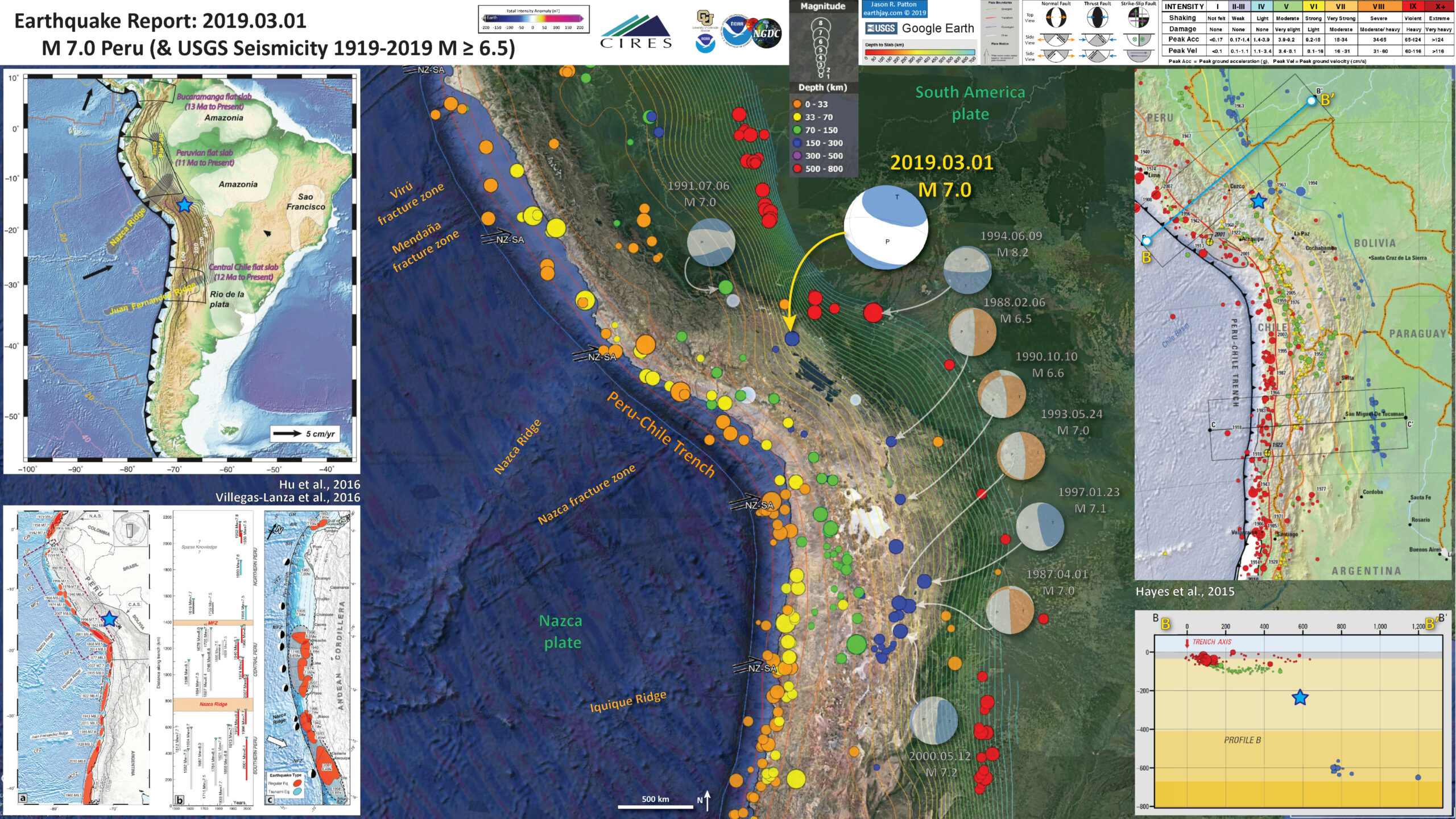
On 01 March 2019 there was an intermediate depth earthquake near the border of Peru and Bolivia. In the past century, this is the first earthquake in this area at this depth. There are some historic quakes to the east, but they are much deeper. However, if we take a look at the 1994 M=8.2 shaker, it has a similar orientation as yesterday’s M=7.0 quake.
Another similarity with the 1994 temblor, is that they are both extensional (normal) earthquakes. The majority of intermediate depth earthquakes are extensional, but not all.
Here are the USGS web pages for these two earthquakes.
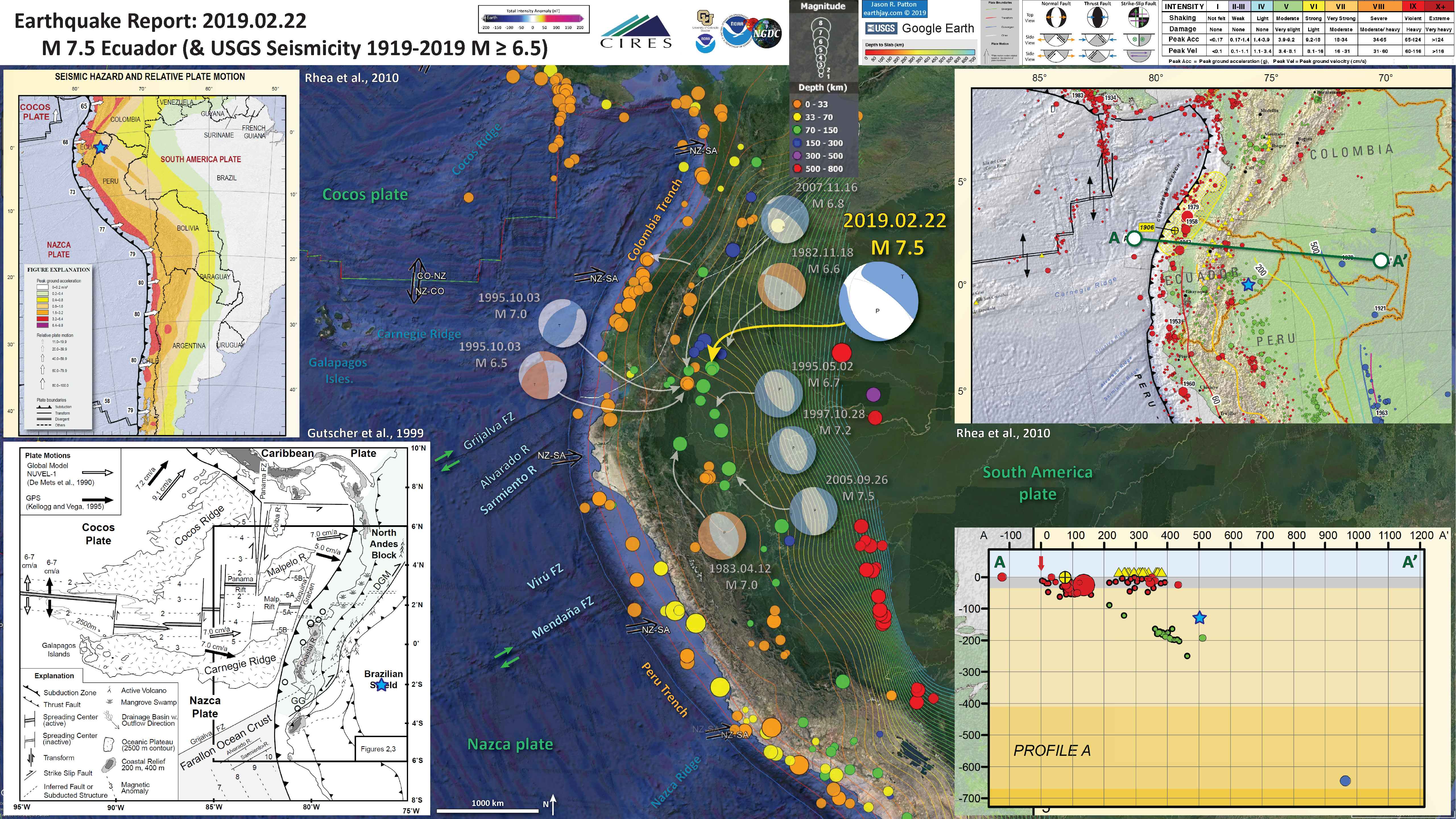
Recently (22 February 2019), there was an intermediate depth M 7.5 earthquake to the northwest of this one, in Ecuador. Here is my report for that earthquake. I spend some time discussing intermediate depth earthquakes and the landslide probability failure maps from the USGS.
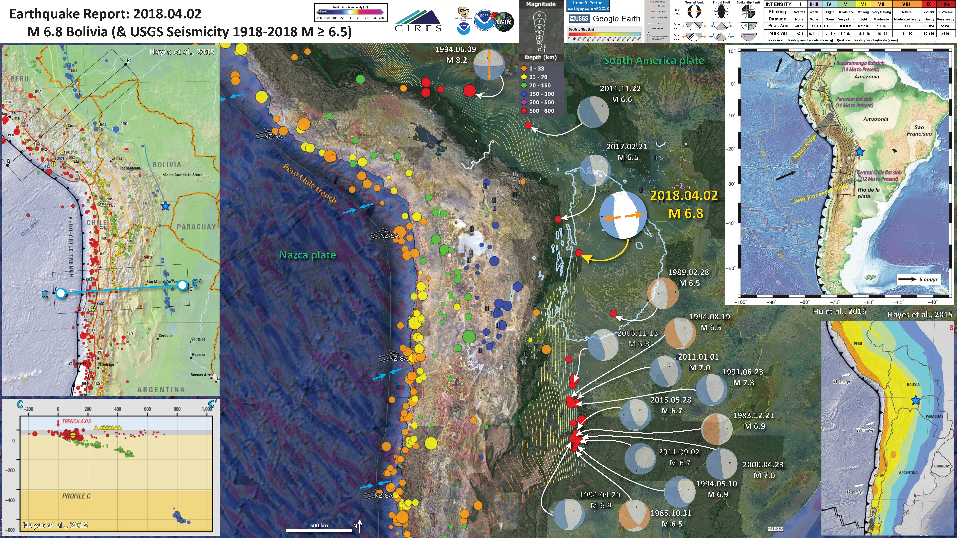
On 08 April 2018 there was a M=6.8 deep earthquake tot he southeast of this M 7.0. Please visit my earthquake report page here for more background material on deep earthquakes and what may cause them.
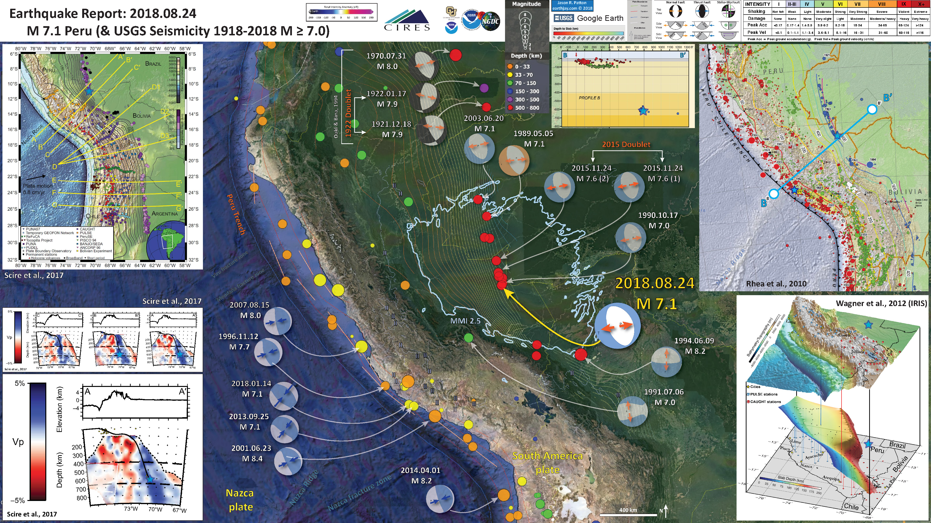
Later, on 24 August 2018 there was another deep quake in Peru, and my earthquake report for that event describes in greater detail the subduction zone in this region.
I include interpretive posters from these reports below.
Yesterday’s M 7.0 earthquake shows extension in the north-south direction, which is oblique to the orientation of the subducting plate (the “slab”). However, it is oriented the same as the 1994 quake, so there is possibly something shared between these two quakes that may tell us something about the plate here. Read my report on the 22 Feb ’19 quaKe as I discuss various factors that may control the orientation of these intermediate depth earthquakes as they relate to the orientation of the subducting plate and structures in the downgoing plate.
Below is my interpretive poster for this earthquake
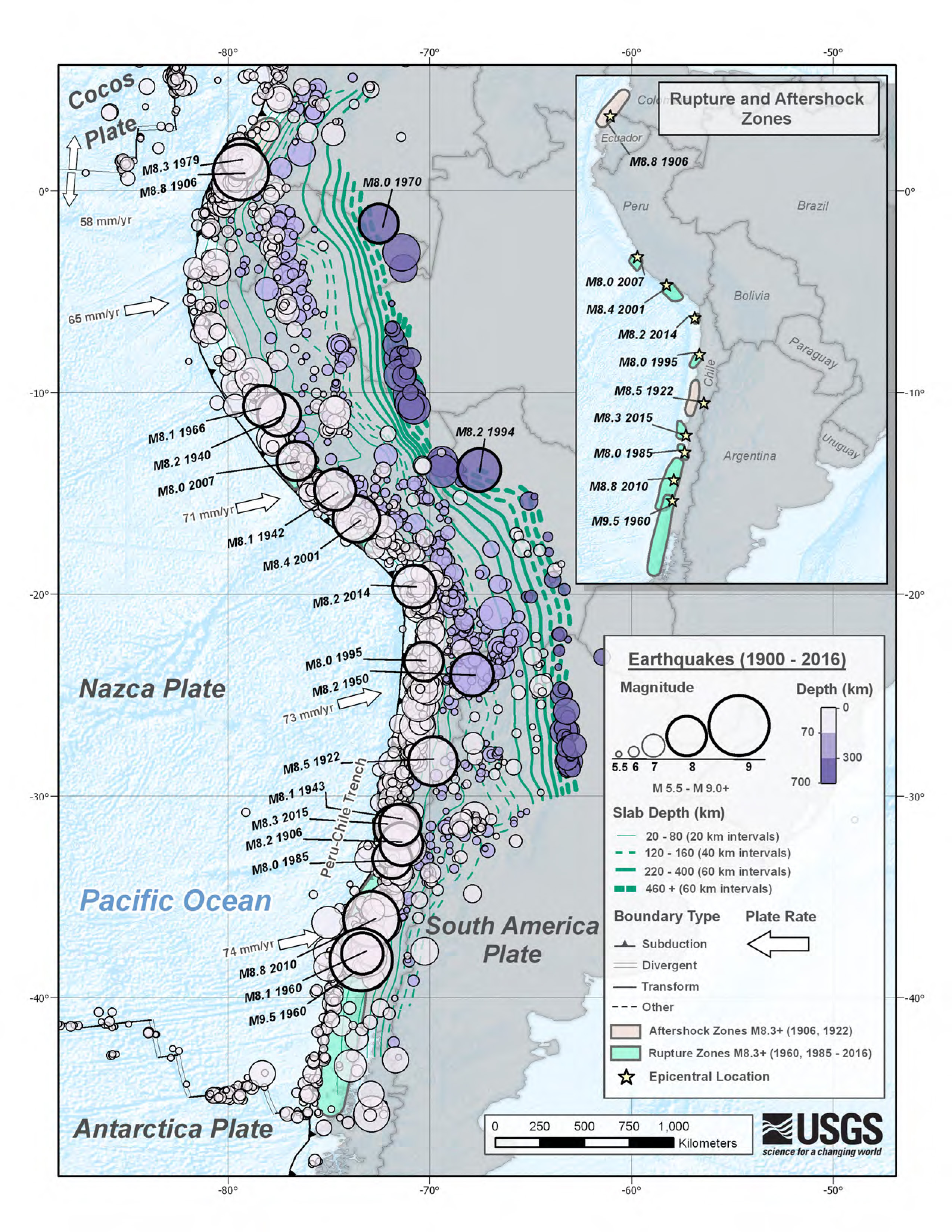
I plot the seismicity from the past month, with color representing depth and diameter representing magnitude (see legend). I include earthquake epicenters from 1919-2019 with magnitudes M ≥ 6.5 in one version.
I plot the USGS fault plane solutions (moment tensors in blue and focal mechanisms in orange), possibly in addition to some relevant historic earthquakes.
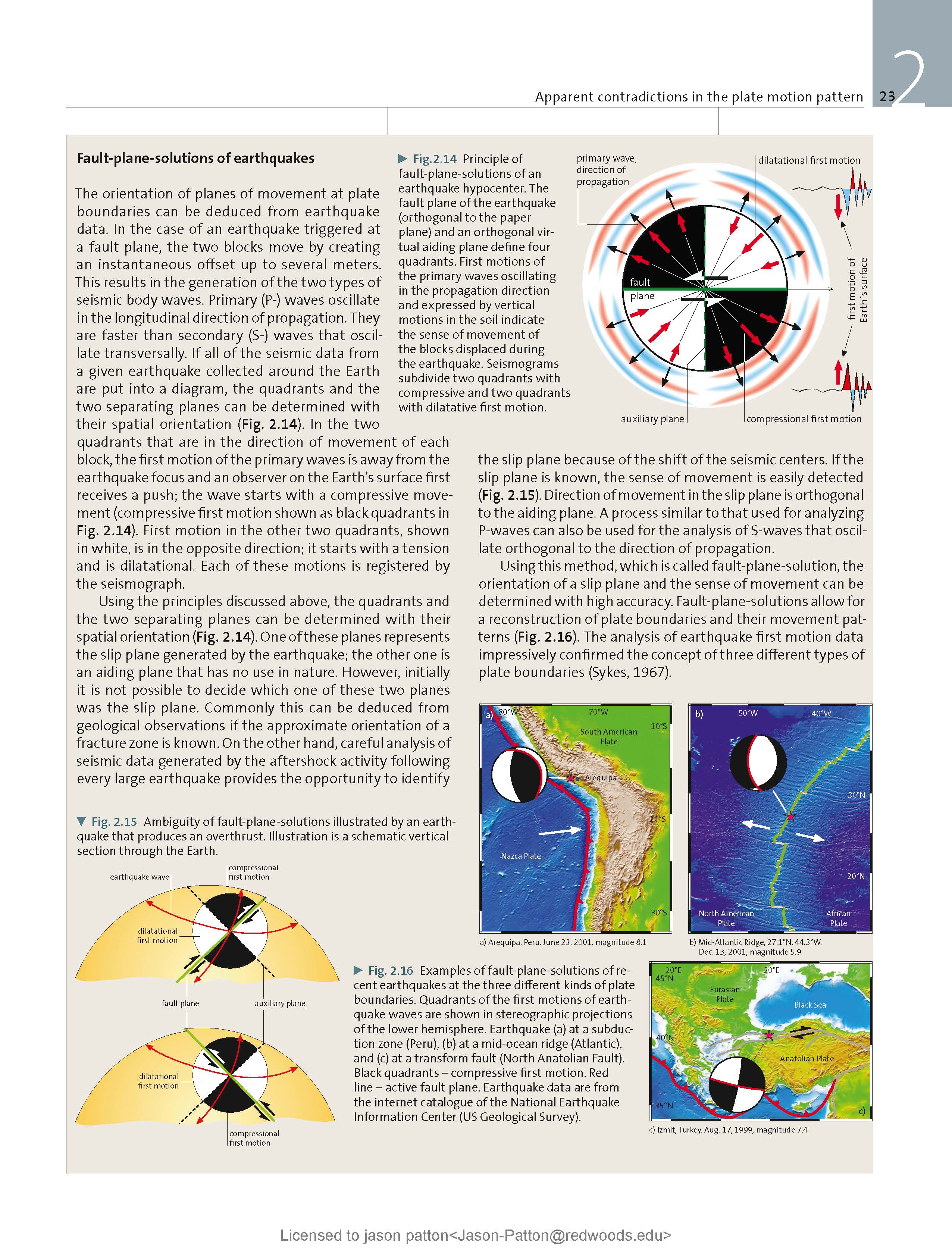
- I placed a moment tensor / focal mechanism legend on the poster. There is more material from the USGS web sites about moment tensors and focal mechanisms (the beach ball symbols). Both moment tensors and focal mechanisms are solutions to seismologic data that reveal two possible interpretations for fault orientation and sense of motion. One must use other information, like the regional tectonics, to interpret which of the two possibilities is more likely.
- I also include the shaking intensity contours on the map. These use the Modified Mercalli Intensity Scale (MMI; see the legend on the map). This is based upon a computer model estimate of ground motions, different from the “Did You Feel It?” estimate of ground motions that is actually based on real observations. The MMI is a qualitative measure of shaking intensity. More on the MMI scale can be found here and here. This is based upon a computer model estimate of ground motions, different from the “Did You Feel It?” estimate of ground motions that is actually based on real observations.
- I include the slab 2.0 contours plotted (Hayes, 2018), which are contours that represent the depth to the subduction zone fault. These are mostly based upon seismicity. The depths of the earthquakes have considerable error and do not all occur along the subduction zone faults, so these slab contours are simply the best estimate for the location of the fault.
- In the map below, I include a transparent overlay of the magnetic anomaly data from EMAG2 (Meyer et al., 2017). As oceanic crust is formed, it inherits the magnetic field at the time. At different points through time, the magnetic polarity (north vs. south) flips, the North Pole becomes the South Pole. These changes in polarity can be seen when measuring the magnetic field above oceanic plates. This is one of the fundamental evidences for plate spreading at oceanic spreading ridges (like the Gorda rise).
- Regions with magnetic fields aligned like today’s magnetic polarity are colored red in the EMAG2 data, while reversed polarity regions are colored blue. Regions of intermediate magnetic field are colored light purple.
- We can see the roughly northwest-southeast trends of these red and blue stripes in the Nazca plate, as formed along the East Pacific Rise oceanic spreading center. These lines are parallel to the ocean spreading ridges from where they were formed. #Awesome
Magnetic Anomalies
- In the upper right corner is a section of the map from Hayes et al. (2015), which is a USGS map documenting the seismicity of the earth in this region. The cross section B-B’ is shown below. The cross section plots the earthquake depths along the profile shown on the map. The B-B’ profile crosses the subduction zone very close to where this earthquake happened. I place a blue star in the general location of today’s M 7.0 earthquake.
- In the lower right corner is the B-B’ cross section. Note the location of the earthquake (blue star). There have not been many earthquakes in this area, though our history of earthquakes is very very short (so it is difficult to say that this earthquake is rare).
- In the upper left corner is a plate tectonic map from Hu et al. (2016), which shows the major plate boundaries in the region. The subduction zone is indicated as a black line with triangles (the triangles show the direction that the Nazca plate is subducting below the South America plate).
- In the lower left corner is a figure from Villegas-Lanza et al. (2016). We can use the slab contours to help us navigate today’s earthquake location relative to this map. On the left is a map showing historic subduction zone earthquakes. The center shows the spatial extent of these quakes and plots them on a time scale (the horizontal axis). On the right are earthquake mechanisms for quakes in the Peru/Ecuador area.
I include some inset figures. Some of the same figures are located in different places on the larger scale map below.
- Here is the map with a month’s seismicity plotted. I include a comparison of the Intensity model and the observations.
- The horizontal axis is distance from the earthquake and the vertical axis is shaking intensity using the MMI scale (discussed above). The observations (people can report their observations of intensity using the USGS “Did You Feel It?” form posted on their earthquake pages) are the dots and the modeled regressions are the solid lines.
- I also note the areas in the main map that are where the shaking is modeled to be felt. There are 3 main areas. These show up in the comparison plot below, where I compare the 1994 M 8.2 quake with this M 7.0 quake.

- Here is the map with a century’s seismicity plotted.

- Here is a figure that shows the MMI maps for these two earthquakes. Earthquake magnitudes scale with energy (how strong they might shake) on a logorhythmic scale. A M 8.0 earthquake releases ~32 times more energy than a M 7.0 quake. So, the M 8.2 quake released much much more energy than the M 7.0.
- The take away with this figure is that the M 8.2 earthquake, even though it is twice as deep, it was much more energetic. The ground shaking was much higher than for the M 7.0 temblor… I include red stars showing the comparison epicenter for the adjacent quake.

- Below are some key posters that show additional recent and additional historic earthquakes in the region.
- 2018.04.02 M 6.8 Bolivia
- 2018.08.24 M 7.1 Peru
- 2019.02.23 M 7.5 Ecuador
Some Relevant Discussion and Figures
- This is the Hu et al. (2016) tectonic map. Note the slab contours and how they help us understand the shape of the downgoing Nazca plate.

Geological setting of South America with depth contours of slab 1.0 (Hayes et al., 2012)indicated by thin black lines, subducting oceanic plateaus translucent gray and continental cratons translucent white. The major flat slabs in South America are outlined with thick black lines. The locations of oceanic plateaus, cratons and flat slabs are modified from Gutscher et al.(2000), Loewy et al.(2004)and Ramos and Folguera (2009), respectively. The present-day plate motion is shown as black arrows. Tooth-shaped line represents the South American trench. Seafloor ages to the west of South America are shown with colorful lines with numbers indicating the age in Ma.
- Here are some cross sections that show the geometry of the slab, as modeled by Hu et al. (2016). Cross section C is almost exactly where the 01 March 2019 M 7.0 and 9 June 1994 M 8.2 earthquakes are.

Cross sections of the best-fit model from 5◦to 30◦S at an interval of 5◦. Orange arrows mark the location of these cross sections. In each cross section, background color represents the temperature field with the yellow lines indicating the interpolated Benioff zone from slab 1.0(Hayes et al., 2012). Gray circles represent the locations of earthquakes with magnitude >4.0 from IRIS earthquake catalog for years from 1970 to 2015. Black lines above each cross section delineate the topography, with the vertical scale amplified by 20 times. Note the overall match of the slab geometry to both individual seismicity and slab 1.0 contour.
- Here is an animation from IRIS that reviews the tectonics of the Peru-Chile subduction zone. For the animation, first is a screen shot and below that is the embedded video. This animation is from IRIS. Written and directed by Robert F. Butler, University of Portland. Animation and Graphics: Jenda Johnson, geologist. Consultant: Susan Beck, University or Arizona. Narration: Elayne Shapiro, University of Portland.
- Here is a download link for the embedded video below (34 MB mp4)

- The Rhea et al. (2016) document is excellent and can be downloaded here. The USGS prepared another cool poster that shows the seismicity for this region (though there does not seem to be a reference for this).
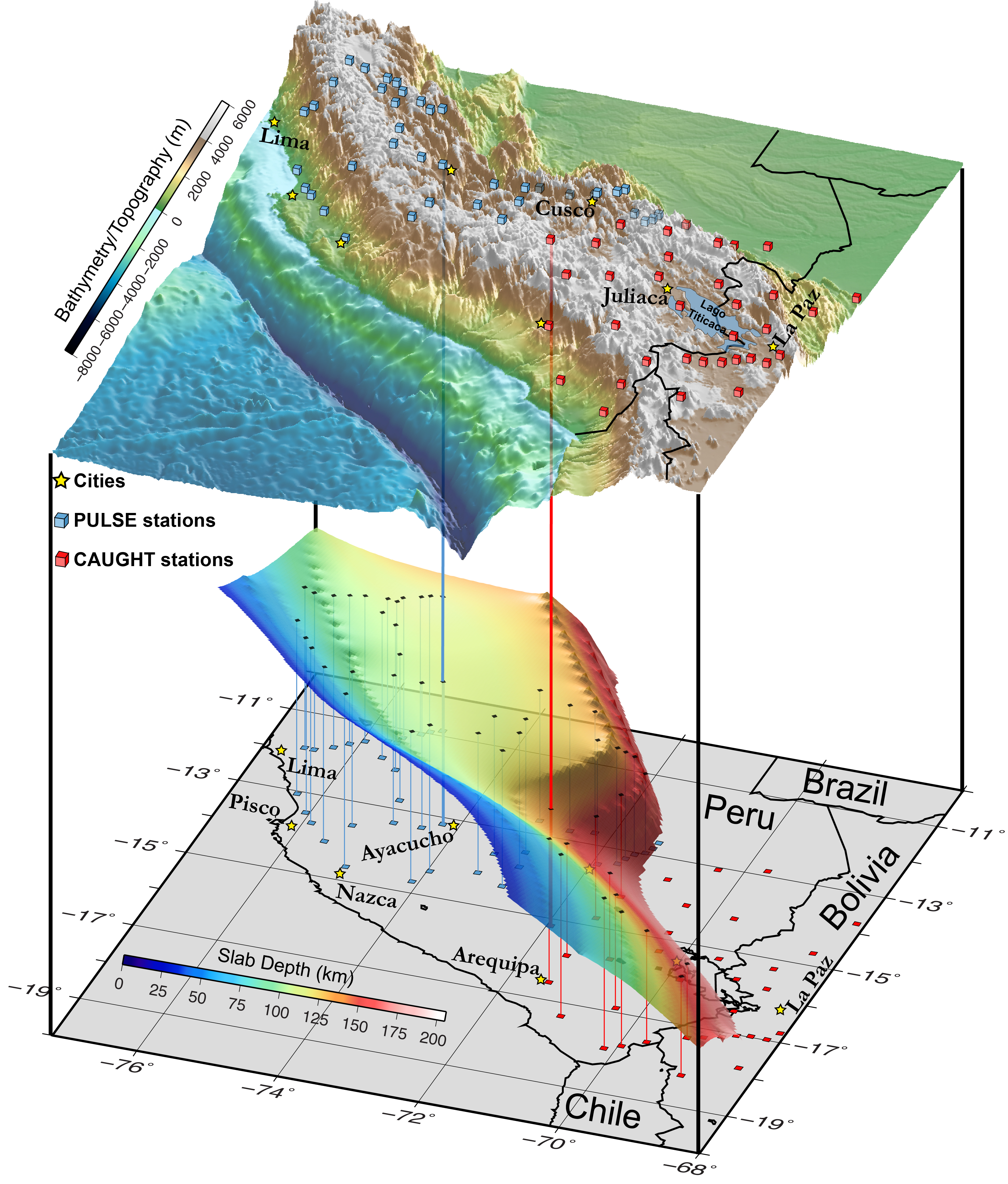
- This is a great visualization from Dr. Laura Wagner. This shows how the downgoing Nazca plate is shaped, based upon their modeling.
- Below are all figures from Scire et al. (2017).
- This first one shows the location of (1) their cross sections (see below), (2) the locations of the seismometers and other equipment used in this study, and (3) historic seismicity used in their analyses.
- Here are all the tomographic cross sections.
- This figure that shows an estimate of the geometery of the slab (scire et al., 2016). This surface is based on a contrast between material properties of the slab and the overlying material (mantle). Note the north arrow. These authors were interested in many things, including how the Nazca Ridge changes the geometry of ht emegathrust fault. Today’s M 7.1 happened in a place where the fault is steeply dipping. Use the latitude and longitude to findthe location of today’s earthquake relativ to this figure. 11° South and 70.8° East, with a depth of 610 km.

Map showing seismic station locations (squares—broadband; inverted triangles—short period) for individual networks used in the study and topography of the central Andes. Slab contours (gray) are from the Slab1.0 global subduction zone model (Hayes et al., 2012). Earthquake data (circles) for deep earthquakes (depth >375 km) are from 1973 to 2012 (magnitude >4.0) and were obtained from the U.S. Geological Survey National Earthquake Information Center (NEIC) catalog (https://earthquake.usgs.gov/earthquakes/). Red triangles mark the location of Holocene volcanoes (Global Volcanism Program, 2013). Plate motion vector is from Somoza and Ghidella (2012). Cross section lines (yellow) are shown for cross sections in Figures 5 and 8.

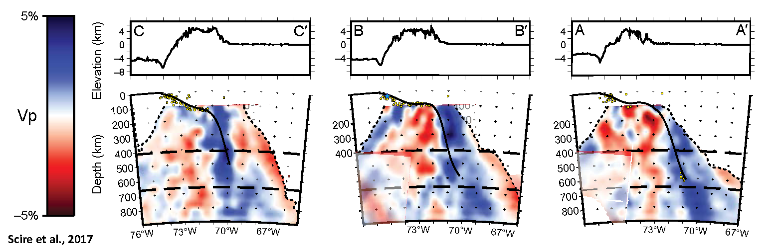
Trench-perpendicular cross sections through the tomography model. Velocity anomalies are shown in blue for fast anomalies, red for slow anomalies. Cross section locations are as shown in Figure 1. Dashed lines are the same as in Figure 6. Yellow dots are earthquake locations from the EHB catalog (Engdahl et al., 1998). Solid black line marks the top of the Nazca slab from the Slab1.0 model (Hayes et al., 2012).
![]()
3-D diagram of the resolved subducting Nazca slab and prominent mantle low-velocity anomalies inferred from our tomographic models. The isosurfaces for this diagram are obtained by tracing the most coherent low-velocity anomalies (less than negative 3 per cent) and slab-related (greater than positive 3 per cent) coherent fast anomalies in the tomographic model. Geomorphic provinces (fine dashed lines) are the same as in Fig. 1(a). Heavy black outline marks the projection of the subducted Nazca Ridge from Hampel (2002). Anomalies A, C, D and E labelled as in previous figures. Downloaded from http://gji.oxfordjournals.org/ at Yale University on December 1, 2015
Geologic Fundamentals
- For more on the graphical representation of moment tensors and focal mechanisms, check this IRIS video out:
- Here is a fantastic infographic from Frisch et al. (2011). This figure shows some examples of earthquakes in different plate tectonic settings, and what their fault plane solutions are. There is a cross section showing these focal mechanisms for a thrust or reverse earthquake. The upper right corner includes my favorite figure of all time. This shows the first motion (up or down) for each of the four quadrants. This figure also shows how the amplitude of the seismic waves are greatest (generally) in the middle of the quadrant and decrease to zero at the nodal planes (the boundary of each quadrant).
- Here is another way to look at these beach balls.
The two beach balls show the stike-slip fault motions for the M6.4 (left) and M6.0 (right) earthquakes. Helena Buurman's primer on reading those symbols is here. pic.twitter.com/aWrrb8I9tj
— AK Earthquake Center (@AKearthquake) August 15, 2018
- There are three types of earthquakes, strike-slip, compressional (reverse or thrust, depending upon the dip of the fault), and extensional (normal). Here is are some animations of these three types of earthquake faults. The following three animations are from IRIS.
Strike Slip:
Compressional:
Extensional:
- This is an image from the USGS that shows how, when an oceanic plate moves over a hotspot, the volcanoes formed over the hotspot form a series of volcanoes that increase in age in the direction of plate motion. The presumption is that the hotspot is stable and stays in one location. Torsvik et al. (2017) use various methods to evaluate why this is a false presumption for the Hawaii Hotspot.
- Here is a map from Torsvik et al. (2017) that shows the age of volcanic rocks at different locations along the Hawaii-Emperor Seamount Chain.
- Here is a great tweet that discusses the different parts of a seismogram and how the internal structures of the Earth help control seismic waves as they propagate in the Earth.
A cutaway view along the Hawaiian island chain showing the inferred mantle plume that has fed the Hawaiian hot spot on the overriding Pacific Plate. The geologic ages of the oldest volcano on each island (Ma = millions of years ago) are progressively older to the northwest, consistent with the hot spot model for the origin of the Hawaiian Ridge-Emperor Seamount Chain. (Modified from image of Joel E. Robinson, USGS, in “This Dynamic Planet” map of Simkin and others, 2006.)
Hawaiian-Emperor Chain. White dots are the locations of radiometrically dated seamounts, atolls and islands, based on compilations of Doubrovine et al. and O’Connor et al. Features encircled with larger white circles are discussed in the text and Fig. 2. Marine gravity anomaly map is from Sandwell and Smith.
Today, on #SeismogramSaturday: what are all those strangely-named seismic phases described in seismograms from distant earthquakes? And what do they tell us about Earth’s interior? pic.twitter.com/VJ9pXJFdCy
— Jackie Caplan-Auerbach (@geophysichick) February 23, 2019
- 2010.02.27 M 8.8 Earthquake Review
- 2019.03.01 M 7.0 Peru
- 2019.02.22 M 7.5 Ecuador
- 2019.01.20 M 6.7 Chile
- 2018.08.21 M 7.3 Venezuela
- 2018.08.24 M 7.1 Peru
- 2018.04.02 M 6.8 Bolivia
- 2018.01.14 M 7.1 Peru
- 2018.01.15 M 7.1 Peru Update #1
- 2017.06.30 M 6.0 Ecuador
- 2017.04.24 M 6.9 Chile
- 2017.04.23 M 5.9 Chile
- 2016.12.25 M 7.6 Chile
- 2016.11.24 M 7.0 El Salvador
- 2016.11.04 M 6.4 Maule, Chile
- 2016.04.16 M 7.8 Ecuador
- 2016.04.16 M 7.8 Ecuador Update #1
- 2015.11.29 M 5.9 Argentina
- 2015.11.11 M 6.9 Chile
- 2015.11.24 M 7.6 Peru
- 2015.11.26 M 7.6 Peru Update
- 2015.09.16 M 8.3 Chile
- 2014.04.01 M 8.2 Chile
- 2010.02.27 M 8.8 Chile
- 1960.05.22 M 9.5 Chile
Chile | South America
General Overview
Earthquake Reports
Social Media
very different from moment-tensor mechanism:https://t.co/iqO1rMHR8v pic.twitter.com/YjSREqNlAy
— Anthony Lomax 🌍🇪🇺 (@ALomaxNet) March 1, 2019
Mw=7.0, CENTRAL PERU (Depth: 280 km), 2019/03/01 08:50:41 UTC – Full details here: https://t.co/qhth66kcRc pic.twitter.com/fatXXlgvbv
— Earthquakes (@geoscope_ipgp) March 1, 2019
- Chlieh et al., 2011. Interseismic coupling and seismic potential along the Central Andes subduction zone, Journal of Geophysical Research, v. 116, B12405, 21 p.
- Espurt, N., Baby, P., Brusset, S., Roddaz, M., Hermoza, W., Regard, V., Antoine, P.-O., Salas-Gismodi, R., and Bolaños, R., 2007. How does the Nazca Ridge subduction influence the modern Amazonian foreland basin? in Geology, v. 35, no. 6, p. 515-518.
- Frisch, W., Meschede, M., Blakey, R., 2011. Plate Tectonics, Springer-Verlag, London, 213 pp.
- Goes, S., Agrusta, R., van Hunen, J., and Garel, F., 2017. Subduction-transition zone interaction: A review: Geosphere, v. 13, no. 3, p. 1–21, http://dx.doi.org/10.1130/GES01476.1.
- Hayes, G.P., Smoczyk, G.M., Benz, H.M., Villaseñor, Antonio, and Furlong, K.P., 2015. Seismicity of the Earth 1900–2013, Seismotectonics of South America (Nazca Plate Region): U.S. Geological Survey Open-File Report 2015–1031–E, 1 sheet, scale 1:14,000,000, http://dx.doi.org/10.3133/ofr20151031E.
- Hayes, G., 2018, Slab2 – A Comprehensive Subduction Zone Geometry Model: U.S. Geological Survey data release, https://doi.org/10.5066/F7PV6JNV.
- Hu, J., Liu, L., Hermosillo, A., Zhou, Q., 2016. Simulation of late Cenozoic South American flat-slab subduction using geodynamic models with data assimilation in EPSL, v. 438, p. 1-13, http://dx.doi.org/10.1016/j.epsl.2016.01.011
- Kirby, S.H., Okal, E.A., and Engdahl, E.R., 1995. The 9 June 94 Bolivian deep earthquake: An exceptional event in an extraordinary subduction zone in Geophysical Research Letters, v. 22, no. 16, p. 2233-2236.
- Meyer, B., Saltus, R., Chulliat, a., 2017. EMAG2: Earth Magnetic Anomaly Grid (2-arc-minute resolution) Version 3. National Centers for Environmental Information, NOAA. Model. doi:10.7289/V5H70CVX
- Meyer, B., Saltus, R., Chulliat, a., 2017. EMAG2: Earth Magnetic Anomaly Grid (2-arc-minute resolution) Version 3. National Centers for Environmental Information, NOAA. Model. https://doi.org/10.7289/V5H70CVX
- Müller, R.D., Sdrolias, M., Gaina, C. and Roest, W.R., 2008, Age spreading rates and spreading asymmetry of the world’s ocean crust in Geochemistry, Geophysics, Geosystems, 9, Q04006, https://doi.org/10.1029/2007GC001743
- Rhea, S., Hayes, G., Villaseñor, A., Furlong, K.P., Tarr, A.C., and Benz, H.M., 2010. Seismicity of the earth 1900–2007, Nazca Plate and South America: U.S. Geological Survey Open-File Report 2010–1083-E, 1 sheet, scale 1:12,000,000.
- Silver., P.G., Beck, S.L., Wallace, T.C., Meade, C., Myers, S.C., James, D.E., and Kuehnel, R., 1995. Rupture Characteristics of the Deep Bolivian Earthquake of 9 June 1994 and the Mechanism of Deep-Focus Earthquakes in Science, v. 268, p. 69-73.
- Trabant, C., A. R. Hutko, M. Bahavar, R. Karstens, T. Ahern, and R. Aster, 2012. Data Products at the IRIS DMC: Stepping Stones for Research and Other Applications, Seismological Research Letters, 83(5), 846–854, http://dx.doi.org/10.1785/0220120032.
- Villegas-Lanza, J. C., M. Chlieh, O. Cavalié, H. Tavera, P. Baby, J. Chire-Chira, and J.-M. Nocquet (2016), Active tectonics of Peru: Heterogeneous interseismic coupling along the Nazca megathrust, rigid motion of the Peruvian Sliver, and Subandean shortening accommodation, J. Geophys. Res. Solid Earth, 121, 7371–7394, https://doi.org/10.1002/2016JB013080.
- Zhan, Z., Kanamori, H., Tsai, V.C., Helmberger, D.V., and Wei, S., 2014. Rupture complexity of the 1994 Bolivia and 2013 Sea of Okhotsk deep earthquakes in Earth and Planetary Science Letters, v. 385, p. 89-96.
References:
Return to the Earthquake Reports page.