In commemoration of the #EarthquakeCup, I have put together a summary for the largest instrumentally recorded earthquake, the M 9.5 1960 Valdivia, Chile Earthquake.
The Peru-Chile trench is quite active and generated Great earthquakes (M>8) in 1985, 2010, 2014, and 2015, with some large earthquakes sprinkled in for good measure (notably a M 7.6 in the region of the 1960 earthquake on 2016.12.15).
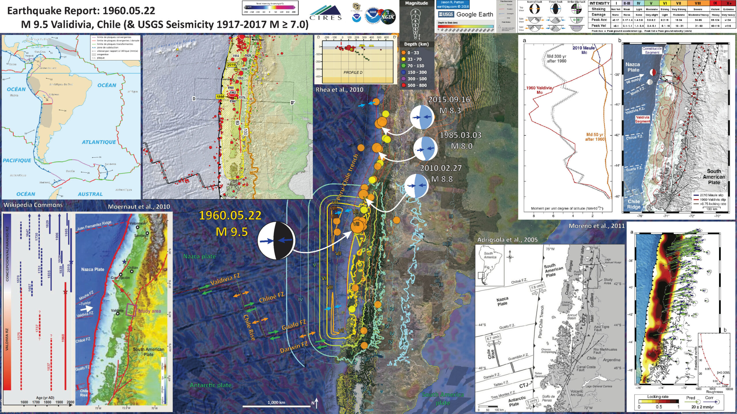
Below is my interpretive poster for this earthquake
I plot the seismicity from the past month, with color representing depth and diameter representing magnitude (see legend). I include earthquake epicenters from 1917-2017 with magnitudes M ≥ 7.0.
I plot the USGS fault plane solutions (moment tensors in blue and focal mechanisms in orange) for the M 9.5 earthquake (Moreno et al., 2010), in addition to some relevant historic earthquakes.
- I placed a moment tensor / focal mechanism legend on the poster. There is more material from the USGS web sites about moment tensors and focal mechanisms (the beach ball symbols). Both moment tensors and focal mechanisms are solutions to seismologic data that reveal two possible interpretations for fault orientation and sense of motion. One must use other information, like the regional tectonics, to interpret which of the two possibilities is more likely.
- I also include the shaking intensity contours on the map. These use the Modified Mercalli Intensity Scale (MMI; see the legend on the map). This is based upon a computer model estimate of ground motions, different from the “Did You Feel It?” estimate of ground motions that is actually based on real observations. The MMI is a qualitative measure of shaking intensity. More on the MMI scale can be found here and here. This is based upon a computer model estimate of ground motions, different from the “Did You Feel It?” estimate of ground motions that is actually based on real observations.
- I include the slab contours plotted (Hayes et al., 2012), which are contours that represent the depth to the subduction zone fault. These are mostly based upon seismicity. The depths of the earthquakes have considerable error and do not all occur along the subduction zone faults, so these slab contours are simply the best estimate for the location of the fault. Slab 2.0 is due out later this year!
-
I include some inset figures.
- In the upper left corner is a plate tectonic map from Wikipedia.
- To the right of this tectonic map I include an inset map from the USGS Seismicity History poster for this region (Rhea et al., 2010). There is one seismicity cross section with its locations plotted on the map (DD’). The USGS plot these hypocenters along this cross section and I include that below.
- In the lower left corner, I include a time-space diagram from Moernaut et al. (2010).
- In the lower right corner, I include a figure from Moreno et al. (2011) that shows the seismogenic coupling (the amount of the plate convergence rate that is accumulated as elastic strain, to be released during earthquakes). This shows how their model fits the GPS observations.
- To the left of the plate locking figure is a map showing the fracture zones the form the plate boundary between the Nazca and Antarctic plates (Adriosola et al., 2005). This map also shows how the oblique convergence at the subduction zone is partitioned between the subduction zone and forearc sliver faults (strike slip faults that accommodate plate margin parallel strain).
- In the upper right corner is a figure that shows the seismic moment (amount of energy, or force) released during the 1960 and 2010 earthquakes, along with the moment deficit (the amount of energy stored by the fault and crust) for the period following 1960 (Moreno et al., 2011).

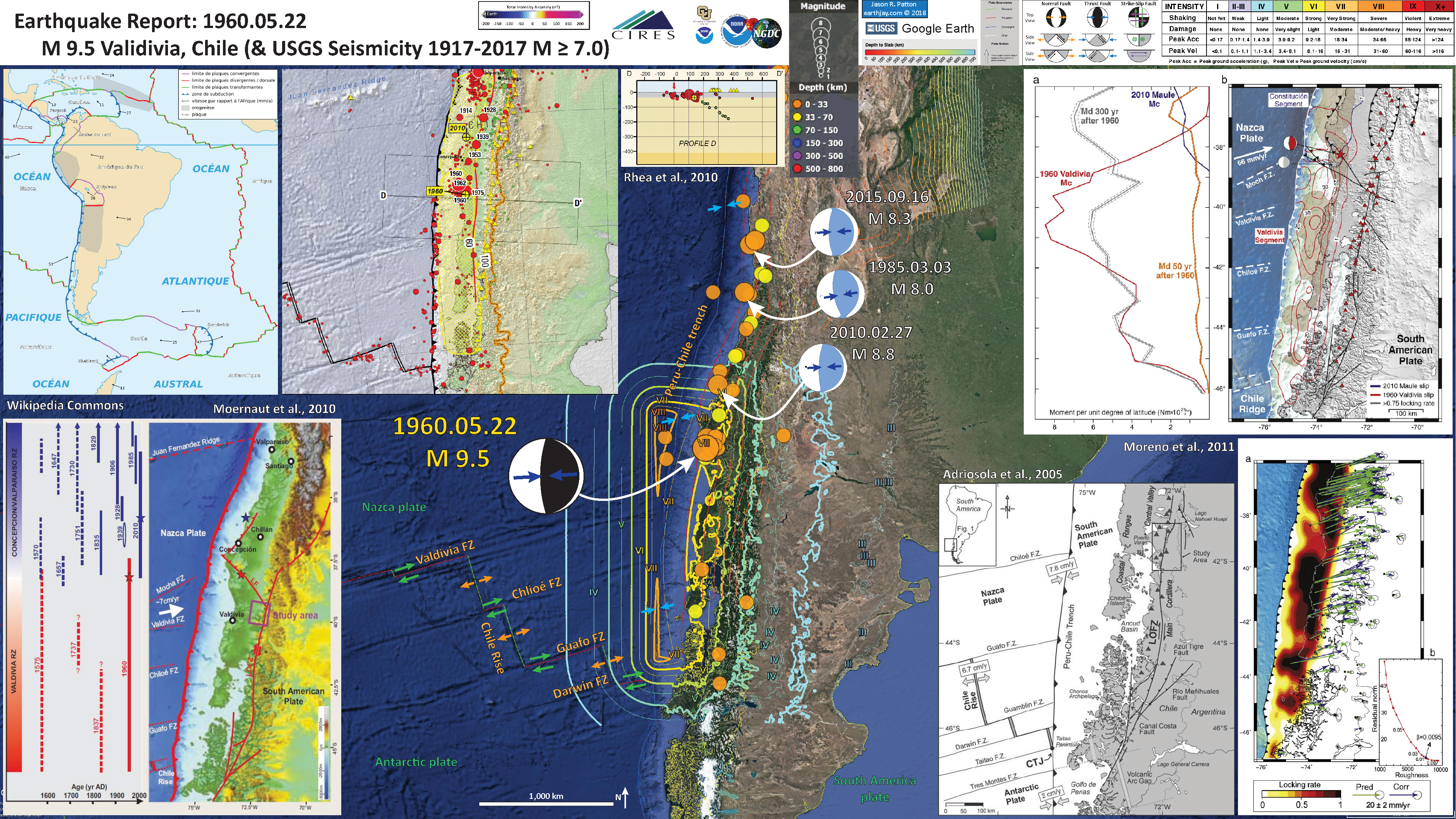
- Here is the same map, but showing the magnetic anomalies.
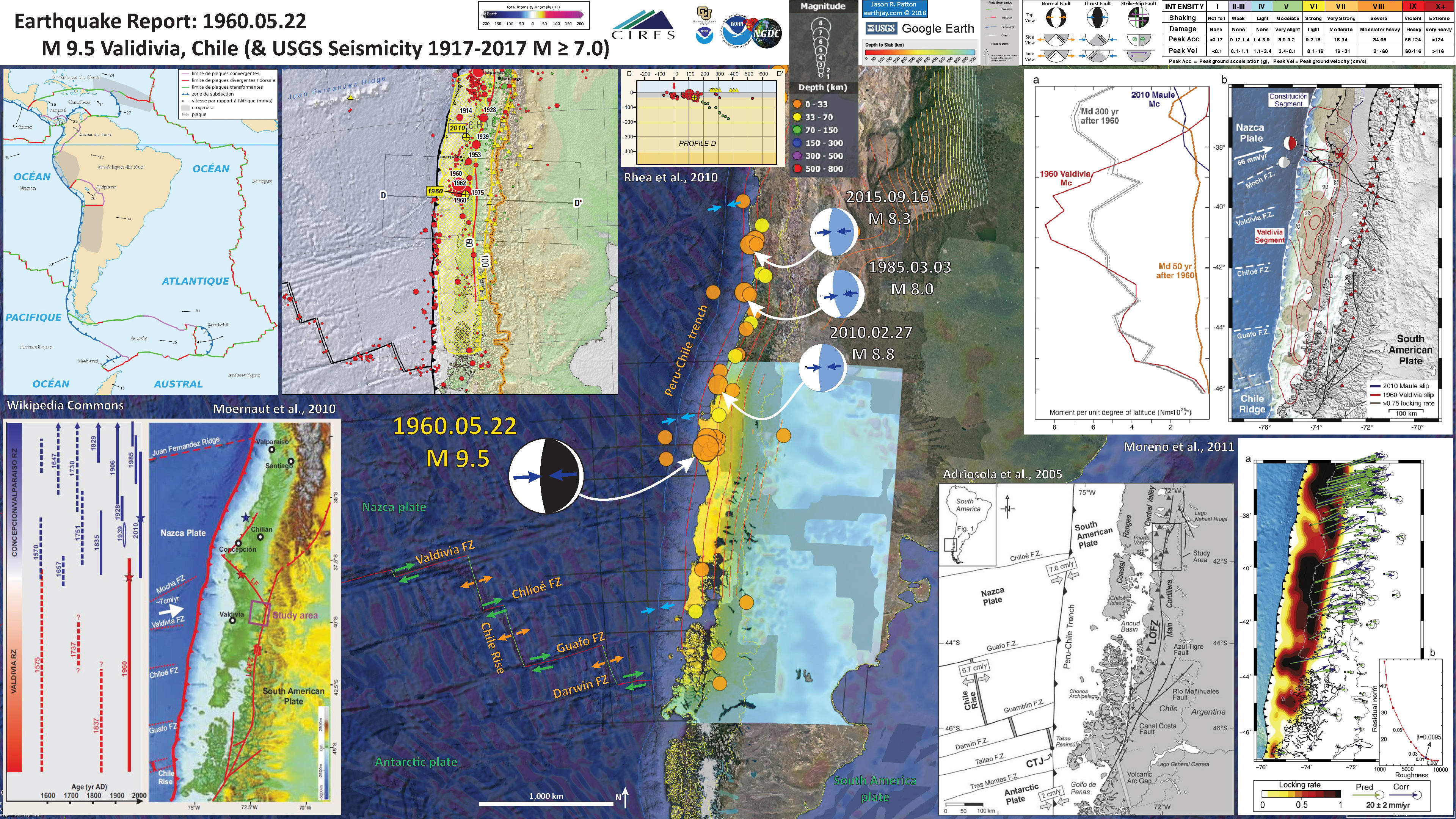

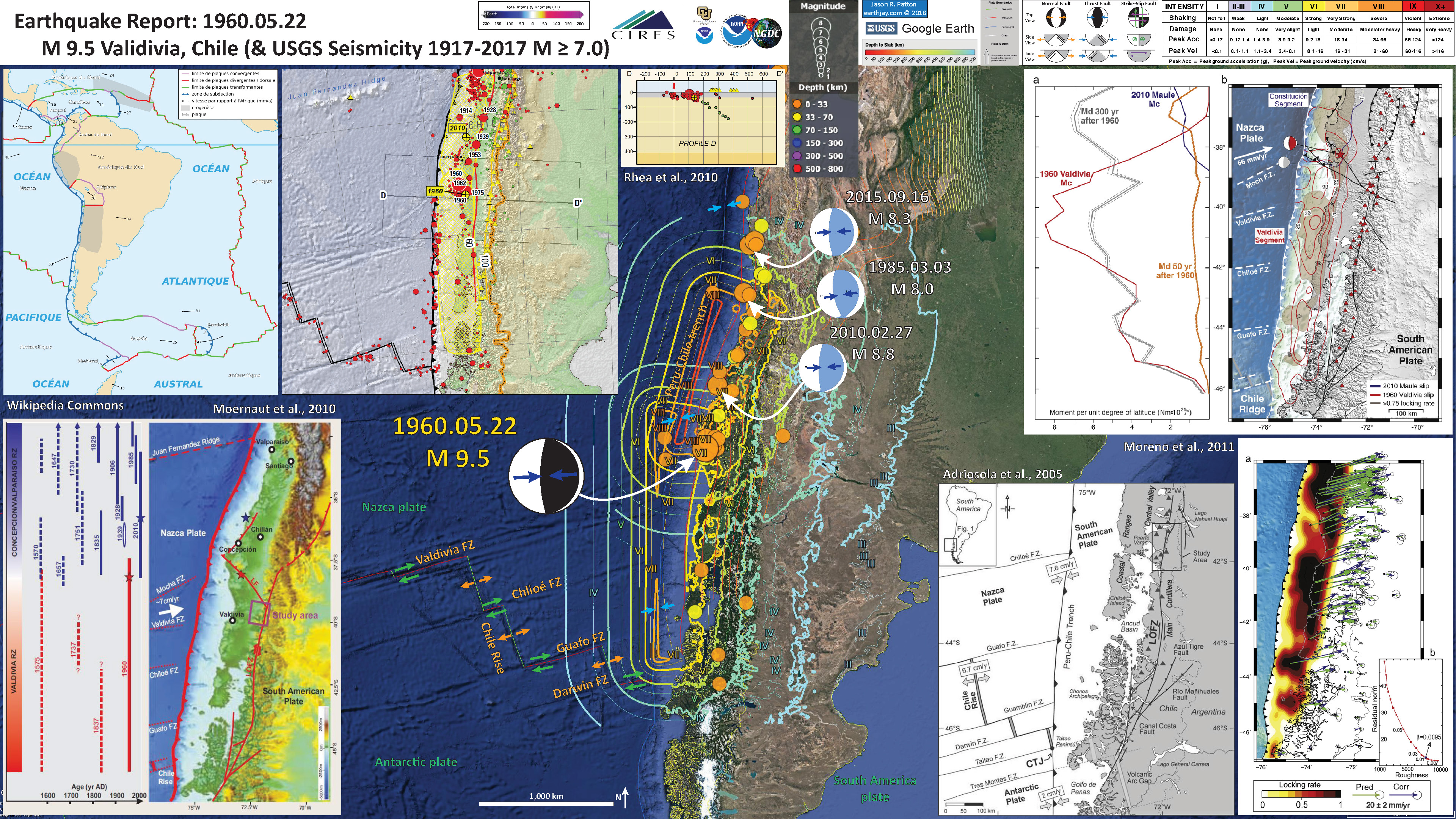
- Here is a map that shows a comparison of the shaking intensity between the 1960 and 2010 earthquakes.
Some Relevant Discussion and Figures
- Below are some figures from Moreno et al. (2011) that show estimates of locking along the plate interface in this region. I include the figure captions as blockquote.
- The first figure shows how the region of today’s earthquake is in an area of higher locking.
- This second figure shows the moment released during historic earthquakes and the moment accumulated due to seismogenic locking along the megathrust.

a) Optimal distribution of locking rate in the plate interface. Predicted interseismic velocities and GPS vectors corrected by the postseismic signals are shown by green and blue arrows, respectively. b) Tradeoff curve for a broad range of the smoothing parameter (β). The optimal value for β is 0.0095 located at the inflection of the curve.

a) Latitudinal distribution of the coseismic moment (Mc) released by the 1960 Valdivia (Moreno et al., 2009) (red line) and 2010 Maule (Tong et al., 2010) (blue line) earthquakes, and of accumulated deficit of moment (Md) due to interseismic locking of the plate interface 50 (orange line) and 300 (gray line) years after the 1960 earthquake, respectively. The range of errors of the Md rate is depicted by dashed lines. High rate of Md was found in the earthquake rupture boundary, where slip deficit accumulated since 1835 seems to be not completely released by the 2010 Maule earthquake. b) Schematic map showing the deformation processes that control the observed deformation in the southern Andes and the similarity between coseismic and locking patches. Blue and red contours denote the coseismic slip for the 2010 Maule (Tong et al., 2010) and 1960 Valdivia (Moreno et al., 2009) earthquakes, respectively. Patches with locking degree over 0.75 are shown by brown shaded areas. The 1960 earthquake (red star) nucleated in the segment boundary, area that appears to be highly locked at present. The 2011 Mw 7.1 aftershock (gray) may indicate that stress has been transmitted to the southern limit of the Arauco peninsula.
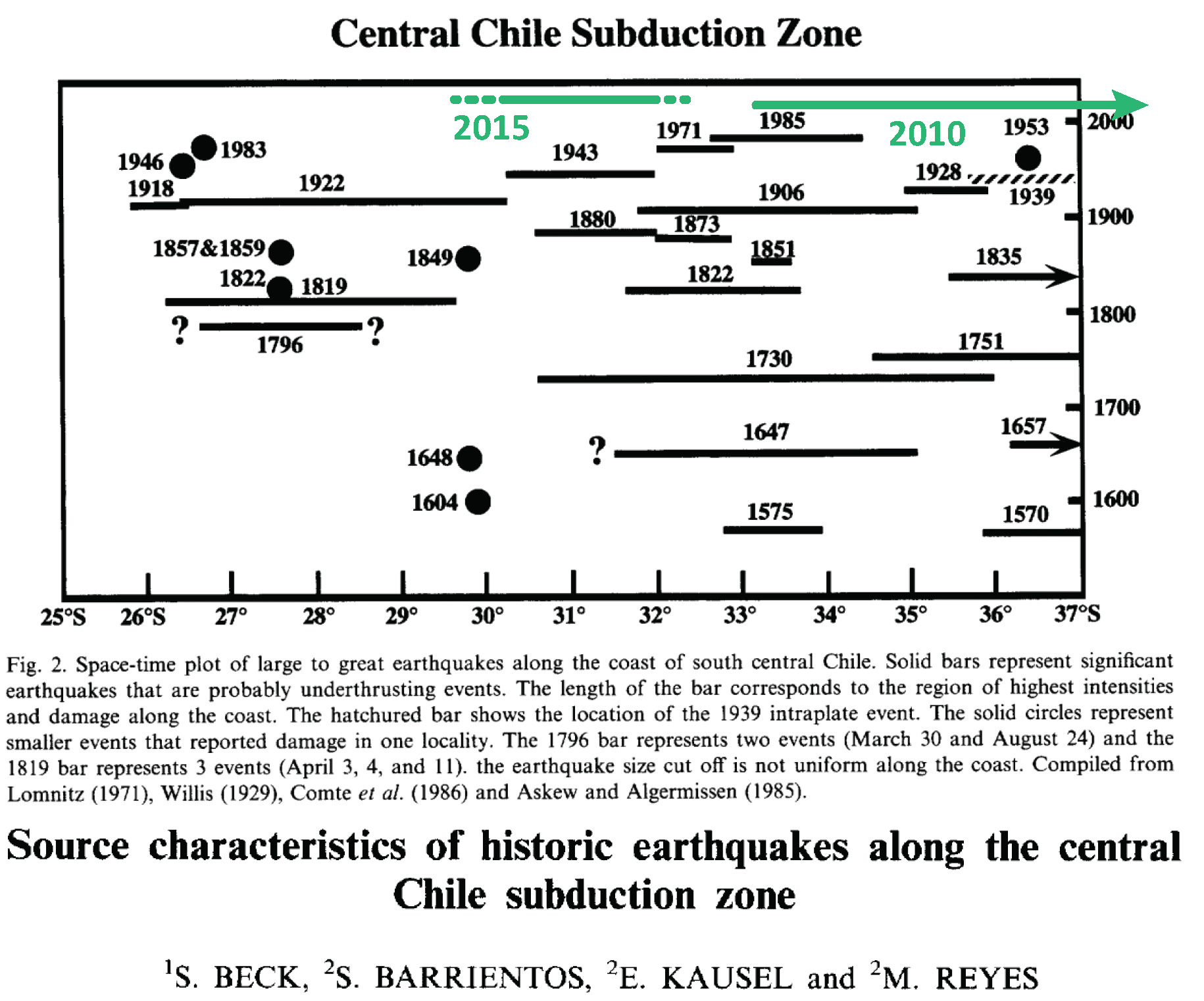
- Here is the space-time diagram from Moernaut et al., 2010. I include their figure caption below in blockquote.

Fig.: Setting and historical earthquakes in South-Central Chile. Data derived from Barrientos (2007); Campos et al. (2002); Melnick et al.(2009)
- The September 2015 earthquake series inspired me to compile some information on the historic tsunami in this region. Here is my report on those tsunami. Below I present my figure and an animation that compares these three tsunami from 1960, 2010, and 2014.
- These three maps use the same color scale. There is not yet a map with this scale for the 2015 tsunami, so we cannot yet make the comparison.
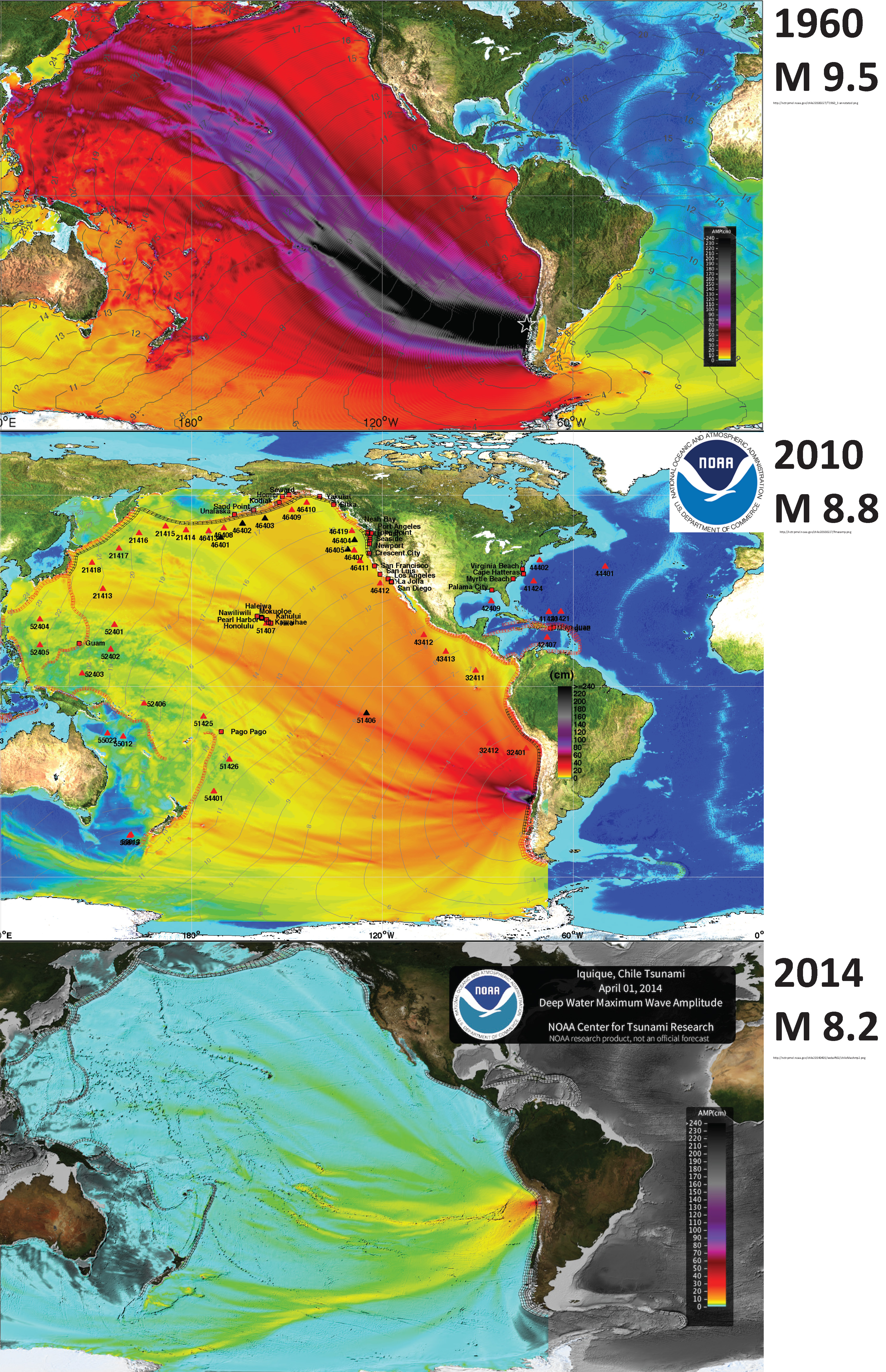
Here is an animation of these three tsunami from the US NWS Pacific Tsunami Warning Center (PTWC). This is the YouTube link.
- Here is the cross section of the subduction zone just to the south of this Sept/Nov 2015 swarm (Melnick et al., 2006). Below I include the text from the Melnick et al. (2006) figure caption as block text.
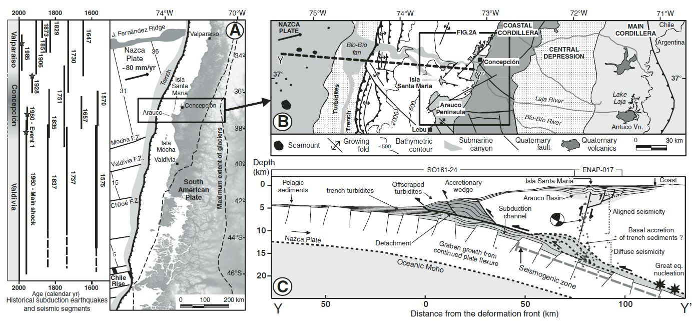
(A) Seismotectonic segments, rupture zones of historical subduction earthquakes, and main tectonic features of the south-central Andean convergent margin. Earthquakes were compiled from Lomnitz (1970, 2004), Kelleher (1972), Comte et al. (1986), Cifuentes (1989), Beck et al. (1998 ), and Campos et al. (2002). Nazca plate and trench are from Bangs and Cande (1997) and Tebbens and Cande (1997). Maximum extension of glaciers is from Rabassa and Clapperton (1990). F.Z.—fracture zone. (B) Regional morphotectonic units, Quaternary faults, and location of the study area. Trench and slope have been interpreted from multibeam bathymetry and seismic-reflection profiles (Reichert et al., 2002). (C) Profile of the offshore Chile margin at ~37°S, indicated by thick stippled line on the map and based on seismic-reflection profiles SO161-24 and ENAP-017. Integrated Seismological experiment in the Southern Andes (ISSA) local network seismicity (Bohm et al., 2002) is shown by dots; focal mechanism is from Bruhn (2003). Updip limit of seismogenic coupling zone from heat-fl ow measurements (Grevemeyer et al., 2003). Basal accretion of trench sediments from sandbox models (Lohrmann, 2002; Glodny et al., 2005). Convergence parameters from Somoza (1998 ).
- In September through November of 2015, there was a M 8.3 earthquake further to the north. Below is my interpretive poster for that earthquake and here is my report, where I discuss the relations between the 2010, 2015, and other historic earthquakes in this region. Here is my report from September.
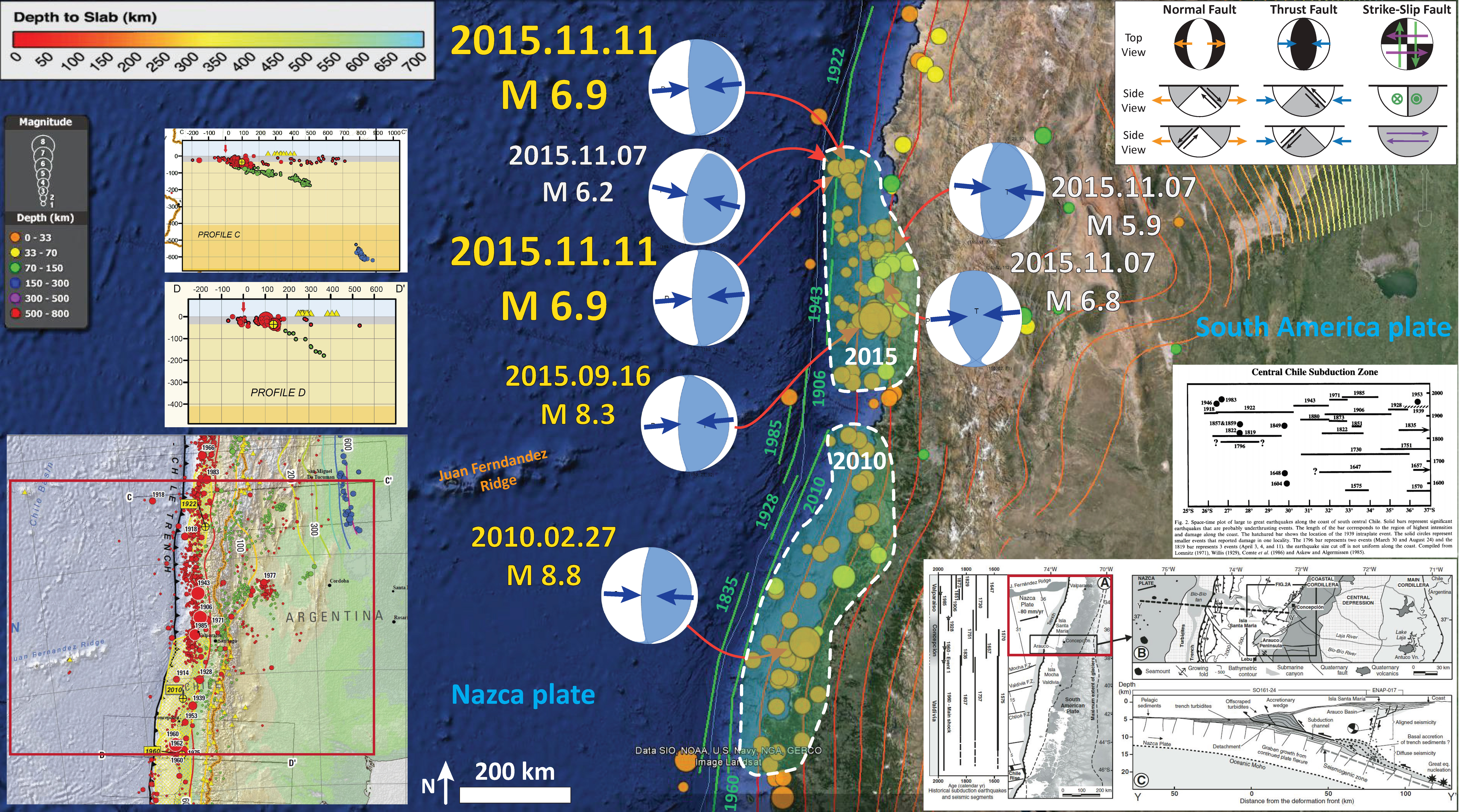
- Here is a space time diagram from Beck et al. (1998 ). The 2015 earthquake occurs in the region of the 1943 and 1880 earthquakes. I updated this figure to show the latitudinal extent of the 2010 and 2015 earthquakes.
Select Earthquake Reports for the Region
- 2010.02.27 M 8.8 Chile
- 2014.04.01 M 8.2 Chile
- Here is an estimate of ground shaking intensity, with contours offshore and the fault slip region plotted at 21:00 PST:
- 2015.09.16 M 8.3 Chile
- This map shows the MMI contours for the 1960 and 2010 earthquakes in addition to this 2016 earthquake. This helps us visualize the spatial extent for these earthquakes with a large range of magnitudes. Recall that an M 9.5 earthquake releases about 32 times the energy that an M 8.5 earthquake releases. Note how the 1960 and 2010 earthquakes span a region between the Juan Fernandez fracture zone and where the Chile Rise intersects the trench, where the 4 fracture zones (Guamblin, Darwin, Taitao, and Tres Montes) intersect the trench.
- 2016.12.25 M 7.6 Chile
- 2010.02.27 M 8.8 Earthquake Review
- 2018.01.14 M 7.1 Peru
- 2018.01.15 M 7.1 Peru Update #1
- 2017.06.30 M 6.0 Ecuador
- 2017.04.24 M 6.9 Chile
- 2017.04.23 M 5.9 Chile
- 2016.12.25 M 7.6 Chile
- 2016.11.24 M 7.0 El Salvador
- 2016.11.04 M 6.4 Maule, Chile
- 2016.04.16 M 7.8 Ecuador
- 2016.04.16 M 7.8 Ecuador Update #1
- 2015.11.29 M 5.9 Argentina
- 2015.11.11 M 6.9 Chile
- 2015.11.24 M 7.6 Peru
- 2015.11.26 M 7.6 Peru Update
- 2015.09.16 M 8.3 Chile
- 2014.04.01 M 8.2 Chile
- 2010.02.27 M 8.8 Chile
- 1960.05.22 M 9.5 Chile
Chile | South America
General Overview
Earthquake Reports
- Adriosola, A.C., Thomson, S.N., and Hervé, F., 2005. Postmagmatic cooling and late Cenozoic denudation of the North Patagonian Batholith in the Los Lagos region of Chile, 41°-42°15’S in Int. J. Earth Sci, DOI 10.1007/s00531-005-0027-9
- Beck, S., Barientos, S., Kausel, E., and Reyes, M., 1998. Source Characteristics of Historic Earthquakes along the Central Chile Subduction Zone in Journal of South American Earth Sciences, v. 11, no. 2., p. 115-129.
- Hayes, G.P., Wald, D.J., and Johnson, R.L., 2012. Slab1.0: A three-dimensional model of global subduction zone geometries in, J. Geophys. Res., 117, B01302, doi:10.1029/2011JB008524
- Hayes, G.P., Smoczyk, G.M., Benz, H.M., Villaseñor, Antonio, and Furlong, K.P., 2015. Seismicity of the Earth 1900–2013, Seismotectonics of South America (Nazca Plate Region): U.S. Geological Survey Open-File Report 2015–1031–E, 1 sheet, scale 1:14,000,000, http://dx.doi.org/10.3133/ofr20151031E.
- Melnick, D., Bookhagen, B., Echtler, H.P., and Strecker, M.R., 2006. Coastal deformation and great subduction earthquakes, Isla Santa María, Chile (37°S) in GSA Bulletin, v. 118, no. 11/12, p. 1463-1480.
- Moernaut, J., Batist, M., Haeirman, K., Van Daele, M., Brümmer, R., Urrutia, R., Wolff, C., Brauer, A., Roberts, S., Kilian, R., Pino, M., 2010. Recurrence of 1960-like earthquake shaking in South-Central Chile revealed by lacustrine sedimentary records in proceedings Chapman Conference on Giant Earthquakes and Their Tsunamis Valparaíso, Viña del Mar, and Valdivia, Chile 16–24 May 2010.
- Moreno, M., Melnick, D., Rosenau, M., Bolte, J., Klotz, J., Echtler, H., Basez, J., Bataille, K., Chen, J., Bevis, M., Hase, H., Oncken, O., 2011. Heterogeneous plate locking in the South–Central Chile subduction zone: Building up the next great earthquake in Earth and Planetary Science Letters, v. 305, p. 413-424.
- Rhea, Susan, Hayes, Gavin, Villaseñor, Antonio, Furlong, K.P., Tarr, A.C., and Benz, H.M., 2010. Seismicity of the earth 1900–2007, Nazca Plate and South America: U.S. Geological Survey Open-File Report 2010–1083-E, 1 sheet, scale 1:12,000,000.
- Rodrigo, C. and Lara, L.E., 2014. Plate tectonics and the origin of the Juan Fernández Ridge: analysis of bathymetry and magnetic patterns in Lat. Am. J. Aquat. Res, v. 42, no. 4, p. 907-917
- von Huene, R. et al., 1997. Tectonic control of the subducting Juan Fernandez Ridge on the Andean margin near Valparaiso, Chile in Tectonics, v. 16, no. 3, p. 474-488.
very interesting report. but several refs. are missing in the end, from publications you present figs.
Please raise.
Thanks for the nice work.
Thanks!
I include the references in my report, but there are some references in the figure captions. Those figure captions are from the original publications and can be found in those pubs (typically journals list the reference list for their articles, so these can be found on those sites, generally). Because they are not references that I used, I do not include them in my references list. Doing so would add considerable more time to my 100% volunteer effort.
However, upon reviewing this report, I noticed a typo. There is no Moreno et al., 2010 (so I fixed it to 2011, the correct pub date). This was a mistake in only 1 of several places where I referred to the pub.
Thanks again! Jay
Fascinating poster! I’d like to know what software you are using to generate these beautiful maps..Care to share?
Eric
I use adobe illustrator to create these posters. my earlier posters were composed over a google earth base map. now i use arcmap to create the base map. then i throw the base map into illustrator to do the labeling.
i have an illustrator file where i maintain and update the graphics that i use on all these posters so i can copy and paste them en masse. this helps save lots of time.
hope this helps!