Earthquake Report: M 7.3 Tonga trench outer rise

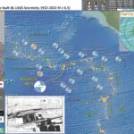
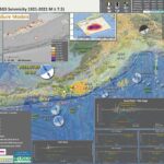
Early this morning I received some notifications of earthquakes along the Tonga trench (southwestern central Pacific Ocean). It was about 2am my local time.

I work on the tsunami program for the California state tsunami program (CTP) and we respond to tsunami to (1) help local communities do their first response activities so that they can help reduce suffering and to (2) document the impact of these tsunami.

Because of this work, our team is “at the ready” 24 hours a day, 7 days a week, to respond to these events. Luckily, this event was unlikely to generate a tsunami that would impact California. I went back to sleep.

This morning I put together a report and checked to see if there was a tsunami generated. Here is one place that I check for tsunami records as observed on tide gages http://www.ioc-sealevelmonitoring.org/map.php. I did not see anything convincing.

This earthquake, from last night my time, has a magnitude of M 7.3.

https://earthquake.usgs.gov/earthquakes/eventpage/us7000ip0l/executive

This area of the Earth has a plate boundary fault system called a subduction zone. A subduction zone is a convergent plate boundary, which means that the plates on either side of the boundary move towards each other.

Here, the Pacific plate dives westwards beneath the Australia plate, forming the Tonga trench. Below is a schematic illustration showing what these plates may look like if we cut into the Earth and viewed this subduction zone from the side. Note the Pacific plate on the right and the Australia plate on the left, with the megathrust subduction zone fault where they meet.

This illustration shows where earthquakes may happen along this plate boundary. There could be interface earthquakes along the megathrust fault (megathrust earthquakes). These are what most people are familiar with when they are thinking about tsunami (e.g., the 2011 Great East Japan Earthquake and Tsunami).

In the upper plate (the Australia plate), there can be crustal fault earthquakes. In the lower plate (the Pacific plate) there can be slab earthquakes (events within the crust, aka the slab), and there can be outer rise earthquakes).

The outer rise is a part of the plate that is warping up and down because of the forces adjacent to the subduction zone. This warping can cause extension in the upper part, and compression in the lower part, of this plate.

This 11 Nov 2022 M 7.3 earthquake was a compressional (reverse) earthquake in the outer rise region of this plate boundary. It was pretty deep (for oceanic crust) so fits nicely in the correct place in this illustration:


But megathrust earthquakes are not the only type of earthquake that can cause a tsunami. The 2009 magnitude M 8.1 extensional (normal) fault earthquake near Samoa and American Samoa caused a tsunami that inundated the nearby islands (causing lots of damage and human suffering). This tsunami also travelled across the Pacific Ocean to impact California! (This is why the California Tsunami Program monitors tsunami across the Pacific Basin, so that we can help reduce suffering through the evacuation of coastal areas. Remember, the entire coast of California is a Tsunami Hazard Area.)

Below is my interpretive poster for this earthquake

  • I plot the seismicity from the past month, with diameter representing magnitude (see legend). I include earthquake epicenters from 1922-2022 with magnitudes M ≥ 7.0 in one version.
  • I plot the USGS fault plane solutions (moment tensors in blue and focal mechanisms in orange), possibly in addition to some relevant historic earthquakes.
  • A review of the basic base map variations and data that I use for the interpretive posters can be found on the Earthquake Reports page. I have improved these posters over time and some of this background information applies to the older posters.
  • Some basic fundamentals of earthquake geology and plate tectonics can be found on the Earthquake Plate Tectonic Fundamentals page.

    I include some inset figures. Some of the same figures are located in different places on the larger scale map below.

  • In the upper left corner is a map that shows the plates, their boundaries, and a century of seismicity.
  • In the lower right corner is a map that shows the ground shaking from the earthquake, with color representing intensity using the Modified Mercalli Intensity (MMI) scale. The closer to the earthquake, the stronger the ground shaking. The colors on the map represent the USGS model of ground shaking. The colored circles represent reports from people who posted information on the USGS Did You Feel It? part of the website for this earthquake. There are things that affect the strength of ground shaking other than distance, which is why the reported intensities are different from the modeled intensities.
  • To the left is a plot that shows how the shaking intensity models and reports relate to each other. The horizontal axis is distance from the earthquake and the vertical axis is shaking intensity (using the MMI scale, just like in the map to the right: these are the same datasets).
  • Further to the left is a diagram that shows the different types of earthquakes that can occur along a subduction zone.
  • In the upper right corner is a map that shows some of the historic earthquakes in the region, with the earthquake mechanisms. I labeled these events for the type of event that I interpret them to be.
  • In the upper left center is a map from Richards et al. (2011) that shows earthquake locations (epicenters) with color representing depth. I place a yellow star in the general location of today’s M 7.3 earthquake. These colors help us visualize how the Pacific plate dips deeper towards the left (yellow are shallow events and purple are deep events). The 2000.01.08 M 7.2 earthquake is an intermediate depth earthquake (see the map in the upper right corner).
  • In the right center is a map from Timm et al (2013) that also shows the depth to the slab (the downgoing Pacific plate). I place a yellow star in the general location of today’s M 7.3 earthquake.
  • Here is the map with 3 month’s seismicity plotted.

  • Well, I just looked at Pago Pago and the record is clear. I am kinda surprised since this gage is on the nodal plane for this event. I will plot these data up.

  • Here is a screenshot:

  • Here are the two plots for the gages listed above. The Pago pago record is quite clear. However, the Nukualofa gage is pretty noisy. I don’t have much confidence in the measurements of the wave size.
  • Data from both gages show a background wave sequence that makes it difficult to know when the tsunami ends. Someone who can filter out that wave series could probably do a better job at locating when the tsunami ends, at least for the Pago Pago data.
  • Pago Pago (American Samoa) https://webcritech.jrc.ec.europa.eu/SeaLevelsDb/Device/959

  • Nukualofa (Tonga Island) https://webcritech.jrc.ec.europa.eu/SeaLevelsDb/Device/950

Other Report Pages

Some Relevant Discussion and Figures

  • Here is the map from Timm et al., 2013.

  • Bathymetric map of the Tonga–Kermadec arc system. Map showing the depth of the subducted slab beneath the Tonga–Kermadec arc system. Louisville seamount ages are after Koppers et al.49 ELSC, eastern Lau-spreading centre; DSDP, Deep Sea Drilling Programme; NHT, Northern Havre Trough; OT, Osbourn Trough; VFR, Valu Fa Ridge. Arrows mark total convergence rates.

  • Here is the oblique view of the slab from Green (2003).

  • Earthquakes and subducted slabs beneath the Tonga–Fiji area. The subducting slab and detached slab are defined by the historic earthquakes in this region: the steeply dipping surface descending from the Tonga Trench marks the currently active subduction zone, and the surface lying mostly between 500 and 680 km, but rising to 300 km in the east, is a relict from an old subduction zone that descended from the fossil Vitiaz Trench. The locations of the mainshocks of the two Tongan earthquake sequences discussed by Tibi et al. are marked in yellow (2002 sequence) and orange (1986 series). Triggering mainshocks are denoted by stars; triggered mainshocks by circles. The 2002 sequence lies wholly in the currently subducting slab (and slightly extends the earthquake distribution in it),whereas the 1986 mainshock is in that slab but the triggered series is located in the detached slab,which apparently contains significant amounts of metastable olivine

  • Here are figures from Richards et al. (2011) with their figure captions below in blockquote.
  • The main tectonic map

  • bathymetry, and major tectonic element map of the study area. The Tonga and Vanuatu subduction systems are shown together with the locations of earthquake epicenters discussed herein. Earthquakes between 0 and 70 km depth have been removed for clarity. Remaining earthquakes are color-coded according to depth. Earthquakes located at 500–650 km depth beneath the North Fiji Basin are also shown. Plate motions for Vanuatu are from the U.S. Geological Survey, and for Tonga from Beavan et al. (2002) (see text for details). Dashed line indicates location of cross section shown in Figure 3. NFB—North Fiji Basin; HFZ—Hunter Fracture Zone.

  • Here is the map showing the current configuration of the slabs in the region.

  • Map showing distribution of slab segments beneath the Tonga-Vanuatu region. West-dipping Pacifi c slab is shown in gray; northeast-dipping Australian slab is shown in red. Three detached segments of Australian slab lie below the North Fiji Basin (NFB). HFZ—Hunter Fracture Zone. Contour interval is 100 km. Detached segments of Australian plate form sub-horizontal sheets located at ~600 km depth. White dashed line shows outline of the subducted slab fragments when reconstructed from 660 km depth to the surface. When all subducted components are brought to the surface, the geometry closely approximates that of the North Fiji Basin.

  • This is the cross section showing the megathrust fault configuration based on seismic tomography and seismicity.

  • Previous interpretation of combined P-wave tomography and seismicity from van der Hilst (1995). Earthquake hypocenters are shown in blue. The previous interpretation of slab structure is contained within the black dashed lines. Solid red lines mark the surface of the Pacifi c slab (1), the still attached subducting Australian slab (2a), and the detached segment of the Australian plate (2b). UM—upper mantle;
    TZ—transition zone; LM—lower mantle.

  • Here is their time step interpretation of the slabs that resulted in the second figure above.

  • Simplified plate tectonic reconstruction showing the progressive geometric evolution of the Vanuatu and Tonga subduction systems in plan view and in cross section. Initiation of the Vanuatu subduction system begins by 10 Ma. Initial detachment of the basal part of the Australian slab begins at ca. 5–4 Ma and then sinking and collision between the detached segment and the Pacifi c slab occur by 3–4 Ma. Initial opening of the Lau backarc also occurred at this time. Between 3 Ma and the present, both slabs have been sinking progressively to their current position. VT—Vitiaz trench; dER—d’Entrecasteaux Ridge.

  • Here is the tectonic map from Ballance et al., 1999.

  • Map of the Southwest Pacific Ocean showing the regional tectonic setting and location of the two dredged profiles. Depth contours in kilometres. The presently active arcs comprise New Zealand–Kermadec Ridge–Tonga Ridge, linked with Vanuatu by transforms associated with the North Fiji Basin. Colville Ridge–Lau Ridge is the remnant arc. Havre Trough–Lau Basin is the active backarc basin. Kermadec–Tonga Trench marks the site of subduction of Pacific lithosphere westward beneath Australian plate lithosphere. North and South Fiji Basins are marginal basins of late Neogene and probable Oligocene age, respectively. 5.4sK–Ar date of dredged basalt sample (Adams et al., 1994).

  • Here is a great summary of the fault mechanisms for earthquakes along this plate boundary (Yu, 2013).

  • Large subduction-zone interplate earthquakes (large open gray stars) labeled with event date, Mw, GCMT focal mechanisms, and GPS velocity vectors (gray arrows and black triangles labeled with station name). GPS velocities are listed in Table 3. Black lines indicate the Tonga–Kermadec and Vanuatu trenches. Note that the 2009/09/29 Samoa–Tonga outer trench-slope event (Mw 8.1) triggered large interplate doublets (both of Mw 7.8; Lay et al., 2010). The Pacific plate subducts westward beneath the Australian plate along the Tonga–Kermadec trench, whereas the Australian plate subducts eastward beneath the Vanuatu arc and North Fiji basin. The opposite orientation between the Tonga–Kermadec and Vanuatu subduction systems is due to complex and broad back-arc extension in the Lau and North Fiji basins (Pelletier et al., 1998).


    Regional map of moderate-sized (mb > 4:7) shallow-focus repeating earthquakes and background seismicity along the (a) Tonga–Kermadec and (b) Vanuatu (former New Hebrides) subduction zones. Shallow repeating earthquakes (black stars) and their available Global Centroid Moment Tensor (GCMT; Dziewoński et al., 1981; Ekström et al., 2003) are labeled with event date and doublet/cluster id where applicable. Colors of GCMT are used to distinguish nearby different repeaters. Source parameters for the clusters and doublets are listed in Tables 1 and 2. Background seismicity is shown as gray dots and large interplate earthquakes (moment magnitude, Mw > 7:3) since 1976 are shown as large open gray stars. Black lines indicate the trench (Bird, 2003) and slab contour at 50-km depth (Gudmundsson and Sambridge, 1998). Repeating earthquake clusters in the (a) T1 and T2 plate-interface regions in Tonga and (b) V3 plate-interface region in Vanuatu are used to study the fault-slip rate ( _d). A regional map of the Tonga–Kermadec–Vanuatu subduction zones is
    shown in the inset figure, with the gray dotted box indicating the expanded region in the main figure.

    References:

    Basic & General References

  • Frisch, W., Meschede, M., Blakey, R., 2011. Plate Tectonics, Springer-Verlag, London, 213 pp.
  • Hayes, G., 2018, Slab2 – A Comprehensive Subduction Zone Geometry Model: U.S. Geological Survey data release, https://doi.org/10.5066/F7PV6JNV.
  • Holt, W. E., C. Kreemer, A. J. Haines, L. Estey, C. Meertens, G. Blewitt, and D. Lavallee (2005), Project helps constrain continental dynamics and seismic hazards, Eos Trans. AGU, 86(41), 383–387, , https://doi.org/10.1029/2005EO410002. /li>
  • Jessee, M.A.N., Hamburger, M. W., Allstadt, K., Wald, D. J., Robeson, S. M., Tanyas, H., et al. (2018). A global empirical model for near-real-time assessment of seismically induced landslides. Journal of Geophysical Research: Earth Surface, 123, 1835–1859. https://doi.org/10.1029/2017JF004494
  • Kreemer, C., J. Haines, W. Holt, G. Blewitt, and D. Lavallee (2000), On the determination of a global strain rate model, Geophys. J. Int., 52(10), 765–770.
  • Kreemer, C., W. E. Holt, and A. J. Haines (2003), An integrated global model of present-day plate motions and plate boundary deformation, Geophys. J. Int., 154(1), 8–34, , https://doi.org/10.1046/j.1365-246X.2003.01917.x.
  • Kreemer, C., G. Blewitt, E.C. Klein, 2014. A geodetic plate motion and Global Strain Rate Model in Geochemistry, Geophysics, Geosystems, v. 15, p. 3849-3889, https://doi.org/10.1002/2014GC005407.
  • Meyer, B., Saltus, R., Chulliat, a., 2017. EMAG2: Earth Magnetic Anomaly Grid (2-arc-minute resolution) Version 3. National Centers for Environmental Information, NOAA. Model. https://doi.org/10.7289/V5H70CVX
  • Müller, R.D., Sdrolias, M., Gaina, C. and Roest, W.R., 2008, Age spreading rates and spreading asymmetry of the world’s ocean crust in Geochemistry, Geophysics, Geosystems, 9, Q04006, https://doi.org/10.1029/2007GC001743
  • Pagani,M. , J. Garcia-Pelaez, R. Gee, K. Johnson, V. Poggi, R. Styron, G. Weatherill, M. Simionato, D. Viganò, L. Danciu, D. Monelli (2018). Global Earthquake Model (GEM) Seismic Hazard Map (version 2018.1 – December 2018), DOI: 10.13117/GEM-GLOBAL-SEISMIC-HAZARD-MAP-2018.1
  • Silva, V ., D Amo-Oduro, A Calderon, J Dabbeek, V Despotaki, L Martins, A Rao, M Simionato, D Viganò, C Yepes, A Acevedo, N Horspool, H Crowley, K Jaiswal, M Journeay, M Pittore, 2018. Global Earthquake Model (GEM) Seismic Risk Map (version 2018.1). https://doi.org/10.13117/GEM-GLOBAL-SEISMIC-RISK-MAP-2018.1
  • Zhu, J., Baise, L. G., Thompson, E. M., 2017, An Updated Geospatial Liquefaction Model for Global Application, Bulletin of the Seismological Society of America, 107, p 1365-1385, https://doi.org/0.1785/0120160198
  • Specific References

  • Richards, S., Holm, R., and Barber, G., 2011. Skip Nav Destination When slabs collide: A tectonic assessment of deep earthquakes in the Tonga-Vanuatu region in Geology, c. 39, no. 8, p. 787-790, https://doi.org/10.1130/G31937.1
  • Timm, C., Bassett, D., Graham, I. et al. Louisville seamount subduction and its implication on mantle flow beneath the central Tonga–Kermadec arc. Nat Commun 4, 1720 (2013). https://doi.org/10.1038/ncomms2702

Return to the Earthquake Reports page.

Earthquake Report: M 6.9 Mid Atlantic Ridge

There have not been that many large earthquakes this year. This is good for one main reason, there is a lower potential for human suffering.

Therefore, there are fewer Earthquake Reports for this year.

This morning (my time) there was a magnitude M 6.9 earthquake along the Romanche transform fault, a right-lateral strike-slip fault system that offsets the Mid Atlantic Ridge in the equatorial Atlantic Ocean. The fault is part of the Romanche fracture zone.

https://earthquake.usgs.gov/earthquakes/eventpage/us7000i53f/executive

The transform faults in this part of the Mid Atlantic Ridge plate boundary have a pattern of earthquakes that seem to max out in the lower 7 magnitudes. This may be (at least partly) due to the maximum length of these faults (?).

The Romanche fault is about 900 kilometers long. The Chain fault is about 250 km long. The St. Paul fault is about 350 km long.

    Earthquake magnitude is controlled by three things:

  1. the size of the earthquake slip area, for most events, this is basically the length of the fault (since the width of the fault is controlled by the thickness of the lithosphere, or the crust)
  2. the amount that the fault slipped
  3. physical properties of the lithosphere or crust on either side of the fault (how “elastic” the Earth is)

Using empirical (data) based relations between earthquake subsurface rupture length and earthquake magnitude (Wells and Coppersmith, 1994), I calculate the maximum earthquake magnitude we may get on these three faults listed above.

Here are the data that Wells and Coppersmith use to establish these relations.


(a) Regression of subsurface rupture length on magnitude (M). Regression line shown for all-slip-type relationship. Short dashed line indicates 95% confidence interval. (b) Regression lines for strike-slip relationships. See Table 2 for regression coefficients. Length of regression lines shows the range of data for each relationship.

Here are the magnitude estimates for each of these fault systems.


Looking at the interpretive poster, we can see that there have not been any temblors that approach the sizes listed in this table. The largest historic earthquake was M 7.1 (there were several).

So, we may ask ourselves one of the most common questions people ask regarding earthquakes. Was this M 6.9 a foreshock to a larger earthquake?

Obviously, we cannot yet know this. Nobody can predict the future (at least not yet).

However, based on the incredibly short historic record of earthquakes, we may answer this question: “no, probably not.” This answer is tempered by the very short seismic record. If magnitude 8 earthquakes occur, on average, every 1000 years, then our ~100 year record might be too short to “notice” one of these M 8 events.
If we continue to look at the historic record, we will see that there appear to be three instances where one of these M 6.5-7 earthquakes had a later earthquake of a similar magnitude.
When an earthquake fault slips, the crust surrounding the fault squishes and expands, deforming elastically (like in one’s underwear). These changes in shape of the crust cause earthquake fault stresses to change. These changes in stress can either increase or decrease the chance of another earthquake.
I wrote more about this type of earthquake triggering for Temblor here. Head over there to learn more about “static coulomb stress triggering.”
In the poster, I label these earthquakes as “Linked Earthquakes.” Perhaps the later of each earthquake pair (or triple) was triggered by the change in static coulomb stress.

    Here are the three sets of “Linked Earthquakes:”

  • In 1992, along the Chain fault, the 16 Feb M 6.6 appears to have triggered the 18 Feb M 6.6. More speculatively, about 6 months later, it seems that there was a triggered M 6.9 on 18 Aug. Static Coulomb triggering typically has a limit of about 2-3 times the rupture length (and this depends of the pre-existing stress on the receiver fault, the fault that may be having triggered slip). A M 6.6 may have a rupture length of 50 km, so could possibly affect faults as far as 100-150 km away. The M 6.9 is about 70 km from the easternmost M 6.6, so it seems possible that the M 6.9 was triggered by the M 6.6.
  • In 2003, along the Romanche fault, there were two M 6.6 earthquakes separated by about 6 weeks. These quakes are about 100 km apart, possibly close enough to be triggered.
  • In 2020, along the St. Paul transform fault, there was a pair of quakes about 3 weeks and 340 km apart. The first quake was M 6.5, so this pair of events seems to far apart to be related.

So, given the historic record, it sure seems likely that there may be another M6-7 earthquakes in the region of the fault sometime in the next couple of months. And, given our lack of knowledge about the long term behavior of these faults, it is also possible that there could be a larger M 8 event.
Since we cannot yet know the real answer to this question, we are reminded of the advice that educators and emergency response people provide: If one lives in Earthquake Country, get earthquake prepared. Just a little effort to get better prepared makes a major difference in the outcome.
Head over to Earthquake Alliance where there are some excellent brochures about how to be better prepared and more resilient to earthquake and tsunami hazards. Living on Shaky Ground is one of my favorites!

Below is my interpretive poster for this earthquake

  • I plot the seismicity from the past month, with diameter representing magnitude (see legend). I include earthquake epicenters from 1920-2020 with magnitudes M ≥ 3.0 in one version.
  • I plot the USGS fault plane solutions (moment tensors in blue and focal mechanisms in orange), possibly in addition to some relevant historic earthquakes.
  • A review of the basic base map variations and data that I use for the interpretive posters can be found on the Earthquake Reports page. I have improved these posters over time and some of this background information applies to the older posters.
  • Some basic fundamentals of earthquake geology and plate tectonics can be found on the Earthquake Plate Tectonic Fundamentals page.

    I include some inset figures. Some of the same figures are located in different places on the larger scale map below.

  • In the lower right corner I include a map that shows the age of the oceanic crust in the Atlantic Ocean. Oceanic crust (or lithosphere) is created at mid ocean ridges, where there is extension that allows upward movement of magma, leading to the formation of oceanic crust. The Mid Atlantic Ridge system is one of these types of plate boundaries.
  • Above the crust age map is an illustration showing the how the crust moving away from the ocean ridges leaves behind oceanic crust. The Earth’s magnetic polarity changes at times and the oceanic crust records these changes in magnetic polarity. These changes are the main reason why we know that the crust is formed along these ridge systems. Read more here.
  • In the upper left corner is a small scale map that shows the historic seismicity, the plate boundary fault systems, and the magnetic anomalies. Places with crust formed when the magnetic field is like today, is colored red (a.k.a. normal polarity) and crust formed when the poles were reversed relative to today is blue (i.e., reversed polarity).
  • In the upper right corner is a map that shows the earthquake intensity from this earthquake (using the modified Mercalli Intensity Scale). Intensity is a measure of how strongly the shaking is felt, not a measure of the earthquake size. So, the intensity gets smaller with distance (see how the highest intensity is nearest the earthquake epicenter).
  • In the lower left center there is a map from Heezen et al. (1964). Heezen was an oceanographer that contributed greatly to our knowledge of the oceans. In this study, one of the things that they were studying is the flow of deep water (deep water flows largely because of changes in density of the seawater, controlled by salinity and temperature). Because of this, they were mapping the shape of the seafloor to see where this deep water could flow. Ths location of this map is outlined by a dashed rectangle in the main map.
  • Here is the map with a month’s seismicity plotted.

Some Relevant Discussion and Figures

  • Here is the Müller et al. (2008) figure from the interpretive poster above.

  • Here a the Bonatti et al. (2001) figure showing the bathymetry of this area. I include the figure caption as a blockquote below.

  • A: Multibeam topography of Romanche region, showing north-south profiles where sampling was carried out. Black dots and red numbers indicate estimated age (in million years) of lithosphere south of Romanche Transform, assuming spreading half-rate of 17 mm/yr within present-day ridge and transform geometry. White dots indicate epicenters of teleseismically recorded 1970–1995 events (magnitude . 4). FZ is fracture zone. B: Topography and petrology at eastern intersection of Romanche Fracture Zone with Mid-Atlantic Ridge. Data were obtained during expeditions S-16, S-19, and G-96 (Bonatti et al., 1994, 1996). C: Location of A along Mid-Atlantic Ridge.

  • Dr. Stephen Hicks and their colleagues conducted a fascinating study of the 2016 M 7.1 earthquake. They hypothesize that the Romanche fault slipped in different parts of the fault at different times (during the earthquake).
  • This map shows the historic seismicity of the region.

  • Seismotectonic context. The map location is given by the red rectangle on the inset globe. Focal mechanisms are shown for events with Mw > 6 (ref. 30). Mw > 7.0 events are labelled. Stations of the PI-LAB ocean bottom seismometer network are indicated by triangles. Our relocated hypocentre and low-frequency RMT of the 2016 earthquake are shown by the red star and red beach ball, respectively. The orange beach ball is a colocated Mw 5.8 used for the Mach cone analysis. The black rectangle shows the location of the map in Fig. 2. ISC Bulletin, Bulletin of the International Seismological Centre.

  • Here is where Hicks et al. (2020) hypothesize that the slip slipped.

  • Interpretation of rupture dynamics for the 2016 Romanche earthquake. Top: perspective view of bathymetry along the Romanche FZ. Bottom: interpretive cross-section along the ruptured fault plane. Colours show a thermal profile based on half-space cooling. The green line denotes the predicted transition between velocity-strengthening and velocity-weakening frictional regimes (as expressed by the a – b friction rate parameter) from Gabbro data35. The numbers show the key stages of rupture evolution: (1) rupture initiation (star) in the oceanic mantle, (2) initiation phase has sufficient fracture energy to propagate upwards to the locked section of fault, (3) weak subshear rupture front travels east in the lower crust and/or upper mantle, (4) rupture reaches the locked, thinner crustal segment close to the weaker RTI (SE1), (5) sufficient fracture energy for a westward supershear rupture in the crust along the strongly coupled fault segment (SE2) and (6) rupture possibly terminated by a serpentinized and hydrothermally altered fault segment.

    References:

    Basic & General References

  • Frisch, W., Meschede, M., Blakey, R., 2011. Plate Tectonics, Springer-Verlag, London, 213 pp.
  • Hayes, G., 2018, Slab2 – A Comprehensive Subduction Zone Geometry Model: U.S. Geological Survey data release, https://doi.org/10.5066/F7PV6JNV.
  • Holt, W. E., C. Kreemer, A. J. Haines, L. Estey, C. Meertens, G. Blewitt, and D. Lavallee (2005), Project helps constrain continental dynamics and seismic hazards, Eos Trans. AGU, 86(41), 383–387, , https://doi.org/10.1029/2005EO410002. /li>
  • Jessee, M.A.N., Hamburger, M. W., Allstadt, K., Wald, D. J., Robeson, S. M., Tanyas, H., et al. (2018). A global empirical model for near-real-time assessment of seismically induced landslides. Journal of Geophysical Research: Earth Surface, 123, 1835–1859. https://doi.org/10.1029/2017JF004494
  • Kreemer, C., J. Haines, W. Holt, G. Blewitt, and D. Lavallee (2000), On the determination of a global strain rate model, Geophys. J. Int., 52(10), 765–770.
  • Kreemer, C., W. E. Holt, and A. J. Haines (2003), An integrated global model of present-day plate motions and plate boundary deformation, Geophys. J. Int., 154(1), 8–34, , https://doi.org/10.1046/j.1365-246X.2003.01917.x.
  • Kreemer, C., G. Blewitt, E.C. Klein, 2014. A geodetic plate motion and Global Strain Rate Model in Geochemistry, Geophysics, Geosystems, v. 15, p. 3849-3889, https://doi.org/10.1002/2014GC005407.
  • Meyer, B., Saltus, R., Chulliat, a., 2017. EMAG2: Earth Magnetic Anomaly Grid (2-arc-minute resolution) Version 3. National Centers for Environmental Information, NOAA. Model. https://doi.org/10.7289/V5H70CVX
  • Müller, R.D., Sdrolias, M., Gaina, C. and Roest, W.R., 2008, Age spreading rates and spreading asymmetry of the world’s ocean crust in Geochemistry, Geophysics, Geosystems, 9, Q04006, https://doi.org/10.1029/2007GC001743
  • Pagani,M. , J. Garcia-Pelaez, R. Gee, K. Johnson, V. Poggi, R. Styron, G. Weatherill, M. Simionato, D. Viganò, L. Danciu, D. Monelli (2018). Global Earthquake Model (GEM) Seismic Hazard Map (version 2018.1 – December 2018), DOI: 10.13117/GEM-GLOBAL-SEISMIC-HAZARD-MAP-2018.1
  • Silva, V ., D Amo-Oduro, A Calderon, J Dabbeek, V Despotaki, L Martins, A Rao, M Simionato, D Viganò, C Yepes, A Acevedo, N Horspool, H Crowley, K Jaiswal, M Journeay, M Pittore, 2018. Global Earthquake Model (GEM) Seismic Risk Map (version 2018.1). https://doi.org/10.13117/GEM-GLOBAL-SEISMIC-RISK-MAP-2018.1
  • Zhu, J., Baise, L. G., Thompson, E. M., 2017, An Updated Geospatial Liquefaction Model for Global Application, Bulletin of the Seismological Society of America, 107, p 1365-1385, https://doi.org/0.1785/0120160198
  • Specific References

  • Abercrombie, R.E. and Ekstrom, G., 2001. Earthquake slip on oceanic transform faults in Nature, v. 410, p. 74-77
  • Bonatti, E., Brunello, D., Fabretti, P., Ligi, M., Porcaro, R.A., and Sealer, M., 2001. Steady-state creation of crust-free lithosphere at cold spots in mid-ocean ridges in Geology, v. 29, no. 11, p. 979-982.
  • Hicks, S.P., Okuwaki, R., Steinberg, A., Rychert, C.A., Harmon, N. Abercrombie, R.E., Bogiatzis, P., Cataphors, D., Zahradnik, J., Kendall, J-M., Yagi, Y., Shimizu, K., and Sudhaus, H., 2020. Back-propagating supershear rupture in the 2016 Mw 7.1 Romanche transform fault earthquake in Nature Geoscience, v. 13, p. 647-653, https://doi.org/10.1038/s41561-020-0619-9
  • Heezen, B.C., Bunce, E.T., Hersey, J.B., and Tharp, M., 1964. Chain and Romanche fracture zones in Deep-Sea research, v. 11, p. 11-33
  • Müller, R.D., Sdrolias, M., Gaina, C., and Roest, W.R., 2008. Age, spreading rates and spreading symmetry of the world’s ocean crust in Geochem. Geophys. Geosyst., 9, Q04006, doi:10.1029/2007GC001743
  • Torsvik, T.H., Tousse, S., Labaila, C., and Smethurst, M.A., 2009. A new scheme for the opening of the South Atlantic Ocean and the dissection of an Aptian salt basin in Geophysical Journal International, v. 177, p. 1315-1333.

Return to the Earthquake Reports page.


Earthquake Report: M 7.5 in Peru

In the middle of the night (my time) I got a notification from the EMSC earthquake notification service. I encourage everyone to download and use this app.

There was an intermediate depth magnitude M 7.5 earthquake in Peru. The tectonics in this region of the world are dominated by the convergent plate boundary, a subduction zone formed by the convergence of the oceanic Nazca and continental South America plates.

https://earthquake.usgs.gov/earthquakes/eventpage/us7000fxq2/executive

As the Nazca plate subducts, it dips below the South America plate at different dip angles. In this region of Peru, the dip angle is shallow and we term this flat-slab subduction.

This M 7.5 earthquake occurred in the downgoing Nazca plate, so was not a subduction zone megathrust event, but a “slab” event (for being in the Nazca slab).

I prepared a much more extensive report for a M 8.0 earthquake in a nearby location that happened on 26 May 2019. Read more about the tectonics of this region in that report here.

Was this M 7.5 an aftershock of the M 8.0? Probably not, based on the USGS M 8.0 slip model. However this M 7.5 could have been triggered by changes in static coulomb stress following the M 8.0.

I don’t always have the time to write a proper Earthquake Report. However, I prepare interpretive posters for these events.

Because of this, I present Earthquake Report Lite. (but it is more than just water, like the adult beverage that claims otherwise). I will try to describe the figures included in the poster, but sometimes I will simply post the poster here.

Below is my interpretive poster for this earthquake

  • I plot the seismicity from the past month, with diameter representing magnitude (see legend). I include earthquake epicenters from 1921-2021 with magnitudes M ≥ 3.0 in one version.
  • I plot the USGS fault plane solutions (moment tensors in blue and focal mechanisms in orange), possibly in addition to some relevant historic earthquakes.
  • A review of the basic base map variations and data that I use for the interpretive posters can be found on the Earthquake Reports page. I have improved these posters over time and some of this background information applies to the older posters.
  • Some basic fundamentals of earthquake geology and plate tectonics can be found on the Earthquake Plate Tectonic Fundamentals page.

    I include some inset figures.

  • In the upper left corner is a large scale plate tectonic map showing the major plate boundary faults.
  • In the lower left center is a map showing how the Nazca slab is configured in different locations (Ramos and Folguera, 2009).
  • In the left center is a cross section showing seismicity in this region (Kirby et al., 1995). The source area for this plot is designated by a dashed yellow box on the map.
  • In the upper right corner is a pair of maps that show the landslide probability (left) and the liquefaction susceptibility (right) for this M 7.5 earthquake. I spend more time describing these types of data here. Read more about these maps here.
  • In the lower right corner I plot the USGS modeled intensity (Modified Mercalli Intensity scale, MMI) and the USGS “Did You Feel It?” observations (labeled in yellow). Above the map is a plot showing these same data plotted relative to distance from the earthquake. Read more about what these data sets are and what they represent in the report here.
  • Here is the map with 3 month’s seismicity plotted.

    Social Media

    References:

    Basic & General References

  • Frisch, W., Meschede, M., Blakey, R., 2011. Plate Tectonics, Springer-Verlag, London, 213 pp.
  • Hayes, G., 2018, Slab2 – A Comprehensive Subduction Zone Geometry Model: U.S. Geological Survey data release, https://doi.org/10.5066/F7PV6JNV.
  • Holt, W. E., C. Kreemer, A. J. Haines, L. Estey, C. Meertens, G. Blewitt, and D. Lavallee (2005), Project helps constrain continental dynamics and seismic hazards, Eos Trans. AGU, 86(41), 383–387, , https://doi.org/10.1029/2005EO410002. /li>
  • Jessee, M.A.N., Hamburger, M. W., Allstadt, K., Wald, D. J., Robeson, S. M., Tanyas, H., et al. (2018). A global empirical model for near-real-time assessment of seismically induced landslides. Journal of Geophysical Research: Earth Surface, 123, 1835–1859. https://doi.org/10.1029/2017JF004494
  • Kreemer, C., J. Haines, W. Holt, G. Blewitt, and D. Lavallee (2000), On the determination of a global strain rate model, Geophys. J. Int., 52(10), 765–770.
  • Kreemer, C., W. E. Holt, and A. J. Haines (2003), An integrated global model of present-day plate motions and plate boundary deformation, Geophys. J. Int., 154(1), 8–34, , https://doi.org/10.1046/j.1365-246X.2003.01917.x.
  • Kreemer, C., G. Blewitt, E.C. Klein, 2014. A geodetic plate motion and Global Strain Rate Model in Geochemistry, Geophysics, Geosystems, v. 15, p. 3849-3889, https://doi.org/10.1002/2014GC005407.
  • Meyer, B., Saltus, R., Chulliat, a., 2017. EMAG2: Earth Magnetic Anomaly Grid (2-arc-minute resolution) Version 3. National Centers for Environmental Information, NOAA. Model. https://doi.org/10.7289/V5H70CVX
  • Müller, R.D., Sdrolias, M., Gaina, C. and Roest, W.R., 2008, Age spreading rates and spreading asymmetry of the world’s ocean crust in Geochemistry, Geophysics, Geosystems, 9, Q04006, https://doi.org/10.1029/2007GC001743
  • Pagani,M. , J. Garcia-Pelaez, R. Gee, K. Johnson, V. Poggi, R. Styron, G. Weatherill, M. Simionato, D. Viganò, L. Danciu, D. Monelli (2018). Global Earthquake Model (GEM) Seismic Hazard Map (version 2018.1 – December 2018), DOI: 10.13117/GEM-GLOBAL-SEISMIC-HAZARD-MAP-2018.1
  • Silva, V ., D Amo-Oduro, A Calderon, J Dabbeek, V Despotaki, L Martins, A Rao, M Simionato, D Viganò, C Yepes, A Acevedo, N Horspool, H Crowley, K Jaiswal, M Journeay, M Pittore, 2018. Global Earthquake Model (GEM) Seismic Risk Map (version 2018.1). https://doi.org/10.13117/GEM-GLOBAL-SEISMIC-RISK-MAP-2018.1
  • Zhu, J., Baise, L. G., Thompson, E. M., 2017, An Updated Geospatial Liquefaction Model for Global Application, Bulletin of the Seismological Society of America, 107, p 1365-1385, https://doi.org/0.1785/0120160198
  • Specific References

  • Antonijevic, S.K., et a;l., 2015. The role of ridges in the formation and longevity of flat slabs in Nature, v. 524, p. 212-215, doi:10.1038/nature14648
  • Bishop, B.T., Beck, S.L., Zandt, G., Wagner, L., Long, M., Knezevic Antonijevic, S., Kumar, A., and Tavera, H., 2017, Causes and consequences of flat-slab subduction in southern Peru: Geosphere, v. 13, no. 5, p. 1392–1407, doi:10.1130/GES01440.1.
  • Chlieh, M. Mothes, P.A>, Nocquet, J-M., Jarrin, P., Charvis, P., Cisneros, D., Font, Y., Color, J-Y., Villegas-Lanza, J-C., Rolandone, F., Vallée, M., Regnier, M., Sogovia, M., Martin, X., and Yepes, H., 2014. Distribution of discrete seismic asperities and aseismic slip along the Ecuadorian megathrust in Earth and Planetary Science Letters, v. 400, p. 292–301
  • Kumar, A., et al., 2016. Seismicity and state of stress in the central and southern Peruvian flat slab in EPSL, v. 441, p. 71-80. http://dx.doi.org/10.1016/j.epsl.2016.02.023
  • Rhea, S., Hayes, G., Villaseñor, A., Furlong, K.P., Tarr, A.C., and Benz, H.M., 2010. Seismicity of the earth 1900–2007, Nazca Plate and South America: U.S. Geological Survey Open-File Report 2010–1083-E, 1 sheet, scale 1:12,000,000.
  • Villegas-Lanza, J. C., M. Chlieh, O. Cavalié, H. Tavera, P. Baby, J. Chire-Chira, and J.-M. Nocquet (2016), Active tectonics of Peru: Heterogeneous interseismic coupling along the Nazca megathrust, rigid motion of the Peruvian Sliver, and Subandean shortening accommodation, J. Geophys. Res. Solid Earth, 121, 7371–7394, https://doi.org/10.1002/2016JB013080.
  • Wagner, L.S., and Okal, E.A., 2019. The Pucallpa Nest and its constraints on the geometry of the Peruvian Flat Slab in Tectonophysics, v. 762, p. 97-108, https://doi.org/10.1016/j.tecto.2019.04.021
  • Yepes,H., L. Audin, A. Alvarado, C. Beauval, J. Aguilar, Y. Font, and F. Cotton (2016), A new view for the geodynamics of Ecuador: Implication in seismogenic source definition and seismic hazard assessment, Tectonics, 35, 1249–1279, https://doi.org/10.1002/2015TC003941.

Return to the Earthquake Reports page.


Earthquake Report Lite: M 7.0 near Acapulco, Mexico

I don’t always have the time to write a proper Earthquake Report. However, I prepare interpretive posters for these events.

Because of this, I present Earthquake Report Lite. (but it is more than just water, like the adult beverage that claims otherwise). I will try to describe the figures included in the poster, but sometimes I will simply post the poster here.

Last afternoon (my time) there was an M 7.0 earthquake near Acapulco, Mexico. This event generated a tsunami, landslides, building damage, casualties (one fatality as I write this), and many emotions.

https://earthquake.usgs.gov/earthquakes/eventpage/us7000f93v/executive

I present my interpretive poster and a few figures. Read more about the tectonics of this region here, in a report for an M 7.4 earthquake in 2020.

Below is my interpretive poster for this earthquake

  • I plot the seismicity from the past month, with diameter representing magnitude (see legend). I include earthquake epicenters from 1921-2021 with magnitudes M ≥ 7.0 in one version.
  • I plot the USGS fault plane solutions (moment tensors in blue and focal mechanisms in orange), possibly in addition to some relevant historic earthquakes.
  • A review of the basic base map variations and data that I use for the interpretive posters can be found on the Earthquake Reports page. I have improved these posters over time and some of this background information applies to the older posters.
  • Some basic fundamentals of earthquake geology and plate tectonics can be found on the Earthquake Plate Tectonic Fundamentals page.

    I include some inset figures.

  • In the upper left corner is a small scale map showing the major plate boundaries.
  • Below the plate tectonic map is a plot showing the tide gage data from Acapulco, Mexico. Note the clear tsunami signal.
  • To the right of the plate tectonic map is a large scale map showing aftershocks in the region of the M 7.1 mainshock. Note that these aftershocks are from the Servicio Sismológico Nacional (SSN) Catálogo de sismos and that there are two mainshock locations (USGS M 7.0 and SSN M 7.1).
  • In the lower right corner is a map that shows a comparison of earthquake intensity between the USGS models and the Did You Feel It observations.
  • Above the intensity comparison map is a plot showing these same data, intensity is on the vertical axis an distance from the earthquake [Hypocenter] is on the horizontal axis.
  • In the upper right corner is a map that shows the results of an earthquake induced liquefaction model. Read more about this model here.
  • Here is the map with a week’s seismicity plotted.

Tide Gage Data – Acapulco

Earthquake Intensity

  • Below is a comparison of earthquake shaking intensity between the USGS Model results and the Did You Feel It observations.

    References:

    Basic & General References

  • Frisch, W., Meschede, M., Blakey, R., 2011. Plate Tectonics, Springer-Verlag, London, 213 pp.
  • Hayes, G., 2018, Slab2 – A Comprehensive Subduction Zone Geometry Model: U.S. Geological Survey data release, https://doi.org/10.5066/F7PV6JNV.
  • Holt, W. E., C. Kreemer, A. J. Haines, L. Estey, C. Meertens, G. Blewitt, and D. Lavallee (2005), Project helps constrain continental dynamics and seismic hazards, Eos Trans. AGU, 86(41), 383–387, , https://doi.org/10.1029/2005EO410002. /li>
  • Jessee, M.A.N., Hamburger, M. W., Allstadt, K., Wald, D. J., Robeson, S. M., Tanyas, H., et al. (2018). A global empirical model for near-real-time assessment of seismically induced landslides. Journal of Geophysical Research: Earth Surface, 123, 1835–1859. https://doi.org/10.1029/2017JF004494
  • Kreemer, C., J. Haines, W. Holt, G. Blewitt, and D. Lavallee (2000), On the determination of a global strain rate model, Geophys. J. Int., 52(10), 765–770.
  • Kreemer, C., W. E. Holt, and A. J. Haines (2003), An integrated global model of present-day plate motions and plate boundary deformation, Geophys. J. Int., 154(1), 8–34, , https://doi.org/10.1046/j.1365-246X.2003.01917.x.
  • Kreemer, C., G. Blewitt, E.C. Klein, 2014. A geodetic plate motion and Global Strain Rate Model in Geochemistry, Geophysics, Geosystems, v. 15, p. 3849-3889, https://doi.org/10.1002/2014GC005407.
  • Meyer, B., Saltus, R., Chulliat, a., 2017. EMAG2: Earth Magnetic Anomaly Grid (2-arc-minute resolution) Version 3. National Centers for Environmental Information, NOAA. Model. https://doi.org/10.7289/V5H70CVX
  • Müller, R.D., Sdrolias, M., Gaina, C. and Roest, W.R., 2008, Age spreading rates and spreading asymmetry of the world’s ocean crust in Geochemistry, Geophysics, Geosystems, 9, Q04006, https://doi.org/10.1029/2007GC001743
  • Pagani,M. , J. Garcia-Pelaez, R. Gee, K. Johnson, V. Poggi, R. Styron, G. Weatherill, M. Simionato, D. Viganò, L. Danciu, D. Monelli (2018). Global Earthquake Model (GEM) Seismic Hazard Map (version 2018.1 – December 2018), DOI: 10.13117/GEM-GLOBAL-SEISMIC-HAZARD-MAP-2018.1
  • Silva, V ., D Amo-Oduro, A Calderon, J Dabbeek, V Despotaki, L Martins, A Rao, M Simionato, D Viganò, C Yepes, A Acevedo, N Horspool, H Crowley, K Jaiswal, M Journeay, M Pittore, 2018. Global Earthquake Model (GEM) Seismic Risk Map (version 2018.1). https://doi.org/10.13117/GEM-GLOBAL-SEISMIC-RISK-MAP-2018.1
  • Zhu, J., Baise, L. G., Thompson, E. M., 2017, An Updated Geospatial Liquefaction Model for Global Application, Bulletin of the Seismological Society of America, 107, p 1365-1385, https://doi.org/0.1785/0120160198
  • Specific References

Return to the Earthquake Reports page.

Earthquake Report: M 7.2 in Haiti

I don’t always have the time to write a proper Earthquake Report. However, I prepare interpretive posters for these events.

Because of this, I present Earthquake Report Lite. (but it is more than just water, like the adult beverage that claims otherwise). I will try to describe the figures included in the poster, but sometimes I will simply post the poster here.

On 14 August ’21 there was a magnitude M 7.2 oblique strike-slip earthquake in Haiti. This earthquake was along the Enriquillo-Plantain Garden fault zone, which also ruptured in 2010. Here is my report for the 2010 Haiti earthquake (see more about the tectonics of this region of the world).

https://earthquake.usgs.gov/earthquakes/eventpage/us6000f65h/executive

Below is my interpretive poster for this earthquake

  • I plot the seismicity from the past month, with diameter representing magnitude (see legend). I include earthquake epicenters from 1921-2021 with magnitudes M ≥ 7.0 in one version.
  • I plot the USGS fault plane solutions (moment tensors in blue and focal mechanisms in orange), possibly in addition to some relevant historic earthquakes.
  • A review of the basic base map variations and data that I use for the interpretive posters can be found on the Earthquake Reports page. I have improved these posters over time and some of this background information applies to the older posters.
  • Some basic fundamentals of earthquake geology and plate tectonics can be found on the Earthquake Plate Tectonic Fundamentals page.

    I include some inset figures.

  • in the lower right corner is a small scale plate tectonic map.
  • Above that map is a plot showing the USGS finite fault slip model. This shows the location of the fault and color represents how much the fault slipped during the earthquake.
  • In the upper right corner is a map that compares the USGS earthquake intensity models (the contoured lines) with the USGS Did You Feel It? observations from real people.
  • In the lower center is a map that shows the aftershocks from the M 7.2 earthquake and from the 2010 M 7.0 earthquake.
  • In the upper left are two maps that show models of earthquake triggered landslides and earthquake induced liquefaction for this M 7.2 event. Read more about these models here.
  • Here is the map with 3 month’s seismicity plotted.

Earthquake Aftershocks

  • Below a map showing the aftershocks from the 2021 M 7.2 and 2010 M 7.0 Haiti earthquakes.

Potential for Ground Failure

  • Below are a series of maps that show the potential for landslides and liquefaction. These are all USGS data products.
  • There are many different ways in which a landslide can be triggered. The first order relations behind slope failure (landslides) is that the “resisting” forces that are preventing slope failure (e.g. the strength of the bedrock or soil) are overcome by the “driving” forces that are pushing this land downwards (e.g. gravity). The ratio of resisting forces to driving forces is called the Factor of Safety (FOS).
  • We can write this ratio like this:

    FOS = Resisting Force / Driving Force

    When FOS > 1, the slope is stable and when FOS < 1, the slope fails and we get a landslide. The illustration below shows these relations. Note how the slope angle α can take part in this ratio (the steeper the slope, the greater impact of the mass of the slope can contribute to driving forces). The real world is more complicated than the simplified illustration below.


    Landslide ground shaking can change the Factor of Safety in several ways that might increase the driving force or decrease the resisting force. Keefer (1984) studied a global data set of earthquake triggered landslides and found that larger earthquakes trigger larger and more numerous landslides across a larger area than do smaller earthquakes. Earthquakes can cause landslides because the seismic waves can cause the driving force to increase (the earthquake motions can “push” the land downwards), leading to a landslide. In addition, ground shaking can change the strength of these earth materials (a form of resisting force) with a process called liquefaction.

    Sediment or soil strength is based upon the ability for sediment particles to push against each other without moving. This is a combination of friction and the forces exerted between these particles. This is loosely what we call the “angle of internal friction.” Liquefaction is a process by which pore pressure increases cause water to push out against the sediment particles so that they are no longer touching.

    An analogy that some may be familiar with relates to a visit to the beach. When one is walking on the wet sand near the shoreline, the sand may hold the weight of our body generally pretty well. However, if we stop and vibrate our feet back and forth, this causes pore pressure to increase and we sink into the sand as the sand liquefies. Or, at least our feet sink into the sand.

    Below is a diagram showing how an increase in pore pressure can push against the sediment particles so that they are not touching any more. This allows the particles to move around and this is why our feet sink in the sand in the analogy above. This is also what changes the strength of earth materials such that a landslide can be triggered.


    Below is a diagram based upon a publication designed to educate the public about landslides and the processes that trigger them (USGS, 2004). Additional background information about landslide types can be found in Highland et al. (2008). There was a variety of landslide types that can be observed surrounding the earthquake region. So, this illustration can help people when they observing the landscape response to the earthquake whether they are using aerial imagery, photos in newspaper or website articles, or videos on social media. Will you be able to locate a landslide scarp or the toe of a landslide? This figure shows a rotational landslide, one where the land rotates along a curvilinear failure surface.


  • Below is the liquefaction susceptibility and landslide probability map (Jessee et al., 2017; Zhu et al., 2017). Please head over to that report for more information about the USGS Ground Failure products (landslides and liquefaction). Basically, earthquakes shake the ground and this ground shaking can cause landslides.
  • I use the same color scheme that the USGS uses on their website. Note how the areas that are more likely to have experienced earthquake induced liquefaction are in the valleys. Learn more about how the USGS prepares these model results here.
  • Below are maps showing a comparison between the USGS modeled earthquake triggered landslides and liquefaction potential with the Centre Nationale De Information Géospatiale (CNIGS) probabilistic models of ground failure.

    References:

    Basic & General References

  • Frisch, W., Meschede, M., Blakey, R., 2011. Plate Tectonics, Springer-Verlag, London, 213 pp.
  • Hayes, G., 2018, Slab2 – A Comprehensive Subduction Zone Geometry Model: U.S. Geological Survey data release, https://doi.org/10.5066/F7PV6JNV.
  • Holt, W. E., C. Kreemer, A. J. Haines, L. Estey, C. Meertens, G. Blewitt, and D. Lavallee (2005), Project helps constrain continental dynamics and seismic hazards, Eos Trans. AGU, 86(41), 383–387, , https://doi.org/10.1029/2005EO410002. /li>
  • Jessee, M.A.N., Hamburger, M. W., Allstadt, K., Wald, D. J., Robeson, S. M., Tanyas, H., et al. (2018). A global empirical model for near-real-time assessment of seismically induced landslides. Journal of Geophysical Research: Earth Surface, 123, 1835–1859. https://doi.org/10.1029/2017JF004494
  • Kreemer, C., J. Haines, W. Holt, G. Blewitt, and D. Lavallee (2000), On the determination of a global strain rate model, Geophys. J. Int., 52(10), 765–770.
  • Kreemer, C., W. E. Holt, and A. J. Haines (2003), An integrated global model of present-day plate motions and plate boundary deformation, Geophys. J. Int., 154(1), 8–34, , https://doi.org/10.1046/j.1365-246X.2003.01917.x.
  • Kreemer, C., G. Blewitt, E.C. Klein, 2014. A geodetic plate motion and Global Strain Rate Model in Geochemistry, Geophysics, Geosystems, v. 15, p. 3849-3889, https://doi.org/10.1002/2014GC005407.
  • Meyer, B., Saltus, R., Chulliat, a., 2017. EMAG2: Earth Magnetic Anomaly Grid (2-arc-minute resolution) Version 3. National Centers for Environmental Information, NOAA. Model. https://doi.org/10.7289/V5H70CVX
  • Müller, R.D., Sdrolias, M., Gaina, C. and Roest, W.R., 2008, Age spreading rates and spreading asymmetry of the world’s ocean crust in Geochemistry, Geophysics, Geosystems, 9, Q04006, https://doi.org/10.1029/2007GC001743
  • Pagani,M. , J. Garcia-Pelaez, R. Gee, K. Johnson, V. Poggi, R. Styron, G. Weatherill, M. Simionato, D. Viganò, L. Danciu, D. Monelli (2018). Global Earthquake Model (GEM) Seismic Hazard Map (version 2018.1 – December 2018), DOI: 10.13117/GEM-GLOBAL-SEISMIC-HAZARD-MAP-2018.1
  • Silva, V ., D Amo-Oduro, A Calderon, J Dabbeek, V Despotaki, L Martins, A Rao, M Simionato, D Viganò, C Yepes, A Acevedo, N Horspool, H Crowley, K Jaiswal, M Journeay, M Pittore, 2018. Global Earthquake Model (GEM) Seismic Risk Map (version 2018.1). https://doi.org/10.13117/GEM-GLOBAL-SEISMIC-RISK-MAP-2018.1
  • Zhu, J., Baise, L. G., Thompson, E. M., 2017, An Updated Geospatial Liquefaction Model for Global Application, Bulletin of the Seismological Society of America, 107, p 1365-1385, https://doi.org/0.1785/0120160198
  • Specific References

Return to the Earthquake Reports page.

Earthquake Report: M 8.2 near Perryville, Alaska

A few days ago, I was passed out on my couch (sleep apnea) and for some reason I awoke and noticed that I had gotten a CSEM notification of a large earthquake offshore of Alaska. Well, after looking into that, I sent my boss, Rick, a text message: “8.2.”
https://earthquake.usgs.gov/earthquakes/eventpage/us6000f02w/executive
Rick Wilson runs the tsunami program at the California Geological Survey (CGS) and works with the California Governor’s Office of Emergency Services (Cal OES) to use official forecasts of tsunami size from the National Tsunami Warning Center (NTWC) to alert coastal emergency managers about the level of potential evacuation that they may want to act upon.
More about this process can be found here. Take a look at the CGS Special Report 236 to learn about the Tsunami Playbooks and the “FASTER” approach for tsunami evacuation guidance. Evacuation is something that is done at the local level, so CGS and Cal OES can only provide recommendations.
Needless to say, we were both at the ready to respond. Rick has hourly phone calls with the NTWC and follows up with phone calls and emails to specific interested parties (e.g. the emergency managers). We each went into tsunami response mode. I manage the Tsunami Event Response Team, which may be activated to collect observations of tsunami inundation or ocean currents.
I started looking at tide gage and DART Buoy data to see how large the tsunami was in the epicentral region. The M 8.2 was in the region of the 1938 M 8.2 earthquake which generated a transoceanic tsunami. I also looked into the literature about the 1938 tsunami, to see what size that tsunami was. The 1938 tsunami had a decimeter scale wave height (peak to trough) for gages in Alaska and in California (Johnson and Satake, 1994). Jeff Freymueller et al. (2021) had also recently worked on the 1938 earthquake source area and tsunami modeling as well.
The nearest tide gage for this 2021 event is at Sand Point, but the nearest gage in 1938 was in Unalaska. So, in order to get a modest comparison between 1938 and 2021, I felt a need to wait for the Unalaska data to trickle in. This may give us some idea whether the 1938 tsunami recorded in Crescent City and San Francisco might be a decent analogue. Of course, we need to get the official forecast from the NTWC prior to sending out any information. But, that process can take hours (over 3 hours in this case). So, we need to get our minds wrangled around the possibilities in the absence of more information.
Earthquake and Tectonic Background:
The plate boundary in the north Pacific is a convergent (pushing together) plate boundary where the Pacific plate on the south ‘subducts’ northwards beneath the North America plate on the north. The Alaska-Aleutian subduction zone forms a deep sea trench which can be seen in maps of the region. The subduction zone fault dips into the Earth, getting deeper to the north.
Between earthquakes (the interseismic period), the megathrust fault is seismogenically coupled (i.e. ‘locked’) just like velcro has the ability to hold together one’s wallet. The plates are always moving towards each other. Because the fault is locked, the crust surrounding the fault bends elastically to accommodate this convergent motion.
As the crust bends and flexes, it stores energy (i.e. tectonic strain). The part of the fault closest to the seafloor (the southernmost part of this subduction zone fault) gets pulled downwards, while the part of the crust further to the north flexes upwards.
The materials along the earthquake fault have properties that resist motion (like the velcro). But, as the plates converge and increase the amount of energy stored, the forces on the fault may exceed the strength of the fault. At this time, the fault slips, causing an earthquake.
The part of the fault that was being pulled downwards gets pushed upwards during the earthquake (the coseismic period), while the crust that was being flexed upwards between earthquakes thus subsides downwards during the earthquake.
The Alaska-Aleutian subduction zone has a history of subduction zone earthquakes and tsunami, plus there exists a prehistory of earthquakes and tsunami in some parts of this plate boundary. Geologists are often asked to determine the potential hazard of future earthquakes and tsunami and their answers are based on what we know from the past (using both historic and prehistoric data).
The 2021 M 8.2 earthquake happened in the same location as a 1938 M 8.2 earthquake, just to the east of a sequence of earthquakes from last year (22 July and 19 October 2020).
Tsunami:
When the earthquake fault slips, and the upper plate deforms, the vertical motion of the plate can elevate (or lower) the overlying ocean water. After the water changes position, it seeks to return to sea-level (an equipotential surface). If elevated, the water drops downwards and then oscillates up and down. This is the process that generates waves that radiate from the area with seafloor deformed by the earthquake.

    Things that make a tsunami larger are [generally]:

  1. More vertical land motion (possibly from larger slip on the fault, e.g. from a larger magnitude earthquake)
  2. Deeper water (deeper water = more volume of water moving = more energy to create larger tsunami waves)

So let’s take a look at the things that may have affected the size of the tsunami from this 2021 M 8.2 earthquake.
First of all, based on the earthquake slip models (estimates of how the earthquake slipped, in meters, and how that slip varied along the fault) suggest that a majority of the largest slip happened beneath the continental shelf. The water depth on the shelf is similar to many shelfs worldwide, shallower than about 200 meters. How does this affect the size of the tsunami?
Well, I guess that is the main point, the ground deformation that generated the tsunami was beneath shallow water.
These slip models are based on a variety of data and most of the data are seismic data. Some tsunami are generated by slow slip (not generating seismic waves) on the shallow part of the fault. These are called tsunami earthquakes.
Because tsunami earthquakes may be generated by slip in this way, slip models using seismic data cannot resolve the location of the slip on the fault that created these tsunami. However, the tsunami from this 2021 M 8.2 earthquake were small. Therefore the updip part of the fault probably did not contribute significantly to the tsunamigenic ground deformation.

Below is my interpretive poster for this earthquake

  • I plot the seismicity from the past 3 months, with diameter representing magnitude (see legend). I also include earthquake epicenters from 1921-2021 with magnitudes M ≥ 7.5.
  • I plot the USGS fault plane solutions (moment tensors in blue and focal mechanisms in orange), possibly in addition to some relevant historic earthquakes.
  • A review of the basic base map variations and data that I use for the interpretive posters can be found on the Earthquake Reports page. I have improved these posters over time and some of this background information applies to the older posters.
  • Some basic fundamentals of earthquake geology and plate tectonics can be found on the Earthquake Plate Tectonic Fundamentals page.
  • I include outlines of the historic subduction zone earthquakes as prepared by Peter Haeussler from the USGS in Anchorage. He appears in the video about the 1964 earthquake below.
  • Some of the tide gage and DART buoy locations are labeled.
  • Note how there are still aftershocks from the 2018 M 7.9 earthquake sequence.

    I include some inset figures. Some of the same figures are located in different places on the larger scale map below. I present 3 posters, each with slightly different information.

  • This is the first poster I prepared.
  • In the upper center is a low-angle oblique view of the plate boundary. Note the oceanic Pacific plate is subducting beneath the continental North America plate. As the plate goes down, the water embedded in the rocks and sediment are released into the overlying mantle wedge. This water causes the mantle to melt, which rises, erupts as lava and forms the volcanic chain we call the Aleutian Islands. I place a green star in the “epicentral” location of the 2021 M 8.2 earthquake.
  • In the upper left corner is part of a figure from Witter et al. (2019) that shows sections of the megathrust fault relative to how much the fault is thought to be locked. This is called the coupling ratio. For a fault that is fully coupled (or locked), the ratio is 1.0. For a fault that is slipping about 50% and accumulating about 50% of the plate motion rate, the coupling ratio is 0.5. Many subduction zones have low coupling ratios of 0.2-0.6. The region of the fault west of the 1938 and 2021 M 8.2 earthquakes is called the Shumagin Gap, thought to be possibly aseismic (with a coupling ratio closer to 0). But the 2020 sequence of M 7.8 and 7.9 earthquakes filled much of this gap.
  • In the upper right corner is a plot showing the earthquake shaking intensity using the Modified Mercalli Intensity Scale (MMI). This is a USGS model based on observations of intensity from thousands of earthquakes. Read more about MMI here.
  • In the center right is a plot showing the aftershocks within a couple hours of the mainshock
  • In the lower right corner is the initial record of the tsunami at the Sand Point tide gage (see map for gage location).
  • I labeled the USGS slab 2.0 slab contours (Hayes et al., 2018). These depth contours represent the depth of the megathrust fault at these locations. The M 8.2 hypocentral depth is 32.2 km and the slab2 depth is about 35 km. Nice!
  • Here is the map with 3 month’s seismicity plotted. There are 3 posters. The first one is something I put together around 2 hours after I awoke on the couch (abt 2am my time). I prepared the 2nd poster an hour later, which includes some information about tsunami prehistory. I prepared the 3rd poster late Sunday evening, about 3 days after the earthquake.

  • This is the second map I prepared and some figures are the same as in the first poster.
  • Below the low-angle oblique map is a slip model from the USGS. The color represents the amount of slip on the fault. Note that the maximum slip is close to the epicenter. This is not always the case, as for the 1938 event, it appears that the maximum slip was not where the mainshock epicenter was.
  • In the upper left corner is a map from Nelson et al. (2015). Those authors studied the prehistoric tsunami records at Chrikof Island, an island about 200 km to the east of the 2021 M 8.2 epicenter. The lower map shows GPS derived plate motion rates.
  • In the lower right corner is also from Nelson et al. (2015). On this plot, the vertical axis represents time with “today” at the top and over 5000 years ago at the bottom. The horizontal axis is space, west to east from left to right. Each colored symbol represents the time of a prehistoric tsunami. The vertical size of these symbols represents the uncertainty (or “error”) associated with those chronologic data. We can take the number of earthquakes or tsunami over a period of time to estimate how frequently those process happen over time.
  • To the left is a more updated version of the Sand Point tide gage, showing a wave height (peak to trough) of about 45 cm. We cannot compare this to the 1938 tsunami as there was not a tide gage at Sand Point in 1938

  • I prepared a 3rd poster, but updated it to this 4th poster.
  • In the Intensity Data area, I added USGS “Did You Feel It?” data, which come from reports from real people. Learn more about dyfi here. The model data are the colored lines labeled in white and the dyfi data are colored polygons labeled in yellow.
  • In the aftershocks plot, I added epicenters from the several days after the mainshock. I also added a transparent overlay of the USGS finite fault model (the slip model). Compare the overlap, or non-overlap, of the slip region and the aftershocks. Why do you think that they are not completely overlapping?
  • In the lower right section are tide gage records from gages in the area included in the poster. I plot the tidal forecast (dark blue), the tide gage observed water surface elevation (medium blue), and the difference between these data (in light blue) which is a record of the tsunami (and other waves, like wind waves). I made a rough approximation estimate of the maximum wave height and labeled this in yellow. The San Point tide gage has a mx wave height of about 0.8 m!
  • I also plot the data from the DART buoy 46403, which is the closest DART buoy to the mainshock epicenter. The DART buoy network is used to help calibrate tsunami forecast models during tsunami events. These are basically pressure transducers on the seafloor that measure changes in pressure caused by waves and atmospheric processes. The data plotted here are not tsunami data, but seismic wave data. One reason we know that this is not a tsunami is that the waveform initiated about 3 minutes after the earthquake. A tsunami would take longer to get to the buoy.
  • In the upper left corner is a pair of maps that show USGS earthquake induced ground failure models. The map on the right shows what areas have likelihood of having landslides triggered by the 2021 M 8.2 earthquake. The panel on the right shows the possibility that areas might experience liquefaction induced by the earthquake.
  • I added aftershocks associated with the 2020 M 7.8/7.5 sequence that filled the Shumagin Gap (green circles) and outlined the aftershock region for both 2020 and 2021 sequences. The 2021 sequence is not yet over. The largest aftershock so far has only been M 6.1. The 1938 M 8.2 event had a M~7 event 5 days after the mainshock. Stay tuned?

Tectonic Overview

Below is an educational video from the USGS that presents material about subduction zones and the 1964 earthquake and tsunami in particular.
Youtube Source IRIS
mp4 file for downloading.

    Credits:

  • Animation & graphics by Jenda Johnson, geologist
  • Directed by Robert F. Butler, University of Portland
  • U.S. Geological Survey consultants: Robert C. Witter, Alaska Science Center Peter J. Haeussler, Alaska Science Center
  • Narrated by Roger Groom, Mount Tabor Middle School

This is a map from Haeussler et al. (2014). The region in red shows the area that subsided and the area in blue shows the region that uplifted during the earthquake. These regions were originally measured in the field by George Plafker and published in several documents, including this USGS Professional Paper (Plafker, 1969).


Here is a cross section showing the differences of vertical deformation between the coseismic (during the earthquake) and interseismic (between earthquakes).


This figure, from Atwater et al. (2005) shows the earthquake deformation cycle and includes the aspect that the uplift deformation of the seafloor can cause a tsunami.


Here is a figure recently published in the 5th International Conference of IGCP 588 by the Division of Geological and Geophysical Surveys, Dept. of Natural Resources, State of Alaska (State of Alaska, 2015). This is derived from a figure published originally by Plafker (1969). There is a cross section included that shows how the slip was distributed along upper plate faults (e.g. the Patton Bay and Middleton Island faults).


Here is a graphic showing the sediment-stratigraphic evidence of earthquakes in Cascadia, but the analogy works for Alaska also. Atwater et al., 2005. There are 3 panels on the left, showing times of (1) prior to earthquake, (2) several years following the earthquake, and (3) centuries after the earthquake. Before the earthquake, the ground is sufficiently above sea level that trees can grow without fear of being inundated with salt water. During the earthquake, the ground subsides (lowers) so that the area is now inundated during high tides. The salt water kills the trees and other plants. Tidal sediment (like mud) starts to be deposited above the pre-earthquake ground surface. This sediment has organisms within it that reflect the tidal environment. Eventually, the sediment builds up and the crust deforms interseismically until the ground surface is again above sea level. Now plants that can survive in this environment start growing again. There are stumps and tree snags that were rooted in the pre-earthquake soil that can be used to estimate the age of the earthquake using radiocarbon age determinations. The tree snags form “ghost forests.


This is a photo that I took along the Seward HWY 1, that runs east of Anchorage along the Turnagain Arm. I attended the 2014 Seismological Society of America Meeting that was located in Anchorage to commemorate the anniversary of the Good Friday Earthquake. This is a ghost forest of trees that perished as a result of coseismic subsidence during the earthquake. Copyright Jason R. Patton (2014). This region subsided coseismically during the 1964 earthquake. Here are some photos from the paleoseismology field trip. (Please contact me for a higher resolution version of this image: quakejay at gmail.com)


This is another video about the 1964 Good Friday Earthquake and how we learned about what happened.

  • Here is a map that shows historic earthquake slip regions as pink polygons (Peter Haeussler, USGS). Dr. Haeussler also plotted the magnetic anomalies (grey regions), the arc volcanoes (black diamonds), and the plate motion vectors (mm/yr, NAP vs PP).

  • Here is the figure from Sykes et al. (1980) that shows the space time relations for historic earthquakes in relation to the map.

  • Above: Rupture zones of earthquakes of magnitude M > 7.4 from 1925-1971 as delineated by their aftershocks along plate boundary in Aleutians, southern Alaska and offshore British Columbia [after Sykes, 1971]. Contours in fathoms. Various symbols denote individual aftershock sequences as follows: crosses, 1949, 1957 and 1964; squares, 1938, 1958 and 1965; open triangles, 1946; solid triangles, 1948; solid circles, 1929, 1972. Larger symbols denote more precise locations. C = Chirikof Island. Below: Space-time diagram showing lengths of rupture zones, magnitudes [Richter, 1958; Kanamori, 1977 b; Kondorskay and Shebalin, 1977; Kanamori and Abe, 1979; Perez and Jacob, 1980] and locations of mainshocks for known events of M > 7.4 from 1784 to 1980. Dashes denote uncertainties in size of rupture zones. Magnitudes pertain to surface wave scale, M unless otherwise indicated. M is ultra-long period magnitude of Kanamori 1977 b; Mt is tsunami magnitude of Abe[ 1979]. Large shocks 1929 and 1965 that involve normal faulting in trench and were not located along plate interface are omitted. Absence of shocks before 1898 along several portions of plate boundary reflects lack of an historic record of earthquakes for those areas.

  • Here is a great illustration that shows how forearc sliver faults form due to oblique convergence at a subduction zone (Lange et al., 2008). Strain is partitioned into fault normal faults (the subduction zone) and fault parallel faults (the forearc sliver faults, which are strike-slip). This figure is for southern Chile, but is applicable globally.

  • Proposed tectonic model for southern Chile. Partitioning of the oblique convergence vector between the Nazca plate and South American plate results in a dextral strike-slip fault zone in the magmatic arc and a northward moving forearc sliver. Modified after Lavenu and Cembrano (1999).

In 2016, there was an earthquake along the Alaska Peninsula, a M 7.1 on 2016.01.24. Here is my earthquake report for this earthquake. Here is a map for the earthquakes of magnitude greater than or equal to M 7.0 between 1900 and today. This is the USGS query that I used to make this map. One may locate the USGS web pages for all the earthquakes on this map by following that link.

Tsunami Data

I plot tide gage data for gages in the north and northeast Pacific Ocean. These data are from NOAA Tides and Currents, though are also available via the eu tide gage website here.

    Each plot includes three datasets:

  1. The tidal forecasts are shown as a dark blue line.
  2. The actual observed water surface elevation is plotted in medium blue.
  3. By removing (subtracting) the tide forecast from the observed data, we get the signal from wind waves, tsunami, and atmospheric phenomena. This residual is plotted in light blue.

The scale for the tsunami wave height is on the right side of the chart.
Note the all tsunami wave height plots are the same vertical scale, except for Sand Point.
I measured the largest wave heights for each site, displayed in yellow.
Alaska


Here are the data from the DART buoy nearest the M 8.2. People often mistake these data for tsunami data, but this is generated by seismic waves.
One way to test one’s hypothesis about whether these buoy data are seismic waves or tsunami waves, one simply need to take a look at the time that the wave begins to be recorded by the DART buoy.
Seismic waves travel through water at about 1.5 kms per second. While tsunami wave velocity (based on the shallow water wave equation) for depths ranging from 200-4000 meters is between ~0.02 to 0.2 kms per second, much slower than seismic waves.

Surface Deformation

Below are surface deformation data generated by the USGS based on their finite fault model. The three panels show surface deformation in the north, east, and vertical directions.
North, East, and Up are positive (blue) while South, West, and Down are negative (red).
Note the upper panel and how the Pacific plate is moving to the north and the North America is moving south. Does this make sense?
The middle panel is interesting too, but skip to the lower panel, vertical. The accretionary prism (forming the continental slope), directly above the aftershocks and mainshock, rises up during the earthquake. The upper North America plate landward of the slip patch subsides. Does this make sense?
Earlier in this report we took a look at the geologic evidence for megathrust subduction zone earthquakes, evidence that records this “coseismic” subsidence.

Shaking Intensity and Potential for Ground Failure

  • Below are a series of maps that show the shaking intensity and potential for landslides and liquefaction. These are all USGS data products.
  • There are many different ways in which a landslide can be triggered. The first order relations behind slope failure (landslides) is that the “resisting” forces that are preventing slope failure (e.g. the strength of the bedrock or soil) are overcome by the “driving” forces that are pushing this land downwards (e.g. gravity). The ratio of resisting forces to driving forces is called the Factor of Safety (FOS). We can write this ratio like this:

    FOS = Resisting Force / Driving Force

    When FOS > 1, the slope is stable and when FOS < 1, the slope fails and we get a landslide. The illustration below shows these relations. Note how the slope angle α can take part in this ratio (the steeper the slope, the greater impact of the mass of the slope can contribute to driving forces). The real world is more complicated than the simplified illustration below.


    Landslide ground shaking can change the Factor of Safety in several ways that might increase the driving force or decrease the resisting force. Keefer (1984) studied a global data set of earthquake triggered landslides and found that larger earthquakes trigger larger and more numerous landslides across a larger area than do smaller earthquakes. Earthquakes can cause landslides because the seismic waves can cause the driving force to increase (the earthquake motions can “push” the land downwards), leading to a landslide. In addition, ground shaking can change the strength of these earth materials (a form of resisting force) with a process called liquefaction.
    Sediment or soil strength is based upon the ability for sediment particles to push against each other without moving. This is a combination of friction and the forces exerted between these particles. This is loosely what we call the “angle of internal friction.” Liquefaction is a process by which pore pressure increases cause water to push out against the sediment particles so that they are no longer touching.
    An analogy that some may be familiar with relates to a visit to the beach. When one is walking on the wet sand near the shoreline, the sand may hold the weight of our body generally pretty well. However, if we stop and vibrate our feet back and forth, this causes pore pressure to increase and we sink into the sand as the sand liquefies. Or, at least our feet sink into the sand.
    Below is a diagram showing how an increase in pore pressure can push against the sediment particles so that they are not touching any more. This allows the particles to move around and this is why our feet sink in the sand in the analogy above. This is also what changes the strength of earth materials such that a landslide can be triggered.


    Below is a diagram based upon a publication designed to educate the public about landslides and the processes that trigger them (USGS, 2004). Additional background information about landslide types can be found in Highland et al. (2008). There was a variety of landslide types that can be observed surrounding the earthquake region. So, this illustration can help people when they observing the landscape response to the earthquake whether they are using aerial imagery, photos in newspaper or website articles, or videos on social media. Will you be able to locate a landslide scarp or the toe of a landslide? This figure shows a rotational landslide, one where the land rotates along a curvilinear failure surface.

  • Below is the liquefaction susceptibility and landslide probability map (Jessee et al., 2017; Zhu et al., 2017). Please head over to that report for more information about the USGS Ground Failure products (landslides and liquefaction). Basically, earthquakes shake the ground and this ground shaking can cause landslides.
  • I use the same color scheme that the USGS uses on their website. Note how the areas that are more likely to have experienced earthquake induced liquefaction are in the valleys. Learn more about how the USGS prepares these model results here.

Some Relevant Discussion and Figures

  • Johnson and Satake (1994) studied tsunami waveforms from the 10 November 1938 Alaska M 8.2 earthquake. Their analysis was designed to estimate the source for the tsunami. Below are some figures from their paper, with figure captions beneath each figure.
  • This first plot shows the tsunami records from tide gages. This is the plot I used to consider the potential impact to the coast from the 2021 M 8.2 tsunami.

  • Digitized marigrams from 1938 Alaskan earthquake recorded in Crescent City, San Diego, and San Francisco. The tidal componenht asn ot beenr emoved.S tartt ime listedf or each record is the time in minutes from the origin time of the earthquaketo the startt ime of the digitizedr ecord.

  • Here is a map that shows the fault model that they used, as well as the amount of slip that they used for each fault element.

  • Location of subfaults used in inversion of tsunami waveforms. Graph shows slip distribution in meters.

  • This is a figure comparing their model results (synthetic = dashed) compared to the tide gage records (solid lines).

  • Observed and synthetic waveforms from inversion for four subfaults. Start time of each record is different. The arrows indicate the parts of the waveforms used for the inversion.

  • Freymueller et al. (2021) also studied the 1938 M 8.2 event, seeking to resolve the slip on the fault using tsunami modeling.
  • Below are figures with their captions in blockquote.
  • Here are some maps showing 2 of the slip distrubutions that they used for their modeling.

  • Example slip distributions for two of the slip models, shallow eastern and shallow far eastern. For each model the slip is the product of a function f(x) representing the along-strike variation and g(y) representing the downdip variation, and then scaled to a constant magnitude MW 8.25. The functions f(x) and g(y) are based on relations in Freund and Barnett [1976]. For the central and western models, the rupture area is the same as for the eastern model, but the area of higher slip is shifted to the west. For the mid-depth and deep models, the main area of high slip is shifted downdip.

  • Here are some maps showing vertical seafloor displacements for some of their tsunami scenarios.

  • Vertical seafloor displacements caused by representative slip scenarios. On the left side, the slip is concentrated in the east and the deep, mid-depth and shallow slip distribution scenarios are shown. On the right, the Western, Central and Far Eastern slip distribution scenarios are shown assuming the shallow rupture. Displacements are in meters. Red contours show depth to the plate interface from 0 to 80 km with a 10 km increment.

  • Here are plots that show some results of their modeling. The tide gage data are plotted in black and their simulated waves are plotted with red and blue lines.

  • Tide gauge data and model predictions for the eastern and far eastern source models.

    Here is an animation from one of the Ferymueller et al. (2021) models for the 1938 M 8.2 tsunami.

  • Nelson et al. (2015) presented their evidence for prehistoric tsunami on Chirikof Island, an island in the forearc in the eastern part of the 1938 earthquake slip patch.
  • They found evidence for many tsunami over a timespan from before 5000 years ago.
  • Below are some figures from their paper, with figure captions in blockquote.
  • This figure shows the tectonic setting and the area of their field study.

  • A) Location of Chirikof Island within the plate tectonic setting of the Alaska-Aleutian subduction zone. Rupture areas for great twentieth century earthquakes on the megathrust are in pink. (B) Velocity field of the Alaska Peninsula and the eastern Aleutian Islands observed by global positioning system (GPS) (Fournier and Freymueller, 2007). Colors show inferred rupture areas for earthquakes in 1788 (green) and 1938 (orange). Both A and B are modified from Witter et al. (2014). The section of the megathrust between Kodiak Island and the Shumagin Islands has been referred to as the Semidi segment (e.g., Shennan et al., 2014b). (C) Physiography of Chirikof Island (Google Earth image, 2012) showing the location of our study area at Southwest Anchorage, a prominent moraine, a fault scarp (facing southeast) that probably records the 1880 earthquake, the New Ranch valley reconnaissance core site, and UNAVCO GPS station AC13 (http:// pbo .unavco .org /station /overview /AC13). In the eighteenth and nineteenth centuries, Chirikof Island was known to native Alutiiq and Russians as Ukamuk Island.

  • Here is a plot that shows the timing for the prehistoric tsunami inferred by these authors. The vertical axis is the time scale, with “today” at the top. Each colored pattern represents the age range for a tsunami deposit.
  • These data are plotted left to right, west to east, so we can compare tsunami records at different locations along the margin. These comparisons are important so that we can test different hypotheses about how subduciton faults may slip over time. In the 2021 case, the slip area was close to the 1938 earthquake. But, did has this always occured here?

  • Age probability distributions for probable (red) and possible (orange) tsunami deposits at Southwest Anchorage (labels as in Fig. 11) compared with age distributions for possible tsunami deposits at Sitkinak Island (Briggs et al., 2014a) and with age estimates for great earthquakes and tsunamis on Kodiak Island (from studies referenced on this figure;
    Fig. 1). Dotted horizontal lines show our correlation of evidence for some younger earthquakes and tsunamis. Times of great earthquakes inferred from episodes of village abandonment determined from archaeological stratigraphy in the eastern Alaska-Aleutian megathrust region are also shown (Hutchinson and Crowell, 2007).

Return to the Earthquake Reports page.


Earthquake Report M 6.7 in Panama

I don’t always have the time to write a proper Earthquake Report. However, I prepare interpretive posters for these events.
Because of this, I present Earthquake Report Lite. (but it is more than just water, like the adult beverage that claims otherwise). I will try to describe the figures included in the poster, but sometimes I will simply post the poster here.
https://earthquake.usgs.gov/earthquakes/eventpage/us6000exs5/executive

Below is my interpretive poster for this earthquake

  • I plot the seismicity from the past month, with diameter representing magnitude (see legend). I include earthquake epicenters from 1921-2021 with magnitudes M ≥ 3.0 in one version.
  • I plot the USGS fault plane solutions (moment tensors in blue and focal mechanisms in orange), possibly in addition to some relevant historic earthquakes.
  • A review of the basic base map variations and data that I use for the interpretive posters can be found on the Earthquake Reports page. I have improved these posters over time and some of this background information applies to the older posters.
  • Some basic fundamentals of earthquake geology and plate tectonics can be found on the Earthquake Plate Tectonic Fundamentals page.

    I include some inset figures.

  • Here is the map with a month’s seismicity plotted.

    References:

    Basic & General References

  • Frisch, W., Meschede, M., Blakey, R., 2011. Plate Tectonics, Springer-Verlag, London, 213 pp.
  • Hayes, G., 2018, Slab2 – A Comprehensive Subduction Zone Geometry Model: U.S. Geological Survey data release, https://doi.org/10.5066/F7PV6JNV.
  • Holt, W. E., C. Kreemer, A. J. Haines, L. Estey, C. Meertens, G. Blewitt, and D. Lavallee (2005), Project helps constrain continental dynamics and seismic hazards, Eos Trans. AGU, 86(41), 383–387, , https://doi.org/10.1029/2005EO410002. /li>
  • Jessee, M.A.N., Hamburger, M. W., Allstadt, K., Wald, D. J., Robeson, S. M., Tanyas, H., et al. (2018). A global empirical model for near-real-time assessment of seismically induced landslides. Journal of Geophysical Research: Earth Surface, 123, 1835–1859. https://doi.org/10.1029/2017JF004494
  • Kreemer, C., J. Haines, W. Holt, G. Blewitt, and D. Lavallee (2000), On the determination of a global strain rate model, Geophys. J. Int., 52(10), 765–770.
  • Kreemer, C., W. E. Holt, and A. J. Haines (2003), An integrated global model of present-day plate motions and plate boundary deformation, Geophys. J. Int., 154(1), 8–34, , https://doi.org/10.1046/j.1365-246X.2003.01917.x.
  • Kreemer, C., G. Blewitt, E.C. Klein, 2014. A geodetic plate motion and Global Strain Rate Model in Geochemistry, Geophysics, Geosystems, v. 15, p. 3849-3889, https://doi.org/10.1002/2014GC005407.
  • Meyer, B., Saltus, R., Chulliat, a., 2017. EMAG2: Earth Magnetic Anomaly Grid (2-arc-minute resolution) Version 3. National Centers for Environmental Information, NOAA. Model. https://doi.org/10.7289/V5H70CVX
  • Müller, R.D., Sdrolias, M., Gaina, C. and Roest, W.R., 2008, Age spreading rates and spreading asymmetry of the world’s ocean crust in Geochemistry, Geophysics, Geosystems, 9, Q04006, https://doi.org/10.1029/2007GC001743
  • Pagani,M. , J. Garcia-Pelaez, R. Gee, K. Johnson, V. Poggi, R. Styron, G. Weatherill, M. Simionato, D. Viganò, L. Danciu, D. Monelli (2018). Global Earthquake Model (GEM) Seismic Hazard Map (version 2018.1 – December 2018), DOI: 10.13117/GEM-GLOBAL-SEISMIC-HAZARD-MAP-2018.1
  • Silva, V ., D Amo-Oduro, A Calderon, J Dabbeek, V Despotaki, L Martins, A Rao, M Simionato, D Viganò, C Yepes, A Acevedo, N Horspool, H Crowley, K Jaiswal, M Journeay, M Pittore, 2018. Global Earthquake Model (GEM) Seismic Risk Map (version 2018.1). https://doi.org/10.13117/GEM-GLOBAL-SEISMIC-RISK-MAP-2018.1
  • Zhu, J., Baise, L. G., Thompson, E. M., 2017, An Updated Geospatial Liquefaction Model for Global Application, Bulletin of the Seismological Society of America, 107, p 1365-1385, https://doi.org/0.1785/0120160198
  • Specific References

Return to the Earthquake Reports page.

Earthquake Report: Tōhoku-oki Earthquake Ten Years Later

This year we look back and remember what happened ten years ago in Japan and across the entire Pacific Basin.
There are numerous web experiences focused on this type of reflection. Here is a short list, some of which I have been involved in.

Here are all the pages for this earthquake and tsunami:

I have several reports from previous years that have reviews of the earthquake and tsunami.

I focus mostly on new material I prepared for the following report.

Updated Interpretive Poster

  • I plot the seismicity from the year after the M 9.1, as well as large events from the past century, with diameter representing magnitude (see legend).
  • I plot the USGS fault plane solutions (moment tensors in blue and focal mechanisms in orange), possibly in addition to some relevant historic earthquakes.
  • A review of the basic base map variations and data that I use for the interpretive posters can be found on the Earthquake Reports page. I have improved these posters over time and some of this background information applies to the older posters.
  • Some basic fundamentals of earthquake geology and plate tectonics can be found on the Earthquake Plate Tectonic Fundamentals page.

    I include some inset figures.

  • In the upper left corner is a small scale plate tectonic map showing the plate boundary faults with the magnetic anomalies overlain in transparency. There is an inset low angle oblique illustrative map showing how these plates interact in the subsurface (Lin et al., 2016).
  • In the lower right corner is a map that shows a comparison between the USGS modeled earthquake intensity and the USGS Did You Feel It? observations. These data are also included in a web map lower down in this update.
  • To the left of the intensity map are two tide gage plots that show a tsunami record. The upper plot is from Crescent City, California. The lower plot is from Naha, a location southwest of the earthquake, labeled on tectonic map. These and other tide gage records are viewable in the tide gage web map below.
  • In the upper right corner are two maps displaying the results from ground failure models from the USGS. The map on the left shows the potential for landslides triggered by the M 9.1 earthquake. The map on the right shows the chance that an area may have experienced liquefaction. These are included in a web map below.
  • Here is the map with a year’s and century’s seismicity plotted.

Seismicity

Web Map

Use this map to see the magnitudes of different earthquakes experienced in Japan. The map shows earthquake epicenters for large-magnitude historic events of the past century. It also includes epicenters for all aftershocks and triggered earthquakes for a year after the M 9.1 earthquake, and an outline of the aftershocks, which illustrates the area of the fault that slipped during the M 9.1 earthquake.

  • If you want to see this map in a larger window, click here.

Earthquake Intensity

Earthquake intensity is a measure of how strongly earthquake shaking is felt by people and objects. The further away from the epicenter, the lower the earthquake intensity. Seismologists use computer models to estimate what the intensity will be from an earthquake. The U.S. Geological Survey uses its “Did You Feel It?” (DYFI) system to collect observations about how strongly people in different places felt an earthquake.

  • Here is a figure that shows a more comparison between the modeled intensity and the reported intensity. Both data use the same color scale, the Modified Mercalli Intensity Scale (MMI). More about this can be found here. The colors and contours on the map are results from the USGS modeled intensity. The DYFI data are plotted as colored dots (color = MMI, diameter = number of reports).
  • The 3 panels, from left to right, show the USGS Shakemap (the model estimate), the DYFI reports, and an overlay comparing both of these data.

Web Map

Use this map to see the level of intensity people felt in different parts of Japan. The map displays the USGS intensity model for the M 9.1 earthquake as transparent colors. The map also shows, as colored circles, the “Did You Feel It?” report results from people who experienced shaking from this earthquake.

  • If you want to see this map in a larger window, click here.

Tsunami

Tsunami can be caused by a variety of processes, including earthquakes, volcanic eruptions, landslides, and meteorological phenomena. Earthquakes, eruptions, and landslides cause tsunami when these processes displace water in some way. We may typically associate tsunami with subduction zone earthquakes because these earthquakes are the type that generate vertical land motion along the sea floor.

  • Here is a great illustration of how a subduction zone earthquake can generate a tsunami (Atwater et al., 2005).


We think that the earthquake slipped at least 50 meters (165 feet) during several minutes. This is the largest coseismic measurement of any subduction zone earthquake (so far).
When the fault slipped, it caused the seafloor to deform and move. This motion also displaced the overlying water column.
As the water column is elevated, it gains potential energy. As this uplifted water expends this energy by oscillating up and down, it radiates energy in the form of tsunami waves.
Tsunami were observed across the entire Pacific Basin, causing extensive damage and casualties in Japan, but also in other places too. There was about $100 million damage to coastal infrastructure in California alone.
This is an animated model of the Great East Japan tsunami of ten years ago. The warmer the colors, the larger the wave. The first surges reached the closest Japan coasts in about 25 minutes. The first surges reached Crescent City in 9.5 hours. (modified text from Dr. Lori Dengler)
This is the same map used as an overlay in the web map below.

    Here is the tide gage record from Crescent City, California, USA.
    Time is represented by the horizontal axis and elevation is represented on the vertical axis. The darker blue line in this image represents NOAA’s tidal forecast. The data recorded by the tide gage are represented by the light blue colored lines. Wave height is the distance measured between the wave crest and trough. Wave amplitude is the level of water above sea level.
    Some of these data came from the IOC sea level monitoring website.


Web Map

Use this map to see tsunami wave data as recorded by tide gages across the entire Pacific Basin. Click on a white triangle and there is a link to open the tide gage data as a graphic.
There is an overlay of color that represents the size of the tsunami as it travelled across the ocean. Learn more about these data here.

  • If you want to see this map in a larger window, click here.

Ground Failure

  • Below are a series of maps that show the shaking intensity and potential for landslides and liquefaction. These are all USGS data products.
  • There are many different ways in which a landslide can be triggered. The first order relations behind slope failure (landslides) is that the “resisting” forces that are preventing slope failure (e.g. the strength of the bedrock or soil) are overcome by the “driving” forces that are pushing this land downwards (e.g. gravity). The ratio of resisting forces to driving forces is called the Factor of Safety (FOS). We can write this ratio like this:

    FOS = Resisting Force / Driving Force

    When FOS > 1, the slope is stable and when FOS < 1, the slope fails and we get a landslide. The illustration below shows these relations. Note how the slope angle α can take part in this ratio (the steeper the slope, the greater impact of the mass of the slope can contribute to driving forces). The real world is more complicated than the simplified illustration below.


    Landslide ground shaking can change the Factor of Safety in several ways that might increase the driving force or decrease the resisting force. Keefer (1984) studied a global data set of earthquake triggered landslides and found that larger earthquakes trigger larger and more numerous landslides across a larger area than do smaller earthquakes. Earthquakes can cause landslides because the seismic waves can cause the driving force to increase (the earthquake motions can “push” the land downwards), leading to a landslide. In addition, ground shaking can change the strength of these earth materials (a form of resisting force) with a process called liquefaction.
    Sediment or soil strength is based upon the ability for sediment particles to push against each other without moving. This is a combination of friction and the forces exerted between these particles. This is loosely what we call the “angle of internal friction.” Liquefaction is a process by which pore pressure increases cause water to push out against the sediment particles so that they are no longer touching.
    An analogy that some may be familiar with relates to a visit to the beach. When one is walking on the wet sand near the shoreline, the sand may hold the weight of our body generally pretty well. However, if we stop and vibrate our feet back and forth, this causes pore pressure to increase and we sink into the sand as the sand liquefies. Or, at least our feet sink into the sand.
    Below is a diagram showing how an increase in pore pressure can push against the sediment particles so that they are not touching any more. This allows the particles to move around and this is why our feet sink in the sand in the analogy above. This is also what changes the strength of earth materials such that a landslide can be triggered.


    Below is a diagram based upon a publication designed to educate the public about landslides and the processes that trigger them (USGS, 2004). Additional background information about landslide types can be found in Highland et al. (2008). There was a variety of landslide types that can be observed surrounding the earthquake region. So, this illustration can help people when they observing the landscape response to the earthquake whether they are using aerial imagery, photos in newspaper or website articles, or videos on social media. Will you be able to locate a landslide scarp or the toe of a landslide? This figure shows a rotational landslide, one where the land rotates along a curvilinear failure surface.

  • Below is the liquefaction susceptibility and landslide probability map (Jessee et al., 2017; Zhu et al., 2017). Please head over to that report for more information about the USGS Ground Failure products (landslides and liquefaction). Basically, earthquakes shake the ground and this ground shaking can cause landslides. We can see that there is a low probability for landslides. However, we have already seen photographic evidence for landslides and the lower limit for earthquake triggered landslides is magnitude M 5.5 (from Keefer 1984)
  • I use the same color scheme that the USGS uses on their website. Note how the areas that are more likely to have experienced earthquake induced liquefaction are in the valleys. Learn more about how the USGS prepares these model results here.

    Use this map to see the magnitudes of different earthquakes experienced in Japan. The map shows earthquake epicenters for large-magnitude historic events of the past century. It also includes epicenters for all aftershocks and triggered earthquakes for a year after the M 9.1 earthquake, and an outline of the aftershocks, which illustrates the area of the fault that slipped during the M9.1 earthquake.

Web Map

  • If you want to see this map in a larger window, click here.

    References:

    Basic & General References

  • Frisch, W., Meschede, M., Blakey, R., 2011. Plate Tectonics, Springer-Verlag, London, 213 pp.
  • Hayes, G., 2018, Slab2 – A Comprehensive Subduction Zone Geometry Model: U.S. Geological Survey data release, https://doi.org/10.5066/F7PV6JNV.
  • Holt, W. E., C. Kreemer, A. J. Haines, L. Estey, C. Meertens, G. Blewitt, and D. Lavallee (2005), Project helps constrain continental dynamics and seismic hazards, Eos Trans. AGU, 86(41), 383–387, , https://doi.org/10.1029/2005EO410002. /li>
  • Jessee, M.A.N., Hamburger, M. W., Allstadt, K., Wald, D. J., Robeson, S. M., Tanyas, H., et al. (2018). A global empirical model for near-real-time assessment of seismically induced landslides. Journal of Geophysical Research: Earth Surface, 123, 1835–1859. https://doi.org/10.1029/2017JF004494
  • Kreemer, C., J. Haines, W. Holt, G. Blewitt, and D. Lavallee (2000), On the determination of a global strain rate model, Geophys. J. Int., 52(10), 765–770.
  • Kreemer, C., W. E. Holt, and A. J. Haines (2003), An integrated global model of present-day plate motions and plate boundary deformation, Geophys. J. Int., 154(1), 8–34, , https://doi.org/10.1046/j.1365-246X.2003.01917.x.
  • Kreemer, C., G. Blewitt, E.C. Klein, 2014. A geodetic plate motion and Global Strain Rate Model in Geochemistry, Geophysics, Geosystems, v. 15, p. 3849-3889, https://doi.org/10.1002/2014GC005407.
  • Meyer, B., Saltus, R., Chulliat, a., 2017. EMAG2: Earth Magnetic Anomaly Grid (2-arc-minute resolution) Version 3. National Centers for Environmental Information, NOAA. Model. https://doi.org/10.7289/V5H70CVX
  • Müller, R.D., Sdrolias, M., Gaina, C. and Roest, W.R., 2008, Age spreading rates and spreading asymmetry of the world’s ocean crust in Geochemistry, Geophysics, Geosystems, 9, Q04006, https://doi.org/10.1029/2007GC001743
  • Pagani,M. , J. Garcia-Pelaez, R. Gee, K. Johnson, V. Poggi, R. Styron, G. Weatherill, M. Simionato, D. Viganò, L. Danciu, D. Monelli (2018). Global Earthquake Model (GEM) Seismic Hazard Map (version 2018.1 – December 2018), DOI: 10.13117/GEM-GLOBAL-SEISMIC-HAZARD-MAP-2018.1
  • Silva, V ., D Amo-Oduro, A Calderon, J Dabbeek, V Despotaki, L Martins, A Rao, M Simionato, D Viganò, C Yepes, A Acevedo, N Horspool, H Crowley, K Jaiswal, M Journeay, M Pittore, 2018. Global Earthquake Model (GEM) Seismic Risk Map (version 2018.1). https://doi.org/10.13117/GEM-GLOBAL-SEISMIC-RISK-MAP-2018.1
  • Zhu, J., Baise, L. G., Thompson, E. M., 2017, An Updated Geospatial Liquefaction Model for Global Application, Bulletin of the Seismological Society of America, 107, p 1365-1385, https://doi.org/0.1785/0120160198
  • Specific References

  • Ammon et al., 2011. A rupture model of the 2011 off the Pacific coast of the Tohoku Earthquake in Earth Planets Space, v. 63, p. 693-696.
  • Fujitsu et al., 2011
  • Gusman et al., 2012. Source model of the great 2011 Tohoku earthquake estimated from tsunami waveforms and crustal deformation data in Earth and Planetary Science Letters, v. 341-344, p. 234-242.
  • Hirose et al., 2011. Outline of the 2011 off the Pacific coast of Tohoku Earthquake (Mw 9.0) Seismicity: foreshocks, mainshock, aftershocks, and induced activity in Earth Planets Space, v. 63, p. 655-658
  • Iinuma et al., 2012. Coseismic slip distribution of the 2011 off the Pacific Coast of Tohoku Earthquake (M9.0) refined by means of seafloor geodetic data in Journal of Geophysical Research, v. 117, DOI: 10.1029/2012JB009186
  • Ikuta et al., 2012. A small persistent locked area associated with the 2011 Mw9.0 Tohoku-Oki earthquake, deduced from GPS data in Journal of Geophysical Research, v. 117, DOI: 10.1029/2012JB009335
  • Ito et al., 2011. Slip distribution of the 2011 off the Pacific coast of Tohoku Earthquake inferred from geodetic data in Earth Planets Space, v. 63, p. 627-630
  • Koper et al., 2011. Frequency-dependent rupture process of the 2011 Mw 9.0 Tohoku Earthquake: Comparison of short-period P wave back projection images and broadband seismic rupture models in Earth Planets Space, v. 63, p. 599-602.
  • Kosuga et al, 2011. Seismic activity around the northern neighbor of the 2011 off the Pacific coast of Tohoku Earthquake with emphasis on a potentially large aftershock in the area in Earth Planets Space, v. 63, p. 719-723.
  • Lay et al., 2011 a. The 2011 Mw 9.0 off the Pacific coast of Tohoku Earthquake: Comparison of deep-water tsunami signals with finite-fault rupture model predictions in Earth Planets Space, v. 63, p. 797-801.
  • Lay et al., 2011 b. Possible large near-trench slip during the 2011 Mw 9.0 off the Pacific coast of Tohoku Earthquake in Earth Planets Space, v. 63, p. 687-692.
  • Lay et al., 2011 c. Outer trench-slope faulting and the 2011 Mw 9.0 off the Pacific coast of Tohoku Earthquake in Earth Planets Space, v. 63, p. 713-718.
  • Lee et al., 2011. Evidence of large scale repeating slip during the 2011 Tohoku‐Oki earthquake in Geophysical Research Letters, v. 38, DOI: 10.1029/2011GL049580.
  • Newman et al., 2011. Hidden depths in Nature, v. 474, p. 441-443.
  • Nishimura et al., 2011. The 2011 off the Pacific coast of Tohoku Earthquake and its aftershocks observed by GEONET in Earth Planets Space, v. 63, p. 631-636.
  • Orzawa et al., 2011. Coseismic and postseismic slip of the 2011 magnitude-9 Tohoku-Oki earthquake in Nature, v. 000, p. 1-4.
  • Satake et al., 2013. Time and Space Distribution of Coseismic Slip of the 2011 Tohoku Earthquake as Inferred from Tsunami Waveform Data in Bulletin of the Seismological Society of America, v. 1032, p. 1473-1492.
  • Shao et al., 2011. Focal mechanism and slip history of the 2011 Mw 9.1 off the Pacific coast of Tohoku Earthquake, constrained with teleseismic body and surface waves in Earth Planets Space, v. 63, p. 559-564.
  • Simons et al., 2011. The 2011 Magnitude 9.0 Tohoku-Oki Earthquake: Mosaicking the Megathrust from Seconds to Centuries in Science, v. 332, p. 1421-1425.
  • Terakawa et al., 2013. Changes in seismic activity following the 2011 Tohoku-oki earthquake: Effects of pore fluid pressure in Earth and Planetary Science Letters, v. 365, p. 17-24.
  • Toda et al., 2011. Using the 2011 Mw 9.0 off the Pacific coast of Tohoku Earthquake to test the Coulomb stress triggering hypothesis and to calculate faults brought closer to failure in Earth Planets Space, v. 63, p. 725-730.
  • Uchida and Matsuzawa, 2011. Coupling coefficient, hierarchical structure, and earthquake cycle for the source area of the 2011 off the Pacific coast of Tohoku earthquake inferred from small repeating earthquake data in Earth Planets Space, v. 63, p. 675-679.
  • Wang et al., 2013. The 2011 Mw 9.0 Tohoku Earthquake: Comparison of GPS and Strong-Motion Data in Bulletin of the Seismological Society of America, v. 103, p. 1336-1347.
  • Yagi and Fukahata, 2011. Rupture process of the 2011 Tohoku‐oki earthquake and absolute elastic strain release in Geophysical Research Letters, v. 38, DOI: 10.1029/2011GL048701
  • Yamazaki et al., 2011. Modeling near‐field tsunami observations to improve finite‐fault slip models for the 11 March 2011 Tohoku earthquake in Geophysical Research Letter,s v. 38, DOI: 10.1029/2011GL049130
  • Yomogida et al., 2011. Along-dip segmentation of the 2011 off the Pacific coast of Tohoku Earthquake and comparison with other megathrust earthquakes in Earth Planets Space, v. 63, p. 697-701.
  • Yue and Lay, 2013. Source Rupture Models for the Mw 9.0 2011 Tohoku Earthquake from Joint Inversions of High-Rate Geodetic and Seismic Data in Bulletin of the Seismological Society of America, v. 103, p. 1242-1255.

Return to the Earthquake Reports page.

Earthquake Report: Croatia!

Yesterday as I was signing into work, my colleague Jackie Bott (a seismologist, seismic hazard/geology mapper, and on my tsunami team at CGS) mentioned the outer rise earthquake offshore of Chile that caused a small tsunami.
https://earthquake.usgs.gov/earthquakes/eventpage/us6000d3i9/executive
I checked this out and found a 20 cm wave height tsunami observed on a tide gage directly east of the earthquake epicenter. This was interesting as the earthquake was an “outer rise” event (seaward of the subduction zone trench, where the Nazca plate flexes downward prior to being subducted.
As the plate flexes downward, the upper part of the plate gets stretched and extensional faults can form here (or cause pre-existing faults to be reactivated as extensional/normal faults). For more background about different types of faults, head here: Earthquake Plate Tectonic Fundamentals page.
And, this M 6.7 earthquake was a normal fault earthquake (based on the earthquake mechanism). The largest tsunami waves can be generated by landslides or subduction zone faults, but other fault types can generate tsunami too (albeit smaller in size). Interesting indeed (there is more, like it is in a region of a triggered outer rise events following the 1960 M 9.5 Chile earthquake; is this M 6.7 an aftershock?, probably not).
BUT, this earthquake report is about the earthquake in Croatia that Jackie also mentioned in her email. Upon quick review, looking at the USGS PAGER Alert page, I knew that there was a high likelihood for casualties.
https://earthquake.usgs.gov/earthquakes/eventpage/us6000d3zh/executive

PAGER provides shaking and loss estimates following significant earthquakes anywhere in the world. These estimates are generally available within 30 minutes and are updated as more information becomes available. Rapid estimates include the number of people and names of cities exposed to each shaking intensity level as well as the likely ranges of fatalities and economic losses.

Yesterday’s M 6.4 is a strike-slip earthquake (look at the earthquake mechanism legend on the top center of the poster) and appears to have slipped along the Petrinja fault. This fault has different names in different papers (which is common), but this name comes from the European Database of Seismogenic Faults.
According to the database, the Petrinja fault is capable of a M 6.5 earthquake.

Below is my interpretive poster for this earthquake

  • I plot the seismicity from the past month, with diameter representing magnitude (see legend). I include earthquake epicenters from 1920-2020 with magnitudes M ≥ 3.0 in one version.
  • I plot the USGS fault plane solutions (moment tensors in blue and focal mechanisms in orange), possibly in addition to some relevant historic earthquakes.
  • A review of the basic base map variations and data that I use for the interpretive posters can be found on the Earthquake Reports page. I have improved these posters over time and some of this background information applies to the older posters.
  • Some basic fundamentals of earthquake geology and plate tectonics can be found on the Earthquake Plate Tectonic Fundamentals page.

    I include some inset figures. Some of the same figures are located in different places on the larger scale map below.

  • In the upper right corner is a map showing the crustal and plate boundary tectonic faults in the eastern Mediterranean region. Note the seismicity (1 century M≥6) dominates the area to the southeast of today’s earthquake.
  • In the lower left corner is the legend. Above the legend is a map from Woudlopper (2009) that shows the Alpide belt in Europe and the Middle East. This “belt” is a convergent plate boundary (plates pushing together) that extends from Australia/Indonesia, through Miyanmar and India, across Iraq and Iran, through Europe, and possibly extending as far as offshore west of Portugal. The tectonics in the eastern Mediterranean is dominated by this north-south oriented compression and how this tectonic strain interacts with existing tectonic structures.
  • In the right center top is a geologic map from Schmid et al. (2019) that shows the main crustal faults and geologic units in the region. These geologic units all reflect the tectonic history of this region.
  • In the center left bottom is a plot that shows earthquake intensity (vertical axis) as it decreases with distance from the earthquake (horizontal axis with the earthquake source at 0km distance). Two types of data are plotted here:
    1. The USGS uses a model that uses seismometer (accelerometer) observations from thousands of earthquakes to estimate the intensity of the earthquake based on its magnitude (generally). The USGS uses the Modified Mercalli Intensity (MMI)scale. The green and brown lines show the average intensity for models based on earthquakes in the western USA (brown) and the eastern USA (green). These models are used to create the intensity map in the lower right corner.
    2. The USGS has a webpage for each earthquake where people can enter their location and observations. These observations are used to estimate the MMI at the location of the person. These Did You Feel It? results are plotted individually as blue dots and statistically as orange and larger blue dots.
  • In the lower right corner is a map that shows the earthquake intensity as derived from the USGS models. I also placed the Did You Feel It? results as colored dots (some are labeled).
  • In the right middle is a map that shows the liquefaction susceptibility from this earthquake. This is generated from a model that relates earthquake size and the potential for an area to experience liquefaction.
  • In the upper left corner are two maps: seismic hazard and seismic risk. I review this type of information below. I labeled the range in ground shaking (pga) and normalized construction costs (millions of dollars) for the area of the M 6.4 earthquake.
  • Here is the map with a years’ (EMSC) and century’s (USGS) seismicity plotted.

  • Note that there have been very few earthquakes in the past century M≥6. But there are some along the eastern Adriatic Sea that show this to be a region of northeast-southwest oriented compression. The 1979 doublet and 1996 M 6.
  • Also, check out the M 5.3 from earlier this year. This is a thrust (compressional/convergent) fault earthquake that happened on a fault that exists to the north of Zagreb. This region has a complicated tectonic history, but the 5.3 matches the overall north-south convergence of the Alpide belt (the Africa plate moving relatively north and the Eurasia plate moving relatively south).
  • Because these thrust faults are oblique to the relative plate motion, the tectonic strain is partitioned onto different faults. The thrust faults accommodate some of the convergence, while strike-slip faults accommodate other portions of the convergence. This M 6.4 earthquake has accommodated some of the strike-slip motion.

UPDATE: 2021.01.03 Aftershocks and Intensity Comparison.

  • I use the EMSC database to plot aftershocks (1 monthish) for the two earthquakes in central Croatia, the 22 March ’20 M 5.3 near Zagreb and the 29 Dec ’20 M 64 near Petrinja.
  • The locations are aliased (see how they align in rows and columns) due to rounding of the lat long coordinates provided by EMSC (rounded to 1km spacing).
  • Also note the scale on the intensity maps are different.
  • I list the potential magnitudes for the faults from the SHARE fault database.

Other Report Pages

    Shaking Intensity and Potential for Ground Failure

    • Below are a series of maps that show the shaking intensity and potential for landslides and liquefaction. These are all USGS data products.
    • There are many different ways in which a landslide can be triggered. The first order relations behind slope failure (landslides) is that the “resisting” forces that are preventing slope failure (e.g. the strength of the bedrock or soil) are overcome by the “driving” forces that are pushing this land downwards (e.g. gravity). The ratio of resisting forces to driving forces is called the Factor of Safety (FOS). We can write this ratio like this:

      FOS = Resisting Force / Driving Force

      When FOS > 1, the slope is stable and when FOS < 1, the slope fails and we get a landslide. The illustration below shows these relations. Note how the slope angle α can take part in this ratio (the steeper the slope, the greater impact of the mass of the slope can contribute to driving forces). The real world is more complicated than the simplified illustration below.


      Landslide ground shaking can change the Factor of Safety in several ways that might increase the driving force or decrease the resisting force. Keefer (1984) studied a global data set of earthquake triggered landslides and found that larger earthquakes trigger larger and more numerous landslides across a larger area than do smaller earthquakes. Earthquakes can cause landslides because the seismic waves can cause the driving force to increase (the earthquake motions can “push” the land downwards), leading to a landslide. In addition, ground shaking can change the strength of these earth materials (a form of resisting force) with a process called liquefaction.
      Sediment or soil strength is based upon the ability for sediment particles to push against each other without moving. This is a combination of friction and the forces exerted between these particles. This is loosely what we call the “angle of internal friction.” Liquefaction is a process by which pore pressure increases cause water to push out against the sediment particles so that they are no longer touching.
      An analogy that some may be familiar with relates to a visit to the beach. When one is walking on the wet sand near the shoreline, the sand may hold the weight of our body generally pretty well. However, if we stop and vibrate our feet back and forth, this causes pore pressure to increase and we sink into the sand as the sand liquefies. Or, at least our feet sink into the sand.
      Below is a diagram showing how an increase in pore pressure can push against the sediment particles so that they are not touching any more. This allows the particles to move around and this is why our feet sink in the sand in the analogy above. This is also what changes the strength of earth materials such that a landslide can be triggered.


      Below is a diagram based upon a publication designed to educate the public about landslides and the processes that trigger them (USGS, 2004). Additional background information about landslide types can be found in Highland et al. (2008). There was a variety of landslide types that can be observed surrounding the earthquake region. So, this illustration can help people when they observing the landscape response to the earthquake whether they are using aerial imagery, photos in newspaper or website articles, or videos on social media. Will you be able to locate a landslide scarp or the toe of a landslide? This figure shows a rotational landslide, one where the land rotates along a curvilinear failure surface.

    • Below is the liquefaction susceptibility and landslide probability map (Jessee et al., 2017; Zhu et al., 2017). Please head over to that report for more information about the USGS Ground Failure products (landslides and liquefaction). Basically, earthquakes shake the ground and this ground shaking can cause landslides. We can see that there is a low probability for landslides. However, we have already seen photographic evidence for landslides and the lower limit for earthquake triggered landslides is magnitude M 5.5 (from Keefer 1984)
    • I use the same color scheme that the USGS uses on their website. Note how the areas that are more likely to have experienced earthquake induced liquefaction are in the valleys. Learn more about how the USGS prepares these model results here.

    Seismic Hazard and Seismic Risk

    • As a reminder, this region is in the most seismically hazardous region of the Mediterranean. Here is the 50% probability of exceedance map (for 50 yrs) from Giardini et al. (2013).

    • I put together this figure that shows the seismic hazard and seismic risk for Europe.
    • The GEM Seismic Hazard and the GEM Seismic Risk maps from Pagani et al. (2018) and Silva et al. (2018).
    • I list the general range of values for hazard (pga) and risk (construction cost). The USGS shaking models suggest that there were ground accelerations exceeding 50% g (gravity at sea level). This is higher than the hazard map suggests, but this is just a model.

    • The GEM Seismic Hazard Map:


    • The Global Earthquake Model (GEM) Global Seismic Hazard Map (version 2018.1) depicts the geographic distribution of the Peak Ground Acceleration (PGA) with a 10% probability of being exceeded in 50 years, computed for reference rock conditions (shear wave velocity, VS30, of 760-800 m/s). The map was created by collating maps computed using national and regional probabilistic seismic hazard models developed by various institutions and projects, and by GEM Foundation scientists. The OpenQuake engine, an open-source seismic hazard and risk calculation software developed principally by the GEM Foundation, was used to calculate the hazard values. A smoothing methodology was applied to homogenise hazard values along the model borders. The map is based on a database of hazard models described using the OpenQuake engine data format (NRML); those models originally implemented in other software formats were converted into NRML. While translating these models, various checks were performed to test the compatibility between the original results and the new results computed using the OpenQuake engine. Overall the differences between the original and translated model results are small, notwithstanding some diversity in modelling methodologies implemented in different hazard modelling software. The hashed areas in the map (e.g. Greenland) are currently not covered by a hazard model. The map and the underlying database of models are a dynamic framework, capable to incorporate newly released open models. Due to possible model limitations, regions portrayed with low hazard may still experience potentially damaging earthquakes.

    • The GEM Seismic Risk Map:


    • The Global Seismic Risk Map (v2018.1) presents the geographic distribution of average annual loss (USD) normalised by the average construction costs of the respective country (USD/m2) due to ground shaking in the residential, commercial and industrial building stock, considering contents, structural and non-structural components. The normalised metric allows a direct comparison of the risk between countries with widely different construction costs. It does not consider the effects of tsunamis, liquefaction, landslides, and fires following earthquakes. The loss estimates are from direct physical damage to buildings due to shaking, and thus damage to infrastructure or indirect losses due to business interruption are not included. The average annual losses are presented on a hexagonal grid, with a spacing of 0.30 x 0.34 decimal degrees (approximately 1,000 km2 at the equator). The average annual losses were computed using the event-based calculator of the OpenQuake engine, an open-source software for seismic hazard and risk analysis developed by the GEM Foundation. The seismic hazard, exposure and vulnerability models employed in these calculations were provided by national institutions, or developed within the scope of regional programs or bilateral collaborations. This global map and the underlying databases are based on best available and publicly accessible datasets and models. Due to possible model limitations, regions portrayed with low risk may still experience potentially damaging earthquakes.

Human Impact

  • Copernicus is an organization that is part of the European Union that has many programs devoted to helping people mitigate, prepare, and respond to natural disasters.
  • Below is a poster that summarizes the impacts from the M 6.4 earthquake as of 30 December 2020.

Some Relevant Discussion and Figures

  • Here is another map of the region showing the compression in this region (Burchfiel et al., 2008 ). I include the figure caption below in blockquote.

  • Location of the South Balkan extensional system (SBER) withing the eastern European region. The system today is within the southern Balkan region north of the North Anatolian fault (NAF), shown by the horizontal line patter. Retreating subduction zones and related backarc extensional areas for the Mediterranean region are shown in blue , and advancing subduction zones an related are a of backarc shortening are shown in red). Backarc extensional regions are shown by dotted pattern. KF = Kefalonia fault zone.

  • Here is a map showing the active faults in Croatia (Markušić and Herak_1998). They prepared thsi figure to help explain how they subdivided Croatia for seismic hazard zoning.

  • Map of the most important seismogenic faults

  • The area impacted by the M 6.4 is in the western part of a large sedimentary basin called the Pannononian Basin. The geographic name for this place is the Great Hungarian Plain. The map below shows Zagreb in the lower left part of the map. The fault involved with yesterday’s M 6.4 are at the boundary of the Pannononian Basin and the Dinarides Mountains (Horváth et al., 2015).

  • Digital terrain model of the Pannonian basin to show its position within the Alpine mountain belt and the location of different subunits.

  • Here is a low angle oblique view of a tectonic model for this region (Horváth et al., 2015). Their paper describes the tectonic history that led to the development of the Pannononian Basin.

  • Block model depicting the present position of the Alcapa and Tisza-Dacia terranes in the Carpathian embayment and the associated lithospheric and asthenosphericprocesses down to the upper mantle transition zone (inspired after Ustaszewski et al., 2008).

  • This is a map that shows the Neogene-Quaternary (time periods) sedimentary basin deposits, and how thick they are (Dolton, 2006). The river that runs between Zagreb, Sisak, and Petrinja is the blue line in the southwest of the basin (outlined in a red line). Note that there are thick (over 4km) sedimentary deposits here.

  • Map of the Neogene Pannonian Basin, showing depocenters of the subbasins. The associated Transylvanian (TR) and Vienna (V) basins are shown. Modified from Horvath (1985a).

  • Here is a similar map that shows the main fault systems where there are regions of tectonic subsidence (we need subsidence to create space for sediments to deposit, called accommodation space). Note the area of subsidence that straddles the sedimentary basin deposits and river in the previous map. Also, note that the faults bounding this subsiding area are strike-slip faults (note the arrows).
  • Sedimentary basins can amplify ground shaking, thus leading to increased liquefaction susceptibility. Note how the higher liquefaction susceptibility areas for the M 6.4 are associated with the mapped sedimentary deposits and the region of subsidence.

  • Tectonic map of the Pannonian Basin and surrounding regions showing the main extensional faults of Neogene age. After Rumpler and Horvath (1988). Area of Pannonian Basin Tertiary rocks within the Alpine-Carpathian fold belts shown as white.

  • To understand the tectonic stresses that cause earthquakes in this region, Bada et al. (1998) prepared a numerical model. The next several figures help us walk through the basics of their modeling.
  • This first figure shows their configuration, with the boundary conditions and relative plate motions that cause the tectonic stresses.

  • Model geometry and boundary conditions used in the finite element procedure. Note that a larger framework was created to minimize edge effects and errors. As a result, the ‘free’ edges are buffered but can be deformed on a small scale. For further discussion see text. The Adria–Europe rotation pole was taken from Ward (1994).

  • These two panels compare two versions of their model results, showing the orientation of maximum stress compared with their calculations of maximum stress. The region south of Zagreb is in an area with north-south compression, in the western part of the Pannanonian Basin.

  • Best-fitting resultant stress pattern reflecting the combined effects of the applied boundary conditions (see insets), changing crustal thickness and two predefined weakness zones. (a), ( b) The edge at the Bohemian Massif is fixed and slightly deforming, respectively. In order to make direct comparison possible, the smoothed (observed) and calculated stress directions are superimposed.

  • This is a map showing the major faults in the region and how their tectonic stresses are oriented relative to these faults (the gray arrows at the boundary of the model).

  • Cartoon summarizing the main stress sources in the Alpine–Carpathian–Pannonian–Dinaric system applied in our finite element models. Buttresses are rigid crustal blocks indenting or blocking their surroundings. Dashed lines represent faults that were included during modelling. The kinematics of some major faults showing present-day activity are also shown (after Gerner et al. 1997) 1: Molasse belt; 2: Flysch belt; 3: internal units; 4: Neogene and Quaternary
    volcanites; 5: Pieniny Klippen Belt; 6: strike-slip faults; 7: normal faults; 8: thrust faults.

Earthquake Report: Turkey!

I awakened to be late to attending the GSA meeting today. I had not checked the time. 7am is too early, but i understand the time differences…
As i was logging into Zoom, my coworker emailed our Tsunami Unit group about a M7 in the eastern Mediterranean. So, I shifted gears a bit. But i had my poster to present, so i had to stay somewhat focused on that.
https://earthquake.usgs.gov/earthquakes/eventpage/us7000c7y0/executive
Today, in the wee hours (my time in California), there was a M 7.0 earthquake offshore of western Turkey in the Icarian Sea. The earthquake mechanism (i.e. focal mechanism or moment tensor) was for an extensional type of an earthquake, slip along a normal fault.
I immediately thought about some quakes/deprems that happened there several years ago. This area is an interesting and complicated part of the world, tectonically.

To the north is a strike-slip plate boundary localized along the North Anatolia fault system. This is a right lateral fault system, where the plates move side by side, relative to each other. See the introductory information links below to learn more about different types of faults.
To the south is a convergent plate boundary (plates are moving towards each other) related to (1) the Alpide Belt, a convergent plate boundary formed in the Cenozoic that extends from Australia to Morocco. On the southern side of Greece and western Turkey, there are subduction zones where the Africa plate dives northward beneath the Eurasia and Anatolia plates.
The region of today’s earthquake is in a zone of north-south oriented extension. This extension appears to be in part due to gravitational collapse of uplifted metamorphic core complexes.
There are several “massifs” that were emplaced in the past, lifted up, creating gravitational potential. The normal faults may have formed as the upper crust extended. It is complicated here, so i am probably missing some details. But, with the references i provide below, y’all can read more on your own. Feel free to contact me if i wrote something incorrect. I love my peer reviewers (you).
So, this N-S extension creates east-west oriented valleys/basins with E-W striking (trending) faults. There are south dipping faults on the north sides and north dipping faults on the south side of these valleys.
These structures are called rifts. A famous rift is the East Africa Rift.
There are two main rifts in western Turkey, the Büyük Menderes Graben and the Küçük Menderes Graben Systems. If we project these rifts westward, we can see another rift, the rift that forms the Gulf of Corinth in Greece, the Gulf of Corinth Rift. This is one of the most actively spreading rifts in the world.
In addition to the large earthquake, which caused lots of building damage and also caused over a dozen deaths so far (sadly), there was recorded a tsunami on the tide gages in the region. I use the IOC website to obtain tide gage data. This is an excellent service. There are only a few national tide gage online websites that rival this one.
It is also highly likely that there were landslides or that there was liquefaction somewhere in the region. The USGS models i present below show a high likelihood for these earthquake triggered processes.

Below is my interpretive poster for this earthquake

  • I plot the seismicity from the past month, with diameter representing magnitude (see legend). I include earthquake epicenters from 1920-2020 with magnitudes M ≥ 7.0 in one version.
  • I plot the USGS fault plane solutions (moment tensors in blue and focal mechanisms in orange), possibly in addition to some relevant historic earthquakes.
  • A review of the basic base map variations and data that I use for the interpretive posters can be found on the Earthquake Reports page. I have improved these posters over time and some of this background information applies to the older posters.
  • Some basic fundamentals of earthquake geology and plate tectonics can be found on the Earthquake Plate Tectonic Fundamentals page.

    I include some inset figures. Some of the same figures are located in different places on the larger scale map below.

  • On the left is a map from Armijo et al. (1999) that shows the plate boundary faults and tectonic plates in the region. This M 7.0 earthquake, denoted by the blue circle.
  • In the upper left corner is a map that shows the tectonic strain in the region. Areas of red are deforming more from tectonic motion than are areas that are blue. Learn more about the Global Strain Rate Map project here.
  • To the right of the strain map is a comparison of the shaking intensity modeled by the USGS and the shaking intensity based on peoples’ “boots on the ground” observations. A modeled estimate of intensity is shown by the color overlay and labels MMI 4, 5, 6, 7. The USGS Did You Feel It observations are the colored circles (color = intensity) and labeled dyfi 6.2 for example.
  • On the upper right and right center are two maps that show (bottom) liquefaction susceptibility and (top) landslide probability. These are based on empirical models from the USGS that show the chance an area may have experienced these processes that may have happened as a result of the ground shaking from the earthquake. I spend more time explaining these types of models and what they represent in this Earthquake Report for the recent event in Albania.
  • Faults shown on these maps come from the DISS fault database from INGV and their collaborators. These data have been incorporated into the Global Earthquake Model. The red lines represent the top of the fault plane and the green shapes represent the fault planes as they dip into the Earth. Note how the North Anatolia fault, which is a vertically dipping strike-slip fault, appears to not have fault planes. Why do you think that is?
  • In the lower right corner is a map showing epicenters for earthquakes since 30 July 2020 (from EMSC).
  • Along the bottom of the poster are several tsunami plots from the region. The Bodrum tide gage is on a south facing shoreline, so the waves are not directed directly at this gage. The Kos Marina and Hrakleio gages are more directly facing the earthquake. Note which gages have larger waves. Why do you think this is so?
  • Here are the main tide gages that have decent tsunami records in the Aegean region. I offset these records vertically a modest amount for the plot, so disregard the absolute elevation values.
  • I made a crude measurements for the wave height of these tsunami records (neglecting to take into account changes in tide). The locations are shown in the map.

Other Report Pages

Some Relevant Discussion and Figures

  • Here is a lovely plate tectonic overview map, highlighting the plate boundary faults, as well as the crustal faults (Taymaz et a., 2007).

  • Seismicity of the Eastern Mediterranean region and surroundings reported by USGS–NEIC during 1973–2007 with magnitudes for M . 3 superimposed on a shaded relief map derived from the GTOPO-30 Global Topography Data taken after USGS. Bathymetry data are derived from GEBCO/97–BODC, provided by GEBCO (1997) and Smith & Sandwell (1997a, b).

  • Here is the tectonic map from Dilek and Sandvol (2009).

  • Tectonic map of the Aegean and eastern Mediterranean region showing the main plate boundaries, major suture zones, fault systems and tectonic units. Thick, white arrows depict the direction and magnitude (mm a21) of plate convergence; grey arrows mark the direction of extension (Miocene–Recent). Orange and purple delineate Eurasian and African plate affinities, respectively. Key to lettering: BF, Burdur fault; CACC, Central Anatolian Crystalline Complex; DKF, Datc¸a–Kale fault (part of the SW Anatolian Shear Zone); EAFZ, East Anatolian fault zone; EF, Ecemis fault; EKP, Erzurum–Kars Plateau; IASZ, Izmir–Ankara suture zone; IPS, Intra–Pontide suture zone; ITS, Inner–Tauride suture; KF, Kefalonia fault; KOTJ, Karliova triple junction; MM, Menderes massif; MS, Marmara Sea; MTR, Maras triple junction; NAFZ, North Anatolian fault zone; OF, Ovacik fault; PSF, Pampak–Sevan fault; TF, Tutak fault; TGF, Tuzgo¨lu¨ fault; TIP, Turkish–Iranian plateau (modified from Dilek 2006).

  • This is a fantastic figure, yet quite complicated. This map shows teh plate boundaries, the GPS motions, and the tectonic strain for the region (Perouse et al., 2012).
  • We use GPS sites at specific locations to measure how fast the Earth’s crust moves due to plate tectonics and other reasons. These GPS sites are almost constantly recording their geographic position. If a GPS site is moving, we can take two observations (lets say a year apart), measure their relative distance, and divide the time between the measurements to get the velocity (the speed) that this GPS site is moving. The white vectors (the arrows) show the direction those GPS sites are moving and the length of the vector represents its velocity. The black arrows show what the plate motion rates are at the plate boundaries and these are modeled using lots of different data sources (not just GPS).
  • Tectonic strain is a measure of how much the Earth’s crust is deforming over time. The higher the tectonic strain rate (i.e. red), the more tectonic stress is being accumulated in the crust and along faults. Areas of higher strain are places where there are more likely to be larger or more (or both) earthquakes.

  • Present-day kinematic and tectonic map encompassing the Central and Eastern Mediterranean, summarizing our main results and interpretations. Our kinematic model includes rigid-block motions as well as localized and distributed strain. Central-SW Aegean block (CSW AEG block) and East Anatolian block (East Anat. block) are purely kinematic and directly results from strain modeling (Figure 5). AP-IO Block is our Apulian-Ionian block with tentative tectonic boundaries. Rotation pole of this Apulian-Ionian block relative to Nubia (Nu WAp-Io) and to Eurasia (Eu WAp-Io) are shown with their 95% confidence ellipse.

  • This is the Ersoy et al. (2014) map showing their interpretation of the modern deformation in the northern Aegean Sea and western Turkey.

  • Geological map showing the distribution of the Menderes Extensional Metamorphic Complex (MEMC), Oligocene–Miocene volcanic and sedimentary units and volcanic centers in the Aegean Extensional Province (compiled from geological maps of Greece (IGME) and Turkey (MTA), and adapted from Ersoy and Palmer, 2013). Extensional deformation field with rotation (rotational extension) is shown with gray field, and simplified from Brun and Sokoutis (2012), Kissel et al. (2003) and van Hinsbergen and Schmid (2012). İzmir–Balıkesir Transfer zone (İBTZ) give the outer limit for the rotational extension, and also limit of ellipsoidal structure of the MEMC. MEMC developed in two stages: the first one was accommodated during early Miocene by the Simav Detachment Fault (SDF) in the north; and the second one developed during Middle Miocene along the Gediz (Alaşehir) Detachment Fault (GDF) and Küçük Menderes Detachment Fault (KMDF). Extensional detachments were also accommodated by strike-slip movement along the İBTZ (Ersoy et al., 2011) and Uşak–Muğla Transfer Zone (Çemen et al., 2006; Karaoğlu and Helvacı, 2012). Other main core complexes in the Aegean, the Central Rhodope (CRCC), Southern Rhodope (SRCC), Kesebir–Kardamos Dome (KKD) and Cycladic (CCC) Core Complexes are also shown. The area bordered with dashed green line represents the surface trace of the asthenospheric window between the Aegean and Cyprean subducted slabs (Biryol et al., 2011; de Boorder et al., 1998). See text for detail.

  • This is a great figure showing another interpretation to explain the extension in this region (slab rollback and mantle flow) from Brun and Sokoutis (2012).

  • Mantle flow pattern at Aegean scale powered by slab rollback in rotation around vertical axis located at Scutary-Pec (Albania). A: Map view of fl ow lines above (red) and below (blue) slab. B: Three-dimensional sketch showing how slab tear may accommodate slab rotation. Mantle fl ow above and below slab in red and blue, respectively. Yellow arrows show crustal stretching.

  • Below is a series of figures from Jolivet et al. (2013). These show various data sets and analyses for Greece and Turkey.
  • Upper Panel (A): This is a tectonic map showing the major faults and geologic terranes in the region. The fault possibly associated with today’s earthquake is labeled OU on the map, for the Ula-Oren fault.
  • Lower Panel (B): This shows historic seismicity for the region. Note the general correlation with the faults in the upper panel.

  • A: Tectonic map of the Aegean and Anatolian region showing the main active structures
    (black lines), the main sutures zones (thick violet or blue lines), the main thrusts in the Hellenides where they have not been reworked by later extension (thin blue lines), the North Cycladic Detachment (NCDS, in red) and its extension in the Simav Detachment (SD), the main metamorphic units and their contacts; AlW: Almyropotamos window; BD: Bey Daglari; CB: Cycladic Basement; CBBT: Cycladic Basement basal thrust; CBS: Cycladic Blueschists; CHSZ: Central Hellenic Shear Zone; CR: Corinth Rift; CRMC: Central Rhodope Metamorphic Complex; GT: Gavrovo–Tripolitza Nappe; KD: Kazdag dome; KeD: Kerdylion Detachment; KKD: Kesebir–Kardamos dome; KT: Kephalonia Transform Fault; LN: Lycian Nappes; LNBT: Lycian Nappes Basal Thrust; MCC: Metamorphic Core Complex; MG: Menderes Grabens; NAT: North Aegean Trough; NCDS: North Cycladic Detachment System; NSZ: Nestos Shear Zone; OlW: Olympos Window; OsW: Ossa Window; OSZ: Ören Shear Zone; Pel.: Peloponnese; ÖU: Ören Unit; PQN: Phyllite–Quartzite Nappe; SiD: Simav Detachment; SRCC: South Rhodope Core Complex; StD: Strymon Detachment; WCDS: West Cycladic Detachment System; ZD: Zaroukla Detachment. B: Seismicity. Earthquakes are taken from the USGS-NEIC database. Colour of symbols gives the depth (blue for shallow depths) and size gives the magnitude (from 4.5 to 7.6).

  • Upper Panel (C): These red arrows are Global Positioning System (GPS) velocity vectors. The velocity scale vector is in the lower left corner. The main geodetic (study of plate motions and deformation of the earth) signal here is the westward motion of the North Anatolian fault system as it rotates southward as it traverses Greece. The motion trends almost south near the island of Crete, which is perpendicular to the subduction zone.
  • Lower Panel (D): This map shows the region of mid-Cenozoic (Oligo-Miocene) extension (shaded orange). It just happens that there is still extension going on in parts of this prehistoric extension.

  • C: GPS velocity field with a fixed Eurasia after Reilinger et al. (2010) D: the domain affected by distributed post-orogenic extension in the Oligocene and the Miocene and the stretching lineations in the exhumed metamorphic complexes.

  • Upper Panel (E): This map shows where the downgoing slab may be located (in blue), along with the volcanic centers associated with the subduction zone in the past.
  • Lower Panel (F): This map shows the orientation of how seismic waves orient themselves differently in different places (anisotropy). We think seismic waves travel in ways that reflects how tectonic strain is stored in the earth. The blue lines show the direction of extension in the asthenosphere, green lines in the lithospheric mantle, and red lines for the crust.

  • E: The thick blue lines illustrate the schematized position of the slab at ~150 km according to the tomographic model of Piromallo and Morelli (2003), and show the disruption of the slab at three positions and possible ages of these tears discussed in the text. Velocity anomalies are displayed in percentages with respect to the reference model sp6 (Morelli and Dziewonski, 1993). Coloured symbols represent the volcanic centres between 0 and 3 Ma after Pe-Piper and Piper (2006). F: Seismic anisotropy obtained from SKS waves (blue bars, Paul et al., 2010) and Rayleigh waves (green and orange bars, Endrun et al., 2011). See also Sandvol et al. (2003). Blue lines show the direction of stretching in the asthenosphere, green bars represent the stretching in the lithospheric mantle and orange bars in the lower crust.

  • Upper Panel (G): This is the map showing focal mechanisms in the poster above. Note the strike slip earthquakes associated with the North Anatolian fault and the thrust/reverse mechanisms associated with the thrust faults.

  • G: Focal mechanisms of earthquakes over the Aegean Anatolian region.

    • Here is another map showing the GPS plate motion rates from Perouse et al. (2012). Note the scale on the two map panels are different. The rates on the map on the right are much faster than the rates in Africa.

    • Input GPS velocities of the model. Velocities are in Eurasia fixed reference frame with their respective 95% confidence ellipse. Velocity vectors are color coded relative to the study they have been taken from (see paper for more details). (a) GPS velocities of the entire Nubian plate used to constrain the Nubia–Eurasia relative motion. Nubia–Eurasia rotation pole defined in this and previous studies are shown with their 1s confidence ellipse: circle, Calais et al. [2003]; diamond, Le Pichon and Kreemer [2010]; open square, D’Agostino et al. [2008]; triangle, Argus et al. [2010]; filled square, Reilinger et al. [2006]; red star, present study. Parameters of these rotation poles are summarized in Table 2. (b) Focus on the GPS velocities in the Central and Eastern Mediterranean region.

    • Here is a map that shows historic earthquake mechanisms (Perouse et al., 2012).

    • Input seismic moment tensors of the model. Fault plane solutions are from the Harvard CMT catalog (from 1976 to 2007) and the Regional Centroid Moment Tensor (RCMT) catalog (from 1995 to 2007). Location and hypocenter depth of the events are relocalized according to the Engdahl et al. [1998] catalog.

    Those Rifts

    • First we can see this map that highlights all the grabens mapped in the region. A graben is basically a block of Earth that has moved relatively down, forming a valley.
    • These grabens are bound on at least one side by a normal fault (shown here with stippled lines pointing in the direction that the faults dip into the Earth.

    • Outline geological map of western Anatolia showing Neogene and Quaternary basins [simplified from Bingo1 (1989).

    • Here is a map of the western part of the Buyuk Menderes Graben valley (Bozcurt 2000). The main reason to show this is because it shows the location of the cross-section shown next (in the box labeled “Figure 6b”).
    • The island labeled Chios here is also called Samos on other maps.

    • Simplified geological map of the northern margin of the Btiytik Menderes Graben in the area between Germencik and Umurlu.

    • Here is the cross section that shows their interpretation of the tectonic faults in the subsurface.

    • Geological cross-section of the northern margin of the Bt~yt~k Menderes Graben (see Fig. 6b for location) based on fig. llb of Cohen et al. (1995). This cross-section indicates a total of c. 5 km of extension. Assuming a uniform extension rate, the age of the fault zone is (c. 5 km/1 mm a -1) 5 Ma. More details in the paper.

    • Here is a low-angle oblique illustrative view of the Graben forming basin common in the region (Emre and Sozbilir, 2007..

    • Let’s now venture offshore into the ocean. This map shows some geologic units, some mapped crustal faults, and some seismic lines (Ocakoglu et al., 2005). These seismic lines are shown as rows of dots.
    • Each straight dotted line represents a path that a research vessel took to make observations about the subsurface using seismic waves. The 30 Oct 2020 M 7.0 earthquake was to the north of Samos.
    • None of the seismic lines are optimally located to look for the fault that ruptured earlier today, but they may help us learn about what might be possible here.

    • Geology map of the study area (simplified from MTA 1: 500,000 scale geology map) and location of the seismic lines. Active faults are marked onland with bold lines.

    • Here are some seismic lines (seismic reflection profiles), whose locations are shown on the above map. The upper two panels are relevant (see line 10 on the map). These are consistent with normal faults on the north side of the basin.

    • Time migrated seismic sections, offshore Teke and Karaburun, showing active normal faults marked with white lines and strike-slip faults with black lines (see Fig. 3A for locations). Vertical exaggeration is ~2. Observed vertical displacement on the seafloor and basement surface by normal fault (marked with bold circle on Line-10) looks the same, thus this normal fault is Quaternary age. On line-18, vertical displacement seen on basement units are greater than displacement on Pliocene–Quaternary deposits due to fault marked with a bold circle thus this normal fault can be interpreted as Later Miocene–Pliocene age.

    • I include this map to show that there are lots of faults in this area. This is their final fault map based on the interpretations of many seismic lines.

    • (A) The correlations between offshore and onshore active fault systems in the study region. N–S, NE–SW and NW–SE oriented lines and dashed-lines show interpreted active strike-slip faults and their possible extensions. These faults are annotated with dNT for those at north and dST for those at south. E–W oriented lines and dashed lines show interpreted active normal faults and their possible continuations, with footwalls indicated by the plus symbol. (B) Simplified active fault map of the study area. The bold lines show the master active faults. (C) Pureshear model can explain the development of active structures in the study area.

    • Below are a map and a cross section further to the east, in the eastern part of the Büyük Menderes Graben (Kaya, 2015). They were studying geotherm water in the region as it relates to the fault geometry and other factors. and, well, who doesn’t like a little pre-planning at a hot spring?

    • Geological map of western Turkey showing the Menderes massif and its subdivision into the AG Alasehir graben, the BMG Büyük Menderes graben, the CMM Central Menderes massif, the KMG Küçük Menderes graben, the NMM Northern Menderes massif and the SMM Southern Menderes massif, modified from Sengör and Bozkurt (2013).

    • Here is the cross-section, showing normal faults bounding the graben.

    • (a) A conceptual model of geothermal circulation in the study area, (b) a deep seismic profile with the N–S direction taken from a 30 km west of study area (Nazilli region) (Çifçi et al., 2011). Roman numerals indicate the different sedimentary sequences.

    • Let’s look at this yet another way. Below is a map and series of cross sections along the Küçük Menderes Graben (KMG). Rojay et al. (2005) take a look at the Plio-Quaternary history of the KMG. The KMG is the rift to the north of the Buyuk Menderes Graben.

    • Simplified geological map of the KMG showing the positions of geological cross-sections.

    • Here is a series of cross sections along this basin, locaions are shown on the previous map.

    • Series of geological cross-sections showing various sectors of the KMG depicting horst and graben structures overprinted onto the huge synclinal structure (see Fig. 3 for positions of geological cross-sections).

    • Here is their model of how the regional deformation is driven by the metamorphic core complex process.

    • Schematic tentative cross-sections showing the Miocene to Quaternary evolution of the KMG (modified from Erinç [66]). Note the continuing extension since Miocene.

    Regional Cross Sections

    • The following three figures are from Dilek and Sandvol, 2006. The locations of the cross sections are shown on the map as orange lines. Cross section G-G’ is located in the region of today’s earthquake.
    • Here is the map (Dilek and Sandvol, 2006). I include the figure caption below in blockquote.

    • Simplified tectonic map of the Mediterranean region showing the plate boundaries, collisional zones, and directions of extension and tectonic transport. Red lines A through G show the approximate profile lines for the geological traverses depicted in Figure 2. MHSZ—mid-Hungarian shear zone; MP—Moesian platform; RM—Rhodope massif; IAESZ— Izmir-Ankara-Erzincan suture zone; IPS—Intra-Pontide suture zone; ITS—inner Tauride suture zone; NAFZ—north Anatolian fault zone; KB—Kirsehir block; EKP—Erzurum-Kars plateau; TIP—Turkish-Iranian plateau.

    • Here are cross sections A-D (Dilek and Sandvol, 2006). I include the figure caption below in blockquote.


    • Simplified tectonic cross-sections across various segments of the broader Alpine orogenic belt.

    • (A) Eastern Alps. The collision of Adria with Europe produced a bidivergent crustal architecture with both NNW- and SSE-directed nappe structures that involved Tertiary molasse deposits, with deep-seated thrust faults that exhumed lower crustal rocks. The Austro-Alpine units north of the Peri-Adriatic lineament represent the allochthonous outliers of the Adriatic upper crust tectonically resting on the underplating European crust. The Penninic ophiolites mark the remnants of the Mesozoic ocean basin (Meliata). The Oligocene granitoids between the Tauern window and the Peri-Adriatic lineament represent the postcollisional intrusions in the eastern Alps. Modified from Castellarin et al. (2006), with additional data from Coward and Dietrich (1989); Lüschen et al. (2006); Ortner et al. (2006).
    • (B) Northern Apennines. Following the collision of Adria with the Apenninic platform and Europe in the late Miocene, the westward subduction of the Adriatic lithosphere and the slab roll-back (eastward) produced a broad extensional regime in the west (Apenninic back-arc extension) affecting the Alpine orogenic crust, and also a frontal thrust belt to the east. Lithospheric-scale extension in this broad back-arc environment above the west-dipping Adria lithosphere resulted in the development of a large boudinage structure in the European (Alpine) lithosphere. Modified from Doglioni et al. (1999), with data from Spakman and Wortel (2004); Zeck (1999).
    • (C) Western Mediterranean–Southern Apennines–Calabria. The westward subduction of the Ionian seafloor as part of Adria since ca. 23 Ma and the associated slab roll-back have induced eastward-progressing extension and lithospheric necking through time, producing a series of basins. Rifting of Sardinia from continental Europe developed the Gulf of Lion passive margin and the Algero-Provencal basin (ca. 15–10 Ma), then the Vavilov and Marsili sub-basins in the broader Tyrrhenian basin to the east (ca. 5 Ma to present). Eastward-migrating lithospheric-scale extension and
      necking and asthenospheric upwelling have produced locally well-developed alkaline volcanism (e.g., Sardinia). Slab tear or detachment in the Calabria segment of Adria, as imaged through seismic tomography (Spakman and Wortel, 2004), is probably responsible for asthenospheric upwelling and alkaline volcanism in southern Calabria and eastern Sicily (e.g., Mount Etna). Modified from Séranne (1999), with additional data from Spakman et al. (1993); Doglioni et al. (1999); Spakman and Wortel (2004); Lentini et al. (this volume).
    • (D) Southern Apennines–Albanides–Hellenides. Note the break where the Adriatic Sea is located between the western and eastern sections along this traverse. The Adria plate and the remnant Ionian oceanic lithosphere underlie the Apenninic-Maghrebian orogenic belt. The Alpine-Tethyan and Apulian platform units are telescoped along ENE-vergent thrust faults. The Tyrrhenian Sea opened up in the latest Miocene as a back-arc basin behind the Apenninic-Maghrebian mountain belt. The Aeolian volcanoes in the Tyrrhenian Sea represent the volcanic arc system in this subduction-collision zone environment. Modified from Lentini et al. (this volume). The eastern section of this traverse across the Albanides-Hellenides in the northern Balkan Peninsula shows a bidivergent crustal architecture, with the Jurassic Tethyan ophiolites (Mirdita ophiolites in Albania and Western Hellenic ophiolites in Greece) forming the highest tectonic nappe, resting on the Cretaceous and younger flysch deposits of the Adria affinity to the west and the Pelagonia affinity to the east. Following the emplacement of the Mirdita- Hellenic ophiolites onto the Pelagonian ribbon continent in the Early Cretaceous, the Adria plate collided with Pelagonia-Europe obliquely starting around ca. 55 Ma. WSW-directed thrusting, developed as a result of this oblique collision, has been migrating westward into the peri-Adriatic depression. Modified from Dilek et al. (2005).
    • (E) Dinarides–Pannonian basin–Carpathians. The Carpathians developed as a result of the diachronous collision of the Alcapa and Tsia lithospheric blocks, respectively, with the southern edge of the East European platform during the early to middle Miocene (Nemcok et al., 1998; Seghedi et al., 2004). The Pannonian basin evolved as a back-arc basin above the eastward retreating European platform slab (Royden, 1988). Lithospheric-scale necking and boudinage development occurred synchronously with this extension and resulted in the isolation of continental fragments (e.g., the Apuseni mountains) within a broadly extensional Pannonian basin separating the Great Hungarian Plain and the Transylvanian subbasin. Steepening and tearing of the west-dipping slab may have caused asthenospheric flow and upwelling, decompressional melting, and alkaline volcanism (with an ocean island basalt–like mantle source) in the Eastern Carpathians. Modified from Royden (1988), with additional data from Linzer (1996); Nemcok et al. (1998); Doglioni et al. (1999); Seghedi et al. (2004).
    • (F) Arabia-Eurasia collision zone and the Turkish-Iranian plateau. The collision of Arabia with Eurasia around 13 Ma resulted in (1) development of a thick orogenic crust via intracontinental convergence and shortening and a high plateau and (2) westward escape of a lithospheric block (the Anatolian microplate) away from the collision front. The Arabia plate and the Bitlis-Pütürge ribbon continent were probably amalgamated earlier (ca. the Eocene) via a separate collision event within the Neo-Tethyan realm. BSZ—Bitlis suture zone; EKP—Erzurum-Kars plateau. A slab break-off and the subsequent removal of the lithospheric mantle (lithospheric delamination) beneath the eastern Anatolian accretionary complex caused asthenospheric upwelling and extensive melting, leading to continental volcanism and regional uplift, which has contributed to the high mean elevation of the Turkish-Iranian plateau. The Eastern Turkey Seismic Experiment results have shown that the crustal thickness here is ~ 45–48 km and that the Turkish-Iranian plateau is devoid of mantle lithosphere. The collision-induced convergence has been accommodated by active diffuse north-south shortening and oblique-slip faults dispersing crustal blocks both to the west and the east. The late Miocene through Plio-Quaternary volcanism appears to have become more alkaline toward the south in time. The Pleistocene Karacadag shield volcano in the Arabian foreland represents a local fissure eruption associated with intraplate extension. Data from Pearce et al. (1990); Keskin (2003); Sandvol et al. (2003); S¸engör et al. (2003).
    • (G) Africa-Eurasia collision zone and the Aegean extensional province. The African lithosphere is subducting beneath Eurasia at the Hellenic trench. The Mediterranean Ridge represents a lithospheric block between the Africa and Eurasian plate (Hsü, 1995). The Aegean extensional province straddles the Anatolide-Tauride and Sakarya continental blocks, which collided in the Eocene. NAF—North Anatolian fault. South-transported Tethyan ophiolite nappes were derived from the suture zone between these two continental blocks. Postcollisional granitic intrusions (Eocone and Oligo-Miocene, shown in red) occur mainly north of the suture zone and at the southern edge of the Sakarya continent. Postcollisional volcanism during the Eocene–Quaternary appears to have migrated southward and to have changed from calc-alkaline to alkaline in composition through time. Lithospheric-scale necking, reminiscent of the Europe-Apennine-Adria collision system, and associated extension are also important processes beneath the Aegean and have resulted in the exhumation of core complexes, widespread upper crustal attenuation, and alkaline and mid-ocean ridge basalt volcanism. Slab steepening and slab roll-back appear to have been at work resulting in subduction zone magmatism along the Hellenic arc.
    • Here is another cross section that shows the temporal evolution of the tectonics of this region in the area of cross section G-G’ above (Dilek and Sandvol, 2009).

    • Late Mesozoic–Cenozoic geodynamic evolution of the western Anatolian orogenic belt as a result of collisional
      and extensional processes in the upper plate of north-dipping subduction zone(s) within the Tethyan realm. See text
      for discussion.

      References:

      Basic & General References

    • Frisch, W., Meschede, M., Blakey, R., 2011. Plate Tectonics, Springer-Verlag, London, 213 pp.
    • Hayes, G., 2018, Slab2 – A Comprehensive Subduction Zone Geometry Model: U.S. Geological Survey data release, https://doi.org/10.5066/F7PV6JNV.
    • Holt, W. E., C. Kreemer, A. J. Haines, L. Estey, C. Meertens, G. Blewitt, and D. Lavallee (2005), Project helps constrain continental dynamics and seismic hazards, Eos Trans. AGU, 86(41), 383–387, , https://doi.org/10.1029/2005EO410002. /li>
    • Jessee, M.A.N., Hamburger, M. W., Allstadt, K., Wald, D. J., Robeson, S. M., Tanyas, H., et al. (2018). A global empirical model for near-real-time assessment of seismically induced landslides. Journal of Geophysical Research: Earth Surface, 123, 1835–1859. https://doi.org/10.1029/2017JF004494
    • Kreemer, C., J. Haines, W. Holt, G. Blewitt, and D. Lavallee (2000), On the determination of a global strain rate model, Geophys. J. Int., 52(10), 765–770.
    • Kreemer, C., W. E. Holt, and A. J. Haines (2003), An integrated global model of present-day plate motions and plate boundary deformation, Geophys. J. Int., 154(1), 8–34, , https://doi.org/10.1046/j.1365-246X.2003.01917.x.
    • Kreemer, C., G. Blewitt, E.C. Klein, 2014. A geodetic plate motion and Global Strain Rate Model in Geochemistry, Geophysics, Geosystems, v. 15, p. 3849-3889, https://doi.org/10.1002/2014GC005407.
    • Meyer, B., Saltus, R., Chulliat, a., 2017. EMAG2: Earth Magnetic Anomaly Grid (2-arc-minute resolution) Version 3. National Centers for Environmental Information, NOAA. Model. https://doi.org/10.7289/V5H70CVX
    • Müller, R.D., Sdrolias, M., Gaina, C. and Roest, W.R., 2008, Age spreading rates and spreading asymmetry of the world’s ocean crust in Geochemistry, Geophysics, Geosystems, 9, Q04006, https://doi.org/10.1029/2007GC001743
    • Pagani,M. , J. Garcia-Pelaez, R. Gee, K. Johnson, V. Poggi, R. Styron, G. Weatherill, M. Simionato, D. Viganò, L. Danciu, D. Monelli (2018). Global Earthquake Model (GEM) Seismic Hazard Map (version 2018.1 – December 2018), DOI: 10.13117/GEM-GLOBAL-SEISMIC-HAZARD-MAP-2018.1
    • Silva, V ., D Amo-Oduro, A Calderon, J Dabbeek, V Despotaki, L Martins, A Rao, M Simionato, D Viganò, C Yepes, A Acevedo, N Horspool, H Crowley, K Jaiswal, M Journeay, M Pittore, 2018. Global Earthquake Model (GEM) Seismic Risk Map (version 2018.1). https://doi.org/10.13117/GEM-GLOBAL-SEISMIC-RISK-MAP-2018.1
    • Zhu, J., Baise, L. G., Thompson, E. M., 2017, An Updated Geospatial Liquefaction Model for Global Application, Bulletin of the Seismological Society of America, 107, p 1365-1385, https://doi.org/0.1785/0120160198
    • Specific References

    • Basili R., G. Valensise, P. Vannoli, P. Burrato, U. Fracassi, S. Mariano, M.M. Tiberti, E. Boschi (2008), The Database of Individual Seismogenic Sources (DISS), version 3: summarizing 20 years of research on Italy’s earthquake geology, Tectonophysics, doi:10.1016/j.tecto.2007.04.014
    • Brun, J.-P., Sokoutis, D., 2012. 45 m.y. of Aegean crust and mantle flow driven by trench retreat. Geol. Soc. Am., v. 38, p. 815–818.
    • Caputo, R., Chatzipetros, A., Pavlides, S., and Sboras, S., 2012. The Greek Database of Seismogenic Sources (GreDaSS): state-of-the-art for northern Greece in Annals of Geophysics, v. 55, no. 5, doi: 10.4401/ag-5168
    • Dilek, Y., 2006. Collision tectonics of the Mediterranean region: Causes and consequences in Dilek, Y., and Pavlides, S., eds., Postcollisional tectonics and magmatism in the Mediterranean region and Asia: Geological Society of America Special Paper 409, p. 1–13
    • Dilek, Y. and Sandvol, E., 2006. Collision tectonics of the Mediterranean region: Causes and consequences in Dilek, Y., and Pavlides, S., eds., Postcollisional tectonics and magmatism in the Mediterranean region and Asia: Geological Society of America Special Paper 409, p. 1–13
    • DISS Working Group (2015). Database of Individual Seismogenic Sources (DISS), Version 3.2.0: A compilation of potential sources for earthquakes larger than M 5.5 in Italy and surrounding areas. http://diss.rm.ingv.it/diss/, Istituto Nazionale di Geofisica e Vulcanologia; DOI:10.6092/INGV.IT-DISS3.2.0.
    • Emre, T. and Sozbilir, H., 2007. Tectonic Evolution of the Kiraz Basin, Küçük Menderes Graben: Evidence for Compression/Uplift-related Basin Formation Overprinted by Extensional Tectonics in West Anatolia in Turkish Journal of Earth Sciences, v. 106, p. 441-470
    • Ersoy, E.Y., Cemen, I., Helvaci, C., and Billor, Z., 2014. Tectono-stratigraphy of the Neogene basins in Western Turkey: Implications for tectonic evolution of the Aegean Extended Region in Tectonophysics v. 635, p. 33-58.
    • Jolivet, L., et al., 2013. Aegean tectonics: Strain localisation, slab tearing and trench retreat in Tectonophysics, v. 597-598, p. 1-33
    • Kaya, A., 2015. The effects of extensional structures on the heat transport mechanism: An example from the Ortakçı geothermal field (Büyük Menderes Graben, SW Turkey) in Journal oF african Easth Sciences, v. 108, p. 74-88, http://dx.doi.org/10.1016/j.jafrearsci.2015.05.002
    • Kokkalas, S., et al., 2006. Postcollisional contractional and extensional deformation in the Aegean region in GSA Special Papers, v. 409, p. 97-123.
    • Kurt, H., Demirbag, E., and Kuscu, I., 1999. Investigation of the submarine active tectonism in the Gulf of Gokova, southwest Anatolia–southeast Aegean Sea, by multi-channel seismic reflection data in Tectonophysics, v. 305, p. 477-496
    • Ocakoglu, N., DEmirbag, E.,. and Kuscu, I., 2005. Neotectonic structures in I˙zmir Gulf and surrounding regions (western Turkey): Evidences of strike-slip faulting with compression in the Aegean extensional regime in Marine Geology, v. 219, p. 155-171, doi:10.1016/j.margeo.2005.06.004
    • Papazachos, B.C., Papadimitrious, E.E., Kiratzi, A.A., Papazachos, C.B., and Louvari, E.k., 1998. Fault Plane Solutions in the Aegean Sea and the Surrounding Area and their Tectonic Implication, in Bollettino Di Geofisica Terorica Ed Applicata, v. 39, no. 3, p. 199-218.
    • Pérouse, E., N. Chamot-Rooke, A. Rabaute, P. Briole, F. Jouanne, I. Georgiev, and D. Dimitrov, 2012. Bridging onshore and offshore present-day kinematics of central and eastern Mediterranean: Implications for crustal dynamics and mantle flow, Geochem. Geophys. Geosyst., 13, Q09013, doi:10.1029/2012GC004289.
    • Rojay, B., Toprak, V., Demirci, C., and Süzen, L., 2005. Plio-Quaternary evolution of the Küçük Menderes Graben Southwestern Anatolia, Turkey in Geodinamica Acta, v. 18, no. 3-4, p. 317-331
    • Taymaz, T., Yilmaz, Y., and Dilek, Y., 2007. The geodynamics of the Aegean and Anatolia: introduction in Geological Society Special Publications, v. 291, p. 1-16.
    • Wouldloper, 2009. Tectonic map of southern Europe and the Middle East, showing tectonic structures of the western Alpide mountain belt. Only Alpine (tertiary) structures are shown.

    Return to the Earthquake Reports page.