Earthquake Report: Mendocino triple junction

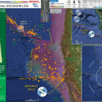
Well, I was on the road for 1.5 days (work party for the Community Village at the Oregon Country Fair). As I was driving home, there was a magnitude M 5.6 earthquake in coastal northern California.
https://earthquake.usgs.gov/earthquakes/eventpage/nc73201181/executive
I didn’t realize this until I was almost home (finally hit the sack around 4 am).
This earthquake follows a sequence of quakes further to the northwest, however their timing is merely a coincidence. Let me repeat this. The M 5.6 earthquake is not related to the sequence of earthquakes along the Blanco fracture zone.
Contrary to what people have posted on social media, there was but a single earthquake. This earthquake happened beneath the area of Petrolia, nearby the 1991 Honeydew Earthquake. More about the Honeydew Earthquake can be found here.
This region also had a good sized shaker in 1992, the Cape Mendocino Earthquake, which led to the development of the National Tsunami Hazard Mitigation Program. More about the Cape Mendocino Earthquake can be found on the 25th anniversary page here and in my earthquake report here.
The regional tectonics in coastal northern California are dominated by the Pacific-North America plate boundary. North of Cape Mendocino, this plate boundary is convergent and forms the Cascadia subduction zone (CSZ). To the south of Cape Mendocino, the plate boundary is the right-lateral (dextral) San Andreas fault (SAF). Where these 2 fault systems meet, there is another plate boundary system, the right-lateral strike-slip Mendocino fault (don’t write Mendocino fracture zone on your maps!). Where these 3 systems meet is called the Mendocino triple junction (MTJ).
The MTJ is a complicated region as these plate boundaries overlap in ways that we still do not fully understand. Geologic mapping in the mid- to late-20th century provides some basic understanding of the long term history. However, recent discoveries have proven that this early work needs to be revisited as there are many unanswered questions (and some of this early work has been demonstrated to be incorrect). Long live science!
Last night’s M 5.6 temblor happened where one strand of the MF trends onshore (another strand bends towards the south). But, it also is where the SAF trends onshore. At this point, I am associating this earthquake with the MF (so, a right-lateral strike-slip earthquake). The mechanism suggest that this is not a SAF related earthquake. However, it is oriented in a way that it could be in the Gorda plate (making it a left-lateral strike-slip earthquake). However, this quake is at the southern edge of the Gorda plate (sedge), so it is unlikely this is a Gorda plate event.

Below is my interpretive poster for this earthquake

I plot the seismicity from the past month, with color representing depth and diameter representing magnitude (see legend). I include earthquake epicenters from 1918-2018 with magnitudes M ≥ 5.0 in one version.
I plot the USGS fault plane solutions (moment tensors in blue and focal mechanisms in orange), possibly in addition to some relevant historic earthquakes.

  • I placed a moment tensor / focal mechanism legend on the poster. There is more material from the USGS web sites about moment tensors and focal mechanisms (the beach ball symbols). Both moment tensors and focal mechanisms are solutions to seismologic data that reveal two possible interpretations for fault orientation and sense of motion. One must use other information, like the regional tectonics, to interpret which of the two possibilities is more likely.
  • I also include the shaking intensity contours on the map. These use the Modified Mercalli Intensity Scale (MMI; see the legend on the map). This is based upon a computer model estimate of ground motions, different from the “Did You Feel It?” estimate of ground motions that is actually based on real observations. The MMI is a qualitative measure of shaking intensity. More on the MMI scale can be found here and here. This is based upon a computer model estimate of ground motions, different from the “Did You Feel It?” estimate of ground motions that is actually based on real observations.
  • I include the slab 2.0 contours plotted (Hayes, 2018), which are contours that represent the depth to the subduction zone fault. These are mostly based upon seismicity. The depths of the earthquakes have considerable error and do not all occur along the subduction zone faults, so these slab contours are simply the best estimate for the location of the fault.

    Magnetic Anomalies

  • In the map below, I include a transparent overlay of the magnetic anomaly data from EMAG2 (Meyer et al., 2017). As oceanic crust is formed, it inherits the magnetic field at the time. At different points through time, the magnetic polarity (north vs. south) flips, the North Pole becomes the South Pole. These changes in polarity can be seen when measuring the magnetic field above oceanic plates. This is one of the fundamental evidences for plate spreading at oceanic spreading ridges (like the Gorda rise).
  • Regions with magnetic fields aligned like today’s magnetic polarity are colored red in the EMAG2 data, while reversed polarity regions are colored blue. Regions of intermediate magnetic field are colored light purple.
  • We can see the roughly ~north-south trends of these red and blue stripes in the Pacific plate. These lines are parallel to the ocean spreading ridges from where they were formed. The stripes disappear at the subduction zone because the oceanic crust with these anomalies is diving deep beneath the North America plate, so the magnetic anomalies from the overlying Sunda plate mask the evidence for the Juan de Fuca and Gorda plates.

    Global Strain

  • In a map below, I include a transparent overlay of the Global Strain Rate Map (Kreemer et al., 2014).
  • The mission of the Global Strain Rate Map (GSRM) project is to determine a globally self-consistent strain rate and velocity field model, consistent with geodetic and geologic field observations. The overall mission also includes:
    1. contributions of global, regional, and local models by individual researchers
    2. archive existing data sets of geologic, geodetic, and seismic information that can contribute toward a greater understanding of strain phenomena
    3. archive existing methods for modeling strain rates and strain transients
  • The completed global strain rate map will provide a large amount of information that is vital for our understanding of continental dynamics and for the quantification of seismic hazards.
  • The version used in the poster(s) below is an update to the original 2004 map (Kreemer et al., 2000, 2003; Holt et al., 2005).

    I include some inset figures. Some of the same figures are located in different places on the larger scale map below.

  • n the upper left corner is a map of the Cascadia subduction zone (CSZ) and regional tectonic plate boundary faults. This is modified from several sources (Chaytor et al., 2004; Nelson et al., 2004)
    Below the CSZ map is an illustration modified from Plafker (1972). This figure shows how a subduction zone deforms between (interseismic) and during (coseismic) earthquakes.
  • In the lower right corner is a map that shows a comparison between the USGS Did You Feel It? reports and the USGS Modified Mercalli Intensity shakemap model. This comparison shows that the model is a decent fit for the reports from real people. If you felt the earthquake, please submit a report to the USGS here.
  • In the upper right corner I include a larger scale view of seismicity for this area. I highlight the important historic events (e.g. the 1991 Honeydew Earthquake and the 1992 Cape Mendocino Earthquake sequence.
  • Here is the map with a month’s seismicity plotted.

  • Here is the map with a century’s seismicity plotted.

  • Here is the map with a century’s seismicity plotted along with the Global Strain Map with a 30% transparency.

  • Here is the educational interpretive poster from the 1992 Cape Mendocino Earthquake (report here).

  • The USGS has been increasing the list of products that are produced in association with their earthquake pages. One of these products is an earthquake forecast (not a prediction as nobody can predict earthquakes yet) that lists the chance of an earthquake with a given magnitude over a certain period of time. The forecast for the M 5.6 earthquake is found here. These forecasts are updated periodically, so the information will change with time. Below is a table where I present the forecast as it was when I checked the page this morning (would be nice if the USGS would produce an easy to read table).
  • From the USGS:

    Be ready for more earthquakes

    • More earthquakes than usual (called aftershocks) will continue to occur near the mainshock.
    • When there are more earthquakes, the chance of a large earthquake is greater which means that the chance of damage is greater.
    • The USGS advises everyone to be aware of the possibility of aftershocks, especially when in or around vulnerable structures such as unreinforced masonry buildings.
    • This earthquake could be part of a sequence. An earthquake sequence may have larger and potentially damaging earthquakes in the future, so remember to: Drop, Cover, and Hold on.

    What we think will happen next

    • According to our forecast, over the next 1 Week there is a < 1 % chance of one or more aftershocks that are larger than magnitude 5.6. It is likely that there will be smaller earthquakes over the next 1 Week, with 0 to 11 magnitude 3 or higher aftershocks. Magnitude 3 and above are large enough to be felt near the epicenter. The number of aftershocks will drop off over time, but a large aftershock can increase the numbers again, temporarily.

    About our earthquake forecasts

    • No one can predict the exact time or place of any earthquake, including aftershocks. Our earthquake forecasts give us an understanding of the chances of having more earthquakes within a given time period in the affected area. We calculate this earthquake forecast using a statistical analysis based on past earthquakes.
    • Our forecast changes as time passes due to decline in the frequency of aftershocks, larger aftershocks that may trigger further earthquakes, and changes in forecast modeling based on the data collected for this earthquake sequence.


  • Gosh, almost forgot to include this photo of the seismic waves recorded on the Humboldt State University Department of Geology Baby Benioff seismometer. Photo Credit: Amanda Admire.

USGS Landslide and Liquefaction Ground Failure data products

  • Below I present a series of maps that are intended to address the excellent ‘new’ products included in the USGS earthquake pages: landslide probability and liquefaction susceptibility (a.k.a. the Ground Failure data products).
  • First I present the landslide probability model. This is a GIS data product that relates a variety of factors to the probability (the chance of) landslides as triggered by this earthquake. There are a number of assumptions that are made in order to be able to produce this model across such a large region, though this is still of great value (like other aspects from teh USGS, e.g. the PAGER alert). Learn more about all of these Ground Failure products here.
  • There are many different ways in which a landslide can be triggered. The first order relations behind slope failure (landslides) is that the “resisting” forces that are preventing slope failure (e.g. the strength of the bedrock or soil) are overcome by the “driving” forces that are pushing this land downwards (e.g. gravity). I spend more time discussing landslides and liquefaction in this recent earthquake report.
  • This model, like all landslide computer models, uses similar inputs. I review these here:
    1. Some information about ground shaking. Often, people use Peak Ground Acceleration, though in the past decade+, it has been recognized that the parameter “Arias Intensity” is a better measure of the energy imparted by the earthquake across the land and seascape. Instead of simply accounting for the peak accelerations, AI integrates the entire energy (duration) during the earthquake. That being said, PGA is a more common parameter that is available for people to use. For example, when I was modeling slope stability for the 2004 Sumatra-Andaman subduction zone earthquake, the only model that was calibrated to observational data were in units of PGA. The first order control to shaking intensity (energy observed at any particular location) is distance to the earthquake fault that slipped.
    2. Some information about the strength of the materials (e.g. angle of internal friction (the strength) and cohesion (the resistance).
    3. Information about the slope. Steeper slopes, with all other things being equal, are more likely to fail than are shallower slopes. Think about skiing. Beginners (like me) often choose shallower slopes to ski because they will go down the slope slower, while experts choose steeper slopes.
  • Areas that are red are more likely to experience landslides than areas that are colored blue. I include a coarse resolution topographic/bathymetric dataset to help us identify where the mountains are relative to the coastal plain and continental shelf (submarine).

  • Landslide ground shaking can change the Factor of Safety in several ways that might increase the driving force or decrease the resisting force. Keefer (1984) studied a global data set of earthquake triggered landslides and found that larger earthquakes trigger larger and more numerous landslides across a larger area than do smaller earthquakes. Earthquakes can cause landslides because the seismic waves can cause the driving force to increase (the earthquake motions can “push” the land downwards), leading to a landslide. In addition, ground shaking can change the strength of these earth materials (a form of resisting force) with a process called liquefaction.
  • Sediment or soil strength is based upon the ability for sediment particles to push against each other without moving. This is a combination of friction and the forces exerted between these particles. This is loosely what we call the “angle of internal friction.” Liquefaction is a process by which pore pressure increases cause water to push out against the sediment particles so that they are no longer touching.
  • An analogy that some may be familiar with relates to a visit to the beach. When one is walking on the wet sand near the shoreline, the sand may hold the weight of our body generally pretty well. However, if we stop and vibrate our feet back and forth, this causes pore pressure to increase and we sink into the sand as the sand liquefies. Or, at least our feet sink into the sand.
  • The liquefaction susceptibility map for the M 5.6 earthquake did not suggest that there would be possibly much liquefaction from this earthquake (probably due to the small magnitude). I discuss liquefaction more in my earthquake report on the 28 September 20018 Sulawesi, Indonesia earthquake, landslide, and tsunami here.
  • Here is a map that shows shaking intensity using the MMI scale (mentioned and plotted in the main earthquake poster maps). I present this here in the same format as the ground failure model maps so we can compare these other maps with the ground shaking model (which is a first order control on slope failure).

Other Report Pages

Some Relevant Discussion and Figures

  • Here is a map of the Cascadia subduction zone, modified from Nelson et al. (2006). The Juan de Fuca and Gorda plates subduct norteastwardly beneath the North America plate at rates ranging from 29- to 45-mm/yr. Sites where evidence of past earthquakes (paleoseismology) are denoted by white dots. Where there is also evidence for past CSZ tsunami, there are black dots. These paleoseismology sites are labeled (e.g. Humboldt Bay). Some submarine paleoseismology core sites are also shown as grey dots. The two main spreading ridges are not labeled, but the northern one is the Juan de Fuca ridge (where oceanic crust is formed for the Juan de Fuca plate) and the southern one is the Gorda rise (where the oceanic crust is formed for the Gorda plate).

  • This figure shows how a subduction zone deforms between (interseismic) and during (coseismic) earthquakes.

  • This figure shows how a subduction zone deforms between (interseismic) and during (coseismic) earthquakes. We also can see how a subduction zone generates a tsunami. Atwater et al., 2005.

  • Here is an animation produced by the folks at Cal Tech following the 2004 Sumatra-Andaman subduction zone earthquake. I have several posts about that earthquake here and here. One may learn more about this animation, as well as download this animation here.
  • This is the map used in the animation below. Earthquake epicenters are plotted (some with USGS moment tensors) for this region from 1917-2017 with M ≥ 6.5. I labeled the plates and shaded their general location in different colors.
  • I include some inset maps.
    • In the upper right corner is a map of the Cascadia subduction zone (Chaytor et al., 2004; Nelson et al., 2004).
    • In the upper left corner is a map from Rollins and Stein (2010). They plot epicenters and fault lines involved in earthquakes between 1976 and 2010.


Geologic Fundamentals

  • For more on the graphical representation of moment tensors and focal mechanisms, check this IRIS video out:
  • Here is a fantastic infographic from Frisch et al. (2011). This figure shows some examples of earthquakes in different plate tectonic settings, and what their fault plane solutions are. There is a cross section showing these focal mechanisms for a thrust or reverse earthquake. The upper right corner includes my favorite figure of all time. This shows the first motion (up or down) for each of the four quadrants. This figure also shows how the amplitude of the seismic waves are greatest (generally) in the middle of the quadrant and decrease to zero at the nodal planes (the boundary of each quadrant).

  • Here is another way to look at these beach balls.
  • There are three types of earthquakes, strike-slip, compressional (reverse or thrust, depending upon the dip of the fault), and extensional (normal). Here is are some animations of these three types of earthquake faults. The following three animations are from IRIS.
  • Strike Slip:

    Compressional:

    Extensional:

  • This is an image from the USGS that shows how, when an oceanic plate moves over a hotspot, the volcanoes formed over the hotspot form a series of volcanoes that increase in age in the direction of plate motion. The presumption is that the hotspot is stable and stays in one location. Torsvik et al. (2017) use various methods to evaluate why this is a false presumption for the Hawaii Hotspot.

  • A cutaway view along the Hawaiian island chain showing the inferred mantle plume that has fed the Hawaiian hot spot on the overriding Pacific Plate. The geologic ages of the oldest volcano on each island (Ma = millions of years ago) are progressively older to the northwest, consistent with the hot spot model for the origin of the Hawaiian Ridge-Emperor Seamount Chain. (Modified from image of Joel E. Robinson, USGS, in “This Dynamic Planet” map of Simkin and others, 2006.)

  • Here is a map from Torsvik et al. (2017) that shows the age of volcanic rocks at different locations along the Hawaii-Emperor Seamount Chain.

  • Hawaiian-Emperor Chain. White dots are the locations of radiometrically dated seamounts, atolls and islands, based on compilations of Doubrovine et al. and O’Connor et al. Features encircled with larger white circles are discussed in the text and Fig. 2. Marine gravity anomaly map is from Sandwell and Smith.

  • Here is a great tweet that discusses the different parts of a seismogram and how the internal structures of the Earth help control seismic waves as they propagate in the Earth.

    Social Media

    References:

  • Atwater, B.F., Musumi-Rokkaku, S., Satake, K., Tsuju, Y., Eueda, K., and Yamaguchi, D.K., 2005. The Orphan Tsunami of 1700—Japanese Clues to a Parent Earthquake in North America, USGS Professional Paper 1707, USGS, Reston, VA, 144 pp.
  • Goldfinger, C., Nelson, C.H., Morey, A., Johnson, J.E., Gutierrez-Pastor, J., Eriksson, A.T., Karabanov, E., Patton, J., Gràcia, E., Enkin, R., Dallimore, A., Dunhill, G., and Vallier, T., 2012 a. Turbidite Event History: Methods and Implications for Holocene Paleoseismicity of the Cascadia Subduction Zone, USGS Professional Paper # 1661F. U.S. Geological Survey, Reston, VA, 184 pp.
  • Dengler, L.A., and McPherson, R.C., 1993. The 17 August 1991 Honeydew Earthquake, North Coast California: A Case for Revising the Modified Mercalli Scale in Sparsely Populated Areas in BSSA, v. 83, no. 4, pp. 1081-1094
  • Frisch, W., Meschede, M., Blakey, R., 2011. Plate Tectonics, Springer-Verlag, London, 213 pp.
  • Hayes, G., 2018, Slab2 – A Comprehensive Subduction Zone Geometry Model: U.S. Geological Survey data release, https://doi.org/10.5066/F7PV6JNV.
  • Holt, W. E., C. Kreemer, A. J. Haines, L. Estey, C. Meertens, G. Blewitt, and D. Lavallee (2005), Project helps constrain continental dynamics and seismic hazards, Eos Trans. AGU, 86(41), 383–387, , https://doi.org/10.1029/2005EO410002. /li>
  • Kreemer, C., J. Haines, W. Holt, G. Blewitt, and D. Lavallee (2000), On the determination of a global strain rate model, Geophys. J. Int., 52(10), 765–770.
  • Kreemer, C., W. E. Holt, and A. J. Haines (2003), An integrated global model of present-day plate motions and plate boundary deformation, Geophys. J. Int., 154(1), 8–34, , https://doi.org/10.1046/j.1365-246X.2003.01917.x.
  • Kreemer, C., G. Blewitt, E.C. Klein, 2014. A geodetic plate motion and Global Strain Rate Model in Geochemistry, Geophysics, Geosystems, v. 15, p. 3849-3889, https://doi.org/10.1002/2014GC005407.
  • McCrory, P.A., 2000, Upper plate contraction north of the migrating Mendocino triple junction, northern California: Implications for partitioning of strain: Tectonics, v. 19, p. 11441160.
  • McCrory, P. A., Blair, J. L., Oppenheimer, D. H., and Walter, S. R., 2006, Depth to the Juan de Fuca slab beneath the Cascadia subduction margin; a 3-D model for sorting earthquakes U. S. Geological Survey
  • Meyer, B., Saltus, R., Chulliat, a., 2017. EMAG2: Earth Magnetic Anomaly Grid (2-arc-minute resolution) Version 3. National Centers for Environmental Information, NOAA. Model. https://doi.org/10.7289/V5H70CVX
  • Müller, R.D., Sdrolias, M., Gaina, C. and Roest, W.R., 2008, Age spreading rates and spreading asymmetry of the world’s ocean crust in Geochemistry, Geophysics, Geosystems, 9, Q04006, https://doi.org/10.1029/2007GC001743
  • Nelson, A.R., Kelsey, H.M., Witter, R.C., 2006. Great earthquakes of variable magnitude at the Cascadia subduction zone. Quaternary Research 65, 354-365.
  • Oppenheimer, D., Beroza, G., Carver, G., Dengler, L., Eaton, J., Gee, L., Gonzalez, F., Jayko, A., Ki., W.H., Lisowski, M., Magee, M., Marshall, G., Murray, M., McPherson, R., Romanowicz, B., Satake, K., Simpson, R., Somerille, P., Stein, R., and Valentine, D., The Cape Mendocino, California, Earthquakes of April, 1992: Subduction at the Triple Junction in Science, v. 261, no. 5120, p. 433-438.
  • Patton, J. R., Goldfinger, C., Morey, A. E., Romsos, C., Black, B., Djadjadihardja, Y., and Udrekh, 2013. Seismoturbidite record as preserved at core sites at the Cascadia and Sumatra–Andaman subduction zones, Nat. Hazards Earth Syst. Sci., 13, 833-867, doi:10.5194/nhess-13-833-2013, 2013.
  • Plafker, G., 1972. Alaskan earthquake of 1964 and Chilean earthquake of 1960: Implications for arc tectonics in Journal of Geophysical Research, v. 77, p. 901-925.
  • Rollins, J.C. and Stein, R.S., 2010. Coulomb stress interactions among M ≥ 5.9 earthquakes in the Gorda deformation zone and on the Mendocino Fault Zone, Cascadia subduction zone, and northern San Andreas Fault: Journal of Geophysical Research, v. 115, B12306, doi:10.1029/2009JB007117, 2010.
  • Stein, R.S., Marshall, G.A., Murray, M.H., Balazs, E., Carver, G.A., Dunklin, T.A>, McLaughlin, R.J., Cyr, K., and Jayko, A., 1993. Permanent Ground Movement Associate with the 1992 M=7 Cape Mendocino, California, Earthquake: Implications for Damage to Infrastructure and Hazards to navigation, U.S. Geological Survey Open-File Report 93-383.
  • Wang, K., Wells, R., Mazzotti, S., Hyndman, R. D., and Sagiya, T., 2003, A revised dislocation model of interseismic deformation of the Cascadia subduction zone Journal of Geophysical Research, B, Solid Earth and Planets v. 108, no. 1.

Return to the Earthquake Reports page.


Earthquake Report: Iran

This morning (my time) there was a possibly shallow earthquake in western Iran with a magnitude of M = 6.3. This earthquake occurred in the aftershock zone of the 2017.11.12 M 7.3 earthquake. Here is my report for the M 7.3 earthquake. Here are the USGS webpagea for the M 6.3 and M 7.3 earthquakes.
The M 7.3 earthquake was a reverse/thrust earthquake associated with tectonics of the Zagros fold and thrust belt. This plate boundary fault system is a section of the Alpide belt, a convergent plate boundary that extends from the west of the Straits of Gibraltar, through Europe (causing uplift of the Alps and subduction offshore of Greece), the Middle East, India (causing the uplift forming the Himalayas), then to end in eastern Indonesia (forming the continental collision zone between Australia and Indonesia).
Some of the earthquakes (including this one) are strike-slip earthquakes (see explanation of different earthquake types below in the geologic fundamentals section). So, one might ask why there are strike-slip earthquakes associated with a compressional earthquake?
As pointed out by Baptiste Gombert, these strike-slip earthquakes are are evidence of strain partitioning. Basically, when relative plate motion (the direction that plates are moving relative to each other) is not perpendicular or parallel to a tectonic fault, this oblique motion is partitioned into these perpendicular and parallel directions.
A great example of this type of strain partitioning is the plate boundary offshore of Sumatra where the India-Australia plate subducts beneath the Sunda plate (part of Eurasia). The plate boundary is roughly N45W (oriented to the northwest with an azimuth of 325°) and the relative plate motion direction is oriented closer to a north-south orientation. The relative plate motion perpendicular to the plate boundary is accommodated by earthquakes on the subduction. These earthquakes are oriented showing compression in a northeast direction. Along the axis of Sumatra is a huge strike-slip fault called the Great Sumatra fault. This fault is parallel to the plate boundary and accommodates relative plate motion parallel to the plate boundary. The Great Sumatra fault is a fault called a forearc sliver fault.
There are other examples of this elsewhere, like here in western Iran/eastern Iraq. Relative plate motion between the Arabia and Eurasia plates is oriented north-south, but the plate boundary is oriented northwest-southeast (just like the Sumatra example). So this oblique relative plate motion is partitioned into fault normal compression (the M 7.3 earthquake) and fault parallel shear (today’s M 6.3 earthquake).
There is also a strike-slip fault in the region of today’s M 6.3, the Khanaqin fault. So, given what we know about the tectonics and historic seismicity, I interpret today’s M 6.3 earthquake to have been a strike-slip earthquake associated with the Khanaqin fault, triggered by changes in stress by the M 7.3 earthquake. I could be incorrect and this earthquake could be unrelated to the > 7.3 earthquake.

Below is my interpretive poster for this earthquake

I plot the seismicity from the past month, with color representing depth and diameter representing magnitude (see legend). I include earthquake epicenters from 1918-2018 with magnitudes M ≥ 5.0 in one version.
I include an inset map showing seismicity from 2016.11.22 through 2018.11.28 showing the aftershocks from the M 7.3 earthquake. Note the cluster of earthquakes to the south of the aftershock zone. This is a swarm with earthquakes in the lower to mid M 5 range. The earthquakes with mechanisms are compressional, oriented the same as the M 7.3.
I plot the USGS fault plane solutions (moment tensors in blue and focal mechanisms in orange), possibly in addition to some relevant historic earthquakes.

  • I placed a moment tensor / focal mechanism legend on the poster. There is more material from the USGS web sites about moment tensors and focal mechanisms (the beach ball symbols). Both moment tensors and focal mechanisms are solutions to seismologic data that reveal two possible interpretations for fault orientation and sense of motion. One must use other information, like the regional tectonics, to interpret which of the two possibilities is more likely.
  • I also include the shaking intensity contours on the map. These use the Modified Mercalli Intensity Scale (MMI; see the legend on the map). This is based upon a computer model estimate of ground motions, different from the “Did You Feel It?” estimate of ground motions that is actually based on real observations. The MMI is a qualitative measure of shaking intensity. More on the MMI scale can be found here and here. This is based upon a computer model estimate of ground motions, different from the “Did You Feel It?” estimate of ground motions that is actually based on real observations.

    I include some inset figures. Some of the same figures are located in different places on the larger scale map below.

  • In the upper left corner is a map showing the regional plate boundary faults and some information about relative plate motions (Stern and Johnson, 2010). As for other inset figures, I plate a transparent cyan star in the general location of today’s M 6.3 earthquake.
  • In the lower left corner is a similarly scaled tectonic map from Scharf et al. (2015) showing more information about the amount of plate motion in the Tertiary (post 66 Ma). Note the contrast of the extension (in red) associated with the rifting in east Africa and the convergence (in blue) associated with the Alpide belt in this area.
  • In the upper right corner is a structural cross section showing the folding of the crust and rocks associated with the convergence at this plate boundary (Verges et al., 2011). I show the general location for this cross section on the map as a cyan line with balls on the ends.
  • In the lower left center is a map from Emami et al. (2010). This map shows how this convergent plate boundary creates topography (uplift and mountains) with color. Lower elevations are shown as yellow and green and higher elevations are shown as red and brown. Note the location of the Khanaqin fault, a left-lateral strike slip fault..
  • In the upper left center is a map showing a kinematic interpretation of the faulting in this area (Hessami, 2002). While the focus of this PhD dissertation is for the faulting in the southern Zagros system, they show relative plate motions and how the Khanaqin fault may accommodate this plate motion (oblique to Zagros).
  • In the lower right corner is a map showing USGS seismicity from 2016.11.22 through 2018.11.25 for earthquakes M ≥ 3.0. The spatial extent of this area is shown in a dashed white rectangle on the main map.
  • In the lower right center is the USGS seismic hazard map for the region (Jenkins et al., 2014).
  • Here is the map with a month’s seismicity plotted.

  • Here is the map with a century’s seismicity plotted for earthquakes M ≥ 5.0.

Other Report Pages

Some Relevant Discussion and Figures

  • The Alpide Belt, shown in this map, is a convergent plate boundary that extends from Australia to Portugal. This map shows the westernmost extent of this system. The convergence here drives uplift of the Himalayas and the European Alps. Subduction along the Makran and Sunda subduction zones are also part of this system.

  • Below is the tectonic map from Stern and Johnson (2010).

  • Simpli”ed map of the Arabian Plate, with plate boundaries, approximate plate convergence vectors, and principal geologic features. Note location of Central Arabian Magnetic Anomaly (CAMA).

  • Here is the Scharf et al., 2015 map.

  • Tectonic setting of the Arabian Plate. Red and blue coloured symbols indicate divergence and convergence with overall amount and age, respectively. Green arrows show present-day GPS values with respect to fixed Europa from Iran [21] and white arrow from Oman [22]. a – [23]; b – [20]; c – [18]; d – [19]; e – [14]; f – [15]; g – [8]; h – [16]; i – [17]

  • This is the Enami et al., 2010 figure.

  • Tectonic map of the Zagros Fold Belt showing the position and geometry of the Mountain Front Flexure (MFF). Earthquakes of M ≥ 5 are indicated by small black diamonds. Focal mechanisms from Talebian & Jackson (2004) are also shown, in black (Mw ≥ 5.3) and grey (Mw ≥ 5.3). KH, Khavir anticline; SI, Siah Kuh anticline; ZDF, Zagros Deformation Front.

  • This is the tectonic map from Hessami, 2002.

  • a) Earthquakes with mb > 5.0 (Jackson and McKenzie, 1984) along seismogenic basement thrusts offset by major strike-slip faults. b) Schematic interpretative map of the main structural features in the Zagros basement. The overall north-south motion of Arabia increases along the belt from NW to SE (arrows with numbers). Central Iran acted as a rigid backstop and caused the strike-slip faults with N-S trends in the west to bulge increasingly eastward. Fault blocks in the north (elongated NW-SE) rotate anticlockwise; while fault blocks in the south (elongated NE-SW) rotate clockwise. c) Simple model involving parallel paper sheets illustrating the observed strike-slip faults in the Zagros. Opening between the sheets (i.e. faults) helped salt diapirs to extrude.

  • Below are a series of figures from Verges et al., 2011. First is a map that shows the tectonics and locations of the cross section.

  • Tectonic map of the Zagros showing the location of the previously published cross-sections with the calculated amount of shortening and the extent of major hydrocarbon fields. The balanced cross-section is marked by the thick black line. M – Mand anticline. Dark grey: Naien-Baft ophiolites (Stöklin, 1968).

  • Here are the cross sections from Verges et al. (2011).

  • Structural cross-sections showing the style of folding across the studied regional transect (see location in Fig. 3). (a) The front of the Zagros Fold Belt along the Anaran anticline above the Mountain Front Flexure (MFF in Emami et al. 2010); (b) the Kabir Kuh anticline, which represents a multi-detachment fold (Vergés et al. 2010); (c) folds developed in the Upper Cretaceous basinal stratigraphy showing much tighter and upright anticlines (modified from Casciello et al. 2009).

  • Here is a map that displays an estimate of seismic hazard for the region (Jenkins et al., 2010). This comes from Giardini et al. (1999).

  • The Global Seismic Hazard Map. Peak ground acceleration (pga) with a 10% chance of exceedance in 50 years is depicted in m/s2. The site classification is rock everywhere except Canada and the United States, which assume rock/firm soil site classifications. White and green correspond to low seismicity hazard (0%-8%g), yellow and orange correspond to moderate seismic hazard (8%-24%g), pink and dark pink correspond to high seismicity hazard (24%-40%g), and red and brown correspond to very high seismic hazard (greater than 40%g).

  • Just found this as it as posted to the Bertrand tweet (see social media below). This is a figure from Talebian and Jackson (2004) that uses Sumatra as an analogue to the oblique convergence along the Zagros thrust. Pretty cool.

  • (a) Summary sketch of the tectonic pattern in the Zagros. Overall Arabia–Eurasia motions are shown by the big white arrows, as before. In the NW Zagros (Borujerd-Dezful), oblique shortening is partitioned into right-lateral strike-slip on the Main Recent Fault (MRF) and orthogonal shortening (large gray arrows). In the SE Zagros (Bandar Abbas) no strike-slip is necessary, as the shortening is parallel to the overall convergence. The central Zagros (Shiraz) is where the transition between these two regimes occurs, with anticlockwise rotating strike-slip faults allowing an along-strike extension (black arrows) between Bandar Abbas and Dezful. (b) A similar sketch for the Himalaya (after McCaffrey & N´abˇelek 1998). In this case the overall Tibet-India motion is likely to be slightly west of north. (The India-Eurasia motion is about 020◦, but Tibet moves east relative to both India and Eurasia: Wang et al. 2001). Thrust faulting slip vectors are radially outward around the entire arc (gray arrows). This leads to partitioning of the oblique convergence in the west, where right-lateral strike-slip is prominent on the Karakoram Fault, but no strike-slip in the east, where the convergence and shortening are parallel. The region in between extends parallel to the arc, on normal faults in southern Tibet. (c) A similar sketch for the Java–Sumatra arc, based on McCaffrey (1991). Slip partitioning occurs in the NW, with strike-slip faulting through Sumatra, but not in the SE, near Java. This change along the zone requires the Java–Sumatra forearc to extend along strike.

Geologic Fundamentals

  • For more on the graphical representation of moment tensors and focal mechnisms, check this IRIS video out:
  • Here is a fantastic infographic from Frisch et al. (2011). This figure shows some examples of earthquakes in different plate tectonic settings, and what their fault plane solutions are. There is a cross section showing these focal mechanisms for a thrust or reverse earthquake. The upper right corner includes my favorite figure of all time. This shows the first motion (up or down) for each of the four quadrants. This figure also shows how the amplitude of the seismic waves are greatest (generally) in the middle of the quadrant and decrease to zero at the nodal planes (the boundary of each quadrant).

  • Here is another way to look at these beach balls.
  • There are three types of earthquakes, strike-slip, compressional (reverse or thrust, depending upon the dip of the fault), and extensional (normal). Here is are some animations of these three types of earthquake faults. The following three animations are from IRIS.
  • Strike Slip:

    Compressional:

    Extensional:

  • This is an image from the USGS that shows how, when an oceanic plate moves over a hotspot, the volcanoes formed over the hotspot form a series of volcanoes that increase in age in the direction of plate motion. The presumption is that the hotspot is stable and stays in one location. Torsvik et al. (2017) use various methods to evaluate why this is a false presumption for the Hawaii Hotspot.

  • A cutaway view along the Hawaiian island chain showing the inferred mantle plume that has fed the Hawaiian hot spot on the overriding Pacific Plate. The geologic ages of the oldest volcano on each island (Ma = millions of years ago) are progressively older to the northwest, consistent with the hot spot model for the origin of the Hawaiian Ridge-Emperor Seamount Chain. (Modified from image of Joel E. Robinson, USGS, in “This Dynamic Planet” map of Simkin and others, 2006.)

  • Here is a map from Torsvik et al. (2017) that shows the age of volcanic rocks at different locations along the Hawaii-Emperor Seamount Chain.

  • Hawaiian-Emperor Chain. White dots are the locations of radiometrically dated seamounts, atolls and islands, based on compilations of Doubrovine et al. and O’Connor et al. Features encircled with larger white circles are discussed in the text and Fig. 2. Marine gravity anomaly map is from Sandwell and Smith.

    References:

  • Allen, M.B., Saville, C., Blac, E.K-P., Talebian, M., and Nissen, E., 2013. Orogenic plateau growth: Expansion of the Turkish-Iranian Plateau across the Zagros fold-and-thrust belt in Tectonics, v. 32, p. 171-190, doi:10.1002/tect.20025
  • Emami, H., Verges, J., nalpas, T., Gillespie, P., Sharp, I., Karpuz, R., Blanc, E.P., and Goodarzi, G.H., 2010. Structure of the Mountain Front Flexure along the Anaran anticline in the Pusht-e Kuh Arc (NW Zagros, Iran): insights from sand box models in LETURMY, P. & ROBIN, C. (eds) Tectonic and Stratigraphic Evolution of Zagros and Makran during the Mesozoic–Cenozoic. Geological Society, London, Special Publications, 330, 155–178.
  • Giardini, D., Grunthal, G., Shedlock, K., Zhang. P., and Global Seismic Hazards Program, 1999. Global seismic hazards map: Accessed on Jan. 9, 2007 at http://www.seismo.ethz.ch/GSHAP.
  • Hessami, K., 2002. Tectonic History and Present-Day Deformation in the Zagros Fold-Thrust Belt, PhD for the Degree of Doctor of Philosophy in Mineralogy, Petrology, and Tectonics presented at Uppsala University in 2002, ISBN 91-554-5285-5
  • Jenkins, Jennifer, Turner, Bethan, Turner, Rebecca, Hayes, G.P., Sinclair, Alison, Davies, Sian, Parker, A.L., Dart, R.L., Tarr, A.C., Villaseñor, Antonio, and Benz, H.M., compilers, 2013, Seismicity of the Earth 1900–2010 Middle East and vicinity (ver 1.1, Jan. 28, 2014): U.S. Geological Survey Open-File Report 2010–1083-K, scale 1:7,000,000, https://pubs.usgs.gov/of/2010/1083/k/.
  • Scharf, A., Mattern, F., and Al Sadi, S., 2016. Kinematics of Post-obduction Deformation of the Tertiary Ridge at Al-Khod Village (Muscat Area, Oman) in SQU Journal for Science, v. 21, no. 1, p. 26-40
  • Stern, R.J. and Johnson, P., 2010. Continental lithosphere of the Arabian Plate: A geologic, petrologic, and geophysical synthesis in Earth-Science Reviews, v. 101, p. 29-67.
  • Talebian and Jackson, 2004. A reappraisal of earthquake focal mechanisms and active shortening in the Zagros mountains of Iran in GJI, v. 156, no. 3, P. 506–526, https://doi.org/10.1111/j.1365-246X.2004.02092.x
  • Taymaz, T., Yilmaz, Y., and Dilek, Y., 2007. The geodynamics of the Aegean and Anatolia: introduction in Geological Society, London, Special Publications, v. 291; p. 1-16, doi:10.1144/SP291.1
  • Verges, J., Saura, E., Casciello, E., Fernandez, M., Villasenor, A., Jimenez-Munt, I., and Garcia-Castellanos, D., 2011. Crustal-scale cross-sections across the NW Zagros belt: implications for the Arabian margin reconstruction in Geol. Mag, v. 148, no. 5-6, p. 739-761, doi:10.1017/S0016756811000331
  • Woudloper, 2009. Tectonic map of southern Europe and the Middle East, showing tectonic structures of the western Alpide mountain belt.

Return to the Earthquake Reports page.


Earthquake Report: Mid Atlantic Ridge

There was a M = 6.8 earthquake along a transform fault connecting segments of the Mid Atlantic Ridge recently. (now an M 6.7)

https://earthquake.usgs.gov/earthquakes/eventpage/us1000hpim/executive

The Mid Atlantic Ridge is an extensional plate boundary called an oceanic spreading ridge. Oceanic crust is formed along these types of plate boundaries.
Transform faults are faults that move side-by-side (i.e. strike-slip faults) that offset spreading ridges. Learn more about different types of faults in the geologic fundamentals section below.
The Atlantic Ocean is known for the spreading center, Mid Atlantic Ridge (MAR), which was probably born in the mid Cretaceous Period, about 130 million years ago. We use the age of the oceanic crust at the eastern and western margins of the Atlantic Ocean as a basis for this interpretation.
The Mid Atlantic Ridge also splits apart the island of Iceland, which also overlies a volcanic hot spot. I have always wanted to visit Iceland to see the rocks get older as I might travel east or west from the middle of Iceland.
North of Iceland, the MAR is offset by many small and several large transform faults. The largest transform fault north of Iceland is called the Jan Mayen fracture zone, which is the location for the 2018.11.08 M = 6.8 earthquake.

Below is my interpretive poster for this earthquake

I plot the seismicity from the past month, with color representing depth and diameter representing magnitude (see legend). I include earthquake epicenters from 1918-2018 with magnitudes M ≥ 4.5 in one version.
I plot the USGS fault plane solutions (moment tensors in blue and focal mechanisms in orange), possibly in addition to some relevant historic earthquakes. I also include the IPGP focal mechanism as that was available before the USGS moment tensor was available (I included it in my initial poster).

  • I placed a moment tensor / focal mechanism legend on the poster. There is more material from the USGS web sites about moment tensors and focal mechanisms (the beach ball symbols). Both moment tensors and focal mechanisms are solutions to seismologic data that reveal two possible interpretations for fault orientation and sense of motion. One must use other information, like the regional tectonics, to interpret which of the two possibilities is more likely.
  • I also include the shaking intensity contours on the map. These use the Modified Mercalli Intensity Scale (MMI; see the legend on the map). This is based upon a computer model estimate of ground motions, different from the “Did You Feel It?” estimate of ground motions that is actually based on real observations. The MMI is a qualitative measure of shaking intensity. More on the MMI scale can be found here and here. This is based upon a computer model estimate of ground motions, different from the “Did You Feel It?” estimate of ground motions that is actually based on real observations.
  • I include the slab 2.0 contours plotted (Hayes, 2018), which are contours that represent the depth to the subduction zone fault. These are mostly based upon seismicity. The depths of the earthquakes have considerable error and do not all occur along the subduction zone faults, so these slab contours are simply the best estimate for the location of the fault.li>

    Magnetic Anomalies

  • In the map below, I include a transparent overlay of the magnetic anomaly data from EMAG2 (Meyer et al., 2017). As oceanic crust is formed, it inherits the magnetic field at the time. At different points through time, the magnetic polarity (north vs. south) flips, the north pole becomes the south pole. These changes in polarity can be seen when measuring the magnetic field above oceanic plates. This is one of the fundamental evidences for plate spreading at oceanic spreading ridges (like the Mid Atlantic Ridge).
  • Regions with magnetic fields aligned like today’s magnetic polarity are colored red in the EMAG2 data, while reversed polarity regions are colored blue. Regions of intermediate magnetic field are colored light purple.
  • We can see the roughly north-south trends of these red and blue stripes. These lines are parallel to the ocean spreading ridges from where they were formed.

    Age of Oceanic Lithosphere

  • In the map below, I include a transparent overlay of the age of the oceanic crust data from Agegrid V 3 (Müller et al., 2008).
  • Because oceanic crust is formed at oceanic spreading ridges, the age of oceanic crust is youngest at these spreading ridges. The youngest crust is red and older crust is yellow (see legend at the top of this poster).

    I include some inset figures. Some of the same figures are located in different places on the larger scale map below.

  • In the upper right corner is a plate tectonic map from Le Breton (et al., 2012). This map shows the configuration of the Mid Atlantic Ridge (MAR) and shows their interpretation about how this spreading center is divided into segments separated by transform faults. I placed a red star in the general location of the M = 6.8 earthquake.
  • In the upper left corner is a map showing the isochrons (lines of each age for the crust) as summarized by Gaina et al. (2017). Isochrons are displayed with color relative to age.
  • In the lower right corner is a larger scale map zoomed into the Jan Mayen fracture zone at the MAR. I placed existing USGS fault mechanisms (blue = moment tensor, orange = focal mechanism) for earthquakes with magnitudes M ≥ 5.5.
  • In the lower left corner is a map from the Temblor.net app. This map shows the seismic hazard from the GEAR model (Bird et al., 2012). Seismicity is shown as colored circles. The red dot is the M = 6.8 epicenter, which lies in a region that is forecast to have an earthquake of magnitude M = 6.25-6.5 in someone’s lifetime.
  • Here is the map with a month’s seismicity plotted.

  • Here is the map with a century’s seismicity plotted.

  • Here is the large scale map showing earthquake mechanisms for historic earthquakes in the region. Note how they mostly behave well (are almost perfectly aligned with the Jan Mayen fracture zone). There are a few exceptions, including an extensional earthquake possibly associated with extension on the MAR (2010.06.03 M = 5.6). Also, 2 earthquakes (2003.06.19 and 2005.07.25) are show oblique slip (not pure strike-slip as they have an amount of compressional motion) near the intersection of the fracture zone and the MAR.

Other Report Pages

Some Relevant Discussion and Figures

  • Here is a map that shows the ace of the oceanic lithosphere for the entire Earth.

  • Here is the tectonic map from Le Breton et al. (2012). Depth to the seafloor is shown in color. Note the spreading rates in red. Note how the MAR is offset by the Jan Mayen fracture zone, as well as the smaller unnamed fracture zones.

  • Principal tectonic features of the NE Atlantic Ocean on a bathymetric and topographic map (ETOPO1). Compressional structures (folds and reverse faults) on the NE Atlantic Continental Margin are from Doré et al. [2008], Johnson et al. [2005], Hamann et al. [2005], Price et al. [1997] and Tuitt et al. [2010]. Present-day spreading rates along Reykjavik, Kolbeinsey and Mohns Ridges are from Mosar et al. [2002]. Continent-ocean boundaries of Europe and Greenland are from Gaina et al. [2009] and Olesen et al. [2007]. Black thick lines indicate seismic profiles of Figure 3. Abbreviations (north to south): GFZ, Greenland Fracture Zone; SFZ, Senja Fracture Zone; JMFZ, Jan Mayen Fracture Zone (west and east); JMMC, Jan Mayen Microcontinent; HHA, Helland Hansen Arch; OL, Ormen Lange Dome; FR, Fugløy Ridge; GIR, Greenland-Iceland Ridge; IFR: Iceland-Faeroe Ridge; MGR, Munkagrunnar Ridge; WTR, Wyville Thomson Ridge; YR, Ymir Ridge; NHBFC, North Hatton Bank Fold Complex; MHBFC, Mid-Hatton Bank Fold Complex; CGFZ, Charlie Gibbs Fracture Zone. Map
    projection is Universal Transverse Mercator (UTM, WGS 1984, zone 27N).

  • This is a fantastic figure that shows the isochrons on either side of the MAR in this region (Le Breton et al., 2012). Isochrons are lines of equal age, based on magnetic anomaly mapping and numerical ages from rock samples collected from the oceanic crust.The geomagnetic time scale is shown at the right. “Chrons” are numbered with their numerical ages in millions of years (Ma). These chron numbers are also on the map, showing the chron number for each isochron. For some reason I want to watch the film Tron right now.

  • Map of magnetic anomalies, NE Atlantic Ocean. Background image is recent model EMAG2 of crustal magnetic anomalies [Maus et al., 2009]. Ages of magnetic anomalies are from Cande and Kent [1995]. Map projection is Universal Transverse Mercator (UTM, WGS 1984, zone 27N).

  • This map shows their reconstruction of the fracture zones, MAR, and the Iceland Hot Spot for the Tertiary to present (Le Breton et al., 2012).

  • Positions relative to stationary Greenland plate of Europe, Jan Mayen Microcontinent (JMMC) and Iceland Mantle Plume at intervals of 10 Myr, according to stationary hot spot model of Lawver and Müller [1994] and moving hot spot model of Mihalffy et al. [2008]. Timing is (a) late Paleocene, 55.9 Ma; (b) late Eocene, 36.6 Ma ; (c) early Miocene, 19.6 Ma; and (d) present. (more info is in the original figure caption)

  • Here is the Gaina et al. (2017 a) isochron map for this region of the north Atlantic Ocean. Below are also some great summary figures that show a series of geophysical data from their work in the region (Gaina et al., 2017 b).

  • Magnetic anomaly and fracture zone identifications and interpreted isochrons.

  • On the left is a free air gravity map (Gaina et al., 2017 b). This is a gravity map after the “free-air” correction has been made (that corrects for the elevation that the gravity data were observed).
  • On the right is the isostatic gravity anomaly map. This is a gravity map that shows the results of correcting the gravity data for the variable density of materials in the earth’s crust and mantle.

  • (a) Free-air gravity (DTU10: Andersen 2010); (b) isostatic gravity anomaly (this was computed using the Airy–Heiskanen model, where the compensation is accomplished by variations in thickness of the constant density layers: the root is calculated using the ETOPO1 topography and bathymetry: Haase et al., this volume, in press);

  • On the left is the magnetic anomaly map (Gaina et al., 2017 b)
  • On the right is the sediment thickness map.

  • magnetic anomaly (Nasuti & Olesen 2014; Gaina et al., this volume, in review); and (d) sediment thickness (Funck et al. 2014). Distribution of volcanic edifices as in Figure 1. Dark grey lines indicate the active and extinct plate boundaries

  • This is a really cool map that shows how the MAR extends further into the Arctic Ocean. Color represents depth to the seafloor (Mjelde et al., 2008).

  • Location map of the North Atlantic and Arctic. ETOPO-2 shaded relief bathymetry and topography are based on data from Sandwell & Smith (1997). (more detail is found in the original figure caption)

Geologic Fundamentals

  • For more on the graphical representation of moment tensors and focal mechnisms, check this IRIS video out:
  • Here is a fantastic infographic from Frisch et al. (2011). This figure shows some examples of earthquakes in different plate tectonic settings, and what their fault plane solutions are. There is a cross section showing these focal mechanisms for a thrust or reverse earthquake. The upper right corner includes my favorite figure of all time. This shows the first motion (up or down) for each of the four quadrants. This figure also shows how the amplitude of the seismic waves are greatest (generally) in the middle of the quadrant and decrease to zero at the nodal planes (the boundary of each quadrant).

  • Here is another way to look at these beach balls.
  • There are three types of earthquakes, strike-slip, compressional (reverse or thrust, depending upon the dip of the fault), and extensional (normal). Here is are some animations of these three types of earthquake faults. The following three animations are from IRIS.
  • Strike Slip:

    Compressional:

    Extensional:

  • This is an image from the USGS that shows how, when an oceanic plate moves over a hotspot, the volcanoes formed over the hotspot form a series of volcanoes that increase in age in the direction of plate motion. The presumption is that the hotspot is stable and stays in one location. Torsvik et al. (2017) use various methods to evaluate why this is a false presumption for the Hawaii Hotspot.

  • A cutaway view along the Hawaiian island chain showing the inferred mantle plume that has fed the Hawaiian hot spot on the overriding Pacific Plate. The geologic ages of the oldest volcano on each island (Ma = millions of years ago) are progressively older to the northwest, consistent with the hot spot model for the origin of the Hawaiian Ridge-Emperor Seamount Chain. (Modified from image of Joel E. Robinson, USGS, in “This Dynamic Planet” map of Simkin and others, 2006.)

  • Here is a map from Torsvik et al. (2017) that shows the age of volcanic rocks at different locations along the Hawaii-Emperor Seamount Chain.

  • Hawaiian-Emperor Chain. White dots are the locations of radiometrically dated seamounts, atolls and islands, based on compilations of Doubrovine et al. and O’Connor et al. Features encircled with larger white circles are discussed in the text and Fig. 2. Marine gravity anomaly map is from Sandwell and Smith.

    Social Media

    References:

  • Bird, P., Jackson, D. D., Kagan, Y. Y., Kreemer, C., and Stein, R. S., 2015. GEAR1: A global earthquake activity rate model constructed from geodetic strain rates and smoothed seismicity, Bull. Seismol. Soc. Am., v. 105, no. 5, p. 2538–2554, DOI: 10.1785/0120150058
  • Gaina, C., Nasuti, A., Kimbell, G.S., and Blishchke, A., 2017 a. Break-up and seafloor spreading domains in the NE Atlantic in Peron-Pinvidic, G., Hopper, J. R., Stoker, M. S., Gaina, C., Doornenbal, J. C., Funck, T. & Arting, U. E. (eds) 2017. The NE Atlantic Region: A Reappraisal of Crustal Structure, Tectonostratigraphy and Magmatic Evolution. Geological Society, London, Special Publications, 447, 393–417. https://doi.org/10.1144/SP447.12
  • Gaina, C., Blischke, A., Geissler, W.H., Kimbell, G.S., and Erlendsson, O., 2017 b. Seamounts and oceanic igneous features in the NE Atlantic: a link between plate motions and mantle dynamics in the NE Atlantic in Peron-Pinvidic, G., Hopper, J. R., Stoker, M. S., Gaina, C., Doornenbal, J. C., Funck, T. & Arting, U. E. (eds) 2017. The NE Atlantic Region: A Reappraisal of Crustal Structure, Tectonostratigraphy and Magmatic Evolution. Geological Society, London, Special Publications, 447, 393–417. https://doi.org/10.1144/SP447.12
  • Le Breton, E., P. R. Cobbold, O. Dauteuil, and G. Lewis (2012), Variations in amount and direction of seafloor spreading along the northeast Atlantic Ocean and resulting deformation of the continental margin of northwest Europe, Tectonics, 31, TC5006, doi:10.1029/2011TC003087.
  • Meyer, B., Saltus, R., Chulliat, a., 2017. EMAG2: Earth Magnetic Anomaly Grid (2-arc-minute resolution) Version 3. National Centers for Environmental Information, NOAA. Model. doi:10.7289/V5H70CVX
  • Müller, R.D., Sdrolias, M., Gaina, C. and Roest, W.R., 2008, Age spreading rates and spreading asymmetry of the world’s ocean crust in Geochemistry, Geophysics, Geosystems, 9, Q04006, doi:10.1029/2007GC001743

Return to the Earthquake Reports page.


Earthquake Report: Greece

Well, I was about to head to town and noticed a magnitude M = 5.0 earthquake in Greece. I thought to myself, I wonder if that is a foreshock. It was.
Then, the M 6.8 mainshock hit while i was out and about, followed by a M = 5.2 aftershock.
Before I looked more closely, I thought this sequence might be related to the Kefallonia fault. I prepared some earthquake reports for earthquakes here in the past, in 2015 and in 2016.
Both of those earthquakes were right-lateral strike-slip earthquakes associated with the Kefallonia fault.
However, today’s earthquake sequence was further to the south and east of the strike-slip fault, in a region experiencing compression from the Ionian Trench subduction zone. But there is some overlap of these different plate boundaries, so the M 6.8 mainshock is an oblique earthquake (compressional and strike-slip). Based upon the sequence, I interpret this earthquake to be right-lateral oblique. I could be wrong.
There are records of tsunami observed on tide gage data.

Below is my interpretive poster for this earthquake

I plot the seismicity from the past month, with color representing depth and diameter representing magnitude (see legend). I include earthquake epicenters from 1918-2018 with magnitudes M ≥ 6.5 in one version.
I plot the USGS fault plane solutions (moment tensors in blue and focal mechanisms in orange), possibly in addition to some relevant historic earthquakes.
The poster below includes earthquakes that represent the different plate boundaries and tectonic regimes.

  • The 1999 M = 7.6 Izmit earthquake was quite damaging and deadly earthquake on the North Anatolian fault. To the east, the majority of this plate boundary has ruptured in the 20th century. The last portion of the fault to rupture is to the west of this M = 7.6 earthquake and those who live in Istanbul would do well to invest in earthquake resilient building design. The Iszmit earthquake generated a tsunami with run up elevations about 2 meters, though had localized larger run ups due to a submarine landslide.
  • The 1981 M = 7.2 earthquake shows that this dextral (right-lateral) strain extends through the region into eastern Greece.
  • The 2015 M = 6.5 earthquake I mention above is plotted, showing the right-lateral sense of motion associated with the Kefallonia fault. There was a tsunami observed following this earthquake, probably associated with a landslide also observed (dust was seen and photographed).
  • The 2008 M = 6.9 earthquake is a thrust earthquake and represents the convergence (compression) associated with the convergent plate boundary associated with the Ionian Trench.
  • The 2017 M = 6.6 earthquake is an interesting earthquake that shows the upper plate deformation in the Anatolia plate in western Turkey is extending. Geologic structural cross sections in this region shows that this extension has been ongoing for millions of years. Here is my earthquake report for this 2017 M 6.6 earthquake. There was a tsunami observed as a result of this earthquake, believe it or not.
  • I placed a moment tensor / focal mechanism legend on the poster. There is more material from the USGS web sites about moment tensors and focal mechanisms (the beach ball symbols). Both moment tensors and focal mechanisms are solutions to seismologic data that reveal two possible interpretations for fault orientation and sense of motion. One must use other information, like the regional tectonics, to interpret which of the two possibilities is more likely.
  • I also include the shaking intensity contours on the map. These use the Modified Mercalli Intensity Scale (MMI; see the legend on the map). This is based upon a computer model estimate of ground motions, different from the “Did You Feel It?” estimate of ground motions that is actually based on real observations. The MMI is a qualitative measure of shaking intensity. More on the MMI scale can be found here and here. This is based upon a computer model estimate of ground motions, different from the “Did You Feel It?” estimate of ground motions that is actually based on real observations.
  • I include the slab 2.0 contours plotted (Hayes, 2018), which are contours that represent the depth to the subduction zone fault. These are mostly based upon seismicity. The depths of the earthquakes have considerable error and do not all occur along the subduction zone faults, so these slab contours are simply the best estimate for the location of the fault.li>
  • I include the faults from the NOA Digital Database for Active faults in Greece (Ganas et a., 2013) as red lines.

    I include some inset figures. Some of the same figures are located in different places on the larger scale map below.

  • In the upper left corner is a small scale map showing the major tectonic fault systems in the eastern Mediterranean (Taymaz et al., 2007). The large black arrows show relative plate motions. I place a blue star in the general location of today’s earthquake sequence.
  • In the lower left corner is a generalized view of the tectonic regimes as interpreted by Taymaz et al. (2007). Today’s earthquake is in the SW Aegena/Peloponnisos plate, a region of compression associated with the Ionian Trench subduction zone. Today’s earthquake was probably right-lateral oblique, given the spatial relations between the different earthquakes.
  • In the upper right corner is a figure that shows GPS plate motion vectors (Ganas and Parsons, 2009). NOt how the vectors in the northeast are parallel to the North Anatolian fault and, as one moves to the southwest, they become normal (perpendicular) to the Ionian trench.
  • In the lower right corner is a more detailed map showing an interpretation of the faulting in the region (Kokkalas et al., 2006).
  • Here is the map with a month’s seismicity plotted.

  • Here is the map with a century’s seismicity plotted.

  • Here is the tide gage data from Katakolo, which is only 65 km from the M 6.8 epicenter.

Other Report Pages

Some Relevant Discussion and Figures

  • Here is the large scale tectonic setting map (Taymaz et al., 2007) with their figure below.

  • Summary sketch map of the faulting and bathymetry in the Eastern Mediterranean region, compiled from our observations and those of Le Pichon & Angelier (1981), Taymaz (1990), Taymaz et al. (1990, 1991a, b); S¸arogˇlu et al. (1992), Papazachos et al. (1998), McClusky et al. (2000) and Tan & Taymaz (2006). Large black arrows show relative motions of plates with respect to Eurasia (McClusky et al. 2003). Bathymetry data are derived from GEBCO/97–BODC, provided by GEBCO (1997) and Smith & Sandwell (1997a, b). Shaded relief map derived from the GTOPO-30 Global Topography Data taken after USGS. NAF, North Anatolian Fault; EAF, East Anatolian Fault; DSF, Dead Sea Fault; NEAF, North East Anatolian Fault; EPF, Ezinepazarı Fault; PTF, Paphos Transform Fault; CTF, Cephalonia Transform Fault; PSF, Pampak–Sevan Fault; AS, Apsheron Sill; GF, Garni Fault; OF, Ovacık Fault; MT, Mus¸ Thrust Zone; TuF, Tutak Fault; TF, Tebriz Fault; KBF, Kavakbas¸ı Fault; MRF, Main Recent Fault; KF, Kagˇızman Fault; IF, Igˇdır Fault; BF, Bozova Fault; EF, Elbistan Fault; SaF, Salmas Fault; SuF, Su¨rgu¨ Fault; G, Go¨kova; BMG, Bu¨yu¨k Menderes Graben; Ge, Gediz Graben; Si, Simav Graben; BuF, Burdur Fault; BGF, Beys¸ehir Go¨lu¨ Fault; TF, Tatarlı Fault; SuF, Sultandagˇ Fault; TGF, Tuz Go¨lu¨ Fault; EcF, Ecemis¸ Fau; ErF, Erciyes Fault; DF, Deliler Fault; MF, Malatya Fault; KFZ, Karatas¸–Osmaniye Fault Zone.

  • This figure shows GPS velocities in the region (Taymaz et al., 2007).

  • GPS horizontal velocities and their 95% confidence ellipses in a Eurasia-fixed reference frame for the period 1988–1997 superimposed on a shaded relief map derived from the GTOPO-30 Global Topography Data taken after USGS. Bathymetry data are derived from GEBCO/97–BODC, provided by GEBCO (1997) and Smith & Sandwell (1997a, b). Large arrows designate generalized relative motions of plates with respect to Eurasia (in mm a21) (recompiled after McClusky et al. 2000). NAF, North Anatolian Fault; EAF, East Anatolian Fault; DSF, Dead Sea Fault; NEAF, North East Anatolian Fault; EPF, Ezinepazarı Fault; CTF, Cephalonia Transform Fault; PTF, Paphos Transform Fault; CMT, Caucasus Main Thrust; MRF, Main Recent Fault.

  • Finally their summary figure showing the tectonic regimes (Taymaz et al., 2007).

  • Schematic map of the principal tectonic settings in the Eastern Mediterranean. Hatching shows areas of coherent motion and zones of distributed deformation. Large arrows designate generalized regional motion (in mm a21) and errors (recompiled after McClusky et al. (2000, 2003). NAF, North Anatolian Fault; EAF, East Anatolian Fault; DSF, Dead Sea Fault; NEAF, North East Anatolian Fault; EPF, Ezinepazarı Fault; CTF, Cephalonia Transform Fault; PTF, Paphos Transform Fault.

  • This is a tectonic summary figure from Kokkalas et al. (2006).

  • Simplified map showing the main structural features along the Hellenic arc and trench system, as well as the main active structures in the Aegean area. The mean GPS horizontal velocities in the Aegean plate, with respect to a Eurasia-fixed reference frame, are shown (after Kahle et al., 1998; McClusky et al., 2000). The lengths of vectors are
    proportional to the amount of movement. The thick black arrows indicate the mean motion vectors of the plates. The polygonal areas on the map (dashed lines) define the approximate borders of the five different structural regions discussed in the text. The borders between structural regions are not straightforward, and wide transitional zones probably exist between them. The inset shows a schematic map with the geodynamic framework in the eastern Mediterranean area (modified from McClusky et al., 2000). DSF—Dead Sea fault; EAF—East Anatolia fault; HT—Hellenic trench; KFZ— Kefallonia fault zone; MRAC—Mediterranean Ridge accretionary complex; NAF—North Anatolia fault; NAT—North Aegean trough.

  • Here is their detailed view of the faulting in the region (Kokkalas et al., 2006)

  • General simplified structural map of Greece showing the main currently active structures in the five structural regions along the Hellenic Arc, as well as some main pre-existing lineaments. Insets illustrate the main structural features of each region and the period of activity of these structures (for further details see discussion). KFZ—Kefallonia Fault zone; MCL—Mid-Cycladic lineament; NAFZ—North Anatolia fault zone; NAT—North Aegean trough; PF—Pelagonian fault.

  • Here is an even more detailed view of this region (Kokkalas et al., 2006). Note how the Convergent plate boundary “Ionian thrust” overlaps with the strike-slip faulting of the Kefallonia fault. Today’s M 6.8 happened south of where these authors map the Ionian thrust extending south from Zakynthos Island.

  • Schematic structural map of the central Hellenic Peninsula (Region II), with stress nets showing the orientation of principal stress axes. Stress net explanation as for Figure 3. Also included are cross-sections showing the geometry and kinematics of the External Hellenides in the area (A-A′) and the evolution of the synorogenic basin in the Paleros area (B-B′-B′′). AG—Abelon graben; ALG—Almyros graben; AMG—Amvrakikos graben; CG—Corinth graben; KB—Kymi basin; KF—Klenia fault zone; KFZ—Kefalonia fault zone; LF—Lapithas fault; MG—Megara graben; NG—Nedas graben; P—Parnitha area; PG—Pyrgos graben; PLB—Paleros basin; PTG—Patras graben; RG—Rio graben; S-A.G— Sperchios-Atalanti graben; SEG—South Evoikos graben; TB—Thiva basin; TG—Tithorea graben; TRG—Trihonis graben; VF—Vounargos fault.

Geologic Fundamentals

  • For more on the graphical representation of moment tensors and focal mechnisms, check this IRIS video out:
  • Here is a fantastic infographic from Frisch et al. (2011). This figure shows some examples of earthquakes in different plate tectonic settings, and what their fault plane solutions are. There is a cross section showing these focal mechanisms for a thrust or reverse earthquake. The upper right corner includes my favorite figure of all time. This shows the first motion (up or down) for each of the four quadrants. This figure also shows how the amplitude of the seismic waves are greatest (generally) in the middle of the quadrant and decrease to zero at the nodal planes (the boundary of each quadrant).

  • Here is another way to look at these beach balls.
  • There are three types of earthquakes, strike-slip, compressional (reverse or thrust, depending upon the dip of the fault), and extensional (normal). Here is are some animations of these three types of earthquake faults. The following three animations are from IRIS.
  • Strike Slip:

    Compressional:

    Extensional:

  • This is an image from the USGS that shows how, when an oceanic plate moves over a hotspot, the volcanoes formed over the hotspot form a series of volcanoes that increase in age in the direction of plate motion. The presumption is that the hotspot is stable and stays in one location. Torsvik et al. (2017) use various methods to evaluate why this is a false presumption for the Hawaii Hotspot.

  • A cutaway view along the Hawaiian island chain showing the inferred mantle plume that has fed the Hawaiian hot spot on the overriding Pacific Plate. The geologic ages of the oldest volcano on each island (Ma = millions of years ago) are progressively older to the northwest, consistent with the hot spot model for the origin of the Hawaiian Ridge-Emperor Seamount Chain. (Modified from image of Joel E. Robinson, USGS, in “This Dynamic Planet” map of Simkin and others, 2006.)

  • Here is a map from Torsvik et al. (2017) that shows the age of volcanic rocks at different locations along the Hawaii-Emperor Seamount Chain.

  • Hawaiian-Emperor Chain. White dots are the locations of radiometrically dated seamounts, atolls and islands, based on compilations of Doubrovine et al. and O’Connor et al. Features encircled with larger white circles are discussed in the text and Fig. 2. Marine gravity anomaly map is from Sandwell and Smith.

    References:

  • Ganas, A., and T. Parsons (2009), Three-dimensional model of Hellenic Arc deformation and origin of the Cretan uplift, J. Geophys. Res., 114, B06404, doi:10.1029/2008JB005599
  • Ganas, A., Oikonomou, I.A., and Tsimi, C., 2013. NOAFAULTS: A Digital Database for Active Faults in Greece in Bulletin of the Geological Society of Greece, v. XLVII, Proceedings fo the 13th International Cogfress, Chania, Sept, 2013
  • Kokkalas, S., Xypolias, P., Koukouvelas, I., and Doutsos, T., 2006, Postcollisional contractional and extensional deformation in the Aegean region, in Dilek, Y., and Pavlides, S., eds., Postcollisional tectonics and magmatism in the Mediterranean region and Asia: Geological Society of America Special Paper 409, p. 97–123, doi: 10.1130/2006.2409(06)
  • Hayes, G., 2018, Slab2 – A Comprehensive Subduction Zone Geometry Model: U.S. Geological Survey data release, https://doi.org/10.5066/F7PV6JNV.
  • Meyer, B., Saltus, R., Chulliat, a., 2017. EMAG2: Earth Magnetic Anomaly Grid (2-arc-minute resolution) Version 3. National Centers for Environmental Information, NOAA. Model. doi:10.7289/V5H70CVX
  • Taymaz, T. , Yilmaz, Y., and Dilek, Y., 2007. The geodynamics of the Aegean and Anatolia: introduction in TAYMAZ, T., YILMAZ, Y. & DILEK, Y. (eds) The Geodynamics of the Aegean and Anatolia. Geological Society, London, Special Publications, 291, 1–16. DOI: 10.1144/SP291.1 0305-8719/07

Return to the Earthquake Reports page.


Earthquake Report: Explorer plate

Last night I had completed preparing for class the next day. I was about to head to bed. I got an email from the Pacific Tsunami Warning Center notifying me that there was no risk of a tsunami due to an earthquake with a magnitude M 6.6. I noticed it was along the Sovanco fault, a transform fault (right-lateral strike-slip). Strike slip faults can produce tsunami, but they are smaller than tsunami generated along subduction zones. The recent M = 7.5 Donggala Earthquake in Sulawesi, Indonesia is an example of a tsunami generated in response to a strike-slip earthquake (tho coseismic landslides may be part of the story there too).
I thought I could put together a map in short time as I already had a knowledge base for this area (e.g. earthquake reports from 2017.01.07 and 2016.03.18). However, as I was creating base maps in Google Earth, before I completed making a set (the posters below each take 4 different basemaps displayed at different transparencies), there was the M 6.8 earthquake. Then there was the M 6.6 earthquake. I had to start all over. Twice. Heheh.
This region of the Pacific-North America plate boundary is at the northern end of the Cascadia subduction zone (CSZ). To the east, the Explorer and Juan de Fuca plates subduct beneath the North America plate to form the megathrust subduction zone fault capable of producing earthquakes in the magnitude M = 9 range. The last CSZ earthquake was in January of 1700, just almost 319 years ago.
The Juan de Fuca plate is created at an oceanic spreading center called the Juan de Fuca Ridge. This spreading ridge is offset by several transform (strike-slip) faults. At the southern terminus of the JDF Ridge is the Blanco fault, a transtensional transform fault connecting the JDF and Gorda ridges.
At the northern terminus of the JDF Ridge is the Sovanco transform fault that strikes to the northwest of the JDF Ridge. There are additional fracture zones parallel and south of the Sovanco fault, called the Heck, Heckle, and Springfield fracture zones.
The first earthquake (M = 6.6) appears to have slipped along the Sovanco fault as a right-lateral strike-slip earthquake. Then the M 6.8 earthquake happened and, given the uncertainty of the location for this event, occurred on a fault sub-parallel to the Sovanco fault. Then the M 6.5 earthquake hit, back on the Sovanco fault.
So, I would consider the M 6.6 to be a mainshock that triggered the M 6.8. The M 6.5 is an aftershock of the M 6.6.
Based upon our knowledge of how individual earthquakes can change the stress (or strain) in the surrounding earth, it is unlikely that this earthquake sequence changed the stress on the megathrust. Over time, hundreds of these earthquakes do affect the potential for earthquakes on the CSZ megathrust. But, individual earthquakes (or even a combination of these 3 earthquakes) do not change the chance that there will be an earthquake on the CSZ megathrust. The chance of an earthquake tomorrow is about the same as the chance of an earthquake today. Day to day the chances don’t change much. However, year to year, the chances of an earthquake get higher and higher. But of course, we cannot predict when an earthquake will happen.
So, if we live, work, or play in earthquake country, it is best to always be prepared for an earthquake, for tsunami, and for landslides.

Below is my interpretive poster for this earthquake

I plot the seismicity from the past month, with color representing depth and diameter representing magnitude (see legend). I include earthquake epicenters from 1918-2018 with magnitudes M ≥ 6.5 in one version.
I plot the USGS fault plane solutions (moment tensors in blue and focal mechanisms in orange), possibly in addition to some relevant historic earthquakes.
I include the earthquake mechanisms for 2 special earthquakes that happened in the past two decades along this plate boundary system. In 2001 the M 6.8 Nisqually earthquake struck the Puget Sound region of Washington causing extensive damage. This earthquake was an extensional earthquake in the downgoing JDF plate. The damage was extensive because the earthquake was close to an urban center, where there was lots of infrastructure to be damaged (the closer to an earthquake, the higher the shaking intensity).
In 2012 was a M = 7.8 earthquake along the northern extension of the CSZ. The northern part of the CSZ is a very interesting region, often called the Queen Charlotte triple junction. There are some differences than the Mendocino triple junction to the south, in northern California. There continues to be some debate about how the plate boundary faults are configured here. The Queen Charlotte is a right lateral strike slip fault that extends from south of Haida Gwaii (the large island northwest of Vancouver Island) up northwards, where it is called the Fairweather fault. There are several large strike-slip earthquakes on the Queen Charlotte/Fairweather fault system in the 20th century. However, the 2012 earthquake was a subduction zone fault, evidence that the CSZ megathrust (or some semblance of this subduction zone) extends beneath Haida Gwaii (so the CSZ and QCF appear to over lap).

  • I placed a moment tensor / focal mechanism legend on the poster. There is more material from the USGS web sites about moment tensors and focal mechanisms (the beach ball symbols). Both moment tensors and focal mechanisms are solutions to seismologic data that reveal two possible interpretations for fault orientation and sense of motion. One must use other information, like the regional tectonics, to interpret which of the two possibilities is more likely.
  • I also include the shaking intensity contours on the map. These use the Modified Mercalli Intensity Scale (MMI; see the legend on the map). This is based upon a computer model estimate of ground motions, different from the “Did You Feel It?” estimate of ground motions that is actually based on real observations. The MMI is a qualitative measure of shaking intensity. More on the MMI scale can be found here and here. This is based upon a computer model estimate of ground motions, different from the “Did You Feel It?” estimate of ground motions that is actually based on real observations.
  • I include the slab 2.0 contours plotted (Hayes, 2018), which are contours that represent the depth to the subduction zone fault. These are mostly based upon seismicity. The depths of the earthquakes have considerable error and do not all occur along the subduction zone faults, so these slab contours are simply the best estimate for the location of the fault.li>

    Magnetic Anomalies

  • In the map below, I include a transparent overlay of the magnetic anomaly data from EMAG2 (Meyer et al., 2017). As oceanic crust is formed, it inherits the magnetic field at the time. At different points through time, the magnetic polarity (north vs. south) flips, the north pole becomes the south pole. These changes in polarity can be seen when measuring the magnetic field above oceanic plates. This is one of the fundamental evidences for plate spreading at oceanic spreading ridges (like the Gorda rise).
  • Regions with magnetic fields aligned like today’s magnetic polarity are colored red in the EMAG2 data, while reversed polarity regions are colored blue. Regions of intermediate magnetic field are colored light purple.
  • We can see the roughly northeast-southwest trends of these red and blue stripes in the JDF and Pacific plates. These lines are parallel to the ocean spreading ridges from where they were formed. The stripes disappear at the subduction zone because the oceanic crust with these anomalies is diving deep beneath the Sunda plate (part of Eurasia), so the magnetic anomalies from the overlying North America plate (and accretionary prism) mask the evidence for the JDF plate.

    I include some inset figures. Some of the same figures are located in different places on the larger scale map below.

  • In the upper right corner is a map of the Cascadia subduction zone (CSZ) and regional tectonic plate boundary faults. This is modified from several sources (Chaytor et al., 2004; Nelson et al., 2004). I place a blue star in the general location of today’s seismicity.
  • In the upper left corner is a map showing the plate boundary faults associated with the northern CSZ and to the north (including the Queen Charlotte fault; Braunmiller and Nabalek, 2002). I place a red star in the general location of today’s seismicity. These earthquakes occurred in the region east of the Explorer rift. This region of the world still contains some major tectonic mysteries and this is quite exciting. This shows the Winona Block as a microplate between the Pacific and North America plates, north of the Explorer plate. The Winona Block is labeled “WIN BLOCK” on the map. Note that there are two spreading ridges on the western and central part of this block. It is possible that the Explorer ridge-rift system extends into the Winona Block to form a third spreading ridge in the Winona Block.
  • In the lower left corner is a map from Dziak (2006). Dziak (2006) used bathymetric and seismologic data to evaluate the faulting in the region and discussed how the Explorer plate is accommodating a reorganization of the plate boundary.
  • Here is the map with a month’s seismicity plotted.


  • Here is the map with a century’s seismicity plotted.


  • Here is a video showing the earthquake epicenters for the period of 1900-2017 for USGS earthquakes with magnitudes M ≥ 5.0. Here is a link to the embedded video below (2.5 MB mp4). Note how the earthquakes that happen between the northern terminus of the JDF Ridge and the southern terminus of the Queen Charlotte fault form a wide band (not a stepwise patter that might reflect steps in ridges and spreading centers). This pattern is key to unravelling the mysteries of the western Explorer plate.
    • Here is the map with the seismicity from 1900-2017 plotted. These are USGS earthquakes with magnitudes M ≥ 7.0 for this time period. I include the moment tensors from the 2012 and 2013 earthquakes (the only earthquakes for this time period that have USGS moment tensors). The 2012 earthquake generated a tsunami. I discuss the 2012 “Haida Gwaii” earthquake here.


Other Report Pages

Some Relevant Discussion and Figures

  • Here is the general tectonic map of the region (Braunmiller and Nabalek, 2002). Today’s earthquakes happened in a place that suggest the Explorer ridge extends further to the north into the Winona Block. Below I include the text from the original figure caption in blockquote.

  • Map of Explorer region and surroundings. Plate boundaries are based on Riddihough’s [1984] and Davis and Riddihough’s [1982] tectonic models. Solid lines are active plate boundaries (single lines are transform faults, double lines are spreading centers, barbed lines are subduction zones with barbs in downgoing plate direction). The wide double line outlines the width of the Sovanco fracture zone, and the dots sketch the Explorer-Winona boundary. Plate motion vectors (solid arrows) are from NUVEL-1A [DeMets et al., 1994] for Pacific-North America motion and from Wilson [1993] for Pacific-Juan de Fuca and Juan de Fuca-North America motion. Open arrows are Explorer relative plate motions averaged over last 1 Myr [Riddihough, 1984] (in text, we refer to these most recent magnetically determined plate motions as the ‘‘Riddihough model’’). Winona block motions (thin arrows), described only qualitatively by Davis and Riddihough [1982], are not to scale. Abbreviations are RDW for Revere-Dellwood- Wilson, Win for Winona, FZ for fault zone, I for island, S for seamount, Pen for peninsula.

  • Here is the larger scale figure that shows the details of the plate boundary in this region (Braunmiller and Nabalek, 2002). Below I include the text from the original figure caption in blockquote.

  • Close-up of the Pacific-Explorer boundary. Plotted are fault plane solutions (gray scheme as in Figure 3) and well-relocated earthquake epicenters. The SeaBeam data are from the RIDGE Multibeam Synthesis Project (http://imager.ldeo.columbia.edu) at the Lamont-Doherty Earth observatory. Epicenters labeled by solid triangles are pre-1964, historical earthquakes (see Appendix B). Solid lines mark plate boundaries inferred from bathymetry and side-scan data [Davis and Currie, 1993]; dashed were inactive. QCF is Queen Charlotte fault, TW are Tuzo Wilson seamounts, RDW is Revere-Dellwood-Wilson fault, DK are Dellwood Knolls, PRR is Paul Revere ridge, ER is Explorer Rift, ED is Explorer Deep, SERg is Southern Explorer ridge, ESM is Explorer seamount, SETB is Southwest Explorer Transform Boundary, SAT is Southwestern Assimilated Territory, ESDZ is Eastern Sovanco Deformation Zone, HSC is Heck seamount chain, WV is active west valley of Juan de Fuca ridge, MV is inactive middle valley.

  • This is the figure that shows an interpretation of how this plate boundary formed over the past 3 Ma (Braunmiller and Nabalek, 2002). Below I include the text from the original figure caption in blockquote.

  • Schematic plate tectonic reconstruction of Explorer region during the last 3 Myr. Note the transfer of crustal blocks (hatched) from the Explorer to the Pacific plate; horizontal hatch indicates transfer before 1.5 Ma and vertical hatch transfer since then. Active boundaries are shown in bold and inactive boundaries are thin dashes. Single lines are transform faults, double lines are spreading centers; barbed lines are subduction zones with barbs in downgoing plate direction. QCF is Queen Charlotte fault, TW are the Tuzo Wilson seamounts, RDW is Revere-Dellwood-Wilson fault, DK are the Dellwood Knolls, ED is Explorer Deep, ER is Explorer Rift, ERg is Explorer Ridge, ESM is Explorer Seamount, SOV is Sovanco fracture zone, ESDZ is Eastern Sovanco Deformation Zone, JRg is Juan de Fuca ridge, and NF is Nootka fault. The question mark indicates ambiguity whether spreading offshore Brooks peninsula ceased when the Dellwood Knolls became active (requiring only one independently moving plate) or if both spreading centers, for a short time span, where active simultaneously (requiring Winona block motion independent from Explorer plate during that time).

  • Below I include some inset maps from Audet et al. (2008 ) and Dziak (2006). Each of these authors have published papers about the Explorer plate. Dziak (2006) used bathymetric and seismologic data to evaluate the faulting in the region and discussed how the Explorer plate is accommodating a reorganization of the plate boundary. Audet et al. (2008 ) use terrestrial seismic data to evaluate the crust along northern Vancouver Island and present their tectonic map as part of this research (though they do not focus on the offshore part of the Explorer plate). I include these figures below along with their figure captions. Today’s earthquakes happened at the northwestern portion of these maps from Dziak (2006).
  • Dziak, 2006

  • This map shows the shape of the seafloor in this region and there is an inset map that shows the major fault systems here.

  • Bathymetric map of northern Juan de Fuca and Explorer Ridges. Map is composite of multibeam bathymetry and satellite altimetry (Sandwell and Smith, 1997). Principal structures are labeled: ERB—Explorer Ridge Basin, SSL—strike-slip lineation. Inset map shows conventional tectonic interpretation of region. Dashed box shows location of main figure. Solid lines are active plate boundaries, dashed line shows Winona-Explorer boundary, gray ovals represent seamount chains. Solid arrows show plate motion vectors from NUVEL-1A (DeMets et al., 1994) for Pacific–North America and from Wilson (1993) for Pacific–Juan de Fuca and Juan de Fuca–North America. Open arrows are Explorer relative motion averaged over past 1 m.y. (Riddihough, 1984). Abbreviations: RDW—Revere-Dellwood-Wilson,Win—Winona block, C.O.—Cobb offset, F.Z.—fracture zone. Endeavour segment is northernmost section of Juan de Fuca Ridge.

  • This map shows the line work Dziak (2006) used to delineate the structures shown in the bathymetric map.

  • Structural interpretation map of Explorer–Juan de Fuca plate region based on composite multibeam bathymetry and satellite altimetry data (Fig. 1). Heavy lines are structural (fault) lineations, gray circles and ovals indicate volcanic cones and seamounts, dashed lines are turbidite channels. Location of magnetic anomaly 2A is shown; boundaries are angled to show regional strike of anomaly pattern.

  • This map shows the seismicity patterns (this matches the patterns in the animation above).

  • Earthquake locations estimated using U.S. Navy hydrophone arrays that occurred between August 1991 and January 2002. Focal mechanisms are of large (Mw>4.5) earthquakes that occurred during same time period, taken from Pacific Geoscience Center, National Earthquake Information Center, and Harvard moment-tensor catalogs. Red mechanism shows location of 1992 Heck Seamount main shock.

  • Here Dziak (2006) shows how they interpret that this plate boundary is being reconfigured with time. Like the rest of the adjacent plate boundary (Queen Charlotte/Fairweather, Cascadia, San Andreas), there is an overall dextral (right-lateral) shear couple between the North America and Pacific plates. Some of the existing structures represent the orientation of faults from an earlier strain field. Eventually through going faults will align with the band of seismicity in the above map and above animation. At least, that is one hypothesis. Seems reasonable to me, given the very short record of earthquakes.

  • Tectonic model of Explorer plate boundaries. Evidence presented here is consistent with zone of shear extending through Explorer plate well south of Sovanco Fracture Zone (SFZ) to include Heck, Heckle, and Springfield seamounts, and possibly Cobb offset (gray polygon roughly outlines shear zone). Moreover, Pacific– Juan de Fuca–North American triple junction may be reorganizing southward to establish at Cobb offset. QCF—Queen Charlotte fault.

  • From Audet et al. (2008), here is another view of the fault system in this part of the plate boundary.

  • Identification of major tectonic features in western Canada. BP—Brooks Peninsula, BPfz—Brooks Peninsula fault zone, NI— Nootka Island, QCTJ—Queen Charlotte triple junction. Dotted lines delineate extinct boundaries or shear zones. Seismic stations are displayed as inverted black triangles. Station projections along line 1 and line 2 are plotted as thick white lines. White triangles represent Alert Bay volcanic field centers. Center of array locates town of Woss. Plates: N-A—North America; EXP—Explorer; JdF—Juan de Fuca; PAC—Pacific.

  • Speaking of the Queen Charlotte/Fairweather fault system, here is another map that shows the tectonics of this region. Hyndman (2015) shows the region where the 2012 Haida Gwaii earthquake ruptured. I include two more figures below. This figure Below I include the text from the original figure caption in blockquote.

  • The Queen Charlotte fault (QCF) zone, the islands of Haida Gwaii and adjacent area, and the locations of the 2012 Mw 7.8 (ellipse), 2013 Mw 7.5 (solid line), and 1949 Ms 8.1 (dashed) earthquakes. The along margin extent of the 1949 event is not well constrained.

  • This map shows the main and aftershocks from the 2012 Haida Gwaii earthquake sequence (Hyndman, 2015). This 2012 sequence is interesting because, prior to these earthquakes, it was unclear whether the fault along Haida Gwaii was a strike-slip or a thrust fault. For example, Riddihough (1984) suggests that there is no subduction going on along the Explorer plate at all. Turns out it is probably both. When this 2012 earthquake happened, I took a look at the bathymetry in Google Earth and noticed the Queen Charlotte Terrace, which looks suspiciously like an accretionary prism. This was convincing evidence for the thrust fault earthquakes. Below I include the text from the original figure caption in blockquote.

  • Aftershocks of the 2012 Mw 7.8 Haida Gwaii thrust 13 earthquake (after Cassidy et al., 2013). They approximately define the rupture area. The normal-faulting mechanisms for two of the larger aftershocks are also shown. Many of the aftershocks are within the incoming oceanic plate and within the overriding continental plate rather than on the thrust rupture plane.

  • This is a great version of this figure that shows how there are overlapping subduction (thrust) and transform (strike-slip) faults along the Haida Gwaii region (Hyndman, 2015). Below I include the text from the original figure caption in blockquote.

  • Model for the 2012 Mw 7.8 earthquake rupture and the partitioning of oblique convergence into margin parallel motion on the Queen Charlotte transcurrent fault and nearly orthogonal thrust convergence on the Haida Gwaii thrust fault.

  • Here is a figure that shows two ways of interpreting the Queen Charlotte triple junction region (Kreemer et al., 1998). Note the 1900-2017 seismicity map above, which supports the interpretation in the right panel (B). Something of trivial nature is that this article is from the pre-computer illustration era (see the squiggly hand drawn arrow in the right panel B). Below I include the text from the original figure caption in blockquote.

  • (A) Major tectonic features describing the micro-plate model for the Explorer region. The Explorer plate (EXP) is an independent plate and is in convergent motion towards the North American plate (NAM). V.I. D Vancouver Island; PAC D the Pacific plate; JdF D the Juan the Fuca plate. The accentuated zone between the Explorer and JdF ridges is the Sovanco transform zone and the two boundary lines do not indicate the presence of faults but define the boundaries of this zone of complex deformation. (B) The key features of the pseudo-plate model for the region are a major plate boundary transform fault zone between the North American and Pacific plates and the Nootka Transform, a left-lateral transform fault north of the Juan the Fuca plate.

Geologic Fundamentals

  • For more on the graphical representation of moment tensors and focal mechnisms, check this IRIS video out:
  • Here is a fantastic infographic from Frisch et al. (2011). This figure shows some examples of earthquakes in different plate tectonic settings, and what their fault plane solutions are. There is a cross section showing these focal mechanisms for a thrust or reverse earthquake. The upper right corner includes my favorite figure of all time. This shows the first motion (up or down) for each of the four quadrants. This figure also shows how the amplitude of the seismic waves are greatest (generally) in the middle of the quadrant and decrease to zero at the nodal planes (the boundary of each quadrant).

  • Here is another way to look at these beach balls.
  • There are three types of earthquakes, strike-slip, compressional (reverse or thrust, depending upon the dip of the fault), and extensional (normal). Here is are some animations of these three types of earthquake faults. The following three animations are from IRIS.
  • Strike Slip:

    Compressional:

    Extensional:

  • This is an image from the USGS that shows how, when an oceanic plate moves over a hotspot, the volcanoes formed over the hotspot form a series of volcanoes that increase in age in the direction of plate motion. The presumption is that the hotspot is stable and stays in one location. Torsvik et al. (2017) use various methods to evaluate why this is a false presumption for the Hawaii Hotspot.

  • A cutaway view along the Hawaiian island chain showing the inferred mantle plume that has fed the Hawaiian hot spot on the overriding Pacific Plate. The geologic ages of the oldest volcano on each island (Ma = millions of years ago) are progressively older to the northwest, consistent with the hot spot model for the origin of the Hawaiian Ridge-Emperor Seamount Chain. (Modified from image of Joel E. Robinson, USGS, in “This Dynamic Planet” map of Simkin and others, 2006.)

  • Here is a map from Torsvik et al. (2017) that shows the age of volcanic rocks at different locations along the Hawaii-Emperor Seamount Chain.

  • Hawaiian-Emperor Chain. White dots are the locations of radiometrically dated seamounts, atolls and islands, based on compilations of Doubrovine et al. and O’Connor et al. Features encircled with larger white circles are discussed in the text and Fig. 2. Marine gravity anomaly map is from Sandwell and Smith.


    References:

  • Atwater, B.F., Musumi-Rokkaku, S., Satake, K., Tsuju, Y., Eueda, K., and Yamaguchi, D.K., 2005. The Orphan Tsunami of 1700—Japanese Clues to a Parent Earthquake in North America, USGS Professional Paper 1707, USGS, Reston, VA, 144 pp.
  • Braunmiller, J. and Nabelek, J., 2002. Seismotectonics of the Explorer region in JGR, v. 107, NO. B10, 2208, doi:10.1029/2001JB000220, 2002
  • Chaytor, J.D., Goldfinger, C., Dziak, R.P., and Fox, C.G., 2004. Active deformation of the Gorda plate: Constraining deformation models with new geophysical data: Geology v. 32, p. 353-356.
  • Audet, P., Bostock, M.G., Mercier, J.-P., and Cassidy, J.F., 2008., Morphology of the Explorer–Juan de Fuca slab edge in northern Cascadia: Imaging plate capture at a ridge-trench-transform triple junction in Geology, v. 36, p. 895-898.
  • Clarke, S. H., and Carver, G. C., 1992. Late Holocene Tectonics and Paleoseismicity, Southern Cascadia Subduction Zone, Science, vol. 255:188-192.
  • Dziak, R.P., 2006. Explorer deformation zone: Evidence of a large shear zone and reorganization of the Pacific–Juan de Fuca–North American triple junction in Geology, v. 34, p. 213-216.
  • Flück, P., Hyndman, R. D., Rogers, G. C., and Wang, K., 1997. Three-Dimensional Dislocation Model for Great Earthquakes of the Cascadia Subduction Zone, Journal of Geophysical Research, vol. 102: 20,539-20,550.
  • Heaton, f f., Kanamori, F. F., 1984. Seismic Potential Associated with Subduction in the Northwest United States, Bulletin of the Seismological Society of America, vol. 74: 933-941.
  • Hyndman, R. D., and Wang, K., 1995. The rupture zone of Cascadia great earthquakes from current deformation and the thermal regime, Journal of Geophysical Research, vol. 100: 22,133-22,154.
  • Keemer, C., Govers, R., Furlong, K.P., and Holt, W.E., 1998. Plate boundary deformation between the Pacific and North America in the Explorer region in Tectonophysics, v. 293, p. 225-238.
  • Meyer, B., Saltus, R., Chulliat, a., 2017. EMAG2: Earth Magnetic Anomaly Grid (2-arc-minute resolution) Version 3. National Centers for Environmental Information, NOAA. Model. doi:10.7289/V5H70CVX
  • McPherson, R. M., 1989. Seismicity and Focal Mechanisms Near Cape Mendocino, Northern California: 1974-1984: M. S. thesis, Arcata, California, Humboldt State University, 75 p
  • Nelson, A.R., Asquith, A.C., and Grant, W.C., 2004. Great Earthquakes and Tsunamis of the Past 2000 Years at the Salmon River Estuary, Central Oregon Coast, USA: Bulletin of the Seismological Society of America, Vol. 94, No. 4, pp. 1276–1292
  • Plafker, G., 1972. Alaskan earthquake of 1964 and Chilean earthquake of 1960: Implications for arc tectonics in Journal of Geophysical Research, v. 77, p. 901-925.
  • Riddihough, R., 1984. Recent Movements of the Juan de Fuca Plate System in JGR, v. 89, no. B8, p. 6980-6994.
  • Wang, K., Wells, R., Mazzotti, S., Hyndman, R. D., and Sagiya, T., 2003. A revised dislocation model of interseismic deformation of the Cascadia subduction zone Journal of Geophysical Research, B, Solid Earth and Planets v. 108, no. 1.

Return to the Earthquake Reports page.


Earthquake/Landslide/Tsunami Report: Donggala Earthquake, Central Sulawesi: UPDATE #1

We continue to learn more each day as people collect additional information. Here is my initial Earthquake Report for this M 7.5 Donggala Earthquake.

In short, there was an earthquake with magnitude M = 7.5 on 2018.09.28. Minutes after the earthquake there was a tsunami that hit the coasts of Palu Bay. Possibly during the earthquake, kilometer scale landslides were triggered along the floor of Palu Valley.

These three natural disasters would be devastating on their own, but when considered in their totality, this trifecta has led to considerable suffering in central Sulawesi, Indonesia.

  • Pre- and post-earthquake remote sensing data have been used to estimate the deformation from the earthquake.
  • A collaboration between the Indonesian Government and Japanese tsunami experts (from a variety of universities) have produced a summary report from their field investigation of tsunami inundation and size.
  • Landslide experts have chimed in about how they interpret the landslides in Palu Valley.

I will attempt to summarize some of what we have learned in the past couple of weeks. I will begin with the earthquake observations, then discuss the tsunami and landslides.

M 7.5 Doggala Earthquake

The M=7.5 Donggala earthquake struck along the most active and seismically hazardous fault on the island of Sulawesi (Celebes), Indonesia. The Palu-Koro fault has a slip rate of 42 mm per year (Socquet et al., 2006), has a record of M=7-8 prehistoric earthquakes (Watkinson and Hall, 2017), as well as a record of M>7 earthquakes in the 20th century (Gómez et al., 2000). The seismic hazard associated with this fault was well evidenced prior to the earthquake (Cipta et al., 2016).

  • Here is the interpretive poster from my initial earthquake report. Go to the report page for more information about the seismotectonics of the region.

According to the National Disaster Management Authority (Badan Nasional Penanggulangan Bencana, BNPB), there were around 2.4 million people exposed to earthquake intensity MMI V or greater. The Modified Mercalli Intensity (MMI) scale is a measure of how strongly the ground shaking is from an earthquake. MMI V is described as, “Felt by nearly everyone; many awakened. Some dishes, windows broken. Unstable objects overturned. Pendulum clocks may stop.” However, the closer one is to the earthquake source, the greater the MMI intensity. There have been reported observations as large as MMI VIII.

Here is a map that shows the updated USGS model of ground shaking. The USGS prepared an updated earthquake fault slip model that was additionally informed by post-earthquake analysis of ground deformation. The original fault model extended from north of the epicenter to the northernmost extent of Palu City. Soon after the earthquake, Dr. Sotiris Valkaniotis prepared a map that showed large horizontal offsets across the ruptured fault along the entire length of the western margin on Palu Valley. This horizontal offset had an estimated ~8 meters of relative displacement. InSAR analyses confirmed that the coseismic ground deformation extended through Palu Valley and into the mountains to the south of the valley.


My 2018.10.01 BC Newshour Interview

Optical Analysis

Perhaps some of the most phenomenal results from remote sensing analyses are coming from the work of Dr. Sotiris Valkaniotis. Dr. Valkaniotis has been using the open source softare mic-mac to compare pre- and post-earthquake satellite imagery. I will call this “pixel matching” analysis, or optical analysis.

Pixels are “picture elements” that comprise what a raster is created out of. Consider a television or computer monitor. The screen is displaying rows and columns of colored light. Each cell of this “raster” display is called a pixel.

Basically, the software compares the patterns in the compared imagery to detect changes. If a group of pixels in the image move relative to other pixels, then this motion is quantified. This type of analysis is particularly useful for strike-slip earthquakes as the ground moves side by side.

Dr. Valkniotis has used a variety of imagery types. Below are a couple products that they have shared on social media. Please contact Dr. Valkaniotis for more information!

  • This was one of the first images, showing a large displacement near the coastline in western Palu.

  • Here is another way of looking at this displacement. Valkaniotis plotted the gradient (the slope of the mic-mac displacement) to show the localized deformation from the earthquake.

  • Others have used this analysis too. Here is an example from Johann Champenois who used Sentinel 2-B satellite imagery.

  • Here is an example that was prepared using Landsat satellite imagery conducted by Hawkeye Seismo. Here is their tweet. The left step in the Palu-Koro fault at the southern part of Palu Valley is clearly evident in this map.

  • Landsat-8 pixel tracking results (old school with Ampcor!) show a nice stepover in the Indonesia earthquake. This event gives a good perspective on why the valley in which Palu rests even exists in the first place

  • Here is a compilation from Valkaniotis, based upon Sentinel 2 imagery.

InSAR Analysis

Synthetic Aperture Radar (SAR) is a remote sensing method that uses Radar to make observations of Earth. These observations include the position of the ground surface, along with other information about the material properties of the Earth’s surface.
Interferometric SAR (InSAR) utilizes two separate SAR data sets to determine if the ground surface has changed over time, the time between when these 2 data sets were collected. More about InSAR can be found here and here. Explaining the details about how these data are analyzed is beyond the scope of this report. I rely heavily on the expertise of those who do this type of analysis, for example Dr. Eric Fielding.
Below are a series of different InSAR analytical results.

  • This is the result from Dr. Xiaohua Xu, prepared on 2018.10.15

  • Line-of-sight deformation from ALOS-2 for the Palu earthquake (data provided by JAXA, processed using GMTSAR). Unwrapping is challenging for this earthquake! Some near-fault region is too decorrelated to be trustworthy.

  • Below are 2 results from Dr. Fielding.

  • #InSAR map of range or line-of-sight deformation of #PaluEarthquake from NASA Caltech-JPL analysis of JAXA ALOS-2 PALSAR-2 data acquired last week. Red areas moved west or down in this unwrapped interferogram, unreliable phase masked out. Star USGS epicenter.


    #InSAR map of range or line-of-sight deformation of #PaluEarthquake from NASA Caltech-JPL analysis of JAXA ALOS-2 PALSAR-2 data acquired last week. Red areas moved west or down in this unwrapped interferogram, unreliable phase masked out. Star USGS epicenter.

  • I prepared a map using the NASA-JPL InSAR data. They post all their data online here. I used the tiff image as it is georeferenced. However, some may prefer to use the kmz file in Google Earth.
  • I include the faults mapped by Wilkinson and Hall (2017), the PGA contours from the USGS model results. More on Peak Ground Acceleration (PGA) can be found here. I also include the spatial extent of the largest landslides that I mapped using post-earthquake satellite imagery provided by Digital Globe using their open source imagery program.


Tsunami

There have been observations of tsunami waves recorded by tide gages installed at Pantoloan Port and Mumuju, Sulawesi. Locations are shown on the map above. A tsunami with a 10 cm wave height was recorded at Mumuju tide gage and a wave with a height of about 1.7 meters was recorded at Pantoloan tide gage. Learn more about the tsunami here.
Tsunami can be caused by a variety of processes, including earthquakes, volcanic eruptions, landslides, and meteorological phenomena. Earthquakes, eruptions, and landslides cause tsunami when these processes displace water in some way. We may typically associate tsunami with subduction zone earthquakes because these earthquakes are the type that generate vertical land motion along the sea floor. However, we know that strike-slip earthquakes can also generate tsunami (e.g. the 1999 Izmit, Turkey earthquake). But strike-slip earthquakes typically generate tsunami that are smaller in size.

  • Here is a great illustration of how a subduction zone earthquake can generate a tsunami (Atwater et al., 2005).


When landslides generate tsunami, they are often localized relative to the location of the landslide. The tsunami size can be rather large near the landslide and the size diminishes rapidly with distance from the landslide. An example of a landslide generated tsunami is the 1998 Papua New Guinea tsunami (an earthquake triggered a landslide, causing a “larger than expected” tsunami to inundate the land there. The size of the tsunami was very large near the landslide.
Based on post-earthquake satellite imagery from Digital Globe, the overwhelming majority of tsunami damage is localized within Palu Bay. The severity of damage is worse in southern Palu Bay where tsunami inundation is on the order of 300 feet. While at the northern part of the bay, inundation is on the order of 50 feet. In the north, most of the buildings that were destroyed by the tsunami were built over the water, though not entirely. While in the south, building damage extends further inland where buildings have been destroyed that were not built over the water. North of the mouth of the bay, there is less evidence for tsunami inundation, but there is localized damage in places.
There was a tsunami recorded at the Pantoloan Port tide gage with an amplitude of about 1 meter. At this location is also a 50 long ship that was lifted up onto a dock at the port. More details about the observations made by the joint Indonesia/Japan post-tsunami survey team cab be found at Temblor here.

Here is my plot of the Pantoloan Port tide gage.


  • Here is a map that shows the preliminary results from the field survey. These elevation data are better explained in their report.


M 7.5 Landslide Model vs. Observation Comparison

Landslides during and following the M=7.5 earthquake in central Sulawesi, Indonesia possibly caused the majority of casualties from this catastrophic natural disaster. Volunteers (citizen scientists) have used satellite aerial imagery collected after the earthquake to document the spatial extent and magnitude of damage caused by the earthquake, landslides, and tsunami.

While remote sensing methods are useful to locate damage in the region, field observations will be key in the effort to analyze the landscape response to these natural disasters. The Indonesian government and international researchers are already surveying the region and collecting these important observational details.

There are many different ways in which a landslide can be triggered. The first order relations behind slope failure (landslides) is that the “resisting” forces that are preventing slope failure (e.g. the strength of the bedrock or soil) are overcome by the “driving” forces that are pushing this land downwards (e.g. gravity). The ratio of resisting forces to driving forces is called the Factor of Safety (FOS). We can write this ratio like this:

FOS = Resisting Force / Driving Force

When FOS > 1, the slope is stable and when FOS < 1, the slope fails and we get a landslide. The illustration below shows these relations. Note how the slope angle α can take part in this ratio (the steeper the slope, the greater impact of the mass of the slope can contribute to driving forces). The real world is more complicated than the simplified illustration below.


Landslide ground shaking can change the Factor of Safety in several ways that might increase the driving force or decrease the resisting force. Keefer (1984) studied a global data set of earthquake triggered landslides and found that larger earthquakes trigger larger and more numerous landslides across a larger area than do smaller earthquakes.

Earthquakes can cause landslides because the seismic waves can cause the driving force to increase (the earthquake motions can “push” the land downwards), leading to a landslide. In addition, ground shaking can change the strength of these earth materials (a form of resisting force) with a process called liquefaction.

Sediment or soil strength is based upon the ability for sediment particles to push against each other without moving. This is a combination of friction and the forces exerted between these particles. This is loosely what we call the “angle of internal friction.” Liquefaction is a process by which pore pressure increases cause water to push out against the sediment particles so that they are no longer touching.

An analogy that some may be familiar with relates to a visit to the beach. When one is walking on the wet sand near the shoreline, the sand may hold the weight of our body generally pretty well. However, if we stop and vibrate our feet back and forth, this causes pore pressure to increase and we sink into the sand as the sand liquefies. Or, at least our feet sink into the sand.

Below is a diagram showing how an increase in pore pressure can push against the sediment particles so that they are not touching any more. This allows the particles to move around and this is why our feet sink in the sand in the analogy above. This is also what changes the strength of earth materials such that a landslide can be triggered.


Below is a diagram based upon a publication designed to educate the public about landslides and the processes that trigger them (USGS, 2004). Additional background information about landslide types can be found in Highland et al. (2008). There was a variety of landslide types that can be observed surrounding the earthquake region. So, this illustration can help people when they observing the landscape response to the earthquake whether they are using aerial imagery, photos in newspaper or website articles, or videos on social media. Will you be able to locate a landslide scarp or the toe of a landslide? This figure shows a rotational landslide, one where the land rotates along a curvilinear failure surface.


A lateral spread is a translational landslide that occurs over gentle slopes or flat terrain. The failure surface is more planar and less curvy than for rotational slides. The spread is usually caused when a confined layer of sediment is transformed from a solid into a liquid state. In the lateral spread figure below, it is the water that exists in the “silt and sand” deposits that has an increase in pore pressure to generate liquefaction, causing the failure. The overlying sediment is more cohesive, which is why we may have seen landslides move as coherent blocks across the landscape. However, these landslide blocks may disaggregate as they move, sometimes turning into a flow. This entire range of behavior can be seen in the post-earthquake aerial imagery of Palu Valley.


Here is an excellent educational video from IRIS and a variety of organizations. The video helps us learn about how earthquake intensity gets smaller with distance from an earthquake. The concept of liquefaction is reviewed and we learn how different types of bedrock and underlying earth materials can affect the severity of ground shaking in a given location. The intensity map above is based on a model that relates intensity with distance to the earthquake, but does not incorporate changes in material properties as the video below mentions is an important factor that can increase intensity in places.

If we look at the map at the top of this report, we might imagine that because the areas close to the fault shake more strongly, there may be more landslides in those areas. This is probably true at first order, but the variation in material properties and water content also control where landslides might occur.

There has been a large amount of videos posted online via social media and professional news organizations showing the impact of these landslides. Perhaps one of the best places to seek an expert informed view of landslide processes, of all types, is from Dr. David Petley and his blog, The Landslide Blog. Petley has presented a couple summaries of these observations of coseismic (during the earthquake) landslides as triggered by ground shaking from the M=7.5 Donggala earthquake.

The company Digital Globe provides high resolution satellite imagery for a fee, but they distribute imagery for free via their open data program following natural disasters. This imagery is available for noncommercial use including disaster impact analysis. Many of the preliminary analyses of impact presented on social media by subject matter experts has been based upon this imagery. Another source of fee based imagery is from Planet Lab that also provides imagery in support of peoples’ response to natural disasters via their disaster data program.

Most of the entire Palu Valley has previously been mapped as susceptible to liquefaction due to (1) the underlying materials are sediments and (2) a shallow ground water table (lots of water in the sediment, reaching close to the ground surface). The northern part of the valley is a river delta full of loose and water saturated sediments. Yet, only a small portion of the entire valley failed as these km scale lateral spreads.

Why is this? This is probably due to a combination of factors, but the biggest factor may be the heterogeneity of the underlying earth materials. These sediments probably have variation in material properties: strength (“angle of internal friction“), stickiness (“cohesion“), and porosity (spaces between sediment particles that can be filled with water).

Below is the liquefaction susceptibility map prepared in 2012. I just noticed that one of the 2 largest landslides actually happened outside of these liquefaction zones.


It is also possible that the earthquake intensity (ground shaking and seismic wave energy), that was directed in different directions, may have caused different amounts of “seismic loading” of these slopes.

Knowing how these material properties vary spatially is difficult to know as the materials in the subsurface are generally not in plain view (buried under ground). People can drill and sample the material properties (an engineering geologist) and then calculate the strength of these materials (engineer) on a site by site basis.

Until these landslides are analyzed and compared with regions that did not fail in slope failure, we will not be able to reconstruct what happened… why some areas failed and some did not.

There are landslide slope stability and liquefaction susceptibility models based on empirical data from past earthquakes. The USGS has recently incorporated these types of analyses into their earthquake event pages. More about these USGS models can be found on this page.

I prepared some maps that compare the USGS landslide and liquefaction probability maps. Below I present these results along with the MMI contours. I also include the faults mapped by Wilkinson and Hall (2017). Shown are the cities of Donggala and Palu. Also shown are the 2 tide gage locations (Pantoloan Port – PP and Mumuju – M). I also used post-earthquake satellite imagery to outline the largest landslides in Palu Valley, ones that appear to be lateral spreads.

  • Here is the landslide probability map (Jessee et al., 2018). Below the poster I include the text from the USGS website that describes how this model is prepared.


Nowicki Jessee and others (2018) is the preferred model for earthquake-triggered landslide hazard. Our primary landslide model is the empirical model of Nowicki Jessee and others (2018). The model was developed by relating 23 inventories of landslides triggered by past earthquakes with different combinations of predictor variables using logistic regression. The output resolution is ~250 m. The model inputs are described below. More details about the model can be found in the original publication. We modify the published model by excluding areas with slopes <5° and changing the coefficient for the lithology layer "unconsolidated sediments" from -3.22 to -1.36, the coefficient for "mixed sedimentary rocks" to better reflect that this unit is expected to be weak (more negative coefficient indicates stronger rock).To exclude areas of insignificantly small probabilities in the computation of aggregate statistics for this model, we use a probability threshold of 0.002.

  • Here is the liquefaction probability (susceptibility) map (Zhu et al., 2017). Note that the regions of low slopes in the valleys and coastal plains are the areas with a high chance of experiencing liquefaction. Areas of slopes >5° are excluded from this analysis.
  • Note that the large landslides (yellow polygons) are not in regions of high probability for liquefaction.


Zhu and others (2017) is the preferred model for liquefaction hazard. The model was developed by relating 27 inventories of liquefaction triggered by past earthquakes to globally-available geospatial proxies (summarized below) using logistic regression. We have implemented the global version of the model and have added additional modifications proposed by Baise and Rashidian (2017), including a peak ground acceleration (PGA) threshold of 0.1 g and linear interpolation of the input layers. We also exclude areas with slopes >5°. We linearly interpolate the original input layers of ~1 km resolution to 500 m resolution. The model inputs are described below. More details about the model can be found in the original publication.

    References:

  • Atwater, B.F., Musumi-Rokkaku, S., Satake, K., Tsuju, Y., Eueda, K., and Yamaguchi, D.K., 2005. The Orphan Tsunami of 1700—Japanese Clues to a Parent Earthquake in North America, USGS Professional Paper 1707, USGS, Reston, VA, 144 pp.
  • Cipta, A., Robiana, R., Griffin, J.D., Horspool, N., Hidayati, S., and Cummins, P., 2016. A probabilistic seismic hazard assessment for Sulawesi, Indonesia in Cummins, P. R. &Meilano, I. (eds) Geohazards in Indonesia: Earth Science for Disaster Risk Reduction, Geological Society, London, Special Publications, v. 441, http://doi.org/10.1144/SP441.6
  • Gómez, J.M., Madariaga, R., Walpersdorf, A., and Chalard, E., 2000. The 1996 Earthquakes in Sulawesi, Indonesia in BSSA, v. 90, no. 3, p. 739-751
  • Highland, L.M., and Bobrowsky, P., 2008. The landslide handbook—A guide to understanding landslides, Reston, Virginia, U.S. Geological Survey Circular 1325, 129 p.
  • Jessee, M.A.N., Hamburger, M. W., Allstadt, K., Wald, D. J., Robeson, S. M., Tanyas, H., et al. (2018). A global empirical model for near-real-time assessment of seismically induced landslides. Journal of Geophysical Research: Earth Surface, 123, 1835–1859. https://doi.org/10.1029/2017JF004494
  • Keefer, D.K., 1984. Landslides Caused by Earthquakes in GSA Bulletin, v. 95, p. 406-421
  • Socquet, A., Simons, W., Vigny, C., McCaffrey, R., Subarya, C., Sarsito, D., Ambrosius, B., and Spakman, W., 2006. Microblock rotations and fault coupling in SE Asia triple junction (Sulawesi, Indonesia) from GPS and earthquake slip vector data, J. Geophys. Res., 111, B08409, doi:10.1029/2005JB003963.
  • USGS, 2004. Landslide Types and Processes, U.S. Geological Survey Fact Sheet 2004-3072
  • Watkinson, I.M. and Hall, R., 2017. Fault systems of the eastern Indonesian triple junction: evaluation of Quaternary activity and implications for seismic hazards in Cummins, P. R. & Meilano, I. (eds) Geohazards in Indonesia: Earth Science for Disaster Risk Reduction, Geological Society, London, Special Publications, v. 441, https://doi.org/10.1144/SP441.8
  • Zhu, J., Baise, L. G., Thompson, E. M., 2017, An Updated Geospatial Liquefaction Model for Global Application, Bulletin of the Seismological Society of America, 107, p 1365-1385, doi: 0.1785/0120160198

Earthquake Report: New Britain!

Just a few hours ago there was a subduction zone megathrust earthquake along the New Britain Trench in the western equatorial Pacific Ocean.
In this region of the world, the Solomon Sea plate and the South Bismarck plate converge to form a subduction zone, where the Solomon Sea plate is the oceanic crust diving beneath the S.Bismarck plate.
The subduction zone forms the New Britain Trench with an axis that trends east-northeast. To the east of New Britain, the subduction zone bends to the southeast to form the San Cristobal and South Solomon trenches. Between these two subduction zones is a series of oceanic spreading ridges sequentially offset by transform (strike slip) faults.
Earthquakes along the megathrust at the New Britain trench are oriented with the maximum compressive stress oriented north-northwest (perpendicular to the trench). Likewise, the subduction zone megathrust earthquakes along the S. Solomon trench compress in a northeasterly direction (perpendicular to that trench).
There is also a great strike slip earthquake that shows that the transform faults are active.
This earthquake was too small and too deep to generate a tsunami.

Below is my interpretive poster for this earthquake

I plot the seismicity from the past month, with color representing depth and diameter representing magnitude (see legend). I include earthquake epicenters from 1918-2018 with magnitudes M ≥ 7.5 in one version.
I plot the USGS fault plane solutions (moment tensors in blue and focal mechanisms in orange), possibly in addition to some relevant historic earthquakes.

  • I placed a moment tensor / focal mechanism legend on the poster. There is more material from the USGS web sites about moment tensors and focal mechanisms (the beach ball symbols). Both moment tensors and focal mechanisms are solutions to seismologic data that reveal two possible interpretations for fault orientation and sense of motion. One must use other information, like the regional tectonics, to interpret which of the two possibilities is more likely.
  • I also include the shaking intensity contours on the map. These use the Modified Mercalli Intensity Scale (MMI; see the legend on the map). This is based upon a computer model estimate of ground motions, different from the “Did You Feel It?” estimate of ground motions that is actually based on real observations. The MMI is a qualitative measure of shaking intensity. More on the MMI scale can be found here and here. This is based upon a computer model estimate of ground motions, different from the “Did You Feel It?” estimate of ground motions that is actually based on real observations.
  • I include the slab 2.0 contours plotted (Hayes, 2018), which are contours that represent the depth to the subduction zone fault. These are mostly based upon seismicity. The depths of the earthquakes have considerable error and do not all occur along the subduction zone faults, so these slab contours are simply the best estimate for the location of the fault.li>

    Magnetic Anomalies

  • In the map below, I include a transparent overlay of the magnetic anomaly data from EMAG2 (Meyer et al., 2017). As oceanic crust is formed, it inherits the magnetic field at the time. At different points through time, the magnetic polarity (north vs. south) flips, the north pole becomes the south pole. These changes in polarity can be seen when measuring the magnetic field above oceanic plates. This is one of the fundamental evidences for plate spreading at oceanic spreading ridges (like the Gorda rise).
  • Regions with magnetic fields aligned like today’s magnetic polarity are colored red in the EMAG2 data, while reversed polarity regions are colored blue. Regions of intermediate magnetic field are colored light purple.
  • We can see the roughly east-west trends of these red and blue stripes. These lines are parallel to the ocean spreading ridges from where they were formed. These stripes make evident the spreading centers south of the Solomon Sea plate, forming the Woodlark Basin. Note how the color bands along the spreading centers (orange arrows pointing in direction of plate motion). What color are they? Why?

    I include some inset figures. Some of the same figures are located in different places on the larger scale map below.

  • In the upper left corner is a general overview of the plate boundaries and mapped faults in the region (Koulali et al., 2015). I place a blue star in the general location of the M 7.0 epicenter.
  • In the upper right corner is a more detailed tectonic map of the region, showing the ways that the S. Bismark plate is dissected by strike-slip faults. The active volcanoes are shown as red stars.
  • In the lower left corner are a couple figures Dr. Stephen Hicks prepared in response to an earthquake sequence earlier in 2018. On the left is a map showing recently observed seismicity. The seismicity that lies within the dashed box is used to plot the earthquakes with depth (the hypocenters). The March 2018 earthquakes are in yellow and orange. Today’s M 7.0 is shown as a blue star on both plots. The location of profile A-A’ is located in the general location on the earthquake interpretive poster.
  • Above these figures is a figure pair from Holm & Richards (2013). On the left is a map that shows land in green and the subducting Solomon Sea plate in black that turns orange with depth. The image on the right is a low angle oblique view of the slab, shoing the shape of the plate in 3-D. Note the tear in the slab. Read more about this below.
  • Here is the map with a month’s seismicity plotted.

  • Here is the map with a century’s seismicity plotted.

Other Report Pages

Some Relevant Discussion and Figures

  • Here are the figures presented by Dr. Hicks.
  • On March 26, 2018 there was an M 6.6 earthquake. Steve prepared these figures. 3 days later there was an M 6.9, which made the M 6.6 a foreshock.
  • Today’s earthquake sequence also included a foreshock-mainshock sequence. There was an M 6.1 and 3 minutes later there was the M 7.0, making the M 6.1 a foreshock. We do not know if an earthquake is a foreshock until there is a larger magnitude earthquake later.

Here is a visualization of the seismicity as presented by Dr. Steve Hicks.

  • Here is the generalized tectonic map of the region from Holm et al., 2015. I include the figure caption below as a blockquote.

  • Topography, bathymetry and regional tectonic setting of New Guinea and Solomon Islands. Arrows indicate rate and direction of plate motion of the Australian and Pacific plates (MORVEL, DeMets et al., 2010); Mamberamo thrust belt, Indonesia (MTB); North Fiji Basin (NFB).

  • Here is the slab interpretation for the New Britain region from Holm and Richards, 2013. I include the figure caption below as a blockquote.

  • 3-D model of the Solomon slab comprising the subducted Solomon Sea plate, and associated crust of the Woodlark Basin and Australian plate subducted at the New Britain and San Cristobal trenches. Depth is in kilometres; the top surface of the slab is contoured at 20 km intervals from the Earth’s surface (black) to termination of slabrelated seismicity at approximately 550 km depth (light brown). Red line indicates the locations of the Ramu-Markham Fault (RMF)–New Britain trench (NBT)–San Cristobal trench (SCT); other major structures are removed for clarity; NB, New Britain; NI, New Ireland; SI, Solomon Islands; SS, Solomon Sea; TLTF, Tabar–Lihir–Tanga–Feni arc. See text for details.

  • Here are the forward models for the slab in the New Britain region from Holm and Richards, 2013. I include the figure caption below as a blockquote.

  • Forward tectonic reconstruction of progressive arc collision and accretion of New Britain to the Papua New Guinea margin. (a) Schematic forward reconstruction of New Britain relative to Papua New Guinea assuming continued northward motion of the Australian plate and clockwise rotation of the South Bismarck plate. (b) Cross-sections illustrate a conceptual interpretation of collision between New Britain and Papua New Guinea.

  • This map shows plate velocities and euler poles for different blocks. Note the counterclockwise motion of the plate that underlies the Solomon Sea (Baldwin et al., 2012). I include the figure caption below as a blockquote.

  • Tectonic maps of the New Guinea region. (a) Seismicity, volcanoes, and plate motion vectors. Plate motion vectors relative to the Australian plate are surface velocity models based on GPS data, fault slip rates, and earthquake focal mechanisms (UNAVCO, http://jules.unavco.org/Voyager/Earth). Earthquake data are sourced from the International Seismological Center EHB Bulletin (http://www.isc.ac.uk); data represent events from January 1994 through January 2009 with constrained focal depths. Background image is generated from http://www.geomapapp.org. Abbreviations: AB, Arafura Basin; AT, Aure Trough; AyT, Ayu Trough; BA, Banda arc; BSSL, Bismarck Sea seismic lineation; BH, Bird’s Head; BT, Banda Trench; BTFZ, Bewani-Torricelli fault zone; DD, Dayman Dome; DEI, D’Entrecasteaux Islands; FP, Fly Platform; GOP, Gulf of Papua; HP, Huon peninsula; LA, Louisiade Archipelago; LFZ, Lowlands fault zone; MaT, Manus Trench; ML, Mt. Lamington; MT, Mt. Trafalgar; MuT, Mussau Trough; MV, Mt. Victory; MTB, Mamberamo thrust belt; MVF, Managalase Plateau volcanic field; NBT, New Britain Trench; NBA, New Britain arc; NF, Nubara fault; NGT, New Guinea Trench; OJP, Ontong Java Plateau; OSF, Owen Stanley fault zone; PFTB, Papuan fold-and-thrust belt; PP, Papuan peninsula; PRi, Pocklington Rise; PT, Pocklington Trough; RMF, Ramu-Markham fault; SST, South Solomons Trench; SA, Solomon arc; SFZ, Sorong fault zone; ST, Seram Trench; TFZ, Tarera-Aiduna fault zone; TJ, AUS-WDKPAC triple junction; TL, Tasman line; TT, Trobriand Trough;WD, Weber Deep;WB, Woodlark Basin;WFTB, Western (Irian) fold-and-thrust belt; WR,Woodlark Rift; WRi, Woodlark Rise; WTB, Weyland thrust; YFZ, Yapen fault zone.White box indicates the location shown in Figure 3. (b) Map of plates, microplates, and tectonic blocks and elements of the New Guinea region. Tectonic elements modified after Hill & Hall (2003). Abbreviations: ADB, Adelbert block; AOB, April ultramafics; AUS, Australian plate; BHB, Bird’s Head block; CM, Cyclops Mountains; CWB, Cendrawasih block; CAR, Caroline microplate; EMD, Ertsberg Mining District; FA, Finisterre arc; IOB, Irian ophiolite belt; KBB, Kubor & Bena blocks (including Bena Bena terrane); LFTB, Lengguru fold-and-thrust belt; MA, Mapenduma anticline; MB, Mamberamo Basin block; MO, Marum ophiolite belt; MHS, Manus hotspot; NBS, North Bismarck plate; NGH, New Guinea highlands block; NNG, Northern New Guinea block; OKT, Ok Tedi mining district; PAC, Pacific plate; PIC, Porgera intrusive complex; PSP, Philippine Sea plate; PUB, Papuan Ultramafic Belt ophiolite; SB, Sepik Basin block; SDB, Sunda block; SBS, South Bismarck plate; SIB, Solomon Islands block; WP, Wandamen peninsula; WDK, Woodlark microplate; YQ, Yeleme quarries.

  • This figure incorporates cross sections and map views of various parts of the regional tectonics (Baldwin et al., 2012). The New Britain region is in the map near the A and B sections. I include the figure caption below as a blockquote.

  • Oblique block diagram of New Guinea from the northeast with schematic cross sections showing the present-day plate tectonic setting. Digital elevation model was generated from http://www.geomapapp.org. Oceanic crust in tectonic cross sections is shown by thick black-and-white hatched lines, with arrows indicating active subduction; thick gray-and-white hatched lines indicate uncertain former subduction. Continental crust, transitional continental crust, and arc-related crust are shown without pattern. Representative geologic cross sections across parts of slices C and D are marked with transparent red ovals and within slices B and E are shown by dotted lines. (i ) Cross section of the Papuan peninsula and D’Entrecasteaux Islands modified from Little et al. (2011), showing the obducted ophiolite belt due to collision of the Australian (AUS) plate with an arc in the Paleogene, with later Pliocene extension and exhumation to form the D’Entrecasteaux Islands. (ii ) Cross section of the Papuan peninsula after Davies & Jaques (1984) shows the Papuan ophiolite thrust over metamorphic rocks of AUS margin affinity. (iii ) Across the Papuan mainland, the cross section after Crowhurst et al. (1996) shows the obducted Marum ophiolite and complex folding and thrusting due to collision of the Melanesian arc (the Adelbert, Finisterre, and Huon blocks) in the Late Miocene to recent. (iv) Across the Bird’s Head, the cross section after Bailly et al. (2009) illustrates deformation in the Lengguru fold-and-thrust belt as a result of Late Miocene–Early Pliocene northeast-southwest shortening, followed by Late Pliocene–Quaternary extension. Abbreviations as in Figure 2, in addition to NI, New Ireland; SI, Solomon Islands; SS, Solomon Sea; (U)HP, (ultra)high-pressure.

Geologic Fundamentals

  • For more on the graphical representation of moment tensors and focal mechnisms, check this IRIS video out:
  • Here is a fantastic infographic from Frisch et al. (2011). This figure shows some examples of earthquakes in different plate tectonic settings, and what their fault plane solutions are. There is a cross section showing these focal mechanisms for a thrust or reverse earthquake. The upper right corner includes my favorite figure of all time. This shows the first motion (up or down) for each of the four quadrants. This figure also shows how the amplitude of the seismic waves are greatest (generally) in the middle of the quadrant and decrease to zero at the nodal planes (the boundary of each quadrant).

  • Here is another way to look at these beach balls.
  • There are three types of earthquakes, strike-slip, compressional (reverse or thrust, depending upon the dip of the fault), and extensional (normal). Here is are some animations of these three types of earthquake faults. The following three animations are from IRIS.
  • Strike Slip:

    Compressional:

    Extensional:

  • This is an image from the USGS that shows how, when an oceanic plate moves over a hotspot, the volcanoes formed over the hotspot form a series of volcanoes that increase in age in the direction of plate motion. The presumption is that the hotspot is stable and stays in one location. Torsvik et al. (2017) use various methods to evaluate why this is a false presumption for the Hawaii Hotspot.

  • A cutaway view along the Hawaiian island chain showing the inferred mantle plume that has fed the Hawaiian hot spot on the overriding Pacific Plate. The geologic ages of the oldest volcano on each island (Ma = millions of years ago) are progressively older to the northwest, consistent with the hot spot model for the origin of the Hawaiian Ridge-Emperor Seamount Chain. (Modified from image of Joel E. Robinson, USGS, in “This Dynamic Planet” map of Simkin and others, 2006.)

  • Here is a map from Torsvik et al. (2017) that shows the age of volcanic rocks at different locations along the Hawaii-Emperor Seamount Chain.

  • Hawaiian-Emperor Chain. White dots are the locations of radiometrically dated seamounts, atolls and islands, based on compilations of Doubrovine et al. and O’Connor et al. Features encircled with larger white circles are discussed in the text and Fig. 2. Marine gravity anomaly map is from Sandwell and Smith.

Return to the Earthquake Reports page.


Earthquake Report: Sulawesi (Celebes), Indonesia

Well, around 3 AM my time (northeastern Pacific, northern CA) there was a sequence of earthquakes including a mainshock with a magnitude M = 7.5. This earthquake happened in a highly populated region of Indonesia.

This area of Indonesia is dominated by a left-lateral (sinistral) strike-slip plate boundary fault system. Sulawesi is bisected by the Palu-Kola / Matano fault system. These faults appear to be an extension of the Sorong fault, the sinistral strike-slip fault that cuts across the northern part of New Guinea.

There have been a few earthquakes along the Palu-Kola fault system that help inform us about the sense of motion across this fault, but most have maximum magnitudes mid M 6.

GPS and block modeling data suggest that the fault in this area has a slip rate of about 40 mm/yr (Socquet et al., 2006). However, analysis of offset stream channels provides evidence of a lower slip rate for the Holocene (last 12,000 years), a rate of about 35 mm/yr (Bellier et al., 2001). Given the short time period for GPS observations, the GPS rate may include postseismic motion earlier earthquakes, though these numbers are very close.

Using empirical relations for historic earthquakes compiled by Wells and Coppersmith (1994), Socquet et al. (2016) suggest that the Palu-Koro fault system could produce a magnitude M 7 earthquake once per century. However, studies of prehistoric earthquakes along this fault system suggest that, over the past 2000 years, this fault produces a magnitude M 7-8 earthquake every 700 years (Bellier et al., 2006). So, it appears that this is the characteristic earthquake we might expect along this fault.

Based on what we know about strike-slip fault earthquakes, the portions of the fault to the north and south of today’s sequence may have an increased amount of stress due to this earthquake. Stay tuned for a Temblor.net report about this earthquake where I discuss this further.

There are reports of a local tsunami with a run-up about 2 meters. However, the UNESCO Sea Level Monitoring Facility (website) does not show any tsunami observations on tide gage data in the region.

Most commonly, we associate tsunamigenic earthquakes with subduction zones and thrust faults because these are the types of earthquakes most likely to deform the seafloor, causing the entire water column to be lifted up. Strike-slip earthquakes can generate tsunami if there is sufficient submarine topography that gets offset during the earthquake. Also, if a strike-slip earthquake triggers a landslide, this could cause a tsunami. We will need to wait until people take a deeper look into this before we can make any conclusions about the tsunami and what may have caused it.

Did you feel this earthquake? If so, fill out the USGS “Did You Feel It?” form here. If not, why not? Probably because you were too far away. The closer to an earthquake, the more strong the shaking intensity and the larger chance of infrastructure damage (roads, houses, etc.). The USGS PAGER alert for this earthquake shows that there are ~282,000 people living in Palu, a city near the epicenter. The estimate for shaking intensity is a MMI VI, which could result in light damage for resistant structures and moderate damage for vulnerable structures. More about USGS PAGER alerts here. There exists a possibility that there were more than 100 fatalities from this earthquake.

UPDATE 2018.09.28 23:00

  • There have been tsunami waves recorded on a tide gage over 300 km to the south of the epicenter, at a site called Mumuju. Below is a map and a plot of water surface elevations from this source.


UPDATE 2018.09.29 07:00

I awakened this morning (my time, obviously) to find that there are over 380 reported deaths from this earthquake and tsunami. More on this later in the day (clouds are preparing to our and i need to put some of my stuff under tarps).

I prepared a report for Temblor where we present results of static coulomb stress modeling. Here is that report.

UPDATE 2018.09.29 10:45

Here is a (200 MB) video that I edited slightly. Download here. This was originally posted here.

UPDATE 2018.09.30 17:00

Below is my interpretive poster for this earthquake

I plot the seismicity from the past month, with color representing depth and diameter representing magnitude (see legend). I include earthquake epicenters from 1918-2018 with magnitudes M ≥ 6.0 in one version.

I plot the USGS fault plane solutions (moment tensors in blue and focal mechanisms in orange), possibly in addition to some relevant historic earthquakes.

  • I placed a moment tensor / focal mechanism legend on the poster. There is more material from the USGS web sites about moment tensors and focal mechanisms (the beach ball symbols). Both moment tensors and focal mechanisms are solutions to seismologic data that reveal two possible interpretations for fault orientation and sense of motion. One must use other information, like the regional tectonics, to interpret which of the two possibilities is more likely.
  • I also include the shaking intensity contours on the map. These use the Modified Mercalli Intensity Scale (MMI; see the legend on the map). This is based upon a computer model estimate of ground motions, different from the “Did You Feel It?” estimate of ground motions that is actually based on real observations. The MMI is a qualitative measure of shaking intensity. More on the MMI scale can be found here and here. This is based upon a computer model estimate of ground motions, different from the “Did You Feel It?” estimate of ground motions that is actually based on real observations.
  • I include the slab 2.0 contours plotted (Hayes, 2018), which are contours that represent the depth to the subduction zone fault. These are mostly based upon seismicity. The depths of the earthquakes have considerable error and do not all occur along the subduction zone faults, so these slab contours are simply the best estimate for the location of the fault.

    Magnetic Anomalies

  • In the map below, I include a transparent overlay of the magnetic anomaly data from EMAG2 (Meyer et al., 2017). As oceanic crust is formed, it inherits the magnetic field at the time. At different points through time, the magnetic polarity (north vs. south) flips, the north pole becomes the south pole. These changes in polarity can be seen when measuring the magnetic field above oceanic plates. This is one of the fundamental evidences for plate spreading at oceanic spreading ridges (like the Gorda rise).
  • Regions with magnetic fields aligned like today’s magnetic polarity are colored red in the EMAG2 data, while reversed polarity regions are colored blue. Regions of intermediate magnetic field are colored light purple.
  • We can see the roughly east-west trends of these red and blue stripes. These lines are parallel to the ocean spreading ridges from where they were formed. The stripes disappear at the subduction zone because the oceanic crust with these anomalies is diving deep beneath the Sunda plate (part of Eurasia), so the magnetic anomalies from the overlying Sunda plate mask the evidence for the Australia plate.

    I include some inset figures. Some of the same figures are located in different places on the larger scale map below.

  • In the upper left corner is a map from Bellier et al. (2016) that shows the plate boundary faults in the region. Relative senses of motion across these faults is shown as red arrows. The M 7.5 epicenter is shown as a blue star (as in other figures).
  • In the upper right corner is a larger scale map showing the strike-slip fautls that transect the island of Sulawesi, Indonesia (Bellier, et al., 2006)
  • In the lower right corner is a low angle oblique view of the subducting plates in this region (Hall, 2011). Note the orientation of the Sorong fault and the Sulawesi faults.
  • In the lower left corner is a large scale map showing detailed versions of these fault systems in Sulawesi. Earthquake fault mechanisms are plotted for historic earthquakes. Today’s M 7.5 occurred just to the north of the spatial extent of this map.
  • Here is the map with a month’s seismicity plotted.

  • Here is the map with a centuries worth of seismicity plotted.

Other Report Pages

Some Relevant Discussion and Figures

  • Here is the low angle oblique view of the plate boundaries in this region (Hall., 2011).

  • 3D cartoon of plate boundaries in the Molucca Sea region modified from Hall et al. (1995). Although seismicity identifies a number of plates there are no continuous boundaries, and the Cotobato, North Sulawesi and Philippine Trenches are all intraplate features. The apparent distinction between different crust types, such as Australian continental crust and oceanic crust of the Philippine and Molucca Sea, is partly a boundary inactive since the Early Miocene (east Sulawesi) and partly a younger but now probably inactive boundary of the Sorong Fault. The upper crust of this entire region is deforming in a much more continuous way than suggested by this cartoon.

  • Here is the map from Bellier et al. (2006) that shows the plate boundary faults, along with some other tectonic information.

  • Regional geodynamic sketch that presents the present day deformation model of Sulawesi area (after Beaudouin et al., 2003) and four main deformation systems around the Central Sulawesi block, highlighting the tectonic complexity of Sulawesi. Approximate location of the Central Sulawesi block rotation pole (P) [compatible with both GPS measurements (Walpersdorf et al., 1998a) and earthquake moment tensor analyses (Beaudouin et al., 2003)], as well as the major active structures are reported. Central Sulawesi Fault System (CSFS) is formed by the Palu–Koro and Matano faults. Arrows correspond to the compression and/or extension directions deduced from both inversion and moment tensor analyses of the focal mechanisms; arrow size being proportional to the deformation rate (e.g., Beaudouin et al., 2003).We also represent the focal mechanism provided by the Harvard CMT database [CMT data base, 2005] for the recent large earthquake (Mw=6.2; 2005/1/23; lat.=0.92° S; long.=120.10° E). The box indicates the approximate location of the Fig. 6 that corresponds to the geological map of the Palu basin region. The bottom inset shows the SE Asia and Sulawesi geodynamic frame where arrows represent the approximate Indo-Australian and Philippines plate motions relative to Eurasia.

  • The is the larger scale map showing the general layout of the strike-slip faults in Sulawesi (Bellier et al., 2006).

  • Sketch map of the Cenozoic Central Sulawesi fault system. ML represents the Matano Lake, and Leboni RFZ, the Leboni releasing fault zone that connects the Palu–Koro and Matano Faults. Triangles indicate faults with reverse component (triangles on the upthrown block). On this map are reported the fault kinematic measurement sites.

  • Here is a spectacular photo/sketch pair that demonstrates the excellent geomorphic evidence for this strike-slip fault (Bellier et al., 2006).The stream channels that flow down the alluvial fan in this photo are typical of the features that were used to evaluate the Holocene slip rate. There is a modest amount of vertical motion across this fault in places, causing the formation of basins like the Palu Palu Basin (a graben). The city of Palu is in the center of the Palu Palu Basin.

  • West-looking view of the Palu–Koro fault escarpment SSW of the Palu basin showing faceted spurs and a left-lateral offset of an alluvial fan. At the bottom, sketch of the photograph where white arrows point to the fault trace and black arrows point to the cumulate fan offset along the fault traces.

  • This map shows how Palu is situated relative to this fault system (Bellier et al., 2006).

  • Simplified geological map of the Palu domain (modified after Sukamto, 1973) where are reported the locations of fission-track samples. 1 — Holocene alluvial deposits; 2 — Quaternary coral reef terraces; 3 — Mio-quaternary molasses, 4 — Mio-quaternary granitic rocks and granodiorites, 5 — Middle to Upper Eocene Tinombo Formation metamorphism, 6 — Tinombo Formation magmatism, 7 and 8 — metamorphic bedrock (7 — Cretaceous Latimonjong Formation; 8 — Triassic-Jurassic Gumbasa Formation).

  • Some early GPS analysis was conducted by Waldpersdorf et al. (1998). Below is a map showing the location of these GPS observations relative tot he Palu-Koro fault.

  • The area of convergence of the Eurasian, Philippine and Australian plate is characterized by the Sula block motion. Active block boundaries are the North Sulawesi trench *(1)., the Palu-Koro (2), and the Matano (3) faults. The Palu transect is indicated buy the box, with a zoom presented in the inset. Furthermore, the two largest earthquakes (CMT) occurring during the observation period are indicated.

  • Here is a map that shows the GPS velocities as vectors in the region of Palu, Indonesia (Waldpersdorf et al., 1998).

  • Velocities of the Palu transect stations, with respect to the PALU station. Error ellipses correspond to formal uncertainties of the global solution with a confidence level of 90%.

  • Here are the Waldpersdorf et al. (1998) velocities plotted on a chart.

  • Transect station velocity components parallel to the fault, with the co-seismic deformation due to the Jan. 1996 earthquake removed. They are indicated in function of their distance to the fault. The dark grey line shows best model values (5.5 cm/yr total velocity, 12 km locking depth). Lighter grey lines correspond to locking depths of 8 and 16 km, marking an uncertainty of +-4 km.

  • Below are updated results from GPS and block model analyses from Socquet et al. (2006). Arrows are vectors that represent plate motion velocity in mm/yr (scale in upper right corner). Note how the velocities are different on either side of the Palu-Koro fault.

  • GPS velocities of Sulawesi and surrounding sites with respect to the Sunda Plate. Grey arrows belong to the Makassar Block, black arrows belong to the northern half of Sulawesi, and white arrows belong to non-Sulawesi sites (99% confidence ellipses). Numbers near the tips of the vectors give the rates in mm/yr. The main tectonic structures of the area are shown as well.

  • This map shows models plate motion velocities as informed by their block model.

  • Rotational part of the inferred velocity field in the Sulawesi area (relative to the Sunda Plate) as predicted by the Euler vectors of the best fit model (model 2). Error ellipses of predicted vectors show the 99% level of confidence. Also shown are poles of rotation and error ellipses (with respect to the Sunda Plate) from the best fit model. Curved arrows indicate the sense of rotation, and numbers indicate the rotation rate. MAKA, Makassar Block; MANA, Manado Block; ESUL, East Sula Block; NSUL, North Sula Block.

  • Here is a map that shows the plate boundary slip velocities as color (Socquet et al., 2006).

  • Best fit block model derived from both GPS and earthquakes slip vector azimuth data. Center: Observed (red) and calculated (green) velocities with respect to the Sunda Block (shown are 20% confidence ellipses, after GPS reweighting; see text). The slip rate deficit (mm/yr) for the faults included in the model is represented by a color bar. The profile of Figure 7 is located by the dashed black line. The black rectangles around Palu and Gorontalo faults localize the insets. Top right and bottom left insets show details of the measured and modeled velocities across the Gorontalo and Palu faults. The bottom right inset shows residual GPS velocities with respect to the model. The value of the coupling ratio, j, for the faults included in the model is represented by the color bar. Light blue dots represent the locations of the fault nodes where the coupling ratio is estimated. Nodes along the block boundaries are at the surface of the Earth, and the others are at depth along the fault plane. In this model, j is considered uniform along strike and depth for all the faults, except for Palu Fault and Minahassa Trench, where it is allowed to vary along strike.

  • This plot is similar to the one above, which shows how different GPS observations have different plate motion velocities relative to the faults in the area (Socquet et al., 2006).

  • Velocity profile across Makassar Trench, Palu Fault, and Gorontalo Fault (profile location in Figure 6) in Sunda reference frame. Observed GPS velocities are depicted by dots with 1-sigma uncertainty bars, while the predicted velocities are shown as curves. The profile normal component (approximately NNW) (i.e., the strike-slip component across the NW trending faults) is shown with black dots and solid line, while the profile-parallel component (normal or thrust component across the fault) is shown with grey dots and a dashed line. Where the profile crosses the faults and blocks is labeled.

  • Here are their results plotted on a map (Socquet et al., 2006).

  • (top) GPS velocities in Palu area relative to station WATA. STRM topography is used as background. (bottom) Four parallel elastic dislocations that fit best the velocities in the Palu fault zone. The fault-parallel component of the GPS velocities (with 1-sigma error bars) is plotted with respect to their distance to the main fault scarp, in the North Sula Block reference frame. The black curve represents the fault-parallel modeled velocity of the four strand model. For comparison, the fault-parallel modeled velocity predicted by the single fault model is also plotted (grey dashed curve). The location of the modeled dislocation is represented as vertical bars for each model (black and dashed grey lines, respectively).

  • Here is the fault map from Watkinson and Hall (2017).

  • Central Sulawesi overview digital elevation model (SRTM), CMT catalogue earthquakes, 35 km depth and structures that show geomorphic evidence of Quaternary tectonic activity. Rivers marked in white. Illumination from NE.

  • Here is another fantastic view of the geomorphology associated with the Palu-Koro fault (Watkinson and Hall, 2017). The hanging valley is evidence for normal displacement (extension) along this fault. Wine glass canyons are evidence for differential uplift.

  • (a) The Palu and Sapu valleys showing structures that with geomorphic evidence of Quaternary tectonic activity, plus topography and drainage. Mountain front sinuosity values in bold italic text. For location, see Figure 4. Major drainage basins for Salo Sapu and Salo Wuno are marked, separated by uplift at the western end of the Sapu valley fault system. (b) View of the Palu–Koro Fault scarp from the Palu valley, showing geomorphic evidence of Quaternary tectonic activity.

  • In this case, we can see how the river meanders are controlled by the fault. Places where stream offsets were used to measure slip rate are also shown (Watkinson and Hall, 2017).

  • Evidence of a cross-basin fault system within the Palu valley Quaternary fill. (a) Overview ASTER digital elevation model draped with ESRI imagery layer. Illumination from NW. Palu River channels traced from six separate images from 2003 to 2015. Inset shows fault pattern developed in an analogue model of a releasing bend, modified after Wu et al. (2009), reflected and rotated to mimic the Palu valley. Sidewall faults and cross-basin fault system are highlighted in the model and on the satellite imagery. (b, c) Laterally confined meander belts, interpreted as representing minor subsidence within the cross-basin fault system. (d) Laterally confined river channels directly along-strike from a Palu–Koro Fault strand seen to offset alluvial fans in the south of the valley. (c, d, e) showESRI imagery.

Geologic Fundamentals

  • For more on the graphical representation of moment tensors and focal mechnisms, check this IRIS video out:
  • Here is a fantastic infographic from Frisch et al. (2011). This figure shows some examples of earthquakes in different plate tectonic settings, and what their fault plane solutions are. There is a cross section showing these focal mechanisms for a thrust or reverse earthquake. The upper right corner includes my favorite figure of all time. This shows the first motion (up or down) for each of the four quadrants. This figure also shows how the amplitude of the seismic waves are greatest (generally) in the middle of the quadrant and decrease to zero at the nodal planes (the boundary of each quadrant).

  • Here is another way to look at these beach balls.
  • There are three types of earthquakes, strike-slip, compressional (reverse or thrust, depending upon the dip of the fault), and extensional (normal). Here is are some animations of these three types of earthquake faults. The following three animations are from IRIS.
  • Strike Slip:

    Compressional:

    Extensional:

  • This is an image from the USGS that shows how, when an oceanic plate moves over a hotspot, the volcanoes formed over the hotspot form a series of volcanoes that increase in age in the direction of plate motion. The presumption is that the hotspot is stable and stays in one location. Torsvik et al. (2017) use various methods to evaluate why this is a false presumption for the Hawaii Hotspot.

  • A cutaway view along the Hawaiian island chain showing the inferred mantle plume that has fed the Hawaiian hot spot on the overriding Pacific Plate. The geologic ages of the oldest volcano on each island (Ma = millions of years ago) are progressively older to the northwest, consistent with the hot spot model for the origin of the Hawaiian Ridge-Emperor Seamount Chain. (Modified from image of Joel E. Robinson, USGS, in “This Dynamic Planet” map of Simkin and others, 2006.)

  • Here is a map from Torsvik et al. (2017) that shows the age of volcanic rocks at different locations along the Hawaii-Emperor Seamount Chain.

  • Hawaiian-Emperor Chain. White dots are the locations of radiometrically dated seamounts, atolls and islands, based on compilations of Doubrovine et al. and O’Connor et al. Features encircled with larger white circles are discussed in the text and Fig. 2. Marine gravity anomaly map is from Sandwell and Smith.

    References:

  • Bellier, O., Sebrier, M., Beaudouin, T., Villenueve, M., Braucher, R., Bourles, D., Siame, L., Putranto, E., and Pratomo, I., 2001. High slip rate for a low seismicity along the Palu-Koro active fault in central Sulawesi (Indonesia) in Terra Nova, v. 13, No. 6, p. 463-470
  • Bellier, O., Sebrier, M., Seward, D., Beaudouin, T., Villenueve, M., and Putranto, E., 2006. Fission track and fault kinematics analyses for new insight into the Late Cenozoic tectonic regime changes in West-Central Sulawesi (Indonesia) uin Tectonophysics, v. 413, p. 201-220, doi:10.1016/j.tecto.2005.10.036
  • Hall, R., 2011. Australia-SE Asia collision: plate tectonics and crustal flow in Geological Society, London, Special Publications 2011; v. 355; p. 75-109 doi: 10.1144/SP355.5
  • Hayes, G., 2018, Slab2 – A Comprehensive Subduction Zone Geometry Model: U.S. Geological Survey data release, https://doi.org/10.5066/F7PV6JNV.
  • Meyer, B., Saltus, R., Chulliat, a., 2017. EMAG2: Earth Magnetic Anomaly Grid (2-arc-minute resolution) Version 3. National Centers for Environmental Information, NOAA. Model. doi:10.7289/V5H70CVX
  • Socquet, A., W. Simons, C. Vigny, R. McCaffrey, C. Subarya, D. Sarsito, B. Ambrosius, and W. Spakman (2006), Microblock rotations and fault coupling in SE Asia triple junction (Sulawesi, Indonesia) from GPS and earthquake slip vector data, J. Geophys. Res., 111, B08409, doi:10.1029/2005JB003963.
  • Watkinson, I.M. and Hall, R., 2017. Fault systems of the eastern Indonesian triple junction: evaluation of Quaternary activity and implications for seismic hazards in Cummins, P. R. &Meilano, I. (eds) Geohazards in Indonesia: Earth Science for Disaster Risk Reduction, Geological Society, London, Special Publications, v. 441, https://doi.org/10.1144/SP441.8,
  • Walpersdorf, A., Rangin, C., and Vigny, C., 1998. GPS compared to long-term geologic motion of the north arm of Sulawesi in EPSL, v. 159, p. 47-55
  • Zahirovic, S., Seton, M., and Müller, R.D., 2014. The Cretaceous and Cenozoic tectonic evolution of Southeast Asia in Solid Earth, v. 5, p. 227-273, doi:10.5194/se-5-227-2014


Earthquake Report: Kermadec

The earthquakes continue, every day. Today, there was a large earthquake associated with the subduction zone that forms the Kermadec Trench.

This earthquake was quite deep, so was not expected to generate a significant tsunami (if one at all).

There are several analogies to today’s earthquake. There was a M 7.4 earthquake in a similar location, but much deeper. These are an interesting comparison because the M 7.4 was compressional and the M 6.9 was extensional. There is some debate about what causes ultra deep earthquakes. The earthquakes that are deeper than about 40-50 km are not along subduction zone faults, but within the downgoing plate. This M 6.9 appears to be in a part of the plate that is bending (based on the Benz et al., 2011 cross section). As plates bend downwards, the upper part of the plate gets extended and the lower part of the plate experiences compression.

This is my first earthquake report to utilize the new slab contours (Slab 2.0) from Hayes (2018).

There has been a recent sequence of ultra deep earthquakes in the Fiji region, as well as subduction zone related earthquakes along the southern New Hebrides Trench. These links lead to my earthquake reports for those two regions: Fiji and New Hebrides.

Below is my interpretive poster for this earthquake

I plot the seismicity from the past month, with color representing depth and diameter representing magnitude (see legend). I include earthquake epicenters from 1918-2018 with magnitudes M ≥ 6.5 in one version.
I plot the USGS fault plane solutions (moment tensors in blue and focal mechanisms in orange), possibly in addition to some relevant historic earthquakes.

  • I placed a moment tensor / focal mechanism legend on the poster. There is more material from the USGS web sites about moment tensors and focal mechanisms (the beach ball symbols). Both moment tensors and focal mechanisms are solutions to seismologic data that reveal two possible interpretations for fault orientation and sense of motion. One must use other information, like the regional tectonics, to interpret which of the two possibilities is more likely.
  • I also include the shaking intensity contours on the map. These use the Modified Mercalli Intensity Scale (MMI; see the legend on the map). This is based upon a computer model estimate of ground motions, different from the “Did You Feel It?” estimate of ground motions that is actually based on real observations. The MMI is a qualitative measure of shaking intensity. More on the MMI scale can be found here and here. This is based upon a computer model estimate of ground motions, different from the “Did You Feel It?” estimate of ground motions that is actually based on real observations.
  • I include the slab 2.0 contours plotted (Hayes, 2018), which are contours that represent the depth to the subduction zone fault. These are mostly based upon seismicity. The depths of the earthquakes have considerable error and do not all occur along the subduction zone faults, so these slab contours are simply the best estimate for the location of the fault.

    Magnetic Anomalies

  • In the map below, I include a transparent overlay of the magnetic anomaly data from EMAG2 (Meyer et al., 2017). As oceanic crust is formed, it inherits the magnetic field at the time. At different points through time, the magnetic polarity (north vs. south) flips, the north pole becomes the south pole. These changes in polarity can be seen when measuring the magnetic field above oceanic plates. This is one of the fundamental evidences for plate spreading at oceanic spreading ridges (like the Gorda rise).
  • Regions with magnetic fields aligned like today’s magnetic polarity are colored red in the EMAG2 data, while reversed polarity regions are colored blue. Regions of intermediate magnetic field are colored light purple.

    I include some inset figures. Some of the same figures are located in different places on the larger scale map below.

  • In the upper right corner is a plate tectonic map from Ballance et al. (1999) that shows the plate boundary faults in this region of the western Pacific. This shows that the Pacific plate subducts westward beneath the Australia plate. I placed a blue star in the general location of the M 6.9 earthquake (same for other inset figures).
  • In the upper left corner is a portion of the map from Benz et al. (2011) that shows earthquake epicenters with color representing depth and diameter representing magnitude. There are several cross sectional data prepared and the location for these cross sections is shown on the map.
  • In the lower left corner is cross section J-J’ that shows earthquake hypocenters (3-D locations) in the region of the M 6.9 earthquake.
  • In the lower right corner, there is a cross section of the Kermadec trench that includes bathymetry of the region (topography of the sea floor). This graphic was created by scientists at Woods Hole. I label the Louisville Seamount Chain for reference to compare with the main map.
  • Here is the map with a month’s seismicity plotted.

  • Here is the map with a centuries seismicity plotted.

Other Report Pages

Some Relevant Discussion and Figures

  • Here is the tectonic map from Ballance et al., 1999.

  • Map of the Southwest Pacific Ocean showing the regional tectonic setting and location of the two dredged profiles. Depth contours in kilometres. The presently active arcs comprise New Zealand–Kermadec Ridge–Tonga Ridge, linked with Vanuatu by transforms associated with the North Fiji Basin. Colville Ridge–Lau Ridge is the remnant arc. Havre Trough–Lau Basin is the active backarc basin. Kermadec–Tonga Trench marks the site of subduction of Pacific lithosphere westward beneath Australian plate lithosphere. North and South Fiji Basins are marginal basins of late Neogene and probable Oligocene age, respectively. 5.4sK–Ar date of dredged basalt sample (Adams et al., 1994).

  • Here is a great summary of the fault mechanisms for earthquakes along this plate boundary (Yu, 2013).

  • Large subduction-zone interplate earthquakes (large open gray stars) labeled with event date, Mw, GCMT focal mechanisms, and GPS velocity vectors (gray arrows and black triangles labeled with station name). GPS velocities are listed in Table 3. Black lines indicate the Tonga–Kermadec and Vanuatu trenches. Note that the 2009/09/29 Samoa–Tonga outer trench-slope event (Mw 8.1) triggered large interplate doublets (both of Mw 7.8; Lay et al., 2010). The Pacific plate subducts westward beneath the Australian plate along the Tonga–Kermadec trench, whereas the Australian plate subducts eastward beneath the Vanuatu arc and North Fiji basin. The opposite orientation between the Tonga–Kermadec and Vanuatu subduction systems is due to complex and broad back-arc extension in the Lau and North Fiji basins (Pelletier et al., 1998).


    Regional map of moderate-sized (mb > 4:7) shallow-focus repeating earthquakes and background seismicity along the (a) Tonga–Kermadec and (b) Vanuatu (former New Hebrides) subduction zones. Shallow repeating earthquakes (black stars) and their available Global Centroid Moment Tensor (GCMT; Dziewoński et al., 1981; Ekström et al., 2003) are labeled with event date and doublet/cluster id where applicable. Colors of GCMT are used to distinguish nearby different repeaters. Source parameters for the clusters and doublets are listed in Tables 1 and 2. Background seismicity is shown as gray dots and large interplate earthquakes (moment magnitude, Mw > 7:3) since 1976 are shown as large open gray stars. Black lines indicate the trench (Bird, 2003) and slab contour at 50-km depth (Gudmundsson and Sambridge, 1998). Repeating earthquake clusters in the (a) T1 and T2 plate-interface regions in Tonga and (b) V3 plate-interface region in Vanuatu are used to study the fault-slip rate ( _d). A regional map of the Tonga–Kermadec–Vanuatu subduction zones is
    shown in the inset figure, with the gray dotted box indicating the expanded region in the main figure.

  • Here is a 3-D view of the subducting slab along the Tonga Trench (Green, 2007). While this is to the north of where the M 6.9 happened, it helps us visualize the geometry of the subducting slab. Note how there is a different shape to the slab to the north than to the south. Take a look at the seismicity map in Benz et al., 2011 for comparison.

  • Earthquakes and subducted slabs beneath the Tonga–Fiji area. The subducting slab and detached slab are defined by the historic earthquakes in this region: the steeply dipping surface descending from the Tonga Trench marks the currently active subduction zone, and the surface lying mostly between 500 and 680 km, but rising to 300 km in the east, is a relict from an old subduction zone that descended from the fossil Vitiaz Trench. The locations of the mainshocks of the two Tongan earthquake sequences discussed by Tibi et al.2 are marked in yellow (2002 sequence) and orange (1986 series). Triggering mainshocks are denoted by stars; triggered mainshocks by circles. The 2002 sequence lies wholly in the currently subducting slab (and slightly extends the earthquake distribution in it),whereas the 1986 mainshock is in that slab but the triggered series is located in the detached slab,which apparently contains significant amounts of metastable olive.

  • This is a figure from de Paor et al. (2012) that shows cross sections along the Tonga/Kermadec system. These cross sections are based on “seismic tomographic” methods. Seismic tomography is similar to CT scans, which are “computed tomography” using X-Rays. Seismic tomography uses seismic waves to interrogate Earth’s interior and are calculated using the same general concepts that are used to resolve differences in density using CT scans (“cat scans”). The colors represent the relative seismic velocity of different parts of the lithosphere. Cool colors represent higher velocities, which are found in cold slabs (compared to warmer mantle, where seismic velocities are slower). These authors use the faster velocities to locate the subducting slab. The M 6.9 earthquake happened between cross sections B and C, but the geometry in that area looks more similar to cross section C.

  • This is a schematic illustration showing the interpretation from Chang et al. (2015) of the geometry of these subducting slabs. Compare with the Green (2007) figure above.

  • A schematic diagram illustrating the slab–plume interaction beneath the Tonga–Kermadec arc. Cyan lines on the surface show trenches, as shown in Fig. 1. HP, Hikurangi Plateau; KT, Kermadec Trench; NHT, New Hebrides Trench; TT, Tonga Trench; VT, Vitiaz Trench. The Samoan plume originates from a Mega ULVZ at the core–mantle boundary (CMB). The buoyancy caused by large stress from the plume at the bottom of the Tonga slab may contribute to the slab stagnation within the mantle transition zone, while the Kermadec slab is penetrating into the lower mantle directly. At the northern end of the Tonga slab, plume materials migrate into the mantle wedge, facilitated by strong toroidal flow around the slab edge induced by fast slab retreat

  • Here is a fantastic summary of the plate boundary in this region (Bird, 2003). There are so many earthquakes here that their symbols overlap each other.

  • Boundaries (heavy colored lines) of the New Hebrides (NH), Balmoral Reef (BR), Conway Reef (CR), and Futuna (FT) plates. All are included in the New Hebrides-Fiji orogen because of evidence that they may be deforming rapidly. Surrounding plates are Australia (AU), Tonga (TO), Niuafo’ou (NI), and Pacific (PA). Conventions as in Figure 2, except coastlines are blue. Oblique Mercator projection on great circle passing E-W through (17°S, 174°E).

  • Here is another map of the bathymetry in this region of the Kermadec trench. This was produced by Jack Cook at the Woods Hole Oceanographic Institution. The Lousiville Seamount Chain is clearly visible in this graphic.

  • I put together an animation of seismicity from 1965 – 2015 Sept. 7. Here is a map that shows the entire seismicity for this period. I plot the slab contours for the subduction zone here. These were created by the USGS (Hayes et al., 2012).

  • Here is the animation. Download the mp4 file here. This animation includes earthquakes with magnitudes greater than M 6.5 and this is the kml file that I used to make this animation.
  • Finally, I would like to show a figure prepared by Dr. Gavin Hayes (USGS) that shows the relations between the two ultra deep earthquakes near Fiji. I did not prepare a report for the M 7.9 earthquake on 2018.09.06, which is the main reason I included this information in this report. Dr. Hayes shows earthquake fault mechanisms (viewed from their side) relative to depth (along with earthquake hypocenters for smaller magnitude earthquakes). The geometry for the downgoing slab is shown as a purple dashed-dotted line. More can be found about this M 7.9 earthquake here.

Geologic Fundamentals

  • For more on the graphical representation of moment tensors and focal mechnisms, check this IRIS video out:
  • Here is a fantastic infographic from Frisch et al. (2011). This figure shows some examples of earthquakes in different plate tectonic settings, and what their fault plane solutions are. There is a cross section showing these focal mechanisms for a thrust or reverse earthquake. The upper right corner includes my favorite figure of all time. This shows the first motion (up or down) for each of the four quadrants. This figure also shows how the amplitude of the seismic waves are greatest (generally) in the middle of the quadrant and decrease to zero at the nodal planes (the boundary of each quadrant).

  • Here is another way to look at these beach balls.
  • There are three types of earthquakes, strike-slip, compressional (reverse or thrust, depending upon the dip of the fault), and extensional (normal). Here is are some animations of these three types of earthquake faults. The following three animations are from IRIS.
  • Strike Slip:

    Compressional:

    Extensional:

  • This is an image from the USGS that shows how, when an oceanic plate moves over a hotspot, the volcanoes formed over the hotspot form a series of volcanoes that increase in age in the direction of plate motion. The presumption is that the hotspot is stable and stays in one location. Torsvik et al. (2017) use various methods to evaluate why this is a false presumption for the Hawaii Hotspot.

  • A cutaway view along the Hawaiian island chain showing the inferred mantle plume that has fed the Hawaiian hot spot on the overriding Pacific Plate. The geologic ages of the oldest volcano on each island (Ma = millions of years ago) are progressively older to the northwest, consistent with the hot spot model for the origin of the Hawaiian Ridge-Emperor Seamount Chain. (Modified from image of Joel E. Robinson, USGS, in “This Dynamic Planet” map of Simkin and others, 2006.)

  • Here is a map from Torsvik et al. (2017) that shows the age of volcanic rocks at different locations along the Hawaii-Emperor Seamount Chain.

  • Hawaiian-Emperor Chain. White dots are the locations of radiometrically dated seamounts, atolls and islands, based on compilations of Doubrovine et al. and O’Connor et al. Features encircled with larger white circles are discussed in the text and Fig. 2. Marine gravity anomaly map is from Sandwell and Smith.

    Social Media

    References:

  • Ballance, P.F., ablaev, A.G., Pushchin, I.K., Pletnev, S.P., Birylina, M.G., Itaya, T., Follas, H.A., and Gibson, G.W., 1999. Morphology and history of the Kermadec trench–arc–backarc basin–remnant arc system at 30 to 32°S: geophysical profile, microfossil and K–Ar data in Marine Geology, v. 149, p. 35-62.
  • Bird, P., 2003. An updated digital model of plate boundaries in Geochemistry, Geophysics, Geosystems, v. 4, doi:10.1029/2001GC000252, 52 p.
  • Benz, H.M., Herman, Matthew, Tarr, A.C., Furlong, K.P., Hayes, G.P., Villaseñor, Antonio, Dart, R.L., and Rhea, Susan, 2011. Seismicity of the Earth 1900–2010 eastern margin of the Australia plate: U.S. Geological Survey Open-File Report 2010–1083-I, scale 1:8,000,000.
  • Chang, S-J., Ferreira, A.M.G., and Faccenda, M., 2016. Upper- and mid-mantle interaction between the Samoan plume and the Tonga–Kermadec slabs in Nature Communications, v. 7, DOI: 10.1038/ncomms10799
  • Green, H.W.II, 2007. Shearing instabilities accompanying high-pressure phase transformations and the mechanics of deep earthquakes in PNAS, v. 104, no. 22, p. 9133-9138, www.pnas.org/cgi/doi/10.1073/pnas.0608045104
  • Hayes, G., 2018, Slab2 – A Comprehensive Subduction Zone Geometry Model: U.S. Geological Survey data release, https://doi.org/10.5066/F7PV6JNV.

Return to the Earthquake Reports page.


°

ñ

Earthquake Report: Hokkaido, Japan

Following the largest typhoon to strike Japan in a very long time, there was an earthquake on the island of Hokkaido, Japan today. There is lots on social media, including some spectacular views of disastrous and deadly landslides triggered by this earthquake (earthquakes are the number 1 source for triggering of landslides). These landslides may have been precipitated (sorry for the pun) by the saturation of hillslopes from the typhoon. Based upon the USGS PAGER estimate, this earthquake has the potential to cause significant economic damages, but hopefully a small number of casualties. As far as I know, this does not incorporate potential losses from earthquake triggered landslides [yet].

This earthquake is in an interesting location. to the east of Hokkaido, there is a subduction zone trench formed by the subduction of the Pacific plate beneath the Okhotsk plate (on the north) and the Eurasia plate (to the south). This trench is called the Kuril Trench offshore and north of Hokkaido and the Japan Trench offshore of Honshu.

The okhotsk plate is considered part of the North America plate on some maps. The location of the plate boundary of the Okhotsk plate are not well understood (e.g. using GPS plate motion velocities, it is difficult to find the northern boundary with the North America plate).

Many of the earthquakes in this region are related to the subduction zone. Most notably is the 2011 Tohoku-oki M 9.1 tsunamigenic earthquake. More background information about the 2011 earthquake can be found here and information about the tsunami can be found here.

The 2011 earthquake had lots of aftershocks and was quite complicated. One interesting thing that happened is that there was an extensional earthquake in the Pacific plate to the west of the Japan Trench. This M 7.7 earthquake happened along faults formed as the Pacific plate bends near where it meets the trench. Similar subduction zone / outer rise earthquake pairs are known, including some along the New Hebrides Trench in the western equatorial Pacific ocean, as well as further north along the Kuril subduction zone. I spend time discussing the 2006/2007 Kuril earthquake pair in this report.

There was also a subduction zone earthquake in 2003, the Tokachi-oki earthquake, that triggered submarine landslides. These landslides transformed into turbidity currents and these were directly observed with offshore instrumentation.

One of the interesting things about this region is that there is a collision zone (a convergent plate boundary where two continental plates are colliding) that exists along the southern part of the island of Hokkaido. The Hidaka collision zone is oriented (strikes) in a northwest orientation as a result of northeast-southwest compression. Some suggest that this collision zone is no longer very active, however, there are an abundance of active crustal faults that are spatially coincident with the collision zone.

Today’s M 6.6 earthquake is a thrust or reverse earthquake that responded to northeast-southwest compression, just like the Hidaka collision zone. However, the hypocentral (3-D) depth was about 33 km. This would place this earthquake deeper than what most of the active crustal faults might reach. The depth is also much shallower than where we think that the subduction zone megathrust fault is located at this location (the fault formed between the Pacific and the Okhotsk or Eurasia plates). Based upon the USGS Slab 1.0 model (Hayes et al., 2012), the slab (roughly the top of the Pacific plate) is between 80 and 100 km. So, the depth is too shallow for this hypothesis (Kuril Trench earthquake) and the orientation seems incorrect. Subduction zone earthquakes along the trench are oriented from northwest-southweast compression, a different orientation than today’s M 6.6.

So today’s M 6.6 earthquake appears to have been on a fault deeper than the crustal faults, possibly along a deep fault associated with the collision zone. Though I am not really certain. This region is complicated (e.g. Kita et al., 2010), but there are some interpretations of the crust at this depth range (Iwasaki et al., 2004) shown in an interpreted cross section below.

I present more about the basics behind ground shaking, triggered landslides, and possible earthquake triggering on Temblor here:

Below is my interpretive poster for this earthquake

I plot the seismicity from the past month, with color representing depth and diameter representing magnitude (see legend). I include earthquake epicenters from 1918-2018 with magnitudes M ≥ 6.5 in one version.
I plot the USGS fault plane solutions (moment tensors in blue and focal mechanisms in orange), possibly in addition to some relevant historic earthquakes.
I also include active crustal faults from the Coordinating Committee for Geoscience Programmes in East and Southeast Asia (CCOP). Note the abundance of north-northwest oriented yellow lines to the east of today’s earthquakes. While today’s earthquake was not on those crustal faults, the earthquakes and these faults are responding to similarly oriented tectonic stresses.

  • I placed a moment tensor / focal mechanism legend on the poster. There is more material from the USGS web sites about moment tensors and focal mechanisms (the beach ball symbols). Both moment tensors and focal mechanisms are solutions to seismologic data that reveal two possible interpretations for fault orientation and sense of motion. One must use other information, like the regional tectonics, to interpret which of the two possibilities is more likely.
  • I also include the shaking intensity contours on the map. These use the Modified Mercalli Intensity Scale (MMI; see the legend on the map). This is based upon a computer model estimate of ground motions, different from the “Did You Feel It?” estimate of ground motions that is actually based on real observations. The MMI is a qualitative measure of shaking intensity. More on the MMI scale can be found here and here. This is based upon a computer model estimate of ground motions, different from the “Did You Feel It?” estimate of ground motions that is actually based on real observations.
  • I include the slab contours plotted (Hayes et al., 2012), which are contours that represent the depth to the subduction zone fault. These are mostly based upon seismicity. The depths of the earthquakes have considerable error and do not all occur along the subduction zone faults, so these slab contours are simply the best estimate for the location of the fault.

    Magnetic Anomalies

  • In the map below, I include a transparent overlay of the magnetic anomaly data from EMAG2 (Meyer et al., 2017). As oceanic crust is formed, it inherits the magnetic field at the time. At different points through time, the magnetic polarity (north vs. south) flips, the north pole becomes the south pole. These changes in polarity can be seen when measuring the magnetic field above oceanic plates. This is one of the fundamental evidences for plate spreading at oceanic spreading ridges (like the Gorda rise).
  • Regions with magnetic fields aligned like today’s magnetic polarity are colored red in the EMAG2 data, while reversed polarity regions are colored blue. Regions of intermediate magnetic field are colored light purple.
  • Note the parallel magnetic anomalies to the east of Japan. These were formed about 150 million years ago at the spreading center where this portion of the Pacific plate was created. More can be found about the creation of the Pacific plate in Boschman and van Hinsbergen, 2(016).

    I include some inset figures. Some of the same figures are located in different places on the larger scale map below.

  • In the upper right corner is a low angle oblique view of the tectonic configuration in this region. Note how many subduction zones are that are interacting in different ways. This is from the AGU blog, “Trembling Earth.” I place a blue star in the general location of today’s earthquakes (same for other figures in this poster).
  • In the lower right corner is a plate tectonic map of this part of the world (Liu et al., 2013). The major plate boundary faults are shown, along with the volcanoes in the magmatic arcs. Also, seismicity is shown (the 2011 earthquake as a small blue star) and the slab contours for the Pacific and Philippine Sea plates. Color shows the age of the oceanic crust. These authors place the southern boundary of the Okhotsk plate further to the south (dashed black line), where the Izu Collision Zone intersects Japan (near the intersection of the magmatic arc associated with the Izu-Bonin Trench, with Japan).
  • In the lower left corner is a geologic map of Japan (van Horne et al., 2016). Note the orientation of the rocks in Hokkaido as they are oriented in a northwest-southeast direction in the area labeled Hidaka Collision. These rocks are oriented this way due to the northeast-southwest convergence. This map places the southern boundary of the Okhotsk plate near where the Hidaka Collision is. Compare this with the Liu map to the right.
  • In the upper left corner is a large scale portion of a figure from NUMO (Kurikami et al., 2009), a publication put together by the N to evaluate the suitability of sites for high level radioactive waste. They considered various geologic hazards in this report. This map shows some key tectonic features and geologic data. I include the legend to the right of the map. The magmatic arc is shown as a red line. The Hidaka Collision Zone is shown as a dashed blue line with arrows showing the direction of collision. The blue arrows show the direction of maximum stress, the stress field. These arrows are pointed in the direction of compression. The convergence direction along the collision zone is oriented well with today’s earthquakes, but the stress field data are not perfectly oriented.
  • Here is the map with a month’s seismicity plotted.

  • Here is the map with a centuries seismicity plotted.

Some Relevant Discussion and Figures

  • This map shows the current tectonic configuration of this region, along with some inherited features from the tectonic past (e.g. green lines). This is from NUMO’s report: “Evaluating Site Suitability for a HLW Repository (Scientific Background and Practical Application of NUMO’s Siting Factors), NUMO-TR-04-04.”

  • Also from the NUMO report, this shows the Niigata-Kobe fold and thrust belt. In addition, this map shows a northwest striking convergent plate boundary along the southeastern boundary of Hokkaido. However, it cannot explain the interesting orientation of the M 6.2 deep (240 km) earthquake.

  • Here is a great figure from Itoh et al. (2005) that shows how they interpret the Hidaka Collision Zone.

  • Maps showing tectonic context around the Japanese Islands (a) and geologic belts in Hokkaido (b; after Kato et al., 1990).

  • This map (also from Itoh et al., 2005) shows the active faults and folds mapped in the region, along with the geology.

  • Geologic map around the Umaoi anticline redrawn from Geological Survey of Japan (2002). Location of active fault and/or fold scarps (after Ikeda et al., 2002) are also shown. buQ and bdQ attached on fault traces are upthrown and downthrown sides of faults, respectively. Sampling points of surface paleomagnetic data is after Kodama et al. (1993).

  • Here is more evidence for the thrust faults associated with the Hidaka Collision Zone (Iwasaki et al., 2004). These authors used seismic refraction and seismic reflection experiments to interpret the deep crustal structures associated with the collision here. The profile shown in the next figure is denoted by the east-west oriented black arrows in the lower part of this figure.

  • Geological map of Central Hokkaido with our seismic refraction/wide-angle reflection profiles and shot points (stars). Seismic reflection lines of the Hokkaido Transect were laid out from shot L-2 to M-5 on the wide-angle line. Reflection lines carried out from 1994 to 1997 in the southernmost part of the HCZ and refraction/wide-angle reflection lines in 1984 and 1992 are also shown. SYB: Sorachi-Yezo Belt; KMB: Kamuikotan Metamorphic Belt; IB: Idon’nappu Belt; HMB: Hidaka Metamorphic Belt; HB: Hidaka Belt; YB: Yubetsu Belt; TB: Tokoro Belt; HMT: Hidaka Main Trust.

  • Here is the interpreted cross section from Iwasaki et al. (2004). Note (1) the thrust faults and (2) the depths for these different structures. There are still regions that are poorly understood. Recall the depth of the M 6.6 earthquake is about 33 km.

  • Geological interpretation of the seismic model. KMB: Kamuikotan Metamorphic Belt; IB: Idon’nappu Belt; HMB: Hidaka Metamorphic Belt; Yz: Yezo Super Group; Sr: Sorachi Group; HMT: Hidaka Main Thrust.

  • Here is the cool tectonic map from Liu et al. (2013). We all like cool maps! (right?)

  • Tectonic settings of the study region (black box). The solid sawtooth lines and the black dashed line denote the plate boundaries (Bird 2003). The red triangles denote the active volcanoes. The blue dashed lines and the pink lines denote the depth contours to the upper boundary of the subducting Pacific slab and that of the subducting Philippine Sea slab, respectively (Hasegawa et al. 2009; Zhao et al. 2012). The topography data are derived from the GEBCO_08 Grid, version 20100927, http://www.gebco.net. The ages of oceanic plates are from M¨uller et al. (2008).

  • This is a very cool figure (also from Liu et al., 2013) that shows a plot of earthquakes from 3 different perspectives. First is the map view. To the right of the map is a plot of earthquakes shown as viewed from the east of the map and this shows the hypocenters. The profile below the map shows a cross section of seismicity as viewed from the south looking north. The original figure includes more maps (A and B).

  • (c) Distribution of the 4803 earthquakes used in
    this study. The black crosses denote 3818 events (Group-1) that occurred under the seismic network. The green dots show 228 events (Group-2) that occurred outside the seismic network, selected from the events relocated by Gamage et al. (2009) using sP depth phases. The red dots denote 757 suboceanic earthquakes (Group-3) that are newly relocated in this work using P-wave, S-wave and sP depth-phase data. (d) East–west and (e) north–south vertical cross-sections of the earthquakes shown in (c).

  • Here is a map from the recent update of the Japan National Seismic Hazard Maps, resulting from knowledge gained following the 2011 M 9.1 earthquake (Fujiwara et al., 2012). The color represents the chance that a region will experience ground shaking at or greater that Japan Meteorological Agency (JMA) seismic intensity 6 in the next 30 years. JMA intensity is a scale of shaking intensity similar to the Modified Mercalli Intensity (MMI) Scale. The numbers are different, so they are difficult to compare. The JMA intensity 6 is similar to MMI X. Today’s earthquakes are in a region of slightly elevated chance of ground shaking (between 6-26%). Today’s M 6.6 earthquake may have reached

  • This is a map from the National Research Institute for Earth Science and Disaster Resilience, where data from the Strong-motion Seismograph Networks in Japan are located. This shows measurements of JMA intensity. It appears that a site near the epicenter (red star) reached JMA intensity 7.

  • This is an animation from the same source showing observations of JMA intensity recorded at the surface throughout Japan. h/t to Jascha Polet for sharing this on twitter.
  • Here is the upper figure showing the tectonic setting (Kurikami et al., 2009). Note how the Okhotsk plate has a strike-slip fault that terminates near the Hidaka Collision Zone (called a forearc-sliver fault, formed because the plate convergence is oblique to the subduction zone fault). I include their figure caption as a blockquote.

  • Tectonic setting of Kyushu within the Japanese island arc. The locations of active faults and volcanoes that have been active in the last 10,000 years are also shown.

  • This is a fantastic educational video from IRIS that discusses the plate tectonics and mentions some earthquakes in the region of Japan.

  • Here is a USGS poster than summarizes the earthquake history and plate geometry for this region. This is the USGS Open File Report 2010-1083-D (Rhea et al., 2010).

Earthquake Triggered Landslides

  • Here is the aerial video from NHK that shows some of the landslides triggered by this sequence of earthquakes today. This comes from a tweet below.
  • Well, here is a great figure from Keefer (1984) that shows that the larger the magnitude of an earthquake, the larger an area can be subject to triggering of landslides from the ground shaking from that earthquake.

  • Area affected by landslides in earthquakes of different magnitudes. Numbers beside data points are earthquakes listed in Table 1. Dots = onshore earthquakes; x = offshore earthquakes. Horizontal bars indicate range in reported magnitudes. Solid line is approximate upper bound enclosing all data.

  • In 2008 there was an earthquake in China with a magnitude M 7.9. Unfortunately this earthquake caused many deaths. Using satellite imagery, geologists identified about 60,000 individual landslides (Gorum et al., 2011). Below is a map that shows the faults in the region, as well as epicenters from the earthquakes from this sequence.

  • Location and 12May 2008Wenchuan earthquake fault surface rupturemap, and focalmechanisms of the main earthquake (12May) and two of the major aftershocks (13 May and 25 May). Also the epicenters of historic earthquakes are indicated. The following faults are indicated: WMF: Wenchuan–Maowen fault; BF: Beichuan–Yingxiu fault; PF: Pengguan fault; JGF: Jiangyou–Guanxian fault; QCF: Qingchuan fault; HYF: Huya fault;MJF:Minjian fault based on the following sources: (Surface rupture: Xu et al., 2009a,b; Epicenter and aftershocks: USGS 2008; Historic earthquakes: Kirby et al., 2000; Li et al., 2008; Xu et al., 2009a,b).

  • This map shows the region where there was a high density of landslides (Fan et al., 2012). Note how the majority of landslides are located near the larger earthquakes (the larger circles in the above map).

  • Distribution of landslide dams triggered by the Wenchuan earthquake, China. The high landslide density zone is defined by a landslide area density >0.1 km−2; also shown are epicenters of historical earthquakes (USGS, 2008) and the historical Diexi landslide dams (Dahaizi, Xiaohaizi and Diexi). White polygons are unmapped due to the presence of clouds and shadows in post-earthquake imagery. WMF: Wenchuan–Maowen fault; YBF: Yingxiu–Beichuan fault; PF: Pengguan fault; JGF: Jiangyou–Guanxian fault; QCF: Qingchuan fault; HYF: Huya fault; MJF: Minjiang fault (after X. Xu et al., 2009). MJR: Minjiang River; MYR: Mianyuan River; JJR: Jianjiang River; QR: Qingjiang River.

  • Many of these landslides dammed rivers, causing an additional hazard. These earthen dams block rivers, leading to a large lake forming upstream of these dams. The dams can be overtopped when the lakes fill with water. once the water reaches the top of the dam, they can overflow and rapidly down cut back to the level of the river prior to the dam emplacement. If this happens too rapidly, a flood can occur, putting those downstream at risk of flooding.

  • Comparison of densities of blocking and non-blocking landslides. (a) Landslide density. (b) Landslide dam point density. White dashed lines are 240-km by 25-km swath profiles. (c). Mean normalized landslide and landslide dam densities along the SW–NE profile. Red lines are Yingxiu-Beichuan fault (YBF) and Pengguan fault (PF). Yellow dash lines are the boundary of the P1–P7 watersheds in the Pengguan Massif. YX, WC, HW, BC, and QC are the cities of Yingxiu, Wenchuan, Hanwang, Beichuan and Qingchuan, respectively. MJR, JJR, FJR, and QR represent Minjiang, Jianjiang, Fujiang and Qingjiang rivers, respectively.

  • In 1959, there was an earthquake in southwestern Montana, the M 7.2 Hebgen Lake Earthquake. This earthquake triggered a landslide that dammed the Madison River. This dam created a lake now called “Earthquake Lake.” I was actually driving on a road trip following my graduation from Oregon State University in 2014. I drove to this area and arrived the day that the Earthquake Lake Visitor Center opened. Pretty cool.
  • Here is a view of the lake as it was in May, 2014. Note the dead trees. The landslide is the bare looking mountainside in the distance on the left. We are looking to the West.

  • Here is a view of the landslide from my truck.

  • Here are all the people waiting to go into the visitor center on opening day.

  • Here is another cool view of the ghost forest.

  • Here is an educational display near the lake. Click on the image and one may zoom in within their browser, or save the image and zoom in that way. The text is readable if one wants to follow along.

  • This is from the poster and shows the landslide dam after it formed.

Geologic Fundamentals

  • For more on the graphical representation of moment tensors and focal mechnisms, check this IRIS video out:
  • Here is a fantastic infographic from Frisch et al. (2011). This figure shows some examples of earthquakes in different plate tectonic settings, and what their fault plane solutions are. There is a cross section showing these focal mechanisms for a thrust or reverse earthquake. The upper right corner includes my favorite figure of all time. This shows the first motion (up or down) for each of the four quadrants. This figure also shows how the amplitude of the seismic waves are greatest (generally) in the middle of the quadrant and decrease to zero at the nodal planes (the boundary of each quadrant).

  • Here is another way to look at these beach balls.
  • There are three types of earthquakes, strike-slip, compressional (reverse or thrust, depending upon the dip of the fault), and extensional (normal). Here is are some animations of these three types of earthquake faults. The following three animations are from IRIS.
  • Strike Slip:

    Compressional:

    Extensional:

  • This is an image from the USGS that shows how, when an oceanic plate moves over a hotspot, the volcanoes formed over the hotspot form a series of volcanoes that increase in age in the direction of plate motion. The presumption is that the hotspot is stable and stays in one location. Torsvik et al. (2017) use various methods to evaluate why this is a false presumption for the Hawaii Hotspot.

  • A cutaway view along the Hawaiian island chain showing the inferred mantle plume that has fed the Hawaiian hot spot on the overriding Pacific Plate. The geologic ages of the oldest volcano on each island (Ma = millions of years ago) are progressively older to the northwest, consistent with the hot spot model for the origin of the Hawaiian Ridge-Emperor Seamount Chain. (Modified from image of Joel E. Robinson, USGS, in “This Dynamic Planet” map of Simkin and others, 2006.)

  • Here is a map from Torsvik et al. (2017) that shows the age of volcanic rocks at different locations along the Hawaii-Emperor Seamount Chain.

  • Hawaiian-Emperor Chain. White dots are the locations of radiometrically dated seamounts, atolls and islands, based on compilations of Doubrovine et al. and O’Connor et al. Features encircled with larger white circles are discussed in the text and Fig. 2. Marine gravity anomaly map is from Sandwell and Smith.

    References:

  • Chapman et al., 2009. Development of Methodologies for the Identification of Volcanic and Tectonic Hazards to Potential HLW Repository Sites in Japan –The Kyushu Case Study-, NUMO-TR-09-02, NOv. 2009, 192 pp.
  • Fan, X., et al., 2012. Transient water and sediment storage of the decaying landslide dams induced by the 2008 Wenchuan earthquake, China in Geomorphology, v. 171-172, p. 58-68, doi:10.1016/j.geomorph.2012.05.003
  • Fujiwara, H., Morikawa, N., Okumura, T., Ishikawa, Y., and Nojima, N., 2012. Revision of Probabilistic Seismic Hazard Assessment for Japan after the 2011 Tohoku-oki Mega-thrust Earthquake (M9.0) in Proceedings of the 15th World Conference on Earthquake Engineering, 15th World Conference on Earthquake Engineering, Lisbon.
  • Gorum, T., Fan, X., van Westen, C.J., Huang, R., Xu, Q., Tang, C., Wang, G., 2011. Distribution pattern of earthquake-induced landslides triggered by the 12 May 2008 Wenchuan earthquake in Geomorphology, v. 133, p. 152-167, doi:10.1016/j.geomorph.2010.12.030
  • Hayes, G. P., D. J. Wald, and R. L. Johnson, 2012. Slab1.0: A three-dimensional model of global subduction zone geometries in J. Geophys. Res., 117, B01302, doi:10.1029/2011JB008524.
  • Itoh, Y., Ishiuyama, T., and Nagasaki, Y., 2005. Deformation mode in the frontal edge of an arc–arc collision zone: subsurface geology, active faults and paleomagnetism in southern central Hokkaido, Japan in Tectonophysics, v. 395, p. 81-97 doi:10.1016/j.tecto.2004.09.003
  • Iwasaki, T., et al., 2004. Upper and middle crustal deformation of an arc–arc collision across Hokkaido, Japan, inferred from seismic refraction/wide-angle reflection experiments in Tectonophysics, v. 388, p. 59-73, doi:10.1016/j.tecto.2004.03.025
  • Keefer, D.K., 1984. Landslides caused by earthquakes in Geological Society of America Bulletin, v. 95, p. 406-421, doi: 10.1130/0016-7606(1984)95<406:LCBE>2.0.CO;2
  • Kurikami et al., 2009. Study on strategy and methodology for repository concept development for the Japanese geological disposal project, NUMO-TR-09-04, Sept. 20-09, 101 pp.
  • Lay, T., and Kanamori, H., 1980, Earthquake doublets in the Solomon Islands: Physics of the Earth and Planetary Interiors, v. 21, p. 283-304.
  • Lay, T., Ammon, C.J., Kanamori, H., Kim, M.J., and Xue, L., 2011. Outer trench-slope faulting and the 2011 Mw 9.0 off the Pacific coast of Tohoku Earthquake in Earth Planets Space, v. 63, p. 713-718.
  • Lay, T., H. Kanamori, C. J. Ammon, A. R. Hutko, K. Furlong, and L. Rivera, 2009. The 2006 – 2007 Kuril Islands great earthquake sequence in J. Geophys. Res., 114, B11308, doi:10.1029/2008JB006280.
  • Liu, X., Zhao, D., and Li, DS., 2013. Seismic heterogeneity and anisotropy of the southern Kuril arc: insight into megathrust earthquakes in Geophysical Journal International, Volume 194, Issue 2, 1 August 2013, Pages 1069–1090, https://doi.org/10.1093/gji/ggt150
  • Meyer, B., Saltus, R., Chulliat, a., 2017. EMAG2: Earth Magnetic Anomaly Grid (2-arc-minute resolution) Version 3. National Centers for Environmental Information, NOAA. Model. doi:10.7289/V5H70CVX
  • Rhea, S., Tarr, A.C., Hayes, G., Villaseñor, A., Furlong, K.P., and Benz, H.M., 2010. Seismicity of the Earth 1900-2007, Kuril-Kamchatka arc and vicinity: U.S. Geological Survey Open-File Report 2010-1083-C, 1 map sheet, scale 1:5,000,000.
  • Van Horne, A., Sato, H., Ishiyama, T., 2017. Evolution of the Sea of Japan back-arc and some unsolved issues in Tectonophysics, v. 710-711, p. 6-20, http://dx.doi.org/10.1016/j.tecto.2016.08.020

Return to the Earthquake Reports page.


°

ñ