
There have been a few earthquakes in the region between the 2010 and 2014 Chile subduction zone earthquakes. This is a seismic gap that has not had a Great earthquake since 1977, a ~M = 8.5 earthquake that spanned the distance between the ’10 and ’14 earthquakes.
-
I put together some material for the 2014 earthquake in the past:
- Interseismic Fault Coupling: the 2014 March Northern Chile Swarm 3/27/14: There were some earthquakes in this region of the subduction zone, so I started posting information about historic earthquakes there.
- M 8.2 earthquake in northern Chile 4/1/14: Here is the main page.
- Tsunamis in the region of the M 8.2 northern Chile earthquake 4/1/14
- M 8.2 northern Chile tsunamis recorded at tide gages 4/2/14
- large magnitude aftershock in northern Chile 4/2/14: the second patch that slipped
- all right, another M 6.2 aftershock in Chile 4/2/14: another large aftershock in the 2014 swarm
- northern Chile M 8.2 earthquake series animations 4/3/14: I put this together to show how this swarm slipped two distinct patches (sub-faults in modeling parlance, asperities in Aki parlance)
- M 6.7 earthquake swarm in northern Chile! 2014/03/06: This is the swarm that started it all.
Here is a map that shows the recent swarm of ~M = 5 earthquakes. There are moment tensors for the earthquakes listed below, some recent historic subduction zone earthquakes. I placed the general along-strike distance for older historic earthquakes in green (and labeled their years). The largest earthquake ever recorded, the Mw = 9.5 Chile earthquake, had a slip patch that extends from the south of the map to just south of the 2010 earthquake swarm. The 2010 and 2014 earthquake swarm epicenters are plotted as colored circles, while most other historic earthquake epicenters are plotted as gray circles. Note how this March 2015 swarm is at the northern end of the 1922/11/11 M 8.3 earthquake. At the bottom of this page, I put a USGS graphic about what these moment tensor plots (beach balls) tell us about the earthquakes.
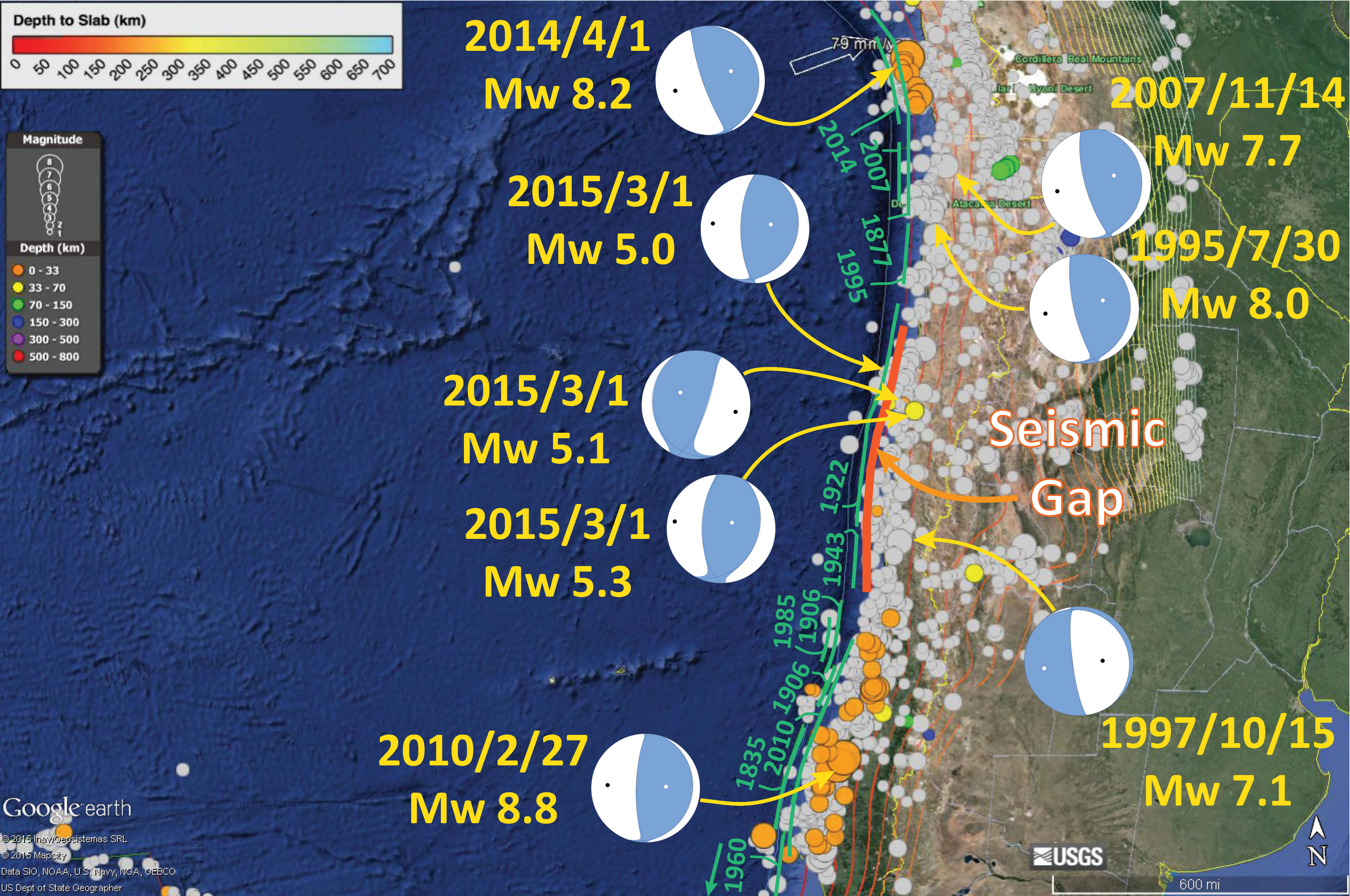
Hundreds of people died as a result of the 1922 earthquake. The USGS has more news reports about the 1922 earthquake here. There were also reports of a tsunami over 9 meters. So we know that this segment of the fault can produce large earthquakes and tsunami. However, it has been about a century since the last Great subduction zone earthquake in this region of the fault.
-
Here are the main earthquakes in the above map:
- 1922/11/7 M 7.0
- 1922/11/11 M 8.3
- 1995/07/30 M 8.0
- 1997/10/15 M 7.1
- 2007/11/14 M 7.7
- 2010/2/27 M 8.8
- 2014/4/1 M 8.2
Here is a map that shows the 2014 EQ swarm as it relates to historic slip patches in the region (Hayes et al., 2014). Note how there are large portions of the 1877 segment that have not gone off since 1877. This swarm of M~5 earthquakes is to the south of the 1995 earthquake that is plotted on the southern portion of this figure.

I remember discussing the 2014 earthquake at the 2014 SSA meeting. It was just after the swarm and it was fresh in my mind. Especially since I put together that animation of the time series. I mentioned to someone whose name I wont mention how interesting it was that there appeared to be two distinct slaong-strike slip patches to the swarm. They claimed that it could not be the case. He looked at the deformation data (inSAR) and claimed that it was clearly a single patch. Later I realized that inSAR could not distinguish these patches due to the time limitations of the overflight. Basically, there would need to be an acquisition before the swarm, in the middle of the swarm (between the two large slips), and one after the swarm was over. Since this is not possible (due to the short time of the swarm), it would be impossible to say there could not be two distinct patches. I wish I had this in my mind at the time. Here is a figure showing how these two patches have resolvable slip. Ironically, the person I spoke with about this at the meeting reviewed the Hayes manuscript. From Hayes et al. (2014).

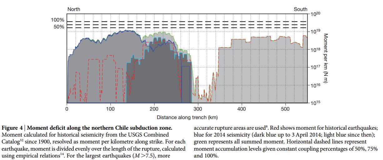
Here is the figure I was looking for (Hayes et al., 2014). This shows the moment/slip deficit based on seismicity since 1900. The slip deficit is an estimate of the amount of “slip” or moment that has been accumulated as strain upon the fault over a given amount of time. This is determined with several assumptions:
- The geometry of the fault, plate configuration, and convergence rates
- The coupling ratio, or how much of the plate convergence is actually contributing to accumulated strain and how much is aseismic, or not contributing to accumulated strain.
The region between 300 and 550 km is the region of the 1877 slip that has not ruptured since then, except for the 1995 and 2007 earthquakes (which contribute to the moment/slip deficit estimate in this figure). This is the region immediately to the north of this March 2015 swarm. This region (300-550 km) is the same region in the seismic gap in the next map (Fig. 1 Hayes et al., 2014).
Here is figure 1 from Hayes et al. (2014). This shows this seismic gap for the region of the subduction zone that ruptured in 1977. The southern boundary of this figure stops north of the 2015 EQ swarm.

Going to the north, we can see this slip deficit map modeled by Chlieh et al. (2011). They also placed the historic and prehistoric along-strike slip extents as part of this plot. The 2001 M 8.4 earthquake in Peru is shown in this figure, as well as the Hayes et al. (2014) figure above. The southernmost part of this figure (red slip deficit) is the region that slipped in 2014. There remains a patch with a large slip deficit offshore of Tacna, Peru.

Going to the south we can take a look at the 1835, 1960, and 2010 slip patches and how they might relate to each other. Here is a map from Melnick et al. (2014). Below I paste the figure caption from this Melnick et al. (2014) figure.

Here is the figure text from their article (you will need to read their article to get the references they list in this caption): FIG. 1. Modeled plate-boundary slip during the 2010 Maule earthquake and slip deficit of Darwin seismic gap. a. Slip from Lorito et al. (2011) with computed (grey arrows) and GPS (orange arrows) displacements (Vigny et al., 2011; Moreno et al., 2012). White squares show GPS sites used by Lorito et al. (2011). Inset shows histogram of residuals between measured and modeled displacements. SE-standard error. Note that Lorito et al. ‘s model underestimates GPS displacements between 36-37.5°S where they forecasted a Mw 7.5-8 earthquake; b. Alternative slip distribution (Moreno et al., 2012) with modeled and GPS displacements. Inset shows histogram of residuals; c. Slip deficit after the 2010 earthquake including plate coupling over 175 years at an heterogeneous rate (Moreno et al., 2010; Moreno et al., 2011), slip release by the 1960, 1928, and 1985 events (Moreno et al., 2009; Moreno et al., 2012), and the slip distribution of Moreno et al. (2012). Note that the deficit is negative or null over most of the rupture zone, suggesting the 2010 earthquake closed the gap opened in 1835. Extent of 1835 rupture inferred from a compilation of historical sources (see text). The Santa María splay fault system, which slipped during the Maule earthquake (Melnick et al., 2012b), may be associated with the positive slip deficit near Concepción; d. Slip deficit using the same constraints as in (c) but with the slip model of Lorito et al. Note the large positive region northwest of Concepción. The extent of the 1835 rupture assumed by Lorito et al. (2011) is shown.
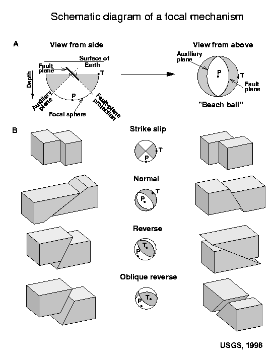
Here is a primer for the different types of earthquake faults and moment tensor/focal mechanisms. This comes from the USGS. This explains focal mechanisms. Moment tensors (which I use on my figures above) are determined differently, but their graphical solution/representation is the same as for focal mechanisms (for all practical purposes). Here is the USGS page on moment tensors if you want to learn more about them.
-
References:
- Chlieh et al., 2011. Interseismic coupling and seismic potential along the Central Andes subduction zone, Journal of Geophysical Research, v. 116, B12405, 21 p.
- Hayes, G.P., Herman, M.W., Barnhart, W.D., Furlong, K.P., Riquelme, S., Benz., H.M., Bergman, E., Barrientos, S., Earle, P.S., and Samsonov, S., 2014. Continuing megathrust earthquake potential in Chile after the 2014 Iquique earthquake: Nature, v. 512, p. 295-299.
-
Here are some related papers:
- Moreno 2010
- Chileh et al., 2011
- Lay 2011
- Schurr et al., 2014
- Melnick et al., 2014
- Béjar-Pizarro et al., 2013
10 thoughts on “Earthquakes in Chile: Between the 2010 and 2014 Slip Patches”