Earthquake Report: M 8.1 along Kermadec trench

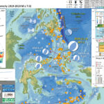
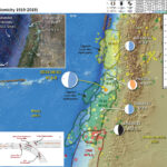
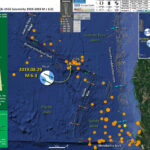
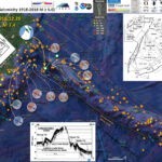
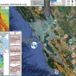
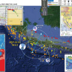
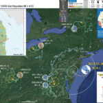
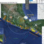
I don’t always have the time to write a proper Earthquake Report. However, I prepare interpretive posters for these events.
Because of this, I present Earthquake Report Lite. (but it is more than just water, like the adult beverage that claims otherwise). I will try to describe the figures included in the poster, but sometimes I will simply post the poster here.

Below is my interpretive poster for this earthquake

  • I plot the seismicity from the past month, with diameter representing magnitude (see legend). I include earthquake epicenters from 1921-2021 with magnitudes M ≥ 3.0 in one version.
  • I plot the USGS fault plane solutions (moment tensors in blue and focal mechanisms in orange), possibly in addition to some relevant historic earthquakes.
  • A review of the basic base map variations and data that I use for the interpretive posters can be found on the Earthquake Reports page. I have improved these posters over time and some of this background information applies to the older posters.
  • Some basic fundamentals of earthquake geology and plate tectonics can be found on the Earthquake Plate Tectonic Fundamentals page.

    I include some inset figures.

  • Here is the map with a month’s seismicity plotted.

UPDATE: 2023.03.04

I added additional context for this event and the regional tectonics.

    Magnetic Anomalies

  • In the map above, I include a transparent overlay of the magnetic anomaly data from EMAG2 (Meyer et al., 2017). As oceanic crust is formed, it inherits the magnetic field at the time. At different points through time, the magnetic polarity (north vs. south) flips, the North Pole becomes the South Pole. These changes in polarity can be seen when measuring the magnetic field above oceanic plates. This is one of the fundamental evidences for plate spreading at oceanic spreading ridges (like the Gorda rise).
  • Regions with magnetic fields aligned like today’s magnetic polarity are colored red in the EMAG2 data, while reversed polarity regions are colored blue. Regions of intermediate magnetic field are colored light purple.
  • We can see the roughly east-west trends of these red and blue stripes. These lines are parallel to the ocean spreading ridges from where they were formed. The stripes disappear at the subduction zone because the oceanic crust with these anomalies is diving deep beneath the Sunda plate (part of Eurasia), so the magnetic anomalies from the overlying Sunda plate mask the evidence for the Australia plate.

    Global Strain

  • In a map above, I include a transparent overlay of the Global Strain Rate Map (Kreemer et al., 2014).
  • The mission of the Global Strain Rate Map (GSRM) project is to determine a globally self-consistent strain rate and velocity field model, consistent with geodetic and geologic field observations. The overall mission also includes:
    1. contributions of global, regional, and local models by individual researchers
    2. archive existing data sets of geologic, geodetic, and seismic information that can contribute toward a greater understanding of strain phenomena
    3. archive existing methods for modeling strain rates and strain transients
  • The completed global strain rate map will provide a large amount of information that is vital for our understanding of continental dynamics and for the quantification of seismic hazards.
  • The version used in the poster(s) below is an update to the original 2004 map (Kreemer et al., 2000, 2003; Holt et al., 2005).

    I include some inset figures. Some of the same figures are located in different places on the larger scale map below.

  • In the lower right corner is a map that shows the major islands, the major plate tectonic boundaries (the faults, the volcanoes), and the location of two profiles shown above (Ballance et al., 1999. I place a blue star in the general location of the earthquake.
  • In the upper right corner are these two profiles (17-1 & 17-2). These profiles show how the elevation changes (solid line) and how the geomagnetic properties intensity, declination, inclination (dashed) vary across the plate boundary.
  • In the lower left corner is a map from Benz et al. (2010) that shows earthquakes with circles that represent magnitude (diameter) and depth (color). Deeper = blue & shallower = red. There is a cross section (cut into the earth) profile through this seismicity that uses a source area as shown by a rectangle (the green line J-J’).
  • In the upper left corner is cross section J-J’ that shows earthquake hypocenters (3-D locations) in the region of the M 7.2 earthquake.
  • there is a cross section of the Kermadec trench that includes bathymetry of the region (topography of the sea floor). This graphic was created by scientists at Woods Hole. I label the Louisville Seamount Chain for reference to compare with the main map.

Some Relevant Discussion and Figures

  • Here is the tectonic map from Ballance et al., 1999.

  • Map of the Southwest Pacific Ocean showing the regional tectonic setting and location of the two dredged profiles. Depth contours in kilometres. The presently active arcs comprise New Zealand–Kermadec Ridge–Tonga Ridge, linked with Vanuatu by transforms associated with the North Fiji Basin. Colville Ridge–Lau Ridge is the remnant arc. Havre Trough–Lau Basin is the active backarc basin. Kermadec–Tonga Trench marks the site of subduction of Pacific lithosphere westward beneath Australian plate lithosphere. North and South Fiji Basins are marginal basins of late Neogene and probable Oligocene age, respectively. 5.4sK–Ar date of dredged basalt sample (Adams et al., 1994).

  • Here is a great visualization of the Kermadec Trench from Woods Hole.

Kermadec Trench from Woods Hole Oceanographic Inst. on Vimeo.

  • Here is another map of the bathymetry in this region of the Kermadec trench. This was produced by Jack Cook at the Woods Hole Oceanographic Institution. The Lousiville Seamount Chain is clearly visible in this graphic.

  • I put together an animation of seismicity from 1965 – 2015 Sept. 7. Here is a map that shows the entire seismicity for this period. I plot the slab contours for the subduction zone here. These were created by the USGS (Hayes et al., 2012).

  • Here is the animation. Download the mp4 file here. This animation includes earthquakes with magnitudes greater than M 6.5 and this is the kml file that I used to make this animation.

    Social Media:

    References:

    Basic & General References

  • Frisch, W., Meschede, M., Blakey, R., 2011. Plate Tectonics, Springer-Verlag, London, 213 pp.
  • Hayes, G., 2018, Slab2 – A Comprehensive Subduction Zone Geometry Model: U.S. Geological Survey data release, https://doi.org/10.5066/F7PV6JNV.
  • Holt, W. E., C. Kreemer, A. J. Haines, L. Estey, C. Meertens, G. Blewitt, and D. Lavallee (2005), Project helps constrain continental dynamics and seismic hazards, Eos Trans. AGU, 86(41), 383–387, , https://doi.org/10.1029/2005EO410002. /li>
  • Jessee, M.A.N., Hamburger, M. W., Allstadt, K., Wald, D. J., Robeson, S. M., Tanyas, H., et al. (2018). A global empirical model for near-real-time assessment of seismically induced landslides. Journal of Geophysical Research: Earth Surface, 123, 1835–1859. https://doi.org/10.1029/2017JF004494
  • Kreemer, C., J. Haines, W. Holt, G. Blewitt, and D. Lavallee (2000), On the determination of a global strain rate model, Geophys. J. Int., 52(10), 765–770.
  • Kreemer, C., W. E. Holt, and A. J. Haines (2003), An integrated global model of present-day plate motions and plate boundary deformation, Geophys. J. Int., 154(1), 8–34, , https://doi.org/10.1046/j.1365-246X.2003.01917.x.
  • Kreemer, C., G. Blewitt, E.C. Klein, 2014. A geodetic plate motion and Global Strain Rate Model in Geochemistry, Geophysics, Geosystems, v. 15, p. 3849-3889, https://doi.org/10.1002/2014GC005407.
  • Meyer, B., Saltus, R., Chulliat, a., 2017. EMAG2: Earth Magnetic Anomaly Grid (2-arc-minute resolution) Version 3. National Centers for Environmental Information, NOAA. Model. https://doi.org/10.7289/V5H70CVX
  • Müller, R.D., Sdrolias, M., Gaina, C. and Roest, W.R., 2008, Age spreading rates and spreading asymmetry of the world’s ocean crust in Geochemistry, Geophysics, Geosystems, 9, Q04006, https://doi.org/10.1029/2007GC001743
  • Pagani,M. , J. Garcia-Pelaez, R. Gee, K. Johnson, V. Poggi, R. Styron, G. Weatherill, M. Simionato, D. Viganò, L. Danciu, D. Monelli (2018). Global Earthquake Model (GEM) Seismic Hazard Map (version 2018.1 – December 2018), DOI: 10.13117/GEM-GLOBAL-SEISMIC-HAZARD-MAP-2018.1
  • Silva, V ., D Amo-Oduro, A Calderon, J Dabbeek, V Despotaki, L Martins, A Rao, M Simionato, D Viganò, C Yepes, A Acevedo, N Horspool, H Crowley, K Jaiswal, M Journeay, M Pittore, 2018. Global Earthquake Model (GEM) Seismic Risk Map (version 2018.1). https://doi.org/10.13117/GEM-GLOBAL-SEISMIC-RISK-MAP-2018.1
  • Zhu, J., Baise, L. G., Thompson, E. M., 2017, An Updated Geospatial Liquefaction Model for Global Application, Bulletin of the Seismological Society of America, 107, p 1365-1385, https://doi.org/0.1785/0120160198
  • Specific References

  • Richards, S., Holm, R., and Barber, G., 2011. Skip Nav Destination When slabs collide: A tectonic assessment of deep earthquakes in the Tonga-Vanuatu region in Geology, c. 39, no. 8, p. 787-790, https://doi.org/10.1130/G31937.1
  • Timm, C., Bassett, D., Graham, I. et al. Louisville seamount subduction and its implication on mantle flow beneath the central Tonga–Kermadec arc. Nat Commun 4, 1720 (2013). https://doi.org/10.1038/ncomms2702

Return to the Earthquake Reports page.

Earthquake Report: Halmahera, Indonesia

While I was back in the Ridgecrest, CA area further documenting our slickenline observations from the 5 July 2019 M 7.1 Ridgecrest Earthquake, there was a tsunamigenic earthquake in the Molucca Sea near Halmahera, Indonesia. Some of my earliest earthquake reports were from this region, but I have not had the opportunity to write anything up for earthquakes in this area for a few years.
https://earthquake.usgs.gov/earthquakes/eventpage/us60006bjl/executive
The Halmahera Strait/Molucca Sea region is interesting as there is a pair of divergent subduction zones here. Basically, one dips to the east and one dips to the west, though it is a little more complicated.
McCaffrey et al. (1980) presented one of the first views of the subduction/thrust tectonics in this region. Since then, advances in marine geophysical methods have furthered our understanding and have generally re-enforced the early hypotheses rather well.
There was a minor tsunami recorded at a tide gage that was only 135 km (65 miles) from the epicenter. Here are those data plotted relative to time. The wave has a wave height of about 20 cm. The waves lasted several hours (it appears that maybe the waves resonated in the harbor).


In the interest of keeping this simple, I first present the interpretive poster, then I present some key figures that provide a seismotectonic context to this sequence.

Below is my interpretive poster for this earthquake

  • I plot the seismicity from the past month, with diameter representing magnitude (see legend). I include earthquake epicenters from 1919-2019 with magnitudes M ≥ 7.0 in one version.
  • I plot the USGS fault plane solutions (moment tensors in blue and focal mechanisms in orange), possibly in addition to some relevant historic earthquakes.
  • A review of the basic base map variations and data that I use for the interpretive posters can be found on the Earthquake Reports page.
  • Some basic fundamentals of earthquake geology and plate tectonics can be found on the Earthquake Plate Tectonic Fundamentals page.

    I include some inset figures. Some of the same figures are located in different places on the larger scale map below.

  • In the upper right corner are a series of panels from Zhang et al. (2017). The upper panel shows the major plate boundaries (subduction zones). I place a yellow star in the general location of this M 7.1 temblor. The middle panel shows a cross section of the Halmahera Strait where we can see the Mulucca Sea plate is diving to the east under the Philippine Sea plate and to the west under the Eurasia plate. This matches early cross sections (e.g. McCaffrey et al., 1980). The cross section is located along the red line on the poster (A-B). The lower panel shows seismicity for this area and we can see earthquakes trend deeper in bothe directions (east and west), though deeper to the west (red dots). Lines A-A’, B-B’, C-C’, D-D’, and E-E’ represent the locations of profiles included in the upper left figure.
  • In the upper left corner is a series of cross sections A-A’, B-B’, C-C’, D-D’, and E-E’. These are profiles showing material properties of the Earth based on seismic tomographic analysis. Seismic tomography is based on the same principles as CT scans. So, we can imagine that these profiles are like X-Ray scans of the Earth’s interior. Blue represents materials with faster seismic velocity (older and colder oceanic crust) and red represents materials with slower seismic velocity (generally hotter crust).
  • In the lower left corner is a plot of the tide gage data from Bitung, Sulawesi (location shown on interpretive poster).
  • Here is the map with a month’s and century’s seismicity plotted.

  • Here is a map that shows shaking intensity using the MMI scale. The colors and black contours are from the USGS shaking intensity model. I also include some of the “Did You Feel It?” report observations (e.g. labeled “DYFI 4.9”).
  • In the upper left corner is a plot from the USGS that includes both modeled data (the orange and green lines) and DYFI data (the points and whisker plots). The legend informs us about the source of these different data.

Other Report Pages

Some Relevant Discussion and Figures

  • Here is a tectonic map for this part of the world from Zahirovic et al., 2014. I left out all the acronym definitions (you’re welcome), but they are listed in the paper.

  • Regional tectonic setting with plate boundaries (MORs/transforms = black, subduction zones = teethed red) from Bird (2003) and ophiolite belts representing sutures modified from Hutchison (1975) and Baldwin et al. (2012). West Sulawesi basalts are from Polvé et al. (1997), fracture zones are from Matthews et al. (2011) and basin outlines are from Hearn et al. (2003).

  • Here are the figures from Zhang et al. (2017). First I present the tectonic overview figure, with captions below.

  • (a) Sketch of the Molucca Sea subduction zone and its vicinity. (b) Cross section (A-B) demonstrating the structure of arc-arc collision zone (modified after Hall and Smyth [2008]). (c) Distribution of earthquake events (2011.1.1–2015.12.31) and focal mechanism; the insert shows the vertical profile of epicenters sliced at position B-B0 . The black
    dashed line in Figure 1a is the position of cross section A-B in Figure 1b, and the red solid lines in Figure 1c are the cross sections of the seismic tomographic velocity model in Figure 2.

  • Here is the seismic tomography profile figure.

  • Vertical slices of seismic velocity beneath the Molucca Sea and its surrounding regions, in which positive velocity anomalies outline the unique shape of the subducting Molucca Sea plate. The tomographic images are sliced from the global P wave velocity anomaly model UU-P07 [Amaru, 2007] along positions shown in Figure 1c.

  • If we look at the first Zhang et al. (2017) figure above, the seismicity shows that the slab dipping to the west has earthquakes that extend much deeper than the zone dipping to the east. These authors hypothesized about why these subduciton zones are assymetrical (possibly due to mantle flow around the downgoing ocean crustal slabs). Zhang et al. (2017) conducted numerical analysis of mantle flow.
  • Here is a figure that shows some illustrations depicting possible tectonic configurations for this region.

  • Cartoon of end-member models illustrating effects of the order of subduction initiation, the mobility and thickness of the overriding plates on slab morphology, and migration of the overriding plates during DDS. Idealized DDS features (a) symmetrical subduction of slabs and (b–d) asymmetrical plate shape resulted from influence of order of subduction initiation, mobility, and thickness of overriding plates, respectively. (e) Tentative interpretation of formation of the asymmetrical DDS observed in the Molucca Sea region. Size of arrows indicate relative scale of the subduction-induced mantle flow.

  • Zhang et al., 2017 present below different possible configurations of double subduction zones.

  • Cartoons illustrating several forms of double subduction. (a) Divergent double subduction (descripted in this study and by Soesoo et al. [1997], Di Leo et al. [2014], Li et al., [2014], etc.). (b) Double subduction with opposite dipping directions (descripted by Maruyama et al. [ 2007]). (c and d) Convergent double subduction (descripted by Jagoutz et al. [2015] and Billen [2015]). In all of these case, sustainable subduction of the oceanic plate(s) requires smooth escape (Figures 17a and 17c) of the slab-trapped mantle or replenishment of external materials of mantle into the void space left by slab rollback (Figures 17b and 17d). The toroidal mantle flow (orange arrows) plays a dominant role in
    redistribution of material during all these types of double subduction.

  • Based on their analyses, Zhang et al. (2017) make some conclusions about the divergent subduction zones in this region.
    1. The self-sustaining, asymmetrical subduction of the Molucca Sea plate may drive the convergence of the overriding plates and collision of magmatic arcs, even in an extensional setting of SE Asia.
    2. The earlier and faster subduction on the western Sangihe side with respect to the eastern Halmahera side predominantly led to formation of the present-day asymmetrical shape of the subducting Molucca Sea plate.
    3. The relative immobility of the western overriding Eurasian plate may have promoted the westward migration of the Halmahera arc in the Molucca Sea subduction zone.
    4. Bending of arcs was probably a consequence of the toroidal mantle flow induced by rollback of the subducting Molucca Sea plate on its both sides.
    5. DDS is unsustainable without effective escape of the slab-trapped mantle via toroidal flow. It is therefore likely that DDS is confined to narrow and short oceanic plates and is related to closure of archipelagic oceans and accretion of arcs in accretionary orogenic belts.
  • Here are maps showing the regional tectonics (Smoczyk et al., 2013).

  • Along its western margin, the Philippine Sea plate is associated with a zone of oblique convergence with the Sunda plate. This highly active convergent plate boundary extends along both sides the Philippine Islands, from Luzon in the north to Sulawesi in the south. The tectonic setting of the Philippines is unusual in several respects: it is characterized by opposite-facing subduction systems on its east and west sides; the archipelago is cut by a major transform fault, the Philippine Fault; and the arc complex itself is marked by volcanism, faulting, and high seismic activity. Subduction of the Philippine Sea plate occurs at the eastern margin of the archipelago along the Philippine Trench and its northern extension, the East Luzon Trough. The East Luzon Trough is thought to be an unusual example of a subduction zone in the process of formation, as the Philippine Trench system gradually extends northward (Hamburger and others, 1983).

  • This shows Global Positioning System (GPS) velocities at various locations. These plate motions are represented as vectors in mm/yr. (see legend) Note that the plate motion vectors on either side of the Halmahera Strait are opposing each other, evidence of the contraction/convergence/compression across these plate boundary faults. Below I include the text from the original figure caption in blockquote.

  • Topographic and tectonic map of the Indonesian archipelago and surrounding region. Labeled, shaded arrows show motion (NUVEL-1A model) of the first-named tectonic plate relative to the second. Solid arrows are velocity vectors derived from GPS surveys from 1991 through 2001, in ITRF2000. For clarity, only a few of the vectors for Sumatra are included. The detailed velocity field for Sumatra is shown in Figure 5. Velocity vector ellipses indicate 2-D 95% confidence levels based on the formal (white noise only) uncertainty estimates. NGT, ew Guinea Trench; NST, North Sulawesi Trench; SF, Sumatran Fault; TAF, Tarera-Aiduna Fault. Bathymetry [Smith and Sandwell, 1997] in this and all subsequent figures contoured at 2 km intervals

  • This is one of my favorite figures of all time (Hall, 2011). Today’s earthquake sequence happened in the center of the middle panel, between the cyan (Molluca plate) and yellow plates. Read below for more details.

  • 3D cartoon of plate boundaries in the Molucca Sea region modified from Hall et al. (1995). Although seismicity identifies a number of plates there are no continuous boundaries, and the Cotobato, North Sulawesi and Philippine Trenches are all intraplate features. The apparent distinction between different crust types, such as Australian continental crust and oceanic crust of the Philippine and Molucca Sea, is partly a boundary inactive since the Early Miocene (east Sulawesi) and partly a younger but now probably inactive boundary of the Sorong Fault. The upper crust of this entire region is deforming in a much more continuous way than suggested by this cartoon.

  • Here is a map and cross section presented by Waltham et al. (2008). They use a variety of data sources as a basis for their interpretations (seismic reflection data, gravity data). Note how the Molucca Sea plate subducts both to the west and to the east. Below I include the text from the original figure caption in blockquote.

  • (A) Location and major tectonic features of the Molucca Sea region. Small, black-filled triangles are modern volcanoes. Bathymetric contours are at 200, 2000, 4000, and 6000 m. Large barbed lines are subduction zones, and small barbed lines are thrusts. (B) Cross section across the Halmahera and Sangihe Arcs on section line B. Thrusts on each side of the Molucca Sea are directed outward toward the adjacent arcs, although the subducting Molucca Sea plate dips east beneath Halmahera and west below the Sangihe Arc. (C) Inset is the restored cross section of the Miocene–Pliocene Weda Bay Basin of SW Halmahera on section line C, fl attened to the Pliocene unconformity, showing estimated thickness of the section

  • Early work done in the region was presented by McCaffrey et al. (1980). Here is a map showing seismic refraction lines that they used to constrain the structures in this region. Below I include the text from the original figure caption in blockquote.

  • Map of the Molucca Sea, eastern Indonesia, showing I~tions of seismic refraction lines (solid straight lines) and gravity traverses (dashed-dotted lines). Thrust faults are shown with teeth on hanging wall. Triangles represent active volcanoes defining the Sangihe and Halmahera magmatic arcs. Isobath interval is 1 km from Mammericks et al. [1976].

  • Here is a cross section that shows the gravity model they used to interpret this region.

  • Gravity model for the central Molucca Sea. (II) Crustal model with layers designated by their density contrasts and refraction control points by open circles and vertical bars. (b) Mantle structure used in modeling the gravity profiles in the central Molucca Sea. Figure 124 fits into the small box at the apex of the inverted-V-ehaped lithosphere. Slab dimensions are controlled by earthquake foci (dots) from Hlltherton 11M Dickinaon [1969J, and mantle densities are taken from Grow 11M Rowin [1975J. The column at the left shows assumed densities for the range of depths between the tick marks. The small v pattern represents oceanic crust, and island arc crust is designated by a short parallel line pattern. East is to the right of the figure.

  • Here is another tectonic map showing the Sorong fault and some splay faults (dashed lines running along Halmahera), one of which may be involved in today’s earthquake.

  • Location map and active faults of the Molucca Sea region. Fault colours: blue, convergence; red, transvergence; yellow, divergence; grey, uncertain motion. Fault abbreviations: CF, Catabato Fault; GF, Gorontalo Fault; NST, North Sulawesi Trench; PKF, Palu-Koro Fault; SF, Sorong Fault.

Seismic Hazard and Seismic Risk

  • These are the two maps shown in the map above, the GEM Seismic Hazard and the GEM Seismic Risk maps from Pagani et al. (2018) and Silva et al. (2018).
    • The GEM Seismic Hazard Map:


    • The Global Earthquake Model (GEM) Global Seismic Hazard Map (version 2018.1) depicts the geographic distribution of the Peak Ground Acceleration (PGA) with a 10% probability of being exceeded in 50 years, computed for reference rock conditions (shear wave velocity, VS30, of 760-800 m/s). The map was created by collating maps computed using national and regional probabilistic seismic hazard models developed by various institutions and projects, and by GEM Foundation scientists. The OpenQuake engine, an open-source seismic hazard and risk calculation software developed principally by the GEM Foundation, was used to calculate the hazard values. A smoothing methodology was applied to homogenise hazard values along the model borders. The map is based on a database of hazard models described using the OpenQuake engine data format (NRML). Due to possible model limitations, regions portrayed with low hazard may still experience potentially damaging earthquakes.
    • Here is a view of the GEM seismic hazard map for Indonesia.

    • The USGS Seismic Hazard Map:
    • Here is another version of the seismic hazard for this region (Smoczyk et al., 2013). The GEM map suggests that the islands along the Halmahera Strait may have accelerations between 0.8-1.6 m2. This translates to 0.08 to 0.16 g. The GEM seismic hazard map shows a potential shaking of 0.20-0.35 g, slightly higher.

    • The GEM Seismic Risk Map:


    • The Global Seismic Risk Map (v2018.1) presents the geographic distribution of average annual loss (USD) normalised by the average construction costs of the respective country (USD/m2) due to ground shaking in the residential, commercial and industrial building stock, considering contents, structural and non-structural components. The normalised metric allows a direct comparison of the risk between countries with widely different construction costs. It does not consider the effects of tsunamis, liquefaction, landslides, and fires following earthquakes. The loss estimates are from direct physical damage to buildings due to shaking, and thus damage to infrastructure or indirect losses due to business interruption are not included. The average annual losses are presented on a hexagonal grid, with a spacing of 0.30 x 0.34 decimal degrees (approximately 1,000 km2 at the equator). The average annual losses were computed using the event-based calculator of the OpenQuake engine, an open-source software for seismic hazard and risk analysis developed by the GEM Foundation. The seismic hazard, exposure and vulnerability models employed in these calculations were provided by national institutions, or developed within the scope of regional programs or bilateral collaborations.

Tsunami Hazard

  • Here are two maps that show the results of probabilistic tsunami modeling for the nation of Indonesia (Horspool et al., 2014). These results are similar to results from seismic hazards analysis and maps. The color represents the chance that a given area will experience a certain size tsunami (or larger).
  • The first map shows the annual chance of a tsunami with a height of at least 0.5 m (1.5 feet). The second map shows the chance that there will be a tsunami at least 3 meters (10 feet) high at the coast.

  • Annual probability of experiencing a tsunami with a height at the coast of (a) 0.5m (a tsunami warning) and (b) 3m (a major tsunami warning).

    Social Media

    References:

    Basic & General References

  • Frisch, W., Meschede, M., Blakey, R., 2011. Plate Tectonics, Springer-Verlag, London, 213 pp.
  • Hayes, G., 2018, Slab2 – A Comprehensive Subduction Zone Geometry Model: U.S. Geological Survey data release, https://doi.org/10.5066/F7PV6JNV.
  • Holt, W. E., C. Kreemer, A. J. Haines, L. Estey, C. Meertens, G. Blewitt, and D. Lavallee (2005), Project helps constrain continental dynamics and seismic hazards, Eos Trans. AGU, 86(41), 383–387, , https://doi.org/10.1029/2005EO410002. /li>
  • Kreemer, C., J. Haines, W. Holt, G. Blewitt, and D. Lavallee (2000), On the determination of a global strain rate model, Geophys. J. Int., 52(10), 765–770.
  • Kreemer, C., W. E. Holt, and A. J. Haines (2003), An integrated global model of present-day plate motions and plate boundary deformation, Geophys. J. Int., 154(1), 8–34, , https://doi.org/10.1046/j.1365-246X.2003.01917.x.
  • Kreemer, C., G. Blewitt, E.C. Klein, 2014. A geodetic plate motion and Global Strain Rate Model in Geochemistry, Geophysics, Geosystems, v. 15, p. 3849-3889, https://doi.org/10.1002/2014GC005407.
  • Meyer, B., Saltus, R., Chulliat, a., 2017. EMAG2: Earth Magnetic Anomaly Grid (2-arc-minute resolution) Version 3. National Centers for Environmental Information, NOAA. Model. https://doi.org/10.7289/V5H70CVX
  • Müller, R.D., Sdrolias, M., Gaina, C. and Roest, W.R., 2008, Age spreading rates and spreading asymmetry of the world’s ocean crust in Geochemistry, Geophysics, Geosystems, 9, Q04006, https://doi.org/10.1029/2007GC001743
  • Specific References

  • Hall, R., 2011. Australia-SE Asia collision: plate tectonics and crustal flow in Geological Society, London, Special Publications 2011; v. 355; p. 75-109 doi: 10.1144/SP355.5
  • Hall., R., Audley-Charles, M.G., Banner, F.T., Hidayat, S., Tobing, S.L., 1988. Basement rocks of the Halmahera region, eastern Indonesia: a Late Cretaceous-early Tertiary arc and fore-arc in Journal of the Geological Society, v. 145, p. 65-84
  • Horspool, N., Pranantyo, I., Griffin, J., Latief, H., Natawidjaja, D. H., Kongko, W., Cipta, A., Bustaman, B., Anugrah, S. D., and Thio, H. K., 2014. A probabilistic tsunami hazard assessment for Indonesia, Nat. Hazards Earth Syst. Sci., 14, 3105-3122, https://doi.org/10.5194/nhess-14-3105-2014, 2014.
  • McCaffrey, R., Silver, E.A., and Raitt, R.W., 1980. Crustal Structure of the Molucca Sea Collision Zone, Indonesia in The Tectonic and Geologic Evolution of Southeast Asian Seas and Islands-Geophysical Monograph 23, p. 161-177.
  • Pagani,M. , J. Garcia-Pelaez, R. Gee, K. Johnson, V. Poggi, R. Styron, G. Weatherill, M. Simionato, D. Viganò, L. Danciu, D. Monelli (2018). Global Earthquake Model (GEM) Seismic Hazard Map (version 2018.1 – December 2018), DOI: 10.13117/GEM-GLOBAL-SEISMIC-HAZARD-MAP-2018.1
  • Silva, V ., D Amo-Oduro, A Calderon, J Dabbeek, V Despotaki, L Martins, A Rao, M Simionato, D Viganò, C Yepes, A Acevedo, N Horspool, H Crowley, K Jaiswal, M Journeay, M Pittore, 2018. Global Earthquake Model (GEM) Seismic Risk Map (version 2018.1). https://doi.org/10.13117/GEM-GLOBAL-SEISMIC-RISK-MAP-2018.1
  • Smoczyk, G.M., Hayes, G.P., Hamburger, M.W., Benz, H.M., Villaseñor, Antonio, and Furlong, K.P., 2013. Seismicity of the Earth 1900–2012 Philippine Sea plate and vicinity: U.S. Geological Survey Open-File Report 2010–1083-M, 1 sheet, scale 1:10,000,000.
  • Zahirovic et al., 2014. The Cretaceous and Cenozoic tectonic evolution of Southeast Asia in Solid Earth, v. 5, p. 227-273, doi:10.5194/se-5-227-2014.
  • Zhang, Q., F. Guo, L. Zhao, and Y. Wu, 2017. Geodynamics of divergent double subduction: 3-D numerical modeling of a Cenozoic example in the Molucca Sea region, Indonesia, J. Geophys. Res. Solid Earth, 122, 3977–3998, doi:10.1002/2017JB013991.
  • Zulkifli, M., Rudyanto, A., and Sakti, A.P., 2016. The View of Seismic Hazard in The Halmahera Region in proceedings from International Symposium on Earth Hazard and Disaster Mitigation (ISEDM) 2016 AIP Conf. Proc. 1857, 050004-1–050004-7; doi:10.1063/1.4987082

Return to the Earthquake Reports page.


Earthquake Report: 1989 Loma Prieta!

Well, I prepared this report for the 30th anniversary of the 18 Oct 1989 Loma Prieta M 6.9 earthquake in central California, a.k.a. the World Series Earthquake (it happened during the 1989 World Series game at Candlestick Park in San Francisco). The date was 17 October in CA, but 18 Oct in England (UTC time).
Learn more about how to prepare for the next SF Bay Area quake here.
There is a treasure trove of information about this earthquake, the impacts from the earthquake, and the response of people to these impacts. The “go to” place to start looking at some of these resources is from the USGS here. Some of the information I gleaned for this report came from one of the links on that page.


I was a sophomore at the California Institute of the Arts (studying cinematography with an interest of being a DP) in October 1989. The previous year I was living at a housing coop (UCHA at 500 Landfair Ave in Westwood) while attending UCLA. One of my good friends (David Silver) from the coop was from Santa Cruz, so I called him to find out if his family was OK (they were).
That was the closest I came to experiencing the quake and this was almost a decade before I started growing my interest in geology and plate tectonics.
The earthquake had a major impact upon the entire SF Bay area. Freeway overpasses collapsed. A section of the Bay Bridge fell. Many houses were damaged. Fires started. The ground along the coast liquefied.
All of this may happen again when the next big earthquake hits.
The good thing is that, given a little bit of information, people are much more capable of experiencing an earthquake with a reduced amount of suffering. Some stuff we cannot completely prevent, but a little bit of knowledge goes a long way. If you did not participate in a shakeout this year, sign up so you can do so next year. Or, check out shakeout to see what you can learn even without the shakeout going on. If you don’t live in California or the USA, there are still lots of things that you can learn! There are shakeouts in other states and in other countries too!
Below I present several interpretive posters, as well as some figures from papers and public reports (e.g. from the USGS).

Below is my interpretive poster for this earthquake

  • I plot the seismicity from the 3 months including and after the M 6.9 earthquake, with orange circles with the symbol diameter representing magnitude (see legend). I include earthquake epicenters from 1969-2019 with magnitudes M ≥ 2.5 in one version (gray circles). I use the USGS Quaternary fault and fold database as a source for the tectonic faults on the map, with color showing their slip rates.
  • I plot the USGS fault plane solutions (moment tensors in blue and focal mechanisms in orange), possibly in addition to some relevant historic earthquakes.
  • A review of the basic base map variations and data that I use for the interpretive posters can be found on the Earthquake Reports page.
  • Some basic fundamentals of earthquake geology and plate tectonics can be found on the Earthquake Plate Tectonic Fundamentals page.

    I include some inset figures. Some of the same figures are located in different places on the larger scale map below.

  • In the upper left corner there is a map that shows the major faults in the SF Bay region. The fault lines are colored (yellow to orange) that shows the chance that a given fault may slip between 2007 and 2036. The Hayward/Rodgers Creek fault system has the highest chance of having an earthquake in the next 17 years (about 31%). This is based on our knowledge of earthquakes from the past and into the prehistoric time. The region of the San Andreas fault that was involved in the Loma Prieta temblor is labeled with black arrows.
  • In the upper right corner is a map from the USGS, the Governor’s Office for Emergency Services (CalOES), and the California Geological Survey (CGS, where I work) that uses our knowledge of past earthquakes and the bedrock geology (or lack thereof) to show the potential for strong ground shaking from future earthquakes. High hazard areas are colored pink and are close to the faults (compare with the map in the upper left corner). Areas of low hazard are further away from faults. I placed a yellow circle in the general location of the M 6.9 epicenter.
  • In the lower right corner is a detailed figure from McLaughlin and Clark (2003) (labeled Wells, 2003) that shows their interpretation of the faults in the area. The mainshock is labeled by a black star.
  • Here is the map with 3 month’s seismicity plotted.

USGS Shaking Intensity

  • Here is a figure that shows a more detailed comparison between the modeled intensity and the reported intensity. Borth data use the same color scale, the Modified Mercalli Intensity Scale (MMI). More about this can be found here. The colored contours on the map are results from the USGS modeled intensity. The DYFI data are plotted as colored regions (color = MMI). I labeled some of the DYFI regions (e.g. DYFI 8.1) and MMI contours (e.g. MMI 7).
  • in the lower left-center there are two inset maps. The map on the left is the MMI shakemap from the USGS. The map on the right is shows the same DYFI regions as shown in the main map.
  • In the upper left corner is a plot showing MMI intensity (vertical axis) relative to distance from the earthquake (horizontal axis). The models are represented by the green and orange lines. The DYFI data are plotted as light blue dots. The mean and median (different types of “average”) are plotted as orand and purple dots. Note how well the reports fit the green line (the model that represents how MMI works based on quakes in California). I plot Santiago relative to distance from the earthquake with a blue arrow (compare with the poster).

Shaking Intensity and Potential for Ground Failure

  • Below are a series of maps that show the shaking intensity and potential for landslides and liquefaction. These are all USGS data products.
  • There are many different ways in which a landslide can be triggered. The first order relations behind slope failure (landslides) is that the “resisting” forces that are preventing slope failure (e.g. the strength of the bedrock or soil) are overcome by the “driving” forces that are pushing this land downwards (e.g. gravity). The ratio of resisting forces to driving forces is called the Factor of Safety (FOS). We can write this ratio like this:

    FOS = Resisting Force / Driving Force

    When FOS > 1, the slope is stable and when FOS < 1, the slope fails and we get a landslide. The illustration below shows these relations. Note how the slope angle α can take part in this ratio (the steeper the slope, the greater impact of the mass of the slope can contribute to driving forces). The real world is more complicated than the simplified illustration below.


    Landslide ground shaking can change the Factor of Safety in several ways that might increase the driving force or decrease the resisting force. Keefer (1984) studied a global data set of earthquake triggered landslides and found that larger earthquakes trigger larger and more numerous landslides across a larger area than do smaller earthquakes. Earthquakes can cause landslides because the seismic waves can cause the driving force to increase (the earthquake motions can “push” the land downwards), leading to a landslide. In addition, ground shaking can change the strength of these earth materials (a form of resisting force) with a process called liquefaction.
    Sediment or soil strength is based upon the ability for sediment particles to push against each other without moving. This is a combination of friction and the forces exerted between these particles. This is loosely what we call the “angle of internal friction.” Liquefaction is a process by which pore pressure increases cause water to push out against the sediment particles so that they are no longer touching.
    An analogy that some may be familiar with relates to a visit to the beach. When one is walking on the wet sand near the shoreline, the sand may hold the weight of our body generally pretty well. However, if we stop and vibrate our feet back and forth, this causes pore pressure to increase and we sink into the sand as the sand liquefies. Or, at least our feet sink into the sand.
    Below is a diagram showing how an increase in pore pressure can push against the sediment particles so that they are not touching any more. This allows the particles to move around and this is why our feet sink in the sand in the analogy above. This is also what changes the strength of earth materials such that a landslide can be triggered.


    Below is a diagram based upon a publication designed to educate the public about landslides and the processes that trigger them (USGS, 2004). Additional background information about landslide types can be found in Highland et al. (2008). There was a variety of landslide types that can be observed surrounding the earthquake region. So, this illustration can help people when they observing the landscape response to the earthquake whether they are using aerial imagery, photos in newspaper or website articles, or videos on social media. Will you be able to locate a landslide scarp or the toe of a landslide? This figure shows a rotational landslide, one where the land rotates along a curvilinear failure surface.


    Here is an excellent educational video from IRIS and a variety of organizations. The video helps us learn about how earthquake intensity gets smaller with distance from an earthquake. The concept of liquefaction is reviewed and we learn how different types of bedrock and underlying earth materials can affect the severity of ground shaking in a given location. The intensity map above is based on a model that relates intensity with distance to the earthquake, but does not incorporate changes in material properties as the video below mentions is an important factor that can increase intensity in places.

    Here is a map with landslide probability on the left (Jessee et al., 2017) and a map showing liquefaction susceptibility on the right (Zhu et al., 2017). Please head over to that report for more information about the USGS Ground Failure products (landslides and liquefaction). Basically, earthquakes shake the ground and this ground shaking can cause landslides. We can see that there is a moderate probability for landslides and high probability for liquefaction.

    Our primary landslide model is the empirical model of Nowicki Jessee and others (2018). The model was developed by relating 23 inventories of landslides triggered by past earthquakes with different combinations of predictor variables using logistic regression.

    Zhu and others (2017) is the preferred model for liquefaction hazard. The model was developed by relating 27 inventories of liquefaction triggered by past earthquakes to globally-available geospatial proxies (summarized below) using logistic regression. We have implemented the global version of the model and have added additional modifications.

  • Keefer (1998) presented a review of the earthquake triggered landslides from the Loma Prieta earthquake.
  • Below Keefer and Manson (1998) present a summary of observed earthquake triggered landslides, with Loma Prieta plotted as a circle. This plot shows the area affected by landslides relative to earthquake magnitude. This makes sense, that the larger the earthquake, the larger the area the landslides could be triggered by the earthquake.

  • Area of landslides generated by 1989 Loma Prieta earthquake, A, as a function of earthquake magnitude, M, in comparison with other historical earthquakes with epicenters onshore (dots) and offshore (x’s). Most data points and upper-bound curve (solid line) from Keefer (1984); additional data points and log-linear mean (dashed line) from Keefer and Wilson (1989).

Shaking Visualization & Videos

  • Below is a great visualization of the ground shaking from the ’89 shaker. This comes from the USGS here. Note how the majority of the urban areas did NOT have strong ground shaking from this earthquake, even though that lots of the damage was in those areas. Imagine what will happen when the Hayward or San Andreas faults rupture next.
  • From the USGS: The movie shows the propagation of seismic waves away from the epicenter, which lies in the Santa Cruz Mountains, about ten miles northeast of the of the city of Santa Cruz. The residual colors indicate the peak shaking intensity at locations up to the time in seconds indicated near the top center of the movie. The current intensity, at the time indicated, is indicated by shading of the colors.
  • From the USGS: One striking observation for those who experienced the 1989 Loma Prieta earthquake’s shaking is the comparison of the extent and intensity of shaking with the 1906 earthquake. The Loma Prieta rupture was about 30 times smaller in energy than the great 1906 earthquake.
  • From the USGS: he rupture in the Loma Prieta earthquake began at a depth of about 12 miles and appears to have ruptured a 25 mile long portion of the San Andreas fault. Unlike the 1906 earthquake, the rupture in the Loma Prieta earthquake did not reach the surface. As in the 1906 earthquake, the strongest shaking was concentrated along the fault. In 1989 the two areas of most intense shaking were north and south of the epicenter in the Santa Cruz mountains.

The movie’s color the landscape in each frame according to the maximum (peak) intensity of shaking (amplitude of the ground motion) up to that point in time. The color scale is the same as the one used in ShakeMap. In order to show the intensity of the current shaking, the colors darken as the shaking intensifies. At some locations, the most intense shaking lasts for several seconds, so the colors will darken as seismic waves continue to cause strong shaking. The first example shows how the colors change as the shaking at a location progresses from no shaking through weak, moderate, and strong shaking, peaking at a violent shaking level (very dark red), before the shaking dies off (red becomes brighter). The second example shows the color progression for a location that peaks at a strong level of shaking.

  • Here is a spectacular video from the California Highway Patrol.
  • Here is a documentary from NBC from 2019

Some Relevant Discussion and Figures

Loma Prieta – Geologic Setting

  • McLaughlin and Clark (2003) present two great maps that show the plate tectonic setting associated with the Loma Prieta earthquake.
  • We see maps that show the major faults associated with the Pacific-North America plate boundary. The big player is the San Andreas fault, a right-lateral strike-slip fault (see more in the geological fundamentals section to learn more about strike-slip faults).


  • Figure caption is for both maps from McLaughlin and Clark. Loma Prieta region, Calif., showing major fault blocks and fault zones. A, Regional setting. BSF, Bartlett Springs fault; CA, Calaveras fault; CSZ, Cascadia subduction zone; FF, Franklin fault; GF, Garberville fault; GLF, Garlock fault; HAY, Hayward fault; HF, Hosgri fault; MF, Maacama fault; MFZ, Mendocino Fracture Zone; NAD, Navarro discontinuity; NSAF, northern section of the San Andreas fault (north of the San Francisco peninsula); PF, Pilarcitos fault; PFZ, Pioneer Fracture Zone; PLT, Pleito thrust; PRT, Pastoria-Rand thrust zone; RCF, Rodgers Creek fault; SAF, San Andreas fault, including Peninsular segment; SGF, San Gregorio fault; SNF, Sur-Nacimiento fault; TBF, Tolay-Bloomfield fault; ZVF, Zayante-Vergeles fault. B, San Francisco Bay block, showing locations of plate 1 and figure 2A. Star, epicenter of October 18, 1989, main shock.

  • Here is the cross-section presented by McLaughlin and Clark (2003). We can see how Wells interprets the subsurface geology to be configured. First we see a deeper and more zoomed out view of the plate tectonics here. Then we see a larger scale version showing the faults in greater detail.

  • Schematic cross section across the California margin at latitude of Loma Prieta (fig. 1), showing hypothetical deep structure of the San Andreas fault system, tectonic wedging, and plate boundary relations. Depth, thickness, and compositions of crust and mantle units and location of midcrustal decollement are partly inferred from seismic reflection and refraction models of Fuis and Mooney (1990), Page and Brocher (1993), and Brocher and others (this chapter). Depth to present top of slab window (Dickinson and Snyder, 1979), configuration of lithified materials underplated in older, shallower roof area of window, and hypothetical boundary relation between the Pacific and North American plates are based on thermal and seismic models of Furlong and others (1989). CAL, Calaveras fault; SAF, San Andreas fault; SAR, Sargent fault; SGF, San Gregorio fault; TESLA–ORT, Tesla-Ortigalita fault; ZAY, Zayante fault.


    Surface deformation and crustal structure in the Summit Road-Skyland Ridge area (fig. 2B). A, Rose diagrams comparing observed and expected horizontal surface-deformation fields during 1989 Loma Prieta earthquake. B, Block diagram showing inferred crustal structure across the San Andreas fault and possible relation to primary and secondary slip during 1989 Loma Prieta earthquake. Red echelon faults at surface and shallow subsurface are fissures in the Summit Road-Skyland Ridge fault zone. Loma Prieta rupture is shown in red at depth, extending upward from main shock to base of the gabbro of Logan. Deep configuration of the San Andreas fault is partly inferred from Olson and Hill (1993). Crustal structure to about 10-km depth is partly inferred from Jachens and Griscom (this chapter), and below about 10-km depth is highly speculative and inferred from indicated seismic velocities (Fuis and Mooney, 1990; Rufus Catchings, oral commun., 1993; see Brocher and others, this chapter).

Central California – Earthquake Hazard

  • Based on our knowledge of prehistoric and historic earthquakes, the USGS and CGS have made estimates of the chance that faults may rupture in the next couple of decades (Aagaard et al., 2014). Below is a map from this report that shows the major faults and the likelihood that they may cause an earthquake in between 2014 & 2043. Note that the Hayward fault has the highest chance of slipping over this time period.

Loma Prieta – Earthquake Fault Slip Distribution

  • There are a number of slip models for the Loma Prieta Earthquake. These show the amount that the fault slipped during an earthquake. This type of modeling can be constrained by a number of factors including GPS geodetic data or seismic data.
  • Below is a figure from Jiang and Lapusta (2016). There are slip models for 3 different earthquakes. Slip is represented by color. Earthquake locations are shown as circles. B shows the depth distribution of the earthquakes.

  • (A) Spatial relations of the inferred coseismic slip during large earthquakes (in color, with hypocenters as red stars) and microseismicity before (blue circles) and after (black circles), over time periods shown in (B).The large earthquakes are: (i) 2004 Mw 6.0 Parkfield (6, 16), (ii) 1989 Mw 6.9 Loma Prieta (32), and (iii) 2002 Mw 7.9 Denali (33). Small earthquakes within 2, 4, and 5 km of the fault for the three cases, respectively, are projected onto the fault plane (except iii) and plotted using a circular crack model with the same seismic moment and 3 MPa stress drop. (B) (Left) Time evolution of the depths of seismicity (gray circles) and (right) the depth distribution of normalized total seismic moment released before (blue lines), during (red lines), and after (gray) the mainshock (MS).We considered seismicity and coseismic fault slip inside the regions of largest slip outlined by the red dashed lines in (A). Seismic moment release before the Denali event is not shown because of the small number of events.

  • These authors were investigating how faults behave. Below is another schematic illustration showing their different fault models (conventional vs. deeper-penetration).

  • (A) A strike-slip fault model with the seismogenic zone (light gray areas), creeping regions (yellow), and fault heterogeneity (dark gray circles). The initiation point and rupture fronts of a large earthquake are illustrated by the red star and contours, respectively. (B) The locked seismogenic zone and creeping regions below are typically interpreted as having VW and VS rate-and-state friction properties, respectively. In purely rate-and-state models, the VW/VS boundary and locked-creeping transition nearly coincide, and the associated concentrated shear stressing induced at the locked-creeping transition (blue line) promotes microseismicity at the bottom of the seismogenic zone in the interseismic period (blue circles). However, large earthquake rupture may extend seismic slip deeper than the VW/VS boundary, due to enhanced dynamic weakening (DW) at high slip rates, putting the locked-creeping transition and the associated concentrated stressing (red line) within the VS region and hence suppressing microseismicity nucleation.


More about the background seismotectonics

  • I place a map shows the configuration of faults in central (San Francisco) and northern (Point Delgada – Punta Gorda) CA (Wallace, 1990). Here is the caption for this map, that is on the lower left corner of my map. Below the citation is this map presented on its own.

  • Geologic sketch map of the northern Coast Ranges, central California, showing faults with Quaternary activity and basin deposits in northern section of the San Andreas fault system. Fault patterns are generalized, and only major faults are shown. Several Quaternary basins are fault bounded and aligned parallel to strike-slip faults, a relation most apparent along the Hayward-Rodgers Creek-Maacama fault trend.

  • Here is the figure showing the evolution of the SAF since its inception about 29 Ma. I include the USGS figure caption below as a blockquote.

  • EVOLUTION OF THE SAN ANDREAS FAULT.
    This series of block diagrams shows how the subduction zone along the west coast of North America transformed into the San Andreas Fault from 30 million years ago to the present. Starting at 30 million years ago, the westward- moving North American Plate began to override the spreading ridge between the Farallon Plate and the Pacific Plate. This action divided the Farallon Plate into two smaller plates, the northern Juan de Fuca Plate (JdFP) and the southern Cocos Plate (CP). By 20 million years ago, two triple junctions began to migrate north and south along the western margin of the West Coast. (Triple junctions are intersections between three tectonic plates; shown as red triangles in the diagrams.) The change in plate configuration as the North American Plate began to encounter the Pacific Plate resulted in the formation of the San Andreas Fault. The northern Mendocino Triple Junction (M) migrated through the San Francisco Bay region roughly 12 to 5 million years ago and is presently located off the coast of northern California, roughly midway between San Francisco (SF) and Seattle (S). The Mendocino Triple Junction represents the intersection of the North American, Pacific, and Juan de Fuca Plates. The southern Rivera Triple Junction (R) is presently located in the Pacific Ocean between Baja California (BC) and Manzanillo, Mexico (MZ). Evidence of the migration of the Mendocino Triple Junction northward through the San Francisco Bay region is preserved as a series of volcanic centers that grow progressively younger toward the north. Volcanic rocks in the Hollister region are roughly 12 million years old whereas the volcanic rocks in the Sonoma-Clear Lake region north of San Francisco Bay range from only few million to as little as 10,000 years old. Both of these volcanic areas and older volcanic rocks in the region are offset by the modern regional fault system. (Image modified after original illustration by Irwin, 1990 and Stoffer, 2006.)

  • Here is a map that shows the shaking potential for earthquakes in CA. This comes from the state of California here.

  • Earthquake shaking hazards are calculated by projecting earthquake rates based on earthquake history and fault slip rates, the same data used for calculating earthquake probabilities. New fault parameters have been developed for these calculations and are included in the report of the Working Group on California Earthquake Probabilities. Calculations of earthquake shaking hazard for California are part of a cooperative project between USGS and CGS, and are part of the National Seismic Hazard Maps. CGS Map Sheet 48 (revised 2008) shows potential seismic shaking based on National Seismic Hazard Map calculations plus amplification of seismic shaking due to the near surface soils.

Hayward Fault Scenarios

  • The USGS prepares earthquake shakemap scenarios for known earthquake sources in the US.
  • Below is a summary of what these scenarios are and how they can be used (from the USGS).
  • A scenario represents one realization of a potential future earthquake by assuming a particular magnitude, location, and fault-rupture geometry and estimating shaking using a variety of strategies.

    In planning and coordinating emergency response, utilities, local government, and other organizations are best served by conducting training exercises based on realistic earthquake situations—ones similar to those they are most likely to face. ShakeMap Scenario earthquakes can fill this role. They can also be used to examine exposure of structures, lifelines, utilities, and transportation corridors to specified potential earthquakes.

    A ShakeMap earthquake scenario is a predictive ShakeMap with an assumed magnitude and location, and, optionally, specified fault geometry.

  • Last year there was an effort to educate the public about earthquake hazards in the San Francisco Bay Area. This effort surrounded the 150 year anniversary of the last major earthquake on the Hayward fault. More can be found about the Haywired Project here.
  • I prepare below an interpretive poster that highlights three of the earthquake scenarios for the Hayward fault system, each with increasing magnitude (M 6.9, M 7.3, and M 7.6). Due to the uncertainty about which faults may rupture next, multiple scenarios are used to simulate earthquake effects.
  • The poster below shows the scenario earthquake fault in white (the source of the ground shaking). Earthquake intensity (using the Modified Mercalli Intensity scale) is represented by a color scale (see legend). The inset map on the right shows USGS seismicity between 1919 and 2019.

  • Look at how the same MMI extends for a larger distance across the flat areas (like Sacramento Valley). This is because the sedimentary basins in those areas amplify the seismic waves, so the ground shaking is stronger there.
  • The effect is evidenced in most valleys, such as Napa, Santa Clara, and Salinas.
  • Here is the USGS ShakeMap (Aargard et al., 2008)

  • ShakeMap for the 1906 San Francisco earthquake based on the Boatwright and Bundock (2005) intensities (processed 18 October 2005). Open circles identify the intensity sites used to construct the ShakeMap.

Geologic Fundamentals

  • For more on the graphical representation of moment tensors and focal mechnisms, check this IRIS video out:
  • Here is a fantastic infographic from Frisch et al. (2011). This figure shows some examples of earthquakes in different plate tectonic settings, and what their fault plane solutions are. There is a cross section showing these focal mechanisms for a thrust or reverse earthquake. The upper right corner includes my favorite figure of all time. This shows the first motion (up or down) for each of the four quadrants. This figure also shows how the amplitude of the seismic waves are greatest (generally) in the middle of the quadrant and decrease to zero at the nodal planes (the boundary of each quadrant).

  • There are three types of earthquakes, strike-slip, compressional (reverse or thrust, depending upon the dip of the fault), and extensional (normal). Here is are some animations of these three types of earthquake faults. The following three animations are from IRIS.
  • Strike Slip:

    Compressional:

    Extensional:

  • This is an image from the USGS that shows how, when an oceanic plate moves over a hotspot, the volcanoes formed over the hotspot form a series of volcanoes that increase in age in the direction of plate motion. The presumption is that the hotspot is stable and stays in one location. Torsvik et al. (2017) use various methods to evaluate why this is a false presumption for the Hawaii Hotspot.

  • A cutaway view along the Hawaiian island chain showing the inferred mantle plume that has fed the Hawaiian hot spot on the overriding Pacific Plate. The geologic ages of the oldest volcano on each island (Ma = millions of years ago) are progressively older to the northwest, consistent with the hot spot model for the origin of the Hawaiian Ridge-Emperor Seamount Chain. (Modified from image of Joel E. Robinson, USGS, in “This Dynamic Planet” map of Simkin and others, 2006.)

  • Here is a map from Torsvik et al. (2017) that shows the age of volcanic rocks at different locations along the Hawaii-Emperor Seamount Chain.

  • Hawaiian-Emperor Chain. White dots are the locations of radiometrically dated seamounts, atolls and islands, based on compilations of Doubrovine et al. and O’Connor et al. Features encircled with larger white circles are discussed in the text and Fig. 2. Marine gravity anomaly map is from Sandwell and Smith.

    Social Media

    References:

    Basic & General References

  • Frisch, W., Meschede, M., Blakey, R., 2011. Plate Tectonics, Springer-Verlag, London, 213 pp.
  • Holt, W. E., C. Kreemer, A. J. Haines, L. Estey, C. Meertens, G. Blewitt, and D. Lavallee (2005), Project helps constrain continental dynamics and seismic hazards, Eos Trans. AGU, 86(41), 383–387, , https://doi.org/10.1029/2005EO410002. /li>
  • Müller, R.D., Sdrolias, M., Gaina, C. and Roest, W.R., 2008, Age spreading rates and spreading asymmetry of the world’s ocean crust in Geochemistry, Geophysics, Geosystems, 9, Q04006, https://doi.org/10.1029/2007GC001743
  • Specific References

  • Aargard, B.T. and Beroza, G.C., 2008. The 1906 San Francisco Earthquake a Century Later: Introduction to the Special Section in BSSA, v. 98, no. 2, p. 817-822, https://doi.org/10.1785/0120060401
  • Aargard, B.T. et al., 2008. Ground-Motion Modeling of the 1906 San Francisco Earthquake, Part II: Ground-Motion Estimates for the 1906 Earthquake and Scenario Events in BSSA, v. 98, no. 2, p. 1012-1046, https://doi.org/10.1785/0120060410
  • Aagaard, B.T., Blair, J.L., Boatwright, J., Garcia, S.H., Harris, R.A., Michael, A.J., Schwartz, D.P., and DiLeo, J.S., 2016, Earthquake outlook for the San Francisco Bay region 2014–2043 (ver. 1.1, August 2016): U.S. Geological Survey Fact Sheet 2016–3020, 6 p., http://dx.doi.org/10.3133/fs20163020.
  • Jessee, M.A.N., Hamburger, M. W., Allstadt, K., Wald, D. J., Robeson, S. M., Tanyas, H., et al. (2018). A global empirical model for near-real-time assessment of seismically induced landslides. Journal of Geophysical Research: Earth Surface, 123, 1835–1859. https://doi.org/10.1029/2017JF004494
  • Jiang, J. and Lapusta, N., 2016. Deeper penetration of large earthquakes on seismically quiescent faults in Science, v. 352, no. 6291, p. 1293-1297, DOI: 10.1126/science.aaf1496
  • Keefer, D.K., 1984. Landslides Caused by Earthquakes in GSA Bulletin, v. 95, p. 406-421
  • Keefer, D.K., 1998. The Loma Prieta, California, Earthquake of October 17, 1989: Strong Ground Motion and Ground Failure in Keefer, D.K., Manson, M.W., Griggs, G.B., Plant, Nathaniel, Schuster, R.L., Wieczorek, G.F., Hope, D.G., Harp, E.L., Nolan, J.M., Weber, G.E., Cole, W.F., Marcum, D.R., Shires, P.O., and Clark, B.R., Chapter C. The Loma Prieta, California, Earthquake of October 17, 1989 – Landslides, USGS Professional Paper 1551-C, https://doi.org/10.3133/pp1551C
  • Keefer, D.K. and Mason M.W., 1998. Regional Distribution and Characteristics of Landslides Generated by the Earthquake in Keefer, D.K., Manson, M.W., Griggs, G.B., Plant, Nathaniel, Schuster, R.L., Wieczorek, G.F., Hope, D.G., Harp, E.L., Nolan, J.M., Weber, G.E., Cole, W.F., Marcum, D.R., Shires, P.O., and Clark, B.R., Chapter C. The Loma Prieta, California, Earthquake of October 17, 1989 – Landslides, USGS Professional Paper 1551-C, https://doi.org/10.3133/pp1551C
  • McLaughlin, R.J. and Clark, J.C., 2003. Stratigraphy and Structure Across the San Andreas Fault Zone in the Loma Preita Region and Deformation During the Earthquake in Wells, R.E., ed., The Loma Prieta, California, Earthquake of October 17, 1989—Geologic Setting and Crustal Structure, USGS Professional Paper 11550-E, http://pubs.usgs.gov/pp/p1550e/
  • Stoffer, P.W., 2006, Where’s the San Andreas Fault? A guidebook to tracing the fault on public lands in the San Francisco Bay region: U.S. Geological Survey General Interest Publication 16, 123 p., online at http://pubs.usgs.gov/gip/2006/16/
  • USGS, 2004. Landslide Types and Processes, U.S. Geological Survey Fact Sheet 2004-3072
  • Wallace, Robert E., ed., 1990, The San Andreas fault system, California: U.S. Geological Survey Professional Paper 1515, 283 p. [http://pubs.usgs.gov/pp/1988/1434/].
  • Zhu, J., Baise, L. G., Thompson, E. M., 2017, An Updated Geospatial Liquefaction Model for Global Application, Bulletin of the Seismological Society of America, 107, p 1365-1385, doi: 0.1785/0120160198

Return to the Earthquake Reports page.


Earthquake Report: Chile

I am catching up on earthquake reports today as I was in the field the past couple of weeks…

Well, these reports are getting too long. So, I have placed the explanatory material on 2 web pages, so one does not need to read through that stuff if they have been here before. I will link those pages in all reports. You’re welcome. ;-)

This will also save me some time and make writing these reports simpler.

On 1 August 2019 there was an earthquake along the convergent plate boundary along the west coast of Chile (a subduction zone forming the Peru-Chile trench). This subduction zone megathrust fault produced the largest magnitude earthquake recorded on seismometers in 1960, the Valparaiso, Chile magnitude M9.5 earthquake that caused a trans-pacific tsunami causing damage and deaths all along the western hemispheric coastline.

https://earthquake.usgs.gov/earthquakes/eventpage/us60004yps/executive

This M 6.8 earthquake happened at the overlap of the southern end of the 1985 M8.0 and northern end of the 2010 M8.8 earthquakes. Does this portend that there will be another, larger, earthquake in this area soon? Only time will tell.

Below is my interpretive poster for this earthquake

  • I plot the seismicity from the past month, with color representing depth and diameter representing magnitude (see legend). I include earthquake epicenters from 1919-2019 with magnitudes M ≥ 3.0 in one version.
  • I plot the USGS fault plane solutions (moment tensors in blue and focal mechanisms in orange), possibly in addition to some relevant historic earthquakes.
  • A review of the basic base map variations and data that I use for the interpretive posters can be found on the Earthquake Reports page.
  • Some basic fundamentals of earthquake geology and plate tectonics can be found on the Earthquake Plate Tectonic Fundamentals page.

    I include some inset figures. Some of the same figures are located in different places on the larger scale map below.

  • In the upper left corner is a map showing historic earthquakes along the Chile margin (Rhea et al., 2010). We may visualize the earthquake depths by checking out the color of the dots. To the below is a cross section, cutting into the Earth. Earthquakes that are along the profile D-D’ (in blue on the map) are included in this cross section. I also placed a blue line on the main map in the general location of this cross section. I placed a blue star in the general location of the M=6.8 earthquake (same for the other inset figures).
  • To the right is a map that shows a comparison between the USGS modeled intensity (using the MMI scale) with the USGS “Did You Feel It?” reports (results from real people). The model and the reported results are quite similar. See the MMI poster below for a more comprehensive comparison. In addition, I include depth contours of the subducting megathrust slab (Hayes et al., 2016; read more here).
  • In the center left bottom, I include a schematic cross section of the subduction zone. This shows where earthquakes may occur, generally. There are subduction zone megathrust earthquakes (the largest of magnitude), crustal earthquakes, slab earthquakes, and outer rise earthquakes.
  • In the lower right corner is a map that shows the relative seismic hazard for this plate boundary (Rhea et al., 2010). I plot both 2019 earthquakes.< The numbers (“80”) indicate the rate at which the Nazca Plate is subducting beneath South America. 80 mm/yr = 3 in/yr.
  • In the upper right corner is a composite figure from several figures from Metois et al., 2016. On the left is a panel that shows the latitudinal range of earthquake ruptures (I fixed it in places as the original figure did not extend the 2010 rupture sufficiently to the north). The panel on the right shows how much the subduction zone fault is “locked” (or, seismically coupled). Darker colors represent parts of the fault that are storing more energy over time and are possibly places where the fault will slip (compared to parts of the fault that are white or yellow, which may be places where the fault is currently slipping and would not generate earthquakes in the future). This is simply a model and there is not way to really know where an earthquake will happen until there is an earthquake.
  • Here is the map with a century’s seismicity plotted, for earthquakes associated with the larger earthquakes from this region (colored relative to time scale, 1960, 1985, 2010, 2015, 2019).

USGS Shaking Intensity

  • Here is a figure that shows a more detailed comparison between the modeled intensity and the reported intensity. Borth data use the same color scale, the Modified Mercalli Intensity Scale (MMI). More about this can be found here. The colors and contours on the map are results from the USGS modeled intensity. The DYFI data are plotted as colored dots (color = MMI, diameter = number of reports).
  • In the lower right corner is a plot showing MMI intensity (vertical axis) relative to distance from the earthquake (horizontal axis). The models are represented by the green and orange lines. The DYFI data are plotted as light blue dots. The mean and median (different types of “average”) are plotted as orand and purple dots. Note how well the reports fit the green line (the model that represents how MMI works based on quakes in California). I plot Santiago relative to distance from the earthquake with a blue arrow (compare with the poster).

USGS Historic Seismicity

  • Here is a poster that shows the significant earthquakes along this plate boundary. Note how there are earthquakes in the Nazca plate associated with the 2010 and 2015 megathrust subduction zone earthquakes. These are triggered earthquakes along the outer rise, not additional subduction zone earthquakes.
  • In the lower right corner is a figure from Beck (1998) that shows the spatial extent of the known earthquakes. I added the extent of the 2015 and 2010 earthquakes as green arrows.
  • In the upper right corner is an excellent figure from Horton (2018) that shows the plate tectonic setting for this area.

Some Relevant Discussion and Figures

  • Here is the overview figure from Horton, 2018.

  • Maps of (A) tectonic framework, (B) topography, and (C) sedimentary basin configuration of South America. (A) Map of plate boundaries, Andean magmatic arc (including the northern, central, and southern volcanic zones), regions of flat slab subduction, modern stress orientations from earthquake focal mechanisms, eastern front of Andean fold-thrust belt, and key segments of the retroarc foreland basin system. Plate velocities are shown relative to stable South American plate (DeMets et al., 2010). (B) DEM topographic map showing the Andes mountains and adjacent foreland region, including the Amazon, Parana, Orinoco, and Magdalena (Mag) river systems. (C) Map of Andean retroarc basins, showing isopach thicknesses (in km) of Cretaceous-Cenozoic basin fill, forebulge axis (from Chase et al., 2009), and locations of 13 sites (8 foreland basins, 5 hinterland basins) considered in this synthesis

  • Here is the seismic hazard map is from Rhea et al. (2010).

  • Here is the seismicity map and space time diagram from Métois et al. (2016). The subduction zone fault in the region of Coquimbo, Chile changes geometry, probably because of the Juan Fernandez Ridge (this structure controls the shape of the subduction zone). This figure shows a map and cross section for two parts of the subduction zone (Marot et al., 2014). Note how the subduction zone flattens out with depth here. The M=6.7 quake was shallower than this, but the shape of the downgoing slab does affect the amount of slab pull (tension in the down-dip direction) is exerted along the plate.

  • Left estimated extent of large historical or instrumental ruptures along the Chilean margin adapted from ME´ TOIS et al. (2012). Gray stars mark major intra-slab events. The recent Mw[8 earthquakes are indicated in red. Gray shaded areas correspond to LCZs defined in Fig. 3. Right seismicity recorded by the Centro Sismologico Nacional (CSN) during
    interseismic period, color-coded depending on the event’s depth. Three zones have been defined to avoid including aftershocks and preshocks associated with major events: (1) in North Chile, we plot the seismicity from 2008 to january 2014, i.e., between the Tocopilla and Iquique earthquakes; (2) in Central Chile, we plot the seismicity on the entire 2000–2014 period; (3) in South-Central Chile, we selected events that occurred between 2000 and 2010, i.e., before the Maule earthquake.

  • This figure is the 3 panel figure in the interpretive poster showing how seismicity is distributed along the margin, how historic earthquake slip was distributed, and how the fault may be locked (or slipping) along the megathrust fault.

  • a Histogram depicts the rate of Mw>3 earthquakes registered by the CSN catalog during the interseismic period defined for each zone (see Fig. 2) on the subduction interface, on 0.2° of latitude sliding windows. Stars are swarm-like sequences detected by HOLTKAMP et al. (2011) depending on their occurrence date. Swarms located in the Iquique LCZ and Camarones segment are from RUIZ et al. (2014). Empty squares are significant intraplate earthquakes. b Red curve variations of the average coupling coefficient on the first 60 km of depth calculated on 0.2° of latitude sliding windows for our best model including an Andean sliver motion. Dashed pink curves are alternative models with different smoothing options that fit the data with nRMS better than 2 (see supplementary figure 6): the pink shaded envelope around our best model stands for the variability of the coupling along strike. Green curves coseismic distribution for Maule (VIGNY et al. 2011), Iquique (LAY et al. 2014) and Illapel earthquakes (RUIZ et al. 2016). Gray shaded areas stand for the identified low coupling zones (LCZs). LCZs and high coupling segments are named on the left. The apparent decrease in the average coupling North of 30°S is considered as an artifact of the Andean sliver motion (see Sect. 5.2). c Best coupling distribution obtained inverting for Andean sliver motion and coupling amount simultaneously. The rupture zones for the three major earthquakes are indicated as green ellipses. White shaded areas are zones where we lack resolution.

  • This is a figure that shows details about the coupling compared to some slip models for the 2010, 2014, and 2015 earthquakes.

  • Left coupling maps (color coded) versus coseismic slip distributions (gray shaded contours in cm) for the last three major Chilean earthquakes (epicenters are marked by white stars). From top to bottom Iquique area, white squares are pre-seismic swarm event in the month before the main shock, green star is the 2005, Tarapaca´ intraslab earthquake epicenter, blue star is the Mw 6.7 Iquique aftershock; Illapel area, green squares show the seismicity associated with the 1997 swarm following the Punitaqui intraslab earthquake (green star); Maule area, green star is the epicenter of the 1939 Chillan intraslab earthquake. Right interseismic background seismicity in the shallow part of the subduction zone (shallower than 60 km depth) for each region (red dots) together with 80 and 90 % coupling contours. White dots are events identified as mainshock after a declustering procedure following GARDNER and KNOPOFF (1974). Yellow areas extent of swarm sequences identified by HOLTKAMP et al. (2011) for South and Central Chile, and RUIZ et al. (2014) for North Chile.

  • This is the fault locking figure from Saillard et al. (2017), showing the percent coupling (how much of the plate convergence contributes to deformation of the plate boundary, which may tell us places on the fault that might slip during an earthquake. We are still learning about why this is important and what it means.

  • Comparison between the uplift rates, interseismic coupling, major bathymetric features, and peninsulas along the Andean margin (10°S–40°S). (a) Uplift rates of marine terraces reported in the literature (we present the average rate since terrace abandonment; Table S1 in the supporting information [Jara-Muñoz et al., 2015]). Each color corresponds to a marine terrace assigned to a marine isotopic stage (MIS). Gray dots are the uplift rates of the central Andean rasa estimated from a numerical model of landscape evolution [Melnick, 2016]. (b) Major bathymetric features and peninsulas and pattern of interseismic coupling of the Andean margin from GPS data inversion (this study). Gray shaded areas correspond to the areas where the spatial resolution of inversion is low due to the poor density of GPS observations (see text and supporting information for more details). The Peru-Chile trench (thick black line), the coastline (thin black line), and the convergence direction (black arrows) are indicated. We superimposed the curve obtained by shifting the trench geometry eastward by 110 km (trench-coast distance of 110 km; blue line) with the curve reflecting the 40 km isodepth of the subducting slab (red line; Slab1.0 from Hayes and Wald [2009]), a depth which corresponds approximately with the downdip end of the locked portion of the Andean seismogenic zone (±10 km) [Ruff and Tichelaar, 1996; Khazaradze and Klotz, 2003; Chlieh et al., 2011; Ruegg et al., 2009; Moreno et al., 2011; Métois et al., 2012]. The two curves are spatially similar in the erosive part of the Chile margin (north of 34°S), whereas they diverge along the shallower slab geometry in the accretionary part of the Chile margin (south of 34°S), where the downdip end of the locked zone may be shallower (Figure 4b). Red arrows indicate the low interseismic coupling associated with peninsulas and marine terraces and evidence of aseismic afterslip (after Perfettini et al. [2010] below the Pisco-Nazca Peninsula; Pritchard and Simons [2006], Victor et al. [2011], Shirzaei et al. [2012], Bejar-Pizarro et al. [2013], and Métois et al. [2013] for the Mejillones Peninsula; Métois et al. [2012, 2014] below the Tongoy Peninsula; and Métois et al. [2012] and Lin et al. [2013] for the Arauco Peninsula). FZ: Fracture zone. Horizontal blue bands are the areas where coastline is less than 110 km (light blue) or 90 km (dark blue) from the trench (see Figure 1).

  • The following figures from Leyton et al. (2009) are great analogies, showing examples of interplate earthquakes (e.g. subduction zone megathrust events) and intraplate earthquakes (e.g. slab quakes, or events within the downgoing plate). The first figures are maps showing these earthquakes, then there are some seismicity cross sections.

  • Maps showing the location of the study and the events used ((a)–(c)). In red we present interplate earthquakes, while in blue, the intermediate depth, intraplate ones. We used beach balls to plot those events with known focal and circles for those without. White triangles mark the position of the Chilean Seismological Network used to locate the events; those with names represent stations used in the waveform analysis (either accelerometers or broadbands with known instrumental response). Labels over beach balls correspond to CMT codes.

  • Here are 2 cross sections showing the earthquakes plotted in the maps above (Leyton et al., 2009).

  • Cross-section at (a) 33.5◦S and (b) 36.5◦S showing the events used in this study. In red we present interplate earthquakes, while in blue, the intermediate depth, intraplate ones.We used beach balls (vertical projection) to plot those events with knownfocal and circles for those without. In light gray is shown the background seismicity recorded from 2000 to 2006 by the Chilean Seismological Service

  • Here is the cross section figure I prepared for the interpretive poster above.

    Social Media

    References:

    Basic & General References

  • Frisch, W., Meschede, M., Blakey, R., 2011. Plate Tectonics, Springer-Verlag, London, 213 pp.
  • Hayes, G., 2018, Slab2 – A Comprehensive Subduction Zone Geometry Model: U.S. Geological Survey data release, https://doi.org/10.5066/F7PV6JNV.
  • Holt, W. E., C. Kreemer, A. J. Haines, L. Estey, C. Meertens, G. Blewitt, and D. Lavallee (2005), Project helps constrain continental dynamics and seismic hazards, Eos Trans. AGU, 86(41), 383–387, , https://doi.org/10.1029/2005EO410002. /li>
  • Kreemer, C., J. Haines, W. Holt, G. Blewitt, and D. Lavallee (2000), On the determination of a global strain rate model, Geophys. J. Int., 52(10), 765–770.
  • Kreemer, C., W. E. Holt, and A. J. Haines (2003), An integrated global model of present-day plate motions and plate boundary deformation, Geophys. J. Int., 154(1), 8–34, , https://doi.org/10.1046/j.1365-246X.2003.01917.x.
  • Kreemer, C., G. Blewitt, E.C. Klein, 2014. A geodetic plate motion and Global Strain Rate Model in Geochemistry, Geophysics, Geosystems, v. 15, p. 3849-3889, https://doi.org/10.1002/2014GC005407.
  • Meyer, B., Saltus, R., Chulliat, a., 2017. EMAG2: Earth Magnetic Anomaly Grid (2-arc-minute resolution) Version 3. National Centers for Environmental Information, NOAA. Model. https://doi.org/10.7289/V5H70CVX
  • Müller, R.D., Sdrolias, M., Gaina, C. and Roest, W.R., 2008, Age spreading rates and spreading asymmetry of the world’s ocean crust in Geochemistry, Geophysics, Geosystems, 9, Q04006, https://doi.org/10.1029/2007GC001743
  • Specific References

  • Beck, S., Barrientos, S., Kausel, E., and Reyes, M., 1998. Source Characteristics of Historic Earthquakes along the Central Chile Subduction Zone in Journal of South American Earth Sciences, v. 11, no. 2, p. 115-129, https://doi.org/10.1016/S0895-9811(98)00005-4
  • Gardi, A., A. Lemoine, R. Madariaga, and J. Campos (2006), Modeling of stress transfer in the Coquimbo region of central Chile, J. Geophys. Res., 111, B04307, https://doi.org/10.1029/2004JB003440
  • Horton, B.K., 2018. Sedimentary record of Andean mountain building< in Earth-Science Reviews, v. 178, p. 279-309, https://doi.org/10.1016/j.earscirev.2017.11.025
  • Leyton, F., Ruiz, J., Campos, J., and Kausel, E., 2009. Intraplate and interplate earthquakes in Chilean subduction zone:
    A theoretical and observational comparison in Physics of the Earth and Planetary Interiors, v. 175, p. 37-46, https://doi.org/10.1016/j.pepi.2008.03.017
  • Marot, M., Monfret, T., Gerbault, M.,. Nolet, G., Ranalli, G., and Pardo, M., 2014. Flat versus normal subduction zones: a comparison based on 3-D regional traveltime tomography and petrological modelling of central Chile and western Argentina (29◦–35◦S) in GJI, v. 199, p. 1633-164, https://doi.org/10.1093/gji/ggu355
  • Métois, M., Vigny, C., and Socquet, A., 2016. Interseismic Coupling, Megathrust Earthquakes and Seismic Swarms Along the Chilean Subduction Zone (38°–18°S) in Pure Applied Geophysics, https://doi.org/10.1007/s00024-016-1280-5
  • Rhea, S., Hayes, G., Villaseñor, A., Furlong, K.P., Tarr, A.C., and Benz, H.M., 2010. Seismicity of the earth 1900–2007, Nazca Plate and South America: U.S. Geological Survey Open-File Report 2010–1083-E, 1 sheet, scale 1:12,000,000.
  • Ruiz, S. and Madariaga, R., 2018. Historical and recent large megathrust earthquakes in Chile in Tectonophysics, v. 733, p. 37-56, https://doi.org/10.1016/j.tecto.2018.01.015
  • Saillard, M., L. Audin, B. Rousset, J.-P. Avouac, M. Chlieh, S. R. Hall, L. Husson, and D. L. Farber, 2017. From the seismic cycle to long-term deformation: linking seismic coupling and Quaternary coastal geomorphology along the Andean megathrust in Tectonics, 36, https://doi:10.1002/2016TC004156.

Return to the Earthquake Reports page.


Earthquake Report: Blanco fault

Well, these reports are getting too long. So, I have placed the explanatory material on 2 web pages, so one does not need to read through that stuff if they have been here before. I will link those pages in all reports. You’re welcome. ;-)

This will also save me some time and make writing these reports simpler.

The tectonics of the northeast Pacific is dominated by the Cascadia subduction zone, a convergent plate boundary, where the Explorer, Juan de Fuca, and Gorda oceanic plates dive eastward beneath the North America plate.

These oceanic plates are created (formed, though I love writing “created” in science writing) at oceanic spreading ridges/centers.

When oceanic spreading centers are offset laterally, a strike-slip fault forms called a transform fault. The Blanco transform fault is a right-lateral strike-slip fault (like the San Andreas fault). Thanks to Dr. Harold Tobin for pointing out why this is not a fracture zone.

This plate boundary fault system (BF) is quite active with ten magnitude M ≥ 6.0 earthquakes in the past 50 years (one every 5 years) and about 150 M ≥ 5 earthquakes in the same time range.

https://earthquake.usgs.gov/earthquakes/eventpage/us700059qh/executive

When there are quakes on the BF, people always wonder if the Cascadia megathrust is affected by this… “are we at greater risk because of those BF earthquakes?”

The main take away is that we are not at a greater risk because of these earthquakes. More on this below the interpretive poster.

Below is my interpretive poster for this earthquake

  • I plot the seismicity from the past month, with color representing depth and diameter representing magnitude (see legend). I include earthquake epicenters from 1919-2019 with magnitudes M ≥ 3.0 in one version.
  • I plot the USGS fault plane solutions (moment tensors in blue and focal mechanisms in orange), possibly in addition to some relevant historic earthquakes.
  • A review of the basic base map variations and data that I use for the interpretive posters can be found on the Earthquake Reports page.
  • Some basic fundamentals of earthquake geology and plate tectonics can be found on the Earthquake Plate Tectonic Fundamentals page.

    I include some inset figures. Some of the same figures are located in different places on the larger scale map below.

  • In the upper left corner is a map of the Cascadia subduction zone (CSZ) and regional tectonic plate boundary faults. This is modified from several sources (Chaytor et al., 2004; Nelson et al., 2004). I placed a blue stars in the general location of today’s earthquake (as in other inset figures in this poster). As for all insets in this poster, I place a cyan star in the general location of this M 6.3 earthquake.
  • In the lower left corner is an illustration modified from Plafker (1972). This figure shows how a subduction zone deforms between (interseismic) and during (coseismic) earthquakes. Today’s earthquake did not occur along the CSZ, so did not produce crustal deformation like this. However, it is useful to know this when studying the CSZ. Today’s earthquakes happened in the lower Gorda plate
  • In the upper right corner is a map that shows 21st century earthquakes along the Blanco transform fault system.
  • In the lower right corner is a map from Dziak et al. (2000) that shows the topography (in the upper panel) and the faulting (in the lower panel) along the BFZ. I outline the location of this figure in the main part of the poster. Blue = lower elevation, deeper oceanic depths; Red = shallower oceanic depth, higher elevation. I placed orange arrows to help one locate the normal faults (perpendicular to the strike-slip faults) in this map. Compare this inset map with the Google Earth bathymetry in the main map. Can you see the BFZ perpendicular ridges?
  • Here is the map with a century’s seismicity plotted, for earthquakes of magnitude M ≥ 6.0.

Stress Triggering

When earthquake faults slip, the surrounding crust and faults change shape and this causes areas of the faults to get imparted increased or decreased amounts of stress. If these faults are almost ready to slip and the change of stress is increased sufficiently, those source earthquakes may trigger earthquakes on the receiver fault (the one with increased stress). This is termed “static coulomb stress triggering.”

Typically the maximum distance from an earthquake that these stress changes can trigger an earthquake is about twice the length of the source earthquake.

If we use data from historic earthquakes to correlate earthquake fault slip length to magnitude, we can estimate the length of the BF that slipped during the M 6.3 temblor (Wells and Coppersmith, 1994).

Below is a figure from Wells and Coppersmith (1994) that shows the empirical relations between surface rupture length (SRL, the length of the fault that ruptures to the ground surface) and magnitude. If one knows the SRL (horizontal axis), they can estimate the magnitude (vertical axis). The left plot shows the earthquake data. The right plot shows how their formulas “predict” these data.


* note, i corrected this caption by changing the word “relationships” to “relations.”
(a) Regression of surface rupture length on magnitude (M). Regression line shown for all-slip-type relations. Short dashed line indicates 95% confidence interval. (b) Regression lines for strike-slip, reverse, and normal-slip relations. See Table 2 for regression coefficients. Length of regression lines shows the range of data for each relation.

We don’t really know what the SRL for the M 6.3, but using these empirical relations, the length of the M 6.3 fault is probably between 11-14 km. So, the distance that the M 6.3 could probably trigger another quake is limited to 30 km or so. The westward tip of North America is about 230 km from the M 6.3 epicenter, with the locked zone (the part of the megathrust that might slip during an earthquake) is tens of km even further away (maybe more than 300 km).

To give us an idea about this stress triggering stuff, below is a figure from Rollins and Stein (2010). This figure shows the results from their model. This model shows the change in stress imparted upon the megathrust from a strike-slip fault in the Gorda plate (a 1980 M 7.3 earthquake, which was very close to the megathrust).

The red areas show areas of increased stress, blue areas show decreased stress. This is based on a left-lateral strike-slip fault (so a right-lateral quake would produce changes in stress the opposite as this, red regions would be blue and blue regions would be red, generally).

The M 7.3 SRL may have been between 86-104 km. Compare this with the 12-14 km SRL for a M 6.3. The changes in coulomb stress for the M 6.3 is much much less than for the > 7.3.


Coulomb stress changes imparted by the 1980 Mw = 7.3 earthquake (B) to a matrix of faults representing the Mendocino Fault Zone, the Cascadia subduction zone, and NE striking left‐lateral faults in the Gorda zone. (con’t)

So, now you may have more insight about whether or not a BF earthquake could affect the CSZ megathrust. (If a M 7.8 BF earthquake happened, it would be at the outer limits of beginning to influence the megathrust, but this affect would be quite small)

2018.08.22 M 6.2 Blanco transform fault

About a year ago, there was a magnitude M 6.2 temblor on the same plate boundary fault system. Here is the earthquake report for that M 6.2 event. Below I include the 2 posters from that Earthquake Report.

  • I include two main interpretive posters for this earthquake. One includes information from this earthquake, including the MMI contours and USGS “Did You Feel It?” colored polygons. This way we can compare the modeled estimate of intensity (MMI contours) and the reports from real people (DYFI data). There are some good matches and some mismatches (in western Oregon). Check this out and try to think about why there may be mismatches.

  • The second poster includes earthquake information for earthquakes with M ≥ 6.0. I place fault mechanisms for all existing USGS mechanisms from the Blanco fracture zone and I include some examples from the rest of the region. These other mechanisms show how different areas have different tectonic regimes. Earthquakes within the Gorda plate are largely responding to being deformed in a tectonic die between the surrounding stronger plates (northeast striking (oriented) left-lateral strike-slip earthquakes). I include one earthquake along the Mendocino fracture zone, a right-lateral (dextral) strike-slip earthquake from 1994. I include one of the more memorable thrust earthquakes, the 1992 Cape Mendocino earthquake. I also include an extensional earthquake from central Oregon that may represent extension (basin and range?) in the northwestern region of the basin and range.

Some Relevant Discussion and Figures

Cascadia subduction zone

  • Here is a map of the Cascadia subduction zone, modified from Nelson et al. (2006). The Juan de Fuca and Gorda plates subduct norteastwardly beneath the North America plate at rates ranging from 29- to 45-mm/yr. Sites where evidence of past earthquakes (paleoseismology) are denoted by white dots. Where there is also evidence for past CSZ tsunami, there are black dots. These paleoseismology sites are labeled (e.g. Humboldt Bay). Some submarine paleoseismology core sites are also shown as grey dots. The two main spreading ridges are not labeled, but the northern one is the Juan de Fuca ridge (where oceanic crust is formed for the Juan de Fuca plate) and the southern one is the Gorda rise (where the oceanic crust is formed for the Gorda plate).

  • Here is a version of the CSZ cross section alone (Plafker, 1972). This shows two parts of the earthquake cycle: the interseismic part (between earthquakes) and the coseismic part (during earthquakes). Regions that experience uplift during the interseismic period tend to experience subsidence during the coseismic period.

  • I was inspired today to prepare a new plate tectonic setting map for the Cascadia subduction zone. More about the materials on this poster can be found on this page.
  • This poster includes seismicity from the past 5 decades, for temblors M > 3.0. I also include the map and cross section as explained above. On the left is a map that shows the possible shaking intensity from a future CSZ earthquake.

Blanco transform fault

  • This is the figure from Dziak et al. (2000) for us to evaluate. I include their long figure caption below.

  • (Top) Sea Beam bathymetric map of the Cascadia Depression, Blanco Ridge, and Gorda Depression, eastern Blanco Transform Fault Zone (BTFZ).Multibeam bathymetry was collected by the NOAA R/V’s Surveyor and Discoverer and the R/V Laney Chouest during 12 cruises in the 1980’s and 90’s. Bathymetry displayed using a 500 m grid interval. Numbers with arrows show look directions of three-dimensional diagrams in Figures 2 and 3. (Bottom) Structure map, interpreted from bathymetry, showing active faults and major geologic features of the region. Solid lines represent faults, dashed lines are fracture zones, and dotted lines show course of turbidite channels. When possible to estimate sense of motion on a fault, a filled circle shows the down-thrown side. Inset maps show location and generalized geologic structure of the BTFZ. Location of seismic reflection and gravity/magnetics profiles indicated by opposing brackets. D-D’ and E-E’ are the seismic reflection profiles shown in Figures 8a and 8b, and G-G’ is the gravity and magnetics profile shown in Figure 13. Submersible dive tracklines from sites 1 through 4 are highlighted in red. L1 and L2 are two lineations seen in three-dimensional bathymetry shown in Figures 2 and 3. Location of two Blanco Ridge slump scars indicated by half-rectangles, inferred direction of slump shown by arrow, and debris location (when identified) designated by an ‘S’. CD stands for Cascadia Depression, BR is Blanco Ridge, GD is Gorda Depression, and GR is Gorda Ridge. Numbers on north and south side of transform represent Juan de Fuca and Pacific plate crustal ages inferred from magnetic anomalies. Long-term plate motion rate between the Pacific and southern Juan de Fuca plates from Wilson (1989).

BF Historic Seismicity

  • There were two Mw 4.2 earthquakes associated with this plate boundary fault system in mid 2015. I plot the moment tensors for these earthquakes (USGS pages: 4/7/15 and 4/11/15) in this map below. I also have placed the relative plate motions as arrows, labeled the plates, and placed a transparent focal mechanism plot above the BFZ showing the general sense of motion across this plate boundary. There have been several earthquakes along the Mendocino fault recently and I write about them 1/2015 here and 4/2015 here.

  • There was also seismic activity along the BFZ later in 2015. Here are my report and report update.
  • Here is a map showing these earthquakes, with moment tensors plotted for the M 5.8 and M 5.5 earthquakes. I include an inset map showing the plate configuration based upon the Nelson et al. (2004) and Chaytor et al. (2004) papers (I modified it). I also include a cross section of the subduction zone, as it is configured in-between earthquakes (interseismic) and during earthquakes (coseismic), modified from Plafker (1972).

  • I put together an animation that includes the seismicity from 1/1/2000 until 6/1/2015 for the region near the Blanco fracture zone, with earthquake magnitudes greater than or equal to M = 5.0. The map here shows all these epicenters, with the moment tensors for earthquakes of M = 6 or more (plus the two largest earthquakes from today’s swarm). Here is the page that I posted regarding the beginning of this swarm. Here is a post from some earthquakes earlier this year along the BFZ.
  • Earthquake epicenters are plotted with the depth designated by color and the magnitude depicted by the size of the circle. These are all fairly shallow earthquakes at depths suitable for oceanic lithosphere.

    Here is the list of the earthquakes with moment tensors plotted in the above maps (with links to the USGS websites for those earthquakes):

  • 2000/06/02 M 6.0
  • 2003/01/16 M 6.3
  • 2008/01/10 M 6.3
  • 2012/04/12 M 6.0
  • 2015/06/01 M 5.8
  • 2015/06/01 M 5.9
    Here are some files that are outputs from that USGS search above.

  • csv file
  • kml file (not animated)
  • kml file (animated)

VIDEOS

    Here are links to the video files (it might be easier to download them and view them remotely as the files are large).

  • First Animation (20 mb mp4 file)
  • Second Animation (10 mb mp4 file)

Here is the first animation that first adds the epicenters through time (beginning with the oldest earthquakes), then removes them through time (beginning with the oldest earthquakes).


Here is the second animation that uses a one-year moving window. This way, one year after an earthquake is plotted, it is removed from the plot. This animation is good to see the spatiotemporal variation of seismicity along the BFZ.

Here is a map with all the fore- and after-shocks plotted to date.

Gorda Plate Seismicity

  • Here is a map from Chaytor et al. (2004) that shows some details of the faulting in the region. The moment tensor (at the moment i write this) shows a north-south striking fault with a reverse or thrust faulting mechanism. While this region of faulting is dominated by strike slip faults (and most all prior earthquake moment tensors showed strike slip earthquakes), when strike slip faults bend, they can create compression (transpression) and extension (transtension). This transpressive or transtentional deformation may produce thrust/reverse earthquakes or normal fault earthquakes, respectively. The transverse ranges north of Los Angeles are an example of uplift/transpression due to the bend in the San Andreas fault in that region.

  • A: Mapped faults and fault-related ridges within Gorda plate based on basement structure and surface morphology, overlain on bathymetric contours (gray lines—250 m interval). Approximate boundaries of three structural segments are also shown. Black arrows indicated approximate location of possible northwest- trending large-scale folds. B, C: uninterpreted and interpreted enlargements of center of plate showing location of interpreted second-generation strike-slip faults and features that they appear to offset. OSC—overlapping spreading center.

  • These are the models for tectonic deformation within the Gorda plate as presented by Jason Chaytor in 2004.
  • Mw = 5 Trinidad Chaytor

    Models of brittle deformation for Gorda plate overlain on magnetic anomalies modified from Raff and Mason (1961). Models A–F were proposed prior to collection and analysis of full-plate multibeam data. Deformation model of Gulick et al. (2001) is included in model A. Model G represents modification of Stoddard’s (1987) flexural-slip model proposed in this paper.

  • Here is a map from Rollins and Stein, showing their interpretations of different historic earthquakes in the region. This was published in response to the Januray 2010 Gorda plate earthquake. The faults are from Chaytor et al. (2004).

  • Tectonic configuration of the Gorda deformation zone and locations and source models for 1976–2010 M ≥ 5.9 earthquakes. Letters designate chronological order of earthquakes (Table 1 and Appendix A). Plate motion vectors relative to the Pacific Plate (gray arrows in main diagram) are from Wilson [1989], with Cande and Kent’s [1995] timescale correction.

  • In this map below, I label a number of other significant earthquakes in this Mendocino triple junction region. Another historic right-lateral earthquake on the Mendocino fault system was in 1994. There was a series of earthquakes possibly along the easternmost section of the Mendocino fault system in late January 2015, here is my post about that earthquake series.

The Gorda and Juan de Fuca plates subduct beneath the North America plate to form the Cascadia subduction zone fault system. In 1992 there was a swarm of earthquakes with the magnitude Mw 7.2 Mainshock on 4/25. Initially this earthquake was interpreted to have been on the Cascadia subduction zone (CSZ). The moment tensor shows a compressional mechanism. However the two largest aftershocks on 4/26/1992 (Mw 6.5 and Mw 6.7), had strike-slip moment tensors. These two aftershocks align on what may be the eastern extension of the Mendocino fault.

There have been several series of intra-plate earthquakes in the Gorda plate. Two main shocks that I plot of this type of earthquake are the 1980 (Mw 7.2) and 2005 (Mw 7.2) earthquakes. I place orange lines approximately where the faults are that ruptured in 1980 and 2005. These are also plotted in the Rollins and Stein (2010) figure above. The Gorda plate is being deformed due to compression between the Pacific plate to the south and the Juan de Fuca plate to the north. Due to this north-south compression, the plate is deforming internally so that normal faults that formed at the spreading center (the Gorda Rise) are reactivated as left-lateral strike-slip faults. In 2014, there was another swarm of left-lateral earthquakes in the Gorda plate. I posted some material about the Gorda plate setting on this page.


    References:

    Basic & General References

  • Frisch, W., Meschede, M., Blakey, R., 2011. Plate Tectonics, Springer-Verlag, London, 213 pp.
  • Hayes, G., 2018, Slab2 – A Comprehensive Subduction Zone Geometry Model: U.S. Geological Survey data release, https://doi.org/10.5066/F7PV6JNV.
  • Holt, W. E., C. Kreemer, A. J. Haines, L. Estey, C. Meertens, G. Blewitt, and D. Lavallee (2005), Project helps constrain continental dynamics and seismic hazards, Eos Trans. AGU, 86(41), 383–387, , https://doi.org/10.1029/2005EO410002. /li>
  • Kreemer, C., J. Haines, W. Holt, G. Blewitt, and D. Lavallee (2000), On the determination of a global strain rate model, Geophys. J. Int., 52(10), 765–770.
  • Kreemer, C., W. E. Holt, and A. J. Haines (2003), An integrated global model of present-day plate motions and plate boundary deformation, Geophys. J. Int., 154(1), 8–34, , https://doi.org/10.1046/j.1365-246X.2003.01917.x.
  • Kreemer, C., G. Blewitt, E.C. Klein, 2014. A geodetic plate motion and Global Strain Rate Model in Geochemistry, Geophysics, Geosystems, v. 15, p. 3849-3889, https://doi.org/10.1002/2014GC005407.
  • Meyer, B., Saltus, R., Chulliat, a., 2017. EMAG2: Earth Magnetic Anomaly Grid (2-arc-minute resolution) Version 3. National Centers for Environmental Information, NOAA. Model. https://doi.org/10.7289/V5H70CVX
  • Müller, R.D., Sdrolias, M., Gaina, C. and Roest, W.R., 2008, Age spreading rates and spreading asymmetry of the world’s ocean crust in Geochemistry, Geophysics, Geosystems, 9, Q04006, https://doi.org/10.1029/2007GC001743
  • Specific References

  • Atwater, B.F., Musumi-Rokkaku, S., Satake, K., Tsuju, Y., Eueda, K., and Yamaguchi, D.K., 2005. The Orphan Tsunami of 1700—Japanese Clues to a Parent Earthquake in North America, USGS Professional Paper 1707, USGS, Reston, VA, 144 pp.
  • Chaytor, J.D., Goldfinger, C., Dziak, R.P., and Fox, C.G., 2004. Active deformation of the Gorda plate: Constraining deformation models with new geophysical data: Geology v. 32, p. 353-356.
  • Dengler, L.A., Moley, K.M., McPherson, R.C., Pasyanos, M., Dewey, J.W., and Murray, M., 1995. The September 1, 1994 Mendocino Fault Earthquake, California Geology, Marc/April 1995, p. 43-53.
  • Dziak, R.P., Fox, C.G., Embleey, R.W., Nabelek, J.L., Braunmiller, J., and Koski, R.A., 2000. Recent tectonics of the Blanco Ridge, eastern blanco transform fault zone in Marine Geophysical Researches, vol. 21, p. 423-450
  • Geist, E.L. and Andrews D.J., 2000. Slip rates on San Francisco Bay area faults from anelastic deformation of the continental lithosphere, Journal of Geophysical Research, v. 105, no. B11, p. 25,543-25,552.
  • Irwin, W.P., 1990. Quaternary deformation, in Wallace, R.E. (ed.), 1990, The San Andreas Fault system, California: U.S. Geological Survey Professional Paper 1515, online at: http://pubs.usgs.gov/pp/1990/1515/
  • Lin, J., R. S. Stein, M. Meghraoui, S. Toda, A. Ayadi, C. Dorbath, and S. Belabbes (2011), Stress transfer among en echelon and opposing thrusts and tear faults: Triggering caused by the 2003 Mw = 6.9 Zemmouri, Algeria, earthquake, J. Geophys. Res., 116, B03305, doi:10.1029/2010JB007654.
  • McCrory, P.A.,. Blair, J.L., Waldhauser, F., kand Oppenheimer, D.H., 2012. Juan de Fuca slab geometry and its relation to Wadati-Benioff zone seismicity in JGR, v. 117, B09306, doi:10.1029/2012JB009407.
  • McLaughlin, R.J., Sarna-Wojcicki, A.M., Wagner, D.L., Fleck, R.J., Langenheim, V.E., Jachens, R.C., Clahan, K., and Allen, J.R., 2012. Evolution of the Rodgers Creek–Maacama right-lateral fault system and associated basins east of the northward-migrating Mendocino Triple Junction, northern California in Geosphere, v. 8, no. 2., p. 342-373.
  • Nelson, A.R., Asquith, A.C., and Grant, W.C., 2004. Great Earthquakes and Tsunamis of the Past 2000 Years at the Salmon River Estuary, Central Oregon Coast, USA: Bulletin of the Seismological Society of America, Vol. 94, No. 4, pp. 1276–1292
  • Rollins, J.C. and Stein, R.S., 2010. Coulomb stress interactions among M ≥ 5.9 earthquakes in the Gorda deformation zone and on the Mendocino Fault Zone, Cascadia subduction zone, and northern San Andreas Fault: Journal of Geophysical Research, v. 115, B12306, doi:10.1029/2009JB007117, 2010.
  • Stoffer, P.W., 2006, Where’s the San Andreas Fault? A guidebook to tracing the fault on public lands in the San Francisco Bay region: U.S. Geological Survey General Interest Publication 16, 123 p., online at http://pubs.usgs.gov/gip/2006/16/
  • Yue, H., Zhang, Z., Chen, Y.J., 2008. Interaction between adjacent left-lateral strike-slip faults and thrust faults: the 1976 Songpan earthquake sequence in Chinese Science Bulletin, v. 53, no. 16, p. 2520-2526
  • Wallace, Robert E., ed., 1990, The San Andreas fault system, California: U.S. Geological Survey Professional Paper 1515, 283 p. [http://pubs.usgs.gov/pp/1988/1434/].

Return to the Earthquake Reports page.


Earthquake Report: Bering Kresla Update #1

Well, the USGS updated their earthquake mechanism (moment tensor) to be more steeply dipping, showing a more vertical fault possibly. This makes more sense given the historic earthquakes in this region and our knowledge of the history of this complicated plate boundary. The USGS also updated their model of shaking intensity (MMI) and revised the magnitude to M =7.3 (though I keep M = 7.4 in these reports to avoid confusion).
I present a larger scale map with more historic earthquake mechanisms below.
These historic mechanisms reveal something about how the Pacific plate subducts beneath the Okhotsk plate (part of North America). Read more about the tectonics and my initial interpretation of this earthquake in the first earthquake report here.
The M = 7.4 earthquake from yesterday clearly ruptured the Aleutian fracture zone (AFZ), which is part of the Bering Kresla Shear zone. There is a series of aftershocks that plot to the southwest of the mainshock, but these are mislocated. The M =7.4 was originally located to the southwest also (off of the fault), but has since been relocated. So, I suspect that these aftershocks could be relocated also, if someone were to work on them (e.g. double difference analysis). The 1978.03.03 M 6.2 earthquake is a great analogy for this M 7.4 as it is in the same location and has a nice right-lateral strike slip focal mechanism.
The relative motion between the Pacific plate and North America plate here is parallel to the plate boundary, giving rise to this shear zone. To the west, the Pacific plate subducts beneath the Okhotsk plate to form the Kuril/Kamchatka trench.
We can see strike slip earthquakes west of the trench (1984.11.01 and 1986.05.02). Further to the west, there are some earthquakes that show the convergence associated with this subduction margin (1983.01.09, 1982.11.21, 1997.12.05). The Aleutian fracture zone exists within the Pacific plate as it dives beneath the Okhotsk plate,as evidenced by the 2004.04.14 M = 6.2 earthquake.

Below is my interpretive poster for this earthquake

I plot the seismicity from the past month, with color representing depth and diameter representing magnitude (see legend). I include earthquake epicenters from 1918-2018 with magnitudes M ≥ 6.0 in one version.
I plot the USGS fault plane solutions (moment tensors in blue and focal mechanisms in orange), possibly in addition to some relevant historic earthquakes.

  • I placed a moment tensor / focal mechanism legend on the poster. There is more material from the USGS web sites about moment tensors and focal mechanisms (the beach ball symbols). Both moment tensors and focal mechanisms are solutions to seismologic data that reveal two possible interpretations for fault orientation and sense of motion. One must use other information, like the regional tectonics, to interpret which of the two possibilities is more likely.
  • I also include the shaking intensity contours on the map. These use the Modified Mercalli Intensity Scale (MMI; see the legend on the map). This is based upon a computer model estimate of ground motions, different from the “Did You Feel It?” estimate of ground motions that is actually based on real observations. The MMI is a qualitative measure of shaking intensity. More on the MMI scale can be found here and here. This is based upon a computer model estimate of ground motions, different from the “Did You Feel It?” estimate of ground motions that is actually based on real observations.
  • I include the slab 2.0 contours plotted (Hayes, 2018), which are contours that represent the depth to the subduction zone fault. These are mostly based upon seismicity. The depths of the earthquakes have considerable error and do not all occur along the subduction zone faults, so these slab contours are simply the best estimate for the location of the fault.li>

    Magnetic Anomalies

  • In the map below, I include a transparent overlay of the magnetic anomaly data from EMAG2 (Meyer et al., 2017). As oceanic crust is formed, it inherits the magnetic field at the time. At different points through time, the magnetic polarity (north vs. south) flips, the north pole becomes the south pole. These changes in polarity can be seen when measuring the magnetic field above oceanic plates. This is one of the fundamental evidences for plate spreading at oceanic spreading ridges (like the Gorda rise).
  • Regions with magnetic fields aligned like today’s magnetic polarity are colored red in the EMAG2 data, while reversed polarity regions are colored blue. Regions of intermediate magnetic field are colored light purple.

    I include some inset figures. Some of the same figures are located in different places on the larger scale map below.

  • In the upper right corner I include a map that shows more details about the faulting in the region (Konstantinovskaia (2001).
  • In the upper left corner is a map from Gaedicke et a. (2000) that shows a detailed map of the faulting in the region. Note that there are strike-slip, normal, and thrust faults all overlapping in cool ways. When I wrote my intitial report, I hypothesized that the M = 7.4 earthquake was extensional and one of the reasons this may happen here is that there are normal faults (extensional) that form sedimentary basins in this area (e.g. the Steller Basin).
  • In the lower center, I present a cross section (seismic reflection data) showing the bathymetry from A-A’ (location shown on upper left map and the main map as a green bar bell line) from Gaedicke et al. (2000). Note the different fracture zones. I place a blue star in the general location of the M = 7.4 earthquake.
  • Here is the map with a month’s seismicity plotted.

  • Here is the map with a century’s seismicity plotted, with earthquakes M ≥ 6.0.

Some Relevant Discussion and Figures

  • Here is the large scale map from Gaedicke et al. (2000). Note that the map in the poster is rotated so that north is up, because in this map, north is not “up.” Note the location of the cross sections A-A’ and B-B’.

  • Here are the two cross sections (seismic reflection) showing the topography created by these fracture zones (Gaedicke et al., 2000). The lower cross section shows a basin formed by the transtension (extension associated with a strike-slip fault) along the Bering fracture zone.

  • Here is the more detailed tectonic map from Konstantinovskaia et al. (2001).


  • This is the cross section associated with the above map, showing subduction at the Kuril/Kamchatka trench.


  • Below are a series of maps that show the tectonic history in the northwest Pacific. This helps us learn how the plate boundary of the westernmost Aleutian trench is very different from the history of the subduction zone further to the east (responsible for the 1964 Good Friday earthquake for example). The time series begins at the beginning of the Tertiary at about 65 million years ago.


  • Finally, here I present tide gage records from the IOC sea level monitoring website. The M = 7.4 earthquake occurred at 2018-12-20 17:01:55 (UTC) and these plots use the UTC time scale. We may observe that there were no tsunami recorded at these gages here and here.


  • However, if we take a look at some DART buoy data, we do see some perturbations. Dr. Lori Dengler (emeritus professor at the Humboldt State University, Department of Geology) suggests that these data show surface waves being recorded by these sensors. Below are plots from this buoy. The upper panel are the raw data and the lower panel are the data relative to the prediction.


Geologic Fundamentals

  • For more on the graphical representation of moment tensors and focal mechnisms, check this IRIS video out:
  • Here is a fantastic infographic from Frisch et al. (2011). This figure shows some examples of earthquakes in different plate tectonic settings, and what their fault plane solutions are. There is a cross section showing these focal mechanisms for a thrust or reverse earthquake. The upper right corner includes my favorite figure of all time. This shows the first motion (up or down) for each of the four quadrants. This figure also shows how the amplitude of the seismic waves are greatest (generally) in the middle of the quadrant and decrease to zero at the nodal planes (the boundary of each quadrant).

  • Here is another way to look at these beach balls.
  • There are three types of earthquakes, strike-slip, compressional (reverse or thrust, depending upon the dip of the fault), and extensional (normal). Here is are some animations of these three types of earthquake faults. The following three animations are from IRIS.
  • Strike Slip:

    Compressional:

    Extensional:

  • This is an image from the USGS that shows how, when an oceanic plate moves over a hotspot, the volcanoes formed over the hotspot form a series of volcanoes that increase in age in the direction of plate motion. The presumption is that the hotspot is stable and stays in one location. Torsvik et al. (2017) use various methods to evaluate why this is a false presumption for the Hawaii Hotspot.

  • A cutaway view along the Hawaiian island chain showing the inferred mantle plume that has fed the Hawaiian hot spot on the overriding Pacific Plate. The geologic ages of the oldest volcano on each island (Ma = millions of years ago) are progressively older to the northwest, consistent with the hot spot model for the origin of the Hawaiian Ridge-Emperor Seamount Chain. (Modified from image of Joel E. Robinson, USGS, in “This Dynamic Planet” map of Simkin and others, 2006.)

  • Here is a map from Torsvik et al. (2017) that shows the age of volcanic rocks at different locations along the Hawaii-Emperor Seamount Chain.

  • Hawaiian-Emperor Chain. White dots are the locations of radiometrically dated seamounts, atolls and islands, based on compilations of Doubrovine et al. and O’Connor et al. Features encircled with larger white circles are discussed in the text and Fig. 2. Marine gravity anomaly map is from Sandwell and Smith.

    Social Media

    References:

  • Bindeman, I.N., Vinogradov, V.I., Valley, J.W., Wooden, J.L., and Natal’in, B.A., 2002. Archean Protolith and Accretion of Crust in Kamchatka: SHRIMP Dating of Zircons from Sredinny and Ganal Massifs in The Journal of Geology, v. 110, p. 271-289.
  • Gaedicke, C., Baranov, B., Seliverstov, N., Alexeiev, D., Tsdukanaov, N., and Freitag, R., 2000. Structure of an active arc-continent collision area: the Aleutian–Kamchatka junction in Tecrtonophysics, v. 325, p. 63-85.
  • Hayes, G., 2018, Slab2 – A Comprehensive Subduction Zone Geometry Model: U.S. Geological Survey data release, https://doi.org/10.5066/F7PV6JNV.
  • Konstantinovskaia, E.A., 2001. Arc-continent collision and subduction reversal in the Cenozoic evolution of the Northwest Pacific: and example from Kamchatka (NE Russia) in Tectonophysics, v. 333, p. 75-94.
  • Koulakov, I.Y., Dobretsov, N.L., Bushenkova, N.A., and Yakovlev, A.V., 2011. Slab shape in subduction zones beneath the Kurile–Kamchatka and Aleutian arcs based on regional tomography results in Russian Geology and Geophysics, v. 52, p. 650-667.
  • Krutikov, L., et al., 2008. Active Tectonics and Seismic Potential of Alaska, Geophysical Monograph Series 179, doi:10.1029/179GM07
  • Lay, T., H. Kanamori, C. J. Ammon, A. R. Hutko, K. Furlong, and L. Rivera, 2009. The 2006 – 2007 Kuril Islands great earthquake sequence in J. Geophys. Res., 114, B11308, doi:10.1029/2008JB006280.
  • Meyer, B., Saltus, R., Chulliat, a., 2017. EMAG2: Earth Magnetic Anomaly Grid (2-arc-minute resolution) Version 3. National Centers for Environmental Information, NOAA. Model. doi:10.7289/V5H70CVX
  • Meyer, B., Saltus, R., Chulliat, a., 2017. EMAG2: Earth Magnetic Anomaly Grid (2-arc-minute resolution) Version 3. National Centers for Environmental Information, NOAA. Model. doi:10.7289/V5H70CVX
  • Müller, R.D., Sdrolias, M., Gaina, C. and Roest, W.R., 2008, Age spreading rates and spreading asymmetry of the world’s ocean crust in Geochemistry, Geophysics, Geosystems, 9, Q04006, doi:10.1029/2007GC001743
  • Portnyagin, M. and Manea, V.C., 2008. Mantle temperature control on composition of arc magmas along the Central Kamchatka Depression in Geology, v. 36, no. 7, p. 519-522.
  • Rhea, Susan, Tarr, A.C., Hayes, Gavin, Villaseñor, Antonio, Furlong, K.P., and Benz, H.M., 2010, Seismicity of the earth 1900–2007, Kuril-Kamchatka arc and vicinity: U.S. Geological Survey Open-File Report 2010–1083-C, scale 1:5,000,000.

Return to the Earthquake Reports page.


Earthquake Report: San Pablo Bay, CA

Well well.
There was a small earthquake in the San Francisco Bay area today, with an epicenter in San Pablo Bay northwest of Richmond and San Pablo, CA. This earthquake is cool, at least in part, because of its location.
There are several fault systems that bisect the SF Bay area, which are all part of the San Andreas fault system, the right-lateral strike-slip plate boundary between the North America and Pacific plates. A large proportion of the relative motion along this plate boundary is localized on the San Andreas fault proper. The faults in the SF Bay area are thought to accommodate 85% of the plate boundary relative motion. The rest of this boundary relative motion can be observed along the east side of the Sierra Nevada, with smaller proportions extending through central Nevada and as far east as the Wasatch fault system in Utah.
The San Andreas and sister faults initiated this right-lateral relative motion at the plate boundary approximately 29 million years ago, in a location near where Los Angeles currently is. Over time, various subparallel strike-slip faults have formed. The main strands in the SF Bay area are the San Gregorio, San Andreas, Hayward – Rogers Creek, Maacama, Calaveras – Paicines, and Hunting Creek – Berryessa – Green Valley – Concord – Greenville fault systems. Geologists have been debating about how the Hayward and Rogers Creek faults interact.
The cool part about the location of this earthquake is that it happened in a place that holds great interest to those in the seismic hazard community. In the SF Bay area, the Hayward – Rogers Creek fault system is the fault that has the highest probability of having an earthquake with a magnitude of M 6.7. There is a 33% chance that there will be a M ≥ 6.7 earthquake between 2014 and 2043.
Some have proposed that there is a step over, where these two faults overlap and there is some proportion of extension in this transfer zone. This hypothesis includes the idea that ruptures here may cause subsidence between the fault strands, causing a local tsunami in the area.
Others hypothesize that these faults are more directly linked. USGS geologists like Janet Watt have been conducting seismic reflection and sediment coring studies to evaluate this likelihood. Here is a review of their work in San Pablo Bay.

    From the USGS: Why does it matter?

  • The longer the stretch of fault that breaks during an earthquake, the stronger the quake. When two faults are close to one another, the earthquake can jump from one to the other, making the rupture longer and the shaking stronger. When two faults are directly connected, it’s even easier for earthquake rupture to continue from one fault to the next.
  • A break along the combined length of the Hayward and Rodgers Creek faults could produce a major earthquake of magnitude 7.4. That earthquake would release more than five times the energy released by the 1989 magnitude 6.9 Loma Prieta earthquake, which caused about $6 billion in damage and killed 63 people.
  • To estimate the earthquake hazard posed by the Hayward and Rodgers Creek faults, scientists need to understand whether and how the faults connect. Previous work showed that the two faults approach each other closely beneath San Pablo Bay, but their exact relationship remained a mystery.

The USGS researchers found that the Hayward fault appears to connect directly to the Rodgers Creek fault.

    From the USGS: Unexpected trajectory

  • “Where the faults enter San Pablo Bay, the Hayward from the south and the Rodgers Creek from the north, their orientations suggest that they’ll run parallel to one another, separated by a space, or ‘stepover,’ of about 5 kilometers [3 miles],” said Janet Watt, USGS research geophysicist and lead author of the study. “So when we went out to map, we thought we were going to map details of the stepover—like minor fractures that might enable an earthquake rupture to cross from one fault to the other.”
  • As the data accumulated, however, the researchers saw that the Hayward fault strand they were mapping bends slightly to the right as it traverses San Pablo Bay, heading toward the Rodgers Creek fault.
  • They realized that they might be looking at a fault bend. The distinction is important because fault bends affect earthquake hazards differently than stepovers. These differences include how likely a break on one fault will continue on to the next, how much slip (movement of rock on either side of the fault) will occur, and where ground shaking will be strongest.

Another cool thing about today’s earthquake is that this year marks the anniversary of the last major earthquake on the Hayward fault in 1868. The USGS, CGS, and other organizations and agencies are rolling out Haywired, an earthquake scenario designed to help people to learn to become more prepared and more resilient to earthquake hazards in the SF Bay area. More can be found out about Haywired here. There is more layperson speak material on the Hayward fault here.

Below is my interpretive poster for this earthquake

I plot the seismicity from the past month, with color representing depth and diameter representing magnitude (see legend). I also include earthquake epicenters from 1918-2018 with magnitudes M ≥ 3.0 in one version of the poster.
I plot the USGS fault plane solutions (moment tensors in blue and focal mechanisms in orange), possibly in addition to some relevant historic earthquakes. Most earthquakes are strike-slip and aligned with the orientation of the plate boundary fault system. Some are normal (extensional) earthquakes which are probably places where faults are bending or stepping over. The 1989 event is the compressional Loma Prieta Earthquake. There is a good example of the earthquake types in the Geysers area (2016.12.14 M 5.0). These earthquakes often share this type of moment tensor, showing a poorly fit double couple (note how the corners of the beach ball are rounded, not sharp like the 1989 Loma Prieta focal mechanism. Most tectonic earthquakes are slip along a fault, which would ideally produce a double couple mechanism. When other types of seismic events occur (like volcanic explosions, nuclear test explosions, steam explosions, etc.) they have mechanisms that are not double couples.

  • I placed a moment tensor / focal mechanism legend on the poster. There is more material from the USGS web sites about moment tensors and focal mechanisms (the beach ball symbols). Both moment tensors and focal mechanisms are solutions to seismologic data that reveal two possible interpretations for fault orientation and sense of motion. One must use other information, like the regional tectonics, to interpret which of the two possibilities is more likely.
  • I also include the shaking intensity contours on the map. These use the Modified Mercalli Intensity Scale (MMI; see the legend on the map). This is based upon a computer model estimate of ground motions, different from the “Did You Feel It?” estimate of ground motions that is actually based on real observations. The MMI is a qualitative measure of shaking intensity. More on the MMI scale can be found here and here. This is based upon a computer model estimate of ground motions, different from the “Did You Feel It?” estimate of ground motions that is actually based on real observations.
  • I include the Did You Feel It?” felt reports data as a transparent overlay. The colors are based upon reports that people submit when they feel an earthquake. This is shown for a comparison between the modeled data (the MMI contours) and the DYFI data.
  • I include some inset figures.

  • On the right, I include generalized fault map of northern California from Wallace (1990). I place a blue star in the general location of today’s M 4.4 earthquake.
  • In the upper left corner is a map that shows the potential for shaking from earthquakes in central California, the San Francisco Bay area. This was published in 2003.
  • In the lower left corner is a figure from Watt et al. (2016). In the upper right is a map showing the blue San Pablo Bay. These authors collected subsurface data (seismic reflection, CHIRP) along lines shown in gray. In the main part of the map is a magnetic anomaly map, which shows how the magnetic field can be used to interrogate the structures and material types within the earth. This figure shows that the Hayward fault location can be inferred by the magnetic anomaly data. The gray bands labeled A, B, C, and D show the location of the seismic profiles shown on this poster.
  • To the right of the magnetic anomaly map is a series of 4 seismic profiles. The color changes (white to black) represent locations in the subsurface that have changes in material properties. These are most likely layers of sediment. Where layers are flat, the sediment may still be in place where it was deposited. Where the layers are folded, this may be evidence for tectonic deformation. Where these layers terminate along a line, this may show that there is an earthquake fault along that line. Note the observations you can make along the proposed location of the northern Hayward fault. I include this figure below so one may zoom in further.
  • Here is the interpretive poster with seismicity from the past month.

  • Here is the interpretive poster with seismicity from 1918-2018 for earthquakes M ≥ 3.0.

USGS Earthquake Pages

Some Relevant Discussion and Figures

  • Here is a fault map from Parsons et al., 2003. Note the configuration of the Hayward relative to the Rodgers Creek fault. These authors use seismic reflection and seismic tomography to interpret the subsurface in San Pablo Bay. The seismic profile below is located where the red line is shown on this map.

  • Fault map of San Pablo Bay based on the cross sections of Wright and Smith (1992) (cross section locations shown with black lines) and our new section in south San Pablo Bay (cross-section location shown with red line). We carry the Pinole fault offshore at least as far north as our cross section, and we connect the Rodgers Creek fault as far south as our section.

  • Here is the seismic profile (Parsons et al., 2003). Color represents material properties (seismic velocity). The black and white layers represent geologic materials with varying material properties (where there are layers of alternating material properties). These authors interpret faulting along this profile.

  • A structural cross section (upper 2 km) across south San Pablo Bay and the Hayward–Rodgers Creek step-over (see Fig. 1 for location). Seismic reflection data are overlain on a tomographic seismic velocity section. A significant lateral contrast is observed about 1 km east of the presently active trace of the Hayward fault and may represent an older fault trace. Another fault ~4 km east of the active Hayward fault separates east-dipping from west-dipping bedding within a basin; this structure is located on the Rodgers Creek fault trend projected from two structural sections in central and north San Pablo Bay developed by Wright and Smith (1992). Sparse relocated earthquake hypocenters (Waldhauser and Ellsworth, 2002) are shown in the lower panels with and without the Wright and Smith (1992) interpretation.

  • Here is their gravity map. Compare these results with the map from Watts et al. (2016; below and on the interpretive poster).

  • Gravity map of the San Pablo Bay region. An upward continued (500 m) signal was subtracted from the data, which filters out the broader wavelength features and allows us to focus on the shallowest part of the crust. A simplified fault map is shown by the black lines, and gravity gradients are identified by the white dots. A broad gravity low characterizes San Pablo Bay, and a subtly lower anomaly appears to coincide with the region between the Hayward and Rodgers Creek faults. This low is truncated near the north edge of San Pablo Bay by a strong gravity gradient that might be a normal fault boundary of a pull-apart basin.

  • This is the figure from Watts et al. (2016). I include their figure caption below.

  • Marine magnetic map of San Pablo Bay. Warm colors show magnetic highs, and cool colors show magnetic or dipole lows. Plus signs show locations of the offshore Hayward fault along chirp seismic profiles. Thick red lines show Late Pleistocene and younger traces of Hayward and Rodgers Creek faults (23). Black lines are older Quaternary faults (23). Thick gray lines show locations of seismic profiles in Fig. 3. Capital letters E, F, G, H, and J are discussed in the text. Black circles show exploratory well locations (5). Base map, 2010 (1m) National Oceanic and Atmospheric Administration Lidar. Inset: New Hayward fault strand (yellow) connecting directly to the Rodgers Creek fault. Gray lines show locations of chirp seismic track lines. Small black circles show relocated earthquakes (22).

  • Here are the 4 seismic profiles from Watt et al. (2016), their locations shown as gray bands in the above map. I include their figure caption below.

  • null

    Chirp seismic profiles along the offshore Hayward fault. (A) to (D) are discussed in the text. Note vertical exaggeration of ~195:1. NW, northwest; SE, southeast.

  • Here is the isostatic gravity map from Watt et al. (2016). Gravity measurements have been modeled to account for the geometry of the earth (e.g. thickness of the crust or sections of the crust, sediment bodies, etc.), topography, etc. The result of this modeling can let us learn about structures like faults. I include their figure caption below.


  • Isostatic gravity map of San Pablo Bay. Map shows isostatic gravity anomalies in San Pablo Bay (45–47). Thick dashed white line shows the location of the horizontal gravity gradient maxima relative to the location of the Hayward fault (black plus signs). Orange star shows the location of a steep tomographic gradient along a seismic velocity profile (dotted black line) (6).


More about the background seismotectonics

  • I place a map shows the configuration of faults in central (San Francisco) and northern (Point Delgada – Punta Gorda) CA (Wallace, 1990). Here is the caption for this map, that is on the lower left corner of my map. Below the citation is this map presented on its own.

  • Geologic sketch map of the northern Coast Ranges, central California, showing faults with Quaternary activity and basin deposits in northern section of the San Andreas fault system. Fault patterns are generalized, and only major faults are shown. Several Quaternary basins are fault bounded and aligned parallel to strike-slip faults, a relation most apparent along the Hayward-Rodgers Creek-Maacama fault trend.

  • Here is the figure showing the evolution of the SAF since its inception about 29 Ma. I include the USGS figure caption below as a blockquote.

  • EVOLUTION OF THE SAN ANDREAS FAULT.
    This series of block diagrams shows how the subduction zone along the west coast of North America transformed into the San Andreas Fault from 30 million years ago to the present. Starting at 30 million years ago, the westward- moving North American Plate began to override the spreading ridge between the Farallon Plate and the Pacific Plate. This action divided the Farallon Plate into two smaller plates, the northern Juan de Fuca Plate (JdFP) and the southern Cocos Plate (CP). By 20 million years ago, two triple junctions began to migrate north and south along the western margin of the West Coast. (Triple junctions are intersections between three tectonic plates; shown as red triangles in the diagrams.) The change in plate configuration as the North American Plate began to encounter the Pacific Plate resulted in the formation of the San Andreas Fault. The northern Mendicino Triple Junction (M) migrated through the San Francisco Bay region roughly 12 to 5 million years ago and is presently located off the coast of northern California, roughly midway between San Francisco (SF) and Seattle (S). The Mendicino Triple Junction represents the intersection of the North American, Pacific, and Juan de Fuca Plates. The southern Rivera Triple Junction (R) is presently located in the Pacific Ocean between Baja California (BC) and Manzanillo, Mexico (MZ). Evidence of the migration of the Mendicino Triple Junction northward through the San Francisco Bay region is preserved as a series of volcanic centers that grow progressively younger toward the north. Volcanic rocks in the Hollister region are roughly 12 million years old whereas the volcanic rocks in the Sonoma-Clear Lake region north of San Francisco Bay range from only few million to as little as 10,000 years old. Both of these volcanic areas and older volcanic rocks in the region are offset by the modern regional fault system. (Image modified after original illustration by Irwin, 1990 and Stoffer, 2006.)

Tectonic History of Western North America and Southern California

  • Here is an animation from Tanya Atwater that shows how the Pacific-North America plate margin evolved over the past 40 million years (Ma).

  • Here is a map from McLaughlin et al. (2012) that shows the regional faulting. I include the figure caption as a blockquote below.

  • Maps showing the regional setting of the Rodgers Creek–Maacama fault system and the San Andreas fault in northern California. (A) The Maacama (MAFZ) and Rodgers Creek (RCFZ) fault zones and related faults (dark red) are compared to the San Andreas fault, former and present positions of the Mendocino Fracture Zone (MFZ; light red, offshore), and other structural features of northern California. Other faults east of the San Andreas fault that are part of the wide transform margin are collectively referred to as the East Bay fault system and include the Hayward and proto-Hayward fault zones (green) and the Calaveras (CF), Bartlett Springs, and several other faults (teal). Fold axes (dark blue) delineate features associated with compression along the northern and eastern sides of the Coast Ranges. Dashed brown line marks inferred location of the buried tip of an east-directed tectonic wedge system along the boundary between the Coast Ranges and Great Valley (Wentworth et al., 1984; Wentworth and Zoback, 1990). Dotted purple line shows the underthrust south edge of the Gorda–Juan de Fuca plate, based on gravity and aeromagnetic data (Jachens and Griscom, 1983). Late Cenozoic volcanic rocks are shown in pink; structural basins associated with strike-slip faulting and Sacramento Valley are shown in yellow. Motions of major fault blocks and plates relative to fi xed North America, from global positioning system and paleomagnetic studies (Argus and Gordon, 2001; Wells and Simpson, 2001; U.S. Geological Survey, 2010), shown with thick black arrows; circled numbers denote rate (in mm/yr). Restraining bend segment of the northern San Andreas fault is shown in orange; releasing bend segment is in light blue. Additional abbreviations: BMV—Burdell Mountain Volcanics; QSV—Quien Sabe Volcanics. (B) Simplifi ed map of color-coded faults in A, delineating the principal fault systems and zones referred to in this paper.

  • Here is a map that shows the shaking potential for earthquakes in CA. This comes from the state of California here.

  • Earthquake shaking hazards are calculated by projecting earthquake rates based on earthquake history and fault slip rates, the same data used for calculating earthquake probabilities. New fault parameters have been developed for these calculations and are included in the report of the Working Group on California Earthquake Probabilities. Calculations of earthquake shaking hazard for California are part of a cooperative project between USGS and CGS, and are part of the National Seismic Hazard Maps. CGS Map Sheet 48 (revised 2008) shows potential seismic shaking based on National Seismic Hazard Map calculations plus amplification of seismic shaking due to the near surface soils.

  • Here is the earthquake probability map for the SF Bay area (Aagard et al., 2016).

  • This shows a timeline for historic earthquakes in this region (Aagaard et al., 2016).

  • Here is a map from the CGS that shows some of the detailed fault mapping done in this region. One can view this map on the CGS website here.

HayWired

  • There is much more about the Haywired scenario here.
  • However I include here a couple graphics to help us key into this knowledge of the past so we can prepare for the future.
  • Here is an estimate (from ground motion modeling) of the amount of shaking that might happen when the Hayward fault ruptures next (USGS, 2018). Remember that the Hayward fault is the fault in the SF Bay area that has the highest chance of going off in the next few decades. Red = severe shaking, green = moderate shaking.

  • This map of the San Francisco Bay region, California, shows simulated ground shaking caused by the hypothetical magnitude-7.0 mainshock of the HayWired earthquake scenario on the Hayward Fault. Red shows the most extreme ground shaking and where damage is the worst. The mainshock begins beneath the City of Oakland (star) and causes the Hayward Fault to rupture along about 52 miles of its length (thick black line). White lines are other major faults in the region.

  • Here is a map that shows what aftershocks and triggered earthquakes may happen as part of the result of the Hayward fault rupturing (USGS, 2018).

  • This map of California’s San Francisco Bay region shows the hypothetical mainshock and aftershock sequence of the HayWired earthquake scenario on the Hayward Fault. In the scenario, aftershocks are modeled for 2 years after the mainshock—an innovation unique to HayWired. Early in the sequence, most aftershocks are concentrated near the Hayward Fault.

Informational Video: HayWired

Geologic Fundamentals

  • For more on the graphical representation of moment tensors and focal mechnisms, check this IRIS video out:
  • Here is a fantastic infographic from Frisch et al. (2011). This figure shows some examples of earthquakes in different plate tectonic settings, and what their fault plane solutions are. There is a cross section showing these focal mechanisms for a thrust or reverse earthquake. The upper right corner includes my favorite figure of all time. This shows the first motion (up or down) for each of the four quadrants. This figure also shows how the amplitude of the seismic waves are greatest (generally) in the middle of the quadrant and decrease to zero at the nodal planes (the boundary of each quadrant).

  • There are three types of earthquakes, strike-slip, compressional (reverse or thrust, depending upon the dip of the fault), and extensional (normal). Here is are some animations of these three types of earthquake faults. The following three animations are from IRIS.
  • Strike Slip:

    Compressional:

    Extensional:

  • This is an image from the USGS that shows how, when an oceanic plate moves over a hotspot, the volcanoes formed over the hotspot form a series of volcanoes that increase in age in the direction of plate motion. The presumption is that the hotspot is stable and stays in one location. Torsvik et al. (2017) use various methods to evaluate why this is a false presumption for the Hawaii Hotspot.

  • A cutaway view along the Hawaiian island chain showing the inferred mantle plume that has fed the Hawaiian hot spot on the overriding Pacific Plate. The geologic ages of the oldest volcano on each island (Ma = millions of years ago) are progressively older to the northwest, consistent with the hot spot model for the origin of the Hawaiian Ridge-Emperor Seamount Chain. (Modified from image of Joel E. Robinson, USGS, in “This Dynamic Planet” map of Simkin and others, 2006.)

  • Here is a map from Torsvik et al. (2017) that shows the age of volcanic rocks at different locations along the Hawaii-Emperor Seamount Chain.

  • Hawaiian-Emperor Chain. White dots are the locations of radiometrically dated seamounts, atolls and islands, based on compilations of Doubrovine et al. and O’Connor et al. Features encircled with larger white circles are discussed in the text and Fig. 2. Marine gravity anomaly map is from Sandwell and Smith.

    References:

  • Aagaard, B.T., Blair, J.L., Boatwright, J., Garcia, S.H., Harris, R.A., Michael, A.J., Schwartz, D.P., DiLeo, J.S., Jacques, K., and Donlin, C., 2016. Earthquake Outlook for the San Francisco Bay Region 2014–2043 in USGS Fact Sheet 2016–3020 Revised August 2016 (ver. 1.1) ISSN 2327-6916 (print) ISSN 2327-6932 (online) http://dx.doi.org/10.3133/fs20163020
  • Detweiler, S.T., and Wein, A.M., eds., 2017, The HayWired earthquake scenario—Earthquake hazards (ver. 1.1, March 2018): U.S. Geological Survey Scientific Investigations Report 2017–5013–A–H, 126 p., https://doi.org/10.3133/sir20175013v1.
  • Detweiler, S.T., and Wein, A.M., eds., 2018, The HayWired earthquake scenario—Engineering implications: U.S. Geological Survey Scientific Investigations Report 2017–5013–I–Q, 429 p., https://doi.org/10.3133/sir20175013v2.
  • Geist, E.L. and Andrews D.J., 2000. Slip rates on San Francisco Bay area faults from anelastic deformation of the continental lithosphere, Journal of Geophysical Research, v. 105, no. B11, p. 25,543-25,552.
  • Hudnut, K.W., Wein, A.M., Cox, D.A., Porter, K.A., Johnson, L.A., Perry, S.C., Bruce, J.L., and LaPointe, D., 2018, The HayWired earthquake scenario—We can outsmart disaster: U.S. Geological Survey Fact Sheet 2018–3016, 6 p., https://doi.org/10.3133/fs20183016.
  • Irwin, W.P., 1990. Quaternary deformation, in Wallace, R.E. (ed.), 1990, The San Andreas Fault system, California: U.S. Geological Survey Professional Paper 1515, online at: http://pubs.usgs.gov/pp/1990/1515/
  • Parsons, T., Sliter, R., Geist, E.L., Jachens, R.C., Jaffe, B.E., Foxgrover, A., Hart, P.E., and McCarthy, J., 2003. Structure and Mechanics of the Hayward–Rodgers Creek Fault Step-Over, San Francisco Bay, California in BSSA, vol. 93, no. 5, pp. 2187–2200
  • Stoffer, P.W., 2006, Where’s the San Andreas Fault? A guidebook to tracing the fault on public lands in the San Francisco Bay region: U.S. Geological Survey General Interest Publication 16, 123 p., online at http://pubs.usgs.gov/gip/2006/16/
  • USGS, 2018. The HayWired Earthquake Scenario – We Can Outsmart Disaster, USGS Fact Sheet 2018-3016, April, 2018.
  • Wallace, Robert E., ed., 1990, The San Andreas fault system, California: U.S. Geological Survey Professional Paper 1515, 283 p. [https://pubs.er.usgs.gov/publication/pp1515].
  • Watt, J., Ponce, D., Parsons, T., and Hart, P., 2016. Missing link between the Hayward and Rodgers Creek faults in Science Advances, v. 2, no. 10, e1601441 DOI: 10.1126/sciadv.1601441

°

Earthquake Report: Java!

This morning (my time) there was a deep earthquake along the subduction zone beneath Java. The M 6.5 earthquake hypocentral depth is deeper than the subduction zone megathrust fault, so it is the downgoing Australia plate (AP).

My initial interpretation was that this earthquake is a strike-slip earthquake related to reactivated transform faults/fracture zones in the subducting AP. So, I did a little searching for prior historic earthquakes in the region to see what they might tell us about the tectonics of the subducting AP in this region. Given my knowledge of the fracture zones in the AP to the west, these fracture zones are ~north-south in orientation. Thus, my first interpretation was that this M 6.5 earthquake was a left-lateral strike-slip earthquake on a north-northwest striking (oriented) fault.

However, looking into these historic earthquakes, there are two good analogues. On 2001.05.25 there was an earthquake with magnitude of M 6.3 to the east of today’s M 6.5 earthquake, with a similar depth relation to the downgoing plate (it was also within the AP). This M 6.3 has a similarly oriented moment tensor.

Then I found a deeper earthquake (that plots closer to the depth of the downgoing AP, but does not have a thrust moment tensor, so is probably in the AP). This earthquake has a fault slip model from the USGS, where they inverted seismic data to interpret the M 7.5 earthquake to be a left-lateral strike-slip earthquake on an ~east-west fault. This did not fit my hypothesis about north-south fracture zones. So, I realized I needed to look at the magnetic anomaly data (and any other sources about the structures in the AP south of Java).

The fracture zones are differently oriented south of Java. In the Hall (2011) inset map in the interpretive poster, the fracture zones are oriented to the northwest, and the normal faults associated with spreading ridge tectonics are oriented to the northeast. So, perhaps the M 7.5 earthquake was on a reactivated spreading ridge fault and the 2017 M 6.5 and 2001 M 6.3 are on reactivated fracture zone faults. This leads me to my original interpretation, that the M 6.5 earthquake is a left-lateral strike-slip fault earthquake. Of course, this is still just an hypothesis. Since the earthquake is so deep, we will never be able to observe offset geomorphic features like we can for earthquakes on land.

Below is my interpretive poster for this earthquake.

I plot the seismicity from the past month, with color representing depth and diameter representing magnitude (see legend). I include earthquake epicenters from 1917-2017 with magnitudes M > 6.0.
I plot the USGS fault plane solutions (moment tensors in blue) for the M 6.5 and some earlier earthquakes.

  • I placed a moment tensor / focal mechanism legend on the poster. There is more material from the USGS web sites about moment tensors and focal mechanisms (the beach ball symbols). Both moment tensors and focal mechanisms are solutions to seismologic data that reveal two possible interpretations for fault orientation and sense of motion. One must use other information, like the regional tectonics, to interpret which of the two possibilities is more likely.
  • I also include the shaking intensity contours on the map. These use the Modified Mercalli Intensity Scale (MMI; see the legend on the map). This is based upon a computer model estimate of ground motions, different from the “Did You Feel It?” estimate of ground motions that is actually based on real observations. The MMI is a qualitative measure of shaking intensity. More on the MMI scale can be found here and here. This is based upon a computer model estimate of ground motions, different from the “Did You Feel It?” estimate of ground motions that is actually based on real observations.
  • I include the slab contours plotted (Hayes et al., 2012), which are contours that represent the depth to the subduction zone fault. These are mostly based upon seismicity. The depths of the earthquakes have considerable error and do not all occur along the subduction zone faults, so these slab contours are simply the best estimate for the location of the fault. The depth is probably not very well constrained due to the geometry and lack of seismometer coverage in the oceanic setting.
  • Here are the USGS pages for the earthquakes with fault plane solutions plotted on the interpretive poster below.
  • 2017.12.15 M 6.5
  • 2007.07.08 M 7.5
  • 2001.05.25 M 6.3
  • I include some inset figures.

  • In the upper right corner I include a small scale (upper panel) and a large scale (bottom panel) view of the regional tectonics (Zahirovic et al., 2014). Plate boundary fault symbology (and other features, like fracture zones) is shown in the legend. I place a blue star on the map in the general location of this earthquake epicenter.
  • In the lower right corner is a figure from Krabbenhoeft et al. (2010) that shows the tectonic land forms associated with the subduction zone offshore of Java (forearc basins).
  • In the upper left corner are some figure insets from Jones et al. (2010). This is a report on the regional seismicity. The panel on the right is a map showing seismicity vs. depth (color of circle) and magnitude (diameter of circle). There are two cross sections (A-A’ and B-B’) that sample seismicity limited to the rectangular boxes shown on the map. The seismicity cross sections show the general location of the India-Australia slab as it subducts beneath the Sunda plate. On the left are legends for the map and the cross sections. I place a blue star for the general location of the epicenter of this M 6.5 earthquake on the map and on the cross section. I also place a blue line labeled A-A’ in the general location of the cross section on the map.


  • Here is the same map, but with the Magnetic Anomaly map as a base (Meyer et al., 2017). Note how the anomalies are oriented subparallel to the spreading ridge related structures.

  • Here is the figure from Hall (2011) showing the structures in some of the oceanic plates in this region.

  • Black lines show general trends of deep structures in NW Australia and predicted orientation of deep structures in Indonesia at the present-day if these faults were brought with accreted blocks from NW Australia according to the reconstructions of Figures 4 and 5.

  • Here is the plate tectonic map from Zahirovic et al (2014).

  • Regional tectonic setting with plate boundaries (MORs/transforms = black, subduction zones = teethed red) from Bird (2003) and ophiolite belts representing sutures modified from Hutchison (1975) and Baldwin et al. (2012). West Sulawesi basalts are from Polvé et al. (1997), fracture zones are from Matthews et al. (2011) and basin outlines are from Hearn et al. (2003). ANI – Andaman and Nicobar Islands, BD– Billiton Depression, Ba – Bangka Island, BI – Belitung (Billiton) Island, BiS – Bismarck Sea, BP – Benham Plateau, CaR – Caroline Ridge, CS – Celebes Sea, DG– Dangerous Grounds, EauR – Eauripik Ridge, FIN – Finisterre Terrane, GoT – Gulf of Thailand, GR– Gagua Ridge, HAL– Halmahera, HBa – Huatung Basin, KB–Ketungau Basin, KP – Khorat Platform, KT – Kiilsgaard Trough, LS – Luconia Shoals, MacB – Macclesfield Bank, ManTr – Manus Trench, MaTr – Mariana Trench, MB– Melawi Basin, MDB– Minami Daito Basin, MG– Mangkalihat, MIN – Mindoro, MN– Mawgyi Nappe, MoS – Molucca Sea, MS– Makassar Straits, MTr – Mussau Trench, NGTr – New Guinea Trench, NI – Natuna Islands, ODR– Oki Daito Ridge, OJP –Ontong Java Plateau, OSF – Owen Stanley Fault, PAL – Palawan, PhF – Philippine Fault, PT – Paternoster Platform, PTr – Palau Trench, PVB – Parece Vela Basin, RB – Reed Bank, RMF– Ramu-Markham Fault, RRF – Red River fault, SEM– Semitau, ShB – Shikoku Basin, Sol. Sea – Solomon Sea, SPK – Sepik, SPT – Sabah–Palawan Trough, STr – Sorol Trough, Sul – Sulawesi, SuS – Sulu Sea, TPAA– Torricelli–Prince Alexander Arc, WB–West Burma, WCT–W Caroline Trough, YTr –Yap Trough.

  • Here is the base map without inset figures. The 1917-2017 USGS seismicity is included for reference.

  • Here is a figure showing the regional geodetic motions (Bock et al., 2003). I include their figure caption below as a blockquote.

  • Topographic and tectonic map of the Indonesian archipelago and surrounding region. Labeled, shaded arrows show motion (NUVEL-1A model) of the first-named tectonic plate relative to the second. Solid arrows are velocity vectors derived from GPS surveys from 1991 through 2001, in ITRF2000. For clarity, only a few of the vectors for Sumatra are included. The detailed velocity field for Sumatra is shown in Figure 5. Velocity vector ellipses indicate 2-D 95% confidence levels based on the formal (white noise only) uncertainty estimates. NGT, New Guinea Trench; NST, North Sulawesi Trench; SF, Sumatran Fault; TAF, Tarera-Aiduna Fault. Bathymetry [Smith and Sandwell, 1997] in this and all subsequent figures contoured at 2 km intervals.

  • In addition to the orientation of relative plate motion (that controls seismogenic zone and strain partitioning), the Indo Australia plate varies in crustal age (Lasitha et al., 2006). I include their figure caption below as a blockquote.

  • Tectonic sketch map of the Sumatra–Java trench-arc region in eastern Indian Ocean Benioff Zone configuration. Hatched line with numbers indicates depth to the top of the Benioff Zone (after Newcomb and McCann13). Magnetic anomaly identifications have been considered from Liu et al.14 and Krishna et al.15. Magnitude and direction of the plate motion is obtained from Sieh and Natawidjaja11. O indicates the location of the recent major earthquakes of 26 December 2004, i.e. the devastating tsunamigenic earthquake (Mw = 9.3) and the 28 March 2005 earthquake (Mw = 8.6).


    References:

  • Abercrombie, R.E., Antolik, M., Ekstrom, G., 2003. The June 2000 Mw 7.9 earthquakes south of Sumatra: Deformation in the India–Australia Plate. Journal of Geophysical Research 108, 16.
  • Bothara, J., Beetham, R.D., Brunston, D., Stannard, M., Brown, R., Hyland, C., Lewis, W., Miller, S., Sanders, R., Sulistio, Y., 2010. General observations of effects of the 30th September 2009 Padang earthquake, Indonesia. Bulletin of the New Zealand Society for Earthquake Engineering 43, 143-173.
  • Chlieh, M., Avouac, J.-P., Hjorleifsdottir, V., Song, T.-R.A., Ji, C., Sieh, K., Sladen, A., Hebert, H., Prawirodirdjo, L., Bock, Y., Galetzka, J., 2007. Coseismic Slip and Afterslip of the Great (Mw 9.15) Sumatra-Andaman Earthquake of 2004. Bulletin of the Seismological Society of America 97, S152-S173.
  • Harris, R. A., 2006. Rise and fall of the Eastern Great Indonesian arc recorded by the assembly, dispersion and accretion of the Banda Terrane, Timor, Gondwana Res., 10, 207–231.
  • Hayes, G. P., D. J. Wald, and R. L. Johnson (2012), Slab1.0: A three-dimensional model of global subduction zone geometries, J. Geophys. Res., 117, B01302, doi:10.1029/2011JB008524.
  • Hengesh, J.V. and Whitney, B.B., 2016. Transcurrent reactivation of Australia’s western passive margin: An example of intraplate deformation from the central Indo-Australian plate in Tectonics, v. 35, doi:10.1002/2015TC004103.
  • Jones, E.S., Hayes, G.P., Bernardino, Melissa, Dannemann, F.K., Furlong, K.P., Benz, H.M., and Villaseñor, Antonio, 2014, Seismicity of the Earth 1900–2012 Java and vicinity: U.S. Geological SurveyOpen-File Report 2010–1083-N, 1 sheet, scale 1:5,000,000,http://dx.doi.org/10.3133/ofr20101083N.
  • Kanamori, H., Rivera, L., Lee, W.H.K., 2010. Historical seismograms for unravelling a mysterious earthquake: The 1907 Sumatra Earthquake. Geophysical Journal International 183, 358-374.
  • Konca, A.O., Avouac, J., Sladen, A., Meltzner, A.J., Sieh, K., Fang, P., Li, Z., Galetzka, J., Genrich, J., Chlieh, M., Natawidjaja, D.H., Bock, Y., Fielding, E.J., Ji, C., Helmberger, D., 2008. Partial Rupture of a Locked Patch of the Sumatra Megathrust During the 2007 Earthquake Sequence. Nature 456, 631-635.
  • Krabbenhoeft, A., Weinrebe, R.W., Kopp, H., Flueh, E.R., Ladage, S., Papenberg, C., Planert, L., and Djajadihardja, Y., 2010. Bathymetry of the Indonesian Sunda margin-relating morphological features of the upper plate slopes to the location and extent of the seismogenic zone in NHESS, v. 10, p. 1899-1911, doi:10.5194/nhess-10-1899-2010
  • Lasitha, S., Radhakrishna, M., Sanu, T.D., 2006. Seismically active deformation in the Sumatra–Java trench-arc region: geodynamic implications in Current Science, v. 90, p. 690-696.
  • Meyer, B., Saltus, R., Chulliat, A., 2017. EMAG2: Earth Magnetic Anomaly Grid (2-arc-minute resolution) Version 3. National Centers for Environmental Information, NOAA. Model. doi:10.7289/V5H70CVX
  • Natawidjaja, D.H., Sieh, K., Chlieh, M., Galetzka, J., Suwargadi, B., Cheng, H., Edwards, R.L., Avouac, J., Ward, S.N., 2006. Source parameters of the great Sumatran megathrust earthquakes of 1797 and 1833 inferred from coral microatolls. Journal of Geophysical Research 111, 37.
  • Newcomb, K.R., McCann, W.R., 1987. Seismic History and Seismotectonics of the Sunda Arc. Journal of Geophysical Research 92, 421-439.
  • Philibosian, B., Sieh, K., Natawidjaja, D.H., Chiang, H., Shen, C., Suwargadi, B., Hill, E.M., Edwards, R.L., 2012. An ancient shallow slip event on the Mentawai segment of the Sunda megathrust, Sumatra. Journal of Geophysical Research 117, 12.
  • Rigg, J. W., and R. Hall (2011), Structural and stratigraphic evolution of the Savu Basin, Indonesia, Geol. Soc. London Spec. Publ., 355(1), 225–240.
  • Rivera, L., Sieh, K., Helmberger, D., Natawidjaja, D.H., 2002. A Comparative Study of the Sumatran Subduction-Zone Earthquakes of 1935 and 1984. BSSA 92, 1721-1736.
  • Sieh, K., Natawidjaja, D.H., Meltzner, A.J., Shen, C., Cheng, H., Li, K., Suwargadi, B.W., Galetzka, J., Philobosian, B., Edwards, R.L., 2008. Earthquake Supercycles Inferred from Sea-Level Changes Recorded in the Corals of West Sumatra. Science 322, 1674-1678.
  • Smith, W.H.F., Sandwell, D.T., 1997. Global seafloor topography from satellite altimetry and ship depth soundings: Science, v. 277, p. 1,957-1,962.
  • Storchak, D. A., D. Di Giacomo, I. Bondár, E. R. Engdahl, J. Harris, W. H. K. Lee, A. Villaseñor, and P. Bormann (2013), Public release of the ISC-GEM global instrumental earthquake catalogue (1900–2009), Seismol. Res. Lett., 84(5), 810–815, doi:10.1785/0220130034.
  • Stow, D.A.V., et al., 1990. Sediment facies and processes on the distal Bengal Fan, Leg 116, ODP Texas & M University College Station; UK distributors IPOD Committee NERC Swindon, p. 377-396.
  • Zahirovic et al., 2014. The Cretaceous and Cenozoic tectonic evolution of Southeast Asia in Solid Earth, v. 5, p. 227-273, doi:10.5194/se-5-227-2014.

Earthquake Report: Delaware!

Today there was an earthquake in the state of Delaware, a region that does not have many mapped surface faults (I could not find any active faults in a couple hours of lit review). This area also does not have much historic seismicity, however there is an Open File Report from the Delaware Geological Survey, published in 2001. Today’s M 4.1 earthquake matches the record for the largest earthquake of record. There was a M 4.1 in the Wilmington, Delaware region on 1871.10.09 (see OFR42 linked above). The Wilmington region seems to be the most seismically active part of Delaware. Today’s earthquake, to the northeast of Dover, Delaware, happened in a place that has only had a single earthquake in the historic record (M 3.3 on 1879.03.26).
The earthquake happened along the coast plain, where the surficial geology is mapped as marsh deposits (underlain by Quaternary sediments, then by Tertiary sediments). I include a geological map below, along with a cross section. There does not appear to be any structural control for today’s earthquake (but I have only spent a couple hours on this, and the cross section is not very deep). To the south, in Maryland, there is an impact structure (from a Bolide impact). But the structures from this probably don’t extend this far north. There is probably some structures related to the active tectonics of the past (as mapped in the Appalachans to the west), and this earthquake is probably reactivating one of those structures.
Also, there is a possible chance that this is a foreshock. But we won’t know until later if this is the case.
Here is the USGS website for this 2017.11.30 M 4.1 earthquake.

Below is my interpretive poster for this earthquake.

I plot the seismicity from the past month, with color representing depth and diameter representing magnitude (see legend). I include earthquake epicenters from 1917-2017 with magnitudes M > 4.5. I include fault plane solutions (moment tensors in blue and focal mechanisms in orange) for the larger earthquakes in the eastern USA.

  • I placed a moment tensor / focal mechanism legend on the poster. There is more material from the USGS web sites about moment tensors and focal mechanisms (the beach ball symbols). Both moment tensors and focal mechanisms are solutions to seismologic data that reveal two possible interpretations for fault orientation and sense of motion. One must use other information, like the regional tectonics, to interpret which of the two possibilities is more likely. The structural grain of the Appalachians are oriented in a north-northeastern orientation, so the left-lateral northeast striking solution is slightly favored. However, more analysis will need to be done (or more lit review).
  • I also include the shaking intensity contours on the map. These use the Modified Mercalli Intensity Scale (MMI; see the legend on the map). This is based upon a computer model estimate of ground motions, different from the “Did You Feel It?” estimate of ground motions that is actually based on real observations. The MMI is a qualitative measure of shaking intensity. More on the MMI scale can be found here and here. This is based upon a computer model estimate of ground motions, different from the “Did You Feel It?” estimate of ground motions that is actually based on real observations. I include MMI contours for the earthquakes with fault plane solutions plotted (except, I do not include the MMI contours for the 2011.08.25 M 4.5 earthquake, an aftershock of the Mineral, Virginia M 5.8 earthquake.
  • I include some inset figures.

  • In the upper left corner I include an inset of the Geological Map of Kent County, Delaware (Ramsey, 2007). I include the legend for the relevant geological units on the map and on the cross section below. I place a blue star in the general location of the M 4.1 epicenter. Note that there are no mapped faults on this map (the geologic contacts are depositional contacts). Here is a link to a pdf of the map (19 MB pdf).
  • In the lower right corner I include the cross section B-B’ that shows the subsurface geology in this region (Ramsey, 2007). This cross section is constructed from well log data. The location of the cross section is shown on the geologic map as a red line. The well log locations are the vertices (labeled dots) along this red line. Only the easternmost portion of the cross section is represented on the map in the interpretive poster.
  • In the upper right corner is a plot showing “Did You Feel It?” (DYFI) responses for two earthquakes. This shows how earthquakes on the west coast attenuate faster than earthquakes on the east coast. Basically, on the west coast, due to the geology there, seismic waves are absorbed by the Earth with distance. While, on the east coast, they do so to a lesser degree. The result is that earthquakes on the east coast are felt from a greater distance than those on the west coast. This comparison is for between the 2004.09.28 M 6.0 Parkfield Earthquake in California and the 2011.08.23 M 5.8 Mineral Virginia Earthquake.
  • Below the DYFI comparison figure is a map from the 2014 USGS National Seismic Hazard Map project. This shows a simplified view of seismic hazard for the USA. “The 2014 U.S. Geological Survey (USGS) National Seismic Hazard Maps display earthquake ground motions for various probability levels across the United States and are applied in seismic provisions of building codes, insurance rate structures, risk assessments, and other public policy.” Today’s earthquake happened in a region of low seismic hazard (due to the lack of active faults in the region and the low background seismicity).


  • Here is the geologic map for the Dover, Delaware region (Ramsey, 2007) that is included in the interpretive poster above.

  • Here is cross section B-B’ for the Dover, Delaware region (Ramsey, 2007) that is included in the interpretive poster above. Note the petrophysical logs that the correlations are made with. The Tch unit is well correlated, especially in the western region of this section. The unit Tc has more variability within the unit, but it represents more time and geologic thickness. Note that there are no faults in this cross section (albeit a shallow cross section, only about 100 meters deep).

  • The Ramapo fault system is one of the best known fault systems in the Mid-Atlantic region. Today’s M 4.1 is not related to this fault system. Below is a map showing this fault system reltaed to the topography in the region. Todays’ M 4.1 earthquake is located behind the legend of this map, just to the south of the “g” in the word Furlong.

  • Here is a figure that shows a comparison between several earthquakes in this region. I plot intensity maps above and empirical relations between shaking and distance to the earthquake below. It is important to note that these maps are just models of ground shaking; the “Did You Feel It?” maps are better to show the actual felt intensities as they are based upon reports from real people. The solid and dashed lines represent the mean and 2 sigma range of the empirical relations between shaking and distance. Basically, thousands of earthquakes have been measured by seismometers. These measurements have been entered into a database and filtered by various factors. The filtered data have been regressed and the equation for these regression lines are used to estimate ground shaking at locations relative to their distance from the earthquake. In most cases, for earthquakes of smaller magnitude, the distance is measured as a point source from the epicentral location (which is not realistic). However, for larger earthquakes, where a fault can be resolved from the seismologic data (source inversions), the rectilinear fault is used as a source to model the intensities.
  • There was an aftershock to the 2011.08.23 M 5.8 Mineral, VA earthquake, an M 4.5 earthquake. This M 4.5 earthquake is more comparable to today’s M 4.1 earthquake. The maps are at different scales (unfortunately). However, the regressions are at the same scale. Note that the M 4.1 and M 4.5 have similar regression lines (due to their similar magnitude).

  • Here is the DYFI comparison map from the USGS. More can be found about the 2011.08.23 M 5.8 earthquake at the USGS website here.

  • Earthquakes in the central and eastern U.S., although less frequent than in the western U.S., are typically felt over a much broader region. East of the Rockies, an earthquake can be felt over an area as much as ten times larger than a similar magnitude earthquake on the west coast. A magnitude 4.0 eastern U.S. earthquake typically can be felt at many places as far as 100 km (60 mi) from where it occurred, and it infrequently causes damage near its source. A magnitude 5.5 eastern U.S. earthquake usually can be felt as far as 500 km (300 mi) from where it occurred, and sometimes causes damage as far away as 40 km (25 mi).

  • Here is a great video from IRIS that helps explain Earthquake Instensity.
  • Here is the generalized 2014 Seismic Hazard map for the USA.

  • The 2014 U.S. Geological Survey (USGS) National Seismic Hazard Maps display earthquake ground motions for various probability levels across the United States and are applied in seismic provisions of building codes, insurance rate structures, risk assessments, and other public policy. The updated maps represent an assessment of the best available science in earthquake hazards and incorporate new findings on earthquake ground shaking, faults, seismicity, and geodesy. The USGS National Seismic Hazard Mapping Project developed these maps by incorporating information on potential earthquakes and associated ground shaking obtained from interaction in science and engineering workshops involving hundreds of participants, review by several science organizations and State surveys, and advice from expert panels and a Steering Committee. The new probabilistic hazard maps represent an update of the seismic hazard maps; previous versions were developed by Petersen and others (2008) and Frankel and others (2002), using the methodology developed Frankel and others (1996). Algermissen and Perkins (1976) published the first probabilistic seismic hazard map of the United States which was updated in Algermissen and others (1990).
    The National Seismic Hazard Maps are derived from seismic hazard curves calculated on a grid of sites across the United States that describe the annual frequency of exceeding a set of ground motions. Data and maps from the 2014 U.S. Geological Survey National Seismic Hazard Mapping Project are available for download below. Maps for available periods (0.2 s, 1 s, PGA) and specified annual frequencies of exceedance can be calculated from the hazard curves. Figures depict probabilistic ground motions with a 2 percent probability of exceedance. Spectral accelerations are calculated for 5 percent damped linear elastic oscillators. All ground motions are calculated for site conditions with Vs30=760 m/s, corresponding to NEHRP B/C site class boundary.


Earthquake Report: Puebla, Mexico

Earlier today there was a large earthquake associated in some way with the subduction zone forming the Middle America Trench. There is currently some debate about what plate this earthquake occurred within, but it appears to be an intraplate earthquake within the downgoing Cocos plate (CP), beneath the North America plate (NAP).

I initially thought that this was unrelated to the recent M 8.1 earthquake offshore of Chiapas, Mexico. This is due to my view of aftershocks, that they typically occur within 2 rupture lengths of the mainshock and that they need to be on the same fault (or nearby synthetic fault). However, upon discussing this on twitter, Dr. Susan Hough suggests that this need not be the case, referring to Richter, “Charles Richter observed in the ’50s that distant aftershocks could be part of local sequences set into motion by early triggered quakes.” My initial view was also based upon the slab contours (depth contours to the top of the subducting plate, as published by Hayes et al., 2012), which are discontinuous in this region. This suggested that the earthquake was in the upper plate, the NAP. However, upon discussions with Dr. Stephen Hicks, he suggested people refer to Gérault et al. (2015) that show how the subducting slab (the CP) is flat in this region. This evidence may place the M 7.1 earthquake within the CP.

  • Upon doing my research, I learned that there was a very similar earthquake in this region in 1999. Below are the USGS websites for these two similar earthquakes.
  • 2017.09.19 M 7.1 Puebla, Mexico
  • 1999.06.15 M 7.0 Puebla, Mexico

Click on this link to my first update for this M 7.1 earthquake: UPDATE #1


Below is my interpretive poster for this earthquake

I plot the seismicity from the past month, with color representing depth and diameter representing magnitude (see legend). I also include USGS epicenters from 1917-2017 for magnitudes M ≥ 7.0. I include fault plane solutions for the 1985 and 1995 earthquakes (along with the MMI contours for those earthquakes, see below for a discussion of MMI contours). I also include the moment tensor for the 2017.09.08 M 8.1 and 1999.06.15 M 7.0 earthquakes. I prepared the same poster below that also includes MMI contours for the 1985 M 8.0 earthquake. One may see that for both the 1985 and today’s M 7.1 earthquake, there are similar intensities in Mexico City. The 1985 did have slightly higher MMI intensities (MMI 6 vs. MMI 5.5). We will just need to wait and see as damage reports come in as these MMI contours are simply model based estimates (and the USGS Did You Feel It system was not yet created in 1985). I also include a map below that shows the 2017.09.08 M 8.1 MMI contours for comparison.

  • I placed a moment tensor / focal mechanism legend on the poster. There is more material from the USGS web sites about moment tensors and focal mechanisms (the beach ball symbols). Both moment tensors and focal mechanisms are solutions to seismologic data that reveal two possible interpretations for fault orientation and sense of motion. One must use other information, like the regional tectonics, to interpret which of the two possibilities is more likely.
  • I also include the shaking intensity contours on the map. These use the Modified Mercalli Intensity Scale (MMI; see the legend on the map). This is based upon a computer model estimate of ground motions, different from the “Did You Feel It?” estimate of ground motions that is actually based on real observations. The MMI is a qualitative measure of shaking intensity. More on the MMI scale can be found here and here. This is based upon a computer model estimate of ground motions, different from the “Did You Feel It?” estimate of ground motions that is actually based on real observations.
  • I include the slab contours plotted (Hayes et al., 2012), which are contours that represent the depth to the subduction zone fault. These are mostly based upon seismicity. The depths of the earthquakes have considerable error and do not all occur along the subduction zone faults, so these slab contours are simply the best estimate for the location of the fault.

    I include some inset figures in the poster.

  • In the upper right corner is a figure from Franco et al. (2012) that shows the tectonic plate boundaries in this region. I place a blue star in the general location of this M 8.1 earthquake (as below).
  • In the upper left corner is a figure from Perez and Campos (2008; as presented here) which shows the interpreted geometry of the subducting slab in this region. The profile of the seismic array used as a basis for this interpretation (the MASE array) is denoted by the brown dashed line. This line is also shown on the figure in the lower right corner).
  • In the lower right corner is a figure that shows the slab contours for the Mexico subduction zone (Gérault et al., 2015). I also place a blue star in the general location of today’s earthquake.
  • In the lower left corner is a map showing the same seismicity presented in the main map, but I include MMI contours from the 1999 earthquake. I show where Mexico City is and the ground shaking from 1999 does not have the same intensities (in Mexico City) as does the 2017 M 7.1 earthquake.


  • This shows the MMI contours for the 1985 M 8.0 earthquake.

  • This version includes the MMI contours for the 2017.09.08 M 8.1 earthquake.

  • As I was writing this, the USGS prepared a poster. Below is that poster (also on the earthquake page here.)

  • Here is a comparison of the modeled intensities for three earthquakes, the 1985, 1999, and today’s M 7.1 earthquakes.

  • Here is the Franco et al. (2012) tectonic map.

  • Tectonic setting of the Caribbean Plate. Grey rectangle shows study area of Fig. 2. Faults are mostly from Feuillet et al. (2002). PMF, Polochic–Motagua faults; EF, Enriquillo Fault; TD, Trinidad Fault; GB, Guatemala Basin. Topography and bathymetry are from Shuttle Radar Topography Mission (Farr&Kobrick 2000) and Smith & Sandwell (1997), respectively. Plate velocities relative to Caribbean Plate are from Nuvel1 (DeMets et al. 1990) for Cocos Plate, DeMets et al. (2000) for North America Plate and Weber et al. (2001) for South America Plate.

  • Here is the figure from Gérault et al. (2015) that shows the slab contours.

  • (a) Geodynamic context of southwestern Mexico. Topography and bathymetry from ETOPO1 [Amante and Eakins, 2009]. A white curve outlines the Trans-Mexican Volcanic Belt (TMVB) [Ferrari et al., 2012]. The black lines show the isodepths of the Cocos slab at a 20 km interval, using seismicity up to ∼45 km depth and tomography below [Kim et al., 2012a]. These slab contours show that distinct topographic domains are associated with variations in slab geometry. The yellow vector shows the relative convergence velocity between the Cocos and North America Plate near Acapulco, holding North America fixed [DeMets et al., 2010]. The pink circles show the locations of the Meso-America Subduction Experiment (MASE) stations. (b) Moho depth (red) and upper slab limit (blue) from Kim et al. [2012a, 2013]. The dashed line shows the simplified Moho depth that we used in the numerical models. (c) Measured and smoothed topography along the MASE profile as a function of the distance from the southernmost seismic station, near Acapulco. The topography is smoothed using three passages of a rectangular sliding average of width 15 km.

    P

  • Here are some figures from Pérez-Campos et al. (2008) that show results from the MASE seismic experiment. First is the map showing the seismic array in the tectonic context.

  • MASE seismic array. Slab isodepth contours from Pardo and Sua´rez [1995] are in blue dashed lines. The dots represent epicenters of M>4 earthquakes, reported by the Servicio Sismolo´gico Nacional (SSN; in pink) from December 2004 through June 2007 and those re-located by Pardo and Sua´rez [1995] (in green). The thick orange line represents the profile of Figures 2 and 3. The arrows indicate the beginning (dark blue) and end (light blue) of the flat segment, and the tip of the slab (red).

  • These authors used receiver functions to estimate the depth to the Cocos plate (the slab depth). Below is their figure showing their results. Receiver function analyses use an array (a linear network, or grid network, but a linear network in this case) of seismometers. “A receiver function technique is a way to model the structure of the Earth by using the information from teleseismic earthquakes recorded at a three component seismograph.” More can be found on this here and here.

  • Receiver function images. The black triangles denote the position of the stations along the profile with elevation exaggerated 10 times. The thick brown line denotes the extent of the TMVB. Seismicity (SSN: pink; Pardo and Sua´rez [1995]: green), within 50 km of the MASE profile, is shown as dots. The bottom left plot shows RFs for one teleseismic event along the flat slab portion of the slab; the bottom middle plot illustrates the corresponding model (LVM = low velocity mantle and OC = oceanic crust). Compressional-wave velocity models A, B, and C shown in the bottom right plot were determined from waveform modeling of RFs. They correspond to the structure at A, B, and C of the bottom left plot.

  • And finally, here is their model of the subducting slab. The authors also use seismic tomography to evaluate the geometry of the plates in this region. Seismic tomography is the same as a CT scan of the Earth. We can think of seismic tomography as a 3-D X-Ray of the Earth, just using seismic waves instead.

  • Composite model: tomographic and RF image showing the flat and descending segments of the slab. The key features are the flat under-plated subduction for 250 km, and the location and truncation of the slab at 500 km. The zone separating the ocean crust from the continental Moho is estimated to be less than 10 km in thickness. NA = North America, C = Cocos, LC = lower crust, LVM = low velocity mantle, OC = oceanic crust.

  • Below is a video that explains seismic tomography from IRIS.

Update 17:25 PST

  • While I was in the bath, I was thinking about the Tehuantepec Ridge (TR; a fracture zone, not really a ridge) may be the location of a tear in the slab of the downgoing Cocos plate. There is a small age offset (of the oceanic crust) on either side of the TR and the dip of the slab is different too. When I got back in bed (I am currently ill), I saw Dr. Jasha Polet’s post showing the cross sections at the locations for these two earthquakes. Whether there is a tear or not, the slab is behaving differently in these locations. This lends credence to the interpretation that these earthquakes are not a foreshock/aftershock sequence. Below I present Dr. Polet’s cross sections, along with a map showing the entire region.
  • Map

  • Northern Cross Section M 7.1. The M 7.1 earthquake is the largest focal mechanism in the easternmost part of the section (the outline is not black like the other focal mechanisms).

  • Southern Cross Section M 8.1. The M 8.1 earthquake is the largest focal mechanism at about 200 km distance (the outline is not black like the other focal mechanisms).

  • Also, Dr. Gavin Hayes (as mentioned above with the earthquake poster) tweeted this interpretation below. This is also posted on the USGS website for this earthquake.

References:

  • Benz, H.M., Dart, R.L., Villaseñor, Antonio, Hayes, G.P., Tarr, A.C., Furlong, K.P., and Rhea, Susan, 2011 a. Seismicity of the Earth 1900–2010 Mexico and vicinity: U.S. Geological Survey Open-File Report 2010–1083-F, scale 1:8,000,000.
  • Benz, H.M., Tarr, A.C., Hayes, G.P., Villaseñor, Antonio, Furlong, K.P., Dart, R.L., and Rhea, Susan, 2011 b. Seismicity of the Earth 1900–2010 Caribbean plate and vicinity: U.S. Geological Survey Open-File Report 2010–1083-A, scale 1:8,000,000.
  • Franco, A., C. Lasserre H. Lyon-Caen V. Kostoglodov E. Molina M. Guzman-Speziale D. Monterosso V. Robles C. Figueroa W. Amaya E. Barrier L. Chiquin S. Moran O. Flores J. Romero J. A. Santiago M. Manea V. C. Manea, 2012. Fault kinematics in northern Central America and coupling along the subduction interface of the Cocos Plate, from GPS data in Chiapas (Mexico), Guatemala and El Salvador in Geophysical Journal International., v. 189, no. 3, p. 1223-1236. DOI: https://doi.org/10.1111/j.1365-246X.2012.05390.x
  • Franco, S.I., Kostoglodov, V., Larson, K.M., Manea, V.C>, Manea, M., and Santiago, J.A., 2005. Propagation of the 2001–2002 silent earthquake and interplate coupling in the Oaxaca subduction zone, Mexico in Earth Planets Space, v. 57., p. 973-985.
  • Garcia-Casco, A., Projenza, J.A., Iturralde-Vinent, M.A., 2011. Subduction Zones of the Caribbean: the sedimentary, magmatic, metamorphic and ore-deposit records UNESCO/iugs igcp Project 546 Subduction Zones of the Caribbean in Geologica Acta, v. 9, no., 3-4, p. 217-224
  • Gérault, M., Husson, L., Miller, M.S., and Humphreys, E.D., 2015. Flat-slab subduction, topography, and mantle dynamics in southwestern Mexico in Tectonics, v. 34, p. 1892-1909, doi:10.1002/2015TC003908.
  • Hayes, G. P., D. J. Wald, and R. L. Johnson, 2012. Slab1.0: A three-dimensional model of global subduction zone geometries, J. Geophys. Res., 117, B01302, doi:10.1029/2011JB008524.
  • Lay et al., 2011. Outer trench-slope faulting and the 2011 Mw 9.0 off the Pacific coast of Tohoku Earthquake in Earth Planets Space, v. 63, p. 713-718.
  • Manea, M., and Manea, V.C., 2014. On the origin of El Chichón volcano and subduction of Tehuantepec Ridge: A geodynamical perspective in JGVR, v. 175, p. 459-471.
  • Mann, P., 2007, Overview of the tectonic history of northern Central America, in Mann, P., ed., Geologic and tectonic development of the Caribbean plate boundary in northern Central America: Geological Society of America Special Paper 428, p. 1–19, doi: 10.1130/2007.2428(01). For
  • McCann, W.R., Nishenko S.P., Sykes, L.R., and Krause, J., 1979. Seismic Gaps and Plate Tectonics” Seismic Potential for Major Boundaries in Pageoph, v. 117
  • Pérez-Campos, Z., Kim, Y., Husker, A., Davis, P.M. ,Clayton, R.W., Iglesias,k A., Pacheco, J.F., Singh, S.K., Manea, V.C., and Gurnis, M., 2008. Horizontal subduction and truncation of the Cocos Plate beneath central Mexico in GRL, v. 35, doi:10.1029/2008GL035127
  • Symithe, S., E. Calais, J. B. de Chabalier, R. Robertson, and M. Higgins, 2015. Current block motions and strain accumulation on active faults in the Caribbean in J. Geophys. Res. Solid Earth, v. 120, p. 3748–3774, doi:10.1002/2014JB011779.