- Summary of Reports for the Ridgecrest Earthquake Sequence
Well, happy fourth of July!
There was a good sized earthquake in southern California today. The largest earthquake since the 1999 M 7.1 Hector Mine earthquake. (The 2003 San Simeon earthquake was larger, but much farther to the west, at about the same latitude.)
Today’s earthquake sequence has a mainshock (so far) with a magnitude M = 6.4. If you live in southern California or southern Nevada, please visit this website to describe your observations.
https://earthquake.usgs.gov/earthquakes/eventpage/ci38443183/executive
This region is at the intersection of several different fault systems. The Pacific-North America plate boundary, which most people associate with the San Andreas fault, includes the South Sierra Nevada fault zone and other right-lateral strike-slip faults that trend along the eastern side of the Sierra Nevada Mountains (including the Eastern California Shear Zone). There is also an interesting conjugate fault, the Garlock fault, which is a left-lateral strike-slip fault.
If we zoom into the area where this earthquake sequence is happening, we can locate some mapped faults. Some are parallel to the S. Sierra Nevada system and some are parallel to the Garlock fault. The faults parallel to the Sierra Nevada system are right-lateral and the faults parallel to the Garlock are left-lateral.
The sequence today appears to involve faults with both orientations. Looking at the aftershocks, it looks like the main shock is left-lateral (more aftershocks along the northeast trend).
These strike-slip faults also have normal motion on them (so they are both strike-slip and normal, i.e. “oblique”).
There are photographic reports of surface rupture (where the earthquake fault breaks the ground surface) across Highway 178.
This earthquake will be studied over the coming weeks, so I will be preparing updates in the near and far future.
The USGS earthquake products I review below include (1) the probability (“chance for”) landslides and liquefaction and (2) an earthquake forecast (the chance of future earthquakes for given time ranges).
Below, check out the social media links. There are field observations and a link to a Temblor report where they suggest this earthquake was possibly triggered by earthquakes in the 20th century.
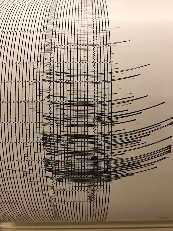
Here is the Baby Benioff Seismograph from Humboldt State University, Department of Geology (photo credit Dr. Mark Hemphill-Haley).
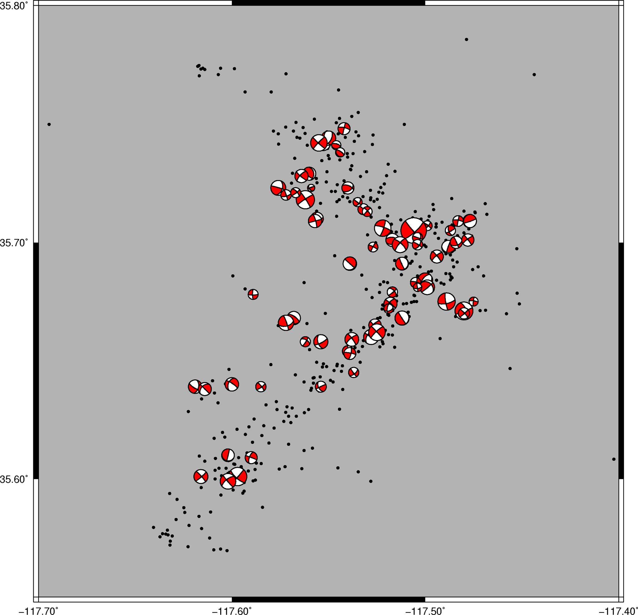
This is in a tweet below, but the figure is so telling, I am placing it up here. Some may need to read more background material (below) to understand this figure.
This figure shows earthquake mechanisms (focal mechanisms) for seismicity associated with this ongoing sequence in Ridgecrest.
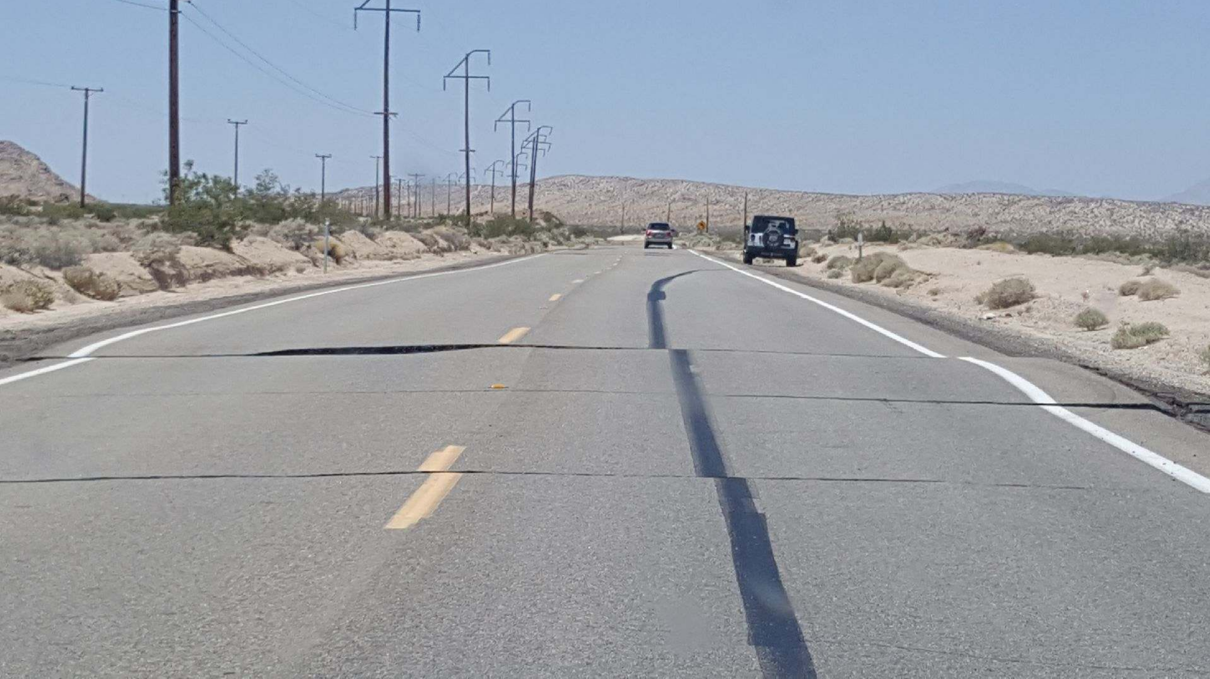
There are lots of great field photos in tweets below. Here is one of them. The reason I show this here is to mention one of the principles of geologic time. Relative time is based on several principles (e.g. law of superposition, principle of original horizontality). The principle demonstrated here is cross cutting relations.
The spectacular example spans different time scales. First the road was built, then the paint stripes were painted (superposed above the road, so are younger than the road). Then the driver of the Jeep felt the earthquake (inferred by the black rubber skid marks). The skid marks were then offset by the earthquake (the skid marks are cross-cut by the earthquake fault).
This objective information tells us several things about the earthquake. I already mentioned that the driver may have felt the earthquake, leading them to skid to a stop. The cool thing is that we can tell that the fault slipped in this area after the person skid across the fault. This is really cool… at this location, the shaking started prior to the fault slip.
UPDATE: Ian Pierce tells us that the black mark is not a skid mark, but road tar. So, I was incorrect.
UPDATE (2019.07.05): Here is my first Earthquake Report Update
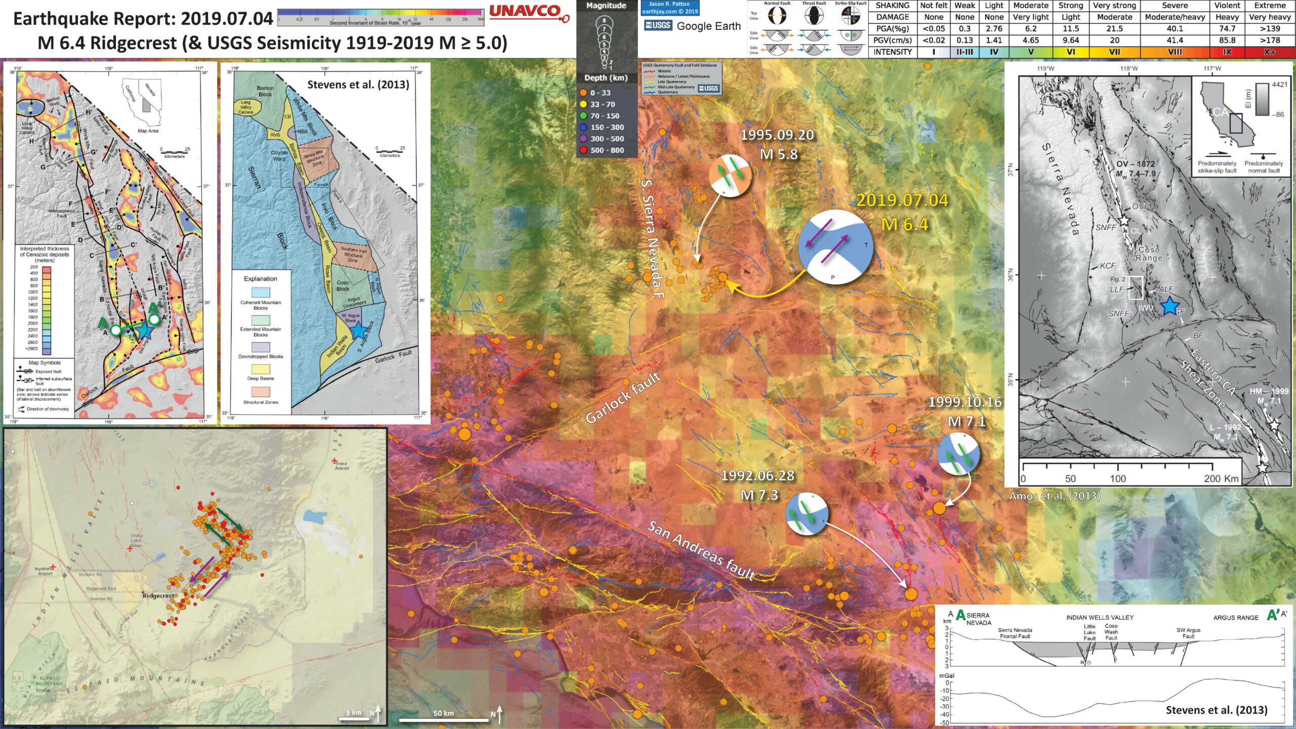
Below is my interpretive poster for this earthquake
I plot the seismicity from the past month, with color representing depth and diameter representing magnitude (see legend). I include earthquake epicenters from 1919-2019 with magnitudes M ≥ 5.0 in one version.
I plot the USGS fault plane solutions (moment tensors in blue and focal mechanisms in orange), possibly in addition to some relevant historic earthquakes.
- I placed a moment tensor / focal mechanism legend on the poster. There is more material from the USGS web sites about moment tensors and focal mechanisms (the beach ball symbols). Both moment tensors and focal mechanisms are solutions to seismologic data that reveal two possible interpretations for fault orientation and sense of motion. One must use other information, like the regional tectonics, to interpret which of the two possibilities is more likely.
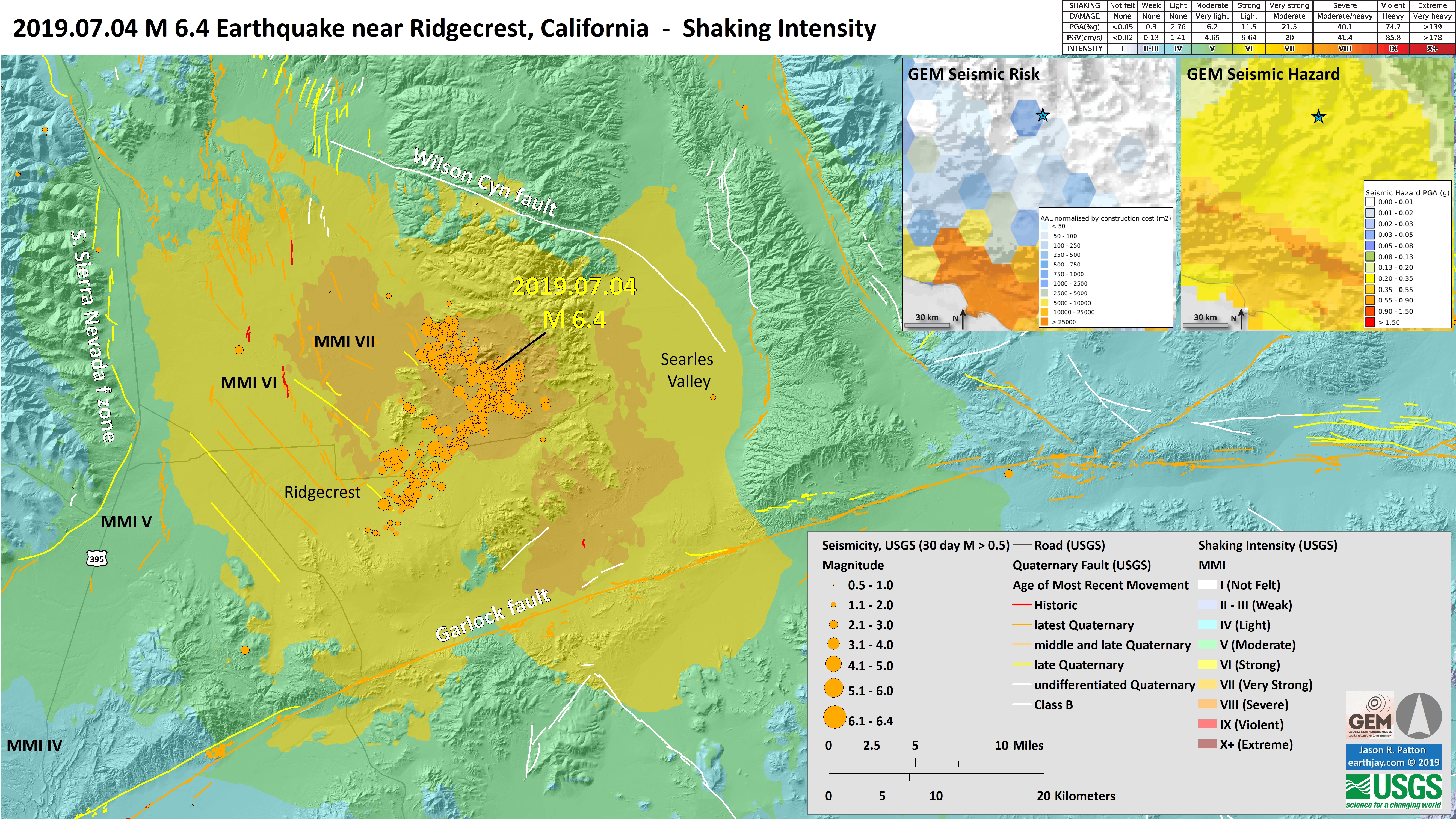
- I also include the shaking intensity contours on the map. These use the Modified Mercalli Intensity Scale (MMI; see the legend on the map). This is based upon a computer model estimate of ground motions, different from the “Did You Feel It?” estimate of ground motions that is actually based on real observations. The MMI is a qualitative measure of shaking intensity. More on the MMI scale can be found here and here. This is based upon a computer model estimate of ground motions, different from the “Did You Feel It?” estimate of ground motions that is actually based on real observations.
- I include the slab 2.0 contours plotted (Hayes, 2018), which are contours that represent the depth to the subduction zone fault. These are mostly based upon seismicity. The depths of the earthquakes have considerable error and do not all occur along the subduction zone faults, so these slab contours are simply the best estimate for the location of the fault.
- In a map below, I include a transparent overlay of the Global Strain Rate Map (Kreemer et al., 2014).
- The mission of the Global Strain Rate Map (GSRM) project is to determine a globally self-consistent strain rate and velocity field model, consistent with geodetic and geologic field observations. The overall mission also includes:
- contributions of global, regional, and local models by individual researchers
- archive existing data sets of geologic, geodetic, and seismic information that can contribute toward a greater understanding of strain phenomena
- archive existing methods for modeling strain rates and strain transients
- The completed global strain rate map will provide a large amount of information that is vital for our understanding of continental dynamics and for the quantification of seismic hazards.
- The version used in the poster(s) below is an update to the original 2004 map (Kreemer et al., 2000, 2003; Holt et al., 2005).
Global Strain
- In the upper right corner is a regional plate tectonic map (Amos et al., 2013). Earthquake faults are shown and labeled. I place a blue star in the location of today’s sequence. I label the Eastern California Shear zone. This map shows the locations of the historic major surface rupturing earthquakes (1872 Owen’s Valley, 1992 Landers, and 1999 Hector Mine).
- In the lower left corner is a screen shot of the USGS website showing earthquakes from this sequence for M > 0.5.
- In the upper left corner are two maps.
- The one on the left shows the thickness of sedimentary deposits (Stevens et al., 2013). As these faults move, they create space for sediments to deposit. The faster the faults move (the slip rate) and the more time that passes, the thicker the sedimentary deposits can be. The thickest deposits are warmer in color. There is a cross section labeled (A-A’).
- The one on the right shows how these authors interpret how the North America plate is broken up into “blocks.” These blocks are bounded by the different fault systems. The Indian Wells Valley is bisected by the Airport Lane/Little Lake fault.
- In the lower right corner is cross section A-A’ through the Indian Wells Valley (Stevens et al., 2013). The gray areas represent the sedimentary deposits. The faults curring across and bounding this valley are shown (with arrows showing relative motion). The Little Lake fault is shown as a right-lateral strike-slip fault.
I include some inset figures. Some of the same figures are located in different places on the larger scale map below.
- Here is the map with a month’s seismicity plotted. I include transparent colors that are based on the USGS “Did You Feel It?” (DYFI) felt reports database. This way we can compare the computer model based intensity data (the MMI contours) with the reports provided by real people. The comparison is decent.
- This is a plot that allows us to take a closer look at the comparison between the modeled data relative to the reported data.
- The vertical axis is shaking intensity (MMI). The horizontal axis is distance from the fault that slipped.
- The orange line shows the result from the USGS application of a model from Atkinson and Wald (2007) called an “Attenuation Relation” model. This is an empirical model that relates shaking intensity with earthquake magnitude and distance.
- These attenuation relations also take into account earthquake type, material properties, and other parameters that affect shaking intensity.
- The blue dots are the actual reported values of intensity from people who used the USGS website to report their direct observations. As I write this, over 42,800 people reported what they experienced and observed. The bigger dots represent the meand and median intensity from the DYFI reports.


- Here is the map with a century’s seismicity plotted, for quakes M ≥ 5.0.

- Here is the map with a century’s seismicity plotted, for quakes M ≥ 5.0 with the Global Strain Map as an overlay.

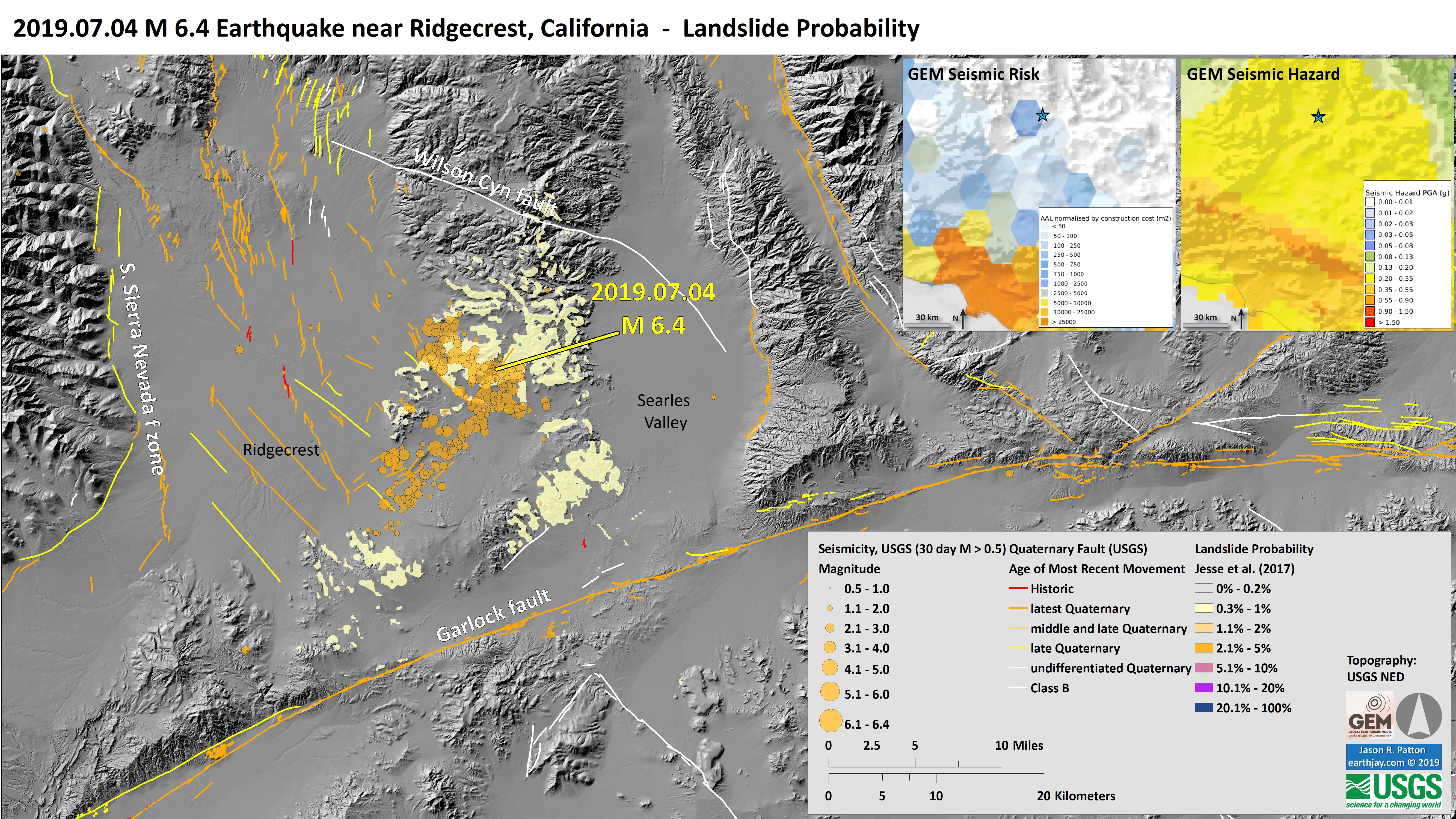
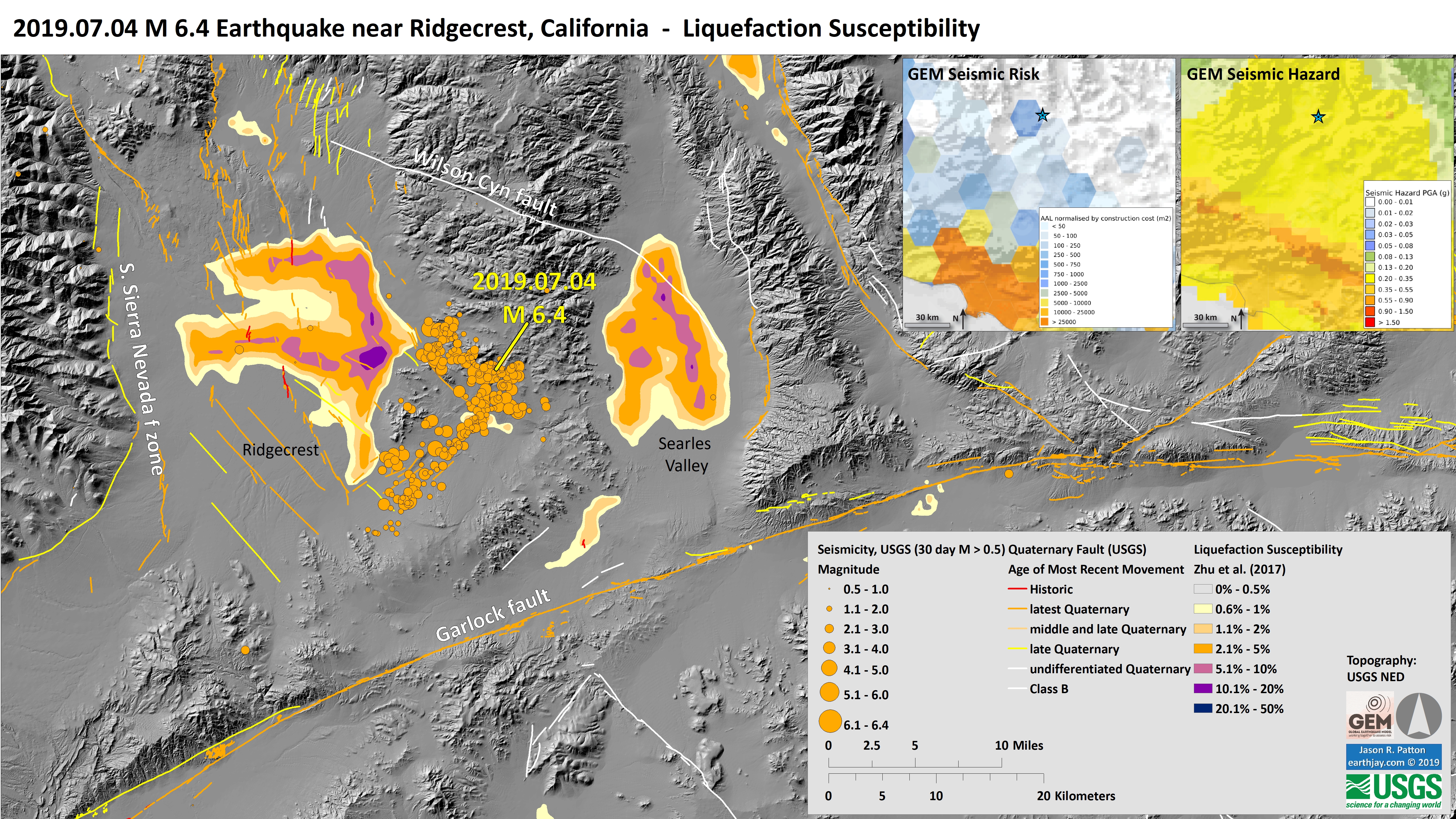
- Here is a suite of maps that use USGS earthquake products to help us learn about how earthquakes may affect the landscape: landslide probability and liquefaction susceptibility (a.k.a. the Ground Failure data products)..
- First I present the landslide probability model. This is a GIS data product that relates a variety of factors to the probability (the chance of) landslides as triggered by this earthquake. There are a number of assumptions that are made in order to be able to produce this model across such a large region, though this is still of great value (like other aspects from the USGS, e.g. the PAGER alert). Learn more about all of these Ground Failure products here.
- There are many different ways in which a landslide can be triggered. The first order relations behind slope failure (landslides) is that the “resisting” forces that are preventing slope failure (e.g. the strength of the bedrock or soil) are overcome by the “driving” forces that are pushing this land downwards (e.g. gravity). I spend more time discussing landslides and liquefaction in this recent earthquake report.
- This model, like all landslide computer models, uses similar inputs. I review these here:
- Some information about ground shaking. Often, people use Peak Ground Acceleration, though in the past decade+, it has been recognized that the parameter “Arias Intensity” is a better measure of the energy imparted by the earthquake across the land and seascape. Instead of simply accounting for the peak accelerations, AI integrates the entire energy (duration) during the earthquake. That being said, PGA is a more common parameter that is available for people to use. For example, when I was modeling slope stability for the 2004 Sumatra-Andaman subduction zone earthquake, the only model that was calibrated to observational data were in units of PGA. The first order control to shaking intensity (energy observed at any particular location) is distance to the earthquake fault that slipped.
- Some information about the strength of the materials (e.g. angle of internal friction (the strength) and cohesion (the resistance).
- Information about the slope. Steeper slopes, with all other things being equal, are more likely to fail than are shallower slopes. Think about skiing. Beginners (like me) often choose shallower slopes to ski because they will go down the slope slower, while experts choose steeper slopes.
- I use the same color scheme that is presented by the USGS on their website. Note that the majority of areas that may have experienced earthquake triggered landslides are cream in color (0.3-1%). There are a few places with a slightly higher chance that there were triggered landslides. It is possible that there were no significant landslides from this earthquake. The lower bounds for earthquake triggered landslides on land is about M 5.5 and a M 6.4 releases much more energy than that.
- Landslide ground shaking can change the Factor of Safety in several ways that might increase the driving force or decrease the resisting force. Keefer (1984) studied a global data set of earthquake triggered landslides and found that larger earthquakes trigger larger and more numerous landslides across a larger area than do smaller earthquakes. Earthquakes can cause landslides because the seismic waves can cause the driving force to increase (the earthquake motions can “push” the land downwards), leading to a landslide. In addition, ground shaking can change the strength of these earth materials (a form of resisting force) with a process called liquefaction.
- Sediment or soil strength is based upon the ability for sediment particles to push against each other without moving. This is a combination of friction and the forces exerted between these particles. This is loosely what we call the “angle of internal friction.” Liquefaction is a process by which pore pressure increases cause water to push out against the sediment particles so that they are no longer touching.
- An analogy that some may be familiar with relates to a visit to the beach. When one is walking on the wet sand near the shoreline, the sand may hold the weight of our body generally pretty well. However, if we stop and vibrate our feet back and forth, this causes pore pressure to increase and we sink into the sand as the sand liquefies. Or, at least our feet sink into the sand.
- Below is the liquefaction susceptibility map. I discuss liquefaction more in my earthquake report on the 28 September 20018 Sulawesi, Indonesia earthquake, landslide, and tsunami here.
- I use the same color scheme that the USGS uses on their website. Note how the areas that are more likely to have experienced earthquake induced liquefaction are in the valleys. The fact that this earthquake happened in the summer time suggests that there may not have been any liquefaction from this earthquake.
- Finally, here is a map showing the earthquake shaking intensity. The scale is the Modified Mercalli Intensity scale (explained above).
- I also include two inset maps (also in the landslide and liquefaction maps). These are seismic hazard and seismic risk maps. Read more about these maps here.
- On the right is the Global Earthquake Model Seismic Hazard map. Color represents the amount of shaking that an area may experience over the next 50 years. The units are “g” (which stands for gravity, where g= 1 is the gravity at the Earth’s surface). If g > 1, objects can be thrown into the air.
- On the left is the GEM Seismic Risk map. Risk is the combination of hazard and people. If there is seismic hazard where there are no people, then there is no seismic risk. If there are people where there is no seismic hazard, there is no seismic risk. Seismic risk happens when there are people exposed to seismic hazard. The color represents the financial expense due to seismic hazards.
Landslide, Liquefaction, and Shaking Intensity
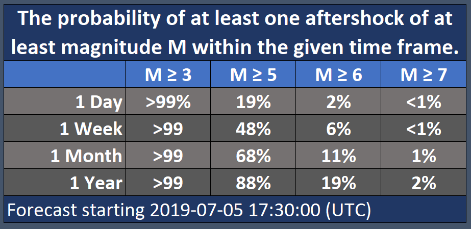
- The USGS has been increasing the list of products that are produced in association with their earthquake pages. One of these products is an earthquake forecast (not a prediction as nobody can predict earthquakes yet) that lists the chance of an earthquake with a given magnitude over a certain period of time. The forecast for the M 6.4 earthquake is found here. These forecasts are updated periodically, so the information will change with time. Below is a table where I present the forecast as it was when I checked the page this morning (would be nice if the USGS would produce an easy to read table).
- Thanks to Dr. Harold Tobin for reviewing these tables (I reformat them) as he noticed a mistake. They are now fixed.
- More earthquakes than usual (called aftershocks) will continue to occur near the mainshock.
- When there are more earthquakes, the chance of a large earthquake is greater which means that the chance of damage is greater.
- The USGS advises everyone to be aware of the possibility of aftershocks, especially when in or around vulnerable structures such as unreinforced masonry buildings.
- This earthquake could be part of a sequence. An earthquake sequence may have larger and potentially damaging earthquakes in the future, so remember to: Drop, Cover, and Hold on.
- So far in this sequence there have been 97 magnitude 3 or higher earthquakes, which are strong enough to be felt, and 1 magnitude 5 or higher earthquakes, which are large enough to do damage.
- According to our forecast, over the next 1 Week there is a 3 % chance of one or more aftershocks that are larger than magnitude 6.4. It is likely that there will be smaller earthquakes over the next 1 Week, with 47 to 88 magnitude 3 or higher aftershocks. Magnitude 3 and above are large enough to be felt near the epicenter. The number of aftershocks will drop off over time, but a large aftershock can increase the numbers again, temporarily.
- No one can predict the exact time or place of any earthquake, including aftershocks. Our earthquake forecasts give us an understanding of the chances of having more earthquakes within a given time period in the affected area. We calculate this earthquake forecast using a statistical analysis based on past earthquakes.
- Our forecast changes as time passes due to decline in the frequency of aftershocks, larger aftershocks that may trigger further earthquakes, and changes in forecast modeling based on the data collected for this earthquake sequence.
- The first table presents this forecast in terms of percent chance and the second table presents the forecast in terms of number of earthquakes.
USGS Earthquake Forecast (UPDATED 5 July 2019)
From the USGS:
Be ready for more earthquakes
About this earthquake and related aftershocks
What we think will happen next
About our earthquake forecasts

Other Reports for this Earthquake
Some Relevant Discussion and Figures
- Here is the Amos et al. (2013) plate tectonic map. Check out the location of the historic surface rupturing earthquakes. Their figure caption is below (as for other figures here).

Overview of active faults and regional topography of the Eastern California shear zone (ECSZ) and southern Walker Lane belt. Labeled faults are abbreviated as follows: ALF—Airport Lake fault, BF—Blackwater fault, GF—Garlock fault, KCF—Kern Canyon fault, LLF—Little Lake fault, OVF—Owens Valley fault, SNFF—Sierra Nevada frontal fault. OL—Owens Lake, IWV—Indian Wells Valley. Major historical earthquake surface ruptures in the Eastern California shear zone and Walker Lane belt are outlined in white, with stars denoting epicentral locations: OV—1872 Owens Valley, L—Landers 1992, HM—1999 Hector Mine. Active fault traces are taken from the U.S. Geological Survey Quaternary fault and fold database, with the exception of the Kern Canyon fault, taken from Brossy et al. (2012).
- This map extends a little farther to the east (Frankel et al., 2008). This map shows nicely how the Sierra Nevada and Owens Valley faults (the Pacific-North America plate boundary) and Eastern California Shear Zone, aka ECSZ (the maps south of the Garlock fault, 35.5N°) interact with east-west trending left-lateral strike-slip faults like the Garlock fault. The ’92 Landers and ’99 Hector Mine Earthquakes are on faults in the ECSZ.

Shaded relief index map of Quaternary faults, roads, towns, and fi eld trip stops in the eastern California shear zone. Most faults are from the U.S. Geological Survey Quaternary fault and fold database (http://earthquake.usgs.gov/regional/qfaults). Arrows indicate relative fault motion for strike slip faults. Bar and circle indicates the hanging wall of normal faults. Field trip stop location numbers are tied to site descriptions in the fi eld guide section. AHF—Ash Hill fault; ALF—Airport Lake fault; B—Bishop; BF—Blackwater fault; BLF—Bicycle Lake fault; BM—Black Mountains; BP—Big Pine; Br—Baker; Bw—Barstow; By—Beatty; CA—California; CF—Cady fault; CLF—Coyote Lake fault; CoF—Calico fault; CRF—Camp Rock fault; DSF—Deep Springs fault; DV-FLVF—Death Valley–Fish Lake Valley fault; EPF—Emigrant Peak fault; EV— Eureka Valley; FIF—Fort Irwin fault; FM—Funeral Mountains; GF—Garlock fault; GFL—Goldstone Lake fault; GM—Grapevine Mountains; HF—Helendale fault; HLF—Harper Lake fault; HMSVF—Hunter Mountain–Saline Valley fault; I—Independence; LF—Lenwood fault; LLF— Lavic Lake fault; LoF—Lockhart fault; LP—Lone Pine; LuF—Ludlow fault; LV—Las Vegas; M—Mojave; MF—Manix fault; NV—Nevada; O—Olancha; OL—Owens Lake; OVF—Owens Valley fault; P—Pahrump; PF—Pisgah fault; PV—Panamint Valley; PVF—Panamint Valley fault; R—Ridgecrest; S—Shoshone; SAF—San Andreas fault; SDVF—southern Death Valley fault; SLF—Stateline fault; SPLM—Silver Peak–Lone Mountain extensional complex; SNF—Sierra Nevada frontal fault; SP—Silver Peak Range; T—Tonopah; TF—Tiefort Mountain fault; TMF—Tin Mountain fault; TPF—Towne Pass fault; WMF—White Mountains fault; YM—Yucca Mountain.
- This is also from Amos et al. (2013) that shows how some northeast striking normal faults are related to the Little Lake fault, in the northern part of Indian Wells Valley. The Little Lake fault connects to the Sierra Nevada frontal fault.

Simplified geologic map of the Little Lake fault, highlighting Quaternary volcanic and alluvial deposits bearing on the Pleistocene drainage of Owens River through the Little Lake area. Map units are named and modified from Duffield and Bacon (1981). The 30 m elevation contours are taken from the National Elevation Database (NED). The 40Ar/39Ar dates are labeled as in Table 1. SNFF—Sierra Nevada frontal fault.
- Here is the Frankel et al. (2008) larger scale fault map, also focusing on the northern Indian Wells Valley.

Northward branching of the Holocene-active Airport Lake fault zone in northern Indian Wells Valley, Rose Valley, the Coso Range, and Wild Horse Mesa. AL—Airport Lake playa; BR— basement ridge; CB—Central branch; CWF—Coso Wash fault; EB—Eastern branch; GF—geothermal field; HS— Haiwee Spring; LCF—Lower Cactus Flat; MF—McCloud Flat; UCF—Upper Centennial Flat; WB—Western branch; WHA—White Hills anticline; WHM—Wild Horse Mesa; WHMFZ— Wild Horse Mesa fault zone. Faults with especially prominent scarps in Wild Horse Mesa are highlighted in bold. Late Quaternary faults modified from Duffield and Bacon (1981) and Whitmarsh (1998), with additional original mapping. A and B indicate two faults that display evidence for late Quaternary dextral offset.
- In 1995-1996 there was a sequence in Ridgecrest that had a mainshock of M 5.8. This sequence is also in the same forecast area suggested by Toda et al. (2005) to have a higher chance of earthquakes following the ECSZ temblors.
- This figure from Dreger et al. (2008) show some earthquake mechanisms from the Ridgecrest sequence. Note that most of the quakes are strike slip, but there are some normal (extensional) earthquakes too. This matches the fault configuration, which represents longer term strain.

Map showing the locations of events from the SCSN Earthquake Catalog and seismic moment tensors obtained by inverting low-frequency waveforms recorded at BDSN stations CMB, PKD1, and SAO.
- Speaking of earthquake triggering and aftershocks, this figure shows some triggered earthquakes following the 1992 Landers earthquake Rouqemore and Simila (1994). They extend to and beyond the Indian Wells Valley. One aftershock near the Little Lake fault zone has a strike-slip mechanism and is located nearby today’s M 6.4.

Seismicity (M 4 or greater) for 28 June 1992 to 1 June 1993. See Figure 1 legend for definitions of abbreviations. The 28 June 1992 Landers rupture is shown as shaded fault lines. Faults are from Jennings (1992).
- Here is a figure that Dr. Ross Stein prepared in the Temblor article linked and tweeted below.
- When earthquake faults slip, the surrounding crust deforms like jello. This deformation and the fault slip lead to changes in the forces within the Earth. These changes can increase or decrease the stress on faults in these areas.
- The map below shows regions that have an increase in fault stress as red and areas that have a decrease in stress as blue.
- Note that there are sections of faults that experience both increases and decreases in stress. Take note that these changes in stress are tiny compared to the amount of stress that it takes for a fault to create an earthquake. So, for this type of stress change to lead to an earthquake, the fault would need to already be highly stressed. If the fault is just about ready to slip before this M 6.4, it probably would not be triggered.
- Read more in Dr. Stein’s article here.

Coulomb 3.3 calculation of stress transferred by the 4th July shock to the surrounding region and major faults. Here we use a simple source based on the moment tensor (geometry, sense of slip, and size) of the earthquake, as determined by the USGS.
- Here is a low-angle oblique image from Roquemore (1980) that shows some normal faults (the Airport Lake fault). North is up in this case.

Aerial view of a 2 km wide tension graben located along the south end of the right slip Airport Lake fault.
- Here is a map I put together showing the faulting in the area where the above aerial image was taken Guess which faults are more strike-slip in nature, compared to extensional (normal). North isn’t always up.

- This is the Stevens et al. (2013) map that shows the sedimentary basins in the region.

Map showing interpreted thickness of Cenozoic deposits and major faults outlining the deep basins, based on inversion of gravity data [56]. Connection between West Inyo and Southwest Argus faults from Pluhar et al. [58]. ALFZ = Airport Lake Fault Zone; CWF = Coso Wash Fault; EIF = East Inyo Fault; LLF = Little Lake Fault. A-A’ to H-H’ indicate lines of cross sections and gravity profiles shown in Figure 10.
- Here are the fault blocks presented by Stevens et al. (2013).

Map showing deep basins, relatively shallow down-dropped blocks, extended mountain blocks, and structural zones in the ESVS, which is bounded by largely unextended mountain blocks. CB = Chalfant Basin; NBB = North Bishop Block; RVB = Round Valley Basin
- This is cross section A-A’ showing the normal and normal oblique faults that cross the Indian Wells Valley (Stevens et al., 2013).

Structural cross sections across the East Sierra Valley System (ESVS), with corresponding gravity profiles. Locations of sections are shown in Figure 5. No vertical exaggeration. Shading represents Quaternary sedimentary and volcanic deposits, with thicknesses based on inversion of gravity data [53].
Geologic Fundamentals
- For more on the graphical representation of moment tensors and focal mechanisms, check this IRIS video out:
- Here is a fantastic infographic from Frisch et al. (2011). This figure shows some examples of earthquakes in different plate tectonic settings, and what their fault plane solutions are. There is a cross section showing these focal mechanisms for a thrust or reverse earthquake. The upper right corner includes my favorite figure of all time. This shows the first motion (up or down) for each of the four quadrants. This figure also shows how the amplitude of the seismic waves are greatest (generally) in the middle of the quadrant and decrease to zero at the nodal planes (the boundary of each quadrant).
- Here is another way to look at these beach balls.
The two beach balls show the stike-slip fault motions for the M6.4 (left) and M6.0 (right) earthquakes. Helena Buurman's primer on reading those symbols is here. pic.twitter.com/aWrrb8I9tj
— AK Earthquake Center (@AKearthquake) August 15, 2018
- There are three types of earthquakes, strike-slip, compressional (reverse or thrust, depending upon the dip of the fault), and extensional (normal). Here is are some animations of these three types of earthquake faults. The following three animations are from IRIS.
Strike Slip:
Compressional:
Extensional:
- This is an image from the USGS that shows how, when an oceanic plate moves over a hotspot, the volcanoes formed over the hotspot form a series of volcanoes that increase in age in the direction of plate motion. The presumption is that the hotspot is stable and stays in one location. Torsvik et al. (2017) use various methods to evaluate why this is a false presumption for the Hawaii Hotspot.
- Here is a map from Torsvik et al. (2017) that shows the age of volcanic rocks at different locations along the Hawaii-Emperor Seamount Chain.
- Here is a great tweet that discusses the different parts of a seismogram and how the internal structures of the Earth help control seismic waves as they propagate in the Earth.
A cutaway view along the Hawaiian island chain showing the inferred mantle plume that has fed the Hawaiian hot spot on the overriding Pacific Plate. The geologic ages of the oldest volcano on each island (Ma = millions of years ago) are progressively older to the northwest, consistent with the hot spot model for the origin of the Hawaiian Ridge-Emperor Seamount Chain. (Modified from image of Joel E. Robinson, USGS, in “This Dynamic Planet” map of Simkin and others, 2006.)
Hawaiian-Emperor Chain. White dots are the locations of radiometrically dated seamounts, atolls and islands, based on compilations of Doubrovine et al. and O’Connor et al. Features encircled with larger white circles are discussed in the text and Fig. 2. Marine gravity anomaly map is from Sandwell and Smith.
Today, on #SeismogramSaturday: what are all those strangely-named seismic phases described in seismograms from distant earthquakes? And what do they tell us about Earth’s interior? pic.twitter.com/VJ9pXJFdCy
— Jackie Caplan-Auerbach (@geophysichick) February 23, 2019
- 1906.04.18 M 7.9 San Francisco
- 2017.12.14 M 4.3 Laytonville
- 2016.11.06 M 4.1 Laytonville, CA
- 2016.11.03 M 3.8 Laytonville, CA
- 2016.08.10 M 5.1 Lake Pillsbury, CA
- 2015.08.30 M 3.6 Mendocino County, CA
- 2015.07.27 M 3.5 Point Arena, CA
- 2018.07.30 M 3.7 San Pablo Bay
- 2018.01.04 M 4.4 Berkeley
- 2019.07.04 M 6.4 Ridgecrest
- 2016.02.23 M 4.9 Bakersfield
- 2015.12.30 M 4.4 San Bernardino, CA
- 2015.05.03 M 3.8 Los Angeles, CA
- 2015.04.13 M 3.3 Los Angeles, CA
- 2014.04.01 M 5.1 La Habra p-3
- 2014.03.29 M 5.1 La Habra p-2
- 2014.03.28 M 5.1 La Habra p-1
- 2016.08.04 M 4.5 Honey Lake, CA
San Andreas fault
General Overview
Earthquake Reports
Northern CA
Central CA
Southern CA
Eastern CA
- 2019.06.05 M 4.3 San Clemente Island
- 2018.04.05 M 5.3 Channel Islands
- 2018.04.05 M 5.3 Channel Islands Update #1
- 1994.11.17 M 6.7 Northridge, CA
- 1971.02.09 M 6.7 Sylmar, CA
Southern CA
Earthquake Reports
Social Media
Californians are real time seismometers: they jump on LastQuake app as soon as the tremor (propagating circles) reach them pic.twitter.com/ymRLUXczkc
— EMSC (@LastQuake) July 4, 2019
First-motion mechanism: Mwp6.4 #earthquake Central California https://t.co/kCIw9Vypa6 https://t.co/cge7d6C4jw pic.twitter.com/iReAd4TTl4
— Anthony Lomax 🌍🇪🇺 (@ALomaxNet) July 4, 2019
apparent left lateral offset along CA178 between Trona and Ridgecrest #earthquake #ridgecrest pic.twitter.com/tjZagKMJ9V
— Ian Pierce (@neotectonic) July 4, 2019
Southern California M 6.4 earthquake stressed by two large historic ruptures | https://t.co/1twVj9WIVY https://t.co/bvNUbcEbPG via @temblor #SouthernCalifornia #earthquake #LA
— temblor (@temblor) July 4, 2019
this is over by Trona pic.twitter.com/6SXodtcQ8z
— t.s. idiot (@THEjoeydavis) July 4, 2019
Here's a map of focal mechanisms for the M 6.4 Searles Valley sequence. Mostly strike-slip and the outliers will probably get cleaned up by analysts in coming days. pic.twitter.com/UfKxszbNF7
— Zach Ross (@zross_) July 5, 2019
BREAKING: Video footage shows a landslide following a magnitude 6.6 #earthquake in Southern California.
pic.twitter.com/vGtflE7ScQ— Global News Network (@GlobalNews77) July 4, 2019
Also while talking about the Searles Valley #Earthquake today @GriffithObserv’s seismograph detected and recorded an aftershock: a 4.0 at 1634PDT/2334UTC. pic.twitter.com/KzkOubP8hQ
— THE MONTH OF GAY WRATH HAS BEGUN 💪✊👊🏳️🌈 (@jaredhead) July 5, 2019
❗️NEW VIDEOS ❗️@USGS reported that 6.4 magnitude #earthquake rocked Ridgecrest, California at 10:33am Pacific Time. The earthquake was also felt in Los Angeles, #California.#CAwx pic.twitter.com/qHpLlP6HXB
— WeatherNation (@WeatherNation) July 4, 2019
"We should be expecting lots of aftershocks and some of them will be bigger than the 3s we've been having so far," says USGS seismologist Lucy Jones on the California quake. "I think the chance of having a magnitude 5…it's probably greater than 50-50." https://t.co/klvvgQkSCI pic.twitter.com/oMAHheAsic
— CNN (@CNN) July 4, 2019
THREAD: A strong (Mw 6.4) earthquake occurred 12 km SW of Searles Valley,
California on the China Lake Naval Air Center at 10:33:48 am local
time on July 4, 2019. The closest big population center is the city of
Ridgecrest with a population of 28k people.— USGS (@USGS) July 4, 2019
To all heading to the ridgecrest earthquake rupture zone: please, please do not trespass on the military base. This includes drone overflights! Trespassing could result in loss of access permission for everyone. Don’t be that person.
— Mike Oskin (@mikeoskin) July 5, 2019
I collected a few links and mashed up a couple of graphics to help think about the #earthquake in southeastern California: https://t.co/u0qJCX9SP9
— Ramon Arrowsmith (@ramonarrowsmith) July 4, 2019
Check out the skid marks:
Pictures my mom took while working out in ridgecrest… pic.twitter.com/aLRBwMB2jm
— Em💞 (@Emily31377) July 4, 2019
Rupture says hi (probably a zone of distributed opening and rotation, most likely, the 'ruptures' are oriented N-S which is very oblique to the strike) pic.twitter.com/jWbFTEvhuj
— Gareth Funning (@gfun) July 5, 2019
Watch the waves from the M6.4 southern California #earthquake roll across the USArray seismic network (https://t.co/RIcNz4bgWq)! #socalearthquake THREAD pic.twitter.com/RUcTkh4cHF
— IRIS Earthquake Sci (@IRIS_EPO) July 5, 2019
6.4 magnitude earthquake hits Southern #California
Firefighters working fire pic.twitter.com/iv80v2Q5aZ— Trama (@Trama70602212) July 4, 2019
6.4 magnitude earthquake hits Southern #California
Firefighters working fire pic.twitter.com/iv80v2Q5aZ— Trama (@Trama70602212) July 4, 2019
California’s joint Emergency Management Team @Cal_OES @CHP_HQ @CAL_FIRE @theCaGuard joining @kerncountyfire on a damage assessment overflight of the #RidgecrestEarthquake #OneTeamOneFight #MACS #ICS #SEMS pic.twitter.com/mKExsN2r7Y
— mark s ghilarducci (@FormerCal_OES) July 5, 2019
Ridgecrest Regional Hospital being evacuated. #ABC7Eyewitness #Ridgecrest #RidgecrestEarthquake #KernCounty #SearlesValley .@cnnbrk .@CNN .@ABC7 .@CBSLA .@cbs2kcal9brk pic.twitter.com/g5kFnKQzDI
— Go Ridgecrest – Tourism & Filming – RACVB (@goridgecrest) July 4, 2019
California M6.4 earthquake: for examples of past ruptures on conjugate faults see summary in Fukuyama (2015 https://t.co/SwSSJ35RQM) https://t.co/VwHHW2OUcR pic.twitter.com/RSLj41loqv
— Pablo Ampuero (@DocTerremoto) July 5, 2019
UPDATE: 2019.07.05
The morning after the evening before… No offset in the paint line across the asphalt repairs => probably no significant ongoing shallow afterslip at this location. pic.twitter.com/XxNRiNdEr0
— Gareth Funning (@gfun) July 5, 2019
UPDATE to previous tweet https://t.co/HcDzaWnNce
Thanks to @gfun: accurate location of road offset 35.644050°N 117.536939°W
I haven't realised former field photo was taken with long focal lens. At the right site, even the black mark is visible on google street view 🤓 pic.twitter.com/CDqBiA2OKK
— Robin Lacassin (@RLacassin) July 5, 2019
A large-ish quake (6.4M) just shook Southern California. I'll be continuously updating this post as information comes in for @ForbesScience, which will explain:
-What caused it
-What this quake *isn't* related to
-How this fits in with the region's geologyhttps://t.co/BRLCSihyUH— Dr Robin George Andrews 🌋 (@SquigglyVolcano) July 4, 2019
My dad lives in Ridgecrest and felt strong ground shaking. I asked him to take pictures of any damage, see photos below (credit Adam Graehl).
M 6.4 – 12km SW of Searles Valley, CAhttps://t.co/3e222a3nq8 pic.twitter.com/jaTt3GWLYw
— Nick Graehl (@nickgraehl) July 4, 2019
Surface rupture near Ridgecrest! pic.twitter.com/JsFlLGieSG
— Danielle Madugo (@DanielleVerdugo) July 5, 2019
These are my rapid coseismic values for the Searles Valley EQ. Using about 100 seconds on either side of the shaking. @UNAVCO pic.twitter.com/i8ChP2x0Sp
— Brendan Crowell (@bwcphd) July 5, 2019
About 100 ft wide zone of parallel ruptures showing LL and some dilation along the Ridgecrest surface rupture. pic.twitter.com/Gp5a1G0tG6
— Danielle Madugo (@DanielleVerdugo) July 5, 2019
A "reminder that the Big One lurks." "Lurks" might be an under-used word in earthquake #SciComm. A good word. @NickAtNews https://t.co/fi1Zj2qSo2
— Susan Hough (@SeismoSue) July 5, 2019
#Ridgecrest #Earthquake: M5.4 aftershock 2019-07-05 11:07 UTC (below) and M6.4 mainshock (above) seismograms plotted with the same amplitude scale.
Seismic station at Goldstone ~80km SE of the epicenters. pic.twitter.com/or445gJzPw— Anthony Lomax 🌍🇪🇺 (@ALomaxNet) July 5, 2019
More surface ruptures from #RidgecrestEarthquake #earthquake #Ridgecrest with @faultcreeper pic.twitter.com/iPjV1cXo63
— Ian Pierce (@neotectonic) July 5, 2019
- Amos, C.B., Bwonlee, S.J., Hood, D.H., Fisher, G.B., Bürgmann, R., Renne, P.R., and Jayko, A.S., 2013. Chronology of tectonic, geomorphic, and volcanic interactions and the tempo of fault slip near Little Lake, California in GSA Bulletin, v. 125, no. 7-8, https://doi.org/10.1130/B30803.1
- Frankel, K.L., Glazner, A.F., Kirby, E., Monastero, F.C., Strane, M.D., Oskin, M.E., Unruh, J.R., Walker, J.D., Anandakrishnan, S., Bartley, J.M., Coleman, D.S., Dolan, J.F., Finkel, R.C., Greene, D., Kylander-Clark, A., Morrero, S., Owen, L.A., and Phillips, F., 2008, Active tectonics of the eastern California shear zone, in Duebendorfer, E.M., and Smith, E.I., eds., Field Guide to Plutons, Volcanoes, Faults, Reefs, Dinosaurs, and Possible Glaciation in Selected Areas of Arizona, California, and Nevada: Geological Society of America Field Guide 11, p. 43–81, doi: 10.1130/2008.fl d011(03).
- Frisch, W., Meschede, M., Blakey, R., 2011. Plate Tectonics, Springer-Verlag, London, 213 pp.
- Hayes, G., 2018, Slab2 – A Comprehensive Subduction Zone Geometry Model: U.S. Geological Survey data release, https://doi.org/10.5066/F7PV6JNV.
- Holt, W. E., C. Kreemer, A. J. Haines, L. Estey, C. Meertens, G. Blewitt, and D. Lavallee (2005), Project helps constrain continental dynamics and seismic hazards, Eos Trans. AGU, 86(41), 383–387, , https://doi.org/10.1029/2005EO410002. /li>
- Kreemer, C., J. Haines, W. Holt, G. Blewitt, and D. Lavallee (2000), On the determination of a global strain rate model, Geophys. J. Int., 52(10), 765–770.
- Kreemer, C., W. E. Holt, and A. J. Haines (2003), An integrated global model of present-day plate motions and plate boundary deformation, Geophys. J. Int., 154(1), 8–34, , https://doi.org/10.1046/j.1365-246X.2003.01917.x.
- Kreemer, C., G. Blewitt, E.C. Klein, 2014. A geodetic plate motion and Global Strain Rate Model in Geochemistry, Geophysics, Geosystems, v. 15, p. 3849-3889, https://doi.org/10.1002/2014GC005407.
- Meyer, B., Saltus, R., Chulliat, a., 2017. EMAG2: Earth Magnetic Anomaly Grid (2-arc-minute resolution) Version 3. National Centers for Environmental Information, NOAA. Model. https://doi.org/10.7289/V5H70CVX
- Müller, R.D., Sdrolias, M., Gaina, C. and Roest, W.R., 2008, Age spreading rates and spreading asymmetry of the world’s ocean crust in Geochemistry, Geophysics, Geosystems, 9, Q04006, https://doi.org/10.1029/2007GC001743
References:
Return to the Earthquake Reports page.
Jay I have bookmarked to see all you post ! Astounding work !
-
thanks!