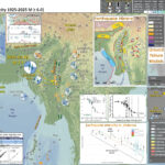
Earthquake Report: M 7.8 in Turkey/Syria

We just had a severe earthquake in south eastern Turkey, northwestern Syria. We call this the Kahramanmaraş Earthquake

https://earthquake.usgs.gov/earthquakes/eventpage/us6000jllz/executive

Well, I learned tonight (14 Feb) that these M 7.8 and M 7.5 earthquakes have been named by the Turkey Minister of the Interior. The names are the Pazarcik (M7.7) and Elbistan (M7.5) earthquakes.

This earthquake is the largest magnitude event in Turkey since 1939 and it looks like there will be many many casualties.

Hopefully international aid can rapidly travel there to assist in rescue and recovery. The videos I have seen so far are terrifying.

This is the same magnitude as the 1906 San Francisco earthquake.

There has already been an aftershock with a magnitude M 6.7. This size of an earthquake would be damaging on its own, let alone as it is an aftershock.

I will be updating this page over the next few days.

UPDATE 6 Feb ’23

The East Anatolia fault is a left-lateral strike-slip fault system composed of many faults and is subdivided into different branches and different segments.

The first thing to remember is that people created these names and organized these faults using these names. The faults don’t know this and don’t care. It is possible that the people that organized these faults did not fully understand the reason these faults are here, so they may have organized them incorrectly. It may be centuries to millenia before we really know the real answer to why faults are where they are and how they relate to each other.

The Arabia plate moves north towards the Eurasia plate, forming the Alpide belt (perhaps the longest convergent plate boundary on Earth, extending from Australia/Indonesia in the east to offshore Portugal in the west. This convergence helps form the European Alps and the Asian Himalaya. In the aftershock poster below, we see the Bitlis-Zagros fold and thrust belt, also part of this convergence.

Turkey is escaping this convergence westwards. This escape has developed the right-lateral strike-slip North Anatolia fault system along the northern boundary of Turkey and the left-lateral East Anatolia fault system in southern Turkey.

During the 20th century, there was a series of large, deadly, and damaging earthquakes along the North Anatolia fault (NAF), culminating (for now) with the 1999 M7.6 Izmit Earthquake. The remaining segment of the NAF that has yet to rupture in this series is the section of the NAF that extends near Istanbul and into the Marmara Sea.

The East Anatolia fault (EAF) has a long history of large earthquakes and I include maps that show this history in the posters and in the report below (I have more to add later this week).

Today, I woke up to learn that there was a magnitude M 7.5 earthquake that happened since I posted this report the night before. This was not an aftershock but a newly triggered earthquake on a different fault than that that slipped during the M 7.8. However, there will be some people who will call this an aftershock.

https://earthquake.usgs.gov/earthquakes/eventpage/us6000jlqa/executive

The aftershocks have been filling in to reveal what faults are involved and there are many faults involved in this sequence. I include a larger scale view of these faults in the updated aftershock interpretive poster below. >>>

This M 7.5 earthquake is on a different fault than the main part of the sequence (the Çardak fault). The main sequence appears to be on two segments of the main branch of the East Anatolia fault

Below is my interpretive poster for this earthquake

  • I plot the seismicity from the past month, with diameter representing magnitude (see legend). I include earthquake epicenters from 1922-2022 with magnitudes M ≥ 3.0 in one version.
  • I plot the USGS fault plane solutions (moment tensors in blue and focal mechanisms in orange), possibly in addition to some relevant historic earthquakes.
  • A review of the basic base map variations and data that I use for the interpretive posters can be found on the Earthquake Reports page. I have improved these posters over time and some of this background information applies to the older posters.
  • Some basic fundamentals of earthquake geology and plate tectonics can be found on the Earthquake Plate Tectonic Fundamentals page.

    I include some inset figures. Some of the same figures are located in different places on the larger scale map below.

  • In the upper right corner is a map from Armijo et al. (1999) that shows the plate boundary faults and tectonic plates in the region. This M 6.7 earthquake, denoted by the blue star, is along the East Anatolia fault, a left-lateral strike-slip plate boundary fault.
  • In the upper left corner is a comparison of the shaking intensity modeled by the USGS and the shaking intensity based on peoples’ “boots on the ground” observations. People felt intensities exceeding MMI 7.
  • To the right of the intensity map is a figure from Duman and Emre (2013). This shows the historic earthquakes along the EAF.
  • In the lower right corner is a map that shows the faults in the region. Note how the topography reflects the tectonics.
  • In the lower center lerft is a plot that shows how the shaking intensity models and reports relate to each other. The horizontal axis is distance from the earthquake and the vertical axis is shaking intensity (using the MMI scale, just like in the map to the right: these are the same datasets).
  • Here is the map with a month’s seismicity plotted.

  • Here is the map with a day’s seismicity plotted (prepared a few hours after the main shock).
  • There are some additional inset figures here:
    • The USGS Finite Fault Model (FFM) is shown on center right. This graphic shows how much the USGS model suggests that the fault slipped during this earthquake. Learn more about the USGS Finite Fault Models here.
    • To the right of the legend are two maps that show (left) liquefaction susceptibility and (right) landslide probability. These are based on empirical models from the USGS that show the chance an area may have experienced these processes that may have happened as a result of the ground shaking from the earthquake. I spend more time explaining these types of models and what they represent in this Earthquake Report for the recent event in Albania.
    • I include a plot of the tide gage data from Erdemli.


    UPDATE: 6 February 2023

    • Here is the map with about a day’s seismicity plotted.
    • I plot the 2023 earthquakes in blue and the 2020 earthquakes in green.

    UPDATE: 8 February 2023

  • Here is the same two maps with about 3 day’s seismicity plotted. There are other modest changes.


  • UPDATE: 14 February 2023

    I updated some of the content below including slip rate estimates, probabilistic seismic hazard assessment for the EAF, stress modeling following the 2020 M 6.7 earthquake, and information about the Dead Sea fault.

    UPDATE: 15 February 2023

  • I updated the aftershock map that now includes about 2 weeks of aftershocks from CSEM-EMSC.
  • This also includes the faults mapped by the USGS (Reitman et a., 2023).

  • Below I also added a comparison of the USGS ground failure and intensity data between the ’20 M 6.7 and the ’22 M 7.5 & M 7.8 earthquakes.
  • UPDATE: 27 February 2023

  • I updated the aftershock map that now includes about 3 weeks of aftershocks from CSEM-EMSC.
  • This also includes the faults mapped by the USGS (Reitman et a., 2023).
  • The USGS does not have a mechanism for the M 6.7, so I am using the INGV focal mechanism from here: https://www.emsc-csem.org/Earthquake/earthquake.php?id=1218449

    Some Relevant Discussion and Figures

    • This is the plate tectonic map from Armijo et al., 1999.

    • Tectonic setting of continental extrusion in eastern Mediterranean. Anatolia-Aegean block escapes westward from Arabia-Eurasia collision zone, toward Hellenic subduction zone. Current motion relative to Eurasia (GPS [Global Positioning System] and SLR [Satellite Laser Ranging] velocity vectors, in mm/yr, from Reilinger et al., 1997). In Aegean, two deformation regimes are superimposed (Armijo et al., 1996): widespread, slow extension starting earlier (orange stripes, white diverging arrows), and more localized, fast transtension associated with later, westward propagation of North Anatolian fault (NAF). EAF—East Anatolian fault, K—Karliova triple junction, DSF—Dead Sea fault,NAT—North Aegean Trough, CR—Corinth Rift.Box outlines Marmara pull-apart region, where North Anatolian fault enters Aegean.

    • Here is the tectonic map from Dilek and Sandvol (2009).

    • Tectonic map of the Aegean and eastern Mediterranean region showing the main plate boundaries, major suture zones, fault systems and tectonic units. Thick, white arrows depict the direction and magnitude (mm a21) of plate convergence; grey arrows mark the direction of extension (Miocene–Recent). Orange and purple delineate Eurasian and African plate affinities, respectively. Key to lettering: BF, Burdur fault; CACC, Central Anatolian Crystalline Complex; DKF, Datc¸a–Kale fault (part of the SW Anatolian Shear Zone); EAFZ, East Anatolian fault zone; EF, Ecemis fault; EKP, Erzurum–Kars Plateau; IASZ, Izmir–Ankara suture zone; IPS, Intra–Pontide suture zone; ITS, Inner–Tauride suture; KF, Kefalonia fault; KOTJ, Karliova triple junction; MM, Menderes massif; MS, Marmara Sea; MTR, Maras triple junction; NAFZ, North Anatolian fault zone; OF, Ovacik fault; PSF, Pampak–Sevan fault; TF, Tutak fault; TGF, Tuzgo¨lu¨ fault; TIP, Turkish–Iranian plateau (modified from Dilek 2006).

    • This is the Woudloper (2009) tectonic map of the Mediterranean Sea. The yellow/orange band represents the Alpide Belt, a convergent plate boundary that extends from western Europe, through the Middle East, beneath northern India and Nepal (forming the Himalayas), through Indonesia, terminating east of Australia.

    • Below is a series of figures from Jolivet et al. (2013). These show various data sets and analyses for Greece and Turkey.
    • Upper Panel (A): This is a tectonic map showing the major faults and geologic terranes in the region. The fault possibly associated with today’s earthquake is labeled “Neo Tethys Suture” on the map, for the Eastern Anatolia fault.
    • Lower Panel (B): This shows historic seismicity for the region. Note the general correlation with the faults in the upper panel.

    • A: Tectonic map of the Aegean and Anatolian region showing the main active structures
      (black lines), the main sutures zones (thick violet or blue lines), the main thrusts in the Hellenides where they have not been reworked by later extension (thin blue lines), the North Cycladic Detachment (NCDS, in red) and its extension in the Simav Detachment (SD), the main metamorphic units and their contacts; AlW: Almyropotamos window; BD: Bey Daglari; CB: Cycladic Basement; CBBT: Cycladic Basement basal thrust; CBS: Cycladic Blueschists; CHSZ: Central Hellenic Shear Zone; CR: Corinth Rift; CRMC: Central Rhodope Metamorphic Complex; GT: Gavrovo–Tripolitza Nappe; KD: Kazdag dome; KeD: Kerdylion Detachment; KKD: Kesebir–Kardamos dome; KT: Kephalonia Transform Fault; LN: Lycian Nappes; LNBT: Lycian Nappes Basal Thrust; MCC: Metamorphic Core Complex; MG: Menderes Grabens; NAT: North Aegean Trough; NCDS: North Cycladic Detachment System; NSZ: Nestos Shear Zone; OlW: Olympos Window; OsW: Ossa Window; OSZ: Ören Shear Zone; Pel.: Peloponnese; ÖU: Ören Unit; PQN: Phyllite–Quartzite Nappe; SiD: Simav Detachment; SRCC: South Rhodope Core Complex; StD: Strymon Detachment; WCDS: West Cycladic Detachment System; ZD: Zaroukla Detachment. B: Seismicity. Earthquakes are taken from the USGS-NEIC database. Colour of symbols gives the depth (blue for shallow depths) and size gives the magnitude (from 4.5 to 7.6).

    • Upper Panel (C): These red arrows are Global Positioning System (GPS) velocity vectors. The velocity scale vector is in the lower left corner. The main geodetic (study of plate motions and deformation of the earth) signal here is the westward motion of the North Anatolian fault system as it rotates southward as it traverses Greece. The motion trends almost south near the island of Crete, which is perpendicular to the subduction zone.
    • Lower Panel (D): This map shows the region of mid-Cenozoic (Oligo-Miocene) extension (shaded orange). It just happens that there is still extension going on in parts of this prehistoric extension.

    • C: GPS velocity field with a fixed Eurasia after Reilinger et al. (2010) D: the domain affected by distributed post-orogenic extension in the Oligocene and the Miocene and the stretching lineations in the exhumed metamorphic complexes.

    • Upper Panel (E): This map shows where the downgoing slab may be located (in blue), along with the volcanic centers associated with the subduction zone in the past.
    • Lower Panel (F): This map shows the orientation of how seismic waves orient themselves differently in different places (anisotropy). We think seismic waves travel in ways that reflects how tectonic strain is stored in the earth. The blue lines show the direction of extension in the asthenosphere, green lines in the lithospheric mantle, and red lines for the crust.

    • E: The thick blue lines illustrate the schematized position of the slab at ~150 km according to the tomographic model of Piromallo and Morelli (2003), and show the disruption of the slab at three positions and possible ages of these tears discussed in the text. Velocity anomalies are displayed in percentages with respect to the reference model sp6 (Morelli and Dziewonski, 1993). Coloured symbols represent the volcanic centres between 0 and 3 Ma after Pe-Piper and Piper (2006). F: Seismic anisotropy obtained from SKS waves (blue bars, Paul et al., 2010) and Rayleigh waves (green and orange bars, Endrun et al., 2011). See also Sandvol et al. (2003). Blue lines show the direction of stretching in the asthenosphere, green bars represent the stretching in the lithospheric mantle and orange bars in the lower crust.

    • Upper Panel (G): This is the map showing focal mechanisms in the poster above. Note the strike slip earthquakes associated with the North Anatolia and East Anatolia faults and the thrust/reverse mechanisms associated with the thrust faults.

    • G: Focal mechanisms of earthquakes over the Aegean Anatolian region.

    • Here are some interesting seismicity plots from Bulut et al., 2012.
    • The upper two panels show the faults, earthquake epicenters, depth profile locations, and the names of the EAF fault segments.
    • The lower panels show the seismicity plotted relative to depth, for each of the 5 profiles.

    • Epicentral map and depth sectional views for seismicity along the EAFZ obtained in this study based on (a, c) absolute locations and (b, d) double-difference derived relative locations, respectively. Black dots represent earthquake locations and the gray lines are presently active faults. Selected NWSE trending transects indicated in Figures 6a and 6b and plotted as depth sections in Figures 6c and 6d.

    Fault Mapping

    • Here is a map showing tectonic domains (Taymaz et al., 2007).

    • Schematic map of the principal tectonic settings in the Eastern Mediterranean. Hatching shows areas of coherent motion and zones of distributed deformation. Large arrows designate generalized regional motion (in mm a21) and errors (recompiled after McClusky et al. (2000, 2003). NAF, North Anatolian Fault; EAF, East Anatolian Fault; DSF, Dead Sea Fault; NEAF, North East Anatolian Fault; EPF, Ezinepazarı Fault; CTF, Cephalonia Transform Fault; PTF, Paphos Transform Fault.

    • Here is a tectonic overview figure from Duman and Emre, 2013.

    • The main fault systems of the AN–AR and TR–AF plate boundaries (modified from Sengor & Yılmaz 1981; Saroglu et al. 1992a, b; Westaway 2003; Emre et al. 2011a, b, c). Arrows indicate relative plate motions (McClusky et al. 2000). Abbreviations: AN, Anatolian microplate; AF, African plate; AR, Arabian plate; EU, Eurasian plate; NAFZ, North Anatolian Fault Zone; EAFZ, East Anatolian Fault Zone; DSFZ, Dead Sea Fault Zone; MF; Malatya Fault, TF, Tuzgo¨lu¨ fault; EF, Ecemis¸ fault; SATZ, Southeast Anatolian Thrust Zone; SS, southern strand of the EAFZ; NS, northern strand of the EAFZ.

    • This is a map that shows the subdivisions of the EAF (Duman and Emre, 2013). Note Lake Hazar for reference.

    • Map of the East Anatolian strike-slip fault system showing strands, segments and fault jogs. Abbreviations: FS, fault Segment; RB, releasing bend; RS, releasing stepover; RDB, restraining double bend; RSB, restraining bend; PB, paired bend; (1) Du¨zic¸i–Osmaniye fault segment; (2) Erzin fault segment; (3) Payas fault segment; (4) Yakapınar fault segment; (5) C¸ okak fault segment; (6) Islahiye releasing bend; (7) Demrek restraining stepover; (8) Engizek fault zone; (9) Maras¸ fault zone.

    • This map shows the fault mapping from Duman and Emre, 2013. Note Lake Hazar for reference. We can see some of the thrust faults mapped as part of the Southeast Anatolia fault zone.

    • Map of the (a) Palu and (b) Puturge segments of the East Anatolian fault. Abbreviations: LHRB, Lake Hazar releasing bend; PS, Palu segment; ES, Erkenek segment; H, hill; M, mountain; C, creek; (1) left lateral strike-slip fault; (2) normal fault; (3) reverse or thrust fault; (4) East Anatolian Fault; (5) Southeastern Anatolian Thrust Zone; (6) syncline;(7) anticline; (8) undifferentiated Holocene deposits; (9) undifferentiated Quaternary deposits; (10) landslide.

    • This is the figure from Duman and Emre (2013) that shows the spatial extent for historic earthquakes on the EAF.

    • Surface ruptures produced by large earthquakes during the 19th and 20th centuries along the EAF. Data from Arpat (1971), Arpat and S¸arog˘lu (1972), Seymen and Aydın (1972), Ambraseys (1988), Ambraseys and Jackson (1998), Cetin et al. (2003), Herece (2008), Karabacak et al. (2011) and this study. Ruptured fault segments are highlighted.

    Slip Rates

    • Aktug et al. (2016) used GPS observations to evaluate the plate motion rates along the EAF.
    • The following two figures show the plate motion vectors and profiles of the plate velocities across the fault zone in three locations (a, b, and c).
    • They used GPS data from different studies, which is the reason the vectors have different colors.

    • The GPS observations employed in this study. The velocity error ellipses are at 95% confidence level. The dashed rectangles show the profiles for investigating the trade-off between the slip rate and the locking depth.

    • These are the 3 GPS velocity profiles from Aktug et al. (2016) shown on the above map.
    • The panels on the left represent their estimates for the slip rate of the EAF relative to the locking depth for the EAF.
    • The panels on the right show how the GPS velocities change across the fault zone in these 3 areas. The velocities are measured parallel to the fault.
    • Using profile a as an example, on the ight side of the fault, the velocity is held to be about 0 mm per year. As we cross the fault, the velocity jumps up to about 10 mm/year. So, the slip rate of the EAF zone across the profiles a, b, and c are about 10, 7, and 12 mm/year. As a reference, the San Andreas fault in California has a slip rate of about 25 mm/year.

    • The variability of the slip rates w.r.t. the locking depth (red) and the χ2 values of the estimation (black). The thick grey bands show 2-s error bounds of the slip rates for profiles a to c (left panel) and the velocity profiles with slip rate and locking depth estimated simultaneously (right panel). The red curve shows the model fit to the GPS data (open circles with error bars at 95% confidence level) and the blue curve is the fault parallel shear strain rate for the best fit model determined from the analysis shown in Figure 3 and described in the text.

    • Ferry et al. (2011) used a 14,000 year long record of prehistoric earthquakes to evaluate the episodic behavior of the Dead Sea fault (DSF).
    • This first map show the DSF, GPS site velocities, and geological slip rates in different locations. The DSF eventually turns into the EAF.

    • a) General map of the Dead Sea Transform system. Numbers are geological slip rates (in black) and geodetic strain rates (in white). Sources: Klinger et al. (2000); Niemi et al. (2001); Meghraoui et al. (2003); Reilinger et al. (2006); Ferry et al. (2007). Pull-apart basins: ab, Amik basin; gb, Ghab basin; hb, Hula basin; ds, Dead Sea. Major fault segments: EAF, East Anatolian fault; AF, Afrin fault; KF, Karasu fault; JSF, Jisr Shuggur fault; MF, Missyaf fault; YF, Yammouneh fault; ROF, Roum fault; RAF, Rachaya fault; SF, Serghaya fault; JVF, Jordan Valley fault; WAF, Wadi Araba fault. (b) Detailed map of the JVF segment between the Sea of Galilee and the Dead Sea. The segment itself is organized as six 15-km to 30-km-long right-stepping subsegments limited by 2-km to 3-km-wide transpressive relay zones. The active trace of the JVF continues for a further ∼10 km northward into the Sea of Galilee (SG) and ∼20 km southward into the northern Dead Sea (DS). The color version of this figure is available only in the electronic edition.

    • This map (Ferry et al., 2011) shows the historic seismicity for this region with earthquake mechanisms for some of the earthquakes.

    • Seismicity of the Dead Sea Transform system. Instrumental events with M ≥4 from 1964 to 2006 (IRIS Data Management Center; see Data and Resources section) in filled circles. Background seismicity is very scarce and mainly restricted to the Lebanese Bend and the Jordan Valley. The 1995 Mw 7.3 Aqaba earthquake and aftershock swarm dominate the seismicity of the Red Sea basin. Historical events with I0 ≥ VII (Ambraseys and Jackson, 1998; Sbeinati et al., 2005) in open circles. Apart from the 1927 Mw 6.2 Jericho earthquake, no significant event has occurred along the JVF since A.D. 1033 (see text for details).

    Shaking Intensity

    • Here is a figure that shows a more detailed comparison between the modeled intensity and the reported intensity. Both data use the same color scale, the Modified Mercalli Intensity Scale (MMI). More about this can be found here. The colors and contours on the map are results from the USGS modeled intensity. The DYFI data are plotted as colored dots (color = MMI, diameter = number of reports). In addition to what I write below, the data on the left are from the M 7.5 and the data on the right are from the M 7.8.
    • In the upper panel is the USGS Did You Feel It reports map, showing reports as colored dots using the MMI color scale. Underlain on this map are colored areas showing the USGS modeled estimate for shaking intensity (MMI scale).
    • In the lower panel is a plot showing MMI intensity (vertical axis) relative to distance from the earthquake (horizontal axis). The models are represented by the green and orange lines. The DYFI data are plotted as light blue dots. The mean and median (different types of “average”) are plotted as orange and purple dots. Note how well the reports fit the green line, the orange line, or neither line. What reasons can you think that may be explain these real observation deviations from the models.
    • Below the lower plot is the USGS MMI Intensity scale, which lists the level of damage for each level of intensity, along with approximate measures of how strongly the ground shakes at these intensities, showing levels in acceleration (Peak Ground Acceleration, PGA) and velocity (Peak Ground Velocity, PGV).

    • Here is a comparison between these three earthquakes from 2020 and 2022.
    • The scale and spatial extent for each map is the same.

      Earthquake Triggered Landslides

    • There are many different ways in which a landslide can be triggered. The first order relations behind slope failure (landslides) is that the “resisting” forces that are preventing slope failure (e.g. the strength of the bedrock or soil) are overcome by the “driving” forces that are pushing this land downwards (e.g. gravity). The ratio of resisting forces to driving forces is called the Factor of Safety (FOS). We can write this ratio like this:

      FOS = Resisting Force / Driving Force

    • When FOS > 1, the slope is stable and when FOS < 1, the slope fails and we get a landslide. The illustration below shows these relations. Note how the slope angle α can take part in this ratio (the steeper the slope, the greater impact of the mass of the slope can contribute to driving forces). The real world is more complicated than the simplified illustration below.

    • Landslide ground shaking can change the Factor of Safety in several ways that might increase the driving force or decrease the resisting force. Keefer (1984) studied a global data set of earthquake triggered landslides and found that larger earthquakes trigger larger and more numerous landslides across a larger area than do smaller earthquakes. Earthquakes can cause landslides because the seismic waves can cause the driving force to increase (the earthquake motions can “push” the land downwards), leading to a landslide. In addition, ground shaking can change the strength of these earth materials (a form of resisting force) with a process called liquefaction.
    • Sediment or soil strength is based upon the ability for sediment particles to push against each other without moving. This is a combination of friction and the forces exerted between these particles. This is loosely what we call the “angle of internal friction.” Liquefaction is a process by which pore pressure increases cause water to push out against the sediment particles so that they are no longer touching.
    • An analogy that some may be familiar with relates to a visit to the beach. When one is walking on the wet sand near the shoreline, the sand may hold the weight of our body generally pretty well. However, if we stop and vibrate our feet back and forth, this causes pore pressure to increase and we sink into the sand as the sand liquefies. Or, at least our feet sink into the sand.
    • Below is a diagram showing how an increase in pore pressure can push against the sediment particles so that they are not touching any more. This allows the particles to move around and this is why our feet sink in the sand in the analogy above. This is also what changes the strength of earth materials such that a landslide can be triggered.

    • Below is a diagram based upon a publication designed to educate the public about landslides and the processes that trigger them (USGS, 2004). Additional background information about landslide types can be found in Highland et al. (2008). There was a variety of landslide types that can be observed surrounding the earthquake region. So, this illustration can help people when they observing the landscape response to the earthquake whether they are using aerial imagery, photos in newspaper or website articles, or videos on social media. Will you be able to locate a landslide scarp or the toe of a landslide? This figure shows a rotational landslide, one where the land rotates along a curvilinear failure surface.

    • Here is an excellent educational video from IRIS and a variety of organizations. The video helps us learn about how earthquake intensity gets smaller with distance from an earthquake. The concept of liquefaction is reviewed and we learn how different types of bedrock and underlying earth materials can affect the severity of ground shaking in a given location. The intensity map above is based on a model that relates intensity with distance to the earthquake, but does not incorporate changes in material properties as the video below mentions is an important factor that can increase intensity in places.
    • If we look at the map at the top of this report, we might imagine that because the areas close to the fault shake more strongly, there may be more landslides in those areas. This is probably true at first order, but the variation in material properties and water content also control where landslides might occur.
    • There are landslide slope stability and liquefaction susceptibility models based on empirical data from past earthquakes. The USGS has recently incorporated these types of analyses into their earthquake event pages. More about these USGS models can be found on this page.
    • Below is a figure that shows both landslide probability and liquefaction susceptibility maps for this M 7.8 earthquake.

    • Below is a figure that compares both landslide probability and liquefaction susceptibility maps for these three earthquakes.
    • The scale for each map is the same.

    Fault Scaling Relations

  • There is a seminal paper (Wells and Coppersmith, 1994) where these geologists compiled the existing data from global earthquakes.
  • They extracted different aspects of the physical size of these earthquakes so that they could develop relations between the earthquake size (e.g., length of the fault that ruptured the surface of the Earth) and earthquake magnitude. Since these relations are based on real data from real earthquakes, we call these empirical scaling relations (i.e., the size of the earthquake slip “scales” with the size of the magnitude).
  • Their analyses also subdivided the earthquakes in ways to see if different types of earthquakes (strike-slip, normal, or thrust/reverse) had different scaling relations.
  • Some have updated the database of earthquake observations. However, these updated scaling relations are not that much different than the original Wells and Coppersmith (1994) scaling relations. Perhaps there is sufficient variation in earthquake size that we have yet to deconvolve all the variation in fault ruptures?
  • Below I present the Wells and Coppersmith (1994) scaling relations for subsurface earthquake slip length. I do this because it may be a while until we have a good estimate for other measures (like surface rupture length) but we can estimate the subsurface fault length in different ways with existing data (like the spatial extent of aftershocks).
  • In the upper panel I list the rough length of three fault segments that are part of the East Anatolia fault system.
  • I use the relations represented by the diagonal lines in the center panel to calculate the earthquake magnitude for faults of varying length (100-200km). Based on their relations, a magnitude M 7.8 earthquake may have ruptured a fault with a subsurface length of 200 km.

Seismic Hazard and Seismic Risk

  • These are the two seismic maps from the Global Earthquake Model (GEM) project, the GEM Seismic Hazard and the GEM Seismic Risk maps from Pagani et al. (2018) and Silva et al. (2018).
    • The GEM Seismic Hazard Map:

    • The Global Earthquake Model (GEM) Global Seismic Hazard Map (version 2018.1) depicts the geographic distribution of the Peak Ground Acceleration (PGA) with a 10% probability of being exceeded in 50 years, computed for reference rock conditions (shear wave velocity, VS30, of 760-800 m/s). The map was created by collating maps computed using national and regional probabilistic seismic hazard models developed by various institutions and projects, and by GEM Foundation scientists. The OpenQuake engine, an open-source seismic hazard and risk calculation software developed principally by the GEM Foundation, was used to calculate the hazard values. A smoothing methodology was applied to homogenise hazard values along the model borders. The map is based on a database of hazard models described using the OpenQuake engine data format (NRML). Due to possible model limitations, regions portrayed with low hazard may still experience potentially damaging earthquakes.
    • Here is a view of the GEM seismic hazard map for Europe.

    • The USGS Seismic Hazard Map:
    • Here is a map that displays an estimate of seismic hazard for the region (Jenkins et al., 2010). This comes from Giardini et al. (1999).

    • The Global Seismic Hazard Map. Peak ground acceleration (pga) with a 10% chance of exceedance in 50 years is depicted in m/s2. The site classification is rock everywhere except Canada and the United States, which assume rock/firm soil site classifications. White and green correspond to low seismicity hazard (0%-8%g), yellow and orange correspond to moderate seismic hazard (8%-24%g), pink and dark pink correspond to high seismicity hazard (24%-40%g), and red and brown correspond to very high seismic hazard (greater than 40%g).

    • The GEM Seismic Risk Map:

    • The Global Seismic Risk Map (v2018.1) presents the geographic distribution of average annual loss (USD) normalised by the average construction costs of the respective country (USD/m2) due to ground shaking in the residential, commercial and industrial building stock, considering contents, structural and non-structural components. The normalised metric allows a direct comparison of the risk between countries with widely different construction costs. It does not consider the effects of tsunamis, liquefaction, landslides, and fires following earthquakes. The loss estimates are from direct physical damage to buildings due to shaking, and thus damage to infrastructure or indirect losses due to business interruption are not included. The average annual losses are presented on a hexagonal grid, with a spacing of 0.30 x 0.34 decimal degrees (approximately 1,000 km2 at the equator). The average annual losses were computed using the event-based calculator of the OpenQuake engine, an open-source software for seismic hazard and risk analysis developed by the GEM Foundation. The seismic hazard, exposure and vulnerability models employed in these calculations were provided by national institutions, or developed within the scope of regional programs or bilateral collaborations.
    • Here is a view of the GEM seismic risk map for Europe.

    • Probabilistic Seismic Hazard Assessment – East Anatolia fault
    • Gülerce et al. (2017) conducted a Probabilistic Seismic Hazard Assessment (PSHA) for the EAF. I hope you are keeping up with all the acronyms in this report.
    • A PSHA is basically a way of taking information about earthquake recurrence (from paleoseismology, seismicity rates, geodesy, etc.) for faults in a given region and using this information to make estimates of the likelihood (the chance) of a certain measure of ground shaking that might be exceeded over a period of time.
    • The California Geological Survey has a website that provides an overview of what PSHA is and how it is conducted.
    • A key part of PSHA is the incorporation of all possible and probable earthquakes for the faults in the analysis region. People conducting PSHA use a “logic tree” to organize this variation. Each branch of the logic tree is given a weight that the experts think that that branch is most likely to happen.
    • Here is the logic tree presented by Gülerce et al. (2017).

    • Of the many products that can come from a PSHA, the principal output are a series of maps that show the chance that ground shaking levels will be exceeded. E.g., a map that shows a 10% chance of being exceeded in 50 years (in other words, the chance that this ground shaking might happen in 475 years; aka the 475 year return period ground shaking map).
    • There are lots of parameters that we use to calculate the ground shaking, such as the seismic velocity structure of the Earth (e.g., the Vs30, the seismic velocity of the upper 30 meters of the Earth).
    • Here is the table showing the fault parameters for the faults used in this PSHA.

    • These first maps are the 475 year return period maps (10% in 50 years) for Vs30 = 760 m/second (“softer” rock) and Vs30 = 1100 m/second (“harder” rock).

    • PSHA map for the 475-yr return period peak ground acceleration (PGA) for (a) VS30  760 m=s and (b) VS30  1100 m=s. Contour lines (for PGA  0:4g) represent the design value for the highest earthquake zone in Turkish Earthquake Code (2007). The color version of this figure is available only in the electronic edition.

    • These maps are the 2475 year return period maps (2% in 50 years) for Vs30 = 760 m/second (“softer” rock) and Vs30 = 1100 m/second (“harder” rock).

    • PSHA map for the 2475-yr return period PGA for (a) VS30  760 m=s and (b) VS30  1100 m=s. Contour lines (for PGA  0:6g) represent the design value for special structures for the highest earthquake zone in Turkish Earthquake Code (2007). The color version of this figure is available only in the electronic edition.

    Stress Triggering

  • When an earthquake fault slips, the crust surrounding the fault squishes and expands, deforming elastically (like in one’s underwear). These changes in shape of the crust cause earthquake fault stresses to change. These changes in stress can either increase or decrease the chance of another earthquake.
  • I wrote more about this type of earthquake triggering for Temblor here. Head over there to learn more about “static coulomb stress triggering.”
  • Lin et al. (2020) used the 24 January 2020 M 6.7 Doganyol Earthquake to investigate how the EAF slips before and after the M 6.7 mainshock.
  • They also modeled the static coulomb stress changes along the EAF system following the 2020 M 6.7 earthquake.
  • This map shows historic earthquakes and mechanisms, highlighting the 2020 M 6.7 event in red. (Lin et al., 2020).

  • Tectonic setting of the 2020 Doganyol earthquake. Red and black stars represent the epicenter of the 2020 earthquake and historical earthquakes, respectively. Black lines indicate the major active faults in this region, and the white box shows the projection of the fault plane. The locations of mainshock and historical earthquakes are from Kandilli Observatory and Earthquake Research Institute (KOERI; see Data and Resources) and U.S. Geological Survey (USGS) (see Data and Resources), respectively. Focal mechanisms are also plotted (see Data and Resources). The inset
    shows motions of major tectonic units (Armijo et al., 1999).

  • This map shows the extent for some historic earthquakes and the inset shows the change in static coulomb stress on the EAF following the 2020 M 6.7 event.

  • Segments of the East Anatolian fault (EAF), distribution of historical earthquakes, and stress accumulation on the surrounding faults caused by the earthquake at a depth of 10 km (inset). The receiver fault is −246°=67°= − 9°. The geometry of each fault segment refers to the mechanism of the regional historical earthquake, and the effective friction coefficient is 0.4. The locations of historical earthquakes are from Ambraseys (1989), Ambraseys and Jackson (1998), Tan et al. (2008), and USGS (see Data and Resources). GCMT; Global Centroid Moment Tensor; KTJ, Karliova Triple Junction.

  • Here are a suite of static coulomb stress changes given a range of fault parameters.

  • Stress accumulation caused by the earthquake on the surrounding faults calculated at a depth of 10 km; the dip angles are (a) 67°, (b) 47°, and (c) 87° with reference strikes fromDuman and Emre (2013). Stress accumulation caused by the earthquake on the surrounding faults calculated at (d) depths of 5 km; the geometry of each fault segment refers to the mechanism of the regional historical earthquake. The effective friction coefficient is 0.4.

  • Dr. Shinji Toda worked with Ross Stein and others to calculate static coulomb stress changes related to the M 7.8 earthquake. Here is their article and below is a video from their report.

    References:

    Basic & General References

  • Frisch, W., Meschede, M., Blakey, R., 2011. Plate Tectonics, Springer-Verlag, London, 213 pp.
  • Hayes, G., 2018, Slab2 – A Comprehensive Subduction Zone Geometry Model: U.S. Geological Survey data release, https://doi.org/10.5066/F7PV6JNV.
  • Holt, W. E., C. Kreemer, A. J. Haines, L. Estey, C. Meertens, G. Blewitt, and D. Lavallee (2005), Project helps constrain continental dynamics and seismic hazards, Eos Trans. AGU, 86(41), 383–387, , https://doi.org/10.1029/2005EO410002. /li>
  • Jessee, M.A.N., Hamburger, M. W., Allstadt, K., Wald, D. J., Robeson, S. M., Tanyas, H., et al. (2018). A global empirical model for near-real-time assessment of seismically induced landslides. Journal of Geophysical Research: Earth Surface, 123, 1835–1859. https://doi.org/10.1029/2017JF004494
  • Kreemer, C., J. Haines, W. Holt, G. Blewitt, and D. Lavallee (2000), On the determination of a global strain rate model, Geophys. J. Int., 52(10), 765–770.
  • Kreemer, C., W. E. Holt, and A. J. Haines (2003), An integrated global model of present-day plate motions and plate boundary deformation, Geophys. J. Int., 154(1), 8–34, , https://doi.org/10.1046/j.1365-246X.2003.01917.x.
  • Kreemer, C., G. Blewitt, E.C. Klein, 2014. A geodetic plate motion and Global Strain Rate Model in Geochemistry, Geophysics, Geosystems, v. 15, p. 3849-3889, https://doi.org/10.1002/2014GC005407.
  • Meyer, B., Saltus, R., Chulliat, a., 2017. EMAG2: Earth Magnetic Anomaly Grid (2-arc-minute resolution) Version 3. National Centers for Environmental Information, NOAA. Model. https://doi.org/10.7289/V5H70CVX
  • Müller, R.D., Sdrolias, M., Gaina, C. and Roest, W.R., 2008, Age spreading rates and spreading asymmetry of the world’s ocean crust in Geochemistry, Geophysics, Geosystems, 9, Q04006, https://doi.org/10.1029/2007GC001743
  • Pagani,M. , J. Garcia-Pelaez, R. Gee, K. Johnson, V. Poggi, R. Styron, G. Weatherill, M. Simionato, D. Viganò, L. Danciu, D. Monelli (2018). Global Earthquake Model (GEM) Seismic Hazard Map (version 2018.1 – December 2018), DOI: 10.13117/GEM-GLOBAL-SEISMIC-HAZARD-MAP-2018.1
  • Silva, V ., D Amo-Oduro, A Calderon, J Dabbeek, V Despotaki, L Martins, A Rao, M Simionato, D Viganò, C Yepes, A Acevedo, N Horspool, H Crowley, K Jaiswal, M Journeay, M Pittore, 2018. Global Earthquake Model (GEM) Seismic Risk Map (version 2018.1). https://doi.org/10.13117/GEM-GLOBAL-SEISMIC-RISK-MAP-2018.1
  • Zhu, J., Baise, L. G., Thompson, E. M., 2017, An Updated Geospatial Liquefaction Model for Global Application, Bulletin of the Seismological Society of America, 107, p 1365-1385, https://doi.org/0.1785/0120160198
  • Specific References

  • Aktug, B., Ozener, H., Dogru, A., Sabuncu, A., Turgut, B., Halicioglu, K., Yilmaz, O., Havazli, E.,Slip rates and seismic potential on the East Anatolian Fault System using an improved GPS velocity field, Journal of Geodynamics (2016), http://dx.doi.org/10.1016/j.jog.2016.01.001
  • Armijo, R., Meyer, B., Hubert, A., and Barka, A., 1999. Westward propagation of the North Anatolian fault into the northern Aegean: Timing and kinematics in Geology, v. 27, no. 3, p. 267-270
  • Basili R., G. Valensise, P. Vannoli, P. Burrato, U. Fracassi, S. Mariano, M.M. Tiberti, E. Boschi (2008), The Database of Individual Seismogenic Sources (DISS), version 3: summarizing 20 years of research on Italy’s earthquake geology, Tectonophysics, doi:10.1016/j.tecto.2007.04.014
  • Brun, J.-P., Sokoutis, D., 2012. 45 m.y. of Aegean crust and mantle flow driven by trench retreat. Geol. Soc. Am., v. 38, p. 815–818.
  • Bulut, F., M. Bohnhoff, T. Eken, C. Janssen, T. Kılıç, and G. Dresen (2012), The East Anatolian Fault Zone: Seismotectonic setting and spatiotemporal characteristics of seismicity based on precise earthquake locations, J. Geophys. Res., 117, B07304, http://dx.doi.org/10.1029/2011JB008966.
  • Caputo, R., Chatzipetros, A., Pavlides, S., and Sboras, S., 2012. The Greek Database of Seismogenic Sources (GreDaSS): state-of-the-art for northern Greece in Annals of Geophysics, v. 55, no. 5, doi: 10.4401/ag-5168
  • Dilek, Y., 2006. Collision tectonics of the Mediterranean region: Causes and consequences in Dilek, Y., and Pavlides, S., eds., Postcollisional tectonics and magmatism in the Mediterranean region and Asia: Geological Society of America Special Paper 409, p. 1–13
  • Dilek, Y. and Sandvol, E., 2006. Collision tectonics of the Mediterranean region: Causes and consequences in Dilek, Y., and Pavlides, S., eds., Postcollisional tectonics and magmatism in the Mediterranean region and Asia: Geological Society of America Special Paper 409, p. 1–13
  • DISS Working Group (2015). Database of Individual Seismogenic Sources (DISS), Version 3.2.0: A compilation of potential sources for earthquakes larger than M 5.5 in Italy and surrounding areas. http://diss.rm.ingv.it/diss/, Istituto Nazionale di Geofisica e Vulcanologia; DOI:10.6092/INGV.IT-DISS3.2.0.
  • Duman, T.Y. and Emre, O., 2013. The East Anatolian Fault: geometry, segmentation and jog characteristics in Geological Society of London, Special Publications, v. 372, doi: 10.1144/SP372.14
  • Ersoy, E.Y., Cemen, I., Helvaci, C., and Billor, Z., 2014. Tectono-stratigraphy of the Neogene basins in Western Turkey: Implications for tectonic evolution of the Aegean Extended Region in Tectonophysics v. 635, p. 33-58.
  • Ferry, M., Meghraoui, M., Karaki, N.A., Al-Taj, M., Khalil, L., 2011. Episodic Behavior of the Jordan Valley Section of the Dead Sea Fault Inferred from a 14-ka-Long Integrated Catalog of Large Earthquakes in bSSA, v. 101, no. 1., p. 39-67, https://doi.org/10.1785/0120100097
  • Gülerce, Z., Shah, S.T., Menekşe, A, Menekşe, A.A., Kaymakci, N., and Çetin, K.Ö., 2017. Probabilistic Seismic‐Hazard Assessment for East Anatolian Fault Zone Using Planar Fault Source Models in BSSA, v. 107, no. 5, p. 2353-2366, https://doi.org/10.1785/0120170009
  • Jenkins, Jennifer, Turner, Bethan, Turner, Rebecca, Hayes, G.P., Sinclair, Alison, Davies, Sian, Parker, A.L., Dart, R.L., Tarr, A.C., Villaseñor, Antonio, and Benz, H.M., compilers, 2013, Seismicity of the Earth 1900–2010 Middle East and vicinity (ver 1.1, Jan. 28, 2014): U.S. Geological Survey Open-File Report 2010–1083-K, scale 1:7,000,000, https://pubs.usgs.gov/of/2010/1083/k/.
  • Jolivet, L., et al., 2013. Aegean tectonics: Strain localisation, slab tearing and trench retreat in Tectonophysics, v. 597-598, p. 1-33
  • Kokkalas, S., et al., 2006. Postcollisional contractional and extensional deformation in the Aegean region in GSA Special Papers, v. 409, p. 97-123.
  • Kurt, H., Demirbag, E., and Kuscu, I., 1999. Investigation of the submarine active tectonism in the Gulf of Gokova, southwest Anatolia–southeast Aegean Sea, by multi-channel seismic reflection data in Tectonophysics, v. 305, p. 477-496
  • Lin, X., J. Hao, D.Wang, R. Chu, X. Zeng, J. Xie, B. Zhang, and Q. Bai (2020). Coseismic Slip Distribution of the 24 January 2020 Mw 6.7 Doganyol Earthquake and in Relation to the Foreshock and Aftershock Activities, Seismol. Res. Lett. 92, 127–139, https://doi.org/10.1785/0220200152
  • Papazachos, B.C., Papadimitrious, E.E., Kiratzi, A.A., Papazachos, C.B., and Louvari, E.k., 1998. Fault Plane Solutions in the Aegean Sea and the Surrounding Area and their Tectonic Implication, in Bollettino Di Geofisica Terorica Ed Applicata, v. 39, no. 3, p. 199-218.
  • Reitman, Nadine G, Richard W. Briggs, William D. Barnhart, Jessica A. Thompson Jobe, Christopher B. DuRoss, Alexandra E. Hatem, Ryan D. Gold, and John D. Mejstrik (2023) Preliminary fault rupture mapping of the 2023 M7.8 and M7.5 Türkiye Earthquakes. https://doi.org/10.5066/P985I7U2
  • Taymaz, T., Yilmaz, Y., and Dilek, Y., 2007. The geodynamics of the Aegean and Anatolia: introduction in Geological Society Special Publications, v. 291, p. 1-16.
  • Toda, S., Stein, R. S., Özbakir, A. D., Gonzalez-Huizar, H., Sevilgen, V., Lotto, G., and Sevilgen, S., 2023, Stress change calculations provide clues to aftershocks in 2023 Türkiye earthquakes, Temblor, http://doi.org/10.32858/temblor.295
  • Wouldloper, 2009. Tectonic map of southern Europe and the Middle East, showing tectonic structures of the western Alpide mountain belt. Only Alpine (tertiary) structures are shown.

Return to the Earthquake Reports page.

Earthquake Report M 7.0 Philippines

I don’t always have the time to write a proper Earthquake Report. However, I prepare interpretive posters for these events.
Because of this, I present Earthquake Report Lite. (but it is more than just water, like the adult beverage that claims otherwise). I will try to describe the figures included in the poster, but sometimes I will simply post the poster here.

https://earthquake.usgs.gov/earthquakes/eventpage/us6000i5rd/executive

Below is my interpretive poster for this earthquake

  • I plot the seismicity from the past month, with diameter representing magnitude (see legend). I include earthquake epicenters from 1921-2021 with magnitudes M ≥ 3.0 in one version.
  • I plot the USGS fault plane solutions (moment tensors in blue and focal mechanisms in orange), possibly in addition to some relevant historic earthquakes.
  • A review of the basic base map variations and data that I use for the interpretive posters can be found on the Earthquake Reports page. I have improved these posters over time and some of this background information applies to the older posters.
  • Some basic fundamentals of earthquake geology and plate tectonics can be found on the Earthquake Plate Tectonic Fundamentals page.

    I include some inset figures.

  • Here is the map with a month’s seismicity plotted.

20220727_philippines_interpretation.pdf 16 MB pdf

    References:

    Basic & General References

  • Frisch, W., Meschede, M., Blakey, R., 2011. Plate Tectonics, Springer-Verlag, London, 213 pp.
  • Hayes, G., 2018, Slab2 – A Comprehensive Subduction Zone Geometry Model: U.S. Geological Survey data release, https://doi.org/10.5066/F7PV6JNV.
  • Holt, W. E., C. Kreemer, A. J. Haines, L. Estey, C. Meertens, G. Blewitt, and D. Lavallee (2005), Project helps constrain continental dynamics and seismic hazards, Eos Trans. AGU, 86(41), 383–387, , https://doi.org/10.1029/2005EO410002. /li>
  • Jessee, M.A.N., Hamburger, M. W., Allstadt, K., Wald, D. J., Robeson, S. M., Tanyas, H., et al. (2018). A global empirical model for near-real-time assessment of seismically induced landslides. Journal of Geophysical Research: Earth Surface, 123, 1835–1859. https://doi.org/10.1029/2017JF004494
  • Kreemer, C., J. Haines, W. Holt, G. Blewitt, and D. Lavallee (2000), On the determination of a global strain rate model, Geophys. J. Int., 52(10), 765–770.
  • Kreemer, C., W. E. Holt, and A. J. Haines (2003), An integrated global model of present-day plate motions and plate boundary deformation, Geophys. J. Int., 154(1), 8–34, , https://doi.org/10.1046/j.1365-246X.2003.01917.x.
  • Kreemer, C., G. Blewitt, E.C. Klein, 2014. A geodetic plate motion and Global Strain Rate Model in Geochemistry, Geophysics, Geosystems, v. 15, p. 3849-3889, https://doi.org/10.1002/2014GC005407.
  • Meyer, B., Saltus, R., Chulliat, a., 2017. EMAG2: Earth Magnetic Anomaly Grid (2-arc-minute resolution) Version 3. National Centers for Environmental Information, NOAA. Model. https://doi.org/10.7289/V5H70CVX
  • Müller, R.D., Sdrolias, M., Gaina, C. and Roest, W.R., 2008, Age spreading rates and spreading asymmetry of the world’s ocean crust in Geochemistry, Geophysics, Geosystems, 9, Q04006, https://doi.org/10.1029/2007GC001743
  • Pagani,M. , J. Garcia-Pelaez, R. Gee, K. Johnson, V. Poggi, R. Styron, G. Weatherill, M. Simionato, D. Viganò, L. Danciu, D. Monelli (2018). Global Earthquake Model (GEM) Seismic Hazard Map (version 2018.1 – December 2018), DOI: 10.13117/GEM-GLOBAL-SEISMIC-HAZARD-MAP-2018.1
  • Silva, V ., D Amo-Oduro, A Calderon, J Dabbeek, V Despotaki, L Martins, A Rao, M Simionato, D Viganò, C Yepes, A Acevedo, N Horspool, H Crowley, K Jaiswal, M Journeay, M Pittore, 2018. Global Earthquake Model (GEM) Seismic Risk Map (version 2018.1). https://doi.org/10.13117/GEM-GLOBAL-SEISMIC-RISK-MAP-2018.1
  • Zhu, J., Baise, L. G., Thompson, E. M., 2017, An Updated Geospatial Liquefaction Model for Global Application, Bulletin of the Seismological Society of America, 107, p 1365-1385, https://doi.org/0.1785/0120160198
  • Specific References

Social Media: Here is my thread for this event.

Return to the Earthquake Reports page.

Earthquake Report: M 6.2 along the Great Sumatra fault

There was a magnitude M 6.2 Gempa or Earthquake on 25 February 2022.

https://earthquake.usgs.gov/earthquakes/eventpage/us6000gzyg/executive

The plate boundary fault system that dominates the tectonics of the Island of Sumatera, Indonesia, is the complicated.

The oceanic India-Australia plate converges with the Eurasia plate to form the Sunda trench. This convergent plate boundary forms a subduction zone where the oceanic plate subducts beneath the continental plate.
Below is a low-angle oblique view cut into the Earth showing this plate configuration from the Earth Observatory Singapore.


However, the direction of plate convergence is not perpendicular to the plate boundary fault (the megathrust subduction zone). Why does this matter?
Because the convergence is at an angle oblique to the plate boundary, we can imagine that this convergence can be subdivided into two components of motion:

  1. the fault perpendicular motion
  2. and the fault parallel motion

The amount of plate convergence that is perpendicular to the plate boundary is accommodated by earthquake fault slip on the megathrust.

The amount of plate convergence that is parallel to the plate boundary is accommodated by earthquake fault slip on a different series of faults that we call sliver faults. The Great Sumatra fault is one of these [forearc] sliver faults.

Here is a figure from Lange et al. (2008) that shows how oblique plate convergence forms both a subduction zone and a forearc sliver fault system.


The M 6.2 earthquake is a strike-slip earthquake along the Great Sumatra fault, one of these forearc sliver faults.

Based on our knowledge of this fault system and the earthquake mechanism, we can easily interpret this to be a right-lateral strike-slip fault.

There are numerous historical analogies from the past century. Most of the events in the past few decades have been in the M 6-7 range, though there have been events of larger magnitude in the past centuries.

Below is my interpretive poster for this earthquake

  • I plot the seismicity from the past 3 months, with diameter representing magnitude (see legend). I include earthquake epicenters from 1922-2022 with magnitudes M ≥ 6.0.
  • I plot the USGS fault plane solutions (moment tensors in blue and focal mechanisms in orange), possibly in addition to some relevant historic earthquakes.
  • A review of the basic base map variations and data that I use for the interpretive posters can be found on the Earthquake Reports page. I have improved these posters over time and some of this background information applies to the older posters.
  • Some basic fundamentals of earthquake geology and plate tectonics can be found on the Earthquake Plate Tectonic Fundamentals page.

    I include some inset figures. Some of the same figures are located in different places on the larger scale map below.

  • In the upper right corner is a map that shows the major plate boundaries with tectonic strain shown in red and blue. Areas that are red have a higher rate of tectonic deformation due to the motion of these plates and the orientation of the plate boundaries.
  • In the lower center is a low angle oblique view of the Sumatra subduction zone that forms the Sunda Trench. I placed a red circle in the location of the M 6.2 earthquake.
  • In the upper left center there is a map that shows the earthquake shaking intensity. Read more about this further down in this report.
  • In the upper right center is a plot showing earthquake shaking intensity (vertical axis) relative to distance from the earthquake (horizontal axis). This shows a comparison between the USGS shaking models as colored lines (also shown on the map to the left) relative to real reports from real people (the Did You Feel It? (dyfi) points).
  • Below the earthquake intensity map is a map that shows the mapped active faults, along with their slip rates from Natawidjaja (2018).
  • On the right margin are two maps that show models of earthquake triggered landslides and earthquake induced liquefaction. I describe these phenomena later in this report.
  • In the upper left corner are two maps from the Global Earthquake Model program: Seismic Hazard and Seismic Risk. Read more about this later in this report.
  • Here is the map with 3 month’s seismicity plotted.

Some Relevant Discussion and Figures

  • Here is a part of the poster “Seismicity of the Earth 1900-2012, Sumatra and Vicinity” (Hayes et al., 2013). Note the location of Padang, which is southwest of the M 6.2 earthquake.
  • The map shows the location of the seismicity cross section (the next figure). The cross section includes earthquakes from locations within the rectangle. These events are plotted along the line C-C.’
  • See that the Sumatra fault crosses this cross section just to the east of the center.

  • Here is the seismicity cross section C-C’. Many of the earthquakes plotted here follow the subducting slab of the India-Australia plate.
  • However, there are some shallow earthquakes in the upper plate that represent slip along Sumatra fault zone faults (like yesterday’s M 6.2).

  • Further to the north there was a pair of subduction zone earthquakes in 2004 and 2005. The 2004 Sumatra-Andaman subduction zone earthquake was devastating and the earthquake and tsunami led to almost a quarter of million deaths.
  • There are several earthquake report pages on these two events. Here is one of them:/li>
  • This is my poster from that report.

  • Here is a cross section showing where the earthquake hypocenter is compared to where we think the mantle exists. We have not been here, so nobody actually knows… These interpretations are based on industry deep seismic data (Singh et al., 2008 ).

  • Here is the historic rupture map showing the locations of historic subduction zone earthquakes. I include a figure caption below that I wrote as blockquote.

  • India-Australia plate subducts northeastwardly beneath the Sunda plate (part of Eurasia) at modern rates (GPS velocities are based on regional modeling of Bock et al, 2003 as plotted in Subarya et al., 2006). Historic earthquake ruptures (Bilham, 2005; Malik et al., 2011) are plotted in orange. 2004 earthquake and 2005 earthquake 5 meter slip contours are plotted in orange and green respectively (Chlieh et al., 2007, 2008). Bengal and Nicobar fans cover structures of the India-Australia plate in the northern part of the map. RR0705 cores are plotted as light blue. SRTM bathymetry and topography is in shaded relief and colored vs. depth/elevation (Smith and Sandwell, 1997).

  • One of my favorite interpretive posters for this part of the world is from the 2012 outer rise sequence offshore of northern Sumatra. This poster includes additional details about the structure of the India-Australia plate.
  • The India-Australia plate is important as it appears to control some of the tectonics of the megathrust, as well as for the upper plate faults like the Sumatra fault.
  • Read more about the 2012 sequence here.

  • This is a video showing a visualization of the seismic waves transmitted from the 2004 SASZ earthquake from IRIS and others.
  • This movie illustrates simulation of seismic wave propagation generated by Dec. 26 Sumatra earthquake. Colors indicate amplitude of vertical displacement at the surface of the Earth. Red is upward and blue is downward. Total duration of this simulation is 20 minutes. Source model we used is that of Chen Ji of Caltech. Simulation was performed by using the Earth Simulator of JAMSTEC.

  • Here is a great figure from Philobosian et al. (2014) that shows the slip patches from the subduction zone earthquakes in this region.

  • Map of Southeast Asia showing recent and selected historical ruptures of the Sunda megathrust. Black lines with sense of motion are major plate-bounding faults, and gray lines are seafloor fracture zones. Motions of Australian and Indian plates relative to Sunda plate are from the MORVEL-1 global model [DeMets et al., 2010]. The fore-arc sliver between the Sunda megathrust and the strike-slip Sumatran Fault becomes the Burma microplate farther north, but this long, thin strip of crust does not necessarily all behave as a rigid block. Sim = Simeulue, Ni = Nias, Bt = Batu Islands, and Eng = Enggano. Brown rectangle centered at 2°S, 99°E delineates the area of Figure 3, highlighting the Mentawai Islands. Figure adapted from Meltzner et al. [2012] with rupture areas and magnitudes from Briggs et al. [2006], Konca et al. [2008], Meltzner et al. [2010], Hill et al. [2012], and references therein.

  • Now let’s take a closer look at the Sumatra fault. Here is a map that is from Natawidjaja (2017). Dr. Natawidjaja worked with Dr. Kerry Sieh on the Sumatra fault for his Ph.D. research. This map is an updated version showing the different fault segments of the Sumatra fault system. I inlcude their figure caption in blackquote.

  • New revised (simplified) active fault map of the Sumatran Fault Zone (SFZ) according to the PuSGeN Team for Updating Indonesia Seismic Hazard Map (2016) with new slip rates from geological and geodetical (GPS) recent studies.

  • Here is a figure from their dissertation showing these fault segments in greater detail (Natawidjaja , 2002). The M 6.2 earthquake is near the southern boundary of the Barumun segment.

  • Map of 20 geometrically defined segments of the Sumatran fault system and their spatial relationships to active volcanoes, major graben, and lakes.

  • This map shows what the slip rate would be on an hypothetical forearc sliver fault in the location of the Sumatra fault, given plate convergence rates and coral uplift rates (Natawidjaja, 2017).

  • Tectonic modelling based on continuous GPS – SuGAr 9 Sumatran GPS Array) and coral uplift rates,

  • This figure shows a comparison of fault slip rates for different parts of the Sumatra fault (Natawidjaja, 2017).

  • Comparison of GPS velocity profiles across the Sumatran fore arc inferred from (left) kinematic block models (right) with previously published velocity profiles. Modeling all fore-arc site velocities with a single strike-slip fault results in anomalously high inferred slip-rates (>22mm/yr) and missing the Sumatran Fault trace by up to 40km. Incorporating the effect of oblique locking of the Sunda megathrust results in lower inferred slip – rates for the Sumatran Fault (~15mm/yr) that are more consistent with updated geological slip rates.

  • And finally here is an interpretive figure showing how Natawidjaja(2002) interpret the formation of the Sumatra fault system.

  • A plausible (but nonunique) history of deformation along the obliquely convergent Sumatran plate margin, based upon our work and consistent with GPS results and the timing of deformation in the forearc region. (a) By about 4 Ma, the outer-arc ridge has formed. The former deformation front and the Mentawai homocline provide a set of reference features for assessing later deformations. From 4 to 2 Ma, partitioning of oblique plate convergence occurs only north of the equator. Dextral-slip faults on the northeast flank of the forearc sliver plate parallel the trench in northern Sumatra but swing south and disarticulate the forearc basin and outer-arc ridge north of the equator. (b) Slip partitioning begins south of the equator about 2 Ma, with the creation of the Mentawai and Sumatran faults. Transtension continues in the forearc north of the equator. (c) In perhaps just the past 100 yr, the Mentawai fault has become inactive, and the rate of slip on the Sumatran fault north of 2°N has more than doubled. This difference in slip rate may be accommodated by a new zone of transtension between the Sumatran fault and the deformation front in the forearc and outer-arc regions.

  • What about further back in time? Hurukawa et al., 2014 prepared a summary of the earthquakes along the Sumatra fault. Below is a map showing the location of these ruptures.

  • Relocated MJHD epicenters. (a) Northern Sumatra. (b) Central Sumatra. (c) Southern Sumatra. Solid lines with names indicate segments of the Sumatran fault (Sieh and Natawidjaja, 2000). Symbols are as in Figure 2. The thick solid line (see Fig. 4c) indicates the Ranau–Suwoh area, which was severely damaged by the 1933 Liwa earthquake (Berlage, 1934;Widiwijayanti et al., 1996). The slip rates of the Sumatran fault in northern, central, and southern Sumatra are taken from Ito et al. (2012) and Genrich et al. (2000) for Global Positioning System (GPS) and Bellier and Sebrier (1995) for Satellite Pour l’Observation de la Terre (SPOT).

  • This shows these records on a space-time diagram.

  • Earthquake history along the Sumatran fault since 1892. Fault planes estimated in this study are shown by thick lines. SG: Seismic gap.

    Earthquake Stress Triggering

    • When an earthquake fault slips, the crust surrounding the fault squishes and expands, deforming elastically (like in one’s underwear). These changes in shape of the crust cause earthquake fault stresses to change. These changes in stress can either increase or decrease the chance of another earthquake.
    • I wrote more about this type of earthquake triggering for Temblor here. Head over there to learn more about “static coulomb stress triggering.”
    • There are two kinds of earthquake triggering.
      1. Dynamic Triggering – When seismic waves travel through the Earth, they change the stresses in the crust. IF the faults are “locked and loaded” (i.e. they are just about ready to slip in an earthquake), there may be an earthquake on the “receiver” fault. Generally, once the seismic waves are done travelling, this effect is over. Though, some suggest that this affect on the stress changes may last longer (but not much longer).
      2. Static Triggering – When an earthquake fault slips, it deforms (changes the shape) of the crust surrounding that earthquake. These changes can cause increases and decreases in the stress on faults (either increasing or decreasing the chance for an earthquake). Just like for dynamic triggering, the fault needs to be about ready to slip. The effect on fault slip changes in “static coulomb stress” generally extend a distance of about 2-3 times the fault length of the “source” fault.
    • Raffie et al. (2021) calculated static coulomb stress changes on the central Sumatra fault segments as imposed by several megathrust subduction zone earthquakes.
    • Below is a series of maps that show the results from their analyses.

    • Coulomb stress models resolved on receiver faults of central part of GSF from coseismic slip model of each large interplate earthquakes. The color represents the maximum stress changes at 10 km depth with a scale saturated at 1 bar.

    • Here are the results when they consider all sources in a cumulative manner.

    • Cumulative ΔCFF of each earthquake listed in Table 1 (a) and cumulative ΔCFF of 1797, 1833, and 1861 earthquakes (b). The cyan ellipses are the damage area of large intraplate earthquakes marked as green star. The ΔCFF is calculated at 10 km depth with a scale saturated at 1 bar.

    Shaking Intensity

    • Here is a figure that shows a more detailed comparison between the modeled intensity and the reported intensity. Both data use the same color scale, the Modified Mercalli Intensity Scale (MMI). More about this can be found here. The colors and contours on the map are results from the USGS modeled intensity. The DYFI data are plotted as colored dots (color = MMI, diameter = number of reports).
    • In the upper panel is the USGS Did You Feel It reports map, showing reports as colored dots using the MMI color scale. Underlain on this map are colored areas showing the USGS modeled estimate for shaking intensity (MMI scale).
    • In the lower panel is a plot showing MMI intensity (vertical axis) relative to distance from the earthquake (horizontal axis). The models are represented by the green and orange lines. The DYFI data are plotted as light blue dots. The mean and median (different types of “average”) are plotted as orange and purple dots. Note how well the reports fit the green line (the model that represents how MMI works based on quakes in California).
    • Below the lower plot is the USGS MMI Intensity scale, which lists the level of damage for each level of intensity, along with approximate measures of how strongly the ground shakes at these intensities, showing levels in acceleration (Peak Ground Acceleration, PGA) and velocity (Peak Ground Velocity, PGV).

    Potential for Ground Failure

    • Below are a series of maps that show the potential for landslides and liquefaction. These are all USGS data products.
      There are many different ways in which a landslide can be triggered. The first order relations behind slope failure (landslides) is that the “resisting” forces that are preventing slope failure (e.g. the strength of the bedrock or soil) are overcome by the “driving” forces that are pushing this land downwards (e.g. gravity). The ratio of resisting forces to driving forces is called the Factor of Safety (FOS). We can write this ratio like this:

      FOS = Resisting Force / Driving Force

    • When FOS > 1, the slope is stable and when FOS < 1, the slope fails and we get a landslide. The illustration below shows these relations. Note how the slope angle α can take part in this ratio (the steeper the slope, the greater impact of the mass of the slope can contribute to driving forces). The real world is more complicated than the simplified illustration below.

    • Landslide ground shaking can change the Factor of Safety in several ways that might increase the driving force or decrease the resisting force. Keefer (1984) studied a global data set of earthquake triggered landslides and found that larger earthquakes trigger larger and more numerous landslides across a larger area than do smaller earthquakes. Earthquakes can cause landslides because the seismic waves can cause the driving force to increase (the earthquake motions can “push” the land downwards), leading to a landslide. In addition, ground shaking can change the strength of these earth materials (a form of resisting force) with a process called liquefaction.
    • Sediment or soil strength is based upon the ability for sediment particles to push against each other without moving. This is a combination of friction and the forces exerted between these particles. This is loosely what we call the “angle of internal friction.” Liquefaction is a process by which pore pressure increases cause water to push out against the sediment particles so that they are no longer touching.
    • An analogy that some may be familiar with relates to a visit to the beach. When one is walking on the wet sand near the shoreline, the sand may hold the weight of our body generally pretty well. However, if we stop and vibrate our feet back and forth, this causes pore pressure to increase and we sink into the sand as the sand liquefies. Or, at least our feet sink into the sand.
    • Below is a diagram showing how an increase in pore pressure can push against the sediment particles so that they are not touching any more. This allows the particles to move around and this is why our feet sink in the sand in the analogy above. This is also what changes the strength of earth materials such that a landslide can be triggered.

    • Below is a diagram based upon a publication designed to educate the public about landslides and the processes that trigger them (USGS, 2004). Additional background information about landslide types can be found in Highland et al. (2008). There was a variety of landslide types that can be observed surrounding the earthquake region. So, this illustration can help people when they observing the landscape response to the earthquake whether they are using aerial imagery, photos in newspaper or website articles, or videos on social media. Will you be able to locate a landslide scarp or the toe of a landslide? This figure shows a rotational landslide, one where the land rotates along a curvilinear failure surface.

    • Below is the liquefaction susceptibility and landslide probability map (Jessee et al., 2017; Zhu et al., 2017). Please head over to that report for more information about the USGS Ground Failure products (landslides and liquefaction). Basically, earthquakes shake the ground and this ground shaking can cause landslides.
    • I use the same color scheme that the USGS uses on their website. Note how the areas that are more likely to have experienced earthquake induced liquefaction are in the valleys. Learn more about how the USGS prepares these model results here.

    Seismic Hazard and Seismic Risk

    • Here is a map that shows the seismic hazard in southeast Asia, including Sumatra (Hayes et al., 2013). The plate convergence vectors, showing the direction of plate convergence and the rate of plate convergence in mm per year. Note how the plate convergence vectors are not perpendicular to the plate boundary.

    • These are the two maps shown in the map above, the GEM Seismic Hazard and the GEM Seismic Risk maps from Pagani et al. (2018) and Silva et al. (2018).
      • The GEM Seismic Hazard Map:


      • The Global Earthquake Model (GEM) Global Seismic Hazard Map (version 2018.1) depicts the geographic distribution of the Peak Ground Acceleration (PGA) with a 10% probability of being exceeded in 50 years, computed for reference rock conditions (shear wave velocity, VS30, of 760-800 m/s). The map was created by collating maps computed using national and regional probabilistic seismic hazard models developed by various institutions and projects, and by GEM Foundation scientists. The OpenQuake engine, an open-source seismic hazard and risk calculation software developed principally by the GEM Foundation, was used to calculate the hazard values. A smoothing methodology was applied to homogenise hazard values along the model borders. The map is based on a database of hazard models described using the OpenQuake engine data format (NRML). Due to possible model limitations, regions portrayed with low hazard may still experience potentially damaging earthquakes.
      • Here is a view of the GEM seismic hazard map for Indonesia.

      • The GEM Seismic Risk Map:


      • The Global Seismic Risk Map (v2018.1) presents the geographic distribution of average annual loss (USD) normalised by the average construction costs of the respective country (USD/m2) due to ground shaking in the residential, commercial and industrial building stock, considering contents, structural and non-structural components. The normalised metric allows a direct comparison of the risk between countries with widely different construction costs. It does not consider the effects of tsunamis, liquefaction, landslides, and fires following earthquakes. The loss estimates are from direct physical damage to buildings due to shaking, and thus damage to infrastructure or indirect losses due to business interruption are not included. The average annual losses are presented on a hexagonal grid, with a spacing of 0.30 x 0.34 decimal degrees (approximately 1,000 km2 at the equator). The average annual losses were computed using the event-based calculator of the OpenQuake engine, an open-source software for seismic hazard and risk analysis developed by the GEM Foundation. The seismic hazard, exposure and vulnerability models employed in these calculations were provided by national institutions, or developed within the scope of regional programs or bilateral collaborations.
    • Here is a view of the GEM seismic risk map for Indonesia.

    Tsunami Hazard

    • Here are two maps that show the results of probabilistic tsunami modeling for the nation of Indonesia (Horspool et al., 2014). These results are similar to results from seismic hazards analysis and maps. The color represents the chance that a given area will experience a certain size tsunami (or larger).
    • The first map shows the annual chance of a tsunami with a height of at least 0.5 m (1.5 feet). The second map shows the chance that there will be a tsunami at least 3 meters (10 feet) high at the coast.

    • Annual probability of experiencing a tsunami with a height at the coast of (a) 0.5m (a tsunami warning) and (b) 3m (a major tsunami warning).

      References:

      Basic & General References

    • Frisch, W., Meschede, M., Blakey, R., 2011. Plate Tectonics, Springer-Verlag, London, 213 pp.
    • Hayes, G., 2018, Slab2 – A Comprehensive Subduction Zone Geometry Model: U.S. Geological Survey data release, https://doi.org/10.5066/F7PV6JNV.
    • Holt, W. E., C. Kreemer, A. J. Haines, L. Estey, C. Meertens, G. Blewitt, and D. Lavallee (2005), Project helps constrain continental dynamics and seismic hazards, Eos Trans. AGU, 86(41), 383–387, , https://doi.org/10.1029/2005EO410002. /li>
    • Jessee, M.A.N., Hamburger, M. W., Allstadt, K., Wald, D. J., Robeson, S. M., Tanyas, H., et al. (2018). A global empirical model for near-real-time assessment of seismically induced landslides. Journal of Geophysical Research: Earth Surface, 123, 1835–1859. https://doi.org/10.1029/2017JF004494
    • Kreemer, C., J. Haines, W. Holt, G. Blewitt, and D. Lavallee (2000), On the determination of a global strain rate model, Geophys. J. Int., 52(10), 765–770.
    • Kreemer, C., W. E. Holt, and A. J. Haines (2003), An integrated global model of present-day plate motions and plate boundary deformation, Geophys. J. Int., 154(1), 8–34, , https://doi.org/10.1046/j.1365-246X.2003.01917.x.
    • Kreemer, C., G. Blewitt, E.C. Klein, 2014. A geodetic plate motion and Global Strain Rate Model in Geochemistry, Geophysics, Geosystems, v. 15, p. 3849-3889, https://doi.org/10.1002/2014GC005407.
    • Meyer, B., Saltus, R., Chulliat, a., 2017. EMAG2: Earth Magnetic Anomaly Grid (2-arc-minute resolution) Version 3. National Centers for Environmental Information, NOAA. Model. https://doi.org/10.7289/V5H70CVX
    • Müller, R.D., Sdrolias, M., Gaina, C. and Roest, W.R., 2008, Age spreading rates and spreading asymmetry of the world’s ocean crust in Geochemistry, Geophysics, Geosystems, 9, Q04006, https://doi.org/10.1029/2007GC001743
    • Pagani,M. , J. Garcia-Pelaez, R. Gee, K. Johnson, V. Poggi, R. Styron, G. Weatherill, M. Simionato, D. Viganò, L. Danciu, D. Monelli (2018). Global Earthquake Model (GEM) Seismic Hazard Map (version 2018.1 – December 2018), DOI: 10.13117/GEM-GLOBAL-SEISMIC-HAZARD-MAP-2018.1
    • Silva, V ., D Amo-Oduro, A Calderon, J Dabbeek, V Despotaki, L Martins, A Rao, M Simionato, D Viganò, C Yepes, A Acevedo, N Horspool, H Crowley, K Jaiswal, M Journeay, M Pittore, 2018. Global Earthquake Model (GEM) Seismic Risk Map (version 2018.1). https://doi.org/10.13117/GEM-GLOBAL-SEISMIC-RISK-MAP-2018.1
    • Zhu, J., Baise, L. G., Thompson, E. M., 2017, An Updated Geospatial Liquefaction Model for Global Application, Bulletin of the Seismological Society of America, 107, p 1365-1385, https://doi.org/0.1785/0120160198
    • Specific References

    • Abercrombie, R.E., Antolik, M., Ekstrom, G., 2003. The June 2000 Mw 7.9 earthquakes south of Sumatra: Deformation in the India–Australia Plate. Journal of Geophysical Research 108, 16.
    • Bassin, C., Laske, G. and Masters, G., The Current Limits of Resolution for Surface Wave Tomography in North America, EOS Trans AGU, 81, F897, 2000.
    • Bock, Y., Prawirodirdjo, L., Genrich, J.F., Stevens, C.W., McCaffrey, R., Subarya, C., Puntodewo, S.S.O., Calais, E., 2003. Crustal motion in Indonesia from Global Positioning System measurements: Journal of Geophysical Research, v. 108, no. B8, 2367, doi: 10.1029/2001JB000324.
    • Bothara, J., Beetham, R.D., Brunston, D., Stannard, M., Brown, R., Hyland, C., Lewis, W., Miller, S., Sanders, R., Sulistio, Y., 2010. General observations of effects of the 30th September 2009 Padang earthquake, Indonesia. Bulletin of the New Zealand Society for Earthquake Engineering 43, 143-173.
    • Chlieh, M., Avouac, J.-P., Hjorleifsdottir, V., Song, T.-R.A., Ji, C., Sieh, K., Sladen, A., Hebert, H., Prawirodirdjo, L., Bock, Y., Galetzka, J., 2007. Coseismic Slip and Afterslip of the Great (Mw 9.15) Sumatra-Andaman Earthquake of 2004. Bulletin of the Seismological Society of America 97, S152-S173.
    • Chlieh, M., Avouac, J.P., Sieh, K., Natawidjaja, D.H., Galetzka, J., 2008. Heterogeneous coupling of the Sumatran megathrust constrained by geodetic and paleogeodetic measurements: Journal of Geophysical Research, v. 113, B05305, doi: 10.1029/2007JB004981.
    • DEPLUS, C. et al., 1998 – Direct evidence of active derormation in the eastern Indian oceanic plate, Geology.
    • DYMENT, J., CANDE, S.C. & SINGH, S., 2007 – Oceanic lithosphere subducting beneath the Sunda Trench: the Wharton Basin revisited. European Geosciences Union General Assembly, Vienna, 15-20/05.
    • Hayes, G. P., Wald, D. J., and Johnson, R. L., 2012. Slab1.0: A three-dimensional model of global subduction zone geometries in J. Geophys. Res., 117, B01302, doi:10.1029/2011JB008524.
    • Hayes, G.P., Bernardino, Melissa, Dannemann, Fransiska, Smoczyk, Gregory, Briggs, Richard, Benz, H.M., Furlong, K.P., and Villaseñor, Antonio, 2013. Seismicity of the Earth 1900–2012 Sumatra and vicinity: U.S. Geological Survey Open-File Report 2010–1083-L, scale 1:6,000,000, https://pubs.usgs.gov/of/2010/1083/l/.
    • JACOB, J., DYMENT, J., YATHEESH, V. & BHATTACHARYA, G.C., 2009 – Marine magnetic anomalies in the NE Indian Ocean: the Wharton and Central Indian basins revisited. European Geosciences Union General Assembly, Vienna, 19-24/04.
    • Ji, C., D.J. Wald, and D.V. Helmberger, Source description of the 1999 Hector Mine, California earthquake; Part I: Wavelet domain inversion theory and resolution analysis, Bull. Seism. Soc. Am., Vol 92, No. 4. pp. 1192-1207, 2002.
    • Hurukawa, N., Wulandari, B.R., and Kasahara, M., 2014. Earthquake History of the Sumatran Fault, Indonesia, since 1892, Derived from Relocation of Large Earthquakes in BSSA,v. 104, no. 4, p. 1750-1762, doi: 10.1785/0120130201
    • Ishii, M., Shearer, P.M., Houston, H., Vidale, J.E., 2005. Extent, duration and speed of the 2004 Sumatra-Andaman earthquake imaged by the Hi-Net array. Nature 435, 933.
    • Kanamori, H., Rivera, L., Lee, W.H.K., 2010. Historical seismograms for unravelling a mysterious earthquake: The 1907 Sumatra Earthquake. Geophysical Journal International 183, 358-374.
    • Konca, A.O., Avouac, J., Sladen, A., Meltzner, A.J., Sieh, K., Fang, P., Li, Z., Galetzka, J., Genrich, J., Chlieh, M., Natawidjaja, D.H., Bock, Y., Fielding, E.J., Ji, C., Helmberger, D., 2008. Partial Rupture of a Locked Patch of the Sumatra Megathrust During the 2007 Earthquake Sequence. Nature 456, 631-635.
    • Lange, D., Cembrano, J., Rietbrock, A., Haberland, C., Dahm, T., and Bataille, K., 2008. First seismic record for intra-arc strike-slip tectonics along the Liquiñe-Ofqui fault zone at the obliquely convergent plate margin of the southern Andes in Tectonophysics, v. 455, p. 14-24
    • Maus, S., et al., 2009. EMAG2: A 2–arc min resolution Earth Magnetic Anomaly Grid compiled from satellite, airborne, and marine magnetic measurements, Geochem. Geophys. Geosyst., 10, Q08005, doi:10.1029/2009GC002471.
    • Malik, J.N., Shishikura, M., Echigo, T., Ikeda, Y., Satake, K., Kayanne, H., Sawai, Y., Murty, C.V.R., Dikshit, D., 2011. Geologic evidence for two pre-2004 earthquakes during recent centuries near Port Blair, South Andaman Island, India: Geology, v. 39, p. 559-562.
    • Meltzner, A.J., Sieh, K., Chiang, H., Shen, C., Suwargadi, B.W., Natawidjaja, D.H., Philobosian, B., Briggs, R.W., Galetzka, J., 2010. Coral evidence for earthquake recurrence and an A.D. 1390–1455 cluster at the south end of the 2004 Aceh–Andaman rupture. Journal of Geophysical Research 115, 1-46.
    • Meng, L., Ampuero, J.-P., Stock, J., Duputel, Z., Luo, Y., and Tsai, V.C., 2012. Earthquake in a Maze: Compressional Rupture Branching During the 2012 Mw 8.6 Sumatra Earthquake in Science, v. 337, p. 724-726.
    • Natawidjaja, D.H., Sieh, K., Chlieh, M., Galetzka, J., Suwargadi, B., Cheng, H., Edwards, R.L., Avouac, J., Ward, S.N., 2006. Source parameters of the great Sumatran megathrust earthquakes of 1797 and 1833 inferred from coral microatolls. Journal of Geophysical Research 111, 37.
    • Natawidjaja, D.H., 2018. Updating active fault maps and slip rates along the Sumatran Fault Zone, Indonesia in IOP Conf. Ser.: Earth Environ. Sci. 118 012001
    • Natawidjaja, D.H., 2002. Neotectonics of the Sumatran Fault And Paleogeodesy of the Sumatran Subduction Zone [thesis] Californiat Institute of Technilogy, Pasadena, California, 289 pp.
    • Newcomb, K.R., McCann, W.R., 1987. Seismic History and Seismotectonics of the Sunda Arc. Journal of Geophysical Research 92, 421-439.
    • Philibosian, B., Sieh, K., Natawidjaja, D.H., Chiang, H., Shen, C., Suwargadi, B., Hill, E.M., Edwards, R.L., 2012. An ancient shallow slip event on the Mentawai segment of the Sunda megathrust, Sumatra. Journal of Geophysical Research 117, 12.
    • Prawirodirdjo, P., McCaffrey,R., Chadwell, D., Bock, Y, and Subarya, C., 2010. Geodetic observations of an earthquake cycle at the Sumatra subduction zone: Role of interseismic strain segmentation, JOURNAL OF GEOPHYSICAL RESEARCH, v. 115, B03414, doi:10.1029/2008JB006139
    • Rafie, M.T., Cummins, P.R., Sahara, D.P., Widiyantoro, S., Triyoso, W., and Nugraha, A.D., 2021. Preliminary study of stress changes evolution on central part of Sumatran Fault influenced by large interplate earthquakes and tectonic stress rates, IOP Conf. Ser.: Earth Environ. Sci. 873 012011
    • Rivera, L., Sieh, K., Helmberger, D., Natawidjaja, D.H., 2002. A Comparative Study of the Sumatran Subduction-Zone Earthquakes of 1935 and 1984. BSSA 92, 1721-1736.
    • Shearer, P., and Burgmann, R., 2010. Lessons Learned from the 2004 Sumatra-Andaman Megathrust Rupture, Annu. Rev. Earth Planet. Sci. v. 38, pp. 103–31
    • SATISH C. S, CARTON H, CHAUHAN A.S., et al., 2011 – Extremely thin crust in the Indian Ocean possibly resulting from Plume-Ridge Interaction, Geophysical Journal International.
    • Sieh, K., Natawidjaja, D.H., Meltzner, A.J., Shen, C., Cheng, H., Li, K., Suwargadi, B.W., Galetzka, J., Philobosian, B., Edwards, R.L., 2008. Earthquake Supercycles Inferred from Sea-Level Changes Recorded in the Corals of West Sumatra. Science 322, 1674-1678.
    • Singh, S.C., Carton, H.L., Tapponnier, P, Hananto, N.D., Chauhan, A.P.S., Hartoyo, D., Bayly, M., Moeljopranoto, S., Bunting, T., Christie, P., Lubis, H., and Martin, J., 2008. Seismic evidence for broken oceanic crust in the 2004 Sumatra earthquake epicentral region, Nature Geoscience, v. 1, pp. 5.
    • Smith, W.H.F., Sandwell, D.T., 1997. Global seafloor topography from satellite altimetry and ship depth soundings: Science, v. 277, p. 1,957-1,962.
    • Sorensen, M.B., Atakan, K., Pulido, N., 2007. Simulated Strong Ground Motions for the Great M 9.3 Sumatra–Andaman Earthquake of 26 December 2004. BSSA 97, S139-S151.
    • Subarya, C., Chlieh, M., Prawirodirdjo, L., Avouac, J., Bock, Y., Sieh, K., Meltzner, A.J., Natawidjaja, D.H., McCaffrey, R., 2006. Plate-boundary deformation associated with the great Sumatra–Andaman earthquake: Nature, v. 440, p. 46-51.
    • Tolstoy, M., Bohnenstiehl, D.R., 2006. Hydroacoustic contributions to understanding the December 26th 2004 great Sumatra–Andaman Earthquake. Survey of Geophysics 27, 633-646.
    • Zhu, Lupei, and Donald V. Helmberger. “Advancement in source estimation techniques using broadband regional seismograms.” Bulletin of the Seismological Society of America 86.5 (1996): 1634-1641.

    Return to the Earthquake Reports page.


    Earthquake Report: M 5.7 & 6.2 Mendocino triple junction

    I was returning from New Orleans where I was attending the American Geophysical Union Fall Meeting. There was a short layover in Denver and I had a short time to find some food, which is challenging with my dietary restrictions. I cannot recall precisely, but I got some notification from my CGS crew about a magnitude M 6.2 earthquake offshore of the Mendocino triple junction. One of these notifications was from Cindy as we both collaborate to prepare quick reports for earthquakes in California. These reports are sent upstream to management in our organization and others. I was unavailable to contribute this time.

    Needless to say, I was sad to have missed experiencing this good sized shaker for myself. This is the first earthquake of this size that I have missed (in Humboldt) since I moved here in 1991.
    I got home about 3 am the next morning and did not have energy to prepare an earthjay report. Though I started working on it the next day. However, I soon learned that this was a complicated earthquake and I decided to await additional analyses by the Berkeley Seismmo Lab and the USGS.

    Last week or so, their analyses were produced publicly and the earthquake catalog was updated. What we discovered is that there were two closely spaced (in time but not space) earthquakes, an M 5.7 and and M 6.2.

    https://earthquake.usgs.gov/earthquakes/eventpage/nc71127029/executive
    https://earthquake.usgs.gov/earthquakes/eventpage/nc73666231/executive

    It was complicated for the seismologists to work out because the seismic waves of the two events overlapped in time. i.e., the waves from the first quake were still passing through the Earth when the waves from the second quake started.

    Basically, there was initially an M 5.7 strike-slip earthquake along the Mendocino transform fault zone about 20 km (12.5 miles) offshore. About 10 or 11 seconds later, there was an M 6.2 strike-slip earthquake within the Gorda plate, below the megathrust fault.

    Here is a plot from the USGS. Each horizontal squiggly line is the seismograph record from an individual seismometer. They are plotted with the seismometer closest to the earthquake on the bottom row and the furthest seismometer on the uppermost row.

    The P wave (primary wave) is the first of four major types of seismic waves. Next comes the S (secondary) wave, then the Love waves, and finally the Raleigh waves.

    The P wave arrives at closer seismometers before it arrives at more distant seismometers. Because of this, we generally call this type of plot a travel time plot.


    In the above plot we can see how the M 6.1 P waves are arriving while the M 5.7 S waves are still being transmitted.

    The M 5.7 is clearly a right-lateral strike-slip event given the aftershock pattern and the known location and type of the Mendocino fault system (a right-lateral strike-slip fault.
    The interpretation for the type of earthquake for the M 6.2 is a little more complicated.

    Earthquake mechanisms (the “beach balls”) show two possible ways that the earthquake could have slipped. We use aftershock patterns and existing mapped faults to help us interpret which of these [nodal] fault planes is the more likely one.

    If we look at the earthquake poster below, we see that the M 6.2 earthquake is an almost pure strike-slip earthquake. The two possible fault planes are one that is oriented in the northwest direction (would be right-lateral) and one that is in the northeast direction (would be left-lateral).

      There are two reasons why I interpret the M 6.2 to be right-lateral (of course, I could be wrong).

    1. There are a series of aftershocks that appear to align along a northwest trajectory. See the 6 mechanisms for the earthquakes just north of the M 6.2. The epicenters for these M 3.8, 3.0, 3.2, 3.0, 3.3, and 3.8 earthquakes align with a northwest oriented trend.
    2. The 1992 Cape Mendocino Earthquake main events began with an M 7.2 thrust type earthquake mainshock followed by two triggered events with magnitudes of M 6.6 and M 6.5. These triggered events are strike-slip and within the Gorda plate (“intraplate” events). If we take a look at the earthquake catalog after it has been modeled using a “double differencing” technique (read more here), we would notice several northwest trends in seismicity. These trends appeared after the 1992 sequence.

    So, while most of our experience with the Gorda plate is with northeast oriented (striking) left-lateral strike-slip faults (e.g., 1980, 2010, 2014, etc.) it is possible that there are other faults, sub-parallel to the post-1992 seismicity trends, where the M 6.2 and other aftershocks were hosted. I mention these northwest trending faults in a recent Earthquake Report here.

    Something that is interesting is that the onshore events from this 20 Dec 2021 sequence are just to the north of the aftershocks from the 1992 sequence. They are at similar depths as those ’92 quakes and have similar earthquake mechanisms. As Spock would say, Fascinating.

    Dr. Anthony Lomax, famous for his work locating the hypocenter for the 1906 San Francisco Earthquake, has been developing excellent tools for seismologists ever since. He recently applied one of his new tools to locate earthquakes to the Mendocino triple junction region. I present some of his figures below.

    Below is my interpretive poster for this earthquake

    • I plot the seismicity from the past month, with diameter representing magnitude (see legend). I include earthquake epicenters from 1920-2020 with magnitudes M ≥ 3.0 in one version.
    • I plot the USGS fault plane solutions (moment tensors in blue and focal mechanisms in orange), possibly in addition to some relevant historic earthquakes.
    • A review of the basic base map variations and data that I use for the interpretive posters can be found on the Earthquake Reports page. I have improved these posters over time and some of this background information applies to the older posters.
    • Some basic fundamentals of earthquake geology and plate tectonics can be found on the Earthquake Plate Tectonic Fundamentals page.

      I include some inset figures. Some of the same figures are located in different places on the larger scale map below.

    • In the upper left corner is a small scale view of the Mendocino triple junction where the southern Cascadia subduction zone meets the right-lateral Mendocino and San Andreas strike-slip faults.
    • In the lower center is a plot of earthquake intensity (vertical axis) relative to distance from the earthquake (horizontal axis). The blue and orange dots represent USGS Did You Feel It? reports, observations from real people. The green and orange lines show the plots from the USGS [empirical] models of shaking intensity.
    • To the left of the plot is a map that shows these same data. The colored areas are the average intensity reported by people (dyfi numbers). The colored lines represent the USGS modeled intensities. Both the plot and the map show that the shaking intensity gets smaller with distance from the earthquake.
    • In the left upper center is a map that shows liquefaction susceptibility. This is a model from the USGS that uses ground shaking data to estimate where there may be liquefaction. I drove around after the earthquake and could not locate any evidence for liquefaction but my search was far from comprehensive.
    • Here is the map with a month’s seismicity plotted.

    • This one helps us compare the mainshock and two main triggered earthquakes.

    • Here is a poster that shows a comparison between the 1991 Honeydew and 1992 Cape Mendocino earthquakes..

    Other Report Pages

    Shaking Intensity and Potential for Ground Failure

    • Below are a series of maps that show the shaking intensity and potential for landslides and liquefaction. These are all USGS data products.
    • There are many different ways in which a landslide can be triggered. The first order relations behind slope failure (landslides) is that the “resisting” forces that are preventing slope failure (e.g. the strength of the bedrock or soil) are overcome by the “driving” forces that are pushing this land downwards (e.g. gravity). The ratio of resisting forces to driving forces is called the Factor of Safety (FOS). We can write this ratio like this:

      FOS = Resisting Force / Driving Force

      When FOS > 1, the slope is stable and when FOS < 1, the slope fails and we get a landslide. The illustration below shows these relations. Note how the slope angle α can take part in this ratio (the steeper the slope, the greater impact of the mass of the slope can contribute to driving forces). The real world is more complicated than the simplified illustration below.


      Landslide ground shaking can change the Factor of Safety in several ways that might increase the driving force or decrease the resisting force. Keefer (1984) studied a global data set of earthquake triggered landslides and found that larger earthquakes trigger larger and more numerous landslides across a larger area than do smaller earthquakes. Earthquakes can cause landslides because the seismic waves can cause the driving force to increase (the earthquake motions can “push” the land downwards), leading to a landslide. In addition, ground shaking can change the strength of these earth materials (a form of resisting force) with a process called liquefaction.

      Sediment or soil strength is based upon the ability for sediment particles to push against each other without moving. This is a combination of friction and the forces exerted between these particles. This is loosely what we call the “angle of internal friction.” Liquefaction is a process by which pore pressure increases cause water to push out against the sediment particles so that they are no longer touching.

      An analogy that some may be familiar with relates to a visit to the beach. When one is walking on the wet sand near the shoreline, the sand may hold the weight of our body generally pretty well. However, if we stop and vibrate our feet back and forth, this causes pore pressure to increase and we sink into the sand as the sand liquefies. Or, at least our feet sink into the sand.

      Below is a diagram showing how an increase in pore pressure can push against the sediment particles so that they are not touching any more. This allows the particles to move around and this is why our feet sink in the sand in the analogy above. This is also what changes the strength of earth materials such that a landslide can be triggered.


      Below is a diagram based upon a publication designed to educate the public about landslides and the processes that trigger them (USGS, 2004). Additional background information about landslide types can be found in Highland et al. (2008). There was a variety of landslide types that can be observed surrounding the earthquake region. So, this illustration can help people when they observing the landscape response to the earthquake whether they are using aerial imagery, photos in newspaper or website articles, or videos on social media. Will you be able to locate a landslide scarp or the toe of a landslide? This figure shows a rotational landslide, one where the land rotates along a curvilinear failure surface.


    • Below is the liquefaction susceptibility and landslide probability map (Jessee et al., 2017; Zhu et al., 2017). Please head over to that report for more information about the USGS Ground Failure products (landslides and liquefaction). Basically, earthquakes shake the ground and this ground shaking can cause landslides. We can see that there is a low probability for landslides. However, we have already seen photographic evidence for landslides and the lower limit for earthquake triggered landslides is magnitude M 5.5 (from Keefer 1984)
    • I use the same color scheme that the USGS uses on their website. Note how the areas that are more likely to have experienced earthquake induced liquefaction are in the valleys. Learn more about how the USGS prepares these model results here.

    Some Relevant Discussion and Figures

    • Here is a map of the Cascadia subduction zone, modified from Nelson et al. (2006). The Juan de Fuca and Gorda plates subduct norteastwardly beneath the North America plate at rates ranging from 29- to 45-mm/yr. Sites where evidence of past earthquakes (paleoseismology) are denoted by white dots. Where there is also evidence for past CSZ tsunami, there are black dots. These paleoseismology sites are labeled (e.g. Humboldt Bay). Some submarine paleoseismology core sites are also shown as grey dots. The two main spreading ridges are not labeled, but the northern one is the Juan de Fuca ridge (where oceanic crust is formed for the Juan de Fuca plate) and the southern one is the Gorda rise (where the oceanic crust is formed for the Gorda plate).

    • Here is a version of the CSZ cross section alone (Plafker, 1972). This shows two parts of the earthquake cycle: the interseismic part (between earthquakes) and the coseismic part (during earthquakes). Regions that experience uplift during the interseismic period tend to experience subsidence during the coseismic period.

    • This figure shows how a subduction zone deforms between (interseismic) and during (coseismic) earthquakes. We also can see how a subduction zone generates a tsunami. Atwater et al., 2005.

    • Here is an animation produced by the folks at Cal Tech following the 2004 Sumatra-Andaman subduction zone earthquake. I have several posts about that earthquake here and here. One may learn more about this animation, as well as download this animation here.

    The Gorda and Juan de Fuca plates subduct beneath the North America plate to form the Cascadia subduction zone fault system. In 1992 there was a swarm of earthquakes with the magnitude Mw 7.2 Mainshock on 4/25. Initially this earthquake was interpreted to have been on the Cascadia subduction zone (CSZ). The moment tensor shows a compressional mechanism. However the two largest aftershocks on 4/26/1992 (Mw 6.5 and Mw 6.7), had strike-slip moment tensors. In my mind, these two aftershocks aligned on what may be the eastern extension of the Mendocino fault. However, looking at their locations, my mind was incorrect. These two earthquakes were not aftershocks, but were either left-lateral or right-lateral strike-slip Gorda plate earthquakes triggered by the M 7.1 thrust event.

    These two quakes appear to be aligned with the two northwest trends in seismicity and the 18 March 2020 M 5.2. The orientation of the mechanisms are not as perfectly well aligned, but there are lots of reasons for this (perhaps the faults were formed in a slightly different orientation, but have rotated slightly).

    There have been several series of intra-plate earthquakes in the Gorda plate. Two main shocks that I plot of this type of earthquake are the 1980 (Mw 7.2) and 2005 (Mw 7.2) earthquakes. I place orange lines approximately where the faults are that ruptured in 1980 and 2005. These are also plotted in the Rollins and Stein (2010) figure above. The Gorda plate is being deformed due to compression between the Pacific plate to the south and the Juan de Fuca plate to the north. Due to this north-south compression, the plate is deforming internally so that normal faults that formed at the spreading center (the Gorda Rise) are reactivated as left-lateral strike-slip faults. In 2014, there was another swarm of left-lateral earthquakes in the Gorda plate. I posted some material about the Gorda plate setting on this page.

    • This is the map used in the animation below. Earthquake epicenters are plotted (some with USGS moment tensors) for this region from 1917-2017 with M ≥ 6.5. I labeled the plates and shaded their general location in different colors.
    • I include some inset maps.
      • In the upper right corner is a map of the Cascadia subduction zone (Chaytor et al., 2004; Nelson et al., 2004).
      • In the upper left corner is a map from Rollins and Stein (2010). They plot epicenters and fault lines involved in earthquakes between 1976 and 2010.


      • Here is a map from Rollins and Stein, showing their interpretations of different historic earthquakes in the region. This was published in response to the Januray 2010 Gorda plate earthquake. The faults are from Chaytor et al. (2004).

      • Tectonic configuration of the Gorda deformation zone and locations and source models for 1976–2010 M ≥ 5.9 earthquakes. Letters designate chronological order of earthquakes (Table 1 and Appendix A). Plate motion vectors relative to the Pacific Plate (gray arrows in main diagram) are from Wilson [1989], with Cande and Kent’s [1995] timescale correction.

      • Here is a large scale map of the 1994 earthquake swarm. The mainshock epicenter is a black star and epicenters are denoted as white circles.

      • Here is a plot of focal mechanisms from the Dengler et al. (1995) paper in California Geology.

        • In this map below, I label a number of other significant earthquakes in this Mendocino triple junction region. Another historic right-lateral earthquake on the Mendocino fault system was in 1994. There was a series of earthquakes possibly along the easternmost section of the Mendocino fault system in late January 2015, here is my post about that earthquake series.

        • Here is a map from Chaytor et al. (2004) that shows some details of the faulting in the region. The moment tensor (at the moment i write this) shows a north-south striking fault with a reverse or thrust faulting mechanism. While this region of faulting is dominated by strike slip faults (and most all prior earthquake moment tensors showed strike slip earthquakes), when strike slip faults bend, they can create compression (transpression) and extension (transtension). This transpressive or transtentional deformation may produce thrust/reverse earthquakes or normal fault earthquakes, respectively. The transverse ranges north of Los Angeles are an example of uplift/transpression due to the bend in the San Andreas fault in that region.

        • A: Mapped faults and fault-related ridges within Gorda plate based on basement structure and surface morphology, overlain on bathymetric contours (gray lines—250 m interval). Approximate boundaries of three structural segments are also shown. Black arrows indicated approximate location of possible northwest- trending large-scale folds. B, C: uninterpreted and interpreted enlargements of center of plate showing location of interpreted second-generation strike-slip faults and features that they appear to offset. OSC—overlapping spreading center.

        • These are the models for tectonic deformation within the Gorda plate as presented by Jason Chaytor in 2004.
        • Mw = 5 Trinidad Chaytor

          Models of brittle deformation for Gorda plate overlain on magnetic anomalies modified from Raff and Mason (1961). Models A–F were proposed prior to collection and analysis of full-plate multibeam data. Deformation model of Gulick et al. (2001) is included in model A. Model G represents modification of Stoddard’s (1987) flexural-slip model proposed in this paper.


      Social Media

      References:

      Basic & General References

    • Frisch, W., Meschede, M., Blakey, R., 2011. Plate Tectonics, Springer-Verlag, London, 213 pp.
    • Hayes, G., 2018, Slab2 – A Comprehensive Subduction Zone Geometry Model: U.S. Geological Survey data release, https://doi.org/10.5066/F7PV6JNV.
    • Holt, W. E., C. Kreemer, A. J. Haines, L. Estey, C. Meertens, G. Blewitt, and D. Lavallee (2005), Project helps constrain continental dynamics and seismic hazards, Eos Trans. AGU, 86(41), 383–387, , https://doi.org/10.1029/2005EO410002. /li>
    • Jessee, M.A.N., Hamburger, M. W., Allstadt, K., Wald, D. J., Robeson, S. M., Tanyas, H., et al. (2018). A global empirical model for near-real-time assessment of seismically induced landslides. Journal of Geophysical Research: Earth Surface, 123, 1835–1859. https://doi.org/10.1029/2017JF004494
    • Kreemer, C., J. Haines, W. Holt, G. Blewitt, and D. Lavallee (2000), On the determination of a global strain rate model, Geophys. J. Int., 52(10), 765–770.
    • Kreemer, C., W. E. Holt, and A. J. Haines (2003), An integrated global model of present-day plate motions and plate boundary deformation, Geophys. J. Int., 154(1), 8–34, , https://doi.org/10.1046/j.1365-246X.2003.01917.x.
    • Kreemer, C., G. Blewitt, E.C. Klein, 2014. A geodetic plate motion and Global Strain Rate Model in Geochemistry, Geophysics, Geosystems, v. 15, p. 3849-3889, https://doi.org/10.1002/2014GC005407.
    • Meyer, B., Saltus, R., Chulliat, a., 2017. EMAG2: Earth Magnetic Anomaly Grid (2-arc-minute resolution) Version 3. National Centers for Environmental Information, NOAA. Model. https://doi.org/10.7289/V5H70CVX
    • Müller, R.D., Sdrolias, M., Gaina, C. and Roest, W.R., 2008, Age spreading rates and spreading asymmetry of the world’s ocean crust in Geochemistry, Geophysics, Geosystems, 9, Q04006, https://doi.org/10.1029/2007GC001743
    • Pagani,M. , J. Garcia-Pelaez, R. Gee, K. Johnson, V. Poggi, R. Styron, G. Weatherill, M. Simionato, D. Viganò, L. Danciu, D. Monelli (2018). Global Earthquake Model (GEM) Seismic Hazard Map (version 2018.1 – December 2018), DOI: 10.13117/GEM-GLOBAL-SEISMIC-HAZARD-MAP-2018.1
    • Silva, V ., D Amo-Oduro, A Calderon, J Dabbeek, V Despotaki, L Martins, A Rao, M Simionato, D Viganò, C Yepes, A Acevedo, N Horspool, H Crowley, K Jaiswal, M Journeay, M Pittore, 2018. Global Earthquake Model (GEM) Seismic Risk Map (version 2018.1). https://doi.org/10.13117/GEM-GLOBAL-SEISMIC-RISK-MAP-2018.1
    • Zhu, J., Baise, L. G., Thompson, E. M., 2017, An Updated Geospatial Liquefaction Model for Global Application, Bulletin of the Seismological Society of America, 107, p 1365-1385, https://doi.org/0.1785/0120160198
    • Specific References

    • Atwater, B.F., Musumi-Rokkaku, S., Satake, K., Tsuju, Y., Eueda, K., and Yamaguchi, D.K., 2005. The Orphan Tsunami of 1700—Japanese Clues to a Parent Earthquake in North America, USGS Professional Paper 1707, USGS, Reston, VA, 144 pp.
    • Chaytor, J.D., Goldfinger, C., Dziak, R.P., and Fox, C.G., 2004. Active deformation of the Gorda plate: Constraining deformation models with new geophysical data: Geology v. 32, p. 353-356.
    • Dengler, L.A., Moley, K.M., McPherson, R.C., Pasyanos, M., Dewey, J.W., and Murray, M., 1995. The September 1, 1994 Mendocino Fault Earthquake, California Geology, Marc/April 1995, p. 43-53.
    • Geist, E.L. and Andrews D.J., 2000. Slip rates on San Francisco Bay area faults from anelastic deformation of the continental lithosphere, Journal of Geophysical Research, v. 105, no. B11, p. 25,543-25,552.
    • Irwin, W.P., 1990. Quaternary deformation, in Wallace, R.E. (ed.), 1990, The San Andreas Fault system, California: U.S. Geological Survey Professional Paper 1515, online at: http://pubs.usgs.gov/pp/1990/1515/
    • McCrory, P.A.,. Blair, J.L., Waldhauser, F., kand Oppenheimer, D.H., 2012. Juan de Fuca slab geometry and its relation to Wadati-Benioff zone seismicity in JGR, v. 117, B09306, doi:10.1029/2012JB009407.
    • McLaughlin, R.J., Sarna-Wojcicki, A.M., Wagner, D.L., Fleck, R.J., Langenheim, V.E., Jachens, R.C., Clahan, K., and Allen, J.R., 2012. Evolution of the Rodgers Creek–Maacama right-lateral fault system and associated basins east of the northward-migrating Mendocino Triple Junction, northern California in Geosphere, v. 8, no. 2., p. 342-373.
    • Nelson, A.R., Asquith, A.C., and Grant, W.C., 2004. Great Earthquakes and Tsunamis of the Past 2000 Years at the Salmon River Estuary, Central Oregon Coast, USA: Bulletin of the Seismological Society of America, Vol. 94, No. 4, pp. 1276–1292
    • Rollins, J.C. and Stein, R.S., 2010. Coulomb stress interactions among M ≥ 5.9 earthquakes in the Gorda deformation zone and on the Mendocino Fault Zone, Cascadia subduction zone, and northern San Andreas Fault: Journal of Geophysical Research, v. 115, B12306, doi:10.1029/2009JB007117, 2010.
    • Stoffer, P.W., 2006, Where’s the San Andreas Fault? A guidebook to tracing the fault on public lands in the San Francisco Bay region: U.S. Geological Survey General Interest Publication 16, 123 p., online at http://pubs.usgs.gov/gip/2006/16/
    • Wallace, Robert E., ed., 1990, The San Andreas fault system, California: U.S. Geological Survey Professional Paper 1515, 283 p. [http://pubs.usgs.gov/pp/1988/1434/].
    • Wells, D.L., and Coopersmith, K.J., 1994. New empirical relationships among magnitude, rupture length, rupture width, rupture area, and surface displacement in BSSA, v. 84, no. 4, p. 974-1002

    Return to the Earthquake Reports page.


    Earthquake Report: M 7.2 in Haiti

    I don’t always have the time to write a proper Earthquake Report. However, I prepare interpretive posters for these events.
    Because of this, I present Earthquake Report Lite. (but it is more than just water, like the adult beverage that claims otherwise). I will try to describe the figures included in the poster, but sometimes I will simply post the poster here.
    On 14 August ’21 there was a magnitude M 7.2 oblique strike-slip earthquake in Haiti. This earthquake was along the Enriquillo-Plantain Garden fault zone, which also ruptured in 2010. Here is my report for the 2010 Haiti earthquake (see more about the tectonics of this region of the world).
    https://earthquake.usgs.gov/earthquakes/eventpage/us6000f65h/executive

    Below is my interpretive poster for this earthquake

    • I plot the seismicity from the past month, with diameter representing magnitude (see legend). I include earthquake epicenters from 1921-2021 with magnitudes M ≥ 7.0 in one version.
    • I plot the USGS fault plane solutions (moment tensors in blue and focal mechanisms in orange), possibly in addition to some relevant historic earthquakes.
    • A review of the basic base map variations and data that I use for the interpretive posters can be found on the Earthquake Reports page. I have improved these posters over time and some of this background information applies to the older posters.
    • Some basic fundamentals of earthquake geology and plate tectonics can be found on the Earthquake Plate Tectonic Fundamentals page.

      I include some inset figures.

    • in the lower right corner is a small scale plate tectonic map.
    • Above that map is a plot showing the USGS finite fault slip model. This shows the location of the fault and color represents how much the fault slipped during the earthquake.
    • In the upper right corner is a map that compares the USGS earthquake intensity models (the contoured lines) with the USGS Did You Feel It? observations from real people.
    • In the lower center is a map that shows the aftershocks from the M 7.2 earthquake and from the 2010 M 7.0 earthquake.
    • In the upper left are two maps that show models of earthquake triggered landslides and earthquake induced liquefaction for this M 7.2 event. Read more about these models here.
    • Here is the map with 3 month’s seismicity plotted.

    Earthquake Aftershocks

    • Below a map showing the aftershocks from the 2021 M 7.2 and 2010 M 7.0 Haiti earthquakes.

    Potential for Ground Failure

    • Below are a series of maps that show the potential for landslides and liquefaction. These are all USGS data products.
      There are many different ways in which a landslide can be triggered. The first order relations behind slope failure (landslides) is that the “resisting” forces that are preventing slope failure (e.g. the strength of the bedrock or soil) are overcome by the “driving” forces that are pushing this land downwards (e.g. gravity). The ratio of resisting forces to driving forces is called the Factor of Safety (FOS). We can write this ratio like this:

      FOS = Resisting Force / Driving Force

      When FOS > 1, the slope is stable and when FOS < 1, the slope fails and we get a landslide. The illustration below shows these relations. Note how the slope angle α can take part in this ratio (the steeper the slope, the greater impact of the mass of the slope can contribute to driving forces). The real world is more complicated than the simplified illustration below.


      Landslide ground shaking can change the Factor of Safety in several ways that might increase the driving force or decrease the resisting force. Keefer (1984) studied a global data set of earthquake triggered landslides and found that larger earthquakes trigger larger and more numerous landslides across a larger area than do smaller earthquakes. Earthquakes can cause landslides because the seismic waves can cause the driving force to increase (the earthquake motions can “push” the land downwards), leading to a landslide. In addition, ground shaking can change the strength of these earth materials (a form of resisting force) with a process called liquefaction.
      Sediment or soil strength is based upon the ability for sediment particles to push against each other without moving. This is a combination of friction and the forces exerted between these particles. This is loosely what we call the “angle of internal friction.” Liquefaction is a process by which pore pressure increases cause water to push out against the sediment particles so that they are no longer touching.
      An analogy that some may be familiar with relates to a visit to the beach. When one is walking on the wet sand near the shoreline, the sand may hold the weight of our body generally pretty well. However, if we stop and vibrate our feet back and forth, this causes pore pressure to increase and we sink into the sand as the sand liquefies. Or, at least our feet sink into the sand.
      Below is a diagram showing how an increase in pore pressure can push against the sediment particles so that they are not touching any more. This allows the particles to move around and this is why our feet sink in the sand in the analogy above. This is also what changes the strength of earth materials such that a landslide can be triggered.


      Below is a diagram based upon a publication designed to educate the public about landslides and the processes that trigger them (USGS, 2004). Additional background information about landslide types can be found in Highland et al. (2008). There was a variety of landslide types that can be observed surrounding the earthquake region. So, this illustration can help people when they observing the landscape response to the earthquake whether they are using aerial imagery, photos in newspaper or website articles, or videos on social media. Will you be able to locate a landslide scarp or the toe of a landslide? This figure shows a rotational landslide, one where the land rotates along a curvilinear failure surface.

    • Below is the liquefaction susceptibility and landslide probability map (Jessee et al., 2017; Zhu et al., 2017). Please head over to that report for more information about the USGS Ground Failure products (landslides and liquefaction). Basically, earthquakes shake the ground and this ground shaking can cause landslides.
    • I use the same color scheme that the USGS uses on their website. Note how the areas that are more likely to have experienced earthquake induced liquefaction are in the valleys. Learn more about how the USGS prepares these model results here.
    • Below are maps showing a comparison between the USGS modeled earthquake triggered landslides and liquefaction potential with the Centre Nationale De Information Géospatiale (CNIGS) probabilistic models of ground failure.

      References:

      Basic & General References

    • Frisch, W., Meschede, M., Blakey, R., 2011. Plate Tectonics, Springer-Verlag, London, 213 pp.
    • Hayes, G., 2018, Slab2 – A Comprehensive Subduction Zone Geometry Model: U.S. Geological Survey data release, https://doi.org/10.5066/F7PV6JNV.
    • Holt, W. E., C. Kreemer, A. J. Haines, L. Estey, C. Meertens, G. Blewitt, and D. Lavallee (2005), Project helps constrain continental dynamics and seismic hazards, Eos Trans. AGU, 86(41), 383–387, , https://doi.org/10.1029/2005EO410002. /li>
    • Jessee, M.A.N., Hamburger, M. W., Allstadt, K., Wald, D. J., Robeson, S. M., Tanyas, H., et al. (2018). A global empirical model for near-real-time assessment of seismically induced landslides. Journal of Geophysical Research: Earth Surface, 123, 1835–1859. https://doi.org/10.1029/2017JF004494
    • Kreemer, C., J. Haines, W. Holt, G. Blewitt, and D. Lavallee (2000), On the determination of a global strain rate model, Geophys. J. Int., 52(10), 765–770.
    • Kreemer, C., W. E. Holt, and A. J. Haines (2003), An integrated global model of present-day plate motions and plate boundary deformation, Geophys. J. Int., 154(1), 8–34, , https://doi.org/10.1046/j.1365-246X.2003.01917.x.
    • Kreemer, C., G. Blewitt, E.C. Klein, 2014. A geodetic plate motion and Global Strain Rate Model in Geochemistry, Geophysics, Geosystems, v. 15, p. 3849-3889, https://doi.org/10.1002/2014GC005407.
    • Meyer, B., Saltus, R., Chulliat, a., 2017. EMAG2: Earth Magnetic Anomaly Grid (2-arc-minute resolution) Version 3. National Centers for Environmental Information, NOAA. Model. https://doi.org/10.7289/V5H70CVX
    • Müller, R.D., Sdrolias, M., Gaina, C. and Roest, W.R., 2008, Age spreading rates and spreading asymmetry of the world’s ocean crust in Geochemistry, Geophysics, Geosystems, 9, Q04006, https://doi.org/10.1029/2007GC001743
    • Pagani,M. , J. Garcia-Pelaez, R. Gee, K. Johnson, V. Poggi, R. Styron, G. Weatherill, M. Simionato, D. Viganò, L. Danciu, D. Monelli (2018). Global Earthquake Model (GEM) Seismic Hazard Map (version 2018.1 – December 2018), DOI: 10.13117/GEM-GLOBAL-SEISMIC-HAZARD-MAP-2018.1
    • Silva, V ., D Amo-Oduro, A Calderon, J Dabbeek, V Despotaki, L Martins, A Rao, M Simionato, D Viganò, C Yepes, A Acevedo, N Horspool, H Crowley, K Jaiswal, M Journeay, M Pittore, 2018. Global Earthquake Model (GEM) Seismic Risk Map (version 2018.1). https://doi.org/10.13117/GEM-GLOBAL-SEISMIC-RISK-MAP-2018.1
    • Zhu, J., Baise, L. G., Thompson, E. M., 2017, An Updated Geospatial Liquefaction Model for Global Application, Bulletin of the Seismological Society of America, 107, p 1365-1385, https://doi.org/0.1785/0120160198
    • Specific References

    Return to the Earthquake Reports page.

    Earthquake Report: Croatia!

    Yesterday as I was signing into work, my colleague Jackie Bott (a seismologist, seismic hazard/geology mapper, and on my tsunami team at CGS) mentioned the outer rise earthquake offshore of Chile that caused a small tsunami.
    https://earthquake.usgs.gov/earthquakes/eventpage/us6000d3i9/executive
    I checked this out and found a 20 cm wave height tsunami observed on a tide gage directly east of the earthquake epicenter. This was interesting as the earthquake was an “outer rise” event (seaward of the subduction zone trench, where the Nazca plate flexes downward prior to being subducted.
    As the plate flexes downward, the upper part of the plate gets stretched and extensional faults can form here (or cause pre-existing faults to be reactivated as extensional/normal faults). For more background about different types of faults, head here: Earthquake Plate Tectonic Fundamentals page.
    And, this M 6.7 earthquake was a normal fault earthquake (based on the earthquake mechanism). The largest tsunami waves can be generated by landslides or subduction zone faults, but other fault types can generate tsunami too (albeit smaller in size). Interesting indeed (there is more, like it is in a region of a triggered outer rise events following the 1960 M 9.5 Chile earthquake; is this M 6.7 an aftershock?, probably not).
    BUT, this earthquake report is about the earthquake in Croatia that Jackie also mentioned in her email. Upon quick review, looking at the USGS PAGER Alert page, I knew that there was a high likelihood for casualties.
    https://earthquake.usgs.gov/earthquakes/eventpage/us6000d3zh/executive

    PAGER provides shaking and loss estimates following significant earthquakes anywhere in the world. These estimates are generally available within 30 minutes and are updated as more information becomes available. Rapid estimates include the number of people and names of cities exposed to each shaking intensity level as well as the likely ranges of fatalities and economic losses.

    Yesterday’s M 6.4 is a strike-slip earthquake (look at the earthquake mechanism legend on the top center of the poster) and appears to have slipped along the Petrinja fault. This fault has different names in different papers (which is common), but this name comes from the European Database of Seismogenic Faults.
    According to the database, the Petrinja fault is capable of a M 6.5 earthquake.

    Below is my interpretive poster for this earthquake

    • I plot the seismicity from the past month, with diameter representing magnitude (see legend). I include earthquake epicenters from 1920-2020 with magnitudes M ≥ 3.0 in one version.
    • I plot the USGS fault plane solutions (moment tensors in blue and focal mechanisms in orange), possibly in addition to some relevant historic earthquakes.
    • A review of the basic base map variations and data that I use for the interpretive posters can be found on the Earthquake Reports page. I have improved these posters over time and some of this background information applies to the older posters.
    • Some basic fundamentals of earthquake geology and plate tectonics can be found on the Earthquake Plate Tectonic Fundamentals page.

      I include some inset figures. Some of the same figures are located in different places on the larger scale map below.

    • In the upper right corner is a map showing the crustal and plate boundary tectonic faults in the eastern Mediterranean region. Note the seismicity (1 century M≥6) dominates the area to the southeast of today’s earthquake.
    • In the lower left corner is the legend. Above the legend is a map from Woudlopper (2009) that shows the Alpide belt in Europe and the Middle East. This “belt” is a convergent plate boundary (plates pushing together) that extends from Australia/Indonesia, through Miyanmar and India, across Iraq and Iran, through Europe, and possibly extending as far as offshore west of Portugal. The tectonics in the eastern Mediterranean is dominated by this north-south oriented compression and how this tectonic strain interacts with existing tectonic structures.
    • In the right center top is a geologic map from Schmid et al. (2019) that shows the main crustal faults and geologic units in the region. These geologic units all reflect the tectonic history of this region.
    • In the center left bottom is a plot that shows earthquake intensity (vertical axis) as it decreases with distance from the earthquake (horizontal axis with the earthquake source at 0km distance). Two types of data are plotted here:
      1. The USGS uses a model that uses seismometer (accelerometer) observations from thousands of earthquakes to estimate the intensity of the earthquake based on its magnitude (generally). The USGS uses the Modified Mercalli Intensity (MMI)scale. The green and brown lines show the average intensity for models based on earthquakes in the western USA (brown) and the eastern USA (green). These models are used to create the intensity map in the lower right corner.
      2. The USGS has a webpage for each earthquake where people can enter their location and observations. These observations are used to estimate the MMI at the location of the person. These Did You Feel It? results are plotted individually as blue dots and statistically as orange and larger blue dots.
    • In the lower right corner is a map that shows the earthquake intensity as derived from the USGS models. I also placed the Did You Feel It? results as colored dots (some are labeled).
    • In the right middle is a map that shows the liquefaction susceptibility from this earthquake. This is generated from a model that relates earthquake size and the potential for an area to experience liquefaction.
    • In the upper left corner are two maps: seismic hazard and seismic risk. I review this type of information below. I labeled the range in ground shaking (pga) and normalized construction costs (millions of dollars) for the area of the M 6.4 earthquake.
    • Here is the map with a years’ (EMSC) and century’s (USGS) seismicity plotted.

    • Note that there have been very few earthquakes in the past century M≥6. But there are some along the eastern Adriatic Sea that show this to be a region of northeast-southwest oriented compression. The 1979 doublet and 1996 M 6.
    • Also, check out the M 5.3 from earlier this year. This is a thrust (compressional/convergent) fault earthquake that happened on a fault that exists to the north of Zagreb. This region has a complicated tectonic history, but the 5.3 matches the overall north-south convergence of the Alpide belt (the Africa plate moving relatively north and the Eurasia plate moving relatively south).
    • Because these thrust faults are oblique to the relative plate motion, the tectonic strain is partitioned onto different faults. The thrust faults accommodate some of the convergence, while strike-slip faults accommodate other portions of the convergence. This M 6.4 earthquake has accommodated some of the strike-slip motion.

    UPDATE: 2021.01.03 Aftershocks and Intensity Comparison.

    • I use the EMSC database to plot aftershocks (1 monthish) for the two earthquakes in central Croatia, the 22 March ’20 M 5.3 near Zagreb and the 29 Dec ’20 M 64 near Petrinja.
    • The locations are aliased (see how they align in rows and columns) due to rounding of the lat long coordinates provided by EMSC (rounded to 1km spacing).
    • Also note the scale on the intensity maps are different.
    • I list the potential magnitudes for the faults from the SHARE fault database.

    Other Report Pages

      Shaking Intensity and Potential for Ground Failure

      • Below are a series of maps that show the shaking intensity and potential for landslides and liquefaction. These are all USGS data products.
      • There are many different ways in which a landslide can be triggered. The first order relations behind slope failure (landslides) is that the “resisting” forces that are preventing slope failure (e.g. the strength of the bedrock or soil) are overcome by the “driving” forces that are pushing this land downwards (e.g. gravity). The ratio of resisting forces to driving forces is called the Factor of Safety (FOS). We can write this ratio like this:

        FOS = Resisting Force / Driving Force

        When FOS > 1, the slope is stable and when FOS < 1, the slope fails and we get a landslide. The illustration below shows these relations. Note how the slope angle α can take part in this ratio (the steeper the slope, the greater impact of the mass of the slope can contribute to driving forces). The real world is more complicated than the simplified illustration below.


        Landslide ground shaking can change the Factor of Safety in several ways that might increase the driving force or decrease the resisting force. Keefer (1984) studied a global data set of earthquake triggered landslides and found that larger earthquakes trigger larger and more numerous landslides across a larger area than do smaller earthquakes. Earthquakes can cause landslides because the seismic waves can cause the driving force to increase (the earthquake motions can “push” the land downwards), leading to a landslide. In addition, ground shaking can change the strength of these earth materials (a form of resisting force) with a process called liquefaction.
        Sediment or soil strength is based upon the ability for sediment particles to push against each other without moving. This is a combination of friction and the forces exerted between these particles. This is loosely what we call the “angle of internal friction.” Liquefaction is a process by which pore pressure increases cause water to push out against the sediment particles so that they are no longer touching.
        An analogy that some may be familiar with relates to a visit to the beach. When one is walking on the wet sand near the shoreline, the sand may hold the weight of our body generally pretty well. However, if we stop and vibrate our feet back and forth, this causes pore pressure to increase and we sink into the sand as the sand liquefies. Or, at least our feet sink into the sand.
        Below is a diagram showing how an increase in pore pressure can push against the sediment particles so that they are not touching any more. This allows the particles to move around and this is why our feet sink in the sand in the analogy above. This is also what changes the strength of earth materials such that a landslide can be triggered.


        Below is a diagram based upon a publication designed to educate the public about landslides and the processes that trigger them (USGS, 2004). Additional background information about landslide types can be found in Highland et al. (2008). There was a variety of landslide types that can be observed surrounding the earthquake region. So, this illustration can help people when they observing the landscape response to the earthquake whether they are using aerial imagery, photos in newspaper or website articles, or videos on social media. Will you be able to locate a landslide scarp or the toe of a landslide? This figure shows a rotational landslide, one where the land rotates along a curvilinear failure surface.

      • Below is the liquefaction susceptibility and landslide probability map (Jessee et al., 2017; Zhu et al., 2017). Please head over to that report for more information about the USGS Ground Failure products (landslides and liquefaction). Basically, earthquakes shake the ground and this ground shaking can cause landslides. We can see that there is a low probability for landslides. However, we have already seen photographic evidence for landslides and the lower limit for earthquake triggered landslides is magnitude M 5.5 (from Keefer 1984)
      • I use the same color scheme that the USGS uses on their website. Note how the areas that are more likely to have experienced earthquake induced liquefaction are in the valleys. Learn more about how the USGS prepares these model results here.

      Seismic Hazard and Seismic Risk

      • As a reminder, this region is in the most seismically hazardous region of the Mediterranean. Here is the 50% probability of exceedance map (for 50 yrs) from Giardini et al. (2013).

      • I put together this figure that shows the seismic hazard and seismic risk for Europe.
      • The GEM Seismic Hazard and the GEM Seismic Risk maps from Pagani et al. (2018) and Silva et al. (2018).
      • I list the general range of values for hazard (pga) and risk (construction cost). The USGS shaking models suggest that there were ground accelerations exceeding 50% g (gravity at sea level). This is higher than the hazard map suggests, but this is just a model.

      • The GEM Seismic Hazard Map:


      • The Global Earthquake Model (GEM) Global Seismic Hazard Map (version 2018.1) depicts the geographic distribution of the Peak Ground Acceleration (PGA) with a 10% probability of being exceeded in 50 years, computed for reference rock conditions (shear wave velocity, VS30, of 760-800 m/s). The map was created by collating maps computed using national and regional probabilistic seismic hazard models developed by various institutions and projects, and by GEM Foundation scientists. The OpenQuake engine, an open-source seismic hazard and risk calculation software developed principally by the GEM Foundation, was used to calculate the hazard values. A smoothing methodology was applied to homogenise hazard values along the model borders. The map is based on a database of hazard models described using the OpenQuake engine data format (NRML); those models originally implemented in other software formats were converted into NRML. While translating these models, various checks were performed to test the compatibility between the original results and the new results computed using the OpenQuake engine. Overall the differences between the original and translated model results are small, notwithstanding some diversity in modelling methodologies implemented in different hazard modelling software. The hashed areas in the map (e.g. Greenland) are currently not covered by a hazard model. The map and the underlying database of models are a dynamic framework, capable to incorporate newly released open models. Due to possible model limitations, regions portrayed with low hazard may still experience potentially damaging earthquakes.

      • The GEM Seismic Risk Map:


      • The Global Seismic Risk Map (v2018.1) presents the geographic distribution of average annual loss (USD) normalised by the average construction costs of the respective country (USD/m2) due to ground shaking in the residential, commercial and industrial building stock, considering contents, structural and non-structural components. The normalised metric allows a direct comparison of the risk between countries with widely different construction costs. It does not consider the effects of tsunamis, liquefaction, landslides, and fires following earthquakes. The loss estimates are from direct physical damage to buildings due to shaking, and thus damage to infrastructure or indirect losses due to business interruption are not included. The average annual losses are presented on a hexagonal grid, with a spacing of 0.30 x 0.34 decimal degrees (approximately 1,000 km2 at the equator). The average annual losses were computed using the event-based calculator of the OpenQuake engine, an open-source software for seismic hazard and risk analysis developed by the GEM Foundation. The seismic hazard, exposure and vulnerability models employed in these calculations were provided by national institutions, or developed within the scope of regional programs or bilateral collaborations. This global map and the underlying databases are based on best available and publicly accessible datasets and models. Due to possible model limitations, regions portrayed with low risk may still experience potentially damaging earthquakes.

    Human Impact

    • Copernicus is an organization that is part of the European Union that has many programs devoted to helping people mitigate, prepare, and respond to natural disasters.
    • Below is a poster that summarizes the impacts from the M 6.4 earthquake as of 30 December 2020.

    Some Relevant Discussion and Figures

    • Here is another map of the region showing the compression in this region (Burchfiel et al., 2008 ). I include the figure caption below in blockquote.

    • Location of the South Balkan extensional system (SBER) withing the eastern European region. The system today is within the southern Balkan region north of the North Anatolian fault (NAF), shown by the horizontal line patter. Retreating subduction zones and related backarc extensional areas for the Mediterranean region are shown in blue , and advancing subduction zones an related are a of backarc shortening are shown in red). Backarc extensional regions are shown by dotted pattern. KF = Kefalonia fault zone.

    • Here is a map showing the active faults in Croatia (Markušić and Herak_1998). They prepared thsi figure to help explain how they subdivided Croatia for seismic hazard zoning.

    • Map of the most important seismogenic faults

    • The area impacted by the M 6.4 is in the western part of a large sedimentary basin called the Pannononian Basin. The geographic name for this place is the Great Hungarian Plain. The map below shows Zagreb in the lower left part of the map. The fault involved with yesterday’s M 6.4 are at the boundary of the Pannononian Basin and the Dinarides Mountains (Horváth et al., 2015).

    • Digital terrain model of the Pannonian basin to show its position within the Alpine mountain belt and the location of different subunits.

    • Here is a low angle oblique view of a tectonic model for this region (Horváth et al., 2015). Their paper describes the tectonic history that led to the development of the Pannononian Basin.

    • Block model depicting the present position of the Alcapa and Tisza-Dacia terranes in the Carpathian embayment and the associated lithospheric and asthenosphericprocesses down to the upper mantle transition zone (inspired after Ustaszewski et al., 2008).

    • This is a map that shows the Neogene-Quaternary (time periods) sedimentary basin deposits, and how thick they are (Dolton, 2006). The river that runs between Zagreb, Sisak, and Petrinja is the blue line in the southwest of the basin (outlined in a red line). Note that there are thick (over 4km) sedimentary deposits here.

    • Map of the Neogene Pannonian Basin, showing depocenters of the subbasins. The associated Transylvanian (TR) and Vienna (V) basins are shown. Modified from Horvath (1985a).

    • Here is a similar map that shows the main fault systems where there are regions of tectonic subsidence (we need subsidence to create space for sediments to deposit, called accommodation space). Note the area of subsidence that straddles the sedimentary basin deposits and river in the previous map. Also, note that the faults bounding this subsiding area are strike-slip faults (note the arrows).
    • Sedimentary basins can amplify ground shaking, thus leading to increased liquefaction susceptibility. Note how the higher liquefaction susceptibility areas for the M 6.4 are associated with the mapped sedimentary deposits and the region of subsidence.

    • Tectonic map of the Pannonian Basin and surrounding regions showing the main extensional faults of Neogene age. After Rumpler and Horvath (1988). Area of Pannonian Basin Tertiary rocks within the Alpine-Carpathian fold belts shown as white.

    • To understand the tectonic stresses that cause earthquakes in this region, Bada et al. (1998) prepared a numerical model. The next several figures help us walk through the basics of their modeling.
    • This first figure shows their configuration, with the boundary conditions and relative plate motions that cause the tectonic stresses.

    • Model geometry and boundary conditions used in the finite element procedure. Note that a larger framework was created to minimize edge effects and errors. As a result, the ‘free’ edges are buffered but can be deformed on a small scale. For further discussion see text. The Adria–Europe rotation pole was taken from Ward (1994).

    • These two panels compare two versions of their model results, showing the orientation of maximum stress compared with their calculations of maximum stress. The region south of Zagreb is in an area with north-south compression, in the western part of the Pannanonian Basin.

    • Best-fitting resultant stress pattern reflecting the combined effects of the applied boundary conditions (see insets), changing crustal thickness and two predefined weakness zones. (a), ( b) The edge at the Bohemian Massif is fixed and slightly deforming, respectively. In order to make direct comparison possible, the smoothed (observed) and calculated stress directions are superimposed.

    • This is a map showing the major faults in the region and how their tectonic stresses are oriented relative to these faults (the gray arrows at the boundary of the model).

    • Cartoon summarizing the main stress sources in the Alpine–Carpathian–Pannonian–Dinaric system applied in our finite element models. Buttresses are rigid crustal blocks indenting or blocking their surroundings. Dashed lines represent faults that were included during modelling. The kinematics of some major faults showing present-day activity are also shown (after Gerner et al. 1997) 1: Molasse belt; 2: Flysch belt; 3: internal units; 4: Neogene and Quaternary
      volcanites; 5: Pieniny Klippen Belt; 6: strike-slip faults; 7: normal faults; 8: thrust faults.

    Earthquake Report: Owens Valley, CA

    Well, the east side of the Sierra lives up to its reputation for being in earthquake country. From the July 2019 Ridgecrest Earthquake Sequence (reports here)to some shakers east of Mono Lake, to the May 2020 Monte Cristo Earthquake Sequence (report here) to some earthquakes in the Owens Lake area of California. Residents of Olancha, Lone Pine, and Keeler felt strong shaking from a magnitude M 5.8 earthquake, also preceded by about 2 days with a M 4.6 temblor.
    https://earthquake.usgs.gov/earthquakes/eventpage/ci39493944/executive
    The plate tectonics in the western US is overwhelmingly dominated by the plate boundary between the North America and Pacific plate. The North America plate moves south “relative” to the Pacific plate. Standing on the Pacific plate, looking across the fault, the North America plate moves to your right (a right-lateral strike-slip fault).
    Here, both plates are moving “absolutely” in the northwestern direction, but the Pacific plate is moving slower. Therefore the relative sense of motion results in a right-lateral fault.
    The plates move side-by-side at a velocity (speed) of about 50 mm per year (2 inches per year). In California, most of this relative motion is localized along the San Andreas fault system. But there are sub-parallel “sibling” faults that also share some of the “slip budget” (their proportion of the 50 mm/yr).
    About 20% of the relative plate motion is found along faults on the east side of the Sierra Nevada, along the Eastern California Shear Zone and the Walker Lane system.
    Further to the north, in northern California, Oregon, Washington, and Canada, the relative plate motion is compressive, forming the Cascadia subduction zone.
    East of California, the plate boundary experiences relative extension, forming the geomorphic province called the Basin and Range. The faults in the Basin and Range are mostly normal faults (extensional faults).
    Read more about the different fault types here.
    On 26 March 1872 there was a large earthquake that ruptured faults from south of Owens Lake near Olancha, CA northwards to Big Pine, CA. This earthquake may be the largest historic earthquake in California with a magnitude of M 7.8 to 7.9 (Hough and Hutton, 2008).
    This earthquake was the result of slip on the Owens Valley fault system (OVF). The majority of slip was right-lateral strike-slip, but because the OVF is not perfectly aligned with the relative plate motion, some of the slip on these faults was normal slip (i.e. extensional).
    There are still preserved remains of structures damaged by the earthquake in Lone Pine, CA.
    The OVF has been mapped and trenched across to learn about the prehistoric record of earthquakes on the fault.
    Also, from measurements of features that have been offset along the fault during earthquakes, along with knowledge of the age of those features, we can estimate how fast the frust is moving relatively across the fault. Below are some figures that help us learn about this historty and activity of the OVF (e.g. Bacon and Pezzopane, 2007; Kirby et al, 2008; Haddon et al., 2013; Bacon et al., 2019).
    Beth Haddon et al. (2013) conducted a very interesting study that compiled and updated previous slip estimates for the 1872 OVF earthquake. Their analysis vastly improved the estimate of how much the fault slipped at different locations along the fault (i.e. the fault slip distribution) and included a novel way to account for uncertainty (a.k.a. error) in the measurements of these offsets.
    California Geological Survey Engineering Geologist Brian Olson was sent to the field to make observations of fault rupture, landslides, and liquefaction related to this earthquake. Some of his tweets from the field are included below in the social media section.

    Below is my interpretive poster for this earthquake

    • I plot the seismicity from the past month, with diameter representing magnitude (see legend). I include earthquake epicenters from 1920-2020.
    • I plot the USGS fault plane solutions (moment tensors in blue and focal mechanisms in orange), possibly in addition to some relevant historic earthquakes.
    • A review of the basic base map variations and data that I use for the interpretive posters can be found on the Earthquake Reports page.
    • Some basic fundamentals of earthquake geology and plate tectonics can be found on the Earthquake Plate Tectonic Fundamentals page.

      I include some inset figures. Some of the same figures are located in different places on the larger scale map below.

    • In the upper left corner is a map that shows the earthquake faults and historic earthquake locations (epicenters) in the western US. Historic earthquake fault ruptures are mapped as red lines and labeled with their year and magnitude.
    • In the lower right corner is a map that shows a comparison of the California Geological Survey Shakemap (a model of how strong the ground might shake during the M 5.8 earthquake) and results from online web surveys from peoples’ real observations (i.e. “Did You Feel It?” reports. The colored lines show the boundary between different levels of intensity using the Modified Mercalli Intensity (NNI) scale. The areas are colored relative to the DYFI reports, using the same MMI scale and colors shown on the legend).
    • In the lower center is an illustration showing how earthquake intensity is higher closer to the earthquake. With distance, the intensity goes down. This is another comparison between the Shakemap models and the DYFI observations.
    • In the upper right corner is a map that shows the liquefaction susceptibility, or the chance that an area may experience liquefaction during the earthquake. I present a map that also shows the chance that there will be landslides triggered by the earthquake lower in this report. Also, check out social media section to see videos of evidence of these landslides.
    • Here is the map with a year’s seismicity plotted (and a century in the overview map).
    • Something to note is that these Owens Lake earthquakes follow some triggered earthquakes that have been going on in the Coso Mountains and to the west of the reservoirs along the Owens River. Following the Ridgecrest Earthquake Sequence, the crust near the fault that slipped flexed like our elastic waist bands. This flexing caused the forces acting on faults withing the crust to increase and decrease in different places. These changes are called changes in static coulomb stress.
    • According to some studies (see tweets and the Temblor reports related to Ridgecrest), the area to the northwest of Ridgecrest have increased static coulomb stress changes, which increases the chance that faults might slip in those areas.
    • Guess where these Owens Valley earthquakes are happening? Yup, in an area tha has possibly experienced an increase in stress.

    • Below is an updated map that shows the aftershocks (and foreshocks) related to the M 5.8 earthquake.
    • There have only been two earthquakes in the past century that have magnitudes M ≥ 5. Some earthquakes can have aftershocks that last centuries (like the 1872 central Washington earthquake, which is still popping off aftershocks today). Because of the paucity of seismicity in this area, we may not be able to know if these two events in 2009 are aftershocks from 1872. The same is true for the M 5.8 sectence that is ongoing right now in Owens Valley. I suspect that these are unrelated to 1872 and are directly related to the Ridgecrest Earthquakes.
    • This part of the OVF is at the end of the fault, where it is less organized, so fault lengths are shorter and misaligned. Based on the work of Haddon et al. (2013), the slip on these faults in 1872 was low. So, maybe these faults had more accumulated strain than the rest of the OVF faults, so we would not expect more earthquakes on the OVF system (?). Hard to really know…
      • I include some inset figures. Some of the same figures are located in different places on the larger scale map below.

      • In the upper left corner is a map that shows historic earthquake locations (a century M ≥ 2 and a week M ≥ 0). I highlight areas of recent seismic unrest.
      • In the upper right corner is a map from Bacon et al. (2019) that shows the different faults that they studied in this area. Each different fault is colored and labeled, along with symbology showing what type of relative motion is accommodated on those faults. These authors mapped and dated prehistoric shorelines, then used their location to evaluate slip rates for these faults over a very long time span.
      • In the lower right corner are some cross sections showing how Bacon et al/ (20219) interpret how the tectonic structures are oriented in the subsurface beneath the Owens Valley. The locations for section A-A’ and B-B’ are shown on the main map as yellow-green lines.


    • So what does all this mean about the future? We won’t know until the future becomes the present, and then the past.
    • The Garlock fault south of Ridgecrest. Some of the most detailed paleoseismology studies have taken place along the Garlock fault. Yet, we don’t know if there will be an earthquake there tomorrow or a decade or century from now. Read more about the Garlock fault here.
    • The Blackwater fault south of Ridgecrest. There are numerous faults in the Eastern California Shear Zone between the Ridgecrest Earthquake Sequence and the Landers and Hector Mine earthquakes from 1992 and 1999 respectively. How do changes in stress following the Ridgecrest earthquake affect the crust south of the Garlock fault? This is a place to watch, but it may take decades, or more, before there is an earthquake here.
    • The Owens Valley fault north of Ridgecrest. This seems like a lesser likelihood. The average time between large earthquakes on the OVF is several thousands of years and 1972 was the last one. It is possible we don’t know everything about this system (as always, our knowledge about prehistoric earthquakes is a minimum estimate; we may find more evidence later).
    • The area north of the 1972 OVF earthquake and south of the Cedar Mountain Earthquake or anywhere along the 395 corridor through Walker, Carson City, Reno, etc. The 2019 Pacific Cell Friends of the Pleistocene field trip reviewed some evidences for recent faulting in this region. So, this is a place to watch for sure.

      Earthquake Triggered Landslides and Liquefaction

    • Here is a suite of maps that use USGS earthquake products to help us learn about how earthquakes may affect the landscape: landslide probability and liquefaction susceptibility (a.k.a. the Ground Failure data products)..
    • First I present the landslide probability model. This is a GIS data product that relates a variety of factors to the probability (the chance of) landslides as triggered by this earthquake. There are a number of assumptions that are made in order to be able to produce this model across such a large region, though this is still of great value (like other aspects from the USGS, e.g. the PAGER alert). Learn more about all of these Ground Failure products here.
    • There are many different ways in which a landslide can be triggered. The first order relations behind slope failure (landslides) is that the “resisting” forces that are preventing slope failure (e.g. the strength of the bedrock or soil) are overcome by the “driving” forces that are pushing this land downwards (e.g. gravity). I spend more time discussing landslides and liquefaction in this recent earthquake report.
    • This model, like all landslide computer models, uses similar inputs. I review these here:
      1. Some information about ground shaking. Often, people use Peak Ground Acceleration, though in the past decade+, it has been recognized that the parameter “Arias Intensity” is a better measure of the energy imparted by the earthquake across the land and seascape. Instead of simply accounting for the peak accelerations, AI integrates the entire energy (duration) during the earthquake. That being said, PGA is a more common parameter that is available for people to use. For example, when I was modeling slope stability for the 2004 Sumatra-Andaman subduction zone earthquake, the only model that was calibrated to observational data were in units of PGA. The first order control to shaking intensity (energy observed at any particular location) is distance to the earthquake fault that slipped.
      2. Some information about the strength of the materials (e.g. angle of internal friction (the strength) and cohesion (the resistance).
      3. Information about the slope. Steeper slopes, with all other things being equal, are more likely to fail than are shallower slopes. Think about skiing. Beginners (like me) often choose shallower slopes to ski because they will go down the slope slower, while experts choose steeper slopes.
    • I use the same color scheme that is presented by the USGS on their website. Note that the majority of areas that may have experienced earthquake triggered landslides are cream in color (0.3-1%). There are a few places with a slightly higher chance that there were triggered landslides. It is possible that there were no significant landslides from this earthquake. The lower bounds for earthquake triggered landslides on land is about M 5.5 and a M 6.4 releases much more energy than that.
    • Landslide ground shaking can change the Factor of Safety in several ways that might increase the driving force or decrease the resisting force. Keefer (1984) studied a global data set of earthquake triggered landslides and found that larger earthquakes trigger larger and more numerous landslides across a larger area than do smaller earthquakes. Earthquakes can cause landslides because the seismic waves can cause the driving force to increase (the earthquake motions can “push” the land downwards), leading to a landslide. In addition, ground shaking can change the strength of these earth materials (a form of resisting force) with a process called liquefaction.
    • Sediment or soil strength is based upon the ability for sediment particles to push against each other without moving. This is a combination of friction and the forces exerted between these particles. This is loosely what we call the “angle of internal friction.” Liquefaction is a process by which pore pressure increases cause water to push out against the sediment particles so that they are no longer touching.
    • An analogy that some may be familiar with relates to a visit to the beach. When one is walking on the wet sand near the shoreline, the sand may hold the weight of our body generally pretty well. However, if we stop and vibrate our feet back and forth, this causes pore pressure to increase and we sink into the sand as the sand liquefies. Or, at least our feet sink into the sand.
    • Below is the liquefaction susceptibility map. I discuss liquefaction more in my earthquake report on the 28 September 20018 Sulawesi, Indonesia earthquake, landslide, and tsunami here.
    • I use the same color scheme that the USGS uses on their website. Note how the areas that are more likely to have experienced earthquake induced liquefaction are in the valleys. The fact that this earthquake happened in the summer time suggests that there may not have been any liquefaction from this earthquake.

    Other Report Pages

    Some Relevant Discussion and Figures

    • Here is a figure from Rinke et al. (2012) that shows the global and regional tectonics here. I include the figure captions below as blockquotes. The first map shows the plate boundary scale tectonic regions. This is a generalized map (e.g. don’t pay attention to where the San Andreas and Cascadia faults are located).

    • Simplified tectonic map of the western U.S. Cordillera showing the modern plate boundaries and tectonic provinces. Basin and Range Province is in medium gray; Central Nevada seismic belt (CNSB), eastern California shear zone (ECSZ), Intermountain seismic belt (ISB), and Walker Lane belt (WLB) are in light gray; Mina deflection (MD) is in dark gray.

    • Here is the Amos et al. (2013) plate tectonic map. Check out the location of the historic surface rupturing earthquakes. Their figure caption is below (as for other figures here).

    • Overview of active faults and regional topography of the Eastern California shear zone (ECSZ) and southern Walker Lane belt. Labeled faults are abbreviated as follows: ALF—Airport Lake fault, BF—Blackwater fault, GF—Garlock fault, KCF—Kern Canyon fault, LLF—Little Lake fault, OVF—Owens Valley fault, SNFF—Sierra Nevada frontal fault. OL—Owens Lake, IWV—Indian Wells Valley. Major historical earthquake surface ruptures in the Eastern California shear zone and Walker Lane belt are outlined in white, with stars denoting epicentral locations: OV—1872 Owens Valley, L—Landers 1992, HM—1999 Hector Mine. Active fault traces are taken from the U.S. Geological Survey Quaternary fault and fold database, with the exception of the Kern Canyon fault, taken from Brossy et al. (2012).

    • This map extends a little farther to the east (Frankel et al., 2008). This map shows nicely how the Sierra Nevada and Owens Valley faults (the Pacific-North America plate boundary) and Eastern California Shear Zone, aka ECSZ (the maps south of the Garlock fault, 35.5N°) interact with east-west trending left-lateral strike-slip faults like the Garlock fault. The ’92 Landers and ’99 Hector Mine Earthquakes are on faults in the ECSZ.

    • Shaded relief index map of Quaternary faults, roads, towns, and fi eld trip stops in the eastern California shear zone. Most faults are from the U.S. Geological Survey Quaternary fault and fold database (http://earthquake.usgs.gov/regional/qfaults). Arrows indicate relative fault motion for strike slip faults. Bar and circle indicates the hanging wall of normal faults. Field trip stop location numbers are tied to site descriptions in the fi eld guide section. AHF—Ash Hill fault; ALF—Airport Lake fault; B—Bishop; BF—Blackwater fault; BLF—Bicycle Lake fault; BM—Black Mountains; BP—Big Pine; Br—Baker; Bw—Barstow; By—Beatty; CA—California; CF—Cady fault; CLF—Coyote Lake fault; CoF—Calico fault; CRF—Camp Rock fault; DSF—Deep Springs fault; DV-FLVF—Death Valley–Fish Lake Valley fault; EPF—Emigrant Peak fault; EV— Eureka Valley; FIF—Fort Irwin fault; FM—Funeral Mountains; GF—Garlock fault; GFL—Goldstone Lake fault; GM—Grapevine Mountains; HF—Helendale fault; HLF—Harper Lake fault; HMSVF—Hunter Mountain–Saline Valley fault; I—Independence; LF—Lenwood fault; LLF— Lavic Lake fault; LoF—Lockhart fault; LP—Lone Pine; LuF—Ludlow fault; LV—Las Vegas; M—Mojave; MF—Manix fault; NV—Nevada; O—Olancha; OL—Owens Lake; OVF—Owens Valley fault; P—Pahrump; PF—Pisgah fault; PV—Panamint Valley; PVF—Panamint Valley fault; R—Ridgecrest; S—Shoshone; SAF—San Andreas fault; SDVF—southern Death Valley fault; SLF—Stateline fault; SPLM—Silver Peak–Lone Mountain extensional complex; SNF—Sierra Nevada frontal fault; SP—Silver Peak Range; T—Tonopah; TF—Tiefort Mountain fault; TMF—Tin Mountain fault; TPF—Towne Pass fault; WMF—White Mountains fault; YM—Yucca Mountain.

    • This is also from Amos et al. (2013) that shows how some northeast striking normal faults are related to the Little Lake fault, in the northern part of Indian Wells Valley. The Little Lake fault connects to the Sierra Nevada frontal fault.

    • Simplified geologic map of the Little Lake fault, highlighting Quaternary volcanic and alluvial deposits bearing on the Pleistocene drainage of Owens River through the Little Lake area. Map units are named and modified from Duffield and Bacon (1981). The 30 m elevation contours are taken from the National Elevation Database (NED). The 40Ar/39Ar dates are labeled as in Table 1. SNFF—Sierra Nevada frontal fault.

    • Here is the Frankel et al. (2008) larger scale fault map, also focusing on the northern Indian Wells Valley.

    • Northward branching of the Holocene-active Airport Lake fault zone in northern Indian Wells Valley, Rose Valley, the Coso Range, and Wild Horse Mesa. AL—Airport Lake playa; BR— basement ridge; CB—Central branch; CWF—Coso Wash fault; EB—Eastern branch; GF—geothermal field; HS— Haiwee Spring; LCF—Lower Cactus Flat; MF—McCloud Flat; UCF—Upper Centennial Flat; WB—Western branch; WHA—White Hills anticline; WHM—Wild Horse Mesa; WHMFZ— Wild Horse Mesa fault zone. Faults with especially prominent scarps in Wild Horse Mesa are highlighted in bold. Late Quaternary faults modified from Duffield and Bacon (1981) and Whitmarsh (1998), with additional original mapping. A and B indicate two faults that display evidence for late Quaternary dextral offset.

    • This is the Stevens et al. (2013) map that shows the sedimentary basins in the region.

    • Map showing interpreted thickness of Cenozoic deposits and major faults outlining the deep basins, based on inversion of gravity data [56]. Connection between West Inyo and Southwest Argus faults from Pluhar et al. [58]. ALFZ = Airport Lake Fault Zone; CWF = Coso Wash Fault; EIF = East Inyo Fault; LLF = Little Lake Fault. A-A’ to H-H’ indicate lines of cross sections and gravity profiles shown in Figure 10.

    • Here are the fault blocks presented by Stevens et al. (2013).

    • Map showing deep basins, relatively shallow down-dropped blocks, extended mountain blocks, and structural zones in the ESVS, which is bounded by largely unextended mountain blocks. CB = Chalfant Basin; NBB = North Bishop Block; RVB = Round Valley Basin

    • Here is a great overview map of the faults in the region from Oskin et al. (2008). Their paper is about their research to quantify the tectonic loading of faults in the Eastern California shear zone. Note that they use about 12 mm per year of Pacific-North America relative plate motion across this region.

    • A: Index map of southwest North America showing geodetic provinces from Bennett et al. (2003) and location of Mojave block. Velocities of geodetically stable regions are shown relative to Colorado Plateau. ECSZ—eastern California shear zone in Mojave block. Shear zone continues northward into western Great Basin province. GF—Garlock fault. B: Index map of the Mojave block with active faults and locations of recent earthquake ruptures. Circles show localities of slip-rate measurements that sum to ≤6.2 ± 1.9 mm/yr across the ECSZ. GPS—global positioning system.

    • Here is another good overview map, showing the faults for which Petersen and Wesnousky (1994) reviewed slip rates in that publication. They present an excellent review of all slip rate and paleoseismic investigations at the time that paper was published.

    • Map showing sites of slip rate studies in southern California for the San Andreas (SAI-14), San Jacinto (SJI-13), Elsinore-Whittier (El-8), Newport- Inglewood (N1-3), Palos Verdes (N4-6), Rose Canyon (N7), Transverse Ranges (T1-50), Mojave (MI-6), and Garlock (G1-9) faults.

    • Oskin and Iriondo studied the Blackwater fault, the right-lateral strike-slip fault system that extends from the south into the region of the Ridgecrest Earthquake Sequence. The Blackwater fault is connected to the south with the Calico fault (a fault between the 1992 and 1999 earthquakes). This appears to be the major Eastern California Shear zone fault that extends towards the Airport Valley and Little Lake faults (which ruptured during the Ridgecrest Earthquake Sequence).

    • A: Index map of Pacific–North America plate boundary through southwest North America. Principal faults are shown as thick black lines. Tectonically stable areas are outlined by dotted lines. Walker Lane and Eastern California shear zone, shown as dark gray band encompassing network of active faults, together absorb 9%–23% of total plate boundary shear (Dixon et al., 2000; Dokka and Travis, 1990a). JDF—Juan de Fuca; MTJ— Mendocino triple junction. B: Index map of Eastern California shear zone showing fault slip rates (in parentheses, mm/yr) determined by paleoseismic studies (Klinger and Piety, 2000; Lee et al., 2001; McGill and Sieh, 1993; Rockwell et al., 2000; Zhang et al., 1990). Heavy dark gray lines outline historic earthquake ruptures (Beanland and Clark, 1994; Sieh et al., 1993; Treiman et al., 2002). Heavy, medium gray band highlights Blackwater–Calico fault system. Light gray band surrounding Blackwater fault and passing north of Garlock fault is zone of localized 1.2 6 0.5 mm/yr strain accumulation documented by radar interferometry (Peltzer et al., 2001). C: Neotectonic map of Blackwater fault, showing type and orientation of fault line scarps with ticks on downthrown side. Dark patterned areas are lava flows cut by Blackwater fault (Dibblee, 1968, 1967; Smith, 1964)

    • Peltzer et al. (2001) evaluate the amount of tectonic strain that has accumulated over time (see geodesy section to learn more about strain). First I present their tectonic map.

    • Tectonic map of southern California. Solid lines are active faults (Jennings, 1975). Yellow dots are relocated earthquakes between 1981 and 2000 (Hauksson, 2000). Dashed-line box is area covered by Earth Resource Satellite (ERS) data used in this study. White dashed line shows location of concentrated shear observed in synthetic aperture radar (SAR) data. Black stars indicate epicenters of recent earthquakes: OV—1872 Owens Valley, JT—1992 Joshua Tree, L—1992 Landers, BB—1992 Big Bear, N—1994 Northridge, RC—1994 and 1995 Ridgecrest, HM—1999 Hector Mine. Heavy solid lines depict surface ruptures of Landers (Sieh et al., 1993), Hector Mine (U.S. Geological Survey and California Division of Mines and
      Geology, 2000; Peltzer et al., 2001), and Owens Valley (Beanland and Clark, 1994; only southern half of rupture is shown) earthquakes. Black dots and arrows show locations and observed velocities of 11 stations of Yucca GPS array (Gan et al., 2000).
      * Faults are listed in the paper

    • Here is the Guest et al. (2003) map showing their interpretation of how these faults developed over time.

    • In this model the Owlshead and southern Panamint blocks are hypothesized to have undergone sinistral transtension in response to a clockwise rotation of their southern confining boundary (Garlock fault zone).
      RTR—Radio Tower Range, SOM—Southern Owlshead Mountains, WWFZ—WingateWash fault zone, BMF—Brown Mountain fault, OLF—Owl Lake fault, GF—Garlock fault, MSS—Mule Springs strand, LLZ—Leach Lake fault zone, SDVFZ—Southern Death Valley fault zone.

    Background Literature – Geodesy

    • Gan et al. (2003) present a summary of geodetic data where they show that the Owens Valley, Little Lake, and Helendale faults form the generalized western boundary of the Eastern California shear zone (there are additional right-lateral faults to the west however).

    • Map showing the location of the ECSZ, the GPS arrays, the station velocities (relative to the fixed North America), and the principal faults in southern California (from Jennings [1992]). The thick dashed lines directed N23°W show the boundaries of the assumed parallel-sided ECSZ. The thin dashed lines extended from the segments of the Garlock fault show the trends of the segments.

    • One of the challenges with interpreting geodetic data is comparing earthquake fault slip rates inferred from geodetic methods with rates calculated using geologic data (either from long term offsets of bedrock, or from more recent rates using fault trenches).
    • Chuang and Johnson (2011) present their comparisons of GPS slip rates with geologic rates.
      • Blue = geologic rate
      • Black = geodetic rate
      • Magenta = block model rate from their analyses


      Comparison of geologic fault slip rates (blue, mm/yr) used in model, range of estimates from elastic block models (black) of Becker et al. (2005) and Meade and Hager (2005), and estimates from our block model (magenta) along major faults. Negative is left lateral. Light red lines are surface fault traces, and white thick lines are model blocks. Blue arrows are Southern California Earthquake Center (SCEC) crustal motion map 3 (Shen et al., 2003) velocities with respect to stable North America.
      *See their paper for fault abbreviations.

    • Here is an interesting figure showing their (Chuang and Johnson, 2011) estimate of the relative position in the earthquake cycle for these faults. This is based on published recurrence intervals for these faults (the average time between earthquakes given paleoseismic investigation data).

    • Summary of assumed geologic rates, recurrence interval (T), and time since last earthquake (teq) in Southern California. (For further discussion of sources of T and teq, see footnote 1). Blue numbers are expert opinion slip rates from Working Group on California Earthquake Probabilities (2008) and red numbers are rates from other paleoseismology data.
      Color of rupture segment represents ratio of time since last earthquake and recurrence interval. Hot (red) colors show segments are in early earthquake cycle, and cold (blue) colors show late earthquake cycle.

    • This is the summary of the Chuang and Johnson (2011) slip rate comparison.

    • A: Geologic fault slip rates versus slip rates inferred from geodetic data. Geologic rates are summarized in Table DR1 (see footnote 1). Blue bars are slip rate comparisons from Meade and Hager (2005) and red bars are from this study. B: Normalized velocity across Garlock fault (blue), Mojave segment of San Andreas fault (red), and eastern California shear zone (ECSZ, green) from our cycle model. Black line is normalized velocity derived from elastic model.

    • Here is an earlier analysis comparing geodetic rates with geologic rates (Dixon et al., 2003). First we see a map showing the faults from which the fault comparisons are shown.

    • Sketch map of study area, modified from Dixon et al. (1995). Bar marks approximate location of Global Positioning System transect (Gan et al., 2000). GF— Garlock fault. Labeled faults of Eastern California shear zone: ALF— Airport Lake fault zone; OVF—Owens Valley fault zone; HMF—Hunter Mountain–Panamint Valley fault zone; DVF— Death Valley–Furnace
      Creek fault zone; FLV— Fish Lake Valley fault zone.

    • Here is the east west profile from Dixon et al. (2003). The horizontal axis is distance and the vertical axis is the rate that each site moves in mm per year. Their fault modeling is represented by the dark black line.

    • Global Positioning System velocity (triangles) and one standard error (bars) from Gan et al. (2000) compared to prediction of viscoelastic coupling model (heavy solid line), representing summed velocity contributions from four parallel faults (light dashed lines). SAF—San Andreas fault; DVF—Death Valley–Furnace Creek fault zone; HMF—Hunter Mountain–Panamint Valley fault zone; OVF—Owens Valley fault zone. Inset shows model rheology for Eastern California shear zone. SNB—Sierra Nevada block;B&R— Basin and Range Province; h is fault depth (depth of elastic layer) for three faults (a, b, or c), m is rigidity, h is viscosity. Arrows mark location of major shear-zone faults.

    • Peltzer et al. (2001) use synthetic aperture radar interferometry (see my second update report for more on InSAR anslysis) to measure tectonic deformation that accumulated between 1992-2000.
    • The Coso Geothermal Field is the rainbow area in the northernmost part of the map. Indian Wells Valley is the green area to the south of the Coso Field. This is an area of elevated strain. The Garlock fault is the ~east-west black line in the center of the white inset box.

    • Surface velocity map obtained by averaging 25 interferograms of Los Angeles–Mojave region. One color cycle depicts 10 mm/yr of surface displacement along radar line of sight (at lat N348; ERS [Earth Resource Satellite] descending track trends S13.68W, radar looking westward at 238 off vertical incidence angle in middle of imaged swath). Gray areas are zones of low phase coherence that have been masked in processing. Black lines are active faults (Jennings, 1975). White box indicates subset of synthetic aperture radar (SAR) data that was used for profile in Figure 4. Note conspicuous shear strain along San Andreas fault and shear zone parallel to Blackwater–Little Lake fault system. Large deformation signal in northwest corner of frame is ground subsidence related to Coso volcanic and geothermal field (Fig. 1). Surface displacement associated with 1994 and 1995 Ridgecrest earthquakes is visible south of Coso area. Other patterns of surface deformation include ground subsidence due to groundwater withdrawal in Los Angeles and Lancaster areas (Fig. 1) and to seasonal change of water table level around dry lakes.

    • Peltzer et al. (2001) plot observations from their radar data showing relative plate motion associated with dislocation along the Blackwater-Little Lake fault system.

    • Profiles of observed and modeled line-of-sight displacement projected on vertical plane perpendicular to shear zone. Gray dots are individual data points for all radar-image pixels included in box shown in Figure 3. Solid line shows 2 km running mean of observed displacement along profile length. Note that apparent standard deviation of projected data relative to average profile reflects in part displacement gradient parallel to fault strike and not only error in data. Groups of dots that deviate from dense part of profile are due to ground subsidence near lake shores and to surface displacement associated with Ridgecrest earthquakes (Figs. 1, 3). Short-dash line is profile predicted by long-term velocity model used to estimate interferometric baseline (Shen et al., 1996). Long-dash line is profile predicted by velocity model, including additional buried dislocation along Blackwater–Little Lake fault system. Parameters of added fault are given in text. Black dots and error bars (2s) are line-of-sight projections of horizontal velocities observed by GPS at stations of Yucca transect (Gan et al., 2000).

    Background Literature – Owens Valley fault

    • Kylander-Clark et al. (2005) use the lateral offset of plutonic dikes (igneous rocks) to constrain a long term slip rate across the Owens Valley fault. This map shows one of the dike pairs used in their analysis. By knowing the age of these dieks, and the distance that they have been offset, we can obtain a slip rate.

    • Locations of the Golden Bear and Coso dikes, adjacent to Owens Valley. Main figure shows the Golden Bear and Coso dikes striking into the valley, where they intrude 102 Ma plutons. Both the dikes and the plutons provide distinctive markers that can be matched across the valley and are consistent with 65 km of dextral displacement since 84 Ma. Inset shows other markers across Owens Valley that earlier workers suggested indicate from 0 to 65 km of dextral offset across the valley. Also shown are the traces of the Tinemaha fault (Stevens et al., 1997; Stevens and Stone, 2002) and intrabatholithic break 3 (IBB3; Kistler, 1993), which are hypothesized to accommodate offset of these markers. Note that the section of IBB3 between 38°N and 36.5°N is correlative with the eastern intrabatholithic break (EIB) of Saleeby and Busby (1993). Not all known locations of Independence dikes are indicated. Instead, patterned areas show only the densest parts of the dike swarm as defi ned by Glazner et al. (2003). AR—Argus Range; CR—Coso Range; IR—Inyo Range; WM—White Mountains

    • Bacon and Pezzopane used trench excavations across earthquake faults to construct a prehistoric earthquake history for the Owens Valley fault. Below is their tectonic map for the region.

    • (A) Map of major Quaternary faults in the northern Eastern California shear zone and southern and central Walker Lane, as well as the locations of the Owens Valley fault. Faults are modified from Reheis and Dixon (1996) and Wesnousky (2005)
      (B) Generalized fault and geology map of south-central Owens Valley, showing the A.D. 1872 Owens Valley fault rupture and major fault zones in the valley (modified from Hollett et al. [1991] and Beanland and Clark [1994]).
      (For fault abbreviations, see their paper.)

    • This map shows a more detailed view of the Owens Valley fault and the Owens Lake topography (Bacon and Pezzopane, 2007).

    • Shaded relief map of southern Owens Valley showing fault zones and the ages of the most recent prominent highstands and recessional shorelines of Owens Lake during the latest Quaternary (modified from Bacon et al., 2006).

    • This map shows the Bacon and Pezzopane (2007) field sites.

    • Map of the field area and locations of paleoseismic study sites in relation to the A.D. 1872 Owens Valley earthquake fault trace near Lone Pine. Study sites are located on the Alabama Hills (AHS), Diaz Lake (DLS), and Manzanar (MZS) sections of the Owens Valley fault zone mapped by Bryant (1988) and Beanland and Clark (1994) from 1:12,000 aerial photographs.

    • An essential part of any earthquake fault investigation is knowledge about the geologic units that are offset by the fault. Bacon and Pezzopane (2007) also described and interpreted the sediment stratigraphy in southern Owens Valley as part of their research.

    • Schematic composite stratigraphic column. The generalized stratigraphic and geochronologic relations, developed from exposures at the Alabama Gates and Quaker paleoseismic sites and Owens River bluffs near Lone Pine (Bacon et al., 2006), show the positions of radiocarbon dates, sequence boundaries, and event chronologies as discussed in the text.

    • The geologic method (McCalpin, 1996) is based on the offset of geologic materials like sedimentary deposits or bedrock lithologic units. Below are trench logs showing the geologic units that Bacon and Pezzopane (2007) use to infer an earthquake history. Geologic evidence is “primary” evidence for earthquakes.

    • Here is a time series showing the sedimentary and earthquake history as interpreted by Bacon and Pezzopane (2007).

    • Schematic depiction of stratigraphy and structural relations at the Quaker paleoseismic site prior to the penultimate event and after the A.D. 1872 earthquake (depictions A–H). The stratigraphy and structure exposed in trench T5 (Fig. 7) was retrodeformed and reconstructed one event at a time (while also accounting for other stratigraphic and
      paleoseismic relations exposed in adjacent fault trenches and stratigraphic pits). The locations of sequence boundaries (SB0–SB4) are shown and can be referenced on Figure 5.

    • Haddon et al. (2013) compiled fault offset measurements and presented a summary here, showing the slip distribution along the fault (along strike). The measurements plotted below represent measurements of offsets of features as measured in high resolution LiDAR topographic data. They separate data into lateral offset (the amount of strike-slip relative motion) and throw offset (the amount of normal relative motion, from extension).
    • We can see that the fault has both strike-slip and normal offsets, with strike-slip the dominant relative motion.

    • Compilation of small geomorphic offsets measured from lidar using LaDiCaoz_v2 along average OVF strike (3408) (supporting information Tables S2 and S3). Data include confidence ratings of low-moderate to high and omit net values determined by summing. Gray error bars show uncertainty limits determined visually from back-slipping. (a) The spatial distribution of OVF scarps (red lines) mapped from EarthScope lidar and classified by Owens Valley fault section (orange and black points), following previous mapping by Beanland and Clark [1994], Bryant [1984a, 1984b], and Slemmons et al. [2008]. Nearby faults are taken from the U.S. Geological Survey Quaternary fault and fold database. From south to north: DS, Dirty Socks; OL, Owens Lake; LP, Lone Pine fault; DL, Diaz Lake; IS, southern Independence; MF, Manzanar fault; I, Independence; T, Tinemaha; TW, western Tinemaha; FS, Fish Springs; BP, Big Pine; K, Keough section of Sierra Nevada frontal fault (SNNF), KLF, Klondike Lake fault; KSF, Klondike Springs fault; WMF, White Mountain fault. (b) Right-lateral offset measurements symbolized by fault section include previously reported values (orange diamonds) from Bateman [1961], Lubetkin and Clark [1988], Beanland and Clark [1994], Lee et al. [2001a], Zehfuss et al. [2001], and Slemmons et al. [2008]. (c) Along-strike compilation of measured vertical throw. Throw is predominantly east-down, with negative values indicative of downward motion to the west.

    • This is a spectacular plot showing the along-strike variation in offset measurements.

    • Frequency distributions and cumulative offset probability density (COPD) plots for lateral and vertical offsets, compiled using bin sizes of 1 and 0.25 m, respectively (supporting information Tables S2 and S3). Histograms omit uncertainties, whereas COPD plots incorporate PDFs generated by the cross-correlation routine and truncated based on the range of uncertainty from back-slipping. Data are color-coded according to major sections of the OVF. (a) Scarps along the southern, central, and northern sections of the OVF relative to volcanic flows (purple) and a few representative elevation contours, generally corresponding to recognized pluviallacustrine features (#1–4) [Bacon et al., 2006; Jayko and Bacon, 2008; Bacon et al., 2013; Bacon et al., 2014]. Age estimates for features documented near (1) 1180 m, (2) 1162 m, (3) 1131 m, and (4) 1101 m are 160632 ka [Jayko and Bacon, 2008], 23,230–26,250 cal yr BP [Bacon et al., 2006], 15,870–16,230 cal yr BP [Bacon et al., 2014], and 300630 to 400630 yr BP [Bacon et al., 2013], respectively. Green points mark surface slip measurements based on geomorphic features. CM, Crater Mountain. Volcanic flows are from the California Geological Survey. (b–e) Optimum offset values for the southern (yellow), central (blue), and northern (red) sections are grouped and shaded by confidence rating. COPD plots use moderate to high confidence offsets and incorporate summed values.

    • Here is the plot from Haddon et al. (2013) that shows a summary of their displacement measurements from the Owens Valley and Lone Pine faults. The lower panel shows these measurements combined.

    • Net 1872 surface slip derived from moderate to high confidence displacements plotted along subparallel strands. Gray bars reflect aggregated uncertainties from back-slipping of lidar imagery. (a) Along-strike compilation of displacement values for main traces of the OVF, as predicted by binned COPD plots. (b) Along-strike compilation of Lone Pine fault displacements. (c) Summed distributions (red lines) for possible net 1872 surface slip along a simplified
      fault plane striking 3408 and dipping 808 northeast. The maximum implied displacement is between 7 and 11 m and reflects the average of four high values. The net slip averages 4.461.5 m based on a 5-km binned average that incorporates graphical values for gaps between higher confidence data.

    • Here is their summary map showing slip rates for each of the faults used in their study (Haddon et al., 2013).

    • Compilation of reported slip rates in mm/yr on active faults in the southern Walker Lane (modified from Foy et al. [2012]) with rspect to the geodetic rate across the zone derived from the global positioning system and the relative motion of the Sierra Nevada– Great Valley microplate [Lifton et al., 2013]. Geologic slip rate studies, from south to north: Amos et al. [2013b], (this study), Oswald and Wesnousky [2002], Frankel et al. [2007a,b], Lubetkin and Clark [1988], Reheis and Sawyer [1997], Lee et al. [2001b], Ganev et al. [2010], Kirby et al. [2006], and Nagorsen-Rinke et al. [2013]. Faults listed alphabetically: AHF, Adobe Hills fault; ALF, Airport Lake fault; BMF, Black Mountain fault; DSF, Deep Springs fault; FCF, Furnace Creek fault; FLVF, Fish Lake Valley fault; HMF, Hunter Mountain fault; LLF, Little Lake fault; OVF, Owens Valley fault; NDVF, Northern Death Valley fault; PVF, Panamint Valley fault; QVF, Queen Valley fault; SAF, San Andreas fault; SNFF, Sierra Nevada frontal fault; SVF, Saline Valley fault; WMF, White Mountain fault.

    • Dr. Steve Bacon was first infected with the quest for knowledge about the tectonics of the Owens Valley when he attended the 1997 Pacific Cell Friends of the Pleistocene field trip to Owens Valley. IF anyone has a scan of the 1997 Owens Valley guidebook, please contact me.
    • Dr. Bacon chose to study the Owens Valley fault for his Masters Thesis work at Humboldt State University, Department of Geology. I was lucky enough to help him do some of this work as I was also attending HSU at the time. I also remembering how another researcher had failed to listed to Steve, yet they published a paper where they measured post-earthquake features as it they were offset during the earthquake. The peer review process is imperfect sometimes.
    • Being a sediment stratigrapher, I appreciate the fact that the key preface to consducting a paleoseismic investigation is developing knowledge about the stratigraphy in the region. This was a major part of Dr. Bacon’s research. Please read more about his analysis of the lake level variations for the past 50,000 years in the Owens Lake in his recently published article (Bacon et al., 2020) listed in the references.
    • Here is the Bacon et al. (2019) overview map that shows the spatial extent of the 1872 Owens Valley fault earthquake rupture.

    • Map of primary faults and rocks of the Big Pine volcanic field in south-central Owens Valley. The A.D. 1872 Owens Valley fault rupture and fault segments of the OVF and SNFF are shown (modified from Bacon and Pezzopane, 2007). Faults: CFF—Centennial Flat fault; KF—Keeler fault; ORF—Owens River fault; SFF—Sage Flat fault. Numbers show sites on OVF referred to in text of: 1—Kirby et al. (2008); 2—Lee et al. (2001); and 3—Bacon and Pezzopane (2007).

    • Here is a map showing the detailed faults in the Owens Lake area, which is the focus of their study (Bacon et al., 2019). These authors used the geometric position of geomorphic features (like shorelines), along with numerical ages of those features (the time that they formed), to calculate long term slip rates for these faults.

    • Map of primary faults in Owens Lake basin and elevations of deformed shoreline features (∼1156–1166 m) used to estimate the magnitude of ground deformation and slip rates across faults in the lake basin. Faults are modified after Bacon et al. (2005) and Slemmons et al. (2008). Faults: CFF—Centennial Flat fault; COLF—Central Owens Lake fault; IMF—Inyo Mountains fault; KF—Keeler fault; ORF—Owens River fault; OVF—Owens Valley fault; SIMF—southern Inyo Mountains fault; and SNFF—Sierra Nevada frontal fault. The location of the Sage Flat fault (SFF) after Jayko (2009) and Amos et al. (2013a) is also shown. Plunging anticlines from Frankel et al. (2008). Reference elevation contours at 1096 and 1160 m represent the margin of Owens Lake playa and the approximate location of ca. 40.0 ka shoreline features, respectively. Modern sill is also shown relative to the 1160 m elevation that defines the overflow channel of the basin. Sediment lake core OL92 of Smith and Bischoff (1997) is shown relative to the depocenter area of the lake basin. Approximate location of transect for repeat leveling surveys near Lone Pine of Savage and Lisowski (1980, 1995) is also shown. K—town of Keeler; S—Swansea embayment; O—town of Olancha.

    • This is a summary of fault characteristics as presented by Bacon et al. (2019). Dip-slip rate is the slip rate as measured up and down along the fault (in the direction that water would drip if it were placed on the fault). The extension rate is the slip rate measured horizontally in the same direction.

    • Here is another map of the Owens Lake area, showing these slip rates and cross section locations for sections shown below (Bacon et al., 2019).

    • Generalized fault map of Owens Lake basin showing slip rates from this study and previous investigations. Faults: CFF—Centennial Flat fault; COLF—Central Owens Lake fault; IMF—Inyo Mountains fault; KF—Keeler fault; ORF—Owens River fault; OVF—Owens Valley fault; SFF—Sage Flat fault; SIMF—southern Inyo Mountains fault; SNFF—Sierra Nevada frontal fault. Extension direction at N72°E normal to Owens Valley is shown with geologic extension rate from this study and geodetic extension rates from trilateration networks in the valley (Savage and Lisowski, 1995) and GPS arrays across northern Owens Valley (Ganev et al., 2010a). The location of transects A–A′, B–B′, and C–C′ used in cross sections are shown. K—town of Keeler; S—Swansea embayment.

    • Here are the cross sections showing the faults as these authors (Bacon et al., 2019) interpret their geometry in the subsurface.

    • Cross sections showing orientation of faults and sense of slip, and reconstructed water levels of the ca. 40 ka highstand pluvial lake in Owens Lake basin. Faults: CFF—Centennial Flat fault; COLF—Central Owens Lake fault; IMF—Inyo Mountains fault; KF—Keeler fault; ORF—Owens River fault; OVF—Owens Valley fault; SFF—Sage Flat fault; SIMF—southern Inyo Mountains fault; SNFF—Sierra Nevada frontal fault. Fault orientations are apparent dip based on fault strike across transects. Inferred locations of IMF and SIMF on transect A–A′ are from Pakiser et al. (1964) and Bacon et al. (2005).

    • Here is a figure that shows a summary of their analysis (Bacon et al., 2019). Read the caption below to help yourself to understand this figure. It is complicated, but simple at the same time. Read their paper to learn more about this comprehensive and amazing research.

    • Plots showing the elevation of: (A) deformed ca. 40 ka shoreline features and lowstand beach ridge deposits, and (B) ca. 15 cal k.y. B.P. shorelines features and deformed fluvial-deltaic deposits. The elevation of shoreline features and deposits are projected onto transect B–B′ and shown in relation to the generalized location of faults in Owens Lake basin (Fig. 9). Magnitude of ground deformation shown is ∼10 m subsidence relative to the ca. 40 ka reconstructed water level (i.e., paleohorizontal datum) and ∼3.6 m fault separation on the Keeler fault of the ca. 40 ka beach ridge crests. The elevation and age of fluvial deltaic deposits on the hanging wall of the Owens Valley fault are from paleoseismic fault trench data (Bacon and Pezzopane, 2007). Faults: CFF—Centennial Flat fault; COLF— Central Owens Lake fault; KF—Keeler fault; ORF—Owens River fault; OVF—Owens Valley fault; SIMF—southern Inyo Mountains fault; NFF—Sierra Nevada frontal fault. Actual dips of faults are not shown. Vertical sense of slip is indicated by arrows. Lateral slip is indicated by crosses (away) and dots (toward). The elevation errors from GPS survey of shoreline features and deposits are less than width of symbols.

      Background Literature – Earthquake History

      • Here are the results of the paleoseismic (prehistoric earthquake history) investigation for the Owens Valley fault (Bacon and Pezzopane, 2007).

      • Fault segmentation and section map of central and southern Owens Valley showing overlap and possible distributive faulting and linkage between the northern segment of the Owens Valley fault (OVF) and southern White Mountains fault (WMF) near Big Pine. The trace of the A.D. Owens Valley fault rupture and section boundaries of Beanland and Clark (1994) and segment boundaries of dePolo et al. (1991) are shown in relation to the central and southern White Mountains fault and the location of the Black Mountain rupture of dePolo (1989). RRF—Red Ridge fault; LP—Lone Pine; I—Independence; BP—Big Pine; OSL—optically stimulated luminescence; PE—Penultimate event; APE—antepenultimate event; MRE—most recent event.

        San Andreas plate boundary

        General Overview

      • 1906.04.18 M 7.9 San Francisco
      • Earthquake Reports

        Northern CA

        Central CA

        Southern CA

          References:

          Basic & General References

        • Frisch, W., Meschede, M., Blakey, R., 2011. Plate Tectonics, Springer-Verlag, London, 213 pp.
        • Hayes, G., 2018, Slab2 – A Comprehensive Subduction Zone Geometry Model: U.S. Geological Survey data release, https://doi.org/10.5066/F7PV6JNV.
        • Holt, W. E., C. Kreemer, A. J. Haines, L. Estey, C. Meertens, G. Blewitt, and D. Lavallee (2005), Project helps constrain continental dynamics and seismic hazards, Eos Trans. AGU, 86(41), 383–387, , https://doi.org/10.1029/2005EO410002. /li>
        • Jessee, M.A.N., Hamburger, M. W., Allstadt, K., Wald, D. J., Robeson, S. M., Tanyas, H., et al. (2018). A global empirical model for near-real-time assessment of seismically induced landslides. Journal of Geophysical Research: Earth Surface, 123, 1835–1859. https://doi.org/10.1029/2017JF004494
        • Kreemer, C., J. Haines, W. Holt, G. Blewitt, and D. Lavallee (2000), On the determination of a global strain rate model, Geophys. J. Int., 52(10), 765–770.
        • Kreemer, C., W. E. Holt, and A. J. Haines (2003), An integrated global model of present-day plate motions and plate boundary deformation, Geophys. J. Int., 154(1), 8–34, , https://doi.org/10.1046/j.1365-246X.2003.01917.x.
        • Kreemer, C., G. Blewitt, E.C. Klein, 2014. A geodetic plate motion and Global Strain Rate Model in Geochemistry, Geophysics, Geosystems, v. 15, p. 3849-3889, https://doi.org/10.1002/2014GC005407.
        • Meyer, B., Saltus, R., Chulliat, a., 2017. EMAG2: Earth Magnetic Anomaly Grid (2-arc-minute resolution) Version 3. National Centers for Environmental Information, NOAA. Model. https://doi.org/10.7289/V5H70CVX
        • Müller, R.D., Sdrolias, M., Gaina, C. and Roest, W.R., 2008, Age spreading rates and spreading asymmetry of the world’s ocean crust in Geochemistry, Geophysics, Geosystems, 9, Q04006, https://doi.org/10.1029/2007GC001743
        • Pagani,M. , J. Garcia-Pelaez, R. Gee, K. Johnson, V. Poggi, R. Styron, G. Weatherill, M. Simionato, D. Viganò, L. Danciu, D. Monelli (2018). Global Earthquake Model (GEM) Seismic Hazard Map (version 2018.1 – December 2018), DOI: 10.13117/GEM-GLOBAL-SEISMIC-HAZARD-MAP-2018.1
        • Silva, V ., D Amo-Oduro, A Calderon, J Dabbeek, V Despotaki, L Martins, A Rao, M Simionato, D Viganò, C Yepes, A Acevedo, N Horspool, H Crowley, K Jaiswal, M Journeay, M Pittore, 2018. Global Earthquake Model (GEM) Seismic Risk Map (version 2018.1). https://doi.org/10.13117/GEM-GLOBAL-SEISMIC-RISK-MAP-2018.1
        • Zhu, J., Baise, L. G., Thompson, E. M., 2017, An Updated Geospatial Liquefaction Model for Global Application, Bulletin of the Seismological Society of America, 107, p 1365-1385, https://doi.org/0.1785/0120160198
        • Specific References

        • Amos, C.B., Bwonlee, S.J., Hood, D.H., Fisher, G.B., Bürgmann, R., Renne, P.R., and Jayko, A.S., 2013. Chronology of tectonic, geomorphic, and volcanic interactions and the tempo of fault slip near Little Lake, California in GSA Bulletin, v. 125, no. 7-8, https://doi.org/10.1130/B30803.1
        • Astiz, L. and Allen, C.R., 1983. Seismicity of the Garlock Fault, California in BSSA v. 73, no. 6, p. 1721-1734
        • Bacon, S.N. and Pezzopane, S.K., 2007. A 25,000-year record of earthquakes on the Owens Valley fault near Lone Pine, California: Implications for recurrence intervals, slip rates, and segmentation models in GSA Bulletin, v. 119, no. 7/8, p. 823-847, https://doi.org/10.1130/B25879.1
        • Bacon, S.N., Bullard, T.F., Keen-Zebert, A.K., Jayko, A.S., and Decker, D.L., 2019. Spatiotemporal patterns of distributed slip in southern Owens Valley indicated by deformation of late Pleistocene shorelines, eastern California in GSA Bulletin, https://doi.org/10.1130/B35247.1
        • Bason, S.N., Jaylo, A.S., Owen, L.A., Lindvall, S.C., Rhodes, E.J., Shumer, R.A., and Decker, D.L., 2010. A 50,000-year record of lake-level variations and overflow from Owens Lake, eastern California, USA in Quaternary Science Reviews, v. 238, https://doi.org/10.1016/j.quascirev.2020.106312
        • Bakun, W.H., Ralph A. Haugerud, Margaret G. Hopper, Ruth S. Ludwin, 2002. The December 1872 Washington State Earthquake in BSSA, v. 92, no. 8., https://doi.org/10.1785/0120010274
        • Brocher, T., Margaret G. Hopper, S.T. Ted Algermissen, David M. Perkins, Stanley R. Brockman, and Edouard P. Arnold, 2048. Aftershocks, Earthquake Effects, and the Location of the Large 14 December 1872 Earthquake near Entiat, Central Washington in BSSA, v. 108, no. 1., https://doi.org/10.1785/0120170224
        • Chuang, R.Y. and Johnson, K.M., 2011. Reconciling geologic and geodetic model fault slip-rate discrepancies in Southern California: Consideration of nonsteady mantle flow and lower crustal fault creep in Geology, v. 39, no. 7, p. 627630, https://doi.org/10.1130/G32120.1
        • Dawson, T. E., S. F. McGill, and T. K. Rockwell, Irregular recurrence of paleoearthquakes along the central Garlock fault near El Paso Peaks, California, J. Geophys. Res., 108(B7), 2356, https://doi.org/10.1029/2001JB001744, 2003.
        • Dixon, T.H., Norabuena, E., and Hotaling, L., 2003. Paleoseismology and Global Positioning System: Earthquake-cycle effects and geodetic versus geologic fault slip rates in the Eastern California shear zone in Geology, v. 31, no. 1., p. 55-58,
        • Frankel, K.L., Glazner, A.F., Kirby, E., Monastero, F.C., Strane, M.D., Oskin, M.E., Unruh, J.R., Walker, J.D., Anandakrishnan, S., Bartley, J.M., Coleman, D.S., Dolan, J.F., Finkel, R.C., Greene, D., Kylander-Clark, A., Morrero, S., Owen, L.A., and Phillips, F., 2008, Active tectonics of the eastern California shear zone, in Duebendorfer, E.M., and Smith, E.I., eds., Field Guide to Plutons, Volcanoes, Faults, Reefs, Dinosaurs, and Possible Glaciation in Selected Areas of Arizona, California, and Nevada: Geological Society of America Field Guide 11, p. 43–81, doi: 10.1130/2008.fl d011(03).
        • Frankel, K.L., Glazner, A.F., Kirby, E., Monastero, F.C., Strane, M.D., Oskin, M.E., Unruh, J.R., Walker, J.D., Anandakrishnan, S., Bartley, J.M., Coleman, D.S., Dolan, J.F., Finkel, R.C., Greene, D., Kylander-Clark, A., Morrero, S., Owen, L.A., and Phillips, F., 2008, Active tectonics of the eastern California shear zone, in Duebendorfer, E.M., and Smith, E.I., eds., Field Guide to Plutons, Volcanoes, Faults, Reefs, Dinosaurs, and Possible Glaciation in Selected Areas of Arizona, California, and Nevada: Geological Society of America Field Guide 11, p. 43–81, doi: 10.1130/2008.fl d011(03).
        • Gan, W., Zhang, P., Shen, Z-K., Prescott, W.H., and Svarc, J.L., 2003. Initiation of deformation of the Eastern California Shear Zone: Constraints from Garlock fault geometry and GPS observations in GRL, v. 30, no. 10, https://doi.org/10.1029/2003GL017090
        • Guest, B., Pavlis, T.L., Goldberg, H., and Serpa, L., 2003. Chasing the Garlock: A study of tectonic response to vertical axis rotation in Geology, v. 31, no. 6, p. 553-556
        • Haddon, Elizabeth K.; Amos, Colin B.; Zielke, O.; Jayko, A. S.; and Bürgmann, R., “Surface Slip During Large Owens Valley Fault Earthquakes” (2016). Geology Faculty Publications. 99. https://cedar.wwu.edu/geology_facpubs/99
        • Kylander-Clark, A.R.C., Coleman, D.S., Glazner, A.F., and Bartley, J.M., 2005. Evidence for 65 km of dextral slip across Owens Valley, California, since 83 Ma in GSA Bulletin, v. 117, no. 7/8, https://doi.org/10.1130/B25624.1
        • Oskin, M. and Iriondo, A., 2004. Large-magnitude transient strain accumulation on the Blackwater fault, Eastern California shear zone in Geology, v. 32, no. 4, https://doi.org/10.1130/G20223.1
        • Oskin, M., L. Perg, D. Blumentritt, S. Mukhopadhyay, and A. Iriondo, 2007. Slip rate of the Calico fault: Implications for geologic versus geodetic rate discrepancy in the Eastern California Shear Zone, J. Geophys. Res., v. 112, B03402, https://doi.org/10.1029/2006JB004451
        • Oskin, M., Perg, L., Shelef, E., Strane, M., Gurney, E., Singer, B., and Zhang, X., 2008. Elevated shear zone loading rate during an earthquake cluster in eastern California in Geology, v. 36, no. 6, https://doi.org/10.1130/G24814A.1
        • Peltzer, G., Crampe, F., Hensely, S., and Rosen, P., 2001. Transient strain accumulation and fault interaction in the Eastern California shear zone in geology, v. 29, no. 11
        • Petersen, M.D. and Wesnousky, S.G., 1994. Review Fault Slip Rates and Earthquake Histories for Active Faults in Southern California in BSSA, v. 84, no. 5, p. 1608-1649
        • Stein, R.S., Earthquake Conversations, Scientific American, vol. 288, 72-79, January issue, 2003. Republished in: Our Ever Changing Earth, Scientific American, Special Edition, v. 15 (2), 82-89, 2005.
        • Toda, S., Stein, R. S., Richards-Dinger, K. & Bozkurt, S. Forecasting the evolution of seismicity in southern California: Animations built on earthquake stress transfer. J. Geophys. Res. 110, B05S16 (2005) https://doi.org/10.1029/2004JB003415

        Return to the Earthquake Reports page.


    Earthquake Report: Banda Sea

    Early morning (my time) there was an intermediate depth earthquake in the Banda Sea.
    https://earthquake.usgs.gov/earthquakes/eventpage/us70009b14/executive
    This earthquake was a strike-slip earthquake in the Australia plate. There are analogical earthquakes in the same area in 1963, 1987, 2005, and 2012 that appear to have occurred on the same fault.
    In June 2019 there was an earthquake nearby with a similar mechanism.

    Below is my interpretive poster for this earthquake

    • I plot the seismicity from the past 3 months, with diameter representing magnitude (see legend). I include earthquake epicenters from 1920-2020 with magnitudes M ≥ 6.5.
    • I plot the USGS fault plane solutions (moment tensors in blue and focal mechanisms in orange), possibly in addition to some relevant historic earthquakes.
    • A review of the basic base map variations and data that I use for the interpretive posters can be found on the Earthquake Reports page.
    • Some basic fundamentals of earthquake geology and plate tectonics can be found on the Earthquake Plate Tectonic Fundamentals page.

      Global Strain

    • In a map below, I include a transparent overlay of the Global Strain Rate Map (Kreemer et al., 2014).
    • The mission of the Global Strain Rate Map (GSRM) project is to determine a globally self-consistent strain rate and velocity field model, consistent with geodetic and geologic field observations. The overall mission also includes:
      1. contributions of global, regional, and local models by individual researchers
      2. archive existing data sets of geologic, geodetic, and seismic information that can contribute toward a greater understanding of strain phenomena
      3. archive existing methods for modeling strain rates and strain transients
    • The completed global strain rate map will provide a large amount of information that is vital for our understanding of continental dynamics and for the quantification of seismic hazards.
    • The version used in the poster(s) below is an update to the original 2004 map (Kreemer et al., 2000, 2003; Holt et al., 2005).

      I include some inset figures. Some of the same figures are located in different places on the larger scale map below.

    • In the upper right corner is a map showing historic seismicity, fault lines, and the global strain rate map (red shows area of higher tectonic strain).
    • In the lower right corner is a low angle oblique view of the tectonic plate configuration (Pownall et al., 2014).
    • In the upper left corner are maps that show the seismic hazard and seismic risk for Indonesia. I spend more time explaining this below.
    • In the center top-left is a map that shows earthquake intensity using the Modified Mercalli Intensity (MMI) Scale.
    • Here is the map with a month’s seismicity plotted.

    • Here is the poster from the nearby earthquake in June of 2019.

    Other Report Pages

    Some Relevant Discussion and Figures

    • Here is a tectonic map for this part of the world from Zahirovic et al., 2014. They show a fracture zone where the M 7.3 earthquake happened. I left out all the acronym definitions (you’re welcome), but they are listed in the paper.

    • Regional tectonic setting with plate boundaries (MORs/transforms = black, subduction zones = teethed red) from Bird (2003) and ophiolite belts representing sutures modified from Hutchison (1975) and Baldwin et al. (2012). West Sulawesi basalts are from Polvé et al. (1997), fracture zones are from Matthews et al. (2011) and basin outlines are from Hearn et al. (2003).

    • This is a great visualization showing the Australia plate and how it formed the largest forearc basin on Earth (Pownall et al., 2014).
    • The maps on the left show a time history of the tectonics. The low angle oblique view on the right shows the dipping crust (north is not always up, as in this figure).
    • In the lower right, they show how there is strike-slip faulting along the Seram trough also (I left out the figure caption for E).

    • Reconstructions of eastern Indonesia, adapted from Hall (2012), depict collision of Australia with Southeast Asia and slab rollback into Banda Embayment. Yellow star indicates Seram. Oceanic crust is shown in purple (older than 120 Ma) and blue (younger than 120 Ma); submarine arcs and oceanic plateaus are shown in cyan; volcanic island arcs, ophiolites, and material accreted along plate margins are shown in green. A: Reconstruction at 15 Ma. B: Reconstruction at 7 Ma. C: Reconstruction at 2 Ma. D: Visualization of present-day slab morphology of proto–Banda Sea based on earthquake hypocenter distribution and tomographic models

    • Here is a map and some cross sections showing seismic tomography (like C-T scans into the Earth using seismic waves instead of X-Rays). The map shows the location of the cross sections (Spakman et al., 2010).

    • The Banda arc and surrounding region. 200 m and 4,000 m bathymetric contours are indicated. The numbered black lines are Benioff zone contours in kilometres. The red triangles are Holocene volcanoes (http://www.volcano.si.edu/world/). Ar=Aru, Ar Tr=Aru trough, Ba=Banggai Islands, Bu=Buru, SBS=South Banda Sea, Se=Seram, Sm=Sumba, Su=Sula Islands, Ta=Tanimbar, Ta Tr=Tanimbar trough, Ti=Timor, W=Weber Deep.


      Tomographic images of the Banda slab. Vertical sections through the tomography model along the lines shown in Fig. 1. Colours: P-wave anomalies with reference to velocity model ak135 (ref. 30). Dots: earthquake hypocentres within 12 km of the section. The dashed lines are phase changes at ~410 km and ~660 km. The sections are plotted without vertical exaggeration; the horizontal axis is in degrees. The labelled positive anomalies are the Sunda (Su) and Banda (Ba) slabs: BuDdetached slab under Buru, FlDslab under Flores, SDslab under Seram, TDslab under Timor. a, The Sunda slab enters the lower mantle whereas the Banda embayment slab is entirely in the upper mantle with the change under Sulawesi. b–e, Banda slab morphology in sections parallel to Australia plate motion shows a transition from a steep slab with a flat section (fs) (b) to a spoon shape shallowing eastward (c–e).

    • Here is the tectonic map from Hengesh and Whitney (2016)

    • Illustration of major tectonic elements in triple junction geometry: tectonic features labeled per Figure 1; seismicity from ISC-GEM catalog [Storchak et al., 2013]; faults in Savu basin from Rigg and Hall [2011] and Harris et al. [2009]. Purple line is edge of Australian continental basement and fore arc [Rigg and Hall, 2011]. Abbreviations: AR = Ashmore Reef; SR = Scott Reef; RS = Rowley Shoals; TCZ = Timor Collision Zone; ST = Savu thrust; SB = Savu Basin; TT = Timor thrust; WT =Wetar thrust; WASZ = Western Australia Shear Zone. Open arrows indicate relative direction of motion; solid arrows direction of vergence.

    • Here is the Audley (2011) cross section showing how the backthrust relates to the subduction zone beneath Timor. I include their figure caption in blockquote below.

    • Cartoon cross section of Timor today, (cf. Richardson & Blundell 1996, their BIRPS figs 3b, 4b & 7; and their fig. 6 gravity model 2 after Woodside et al. 1989; and Snyder et al. 1996 their fig. 6a). Dimensions of the filled 40 km deep present-day Timor Tectonic Collision Zone are based on BIRPS seismic, earthquake seismicity and gravity data all re-interpreted here from Richardson & Blundell (1996) and from Snyder et al. (1996). NB. The Bobonaro Melange, its broken formation and other facies are not indicated, but they are included with the Gondwana mega-sequence. Note defunct Banda Trench, now the Timor TCZ, filled with Australian continental crust and Asian nappes that occupy all space between Wetar Suture and the 2–3 km deep deformation front north of the axis of the Timor Trough. Note the much younger decollement D5 used exactly the same part of the Jurassic lithology of the Gondwana mega-sequence in the older D1 decollement that produced what appears to be much stronger deformation.

    • Here is a figure showing the regional geodetic motions (Bock et al., 2003). I include their figure caption below as a blockquote.

    • Topographic and tectonic map of the Indonesian archipelago and surrounding region. Labeled, shaded arrows show motion (NUVEL-1A model) of the first-named tectonic plate relative to the second. Solid arrows are velocity vectors derived from GPS surveys from 1991 through 2001, in ITRF2000. For clarity, only a few of the vectors for Sumatra are included. The detailed velocity field for Sumatra is shown in Figure 5. Velocity vector ellipses indicate 2-D 95% confidence levels based on the formal (white noise only) uncertainty estimates. NGT, New Guinea Trench; NST, North Sulawesi Trench; SF, Sumatran Fault; TAF, Tarera-Aiduna Fault. Bathymetry [Smith and Sandwell, 1997] in this and all subsequent figures contoured at 2 km intervals.

    • Whitney and Hengesh (2015) used GPS modeling to suggest a model of plate blocks. Below are their model results.

    • Plate boundary segments in the Banda Arc region from Nugroho et al (2009). Numbers inside rectangles show possible micro-plate blocks near the Sumba Triple Junction (colored) based on GPS velocities (black arrows) with in a stable Eurasian reference frame.

    • Here is the conceptual model from Whitney and Hengesh (2015) that shows how left-lateral strike-slip faulting can come into the region.

    • Schematic map views of kinematic relations between major crustal elements in the Sumba Triple Junction region. CTZ= collisional tectonic zone. Red arrow size designates schematic plate motion relations based on geological data relative to a fixed Sunda shelf reference frame (pin).

    Seismic Hazard and Seismic Risk

    • These are the two maps shown in the map above, the GEM Seismic Hazard and the GEM Seismic Risk maps from Pagani et al. (2018) and Silva et al. (2018).
      • The GEM Seismic Hazard Map:


      • The Global Earthquake Model (GEM) Global Seismic Hazard Map (version 2018.1) depicts the geographic distribution of the Peak Ground Acceleration (PGA) with a 10% probability of being exceeded in 50 years, computed for reference rock conditions (shear wave velocity, VS30, of 760-800 m/s). The map was created by collating maps computed using national and regional probabilistic seismic hazard models developed by various institutions and projects, and by GEM Foundation scientists. The OpenQuake engine, an open-source seismic hazard and risk calculation software developed principally by the GEM Foundation, was used to calculate the hazard values. A smoothing methodology was applied to homogenise hazard values along the model borders. The map is based on a database of hazard models described using the OpenQuake engine data format (NRML). Due to possible model limitations, regions portrayed with low hazard may still experience potentially damaging earthquakes.
      • Here is a view of the GEM seismic hazard map for Indonesia.

      • The GEM Seismic Risk Map:


      • The Global Seismic Risk Map (v2018.1) presents the geographic distribution of average annual loss (USD) normalised by the average construction costs of the respective country (USD/m2) due to ground shaking in the residential, commercial and industrial building stock, considering contents, structural and non-structural components. The normalised metric allows a direct comparison of the risk between countries with widely different construction costs. It does not consider the effects of tsunamis, liquefaction, landslides, and fires following earthquakes. The loss estimates are from direct physical damage to buildings due to shaking, and thus damage to infrastructure or indirect losses due to business interruption are not included. The average annual losses are presented on a hexagonal grid, with a spacing of 0.30 x 0.34 decimal degrees (approximately 1,000 km2 at the equator). The average annual losses were computed using the event-based calculator of the OpenQuake engine, an open-source software for seismic hazard and risk analysis developed by the GEM Foundation. The seismic hazard, exposure and vulnerability models employed in these calculations were provided by national institutions, or developed within the scope of regional programs or bilateral collaborations.
    • Here is a view of the GEM seismic risk map for Indonesia.

      Social Media

      References:

      Basic & General References

    • Frisch, W., Meschede, M., Blakey, R., 2011. Plate Tectonics, Springer-Verlag, London, 213 pp.
    • Hayes, G., 2018, Slab2 – A Comprehensive Subduction Zone Geometry Model: U.S. Geological Survey data release, https://doi.org/10.5066/F7PV6JNV.
    • Holt, W. E., C. Kreemer, A. J. Haines, L. Estey, C. Meertens, G. Blewitt, and D. Lavallee (2005), Project helps constrain continental dynamics and seismic hazards, Eos Trans. AGU, 86(41), 383–387, , https://doi.org/10.1029/2005EO410002. /li>
    • Jessee, M.A.N., Hamburger, M. W., Allstadt, K., Wald, D. J., Robeson, S. M., Tanyas, H., et al. (2018). A global empirical model for near-real-time assessment of seismically induced landslides. Journal of Geophysical Research: Earth Surface, 123, 1835–1859. https://doi.org/10.1029/2017JF004494
    • Kreemer, C., J. Haines, W. Holt, G. Blewitt, and D. Lavallee (2000), On the determination of a global strain rate model, Geophys. J. Int., 52(10), 765–770.
    • Kreemer, C., W. E. Holt, and A. J. Haines (2003), An integrated global model of present-day plate motions and plate boundary deformation, Geophys. J. Int., 154(1), 8–34, , https://doi.org/10.1046/j.1365-246X.2003.01917.x.
    • Kreemer, C., G. Blewitt, E.C. Klein, 2014. A geodetic plate motion and Global Strain Rate Model in Geochemistry, Geophysics, Geosystems, v. 15, p. 3849-3889, https://doi.org/10.1002/2014GC005407.
    • Meyer, B., Saltus, R., Chulliat, a., 2017. EMAG2: Earth Magnetic Anomaly Grid (2-arc-minute resolution) Version 3. National Centers for Environmental Information, NOAA. Model. https://doi.org/10.7289/V5H70CVX
    • Müller, R.D., Sdrolias, M., Gaina, C. and Roest, W.R., 2008, Age spreading rates and spreading asymmetry of the world’s ocean crust in Geochemistry, Geophysics, Geosystems, 9, Q04006, https://doi.org/10.1029/2007GC001743
    • Pagani,M. , J. Garcia-Pelaez, R. Gee, K. Johnson, V. Poggi, R. Styron, G. Weatherill, M. Simionato, D. Viganò, L. Danciu, D. Monelli (2018). Global Earthquake Model (GEM) Seismic Hazard Map (version 2018.1 – December 2018), DOI: 10.13117/GEM-GLOBAL-SEISMIC-HAZARD-MAP-2018.1
    • Silva, V ., D Amo-Oduro, A Calderon, J Dabbeek, V Despotaki, L Martins, A Rao, M Simionato, D Viganò, C Yepes, A Acevedo, N Horspool, H Crowley, K Jaiswal, M Journeay, M Pittore, 2018. Global Earthquake Model (GEM) Seismic Risk Map (version 2018.1). https://doi.org/10.13117/GEM-GLOBAL-SEISMIC-RISK-MAP-2018.1
    • Zhu, J., Baise, L. G., Thompson, E. M., 2017, An Updated Geospatial Liquefaction Model for Global Application, Bulletin of the Seismological Society of America, 107, p 1365-1385, https://doi.org/0.1785/0120160198
    • Specific References

    • Audley-Charles, M.G., 1986. Rates of Neogene and Quaternary tectonic movements in the Southern Banda Arc based on micropalaeontology in: Journal of fhe Geological Society, London, Vol. 143, 1986, pp. 161-175.
    • Audley-Charles, M.G., 2011. Tectonic post-collision processes in Timor, Hall, R., Cottam, M. A. &Wilson, M. E. J. (eds) The SE Asian Gateway: History and Tectonics of the Australia–Asia Collision. Geological Society, London, Special Publications, 355, 241–266.
    • Baldwin, S.L., Fitzgerald, P.G., and Webb, L.E., 2012. Tectonics of the New Guinea Region in Annu. Rev. Earth Planet. Sci., v. 41, p. 485-520.
    • Benz, H.M., Herman, Matthew, Tarr, A.C., Hayes, G.P., Furlong, K.P., Villaseñor, Antonio, Dart, R.L., and Rhea, Susan, 2011. Seismicity of the Earth 1900–2010 New Guinea and vicinity: U.S. Geological Survey Open-File Report 2010–1083-H, scale 1:8,000,000.
    • Given, J. W., and H. Kanamori (1980). The depth extent of the 1977 Sumbawa, Indonesia, earthquake, in EOS Trans. AGU., v. 61, p. 1044.
    • Gusnman, A.R., Tanioka, Y., Matsumoto, H., and Iwasakai, S.-I., 2009. Analysis of the Tsunami Generated by the Great 1977 Sumba Earthquake that Occurred in Indonesia in BSSA, v. 99, no. 4, p. 2169-2179, https://doi.org/10.1785/0120080324
    • Hall, R., 2011. Australia-SE Asia collision: plate tectonics and crustal flow in Geological Society, London, Special Publications 2011; v. 355; p. 75-109 doi: 10.1144/SP355.5
    • Hangesh, J. and Whitney, B., 2014. Quaternary Reactivation of Australia’s Western Passive Margin: Inception of a New Plate Boundary? in: 5th International INQUA Meeting on Paleoseismology, Active Tectonics and Archeoseismology (PATA), 21-27 September 2014, Busan, Korea, 4 pp.
    • Okal, E. A., & Reymond, D., 2003. The mechanism of great Banda Sea earthquake of 1 February 1938: applying the method of preliminary determination of focal mechanism to a historical event in EPSL, v. 216, p. 1-15.
    • Osada, M. and Abe, K., 1981. Mechanism and tectonic implications of the great Banda Sea earthquake of November 4, 1963 in Physics of the Earth and Plentary Interiors, v. 25, p. 129-139
    • Pownall, J.M., Hall, R., Armstrong,, R.A., and Forster, M.A., 2014. Earth’s youngest known ultrahigh-temperature granulites discovered on Seram, eastern Indonesia in Geology, v. 42, no. 4, p. 379-282, https://doi.org/10.1130/G35230.1
    • Spakman, W. and Hall, R., 2010. Surface deformation and slab–mantle interaction during Banda arc subduction rollback in Nature Geosceince, v. 3, p. 562-566, https://doi.org/10.1038/NGEO917
    • Whitney, B.B. and Hengesh, J.V., 2015. A new model for active intraplate tectonics in western Australia in Proceedings of the Tenth Pacific Conference on Earthquake Engineering Building an Earthquake-Resilient Pacific 6-8 November 2015, Sydney, Australia, paper number 82
    • Zahirovic, S., Seton, M., and Müller, R.D., 2014. The Cretaceous and Cenozoic tectonic evolution of Southeast Asia in Solid Earth, v. 5, p. 227-273, doi:10.5194/se-5-227-2014

    Return to the Earthquake Reports page.


    Earthquake Report: Idaho!

    Well Well Well
    Yesterday there was a very interesting magnitude M 6.5 earthquake that ruptured in central Idaho, near the Sawtooth fault.

    https://earthquake.usgs.gov/earthquakes/eventpage/us70008jr5/executive

    Idaho lies in the intersection of several different physiographic provinces. Physiographic provinces are areas of Earth that have landforms of similar shape. These landforms are largely caused by tectonics and climate (of course, the climate is controlled largely by tectonics, but there are other factors like the rotation of the planet, convection cells in the atmosphere, etc. well, those convection cells are also controlled by tectonics (i.e. where continents are) too. so, yes, tectonics controls everything (even though it does not).

    The two main physiographic provinces (also called geomorphic provinces, after the word “geomorphology” – the shape of the landscape) at play in central Idaho are the Basin and Range and the Rocky Mountains.

    1. The Rocky Mountains were formed long ago (between 80 and 55 million years ago) and are the result of compressional tectonics that uplifted the continent, forming these mountains. While the compression that formed the Rocky Mtns ceased millions of years ago, the topography remains (e.g. Denver, the mile high city).
    2. The Basin and Range is a region of the western US and northwestern Mexico that has undergone East-West directed extension since the Miocene (~17 million years ago). This extension forms normal fault bounded basins (valleys), separated by ranges (mountains). These faults generally trend north-south, but there have been several phases of extension in slightly different directions. So, the faults preserve a complicated history of these changes in tectonic regime. Though, the landforms left behind are persistent (the basins and the ranges).

    Here is a view of the physiographic provinces in the USA.


    There are many different phases of tectonic deformation that formed the geomorphic provinces of North America, so take an historical geology course to learn more!

    In northern Idaho, there is additional period of tectonic deformation that left behind geologic structures that appear to be playing a part in the M 6.5 temblor. During the Eocene, there was a period of east-west extension that caused lots of faults to form. These faults have been inactive for a very long time.

    However, sometimes there are older inactive faults that are oriented optimally to be reactivated under newer and possibly different tectonic forces. One example of this is in the Gorda plate offshore of northern California. Faults formed along the spreading ridge (the Gorda Rise), initially formed as normal faults, are exposed to north-south oriented compression and reactivate as strike-slip faults.

    Here we are, in central Idaho, where there are some Basin and Range faults (generally northwest trending here) that have been responsible for very large historic earthquakes.

    • The 1959 Hebgen Lake M 7.3 earthquake in Montana was felt widely, caused surface rupture (where the fault breaks through the ground surface, forming a topographic escarpment called a fault scarp), and triggered many landslides. One of these landslides slipped into a river, blocking the flow of the river, forming a lake. After I defended my Ph.D. I went on a drive about. Beginning at a Geological Society of America meeting in Bozeman (yes, this is what geologists do for their vacation), I drove through Yellowstone and crossed the continental divide to visit friends in Colorado. As I was camping near Yellowstone, I drove to see the scarp from this large earthquake and stopped at the “Earthquake Lake.” Lucky me, it was the opening day of the Earthquake Lake Visitor’s Center (though it turns out it was just a new building, lol). I grabbed an Earthquake Lake coffee mug and went on my way.
    • The 1983 magnitude M 6.9 Borah Peak Earthquake ruptured a normal fault about 70 km to the east of yesterday’s M 6.5. That earthquake also caused surface rupture and geologists like Dr. Chris Duross (from the USGS) have been studying that fault to learn about the prehistoric earthquake history.

    A recent example of a Basin and Range fault earthquake happened in 2017 in southeastern Idaho, just south of the Snake River Plain (another geomorphic province, formed by the passage of the Yellowstone Hotspot). Here is my report for that earthquake.
    The M 6.5 earthquake yesterday happened in an area where a Basin & Range (B&R) fault ends near one of these older Eocene aged faults. Most of us saw the earthquake notification and probably thought that the quake would have been a B&R normal (extensional) fault. However, when the mechanism was posted online, the earthquake mechanism was instead a strike-slip earthquake. This was really interesting. I love when things happen that are unexpected. This is what makes life exciting.

    Over the past few years, there has been an increase in the amount of people making observations, looking at the academic and govt literature, and forming hypotheses about these events.It used to be just a few of us, but now the bug has spread and lots of people are part of this educational process. This all is expressed via social media (mostly on twitter), where peoples’ hypotheses are discussed, shot down, or synchronistically further developed to learn something new we were not expecting. I am a coauthor of a forthcoming paper where we discussed some of these events. This is where it happens, online and in real time.

    The same was true for this M 6.5 earthquake in Idaho. People started using existing data, using visualizations in Google Earth, and using all the tools we have at our desktop fingertips, to figure out what the heck happened in a remote region of Idaho.
    Thanks to the Idaho Geological Survey, I learned of some of the faults in the region. I downloaded their geologic maps and GIS data and started to work.

    The main B&R normal fault that may be somehow related to the M 6.5 earthquake is the Sawtooth fault, a northwest trending (striking) fault that Dr. Glenn Thackray (2013) suggested was “Holocene Active.” (This means the last time it had a large earthquake was sometime during the Holocene, or during the last 12,000 years or so.)
    Dr. Thackray used newly collected high resolution LiDAR topographic data to identify fault scarps that offset geomorphic features that during Holocene time. If the landforms were created less than 12,000 years ago and the fault cut through these landforms, then the earthquake that cut the landforms happened after the landforms were created (and also less than 12,000 years ago).

    Here is a figure from Thackray et al. (2013) that shows the fault they observed (in the inset B, look at the shadow formed by the fault; the arrows are pointing at the fault scarp). This fault is listed as a high priority to be studied, yet there are no published records yet (Crone et al., 2009).


    One of the major older faults (Eocene age) that cuts through the center of Idaho is the Trans-Challis fault zones (TCFZ; Bennet, 1986). Based on the work of others (like Kiilsgaard et al., 1986), this fault is thought to be related to the extension from Eocene time and is possibly related to the volcanism and detatchemnt faulting associated with metamorphic core complexes.

    Most of the faults in the TCFZ are also normal faults (makes sense since they were formed from extension). However, there are lots of faults of different types as they can form is they are oriented in ways different than the normal faults.

    So, at second glance, the M 6.5 event may have been on one of these older faults associated with the TCFZ. Perhaps the pre-existing older fault, which was inactive, was oriented in the correct position to respond to the modern tectonic forces. Thus, this fault would be considered to be reactivated.

    At third glance, it is possible that the M 6.5 event happened on a fault not observed at Earth’s surface and could be related to the Sawtooth fault (or some other fault).

    The mechanism is not a purely strike-slip earthquake as it is not a 100% double-couple earthquake (a double couple is the type of force that is associated with the crust moving in one direction on one side of the fault and in the other direction on the other side of the fault). Someone has hypothesized that the M 6.5 earthquake may have been complicated and involved both normal and strike-slip faulting. I like this hypothesis as it fits my idea of an older fault being reactivated under a newer (modern = today) tectonic regime.

    Something else to note. I took a look at Wells and Coppersmith (1994). These authors use earthquake event data to prepare some empirical relations between earthquakes of various sizes, types,e tc. and the magnitude of those earthquakes. So we can take one parameter and estimate what another parameter may be.
    OK, lets look at some eye candy. (sorry for the long introduction)

    Below is my interpretive poster for this earthquake

    • I plot the seismicity from the past 3 months, with diameter representing magnitude (see legend). I include earthquake epicenters from 1920-2020 with magnitudes M ≥ 6.5.
    • I plot the USGS fault plane solutions (moment tensors in blue and focal mechanisms in orange), possibly in addition to some relevant historic earthquakes.
    • A review of the basic base map variations and data that I use for the interpretive posters can be found on the Earthquake Reports page.
    • Some basic fundamentals of earthquake geology and plate tectonics can be found on the Earthquake Plate Tectonic Fundamentals page.

      I include some inset figures. Some of the same figures are located in different places on the larger scale map below.

    • In the lower left corner is a map of the western USA showing the topography and seismicity for the past 3 months. Note the M 6.5 event in yellow and the recent earthquake in Utah near the Great Salt Lake.
    • In the upper left corner I include a map from Bennett (1986) that shows some of the major faults in Idaho. I placed a blue star in the location of the M 6.5 and labeled the Trans-Challis fault zone.
    • In the upper right corner I include a map showing the region impacted by this earthquake. The Earthquake Intensity uses the MMI scale (the colors), read more about this here. This map represents an estimate of ground shaking from the M 6.5 based on a statistical model using the results of tens of thousands of earthquakes.
    • To the right of the Bennet map is a plot showing how these USGS models “predict” the ground shaking intensity will be relative to distance from the earthquake. These models are represented by the broan and green lines. People can fill out an online form to enter their observations and these “Did You Feel It?” observations are converted into an intensity number and these are plotted as dots in this figure.
    • In the lower center is a map from the U.S. Geological Survey National Seismic Hazard Map (Petersen et al., 2019). This map shows the chance that any region may experience strong ground shaking from an earthquake in the next 100 years. The M 6.5 happened in an area thought to have a 36-74% chance of shaking at least MMI VI. Looking at the other plots on this poster, we can see that this map held true. What is the highest MMI in the upper right inset map? What is the highest ground shaking intensity in the plot in the upper center? Most of the observed intensities are less than MMI 6, but there were some.
    • Here is the map with 3 month’s seismicity plotted.

    • After I worked for the day, I thought to put together an updated map with aftershocks plotted, at a larger scale. I had downloaded the 10m digital elevation model data for Idaho about a year ago, so it was easy to load it up as a base map.
    • I annotated the Bennet (1986) tectonic map to highlight the different faults (older faults in light orange, younger B&R faults in darker orange). I encircled the area of the M 6.5 sequence.
    • These seismicity data are sourced from IRIS’ earthquake browser. The USGS earthquakes website was not working, so I needed to go elsewhere to obtain seismicity data. This has become a problem in the past few years as more and more people find the excellent services from he USGS to be useful to them. This is good and bad. It makes it difficult to get data. Another problem is that the “Did You Feel It” website does not work (the M 7.1 Ridgecrest Earthquake has many fewer DYFI observations due to this problem).

    One thing we might do is estimate what the surface rupture length might it take to generate a M 6.5 earthquake. According to the Wells and Coppersmith (1994) empirical relations, there may be a surface rupture length of about 20 km. If we look at the aftershock sequence in the poster below, we might observe that the fault length may be about 24 km. So, while these are not the same thing, they are of about the same scale. (I used the relations in their figure 9)

    Earthquake Triggered Landslides

    There are many different ways in which a landslide can be triggered. The first order relations behind slope failure (landslides) is that the “resisting” forces that are preventing slope failure (e.g. the strength of the bedrock or soil) are overcome by the “driving” forces that are pushing this land downwards (e.g. gravity). The ratio of resisting forces to driving forces is called the Factor of Safety (FOS). We can write this ratio like this:

    FOS = Resisting Force / Driving Force

    When FOS > 1, the slope is stable and when FOS < 1, the slope fails and we get a landslide. The illustration below shows these relations. Note how the slope angle α can take part in this ratio (the steeper the slope, the greater impact of the mass of the slope can contribute to driving forces). The real world is more complicated than the simplified illustration below.

    Landslide ground shaking can change the Factor of Safety in several ways that might increase the driving force or decrease the resisting force. Keefer (1984) studied a global data set of earthquake triggered landslides and found that larger earthquakes trigger larger and more numerous landslides across a larger area than do smaller earthquakes. Earthquakes can cause landslides because the seismic waves can cause the driving force to increase (the earthquake motions can “push” the land downwards), leading to a landslide. In addition, ground shaking can change the strength of these earth materials (a form of resisting force) with a process called liquefaction.

    Sediment or soil strength is based upon the ability for sediment particles to push against each other without moving. This is a combination of friction and the forces exerted between these particles. This is loosely what we call the “angle of internal friction.” Liquefaction is a process by which pore pressure increases cause water to push out against the sediment particles so that they are no longer touching.

    An analogy that some may be familiar with relates to a visit to the beach. When one is walking on the wet sand near the shoreline, the sand may hold the weight of our body generally pretty well. However, if we stop and vibrate our feet back and forth, this causes pore pressure to increase and we sink into the sand as the sand liquefies. Or, at least our feet sink into the sand.

    Below is a diagram showing how an increase in pore pressure can push against the sediment particles so that they are not touching any more. This allows the particles to move around and this is why our feet sink in the sand in the analogy above. This is also what changes the strength of earth materials such that a landslide can be triggered.

    Below is a diagram based upon a publication designed to educate the public about landslides and the processes that trigger them (USGS, 2004). Additional background information about landslide types can be found in Highland et al. (2008). There was a variety of landslide types that can be observed surrounding the earthquake region. So, this illustration can help people when they observing the landscape response to the earthquake whether they are using aerial imagery, photos in newspaper or website articles, or videos on social media. Will you be able to locate a landslide scarp or the toe of a landslide? This figure shows a rotational landslide, one where the land rotates along a curvilinear failure surface.


    Here is an excellent educational video from IRIS and a variety of organizations. The video helps us learn about how earthquake intensity gets smaller with distance from an earthquake. The concept of liquefaction is reviewed and we learn how different types of bedrock and underlying earth materials can affect the severity of ground shaking in a given location. The intensity map above is based on a model that relates intensity with distance to the earthquake, but does not incorporate changes in material properties as the video below mentions is an important factor that can increase intensity in places.


    If we look at the map at the top of this report, we might imagine that because the areas close to the fault shake more strongly, there may be more landslides in those areas. This is probably true at first order, but the variation in material properties and water content also control where landslides might occur.

    There are landslide slope stability and liquefaction susceptibility models based on empirical data from past earthquakes. The USGS has recently incorporated these types of analyses into their earthquake event pages. More about these USGS models can be found on this page.

    I prepared some maps that compare the USGS landslide probability maps for the 2020 M 6.5 and 1959 M 7.3 Hebgen Lake earthquakes.

    • Here is the landslide probability map (Jessee et al., 2018). Below the poster I include the text from the USGS website that describes how this model is prepared.
    • Note that they are at different scales.


    Nowicki Jessee and others (2018) is the preferred model for earthquake-triggered landslide hazard. Our primary landslide model is the empirical model of Nowicki Jessee and others (2018). The model was developed by relating 23 inventories of landslides triggered by past earthquakes with different combinations of predictor variables using logistic regression. The output resolution is ~250 m. The model inputs are described below. More details about the model can be found in the original publication. We modify the published model by excluding areas with slopes <5° and changing the coefficient for the lithology layer "unconsolidated sediments" from -3.22 to -1.36, the coefficient for "mixed sedimentary rocks" to better reflect that this unit is expected to be weak (more negative coefficient indicates stronger rock).To exclude areas of insignificantly small probabilities in the computation of aggregate statistics for this model, we use a probability threshold of 0.002.

    Other Report Pages

    Some Relevant Discussion and Figures

    • Here is the tectonic map from Bennett (1986). The Challis Volcanics are the stippled areas near the Trans-Challis fault zone.

    • Trans-Challis fault system and other selected geologic features in Pacific Northwest and southern British Columbia, Canada. Modified from Tipper et al. (1981); strontium data from Armstrong (1979) and Armstrong et al. (1977). Volcanics: 1—McAbee Basin; 2—Tranquille Basin; 3—Monte Lake Volcanics; 4—Torada graben; 5—Republic graben; 6—Kettle graben; 7—Clarno Volcanics; 8—Challis Volcanics; 9—Challis Volcanics in Owyhee County. Core complexes: A—Shuswap Complex; B—Valhalla gneiss dome and Passmore gneiss dome; C— Kcitie yueiss dome; D—Okanogan gneiss dome; E—Selkirk igneous complex (Kaniksu batholith); F—Spokane dome; 6—Boehls Butte Formation; H—Pioneer Mountain core complex; I—House Mountain metamorphic complex. X—Chilly Buttes; Borah Peak earthquake, October 28,1983. Dashdot line = boundary of Basin and Range province in Oregon.

    • This is a larger scale map showing some of the detailed fault mapping (Bennett, 1986). The Trans-Challis fault system is the northeast trending faults. Normal (extensional) faults are shown with symbols that look like small balls at the end of tiny sticks. The balls are on the side of the fault that goes down.
    • Note the location of Stanley, Idaho. I labeled the location of Stanley in the updated poster above, as well as the landslide probability map.
    • The M 6.5 earthquake is to the northwest of Stanley, just to the east of the Knapp Creek graben.

    • Major geologic features of trans-Challis fault system in central Idaho. Modified from Kiilsgaard et al. (1986).

    • This map shows the geologic structures formed at different times since the Jurassic (150-200 million years ago), through the Eocene (56-34 million years ago).

    • Tectonic map of the western United States, showing the major components of the Cordilleran orogenic belt. The initial Sr ratio line is taken to represent the approximate western edge of North American cratonic basement (Armstrong and others, 1977; Kistler and Peterman, 1978). Abbreviations as follows: CRO, Coast Range ophiolite; LFTB, Luning-Fencemaker thrust belt; CNTB, Central Nevada thrust belt; WH, Wasatch hinge line; UU, Uinta Mountains uplift; CMB, Crazy Mountains basin; PRB, Powder River basin; DB, Denver basin; RB, Raton basin. Precambrian shear zones after Karlstrom and Williams (1998).

    • Here is another version of that map. The Idaho Batholith is the plus “+” symbolized ares in central western Idaho, a magmatic arc formed adjacent to an ancient convergent plate boundary.

    • Simplified version of figure 2, showing some of the major tectonic features in the Cordilleran thrust belt discussed in the text. Abbreviations as follows: LCL, Lewis and Clark line; SWMT, Southwest Montana transverse zone; CC, Cabin culmination; WC, Wasatch culmination; SAC, Santaquin culmination; SC, Sevier culmination; CNTB, Central Nevada thrust belt; LFTB, Luning-Fencemaker thrust belt; WH, Wasatch hinge line. Stippled region represents Cordilleran foreland basin system.

    • If one looks at the updated aftershock poster above, or the Bennet (1986) map that shows the B&R faults in dark orange. These are some of the faults in the figure below, from Janecke (1992).
    • The fault (thick black line) the is southwest of the Lost River Range and extends southeast of Challis is the Lost River fault zone.

    • Location map of central Idaho showings elected Cenozoic normal faults. Solid triangles hows location of tilted Tertiary conglomerates in the footwall of the Pass Creek fault system. Widely-spaced diagonal rule shows Trans-Challis zone. Selected Tertiary plutons are cross-hatched. Small dots outline late Cenozoic basin fill. Numerous NE striking normal faults in the central Lost River Range are omitted for clarity. BPH is Borah Peak horst; WKH is White Knob horst; PCWC is Pass Creek-Wet Creek reentrant.

    • This is a great cross section to check out the proposed geometry of some of these normal faults (Janecke, 1992),

    • Northwest-southeast cross section of three NE striking normal faults. Volcanic rocks are stippled. Location of cross section is in above map. Restoration indicates 30% extension during synvolcanic faulting int he area. The Long Lost fault may have been reactivated.

    • This is a map that shows the geologic regions of Idaho (Kuntz et al., 1982). The Idaho Batholith is the mapped geologic unit where the M 6.5 earthquake happened.

    • Generalized map of southern Idaho showing major geologic and physiographic features and locations referred to in the text.

    • A recent study of the Lost River fault by DuRoss et al. (2019) has given us an idea about how much that fault slips during earthquakes. This is the fault that ruptured during the Borah Peak earthquake in 1983.
    • This is a map showing the part of the fault that they studied.

    • Surface-rupture extent of the 1983 Mw 6.9 Borah Peak earthquake (red), which ruptured the Thousand Springs and southernmost Warm Springs sections of the Lost River fault zone (LRFZ). The Willow Creek Hills are an area of hanging-wall bedrock and complex surface faulting that form a normal-fault structural barrier between the two sections. Yellow polygons show the extent of digital surface models generated in this study using low-altitude aerial imagery derived from unmanned aircraft systems. Fault traces and time of most recent faulting modified from U.S. Geological Survey (2018). Focal mechanism from Doser and Smith (1985); approximate location is 10 km south of figure extent (Richins et al., 1987). Triangles indicate paleoseismic sites: RC—Rattlesnake Creek; SC—Sheep Creek; PS—Poison Spring; DP—Doublespring Pass; EC—Elkhorn Creek; MC—McGowen Creek. Inset map shows regional context. LFZ—Lemhi fault zone; BFZ—Beaverhead fault zone; ESRP—Eastern Snake River Plain; INL—Idaho National Laboratory. Base maps are National Elevation Data set 10 m and 30 m (inset map) digital elevation models.

    • Dr. DuRoss and his colleagues made a series of measurements of the displacement across the fault for for past earthquakes, including a surface measurement from the most recent 1983 earthquake (using a high resolution topographic model they created using aerial images they collected and “structure from motion” computer processing they applied. Using these different measurements, along with radiocarbon ages of the timing of these past earthquakes, we can get an idea about what type of size of an earthquake happens here and how often.
    • This is the type of information that is used to create seismic hazard maps. The first figure shows two estimates of slip for the 1983 earthquake along the Warm Springs section of the Lost River fault.. The lower panel shows the slip distribution for the penultimate (PE1) and the ante-penultimate (PE2) earthquakes.

    • Vertical separation (VS) along the southern 8 km of Warm Springs section. (A) 1983 VS measured in this study (red) compared to those of Crone et al. (1987) (blue) for the 1983 surface rupture. RC shows displacement measured at the Rattlesnake Canyon trench (Schwartz, written communication, 2016). (B) Cumulative VS for prehistoric scarps along the Warm Springs section, showing scarps having VS of ≤2 m (PE1; blue line and shading) and >2 m (PE2; magenta line and shading). Plus signs (1983 rupture) and circles (prehistoric) indicate preferred VS values; vertical lines show min-max VS range based on multiple VS measurement iterations.

    • This second figure shows something similar for the Arentson Gulch fault, a system that crosses the valley in the middle of the valley to the west of the Lost River Mtns.Knowing about how much this fault slips during earthquakes allows us to consider different earthquake models and how these faults interact with each other during earthquakes.

    • Vertical separation (VS) along the 8-km-long Arentson Gulch fault near the northernmost Thousand Springs section. (A) 1983 VS measured in this study (red) compared to those of Crone et al. (1987) (blue) for the 1983 surface rupture. (B) Cumulative VS for prehistoric scarps (squares), including VS for compound (including 1983 and prehistoric displacement) and single-event (prehistoric displacement only) scarps.

    • Here is a compilation of all their data for slip along the different faults in their study.

    • Summary of vertical separation (VS) along the Warm Springs and Thousand Springs sections. (A) Cumulative VS, showing Warm Springs section scarps (magenta and blue) and the 1983 rupture (red). Prehistoric scarps along the northern Thousand Springs section (gray circles; this study) show a pattern of VS decreasing toward the Willow Creek Hills that is similar to the 1983 (red) and prehistoric (green) VS curves for the Arentson Gulch fault. The VS curve for the 1983 rupture of the Thousand Springs section (kilometers 13–34) is fit to data reported in Crone et al. (1987). (B) Per-event vertical displacement based on mean displacement difference curves (see text for discussion). Along the Warm
      Springs section, prehistoric ruptures PE2 (magenta) and PE1 (blue) show significantly more displacement than the 1983 rupture (red). Green line shows prehistoric VS along the Arentson Gulch fault. Gray box shows extent of the Willow Creek Hills structure along the Lost River fault zone. Triangles show paleoseismic sites. SC—Sheep Creek; DP—Doublespring Pass.

      References:

      Basic & General References

    • Frisch, W., Meschede, M., Blakey, R., 2011. Plate Tectonics, Springer-Verlag, London, 213 pp.
    • Hayes, G., 2018, Slab2 – A Comprehensive Subduction Zone Geometry Model: U.S. Geological Survey data release, https://doi.org/10.5066/F7PV6JNV.
    • Holt, W. E., C. Kreemer, A. J. Haines, L. Estey, C. Meertens, G. Blewitt, and D. Lavallee (2005), Project helps constrain continental dynamics and seismic hazards, Eos Trans. AGU, 86(41), 383–387, , https://doi.org/10.1029/2005EO410002. /li>
    • Jessee, M.A.N., Hamburger, M. W., Allstadt, K., Wald, D. J., Robeson, S. M., Tanyas, H., et al. (2018). A global empirical model for near-real-time assessment of seismically induced landslides. Journal of Geophysical Research: Earth Surface, 123, 1835–1859. https://doi.org/10.1029/2017JF004494
    • Kreemer, C., J. Haines, W. Holt, G. Blewitt, and D. Lavallee (2000), On the determination of a global strain rate model, Geophys. J. Int., 52(10), 765–770.
    • Kreemer, C., W. E. Holt, and A. J. Haines (2003), An integrated global model of present-day plate motions and plate boundary deformation, Geophys. J. Int., 154(1), 8–34, , https://doi.org/10.1046/j.1365-246X.2003.01917.x.
    • Kreemer, C., G. Blewitt, E.C. Klein, 2014. A geodetic plate motion and Global Strain Rate Model in Geochemistry, Geophysics, Geosystems, v. 15, p. 3849-3889, https://doi.org/10.1002/2014GC005407.
    • Meyer, B., Saltus, R., Chulliat, a., 2017. EMAG2: Earth Magnetic Anomaly Grid (2-arc-minute resolution) Version 3. National Centers for Environmental Information, NOAA. Model. https://doi.org/10.7289/V5H70CVX
    • Müller, R.D., Sdrolias, M., Gaina, C. and Roest, W.R., 2008, Age spreading rates and spreading asymmetry of the world’s ocean crust in Geochemistry, Geophysics, Geosystems, 9, Q04006, https://doi.org/10.1029/2007GC001743
    • Pagani,M. , J. Garcia-Pelaez, R. Gee, K. Johnson, V. Poggi, R. Styron, G. Weatherill, M. Simionato, D. Viganò, L. Danciu, D. Monelli (2018). Global Earthquake Model (GEM) Seismic Hazard Map (version 2018.1 – December 2018), DOI: 10.13117/GEM-GLOBAL-SEISMIC-HAZARD-MAP-2018.1
    • Silva, V ., D Amo-Oduro, A Calderon, J Dabbeek, V Despotaki, L Martins, A Rao, M Simionato, D Viganò, C Yepes, A Acevedo, N Horspool, H Crowley, K Jaiswal, M Journeay, M Pittore, 2018. Global Earthquake Model (GEM) Seismic Risk Map (version 2018.1). https://doi.org/10.13117/GEM-GLOBAL-SEISMIC-RISK-MAP-2018.1
    • Zhu, J., Baise, L. G., Thompson, E. M., 2017, An Updated Geospatial Liquefaction Model for Global Application, Bulletin of the Seismological Society of America, 107, p 1365-1385, https://doi.org/0.1785/0120160198
    • Specific References

    • Crone, A.J., Haller, K.M., and Maharrey, J.Z., 2009, Evaluation of hazardous faults in the Intermountain West region—Summary and recommendations of a workshop: U.S. Geological Survey Open-File Report 2009-1140, 71 p. Available at: http://pubs.usgs.gov/of/2009/1140/
    • DeCelles, P/G/, 2004. Late Jurassic to Eocene Evolution of the Cordilleran Thrust Belt and Foreland Basin System, Western U.S.A. in American Journal of Science, v. 304., p. 105-168
    • DuRoss, C.B., Bunds, M.P., Gold, R.D., Briggs, R.W., Reitman, N.G., Personius, S.F., and Toké, N.A., 2019, Variable normal-fault rupture behavior, northern Lost River fault zone, Idaho, USA: Geosphere, v. 15, no. 6, p. 1869–1892, https://doi.org/10.1130/GES02096.1.
    • Janecke, S.U., 1992. Kinematics and Timing of Three Superposed Extensional Systems, East Central Idaho: Evidence for an Eocene Tectonic Transition in Tectonics, v. 11, no. 6, p. 1121-1138
    • Kiilsgaard, T.H., and Lewis, R.S., 1986, Plutonic rocks of Cretaceous age and faults, Atlanta lobe, Idaho batholith, in McIntyre, D.H., ed., Symposium on the geology and mineral deposits of the Challis 1 by 2 degree quadrangle, Idaho: U.S. Geological Survey Bulletin 1658
    • Kuntz, M.A., Champion, D.E., Spiker, E.C., LeFebvre, R.H., and McBroome, L.A., 1982. The Great Rift and the Evolution of the Craters of the Moon Lava Field, Idaho in Bill Bonnichsen and R.M. Breckenridge, ed., Cenozoic geology of Idaho: Idaho Bureau of Mines and Geology Bulletin, v. 26., p. 423-437
    • Thackray, G.D., Rodgers, D.W., and Streutker, D., 2013., Holocene scarp on the Sawtooth fault, central Idaho, USA, documented through lidar topographic analysis

    Return to the Earthquake Reports page.


    Earthquake Report: Mendocino triple junction

    Well, it was a big mag 5 day today, two magnitude 5+ earthquakes in the western USA on faults related to the same plate boundary! Crazy, right? The same plate boundary, about 800 miles away from each other, and their coincident occurrence was in no way related to each other.
    In the past 9 months it was also a big mag 5 MTJ year. There have been 3 mag 5+ earthquakes in the Mendocino triple junction (MTJ) region. The first one in June of 2019, at the time, appeared to be related to the Mendocino fault. The 9 March M 5.8 event was clearly associated with the right lateral Mendocino transform fault. The latest in this series of unrelated earthquakes is possibly associated with NW striking faults in the Gorda plate. I will discuss this below and include background about all the different faults in the region.

    I was on the phone with my friend, collaborator, and business partner Thomas Harvey Leroy (the man with 4 first names: Tom, Harvey, Lee, and Roy) yesterday afternoon. We were determining the best course of action after a tenant of ours moved out leaving PG&E with an unpaid ~$9000 bill and we could not turn the power back on until the bill was paid. His son walked up to him and asked if what he had just felt was an earthquake. Because Tom was pacing back and forth, he did not feel it (as Tom likes to say, “feel the pain.”). He wishes that he had felt it.
    My social media feed was immediately dominated by posts about the earthquake in Humboldt County. I put together a quick map (see below). My good friend and collaborator Bob McPherson (a seismologist who ran the Humboldt Bay Seismic Network in the late 70s and 80s) sent me several text messages about the earthquake. we texted back and forth. I initially thought it might be Mendo fault and so did he.
    Then the USGS moment tensor (earthquake mechanism) came in with an orientation similar to that of Gorda plate earthquakes further to the north. These earthquakes are typically on northeast striking (trending) left-lateral strike-slip faults (see more here about types of earthquakes). So, I stated that I thought it was like those, a left-lateral strike-slip fault earthquake. So I deleted my social media posts and updated the map to show it could be either left-lateral or right-lateral (the map below shows both options), but that we thought it was in the Gorda plate, not the Mendocino fault.


    Then Bomac mentioned these northwest trends in seismicity that we noticed (as a group) about 5 years ago, seismicity trends (seismolineaments is what Tom calls them) that first appeared following the 1992 Cape Mendocino Earthquake.
    We don’t yet have a full explanation for these trends in seismicity, but the orientation fits a stress field from north-south compression (from the northward motion of the Pacific plate relative to the Gorda plate). This north-south compression is also the explanation for the left-lateral strike-slip fault earthquakes in the Gorda plate (Silver, 1971).

    How are these 3 M5+ MTJ events related?

    Well, they are not directly related to each other (i.e. none of these earthquakes caused any of the other earthquakes). The exception is that the 2019 M 5.6 may have affected the stress in the crust leading to the March M 5.2, but this is unlikely. What is even less likely that the M 5.8 was caused by the June 5.6 or caused the march 5.2.
    WHy?
    Well, there are two kinds of earthquake triggering.

    1. Dynamic Triggering – When seismic waves travel through the Earth, they change the stresses in the crust. IF the faults are “locked and loaded” (i.e. they are just about ready to slip in an earthquake), there may be an earthquake on the “receiver” fault. Generally, once the seismic waves are done travelling, this effect is over. Though, some suggest that this affect on the stress changes may last longer (but not much longer).
    2. Static Triggering – When an earthquake fault slips, it deforms (changes the shape) of the crust surrounding that earthquake. These changes can cause increases and decreases in the stress on faults (either increasing or decreasing the chance for an earthquake). Just like for dynamic triggering, the fault needs to be about ready to slip. The effect on fault slip changes in “static coulomb stress” generally extend a distance of about 2-3 times the fault length of the “source” fault.

    Below is a figure from Wells and Coppersmith (1994) that shows the empirical relations between surface rupture length (SRL, the length of the fault that ruptures to the ground surface) and magnitude. If one knows the SRL (horizontal axis), they can estimate the magnitude (vertical axis). The left plot shows the earthquake data. The right plot shows how their formulas “predict” these data.

    (a) Regression of surface rupture length on magnitude (M). Regression line shown for all-slip-type relations. Short dashed line indicates 95% confidence interval. (b) Regression lines for strike-slip, reverse, and normal-slip relations. See Table 2 for regression coefficients. Length of regression lines shows the range of data for each relation.
    * note, i corrected this caption by changing the word “relationships” to “relations.”

    Using these empirical relations (which are crude and may not cover earthquakes as small as this M 5.8, but they are better than nothing), the “surface rupture length” of this M 5.8 might be about 5 km. So, changes in static coulomb stress from the M 5.8 extended, at most, about 16 km (or about 10 miles). Yesterday’s M 5.2. is about 72 km away, far too distant to be statically triggered by the 5.8.
    The M 5.6 might have a rupture length crudely about 3 km might affect the region up to 9 km away. The M 5.2 is ~16 km from the M 5.6, so probably too far to be affected.
    However, these earthquakes are related because they are all in the same region and are responding to the same tectonic forces.

    Below is my interpretive poster for this earthquake

    • I plot the seismicity from the past month, with diameter representing magnitude (see legend). I include earthquake epicenters from 1919-2019 with magnitudes M ≥ 3.0 in one version.
    • I plot the USGS fault plane solutions (moment tensors in blue and focal mechanisms in orange), possibly in addition to some relevant historic earthquakes.
    • A review of the basic base map variations and data that I use for the interpretive posters can be found on the Earthquake Reports page.
    • Some basic fundamentals of earthquake geology and plate tectonics can be found on the Earthquake Plate Tectonic Fundamentals page.

      I include some inset figures. Some of the same figures are located in different places on the larger scale map below.

    • In the upper left corner are a map of the tectonic plates and their boundary faults (Chaytor et al., 2006; Nelson et al., 2006). To the right is a and cross section cutting into the Earth from West (left) to East (right) that shows the downgoing (subducting) Gorda plate beneath the North America plate (Plafker, 1972).
    • In the upper right corner is a map of the MTJ area. The Great Salt Lake is the large light blue bleb in the upper right. We can see the mountains to the east of SLC, the Wasatch Range. The Earthquake Intensity uses the MMI scale (the colors), read more about this here. This map represents an estimate of ground shaking from the M 5.7 based on a statistical model using the results of tens of thousands of earthquakes.
    • In the lower left corner to the right of the legend is a plot showing how these USGS models “predict” the ground shaking intensity will be relative to distance from the earthquake. These models are represented by the broan and green lines. People can fill out an online form to enter their observations and these “Did You Feel It?” observations are converted into an intensity number and these are plotted as dots in this figure.
    • There are several sources of seismicity on this map, but i tried to make it easier to interpret using color choices. I recognize this poster does not satisfy Access and Functional Needs. I will work on that.
      • The three main earthquakes are plotted in pastel yellow and orange-yellow colors.
      • Earthquakes from the past 3 months are light green.
      • The earthquakes from the past century are faint gray.
      • The earthquakes located using a double differenced locating method are colored relative to depth.
    • Look at the westernmost NW trend in seismicity. How does the depth of the earthquakes change along that transect?
    • Yes! The earthquakes deepen to the southeast. These earthquakes are revealing to us the location (e.g. depth) of the Gorda plate as it dives deeper to the east.
    • Here is the map with 3 month’s (in green) and 1 century’s (in gray, mislabeled) seismicity plotted. I also include seismicity from a catalog with events relocated using the Double Differencing method.

    I also outlined the two main northwest trends in seismicity with dashed white line polygons. The 18 March event is in the southern end of the western seismicity trend.
    There is a nice northeast trend in seismicity that I also outlined. This is probably representative of one of the typical left-lateral Strike-slip Gorda plate earthquakes.

    Other Report Pages

    Some Relevant Discussion and Figures

    • Here is a map of the Cascadia subduction zone, modified from Nelson et al. (2006). The Juan de Fuca and Gorda plates subduct norteastwardly beneath the North America plate at rates ranging from 29- to 45-mm/yr. Sites where evidence of past earthquakes (paleoseismology) are denoted by white dots. Where there is also evidence for past CSZ tsunami, there are black dots. These paleoseismology sites are labeled (e.g. Humboldt Bay). Some submarine paleoseismology core sites are also shown as grey dots. The two main spreading ridges are not labeled, but the northern one is the Juan de Fuca ridge (where oceanic crust is formed for the Juan de Fuca plate) and the southern one is the Gorda rise (where the oceanic crust is formed for the Gorda plate).

    • Here is a version of the CSZ cross section alone (Plafker, 1972). This shows two parts of the earthquake cycle: the interseismic part (between earthquakes) and the coseismic part (during earthquakes). Regions that experience uplift during the interseismic period tend to experience subsidence during the coseismic period.

    • This figure shows how a subduction zone deforms between (interseismic) and during (coseismic) earthquakes. We also can see how a subduction zone generates a tsunami. Atwater et al., 2005.

    • Here is an animation produced by the folks at Cal Tech following the 2004 Sumatra-Andaman subduction zone earthquake. I have several posts about that earthquake here and here. One may learn more about this animation, as well as download this animation here.

    The Gorda and Juan de Fuca plates subduct beneath the North America plate to form the Cascadia subduction zone fault system. In 1992 there was a swarm of earthquakes with the magnitude Mw 7.2 Mainshock on 4/25. Initially this earthquake was interpreted to have been on the Cascadia subduction zone (CSZ). The moment tensor shows a compressional mechanism. However the two largest aftershocks on 4/26/1992 (Mw 6.5 and Mw 6.7), had strike-slip moment tensors. In my mind, these two aftershocks aligned on what may be the eastern extension of the Mendocino fault. However, looking at their locations, my mind was incorrect. These two earthquakes were not aftershocks, but were either left-lateral or right-lateral strike-slip Gorda plate earthquakes triggered by the M 7.1 thrust event.
    These two quakes appear to be aligned with the two northwest trends in seismicity and the 18 March 2020 M 5.2. The orientation of the mechanisms are not as perfectly well aligned, but there are lots of reasons for this (perhaps the faults were formed in a slightly different orientation, but have rotated slightly).
    There have been several series of intra-plate earthquakes in the Gorda plate. Two main shocks that I plot of this type of earthquake are the 1980 (Mw 7.2) and 2005 (Mw 7.2) earthquakes. I place orange lines approximately where the faults are that ruptured in 1980 and 2005. These are also plotted in the Rollins and Stein (2010) figure above. The Gorda plate is being deformed due to compression between the Pacific plate to the south and the Juan de Fuca plate to the north. Due to this north-south compression, the plate is deforming internally so that normal faults that formed at the spreading center (the Gorda Rise) are reactivated as left-lateral strike-slip faults. In 2014, there was another swarm of left-lateral earthquakes in the Gorda plate. I posted some material about the Gorda plate setting on this page.

    • This is the map used in the animation below. Earthquake epicenters are plotted (some with USGS moment tensors) for this region from 1917-2017 with M ≥ 6.5. I labeled the plates and shaded their general location in different colors.
    • I include some inset maps.
      • In the upper right corner is a map of the Cascadia subduction zone (Chaytor et al., 2004; Nelson et al., 2004).
      • In the upper left corner is a map from Rollins and Stein (2010). They plot epicenters and fault lines involved in earthquakes between 1976 and 2010.


      • Here is a map from Rollins and Stein, showing their interpretations of different historic earthquakes in the region. This was published in response to the Januray 2010 Gorda plate earthquake. The faults are from Chaytor et al. (2004).

      • Tectonic configuration of the Gorda deformation zone and locations and source models for 1976–2010 M ≥ 5.9 earthquakes. Letters designate chronological order of earthquakes (Table 1 and Appendix A). Plate motion vectors relative to the Pacific Plate (gray arrows in main diagram) are from Wilson [1989], with Cande and Kent’s [1995] timescale correction.

      • Here is a large scale map of the 1994 earthquake swarm. The mainshock epicenter is a black star and epicenters are denoted as white circles.

      • Here is a plot of focal mechanisms from the Dengler et al. (1995) paper in California Geology.

        • In this map below, I label a number of other significant earthquakes in this Mendocino triple junction region. Another historic right-lateral earthquake on the Mendocino fault system was in 1994. There was a series of earthquakes possibly along the easternmost section of the Mendocino fault system in late January 2015, here is my post about that earthquake series.

        • Here is a map from Chaytor et al. (2004) that shows some details of the faulting in the region. The moment tensor (at the moment i write this) shows a north-south striking fault with a reverse or thrust faulting mechanism. While this region of faulting is dominated by strike slip faults (and most all prior earthquake moment tensors showed strike slip earthquakes), when strike slip faults bend, they can create compression (transpression) and extension (transtension). This transpressive or transtentional deformation may produce thrust/reverse earthquakes or normal fault earthquakes, respectively. The transverse ranges north of Los Angeles are an example of uplift/transpression due to the bend in the San Andreas fault in that region.

        • A: Mapped faults and fault-related ridges within Gorda plate based on basement structure and surface morphology, overlain on bathymetric contours (gray lines—250 m interval). Approximate boundaries of three structural segments are also shown. Black arrows indicated approximate location of possible northwest- trending large-scale folds. B, C: uninterpreted and interpreted enlargements of center of plate showing location of interpreted second-generation strike-slip faults and features that they appear to offset. OSC—overlapping spreading center.

        • These are the models for tectonic deformation within the Gorda plate as presented by Jason Chaytor in 2004.
        • Mw = 5 Trinidad Chaytor

          Models of brittle deformation for Gorda plate overlain on magnetic anomalies modified from Raff and Mason (1961). Models A–F were proposed prior to collection and analysis of full-plate multibeam data. Deformation model of Gulick et al. (2001) is included in model A. Model G represents modification of Stoddard’s (1987) flexural-slip model proposed in this paper.

      Further North

      If we move a little further north, we can take a look at the Blanco fault. This is a right-lateral strike-slip fault just like the Mendocino and San Andreas faults.
      If we turn our head at an oblique angle, we may consider the San Andreas, the Mendocino, and the Blanco faults to be all part of the same transform fault.
      Transform faults are often (or solely) defined as a strike-slip fault system that terminates at each end with a spreading ridge. These 3 systems link spreading ridges in the Gulf of California, through the Gorda Rise, to the Juan de Fuca ridge (and further).
      The Blanco fault is as, or more active than the Mendocino fault. The excellent people in Oregon who are aware of their exposure to seismic and tsunami hazards from the Cascadia subduction zone are always interested when there are earthquake notifications.
      Earthquakes on the Blanco fault are some of these events that people notice and ask about, “should I be concerned?” The answer is generally, “those earthquakes are too far away and too small to change the chance of the “Big One.” (remember the discussion about dynamic triggering above?)
      There was a recent earthquake (2018) on the Blanco fault that brought the public to question this again. My report about that earthquake spent a little space addressing these fault length >> magnitude >> triggering issues.
      As we know, the tectonics of the northeast Pacific is dominated by the Cascadia subduction zone, a convergent plate boundary, where the Explorer, Juan de Fuca, and Gorda oceanic plates dive eastward beneath the North America plate.
      These oceanic plates are created (formed, though I love writing “created” in science writing) at oceanic spreading ridges/centers.
      When oceanic spreading centers are offset laterally, a strike-slip fault forms called a transform fault. The Blanco transform fault is a right-lateral strike-slip fault (like the San Andreas fault). Thanks to Dr. Harold Tobin for pointing out why this is not a fracture zone.

      • This is the figure from Dziak et al. (2000) for us to evaluate. I include their long figure caption below.

      • (Top) Sea Beam bathymetric map of the Cascadia Depression, Blanco Ridge, and Gorda Depression, eastern Blanco Transform Fault Zone (BTFZ).Multibeam bathymetry was collected by the NOAA R/V’s Surveyor and Discoverer and the R/V Laney Chouest during 12 cruises in the 1980’s and 90’s. Bathymetry displayed using a 500 m grid interval. Numbers with arrows show look directions of three-dimensional diagrams in Figures 2 and 3. (Bottom) Structure map, interpreted from bathymetry, showing active faults and major geologic features of the region. Solid lines represent faults, dashed lines are fracture zones, and dotted lines show course of turbidite channels. When possible to estimate sense of motion on a fault, a filled circle shows the down-thrown side. Inset maps show location and generalized geologic structure of the BTFZ. Location of seismic reflection and gravity/magnetics profiles indicated by opposing brackets. D-D’ and E-E’ are the seismic reflection profiles shown in Figures 8a and 8b, and G-G’ is the gravity and magnetics profile shown in Figure 13. Submersible dive tracklines from sites 1 through 4 are highlighted in red. L1 and L2 are two lineations seen in three-dimensional bathymetry shown in Figures 2 and 3. Location of two Blanco Ridge slump scars indicated by half-rectangles, inferred direction of slump shown by arrow, and debris location (when identified) designated by an ‘S’. CD stands for Cascadia Depression, BR is Blanco Ridge, GD is Gorda Depression, and GR is Gorda Ridge. Numbers on north and south side of transform represent Juan de Fuca and Pacific plate crustal ages inferred from magnetic anomalies. Long-term plate motion rate between the Pacific and southern Juan de Fuca plates from Wilson (1989).

      When there are quakes on the BF, people always wonder if the Cascadia megathrust is affected by this… “are we at greater risk because of those BF earthquakes?”
      The main take away is that we are not at a greater risk because of these earthquakes.

      • Here is the map with a century’s seismicity plotted, for earthquakes of magnitude M ≥ 6.0 for the 29 Aug 2019 M 6.3 Blanco fault earthquake.

      • The poster includes earthquake information for earthquakes with M ≥ 6.0. I prepared this for a magnitude M 6.2 Blanco fault earthquake on 22 August 2018. I place fault mechanisms for all existing USGS mechanisms from the Blanco fracture zone and I include some examples from the rest of the region. These other mechanisms show how different areas have different tectonic regimes. Earthquakes within the Gorda plate are largely responding to being deformed in a tectonic die between the surrounding stronger plates (northeast striking (oriented) left-lateral strike-slip earthquakes). I include one earthquake along the Mendocino fracture zone, a right-lateral (dextral) strike-slip earthquake from 1994. I include one of the more memorable thrust earthquakes, the 1992 Cape Mendocino earthquake. I also include an extensional earthquake from central Oregon that may represent extension (basin and range?) in the northwestern region of the basin and range.


      Social Media

      References:

      Basic & General References

    • Frisch, W., Meschede, M., Blakey, R., 2011. Plate Tectonics, Springer-Verlag, London, 213 pp.
    • Hayes, G., 2018, Slab2 – A Comprehensive Subduction Zone Geometry Model: U.S. Geological Survey data release, https://doi.org/10.5066/F7PV6JNV.
    • Holt, W. E., C. Kreemer, A. J. Haines, L. Estey, C. Meertens, G. Blewitt, and D. Lavallee (2005), Project helps constrain continental dynamics and seismic hazards, Eos Trans. AGU, 86(41), 383–387, , https://doi.org/10.1029/2005EO410002. /li>
    • Jessee, M.A.N., Hamburger, M. W., Allstadt, K., Wald, D. J., Robeson, S. M., Tanyas, H., et al. (2018). A global empirical model for near-real-time assessment of seismically induced landslides. Journal of Geophysical Research: Earth Surface, 123, 1835–1859. https://doi.org/10.1029/2017JF004494
    • Kreemer, C., J. Haines, W. Holt, G. Blewitt, and D. Lavallee (2000), On the determination of a global strain rate model, Geophys. J. Int., 52(10), 765–770.
    • Kreemer, C., W. E. Holt, and A. J. Haines (2003), An integrated global model of present-day plate motions and plate boundary deformation, Geophys. J. Int., 154(1), 8–34, , https://doi.org/10.1046/j.1365-246X.2003.01917.x.
    • Kreemer, C., G. Blewitt, E.C. Klein, 2014. A geodetic plate motion and Global Strain Rate Model in Geochemistry, Geophysics, Geosystems, v. 15, p. 3849-3889, https://doi.org/10.1002/2014GC005407.
    • Meyer, B., Saltus, R., Chulliat, a., 2017. EMAG2: Earth Magnetic Anomaly Grid (2-arc-minute resolution) Version 3. National Centers for Environmental Information, NOAA. Model. https://doi.org/10.7289/V5H70CVX
    • Müller, R.D., Sdrolias, M., Gaina, C. and Roest, W.R., 2008, Age spreading rates and spreading asymmetry of the world’s ocean crust in Geochemistry, Geophysics, Geosystems, 9, Q04006, https://doi.org/10.1029/2007GC001743
    • Pagani,M. , J. Garcia-Pelaez, R. Gee, K. Johnson, V. Poggi, R. Styron, G. Weatherill, M. Simionato, D. Viganò, L. Danciu, D. Monelli (2018). Global Earthquake Model (GEM) Seismic Hazard Map (version 2018.1 – December 2018), DOI: 10.13117/GEM-GLOBAL-SEISMIC-HAZARD-MAP-2018.1
    • Silva, V ., D Amo-Oduro, A Calderon, J Dabbeek, V Despotaki, L Martins, A Rao, M Simionato, D Viganò, C Yepes, A Acevedo, N Horspool, H Crowley, K Jaiswal, M Journeay, M Pittore, 2018. Global Earthquake Model (GEM) Seismic Risk Map (version 2018.1). https://doi.org/10.13117/GEM-GLOBAL-SEISMIC-RISK-MAP-2018.1
    • Zhu, J., Baise, L. G., Thompson, E. M., 2017, An Updated Geospatial Liquefaction Model for Global Application, Bulletin of the Seismological Society of America, 107, p 1365-1385, https://doi.org/0.1785/0120160198
    • Specific References

    • Atwater, B.F., Musumi-Rokkaku, S., Satake, K., Tsuju, Y., Eueda, K., and Yamaguchi, D.K., 2005. The Orphan Tsunami of 1700—Japanese Clues to a Parent Earthquake in North America, USGS Professional Paper 1707, USGS, Reston, VA, 144 pp.
    • Chaytor, J.D., Goldfinger, C., Dziak, R.P., and Fox, C.G., 2004. Active deformation of the Gorda plate: Constraining deformation models with new geophysical data: Geology v. 32, p. 353-356.
    • Dengler, L.A., Moley, K.M., McPherson, R.C., Pasyanos, M., Dewey, J.W., and Murray, M., 1995. The September 1, 1994 Mendocino Fault Earthquake, California Geology, Marc/April 1995, p. 43-53.
    • Geist, E.L. and Andrews D.J., 2000. Slip rates on San Francisco Bay area faults from anelastic deformation of the continental lithosphere, Journal of Geophysical Research, v. 105, no. B11, p. 25,543-25,552.
    • Irwin, W.P., 1990. Quaternary deformation, in Wallace, R.E. (ed.), 1990, The San Andreas Fault system, California: U.S. Geological Survey Professional Paper 1515, online at: http://pubs.usgs.gov/pp/1990/1515/
    • McCrory, P.A.,. Blair, J.L., Waldhauser, F., kand Oppenheimer, D.H., 2012. Juan de Fuca slab geometry and its relation to Wadati-Benioff zone seismicity in JGR, v. 117, B09306, doi:10.1029/2012JB009407.
    • McLaughlin, R.J., Sarna-Wojcicki, A.M., Wagner, D.L., Fleck, R.J., Langenheim, V.E., Jachens, R.C., Clahan, K., and Allen, J.R., 2012. Evolution of the Rodgers Creek–Maacama right-lateral fault system and associated basins east of the northward-migrating Mendocino Triple Junction, northern California in Geosphere, v. 8, no. 2., p. 342-373.
    • Nelson, A.R., Asquith, A.C., and Grant, W.C., 2004. Great Earthquakes and Tsunamis of the Past 2000 Years at the Salmon River Estuary, Central Oregon Coast, USA: Bulletin of the Seismological Society of America, Vol. 94, No. 4, pp. 1276–1292
    • Rollins, J.C. and Stein, R.S., 2010. Coulomb stress interactions among M ≥ 5.9 earthquakes in the Gorda deformation zone and on the Mendocino Fault Zone, Cascadia subduction zone, and northern San Andreas Fault: Journal of Geophysical Research, v. 115, B12306, doi:10.1029/2009JB007117, 2010.
    • Stoffer, P.W., 2006, Where’s the San Andreas Fault? A guidebook to tracing the fault on public lands in the San Francisco Bay region: U.S. Geological Survey General Interest Publication 16, 123 p., online at http://pubs.usgs.gov/gip/2006/16/
    • Wallace, Robert E., ed., 1990, The San Andreas fault system, California: U.S. Geological Survey Professional Paper 1515, 283 p. [http://pubs.usgs.gov/pp/1988/1434/].
    • Wells, D.L., and Coopersmith, K.J., 1994. New empirical relationships among magnitude, rupture length, rupture width, rupture area, and surface displacement in BSSA, v. 84, no. 4, p. 974-1002

    Return to the Earthquake Reports page.