This earthquake was the second earthquake in the state of CA to lead to major changes in how people in the state handled earthquake hazards and risk and today is the 47th anniversary of this earthquake. The first important earthquake was the 1933 Long Beach Earthquake, which led to major changes in the building code (first in Long Beach, then later adopted by the entire state). These changes in the building code have continued to evolve and improve, eventually adopted globally. The 1971 M 6.7 Sylmar Earthquake (a little larger than the M 6.4 damaging earthquake sequence recently that happened in Taiwan) caused major damage to buildings and other infrastructure in southern CA (e.g a hospital was destroyed, which caused many casualties). The 1906 San Francisco Earthquake was important too, so I don’t want the SAF to feel left out. Though the 1933 Long Beach and 1971 Sylmar earthquakes seem to have led to more significant changes in how people approach earthquake hazards and risk.
A major positive result from the Sylmar Earthquake was the Alquist Priolo Act. The AP Act created a requirement to characterize all the active faults in the state of CA and to regulate how to consider how structures could be built in relation to these active faults. More about the AP Act can be found here. After several years of no support from the state, the CA Geological Survey has recently supported work in this regard, resulting in an update of their guidelines in how to apply the AP Act in Special Publication 42.
I put together a commemorative #EarthquakeReport interpretive poster to discuss the tectonics of the region. The San Andreas fault (SAF) system is the locus of ~75% of the Pacific-North America plate boundary motion. The SAF is in some places a mature fault with a single strand and in other places, there are multiple strands (e.g. the Elsinore, San Jacinto, and SAF in southern CA or the Maacama, Bartlett Springs, and SAF in northern CA). In southern CA, the SAF makes a bend (called the “Big Bend”) that forms a region of compression. This compression is realized in the form of thrust faults and folds, creating uplift forming the mountain ranges like the Santa Monica Mountains. Some of these thrust faults breach the ground surface and some are blind (they don’t reach the surface).
In 1971 there was a large earthquake (M 6.7) that caused tremendous amounts of damage in southern CA. A hospital was built along one of the faults and this earthquake caused the hospital to collapse killing many people. The positive result of this earthquake is that the Alquist Priolo Act was written and passed in the state legislature. I plot the moment tensor for the 1971 earthquake (Carena and Suppe, 2002).
Then, over 2 decades later, there was the M 6.7 Northridge Earthquake. This earthquake was very damaging. Here is a page that links to some photos of the damage. Here is the USGS website for this 1971 M 6.7 Sylmar Earthquake.
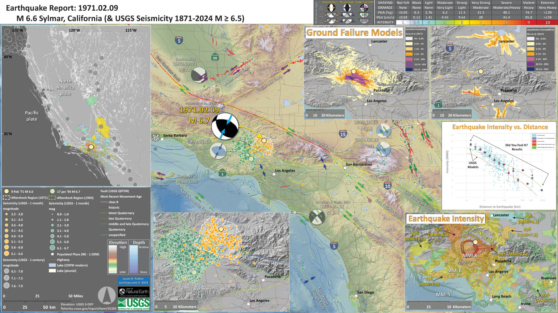
Below is my interpretive poster for this earthquake
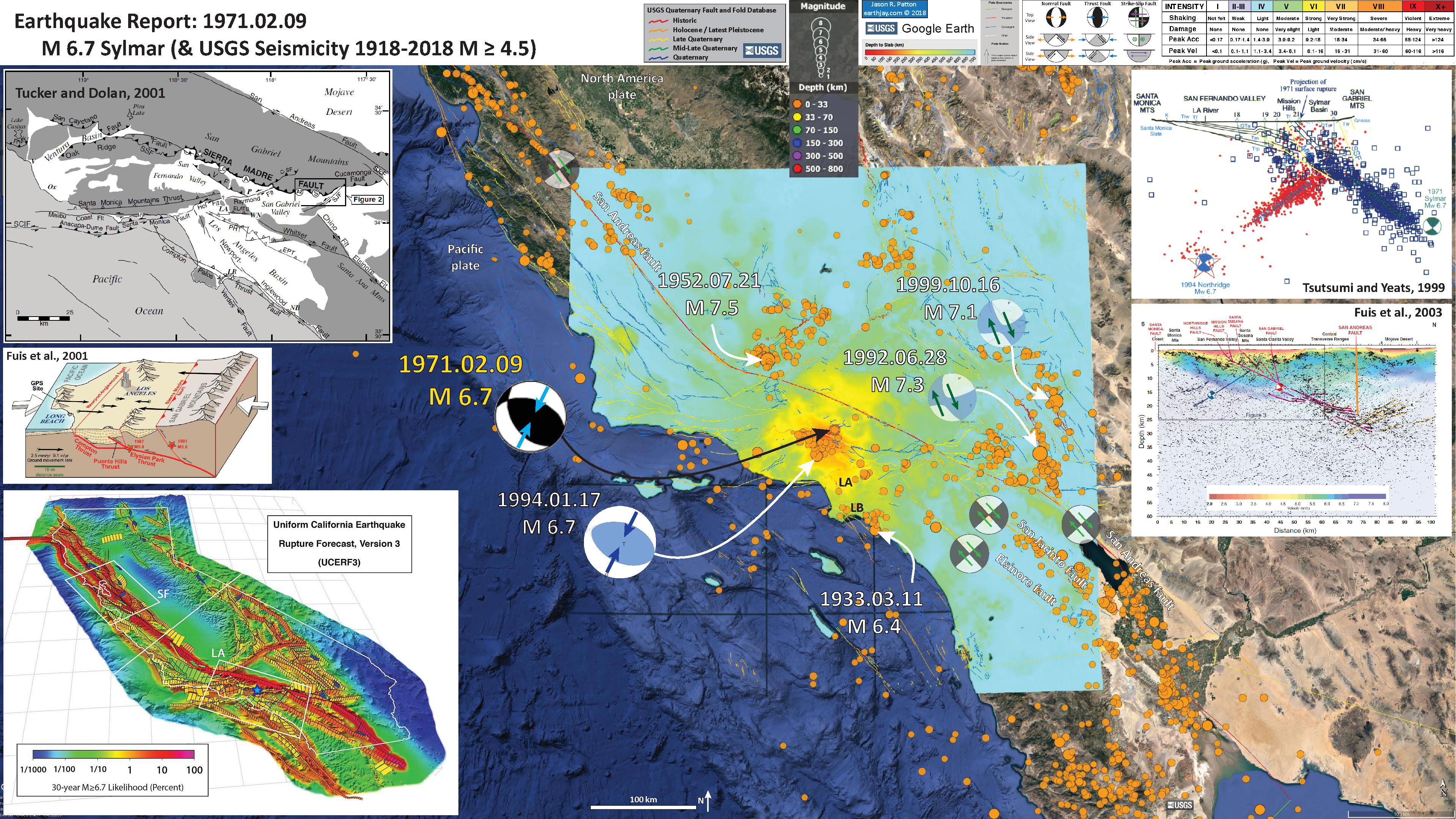
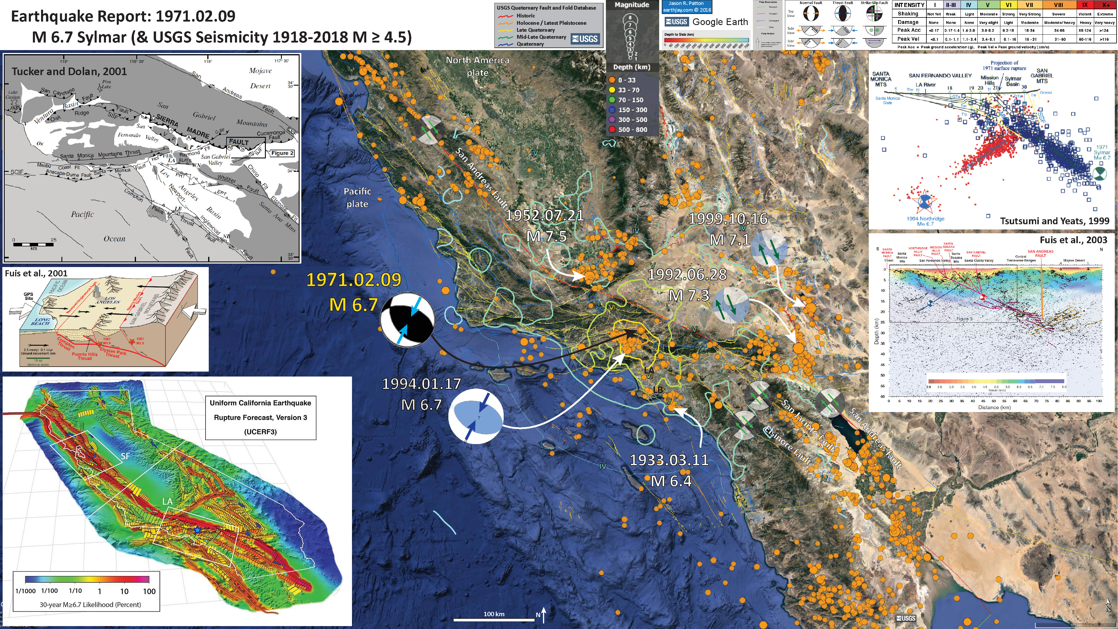
I plot the seismicity from the past month, with color representing depth and diameter representing magnitude (see legend). I include earthquake epicenters from 1918-2018 with magnitudes M ≥ 4.5.
I plot the USGS fault plane solutions (moment tensors in blue and focal mechanisms in orange) for the M 6.7 earthquake, in addition to some of the significant earthquakes in southern CA.
- I placed a moment tensor / focal mechanism legend on the poster. There is more material from the USGS web sites about moment tensors and focal mechanisms (the beach ball symbols). Both moment tensors and focal mechanisms are solutions to seismologic data that reveal two possible interpretations for fault orientation and sense of motion. One must use other information, like the regional tectonics, to interpret which of the two possibilities is more likely.
- I also include the shaking intensity on the map. These use the Modified Mercalli Intensity Scale (MMI; see the legend on the map). This is based upon a computer model estimate of ground motions, different from the “Did You Feel It?” estimate of ground motions that is actually based on real observations. The MMI is a qualitative measure of shaking intensity. More on the MMI scale can be found here and here. This is based upon a computer model estimate of ground motions, different from the “Did You Feel It?” estimate of ground motions that is actually based on real observations.
- I include a legend showing the relative age of most recent activity for faults shown on the map. These faults are from the USGS Active Fault and Fold Database. More can be found about this database here.
-
I include some inset figures.
- In the upper left corner is a map of the faults in southern CA (Tucker and Dolan, 2001). Strike-slip faults (like the SAF) have arrows on either side of the fault desginating the relative motion across the fault. Thrust faults have triangle barbs showing the convergence direction (the triangles are on the side of the fault that is dipping into the Earth).
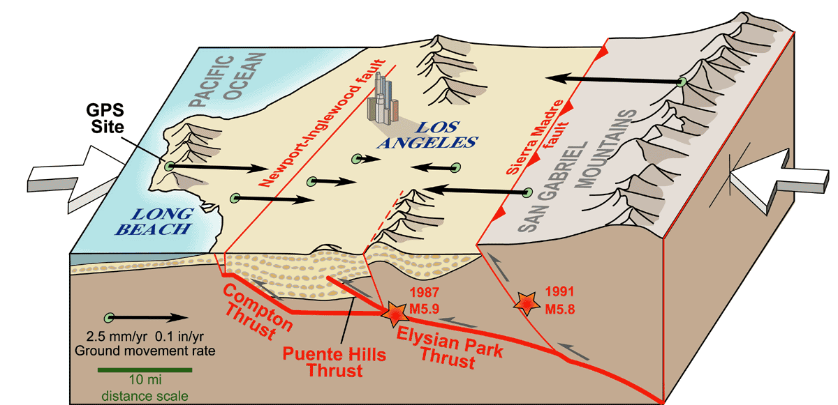
- Below this fault map is a low-angle oblique block diagram showing the configuration of thrust faults in the region of the Big Bend. These thrust faults are forming the topography in southern CA. The 1971 and 1994 earthquakes occurred along thrust faults similar to the ones shown in this block diagram.
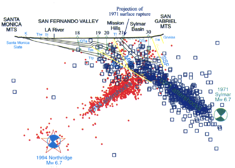
- In the upper right corner is a cross section of seismicity associated with the 1971 and 1994 earthquakes (Tsutsumi and Yeats, 1994). 1971 main and aftershocks are in blue and 1994 main and aftershocks are in red. Note how both earthquakes occurred along blind thrust faults. Also note that these faults were dipping in opposite directions (1971 dips to the north (south vergent) and 1994 dips to the south (north vergent).
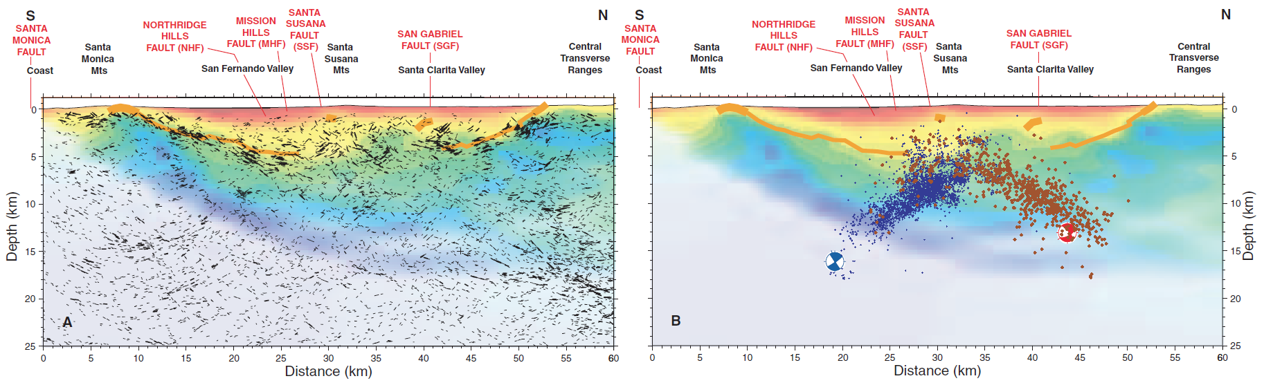
- In the lower right corner is another figure showing the aftershocks from the 1971 and 1994 earthquakes (Fuis et al., 2003). This shows their seismic velocity model (with fault interpretations). The 1971 and 1994 earthquake focal mechanisms are shown.
- In the lower left corner is an illustration that shows the Likelihood of an earthquake with M ≥ 6.7 for the next 30 years. This is based upon the Uniform California Earthquake Rupture Forecast, Version 3 (UCERF3). More about UCERF3 can be found here. I placed a blue star in the general location of the 1971 Sylmar Earthquake.
- Here is the same map, but the MMI is plotted as contours.
- In the upper left corner is a map that shows the tectonic plates and seismicity for California.
- In the lower right corner is a map that shows the earthquake intensity using the modified Mercalli intensity scale. Earthquake intensity is a measure of how strongly the Earth shakes during an earthquake, so gets smaller the further away one is from the earthquake epicenter. The map colors represent a model of what the intensity may be.
- Above the intensity map is a plot that shows the same intensity (both modeled and reported) data as displayed on the map. Note how the intensity gets smaller with distance from the earthquake.
- In the upper right corner are two maps showing the probability of earthquake triggered landslides and possibility of earthquake induced liquefaction. I will describe these phenomena below.
- In the lower left is a larger scale map showing seismicity from the 1971 and 1994 earthquakes.
Here is an updated map (9 Feb. ’24). I include some inset figures. Some of the same figures are located in different places on the larger scale map below.

Some Relevant Discussion and Figures
- Here is the fault map from Tucker and Dolan (2001).
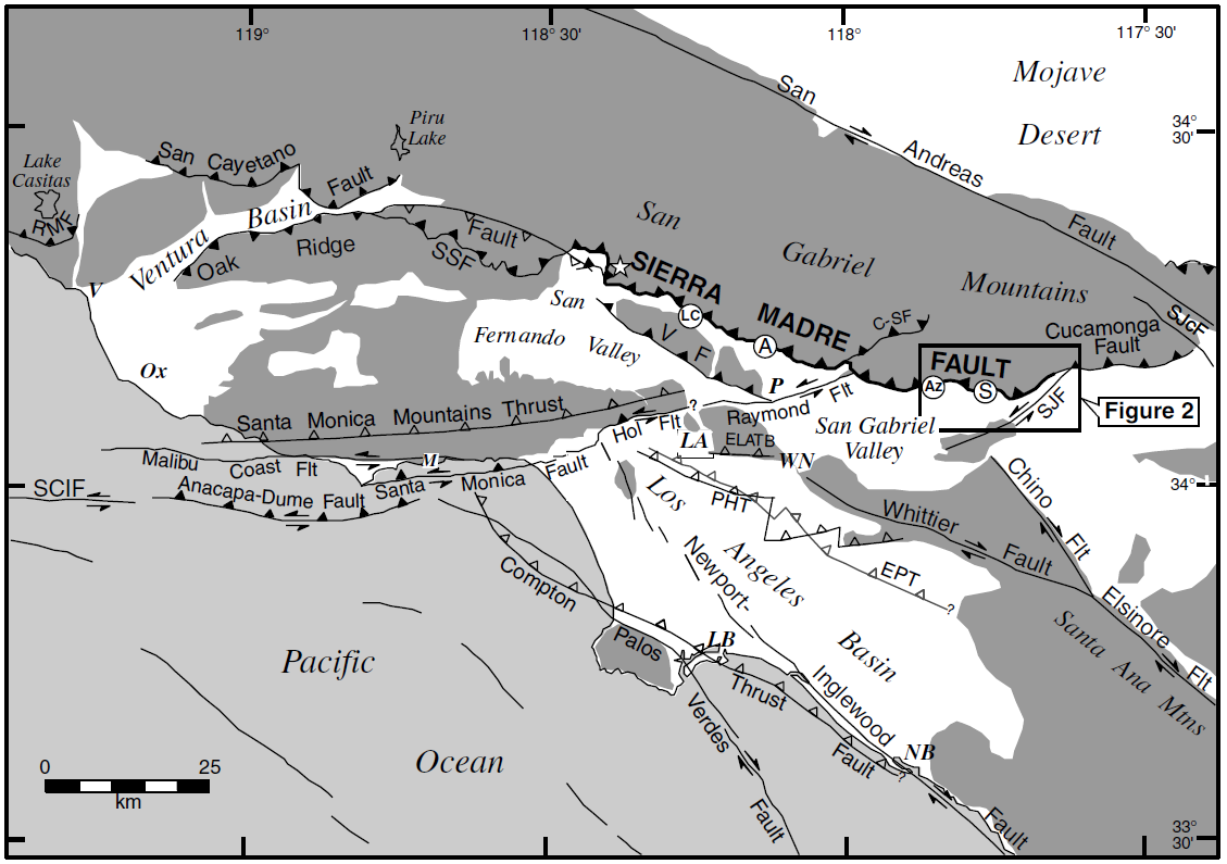
Regional neotectonic map for metropolitan southern California showing major active faults. The Sierra Madre fault is a 75-km-long active reverse fault that extends along the northern edge of the metropolitan region. Fault locations are from Ziony and Jones (1989), Vedder et al. (1986), Dolan and Sieh (1992), Sorlien (1994), and Dolan et al. (1997, 2000b). Closed teeth denote reverse fault surface trace; open teeth on dashed lines show upper edge of blind thrust fault ramps. Strike-slip fault surface traces shown by double arrows. Star denotes location of Oak Hill paleoseismologic trench site of Bonilla (1973). CSI, Clamshell-Sawpit fault; ELATB, East Los Angeles blind thrust system; EPT, Elysian park blind thrust fault; Hol Fl, Hollywood fault; PHT, Puente Hills blind thrust fault; RMF, Red Mountain fault; SCII, Santa Cruz Island fault; SSF, Santa Susana fault; SJcF, San Jacinto fault; SJF, San Jose fault; VF, Verdugo fault; A, Altadena study site of Rubin et al. (1998); LA, Los Angeles; LB, Long Beach; LC, La Crescenta; M, Malibu; NB, Newport Beach; Ox, Oxnard; P, Pasadena; PH, Port Hueneme; S, Horsethief Canyon study site in San Dimas; V, Ventura. Dark shading denotes mountains.
- This is a figure that is based upon Fuis et al. (2001) as redrawn by UNAVCO that shows the orientation of thrust faults in this region of southern CA. Below the block diagram is a map showing the location of their seismic experiment (LARSE = Line 1; Fuis et al., 2003).
Schematic block diagram showing interpreted tectonics in vicinity of LARSE line 1. Active faults are shown in orange, and moderate and large earthquakes are shown with orange stars and attached dates, magnitudes, and names. Gray half-arrows show relative motions on faults. Small white arrows show block motions in vicinities of bright reflective zones A and B (see Fig. 2A). Large white arrows show relative convergence direction of Pacific and North American plates. We interpret a master decollement ascending from bright reflective zone A at San Andreas fault, above which brittle upper crust is imbricating along thrust and reverse faults and below which lower crust is flowing toward San Andreas fault (brown arrows) and depressing Moho. Fluid injection, indicated by small lenticular blue areas, is envisioned in bright reflective zones A and B.

Shaded relief map of Los Angeles region, southern California, showing Quaternary faults (thin black lines, dotted where buried), shotpoints (gray and orange filled circles), seismographs (gray and orange lines), air-gun bursts (dashed yellow lines), and epicenters of earthquakes .M 5.8 since 1933 (focal mechanisms with attached magnitudes: 6.7a—Northridge [Hauksson et al., 1995], 6.7b—San Fernando [Heaton, 1982], 5.9—Whittier Narrows [Hauksson et al., 1988], 5.8—Sierra Madre [Hauksson, 1994], 6.3—Long Beach [Hauksson, 1987]). Faults are labeled in red; abbreviations: HF—Hollywood fault, MCF—Malibu Coast fault, MHF—Mission Hills fault, NHF—Northridge Hills fault, RF—Raymond fault, SF—San Fernando surface breaks, SSF—Santa Susana fault, SMoF—Santa Monica fault, SMFZ—Sierra Madre fault zone, VF—Verdugo fault. NH is Newhall.
- Here are the figures from Hauksson et al. (1995) showing the regions effected by earthquakes in southern CA.

(A) Significant earthquakes of M >= 4.8 that have occurred in the greater Los Angeles basin area since 1920. Aftershock zones are shaded with cross hatching, including the 1994 Northridge earthquake. Dotted areas indicate surface rupture, including the rupture of the 1857 earthquake along the San Andreas fault. (B) Lower hemisphere focal mechanisms (shaded quadrants are compressional) for significant earthquakes that have occurred since 1933 in the greater Los Angeles area.
- Here is the seismicity cross section plot from Tsutsumi and Yeats (1999).
Cross section down to 20 km depth across the central San Fernando Valley, including the 1971 Sylmar and 1994 Northridge earthquake zones. See Figure 2 for location of the section and Figure 3 for stratigraphic abbreviations. Wells are identified in the Appendix. Aftershock data for the 1971 (blue) and 1994 (red) earthquakes within a 10-km-wide strip including the line of this section are provided by Jim Mori at Kyoto University. Abbreviation for faults: MHF, Mission Hills fault; NHF, Northridge Hills fault; SSF, Santa Susana fault.
- Here is the figure from Fuis et al. (2003) showing their interpretation of seismic data from the region. These data are from a seismic experiment also plotted in the map above. The panel on the left is A and the panel on the right is B. This is their figure 3.
Cross section along part of line 2 with superposition of various data layers. A: Tomographic velocity model plus line drawing extracted from reflection data (see text); heavier black lines represent better-correlated or higher-amplitude phases. B: Velocity model plus relocated aftershocks of 1971 San Fernando and 1994 Northridge earthquakes (brown and blue dots, respectively); main shock focal mechanisms (far hemispheres) are red (San Fernando; Heaton, 1982) and blue (Northridge; Hauksson et al., 1995). Aftershocks are projected onto line 2 from up to 10 km east.
- This is a smaller scale cross section from Fuis et al. (2003) showing a broader view of the faults in this region. This shows the velocity model color legend that also applies to the above figure. This is their figure 4.

Similar to Fig. 3, with expanded depth and distance frame. See caption for Fig. 3 for definition of red, magneta, and blue lines; orange line—interpreted San Andreas fault (SAF); yellow lines—south-dipping reflectors of Mojave Desert and northern Transverse Ranges; “K” —reflection of Cheadle et al. (1986), which is out of plane of this section. SAF is not imaged directly; interpretation is based on approximate northward termination of upper reflections (best constrained) in San Fernando reflective zone (magenta lines). (See similar interpretation for SAF on line 1—Fig. 5.) Wells shown in Mojave Desert are (s) H&K Exploration Co., (t) Meridian Oil Co. (Dibblee, 1967). For well color key, see caption for Fig. 3. Thin, dashed yellow-orange line—estimated base of Cenozoic sedimentary rocks in Mojave Desert based on velocity. Darker, multicolored region (above region of light violet) represents part of velocity model where resolution ≥ 0.4 (see color bar).
- Here is a fascinating figure from Carena and Suppe (2002) showing the 3-dimensional configuration of the faults involved in the 1971 and 1994 earthquakes.

Perspective view, looking from the SE, of the modeled Northridge and San Fernando thrusts. The Northridge thrust stops at a depth of about 6 km, and its upper tip east of the lateral ramp (Fig. 4) terminates almost against the San Fernando thrust, as was suggested by Morti et al. (1993). The San Fernando thrust loser tip is at a depth o 13 km, whereas the Northridge thrust lower tip is at 32 km.
- Here is a map view of the Carena and Suppe (2002) interpretation of these fault planes.

Schematic geological map showing the position of the main faults and folds, as well as the depth contours (contour interval = 1 km) of the Northridge (solid) and San Fernando (dashed) thrusts.
- Here is a structural cross section across this region (Carena and Suppe, 2002).

Cross-section through the San Fernando Valley with projected aftershocks of the 1994 Northridge earthquake and of the 1971 Sylmar earthquake. The Northridge aftershocks are projected from a distance of 1 km or less on each side of the cross-section (main shock projected from 2 km W), whereas those of the Sylmar earthquake are projected from 1.5 km or less (main shock projected from 5 km ESE). The sources that we used for near-surface geology and structure are Dibblee (1991) and a seismic line (Fig. 11). The large N-S changes in Upper Tertiary stratigraphic thicknesses in this region (Dibblee, 1991, 1992a), prevent detailed stratigraphic correlation across fault blocks (this figure and Fig. 12). This face suggests that the shallow faults and possible the deeper San Fernando thrust itself, are reactivating old normal faults of the southern margin of the Ventura Basin (Yeats, et al., 1994; Huftle and Yeats, 1996; Tsutsumi and Yeats, 1999). Location of cross-section is in Fig. 13.
Shaking Intensity
- Here is a figure that shows a more detailed comparison between the modeled intensity and the reported intensity. Both data use the same color scale, the Modified Mercalli Intensity Scale (MMI). More about this can be found here. The colors and contours on the map are results from the USGS modeled intensity. The DYFI data are plotted as colored dots (color = MMI, diameter = number of reports).
- In the upper panel is the USGS Did You Feel It reports map, showing reports as colored dots using the MMI color scale. Underlain on this map are colored areas showing the USGS modeled estimate for shaking intensity (MMI scale).
- In the lower panel is a plot showing MMI intensity (vertical axis) relative to distance from the earthquake (horizontal axis). The models are represented by the green and orange lines. The DYFI data are plotted as light blue dots. The mean and median (different types of “average”) are plotted as orange and purple dots. Note how well the reports fit the green line (the model that represents how MMI works based on quakes in California).
- Below the map and the lower plot is the USGS MMI Intensity scale, which lists the level of damage for each level of intensity, along with approximate measures of how strongly the ground shakes at these intensities, showing levels in acceleration (Peak Ground Acceleration, PGA) and velocity (Peak Ground Velocity, PGV).

- Here is a comparison of the ground shaking intensity for these two earthquakes (1971 Sylmar vs. 1994 Northridge). These earthquakes had similar magnitudes, but the 1994 earthquake had a higher MMI. The upper panels are the USGS Shakemaps, which are model based estimates of shaking intensity, based on Ground Motion Predicti0on Equations (GMPE; attenuation relations). The lower panels plot two different sets of data. The orange lines are regression lines that represent how shaking intensity diminishes (attenuates) with distance from the earthquake. These are regressions based upon these GMPE relations. More about GMPE relations can be found here. The dots are data from real observations made by people who have reported this on the USGS Did You Feel It? website for each of these earthquakes. More about the DYFI program can be found here.

Potential for Ground Failure
- Below are a series of maps that show the potential for landslides and liquefaction. These are all USGS data products.
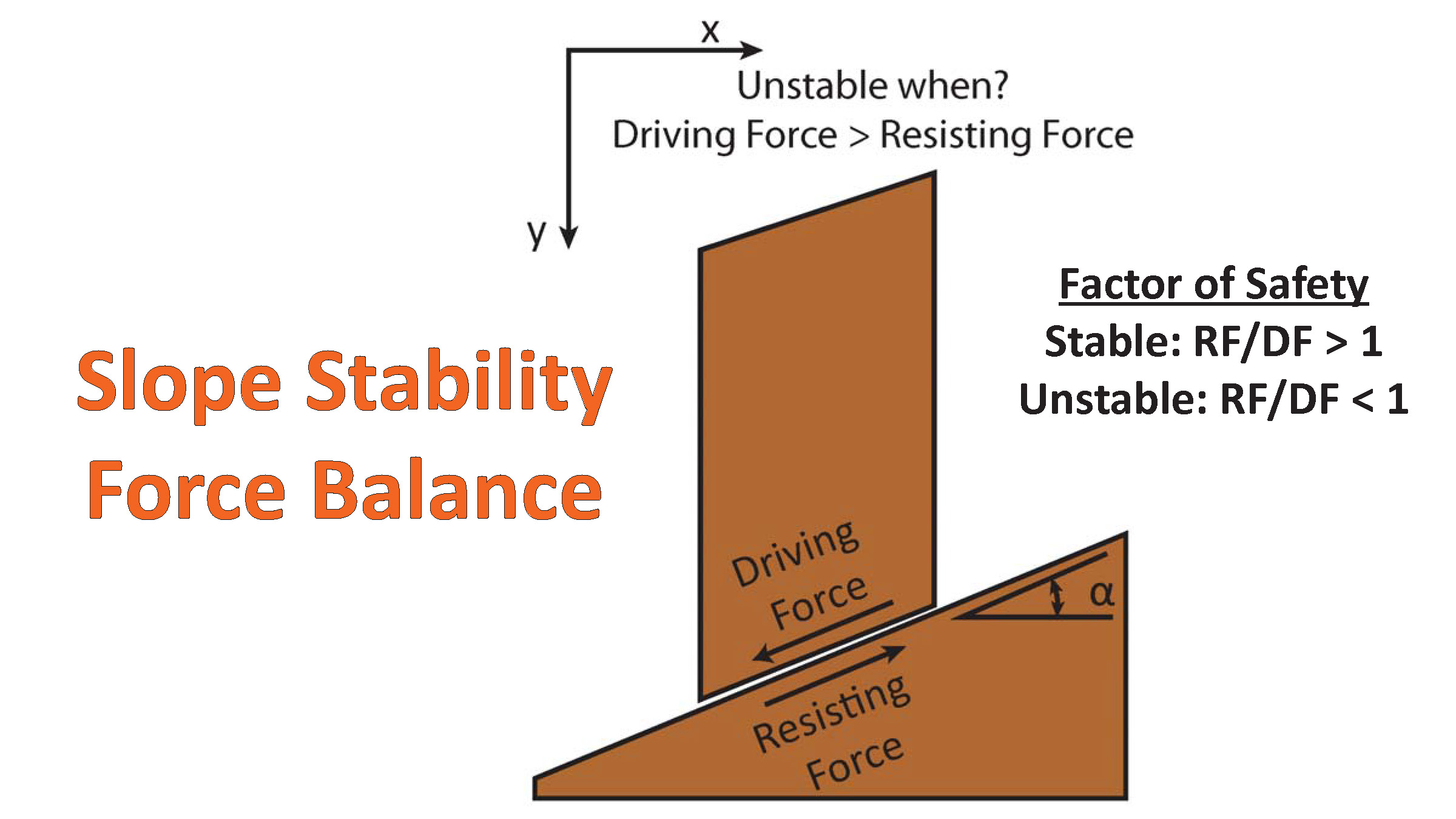
There are many different ways in which a landslide can be triggered. The first order relations behind slope failure (landslides) is that the “resisting” forces that are preventing slope failure (e.g. the strength of the bedrock or soil) are overcome by the “driving” forces that are pushing this land downwards (e.g. gravity). The ratio of resisting forces to driving forces is called the Factor of Safety (FOS). We can write this ratio like this:
FOS = Resisting Force / Driving Force
- When FOS > 1, the slope is stable and when FOS < 1, the slope fails and we get a landslide. The illustration below shows these relations. Note how the slope angle α can take part in this ratio (the steeper the slope, the greater impact of the mass of the slope can contribute to driving forces). The real world is more complicated than the simplified illustration below.
- Landslide ground shaking can change the Factor of Safety in several ways that might increase the driving force or decrease the resisting force. Keefer (1984) studied a global data set of earthquake triggered landslides and found that larger earthquakes trigger larger and more numerous landslides across a larger area than do smaller earthquakes. Earthquakes can cause landslides because the seismic waves can cause the driving force to increase (the earthquake motions can “push” the land downwards), leading to a landslide. In addition, ground shaking can change the strength of these earth materials (a form of resisting force) with a process called liquefaction.
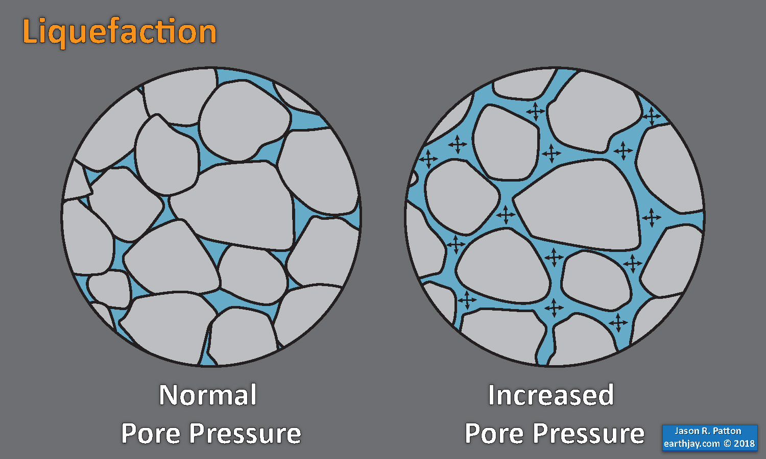
- Sediment or soil strength is based upon the ability for sediment particles to push against each other without moving. This is a combination of friction and the forces exerted between these particles. This is loosely what we call the “angle of internal friction.” Liquefaction is a process by which pore pressure increases cause water to push out against the sediment particles so that they are no longer touching.
- An analogy that some may be familiar with relates to a visit to the beach. When one is walking on the wet sand near the shoreline, the sand may hold the weight of our body generally pretty well. However, if we stop and vibrate our feet back and forth, this causes pore pressure to increase and we sink into the sand as the sand liquefies. Or, at least our feet sink into the sand.
- Below is a diagram showing how an increase in pore pressure can push against the sediment particles so that they are not touching any more. This allows the particles to move around and this is why our feet sink in the sand in the analogy above. This is also what changes the strength of earth materials such that a landslide can be triggered.
- Here Dr. Bohon demonstrates the phenomena of liquefaction.
- And, another video demonstration.
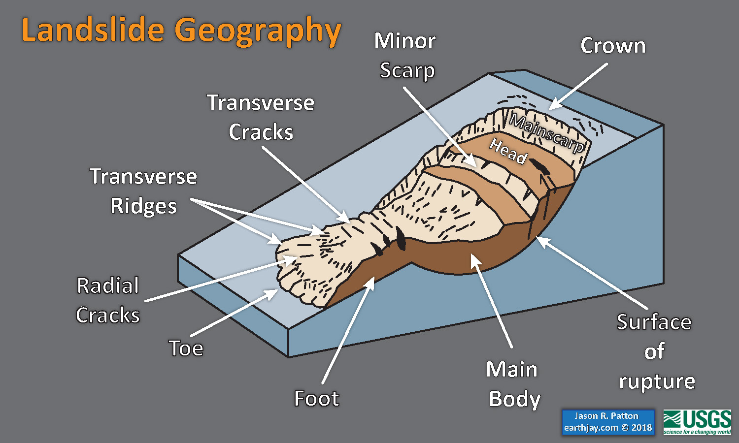
- Below is a diagram based upon a publication designed to educate the public about landslides and the processes that trigger them (USGS, 2004). Additional background information about landslide types can be found in Highland et al. (2008). There was a variety of landslide types that can be observed surrounding the earthquake region. So, this illustration can help people when they observing the landscape response to the earthquake whether they are using aerial imagery, photos in newspaper or website articles, or videos on social media. Will you be able to locate a landslide scarp or the toe of a landslide? This figure shows a rotational landslide, one where the land rotates along a curvilinear failure surface.
- Below is the liquefaction susceptibility and landslide probability map (Jessee et al., 2017; Zhu et al., 2017). Please head over to that report for more information about the USGS Ground Failure products (landslides and liquefaction). Basically, earthquakes shake the ground and this ground shaking can cause landslides.
- I use the same color scheme that the USGS uses on their website. Note how the areas that are more likely to have experienced earthquake induced liquefaction are in the valleys. Learn more about how the USGS prepares these model results here.
Liquefaction in action! This is a short clip of me jumping on water-laden sand at the beach and creating an increase in pore pressure, causing the ground to temporarily behave like a fluid. pic.twitter.com/p8VZNUcrEq
— Wendy Bohon, PhD 🌏 (@DrWendyRocks) April 28, 2021
This liquefaction experiment conducted by the Tokyo Geological Survey of Japan at the Disaster Prevention Exhibition in 2015, shows the effects of different foundations and how hollow objects such as water pipes come to the surface [source, full video: https://t.co/xYLjPY4IHZ] pic.twitter.com/r8LXtmvrO0
— Massimo (@Rainmaker1973) April 17, 2021

Some Background Materials
- For more on the graphical representation of moment tensors and focal mechnisms, check this IRIS video out:
- Here is a fantastic infographic from Frisch et al. (2011). This figure shows some examples of earthquakes in different plate tectonic settings, and what their fault plane solutions are. There is a cross section showing these focal mechanisms for a thrust or reverse earthquake. The upper right corner includes my favorite figure of all time. This shows the first motion (up or down) for each of the four quadrants. This figure also shows how the amplitude of the seismic waves are greatest (generally) in the middle of the quadrant and decrease to zero at the nodal planes (the boundary of each quadrant).
- There are three types of earthquakes, strike-slip, compressional (reverse or thrust, depending upon the dip of the fault), and extensional (normal). Here is are some animations of these three types of earthquake faults. Many of the earthquakes people are familiar with in the Mendocino triple junction region are either compressional or strike slip. The following three animations are from IRIS.
Strike Slip:
Compressional:
Extensional:
- 2017.12.14 M 4.3 Laytonville
- 2016.11.06 M 4.1 Laytonville, CA
- 2016.11.03 M 3.8 Laytonville, CA
- 2016.08.10 M 5.1 Lake Pillsbury, CA
- 2015.08.30 M 3.6 Mendocino County, CA
- 2015.07.27 M 3.5 Point Arena, CA
- 2018.01.04 M 4.4 Berkeley
- 2016.02.23 M 4.9 Bakersfield
- 2015.12.30 M 4.4 San Bernardino, CA
- 2015.05.03 M 3.8 Los Angeles, CA
- 2015.04.13 M 3.3 Los Angeles, CA
- 2014.04.01 M 5.1 La Habra p-3
- 2014.03.29 M 5.1 La Habra p-2
- 2014.03.28 M 5.1 La Habra p-1
- 2016.08.04 M 4.5 Honey Lake, CA
San Andreas fault
General Overview
Earthquake Reports
Northern CA
Central CA
Southern CA
Eastern CA
- 1994.11.17 M 6.7 Northridge, CA
- 1971.02.09 M 6.7 Sylmar, CA
Southern CA
Earthquake Reports
Documentaries
Social Media
128. The Los Angeles area remained quiet, earthquake-wise, during post-WW2 growth. Lull was broken with M6.6 Sylmar earthquake on morning of 9 Feb. 1971, 47 yrs ago #OTD. 1.25g recorded at Pacoima Dam, highest PGA recorded to-date at that time. #200EQFacts pic.twitter.com/q1UyFzqRUw
— Susan Hough (@SeismoSue) February 9, 2018
#OnThisDay in 1971, M6.7 EQ strikes San Fernando Valley, CA. Two hospitals suffered catastrophic damage (including partial collapse),killing 47. EQ spurred effort to better understand building seismic design & performance https://t.co/ukvwER1NEK pic.twitter.com/PmEJfqhzxp
— USGS (@USGS) February 9, 2018
47 years ago this very minute: The 6.7 #Sylmar Earthquake. Were you there (The Militant may or may not have been)? #SFV https://t.co/LYkULwYGwk
— Militant Angeleno (@militantangleno) February 9, 2018
On this day in 1971, the #SanFernando (aka #Sylmar) #earthquake struck in the San Gabriel Mountains. Although a sparsely populated area, 65 people died and more than 2,000 people were injured. Property damage was estimated at $505 million. Be quake ready: https://t.co/LJAQBv9ysm. pic.twitter.com/pLeLlbQWRC
— CEA (@CalQuake) February 9, 2018
A photo of the Olive View Hospital that was damaged during the Sylmar earthquake, which struck #OTD in 1971. @LAPLPhotos: https://t.co/WgWbLv4gUN pic.twitter.com/l65l9j00YE
— ICW: California & The West (@HUSC_ICW) February 10, 2018
Today is the anniversary of the 1971 Sylmar Earthquake. Our article on how the collapse of 12 freeway overpasses that morning changed freeway construction in Southern California: https://t.co/xz0YTN7u9U
— Metro Library (@MetroLibrary) February 9, 2018
February 9: This Date in Los Angeles Transportation History (1971: The 6.6 Sylmar Earthquake jolts L.A., bringing down freeway overpasses) https://t.co/1ndsnV1gXP
— Metro Library (@MetroLibrary) February 9, 2018
Fifty-two people died in the collapse of several concrete structures, including buildings at the San Fernando Veterans Administration Hospital, above, in the 1971 Sylmar earthquake. Such structures are targets for seismic retrofits in L.A. https://t.co/K3Lx8WtoUq
— Christian Joli (@ChristianJoli) January 4, 2018
February 1971 – 6.6 Sylmar Earthquake Shakes the Southland https://t.co/8RRgSgaRMq pic.twitter.com/pDcVHKFcdf
— KCET-TV SoCal (@KCET) August 26, 2016
In the 1971 San Fernando quake #OTD the Santa Susanna Mountains grew by 2 feet. pic.twitter.com/BN5DPQV4OG
— Dr. Lucy Jones (@DrLucyJones) February 10, 2018
Naturally a lot of Northridge guesses, bc I appear to have successfully come off as an Angeleno. BUT I wasn't one til I moved from Minnesota in '97.
Framed seismogram is the '99 7.1 Hector Mine quake in the Mojave. At age 13, I decided at 2:50 that morning that I'd study quakes. pic.twitter.com/jkVHAm8y2o— Austin Elliott (@TTremblingEarth) February 10, 2018
References
- Carena, S. and Supper, J., 2002. Three-dimensional imaging of active structures using earthquake aftershocks: the Northridge thrust, California in Journal of Structural Geology, v. 24, p. 887-904.
- Frisch, W., Meschede, M., Blakey, R., 2011. Plate Tectonics, Springer-Verlag, London, 213 pp.
- Fuis, G.S>, Ryberg, T., Godfrey, N.J>, Okaya, D.A., and Murphy, J.M., 2001. Crustal structure and tectonics from the Los Angeles basin to the Mojave Desert, southern California in Geology, v. 29, no. 1. p. 15-18.
- Fuis, G.S. et al., 2003. Fault systems of the 1971 San Fernando and 1994 Northridge earthquakes, southern California: Relocated aftershocks and seismic images from LARSE II in Geology, v. 31, no. 2, p. 171-174.
- Hauksson, E., Jones, L.M., and Hutton, K., 1995. The 1994 Northridge earthquake sequence in California: Seismological and tectonic aspects in Journal of Geophysical Research, v., 100, no. B7, p. 12235-12355.
- Tsutsumi, H. and Yeats, R.S., 1999. Tectonic Setting of the 1971 Sylmar and 1994 Northridge Earthquakes in the San Fernando Valley, California in BSSA, v. 89, p. 1232-1249.
- Tucker, A.Z. and Dolan, J.F., 2001. Paleoseismologic Evidence for a ~8 Ka Age of the Most Recent Surface Rupture on the Eastern Sierra Madre Fault, Northern Los Angeles Metropolitan Region, California in BSSA, v. 91, no. 2, p. 232-249.