Earthquake Report: M 8.2 near Perryville, Alaska

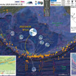
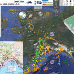
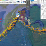
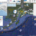
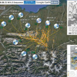
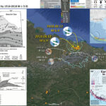
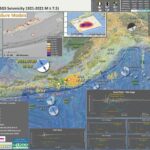
A few days ago, I was passed out on my couch (sleep apnea) and for some reason I awoke and noticed that I had gotten a CSEM notification of a large earthquake offshore of Alaska. Well, after looking into that, I sent my boss, Rick, a text message: “8.2.”
https://earthquake.usgs.gov/earthquakes/eventpage/us6000f02w/executive
Rick Wilson runs the tsunami program at the California Geological Survey (CGS) and works with the California Governor’s Office of Emergency Services (Cal OES) to use official forecasts of tsunami size from the National Tsunami Warning Center (NTWC) to alert coastal emergency managers about the level of potential evacuation that they may want to act upon.
More about this process can be found here. Take a look at the CGS Special Report 236 to learn about the Tsunami Playbooks and the “FASTER” approach for tsunami evacuation guidance. Evacuation is something that is done at the local level, so CGS and Cal OES can only provide recommendations.
Needless to say, we were both at the ready to respond. Rick has hourly phone calls with the NTWC and follows up with phone calls and emails to specific interested parties (e.g. the emergency managers). We each went into tsunami response mode. I manage the Tsunami Event Response Team, which may be activated to collect observations of tsunami inundation or ocean currents.
I started looking at tide gage and DART Buoy data to see how large the tsunami was in the epicentral region. The M 8.2 was in the region of the 1938 M 8.2 earthquake which generated a transoceanic tsunami. I also looked into the literature about the 1938 tsunami, to see what size that tsunami was. The 1938 tsunami had a decimeter scale wave height (peak to trough) for gages in Alaska and in California (Johnson and Satake, 1994). Jeff Freymueller et al. (2021) had also recently worked on the 1938 earthquake source area and tsunami modeling as well.
The nearest tide gage for this 2021 event is at Sand Point, but the nearest gage in 1938 was in Unalaska. So, in order to get a modest comparison between 1938 and 2021, I felt a need to wait for the Unalaska data to trickle in. This may give us some idea whether the 1938 tsunami recorded in Crescent City and San Francisco might be a decent analogue. Of course, we need to get the official forecast from the NTWC prior to sending out any information. But, that process can take hours (over 3 hours in this case). So, we need to get our minds wrangled around the possibilities in the absence of more information.
Earthquake and Tectonic Background:
The plate boundary in the north Pacific is a convergent (pushing together) plate boundary where the Pacific plate on the south ‘subducts’ northwards beneath the North America plate on the north. The Alaska-Aleutian subduction zone forms a deep sea trench which can be seen in maps of the region. The subduction zone fault dips into the Earth, getting deeper to the north.
Between earthquakes (the interseismic period), the megathrust fault is seismogenically coupled (i.e. ‘locked’) just like velcro has the ability to hold together one’s wallet. The plates are always moving towards each other. Because the fault is locked, the crust surrounding the fault bends elastically to accommodate this convergent motion.
As the crust bends and flexes, it stores energy (i.e. tectonic strain). The part of the fault closest to the seafloor (the southernmost part of this subduction zone fault) gets pulled downwards, while the part of the crust further to the north flexes upwards.
The materials along the earthquake fault have properties that resist motion (like the velcro). But, as the plates converge and increase the amount of energy stored, the forces on the fault may exceed the strength of the fault. At this time, the fault slips, causing an earthquake.
The part of the fault that was being pulled downwards gets pushed upwards during the earthquake (the coseismic period), while the crust that was being flexed upwards between earthquakes thus subsides downwards during the earthquake.
The Alaska-Aleutian subduction zone has a history of subduction zone earthquakes and tsunami, plus there exists a prehistory of earthquakes and tsunami in some parts of this plate boundary. Geologists are often asked to determine the potential hazard of future earthquakes and tsunami and their answers are based on what we know from the past (using both historic and prehistoric data).
The 2021 M 8.2 earthquake happened in the same location as a 1938 M 8.2 earthquake, just to the east of a sequence of earthquakes from last year (22 July and 19 October 2020).
Tsunami:
When the earthquake fault slips, and the upper plate deforms, the vertical motion of the plate can elevate (or lower) the overlying ocean water. After the water changes position, it seeks to return to sea-level (an equipotential surface). If elevated, the water drops downwards and then oscillates up and down. This is the process that generates waves that radiate from the area with seafloor deformed by the earthquake.

    Things that make a tsunami larger are [generally]:

  1. More vertical land motion (possibly from larger slip on the fault, e.g. from a larger magnitude earthquake)
  2. Deeper water (deeper water = more volume of water moving = more energy to create larger tsunami waves)

So let’s take a look at the things that may have affected the size of the tsunami from this 2021 M 8.2 earthquake.
First of all, based on the earthquake slip models (estimates of how the earthquake slipped, in meters, and how that slip varied along the fault) suggest that a majority of the largest slip happened beneath the continental shelf. The water depth on the shelf is similar to many shelfs worldwide, shallower than about 200 meters. How does this affect the size of the tsunami?
Well, I guess that is the main point, the ground deformation that generated the tsunami was beneath shallow water.
These slip models are based on a variety of data and most of the data are seismic data. Some tsunami are generated by slow slip (not generating seismic waves) on the shallow part of the fault. These are called tsunami earthquakes.
Because tsunami earthquakes may be generated by slip in this way, slip models using seismic data cannot resolve the location of the slip on the fault that created these tsunami. However, the tsunami from this 2021 M 8.2 earthquake were small. Therefore the updip part of the fault probably did not contribute significantly to the tsunamigenic ground deformation.

Below is my interpretive poster for this earthquake

  • I plot the seismicity from the past 3 months, with diameter representing magnitude (see legend). I also include earthquake epicenters from 1921-2021 with magnitudes M ≥ 7.5.
  • I plot the USGS fault plane solutions (moment tensors in blue and focal mechanisms in orange), possibly in addition to some relevant historic earthquakes.
  • A review of the basic base map variations and data that I use for the interpretive posters can be found on the Earthquake Reports page. I have improved these posters over time and some of this background information applies to the older posters.
  • Some basic fundamentals of earthquake geology and plate tectonics can be found on the Earthquake Plate Tectonic Fundamentals page.
  • I include outlines of the historic subduction zone earthquakes as prepared by Peter Haeussler from the USGS in Anchorage. He appears in the video about the 1964 earthquake below.
  • Some of the tide gage and DART buoy locations are labeled.
  • Note how there are still aftershocks from the 2018 M 7.9 earthquake sequence.

    I include some inset figures. Some of the same figures are located in different places on the larger scale map below. I present 3 posters, each with slightly different information.

  • This is the first poster I prepared.
  • In the upper center is a low-angle oblique view of the plate boundary. Note the oceanic Pacific plate is subducting beneath the continental North America plate. As the plate goes down, the water embedded in the rocks and sediment are released into the overlying mantle wedge. This water causes the mantle to melt, which rises, erupts as lava and forms the volcanic chain we call the Aleutian Islands. I place a green star in the “epicentral” location of the 2021 M 8.2 earthquake.
  • In the upper left corner is part of a figure from Witter et al. (2019) that shows sections of the megathrust fault relative to how much the fault is thought to be locked. This is called the coupling ratio. For a fault that is fully coupled (or locked), the ratio is 1.0. For a fault that is slipping about 50% and accumulating about 50% of the plate motion rate, the coupling ratio is 0.5. Many subduction zones have low coupling ratios of 0.2-0.6. The region of the fault west of the 1938 and 2021 M 8.2 earthquakes is called the Shumagin Gap, thought to be possibly aseismic (with a coupling ratio closer to 0). But the 2020 sequence of M 7.8 and 7.9 earthquakes filled much of this gap.
  • In the upper right corner is a plot showing the earthquake shaking intensity using the Modified Mercalli Intensity Scale (MMI). This is a USGS model based on observations of intensity from thousands of earthquakes. Read more about MMI here.
  • In the center right is a plot showing the aftershocks within a couple hours of the mainshock
  • In the lower right corner is the initial record of the tsunami at the Sand Point tide gage (see map for gage location).
  • I labeled the USGS slab 2.0 slab contours (Hayes et al., 2018). These depth contours represent the depth of the megathrust fault at these locations. The M 8.2 hypocentral depth is 32.2 km and the slab2 depth is about 35 km. Nice!
  • Here is the map with 3 month’s seismicity plotted. There are 3 posters. The first one is something I put together around 2 hours after I awoke on the couch (abt 2am my time). I prepared the 2nd poster an hour later, which includes some information about tsunami prehistory. I prepared the 3rd poster late Sunday evening, about 3 days after the earthquake.

  • This is the second map I prepared and some figures are the same as in the first poster.
  • Below the low-angle oblique map is a slip model from the USGS. The color represents the amount of slip on the fault. Note that the maximum slip is close to the epicenter. This is not always the case, as for the 1938 event, it appears that the maximum slip was not where the mainshock epicenter was.
  • In the upper left corner is a map from Nelson et al. (2015). Those authors studied the prehistoric tsunami records at Chrikof Island, an island about 200 km to the east of the 2021 M 8.2 epicenter. The lower map shows GPS derived plate motion rates.
  • In the lower right corner is also from Nelson et al. (2015). On this plot, the vertical axis represents time with “today” at the top and over 5000 years ago at the bottom. The horizontal axis is space, west to east from left to right. Each colored symbol represents the time of a prehistoric tsunami. The vertical size of these symbols represents the uncertainty (or “error”) associated with those chronologic data. We can take the number of earthquakes or tsunami over a period of time to estimate how frequently those process happen over time.
  • To the left is a more updated version of the Sand Point tide gage, showing a wave height (peak to trough) of about 45 cm. We cannot compare this to the 1938 tsunami as there was not a tide gage at Sand Point in 1938

  • I prepared a 3rd poster, but updated it to this 4th poster.
  • In the Intensity Data area, I added USGS “Did You Feel It?” data, which come from reports from real people. Learn more about dyfi here. The model data are the colored lines labeled in white and the dyfi data are colored polygons labeled in yellow.
  • In the aftershocks plot, I added epicenters from the several days after the mainshock. I also added a transparent overlay of the USGS finite fault model (the slip model). Compare the overlap, or non-overlap, of the slip region and the aftershocks. Why do you think that they are not completely overlapping?
  • In the lower right section are tide gage records from gages in the area included in the poster. I plot the tidal forecast (dark blue), the tide gage observed water surface elevation (medium blue), and the difference between these data (in light blue) which is a record of the tsunami (and other waves, like wind waves). I made a rough approximation estimate of the maximum wave height and labeled this in yellow. The San Point tide gage has a mx wave height of about 0.8 m!
  • I also plot the data from the DART buoy 46403, which is the closest DART buoy to the mainshock epicenter. The DART buoy network is used to help calibrate tsunami forecast models during tsunami events. These are basically pressure transducers on the seafloor that measure changes in pressure caused by waves and atmospheric processes. The data plotted here are not tsunami data, but seismic wave data. One reason we know that this is not a tsunami is that the waveform initiated about 3 minutes after the earthquake. A tsunami would take longer to get to the buoy.
  • In the upper left corner is a pair of maps that show USGS earthquake induced ground failure models. The map on the right shows what areas have likelihood of having landslides triggered by the 2021 M 8.2 earthquake. The panel on the right shows the possibility that areas might experience liquefaction induced by the earthquake.
  • I added aftershocks associated with the 2020 M 7.8/7.5 sequence that filled the Shumagin Gap (green circles) and outlined the aftershock region for both 2020 and 2021 sequences. The 2021 sequence is not yet over. The largest aftershock so far has only been M 6.1. The 1938 M 8.2 event had a M~7 event 5 days after the mainshock. Stay tuned?

Tectonic Overview

Below is an educational video from the USGS that presents material about subduction zones and the 1964 earthquake and tsunami in particular.
Youtube Source IRIS
mp4 file for downloading.

    Credits:

  • Animation & graphics by Jenda Johnson, geologist
  • Directed by Robert F. Butler, University of Portland
  • U.S. Geological Survey consultants: Robert C. Witter, Alaska Science Center Peter J. Haeussler, Alaska Science Center
  • Narrated by Roger Groom, Mount Tabor Middle School

This is a map from Haeussler et al. (2014). The region in red shows the area that subsided and the area in blue shows the region that uplifted during the earthquake. These regions were originally measured in the field by George Plafker and published in several documents, including this USGS Professional Paper (Plafker, 1969).


Here is a cross section showing the differences of vertical deformation between the coseismic (during the earthquake) and interseismic (between earthquakes).


This figure, from Atwater et al. (2005) shows the earthquake deformation cycle and includes the aspect that the uplift deformation of the seafloor can cause a tsunami.


Here is a figure recently published in the 5th International Conference of IGCP 588 by the Division of Geological and Geophysical Surveys, Dept. of Natural Resources, State of Alaska (State of Alaska, 2015). This is derived from a figure published originally by Plafker (1969). There is a cross section included that shows how the slip was distributed along upper plate faults (e.g. the Patton Bay and Middleton Island faults).


Here is a graphic showing the sediment-stratigraphic evidence of earthquakes in Cascadia, but the analogy works for Alaska also. Atwater et al., 2005. There are 3 panels on the left, showing times of (1) prior to earthquake, (2) several years following the earthquake, and (3) centuries after the earthquake. Before the earthquake, the ground is sufficiently above sea level that trees can grow without fear of being inundated with salt water. During the earthquake, the ground subsides (lowers) so that the area is now inundated during high tides. The salt water kills the trees and other plants. Tidal sediment (like mud) starts to be deposited above the pre-earthquake ground surface. This sediment has organisms within it that reflect the tidal environment. Eventually, the sediment builds up and the crust deforms interseismically until the ground surface is again above sea level. Now plants that can survive in this environment start growing again. There are stumps and tree snags that were rooted in the pre-earthquake soil that can be used to estimate the age of the earthquake using radiocarbon age determinations. The tree snags form “ghost forests.


This is a photo that I took along the Seward HWY 1, that runs east of Anchorage along the Turnagain Arm. I attended the 2014 Seismological Society of America Meeting that was located in Anchorage to commemorate the anniversary of the Good Friday Earthquake. This is a ghost forest of trees that perished as a result of coseismic subsidence during the earthquake. Copyright Jason R. Patton (2014). This region subsided coseismically during the 1964 earthquake. Here are some photos from the paleoseismology field trip. (Please contact me for a higher resolution version of this image: quakejay at gmail.com)


This is another video about the 1964 Good Friday Earthquake and how we learned about what happened.

  • Here is a map that shows historic earthquake slip regions as pink polygons (Peter Haeussler, USGS). Dr. Haeussler also plotted the magnetic anomalies (grey regions), the arc volcanoes (black diamonds), and the plate motion vectors (mm/yr, NAP vs PP).

  • Here is the figure from Sykes et al. (1980) that shows the space time relations for historic earthquakes in relation to the map.

  • Above: Rupture zones of earthquakes of magnitude M > 7.4 from 1925-1971 as delineated by their aftershocks along plate boundary in Aleutians, southern Alaska and offshore British Columbia [after Sykes, 1971]. Contours in fathoms. Various symbols denote individual aftershock sequences as follows: crosses, 1949, 1957 and 1964; squares, 1938, 1958 and 1965; open triangles, 1946; solid triangles, 1948; solid circles, 1929, 1972. Larger symbols denote more precise locations. C = Chirikof Island. Below: Space-time diagram showing lengths of rupture zones, magnitudes [Richter, 1958; Kanamori, 1977 b; Kondorskay and Shebalin, 1977; Kanamori and Abe, 1979; Perez and Jacob, 1980] and locations of mainshocks for known events of M > 7.4 from 1784 to 1980. Dashes denote uncertainties in size of rupture zones. Magnitudes pertain to surface wave scale, M unless otherwise indicated. M is ultra-long period magnitude of Kanamori 1977 b; Mt is tsunami magnitude of Abe[ 1979]. Large shocks 1929 and 1965 that involve normal faulting in trench and were not located along plate interface are omitted. Absence of shocks before 1898 along several portions of plate boundary reflects lack of an historic record of earthquakes for those areas.

  • Here is a great illustration that shows how forearc sliver faults form due to oblique convergence at a subduction zone (Lange et al., 2008). Strain is partitioned into fault normal faults (the subduction zone) and fault parallel faults (the forearc sliver faults, which are strike-slip). This figure is for southern Chile, but is applicable globally.

  • Proposed tectonic model for southern Chile. Partitioning of the oblique convergence vector between the Nazca plate and South American plate results in a dextral strike-slip fault zone in the magmatic arc and a northward moving forearc sliver. Modified after Lavenu and Cembrano (1999).

In 2016, there was an earthquake along the Alaska Peninsula, a M 7.1 on 2016.01.24. Here is my earthquake report for this earthquake. Here is a map for the earthquakes of magnitude greater than or equal to M 7.0 between 1900 and today. This is the USGS query that I used to make this map. One may locate the USGS web pages for all the earthquakes on this map by following that link.

Tsunami Data

I plot tide gage data for gages in the north and northeast Pacific Ocean. These data are from NOAA Tides and Currents, though are also available via the eu tide gage website here.

    Each plot includes three datasets:

  1. The tidal forecasts are shown as a dark blue line.
  2. The actual observed water surface elevation is plotted in medium blue.
  3. By removing (subtracting) the tide forecast from the observed data, we get the signal from wind waves, tsunami, and atmospheric phenomena. This residual is plotted in light blue.

The scale for the tsunami wave height is on the right side of the chart.
Note the all tsunami wave height plots are the same vertical scale, except for Sand Point.
I measured the largest wave heights for each site, displayed in yellow.
Alaska


Here are the data from the DART buoy nearest the M 8.2. People often mistake these data for tsunami data, but this is generated by seismic waves.
One way to test one’s hypothesis about whether these buoy data are seismic waves or tsunami waves, one simply need to take a look at the time that the wave begins to be recorded by the DART buoy.
Seismic waves travel through water at about 1.5 kms per second. While tsunami wave velocity (based on the shallow water wave equation) for depths ranging from 200-4000 meters is between ~0.02 to 0.2 kms per second, much slower than seismic waves.

Surface Deformation

Below are surface deformation data generated by the USGS based on their finite fault model. The three panels show surface deformation in the north, east, and vertical directions.
North, East, and Up are positive (blue) while South, West, and Down are negative (red).
Note the upper panel and how the Pacific plate is moving to the north and the North America is moving south. Does this make sense?
The middle panel is interesting too, but skip to the lower panel, vertical. The accretionary prism (forming the continental slope), directly above the aftershocks and mainshock, rises up during the earthquake. The upper North America plate landward of the slip patch subsides. Does this make sense?
Earlier in this report we took a look at the geologic evidence for megathrust subduction zone earthquakes, evidence that records this “coseismic” subsidence.

Shaking Intensity and Potential for Ground Failure

  • Below are a series of maps that show the shaking intensity and potential for landslides and liquefaction. These are all USGS data products.
  • There are many different ways in which a landslide can be triggered. The first order relations behind slope failure (landslides) is that the “resisting” forces that are preventing slope failure (e.g. the strength of the bedrock or soil) are overcome by the “driving” forces that are pushing this land downwards (e.g. gravity). The ratio of resisting forces to driving forces is called the Factor of Safety (FOS). We can write this ratio like this:

    FOS = Resisting Force / Driving Force

    When FOS > 1, the slope is stable and when FOS < 1, the slope fails and we get a landslide. The illustration below shows these relations. Note how the slope angle α can take part in this ratio (the steeper the slope, the greater impact of the mass of the slope can contribute to driving forces). The real world is more complicated than the simplified illustration below.


    Landslide ground shaking can change the Factor of Safety in several ways that might increase the driving force or decrease the resisting force. Keefer (1984) studied a global data set of earthquake triggered landslides and found that larger earthquakes trigger larger and more numerous landslides across a larger area than do smaller earthquakes. Earthquakes can cause landslides because the seismic waves can cause the driving force to increase (the earthquake motions can “push” the land downwards), leading to a landslide. In addition, ground shaking can change the strength of these earth materials (a form of resisting force) with a process called liquefaction.
    Sediment or soil strength is based upon the ability for sediment particles to push against each other without moving. This is a combination of friction and the forces exerted between these particles. This is loosely what we call the “angle of internal friction.” Liquefaction is a process by which pore pressure increases cause water to push out against the sediment particles so that they are no longer touching.
    An analogy that some may be familiar with relates to a visit to the beach. When one is walking on the wet sand near the shoreline, the sand may hold the weight of our body generally pretty well. However, if we stop and vibrate our feet back and forth, this causes pore pressure to increase and we sink into the sand as the sand liquefies. Or, at least our feet sink into the sand.
    Below is a diagram showing how an increase in pore pressure can push against the sediment particles so that they are not touching any more. This allows the particles to move around and this is why our feet sink in the sand in the analogy above. This is also what changes the strength of earth materials such that a landslide can be triggered.


    Below is a diagram based upon a publication designed to educate the public about landslides and the processes that trigger them (USGS, 2004). Additional background information about landslide types can be found in Highland et al. (2008). There was a variety of landslide types that can be observed surrounding the earthquake region. So, this illustration can help people when they observing the landscape response to the earthquake whether they are using aerial imagery, photos in newspaper or website articles, or videos on social media. Will you be able to locate a landslide scarp or the toe of a landslide? This figure shows a rotational landslide, one where the land rotates along a curvilinear failure surface.

  • Below is the liquefaction susceptibility and landslide probability map (Jessee et al., 2017; Zhu et al., 2017). Please head over to that report for more information about the USGS Ground Failure products (landslides and liquefaction). Basically, earthquakes shake the ground and this ground shaking can cause landslides.
  • I use the same color scheme that the USGS uses on their website. Note how the areas that are more likely to have experienced earthquake induced liquefaction are in the valleys. Learn more about how the USGS prepares these model results here.

Some Relevant Discussion and Figures

  • Johnson and Satake (1994) studied tsunami waveforms from the 10 November 1938 Alaska M 8.2 earthquake. Their analysis was designed to estimate the source for the tsunami. Below are some figures from their paper, with figure captions beneath each figure.
  • This first plot shows the tsunami records from tide gages. This is the plot I used to consider the potential impact to the coast from the 2021 M 8.2 tsunami.

  • Digitized marigrams from 1938 Alaskan earthquake recorded in Crescent City, San Diego, and San Francisco. The tidal componenht asn ot beenr emoved.S tartt ime listedf or each record is the time in minutes from the origin time of the earthquaketo the startt ime of the digitizedr ecord.

  • Here is a map that shows the fault model that they used, as well as the amount of slip that they used for each fault element.

  • Location of subfaults used in inversion of tsunami waveforms. Graph shows slip distribution in meters.

  • This is a figure comparing their model results (synthetic = dashed) compared to the tide gage records (solid lines).

  • Observed and synthetic waveforms from inversion for four subfaults. Start time of each record is different. The arrows indicate the parts of the waveforms used for the inversion.

  • Freymueller et al. (2021) also studied the 1938 M 8.2 event, seeking to resolve the slip on the fault using tsunami modeling.
  • Below are figures with their captions in blockquote.
  • Here are some maps showing 2 of the slip distrubutions that they used for their modeling.

  • Example slip distributions for two of the slip models, shallow eastern and shallow far eastern. For each model the slip is the product of a function f(x) representing the along-strike variation and g(y) representing the downdip variation, and then scaled to a constant magnitude MW 8.25. The functions f(x) and g(y) are based on relations in Freund and Barnett [1976]. For the central and western models, the rupture area is the same as for the eastern model, but the area of higher slip is shifted to the west. For the mid-depth and deep models, the main area of high slip is shifted downdip.

  • Here are some maps showing vertical seafloor displacements for some of their tsunami scenarios.

  • Vertical seafloor displacements caused by representative slip scenarios. On the left side, the slip is concentrated in the east and the deep, mid-depth and shallow slip distribution scenarios are shown. On the right, the Western, Central and Far Eastern slip distribution scenarios are shown assuming the shallow rupture. Displacements are in meters. Red contours show depth to the plate interface from 0 to 80 km with a 10 km increment.

  • Here are plots that show some results of their modeling. The tide gage data are plotted in black and their simulated waves are plotted with red and blue lines.

  • Tide gauge data and model predictions for the eastern and far eastern source models.

    Here is an animation from one of the Ferymueller et al. (2021) models for the 1938 M 8.2 tsunami.

  • Nelson et al. (2015) presented their evidence for prehistoric tsunami on Chirikof Island, an island in the forearc in the eastern part of the 1938 earthquake slip patch.
  • They found evidence for many tsunami over a timespan from before 5000 years ago.
  • Below are some figures from their paper, with figure captions in blockquote.
  • This figure shows the tectonic setting and the area of their field study.

  • A) Location of Chirikof Island within the plate tectonic setting of the Alaska-Aleutian subduction zone. Rupture areas for great twentieth century earthquakes on the megathrust are in pink. (B) Velocity field of the Alaska Peninsula and the eastern Aleutian Islands observed by global positioning system (GPS) (Fournier and Freymueller, 2007). Colors show inferred rupture areas for earthquakes in 1788 (green) and 1938 (orange). Both A and B are modified from Witter et al. (2014). The section of the megathrust between Kodiak Island and the Shumagin Islands has been referred to as the Semidi segment (e.g., Shennan et al., 2014b). (C) Physiography of Chirikof Island (Google Earth image, 2012) showing the location of our study area at Southwest Anchorage, a prominent moraine, a fault scarp (facing southeast) that probably records the 1880 earthquake, the New Ranch valley reconnaissance core site, and UNAVCO GPS station AC13 (http:// pbo .unavco .org /station /overview /AC13). In the eighteenth and nineteenth centuries, Chirikof Island was known to native Alutiiq and Russians as Ukamuk Island.

  • Here is a plot that shows the timing for the prehistoric tsunami inferred by these authors. The vertical axis is the time scale, with “today” at the top. Each colored pattern represents the age range for a tsunami deposit.
  • These data are plotted left to right, west to east, so we can compare tsunami records at different locations along the margin. These comparisons are important so that we can test different hypotheses about how subduciton faults may slip over time. In the 2021 case, the slip area was close to the 1938 earthquake. But, did has this always occured here?

  • Age probability distributions for probable (red) and possible (orange) tsunami deposits at Southwest Anchorage (labels as in Fig. 11) compared with age distributions for possible tsunami deposits at Sitkinak Island (Briggs et al., 2014a) and with age estimates for great earthquakes and tsunamis on Kodiak Island (from studies referenced on this figure;
    Fig. 1). Dotted horizontal lines show our correlation of evidence for some younger earthquakes and tsunamis. Times of great earthquakes inferred from episodes of village abandonment determined from archaeological stratigraphy in the eastern Alaska-Aleutian megathrust region are also shown (Hutchinson and Crowell, 2007).

Return to the Earthquake Reports page.


Earthquake Report: central Aleutians

A couple days ago, in my inbox, there was an email from the Pacific Tsunami Warning Center about an earthquake along the Aleutian Islands, near Rat Island, Alaska. However, this earthquake was not along the megathrust subduction zone fault there and it was rather deep (~19 km). Also, this earthquake was strike-slip (not thrust or reverse), so probably did not produce much vertical ground motion. These two factors combined (deep and strike-slip) suggest to me that there would not be a tsunami generated from this earthquake. BUT we learn new things every month.
https://earthquake.usgs.gov/earthquakes/eventpage/us2000k9d7/executive
There was a subduction zone earthquake nearby on 15 August 2018. Learn more about the subduction zone in my earthquake report for this M 6.6 earthquake here.
There was a similar earthquake in 2017 further to the west, which was also a strike-slip earthquake and it produced a small sized tsunami (Lay et al., 2017). However, the 17 July 2017 magnitude M 7.9 earthquake was much larger in magnitude. Here is my earthquake report and update for this 2017 earthquake. These reports include information about the intersection of the Aleutian and Kuril plate boundaries.
The majority of the Aleutian Islands are volcanic arc islands formed as a result of the subduction of the Pacific plate beneath the North America plate. To the west, there is another subduction zone along the Kuril and Kamchatka volcanic arcs. These subduction zones form deep sea trenches (the deepest parts of the ocean are in subduction zone trenches).
In the eastern part of the Aleutian/Alaska subduction zone (e.g. Alaska Peninsula or Prince William Sound), the plates converge in the direction of subduction (perpendicular to the fault orientation or “strike”). Further to the west, the plates converge obliquely compared to the fault orientation.
This oblique convergence results in the development of additional special faults that accommodate the plate convergence not perpendicular to the faults. These are typically strike-slip faults parallel to the subduction zone (they accommodate the proportion of relative motion parallel to the fault), called forearc sliver faults.
Along the central and western Aleutian plate boundary, this strike-slip relative motion also creates blocks in the upper North America plate that rotate relative to the forearc sliver fault. Imagine how ball bearings rotate when the two planes that they are contained within move relative to each other.

Below is my interpretive poster for this earthquake

I plot the seismicity from the past month, with color representing depth and diameter representing magnitude (see legend). I include earthquake epicenters from 1918-2018 with magnitudes M ≥ 6.5 in one version.
I plot the USGS fault plane solutions (moment tensors in blue and focal mechanisms in orange), possibly in addition to some relevant historic earthquakes.

  • I placed a moment tensor / focal mechanism legend on the poster. There is more material from the USGS web sites about moment tensors and focal mechanisms (the beach ball symbols). Both moment tensors and focal mechanisms are solutions to seismologic data that reveal two possible interpretations for fault orientation and sense of motion. One must use other information, like the regional tectonics, to interpret which of the two possibilities is more likely.
  • I also include the shaking intensity contours on the map. These use the Modified Mercalli Intensity Scale (MMI; see the legend on the map). This is based upon a computer model estimate of ground motions, different from the “Did You Feel It?” estimate of ground motions that is actually based on real observations. The MMI is a qualitative measure of shaking intensity. More on the MMI scale can be found here and here. This is based upon a computer model estimate of ground motions, different from the “Did You Feel It?” estimate of ground motions that is actually based on real observations.
  • I include the slab 2.0 contours plotted (Hayes, 2018), which are contours that represent the depth to the subduction zone fault. These are mostly based upon seismicity. The depths of the earthquakes have considerable error and do not all occur along the subduction zone faults, so these slab contours are simply the best estimate for the location of the fault.

    Magnetic Anomalies

  • In the map below, I include a transparent overlay of the magnetic anomaly data from EMAG2 (Meyer et al., 2017). As oceanic crust is formed, it inherits the magnetic field at the time. At different points through time, the magnetic polarity (north vs. south) flips, the North Pole becomes the South Pole. These changes in polarity can be seen when measuring the magnetic field above oceanic plates. This is one of the fundamental evidences for plate spreading at oceanic spreading ridges (like the Gorda rise).
  • Regions with magnetic fields aligned like today’s magnetic polarity are colored red in the EMAG2 data, while reversed polarity regions are colored blue. Regions of intermediate magnetic field are colored light purple.
  • We can see the roughly east-west trends of these red and blue stripes. These lines are parallel to the ocean spreading ridges from where they were formed. The stripes disappear at the subduction zone because the oceanic crust with these anomalies is diving deep beneath the North America plate \, so the magnetic anomalies from the overlying North America plate mask the evidence for the Pacific plate.

    I include some inset figures. Some of the same figures are located in different places on the larger scale map below.

  • In the lower right corner is a figure that shows the historic earthquake ruptures along the Aleutian Megathrust (Peter Haeussler, USGS). I placed a blue star in the general location of this M 6.5 quake (same for the other inset figures).
  • In the upper left corner is a figure that shows how oblique relative motion between plates results in a variety of faults and fault bounded blocks (Lange et al., 2008). This example is from southern Chile (near the 1960 subduction zone earthquake).
  • In the upper right corner is a plate tectonic map showing the plate boundaries (inset) and the crustal faults in the North America plate (Krutikov et al., 2008). The wide arrows show motion of Pacific plate relative to the North America plate (the direction the plate is subducting). These authors used the paleomagnetic data as evidence for rotation of fault bounded blocks.
  • In the lower left corner is a figure from Bassett and Watts (2015 B) that shows the results of their analyses using gravity data.
  • Here is the map with a month’s seismicity plotted. I outlined the blocks and labeled using Ryan and Scholl (1989) as a basemap (but very similar to Krutikov). I outlined some lineaments in the magnetic anomaly data for crust on both sides of the Amlia fracture zone and labeled these B and A (near label for Pacific plate). Note how they are offset relative to each other, demonstration of the left-lateral sense of motion here.

  • Here is the map with a century’s seismicity plotted. Check out the example strike slip earthquakes, including the 2017.06.02 M 6.8 quake (that was interpreted by Lay et al., 2017 to be right lateral). Also shown is the 2003.11.17 M 7.8 subduction earthquake. Many of the other earthquakes plotted in this map are also subduction earthquakes.

  • Here is the map with a century’s seismicity plotted, with megathrust earthquake patches from Peter Haeussler (USGS) outlined. I outlined the subduction zone slip patches shown in the Peter Haeussler (USGS) map. Consider how the structures in the different plates may interact with each other.

Other Report Pages

Some Relevant Discussion and Figures

  • Here is a map that shows historic earthquake slip regions as pink polygons (Peter Haeussler, USGS). Dr. Haeussler also plotted the magnetic anomalies (grey regions), the arc volcanoes (black diamonds), and the plate motion vectors (mm/yr, NAP vs PP).

  • Here is the figure from Sykes et al. (1980) that shows the space time relations for historic earthquakes in relation to the map.

  • Above: Rupture zones of earthquakes of magnitude M > 7.4 from 1925-1971 as delineated by their aftershocks along plate boundary in Aleutians, southern Alaska and offshore British Columbia [after Sykes, 1971]. Contours in fathoms. Various symbols denote individual aftershock sequences as follows: crosses, 1949, 1957 and 1964; squares, 1938, 1958 and 1965; open triangles, 1946; solid triangles, 1948; solid circles, 1929, 1972. Larger symbols denote more precise locations. C = Chirikof Island. Below: Space-time diagram showing lengths of rupture zones, magnitudes [Richter, 1958; Kanamori, 1977 b; Kondorskay and Shebalin, 1977; Kanamori and Abe, 1979; Perez and Jacob, 1980] and locations of mainshocks for known events of M > 7.4 from 1784 to 1980. Dashes denote uncertainties in size of rupture zones. Magnitudes pertain to surface wave scale, M unless otherwise indicated. M is ultra-long period magnitude of Kanamori 1977 b; Mt is tsunami magnitude of Abe[ 1979]. Large shocks 1929 and 1965 that involve normal faulting in trench and were not located along plate interface are omitted. Absence of shocks before 1898 along several portions of plate boundary reflects lack of an historic record of earthquakes for those areas.

  • Here is a great illustration that shows how forearc sliver faults form due to oblique convergence at a subduction zone (Lange et al., 2008). Strain is partitioned into fault normal faults (the subduction zone) and fault parallel faults (the forearc sliver faults, which are strike-slip). This figure is for southern Chile, but is applicable globally.

  • Proposed tectonic model for southern Chile. Partitioning of the oblique convergence vector between the Nazca plate and South American plate results in a dextral strike-slip fault zone in the magmatic arc and a northward moving forearc sliver. Modified after Lavenu and Cembrano (1999).

  • Here is a figure from Krutikov et al. (2008) that shows how blocks in the Aleutian Arc may accommodate the oblique subduction, along forearc sliver faults. Note that these blocks may also rotate to accommodate the oblique convergence. There are also margin parallel strike slip faults that bound these blocks. These faults are in the upper plate, but may impart localized strain to the lower plate, resulting in strike slip motion on the lower plate (my arm waving part of this). Note how the upper plate strike-slip faults have the same sense of motion as these deeper earthquakes.

  • Location map for the Aleutian Islands. The outline blocks and shaded summit basins are from Geist et al. [1988], showing a possible rotation mechanism. The heavy arrows show the mean rotations with respect to North America indicated by paleomagnetic data, the lighter arrows the motion of the Pacific plate with respect to North America. (inset) General location map modified from Chapman and Solomon [1976], Mackey et al. [1997], and Pedoja et al. [2006]. Solid lines show boundaries of plates and blocks: NA, North American Plate; B, Bering Block; PA, Pacific Plate; OKH, Okhotsk Plate; KI, Komandorsky Island Block; EUA, Eurasian Plate

  • Here is a figure from Ryan and Scholl (1989) that shows their interpretation of the fault bounded blocks within the forearc shear couple.

  • Map showing the boundaries of clockwise-rotating and westward translating blocks that comprise the Aleutian Ridge [from Geist et al. 1988]. Summit basins and transverse Pacific slope canyons are extensional structures that formed in the wake of these rotating and translating blocks. Arrows show relative plate motion between the Pacific and North American plates; convergence is increasingly oblique to the west. The central Aleutian sector lies within the Andreanof block located between Adak Canyon and Amukta Basin. A prominent summit basin has formed in the eastern part of the block (the composite Amlia and Amukta Basins). However, a summit basin is not present in the western part of the Andreanof block between Adak and Atka Islands. Asterisks show the location of active and dormant volcanoes; the star denotes the approximate location of the 1986 Andreanof earthquake.

  • This is a figure from Lay et al. (2017) that shows their estimate for fault slip for the 2017 temblor. This shows a northwest-southeast trending (striking) strike-slip fault. This is the slip model they used as input for their tsunami model.

  • (a) Bilateral slip model for the 2017 earthquake and USGS/NEIC catalog seismicity from 1900 to 16 July 2017 (blue circles, scaled proportional to magnitude, with events larger than M ~ 7 being labeled), along with all moment tensor solutions from the GCMT catalog from 1976 to 16 July 2017 (red-filled compressional quadrant focal mechanisms). (b) Foreshock seismicity on 17 July 2017 (blue circles) and aftershock seismicity in the first 2 weeks (magenta circles) along with the MW 6.3 foreshock GCMT focal mechanism (cyan focal mechanism). The large focal mechanism is the W-phase moment tensor from this study. The boxes indicate short-period radiators from the Eurasia-Greenland back projection, and stars indicate radiators from the North American back projection (Figure 3). The slip distribution is shown in detail in Figure S12. White vectors indicate the relative motion of the Pacific Plate to North America (almost identical to that relative to the Bering Plate). The large red star indicates the main shock epicenter.

  • Here is a figure from Lay et al. (2017) that shows (a) their initial condition (the amount of seafloor vertical land motion that initiated the tsunami, (b) the maximum wave height map, and (c) the comparison between their model results (in red) and the observations (in black) for water surface elevations after the earthquake.

  • Predicted tsunami from the bilateral faulting model. (a) Final seafloor deformation with the red star indicating the epicenter and the dashed line delineating projection of the faulting model on the seafloor. (b) Predicted tsunami amplitude and DART stations (circles) considered in this study. (c) Comparison of filtered sea surface recordings (black) at DART stations with predictions (red) along with corresponding amplitude spectra (right). The recorded and predicted time series were filtered to remove signals shorter than 5 min period and the full 5 h time series were used in the computation of the amplitude spectra. The strike-slip faulting and position of the stations result in weak tsunami waves, but the timing and height of long-period arrivals provide bounds on the source.

  • Here is the figure from Bassett and Watts (2015) for the Aleutians.

  • Aleutian subduction zone. Symbols as in Figure 3. (a) Residual free-air gravity anomaly and seismicity. The outer-arc high, trench-parallel fore-arc ridge and block-bounding faults are dashed in blue, black, and red, respectively. Annotations are AP = Amchitka Pass; BHR = Black-Hills Ridge; SS = Sunday Sumit Basin; PD = Pratt Depression. (b) Published asperities and slip-distributions/aftershock areas for large magnitude earthquakes. (c) Cross sections showing residual bathymetry (green), residual free-air gravity anomaly (black), and the geometry of the seismogenic zone [Hayes et al., 2012].

  • Here is the schematic figure from Bassett and Watts (2015).

  • Schematic diagram summarizing the key spatial associations interpreted between the morphology of the fore-arc and variations in the seismogenic behavior of subduction megathrusts.

  • Here are several figures from Konstantnovskaia et al. (2001) showing their tectonic reconstructions. I include their figure captions below in blockquote. The first figure is the one included in the poster above.

  • Geodynamic setting of Kamchatka in framework of the Northwest Pacific. Modified after Nokleberg et al. (1994) and Kharakhinov (1996)). Simplified cross-section line I-I’ is shown in Fig. 2. The inset shows location of Sredinny and Eastern Ranges. [More figure caption text in the publication].

  • Here are 4 panels that show the details of their reconstructions. Panels shown are for 65 Ma, 55 Ma, 37 Ma, and Present.


  • The Cenozoic evolution in the Northwest Pacific. Plate kinematics is shown in hotspot reference frame after (Engebretson et al., 1985). Keys distinguish zones of active volcanism (thick black lines), inactive volcanic belts (thick gray lines), deformed arc terranes (hatched pattern), subduction zones: active (black triangles), inactive *(empty triangles). In letters: sa = Sikhote-aline, bs = Bering shelf belts; SH = Shirshov Ridge; V = Vitus arch; KA = Kuril; RA = Ryukyu’ LA = Luzon; IBMA = Izu-Bonin-Mariana arcs; WPB = Western Philippine, BB = Bowers basins.

  • Here is a beautiful illustration for the Aleutian Trench from Alpha (1973) as posted on the David Rumsey Collection online.

Geologic Fundamentals

  • For more on the graphical representation of moment tensors and focal mechanisms, check this IRIS video out:
  • Here is a fantastic infographic from Frisch et al. (2011). This figure shows some examples of earthquakes in different plate tectonic settings, and what their fault plane solutions are. There is a cross section showing these focal mechanisms for a thrust or reverse earthquake. The upper right corner includes my favorite figure of all time. This shows the first motion (up or down) for each of the four quadrants. This figure also shows how the amplitude of the seismic waves are greatest (generally) in the middle of the quadrant and decrease to zero at the nodal planes (the boundary of each quadrant).

  • Here is another way to look at these beach balls.
  • There are three types of earthquakes, strike-slip, compressional (reverse or thrust, depending upon the dip of the fault), and extensional (normal). Here is are some animations of these three types of earthquake faults. The following three animations are from IRIS.
  • Strike Slip:

    Compressional:

    Extensional:

  • This is an image from the USGS that shows how, when an oceanic plate moves over a hotspot, the volcanoes formed over the hotspot form a series of volcanoes that increase in age in the direction of plate motion. The presumption is that the hotspot is stable and stays in one location. Torsvik et al. (2017) use various methods to evaluate why this is a false presumption for the Hawaii Hotspot.

  • A cutaway view along the Hawaiian island chain showing the inferred mantle plume that has fed the Hawaiian hot spot on the overriding Pacific Plate. The geologic ages of the oldest volcano on each island (Ma = millions of years ago) are progressively older to the northwest, consistent with the hot spot model for the origin of the Hawaiian Ridge-Emperor Seamount Chain. (Modified from image of Joel E. Robinson, USGS, in “This Dynamic Planet” map of Simkin and others, 2006.)

  • Here is a map from Torsvik et al. (2017) that shows the age of volcanic rocks at different locations along the Hawaii-Emperor Seamount Chain.

  • Hawaiian-Emperor Chain. White dots are the locations of radiometrically dated seamounts, atolls and islands, based on compilations of Doubrovine et al. and O’Connor et al. Features encircled with larger white circles are discussed in the text and Fig. 2. Marine gravity anomaly map is from Sandwell and Smith.

  • Here is a great tweet that discusses the different parts of a seismogram and how the internal structures of the Earth help control seismic waves as they propagate in the Earth.

    Social Media

Return to the Earthquake Reports page.


Earthquake Report: Northern Alaska

At shortly before 13:30 today in northern Alaska there was a large earthquake, with a magnitude of M=5.1.
https://earthquake.usgs.gov/earthquakes/eventpage/ak0193wxcfea/executive
Many of us are familiar with the Good Friday earthquake, a megathrust subduction zone earthquake. This earthquake has a birthday tomorrow, from 27 March, 1964 (55 years ago).
The M=9.2 1964 temblor created a tsunami that traveled across the Pacific Ocean. More about the Good Friday earthquake and tsunami can be found here.
Alaska has a variety of major fault systems in addition to the subduction zone. There are also large strike-slip faults (move side by side) such as the Denali fault and the Kaltag fault. There are even more strike slip systems too, like the Queen Charlotte / Fairweather fault in southeastern Alaska and the Bering-Kresla shear zone in the extreme western part of the Aleutian Islands. Alaska is so cool, they even have extensional (normal) earthquakes, such as on 1 December 2018.
Recently, there was a series of strike-slip earthquakes in the Gulf of Alaska probably related to reactivation of pre-existing structures in the Pacific plate. We continue to have aftershocks in this area.
Also, there is an ongoing sequence of earthquakes (now, maybe it is a swarm?) in northeastern Alaska. The largest quake was in August last year (2018), with a magnitude of M=6.3.
Today’s earthquake happened away from one of the mapped faults in the USGS Quaternary Active Fault and Fold Database (the Kaltag fault). The earthquake mechanism shows this earthquake may have been a slightly oblique normal type of an earthquake. I placed strike-slip arrows on the 2 possible nodal planes.but this is mainly a normal earthquake.
There was also a normal earthquake in 1958, when a M=7.1 quake struck about 50 km (35 miles) to the southeast of today’s quake. However, the 1958 event was oriented perpendicular to today’s quake. Below are some observations made following the 1958 earthquake. There was evidence of liquefaction, with sand volcanoes about a meter thick extending for hundreds of meters laterally.
I need to get to bed, but will try to write more tomorrow.

Below is my interpretive poster for this earthquake

I plot the seismicity from the past month, with color representing depth and diameter representing magnitude (see legend). I include earthquake epicenters from 1918-2018 with magnitudes M ≥ 3.0 in one version.
I plot the USGS fault plane solutions (moment tensors in blue and focal mechanisms in orange), possibly in addition to some relevant historic earthquakes.

  • I placed a moment tensor / focal mechanism legend on the poster. There is more material from the USGS web sites about moment tensors and focal mechanisms (the beach ball symbols). Both moment tensors and focal mechanisms are solutions to seismologic data that reveal two possible interpretations for fault orientation and sense of motion. One must use other information, like the regional tectonics, to interpret which of the two possibilities is more likely.
  • I also include the shaking intensity contours on the map. These use the Modified Mercalli Intensity Scale (MMI; see the legend on the map). This is based upon a computer model estimate of ground motions, different from the “Did You Feel It?” estimate of ground motions that is actually based on real observations. The MMI is a qualitative measure of shaking intensity. More on the MMI scale can be found here and here. This is based upon a computer model estimate of ground motions, different from the “Did You Feel It?” estimate of ground motions that is actually based on real observations.
  • I include the slab 2.0 contours plotted (Hayes, 2018), which are contours that represent the depth to the subduction zone fault. These are mostly based upon seismicity. The depths of the earthquakes have considerable error and do not all occur along the subduction zone faults, so these slab contours are simply the best estimate for the location of the fault.

    Magnetic Anomalies

  • In the map below, I include a transparent overlay of the magnetic anomaly data from EMAG2 (Meyer et al., 2017). As oceanic crust is formed, it inherits the magnetic field at the time. At different points through time, the magnetic polarity (north vs. south) flips, the North Pole becomes the South Pole. These changes in polarity can be seen when measuring the magnetic field above oceanic plates. This is one of the fundamental evidences for plate spreading at oceanic spreading ridges (like the Gorda rise).
  • Regions with magnetic fields aligned like today’s magnetic polarity are colored red in the EMAG2 data, while reversed polarity regions are colored blue. Regions of intermediate magnetic field are colored light purple.
  • We can see the trends of these red and blue stripes. These lines are parallel to the ocean spreading ridges from where they were formed.

    I include some inset figures. Some of the same figures are located in different places on the larger scale map below.

  • In the lower left corner is a map from the USGS that shows the major fault systems and historic earthquakes in Alaska. Note the large area in pink from the 1964 Good Friday earthquake.
  • In the upper right corner is a low angle oblique figure showing the subduction zone (see the Pacific plate subduct beneath the North America plate). Some of the strike-slip faults are shown, including the location of the 2002 Denali earthquake sequence. This is from USGS Fact Sheet fs014-03 (USGS, 2003). I placed a blue star in the general location of today’s M=5.2.
  • In the upper left corner is a map from Fletcher and Christensen (1966). In their paper, they describe a sequence of earthquakes in the 1950s. I placed a blue star in the general location of today’s M=5.2.
  • Here is the map with a month’s seismicity plotted.

  • In commemoration of the 55th anniversary of the Good Friday earthquake and tsunami, below is the poster from my report here.

Other Report Pages

Some Relevant Discussion and Figures

  • Davis (1960) includes some fantastic photo records, which some are shown below. Here is a great map showing their observations following the earthquake. Below the map is the legend and caption.


  • Map of a portion of the field epicenter. Alaska earthquake of 7 April 1958. (Compiled from vertical air photos and USGS Alaska Topographic Series 1:63,360, Melozitna and Kateel River Quadrangles, 1954.

  • Here is the map from Davis (1960) that shows their estimate of the ground shaking intensity (using the MMI scale as described above).

  • Isoseismal map of the intensities of the April 7, 1958 earthquake, (Modified Mercalli scale).

  • Here is a photo of one of the sand blows from Davis (1960).

  • Surface of one of the major sand flows covering an area greater than 1 square mile. The silty sand has a relatively uniform thickness of approximately 2½ feet.

  • There was a lake in the middle of some sand dune deposits, which were overlying alluvial (river lain) sediments. Below is a photo showing some of the landsliding in the sediments and below the photo is a cross section drawing. Note the large spatial extent of this slope failure.

  • A conical collapse nearly 20 feet deep. It occurred approximately 200 yards from the nearest sand flow.


    Cross-section A-A’ showing the arrested sand dune deposits resting on the alluvium below. Location of the cross-section is shown on the map (figure 5). [Figure 5 is the map and legend.]

Geologic Fundamentals

  • For more on the graphical representation of moment tensors and focal mechanisms, check this IRIS video out:
  • Here is a fantastic infographic from Frisch et al. (2011). This figure shows some examples of earthquakes in different plate tectonic settings, and what their fault plane solutions are. There is a cross section showing these focal mechanisms for a thrust or reverse earthquake. The upper right corner includes my favorite figure of all time. This shows the first motion (up or down) for each of the four quadrants. This figure also shows how the amplitude of the seismic waves are greatest (generally) in the middle of the quadrant and decrease to zero at the nodal planes (the boundary of each quadrant).

  • Here is another way to look at these beach balls.
  • There are three types of earthquakes, strike-slip, compressional (reverse or thrust, depending upon the dip of the fault), and extensional (normal). Here is are some animations of these three types of earthquake faults. The following three animations are from IRIS.
  • Strike Slip:

    Compressional:

    Extensional:

  • This is an image from the USGS that shows how, when an oceanic plate moves over a hotspot, the volcanoes formed over the hotspot form a series of volcanoes that increase in age in the direction of plate motion. The presumption is that the hotspot is stable and stays in one location. Torsvik et al. (2017) use various methods to evaluate why this is a false presumption for the Hawaii Hotspot.

  • A cutaway view along the Hawaiian island chain showing the inferred mantle plume that has fed the Hawaiian hot spot on the overriding Pacific Plate. The geologic ages of the oldest volcano on each island (Ma = millions of years ago) are progressively older to the northwest, consistent with the hot spot model for the origin of the Hawaiian Ridge-Emperor Seamount Chain. (Modified from image of Joel E. Robinson, USGS, in “This Dynamic Planet” map of Simkin and others, 2006.)

  • Here is a map from Torsvik et al. (2017) that shows the age of volcanic rocks at different locations along the Hawaii-Emperor Seamount Chain.

  • Hawaiian-Emperor Chain. White dots are the locations of radiometrically dated seamounts, atolls and islands, based on compilations of Doubrovine et al. and O’Connor et al. Features encircled with larger white circles are discussed in the text and Fig. 2. Marine gravity anomaly map is from Sandwell and Smith.

  • Here is a great tweet that discusses the different parts of a seismogram and how the internal structures of the Earth help control seismic waves as they propagate in the Earth.

Return to the Earthquake Reports page.


Earthquake Report: 2018 Summary

Here I summarize Earth’s significant seismicity for 2018. I limit this summary to earthquakes with magnitude greater than or equal to M 6.5. I am sure that there is a possibility that your favorite earthquake is not included in this review. Happy New Year.
However, our historic record is very short, so any thoughts about whether this year (or last, or next) has smaller (or larger) magnitude earthquakes than “normal” are limited by this small data set.
Here is a table of the earthquakes M ≥ 6.5.


Here is a plot showing the cumulative release of seismic energy. This summary is imperfect in several ways, but shows how only the largest earthquakes have a significant impact on the tally of energy release from earthquakes. I only include earthquakes M ≥ 6.5. Note how the M 7.5 Sulawesi earthquake and how little energy was released relative to the two M = 7.9 earthquakes.

Below is my summary poster for this earthquake year

  • I include moment tensors for the earthquakes included in the reports below.
  • Click on the map to see a larger version.


This is a video that shuffles through the earthquake report posters of the year


2018 Earthquake Report Pages

Other Annual Summaries

2018 Earthquake Reports

    General Overview of how to interact with these summaries

    • Click on the earthquake “magnitude and location” label (e.g. “M 6.9 Fiji”) to go to the Earthquake Report website for any given earthquake. Click on the map to open a high resolution pdf version of the interpretive poster. More information about the poster is found on the Earthquake Report website.
    • I plot the seismicity from the past month, with color representing depth and diameter representing magnitude (see legend). I include earthquake epicenters from 1918-2018 with magnitudes M ≥ 7.5 in one version.
    • I plot the USGS fault plane solutions (moment tensors in blue and focal mechanisms in orange), possibly in addition to some relevant historic earthquakes.

    Background on the Earthquake Report posters

    • I placed a moment tensor / focal mechanism legend on the posters. There is more material from the USGS web sites about moment tensors and focal mechanisms (the beach ball symbols). Both moment tensors and focal mechanisms are solutions to seismologic data that reveal two possible interpretations for fault orientation and sense of motion. One must use other information, like the regional tectonics, to interpret which of the two possibilities is more likely.
    • I also include the shaking intensity contours on the maps. These use the Modified Mercalli Intensity Scale (MMI; see the legend on the map). This is based upon a computer model estimate of ground motions, different from the “Did You Feel It?” estimate of ground motions that is actually based on real observations. The MMI is a qualitative measure of shaking intensity. More on the MMI scale can be found here and here. This is based upon a computer model estimate of ground motions, different from the “Did You Feel It?” estimate of ground motions that is actually based on real observations.
    • I include the slab 2.0 contours plotted (Hayes, 2018), which are contours that represent the depth to the subduction zone fault. These are mostly based upon seismicity. The depths of the earthquakes have considerable error and do not all occur along the subduction zone faults, so these slab contours are simply the best estimate for the location of the fault.li>

    Magnetic Anomalies

    • In the maps below, I include a transparent overlay of the magnetic anomaly data from EMAG2 (Meyer et al., 2017). As oceanic crust is formed, it inherits the magnetic field at the time. At different points through time, the magnetic polarity (north vs. south) flips, the north pole becomes the south pole. These changes in polarity can be seen when measuring the magnetic field above oceanic plates. This is one of the fundamental evidences for plate spreading at oceanic spreading ridges (like the Gorda rise).
    • Regions with magnetic fields aligned like today’s magnetic polarity are colored red in the EMAG2 data, while reversed polarity regions are colored blue. Regions of intermediate magnetic field are colored light purple.

2018.01.10 M 7.6 Cayman Trough

Just a couple hours ago there was an earthquake along the Swan fault, which is the transform plate boundary between the North America and Caribbean plates. The Cayman trough (CT) is a region of oceanic crust, formed at the Mid-Cayman Rise (MCR) oceanic spreading center. To the west of the MCR the CT is bound by the left-lateral strike-slip Swan fault. To the east of the MCR, the CT is bound on the north by the Oriente fault.
Based upon our knowledge of the plate tectonics of this region, I can interpret the fault plane solution for this earthquake. The M 7.6 earthquake was most likely a left-lateral strike-slip earthquake associated with the Swan fault.

  • Plotted with a century’s earthquakes with magnitudes M ≥ 6.5

  • Plotted with a century’s earthquakes with magnitudes M ≥ 3.5

  • There were two observations of a small amplitude (small wave height) tsunami recorded on tide gages in the region. Below are those observations.

2018.01.14 M 7.1 Peru

We had a damaging and (sadly) deadly earthquake in southern Peru in the last 24 hours. This is an earthquake, with magnitude M 7.1, that is associated with the subduction zone forming the Peru-Chile trench (PCT). The Nazca plate (NP) is subducting beneath the South America plate (SAP). There are lots of geologic structures on the Nazca plate that tend to affect how the subduction zone responds during earthquakes (e.g. segmentation).
In the region of this M 7.1 earthquake, two large structures in the NP are the Nazca Ridge and the Nazca fracture zone. The Nazca fracture zone is a (probably inactive) strike-slip fault system. The Nazca Ridge is an over-thickened region of the NP, thickened as the NP moved over a hotspot located near Salas y Gomez in the Pacific Ocean east of Easter Island (Ray et al., 2012).
There are many papers that discuss how the ridge affects the shape of the megathrust fault here. The main take-away is that the NR is bull dozing into South America and the dip of the subduction zone is flat here. There is a figure below that shows the deviation of the subducting slab contours at the NR.


Well, I missed looking further into a key update paper and used figures from an older paper on my interpretive poster yesterday. Thanks to Stéphane Baize for pointing this out! Turns out, after their new analyses, the M 7.1 earthquake was in a region of higher seismogenic coupling, rather than low coupling (as was presented in my first poster).
Also, Dr. Robin Lacassin noticed (as did I) the paucity of aftershocks from yesterday’s M 7.1. This was also the case for the carbon copy 2013 M 7.1 earthquake (there was 1 M 4.6 aftershock in the weeks following the M 7.1 earthquake on 2013.09.25; there were a dozen M 1-2 earthquakes in Nov. and Dec. of 2013, but I am not sure how related they are to the M 7.1 then). I present a poster below with this in mind. I also include below a comparison of the MMI modeled estimates. The 2013 seems to have possibly generated more widespread intensities, even though that was a deeper earthquake.

2018.01.23 M 7.9 Gulf of Alaska

  • 2018.01.23 M 7.9 Gulf of Alaska UPDATE #1
  • 2018.01.24 M 7.9 Gulf of Alaska UPDATE #2
  • This earthquake appears to be located along a reactivated fracture zone in the GA. There have only been a couple earthquakes in this region in the past century, one an M 6.0 to the east (though this M 6.0 was a thrust earthquake). The Gulf of Alaska shear zone is even further to the east and has a more active historic fault history (a pair of earthquakes in 1987-1988). The magnetic anomalies (formed when the Earth’s magnetic polarity flips) reflect a ~north-south oriented spreading ridge (the anomalies are oriented north-south in the region of today’s earthquake). There is a right-lateral offset of these magnetic anomalies located near the M 7.9 epicenter. Interesting that this right-lateral strike-slip fault (?) is also located at the intersection of the Gulf of Alaska shear zone and the 1988 M 7.8 earthquake (probably just a coincidence?). However, the 1988 M 7.8 earthquake fault plane solution can be interpreted for both fault planes (it is probably on the GA shear zone, but I don’t think that we can really tell).
    This is strange because the USGS fault plane is oriented east-west, leading us to interpret the fault plane solution (moment tensor or focal mechanism) as a left-lateral strike-slip earthquake. So, maybe this earthquake is a little more complicated than first presumed. The USGS fault model is constrained by seismic waves, so this is probably the correct fault (east-west).
    I prepared an Earthquake Report for the 1964 Good Friday Earthquake here.

    • The USGS updated their MMI contours to reflect their fault model. Below is my updated poster. I also added green dashed lines for the fracture zones related to today’s M 7.9 earthquake (on the magnetic anomaly inset map).

    • These are the observations as reported by the NTWC this morning (at 4:15 AM my local time).

    • Large Scale Interpretive Map (from update report)

    As a reminder, if the M 7.9 earthquake fault is E-W oriented, it would be left-lateral. The offset magnetic anomalies show right-lateral offset across these fracture zones. This was perhaps the main reason why I thought that the main fault was not E-W, but N-S. After a day’s worth of aftershocks, the seismicity may reveal some north-south trends. But, as a drama student in 7th grade (1977), my drama teacher (Ms. Naichbor, rest in peace) asked our class to go stand up on stage. We all stood in a line and she mentioned that this is social behavior, that people tend to stand in lines (and to avoid doing this while on stage). Later, when in college, professors often commented about how people tend to seek linear trends in data (lines). I actually see 3-4 N-S trends and ~2 E-W trends in the seismicity data.
    So, that being said, here is the animation I put together. I used the USGS query tool to get earthquakes from 1/22 until now, M ≥ 1.5. I include a couple inset maps presented in my interpretive posters. The music is copyright free. The animations run through twice.
    Here is a screenshot of the 14 MB video embedded below. I encourage you to view it in full screen mode (or download it).


    2018.02.16 M 7.2 Oaxaca, Mexico

    There was just now an earthquake in Oaxaca, Mexico between the other large earthquakes from last 2017.09.08 (M 8.1) and 2017.09.08 (M 7.1). There has already been a M 5.8 aftershock.Here is the USGS website for today’s M 7.2 earthquake.
    The SSN has a reported depth of 12 km, further supporting evidence that this earthquake was in the North America plate.
    This region of the subduction zone dips at a very shallow angle (flat and almost horizontal).
    There was also a sequence of earthquakes offshore of Guatemala in June, which could possibly be related to the M 8.1 earthquake. Here is my earthquake report for the Guatemala earthquake.
    The poster also shows the seismicity associated with the M 7.6 earthquake along the Swan fault (southern boundary of the Cayman trough). Here is my earthquake report for the Guatemala earthquake.

    • Here is the same poster but with the magnetic anomalies included (transparent).

    2018.02.25 M 7.5 Papua New Guinea

  • 2018.02.26 M 7.5 Papua New Guinea Update #1
  • This morning (local time in California) there was an earthquake in Papua New Guinea with, unfortunately, a high likelihood of having a good number of casualties. I was working on a project, so could not immediately begin work on this report.
    This M 7.5 earthquake (USGS website) occurred along the Papua Fold and Thrust Belt (PFTB), a (mostly) south vergent sequence of imbricate thrust faults and associated fold (anticlines). The history of this PFTB appears to be related to the collision of the Australia plate with the Caroline and Pacific plates, the delamination of the downgoing oceanic crust, and then associated magmatic effects (from decompression melting where the overriding slab (crust) was exposed to the mantle following the delamination). More about this can be found in Cloos et al. (2005).

  • The same map without historic seismicity.


  • The aftershocks are still coming in! We can use these aftershocks to define where the fault may have slipped during this M 7.5 earthquake. As I mentioned yesterday in the original report, it turns out the fault dimension matches pretty well with empirical relations between fault length and magnitude from Wells and Coppersmith (1994).
    The mapped faults in the region, as well as interpreted seismic lines, show an imbricate fold and thrust belt that dominates the geomorphology here (as well as some volcanoes, which are probably related to the slab gap produced by crust delamination; see Cloos et al., 2005 for more on this). I found a fault data set and include this in the aftershock update interpretive poster (from the Coordinating Committee for Geoscience Programmes in East and Southeast Asia, CCOP).
    I initially thought that this M 7.5 earthquake was on a fault in the Papuan Fold and Thrust Belt (PFTB). Mark Allen pointed out on twitter that the ~35km hypocentral depth is probably too deep to be on one of these “thin skinned” faults (see Social Media below). Abers and McCaffrey (1988) used focal mechanism data to hypothesize that there are deeper crustal faults that are also capable of generating the earthquakes in this region. So, I now align myself with this hypothesis (that the M 7.5 slipped on a crustal fault, beneath the thin skin deformation associated with the PFTB. (thanks Mark! I had downloaded the Abers paper but had not digested it fully.

    • Here is the “update” map with aftershocks

    2018.03.08 M 6.8 New Ireland

    We had an M 6.8 earthquake near a transform micro-plate boundary fault system north of New Ireland, Papua New Guinea today. Here is the USGS website for this earthquake.
    The main transform fault (Weitin fault) is ~40 km to the west of the USGS epicenter. There was a very similar earthquake on 1982.08.12 (USGS website).
    This earthquake is unrelated to the sequence occurring on the island of New Guinea.
    Something that I rediscovered is that there were two M 8 earthquakes in 1971 in this region. This testifies that it is possible to have a Great earthquake (M ≥ 8) close in space and time relative to another Great earthquake. These earthquakes do not have USGS fault plane solutions, but I suspect that these are subduction zone earthquakes (based upon their depth).
    This transform system is capable of producing Great earthquakes too, as evidenced by the 2000.11.16 M 8.0 earthquake (USGS website). This is another example of two Great earthquakes (or almost 2 Great earthquakes, as the M 7.8 is not quite a Great earthquake) are related. It appears that the M 8.0 earthquake may have triggered teh M 7.8 earthquake about 3 months later (however at first glance, it seemed to me like the strike-slip earthquake might not increase the static coulomb stress on the subduction zone, but I have not spent more than half a minute thinking about this).

    Main Interpretive Poster with emag2


    Earthquakes M≥ 6.5 with emag2


    2018.03.26 M 6.6 New Britain

    The New Britain region is one of the more active regions in the world. See a list of earthquake reports for this region at the bottom of this page, above the reference list.
    Today’s M 6.6 earthquake happened close in proximity to a M 6.3 from 2 days ago and a M 5.6 from a couple weeks ago. The M 5.6 may be related (may have triggered these other earthquakes), but this region is so active, it might be difficult to distinguish the effects from different earthquakes. The M 5.6 is much deeper and looks like it was in the downgoing Solomon Sea plate. It is much more likely that the M 6.3 and M 6.6 are related (I interpret that the M 6.3 probably triggered the M 6.6, or that M 6.3 was a foreshock to the M 6.6, given they are close in depth). Both M 6.3 and M 6.6 are at depths close to the depth of the subducting slab (the megathrust fault depth) at this location. So, I interpret these to be subduction zone earthquakes.

    2018.03.26 M 6.9 New Britain

    Well, those earthquakes from earlier, one a foreshock to a later one, were foreshocks to an earthquake today! Here is my report from a couple days ago. The M 6.6 and M 6.3 straddle today’s earthquake and all have similar hypocentral depths.

    2018.04.02 M 6.8 Bolivia

    A couple days ago there was a deep focus earthquake in the downgoing Nazca plate deep beneath Bolivia. This earthquake has an hypocentral depth of 562 km (~350 miles).
    We are still unsure what causes an earthquake at such great a depth. The majority of earthquakes happen at shallower depths, caused largely by the frictional between differently moving plates or crustal blocks (where earth materials like the crust behave with brittle behavior and not elastic behavior). Some of these shallow earthquakes are also due to internal deformation within plates or crustal blocks.
    As plates dive into the Earth at subduction zones, they undergo a variety of changes (temperature, pressure, stress). However, because people cannot directly observe what is happening at these depths, we must rely on inferences, laboratory analogs, and other indirect methods to estimate what is going on.
    So, we don’t really know what causes earthquakes at the depth of this Bolivia M 6.8 earthquake. Below is a review of possible explanations as provided by Thorne Lay (UC Santa Cruz) in an interview in response to the 2013 M 8.3 Okhotsk Earthquake.

    2018.05.04 M 6.9 Hawai’i

    There has been a swarm of earthquakes on the southeastern part of the big island, with USGS volcanologists hypothesizing about magma movement and suggesting that an eruption may be imminent. Here is a great place to find official USGS updates on the volcanism in Hawaii (including maps).
    Hawaii is an active volcanic island formed by hotspot volcanism. The Hawaii-Emperor Seamount Chain is a series of active and inactive volcanoes formed by this process and are in a line because the Pacific plate has been moving over the hotspot for many millions of years.
    Southeast of the main Kilauea vent, the Pu‘u ‘Ö‘ö crater saw an elevation of lava into the crater, leading to overtopping of the crater (on 4/30/2018). Seismicity migrated eastward along the ERZ. This morning, there was a M 5.0 earthquake in the region of the Hilina fault zone (HFZ). I was getting ready to write something up, but I had other work that I needed to complete. Then, this evening, there was a M 6.9 earthquake between the ERZ and the HFZ.
    There have been earthquakes this large in this region in the past (e.g. the 1975.1.29 M 7.1 earthquake along the HFZ). This earthquake was also most likely related to magma injection (Ando, 1979). The 1975 M 7.1 earthquake generated a small tsunami (Ando, 1979). These earthquakes are generally compressional in nature (including the earthquakes from today).
    Today’s earthquake also generated a tsunami as recorded on tide gages throughout Hawaii. There is probably no chance that a tsunami will travel across the Pacific to have a significant impact elsewhere.

    This version includes earthquakes M ≥ 3.5 (note the seismicity offshore to the south, this is where the youngest Hawaii volcano is).

    Below are a series of plots from tide gages installed at several sites in the Hawaii Island Chain. These data are all posted online here and here.

    • Hilo, Hawaii

    • Kawaihae, Hawaii

    Temblor Reports:

    • Click on the graphic to see a pdf version of the article.
    • Click on the html link (date) to visit the Temblor site.
    2018.05.05 Pele, the Hawai’i Goddess of Fire, Lightning, Wind, and Volcanoes
    2018.05.06 Pele, la Diosa Hawaiana del Fuego, los Relámpagos, el Viento y los Volcanes de Hawái

    2018.08.05 M 6.9 Lombok, Indonesia

    Yesterday morning, as I was recovering from working on stage crew for the 34th Reggae on the River (fundraiser for the non profit, the Mateel Community Center), I noticed on social media that there was an M 6.9 earthquake in Lombok, Indonesia. This is sad because of the likelihood for casualties and economic damage in this region.
    However, it is interesting because the earthquake sequence from last week (with a largest earthquake with a magnitude of M 6.4) were all foreshocks to this M 6.9. Now, technically, these were not really foreshocks. The M 6.4 has an hypocentral (3-D location) depth of ~6 km and the M 6.9 has an hypocentral depth of ~31 km. These earthquakes are not on the same fault, so I would interpret that the M 6.9 was triggered by the sequence from last week due to static coulomb changes in stress on the fault that ruptured. Given the large difference in depths, the uncertainty for these depths is probably not sufficient to state that they may be on the same fault (i.e. these depths are sufficiently different that this difference is larger than the uncertainty of their locations).
    I present a more comprehensive analysis of the tectonics of this region in my earthquake report for the M 6.4 earthquake here. I especially address the historic seismicity of the region there. This M 6.9 may have been on the Flores thrust system, while the earthquakes from last week were on the imbricate thrust faults overlying the Flores Thrust. See the map from Silver et al. (1986) below. I include the same maps as in my original report, but after those, I include the figures from Koulani et al. (2016) (the paper is available on researchgate).

    • Here is the map with a month’s seismicity plotted.

    2018.08.15 M 6.6 Aleutians

    Well, yesterday while I was installing the final window in a reconstruction project, there was an earthquake along the Aleutian Island Arc (a subduction zone) in the region of the Andreanof Islands. Here is the USGS website for the M 6.6 earthquake. This earthquake is close to the depth of the megathrust fault, but maybe not close enough. So, this may be on the subduction zone, but may also be on an upper plate fault (I interpret this due to the compressive earthquake fault mechanism). The earthquake has a hypocentral depth of 20 km and the slab model (see Hayes et al., 2013 below and in the poster) is at 40 km at this location. There is uncertainty in both the slab model and the hypocentral depth.
    The Andreanof Islands is one of the most active parts of the Aleutian Arc. There have been many historic earthquakes here, some of which have been tsunamigenic (in fact, the email that notified me of this earthquake was from the ITIC Tsunami Bulletin Board).
    Possibly the most significant earthquake was the 1957 Andreanof Islands M 8.6 Great (M ≥ 8.0) earthquake, though the 1986 M 8.0 Great earthquake is also quite significant. As was the 1996 M 7.9 and 2003 M 7.8 earthquakes. Lest we forget smaller earthquakes, like the 2007 M 7.2. So many earthquakes, so little time.

    • Here is the map with a month’s seismicity plotted.

    • Here is the map with a centuries seismicity plotted for earthquakes M ≥ 6.6.

    2018.08.18 M 8.2 Fiji

    We just had a Great Earthquake in the region of the Fiji Islands, in the central-western Pacific. Great Earthquakes are earthquakes with magnitudes M ≥ 8.0.
    This earthquake is one of the largest earthquakes recorded historically in this region. I include the other Large and Great Earthquakes in the posters below for some comparisons.
    Today’s earthquake has a Moment Magnitude of M = 8.2. The depth is over 550 km, so is very very deep. This region has an historic record of having deep earthquakes here. Here is the USGS website for this M 8.2 earthquake. While I was writing this, there was an M 6.8 deep earthquake to the northeast of the M 8.2. The M 6.8 is much shallower (about 420 km deep) and also a compressional earthquake, in contrast to the extensional M 8.2.
    This M 8.2 earthquake occurred along the Tonga subduction zone, which is a convergent plate boundary where the Pacific plate on the east subducts to the west, beneath the Australia plate. This subduction zone forms the Tonga trench.

    • Here is the map with a centuries seismicity plotted with M ≥ 7.5.

    2018.08.19 M 6.9 Lombok, Indonesia

    This ongoing sequence began in late July with a Mw 6.4 earthquake. Followed less than 2 weeks later with a Mw 6.9 earthquake.
    Today there was an M 6.3 soon followed by an M 6.9 earthquake (and a couple M 5.X quakes).
    These earthquakes have been occurring along a thrust fault system along the northern portion of Lombok, Indonesia, an island in the magamatic arc related to the Sunda subduction zone. The Flores thrust fault is a backthrust to the subduction zone. The tectonics are complicated in this region of the world and there are lots of varying views on the tectonic history. However, there has been several decades of work on the Flores thrust (e.g. Silver et al., 1986). The Flores thrust is an east-west striking (oriented) north vergent (dipping to the south) thrust fault that extends from eastern Java towards the Islands of Flores and Timor. Above the main thrust fault are a series of imbricate (overlapping) thrust faults. These imbricate thrust faults are shallower in depth than the main Flores thrust.
    The earthquakes that have been happening appear to be on these shallower thrust faults, but there is a possibility that they are activating the Flores thrust itself. Perhaps further research will illuminate the relations between these shallower faults and the main player, the Flores thrust.

    • Here is the map with a month’s seismicity plotted.

    • Here is an updated local scale (large scale) map showing the earthquake fault mechanisms for the current sequence. I label them with yellow numbers according to the sequence timing. I outlined the general areas that have had earthquakes into two zones (phases). Phase I includes the earthquakes up until today and Phase II includes the earthquakes from today. There is some overlap, but only for a few earthquakes. In general, it appears that the earthquakes have slipped in two areas of the Flores fault (or maybe two shallower thrust faults).

    • Here is the interpretive posted from the M 6.4 7/28 earthquake, with historic seismicity and earthquake mechanisms.

    2018.08.21 M 7.3 Venezuela

    We just had a M 7.3 earthquake in northern Venezuela. Sadly, this large earthquake has the potential to be quite damaging to people and their belongings (buildings, infrastructure).
    The northeastern part of Venezuela lies a large strike-slip plate boundary fault, the El Pilar fault. This fault is rather complicated as it strikes through the region. There are thrust faults and normal faults forming ocean basins and mountains along strike.
    Many of the earthquakes along this fault system are strike-slip earthquakes (e.g. the 1997.07.09 M 7.0 earthquake which is just to the southwest of today’s temblor. However, today’s earthquake broke my immediate expectations for strike-slip tectonics. There is a south vergent (dipping to the north) thrust fault system that strikes (is oriented) east-west along the Península de Paria, just north of highway 9, east of Carupano, Venezuela. Audenard et al. (2000, 2006) compiled a Quaternary Fault database for Venezuela, which helps us interpret today’s earthquake. I suspect that this earthquake occurred on this thrust fault system. I bet those that work in this area even know the name of this fault. However, looking at the epicenter and the location of the thrust fault, this is probably not on this thrust fault. When I initially wrote this report, the depth was much shallower. Currently, the hypocentral (3-D location) depth is 123 km, so cannot be on that thrust fault.
    The best alternative might be the subduction zone associated with the Lesser Antilles.

    • Here is the map with a month’s seismicity plotted, along with USGS earthquakes M ≥ 6.0.

    2018.08.24 M 7.1 Peru

    Well, this earthquake, while having a large magnitude, was quite deep. Because earthquake intensity decreases with distance from the earthquake source, the shaking intensity from this earthquake was so low that nobody submitted a single report to the USGS “Did You Feel It?” website for this earthquake.
    While doing my lit review, I found the Okal and Bina (1994) paper where they use various methods to determine focal mechanisms for the some deep earthquakes in northern Peru. More about focal mechanisms below. These authors created focal mechanisms for the 1921 and 1922 deep earthquakes so they could lean more about the 1970 deep earthquake. Their seminal work here forms an important record of deep earthquakes globally. These three earthquakes are all extensional earthquakes, similar to the other deep earthquakes in this region. I label the 1921 and 1922 earthquakes a couplet on the poster.
    There was also a pair of earthquakes that happened in November, 2015. These two earthquakes happened about 5 minutes apart. They have many similar characteristics, suggest that they slipped similar faults, if not the same fault. I label these as doublets also.
    So, there may be a doublet companion to today’s M 7.1 earthquake. However, there may be not. There are examples of both (single and doublet) and it might not really matter for 99.99% of the people on Earth since the seismic hazard from these deep earthquakes is very low.
    Other examples of doublets include the 2006 | 2007 Kuril Doublets (Ammon et al., 2008) and the 2011 Kermadec Doublets (Todd and Lay, 2013).

    • Here is the map with a century’s seismicity plotted, along with USGS earthquakes M ≥ 7.0.

    2018.09.05 M 6.6 Hokkaido, Japan

    Following the largest typhoon to strike Japan in a very long time, there was an earthquake on the island of Hokkaido, Japan today. There is lots on social media, including some spectacular views of disastrous and deadly landslides triggered by this earthquake (earthquakes are the number 1 source for triggering of landslides). These landslides may have been precipitated (sorry for the pun) by the saturation of hillslopes from the typhoon. Based upon the USGS PAGER estimate, this earthquake has the potential to cause significant economic damages, but hopefully a small number of casualties. As far as I know, this does not incorporate potential losses from earthquake triggered landslides [yet].
    This earthquake is in an interesting location. to the east of Hokkaido, there is a subduction zone trench formed by the subduction of the Pacific plate beneath the Okhotsk plate (on the north) and the Eurasia plate (to the south). This trench is called the Kuril Trench offshore and north of Hokkaido and the Japan Trench offshore of Honshu.
    One of the interesting things about this region is that there is a collision zone (a convergent plate boundary where two continental plates are colliding) that exists along the southern part of the island of Hokkaido. The Hidaka collision zone is oriented (strikes) in a northwest orientation as a result of northeast-southwest compression. Some suggest that this collision zone is no longer very active, however, there are an abundance of active crustal faults that are spatially coincident with the collision zone.
    Today’s M 6.6 earthquake is a thrust or reverse earthquake that responded to northeast-southwest compression, just like the Hidaka collision zone. However, the hypocentral (3-D) depth was about 33 km. This would place this earthquake deeper than what most of the active crustal faults might reach. The depth is also much shallower than where we think that the subduction zone megathrust fault is located at this location (the fault formed between the Pacific and the Okhotsk or Eurasia plates). Based upon the USGS Slab 1.0 model (Hayes et al., 2012), the slab (roughly the top of the Pacific plate) is between 80 and 100 km. So, the depth is too shallow for this hypothesis (Kuril Trench earthquake) and the orientation seems incorrect. Subduction zone earthquakes along the trench are oriented from northwest-southweast compression, a different orientation than today’s M 6.6.
    So today’s M 6.6 earthquake appears to have been on a fault deeper than the crustal faults, possibly along a deep fault associated with the collision zone. Though I am not really certain. This region is complicated (e.g. Kita et al., 2010), but there are some interpretations of the crust at this depth range (Iwasaki et al., 2004) shown in an interpreted cross section below.

    • Here is the map with a centuries seismicity plotted.

    Temblor Reports:

    • Click on the graphic to see a pdf version of the article.
    • Click on the html link (date) to visit the Temblor site.
    2018.09.06 Violent shaking triggers massive landslides in Sapporo Japan earthquake

    2018.09.09 M 6.9 Kermadec

    Today, there was a large earthquake associated with the subduction zone that forms the Kermadec Trench.
    This earthquake was quite deep, so was not expected to generate a significant tsunami (if one at all).
    There are several analogies to today’s earthquake. There was a M 7.4 earthquake in a similar location, but much deeper. These are an interesting comparison because the M 7.4 was compressional and the M 6.9 was extensional. There is some debate about what causes ultra deep earthquakes. The earthquakes that are deeper than about 40-50 km are not along subduction zone faults, but within the downgoing plate. This M 6.9 appears to be in a part of the plate that is bending (based on the Benz et al., 2011 cross section). As plates bend downwards, the upper part of the plate gets extended and the lower part of the plate experiences compression.

    • Here is the map with a month’s seismicity plotted.

    • Here is the map with a centuries seismicity plotted.

    2018.09.28 M 7.5 Sulawesi

  • 2018.10.16 M 7.5 Sulawesi UPDATE #1
  • Well, around 3 AM my time (northeastern Pacific, northern CA) there was a sequence of earthquakes including a mainshock with a magnitude M = 7.5. This earthquake happened in a highly populated region of Indonesia.
    This area of Indonesia is dominated by a left-lateral (sinistral) strike-slip plate boundary fault system. Sulawesi is bisected by the Palu-Kola / Matano fault system. These faults appear to be an extension of the Sorong fault, the sinistral strike-slip fault that cuts across the northern part of New Guinea.
    There have been a few earthquakes along the Palu-Kola fault system that help inform us about the sense of motion across this fault, but most have maximum magnitudes mid M 6.
    GPS and block modeling data suggest that the fault in this area has a slip rate of about 40 mm/yr (Socquet et al., 2006). However, analysis of offset stream channels provides evidence of a lower slip rate for the Holocene (last 12,000 years), a rate of about 35 mm/yr (Bellier et al., 2001). Given the short time period for GPS observations, the GPS rate may include postseismic motion earlier earthquakes, though these numbers are very close.
    Using empirical relations for historic earthquakes compiled by Wells and Coppersmith (1994), Socquet et al. (2016) suggest that the Palu-Koro fault system could produce a magnitude M 7 earthquake once per century. However, studies of prehistoric earthquakes along this fault system suggest that, over the past 2000 years, this fault produces a magnitude M 7-8 earthquake every 700 years (Bellier et al., 2006). So, it appears that this is the characteristic earthquake we might expect along this fault.
    Most commonly, we associate tsunamigenic earthquakes with subduction zones and thrust faults because these are the types of earthquakes most likely to deform the seafloor, causing the entire water column to be lifted up. Strike-slip earthquakes can generate tsunami if there is sufficient submarine topography that gets offset during the earthquake. Also, if a strike-slip earthquake triggers a landslide, this could cause a tsunami. We will need to wait until people take a deeper look into this before we can make any conclusions about the tsunami and what may have caused it.

    • There have been tsunami waves recorded on a tide gage over 300 km to the south of the epicenter, at a site called Mumuju. Below is a map and a plot of water surface elevations from this source.


    • Here is the map with a month’s seismicity plotted.

    • Here is the map with a centuries worth of seismicity plotted.

    Here is a map that shows the updated USGS model of ground shaking. The USGS prepared an updated earthquake fault slip model that was additionally informed by post-earthquake analysis of ground deformation. The original fault model extended from north of the epicenter to the northernmost extent of Palu City. Soon after the earthquake, Dr. Sotiris Valkaniotis prepared a map that showed large horizontal offsets across the ruptured fault along the entire length of the western margin on Palu Valley. This horizontal offset had an estimated ~8 meters of relative displacement. InSAR analyses confirmed that the coseismic ground deformation extended through Palu Valley and into the mountains to the south of the valley.

    My 2018.10.01 BC Newshour Interview

    InSAR Analysis

    Synthetic Aperture Radar (SAR) is a remote sensing method that uses Radar to make observations of Earth. These observations include the position of the ground surface, along with other information about the material properties of the Earth’s surface.
    Interferometric SAR (InSAR) utilizes two separate SAR data sets to determine if the ground surface has changed over time, the time between when these 2 data sets were collected. More about InSAR can be found here and here. Explaining the details about how these data are analyzed is beyond the scope of this report. I rely heavily on the expertise of those who do this type of analysis, for example Dr. Eric Fielding.

    • I prepared a map using the NASA-JPL InSAR data. They post all their data online here. I used the tiff image as it is georeferenced. However, some may prefer to use the kmz file in Google Earth.
    • I include the faults mapped by Wilkinson and Hall (2017), the PGA contours from the USGS model results. More on Peak Ground Acceleration (PGA) can be found here. I also include the spatial extent of the largest landslides that I mapped using post-earthquake satellite imagery provided by Digital Globe using their open source imagery program.


    M 7.5 Landslide Model vs. Observation Comparison

    Landslides during and following the M=7.5 earthquake in central Sulawesi, Indonesia possibly caused the majority of casualties from this catastrophic natural disaster. Volunteers (citizen scientists) have used satellite aerial imagery collected after the earthquake to document the spatial extent and magnitude of damage caused by the earthquake, landslides, and tsunami.
    Until these landslides are analyzed and compared with regions that did not fail in slope failure, we will not be able to reconstruct what happened… why some areas failed and some did not.
    There are landslide slope stability and liquefaction susceptibility models based on empirical data from past earthquakes. The USGS has recently incorporated these types of analyses into their earthquake event pages. More about these USGS models can be found on this page.
    I prepared some maps that compare the USGS landslide and liquefaction probability maps. Below I present these results along with the MMI contours. I also include the faults mapped by Wilkinson and Hall (2017). Shown are the cities of Donggala and Palu. Also shown are the 2 tide gage locations (Pantoloan Port – PP and Mumuju – M). I also used post-earthquake satellite imagery to outline the largest landslides in Palu Valley, ones that appear to be lateral spreads.

    • Here is the landslide probability map (Jessee et al., 2018). Below the poster I include the text from the USGS website that describes how this model is prepared.


    Nowicki Jessee and others (2018) is the preferred model for earthquake-triggered landslide hazard. Our primary landslide model is the empirical model of Nowicki Jessee and others (2018). The model was developed by relating 23 inventories of landslides triggered by past earthquakes with different combinations of predictor variables using logistic regression. The output resolution is ~250 m. The model inputs are described below. More details about the model can be found in the original publication. We modify the published model by excluding areas with slopes <5° and changing the coefficient for the lithology layer "unconsolidated sediments" from -3.22 to -1.36, the coefficient for "mixed sedimentary rocks" to better reflect that this unit is expected to be weak (more negative coefficient indicates stronger rock).To exclude areas of insignificantly small probabilities in the computation of aggregate statistics for this model, we use a probability threshold of 0.002.

    • Here is the liquefaction probability (susceptibility) map (Zhu et al., 2017). Note that the regions of low slopes in the valleys and coastal plains are the areas with a high chance of experiencing liquefaction. Areas of slopes >5° are excluded from this analysis.
    • Note that the large landslides (yellow polygons) are not in regions of high probability for liquefaction.


    Zhu and others (2017) is the preferred model for liquefaction hazard. The model was developed by relating 27 inventories of liquefaction triggered by past earthquakes to globally-available geospatial proxies (summarized below) using logistic regression. We have implemented the global version of the model and have added additional modifications proposed by Baise and Rashidian (2017), including a peak ground acceleration (PGA) threshold of 0.1 g and linear interpolation of the input layers. We also exclude areas with slopes >5°. We linearly interpolate the original input layers of ~1 km resolution to 500 m resolution. The model inputs are described below. More details about the model can be found in the original publication.

    Temblor Reports:

    • Click on the graphic to see a pdf version of the article.
    • Click on the html link (date) to visit the Temblor site.
    2018.09.28 The Palu-Koro fault ruptures in a M=7.5 quake in Sulawesi, Indonesia, triggering a tsunami and likely more shocks
    2018.10.03 Tsunami in Sulawesi, Indonesia, triggered by earthquake, landslide, or both
    2018.10.16 Coseismic Landslides in Sulawesi, Indonesia

    2018.10.10 M 7.0 New Britain, PNG

    In this region of the world, the Solomon Sea plate and the South Bismarck plate converge to form a subduction zone, where the Solomon Sea plate is the oceanic crust diving beneath the S.Bismarck plate.
    The subduction zone forms the New Britain Trench with an axis that trends east-northeast. To the east of New Britain, the subduction zone bends to the southeast to form the San Cristobal and South Solomon trenches. Between these two subduction zones is a series of oceanic spreading ridges sequentially offset by transform (strike slip) faults.
    Earthquakes along the megathrust at the New Britain trench are oriented with the maximum compressive stress oriented north-northwest (perpendicular to the trench). Likewise, the subduction zone megathrust earthquakes along the S. Solomon trench compress in a northeasterly direction (perpendicular to that trench).
    There is also a great strike slip earthquake that shows that the transform faults are active.
    This earthquake was too small and too deep to generate a tsunami.

    • Here is the map with a century’s seismicity plotted.

    Temblor Reports:

    • Click on the graphic to see a pdf version of the article.
    • Click on the html link (date) to visit the Temblor site.
    2018.10.10 M 7.5 Earthquake in New Britain, Papua New Guinea

    2018.10.22 M 6.8 Explorer plate

    This region of the Pacific-North America plate boundary is at the northern end of the Cascadia subduction zone (CSZ). To the east, the Explorer and Juan de Fuca plates subduct beneath the North America plate to form the megathrust subduction zone fault capable of producing earthquakes in the magnitude M = 9 range. The last CSZ earthquake was in January of 1700, just almost 319 years ago.
    The Juan de Fuca plate is created at an oceanic spreading center called the Juan de Fuca Ridge. This spreading ridge is offset by several transform (strike-slip) faults. At the southern terminus of the JDF Ridge is the Blanco fault, a transtensional transform fault connecting the JDF and Gorda ridges.
    At the northern terminus of the JDF Ridge is the Sovanco transform fault that strikes to the northwest of the JDF Ridge. There are additional fracture zones parallel and south of the Sovanco fault, called the Heck, Heckle, and Springfield fracture zones.
    The first earthquake (M = 6.6) appears to have slipped along the Sovanco fault as a right-lateral strike-slip earthquake. Then the M 6.8 earthquake happened and, given the uncertainty of the location for this event, occurred on a fault sub-parallel to the Sovanco fault. Then the M 6.5 earthquake hit, back on the Sovanco fault.

    • Here is the map with a century’s seismicity plotted.

    2018.10.25 M 6.8 Greece

    Before I looked more closely, I thought this sequence might be related to the Kefallonia fault. I prepared some earthquake reports for earthquakes here in the past, in 2015 and in 2016.
    Both of those earthquakes were right-lateral strike-slip earthquakes associated with the Kefallonia fault.
    However, today’s earthquake sequence was further to the south and east of the strike-slip fault, in a region experiencing compression from the Ionian Trench subduction zone. But there is some overlap of these different plate boundaries, so the M 6.8 mainshock is an oblique earthquake (compressional and strike-slip). Based upon the sequence, I interpret this earthquake to be right-lateral oblique. I could be wrong.

    • Here is the map with a century’s seismicity plotted.

    • Here is the tide gage data from Katakolo, which is only 65 km from the M 6.8 epicenter.

    Temblor Reports:

    • Click on the graphic to see a pdf version of the article.
    • Click on the html link (date) to visit the Temblor site.
    2018.10.26 Greek earthquake in a region of high seismic hazard

    2018.11.08 M 6.8 Mid Atlantic Ridge (Jan Mayen fracture zone)

    There was a M = 6.8 earthquake along a transform fault connecting segments of the Mid Atlantic Ridge recently.
    North of Iceland, the MAR is offset by many small and several large transform faults. The largest transform fault north of Iceland is called the Jan Mayen fracture zone, which is the location for the 2018.11.08 M = 6.8 earthquake.

    • Here is the map with a century’s seismicity plotted.

    • Here is the large scale map showing earthquake mechanisms for historic earthquakes in the region. Note how they mostly behave well (are almost perfectly aligned with the Jan Mayen fracture zone). There are a few exceptions, including an extensional earthquake possibly associated with extension on the MAR (2010.06.03 M = 5.6). Also, 2 earthquakes (2003.06.19 and 2005.07.25) are show oblique slip (not pure strike-slip as they have an amount of compressional motion) near the intersection of the fracture zone and the MAR.

    2018.11.30 M 7.0 Alaska

    Today’s earthquake occurred along the convergent plate boundary in southern Alaska. This subduction zone fault is famous for the 1964 March 27 M = 9.2 megathrust earthquake. I describe this earthquake in more detail here.
    During the 1964 earthquake, the downgoing Pacific plate slipped past the North America plate, including slip on “splay faults” (like the Patton fault, no relation, heheh). There was deformation along the seafloor that caused a transoceanic tsunami.
    The Pacific plate has pre-existing zones of weakness related to fracture zones and spreading ridges where the plate formed and are offset. There was an earthquake in January 2016 that may have reactivated one of these fracture zones. This earthquake (M = 7.1) was very deep (~130 km), but still caused widespread damage.
    The earthquake appears to have a depth of ~40 km and the USGS model for the megathrust fault (slab 2.0) shows the megathrust to be shallower than this earthquake. There are generally 2 ways that may explain the extensional earthquake: slab tension (the downgoing plate is pulling down on the slab, causing extension) or “bending moment” extension (as the plate bends downward, the top of the plate stretches out.

  • Temblor Report
    • Here is the map with a century’s seismicity plotted.

    Temblor Reports:

    • Click on the graphic to see a pdf version of the article.
    • Click on the html link (date) to visit the Temblor site.
    2018.11.30 Exotic M=7.0 earthquake strikes beneath Anchorage, Alaska
    2018.12.11 What the Anchorage earthquake means for the Bay Area, Southern California, Seattle, and Salt Lake City

    2018.12.05 M 7.5 New Caledonia

    There was a sequence of earthquakes along the subduction zone near New Caledonia and the Loyalty Islands.
    This part of the plate boundary is quite active and I have a number of earthquake reports from the past few years (see below, a list of earthquake reports for this region).
    But the cool thing from a plate tectonics perspective is that there was a series of different types of earthquakes. At first view, it appears that there was a mainshock with a magnitude of M = 7.5. There was a preceding M 6.0 earthquake which may have been a foreshock.
    The M 7.5 earthquake was an extensional earthquake. This may be due to either extension from slab pull or due to extension from bending of the plate. More on this later.
    Following the M 7.5, there was an M 6.6 earthquake, however, this was a thrust or reverse (compressional) earthquake. The M 6.6 may have been in the upper plate or along the subduction zone megathrust fault, but we won’t know until the earthquake locations are better determined.
    A similar sequence happened in October/November 2017. I prepared two reports for this sequence here and here. Albeit, in 2017, the thrust earthquake was first (2017.10.31 vs. 2017.11.19).
    There have been some observations of tsunami. Below is from the Pacific Tsunami Warning Center.

    • Here is the map with a month’s seismicity plotted.

    • Here is the map with a century’s seismicity plotted.

    2018.12.20 M 7.4 Bering Kresla

  • 2018.12.20 M 7.3 Bering Kresla UPDATE #1
  • A large earthquake in the region of the Bering Kresla fracture zone, a strike-slip fault system that coincides with the westernmost portion of the Aleutian trench (which is a subduction zone further to the east).
    This earthquake happened in an interesting region of the world where there is a junction between two plate boundaries, the Kamchatka subduction zone with the Aleutian subduction zone / Bering-Kresla Shear Zone. The Kamchatka Trench (KT) is formed by the subduction (a convergent plate boundary) beneath the Okhotsk plate (part of North America). The Aleutian Trench (AT) and Bering-Kresla Shear Zone (BKSZ) are formed by the oblique subduction of the Pacific plate beneath the Pacific plate. There is a deflection in the Kamchatka subduction zone north of the BKSZ, where the subduction trench is offset to the west. Some papers suggest the subduction zone to the north is a fossil (inactive) plate boundary fault system. There are also several strike-slip faults subparallel to the BKSZ to the north of the BKSZ.

    • Here is the map with a month’s seismicity plotted, including the age of the crust.

    • Here is the map with a century’s seismicity plotted, with earthquakes M ≥ 6.0, including the age of the crust.

    UPDATE #1

    • Here is the map with a month’s seismicity plotted.

    • Here is the map with a century’s seismicity plotted, with earthquakes M ≥ 6.0.

    2018.12.29 M 7.0 Philippines

    This magnitude M = 7.0 earthquake is related to the subduction zone that forms the Philippine trench (where the Philippine Sea plate subducts beneath the Sunda plate). Here is the USGS website for this earthquake.
    The earthquake was quite deep, which makes it less likely to cause damage to people and their belongings (e.g. houses and roads) and also less likely that the earthquake will trigger a trans-oceanic tsunami.
    Here are the tidal data:

    • Here is the map with a century’s seismicity plotted.

    Geologic Fundamentals

    • For more on the graphical representation of moment tensors and focal mechnisms, check this IRIS video out:
    • Here is a fantastic infographic from Frisch et al. (2011). This figure shows some examples of earthquakes in different plate tectonic settings, and what their fault plane solutions are. There is a cross section showing these focal mechanisms for a thrust or reverse earthquake. The upper right corner includes my favorite figure of all time. This shows the first motion (up or down) for each of the four quadrants. This figure also shows how the amplitude of the seismic waves are greatest (generally) in the middle of the quadrant and decrease to zero at the nodal planes (the boundary of each quadrant).

    • Here is another way to look at these beach balls.
    • There are three types of earthquakes, strike-slip, compressional (reverse or thrust, depending upon the dip of the fault), and extensional (normal). Here is are some animations of these three types of earthquake faults. The following three animations are from IRIS.
    • Strike Slip:

      Compressional:

      Extensional:

    • This is an image from the USGS that shows how, when an oceanic plate moves over a hotspot, the volcanoes formed over the hotspot form a series of volcanoes that increase in age in the direction of plate motion. The presumption is that the hotspot is stable and stays in one location. Torsvik et al. (2017) use various methods to evaluate why this is a false presumption for the Hawaii Hotspot.

    • A cutaway view along the Hawaiian island chain showing the inferred mantle plume that has fed the Hawaiian hot spot on the overriding Pacific Plate. The geologic ages of the oldest volcano on each island (Ma = millions of years ago) are progressively older to the northwest, consistent with the hot spot model for the origin of the Hawaiian Ridge-Emperor Seamount Chain. (Modified from image of Joel E. Robinson, USGS, in “This Dynamic Planet” map of Simkin and others, 2006.)

    • Here is a map from Torsvik et al. (2017) that shows the age of volcanic rocks at different locations along the Hawaii-Emperor Seamount Chain.

    • Hawaiian-Emperor Chain. White dots are the locations of radiometrically dated seamounts, atolls and islands, based on compilations of Doubrovine et al. and O’Connor et al. Features encircled with larger white circles are discussed in the text and Fig. 2. Marine gravity anomaly map is from Sandwell and Smith.

    Return to the Earthquake Reports page.

    Earthquake Report: Bering Kresla / Pacific plate

    We just had a large earthquake in the region of the Bering Kresla fracture zone, a strike-slip fault system that coincides with the westernmost portion of the Aleutian trench (which is a subduction zone further to the east).
    At first, when I noticed the location, I hypothesized that this may be a strike-slip earthquake. womp womp. The earthquake mechanism from the USGS shows that this M = 7.4 earthquake was a normal fault earthquake (extension).
    This earthquake happened in an interesting region of the world where there is a junction between two plate boundaries, the Kamchatka subduction zone with the Aleutian subduction zone / Bering-Kresla Shear Zone. The Kamchatka Trench (KT) is formed by the subduction (a convergent plate boundary) beneath the Okhotsk plate (part of North America). The Aleutian Trench (AT) and Bering-Kresla Shear Zone (BKSZ) are formed by the oblique subduction of the Pacific plate beneath the Pacific plate. There is a deflection in the Kamchatka subduction zone north of the BKSZ, where the subduction trench is offset to the west. Some papers suggest the subduction zone to the north is a fossil (inactive) plate boundary fault system. There are also several strike-slip faults subparallel to the BKSZ to the north of the BKSZ.
    Today’s M = 7.4 earthquake shows northwest-southeast directed extension. This is consistent with slab tension in the direction of the Kurile subduction zone. It may also represent extension due to bending in the Pacific plate, but this seems less likely to me. Basically, the Pacific plate, as it subducts beneath the Okhotsk plate, the downgoing slab (the plate) exerts forces on the rest of the plate that pulls it down, into the subduction zone.
    A second cool thing about this earthquake is that this may be evidence that the Kuril subduction zone extends north of the intersection of the BKSZ with Kamchatka. I discussed this in my earthquake report from 2017 here.
    There are a couple analogy earthquakes, but one is the best. There were several strike-slip earthquakes nearby in 1982, 1987, and 1999. However, there was a M = 6.2 earthquake in almost the same location as the M = 7.4 from today. This M = 6.2 earthquake was slightly deeper (33 km) relative to the M = 7.4 (9.6 km).

    Check out my update here

  • 2018.12.20 M 7.4 Bering Kresla UPDATE #1
  • Below is my interpretive poster for this earthquake

    I plot the seismicity from the past month, with color representing depth and diameter representing magnitude (see legend). I include earthquake epicenters from 1918-2018 with magnitudes M ≥ 6.0 in one version.
    I plot the USGS fault plane solutions (moment tensors in blue and focal mechanisms in orange), possibly in addition to some relevant historic earthquakes.

    • I placed a moment tensor / focal mechanism legend on the poster. There is more material from the USGS web sites about moment tensors and focal mechanisms (the beach ball symbols). Both moment tensors and focal mechanisms are solutions to seismologic data that reveal two possible interpretations for fault orientation and sense of motion. One must use other information, like the regional tectonics, to interpret which of the two possibilities is more likely.
    • I also include the shaking intensity contours on the map. These use the Modified Mercalli Intensity Scale (MMI; see the legend on the map). This is based upon a computer model estimate of ground motions, different from the “Did You Feel It?” estimate of ground motions that is actually based on real observations. The MMI is a qualitative measure of shaking intensity. More on the MMI scale can be found here and here. This is based upon a computer model estimate of ground motions, different from the “Did You Feel It?” estimate of ground motions that is actually based on real observations.
    • I include the slab 2.0 contours plotted (Hayes, 2018), which are contours that represent the depth to the subduction zone fault. These are mostly based upon seismicity. The depths of the earthquakes have considerable error and do not all occur along the subduction zone faults, so these slab contours are simply the best estimate for the location of the fault.li>

      Magnetic Anomalies

    • In the map below, I include a transparent overlay of the magnetic anomaly data from EMAG2 (Meyer et al., 2017). As oceanic crust is formed, it inherits the magnetic field at the time. At different points through time, the magnetic polarity (north vs. south) flips, the north pole becomes the south pole. These changes in polarity can be seen when measuring the magnetic field above oceanic plates. This is one of the fundamental evidences for plate spreading at oceanic spreading ridges (like the Gorda rise).
    • Regions with magnetic fields aligned like today’s magnetic polarity are colored red in the EMAG2 data, while reversed polarity regions are colored blue. Regions of intermediate magnetic field are colored light purple.

      Age of Oceanic Lithosphere

    • In the map below, I include a transparent overlay of the age of the oceanic crust data from Agegrid V 3 (Müller et al., 2008).
    • Because oceanic crust is formed at oceanic spreading ridges, the age of oceanic crust is youngest at these spreading ridges. The youngest crust is red and older crust is yellow (see legend at the top of this poster).

      I include some inset figures. Some of the same figures are located in different places on the larger scale map below.

    • In the lower right corner I include a map that shows the tectonic setting of this region, with the major plate boundary faults and volcanic arc designated by triangles (Bindeman et al., 2002). I placed a blue star in the general location of the M 7.4 earthquake. Note the complicated nature of the faulting in this region.
    • In the upper left corner I include a figure from Portnyagin and Manea (2008 ) that shows a low angle oblique view of the downgoing Pacific plate slab. I post this figure and their figure caption below.
    • In the upper right corner I include a map that shows more details about the faulting in the region.
    • Here is the map with a month’s seismicity plotted. The lower map shows the age of the crust.


    • Here is the map with a century’s seismicity plotted, with earthquakes M ≥ 6.0. The lower map shows the age of the crust.


    Other Report Pages

    Some Relevant Discussion and Figures

    • Here is the tectonic map from Bindeman et al., 2002. The original figure caption is below in blockquote.

    • Tectonic setting of the Sredinny and Ganal Massifs in Kamchatka. Kamchatka/Aleutian junction is modified after Gaedicke et al. (2000). Onland geology is after Bogdanov and Khain (2000). 1, Active volcanoes (a) and Holocene monogenic vents (b). 2, Trench (a) and pull-apart basin in the Aleutian transform zone (b). 3, Thrust (a) and normal (b) faults. 4, Strike-slip faults. 5–6, Sredinny Massif. 5, Amphibolite-grade felsic paragneisses of the Kolpakovskaya series. 6, Allochthonous metasedimentary and metavolcanic rocks of the Malkinskaya series. 7, The Kvakhona arc. 8, Amphibolites and gabbro (solid circle) of the Ganal Massif. Lower inset shows the global position of Kamchatka. Upper inset shows main Cretaceous-Eocene tectonic units (Bogdanov and Khain 2000): Western Kamchatka (WK) composite unit including the Sredinny Massif, the Kvakhona arc, and the thick pile of Upper Cretaceous marine clastic rocks; Eastern Kamchatka (EK) arc, and Eastern Peninsulas terranes (EPT). Eastern Kamchatka is also known as the Olyutorka-Kamchatka arc (Nokleberg et al. 1998) or the Achaivayam-Valaginskaya arc (Konstantinovskaya 2000), while Eastern Peninsulas terranes are also called Kronotskaya arc (Levashova et al. 2000).

    • This map shows the configuration of the subducting slab. The original figure caption is below in blockquote.

    • Kamchatka subduction zone. A: Major geologic structures at the Kamchatka–Aleutian Arc junction. Thin dashed lines show isodepths to subducting Pacific plate (Gorbatov et al., 1997). Inset illustrates major volcanic zones in Kamchatka: EVB—Eastern Volcanic Belt; CKD—Central
      Kamchatka Depression (rift-like tectonic structure, which accommodates the northern end of EVB); SR—Sredinny Range. Distribution of Quaternary volcanic rocks in EVB and SR is shown in orange and green, respectively. Small dots are active vol canoes. Large circles denote CKD volcanoes: T—Tolbachik; K l — K l y u c h e v s k o y ; Z—Zarechny; Kh—Kharchinsky; Sh—Shiveluch; Shs—Shisheisky Complex; N—Nachikinsky. Location of profiles shown in Figures 2 and 3 is indicated. B: Three dimensional visualization of the Kamchatka subduction zone from the north. Surface relief is shown as semi-transparent layer. Labeled dashed lines and color (blue to red) gradation of subducting plate denote depths to the plate from the earth surface (in km). Bold arrow shows direction of Pacific Plate movement.

    • Here is the more detailed tectonic map from Konstantinovskaia et al. (2001).


    • This is the cross section associated with the above map.


    • Here is the Rhea et al. (2010) poster.

    • Finally, here is an earthquake report for an earthquake also north of today’s M 7.4 earthquake.

    Geologic Fundamentals

    • For more on the graphical representation of moment tensors and focal mechnisms, check this IRIS video out:
    • Here is a fantastic infographic from Frisch et al. (2011). This figure shows some examples of earthquakes in different plate tectonic settings, and what their fault plane solutions are. There is a cross section showing these focal mechanisms for a thrust or reverse earthquake. The upper right corner includes my favorite figure of all time. This shows the first motion (up or down) for each of the four quadrants. This figure also shows how the amplitude of the seismic waves are greatest (generally) in the middle of the quadrant and decrease to zero at the nodal planes (the boundary of each quadrant).

    • Here is another way to look at these beach balls.
    • There are three types of earthquakes, strike-slip, compressional (reverse or thrust, depending upon the dip of the fault), and extensional (normal). Here is are some animations of these three types of earthquake faults. The following three animations are from IRIS.
    • Strike Slip:

      Compressional:

      Extensional:

    • This is an image from the USGS that shows how, when an oceanic plate moves over a hotspot, the volcanoes formed over the hotspot form a series of volcanoes that increase in age in the direction of plate motion. The presumption is that the hotspot is stable and stays in one location. Torsvik et al. (2017) use various methods to evaluate why this is a false presumption for the Hawaii Hotspot.

    • A cutaway view along the Hawaiian island chain showing the inferred mantle plume that has fed the Hawaiian hot spot on the overriding Pacific Plate. The geologic ages of the oldest volcano on each island (Ma = millions of years ago) are progressively older to the northwest, consistent with the hot spot model for the origin of the Hawaiian Ridge-Emperor Seamount Chain. (Modified from image of Joel E. Robinson, USGS, in “This Dynamic Planet” map of Simkin and others, 2006.)

    • Here is a map from Torsvik et al. (2017) that shows the age of volcanic rocks at different locations along the Hawaii-Emperor Seamount Chain.

    • Hawaiian-Emperor Chain. White dots are the locations of radiometrically dated seamounts, atolls and islands, based on compilations of Doubrovine et al. and O’Connor et al. Features encircled with larger white circles are discussed in the text and Fig. 2. Marine gravity anomaly map is from Sandwell and Smith.

    Return to the Earthquake Reports page.


    Earthquake Report: Alaska

    What a day. I started by waking up about 5:43 AM (about, heheh), which was 17 minutes before my alarm was set. I had a job interview at 8:30.
    I went to the interview for a position working on tsunami geology. During the interview, everyone started getting phone calls and emails, there was an earthquake in Alaska. The main interviewer had to leave the interview to take a few calls. Pretty funny, before they left, they asked me what would I do. Perfect timing.
    We all broke out our phones and started reviewing the early reports and hypothesizing. I thought this may be related to the earthquake in 2016, though that was much deeper.
    Much has been written about this earthquake and I include tweets to summaries below in the social media section.
    Today’s earthquake occurred along the convergent plate boundary in southern Alaska. This subduction zone fault is famous for the 1964 March 27 M = 9.2 megathrust earthquake. I describe this earthquake in more detail here.
    During the 1964 earthquake, the downgoing Pacific plate slipped past the North America plate, including slip on “splay faults” (like the Patton fault, no relation, heheh). There was deformation along the seafloor that caused a transoceanic tsunami.
    The Pacific plate has pre-existing zones of weakness related to fracture zones and spreading ridges where the plate formed and are offset. There was an earthquake in January 2016 that may have reactivated one of these fracture zones. This earthquake (M = 7.1) was very deep (~130 km), but still caused widespread damage.
    There was also an earthquake associated with the faults in the Pacific plate, which is still having asftershocks, earlier this year. Here is my earthquake report for the 2018.01.24 M 7.9 earthquake. I prepared two update reports here and here.
    Today’s earthquake was not on the megathrust fault interface and is extensional. I always have fun chatting with people new to subduction zones when we get to see an extensional earthquake at a convergent plate boundary. Because the earthquake was a normal earthquake (extensional) and it was rather deep, the possibility of a tsunami was quite small. However, there was a possibility that landslides could have triggered tsunami. However, these would be localized near the epicentral region.
    The earthquake appears to have a depth of ~40 km and the USGS model for the megathrust fault (slab 2.0) shows the megathrust to be shallower than this earthquake. There are generally 2 ways that may explain the extensional earthquake: slab tension (the downgoing plate is pulling down on the slab, causing extension) or “bending moment” extension (as the plate bends downward, the top of the plate stretches out.

    UPDATE – 1 year later

    Further down on this page, I include additional materials that were developed in the past year.

    Below is my interpretive poster for this earthquake

    I plot the seismicity from the past month, with color representing depth and diameter representing magnitude (see legend). I include earthquake epicenters from 1918-2018 with magnitudes M ≥ 3.0 in one version.
    I plot the USGS fault plane solutions (moment tensors in blue and focal mechanisms in orange), possibly in addition to some relevant historic earthquakes.

    • I placed a moment tensor / focal mechanism legend on the poster. There is more material from the USGS web sites about moment tensors and focal mechanisms (the beach ball symbols). Both moment tensors and focal mechanisms are solutions to seismologic data that reveal two possible interpretations for fault orientation and sense of motion. One must use other information, like the regional tectonics, to interpret which of the two possibilities is more likely.
    • I also include the shaking intensity contours on the map. These use the Modified Mercalli Intensity Scale (MMI; see the legend on the map). This is based upon a computer model estimate of ground motions, different from the “Did You Feel It?” estimate of ground motions that is actually based on real observations. The MMI is a qualitative measure of shaking intensity. More on the MMI scale can be found here and here. This is based upon a computer model estimate of ground motions, different from the “Did You Feel It?” estimate of ground motions that is actually based on real observations.
    • I include the slab 2.0 contours plotted (Hayes, 2018), which are contours that represent the depth to the subduction zone fault. These are mostly based upon seismicity. The depths of the earthquakes have considerable error and do not all occur along the subduction zone faults, so these slab contours are simply the best estimate for the location of the fault.li>

      Magnetic Anomalies

    • In the map below, I include a transparent overlay of the magnetic anomaly data from EMAG2 (Meyer et al., 2017). As oceanic crust is formed, it inherits the magnetic field at the time. At different points through time, the magnetic polarity (north vs. south) flips, the north pole becomes the south pole. These changes in polarity can be seen when measuring the magnetic field above oceanic plates. This is one of the fundamental evidences for plate spreading at oceanic spreading ridges (like the Gorda rise).
    • Regions with magnetic fields aligned like today’s magnetic polarity are colored red in the EMAG2 data, while reversed polarity regions are colored blue. Regions of intermediate magnetic field are colored light purple.
    • We can see the roughly east-west trends of these red and blue stripes. These lines are parallel to the ocean spreading ridges from where they were formed. The stripes disappear at the subduction zone because the oceanic crust with these anomalies is diving deep beneath the North America plate, so the magnetic anomalies from the overlying North America plate mask the evidence for the Pacific plate.

      I include some inset figures. Some of the same figures are located in different places on the larger scale map below.

    • In the upper left corner is a map of the plate boundary faults from IRIS, which shows seismicity with color representing depth. I place a blue star in the general location of today’s earthquake (same for other inset figures).
    • Below this map is a low-angle oblique view of the subduction zone.
    • In the lower right corner is a map that shows the isochrons (line of equal age) for the oceanic crust of the Pacific plate (Naugler and Wageman, 1973). Compare these lines with the magnetic anomalies in the main poster.
    • In the upper right corner is the USGS liquefaction susceptibility map which is now a standard map product for USGS earthquake pages (for earthquakes of sufficient size). There has been photos of road damage that appear to be the result of liquefaction induced slope failures. I presented this map product in my reports for the 2018.09.28 Sulawesi, Indonesia earthquake and tsunami.
    • Another new product from the USGS is an aftershock forecast. GNS (New Zealand) has been doing this for a while (I first noticed these following the 2016 Kaikoura earthquake). I prepared a table from their data that lists the potential number of earthquakes for different magnitudes for different time periods. These estimates are basically based on the empirical evidence that aftershock size and number decay with time.
    • Here is the map with a century’s seismicity plotted.

    Other Report Pages

    Some Relevant Discussion and Figures

    • Here is a map for the earthquakes of magnitude greater than or equal to M 7.0 between 1900 and 2016. This is the USGS query that I used to make this map. One may locate the USGS web pages for all the earthquakes on this map by following that link.

    • Here is a cross section showing the differences of vertical deformation between the coseismic (during the earthquake) and interseismic (between earthquakes).

    • Here is a figure recently published in the 5th International Conference of IGCP 588 by the Division of Geological and Geophysical Surveys, Dept. of Natural Resources, State of Alaska (State of Alaska, 2015). This is derived from a figure published originally by Plafker (1969). There is a cross section included that shows how the slip was distributed along upper plate faults (e.g. the Patton Bay and Middleton Island faults).

    Below is an educational video from the USGS that presents material about subduction zones and the 1964 earthquake and tsunami in particular.
    Youtube Source IRIS
    mp4 file for downloading.

      Credits:

    • Animation & graphics by Jenda Johnson, geologist
    • Directed by Robert F. Butler, University of Portland
    • U.S. Geological Survey consultants: Robert C. Witter, Alaska Science Center Peter J. Haeussler, Alaska Science Center
    • Narrated by Roger Groom, Mount Tabor Middle School

      Earthquake Triggered Landslides

    • There are many different ways in which a landslide can be triggered. The first order relations behind slope failure (landslides) is that the “resisting” forces that are preventing slope failure (e.g. the strength of the bedrock or soil) are overcome by the “driving” forces that are pushing this land downwards (e.g. gravity). The ratio of resisting forces to driving forces is called the Factor of Safety (FOS). We can write this ratio like this:

      FOS = Resisting Force / Driving Force

    • When FOS > 1, the slope is stable and when FOS < 1, the slope fails and we get a landslide. The illustration below shows these relations. Note how the slope angle α can take part in this ratio (the steeper the slope, the greater impact of the mass of the slope can contribute to driving forces). The real world is more complicated than the simplified illustration below.

    • Landslide ground shaking can change the Factor of Safety in several ways that might increase the driving force or decrease the resisting force. Keefer (1984) studied a global data set of earthquake triggered landslides and found that larger earthquakes trigger larger and more numerous landslides across a larger area than do smaller earthquakes. Earthquakes can cause landslides because the seismic waves can cause the driving force to increase (the earthquake motions can “push” the land downwards), leading to a landslide. In addition, ground shaking can change the strength of these earth materials (a form of resisting force) with a process called liquefaction.
    • Sediment or soil strength is based upon the ability for sediment particles to push against each other without moving. This is a combination of friction and the forces exerted between these particles. This is loosely what we call the “angle of internal friction.” Liquefaction is a process by which pore pressure increases cause water to push out against the sediment particles so that they are no longer touching.
    • An analogy that some may be familiar with relates to a visit to the beach. When one is walking on the wet sand near the shoreline, the sand may hold the weight of our body generally pretty well. However, if we stop and vibrate our feet back and forth, this causes pore pressure to increase and we sink into the sand as the sand liquefies. Or, at least our feet sink into the sand.
    • Below is a diagram showing how an increase in pore pressure can push against the sediment particles so that they are not touching any more. This allows the particles to move around and this is why our feet sink in the sand in the analogy above. This is also what changes the strength of earth materials such that a landslide can be triggered.

    • Below is a diagram based upon a publication designed to educate the public about landslides and the processes that trigger them (USGS, 2004). Additional background information about landslide types can be found in Highland et al. (2008). There was a variety of landslide types that can be observed surrounding the earthquake region. So, this illustration can help people when they observing the landscape response to the earthquake whether they are using aerial imagery, photos in newspaper or website articles, or videos on social media. Will you be able to locate a landslide scarp or the toe of a landslide? This figure shows a rotational landslide, one where the land rotates along a curvilinear failure surface.

    • Here is an excellent educational video from IRIS and a variety of organizations. The video helps us learn about how earthquake intensity gets smaller with distance from an earthquake. The concept of liquefaction is reviewed and we learn how different types of bedrock and underlying earth materials can affect the severity of ground shaking in a given location. The intensity map above is based on a model that relates intensity with distance to the earthquake, but does not incorporate changes in material properties as the video below mentions is an important factor that can increase intensity in places.
    • If we look at the map at the top of this report, we might imagine that because the areas close to the fault shake more strongly, there may be more landslides in those areas. This is probably true at first order, but the variation in material properties and water content also control where landslides might occur.
    • There are landslide slope stability and liquefaction susceptibility models based on empirical data from past earthquakes. The USGS has recently incorporated these types of analyses into their earthquake event pages. More about these USGS models can be found on this page.
    • Here is the USGS liquefaction susceptibility map. Learn more about the background behind this map here.

    UPDATE – 1 year later 2019.11.30

    Well, I now have the job that I was being interviewed for one year ago today.
    Head over to the University of Alaska Fairbanks, Alaska Earthquake Center, to see a one year review of this earthquake sequence (which is still having aftershocks).
    The USGS Alaska Science Center also has an excellent review of this earthquake sequence here.
    Some of the material in this update came from the days immediately following the earthquake, but did not get into the Earthquake Report.
    There was an Earthquake Symposium about this earthquake sequence earlier this year. Head over there to see the presentations from that symposium.

    • Here is a figure from the Alaska Earthquake Center that shows seismograms from the Anchorage area.

    • Here is a map from Dr. Eric Fielding (NASA/JPL-Caltech) that uses Copernicus Sentinel satellite based RADAR data. The process is called interferometric RADAR (InSAR) analysis.

    • Here is the Global Positioning System (GPS) analysis done by Dr. Bill Hammond from the Nevada Geodetic Laboratory. The red arrows (vectors, which show direction and magnitude) represent the motion at the GPS sites that happened during the earthquake (the “coseismic” motion). There is a scale in the lower right corner. The ellipses at the end of the arrow represent the uncertainty (error) for those measurements. The GPS sites are at the base of the arrow (the opposite end from the arrowhead).

    Geologic Fundamentals

    • For more on the graphical representation of moment tensors and focal mechnisms, check this IRIS video out:
    • Here is a fantastic infographic from Frisch et al. (2011). This figure shows some examples of earthquakes in different plate tectonic settings, and what their fault plane solutions are. There is a cross section showing these focal mechanisms for a thrust or reverse earthquake. The upper right corner includes my favorite figure of all time. This shows the first motion (up or down) for each of the four quadrants. This figure also shows how the amplitude of the seismic waves are greatest (generally) in the middle of the quadrant and decrease to zero at the nodal planes (the boundary of each quadrant).

    • Here is another way to look at these beach balls.
    • There are three types of earthquakes, strike-slip, compressional (reverse or thrust, depending upon the dip of the fault), and extensional (normal). Here is are some animations of these three types of earthquake faults. The following three animations are from IRIS.
    • Strike Slip:

      Compressional:

      Extensional:

    • This is an image from the USGS that shows how, when an oceanic plate moves over a hotspot, the volcanoes formed over the hotspot form a series of volcanoes that increase in age in the direction of plate motion. The presumption is that the hotspot is stable and stays in one location. Torsvik et al. (2017) use various methods to evaluate why this is a false presumption for the Hawaii Hotspot.

    • A cutaway view along the Hawaiian island chain showing the inferred mantle plume that has fed the Hawaiian hot spot on the overriding Pacific Plate. The geologic ages of the oldest volcano on each island (Ma = millions of years ago) are progressively older to the northwest, consistent with the hot spot model for the origin of the Hawaiian Ridge-Emperor Seamount Chain. (Modified from image of Joel E. Robinson, USGS, in “This Dynamic Planet” map of Simkin and others, 2006.)

    • Here is a map from Torsvik et al. (2017) that shows the age of volcanic rocks at different locations along the Hawaii-Emperor Seamount Chain.

    • Hawaiian-Emperor Chain. White dots are the locations of radiometrically dated seamounts, atolls and islands, based on compilations of Doubrovine et al. and O’Connor et al. Features encircled with larger white circles are discussed in the text and Fig. 2. Marine gravity anomaly map is from Sandwell and Smith.

    Return to the Earthquake Reports page.


    Earthquake Report: Alaska Update

    Thanks to Jamie Gurney, I took a looksie at the Kaktovik earthquake sequence again. He had interpreted this sequence to possibly represent an extensional step over in a right-lateral (dextral) strike-slip tectonic fault system.
    I do not include much background material on the tectonics of this region in this report. However, there is substantial material in my original earthquake report here. I will include some of the material in the report today, but head on over to that original report for more information.
    Gurney hypothesized that the sequence was a step over and did not have evidence for conjugate faults. I partially agree with this hypothesis. Their tweet is here:


    I agree that there is evidence for a step over. Some of this evidence is laid out here:

    • The larger magnitude earthquakes do not appear to align along a quasi linear feature. They do somewhat align in a curvilinear way, but not really. It appears that there are several faults involved. In the west, there is a more east-west orientation. In the east part of this sequence, the orientation appears more northwest-southeast.
    • Between these two potential main faults, there are some extensional earthquakes. Gurney presented 2 normal fault moment tensors (fault mechanisms), but I only found one while searching the USGS database.
    • In a dextral strike-slip fault system, if the faults step to the right, they create extension between the faults. This extension leads to the formation of basins.

    However, methinks that there is also evidence for a series of ~north-south oriented faults. This is based largely on a series of small earthquakes that appear to be oriented along north-south trends. There are a great number of analogies for this, most remarkably the 2012 Sumatra Outer Rise sequence. I discuss these Sumatra earthquakes more on this page and present some of those figures below.
    I prepared an animation that shows (1) the earthquakes through time and (2) an interpretation of these earthquakes. I present this interpretive poster below.
    Here is the animation (download it here a 10 MB mp4 file).

    Below is my interpretive poster for this earthquake

    I plot the seismicity from the past month, with color representing depth and diameter representing magnitude (see legend). I include earthquake epicenters from 7/14-8/21 with magnitudes M ≥ 1.0.
    I plot the USGS fault plane solutions (moment tensors in blue and focal mechanisms in orange).
    I placed white dashed lines where there are linear trends in seismicity, or where larger earthquakes appear to be aligned (and supported by the fault mechanisms). Below I include the same poster without these hypothesized fault lines.

    • I placed a moment tensor / focal mechanism legend on the poster. There is more material from the USGS web sites about moment tensors and focal mechanisms (the beach ball symbols). Both moment tensors and focal mechanisms are solutions to seismologic data that reveal two possible interpretations for fault orientation and sense of motion. One must use other information, like the regional tectonics, to interpret which of the two possibilities is more likely.

      I include some inset figures. Some of the same figures are located in different places on the larger scale map below.

    • In the upper right corner is a large scale map showing the tectonics on the eastern North Slope (O’Sullivan et al., 2012). This map shows the anticlines and thrust faults. Anticlines are folds in the crust that are formed by compression, with the fold being pushed upwards (viewed from the side, it would look like a frown). The thrust fautls are symbolized with triangles pointed in the direction down dip (into the earth). There is a thrust fault on the north flank of the southern of the two anticlines in the Sadlerochit Mountains.
    • In the lower right corner is a larger scale map (Cox et al., 2015) that shows more detailed mapping of the geology and faults in this region.


    With no fault lines.

    Here are some of the interpretive posters from my earlier report here.

    • Here is the map with a month’s seismicity plotted.

    • Here is the map with a centuries’ seismicity plotted.

    • Here is the larger scale map showing more detail. This includes faults from the Alaska QFF (Koehler et al., 2013). I include a shaded relief map as a base map. I also include the state geological map (Wheeler et al., 1997), colored relative to the age of the geologic unit.

    • UPDATE This is the same map with ESRI imagery as a basemap.

    Sumatra Analogue

    Here are some figures that present the material about the 2012 Outer Rise sequence offshore of Sumatra.

    • This map shows the fracture zones in the India-Australia plate.

    • Here is the inset figure from Meng et al. (2012) showing their interpretation of the outer rise sequence.

    • Spatiotemporal distribution of HF radiation imaged by the (left) European and (right) Japanese networks. Colored circles and squares indicate the positions of primary and secondary peak HF radiation (from movies S1 and S2, respectively). Their size is scaled by beamforming amplitude, and their color indicates timing relative to hypocentral time (color scale in center). The secondary peaks of the MUSIC pseudo-spectrum are those at least 50% as large as the main peak in the same frame. The brown shaded circles in the right figure are the HF radiation peaks from the Mw 8.2 aftershock observed from Japan. The colored contours in the Sumatra subduction zone (left) represent the slip model of the 2004 Mw 9.1 Sumatra earthquake (28). The figure background is colored by the satellite gravity anomaly (left) inmilligalileos (mgals) (color scale on bottom left) and the magnetic anomaly (right) in nanoteslas (color scale on bottom right). Black dots are the epicenters of the first day of aftershocks from the U.S. National Earthquake Information Center catalog. The big and small white stars indicate the hypocenter of the mainshock and Mw 8.2 aftershock. The moment tensors of the Mw 8.6 mainshock, Mw 8.2 aftershock, and double CMT solutions of the mainshock are shown as colored pink, yellow, red, and blue beach balls. The red line in the top left inset shows the boundary between the India (IN) and Sundaland (SU) plates (29). The patterned pink area is the diffuse deformation zone between the India and Australia plate. The red rectangular zone indicates the study area. The top right inset shows the interpreted fault planes (gray dashed lines) and rupture directions (colored arrows).

    • Here is a figure from Wiseman and Burgmean (2012) that shows the change in stress of the plates following the 2004 Sumatra-Andaman subduction zone earthquake. They used modeling of the crust to show that the outer rise earthquakes happened in a region that saw an increase in stress following the 2004 and 2005 earthquakes.

    • Recent stress changes in the Indian Ocean. (a) Total stresses induced by the 2004 [Chlieh et al., 2007], 2005 [Konca et al., 2007], and January M7.2 (http://earthquake.usgs.gov/earthquakes/eqinthenews/2012/usc0007ir5/finite_fault. php) earthquakes, resolved at the 20 km hypocentral depth of the mainshock on the orientation of the initial WNW-ESE (red) fault plane [Meng et al., 2012]. Gray circles mark the first 12 days of the aftershock sequence (NEIC catalog). (b) Coseismic stresses induced by the 2004 and 2005 earthquakes. The yellow focal mechanisms highlight the strike-slip earthquakes during the first year following the 2004 earthquake and the blue focal mechanisms depict the remaining strike-slip events before the 2012 mainshock (Global CMT catalog). (c) Cumulative postseismic stresses induced by the 2004 and 2005 earthquakes at the time of the 2012 earthquake.

      Arctic

      General Overview

      Earthquake Reports

    • 2017.01.08 M 5.8 Arctic

      Social Media

    Earthquake Report: Andreanof Islands, Aleutians

    Well, yesterday while I was installing the final window in a reconstruction project, there was an earthquake along the Aleutian Island Arc (a subduction zone) in the region of the Andreanof Islands. Here is the USGS website for the M 6.6 earthquake. This earthquake is close to the depth of the megathrust fault, but maybe not close enough. So, this may be on the subduction zone, but may also be on an upper plate fault (I interpret this due to the compressive earthquake fault mechanism). The earthquake has a hypocentral depth of 20 km and the slab model (see Hayes et al., 2013 below and in the poster) is at 40 km at this location. There is uncertainty in both the slab model and the hypocentral depth.
    The Andreanof Islands is one of the most active parts of the Aleutian Arc. There have been many historic earthquakes here, some of which have been tsunamigenic (in fact, the email that notified me of this earthquake was from the ITIC Tsunami Bulletin Board).
    Possibly the most significant earthquake was the 1957 Andreanof Islands M 8.6 Great (M ≥ 8.0) earthquake, though the 1986 M 8.0 Great earthquake is also quite significant. As was the 1996 M 7.9 and 2003 M 7.8 earthquakes. Lest we forget smaller earthquakes, like the 2007 M 7.2. So many earthquakes, so little time.
    I include some earthquakes along this plate boundary system that are also interesting as they reveal how the plate boundary changes along strike, and how the margins of the plate boundary (e.g. the western and eastern termini) behave.
    The M 6.6 earthquake is the result of north-northwest compression from the subduction of the Pacific plate underneath the North America plate to the north.
    The majority of the Aleutian Islands are volcanic arc islands formed as a result of the subduction of the Pacific plate beneath the North America plate. As the oceanic crust subducts, the water in the rock tends is released into the overlying mantle, leading to magma formation. This magma is less dense and rises to form volcanoes that comprise this magmatic arc.
    This and other earthquakes have occurred in the region of the subduction zone west of where the Adak fracture zone is aligned. Further to the east is the Amlia fracture zone. The Amlia fracture zone is a left lateral strike slip oriented fracture zone, which displaces crust of unequal age, beneath the megathrust. The difference in age results in a variety of factors that may contribute to differences in fault stress across the fracture zone (buoyancy, thermal properties, etc). For example, older crust is colder and denser, so it sinks lower into the mantle and exerts a different tectonic force upon the overriding plate.
    To the west, there is another subduction zone along the Kuril and Kamchatka volcanic arcs. These subduction zones form deep sea trenches (the deepest parts of the ocean are in subduction zone trenches). Between these 2 subduction zones is another linear trough, but this does not denote the location of a subduction zone. The plate boundary between the Kamchatka and Aleutian trenches is the Bering Kresla shear zone (BKSZ). Below I present some earthquake reports that help explain the western terminus of the Aleutian subduction zone.
    This earthquake sequence is unrelated to the earthquakes in northern Alaska earlier this week. Here is my report for that sequence.
    There was also a sequence (that is still experiencing aftershocks) in the Gulf of Alaska. Here is my main report (there were updates) for this Gulf of Alaska earthquake.

    Below is my interpretive poster for this earthquake

    I plot the seismicity from the past month, with color representing depth and diameter representing magnitude (see legend). I include earthquake epicenters from 1918-2018 with magnitudes M ≥ 3.0 in one version.
    I plot the USGS fault plane solutions (moment tensors in blue and focal mechanisms in orange), in addition to some relevant historic earthquakes.
    Mechanisms for historic earthquakes that come from publications other than the USGS fault plane solutions include the 1957 M 8.7 (Brown et al., 2013), the 1965 M 8.7 (Stauyder, 1968), and the 1965 M 7.6 earthquakes (Abe, 1972).

    • I placed a moment tensor / focal mechanism legend on the poster. There is more material from the USGS web sites about moment tensors and focal mechanisms (the beach ball symbols). Both moment tensors and focal mechanisms are solutions to seismologic data that reveal two possible interpretations for fault orientation and sense of motion. One must use other information, like the regional tectonics, to interpret which of the two possibilities is more likely.
    • I also include the shaking intensity contours on the map. These use the Modified Mercalli Intensity Scale (MMI; see the legend on the map). This is based upon a computer model estimate of ground motions, different from the “Did You Feel It?” estimate of ground motions that is actually based on real observations. The MMI is a qualitative measure of shaking intensity. More on the MMI scale can be found here and here. This is based upon a computer model estimate of ground motions, different from the “Did You Feel It?” estimate of ground motions that is actually based on real observations.
    • I include the slab contours plotted (Hayes et al., 2012), which are contours that represent the depth to the subduction zone fault. These are mostly based upon seismicity. The depths of the earthquakes have considerable error and do not all occur along the subduction zone faults, so these slab contours are simply the best estimate for the location of the fault.

      Magnetic Anomalies

    • In the map below, I include a transparent overlay of the magnetic anomaly data from EMAG2 (Meyer et al., 2017). As oceanic crust is formed, it inherits the magnetic field at the time. At different points through time, the magnetic polarity (north vs. south) flips, the north pole becomes the south pole. These changes in polarity can be seen when measuring the magnetic field above oceanic plates. This is one of the fundamental evidences for plate spreading at oceanic spreading ridges (like the Gorda rise).
    • Regions with magnetic fields aligned like today’s magnetic polarity are colored red in the EMAG2 data, while reversed polarity regions are colored blue. Regions of intermediate magnetic field are colored light purple.
    • We can see the roughly east-west trends of these red and blue stripes. These lines are parallel to the ocean spreading ridges from where they were formed. The stripes disappear at the subduction zone because the oceanic crust with these anomalies is diving deep beneath the Sunda plate (part of Eurasia), so the magnetic anomalies from the overlying Sunda plate mask the evidence for the Australia plate.

      I include some inset figures.

    • In the upper center is a map from IRIS that shows seismicity plotted relative to depth using color. One may observe that the earthquakes get deeper to the north, relative to the subduction zone fault (labeled Aleutain Trench in the posters below). I place a yellow star in the general location of this earthquake sequence (same for other figures here).
    • In the center right is a companion figure from IRIS that shows a low angle oblique view of this Pacific – North America plate boundary. Note how the downgoing Pacific plate subducts beneath the North America plate as a megathrust fault.
    • In the lower left corner is a figure from Torsvik et al. (2017) which shows the age progression for the seamounts along the Emperor and Hawai’i seamount chains. This age progression is a key evidence for plate tectonic theory and a foundation for our knowledge of plate motion rates globally.
    • In the lower right corner is a figure from Sykes et al. (1980) that includes a map and a space-time diagram (shows spatial extent and timing for historic earthquakes along various fault systems.
    • In the upper right corner is a figure that shows the historic earthquake ruptures along the Aleutian Megathrust (Peter Haeussler, USGS).
    • Here is the map with a month’s seismicity plotted.

    • Here is the map with a centuries seismicity plotted for earthquakes M ≥ 6.6.

    Other Report Pages

    Some Background about the North America – Pacific plate boundary

    • Here is a map that shows historic earthquake slip regions as pink polygons (Peter Haeussler, USGS). Dr. Haeussler also plotted the magnetic anomalies (grey regions), the arc volcanoes (black diamonds), and the plate motion vectors (mm/yr, NAP vs PP).

    • Speaking of the 1964 earthquake, here is a map that shows the regions of coseismic uplift and subsidence observed following that earthquake. The 27 March, 1964 M 9.2 earthquake is the second largest earthquake ever recorded on modern seismometers. This figure can be compared to the cross section below.

    • Here is the Plafker (1972)cross-section graphic on its own.

    • Here is a figure recently published in the 5th International Conference of IGCP 588 by the Division of Geological and Geophysical Surveys, Dept. of Natural Resources, State of Alaska (State of Alaska, 2015). This is derived from a figure published originally by Plafker (1969). There is a cross section included that shows how the slip was distributed along upper plate faults (e.g. the Patton Bay and Middleton Island faults).

    • This figure shows a summary of the measured horizontal and vertical displacements from the Good Friday Earthquake. I include a figure caption from here below as a blockquote.

    • Profile and section of coseismic deformation associated with the 1964 Alaska earthquake across the Aleutian arc (oriented NW-SE through Middleton and Montague Islands). Profile of horizontal and vertical components of coseismic slip (above) and inferred slip partitioning between the megathrust and intraplate faults (below). From Plafker (1965, 1967; 1972)

    • Here is a graphic showing the sediment-stratigraphic evidence of earthquakes in Cascadia, but the analogy works for Alaska also. Atwater et al., 2005. There are 3 panels on the left, showing times of (1) prior to earthquake, (2) several years following the earthquake, and (3) centuries after the earthquake. Before the earthquake, the ground is sufficiently above sea level that trees can grow without fear of being inundated with salt water. During the earthquake, the ground subsides (lowers) so that the area is now inundated during high tides. The salt water kills the trees and other plants. Tidal sediment (like mud) starts to be deposited above the pre-earthquake ground surface. This sediment has organisms within it that reflect the tidal environment. Eventually, the sediment builds up and the crust deforms interseismically until the ground surface is again above sea level. Now plants that can survive in this environment start growing again. There are stumps and tree snags that were rooted in the pre-earthquake soil that can be used to estimate the age of the earthquake using radiocarbon age determinations. The tree snags form “ghost forests.

    • This is a photo that I took along the Seward HWY 1, that runs east of Anchorage along the Turnagain Arm. I attended the 2014 Seismological Society of America Meeting that was located in Anchorage to commemorate the anniversary of the Good Friday Earthquake. This is a ghost forest of trees that perished as a result of coseismic subsidence during the earthquake. Copyright Jason R. Patton (2014). (Please contact me for a higher resolution version of this image: quakejay at gmail.com)

    • Here is a map for the earthquakes of magnitude greater than or equal to M 7.0 between 1900 and 2016. This is the USGS query that I used to make this map. One may locate the USGS web pages for all the earthquakes on this map by following that link.

    Some Relevant Discussion and Figures

    • In june 2017, there was an M 6.8 earthquake that happened in a region where the Pacific-North America plate boundary transitions from a subduction zone to a shear zone. To the east of this region, the Pacific plate subducts beneath the North America plate to form the Alaska-Aleutian subduction zone. As a result of this subduction, a deep oceanic trench is formed. To the west of this earthquake, the plate boundary is in the form of a shear zone composed of several strike-slip faults. The main fault that is positioned in the trench is the Bering-Kresla shear zone (BKSZ), a right-lateral strike-slip fault. In the oceanic basin to the north of the BKSZ there are a series of parallel fracture zones, also right-lateral strike-slip faults. Below are my thoughts, some from my Earthquake Report here.
    • My initial thought is that the entire Aleutian trench was a subduction zone prior to about 47 million years ago (Wilson, 1963; Torsvik et al., 2017). Prior to 47 Ma, the relative plate motion in the region of the BKSZ would have been more orthogonal (possibly leading to subduction there). After 47 Ma, the relative plate motion in the region of the BKSZ has been parallel to the plate boundary, owing to the strike-slip motion here. However, Konstantinovskaia (2001) used paleomagnetic data for a plate motion reconstruction through the Cenozoic and they have concluded that there is a much more complicated tectonic history here (with strike-slip faults in the region prior to 47 Ma and other faults extending much farther east into the plate boundary). When considering this, I was reminded that the relative plate motion in the central Aleutian subduction zone is oblique. This results in strain partitioning where the oblique motion is partitioned into fault-normal fault movement (subduction) and fault-parallel fault movement (strike-slip, along forearc sliver faults). The magmatic arc in the central Aleutian subduction zone has a forearc sliver fault, but also appears to have blocks that rotate in response to this shear (Krutikov, 2008).
    • There have been several other M ~6 earthquakes to the west that are good examples of this strike-slip faulting in this area. On 2003.12.05 there was a M 6.7 earthquake along the Bering fracture zone (the first major strike-slip fault northeast of the BKSZ). On 2016.09.05 there was a M 6.3 earthquake also on the Bering fracture zone. Here is my earthquake report for the 2016 M 6.3 earthquake. The next major strike-slip fault, moving away from the BKSZ, is the right-lateral Alpha fracture zone. The M 6.8 earthquake may be related to this northwest striking fracture zone. However, aftershocks instead suggest that this M 6.8 earthquake is on a fault oriented in the northeast direction. There is no northeast striking strike-slip fault mapped in this area and the Shirshov Ridge is mapped as a thrust fault (albeit inactive). There is a left-lateral strike-slip fault that splays off the northern boundary of Bowers Ridge. If this fault strikes a little more counter-slockwise than is currently mapped at, the orientation would match the fault plane solution for this M 6.8 earthquake (and also satisfies the left-lateral motion for this orientation). The bathymetry used in Google Earth does not reveal the orientation of this fault, but the aftershocks sure align nicely with this hypothesis.
    • I include some inset figures in the poster
      • In the upper right corner is a figure that shows the historic earthquake ruptures along the Aleutian Megathrust (Peter Haeussler, USGS). I place a yellow star in the general location of this earthquake sequence (same for other figures here).
      • In the upper left corner is a figure from Gaedicke et al. (2000) which shows some of the major tectonic faults in this region.
      • In the lower right corner is a figure from Konstantnovskaia et al. (2001) that shows a very detailed view of all the faults in this complicated region.


    • Here is the interpretive poster from the 2016.09.05 M 6.3 #EarthquakeReport.

    • Here are several figures from Gaedicke et al. (2000) showing their tectonic reconstructions. I include their figure captions below in blockquote. The first map shows the general tectonic setting as in the poster above.

    • Map of the Aleutian–Bering region and location of the study area (rectangle). Lines with barbs indicate subduction zones: (1) Kamchatka Trench and (2) Aleutian Trench; lines with sense of displacement mark fracture zones (FZs): (3) Steller, (4) Pikezh and (5) Bering FZs. Single arrows show relative direction of convergence of the Pacific (P) and North American (NA) plates. Bathymetric contours are in meters.

    • This figure shows the complicated intersection of the BKSZ and the Kuril-Kamchatka Trench (a subduction zone).

    • The main tectonic features of the Kamchatka–Aleutian junction area modified from Seliverstov (1983), Seliverstov et al. (1988) and Baranov et al. (1991). The eastern side of the Central Kamchatka depression is bounded by normal faults. Contour interval is 1000 m. Lines A and B indicate the locations of profiles shown in Fig. 3; the rectangle marks the location of the area shown in Fig. 4.

    • This figure shows a medium scale view of the faults here, along with the major historic earthquakes. In this figure the BKSZ is labeled the Aleutian fracture zone (AFZ).

    • Rupture zones of the major earthquakes in the Kamchatka–Aleutian junction area [according to Vikulin (1997)]. Earthquakes with a magnitude of Mw>7 are shown.

    • Here is a great illustration that shows how forearc sliver faults form due to oblique convergence at a subduction zone (Lange et al., 2008). Strain is partitioned into fault normal faults (the subduction zone) and fault parallel faults (the forearc sliver faults, which are strike-slip). This figure is for southern Chile, but is applicable globally.

    • Proposed tectonic model for southern Chile. Partitioning of the oblique convergence vector between the Nazca plate and South American plate results in a dextral strike-slip fault zone in the magmatic arc and a northward moving forearc sliver. Modified after Lavenu and Cembrano (1999).

    • Here is a figure from Krutikov (2008) showing the block rotation and forearc sliver faults associated with the oblique subduction in the central Aleutian subduction zone. Note that there are blocks that are rotating to accommodate the oblique convergence. There are also margin parallel strike slip faults that bound these blocks. These faults are in the upper plate, but may impart localized strain to the lower plate, resulting in strike slip motion on the lower plate (my arm waving part of this). Note how the upper plate strike-slip faults have the same sense of motion as these deeper earthquakes.

    • Here are several figures from Konstantnovskaia et al. (2001) showing their tectonic reconstructions. I include their figure captions below in blockquote. The first figure is the one included in the poster above.

    • Geodynamic setting of Kamchatka in framework of the Northwest Pacific. Modified after Nokleberg et al. (1994) and Kharakhinov (1996)). Simplified cross-section line I-I’ is shown in Fig. 2. The inset shows location of Sredinny and Eastern Ranges. [More figure caption text in the publication].

    • Here are 4 panels that show the details of their reconstructions. Panels shown are for 65 Ma, 55 Ma, 37 Ma, and Present.


    • The Cenozoic evolution in the Northwest Pacific. Plate kinematics is shown in hotspot reference frame after (Engebretson et al., 1985). Keys distinguish zones of active volcanism (thick black lines), inactive volcanic belts (thick gray lines), deformed arc terranes (hatched pattern), subduction zones: active (black triangles), inactive *(empty triangles). In letters: sa = Sikhote-aline, bs = Bering shelf belts; SH = Shirshov Ridge; V = Vitus arch; KA = Kuril; RA = Ryukyu’ LA = Luzon; IBMA = Izu-Bonin-Mariana arcs; WPB = Western Philippine, BB = Bowers basins.

    • On 2017.05.08 there was an earthquake further to the east, with a magnitude M 6.2. Here is my interpretive poster for this earthquake, which includes fault plane solutions for several historic earthquakes in the region. These fault plane solutions reveal the complicated intersection of these two different types of faulting along this plate boundary. Here is my earthquake report for this earthquake sequence.

    • Here is the figure from Bassett and Watts (2015) for the Aleutians. They use gravity profile data to characterize subduction zones globally.

    • Aleutian subduction zone. Symbols as in Figure 3. (a) Residual free-air gravity anomaly and seismicity. The outer-arc high, trench-parallel fore-arc ridge and block-bounding faults are dashed in blue, black, and red, respectively. Annotations are AP = Amchitka Pass; BHR = Black-Hills Ridge; SS = Sunday Sumit Basin; PD = Pratt Depression. (b) Published asperities and slip-distributions/aftershock areas for large magnitude earthquakes. (c) Cross sections showing residual bathymetry (green), residual free-air gravity anomaly (black), and the geometry of the seismogenic zone [Hayes et al., 2012].

    • Here is the schematic figure from Bassett and Watts (2015).

    • Schematic diagram summarizing the key spatial associations interpreted between the morphology of the fore-arc and variations in the seismogenic behavior of subduction megathrusts.

    • Here is a beautiful illustration for the Aleutian Trench from Alpha (1973) as posted on the David Rumsey Collection online.

    • Here is the figure from Sykes et al. (1980) that shows the space time relations for historic earthquakes in relation to the map.

    • Above: Rupture zones of earthquakes of magnitude M > 7.4 from 1925-1971 as delineated by their aftershocks along plate boundary in Aleutians, southern Alaska and offshore British Columbia [after Sykes, 1971]. Contours in fathoms. Various symbols denote individual aftershock sequences as follows: crosses, 1949, 1957 and 1964; squares, 1938, 1958 and 1965; open triangles, 1946; solid triangles, 1948; solid circles, 1929, 1972. Larger symbols denote more precise locations. C = Chirikof Island. Below: Space-time diagram showing lengths of rupture zones, magnitudes [Richter, 1958; Kanamori, 1977 b; Kondorskay and Shebalin, 1977; Kanamori and Abe, 1979; Perez and Jacob, 1980] and locations of mainshocks for known events of M > 7.4 from 1784 to 1980. Dashes denote uncertainties in size of rupture zones. Magnitudes pertain to surface wave scale, M unless otherwise indicated. M is ultra-long period magnitude of Kanamori 1977 b; Mt is tsunami magnitude of Abe[ 1979]. Large shocks 1929 and 1965 that involve normal faulting in trench and were not located along plate interface are omitted. Absence of shocks before 1898 along several portions of plate boundary reflects lack of an historic record of earthquakes for those areas.

    • This is a map from Sykes et al. (1980) that shows the regions of slip inferred for these historic earthquakes.

    • Aftershock areas of earthquakes of magnitude M > 7.4 in the Aleutians, southern Alaska and offshore British Columbia from 1938 to 1979, after Sykess [1971] and McCann et al. [1979]. Heavy arrows denote motion of Pacific plate with respect to North American plate as calculated by Chase [1978]. Two thousand fathom contour is shown for Aleutian trench. Ms and Mw denote magnitude scales described by Kanamori [1977b].

    Geologic Fundamentals

    • For more on the graphical representation of moment tensors and focal mechnisms, check this IRIS video out:
    • Here is a fantastic infographic from Frisch et al. (2011). This figure shows some examples of earthquakes in different plate tectonic settings, and what their fault plane solutions are. There is a cross section showing these focal mechanisms for a thrust or reverse earthquake. The upper right corner includes my favorite figure of all time. This shows the first motion (up or down) for each of the four quadrants. This figure also shows how the amplitude of the seismic waves are greatest (generally) in the middle of the quadrant and decrease to zero at the nodal planes (the boundary of each quadrant).

    • Here is another way to look at these beach balls.
    • There are three types of earthquakes, strike-slip, compressional (reverse or thrust, depending upon the dip of the fault), and extensional (normal). Here is are some animations of these three types of earthquake faults. The following three animations are from IRIS.
    • Strike Slip:

      Compressional:

      Extensional:

    • This is an image from the USGS that shows how, when an oceanic plate moves over a hotspot, the volcanoes formed over the hotspot form a series of volcanoes that increase in age in the direction of plate motion. The presumption is that the hotspot is stable and stays in one location. Torsvik et al. (2017) use various methods to evaluate why this is a false presumption for the Hawaii Hotspot.

    • A cutaway view along the Hawaiian island chain showing the inferred mantle plume that has fed the Hawaiian hot spot on the overriding Pacific Plate. The geologic ages of the oldest volcano on each island (Ma = millions of years ago) are progressively older to the northwest, consistent with the hot spot model for the origin of the Hawaiian Ridge-Emperor Seamount Chain. (Modified from image of Joel E. Robinson, USGS, in “This Dynamic Planet” map of Simkin and others, 2006.)

    • Here is a map from Torsvik et al. (2017) that shows the age of volcanic rocks at different locations along the Hawaii-Emperor Seamount Chain.

    • Hawaiian-Emperor Chain. White dots are the locations of radiometrically dated seamounts, atolls and islands, based on compilations of Doubrovine et al. and O’Connor et al. Features encircled with larger white circles are discussed in the text and Fig. 2. Marine gravity anomaly map is from Sandwell and Smith.

      Social Media


    °

    Earthquake Report: northern Alaska

    Well, I awakened shortly after this M 6.4 earthquake hit the northern part of Alaska, along the north Slope, north of the Brooks Range.
    My inbox has had a lower frequency of USGS ENS notifications since Kilauea has settled down somewhat. However, today, the aftershocks just keep rolling in. Those who are on the north slope are getting rattled for sure. I have had to reproduce my seismicity maps several times as the epicenters keep getting updated (thanks USGS). The two largest earthquakes are now actually aligned with the west northwest strike of the earthquake.
    There are no active faults mapped in the region of today’s earthquakes. There is a series of thrust faults that form the mountains in this area (e.g. the Sadlerochit Mountains). To the north is a Quaternary active fold (the Marsh Creek anticline), however, this structure is too far away to be related to today’s activity.
    The interesting thing is that today’s series of earthquakes are strike-slip earthquakes. It is possible that one of these thrust faults has been reactivated as a strike-slip fault (but they are probably dipping too shallow to do this). So, i suspect that these earthquakes are either on an un-mapped active fault or are distributed throughout the region on a variety of different faults (seems more likely, but I would defer to those who are studying the tectonics on the North Slope to be more informed about this). These earthquakes remind me of the 2002 dextral (right-lateral) strike-slip Denali fault earthquake. More on the Denali Earthquake can be found here too.
    I include a second poster below that has more details about the regional geology. On this map I include faults and folds from the Alaska Quaternary Active Faults and Folds database (Keohler et al., 2013).
    Based upon the seismicity, I interpret these earthquakes (at least the ones with mechanisms) as east striking right-lateral strike-slip earthquakes. The historic earthquakes are not as easy to interpret, so I include both nodal plane solutions as being possible. However, if they are related in some way to today’s seismicity, they are probably also right-lateral strike-slip earthquakes.

    Below is my interpretive poster for this earthquake

    I plot the seismicity from the past month, with color representing depth and diameter representing magnitude (see legend). I include earthquake epicenters from 1918-2018 with magnitudes M ≥ 3.0 in one version.
    I plot the USGS fault plane solutions (moment tensors in blue and focal mechanisms in orange), possibly in addition to some relevant historic earthquakes.

    • I placed a moment tensor / focal mechanism legend on the poster. There is more material from the USGS web sites about moment tensors and focal mechanisms (the beach ball symbols). Both moment tensors and focal mechanisms are solutions to seismologic data that reveal two possible interpretations for fault orientation and sense of motion. One must use other information, like the regional tectonics, to interpret which of the two possibilities is more likely.
    • I also include the shaking intensity contours on the map. These use the Modified Mercalli Intensity Scale (MMI; see the legend on the map). This is based upon a computer model estimate of ground motions, different from the “Did You Feel It?” estimate of ground motions that is actually based on real observations. The MMI is a qualitative measure of shaking intensity. More on the MMI scale can be found here and here. This is based upon a computer model estimate of ground motions, different from the “Did You Feel It?” estimate of ground motions that is actually based on real observations.

      I include some inset figures. Some of the same figures are located in different places on the larger scale map below.

    • In the upper right corner is a map from IRIS that shows historic seismicity in the Alaska region. Color represents depth. One may visualize the subduction zone as shallower earthquakes are green in color and the deeper earthquakes are red in color.
    • In the lower right corner is a USGS map showing the major historic earthquakes in Alaska. Most of these are subduction zone earthquakes, however, the 2002 Denali Earthquake also shows up. This was a right-lateral strike-slip earthquake on the Denali fault. I place a blue star in the general location of today’s first M 6.4 earthquake.
    • In the upper left corner is a large scale map showing the tectonics on the eastern North Slope (O’Sullivan et al., 2012). This map shows the anticlines and thrust faults. Anticlines are folds in the crust that are formed by compression, with the fold being pushed upwards (viewed from the side, it would look like a frown). The thrust fautls are symbolized with triangles pointed in the direction down dip (into the earth). There is a thrust fault on the north flank of the southern of the two anticlines in the Sadlerochit Mountains.
    • In the lower left corner is a cross section showing how these thrust faults and anticlines are possibly configured (O’Sullivan et al., 2012).
    • Here is the map with a month’s seismicity plotted.

    • Here is the map with a centuries’ seismicity plotted.

    • Here is the larger scale map showing more detail. This includes faults from the Alaska QFF (Koehler et al., 2013). I include a shaded relief map as a base map. I also include the state geological map (Wheeler et al., 1997), colored relative to the age of the geologic unit.

    • UPDATE This is the same map with ESRI imagery as a basemap.

    Other Report Pages

    Some Relevant Discussion and Figures

    • Here is an informational video from IRIS explaining the tectonics in Alaska. There is a paucity of information about the geology of the north slope in this video, but it is still very educational.

    • Here is the USGS mpa showing historic earthquakes in Alaska.

    • Here is the IRIS map showing seismicity relative to depth (color).

    • This is the low angle oblique view of the Alaska-Aleutian subduction zone. Note how the downgoing Pacific plate subducts beneath the North America plate.

    • Below are 3 figures from O’Sullivan et al. (2012) that present their interpretations for the tectonic structures along the eastern portion of the North Slope in Alaska.
    • Here is their intro overview map. The second map below is outlined here.

    • Generalized geologic map of northeastern Alaska, showing the location of the Arctic National Wildlife Refuge (ANWR), the northeastern Brooks Range, and other features specifically mentioned in the text.

    • This is a larger scale map showing the details for the structures in the area. The cross section locations are labeled here.

    • Tectonic map of the northeastern Brooks Range, showing the location of the Sadlerochit and Shublik mountain ranges, Ignek Valley, the Beli Unit #1 well, seismic line 84-6, and other features mentioned in the text. Map modified from Wallace and Hanks (1990).

    • This is a cross section showing their interpretation of how these thrust faults relate to each other. Note the lack of a strike slip fault in this area.

    • Presentation of known structures recognized within the Sadlerochit Mountains region. (A) Balanced cross section through the northern part of northeastern Brooks Range (modified from Wallace, 1993). Each basement-cored anticlinorium is interpreted to mark a horse in a duplex formed above a detachment at depth in basement (dark shading). The roof thrust in Kayak Shale terminates to north in the Sadlerochit Mountains owing to depositional discontinuity. All structures shown are interpreted to be Cenozoic in age. (B) Reproduced interpretation of seismic line 84-6 by Potter et al. (1999, plate BD2), indicating that basement rocks were involved in deformation beneath the coastal plain to the north of the Sadlerochit Mountains (at same scale as A).

    • Here is a map from Cox et al. (2015) that shows some detailed geologic mapping in the region.

    • Simplified geologic map of the Shublik and Sadlerochit Mountains, northeastern Brooks Range, Alaska. The Kikiktat volcanics are shown in green and outcrop in the hanging wall of large N-directed Cretaceous–Tertiary Brookian thrust sheets. Geologic is mapping by Strauss and Macdonald, with modifications from Robinson et al. (1989) and Bader and Bird (1986).

    Geologic Fundamentals

    • For more on the graphical representation of moment tensors and focal mechnisms, check this IRIS video out:
    • Here is a fantastic infographic from Frisch et al. (2011). This figure shows some examples of earthquakes in different plate tectonic settings, and what their fault plane solutions are. There is a cross section showing these focal mechanisms for a thrust or reverse earthquake. The upper right corner includes my favorite figure of all time. This shows the first motion (up or down) for each of the four quadrants. This figure also shows how the amplitude of the seismic waves are greatest (generally) in the middle of the quadrant and decrease to zero at the nodal planes (the boundary of each quadrant).

    • Here is another way to look at these beach balls.
    • There are three types of earthquakes, strike-slip, compressional (reverse or thrust, depending upon the dip of the fault), and extensional (normal). Here is are some animations of these three types of earthquake faults. The following three animations are from IRIS.
    • Strike Slip:

      Compressional:

      Extensional:

    • This is an image from the USGS that shows how, when an oceanic plate moves over a hotspot, the volcanoes formed over the hotspot form a series of volcanoes that increase in age in the direction of plate motion. The presumption is that the hotspot is stable and stays in one location. Torsvik et al. (2017) use various methods to evaluate why this is a false presumption for the Hawaii Hotspot.

    • A cutaway view along the Hawaiian island chain showing the inferred mantle plume that has fed the Hawaiian hot spot on the overriding Pacific Plate. The geologic ages of the oldest volcano on each island (Ma = millions of years ago) are progressively older to the northwest, consistent with the hot spot model for the origin of the Hawaiian Ridge-Emperor Seamount Chain. (Modified from image of Joel E. Robinson, USGS, in “This Dynamic Planet” map of Simkin and others, 2006.)

    • Here is a map from Torsvik et al. (2017) that shows the age of volcanic rocks at different locations along the Hawaii-Emperor Seamount Chain.

    • Hawaiian-Emperor Chain. White dots are the locations of radiometrically dated seamounts, atolls and islands, based on compilations of Doubrovine et al. and O’Connor et al. Features encircled with larger white circles are discussed in the text and Fig. 2. Marine gravity anomaly map is from Sandwell and Smith.

      Arctic

      General Overview

      Earthquake Reports

    • 2017.01.08 M 5.8 Arctic

      Social Media

    Earthquake Report: Gulf of Alaska UPDATE #2

    UPDATES Below is a list of all the reports associated with this earthquake sequence.

    I thought it would be interesting to see the seismicity with time. Perhaps this could help us learn about the fault sources associated with this earthquake sequence.
    I am not sure it worked as some issues cannot be dealt with simply with this visualization.
    For example, the locations for these earthquakes may not be resolute enough [yet] to figure out the orientation of the faults at work here. The back projection data are perhaps the strongest evidence for an east-west fault. However, we still have the contradictory sense of motion along the fracture zones at the meso scale… (as revealed in the EMAG2 magnetic anomaly data).
    As a reminder, if the M 7.9 earthquake fault is E-W oriented, it would be left-lateral. The offset magnetic anomalies show right-lateral offset across these fracture zones. This was perhaps the main reason why I thought that the main fault was not E-W, but N-S. After a day’s worth of aftershocks, the seismicity may reveal some north-south trends. But, as a drama student in 7th grade (1977), my drama teacher (Ms. Naichbor, rest in peace) asked our class to go stand up on stage. We all stood in a line and she mentioned that this is social behavior, that people tend to stand in lines (and to avoid doing this while on stage). Later, when in college, professors often commented about how people tend to seek linear trends in data (lines). I actually see 3-4 N-S trends and ~2 E-W trends in the seismicity data.
    So, that being said, here is the animation I put together. I used the USGS query tool to get earthquakes from 1/22 until now, M ≥ 1.5. I include a couple inset maps presented in my interpretive posters. The music is copyright free. The animations run through twice.
    Here is a screenshot of the 14 MB video embedded below. I encourage you to view it in full screen mode (or download it).


    • Here is the seismograph at Humboldt State University, Dept. of Geology. The seismometer is located in the basement of Founders Hall, across from the Geology Dept. office.

    Social Media