As i was travelling to a series of meetings to discuss subduction zones, particularly the Cascadia subduction zone, there was a large magnitude earthquake in TIbet.
https://earthquake.usgs.gov/earthquakes/eventpage/us6000pi9w/executive
The earthquake has a normal faulting earthquake mechanism, the result of extension. The extension is oriented east-west.
I had not expected to see an extensional earthquake in this location, so I learned something about the regional tectonics of the southern Tibet Plateau.
This part of the world is dominated by north-south oriented compression from the collision of the India plate from the south and Eurasia plate from the north.
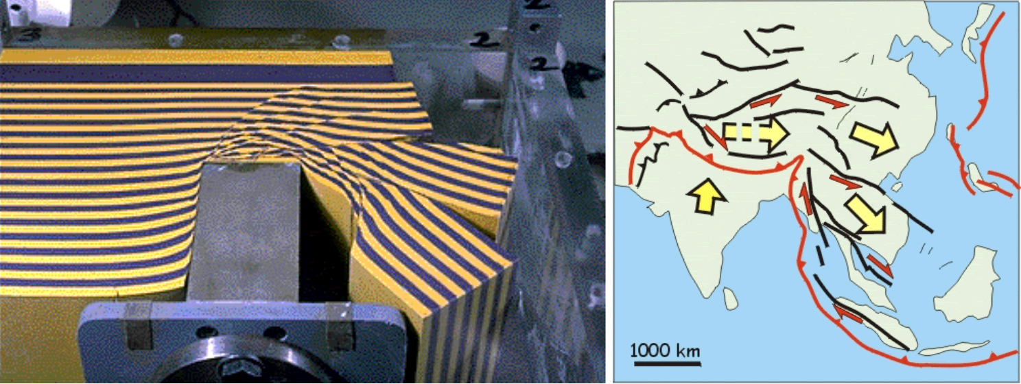
This north-south convergence also results in eastward (and westward) extrusion of the crust. Paul Tapponier used wax models to show how this type of tectonics works.
The M 7.1 earthquake slipped on a fault related to the Pumqu fault, a north-south striking (oriented) normal fault that dips into the Earth to the west.
In the southern Tibet Plateau, there are a series of north-south striking normal faults. These faults represent east-west extension (a result of the extrusion tectonics of Tapponier).
There are many historical analogies for the M 7.1 earthquake, though most are in the magnitude M 5 – M 6+ range.
The USGS use seismic and geodetic (the study of how the Earth deforms) data to construct a fault model. These fault models include the geometry of the fault (the 3-D orientation and size (length and width)) and include an estimate of how much the fault slipped during the earthquake.
This USGS finite fault model shows that the fault length was about 80-km long and the fault slipped up to about 1.5 meters.
Initially, the USGS had two alternative slip models (one for each nodal plane, one dipping east and one dipping west). But (i suspect), once they looked at the existing fault mapping here, they realized it was likely on the west dipping fault. SO, now there is only one finite fault model on their website. I include both models in the poster, but grey out the alternate model that is no longer on the USGS earthquake page.
Below I present some interpretive posters, including updated versions showing the aftershocks from the past couple of days.
When the earthquake initially happened, the USGS PAGER alert (an estimate of the impact of the earthquake, how many casualties and how much infrastructure damage) suggested that the highest probability would be that there would be between 10 and 100 deaths (or more).
After a few hours, after the USGS updated their analyses for a variety of their products, the PAGER estimate changed drastically.
The peak probability was that there was a 39% chance there would be between 100 and 1000 fatalities! This is not good news.
The nation of China has been oppressing Tibetans for decades and this would complicate emergency response efforts (particularly international efforts). The control of media from China might also get in the way of getting news out of the epicentral region.
Also, with this update, the USGS name of the earthquake changed from being in China, to being in Tibet. In fact, my initial tweet included a hashtag for China. Though, subsequent tweets used the Tibet hashtag.
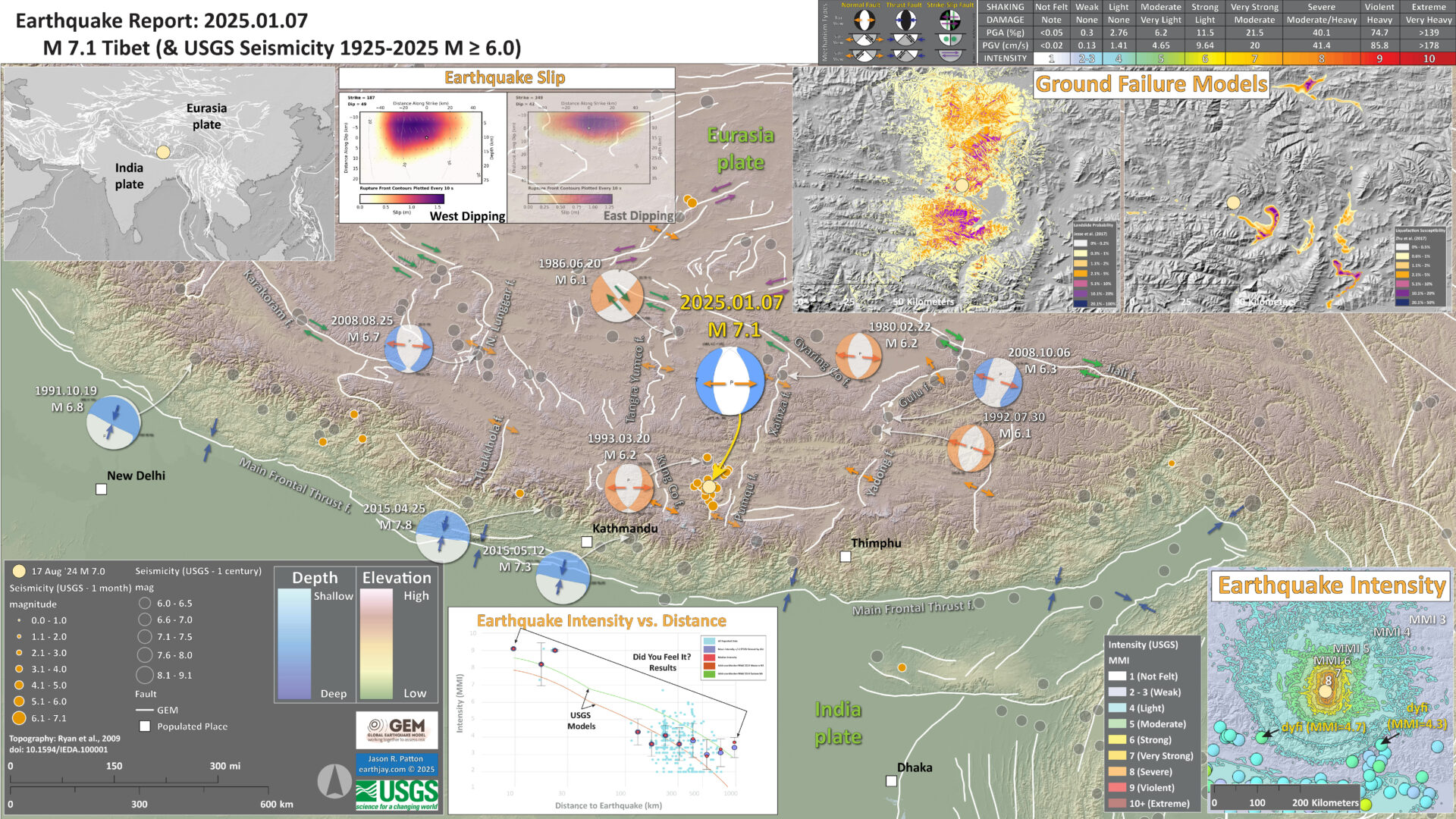
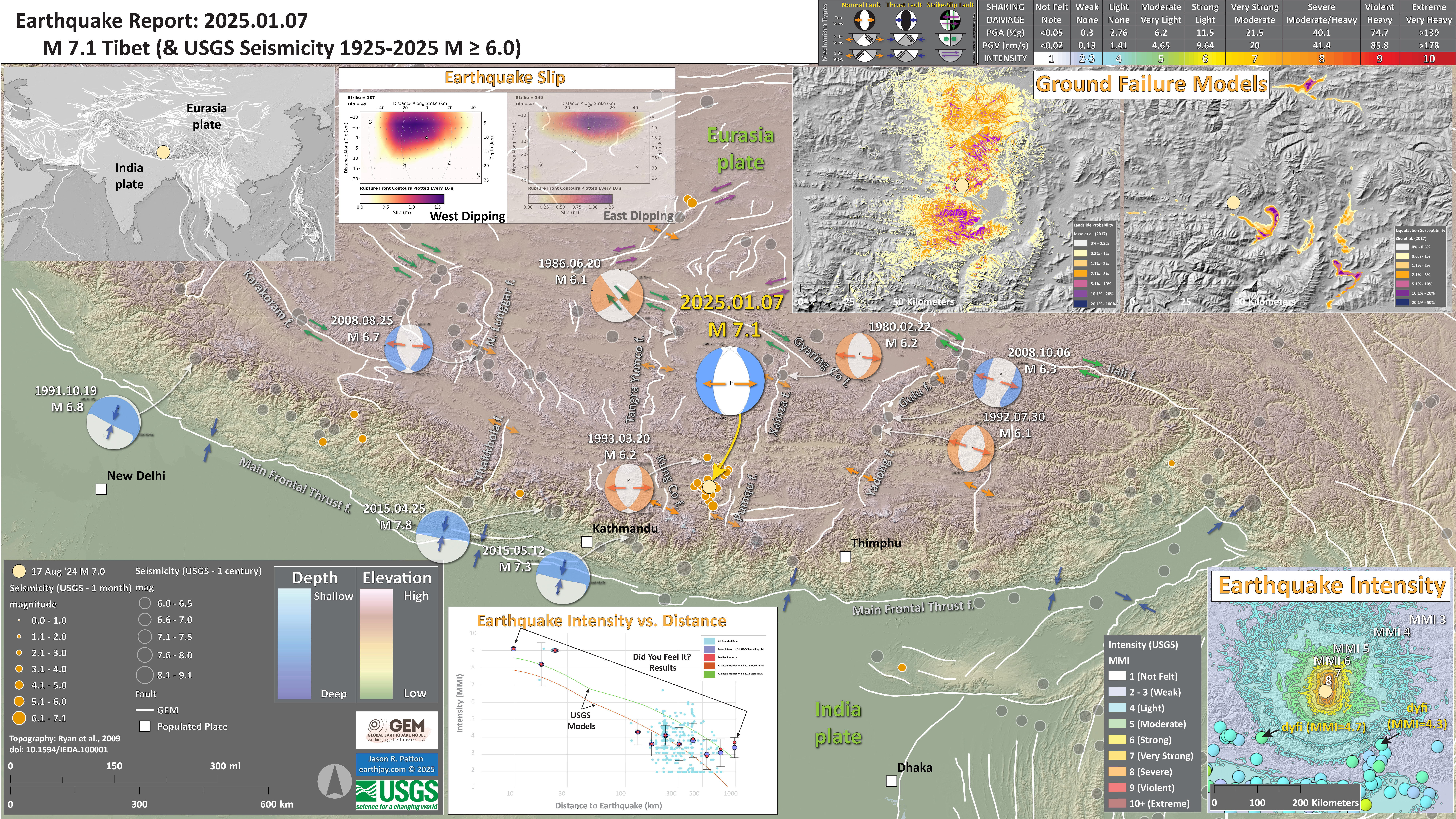
Below is my interpretive poster for this earthquake
- I plot the seismicity from the past month, with diameter representing magnitude (see legend). I include earthquake epicenters from 1924-2024 with magnitudes M ≥ 3.0 in one version.
- I plot the USGS fault plane solutions (moment tensors in blue and focal mechanisms in orange), possibly in addition to some relevant historic earthquakes.
- A review of the basic base map variations and data that I use for the interpretive posters can be found on the Earthquake Reports page. I have improved these posters over time and some of this background information applies to the older posters.
- Some basic fundamentals of earthquake geology and plate tectonics can be found on the Earthquake Plate Tectonic Fundamentals page.
- In the upper left corner is a map showing the plate tectonic boundaries (from the GEM).
- In the lower right corner is a map that shows the M 7.1 earthquake intensity using the modified Mercalli intensity scale. Earthquake intensity is a measure of how strongly the Earth shakes during an earthquake, so gets smaller the further away one is from the earthquake epicenter. The map colors represent a model of what the intensity may be. The USGS has a system called “Did You Feel It?” (DYFI) where people enter their observations from the earthquake and the USGS calculates what the intensity was for that person. The dots with yellow labels show what people actually felt in those different locations.
- To the left of the intensity map is a plot that shows the same intensity (both modeled and reported) data as displayed on the map. Note how the intensity gets smaller with distance from the earthquake.
- In the upper right corner are two maps showing the possibility of earthquake induced liquefaction for these two earthquakes. I discuss these phenomena in more detail later in the report.
- To the left of the ground failure interpretation maps is the USGS finite fault model for the M 7.1 earthquake. They model slip on a rectangular fault and color represents how much the fault moved (up to about 0.9 meters).
I include some inset figures. Some of the same figures are located in different places on the larger scale map below.
Other Report Pages
Tectonic Background
Western China here is dominated by the plate tectonics and climate.
To the south is the India plate that is moving northwards, pummeling into the southern part of the Eurasia plate, at a rate of about 25 to 50 mm per year, depending upon the reference frame (Pusok and Stegman, 2020). The India plate began moving northward from Antarctica since before 80 million years ago.
The details of the story has changed as more geological information is interpreted. But the general story is that the India plate moved away from Antarctica as an oceanic spreading center formed between these plates. The India plate moved towards Asia.
Prior to about 45-50 Ma, there was oceanic crust between India and Eurasia. But at this time, the continental crust of the India and Eurasia plates collided. This collision would eventually cause uplift of the Himalaya mountain range and the Tibetan Plateau to the north of the Himalaya.
There are marine fossils on the top of the mountains in the Himalaya! (this is how we know there was ocean between these plates in the past)
Here is a time series showing the convergence of these two plates modified from Pusok & Stegman (2020) and the USGS.
A part of the tectonic story is told by one of the rock stars of plate tectonics, Dr. Paul Tapponier. Tapponier conducted experiments that showed how north-south convergence, like that of India and Asia, coupled with a backstop (something that is more difficult to move) from the west, would lead to some crust to squish out to the east.
This is called extrusion tectonics as the crust of eastern Asia is being extruded to the east, like a watermelon seed is extruded from between one’s fingers when they squeeze on the wet seed.
Below is a color version of the results from Tapponier’s experiment. Compare this with maps showing the GPS motion of the crust in this region.
Note that the plastic has numerous faults develop as part of the extrusion. We can see how the blue and yellow lines show lateral offset along these faults.
Many of these faults are left-lateral strike-slip faults. Strike-slip means that the curst moves side-by-side when looking down on the crust from outer space (or an airplane, or Google Earth).
Left-lateral means that, when standing on one side of the fault, looking across the fault at something, that thin one is looking at is moving to the left during an earthquake. More about tectonic fundamentals here.
In the map on the right ^^^ we can see that these left-lateral strike-slip faults that are mapped in the region are just like the faults in the blue-yellow plastic.
One of the major left-lateral strike-slip faults along the Tibetan Plateau is the Kunlun fault, which has been well studied in places. A tectonic history of the region, and how the Kunlun fault fits into this history, is presented by Staisch et al., 2020.
- This is a tectonic map from Molnar and Tapponier (1975).
- “We stand on the shoulders of giants.”
- This is a later map from Tapponier et al. (1982) as part of his paper on extrusion tectonics.
- Here is an excellent overview of the faults in the region from Taylor and Yin (2009).
- I especially like this figure as it helps us understand what the fault patterns mean by looking at the fault types. For example, I thought that the faults in the northwest Tarim Bain would have been strike-slip, but they appear to be predominantly thrust or reverse faults (e.g. the Southern Tian Shan thrust).
- Here is a map showing the faults mapped in the southern Tibetan Plateau (Reynolds et al., 2024).
- Note the north-south red faults are normal faults and the east-west black faults (with arrows showing lateral movement) are strike-slip faults. The Main Frontal Thrust (MFT) is also shown as a bold black line with triangles on the side of the “hanging wall.”
- Here is a map that shows some earthquake mechanisms (centroid moment tensors) for earthquakes from 1977 to 2009 (Taylor and Yin, 2009).
- Compare this map with the one above and the mechanisms match pretty well with the types of faults mapped in the above map.
- Here are some maps from Yu et al., 2020 that show mapped faults and earthquake mechanisms.
- All the blue mechanisms are normal faulting mechanisms. Note how they represent east-west extension.
- Here are more examples of east-west oriented extension represented by focal mechanisms.
- Geodesy is the study of the motion of the Earth. The data used to measure how the Earth moves can be from GPS data, tide gage data, benchmark surveys, and satellite remote sensing data (e.g. InSAR, LiDAR, etc.). The motion can be partitioned into different directions (e.g. horizontal, vertical, and rotational).
- The maps below are from Taylor and Yin (2009, lower map) and Zhang et al. (2004, upper map) shows the velocity (speed) of locations where GPS locations (positions) have been collected over a period of time (probably decades). The arrows called vectors represent the direction of motion and the rate of motion (speed or velocity). The GPS sites are where the dots are and the uncertainty (sometimes called error) of the velocity calculation is represented by the ellipse at the tip of the arrow.
- These arrows represent motion relative to stable Eurasia. So, arrows that are pointing to the north tell us that that GPS site is moving north relative to Eurasia. Unfortunately there is no scale, but based on the Zhang et al. (2004) paper (also shown below), the most southwest GPS site (in India) has a velocity of about 25 mm per year (mm/yr)
- We can make some simple observations and interpretations from these data. Look at the lower map with the red and blue arrows (vectors).
- GPS sites in northern India (in the lower left (southwest) part of the map) show that this region is moving north-northeast relative to Eurasia. This matches the long term motion of the India plate we discussed in the introduction to this report above.
- GPS sites in the Tian Basin (the low, green colored area in the central upper left (northwest) part of the map) are also moving north relative to Asia. However, they are moving to the north more slowly than the sites in India
- Because the GPS sites (and the crust in that location) are moving slower in the north, north of the Himalaya and Tibetan Plateau. This tells us that the crust is slowing down between India and the Tarim Basin. Why is this?
- The crust is slowing down because the crust is deforming, either elastically where the deformation of the crust buldges up or flexes sideways, or anelastically where the deformation is accommodated by fault slip on tectonic compressional faults (e.g. reverse or thrust faults).
- Note how these GPS plate motion vectors (the red and blue arrows) change whether they are slightly to the east or slightly to the west of North. In northeast India, the motion is slightly to the northeast and in the Tarim Basin some of them are moving slightly to the west. If this difference is larger than the error ellipses, it would tell us that the crust may also be experiencing changes in lateral motion through this region. This type of lateral motion may be accommodated by strike-slip faults (see the arrow shaped figure from Taylor and Yin (2009) below).
- Caption from Zhang et al., 2004)
- Caption from Taylor and Yin (2009), Figure 4 is the arrow shaped figure below.
- Here are two more maps (Garthwaite et al., 2013). The top map shows the faults in the Tibetan Plateau.
- The bottom map shows interseismic motion derived from InSAR analyses.
- Here is the cross section of the India-Eurasia plate convergence through time from Pusok and Stegman (2020) shown above. They use numerical modeling of the mantle convection to try to interpret the data presented in this cross section.
- Here Pusock and Stegman (2020) present the long term geodetic data (geologic rates) and compare the results of their modeling with these source data.
- Here Pusok and Stegman (2020) present the details from their numerical modeling. What do you think about this?
Some Relevant Discussion and Figures
Global and Regional Tectonic Faults
Preliminary map of recent tectonics in Asia. Bold lines represent faults of major importance-usually seismic and with very sharp morphology. Bold arrows indicate sense of motion, corroborated by fault plane solutions or surface faulting of earthquakes (6. 30. 33, 34). Open arrows indicate sense inferred from analysis of photographs. For Tertiary folding bold symbols indicate more prominent, more recent folds. The dotted areas indicate region of inferred recent vertical motion associated with thrust faulting and compressional tectonics. Areas shaded by dashed lines are covered by thick recent alluvial deposits and are dominated by horizontal extension and subsidence (/4). Contours in the northeast China basins and recent volcanic centers. except for the Hsing An fissure basalts, are from Terman (43). This map is preliminary; coverage by ERTS photographs is not complete, and surely many features relevant to the understanding of Asian tectonics have not yet been recognized or were not plotted. The names of faults are not official names but purely for reference in this article.
Schematic map of Cenozoic extrusion tectonics and large faults in eastern Asia. Heavy lines = major faults or plate boundaries; thin lines = less important faults. Open barbs indicate subduction; solid barbs indicate intracontinental thrusts. White arrows represent qualitatively major block motions with respect to Siberia (rotations are not represented). Black arrows indicate direction of extrusion-related extension. Numbers refer to extrusion phases: 1 =50 to 20 m.y. B.P.; 2 = 20 to 0 m.y. B.P.; 3 = most recent and future. Arrows on faults in western Malaysia, Gulf of Thailand, and southwestern China Sea (earliest extrusion phase) do not correspond to present-day motions.
A color-shaded relief map with active to recently active faults related to the Indo-Asian collision zone and surrounding regions. (The paper lists the sources of their fault data, but are “augmented by our own kinematic interpretations.”)
Thrust faults have barbs on the upper plate, normal faults have bar and ball on the hanging wall, arrows indicate direction of horizontal motion for strike-slip faults. Dashed white lines are Mesozoic suture zones: IYS—Indus Yalu suture zone; BNS—Bangong Nujiang suture zone; JS—Jinsha suture zone; SSZ—Shyok suture zone; TS—Tanymas suture zone; AMS—Anyimaqen-Kunlun-Muztagh suture zone.
Digital elevation model of the Tibetan Plateau highlighting major structures and tectonic features adapted from Taylor and Yin (2009) with fault traces from HimaTibet database (Styron et al., 2010). 1 = Leo Pargil (Thiede et al., 2006); 2 = Gurla Mandhata dome (Murphy et al., 2002; McCallister et al., 2014); 3 = Thakkhola graben (Coleman and Hodges, 1995; Garzione et al., 2003); 4 = Kung Co graben (Maheo et al., 2007; Lee et al., 2011); 5 = Pumqu/Dinggye rift (Arma Drime massif; Jessup et al., 2008; Kali et al., 2010); 6 = Yadong rift (Ratschbacher et al., 2011); 7 = South Lunggar rift (Styron et al., 2013); 8 = North Lunggar rift (Kapp et al., 2008; Sundell et al., 2013); 9 = Lopu Kangri rift (Yin and Harrison, 2000; Sanchez et al., 2013; Laskowski et al., 2017); 10 = Daggyai Tso graben (Yin and Harrison, 2000; Williams et al., 2001); 11 = Tangra Yumco rift (Wolff et al., 2019, 2023, and this study); 12 = Xainza rift (Armijo et al., 1986; Hager et al., 2009); 13 = Gulu rift (Harrison et al., 1995; Kapp et al., 2005; Ratschbacher et al., 2011); 14 = Pung Co rift (Kapp et al., 2008); 15 = Shuanghu graben (Blisniuk et al., 2001; Li et al., 2001). White arrow indicates convergence vector of India relative to Asia. Suture zones shown as dashed blue lines. BNS = Bangong- Nujiang suture; IYS = Indus-Yarlung suture; JS = Jinsha suture; KS = Kunlun suture; KF = Karakorum fault; ATF = Altyn Tagh fault; MFT = Main Frontal Thrust. Gangdese rifts shown in pink.
Color-shaded relief map overlain with Harvard centroid moment tensor (CMT) earthquake focal mechanisms from 1 January 1977 to 1 January 2009 and background seismicity from Engdahl and Villasenor (2002) with events >M5.5 for both data sets. Green, purple, and light-blue earthquake focal mechanisms are locations of 2008 western Kunlun, Nima, and Wenchuan events, respectively.
Topographic and regional tectonic settings surrounding the 2016 Mw 5.9 Zaduo earthquake. a Normal faulting (blue beach ball) and reverse faulting (red beach ball) earthquakes located in the Tibetan Plateau from the GCMT catalog.
Distribution of main active faults in the Tibetan Plateau. Beach balls reflect the normal faulting earthquake, as shown in Fig. 1.
Geodetic Analyses
Global positioning system (GPS) velocities (mm/yr) in and around Tibetan Plateau with respect to stable Eurasia, plotted on shaded relief map using oblique Mercator projection. Ellipses denote 1s errors. Blue polygons show locations of GPS velocity profiles in Figures 3 and DR1 (see footnote 1). Dashed yellow polygons show regions that we used to calculate dilatational strain rates. Yellow numbers 1–7 represent regions of Himalaya, Altyn Tagh, Qilian Shan, Qaidam Basin, Longmen Shan, Tibet, and Sichuan and Yunnan, respectively.
Color-shaded relief map of the Indo-Asian collision zone with global positioning system (GPS) velocities (arrows) from the Zhang et al. (2004) compilation. Blue arrows indicate data used in Figure 4A and line indicates data used in Figure 4B.
(a) Topographic map of the Tibetan Plateau and surrounding region with Quaternary active faults and geological sutures from the compilation of Taylor and Yin [2009]. Dashed black lines are geological sutures, red lines are thrust faults, blue lines are strike-slip faults, and magenta lines are normal faults. Symbols on faults indicate sense of movement with ticks on the hanging wall for normal faults and barbs on the upper plate for thrust faults. Name abbreviations for major features as follows: ATF, Altyn Tagh fault; BENG, Beng Co fault; BNS, Bangong-Nujiang Suture; GYC, Gyaring Co fault; HAI, Haiyuan ault; IZS, Indus-Zangbo Suture; JIA, Jiali fault; JS, Jinsha Suture; KAR, Karakoram fault; KUN, Kunlun fault; LAC, Lamu Co fault; LMT, Longmen Shan Thrust; MFT, Main Frontal Thrust; RPC, Riganpei Co fault; RRF, Red River fault; SAG, Sagaing fault; XSH, Xianshuihe fault. (b) Map showing the distribution of published InSAR studies of interseismic deformation in Tibet. Grey polygons with blue outlines show the spatial extent of synthetic aperture radar (SAR) data used in each study. See Table 1 for the citations relating to each lettered polygon. The spatial extent of data used in this study is highlighted by the white polygon with blue outline. Arrows are horizontal-component GPS velocity vectors relative to stable Eurasia from Gan et al. [2007]. The tail of each arrow is plotted at the measurement location with color representing absolute velocity magnitude. Black lines are active faults compiled by Taylor and Yin [2009].
Proposed convergence history between India and Eurasia. (A) Schematic diagram for the evolution of Neo-Tethys Ocean as a sequence of stages with approximate times for important events. (B) Hypothesized convergence rate versus age, with numbered segments corresponding to stages in (A), superimposed on the relative plate motions between India-Africa and India-Antarctica (dotted blue and green lines, respectively) (4).
India-Eurasia convergence data and results of numerical models. (A) Observed spreading rates versus age for the CIR (black lines) and SEIR (gray lines). Solid lines use the geomagnetic polarity time scale GTS04 and a three-plate algorithm to calculate Euler rotations (2, 4), while dotted lines use the GTS12 time scale and a two-plate rotation algorithm (17). Blue line shows computed convergence rate between the left plate and the overriding plate in the reference model (ConvIndia35). Colored markers correspond to model snapshots in Fig. 3. (B) Speedup over time: Observational data are scaled to a velocity of 70 mm/year, representative of the present-day global subduction. Numerical data (blue line) are scaled to velocities in single subduction experiments (ConvIndia31). (C) Convergence velocity versus the DSF (see Materials and Methods and the Supplementary Materials) for all simulations. Time-averaged values given for single subduction (black), periods of plume push (white), and periods of free double subduction (blue) including reference model (red). Maximum/minimum values during model evolution shown with gray bars. (D) Speedup versus the DSF for all numerical simulations [colors same as (C)]. Least-squares fit (dashed lines) for periods of forced convergence (white markers) and periods of free double subduction (blue markers).
Time evolution of the reference model ConvIndia35. The system is composed of three plates representing India (left plate), an intraoceanic plate (middle plate), and Eurasia (overriding plate). This model was performed with plume-like influx boundary conditions imposed for 9 Ma (Influx BC06) and a mantle density and viscosity profile (25, RLLB15-Mean_norm; see details in Materials and Methods and the Supplementary Materials). Frames correspond to colored markers in Fig. 2A, and full-time evolution is available in movie S1. The dynamic pressure (background field) indicates when each regime dominates. (A) During the plume push regime, the entire system is dominated by the influx velocity, seen by positive dynamic pressures throughout the domain. (B) During the double subduction regime, the mantle flow and plate convergence are dominated by interaction between the two slabs, as indicated by pressure increasing within the region confined between them. Changes in driving forces are also seen by the mantle velocity field (uniformly spaced arrows). The influx boundary conditions, which mimic the stages of a plume push, gradual arrival (1), peak activity (2), and decline (3), are sufficient to initiate a secondary subduction at a weak zone. As the plume push force wanes, the secondary subduction becomes self-sustaining, transitioning the system into a double subduction–driven system (4). The pull from both slabs drives fast convergence and then slows when the middle plate is consumed during arc-continent collision (5) and continental collision (6). Relative motion between the red markers is used to calculate convergence rates.
Shaking Intensity
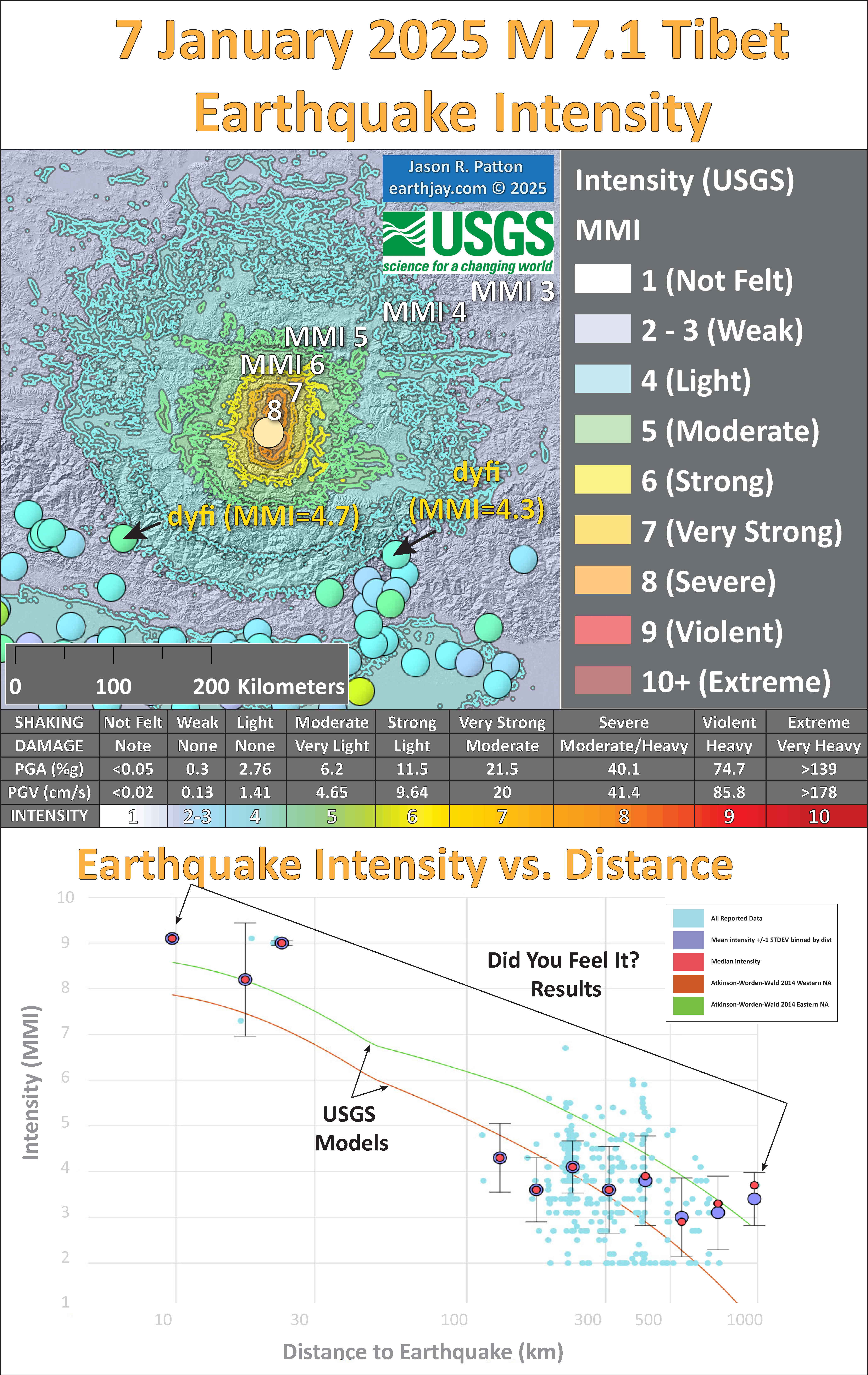
- Here is a figure that shows a more detailed comparison between the modeled intensity and the reported intensity. Both data use the same color scale, the Modified Mercalli Intensity Scale (MMI). More about this can be found here. The colors and contours on the map are results from the USGS modeled intensity. The DYFI data are plotted as colored dots (color = MMI, diameter = number of reports).
- In the upper panel is the USGS Did You Feel It reports map, showing reports as colored dots using the MMI color scale. Underlain on this map are colored areas showing the USGS modeled estimate for shaking intensity (MMI scale).
- In the lower panel is a plot showing MMI intensity (vertical axis) relative to distance from the earthquake (horizontal axis). The models are represented by the green and orange lines. The DYFI data are plotted as light blue dots. The mean and median (different types of “average”) are plotted as orange and purple dots. Note how well the reports fit the green line (the model that represents how MMI works based on quakes in California).
- Below the map and the lower plot is the USGS MMI Intensity scale, which lists the level of damage for each level of intensity, along with approximate measures of how strongly the ground shakes at these intensities, showing levels in acceleration (Peak Ground Acceleration, PGA) and velocity (Peak Ground Velocity, PGV).
Potential for Ground Failure
- Below are a series of maps that show the potential for landslides and liquefaction. These are all USGS data products.
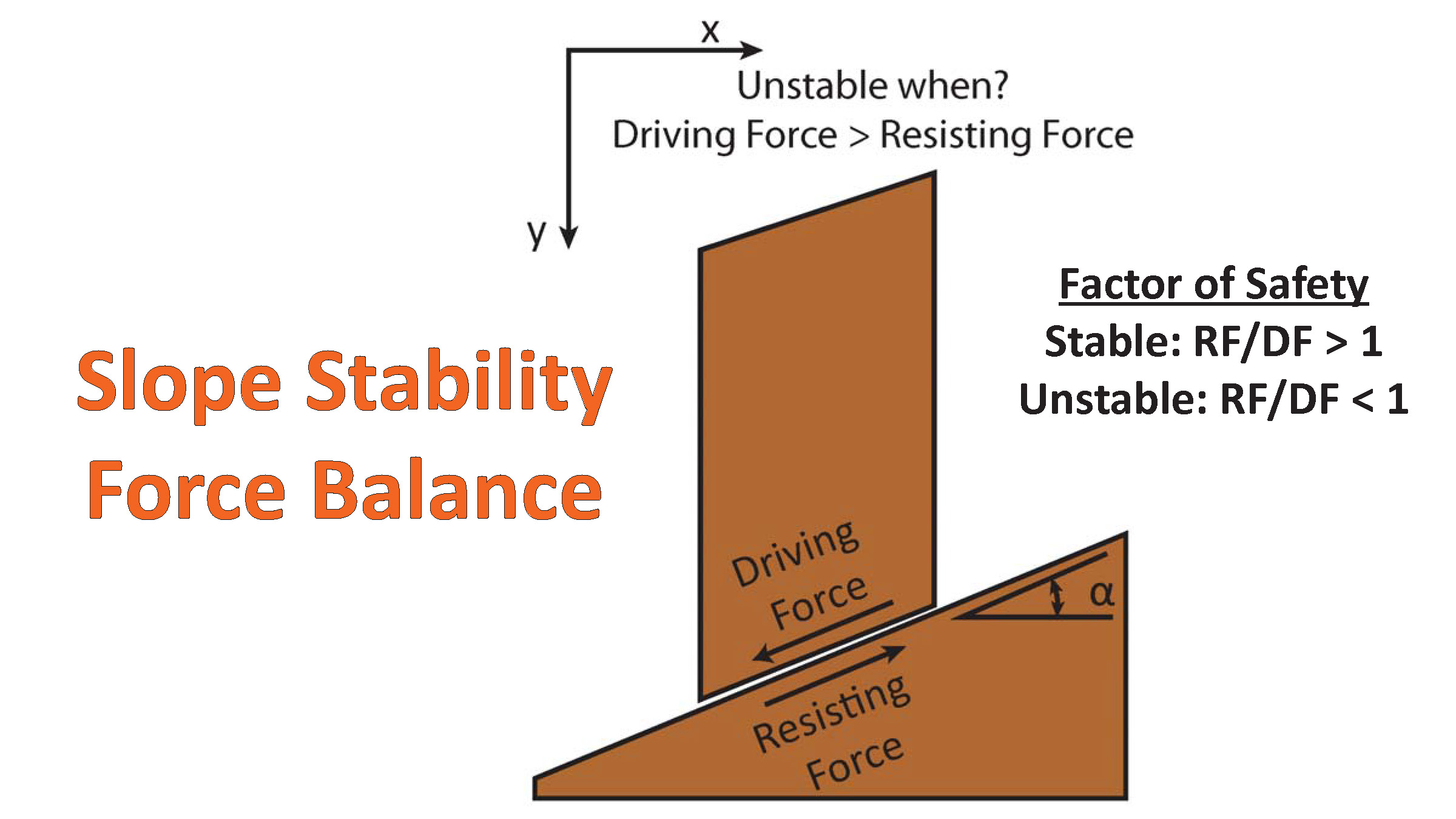
There are many different ways in which a landslide can be triggered. The first order relations behind slope failure (landslides) is that the “resisting” forces that are preventing slope failure (e.g. the strength of the bedrock or soil) are overcome by the “driving” forces that are pushing this land downwards (e.g. gravity). The ratio of resisting forces to driving forces is called the Factor of Safety (FOS). We can write this ratio like this:FOS = Resisting Force / Driving Force
- When FOS > 1, the slope is stable and when FOS < 1, the slope fails and we get a landslide. The illustration below shows these relations. Note how the slope angle α can take part in this ratio (the steeper the slope, the greater impact of the mass of the slope can contribute to driving forces). The real world is more complicated than the simplified illustration below.
- Landslide ground shaking can change the Factor of Safety in several ways that might increase the driving force or decrease the resisting force. Keefer (1984) studied a global data set of earthquake triggered landslides and found that larger earthquakes trigger larger and more numerous landslides across a larger area than do smaller earthquakes. Earthquakes can cause landslides because the seismic waves can cause the driving force to increase (the earthquake motions can “push” the land downwards), leading to a landslide. In addition, ground shaking can change the strength of these earth materials (a form of resisting force) with a process called liquefaction.
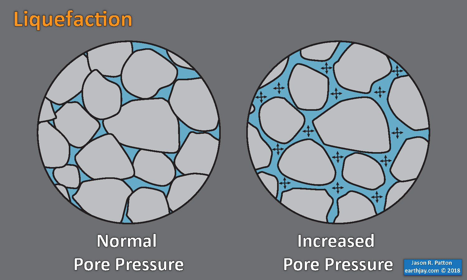
- Sediment or soil strength is based upon the ability for sediment particles to push against each other without moving. This is a combination of friction and the forces exerted between these particles. This is loosely what we call the “angle of internal friction.” Liquefaction is a process by which pore pressure increases cause water to push out against the sediment particles so that they are no longer touching.
- An analogy that some may be familiar with relates to a visit to the beach. When one is walking on the wet sand near the shoreline, the sand may hold the weight of our body generally pretty well. However, if we stop and vibrate our feet back and forth, this causes pore pressure to increase and we sink into the sand as the sand liquefies. Or, at least our feet sink into the sand.
- Below is a diagram showing how an increase in pore pressure can push against the sediment particles so that they are not touching any more. This allows the particles to move around and this is why our feet sink in the sand in the analogy above. This is also what changes the strength of earth materials such that a landslide can be triggered.
- Here Dr. Bohon demonstrates the phenomena of liquefaction.
- And, another video demonstration.
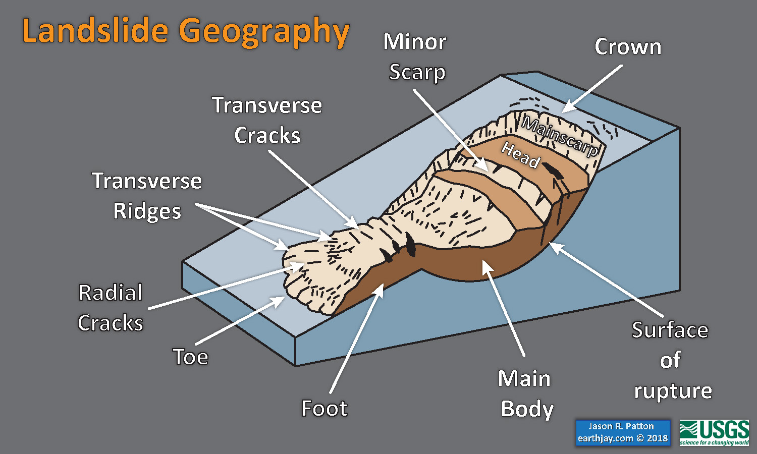
- Below is a diagram based upon a publication designed to educate the public about landslides and the processes that trigger them (USGS, 2004). Additional background information about landslide types can be found in Highland et al. (2008). There was a variety of landslide types that can be observed surrounding the earthquake region. So, this illustration can help people when they observing the landscape response to the earthquake whether they are using aerial imagery, photos in newspaper or website articles, or videos on social media. Will you be able to locate a landslide scarp or the toe of a landslide? This figure shows a rotational landslide, one where the land rotates along a curvilinear failure surface.
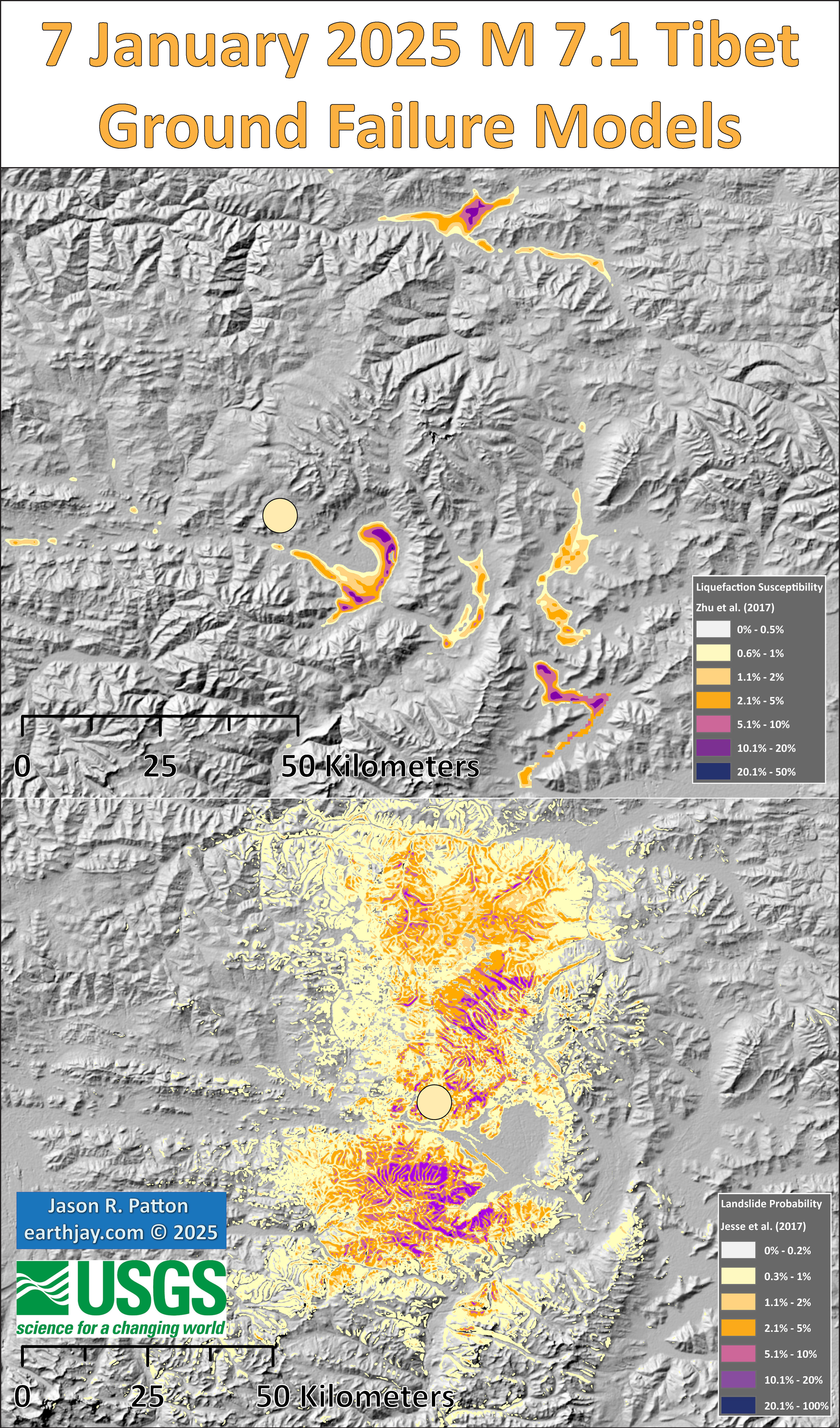
- Below is the liquefaction susceptibility and landslide probability map (Jessee et al., 2017; Zhu et al., 2017). Please head over to that report for more information about the USGS Ground Failure products (landslides and liquefaction). Basically, earthquakes shake the ground and this ground shaking can cause landslides.
- I use the same color scheme that the USGS uses on their website. Note how the areas that are more likely to have experienced earthquake induced liquefaction are in the valleys. Learn more about how the USGS prepares these model results here.
@drwendyrocksit #Liquefaction is a process by which water-saturated sediment temporarily loses strength and acts as a fluid. This can happen during #earthquake shaking. #geophysics #geology ♬ Quicksand – Hatchie
This liquefaction experiment conducted by the Tokyo Geological Survey of Japan at the Disaster Prevention Exhibition in 2015, shows the effects of different foundations and how hollow objects such as water pipes come to the surface [source, full video: https://t.co/xYLjPY4IHZ] pic.twitter.com/r8LXtmvrO0
— Massimo (@Rainmaker1973) April 17, 2021
- 2025.01.07 M 7.1 Tibet
- 2024.04.02 M 7.4 Taiwan
- 2024.01.22 M 7.0 China
- 2022.03.22 M 6.7 Taiwan POSTER
- 2022.09.18 M 6.9 Taiwan
- 2021.05.21 M 7.3 China
- 2018.01.11 M 6.0 Burma
- 2017.08.08 M 6.3 China (different)
- 2017.08.08 M 6.5 China
- 2016.08.24 M 6.8 Burma
- 2016.04.13 M 6.9 Burma
- 2016.02.23 M 5.9 Antarctic plate
- 2016.02.05 M 6.4 Taiwan
- 2016.02.05 M 6.4 Taiwan Update #1
- 2015.12.04 M 7.1 SE India Ridge
- 2015.04.24 M 7.8 Nepal
- 2015.04.25 M 7.8 Nepal Update #1
- 2015.04.25 M 7.8 Nepal Update #2
- 2015.04.26 M 7.8 Nepal Update #3
- 2015.04.26 M 7.8 Nepal Update #4
- 2015.04.27 M 7.8 Nepal Update #5
- 2015.04.27 M 7.8 Nepal Update #6
India | Asia
Earthquake Reports
Social Media
- Frisch, W., Meschede, M., Blakey, R., 2011. Plate Tectonics, Springer-Verlag, London, 213 pp.
- Hayes, G., 2018, Slab2 – A Comprehensive Subduction Zone Geometry Model: U.S. Geological Survey data release, https://doi.org/10.5066/F7PV6JNV.
- Holt, W. E., C. Kreemer, A. J. Haines, L. Estey, C. Meertens, G. Blewitt, and D. Lavallee (2005), Project helps constrain continental dynamics and seismic hazards, Eos Trans. AGU, 86(41), 383–387, , https://doi.org/10.1029/2005EO410002. /li>
- Jessee, M.A.N., Hamburger, M. W., Allstadt, K., Wald, D. J., Robeson, S. M., Tanyas, H., et al. (2018). A global empirical model for near-real-time assessment of seismically induced landslides. Journal of Geophysical Research: Earth Surface, 123, 1835–1859. https://doi.org/10.1029/2017JF004494
- Kreemer, C., J. Haines, W. Holt, G. Blewitt, and D. Lavallee (2000), On the determination of a global strain rate model, Geophys. J. Int., 52(10), 765–770.
- Kreemer, C., W. E. Holt, and A. J. Haines (2003), An integrated global model of present-day plate motions and plate boundary deformation, Geophys. J. Int., 154(1), 8–34, , https://doi.org/10.1046/j.1365-246X.2003.01917.x.
- Kreemer, C., G. Blewitt, E.C. Klein, 2014. A geodetic plate motion and Global Strain Rate Model in Geochemistry, Geophysics, Geosystems, v. 15, p. 3849-3889, https://doi.org/10.1002/2014GC005407.
- Meyer, B., Saltus, R., Chulliat, a., 2017. EMAG2: Earth Magnetic Anomaly Grid (2-arc-minute resolution) Version 3. National Centers for Environmental Information, NOAA. Model. https://doi.org/10.7289/V5H70CVX
- Müller, R.D., Sdrolias, M., Gaina, C. and Roest, W.R., 2008, Age spreading rates and spreading asymmetry of the world’s ocean crust in Geochemistry, Geophysics, Geosystems, 9, Q04006, https://doi.org/10.1029/2007GC001743
- Pagani,M. , J. Garcia-Pelaez, R. Gee, K. Johnson, V. Poggi, R. Styron, G. Weatherill, M. Simionato, D. Viganò, L. Danciu, D. Monelli (2018). Global Earthquake Model (GEM) Seismic Hazard Map (version 2018.1 – December 2018), DOI: 10.13117/GEM-GLOBAL-SEISMIC-HAZARD-MAP-2018.1
- Silva, V ., D Amo-Oduro, A Calderon, J Dabbeek, V Despotaki, L Martins, A Rao, M Simionato, D Viganò, C Yepes, A Acevedo, N Horspool, H Crowley, K Jaiswal, M Journeay, M Pittore, 2018. Global Earthquake Model (GEM) Seismic Risk Map (version 2018.1). https://doi.org/10.13117/GEM-GLOBAL-SEISMIC-RISK-MAP-2018.1
- Storchak, D. A., D. Di Giacomo, I. Bondár, E. R. Engdahl, J. Harris, W. H. K. Lee, A. Villaseñor, and P. Bormann (2013), Public release of the ISC-GEM global instrumental earthquake catalogue (1900–2009), Seismol. Res. Lett., 84(5), 810–815, doi:10.1785/0220130034.
- Zhu, J., Baise, L. G., Thompson, E. M., 2017, An Updated Geospatial Liquefaction Model for Global Application, Bulletin of the Seismological Society of America, 107, p 1365-1385, https://doi.org/0.1785/0120160198
- Allen, M.B., Windley, B.F., Zhang, C., 1994. Cenozoic tectonics in the Urumqi-Korla region of the Chinese Tien Shan. In: Giese, P., Behrmann, J. (eds) Active Continental Margins — Present and Past. Springer, Berlin, Heidelberg. https://doi.org/10.1007/978-3-662-38521-0_15
- Allen, M. B., S. J. Vincent, and P. J. Wheeler, 1999. Late Cenozoic tectonics of the Kepingtage thrust zone: Interactions of the Tien Shan and Tarim Basin, northwest China, Tectonics, v. 18, no. 4, p. 639–654, https://doi.org/10.1029/1999TC900019.
- Burchfiel, B. C., E. T. Brown , Deng Qidong , Feng Xianyue , Li Jun , Peter Molnar , Shi Jianbang , Wu Zhangming & You Huichuan, 1999. Crustal Shortening on the Margins of the Tien Shan, Xinjiang, China in International Geology Review, v. 41, no. 8, p. 665-700, https://doi.org/10.1080/00206819909465164
- Harkins, N., Kirby, E., Shi, X., Burbank, D., and Chun, F., 2010. Millennial slip rates along the eastern Kunlun fault: Implications for the dynamics of intracontinental deformation in Asia in Lithosphere, v. 2, no. 4, p. 247-266, doi: 10.1130/L85.1
- Jolivet, M., S. Dominguez, J. Charreau, Y. Chen, Y. Li, and Q. Wang, 2010, Mesozoic and Cenozoic tectonic history of the central Chinese Tian Shan: Reactivated tectonic structures and active deformation, Tectonics, 29, TC6019, https://doi.org/10.1029/2010TC002712.
- Li, A., Ran, Y., Gomez, F. et al., 2020. Segmentation of the Kepingtage thrust fault based on paleoearthquake ruptures, southwestern Tianshan, China. Nat Hazards 103, 1385–1406. https://doi.org/10.1007/s11069-020-04040-6
- Li, J., Yao, Y., Li, R., Yusan, S., Li, G., Freymueller, J. T., & Wang, Q., 2022. Present-day strike-slip faulting and thrusting of the Kepingtage fold-and-thrust belt in southern Tianshan: Constraints from GPS observations. Geophysical Research Letters, 49, e2022GL099105. https://doi.org/10.1029/2022GL099105
- Li, W., Chen, Y., Yuan, X. et al., 2022 B. Intracontinental deformation of the Tianshan Orogen in response to India-Asia collision. Nat Commun 13, 3738 https://doi.org/10.1038/s41467-022-30795-6
- Molinar, P. and Tapponier, P., 1975. Cenozoic Tectonics of Asia: Effects of a Continental Collision: Features of recent continental tectonics in Asia can be interpreted as results of the India-Eurasia collision in Science, v. 189, Issue 4201, p. 419-426
- Pusok, A.E. and Stegman, D.R., 2020. The convergence history of India-Eurasia records multiple subduction dynamics processes in Science Advances, v. 6 : eeaz8681, 8 p.,https://doi.org/10.1126/sciadv.aaz8681
- Reynolds, A., Laskowski, A., Howlett, C., Orme, D., Sundell, K., Taylor, M., Forte, A., Dixon, S., Cai, F., Guo, X., & Ding, L., 2024. Kinematic Evolution of the Tangra Yumco Rift, South-Central Tibet. τeκτoniκa, 2(1), 190–222. https://doi.org/10.55575/tektonika2024.2.1.42
- Qiu J, Ji L, Zhu L and Wang Q (2022. Present-Day Tectonic Deformation Partitioning Across South Tianshan From Satellite Geodetic Imaging. Front. Earth Sci. 9:793890. https://doi.org/10.3389/feart.2021.793890
- Tapponier, P., Peltzer, G., Le Dain, A.Y., Armijo, R., and Cobbold, P., 1982. Propagating extrusion tectonics in Asia: New insights from simple experiments with plasticine in Geology, v. 10, p. 611-616, doi: 10.1130/0091-7613(1982)10<611:PETIAN>2.0.CO;2
- Taylor, M. and Yin, A., 2009. Active structures of the Himalayan-Tibetan orogen and their relationships to earthquake distribution, contemporary strain field, and Cenozoic volcanism in Geosphere, v. 5, no. 3, doi: 10.1130/GES00217.1
- Turner, S.S., Cosgrove, J.W., and Liu, J.G., 2010. Controls on lateral structural variability along the Keping Shan Thrust Belt, SW Tien Shan Foreland, China in Geological Society, London, Special Publications, v. 348, p. 71-85, https://doi.org/10.1144/SP348.5
- Yin, A., S. Nie, P. Craig, T. M. Harrison, F. J. Ryerson, Q. Xianglin, and Y. Geng, 1998. Late Cenozoic tectonic evolution of the southern Chinese Tian Shan in Tectonics, v. 17, no. 1, p. 1–27, https://doi.org/10.1029/97TC03140.
- Yu, J., Zhao, B., Xu, W. et al., 2020. Oblique fault movement during the 2016 Mw 5.9 Zaduo earthquake: insights into regional tectonics of the Qiangtang block, Tibetan Plateau. J Seismol 24, 693–708, https://doi.org/10.1007/s10950-020-09930-7
- Zhang, P-Z., Shen, Z., Wang, M., Gan, W., Bürgmann, R., Molnar, P., Wang, Q., Niu, Z., Sun, J., Wu, J., Hanrong, S., Xinzhao, Y, 2004. Continuous deformation of the Tibetan Plateau from global positioning system data in Geology, v. 23, no. 9, p. 809-812, https://doi.org/10.1130/G20554.1
- Zubovich, A. V., Xiao-qiang Wang, Yuri G. Scherba, Gennady G. Schelochkov, Robert Reilinger, Christoph Reigber, Olga I. Mosienko, Peter Molnar, Wasili Michajljow, Vladimir I. Makarov, Jie Li, Sergey I. Kuzikov, Thomas A. Herring, Michael W. Hamburger, Bradford H. Hager, Ya-min Dang, Vitaly D. Bragin, Rinat T. Beisenbaev, 2010. GPS velocity field for the Tien Shan and surrounding regions in Tectonics, v. 29, TC6014, https://doi.org/10.1029/2010TC002772.
References:
Basic & General References
Specific References
Return to the Earthquake Reports page.
- Sorted by Magnitude
- Sorted by Year
- Sorted by Day of the Year
- Sorted By Region
