
Today is the anniversary of the 18 April 1906 San Francisco Earthquake. There are few direct observations (e.g. from seismometers or other instruments) from this earthquake, so our knowledge of how strong the ground shook during the earthquake are limited to indirect measurements.
https://earthquake.usgs.gov/earthquakes/eventpage/official19060418131226300_12/executive
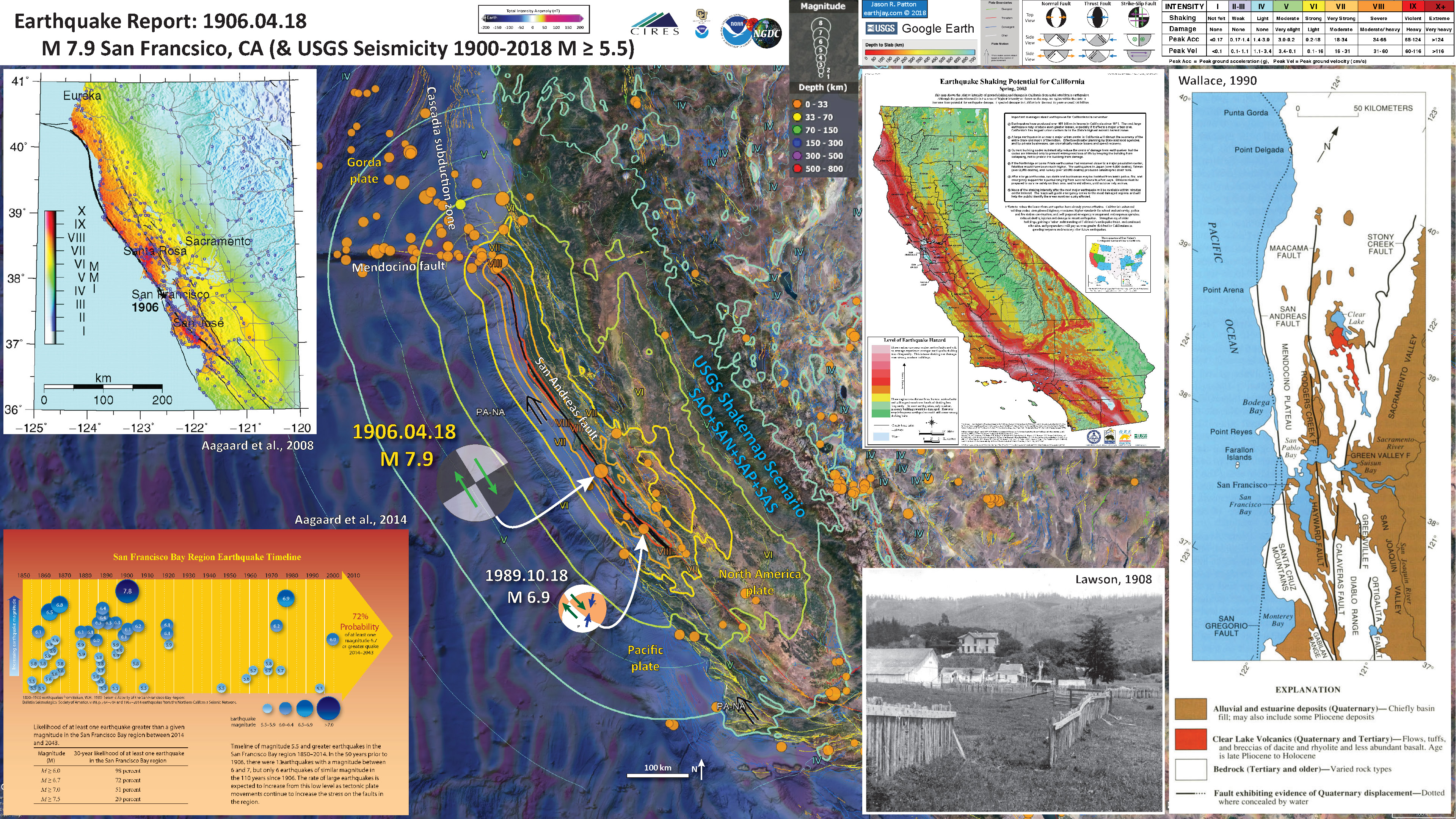
Below I present a poster that shows a computer simulation that provides an estimate of the intensity of the ground shaking that may happen if the San Andreas fault slipped in a similar way that it did in 1906.
The USGS prepares these ShakeMap scenario maps so that we can have an estimate of the ground shaking from hypothetical earthquakes. I present a poster below that uses data from one of these scenarios. This is a scenario that is similar to what we think happened in 1906, but it is only a model.
There is lots about the 1906 Earthquake that I did not include, but this leaves me room for improvement for the years into the future, when we see this anniversary come again.
Below is my interpretive poster for this earthquake
I plot the seismicity from the past month, with color representing depth and diameter representing magnitude (see legend). I include earthquake epicenters from 1900-2018 with magnitudes M ≥ 5.5.
I plot the USGS fault plane solutions (moment tensors in blue and focal mechanisms in orange), possibly in addition to some relevant historic earthquakes.
- I placed a moment tensor / focal mechanism legend on the poster. There is more material from the USGS web sites about moment tensors and focal mechanisms (the beach ball symbols). Both moment tensors and focal mechanisms are solutions to seismologic data that reveal two possible interpretations for fault orientation and sense of motion. One must use other information, like the regional tectonics, to interpret which of the two possibilities is more likely.
- I also include the shaking intensity contours on the map. These use the Modified Mercalli Intensity Scale (MMI; see the legend on the map). This is based upon a computer model estimate of ground motions, different from the “Did You Feel It?” estimate of ground motions that is actually based on real observations. The MMI is a qualitative measure of shaking intensity. More on the MMI scale can be found here and here. This is based upon a computer model estimate of ground motions, different from the “Did You Feel It?” estimate of ground motions that is actually based on real observations.
- In the map below, I include a transparent overlay of the magnetic anomaly data from EMAG2 (Meyer et al., 2017). As oceanic crust is formed, it inherits the magnetic field at the time. At different points through time, the magnetic polarity (north vs. south) flips, the North Pole becomes the South Pole. These changes in polarity can be seen when measuring the magnetic field above oceanic plates. This is one of the fundamental evidences for plate spreading at oceanic spreading ridges (like the Gorda rise).
- Regions with magnetic fields aligned like today’s magnetic polarity are colored red in the EMAG2 data, while reversed polarity regions are colored blue. Regions of intermediate magnetic field are colored light purple.
- We can see the roughly north-south trends of these red and blue stripes. These lines are parallel to the ocean spreading ridges from where they were formed.
Magnetic Anomalies
- On the right is a map from Wallace (1990) that shows the main faults that are part of the Pacific – North America plate boundary. The San Andreas fault is the locus of a majority of this relative plate motion.
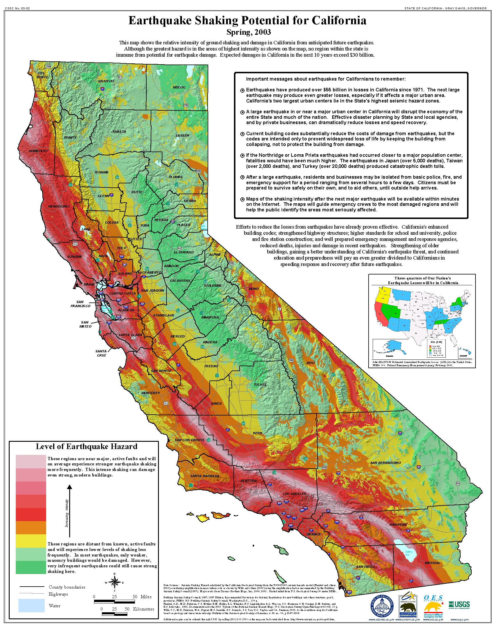
- In the upper right, to the left of the Wallace map, is a map of the entire state of California. This map shows the shaking potential for different regions based on an estimate of earthquake probability. Pink areas are more likely to experience stronger ground shaking, more frequently, than areas colored green.
- In the lower right, to the left of the Wallace map, is a photo showing a fence that was offset during the 1906 earthquake. The relative distance between these fences is about 2.6 meters (Lawson, 1908; Aargard and Bowza, 2008).
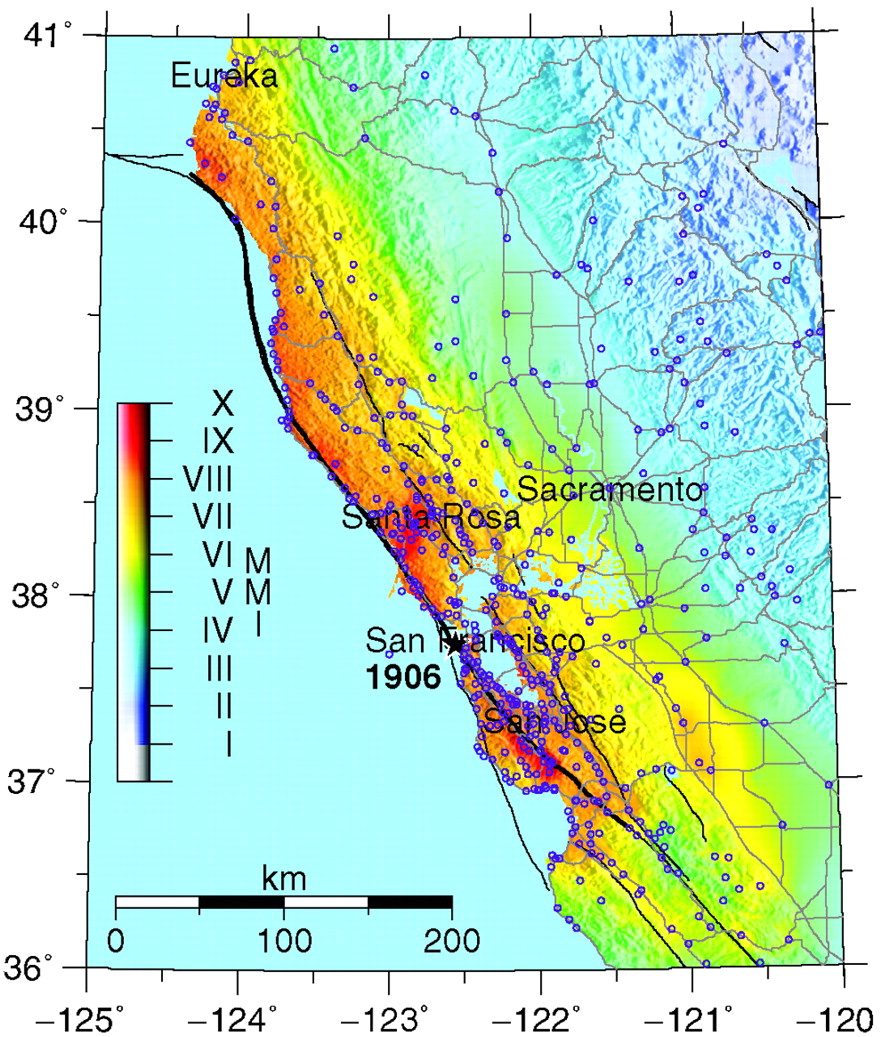
- In the upper left corner is a map showing an estimate of the ground motions produced by the 1906 San Francisco earthquake, based on Song et al. (2008) source model (Aargard et al., 2008).
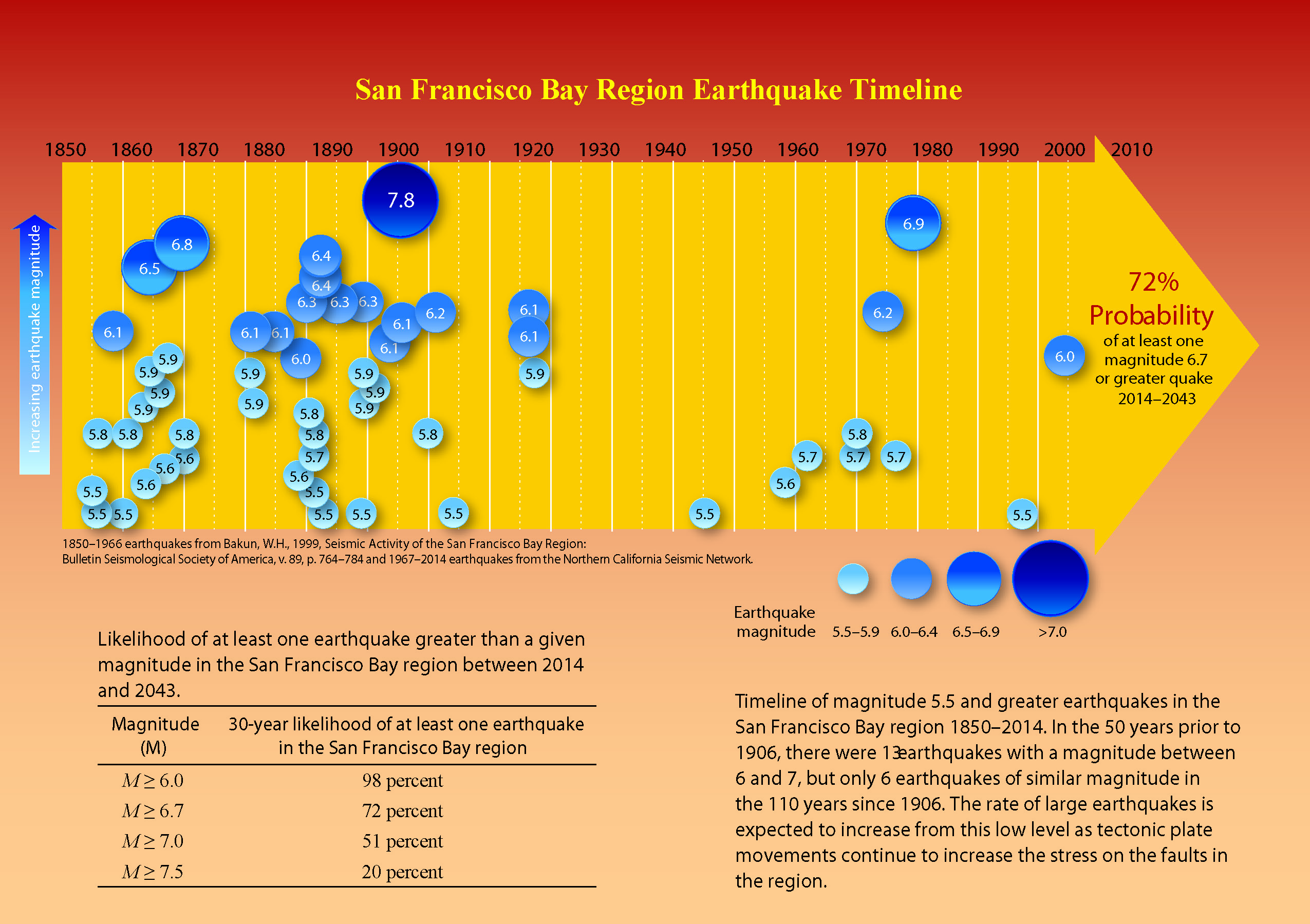
- In the lower left corner is a figure that shows the historic earthquakes for hte San Francisco Bay region (Aagaard et al., 2016). Note that they find there to be a 72% chance of an earthquake with manitude 6.7 or greater between 2014 and 2043.
I include some inset figures. Some of the same figures are located in different places on the larger scale map below.
- Here is the map with a month’s seismicity plotted.
- Here is the photo of the offset fence (Aargard and Bowza, 2008).
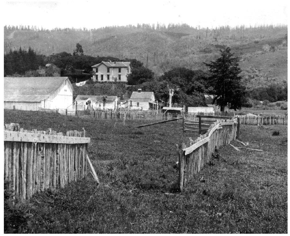
Fence half a mile northwest of Woodville (east of Point Reyes), offset by approximately 2.6 m of right-lateral strike-slip motion on the San Andreas fault in the 1906 San Francisco earthquake (U.S. Geological Survey Photographic Library, Gilbert, G. K. 2845).
- Here is the USGS ShakeMap (Aargard et al., 2008)
ShakeMap for the 1906 San Francisco earthquake based on the Boatwright and Bundock (2005) intensities (processed 18 October 2005). Open circles identify the intensity sites used to construct the ShakeMap.
- In the map above, we can see that the ground shaking was quite high in Humboldt County, CA. Below is a photo from Dengler et al. (2008) that shows headscarps to some lateral slides that failed as a result of the 1906 earthquake. This is the tupe of failure that extended across a much larger landscape for the 28 September 2018 Dongalla / Palu earthquake and tsunami.
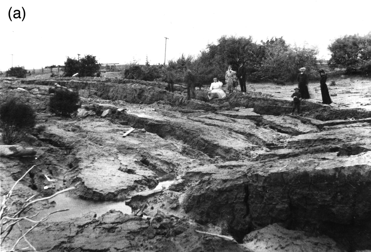
Spread failures on the banks of the Eel River near Port Kenyon in 1906. Photo E. Garrett, courtesy of Peter Palmquist.
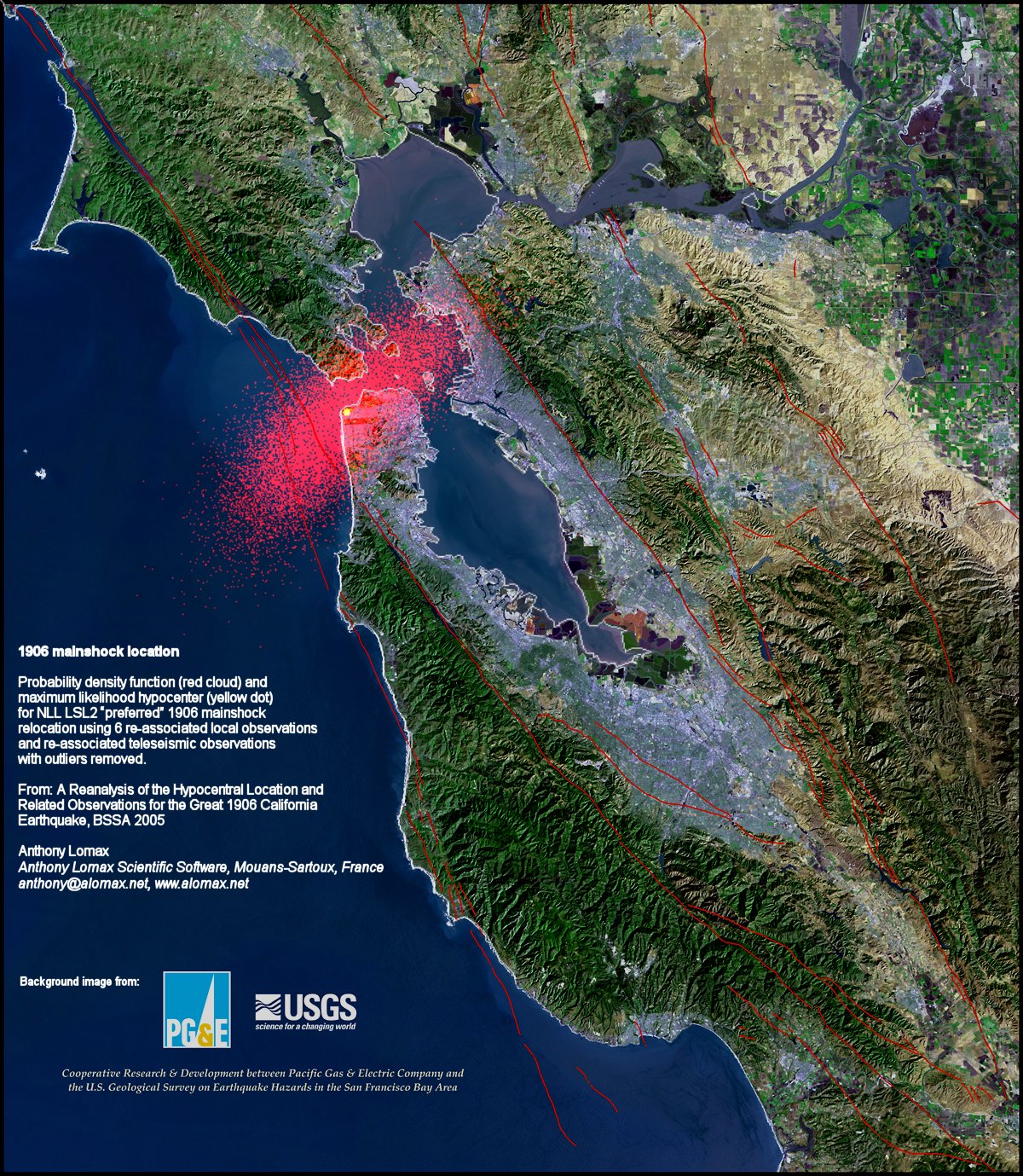
- Here is a map that shows the estimate for the location of the epicenter for the mainshock of the 1906 earthquake. See Lomax (2008) for more on this.
- I place a map shows the configuration of faults in central (San Francisco) and northern (Point Delgada – Punta Gorda) CA (Wallace, 1990). Here is the caption for this map, that is on the lower left corner of my map. Below the citation is this map presented on its own.
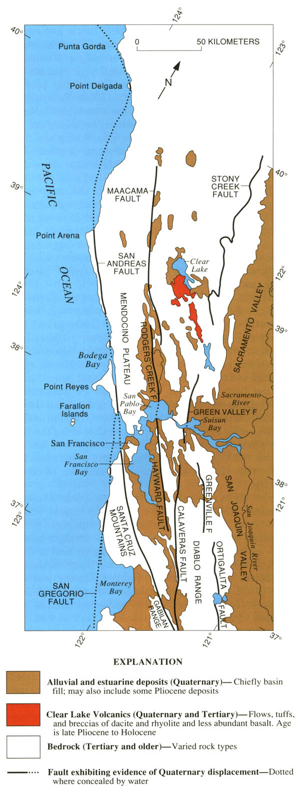
Geologic sketch map of the northern Coast Ranges, central California, showing faults with Quaternary activity and basin deposits in northern section of the San Andreas fault system. Fault patterns are generalized, and only major faults are shown. Several Quaternary basins are fault bounded and aligned parallel to strike-slip faults, a relation most apparent along the Hayward-Rodgers Creek-Maacama fault trend.
- Here is the figure showing the evolution of the SAF since its inception about 29 Ma. I include the USGS figure caption below as a blockquote.
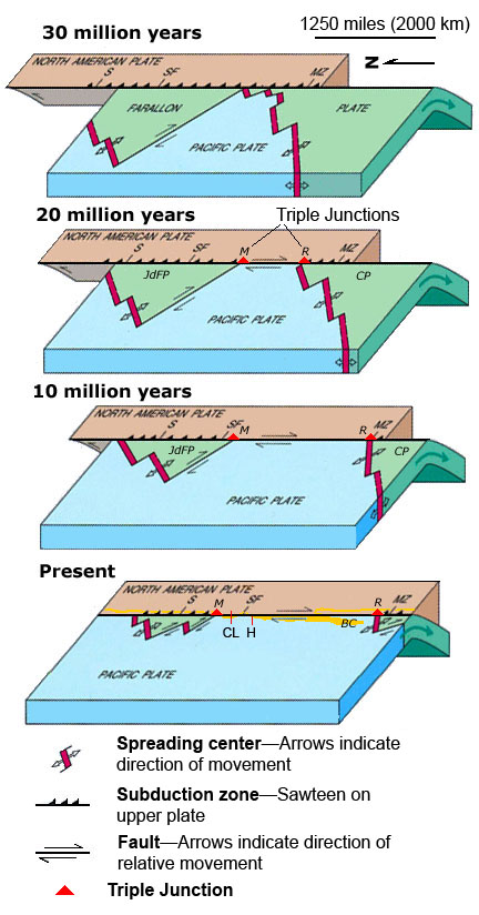
EVOLUTION OF THE SAN ANDREAS FAULT.
This series of block diagrams shows how the subduction zone along the west coast of North America transformed into the San Andreas Fault from 30 million years ago to the present. Starting at 30 million years ago, the westward- moving North American Plate began to override the spreading ridge between the Farallon Plate and the Pacific Plate. This action divided the Farallon Plate into two smaller plates, the northern Juan de Fuca Plate (JdFP) and the southern Cocos Plate (CP). By 20 million years ago, two triple junctions began to migrate north and south along the western margin of the West Coast. (Triple junctions are intersections between three tectonic plates; shown as red triangles in the diagrams.) The change in plate configuration as the North American Plate began to encounter the Pacific Plate resulted in the formation of the San Andreas Fault. The northern Mendocino Triple Junction (M) migrated through the San Francisco Bay region roughly 12 to 5 million years ago and is presently located off the coast of northern California, roughly midway between San Francisco (SF) and Seattle (S). The Mendocino Triple Junction represents the intersection of the North American, Pacific, and Juan de Fuca Plates. The southern Rivera Triple Junction (R) is presently located in the Pacific Ocean between Baja California (BC) and Manzanillo, Mexico (MZ). Evidence of the migration of the Mendocino Triple Junction northward through the San Francisco Bay region is preserved as a series of volcanic centers that grow progressively younger toward the north. Volcanic rocks in the Hollister region are roughly 12 million years old whereas the volcanic rocks in the Sonoma-Clear Lake region north of San Francisco Bay range from only few million to as little as 10,000 years old. Both of these volcanic areas and older volcanic rocks in the region are offset by the modern regional fault system. (Image modified after original illustration by Irwin, 1990 and Stoffer, 2006.)
Tectonic History of Western North America and Southern California
- Here is an animation from Tanya Atwater that shows how the Pacific-North America plate margin evolved over the past 40 million years (Ma).
Some Relevant Discussion and Figures
- Here is the shaking potential map for California.
- Here is the earthquake timeline (Aagaard et al., 2016).
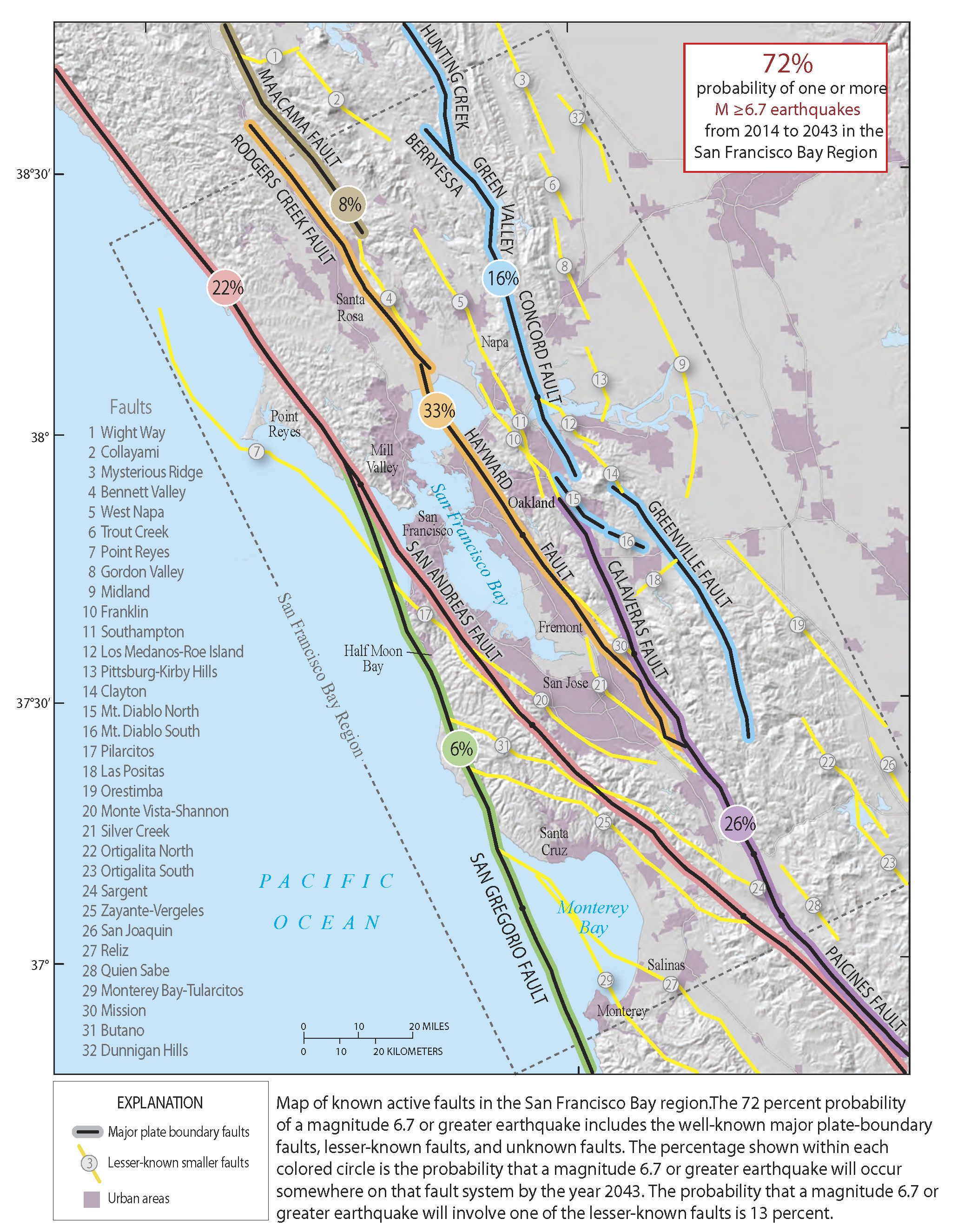
- This map shows the relative contribution that each fault has for the chance of earthquakes in the region. For example, this shows that the Hayward fault is the fault with the highest chance of rupture (Aagaard et al., 2016).
Tsunami
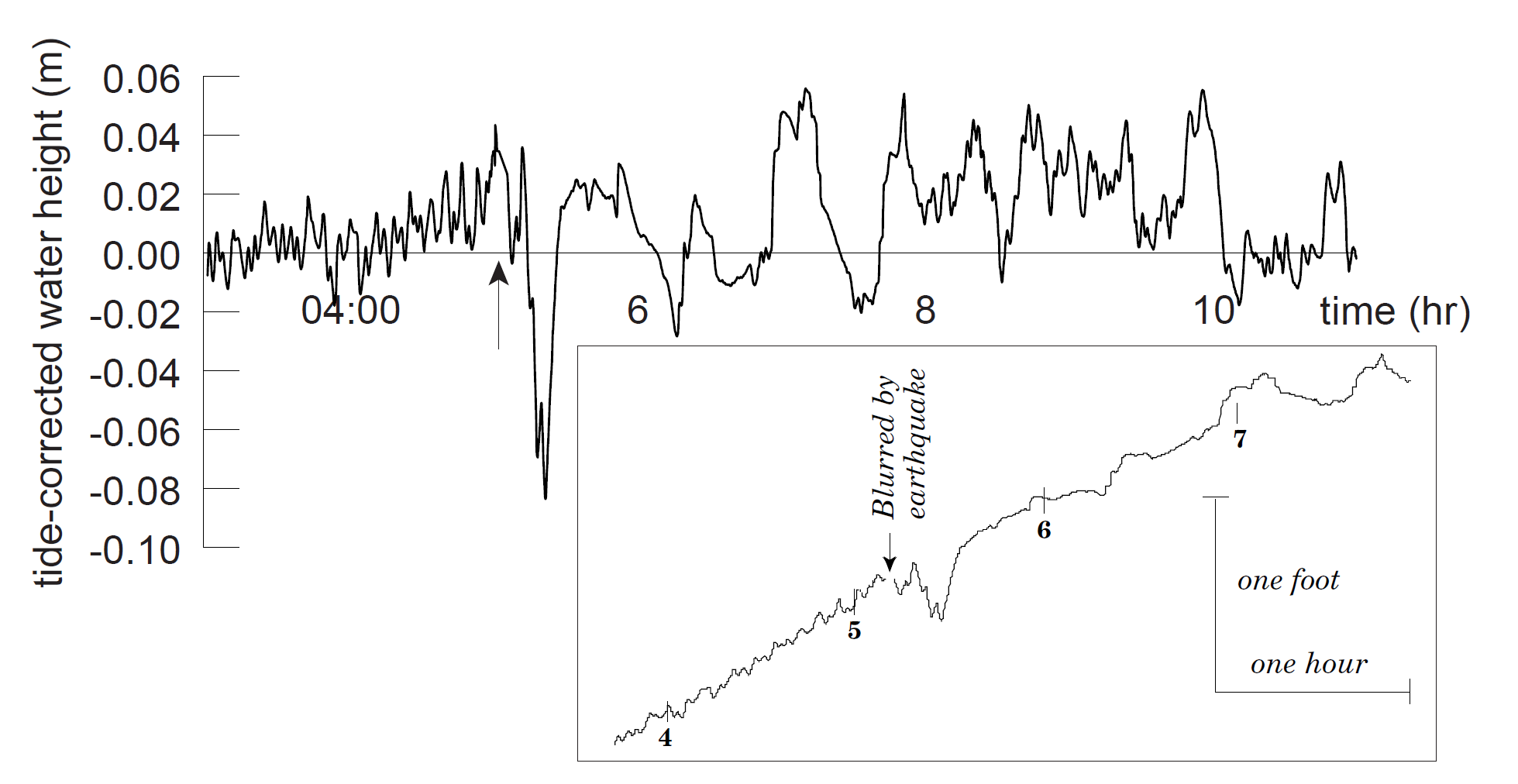
- This is the tide gage record (the marigram) from the tsunami generated by the 1906 San Francisco Earthquake (Geist and Zoback, 1999).
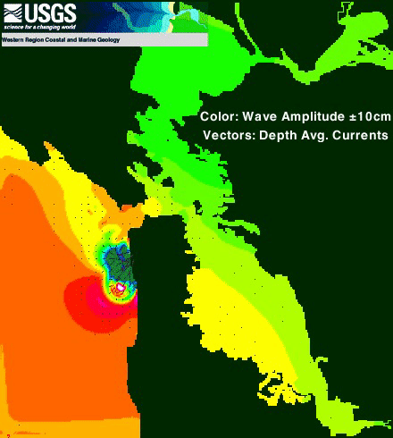
- Here is an animation showing a simulation (a model) of the tsunami generated by the 1906 San Francisco Earthquake (Geist and Zoback, 1999).
- Geist and Zoback used earthquake fault slip modeling to drive a tsunami model and this is one of their model outcomes.
Geologic Fundamentals
- For more on the graphical representation of moment tensors and focal mechanisms, check this IRIS video out:
- Here is a fantastic infographic from Frisch et al. (2011). This figure shows some examples of earthquakes in different plate tectonic settings, and what their fault plane solutions are. There is a cross section showing these focal mechanisms for a thrust or reverse earthquake. The upper right corner includes my favorite figure of all time. This shows the first motion (up or down) for each of the four quadrants. This figure also shows how the amplitude of the seismic waves are greatest (generally) in the middle of the quadrant and decrease to zero at the nodal planes (the boundary of each quadrant).
- Here is another way to look at these beach balls.
The two beach balls show the stike-slip fault motions for the M6.4 (left) and M6.0 (right) earthquakes. Helena Buurman's primer on reading those symbols is here. pic.twitter.com/aWrrb8I9tj
— AK Earthquake Center (@AKearthquake) August 15, 2018
- There are three types of earthquakes, strike-slip, compressional (reverse or thrust, depending upon the dip of the fault), and extensional (normal). Here is are some animations of these three types of earthquake faults. The following three animations are from IRIS.
Strike Slip:
Compressional:
Extensional:
- This is an image from the USGS that shows how, when an oceanic plate moves over a hotspot, the volcanoes formed over the hotspot form a series of volcanoes that increase in age in the direction of plate motion. The presumption is that the hotspot is stable and stays in one location. Torsvik et al. (2017) use various methods to evaluate why this is a false presumption for the Hawaii Hotspot.
- Here is a map from Torsvik et al. (2017) that shows the age of volcanic rocks at different locations along the Hawaii-Emperor Seamount Chain.
- Here is a great tweet that discusses the different parts of a seismogram and how the internal structures of the Earth help control seismic waves as they propagate in the Earth.
A cutaway view along the Hawaiian island chain showing the inferred mantle plume that has fed the Hawaiian hot spot on the overriding Pacific Plate. The geologic ages of the oldest volcano on each island (Ma = millions of years ago) are progressively older to the northwest, consistent with the hot spot model for the origin of the Hawaiian Ridge-Emperor Seamount Chain. (Modified from image of Joel E. Robinson, USGS, in “This Dynamic Planet” map of Simkin and others, 2006.)
Hawaiian-Emperor Chain. White dots are the locations of radiometrically dated seamounts, atolls and islands, based on compilations of Doubrovine et al. and O’Connor et al. Features encircled with larger white circles are discussed in the text and Fig. 2. Marine gravity anomaly map is from Sandwell and Smith.
Today, on #SeismogramSaturday: what are all those strangely-named seismic phases described in seismograms from distant earthquakes? And what do they tell us about Earth’s interior? pic.twitter.com/VJ9pXJFdCy
— Jackie Caplan-Auerbach (@geophysichick) February 23, 2019
- 1906.04.18 M 7.9 San Francisco
- 2017.12.14 M 4.3 Laytonville
- 2016.11.06 M 4.1 Laytonville, CA
- 2016.11.03 M 3.8 Laytonville, CA
- 2016.08.10 M 5.1 Lake Pillsbury, CA
- 2015.08.30 M 3.6 Mendocino County, CA
- 2015.07.27 M 3.5 Point Arena, CA
- 2018.07.30 M 3.7 San Pablo Bay
- 2018.01.04 M 4.4 Berkeley
- 2016.02.23 M 4.9 Bakersfield
- 2015.12.30 M 4.4 San Bernardino, CA
- 2015.05.03 M 3.8 Los Angeles, CA
- 2015.04.13 M 3.3 Los Angeles, CA
- 2014.04.01 M 5.1 La Habra p-3
- 2014.03.29 M 5.1 La Habra p-2
- 2014.03.28 M 5.1 La Habra p-1
- 2016.08.04 M 4.5 Honey Lake, CA
San Andreas fault
General Overview
Earthquake Reports
Northern CA
Central CA
Southern CA
Eastern CA
- 2018.04.05 M 5.3 Channel Islands
- 2018.04.05 M 5.3 Channel Islands Update #1
- 1994.11.17 M 6.7 Northridge, CA
- 1971.02.09 M 6.7 Sylmar, CA
Southern CA
Earthquake Reports
Social Media
- Aargard, B.T. and Beroza, G.C., 2008. The 1906 San Francisco Earthquake a Century Later: Introduction to the Special Section in BSSA, v. 98, no. 2, p. 817-822, https://doi.org/10.1785/0120060401
- Aargard, B.T. et al., 2008. Ground-Motion Modeling of the 1906 San Francisco Earthquake, Part II: Ground-Motion Estimates for the 1906 Earthquake and Scenario Events in BSSA, v. 98, no. 2, p. 1012-1046, https://doi.org/10.1785/0120060410
- Aagaard, B.T., Blair, J.L., Boatwright, J., Garcia, S.H., Harris, R.A., Michael, A.J., Schwartz, D.P., and DiLeo, J.S., 2016. Earthquake outlook for the San Francisco Bay region 2014–2043 (ver. 1.1, August 2016): U.S. Geological Survey Fact Sheet 2016–3020, 6 p., http://dx.doi.org/10.3133/fs20163020
- Frisch, W., Meschede, M., Blakey, R., 2011. Plate Tectonics, Springer-Verlag, London, 213 pp.
- Geist, E.L. and Zoback, M.L., 1999. Analysis of the tsunami generated by the Mw 7.8 1906 San Francisco earthquake in GSA, vol. 27, no. 1., p. 15-18, https://doi.org/10.1130/0091-7613(1999)027%3C0015:AOTTGB%3E2.3.CO;2
- Hayes, G., 2018, Slab2 – A Comprehensive Subduction Zone Geometry Model: U.S. Geological Survey data release, https://doi.org/10.5066/F7PV6JNV.
- Lomax, A., 2008. Location of the Focus and Tectonics of the Focal Region of the California Earthquake of 18 April 1906 in BSSA, v. 98, no. 2., p. 846-860, https://doi.org/10.1785/0120060405
- Meyer, B., Saltus, R., Chulliat, a., 2017. EMAG2: Earth Magnetic Anomaly Grid (2-arc-minute resolution) Version 3. National Centers for Environmental Information, NOAA. Model. https://doi.org/10.7289/V5H70CVX
- Müller, R.D., Sdrolias, M., Gaina, C. and Roest, W.R., 2008, Age spreading rates and spreading asymmetry of the world’s ocean crust in Geochemistry, Geophysics, Geosystems, 9, Q04006, https://doi.org/10.1029/2007GC001743
- Song, S., G. C. Beroza, and P. Segall (2008). A unified source model for the 1906 San Francisco earthquake, Bull. Seismol. Soc. Am. 98, no. 2, 823–831.
References:
Return to the Earthquake Reports page.