Earthquake Report: M 6.9 Mid Atlantic Ridge

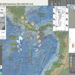
There have not been that many large earthquakes this year. This is good for one main reason, there is a lower potential for human suffering.

Therefore, there are fewer Earthquake Reports for this year.

This morning (my time) there was a magnitude M 6.9 earthquake along the Romanche transform fault, a right-lateral strike-slip fault system that offsets the Mid Atlantic Ridge in the equatorial Atlantic Ocean. The fault is part of the Romanche fracture zone.

https://earthquake.usgs.gov/earthquakes/eventpage/us7000i53f/executive

The transform faults in this part of the Mid Atlantic Ridge plate boundary have a pattern of earthquakes that seem to max out in the lower 7 magnitudes. This may be (at least partly) due to the maximum length of these faults (?).

The Romanche fault is about 900 kilometers long. The Chain fault is about 250 km long. The St. Paul fault is about 350 km long.

    Earthquake magnitude is controlled by three things:

  1. the size of the earthquake slip area, for most events, this is basically the length of the fault (since the width of the fault is controlled by the thickness of the lithosphere, or the crust)
  2. the amount that the fault slipped
  3. physical properties of the lithosphere or crust on either side of the fault (how “elastic” the Earth is)

Using empirical (data) based relations between earthquake subsurface rupture length and earthquake magnitude (Wells and Coppersmith, 1994), I calculate the maximum earthquake magnitude we may get on these three faults listed above.

Here are the data that Wells and Coppersmith use to establish these relations.


(a) Regression of subsurface rupture length on magnitude (M). Regression line shown for all-slip-type relationship. Short dashed line indicates 95% confidence interval. (b) Regression lines for strike-slip relationships. See Table 2 for regression coefficients. Length of regression lines shows the range of data for each relationship.

Here are the magnitude estimates for each of these fault systems.


Looking at the interpretive poster, we can see that there have not been any temblors that approach the sizes listed in this table. The largest historic earthquake was M 7.1 (there were several).

So, we may ask ourselves one of the most common questions people ask regarding earthquakes. Was this M 6.9 a foreshock to a larger earthquake?

Obviously, we cannot yet know this. Nobody can predict the future (at least not yet).

However, based on the incredibly short historic record of earthquakes, we may answer this question: “no, probably not.” This answer is tempered by the very short seismic record. If magnitude 8 earthquakes occur, on average, every 1000 years, then our ~100 year record might be too short to “notice” one of these M 8 events.
If we continue to look at the historic record, we will see that there appear to be three instances where one of these M 6.5-7 earthquakes had a later earthquake of a similar magnitude.
When an earthquake fault slips, the crust surrounding the fault squishes and expands, deforming elastically (like in one’s underwear). These changes in shape of the crust cause earthquake fault stresses to change. These changes in stress can either increase or decrease the chance of another earthquake.
I wrote more about this type of earthquake triggering for Temblor here. Head over there to learn more about “static coulomb stress triggering.”
In the poster, I label these earthquakes as “Linked Earthquakes.” Perhaps the later of each earthquake pair (or triple) was triggered by the change in static coulomb stress.

    Here are the three sets of “Linked Earthquakes:”

  • In 1992, along the Chain fault, the 16 Feb M 6.6 appears to have triggered the 18 Feb M 6.6. More speculatively, about 6 months later, it seems that there was a triggered M 6.9 on 18 Aug. Static Coulomb triggering typically has a limit of about 2-3 times the rupture length (and this depends of the pre-existing stress on the receiver fault, the fault that may be having triggered slip). A M 6.6 may have a rupture length of 50 km, so could possibly affect faults as far as 100-150 km away. The M 6.9 is about 70 km from the easternmost M 6.6, so it seems possible that the M 6.9 was triggered by the M 6.6.
  • In 2003, along the Romanche fault, there were two M 6.6 earthquakes separated by about 6 weeks. These quakes are about 100 km apart, possibly close enough to be triggered.
  • In 2020, along the St. Paul transform fault, there was a pair of quakes about 3 weeks and 340 km apart. The first quake was M 6.5, so this pair of events seems to far apart to be related.

So, given the historic record, it sure seems likely that there may be another M6-7 earthquakes in the region of the fault sometime in the next couple of months. And, given our lack of knowledge about the long term behavior of these faults, it is also possible that there could be a larger M 8 event.
Since we cannot yet know the real answer to this question, we are reminded of the advice that educators and emergency response people provide: If one lives in Earthquake Country, get earthquake prepared. Just a little effort to get better prepared makes a major difference in the outcome.
Head over to Earthquake Alliance where there are some excellent brochures about how to be better prepared and more resilient to earthquake and tsunami hazards. Living on Shaky Ground is one of my favorites!

Below is my interpretive poster for this earthquake

  • I plot the seismicity from the past month, with diameter representing magnitude (see legend). I include earthquake epicenters from 1920-2020 with magnitudes M ≥ 3.0 in one version.
  • I plot the USGS fault plane solutions (moment tensors in blue and focal mechanisms in orange), possibly in addition to some relevant historic earthquakes.
  • A review of the basic base map variations and data that I use for the interpretive posters can be found on the Earthquake Reports page. I have improved these posters over time and some of this background information applies to the older posters.
  • Some basic fundamentals of earthquake geology and plate tectonics can be found on the Earthquake Plate Tectonic Fundamentals page.

    I include some inset figures. Some of the same figures are located in different places on the larger scale map below.

  • In the lower right corner I include a map that shows the age of the oceanic crust in the Atlantic Ocean. Oceanic crust (or lithosphere) is created at mid ocean ridges, where there is extension that allows upward movement of magma, leading to the formation of oceanic crust. The Mid Atlantic Ridge system is one of these types of plate boundaries.
  • Above the crust age map is an illustration showing the how the crust moving away from the ocean ridges leaves behind oceanic crust. The Earth’s magnetic polarity changes at times and the oceanic crust records these changes in magnetic polarity. These changes are the main reason why we know that the crust is formed along these ridge systems. Read more here.
  • In the upper left corner is a small scale map that shows the historic seismicity, the plate boundary fault systems, and the magnetic anomalies. Places with crust formed when the magnetic field is like today, is colored red (a.k.a. normal polarity) and crust formed when the poles were reversed relative to today is blue (i.e., reversed polarity).
  • In the upper right corner is a map that shows the earthquake intensity from this earthquake (using the modified Mercalli Intensity Scale). Intensity is a measure of how strongly the shaking is felt, not a measure of the earthquake size. So, the intensity gets smaller with distance (see how the highest intensity is nearest the earthquake epicenter).
  • In the lower left center there is a map from Heezen et al. (1964). Heezen was an oceanographer that contributed greatly to our knowledge of the oceans. In this study, one of the things that they were studying is the flow of deep water (deep water flows largely because of changes in density of the seawater, controlled by salinity and temperature). Because of this, they were mapping the shape of the seafloor to see where this deep water could flow. Ths location of this map is outlined by a dashed rectangle in the main map.
  • Here is the map with a month’s seismicity plotted.

Some Relevant Discussion and Figures

  • Here is the Müller et al. (2008) figure from the interpretive poster above.

  • Here a the Bonatti et al. (2001) figure showing the bathymetry of this area. I include the figure caption as a blockquote below.

  • A: Multibeam topography of Romanche region, showing north-south profiles where sampling was carried out. Black dots and red numbers indicate estimated age (in million years) of lithosphere south of Romanche Transform, assuming spreading half-rate of 17 mm/yr within present-day ridge and transform geometry. White dots indicate epicenters of teleseismically recorded 1970–1995 events (magnitude . 4). FZ is fracture zone. B: Topography and petrology at eastern intersection of Romanche Fracture Zone with Mid-Atlantic Ridge. Data were obtained during expeditions S-16, S-19, and G-96 (Bonatti et al., 1994, 1996). C: Location of A along Mid-Atlantic Ridge.

  • Dr. Stephen Hicks and their colleagues conducted a fascinating study of the 2016 M 7.1 earthquake. They hypothesize that the Romanche fault slipped in different parts of the fault at different times (during the earthquake).
  • This map shows the historic seismicity of the region.

  • Seismotectonic context. The map location is given by the red rectangle on the inset globe. Focal mechanisms are shown for events with Mw > 6 (ref. 30). Mw > 7.0 events are labelled. Stations of the PI-LAB ocean bottom seismometer network are indicated by triangles. Our relocated hypocentre and low-frequency RMT of the 2016 earthquake are shown by the red star and red beach ball, respectively. The orange beach ball is a colocated Mw 5.8 used for the Mach cone analysis. The black rectangle shows the location of the map in Fig. 2. ISC Bulletin, Bulletin of the International Seismological Centre.

  • Here is where Hicks et al. (2020) hypothesize that the slip slipped.

  • Interpretation of rupture dynamics for the 2016 Romanche earthquake. Top: perspective view of bathymetry along the Romanche FZ. Bottom: interpretive cross-section along the ruptured fault plane. Colours show a thermal profile based on half-space cooling. The green line denotes the predicted transition between velocity-strengthening and velocity-weakening frictional regimes (as expressed by the a – b friction rate parameter) from Gabbro data35. The numbers show the key stages of rupture evolution: (1) rupture initiation (star) in the oceanic mantle, (2) initiation phase has sufficient fracture energy to propagate upwards to the locked section of fault, (3) weak subshear rupture front travels east in the lower crust and/or upper mantle, (4) rupture reaches the locked, thinner crustal segment close to the weaker RTI (SE1), (5) sufficient fracture energy for a westward supershear rupture in the crust along the strongly coupled fault segment (SE2) and (6) rupture possibly terminated by a serpentinized and hydrothermally altered fault segment.

    References:

    Basic & General References

  • Frisch, W., Meschede, M., Blakey, R., 2011. Plate Tectonics, Springer-Verlag, London, 213 pp.
  • Hayes, G., 2018, Slab2 – A Comprehensive Subduction Zone Geometry Model: U.S. Geological Survey data release, https://doi.org/10.5066/F7PV6JNV.
  • Holt, W. E., C. Kreemer, A. J. Haines, L. Estey, C. Meertens, G. Blewitt, and D. Lavallee (2005), Project helps constrain continental dynamics and seismic hazards, Eos Trans. AGU, 86(41), 383–387, , https://doi.org/10.1029/2005EO410002. /li>
  • Jessee, M.A.N., Hamburger, M. W., Allstadt, K., Wald, D. J., Robeson, S. M., Tanyas, H., et al. (2018). A global empirical model for near-real-time assessment of seismically induced landslides. Journal of Geophysical Research: Earth Surface, 123, 1835–1859. https://doi.org/10.1029/2017JF004494
  • Kreemer, C., J. Haines, W. Holt, G. Blewitt, and D. Lavallee (2000), On the determination of a global strain rate model, Geophys. J. Int., 52(10), 765–770.
  • Kreemer, C., W. E. Holt, and A. J. Haines (2003), An integrated global model of present-day plate motions and plate boundary deformation, Geophys. J. Int., 154(1), 8–34, , https://doi.org/10.1046/j.1365-246X.2003.01917.x.
  • Kreemer, C., G. Blewitt, E.C. Klein, 2014. A geodetic plate motion and Global Strain Rate Model in Geochemistry, Geophysics, Geosystems, v. 15, p. 3849-3889, https://doi.org/10.1002/2014GC005407.
  • Meyer, B., Saltus, R., Chulliat, a., 2017. EMAG2: Earth Magnetic Anomaly Grid (2-arc-minute resolution) Version 3. National Centers for Environmental Information, NOAA. Model. https://doi.org/10.7289/V5H70CVX
  • Müller, R.D., Sdrolias, M., Gaina, C. and Roest, W.R., 2008, Age spreading rates and spreading asymmetry of the world’s ocean crust in Geochemistry, Geophysics, Geosystems, 9, Q04006, https://doi.org/10.1029/2007GC001743
  • Pagani,M. , J. Garcia-Pelaez, R. Gee, K. Johnson, V. Poggi, R. Styron, G. Weatherill, M. Simionato, D. Viganò, L. Danciu, D. Monelli (2018). Global Earthquake Model (GEM) Seismic Hazard Map (version 2018.1 – December 2018), DOI: 10.13117/GEM-GLOBAL-SEISMIC-HAZARD-MAP-2018.1
  • Silva, V ., D Amo-Oduro, A Calderon, J Dabbeek, V Despotaki, L Martins, A Rao, M Simionato, D Viganò, C Yepes, A Acevedo, N Horspool, H Crowley, K Jaiswal, M Journeay, M Pittore, 2018. Global Earthquake Model (GEM) Seismic Risk Map (version 2018.1). https://doi.org/10.13117/GEM-GLOBAL-SEISMIC-RISK-MAP-2018.1
  • Zhu, J., Baise, L. G., Thompson, E. M., 2017, An Updated Geospatial Liquefaction Model for Global Application, Bulletin of the Seismological Society of America, 107, p 1365-1385, https://doi.org/0.1785/0120160198
  • Specific References

  • Abercrombie, R.E. and Ekstrom, G., 2001. Earthquake slip on oceanic transform faults in Nature, v. 410, p. 74-77
  • Bonatti, E., Brunello, D., Fabretti, P., Ligi, M., Porcaro, R.A., and Sealer, M., 2001. Steady-state creation of crust-free lithosphere at cold spots in mid-ocean ridges in Geology, v. 29, no. 11, p. 979-982.
  • Hicks, S.P., Okuwaki, R., Steinberg, A., Rychert, C.A., Harmon, N. Abercrombie, R.E., Bogiatzis, P., Cataphors, D., Zahradnik, J., Kendall, J-M., Yagi, Y., Shimizu, K., and Sudhaus, H., 2020. Back-propagating supershear rupture in the 2016 Mw 7.1 Romanche transform fault earthquake in Nature Geoscience, v. 13, p. 647-653, https://doi.org/10.1038/s41561-020-0619-9
  • Heezen, B.C., Bunce, E.T., Hersey, J.B., and Tharp, M., 1964. Chain and Romanche fracture zones in Deep-Sea research, v. 11, p. 11-33
  • Müller, R.D., Sdrolias, M., Gaina, C., and Roest, W.R., 2008. Age, spreading rates and spreading symmetry of the world’s ocean crust in Geochem. Geophys. Geosyst., 9, Q04006, doi:10.1029/2007GC001743
  • Torsvik, T.H., Tousse, S., Labaila, C., and Smethurst, M.A., 2009. A new scheme for the opening of the South Atlantic Ocean and the dissection of an Aptian salt basin in Geophysical Journal International, v. 177, p. 1315-1333.

Return to the Earthquake Reports page.


Earthquake Report M 6.7 in Panama

I don’t always have the time to write a proper Earthquake Report. However, I prepare interpretive posters for these events.
Because of this, I present Earthquake Report Lite. (but it is more than just water, like the adult beverage that claims otherwise). I will try to describe the figures included in the poster, but sometimes I will simply post the poster here.
https://earthquake.usgs.gov/earthquakes/eventpage/us6000exs5/executive

Below is my interpretive poster for this earthquake

  • I plot the seismicity from the past month, with diameter representing magnitude (see legend). I include earthquake epicenters from 1921-2021 with magnitudes M ≥ 3.0 in one version.
  • I plot the USGS fault plane solutions (moment tensors in blue and focal mechanisms in orange), possibly in addition to some relevant historic earthquakes.
  • A review of the basic base map variations and data that I use for the interpretive posters can be found on the Earthquake Reports page. I have improved these posters over time and some of this background information applies to the older posters.
  • Some basic fundamentals of earthquake geology and plate tectonics can be found on the Earthquake Plate Tectonic Fundamentals page.

    I include some inset figures.

  • Here is the map with a month’s seismicity plotted.

    References:

    Basic & General References

  • Frisch, W., Meschede, M., Blakey, R., 2011. Plate Tectonics, Springer-Verlag, London, 213 pp.
  • Hayes, G., 2018, Slab2 – A Comprehensive Subduction Zone Geometry Model: U.S. Geological Survey data release, https://doi.org/10.5066/F7PV6JNV.
  • Holt, W. E., C. Kreemer, A. J. Haines, L. Estey, C. Meertens, G. Blewitt, and D. Lavallee (2005), Project helps constrain continental dynamics and seismic hazards, Eos Trans. AGU, 86(41), 383–387, , https://doi.org/10.1029/2005EO410002. /li>
  • Jessee, M.A.N., Hamburger, M. W., Allstadt, K., Wald, D. J., Robeson, S. M., Tanyas, H., et al. (2018). A global empirical model for near-real-time assessment of seismically induced landslides. Journal of Geophysical Research: Earth Surface, 123, 1835–1859. https://doi.org/10.1029/2017JF004494
  • Kreemer, C., J. Haines, W. Holt, G. Blewitt, and D. Lavallee (2000), On the determination of a global strain rate model, Geophys. J. Int., 52(10), 765–770.
  • Kreemer, C., W. E. Holt, and A. J. Haines (2003), An integrated global model of present-day plate motions and plate boundary deformation, Geophys. J. Int., 154(1), 8–34, , https://doi.org/10.1046/j.1365-246X.2003.01917.x.
  • Kreemer, C., G. Blewitt, E.C. Klein, 2014. A geodetic plate motion and Global Strain Rate Model in Geochemistry, Geophysics, Geosystems, v. 15, p. 3849-3889, https://doi.org/10.1002/2014GC005407.
  • Meyer, B., Saltus, R., Chulliat, a., 2017. EMAG2: Earth Magnetic Anomaly Grid (2-arc-minute resolution) Version 3. National Centers for Environmental Information, NOAA. Model. https://doi.org/10.7289/V5H70CVX
  • Müller, R.D., Sdrolias, M., Gaina, C. and Roest, W.R., 2008, Age spreading rates and spreading asymmetry of the world’s ocean crust in Geochemistry, Geophysics, Geosystems, 9, Q04006, https://doi.org/10.1029/2007GC001743
  • Pagani,M. , J. Garcia-Pelaez, R. Gee, K. Johnson, V. Poggi, R. Styron, G. Weatherill, M. Simionato, D. Viganò, L. Danciu, D. Monelli (2018). Global Earthquake Model (GEM) Seismic Hazard Map (version 2018.1 – December 2018), DOI: 10.13117/GEM-GLOBAL-SEISMIC-HAZARD-MAP-2018.1
  • Silva, V ., D Amo-Oduro, A Calderon, J Dabbeek, V Despotaki, L Martins, A Rao, M Simionato, D Viganò, C Yepes, A Acevedo, N Horspool, H Crowley, K Jaiswal, M Journeay, M Pittore, 2018. Global Earthquake Model (GEM) Seismic Risk Map (version 2018.1). https://doi.org/10.13117/GEM-GLOBAL-SEISMIC-RISK-MAP-2018.1
  • Zhu, J., Baise, L. G., Thompson, E. M., 2017, An Updated Geospatial Liquefaction Model for Global Application, Bulletin of the Seismological Society of America, 107, p 1365-1385, https://doi.org/0.1785/0120160198
  • Specific References

Return to the Earthquake Reports page.

Earthquake Report: Mendocino triple junction

Well, it was a big mag 5 day today, two magnitude 5+ earthquakes in the western USA on faults related to the same plate boundary! Crazy, right? The same plate boundary, about 800 miles away from each other, and their coincident occurrence was in no way related to each other.
In the past 9 months it was also a big mag 5 MTJ year. There have been 3 mag 5+ earthquakes in the Mendocino triple junction (MTJ) region. The first one in June of 2019, at the time, appeared to be related to the Mendocino fault. The 9 March M 5.8 event was clearly associated with the right lateral Mendocino transform fault. The latest in this series of unrelated earthquakes is possibly associated with NW striking faults in the Gorda plate. I will discuss this below and include background about all the different faults in the region.

I was on the phone with my friend, collaborator, and business partner Thomas Harvey Leroy (the man with 4 first names: Tom, Harvey, Lee, and Roy) yesterday afternoon. We were determining the best course of action after a tenant of ours moved out leaving PG&E with an unpaid ~$9000 bill and we could not turn the power back on until the bill was paid. His son walked up to him and asked if what he had just felt was an earthquake. Because Tom was pacing back and forth, he did not feel it (as Tom likes to say, “feel the pain.”). He wishes that he had felt it.
My social media feed was immediately dominated by posts about the earthquake in Humboldt County. I put together a quick map (see below). My good friend and collaborator Bob McPherson (a seismologist who ran the Humboldt Bay Seismic Network in the late 70s and 80s) sent me several text messages about the earthquake. we texted back and forth. I initially thought it might be Mendo fault and so did he.
Then the USGS moment tensor (earthquake mechanism) came in with an orientation similar to that of Gorda plate earthquakes further to the north. These earthquakes are typically on northeast striking (trending) left-lateral strike-slip faults (see more here about types of earthquakes). So, I stated that I thought it was like those, a left-lateral strike-slip fault earthquake. So I deleted my social media posts and updated the map to show it could be either left-lateral or right-lateral (the map below shows both options), but that we thought it was in the Gorda plate, not the Mendocino fault.


Then Bomac mentioned these northwest trends in seismicity that we noticed (as a group) about 5 years ago, seismicity trends (seismolineaments is what Tom calls them) that first appeared following the 1992 Cape Mendocino Earthquake.
We don’t yet have a full explanation for these trends in seismicity, but the orientation fits a stress field from north-south compression (from the northward motion of the Pacific plate relative to the Gorda plate). This north-south compression is also the explanation for the left-lateral strike-slip fault earthquakes in the Gorda plate (Silver, 1971).

How are these 3 M5+ MTJ events related?

Well, they are not directly related to each other (i.e. none of these earthquakes caused any of the other earthquakes). The exception is that the 2019 M 5.6 may have affected the stress in the crust leading to the March M 5.2, but this is unlikely. What is even less likely that the M 5.8 was caused by the June 5.6 or caused the march 5.2.
WHy?
Well, there are two kinds of earthquake triggering.

  1. Dynamic Triggering – When seismic waves travel through the Earth, they change the stresses in the crust. IF the faults are “locked and loaded” (i.e. they are just about ready to slip in an earthquake), there may be an earthquake on the “receiver” fault. Generally, once the seismic waves are done travelling, this effect is over. Though, some suggest that this affect on the stress changes may last longer (but not much longer).
  2. Static Triggering – When an earthquake fault slips, it deforms (changes the shape) of the crust surrounding that earthquake. These changes can cause increases and decreases in the stress on faults (either increasing or decreasing the chance for an earthquake). Just like for dynamic triggering, the fault needs to be about ready to slip. The effect on fault slip changes in “static coulomb stress” generally extend a distance of about 2-3 times the fault length of the “source” fault.

Below is a figure from Wells and Coppersmith (1994) that shows the empirical relations between surface rupture length (SRL, the length of the fault that ruptures to the ground surface) and magnitude. If one knows the SRL (horizontal axis), they can estimate the magnitude (vertical axis). The left plot shows the earthquake data. The right plot shows how their formulas “predict” these data.

(a) Regression of surface rupture length on magnitude (M). Regression line shown for all-slip-type relations. Short dashed line indicates 95% confidence interval. (b) Regression lines for strike-slip, reverse, and normal-slip relations. See Table 2 for regression coefficients. Length of regression lines shows the range of data for each relation.
* note, i corrected this caption by changing the word “relationships” to “relations.”

Using these empirical relations (which are crude and may not cover earthquakes as small as this M 5.8, but they are better than nothing), the “surface rupture length” of this M 5.8 might be about 5 km. So, changes in static coulomb stress from the M 5.8 extended, at most, about 16 km (or about 10 miles). Yesterday’s M 5.2. is about 72 km away, far too distant to be statically triggered by the 5.8.
The M 5.6 might have a rupture length crudely about 3 km might affect the region up to 9 km away. The M 5.2 is ~16 km from the M 5.6, so probably too far to be affected.
However, these earthquakes are related because they are all in the same region and are responding to the same tectonic forces.

Below is my interpretive poster for this earthquake

  • I plot the seismicity from the past month, with diameter representing magnitude (see legend). I include earthquake epicenters from 1919-2019 with magnitudes M ≥ 3.0 in one version.
  • I plot the USGS fault plane solutions (moment tensors in blue and focal mechanisms in orange), possibly in addition to some relevant historic earthquakes.
  • A review of the basic base map variations and data that I use for the interpretive posters can be found on the Earthquake Reports page.
  • Some basic fundamentals of earthquake geology and plate tectonics can be found on the Earthquake Plate Tectonic Fundamentals page.

    I include some inset figures. Some of the same figures are located in different places on the larger scale map below.

  • In the upper left corner are a map of the tectonic plates and their boundary faults (Chaytor et al., 2006; Nelson et al., 2006). To the right is a and cross section cutting into the Earth from West (left) to East (right) that shows the downgoing (subducting) Gorda plate beneath the North America plate (Plafker, 1972).
  • In the upper right corner is a map of the MTJ area. The Great Salt Lake is the large light blue bleb in the upper right. We can see the mountains to the east of SLC, the Wasatch Range. The Earthquake Intensity uses the MMI scale (the colors), read more about this here. This map represents an estimate of ground shaking from the M 5.7 based on a statistical model using the results of tens of thousands of earthquakes.
  • In the lower left corner to the right of the legend is a plot showing how these USGS models “predict” the ground shaking intensity will be relative to distance from the earthquake. These models are represented by the broan and green lines. People can fill out an online form to enter their observations and these “Did You Feel It?” observations are converted into an intensity number and these are plotted as dots in this figure.
  • There are several sources of seismicity on this map, but i tried to make it easier to interpret using color choices. I recognize this poster does not satisfy Access and Functional Needs. I will work on that.
    • The three main earthquakes are plotted in pastel yellow and orange-yellow colors.
    • Earthquakes from the past 3 months are light green.
    • The earthquakes from the past century are faint gray.
    • The earthquakes located using a double differenced locating method are colored relative to depth.
  • Look at the westernmost NW trend in seismicity. How does the depth of the earthquakes change along that transect?
  • Yes! The earthquakes deepen to the southeast. These earthquakes are revealing to us the location (e.g. depth) of the Gorda plate as it dives deeper to the east.
  • Here is the map with 3 month’s (in green) and 1 century’s (in gray, mislabeled) seismicity plotted. I also include seismicity from a catalog with events relocated using the Double Differencing method.

I also outlined the two main northwest trends in seismicity with dashed white line polygons. The 18 March event is in the southern end of the western seismicity trend.
There is a nice northeast trend in seismicity that I also outlined. This is probably representative of one of the typical left-lateral Strike-slip Gorda plate earthquakes.

Other Report Pages

Some Relevant Discussion and Figures

  • Here is a map of the Cascadia subduction zone, modified from Nelson et al. (2006). The Juan de Fuca and Gorda plates subduct norteastwardly beneath the North America plate at rates ranging from 29- to 45-mm/yr. Sites where evidence of past earthquakes (paleoseismology) are denoted by white dots. Where there is also evidence for past CSZ tsunami, there are black dots. These paleoseismology sites are labeled (e.g. Humboldt Bay). Some submarine paleoseismology core sites are also shown as grey dots. The two main spreading ridges are not labeled, but the northern one is the Juan de Fuca ridge (where oceanic crust is formed for the Juan de Fuca plate) and the southern one is the Gorda rise (where the oceanic crust is formed for the Gorda plate).

  • Here is a version of the CSZ cross section alone (Plafker, 1972). This shows two parts of the earthquake cycle: the interseismic part (between earthquakes) and the coseismic part (during earthquakes). Regions that experience uplift during the interseismic period tend to experience subsidence during the coseismic period.

  • This figure shows how a subduction zone deforms between (interseismic) and during (coseismic) earthquakes. We also can see how a subduction zone generates a tsunami. Atwater et al., 2005.

  • Here is an animation produced by the folks at Cal Tech following the 2004 Sumatra-Andaman subduction zone earthquake. I have several posts about that earthquake here and here. One may learn more about this animation, as well as download this animation here.

The Gorda and Juan de Fuca plates subduct beneath the North America plate to form the Cascadia subduction zone fault system. In 1992 there was a swarm of earthquakes with the magnitude Mw 7.2 Mainshock on 4/25. Initially this earthquake was interpreted to have been on the Cascadia subduction zone (CSZ). The moment tensor shows a compressional mechanism. However the two largest aftershocks on 4/26/1992 (Mw 6.5 and Mw 6.7), had strike-slip moment tensors. In my mind, these two aftershocks aligned on what may be the eastern extension of the Mendocino fault. However, looking at their locations, my mind was incorrect. These two earthquakes were not aftershocks, but were either left-lateral or right-lateral strike-slip Gorda plate earthquakes triggered by the M 7.1 thrust event.
These two quakes appear to be aligned with the two northwest trends in seismicity and the 18 March 2020 M 5.2. The orientation of the mechanisms are not as perfectly well aligned, but there are lots of reasons for this (perhaps the faults were formed in a slightly different orientation, but have rotated slightly).
There have been several series of intra-plate earthquakes in the Gorda plate. Two main shocks that I plot of this type of earthquake are the 1980 (Mw 7.2) and 2005 (Mw 7.2) earthquakes. I place orange lines approximately where the faults are that ruptured in 1980 and 2005. These are also plotted in the Rollins and Stein (2010) figure above. The Gorda plate is being deformed due to compression between the Pacific plate to the south and the Juan de Fuca plate to the north. Due to this north-south compression, the plate is deforming internally so that normal faults that formed at the spreading center (the Gorda Rise) are reactivated as left-lateral strike-slip faults. In 2014, there was another swarm of left-lateral earthquakes in the Gorda plate. I posted some material about the Gorda plate setting on this page.

  • This is the map used in the animation below. Earthquake epicenters are plotted (some with USGS moment tensors) for this region from 1917-2017 with M ≥ 6.5. I labeled the plates and shaded their general location in different colors.
  • I include some inset maps.
    • In the upper right corner is a map of the Cascadia subduction zone (Chaytor et al., 2004; Nelson et al., 2004).
    • In the upper left corner is a map from Rollins and Stein (2010). They plot epicenters and fault lines involved in earthquakes between 1976 and 2010.


    • Here is a map from Rollins and Stein, showing their interpretations of different historic earthquakes in the region. This was published in response to the Januray 2010 Gorda plate earthquake. The faults are from Chaytor et al. (2004).

    • Tectonic configuration of the Gorda deformation zone and locations and source models for 1976–2010 M ≥ 5.9 earthquakes. Letters designate chronological order of earthquakes (Table 1 and Appendix A). Plate motion vectors relative to the Pacific Plate (gray arrows in main diagram) are from Wilson [1989], with Cande and Kent’s [1995] timescale correction.

    • Here is a large scale map of the 1994 earthquake swarm. The mainshock epicenter is a black star and epicenters are denoted as white circles.

    • Here is a plot of focal mechanisms from the Dengler et al. (1995) paper in California Geology.

      • In this map below, I label a number of other significant earthquakes in this Mendocino triple junction region. Another historic right-lateral earthquake on the Mendocino fault system was in 1994. There was a series of earthquakes possibly along the easternmost section of the Mendocino fault system in late January 2015, here is my post about that earthquake series.

      • Here is a map from Chaytor et al. (2004) that shows some details of the faulting in the region. The moment tensor (at the moment i write this) shows a north-south striking fault with a reverse or thrust faulting mechanism. While this region of faulting is dominated by strike slip faults (and most all prior earthquake moment tensors showed strike slip earthquakes), when strike slip faults bend, they can create compression (transpression) and extension (transtension). This transpressive or transtentional deformation may produce thrust/reverse earthquakes or normal fault earthquakes, respectively. The transverse ranges north of Los Angeles are an example of uplift/transpression due to the bend in the San Andreas fault in that region.

      • A: Mapped faults and fault-related ridges within Gorda plate based on basement structure and surface morphology, overlain on bathymetric contours (gray lines—250 m interval). Approximate boundaries of three structural segments are also shown. Black arrows indicated approximate location of possible northwest- trending large-scale folds. B, C: uninterpreted and interpreted enlargements of center of plate showing location of interpreted second-generation strike-slip faults and features that they appear to offset. OSC—overlapping spreading center.

      • These are the models for tectonic deformation within the Gorda plate as presented by Jason Chaytor in 2004.
      • Mw = 5 Trinidad Chaytor

        Models of brittle deformation for Gorda plate overlain on magnetic anomalies modified from Raff and Mason (1961). Models A–F were proposed prior to collection and analysis of full-plate multibeam data. Deformation model of Gulick et al. (2001) is included in model A. Model G represents modification of Stoddard’s (1987) flexural-slip model proposed in this paper.

    Further North

    If we move a little further north, we can take a look at the Blanco fault. This is a right-lateral strike-slip fault just like the Mendocino and San Andreas faults.
    If we turn our head at an oblique angle, we may consider the San Andreas, the Mendocino, and the Blanco faults to be all part of the same transform fault.
    Transform faults are often (or solely) defined as a strike-slip fault system that terminates at each end with a spreading ridge. These 3 systems link spreading ridges in the Gulf of California, through the Gorda Rise, to the Juan de Fuca ridge (and further).
    The Blanco fault is as, or more active than the Mendocino fault. The excellent people in Oregon who are aware of their exposure to seismic and tsunami hazards from the Cascadia subduction zone are always interested when there are earthquake notifications.
    Earthquakes on the Blanco fault are some of these events that people notice and ask about, “should I be concerned?” The answer is generally, “those earthquakes are too far away and too small to change the chance of the “Big One.” (remember the discussion about dynamic triggering above?)
    There was a recent earthquake (2018) on the Blanco fault that brought the public to question this again. My report about that earthquake spent a little space addressing these fault length >> magnitude >> triggering issues.
    As we know, the tectonics of the northeast Pacific is dominated by the Cascadia subduction zone, a convergent plate boundary, where the Explorer, Juan de Fuca, and Gorda oceanic plates dive eastward beneath the North America plate.
    These oceanic plates are created (formed, though I love writing “created” in science writing) at oceanic spreading ridges/centers.
    When oceanic spreading centers are offset laterally, a strike-slip fault forms called a transform fault. The Blanco transform fault is a right-lateral strike-slip fault (like the San Andreas fault). Thanks to Dr. Harold Tobin for pointing out why this is not a fracture zone.

    • This is the figure from Dziak et al. (2000) for us to evaluate. I include their long figure caption below.

    • (Top) Sea Beam bathymetric map of the Cascadia Depression, Blanco Ridge, and Gorda Depression, eastern Blanco Transform Fault Zone (BTFZ).Multibeam bathymetry was collected by the NOAA R/V’s Surveyor and Discoverer and the R/V Laney Chouest during 12 cruises in the 1980’s and 90’s. Bathymetry displayed using a 500 m grid interval. Numbers with arrows show look directions of three-dimensional diagrams in Figures 2 and 3. (Bottom) Structure map, interpreted from bathymetry, showing active faults and major geologic features of the region. Solid lines represent faults, dashed lines are fracture zones, and dotted lines show course of turbidite channels. When possible to estimate sense of motion on a fault, a filled circle shows the down-thrown side. Inset maps show location and generalized geologic structure of the BTFZ. Location of seismic reflection and gravity/magnetics profiles indicated by opposing brackets. D-D’ and E-E’ are the seismic reflection profiles shown in Figures 8a and 8b, and G-G’ is the gravity and magnetics profile shown in Figure 13. Submersible dive tracklines from sites 1 through 4 are highlighted in red. L1 and L2 are two lineations seen in three-dimensional bathymetry shown in Figures 2 and 3. Location of two Blanco Ridge slump scars indicated by half-rectangles, inferred direction of slump shown by arrow, and debris location (when identified) designated by an ‘S’. CD stands for Cascadia Depression, BR is Blanco Ridge, GD is Gorda Depression, and GR is Gorda Ridge. Numbers on north and south side of transform represent Juan de Fuca and Pacific plate crustal ages inferred from magnetic anomalies. Long-term plate motion rate between the Pacific and southern Juan de Fuca plates from Wilson (1989).

    When there are quakes on the BF, people always wonder if the Cascadia megathrust is affected by this… “are we at greater risk because of those BF earthquakes?”
    The main take away is that we are not at a greater risk because of these earthquakes.

    • Here is the map with a century’s seismicity plotted, for earthquakes of magnitude M ≥ 6.0 for the 29 Aug 2019 M 6.3 Blanco fault earthquake.

    • The poster includes earthquake information for earthquakes with M ≥ 6.0. I prepared this for a magnitude M 6.2 Blanco fault earthquake on 22 August 2018. I place fault mechanisms for all existing USGS mechanisms from the Blanco fracture zone and I include some examples from the rest of the region. These other mechanisms show how different areas have different tectonic regimes. Earthquakes within the Gorda plate are largely responding to being deformed in a tectonic die between the surrounding stronger plates (northeast striking (oriented) left-lateral strike-slip earthquakes). I include one earthquake along the Mendocino fracture zone, a right-lateral (dextral) strike-slip earthquake from 1994. I include one of the more memorable thrust earthquakes, the 1992 Cape Mendocino earthquake. I also include an extensional earthquake from central Oregon that may represent extension (basin and range?) in the northwestern region of the basin and range.


    Social Media

    References:

    Basic & General References

  • Frisch, W., Meschede, M., Blakey, R., 2011. Plate Tectonics, Springer-Verlag, London, 213 pp.
  • Hayes, G., 2018, Slab2 – A Comprehensive Subduction Zone Geometry Model: U.S. Geological Survey data release, https://doi.org/10.5066/F7PV6JNV.
  • Holt, W. E., C. Kreemer, A. J. Haines, L. Estey, C. Meertens, G. Blewitt, and D. Lavallee (2005), Project helps constrain continental dynamics and seismic hazards, Eos Trans. AGU, 86(41), 383–387, , https://doi.org/10.1029/2005EO410002. /li>
  • Jessee, M.A.N., Hamburger, M. W., Allstadt, K., Wald, D. J., Robeson, S. M., Tanyas, H., et al. (2018). A global empirical model for near-real-time assessment of seismically induced landslides. Journal of Geophysical Research: Earth Surface, 123, 1835–1859. https://doi.org/10.1029/2017JF004494
  • Kreemer, C., J. Haines, W. Holt, G. Blewitt, and D. Lavallee (2000), On the determination of a global strain rate model, Geophys. J. Int., 52(10), 765–770.
  • Kreemer, C., W. E. Holt, and A. J. Haines (2003), An integrated global model of present-day plate motions and plate boundary deformation, Geophys. J. Int., 154(1), 8–34, , https://doi.org/10.1046/j.1365-246X.2003.01917.x.
  • Kreemer, C., G. Blewitt, E.C. Klein, 2014. A geodetic plate motion and Global Strain Rate Model in Geochemistry, Geophysics, Geosystems, v. 15, p. 3849-3889, https://doi.org/10.1002/2014GC005407.
  • Meyer, B., Saltus, R., Chulliat, a., 2017. EMAG2: Earth Magnetic Anomaly Grid (2-arc-minute resolution) Version 3. National Centers for Environmental Information, NOAA. Model. https://doi.org/10.7289/V5H70CVX
  • Müller, R.D., Sdrolias, M., Gaina, C. and Roest, W.R., 2008, Age spreading rates and spreading asymmetry of the world’s ocean crust in Geochemistry, Geophysics, Geosystems, 9, Q04006, https://doi.org/10.1029/2007GC001743
  • Pagani,M. , J. Garcia-Pelaez, R. Gee, K. Johnson, V. Poggi, R. Styron, G. Weatherill, M. Simionato, D. Viganò, L. Danciu, D. Monelli (2018). Global Earthquake Model (GEM) Seismic Hazard Map (version 2018.1 – December 2018), DOI: 10.13117/GEM-GLOBAL-SEISMIC-HAZARD-MAP-2018.1
  • Silva, V ., D Amo-Oduro, A Calderon, J Dabbeek, V Despotaki, L Martins, A Rao, M Simionato, D Viganò, C Yepes, A Acevedo, N Horspool, H Crowley, K Jaiswal, M Journeay, M Pittore, 2018. Global Earthquake Model (GEM) Seismic Risk Map (version 2018.1). https://doi.org/10.13117/GEM-GLOBAL-SEISMIC-RISK-MAP-2018.1
  • Zhu, J., Baise, L. G., Thompson, E. M., 2017, An Updated Geospatial Liquefaction Model for Global Application, Bulletin of the Seismological Society of America, 107, p 1365-1385, https://doi.org/0.1785/0120160198
  • Specific References

  • Atwater, B.F., Musumi-Rokkaku, S., Satake, K., Tsuju, Y., Eueda, K., and Yamaguchi, D.K., 2005. The Orphan Tsunami of 1700—Japanese Clues to a Parent Earthquake in North America, USGS Professional Paper 1707, USGS, Reston, VA, 144 pp.
  • Chaytor, J.D., Goldfinger, C., Dziak, R.P., and Fox, C.G., 2004. Active deformation of the Gorda plate: Constraining deformation models with new geophysical data: Geology v. 32, p. 353-356.
  • Dengler, L.A., Moley, K.M., McPherson, R.C., Pasyanos, M., Dewey, J.W., and Murray, M., 1995. The September 1, 1994 Mendocino Fault Earthquake, California Geology, Marc/April 1995, p. 43-53.
  • Geist, E.L. and Andrews D.J., 2000. Slip rates on San Francisco Bay area faults from anelastic deformation of the continental lithosphere, Journal of Geophysical Research, v. 105, no. B11, p. 25,543-25,552.
  • Irwin, W.P., 1990. Quaternary deformation, in Wallace, R.E. (ed.), 1990, The San Andreas Fault system, California: U.S. Geological Survey Professional Paper 1515, online at: http://pubs.usgs.gov/pp/1990/1515/
  • McCrory, P.A.,. Blair, J.L., Waldhauser, F., kand Oppenheimer, D.H., 2012. Juan de Fuca slab geometry and its relation to Wadati-Benioff zone seismicity in JGR, v. 117, B09306, doi:10.1029/2012JB009407.
  • McLaughlin, R.J., Sarna-Wojcicki, A.M., Wagner, D.L., Fleck, R.J., Langenheim, V.E., Jachens, R.C., Clahan, K., and Allen, J.R., 2012. Evolution of the Rodgers Creek–Maacama right-lateral fault system and associated basins east of the northward-migrating Mendocino Triple Junction, northern California in Geosphere, v. 8, no. 2., p. 342-373.
  • Nelson, A.R., Asquith, A.C., and Grant, W.C., 2004. Great Earthquakes and Tsunamis of the Past 2000 Years at the Salmon River Estuary, Central Oregon Coast, USA: Bulletin of the Seismological Society of America, Vol. 94, No. 4, pp. 1276–1292
  • Rollins, J.C. and Stein, R.S., 2010. Coulomb stress interactions among M ≥ 5.9 earthquakes in the Gorda deformation zone and on the Mendocino Fault Zone, Cascadia subduction zone, and northern San Andreas Fault: Journal of Geophysical Research, v. 115, B12306, doi:10.1029/2009JB007117, 2010.
  • Stoffer, P.W., 2006, Where’s the San Andreas Fault? A guidebook to tracing the fault on public lands in the San Francisco Bay region: U.S. Geological Survey General Interest Publication 16, 123 p., online at http://pubs.usgs.gov/gip/2006/16/
  • Wallace, Robert E., ed., 1990, The San Andreas fault system, California: U.S. Geological Survey Professional Paper 1515, 283 p. [http://pubs.usgs.gov/pp/1988/1434/].
  • Wells, D.L., and Coopersmith, K.J., 1994. New empirical relationships among magnitude, rupture length, rupture width, rupture area, and surface displacement in BSSA, v. 84, no. 4, p. 974-1002

Return to the Earthquake Reports page.


Earthquake Report: Salt Lake City

As I was waking up this morning, I rolled over to check my social media feed and moments earlier there was a good sized shaker in Salt Lake City, Utah. I immediately thought of my good friend Jennifer G. who lives there with her children. I immediately started looking into this earthquake.
https://earthquake.usgs.gov/earthquakes/eventpage/uu60363602/executive
The second thing I thought of was Chris DuRoss, a USGS geologist I first met when he was presenting his research of the record of prehistoric earthquakes along the Wasatch fault at the Seismological Society of America (SSA) meeting that was being held in SLC that year. Gosh, that was in 2013. My, how time passes. Dr. DuRoss now works for the USGS and continues to research the seismic hazards of the intermountain west and beyond from his office in Golden, Colorado.
The third thing I thought of was all the buildings in the SLC area that are not designed to withstand the shaking from the earthquakes that we expect will occur on that fault system. About 85% of the population of the state of Utah lives within 15 miles of the Wasatch fault. This is sobering.
I quickly put together a poster for this earthquake to help people learn a little more. I have a second earthquake to interpret tonight, so I will update this report later with more background on the Wasatch fault tectonics and seismic hazard.
There is also a great resource from the University of Utah, an event page for this earthquake sequence.

Tectonic Background

The west coast of the United States and Mexico is dominated by the plate boundary between the Pacific and North America plates. Many are familiar with the big players in this system:

  • The right-lateral transform fault zone called the San Andreas fault (SAF) where the North America plate on the east moves south relative to the Pacific plate. They are both moving north-ish, but the Pacific plate is moving “North” faster than the North America plate.
  • The convergent plate boundary called the Cascadia subduction zone (CSZ) where the Gorda, Juan de Fuca, and Explorer plates are diving beneath the North America plate, forming a megathrust subduction fault system.

There are many other faults that are also part of this plate boundary system. The San Andreas fault zone “proper” accommodates about 85% of the relative plate motion. The rest of the relative plate motion (15%) is accounted for by slip on other strike-slip fault systems.
There are “sibling” faults to the SAF near the SAF (like the Hayward fault in the San Francisco Bay Area) and further away (like the Eastern California shear zone, the Owens Valley fault, and the Walker Lane fault systems).
Just like Dr. Steve Wesnousky showed us, the crust in the Walker Lane is moving around like a layer of solid wax floating around on a tray of melted wax. So, there are faults in lots of different kinds of directions, and different kinds of faults too.
The easternmost right-lateral strike slip fault is the Wasatch fault.
East of Sierra Nevada. in Nevada and western Utah, there is lots of East-West oriented extension (i.e. the Basin and Range) where the crust in western Nevada is moving west compared to the crust in Salt Lake City, Utah.
The Wasatch is also one of these extensional faults we call Normal faults.
In Salt Lake City, the Wasatch fault is oriented roughly north-south and is generally located on the eastern side of the valley, near the base of the mountains. The Crust on the western side of the fault is moving west relative to the mountains.
The fault then dips down towards the west. Because the motion is east-west, and the fault dips at an angle, the valley goes down over time relative to the mountains (thus forming the valley).
Today’s earthquake happened in the middle of the valley, where the Wasatch fault is deep beneath. The earthquake was a “normal” fault earthquake with east-west extension. So, the earthquake and aftershocks are on a fault related to the Wasatch (or we are wrong about the precise location of the fault, the earthquake, or both).
The USGS has an earthquake forecast product where the scientists at the Earthquake Center use a statistical model to estimate the possibility of earthquakes of different magnitude ranges may occur in the future over ranges of time periods after the main earthquake.
Don’t run outside during an earthquake.

Below is my interpretive poster for this earthquake

  • I plot the seismicity from the past month, with diameter representing magnitude (see legend). I include earthquake epicenters from 1919-2019 with magnitudes M ≥ 3.0 in one version.
  • I plot the USGS fault plane solutions (moment tensors in blue and focal mechanisms in orange), possibly in addition to some relevant historic earthquakes.
  • A review of the basic base map variations and data that I use for the interpretive posters can be found on the Earthquake Reports page.
  • Some basic fundamentals of earthquake geology and plate tectonics can be found on the Earthquake Plate Tectonic Fundamentals page.

    I include some inset figures. Some of the same figures are located in different places on the larger scale map below.

  • In the lower right corner is a map of the western USA with USGS seismicity from the past century for earthquakes M 5.5+. Note all the north-south oriented lines in Nevada and Utah. These are formed by all the normal faults from the east-west extension in the basin and range.
  • In the upper right corner is a map of the Salt Lake City (SLC) area. The Great Salt Lake is the large light blue bleb in the upper right. We can see the mountains to the east of SLC, the Wasatch Range. The Earthquake Intensity uses the MMI scale (the colors), read more about this here. This map represents an estimate of ground shaking from the M 5.7 based on a statistical model using the results of tens of thousands of earthquakes.
  • In the upper left corner is a plot showing how these USGS models “predict” the ground shaking intensity will be relative to distance from the earthquake. These models are represented by the broan and green lines. People can fill out an online form to enter their observations and these “Did You Feel It?” observations are converted into an intensity number and these are plotted as dots in this figure.
  • In the left-center is a map from DuRoss et al. (2016) that shows the Wasatch fault along the base of the Wasatch Range. Note that the fault is subdivided into different segments. We think that sometimes these different segments may rupture at different times and sometimes some of them may rupture at the same time.I placed a blue star in the location of today’s earthquake (projected onto the surface).
  • Here is the map with 1 year’s and 1 century’s seismicity plotted.

  • Two great resources for information about the tectonics of Utah are here:

Other Report Pages

Some Relevant Discussion and Figures

  • Here is the map from DuRoss et al. (2016).
  • The main fault is in red. There are additional faults, like the white lines west of Salt Lake City. These are traces of the West Valley fault zone (WVFZ). Note the next mountain range to the west (left) and that there is another north-south series of faults drawn at the base of those mountains too. This is the Oquirrh Great Salt Lake fault zone, a series of west dipping faults (just like the Wasatch fault)
  • The Wasatch fault is very long and notice how it is not continuous. One of the important things that we may want to know is if these all slip at the same time during an earthquake, or only some of them slip, or just one of them. This is one of the largest sources of uncertainty when it comes to estimating the seismic hazard of a region.
  • The authors (and others before them) subdivided the segments and these segments are labeled on this map.

  • Central segments of the WFZ (red), which have evidence of repeated Holocene surface-faulting earthquakes. Circles indicate sites with data that we reanalyzed using OxCal (abbreviations shown in Table 2); triangles indicate sites where data or documentation was inadequate for reanalysis (HC, Hobble Creek; PP, Pole Patch; WC, Water Canyon; WH, Woodland Hills). Other Quaternary faults in northern Utah (white lines) include the ECFZ, East Cache fault zone; OGSLFZ, Oquirrh Great Salt Lake fault zone; ULFF, Utah Lake faults and folds; WVFZ, West Valley fault zone. Fault traces are from Black et al. [2003]. Horizontal bars mark primary segment boundaries. Inset map shows the trace of the WFZ in northern Utah and southern Idaho.

  • This is a figure that shows what we think may be the way that these fault segments link (or not) through time (DuRoss et la., 2016).
  • The fault line map is on top (note how North is not always “up.”). The bottom chart aligns with the fault segments (along the north south distance represented by the red dashed and dotted line in the map).
  • The vertical axis is time in thousands of years ago (1950 is on the bottom and 7 thousand years ago is on top). Each blue bar represents the time that an earthquake may haven happened in the past and how those earthquakes may match the earthquake history of an adjacent segment.
  • If the blue bar on one segment matches the age range for an adjacent fault, that earthquake may have involved both segments. However due to the limitation with radiocarbon, we can never really know this.

  • Late Holocene surface-faulting earthquakes identified at trench sites along the central WFZ. Circles with labels indicate sites with data that were reanalyzed using OxCal, and unlabeled white triangles indicate sites where data or documentation was inadequate for reanalysis. Distance is measured along simplified fault trace (dash dotted line) shown in top panel. Individual earthquake-timing probability density functions (PDFs) and mean times are derived from OxCal models for the paleoseismic sites; number in brackets is event number, where one is the youngest.

  • Here is a cross section, showing us what we think may be how the faults extend beneath the ground surface. Drt, DuRoss tweeted this today.
  • The Wasatch fault begins on the right, at the base of the Wasatch Mountains and dips to the west (to the left) beneath Salt Lake City.
  • There are additional (antithetic) faults dipping to the east and these are called the West Valley fault zone. They are also normal faults formed from extension.
  • These faults are plotted in white in the above map.
  • The earthquake location is also plotted using two different information sources. According to Dr. RuRoss, these earthquakes may have happened on a previously unknown fault.

Earthquake Triggered Landslides

    There are many different ways in which a landslide can be triggered. The first order relations behind slope failure (landslides) is that the “resisting” forces that are preventing slope failure (e.g. the strength of the bedrock or soil) are overcome by the “driving” forces that are pushing this land downwards (e.g. gravity). The ratio of resisting forces to driving forces is called the Factor of Safety (FOS). We can write this ratio like this:

    FOS = Resisting Force / Driving Force

    When FOS > 1, the slope is stable and when FOS < 1, the slope fails and we get a landslide. The illustration below shows these relations. Note how the slope angle α can take part in this ratio (the steeper the slope, the greater impact of the mass of the slope can contribute to driving forces). The real world is more complicated than the simplified illustration below.


    Landslide ground shaking can change the Factor of Safety in several ways that might increase the driving force or decrease the resisting force. Keefer (1984) studied a global data set of earthquake triggered landslides and found that larger earthquakes trigger larger and more numerous landslides across a larger area than do smaller earthquakes. Earthquakes can cause landslides because the seismic waves can cause the driving force to increase (the earthquake motions can “push” the land downwards), leading to a landslide. In addition, ground shaking can change the strength of these earth materials (a form of resisting force) with a process called liquefaction.
    Sediment or soil strength is based upon the ability for sediment particles to push against each other without moving. This is a combination of friction and the forces exerted between these particles. This is loosely what we call the “angle of internal friction.” Liquefaction is a process by which pore pressure increases cause water to push out against the sediment particles so that they are no longer touching.
    An analogy that some may be familiar with relates to a visit to the beach. When one is walking on the wet sand near the shoreline, the sand may hold the weight of our body generally pretty well. However, if we stop and vibrate our feet back and forth, this causes pore pressure to increase and we sink into the sand as the sand liquefies. Or, at least our feet sink into the sand.
    Below is a diagram showing how an increase in pore pressure can push against the sediment particles so that they are not touching any more. This allows the particles to move around and this is why our feet sink in the sand in the analogy above. This is also what changes the strength of earth materials such that a landslide can be triggered.


    Below is a diagram based upon a publication designed to educate the public about landslides and the processes that trigger them (USGS, 2004). Additional background information about landslide types can be found in Highland et al. (2008). There was a variety of landslide types that can be observed surrounding the earthquake region. So, this illustration can help people when they observing the landscape response to the earthquake whether they are using aerial imagery, photos in newspaper or website articles, or videos on social media. Will you be able to locate a landslide scarp or the toe of a landslide? This figure shows a rotational landslide, one where the land rotates along a curvilinear failure surface.

  • Here is a map that I put together using the data available from the USGS Earthquake Event pages. More about these models can be found here.
  • The map shows liquefaction susceptibility from the M 5.7 earthquake.
  • These models use empirical relations (earthquake data) between earthquake size, earthquake distance, and material properties of the Earth.
  • The largest assumption is that for the Earth materials. This model uses a global model for the seismic velocity in the upper 30 meters (i.e. the Vs30). This global model basically takes the topographic slope of the ground surface and converts that to Vs30. So, the model is basically based on a slope map. This is imperfect, but works moderately well at a global scale. A model based on real Earth material data would be much much better.

    References:

    Basic & General References

  • Frisch, W., Meschede, M., Blakey, R., 2011. Plate Tectonics, Springer-Verlag, London, 213 pp.
  • Hayes, G., 2018, Slab2 – A Comprehensive Subduction Zone Geometry Model: U.S. Geological Survey data release, https://doi.org/10.5066/F7PV6JNV.
  • Holt, W. E., C. Kreemer, A. J. Haines, L. Estey, C. Meertens, G. Blewitt, and D. Lavallee (2005), Project helps constrain continental dynamics and seismic hazards, Eos Trans. AGU, 86(41), 383–387, , https://doi.org/10.1029/2005EO410002. /li>
  • Jessee, M.A.N., Hamburger, M. W., Allstadt, K., Wald, D. J., Robeson, S. M., Tanyas, H., et al. (2018). A global empirical model for near-real-time assessment of seismically induced landslides. Journal of Geophysical Research: Earth Surface, 123, 1835–1859. https://doi.org/10.1029/2017JF004494
  • Kreemer, C., J. Haines, W. Holt, G. Blewitt, and D. Lavallee (2000), On the determination of a global strain rate model, Geophys. J. Int., 52(10), 765–770.
  • Kreemer, C., W. E. Holt, and A. J. Haines (2003), An integrated global model of present-day plate motions and plate boundary deformation, Geophys. J. Int., 154(1), 8–34, , https://doi.org/10.1046/j.1365-246X.2003.01917.x.
  • Kreemer, C., G. Blewitt, E.C. Klein, 2014. A geodetic plate motion and Global Strain Rate Model in Geochemistry, Geophysics, Geosystems, v. 15, p. 3849-3889, https://doi.org/10.1002/2014GC005407.
  • Meyer, B., Saltus, R., Chulliat, a., 2017. EMAG2: Earth Magnetic Anomaly Grid (2-arc-minute resolution) Version 3. National Centers for Environmental Information, NOAA. Model. https://doi.org/10.7289/V5H70CVX
  • Müller, R.D., Sdrolias, M., Gaina, C. and Roest, W.R., 2008, Age spreading rates and spreading asymmetry of the world’s ocean crust in Geochemistry, Geophysics, Geosystems, 9, Q04006, https://doi.org/10.1029/2007GC001743
  • Pagani,M. , J. Garcia-Pelaez, R. Gee, K. Johnson, V. Poggi, R. Styron, G. Weatherill, M. Simionato, D. Viganò, L. Danciu, D. Monelli (2018). Global Earthquake Model (GEM) Seismic Hazard Map (version 2018.1 – December 2018), DOI: 10.13117/GEM-GLOBAL-SEISMIC-HAZARD-MAP-2018.1
  • Silva, V ., D Amo-Oduro, A Calderon, J Dabbeek, V Despotaki, L Martins, A Rao, M Simionato, D Viganò, C Yepes, A Acevedo, N Horspool, H Crowley, K Jaiswal, M Journeay, M Pittore, 2018. Global Earthquake Model (GEM) Seismic Risk Map (version 2018.1). https://doi.org/10.13117/GEM-GLOBAL-SEISMIC-RISK-MAP-2018.1
  • Zhu, J., Baise, L. G., Thompson, E. M., 2017, An Updated Geospatial Liquefaction Model for Global Application, Bulletin of the Seismological Society of America, 107, p 1365-1385, https://doi.org/0.1785/0120160198
  • Specific References

  • DuRoss, C. B., S. F. Personius, A. J. Crone, S. S. Olig, M. D. Hylland, W. R. Lund, and D. P. Schwartz (2016), Fault segmentation: New concepts from the Wasatch Fault Zone, Utah, USA, J. Geophys. Res. Solid Earth, 121, 1131–1157, doi:10.1002/2015JB012519.

Return to the Earthquake Reports page.


Earthquake Report: Mendocino fault

I was in Humboldt County last week for the Redwood Coast Tsunami Work Group meeting. I stayed there working on my house that a previous tenant had left in quite a destroyed state (they moved in as friends of mine).
As I was grabbing a bite at Taqueria Bravo in Willits, I checked in on social media and noticed my friend Dave Bazard had posted moments earlier about an earthquake there. I had missed it by about 2 hours or so.
https://earthquake.usgs.gov/earthquakes/eventpage/nc73351710/executive
Yesterday’s earthquake was a right-lateral strike-slip earthquake on the Mendocino fault system. The Mendocino fault is a strike-slip fault formed by the eastward motion of the Gorda plate relative to the westward motion of the Pacific plate. The last major damaging earthquake on the MF was in 1994.
Interestingly, this was the 6 year commemoration of the 2014 M 6.8 Gorda plate earthquake (the last large earthquake in the region).
Also, there was a similarly sized event on the MF in 2018.

    Big “take-aways” from this:

  • This earthquake did not affect the Cascadia megathrust subduction zone fault (too small of magnitude and too far away).
  • This earthquake did not generate an observable tsunami.
  • This earthquake changed the stress in the surrounding crust, but a very very small amount (in some places it increased stress on faults and in other places it decreased stresses on faults). However, the magnitude was small and this change in stress is probably short lived. I discuss this about a previous MF earthquake here. I spend more time on this topic for a Gorda plate earthquake here.

Here is a seismic selfie from Riley, a student at Humboldt State University (taking a geology course). This photo was posted on the HSU Dept. of Geology facebook page.

Below is my interpretive poster for this earthquake

  • I plot the seismicity from the past month, with diameter representing magnitude (see legend). I include earthquake epicenters from 1920-2020 with magnitudes M ≥ 3.5 in one version.
  • I plot the USGS fault plane solutions (moment tensors in blue and focal mechanisms in orange), possibly in addition to some relevant historic earthquakes.
  • A review of the basic base map variations and data that I use for the interpretive posters can be found on the Earthquake Reports page.
  • Some basic fundamentals of earthquake geology and plate tectonics can be found on the Earthquake Plate Tectonic Fundamentals page.

    I include some inset figures. Some of the same figures are located in different places on the larger scale map below.

  • In the lower left corner is a legend, but to the right is an inset map of the Cascadia subduction zone (modified from Nelson et al., 2006). I place a blue star in the location of yesterday’s earthquake.
  • In the upper left corner is a small scale map showing the entire pacific northwest with some historic seismicity (up to central Oregon; I forgot to download the data from the entire region; there are other examples of this).
  • To the right of that is a map showing the USGS Did You Feel It observation results showing how broadly this earthquake was felt. My friend in Redding told me that they felt it. This made sense since the Mendocino fault points right at Redding, but it was also felt in southern California (probably from site amplification from sedimentary basins). The color is the same scale as in the legend for shaking intensity (MMI).
  • Here is the map with a week’s and century’s seismicity plotted. I include the USGS model for shaking intensity as a transparent overlay (with MMI intensities up to M 5 near the epicenter).

Other Report Pages

Some Relevant Discussion and Figures

  • The USGS models earthquake intensity using what we often call “Ground Motion Prediction Equations.” Some prefer to change this terminology as the word “prediction” is problematic (because one cannot predict earthquakes).
  • Basically, the further away from an earthquake, the less one feels the shaking. These GMPE “intensity-distance” relations are based on the measurements of earthquake shaking from thousands of earthquakes. There are a variety of factors that control the ground shaking in addition to the distance.
  • The USGS has a “Did You Feel It?” system where people can submit their observations using an online questionnaire. These observations are converted to an intensity value using the Modified Mercalli Intensity (MMI) scale. I explain this a little more here.
  • Here is a figure that I prepared using the USGS map of DYFI results. I also include a plot that shows how the intensity (vertical axis) decays with distance (horizontal axis) from the earthquake.

  • Here is a map of the Cascadia subduction zone, modified from Nelson et al. (2006). The Juan de Fuca and Gorda plates subduct north eastwardly beneath the North America plate at rates ranging from 29- to 45-mm/yr. Sites where evidence of past earthquakes (paleoseismology) are denoted by white dots. Where there is also evidence for past CSZ tsunami, there are black dots. These paleoseismology sites are labeled (e.g. Humboldt Bay). Some submarine paleoseismology core sites are also shown as grey dots. The two main spreading ridges are not labeled, but the northern one is the Juan de Fuca ridge (where oceanic crust is formed for the Juan de Fuca plate) and the southern one is the Gorda rise (where the oceanic crust is formed for the Gorda plate).

  • Here is a version of the CSZ cross section alone (Plafker, 1972). This shows two parts of the earthquake cycle: the interseismic part (between earthquakes) and the coseismic part (during earthquakes). Regions that experience uplift during the interseismic period tend to experience subsidence during the coseismic period.

  • Here is a map from Rollins and Stein, showing their interpretations of different historic earthquakes in the region. This was published in response to the January 2010 Gorda plate earthquake. The faults are from Chaytor et al. (2004). The 1980, 1992, 1994, 2005, and 2010 earthquakes are plotted and labeled. I did not mention the 2010 earthquake, but it most likely was just like 1980 and 2005, a left-lateral strike-slip earthquake on a northeast striking fault.

  • Here is a large scale map of the 1994 earthquake swarm. The mainshock epicenter is a black star and epicenters are denoted as white circles.

  • Here is a plot of focal mechanisms from the Dengler et al. (1995) paper in California Geology.

  • In this map below, I label a number of other significant earthquakes in this Mendocino triple junction region. Another historic right-lateral earthquake on the Mendocino fault system was in 1994. There was a series of earthquakes possibly along the easternmost section of the Mendocino fault system in late January 2015, here is my post about that earthquake series.

  • This figure shows how a subduction zone deforms between (interseismic) and during (coseismic) earthquakes. We also can see how a subduction zone generates a tsunami. Atwater et al., 2005.

  • Here is an animation produced by the folks at Cal Tech following the 2004 Sumatra-Andaman subduction zone earthquake. I have several posts about that earthquake here and here. One may learn more about this animation, as well as download this animation here.
  • This is the map used in the animation below. Earthquake epicenters are plotted (some with USGS moment tensors) for this region from 1917-2017 with M ≥ 6.5. I labeled the plates and shaded their general location in different colors.
  • I include some inset maps.
    • In the upper right corner is a map of the Cascadia subduction zone (Chaytor et al., 2004; Nelson et al., 2004).
    • In the upper left corner is a map from Rollins and Stein (2010). They plot epicenters and fault lines involved in earthquakes between 1976 and 2010.


    Social Media

    References:

    Basic & General References

  • Frisch, W., Meschede, M., Blakey, R., 2011. Plate Tectonics, Springer-Verlag, London, 213 pp.
  • Hayes, G., 2018, Slab2 – A Comprehensive Subduction Zone Geometry Model: U.S. Geological Survey data release, https://doi.org/10.5066/F7PV6JNV.
  • Holt, W. E., C. Kreemer, A. J. Haines, L. Estey, C. Meertens, G. Blewitt, and D. Lavallee (2005), Project helps constrain continental dynamics and seismic hazards, Eos Trans. AGU, 86(41), 383–387, , https://doi.org/10.1029/2005EO410002. /li>
  • Jessee, M.A.N., Hamburger, M. W., Allstadt, K., Wald, D. J., Robeson, S. M., Tanyas, H., et al. (2018). A global empirical model for near-real-time assessment of seismically induced landslides. Journal of Geophysical Research: Earth Surface, 123, 1835–1859. https://doi.org/10.1029/2017JF004494
  • Kreemer, C., J. Haines, W. Holt, G. Blewitt, and D. Lavallee (2000), On the determination of a global strain rate model, Geophys. J. Int., 52(10), 765–770.
  • Kreemer, C., W. E. Holt, and A. J. Haines (2003), An integrated global model of present-day plate motions and plate boundary deformation, Geophys. J. Int., 154(1), 8–34, , https://doi.org/10.1046/j.1365-246X.2003.01917.x.
  • Kreemer, C., G. Blewitt, E.C. Klein, 2014. A geodetic plate motion and Global Strain Rate Model in Geochemistry, Geophysics, Geosystems, v. 15, p. 3849-3889, https://doi.org/10.1002/2014GC005407.
  • Meyer, B., Saltus, R., Chulliat, a., 2017. EMAG2: Earth Magnetic Anomaly Grid (2-arc-minute resolution) Version 3. National Centers for Environmental Information, NOAA. Model. https://doi.org/10.7289/V5H70CVX
  • Müller, R.D., Sdrolias, M., Gaina, C. and Roest, W.R., 2008, Age spreading rates and spreading asymmetry of the world’s ocean crust in Geochemistry, Geophysics, Geosystems, 9, Q04006, https://doi.org/10.1029/2007GC001743
  • Pagani,M. , J. Garcia-Pelaez, R. Gee, K. Johnson, V. Poggi, R. Styron, G. Weatherill, M. Simionato, D. Viganò, L. Danciu, D. Monelli (2018). Global Earthquake Model (GEM) Seismic Hazard Map (version 2018.1 – December 2018), DOI: 10.13117/GEM-GLOBAL-SEISMIC-HAZARD-MAP-2018.1
  • Silva, V ., D Amo-Oduro, A Calderon, J Dabbeek, V Despotaki, L Martins, A Rao, M Simionato, D Viganò, C Yepes, A Acevedo, N Horspool, H Crowley, K Jaiswal, M Journeay, M Pittore, 2018. Global Earthquake Model (GEM) Seismic Risk Map (version 2018.1). https://doi.org/10.13117/GEM-GLOBAL-SEISMIC-RISK-MAP-2018.1
  • Zhu, J., Baise, L. G., Thompson, E. M., 2017, An Updated Geospatial Liquefaction Model for Global Application, Bulletin of the Seismological Society of America, 107, p 1365-1385, https://doi.org/0.1785/0120160198
  • Specific References

  • Atwater, B.F., Musumi-Rokkaku, S., Satake, K., Tsuju, Y., Eueda, K., and Yamaguchi, D.K., 2005. The Orphan Tsunami of 1700—Japanese Clues to a Parent Earthquake in North America, USGS Professional Paper 1707, USGS, Reston, VA, 144 pp.
  • Chaytor, J.D., Goldfinger, C., Dziak, R.P., and Fox, C.G., 2004. Active deformation of the Gorda plate: Constraining deformation models with new geophysical data: Geology v. 32, p. 353-356.
  • Dengler, L.A., Moley, K.M., McPherson, R.C., Pasyanos, M., Dewey, J.W., and Murray, M., 1995. The September 1, 1994 Mendocino Fault Earthquake, California Geology, Marc/April 1995, p. 43-53.
  • Geist, E.L. and Andrews D.J., 2000. Slip rates on San Francisco Bay area faults from anelastic deformation of the continental lithosphere, Journal of Geophysical Research, v. 105, no. B11, p. 25,543-25,552.
  • Irwin, W.P., 1990. Quaternary deformation, in Wallace, R.E. (ed.), 1990, The San Andreas Fault system, California: U.S. Geological Survey Professional Paper 1515, online at: http://pubs.usgs.gov/pp/1990/1515/
  • McCrory, P.A.,. Blair, J.L., Waldhauser, F., kand Oppenheimer, D.H., 2012. Juan de Fuca slab geometry and its relation to Wadati-Benioff zone seismicity in JGR, v. 117, B09306, doi:10.1029/2012JB009407.
  • McLaughlin, R.J., Sarna-Wojcicki, A.M., Wagner, D.L., Fleck, R.J., Langenheim, V.E., Jachens, R.C., Clahan, K., and Allen, J.R., 2012. Evolution of the Rodgers Creek–Maacama right-lateral fault system and associated basins east of the northward-migrating Mendocino Triple Junction, northern California in Geosphere, v. 8, no. 2., p. 342-373.
  • Nelson, A.R., Asquith, A.C., and Grant, W.C., 2004. Great Earthquakes and Tsunamis of the Past 2000 Years at the Salmon River Estuary, Central Oregon Coast, USA: Bulletin of the Seismological Society of America, Vol. 94, No. 4, pp. 1276–1292
  • Rollins, J.C. and Stein, R.S., 2010. Coulomb stress interactions among M ≥ 5.9 earthquakes in the Gorda deformation zone and on the Mendocino Fault Zone, Cascadia subduction zone, and northern San Andreas Fault: Journal of Geophysical Research, v. 115, B12306, doi:10.1029/2009JB007117, 2010.
  • Stoffer, P.W., 2006, Where’s the San Andreas Fault? A guidebook to tracing the fault on public lands in the San Francisco Bay region: U.S. Geological Survey General Interest Publication 16, 123 p., online at http://pubs.usgs.gov/gip/2006/16/
  • Wallace, Robert E., ed., 1990, The San Andreas fault system, California: U.S. Geological Survey Professional Paper 1515, 283 p. [http://pubs.usgs.gov/pp/1988/1434/].

Return to the Earthquake Reports page.


Earthquake Report: 2010 Haiti M 7.0

This is the ten year commemoration of the 2010 magnitude 7 earthquake in Haiti that caused widespread damage and casualties, triggered thousands of landslides, caused tsunami, triggered a turbidity current, and caused thousands to be internally displaced.
https://earthquake.usgs.gov/earthquakes/eventpage/usp000h60h/executive
Here I review some of the earthquake related materials from this temblor.
The M 7 earthquake happened on a strike-slip fault system that accommodates relative plate motion between the North America and Caribbean plates. There is a history and prehistory of earthquakes on this fault system.
This event was quite deadly. Here is a comparison of this earthquake relative to other earthquakes (Billham, 2010).

Deaths from earthquakes since 1900. The toll of the Haiti quake is more than twice that of any previous magnitude-7.0 event, and the fourth worst since 1900.

Below is my interpretive poster for this earthquake

  • I plot the seismicity from the past month, with color representing depth and diameter representing magnitude (see legend). I include earthquake epicenters from 1920-2020 with magnitudes M ≥ 6.0.
  • I plot the USGS fault plane solutions (moment tensors in blue and focal mechanisms in orange), possibly in addition to some relevant historic earthquakes.
  • A review of the basic base map variations and data that I use for the interpretive posters can be found on the Earthquake Reports page.
  • Some basic fundamentals of earthquake geology and plate tectonics can be found on the Earthquake Plate Tectonic Fundamentals page.

    I include some inset figures. Some of the same figures are located in different places on the larger scale map below.

  • In the lower right corner is an inset map showing the major plate boundary faults from the Global Earthquake Model (GEM). The M 7.0 is shown as a yellow circle (as the same for the other insets).
  • In the upper left corner is a tectonic overview figure from Symithe et al. (2015) showing earthquakes colored relative to depth.
  • To the right of the Symithe et al. (2015) map is a plot showing horizontal motion based on GPS sites. The north-south profile (A-A’ in green) shows how horizontal GPS motions change as the profile crosses the two main faults. Because of these offsets, we can infer these faults are seismogenically locked and storing tectonic strain. The Enriquillo fault is accumulating about 8 mm/year of strain and the Septentrional fault is accumulating about 8 mm/year of tectonic strain. In general, if these faults rupture every 100 years, they might slip 80 mm. This is a rough approximation and there are lots of complications for such an estimate. But what is true, these faults cannot slip more than they can accumulate over time due to plate motions.
  • In the upper right corner is a map that shows the tectonic strain (deformation of the crust) due to earthquakes and interseismic ground motion (Kreemer et al., 2014).
  • To the left of the strain map are two figures from Frankel et al. (2011) that show the chance of shaking of a certain magnitude (percent gravity, or “g”) for a 50 year period (the life of a building).
  • In the lower center are 2 figures from Hayes et al. (2010) that show the USGS fault slip models.
  • Here is the map with a month’s and century’s seismicity plotted.

  • Here is a great tectonic overview for the entire Caribbean region from Symithe et al. (2015).

  • Seismotectonic setting of the Caribbean region. Black lines show the major active plate boundary faults. Colored circles are precisely relocated seismicity [1960–2008, Engdahl et al., 1998] color coded as a function of depth. Earthquake focal mechanism are from the Global CMT Catalog (1976–2014) [Ekstrom et al., 2012], thrust focal mechanisms are shown in blue, others in red. H = Haiti, DR = Dominican Republic, MCS = mid-Cayman spreading center, WP = Windward Passage, EPGF = Enriquillo Plaintain Garden fault.

  • Here is a video from IRIS that reviews the 2010 Haiti Earthquake.
      • These figures show the chance of the region will experience ground shaking over a period of 50 years (the life of a building) from Frankel et al. (2011). These maps are based on a model that uses the seismic velocity of materials in the upper 30 meters using the topographic slope as a proxy for Earth materials. Some consider this a better estimate of shaking likelihood compared to models that consider a fixed parameter for Earth materials (e.g. bedrock of a specific range in seismic velocities).

      • Hazard maps using grid of VS30 values shown in Figure 7: (top) PGA (%g) with 10% probability of exceedance, (bottom) PGA (%g) with 2% probability of exceedance in 50 years.

      • This is an excellent tectonic overview figure from Calais et al. (2010). The upper panel shows the main tectonic faults and historic seismicity. The lower panel shows the location of some of the known historic earthquake slip patches (where the faults slipped during the earthquakes).

      • Tectonic setting of the northeastern Caribbean and Hispaniola. a, Major active plate-boundary faults (black lines), instrumental seismicity (National Earthquake Information Center database, 1974–present) and Caribbean–North America relative motion (arrow). P.R. Puerto Rico; D.R. Dominican Republic. b, Summary of the present-day tectonic setting of Hispaniola. Estimated historical rupture areas are derived from archives. 1860, 1953 and 1701 are the dates of smaller magnitude, poorly located events. Vertical strike-slip events are shown as lines; dip-slip events are shown as projected surface areas. The red arrows show geodetically inferred long-term slip rates (labelled in mmyr-1) of active faults in the region from the block model discussed here (the arrows show motion of the southern with respect to the northern block).

      • Here is a more localized view of the tectonics of Hispaniola (Fleur et al., 2015). Because the relative motion between the North America and Caribbean plates (and all the other complicated blocks, fault orientations, etc.) is oblique to the plate boundary, there are both strike-slip and thrust faults (the result of strain partitioning).

      • Tectonic setting and active faulting in Haiti. (a) Major anticlines (lines with arrows, dashed white: growing and grey: older), active thrusts (black), and strike-slip faults (EPGF and SF: in red) from this study [Mann et al., 1995; Pubellier et al., 2000; Mauffret and Leroy, 1997; Granja Bruña et al., 2014]. Blue (1): rigid Beata oceanic crust block. Dark purples: toleitic complex oceanic crust outcrops. Orange: Cul-de-Sac and Enriquillo (CSE) ramp basins; brown (2): Hispaniola volcanic arc. Black crosses: metamorphic Cretaceous basement; yellow: rigid Bahamas bank. Haiti FTB: Haiti fold and thrust belt. Grey line: trench. Double black arrows: regional compression deduced from mean orientations of folds and thrusts. (b) Active faulting in southern Haiti. Topography and bathymetry (contours each 200 m) from Global Multi-Resolution Topography (GMRT) synthesis (http://www.geomapapp.org). Faults, folds, and symbols as in Figure 1a. Simple red and black arrows: strike-slip motion. In orange: push-down troughs of Port-au-Prince Bay and Azuei and Enriquillo Lakes in the CSE ramp basin. Inset (bottom left): fault geometry and kinematics. Grey ellipse: zone with en echelon troughs in N100°E direction. Inset (top right): simplified strain ellipse in southern Haiti.

      • This shows a fantastic visualization of the tectonics of southern Hispaniola (Fleur et al., 2015). Most of the faults are thrust faults and the Equillon fault system bisects them.

      • (a) Active faulting and seismicity in the southeastern part of Haiti. Topography and bathymetry (contours each 100 m), from Advanced Spaceborne Thermal Emission and Reflection (http://asterweb.jpl.nasa.gov/) and Shuttle Radar Topography Mission 30+ (http://www2.jpl.nasa.gov/srtm/), respectively, and the 1:25000 bathymetric chart of the Hydrographic and Oceanographic Department of the French Navy (contours at 2, 5, 10, 20, 30, 50, 100, and 130m) in the Port-au-Prince Bay. Faults, folds, and symbols as in Figure 1. Red star: 2010 main shock epicenter from Mercier de Lépinay et al. [2011] with the centroid moment tensor from Harvard University (http://www.globalcmt.org); seismicity from Douilly et al. [2013], and focal mechanisms from Nettles and Hjörleifsdóttir [2010]. Location of Figure 3a is indicated. PAP, Port-au-Prince. Folds in CSE ramp basin with locations of Figures 4a and 4b are indicated: PaPT: Port-au-Prince thrust; DT: Dumay thrust; NaC: Nan Cadastre thrust (see Figure 4b); Jac: Jacquet thrust; Gan: Ganthier thrust (see figure 4a). Red and white star near DT: location of Figure 4d. (b) NNE-SSW geological cross section across the Cul-de-Sac-Enriquillo plain. Geology from www.bme.gouv.ht and Mann et al. [1991b] (supporting information Figure S5) with colors of units as in Figure 2c. Profile location shown in Figure 2a; topography as in Figure 1. No vertical exaggeration. (c) Three-dimensional block diagram showing the geology, the aftershocks [from Douilly et al., 2013], and the fault system along a N-S cross section (location in Figure 2a). The block highlighted in red is uplifting in between the LT and the EPGF.

      • These figures show the tectonic geomorphology of the area near Port-au-Prince (Fleur et al., 2015).

      • (a) Active faulting in the 2010 earthquake epicentral area. Active faults, symbols, topography, and bathymetry as in Figure 2a. Location of Figure 3b is indicated. SSW-NNE topographic profiles are shown in the inset. ΔR: fault throw at the seafloor. Vertical exaggeration (VE): 20X; α: slope of the Léogâne delta fan. (b) The Lamentin thrust in Carrefour. Topography from lidar data (contours at 5m vertical interval). Rivers in blue, with thicker traces for larger ones. Inset in the lower left corner: topographic profile BB′ along of the Lamentin fold crest (VE: 5X). Inset in the upper right corner: topographic profile AA′ perpendicular to the Lamentin thrust system (VE: 2.5X) and the most plausible geometry of the thrusts (with no vertical exaggeration). In yellow: upper Miocene limestone; in grey: Quaternary conglomerates. MT:main thrust. The width of the fold and the slope of the fan surface constrain the rooting depth of the emergent ramp to the décollement [e.g.,Meyer et al., 1998].

      • Here are some maps and photos of field evidence for active faulting in the area (Fleur et al., 2015).

      • Active folding in the Cul-de-Sac-Enriquillo ramp basin. (a) Aerial photograph of the 8 km long Ganthier Quaternary fold. (b) Lidar topography of the Nan Cadastre Quaternary thrust folding. Inset: topographic profile AA′ and possible interpretation at depth. (c) Field photograph along the eastern flank of the Bois Galette River (location in Figure 4a) showing the folded alluvial sediments of the Ganthier fold dipping ~30°N. (d) Field photograph and interpretation of the 50 ± 15° southward dipping Dumay thrusts (in red) exposed in cross section on the eastern bank of the Rivière Grise (location in Figure 2a). The fault offsets by several tens of centimeters Quaternary sediments (lacustrine and conglomerates) incised by the river.

      • This figure shows the interseismic (between earthquakes) GPS plate motion vectors (Calais et al., 2011). Each red arrow represents the direction and velocity (speed) that a GPS site is moving over the past decade or two.
      • The panel on the right shows a north-south transect of velocities relative to strike-slip (blue) and thrust (red) motion. There is clear evidence for decadal scale (“active”) strike-slip tectonic strain (deformation) across both Enriquillo and Septentrional faults. There is also compressional deformation across these fault zones, though much more compression across the Enriquillo fault (there is considerable noise in the compressional plot).

      • Interseismic GPS velocities. The GPS velocity field is determined from GPS campaigns before the 12 January 2010 earthquake. The ellipses and error bars are 95% confidence. a, Velocities with respect to the North American plate. b, Velocities with respect to the Caribbean plate. c, Velocity profile perpendicular to the plate boundary (coloured circles and one-sigma error bars) and best-fit elastic block model (solid lines). Blue D profile-perpendicular (‘strike-slip’) velocity components; orange D profile-parallel (‘shortening’) velocity components. The profile trace and width are indicated by dashed lines in a and b.

      • Here is an updated geodetic figure from Symithe and Calais (2016) showing strike-slip and thrust strain.

      • GPS velocities shown with respect to the North American plate (A) and to the Caribbean plate (B). Error ellipses are 95% confidence. (C) North–south profile including GPS sites shown with the dashed box shown on panels A and B. Velocities are projected onto directions parallel (blue) and normal (red) to the EPGF direction. MS = Massif de la Selle, CdS = Cul-de-Sac basin, MN= Matheux-Neiba range, PC= Plateau Central, PN= Plaine du Nord, EF= Enriquillo fault, SF= Septentrional fault.

      • Here is their interpretation about how this interseismic motion relates to the geologic structures (Symithe and Calais, 2016)..

      • Top and middle: comparison between the best-fit model (solid lines) and GPS observations for the strike-slip (blue) and shortening (red) components for the one– fault model, i.e. with oblique slip on the south-dipping fault. Bottom: interpretative geological cross-section using information from Saint Fleur et al. (2015). The red line indicates the model fault with its locked portion shown as solid. The surface trace of the fault in the best-fit model coincides with the northern limb of the Ganthier fold, indicated by the letter G. The gradient of GPS velocities coincides with the southern edge of the Cul-de-Sac basin, while the Matheux range appears devoid from present-day strain accumulation. D = Dumay locale where Terrier et al. (2014) report reverse faulting affecting Quaternary sediments. G = Ganthier fold (Mann et al., 1995).

      • This figure shows the coseismic displacements in the region (Calais et al., 2010). The map shows horizontal motion. The plot on the right shows these displacements in 3 directions (north-south in black; east-west in blue; up-down in red)

      • Coseismic displacements from GPS measurements. a, Map of horizontal coseismic displacements. Note the significant component of shortening, similar to the interseismic velocity field (Fig. 2). The orange arrows have been shortened by 50% to fit within the map. Displacements at stations TROU and DFRT, cited in the text, are labelled. NR Can Natural
        Resources Canada. b, Position time series at station DFRT (orange arrow labelled on a) showing four pre-earthquake measurement epochs and the post-earthquake epoch. Note the steady interseismic strain accumulation rate and the sudden coseismic displacement.

      • This figure shows the earthquake surface deformation as measured using satellite data (interferrometric RADAR). The figure also shows a slip model showing the relative amount of slip. Finally, a cross section showing the orientation of the fault that slipped. This is also from Calais et al. (2010).

      • Deformation observations and rupture model. a, Interferogram (descending track, constructed from images acquired on 9 March 2009 and 25 January 2010), GPS observed (black) and model (red) coseismic displacements. The yellow circles show aftershocks. G D Greissier, L D Léogâne, PaP D Port-au-Prince. EF D Enriquillo–Plantain Garden fault. The black rectangle shows the surface projection of the modelled rupture; the black–white dashed line is the intersection with the surface. LOS displ:D line-of-sight displacement. b, Total slip distribution from a joint inversion of InSAR and GPS data, viewed from the northwest. c, Interpretative cross-section between points A and B indicated on a. The red line shows coseismic rupture.

      • Here is a figure showing the aftershocks for the Haiti Earthquake sequence (Douilly et al., 2013). They sampled the seismicity in various transects (A, B, C, D, E, and F) and plotted these seismicity in cross sections below the map. These authors use these plots to evaluate hypothetical fault models.

      • Cross sections perpendicular to the Enriquillo fault illustrating possible fault structures. Hypocenters within the rectangular boxes are included in the corresponding cross section. The open triangles in the cross sections indicate the surface trace of the Enriquillo fault. The red line shows the main earthquake rupture on the Léogâne fault; blue lines show the Trois Baies thrust fault; green lines show south-dipping antithetic structures delineated by aftershocks possibly triggered by Coulomb stress changes following the mainshock. The black lines in the cross sections show the hypothesized location of the Enriquillo fault, which is believed to dip from 65° north (Prentice et al., 2010) to vertical.

      Earthquake Stress Triggering

      • When an earthquake fault slips, the crust surrounding the fault squishes and expands, deforming elastically (like in one’s underwear). These changes in shape of the crust cause earthquake fault stresses to change. These changes in stress can either increase or decrease the chance of another earthquake.
      • I wrote more about this type of earthquake triggering for Temblor here. Head over there to learn more about “static coulomb stress triggering.”
      • Lin et al. (2010) conducted this type of analysis for the 2010 M 7.0 Haiti Earthquake. They found that some of the faults in the region experienced an increase in fault stress (the red areas on the figure below). These changes in stress are very small, so require a fault to be at the “tipping point” for these changes in stress to cause an earthquake.
      • There has not yet been a triggered earthquake in this region. However, we don’t know much about how long these stress changes really can affect an earthquake fault (it is thought to last only a few years at most, but some suggest it may last centuries).
      • This first figure from Lin et al. (2010) shows the changes in stress on some nearby faults.

      • Coulomb stress changes imparted by the January 12, 2010, Mw=7.0 rupture resolved on surrounding faults inferred from Mann and others (2002). Thrust faults dip 45°.

      • This second figure from Lin et al. (2010) shows the regional changes in stress.

      • Coulomb stress changes imparted by the January 12, 2010, Mw=7.0 rupture to the Septentrional Fault, assuming a friction of 0.4 (a friction of 0.0 yields a similar result, with the peak stress shifted 25 km to the west). Stress changes are positive but very small. The two 1/26/10 aftershocks are the only events thus far to locate well off the source model; if they are left-lateral events on roughly E-W planes, then they would have been promoted by stress imparted by the January 12 mainshock rupture.

      • This figure shows a slip model for the earthquake (compared with coastal uplift observations) and the results of a static coulomb stress modeling.
      • In the upper panel, color represents the amount the fault slipped in centimeters.
      • In the lower panel, red areas are areas that experienced an increase in stress on a fault and blue areas experienced a stress decrease. The left map shows these stress changes imparted on south vergent (north dipping) thrust faults. The panel on the right shows north vergent (south dipping) receiver thrust faults.

      • Newstatic slipmodel for the 2010 Haiti earthquake and induced Coulomb stress changes. (a) Axonometric view from SE showing the slip distribution on two faults (EPGF and LT) determined by modeling geodetic data (GPS and interferometry) and coastal uplift values recorded by coral (see supporting information). Arrows (white for EPGF and black for LT) indicate the motion of the hanging wall with respect to the footwall. Land surfaces in grey. Red lines: active faults. Blue bars: coastal uplift measured by using corals from Hayes et al. [2010]. Red bars: uplift predicted by our model. Focal mechanisms indicated the EPGF (dark yellow) and Lamentin fault (green) geometry. (b) Coulomb stress changes induced by the slip model we determined, in map view at 7.5 km depth. Black rectangles: modeled faults. Epicentral locations of aftershocks from Douilly et al. [2013]. Insets in the upper left corners: parameters of the receiver faults used for the Coulomb stress calculation. Calculated for receiver faults having the same geometry as the strike-slip EPGF (dark yellow lines) and as the Lamentin thrust (dark green lines), respectively (Figure 5b, left and right).

      • Here is another static coulomb stress transfer model from Symithe et al. (2013). The difference between the upper and lower panels reflects the different fault friction parameter used in these two models.

      • Calculated coseismic Coulomb stress change on the regional faults of southern Haiti based on coseismic slip associated with our preferred model (Fig. 5c) and two assumptions of apparent friction. The Enriquillo fault is assumed to dip 65° to the south with a rake of 20°. The Trois Baies fault is assumed to dip 55° to the north with a rake of 70°. All other faults are assumed to dip at 60° and a rake of 90° (pure
        thrust). Major cities are noted by green circles.

      Earthquake Humanitarian Impact

      • Here is a summary figure from USAID that shows the humanitarian impact from the earthquake and other related factors. The gray arrows show the location and quantity of internally displaced persons (people who moved within Haiti following the earthquake).


      • Here is a figure that is the result of some analyses of the rate at which people displaced themselves internally (Lu et al., 2012).

      • Overview of population movements. (A) Shows the geography of Haiti, with distances from PaP marked. The epicenter of the earthquake is marked by a cross. (B) Gives the proportion of individuals who traveled more than d km between day t − 1 and t. Distances are calculated by comparing the person’s current location with his or her latest observed location. In (C), we graph the change in the number of individuals in the various provinces in Haiti. (D) Gives a cumulative probability distribution of the daily travel distances d for people in PaP at the time of the earthquake. (E) Shows the cumulative probability distribution of d for people outside PaP at the time of the earthquake. Finally, (F) gives the exponent α of the power-law dependence of d—the probability of d is proportional to d−α. These are obtained by a maximum-likelihood method (33), and differ from the slopes of the lines in (D) and (E) by unity since these are the cumulative distributions.

      Earthquake Shaking Intensity

      • Here is a figure that shows a more detailed comparison between the modeled intensity and the reported intensity. Both data use the same color scale, the Modified Mercalli Intensity Scale (MMI). More about this can be found here. The colors and contours on the map are results from the USGS modeled intensity. The DYFI data are plotted as colored dots (color = MMI, diameter = number of reports).
      • In the upper right corner is a plot showing MMI intensity (vertical axis) relative to distance from the earthquake (horizontal axis). The models are represented by the green and orange lines. The DYFI data are plotted as light blue dots.

      Earthquake Triggered Landslides

        There are many different ways in which a landslide can be triggered. The first order relations behind slope failure (landslides) is that the “resisting” forces that are preventing slope failure (e.g. the strength of the bedrock or soil) are overcome by the “driving” forces that are pushing this land downwards (e.g. gravity). The ratio of resisting forces to driving forces is called the Factor of Safety (FOS). We can write this ratio like this:

        FOS = Resisting Force / Driving Force

        When FOS > 1, the slope is stable and when FOS < 1, the slope fails and we get a landslide. The illustration below shows these relations. Note how the slope angle α can take part in this ratio (the steeper the slope, the greater impact of the mass of the slope can contribute to driving forces). The real world is more complicated than the simplified illustration below.


        Landslide ground shaking can change the Factor of Safety in several ways that might increase the driving force or decrease the resisting force. Keefer (1984) studied a global data set of earthquake triggered landslides and found that larger earthquakes trigger larger and more numerous landslides across a larger area than do smaller earthquakes. Earthquakes can cause landslides because the seismic waves can cause the driving force to increase (the earthquake motions can “push” the land downwards), leading to a landslide. In addition, ground shaking can change the strength of these earth materials (a form of resisting force) with a process called liquefaction.
        Sediment or soil strength is based upon the ability for sediment particles to push against each other without moving. This is a combination of friction and the forces exerted between these particles. This is loosely what we call the “angle of internal friction.” Liquefaction is a process by which pore pressure increases cause water to push out against the sediment particles so that they are no longer touching.
        An analogy that some may be familiar with relates to a visit to the beach. When one is walking on the wet sand near the shoreline, the sand may hold the weight of our body generally pretty well. However, if we stop and vibrate our feet back and forth, this causes pore pressure to increase and we sink into the sand as the sand liquefies. Or, at least our feet sink into the sand.
        Below is a diagram showing how an increase in pore pressure can push against the sediment particles so that they are not touching any more. This allows the particles to move around and this is why our feet sink in the sand in the analogy above. This is also what changes the strength of earth materials such that a landslide can be triggered.


        Below is a diagram based upon a publication designed to educate the public about landslides and the processes that trigger them (USGS, 2004). Additional background information about landslide types can be found in Highland et al. (2008). There was a variety of landslide types that can be observed surrounding the earthquake region. So, this illustration can help people when they observing the landscape response to the earthquake whether they are using aerial imagery, photos in newspaper or website articles, or videos on social media. Will you be able to locate a landslide scarp or the toe of a landslide? This figure shows a rotational landslide, one where the land rotates along a curvilinear failure surface.

      • Here is a map that I put together using the GIS data available from Harp et al. (2016).

      • Here is a map from Gorum et al. (2023) that also shows the landslide distribution across the landscape.

      • Tectonic setting and landslide distribution map of the study area. (a) Area surrounding the Mw 7.0 January 2010 Haiti earthquake epicenter; beach ball shows focal mechanism (earthquake.usgs.gov). (b) Tectonic setting of the Caribbean plate boundaries. Red star and the points are locations of main shock and major aftershock distributions, respectively. (c) Topographic setting and mean local relief (white circles with±1σ whiskers) of pre- and post-earthquake landslides: alluvial plains and fans (APF), coastal cliff (CSC), deeply incised valley (DIV), dissected hilly and mountainous terrain (HDHM), round crested slopes and hills (RLH), moderately steep slopes (MR), plateau escarpments (PE), and steep faulted hills (SFH).

      • This shows a large scale comparison of landslides with different temporal origins (Gorum et al., 2013).

      • Distribution of (a) coseismic and (b) aseismic landslides along a reach of the Momance River, Haiti; black star is location of 2010 earthquake epicenter; white arrow is flow direction. Old landslides may likely be of prehistoric origin.

      • These authors considered topographic relief as a control for landslide triggering.

      • Regional distribution of co- and aseismic landslides, and re-activated slope failures. (a) Normalized spatial density of pre-earthquake aseismic landslides within 1-km radius (see text). (b) Spatial density of coseismic landslides. (c) Spatial density of re-activated landslides. (d and e) Fraction of area affected by (d) aseismic and (e) coseismic
        landslides per 0.01° latitude; circles are individual landslide locations scaled by area (see legend in panel g). Thin black dashed lines are areas affected by the landslides; thick black dashed lines are mean local relief of coseismically uplifted and subsided areas. (f and g) Histograms of (f) point density [km−2] and (g) rate [%] of re-activated landslides for 0.01° latitude bins; PaP: Port-au-Prince; PG: Petit Goave.

      • Here these authors compare uplift and subsidence measured from satellites (Gorum et al., 2013).

      • Distribution of coseismic deformation, slip, and landslide density. (a) Vertical-deformation signal from InSAR (after Hayes et al., 2010); black circles are mapped coseismic landslides; the black star is the epicenter. (b) Normalized landslide density map (cf. Fig. 4). (c) Rupture model and coseismic slip amplitudes from inversion of InSAR data, field based off-set measurements, and broadband teleseismic body-waveform data (after Hayes et al., 2010). (d) Block diagram of the Léogâne thrust and Enriquillo–Plantain Garden Fault blind rupture. Normalized landslide density superimposed on data by Mercier de Lépinay et al. (2011). Inset block diagram shows proposed fault geometry by Hayes et al., (2010) for Haiti earthquake ruptures. Thick solid lines are surface projections of each fault; PaP: Port-au-Prince.

      • Here is the conclusion figure from Gorum et al. (2013) that shows some of the controlling factors for earthquake triggered landslides.

      • Along-strike (W–E) distribution of (a) mean coseismic deformation (Hayes et al., 2010), (b) coseismic and re-activated normalized landslide density, (c) mean local relief, and (d)mean hillslope gradient in the uplifted section.N–S distribution of (e) mean coseismic deformation (Hayes et al., 2010), (f) coseismic and re-activated landslide density, (g)mean local relief, and (h) mean hillslope gradient in both uplifted and subsided parts. Inset maps show locations of the swaths. Black lines (c, d, g and h) and shadings are means and±1 σ in 60-m bins. Light and dark grey boxes delimit peaks in normalized landslide density (b), and sub-sections of differing dominant fault geometries in (e). Dashed grey lines are regional means; scale differs between panels (b and f) in coseismic and re-activated landslide density.

      • This is a take away figure putting the Haiti earthquake triggered landslides in context with other earthquakes.

      • Summary of coseismic landslide inventory data from documented reverse or thrust-fault earthquakes. Left panel shows extent of faulting recorded in historical (grey bars) and recent earthquakes (black bars; modified after McCalpin, 2009). Thick and thin black bars are lengths of surface and blind fault ruptures; estimates of surface rupture lengths (grey bars) and maximum coseismic uplift (light grey arrows) from Wells and Coppersmith (1994); lower limits from Bonilla (1988). Maximum coseismic uplift (MCU, dark grey arrows) and surface/blind ruptures: (1)Wenchuan, China, Mw 7.9 (Liu-Zeng et al., 2009); (2) Chi-Chi, Taiwan, Mw 7.6 (Chen et al., 2003); (3) Haiti Mw 7.0 (Hayes et al., 2010); (4) Iwate-Miyagi, Japan, Mw 6.9 (Ohta et al., 2008); (5) Northridge, USA, Mw 6.7 (Shen et al., 1996); and (6) Lorca, Spain, Mw 5.2 (Martinez-Diaz et al., 2012). Right panel shows hanging wall and foot-wall areas affected by coseismic landsliding, and box-and-whisker plots of local relief. Box delimits lower and upper quartiles and median; whiskers are 5th and 95th percentiles; open circles are outliers. Landslide inventory data from Gorum et al. (2011), Liao and Lee (2000), Yagi et al. (2009), Harp and Jibson (1995), and Alfaro et al. (2012); landslide lower limits are from Keefer (1984).

      Earthquake Triggered Turbidity Currents

      • Cecilia McHugh used NSF rapid response funding to collect geophysical (e.g. bathymetry, subsurface seismic profiles) and sedimentary core data in the epicentral region of the M 7.0 Haiti Earthquake. McHugh et al. (2011) discovered that the earthquake triggered turbidity currents (submarine landslides) that (A) caused suspended sediment to be found in the water column after the earthquake and (B) led to the deposition of a turbidite.
      • McHugh et al. (2011) found evidence for prior earthquake triggered turbidites in the form of sedimentary deposits. These deposits were found in sedimentary cores and in subsurface imaging (seismic reflection data).
      • Here is a sediment core that includes the 2010 seismoturbidite, as well as several previous likely seismoturbidites.

      • A: Bulk density, magnetic suscep- GC-2 tibility, 234Th (dpm/g), and photo of GC2 recovered from Canal du Sud at 1753 m. The 12 January turbidite contains 5-cm-thick basal bed of black sand and 50 cm of mud above, forming turbidite-homogenite unit. Bulk density decreases upward to nearly seawater values, and magnetic susceptibility signal is higher near base, corresponding to sand rich in magnetic minerals analyzed at 55, 113, and 143 cm (plag—plagioclase; qtz—quartz). Boxes delineate 12 January and older events.

      • Here is a seismic reflection profile from McHugh et al. (2011). The dark layers are muddy layers between the turbidites. The plot on the right shows evidence for the suspended sediment.

      • A: Semitransparent lens on Chirp profile is 12 January earthquake-generated turbidite. B: CTD (conductivity, temperature, depth) transmissometer measurements of water column obtained at 1750 m. Anomaly in beam attenuation in lower 600 m is interpreted as sediment plume that has remained in suspension since 12 January.

      Earthquake Triggered Tsunami

      • Here is a plot from Fritz et al. (2012) that shows field observations from the tsunami.

      • Tsunami flow depths and runup heights measured along coastlines in the Gulf of Gonaˆve and along Hispaniola’s south coast.

        Social Media

        References:

        Basic & General References

      • Frisch, W., Meschede, M., Blakey, R., 2011. Plate Tectonics, Springer-Verlag, London, 213 pp.
      • Hayes, G., 2018, Slab2 – A Comprehensive Subduction Zone Geometry Model: U.S. Geological Survey data release, https://doi.org/10.5066/F7PV6JNV.
      • Holt, W. E., C. Kreemer, A. J. Haines, L. Estey, C. Meertens, G. Blewitt, and D. Lavallee (2005), Project helps constrain continental dynamics and seismic hazards, Eos Trans. AGU, 86(41), 383–387, , https://doi.org/10.1029/2005EO410002. /li>
      • Jessee, M.A.N., Hamburger, M. W., Allstadt, K., Wald, D. J., Robeson, S. M., Tanyas, H., et al. (2018). A global empirical model for near-real-time assessment of seismically induced landslides. Journal of Geophysical Research: Earth Surface, 123, 1835–1859. https://doi.org/10.1029/2017JF004494
      • Kreemer, C., J. Haines, W. Holt, G. Blewitt, and D. Lavallee (2000), On the determination of a global strain rate model, Geophys. J. Int., 52(10), 765–770.
      • Kreemer, C., W. E. Holt, and A. J. Haines (2003), An integrated global model of present-day plate motions and plate boundary deformation, Geophys. J. Int., 154(1), 8–34, , https://doi.org/10.1046/j.1365-246X.2003.01917.x.
      • Kreemer, C., G. Blewitt, E.C. Klein, 2014. A geodetic plate motion and Global Strain Rate Model in Geochemistry, Geophysics, Geosystems, v. 15, p. 3849-3889, https://doi.org/10.1002/2014GC005407.
      • Meyer, B., Saltus, R., Chulliat, a., 2017. EMAG2: Earth Magnetic Anomaly Grid (2-arc-minute resolution) Version 3. National Centers for Environmental Information, NOAA. Model. https://doi.org/10.7289/V5H70CVX
      • Müller, R.D., Sdrolias, M., Gaina, C. and Roest, W.R., 2008, Age spreading rates and spreading asymmetry of the world’s ocean crust in Geochemistry, Geophysics, Geosystems, 9, Q04006, https://doi.org/10.1029/2007GC001743
      • Pagani,M. , J. Garcia-Pelaez, R. Gee, K. Johnson, V. Poggi, R. Styron, G. Weatherill, M. Simionato, D. Viganò, L. Danciu, D. Monelli (2018). Global Earthquake Model (GEM) Seismic Hazard Map (version 2018.1 – December 2018), DOI: 10.13117/GEM-GLOBAL-SEISMIC-HAZARD-MAP-2018.1
      • Silva, V ., D Amo-Oduro, A Calderon, J Dabbeek, V Despotaki, L Martins, A Rao, M Simionato, D Viganò, C Yepes, A Acevedo, N Horspool, H Crowley, K Jaiswal, M Journeay, M Pittore, 2018. Global Earthquake Model (GEM) Seismic Risk Map (version 2018.1). https://doi.org/10.13117/GEM-GLOBAL-SEISMIC-RISK-MAP-2018.1
      • Zhu, J., Baise, L. G., Thompson, E. M., 2017, An Updated Geospatial Liquefaction Model for Global Application, Bulletin of the Seismological Society of America, 107, p 1365-1385, https://doi.org/0.1785/0120160198
      • Specific References

      • Billham, R., 2010. Lessons from the Haiti Earthquake in Nature, v. 463, doi:10.1038/463878a
      • Calais, E., Mazabraud, Y., de Lepinay, B.M., Mann, P., Mattioli, G., and Jansma, P., 2002. Strain partitioning and fault slip rates in the northeastern Caribbean from GPS measurements in GRL, v. 29, no. 18, doi:10.1029/2002GL015397
      • Calais, E., Freed, A., Mattioli, G., Amerlung, F., Jonsson, S., Jansma, P., Hong, S-H., Dixon, T., Prepetit, C., and Momplaisir, R., 2010. Transpressional rupture of an unmapped fault
        during the 2010 Haiti earthquake in Nature Geoscience, http://www.nature.com/doifinder/10.1038/ngeo992
      • Douilly, R., Haase, J.S., Ellsworth, W.L., Bouin, M-P., Calais, E., Symithe, S.J., Aerbruster, J.G., de Lepinay, B.M., Deschamps, A., Mildor, S-L., Meremonte, M.E., and Hough, S.E., 2013. Crustal Structure and Fault Geometry of the 2010 Haiti Earthquake from Temporary Seismometer Deployments in BSSA, v. 103, no. 4, p. 2305-2325, doi: 10.1785/0120120303
      • Douilly, R., H. Aochi, E. Calais, and A. M. Freed, 2015. Three-dimensional dynamic rupture simulations across interacting faults: The Mw7.0, 2010, Haiti earthquake, J. Geophys. Res. Solid Earth, 120, 1108–1128, doi:10.1002/2014JB011595.
      • Frankel, A., Harmsen, S., Mueller, C., Calais, E., and Haase, J., 2011. Seismic Hazard Maps for Haiti in Earthquake Spectra, v. 27, no. 1, p. S23-S41
      • Fritz, H.M., Hillaire, J.V., Moliere, E., Wei, Y., and Mohammed, F., 2012. Twin Tsunamis Triggered by the 12 January 2010 Haiti Earthquake in Pure and Applied Geophysics, doi:10.1007/s00024-012-0479-3
      • Gorum, T., van Westen, C.J., Korup, O., van der Meijde, M., Fan, X., and van der Meer, F.D., 2013. Complex rupture mechanism and topography control symmetry of mass-wasting pattern, 2010 Haiti earthquake in Geomorphology, v. 184, p. 127-138, http://dx.doi.org/10.1016/j.geomorph.2012.11.027
      • Harp, E.L., Jibson, R.W., and Schmitt, R.G., 2016, Map of landslides triggered by the January 12, 2010, Haiti earthquake: U.S. Geological Survey Scientific Investigations Map 3353, 15 p., 1 sheet, scale 1:150,000, http://dx.doi.org/10.3133/sim3353.
      • Lin, Jian, Stein, Ross S., Sevilgen, Volkan, and Toda, Shinji, 2010. USGS-WHOI-DPRI Coulomb stress-transfer model for the January 12, 2010, MW=7.0 Haiti earthquake: U.S. Geological Survey Open-File Report 2010-1019, 7 p. http://pubs.usgs.gov/of/2010/1019/.
      • Liu, J. Y., H. Le, Y. I. Chen, C. H. Chen, L. Liu, W. Wan, Y. Z. Su, Y. Y. Sun, C. H. Lin, and M. Q. Chen, 2011. Observations and simulations of seismoionospheric GPS total electron content anomalies before the 12 January 2010 M7 Haiti earthquake, J. Geophys. Res., 116, A04302, doi:10.1029/2010JA015704.
      • Lu, X., Bengtsson, L., and olme, P., 2012. Predictability of population displacement after the 2010 Haiti earthquake in PNAS, v. 109, no. 29, https://doi.org/10.1073/pnas.1203882109
      • McHugh, C.M., Seeber, L., Braudy, N., Cormier, M-H., Davis, M.B., Diebold, J.B., Dieudonne, N., Douilly, R., R., Guilick, S.P.S., Hornbach, M.J., Johnson III,, H.E., Mishkin, K.R., Sorlien, C.C., Steckler, M.S., Symithe, S.J., and Templeton, J., 2011. Offshore sedimentary effects of the 12 January 2010 Haiti earthquake in Geology, v. 39, no. 8, p. 723-726, doi:10.1130/G31815.1
      • Saint Fleur, N., N. Feuillet, R. Grandin, E. Jacques, J. Weil-Accardo, and Y. Klinger, 2015. Seismotectonics of southern Haiti: A new faulting model for the 12 January 2010M7.0 earthquake, Geophys. Res. Lett., 42, 10,273–10,281, doi:10.1002/2015GL065505.
      • Symithe, S., E. Calais, Haase, J.S., Freed, A.M., and Douilly, R., 2013. Coseismic Slip Distribution of the 2010 M 7.0 Haiti Earthquake and Resulting Stress Changes on Regional Faults in BSSA, v. 103, np. 4, p. 2326-2343, doi: 10.1785/0120120306
      • Symithe, S., E. Calais, J. B. de Chabalier, R. Robertson, and M. Higgins, 2015. Current block motions and strain accumulation on active faults in the Caribbean, J. Geophys. Res. Solid Earth, 120, 3748–3774, doi:10.1002/2014JB011779.
      • Symithe, S. and E. Calais, 2016. Present-day Shortening in Southern Haiti from GPS measurements and implications for seismic hazard in Tectonophysics, v. 689, p. 117-124, http://dx.doi.org/10.1016/j.tecto.2016.04.034

      Return to the Earthquake Reports page.


    Earthquake Report: 1989 Loma Prieta!

    Well, I prepared this report for the 30th anniversary of the 18 Oct 1989 Loma Prieta M 6.9 earthquake in central California, a.k.a. the World Series Earthquake (it happened during the 1989 World Series game at Candlestick Park in San Francisco). The date was 17 October in CA, but 18 Oct in England (UTC time).
    Learn more about how to prepare for the next SF Bay Area quake here.
    There is a treasure trove of information about this earthquake, the impacts from the earthquake, and the response of people to these impacts. The “go to” place to start looking at some of these resources is from the USGS here. Some of the information I gleaned for this report came from one of the links on that page.


    I was a sophomore at the California Institute of the Arts (studying cinematography with an interest of being a DP) in October 1989. The previous year I was living at a housing coop (UCHA at 500 Landfair Ave in Westwood) while attending UCLA. One of my good friends (David Silver) from the coop was from Santa Cruz, so I called him to find out if his family was OK (they were).
    That was the closest I came to experiencing the quake and this was almost a decade before I started growing my interest in geology and plate tectonics.
    The earthquake had a major impact upon the entire SF Bay area. Freeway overpasses collapsed. A section of the Bay Bridge fell. Many houses were damaged. Fires started. The ground along the coast liquefied.
    All of this may happen again when the next big earthquake hits.
    The good thing is that, given a little bit of information, people are much more capable of experiencing an earthquake with a reduced amount of suffering. Some stuff we cannot completely prevent, but a little bit of knowledge goes a long way. If you did not participate in a shakeout this year, sign up so you can do so next year. Or, check out shakeout to see what you can learn even without the shakeout going on. If you don’t live in California or the USA, there are still lots of things that you can learn! There are shakeouts in other states and in other countries too!
    Below I present several interpretive posters, as well as some figures from papers and public reports (e.g. from the USGS).

    Below is my interpretive poster for this earthquake

    • I plot the seismicity from the 3 months including and after the M 6.9 earthquake, with orange circles with the symbol diameter representing magnitude (see legend). I include earthquake epicenters from 1969-2019 with magnitudes M ≥ 2.5 in one version (gray circles). I use the USGS Quaternary fault and fold database as a source for the tectonic faults on the map, with color showing their slip rates.
    • I plot the USGS fault plane solutions (moment tensors in blue and focal mechanisms in orange), possibly in addition to some relevant historic earthquakes.
    • A review of the basic base map variations and data that I use for the interpretive posters can be found on the Earthquake Reports page.
    • Some basic fundamentals of earthquake geology and plate tectonics can be found on the Earthquake Plate Tectonic Fundamentals page.

      I include some inset figures. Some of the same figures are located in different places on the larger scale map below.

    • In the upper left corner there is a map that shows the major faults in the SF Bay region. The fault lines are colored (yellow to orange) that shows the chance that a given fault may slip between 2007 and 2036. The Hayward/Rodgers Creek fault system has the highest chance of having an earthquake in the next 17 years (about 31%). This is based on our knowledge of earthquakes from the past and into the prehistoric time. The region of the San Andreas fault that was involved in the Loma Prieta temblor is labeled with black arrows.
    • In the upper right corner is a map from the USGS, the Governor’s Office for Emergency Services (CalOES), and the California Geological Survey (CGS, where I work) that uses our knowledge of past earthquakes and the bedrock geology (or lack thereof) to show the potential for strong ground shaking from future earthquakes. High hazard areas are colored pink and are close to the faults (compare with the map in the upper left corner). Areas of low hazard are further away from faults. I placed a yellow circle in the general location of the M 6.9 epicenter.
    • In the lower right corner is a detailed figure from McLaughlin and Clark (2003) (labeled Wells, 2003) that shows their interpretation of the faults in the area. The mainshock is labeled by a black star.
    • Here is the map with 3 month’s seismicity plotted.

    USGS Shaking Intensity

    • Here is a figure that shows a more detailed comparison between the modeled intensity and the reported intensity. Borth data use the same color scale, the Modified Mercalli Intensity Scale (MMI). More about this can be found here. The colored contours on the map are results from the USGS modeled intensity. The DYFI data are plotted as colored regions (color = MMI). I labeled some of the DYFI regions (e.g. DYFI 8.1) and MMI contours (e.g. MMI 7).
    • in the lower left-center there are two inset maps. The map on the left is the MMI shakemap from the USGS. The map on the right is shows the same DYFI regions as shown in the main map.
    • In the upper left corner is a plot showing MMI intensity (vertical axis) relative to distance from the earthquake (horizontal axis). The models are represented by the green and orange lines. The DYFI data are plotted as light blue dots. The mean and median (different types of “average”) are plotted as orand and purple dots. Note how well the reports fit the green line (the model that represents how MMI works based on quakes in California). I plot Santiago relative to distance from the earthquake with a blue arrow (compare with the poster).

    Shaking Intensity and Potential for Ground Failure

    • Below are a series of maps that show the shaking intensity and potential for landslides and liquefaction. These are all USGS data products.
    • There are many different ways in which a landslide can be triggered. The first order relations behind slope failure (landslides) is that the “resisting” forces that are preventing slope failure (e.g. the strength of the bedrock or soil) are overcome by the “driving” forces that are pushing this land downwards (e.g. gravity). The ratio of resisting forces to driving forces is called the Factor of Safety (FOS). We can write this ratio like this:

      FOS = Resisting Force / Driving Force

      When FOS > 1, the slope is stable and when FOS < 1, the slope fails and we get a landslide. The illustration below shows these relations. Note how the slope angle α can take part in this ratio (the steeper the slope, the greater impact of the mass of the slope can contribute to driving forces). The real world is more complicated than the simplified illustration below.


      Landslide ground shaking can change the Factor of Safety in several ways that might increase the driving force or decrease the resisting force. Keefer (1984) studied a global data set of earthquake triggered landslides and found that larger earthquakes trigger larger and more numerous landslides across a larger area than do smaller earthquakes. Earthquakes can cause landslides because the seismic waves can cause the driving force to increase (the earthquake motions can “push” the land downwards), leading to a landslide. In addition, ground shaking can change the strength of these earth materials (a form of resisting force) with a process called liquefaction.
      Sediment or soil strength is based upon the ability for sediment particles to push against each other without moving. This is a combination of friction and the forces exerted between these particles. This is loosely what we call the “angle of internal friction.” Liquefaction is a process by which pore pressure increases cause water to push out against the sediment particles so that they are no longer touching.
      An analogy that some may be familiar with relates to a visit to the beach. When one is walking on the wet sand near the shoreline, the sand may hold the weight of our body generally pretty well. However, if we stop and vibrate our feet back and forth, this causes pore pressure to increase and we sink into the sand as the sand liquefies. Or, at least our feet sink into the sand.
      Below is a diagram showing how an increase in pore pressure can push against the sediment particles so that they are not touching any more. This allows the particles to move around and this is why our feet sink in the sand in the analogy above. This is also what changes the strength of earth materials such that a landslide can be triggered.


      Below is a diagram based upon a publication designed to educate the public about landslides and the processes that trigger them (USGS, 2004). Additional background information about landslide types can be found in Highland et al. (2008). There was a variety of landslide types that can be observed surrounding the earthquake region. So, this illustration can help people when they observing the landscape response to the earthquake whether they are using aerial imagery, photos in newspaper or website articles, or videos on social media. Will you be able to locate a landslide scarp or the toe of a landslide? This figure shows a rotational landslide, one where the land rotates along a curvilinear failure surface.


      Here is an excellent educational video from IRIS and a variety of organizations. The video helps us learn about how earthquake intensity gets smaller with distance from an earthquake. The concept of liquefaction is reviewed and we learn how different types of bedrock and underlying earth materials can affect the severity of ground shaking in a given location. The intensity map above is based on a model that relates intensity with distance to the earthquake, but does not incorporate changes in material properties as the video below mentions is an important factor that can increase intensity in places.

      Here is a map with landslide probability on the left (Jessee et al., 2017) and a map showing liquefaction susceptibility on the right (Zhu et al., 2017). Please head over to that report for more information about the USGS Ground Failure products (landslides and liquefaction). Basically, earthquakes shake the ground and this ground shaking can cause landslides. We can see that there is a moderate probability for landslides and high probability for liquefaction.

      Our primary landslide model is the empirical model of Nowicki Jessee and others (2018). The model was developed by relating 23 inventories of landslides triggered by past earthquakes with different combinations of predictor variables using logistic regression.

      Zhu and others (2017) is the preferred model for liquefaction hazard. The model was developed by relating 27 inventories of liquefaction triggered by past earthquakes to globally-available geospatial proxies (summarized below) using logistic regression. We have implemented the global version of the model and have added additional modifications.

    • Keefer (1998) presented a review of the earthquake triggered landslides from the Loma Prieta earthquake.
    • Below Keefer and Manson (1998) present a summary of observed earthquake triggered landslides, with Loma Prieta plotted as a circle. This plot shows the area affected by landslides relative to earthquake magnitude. This makes sense, that the larger the earthquake, the larger the area the landslides could be triggered by the earthquake.

    • Area of landslides generated by 1989 Loma Prieta earthquake, A, as a function of earthquake magnitude, M, in comparison with other historical earthquakes with epicenters onshore (dots) and offshore (x’s). Most data points and upper-bound curve (solid line) from Keefer (1984); additional data points and log-linear mean (dashed line) from Keefer and Wilson (1989).

    Shaking Visualization & Videos

    • Below is a great visualization of the ground shaking from the ’89 shaker. This comes from the USGS here. Note how the majority of the urban areas did NOT have strong ground shaking from this earthquake, even though that lots of the damage was in those areas. Imagine what will happen when the Hayward or San Andreas faults rupture next.
    • From the USGS: The movie shows the propagation of seismic waves away from the epicenter, which lies in the Santa Cruz Mountains, about ten miles northeast of the of the city of Santa Cruz. The residual colors indicate the peak shaking intensity at locations up to the time in seconds indicated near the top center of the movie. The current intensity, at the time indicated, is indicated by shading of the colors.
    • From the USGS: One striking observation for those who experienced the 1989 Loma Prieta earthquake’s shaking is the comparison of the extent and intensity of shaking with the 1906 earthquake. The Loma Prieta rupture was about 30 times smaller in energy than the great 1906 earthquake.
    • From the USGS: he rupture in the Loma Prieta earthquake began at a depth of about 12 miles and appears to have ruptured a 25 mile long portion of the San Andreas fault. Unlike the 1906 earthquake, the rupture in the Loma Prieta earthquake did not reach the surface. As in the 1906 earthquake, the strongest shaking was concentrated along the fault. In 1989 the two areas of most intense shaking were north and south of the epicenter in the Santa Cruz mountains.

    The movie’s color the landscape in each frame according to the maximum (peak) intensity of shaking (amplitude of the ground motion) up to that point in time. The color scale is the same as the one used in ShakeMap. In order to show the intensity of the current shaking, the colors darken as the shaking intensifies. At some locations, the most intense shaking lasts for several seconds, so the colors will darken as seismic waves continue to cause strong shaking. The first example shows how the colors change as the shaking at a location progresses from no shaking through weak, moderate, and strong shaking, peaking at a violent shaking level (very dark red), before the shaking dies off (red becomes brighter). The second example shows the color progression for a location that peaks at a strong level of shaking.

    • Here is a spectacular video from the California Highway Patrol.
    • Here is a documentary from NBC from 2019

    Some Relevant Discussion and Figures

    Loma Prieta – Geologic Setting

    • McLaughlin and Clark (2003) present two great maps that show the plate tectonic setting associated with the Loma Prieta earthquake.
    • We see maps that show the major faults associated with the Pacific-North America plate boundary. The big player is the San Andreas fault, a right-lateral strike-slip fault (see more in the geological fundamentals section to learn more about strike-slip faults).


    • Figure caption is for both maps from McLaughlin and Clark. Loma Prieta region, Calif., showing major fault blocks and fault zones. A, Regional setting. BSF, Bartlett Springs fault; CA, Calaveras fault; CSZ, Cascadia subduction zone; FF, Franklin fault; GF, Garberville fault; GLF, Garlock fault; HAY, Hayward fault; HF, Hosgri fault; MF, Maacama fault; MFZ, Mendocino Fracture Zone; NAD, Navarro discontinuity; NSAF, northern section of the San Andreas fault (north of the San Francisco peninsula); PF, Pilarcitos fault; PFZ, Pioneer Fracture Zone; PLT, Pleito thrust; PRT, Pastoria-Rand thrust zone; RCF, Rodgers Creek fault; SAF, San Andreas fault, including Peninsular segment; SGF, San Gregorio fault; SNF, Sur-Nacimiento fault; TBF, Tolay-Bloomfield fault; ZVF, Zayante-Vergeles fault. B, San Francisco Bay block, showing locations of plate 1 and figure 2A. Star, epicenter of October 18, 1989, main shock.

    • Here is the cross-section presented by McLaughlin and Clark (2003). We can see how Wells interprets the subsurface geology to be configured. First we see a deeper and more zoomed out view of the plate tectonics here. Then we see a larger scale version showing the faults in greater detail.

    • Schematic cross section across the California margin at latitude of Loma Prieta (fig. 1), showing hypothetical deep structure of the San Andreas fault system, tectonic wedging, and plate boundary relations. Depth, thickness, and compositions of crust and mantle units and location of midcrustal decollement are partly inferred from seismic reflection and refraction models of Fuis and Mooney (1990), Page and Brocher (1993), and Brocher and others (this chapter). Depth to present top of slab window (Dickinson and Snyder, 1979), configuration of lithified materials underplated in older, shallower roof area of window, and hypothetical boundary relation between the Pacific and North American plates are based on thermal and seismic models of Furlong and others (1989). CAL, Calaveras fault; SAF, San Andreas fault; SAR, Sargent fault; SGF, San Gregorio fault; TESLA–ORT, Tesla-Ortigalita fault; ZAY, Zayante fault.


      Surface deformation and crustal structure in the Summit Road-Skyland Ridge area (fig. 2B). A, Rose diagrams comparing observed and expected horizontal surface-deformation fields during 1989 Loma Prieta earthquake. B, Block diagram showing inferred crustal structure across the San Andreas fault and possible relation to primary and secondary slip during 1989 Loma Prieta earthquake. Red echelon faults at surface and shallow subsurface are fissures in the Summit Road-Skyland Ridge fault zone. Loma Prieta rupture is shown in red at depth, extending upward from main shock to base of the gabbro of Logan. Deep configuration of the San Andreas fault is partly inferred from Olson and Hill (1993). Crustal structure to about 10-km depth is partly inferred from Jachens and Griscom (this chapter), and below about 10-km depth is highly speculative and inferred from indicated seismic velocities (Fuis and Mooney, 1990; Rufus Catchings, oral commun., 1993; see Brocher and others, this chapter).

    Central California – Earthquake Hazard

    • Based on our knowledge of prehistoric and historic earthquakes, the USGS and CGS have made estimates of the chance that faults may rupture in the next couple of decades (Aagaard et al., 2014). Below is a map from this report that shows the major faults and the likelihood that they may cause an earthquake in between 2014 & 2043. Note that the Hayward fault has the highest chance of slipping over this time period.

    Loma Prieta – Earthquake Fault Slip Distribution

    • There are a number of slip models for the Loma Prieta Earthquake. These show the amount that the fault slipped during an earthquake. This type of modeling can be constrained by a number of factors including GPS geodetic data or seismic data.
    • Below is a figure from Jiang and Lapusta (2016). There are slip models for 3 different earthquakes. Slip is represented by color. Earthquake locations are shown as circles. B shows the depth distribution of the earthquakes.

    • (A) Spatial relations of the inferred coseismic slip during large earthquakes (in color, with hypocenters as red stars) and microseismicity before (blue circles) and after (black circles), over time periods shown in (B).The large earthquakes are: (i) 2004 Mw 6.0 Parkfield (6, 16), (ii) 1989 Mw 6.9 Loma Prieta (32), and (iii) 2002 Mw 7.9 Denali (33). Small earthquakes within 2, 4, and 5 km of the fault for the three cases, respectively, are projected onto the fault plane (except iii) and plotted using a circular crack model with the same seismic moment and 3 MPa stress drop. (B) (Left) Time evolution of the depths of seismicity (gray circles) and (right) the depth distribution of normalized total seismic moment released before (blue lines), during (red lines), and after (gray) the mainshock (MS).We considered seismicity and coseismic fault slip inside the regions of largest slip outlined by the red dashed lines in (A). Seismic moment release before the Denali event is not shown because of the small number of events.

    • These authors were investigating how faults behave. Below is another schematic illustration showing their different fault models (conventional vs. deeper-penetration).

    • (A) A strike-slip fault model with the seismogenic zone (light gray areas), creeping regions (yellow), and fault heterogeneity (dark gray circles). The initiation point and rupture fronts of a large earthquake are illustrated by the red star and contours, respectively. (B) The locked seismogenic zone and creeping regions below are typically interpreted as having VW and VS rate-and-state friction properties, respectively. In purely rate-and-state models, the VW/VS boundary and locked-creeping transition nearly coincide, and the associated concentrated shear stressing induced at the locked-creeping transition (blue line) promotes microseismicity at the bottom of the seismogenic zone in the interseismic period (blue circles). However, large earthquake rupture may extend seismic slip deeper than the VW/VS boundary, due to enhanced dynamic weakening (DW) at high slip rates, putting the locked-creeping transition and the associated concentrated stressing (red line) within the VS region and hence suppressing microseismicity nucleation.


    More about the background seismotectonics

    • I place a map shows the configuration of faults in central (San Francisco) and northern (Point Delgada – Punta Gorda) CA (Wallace, 1990). Here is the caption for this map, that is on the lower left corner of my map. Below the citation is this map presented on its own.

    • Geologic sketch map of the northern Coast Ranges, central California, showing faults with Quaternary activity and basin deposits in northern section of the San Andreas fault system. Fault patterns are generalized, and only major faults are shown. Several Quaternary basins are fault bounded and aligned parallel to strike-slip faults, a relation most apparent along the Hayward-Rodgers Creek-Maacama fault trend.

    • Here is the figure showing the evolution of the SAF since its inception about 29 Ma. I include the USGS figure caption below as a blockquote.

    • EVOLUTION OF THE SAN ANDREAS FAULT.
      This series of block diagrams shows how the subduction zone along the west coast of North America transformed into the San Andreas Fault from 30 million years ago to the present. Starting at 30 million years ago, the westward- moving North American Plate began to override the spreading ridge between the Farallon Plate and the Pacific Plate. This action divided the Farallon Plate into two smaller plates, the northern Juan de Fuca Plate (JdFP) and the southern Cocos Plate (CP). By 20 million years ago, two triple junctions began to migrate north and south along the western margin of the West Coast. (Triple junctions are intersections between three tectonic plates; shown as red triangles in the diagrams.) The change in plate configuration as the North American Plate began to encounter the Pacific Plate resulted in the formation of the San Andreas Fault. The northern Mendocino Triple Junction (M) migrated through the San Francisco Bay region roughly 12 to 5 million years ago and is presently located off the coast of northern California, roughly midway between San Francisco (SF) and Seattle (S). The Mendocino Triple Junction represents the intersection of the North American, Pacific, and Juan de Fuca Plates. The southern Rivera Triple Junction (R) is presently located in the Pacific Ocean between Baja California (BC) and Manzanillo, Mexico (MZ). Evidence of the migration of the Mendocino Triple Junction northward through the San Francisco Bay region is preserved as a series of volcanic centers that grow progressively younger toward the north. Volcanic rocks in the Hollister region are roughly 12 million years old whereas the volcanic rocks in the Sonoma-Clear Lake region north of San Francisco Bay range from only few million to as little as 10,000 years old. Both of these volcanic areas and older volcanic rocks in the region are offset by the modern regional fault system. (Image modified after original illustration by Irwin, 1990 and Stoffer, 2006.)

    • Here is a map that shows the shaking potential for earthquakes in CA. This comes from the state of California here.

    • Earthquake shaking hazards are calculated by projecting earthquake rates based on earthquake history and fault slip rates, the same data used for calculating earthquake probabilities. New fault parameters have been developed for these calculations and are included in the report of the Working Group on California Earthquake Probabilities. Calculations of earthquake shaking hazard for California are part of a cooperative project between USGS and CGS, and are part of the National Seismic Hazard Maps. CGS Map Sheet 48 (revised 2008) shows potential seismic shaking based on National Seismic Hazard Map calculations plus amplification of seismic shaking due to the near surface soils.

    Hayward Fault Scenarios

    • The USGS prepares earthquake shakemap scenarios for known earthquake sources in the US.
    • Below is a summary of what these scenarios are and how they can be used (from the USGS).
    • A scenario represents one realization of a potential future earthquake by assuming a particular magnitude, location, and fault-rupture geometry and estimating shaking using a variety of strategies.

      In planning and coordinating emergency response, utilities, local government, and other organizations are best served by conducting training exercises based on realistic earthquake situations—ones similar to those they are most likely to face. ShakeMap Scenario earthquakes can fill this role. They can also be used to examine exposure of structures, lifelines, utilities, and transportation corridors to specified potential earthquakes.

      A ShakeMap earthquake scenario is a predictive ShakeMap with an assumed magnitude and location, and, optionally, specified fault geometry.

    • Last year there was an effort to educate the public about earthquake hazards in the San Francisco Bay Area. This effort surrounded the 150 year anniversary of the last major earthquake on the Hayward fault. More can be found about the Haywired Project here.
    • I prepare below an interpretive poster that highlights three of the earthquake scenarios for the Hayward fault system, each with increasing magnitude (M 6.9, M 7.3, and M 7.6). Due to the uncertainty about which faults may rupture next, multiple scenarios are used to simulate earthquake effects.
    • The poster below shows the scenario earthquake fault in white (the source of the ground shaking). Earthquake intensity (using the Modified Mercalli Intensity scale) is represented by a color scale (see legend). The inset map on the right shows USGS seismicity between 1919 and 2019.

    • Look at how the same MMI extends for a larger distance across the flat areas (like Sacramento Valley). This is because the sedimentary basins in those areas amplify the seismic waves, so the ground shaking is stronger there.
    • The effect is evidenced in most valleys, such as Napa, Santa Clara, and Salinas.
    • Here is the USGS ShakeMap (Aargard et al., 2008)

    • ShakeMap for the 1906 San Francisco earthquake based on the Boatwright and Bundock (2005) intensities (processed 18 October 2005). Open circles identify the intensity sites used to construct the ShakeMap.

    Geologic Fundamentals

    • For more on the graphical representation of moment tensors and focal mechnisms, check this IRIS video out:
    • Here is a fantastic infographic from Frisch et al. (2011). This figure shows some examples of earthquakes in different plate tectonic settings, and what their fault plane solutions are. There is a cross section showing these focal mechanisms for a thrust or reverse earthquake. The upper right corner includes my favorite figure of all time. This shows the first motion (up or down) for each of the four quadrants. This figure also shows how the amplitude of the seismic waves are greatest (generally) in the middle of the quadrant and decrease to zero at the nodal planes (the boundary of each quadrant).

    • There are three types of earthquakes, strike-slip, compressional (reverse or thrust, depending upon the dip of the fault), and extensional (normal). Here is are some animations of these three types of earthquake faults. The following three animations are from IRIS.
    • Strike Slip:

      Compressional:

      Extensional:

    • This is an image from the USGS that shows how, when an oceanic plate moves over a hotspot, the volcanoes formed over the hotspot form a series of volcanoes that increase in age in the direction of plate motion. The presumption is that the hotspot is stable and stays in one location. Torsvik et al. (2017) use various methods to evaluate why this is a false presumption for the Hawaii Hotspot.

    • A cutaway view along the Hawaiian island chain showing the inferred mantle plume that has fed the Hawaiian hot spot on the overriding Pacific Plate. The geologic ages of the oldest volcano on each island (Ma = millions of years ago) are progressively older to the northwest, consistent with the hot spot model for the origin of the Hawaiian Ridge-Emperor Seamount Chain. (Modified from image of Joel E. Robinson, USGS, in “This Dynamic Planet” map of Simkin and others, 2006.)

    • Here is a map from Torsvik et al. (2017) that shows the age of volcanic rocks at different locations along the Hawaii-Emperor Seamount Chain.

    • Hawaiian-Emperor Chain. White dots are the locations of radiometrically dated seamounts, atolls and islands, based on compilations of Doubrovine et al. and O’Connor et al. Features encircled with larger white circles are discussed in the text and Fig. 2. Marine gravity anomaly map is from Sandwell and Smith.

      Social Media

      References:

      Basic & General References

    • Frisch, W., Meschede, M., Blakey, R., 2011. Plate Tectonics, Springer-Verlag, London, 213 pp.
    • Holt, W. E., C. Kreemer, A. J. Haines, L. Estey, C. Meertens, G. Blewitt, and D. Lavallee (2005), Project helps constrain continental dynamics and seismic hazards, Eos Trans. AGU, 86(41), 383–387, , https://doi.org/10.1029/2005EO410002. /li>
    • Müller, R.D., Sdrolias, M., Gaina, C. and Roest, W.R., 2008, Age spreading rates and spreading asymmetry of the world’s ocean crust in Geochemistry, Geophysics, Geosystems, 9, Q04006, https://doi.org/10.1029/2007GC001743
    • Specific References

    • Aargard, B.T. and Beroza, G.C., 2008. The 1906 San Francisco Earthquake a Century Later: Introduction to the Special Section in BSSA, v. 98, no. 2, p. 817-822, https://doi.org/10.1785/0120060401
    • Aargard, B.T. et al., 2008. Ground-Motion Modeling of the 1906 San Francisco Earthquake, Part II: Ground-Motion Estimates for the 1906 Earthquake and Scenario Events in BSSA, v. 98, no. 2, p. 1012-1046, https://doi.org/10.1785/0120060410
    • Aagaard, B.T., Blair, J.L., Boatwright, J., Garcia, S.H., Harris, R.A., Michael, A.J., Schwartz, D.P., and DiLeo, J.S., 2016, Earthquake outlook for the San Francisco Bay region 2014–2043 (ver. 1.1, August 2016): U.S. Geological Survey Fact Sheet 2016–3020, 6 p., http://dx.doi.org/10.3133/fs20163020.
    • Jessee, M.A.N., Hamburger, M. W., Allstadt, K., Wald, D. J., Robeson, S. M., Tanyas, H., et al. (2018). A global empirical model for near-real-time assessment of seismically induced landslides. Journal of Geophysical Research: Earth Surface, 123, 1835–1859. https://doi.org/10.1029/2017JF004494
    • Jiang, J. and Lapusta, N., 2016. Deeper penetration of large earthquakes on seismically quiescent faults in Science, v. 352, no. 6291, p. 1293-1297, DOI: 10.1126/science.aaf1496
    • Keefer, D.K., 1984. Landslides Caused by Earthquakes in GSA Bulletin, v. 95, p. 406-421
    • Keefer, D.K., 1998. The Loma Prieta, California, Earthquake of October 17, 1989: Strong Ground Motion and Ground Failure in Keefer, D.K., Manson, M.W., Griggs, G.B., Plant, Nathaniel, Schuster, R.L., Wieczorek, G.F., Hope, D.G., Harp, E.L., Nolan, J.M., Weber, G.E., Cole, W.F., Marcum, D.R., Shires, P.O., and Clark, B.R., Chapter C. The Loma Prieta, California, Earthquake of October 17, 1989 – Landslides, USGS Professional Paper 1551-C, https://doi.org/10.3133/pp1551C
    • Keefer, D.K. and Mason M.W., 1998. Regional Distribution and Characteristics of Landslides Generated by the Earthquake in Keefer, D.K., Manson, M.W., Griggs, G.B., Plant, Nathaniel, Schuster, R.L., Wieczorek, G.F., Hope, D.G., Harp, E.L., Nolan, J.M., Weber, G.E., Cole, W.F., Marcum, D.R., Shires, P.O., and Clark, B.R., Chapter C. The Loma Prieta, California, Earthquake of October 17, 1989 – Landslides, USGS Professional Paper 1551-C, https://doi.org/10.3133/pp1551C
    • McLaughlin, R.J. and Clark, J.C., 2003. Stratigraphy and Structure Across the San Andreas Fault Zone in the Loma Preita Region and Deformation During the Earthquake in Wells, R.E., ed., The Loma Prieta, California, Earthquake of October 17, 1989—Geologic Setting and Crustal Structure, USGS Professional Paper 11550-E, http://pubs.usgs.gov/pp/p1550e/
    • Stoffer, P.W., 2006, Where’s the San Andreas Fault? A guidebook to tracing the fault on public lands in the San Francisco Bay region: U.S. Geological Survey General Interest Publication 16, 123 p., online at http://pubs.usgs.gov/gip/2006/16/
    • USGS, 2004. Landslide Types and Processes, U.S. Geological Survey Fact Sheet 2004-3072
    • Wallace, Robert E., ed., 1990, The San Andreas fault system, California: U.S. Geological Survey Professional Paper 1515, 283 p. [http://pubs.usgs.gov/pp/1988/1434/].
    • Zhu, J., Baise, L. G., Thompson, E. M., 2017, An Updated Geospatial Liquefaction Model for Global Application, Bulletin of the Seismological Society of America, 107, p 1365-1385, doi: 0.1785/0120160198

    Return to the Earthquake Reports page.


    Earthquake Report: Ridgecrest Update #3 Literature Review

    I have reviewed a small portion of the literature for the tectonics of the northern Eastern California shear zone, Owens Valley fault, Garlock fault, etc. I have a basic knowledge of this region and have attended several Pacific Cell Friends of the Pleistocene field trips in this area, but have not done extensive literature review for this area (though I did help Steve Bacon (DRI PhD. student defending soon) for his work on the Owens Valley fault for his M.S. thesis at Humboldt State University, Dept. of Geology, while I was a graduate student there with “early morning” Steve).
    Below I present some key overview figures from some of the papers I reviewed today. See the reference list for additional papers. However, first I present a new map.

    Global Strain Rate Map

    • Strain is basically the change in shape or volume of a material through time. The Earth deforms with space and time in relation to geospatial variations in plate tectonic motions.
    • Tectonic strain can be measured in a variety of methods. Most people are familiar with geodetic methods. Geodesy is the study of the motion of the Earth as measured at discrete locations (e.g. with GPS observations). One may use changes in position at GPS sites to measure how the Earth moves, so we can directly measure changes in shape this way.
    • Geodetic data can be combined with geologic and seismicity data to evaluate tectonic strain at global, regional, and local scales.
    • In 1998 the International Lithosphere Program started compiling a global dataset to support the construction of a Global Strain Rate Map (GSRM; Kreemer et al., 2000, 2002, 2003, 2014).
    • The GSRM has been incorporated into the Global Earthquake Model of Seismic Hazard, v 2.1 presented online here.
    • I present a map for the Ridgecrest Earthquake Sequence that uses an older version of the GSRM (v 1.2). The color ramp is based on the “second invariant” of strain. Warmer colors show regions of greater tectonic strain. Units are in 10 per year. I acquired these data here.

    Geologic Map

    • There are some larger scale geology maps for this region, but they cost money (Dibblee Foundation/AAPG). Needless to say, I don’t have the $50 to buy them right now. They are geotiffs, so would overlay nicely.
    • The map below shows seismicity for the past month overlain upon the 1962 California Division of Mines and Geology 1:250,000 scale geologic map (Jennings et al., 1962). I prepared this on 21 July 2019 after georeferencing the map from the CGS website..


    UNAVCO Response Page

    • UNAVCO has event response pages where people post visualizations of data. Here is the Ridgecrest Earhquake Response Page.

    • OTA-measured GNSS static displacements from the real-time GNSS system (blue) compared to the seismically derived static displacements (pink).


      Preliminary coseismic horizontal vector displacements for the July 4, 2019 M 6.4 earthquake. The 5-minute sample rate time series were obtained using rapid orbits from the Jet Propulsion Laboratory.


      Ultra rapid analysis coseismic offsets calculated by the Nevada Geodetic Laboratory (NGL) for a subset of continuous GPS stations in the region of the July 6, 2019 M 7.1 earthquake.


      Rapid analysis coseismic offset pattern for the July 6, 2019 M 7.1 Ridgecrest earthquake, from the Nevada Geodetic Laboratory (NGL)


      GPS derived coseismic displacements of Mw6.4 foreshock. Five days of GPS data spanning the foreshock and prior to the mainshock were processed to obtain the solution.


      GPS derived coseismic displacements of Mw7.1 mainshock. Four days of GPS data spanning the mainshock and after the foreshock were processed to obtain the solution.


      Preliminary slip results derived from geodetic and seismic data for the July 6, 2019 M 7.1 Ridgecrest earthquake, from the Pacfic Northwest Seismic Network. The slip model was run through G-FAST.

    • Here is a video showing real time GPS displacement from 1Hz GPS/GNSS NOTA data analyzed by Christine Puskas.

    Background Literature – Tectonics

    • Here is a great overview map of the faults in the region from Oskin et al. (2008). Their paper is about their research to quantify the tectonic loading of faults in the Eastern California shear zone. Note that they use about 12 mm per year of Pacific-North America relative plate motion across this region.

    • A: Index map of southwest North America showing geodetic provinces from Bennett et al. (2003) and location of Mojave block. Velocities of geodetically stable regions are shown relative to Colorado Plateau. ECSZ—eastern California shear zone in Mojave block. Shear zone continues northward into western Great Basin province. GF—Garlock fault. B: Index map of the Mojave block with active faults and locations of recent earthquake ruptures. Circles show localities of slip-rate measurements that sum to ≤6.2 ± 1.9 mm/yr across the ECSZ. GPS—global positioning system.

    • Here is another good overview map, showing the faults for which Petersen and Wesnousky (1994) reviewed slip rates in that publication. They present an excellent review of all slip rate and paleoseismic investigations at the time that paper was published.

    • Map showing sites of slip rate studies in southern California for the San Andreas (SAI-14), San Jacinto (SJI-13), Elsinore-Whittier (El-8), Newport- Inglewood (N1-3), Palos Verdes (N4-6), Rose Canyon (N7), Transverse Ranges (T1-50), Mojave (MI-6), and Garlock (G1-9) faults.

    • Oskin and Iriondo studied the Blackwater fault, the right-lateral strike-slip fault system that extends from the south into the region of the Ridgecrest Earthquake Sequence. The Blackwater fault is connected to the south with the Calico fault (a fault between the 1992 and 1999 earthquakes). This appears to be the major Eastern California Shear zone fault that extends towards the Airport Valley and Little Lake faults (which ruptured during the Ridgecrest Earthquake Sequence).

    • A: Index map of Pacific–North America plate boundary through southwest North America. Principal faults are shown as thick black lines. Tectonically stable areas are outlined by dotted lines. Walker Lane and Eastern California shear zone, shown as dark gray band encompassing network of active faults, together absorb 9%–23% of total plate boundary shear (Dixon et al., 2000; Dokka and Travis, 1990a). JDF—Juan de Fuca; MTJ— Mendocino triple junction. B: Index map of Eastern California shear zone showing fault slip rates (in parentheses, mm/yr) determined by paleoseismic studies (Klinger and Piety, 2000; Lee et al., 2001; McGill and Sieh, 1993; Rockwell et al., 2000; Zhang et al., 1990). Heavy dark gray lines outline historic earthquake ruptures (Beanland and Clark, 1994; Sieh et al., 1993; Treiman et al., 2002). Heavy, medium gray band highlights Blackwater–Calico fault system. Light gray band surrounding Blackwater fault and passing north of Garlock fault is zone of localized 1.2 6 0.5 mm/yr strain accumulation documented by radar interferometry (Peltzer et al., 2001). C: Neotectonic map of Blackwater fault, showing type and orientation of fault line scarps with ticks on downthrown side. Dark patterned areas are lava flows cut by Blackwater fault (Dibblee, 1968, 1967; Smith, 1964)

    • Peltzer et al. (2001) evaluate the amount of tectonic strain that has accumulated over time (see geodesy section to learn more about strain). First I present their tectonic map.

    • Tectonic map of southern California. Solid lines are active faults (Jennings, 1975). Yellow dots are relocated earthquakes between 1981 and 2000 (Hauksson, 2000). Dashed-line box is area covered by Earth Resource Satellite (ERS) data used in this study. White dashed line shows location of concentrated shear observed in synthetic aperture radar (SAR) data. Black stars indicate epicenters of recent earthquakes: OV—1872 Owens Valley, JT—1992 Joshua Tree, L—1992 Landers, BB—1992 Big Bear, N—1994 Northridge, RC—1994 and 1995 Ridgecrest, HM—1999 Hector Mine. Heavy solid lines depict surface ruptures of Landers (Sieh et al., 1993), Hector Mine (U.S. Geological Survey and California Division of Mines and
      Geology, 2000; Peltzer et al., 2001), and Owens Valley (Beanland and Clark, 1994; only southern half of rupture is shown) earthquakes. Black dots and arrows show locations and observed velocities of 11 stations of Yucca GPS array (Gan et al., 2000).
      * Faults are listed in the paper

    • Guest et al. (2003) used geologic mapping and geochronologic data (ages of geologic units) to constrain a tectonic model. They suggest that some of the faults in the region developed as a result of tectonic blocks rotating about a vertical axis. First we see their geologic map.

    • Segment of Trona sheet geologic map showing Owlshead block, southern Death Valley, and Northeast Mojave block. WWFZ— Wingate Wash fault zone, BMF—Brown Mountain fault, OLF—Owl Lake fault, DVFZ—Death Valley fault zone, MSS—Mule Springs strand, LLS—Leach Lake strand, DWLF—Drink Water Lake fault, FIF—Fort Irwin fault, CCF—Coyote Canyon fault, TMF—Tiefort
      Mountain fault.

    • Here is the Guest et al. (2003) map showing their interpretation of how these faults developed over time.

    • In this model the Owlshead and southern Panamint blocks are hypothesized to have undergone sinistral transtension in response to a clockwise rotation of their southern confining boundary (Garlock fault zone).
      RTR—Radio Tower Range, SOM—Southern Owlshead Mountains, WWFZ—WingateWash fault zone, BMF—Brown Mountain fault, OLF—Owl Lake fault, GF—Garlock fault, MSS—Mule Springs strand, LLZ—Leach Lake fault zone, SDVFZ—Southern Death Valley fault zone.

    Background Literature – Geodesy

    • Gan et al. (2003) present a summary of geodetic data where they show that the Owens Valley, Little Lake, and Helendale faults form the generalized western boundary of the Eastern California shear zone (there are additional right-lateral faults to the west however).

    • Map showing the location of the ECSZ, the GPS arrays, the station velocities (relative to the fixed North America), and the principal faults in southern California (from Jennings [1992]). The thick dashed lines directed N23°W show the boundaries of the assumed parallel-sided ECSZ. The thin dashed lines extended from the segments of the Garlock fault show the trends of the segments.

    • One of the challenges with interpreting geodetic data is comparing earthquake fault slip rates inferred from geodetic methods with rates calculated using geologic data (either from long term offsets of bedrock, or from more recent rates using fault trenches).
    • Chuang and Johnson (2011) present their comparisons of GPS slip rates with geologic rates.
      • Blue = geologic rate
      • Black = geodetic rate
      • Magenta = block model rate from their analyses


      Comparison of geologic fault slip rates (blue, mm/yr) used in model, range of estimates from elastic block models (black) of Becker et al. (2005) and Meade and Hager (2005), and estimates from our block model (magenta) along major faults. Negative is left lateral. Light red lines are surface fault traces, and white thick lines are model blocks. Blue arrows are Southern California Earthquake Center (SCEC) crustal motion map 3 (Shen et al., 2003) velocities with respect to stable North America.
      *See their paper for fault abbreviations.

    • Here is an interesting figure showing their (Chuang and Johnson, 2011) estimate of the relative position in the earthquake cycle for these faults. This is based on published recurrence intervals for these faults (the average time between earthquakes given paleoseismic investigation data).

    • Summary of assumed geologic rates, recurrence interval (T), and time since last earthquake (teq) in Southern California. (For further discussion of sources of T and teq, see footnote 1). Blue numbers are expert opinion slip rates from Working Group on California Earthquake Probabilities (2008) and red numbers are rates from other paleoseismology data.
      Color of rupture segment represents ratio of time since last earthquake and recurrence interval. Hot (red) colors show segments are in early earthquake cycle, and cold (blue) colors show late earthquake cycle.

    • This is the summary of the Chuang and Johnson (2011) slip rate comparison.

    • A: Geologic fault slip rates versus slip rates inferred from geodetic data. Geologic rates are summarized in Table DR1 (see footnote 1). Blue bars are slip rate comparisons from Meade and Hager (2005) and red bars are from this study. B: Normalized velocity across Garlock fault (blue), Mojave segment of San Andreas fault (red), and eastern California shear zone (ECSZ, green) from our cycle model. Black line is normalized velocity derived from elastic model.

    • Here is an earlier analysis comparing geodetic rates with geologic rates (Dixon et al., 2003). First we see a map showing the faults from which the fault comparisons are shown.

    • Sketch map of study area, modified from Dixon et al. (1995). Bar marks approximate location of Global Positioning System transect (Gan et al., 2000). GF— Garlock fault. Labeled faults of Eastern California shear zone: ALF— Airport Lake fault zone; OVF—Owens Valley fault zone; HMF—Hunter Mountain–Panamint Valley fault zone; DVF— Death Valley–Furnace
      Creek fault zone; FLV— Fish Lake Valley fault zone.

    • Here is the east west profile from Dixon et al. (2003). The horizontal axis is distance and the vertical axis is the rate that each site moves in mm per year. Their fault modeling is represented by the dark black line.

    • Global Positioning System velocity (triangles) and one standard error (bars) from Gan et al. (2000) compared to prediction of viscoelastic coupling model (heavy solid line), representing summed velocity contributions from four parallel faults (light dashed lines). SAF—San Andreas fault; DVF—Death Valley–Furnace Creek fault zone; HMF—Hunter Mountain–Panamint Valley fault zone; OVF—Owens Valley fault zone. Inset shows model rheology for Eastern California shear zone. SNB—Sierra Nevada block;B&R— Basin and Range Province; h is fault depth (depth of elastic layer) for three faults (a, b, or c), m is rigidity, h is viscosity. Arrows mark location of major shear-zone faults.

    • Peltzer et al. (2001) use synthetic aperture radar interferometry (see my second update report for more on InSAR anslysis) to measure tectonic deformation that accumulated between 1992-2000.
    • Alos, check out a more recent analysis using InSAR in CA here.
    • The Coso Geothermal Field is the rainbow area in the northernmost part of the map. Indian Wells Valley is the green area to the south of the Coso Field. This is an area of elevated strain. The Garlock fault is the ~east-west black line in the center of the white inset box.

    • Surface velocity map obtained by averaging 25 interferograms of Los Angeles–Mojave region. One color cycle depicts 10 mm/yr of surface displacement along radar line of sight (at lat N348; ERS [Earth Resource Satellite] descending track trends S13.68W, radar looking westward at 238 off vertical incidence angle in middle of imaged swath). Gray areas are zones of low phase coherence that have been masked in processing. Black lines are active faults (Jennings, 1975). White box indicates subset of synthetic aperture radar (SAR) data that was used for profile in Figure 4. Note conspicuous shear strain along San Andreas fault and shear zone parallel to Blackwater–Little Lake fault system. Large deformation signal in northwest corner of frame is ground subsidence related to Coso volcanic and geothermal field (Fig. 1). Surface displacement associated with 1994 and 1995 Ridgecrest earthquakes is visible south of Coso area. Other patterns of surface deformation include ground subsidence due to groundwater withdrawal in Los Angeles and Lancaster areas (Fig. 1) and to seasonal change of water table level around dry lakes.

    • Peltzer et al. (2001) plot observations from their radar data showing relative plate motion associated with dislocation along the Blackwater-Little Lake fault system.

    • Profiles of observed and modeled line-of-sight displacement projected on vertical plane perpendicular to shear zone. Gray dots are individual data points for all radar-image pixels included in box shown in Figure 3. Solid line shows 2 km running mean of observed displacement along profile length. Note that apparent standard deviation of projected data relative to average profile reflects in part displacement gradient parallel to fault strike and not only error in data. Groups of dots that deviate from dense part of profile are due to ground subsidence near lake shores and to surface displacement associated with Ridgecrest earthquakes (Figs. 1, 3). Short-dash line is profile predicted by long-term velocity model used to estimate interferometric baseline (Shen et al., 1996). Long-dash line is profile predicted by velocity model, including additional buried dislocation along Blackwater–Little Lake fault system. Parameters of added fault are given in text. Black dots and error bars (2s) are line-of-sight projections of horizontal velocities observed by GPS at stations of Yucca transect (Gan et al., 2000).

    Background Literature – Little Lake fault

    • Amos et al. (2013) presented an analysis of “tectonic, geomorphic, and volcanic” features to derive a slip rate for the Little Lake fault near Little Lake, California. This is just northwest of the 2019 Ridgecrest Earthquake Sequence. Here is their tectonic map.

    • Overview of active faults and regional topography of the Eastern California shear zone (ECSZ) and southern Walker Lane belt. Labeled faults are abbreviated as follows: ALF—Airport Lake fault, BF—Blackwater fault, GF—Garlock fault, KCF—Kern Canyon fault, LLF—Little Lake fault, OVF—Owens Valley fault, SNFF—Sierra Nevada frontal fault. OL—Owens Lake, IWV—Indian Wells Valley. Major historical earthquake surface ruptures in the Eastern California shear zone and Walker Lane belt are outlined in white, with stars denoting epicentral locations: OV—1872 Owens Valley, L—Landers 1992, HM—1999 Hector Mine. Active fault traces are taken from the U.S. Geological Survey Quaternary fault and fold database, with the exception of the Kern Canyon fault, taken from Brossy et al. (2012).

    • Here is a geologic map from Amos et al. (2013) that shows the mapped faults and topographic controls of river drainage for the area.

    • Simplified geologic map of the Little Lake fault, highlighting Quaternary volcanic and alluvial deposits bearing on the Pleistocene drainage of Owens River through the Little Lake area. Map units are named and modified from Duffield and Bacon (1981). The 30 m elevation contours are taken from the National Elevation Database (NED). The 40Ar/39Ar dates are labeled as in Table 1. SNFF—Sierra Nevada frontal fault.

    • Here is a figure that shows the topography at the Amos et al. (2003) slip rate site along the Owens River. They measured topographic profiles of the ground surface across topographic landforms. These profiles were taken along the thin white lines on the map on the left.
    • On the right are the profiles from the western (B) and the eastern (C) profiles are shown on the right. They use these offset features, and the distance that they are offset, to calculate the slip rate here.

    • (A) 50 cm digital elevation model derived from terrestrial laser scanning (TLS) of displaced terrace risers in Little Lake narrows. (B–C) Stacked topographic profiles along the western and eastern edges of the Qt1 surface, respectively, used to reconstruct the total dextral offset of the Qt1-Qt2 terrace riser. Individual profiles were extracted perpendicular to the average riser orientation and were then projected onto a plane parallel to the local fault strike. Profile locations for each margin are shown in A. VE—vertical exaggeration.

    • This is one of the coolest figures I found during my literature review. Amos et al. (2013) back calculate what the ground surface would look like if back in time, before the fault started to offset the topography here.

    • Geometric reconstruction of (A) the modern geomorphic configuration of the upper Little Lake narrows indicates between ~140 and 250 m of dextral offset for the base (B) and upper edge (C) of the eastern canyon wall. Geologic units are labeled as in Figure 3. The base image includes a hillshade image from our terrestrial laser scanning (TLS) survey, as
      well as 10 m contours overlain on a National Elevation Database (NED) hillshade map. The map location is shown by the boxed area in Figure 3. Geologic units are labeled as in Figures 2 and 3.

    • This is a cool figure, but not as cool as the above map. Amos et al. (2013) plot their slip rate estimates compared to published rates. First they show their observations of displacement relative to the age of the offset topographic landform. Then they plot slip rate estimates in the same manner.

    • (A) Compiled dextral displacements and (B) corresponding fault-slip rates as a function of age for the Little Lake, Blackwater, and Garlock faults. Linear regressions in A indicate constant slip rates through time. Geologic slip rate estimates in B are for time intervals since the respective age measurements. Geodetic measurements represent
      interseismic deformation measured from interferometric synthetic aperture radar (InSAR) and global positioning system (GPS). […]

    Background Literature – Garlock fault

    • Astiz and Allen (1983) studied the seismicity of southern California and looked specifically at earthquake mechanisms associated with the Garlock fault. First we see their seismicity map for the region, then we zoom into the Garlock fault.

    • Southern California seismiclty during 1981 from Caltech-USGS catalog. The outer border corresponds to the limits of the southern California array. The inner frame is the limit of Figures 2 and 6. Notice the cluster of earthquakes along the Garlock fault trace and the smaller activity w~th respect to many other faults in southern California.

    • Astiz and Allen (1983) plot the earthquake locations that they relocated for their analyses. This map shows a detailed map of the faults in the area..

    • Earthquake relocations from 1932 to 1981 in the Garlock fault zone. The light line corresponds to the 25-km-wide zone around the fault from which the earthquakes were taken from the catalog. The numbers m the figure corresponds to kilometers along the fault northeast from Gorman quarry (vertical axes in Figure 3). Sohd circles are quarries, and solid triangles are alignment array locations (from Keller et al., 1978). Faults are taken from Jennings and Strand (1969), Smith (1964), and Jennings et al. (1962).

    • This figure shows the earthquake mechanisms for some events that Astiz and Allen (1983) worked on to show how many faults have strike slip mechanisms, but that there are changes in earthquake type (some thrust (compression) and normal (extension) events).

    • Focal mechanisms for selected events that occurred m the Garlock fault zone between 1977 and 1981 Numbers correspond to those m Table 3 Event 5 is a composite mechanism of six nearby events.

    • McGill et al. (2009) late Pleistocene sediments (alluvial fan) and alluvial channels (with radiocarbon ages) to constrain an earthquake fault slip rate for the Garlock fault. First we see a tectonic map for the region.

    • Location of the Clark Wash site (large white circle) as well as other slip-rate and paleoseismic sites (small white circles) along the Garlock fault. AM—Avawatz Mountains; EPM—El Paso Mountains; GF—Garlock fault; PM—Providence Mountains; SAF—San Andreas fault; SLB—Soda Lake Basin; SM—Soda Mountains; SR—Slate Range; SSH—Salt Spring Hills; SV—Searles
      Valley.

    • These authors used a variety of observations to derive a statistical estimate (using probabilistic model) for a slip rate based on an estimate of offset and radiocarbon age (which both had a range of probabilities, plotted as a probability density function). This is really cool.

    • Probability density functions for left-lateral offset (A) and age (B) of Clark Wash that were assigned on the basis of quantitative constraints and subjective judgment (see text), and the resulting probability density function for the slip rate of the Garlock fault (C).

    • Here is a compilation of their slip rate estimates (McGill et al., 2009).

    • Comparison of slip-rate estimates for the Garlock fault. The three values in italics, associated with boxes that outline sections of the fault, are the slip rates and formal uncertainties from Meade and Hager’s (2005) best-fitting elastic block model of available geodetic data. They report, however, that experience with a range of models suggests that true uncertainties are ~3 mm/yr. White-filled circles mark the locations of Holocene and Late Quaternary geologic slip-rate estimates. The Holocene rates that are constrained by radiocarbon dates and are thus considered most reliable are shown in bold […].
      * more abbreviations and explanation in the paper

    Background Literature – Owens Valley fault

    • Kylander-Clark et al. (2005) use the lateral offset of plutonic dikes (igneous rocks) to constrain a long term slip rate across the Owens Valley fault. This map shows one of the dike pairs used in their analysis. By knowing the age of these dieks, and the distance that they have been offset, we can obtain a slip rate.

    • Locations of the Golden Bear and Coso dikes, adjacent to Owens Valley. Main figure shows the Golden Bear and Coso dikes striking into the valley, where they intrude 102 Ma plutons. Both the dikes and the plutons provide distinctive markers that can be matched across the valley and are consistent with 65 km of dextral displacement since 84 Ma. Inset shows other markers across Owens Valley that earlier workers suggested indicate from 0 to 65 km of dextral offset across the valley. Also shown are the traces of the Tinemaha fault (Stevens et al., 1997; Stevens and Stone, 2002) and intrabatholithic break 3 (IBB3; Kistler, 1993), which are hypothesized to accommodate offset of these markers. Note that the section of IBB3 between 38°N and 36.5°N is correlative with the eastern intrabatholithic break (EIB) of Saleeby and Busby (1993). Not all known locations of Independence dikes are indicated. Instead, patterned areas show only the densest parts of the dike swarm as defi ned by Glazner et al. (2003). AR—Argus Range; CR—Coso Range; IR—Inyo Range; WM—White Mountains

    • Bacon and Pezzopane used trench excavations across earthquake faults to construct a prehistoric earthquake history for the Owens Valley fault. Below is their tectonic map for the region.

    • (A) Map of major Quaternary faults in the northern Eastern California shear zone and southern and central Walker Lane, as well as the locations of the Owens Valley fault. Faults are modified from Reheis and Dixon (1996) and Wesnousky (2005)
      (B) Generalized fault and geology map of south-central Owens Valley, showing the A.D. 1872 Owens Valley fault rupture and major fault zones in the valley (modified from Hollett et al. [1991] and Beanland and Clark [1994]).
      (For fault abbreviations, see their paper.)

    • This map shows a more detailed view of the Owens Valley fault and the Owens Lake topography (Bacon and Pezzopane, 2007).

    • Shaded relief map of southern Owens Valley showing fault zones and the ages of the most recent prominent highstands and recessional shorelines of Owens Lake during the latest Quaternary (modified from Bacon et al., 2006).

    • This map shows the Bacon and Pezzopane (2007) field sites.

    • Map of the field area and locations of paleoseismic study sites in relation to the A.D. 1872 Owens Valley earthquake fault trace near Lone Pine. Study sites are located on the Alabama Hills (AHS), Diaz Lake (DLS), and Manzanar (MZS) sections of the Owens Valley fault zone mapped by Bryant (1988) and Beanland and Clark (1994) from 1:12,000 aerial photographs.

    • An essential part of any earthquake fault investigation is knowledge about the geologic units that are offset by the fault. Bacon and Pezzopane (2007) also described and interpreted the sediment stratigraphy in southern Owens Valley as part of their research.

    • Schematic composite stratigraphic column. The generalized stratigraphic and geochronologic relations, developed from exposures at the Alabama Gates and Quaker paleoseismic sites and Owens River bluffs near Lone Pine (Bacon et al., 2006), show the positions of radiocarbon dates, sequence boundaries, and event chronologies as discussed in the text.

    • The geologic method (McCalpin, 1996) is based on the offset of geologic materials like sedimentary deposits or bedrock lithologic units. Below are trench logs showing the geologic units that Bacon and Pezzopane (2007) use to infer an earthquake history. Geologic evidence is “primary” evidence for earthquakes.

    • Here is a time series showing the sedimentary and earthquake history as interpreted by Bacon and Pezzopane (2007).

    • Schematic depiction of stratigraphy and structural relations at the Quaker paleoseismic site prior to the penultimate event and after the A.D. 1872 earthquake (depictions A–H). The stratigraphy and structure exposed in trench T5 (Fig. 7) was retrodeformed and reconstructed one event at a time (while also accounting for other stratigraphic and
      paleoseismic relations exposed in adjacent fault trenches and stratigraphic pits). The locations of sequence boundaries (SB0–SB4) are shown and can be referenced on Figure 5.

    Background Literature – Earthquake History

    • Here are the results of the paleoseismic (prehistoric earthquake history) investigation for the Owens Valley fault (Bacon and Pezzopane, 2007).

    • Fault segmentation and section map of central and southern Owens Valley showing overlap and possible distributive faulting and linkage between the northern segment of the Owens Valley fault (OVF) and southern White Mountains fault (WMF) near Big Pine. The trace of the A.D. Owens Valley fault rupture and section boundaries of Beanland and Clark (1994) and segment boundaries of dePolo et al. (1991) are shown in relation to the central and southern White Mountains fault and the location of the Black Mountain rupture of dePolo (1989). RRF—Red Ridge fault; LP—Lone Pine; I—Independence; BP—Big Pine; OSL—optically stimulated luminescence; PE—Penultimate event; APE—antepenultimate event; MRE—most recent event.

    • McGill and Rockwell (1998) and Dawson et al. (2003) used fault trenching near El Paso Peaks, California to conduct a paleoseismic investigation along the Garlock fault. Below is a map that shows their trench site relative to tectonic features in the region.

    • Map showing the location of the trench site along the Garlock fault. Mountains are shaded, and valleys are shown open. Stippled areas are dry lake beds. SAF is San Andreas fault, DV is Death Valley, QM is Quail Mountains, LTC is Lone Tree Canyon, and SL is Searles (dry) Lake. Modified from McGill and Sieh [1993].

    • McGill and Rockwell (1998) present this figure that shows an aerial image and a geologic map showing topographic features labeled in the aerial image. Note how there is a stream channel that is left-laterally offset.

    • Geomorphic and geologic expression ofthe Garlock fault at the trench site. (top) An annotated aerial photograph (courtesy U.S. Geological Survey) showing the trench site and selected geomorphic features. Unlabeled arrows mark the locations of fault scarps and benches. (bottom) A geologic map of the same area. Scale and orientation of the air photo are the same as shown on the map.

    • Here is an annotated aerial image that was acquired when the light from the sun was at an angle that highlights the topographic features. This low-angle sun aerial photography method was pioneered by Bert Slemmons, one of the fathers of paleoseismology (who advised my HSU professor, Gary Carver when Gary was a student).
    • Note how some features on the north side of the fault are to the left of features on the south side of the fault. This is why we call these left-lateral strike-slip faults. If one turns the image upside down, they will notice that the stuff on the other side of the fault still moves to the left. So, it does not matter what side of the fault one is standing on. I rotated the image below so we can see this first hand (see how features on the top of the image are offset to the left compared to the bottom of the image.


    • Annotated aerial photograph showing local tectonic geomorphology of the trench site. Scale is approximate. Solid lines are mappable fault traces, and dashed lines are inferred fault traces.

    • This photo shows how huge and impressive the fault trenches were that Dawson et al. (2003) excavated for this study. Note the heavy equipment for scale. Read their paper to see the impressive amount of details that they used to unravel the earthquake history.

    • Annotated photograph illustrating some of the additional exposures that were created and documented. Note the location of trench 2, which had been backfilled at the time this photograph was taken. Trench 2 was later reexcavated to create the final and deepest exposure.

    • This is but one example of the complicated sediment stratigraphy and faulting evidence that Dawson et al. (2003) used as a basis for their observations and interpretations. I show both the trench log (artwork) and the annotated panchromatic photo mosaic.


    • Event Y logs and three-dimensional excavation. Figure 7a is a log of a portion of trench 1 with evidence for event Y taken from McGill and Rockwell [1998]. Units shown shaded were interpreted to have been deposited in a collapse pit and then subsequently faulted by event Y. Figure 7b shows the three-dimensional excavation of this feature that shows units 90 and 92 actually being tubular in shape and units 78–42 correlative with units outside of the interpreted collapse feature. Scale varies in this mosaic due to three-dimensionality of the exposure, but the total width of the area shown is about 2.5 m. Dashed lines represent corners of 3-D exposure.

    • These are complicated figures, yet elegant (McGill and Rockwell, 1998; Dawson et al., 2003). My favorite type of figure. The horizontal axis is time in calendar years (now is on the right and the past is on the left). The vertical axis is the thickness of the sedimentary deposits, with the ground surface at the top.
    • Each earthquake is named an event (e.g. Event W). The dots represent radiocarbon ages (and the horizontal lines are the uncertainty associated with these ages). In the Dawson figure, the gray region represents the envelope of possible ages for the sediments between the radiocarbon ages. They assume a linear sedimentation rate between ages. Often people call these radiocarbon dates, but they are ages (it is not possible to obtain a date from radiocarbon age determinations because a date is a single day and these analyses are not that precise).

    • Variation of calibrated radiocarbon dates with stratigraphic depth. Errors shown are 2-sigma. The thick, diagonal line connecting the best estimates of most of the radiocarbon ages illustrates the simplest sedimentation rate history. Thinner, diagonal lines on either side represent the 2-sigma error envelope on the sedimentation rate, assuming that the date of each sample closely approximates its time of deposition. The faulting events visible within the trench are labelled along the right side of the graph, according to their stratigraphic depth; implied, preferred ages are plotted explicitly. Uncertain events are shown in parentheses. Stratigraphic depths to the earthquake horizons and to each depositional unit containing a radiocarbon sample were taken from the composite stratigraphic section shown in Figure 4.


      Variation of calibrated radiocarbon dates with stratigraphic depth. Errors on the calibrated radiocarbon dates are 2-sigma. The curve connecting the solid circles connects the best estimates of the radiocarbon ages, providing the sedimentation rate. The dashed lines give the 2-sigma error envelope on the sedimentation rate.

    • Here is a table showing McGill and Rockwell (1998) earthquake event times and return interval for each prehistoric earthquake.

    • Here is the summary of prehistoric earthquake event times for this part of the Garlock fault (Dawson et al., 2003).

    Social Media (UPDATE 2019.07.21


    This is not about Ridgecrest, but about the time, 20 June.

    UPDATE 2020.12.09

      References:

    • Amos, C.B., Bwonlee, S.J., Hood, D.H., Fisher, G.B., Bürgmann, R., Renne, P.R., and Jayko, A.S., 2013. Chronology of tectonic, geomorphic, and volcanic interactions and the tempo of fault slip near Little Lake, California in GSA Bulletin, v. 125, no. 7-8, https://doi.org/10.1130/B30803.1
    • Astiz, L. and Allen, C.R., 1983. Seismicity of the Garlock Fault, California in BSSA v. 73, no. 6, p. 1721-1734
    • Bacon, S.N. and Pezzopane, S.K., 2007. A 25,000-year record of earthquakes on the Owens Valley fault near Lone Pine, California: Implications for recurrence intervals, slip rates, and segmentation models in GSA Bulletin, v. 119, no. 7/8, p. 823-847, https://doi.org/10.1130/B25879.1
    • Bakun, W.H., Ralph A. Haugerud, Margaret G. Hopper, Ruth S. Ludwin, 2002. The December 1872 Washington State Earthquake in BSSA, v. 92, no. 8., https://doi.org/10.1785/0120010274
    • Brocher, T., Margaret G. Hopper, S.T. Ted Algermissen, David M. Perkins, Stanley R. Brockman, and Edouard P. Arnold, 2048. Aftershocks, Earthquake Effects, and the Location of the Large 14 December 1872 Earthquake near Entiat, Central Washington in BSSA, v. 108, no. 1., https://doi.org/10.1785/0120170224
    • Chuang, R.Y. and Johnson, K.M., 2011. Reconciling geologic and geodetic model fault slip-rate discrepancies in Southern California: Consideration of nonsteady mantle flow and lower crustal fault creep in Geology, v. 39, no. 7, p. 627630, https://doi.org/10.1130/G32120.1
    • Dawson, T. E., S. F. McGill, and T. K. Rockwell, Irregular recurrence of paleoearthquakes along the central Garlock fault near El Paso Peaks, California, J. Geophys. Res., 108(B7), 2356, https://doi.org/10.1029/2001JB001744, 2003.
    • Dixon, T.H., Norabuena, E., and Hotaling, L., 2003. Paleoseismology and Global Positioning System: Earthquake-cycle effects and geodetic versus geologic fault slip rates in the Eastern California shear zone in Geology, v. 31, no. 1., p. 55-58,
    • Frankel, K.L., Glazner, A.F., Kirby, E., Monastero, F.C., Strane, M.D., Oskin, M.E., Unruh, J.R., Walker, J.D., Anandakrishnan, S., Bartley, J.M., Coleman, D.S., Dolan, J.F., Finkel, R.C., Greene, D., Kylander-Clark, A., Morrero, S., Owen, L.A., and Phillips, F., 2008, Active tectonics of the eastern California shear zone, in Duebendorfer, E.M., and Smith, E.I., eds., Field Guide to Plutons, Volcanoes, Faults, Reefs, Dinosaurs, and Possible Glaciation in Selected Areas of Arizona, California, and Nevada: Geological Society of America Field Guide 11, p. 43–81, doi: 10.1130/2008.fl d011(03).
    • Frisch, W., Meschede, M., Blakey, R., 2011. Plate Tectonics, Springer-Verlag, London, 213 pp.
    • Gan, W., Zhang, P., Shen, Z-K., Prescott, W.H., and Svarc, J.L., 2003. Initiation of deformation of the Eastern California Shear Zone: Constraints from Garlock fault geometry and GPS observations in GRL, v. 30, no. 10, https://doi.org/10.1029/2003GL017090
    • Guest, B., Pavlis, T.L., Goldberg, H., and Serpa, L., 2003. Chasing the Garlock: A study of tectonic response to vertical axis rotation in Geology, v. 31, no. 6, p. 553-556
    • Hayes, G., 2018, Slab2 – A Comprehensive Subduction Zone Geometry Model: U.S. Geological Survey data release, https://doi.org/10.5066/F7PV6JNV.
    • Holt, W. E., C. Kreemer, A. J. Haines, L. Estey, C. Meertens, G. Blewitt, and D. Lavallee (2005), Project helps constrain continental dynamics and seismic hazards, Eos Trans. AGU, 86(41), 383–387, , https://doi.org/10.1029/2005EO410002. /li>
    • Kreemer, C., J. Haines, W. Holt, G. Blewitt, and D. Lavallee, 2000. On the determination of a global strain rate model, Geophys. J. Int., 52(10), 765–770.
    • Kreemer, C. , W.E. Holt, and A.J. Haines, 2002. The global moment rate distribution within plate boundary zones. In S. Stein and J.T. Freymueller (eds.): Plate Boundary Zones, Geodynamics Series, Vol. 30, https://doi.org/10/1029/030GD10
    • Kreemer, C., W. E. Holt, and A. J. Haines, 2003. An integrated global model of present-day plate motions and plate boundary deformation, Geophys. J. Int., 154(1), 8–34, , https://doi.org/10.1046/j.1365-246X.2003.01917.x.
    • Kreemer, C., G. Blewitt, E.C. Klein, 2014. A geodetic plate motion and Global Strain Rate Model in Geochemistry, Geophysics, Geosystems, v. 15, p. 3849-3889, https://doi.org/10.1002/2014GC005407.
    • Kylander-Clark, A.R.C., Coleman, D.S., Glazner, A.F., and Bartley, J.M., 2005. Evidence for 65 km of dextral slip across Owens Valley, California, since 83 Ma in GSA Bulletin, v. 117, no. 7/8, https://doi.org/10.1130/B25624.1
    • McAuliffe, L. J., Dolan, J. F., Kirby, E., Rollins, C., Haravitch, B., Alm, S., & Rittenour, T. M., 2013. Paleoseismology of the southern Panamint Valley fault: Implications for regional earthquake occurrence and seismic hazard in southern California. Journal of Geophysical Research: Solid Earth, 118, 5126-5146, https://doi.org/10.1029/jgrb.50359.
    • McGill, S.F. and Rockwell, T., 1998. Ages of late Holocene earthquakes on the central Garlock fault near El Paso Peaks, California in JGR, v. 103, no. B4, p. 7265-7279
    • McGill, S.F., Wells, S.G., Fortner, S.K., Kuzma, H.A., and McGill, J.D., 2009. Slip rate of the western Garlock fault, at Clark Wash, near Lone Tree Canyon, Mojave Desert, California in GSA Bulletin, v. 121, no. 3/4, https://doi.org/10.1130/B26123.1
    • Meyer, B., Saltus, R., Chulliat, a., 2017. EMAG2: Earth Magnetic Anomaly Grid (2-arc-minute resolution) Version 3. National Centers for Environmental Information, NOAA. Model. https://doi.org/10.7289/V5H70CVX
    • Müller, R.D., Sdrolias, M., Gaina, C. and Roest, W.R., 2008, Age spreading rates and spreading asymmetry of the world’s ocean crust in Geochemistry, Geophysics, Geosystems, 9, Q04006, https://doi.org/10.1029/2007GC001743
    • Oskin, M. and Iriondo, A., 2004. Large-magnitude transient strain accumulation on the Blackwater fault, Eastern California shear zone in Geology, v. 32, no. 4, https://doi.org/10.1130/G20223.1
    • Oskin, M., L. Perg, D. Blumentritt, S. Mukhopadhyay, and A. Iriondo, 2007. Slip rate of the Calico fault: Implications for geologic versus geodetic rate discrepancy in the Eastern California Shear Zone, J. Geophys. Res., v. 112, B03402, https://doi.org/10.1029/2006JB004451
    • Oskin, M., Perg, L., Shelef, E., Strane, M., Gurney, E., Singer, B., and Zhang, X., 2008. Elevated shear zone loading rate during an earthquake cluster in eastern California in Geology, v. 36, no. 6, https://doi.org/10.1130/G24814A.1
    • Peltzer, G., Crampe, F., Hensely, S., and Rosen, P., 2001. Transient strain accumulation and fault interaction in the Eastern California shear zone in geology, v. 29, no. 11
    • Petersen, M.D. and Wesnousky, S.G., 1994. Review Fault Slip Rates and Earthquake Histories for Active Faults in Southern California in BSSA, v. 84, no. 5, p. 1608-1649
    • Stein, R.S., Earthquake Conversations, Scientific American, vol. 288, 72-79, January issue, 2003. Republished in: Our Ever Changing Earth, Scientific American, Special Edition, v. 15 (2), 82-89, 2005.
    • Toda, S., Stein, R. S., Richards-Dinger, K. & Bozkurt, S. Forecasting the evolution of seismicity in southern California: Animations built on earthquake stress transfer. J. Geophys. Res. 110, B05S16 (2005) https://doi.org/10.1029/2004JB003415

    Return to the Earthquake Reports page.


    Earthquake Report: Indonesia

    I had been making an update to an earthquake report on a regionally experienced M 5.6 earthquake from coastal northern California when I noticed that there was a M 7.3 earthquake in eastern Indonesia.
    https://earthquake.usgs.gov/earthquakes/eventpage/us600044zz/executive
    This earthquake is in a region of strike-slip faulting (if in downgoing plate for example) or subduction thrusting, so I thought it may or may not produce a tsunami. There are also intermediate depth quakes here (deeper than subduction zone megathrust events), like this earthquake (which reduces the chance of a tsunami). While we often don’t think of strike-slip earthquakes as those that could cause a tsunami, they can trigger tsunami, albeit smaller in size than those from subduction zone earthquakes or locally for landslides. But, I checked tsunami.gov just in case (result = no tsunami locally nor regionally). I also took a look at the tide gages in the region here and here (result = no observations).
    South of this earthquake is a convergent plate boundary, where the Australia plate dives northwards beneath a part of the Sunda plate (Eurasia) forming the Java and Timor trenches (subduction zones). Far to the west, on 2 June 1994 there was a subduction zone megathrust earthquake along the Java Trench. Earlier, on 19 August 1977 there was an M 8.3 earthquake, but it was not a subduction zone thrust event, but an extensional earthquake in the downgoing Australia plate (Given and Kanamori, 19080). Both 1977 and 1994 events are shown on one of the maps below. The 1977 earthquake was tsunamigenic, creating a wave observed on tide gages at Damier, Hampton, and Port Hedland in Australia (Gusman et al., 2009).
    To the north of the subduction zone, there is a parallel fault system that dips in the opposite direction as the subduction zone. This is referred to as a backthrust fault (it is a thrust fault and “backwards” to the main fault). The Wetar and Flores faults are both part of this backthrust system. In JUly and August of 2018 there was a series of earthquakes near the Island of Flores associated with this backthrust. Here is my final of 3 reports on those earthquakes.
    The Timor trough wraps around to the north on its eastern end and eventually forms the Seram Trench, which dips to the south. The shape of these linked trenches forms a “U” shape with the open part of the U pointing to the west. Recently it has been published that the basin formed by these fault systems is the deepest forearc basin on Earth (Pownall et al., 2016). There was a subduction zone earthquake in 1938, called the Great Banda Sea Earthquake. Okal and Reymond (2003) prepared an earthquake mechanism for this M 8.5 earthquake.
    To complicate matters, there is a large strike-slip system that comes into the area from the east (Papua New Guinea) and bisects the crest of the “U” shape. This strike slip system feeds into the backthrust so that the backthrust is both a thrust fault and a strike-slip fault. There are probably separate faults that accommodate these different senses of motion. There have been a series of strike-slip earthquakes in the 20th century associated with the strike-slip motion along this boundary. For example, Osada and Abe (1981) uses seismologic records (e.g. from seismometers) to prepare an earthquake mechanism for this M 8.1 earthquake. They found that it was an oblique strike-slip earthquake. The depth was pretty shallow compared to the M 7.3 earthquake I am reporting about today.
    On 17 June 1987 there was another relatively shallow M 7.1 strike-slip earthquake on this strike-slip fault system.
    However, there is also a deeper strike-slip fault within the Australia plate. This fault is probably what ruptured on 2 March 2005 (M 7.1) and 10 December 2012 (M 7.1). The M 7.3 earthquake from a day ago had a similar magnitude, depth, mechanism, and location as these earlier quakes. These may have all ruptured the same fault (or not).

    Below is my interpretive poster for this earthquake

    I plot the seismicity from the past month, with color representing depth and diameter representing magnitude (see legend). I include earthquake epicenters from 1919-2019 with magnitudes M ≥ 7.0 in one version.
    I plot the USGS fault plane solutions (moment tensors in blue and focal mechanisms in orange), possibly in addition to some relevant historic earthquakes. Some earthquakes have older focal mechanisms plotted in black and white.

    • I placed a moment tensor / focal mechanism legend on the poster. There is more material from the USGS web sites about moment tensors and focal mechanisms (the beach ball symbols). Both moment tensors and focal mechanisms are solutions to seismologic data that reveal two possible interpretations for fault orientation and sense of motion. One must use other information, like the regional tectonics, to interpret which of the two possibilities is more likely.
    • I also include the shaking intensity contours on the map. These use the Modified Mercalli Intensity Scale (MMI; see the legend on the map). This is based upon a computer model estimate of ground motions, different from the “Did You Feel It?” estimate of ground motions that is actually based on real observations. The MMI is a qualitative measure of shaking intensity. More on the MMI scale can be found here and here. This is based upon a computer model estimate of ground motions, different from the “Did You Feel It?” estimate of ground motions that is actually based on real observations.
    • I include the slab 2.0 contours plotted (Hayes, 2018), which are contours that represent the depth to the subduction zone fault. These are mostly based upon seismicity. The depths of the earthquakes have considerable error and do not all occur along the subduction zone faults, so these slab contours are simply the best estimate for the location of the fault.

      Magnetic Anomalies

    • In the map below, I include a transparent overlay of the magnetic anomaly data from EMAG2 (Meyer et al., 2017). As oceanic crust is formed, it inherits the magnetic field at the time. At different points through time, the magnetic polarity (north vs. south) flips, the North Pole becomes the South Pole. These changes in polarity can be seen when measuring the magnetic field above oceanic plates. This is one of the fundamental evidences for plate spreading at oceanic spreading ridges (like the Gorda rise).
    • Regions with magnetic fields aligned like today’s magnetic polarity are colored red in the EMAG2 data, while reversed polarity regions are colored blue. Regions of intermediate magnetic field are colored light purple.
    • We can see the roughly east-west trends of these red and blue stripes in the Caroline and Australia plates. These lines are parallel to the ocean spreading ridges from where they were formed. The stripes disappear at the subduction zone because the oceanic crust with these anomalies is diving deep beneath the Sunda plate (part of Eurasia), so the magnetic anomalies from the overlying Sunda plate mask the evidence for the Australia plate.

      Global Strain

    • In a map below, I include a transparent overlay of the Global Strain Rate Map (Kreemer et al., 2014).
    • The mission of the Global Strain Rate Map (GSRM) project is to determine a globally self-consistent strain rate and velocity field model, consistent with geodetic and geologic field observations. The overall mission also includes:
      1. contributions of global, regional, and local models by individual researchers
      2. archive existing data sets of geologic, geodetic, and seismic information that can contribute toward a greater understanding of strain phenomena
      3. archive existing methods for modeling strain rates and strain transients
    • The completed global strain rate map will provide a large amount of information that is vital for our understanding of continental dynamics and for the quantification of seismic hazards.
    • The version used in the poster(s) below is an update to the original 2004 map (Kreemer et al., 2000, 2003; Holt et al., 2005).

      I include some inset figures. Some of the same figures are located in different places on the larger scale map below.

    • In the upper left corner, I include a map from Benz et al. (2011) that shows historic earthquake locations (epicenters) along with some of the plate boundary faults. Note the strike slip fault (with the opposing black arrows) that cross the location of the 1938 earthquake (labeled in yellow on that map). I placed a blue star in the location of the M 7.3 quake. There is a cross section to the right of the map that shows how earthquakes dive down with a westward trend (following the plate down the subduction zone). The cross section location is shown on the map (B-B’).
    • In the upper right corner is a larger scale tectonic map from Audley (2011) showing the major thrust faults and the large forearc basin is labeled “Weber Deep.”
    • Hangesh and Whitney (2016) did lots of work on the faulting in the region to the south of the M 7.3. They show block boundaries and relative plate motion arrows in white. Note how they extend strike-slip motion along the Timor trough. This may be in addition to the strike-slip along the backthrust.
    • Here is the map with a month’s seismicity plotted. I included MMI contours from a recent M 6.3 earthquake in PNG, which led to a sequence of additional M~6 quakes to the southeast of that main shock. I won’t be writing a report for those quakes, even though it is interesting (check it out!). Sorry to have misspelled Hengesh as Hangesh.

    • Here is the map with a century’s seismicity (M ≥ 7.0) plotted.

    • Here is the map with a month’s seismicity (M ≥ 0.5) plotted with the Global Strain data plotted. We can see the 2018 Flores swarm show up here.

    Other Report Pages

    Some Relevant Discussion and Figures

    • Here is a tectonic map for this part of the world from Zahirovic et al., 2014. They show a fracture zone where the M 7.3 earthquake happened. I left out all the acronym definitions (you’re welcome), but they are listed in the paper.

    • Regional tectonic setting with plate boundaries (MORs/transforms = black, subduction zones = teethed red) from Bird (2003) and ophiolite belts representing sutures modified from Hutchison (1975) and Baldwin et al. (2012). West Sulawesi basalts are from Polvé et al. (1997), fracture zones are from Matthews et al. (2011) and basin outlines are from Hearn et al. (2003).

    • This is a great visualization showing the Australia plate and how it formed the largest forearc basin on Earth (Pownall et al., 2014).
    • The maps on the left show a time history of the tectonics. The low angle oblique view on the right shows the dipping crust (north is not always up, as in this figure).
    • In the lower right, they show how there is strike-slip faulting along the Seram trough also (I left out the figure caption for E).

    • Reconstructions of eastern Indonesia, adapted from Hall (2012), depict collision of Australia with Southeast Asia and slab rollback into Banda Embayment. Yellow star indicates Seram. Oceanic crust is shown in purple (older than 120 Ma) and blue (younger than 120 Ma); submarine arcs and oceanic plateaus are shown in cyan; volcanic island arcs, ophiolites, and material accreted along plate margins are shown in green. A: Reconstruction at 15 Ma. B: Reconstruction at 7 Ma. C: Reconstruction at 2 Ma. D: Visualization of present-day slab morphology of proto–Banda Sea based on earthquake hypocenter distribution and tomographic models

    • Here is a map and some cross sections showing seismic tomography (like C-T scans into the Earth using seismic waves instead of X-Rays). The map shows the location of the cross sections (Spakman et al., 2010).

    • The Banda arc and surrounding region. 200 m and 4,000 m bathymetric contours are indicated. The numbered black lines are Benioff zone contours in kilometres. The red triangles are Holocene volcanoes (http://www.volcano.si.edu/world/). Ar=Aru, Ar Tr=Aru trough, Ba=Banggai Islands, Bu=Buru, SBS=South Banda Sea, Se=Seram, Sm=Sumba, Su=Sula Islands, Ta=Tanimbar, Ta Tr=Tanimbar trough, Ti=Timor, W=Weber Deep.


      Tomographic images of the Banda slab. Vertical sections through the tomography model along the lines shown in Fig. 1. Colours: P-wave anomalies with reference to velocity model ak135 (ref. 30). Dots: earthquake hypocentres within 12 km of the section. The dashed lines are phase changes at ~410 km and ~660 km. The sections are plotted without vertical exaggeration; the horizontal axis is in degrees. The labelled positive anomalies are the Sunda (Su) and Banda (Ba) slabs: BuDdetached slab under Buru, FlDslab under Flores, SDslab under Seram, TDslab under Timor. a, The Sunda slab enters the lower mantle whereas the Banda embayment slab is entirely in the upper mantle with the change under Sulawesi. b–e, Banda slab morphology in sections parallel to Australia plate motion shows a transition from a steep slab with a flat section (fs) (b) to a spoon shape shallowing eastward (c–e).

    • Here is the tectonic map from Hengesh and Whitney (2016)

    • Illustration of major tectonic elements in triple junction geometry: tectonic features labeled per Figure 1; seismicity from ISC-GEM catalog [Storchak et al., 2013]; faults in Savu basin from Rigg and Hall [2011] and Harris et al. [2009]. Purple line is edge of Australian continental basement and fore arc [Rigg and Hall, 2011]. Abbreviations: AR = Ashmore Reef; SR = Scott Reef; RS = Rowley Shoals; TCZ = Timor Collision Zone; ST = Savu thrust; SB = Savu Basin; TT = Timor thrust; WT =Wetar thrust; WASZ = Western Australia Shear Zone. Open arrows indicate relative direction of motion; solid arrows direction of vergence.

    • Here is the Audley (2011) cross section showing how the backthrust relates to the subduction zone beneath Timor. I include their figure caption in blockquote below.

    • Cartoon cross section of Timor today, (cf. Richardson & Blundell 1996, their BIRPS figs 3b, 4b & 7; and their fig. 6 gravity model 2 after Woodside et al. 1989; and Snyder et al. 1996 their fig. 6a). Dimensions of the filled 40 km deep present-day Timor Tectonic Collision Zone are based on BIRPS seismic, earthquake seismicity and gravity data all re-interpreted here from Richardson & Blundell (1996) and from Snyder et al. (1996). NB. The Bobonaro Melange, its broken formation and other facies are not indicated, but they are included with the Gondwana mega-sequence. Note defunct Banda Trench, now the Timor TCZ, filled with Australian continental crust and Asian nappes that occupy all space between Wetar Suture and the 2–3 km deep deformation front north of the axis of the Timor Trough. Note the much younger decollement D5 used exactly the same part of the Jurassic lithology of the Gondwana mega-sequence in the older D1 decollement that produced what appears to be much stronger deformation.

    • Here is a figure showing the regional geodetic motions (Bock et al., 2003). I include their figure caption below as a blockquote.

    • Topographic and tectonic map of the Indonesian archipelago and surrounding region. Labeled, shaded arrows show motion (NUVEL-1A model) of the first-named tectonic plate relative to the second. Solid arrows are velocity vectors derived from GPS surveys from 1991 through 2001, in ITRF2000. For clarity, only a few of the vectors for Sumatra are included. The detailed velocity field for Sumatra is shown in Figure 5. Velocity vector ellipses indicate 2-D 95% confidence levels based on the formal (white noise only) uncertainty estimates. NGT, New Guinea Trench; NST, North Sulawesi Trench; SF, Sumatran Fault; TAF, Tarera-Aiduna Fault. Bathymetry [Smith and Sandwell, 1997] in this and all subsequent figures contoured at 2 km intervals.

    • Whitney and Hengesh (2015) used GPS modeling to suggest a model of plate blocks. Below are their model results.

    • Plate boundary segments in the Banda Arc region from Nugroho et al (2009). Numbers inside rectangles show possible micro-plate blocks near the Sumba Triple Junction (colored) based on GPS velocities (black arrows) with in a stable Eurasian reference frame.

    • Here is the conceptual model from Whitney and Hengesh (2015) that shows how left-lateral strike-slip faulting can come into the region.

    • Schematic map views of kinematic relations between major crustal elements in the Sumba Triple Junction region. CTZ= collisional tectonic zone. Red arrow size designates schematic plate motion relations based on geological data relative to a fixed Sunda shelf reference frame (pin).

    Geologic Fundamentals

    • For more on the graphical representation of moment tensors and focal mechanisms, check this IRIS video out:
    • Here is a fantastic infographic from Frisch et al. (2011). This figure shows some examples of earthquakes in different plate tectonic settings, and what their fault plane solutions are. There is a cross section showing these focal mechanisms for a thrust or reverse earthquake. The upper right corner includes my favorite figure of all time. This shows the first motion (up or down) for each of the four quadrants. This figure also shows how the amplitude of the seismic waves are greatest (generally) in the middle of the quadrant and decrease to zero at the nodal planes (the boundary of each quadrant).

    • Here is another way to look at these beach balls.
    • There are three types of earthquakes, strike-slip, compressional (reverse or thrust, depending upon the dip of the fault), and extensional (normal). Here is are some animations of these three types of earthquake faults. The following three animations are from IRIS.
    • Strike Slip:

      Compressional:

      Extensional:

    • This is an image from the USGS that shows how, when an oceanic plate moves over a hotspot, the volcanoes formed over the hotspot form a series of volcanoes that increase in age in the direction of plate motion. The presumption is that the hotspot is stable and stays in one location. Torsvik et al. (2017) use various methods to evaluate why this is a false presumption for the Hawaii Hotspot.

    • A cutaway view along the Hawaiian island chain showing the inferred mantle plume that has fed the Hawaiian hot spot on the overriding Pacific Plate. The geologic ages of the oldest volcano on each island (Ma = millions of years ago) are progressively older to the northwest, consistent with the hot spot model for the origin of the Hawaiian Ridge-Emperor Seamount Chain. (Modified from image of Joel E. Robinson, USGS, in “This Dynamic Planet” map of Simkin and others, 2006.)

    • Here is a map from Torsvik et al. (2017) that shows the age of volcanic rocks at different locations along the Hawaii-Emperor Seamount Chain.

    • Hawaiian-Emperor Chain. White dots are the locations of radiometrically dated seamounts, atolls and islands, based on compilations of Doubrovine et al. and O’Connor et al. Features encircled with larger white circles are discussed in the text and Fig. 2. Marine gravity anomaly map is from Sandwell and Smith.

    • Here is a great tweet that discusses the different parts of a seismogram and how the internal structures of the Earth help control seismic waves as they propagate in the Earth.

      Social Media

      References:

    • Audley-Charles, M.G., 1986. Rates of Neogene and Quaternary tectonic movements in the Southern Banda Arc based on micropalaeontology in: Journal of fhe Geological Society, London, Vol. 143, 1986, pp. 161-175.
    • Audley-Charles, M.G., 2011. Tectonic post-collision processes in Timor, Hall, R., Cottam, M. A. &Wilson, M. E. J. (eds) The SE Asian Gateway: History and Tectonics of the Australia–Asia Collision. Geological Society, London, Special Publications, 355, 241–266.
    • Baldwin, S.L., Fitzgerald, P.G., and Webb, L.E., 2012. Tectonics of the New Guinea Region in Annu. Rev. Earth Planet. Sci., v. 41, p. 485-520.
    • Benz, H.M., Herman, Matthew, Tarr, A.C., Hayes, G.P., Furlong, K.P., Villaseñor, Antonio, Dart, R.L., and Rhea, Susan, 2011. Seismicity of the Earth 1900–2010 New Guinea and vicinity: U.S. Geological Survey Open-File Report 2010–1083-H, scale 1:8,000,000.
    • Given, J. W., and H. Kanamori (1980). The depth extent of the 1977 Sumbawa, Indonesia, earthquake, in EOS Trans. AGU., v. 61, p. 1044.
    • Gusnman, A.R., Tanioka, Y., Matsumoto, H., and Iwasakai, S.-I., 2009. Analysis of the Tsunami Generated by the Great 1977 Sumba Earthquake that Occurred in Indonesia in BSSA, v. 99, no. 4, p. 2169-2179, https://doi.org/10.1785/0120080324
    • Hall, R., 2011. Australia-SE Asia collision: plate tectonics and crustal flow in Geological Society, London, Special Publications 2011; v. 355; p. 75-109 doi: 10.1144/SP355.5
    • Hangesh, J. and Whitney, B., 2014. Quaternary Reactivation of Australia’s Western Passive Margin: Inception of a New Plate Boundary? in: 5th International INQUA Meeting on Paleoseismology, Active Tectonics and Archeoseismology (PATA), 21-27 September 2014, Busan, Korea, 4 pp.
    • Frisch, W., Meschede, M., Blakey, R., 2011. Plate Tectonics, Springer-Verlag, London, 213 pp.
    • Hayes, G., 2018, Slab2 – A Comprehensive Subduction Zone Geometry Model: U.S. Geological Survey data release, https://doi.org/10.5066/F7PV6JNV.
    • Holt, W. E., C. Kreemer, A. J. Haines, L. Estey, C. Meertens, G. Blewitt, and D. Lavallee (2005), Project helps constrain continental dynamics and seismic hazards, Eos Trans. AGU, 86(41), 383–387, , https://doi.org/10.1029/2005EO410002. /li>
    • Kreemer, C., J. Haines, W. Holt, G. Blewitt, and D. Lavallee (2000), On the determination of a global strain rate model, Geophys. J. Int., 52(10), 765–770.
    • Kreemer, C., W. E. Holt, and A. J. Haines (2003), An integrated global model of present-day plate motions and plate boundary deformation, Geophys. J. Int., 154(1), 8–34, , https://doi.org/10.1046/j.1365-246X.2003.01917.x.
    • Kreemer, C., G. Blewitt, E.C. Klein, 2014. A geodetic plate motion and Global Strain Rate Model in Geochemistry, Geophysics, Geosystems, v. 15, p. 3849-3889, https://doi.org/10.1002/2014GC005407.
    • Meyer, B., Saltus, R., Chulliat, a., 2017. EMAG2: Earth Magnetic Anomaly Grid (2-arc-minute resolution) Version 3. National Centers for Environmental Information, NOAA. Model. https://doi.org/10.7289/V5H70CVX
    • Müller, R.D., Sdrolias, M., Gaina, C. and Roest, W.R., 2008, Age spreading rates and spreading asymmetry of the world’s ocean crust in Geochemistry, Geophysics, Geosystems, 9, Q04006, https://doi.org/10.1029/2007GC001743
    • Okal, E. A., & Reymond, D., 2003. The mechanism of great Banda Sea earthquake of 1 February 1938: applying the method of preliminary determination of focal mechanism to a historical event in EPSL, v. 216, p. 1-15.
    • Osada, M. and Abe, K., 1981. Mechanism and tectonic implications of the great Banda Sea earthquake of November 4, 1963 in Physics of the Earth and Plentary Interiors, v. 25, p. 129-139
    • Pownall, J.M., Hall, R., Armstrong,, R.A., and Forster, M.A., 2014. Earth’s youngest known ultrahigh-temperature granulites discovered on Seram, eastern Indonesia in Geology, v. 42, no. 4, p. 379-282, https://doi.org/10.1130/G35230.1
    • Spakman, W. and Hall, R., 2010. Surface deformation and slab–mantle interaction during Banda arc subduction rollback in Nature Geosceince, v. 3, p. 562-566, https://doi.org/10.1038/NGEO917
    • Whitney, B.B. and Hengesh, J.V., 2015. A new model for active intraplate tectonics in western Australia in Proceedings of the Tenth Pacific Conference on Earthquake Engineering Building an Earthquake-Resilient Pacific 6-8 November 2015, Sydney, Australia, paper number 82
    • Zahirovic, S., Seton, M., and Müller, R.D., 2014. The Cretaceous and Cenozoic tectonic evolution of Southeast Asia in Solid Earth, v. 5, p. 227-273, doi:10.5194/se-5-227-2014

    Return to the Earthquake Reports page.


    Earthquake Report: Mendocino triple junction

    Well, I was on the road for 1.5 days (work party for the Community Village at the Oregon Country Fair). As I was driving home, there was a magnitude M 5.6 earthquake in coastal northern California.
    https://earthquake.usgs.gov/earthquakes/eventpage/nc73201181/executive
    I didn’t realize this until I was almost home (finally hit the sack around 4 am).
    This earthquake follows a sequence of quakes further to the northwest, however their timing is merely a coincidence. Let me repeat this. The M 5.6 earthquake is not related to the sequence of earthquakes along the Blanco fracture zone.
    Contrary to what people have posted on social media, there was but a single earthquake. This earthquake happened beneath the area of Petrolia, nearby the 1991 Honeydew Earthquake. More about the Honeydew Earthquake can be found here.
    This region also had a good sized shaker in 1992, the Cape Mendocino Earthquake, which led to the development of the National Tsunami Hazard Mitigation Program. More about the Cape Mendocino Earthquake can be found on the 25th anniversary page here and in my earthquake report here.
    The regional tectonics in coastal northern California are dominated by the Pacific-North America plate boundary. North of Cape Mendocino, this plate boundary is convergent and forms the Cascadia subduction zone (CSZ). To the south of Cape Mendocino, the plate boundary is the right-lateral (dextral) San Andreas fault (SAF). Where these 2 fault systems meet, there is another plate boundary system, the right-lateral strike-slip Mendocino fault (don’t write Mendocino fracture zone on your maps!). Where these 3 systems meet is called the Mendocino triple junction (MTJ).
    The MTJ is a complicated region as these plate boundaries overlap in ways that we still do not fully understand. Geologic mapping in the mid- to late-20th century provides some basic understanding of the long term history. However, recent discoveries have proven that this early work needs to be revisited as there are many unanswered questions (and some of this early work has been demonstrated to be incorrect). Long live science!
    Last night’s M 5.6 temblor happened where one strand of the MF trends onshore (another strand bends towards the south). But, it also is where the SAF trends onshore. At this point, I am associating this earthquake with the MF (so, a right-lateral strike-slip earthquake). The mechanism suggest that this is not a SAF related earthquake. However, it is oriented in a way that it could be in the Gorda plate (making it a left-lateral strike-slip earthquake). However, this quake is at the southern edge of the Gorda plate (sedge), so it is unlikely this is a Gorda plate event.

    Below is my interpretive poster for this earthquake

    I plot the seismicity from the past month, with color representing depth and diameter representing magnitude (see legend). I include earthquake epicenters from 1918-2018 with magnitudes M ≥ 5.0 in one version.
    I plot the USGS fault plane solutions (moment tensors in blue and focal mechanisms in orange), possibly in addition to some relevant historic earthquakes.

    • I placed a moment tensor / focal mechanism legend on the poster. There is more material from the USGS web sites about moment tensors and focal mechanisms (the beach ball symbols). Both moment tensors and focal mechanisms are solutions to seismologic data that reveal two possible interpretations for fault orientation and sense of motion. One must use other information, like the regional tectonics, to interpret which of the two possibilities is more likely.
    • I also include the shaking intensity contours on the map. These use the Modified Mercalli Intensity Scale (MMI; see the legend on the map). This is based upon a computer model estimate of ground motions, different from the “Did You Feel It?” estimate of ground motions that is actually based on real observations. The MMI is a qualitative measure of shaking intensity. More on the MMI scale can be found here and here. This is based upon a computer model estimate of ground motions, different from the “Did You Feel It?” estimate of ground motions that is actually based on real observations.
    • I include the slab 2.0 contours plotted (Hayes, 2018), which are contours that represent the depth to the subduction zone fault. These are mostly based upon seismicity. The depths of the earthquakes have considerable error and do not all occur along the subduction zone faults, so these slab contours are simply the best estimate for the location of the fault.

      Magnetic Anomalies

    • In the map below, I include a transparent overlay of the magnetic anomaly data from EMAG2 (Meyer et al., 2017). As oceanic crust is formed, it inherits the magnetic field at the time. At different points through time, the magnetic polarity (north vs. south) flips, the North Pole becomes the South Pole. These changes in polarity can be seen when measuring the magnetic field above oceanic plates. This is one of the fundamental evidences for plate spreading at oceanic spreading ridges (like the Gorda rise).
    • Regions with magnetic fields aligned like today’s magnetic polarity are colored red in the EMAG2 data, while reversed polarity regions are colored blue. Regions of intermediate magnetic field are colored light purple.
    • We can see the roughly ~north-south trends of these red and blue stripes in the Pacific plate. These lines are parallel to the ocean spreading ridges from where they were formed. The stripes disappear at the subduction zone because the oceanic crust with these anomalies is diving deep beneath the North America plate, so the magnetic anomalies from the overlying Sunda plate mask the evidence for the Juan de Fuca and Gorda plates.

      Global Strain

    • In a map below, I include a transparent overlay of the Global Strain Rate Map (Kreemer et al., 2014).
    • The mission of the Global Strain Rate Map (GSRM) project is to determine a globally self-consistent strain rate and velocity field model, consistent with geodetic and geologic field observations. The overall mission also includes:
      1. contributions of global, regional, and local models by individual researchers
      2. archive existing data sets of geologic, geodetic, and seismic information that can contribute toward a greater understanding of strain phenomena
      3. archive existing methods for modeling strain rates and strain transients
    • The completed global strain rate map will provide a large amount of information that is vital for our understanding of continental dynamics and for the quantification of seismic hazards.
    • The version used in the poster(s) below is an update to the original 2004 map (Kreemer et al., 2000, 2003; Holt et al., 2005).

      I include some inset figures. Some of the same figures are located in different places on the larger scale map below.

    • n the upper left corner is a map of the Cascadia subduction zone (CSZ) and regional tectonic plate boundary faults. This is modified from several sources (Chaytor et al., 2004; Nelson et al., 2004)
      Below the CSZ map is an illustration modified from Plafker (1972). This figure shows how a subduction zone deforms between (interseismic) and during (coseismic) earthquakes.
    • In the lower right corner is a map that shows a comparison between the USGS Did You Feel It? reports and the USGS Modified Mercalli Intensity shakemap model. This comparison shows that the model is a decent fit for the reports from real people. If you felt the earthquake, please submit a report to the USGS here.
    • In the upper right corner I include a larger scale view of seismicity for this area. I highlight the important historic events (e.g. the 1991 Honeydew Earthquake and the 1992 Cape Mendocino Earthquake sequence.
    • Here is the map with a month’s seismicity plotted.

    • Here is the map with a century’s seismicity plotted.

    • Here is the map with a century’s seismicity plotted along with the Global Strain Map with a 30% transparency.

    • Here is the educational interpretive poster from the 1992 Cape Mendocino Earthquake (report here).

    • The USGS has been increasing the list of products that are produced in association with their earthquake pages. One of these products is an earthquake forecast (not a prediction as nobody can predict earthquakes yet) that lists the chance of an earthquake with a given magnitude over a certain period of time. The forecast for the M 5.6 earthquake is found here. These forecasts are updated periodically, so the information will change with time. Below is a table where I present the forecast as it was when I checked the page this morning (would be nice if the USGS would produce an easy to read table).
    • From the USGS:

      Be ready for more earthquakes

      • More earthquakes than usual (called aftershocks) will continue to occur near the mainshock.
      • When there are more earthquakes, the chance of a large earthquake is greater which means that the chance of damage is greater.
      • The USGS advises everyone to be aware of the possibility of aftershocks, especially when in or around vulnerable structures such as unreinforced masonry buildings.
      • This earthquake could be part of a sequence. An earthquake sequence may have larger and potentially damaging earthquakes in the future, so remember to: Drop, Cover, and Hold on.

      What we think will happen next

      • According to our forecast, over the next 1 Week there is a < 1 % chance of one or more aftershocks that are larger than magnitude 5.6. It is likely that there will be smaller earthquakes over the next 1 Week, with 0 to 11 magnitude 3 or higher aftershocks. Magnitude 3 and above are large enough to be felt near the epicenter. The number of aftershocks will drop off over time, but a large aftershock can increase the numbers again, temporarily.

      About our earthquake forecasts

      • No one can predict the exact time or place of any earthquake, including aftershocks. Our earthquake forecasts give us an understanding of the chances of having more earthquakes within a given time period in the affected area. We calculate this earthquake forecast using a statistical analysis based on past earthquakes.
      • Our forecast changes as time passes due to decline in the frequency of aftershocks, larger aftershocks that may trigger further earthquakes, and changes in forecast modeling based on the data collected for this earthquake sequence.


    • Gosh, almost forgot to include this photo of the seismic waves recorded on the Humboldt State University Department of Geology Baby Benioff seismometer. Photo Credit: Amanda Admire.

    USGS Landslide and Liquefaction Ground Failure data products

    • Below I present a series of maps that are intended to address the excellent ‘new’ products included in the USGS earthquake pages: landslide probability and liquefaction susceptibility (a.k.a. the Ground Failure data products).
    • First I present the landslide probability model. This is a GIS data product that relates a variety of factors to the probability (the chance of) landslides as triggered by this earthquake. There are a number of assumptions that are made in order to be able to produce this model across such a large region, though this is still of great value (like other aspects from teh USGS, e.g. the PAGER alert). Learn more about all of these Ground Failure products here.
    • There are many different ways in which a landslide can be triggered. The first order relations behind slope failure (landslides) is that the “resisting” forces that are preventing slope failure (e.g. the strength of the bedrock or soil) are overcome by the “driving” forces that are pushing this land downwards (e.g. gravity). I spend more time discussing landslides and liquefaction in this recent earthquake report.
    • This model, like all landslide computer models, uses similar inputs. I review these here:
      1. Some information about ground shaking. Often, people use Peak Ground Acceleration, though in the past decade+, it has been recognized that the parameter “Arias Intensity” is a better measure of the energy imparted by the earthquake across the land and seascape. Instead of simply accounting for the peak accelerations, AI integrates the entire energy (duration) during the earthquake. That being said, PGA is a more common parameter that is available for people to use. For example, when I was modeling slope stability for the 2004 Sumatra-Andaman subduction zone earthquake, the only model that was calibrated to observational data were in units of PGA. The first order control to shaking intensity (energy observed at any particular location) is distance to the earthquake fault that slipped.
      2. Some information about the strength of the materials (e.g. angle of internal friction (the strength) and cohesion (the resistance).
      3. Information about the slope. Steeper slopes, with all other things being equal, are more likely to fail than are shallower slopes. Think about skiing. Beginners (like me) often choose shallower slopes to ski because they will go down the slope slower, while experts choose steeper slopes.
    • Areas that are red are more likely to experience landslides than areas that are colored blue. I include a coarse resolution topographic/bathymetric dataset to help us identify where the mountains are relative to the coastal plain and continental shelf (submarine).

    • Landslide ground shaking can change the Factor of Safety in several ways that might increase the driving force or decrease the resisting force. Keefer (1984) studied a global data set of earthquake triggered landslides and found that larger earthquakes trigger larger and more numerous landslides across a larger area than do smaller earthquakes. Earthquakes can cause landslides because the seismic waves can cause the driving force to increase (the earthquake motions can “push” the land downwards), leading to a landslide. In addition, ground shaking can change the strength of these earth materials (a form of resisting force) with a process called liquefaction.
    • Sediment or soil strength is based upon the ability for sediment particles to push against each other without moving. This is a combination of friction and the forces exerted between these particles. This is loosely what we call the “angle of internal friction.” Liquefaction is a process by which pore pressure increases cause water to push out against the sediment particles so that they are no longer touching.
    • An analogy that some may be familiar with relates to a visit to the beach. When one is walking on the wet sand near the shoreline, the sand may hold the weight of our body generally pretty well. However, if we stop and vibrate our feet back and forth, this causes pore pressure to increase and we sink into the sand as the sand liquefies. Or, at least our feet sink into the sand.
    • The liquefaction susceptibility map for the M 5.6 earthquake did not suggest that there would be possibly much liquefaction from this earthquake (probably due to the small magnitude). I discuss liquefaction more in my earthquake report on the 28 September 20018 Sulawesi, Indonesia earthquake, landslide, and tsunami here.
    • Here is a map that shows shaking intensity using the MMI scale (mentioned and plotted in the main earthquake poster maps). I present this here in the same format as the ground failure model maps so we can compare these other maps with the ground shaking model (which is a first order control on slope failure).

    Other Report Pages

    Some Relevant Discussion and Figures

    • Here is a map of the Cascadia subduction zone, modified from Nelson et al. (2006). The Juan de Fuca and Gorda plates subduct norteastwardly beneath the North America plate at rates ranging from 29- to 45-mm/yr. Sites where evidence of past earthquakes (paleoseismology) are denoted by white dots. Where there is also evidence for past CSZ tsunami, there are black dots. These paleoseismology sites are labeled (e.g. Humboldt Bay). Some submarine paleoseismology core sites are also shown as grey dots. The two main spreading ridges are not labeled, but the northern one is the Juan de Fuca ridge (where oceanic crust is formed for the Juan de Fuca plate) and the southern one is the Gorda rise (where the oceanic crust is formed for the Gorda plate).

    • This figure shows how a subduction zone deforms between (interseismic) and during (coseismic) earthquakes.

    • This figure shows how a subduction zone deforms between (interseismic) and during (coseismic) earthquakes. We also can see how a subduction zone generates a tsunami. Atwater et al., 2005.

    • Here is an animation produced by the folks at Cal Tech following the 2004 Sumatra-Andaman subduction zone earthquake. I have several posts about that earthquake here and here. One may learn more about this animation, as well as download this animation here.
    • This is the map used in the animation below. Earthquake epicenters are plotted (some with USGS moment tensors) for this region from 1917-2017 with M ≥ 6.5. I labeled the plates and shaded their general location in different colors.
    • I include some inset maps.
      • In the upper right corner is a map of the Cascadia subduction zone (Chaytor et al., 2004; Nelson et al., 2004).
      • In the upper left corner is a map from Rollins and Stein (2010). They plot epicenters and fault lines involved in earthquakes between 1976 and 2010.


    Geologic Fundamentals

    • For more on the graphical representation of moment tensors and focal mechanisms, check this IRIS video out:
    • Here is a fantastic infographic from Frisch et al. (2011). This figure shows some examples of earthquakes in different plate tectonic settings, and what their fault plane solutions are. There is a cross section showing these focal mechanisms for a thrust or reverse earthquake. The upper right corner includes my favorite figure of all time. This shows the first motion (up or down) for each of the four quadrants. This figure also shows how the amplitude of the seismic waves are greatest (generally) in the middle of the quadrant and decrease to zero at the nodal planes (the boundary of each quadrant).

    • Here is another way to look at these beach balls.
    • There are three types of earthquakes, strike-slip, compressional (reverse or thrust, depending upon the dip of the fault), and extensional (normal). Here is are some animations of these three types of earthquake faults. The following three animations are from IRIS.
    • Strike Slip:

      Compressional:

      Extensional:

    • This is an image from the USGS that shows how, when an oceanic plate moves over a hotspot, the volcanoes formed over the hotspot form a series of volcanoes that increase in age in the direction of plate motion. The presumption is that the hotspot is stable and stays in one location. Torsvik et al. (2017) use various methods to evaluate why this is a false presumption for the Hawaii Hotspot.

    • A cutaway view along the Hawaiian island chain showing the inferred mantle plume that has fed the Hawaiian hot spot on the overriding Pacific Plate. The geologic ages of the oldest volcano on each island (Ma = millions of years ago) are progressively older to the northwest, consistent with the hot spot model for the origin of the Hawaiian Ridge-Emperor Seamount Chain. (Modified from image of Joel E. Robinson, USGS, in “This Dynamic Planet” map of Simkin and others, 2006.)

    • Here is a map from Torsvik et al. (2017) that shows the age of volcanic rocks at different locations along the Hawaii-Emperor Seamount Chain.

    • Hawaiian-Emperor Chain. White dots are the locations of radiometrically dated seamounts, atolls and islands, based on compilations of Doubrovine et al. and O’Connor et al. Features encircled with larger white circles are discussed in the text and Fig. 2. Marine gravity anomaly map is from Sandwell and Smith.

    • Here is a great tweet that discusses the different parts of a seismogram and how the internal structures of the Earth help control seismic waves as they propagate in the Earth.

      Social Media

      References:

    • Atwater, B.F., Musumi-Rokkaku, S., Satake, K., Tsuju, Y., Eueda, K., and Yamaguchi, D.K., 2005. The Orphan Tsunami of 1700—Japanese Clues to a Parent Earthquake in North America, USGS Professional Paper 1707, USGS, Reston, VA, 144 pp.
    • Goldfinger, C., Nelson, C.H., Morey, A., Johnson, J.E., Gutierrez-Pastor, J., Eriksson, A.T., Karabanov, E., Patton, J., Gràcia, E., Enkin, R., Dallimore, A., Dunhill, G., and Vallier, T., 2012 a. Turbidite Event History: Methods and Implications for Holocene Paleoseismicity of the Cascadia Subduction Zone, USGS Professional Paper # 1661F. U.S. Geological Survey, Reston, VA, 184 pp.
    • Dengler, L.A., and McPherson, R.C., 1993. The 17 August 1991 Honeydew Earthquake, North Coast California: A Case for Revising the Modified Mercalli Scale in Sparsely Populated Areas in BSSA, v. 83, no. 4, pp. 1081-1094
    • Frisch, W., Meschede, M., Blakey, R., 2011. Plate Tectonics, Springer-Verlag, London, 213 pp.
    • Hayes, G., 2018, Slab2 – A Comprehensive Subduction Zone Geometry Model: U.S. Geological Survey data release, https://doi.org/10.5066/F7PV6JNV.
    • Holt, W. E., C. Kreemer, A. J. Haines, L. Estey, C. Meertens, G. Blewitt, and D. Lavallee (2005), Project helps constrain continental dynamics and seismic hazards, Eos Trans. AGU, 86(41), 383–387, , https://doi.org/10.1029/2005EO410002. /li>
    • Kreemer, C., J. Haines, W. Holt, G. Blewitt, and D. Lavallee (2000), On the determination of a global strain rate model, Geophys. J. Int., 52(10), 765–770.
    • Kreemer, C., W. E. Holt, and A. J. Haines (2003), An integrated global model of present-day plate motions and plate boundary deformation, Geophys. J. Int., 154(1), 8–34, , https://doi.org/10.1046/j.1365-246X.2003.01917.x.
    • Kreemer, C., G. Blewitt, E.C. Klein, 2014. A geodetic plate motion and Global Strain Rate Model in Geochemistry, Geophysics, Geosystems, v. 15, p. 3849-3889, https://doi.org/10.1002/2014GC005407.
    • McCrory, P.A., 2000, Upper plate contraction north of the migrating Mendocino triple junction, northern California: Implications for partitioning of strain: Tectonics, v. 19, p. 11441160.
    • McCrory, P. A., Blair, J. L., Oppenheimer, D. H., and Walter, S. R., 2006, Depth to the Juan de Fuca slab beneath the Cascadia subduction margin; a 3-D model for sorting earthquakes U. S. Geological Survey
    • Meyer, B., Saltus, R., Chulliat, a., 2017. EMAG2: Earth Magnetic Anomaly Grid (2-arc-minute resolution) Version 3. National Centers for Environmental Information, NOAA. Model. https://doi.org/10.7289/V5H70CVX
    • Müller, R.D., Sdrolias, M., Gaina, C. and Roest, W.R., 2008, Age spreading rates and spreading asymmetry of the world’s ocean crust in Geochemistry, Geophysics, Geosystems, 9, Q04006, https://doi.org/10.1029/2007GC001743
    • Nelson, A.R., Kelsey, H.M., Witter, R.C., 2006. Great earthquakes of variable magnitude at the Cascadia subduction zone. Quaternary Research 65, 354-365.
    • Oppenheimer, D., Beroza, G., Carver, G., Dengler, L., Eaton, J., Gee, L., Gonzalez, F., Jayko, A., Ki., W.H., Lisowski, M., Magee, M., Marshall, G., Murray, M., McPherson, R., Romanowicz, B., Satake, K., Simpson, R., Somerille, P., Stein, R., and Valentine, D., The Cape Mendocino, California, Earthquakes of April, 1992: Subduction at the Triple Junction in Science, v. 261, no. 5120, p. 433-438.
    • Patton, J. R., Goldfinger, C., Morey, A. E., Romsos, C., Black, B., Djadjadihardja, Y., and Udrekh, 2013. Seismoturbidite record as preserved at core sites at the Cascadia and Sumatra–Andaman subduction zones, Nat. Hazards Earth Syst. Sci., 13, 833-867, doi:10.5194/nhess-13-833-2013, 2013.
    • Plafker, G., 1972. Alaskan earthquake of 1964 and Chilean earthquake of 1960: Implications for arc tectonics in Journal of Geophysical Research, v. 77, p. 901-925.
    • Rollins, J.C. and Stein, R.S., 2010. Coulomb stress interactions among M ≥ 5.9 earthquakes in the Gorda deformation zone and on the Mendocino Fault Zone, Cascadia subduction zone, and northern San Andreas Fault: Journal of Geophysical Research, v. 115, B12306, doi:10.1029/2009JB007117, 2010.
    • Stein, R.S., Marshall, G.A., Murray, M.H., Balazs, E., Carver, G.A., Dunklin, T.A>, McLaughlin, R.J., Cyr, K., and Jayko, A., 1993. Permanent Ground Movement Associate with the 1992 M=7 Cape Mendocino, California, Earthquake: Implications for Damage to Infrastructure and Hazards to navigation, U.S. Geological Survey Open-File Report 93-383.
    • Wang, K., Wells, R., Mazzotti, S., Hyndman, R. D., and Sagiya, T., 2003, A revised dislocation model of interseismic deformation of the Cascadia subduction zone Journal of Geophysical Research, B, Solid Earth and Planets v. 108, no. 1.

    Return to the Earthquake Reports page.