Earthquake Report: Southern California

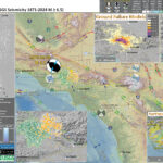
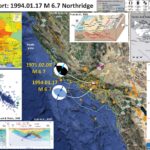
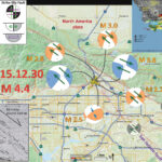
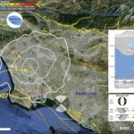
Late last night there was a sequence of earthquakes in southern California. The mainshock is a M 4.5 earthquake.

https://earthquake.usgs.gov/earthquakes/eventpage/ci38695658/executive

This temblor was widely felt across the southland (including by my mom, who was warned by earthquake early warning). This sequence happened in the same area as the 1987 Whittier Narrows Earthquake Sequence (which I felt as a child, growing up in Long Beach, CA).

https://earthquake.usgs.gov/earthquakes/eventpage/ci731691/executive

The tectonics of southern CA are dominated by the San Andreas fault (SAF) system. The SAF system is a right-lateral strike-slip plate boundary fault marking the boundary between the Pacific and North America plates.

Basically, the Pacific plate is moving northwest relative to the North America plate. Both plates are moving northwest relative to an Earth reference frame, but the Pacific plate is moving faster.

The SAF system goes through a bend in southern CA, which causes things to get complicated. There are sibling faults to the SAF, also right-lateral strike-slip (e.g. the San Jacinto and Elsinore faults).

Also, because of the fault geometry, there is considerable north-south compression that forms the mountain ranges to the north of the Los Angeles Basin. Some of the faults formed by this compression are the Sierra Madre, Hollywood, Compton, and Puente Hills faults.

A recent earthquake (2014) happened along one of these thrust fault systems. On 28 March 2014 (one day after the 50th anniversary of the Good Friday Earthquake in Alaska) there was an oblique thrust fault earthquake beneath La Habra, CA. My cousins felt that sequence and I remember them mentioning how their children kept waking up after every aftershock, some epicenters were located within a half km from their house.

https://earthquake.usgs.gov/earthquakes/eventpage/ci15481673/executive

This La Habra sequence appears to be related to the Puente Hills Thrust fault system (same for the Whittier Narrows Earthquake). Last night’s M 4.5 also appears to have slipped along a thrust fault on this system. Based on the depth, it looks like the earthquake slipped along the Lower Elysian Park ramp (see poster).

There were a few aftershocks. However, two of them I would rather interpret them as triggered earthquakes. The M 1.6 and M 1.9 earthquakes have strike-slip earthquake mechanisms (focal mechanisms = orange). These also have shallower [hypocentral] depths. There is mapped the Montebello fault, a right-lateral strike-slip fault, just to the east of the M 4.5 epicenter. The Montebello fault is a strand of the Whittier fault system.

So, while this may be incorrect, my initial interpretation is that these two M1+ events happened on the Montebello fault system and were triggered by the M 4.5 event.

There was also an historic earthquake on the Sierra Madre fault system. On 28 June 1991, there was a M 5.8 earthquake beneath the San Gabriel Mountains to the north of the LA Basin. This was also an oblique thrust earthquake.

https://earthquake.usgs.gov/earthquakes/eventpage/ci2021449/executive
Something that all these earthquakes share is that they occurred on blind thrust faults. Why are they called blind? Because they don’t reach the ground surface, so we cannot see them at the surface (thus, we are blind to them).

Below is my interpretive poster for this earthquake

  • I plot the seismicity from the past month, with diameter representing magnitude (see legend). I include earthquake epicenters from 1920-2020 with magnitudes M ≥ 4.5.
  • I plot the USGS fault plane solutions (moment tensors in blue and focal mechanisms in orange), possibly in addition to some relevant historic earthquakes.
  • A review of the basic base map variations and data that I use for the interpretive posters can be found on the Earthquake Reports page.
  • Some basic fundamentals of earthquake geology and plate tectonics can be found on the Earthquake Plate Tectonic Fundamentals page.

    I include some inset figures. Some of the same figures are located in different places on the larger scale map below.

  • In the upper left corner I include a map that shows the USGS tectonic faults and the USGS seismicity from the past 3 months. I highlight the North America and Pacific plates and their relative motion along the San Andreas fault system.
  • In the lower right corner I plot the epicenters related to this sequence. The topographic data here are high resolution LiDAR data from 2016 (publically available).
  • In the lower center left is a low-angle oblique block diagram from Daout at al. (2016) that shows the geometry of the major faults in this area (along with estimates of the slip rates for these faults).
  • Between the aftershock map and the oblique block diagram are two panels from Rollins et al. (2018). On the left is a map that shows the major fault systems, some historic earthquake mechanisms, and GPS derived plate motion vectors (the direction of relative motion is the orientation of the arrow and the velocity is the length of the arrow). I placed a blue star in the location of last night’s M 4.5. On the right are some cross sections through the subsurface (the location of these cross sections is shown as a dashed gray line on the map). The M 4.5 hypocentral depth is 16.9 km, which clearly plots on the Lower Elysian Park ramp (part of the Puente Hills fault system). Note how the Whittier fault, a strike-slip fault at the surface, soles into the Peunte Hills thrus.
  • In the upper right corner is a map where I plot a comparison of the CSIN intensity model results (using the MMI Intensity scale, read more about that here) and the USGS “Did You Feel It?” (dyfi) reports. The intensity map is based on a model of how intensity diminishes with distance from the earthquake. The dyfi results are from real observations from real people. See the plot below the map to check out how these data compare, but in a plot not a map.
  • To the left of the intensity comparisons is another map from Rollins et al. (2018) that shows how much these thrust fault systems are accumulating energy over time. Basically, the warmer colors (e.g. red) shows an area of the fault that is storing more energy per year relative to part of the fault that have less warm colors (e.g. yellow). The Sierra Madre fault system is storing the most energy, per year, of all thrust faults that Rollins and his colleagues studied.
  • Here is the map with a month’s seismicity plotted.

  • Two of the most notable historic earthquakes in southern CA are the 1971 Sylmar and 1994 Northridge earthquakes. Both earthquakes had a significant impact on the growth of knowledge about earthquake hazards in southern CA (and elsewhere), but they also resulted in major changes in how seismic hazards are recognized, codified, and mitigated throughout the state (with impacts nationwide and worldwide). And, both of these earthquakes also happened on blind thrust faults, just like last night’s M 4.5!
  • The 1906 San Francisco and 1933 Long Beach earthquakes led to major changes in the state too. 1933 Long Beach particularly led to changes in how schools are built and resulted in the strongest building code (relative to earthquakes) in the country as the time. These changes were eventually adopted statewide, nationwide, and globally (via the universal building code). Check out the Field Act to learn more about this.
  • The 1971 Sylmar Earthquake happened on a previously unrecognized fault (because it is blind) and caused lots of damage and many casualties. Perhaps most notably was the veterans hospital which was built across a fault. This fault slipped during the earthquake (triggered by the mainshock). Because the fault slipped beneath the hospital, the hospital was cut in half.
  • This was quite educational, to learn that when an earthquake fault slips beneath a building, the building does not (generally) perform well. After this earthquake, state senators Alquist and Priolo wrote and helped to get passed the Alquist-Priolo Act. This act required the state (via the California Geological Survey (CGS), where I work) to identify all active faults in the state. The Board of Mines and Geology (BMG) prepared regulations that help manage development (i.e. construction of buildings) in AP zones. Read more about the AP Act here.
  • The 1994 Northridge Earthquake, with a similar magnitude as the 1971 Sylmar quake, caused extensive damage throughout the San Fernando Valley (like, totally dude) and beyond. There are famous photos of the damage to bridges of the 5 and 14 interchange (interstate 5 and state route 14). The 1994 Northridge Earthquake led to the development of the Seismic Hazards Mapping Act. The CGS and the BMG both have mandates related to the SHMA (I work as part of the Seismic Hazards Mapping Program at CGS). Read more about the SHMA here.
  • Read more about the 1971 Sylmar Earthquake here.
  • Read more about the 1994 Northridge Earthquake here.

Other Report Pages

Some Relevant Discussion and Figures

  • Here is a great map from Wallace (1990) that shows the major faults associated with the San Andreas fault system.

  • Generalized topographic map of southern California, showing major faults with Quaternary activity in the San Andreas firnit system. Faults dotted where concealed by water: hachures on contours indicate area of closed low.

  • This is a more updated map from Tucker and Dolan (2001) prepared for their study of the Sierra Madre fault.

  • Regional neotectonic map for metropolitan southern California showing major active faults. The Sierra Madre fault is a 75-km-long active reverse fault that extends along the northern edge of the metropolitan region. Fault locations are from Ziony and Jones (1989), Vedder et al. (1986), Dolan and Sieh (1992), Sorlien (1994), and Dolan et al. (1997, 2000b). Closed teeth denote reverse fault surface trace; open teeth on dashed lines show upper edge of blind thrust fault ramps. Strike-slip fault surface traces shown by double arrows. Star denotes location of Oak Hill paleoseismologic trench site of Bonilla (1973). CSI, Clamshell-Sawpit fault; ELATB, East Los Angeles blind thrust system; EPT, Elysian park blind thrust fault; Hol Fl, Hollywood fault; PHT, Puente Hills blind thrust fault; RMF, Red Mountain fault; SCII, Santa Cruz Island fault; SSF, Santa Susana fault; SJcF, San Jacinto fault; SJF, San Jose fault; VF, Verdugo fault; A, Altadena study site of Rubin et al. (1998); LA, Los Angeles; LB, Long Beach; LC, La Crescenta; M, Malibu; NB, Newport Beach; Ox, Oxnard; P, Pasadena; PH, Port Hueneme; S, Horsethief Canyon study site in San Dimas; V, Ventura. Dark shading denotes mountains.

  • This is a great low angle oblique view of the faults in the southland from Fuis et al. (2001). Note that the SAF geometry creates North-South compression in this area (that causes the thrust faults, some of hem are blind).

  • Schematic block diagram showing interpreted tectonics in vicinity of LARSE line 1. Active faults are shown in orange, and moderate and large earthquakes are shown with orange stars and attached dates, magnitudes, and names. Gray half-arrows show relative motions on faults. Small white arrows show block motions in vicinities of bright reflective zones A and B (see Fig. 2A). Large white arrows show relative convergence direction of Pacific and North American plates. We interpret a master de´collement ascending from bright reflective zone A at San Andreas fault, above which brittle upper crust is imbricating along thrust and reverse faults and below which lower crust is flowing toward San Andreas fault (brown arrows) and depressing Moho. Fluid injection, indicated by small lenticular blue areas, is envisioned in bright reflective zones A and B.

  • This is an updated figure from Daout et al. (2016). The slip rates are included for each fault.

  • Three-dimensional schematic block model across the SGM [after Fuis et al., 2001b] superimposed to the digital elevation model, the seismicity (yellow dots), the Moho model (red line), and interpreted active faults summarizing the average interseismic strike-slip (back arrows) and dip-slip (red arrows) rates extracted from the Bayesian exploration. Shallow faults (dashed lines) that formed a complex three-dimensional system at the surface [Plesch et al., 2007] are locked during the interseismic period, while the ramp-décollement system (solid lines) decouples the upper crust from the lower crust and partitioned the observed uniform velocity field (blue vector) at the downdip end of the structures.

  • Here is a summary of the historic earthquakes in southern CA from Hauksson et al. (1995). They include earthquake mechanisms (B) and the regions impacted (A).

  • (a) Significant earthquakes of M > 4.8 that have occurred in the greater Los Angeles basin area since 1920. Aftershock zones are shaded with cross hatching, including the 1994 Northridge earthquake. Dotted areas indicate surface rupture, including the rupture of the 1857 earthquake along the San Andreas fault. (b) Lower hemisphere focal mechanisms (shaded quadrants are compressional) for significant earthquakes that have occurred since 1933 in the greater Los Angeles area.

  • This is an important figure from Leon et al. (2007) that shows their interpretation of the different faults in the Puente Hills fault system. They highlight the location of the 1987 Whittier Narrows Earthquake, which was to the north of last nights M 4.5.

  • This is also an important figure as it shows some additional faults (Shaw et al., 2002). The M 4.5 most likely occurred on the Lower Elysian Park fault.

  • Structure contour map of the PHT in relation to other major thrust and strike-slip systems in the northern LA basin. Contour interval is 1 km; depths are subsea. Map coordinates are UTM Zone 11, NAD27 datum.

  • What follows are a series of figures from Rollins et al. (2018). They studied the strain accumulation (the accumulation of energy in a fault system over time) for the three main thrust fault systems in the LA Basin.
  • Here is their first figure that shows the relative plate motions as observed using GPS sites.

  • (a) Tectonics and shortening in the Los Angeles region. Dark blue arrows are shortening-related GPS velocities relative to the San Gabriel Mountains (Argus et al., 2005). Contours are uniaxial strain rate (rate of change of εxx) in the N ~5° E direction estimated from the GPS using the method of Tape et al. (2009). Background shading is the shear modulus at 100-m depth in the CVM*, a heterogeneous elastic model based on the Community Velocity Model (Süss & Shaw, 2003; Shaw et al., 2015) that we create and use in this study (section 4). Black lines are upper edges of faults, dashed for blind faults. Epicenters of the 1971, 1987, and 1994 earthquakes are from Southern California Earthquake Data Center; focal mechanisms are from Heaton (1982) for 1971 and Global CMT Catalog for 1987 and 1994. Profile A-A0 follows LARSE line 1 (Fuis et al., 2001) onshore and line M-M0 of Sorlien et al. (2013) offshore. SGF = San Gabriel Fault; SSF = Santa Susana Fault. VF = Verdugo Fault. SAF = San Andreas Fault. CuF = Cucamonga Fault. A-DF = Anacapa-Dume Fault. SMoF = Santa Monica Fault. HF = Hollywood Fault. RF = Raymond Fault. UEPF = Upper Elysian Park Fault. ChF = Chino Fault. WF = Whittier Fault. N-IF = Newport-Inglewood Fault. PVF = Palos Verdes Fault. (b) GPS velocities on islands. (c) Tectonic setting. Black lines and pairs of half-arrows, respectively, are major faults and their slip senses. Black arrow is Pacific Plate velocity relative to North American plate from Kreemer et al. (2014). GF = Garlock Fault. SJF = San Jacinto Fault. EF = Elsinore Fault. SB = Santa Barbara. LA = Los Angeles. SD = San Diego.

  • Here is their cross section through this part of the LA Basin. The location of this cross section is marked on the above map as a gray dashed line.

  • (a) Cross sections of faults, structure, north-south contraction, and seismicity along profile A-A0 . Red lines are fault surfaces as meshed here (Figure 3), dashed where uncertain (Shaw & Suppe, 1996; Shaw & Shearer, 1999; Fuis et al., 2012). Geometries of basin, basement, and mantle are from Shaw et al. (2015); geometry of base of Fernando Formation (boundary between beige and tan units of the basin) is interpolated from Sorlien et al. (2013; offshore), Wright (1991; coastline to Whittier Fault), and Yeats (2004; Whittier Fault to Sierra Madre Fault); topography is from Fuis et al. (2012). (b) Projections of Argus et al. (2005) GPS velocities (relative to San Gabriel Mountains) onto the direction N 5° E and 1σ uncertainties. Note that stations on Palos Verdes are plotted left of the coastline as the offshore section of profile A-A0 passes alongside Palos Verdes (Figure 1a). (c) Seismotectonic features. Distribution of shear modulus is from the CVM*, the heterogeneous elastic model used in this study (section 4). Translucent white circles are relocated 1981–2016 M ≥ 2 earthquakes whose epicenters lie within the mesh area of the three thrust faults and decollement (Hauksson et al., 2012 and updated). PVF = Palos Verdes Fault; N-IF = Newport-Inglewood Fault; WF = Whittier Fault.

  • I love this map because it shows how these thrust faults dip into the Earth to the north.

  • geometries of the three main thrust faults beneath the Los Angeles basin (section 4), colored by depth, and 1981–2016 M ≥ 2.5 earthquakes within the mesh area from Hauksson et al. (2012 and updated), scaled by magnitude (white-filled circles). Gray-filled circles are 1981–2016 M ≥ 4.5 earthquakes outside the mesh area. Inferred paleoearthquakes are from Rubin et al. (1998) and Leon et al. (2007, 2009). SAF = San Andreas Fault.

  • Finally, we see how they model the amount of plate tectonic motion is accumulated as tectonic strain on these faults. Chris is one of the smartest plate tectonicists I know, so read his paper (several times).

  • Estimates of moment deficit accumulation rate from combining the four interseismic strain accumulation models. (a) Spatial distribution of moment deficit accumulation rate per area. (Values are on the order of ~108 N m -1 yr -1 as the moment deficit accumulation rate per patch is on the order of 1015 N m -1 yr -1 [Figure S11] and the patches are a few kilometers (a few thousand meters) on a side.) (b) Unified PDF of moment deficit accumulation rate (dark blue object) formed by combining the PDFs from the four strain accumulation models. The PDF would follow the red curve if strain accumulation updip of the tips of the Puente Hills and Compton faults (PHF and CF) were counted.

18 April 1906 San Francisco Earthquake

Today is the anniversary of the 18 April 1906 San Francisco Earthquake. There are few direct observations (e.g. from seismometers or other instruments) from this earthquake, so our knowledge of how strong the ground shook during the earthquake are limited to indirect measurements.
Below I present a poster that shows a computer simulation that provides an estimate of the intensity of the ground shaking that may happen if the San Andreas fault slipped in a similar way that it did in 1906.
The USGS prepares these ShakeMap scenario maps so that we can have an estimate of the ground shaking from hypothetical earthquakes. I present a poster below that uses data from one of these scenarios. This is a scenario that is similar to what we think happened in 1906, but it is only a model.
There is lots about the 1906 Earthquake that I did not include, but this leaves me room for improvement for the years into the future, when we see this anniversary come again.

Below is my interpretive poster for this earthquake

I plot the seismicity from the past month, with color representing depth and diameter representing magnitude (see legend). I include earthquake epicenters from 1900-2018 with magnitudes M ≥ 5.5.
I plot the USGS fault plane solutions (moment tensors in blue and focal mechanisms in orange), possibly in addition to some relevant historic earthquakes.

  • I placed a moment tensor / focal mechanism legend on the poster. There is more material from the USGS web sites about moment tensors and focal mechanisms (the beach ball symbols). Both moment tensors and focal mechanisms are solutions to seismologic data that reveal two possible interpretations for fault orientation and sense of motion. One must use other information, like the regional tectonics, to interpret which of the two possibilities is more likely.
  • I also include the shaking intensity contours on the map. These use the Modified Mercalli Intensity Scale (MMI; see the legend on the map). This is based upon a computer model estimate of ground motions, different from the “Did You Feel It?” estimate of ground motions that is actually based on real observations. The MMI is a qualitative measure of shaking intensity. More on the MMI scale can be found here and here. This is based upon a computer model estimate of ground motions, different from the “Did You Feel It?” estimate of ground motions that is actually based on real observations.

    Magnetic Anomalies

  • In the map below, I include a transparent overlay of the magnetic anomaly data from EMAG2 (Meyer et al., 2017). As oceanic crust is formed, it inherits the magnetic field at the time. At different points through time, the magnetic polarity (north vs. south) flips, the North Pole becomes the South Pole. These changes in polarity can be seen when measuring the magnetic field above oceanic plates. This is one of the fundamental evidences for plate spreading at oceanic spreading ridges (like the Gorda rise).
  • Regions with magnetic fields aligned like today’s magnetic polarity are colored red in the EMAG2 data, while reversed polarity regions are colored blue. Regions of intermediate magnetic field are colored light purple.
  • We can see the roughly north-south trends of these red and blue stripes. These lines are parallel to the ocean spreading ridges from where they were formed.

    I include some inset figures. Some of the same figures are located in different places on the larger scale map below.

  • On the right is a map from Wallace (1990) that shows the main faults that are part of the Pacific – North America plate boundary. The San Andreas fault is the locus of a majority of this relative plate motion.
  • In the upper right, to the left of the Wallace map, is a map of the entire state of California. This map shows the shaking potential for different regions based on an estimate of earthquake probability. Pink areas are more likely to experience stronger ground shaking, more frequently, than areas colored green.
  • In the lower right, to the left of the Wallace map, is a photo showing a fence that was offset during the 1906 earthquake. The relative distance between these fences is about 2.6 meters (Lawson, 1908; Aargard and Bowza, 2008).
  • In the upper left corner is a map showing an estimate of the ground motions produced by the 1906 San Francisco earthquake, based on Song et al. (2008) source model (Aargard et al., 2008).
  • In the lower left corner is a figure that shows the historic earthquakes for hte San Francisco Bay region (Aagaard et al., 2016). Note that they find there to be a 72% chance of an earthquake with manitude 6.7 or greater between 2014 and 2043.
  • Here is the map with a month’s seismicity plotted.

  • Here is the photo of the offset fence (Aargard and Bowza, 2008).

  • Fence half a mile northwest of Woodville (east of Point Reyes), offset by approximately 2.6 m of right-lateral strike-slip motion on the San Andreas fault in the 1906 San Francisco earthquake (U.S. Geological Survey Photographic Library, Gilbert, G. K. 2845).

  • Here is the USGS ShakeMap (Aargard et al., 2008)

  • ShakeMap for the 1906 San Francisco earthquake based on the Boatwright and Bundock (2005) intensities (processed 18 October 2005). Open circles identify the intensity sites used to construct the ShakeMap.

  • In the map above, we can see that the ground shaking was quite high in Humboldt County, CA. Below is a photo from Dengler et al. (2008) that shows headscarps to some lateral slides that failed as a result of the 1906 earthquake. This is the tupe of failure that extended across a much larger landscape for the 28 September 2018 Dongalla / Palu earthquake and tsunami.

  • Spread failures on the banks of the Eel River near Port Kenyon in 1906. Photo E. Garrett, courtesy of Peter Palmquist.

  • Here is a map that shows the estimate for the location of the epicenter for the mainshock of the 1906 earthquake. See Lomax (2008) for more on this.

  • I place a map shows the configuration of faults in central (San Francisco) and northern (Point Delgada – Punta Gorda) CA (Wallace, 1990). Here is the caption for this map, that is on the lower left corner of my map. Below the citation is this map presented on its own.

  • Geologic sketch map of the northern Coast Ranges, central California, showing faults with Quaternary activity and basin deposits in northern section of the San Andreas fault system. Fault patterns are generalized, and only major faults are shown. Several Quaternary basins are fault bounded and aligned parallel to strike-slip faults, a relation most apparent along the Hayward-Rodgers Creek-Maacama fault trend.

  • Here is the figure showing the evolution of the SAF since its inception about 29 Ma. I include the USGS figure caption below as a blockquote.

  • EVOLUTION OF THE SAN ANDREAS FAULT.
    This series of block diagrams shows how the subduction zone along the west coast of North America transformed into the San Andreas Fault from 30 million years ago to the present. Starting at 30 million years ago, the westward- moving North American Plate began to override the spreading ridge between the Farallon Plate and the Pacific Plate. This action divided the Farallon Plate into two smaller plates, the northern Juan de Fuca Plate (JdFP) and the southern Cocos Plate (CP). By 20 million years ago, two triple junctions began to migrate north and south along the western margin of the West Coast. (Triple junctions are intersections between three tectonic plates; shown as red triangles in the diagrams.) The change in plate configuration as the North American Plate began to encounter the Pacific Plate resulted in the formation of the San Andreas Fault. The northern Mendicino Triple Junction (M) migrated through the San Francisco Bay region roughly 12 to 5 million years ago and is presently located off the coast of northern California, roughly midway between San Francisco (SF) and Seattle (S). The Mendicino Triple Junction represents the intersection of the North American, Pacific, and Juan de Fuca Plates. The southern Rivera Triple Junction (R) is presently located in the Pacific Ocean between Baja California (BC) and Manzanillo, Mexico (MZ). Evidence of the migration of the Mendicino Triple Junction northward through the San Francisco Bay region is preserved as a series of volcanic centers that grow progressively younger toward the north. Volcanic rocks in the Hollister region are roughly 12 million years old whereas the volcanic rocks in the Sonoma-Clear Lake region north of San Francisco Bay range from only few million to as little as 10,000 years old. Both of these volcanic areas and older volcanic rocks in the region are offset by the modern regional fault system. (Image modified after original illustration by Irwin, 1990 and Stoffer, 2006.)

Tectonic History of Western North America and Southern California

  • Here is an animation from Tanya Atwater that shows how the Pacific-North America plate margin evolved over the past 40 million years (Ma).

Some Relevant Discussion and Figures

  • Here is the shaking potential map for California.

  • Here is the earthquake timeline (Aagaard et al., 2016).

  • This map shows the relative contribution that each fault has for the chance of earthquakes in the region. For example, this shows that the Hayward fault is the fault with the highest chance of rupture (Aagaard et al., 2016).

Geologic Fundamentals

  • For more on the graphical representation of moment tensors and focal mechanisms, check this IRIS video out:
  • Here is a fantastic infographic from Frisch et al. (2011). This figure shows some examples of earthquakes in different plate tectonic settings, and what their fault plane solutions are. There is a cross section showing these focal mechanisms for a thrust or reverse earthquake. The upper right corner includes my favorite figure of all time. This shows the first motion (up or down) for each of the four quadrants. This figure also shows how the amplitude of the seismic waves are greatest (generally) in the middle of the quadrant and decrease to zero at the nodal planes (the boundary of each quadrant).

  • Here is another way to look at these beach balls.
  • There are three types of earthquakes, strike-slip, compressional (reverse or thrust, depending upon the dip of the fault), and extensional (normal). Here is are some animations of these three types of earthquake faults. The following three animations are from IRIS.
  • Strike Slip:

    Compressional:

    Extensional:

  • This is an image from the USGS that shows how, when an oceanic plate moves over a hotspot, the volcanoes formed over the hotspot form a series of volcanoes that increase in age in the direction of plate motion. The presumption is that the hotspot is stable and stays in one location. Torsvik et al. (2017) use various methods to evaluate why this is a false presumption for the Hawaii Hotspot.

  • A cutaway view along the Hawaiian island chain showing the inferred mantle plume that has fed the Hawaiian hot spot on the overriding Pacific Plate. The geologic ages of the oldest volcano on each island (Ma = millions of years ago) are progressively older to the northwest, consistent with the hot spot model for the origin of the Hawaiian Ridge-Emperor Seamount Chain. (Modified from image of Joel E. Robinson, USGS, in “This Dynamic Planet” map of Simkin and others, 2006.)

  • Here is a map from Torsvik et al. (2017) that shows the age of volcanic rocks at different locations along the Hawaii-Emperor Seamount Chain.

  • Hawaiian-Emperor Chain. White dots are the locations of radiometrically dated seamounts, atolls and islands, based on compilations of Doubrovine et al. and O’Connor et al. Features encircled with larger white circles are discussed in the text and Fig. 2. Marine gravity anomaly map is from Sandwell and Smith.

  • Here is a great tweet that discusses the different parts of a seismogram and how the internal structures of the Earth help control seismic waves as they propagate in the Earth.

    Social Media

Return to the Earthquake Reports page.


Earthquake Report: Channel Islands Update #1

Well well.
There was lots of interest in this M 5.3 earthquake offshore of Ventura/Los Angeles, justifiably so. Southern California is earthquake country.

Here is an update. There was lots of information that I was trying to incorporate and I needed an additional report to cover some of this material. That being said, there is still some mystery about this earthquake. My favored interpretation is that this EQ was a left-lateral strike-slip earthquake. There is still room to interpret this as a right-lateral strike-slip (llss) earthquake however.

Below I have prepared some figures that provide additional information that helps us learn about the faulting and basin development in the CA Borderlands here. There is lots of work that has been done here and this is far from a comprehensive analysis.

As I mentioned before (here is my initial Earthquake Report for this EQ), due to the big bend in the San Andreas fault (SAF) in southern CA, there is evidence for compression in the form of thrust faults and uplifted mountains (e.g. Sierra Madre fault and the San Gabriel Mtns). One of these thrust faults (which may also have some strike-slip motion) is the Hollywood fault (recently highlighted by the recent work by the CA Geological Survey).

Also part of the development of the SAF involved the clockwise rotation of a crustal block where the Transverse Ranges are (the mtns to the north of Ventura/Santa Barbara). Along the southern boundary of the Transverse Ranges formed left-lateral strike slip faults. The Santa Cruz Island fault just happens to be a left-lateral strike-slip fault.

The CA Borderlands is a complex region of faulting, inheriting structures from the Tertiary, overprinted by modern tectonics and everything in between. The Hollywood fault trends towards (and turns into?) the Malibu Coast fault, which may turn into the Santa Cruz Island fault (SCIF), a vertical left-lateral strike-slip fault (but may have some vertical motion on it, based upon offsets in vertical uplift rates from marine terrace profiles).

Schindler used seismic reflection profiles in the Santa Cruz Basin area to interpret the tectonic history here. I placed the faults interpreted by them as orange lines in the interpretive poster (labeled as the Ferrelo fault and the East Santa Cruz (ECS) Basin fault system). The ESCBFS is a thrust fault system, with possible oblique motion (strike-slip). My initial interpretation was that this M 5.3 was a llss earthquake associated with this fault. There are some interesting problems that arise considering this fault. To the south, the fault is oriented similar to the San Clemente fault (which may have had a M 5.5 right-lateral strike-slip (rlss) earthquake on 1981.09.04). Due to this, the simple interpretation is that the ESCBFS is right lateral oblique at the southern part of the Santa Cruz Basin. However, along the northern boundary of this basin, the ESCBFS rotates to an east-west strike (orientation). The simple interpretation would be that this part of the fault system would be llss, similar to the SCIF. So, clearly, things are not so simple here. See the Chaytor et al. (2008) figure below.

That being said, if this M 5.3 earthquake was on an east-west fault, it would be llss. There is no evidence for a north-south oriented fault on the western boundary of the Santa Cruz Basin (see Schindler (2007) seismic profile below), supporting the left-lateral interpretation.

Below is my interpretive poster for this earthquake

I plot the seismicity from the past month, with color representing depth and diameter representing magnitude (see legend). I include earthquake epicenters from 1918-2018 with magnitudes M ≥ 4.5.

I plot the USGS fault plane solutions (moment tensors in blue and focal mechanisms in orange) for the M 5.3 earthquake, in addition to some relevant historic earthquakes (including the 1971 Sylmar and 1994 Northridge earthquakes, as evidence for the compression in the region).

  • I placed a moment tensor / focal mechanism legend on the poster. There is more material from the USGS web sites about moment tensors and focal mechanisms (the beach ball symbols). Both moment tensors and focal mechanisms are solutions to seismologic data that reveal two possible interpretations for fault orientation and sense of motion. One must use other information, like the regional tectonics, to interpret which of the two possibilities is more likely.
  • I also include the shaking intensity contours on the map. These use the Modified Mercalli Intensity Scale (MMI; see the legend on the map). This is based upon a computer model estimate of ground motions, different from the “Did You Feel It?” estimate of ground motions that is actually based on real observations. The MMI is a qualitative measure of shaking intensity. More on the MMI scale can be found here and here. This is based upon a computer model estimate of ground motions, different from the “Did You Feel It?” estimate of ground motions that is actually based on real observations.
  • I include the slab contours plotted (Hayes et al., 2012), which are contours that represent the depth to the subduction zone fault. These are mostly based upon seismicity. The depths of the earthquakes have considerable error and do not all occur along the subduction zone faults, so these slab contours are simply the best estimate for the location of the fault.
  • I include some inset figures.

  • In the upper left corner is a cross section from Shaw and Suppe (1994). This cross section location is shown on the interpretive poster as a blue line labeled X-Y. This cross section (from interpretations of offshore seismic reflection profiles) shows the major player here is a thrust fault, the Channel Islands Thrust. Note the SCIF is also shown to rip right through Santa Cruz Island.
  • In the upper right corner is a map that shows the area of this fault ramp of the Channel Islands Thrust (Shaw and Suppe, 1994). Note that this fault ramp area is also shown on the interpretive poster, outlined in light orange.
  • In the center left is a figure from Fuis et al. (2001) that shows a block diagram revealing how the north-south convergence (from the bend in the San Andreas) is accommodated by thrust/reverse faults. The Sierra Madre fault is also labeled on the interpretive poster. A recent earthquake in La Habra is an example of this north-south compression. Here are my report and report update for this M 5.1 La Habra earthquake.
  • In the lower left corner is a seismic reflection profile from Schindler (2007), from her Master’s Thesis. The profile A-A’ is shown on the map as a green line labeled A-A’. Note that there is no faulting on the western boundary of the Santa Cruz Basin. When I first looked at this section, I thought that the ESCBFS were either normal (extensional) or strike-slip faults. After reading her thesis, I learned that these faults did have normal offset (in the Miocene Epoch, part of the Tertiary Period), but have been reactivated as thrust faults in post-Miocene time. The San Clemente fault (labeled on the interpretive poster) turns into the Santa Cruz-Catalina Ridge fault (labeled on this cross section).
  • In the lower right corner is a figure that shows how these faults interact in a complicated manner (Sorlien et al., 2006). This figure was prepared after they interpreted seismic reflection profile data. The upper panel is a low-angle oblique view of the faults in 3-D view. The lower two panels are the cross sections B-B’ and E-E’ (also shown on the interpretive poster as orange lines). These cross sections show how the Malibu Coast fault is more deeply dipping (more close to vertical) compared to the Santa Monica-Dume fault (a shallow dipping thrust fault). Both of these faults appear to join in some way near the coast, where they turn into the Hollywood fault. There are probably some inaccuracies in how I am interpreting how these faults interact beyond the limit of the figures I present here.


  • Here is the same map including the magnetic anomaly data (the red and blue shades).


USGS Earthquake Pages

Some Relevant Discussion and Figures

  • Here is a map that shows where the seismic profile was acquired (Shaw and SUppe, 1994).

  • Epicenters from an earthquake swarm in 1984 (Henyey and Teng, 1985) define the active axial surface (A) of the Offshore Oak Ridge trend. Single-event (C and D) and composite (E and F) focal mechanism solutions from the 1984 seismicity have gentle north dipping (C, D, and E) and horizontal (F) nodal planes (Henyey and Teng, 1985) consistent with folding through the active axial surfaces by bedding parallel slip (see Figure 10B). Cross section traces: X-X’ (Fig. 7); X-Y (Fig. 11). SCIF = Santa Cruz Island fault.

  • Here is the cross section. The upper panel shows the modern configuration and the lower panel shows their interpretation during the Tertiary (Shaw and Suppe, 1994).

  • A balanced geologic cross section across the eastern Santa Barbara Channel and Santa Cruz Island combines subsurface seismic reflection and well-log data (the section trace is in Figs. 1 and 10A). The Channel Islands thrust ramps beneath the Offshore Oak Ridge trend and approaches the surface south of Santa Cruz Island. The kink-band width (A-A’) of the Offshore Oak Ridge trend represents dip slip on the underlying Channel Islands thrust. The shallow fold and fault geometry along the Offshore Oak Ridge and Blue Bottle trends is depicted in Figure 7. Strike-slip motion out of the section plane may occur on the Santa Cruz Island fault; however, moderate displacements on this fault should not significantly effect our area balance and restoration, because the strike-slip fault trace is perpendicular to the section plane (Fig. 10A). SCIF = Santa Cruz Island fault. Horizontal equals vertical scale.

  • For background, here is a timeline for the tectonics along the Pacific-North America plate boundary (Schindler, 2007). The Transverse Ranges block is shown as a green bleb labeled WTR. Note how this block is rotating in a clockwise fasion, and see that there are strike-slip faults that form along the block edge to accommodate this rotation.

  • A simple tectonic model of the evolution of the Pacific-North American plate boundary that includes the Inner and Outer Borderland (IB, OB) and rotation of the western Transverse Ranges (WTR) province (from Nicholson et al, 1994). The model assumes a constant rate and direction of Pacific plate motion and constant rate of western Transverse Ranges rotation. As each partially subducted microplate is captured by the Pacific plate (Monterey, ~19 Ma; Arguello, ~17.5 Ma; Guadalupe and Magdalena, ~12 Ma), this results in a transfer of part of the over-riding North American upper plate to the Pacific plate. The fine gray lines provide a reference grid fixed to North America. ArP-Arguello plate; GP-Guadalupe plate; MtP-Monterey plate; SG-San Gabriel block; JdFP-Juan de Fuca plate; SLB-San Lucia Bank; SMB-Santa Maria basin; SB-southern Borderland;T-AFTosco- Arbreojos fault; MP-Magdalena plate. Red areas are regions of transtension; Purple areas are captured or soon to be captured microplates.

  • Here is the seismic reflection profile from Schindler (2010).

  • Regional seismic line WC82-108 showing the ~50 km wide Santa Rosa Ridge anticlinorium. Parallel bedding of pre-Pliocene strata indicates that this anticlinal structure formed post Miocene. The Cretaceous-Paleogene sedimentary rocks are eroded by the early Miocene unconformity (green) and truncate against basement (black arrows). Mapped reference horizons and faults are shown in color and in black, respectively.

  • This is a fantastic low-angle oblique view of the topography and bathymetry of this region (and the Santa Cruz Basin) from Schindler (2010). The figure caption is embedded in the figure.

  • This is the figure from Schindler (2010) that shows the geometry of the ESCBFS and Ferrlo faults. Red shows the upper part of the faults. These faults dip to the north, northeast, and east.

  • A map view of 3D fault surfaces surrounding Santa Cruz basin in the northern Borderland. Depths down-dip along fault surfaces are shown as changing colors at even kilometer levels. The ESCB fault system is observed to be a gently east- to northeast-dipping, right stepping, en echelon reactivated reverse or oblique-reverse fault that bends to become more northerly dipping as it approaches Santa Cruz Island.

  • There has been lots of work here. Jason Chaytor (now at USGS in Woods Hole) worked on submerged marine terraces in this region. These marine terraces were formed when sea level was lower and are a result of erosion from ocean waves at that time. Dr. Chaytor used radiometric ages and sea level curve data to evaluate the tectonic uplift in the region. Here is a map that shows Jason’s interpretation of the seismic profiles for this region (same seismic data used by Schindler).

  • Preliminary map of geologic structures currently mapped using multichannel sparker, and recently released WesternGeco multichannel seismic-reflection profiles (modified from Chaytor, 2006). SCIF—Santa Cruz Island fault.

Geologic Fundamentals

  • For more on the graphical representation of moment tensors and focal mechnisms, check this IRIS video out:
  • Here is a fantastic infographic from Frisch et al. (2011). This figure shows some examples of earthquakes in different plate tectonic settings, and what their fault plane solutions are. There is a cross section showing these focal mechanisms for a thrust or reverse earthquake. The upper right corner includes my favorite figure of all time. This shows the first motion (up or down) for each of the four quadrants. This figure also shows how the amplitude of the seismic waves are greatest (generally) in the middle of the quadrant and decrease to zero at the nodal planes (the boundary of each quadrant).

  • There are three types of earthquakes, strike-slip, compressional (reverse or thrust, depending upon the dip of the fault), and extensional (normal). Here is are some animations of these three types of earthquake faults. The following three animations are from IRIS.
  • Strike Slip:

    Compressional:

    Extensional:

Social Media

    References:

    Basic & General References

  • Frisch, W., Meschede, M., Blakey, R., 2011. Plate Tectonics, Springer-Verlag, London, 213 pp.
  • Hayes, G., 2018, Slab2 – A Comprehensive Subduction Zone Geometry Model: U.S. Geological Survey data release, https://doi.org/10.5066/F7PV6JNV.
  • Holt, W. E., C. Kreemer, A. J. Haines, L. Estey, C. Meertens, G. Blewitt, and D. Lavallee (2005), Project helps constrain continental dynamics and seismic hazards, Eos Trans. AGU, 86(41), 383–387, , https://doi.org/10.1029/2005EO410002. /li>
  • Jessee, M.A.N., Hamburger, M. W., Allstadt, K., Wald, D. J., Robeson, S. M., Tanyas, H., et al. (2018). A global empirical model for near-real-time assessment of seismically induced landslides. Journal of Geophysical Research: Earth Surface, 123, 1835–1859. https://doi.org/10.1029/2017JF004494
  • Kreemer, C., J. Haines, W. Holt, G. Blewitt, and D. Lavallee (2000), On the determination of a global strain rate model, Geophys. J. Int., 52(10), 765–770.
  • Kreemer, C., W. E. Holt, and A. J. Haines (2003), An integrated global model of present-day plate motions and plate boundary deformation, Geophys. J. Int., 154(1), 8–34, , https://doi.org/10.1046/j.1365-246X.2003.01917.x.
  • Kreemer, C., G. Blewitt, E.C. Klein, 2014. A geodetic plate motion and Global Strain Rate Model in Geochemistry, Geophysics, Geosystems, v. 15, p. 3849-3889, https://doi.org/10.1002/2014GC005407.
  • Meyer, B., Saltus, R., Chulliat, a., 2017. EMAG2: Earth Magnetic Anomaly Grid (2-arc-minute resolution) Version 3. National Centers for Environmental Information, NOAA. Model. https://doi.org/10.7289/V5H70CVX
  • Müller, R.D., Sdrolias, M., Gaina, C. and Roest, W.R., 2008, Age spreading rates and spreading asymmetry of the world’s ocean crust in Geochemistry, Geophysics, Geosystems, 9, Q04006, https://doi.org/10.1029/2007GC001743
  • Pagani,M. , J. Garcia-Pelaez, R. Gee, K. Johnson, V. Poggi, R. Styron, G. Weatherill, M. Simionato, D. Viganò, L. Danciu, D. Monelli (2018). Global Earthquake Model (GEM) Seismic Hazard Map (version 2018.1 – December 2018), DOI: 10.13117/GEM-GLOBAL-SEISMIC-HAZARD-MAP-2018.1
  • Silva, V ., D Amo-Oduro, A Calderon, J Dabbeek, V Despotaki, L Martins, A Rao, M Simionato, D Viganò, C Yepes, A Acevedo, N Horspool, H Crowley, K Jaiswal, M Journeay, M Pittore, 2018. Global Earthquake Model (GEM) Seismic Risk Map (version 2018.1). https://doi.org/10.13117/GEM-GLOBAL-SEISMIC-RISK-MAP-2018.1
  • Zhu, J., Baise, L. G., Thompson, E. M., 2017, An Updated Geospatial Liquefaction Model for Global Application, Bulletin of the Seismological Society of America, 107, p 1365-1385, https://doi.org/0.1785/0120160198
  • Specific References

  • Chaytor, J.D., Goldfinger, C., Meiner, M.A., Huftile, G.J., Romsost, C.G., Legg, M.R., 2008. Measuring vertical tectonic motion at the intersection of the Santa Cruz–Catalina Ridge and Northern Channel Islands platform, California Continental Borderland, using submerged paleoshorelines in GSA Bulletin, v. 120, no. 7/8, p. 1053-1071, doi: 10.1130/B26316.1
  • Du, X., Hendy, I., Schimmelmann, 2018. A 9000-year flood history for Southern California: A revised stratigraphy of varved sediments in Santa Barbara Basin in Marine Geology, v. 397, p. 29-42, https://doi.org/10.1016/j.margeo.2017.11.014
  • Fuis, G.S., Ryberg, T., Godfrey, N.J., Okaya, D.A., Murphy, J.M., 2001. Crustal structure and tectonics from the Los Angeles basin to the Mojave Desert, southern California in Geology, v. 29, no. 1, p. 15-18
  • Legg, M. R., M. D. Kohler, N. Shintaku, and D. S. Weeraratne, 2015. Highresolution mapping of two large-scale transpressional fault zones in the California Continental Borderland: Santa Cruz-Catalina Ridge and Ferrelo faults, J. Geophys. Res. Earth Surf., 120, 915–942, doi:10.1002/2014JF003322.
  • Pinter, N., Lueddecke, S.B., Keller, E.A., Simmons, K.R., 1998. Late Quaternary slip on the Santa Cruz Island fault, California in GSA Bulletin, v. 110, no. 6, p. 711-722
  • Pinter, N., Johns, B., Little, B., Vestal, W.D., 2001. Fault-Related Folding in California’s Northern Channel Islands Documented by Rapid-Static GPS Positioning in GSA Today, May, 2001
  • Schindler, C.S., 2010. 3D Fault Geometry and Basin Evolution in the Northern Continental Borderland Offshore Southern California Catherine Sarah Schindler, B.S. A Thesis Submitted to the Department of Physics and Geology California State University Bakersfield In Partial Fulfillment for the Degree of Masters of Science in Geology
  • Shaw, J.H., Suppe, J., 1994. Active faulting and growth folding in the eastern Santa Barbara Channel, California in GSA Bulletin, v. 106, p. 607-626
  • Wallace, Robert E., ed., 1990, The San Andreas fault system, California: U.S. Geological Survey Professional Paper 1515, 283 p. [https://pubs.er.usgs.gov/publication/pp1515].

Return to the Earthquake Reports page.

Earthquake Report: Channel Islands

I was finally getting around to writing a report for the deep Bolivia earthquake (Bolivia report here), when a M 5.3 earthquake struck offshore of the channel islands (south of Santa Cruz Island, west of Los Angeles). As is typical when an earthquake hits a populated region in the USA, the USGS websites stopped working (for the earthquakes in South America I was researching). After about half an hour or so, the websites started working again (the M 5.3 earthquake website never had a problem).

The Los Angeles region is dominated by the tectonics associated with the North America – Pacific transform plate boundary system of the San Andreas fault (SAF). The SAF accommodates the majority of plate motion between these two plates. There are sister faults where some of the plate boundary motion also goes. This plate boundary extends from the Pacific Ocean eastwards to Utah (the Wasatch fault system).

The SAF is considered a “mature” strike-slip fault because it is straight along most of the system. We think that strike-slip faults start out as smaller faults that develop as tectonic strain enters a region that is different from prior strain. As time passes, these smaller faults join each other, to align with the great circle aligned to the euler pole (the axis of rotation for plates).

The SAF does bend in some places, most notably in southern CA. This bend creates complexities in the fault, but also results in north-south compression (and thrust faults) forming the Transverse Ranges north of the LA Basin. Recent work by the California Geological Survey has been focusing on these thrust faults as they strike (trend) through Hollywood. These thrust faults are oriented east-west.

There are also additional faults offshore of LA in what is called the borderlands. Many of these faults are sub-parallel to the SAF. The best example is the Newport Inglewood fault (NIF), the locus of the 1933 Long Beach Earthquake. This fault is offshore, but also extends onshore. The NIF is generally a northwest-southeast striking right lateral strike-slip fault just like the SAF.

Some of the east-west faults also extend offshore. Onshore, they are generally thrust faults, but less is known about what they do offshore (i.e. they could have some strike-slip motion too).

Today’s earthquake happened south of Santa Catalina Island, where there is a major fault system that runs through the island: the Santa Cruz Island fault. This fault is mostly a left-lateral strike-slip fault, with a small portion of reverse (compression) motion (Pinter et al, 1998, 2001).
To the north of SC Island, is the Santa Barbara Basin, an oceanic basin that preserves an excellent record of flood and earthquake triggered sedimentary deposits.

If today’s M 5.3 is possibly related to the faults that form the Santa Cruz Basin. I provide some maps of this region below the interpretive poster. Based upon the work conducted by Schindler for their MS Thesis, Today’s earthquake appears associated with the East Santa Cruz Basin fault system (supporting that this was a left-lateral strike-slip earthquake). This is not included in the USGS active fault and fold database, but today’s earthquake suggests that it could be added.

These sedimentary basins are most likely formed from extension when the orientation of strike slip faults is not parallel to the plate motion. These are called “pull apart” basins and are a result of “transtension.” Do an internet search for more about transtension and how pull apart basins can form.

After one reads this report, check out the update here.

Below is my interpretive poster for this earthquake

I plot the seismicity from the past month, with color representing depth and diameter representing magnitude (see legend). I include earthquake epicenters from 1918-2018 with magnitudes M ≥ 4.5.

I plot the USGS fault plane solutions (moment tensors in blue and focal mechanisms in orange) for the M 5.3 earthquake, in addition to some relevant historic earthquakes.

  • I placed a moment tensor / focal mechanism legend on the poster. There is more material from the USGS web sites about moment tensors and focal mechanisms (the beach ball symbols). Both moment tensors and focal mechanisms are solutions to seismologic data that reveal two possible interpretations for fault orientation and sense of motion. One must use other information, like the regional tectonics, to interpret which of the two possibilities is more likely.
  • I also include the shaking intensity contours on the map. These use the Modified Mercalli Intensity Scale (MMI; see the legend on the map). This is based upon a computer model estimate of ground motions, different from the “Did You Feel It?” estimate of ground motions that is actually based on real observations. The MMI is a qualitative measure of shaking intensity. More on the MMI scale can be found here and here. This is based upon a computer model estimate of ground motions, different from the “Did You Feel It?” estimate of ground motions that is actually based on real observations.
  • I include some inset figures.

  • On the right side of the poster are figures from Wallace (1990) and show the main faults associated with the SAF system. I place a blue star in the general location of today’s earthquake (as also in other places on this poster).
  • To the upper left of the Wallace SAF map for California is a figure also from Wallace (1990) that shows more details, including elevation information (color = height or depth).
  • To the lower left of the Wallace SAF map for CA is a figure that shows the high resolution bathymetry (seafloor shape) for the Santa Cruz Basin.
  • In the upper left corner is a seismotectonic map of the CA Borderlands (Legg et al., 2015). They show faults and their sense of motion. There are also focal mechanisms for historic earthquakes.
  • In the lower left corner is a larger scale map of this region, showing the faults as mapped by Schindler (2007).


USGS Earthquake Pages

Some Relevant Discussion and Figures

  • Here is the figure showing the evolution of the SAF since its inception about 29 Ma. I include the USGS figure caption below as a blockquote.
  • EVOLUTION OF THE SAN ANDREAS FAULT.
    This series of block diagrams shows how the subduction zone along the west coast of North America transformed into the San Andreas Fault from 30 million years ago to the present. Starting at 30 million years ago, the westward- moving North American Plate began to override the spreading ridge between the Farallon Plate and the Pacific Plate. This action divided the Farallon Plate into two smaller plates, the northern Juan de Fuca Plate (JdFP) and the southern Cocos Plate (CP). By 20 million years ago, two triple junctions began to migrate north and south along the western margin of the West Coast. (Triple junctions are intersections between three tectonic plates; shown as red triangles in the diagrams.) The change in plate configuration as the North American Plate began to encounter the Pacific Plate resulted in the formation of the San Andreas Fault. The northern Mendicino Triple Junction (M) migrated through the San Francisco Bay region roughly 12 to 5 million years ago and is presently located off the coast of northern California, roughly midway between San Francisco (SF) and Seattle (S). The Mendicino Triple Junction represents the intersection of the North American, Pacific, and Juan de Fuca Plates. The southern Rivera Triple Junction (R) is presently located in the Pacific Ocean between Baja California (BC) and Manzanillo, Mexico (MZ). Evidence of the migration of the Mendicino Triple Junction northward through the San Francisco Bay region is preserved as a series of volcanic centers that grow progressively younger toward the north. Volcanic rocks in the Hollister region are roughly 12 million years old whereas the volcanic rocks in the Sonoma-Clear Lake region north of San Francisco Bay range from only few million to as little as 10,000 years old. Both of these volcanic areas and older volcanic rocks in the region are offset by the modern regional fault system. (Image modified after original illustration by Irwin, 1990 and Stoffer, 2006.)

  • Here is a map that shows the shaking potential for earthquakes in CA. This comes from the state of California here. Note how Santa Cruz Island has an increased chance of hazard due to the Santa Cruz Island fault.

  • Earthquake shaking hazards are calculated by projecting earthquake rates based on earthquake history and fault slip rates, the same data used for calculating earthquake probabilities. New fault parameters have been developed for these calculations and are included in the report of the Working Group on California Earthquake Probabilities. Calculations of earthquake shaking hazard for California are part of a cooperative project between USGS and CGS, and are part of the National Seismic Hazard Maps. CGS Map Sheet 48 (revised 2008) shows potential seismic shaking based on National Seismic Hazard Map calculations plus amplification of seismic shaking due to the near surface soils.

  • Here is a map that shows the tectonic provides in this region (Legg et al. (2015). While the region inherits topography and geologic structures from past tectonic regimes, the dominant tectonic control here is currently the North America – Pacific plate boundary.

  • Map of the California Continental Borderland showing major tectonic features and moderate earthquake locations (M >5.5). The dashed box shows area of this study. The large arrows show relative plate motions for the Pacific-North America transform fault boundary (~N40° ± 2°W; RM2 and PA-1 [Plattner et al., 2007]). BP = Banning Pass, CH = Chino Hills, CP = Cajon Pass, LA = Los Angeles, PS = Palm Springs, V = Ventura, ESC = Santa Cruz Basin, ESCBZ = East Santa Cruz Basin fault zone, SCI = Santa Catalina Island, SCL = San Clemente Island, SMB = Santa Monica Basin, and SNI = San Nicolas Island. Base map from GeoMapApp/Global Multi-Resolution Topography (GMRT) [Ryan et al., 2009].

  • This shows the timeline of what has controlled the tectonics in this region (Legg et al., 2015).

  • Chronology of major Cenozoic events in the Southern California region (after Wright [1991] and Legg and Kamerling [2012]). Intensity of tectonic deformation is represented by the curve. Local (Los Angeles Basin) biostratigraphic zonation is shown. The slanted labels for Neogene stages represent the time-transgressive nature of these boundaries.

  • Here is the figure with more details about the tectonic interpretation of the area (Legg et al., 2015)

  • Map showing bathymetry, Quaternary faults, and recent seismicity in the Outer Borderland. Fault locations are based on the high-resolution bathymetry, available high-resolution seismic reflection profiles, and published fault maps [cf. California Geological Survey (CGS), 2010]. The red symbols show magnitude-scaled (M>4) epicenters for seismicity recorded for the period of 1932 to 2013. Seismicity data and focal mechanisms are derived from the Southern California Seismograph Network catalogs, National Earthquake Information Center [2012–2013], and Legg [1980]. Focal mechanism event numbers correspond to Table S2 in the supporting information. The black rectangle shows location of Figure 10. The light blue lines show tracklines of multichannel seismic profiles—the labeled white profiles are shown in Figures 12 (124) and 13 (108 and 126).

  • Here is the summary figure from Legg et al. (2015). This helps us put these faults systems into context.

  • Map showing major active tectonic elements of the northern part of the California Continental Borderland. Major active (Quaternary) faults are shown in red (SAF = San Andreas fault, ABF = Agua Blanca fault, SCF = San Clemente fault, and SCCR = Santa Cruz-Catalina Ridge, Ferrelo). Major strike-slip offsets are shown by shaded areas with estimated displacement (EK = Emery Knoll crater; Tanner Basin near DB = Dall Bank; and SDT = San Diego Trough, small pull-apart near Catalina). Other symbols show oblique fault character including transpressional restraining bends (CAT = Santa Catalina Island, CB = Cortes Bank, and TB = Tanner Bank), uplifts (SRI = Santa Rosa Island, SCz = Santa Cruz Island, SNI = San Nicolas Island, CB = Cortes Bank, TB = Tanner Bank, and SBM = San Bernardino Mountains), and transtensional pull-apart basins (SD = San Diego, ENS = Ensenada, SCB = San Clemente Basin, and SIB = San Isidro Basin). The large arrows show Pacific-North America relative plate motions with the blue dashed line (PAC-NAM) along a small circle for the RM2 [Minster and Jordan, 1978] plate motions model through San Clemente Island (SCL). Boundary between the Inner and Outer Borderland follows the East Santa Cruz Basin fault zone (dotted line; modified from Schindler [2010] and De Hoogh [2012]). Holocene volcanoes exist along the coast (SQ= San Quintín) and within the Gulf of California Rift (CP = Cerro Prieto and Obsidian Buttes, Salton Trough). Dates show year of earthquakes with mapped focal mechanisms (see Table S2 in the supporting information). SB = Santa Barbara, LA = Los Angeles, and PS = Palm Springs.

  • The Santa Barbara Basin to the north has an excellent Holocene record of floods and earthquakes (Du et al., 2018). Here is a plot showing the ages of possible earthquake triggered turbidites (submarine landslide deposits) from the Santa Barbara Basin.

  • Probability density functions (PDFs) for the 19 turbidites (olive layers) in core MV0811-14JC and core SPR090106KC in Santa Barbara Basin generated from Bacon 2.2. Brackets show 95% confidence intervals. Estimate emergence times of the Newport-Inglewood Fault (Leeper et al., 2017) in pink, Ventura- Pitas Point Fault (Rockwell et al., 2016) in green, Ventura blind thrust fault (McAuliffe et al., 2015) in purple, Compton Thrust Fault (Leon et al., 2009) in yellow and the Goleta Slide Complex (Fisher et al., 2005)in gray. Age of slumped material in 14JC is indicated by wavy texture. (For interpretation of the references to colour in this figure legend, the reader is referred to the web version of this article.)

  • As I mentioned, there is some uplift associated with compression along the Santa Cruz Island fault (Pinter et al., 2001). This plot shows uplift across the region in the form of uplifted marine terraces. This plot assumes these marine terraces were formed at the same time, so if there were no differential tectonic uplift, these lines would be horizontal.

  • Cross-sectional profile A-B-C on Santa Rosa Island (see Fig. 3) showing corrected terrace elevations. SRIF shows the locations of the Santa Rosa Island fault. Error bars are the sum of the ±1 s uncertainties in wave-cut platform slope and the GPS measurement errors. Note the change in vertical exaggeration between the lower and upper plots. The green curve was qualitatively fit to the T2 data in order to create the smoothest possible curve that conforms to all points; other curves are scaled versions of the T2 curve. Point spacing is too coarse and error bars too large on the other levels to show deformation details, but the scaled curves show that every measured point is consistent with the pattern measured on T2.

  • This is a diagram that shows how a pull apart basin might form (Wu et al., 2009).

  • General characteristics of a pull-apart basin in a dextral side-stepping fault system. The pull-apart basin is defined to develop in pure strike-slip when alpha = 0 degrees and in transtension when 0 degrees < alpha 45 degrees.

  • This figure shows the results of modeling in clay, showing a pull apart basin form (Wu et al., 2009).

  • Plan view evolution of transtensional pull-apart basin model illustrated with: (a) time-lapse overhead photography; and (b) fault interpretation and incremental basin subsidence calculated from differential laser scans. Initial and final baseplate geometry shown with dashed lines; (c) basin topography at end of experiment.

Geologic Fundamentals

  • For more on the graphical representation of moment tensors and focal mechnisms, check this IRIS video out:
  • Here is a fantastic infographic from Frisch et al. (2011). This figure shows some examples of earthquakes in different plate tectonic settings, and what their fault plane solutions are. There is a cross section showing these focal mechanisms for a thrust or reverse earthquake. The upper right corner includes my favorite figure of all time. This shows the first motion (up or down) for each of the four quadrants. This figure also shows how the amplitude of the seismic waves are greatest (generally) in the middle of the quadrant and decrease to zero at the nodal planes (the boundary of each quadrant).

  • There are three types of earthquakes, strike-slip, compressional (reverse or thrust, depending upon the dip of the fault), and extensional (normal). Here is are some animations of these three types of earthquake faults. The following three animations are from IRIS.
  • Strike Slip:

    Compressional:

    Extensional:

Social Media

    References:

    Basic & General References

  • Frisch, W., Meschede, M., Blakey, R., 2011. Plate Tectonics, Springer-Verlag, London, 213 pp.
  • Hayes, G., 2018, Slab2 – A Comprehensive Subduction Zone Geometry Model: U.S. Geological Survey data release, https://doi.org/10.5066/F7PV6JNV.
  • Holt, W. E., C. Kreemer, A. J. Haines, L. Estey, C. Meertens, G. Blewitt, and D. Lavallee (2005), Project helps constrain continental dynamics and seismic hazards, Eos Trans. AGU, 86(41), 383–387, , https://doi.org/10.1029/2005EO410002. /li>
  • Jessee, M.A.N., Hamburger, M. W., Allstadt, K., Wald, D. J., Robeson, S. M., Tanyas, H., et al. (2018). A global empirical model for near-real-time assessment of seismically induced landslides. Journal of Geophysical Research: Earth Surface, 123, 1835–1859. https://doi.org/10.1029/2017JF004494
  • Kreemer, C., J. Haines, W. Holt, G. Blewitt, and D. Lavallee (2000), On the determination of a global strain rate model, Geophys. J. Int., 52(10), 765–770.
  • Kreemer, C., W. E. Holt, and A. J. Haines (2003), An integrated global model of present-day plate motions and plate boundary deformation, Geophys. J. Int., 154(1), 8–34, , https://doi.org/10.1046/j.1365-246X.2003.01917.x.
  • Kreemer, C., G. Blewitt, E.C. Klein, 2014. A geodetic plate motion and Global Strain Rate Model in Geochemistry, Geophysics, Geosystems, v. 15, p. 3849-3889, https://doi.org/10.1002/2014GC005407.
  • Meyer, B., Saltus, R., Chulliat, a., 2017. EMAG2: Earth Magnetic Anomaly Grid (2-arc-minute resolution) Version 3. National Centers for Environmental Information, NOAA. Model. https://doi.org/10.7289/V5H70CVX
  • Müller, R.D., Sdrolias, M., Gaina, C. and Roest, W.R., 2008, Age spreading rates and spreading asymmetry of the world’s ocean crust in Geochemistry, Geophysics, Geosystems, 9, Q04006, https://doi.org/10.1029/2007GC001743
  • Pagani,M. , J. Garcia-Pelaez, R. Gee, K. Johnson, V. Poggi, R. Styron, G. Weatherill, M. Simionato, D. Viganò, L. Danciu, D. Monelli (2018). Global Earthquake Model (GEM) Seismic Hazard Map (version 2018.1 – December 2018), DOI: 10.13117/GEM-GLOBAL-SEISMIC-HAZARD-MAP-2018.1
  • Silva, V ., D Amo-Oduro, A Calderon, J Dabbeek, V Despotaki, L Martins, A Rao, M Simionato, D Viganò, C Yepes, A Acevedo, N Horspool, H Crowley, K Jaiswal, M Journeay, M Pittore, 2018. Global Earthquake Model (GEM) Seismic Risk Map (version 2018.1). https://doi.org/10.13117/GEM-GLOBAL-SEISMIC-RISK-MAP-2018.1
  • Zhu, J., Baise, L. G., Thompson, E. M., 2017, An Updated Geospatial Liquefaction Model for Global Application, Bulletin of the Seismological Society of America, 107, p 1365-1385, https://doi.org/0.1785/0120160198
  • Specific References

  • Du, X., Hendy, I., Schimmelmann, 2018. A 9000-year flood history for Southern California: A revised stratigraphy of varved sediments in Santa Barbara Basin in Marine Geology, v. 397, p. 29-42, https://doi.org/10.1016/j.margeo.2017.11.014
  • Legg, M. R., M. D. Kohler, N. Shintaku, and D. S. Weeraratne, 2015. Highresolution mapping of two large-scale transpressional fault zones in the California Continental Borderland: Santa Cruz-Catalina Ridge and Ferrelo faults, J. Geophys. Res. Earth Surf., 120, 915–942, doi:10.1002/2014JF003322.
  • Pinter, N., Lueddecke, S.B., Keller, E.A., Simmons, K.R., 1998. Late Quaternary slip on the Santa Cruz Island fault, California in GSA Bulletin, v. 110, no. 6, p. 711-722
  • Pinter, N., Johns, B., Little, B., Vestal, W.D., 2001. Fault-Related Folding in California’s Northern Channel Islands Documented by Rapid-Static GPS Positioning in GSA Today, May, 2001
  • Schindler, C.S., 2010. 3D Fault Geometry and Basin Evolution in the Northern Continental Borderland Offshore Southern California Catherine Sarah Schindler, B.S. A Thesis Submitted to the Department of Physics and Geology California State University Bakersfield In Partial Fulfillment for the Degree of Masters of Science in Geology
  • Wallace, Robert E., ed., 1990, The San Andreas fault system, California: U.S. Geological Survey Professional Paper 1515, 283 p. [https://pubs.er.usgs.gov/publication/pp1515].

Return to the Earthquake Reports page.

Earthquake Report: 1971 Sylmar, CA

This earthquake was the second earthquake in the state of CA to lead to major changes in how people in the state handled earthquake hazards and risk and today is the 47th anniversary of this earthquake. The first important earthquake was the 1933 Long Beach Earthquake, which led to major changes in the building code (first in Long Beach, then later adopted by the entire state). These changes in the building code have continued to evolve and improve, eventually adopted globally. The 1971 M 6.7 Sylmar Earthquake (a little larger than the M 6.4 damaging earthquake sequence recently that happened in Taiwan) caused major damage to buildings and other infrastructure in southern CA (e.g a hospital was destroyed, which caused many casualties). The 1906 San Francisco Earthquake was important too, so I don’t want the SAF to feel left out. Though the 1933 Long Beach and 1971 Sylmar earthquakes seem to have led to more significant changes in how people approach earthquake hazards and risk.
A major positive result from the Sylmar Earthquake was the Alquist Priolo Act. The AP Act created a requirement to characterize all the active faults in the state of CA and to regulate how to consider how structures could be built in relation to these active faults. More about the AP Act can be found here. After several years of no support from the state, the CA Geological Survey has recently supported work in this regard, resulting in an update of their guidelines in how to apply the AP Act in Special Publication 42.
I put together a commemorative #EarthquakeReport interpretive poster to discuss the tectonics of the region. The San Andreas fault (SAF) system is the locus of ~75% of the Pacific-North America plate boundary motion. The SAF is in some places a mature fault with a single strand and in other places, there are multiple strands (e.g. the Elsinore, San Jacinto, and SAF in southern CA or the Maacama, Bartlett Springs, and SAF in northern CA). In southern CA, the SAF makes a bend (called the “Big Bend”) that forms a region of compression. This compression is realized in the form of thrust faults and folds, creating uplift forming the mountain ranges like the Santa Monica Mountains. Some of these thrust faults breach the ground surface and some are blind (they don’t reach the surface).
In 1971 there was a large earthquake (M 6.7) that caused tremendous amounts of damage in southern CA. A hospital was built along one of the faults and this earthquake caused the hospital to collapse killing many people. The positive result of this earthquake is that the Alquist Priolo Act was written and passed in the state legislature. I plot the moment tensor for the 1971 earthquake (Carena and Suppe, 2002).
Then, over 2 decades later, there was the M 6.7 Northridge Earthquake. This earthquake was very damaging. Here is a page that links to some photos of the damage. Here is the USGS website for this 1971 M 6.7 Sylmar Earthquake.

Below is my interpretive poster for this earthquake

I plot the seismicity from the past month, with color representing depth and diameter representing magnitude (see legend). I include earthquake epicenters from 1918-2018 with magnitudes M ≥ 4.5.
I plot the USGS fault plane solutions (moment tensors in blue and focal mechanisms in orange) for the M 6.7 earthquake, in addition to some of the significant earthquakes in southern CA.

  • I placed a moment tensor / focal mechanism legend on the poster. There is more material from the USGS web sites about moment tensors and focal mechanisms (the beach ball symbols). Both moment tensors and focal mechanisms are solutions to seismologic data that reveal two possible interpretations for fault orientation and sense of motion. One must use other information, like the regional tectonics, to interpret which of the two possibilities is more likely.
  • I also include the shaking intensity on the map. These use the Modified Mercalli Intensity Scale (MMI; see the legend on the map). This is based upon a computer model estimate of ground motions, different from the “Did You Feel It?” estimate of ground motions that is actually based on real observations. The MMI is a qualitative measure of shaking intensity. More on the MMI scale can be found here and here. This is based upon a computer model estimate of ground motions, different from the “Did You Feel It?” estimate of ground motions that is actually based on real observations.
  • I include a legend showing the relative age of most recent activity for faults shown on the map. These faults are from the USGS Active Fault and Fold Database. More can be found about this database here.
  • I include some inset figures.

  • In the upper left corner is a map of the faults in southern CA (Tucker and Dolan, 2001). Strike-slip faults (like the SAF) have arrows on either side of the fault desginating the relative motion across the fault. Thrust faults have triangle barbs showing the convergence direction (the triangles are on the side of the fault that is dipping into the Earth).
  • Below this fault map is a low-angle oblique block diagram showing the configuration of thrust faults in the region of the Big Bend. These thrust faults are forming the topography in southern CA. The 1971 and 1994 earthquakes occurred along thrust faults similar to the ones shown in this block diagram.
  • In the upper right corner is a cross section of seismicity associated with the 1971 and 1994 earthquakes (Tsutsumi and Yeats, 1994). 1971 main and aftershocks are in blue and 1994 main and aftershocks are in red. Note how both earthquakes occurred along blind thrust faults. Also note that these faults were dipping in opposite directions (1971 dips to the north (south vergent) and 1994 dips to the south (north vergent).
  • In the lower right corner is another figure showing the aftershocks from the 1971 and 1994 earthquakes (Fuis et al., 2003). This shows their seismic velocity model (with fault interpretations). The 1971 and 1994 earthquake focal mechanisms are shown.
  • In the lower left corner is an illustration that shows the Likelihood of an earthquake with M ≥ 6.7 for the next 30 years. This is based upon the Uniform California Earthquake Rupture Forecast, Version 3 (UCERF3). More about UCERF3 can be found here. I placed a blue star in the general location of the 1971 Sylmar Earthquake.


  • Here is the same map, but the MMI is plotted as contours.


Some Relevant Discussion and Figures

  • Here is the fault map from Tucker and Dolan (2001).

  • Regional neotectonic map for metropolitan southern California showing major active faults. The Sierra Madre fault is a 75-km-long active reverse fault that extends along the northern edge of the metropolitan region. Fault locations are from Ziony and Jones (1989), Vedder et al. (1986), Dolan and Sieh (1992), Sorlien (1994), and Dolan et al. (1997, 2000b). Closed teeth denote reverse fault surface trace; open teeth on dashed lines show upper edge of blind thrust fault ramps. Strike-slip fault surface traces shown by double arrows. Star denotes location of Oak Hill paleoseismologic trench site of Bonilla (1973). CSI, Clamshell-Sawpit fault; ELATB, East Los Angeles blind thrust system; EPT, Elysian park blind thrust fault; Hol Fl, Hollywood fault; PHT, Puente Hills blind thrust fault; RMF, Red Mountain fault; SCII, Santa Cruz Island fault; SSF, Santa Susana fault; SJcF, San Jacinto fault; SJF, San Jose fault; VF, Verdugo fault; A, Altadena study site of Rubin et al. (1998); LA, Los Angeles; LB, Long Beach; LC, La Crescenta; M, Malibu; NB, Newport Beach; Ox, Oxnard; P, Pasadena; PH, Port Hueneme; S, Horsethief Canyon study site in San Dimas; V, Ventura. Dark shading denotes mountains.

  • This is a figure that is based upon Fuis et al. (2001) as redrawn by UNAVCO that shows the orientation of thrust faults in this region of southern CA. Below the block diagram is a map showing the location of their seismic experiment (LARSE = Line 1; Fuis et al., 2003).

  • Schematic block diagram showing interpreted tectonics in vicinity of LARSE line 1. Active faults are shown in orange, and moderate and large earthquakes are shown with orange stars and attached dates, magnitudes, and names. Gray half-arrows show relative motions on faults. Small white arrows show block motions in vicinities of bright reflective zones A and B (see Fig. 2A). Large white arrows show relative convergence direction of Pacific and North American plates. We interpret a master decollement ascending from bright reflective zone A at San Andreas fault, above which brittle upper crust is imbricating along thrust and reverse faults and below which lower crust is flowing toward San Andreas fault (brown arrows) and depressing Moho. Fluid injection, indicated by small lenticular blue areas, is envisioned in bright reflective zones A and B.


    Shaded relief map of Los Angeles region, southern California, showing Quaternary faults (thin black lines, dotted where buried), shotpoints (gray and orange filled circles), seismographs (gray and orange lines), air-gun bursts (dashed yellow lines), and epicenters of earthquakes .M 5.8 since 1933 (focal mechanisms with attached magnitudes: 6.7a—Northridge [Hauksson et al., 1995], 6.7b—San Fernando [Heaton, 1982], 5.9—Whittier Narrows [Hauksson et al., 1988], 5.8—Sierra Madre [Hauksson, 1994], 6.3—Long Beach [Hauksson, 1987]). Faults are labeled in red; abbreviations: HF—Hollywood fault, MCF—Malibu Coast fault, MHF—Mission Hills fault, NHF—Northridge Hills fault, RF—Raymond fault, SF—San Fernando surface breaks, SSF—Santa Susana fault, SMoF—Santa Monica fault, SMFZ—Sierra Madre fault zone, VF—Verdugo fault. NH is Newhall.

  • Here are the figures from Hauksson et al. (1995) showing the regions effected by earthquakes in southern CA.

  • (A) Significant earthquakes of M >= 4.8 that have occurred in the greater Los Angeles basin area since 1920. Aftershock zones are shaded with cross hatching, including the 1994 Northridge earthquake. Dotted areas indicate surface rupture, including the rupture of the 1857 earthquake along the San Andreas fault. (B) Lower hemisphere focal mechanisms (shaded quadrants are compressional) for significant earthquakes that have occurred since 1933 in the greater Los Angeles area.

  • Here is the seismicity cross section plot from Tsutsumi and Yeats (1999).

  • Cross section down to 20 km depth across the central San Fernando Valley, including the 1971 Sylmar and 1994 Northridge earthquake zones. See Figure 2 for location of the section and Figure 3 for stratigraphic abbreviations. Wells are identified in the Appendix. Aftershock data for the 1971 (blue) and 1994 (red) earthquakes within a 10-km-wide strip including the line of this section are provided by Jim Mori at Kyoto University. Abbreviation for faults: MHF, Mission Hills fault; NHF, Northridge Hills fault; SSF, Santa Susana fault.

  • Here is the figure from Fuis et al. (2003) showing their interpretation of seismic data from the region. These data are from a seismic experiment also plotted in the map above. The panel on the left is A and the panel on the right is B. This is their figure 3.

  • Cross section along part of line 2 with superposition of various data layers. A: Tomographic velocity model plus line drawing extracted from reflection data (see text); heavier black lines represent better-correlated or higher-amplitude phases. B: Velocity model plus relocated aftershocks of 1971 San Fernando and 1994 Northridge earthquakes (brown and blue dots, respectively); main shock focal mechanisms (far hemispheres) are red (San Fernando; Heaton, 1982) and blue (Northridge; Hauksson et al., 1995). Aftershocks are projected onto line 2 from up to 10 km east.

  • This is a smaller scale cross section from Fuis et al. (2003) showing a broader view of the faults in this region. This shows the velocity model color legend that also applies to the above figure. This is their figure 4.

  • Similar to Fig. 3, with expanded depth and distance frame. See caption for Fig. 3 for definition of red, magneta, and blue lines; orange line—interpreted San Andreas fault (SAF); yellow lines—south-dipping reflectors of Mojave Desert and northern Transverse Ranges; “K” —reflection of Cheadle et al. (1986), which is out of plane of this section. SAF is not imaged directly; interpretation is based on approximate northward termination of upper reflections (best constrained) in San Fernando reflective zone (magenta lines). (See similar interpretation for SAF on line 1—Fig. 5.) Wells shown in Mojave Desert are (s) H&K Exploration Co., (t) Meridian Oil Co. (Dibblee, 1967). For well color key, see caption for Fig. 3. Thin, dashed yellow-orange line—estimated base of Cenozoic sedimentary rocks in Mojave Desert based on velocity. Darker, multicolored region (above region of light violet) represents part of velocity model where resolution ≥ 0.4 (see color bar).

  • Here is a fascinating figure from Carena and Suppe (2002) showing the 3-dimensional configuration of the faults involved in the 1971 and 1994 earthquakes.

  • Perspective view, looking from the SE, of the modeled Northridge and San Fernando thrusts. The Northridge thrust stops at a depth of about 6 km, and its upper tip east of the lateral ramp (Fig. 4) terminates almost against the San Fernando thrust, as was suggested by Morti et al. (1993). The San Fernando thrust loser tip is at a depth o 13 km, whereas the Northridge thrust lower tip is at 32 km.

  • Here is a map view of the Carena and Suppe (2002) interpretation of these fault planes.

  • Schematic geological map showing the position of the main faults and folds, as well as the depth contours (contour interval = 1 km) of the Northridge (solid) and San Fernando (dashed) thrusts.

  • Here is a structural cross section across this region (Carena and Suppe, 2002).

  • Cross-section through the San Fernando Valley with projected aftershocks of the 1994 Northridge earthquake and of the 1971 Sylmar earthquake. The Northridge aftershocks are projected from a distance of 1 km or less on each side of the cross-section (main shock projected from 2 km W), whereas those of the Sylmar earthquake are projected from 1.5 km or less (main shock projected from 5 km ESE). The sources that we used for near-surface geology and structure are Dibblee (1991) and a seismic line (Fig. 11). The large N-S changes in Upper Tertiary stratigraphic thicknesses in this region (Dibblee, 1991, 1992a), prevent detailed stratigraphic correlation across fault blocks (this figure and Fig. 12). This face suggests that the shallow faults and possible the deeper San Fernando thrust itself, are reactivating old normal faults of the southern margin of the Ventura Basin (Yeats, et al., 1994; Huftle and Yeats, 1996; Tsutsumi and Yeats, 1999). Location of cross-section is in Fig. 13.

  • Here is a comparison of the ground shaking intensity for these two earthquakes (1971 Sylmar vs. 1994 Northridge). These earthquakes had similar magnitudes, but the 1994 earthquake had a higher MMI. The upper panels are the USGS Shakemaps, which are model based estimates of shaking intensity, based on Ground Motion Predicti0on Equations (GMPE; attenuation relations). The lower panels plot two different sets of data. The orange lines are regression lines that represent how shaking intensity diminishes (attenuates) with distance from the earthquake. These are regressions based upon these GMPE relations. More about GMPE relations can be found here. The dots are data from real observations made by people who have reported this on the USGS Did You Feel It? website for each of these earthquakes. More about the DYFI program can be found here.

Some Background Materials

  • For more on the graphical representation of moment tensors and focal mechnisms, check this IRIS video out:
  • Here is a fantastic infographic from Frisch et al. (2011). This figure shows some examples of earthquakes in different plate tectonic settings, and what their fault plane solutions are. There is a cross section showing these focal mechanisms for a thrust or reverse earthquake. The upper right corner includes my favorite figure of all time. This shows the first motion (up or down) for each of the four quadrants. This figure also shows how the amplitude of the seismic waves are greatest (generally) in the middle of the quadrant and decrease to zero at the nodal planes (the boundary of each quadrant).

  • There are three types of earthquakes, strike-slip, compressional (reverse or thrust, depending upon the dip of the fault), and extensional (normal). Here is are some animations of these three types of earthquake faults. Many of the earthquakes people are familiar with in the Mendocino triple junction region are either compressional or strike slip. The following three animations are from IRIS.
  • Strike Slip:

    Compressional:

    Extensional:

Documentaries


Social Media

References

  • Carena, S. and Supper, J., 2002. Three-dimensional imaging of active structures using earthquake aftershocks: the Northridge thrust, California in Journal of Structural Geology, v. 24, p. 887-904.
  • Frisch, W., Meschede, M., Blakey, R., 2011. Plate Tectonics, Springer-Verlag, London, 213 pp.
  • Fuis, G.S>, Ryberg, T., Godfrey, N.J>, Okaya, D.A., and Murphy, J.M., 2001. Crustal structure and tectonics from the Los Angeles basin to the Mojave Desert, southern California in Geology, v. 29, no. 1. p. 15-18.
  • Fuis, G.S. et al., 2003. Fault systems of the 1971 San Fernando and 1994 Northridge earthquakes, southern California: Relocated aftershocks and seismic images from LARSE II in Geology, v. 31, no. 2, p. 171-174.
  • Hauksson, E., Jones, L.M., and Hutton, K., 1995. The 1994 Northridge earthquake sequence in California: Seismological and tectonic aspects in Journal of Geophysical Research, v., 100, no. B7, p. 12235-12355.
  • Tsutsumi, H. and Yeats, R.S., 1999. Tectonic Setting of the 1971 Sylmar and 1994 Northridge Earthquakes in the San Fernando Valley, California in BSSA, v. 89, p. 1232-1249.
  • Tucker, A.Z. and Dolan, J.F., 2001. Paleoseismologic Evidence for a ~8 Ka Age of the Most Recent Surface Rupture on the Eastern Sierra Madre Fault, Northern Los Angeles Metropolitan Region, California in BSSA, v. 91, no. 2, p. 232-249.

Earthquake Report: 1994 Northridge!

Today is the commemoration of the 1994 M 6.7 Northridge Earthquake. I was living in Arcata at the time (actually in my school bus in a driveway to save money). I remember calling my mom from a pay phone to talk about the earthquake (I did not have a phone at the time; turns out Pac Bell did not want to install a phone in my bus and I probably could not afford it anyways). She lived in Long Beach, but the damage affected the entirety of southern California.
https://earthquake.usgs.gov/earthquakes/eventpage/ci3144585/executive
I put together a commemorative #EarthquakeReport interpretive poster to discuss the tectonics of the region. The San Andreas fault (SAF) system is the locus of ~75% of the Pacific-North America plate boundary motion. The SAF is in some places a mature fault with a single strand and in other places, there are multiple strands (e.g. the Elsinore, San Jacinto, and SAF in southern CA or the Maacama, Bartlett Springs, and SAF in northern CA). In southern CA, the SAF makes a bend (called the “Big Bend”) that forms a region of compression. This compression is realized in the form of thrust faults and folds, creating uplift forming the mountain ranges like the Santa Monica Mountains. Some of these thrust faults breach the ground surface and some are blind (they don’t reach the surface).
In 1971 there was a large earthquake (M 6.7) that caused tremendous amounts of damage in southern CA. A hospital was built along one of the faults and this earthquake caused the hospital to collapse killing many people. The positive result of this earthquake is that the Alquist Priolo Act was written and passed in the state legislature. I plot the moment tensor for the 1971 earthquake (Carena and Suppe, 2002).
Then, over 2 decades later, there was the M 6.7 Northridge Earthquake. This earthquake was very damaging. Here is a page that links to some photos of the damage. I plot the moment tensor for this earthquake in my interpretive poster below.

Below the 2017 report, see the UPDATE from 2019, the 25 Year Commemoraion

Below is my interpretive poster for this earthquake.

I plot the seismicity from the past month, with color representing depth and diameter representing magnitude (see legend).

  • I placed a moment tensor / focal mechanism legend on the poster. There is more material from the USGS web sites about moment tensors and focal mechanisms (the beach ball symbols). Both moment tensors and focal mechanisms are solutions to seismologic data that reveal two possible interpretations for fault orientation and sense of motion. One must use other information, like the regional tectonics, to interpret which of the two possibilities is more likely. The moment tensor shows northeast-southwest compression, perpendicular to the compression at the “Big Bend.”
  • I also include the shaking intensity contours on the map. These use the Modified Mercalli Intensity Scale (MMI; see the legend on the map). This is based upon a computer model estimate of ground motions, different from the “Did You Feel It?” estimate of ground motions that is actually based on real observations. The MMI is a qualitative measure of shaking intensity. More on the MMI scale can be found here and here. This is based upon a computer model estimate of ground motions, different from the “Did You Feel It?” estimate of ground motions that is actually based on real observations.
  • I plot the fault lines from the USGS Quaternary Fault and Fold Database. I include a legend showing how colors represent the USGS estimates for the most recent activity along each of these faults. More can be found about this database here.

    I include some inset figures in the poster.

  • In the upper right corner is a map of the faults in southern CA (Tucker and Dolan, 2001). Strike-slip faults (like the SAF) have arrows on either side of the fault desginating the relative motion across the fault. Thrust faults have triangle barbs showing the convergence direction (the triangles are on the side of the fault that is dipping into the Earth).
  • To the left of this fault map is a low-angle oblique block diagram showing the configuration of thrust faults in the region of the Big Bend. These thrust faults are forming the topography in southern CA. The 1971 and 1994 earthquakes occurred along thrust faults similar to the ones shown in this block diagram.
  • In the lower right corner is a figure that shows some historic earthquakes in this region (Hauksson et al., 1995). The upper panel shows the affected areas from these earthquakes in hatchured polygons. The lower panel shows the focal mechanisms for these earthquakes.
  • In the upper left corner I include the USGS “Did You Feel It?” shakemap. This map uses the MMI scale mentioned above. These are results from the USGS DYFI reporting website. So, these are real observations, compared to the MMI contours in the main map, which is based upon ground motion modeling of the earthquake.
  • Below the DYFI map is a cross section of seismicity associated with the 1971 and 1994 earthquakes (Tsutsumi and Yeats, 1994). 1971 main and aftershocks are in blue and 1994 main and aftershocks are in red. Note how both earthquakes occurred along blind thrust faults. Also note that these faults were dipping in opposite directions (1971 dips to the north (south vergent) and 1994 dips to the south (north vergent).
  • In the lower left corner is another figure showing the aftershocks from the 1971 and 1994 earthquakes (Fuis et al., 2003). On the left panel is their seismic velocity model (with fault interpretations) and on the right panel shows the seismicity plotted on the velocity model. I present this figure below.


Some Relevant Discussion and Figures

  • Here is the fault map from Tucker and Dolan (2001).

  • Regional neotectonic map for metropolitan southern California showing major active faults. The Sierra Madre fault is a 75-km-long active reverse fault that extends along the northern edge of the metropolitan region. Fault locations are from Ziony and Jones (1989), Vedder et al. (1986), Dolan and Sieh (1992), Sorlien (1994), and Dolan et al. (1997, 2000b). Closed teeth denote reverse fault surface trace; open teeth on dashed lines show upper edge of blind thrust fault ramps. Strike-slip fault surface traces shown by double arrows. Star denotes location of Oak Hill paleoseismologic trench site of Bonilla (1973). CSI, Clamshell-Sawpit fault; ELATB, East Los Angeles blind thrust system; EPT, Elysian park blind thrust fault; Hol Fl, Hollywood fault; PHT, Puente Hills blind thrust fault; RMF, Red Mountain fault; SCII, Santa Cruz Island fault; SSF, Santa Susana fault; SJcF, San Jacinto fault; SJF, San Jose fault; VF, Verdugo fault; A, Altadena study site of Rubin et al. (1998); LA, Los Angeles; LB, Long Beach; LC, La Crescenta; M, Malibu; NB, Newport Beach; Ox, Oxnard; P, Pasadena; PH, Port Hueneme; S, Horsethief Canyon study site in San Dimas; V, Ventura. Dark shading denotes mountains.

  • This is a figure that is based upon Fuis et al. (2001) as redrawn by UNAVCO that shows the orientation of thrust faults in this region of southern CA. Below the block diagram is a map showing the location of their seismic experiment (LARSE = Line 1; Fuis et al., 2003).

  • Schematic block diagram showing interpreted tectonics in vicinity of LARSE line 1. Active faults are shown in orange, and moderate and large earthquakes are shown with orange stars and attached dates, magnitudes, and names. Gray half-arrows show relative motions on faults. Small white arrows show block motions in vicinities of bright reflective zones A and B (see Fig. 2A). Large white arrows show relative convergence direction of Pacific and North American plates. We interpret a master decollement ascending from bright reflective zone A at San Andreas fault, above which brittle upper crust is imbricating along thrust and reverse faults and below which lower crust is flowing toward San Andreas fault (brown arrows) and depressing Moho. Fluid injection, indicated by small lenticular blue areas, is envisioned in bright reflective zones A and B.


    Shaded relief map of Los Angeles region, southern California, showing Quaternary faults (thin black lines, dotted where buried), shotpoints (gray and orange filled circles), seismographs (gray and orange lines), air-gun bursts (dashed yellow lines), and epicenters of earthquakes .M 5.8 since 1933 (focal mechanisms with attached magnitudes: 6.7a—Northridge [Hauksson et al., 1995], 6.7b—San Fernando [Heaton, 1982], 5.9—Whittier Narrows [Hauksson et al., 1988], 5.8—Sierra Madre [Hauksson, 1994], 6.3—Long Beach [Hauksson, 1987]). Faults are labeled in red; abbreviations: HF—Hollywood fault, MCF—Malibu Coast fault, MHF—Mission Hills fault, NHF—Northridge Hills fault, RF—Raymond fault, SF—San Fernando surface breaks, SSF—Santa Susana fault, SMoF—Santa Monica fault, SMFZ—Sierra Madre fault zone, VF—Verdugo fault. NH is Newhall.

  • Here are the figures from Hauksson et al. (1995) showing the regions effected by earthquakes in southern CA.

  • (A) Significant earthquakes of M >= 4.8 that have occurred in the greater Los Angeles basin area since 1920. Aftershock zones are shaded with cross hatching, including the 1994 Northridge earthquake. Dotted areas indicate surface rupture, including the rupture of the 1857 earthquake along the San Andreas fault. (B) Lower hemisphere focal mechanisms (shaded quadrants are compressional) for significant earthquakes that have occurred since 1933 in the greater Los Angeles area.

  • Here is the seismicity cross section plot from Tsutsumi and Yeats (1999).

  • Cross section down to 20 km depth across the central San Fernando Valley, including the 1971 Sylmar and 1994 Northridge earthquake zones. See Figure 2 for location of the section and Figure 3 for stratigraphic abbreviations. Wells are identified in the Appendix. Aftershock data for the 1971 (blue) and 1994 (red) earthquakes within a 10-km-wide strip including the line of this section are provided by Jim Mori at Kyoto University. Abbreviation for faults: MHF, Mission Hills fault; NHF, Northridge Hills fault; SSF, Santa Susana fault.

  • Here is the figure from Fuis et al. (2003) showing their interpretation of seismic data from the region. These data are from a seismic experiment also plotted in the map above. The panel on the left is A and the panel on the right is B. This is their figure 3.

  • Cross section along part of line 2 with superposition of various data layers. A: Tomographic velocity model plus line drawing extracted from reflection data (see text); heavier black lines represent better-correlated or higher-amplitude phases. B: Velocity model plus relocated aftershocks of 1971 San Fernando and 1994 Northridge earthquakes (brown and blue dots, respectively); main shock focal mechanisms (far hemispheres) are red (San Fernando; Heaton, 1982) and blue (Northridge; Hauksson et al., 1995). Aftershocks are projected onto line 2 from up to 10 km east.

  • This is a smaller scale cross section from Fuis et al. (2003) showing a broader view of the faults in this region. This shows the velocity model color legend that also applies to the above figure. This is their figure 4.

  • Similar to Fig. 3, with expanded depth and distance frame. See caption for Fig. 3 for definition of red, magneta, and blue lines; orange line—interpreted San Andreas fault (SAF); yellow lines—south-dipping reflectors of Mojave Desert and northern Transverse Ranges; “K” —reflection of Cheadle et al. (1986), which is out of plane of this section. SAF is not imaged directly; interpretation is based on approximate northward termination of upper reflections (best constrained) in San Fernando reflective zone (magenta lines). (See similar interpretation for SAF on line 1—Fig. 5.) Wells shown in Mojave Desert are (s) H&K Exploration Co., (t) Meridian Oil Co. (Dibblee, 1967). For well color key, see caption for Fig. 3. Thin, dashed yellow-orange line—estimated base of Cenozoic sedimentary rocks in Mojave Desert based on velocity. Darker, multicolored region (above region of light violet) represents part of velocity model where resolution ≥ 0.4 (see color bar).

  • Here is a fascinating figure from Carena and Suppe (2002) showing the 3-dimensional configuration of the faults involved in the 1971 and 1994 earthquakes.

  • Perspective view, looking from the SE, of the modeled Northridge and San Fernando thrusts. The Northridge thrust stops at a depth of about 6 km, and its upper tip east of the lateral ramp (Fig. 4) terminates almost against the San Fernando thrust, as was suggested by Morti et al. (1993). The San Fernando thrust loser tip is at a depth o 13 km, whereas the Northridge thrust lower tip is at 32 km.

  • Here is a map view of the Carena and Suppe (2002) interpretation of these fault planes.

  • Schematic geological map showing the position of the main faults and folds, as well as the depth contours (contour interval = 1 km) of the Northridge (solid) and San Fernando (dashed) thrusts.

  • Here is a structural cross section across this region (Carena and Suppe, 2002).

  • Cross-section through the San Fernando Valley with projected aftershocks of the 1994 Northridge earthquake and of the 1971 Sylmar earthquake. The Northridge aftershocks are projected from a distance of 1 km or less on each side of the cross-section (main shock projected from 2 km W), whereas those of the Sylmar earthquake are projected from 1.5 km or less (main shock projected from 5 km ESE). The sources that we used for near-surface geology and structure are Dibblee (1991) and a seismic line (Fig. 11). The large N-S changes in Upper Tertiary stratigraphic thicknesses in this region (Dibblee, 1991, 1992a), prevent detailed stratigraphic correlation across fault blocks (this figure and Fig. 12). This face suggests that the shallow faults and possible the deeper San Fernando thrust itself, are reactivating old normal faults of the southern margin of the Ventura Basin (Yeats, et al., 1994; Huftle and Yeats, 1996; Tsutsumi and Yeats, 1999). Location of cross-section is in Fig. 13.

UPDATE 2019.01.17 25 Year Commemoration

I present some updates to this earthquake report for the 17 January 1994 M 6.7 Northridge Earthquake. First I present a new poster with some updated figures, then I review some of the new knowledge that we have gained over the years since 1994.
I presented a Temblor post about what would happen if there were a repeat of the Northridge earthquake today, during the partial federal government shutdown. Here is that article.
Below are two interpretive posters that allow one to compare the shaking intensities from the 1994 Northridge earthquake and an hypothetical earthquake on several segments of the southern San Andreas fault.
I won’t review the background for this poster as it includes the same background information as the poster I made 2 years ago (read above).
I include some of the major earthquakes in the region, including a mechanism for the 1993 M = 6.4 Long Beach earthquake (Hauksson and Gross, 1991).

    I include some inset figures in the poster.

  • In the upper left corner is a figure that shows (A) GPS velocities and remote sensing (InSAR) based surface velocities, (B) a cross section showing how these plate motions result in compression, and (C) a low angle oblique block model view of the tectonic blocks configured to accommodate the plate motions (Daout et al., 2016).
  • In the lower left corner is a low angle oblique view of the San Andreas fault and other faults that are underlying much of the LA basin and its millions of inhabitants (Daout et al., 2016).
  • In the upper right corner is a figure from Rollins et al. (2018) that shwos the fault geometry, GPS plate motion rates, and historic earthquake mechanisms for the LA basin.
  • In the lower right corner shows how much plate motion is proportioned onto the different major blind thrust faults in the southland.

I present the poster in 2 formats. First we see the USGS shakemap from the 1994 quake. Then we see a shakemap from a “scenario” earthquake, an earthquake of size that we speculate to occur on several segments of the San Andreas fault.
The USGS prepares scenario earthquakes so that we have an estimate of the potential for damage to people and their belongings from an earthquake of a given size in a given location. Here is an interface that allows one to browse all of the USGS scenario earthquakes.

  • This is the map showing shaking intensities from the 1994 earthquake.


  • Here is the Daout et al. (2016) introduction figure. Note the large remote sensing velocities (LOS) in the LA basin.

  • Seismotectonic setting of the Southern California fault system. (a) GPS data in the ITRF08 reference frame highlighting a uniform velocity field despite the complex three-dimensional geometry of the faults systems. InSAR velocitiy map is derived from Envisat descending track 170 [from Liu et al., 2014]. Black rectangle defines the profile perpendicular to the SAF. Major strikes-slip faults including the San Andreas Fault (SAF), Whittier Fault (WF), San Jacinto Fault (SJF), and the Elsinore Fault (EF) are in black. Major thrust faults including the Sierra Madre Thrust fault (SMT), the Elysian Park Thrust (EPT), the Puente Hills Thrusts (PHT), San Gorgonio Pass (SGP), and the North Frontal Thrusts (NFT) are in red. (b) Simplified kinematic sketch illustrating how the obliquity of the SAF creates a local shortening (red vector) between the Mojave Block (MB) and Los Angeles (LA). (c) Simplified three-dimensional model across the profile PP′ illustrating how the geometry of the ramp-décollement system partitions the uniform velocity field and controls the amount of shortening and uplift along the various blocks.

  • This figure shows how they modeled the subsurface faults and how their model results fit the remote sensing (InSAR) and GPS data. They used a Bayesian statistical technique, which is why there are so many possible fault geometries in panel B.

  • Comparison between the prior and posterior models. (a) Two-dimensional prior model based on the tectonic review along the profile PP′ defined in Figure 1. Black lines (red dashed lines, respectively) represent slipping (locked, respectively) sections of the faults; arrows indicate relative direction of the movement on faults. The SAF is associated with two thick black dashed lines and a question mark as we have no constraints of its deep geometry. We use this configuration and the conservation of motion along each junction to explore the various parameters defined in this figure. Insert is a simplified two-dimensional block model illustrating the relation between the block geometries and longitudinal velocities along the structures. (b) Posterior geometries in agreement with the data (blue lines) and average geometry (black lines). (c) InSAR LOS velocities (grey points) and GPS projected in the LOS direction (black squares) and average model obtained. (d) Profile-perpendicular (blue markers), profile-parallel (green markers), and vertical (red markers) GPS velocities with their associated uncertainties. Average model obtained (blue, green, and red lines) along profiles.

  • Here is the block model from Daout et al. (2016) that shows their modeled fault slip rates for each of these faults.

  • Three-dimensional schematic block model across the SGM [after Fuis et al., 2001b] superimposed to the digital elevation model, the seismicity (yellow dots), the Moho model (red line), and interpreted active faults summarizing the average interseismic strike-slip (back arrows) and dip-slip (red arrows) rates extracted from the Bayesian exploration. Shallow faults (dashed lines) that formed a complex three-dimensional system at the surface [Plesch et al., 2007] are locked during the interseismic period, while the ramp-décollement system (solid lines) decouples the upper crust from the lower crust and partitioned the observed uniform velocity field (blue vector) at the downdip end of the
    structures.

  • Here are the GPS observations used by Rollins et al. (2018) to conduct their study evaluating the seismogenic locking on the blind thrust faults (like the Puente Hills Thrust) beneath Los Angeles. These faults may pose a greater hazard to Angelinos than the San Andreas fault. Take another look at the two interpretive posters above. Chekc out the shaking in the LA basin from both the 1994 Northridge quake and the Scenario San Sandreas fault earthquake. You may notice a slight increase in shaking intensity from the 1994 earthquake. Note: the Puente Hills Thrust is even closer to the LA Basin than the Northridge quake. The Compton fault, similar to the Puente Hills, is hypothesized to generate a M = 7.45 earthquake, which would release a substantially larger earthquake than in 1994.

  • (a) Tectonics and shortening in the Los Angeles region. Dark blue arrows are shortening-related GPS velocities relative to the San Gabriel Mountains (Argus et al., 2005). Contours are uniaxial strain rate (rate of change of εxx) in the N ~5° E direction estimated from the GPS using the method of Tape et al. (2009). Background shading is the shear modulus at 100-m depth in the CVM*, a heterogeneous elastic model based on the Community Velocity Model (Süss & Shaw, 2003; Shaw et al., 2015) that we create and use in this study (section 4). Black lines are upper edges of faults, dashed for blind faults. Epicenters of the 1971, 1987, and 1994 earthquakes are from Southern California Earthquake Data Center; focal mechanisms are from Heaton (1982) for 1971 and Global CMT Catalog for 1987 and 1994. Profile A-A0 follows LARSE line 1 (Fuis et al., 2001) onshore and line M-M0 of Sorlien et al. (2013) offshore. SGF = San Gabriel Fault; SSF = Santa Susana Fault. VF = Verdugo Fault. SAF = San Andreas Fault. CuF = Cucamonga Fault. A-DF = Anacapa-Dume Fault. SMoF = Santa Monica Fault. HF = Hollywood Fault. RF = Raymond Fault. UEPF = Upper Elysian Park Fault. ChF = Chino Fault. WF = Whittier Fault. N-IF = Newport-Inglewood Fault. PVF = Palos Verdes Fault. (b) GPS velocities on islands. (c) Tectonic setting. Black lines and pairs of half-arrows, respectively, are major faults and their slip senses. Black arrow is Pacific Plate velocity relative to North American plate from Kreemer et al. (2014). GF = Garlock Fault. SJF = San Jacinto Fault. EF = Elsinore Fault. SB = Santa Barbara. LA = Los Angeles. SD = San Diego.

  • Here is a cross section showing the fault geometry used by Rollins et al. (2018).

  • (a) Cross sections of faults, structure, north-south contraction, and seismicity along profile A-A0 . Red lines are fault surfaces as meshed here (Figure 3), dashed where uncertain (Shaw & Suppe, 1996; Shaw & Shearer, 1999; Fuis et al., 2012). Geometries of basin, basement, and mantle are from Shaw et al. (2015); geometry of base of Fernando Formation (boundary between beige and tan units of the basin) is interpolated from Sorlien et al. (2013; offshore), Wright (1991; coastline to Whittier Fault), and Yeats (2004; Whittier Fault to Sierra Madre Fault); topography is from Fuis et al. (2012). (b) Projections of Argus et al. (2005) GPS velocities (relative to San Gabriel Mountains) onto the direction N 5° E and 1σ uncertainties. Note that stations on Palos Verdes are plotted left of the coastline as the offshore section of profile A-A0 passes alongside Palos Verdes (Figure 1a). (c) Seismotectonic features. Distribution of shear modulus is from the CVM*, the heterogeneous elastic model used in this study (section 4). Translucent white circles are relocated 1981–2016 M ≥ 2 earthquakes whose epicenters lie within the mesh area of the three thrust faults and decollement (Hauksson et al., 2012 and updated). PVF = Palos Verdes Fault; N-IF = Newport-Inglewood Fault; WF = Whittier
    Fault.

  • This is a great map showing the depth of the faults in the region from Rollins et al. (2018).

  • Meshed geometries of the three main thrust faults beneath the Los Angeles basin (section 4), colored by depth, and 1981–2016 M ≥ 2.5 earthquakes within the mesh area from Hauksson et al. (2012 and updated), scaled by magnitude (white-filled circles). Gray-filled circles are 1981–2016 M ≥ 4.5 earthquakes outside the mesh area. Inferred paleoearthquakes are from Rubin et al. (1998) and Leon et al. (2007, 2009). SAF = San Andreas Fault.

  • There are a great many more fantastic details about the Rollins et al. (2018) analysis in their paper, so please read it (search for the preprint that is lurking around online). This map is the main summary figure, showing the amount of seismic energy (moment deficit) that each fault accumulates each year. Warmer colors mean that the fault is accumulating more strain each year. The more strain that is accumulated, the more energy could potentially be released during an earthquake. Some suggest that larger strain accumulation rates may also lead to more frequent earthquakes, but this is a complicated issue and we don’t know yet what the real answer is… so exciting.

  • Estimates of moment deficit accumulation rate from combining the four interseismic strain accumulation models. (a) Spatial distribution of moment deficit accumulation rate per area. (Values are on the order of ~108 N m -1 yr -1 as the moment deficit accumulation rate per patch is on the order of 1015 N m -1 yr -11 [Figure S11] and the patches are a few kilometers (a few thousand meters) on a side.) (b) Unified PDF of moment deficit accumulation rate (dark blue object) formed by combining the PDFs from the four strain accumulation models. The PDF would follow the red curve if strain accumulation updip of the tips of the Puente Hills and Compton faults (PHF and CF) were counted.

Geologic Fundamentals

  • For more on the graphical representation of moment tensors and focal mechnisms, check this IRIS video out:
  • Here is a fantastic infographic from Frisch et al. (2011). This figure shows some examples of earthquakes in different plate tectonic settings, and what their fault plane solutions are. There is a cross section showing these focal mechanisms for a thrust or reverse earthquake. The upper right corner includes my favorite figure of all time. This shows the first motion (up or down) for each of the four quadrants. This figure also shows how the amplitude of the seismic waves are greatest (generally) in the middle of the quadrant and decrease to zero at the nodal planes (the boundary of each quadrant).

  • Here is another way to look at these beach balls.
  • There are three types of earthquakes, strike-slip, compressional (reverse or thrust, depending upon the dip of the fault), and extensional (normal). Here is are some animations of these three types of earthquake faults. The following three animations are from IRIS.
  • Strike Slip:

    Compressional:

    Extensional:

  • This is an image from the USGS that shows how, when an oceanic plate moves over a hotspot, the volcanoes formed over the hotspot form a series of volcanoes that increase in age in the direction of plate motion. The presumption is that the hotspot is stable and stays in one location. Torsvik et al. (2017) use various methods to evaluate why this is a false presumption for the Hawaii Hotspot.

  • A cutaway view along the Hawaiian island chain showing the inferred mantle plume that has fed the Hawaiian hot spot on the overriding Pacific Plate. The geologic ages of the oldest volcano on each island (Ma = millions of years ago) are progressively older to the northwest, consistent with the hot spot model for the origin of the Hawaiian Ridge-Emperor Seamount Chain. (Modified from image of Joel E. Robinson, USGS, in “This Dynamic Planet” map of Simkin and others, 2006.)

  • Here is a map from Torsvik et al. (2017) that shows the age of volcanic rocks at different locations along the Hawaii-Emperor Seamount Chain.

  • Hawaiian-Emperor Chain. White dots are the locations of radiometrically dated seamounts, atolls and islands, based on compilations of Doubrovine et al. and O’Connor et al. Features encircled with larger white circles are discussed in the text and Fig. 2. Marine gravity anomaly map is from Sandwell and Smith.

References

  • Carena, S. and Supper, J., 2002. Three-dimensional imaging of active structures using earthquake aftershocks: the Northridge thrust, California in Journal of Structural Geology, v. 24, p. 887-904.
  • Daout, S., S. Barbot, G. Peltzer, M.-P. Doin, Z. Liu, and R. Jolivet, 2016. Constraining the kinematics of metropolitan Los Angeles faults with a slip-partitioning model in Geophys. Res. Lett., v. 43, p. 11,192–11,201 doi:10.1002/2016GL071061.
  • Fuis, G.S>, Ryberg, T., Godfrey, N.J>, Okaya, D.A., and Murphy, J.M., 2001. Crustal structure and tectonics from the Los Angeles basin to the Mojave Desert, southern California in Geology, v. 29, no. 1. p. 15-18.
  • Fuis, G.S. et al., 2003. Fault systems of the 1971 San Fernando and 1994 Northridge earthquakes, southern California: Relocated aftershocks and seismic images from LARSE II in Geology, v. 31, no. 2, p. 171-174.
  • Hauksson, E. and Gross, S., 1991, Source Parameters of the 1933 Long Beach Earthquake in BSSA, v. 81, no. 1., p. 81-98
  • Hauksson, E., Jones, L.M., and Hutton, K., 1995. The 1994 Northridge earthquake sequence in California: Seismological and tectonic aspects in Journal of Geophysical Research, v., 100, no. B7, p. 12235-12355.
  • Rollins, C., Avouac, J.-P., Landry, W., Argus, D. F., & Barbot, S. (2018). Interseismic strain accumulation on faults beneath Los Angeles, California. Journal of Geophysical Research: Solid Earth, 123. https://doi.org/10.1029/2017JB015387
  • Tsutsumi, H. and Yeats, R.S., 1999. Tectonic Setting of the 1971 Sylmar and 1994 Northridge Earthquakes in the San Fernando Valley, California in BSSA, v. 89, p. 1232-1249.
  • Tucker, A.Z. and Dolan, J.F., 2001. Paleoseismologic Evidence for a 8 Ka Age of the Most Recent Surface Rupture on the Eastern Sierra Madre Fault, Northern Los Angeles Metropolitan Region, California in BSSA, v. 91, no. 2, p. 232-249.

Earthquake Report: San Bernardino (Devore)!

A couple days ago, I was on the road and did not yet have my laptop. Therefore I am reporting about this earthquake a few days afterwards…
There has been a swarm of seismic activity in the San Bernardino area. I actually drove along Lone Pine Canyon Road on my way to visit my family for the holidays. The San Andreas fault rips through (forms) the canyon through which this road traverses. Once on the 15, I drove within a few hundred meters of the epicenter of the largest magnitude earthquake from this series, a M 4.4 earthquake. Below I list the USGS web sites for the earthquakes of largest magnitude.

Below is a map that shows the epicenters for earthquakes from the past week. I also place moment tensors (in blue) and focal mechanisms (orange) for the largest earthquakes (listed above). I also include a few inset maps. The lower left map is from Grant and Rockwell (2002) and shows how the Pacific-North America relative plate motion of 50 mm/yr is distributed across various fault systems. The San Andreas fault accommodates ~22 mm/yr and the San Jacinto fault accommodates ~12 mm/yr. The map in the upper right corner is from the Southern California Earthquake Center and shows the geometrical relations between the various major crustal faults in southern California.
I placed a moment tensor / focal mechanism legend in the upper left corner of the map. There is more material from the USGS web sites about moment tensors and focal mechanisms (the beach ball symbols). Both moment tensors and focal mechanisms are solutions to seismologic data that reveal two possible interpretations for fault orientation and sense of motion. One must use other information, like the regional tectonics, to interpret which of the two possibilities is more likely.
Presuming that these earthquakes are occurring on a fault synthetic to the San Jacinto fault, I interpret these earthquakes to have NW striking right-lateral strike-slip fault plane solutions. There is one earthquake that shows a compressional solution.


In March 2014 there was a M 5.1 earthquake to the southwest of this swarm, near La Habra. I posted earthquake reports on 2014.03.28 and 2014.03.29.
Here is an interactive map from the LA Times that shows the historic earthquakes in LA.


Here is the Grant and Rockwell (2002) map alone. I include the caption below as a blockquote.

Faults are annotated with geologically measured slip rates where available. Major faults include the San Andreas Fault and zone (SAF and SAFZ), San Jacinto Fault zone (SJFZ), Elsinore Fault zone (EFZ), Whittier Fault (WF), Palos Verdes Fault (PVF), Newport-Inglewood Fault Zone (NIFZ), Rose Canyon Fault (RCF), Agua Blanca Fault zone (ABFZ), San Miguel Fault zone (SMFZ), Imperial Fault (IF), Cerro Prieto (CPF), and Laguna Salada Fault (LSF). Offshore faults include the Coronado Bank Fault zone (CBFZ), San Diego Trough Fault (SDTF), San Clemente Fault zone (SCFZ), Santa Cruz Island Fault (SCIF), and Santa Rosa Island Fault (SRIF). The San Gabriel Fault (SGF), San Cayetano Fault (SCF), Oak Ridge Fault (ORF), and Santa Ynez Fault (SYF) are located in the Transverse Ranges.

Here is that SCEC map alone. I include the caption below as a blockquote.

SCEC Community Fault Model. This map shows the 3-dimensional structure of major faults beneath Southern California. Vertical faults such as the San Andreas (yellow band from top left to bottom right) are shown as a thin strip. Faults that are at an angle to the surface are shown as wider ribbons of color. The nearest fault to you might be a few miles beneath your home. Areas that seem to have few faults can still experience strong shaking from earthquakes on unmapped faults or from large earthquakes on distant faults.

Here is an animation from the Southern California Earthquake Center that shows earthquake hypocenters in relation the SCEC fault model. Here is a link to the embedded video below (24 MB mp4).


Here is a map from Jacha Polet, Professor of Geophysics at Cal Poly Pomona.

    References:

  • Grant, L. B. and Rockwell, T. K., 2002. A Northward-propagting Earthquake Sequence in Coastal Southern California? Seismological Research Letters, Volume 73, Number 4, pp. 461 – 469.

Earthquake, Straight out of Compton!

An earthquake occured this morning in Compton! Initially a 3.2, is currently a M = 2.9, as reported by the USGS (here is their web page).
Here is a map that shows the faults, the earthquakes from the past decade, the shaking intensity (using the Modified Mercalli Shaking Intensity Scale), along with some interpretive graphics.


There have been lots of earthquakes along the Newport Inglewood fault system. Today’s earthquake appears to be along the Compton thrust fault, a compressional fault that connects to the NIF at depth (see inset graphic below, from UNAVCO). A recent earthquake was in 2015.04.13 and here is my page about that earthquake.


Here is a page for an earthquake in May of 2015. Below is a map showing the earthquakes from mid 2015:

Los Angeles: Newport Inglewood Earthquake!

Last night, we had another earthquake on the Newport Inglewood fault (NIF) system. This fault ruptured in 1933, which led to Long Beach adopting the most strict building codes in the nation. Later, these codes were adopted by the state, the nation, and the world. (Of course, they have been updated since then.) The 2015 Seismological Society of America (SSA) meeting was held in Pasadena. I attended a field trip where we reviewed the latest research on some of the faults in the region. The guidebook is available on the SSA 2015 Annual Meeting website here.
Here is a map showing the location of today’s M 3.4 strike-slip earthquake (slightly oblique, as evidenced by the focal mechanism). I also plot the moment tensor for the 1994 Northridge earthquake (a compressional earthquake). Focal mechanisms and moment tensors are two ways to use seismologic observations to learn about two possible fault plane solutions for an earthquake. These two calculations are performed differently, but their graphical depictions are the same. Take a looksie at the USGS websites to learn more about focal mechanisms and moment tensors.


In the above map, I also include the “Did You Feel It” map showing how broadly this earthquake was felt across the southland. I plot the Modified Mercalli Intensity (MMI) contours, along with the MMI legend. The MMI is a scale that relates ground shaking observations to a qualitative shaking intensity scale (ranging from I to XII). There is more on the MMI scale here.
The NIF system has been active lately. In April and May of this year (2015) we had two swarms of seismic activity. I discuss the 1994 Northridge earthquake more on the April NIF page. I summarize the seismic activity from April and May on the May NIF page. Don’t forget about the March 2014 La Habra earthquake. That was larger in magnitude (M 5.1) and had a more widespread effect.
Here is a great illustration from UNAVCO showing an interpretation of the fault configuration in the LA basin.

Earthquakes in Los Angeles

We have had a number of small earthquakes in the Los Angeles Basin in the past month. These three earthquakes appear aligned with the Newport Inglewood fault system, the fault that ruptured in 1933 for what is generally called the Long Beach Earthquake. This earthquake was deadly and led to building codes for Long Beach that were the most stringent in the Nation at the time. Since then, seismic design for building codes have expanded nationwide and globally.

    Here are the USGS links for the three earthquakes that I plot below. I show the focal mechanisms and how I interpret them. I also show where the San Andreas fault (SAF) is and the sense of motion related to a generic focal mechanism. The Newport-Inglewood fault (NIF) is shown as a red line, which abuts the Hollywood fault (HF) system. The NIF is a right-lateral fault system (synthetic to the SAF) and the HF system is left-lateral. In the focal mechanism illustration, I show how focal mechanisms can be interpreted in two ways (the red and orange arrows). The focal mechanism in the legend can either be a left-lateral fault or a right-lateral fault. We need to have additional observations or a knowledge about the local tectonics to know which is the better of the two ways to interpret the correct fault orientation and sense of motion. Based on our knowledge that the NIF system is right-lateral (note the green arrow pair that I placed on the fault), I interpret these three earthquakes to have right-lateral slip (as shown with my purple arrow pairs on the focal mechanisms for each earthquake).

  • 2015.04.13 M 3.3 in the Baldwin Hills
  • 2015.04.30 M 3.4 in Carson
  • 2015.05.03 M 3.8 in the Baldwin Hills


Here is a primer on focal mechanisms, which are graphical depictions of a geometrical estimate of fault slip for an earthquake based upon seismologic observations. One may read more about focal mechanisms on the USGS website here.


I recently posted about the earthquake in April here. I spend more time talking about the thrust faults in the LA region, some of which are shown in the figure below.
This is a 3-D illustration from UNAVCO that shows how the Newport-Inglewood fault system is configured in the LA Basin (as well as the big players, the Compton, Elysian Park, and Puente Hills thrust fault systems).