The 2012 M 8.6 and M 8.2 Wharton Basin earthquakes happened shortly after I started preparing Earthquake Reports as earthjay. So, the material I had presented for this sequence was not very explanatory nor sophisticated (not that any of these reports are sophisticated). Today I take the opportunity to provide more on this.
The M 8.6 earthquake was a strike-slip earthquake that happened in the middle of an oceanic plate. This was considered the largest magnitude intraplate earthquake to have occurred in historic time. I remember correspondence between myself and Dr. Lori Dengler, she asked about other examples and brought up a sequence near Macquarie in the 20th century. But these quakes were larger. There was a triggered event (M 8.2) about 2 hours after the M 8.6
https://earthquake.usgs.gov/earthquakes/eventpage/official20120411083836720_20/executive
https://earthquake.usgs.gov/earthquakes/eventpage/usp000jhjb/executive
These “Great” (quakes with magnitude M ≥ 8) earthquakes happened in the middle of the India plate, just to the west of the Sumatra-Andaman trench. This deep sea trench is formed by a convergent plate boundary called a subduction zone. Here, at the Sumatra-Andaman subduction zone, the India plate (and further south, the Australia plate) dive beneath (subduct) the Sunda plate (part of the Eurasia plate). There was another intraplate earthquake in the Australia plate in 2016.
Read more about different types of earthquakes here.
About 8 years before there was a M 9.15 subduction zone earthquake on 26 December 2004, which was followed by a triggered M 8.6 earthquake further to the south on 28 March 2005. Our initial thoughts were that the 2012 events happened in a region of the oceanic crust that experienced an increase in stress from the 2004/2005 temblors. Dr. Dengler put together a one-pager about this as a possibility.
-
The 2004 Sumatra-Andaman subduction zone earthquake led the beginning of over a decade of advancements in subduction zone science.
- This earthquake caused a trans-oceanic tsunami that travelled across the Indian Ocean and was observed globally by tide gages and satellite platforms (like JASON, no relation).
- The tsunami killed almost a quarter million people, including over 30,000 in Sri Lanka. There was no tsunami warning system in the Indian Ocean at the time, so nobody in India nor Sri Lanka knew the tsunami was coming.
- This earthquake nucleated in the mantle, which was thought previously to be impossible (at least by most plate tectonicists).
- Just like the 2001 Tohoku-oki M 9.0 earthquake, the 2004 event happened over a region that only had smaller (M~8) events in historic time. Thus, this large size of an earthquake was unexpected.
- Read more about the 2004 Sumatra-Andaman subduction zone earthquake here.
-
Some interesting observations for these Wharton Basin earthquakes.
- Something else remarkable is that these earthquakes happened in ways that was moderately unexpected (at least to me, at the time; though, now with events like Kaikoura and Ridgecrest under my belt, this would not be unexpected if these events were to happen today).
- This part of the India plate is sliced up by fracture zones, transform faults (strike-slip) that displace the sea-floor along north-south oriented faults. Slivers of crust move north relative to other slivers that move (relatively) to the south. We won’t spend much time discussing the absolute motions of plates.
- The earthquake mechanisms (e.g. focal mechanisms or moment tensors) from these events were strike-slip. So, my original interpretation was that these earthquakes were along north-south oriented strike-slip faults. Even the aftershock pattern suggested this was true.
- However, as more aftershocks rolled in and seismologists started studying these data, the initial interpretation was not completely correct. There were some major east-west faults involved in this sequence!!! This was very interesting.
- Yet, there is more to remark about these earthquakes. This is their “extreme” depth.
- Oceanic crust is, on average, about 7 km thick. Continental crust is about 25-30 km thick, on average. The M 8.6 and 8.2 were at 20 and 25 km depth respectively.
- Turns out, the crust is very thick in this region (Dr. Satish Sing has worked on this). Also, given our education about earthquakes in the mantle, we have that going for us too (to help explain the depth for these earthquakes).
- The ninetyeast ridge is a part of the oceanic crust that has been overthickened as the crust passed over a hotspot. Note in the map below how the ridge sticks up like a long mountain range, running north-south.
Below is my interpretive poster for this earthquake
- I plot the seismicity from the past month, with diameter representing magnitude (see legend). I include earthquake epicenters from 1920-2020 with magnitudes M ≥ 3.0 in one version.
- I plot the USGS fault plane solutions (moment tensors in blue and focal mechanisms in orange), possibly in addition to some relevant historic earthquakes.
- A review of the basic base map variations and data that I use for the interpretive posters can be found on the Earthquake Reports page.
- Some basic fundamentals of earthquake geology and plate tectonics can be found on the Earthquake Plate Tectonic Fundamentals page.
- In the upper right corner is a map showing the major tectonic plates, their boundaries, and some of the larger fault systems (from the Global Earthquake Model, GEM). I located the M 8.6 and 8.2 as yellow circles).
- In the upper left corner I include an inset map showing the aftershocks for a 6 month period. I have not delineated the hypothetical faults so one may find their own conclusions.
- However, check out the magnetic anomaly data (the red/blue regions oriented east-west).
- These magnetic anomalies are formed when the crust is created at oceanic spreading centers.
- Also, the magnetic poles flip every now and then (when the north pole becomes the south pole). When the crust if formed, it has the magnetic field at the time of formation preserved in the crust.
- If crust was formed at a time in the past when the magnetic polarity is opposite of that from today, this creates a negative anomaly (in red). Regions of the crust that have the same polativy as today’s magnetic field, those regions are blue.
- One may notice that these red/blue regions are east-west. This is because the oceanic spreading ridges where they were formed are oriented east-west.
- Now take a look at how these magnetic anomalies are offset along north-south oriented lines. These are the strike-slip faults (the fracture zones) I mentioned earlier.
- These magnetic anomalies are also visible in the main map.
- In the lower center is a plot showing data from a buoy water pressure sensor (Heidarzadeh et al., 2017). These data show the seismic waves and resulting tsunami waves from each earthquake. I placed a white dot in the location of this buoy to the northwest of the temblors.
- In the right center are two maps showing he seismic hazard and risk in Indonesia. I discuss this further below.
- To the left of these hazard and risk maps is a figure from Jacob et al. (2014). This shows the age of the oceanic crust in the India-Australia plate. The age is in color (see legend) and note how these magnetic anomalies are offset across strike-slip faults.
- To the left of the plate tectonic map is a figure that shows two maps. The outline of the 2004 and 2005 earthquake slip patches are in purple. The hypothetical faults that slipped in 2012 are shown as arrows with numbers relative to the time these faults slipped. The color fringes are their estimate of how much the stress in the India plate changed after teh 2004/2005 earthquakes, shown for different depths (10 km on the left and 40 km on the right). The warmer colors represent areas where there is an increase in stress. Note how the 2012 sequence is in a region of higher stress following the 2004/2005 quakes.
I include some inset figures. Some of the same figures are located in different places on the larger scale map below.
- Here is the map with a month’s seismicity plotted.

Seismic Hazard and Seismic Risk
- These are the two maps shown in the map above, the GEM Seismic Hazard and the GEM Seismic Risk maps from Pagani et al. (2018) and Silva et al. (2018).
- The GEM Seismic Hazard Map:
- The Global Earthquake Model (GEM) Global Seismic Hazard Map (version 2018.1) depicts the geographic distribution of the Peak Ground Acceleration (PGA) with a 10% probability of being exceeded in 50 years, computed for reference rock conditions (shear wave velocity, VS30, of 760-800 m/s). The map was created by collating maps computed using national and regional probabilistic seismic hazard models developed by various institutions and projects, and by GEM Foundation scientists. The OpenQuake engine, an open-source seismic hazard and risk calculation software developed principally by the GEM Foundation, was used to calculate the hazard values. A smoothing methodology was applied to homogenise hazard values along the model borders. The map is based on a database of hazard models described using the OpenQuake engine data format (NRML). Due to possible model limitations, regions portrayed with low hazard may still experience potentially damaging earthquakes.
- Here is a view of the GEM seismic hazard map for Indonesia.
- The GEM Seismic Risk Map:
- The Global Seismic Risk Map (v2018.1) presents the geographic distribution of average annual loss (USD) normalised by the average construction costs of the respective country (USD/m2) due to ground shaking in the residential, commercial and industrial building stock, considering contents, structural and non-structural components. The normalised metric allows a direct comparison of the risk between countries with widely different construction costs. It does not consider the effects of tsunamis, liquefaction, landslides, and fires following earthquakes. The loss estimates are from direct physical damage to buildings due to shaking, and thus damage to infrastructure or indirect losses due to business interruption are not included. The average annual losses are presented on a hexagonal grid, with a spacing of 0.30 x 0.34 decimal degrees (approximately 1,000 km2 at the equator). The average annual losses were computed using the event-based calculator of the OpenQuake engine, an open-source software for seismic hazard and risk analysis developed by the GEM Foundation. The seismic hazard, exposure and vulnerability models employed in these calculations were provided by national institutions, or developed within the scope of regional programs or bilateral collaborations.
- Here is a view of the GEM seismic risk map for Indonesia.

Tsunami Hazard
- Here are two maps that show the results of probabilistic tsunami modeling for the nation of Indonesia (Horspool et al., 2014). These results are similar to results from seismic hazards analysis and maps. The color represents the chance that a given area will experience a certain size tsunami (or larger).
- The first map shows the annual chance of a tsunami with a height of at least 0.5 m (1.5 feet). The second map shows the chance that there will be a tsunami at least 3 meters (10 feet) high at the coast.
Annual probability of experiencing a tsunami with a height at the coast of (a) 0.5m (a tsunami warning) and (b) 3m (a major tsunami warning).
Other Report Pages
Some Relevant Discussion and Figures
- This is my interpretive poster for the 2004 and 2005 earthquakes. Read more here.
- Here is a map from Jacob et a. (2014) that shows the structure of the eastern Indian Ocean. Figure text below.
- Here is the map from Jacobs et a. (2014). Figure text below.
- This is a fascinating figure from Jacob et al. (2014). This shows a reconstruction of the magntic anomalies for the oceanic crust as they are subducted beneath Eurasia.
- Finally, these authors present what their reconstruction implicates about this plate boundary system.
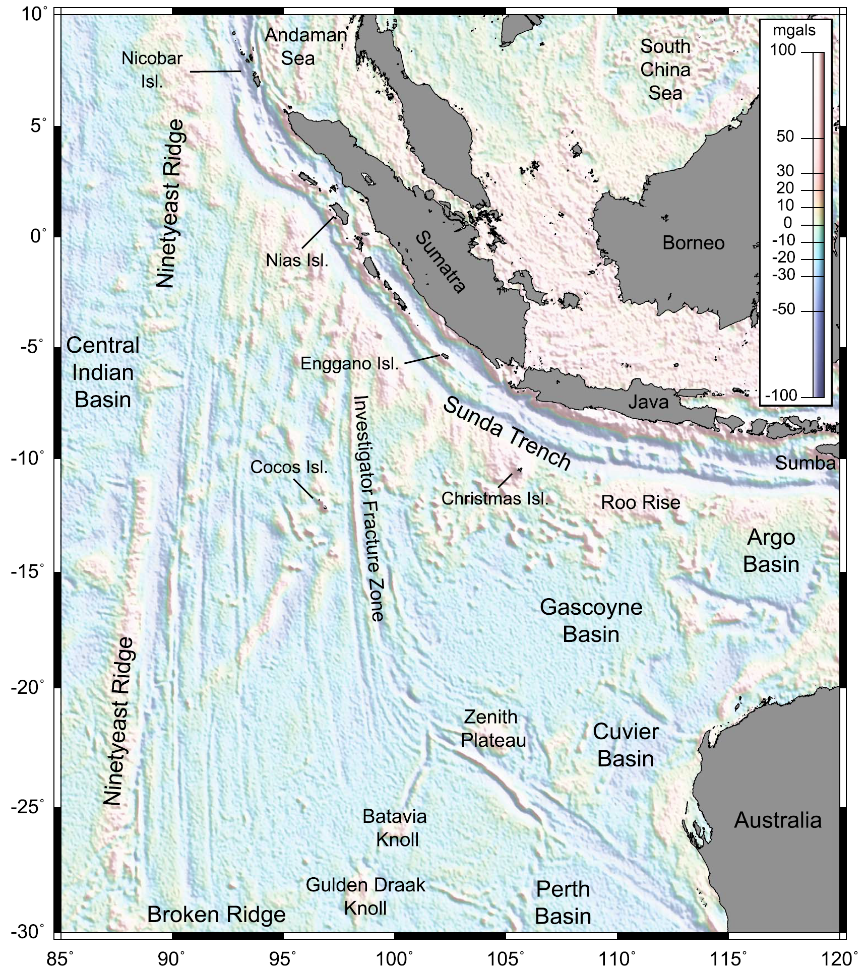
Free-air gravity anomaly map derived from satellite altimetry [Sandwell and Smith, 2009] over the Wharton Basin area.
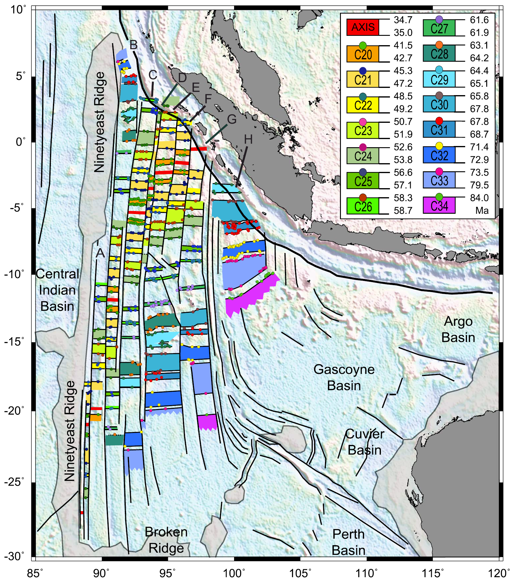
Structure and age of the Wharton Basin deduced from free-air gravity anomaly [Sandwell and Smith, 2009; background colors] for the fracture zones (thin black longitudinal lines), and marine magnetic anomaly profiles (not shown) for the isochrons (thin black latitudinal lines). The plain colors represent the oceanic lithosphere created during normal geomagnetic polarity intervals (see legend for the ages of Chrons 20 to 34 according to the time scale of Gradstein et al. [2004]). Compartments separated by major fracture zones are labeled A to H. Grey areas: oceanic plateaus, thick black line: Sunda Trench subduction zone.
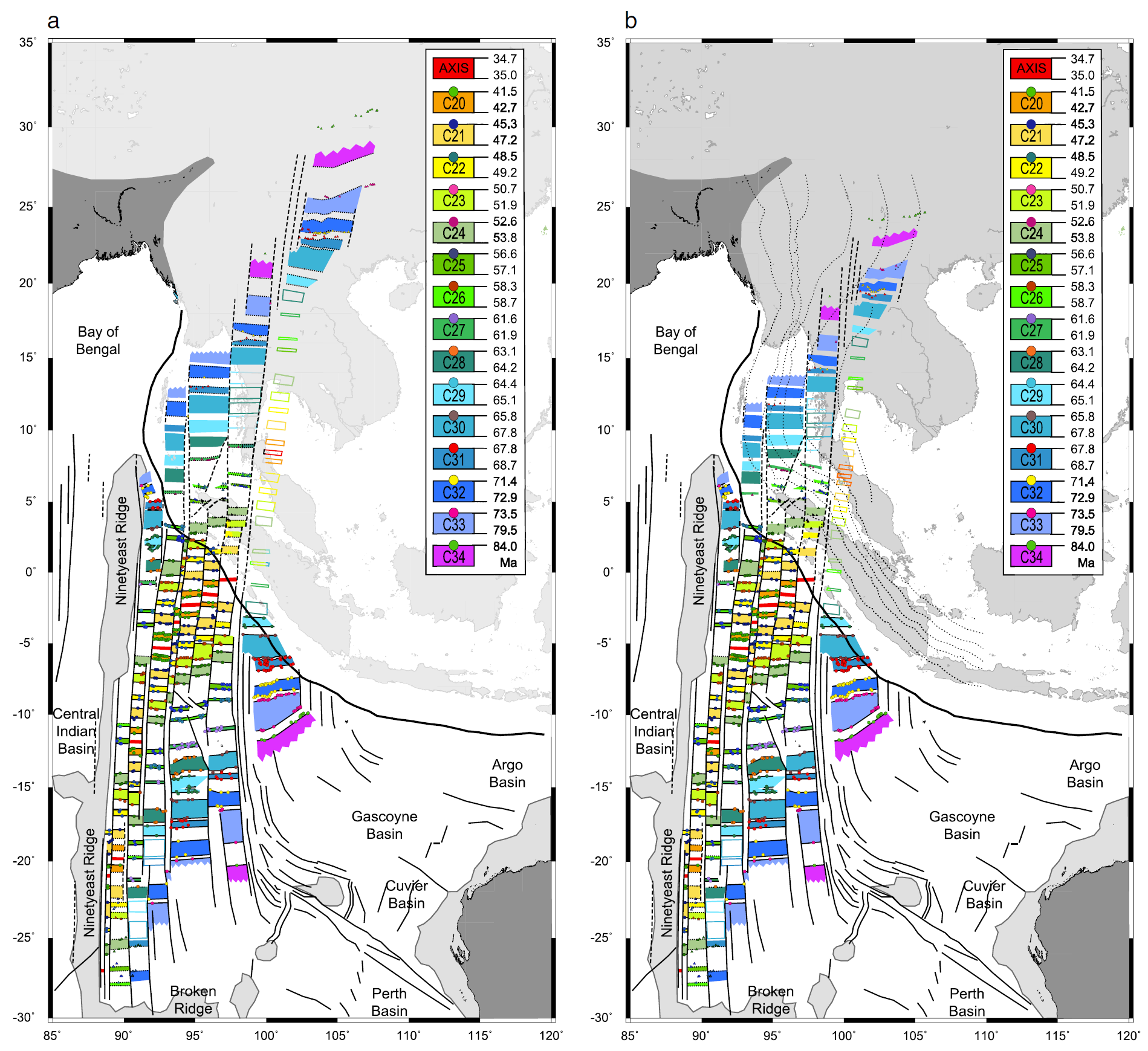
Reconstitution of the subducted magnetic isochrons and fracture zones of the northern Wharton Basin using the finite rotation parameters deduced from our two- and three-plate reconstructions. (a) First the geometry is restored on the Earth surface, then (b) it is draped on the top of the subducting plate as derived from seismic tomography [Pesicek et al., 2010] shown by the thin dotted lines at intervals of 100 km (b). Colored dots: identified magnetic anomalies; colored triangles: rotated magnetic anomalies, solid lines; observed fracture zones and isochrons, dashed lines: uncertain or reconstructed fracture zones, dotted lines: reconstructed isochrons from rotated magnetic anomalies (two-plate and three-plate reconstructions), colored area: oceanic lithosphere created during normal geomagnetic polarity intervals (see legend for the ages; the colored areas without solid or dotted lines have been interpolated), grey areas: oceanic plateaus, thick line: Sunda Trench subduction zone.

The deviation of the Sunda Trench from a regular arc shape (dotted lines) off Sumatra is explained by the presence of the younger, hotter and therefore lighter lithosphere in compartments C–F, which resists subduction and form an indentor (solid line). The very young compartment G was probably part of this indentor before oceanic crust formed at slow spreading rate near the Wharton fossil spreading center approached subduction: The weaker rheology of outcropping or shallow serpentinite may have favored the restoration of the accretionary prism in this area. Further south, the deviation off Java is explained by the resistance of the thicker Roo Rise, an oceanic plateau entering the subduction.
- Andrade and Rajendran (2014) present their interpretation of the seismotectonic context for the 2012 sequence. This is their map showing fracture zones and lineations (which may be earthquake faults).
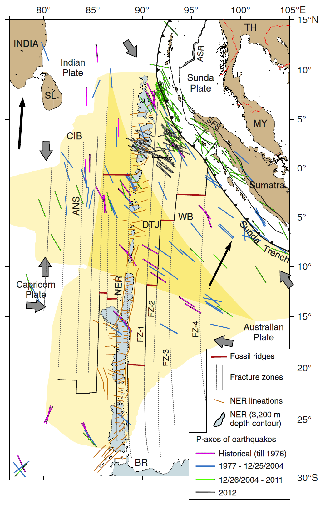
P-axis orientations of earthquakes on the subducting Indo-Australian Plate overlaid on a trace of the diffuse India–Capricorn–Australia plate boundary region (pale yellow) and the diffuse triple junction (DTJ, warm yellow). Gray arrows indicate the convergence directions of the component plates (from Royer and Gordon, 1997). Data for earthquakes pre-1977 are fromStein and Okal (1978), Bergman and Solomon (1985), andPetroy andWiens (1989) and for the later period, fromNEIC and Global CMT. Broken Ridge (BR),
- Here is the same map but with historic earthquake mechanisms plotted for events in the India plate.
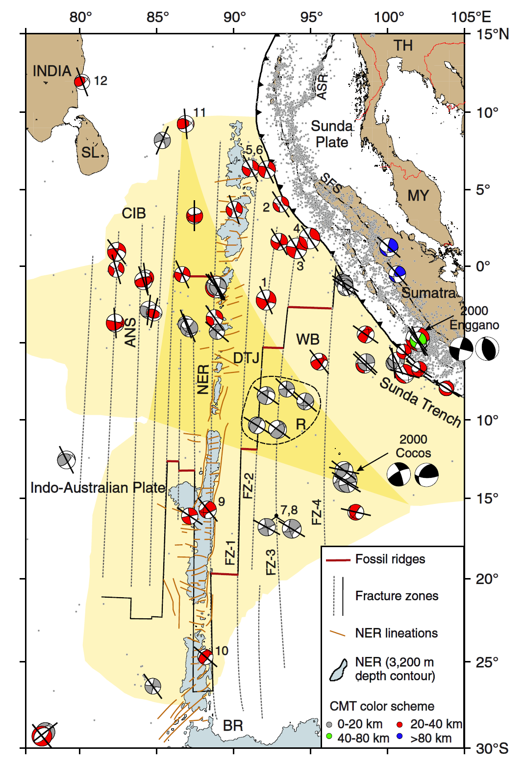
Centroid moment tensors (colored by depth) of earthquakes on the Indian Ocean intraplate region and P-axis orientations from 1977 to 25 December 2004 (data source: Global CMT, with earthquake relocations from Engdahl et al., 2007). Numbered beachballs and cluster ‘R’ are discussed in the text. The Sumatra–Andaman plate boundary seismicity for the same period is represented by gray dots. Subevents of the 2000 Enggano and Cocos Islands events (focal mechanisms with black compressional quadrants) are from Abercrombie et al., 2003.
- This is a large scale view of their interpretations of lineations that cut across the ninetyeast ridge.
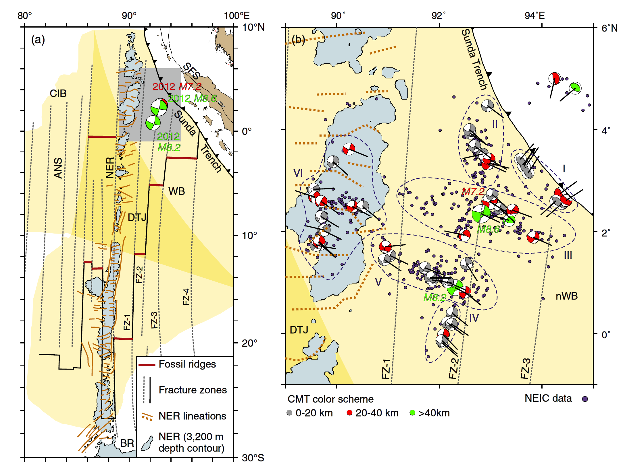
(a) Centroid moment tensor solutions of the January (red) and April 2012 earthquakes (green)with respect to the E–W oriented fossil Wharton Ridge segments and its associated N–S trending fracture zones, and the E–Wlineations that dissect the Ninetyeast Ridge (NER). Other notations and data sources are the same as in Figs. 1 and 2. The source area of the April 2012 earthquakes (gray rectangle) is expanded in (b)which shows centroidmoment tensors (colored by depth) and P-axes in the year 2012; moment tensor solutions are from Global CMT.
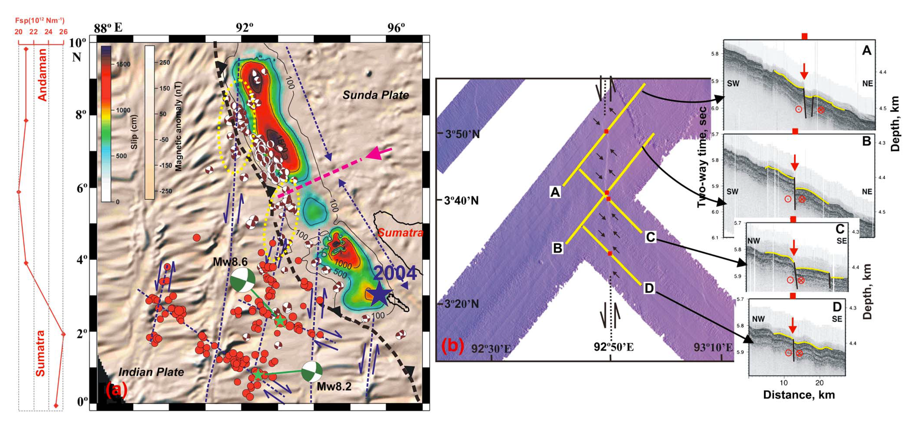
- Here are some maps that show the results from Wiseman and Bürgmann (2012). These show how they calculate the static coulomb stress (tectonic stress) to have changed after the 2004 and 2005 events.
- The upper right map shows the changes exerted during the 2004 event, the lower right panel shows change in stress after the event, and the map on the left shows the total change in stress calculated by these authors.

Recent stress changes in the Indian Ocean. (a) Total stresses induced by the 2004 [Chlieh et al., 2007], 2005 [Konca et al., 2007], and January M7.2 (http://earthquake.usgs.gov/earthquakes/eqinthenews/2012/usc0007ir5/finite_fault. php) earthquakes, resolved at the 20 km hypocentral depth of the mainshock on the orientation of the initial WNW-ESE (red) fault plane [Meng et al., 2012]. Gray circles mark the first 12 days of the aftershock sequence (NEIC catalog). (b) Coseismic stresses induced by the 2004 and 2005 earthquakes. The yellow focal mechanisms highlight the strike-slip earthquakes during the first year following the 2004 earthquake and the blue focal mechanisms depict the remaining strike-slip events before the 2012 mainshock (Global CMT catalog). (c) Cumulative postseismic stresses induced by the 2004 and 2005 earthquakes at the time of the 2012 earthquake.
- This is the figure from the poster that shows how these stress changes varied with depth.

The effects of receiver depth. Coseismic stress changes resulting from the 2004 and 2005 earthquakes [Chlieh et al., 2007; Konca et al., 2007] resolved on the WNW-ESE (red) fault plane. Calculated at (a) 10 km depth, and (b) the deeper centroid depth of 40 km.
- Here is a fascinating figure from Yadav et al. (2013) showing hypothetical changes in the elastic movement of the crust as a result of these earthquakes. They compare their model (the small arrows) with model and observations at GPS sites.
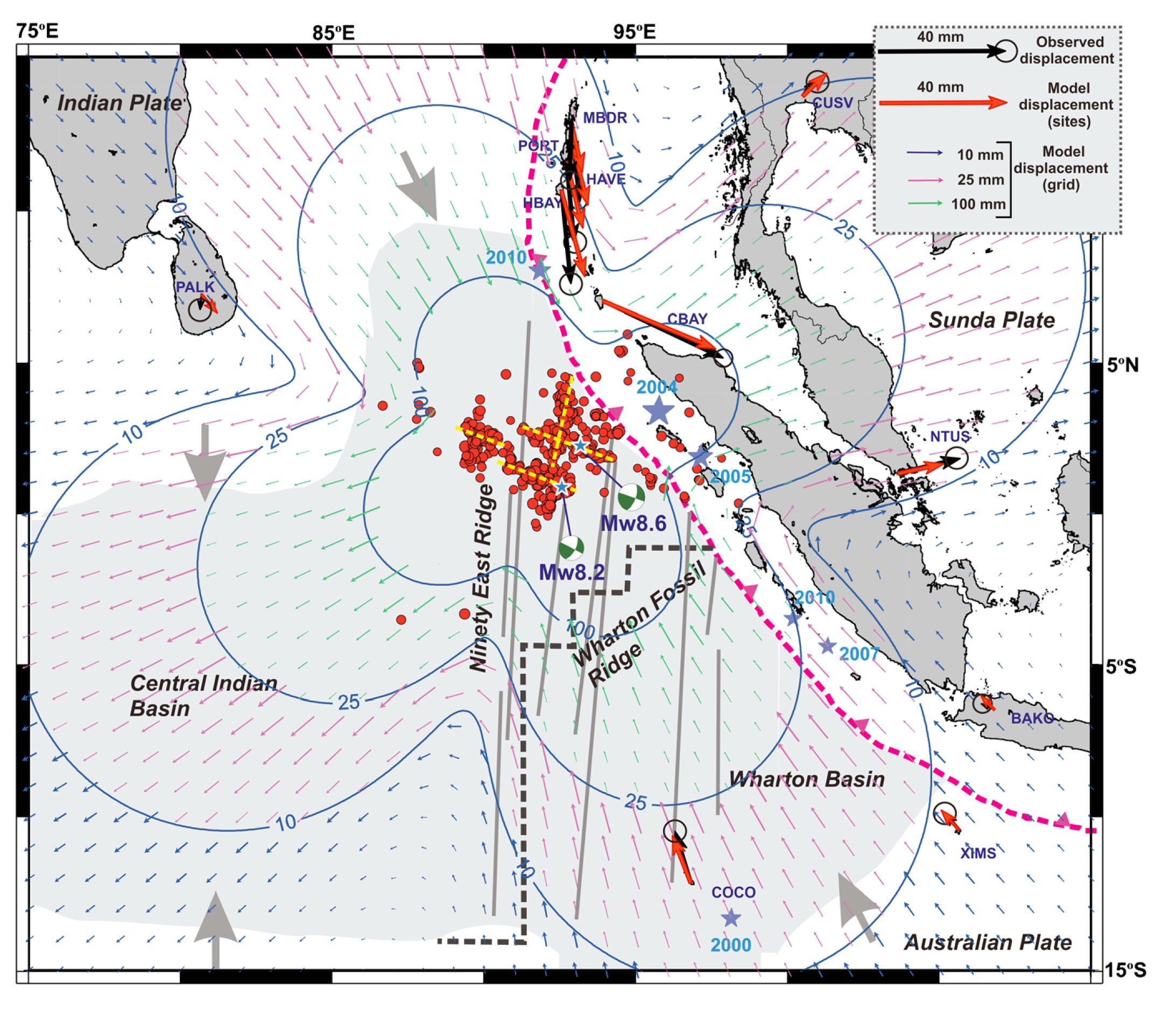
The 11 April 2012 earthquakes and coseismic offsets derived from GPS measurements at various IGS sites and at permanent GPS sites in the Andaman-Nicobar region (shown with black arrows with error bars). The bold gray arrows represent the compressional regime of the diffused plate boundary region (shaded with light gray color) between the Indian and Australian plates [Gordon et al., 1998]. The yellow dashed lines denote the rupture planes of the 11 April 2012 earthquakes [Yue et al., 2012]. Arrows with different colors show the simulated coseismic offsets due to the slip models by Yue et al. [2012] using the layered spherical earth [Pollitz, 1997]. The purple stars are other earthquakes discussed in the text. The north-south gray lines indicate the fracture planes in the Wharton and Central Indian basin.
- This map from Yadav et a. (2013) shows the existence of north-south fracture zones using multibeam bathymetric maps (the purple map on the right) and seismic reflection profiles (the black and white plots on the right).
Satellite magnetic anomalies and swath bathymetry data. (a) North-south-oriented planes can be seen on the magnetic anomalies. These planes extend right up to the trench and appear to influence the tectonics of the subduction zone. Near the trench, they are characterized by strike-slip faulting (marked by yellow ellipses). If extended farther north, they coincide with the low-slip regions of the 2004 Sumatra-Andaman earthquake rupture [Chlieh et al., 2007].
the pink dashed line with arrow marks the northern limit of the fast slip during the 2004 Sumatra-Andaman earthquake rupture [Lay et al., 2005], and it coincides with the north-south plane which accommodated part of the slip during the 11 April 2012 earthquakes. The slab pull force along the arc is also shown [Lallemand et al., 2005]. (b) Swath bathymetry data [Graindorge et al., 2008] showing a north-south-oriented fault. A, B, C, and D in the figure are the seismic lines across the fault. These near-vertical normal faults are now reactivated as left-lateral strike-slip faults.
- Here is the map and plots of tsunami observations in the Indian Ocean from these Wharton Basin earthquakes (Heidarzadeh et al., 2017).
- These authors analyzed the spectral characteristics of the tsunami from these two events.
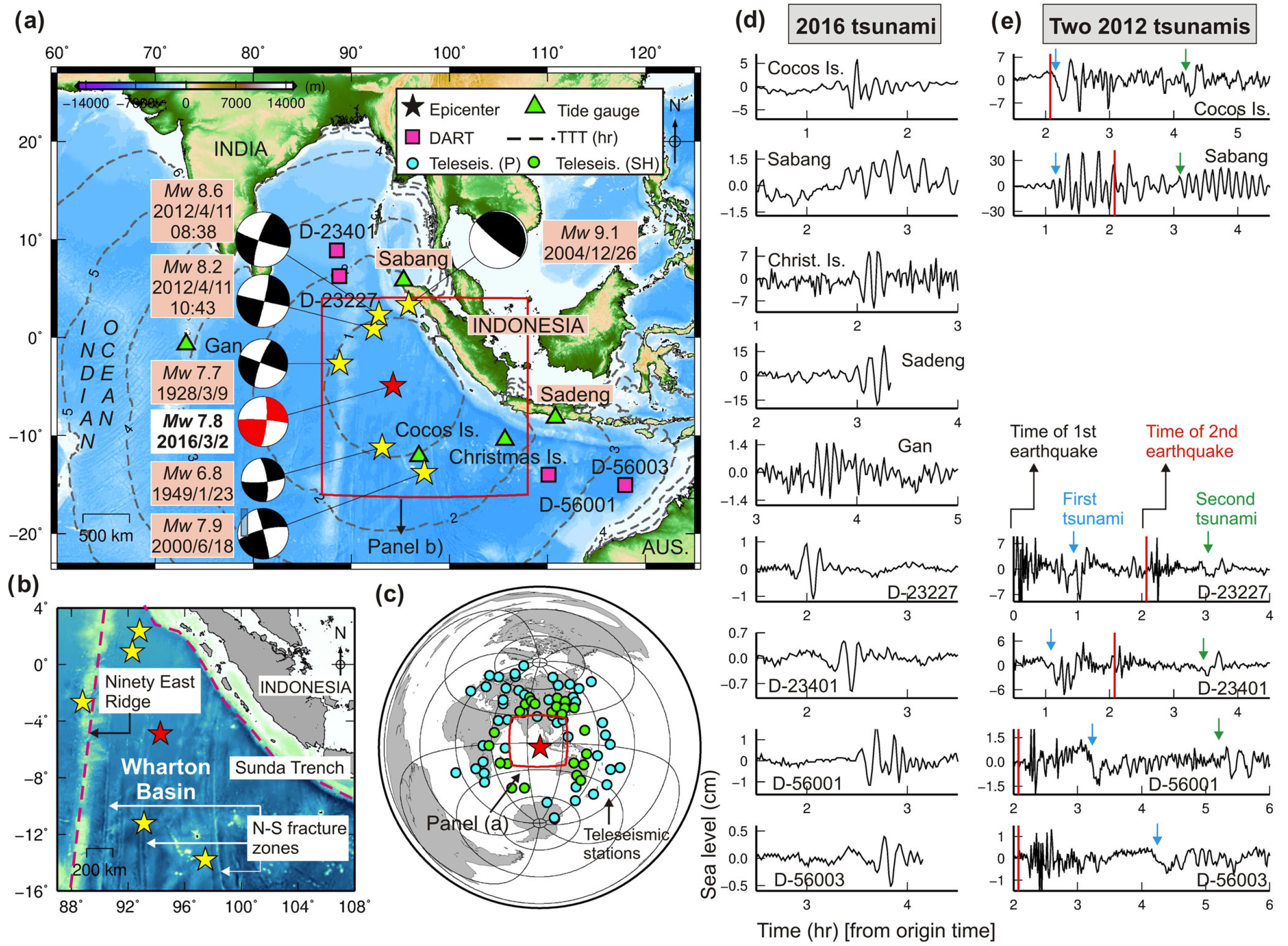
(a) Epicentres and mechanisms of the large strike-slip intraplate earthquakes in the Wharton Basin along with the locations of the DART and tide gauge stations used in this study. Focal mechanisms are from GCMT catalogue. The focal mechanisms for the 1928 and 1949 are from Petroy &Wiens (1989). TTT stands for tsunami travel time. (b) Inset showing the tectonic and bathymetric features along with north–south trending fracture zones. (c) Teleseismic stations used in this study to analyse the 2016 earthquake including both P (cyan circles) and SH (green circles) waves. (d,e) Tsunami waveforms for the 2012 and 2016 tsunamis, respectively.

Comparison of the waveforms and spectra of the 2012 and 2016 off Sumatra tsunamis. (a) The observed waveforms of the 2012 and 2016 tsunamis. The time on the x-axis is from the origin time of the 2016 tsunami while the time of the 2012 event is shifted. (b) The spectra for the 2012 and 2016 tsunamis. The average spectra shown at the bottom row are normalized average. The term ‘Back.’ represents spectrum of background sea level waveforms. For the 2016 tsunami, the background spectrum is based on only the record of the Cocos Island station.
- M 9.2 Andaman-Sumatra subduction zone 2014 Earthquake Anniversary
- M 9.2 Andaman-Sumatra subduction zone SASZ Fault Deformation
- M 9.2 Andaman-Sumatra subduction zone 2016 Earthquake Anniversary
- 2019.08.02 M 6.9 Indonesia
- 2019.06.23 M 7.3 Banda Sea
- 2019.04.12 M 6.8 Sulawesi, Indonesia
- 2018.09.28 M 7.5 Sulawesi
- 2018.10.16 M 7.5 Sulawesi UPDATE #1
- 2018.08.19 M 6.9 Lombok, Indonesia
- 2018.08.05 M 6.9 Lombok, Indonesia
- 2018.07.28 M 6.4 Lombok, Indonesia
- 2017.12.15 M 6.5 Java
- 2017.08.31 M 6.3 Mentawai, Sumatra
- 2017.08.13 M 6.4 Bengkulu, Sumatra, Indonesia
- 2017.05.29 M 6.8 Sulawesi, Indonesia
- 2017.03.14 M 6.0 Sumatra
- 2017.03.01 M 5.5 Banda Sea
- 2016.10.19 M 6.6 Java
- 2016.03.02 M 7.8 Sumatra/Indian Ocean
- 2015.07.22 M 5.8 Andaman Sea
- 2015.11.08 M 6.4 Nicobar Isles
- 2012.04.11 M 8.6 Sumatra outer rise
- 2004.12.26 M 9.2 Andaman-Sumatra subduction zone
Indonesia | Sumatra
General Overview
Earthquake Reports
Social Media
- Frisch, W., Meschede, M., Blakey, R., 2011. Plate Tectonics, Springer-Verlag, London, 213 pp.
- Hayes, G., 2018, Slab2 – A Comprehensive Subduction Zone Geometry Model: U.S. Geological Survey data release, https://doi.org/10.5066/F7PV6JNV.
- Holt, W. E., C. Kreemer, A. J. Haines, L. Estey, C. Meertens, G. Blewitt, and D. Lavallee (2005), Project helps constrain continental dynamics and seismic hazards, Eos Trans. AGU, 86(41), 383–387, , https://doi.org/10.1029/2005EO410002. /li>
- Jessee, M.A.N., Hamburger, M. W., Allstadt, K., Wald, D. J., Robeson, S. M., Tanyas, H., et al. (2018). A global empirical model for near-real-time assessment of seismically induced landslides. Journal of Geophysical Research: Earth Surface, 123, 1835–1859. https://doi.org/10.1029/2017JF004494
- Kreemer, C., J. Haines, W. Holt, G. Blewitt, and D. Lavallee (2000), On the determination of a global strain rate model, Geophys. J. Int., 52(10), 765–770.
- Kreemer, C., W. E. Holt, and A. J. Haines (2003), An integrated global model of present-day plate motions and plate boundary deformation, Geophys. J. Int., 154(1), 8–34, , https://doi.org/10.1046/j.1365-246X.2003.01917.x.
- Kreemer, C., G. Blewitt, E.C. Klein, 2014. A geodetic plate motion and Global Strain Rate Model in Geochemistry, Geophysics, Geosystems, v. 15, p. 3849-3889, https://doi.org/10.1002/2014GC005407.
- Meyer, B., Saltus, R., Chulliat, a., 2017. EMAG2: Earth Magnetic Anomaly Grid (2-arc-minute resolution) Version 3. National Centers for Environmental Information, NOAA. Model. https://doi.org/10.7289/V5H70CVX
- Müller, R.D., Sdrolias, M., Gaina, C. and Roest, W.R., 2008, Age spreading rates and spreading asymmetry of the world’s ocean crust in Geochemistry, Geophysics, Geosystems, 9, Q04006, https://doi.org/10.1029/2007GC001743
- Pagani,M. , J. Garcia-Pelaez, R. Gee, K. Johnson, V. Poggi, R. Styron, G. Weatherill, M. Simionato, D. Viganò, L. Danciu, D. Monelli (2018). Global Earthquake Model (GEM) Seismic Hazard Map (version 2018.1 – December 2018), DOI: 10.13117/GEM-GLOBAL-SEISMIC-HAZARD-MAP-2018.1
- Silva, V ., D Amo-Oduro, A Calderon, J Dabbeek, V Despotaki, L Martins, A Rao, M Simionato, D Viganò, C Yepes, A Acevedo, N Horspool, H Crowley, K Jaiswal, M Journeay, M Pittore, 2018. Global Earthquake Model (GEM) Seismic Risk Map (version 2018.1). https://doi.org/10.13117/GEM-GLOBAL-SEISMIC-RISK-MAP-2018.1
- Zhu, J., Baise, L. G., Thompson, E. M., 2017, An Updated Geospatial Liquefaction Model for Global Application, Bulletin of the Seismological Society of America, 107, p 1365-1385, https://doi.org/0.1785/0120160198
- Andrade, V. and Rajendran, K., 2014. The April 2012 Indian Ocean earthquakes: Seismotectonic context and implications for their mechanisms in Tectonophysics, v. 617, p. 126-139, http://dx.doi.org/10.1016/j.tecto.2014.01.024
- Heidarzadeh, M., Harada, T., Satake, K., Ishibe, T., Takagawa, T., 2017. Tsunamis from strike-slip earthquakes in the Wharton Basin, northeast Indian Ocean: March 2016 Mw7.8 event and its relationship with the April 2012 Mw 8.6 event in GJI, v. 2110, p. 1601-1612, doi: 10.1093/gji/ggx395
- Jacob, J., J. Dyment, and V. Yatheesh, 2014. Revisiting the structure, age, and evolution of the Wharton Basin to better understand subduction under Indonesia, J. Geophys. Res. Solid Earth, 119, 169–190, doi:10.1002/2013JB010285.
- Yadav, R.K., Kundu, B., Gahalaut, K., Catherine, J., Gahalaut, V.K., Ambikapathy, A., and Naidu, MZ.S., 2013. Coseismic offsets due to the 11 April 2012 Indian Ocean earthquakes (Mw 8.6 and 8.2) derived from GPS measurements in Geophysical Research Letters, v. 40, p. 3389-3393, doi:10.1002/grl.50601
- Wiseman, K. and Bürgmann, R., 2012. Stress triggering of the great Indian Ocean strike-slip earthquakes in a diffuse plate boundary zone in Geophysical research Letters, v. 39, L22304, doi:10.1029/2012GL053954
References:
Basic & General References
Specific References
Return to the Earthquake Reports page.
- Sorted by Magnitude
- Sorted by Year
- Sorted by Day of the Year
- Sorted By Region
My original post, one of my first.
looks like we just got some late aftershocks to the 2004 Sumatra-Andaman subduction zone earthquake. on 2012 April 11, there was a swarm of activity, with an Mw 8.6 and an Mw 8.1 event with strike slip focal mechanisms and moment tensors.
the 8.6 is directly updip of the region of maximum slip from the 2004 Great earthquake. the 8.2 is updip from the 2005 Great earthquake. Todays two earthquakes are likely on one or two of the many fracture zones that strike generally north-south in the India-Australia plate. one of the better known fzs is the Investigator fracture zone, several hundred kms to the east of these epicenters.
the fzs are thought to partly contribute to the segmentation of the subduction zone offshore sumatra. i have composed a map that shows Sumatera, the islands (forearc), the 2004 earthquake slip (in cm) modeled by Chlieh et al., 2007, some bathymetry with some structures labeled, and the epicenters of the two largest earthquakes from today mentioned above. my map