There continue to be earthquakes probably related to the 2011.03.11 Tohoku-Oki M 9.0 earthquake (the 4th largest earthquake recorded on modern seismologic instruments). Here are two excellent summary Earthquake Report pages associated with this region: The original Earthquake Report for the M 9.0 earthquake with some great animations!. A page where I present slip models, coulomb stress models, and aftershock location maps.
-
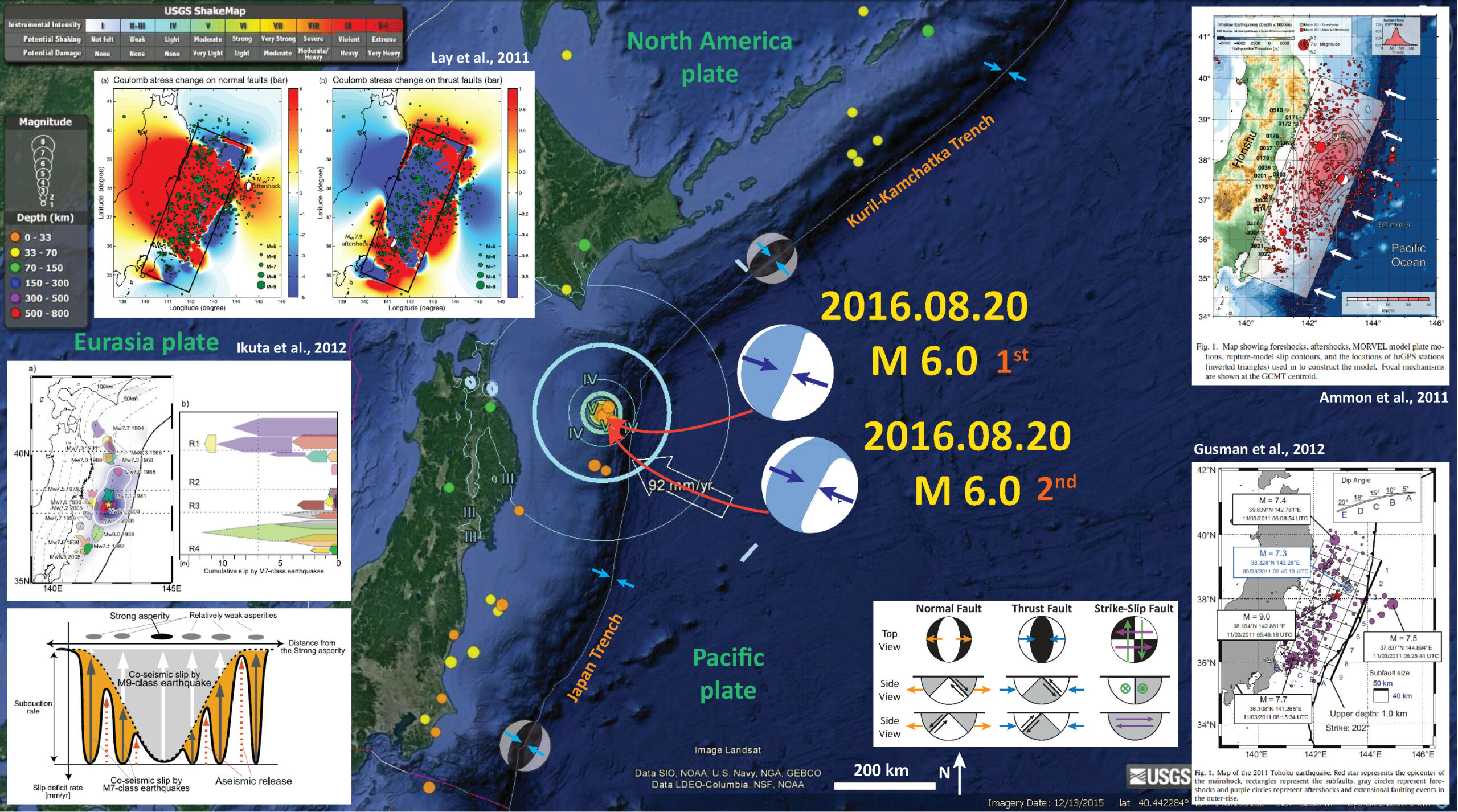
Here are the USGS websites for the larger earthquakes plotted in my interpretive poster below.
- 2016.08.20 09:01:26 UTC M 6.0
- 2016.08.20 15:58:04 UTC M 6.0
- 2016.08.20 16:10:34 UTC M 5.3
- 2016.08.20 16:28:11 UTC M 5.3
-
Here are some Earthquake Reports for seismicity associated with the M 9.0 Tohoku-Oki earthquake.
- 2011.03.11 M 9.0 Japan (Tohoku-Oki)
- 2013.10.25 M 7.1 Japan (Honshu)
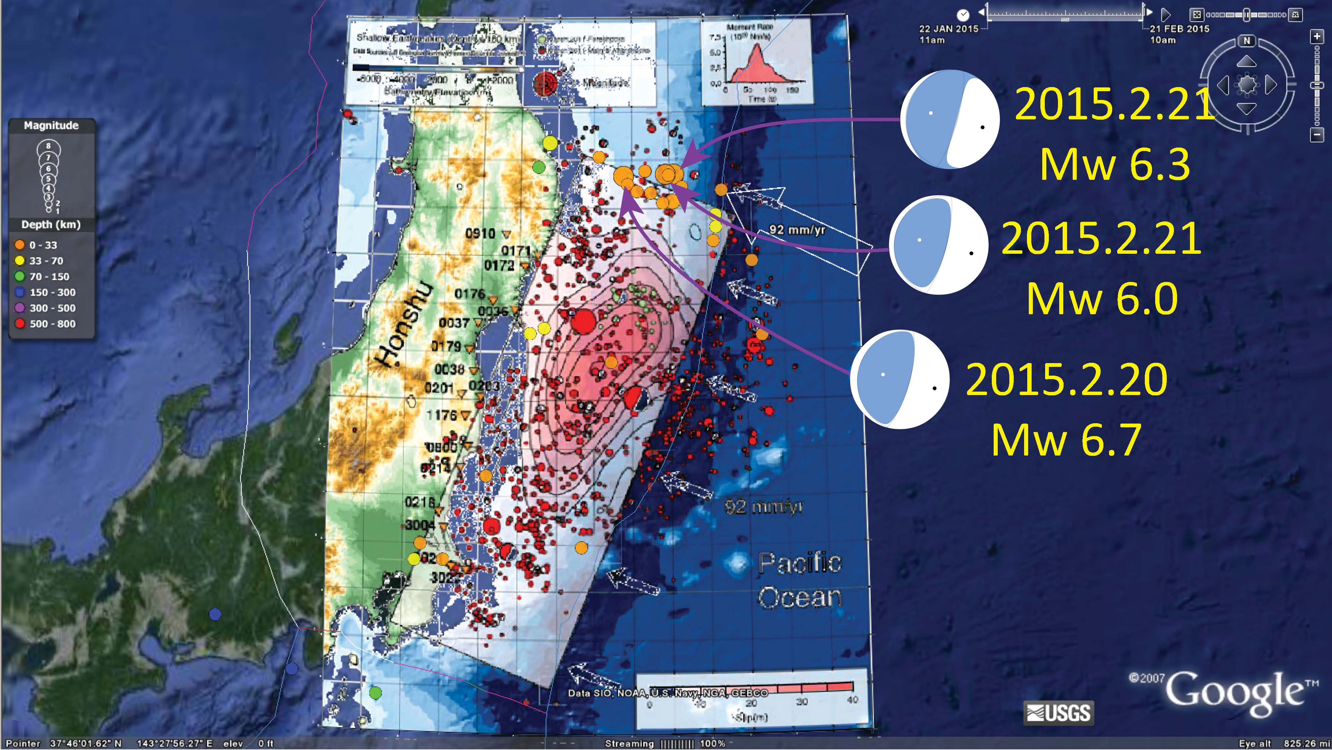
- 2015.02.16 M 6.7 Japan (Sanriku Coast)
- 2015.02.16 M 6.7 Japan (Sanriku Coast Update #1)
- 2015.02.16 M 6.7 Japan (Sanriku Coast Update #2)
- 2015.02.20 M 6.7 Japan (Sanriku Coast Update #3)
- 2015.02.21 M 6.7 Japan (Sanriku Coast Update #4)
- 2015.02.25 M 6.3 Japan (Sanriku Coast Update #5)
Here is my interpretive map that shows the epicenter, along with the shaking intensity contours. These contours use the Modified Mercalli Intensity (MMI) scale. The MMI is a qualitative measure of shaking intensity. More on the MMI scale can be found here and here. This is based upon a computer model estimate of ground motions, different from the “Did You Feel It?” estimate of ground motions that is actually based on real observations.
I placed a moment tensor / focal mechanism legend on the poster. There is more material from the USGS web sites about moment tensors and focal mechanisms (the beach ball symbols). Both moment tensors and focal mechanisms are solutions to seismologic data that reveal two possible interpretations for fault orientation and sense of motion. One must use other information, like the regional tectonics, to interpret which of the two possibilities is more likely.
-
I include some inset figures and maps.
- In the upper right corner I include a map that shows seismicity before and after the M 9.0 Tohoku-Oki earthquake. Ammon et al. (2011) invert teleseismic P waves and broadband Raleigh waves with high-rate GPS data to constrain their slip model. Slip magnitude in meters is represented by shades of red. They also plot the source time function plot. Source time function plots show us the amount of energy that is released during an earthquake and how that energy release varies with time.
- In the lower right corner I include a map that shows the seismicity in the region before and after the M 9.0 earthquake (Gusman et al., 2012).
- In the lower left corner I include two figures from Ikuta et al. (2012). The upper panel shows how the 2011 slip region compares to slip from previous M 7 class earthquakes. The lower panel shows the slip deficit for this part of the subduction zone. Basically, this is a way of viewing how much plate convergence might be expected to contribute to earthquake slip over time.
- In the upper left corner I include a figure from Lay et al. (2011) that shows the coulomb stress changes due to the 2011 earthquake. Basically, this shows which locations on the fault where we might expect higher likelihoods of future earthquake slip.

Here is a map (from this Earthquake Report page) showing the three largest magnitude earthquakes in this recent seismic swarm. Check out my previous post here to see other slip models, estimates of stress change due to the 2011 March 11 Tohoku-Oki earthquake, and how these relate to historic slip models.
-
Below are some of the insets as individual figures. I include their original figure captions.
- Here is a figure showing seismicity in the region of the Tohoku-Oki earthquake, the source time function of the M 9.0 earthquake, and their slip model (Ammon et al., 2011). There are dozens of slip models for the M 9.0 earthquake and they are all non unique. I include their figure caption below as a blockquote.
- Here is another map showing the seismicity associated with the Tohoku-Oki earthquake (Gusman et al., 2012). I include their figure caption below as a blockquote.
- Here is a plot that shows how the 2011 slip region compares to slip from previous M 7 class earthquakes (Ikuta et al., 2012). Ikuta et al. (2012) discuss how regions surrounding the higher slip during the M 9.0 Tohoku-Oki earthquake had experienced smaller earthquakes that consumed some of the plate motion strain, thereby owing to the lower slip in those regions during the M 9.0 earthquake. These are also regions that have increased coulomb stress and increased seismicity following the 2011.03.11 earthquake. I include their figure caption below as a blockquote.
- Here is a plot showing how the low seismic coupling in the regions surrounding the high slip from the M 9.0 earthquake affect the slip deficit. Basically, this is a way of viewing how much plate convergence might be expected to contribute to earthquake slip over time. In this case, we see how the smaller earthquakes took up some of the slip adjacent to the 2011 slip patch (think about where today’s swarm took place compared to the region that slipped in 2011). I include their figure caption below as a blockquote.
- Here is a figure that shows the coulomb stress changes due to the 2011 earthquake. Basically, this shows which locations on the fault where we might expect higher likelihoods of future earthquake slip. Note how many of the aftershocks, including today’s earthquake, are in the region of increased coulomb stress. I include their figure caption below as a blockquote.
- Here is a figure schematically showing how subduction zone earthquakes may increase coulomb stress along the outer rise. The outer rise is a region of the downgoing/subducting plate that is flexing upwards. There are commonly normal faults, sometimes reactivating fracture zone/strike-slip faults, caused by extension along the upper oceanic lithosphere. We call these bending moment normal faults. There was a M 7.1 earthquake on 2013.10.25 that appears to be along one of these faults. I include their figure caption below as a blockquote.

Map showing foreshocks, aftershocks, MORVEL model plate motions, rupture-model slip contours, and the locations of hrGPS stations (inverted triangles) used in to construct the model. Focal mechanisms are shown at the GCMT centroid.

Map of the 2011 Tohoku earthquake. Red star represents the epicenter of the mainshock, rectangles represent the subfaults, gray circles represent fore-shocks and purple circles represent aftershocks and extensional faulting events in the outer-rise.

Co-seismic slip of the 2011 Tohoku-Oki earthquake and previous M 7-class earthquakes around the source region. (a) Co-seismic slip distribution of the 2011 Tohoku-Oki earthquake (blue intensity scale, as in Figure 2); the area with slip greater than 10 m is enclosed by a white line. The two stars show the locations of the main shock and the largest after-shock (March 11, 2011). The asperity distribution for M7-class earthquakes occurring in the past 80 years is shown by colored contours (after Murotani et al. [2004], Yamanaka and Kikuchi [2004], and Y. Yamanaka (NGY Seismology Notebook, http:// www.seis.nagoya-u.ac.jp/sanchu/Seismo_Note, last updated April 11, 2011)). The contour for each asperity encloses the areas in which the slip is greater than half of the maximum slip. (b) Cumulative seismic slip distribution along the trench for the earthquakes shown in Figure 10a. The total length of each arrow represents the maximum slip of the event, and the body length of each arrow represents the average slip. Modified after Figure 12b in Yamanaka and Kikuchi [2004], with the addition of the R4 region (data for the earthquakes in 1938 and 1982 are from Murotani et al. [2004] and Mochizuki et al. [2008], respectively) and new earthquakes (Y. Yamanaka, NGY Seismology Notebook, http://www.seis.nagoya-u.ac. jp/sanchu/Seismo_Note, last updated April 11, 2011). Slips on spatially overlapping asperities are accumulated. It is known that at least three more M7-class earthquakes have occurred since 1930 around the focal area of the southernmost 1982 earthquake (in 1943, 1961, and 1965). Vertical dotted line shows the slip expected with slip-deficit accumulation over 80 years.

Schematic illustration of apparent low seismic coupling and small effective slip deficit controlled by a persistent strong asperity that ruptured to produce a M9-class earthquake. The vertical axis represents the subduction rate and the horizontal axis represents the distance from the strong asperity. The accumulation rate of the slip deficit is shown by the solid curve. Apparent seismic coupling before the M9-class earthquake is represented by the ratio of the co-seismic slip (length of the gray arrows) to the subduction rate. The seismic coupling, as monitored by the occurrence of M7-class earthquakes, is low in areas close to the strong asperity. When the persistent strong asperity slips, the remaining slip deficit (gray area) is released. Note that this figure does not show the accumulated slip deficit; instead, it shows the relative contributions of strong and weak asperities to the accumulation rate of the slip deficit.

Maps of the Coulomb stress change predicted for the joint P wave, Rayleigh wave and continuous GPS inversion in Fig. 2. The margins of the latter fault model are indicated by the box. Two weeks of aftershock locations from the U.S. Geological Survey are superimposed, with symbol sizes scaled relative to seismic magnitude. (a) The Coulomb stress change averaged over depths of 10–15 km for normal faults with the same westward dipping fault plane geometry as the Mw 7.7 outer rise aftershock, for which the global centroid moment tensor mechanism is shown. (b) Similar stress changes for thrust faults with the same geometry as the mainshock, along with the Mw 7.9 thrusting aftershock to the south, for which the global centroid moment tensor is shown.

Schematic cross-sections of the A) Sanriku-oki, B) Kuril and C) Miyagi-oki subduction zones where great interplate thrust events have been followed by great trench slope or outer rise extensional events (in the first two cases) and concern about that happening in the case of the 2011 event.
- a) ARIA_GPSDisplacement:
- Here is the file for direct download. (18 MB mp4)
- b) ARIA_GPSvelocity:
- Here is the file for direct download. (6 MB mp4)
- b) ARIA_GPSDisplacement_composite:
- Here is the file for direct download. (6 MB mp4)
- Here are some maps that are static results displayed in the above animations.
- Coseismic Horizontal:
- Coseismic Vertical:
Here are some animations from the ARIA Project at Caltech/JPL. These document geodetic motion during the Tohoku-Oki Earthquake.
Beginning with a description of the animations in blockquote.
We show 2 videos on Japan’s movement over the 35 minutes following the initiation of the Tohoku-Oki (M 9.0). These images are made possible because of the density of GPS stations in Japan (about 1200 GPS stations, or a GPS station every ~30 km). The preliminary GPS displacement data that these animations are based on are provided by the ARIA team at JPL and Caltech. All Original GEONET RINEX data provided to Caltech by the Geospatial Information Authority (GSI) of Japan.
This animation shows the cumulative displacements of the GPS stations relative to their position before the M9.0 Tohoku-Oki earthquake. The colors show the magnitude of displacement and the arrows indicate direction. We observe 2 kinds of motions, a permanent deformation in the vicinity of the earthquake (first red star) intermediately followed by a perturbation that travels about ~4 km/sec which are the surface waves generated by the earthquake.
This animation shows the estimated instantaneous velocities of the GPS stations. In this view, we only observe the transient motion caused by the earthquake. The first waves to propagate from the mainshock (red star) are the body waves (P and S) but they can be barely seen (look for a slight purple perturbation). These are followed by the surface waves (Love and Rayleigh) propagating as 2 orange-red stripes, as surface waves generate larger velocities at the surface than the body waves. At about 25 minutes there is a subtle signal from seismic waves generated by a small aftershock in northern Japan. At around 30 minutes we observe the seismic waves from a M7.9 aftershock (smaller red star), the largest aftershock to date. Since this event is about 30 times smaller than the mainshock, the P and S waves from this earthquake are too small to be detected with these rapid GPS solutions, but we can observe the surface waves. The small patches of color that appear randomly across Japan show the noise level of the measurements and are not related to any significant ground motion.


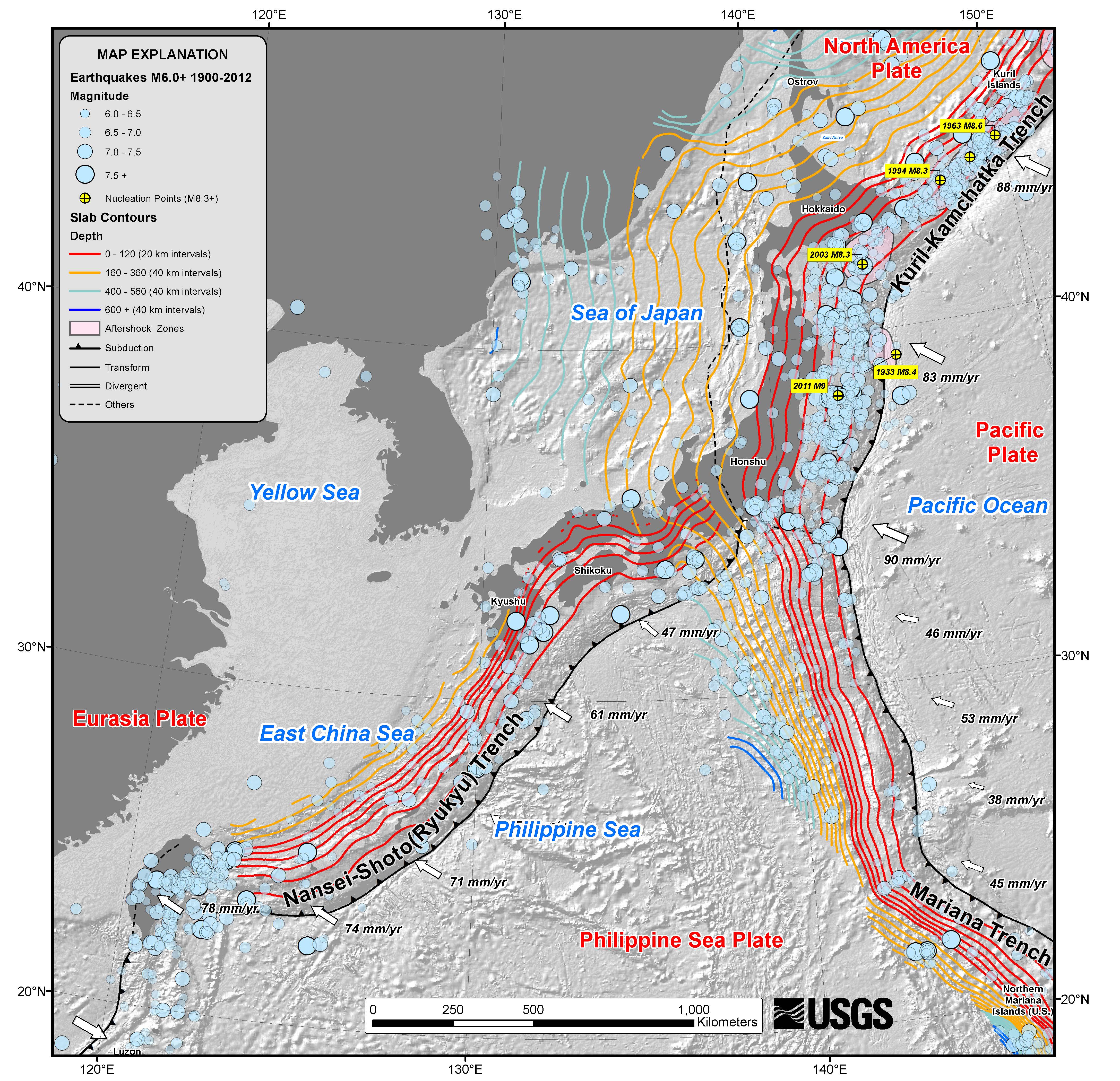
Here is the usgs map for the region:
-
References
- Ammon et al., 2011. A rupture model of the 2011 off the Pacific coast of the Tohoku Earthquake in Earth Planets Space, v. 63, p. 693-696.
- Gusman et al., 2012. Source model of the great 2011 Tohoku earthquake estimated from tsunami waveforms and crustal deformation data in Earth and Planetary Science Letters, v. 341-344, p. 234-242.
- Ikuta et al., 2012. A small persistent locked area associated with the 2011 Mw9.0 Tohoku-Oki earthquake, deduced from GPS data in Journal of Geophysical Research, v. 117, DOI: 10.1029/2012JB009335
1 thought on “Earthquake Report: Japan!”