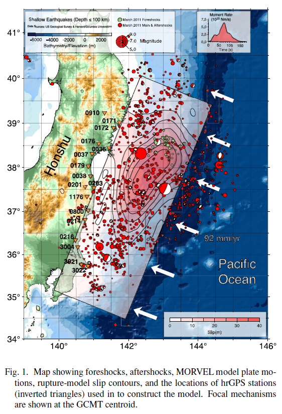
On March 22, 2011, a M=9.0 great subduction zone earthquake occurred along the Japan trench, where the Pacific plate subducts westward beneath the North America plate. These plates converge about 92 mm/yr.
The Great East Japan Earthquake.
https://earthquake.usgs.gov/earthquakes/eventpage/official20110311054624120_30/executive
I updated this page on 2018.03.11 (and then on 2022.03.11) with some new interpretive posters.
Here are all the pages for this earthquake and tsunami:
- 2011.03.11 M 9.0 Japan (Tohoku-Oki) Main Page (this page)
- 2011.03.11 M 9.0 Japan (Tōhoku-oki) Tsunami
- 2011.03.11 M 9.1 Japan (Tōhoku-oki) Decade Remembrance
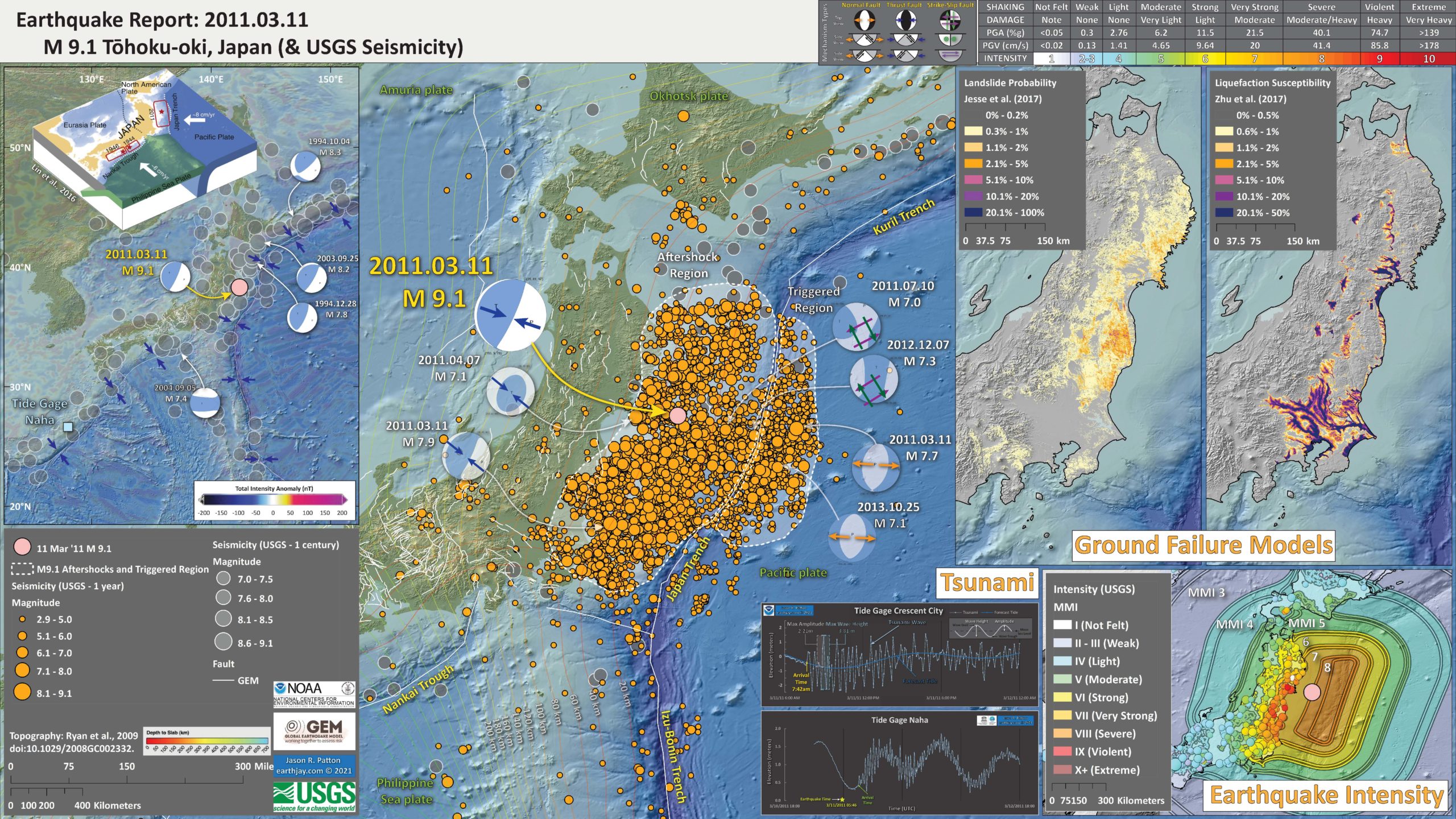
Below is my interpretive poster for this earthquake
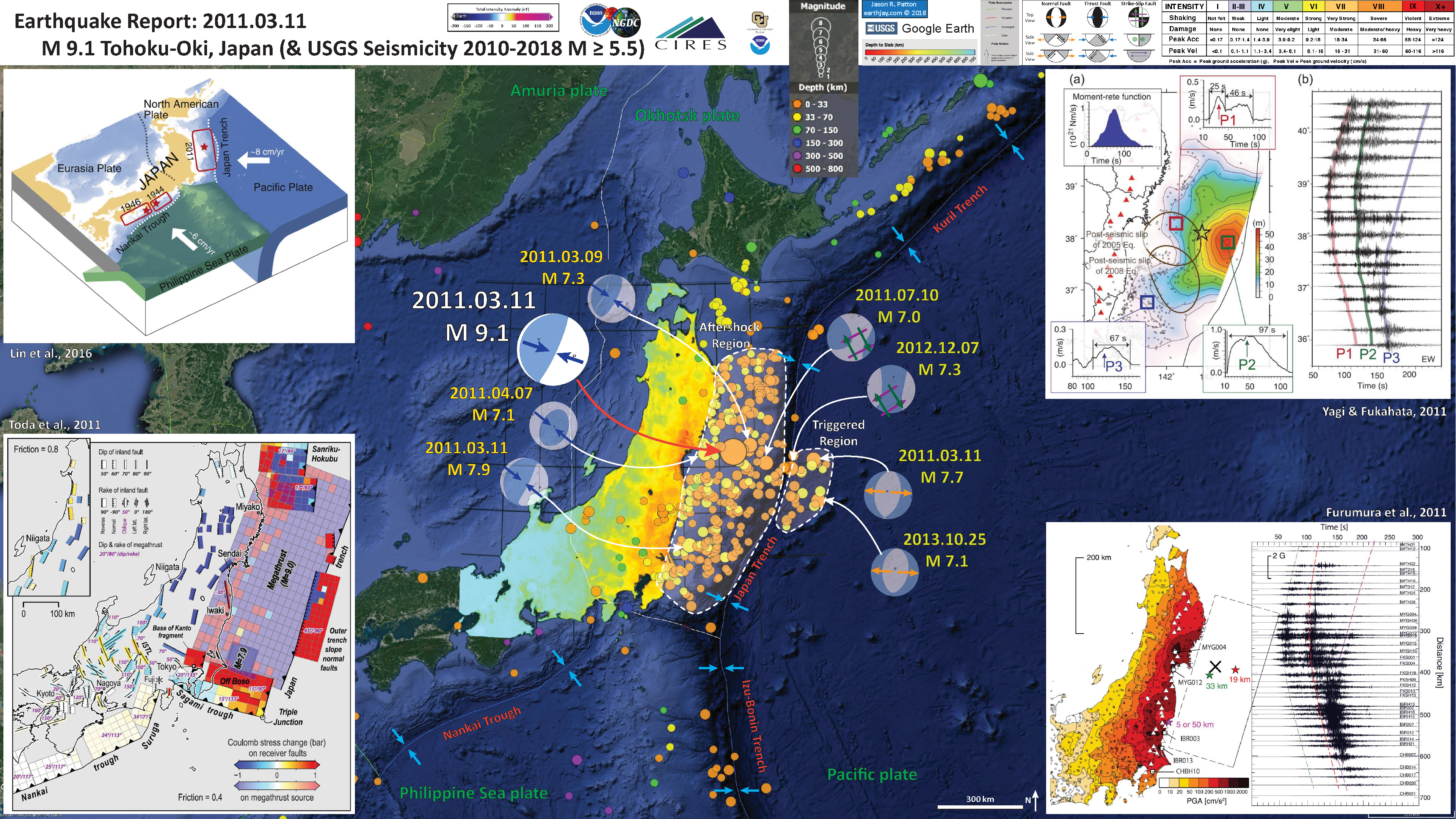
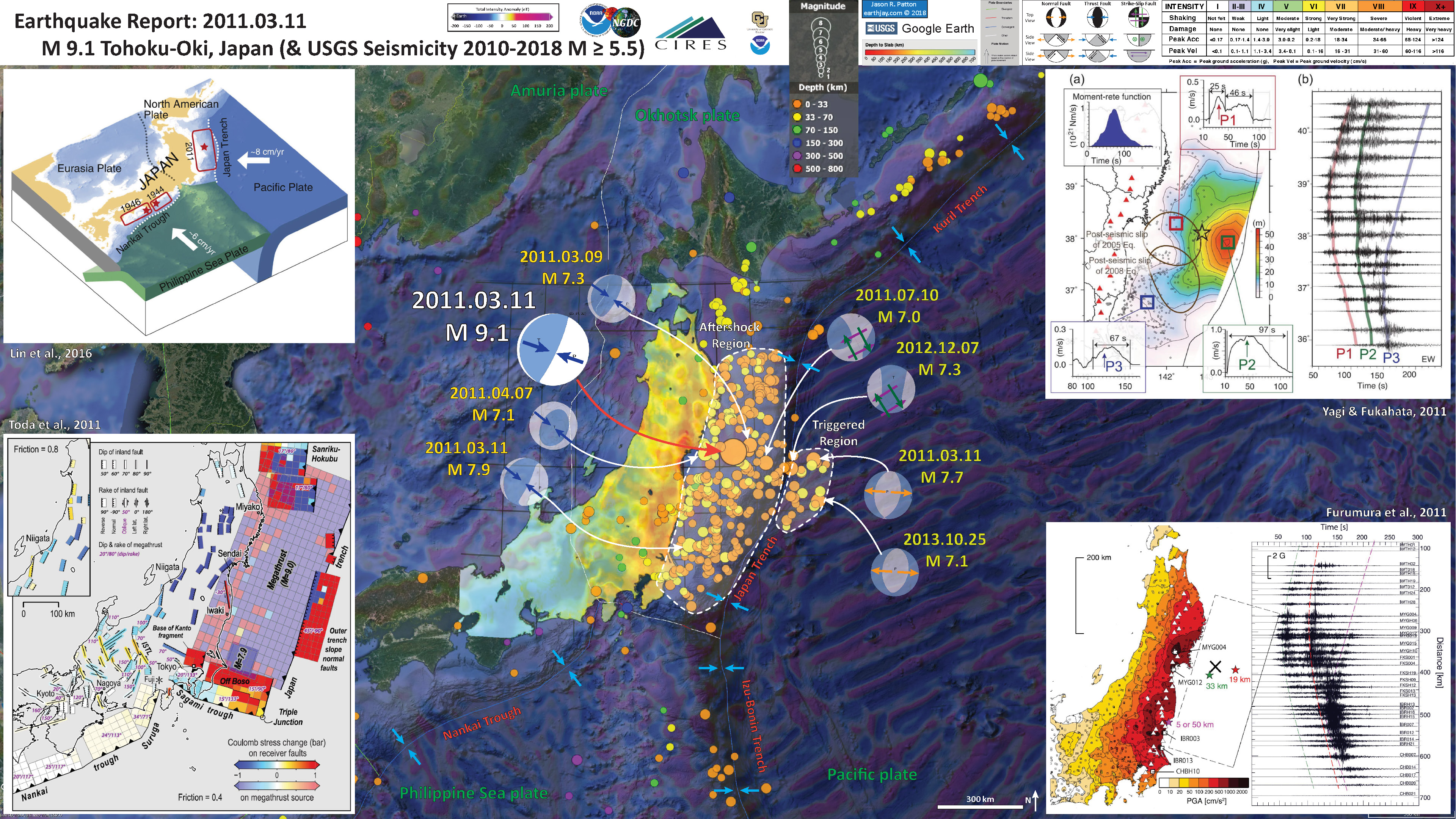
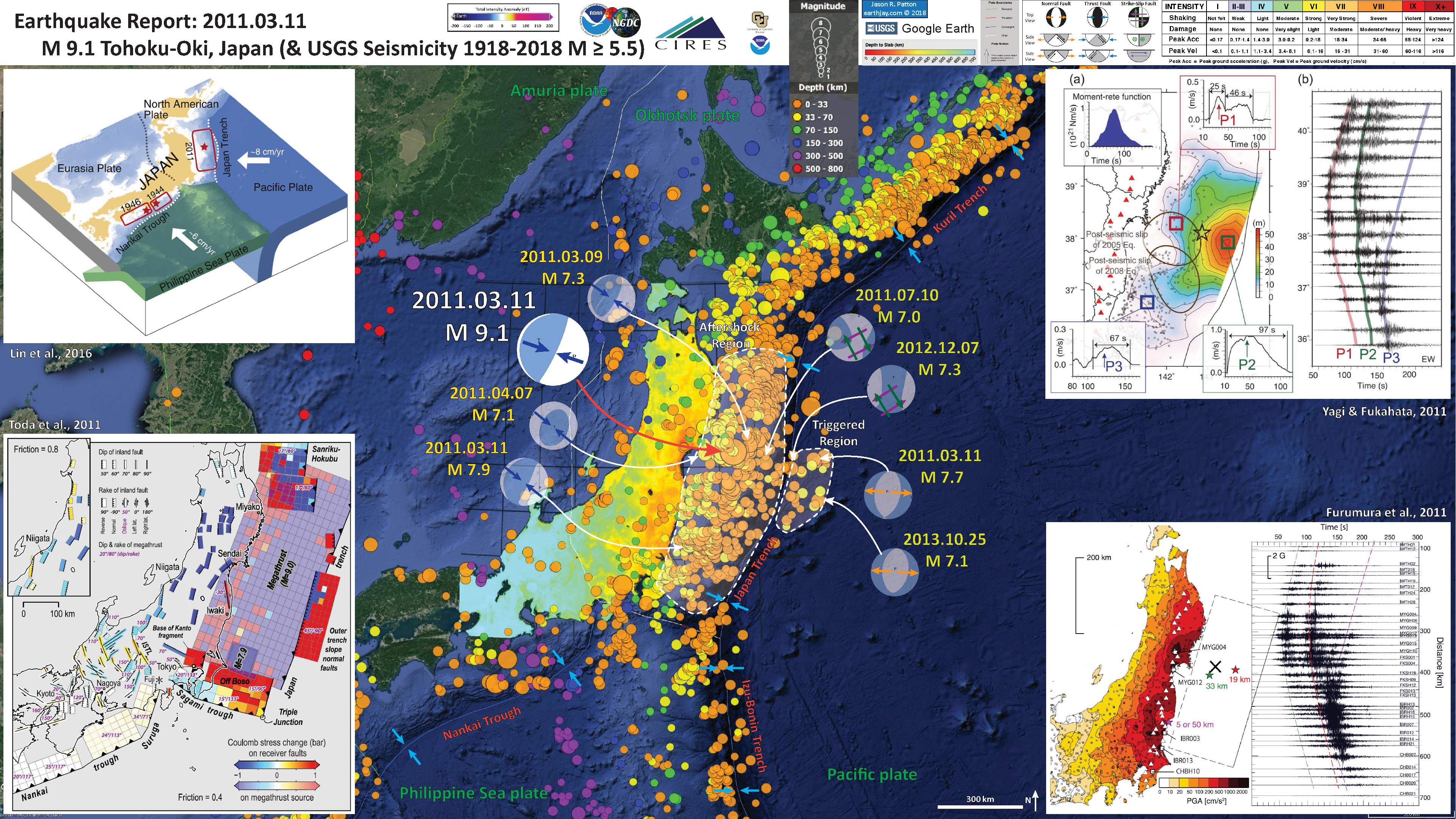
I plot the seismicity from 2010.03.11 through 2018.02.10, with color representing depth and diameter representing magnitude (see legend). I include earthquake epicenters with magnitudes M ≥ 5.5. I also prepared these two posters with and without emag2 magnetic anomaly data (the file sizes are larger for these emag2 posters), with seismicity from 1918-2018 for earthquakes M 5.5.
I plot the USGS fault plane solutions (moment tensors in blue and focal mechanisms in orange) for the M 6.8 earthquake, in addition to some relevant historic earthquakes.
I note how that there were some crustal fault earthquakes in the Pacific plate that were triggered as a response to the M 9.0 earthquake. The modeling from Toda et al. (2011) tests this hypothesis with static coulomb stress modeling (the earthquakes are supportive evidence of their modeling).
- I placed a moment tensor / focal mechanism legend on the poster. There is more material from the USGS web sites about moment tensors and focal mechanisms (the beach ball symbols). Both moment tensors and focal mechanisms are solutions to seismologic data that reveal two possible interpretations for fault orientation and sense of motion. One must use other information, like the regional tectonics, to interpret which of the two possibilities is more likely.
- I also include the shaking intensity intensity on the map (shows where there is land). These use the Modified Mercalli Intensity Scale (MMI; see the legend on the map). This is based upon a computer model estimate of ground motions, different from the “Did You Feel It?” estimate of ground motions that is actually based on real observations. The MMI is a qualitative measure of shaking intensity. More on the MMI scale can be found here and here. This is based upon a computer model estimate of ground motions, different from the “Did You Feel It?” estimate of ground motions that is actually based on real observations.
-
I include some inset figures.
- In the upper left corner is a low angle oblique view of the plate boundaries in this region (Lin et al., 2016). Earthquake slip regions for the major historic subduction zone earthquakes in Japan are outlined.
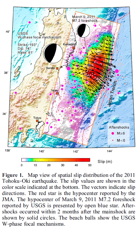
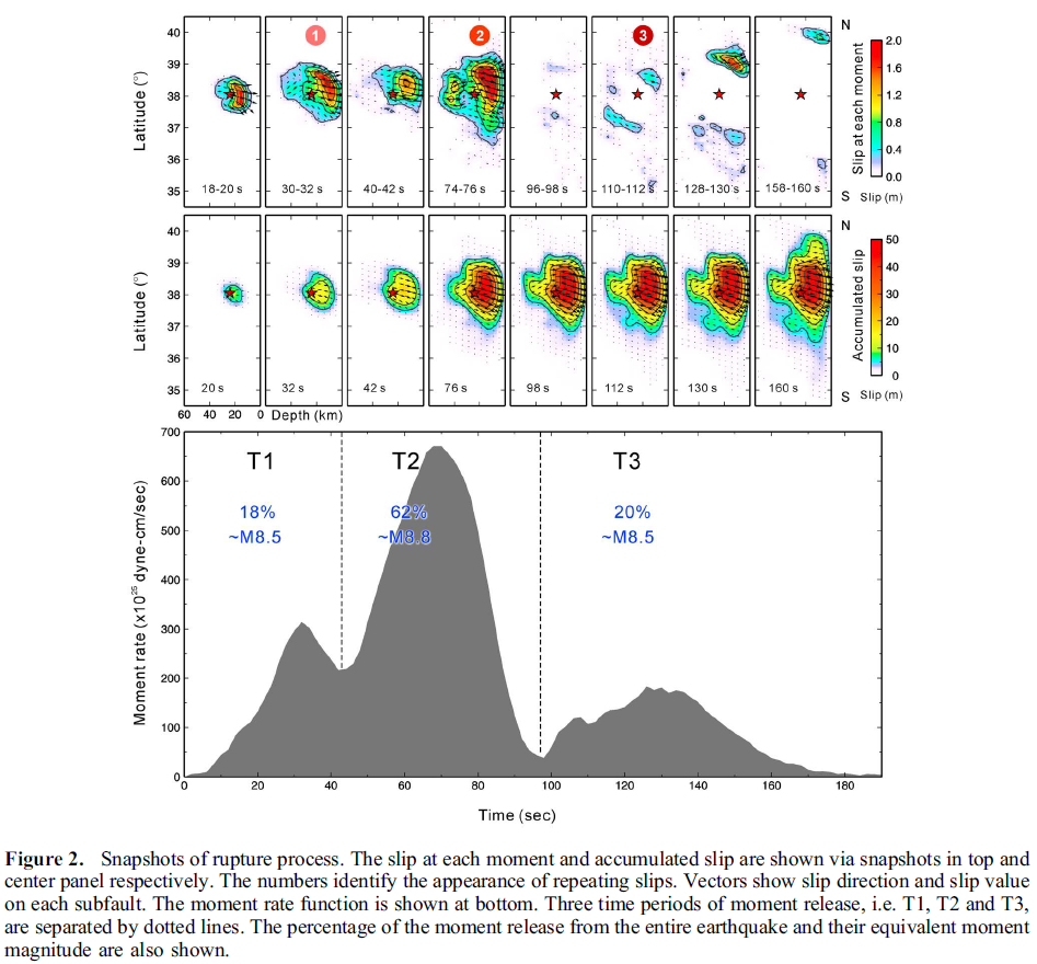
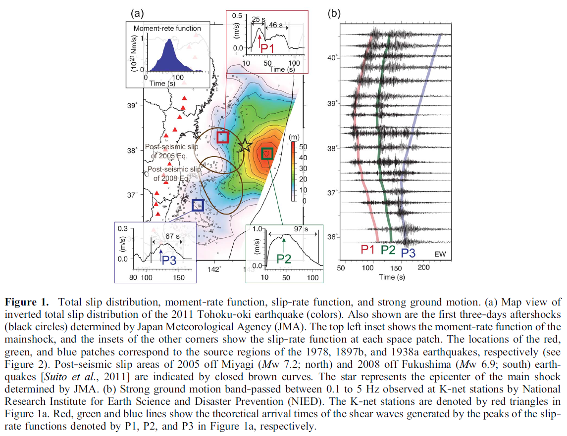
- In the upper right corner is a figure from Yagi and Fukuhata, 2011. This figure shows a map on the left, with color representing the amount of slip on the fault (over 50 m!!!). On the right are the seismographs plotted along strike (north-south). The red, green, and blue bands are the three main sub-events as recorded on these seismographs.
- In he lower right corner is a map that shows an estimate of the ground motion shaking intensity from this earthquake (Furumura eta l.m, 2011). Note the similar record of seismographs.
- In the lower left corner is an illustration from Toda et al., 2011. This figure shows the results of their static coulomb stress modeling. Basically, this shows the amount of increased stress imparted on various fault types as a result of the 2011 M 9.0 earthquake.
Main Interpretive Poster
Main Interpretive Poster with emag2
Main Interpretive Poster with 1918-2018 M ≥ 5.5 earthquakes
This map is a comparison of the USGS Shakemap and the DYFI results
This figure is another comparison of the USGS Shakemap and the DYFI results
Here is an updated poster that includes tide gage, intensity, and ground failure information.

Here are the tide gage data from Crescent City, California. See more tide gage data from CA here.
Here are a couple videos recently posted (16 Jan 2020) that shows the strong shaking at the Sendai Airport, along with the tsunami inundation there (the second one is from a different location).
Here is a video showing 30 years of earthquakes.
Potential for Ground Failure
- Below are a series of maps that show the potential for landslides and liquefaction. These are all USGS data products.
There are many different ways in which a landslide can be triggered. The first order relations behind slope failure (landslides) is that the “resisting” forces that are preventing slope failure (e.g. the strength of the bedrock or soil) are overcome by the “driving” forces that are pushing this land downwards (e.g. gravity). The ratio of resisting forces to driving forces is called the Factor of Safety (FOS). We can write this ratio like this:FOS = Resisting Force / Driving Force
When FOS > 1, the slope is stable and when FOS < 1, the slope fails and we get a landslide. The illustration below shows these relations. Note how the slope angle α can take part in this ratio (the steeper the slope, the greater impact of the mass of the slope can contribute to driving forces). The real world is more complicated than the simplified illustration below.
Landslide ground shaking can change the Factor of Safety in several ways that might increase the driving force or decrease the resisting force. Keefer (1984) studied a global data set of earthquake triggered landslides and found that larger earthquakes trigger larger and more numerous landslides across a larger area than do smaller earthquakes. Earthquakes can cause landslides because the seismic waves can cause the driving force to increase (the earthquake motions can “push” the land downwards), leading to a landslide. In addition, ground shaking can change the strength of these earth materials (a form of resisting force) with a process called liquefaction.
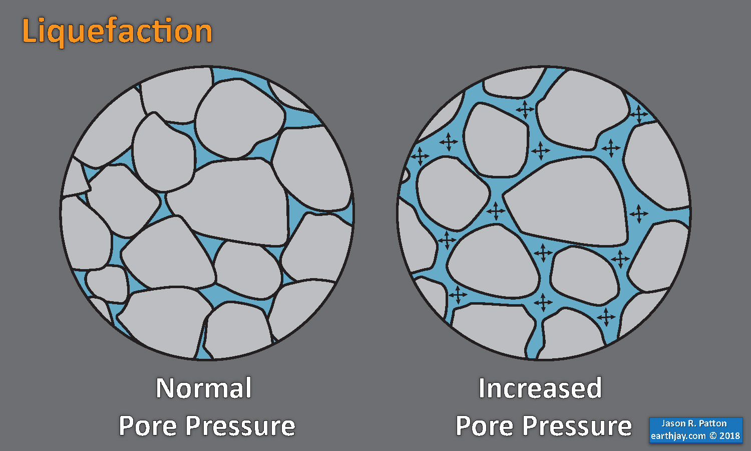
Sediment or soil strength is based upon the ability for sediment particles to push against each other without moving. This is a combination of friction and the forces exerted between these particles. This is loosely what we call the “angle of internal friction.” Liquefaction is a process by which pore pressure increases cause water to push out against the sediment particles so that they are no longer touching.
An analogy that some may be familiar with relates to a visit to the beach. When one is walking on the wet sand near the shoreline, the sand may hold the weight of our body generally pretty well. However, if we stop and vibrate our feet back and forth, this causes pore pressure to increase and we sink into the sand as the sand liquefies. Or, at least our feet sink into the sand.
Below is a diagram showing how an increase in pore pressure can push against the sediment particles so that they are not touching any more. This allows the particles to move around and this is why our feet sink in the sand in the analogy above. This is also what changes the strength of earth materials such that a landslide can be triggered.
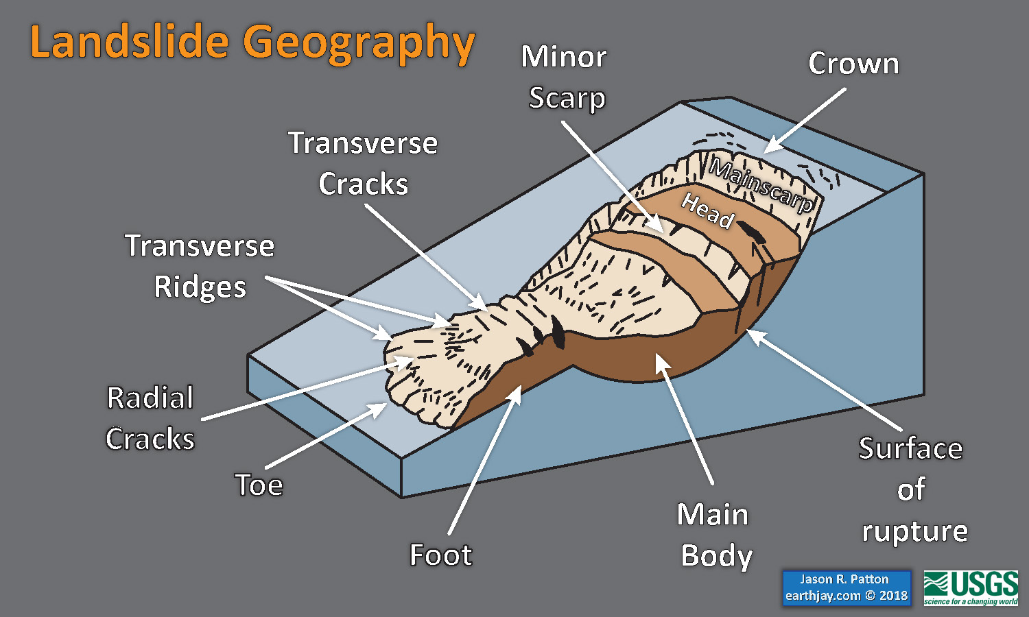
Below is a diagram based upon a publication designed to educate the public about landslides and the processes that trigger them (USGS, 2004). Additional background information about landslide types can be found in Highland et al. (2008). There was a variety of landslide types that can be observed surrounding the earthquake region. So, this illustration can help people when they observing the landscape response to the earthquake whether they are using aerial imagery, photos in newspaper or website articles, or videos on social media. Will you be able to locate a landslide scarp or the toe of a landslide? This figure shows a rotational landslide, one where the land rotates along a curvilinear failure surface.
- Below is the liquefaction susceptibility and landslide probability map (Jessee et al., 2017; Zhu et al., 2017). Please head over to that report for more information about the USGS Ground Failure products (landslides and liquefaction). Basically, earthquakes shake the ground and this ground shaking can cause landslides.
- I use the same color scheme that the USGS uses on their website. Note how the areas that are more likely to have experienced earthquake induced liquefaction are in the valleys. Learn more about how the USGS prepares these model results here.

Some Relevant Discussion and Figures
- Here is the Yagi and Fukuhata (2011) figure.
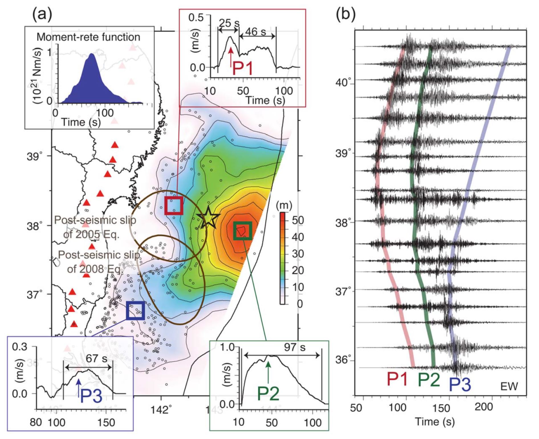
Total slip distribution, moment‐rate function, slip‐rate function, and strong ground motion. (a) Map view of inverted total slip distribution of the 2011 Tohoku‐oki earthquake (colors). Also shown are the first three‐days aftershocks (black circles) determined by Japan Meteorological Agency (JMA). The top left inset shows the moment‐rate function of the mainshock, and the insets of the other corners show the slip‐rate function at each space patch. The locations of the red, green, and blue patches correspond to the source regions of the 1978, 1897b, and 1938a earthquakes, respectively (see Figure 2). Post‐seismic slip areas of 2005 off Miyagi (Mw 7.2; north) and 2008 off Fukushima (Mw 6.9; south) earthquakes [Suito et al., 2011] are indicated by closed brown curves. The star represents the epicenter of the main shock determined by JMA. (b) Strong ground motion band‐passed between 0.1 to 5 Hz observed at K‐net stations by National Research Institute for Earth Science and Disaster Prevention (NIED). The K‐net stations are denoted by red triangles in Figure 1a. Red, green and blue lines show the theoretical arrival times of the shear waves generated by the peaks of the slip rate functions denoted by P1, P2, and P3 in Figure 1a, respectively.
- Here is the figure from Furumura et al., 2011). Color represents the ground shaking in units of g (9.8 m/s^2), PGA (peak ground acceleration). There are other measures of ground shaking that appear to be more relevant (e.g. Arias Intensity), but PGA is still a relevant measure.
- This shows the PGA with time (Furumura et al., 2011).

Snapshots of seismic wave propagation following the 2011 off-the-Pacific-coast-of-Tohoku, Japan (Mw=9.0) earthquake. The amplitude of ground–velocity motions are shown for times of 60, 110, 160, 210, 260, and 310 s after the earthquake rupture. Star the hypocenter of this earthquake. Major city and prefecture are
marked
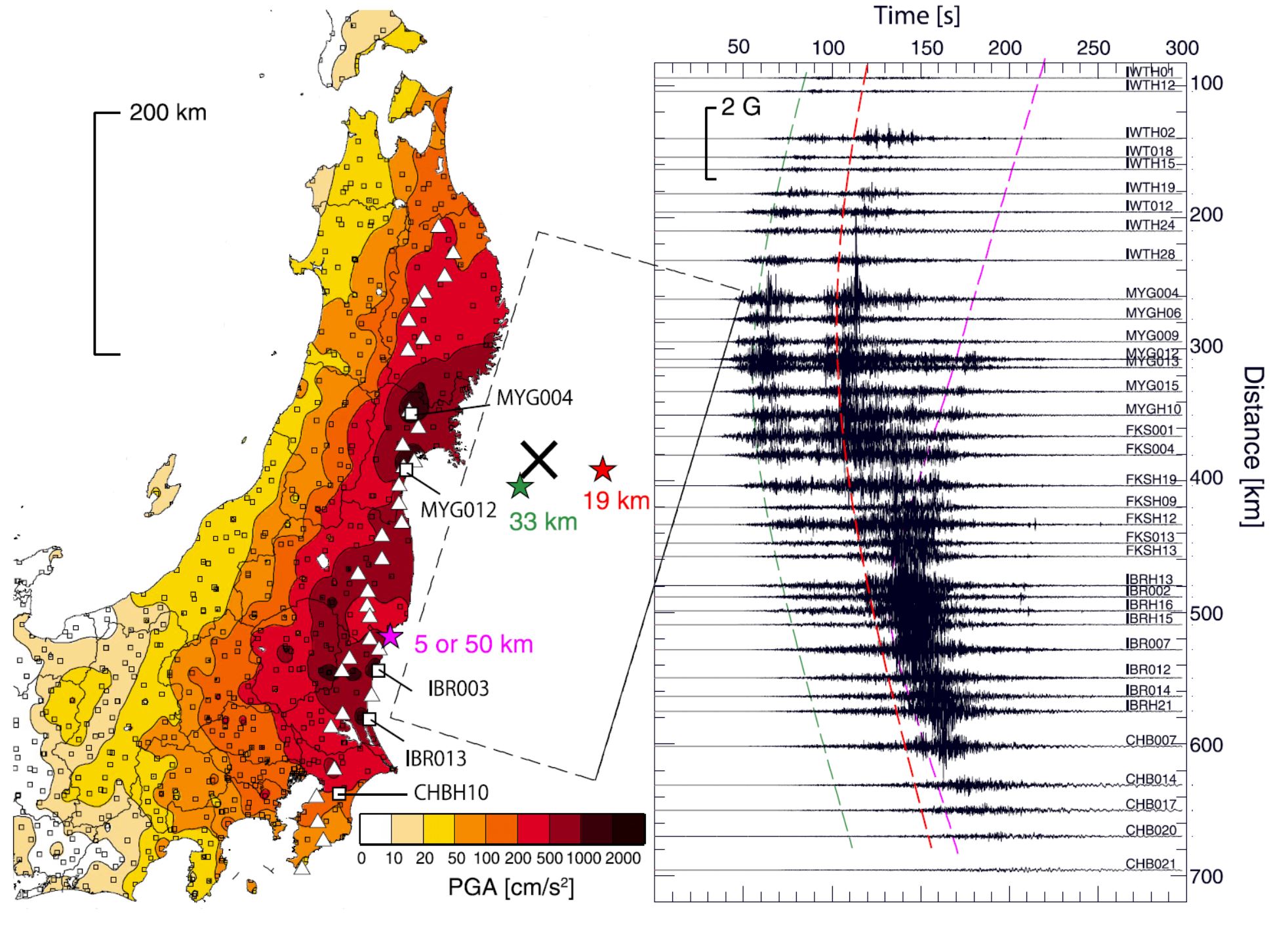
Distribution of peak ground acceleration (PGA; cm/s/s) and record section of the vertical component ground acceleration recorded at linearly aligned 42 stations from north to south (triangles in the PGA map). The hypocenter (cross) and three large slips (green, red, and purple stars) with their theoretical travel–time curves are indicated
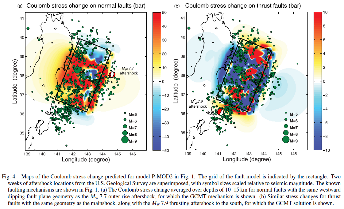
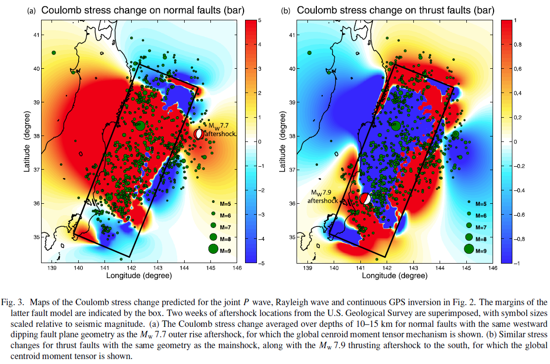
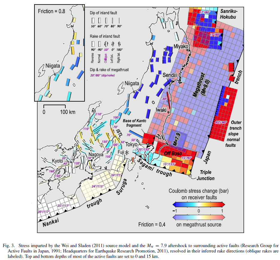
- Here is the Toda et al. (2011) figure, showing an increase in static coulomb stress along outer rise (the Pacific plate east of the Japan trench) and Sagami trough subduction zone settings.

Stress imparted by the Wei and Sladen (2011) source model and the Mw = 7.9 aftershock to surrounding active faults (Research Group for Active Faults in Japan, 1991; Headquarters for Earthquake Research Promotion, 2011), resolved in their inferred rake directions (oblique rakes are labeled). Top and bottom depths of most of the active faults are set to 0 and 15 km.
-
Below I present some material in the following categories:
- GPS Observations (ARIA)
- IRIS Observations
- USGS Material
- Slip Models and Aftershock Maps
- a) ARIA_GPSDisplacement:
- Here is the file for direct download. (18 MB mp4)
- b) ARIA_GPSvelocity:
- Here is the file for direct download. (6 MB mp4)
- b) ARIA_GPSDisplacement_composite:
- Here is the file for direct download. (6 MB mp4)
- Here are some maps that are static results displayed in the above animations.
- Coseismic Horizontal:
- Coseismic Vertical:
Here are some animations from the ARIA Project at Caltech/JPL.
Beginning with a description of the animations in blockquote.
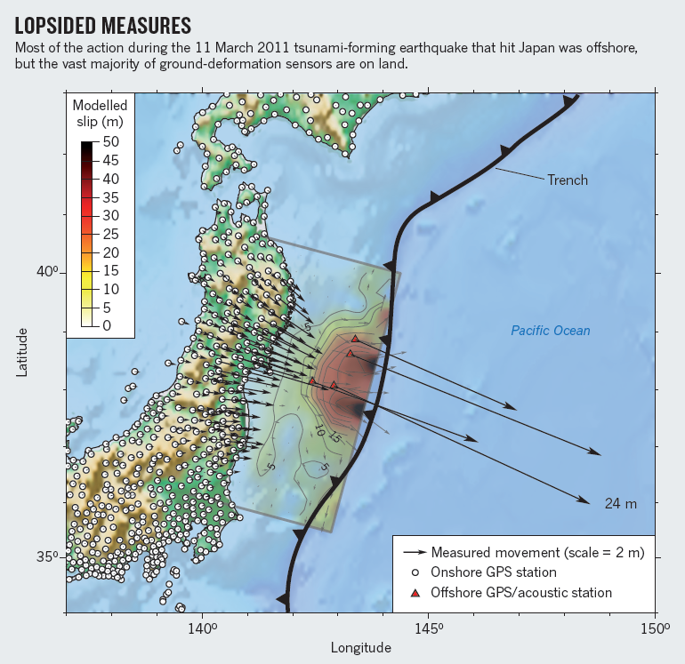
We show 2 videos on Japan’s movement over the 35 minutes following the initiation of the Tohoku-Oki (M 9.0). These images are made possible because of the density of GPS stations in Japan (about 1200 GPS stations, or a GPS station every ~30 km). The preliminary GPS displacement data that these animations are based on are provided by the ARIA team at JPL and Caltech. All Original GEONET RINEX data provided to Caltech by the Geospatial Information Authority (GSI) of Japan.
This animation shows the cumulative displacements of the GPS stations relative to their position before the M9.0 Tohoku-Oki earthquake. The colors show the magnitude of displacement and the arrows indicate direction. We observe 2 kinds of motions, a permanent deformation in the vicinity of the earthquake (first red star) intermediately followed by a perturbation that travels about ~4 km/sec which are the surface waves generated by the earthquake.
This animation shows the estimated instantaneous velocities of the GPS stations. In this view, we only observe the transient motion caused by the earthquake. The first waves to propagate from the mainshock (red star) are the body waves (P and S) but they can be barely seen (look for a slight purple perturbation). These are followed by the surface waves (Love and Rayleigh) propagating as 2 orange-red stripes, as surface waves generate larger velocities at the surface than the body waves. At about 25 minutes there is a subtle signal from seismic waves generated by a small aftershock in northern Japan. At around 30 minutes we observe the seismic waves from a M7.9 aftershock (smaller red star), the largest aftershock to date. Since this event is about 30 times smaller than the mainshock, the P and S waves from this earthquake are too small to be detected with these rapid GPS solutions, but we can observe the surface waves. The small patches of color that appear randomly across Japan show the noise level of the measurements and are not related to any significant ground motion.


- First is an animation showing seismic waves as measured at stations associated with the USArray. Above is a screen shot and below is the embedded animation (with a direct download link).
- Vertical Component:
- Here is the file for direct download. (10 MB mp4)
- Three Components:
- Here is the file for direct download. (18 MB mp4)
- Here is an animation showing the aftershocks
- Here is the file for direct download. (7 MB mp4)
Here are some animations from IRIS.


USGS Material
Here is the USGS earthquake web page for this earthquake.
Here is the USGS poster for this earthquake
-
Here are some “Did You Feel It?” maps:
- The main DYFI map
- The DYFI aggregated vs. region
- The DYFI zoomed to a smaller scale
- This is the attenuation with distance plot. This shows how the ground motions decay with distance from the earthquake.


Here is the USGS text describing the tectonic setting:
Tectonic Summary
The magnitude 9.0 Tohoku earthquake on March 11, 2011, which occurred near the northeast coast of Honshu, Japan, resulted from thrust faulting on or near the subduction zone plate boundary between the Pacific and North America plates. At the latitude of this earthquake, the Pacific plate moves approximately westwards with respect to the North America plate at a rate of 83 mm/yr, and begins its westward descent beneath Japan at the Japan Trench. Note that some authors divide this region into several microplates that together define the relative motions between the larger Pacific, North America and Eurasia plates; these include the Okhotsk and Amur microplates that are respectively part of North America and Eurasia.
The March 11 earthquake was preceded by a series of large foreshocks over the previous two days, beginning on March 9th with a M 7.2 event approximately 40 km from the epicenter of the March 11 earthquake, and continuing with another three earthquakes greater than M 6 on the same day.
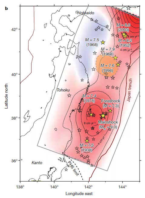
The Japan Trench subduction zone has hosted nine events of magnitude 7 or greater since 1973. The largest of these, a M 7.8 earthquake approximately 260 km to the north of the March 11 epicenter, caused 3 fatalities and almost 700 injuries in December 1994. In June of 1978, a M 7.7 earthquake 35 km to the southwest of the March 11 epicenter caused 22 fatalities and over 400 injuries. Large offshore earthquakes have occurred in the same subduction zone in 1611, 1896 and 1933 that each produced devastating tsunami waves on the Sanriku coast of Pacific NE Japan. That coastline is particularly vulnerable to tsunami waves because it has many deep coastal embayments that amplify tsunami waves and cause great wave inundations. The M 7.6 subduction earthquake of 1896 created tsunami waves as high 38 m and a reported death toll of 22,000. The M 8.6 earthquake of March 2, 1933 produced tsunami waves as high as 29 m on the Sanriku coast and caused more than 3000 fatalities.
The March 11, 2011 earthquake was an infrequent catastrophe. It far surpassed other earthquakes in the southern Japan Trench of the 20th century, none of which attained M8. A predecessor may have occurred on July 13, 869, when the Sendai area was swept by a large tsunami that Japanese scientists have identified from written records and a sand sheet.
Continuing readjustments of stress and associated aftershocks are expected in the region of this earthquake. The exact location and timing of future aftershocks cannot be specified. Numbers of aftershocks will continue to be highest on and near to fault-segments on which rupture occurred at the time of the main-shock. The frequency of aftershocks will tend to decrease with elapsed time from the time of the main shock, but the general decrease of activity may be punctuated by episodes of higher aftershock activity. The risks of great earthquakes at locations far from northern Honshu are neither significantly higher nor significantly lower than before the March 11 main-shock. ”
Slip Models and Aftershock Maps
Gusman et al., 2013
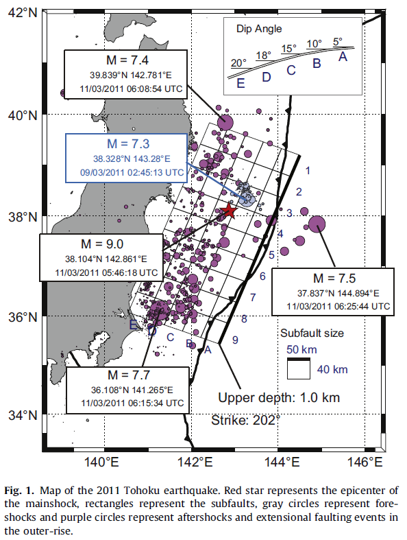
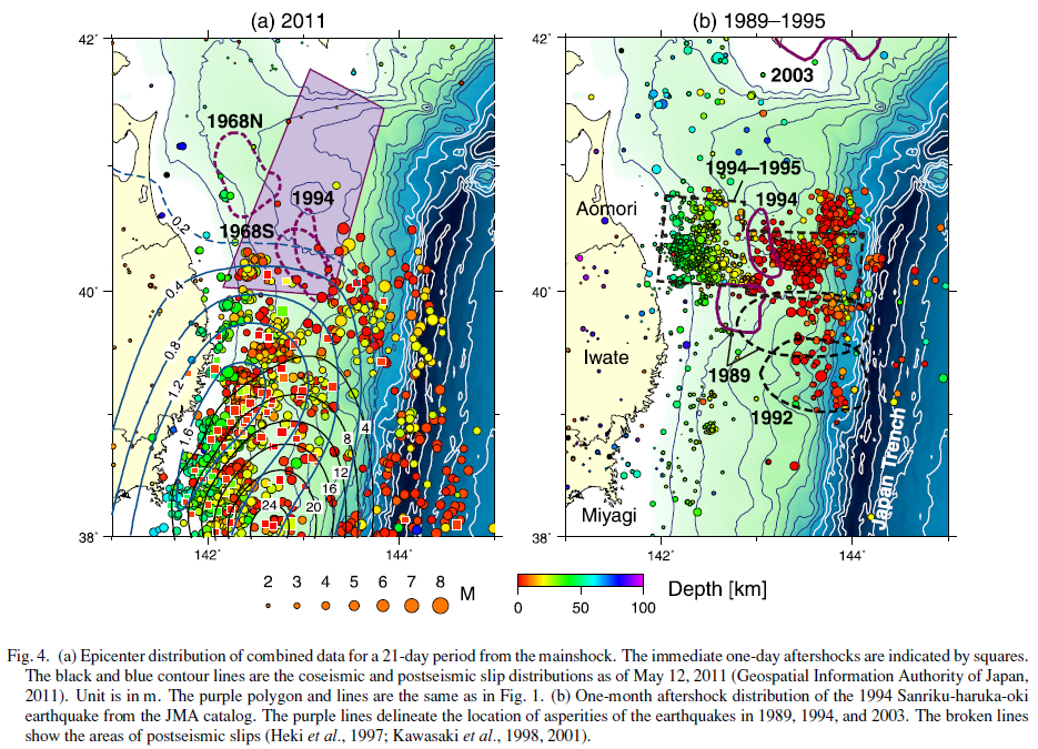
This one from Kosuga et al, 2011 show the aftershocks in 2011 as they relate to some historic earthquakes and their aftershocks. This most recent swarm appears to plot just to the south of the 1994 swarm.
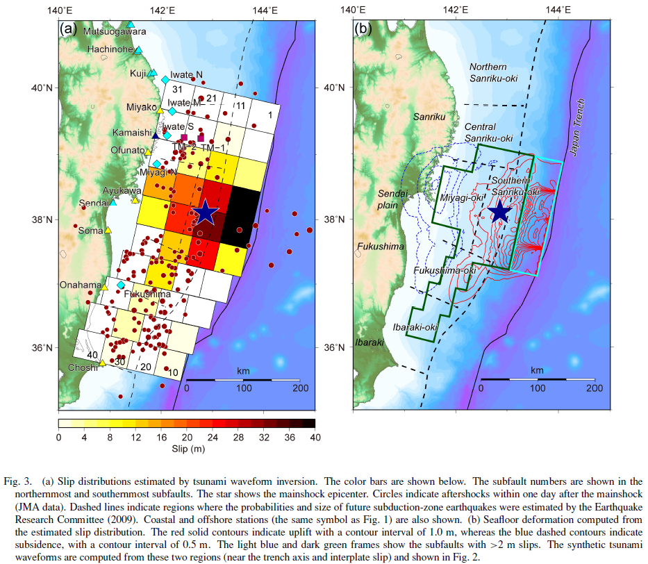
This shows various mainshock and aftershock slip patches from Nishimura et al., 2011:
![]()
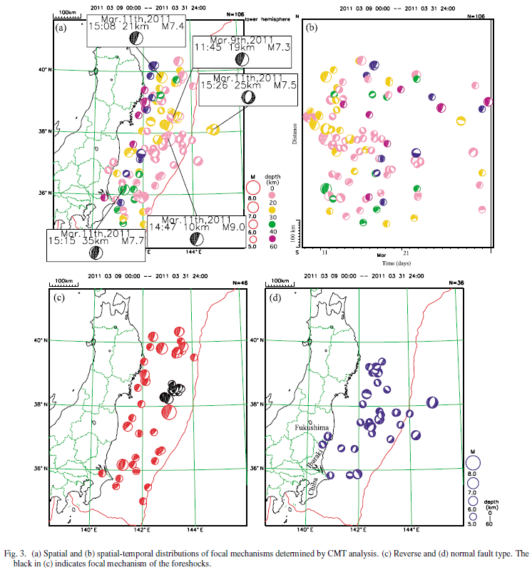
This Hirose et al. (2011) map shows focal mechanisms for select fore- and after-shocks, as well as the main shock. There were some large magnitude afteshocks in the segment that has swarmed in the past ~1 week.
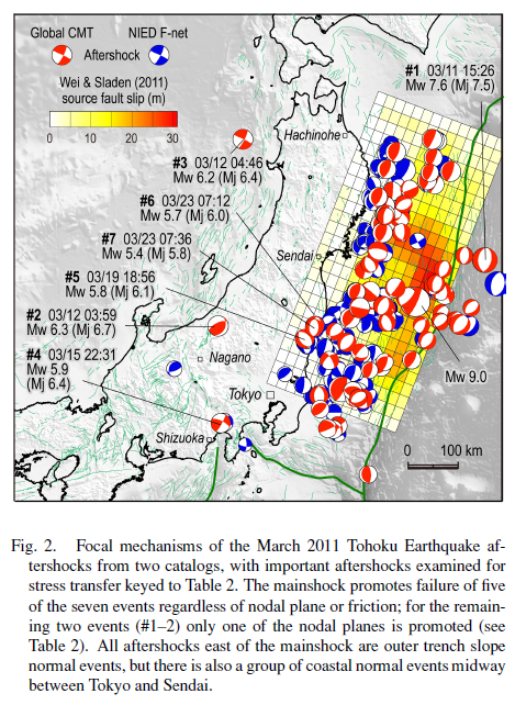
This Toda et al. (2011) map also shows focal mechanisms for related earthquakes, along with their slip model.
Lets take a look at some of the earthquake slip models for the 2011 March 11 Tohoku-Oki M 9.1 subduction zone earthquake. There are dozens of them. Note where the slip was in 2011 and where this recent swarm is located. There are different sources of information that have been inverted for these source slip models. Some only use one type of data, others use multiple types of data (seismologic data, GPS data, tsunami wave form data, etc.). The best inversions include as many sources as possible. I posted these slip models first when I was reporting on some aftershocks on 2015/02/20 here.
Earthquake Slip Inversions
Ammon et a., 2011 show their slip inversion (GPS) along with the epicenters and their source time function plot.
Fujitsu et al., 2011, inverted from tsunami wave forms.
Gusman et al., 2013, inverted from tsunami wave forms.
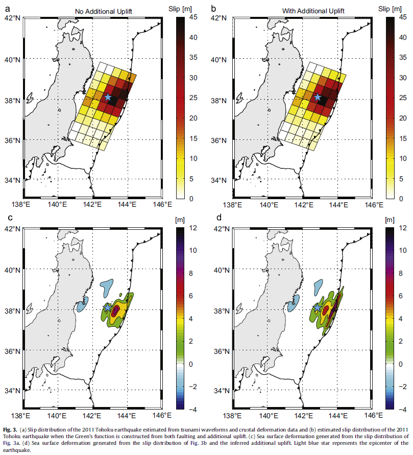
Iinuma et al., 2012 shows the seafloor displacement used in their slip model.
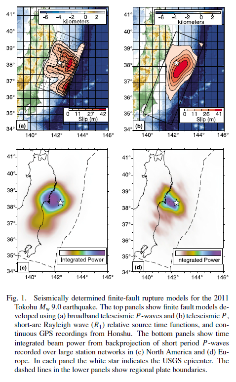
Koper et al., 2011 using seismic and GPS data:
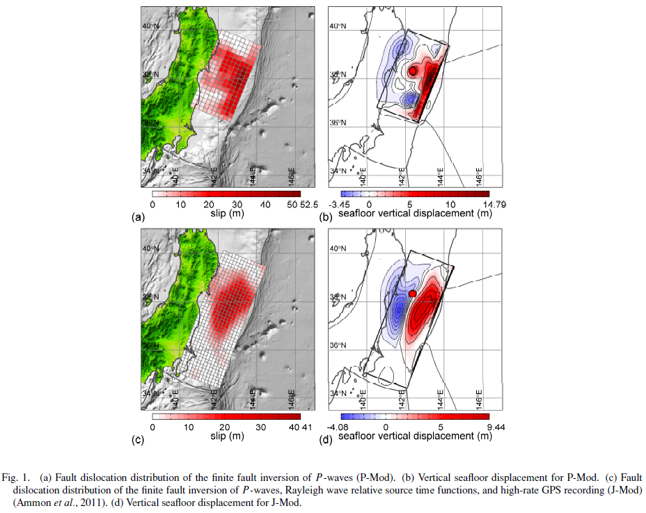
Lay et al., 2011 b, showing their seafloor deformation using seismic data.
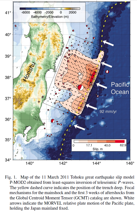
Lay et al., 2011 a, using seismic, GPS, and tsunami wave inversions.
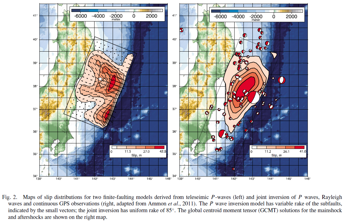
Lay et al., 2011 c, joint inversions os seismic and GPS data:
Lee et al., 2011:
This shows how the Lee et al. (2011) slip model incorporates the three main sub event slip patches through time (with the source time function plotted as well).
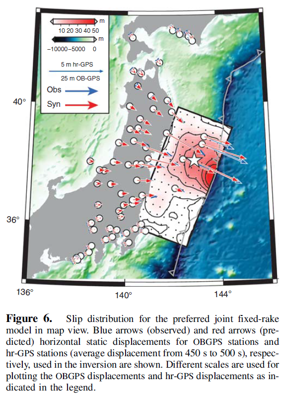
Newman et al., 2011, based on a GPS inversion:
Satake et al., 2013, based on tsunami wave form inversion:
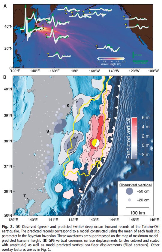
Simons et al., 2011 seafloor deformation for their tsunami wave inversions:
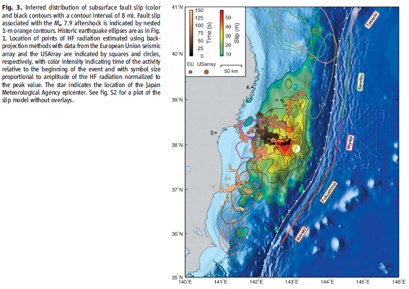
Simons et al., 2011 slip inversion from high frequency seismic data:
Wang et al., 2013 showing inversions from six different sources:
Wang et al., 2013 and their joint inversion:
Here is one of the more comprehensive figures from Yagi et al., 2011. They plot their slip model (seismic data), historic slip patches, source time functions for the main sub-events, and the seismic waves, outlining the 3 main sub-events.
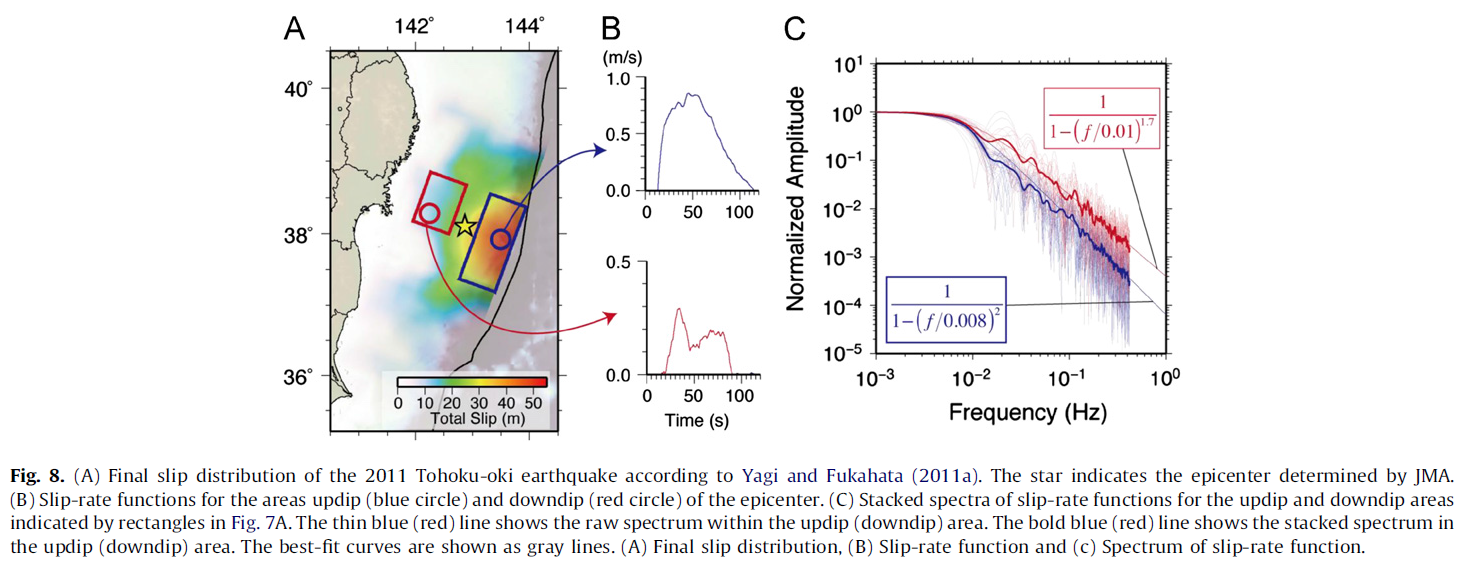
This is Yagi et al.’s (2012) final slip distribution, the source time function for two patches, and the spectra of the slip rate.
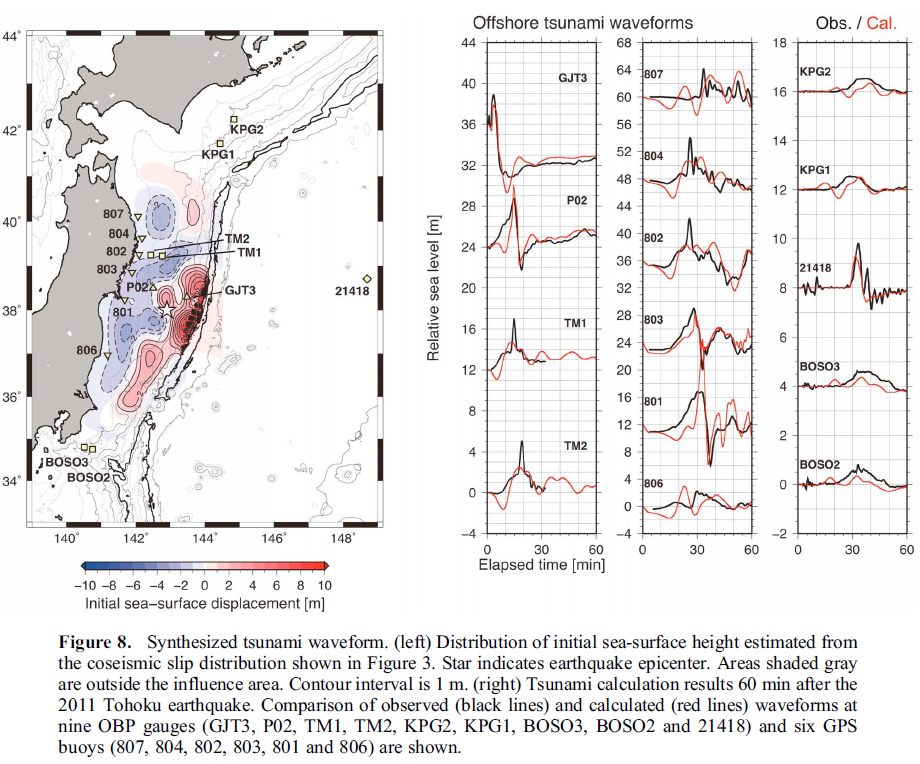
This is from Yamazaki et al., 2011 using GPS and tsunami wave inversions.
This is from Yamazaki et al., 2011 showing the sea floor deformation used for their inversion.
Yue and Lay, 2013 show their joint slip model (GPS):
Shao et al., 2011. Slip models prepared by inverting teleseismic body and surface waves, followed by their figure caption as a blockquote.

Comparison of surface projections of slip model I, II, III by joint inverting teleseismic body and surface waves. Yellow line highlights the 5-m slip contour. Red star indicates the epicenter location and red dots are the aftershocks within first 6 days from JMA catalog. White arrow shows the Pacific plate motion relative to the North America plate (Demets et al., 1994). (a) Model I. (b) Model II. (c) Model III. (d) Comparison of moment rate functions of UCSB Model I, II, and III.
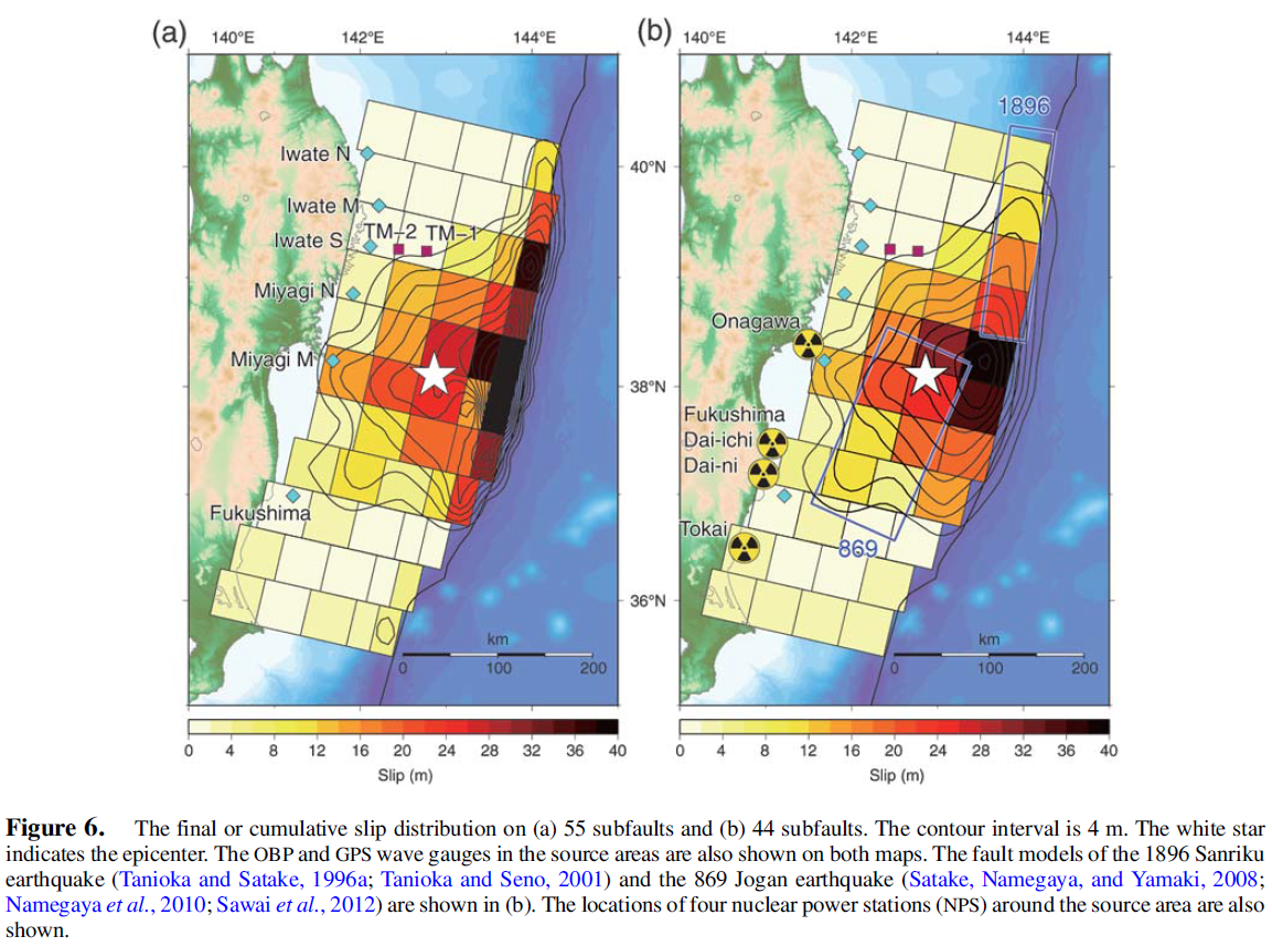
Lets now compare the 2011 earthquake with historic earthquake slip regions. Lets also look at the regional slip deficit and how this recent swarm may fit into the bigger picture of this part of this subduction zone.
Slip Compared to historic earthquakes and pre- and post-seismic slip, etc.
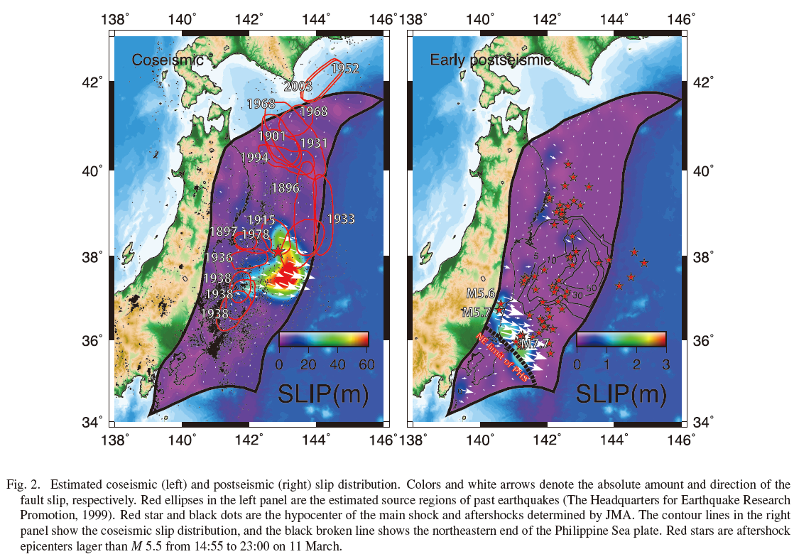
Ito et al., 2011 2011 slip compared to historic earthquake slip patches.
Ikuta et al., 2012, 2011 slip compared to historic slip estimates:
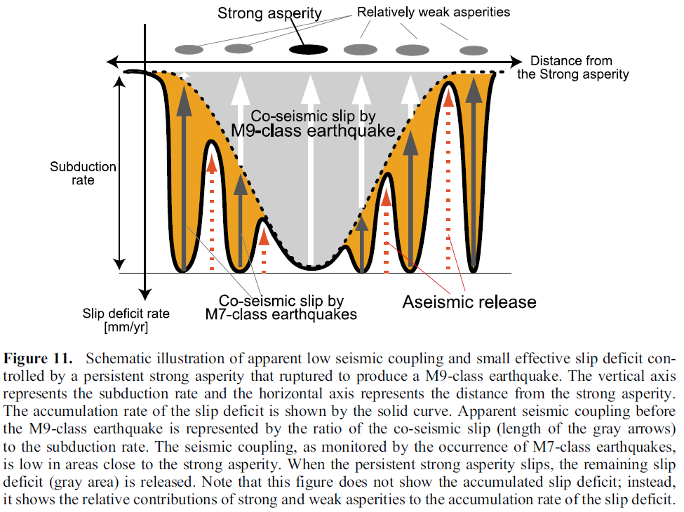
This Ikuta et al. (2012) plots shows the slip deficit for this part of the subduction zone. Basically, this is a way of viewing how much plate convergence might be expected to contribute to earthquake slip over time. In this case, we see how the smaller earthquakes took up some of the slip adjacent to the 2011 slip patch (think about where today’s swarm took place compared to the region that slipped in 2011).
What about how the 2011 earthquake changed the stress on the fault in regions adjacent to the 2011 earthquake?
Here are some plots showing the coulomb stress changes due to the 2011 earthquake.
Basically, this shows which locations on the fault where we might expect higher likelihoods of future earthquake slip.
Lay et al., 2011 b:
Lay et al., 2011 c, note how the segment to the north of the 2011 slip region experiences an increased stress:
Terakawa et al., 2013, also note how the segment to the north of the 2011 slip region experiences an increased stress:
Toda et al., 2011 shows stress changes on certain receiver faults:
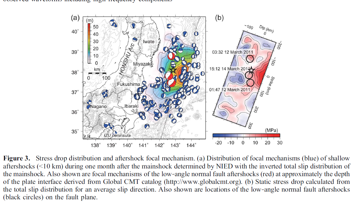
Yagi and Fukahata, 2011 shows the stress drop calculated from their slip distribution.
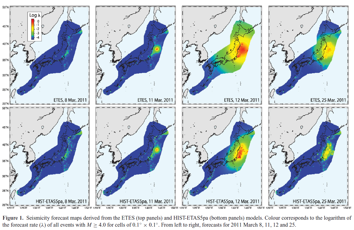
This is a series of seismicity forecast maps from Nanjo et al. (2012; another way of looking at how the stress changed following the 2011 earthquake).
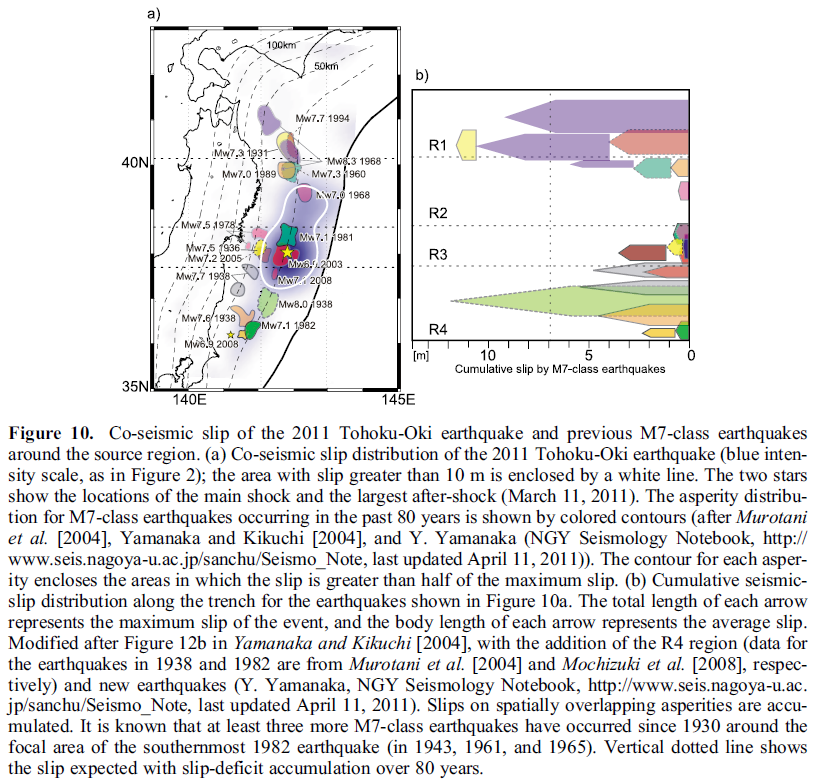
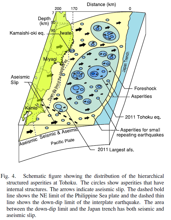
Here is a cool plot showing Uchida et al.’s (2011) view of where the asperities are in this part of the subduction zone. There are two definitions for asperity. (1) the regions of higher slip and (2) the regions of the fault that store strain (like sea mounts?). They are related, but defined differently (most people conflate the two). This figure refers to type 2. How does this most recent swarm fit into this view of subduction zone faults?
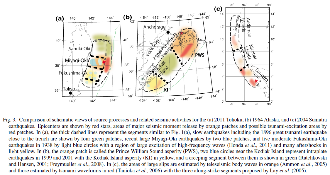
Here is the Yomogida et al. (2011) view of the segmentation of the subduction zone in 2011 Japan, 1964 Alaska, and 2004 Sumatra. Note how this recent swarm is in the northernmost segment (areas of lowest slip in 2011).
This Orzawa et al. (2011) map is exciting because it shows the slip distribution for several earthquakes in this region… The 2011 in the south and the 2003 in the north (along with the 1994 slip in the center). Where was this most recent swarm?
-
References:
- Ammon et al., 2011. A rupture model of the 2011 off the Pacific coast of the Tohoku Earthquake in Earth Planets Space, v. 63, p. 693-696.
- Fujitsu et al., 2011
- Gusman et al., 2012. Source model of the great 2011 Tohoku earthquake estimated from tsunami waveforms and crustal deformation data in Earth and Planetary Science Letters, v. 341-344, p. 234-242.
- Hirose et al., 2011. Outline of the 2011 off the Pacific coast of Tohoku Earthquake (Mw 9.0) Seismicity: foreshocks, mainshock, aftershocks, and induced activity in Earth Planets Space, v. 63, p. 655-658
- Iinuma et al., 2012. Coseismic slip distribution of the 2011 off the Pacific Coast of Tohoku Earthquake (M9.0) refined by means of seafloor geodetic data in Journal of Geophysical Research, v. 117, DOI: 10.1029/2012JB009186
- Ikuta et al., 2012. A small persistent locked area associated with the 2011 Mw9.0 Tohoku-Oki earthquake, deduced from GPS data in Journal of Geophysical Research, v. 117, DOI: 10.1029/2012JB009335
- Ito et al., 2011. Slip distribution of the 2011 off the Pacific coast of Tohoku Earthquake inferred from geodetic data in Earth Planets Space, v. 63, p. 627-630
- Koper et al., 2011. Frequency-dependent rupture process of the 2011 Mw 9.0 Tohoku Earthquake: Comparison of short-period P wave back projection images and broadband seismic rupture models in Earth Planets Space, v. 63, p. 599-602.
- Kosuga et al, 2011. Seismic activity around the northern neighbor of the 2011 off the Pacific coast of Tohoku Earthquake with emphasis on a potentially large aftershock in the area in Earth Planets Space, v. 63, p. 719-723.
- Lay et al., 2011 a. The 2011 Mw 9.0 off the Pacific coast of Tohoku Earthquake: Comparison of deep-water tsunami signals with finite-fault rupture model predictions in Earth Planets Space, v. 63, p. 797-801.
- Lay et al., 2011 b. Possible large near-trench slip during the 2011 Mw 9.0 off the Pacific coast of Tohoku Earthquake in Earth Planets Space, v. 63, p. 687-692.
- Lay et al., 2011 c. Outer trench-slope faulting and the 2011 Mw 9.0 off the Pacific coast of Tohoku Earthquake in Earth Planets Space, v. 63, p. 713-718.
- Lee et al., 2011. Evidence of large scale repeating slip during the 2011 Tohoku‐Oki earthquake in Geophysical Research Letters, v. 38, DOI: 10.1029/2011GL049580.
- Newman et al., 2011. Hidden depths in Nature, v. 474, p. 441-443.
- Nishimura et al., 2011. The 2011 off the Pacific coast of Tohoku Earthquake and its aftershocks observed by GEONET in Earth Planets Space, v. 63, p. 631-636.
- Orzawa et al., 2011. Coseismic and postseismic slip of the 2011 magnitude-9 Tohoku-Oki earthquake in Nature, v. 000, p. 1-4.
- Satake et al., 2013. Time and Space Distribution of Coseismic Slip of the 2011 Tohoku Earthquake as Inferred from Tsunami Waveform Data in Bulletin of the Seismological Society of America, v. 1032, p. 1473-1492.
- Shao et al., 2011. Focal mechanism and slip history of the 2011 Mw 9.1 off the Pacific coast of Tohoku Earthquake, constrained with teleseismic body and surface waves in Earth Planets Space, v. 63, p. 559-564.
- Simons et al., 2011. The 2011 Magnitude 9.0 Tohoku-Oki Earthquake: Mosaicking the Megathrust from Seconds to Centuries in Science, v. 332, p. 1421-1425.
- Terakawa et al., 2013. Changes in seismic activity following the 2011 Tohoku-oki earthquake: Effects of pore fluid pressure in Earth and Planetary Science Letters, v. 365, p. 17-24.
- Toda et al., 2011. Using the 2011 Mw 9.0 off the Pacific coast of Tohoku Earthquake to test the Coulomb stress triggering hypothesis and to calculate faults brought closer to failure in Earth Planets Space, v. 63, p. 725-730.
- Uchida and Matsuzawa, 2011. Coupling coefficient, hierarchical structure, and earthquake cycle for the source area of the 2011 off the Pacific coast of Tohoku earthquake inferred from small repeating earthquake data in Earth Planets Space, v. 63, p. 675-679.
- Wang et al., 2013. The 2011 Mw 9.0 Tohoku Earthquake: Comparison of GPS and Strong-Motion Data in Bulletin of the Seismological Society of America, v. 103, p. 1336-1347.
- Yagi and Fukahata, 2011. Rupture process of the 2011 Tohoku‐oki earthquake and absolute elastic strain release in Geophysical Research Letters, v. 38, DOI: 10.1029/2011GL048701
- Yamazaki et al., 2011. Modeling near‐field tsunami observations to improve finite‐fault slip models for the 11 March 2011 Tohoku earthquake in Geophysical Research Letter,s v. 38, DOI: 10.1029/2011GL049130
- Yomogida et al., 2011. Along-dip segmentation of the 2011 off the Pacific coast of Tohoku Earthquake and comparison with other megathrust earthquakes in Earth Planets Space, v. 63, p. 697-701.
- Yue and Lay, 2013. Source Rupture Models for the Mw 9.0 2011 Tohoku Earthquake from Joint Inversions of High-Rate Geodetic and Seismic Data in Bulletin of the Seismological Society of America, v. 103, p. 1242-1255.
6 thoughts on “The 11 March 2011 Tōhoku-oki earthquake”