Earthquake Report: Japan!

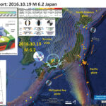
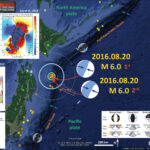
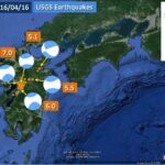
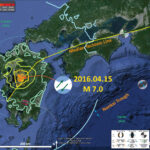
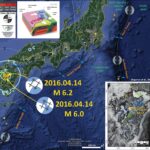
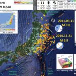
While I was returning from my research cruise offshore of New Zealand, there was an earthquake offshore of Japan in the region of the 2011.01.11 M 9.0 Tohoku-Oki Earthquake. Japan is one of the most seismically active regions on Earth. Below is a series of earthquake reports for the region of Japan. Here is the USGS website for this M 6.9 earthquake.

Here is my interpretive poster for the extensional earthquake that is in the upper North America plate. This earthquake has a shallow depth and produced a small tsunami run-up. I include two versions: (1) the first one has seismicity from the past 30 days and (2) the second one includes earthquakes with magnitudes M ≥ 5.5. The second map is useful to view the aftershock region of the 2011.03.11 M 9.0 earthquake. The M 9.0 Tohoku-Oki Earthquake was a subduction zone earthquake, while this M 6.9 earthquake is a shallow depth extensional earthquake. I label the location of the 1944 Tonanki and 1946 Nankai subduction zone earthquakes (both M 8.1). These earthquakes spawned decades of research that continues until this day. I discuss the recurrence of earthquakes in this region of Japan in my earthquake report here.

I also include the shaking intensity contours on the map. These use the Modified Mercalli Intensity Scale (MMI; see the legend on the map). This is based upon a computer model estimate of ground motions, different from the “Did You Feel It?” estimate of ground motions that is actually based on real observations. The MMI is a qualitative measure of shaking intensity. More on the MMI scale can be found here and here. This is based upon a computer model estimate of ground motions, different from the “Did You Feel It?” estimate of ground motions that is actually based on real observations.

I placed a moment tensor / focal mechanism legend on the poster. There is more material from the USGS web sites about moment tensors and focal mechanisms (the beach ball symbols). Both moment tensors and focal mechanisms are solutions to seismologic data that reveal two possible interpretations for fault orientation and sense of motion. One must use other information, like the regional tectonics, to interpret which of the two possibilities is more likely.

I include the slab contours plotted (Hayes et al., 2012), which are contours that represent the depth to the subduction zone fault. These are mostly based upon seismicity. The depths of the earthquakes have considerable error and do not all occur along the subduction zone faults, so these slab contours are simply the best estimate for the location of the fault. The hypocentral depth plots this close to the location of the fault as mapped by Hayes et al. (2012). So, the earthquake is either in the downgoing slab, or in the upper plate and a result of the seismogenic locked plate transferring the shear strain from a fracture zone in the downgoing plate to the upper plate.

    Inset Figures

    I include some inset figures. Here is some information about them. Below I include the original figures with the figure captions as blockquotes.

  • In the upper right corner is a map showing the tectonics of the region (Kurikami et al., 2009). I include this map below.
  • In the lower right corner is a figure from the USGS that shows seismicity along the subduction zone that forms the Japan trench.
  • To the left of the cross section shows a low angle oblique view of the plate configuration in this region (from AGU).
  • In the upper left corner is a comparison of the USGS “Did You Feel It?” report maps. The map on the right is from the M 9.0 Tohoku-Oki earthquake and the map on the left is from this M 6.9 earthquake.


  • Here is the upper figure showing the tectonic setting (Kurikami et al., 2009). I include their figure caption as a blockquote.

  • Active faults in southwest Japan from the Active Fault Research Centre’s active fault database (http://www.aist.go.jp/RIODB/activefault/cgi-bin/index.cgi). The faults are color coded by sense of movement (green = dextral; blue = normal, red = reverse, yellow = sinistral).

  • Here is another figure showing the tectonic setting (Kurikami et al., 2009). I include their figure caption as a blockquote.

  • Current tectonic situation of Japan and key tectonic features.

  • The upper slope of the accretionary prism for this part of the subduction zone that forms the Japan trench has well developed normal faults. Tsuji et al. (2013) present seismic reflection profiles that for this region. I present their figure and include their figure citation below as a blockquote. The first figure is a map showing the locations of the cross sections and the locations of sites with direct observations of sea floor surface displacements (surface ruptures).

  • Index maps for the 2011 Tohoku-oki earthquake in the Japan Trench (JCG, JAMSTEC, 2011). (a) Blue and white contour lines are subsidence and uplift, respectively, estimated from tsunami inversion (Fujii et al., 2011), with contour intervals of 0.5 m (subsidence) and 1.0 m (uplift).Blue arrows indicate dynamic seafloor displacements observed at seafloor observatories (Kido et al., 2011; Sato et al., 2011). Red lines are locations of seismic profiles (SR101, MY101, and MY102) shown in Fig. 2. Stars indicate diving sites and are labeled with dive numbers of pre-earthquake observations (blue numerals) and post-earthquake observations in 2011 (red numerals) and in 2012 (orange numerals). Background heatflow values measured before the 2011 earthquake are displayed as colored dots (Yamano et al.,2008; Kimura et al., 2012). (b) Enlarged map around the diving sites, corresponding to the yellow rectangle in panel (a). Red dashed lines indicate seafloor traces of normal faults (i.e.,ridge structures). Yellow dashed lines indicate estimated locations of the backstop interface. The white dashed line indicates the boundary of the area of significant seafloor uplift (49 m uplift)and also the tsunami generation area (Fujii et al., 011), corresponding to the reddish-brown area in panel (a). Observations made during the post-earthquake dives are described in panel(b).


    Reflection seismic profiles obtained in the central part of tsunami source area(line MY102 in panels f–h), at its northern edge (line MY101 in panels c–e), and its outside (line SR101 in panels a,b). Original profiles of (a) line SR101, (c) line MY101, and (f) line MY102. Composite seismic reflection profiles with geological interpretations of(b) line SR101,(d) line MY101, and (g) line MY102 (Tsuji et al.,2011). Red arrows in panel (d) and (g) indicate seafloor displacements (Ito et al.,2011; Kido et al.,2011; Sato et al.,2011). Enlarged profiles around (e) Site 2W on line MY101, and (h) Site 3W on line MY102.

  • Here is a figure from Tsuji et al. (2013) that shows some images of the seafloor. These show views of ruptured sea floor.

  • (a) Diving tracks on seafloor bathymetry at Site 2W. Stars indicate locations of seafloor photographs displayed in panels (b)–(f). (b) Photograph of an open fissure representative of those commonly observed after the earthquake. (d) An open fissure was observed during post-earthquake observations where (c) no fissure had been before the earthquake.(g,h) Photographs taken in (g) 2011 and (h) 2012 showing the heat flow measurements being made at the same location by SAHF probe.


    (a) Diving tracks on seafloor bathymetry at Site 1E. The white dashed line indicates the location of the interpreted fault. Stars indicate locations of seafloor images displayed in panels(b)–(f).(b) Photograph of an open fissure representative of those commonly observed after the earthquake. (d) Open fissure seen during post-earthquake observations where (c) a clam colony (1 m wide) was observed before the earthquake. (e,f) Photographs taken in (e) 2011 and (f) 2012,showing the heatflow measurements at the same location by SAHF probe. (g) Dive track on seafloor bathymetry at Site 3E. The star indicates the location of (h) a seafloor photograph showing a steep cliff.

  • Here is an explanation for the extension generated during the 2011 earthquake.

  • Schematic images of coseismic fault ruptures and the tsunami generation model (a) at the northern edge (and outside) and (b) in the central part of the tsunami source area. Soft slope sediments covering the continental crust are not shown in these images. (a) Collapse of the continental framework occurred mainly at the backstop interface north of the large tsunami source area. (b) Anelastic deformation around the normal fault allowed large extension of the overriding plate in the tsunami source area.

  • These are some observations posted by the Pacific Tsunami Warning Center.

Earthquake Report: Japan!

There was an earthquake in Japan tonight (tomorrow morning there). Here is the USGS website for this M 6.2 earthquake. The earthquake was shallow and widely felt with moderate intensity, so some casualties are expected.
In the map below I plot the epicenters of earthquakes from the past 30 days of magnitude greater than M = 2.5. The epicenters have colors representing depth in km. The USGS plate boundaries are plotted vs color. The USGS modeled estimate for ground shaking is plotted with contours of equal ground shaking using the Modified Mercalli Intensity (MMI) scale. The MMI is a qualitative measure of shaking intensity. More on the MMI scale can be found here and here. This is based upon a computer model estimate of ground motions, different from the “Did You Feel It?” estimate of ground motions that is actually based on real observations.
I placed a moment tensor / focal mechanism legend in the lower left corner of the map. There is more material from the USGS web sites about moment tensors and focal mechanisms (the beach ball symbols). Both moment tensors and focal mechanisms are solutions to seismologic data that reveal two possible interpretations for fault orientation and sense of motion. One must use other information, like the regional tectonics, to interpret which of the two possibilities is more likely.
I include the slab contours plotted (Hayes et al., 2012), which are contours that represent the depth to the subduction zone fault. These are mostly based upon seismicity. The depths of the earthquakes have considerable error and do not all occur along the subduction zone faults, so these slab contours are simply the best estimate for the location of the fault. The hypocentral depth plots this close to the location of the fault as mapped by Hayes et al. (2012). So, the earthquake is either in the downgoing slab, or in the upper plate and a result of the seismogenic locked plate transferring the shear strain from a fracture zone in the downgoing plate to the upper plate.
Today’s earthquake may either be a left-lateral or a right-lateral strike-slip earthquake. There are some faults mapped in the area and seismicity (in map below) suggests this is probably an east-northeast striking right_lateral strike_slip earthquake.

    I include some inset figures.

  • In the right hand of the poster are two maps showing the tectonics of the region(Kurikami et al., 2009). I include these maps below.
  • In the lower left corner I place a seismic hazard map for Japan. This map shows the probability of exceedance for ground motion (percent g, where g = gravitational acceleration of 9.8 m/s^2) within the next 30 years. If the ground motions exceed 100% g, then objects can be thrown into the air. Here is the source of this map, from the Japan Seismic Hazard Information Station (JSHIS). I find it interesting that today’s earthquake is in a region of low seismic hazard.
  • In the upper left corner is a low angle oblique view of the tectonic configuration in this region. This is from the AGU blog, “Trembling Earth.”


  • Here is a plot of seismicity (Ohmi et al., 2002). Today’s earthquake plots along the N80W striking seismicity at ~35°30’ (M 6.2 epicenter: 35.358°N 133.801°E).

  • Seismicity in the Tottori and surrounding region. Earthquakes from 1976 until the end of September 2000 from the catalogue of DPRI are plotted. Epicenter of the 2000 Western Tottori Earthquake is shown by a star.

Here is the PAGER report, which is an estimate of damages to people and their belongings (infrastructure, like buildings and roads). Here is the USGS web page that explains the PAGER program and how these estimates are made.


This poster below explains the PAGER alert page.

  • Here is the upper figure showing the tectonic setting (Kurikami et al., 2009). I include their figure caption as a blockquote.

  • Tectonic setting of Kyushu within the Japanese island arc. The locations of active faults and volcanoes that have been active in the last 10,000 years are also shown.

  • Here is the lower figure showing the tectonic setting (Kurikami et al., 2009). I include their figure caption as a blockquote.

  • Current tectonic situation of Japan and key tectonic features.

Here is a USGS poster than summarizes the earthquake history and plate geometry for this region. This is the USGS Open File Report 2010-1083-D (Rhea et al., 2010).


I put together an animation that shows the earthquake epicenters in Japan from 1900-2016/04/01. I include earthquakes with magnitude ≥ 6.0. Below is a screenshot of all these earthquakes, followed by the video. Here is the kml that I made using a USGS earthquake query. Here is the query that I used. The animation has an additional cross section showing the Japan trench, where the 2011/03/11 Tohoku-Oki M 9.0 subduction zone earthquake occurred. Here is a summary of the observations made following that 2011 earthquake.

Earthquake Report: Japan!

There continue to be earthquakes probably related to the 2011.03.11 Tohoku-Oki M 9.0 earthquake (the 4th largest earthquake recorded on modern seismologic instruments). Here are two excellent summary Earthquake Report pages associated with this region: The original Earthquake Report for the M 9.0 earthquake with some great animations!. A page where I present slip models, coulomb stress models, and aftershock location maps.

    Here are the USGS websites for the larger earthquakes plotted in my interpretive poster below.

  • 2016.08.20 09:01:26 UTC M 6.0
  • 2016.08.20 15:58:04 UTC M 6.0
  • 2016.08.20 16:10:34 UTC M 5.3
  • 2016.08.20 16:28:11 UTC M 5.3
    Here are some Earthquake Reports for seismicity associated with the M 9.0 Tohoku-Oki earthquake.

  • 2011.03.11 M 9.0 Japan (Tohoku-Oki)
  • 2013.10.25 M 7.1 Japan (Honshu)
  • 2015.02.16 M 6.7 Japan (Sanriku Coast)
  • 2015.02.16 M 6.7 Japan (Sanriku Coast Update #1)
  • 2015.02.16 M 6.7 Japan (Sanriku Coast Update #2)
  • 2015.02.20 M 6.7 Japan (Sanriku Coast Update #3)
  • 2015.02.21 M 6.7 Japan (Sanriku Coast Update #4)
  • 2015.02.25 M 6.3 Japan (Sanriku Coast Update #5)

Here is my interpretive map that shows the epicenter, along with the shaking intensity contours. These contours use the Modified Mercalli Intensity (MMI) scale. The MMI is a qualitative measure of shaking intensity. More on the MMI scale can be found here and here. This is based upon a computer model estimate of ground motions, different from the “Did You Feel It?” estimate of ground motions that is actually based on real observations.
I placed a moment tensor / focal mechanism legend on the poster. There is more material from the USGS web sites about moment tensors and focal mechanisms (the beach ball symbols). Both moment tensors and focal mechanisms are solutions to seismologic data that reveal two possible interpretations for fault orientation and sense of motion. One must use other information, like the regional tectonics, to interpret which of the two possibilities is more likely.

    I include some inset figures and maps.

  • In the upper right corner I include a map that shows seismicity before and after the M 9.0 Tohoku-Oki earthquake. Ammon et al. (2011) invert teleseismic P waves and broadband Raleigh waves with high-rate GPS data to constrain their slip model. Slip magnitude in meters is represented by shades of red. They also plot the source time function plot. Source time function plots show us the amount of energy that is released during an earthquake and how that energy release varies with time.
  • In the lower right corner I include a map that shows the seismicity in the region before and after the M 9.0 earthquake (Gusman et al., 2012).
  • In the lower left corner I include two figures from Ikuta et al. (2012). The upper panel shows how the 2011 slip region compares to slip from previous M 7 class earthquakes. The lower panel shows the slip deficit for this part of the subduction zone. Basically, this is a way of viewing how much plate convergence might be expected to contribute to earthquake slip over time.
  • In the upper left corner I include a figure from Lay et al. (2011) that shows the coulomb stress changes due to the 2011 earthquake. Basically, this shows which locations on the fault where we might expect higher likelihoods of future earthquake slip.


Here is a map (from this Earthquake Report page) showing the three largest magnitude earthquakes in this recent seismic swarm. Check out my previous post here to see other slip models, estimates of stress change due to the 2011 March 11 Tohoku-Oki earthquake, and how these relate to historic slip models.

    Below are some of the insets as individual figures. I include their original figure captions.

  • Here is a figure showing seismicity in the region of the Tohoku-Oki earthquake, the source time function of the M 9.0 earthquake, and their slip model (Ammon et al., 2011). There are dozens of slip models for the M 9.0 earthquake and they are all non unique. I include their figure caption below as a blockquote.

  • Map showing foreshocks, aftershocks, MORVEL model plate motions, rupture-model slip contours, and the locations of hrGPS stations (inverted triangles) used in to construct the model. Focal mechanisms are shown at the GCMT centroid.

  • Here is another map showing the seismicity associated with the Tohoku-Oki earthquake (Gusman et al., 2012). I include their figure caption below as a blockquote.

  • Map of the 2011 Tohoku earthquake. Red star represents the epicenter of the mainshock, rectangles represent the subfaults, gray circles represent fore-shocks and purple circles represent aftershocks and extensional faulting events in the outer-rise.

  • Here is a plot that shows how the 2011 slip region compares to slip from previous M 7 class earthquakes (Ikuta et al., 2012). Ikuta et al. (2012) discuss how regions surrounding the higher slip during the M 9.0 Tohoku-Oki earthquake had experienced smaller earthquakes that consumed some of the plate motion strain, thereby owing to the lower slip in those regions during the M 9.0 earthquake. These are also regions that have increased coulomb stress and increased seismicity following the 2011.03.11 earthquake. I include their figure caption below as a blockquote.

  • Co-seismic slip of the 2011 Tohoku-Oki earthquake and previous M 7-class earthquakes around the source region. (a) Co-seismic slip distribution of the 2011 Tohoku-Oki earthquake (blue intensity scale, as in Figure 2); the area with slip greater than 10 m is enclosed by a white line. The two stars show the locations of the main shock and the largest after-shock (March 11, 2011). The asperity distribution for M7-class earthquakes occurring in the past 80 years is shown by colored contours (after Murotani et al. [2004], Yamanaka and Kikuchi [2004], and Y. Yamanaka (NGY Seismology Notebook, http:// www.seis.nagoya-u.ac.jp/sanchu/Seismo_Note, last updated April 11, 2011)). The contour for each asperity encloses the areas in which the slip is greater than half of the maximum slip. (b) Cumulative seismic slip distribution along the trench for the earthquakes shown in Figure 10a. The total length of each arrow represents the maximum slip of the event, and the body length of each arrow represents the average slip. Modified after Figure 12b in Yamanaka and Kikuchi [2004], with the addition of the R4 region (data for the earthquakes in 1938 and 1982 are from Murotani et al. [2004] and Mochizuki et al. [2008], respectively) and new earthquakes (Y. Yamanaka, NGY Seismology Notebook, http://www.seis.nagoya-u.ac. jp/sanchu/Seismo_Note, last updated April 11, 2011). Slips on spatially overlapping asperities are accumulated. It is known that at least three more M7-class earthquakes have occurred since 1930 around the focal area of the southernmost 1982 earthquake (in 1943, 1961, and 1965). Vertical dotted line shows the slip expected with slip-deficit accumulation over 80 years.

  • Here is a plot showing how the low seismic coupling in the regions surrounding the high slip from the M 9.0 earthquake affect the slip deficit. Basically, this is a way of viewing how much plate convergence might be expected to contribute to earthquake slip over time. In this case, we see how the smaller earthquakes took up some of the slip adjacent to the 2011 slip patch (think about where today’s swarm took place compared to the region that slipped in 2011). I include their figure caption below as a blockquote.

  • Schematic illustration of apparent low seismic coupling and small effective slip deficit controlled by a persistent strong asperity that ruptured to produce a M9-class earthquake. The vertical axis represents the subduction rate and the horizontal axis represents the distance from the strong asperity. The accumulation rate of the slip deficit is shown by the solid curve. Apparent seismic coupling before the M9-class earthquake is represented by the ratio of the co-seismic slip (length of the gray arrows) to the subduction rate. The seismic coupling, as monitored by the occurrence of M7-class earthquakes, is low in areas close to the strong asperity. When the persistent strong asperity slips, the remaining slip deficit (gray area) is released. Note that this figure does not show the accumulated slip deficit; instead, it shows the relative contributions of strong and weak asperities to the accumulation rate of the slip deficit.

  • Here is a figure that shows the coulomb stress changes due to the 2011 earthquake. Basically, this shows which locations on the fault where we might expect higher likelihoods of future earthquake slip. Note how many of the aftershocks, including today’s earthquake, are in the region of increased coulomb stress. I include their figure caption below as a blockquote.

  • Maps of the Coulomb stress change predicted for the joint P wave, Rayleigh wave and continuous GPS inversion in Fig. 2. The margins of the latter fault model are indicated by the box. Two weeks of aftershock locations from the U.S. Geological Survey are superimposed, with symbol sizes scaled relative to seismic magnitude. (a) The Coulomb stress change averaged over depths of 10–15 km for normal faults with the same westward dipping fault plane geometry as the Mw 7.7 outer rise aftershock, for which the global centroid moment tensor mechanism is shown. (b) Similar stress changes for thrust faults with the same geometry as the mainshock, along with the Mw 7.9 thrusting aftershock to the south, for which the global centroid moment tensor is shown.

  • Here is a figure schematically showing how subduction zone earthquakes may increase coulomb stress along the outer rise. The outer rise is a region of the downgoing/subducting plate that is flexing upwards. There are commonly normal faults, sometimes reactivating fracture zone/strike-slip faults, caused by extension along the upper oceanic lithosphere. We call these bending moment normal faults. There was a M 7.1 earthquake on 2013.10.25 that appears to be along one of these faults. I include their figure caption below as a blockquote.

  • Schematic cross-sections of the A) Sanriku-oki, B) Kuril and C) Miyagi-oki subduction zones where great interplate thrust events have been followed by great trench slope or outer rise extensional events (in the first two cases) and concern about that happening in the case of the 2011 event.

    Here are some animations from the ARIA Project at Caltech/JPL. These document geodetic motion during the Tohoku-Oki Earthquake.

    Beginning with a description of the animations in blockquote.

    We show 2 videos on Japan’s movement over the 35 minutes following the initiation of the Tohoku-Oki (M 9.0). These images are made possible because of the density of GPS stations in Japan (about 1200 GPS stations, or a GPS station every ~30 km). The preliminary GPS displacement data that these animations are based on are provided by the ARIA team at JPL and Caltech. All Original GEONET RINEX data provided to Caltech by the Geospatial Information Authority (GSI) of Japan.

  • a) ARIA_GPSDisplacement:
  • This animation shows the cumulative displacements of the GPS stations relative to their position before the M9.0 Tohoku-Oki earthquake. The colors show the magnitude of displacement and the arrows indicate direction. We observe 2 kinds of motions, a permanent deformation in the vicinity of the earthquake (first red star) intermediately followed by a perturbation that travels about ~4 km/sec which are the surface waves generated by the earthquake.

  • Here is the file for direct download. (18 MB mp4)
  • b) ARIA_GPSvelocity:
  • This animation shows the estimated instantaneous velocities of the GPS stations. In this view, we only observe the transient motion caused by the earthquake. The first waves to propagate from the mainshock (red star) are the body waves (P and S) but they can be barely seen (look for a slight purple perturbation). These are followed by the surface waves (Love and Rayleigh) propagating as 2 orange-red stripes, as surface waves generate larger velocities at the surface than the body waves. At about 25 minutes there is a subtle signal from seismic waves generated by a small aftershock in northern Japan. At around 30 minutes we observe the seismic waves from a M7.9 aftershock (smaller red star), the largest aftershock to date. Since this event is about 30 times smaller than the mainshock, the P and S waves from this earthquake are too small to be detected with these rapid GPS solutions, but we can observe the surface waves. The small patches of color that appear randomly across Japan show the noise level of the measurements and are not related to any significant ground motion.

  • Here is the file for direct download. (6 MB mp4)
  • b) ARIA_GPSDisplacement_composite:
  • Here is the file for direct download. (6 MB mp4)
  • Here are some maps that are static results displayed in the above animations.
  • Coseismic Horizontal:

  • Coseismic Vertical:

Here is the usgs map for the region:

M7.3 Honshu

Earthquake Report: Japan Update #2

Here is an update to the seismicity from the past couple of days in Kyushu Japan. On 2016/04/14 there was an earthquake with magnitude M 6.2 that initiated this series of earthquakes. The largest aftershock was a magnitude M 6.0. The following day, there was a M 7.0 earthquake. These earthquakes have ruptured a series of faults in the region of Kumamoto, Kyushu, Japan.
Here is a page that helps people connect and help those in Japan.

    Here are the USGS websites for the larger earthquakes in this region for today and yesterday.

  • 2016.04.14 12:26 UTC M 6.2
  • 2016.04.14 15:03 UTC M 6.0
  • 2016.04.14 15:06 UTC M 5.3
  • 2016.04.15 16:25 UTC M 7.0
  • 2016.04.15 18:55 UTC M 5.5
  • 2016.04.15 22:11 UTC M 5.1
    Here are my initial reports.

  • 2016.04.14 M 6.2
  • 2016.04.15 M 7.0
  • Here is a fantastic animated gif of the seismicity in this region. The gif has a large file size and one may download it here. Below I include a figure caption as a blockquote.

  • [ For the officials ] we made this kind of animation . In terms of image for this time of seismic activity I hope to reference . (Temporal movement of the epicenters of Kumamoto Earthquakes)
    Time series epicenter plot GIF
    https://drive.google.com/file/d/0B8MRNE4IXrmSZW5fV3k0M3RfeVU/view?pref=2&pli=1
    Credit: JMA hypocenter · Hinet automatic processing epicenter · ALOS World 3D DSM ( land terrain ) · J-EGG500 ( bathymetry ) AIST seamless geological map ( fault ) · GSHHS ( coastline )

    Here are the two maps from the first two Earthquake Reports. Please visit those pages for an explanation.

  • Initial Report 2016.04.14 M 6.2

  • Update # 1 Report 2016.04.15 M 7.0

This area is near the southern terminus of the Median Tectonic Line (MTL), a large dextral strike-slip fault system. Below is a map that shows the major faults in Japan.

  • Here is the figure showing the tectonic setting (Kurikami et al., 2009). I include their figure caption as a blockquote.

  • Current tectonic situation of Japan and key tectonic features.

Jascha Polet, Seismologist at Cal Poly Pomona, posted this map that shows the aftershocks from the past 24 hours. She prepared this map from the Hi-Net Hypocenter Map tool. They clearly align with the mapped faults in the region, that are also align with the MTL.

    Ross Stein and Volkan Sevilgen hypothesize that the M 6.1 earthquake loaded stress upon the fault that ruptured as the M 7.0 earthquake. This short lived increased stress caused the M 7.0 and other earthquakes. They post the figure from below on their website for this earthquake series. They run a website called Tremblor. Below is a figure that shows how slip from the M 6.2 (labeled M 6.1, with the epicenter located by a yellow star) increased stress upon faults to the northeast and to the southwest of the epicenter.

    Changes

  • The USGS constructed an earthquake slip model. Below is a plot of this slip model in relation to the region.

  • Shakemap: Once the USGS constructed a slip model for this earthquake, they ran a new ground motion model with this fault slip model as a source of ground motions. Below is a comparison between these two shakemaps.

  • PAGER Report: With these new estimates of ground shaking, the USGS then makes a new estimate of damage to people and their belongings. Below is a comparison of these two PAGER alert pages.

  • These plots show two things, both relating how ground motions (shaking intensity) attenuate with distance (energy gets absorbed by the Earth). The two colored lines represent the empirical model outputs that drive the shakemap and PAGER models. These empirical models are called Ground Motion Prediction Equations (GMPE). The green line assumes an Earth like that in California (accreted terranes, low seismic Q). The orange line assumes an earth line the central and eastern USA (craton/stable continent, higher seismic Q). The green dots are data from reported observations and the blue dots show the mean and standard deviation of the ground motions for a series of binned distances. The models than produce the green and orange lines are based on seismological measurements from thousands of earthquakes. Note how the observations match the California GMPE plot.

Earthquake Report: Kyushu, Japan!

As I was preparing an aftershock map for yesterday’s earthquake, an earthquake with a magnitude of M = 7.0 happened. This turns all other earthquakes into foreshocks, though this terminology may not really be important (foreshock vs aftershock). The M 7.0 will be much more damaging since it is a much larger earthquake. A M 7.0 earthquake releases ~32 times as much energy as a M 6.0, or about 26 times as much energy as a M 6.2. Here is my report from yesterday’s earthquake.

    Here are the USGS websites for the larger earthquakes in this region for today and yesterday.

  • 2016.04.15 M 7.0
  • 2016.04.14 M 6.2
  • 2016.04.14 M 6.0
  • 2016.04.14 M 5.3

Here is the poster for today’s earthquake. Much of the material is explained on the report from yesterday. I plot the moment tensor for the M 7.0 earthquake. Based upon the proximity to the Median Tectonic Line (MTL), I interpret these earthquakes to be northeast striking right lateral earthquakes. This may be incorrect. There is also a left-lateral strike-slip fault system to the south (see map).
I also include the Modified Mercalli Intensity (MMI) contours. The MMI is a qualitative measure of shaking intensity. More on the MMI scale can be found here and here.
There is a legend that shows how moment tensors can be interpreted. Moment tensors are graphical solutions of seismic data that show two possible fault plane solutions. One must use local tectonics, along with other data, to be able to interpret which of the two possible solutions is correct. The legend shows how these two solutions are oriented for each example (Normal/Extensional, Thrust/Compressional, and Strike-Slip/Shear). There is more about moment tensors and focal mechanisms at the USGS.

    I include some inset maps.

  • In the upper left corner is a map from the Japan Seismic Hazard Information Station. This shows the 2% probability of exceedance for ground motions exceeding the JMA ground shaking intensity scale at any given location. Basically, the warmer (red) colors mean that, in the next 50 years, these areas are likely to shake stronger than the lighter colors (yellow).
  • In the lower right corner is a map showing the plate tectonics of the region. Note the Median Tectonic Line (MTL), a right-lateral (dextral) strike slip fault system. Todays earthquakes appear aligned with this fault system (Kurikami et al., 2009). I plot the epicenter in the approximate location as a blue dot.
  • In the upper right corner is a map that shows the mapped faults in the region (Chapman et al., 2009). The faults are color coded by sense of movement (green = dextral; blue = normal, red = reverse, yellow = sinistral). I plot the epicenter in the approximate location as a blue dot.


    This earthquake will be more damaging that the M 6.2. Below is a comparison of the shakemaps for these two earthquakes. Here is the USGS web page that explains the process that leads to these shakemaps.

  • M 6.2

  • M 7.0

Here is the PAGER report, which is an estimate of damages to people and their belongings (infrastructure, like buildings and roads). The PAGER report for this M 7.0 shows a higher probability for greater damage than the M 6.2 earthquake. Here is the USGS web page that explains the PAGER program and how these estimates are made.


This poster below explains the PAGER alert page.

  • Here is the figure showing the tectonic setting (Kurikami et al., 2009). I include their figure caption as a blockquote.

  • Current tectonic situation of Japan and key tectonic features.

Here is a plot of historic earthquakes and focal mechanisms for this region from Jacha Polet, a seismologist at Cal Poly Pomona. Color refers to depth in km.

Earthquake Report: Kyushu, Japan!

We just had a shallow depth earthquake in Japan along a strike-slip fault.

    Here are the USGS websites for the larger earthquakes in this region for today.

  • 2016.04.14 M 6.2
  • 2016.04.14 M 6.0
  • 2016.04.14 M 5.3

Below is the Earthquake Report Poster for this series of earthquakes. I plot the moment tensors for the M 6.2 and M 6.0 earthquakes. I also include the Modified Mercalli Intensity (MMI) contours. The MMI is a qualitative measure of shaking intensity. More on the MMI scale can be found here and here.
There is a legend that shows how moment tensors can be interpreted. Moment tensors are graphical solutions of seismic data that show two possible fault plane solutions. One must use local tectonics, along with other data, to be able to interpret which of the two possible solutions is correct. The legend shows how these two solutions are oriented for each example (Normal/Extensional, Thrust/Compressional, and Strike-Slip/Shear). There is more about moment tensors and focal mechanisms at the USGS.

    I include some inset maps.

  • In the upper right corner is a figure from a report from Nuclear Waste Management Organization of Japan (NUMO). This report is entitled “Development of Methodologies for the Identification of Volcanic and Tectonic Hazards to Potential HLW Repository Sites in Japan –The Kyushu Case Study-” (Chapman et al., 2009). This figure shows historic focal mechanisms for earthquakes in this region. I plot the moment tensor from the M 6.2 earthquake in the approximate location.
  • In the lower right corner is a map showing the plate tectonics of the region. Note the Median Tectonic Line (MTL), a right-lateral (dextral) strike slip fault system. Todays earthquakes appear aligned with this fault system (Kurikami et al., 2009). I plot the epicenter in the approximate location as a blue dot.
  • To the left of that tectonic map is a map that shows the mapped faults in the region (Chapman et al., 2009). The faults are color coded by sense of movement (green = dextral; blue = normal, red = reverse, yellow = sinistral). I plot the epicenter in the approximate location as a blue dot.

I interpret these earthquakes to be right-lateral strike-slip earthquakes because of the proximity to the MTL. There is also a left lateral strike-slip fault system along the south east part of Kyushu, so this is also possible.

  • Here is the figure showing the tectonic setting (Kurikami et al., 2009). I include their figure caption as a blockquote.

  • Current tectonic situation of Japan and key tectonic features.

  • Here is the figure showing the historical moment tensors for this region (Chapman et al., 2009). I include their figure caption as a blockquote.

  • Focal mechanism plots for earthquakes in southwest Japan from 1997-2006. Based on CMT solutions from the JMA catalogue (data from http://www.fnet.bosai.go.jp).

  • Here is the figure showing the mapped faults for this region (Chapman et al., 2009). I include their figure caption as a blockquote.

  • Active faults in southwest Japan from the Active Fault Research Centre’s active fault database (http://www.aist.go.jp/RIODB/activefault/cgi-bin/index.cgi). The faults are color coded by sense of movement (green = dextral; blue = normal, red = reverse, yellow = sinistral).

  • Here is the figure showing the tectonic setting (Chapman et al., 2009). I include their figure caption as a blockquote.

  • Active faults in southwest Japan from the Active Fault Research Centre’s active fault database (http://www.aist.go.jp/RIODB/activefault/cgi-bin/index.cgi). The faults are color coded by sense of movement (green = dextral; blue = normal, red = reverse, yellow = sinistral).

I put together an animation that shows the earthquake epicenters in Japan from 1900-2016/04/01. I include earthquakes with magnitude ≥ 6.0. Below is a screenshot of all these earthquakes, followed by the video. Here is the kml that I made using a USGS earthquake query. Here is the query that I used. The animation has an additional cross section showing the Japan trench, where the 2011/03/11 Tohoku-Oki M 9.0 subduction zone earthquake occurred. Here is a summary of the observations made following that 2011 earthquake.

Here is the USGS Seismicity Summary Poster for this region (Rhea et al., 2010).

UDATE

The epicenters appear to be aligned with the MTL, suggesting that the NE striking fault plan is the correct solution.

Cascadia subduction zone: 316 years ago tonight!

In commemoration of the last known Cascadia subduction zone earthquake, I present a summary background material here. Since last years commemoration, there have been a few additions.
I made some updates on 2018.01.26.
Most notably was a pair of articles that were published in the New Yorker magazine, written by Kathryn Shulz. The first article summarized what we might expect from a CSZ earthquake and tsunami and the follow-up article discussed how to best prepare for this series of devastating events. The first article sparked a national debate after it was read by millions (using an estimate based upon the recorded time the website was being used). This debate has resulted in a renewed interest in becoming more resilient.

On this evening, 316 years ago, the Cascadia subduction zone fault ruptured as a margin wide earthquake. I here commemorate this birthday with some figures that are in two USGS open source professional papers. The Atwater et al. (2005) paper discusses how we came to the conclusion that this last full margin earthquake happened on January 26, 1700 at about 9 PM (there may have been other large magnitude earthquakes in Cascadia in the 19th century). The Goldfinger et al. (2012) paper discusses how we have concluded that the records from terrestrial paleoseismology are correlable and how we think that the margin may have ruptured in the past (rupture patch sizes and timing). The reference list is extensive and this is but a tiny snapshot of what we have learned about Cascadia subduction zone earthquakes. Brian Atwater and his colleagues have updated the Orphan Tsunami and produced a second edition available here for download and here for hard copy purchase (I have a hard copy).

This is a video from NOVA with the great Dr. Brian Atwater.

Here is a map of the Cascadia subduction zone, modified from Nelson et al. (2006). The Juan de Fuca and Gorda plates subduct norteastwardly beneath the North America plate at rates ranging from 29- to 45-mm/yr. Sites where evidence of past earthquakes (paleoseismology) are denoted by white dots. Where there is also evidence for past CSZ tsunami, there are black dots. These paleoseismology sites are labeled (e.g. Humboldt Bay). Some submarine paleoseismology core sites are also shown as grey dots. The two main spreading ridges are not labeled, but the northern one is the Juan de Fuca ridge (where oceanic crust is formed for the Juan de Fuca plate) and the southern one is the Gorda rise (where the oceanic crust is formed for the Gorda plate).

  • The USGS produces model based estimates for ground shaking using a variety of measures, for “scenario” earthquakes. Here is their website that explains this further. Below I present one of these scenarios, one for a M 9.0 CSZ eaarthquake. This is possibly what it was like for the last full rip CSZ earthquake on 1700.01.26.


USGS Shake Map M 9.0 Scenario Poster

  • In celebration of the anniversary in 2018, I prepared a new educational poster, which is based upon the above scenario shakemap.
  • I include some inset figures.
  • In the upper left corner is a map of the Cascadia subduction zone, modified from Nelson et al. (2004) and Chaytor et al. (2004).
  • Below the CSZ map is an illustration modified from Plafker (1972). This figure shows how a subduction zone deforms between (interseismic) and during (coseismic) earthquakes.
  • In the lower right corner is a figure from Atwater et al. (2005) that shows the earthquake cycle and how the crust deforms at different times.
    1. On the left is the overall setting, where one plate subducts beneath another one at this compressional (convergent) plate boundary.
    2. The center panel represents the interseismic period, the time between earthquakes. The fault is locked. The downgoing plate causes elastic strain to accumulate along the fault and in the two plates. The upper plate deforms vertically because of this. The region closest to the fault tip (the left) goes down and the part further from the fault tip goes up.
    3. The right panel represents the coseismic period, when the earthquake happens. When the fault slips (in addition to some time before and after the earthquake), the upper plate deforms in an opposite sense of motion. This is the conventional view, but some say that because this system is not solely elastic (the mantle behaves with viscoelastic properties; Wang and Trehu, 2017).
  • Above this lower right corner figure is a figure from Atwater et al. (2005) that shows (A) how the vertical land motion produces earthquake stratigraphy in the form of buried soils (the trees died, so sad) and (B) a photo showing these buried soils, including a real dead tree stump (so sad).
  • In the upper right corner is a diagram that shows how we think the CSZ fault is segmented. Each segment is designated by an orange arrow. These orange arrows represent the region of the fault that has ruptured at different times. This is based upon turbidite stratigraphic correlations (Goldfinger et al., 2003, 2012, 2016). The yellow numbers represent the average time between earthquakes for each of these segments.


Dr. Nick Zentner (Central Washington Univ.) Video

  • CWU’s Nick Zentner presents ‘Great Earthquakes of the Pacific Northweset’ – the 13th talk in his ongoing Downtown Geology Lecture Series. Recorded at Hal Holmes Center on February 10, 2016 in Ellensburg, Washington, USA. www.nickzentner.com

IRIS / USGS Video

IRIS and the US Geological Survey have recently produced an educational video about tectonic earthquakes in the region of the US Pacific Northwest. The project was funded by the National Science Foundation.
YT link for the embedded video below.
mp4 link for the embedded video below.
mp4 embedded video:


YT embedded video:

Some Relevant Discussion and Figures

This figure shows how a subduction zone deforms between (interseismic) and during (coseismic) earthquakes. We also can see how a subduction zone generates a tsunami. Atwater et al., 2005.


Here is a version of the CSZ cross section alone (Plafker, 1972).


Here is an animation produced by the folks at Cal Tech following the 2004 Sumatra-Andaman subduction zone earthquake. I have several posts about that earthquake here and here. One may learn more about this animation, as well as download this animation here.

This figure shows the regions that participate in this interseismic and coseismic deformation at Cascadia. Atwater et al., 2005. Black dots on the map show sites where evidence for coseismic subsidence has been found in coastal marshes, lakes, and estuaries.


This shows how the CSZ is deforming vertically today (Wang et al., 2003). The panel on the right shows the vertical motion in mm/yr.


This figure, also from Wang et al. (2003), shows their estimate of how the coseismic vertical motion may happen. Contours are in meters.


Here is a graphic showing the sediment-stratigraphic evidence of earthquakes in Cascadia. Atwater et al., 2005. There are 3 panels on the left, showing times of (1) prior to earthquake, (2) several years following the earthquake, and (3) centuries after the earthquake. Before the earthquake, the ground is sufficiently above sea level that trees can grow without fear of being inundated with salt water. During the earthquake, the ground subsides (lowers) so that the area is now inundated during high tides. The salt water kills the trees and other plants. Tidal sediment (like mud) starts to be deposited above the pre-earthquake ground surface. This sediment has organisms within it that reflect the tidal environment. Eventually, the sediment builds up and the crust deforms interseismically until the ground surface is again above sea level. Now plants that can survive in this environment start growing again. There are stumps and tree snags that were rooted in the pre-earthquake soil that can be used to estimate the age of the earthquake using radiocarbon age determinations. The tree snags form “ghost forests.


Here is a photo of the ghost forest, created from coseismic subsidence during the Jan. 26, 1700 Cascadia subduction zone earthquake. Atwater et al., 2005.


Here is a photo I took in Alaska, where there was a subduction zone earthquake in 1964. These tree snags were living trees prior to the earthquake and remain to remind us of the earthquake hazards along subduction zones.


This shows how a tsunami deposit may be preserved in the sediment stratigraphy following a subduction zone earthquake, like in Cascadia. Atwater et al., 2005. If there is a source of sediment to be transported by a tsunami, it will come along for the ride and possibly be deposited upon the pre-earthquake ground surface. Following the earthquake, tidal sediment is deposited above the tsunami transported sediment. Sometimes plants that were growing prior to the earthquake get entombed within the tsunami deposit.


The NOAA/NWS/Pacific Tsunami Warning Center has updated their animation of the simulation of the 1700 “Orphan Tsunami.”
Source: Nathan C. Becker, Ph.D. nathan.becker at noaa.gov

Below are some links and embedded videos.

  • Here is the yt link for the embedded video below.
  • Here is the mp4 link for the embedded video below. (2160p 145 mb mp4)
  • Here is the mp4 link for the embedded video below. (1080p 145 mb mp4)

  • Here is the text associated with this animation:

    Just before midnight on January 27, 1700 a tsunami struck the coasts of Japan without warning since no one in Japan felt the earthquake that must have caused it. Nearly 300 years later scientists and historians in Japan and the United States solved the mystery of what caused this “orphan tsunami” through careful analysis of historical records in Japan as well as oral histories of Native Americans, sediment deposits, and ghost forests of drowned trees in the Pacific Northwest of North America, a region also known as Cascadia. They learned that this geologically active region, the Cascadia Subduction Zone, not only hosts erupting volcanoes but also produces megathrust earthquakes capable of generating devastating, ocean-crossing tsunamis. By comparing the tree rings of dead trees with those still living they could tell when the last of these great earthquakes struck the region. The trees all died in the winter of 1699-1700 when the coasts of northern California, Oregon, and Washington suddenly dropped 1-2 m (3-6 ft.), flooding them with seawater. That much motion over such a large area requires a very large earthquake to explain it—perhaps as large as 9.2 magnitude, comparable to the Great Alaska Earthquake of 1964. Such an earthquake would have ruptured the earth along the entire length of the 1000 km (600 mi) -long fault of the Cascadia Subduction Zone and severe shaking could have lasted for 5 minutes or longer. Its tsunami would cross the Pacific Ocean and reach Japan in about 9 hours, so the earthquake must have occurred around 9 o’clock at night in Cascadia on January 26, 1700 (05:00 January 27 UTC).

    The Pacific Tsunami Warning Center (PTWC) can create an animation of a historical tsunami like this one using the same too that they use for determining tsunami hazard in real time for any tsunami today: the Real-Time Forecasting of Tsunamis (RIFT) forecast model. The RIFT model takes earthquake information as input and calculates how the waves move through the world’s oceans, predicting their speed, wavelength, and amplitude. This animation shows these values through the simulated motion of the waves and as they race around the globe one can also see the distance between successive wave crests (wavelength) as well as their height (half-amplitude) indicated by their color. More importantly, the model also shows what happens when these tsunami waves strike land, the very information that PTWC needs to issue tsunami hazard guidance for impacted coastlines. From the beginning the animation shows all coastlines covered by colored points. These are initially a blue color like the undisturbed ocean to indicate normal sea level, but as the tsunami waves reach them they will change color to represent the height of the waves coming ashore, and often these values are higher than they were in the deeper waters offshore. The color scheme is based on PTWC’s warning criteria, with blue-to-green representing no hazard (less than 30 cm or ~1 ft.), yellow-to-orange indicating low hazard with a stay-off-the-beach recommendation (30 to 100 cm or ~1 to 3 ft.), light red-to-bright red indicating significant hazard requiring evacuation (1 to 3 m or ~3 to 10 ft.), and dark red indicating a severe hazard possibly requiring a second-tier evacuation (greater than 3 m or ~10 ft.).

    Toward the end of this simulated 24-hours of activity the wave animation will transition to the “energy map” of a mathematical surface representing the maximum rise in sea-level on the open ocean caused by the tsunami, a pattern that indicates that the kinetic energy of the tsunami was not distributed evenly across the oceans but instead forms a highly directional “beam” such that the tsunami was far more severe in the middle of the “beam” of energy than on its sides. This pattern also generally correlates to the coastal impacts; note how those coastlines directly in the “beam” have a much higher impact than those to either side of it.

    This is the timeline of prehistoric earthquakes as preserved in sediment stratigraphy in Grays Harbor and Willapa Bay, Washington. Atwater et al., 2005. This timeline is based upon numerous radiocarbon age determinations for materials that died close to the time of the prehistoric earthquakes inferred from the sediment stratigraphy at locations along the Grays Harbor, Willapa Bay, and Columbia River estuary paleoseismic sites.


    Offshore, Goldfinger and others (from the 1960’s into the 21st Century, see references in Goldfinger et al., 2012) collected cores in the deep sea. These cores contain submarine landslide deposits (called turbidites). These turbidites are thought to have been deposited as a result of strong ground shaking from large magnitude earthquakes. Goldfinger et al. (2012) compile their research in the USGS professional paper. This map shows where the cores are located.


    Here is an example of how these “seismoturbidites” have been correlated. The correlations are the basis for the interpretation that these submarine landslides were triggered by Cascadia subduction zone earthquakes. This correlation figure demonstrates how well these turbidites have been correlated. Goldfinger et al., 2012


    This map shows the various possible prehistoric earthquake rupture regions (patches) for the past 10,000 years. Goldfinger et al., 2012. These rupture scenarios have been adopted by the USGS hazards team that determines the seismic hazards for the USA.


    Here is a plot showing the earthquakes in a linear timescale.


    I combined the plot above into another figure that includes all the recurrence intervals and segment lengths in a single figure. This is modified from Goldfinger et al. (2012), updated from new data (Goldfinger et al., 2016).

    Social Media (2018 addition)


    Viola Riebe, elder of the Hoh Indian Tribe, talks about an oral history of the Thunderbird and the whale — and how this most respected story is related to tsunami awareness. “We’re told in our language to run for high ground to get away from the ocean because it’s dangerous,” she says.


Here is the Chaytor et al. (2004) map that shows their interpretation of the structural relations in the Gorda plate.


Here is a map from Rollins and Stein, showing their interpretations of different historic earthquakes in the region. This was published in response to the Januray 2010 Gorda plate earthquake. The faults are from Chaytor et al. (2004).


The Blanco fracture zone is also an active transform plate boundary. The BFZ is a strike slip fault system that connects two spreading ridges, the Gorda Rise and the Juan de Fuca Ridge. Here is a map that shows the tectonic setting and some earthquakes related to the BFZ from April 2015. There are some animations on this web page showing seismicity with time along the BFZ, over the past 15
years.

    References

  • Atwater, B.F., Musumi-Rokkaku, S., Satake, K., Tsuju, Y., Eueda, K., and Yamaguchi, D.K., 2005. The Orphan Tsunami of 1700—Japanese Clues to a Parent Earthquake in North America, USGS Professional Paper 1707, USGS, Reston, VA, 144 pp.
  • Goldfinger, C., Nelson, C.H., Morey, A., Johnson, J.E., Gutierrez-Pastor, J., Eriksson, A.T., Karabanov, E., Patton, J., Gràcia, E., Enkin, R., Dallimore, A., Dunhill, G., and Vallier, T., 2012 a. Turbidite Event History: Methods and Implications for Holocene Paleoseismicity of the Cascadia Subduction Zone, USGS Professional Paper # 1661F. U.S. Geological Survey, Reston, VA, 184 pp.
  • Chris Goldfinger, Steve Galer, Jeffrey Beeson, Tark Hamilton, Bran Black, Chris Romsos, Jason Patton, C Hans Nelson, Rachel Hausmann, Ann Morey, 2016. The importance of site selection, sediment supply, and hydrodynamics: A case study of submarine paleoseismology on the northern Cascadia margin, Washington USA in Marine Geology, v. 384, https://doi.org/10.1016/j.margeo.2016.06.008
  • McCrory, P.A., 2000, Upper plate contraction north of the migrating Mendocino triple junction, northern California: Implications for partitioning of strain: Tectonics, v. 19, p. 11441160.
  • McCrory, P. A., Blair, J. L., Oppenheimer, D. H., and Walter, S. R., 2006, Depth to the Juan de Fuca slab beneath the Cascadia subduction margin; a 3-D model for sorting earthquakes U. S. Geological Survey
  • Nelson, A.R., Kelsey, H.M., Witter, R.C., 2006. Great earthquakes of variable magnitude at the Cascadia subduction zone. Quaternary Research 65, 354-365.
  • Patton, J. R., Goldfinger, C., Morey, A. E., Romsos, C., Black, B., Djadjadihardja, Y., and Udrekh, 2013. Seismoturbidite record as preserved at core sites at the Cascadia and Sumatra–Andaman subduction zones, Nat. Hazards Earth Syst. Sci., 13, 833-867, doi:10.5194/nhess-13-833-2013, 2013.
  • Plafker, G., 1972. Alaskan earthquake of 1964 and Chilean earthquake of 1960: Implications for arc tectonics in Journal of Geophysical Research, v. 77, p. 901-925.
  • Wang, K., Wells, R., Mazzotti, S., Hyndman, R. D., and Sagiya, T., 2003, A revised dislocation model of interseismic deformation of the Cascadia subduction zone Journal of Geophysical Research, B, Solid Earth and Planets v. 108, no. 1.

Plate Tectonics: 200 Ma

Gibbons and others (2015) have put together a suite of geologic data (e.g. ages of geologic units, fossils), plate motion data (geometry of plates and ocean ridge spreading rates), and plate tectonic data (initiation and cessation of subduction or collision, obduction of ophiolites) to create a global plate tectonic map that spans the past 200 million years (Ma). Here is the facebook post that I first saw to include this video.
Here is a view of their tectonic map at a specific time.


Gibbons et al. (2015) created several animations using their plate tectonic model. I have embedded both of these videos below. Other versions of these files are placed on the NOAA Science on a Sphere Program website.

They also compare their model with P-wave tomographic analytical results. P-Wave tomography works similar to CT-scans. CT-scans are the the result of integrating X-Ray data, from many 3-D orientations, to model the 3-D spatial variations in density. “CT” is an acronym for “computed tomography.” Both are kinds of tomography. Here is a book about seismic tomography. Here is a paper from Goes et al. (2002) that discusses their model of the thermal structure of the uppermost mantle in North America as inferred from seismic tomography.
Here is an illustration from the wiki page that that attempts to help us visualize what tomography is.


P-Wave tomography uses Seismic P-Waves to model the 3-D spatial variation of Earth’s internal structure. P-Wave tomography is similar to Computed-Tomography of X-Rays because the P-wave sources are also in different spatial locations. For CT-scans, the variation in density is inferred with the model. For P-Wave tomography, the variation in seismic velocity. Typically, when seismic waves travel faster, they are travelling through old, cold, and more dense crust/lithosphere/mantle. Likewise, when seismic waves travel slower, they are travelling through relatively young, hot, and less dense crust/lithosphere/mantle.
Regions of Earth’s interior that have faster seismic velocities are often plotted in blue. Regions that have slower velocities are often plotted in red.
Here are their plots showing the velocity perturbation (faster or slower). I include the figure caption below the image.


Plate reconstructions superimposed on age-coded depth slices from P-wave seismic tomography (Li et al., 2008) using first-order assumptions of near-vertical slab sinking, with a) 3.0 and 1.2 cm/yr constant sinking rates in the upper and lower mantle, respectively, following Zahirovic et al. (2012), and b) 5.0 and 2.0 cm/yr upper and lower mantle sinking rates, respectively, following Replumaz et al. (2004). Both end-member sinking rates indicate bands of slab material (blue, S1–S2) offset southward from the Andean-style subduction zone along southern Lhasa, consistentwith the interpretations of Tethyan subducted slabs by Hafkenscheid et al. (2006). However, although the P-wave tomography provides higher resolution than S-wave tomography, the amplitude of the velocity perturbation is significantly lower in oceanic regions (e.g., S2) and the southern hemisphere due to continental sampling biases. Orthographic projection centered on 0°N, 90°E.

another northeast Japan earthquake in the Tohoku-Oki earthquake region

We have had another small aftershock. Here is the USGS web page for this earthquake. This time it is in a different region than the swarm of the past couple of weeks.
There are several report updates, listed here:

Here is a map showing today’s earthquake with a couple of the larger earthquakes also plotted. See my prior posts about these.
The USGS websites for these earlier earthquakes are here:


This map shows the USGS (Hayes et al., 2012) slab depth contours. These contours represent the depth to the top of the downgoing plate (i.e. the subduction zone fault interface location). The depth is currently set at ~56 km. This is a little deep for the slab model, but the slab model is constrained by seismicity (which has considerable depth variation, so cannot be considered precise).

Tohoku-Oki aftershocks are in a region of low slip during main events in 2011

Here is what I was getting at in my last post. I have taken the Ammon et al. (2011) slip model and placed it into a real world reference frame (rubbersheeted it in ArcGIS). Then I exported it as a kml file and placed it into google Earth where I can also plot the recent seismicity.
There are several report updates, listed here:

Here are the USGS web pages for the thrree largest magnitude earthquakes I plot in the map below:

Here is a map showing the three largest magnitude earthquakes in this recent seismic swarm. Check out my previous post here to see other slip models, estimates of stress change due to the 2011 March 11 Tohoku-Oki earthquake, and how these relate to historic slip models.


Here is the Ammon et al. (2011) figure.


These hypocenters continue to align with the probable location of the subduction zone fault based on the Hayes slab model.


References: