Earthquake Report: M 7.5 in Peru

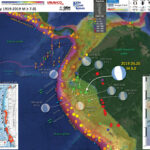
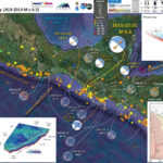
In the middle of the night (my time) I got a notification from the EMSC earthquake notification service. I encourage everyone to download and use this app.

There was an intermediate depth magnitude M 7.5 earthquake in Peru. The tectonics in this region of the world are dominated by the convergent plate boundary, a subduction zone formed by the convergence of the oceanic Nazca and continental South America plates.

https://earthquake.usgs.gov/earthquakes/eventpage/us7000fxq2/executive

As the Nazca plate subducts, it dips below the South America plate at different dip angles. In this region of Peru, the dip angle is shallow and we term this flat-slab subduction.

This M 7.5 earthquake occurred in the downgoing Nazca plate, so was not a subduction zone megathrust event, but a “slab” event (for being in the Nazca slab).

I prepared a much more extensive report for a M 8.0 earthquake in a nearby location that happened on 26 May 2019. Read more about the tectonics of this region in that report here.

Was this M 7.5 an aftershock of the M 8.0? Probably not, based on the USGS M 8.0 slip model. However this M 7.5 could have been triggered by changes in static coulomb stress following the M 8.0.

I don’t always have the time to write a proper Earthquake Report. However, I prepare interpretive posters for these events.

Because of this, I present Earthquake Report Lite. (but it is more than just water, like the adult beverage that claims otherwise). I will try to describe the figures included in the poster, but sometimes I will simply post the poster here.

Below is my interpretive poster for this earthquake

  • I plot the seismicity from the past month, with diameter representing magnitude (see legend). I include earthquake epicenters from 1921-2021 with magnitudes M ≥ 3.0 in one version.
  • I plot the USGS fault plane solutions (moment tensors in blue and focal mechanisms in orange), possibly in addition to some relevant historic earthquakes.
  • A review of the basic base map variations and data that I use for the interpretive posters can be found on the Earthquake Reports page. I have improved these posters over time and some of this background information applies to the older posters.
  • Some basic fundamentals of earthquake geology and plate tectonics can be found on the Earthquake Plate Tectonic Fundamentals page.

    I include some inset figures.

  • In the upper left corner is a large scale plate tectonic map showing the major plate boundary faults.
  • In the lower left center is a map showing how the Nazca slab is configured in different locations (Ramos and Folguera, 2009).
  • In the left center is a cross section showing seismicity in this region (Kirby et al., 1995). The source area for this plot is designated by a dashed yellow box on the map.
  • In the upper right corner is a pair of maps that show the landslide probability (left) and the liquefaction susceptibility (right) for this M 7.5 earthquake. I spend more time describing these types of data here. Read more about these maps here.
  • In the lower right corner I plot the USGS modeled intensity (Modified Mercalli Intensity scale, MMI) and the USGS “Did You Feel It?” observations (labeled in yellow). Above the map is a plot showing these same data plotted relative to distance from the earthquake. Read more about what these data sets are and what they represent in the report here.
  • Here is the map with 3 month’s seismicity plotted.

    Social Media

    References:

    Basic & General References

  • Frisch, W., Meschede, M., Blakey, R., 2011. Plate Tectonics, Springer-Verlag, London, 213 pp.
  • Hayes, G., 2018, Slab2 – A Comprehensive Subduction Zone Geometry Model: U.S. Geological Survey data release, https://doi.org/10.5066/F7PV6JNV.
  • Holt, W. E., C. Kreemer, A. J. Haines, L. Estey, C. Meertens, G. Blewitt, and D. Lavallee (2005), Project helps constrain continental dynamics and seismic hazards, Eos Trans. AGU, 86(41), 383–387, , https://doi.org/10.1029/2005EO410002. /li>
  • Jessee, M.A.N., Hamburger, M. W., Allstadt, K., Wald, D. J., Robeson, S. M., Tanyas, H., et al. (2018). A global empirical model for near-real-time assessment of seismically induced landslides. Journal of Geophysical Research: Earth Surface, 123, 1835–1859. https://doi.org/10.1029/2017JF004494
  • Kreemer, C., J. Haines, W. Holt, G. Blewitt, and D. Lavallee (2000), On the determination of a global strain rate model, Geophys. J. Int., 52(10), 765–770.
  • Kreemer, C., W. E. Holt, and A. J. Haines (2003), An integrated global model of present-day plate motions and plate boundary deformation, Geophys. J. Int., 154(1), 8–34, , https://doi.org/10.1046/j.1365-246X.2003.01917.x.
  • Kreemer, C., G. Blewitt, E.C. Klein, 2014. A geodetic plate motion and Global Strain Rate Model in Geochemistry, Geophysics, Geosystems, v. 15, p. 3849-3889, https://doi.org/10.1002/2014GC005407.
  • Meyer, B., Saltus, R., Chulliat, a., 2017. EMAG2: Earth Magnetic Anomaly Grid (2-arc-minute resolution) Version 3. National Centers for Environmental Information, NOAA. Model. https://doi.org/10.7289/V5H70CVX
  • Müller, R.D., Sdrolias, M., Gaina, C. and Roest, W.R., 2008, Age spreading rates and spreading asymmetry of the world’s ocean crust in Geochemistry, Geophysics, Geosystems, 9, Q04006, https://doi.org/10.1029/2007GC001743
  • Pagani,M. , J. Garcia-Pelaez, R. Gee, K. Johnson, V. Poggi, R. Styron, G. Weatherill, M. Simionato, D. Viganò, L. Danciu, D. Monelli (2018). Global Earthquake Model (GEM) Seismic Hazard Map (version 2018.1 – December 2018), DOI: 10.13117/GEM-GLOBAL-SEISMIC-HAZARD-MAP-2018.1
  • Silva, V ., D Amo-Oduro, A Calderon, J Dabbeek, V Despotaki, L Martins, A Rao, M Simionato, D Viganò, C Yepes, A Acevedo, N Horspool, H Crowley, K Jaiswal, M Journeay, M Pittore, 2018. Global Earthquake Model (GEM) Seismic Risk Map (version 2018.1). https://doi.org/10.13117/GEM-GLOBAL-SEISMIC-RISK-MAP-2018.1
  • Zhu, J., Baise, L. G., Thompson, E. M., 2017, An Updated Geospatial Liquefaction Model for Global Application, Bulletin of the Seismological Society of America, 107, p 1365-1385, https://doi.org/0.1785/0120160198
  • Specific References

  • Antonijevic, S.K., et a;l., 2015. The role of ridges in the formation and longevity of flat slabs in Nature, v. 524, p. 212-215, doi:10.1038/nature14648
  • Bishop, B.T., Beck, S.L., Zandt, G., Wagner, L., Long, M., Knezevic Antonijevic, S., Kumar, A., and Tavera, H., 2017, Causes and consequences of flat-slab subduction in southern Peru: Geosphere, v. 13, no. 5, p. 1392–1407, doi:10.1130/GES01440.1.
  • Chlieh, M. Mothes, P.A>, Nocquet, J-M., Jarrin, P., Charvis, P., Cisneros, D., Font, Y., Color, J-Y., Villegas-Lanza, J-C., Rolandone, F., Vallée, M., Regnier, M., Sogovia, M., Martin, X., and Yepes, H., 2014. Distribution of discrete seismic asperities and aseismic slip along the Ecuadorian megathrust in Earth and Planetary Science Letters, v. 400, p. 292–301
  • Kumar, A., et al., 2016. Seismicity and state of stress in the central and southern Peruvian flat slab in EPSL, v. 441, p. 71-80. http://dx.doi.org/10.1016/j.epsl.2016.02.023
  • Rhea, S., Hayes, G., Villaseñor, A., Furlong, K.P., Tarr, A.C., and Benz, H.M., 2010. Seismicity of the earth 1900–2007, Nazca Plate and South America: U.S. Geological Survey Open-File Report 2010–1083-E, 1 sheet, scale 1:12,000,000.
  • Villegas-Lanza, J. C., M. Chlieh, O. Cavalié, H. Tavera, P. Baby, J. Chire-Chira, and J.-M. Nocquet (2016), Active tectonics of Peru: Heterogeneous interseismic coupling along the Nazca megathrust, rigid motion of the Peruvian Sliver, and Subandean shortening accommodation, J. Geophys. Res. Solid Earth, 121, 7371–7394, https://doi.org/10.1002/2016JB013080.
  • Wagner, L.S., and Okal, E.A., 2019. The Pucallpa Nest and its constraints on the geometry of the Peruvian Flat Slab in Tectonophysics, v. 762, p. 97-108, https://doi.org/10.1016/j.tecto.2019.04.021
  • Yepes,H., L. Audin, A. Alvarado, C. Beauval, J. Aguilar, Y. Font, and F. Cotton (2016), A new view for the geodynamics of Ecuador: Implication in seismogenic source definition and seismic hazard assessment, Tectonics, 35, 1249–1279, https://doi.org/10.1002/2015TC003941.

Return to the Earthquake Reports page.


Earthquake Report: Turkey!

I awakened to be late to attending the GSA meeting today. I had not checked the time. 7am is too early, but i understand the time differences…
As i was logging into Zoom, my coworker emailed our Tsunami Unit group about a M7 in the eastern Mediterranean. So, I shifted gears a bit. But i had my poster to present, so i had to stay somewhat focused on that.
https://earthquake.usgs.gov/earthquakes/eventpage/us7000c7y0/executive
Today, in the wee hours (my time in California), there was a M 7.0 earthquake offshore of western Turkey in the Icarian Sea. The earthquake mechanism (i.e. focal mechanism or moment tensor) was for an extensional type of an earthquake, slip along a normal fault.
I immediately thought about some quakes/deprems that happened there several years ago. This area is an interesting and complicated part of the world, tectonically.

To the north is a strike-slip plate boundary localized along the North Anatolia fault system. This is a right lateral fault system, where the plates move side by side, relative to each other. See the introductory information links below to learn more about different types of faults.
To the south is a convergent plate boundary (plates are moving towards each other) related to (1) the Alpide Belt, a convergent plate boundary formed in the Cenozoic that extends from Australia to Morocco. On the southern side of Greece and western Turkey, there are subduction zones where the Africa plate dives northward beneath the Eurasia and Anatolia plates.
The region of today’s earthquake is in a zone of north-south oriented extension. This extension appears to be in part due to gravitational collapse of uplifted metamorphic core complexes.
There are several “massifs” that were emplaced in the past, lifted up, creating gravitational potential. The normal faults may have formed as the upper crust extended. It is complicated here, so i am probably missing some details. But, with the references i provide below, y’all can read more on your own. Feel free to contact me if i wrote something incorrect. I love my peer reviewers (you).
So, this N-S extension creates east-west oriented valleys/basins with E-W striking (trending) faults. There are south dipping faults on the north sides and north dipping faults on the south side of these valleys.
These structures are called rifts. A famous rift is the East Africa Rift.
There are two main rifts in western Turkey, the Büyük Menderes Graben and the Küçük Menderes Graben Systems. If we project these rifts westward, we can see another rift, the rift that forms the Gulf of Corinth in Greece, the Gulf of Corinth Rift. This is one of the most actively spreading rifts in the world.
In addition to the large earthquake, which caused lots of building damage and also caused over a dozen deaths so far (sadly), there was recorded a tsunami on the tide gages in the region. I use the IOC website to obtain tide gage data. This is an excellent service. There are only a few national tide gage online websites that rival this one.
It is also highly likely that there were landslides or that there was liquefaction somewhere in the region. The USGS models i present below show a high likelihood for these earthquake triggered processes.

Below is my interpretive poster for this earthquake

  • I plot the seismicity from the past month, with diameter representing magnitude (see legend). I include earthquake epicenters from 1920-2020 with magnitudes M ≥ 7.0 in one version.
  • I plot the USGS fault plane solutions (moment tensors in blue and focal mechanisms in orange), possibly in addition to some relevant historic earthquakes.
  • A review of the basic base map variations and data that I use for the interpretive posters can be found on the Earthquake Reports page. I have improved these posters over time and some of this background information applies to the older posters.
  • Some basic fundamentals of earthquake geology and plate tectonics can be found on the Earthquake Plate Tectonic Fundamentals page.

    I include some inset figures. Some of the same figures are located in different places on the larger scale map below.

  • On the left is a map from Armijo et al. (1999) that shows the plate boundary faults and tectonic plates in the region. This M 7.0 earthquake, denoted by the blue circle.
  • In the upper left corner is a map that shows the tectonic strain in the region. Areas of red are deforming more from tectonic motion than are areas that are blue. Learn more about the Global Strain Rate Map project here.
  • To the right of the strain map is a comparison of the shaking intensity modeled by the USGS and the shaking intensity based on peoples’ “boots on the ground” observations. A modeled estimate of intensity is shown by the color overlay and labels MMI 4, 5, 6, 7. The USGS Did You Feel It observations are the colored circles (color = intensity) and labeled dyfi 6.2 for example.
  • On the upper right and right center are two maps that show (bottom) liquefaction susceptibility and (top) landslide probability. These are based on empirical models from the USGS that show the chance an area may have experienced these processes that may have happened as a result of the ground shaking from the earthquake. I spend more time explaining these types of models and what they represent in this Earthquake Report for the recent event in Albania.
  • Faults shown on these maps come from the DISS fault database from INGV and their collaborators. These data have been incorporated into the Global Earthquake Model. The red lines represent the top of the fault plane and the green shapes represent the fault planes as they dip into the Earth. Note how the North Anatolia fault, which is a vertically dipping strike-slip fault, appears to not have fault planes. Why do you think that is?
  • In the lower right corner is a map showing epicenters for earthquakes since 30 July 2020 (from EMSC).
  • Along the bottom of the poster are several tsunami plots from the region. The Bodrum tide gage is on a south facing shoreline, so the waves are not directed directly at this gage. The Kos Marina and Hrakleio gages are more directly facing the earthquake. Note which gages have larger waves. Why do you think this is so?
  • Here are the main tide gages that have decent tsunami records in the Aegean region. I offset these records vertically a modest amount for the plot, so disregard the absolute elevation values.
  • I made a crude measurements for the wave height of these tsunami records (neglecting to take into account changes in tide). The locations are shown in the map.

Other Report Pages

Some Relevant Discussion and Figures

  • Here is a lovely plate tectonic overview map, highlighting the plate boundary faults, as well as the crustal faults (Taymaz et a., 2007).

  • Seismicity of the Eastern Mediterranean region and surroundings reported by USGS–NEIC during 1973–2007 with magnitudes for M . 3 superimposed on a shaded relief map derived from the GTOPO-30 Global Topography Data taken after USGS. Bathymetry data are derived from GEBCO/97–BODC, provided by GEBCO (1997) and Smith & Sandwell (1997a, b).

  • Here is the tectonic map from Dilek and Sandvol (2009).

  • Tectonic map of the Aegean and eastern Mediterranean region showing the main plate boundaries, major suture zones, fault systems and tectonic units. Thick, white arrows depict the direction and magnitude (mm a21) of plate convergence; grey arrows mark the direction of extension (Miocene–Recent). Orange and purple delineate Eurasian and African plate affinities, respectively. Key to lettering: BF, Burdur fault; CACC, Central Anatolian Crystalline Complex; DKF, Datc¸a–Kale fault (part of the SW Anatolian Shear Zone); EAFZ, East Anatolian fault zone; EF, Ecemis fault; EKP, Erzurum–Kars Plateau; IASZ, Izmir–Ankara suture zone; IPS, Intra–Pontide suture zone; ITS, Inner–Tauride suture; KF, Kefalonia fault; KOTJ, Karliova triple junction; MM, Menderes massif; MS, Marmara Sea; MTR, Maras triple junction; NAFZ, North Anatolian fault zone; OF, Ovacik fault; PSF, Pampak–Sevan fault; TF, Tutak fault; TGF, Tuzgo¨lu¨ fault; TIP, Turkish–Iranian plateau (modified from Dilek 2006).

  • This is a fantastic figure, yet quite complicated. This map shows teh plate boundaries, the GPS motions, and the tectonic strain for the region (Perouse et al., 2012).
  • We use GPS sites at specific locations to measure how fast the Earth’s crust moves due to plate tectonics and other reasons. These GPS sites are almost constantly recording their geographic position. If a GPS site is moving, we can take two observations (lets say a year apart), measure their relative distance, and divide the time between the measurements to get the velocity (the speed) that this GPS site is moving. The white vectors (the arrows) show the direction those GPS sites are moving and the length of the vector represents its velocity. The black arrows show what the plate motion rates are at the plate boundaries and these are modeled using lots of different data sources (not just GPS).
  • Tectonic strain is a measure of how much the Earth’s crust is deforming over time. The higher the tectonic strain rate (i.e. red), the more tectonic stress is being accumulated in the crust and along faults. Areas of higher strain are places where there are more likely to be larger or more (or both) earthquakes.

  • Present-day kinematic and tectonic map encompassing the Central and Eastern Mediterranean, summarizing our main results and interpretations. Our kinematic model includes rigid-block motions as well as localized and distributed strain. Central-SW Aegean block (CSW AEG block) and East Anatolian block (East Anat. block) are purely kinematic and directly results from strain modeling (Figure 5). AP-IO Block is our Apulian-Ionian block with tentative tectonic boundaries. Rotation pole of this Apulian-Ionian block relative to Nubia (Nu WAp-Io) and to Eurasia (Eu WAp-Io) are shown with their 95% confidence ellipse.

  • This is the Ersoy et al. (2014) map showing their interpretation of the modern deformation in the northern Aegean Sea and western Turkey.

  • Geological map showing the distribution of the Menderes Extensional Metamorphic Complex (MEMC), Oligocene–Miocene volcanic and sedimentary units and volcanic centers in the Aegean Extensional Province (compiled from geological maps of Greece (IGME) and Turkey (MTA), and adapted from Ersoy and Palmer, 2013). Extensional deformation field with rotation (rotational extension) is shown with gray field, and simplified from Brun and Sokoutis (2012), Kissel et al. (2003) and van Hinsbergen and Schmid (2012). İzmir–Balıkesir Transfer zone (İBTZ) give the outer limit for the rotational extension, and also limit of ellipsoidal structure of the MEMC. MEMC developed in two stages: the first one was accommodated during early Miocene by the Simav Detachment Fault (SDF) in the north; and the second one developed during Middle Miocene along the Gediz (Alaşehir) Detachment Fault (GDF) and Küçük Menderes Detachment Fault (KMDF). Extensional detachments were also accommodated by strike-slip movement along the İBTZ (Ersoy et al., 2011) and Uşak–Muğla Transfer Zone (Çemen et al., 2006; Karaoğlu and Helvacı, 2012). Other main core complexes in the Aegean, the Central Rhodope (CRCC), Southern Rhodope (SRCC), Kesebir–Kardamos Dome (KKD) and Cycladic (CCC) Core Complexes are also shown. The area bordered with dashed green line represents the surface trace of the asthenospheric window between the Aegean and Cyprean subducted slabs (Biryol et al., 2011; de Boorder et al., 1998). See text for detail.

  • This is a great figure showing another interpretation to explain the extension in this region (slab rollback and mantle flow) from Brun and Sokoutis (2012).

  • Mantle flow pattern at Aegean scale powered by slab rollback in rotation around vertical axis located at Scutary-Pec (Albania). A: Map view of fl ow lines above (red) and below (blue) slab. B: Three-dimensional sketch showing how slab tear may accommodate slab rotation. Mantle fl ow above and below slab in red and blue, respectively. Yellow arrows show crustal stretching.

  • Below is a series of figures from Jolivet et al. (2013). These show various data sets and analyses for Greece and Turkey.
  • Upper Panel (A): This is a tectonic map showing the major faults and geologic terranes in the region. The fault possibly associated with today’s earthquake is labeled OU on the map, for the Ula-Oren fault.
  • Lower Panel (B): This shows historic seismicity for the region. Note the general correlation with the faults in the upper panel.

  • A: Tectonic map of the Aegean and Anatolian region showing the main active structures
    (black lines), the main sutures zones (thick violet or blue lines), the main thrusts in the Hellenides where they have not been reworked by later extension (thin blue lines), the North Cycladic Detachment (NCDS, in red) and its extension in the Simav Detachment (SD), the main metamorphic units and their contacts; AlW: Almyropotamos window; BD: Bey Daglari; CB: Cycladic Basement; CBBT: Cycladic Basement basal thrust; CBS: Cycladic Blueschists; CHSZ: Central Hellenic Shear Zone; CR: Corinth Rift; CRMC: Central Rhodope Metamorphic Complex; GT: Gavrovo–Tripolitza Nappe; KD: Kazdag dome; KeD: Kerdylion Detachment; KKD: Kesebir–Kardamos dome; KT: Kephalonia Transform Fault; LN: Lycian Nappes; LNBT: Lycian Nappes Basal Thrust; MCC: Metamorphic Core Complex; MG: Menderes Grabens; NAT: North Aegean Trough; NCDS: North Cycladic Detachment System; NSZ: Nestos Shear Zone; OlW: Olympos Window; OsW: Ossa Window; OSZ: Ören Shear Zone; Pel.: Peloponnese; ÖU: Ören Unit; PQN: Phyllite–Quartzite Nappe; SiD: Simav Detachment; SRCC: South Rhodope Core Complex; StD: Strymon Detachment; WCDS: West Cycladic Detachment System; ZD: Zaroukla Detachment. B: Seismicity. Earthquakes are taken from the USGS-NEIC database. Colour of symbols gives the depth (blue for shallow depths) and size gives the magnitude (from 4.5 to 7.6).

  • Upper Panel (C): These red arrows are Global Positioning System (GPS) velocity vectors. The velocity scale vector is in the lower left corner. The main geodetic (study of plate motions and deformation of the earth) signal here is the westward motion of the North Anatolian fault system as it rotates southward as it traverses Greece. The motion trends almost south near the island of Crete, which is perpendicular to the subduction zone.
  • Lower Panel (D): This map shows the region of mid-Cenozoic (Oligo-Miocene) extension (shaded orange). It just happens that there is still extension going on in parts of this prehistoric extension.

  • C: GPS velocity field with a fixed Eurasia after Reilinger et al. (2010) D: the domain affected by distributed post-orogenic extension in the Oligocene and the Miocene and the stretching lineations in the exhumed metamorphic complexes.

  • Upper Panel (E): This map shows where the downgoing slab may be located (in blue), along with the volcanic centers associated with the subduction zone in the past.
  • Lower Panel (F): This map shows the orientation of how seismic waves orient themselves differently in different places (anisotropy). We think seismic waves travel in ways that reflects how tectonic strain is stored in the earth. The blue lines show the direction of extension in the asthenosphere, green lines in the lithospheric mantle, and red lines for the crust.

  • E: The thick blue lines illustrate the schematized position of the slab at ~150 km according to the tomographic model of Piromallo and Morelli (2003), and show the disruption of the slab at three positions and possible ages of these tears discussed in the text. Velocity anomalies are displayed in percentages with respect to the reference model sp6 (Morelli and Dziewonski, 1993). Coloured symbols represent the volcanic centres between 0 and 3 Ma after Pe-Piper and Piper (2006). F: Seismic anisotropy obtained from SKS waves (blue bars, Paul et al., 2010) and Rayleigh waves (green and orange bars, Endrun et al., 2011). See also Sandvol et al. (2003). Blue lines show the direction of stretching in the asthenosphere, green bars represent the stretching in the lithospheric mantle and orange bars in the lower crust.

  • Upper Panel (G): This is the map showing focal mechanisms in the poster above. Note the strike slip earthquakes associated with the North Anatolian fault and the thrust/reverse mechanisms associated with the thrust faults.

  • G: Focal mechanisms of earthquakes over the Aegean Anatolian region.

    • Here is another map showing the GPS plate motion rates from Perouse et al. (2012). Note the scale on the two map panels are different. The rates on the map on the right are much faster than the rates in Africa.

    • Input GPS velocities of the model. Velocities are in Eurasia fixed reference frame with their respective 95% confidence ellipse. Velocity vectors are color coded relative to the study they have been taken from (see paper for more details). (a) GPS velocities of the entire Nubian plate used to constrain the Nubia–Eurasia relative motion. Nubia–Eurasia rotation pole defined in this and previous studies are shown with their 1s confidence ellipse: circle, Calais et al. [2003]; diamond, Le Pichon and Kreemer [2010]; open square, D’Agostino et al. [2008]; triangle, Argus et al. [2010]; filled square, Reilinger et al. [2006]; red star, present study. Parameters of these rotation poles are summarized in Table 2. (b) Focus on the GPS velocities in the Central and Eastern Mediterranean region.

    • Here is a map that shows historic earthquake mechanisms (Perouse et al., 2012).

    • Input seismic moment tensors of the model. Fault plane solutions are from the Harvard CMT catalog (from 1976 to 2007) and the Regional Centroid Moment Tensor (RCMT) catalog (from 1995 to 2007). Location and hypocenter depth of the events are relocalized according to the Engdahl et al. [1998] catalog.

    Those Rifts

    • First we can see this map that highlights all the grabens mapped in the region. A graben is basically a block of Earth that has moved relatively down, forming a valley.
    • These grabens are bound on at least one side by a normal fault (shown here with stippled lines pointing in the direction that the faults dip into the Earth.

    • Outline geological map of western Anatolia showing Neogene and Quaternary basins [simplified from Bingo1 (1989).

    • Here is a map of the western part of the Buyuk Menderes Graben valley (Bozcurt 2000). The main reason to show this is because it shows the location of the cross-section shown next (in the box labeled “Figure 6b”).
    • The island labeled Chios here is also called Samos on other maps.

    • Simplified geological map of the northern margin of the Btiytik Menderes Graben in the area between Germencik and Umurlu.

    • Here is the cross section that shows their interpretation of the tectonic faults in the subsurface.

    • Geological cross-section of the northern margin of the Bt~yt~k Menderes Graben (see Fig. 6b for location) based on fig. llb of Cohen et al. (1995). This cross-section indicates a total of c. 5 km of extension. Assuming a uniform extension rate, the age of the fault zone is (c. 5 km/1 mm a -1) 5 Ma. More details in the paper.

    • Here is a low-angle oblique illustrative view of the Graben forming basin common in the region (Emre and Sozbilir, 2007..

    • Let’s now venture offshore into the ocean. This map shows some geologic units, some mapped crustal faults, and some seismic lines (Ocakoglu et al., 2005). These seismic lines are shown as rows of dots.
    • Each straight dotted line represents a path that a research vessel took to make observations about the subsurface using seismic waves. The 30 Oct 2020 M 7.0 earthquake was to the north of Samos.
    • None of the seismic lines are optimally located to look for the fault that ruptured earlier today, but they may help us learn about what might be possible here.

    • Geology map of the study area (simplified from MTA 1: 500,000 scale geology map) and location of the seismic lines. Active faults are marked onland with bold lines.

    • Here are some seismic lines (seismic reflection profiles), whose locations are shown on the above map. The upper two panels are relevant (see line 10 on the map). These are consistent with normal faults on the north side of the basin.

    • Time migrated seismic sections, offshore Teke and Karaburun, showing active normal faults marked with white lines and strike-slip faults with black lines (see Fig. 3A for locations). Vertical exaggeration is ~2. Observed vertical displacement on the seafloor and basement surface by normal fault (marked with bold circle on Line-10) looks the same, thus this normal fault is Quaternary age. On line-18, vertical displacement seen on basement units are greater than displacement on Pliocene–Quaternary deposits due to fault marked with a bold circle thus this normal fault can be interpreted as Later Miocene–Pliocene age.

    • I include this map to show that there are lots of faults in this area. This is their final fault map based on the interpretations of many seismic lines.

    • (A) The correlations between offshore and onshore active fault systems in the study region. N–S, NE–SW and NW–SE oriented lines and dashed-lines show interpreted active strike-slip faults and their possible extensions. These faults are annotated with dNT for those at north and dST for those at south. E–W oriented lines and dashed lines show interpreted active normal faults and their possible continuations, with footwalls indicated by the plus symbol. (B) Simplified active fault map of the study area. The bold lines show the master active faults. (C) Pureshear model can explain the development of active structures in the study area.

    • Below are a map and a cross section further to the east, in the eastern part of the Büyük Menderes Graben (Kaya, 2015). They were studying geotherm water in the region as it relates to the fault geometry and other factors. and, well, who doesn’t like a little pre-planning at a hot spring?

    • Geological map of western Turkey showing the Menderes massif and its subdivision into the AG Alasehir graben, the BMG Büyük Menderes graben, the CMM Central Menderes massif, the KMG Küçük Menderes graben, the NMM Northern Menderes massif and the SMM Southern Menderes massif, modified from Sengör and Bozkurt (2013).

    • Here is the cross-section, showing normal faults bounding the graben.

    • (a) A conceptual model of geothermal circulation in the study area, (b) a deep seismic profile with the N–S direction taken from a 30 km west of study area (Nazilli region) (Çifçi et al., 2011). Roman numerals indicate the different sedimentary sequences.

    • Let’s look at this yet another way. Below is a map and series of cross sections along the Küçük Menderes Graben (KMG). Rojay et al. (2005) take a look at the Plio-Quaternary history of the KMG. The KMG is the rift to the north of the Buyuk Menderes Graben.

    • Simplified geological map of the KMG showing the positions of geological cross-sections.

    • Here is a series of cross sections along this basin, locaions are shown on the previous map.

    • Series of geological cross-sections showing various sectors of the KMG depicting horst and graben structures overprinted onto the huge synclinal structure (see Fig. 3 for positions of geological cross-sections).

    • Here is their model of how the regional deformation is driven by the metamorphic core complex process.

    • Schematic tentative cross-sections showing the Miocene to Quaternary evolution of the KMG (modified from Erinç [66]). Note the continuing extension since Miocene.

    Regional Cross Sections

    • The following three figures are from Dilek and Sandvol, 2006. The locations of the cross sections are shown on the map as orange lines. Cross section G-G’ is located in the region of today’s earthquake.
    • Here is the map (Dilek and Sandvol, 2006). I include the figure caption below in blockquote.

    • Simplified tectonic map of the Mediterranean region showing the plate boundaries, collisional zones, and directions of extension and tectonic transport. Red lines A through G show the approximate profile lines for the geological traverses depicted in Figure 2. MHSZ—mid-Hungarian shear zone; MP—Moesian platform; RM—Rhodope massif; IAESZ— Izmir-Ankara-Erzincan suture zone; IPS—Intra-Pontide suture zone; ITS—inner Tauride suture zone; NAFZ—north Anatolian fault zone; KB—Kirsehir block; EKP—Erzurum-Kars plateau; TIP—Turkish-Iranian plateau.

    • Here are cross sections A-D (Dilek and Sandvol, 2006). I include the figure caption below in blockquote.


    • Simplified tectonic cross-sections across various segments of the broader Alpine orogenic belt.

    • (A) Eastern Alps. The collision of Adria with Europe produced a bidivergent crustal architecture with both NNW- and SSE-directed nappe structures that involved Tertiary molasse deposits, with deep-seated thrust faults that exhumed lower crustal rocks. The Austro-Alpine units north of the Peri-Adriatic lineament represent the allochthonous outliers of the Adriatic upper crust tectonically resting on the underplating European crust. The Penninic ophiolites mark the remnants of the Mesozoic ocean basin (Meliata). The Oligocene granitoids between the Tauern window and the Peri-Adriatic lineament represent the postcollisional intrusions in the eastern Alps. Modified from Castellarin et al. (2006), with additional data from Coward and Dietrich (1989); Lüschen et al. (2006); Ortner et al. (2006).
    • (B) Northern Apennines. Following the collision of Adria with the Apenninic platform and Europe in the late Miocene, the westward subduction of the Adriatic lithosphere and the slab roll-back (eastward) produced a broad extensional regime in the west (Apenninic back-arc extension) affecting the Alpine orogenic crust, and also a frontal thrust belt to the east. Lithospheric-scale extension in this broad back-arc environment above the west-dipping Adria lithosphere resulted in the development of a large boudinage structure in the European (Alpine) lithosphere. Modified from Doglioni et al. (1999), with data from Spakman and Wortel (2004); Zeck (1999).
    • (C) Western Mediterranean–Southern Apennines–Calabria. The westward subduction of the Ionian seafloor as part of Adria since ca. 23 Ma and the associated slab roll-back have induced eastward-progressing extension and lithospheric necking through time, producing a series of basins. Rifting of Sardinia from continental Europe developed the Gulf of Lion passive margin and the Algero-Provencal basin (ca. 15–10 Ma), then the Vavilov and Marsili sub-basins in the broader Tyrrhenian basin to the east (ca. 5 Ma to present). Eastward-migrating lithospheric-scale extension and
      necking and asthenospheric upwelling have produced locally well-developed alkaline volcanism (e.g., Sardinia). Slab tear or detachment in the Calabria segment of Adria, as imaged through seismic tomography (Spakman and Wortel, 2004), is probably responsible for asthenospheric upwelling and alkaline volcanism in southern Calabria and eastern Sicily (e.g., Mount Etna). Modified from Séranne (1999), with additional data from Spakman et al. (1993); Doglioni et al. (1999); Spakman and Wortel (2004); Lentini et al. (this volume).
    • (D) Southern Apennines–Albanides–Hellenides. Note the break where the Adriatic Sea is located between the western and eastern sections along this traverse. The Adria plate and the remnant Ionian oceanic lithosphere underlie the Apenninic-Maghrebian orogenic belt. The Alpine-Tethyan and Apulian platform units are telescoped along ENE-vergent thrust faults. The Tyrrhenian Sea opened up in the latest Miocene as a back-arc basin behind the Apenninic-Maghrebian mountain belt. The Aeolian volcanoes in the Tyrrhenian Sea represent the volcanic arc system in this subduction-collision zone environment. Modified from Lentini et al. (this volume). The eastern section of this traverse across the Albanides-Hellenides in the northern Balkan Peninsula shows a bidivergent crustal architecture, with the Jurassic Tethyan ophiolites (Mirdita ophiolites in Albania and Western Hellenic ophiolites in Greece) forming the highest tectonic nappe, resting on the Cretaceous and younger flysch deposits of the Adria affinity to the west and the Pelagonia affinity to the east. Following the emplacement of the Mirdita- Hellenic ophiolites onto the Pelagonian ribbon continent in the Early Cretaceous, the Adria plate collided with Pelagonia-Europe obliquely starting around ca. 55 Ma. WSW-directed thrusting, developed as a result of this oblique collision, has been migrating westward into the peri-Adriatic depression. Modified from Dilek et al. (2005).
    • (E) Dinarides–Pannonian basin–Carpathians. The Carpathians developed as a result of the diachronous collision of the Alcapa and Tsia lithospheric blocks, respectively, with the southern edge of the East European platform during the early to middle Miocene (Nemcok et al., 1998; Seghedi et al., 2004). The Pannonian basin evolved as a back-arc basin above the eastward retreating European platform slab (Royden, 1988). Lithospheric-scale necking and boudinage development occurred synchronously with this extension and resulted in the isolation of continental fragments (e.g., the Apuseni mountains) within a broadly extensional Pannonian basin separating the Great Hungarian Plain and the Transylvanian subbasin. Steepening and tearing of the west-dipping slab may have caused asthenospheric flow and upwelling, decompressional melting, and alkaline volcanism (with an ocean island basalt–like mantle source) in the Eastern Carpathians. Modified from Royden (1988), with additional data from Linzer (1996); Nemcok et al. (1998); Doglioni et al. (1999); Seghedi et al. (2004).
    • (F) Arabia-Eurasia collision zone and the Turkish-Iranian plateau. The collision of Arabia with Eurasia around 13 Ma resulted in (1) development of a thick orogenic crust via intracontinental convergence and shortening and a high plateau and (2) westward escape of a lithospheric block (the Anatolian microplate) away from the collision front. The Arabia plate and the Bitlis-Pütürge ribbon continent were probably amalgamated earlier (ca. the Eocene) via a separate collision event within the Neo-Tethyan realm. BSZ—Bitlis suture zone; EKP—Erzurum-Kars plateau. A slab break-off and the subsequent removal of the lithospheric mantle (lithospheric delamination) beneath the eastern Anatolian accretionary complex caused asthenospheric upwelling and extensive melting, leading to continental volcanism and regional uplift, which has contributed to the high mean elevation of the Turkish-Iranian plateau. The Eastern Turkey Seismic Experiment results have shown that the crustal thickness here is ~ 45–48 km and that the Turkish-Iranian plateau is devoid of mantle lithosphere. The collision-induced convergence has been accommodated by active diffuse north-south shortening and oblique-slip faults dispersing crustal blocks both to the west and the east. The late Miocene through Plio-Quaternary volcanism appears to have become more alkaline toward the south in time. The Pleistocene Karacadag shield volcano in the Arabian foreland represents a local fissure eruption associated with intraplate extension. Data from Pearce et al. (1990); Keskin (2003); Sandvol et al. (2003); S¸engör et al. (2003).
    • (G) Africa-Eurasia collision zone and the Aegean extensional province. The African lithosphere is subducting beneath Eurasia at the Hellenic trench. The Mediterranean Ridge represents a lithospheric block between the Africa and Eurasian plate (Hsü, 1995). The Aegean extensional province straddles the Anatolide-Tauride and Sakarya continental blocks, which collided in the Eocene. NAF—North Anatolian fault. South-transported Tethyan ophiolite nappes were derived from the suture zone between these two continental blocks. Postcollisional granitic intrusions (Eocone and Oligo-Miocene, shown in red) occur mainly north of the suture zone and at the southern edge of the Sakarya continent. Postcollisional volcanism during the Eocene–Quaternary appears to have migrated southward and to have changed from calc-alkaline to alkaline in composition through time. Lithospheric-scale necking, reminiscent of the Europe-Apennine-Adria collision system, and associated extension are also important processes beneath the Aegean and have resulted in the exhumation of core complexes, widespread upper crustal attenuation, and alkaline and mid-ocean ridge basalt volcanism. Slab steepening and slab roll-back appear to have been at work resulting in subduction zone magmatism along the Hellenic arc.
    • Here is another cross section that shows the temporal evolution of the tectonics of this region in the area of cross section G-G’ above (Dilek and Sandvol, 2009).

    • Late Mesozoic–Cenozoic geodynamic evolution of the western Anatolian orogenic belt as a result of collisional
      and extensional processes in the upper plate of north-dipping subduction zone(s) within the Tethyan realm. See text
      for discussion.

      References:

      Basic & General References

    • Frisch, W., Meschede, M., Blakey, R., 2011. Plate Tectonics, Springer-Verlag, London, 213 pp.
    • Hayes, G., 2018, Slab2 – A Comprehensive Subduction Zone Geometry Model: U.S. Geological Survey data release, https://doi.org/10.5066/F7PV6JNV.
    • Holt, W. E., C. Kreemer, A. J. Haines, L. Estey, C. Meertens, G. Blewitt, and D. Lavallee (2005), Project helps constrain continental dynamics and seismic hazards, Eos Trans. AGU, 86(41), 383–387, , https://doi.org/10.1029/2005EO410002. /li>
    • Jessee, M.A.N., Hamburger, M. W., Allstadt, K., Wald, D. J., Robeson, S. M., Tanyas, H., et al. (2018). A global empirical model for near-real-time assessment of seismically induced landslides. Journal of Geophysical Research: Earth Surface, 123, 1835–1859. https://doi.org/10.1029/2017JF004494
    • Kreemer, C., J. Haines, W. Holt, G. Blewitt, and D. Lavallee (2000), On the determination of a global strain rate model, Geophys. J. Int., 52(10), 765–770.
    • Kreemer, C., W. E. Holt, and A. J. Haines (2003), An integrated global model of present-day plate motions and plate boundary deformation, Geophys. J. Int., 154(1), 8–34, , https://doi.org/10.1046/j.1365-246X.2003.01917.x.
    • Kreemer, C., G. Blewitt, E.C. Klein, 2014. A geodetic plate motion and Global Strain Rate Model in Geochemistry, Geophysics, Geosystems, v. 15, p. 3849-3889, https://doi.org/10.1002/2014GC005407.
    • Meyer, B., Saltus, R., Chulliat, a., 2017. EMAG2: Earth Magnetic Anomaly Grid (2-arc-minute resolution) Version 3. National Centers for Environmental Information, NOAA. Model. https://doi.org/10.7289/V5H70CVX
    • Müller, R.D., Sdrolias, M., Gaina, C. and Roest, W.R., 2008, Age spreading rates and spreading asymmetry of the world’s ocean crust in Geochemistry, Geophysics, Geosystems, 9, Q04006, https://doi.org/10.1029/2007GC001743
    • Pagani,M. , J. Garcia-Pelaez, R. Gee, K. Johnson, V. Poggi, R. Styron, G. Weatherill, M. Simionato, D. Viganò, L. Danciu, D. Monelli (2018). Global Earthquake Model (GEM) Seismic Hazard Map (version 2018.1 – December 2018), DOI: 10.13117/GEM-GLOBAL-SEISMIC-HAZARD-MAP-2018.1
    • Silva, V ., D Amo-Oduro, A Calderon, J Dabbeek, V Despotaki, L Martins, A Rao, M Simionato, D Viganò, C Yepes, A Acevedo, N Horspool, H Crowley, K Jaiswal, M Journeay, M Pittore, 2018. Global Earthquake Model (GEM) Seismic Risk Map (version 2018.1). https://doi.org/10.13117/GEM-GLOBAL-SEISMIC-RISK-MAP-2018.1
    • Zhu, J., Baise, L. G., Thompson, E. M., 2017, An Updated Geospatial Liquefaction Model for Global Application, Bulletin of the Seismological Society of America, 107, p 1365-1385, https://doi.org/0.1785/0120160198
    • Specific References

    • Basili R., G. Valensise, P. Vannoli, P. Burrato, U. Fracassi, S. Mariano, M.M. Tiberti, E. Boschi (2008), The Database of Individual Seismogenic Sources (DISS), version 3: summarizing 20 years of research on Italy’s earthquake geology, Tectonophysics, doi:10.1016/j.tecto.2007.04.014
    • Brun, J.-P., Sokoutis, D., 2012. 45 m.y. of Aegean crust and mantle flow driven by trench retreat. Geol. Soc. Am., v. 38, p. 815–818.
    • Caputo, R., Chatzipetros, A., Pavlides, S., and Sboras, S., 2012. The Greek Database of Seismogenic Sources (GreDaSS): state-of-the-art for northern Greece in Annals of Geophysics, v. 55, no. 5, doi: 10.4401/ag-5168
    • Dilek, Y., 2006. Collision tectonics of the Mediterranean region: Causes and consequences in Dilek, Y., and Pavlides, S., eds., Postcollisional tectonics and magmatism in the Mediterranean region and Asia: Geological Society of America Special Paper 409, p. 1–13
    • Dilek, Y. and Sandvol, E., 2006. Collision tectonics of the Mediterranean region: Causes and consequences in Dilek, Y., and Pavlides, S., eds., Postcollisional tectonics and magmatism in the Mediterranean region and Asia: Geological Society of America Special Paper 409, p. 1–13
    • DISS Working Group (2015). Database of Individual Seismogenic Sources (DISS), Version 3.2.0: A compilation of potential sources for earthquakes larger than M 5.5 in Italy and surrounding areas. http://diss.rm.ingv.it/diss/, Istituto Nazionale di Geofisica e Vulcanologia; DOI:10.6092/INGV.IT-DISS3.2.0.
    • Emre, T. and Sozbilir, H., 2007. Tectonic Evolution of the Kiraz Basin, Küçük Menderes Graben: Evidence for Compression/Uplift-related Basin Formation Overprinted by Extensional Tectonics in West Anatolia in Turkish Journal of Earth Sciences, v. 106, p. 441-470
    • Ersoy, E.Y., Cemen, I., Helvaci, C., and Billor, Z., 2014. Tectono-stratigraphy of the Neogene basins in Western Turkey: Implications for tectonic evolution of the Aegean Extended Region in Tectonophysics v. 635, p. 33-58.
    • Jolivet, L., et al., 2013. Aegean tectonics: Strain localisation, slab tearing and trench retreat in Tectonophysics, v. 597-598, p. 1-33
    • Kaya, A., 2015. The effects of extensional structures on the heat transport mechanism: An example from the Ortakçı geothermal field (Büyük Menderes Graben, SW Turkey) in Journal oF african Easth Sciences, v. 108, p. 74-88, http://dx.doi.org/10.1016/j.jafrearsci.2015.05.002
    • Kokkalas, S., et al., 2006. Postcollisional contractional and extensional deformation in the Aegean region in GSA Special Papers, v. 409, p. 97-123.
    • Kurt, H., Demirbag, E., and Kuscu, I., 1999. Investigation of the submarine active tectonism in the Gulf of Gokova, southwest Anatolia–southeast Aegean Sea, by multi-channel seismic reflection data in Tectonophysics, v. 305, p. 477-496
    • Ocakoglu, N., DEmirbag, E.,. and Kuscu, I., 2005. Neotectonic structures in I˙zmir Gulf and surrounding regions (western Turkey): Evidences of strike-slip faulting with compression in the Aegean extensional regime in Marine Geology, v. 219, p. 155-171, doi:10.1016/j.margeo.2005.06.004
    • Papazachos, B.C., Papadimitrious, E.E., Kiratzi, A.A., Papazachos, C.B., and Louvari, E.k., 1998. Fault Plane Solutions in the Aegean Sea and the Surrounding Area and their Tectonic Implication, in Bollettino Di Geofisica Terorica Ed Applicata, v. 39, no. 3, p. 199-218.
    • Pérouse, E., N. Chamot-Rooke, A. Rabaute, P. Briole, F. Jouanne, I. Georgiev, and D. Dimitrov, 2012. Bridging onshore and offshore present-day kinematics of central and eastern Mediterranean: Implications for crustal dynamics and mantle flow, Geochem. Geophys. Geosyst., 13, Q09013, doi:10.1029/2012GC004289.
    • Rojay, B., Toprak, V., Demirci, C., and Süzen, L., 2005. Plio-Quaternary evolution of the Küçük Menderes Graben Southwestern Anatolia, Turkey in Geodinamica Acta, v. 18, no. 3-4, p. 317-331
    • Taymaz, T., Yilmaz, Y., and Dilek, Y., 2007. The geodynamics of the Aegean and Anatolia: introduction in Geological Society Special Publications, v. 291, p. 1-16.
    • Wouldloper, 2009. Tectonic map of southern Europe and the Middle East, showing tectonic structures of the western Alpide mountain belt. Only Alpine (tertiary) structures are shown.

    Return to the Earthquake Reports page.


    Earthquake Report: Gorda Rise

    It was a busy week (usual, right?). The previous week I was working on getting a house remodel done so someone could move in (they have been sleeping on couches for 6 months, so want to get them in asap). This week I spent lots of time putting final touches on a USGS National Earthquake Hazards Reduction Program external grant proposal together, proposing to conduct a paleoseismic investigation for a fault I discovered in late 2018 (see AGU poster here). So, I am catching up on my earthquake reporting for this earthquake offshore northern California.
    On 18 May 2020 there was a magnitude M 5.5 extensional earthquake located near the Gorda Rise, an oceanic spreading ridge where oceanic crust is formed to create (love using the word create in science) the Gorda and Pacific plates.
    https://earthquake.usgs.gov/earthquakes/eventpage/us70009jgy/executive
    There are three types of plate boundaries and three types of earthquake faults (this is not a coincidence because plate boundaries are generally in the form of earthquake faults).

    1. Some plates move side-by-side to form transform plate boundaries (in the form of strike-slip faults, like the San Andreas fault).
    2. Some plates move towards each other to form convergent plate boundaries (in the form of subduction zone megathrust faults (like the Cascadia subduction zone), or collision zones(like the fault system that forms the uplift that created the Himalayas).
    3. Some plates move away from each other to form divergent plate boundaries (in the form of oceanic spreading ridges, or spreading centers, like the Mid Atlantic Ridge or the Gorda Rise; in these locations “normal” faults are formed).

    More about different types of faults can be found here.
    The northeast Pacific (aka Pacific Northwest as viewed by land lubbers) is dominated by the plate boundary formed between the Pacific (PP) and North America plates (NAP). In much of California, this plate boundary is realized in the form of the San Andreas fault (SAF), where the PP moves north relative to the NAP. Both plates are moving to the northwest, but the PP is moving faster, so it appears that the NAP is moving south. This southerly motion is relative not absolute. I present a background of the SAF in my review of the 1906 San Francisco earthquake here.
    Near Cape Mendocino, in Humboldt County, California, the plate boundary gets more complicated and involves all three types of fault systems.
    It appears that the San Andreas fault terminates in the King Range, causing some of the highest tectonic uplift rates in North America. There are sibling faults to the east of the San Andreas that continue further north (e.g. the Maacama fault turns into the Garberville fault and the Bartlett Springs fault (eventually) turns into the Bald Mountain/Big Lagoon fault. So, it looks like these San Andreas related faults extend offshore, possibly to at least the Oregon border. Geodetic evidence supports this, as first published by Williams et al. (2002).
    The San Andreas ends near the beginning of the Cascadia subduction zone (CSZ), formed where the Gorda/Juan de Fuca/Explorer plates dive eastwards beneath the North America plate. More about the CSZ can be found here, where I describe the basis of our knowledge about prehistoric earthquakes and tsunami along the CSZ.
    Far offshore of the CSZ are oceanic spreading ridges, the Gorda Rise and the Juan de Fuca Ridge. Because the plates are moving away from each other here (we think this is due to processes called slab pull and ridge push; slab pull describes the process that in the subduction zone, the downgoing oceanic plate is going deep into the mantle and pulling down the crust; ridge push is not really pushing from the ridge, but that there is additional mass added to the crust and this pushes down and then out, pushing the plate away from the ridge, towards the subduction zone). As these plates diverge, there is lowered pressure beneath this divergent zone. These lowered pressures cause the mantle to melt, leading to eruptions of mafic lava. When the lava cools, it becomes new oceanic crust.
    Connecting the CSZ with these spreading ridges, and spreading ridges with other spreading ridges, are transform plate boundaries in the form of strike-slip faults. For example, the Mendocino fault and the Blanco fault. Here is a report that includes background information about the Mendocino fault. Here is a report with some background information about the Blamco fault.
    The 18 May 2020 M 5.5 earthquake happened near the Gorda Rise and was an extensional earthquake. As the Gorda plate moves away from the spreading ridge, the normal faults formed at the ridge don’t disappear. The Gorda plate is a strange plate as it gets internally deformed, so as the plate moves towards the subduction zone, these normal faults get reactivated as strike-slip faults. These strike-slip faults have been responsible for some of the most damaging earthquakes to impact coastal northern California. More about these left-lateral strike-slip Gorda plate earthquakes can be found in a report here.
    The M 5.5 earthquake happened along one of these normal faults, before that fault turns into a strike-slip fault. There is a good history of earthquakes just like this one. Here is a report for a similar event further to the north, also slightly east of the Gorda Rise.
    One of the most common questions people have is, “does this earthquake change our chances for a CSZ earthquake?” The answer is no. The reason is because the stress changes from earthquakes extends for a limited distance from those earthquakes. I spend more time discussing this limitation for the Blanco fault here. Basically, this M 5.5 event was too small and too far away from the CSZ to change the chance that the CSZ will slip. Today is not different from a couple weeks ago: we always need to be ready for an earthquake when we live in earthquake country.

    Below is my interpretive poster for this earthquake

    • I plot the seismicity from the past month, with diameter representing magnitude (see legend). I include earthquake epicenters from 1920-2020 with magnitudes M ≥ 5.0 in one version.
    • I plot the USGS fault plane solutions (moment tensors in blue and focal mechanisms in orange), possibly in addition to some relevant historic earthquakes.
    • A review of the basic base map variations and data that I use for the interpretive posters can be found on the Earthquake Reports page.
    • Some basic fundamentals of earthquake geology and plate tectonics can be found on the Earthquake Plate Tectonic Fundamentals page.

      I include some inset figures. Some of the same figures are located in different places on the larger scale map below.

    • In the upper right corner is a map and cross section for the Cascadia subduction zone. I spend more time describing these figures below.
    • In the upper left corner is a map showing this entire region with historic seismicity plotted. I also include the plate boundaries (USGS) and include the magnetic anomalies too. Read more about magnetic anomalies here. Notice how the magnetic anomaly bands are parallel to the spreading ridges. Why do you think this might be?
    • Yes, you are correct! The magnetic anomalies are parallel to the spreading ridges because they are formed when the crust cools along these spreading ridges.
    • The Gorda plate is being crushed between all the other plates in the area. This causes the plate to deform internally. The figure in the lower right corner (Chaytor et al., 2004) shows some different models to explain the faults formed from this internal deformation. The map in the upper right center, also from Chaytor et al. (2004) shows how they interpret some of these normal faults to be reactivated as strike-slip faults.
    • Here is the map with a month’s seismicity plotted.

    • Here are two posters from the 2018 Gorda Rise earthquakes.

    • This version includes earthquakes M ≥ 5.0 from the USGS. Note how the region where today’s earthquakes happened is a region of higher levels of seismicity. Perhaps this is because this region is the locus of the deformation within the Mendocino deformation zone?

    Other Report Pages

    Some Relevant Discussion and Figures

    • Here is a map of the Cascadia subduction zone, modified from Nelson et al. (2006). The Juan de Fuca and Gorda plates subduct norteastwardly beneath the North America plate at rates ranging from 29- to 45-mm/yr. Sites where evidence of past earthquakes (paleoseismology) are denoted by white dots. Where there is also evidence for past CSZ tsunami, there are black dots. These paleoseismology sites are labeled (e.g. Humboldt Bay). Some submarine paleoseismology core sites are also shown as grey dots. The two main spreading ridges are not labeled, but the northern one is the Juan de Fuca ridge (where oceanic crust is formed for the Juan de Fuca plate) and the southern one is the Gorda rise (where the oceanic crust is formed for the Gorda plate).

    • Here is a version of the CSZ cross section alone (Plafker, 1972). This shows two parts of the earthquake cycle: the interseismic part (between earthquakes) and the coseismic part (during earthquakes). Regions that experience uplift during the interseismic period tend to experience subsidence during the coseismic period.

    • This figure shows how a subduction zone deforms between (interseismic) and during (coseismic) earthquakes. We also can see how a subduction zone generates a tsunami. Atwater et al., 2005.

    • Here is an animation produced by the folks at Cal Tech following the 2004 Sumatra-Andaman subduction zone earthquake. I have several posts about that earthquake here and here. One may learn more about this animation, as well as download this animation here.
    • Here is a map from Chaytor et al. (2004) that shows some details of the faulting in the region. The moment tensor (at the moment i write this) shows a north-south striking fault with a reverse or thrust faulting mechanism. While this region of faulting is dominated by strike slip faults (and most all prior earthquake moment tensors showed strike slip earthquakes), when strike slip faults bend, they can create compression (transpression) and extension (transtension). This transpressive or transtentional deformation may produce thrust/reverse earthquakes or normal fault earthquakes, respectively. The transverse ranges north of Los Angeles are an example of uplift/transpression due to the bend in the San Andreas fault in that region.

    • A: Mapped faults and fault-related ridges within Gorda plate based on basement structure and surface morphology, overlain on bathymetric contours (gray lines—250 m interval). Approximate boundaries of three structural segments are also shown. Black arrows indicated approximate location of possible northwest- trending large-scale folds. B, C: uninterpreted and interpreted enlargements of center of plate showing location of interpreted second-generation strike-slip faults and features that they appear to offset. OSC—overlapping spreading center.

    • These are the models for tectonic deformation within the Gorda plate as presented by Jason Chaytor in 2004.
    • Mw = 5 Trinidad Chaytor

      Models of brittle deformation for Gorda plate overlain on magnetic anomalies modified from Raff and Mason (1961). Models A–F were proposed prior to collection and analysis of full-plate multibeam data. Deformation model of Gulick et al. (2001) is included in model A. Model G represents modification of Stoddard’s (1987) flexural-slip model proposed in this paper.

    • Here is a map from Rollins and Stein, showing their interpretations of different historic earthquakes in the region. This was published in response to the Januray 2010 Gorda plate earthquake. The faults are from Chaytor et al. (2004).

    • Tectonic configuration of the Gorda deformation zone and locations and source models for 1976–2010 M ≥ 5.9 earthquakes. Letters designate chronological order of earthquakes (Table 1 and Appendix A). Plate motion vectors relative to the Pacific Plate (gray arrows in main diagram) are from Wilson [1989], with Cande and Kent’s [1995] timescale correction.

    • In this map below, I label a number of other significant earthquakes in this Mendocino triple junction region. Another historic right-lateral earthquake on the Mendocino fault system was in 1994. There was a series of earthquakes possibly along the easternmost section of the Mendocino fault system in late January 2015, here is my post about that earthquake series.

    The Gorda and Juan de Fuca plates subduct beneath the North America plate to form the Cascadia subduction zone fault system. In 1992 there was a swarm of earthquakes with the magnitude Mw 7.2 Mainshock on 4/25. Initially this earthquake was interpreted to have been on the Cascadia subduction zone (CSZ). The moment tensor shows a compressional mechanism. However the two largest aftershocks on 4/26/1992 (Mw 6.5 and Mw 6.7), had strike-slip moment tensors. These two aftershocks align on what may be the eastern extension of the Mendocino fault.
    There have been several series of intra-plate earthquakes in the Gorda plate. Two main shocks that I plot of this type of earthquake are the 1980 (Mw 7.2) and 2005 (Mw 7.2) earthquakes. I place orange lines approximately where the faults are that ruptured in 1980 and 2005. These are also plotted in the Rollins and Stein (2010) figure above. The Gorda plate is being deformed due to compression between the Pacific plate to the south and the Juan de Fuca plate to the north. Due to this north-south compression, the plate is deforming internally so that normal faults that formed at the spreading center (the Gorda Rise) are reactivated as left-lateral strike-slip faults. In 2014, there was another swarm of left-lateral earthquakes in the Gorda plate. I posted some material about the Gorda plate setting on this page.

    • This is the map used in the animation below. Earthquake epicenters are plotted (some with USGS moment tensors) for this region from 1917-2017 with M ≥ 6.5. I labeled the plates and shaded their general location in different colors.
    • I include some inset maps.
      • In the upper right corner is a map of the Cascadia subduction zone (Chaytor et al., 2004; Nelson et al., 2004).
      • In the upper left corner is a map from Rollins and Stein (2010). They plot epicenters and fault lines involved in earthquakes between 1976 and 2010.


      Social Media

      References:

      Basic & General References

    • Frisch, W., Meschede, M., Blakey, R., 2011. Plate Tectonics, Springer-Verlag, London, 213 pp.
    • Hayes, G., 2018, Slab2 – A Comprehensive Subduction Zone Geometry Model: U.S. Geological Survey data release, https://doi.org/10.5066/F7PV6JNV.
    • Holt, W. E., C. Kreemer, A. J. Haines, L. Estey, C. Meertens, G. Blewitt, and D. Lavallee (2005), Project helps constrain continental dynamics and seismic hazards, Eos Trans. AGU, 86(41), 383–387, , https://doi.org/10.1029/2005EO410002. /li>
    • Jessee, M.A.N., Hamburger, M. W., Allstadt, K., Wald, D. J., Robeson, S. M., Tanyas, H., et al. (2018). A global empirical model for near-real-time assessment of seismically induced landslides. Journal of Geophysical Research: Earth Surface, 123, 1835–1859. https://doi.org/10.1029/2017JF004494
    • Kreemer, C., J. Haines, W. Holt, G. Blewitt, and D. Lavallee (2000), On the determination of a global strain rate model, Geophys. J. Int., 52(10), 765–770.
    • Kreemer, C., W. E. Holt, and A. J. Haines (2003), An integrated global model of present-day plate motions and plate boundary deformation, Geophys. J. Int., 154(1), 8–34, , https://doi.org/10.1046/j.1365-246X.2003.01917.x.
    • Kreemer, C., G. Blewitt, E.C. Klein, 2014. A geodetic plate motion and Global Strain Rate Model in Geochemistry, Geophysics, Geosystems, v. 15, p. 3849-3889, https://doi.org/10.1002/2014GC005407.
    • Meyer, B., Saltus, R., Chulliat, a., 2017. EMAG2: Earth Magnetic Anomaly Grid (2-arc-minute resolution) Version 3. National Centers for Environmental Information, NOAA. Model. https://doi.org/10.7289/V5H70CVX
    • Müller, R.D., Sdrolias, M., Gaina, C. and Roest, W.R., 2008, Age spreading rates and spreading asymmetry of the world’s ocean crust in Geochemistry, Geophysics, Geosystems, 9, Q04006, https://doi.org/10.1029/2007GC001743
    • Pagani,M. , J. Garcia-Pelaez, R. Gee, K. Johnson, V. Poggi, R. Styron, G. Weatherill, M. Simionato, D. Viganò, L. Danciu, D. Monelli (2018). Global Earthquake Model (GEM) Seismic Hazard Map (version 2018.1 – December 2018), DOI: 10.13117/GEM-GLOBAL-SEISMIC-HAZARD-MAP-2018.1
    • Silva, V ., D Amo-Oduro, A Calderon, J Dabbeek, V Despotaki, L Martins, A Rao, M Simionato, D Viganò, C Yepes, A Acevedo, N Horspool, H Crowley, K Jaiswal, M Journeay, M Pittore, 2018. Global Earthquake Model (GEM) Seismic Risk Map (version 2018.1). https://doi.org/10.13117/GEM-GLOBAL-SEISMIC-RISK-MAP-2018.1
    • Zhu, J., Baise, L. G., Thompson, E. M., 2017, An Updated Geospatial Liquefaction Model for Global Application, Bulletin of the Seismological Society of America, 107, p 1365-1385, https://doi.org/0.1785/0120160198
    • Specific References

    Return to the Earthquake Reports page.


    Earthquake Report: Idaho!

    Well Well Well
    Yesterday there was a very interesting magnitude M 6.5 earthquake that ruptured in central Idaho, near the Sawtooth fault.

    https://earthquake.usgs.gov/earthquakes/eventpage/us70008jr5/executive

    Idaho lies in the intersection of several different physiographic provinces. Physiographic provinces are areas of Earth that have landforms of similar shape. These landforms are largely caused by tectonics and climate (of course, the climate is controlled largely by tectonics, but there are other factors like the rotation of the planet, convection cells in the atmosphere, etc. well, those convection cells are also controlled by tectonics (i.e. where continents are) too. so, yes, tectonics controls everything (even though it does not).

    The two main physiographic provinces (also called geomorphic provinces, after the word “geomorphology” – the shape of the landscape) at play in central Idaho are the Basin and Range and the Rocky Mountains.

    1. The Rocky Mountains were formed long ago (between 80 and 55 million years ago) and are the result of compressional tectonics that uplifted the continent, forming these mountains. While the compression that formed the Rocky Mtns ceased millions of years ago, the topography remains (e.g. Denver, the mile high city).
    2. The Basin and Range is a region of the western US and northwestern Mexico that has undergone East-West directed extension since the Miocene (~17 million years ago). This extension forms normal fault bounded basins (valleys), separated by ranges (mountains). These faults generally trend north-south, but there have been several phases of extension in slightly different directions. So, the faults preserve a complicated history of these changes in tectonic regime. Though, the landforms left behind are persistent (the basins and the ranges).

    Here is a view of the physiographic provinces in the USA.


    There are many different phases of tectonic deformation that formed the geomorphic provinces of North America, so take an historical geology course to learn more!

    In northern Idaho, there is additional period of tectonic deformation that left behind geologic structures that appear to be playing a part in the M 6.5 temblor. During the Eocene, there was a period of east-west extension that caused lots of faults to form. These faults have been inactive for a very long time.

    However, sometimes there are older inactive faults that are oriented optimally to be reactivated under newer and possibly different tectonic forces. One example of this is in the Gorda plate offshore of northern California. Faults formed along the spreading ridge (the Gorda Rise), initially formed as normal faults, are exposed to north-south oriented compression and reactivate as strike-slip faults.

    Here we are, in central Idaho, where there are some Basin and Range faults (generally northwest trending here) that have been responsible for very large historic earthquakes.

    • The 1959 Hebgen Lake M 7.3 earthquake in Montana was felt widely, caused surface rupture (where the fault breaks through the ground surface, forming a topographic escarpment called a fault scarp), and triggered many landslides. One of these landslides slipped into a river, blocking the flow of the river, forming a lake. After I defended my Ph.D. I went on a drive about. Beginning at a Geological Society of America meeting in Bozeman (yes, this is what geologists do for their vacation), I drove through Yellowstone and crossed the continental divide to visit friends in Colorado. As I was camping near Yellowstone, I drove to see the scarp from this large earthquake and stopped at the “Earthquake Lake.” Lucky me, it was the opening day of the Earthquake Lake Visitor’s Center (though it turns out it was just a new building, lol). I grabbed an Earthquake Lake coffee mug and went on my way.
    • The 1983 magnitude M 6.9 Borah Peak Earthquake ruptured a normal fault about 70 km to the east of yesterday’s M 6.5. That earthquake also caused surface rupture and geologists like Dr. Chris Duross (from the USGS) have been studying that fault to learn about the prehistoric earthquake history.

    A recent example of a Basin and Range fault earthquake happened in 2017 in southeastern Idaho, just south of the Snake River Plain (another geomorphic province, formed by the passage of the Yellowstone Hotspot). Here is my report for that earthquake.
    The M 6.5 earthquake yesterday happened in an area where a Basin & Range (B&R) fault ends near one of these older Eocene aged faults. Most of us saw the earthquake notification and probably thought that the quake would have been a B&R normal (extensional) fault. However, when the mechanism was posted online, the earthquake mechanism was instead a strike-slip earthquake. This was really interesting. I love when things happen that are unexpected. This is what makes life exciting.

    Over the past few years, there has been an increase in the amount of people making observations, looking at the academic and govt literature, and forming hypotheses about these events.It used to be just a few of us, but now the bug has spread and lots of people are part of this educational process. This all is expressed via social media (mostly on twitter), where peoples’ hypotheses are discussed, shot down, or synchronistically further developed to learn something new we were not expecting. I am a coauthor of a forthcoming paper where we discussed some of these events. This is where it happens, online and in real time.

    The same was true for this M 6.5 earthquake in Idaho. People started using existing data, using visualizations in Google Earth, and using all the tools we have at our desktop fingertips, to figure out what the heck happened in a remote region of Idaho.
    Thanks to the Idaho Geological Survey, I learned of some of the faults in the region. I downloaded their geologic maps and GIS data and started to work.

    The main B&R normal fault that may be somehow related to the M 6.5 earthquake is the Sawtooth fault, a northwest trending (striking) fault that Dr. Glenn Thackray (2013) suggested was “Holocene Active.” (This means the last time it had a large earthquake was sometime during the Holocene, or during the last 12,000 years or so.)
    Dr. Thackray used newly collected high resolution LiDAR topographic data to identify fault scarps that offset geomorphic features that during Holocene time. If the landforms were created less than 12,000 years ago and the fault cut through these landforms, then the earthquake that cut the landforms happened after the landforms were created (and also less than 12,000 years ago).

    Here is a figure from Thackray et al. (2013) that shows the fault they observed (in the inset B, look at the shadow formed by the fault; the arrows are pointing at the fault scarp). This fault is listed as a high priority to be studied, yet there are no published records yet (Crone et al., 2009).


    One of the major older faults (Eocene age) that cuts through the center of Idaho is the Trans-Challis fault zones (TCFZ; Bennet, 1986). Based on the work of others (like Kiilsgaard et al., 1986), this fault is thought to be related to the extension from Eocene time and is possibly related to the volcanism and detatchemnt faulting associated with metamorphic core complexes.

    Most of the faults in the TCFZ are also normal faults (makes sense since they were formed from extension). However, there are lots of faults of different types as they can form is they are oriented in ways different than the normal faults.

    So, at second glance, the M 6.5 event may have been on one of these older faults associated with the TCFZ. Perhaps the pre-existing older fault, which was inactive, was oriented in the correct position to respond to the modern tectonic forces. Thus, this fault would be considered to be reactivated.

    At third glance, it is possible that the M 6.5 event happened on a fault not observed at Earth’s surface and could be related to the Sawtooth fault (or some other fault).

    The mechanism is not a purely strike-slip earthquake as it is not a 100% double-couple earthquake (a double couple is the type of force that is associated with the crust moving in one direction on one side of the fault and in the other direction on the other side of the fault). Someone has hypothesized that the M 6.5 earthquake may have been complicated and involved both normal and strike-slip faulting. I like this hypothesis as it fits my idea of an older fault being reactivated under a newer (modern = today) tectonic regime.

    Something else to note. I took a look at Wells and Coppersmith (1994). These authors use earthquake event data to prepare some empirical relations between earthquakes of various sizes, types,e tc. and the magnitude of those earthquakes. So we can take one parameter and estimate what another parameter may be.
    OK, lets look at some eye candy. (sorry for the long introduction)

    Below is my interpretive poster for this earthquake

    • I plot the seismicity from the past 3 months, with diameter representing magnitude (see legend). I include earthquake epicenters from 1920-2020 with magnitudes M ≥ 6.5.
    • I plot the USGS fault plane solutions (moment tensors in blue and focal mechanisms in orange), possibly in addition to some relevant historic earthquakes.
    • A review of the basic base map variations and data that I use for the interpretive posters can be found on the Earthquake Reports page.
    • Some basic fundamentals of earthquake geology and plate tectonics can be found on the Earthquake Plate Tectonic Fundamentals page.

      I include some inset figures. Some of the same figures are located in different places on the larger scale map below.

    • In the lower left corner is a map of the western USA showing the topography and seismicity for the past 3 months. Note the M 6.5 event in yellow and the recent earthquake in Utah near the Great Salt Lake.
    • In the upper left corner I include a map from Bennett (1986) that shows some of the major faults in Idaho. I placed a blue star in the location of the M 6.5 and labeled the Trans-Challis fault zone.
    • In the upper right corner I include a map showing the region impacted by this earthquake. The Earthquake Intensity uses the MMI scale (the colors), read more about this here. This map represents an estimate of ground shaking from the M 6.5 based on a statistical model using the results of tens of thousands of earthquakes.
    • To the right of the Bennet map is a plot showing how these USGS models “predict” the ground shaking intensity will be relative to distance from the earthquake. These models are represented by the broan and green lines. People can fill out an online form to enter their observations and these “Did You Feel It?” observations are converted into an intensity number and these are plotted as dots in this figure.
    • In the lower center is a map from the U.S. Geological Survey National Seismic Hazard Map (Petersen et al., 2019). This map shows the chance that any region may experience strong ground shaking from an earthquake in the next 100 years. The M 6.5 happened in an area thought to have a 36-74% chance of shaking at least MMI VI. Looking at the other plots on this poster, we can see that this map held true. What is the highest MMI in the upper right inset map? What is the highest ground shaking intensity in the plot in the upper center? Most of the observed intensities are less than MMI 6, but there were some.
    • Here is the map with 3 month’s seismicity plotted.

    • After I worked for the day, I thought to put together an updated map with aftershocks plotted, at a larger scale. I had downloaded the 10m digital elevation model data for Idaho about a year ago, so it was easy to load it up as a base map.
    • I annotated the Bennet (1986) tectonic map to highlight the different faults (older faults in light orange, younger B&R faults in darker orange). I encircled the area of the M 6.5 sequence.
    • These seismicity data are sourced from IRIS’ earthquake browser. The USGS earthquakes website was not working, so I needed to go elsewhere to obtain seismicity data. This has become a problem in the past few years as more and more people find the excellent services from he USGS to be useful to them. This is good and bad. It makes it difficult to get data. Another problem is that the “Did You Feel It” website does not work (the M 7.1 Ridgecrest Earthquake has many fewer DYFI observations due to this problem).

    One thing we might do is estimate what the surface rupture length might it take to generate a M 6.5 earthquake. According to the Wells and Coppersmith (1994) empirical relations, there may be a surface rupture length of about 20 km. If we look at the aftershock sequence in the poster below, we might observe that the fault length may be about 24 km. So, while these are not the same thing, they are of about the same scale. (I used the relations in their figure 9)

    Earthquake Triggered Landslides

    There are many different ways in which a landslide can be triggered. The first order relations behind slope failure (landslides) is that the “resisting” forces that are preventing slope failure (e.g. the strength of the bedrock or soil) are overcome by the “driving” forces that are pushing this land downwards (e.g. gravity). The ratio of resisting forces to driving forces is called the Factor of Safety (FOS). We can write this ratio like this:

    FOS = Resisting Force / Driving Force

    When FOS > 1, the slope is stable and when FOS < 1, the slope fails and we get a landslide. The illustration below shows these relations. Note how the slope angle α can take part in this ratio (the steeper the slope, the greater impact of the mass of the slope can contribute to driving forces). The real world is more complicated than the simplified illustration below.

    Landslide ground shaking can change the Factor of Safety in several ways that might increase the driving force or decrease the resisting force. Keefer (1984) studied a global data set of earthquake triggered landslides and found that larger earthquakes trigger larger and more numerous landslides across a larger area than do smaller earthquakes. Earthquakes can cause landslides because the seismic waves can cause the driving force to increase (the earthquake motions can “push” the land downwards), leading to a landslide. In addition, ground shaking can change the strength of these earth materials (a form of resisting force) with a process called liquefaction.

    Sediment or soil strength is based upon the ability for sediment particles to push against each other without moving. This is a combination of friction and the forces exerted between these particles. This is loosely what we call the “angle of internal friction.” Liquefaction is a process by which pore pressure increases cause water to push out against the sediment particles so that they are no longer touching.

    An analogy that some may be familiar with relates to a visit to the beach. When one is walking on the wet sand near the shoreline, the sand may hold the weight of our body generally pretty well. However, if we stop and vibrate our feet back and forth, this causes pore pressure to increase and we sink into the sand as the sand liquefies. Or, at least our feet sink into the sand.

    Below is a diagram showing how an increase in pore pressure can push against the sediment particles so that they are not touching any more. This allows the particles to move around and this is why our feet sink in the sand in the analogy above. This is also what changes the strength of earth materials such that a landslide can be triggered.

    Below is a diagram based upon a publication designed to educate the public about landslides and the processes that trigger them (USGS, 2004). Additional background information about landslide types can be found in Highland et al. (2008). There was a variety of landslide types that can be observed surrounding the earthquake region. So, this illustration can help people when they observing the landscape response to the earthquake whether they are using aerial imagery, photos in newspaper or website articles, or videos on social media. Will you be able to locate a landslide scarp or the toe of a landslide? This figure shows a rotational landslide, one where the land rotates along a curvilinear failure surface.


    Here is an excellent educational video from IRIS and a variety of organizations. The video helps us learn about how earthquake intensity gets smaller with distance from an earthquake. The concept of liquefaction is reviewed and we learn how different types of bedrock and underlying earth materials can affect the severity of ground shaking in a given location. The intensity map above is based on a model that relates intensity with distance to the earthquake, but does not incorporate changes in material properties as the video below mentions is an important factor that can increase intensity in places.


    If we look at the map at the top of this report, we might imagine that because the areas close to the fault shake more strongly, there may be more landslides in those areas. This is probably true at first order, but the variation in material properties and water content also control where landslides might occur.

    There are landslide slope stability and liquefaction susceptibility models based on empirical data from past earthquakes. The USGS has recently incorporated these types of analyses into their earthquake event pages. More about these USGS models can be found on this page.

    I prepared some maps that compare the USGS landslide probability maps for the 2020 M 6.5 and 1959 M 7.3 Hebgen Lake earthquakes.

    • Here is the landslide probability map (Jessee et al., 2018). Below the poster I include the text from the USGS website that describes how this model is prepared.
    • Note that they are at different scales.


    Nowicki Jessee and others (2018) is the preferred model for earthquake-triggered landslide hazard. Our primary landslide model is the empirical model of Nowicki Jessee and others (2018). The model was developed by relating 23 inventories of landslides triggered by past earthquakes with different combinations of predictor variables using logistic regression. The output resolution is ~250 m. The model inputs are described below. More details about the model can be found in the original publication. We modify the published model by excluding areas with slopes <5° and changing the coefficient for the lithology layer "unconsolidated sediments" from -3.22 to -1.36, the coefficient for "mixed sedimentary rocks" to better reflect that this unit is expected to be weak (more negative coefficient indicates stronger rock).To exclude areas of insignificantly small probabilities in the computation of aggregate statistics for this model, we use a probability threshold of 0.002.

    Other Report Pages

    Some Relevant Discussion and Figures

    • Here is the tectonic map from Bennett (1986). The Challis Volcanics are the stippled areas near the Trans-Challis fault zone.

    • Trans-Challis fault system and other selected geologic features in Pacific Northwest and southern British Columbia, Canada. Modified from Tipper et al. (1981); strontium data from Armstrong (1979) and Armstrong et al. (1977). Volcanics: 1—McAbee Basin; 2—Tranquille Basin; 3—Monte Lake Volcanics; 4—Torada graben; 5—Republic graben; 6—Kettle graben; 7—Clarno Volcanics; 8—Challis Volcanics; 9—Challis Volcanics in Owyhee County. Core complexes: A—Shuswap Complex; B—Valhalla gneiss dome and Passmore gneiss dome; C— Kcitie yueiss dome; D—Okanogan gneiss dome; E—Selkirk igneous complex (Kaniksu batholith); F—Spokane dome; 6—Boehls Butte Formation; H—Pioneer Mountain core complex; I—House Mountain metamorphic complex. X—Chilly Buttes; Borah Peak earthquake, October 28,1983. Dashdot line = boundary of Basin and Range province in Oregon.

    • This is a larger scale map showing some of the detailed fault mapping (Bennett, 1986). The Trans-Challis fault system is the northeast trending faults. Normal (extensional) faults are shown with symbols that look like small balls at the end of tiny sticks. The balls are on the side of the fault that goes down.
    • Note the location of Stanley, Idaho. I labeled the location of Stanley in the updated poster above, as well as the landslide probability map.
    • The M 6.5 earthquake is to the northwest of Stanley, just to the east of the Knapp Creek graben.

    • Major geologic features of trans-Challis fault system in central Idaho. Modified from Kiilsgaard et al. (1986).

    • This map shows the geologic structures formed at different times since the Jurassic (150-200 million years ago), through the Eocene (56-34 million years ago).

    • Tectonic map of the western United States, showing the major components of the Cordilleran orogenic belt. The initial Sr ratio line is taken to represent the approximate western edge of North American cratonic basement (Armstrong and others, 1977; Kistler and Peterman, 1978). Abbreviations as follows: CRO, Coast Range ophiolite; LFTB, Luning-Fencemaker thrust belt; CNTB, Central Nevada thrust belt; WH, Wasatch hinge line; UU, Uinta Mountains uplift; CMB, Crazy Mountains basin; PRB, Powder River basin; DB, Denver basin; RB, Raton basin. Precambrian shear zones after Karlstrom and Williams (1998).

    • Here is another version of that map. The Idaho Batholith is the plus “+” symbolized ares in central western Idaho, a magmatic arc formed adjacent to an ancient convergent plate boundary.

    • Simplified version of figure 2, showing some of the major tectonic features in the Cordilleran thrust belt discussed in the text. Abbreviations as follows: LCL, Lewis and Clark line; SWMT, Southwest Montana transverse zone; CC, Cabin culmination; WC, Wasatch culmination; SAC, Santaquin culmination; SC, Sevier culmination; CNTB, Central Nevada thrust belt; LFTB, Luning-Fencemaker thrust belt; WH, Wasatch hinge line. Stippled region represents Cordilleran foreland basin system.

    • If one looks at the updated aftershock poster above, or the Bennet (1986) map that shows the B&R faults in dark orange. These are some of the faults in the figure below, from Janecke (1992).
    • The fault (thick black line) the is southwest of the Lost River Range and extends southeast of Challis is the Lost River fault zone.

    • Location map of central Idaho showings elected Cenozoic normal faults. Solid triangles hows location of tilted Tertiary conglomerates in the footwall of the Pass Creek fault system. Widely-spaced diagonal rule shows Trans-Challis zone. Selected Tertiary plutons are cross-hatched. Small dots outline late Cenozoic basin fill. Numerous NE striking normal faults in the central Lost River Range are omitted for clarity. BPH is Borah Peak horst; WKH is White Knob horst; PCWC is Pass Creek-Wet Creek reentrant.

    • This is a great cross section to check out the proposed geometry of some of these normal faults (Janecke, 1992),

    • Northwest-southeast cross section of three NE striking normal faults. Volcanic rocks are stippled. Location of cross section is in above map. Restoration indicates 30% extension during synvolcanic faulting int he area. The Long Lost fault may have been reactivated.

    • This is a map that shows the geologic regions of Idaho (Kuntz et al., 1982). The Idaho Batholith is the mapped geologic unit where the M 6.5 earthquake happened.

    • Generalized map of southern Idaho showing major geologic and physiographic features and locations referred to in the text.

    • A recent study of the Lost River fault by DuRoss et al. (2019) has given us an idea about how much that fault slips during earthquakes. This is the fault that ruptured during the Borah Peak earthquake in 1983.
    • This is a map showing the part of the fault that they studied.

    • Surface-rupture extent of the 1983 Mw 6.9 Borah Peak earthquake (red), which ruptured the Thousand Springs and southernmost Warm Springs sections of the Lost River fault zone (LRFZ). The Willow Creek Hills are an area of hanging-wall bedrock and complex surface faulting that form a normal-fault structural barrier between the two sections. Yellow polygons show the extent of digital surface models generated in this study using low-altitude aerial imagery derived from unmanned aircraft systems. Fault traces and time of most recent faulting modified from U.S. Geological Survey (2018). Focal mechanism from Doser and Smith (1985); approximate location is 10 km south of figure extent (Richins et al., 1987). Triangles indicate paleoseismic sites: RC—Rattlesnake Creek; SC—Sheep Creek; PS—Poison Spring; DP—Doublespring Pass; EC—Elkhorn Creek; MC—McGowen Creek. Inset map shows regional context. LFZ—Lemhi fault zone; BFZ—Beaverhead fault zone; ESRP—Eastern Snake River Plain; INL—Idaho National Laboratory. Base maps are National Elevation Data set 10 m and 30 m (inset map) digital elevation models.

    • Dr. DuRoss and his colleagues made a series of measurements of the displacement across the fault for for past earthquakes, including a surface measurement from the most recent 1983 earthquake (using a high resolution topographic model they created using aerial images they collected and “structure from motion” computer processing they applied. Using these different measurements, along with radiocarbon ages of the timing of these past earthquakes, we can get an idea about what type of size of an earthquake happens here and how often.
    • This is the type of information that is used to create seismic hazard maps. The first figure shows two estimates of slip for the 1983 earthquake along the Warm Springs section of the Lost River fault.. The lower panel shows the slip distribution for the penultimate (PE1) and the ante-penultimate (PE2) earthquakes.

    • Vertical separation (VS) along the southern 8 km of Warm Springs section. (A) 1983 VS measured in this study (red) compared to those of Crone et al. (1987) (blue) for the 1983 surface rupture. RC shows displacement measured at the Rattlesnake Canyon trench (Schwartz, written communication, 2016). (B) Cumulative VS for prehistoric scarps along the Warm Springs section, showing scarps having VS of ≤2 m (PE1; blue line and shading) and >2 m (PE2; magenta line and shading). Plus signs (1983 rupture) and circles (prehistoric) indicate preferred VS values; vertical lines show min-max VS range based on multiple VS measurement iterations.

    • This second figure shows something similar for the Arentson Gulch fault, a system that crosses the valley in the middle of the valley to the west of the Lost River Mtns.Knowing about how much this fault slips during earthquakes allows us to consider different earthquake models and how these faults interact with each other during earthquakes.

    • Vertical separation (VS) along the 8-km-long Arentson Gulch fault near the northernmost Thousand Springs section. (A) 1983 VS measured in this study (red) compared to those of Crone et al. (1987) (blue) for the 1983 surface rupture. (B) Cumulative VS for prehistoric scarps (squares), including VS for compound (including 1983 and prehistoric displacement) and single-event (prehistoric displacement only) scarps.

    • Here is a compilation of all their data for slip along the different faults in their study.

    • Summary of vertical separation (VS) along the Warm Springs and Thousand Springs sections. (A) Cumulative VS, showing Warm Springs section scarps (magenta and blue) and the 1983 rupture (red). Prehistoric scarps along the northern Thousand Springs section (gray circles; this study) show a pattern of VS decreasing toward the Willow Creek Hills that is similar to the 1983 (red) and prehistoric (green) VS curves for the Arentson Gulch fault. The VS curve for the 1983 rupture of the Thousand Springs section (kilometers 13–34) is fit to data reported in Crone et al. (1987). (B) Per-event vertical displacement based on mean displacement difference curves (see text for discussion). Along the Warm
      Springs section, prehistoric ruptures PE2 (magenta) and PE1 (blue) show significantly more displacement than the 1983 rupture (red). Green line shows prehistoric VS along the Arentson Gulch fault. Gray box shows extent of the Willow Creek Hills structure along the Lost River fault zone. Triangles show paleoseismic sites. SC—Sheep Creek; DP—Doublespring Pass.

      References:

      Basic & General References

    • Frisch, W., Meschede, M., Blakey, R., 2011. Plate Tectonics, Springer-Verlag, London, 213 pp.
    • Hayes, G., 2018, Slab2 – A Comprehensive Subduction Zone Geometry Model: U.S. Geological Survey data release, https://doi.org/10.5066/F7PV6JNV.
    • Holt, W. E., C. Kreemer, A. J. Haines, L. Estey, C. Meertens, G. Blewitt, and D. Lavallee (2005), Project helps constrain continental dynamics and seismic hazards, Eos Trans. AGU, 86(41), 383–387, , https://doi.org/10.1029/2005EO410002. /li>
    • Jessee, M.A.N., Hamburger, M. W., Allstadt, K., Wald, D. J., Robeson, S. M., Tanyas, H., et al. (2018). A global empirical model for near-real-time assessment of seismically induced landslides. Journal of Geophysical Research: Earth Surface, 123, 1835–1859. https://doi.org/10.1029/2017JF004494
    • Kreemer, C., J. Haines, W. Holt, G. Blewitt, and D. Lavallee (2000), On the determination of a global strain rate model, Geophys. J. Int., 52(10), 765–770.
    • Kreemer, C., W. E. Holt, and A. J. Haines (2003), An integrated global model of present-day plate motions and plate boundary deformation, Geophys. J. Int., 154(1), 8–34, , https://doi.org/10.1046/j.1365-246X.2003.01917.x.
    • Kreemer, C., G. Blewitt, E.C. Klein, 2014. A geodetic plate motion and Global Strain Rate Model in Geochemistry, Geophysics, Geosystems, v. 15, p. 3849-3889, https://doi.org/10.1002/2014GC005407.
    • Meyer, B., Saltus, R., Chulliat, a., 2017. EMAG2: Earth Magnetic Anomaly Grid (2-arc-minute resolution) Version 3. National Centers for Environmental Information, NOAA. Model. https://doi.org/10.7289/V5H70CVX
    • Müller, R.D., Sdrolias, M., Gaina, C. and Roest, W.R., 2008, Age spreading rates and spreading asymmetry of the world’s ocean crust in Geochemistry, Geophysics, Geosystems, 9, Q04006, https://doi.org/10.1029/2007GC001743
    • Pagani,M. , J. Garcia-Pelaez, R. Gee, K. Johnson, V. Poggi, R. Styron, G. Weatherill, M. Simionato, D. Viganò, L. Danciu, D. Monelli (2018). Global Earthquake Model (GEM) Seismic Hazard Map (version 2018.1 – December 2018), DOI: 10.13117/GEM-GLOBAL-SEISMIC-HAZARD-MAP-2018.1
    • Silva, V ., D Amo-Oduro, A Calderon, J Dabbeek, V Despotaki, L Martins, A Rao, M Simionato, D Viganò, C Yepes, A Acevedo, N Horspool, H Crowley, K Jaiswal, M Journeay, M Pittore, 2018. Global Earthquake Model (GEM) Seismic Risk Map (version 2018.1). https://doi.org/10.13117/GEM-GLOBAL-SEISMIC-RISK-MAP-2018.1
    • Zhu, J., Baise, L. G., Thompson, E. M., 2017, An Updated Geospatial Liquefaction Model for Global Application, Bulletin of the Seismological Society of America, 107, p 1365-1385, https://doi.org/0.1785/0120160198
    • Specific References

    • Crone, A.J., Haller, K.M., and Maharrey, J.Z., 2009, Evaluation of hazardous faults in the Intermountain West region—Summary and recommendations of a workshop: U.S. Geological Survey Open-File Report 2009-1140, 71 p. Available at: http://pubs.usgs.gov/of/2009/1140/
    • DeCelles, P/G/, 2004. Late Jurassic to Eocene Evolution of the Cordilleran Thrust Belt and Foreland Basin System, Western U.S.A. in American Journal of Science, v. 304., p. 105-168
    • DuRoss, C.B., Bunds, M.P., Gold, R.D., Briggs, R.W., Reitman, N.G., Personius, S.F., and Toké, N.A., 2019, Variable normal-fault rupture behavior, northern Lost River fault zone, Idaho, USA: Geosphere, v. 15, no. 6, p. 1869–1892, https://doi.org/10.1130/GES02096.1.
    • Janecke, S.U., 1992. Kinematics and Timing of Three Superposed Extensional Systems, East Central Idaho: Evidence for an Eocene Tectonic Transition in Tectonics, v. 11, no. 6, p. 1121-1138
    • Kiilsgaard, T.H., and Lewis, R.S., 1986, Plutonic rocks of Cretaceous age and faults, Atlanta lobe, Idaho batholith, in McIntyre, D.H., ed., Symposium on the geology and mineral deposits of the Challis 1 by 2 degree quadrangle, Idaho: U.S. Geological Survey Bulletin 1658
    • Kuntz, M.A., Champion, D.E., Spiker, E.C., LeFebvre, R.H., and McBroome, L.A., 1982. The Great Rift and the Evolution of the Craters of the Moon Lava Field, Idaho in Bill Bonnichsen and R.M. Breckenridge, ed., Cenozoic geology of Idaho: Idaho Bureau of Mines and Geology Bulletin, v. 26., p. 423-437
    • Thackray, G.D., Rodgers, D.W., and Streutker, D., 2013., Holocene scarp on the Sawtooth fault, central Idaho, USA, documented through lidar topographic analysis

    Return to the Earthquake Reports page.


    Earthquake Report: Puerto Rico!

    Welcome to the next decade of the 21st century. We may look back a decade to review the second most deadly earthquake in the 21st century, from the magnitude M 7.0 Haiti Earthquake on 12 Jan 2010. I put together an overview of this event sequence here.
    Since late December, southwestern Puerto Rico has seen a sequence of smaller (M3-5) earthquakes, culminating with the 29 Dec 2019 M 5 which later turned out to be a foreshock (there was also a M 4.7 that was a foreshock to the M5). Then on 6 Jan, there was a M 5.8, which was now the mainshock. Then, on the following day, there was the real mainshock, the M 6.4. Lots of other earthquakes too. The largest aftershock was the M 5.9 on 11 Jan. Below I include some comparisons for the M 6.4 and M 5.9 quakes.
    Here is a plot showing the cumulative energy release from this sequence. I used the USGS NEIC earthquake catalog for events M≥0. Time is on the horizontal axis and energy release (in joules) on the vertical axis. For every earthquake, the plot steps up relative to the energy released by that quake.


    These earthquakes in Puerto Rico have been deadly and damaging. Many structures there are constructed with soft stories on the ground level (the buildings are uplifted to mitigate hurricane flood hazards). Unfortunately, these soft story structures don’t perform well when subjected to earthquake shaking. Thus, there have been many structure collapses. Luckily, there have been only a few deaths. While we may all agree that having no deaths is best, there could have been more.
    The M 6.4 even generated a small tsunami. This was localized and was observed clearly on only one tide gage (The Magueyes Island gage).
    Here is the tsunami record, along with a map showing the location of the tide gage in southwestern Puerto Rico. These data are from a site that is my “go-to” website for looking for tsunami in tide gage data. I generally look here first.

    USGS Earthquake Event Pages

    The latest aftershock forecast was tweeted here. I hope people follow this link to stay up to date on these forecasts.


    Here is a screenshot of the forecast updated today (12 Jan 2020). Head to the USGS site to stay up to date.

    • Speaking of aftershocks, here is a tweet that discusses what aftershocks and how we use the temporal distribution of earthquake size to distinguish between a typical foreshock-mainshock-aftershock sequence.
    • The graphic below was prepared by the Swiss Seismological Service and ETH Zurich for their discussion about these two phenomena. There is probably a continuum between these two, but there was some debate about this on the twitterverse today.

    • In so-called ‘earthquake swarms’, numerous earthquakes occur locally over an extended period without a clear sequence of foreshocks, main quakes and aftershocks. The Swiss Seismological Service (SED) registers several of earthquakes swarms every year. They are therefore nothing extraordinary. Swarms usually end after a few days or months. Only seldom does the strength and number of earthquakes increase over time or do occur single, damaging events. How an earthquake swarm develops over time is just as difficult to predict as earthquakes are in general.

      Many earthquake swarms occur in regions with complex contiguous fracture systems. The theory is that they are related to the movement of fluid gases and liquids in the Earth’s crust.

    • Now compare with this figure from Dr. Kasey Aderhold. Dr. Aderhold put this together to compare these earthquakes with the figure above. Sr. Aderhold is who shared that link on social media (in social media section below).

    UPDATE: 2020.02.02 -palindrome day!

    Below is my interpretive poster for this earthquake

    • I plot the seismicity from the past 2 months, with diameter representing magnitude (see legend). I include earthquake epicenters from 1920-2020 with magnitudes M ≥ 5.0.
    • I plot the USGS fault plane solutions (moment tensors in blue and focal mechanisms in orange), possibly in addition to some relevant historic earthquakes.
    • A review of the basic base map variations and data that I use for the interpretive posters can be found on the Earthquake Reports page.
    • Some basic fundamentals of earthquake geology and plate tectonics can be found on the Earthquake Plate Tectonic Fundamentals page.
    • Here is the map with 2 month’s seismicity plotted.
    • I digitized Bruna et al. (2015) fault lines. To the southeast of the M 6.4 there is mapped a northeast striking (trending) normal fault that dips to the northwest. This seemed to be the best candidate as a source for the M 6.4 earthquake. The earliest earthquakes were strike-slip oblique-normal events, so initially I thought this was a strike-slip sequence. But, as quakes kept happening, they had more extensional mechanisms.
    • To the east of the hypothetical M 6.4 source normal fault there are 2 pairs of opposing normal faults. These look typical of a transtension configuration (a strike-slip fault setting with fault geometry that includes extension parallel to the strike-slip faults). These 2 pairs of faults appear to be forming tectonic basins. The M 6.4 hypothetical source fault does not have a mapped counterpart, but the location of that hypothetical counterpart would be close to the shoreline (so could have been missed by the marine geologists who mapped the other faults further offshore).
    • Below these interpretive posters, I include an animation from Dr. Anthony Lomax below that shows a better view of this hypothetical fault geometry.

    • This is an earlier poster from 7 Jan, which has a couple inset figures.
      • In the upper left corner is a tectonic overview map from Symithe et al. (2015). I placed a blue star where the M 6.4 is located.
      • In the upper right corner is a regional-scale earthquake fault map from Bruna et al. (2015). The blue star appears again.
      • In the lower right corner I show the Bruna map with seismicity plotted. I georeferenced the Bruna map and labeled some of the faults mapped by Bruna et al. (2015).


    • This is the interpretation poster from the 29 December 2019 M 5.0 earthquake. I included the earthquake from a more zoomed out (small scale) view.
    • In the upper left corner is a general view of the faults in Puerto Rico (Piety et al., 2018). I placed a blue star in the location of the M 6.4 earthquake. There are many more faults plotted in the upper right figure from Bruna et al. (2015).
    • The M 6.4 was the most damaging earthquake in Puerto Rico since the 1918 earthquake as shown on this poster. Note how both the 2020 M 6.4 and the 1918 M 7.1 were normal type (extensional) earthquakes.

    • Here is the interpretive poster for the 2010 Haiti M 7.0 earthquake. Check out how there are more tectonic basins to the west of Puerto Rico.

    • Here is the animation from Dr. Anthony Lomax. He states that he “relocated seismicity M1.0+ using Lin & Huérfano 2011 Min 1D model & NonLinLoc-EDT with station corrections. The animation shows seismicity aligned to dip to the northwest.” This matches the hypothetical source fault mapped by Bruna et al. (2015). VERY COOL!

    Background Information

    • Here is the tectonic map from Symithe et al. (2015). Puerto Rico is in a place where the plate boundary between the North America and Caribbean plates transitions from subduction (to the east, the Lesser Antilles) to transform (to the west, the Greater Antilles). The Lesser Antilles Great (M>8) earthquake recurrence appears to be several thousand years (based on turbidite stratigraphy from our 2016 cruise). We currently don’t know how far west of the Aves Ridge that subduction zone earthquakes happen. It is possible, but the convergence is highly oblique, similar to the northern part of the 2004 Sumatra-Andaman subduction zone earthquake. Interestingly, there is a series of spreading ridges and transform faults to the east of the Sunda trench (in the Andaman Sea), just like there are the same features to the west of the Greater Antilles (e.g. the Cayman Trough).

    • Seismotectonic setting of the Caribbean region. Black lines show the major active plate boundary faults. Colored circles are precisely relocated seismicity [1960–2008, Engdahl et al., 1998] color coded as a function of depth. Earthquake focal mechanism are from the Global CMT Catalog (1976–2014) [Ekstrom et al., 2012], thrust focal mechanisms are shown in blue, others in red. H = Haiti, DR = Dominican Republic, MCS = mid-Cayman spreading center, WP = Windward Passage, EPGF = Enriquillo Plaintain Garden fault

    • This is another map showing earthquake history, fault location, and earthquake slip direction from Calais et al. (2016). Note how the relative plate motion near Puerto Rico is oriented parallel to the plate boundary (the Puerto Rico trench). This suggests that most of the plate motion would result in strike-slip earthquakes. However, the relative motion is oblique, so subduction zone earthquakes are still possibble.

    • Seismicity and kinematics of the NE Caribbean. The inset shows Caribbean and surrounding plates, red arrows show relative motions in cm/yr: a: NEIC seismicity 1974–2015 is shown with circles colored as a function of depth, stars show large (M > 7) instrumental and historical earthquakes; b: red and blue bars show earthquake slip vector directions derived from the gCMT database [www.globalcmt.org], black arrows show the present-day relative motion of the NA plate with respect to the Caribbean.

    • Here are some figures from Bruna et al. (2015). First I present their tectonic overview figure.

    • Contoured bathymetry map of the northeastern Caribbean showing a summarized tectonic setting. Isobaths based on satellite-derived bathymetry gridded at 1 arcminute intervals (Smith and Sandwell, 1997) using the free software Generic Mapping Tools (GMT; Wessel and Smith, 1998). The purple dashed rectangle marks the study area. Thick green arrows show the relative convergence motion between the North American and the Caribbean plates. GPS-derived velocities with respect to the North American plate are shown with thin red arrows, the arrow length being proportional to the displacement rate (Manaker et al., 2008). Error ellipse for each vector represents two-dimensional error, 95% confidence limit. The thick blue dashed line marks the Hispaniola-PRVI block boundary as suggested by ten Brink and Lopez-Venegas (2012). The green area shows the extension of the Muertos thrust belt (Granja Bru~na et al., 2009, 2014, this study). NOAM ¼ North American. CARIB ¼ Caribbean. EPGFZ ¼ Enriquillo-Plantain Garden fault zone. SFZ ¼ Septentrional fault zone. BF ¼ Bunce fault. SB ¼ Sombrero basin. PRVI BLOCK ¼ Puerto RicoeVirgin Islands block. VIB ¼ Virgin Islands basin. MR ¼ Mona rift. IFZ ¼ Investigator fault zone. JS ¼ Jaguey spur. SCR ¼ St. Croix rise. SCI ¼ St. Croix Island. The inset map shows GPS-derived velocities with respect to St. Croix Island (SCI), the arrow length being proportional to the displacement rate (ten Brink and Lopez-Venegas, 2012). Error ellipse for each vector represents two-dimensional error, 95% confidence limit. MI ¼ Mona Island. CI ¼ Culebra Island. STI ¼ St. Thomas Island. AI ¼ Anegada Island. SCI ¼ St. Croix Island. IFZ ¼ Investigator fault zone.

    • Here is a map that shows the major earthquake faults in Puerto Rico (Piety et al., 2018). There are many more.

    • Map of Puerto Rico showing known and possible Quaternary-active faults. Well-located faults are shown by solid lines; inferred fault locations are shown by dashed lines. The northwest end of the Great Southern Puerto Rico fault zone (GSPRFZ) likely follows the Cerro Goden fault, but an alternative location shown by Jansma et al. (2000) and Jansma and Mattioli (2005) is indicated by the dashed lines. The GSPRFZ is shown by double lines because the fault zone mapped in bedrock is up to 2 km wide. Map base is a digital elevation model (DEM) created from 30-m (∼1 arcsec) National Elevation Dataset (NED) (see Data and Resources). Bathymetric contours are from ten Brink et al. (2004).

    • This is the fault map that I used to digitize fault data in my posters above (Bruna et al., 2015). These faults were mapped using bathymetric mapping and seismic reflection analyses.

    • Regional morphotectonic interpretation. Faults picked from the seismic data and correlated along strike with the aid of swath bathymetry data. Thick orange lines mark the major onshore structures (GSPRFZ ¼ Great Southern Puerto Rico fault zone; LVF ¼ Lajas Valley fault). Thin orange lines show the faults mapped by Bawiec (1999). FC ¼ Frederickted canyon. WIFZ ¼ Western sector of the Investigator fault zone. CIFZ ¼ Central sector of the Investigator fault zone. EIFZ ¼ Eastern sector of the Investigator fault zone. PF ¼ Ponce fault. BTF ¼ Bajo Tasmanian fault. CMF ¼ Caja de Muertos fault. CF ¼ Central fault. MPC ¼ Mona passage canyon. R ¼ Recess. S ¼ Salient in the deformation front. Ss ¼ Salient in the deformation front referred in Section 4.1. JP ¼ Jungfern passage. WC ¼ Whiting canyon. VC ¼ Vieques canyon. Z ¼ Bench in the northern flank of St. Croix rise. PRSBF ¼ Puerto Rican sub-basin fault. RR ¼ Relay ramp.W¼ Canyon referred to in Section 4.4.3. Q ¼ 080-oriented fault in Section 4.4.3. T ¼ possible source of the 1867 earthquake (Barkan and ten Brink, 2010) referred in Section 5.2.

    • This plot shows the GPS observations in the Caribbean. Symithe et al. (2015) used these data to estimate the amount of seismogenic coupling (how much the faults are “locked”) in the region.

    • (top) GPS velocities used in the model shown with respect to the North American plate defined by the velocity of 25 GPS sites located in the stable interior of the plate [Calais et al., 2006]. (bottom) GPS velocities shown with respect to the Caribbean plate as defined in the best fit block model described in the text. Error ellipses are 95% confidence. Blue arrows show GPS velocities from Pérez et al. [2001] in Venezuela because of their large uncertainty and the lack of common sites with our solution, which prevents us from rigorously combining them to our solution. They are not used in the model but used to show that they are consistent with the rest of the velocity field.

    • This map shows cross sections of seismicity in the region (Symithe et al., 2015). The profile for Puerto Rico is B-B.’ Note that subduction from the north is reasonable given the seismicity, while subduction from the south is not supported by the seismicity. Recall that the absence of evidence is not evidence of absence and that the Cascadia subduction zone lacks seismicity but we have a 10,000 year record of megathrust subduction zone earthquakes there. In other words, just because there is no seismicity, that does not mean that there is no active subduction potentially leading to subduction zone type earthquakes.

    • Earthquake focal mechanisms [Ekstrom et al., 2012] and locations [Engdahl et al., 1998] along the subduction interface and cross sections showing with a thick black line the position of the Caribbean-North America plate interface used in the model. Other faults are shown with thick dashed black lines. SF = Septentrional fault, PRT = Puerto Rico trench, MT = Muertos trench, LAT = Lesser Antilles trench, NHT = Northern Hispaniola trench. White dots on the map (top) show the vertices of the triangles used to discretize the subduction interface. Grey lines on cross section show the bathymetry with significant vertical exaggeration compared to the earthquake depth scale. The area used for each cross
      section is shown by a black rectangle on the top map.

    • Here is another hypothetical view of the plate configuration from Xu et al. (2015). Note the regions of extension, one to the northwest of Puerto Rico (the Mona Rift, which also just had a large earthquake near the 1918 quake) and the Anegada Passage (AP).

    • Hypothesized model of the tectonic relationships. The PRVI sits between two subducting slabs; the dip angles of the two subducting slabs increase from east to west. The North American Plate splits in the eastern PRVI (modified after ten Brink, 2005). North arrow is black. Red arrows show the directions of movement for the PRVI and Hispaniola microplate with respect to the North American Plate. The light grey area at the centre is above 2 km bathymetry line. PRVI, Puerto Rico Virgin Islands; AP, Anegada Passage

    • Speaking of the recent quake in the Mona Rift, here is my interpretive poster for that sequence. As we saw in Xu et al. (2015), the Mona Rift is an area where the crust is stretching in an east-west direction. The 1918 M 7.1 earthquake and the 24 September 2019 M 6.0 Mona Rift earthquakes are extensional in an east-west direction. There were about 100 fatalities and there was millions of dollars of damage. The Puerto Rico Seismic Network has a review page for the 1918 earthquake.

    • Here are some plots showing GPS motion rates relative to topography and seismicity in the region (Symithe et al., 2015).
    • First, look at the profile that crosses Haiti, A-A’ (south to north, from left to right).The profile for Haiti clearly shows steps in the GPS velocity profiles. This is evidence for strike-slip faults as tectonic strain from relative plate motions is accumulated along fault boundaries, there are steps in the plate motion rates. These steps are located where the profile crosses two major strike slip faults in Haiti.
    • Next look at profile B-B’ which crosses Puerto Rico. There is no observed strike-slip strain accumulating in Puerto Rico, except there is a step in the north, far offshore of Puerto Rico. There exist several major active strike-slip faults in Puerto Rico, but they are not found in these geodetic data (PIety et al., 2018).

    • Sections across the Lesser and Greater Antilles subduction showing topography (grey line), earthquake hypocenter [Engdahl et al., 1998], velocity magnitude at the GPS sites (red circles with 95% confidence error bar), velocity predicted by the best fit model (solid red line), and velocity predicted by a forward model where we impose full coupling on the subduction interface (dashed blue line). The misfit of the data to a fully locked plate interface is apparent on the three Lesser Antilles cross sections.

    • This is a larger scale view of GPS site motion in the region from Calais et al. (2016).

    • Velocities at selected GPS sites in the NE Caribbean shown with respect to the Caribbean plate (a) and to the North American plate (b). Error ellipses are 95% confidence.

    • While this does not implicate these earthquake sequence, it helps us get a comprehensive view of the tectonics of Puerto Rico. First I show the faults used in their model, then I show the figure showing how much these authors estimate that the faults are locked.

    • Block geometry used in the models tested. Solid black lines show the block boundaries for the best fit model, thick dashed lines show other tested block boundaries. NHIS = North Hispaniola, PRVI = Puerto Rico and Virgin Islands, GONA = Gonave, HISP = Hispaniola, NLAB = North Lesser Antilles Block, SJAM = South Jamaica. CARW = Caribbean West, CARE = Caribbean East, NVEN = North Venezuela, MARA = Maracaibo, ANDE = Andes, HFBT = Hispaniola fault and thrust belt, NMF = Neiba-Matheux thrust, SJF = South Jamaica fault. Thin dashed lines are depth contours of the subduction interface used in the model, derived from the earthquake hypocenters cross sections shown in Figure 4.


      Coupling ratio estimated along the Greater-Lesser Antilles subduction interface estimated on the discretized plate interface also shown in Figure 4. Residual velocities are shown with black arrows. We omitted their error ellipses for a sake of readability. The thin dashed line indicates the boundary of the Bahamas Platform. Note the coincidence between the transition from coupled to uncoupled plate interface with the transition from Bahamas Platform collision to oceanic subduction at the Puerto Rico trench.

    • Here is another view of plate coupling for the region from Manaker et al. (2008). Apologies for the resolution as this may remind us all to provide high quality figures to the publisher of our journal articles.

    • Fault slip rates and slip rate deficit from the best-fit model. Open circles represent the surface projection of fault nodes. Heavy black lines show the model block boundaries. Vertical faults are shown to the right of each main figure. (a) Fault slip rates (mm yr−1). (b) Slip rate deficit (mm yr−1).

    Tectonic Strain and Seismic Hazard

    • As the tectonic plates move relative to each other, and stuck earthquake faults resist this motion, the crust surrounding and including these faults can deform to change shape and volume. This change in shape or volume is called strain.
    • Regions of high tectonic strain are areas that are changing shape or volume more than in areas of low strain. The map below shows a Global Strain Rate Map for the region (Kreemer et al., 2014).

    • These figures show the chance of the region will experience ground shaking over a period of 50 years (the life of a building) from Mueller et al. (2010). These maps show the chance that a region will shake with a given acceleration (units are in percent g, where g = gravity; if the ground shakes with accelleration exceeding 100% g, then rocks and other things can be thrown into the air).
    • Many of us are familiar with the concept of the 100 year flood, a flood that may occur every 100 years on average. However, there could be more than one 100 year flood in a year because it is just a statistical average that can change with time. The same is true for earthquake statistics.
    • Basically, the 2% in 50 year map represents the 250 year earthquake. The 10% in 50 year map represents a 500 year earthquake.
    • Read more about the statistics used in these seismic hazard maps here.
    • The USGS National Seismic Hazard Site is here.

    Earthquake Shaking Intensity

    • Here is a figure that shows a more detailed comparison between the modeled intensity and the reported intensity, for both the M 6.4 and M 5.9 events. Both data use the same color scale, the Modified Mercalli Intensity Scale (MMI). More about this can be found here. The colors and contours on the map are results from the USGS modeled intensity. The DYFI data are plotted as colored polygons (color = MMI, labeled as “dyfi x.x”).
    • In the lower center are plots showing MMI intensity (vertical axis) relative to distance from the earthquake (horizontal axis) for each event. The models are represented by the green and orange lines. The DYFI data are plotted as light blue dots.
    • What do you think? Do these earthquake intensity models (from the USGS) match the observations? What do you think may control how well they do or do not fit the model? What might affect ground shaking locally or regionally?

    • Here is a video from IRIS that helps us learn about what controls the shaking intensity.

    Earthquake Triggered Landslides

      There are many different ways in which a landslide can be triggered. The first order relations behind slope failure (landslides) is that the “resisting” forces that are preventing slope failure (e.g. the strength of the bedrock or soil) are overcome by the “driving” forces that are pushing this land downwards (e.g. gravity). The ratio of resisting forces to driving forces is called the Factor of Safety (FOS). We can write this ratio like this:

      FOS = Resisting Force / Driving Force

      When FOS > 1, the slope is stable and when FOS < 1, the slope fails and we get a landslide. The illustration below shows these relations. Note how the slope angle α can take part in this ratio (the steeper the slope, the greater impact of the mass of the slope can contribute to driving forces). The real world is more complicated than the simplified illustration below.


      Landslide ground shaking can change the Factor of Safety in several ways that might increase the driving force or decrease the resisting force. Keefer (1984) studied a global data set of earthquake triggered landslides and found that larger earthquakes trigger larger and more numerous landslides across a larger area than do smaller earthquakes. Earthquakes can cause landslides because the seismic waves can cause the driving force to increase (the earthquake motions can “push” the land downwards), leading to a landslide. In addition, ground shaking can change the strength of these earth materials (a form of resisting force) with a process called liquefaction.
      Sediment or soil strength is based upon the ability for sediment particles to push against each other without moving. This is a combination of friction and the forces exerted between these particles. This is loosely what we call the “angle of internal friction.” Liquefaction is a process by which pore pressure increases cause water to push out against the sediment particles so that they are no longer touching.
      An analogy that some may be familiar with relates to a visit to the beach. When one is walking on the wet sand near the shoreline, the sand may hold the weight of our body generally pretty well. However, if we stop and vibrate our feet back and forth, this causes pore pressure to increase and we sink into the sand as the sand liquefies. Or, at least our feet sink into the sand.
      Below is a diagram showing how an increase in pore pressure can push against the sediment particles so that they are not touching any more. This allows the particles to move around and this is why our feet sink in the sand in the analogy above. This is also what changes the strength of earth materials such that a landslide can be triggered.


      Below is a diagram based upon a publication designed to educate the public about landslides and the processes that trigger them (USGS, 2004). Additional background information about landslide types can be found in Highland et al. (2008). There was a variety of landslide types that can be observed surrounding the earthquake region. So, this illustration can help people when they observing the landscape response to the earthquake whether they are using aerial imagery, photos in newspaper or website articles, or videos on social media. Will you be able to locate a landslide scarp or the toe of a landslide? This figure shows a rotational landslide, one where the land rotates along a curvilinear failure surface.

    • Here is a map that I put together using the data available from the USGS Earthquake Event pages. More about these models can be found here.
    • The map on the left shows liquefaction susceptibility from the M 6.4 and the map on the right is for the M 5.9 earthquake. The M 6.4 event affects a much more broad region with greater intensity.
    • These models use empirical relations (earthquake data) between earthquake size, earthquake distance, and material properties of the Earth.
    • The largest assumption is that for the Earth materials. This model uses a global model for the seismic velocity in the upper 30 meters (i.e. the Vs30). This global model basically takes the topographic slope of the ground surface and converts that to Vs30. So, the model is basically based on a slope map. This is imperfect, but works moderately well at a global scale. A model based on real Earth material data would be much much better.

    Surface Deformation from Remote Sensing

    • Dr. Eric Fielding used satellite data (“Interferometric Synthetic Aperture RADAR,” or “InSAR”) to estimate how much the ground surface moved. Below is the first result where red

      References:

      Basic & General References

    • Frisch, W., Meschede, M., Blakey, R., 2011. Plate Tectonics, Springer-Verlag, London, 213 pp.
    • Hayes, G., 2018, Slab2 – A Comprehensive Subduction Zone Geometry Model: U.S. Geological Survey data release, https://doi.org/10.5066/F7PV6JNV.
    • Holt, W. E., C. Kreemer, A. J. Haines, L. Estey, C. Meertens, G. Blewitt, and D. Lavallee (2005), Project helps constrain continental dynamics and seismic hazards, Eos Trans. AGU, 86(41), 383–387, , https://doi.org/10.1029/2005EO410002. /li>
    • Jessee, M.A.N., Hamburger, M. W., Allstadt, K., Wald, D. J., Robeson, S. M., Tanyas, H., et al. (2018). A global empirical model for near-real-time assessment of seismically induced landslides. Journal of Geophysical Research: Earth Surface, 123, 1835–1859. https://doi.org/10.1029/2017JF004494
    • Kreemer, C., J. Haines, W. Holt, G. Blewitt, and D. Lavallee (2000), On the determination of a global strain rate model, Geophys. J. Int., 52(10), 765–770.
    • Kreemer, C., W. E. Holt, and A. J. Haines (2003), An integrated global model of present-day plate motions and plate boundary deformation, Geophys. J. Int., 154(1), 8–34, , https://doi.org/10.1046/j.1365-246X.2003.01917.x.
    • Kreemer, C., G. Blewitt, E.C. Klein, 2014. A geodetic plate motion and Global Strain Rate Model in Geochemistry, Geophysics, Geosystems, v. 15, p. 3849-3889, https://doi.org/10.1002/2014GC005407.
    • Meyer, B., Saltus, R., Chulliat, a., 2017. EMAG2: Earth Magnetic Anomaly Grid (2-arc-minute resolution) Version 3. National Centers for Environmental Information, NOAA. Model. https://doi.org/10.7289/V5H70CVX
    • Müller, R.D., Sdrolias, M., Gaina, C. and Roest, W.R., 2008, Age spreading rates and spreading asymmetry of the world’s ocean crust in Geochemistry, Geophysics, Geosystems, 9, Q04006, https://doi.org/10.1029/2007GC001743
    • Pagani,M. , J. Garcia-Pelaez, R. Gee, K. Johnson, V. Poggi, R. Styron, G. Weatherill, M. Simionato, D. Viganò, L. Danciu, D. Monelli (2018). Global Earthquake Model (GEM) Seismic Hazard Map (version 2018.1 – December 2018), DOI: 10.13117/GEM-GLOBAL-SEISMIC-HAZARD-MAP-2018.1
    • Silva, V ., D Amo-Oduro, A Calderon, J Dabbeek, V Despotaki, L Martins, A Rao, M Simionato, D Viganò, C Yepes, A Acevedo, N Horspool, H Crowley, K Jaiswal, M Journeay, M Pittore, 2018. Global Earthquake Model (GEM) Seismic Risk Map (version 2018.1). https://doi.org/10.13117/GEM-GLOBAL-SEISMIC-RISK-MAP-2018.1
    • Zhu, J., Baise, L. G., Thompson, E. M., 2017, An Updated Geospatial Liquefaction Model for Global Application, Bulletin of the Seismological Society of America, 107, p 1365-1385, https://doi.org/0.1785/0120160198
    • Specific References

    • Bruna, J.L.G., ten Brink, U.S., Munoz-Martin, A., Carbo-Gorosabel, A., and Estrada, P.L., 2015. Shallower structure and geomorphology of the southern Puerto Rico offshore margin in Marine and Petroleum Geology, v. 67, p. 30-56, http://dx.doi.org/10.1016/j.marpetgeo.2015.04.014
    • Calais, E., Symithe, S., de Lepinay, B.B., Prepetit, C., 2016. Plate boundary segmentation in the northeastern Caribbean from geodetic measurements and Neogene geological observations in Comptes Rendus Geoscience, v. 348, p. 42-51, http://dx.doi.org/10.1016/j.crte.2015.10.007
    • Manaker, D.M., Calais, E., Freed, A.M., Ali, S.T., Przybylski, P., Mattioli, G., Jansma, O., Prepetit, C., de Chabalier, J.B., 2008. Interseismic Plate coupling and strain partitioning in the Northeastern Caribbean in GJI, v. 174, p. 889-903, doi: 10.1111/j.1365-246X.2008.03819.x
    • Piety, L.A., Redwine, J.R., Derouin, S.A., Prentice, C.S., Kelson, K.I., Klinger, R.E., and Mahan, S., 2018. Holocene Surface Ruptures on the Salinas Fault and Southeastern Great Southern Puerto Rico Fault Zone, South Coastal Plain of Puerto Rico in BSSA, v. 108, no. 2, p. 619-638, doi: 10.1785/0120170182
    • Symithe, S., E. Calais, J. B. de Chabalier, R. Robertson, and M. Higgins, 2015. Current block motions and strain accumulation on active faults in the Caribbean, J. Geophys. Res. Solid Earth, 120, 3748–3774, doi:10.1002/2014JB011779.
    • Xu, X., Keller, G.R., and Guo, X., 2015. Dip variations of the North American and North Caribbean Plates dominate the tectonic activity of Puerto Rico–Virgin Islands and adjacent areas in Geological Journal, doi: 10.1002/gj.2708

    Return to the Earthquake Reports page.


    Earthquake Report: Peru

    Just a moment ago, there was an intermediate depth Great Earthquake (magnitude M≥8.0) beneath Peru. I was heading to bed at about 1:10 local time (Sacramento, CA) when I noticed a tweet from Dr. Anthony Lomax (presenting his first motion mechanism for this earthquake). I realized that I was no longer heading to bed. I put together the interpretive posters and tweeted out to social media, but put off completing the report until today.
    https://earthquake.usgs.gov/earthquakes/eventpage/us60003sc0/executive
    The major plate boundary in this region of the world is the subduction zone that forms the Peru-Chile Trench, where the Nazca plate dives eastwards beneath the South America plate.
    This magnitude M = 8.0 Great earthquake is extensional (normal) and in the downgoing Nazca plate at a depth of about 110 km. Earthquakes M ≥ 8 are generally considered “Great” earthquakes.
    In the past few years, there have been some good examples of deep earthquakes, depths ≥ 300 km or so. For example an M 7.6 on 2015.11.24, an M 6.8 on 2018.04.02, an M 7.1 on 2018.08.24, an M 7.5 on 2019.02.22, and a M 7.0 on 2019.03.01. Today’s temblor happened ~500 km from the 2 February 2019 M 7.5 quake. It seems that the M 8 may be related to this earlier M 7.5, though someone would need to conduct coulomb modeling to get a better gauge of this possibility.
    At first take, this event was deep, so some would consider this to lead to lesser damage had the quake been closer to the surface. While this is true, the size of the quake and the fact that it was not deep (but intermediate in depth, at about 110 km), the damage has shown to be quite extensive. The USGS PAGER alert, along with the USGS liquefaction and landslide probability maps, also suggested that this event would be deadly and damaging (unfortunately). Luckily, the areas hardest hit have low population exposure. Though Iquitos is still pretty close. The MMI contours show MMI VII (very strong shaking) near the epicenter.
    Below I present the standard interpretive posters, as well as maps that show the USGS Ground Failure products.
    Today’s earthquake appears to have occurred where the downgoing Nazca plate is changing the steepness of dip (the angle measured from the horizontal plane). To the west of the quake, the subducting slab is less steeply dipping (flat slab subduction), and to the east, the slab is dipping more steeply. As the plate bends downwards, there is extension in the upper part of the subducting slab (like when one bends a finger, the wrinkles in their knuckles stretch out and disappear due to the extension in the upper part of the finger).

    Below is my interpretive poster for this earthquake

    I plot the seismicity from the past month, with color representing depth and diameter representing magnitude (see legend). I include earthquake epicenters from 1918-2018 with magnitudes M ≥ 3.0 in one version.
    I plot the USGS fault plane solutions (moment tensors in blue and focal mechanisms in orange), possibly in addition to some relevant historic earthquakes.

    • I placed a moment tensor / focal mechanism legend on the poster. There is more material from the USGS web sites about moment tensors and focal mechanisms (the beach ball symbols). Both moment tensors and focal mechanisms are solutions to seismologic data that reveal two possible interpretations for fault orientation and sense of motion. One must use other information, like the regional tectonics, to interpret which of the two possibilities is more likely.
    • I also include the shaking intensity contours on the map. These use the Modified Mercalli Intensity Scale (MMI; see the legend on the map). This is based upon a computer model estimate of ground motions, different from the “Did You Feel It?” estimate of ground motions that is actually based on real observations. The MMI is a qualitative measure of shaking intensity. More on the MMI scale can be found here and here. This is based upon a computer model estimate of ground motions, different from the “Did You Feel It?” estimate of ground motions that is actually based on real observations.
    • I include the slab 2.0 contours plotted (Hayes, 2018), which are contours that represent the depth to the subduction zone fault. These are mostly based upon seismicity. The depths of the earthquakes have considerable error and do not all occur along the subduction zone faults, so these slab contours are simply the best estimate for the location of the fault.

      Magnetic Anomalies

    • In the map below, I include a transparent overlay of the magnetic anomaly data from EMAG2 (Meyer et al., 2017). As oceanic crust is formed, it inherits the magnetic field at the time. At different points through time, the magnetic polarity (north vs. south) flips, the north pole becomes the south pole. These changes in polarity can be seen when measuring the magnetic field above oceanic plates. This is one of the fundamental evidences for plate spreading at oceanic spreading ridges (like the Gorda rise).
    • Regions with magnetic fields aligned like today’s magnetic polarity are colored red in the EMAG2 data, while reversed polarity regions are colored blue. Regions of intermediate magnetic field are colored light purple.
    • We can see the roughly east-west trends of these red and blue stripes. These lines are parallel to the ocean spreading ridges from where they were formed. The stripes disappear at the subduction zone because the oceanic crust with these anomalies is diving deep beneath the Sunda plate (part of Eurasia), so the magnetic anomalies from the overlying Sunda plate mask the evidence for the Australia plate.

      I include some inset figures. Some of the same figures are located in different places on the larger scale map below.

    • In the upper right corner is a generalized plate tectonic map showing the major plate boundaries (Hu et al., 2016).
    • In the lower right corner is a larger scale map with more details about how the relative plate motions and crustal structures in the South America plate relate to each other (Hu et al., 2016).
    • In the upper right corner is a low angle oblique view of the subducting slab beneath South America (Wagner and Okal, 2019). I place a blue star in the general location of the M 8.0 temblor both on the map and on the 3-D view of the slab.
    • In the lower left corner is a map and seismicity cross sections from Wagner and Okal (2019). Note how the M 8.0 is at the edge of the flat slab, where the slab starts to dip more steeply to the east..
    • Here is the map with a month’s seismicity plotted.

    • Here is the map with a century’s seismicity plotted. Note that I include 2 thrust earthquakes. What are the depths for these temblors? (use the color of the circle to help)

    • Here is the map with a century’s seismicity plotted, but also includes the GEM strain data.

    • While today’s M 8.0 was extensional and along this plate boundary system, there are some good examples of subduction zone earthquakes in the region as well. Here is a poster that has a summary of subduction zone earthquakes presented in this report for an earthquake on 2018.01.18.

    • Below are some key posters that show additional recent and additional historic earthquakes in the region.
    • 2018.04.02 M 6.8 Bolivia

    • 2018.08.24 M 7.1 Peru

    • 2019.02.23 M 7.5 Ecuador. This earthquake was only a couple months ago and was at a similar depth.
    • This M 7.5 quake was also near the bend in the subduction zone, so possibly caused by the tension in the upper plate (just like today’s eq). If one looks closely, the strike of the slab near the M 7.5 is oriented counterclockwise compared to the slab near today’s M 8, The M 7.5 earthquake mechanism (e.g. moment tensor) is also rotated counterclockwise (northwest strike). It may not be possible to know if either (or both) of these quakes are due to bending moment extension, or down-dip slab tension.
    • Also, these two earthquakes are separated by 500 km. Earthquakes this size can slip large amounts of the fault. For example, the USGS slip model suggests a fault length of about 250 km or so, with a width of 120 km or so. Given the high rate of large earthquakes (an earthquake magnitude M 7 or greater every 7 years for the past 36 years), it is reasonable to link these earthquakes using our knowledge of static triggering of earthquakes.

    USGS Landslide and Liquefaction Ground Failure data products

    • Below I present a series of maps that are intended to address the excellent ‘new’ products included in the USGS earthquake pages: landslide probability and liquefaction susceptibility (a.k.a. the Ground Failure data products).
    • First I present the landslide probability model. This is a GIS data product that relates a variety of factors to the probability (the chance of) landslides as triggered by this earthquake. There are a number of assumptions that are made in order to be able to produce this model across such a large region, though this is still of great value (like other aspects from teh USGS, e.g. the PAGER alert). Learn more about all of these Ground Failure products here.
    • There are many different ways in which a landslide can be triggered. The first order relations behind slope failure (landslides) is that the “resisting” forces that are preventing slope failure (e.g. the strength of the bedrock or soil) are overcome by the “driving” forces that are pushing this land downwards (e.g. gravity). I spend more time discussing landslides and liquefaction in this recent earthquake report.
    • This model, like all landslide computer models, uses similar inputs. I review these here:
      1. Some information about ground shaking. Often, people use Peak Ground Acceleration, though in the past decade+, it has been recognized that the parameter “Arias Intensity” is a better measure of the energy imparted by the earthquake across the land and seascape. Instead of simply accounting for the peak accelerations, AI integrates the entire energy (duration) during the earthquake. That being said, PGA is a more common parameter that is available for people to use. For example, when I was modeling slope stability for the 2004 Sumatra-Andaman subduction zone earthquake, the only model that was calibrated to observational data were in units of PGA. The first order control to shaking intensity (energy observed at any particular location) is distance to the earthquake fault that slipped.
      2. Some information about the strength of the materials (e.g. angle of internal friction (the strength) and cohesion (the resistance).
      3. Information about the slope. Steeper slopes, with all other things being equal, are more likely to fail than are shallower slopes. Think about skiing. Beginners (like me) often choose shallower slopes to ski because they will go down the slope slower, while experts choose steeper slopes.
    • Areas that are red are more likely to experience landslides than areas that are colored blue. I include a coarse resolution topographic/bathymetric dataset to help us identify where the mountains are relative to the coastal plain and continental shelf (submarine). Note the blue line is the shoreline and that North is to the left. The M=7.5 epicenter is the green dot to the east of the mountains.

    • Landslide ground shaking can change the Factor of Safety in several ways that might increase the driving force or decrease the resisting force. Keefer (1984) studied a global data set of earthquake triggered landslides and found that larger earthquakes trigger larger and more numerous landslides across a larger area than do smaller earthquakes. Earthquakes can cause landslides because the seismic waves can cause the driving force to increase (the earthquake motions can “push” the land downwards), leading to a landslide. In addition, ground shaking can change the strength of these earth materials (a form of resisting force) with a process called liquefaction.
    • Sediment or soil strength is based upon the ability for sediment particles to push against each other without moving. This is a combination of friction and the forces exerted between these particles. This is loosely what we call the “angle of internal friction.” Liquefaction is a process by which pore pressure increases cause water to push out against the sediment particles so that they are no longer touching.
    • An analogy that some may be familiar with relates to a visit to the beach. When one is walking on the wet sand near the shoreline, the sand may hold the weight of our body generally pretty well. However, if we stop and vibrate our feet back and forth, this causes pore pressure to increase and we sink into the sand as the sand liquefies. Or, at least our feet sink into the sand.
    • Below is the liquefaction susceptibility map. I discuss liquefaction more in my earthquake report on the 28 September 20018 Sulawesi, Indonesia earthquake, landslide, and tsunami here.
    • Something else that is cool about the liquefaction map is we can see where the river valleys are. These regions have a higher liq. susc. because they are (1) closer to the earthquake and (2) they are composed of materials that are more susceptible to liquefaction (e.g. sediment rather than bedrock).

    • Here is a map that shows shaking intensity using the MMI scale (mentioned and plotted in the main earthquake poster maps). I present this here in the same format as the ground failure model maps so we can compare these other maps with the ground shaking model (which is a first order control on slope failure).
    • Let’s compare the MMI map below with the liquefaction susc. map. What might we conclude may be the largest factor for the landscape being susceptible to liquefaction?
    • Check out how the liquefaction map more directly resembles this MMI map, than the landslide map. In this case, my interpretation is that for the landslide model, slope is a larger controlling factor than ground shaking (though still a major factor).
    • And to answer my question, you were correct, liquefaction appears to be more highly controlled by ground shaking intensity.

    UPDATE: 2019.05.27

    • I prepared an interpretive poster that shows a comparison of the impact for two similar and different earthquakes in the region. I compare the ground shaking from the 2019.02.22 M 7.5 and the 2019.05.26 M 8.0 earthquakes.
    • Both quakes are in a similar position along the Nazca plate, with extensional mechanisms near the hingeline between flat subduction and steeper dipping subduction.
    • The M 7.5 temblor is deeper at 145 km, compared tot he M 8.0 with a depth of 110 km.
    • I provide map and attenuation relation comparisons on the left and map view comparisons on the right.
      • The maps on the left show the results of intensity modeling done by the USGS, called shakemaps. These models are based on the knowledge we have about how shaking intensity decreases with distance from the earthquake. These attenuation relations are often called “Ground Motion Prediction Equations” (GMPE for short).
      • Below the maps are the plots that show these GMPE models used to make the shakemaps above. The orange and green lines are the predictive lines for ground shaking in sedimentary bedrock (e.g. California, green) and crystalline bedrock (e.g. central and eastern USA, orange).
      • The dots are intensity values as reported by people who submitted their observations via the USGS “did you feel it?” website. Green dots are individual values, and teh larger dots and whisker bars are the average values, with 1 sigma uncertainty (the error bars).
      • I placed a gray rectangle showing the range of MMI reported for the M 7.5 to allow us to easily compare with the M 8.
      • The maps on the right include DYFI reported data (the circles, with diameters representing the number of reports) as well as the USGS model of shaking intensity (the transparent polygons and lines, labeled relative to their MMI value).
      • Note how much farther DYFI reports were sourced (both on the maps and the plots on the left). The M 8.0 was felt over 2,000 km away from teh quake.


    • Here is a map that shows the impact from this event. This is from Copernicus at the European Union. This map was tweeted in a tweet linked below.

    • Here is an updated interpretive poster, still with a century’s seismicity plotted. However, I added more historic earthquakes (including 2 notable megathrust quakes in 2001 and 2007). I added different inset figures, listed below.
      • In the upper right corner is a map that shows an interpretation of different subducting slabs beneath the South America plate (Ramos & Folguera, 2009).
      • In the lower right corner is a map that shows the age of the oceanic lithosphere for the Nazca plate (Capitanio et al., 2011).
      • On the left margin is a series of figures from Kirby et al., 1995. The upper panel is a map showing historic seismicity and some representative earthquake mechanisms. Their paper focused on the deep earthquakes in the northern, western jog, and southern groups. Yesterday’s M 8.0 was up-dip of the northern group.
      • In the two lower panels are plots of seismicity in cross-sectional view (east-west on top and north-south on bottom). I label the locations for different types of earthquakes (megathrust subduction zone, crustal, intermediate depth, and deep earthquakes). The 1921-22 and 1970 quakes are labeled here (as well as the 1994 M 8.2).
    • There have been a series of couplets, large magnitude earthquakes closely spaced in place and time, in this region. About a month spanned a doublet in 1921-22, and less than a day for quakes in 2015. One might consider a pair of M~7 quakes in 1989/90. It seems possible that either yesterday’s M 8.0 was in a region of increased static stress (??) following the 2019.02.22 M 7.5. It also seems possible that there may be an additional earthquake in this region. We won’t know until it happens.
    • I also included the USGS slip models for these 2 2019 temblors. These are placed roughly relative to the online USGS maps for these slip models. Note the large difference in fault size for these 2 quakes; the M 8 slipped a much larger fault than the M 7.5 slipped.

    Some Relevant Discussion and Figures

    • This is the Hu et al. (2016) tectonic map. Note the slab contours and how they help us understand the shape of the downgoing Nazca plate.

    • Geological setting of South America with depth contours of slab 1.0 (Hayes et al., 2012)indicated by thin black lines, subducting oceanic plateaus translucent gray and continental cratons translucent white. The major flat slabs in South America are outlined with thick black lines. The locations of oceanic plateaus, cratons and flat slabs are modified from Gutscher et al.(2000), Loewy et al.(2004)and Ramos and Folguera (2009), respectively. The present-day plate motion is shown as black arrows. Tooth-shaped line represents the South American trench. Seafloor ages to the west of South America are shown with colorful lines with numbers indicating the age in Ma.

    • Here is a more detailed tectonic map from Wagner and Okal (2019) that shows seismicity plotted relative to depth (color). The slab contours are also plotted.

    • Map of South American seismicity and Holocene volcanism. Red triangles indicate Holocene volcanism from the Global Volcanism Project (2013). Circles indicate earthquakes from Jan 1990 to Jan 2015 listed in the Reviewed International Seismological Centre On-line Bulletin (2015) with magnitudes > 4 and depths > 70 km. Orange box shows Pucallpa nest described in this study. Yellow boxes show other nests: the Bucaramanga nest in Colombia and the Pipanaco nest in Argentina. The faded black lines show slab contours from Slab 2.0 (Hayes et al., 2018). The faded blue lines show slab contours from Cahill and Isacks (1992). The black arrow offshore shows relative Nazca-South America plate motion from Altamimi et al. (2016).

    • Here is an animation from IRIS that reviews the tectonics of the Peru-Chile subduction zone. For the animation, first is a screen shot and below that is the embedded video. This animation is from IRIS. Written and directed by Robert F. Butler, University of Portland. Animation and Graphics: Jenda Johnson, geologist. Consultant: Susan Beck, University or Arizona. Narration: Elayne Shapiro, University of Portland.

    • Here is a download link for the embedded video below (34 MB mp4)
    • The Rhea et al. (2016) document is excellent and can be downloaded here. The USGS prepared another cool poster that shows the seismicity for this region (though there does not seem to be a reference for this).

    • This is a great visualization from Dr. Laura Wagner. This shows how the downgoing Nazca plate is shaped, based upon their modeling.

    • Here are some cross sections that show the geometry of the slab, as modeled by Hu et al. (2016). Cross section C is almost exactly where the 01 March 2019 M 7.0 and 9 June 1994 M 8.2 earthquakes are.

    • Cross sections of the best-fit model from 5◦to 30◦S at an interval of 5◦. Orange arrows mark the location of these cross sections. In each cross section, background color represents the temperature field with the yellow lines indicating the interpolated Benioff zone from slab 1.0(Hayes et al., 2012). Gray circles represent the locations of earthquakes with magnitude >4.0 from IRIS earthquake catalog for years from 1970 to 2015. Black lines above each cross section delineate the topography, with the vertical scale amplified by 20 times. Note the overall match of the slab geometry to both individual seismicity and slab 1.0 contour.

    • Here is an alternate view of the Nazca slab from Yepes et al. (2016).

    • Slab bending depicted as a hypothetical contorted surface. The drawings represent the subduction and bending of Farallon and Nazca plates from three different perspectives. The margin convexity (concavity from the perspective of the continental plate) forces the slab to flex and shorten at depth which accumulates stresses in most strained areas. Present-day position of the Grijalva rifted margin at the trench coincides with a noticeable inflection point of the trench axis (in red). A horizontal grid has been added to help visualize the plates dipping angles. A transparent 100 km thick volume has been added below the contorted surface to simulate the plate, but at intermediate depths the depicted surface should be representing the plate inner section. (a) South to north perspective showing the different dipping angles of Farallon and Nazca plates. The slab depth color scale is valid for the three drawings. (b) West to east oblique perspective at approximately the same angle as Nazca plate’s dip. The contortion of the Farallon plate at depth south of the Grijalva rifted margin is clearly noticeable from this perspective. (c) East to west perspective. Intermediate depth seismicity (50–300 km) from the instrumental catalog [Beauval et al., 2013] is drawn at the reported hypocentral depth. Two areas of maximum strain in the Farallon plate are shown (hachured): the El Puyo seismic cluster (SC) and the 100–130 km depth stretch of high moment release seismicity related to a potential hinge in the subducting plate. Lack of seismicity in the Nazca plate is explained due to the fact that this young plate, even though it is also strained, is too hot for brittle rupture.

    • Here are the seismicity cross sections from Wagner and Okal (2019). Today’s M 8.0 (as plotted in the interpretive posters) is at the location in the Nazca slab where it bends. The M 8 is in the upper slab, where there would be extension from this bending.

    • Map of Pucallpa Nest with focal mechanisms and cross sections. Top: map view: circles show seismicity (same as Fig. 2) along with focal mechanisms from the Global CMT catalog (Dziewonski et al., 1981; Ekström et al., 2012). The red contours are our proposed slab geometry in 50 km increments. Teal outlined shape is the projected location of the subducted Nazca Ridge based on its conjugate Tuamotu Plateau on the Pacific plate (Hampel, 2002). The dark blue outlined shape is the subducted Inca Plateau based on the location of its conjugate, the Marquesas Plateau (Rosenbaum et al., 2005). The pink shaded region shows the location of the Shira Mountains (Hermoza et al., 2006). Cross sections have earthquakes and focal mechanisms projected onto the transect from within the boxes outlined on the map. For all cross sections, the red line is the proposed slab geometry shown in red contours and in Fig. 7 – the solid red line indicates the slab geometry determined from PULSE studies (e.g. Antonijevic et al., 2015, 2016; Kumar et al., 2016; Bishop et al., 2017) and the dashed red line indicates the slab geometry inferred in the present study. The dashed black line is the slab from Cahill and Isacks (1992). The blue line is the slab from Slab2.0 (Hayes et al., 2018). The black line above the depth profiles on each cross section shows topography/bathymetry in km. Middle: Cross-section A–A′ through the NNW-SSE trending arm of the Pucallpa Nest. T-axes are uniformly down-dip, roughly parallel to the dip of the proposed slab geometry. Bottom: Cross-section B–B′ is parallel to the WSW-ENE arm of the Pucallpa Nest. Focal mechanisms on this segment are more variable. The inverted red triangle on the topography profile shows the location of the Agua Caliente Oil Field and Boiling River. Cross-section C–C′ is parallel to the NNW-SSE arm of the Pucallpa Nest.

    • This is the updated 3-D view of the slab from Wagner and Okal (2019).

    • 3D image of slab seismicity and possible slab geometry surrounding the Pucallpa Nest. Cubes show event location for seismicity>70 km depth from the RISC 1990–2015. Squares on underlying and overlying topographic maps show projections of the same events. Slab geometry south of ~9°S is constrained by seismic stations of the PULSE deployment (see Fig. 2). Slab geometry proposed here for areas further north is based on RISC event locations and focal mechanisms.

    Geologic Fundamentals

    • For more on the graphical representation of moment tensors and focal mechnisms, check this IRIS video out:
    • Here is a fantastic infographic from Frisch et al. (2011). This figure shows some examples of earthquakes in different plate tectonic settings, and what their fault plane solutions are. There is a cross section showing these focal mechanisms for a thrust or reverse earthquake. The upper right corner includes my favorite figure of all time. This shows the first motion (up or down) for each of the four quadrants. This figure also shows how the amplitude of the seismic waves are greatest (generally) in the middle of the quadrant and decrease to zero at the nodal planes (the boundary of each quadrant).

    • Here is another way to look at these beach balls.
    • There are three types of earthquakes, strike-slip, compressional (reverse or thrust, depending upon the dip of the fault), and extensional (normal). Here is are some animations of these three types of earthquake faults. The following three animations are from IRIS.
    • Strike Slip:

      Compressional:

      Extensional:

    • This is an image from the USGS that shows how, when an oceanic plate moves over a hotspot, the volcanoes formed over the hotspot form a series of volcanoes that increase in age in the direction of plate motion. The presumption is that the hotspot is stable and stays in one location. Torsvik et al. (2017) use various methods to evaluate why this is a false presumption for the Hawaii Hotspot.

    • A cutaway view along the Hawaiian island chain showing the inferred mantle plume that has fed the Hawaiian hot spot on the overriding Pacific Plate. The geologic ages of the oldest volcano on each island (Ma = millions of years ago) are progressively older to the northwest, consistent with the hot spot model for the origin of the Hawaiian Ridge-Emperor Seamount Chain. (Modified from image of Joel E. Robinson, USGS, in “This Dynamic Planet” map of Simkin and others, 2006.)

    • Here is a map from Torsvik et al. (2017) that shows the age of volcanic rocks at different locations along the Hawaii-Emperor Seamount Chain.

    • Hawaiian-Emperor Chain. White dots are the locations of radiometrically dated seamounts, atolls and islands, based on compilations of Doubrovine et al. and O’Connor et al. Features encircled with larger white circles are discussed in the text and Fig. 2. Marine gravity anomaly map is from Sandwell and Smith.

    • Here is a great tweet that discusses the different parts of a seismogram and how the internal structures of the Earth help control seismic waves as they propagate in the Earth.

      References:

    • Antonijevic, S.K., et a;l., 2015. The role of ridges in the formation and longevity of flat slabs in Nature, v. 524, p. 212-215, doi:10.1038/nature14648
    • Bishop, B.T., Beck, S.L., Zandt, G., Wagner, L., Long, M., Knezevic Antonijevic, S., Kumar, A., and Tavera, H., 2017, Causes and consequences of flat-slab subduction in southern Peru: Geosphere, v. 13, no. 5, p. 1392–1407, doi:10.1130/GES01440.1.
    • Chlieh, M. Mothes, P.A>, Nocquet, J-M., Jarrin, P., Charvis, P., Cisneros, D., Font, Y., Color, J-Y., Villegas-Lanza, J-C., Rolandone, F., Vallée, M., Regnier, M., Sogovia, M., Martin, X., and Yepes, H., 2014. Distribution of discrete seismic asperities and aseismic slip along the Ecuadorian megathrust in Earth and Planetary Science Letters, v. 400, p. 292–301
    • Frisch, W., Meschede, M., Blakey, R., 2011. Plate Tectonics, Springer-Verlag, London, 213 pp.
    • Hayes, G., 2018, Slab2 – A Comprehensive Subduction Zone Geometry Model: U.S. Geological Survey data release, https://doi.org/10.5066/F7PV6JNV.
    • Kumar, A., et al., 2016. Seismicity and state of stress in the central and southern Peruvian flat slab in EPSL, v. 441, p. 71-80. http://dx.doi.org/10.1016/j.epsl.2016.02.023
    • Meyer, B., Saltus, R., Chulliat, a., 2017. EMAG2: Earth Magnetic Anomaly Grid (2-arc-minute resolution) Version 3. National Centers for Environmental Information, NOAA. Model. doi:10.7289/V5H70CVX
    • Meyer, B., Saltus, R., Chulliat, a., 2017. EMAG2: Earth Magnetic Anomaly Grid (2-arc-minute resolution) Version 3. National Centers for Environmental Information, NOAA. Model. doi:10.7289/V5H70CVX
    • Müller, R.D., Sdrolias, M., Gaina, C. and Roest, W.R., 2008, Age spreading rates and spreading asymmetry of the world’s ocean crust in Geochemistry, Geophysics, Geosystems, 9, Q04006, doi:10.1029/2007GC001743
    • Rhea, S., Hayes, G., Villaseñor, A., Furlong, K.P., Tarr, A.C., and Benz, H.M., 2010. Seismicity of the earth 1900–2007, Nazca Plate and South America: U.S. Geological Survey Open-File Report 2010–1083-E, 1 sheet, scale 1:12,000,000.
    • Villegas-Lanza, J. C., M. Chlieh, O. Cavalié, H. Tavera, P. Baby, J. Chire-Chira, and J.-M. Nocquet (2016), Active tectonics of Peru: Heterogeneous interseismic coupling along the Nazca megathrust, rigid motion of the Peruvian Sliver, and Subandean shortening accommodation, J. Geophys. Res. Solid Earth, 121, 7371–7394, https://doi.org/10.1002/2016JB013080.
    • Wagner, L.S., and Okal, E.A., 2019. The Pucallpa Nest and its constraints on the geometry of the Peruvian Flat Slab in Tectonophysics, v. 762, p. 97-108, https://doi.org/10.1016/j.tecto.2019.04.021
    • Yepes,H., L. Audin, A. Alvarado, C. Beauval, J. Aguilar, Y. Font, and F. Cotton (2016), A new view for the geodynamics of Ecuador: Implication in seismogenic source definition and seismic hazard assessment, Tectonics, 35, 1249–1279, https://doi.org/10.1002/2015TC003941.
    • https://academic.oup.com/gji/article-abstract/232/1/115/6674205?redirectedFrom=fulltext

    Return to the Earthquake Reports page.


    Earthquake Report: New Ireland

    This region of Earth is one of the most seismically active in the past decade plus. This morning, as I was preparing for work, I got an email notifying me of an earthquake with a magnitude M = 7.5 located near New Ireland, Papua New Guinea.
    https://earthquake.usgs.gov/earthquakes/eventpage/us70003kyy/executive
    There are every type of plate boundary fault in this region. There are subduction zones, such as that forms the New Britain and San Cristobal trenches. There are transform faults, such as that responsible for the M 7.5 temblor. There are also spreading ridges, such as the one that forms the Manus Basin to the northwest of today’s quake.
    I interpret this M 7.5 earthquake to be a left-lateral strike slip earthquake based on (1) the USGS mechanism (moment tensor), (2) our knowledge of the faulting in the region, and (3) historic analogue earthquake examples. There was an earthquake on a subparallel strike-slip fault on 8 March 2018 (here is the earthquake report for that event). Also in that report, I discuss an earthquake from November 2000 that had a magnitude M = 8.0.
    After my work on the 28 September 2018 Donggala-Palu earthquake, landslides, and tsunami, I am open minded about the possibility of strike-slip earthquakes as having tsunamigenic potential. There are actually many examples of strike-slip earthquakes causing tsunami, including the 1999 Izmit, 2012 Wharton Basin, and the 2000 New Ireland earthquake too! (see Geist and Parsons, 2005 for more about the small 2000 tsunami.) There was initially a tsunami notification from tsunami.gov about the possibility of a tsunami. Here is a great website where I usually visit when I am looking for tsunami records on tide gage data. This is the closest gage to the quake, but it is not located optimally to record a small tsunami as might have been generated today (I checked).
    The Weitin fault is a very active fault, with a slip rate of about 130 mm/yr (Tregoning et al, 1999, 2005). For a comparison, the San Andreas fault has a slip rate of about 25-35 mm/year. Here is a great treatise on the SAF.
    There are also examples of earthquake triggering in this region. For example, the 2000.11.16 M 8.0 strike-slip earthquake triggered the 2000.11.16 M 7.8 thrust fault earthquake. It is not unreasonable to consider it possible that there may be triggered earthquakes from this M 7.5 earthquake. Of course, we won’t know until it happens because nobody has the capability to predict earthquakes (regardless of what the charlatans may claim).
    The USGS has a variety of products associated with their earthquake pages. I use many of these products in these earthquake reports, so I especially appreciate them. One of the recently added products is a landslide and a liquefaction probability model output. Based on our knowledge of how earthquake release energy, and our knowledge of how earth materials respond to this energy release, people have developed models that allow us to estimate the possibility any given region may experience landslides or liquefaction. I spent some time discussing this in the 28 Sept. 2018 Donggala-Palu earthquake report here.

    Below is my interpretive poster for this earthquake

    I plot the seismicity from the past month, with color representing depth and diameter representing magnitude (see legend). I include earthquake epicenters from 1918-2018 with magnitudes M ≥ 3.0 in one version.
    I plot the USGS fault plane solutions (moment tensors in blue and focal mechanisms in orange), possibly in addition to some relevant historic earthquakes.

    • I placed a moment tensor / focal mechanism legend on the poster. There is more material from the USGS web sites about moment tensors and focal mechanisms (the beach ball symbols). Both moment tensors and focal mechanisms are solutions to seismologic data that reveal two possible interpretations for fault orientation and sense of motion. One must use other information, like the regional tectonics, to interpret which of the two possibilities is more likely.
    • I also include the shaking intensity contours on the map. These use the Modified Mercalli Intensity Scale (MMI; see the legend on the map). This is based upon a computer model estimate of ground motions, different from the “Did You Feel It?” estimate of ground motions that is actually based on real observations. The MMI is a qualitative measure of shaking intensity. More on the MMI scale can be found here and here. This is based upon a computer model estimate of ground motions, different from the “Did You Feel It?” estimate of ground motions that is actually based on real observations.
    • I include the slab 2.0 contours plotted (Hayes, 2018), which are contours that represent the depth to the subduction zone fault. These are mostly based upon seismicity. The depths of the earthquakes have considerable error and do not all occur along the subduction zone faults, so these slab contours are simply the best estimate for the location of the fault.

      Magnetic Anomalies

    • In the map below, I include a transparent overlay of the magnetic anomaly data from EMAG2 (Meyer et al., 2017). As oceanic crust is formed, it inherits the magnetic field at the time. At different points through time, the magnetic polarity (north vs. south) flips, the North Pole becomes the South Pole. These changes in polarity can be seen when measuring the magnetic field above oceanic plates. This is one of the fundamental evidences for plate spreading at oceanic spreading ridges (like the Gorda rise).
    • Regions with magnetic fields aligned like today’s magnetic polarity are colored red in the EMAG2 data, while reversed polarity regions are colored blue. Regions of intermediate magnetic field are colored light purple.
    • We can see the roughly east-west trends of these red and blue stripes in the Woodlark Basin. These lines are parallel to the ocean spreading ridges from where they were formed. The stripes disappear at the subduction zone because the oceanic crust with these anomalies is diving deep beneath the upper plate, so the magnetic anomalies from the overlying plate mask the evidence for the lower plate.

      I include some inset figures. Some of the same figures are located in different places on the larger scale map below.

    • In the lower left corner is a figure from Oregon State University (Geology). This shows a cartoon view of the tectonic plates in the region. Note the subduction zone where the Solomon Sea late dives beneath the South Bismarck and Pacific plates. Of particular interest today is the transform (strike-slip) plate boundary between the North and South Bismarck plates.
    • In the upper left corner are two more detailed tectonic maps from Holm et al. (2019). The upper panel shows the plate boundary faults (active subduction zones are symbolized with dark triangles, fossil subd. zones are shown as open triangles). I plate a blue star int eh location of today’s earthquake (as for all inset figures). The lower panel shows the source of volcanic rocks as they have been derived from different subducted oceanic crust and overlying mantle. The geochemistry of these volcanic rocks helps us learn about the tectonic history of this complicated region.
    • The figure in the lower right corner (Holm et al., 2019) shows the current configuration of the different plate boundary faults. Note the left lateral strike-slip relative motion on the (labeled here) Bismarck Sea fault. When this fault crosses New Ireland, it splays into a series of different faults. The most active fault is the Weitin fault.
    • The figure in the upper right corner has lots of information, including cross sections showing the subduction zones (Holm et al., 2016). The oceanic crust created by spreading centers is highlighted for the Woodlark Basin, as well as the Manus Basin northwest of today’s M 7.5 earthquake. The cross section A-B shows these spreading centers.
    • Here is the map with a month’s seismicity plotted. This map includes magnetic anomaly data.

    • Here is the map with a century’s seismicity plotted for magnitudes M ≥ 7.5. Because of the complexity of this figure, the magnetic anomaly data are not included.

    M 7.5 Landslide and Liquefaction Models

    There are many different ways in which a landslide can be triggered. The first order relations behind slope failure (landslides) is that the “resisting” forces that are preventing slope failure (e.g. the strength of the bedrock or soil) are overcome by the “driving” forces that are pushing this land downwards (e.g. gravity). The ratio of resisting forces to driving forces is called the Factor of Safety (FOS). We can write this ratio like this:

    FOS = Resisting Force / Driving Force

    When FOS > 1, the slope is stable and when FOS < 1, the slope fails and we get a landslide. The illustration below shows these relations. Note how the slope angle α can take part in this ratio (the steeper the slope, the greater impact of the mass of the slope can contribute to driving forces). The real world is more complicated than the simplified illustration below.


    Landslide ground shaking can change the Factor of Safety in several ways that might increase the driving force or decrease the resisting force. Keefer (1984) studied a global data set of earthquake triggered landslides and found that larger earthquakes trigger larger and more numerous landslides across a larger area than do smaller earthquakes. Earthquakes can cause landslides because the seismic waves can cause the driving force to increase (the earthquake motions can “push” the land downwards), leading to a landslide. In addition, ground shaking can change the strength of these earth materials (a form of resisting force) with a process called liquefaction.
    Sediment or soil strength is based upon the ability for sediment particles to push against each other without moving. This is a combination of friction and the forces exerted between these particles. This is loosely what we call the “angle of internal friction.” Liquefaction is a process by which pore pressure increases cause water to push out against the sediment particles so that they are no longer touching.
    An analogy that some may be familiar with relates to a visit to the beach. When one is walking on the wet sand near the shoreline, the sand may hold the weight of our body generally pretty well. However, if we stop and vibrate our feet back and forth, this causes pore pressure to increase and we sink into the sand as the sand liquefies. Or, at least our feet sink into the sand.
    Below is a diagram showing how an increase in pore pressure can push against the sediment particles so that they are not touching any more. This allows the particles to move around and this is why our feet sink in the sand in the analogy above. This is also what changes the strength of earth materials such that a landslide can be triggered.


    Below is a diagram based upon a publication designed to educate the public about landslides and the processes that trigger them (USGS, 2004). Additional background information about landslide types can be found in Highland et al. (2008). There was a variety of landslide types that can be observed surrounding the earthquake region. So, this illustration can help people when they observing the landscape response to the earthquake whether they are using aerial imagery, photos in newspaper or website articles, or videos on social media. Will you be able to locate a landslide scarp or the toe of a landslide? This figure shows a rotational landslide, one where the land rotates along a curvilinear failure surface.


    Here is an excellent educational video from IRIS and a variety of organizations. The video helps us learn about how earthquake intensity gets smaller with distance from an earthquake. The concept of liquefaction is reviewed and we learn how different types of bedrock and underlying earth materials can affect the severity of ground shaking in a given location. The intensity map above is based on a model that relates intensity with distance to the earthquake, but does not incorporate changes in material properties as the video below mentions is an important factor that can increase intensity in places.

    If we look at the map at the top of this report, we might imagine that because the areas close to the fault shake more strongly, there may be more landslides in those areas. This is probably true at first order, but the variation in material properties and water content also control where landslides might occur.
    There are landslide slope stability and liquefaction susceptibility models based on empirical data from past earthquakes. The USGS has recently incorporated these types of analyses into their earthquake event pages. More about these USGS models can be found on this page.
    I prepared some maps that compare the USGS landslide and liquefaction probability maps.

    • Here is the landslide probability map (Jessee et al., 2018). Below the poster I include the text from the USGS website that describes how this model is prepared. The topography and bathymetry come from the National Science Foundation funded GeoMapApp.


    Nowicki Jessee and others (2018) is the preferred model for earthquake-triggered landslide hazard. Our primary landslide model is the empirical model of Nowicki Jessee and others (2018). The model was developed by relating 23 inventories of landslides triggered by past earthquakes with different combinations of predictor variables using logistic regression. The output resolution is ~250 m. The model inputs are described below. More details about the model can be found in the original publication. We modify the published model by excluding areas with slopes <5° and changing the coefficient for the lithology layer "unconsolidated sediments" from -3.22 to -1.36, the coefficient for "mixed sedimentary rocks" to better reflect that this unit is expected to be weak (more negative coefficient indicates stronger rock).To exclude areas of insignificantly small probabilities in the computation of aggregate statistics for this model, we use a probability threshold of 0.002.

    • Here is the liquefaction probability (susceptibility) map (Zhu et al., 2017). Note that the regions of low slopes in the valleys and coastal plains are the areas with a high chance of experiencing liquefaction.


    Zhu and others (2017) is the preferred model for liquefaction hazard. The model was developed by relating 27 inventories of liquefaction triggered by past earthquakes to globally-available geospatial proxies (summarized below) using logistic regression. We have implemented the global version of the model and have added additional modifications proposed by Baise and Rashidian (2017), including a peak ground acceleration (PGA) threshold of 0.1 g and linear interpolation of the input layers. We also exclude areas with slopes >5°. We linearly interpolate the original input layers of ~1 km resolution to 500 m resolution. The model inputs are described below. More details about the model can be found in the original publication.

    Other Report Pages

    Some Relevant Discussion and Figures

      • Here is the generalized tectonic map of the region from Holm et al., 2015. I include the figure caption below as a blockquote.

      • Tectonic setting and mineral deposits of eastern Papua New Guinea and Solomon Islands. The modern arc setting related to formation of the mineral deposits comprises, from west to east, the West Bismarck arc, the New Britain arc, the Tabar-Lihir-Tanga-Feni Chain and the Solomon arc, associated with north-dipping subduction/underthrusting at the Ramu-Markham fault zone, New Britain trench and San Cristobal trench respectively. Arrows denote plate motion direction of the Australian and Pacific plates. Filled triangles denote active subduction. Outlined triangles denote slow or extinct subduction. NBP: North Bismarck plate; SBP: South Bismarck plate; AT: Adelbert Terrane; FT: Finisterre Terrane; RMF: Ramu-Markham fault zone; NBT: New Britain trench.

      • In earlier earthquake reports, I discussed seismicity from 2000-2015 here. The seismicity on the west of this region appears aligned with north-south shortening along the New Britain trench, while seismicity on the east of this region appears aligned with more east-west shortening. Here is a map that I put together where I show these two tectonic domains with the seismicity from this time period (today’s earthquakes are not plotted on this map, but one may see where they might plot).

      • Here is the slab interpretation for the New Britain region from Holm and Richards, 2013. I include the figure caption below as a blockquote.

      • 3-D model of the Solomon slab comprising the subducted Solomon Sea plate, and associated crust of the Woodlark Basin and Australian plate subducted at the New Britain and San Cristobal trenches. Depth is in kilometres; the top surface of the slab is contoured at 20 km intervals from the Earth’s surface (black) to termination of slabrelated seismicity at approximately 550 km depth (light brown). Red line indicates the locations of the Ramu-Markham Fault (RMF)–New Britain trench (NBT)–San Cristobal trench (SCT); other major structures are removed for clarity; NB, New Britain; NI, New Ireland; SI, Solomon Islands; SS, Solomon Sea; TLTF, Tabar–Lihir–Tanga–Feni arc. See text for details.

      • Here are the forward models for the slab in the New Britain region from Holm and Richards, 2013. I include the figure caption below as a blockquote.

      • Forward tectonic reconstruction of progressive arc collision and accretion of New Britain to the Papua New Guinea margin. (a) Schematic forward reconstruction of New Britain relative to Papua New Guinea assuming continued northward motion of the Australian plate and clockwise rotation of the South Bismarck plate. (b) Cross-sections illustrate a conceptual interpretation of collision between New Britain and Papua New Guinea.

      • Here is a map showing some detailed mapping of the Weitin fault (Lindley, 2006).

      • Weitin Fault, Southern New Ireland, showing trace of fault, topography and evidence used by Hohnen (1978) to tentatively suggest sinistral fault movement (after Hohnen, 1978).

      • This figure shows details of the regional tectonics (Holm et al., 2016). I include the figure caption below as a blockquote.

      • a) Present day tectonic features of the Papua New Guinea and Solomon Islands region as shown in plate reconstructions. Sea floor magnetic anomalies are shown for the Caroline plate (Gaina and Müller, 2007), Solomon Sea plate (Gaina and Müller, 2007) and Coral Sea (Weissel and Watts, 1979). Outline of the reconstructed Solomon Sea slab (SSP) and Vanuatu slab (VS)models are as indicated. b) Cross-sections related to the present day tectonic setting. Section locations are as indicated. Bismarck Sea fault (BSF); Feni Deep (FD); Louisiade Plateau
        (LP); Manus Basin (MB); New Britain trench (NBT); North Bismarck microplate (NBP); North Solomon trench (NST); Ontong Java Plateau (OJP); Ramu-Markham fault (RMF); San Cristobal trench (SCT); Solomon Sea plate (SSP); South Bismarck microplate (SBP); Trobriand trough (TT); projected Vanuatu slab (VS); West Bismarck fault (WBF); West Torres Plateau (WTP); Woodlark Basin (WB).

      • Here is a larger scale map showing lineaments (thin black lines) which represent structures formed at the spreading ridges (Lindley, 2006). These spreading ridges are perpendicular to the Weitin and sister transform faults (like the Sapom fault).

      • Map showing onshore structures of the Gazelle Peninsula and New Ireland and those interpreted from SeaMARC II sidescan backscatter data in the Eastern Bismarck Sea. BSSL, Bismarck Sea Seismic Lineation (BSSL). SeaMARC II backscatter data from which lineations have been picked are from Taylor et al. (1991 a-c). Modified after Madsen and Lindley (1994).

      • The interpretive poster above shows the 2007 M 8.1 tsunamigenic subduction zone earthquake. I presented information about this earthquake in a report from 22 Jan. 2017 here. Below are some of the interpretive posters from that report that show excellent examples of subduction zone earthquakes along the San Cristobal trench.
      • Here is my interpretive poster from the 12/17 M 7.9 Bougainville Earthquake, possibly (probably) related to today’s M 7.9 earthquake. This is my Earthquake Report for the 12/17 earthquake.

      Here is a visualization of the seismicity as presented by Dr. Steve Hicks.

      • Here are the maps from Holm et al. (2019) that show the sources of volcanic rocks in the region.

      • Tectonic setting of Papua New Guinea and Solomon Islands. A) Regional plate boundaries and tectonic elements. Light grey shading illustrates bathymetry <2000m below sea level indicative of continental or arc crust, and oceanic plateaus. The New Guinea Orogen comprises rocks of the New Guinea Mobile Belt and the Papuan Fold and Thrust Belt; Adelbert Terrane (AT); Aure-Moresby trough (AMT); Bougainville Island (B); Bismarck Sea fault (BSF); Bundi fault zone (BFZ); Choiseul Island (C); Feni Deep (FD); Finisterre Terrane (FT); Guadalcanal Island (G); Gazelle Peninsula (GP); Kia-Kaipito-Korigole fault zone (KKKF); Lagaip fault zone (LFZ); Malaita Island (M); Manus Island (MI); New Britain (NB); New Georgia Islands (NG); New Guinea Mobile Belt (NGMB); New Ireland (NI); Papuan Fold and Thrust Belt (PFTB); Ramu-Markham fault (RMF); Santa Isabel Island (SI); Sepik arc (SA); Weitin Fault (WF); West Bismarck fault (WBF); Willaumez-Manus Rise (WMR). Arrows indicate rate and direction of plate motion of the Australian and Pacific plates (MORVEL, DeMets et al., 2010); B) Pliocene-Quaternary volcanic centres and magmatic arcs related to this study. Figure modified from Holm et al. (2016). Subduction zone symbols with filled pattern denote active subduction; empty symbols denote extinct subduction zone or negligible convergence.

      • This is a series of plate reconstructions from Holm et al. (2019), the final panel is in the interpretive poster above.

      • Selected tectonic reconstructions and mineral deposit formation for key areas and times within the eastern Papua New Guinea and Solomon Islands region. A) Formation of the Panguna and Fauro Island Deposits above the interpreted subducted margin of the Solomon Sea plate-Woodlark Basin, and Mase deposit above the subducting Woodlark spreading center; B) Formation of the New Georgia deposits above the subducting Woodlark spreading center, and Guadalcanal deposits above the subducting margin of the Woodlark Basin; C) Formation of the Solwara deposits related to transtension along the Bismarck Sea fault above the subducting Solomon Sea plate, and deposits of the Tabar- Lihir-Tanga-Feni island arc chain related to upper plate extension (normal faulting indicated by hatched linework between New Ireland and Bougainville), while the Ladolam deposit forms above a tear in the subducting slab. Interpreted Solomon Sea slab (light blue shaded area for present-day) is from Holm and Richards (2013); the reconstructed surface extent or indicative trend of slab structure is indicated by the dashed red lines. Green regions denote the present-day landmass using modern coastlines; grey regions are indicative of crustal extent using the 2000m bathymetric contour. The reconstruction is presented here relative to the global moving hotspot reference frame, please see the reconstruction files in the supplementary material for specific reference frames.

    Geologic Fundamentals

    • For more on the graphical representation of moment tensors and focal mechanisms, check this IRIS video out:
    • Here is a fantastic infographic from Frisch et al. (2011). This figure shows some examples of earthquakes in different plate tectonic settings, and what their fault plane solutions are. There is a cross section showing these focal mechanisms for a thrust or reverse earthquake. The upper right corner includes my favorite figure of all time. This shows the first motion (up or down) for each of the four quadrants. This figure also shows how the amplitude of the seismic waves are greatest (generally) in the middle of the quadrant and decrease to zero at the nodal planes (the boundary of each quadrant).

    • Here is another way to look at these beach balls.
    • There are three types of earthquakes, strike-slip, compressional (reverse or thrust, depending upon the dip of the fault), and extensional (normal). Here is are some animations of these three types of earthquake faults. The following three animations are from IRIS.
    • Strike Slip:

      Compressional:

      Extensional:

    • This is an image from the USGS that shows how, when an oceanic plate moves over a hotspot, the volcanoes formed over the hotspot form a series of volcanoes that increase in age in the direction of plate motion. The presumption is that the hotspot is stable and stays in one location. Torsvik et al. (2017) use various methods to evaluate why this is a false presumption for the Hawaii Hotspot.

    • A cutaway view along the Hawaiian island chain showing the inferred mantle plume that has fed the Hawaiian hot spot on the overriding Pacific Plate. The geologic ages of the oldest volcano on each island (Ma = millions of years ago) are progressively older to the northwest, consistent with the hot spot model for the origin of the Hawaiian Ridge-Emperor Seamount Chain. (Modified from image of Joel E. Robinson, USGS, in “This Dynamic Planet” map of Simkin and others, 2006.)

    • Here is a map from Torsvik et al. (2017) that shows the age of volcanic rocks at different locations along the Hawaii-Emperor Seamount Chain.

    • Hawaiian-Emperor Chain. White dots are the locations of radiometrically dated seamounts, atolls and islands, based on compilations of Doubrovine et al. and O’Connor et al. Features encircled with larger white circles are discussed in the text and Fig. 2. Marine gravity anomaly map is from Sandwell and Smith.

    • Here is a great tweet that discusses the different parts of a seismogram and how the internal structures of the Earth help control seismic waves as they propagate in the Earth.

      Social Media

      References:

    • Baldwin, S.L., Monteleone, B.D., Webb, L.E., Fitzgerald, P.G., Grove, M., and Hill, E.J., 2004. Pliocene eclogite exhumation at plate tectonic rates in eastern Papua New Guinea in Nature, v. 431, p/ 263-267, doi:10.1038/nature02846.
    • Baldwin, S.L., Fitzgerald, P.G., and Webb, L.E., 2012. Tectonics of the New Guinea Region, Annu. Rev. Earth Planet. Sci., v. 40, pp. 495-520.
    • Cloos, M., Sapiie, B., Quarles van Ufford, A., Weiland, R.J., Warren, P.Q., and McMahon, T.P., 2005, Collisional delamination in New Guinea: The geotectonics of subducting slab breakoff: Geological Society of America Special Paper 400, 51 p., doi: 10.1130/2005.2400.
    • Hamilton, W.B., 1979. Tectonics of the Indonesian Region, USGS Professional Paper 1078.
    • Frisch, W., Meschede, M., Blakey, R., 2011. Plate Tectonics, Springer-Verlag, London, 213 pp.
    • Geist, E. L., and T. Parsons (2005), Triggering of tsunamigenic aftershocks from large strike-slip earthquakes: Analysis of the November 2000 New Ireland earthquake sequence, Geochem. Geophys. Geosyst., 6, Q10005, https://doi.org/10.1029/2005GC000935.
    • Hayes, G., 2018, Slab2 – A Comprehensive Subduction Zone Geometry Model: U.S. Geological Survey data release, https://doi.org/10.5066/F7PV6JNV.
    • Highland, L.M., and Bobrowsky, P., 2008. The landslide handbook—A guide to understanding landslides, Reston, Virginia, U.S. Geological Survey Circular 1325, 129 p.
    • Holm, R. and Richards, S.W., 2013. A re-evaluation of arc-continent collision and along-arc variation in the Bismarck Sea region, Papua New Guinea in Australian Journal of Earth Sciences, v. 60, p. 605-619.
    • Holm, R.J., Richards, S.W., Rosenbaum, G., and Spandler, C., 2015. Disparate Tectonic Settings for Mineralisation in an Active Arc, Eastern Papua New Guinea and the Solomon Islands in proceedings from PACRIM 2015 Congress, Hong Kong ,18-21 March, 2015, pp. 7.
    • Holm, R.J., Rosenbaum, G., Richards, S.W., 2016. Post 8 Ma reconstruction of Papua New Guinea and Solomon Islands: Microplate tectonics in a convergent plate boundary setting in Eartth Science Reviews, v. 156, p. 66-81.
    • Holm, R.J., Tapster, S., Jelsma, H.A., Rosenbaum, G., and Mark, D.F., 2019. Tectonic evolution and copper-gold metallogenesis of the Papua New Guinea and Solomon Islands region in Ore Geology Reviews, v. 104, p. 208-226, https://doi.org/10.1016/j.oregeorev.2018.11.007
    • Jessee, M.A.N., Hamburger, M. W., Allstadt, K., Wald, D. J., Robeson, S. M., Tanyas, H., et al. (2018). A global empirical model for near-real-time assessment of seismically induced landslides. Journal of Geophysical Research: Earth Surface, 123, 1835–1859. https://doi.org/10.1029/2017JF004494
    • Johnson, R.W., 1976, Late Cainozoic volcanism and plate tectonics at the southern margin of the Bismarck Sea, Papua New Guinea, in Johnson, R.W., ed., 1976, Volcanism in Australia: Amsterdam, Elsevier, p. 101-116
    • Keefer, D.K., 1984. Landslides Caused by Earthquakes in GSA Bulletin, v. 95, p. 406-421
    • Kreemer, C., G. Blewitt, E.C. Klein, 2014. A geodetic plate motion and Global Strain Rate Model in Geochemistry, Geophysics, Geosystems, v. 15, p. 3849-3889, https://doi.org/10.1002/2014GC005407.
    • Lindley, I.D., 2006. Extensional and vertical tectonics in the New Guinea islands: implications for island arc evolution in Annals of Geophysics, suppl to v. 49, no. 1, p. 403-426
    • Meyer, B., Saltus, R., Chulliat, a., 2017. EMAG2: Earth Magnetic Anomaly Grid (2-arc-minute resolution) Version 3. National Centers for Environmental Information, NOAA. Model. https://doi.org/10.7289/V5H70CVX
    • Müller, R.D., Sdrolias, M., Gaina, C. and Roest, W.R., 2008, Age spreading rates and spreading asymmetry of the world’s ocean crust in Geochemistry, Geophysics, Geosystems, 9, Q04006, https://doi.org/10.1029/2007GC001743
    • Tregoning, P., Jackong, R.J., McQueen, H., Lambeck, K., Stevens, C., Little, R.P., Curley, R., and Rosa, R., 1999. Motion of the South Bismarck Plate, Papua New Guinea in GRL, v. 26, no. 23, p. 3517-3520
    • Tregoning, P., McQueen, H., Lambeck, K., Jackson, R. Little, T., Saunders, S., and Rosa, R., 2000. Present-day crustal motion in Papua New Guinea, Earth Planets and Space, v. 52, pp. 727-730.
    • Tregoning, P., Sambridge, M., McQueen, H., Toulin, S., and Nicholson, T., 2005. Motion of the South Bismarck Plate, Papua New Guinea in GJI, v. 160, p. 1103-111, https://doi.org/10.111/j.1365-246X.2005.02567.x
    • USGS, 2004. Landslide Types and Processes, U.S. Geological Survey Fact Sheet 2004-3072
    • Zhu, J., Baise, L. G., Thompson, E. M., 2017, An Updated Geospatial Liquefaction Model for Global Application, Bulletin of the Seismological Society of America, 107, p 1365-1385, doi: 0.1785/0120160198

    Return to the Earthquake Reports page.


    Earthquake Report: Northern Alaska

    At shortly before 13:30 today in northern Alaska there was a large earthquake, with a magnitude of M=5.1.
    https://earthquake.usgs.gov/earthquakes/eventpage/ak0193wxcfea/executive
    Many of us are familiar with the Good Friday earthquake, a megathrust subduction zone earthquake. This earthquake has a birthday tomorrow, from 27 March, 1964 (55 years ago).
    The M=9.2 1964 temblor created a tsunami that traveled across the Pacific Ocean. More about the Good Friday earthquake and tsunami can be found here.
    Alaska has a variety of major fault systems in addition to the subduction zone. There are also large strike-slip faults (move side by side) such as the Denali fault and the Kaltag fault. There are even more strike slip systems too, like the Queen Charlotte / Fairweather fault in southeastern Alaska and the Bering-Kresla shear zone in the extreme western part of the Aleutian Islands. Alaska is so cool, they even have extensional (normal) earthquakes, such as on 1 December 2018.
    Recently, there was a series of strike-slip earthquakes in the Gulf of Alaska probably related to reactivation of pre-existing structures in the Pacific plate. We continue to have aftershocks in this area.
    Also, there is an ongoing sequence of earthquakes (now, maybe it is a swarm?) in northeastern Alaska. The largest quake was in August last year (2018), with a magnitude of M=6.3.
    Today’s earthquake happened away from one of the mapped faults in the USGS Quaternary Active Fault and Fold Database (the Kaltag fault). The earthquake mechanism shows this earthquake may have been a slightly oblique normal type of an earthquake. I placed strike-slip arrows on the 2 possible nodal planes.but this is mainly a normal earthquake.
    There was also a normal earthquake in 1958, when a M=7.1 quake struck about 50 km (35 miles) to the southeast of today’s quake. However, the 1958 event was oriented perpendicular to today’s quake. Below are some observations made following the 1958 earthquake. There was evidence of liquefaction, with sand volcanoes about a meter thick extending for hundreds of meters laterally.
    I need to get to bed, but will try to write more tomorrow.

    Below is my interpretive poster for this earthquake

    I plot the seismicity from the past month, with color representing depth and diameter representing magnitude (see legend). I include earthquake epicenters from 1918-2018 with magnitudes M ≥ 3.0 in one version.
    I plot the USGS fault plane solutions (moment tensors in blue and focal mechanisms in orange), possibly in addition to some relevant historic earthquakes.

    • I placed a moment tensor / focal mechanism legend on the poster. There is more material from the USGS web sites about moment tensors and focal mechanisms (the beach ball symbols). Both moment tensors and focal mechanisms are solutions to seismologic data that reveal two possible interpretations for fault orientation and sense of motion. One must use other information, like the regional tectonics, to interpret which of the two possibilities is more likely.
    • I also include the shaking intensity contours on the map. These use the Modified Mercalli Intensity Scale (MMI; see the legend on the map). This is based upon a computer model estimate of ground motions, different from the “Did You Feel It?” estimate of ground motions that is actually based on real observations. The MMI is a qualitative measure of shaking intensity. More on the MMI scale can be found here and here. This is based upon a computer model estimate of ground motions, different from the “Did You Feel It?” estimate of ground motions that is actually based on real observations.
    • I include the slab 2.0 contours plotted (Hayes, 2018), which are contours that represent the depth to the subduction zone fault. These are mostly based upon seismicity. The depths of the earthquakes have considerable error and do not all occur along the subduction zone faults, so these slab contours are simply the best estimate for the location of the fault.

      Magnetic Anomalies

    • In the map below, I include a transparent overlay of the magnetic anomaly data from EMAG2 (Meyer et al., 2017). As oceanic crust is formed, it inherits the magnetic field at the time. At different points through time, the magnetic polarity (north vs. south) flips, the North Pole becomes the South Pole. These changes in polarity can be seen when measuring the magnetic field above oceanic plates. This is one of the fundamental evidences for plate spreading at oceanic spreading ridges (like the Gorda rise).
    • Regions with magnetic fields aligned like today’s magnetic polarity are colored red in the EMAG2 data, while reversed polarity regions are colored blue. Regions of intermediate magnetic field are colored light purple.
    • We can see the trends of these red and blue stripes. These lines are parallel to the ocean spreading ridges from where they were formed.

      I include some inset figures. Some of the same figures are located in different places on the larger scale map below.

    • In the lower left corner is a map from the USGS that shows the major fault systems and historic earthquakes in Alaska. Note the large area in pink from the 1964 Good Friday earthquake.
    • In the upper right corner is a low angle oblique figure showing the subduction zone (see the Pacific plate subduct beneath the North America plate). Some of the strike-slip faults are shown, including the location of the 2002 Denali earthquake sequence. This is from USGS Fact Sheet fs014-03 (USGS, 2003). I placed a blue star in the general location of today’s M=5.2.
    • In the upper left corner is a map from Fletcher and Christensen (1966). In their paper, they describe a sequence of earthquakes in the 1950s. I placed a blue star in the general location of today’s M=5.2.
    • Here is the map with a month’s seismicity plotted.

    • In commemoration of the 55th anniversary of the Good Friday earthquake and tsunami, below is the poster from my report here.

    Other Report Pages

    Some Relevant Discussion and Figures

    • Davis (1960) includes some fantastic photo records, which some are shown below. Here is a great map showing their observations following the earthquake. Below the map is the legend and caption.


    • Map of a portion of the field epicenter. Alaska earthquake of 7 April 1958. (Compiled from vertical air photos and USGS Alaska Topographic Series 1:63,360, Melozitna and Kateel River Quadrangles, 1954.

    • Here is the map from Davis (1960) that shows their estimate of the ground shaking intensity (using the MMI scale as described above).

    • Isoseismal map of the intensities of the April 7, 1958 earthquake, (Modified Mercalli scale).

    • Here is a photo of one of the sand blows from Davis (1960).

    • Surface of one of the major sand flows covering an area greater than 1 square mile. The silty sand has a relatively uniform thickness of approximately 2½ feet.

    • There was a lake in the middle of some sand dune deposits, which were overlying alluvial (river lain) sediments. Below is a photo showing some of the landsliding in the sediments and below the photo is a cross section drawing. Note the large spatial extent of this slope failure.

    • A conical collapse nearly 20 feet deep. It occurred approximately 200 yards from the nearest sand flow.


      Cross-section A-A’ showing the arrested sand dune deposits resting on the alluvium below. Location of the cross-section is shown on the map (figure 5). [Figure 5 is the map and legend.]

    Geologic Fundamentals

    • For more on the graphical representation of moment tensors and focal mechanisms, check this IRIS video out:
    • Here is a fantastic infographic from Frisch et al. (2011). This figure shows some examples of earthquakes in different plate tectonic settings, and what their fault plane solutions are. There is a cross section showing these focal mechanisms for a thrust or reverse earthquake. The upper right corner includes my favorite figure of all time. This shows the first motion (up or down) for each of the four quadrants. This figure also shows how the amplitude of the seismic waves are greatest (generally) in the middle of the quadrant and decrease to zero at the nodal planes (the boundary of each quadrant).

    • Here is another way to look at these beach balls.
    • There are three types of earthquakes, strike-slip, compressional (reverse or thrust, depending upon the dip of the fault), and extensional (normal). Here is are some animations of these three types of earthquake faults. The following three animations are from IRIS.
    • Strike Slip:

      Compressional:

      Extensional:

    • This is an image from the USGS that shows how, when an oceanic plate moves over a hotspot, the volcanoes formed over the hotspot form a series of volcanoes that increase in age in the direction of plate motion. The presumption is that the hotspot is stable and stays in one location. Torsvik et al. (2017) use various methods to evaluate why this is a false presumption for the Hawaii Hotspot.

    • A cutaway view along the Hawaiian island chain showing the inferred mantle plume that has fed the Hawaiian hot spot on the overriding Pacific Plate. The geologic ages of the oldest volcano on each island (Ma = millions of years ago) are progressively older to the northwest, consistent with the hot spot model for the origin of the Hawaiian Ridge-Emperor Seamount Chain. (Modified from image of Joel E. Robinson, USGS, in “This Dynamic Planet” map of Simkin and others, 2006.)

    • Here is a map from Torsvik et al. (2017) that shows the age of volcanic rocks at different locations along the Hawaii-Emperor Seamount Chain.

    • Hawaiian-Emperor Chain. White dots are the locations of radiometrically dated seamounts, atolls and islands, based on compilations of Doubrovine et al. and O’Connor et al. Features encircled with larger white circles are discussed in the text and Fig. 2. Marine gravity anomaly map is from Sandwell and Smith.

    • Here is a great tweet that discusses the different parts of a seismogram and how the internal structures of the Earth help control seismic waves as they propagate in the Earth.

    Return to the Earthquake Reports page.


    Earthquake Report: Guatemala and Mexico

    This morning (my time) there was a moderately deep earthquake along the coast of southern Mexico and northern Guatemala. Here is my Temblor article about this M=6.6 earthquake and how it might relate to the 2017 M=8.2 quake.
    https://earthquake.usgs.gov/earthquakes/eventpage/us2000jbub/executive
    Offshore of Guatemala and Mexico, the Middle America trench is formed by the subduction of the oceanic Cocos plate beneath the North America and Caribbean plates.
    To the east of Guatemala and Mexico, the North America and Caribbean plates are separated by a left lateral (sinistral) strike-slip plate boundary fault (that forms the Cayman Trough beneath the Caribbean Sea).
    As this plate boundary comes onshore, this fault forms multiple splays, including the Polochi-Montagua fault. As this system trends westwards across Central America, it joins another strike-slip plate boundary associated with the subduction zone (the Volcanic Arc fault).
    South of about 15°N, the relative plate motion between the Caribbean and Cocos plates is oblique (they are not moving towards each other in a direction perpendicular to the subduction zone fault). At plate boundaries where plate convergence is oblique (like also found in Sumatra), the strain is partitioned onto the subduction zone (for fault normal component of the relative plate motion) and a forearc sliver fault (for the fault parallel relative motion).
    The Tehuantepec fracture zone (TFZ) is a major structure in the Cocos plate. Coincidentally, the strike-slip fault systems trend towards where the TFZ intersects the trench.
    There is left-lateral offset of the seafloor across the TFZ so the crust is about 10 million years older on the north side of the eastern TFZ. This age offset changes the depth of the crust across the TFZ and also may affect the megathrust fault properties on either side of the TFZ.
    In addition, the TFZ may have geological properties that also affect the fault properties when this part of the plate subducts (affecting where, when, and how the fault slips).
    There are so many things going on, but I will mention one more thing. Something that also appears to be happening in this part of the subduction zone is that there may be gaps in the slab beneath the megathrust. If this is true (Mann, 2007), then there may be changes in slab pull tension along strike as a result of different widths of attached downgoing slab.

    Below is my interpretive poster for this earthquake

    I plot the seismicity from the past month, with color representing depth and diameter representing magnitude (see legend). I include earthquake epicenters from 1919-2019 with magnitudes M ≥ 6.5 in one version.
    I plot the USGS fault plane solutions (moment tensors in blue and focal mechanisms in orange), possibly in addition to some relevant historic earthquakes.

    • I placed a moment tensor / focal mechanism legend on the poster. There is more material from the USGS web sites about moment tensors and focal mechanisms (the beach ball symbols). Both moment tensors and focal mechanisms are solutions to seismologic data that reveal two possible interpretations for fault orientation and sense of motion. One must use other information, like the regional tectonics, to interpret which of the two possibilities is more likely.
    • I also include the shaking intensity contours on the map. These use the Modified Mercalli Intensity Scale (MMI; see the legend on the map). This is based upon a computer model estimate of ground motions, different from the “Did You Feel It?” estimate of ground motions that is actually based on real observations. The MMI is a qualitative measure of shaking intensity. More on the MMI scale can be found here and here. This is based upon a computer model estimate of ground motions, different from the “Did You Feel It?” estimate of ground motions that is actually based on real observations.
    • I include a transparent version of the slab 2.0 contours plotted (Hayes, 2018), which are contours that represent the depth to the subduction zone fault. These are mostly based upon seismicity. The depths of the earthquakes have considerable error and do not all occur along the subduction zone faults, so these slab contours are simply the best estimate for the location of the fault.li>

      Magnetic Anomalies

    • In the map below, I include a transparent overlay of the magnetic anomaly data from EMAG2 (Meyer et al., 2017). As oceanic crust is formed, it inherits the magnetic field at the time. At different points through time, the magnetic polarity (north vs. south) flips, the north pole becomes the south pole. These changes in polarity can be seen when measuring the magnetic field above oceanic plates. This is one of the fundamental evidences for plate spreading at oceanic spreading ridges (like the Gorda rise).
    • Regions with magnetic fields aligned like today’s magnetic polarity are colored red in the EMAG2 data, while reversed polarity regions are colored blue. Regions of intermediate magnetic field are colored light purple.

      Age of Oceanic Lithosphere

    • In one map below, I include a transparent overlay of the age of the oceanic crust data from Agegrid V 3 (Müller et al., 2008).
    • Because oceanic crust is formed at oceanic spreading ridges, the age of oceanic crust is youngest at these spreading ridges. The youngest crust is red and older crust is yellow (see legend at the top of this poster).

      I include some inset figures. Some of the same figures are located in different places on the larger scale map below.

    • In the lower left corner is a pair of figures from Manea et al. (2013). On the left is a map showing some major plate boundary faults and other fault systems relevant to this region. On the right is a low angle oblique visualization of the Cocos plate. North is to the lower right. The depth of the slab is shown in shades of blue (see legend). Note the offset of blue color across the TFZ.
    • In the upper right corner is another low angle oblique visualization of the structures (Manea et al., 2013). Note the difference in depth of the slab across the TFZ and how the forearc sliver and North America / Caribbean strike-slip faults cross the upper plate. Read more about the forearc sliver in this report about an earthquake in El Salvador.
    • In the lower right corner is a map of the region showing details of the structures in the Cocos plate (Mann, 2007). There are an abundance of faults associated with the spreading ridges and offsets of these by numerous fracture zones. Note how the Cocos plate is formed by 2 different spreading ridges.
    • Here is the map with a century’s seismicity plotted.

    • Here is the map with a century’s seismicity plotted, using the age of the crust as an overlay.

    There are also some interesting relations between different historic earthquakes.
    In 2017 there was a series of large magnitude earthquakes in the region of today’s M=6.6 and further to the south. These quakes are highlighted in the posters above, notable are the 6 Jun M=6.9 and 22 Jun M=6.8. The first quake was a deep extensional event, followed by a thrust event (possibly triggered by the M=6.9). In addition, there was a M=6.9 extensional earthquake in 2014 that also may have been a player.
    I presented an interpretive poster showing the zone of aftershocks associated with the June sequence. Later, in Sept, there was a M=8.2 extensional tsunamigenic earthquake to the north of the June sequence. If we look at the aftershock zone for the M=8.2 quake, it looks like a sausage link adjacent to the sausage link formed by the June aftershocks. mmmm veggie sausages.
    However there was no megathrust earthquake in the area of the M=8.2 sequence.

    • Here is an interpretive poster showing how the 2017 June and September sequences spatially relate.

    • Here is a report where I discuss the June 2017 sequence in greater detail.

    Other Report Pages

    Some Relevant Discussion and Figures

    • Here are some figures from Manea et al. (2013). First are the map and low angle oblique view of the Cocos plate.

    • A. Geodynamic and tectonic setting alongMiddle America Subduction Zone. JB: Jalisco Block; Ch. Rift—Chapala rift; Co. rift—Colima rift; EGG—El Gordo Graben; EPR: East Pacific Rise; MCVA: Modern Chiapanecan Volcanic Arc; PMFS: Polochic–Motagua Fault System; CR—Cocos Ridge. Themain Quaternary volcanic centers of the TransMexican Volcanic Belt (TMVB) and the Central American Volcanic Arc (CAVA) are shown as blue and red dots, respectively. B. 3-D view of the Pacific, Rivera and Cocos plates’ bathymetrywith geometry of the subducted slab and contours of the depth to theWadati–Benioff zone (every 20 km). Grey arrows are vectors of the present plate convergence along theMAT. The red layer beneath the subducting plate represents the sub-slab asthenosphere.

    • Here is the figure that shows how the upper and lower plate structures interplay.

    • Kinematic model (mantle reference frame) of the subducting Cocos slab along the MAT in the vicinity of Cocos–Caribbe–North America triple junction since Early Miocene. The evolution of Caribbean–North America tectonic contact is based on the model of Witt et al. (2012). The blue strips represent markers on the Cocos plate. Note how trench roll forward is associated with steep slab in Central America, whereas trench roll back is associated with flat slab in Mexico.

    • Here are 2 different figures from Mann (2007). First we see a map that shows the structures in the Cocos plate. Note the 3 profile locations labeled 1, 2, and 3. These coincide with the profiles in the lower panel.

    • Present setting of Central America showing plates, Cocos crust produced at East Pacifi c Rise (EPR), and Cocos-Nazca spreading center (CNS), triple-junction trace (heavy dotted line), volcanoes (open triangles), Middle America Trench (MAT), and rates of relative plate motion (DeMets et al., 2000; DeMets, 2001). East Pacifi c Rise half spreading rates from Wilson (1996) and Barckhausen et al. (2001). Lines 1, 2, and 3 are locations of topographic and tomographic profi les in Figure 6.

    • Here are 2 different views of the slabs in the region. These were modeled using seismic tomography (like a CT scan, but using seismic waves instead of X-Rays). The upper maps show the slabs in map-view at 3 different depths. The lower panels are cross sections 1, 2, and 3. Today’s M=6.6 earthquake happened between sections 1 & 2.

    • (A) Tomographic slices of the P-wave velocity of the mantle at depths of 100, 300, and 500 km beneath Central America. (B) Upper panels show cross sections of topography and bathymetry. Lower panels: tomographic profi les showing Cocos slab detached below northern Central America, upper Cocos slab continuous with subducted plate at Middle America Trench (MAT), and slab gap between 200 and 500 km. Shading indicates anomalies in seismic wave speed as a ±0.8% deviation from average mantle velocities. Darker shading indicates colder, subducted slab material of Cocos plate. Circles are earthquake hypocenters. Grid sizes on profi les correspond to quantity of ray-path data within that cell of model; smaller boxes indicate regions of increased data density. CT—Cayman trough; SL—sea level (modifi ed from Rogers et al., 2002).

    • These figures are from the USGS publication (Benz et al., 2011) that presents an educational poster about the historic seismicity and seismic hazard along the Middle America Trench.
    • First is a map showing earthquake depth as color (green depth > red). Seismicity cross section B-B’ is shown on the map. Today’s M=6.6 quake is nearest this section.


    • Franco et al. (2012) used GPS observations to evaluate the kinematics (how the plates move and interact relative to each other) of this region. Below is a map that shows earthquake mechanisms that reveal the strike-slip faults as they converge. The forearc sliver (the block between the megathrust and the forearc sliver fault) is shaded gray.
    • These authors also use a model to estimate how much the megathrust is locked and accumulating elastic strain. They evaluate a range of possible physical properties of the find that the megathrust north of the forearc sliver is more highly locked (seismogenically coupled).

    • Proposed model of faults kinematics and coupling along the Cocos slab interface, revised from Lyon-Caen et al. (2006). Numbers are velocities relative to CA plate in mmyr−1. Focal mechanisms are for crustal earthquakes (depth ≤30 km) since 1976, from CMT Harvard catalogue.

    • Here is a map from Benz et al. (2011) that shows the seismic hazard for this region.

    • Below is a video that explains seismic tomography from IRIS.

    Geologic Fundamentals

    • For more on the graphical representation of moment tensors and focal mechnisms, check this IRIS video out:
    • Here is a fantastic infographic from Frisch et al. (2011). This figure shows some examples of earthquakes in different plate tectonic settings, and what their fault plane solutions are. There is a cross section showing these focal mechanisms for a thrust or reverse earthquake. The upper right corner includes my favorite figure of all time. This shows the first motion (up or down) for each of the four quadrants. This figure also shows how the amplitude of the seismic waves are greatest (generally) in the middle of the quadrant and decrease to zero at the nodal planes (the boundary of each quadrant).

    • Here is another way to look at these beach balls.
    • There are three types of earthquakes, strike-slip, compressional (reverse or thrust, depending upon the dip of the fault), and extensional (normal). Here is are some animations of these three types of earthquake faults. The following three animations are from IRIS.
    • Strike Slip:

      Compressional:

      Extensional:

    • This is an image from the USGS that shows how, when an oceanic plate moves over a hotspot, the volcanoes formed over the hotspot form a series of volcanoes that increase in age in the direction of plate motion. The presumption is that the hotspot is stable and stays in one location. Torsvik et al. (2017) use various methods to evaluate why this is a false presumption for the Hawaii Hotspot.

    • A cutaway view along the Hawaiian island chain showing the inferred mantle plume that has fed the Hawaiian hot spot on the overriding Pacific Plate. The geologic ages of the oldest volcano on each island (Ma = millions of years ago) are progressively older to the northwest, consistent with the hot spot model for the origin of the Hawaiian Ridge-Emperor Seamount Chain. (Modified from image of Joel E. Robinson, USGS, in “This Dynamic Planet” map of Simkin and others, 2006.)

    • Here is a map from Torsvik et al. (2017) that shows the age of volcanic rocks at different locations along the Hawaii-Emperor Seamount Chain.

    • Hawaiian-Emperor Chain. White dots are the locations of radiometrically dated seamounts, atolls and islands, based on compilations of Doubrovine et al. and O’Connor et al. Features encircled with larger white circles are discussed in the text and Fig. 2. Marine gravity anomaly map is from Sandwell and Smith.

      Social Media

    Return to the Earthquake Reports page.


    Earthquake Report: Bering Kresla / Pacific plate

    We just had a large earthquake in the region of the Bering Kresla fracture zone, a strike-slip fault system that coincides with the westernmost portion of the Aleutian trench (which is a subduction zone further to the east).
    At first, when I noticed the location, I hypothesized that this may be a strike-slip earthquake. womp womp. The earthquake mechanism from the USGS shows that this M = 7.4 earthquake was a normal fault earthquake (extension).
    This earthquake happened in an interesting region of the world where there is a junction between two plate boundaries, the Kamchatka subduction zone with the Aleutian subduction zone / Bering-Kresla Shear Zone. The Kamchatka Trench (KT) is formed by the subduction (a convergent plate boundary) beneath the Okhotsk plate (part of North America). The Aleutian Trench (AT) and Bering-Kresla Shear Zone (BKSZ) are formed by the oblique subduction of the Pacific plate beneath the Pacific plate. There is a deflection in the Kamchatka subduction zone north of the BKSZ, where the subduction trench is offset to the west. Some papers suggest the subduction zone to the north is a fossil (inactive) plate boundary fault system. There are also several strike-slip faults subparallel to the BKSZ to the north of the BKSZ.
    Today’s M = 7.4 earthquake shows northwest-southeast directed extension. This is consistent with slab tension in the direction of the Kurile subduction zone. It may also represent extension due to bending in the Pacific plate, but this seems less likely to me. Basically, the Pacific plate, as it subducts beneath the Okhotsk plate, the downgoing slab (the plate) exerts forces on the rest of the plate that pulls it down, into the subduction zone.
    A second cool thing about this earthquake is that this may be evidence that the Kuril subduction zone extends north of the intersection of the BKSZ with Kamchatka. I discussed this in my earthquake report from 2017 here.
    There are a couple analogy earthquakes, but one is the best. There were several strike-slip earthquakes nearby in 1982, 1987, and 1999. However, there was a M = 6.2 earthquake in almost the same location as the M = 7.4 from today. This M = 6.2 earthquake was slightly deeper (33 km) relative to the M = 7.4 (9.6 km).

    Check out my update here

  • 2018.12.20 M 7.4 Bering Kresla UPDATE #1
  • Below is my interpretive poster for this earthquake

    I plot the seismicity from the past month, with color representing depth and diameter representing magnitude (see legend). I include earthquake epicenters from 1918-2018 with magnitudes M ≥ 6.0 in one version.
    I plot the USGS fault plane solutions (moment tensors in blue and focal mechanisms in orange), possibly in addition to some relevant historic earthquakes.

    • I placed a moment tensor / focal mechanism legend on the poster. There is more material from the USGS web sites about moment tensors and focal mechanisms (the beach ball symbols). Both moment tensors and focal mechanisms are solutions to seismologic data that reveal two possible interpretations for fault orientation and sense of motion. One must use other information, like the regional tectonics, to interpret which of the two possibilities is more likely.
    • I also include the shaking intensity contours on the map. These use the Modified Mercalli Intensity Scale (MMI; see the legend on the map). This is based upon a computer model estimate of ground motions, different from the “Did You Feel It?” estimate of ground motions that is actually based on real observations. The MMI is a qualitative measure of shaking intensity. More on the MMI scale can be found here and here. This is based upon a computer model estimate of ground motions, different from the “Did You Feel It?” estimate of ground motions that is actually based on real observations.
    • I include the slab 2.0 contours plotted (Hayes, 2018), which are contours that represent the depth to the subduction zone fault. These are mostly based upon seismicity. The depths of the earthquakes have considerable error and do not all occur along the subduction zone faults, so these slab contours are simply the best estimate for the location of the fault.li>

      Magnetic Anomalies

    • In the map below, I include a transparent overlay of the magnetic anomaly data from EMAG2 (Meyer et al., 2017). As oceanic crust is formed, it inherits the magnetic field at the time. At different points through time, the magnetic polarity (north vs. south) flips, the north pole becomes the south pole. These changes in polarity can be seen when measuring the magnetic field above oceanic plates. This is one of the fundamental evidences for plate spreading at oceanic spreading ridges (like the Gorda rise).
    • Regions with magnetic fields aligned like today’s magnetic polarity are colored red in the EMAG2 data, while reversed polarity regions are colored blue. Regions of intermediate magnetic field are colored light purple.

      Age of Oceanic Lithosphere

    • In the map below, I include a transparent overlay of the age of the oceanic crust data from Agegrid V 3 (Müller et al., 2008).
    • Because oceanic crust is formed at oceanic spreading ridges, the age of oceanic crust is youngest at these spreading ridges. The youngest crust is red and older crust is yellow (see legend at the top of this poster).

      I include some inset figures. Some of the same figures are located in different places on the larger scale map below.

    • In the lower right corner I include a map that shows the tectonic setting of this region, with the major plate boundary faults and volcanic arc designated by triangles (Bindeman et al., 2002). I placed a blue star in the general location of the M 7.4 earthquake. Note the complicated nature of the faulting in this region.
    • In the upper left corner I include a figure from Portnyagin and Manea (2008 ) that shows a low angle oblique view of the downgoing Pacific plate slab. I post this figure and their figure caption below.
    • In the upper right corner I include a map that shows more details about the faulting in the region.
    • Here is the map with a month’s seismicity plotted. The lower map shows the age of the crust.


    • Here is the map with a century’s seismicity plotted, with earthquakes M ≥ 6.0. The lower map shows the age of the crust.


    Other Report Pages

    Some Relevant Discussion and Figures

    • Here is the tectonic map from Bindeman et al., 2002. The original figure caption is below in blockquote.

    • Tectonic setting of the Sredinny and Ganal Massifs in Kamchatka. Kamchatka/Aleutian junction is modified after Gaedicke et al. (2000). Onland geology is after Bogdanov and Khain (2000). 1, Active volcanoes (a) and Holocene monogenic vents (b). 2, Trench (a) and pull-apart basin in the Aleutian transform zone (b). 3, Thrust (a) and normal (b) faults. 4, Strike-slip faults. 5–6, Sredinny Massif. 5, Amphibolite-grade felsic paragneisses of the Kolpakovskaya series. 6, Allochthonous metasedimentary and metavolcanic rocks of the Malkinskaya series. 7, The Kvakhona arc. 8, Amphibolites and gabbro (solid circle) of the Ganal Massif. Lower inset shows the global position of Kamchatka. Upper inset shows main Cretaceous-Eocene tectonic units (Bogdanov and Khain 2000): Western Kamchatka (WK) composite unit including the Sredinny Massif, the Kvakhona arc, and the thick pile of Upper Cretaceous marine clastic rocks; Eastern Kamchatka (EK) arc, and Eastern Peninsulas terranes (EPT). Eastern Kamchatka is also known as the Olyutorka-Kamchatka arc (Nokleberg et al. 1998) or the Achaivayam-Valaginskaya arc (Konstantinovskaya 2000), while Eastern Peninsulas terranes are also called Kronotskaya arc (Levashova et al. 2000).

    • This map shows the configuration of the subducting slab. The original figure caption is below in blockquote.

    • Kamchatka subduction zone. A: Major geologic structures at the Kamchatka–Aleutian Arc junction. Thin dashed lines show isodepths to subducting Pacific plate (Gorbatov et al., 1997). Inset illustrates major volcanic zones in Kamchatka: EVB—Eastern Volcanic Belt; CKD—Central
      Kamchatka Depression (rift-like tectonic structure, which accommodates the northern end of EVB); SR—Sredinny Range. Distribution of Quaternary volcanic rocks in EVB and SR is shown in orange and green, respectively. Small dots are active vol canoes. Large circles denote CKD volcanoes: T—Tolbachik; K l — K l y u c h e v s k o y ; Z—Zarechny; Kh—Kharchinsky; Sh—Shiveluch; Shs—Shisheisky Complex; N—Nachikinsky. Location of profiles shown in Figures 2 and 3 is indicated. B: Three dimensional visualization of the Kamchatka subduction zone from the north. Surface relief is shown as semi-transparent layer. Labeled dashed lines and color (blue to red) gradation of subducting plate denote depths to the plate from the earth surface (in km). Bold arrow shows direction of Pacific Plate movement.

    • Here is the more detailed tectonic map from Konstantinovskaia et al. (2001).


    • This is the cross section associated with the above map.


    • Here is the Rhea et al. (2010) poster.

    • Finally, here is an earthquake report for an earthquake also north of today’s M 7.4 earthquake.

    Geologic Fundamentals

    • For more on the graphical representation of moment tensors and focal mechnisms, check this IRIS video out:
    • Here is a fantastic infographic from Frisch et al. (2011). This figure shows some examples of earthquakes in different plate tectonic settings, and what their fault plane solutions are. There is a cross section showing these focal mechanisms for a thrust or reverse earthquake. The upper right corner includes my favorite figure of all time. This shows the first motion (up or down) for each of the four quadrants. This figure also shows how the amplitude of the seismic waves are greatest (generally) in the middle of the quadrant and decrease to zero at the nodal planes (the boundary of each quadrant).

    • Here is another way to look at these beach balls.
    • There are three types of earthquakes, strike-slip, compressional (reverse or thrust, depending upon the dip of the fault), and extensional (normal). Here is are some animations of these three types of earthquake faults. The following three animations are from IRIS.
    • Strike Slip:

      Compressional:

      Extensional:

    • This is an image from the USGS that shows how, when an oceanic plate moves over a hotspot, the volcanoes formed over the hotspot form a series of volcanoes that increase in age in the direction of plate motion. The presumption is that the hotspot is stable and stays in one location. Torsvik et al. (2017) use various methods to evaluate why this is a false presumption for the Hawaii Hotspot.

    • A cutaway view along the Hawaiian island chain showing the inferred mantle plume that has fed the Hawaiian hot spot on the overriding Pacific Plate. The geologic ages of the oldest volcano on each island (Ma = millions of years ago) are progressively older to the northwest, consistent with the hot spot model for the origin of the Hawaiian Ridge-Emperor Seamount Chain. (Modified from image of Joel E. Robinson, USGS, in “This Dynamic Planet” map of Simkin and others, 2006.)

    • Here is a map from Torsvik et al. (2017) that shows the age of volcanic rocks at different locations along the Hawaii-Emperor Seamount Chain.

    • Hawaiian-Emperor Chain. White dots are the locations of radiometrically dated seamounts, atolls and islands, based on compilations of Doubrovine et al. and O’Connor et al. Features encircled with larger white circles are discussed in the text and Fig. 2. Marine gravity anomaly map is from Sandwell and Smith.

    Return to the Earthquake Reports page.