Today marks 100 years since the 1923 Great Kantō Earthquake.
https://earthquake.usgs.gov/earthquakes/eventpage/iscgem911526/executive
I am putting together the basics and will update over the next few months.
This earthquake generated strong ground shaking, triggered landslides, induced liquefaction, generated tsunami, and (sadly) caused a large number of casualties and deaths.
There was also a large typhoon that hit this area around the time of the earthquake. The fires from the earthquake were spread by the winds from this typhoon.
There are estimates that as many as 142,800 people died from this earthquake.
Here is a short video that mentions the 1923 earthquake.
This part of Japan is tectonically dominated by convergent plate boundaries called subduction zones.
For example, the Tokyo region was in the southern extent of the 2011 Tohoku-oki Earthquake. Here is an Earthquake Report for the 2011 earthquake.
There is a subduction zone that forms the Sagami trough. This is where the Philippine Sea plate subducts northwards beneath the Okhotsk plate (part of North America).
The 1923 earthquake appears to have slipped along this fault (maybe several sub-faults of this fault).
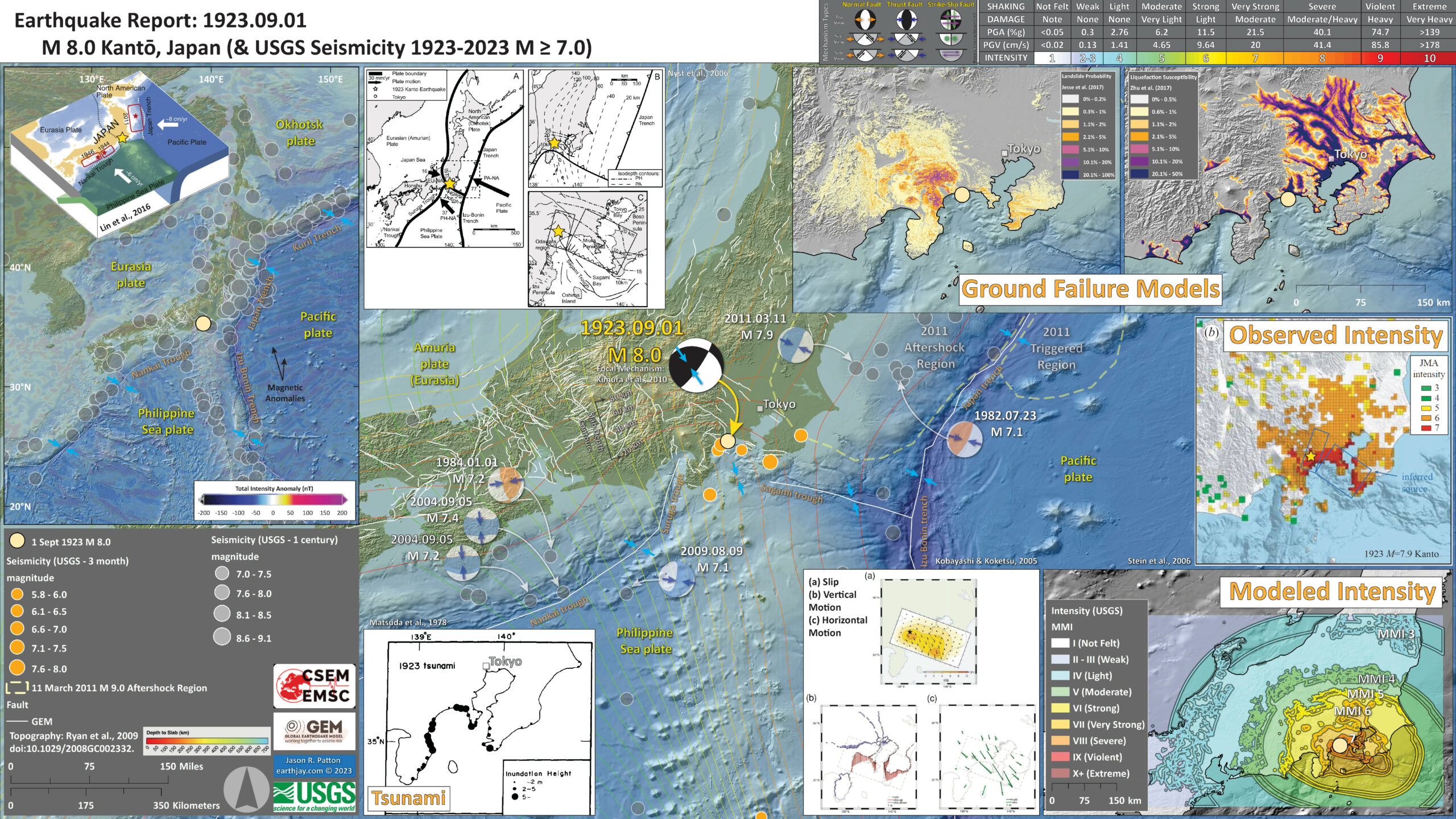
Below is my interpretive poster for this earthquake
- I plot the seismicity from the past month, with diameter representing magnitude (see legend). I include earthquake epicenters from 1922-2022 with magnitudes M ≥ 3.0 in one version.
- I plot the USGS fault plane solutions (moment tensors in blue and focal mechanisms in orange), possibly in addition to some relevant historic earthquakes.
- A review of the basic base map variations and data that I use for the interpretive posters can be found on the Earthquake Reports page. I have improved these posters over time and some of this background information applies to the older posters.
- Some basic fundamentals of earthquake geology and plate tectonics can be found on the Earthquake Plate Tectonic Fundamentals page.
- In the upper left corner is a map showing the tectonic plates and their boundaries. There is an inset figure from Lin et al. (2016) that shows a low angle oblique view of the tectonic plates and how the different subduction zones dive beneath each other.
- To the right of this map is another plate tectonic map from Nyst et al. (2006). I describe this figure lower down in the report.
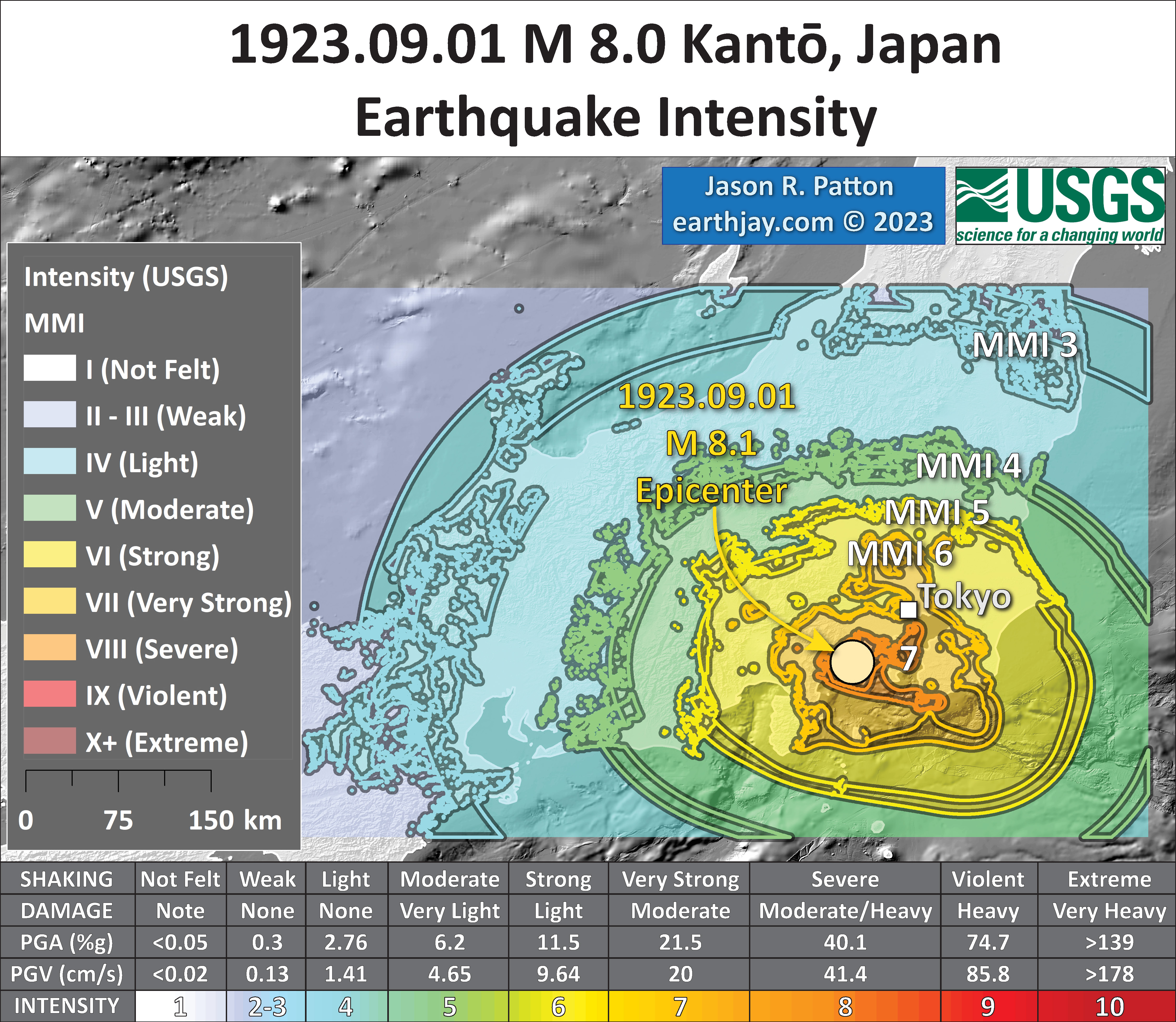
- In the lower right corner is a map that shows the earthquake intensity using the modified Mercalli intensity scale. Earthquake intensity is a measure of how strongly the Earth shakes during an earthquake, so gets smaller the further away one is from the earthquake epicenter. The map colors represent a model of what the intensity may be.
- Above this intensity map is a figure from Stein et al. (2006) that shows what the intensity observations were from the 1923 earthquake. The JMA intensity scale is similar to the MMI scale but just spans a range from 1-7, while the MMI scale spans a range of 1-10.
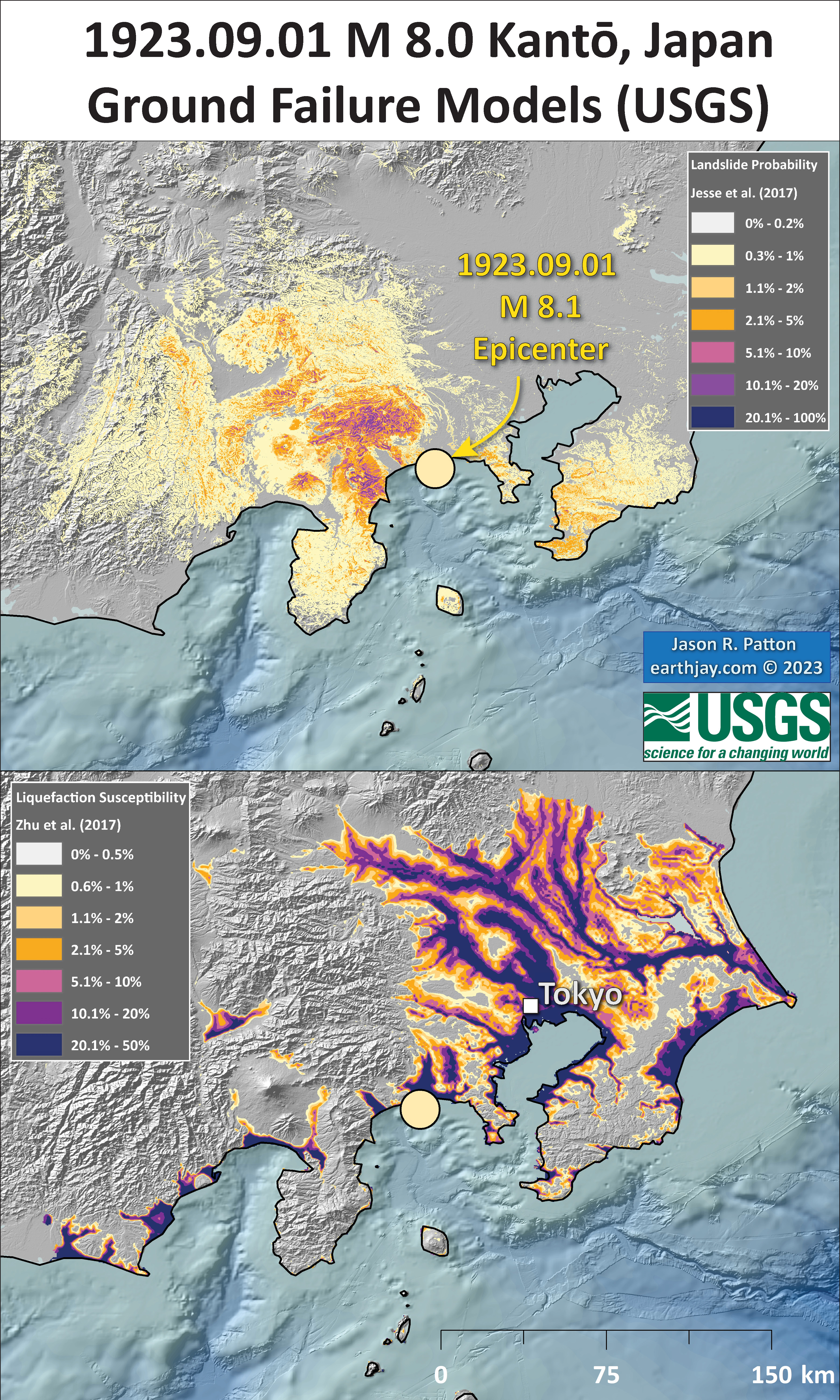
- In the upper right corner are two maps showing the probability of earthquake triggered landslides and possibility of earthquake induced liquefaction. I will describe these phenomena below.
- To the left of the modeled intensity map is a figure that shows an earthquake slip model result from Kobayashi and Koketsu (2006). I discuss this figure later in the report.
- In the lower left is a map showing inundation heights (rup-up elevations) from the 1923 earthquake generated tsunami (Matsuda et al., 1978).
I include some inset figures. Some of the same figures are located in different places on the larger scale map below.
- Here is the map with a month’s seismicity plotted.
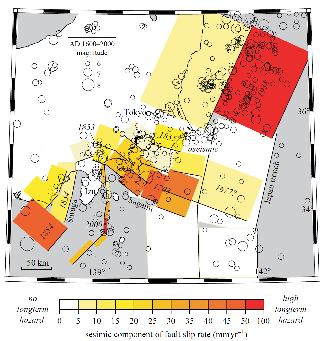
- Matsuda et al. (1978) prepared a summary of major earthquakes in the southern Kanto district in Japan.
- This summary included earthquake mechanisms and recurrence times for these earthquakes.
- They used uplifted marine terraces as a basis for their interpretations.
- This map shows the spatial extent for the earthquakes in their summary.
- This map shows the inundation height for tsunami generated by the 1923 and 1703 tsunami.
- The tsunami was devastating and had a run-up elevation that was at least 12 meters in some locations.
- Here is a map showing some run-up elevations around Sagami Bay, south of the epicenter (Hatori, 1984).
- The authors directly interviewed survivors of the earthquake and tsunami and their report is based on these interviews.
- This is a photo showing damaged houses and a dashed line representing the inundation level of 12 meters above sea level(flow depth; Hatori, 1984).
- Here is a map showing the topography and inundation extent along the coast at Atami (Hatori, 1984).
- Nyst et al. (2006) used updated geodetic analyses to reevaluate the 1923 Great Kanto Earthquake.
- Geodesy is the study of the deformation of the Earth, how the plates and crust move with time.
- This can be for times between earthquakes (interseismic) or during earthquakes (coseismic).
- They used geodetic observations (tide gage data, benchmark survey data) to constrain tectonic models of the earthquake.
- Their analyses included the application of different fault slip models and how those different models may have generated deformation of Earth’s surface.
- Here is a great tectonic map from their paper, showing the major tectonic boundaries, the shape of the megathrust subduction zone faults (slabs), and their proposed earthquake fault planes (the areas of the faults that slipped during the earthquake) for the 1923 temblor.
- Here is a map that shows their calculation of vertical land motion generated by the earthquake (Nyst et al., 2006).
- The height of the colored bars represents the uplift (or subsidence) at each location. The arrowheads show the direction of motion.
- This map shows the different fault slip models that they considered in their study (Nyst et al., 2006).
- These plots show a comparison of their model results with the observations (Nyst et al., 2006).
- Kobayashi and Koketsu (2005) also used geodetic data to develop a slip model for this 1923 Great Kanto Earthquake.
- Kobayashi and Koketsu (2005) “inverted” these geodetic data to estimate where the slip was on their fault models. They considered a range of parameters and included geodetic data, teleseismic data (seismic waves transmitted far distances), and strong ground motion data (seismic waves recorded on seismometers near the earthquake) for their inversions. The result of their inversion is a slip distribution for the earthquake fault slip. A slip distribution is a plot of an earthquake fault that shows how much the fault slipped in different parts of the fault. In most cases, faults do not slip in a homogeneous manner (the fault slips more in some places and less in other places).
- Here is another figure that shows coseismic (during the earthquake) geodetic observations from this earthquake (Kobayashi and Koketsu, 2005)
- Dark arrows show horizontal motion, black bars show subsidence (vertical motion downwards), and the white bars show uplift (vertical motion upwards).
- This is a figure that shows the prefered results from their study (Kobayashi and Koketsu, 2005)
- The figure shows the slip model (color = slip amount, arrows = slip direction), the vertical motion from their model, and the horizontal motion from their model (compared to the observations).
- Nakadai et al. (2023) recently published a new source model for the 1923 Great Kantō Earthquake.
- These authors used (inverted) coseismic geodetic observations to calculate the slip distribution from the earthquake (as Kobayashi and Koketsu (2005) did above ^^^).
- First we see a map showing the region of these earthquakes, the locations of tide gages that recorded the tsunami, and a plot showing the tsunami size in places along the coast.
- Here is a map that shows the hypothetical fault geometry that Nakadai et a.l. (2023) used for their inversions.
- The blue dashed lines show the shape of the megathrust subduction zone fault, the fault that forms the Sagami trough, and how it dips to the north.
- The orange lines show the fault elements (subfaults) used in this study.
- This figure shows the results of their inversion.
- The map on the left shows the fault slip distribution (colored yellow to red to brown, 1- to 12-m of slip). There were two regions of high slip, circled in blue.
- The plots on the right show the tide gage data (these are called marigrams) from the tsunami, in blue. The orange lines are plots showing tsunami waves calculated from their tsunami model that used the slip distribution along the fault shown on the left.
- The comparison between their modeled data and the observed data is really good, except that Chiba misses one of the large waves and misses the timing of the 2nd or 3rd waves.
- This map shows a comparison between their modeled coseismic vertical land motion (using orange (up) and yellow (down) arrows) with the observed vertical land motion (dark blue (up) and light blue (down) arrows).
- These are their slip distributions for a variety of how much they weight the crustal deformation data relative to the tsunami ddata.
- This figure shows a comparison between the tsunami observations and their calculated tsunami sizes.
- Stein et al. (2006) prepared an updated seismic hazard assessment for the Tokyo region of southern Japan.
- Their model was based on observations from historical earthquakes.
- This shows the peak intensities that they used for their hazard model. The intensities from the 1923 Great Kanto Earthquake are in the upper right panel (Stein et al., 2006).
- These are the seismic slip rates for the sources used in their model (Stein et al., 2006).
- These maps show the 30 year probability percent (%) of ground shaking exceeding JMA 6 (about 0.93 pga) and places that may experience earthquake induced liquefaction (Stein et al., 2006).
- Compare the lower map with the USGS earthquake induced liquefaction susceptibility map in the poster or below in the ground failure interpretation figure.
- Kimura et al. (2010) used seismic reflection and microseismicity data to investigate the fault geometry in the region of the 1923 Great Kanto Earthquake.
- They found evidence for the subducting plate (and more).
- Here is a figure showing the earthquakes they studied, the plate tectonic configuration, and the seismicity they used for their study.
- Here is a figure showing the seismic reflection data they used for their study (Kimura et al., 2010).
- Here is a figure showing their interpretations (Kimura et al., 2010).
- Here is a figure that shows a more detailed comparison between the modeled intensity and the reported intensity. Both data use the same color scale, the Modified Mercalli Intensity Scale (MMI). More about this can be found here. The colors and contours on the map are results from the USGS modeled intensity. The DYFI data are plotted as colored dots (color = MMI, diameter = number of reports).
- In the upper panel is the USGS Did You Feel It reports map, showing reports as colored dots using the MMI color scale. Underlain on this map are colored areas showing the USGS modeled estimate for shaking intensity (MMI scale).
- In the lower panel is a plot showing MMI intensity (vertical axis) relative to distance from the earthquake (horizontal axis). The models are represented by the green and orange lines. The DYFI data are plotted as light blue dots. The mean and median (different types of “average”) are plotted as orange and purple dots. Note how well the reports fit the green line (the model that represents how MMI works based on quakes in California).
- Below the lower plot is the USGS MMI Intensity scale, which lists the level of damage for each level of intensity, along with approximate measures of how strongly the ground shakes at these intensities, showing levels in acceleration (Peak Ground Acceleration, PGA) and velocity (Peak Ground Velocity, PGV).
- Here is the observed intensity map from Stein et al. (2006)
- Below are a series of maps that show the potential for landslides and liquefaction. These are all USGS data products.
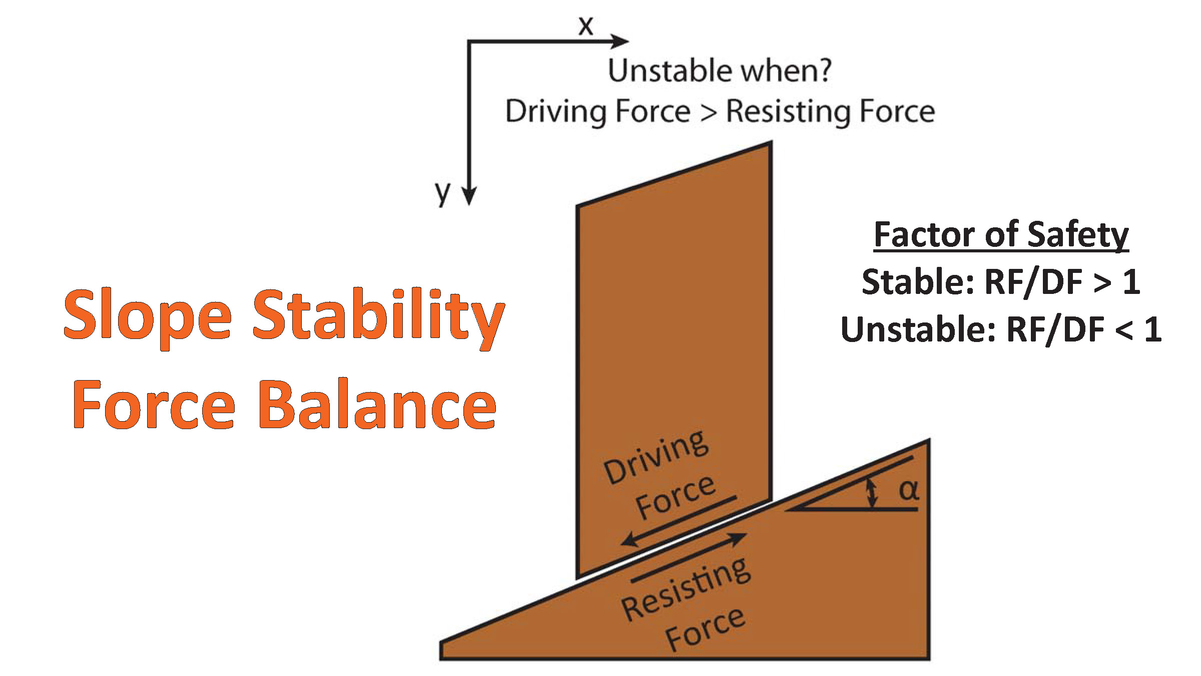
There are many different ways in which a landslide can be triggered. The first order relations behind slope failure (landslides) is that the “resisting” forces that are preventing slope failure (e.g. the strength of the bedrock or soil) are overcome by the “driving” forces that are pushing this land downwards (e.g. gravity). The ratio of resisting forces to driving forces is called the Factor of Safety (FOS). We can write this ratio like this:FOS = Resisting Force / Driving Force
- When FOS > 1, the slope is stable and when FOS < 1, the slope fails and we get a landslide. The illustration below shows these relations. Note how the slope angle α can take part in this ratio (the steeper the slope, the greater impact of the mass of the slope can contribute to driving forces). The real world is more complicated than the simplified illustration below.
- Landslide ground shaking can change the Factor of Safety in several ways that might increase the driving force or decrease the resisting force. Keefer (1984) studied a global data set of earthquake triggered landslides and found that larger earthquakes trigger larger and more numerous landslides across a larger area than do smaller earthquakes. Earthquakes can cause landslides because the seismic waves can cause the driving force to increase (the earthquake motions can “push” the land downwards), leading to a landslide. In addition, ground shaking can change the strength of these earth materials (a form of resisting force) with a process called liquefaction.
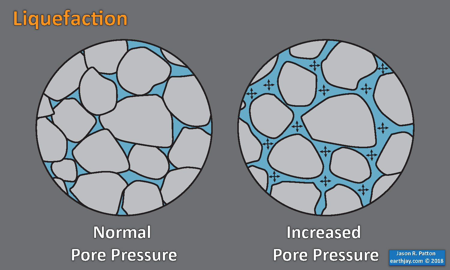
- Sediment or soil strength is based upon the ability for sediment particles to push against each other without moving. This is a combination of friction and the forces exerted between these particles. This is loosely what we call the “angle of internal friction.” Liquefaction is a process by which pore pressure increases cause water to push out against the sediment particles so that they are no longer touching.
- An analogy that some may be familiar with relates to a visit to the beach. When one is walking on the wet sand near the shoreline, the sand may hold the weight of our body generally pretty well. However, if we stop and vibrate our feet back and forth, this causes pore pressure to increase and we sink into the sand as the sand liquefies. Or, at least our feet sink into the sand.
- Below is a diagram showing how an increase in pore pressure can push against the sediment particles so that they are not touching any more. This allows the particles to move around and this is why our feet sink in the sand in the analogy above. This is also what changes the strength of earth materials such that a landslide can be triggered.
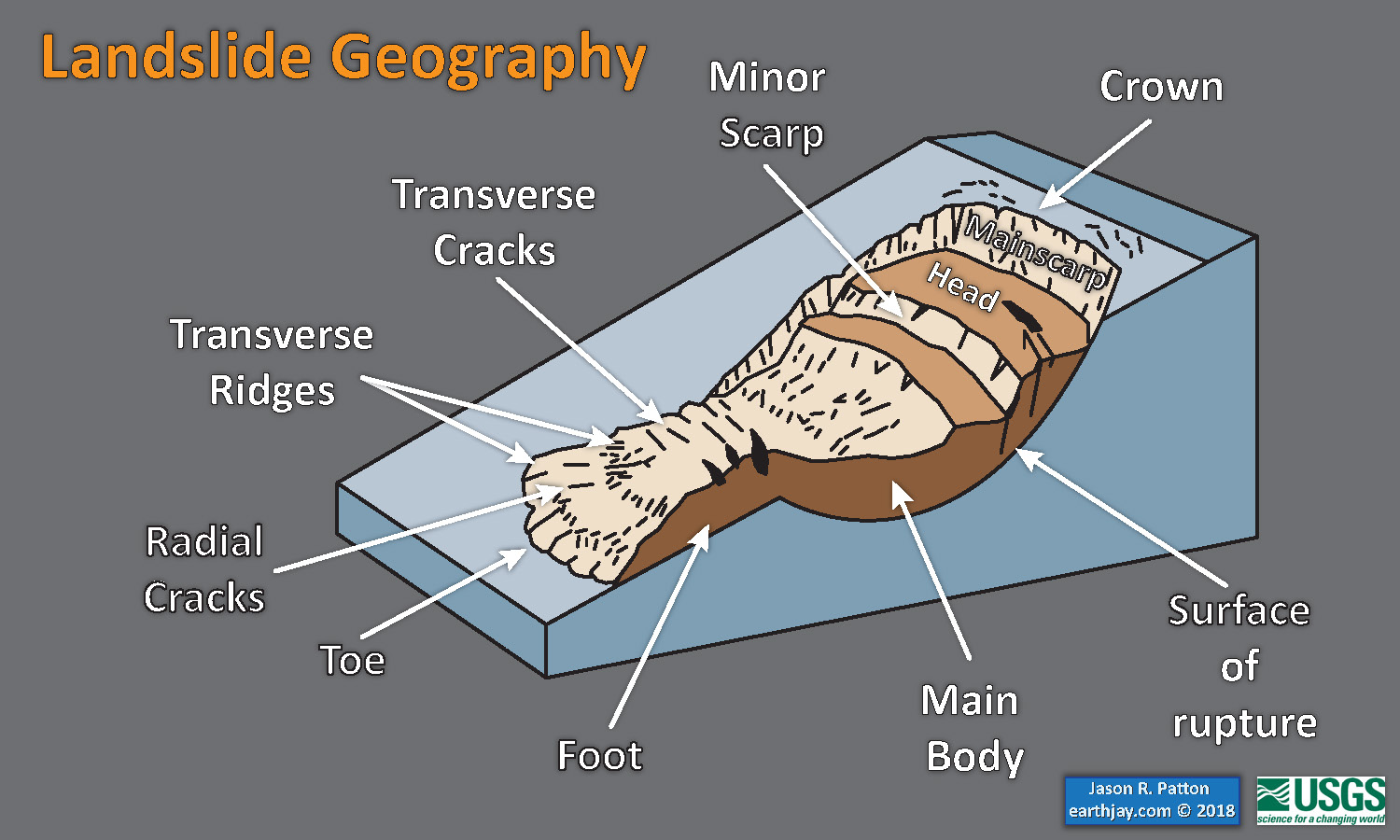
- Below is a diagram based upon a publication designed to educate the public about landslides and the processes that trigger them (USGS, 2004). Additional background information about landslide types can be found in Highland et al. (2008). There was a variety of landslide types that can be observed surrounding the earthquake region. So, this illustration can help people when they observing the landscape response to the earthquake whether they are using aerial imagery, photos in newspaper or website articles, or videos on social media. Will you be able to locate a landslide scarp or the toe of a landslide? This figure shows a rotational landslide, one where the land rotates along a curvilinear failure surface.
- Below is the liquefaction susceptibility and landslide probability map (Jessee et al., 2017; Zhu et al., 2017). Please head over to that report for more information about the USGS Ground Failure products (landslides and liquefaction). Basically, earthquakes shake the ground and this ground shaking can cause landslides.
- I use the same color scheme that the USGS uses on their website. Note how the areas that are more likely to have experienced earthquake induced liquefaction are in the valleys. Learn more about how the USGS prepares these model results here.
- 2011.03.11 Summary of the M 9.0 Japan (Tohoku-Oki)
- 2022.03.16 M 7.3 Japan
- 2018.09.05 M 6.6 Hokkaido, Japan
- 2016.07.29 M 7.7 Mariana
- 2016.11.21 M 6.9 Japan
- 2016.10.19 M 6.2 Japan
- 2016.08.20 M 6.0 Japan
- 2016.04.14 M 6.2 Japan
- 2016.04.01 M 6.0 Japan
- 2015.05.30 M 7.8 Izu Bonin
- 2015.05.31 M 7.8 Izu Bonin Update #1: triggered earthquakes
- 2015.05.31 M 7.8 Izu Bonin Update #2: Historic Seismicity
- 2015.06.09 M 7.8 Izu Bonin Update #3: seismic wave animations
- 2015.02.25 M 6.3 Japan (Sanriku Coast Update #5)
- 2015.02.21 M 6.7 Japan (Sanriku Coast Update #4)
- 2015.02.20 M 6.7 Japan (Sanriku Coast Update #3)
- 2015.02.16 M 6.7 Japan (Sanriku Coast Update #2)
- 2015.02.16 M 6.7 Japan (Sanriku Coast Update #1)
- 2015.02.16 M 6.7 Japan (Sanriku Coast)
- 2013.10.25 M 7.1 Japan (Honshu)
- 2011.03.11 M 9.0 Japan (Tohoku-Oki) Main Page
- 2011.03.11 M 9.0 Japan (Tōhoku-oki) Tsunami
- 2011.03.11 M 9.1 Japan (Tōhoku-oki) Decade Remembrance
- 1923.09.01 M 8.0 Kanto, Japan
- Frisch, W., Meschede, M., Blakey, R., 2011. Plate Tectonics, Springer-Verlag, London, 213 pp.
- Hayes, G., 2018, Slab2 – A Comprehensive Subduction Zone Geometry Model: U.S. Geological Survey data release, https://doi.org/10.5066/F7PV6JNV.
- Holt, W. E., C. Kreemer, A. J. Haines, L. Estey, C. Meertens, G. Blewitt, and D. Lavallee (2005), Project helps constrain continental dynamics and seismic hazards, Eos Trans. AGU, 86(41), 383–387, , https://doi.org/10.1029/2005EO410002. /li>
- Jessee, M.A.N., Hamburger, M. W., Allstadt, K., Wald, D. J., Robeson, S. M., Tanyas, H., et al. (2018). A global empirical model for near-real-time assessment of seismically induced landslides. Journal of Geophysical Research: Earth Surface, 123, 1835–1859. https://doi.org/10.1029/2017JF004494
- Kreemer, C., J. Haines, W. Holt, G. Blewitt, and D. Lavallee (2000), On the determination of a global strain rate model, Geophys. J. Int., 52(10), 765–770.
- Kreemer, C., W. E. Holt, and A. J. Haines (2003), An integrated global model of present-day plate motions and plate boundary deformation, Geophys. J. Int., 154(1), 8–34, , https://doi.org/10.1046/j.1365-246X.2003.01917.x.
- Kreemer, C., G. Blewitt, E.C. Klein, 2014. A geodetic plate motion and Global Strain Rate Model in Geochemistry, Geophysics, Geosystems, v. 15, p. 3849-3889, https://doi.org/10.1002/2014GC005407.
- Meyer, B., Saltus, R., Chulliat, a., 2017. EMAG2: Earth Magnetic Anomaly Grid (2-arc-minute resolution) Version 3. National Centers for Environmental Information, NOAA. Model. https://doi.org/10.7289/V5H70CVX
- Müller, R.D., Sdrolias, M., Gaina, C. and Roest, W.R., 2008, Age spreading rates and spreading asymmetry of the world’s ocean crust in Geochemistry, Geophysics, Geosystems, 9, Q04006, https://doi.org/10.1029/2007GC001743
- Pagani,M. , J. Garcia-Pelaez, R. Gee, K. Johnson, V. Poggi, R. Styron, G. Weatherill, M. Simionato, D. Viganò, L. Danciu, D. Monelli (2018). Global Earthquake Model (GEM) Seismic Hazard Map (version 2018.1 – December 2018), DOI: 10.13117/GEM-GLOBAL-SEISMIC-HAZARD-MAP-2018.1
- Silva, V ., D Amo-Oduro, A Calderon, J Dabbeek, V Despotaki, L Martins, A Rao, M Simionato, D Viganò, C Yepes, A Acevedo, N Horspool, H Crowley, K Jaiswal, M Journeay, M Pittore, 2018. Global Earthquake Model (GEM) Seismic Risk Map (version 2018.1). https://doi.org/10.13117/GEM-GLOBAL-SEISMIC-RISK-MAP-2018.1
- Storchak, D. A., D. Di Giacomo, I. Bondár, E. R. Engdahl, J. Harris, W. H. K. Lee, A. Villaseñor, and P. Bormann (2013), Public release of the ISC-GEM global instrumental earthquake catalogue (1900–2009), Seismol. Res. Lett., 84(5), 810–815, doi:10.1785/0220130034.
- Zhu, J., Baise, L. G., Thompson, E. M., 2017, An Updated Geospatial Liquefaction Model for Global Application, Bulletin of the Seismological Society of America, 107, p 1365-1385, https://doi.org/0.1785/0120160198
- Davison, C., 1925. The Japanese Earthquake of 1 September 1923. The Geographical Journal, 65(1), 41. https://doi.org/10.2307/1782347
- Hatori, Tokutaro, 1984. Tsunami Behavior of the 1923 Kanto Earthquake at Atami and Hatsushima Island in Sagami Bay in Bull. Earthquake Research Institute, v. 58, p. 683-689
- Jones, M., 2016. The Great Kantō Earthquake and the Chimera of National Reconstruction in Japan. By J. Charles Schencking . New York: Columbia University Press, 2013. xxii, 374 pp. ISBN: 9780231162180 (cloth; also available as e-book). – Imaging Disaster: Tokyo and the Visual Culture of Japan’s Great Earthquake of 1923. By Gennifer Weisenfeld . Berkeley: University of California Press, 2012. xv, 393 pp. ISBN: 9780520271951 (cloth; also available as e-book). The Journal of Asian Studies, 75(3), 836–839. https://doi.org/10.1017/s0021911816000851
- Kimura, H., Takeda, T., Obara, K., & Kasahara, K., 2010. Seismic Evidence for Active Underplating Below the Megathrust Earthquake Zone in Japan. Science, 329(5988), 210–212. https://doi.org/10.1126/science.1187115
- Kobayashi, R., Koketsu, K. Source process of the 1923 Kanto earthquake inferred from historical geodetic, teleseismic, and strong motion data. Earth Planet Sp 57, 261–270 (2005). https://doi.org/10.1186/BF03352562
- Matsuda, T., Ota, Y., Ando, M., & Yonekura, N., 1978. Fault mechanism and recurrence time of major earthquakes in southern Kanto district, Japan, as deduced from coastal terrace data. Geological Society of America Bulletin, 89(11), 1610. https://doi.org/10.1785/0120230050
- Nyst, M., Nishimura, T., Pollitz, F. F., and Thatcher, W., 2006. The 1923 Kanto earthquake reevaluated using a newly augmented geodetic data set, J. Geophys. Res., 111, B11306, https://doi.org/10.1029/2005JB003628.
- Pollitz, F. F., Pichon, X., & Lallemant, S. J. (1996). Shear partitioning near the central Japan triple junction: the 1923 great Kanto earthquake revisited-II. Geophysical Journal International, 126(3), 882–892. https://doi.org/10.1111/j.1365-246x.1996.tb04710.x
- Stein, R.S., Toda, S., Parsons, T., amnd Grunewald, E., 2006. A new probabilistic seismic hazard assessment for greater Tokyo in Philos Trans A Math Phys Eng Sci.v. 364, p. 1965-1988. doi: 10.1098/rsta.2006.1808.
- https://www.jstage.jst.go.jp/article/jamstecr/23/0/23_12/_html/-char/en
- https://www.sciencedirect.com/science/article/abs/pii/0040195189903880
- https://www.researchgate.net/publication/282052144_Geological_and_historical_evidence_of_irregular_recurrent_earthquakes_in_Japan
- https://www.researchgate.net/publication/352413188_Time-Dependent_Probabilistic_Tsunami_Inundation_Assessment_Using_Mode_Decomposition_to_Assess_Uncertainty_for_an_Earthquake_Scenario
- Sorted by Magnitude
- Sorted by Year
- Sorted by Day of the Year
- Sorted By Region
-
here is the usgs page that shows where the epicenter is: https://earthquake.usgs.gov/earthquakes/eventpage/iscgem911526/executive
Some Relevant Discussion and Figures

Great earthquakes during past 400 years off central Honshu. Encircled areas are earthquake source areas inferred from tsunami refraction diagram (Hatori, 1974, 1975a, 1975b, 1976a). Encircled area with a broken line is an area of the future earthquake of Oiso type. Ages of sudden uplift for the respective terrace were inferred from the thickness of marine sediments overlying the collected 14C samples and the width of the terrace.
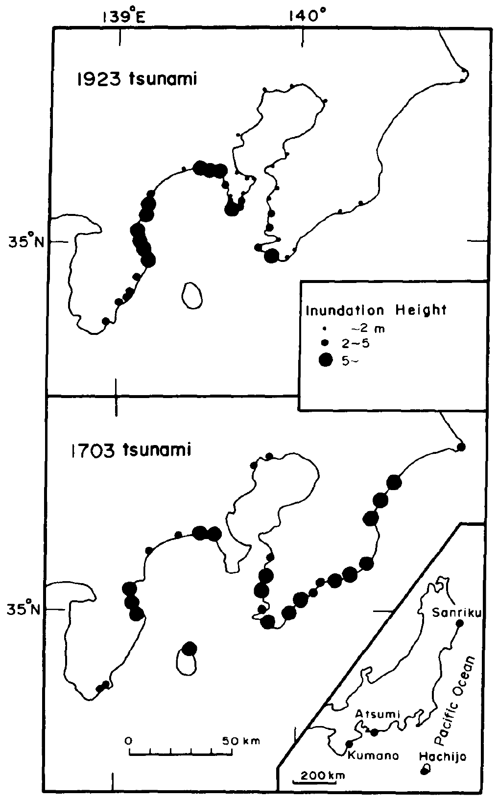
Inundation height of tsunamis at the 1923 earthquake (top) and at the 1703 earthquake (bottom) (data from Hatori and others, 1973; Hatori, 1976b).
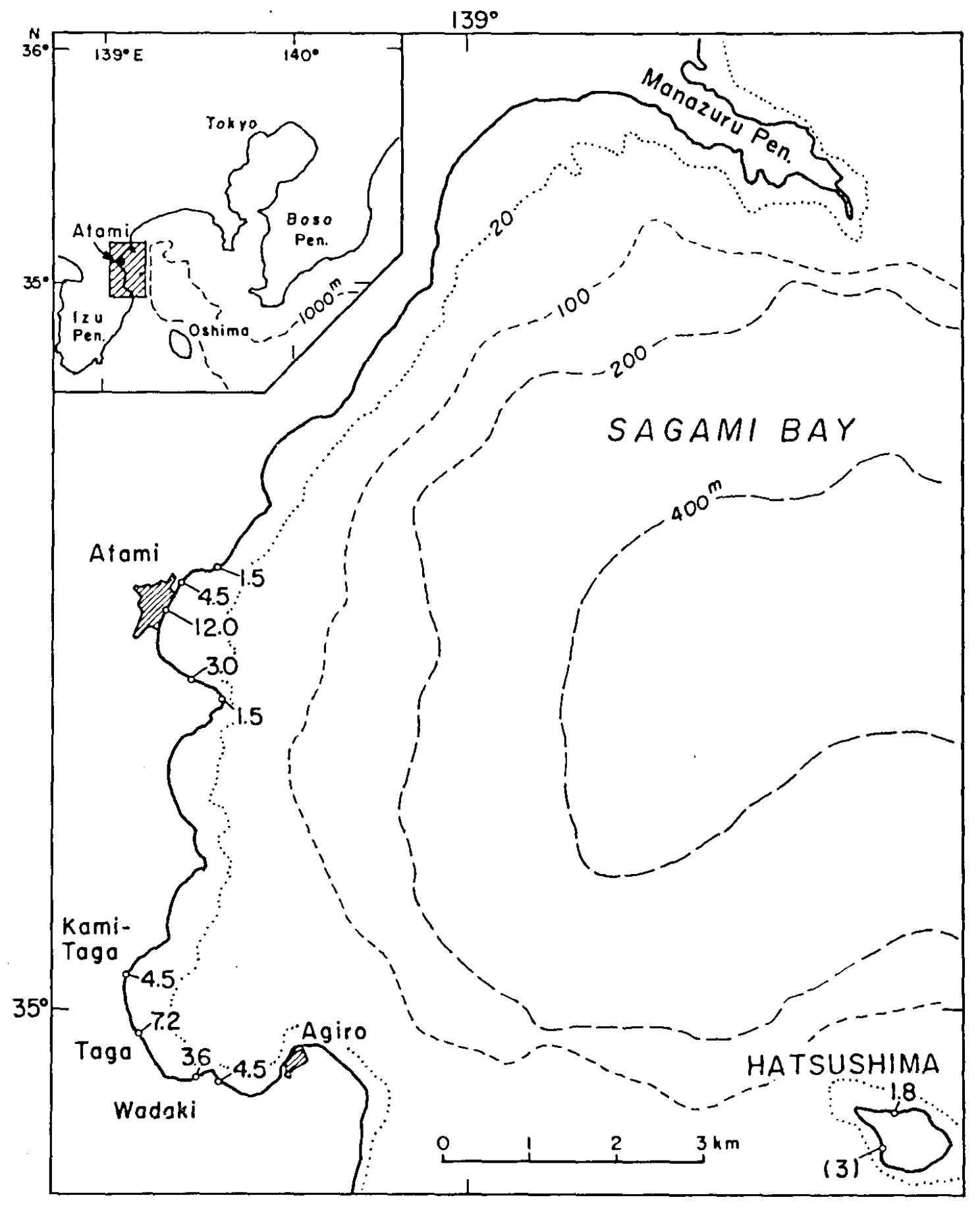
Distribution of inundation heights (above sea level. unti: m) of the 1923 Kanto tsunami in the Atami region.
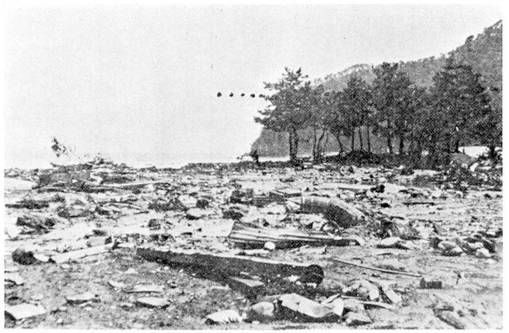
Damage to houses caused by the 1023 Kanto tsunami at Atami (from T. Ikeda). The dotted line shows the inundation level (3.0 m above sea level).
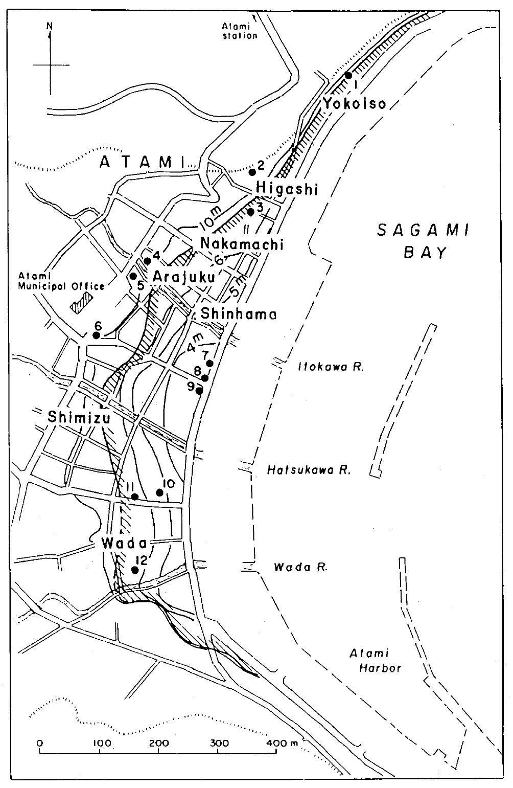
Topography of Atami (ground elevations above M.S.L.) and inundation area of the 1923 Kanto tsunami.
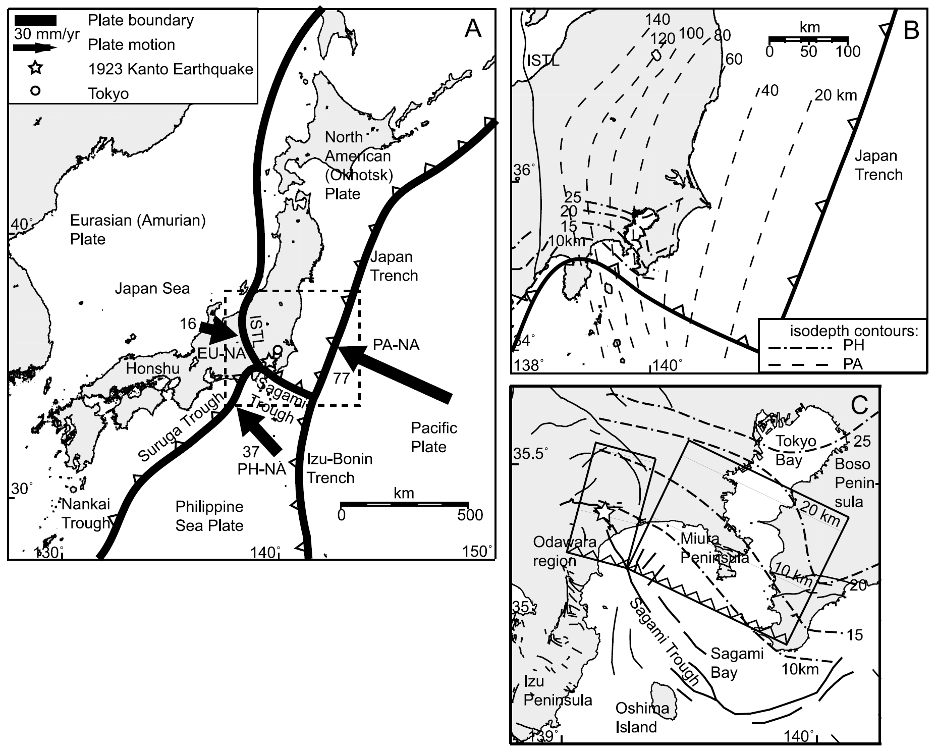
(a) Plate tectonic setting of Japan, where four major plates converge: the Eurasian (EU) or Amurian according to Heki et al. [1999] and Heki and Miyazaki [2001], North American (NA) or Okhotsk according to Seno et al. [1993, 1996], Pacific (PA), and Philippine Sea (PH) plates. Northern Honshu is located on the North American or Okhotsk plate. ISTL, Itoigawa-Shizuoka Tectonic Line. The arrows indicate motion of different plates relative to northern Honshu, and the numbers are averages of the rate predictions in millimeters per year, based on Global Positioning System (GPS) observations [Heki et al., 1999; Seno et al., 1996]. The dashed square outlines the area shown in Figure 1b. (b) Isodepth contours of the surfaces of the PH plate based on seismic reflection data [from Sato et al., 2005] and the PA plate based on seismicity data [from Noguchi, 2002]. (c) Active fault map of the coastal region around Sagami Bay with 1923 coseismic fault model planes (model III) of Matsu’ura et al. [1980] and isodepth contours of the PH plate [Sato et al., 2005]. The star indicates the epicenter of the 1923 Kanto earthquake according to the seismic study of Kanamori and Miyamura [1970]. The boldface lines indicate the Sagami trough.
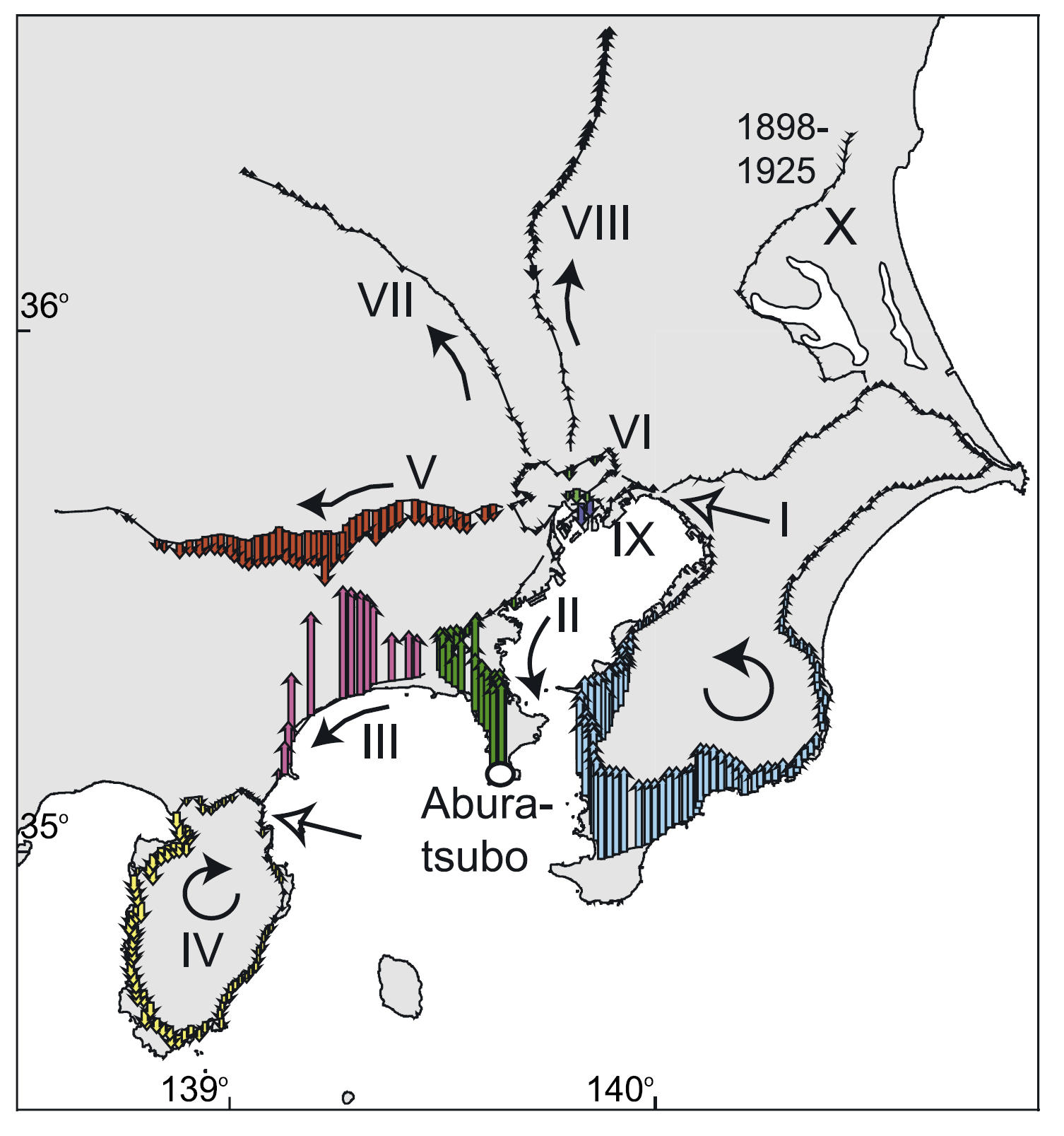
Leveling routes in Kanto and the vertical displacement derived from surveys before and shortly after 1923. The oval indicates tide gauge station Aburatsubo, which provides the data for the absolute vertical reference frame. The roman enumeration and color coding of the arrows correspond to the profiles shown in Figure 10. The direction in which the profiles in Figure 10 display displacement along the routes is here indicated by a black arrow. For closed loops I and IV the white arrow indicates the start of the profile.
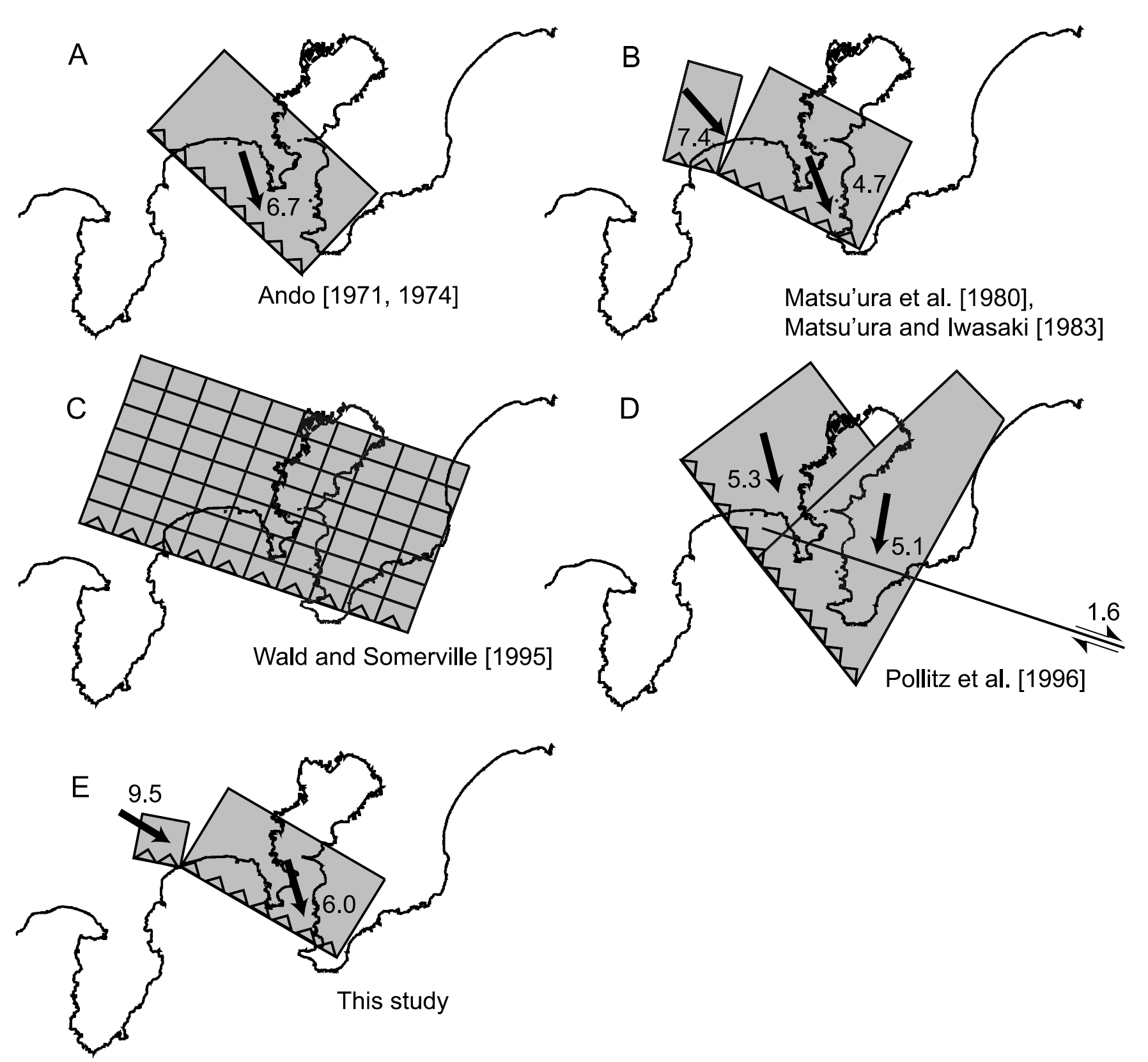
Surface projection of a selection of fault plane models that are based on historical geodetic observations (triangulation and leveling data). The arrows indicate the slip direction, and the numbers indicate the magnitude of the slip for the uniform slip models.
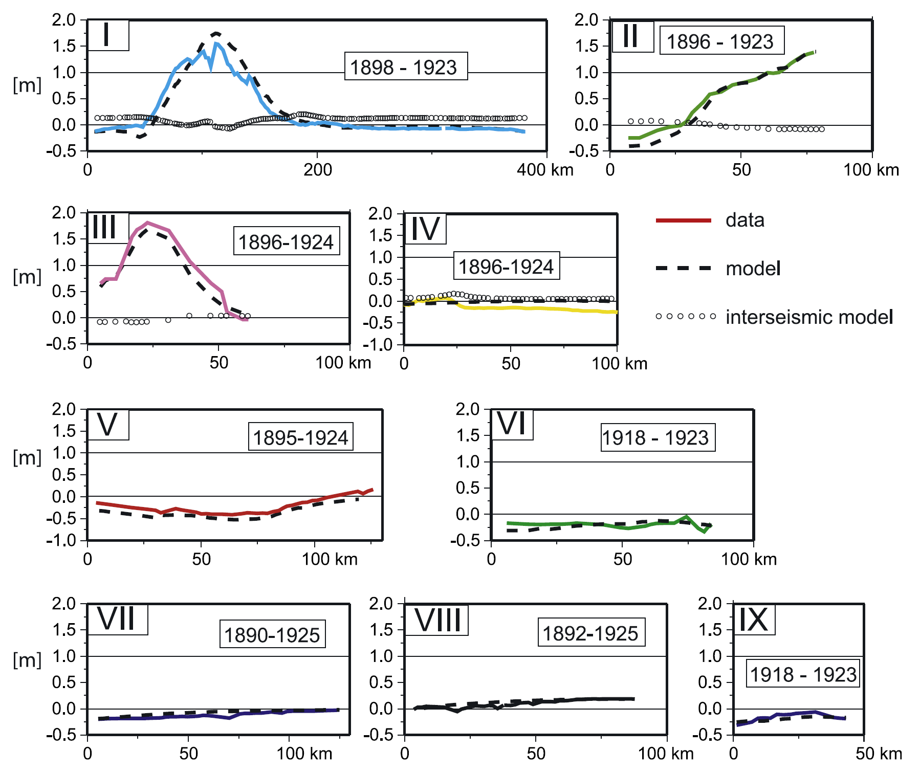
Fit of our uniform source model to the leveling observations that are adjusted for interseismic deformation and indicated by the colored lines. The dashed lines represent the absolute vertical displacement of our model. The color coding and roman numerals correspond to the level routes shown in Figure 5. The vertical component of the interseismic deformation field, plotted for routes I through IV, is omitted for routes V through IX, because there its signal is indistinguishable from zero displacement. Route X (Figure 5) is not displayed here, because the observations do not show any deformation and our model predicts zero vertical displacement along this route.
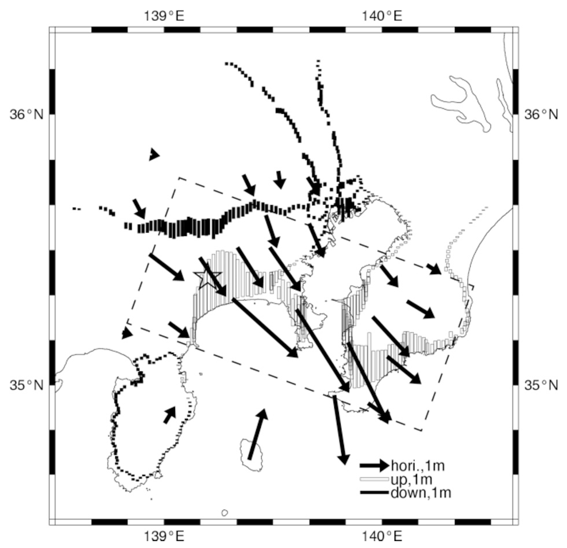
Observed geodetic data. The arrows denote horizontal displacements from triangulation. The bars denote vertical displacements from leveling (up: white, down: black). The rectangular area bounded by dashed lines indicates the horizontal projection of the fault plane. The star symbol denotes the epicenter.
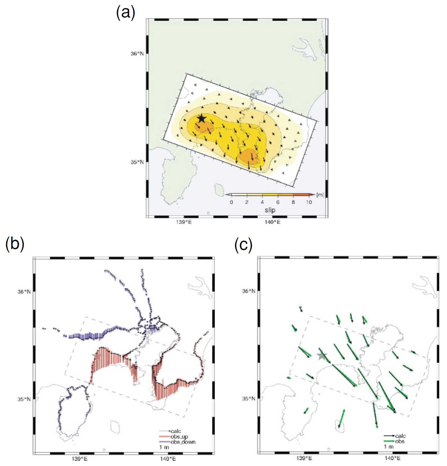
Results from inversions of the geodetic data using the Green’s functions for a 1-D layered structure. (a) Slip distribution. (b) Observed (up: red, down: blue) and calculated (black) vertical displacements. (c) Observed (green) and calculated (black) horizontal displacements. The variance reduction for geodetic data is 0.96.
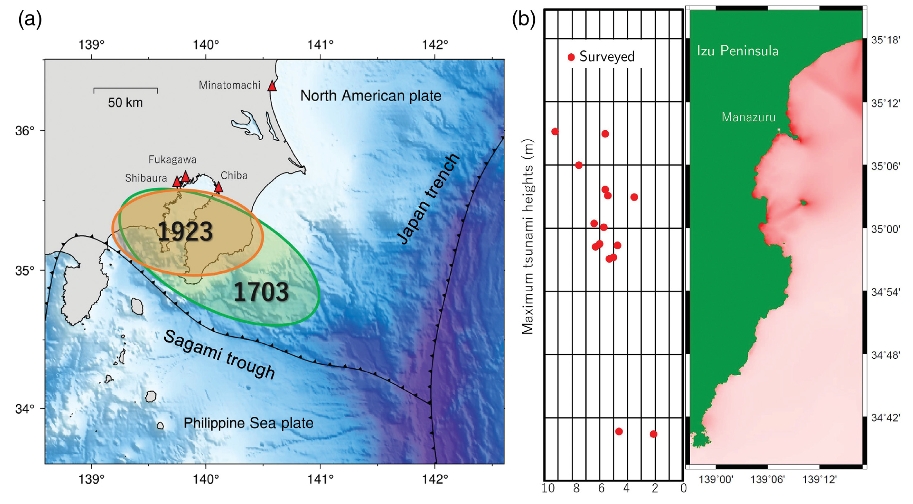
Tectonic setting near the source area of the 1923 Kanto earthquake. (a) The source areas of the 1923 Kanto earthquake (orange) and the 1703 Genroku Kanto earthquake (green). Red triangles show location of tide gauges in which tsunamis generated by the 1923 Kanto earthquake were observed. (b) Maximum tsunami surveyed heights (Aida, 1993) along the east coast of the Izu Peninsula shown in a red rectangle in panel (a).
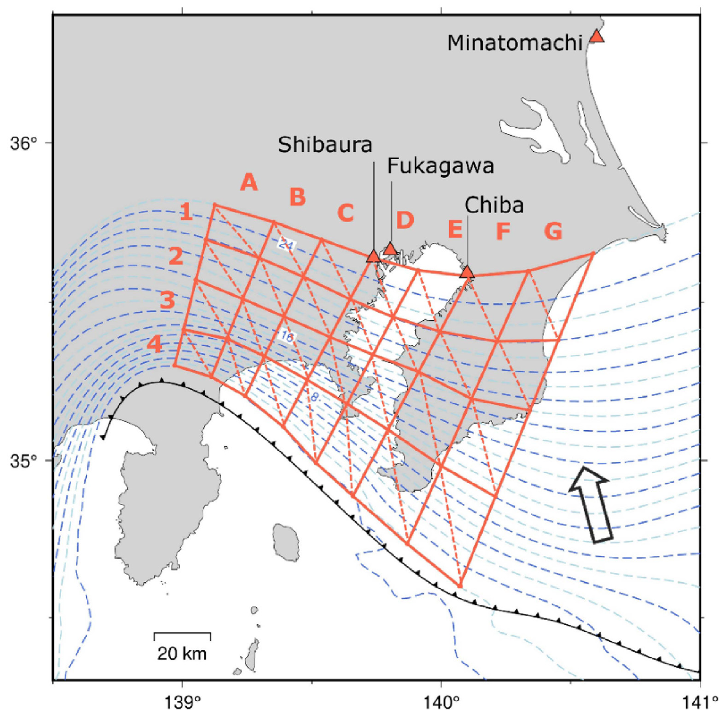
Locations of subfaults along the plate interface along the Sagami trough where the Philippine Sea plate subducts. Blue dashed contours show the depth of the plate interface with a 2 km interval. Red triangles show locations of tide gauges where tsunami waveforms were observed.
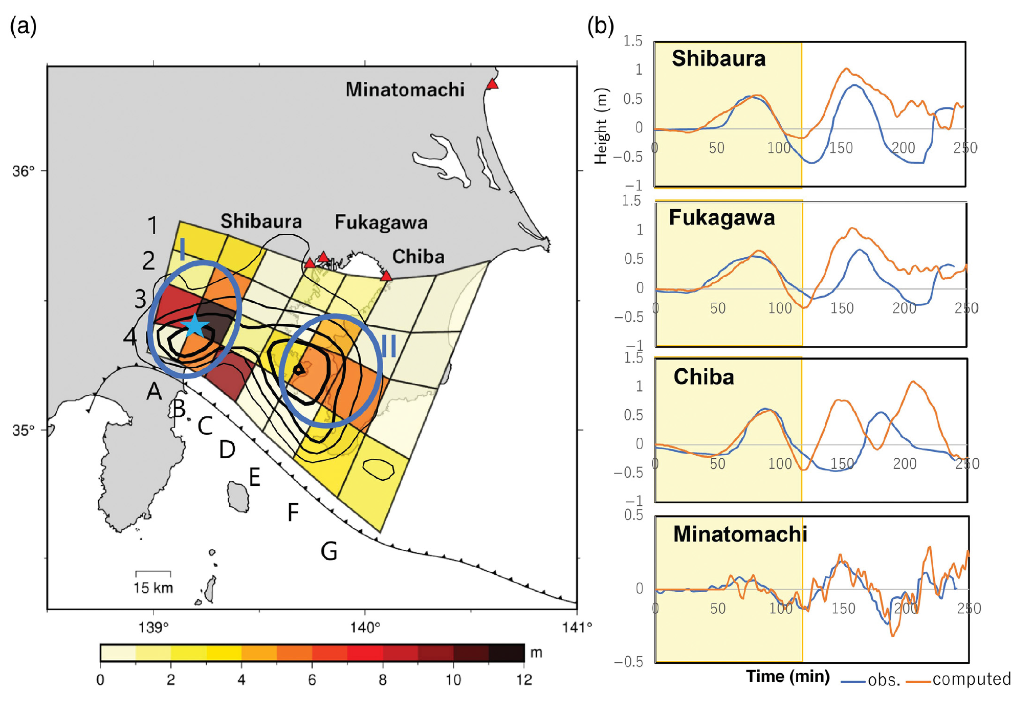
Results of the joint inversion of tsunami waveforms and crustal deformation data. (a) The estimated slip distribution of the 1923 Kanto earthquake. Red triangles show locations of tide gauges where tsunami waveforms were observed. Two blue dashed ellipsoids, I and II, show large slip areas. A blue star shows the epicenter of the Kanto earthquake. Black
contours show the slip distribution estimated by Matsu’ura et al. (2007) with a contour interval of 2 m. Two blue dashed ellipsoids, I and II, show large slip areas. (b) Comparison of observed (blue) and computed (orange) tsunami waveforms. Yellow hatched areas show parts of tsunami waveforms used in the joint inversion.
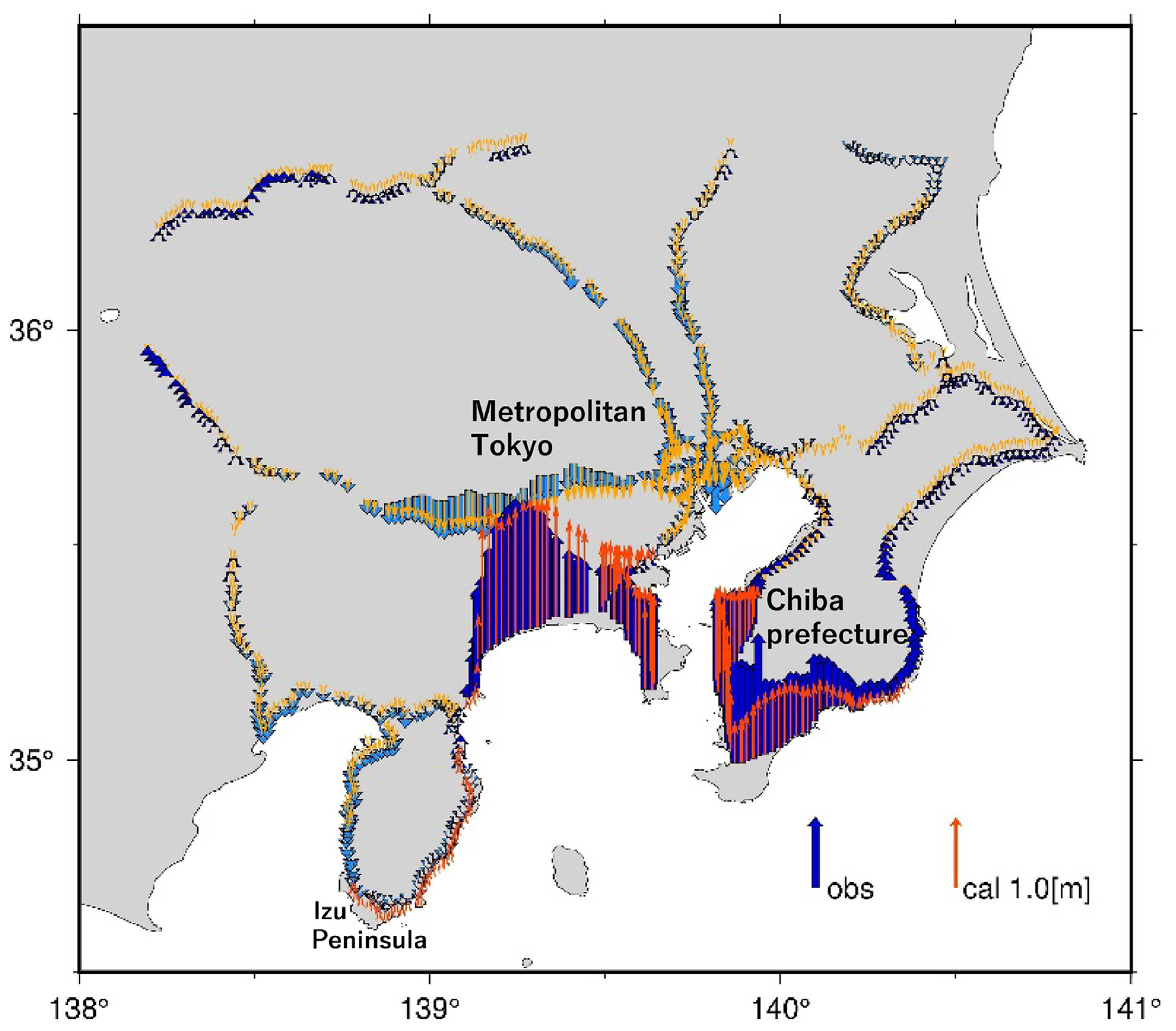
Comparison of observed and computed vertical crustal deformation caused by the 1923 Kanto earthquake. Dark and light blue arrows show observed uplifts and subsidence, respectively. Red and orange arrows show computed uplifts and subsidence, respectively.
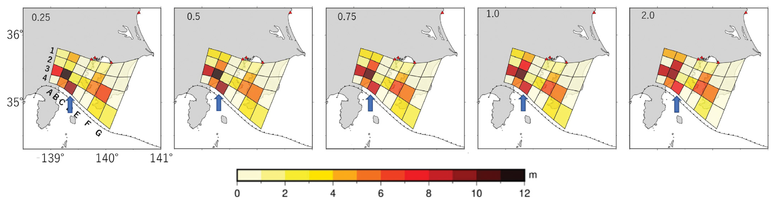
Slip distributions estimated from the joint inversion of tsunami waveforms and crustal deformation data using different weighting factors (λ), the weight of the crustal deformation data against the tsunami data, 0.25, 0.5, 0,75, 1.0, and 2.0. Blue arrows show subfault 4C for which a large slip was estimated in this study but not in the previous studies.
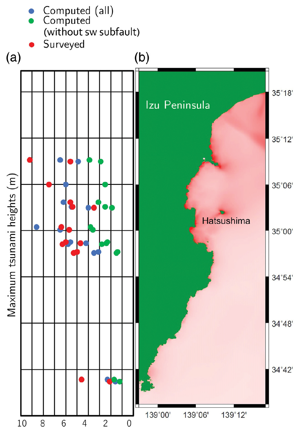
(a) Comparison of surveyed tsunami heights (red dots), computed maximum tsunami heights from the estimated slip distribution (blue dots), and those from the slip distribution without subfault 4C (green dots), along the east coast of the Izu Peninsula. (b) Maximum tsunami height distribution near the east coast of the Izu peninsula computed from the estimated slip distribution.
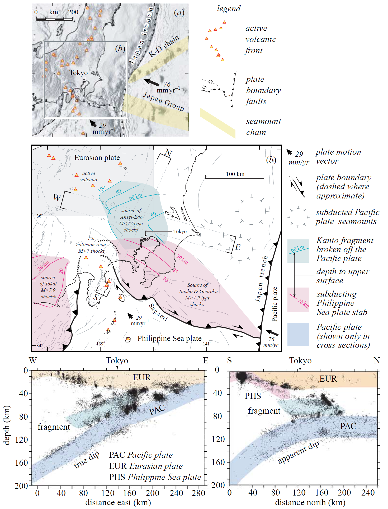
(a) Simplified tectonic map of the Kanto triple junction (Toda et al. submitted), showing the Japan Group and Kashima-Daiichi seamount chains. (b) The Philippine Sea plate is shaded pink, where it descends beneath the Eurasian plate. The proposed Kanto fragment (green) lies between the Philippine Sea plate and the underlying Pacific plate. Sites of
large historical earthquakes are identified with their tectonic plate element. Two cross-sections through greater Tokyo are shown with 1979–2003 microseismicity in the lower panels.
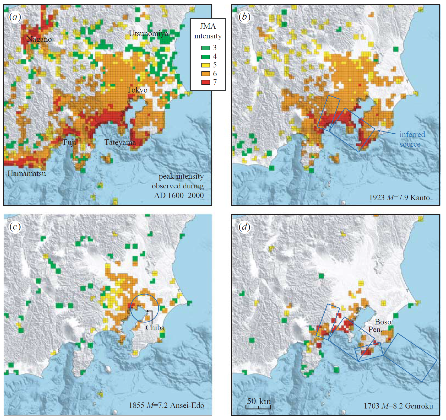
(a) Peak intensities observed during the past 400 years. Observed intensity distribution for (b) 1923 MZ7.9 Kanto (c) 1855 Mw7.4 Ansei-Edo and (d) 1703 Mw8.2 Genroku shocks (Bozkurt et al. submitted), together with our inferred seismic sources for these three earthquakes.
The inferred seismic slip rate (often called the ‘slip deficit rate’) for the major sources, and their association with larger historic events and historical seismicity, modified from Nishimura & Sagiya (submitted). Red sources slip at high rate and are presently locked, and thus are accumulating tectonic strain to be released in future large earthquakes; white sources have a low slip rate or creep, and so are unlikely to be sites of future large shocks.
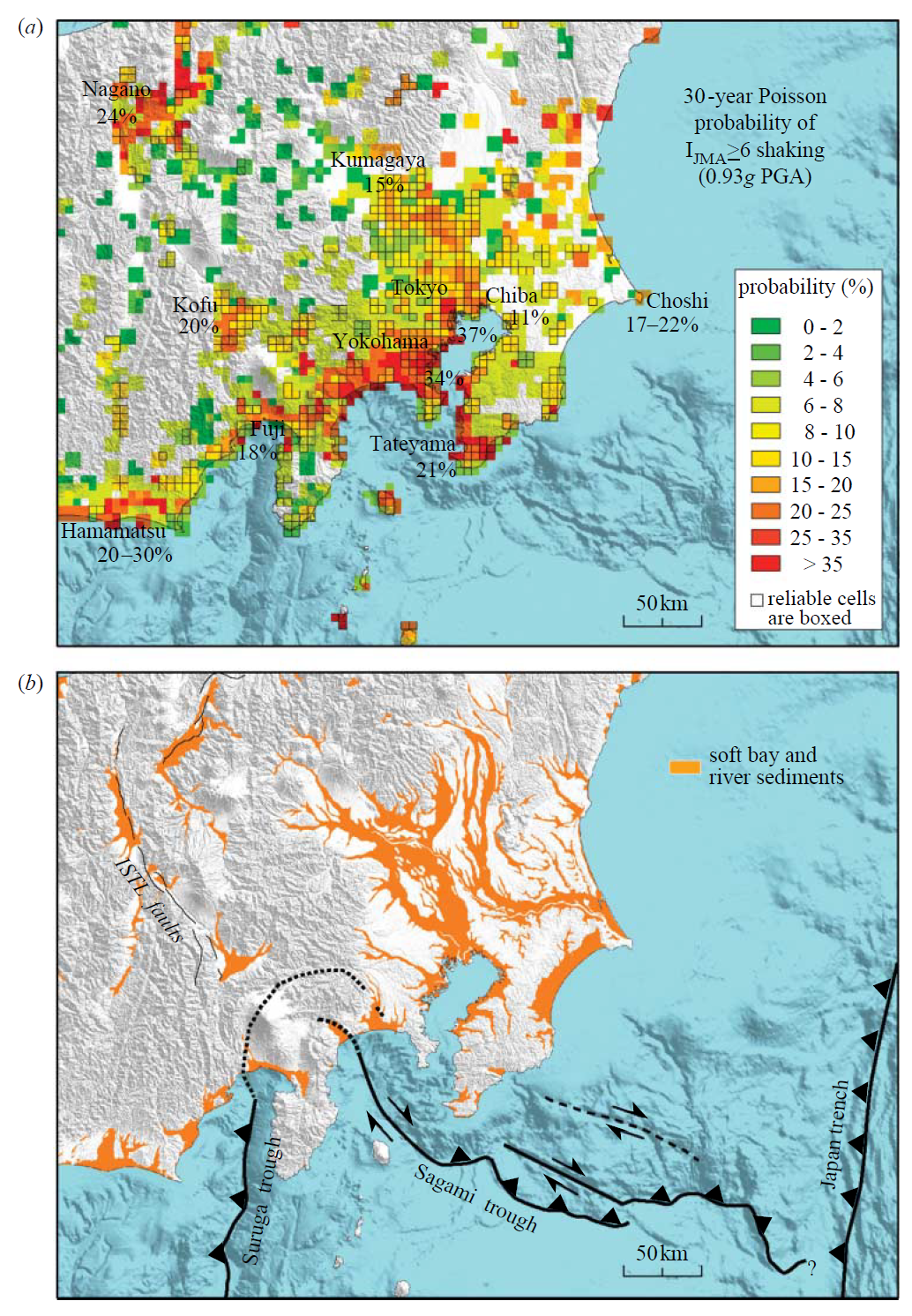
(a) Spatial distribution of the time-averaged 30 year probability of severe shaking (PGAw0.93g), which is consistent with our independent estimate (Bozkurt et al. submitted). (b) The probability of shaking is correlated with proximity to the plate-boundary faults and to sites of unconsolidated sediments. ISTL, Itoigawa-Shizuoka Tectonic Line.
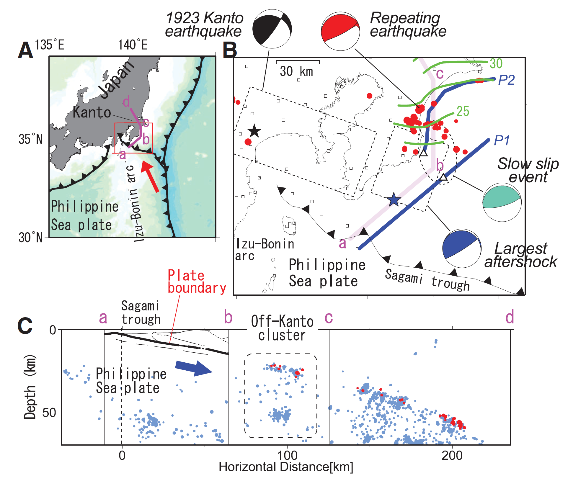
(A) Plate geometry of the PHS, which subducts below Kanto from the Sagami trough. The arrow represents the plate convergence direction relative to Kanto (25).(B) Map of Kanto. Blue lines denote deep seismic survey lines. Small triangles denote the nearest points between P1 and P2. Small red circles denote repeating earthquakeson the PHS, with the representative focal mechanism (13, 18). Green lines represent isodepth contours of the PHS; numbers denote depths in kilometers (18). The epicenter, focal mechanism, and source fault are shown for the 1923 Kanto earthquake (12, 26), its largest aftershock (13), and the SSE (16, 17), respectively. Small squares represent seismographic stations. (C) The cross section along a line a-b-c-d. The plate boundary of the PHS revealed by P1 (13) is shown as a thick line. Small blue circles denote background earthquakes.
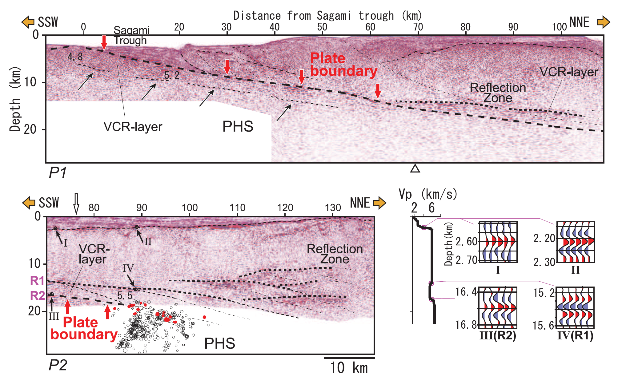
Deep seismic reflection profiles. Horizontal distance from the Sagami trough is shown on top. P2 is projected onto the N30°E direction. Red arrows show the plate boundary. Numbers denote P-wave velocities (km/s). Small triangles denote the nearest point between P1 and P2. In P2, the final hypocenters of the Off-Kanto cluster for which depths were adjusted by the P-S wave are projected (red, RQs; black, background microearthquakes). The original sections are shown in fig. S1. The velocity profile at the location indicated by an open arrow is displayed to the right, with enlargements of waveforms at major deep reflectors (R1 and R2) at locations shown by black arrows (III, IV) that are convolved by reflectors at the basement of the surface sedimentary layer just above each region (I, II). P1 data are from (13).
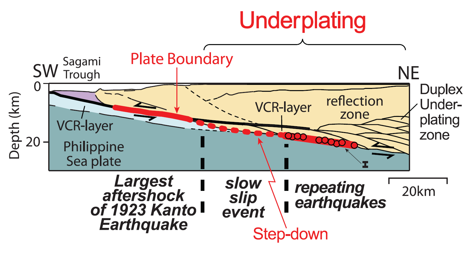
Schematic illustration of subsurface structure, the plate boundary (red line), and underplating off the Kanto region of the Philippine Sea plate. The depth uncertainty of the RQs is also shown.
Shaking Intensity
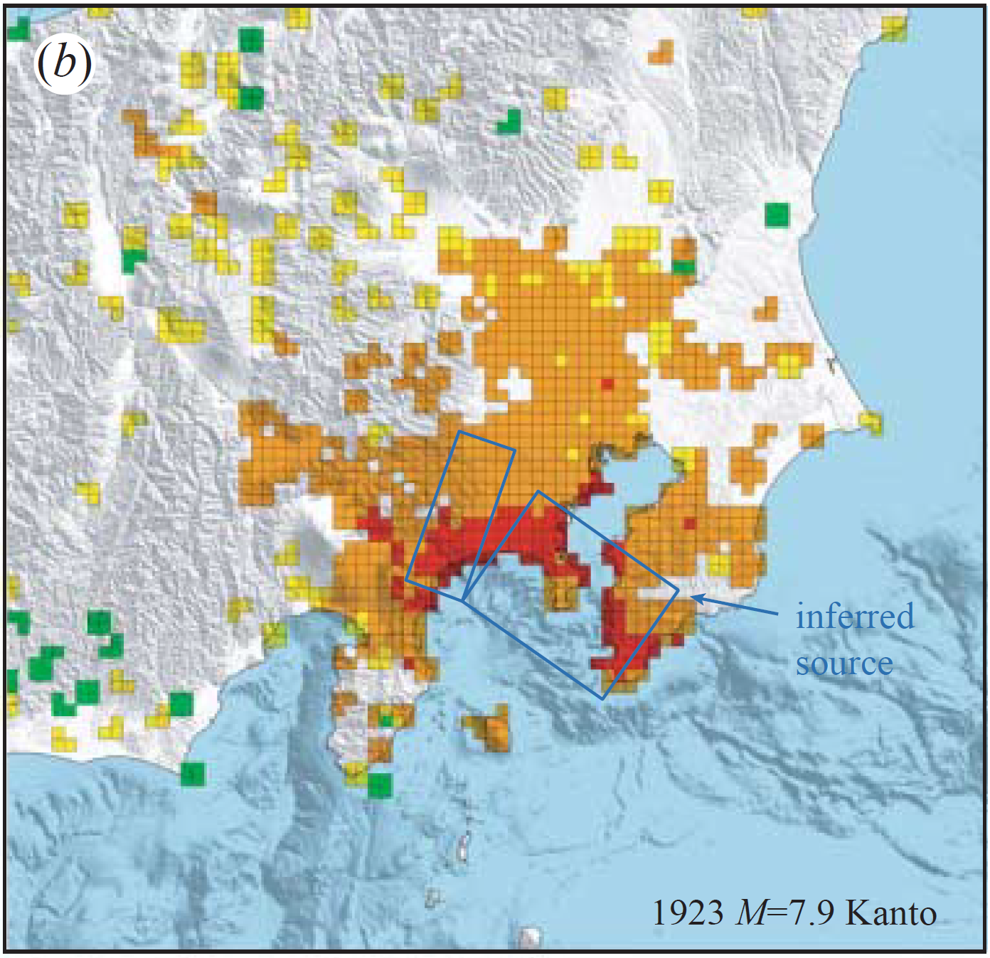
Observed intensity distribution for (b) 1923 MZ7.9 Kanto earthquake.
Potential for Ground Failure
Luckily I updated this page because I noticed that the interpretive figure below was incorrect (it was for a different earthquake).
Japan | Izu-Bonin | Mariana
General Overview
Earthquake Reports
Social Media
#EarthquakeReport #TsunamiReport for #OTD in 1923 M8.0 Great Kantō #Japan #Earthquake
100 year commemoration for this earthquake and tsunami
almost 150,00 deaths :-(
we learned from this event so that we can reduce suffering from future eventsreport https://t.co/B6hHGVfY9n pic.twitter.com/u1zYUeTrSl
— Jason "Jay" R. Patton (@patton_cascadia) September 2, 2023
Asahi TV aired this report tonight marking the 100th anniversary of the massacre of Koreans that took place after the 1923 Great Kantō earthquake.
It highlights the role of the government and media in spreading the false rumors that fueled the massacres. pic.twitter.com/vtaKvwGHjv— Jeffrey J. Hall 🇯🇵🇺🇸 (@mrjeffu) September 1, 2023
Website with data from the 1923 Great Kanto Earthquake. This image shows estimates of the scale of the quake across the region. https://t.co/13tjiCZyzs pic.twitter.com/8OnGG6XZOl
— Mulboyne (@Mulboyne) September 1, 2023
Other Report Pages
https://tokyo100years.mapping.jp/kigyo.html
https://www.smithsonianmag.com/history/the-great-japan-earthquake-of-1923-1764539/
https://en.wikipedia.org/wiki/1923_Great_Kant%C5%8D_earthquake
https://en.wikipedia.org/wiki/File:1923_Kanto_earthquake_intensity-2.png
https://spectrum.ieee.org/earthquake-detection
https://sustainable.japantimes.com/magazine/vol22/22-01
References:
Basic & General References
Specific References
Audio version of the wikipedia page:
Return to the Earthquake Reports page.
do we know the exact epicentre? Is it odawara?