Well, data continue to come in.
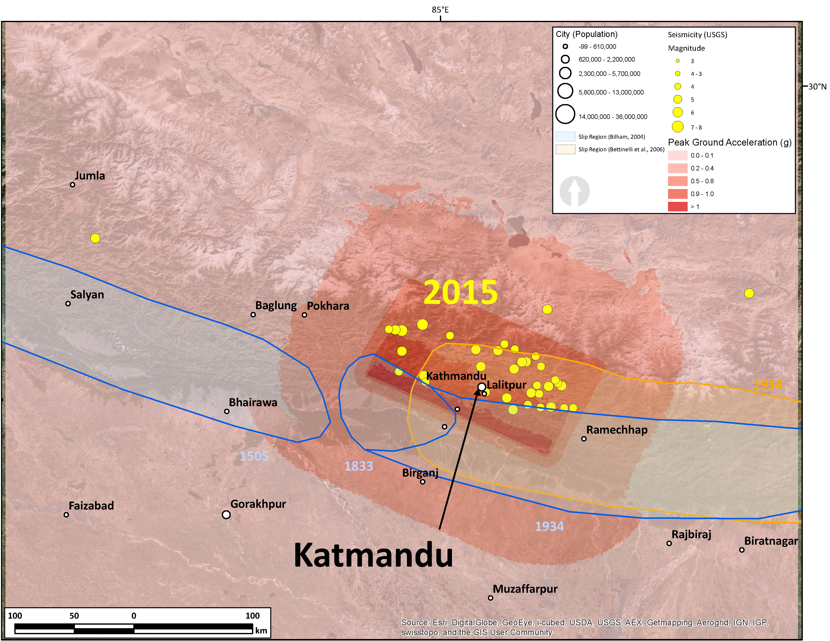
Below I plot the USGS Peak Ground Acceleration model results overlain upon the local map that I have been using to compare the current swarm of seismic activity with historic and prehistoric earthquake slip areas. This is a model based upon an earthquake slip model and Ground Motion Prediction Equations (GMPE). GMPE are empirical relations between earthquakes and recorded seismologic observations from those earthquakes, largely controlled by distance to the fault, ray path (direction and material properties), and site effects (the local geology).
When seismic waves propagate through sediment, the magnitude of the ground motions increases in comparison to when seismic waves propagate through bedrock. We can see this by looking at the PGA pattern as the 0.2-0.4 g region spans the mountains and the flatlands. Look at the how the 0.2-0.4 g region is wider (in the east-west direction) in the south (e.g. west of Rajbiraj and east of Bhairawa).
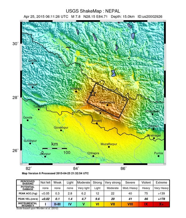
Here is the USGS Modified Mercalli Intensity Scale (MMI) map for this earthquake (based upon a model using the same earthquake slip inversion that was used to estimate PGA plotted in my map above). MMI is a measure of shaking intensity (like PGA, but based upon a subjective scale comprised of observations from people). We can also see how the flat lands shake more strongly than the mountains.
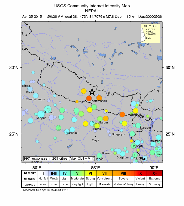
Here I present the USGS Did You Feel It map. This is more comprehensive than the one that I shared earlier as more people have reported their observations. I find it amazing that there are so many observations so close to the epicenter.
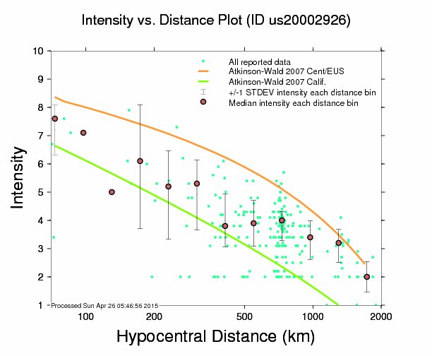
This is the latest attenuation plot that matches the above map. We can see how the ground shaking intensity attenuates (or diminishes) with distance from the earthquake hypocenter. The data from the USGS DYFI online reporting form are plotted as green dots and binned as brown dots (with +- 1 standard deviation error bars). Two GMPE models are plotted in orange and green. Note how the observations generally align with these two curves, but neither fully explains the variation.
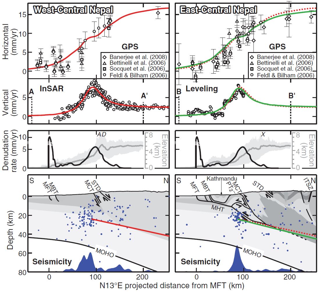
Finally, here are two cross-section plots of geodetic motion (horizontal and vertical), denudation (lowering of the ground surface due to erosion), and seismicity (plotted with fault structures). Thanks to Grandin et al. (2012). Note the plot on the right, which passes through the region of today’s seismic activity. Today’s hypocenters would plot in the region of seismicity shown as a blue curve in the lowest panel.
-
References:
- Grandin, R., Doin, M-P., Bollinger, L., Pinel-Puysségur, B., Ducret, G., Jolivet, R., and Sapkota, S.N., 2012. Long-term growth of the Himalaya inferred from interseismic InSAR
measurement, Geology, v. 40, no. 12, p. 1,059-1,062.
4 thoughts on “Nepal: PGA, DYFI, and the latest attenuation plot.”