Earthquake Report: 2015 Summary M GT 7

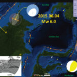
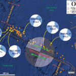
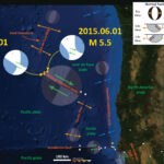
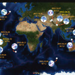
Here I summarize the global seismicity for 2015. I limit this summary to earthquakes with magnitude greater than or equal to M 7.0. I reported on all but one of these earthquakes.

    I include summaries of my earthquake reports in sorted into three categories. One may also search for earthquakes that may not have made it into these summary pages (use the search tool).

  • Magnitude
  • Region
  • Year

Annual Summary Poster

Here is the map where I show the epicenters as white circles. I also plot the USGS moment tensors for each earthquake, with arrows showing the sense of motion for each earthquake.
I placed a moment tensor / focal mechanism legend in the lower left corner of the map. There is more material from the USGS web sites about moment tensors and focal mechanisms (the beach ball symbols). Both moment tensors and focal mechanisms are solutions to seismologic data that reveal two possible interpretations for fault orientation and sense of motion. One must use other information, like the regional tectonics, to interpret which of the two possibilities is more likely.
In some cases, I am able to interpret the sense of motion for strike-slip earthquakes. In other cases, I do not know enough to be able to make this interpretation (so I plot both solutions).

  • 2015.07.18 Santa Cruz Islands


  • 2015.07.27 New Guinea

  • 2015.07.27 New Guinea update #1 updated interpretation
  • 2015.07.27 New Guinea update #2 animations and seismic records

  • Compilation Map from here

  • 2015.09.16 Illapel, Chile

  • 2015.09.16 Illapel, Chile update #1 new maps and tsunami data
  • 2015.09.16 Illapel, Chile update #2 tsunami observations
  • 2015.09.16 Illapel, Chile update #3 more tsunami observations
  • 2015.09.16 Illapel, Chile update #4 historic tsunami comparisons
  • 2015.09.16 Illapel, Chile update #5
    • First Map

    • Second Map

    • Third Map (made in November 2015 following a M 6.8 earthquake). Here is the first report and the second report for that M 6.8 earthquake.

    • Regional Historic Earthquake Comparison Map #1

    • Large Scale Historic Earthquake Comparison Map

    • Regional Historic Earthquake Comparison Map #2 (from here)

    • Historic Tsunami Comparisons
      • Here are the NOAA Center for Tsunami Research websites for the three tsunamis plotted in the map below, plus the one from 2015.09.16 not shown on the map below.

      • 1960.05.22 M 9.5 (There is no page for the 1960 earthquake, so this map is located on the 2010 page.)/li>
      • 2010.02.27 M 8.8
      • 2014.04.01 M 8.2
      • 2015.09.16 M 8.3

      Here is the map. These three maps use the same color scale. There is not yet a map with this scale for the 2015 tsunami, so we cannot yet make the comparison.


      Here is an animation of these three tsunami from the US NWS Pacific Tsunami Warning Center (PTWC). This is the YouTube link.

  • 2015.10.20 Vanuatu


  • 2015.10.26 Afghanistan

  • 2015.10.26 Afghanistan update #1
  • Global Map

  • Local Map

  • 2015.11.18 Solomon Islands


  • 2015.11.24 Peru

  • 2015.11.24 Peru update #1

    • Updated Map

  • 2015.11.24 Argentina/Brazil
  • 2015.12.04 Southeast Indian Ridge


  • 2015.12.07 Tajikistan


    • References:

    • See Earthquake Reports for the references in the maps from those individual earthquakes.

    Springfield Earthquake!

    It took me a couple days to catch up with things, so I missed posting about this earthquake until now.
    We had a Mw = 4.2 earthquake northeast of Eugene on the morning of 2015.07.04. Here is the USGS web page for this earthquake. The hypocentral depth is 9.9 km, well above the Cascadia subduction zone fault (which is at approximately 52 km depth in this location, based upon McCrory et al., 2012).
    Here is a map that shows the faulting in and around the Willamette River Valley. Eugene and Springfield are in the southern portion of the map and Salem is in the northernmost portion of the map. I rubbersheeted (georeferenced) this map from the Bob Yeats text, Living with Earthquakes in the Pacific Northwest (Yeats, 2004). The entire text from Yeat’s book is online and available as a pdf. There is a Quaternary fault (active in at least the last 2.5 million years) called the Upper Willamette River fault (UWRF) that strikes northwest and aligns sub-parallel to hwy 58 (the orange line in the southeast/lower-right part of the map). The epicenter is plotted as an orange dot. I placed the moment tensor for this earthquake, along with a legend showing how to interpret the moment tensor. There are blue arrows showing a northeast-southwest oriented maximum stress orientation (compression in the direction of the blue arrows). The UWRF points directly at the epicenter, so it may be that the UWRF extends further to the northwest.


    This is the “Did You Feel It?” map that uses the Modified Mercalli Intensity Scale to display the relative ground shaking across the region. This earthquake was broadly felt. These data are based upon the results from observations made by people as reported to the USGS on this web page.


    This plot shows how the ground motions attenuate with distance from the earthquake. The green line (and orange line, which is difficult to see) is based upon empirical models of ground shaking based upon seismologic records from thousands of earthquakes in California. The blue dots are observations from real people and the orange dots are the median observed intensities for different distance bins (with bars that show the uncertainty to +-1 standard deviation). The take away is that the further away from the epicenter, the lower the ground motions. Secondly, that the empirical relations fit the data pretty well, but not perfectly. Note the large variation in ground motions at any given Hypocentral Distance (in km).


    Here is a figure from McCaffrey et al. (2007) that shows how the North America plate is possibly chopped up into blocks. Each “block” has a structural affinity to itself (positions within each block move together in a similar direction/orientation that are statistically different than the motions of positions on adjacent blocks). The upper map shows the motions of these positions as they move related to “stable” North America. Each arrow is a vector that show the direction and magnitude of the rate of movement (mm/yr) at that position. The middle panel shows the relative northward motion of these positions at latitudes of 40, 42.5, and 45 degrees north (transects are shown in color on the upper panel/map). The steps in the rates show the boundaries of the blocks as modeled by McCaffrey et al. (2007). The lowest panel shows a schematic of these blocks as they relate to each other. I am not yet sure how the UWRF fits into this block model, but it is a part of the tectonics in this region.

    Redding Earthquakes: 1945-2015

    There have not been many earthquakes since 1945 in this region. Below is a map that shows the largest earthquake as a M = 5.4 earthquake from 1998.11.26. Here is the USGS query that I used to create this map. This is the first page that I posted about the M 2.9 earthquake. I also threw in the 1992 Petrolia earthquake in for good measure. Faults and fault zones are labeled. There are also some ghosted moment tensors that show the general relative plate motion across some fault zones.


    In 1998, there was a M 4.5 earthquake that was followed in November by three earthquakes.

    Earthquake in Redding, CA!

    We just had a small earthquake in Redding, California. The shaking was felt as far as 40 km from the epicenter, which was not deep (so probably in the North America plate). The focal mechanism shows that this was a reverse (compressional) earthquake. This is the USGS web page for this earthquake.
    Here is a map of the region, showing the focal mechanism and USGS epicenter.


    Here is a map for those unfamiliar with the region of northern California where Redding is located. The epicenter is plotted as a red dot.


    This is the USGS “Did You Feel It?” map, showing the responses from real people who actually made observations about this earthquake. The color represents the magnitude of ground shaking (intensity) and uses the Modified Mercalli Intensity scale. If anyone felt this earthquake, go to this web page to report your observations. These data are valuable to the scientific community.

    Movies: Seismic Record of a Deep Izu-Bonin Earthquake

    Scientists at the National Research Institute for Earth Science and Disaster Prevention have collected and processed seismic data from the High Sensitivity Seismograph Network Japan (Hi-net). They created movies of these data, in map view. Here is the page where they posted these movies. I have translated the text below to make it easier to read, but this is completely their work. I include links to the videos. The first movie shows long period seismic data and the second movie shows short period seismic data.
    Here is a link to the USGS web page for this M 7.8 earthquake.

    Here is a map that I put together that shows the mainshock, some aftershocks, and some triggered earthquakes.


    I place the translated text in block quotes. The original text all comes from here.

    Around 24 pm on May 30, 2015, 20:24, an earthquake of M 8.1 (by the Japan Meteorological Agency) has occurred in the Ogasawara Islands off the west coast. The earthquake, which occurred at a very deep place of about 680km, because scale is large, with observing the strong shaking of magnitude 5 [V] in Tokyo and Ogasawara Village and Kanagawa Prefecture Ninomiya Town, seismic intensity of one or more sway in all prefectures me was observed. In addition, long-period ground motion “around the Kanto region was also observed. Whether by this earthquake Japan archipelago is how the shaking, it was visualized using the observation data of NIED of high sensitivity seismograph network (Hi-net). Try compared the differences transmitted the way of waves of long period (wobbling and then shook) and short period waves (shaking was rattled).


    Here is the link of the mp4 file (7 MB).

    The Hi-net using seismic appropriate to be observed oscillation of period shorter than one second, but by correcting the characteristics of the seismometer and data acquisition system, of the wave that vibrates with a period several tens of seconds general features it is possible to also be considered . Here, by applying a band-pass (band-pass) filter to the waveform after the characteristic correction, we visualized how the transmitted seismic waves 25 to 50 seconds range. From around 20:25, you can confirm that wave that has spread from the epicenter to the longitudinal Japan to north-northwest. Initially, it is striped red and blue will continue to spread in concentric circles around the epicenter, from around 20:27, the shift has begun to occur in a stripe pattern at the center of the Japanese archipelago. From around 20:28, reflected by the underground, also joined the wave, which is thought to have through the refraction, etc., wave field shows the complex aspects.


    Here is the link of the mp4 file (7 MB).

    Through the Izu Islands from around 20:25 Kanto, amplitude is increased from the Tokai region coast, you can see that P wave (initial) has arrived. This wave, over a period of about 1 minute half, will continue to longitudinal the Japanese archipelago to Hokkaido northern tip. Over time and towards the West is seen how the amplitude ahead to decay than the East , but this is considered to reflect the region of the attenuation structure of the underground ( * )

    Borneo Earthquake!

    We had an extensional earthquake in northwest Borneo today. The region is an old accretionary prism, probably still active. Here is the USGS web page for this M 6.0 earthquake.
    Here is a map that shows where today’s earthquake is, along with the USGS moment tensor. The earthquake is plotted as an orange circle (represents depth) with a diameter related to the magnitude of the earthquake. Moment tensors (and focal mechanisms) are graphical depictions that show the 3-D orientation of the stresses associated with the earthquake. These graphical solutions are determined differently for moment tensors and for focal mechanisms, however, their graphical depiction of their solutions are the same. There is also a small legend explaining the implications for the different moment tensors. I also plot the moment tensor for an earthquake that happened in November of 2014.
    Also, I plot a cross section from Tingay et al. (2005). This cross section (marked A-A’ ) shows the Tertiary-Quaternary accretionary prism structure, as well as the seismic stratigraphic and geotechnical interpretation of the sedimentary deposits. Note the predominance of thrust faults in this cross section, the result of convergence.

    Here is a map that shows the earthquake at a more global scale, to help orient us for the above map. Today’s M 6.0 earthquake is plotted as an orange dot.


    Here is a map from Cullen (2011). This shows how the region has both thrust/reverse and normal faults. The cross section is located near the Baram Delta shown in this map.


    This is the moment tensor legend at a larger scale.

    Errata for Phantom Earthquakes: USGS

    There have been a couple of reported earthquakes that have since been removed from the database. This happens when seismic waves are incorrectly interpreted by the computers, typically from the results of larger magnitude earthquakes. These large magnitude earthquakes can produce seismic waves that are easily interpreted to be local earthquakes in other locations. When people review the data, these errors are omitted. However, the phantom earthquakes are often submitted to the earthquake notification system prior to this removal. These deletions raise angst in the conspiracy theorists’ minds (we can only imagine what actually is in their minds, if much at all), suggesting that there is some global conspiracy to hide seismic data, for some nefarious reason. I cannot think of a single reason why someone might want to hide seismic data (well, maybe for nuclear testing). It would be difficult to really hide seismic data because there are so many unique and independent seismic networks, which publish their data online.
    Sign up for the Earthquake Notification System here.
    The USGS has posted information about these recent Phantom Earthquakes and the reasons behind their deletions. I paste the relevant information below, just in case there is a conspiracy that will later remove these words from the internets [sarcasm].
    Here was the page for the M 5.1 Lewiston earthquake, which was the result of seismic waves travelling from the M 6.7 earthquake along the Alaska Peninsula. This is my first post about the M 6.7 earthquake and here is a post that I wrote that includes animations of historic seismicity in the region.


    Here was my post about this earthquake. This happened at a time when I needed to go to sleep, so I was putting off from posting a more detailed accounting until the next day. Of course, when I awoke the next day, it was deleted… So I had little to post about. This is the link to the USGS for this earthquake.


    This is the pager alert (which is also an automated product):


    Here is the “Did You Feel It?” map, with no reports (should be no surprise, since there was no earthquake).


    Here is the Modified Mercalli Intensity shake map, showing that people would have felt it if it had happened (and probably would have reported it!).


    Here is what the USGS states about these earthquakes:

    Commentary for Multiple “Phantom Events” in California – posted June 2, 2015
    Automated notification systems are a convenient and often essential component of modern life. The USGS has invested heavily in developing automated systems that provide the public with timely and accurate earthquake information. On rare occasions the Earth throws a curveball and on May 29th and 30th, the USGS issued multiple alerts for false earthquakes in Northern California. The first, a M5.1 near Lewiston, CA, was distributed on Friday. More false alerts were distributed on Saturday, including a M5.5 near Ukiah and M4.7 near San Simeon.
    These erroneous earthquake notifications were created by the seismic waves from large, distant earthquakes. On Friday, a M6.7 earthquake occurred at a depth of approximately 60 km, 111 km off of Chirikof Island, Alaska. It was this earthquake that fooled the automatic processing of the Northern California Seismic System to issue the first false alert. Just 28 hours later, a M7.8 earthquake off of Japan with a depth of more than 660 km – the deepest earthquake of its size to have occurred during our history of recording – spawned two more phantom events in Northern California.
    Large earthquakes have created challenges for regional seismic monitoring in the past. This problem is particularly acute for deep earthquakes as they generate very impulsive seismic waves which may be misinterpreted as a local earthquake. The USGS and its partners have developed a number of methods to stop or screen these events from being distributed on the Web and through such mechanisms as the Earthquake Notification Service. The USGS will be implementing changes to improve the system and minimize the chances of this occurring in the future.
    The erroneous events were deleted quickly by a duty seismologist. Unfortunately, a problem with the distribution software prevented the delete messages from being transmitted to recipients of the Earthquake Notification Service. The inability to transmit the information about the false events to the users of the Earthquake Notification Service caused significant confusion and the USGS regrets the problems caused by this failure. USGS staff have identified the problem in the distribution software and fixed it.
    Errata for “Phantom Events” in Central and Northern California resulting from the M6.7 Alaska Earthquake on 2015-05-29 07:00:29 UTC
    Strong earthquakes generate seismic waves that spread across the entire globe. When the earthquakes are deep, the distant recordings are quite impulsive and are often mistakenly identified by automated systems as local earthquakes. On 2015/05/29 07:00 UTC, a 60 km-deep M6.7 earthquake occurred offshore of Chirikof Island, Alaska and swept across the seismic networks in northern California. The automatic earthquake detection systems recognized the arrival of seismic energy but misinterpreted it as several earthquakes, including an M 5.1 event occurring near Lewiston, rather than one large distant event. These “phantom events” were automatically released for public distribution on the Web and through the Earthquake Notification Service. All “phantom events” were cancelled by the duty seismologist within 15 minutes.

    Blanco Fracture Zone: 2000 – 2015 Seismicity Animation

    I put together an animation that includes the seismicity from 1/1/2000 until 6/1/2015 for the region near the Blanco fracture zone, with earthquake magnitudes greater than or equal to M = 5.0. The map here shows all these epicenters, with the moment tensors for earthquakes of M = 6 or more (plus the two largest earthquakes from today’s swarm). This is the search that I used for the earthquakes plotted in the map and animations below. Here is the page that I posted regarding the beginning of this swarm. Here is a post from some earthquakes last year along the BFZ.
    Earthquake epicenters are plotted with the depth designated by color and the magnitude depicted by the size of the circle. These are all fairly shallow earthquakes at depths suitable for oceanic lithosphere.

      Here is the list of the earthquakes with moment tensors plotted in the above maps (with links to the USGS websites for those earthquakes):

    • 2000/06/02 M 6.0
    • 2003/01/16 M 6.3
    • 2008/01/10 M 6.3
    • 2012/04/12 M 6.0
    • 2015/06/01 M 5.8
    • 2015/06/01 M 5.9
      Here are some files that are outputs from that USGS search above.

    • csv file
    • kml file (not animated)
    • kml file (animated)

    VIDEOS

      Here are links to the video files (it might be easier to download them and view them remotely as the files are large).

    • First Animation (20 mb mp4 file)
    • Second Animation (10 mb mp4 file)

    Here is the first animation that first adds the epicenters through time (beginning with the oldest earthquakes), then removes them through time (beginning with the oldest earthquakes).


    Here is the second animation that uses a one-year moving window. This way, one year after an earthquake is plotted, it is removed from the plot. This animation is good to see the spatiotemporal variation of seismicity along the BFZ.

    Here is a map with all the fore- and after-shocks plotted to date.


    Late addition:
    Here is a seismogram from Gold Mountain Washington. Thanks for posting this Pacific Northwest Seismic Network fb page. Here is the page that it came from.

    Blanco Fracture Zone Earthquakes!

    This morning we had three earthquakes related to the Blanco fracture zone, a transform (shear) plate boundary. These earthquakes occurred quite a bit north of the bathymetric expression of the BFZ (though the M 5.8 is actually plotting closer to the BFZ this morning), similar to the seismicity earlier this year to the southeast of today’s swarm. Here is a post regarding the seismicity along the BFZ in April 2015.
    Here is a map showing these earthquakes, with moment tensors plotted for the M 5.8 and M 5.5 earthquakes. I include an inset map showing the plate configuration based upon the Nelson et al. (2004) and Chaytor et al. (2004) papers (I modified it). I also include a cross section of the subduction zone, as it is configured in-between earthquakes (interseismic) and during earthquakes (coseismic), modified from Plafker (1972).


    Here is a version of the CSZ map alone (Chaytor et al., 2004; Nelson et al., 2004).


    Here is a version of the CSZ cross section alone (Plafker, 1972).


    Here is a map showing the BFZ seismicity from April 2015.

    Historic Seismicity Animations: Izu-Bonin, Mariana: 1940 – 2015

    Following up on the seismicity in the western Pacific, I put together a couple animations. My post about the deep mainshock (magnitude M = 7.8 ) is here. My second post has some aftershocks plotted (and some foreshocks), as well as a little more about this series of earthquakes.
    Here are a couple animations that show the seismicity in the western Pacific for the time span of 1940 through the end of May, 2015. These earthquakes were downloaded from the USGS NEIC using the html based query, using this search. The diameter relates to earthquake magnitude and the color represents the depth. These earthquakes have magnitudes greater than or equal to M = 7 and span the period from 1940 through May 2015.
    I also have placed an overlay of the oceanic crustal age that I downloaded from here: Les SVT dans l’académie de Versailles. Color represents age. The ichrons have 5 Ma spacing.
    Here is a screenshot showing all earthquakes included in the following animations.


    1940 – 2015 with no moving window. Link to the file here.


    1940 – 2015 with 5 year moving window. Link to the file here.

    Also, here is another cross section in the same region as the M 7.8 earthquake. This is from the USGS poster about the seismicity in this region (Rhea. This legend for this cross section is here.


    Here is the cross section. Note again, how this M 7.8 earthquake does not fit the existing slab model.

      References

    • Rhea, S., Tarr, A.C., Hayes, G., Villaseñor, A., and Benz, H.M., 2010, Seismicity of the Earth 1900-2007, Japan and vicinity: U.S. Geological Survey Open-File Report 2010-1083-D, 1 map sheet, scale 1:5,000,000.