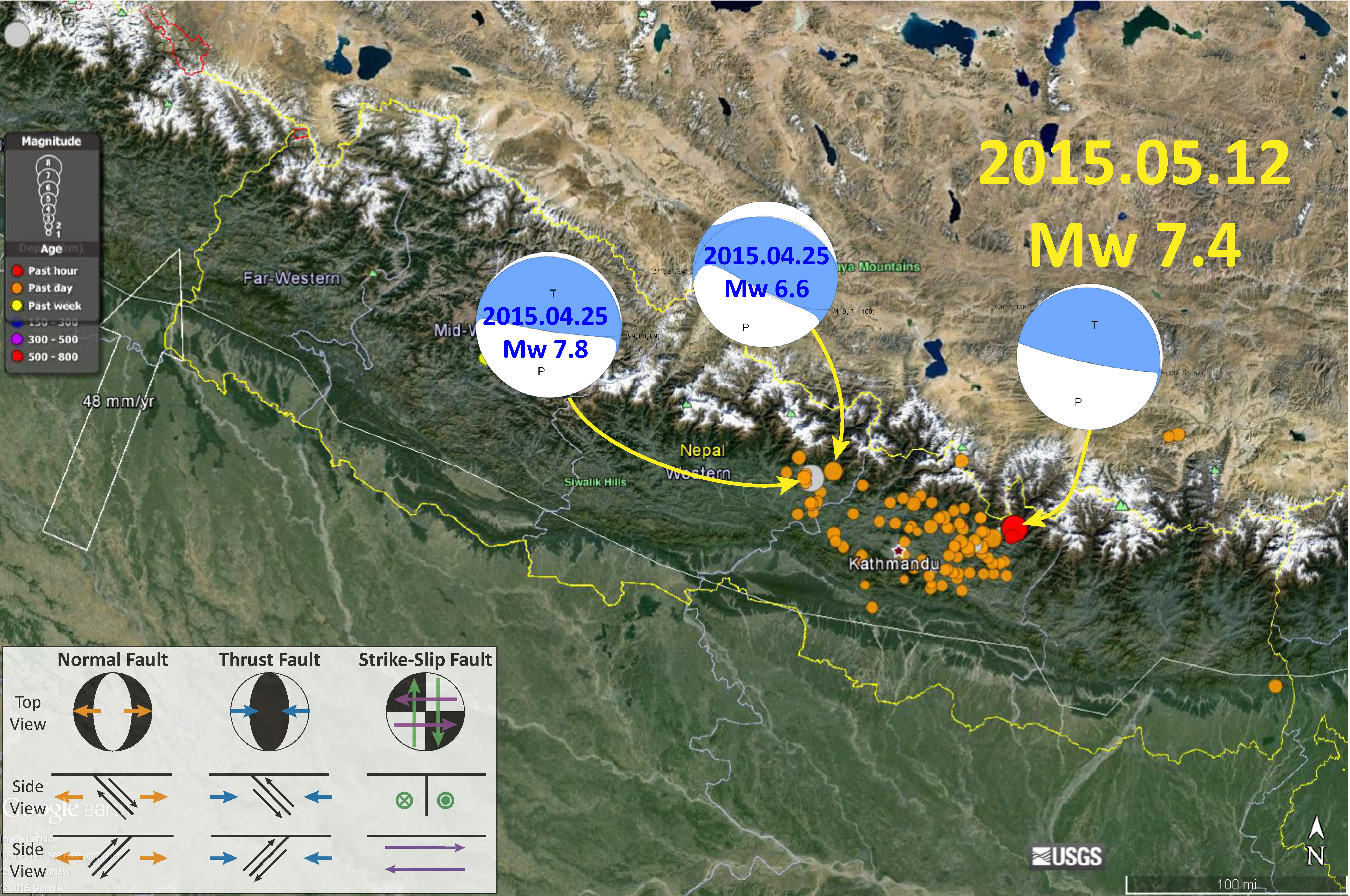
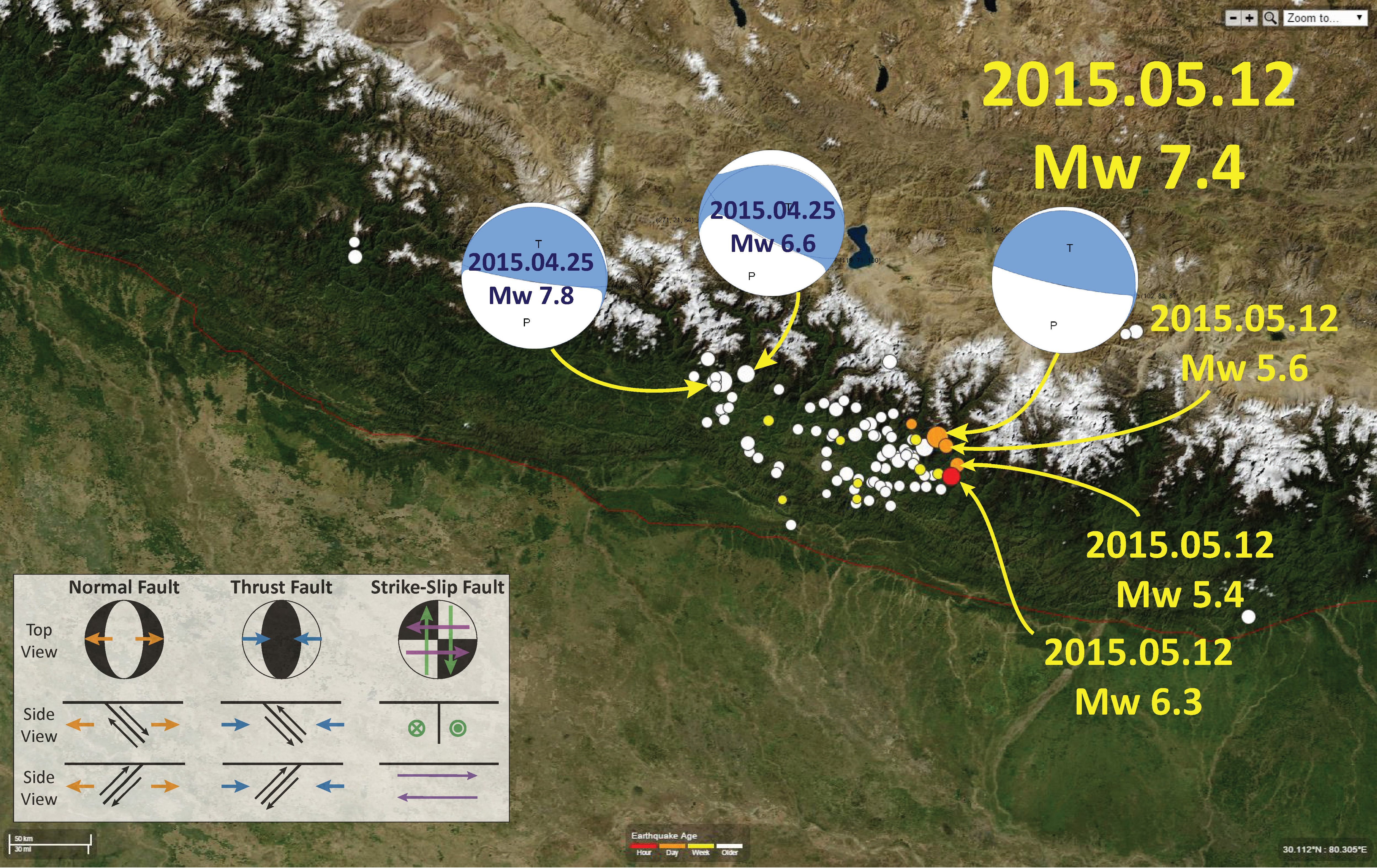
The first moment tensor has been calculated and I have plotted this Mww MT on the map. There has also been a small M 5.6 aftershock to this M 7.3 aftershock. Here is the map, that also includes moment tensors from the main shock and the previously largest aftershock (M = 6.6). The magnitude of this large aftershock has been changed to M 7.3.
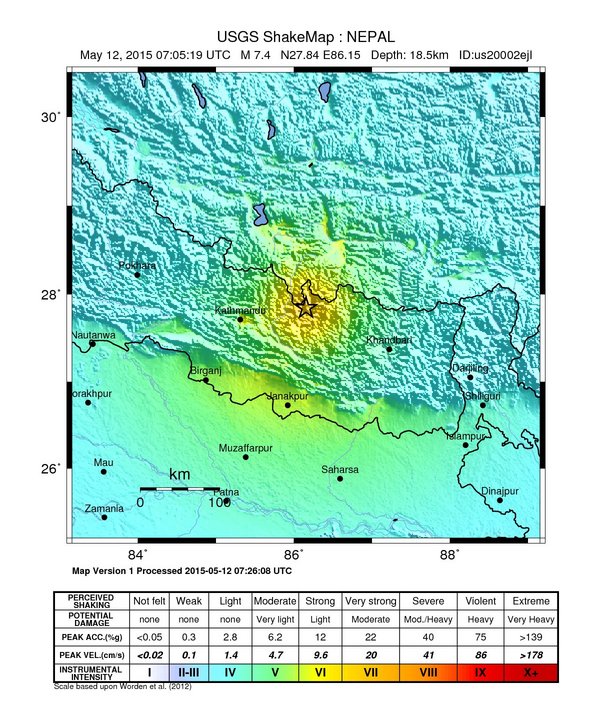
Here is the intensity map. This is generated automatically based upon the magnitude of the earthquake. The color ramp is the shaking intensity in the Modified Mercalli Intensity Scale. Once people register their observations, a “Did You Feel It” map will be generated that is based upon these observations. These DYFI maps are a better representation of the actual ground shaking as observed by real people (and not just a computer simulation). The PAGER estimate on my prior post is based largely upon an overlay of population and infrastructure data with this MMI intensity map (not the DYFI map).
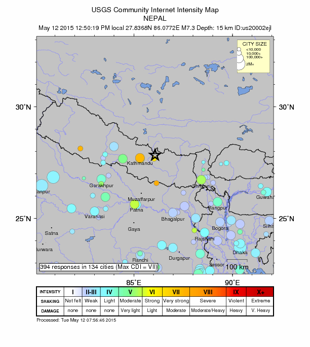
Quick update: The first DYFI map is now online. Here it is (compare with the intensity map above).
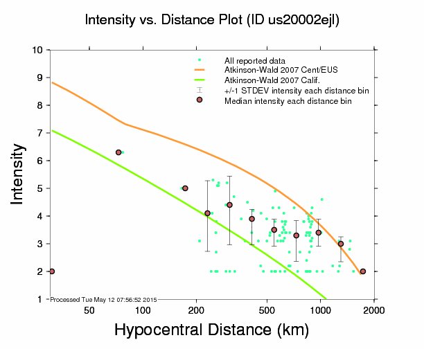
This plot shows the observations as reported via the DYFI website as they relate to the MMI scale and the distance from the earthquake. There are two curves plotted that show how the numerically modeled intensity map (the MMI intensity map above) is determined. Intensity (ground motions) are largest nearest the earthquake and diminish with distance. These intensity-distance relations are referred to as “attenuation relations” because the seismic waves are attenuated as they propagate through the Earth’s materials. Different Earth materials attenuate seismic waves differently. For example, the Earth materials in the western USA attenuate more than on the East Coast, so seismic energy maintains its amplitude for a greater distance on the East Coast compared to the West Coast. The two colored lines show model results for these two settings (orange and green). Note how the intensity is greater with the orange line, which is an empirical relation for ground motions recorded on the East Coast. The green line represents the empirical relations between ground motions with distance as measured by seismometers on the West Coast.
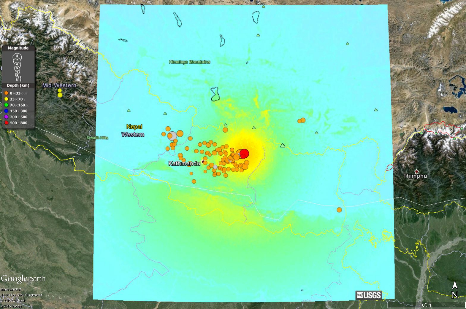
Here is a map that shows the modeled intensity with the epicenters plotted. We can see that the strongest ground shaking for this earthquake has occurred in a region that has been shaking lots in the past 2+ weeks:
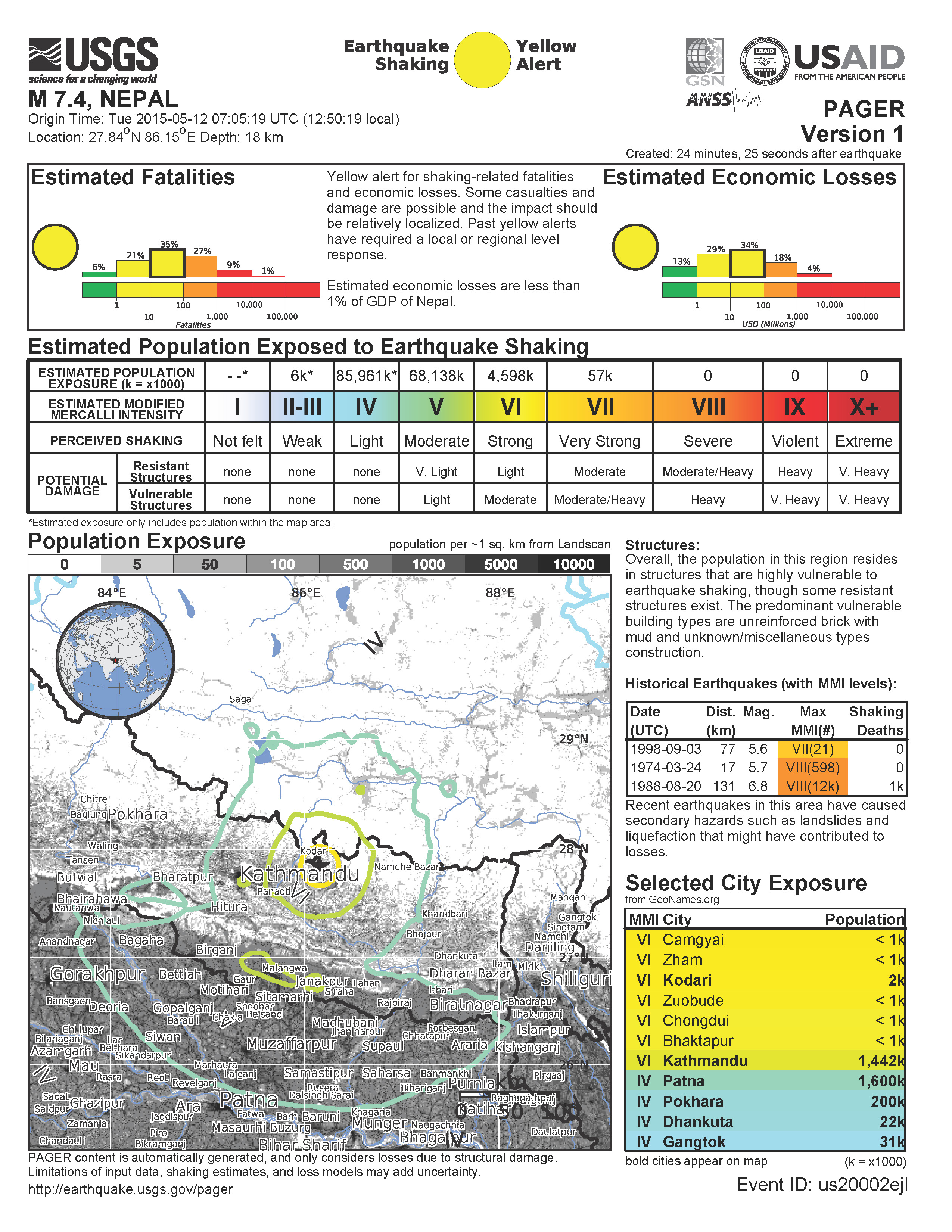
As a reminder, here are the first round of estimates of casualties:
Here is the current PAGER estimate of casualties (Version 1).
Here is an updated map (1:30 AM local time, OR), this shows a M 6.3 aftershock. The earthquakes from the past couple of weeks are shown as white circles in this map.
4 thoughts on “Large Aftershock in Nepal: 1st Update”