Yesterday as I was signing into work, my colleague Jackie Bott (a seismologist, seismic hazard/geology mapper, and on my tsunami team at CGS) mentioned the outer rise earthquake offshore of Chile that caused a small tsunami.
https://earthquake.usgs.gov/earthquakes/eventpage/us6000d3i9/executive
I checked this out and found a 20 cm wave height tsunami observed on a tide gage directly east of the earthquake epicenter. This was interesting as the earthquake was an “outer rise” event (seaward of the subduction zone trench, where the Nazca plate flexes downward prior to being subducted.
As the plate flexes downward, the upper part of the plate gets stretched and extensional faults can form here (or cause pre-existing faults to be reactivated as extensional/normal faults). For more background about different types of faults, head here: Earthquake Plate Tectonic Fundamentals page.
And, this M 6.7 earthquake was a normal fault earthquake (based on the earthquake mechanism). The largest tsunami waves can be generated by landslides or subduction zone faults, but other fault types can generate tsunami too (albeit smaller in size). Interesting indeed (there is more, like it is in a region of a triggered outer rise events following the 1960 M 9.5 Chile earthquake; is this M 6.7 an aftershock?, probably not).
BUT, this earthquake report is about the earthquake in Croatia that Jackie also mentioned in her email. Upon quick review, looking at the USGS PAGER Alert page, I knew that there was a high likelihood for casualties.
https://earthquake.usgs.gov/earthquakes/eventpage/us6000d3zh/executive
PAGER provides shaking and loss estimates following significant earthquakes anywhere in the world. These estimates are generally available within 30 minutes and are updated as more information becomes available. Rapid estimates include the number of people and names of cities exposed to each shaking intensity level as well as the likely ranges of fatalities and economic losses.
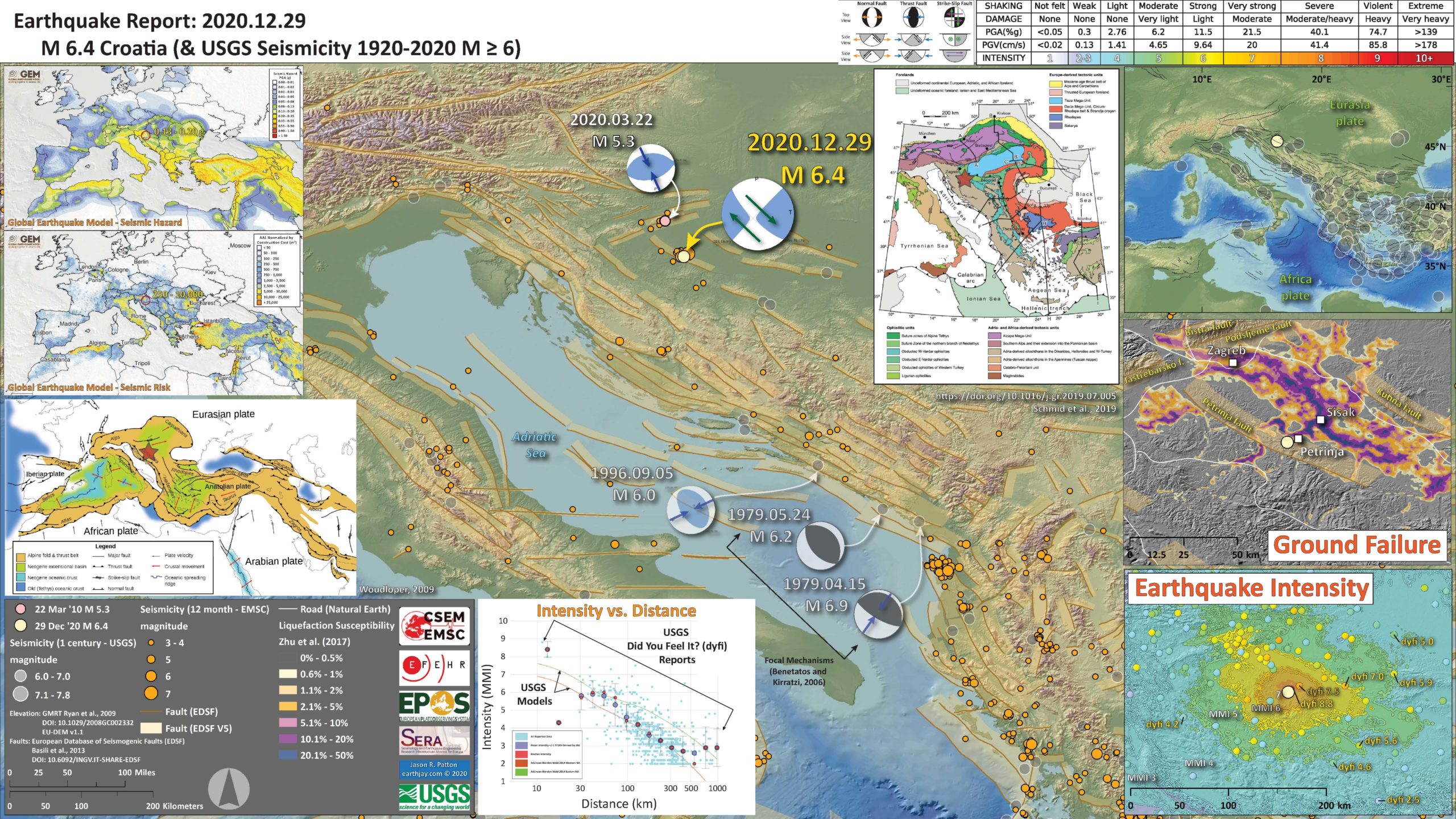
Yesterday’s M 6.4 is a strike-slip earthquake (look at the earthquake mechanism legend on the top center of the poster) and appears to have slipped along the Petrinja fault. This fault has different names in different papers (which is common), but this name comes from the European Database of Seismogenic Faults.
According to the database, the Petrinja fault is capable of a M 6.5 earthquake.
Below is my interpretive poster for this earthquake
- I plot the seismicity from the past month, with diameter representing magnitude (see legend). I include earthquake epicenters from 1920-2020 with magnitudes M ≥ 3.0 in one version.
- I plot the USGS fault plane solutions (moment tensors in blue and focal mechanisms in orange), possibly in addition to some relevant historic earthquakes.
- A review of the basic base map variations and data that I use for the interpretive posters can be found on the Earthquake Reports page. I have improved these posters over time and some of this background information applies to the older posters.
- Some basic fundamentals of earthquake geology and plate tectonics can be found on the Earthquake Plate Tectonic Fundamentals page.
- In the upper right corner is a map showing the crustal and plate boundary tectonic faults in the eastern Mediterranean region. Note the seismicity (1 century M≥6) dominates the area to the southeast of today’s earthquake.
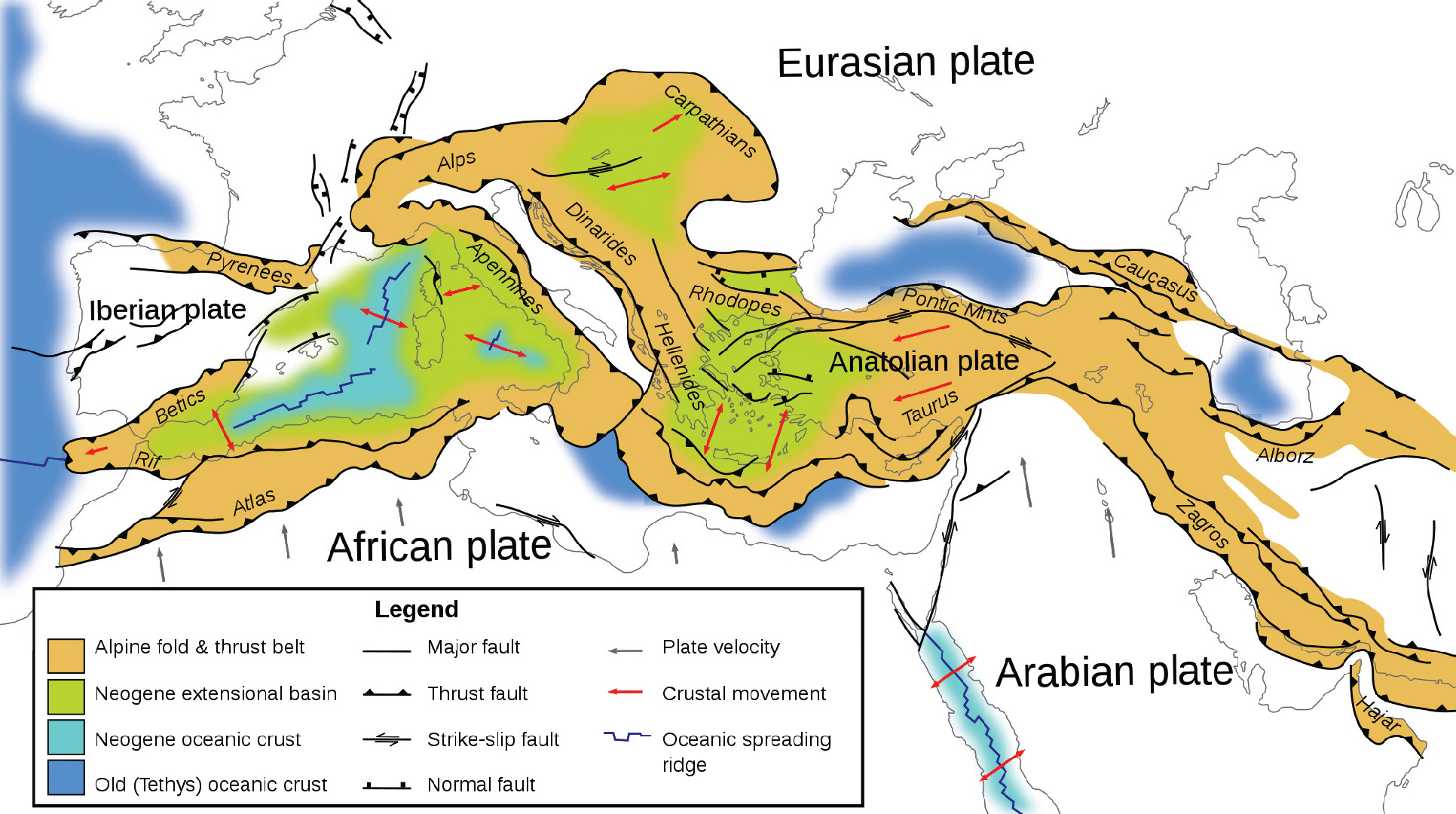
- In the lower left corner is the legend. Above the legend is a map from Woudlopper (2009) that shows the Alpide belt in Europe and the Middle East. This “belt” is a convergent plate boundary (plates pushing together) that extends from Australia/Indonesia, through Miyanmar and India, across Iraq and Iran, through Europe, and possibly extending as far as offshore west of Portugal. The tectonics in the eastern Mediterranean is dominated by this north-south oriented compression and how this tectonic strain interacts with existing tectonic structures.
- In the right center top is a geologic map from Schmid et al. (2019) that shows the main crustal faults and geologic units in the region. These geologic units all reflect the tectonic history of this region.
- In the center left bottom is a plot that shows earthquake intensity (vertical axis) as it decreases with distance from the earthquake (horizontal axis with the earthquake source at 0km distance). Two types of data are plotted here:
- The USGS uses a model that uses seismometer (accelerometer) observations from thousands of earthquakes to estimate the intensity of the earthquake based on its magnitude (generally). The USGS uses the Modified Mercalli Intensity (MMI)scale. The green and brown lines show the average intensity for models based on earthquakes in the western USA (brown) and the eastern USA (green). These models are used to create the intensity map in the lower right corner.
- The USGS has a webpage for each earthquake where people can enter their location and observations. These observations are used to estimate the MMI at the location of the person. These Did You Feel It? results are plotted individually as blue dots and statistically as orange and larger blue dots.
- In the lower right corner is a map that shows the earthquake intensity as derived from the USGS models. I also placed the Did You Feel It? results as colored dots (some are labeled).
- In the right middle is a map that shows the liquefaction susceptibility from this earthquake. This is generated from a model that relates earthquake size and the potential for an area to experience liquefaction.
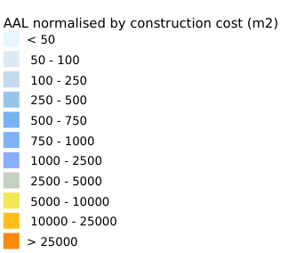
- In the upper left corner are two maps: seismic hazard and seismic risk. I review this type of information below. I labeled the range in ground shaking (pga) and normalized construction costs (millions of dollars) for the area of the M 6.4 earthquake.
I include some inset figures. Some of the same figures are located in different places on the larger scale map below.
- Here is the map with a years’ (EMSC) and century’s (USGS) seismicity plotted.
- Note that there have been very few earthquakes in the past century M≥6. But there are some along the eastern Adriatic Sea that show this to be a region of northeast-southwest oriented compression. The 1979 doublet and 1996 M 6.
- Also, check out the M 5.3 from earlier this year. This is a thrust (compressional/convergent) fault earthquake that happened on a fault that exists to the north of Zagreb. This region has a complicated tectonic history, but the 5.3 matches the overall north-south convergence of the Alpide belt (the Africa plate moving relatively north and the Eurasia plate moving relatively south).
- Because these thrust faults are oblique to the relative plate motion, the tectonic strain is partitioned onto different faults. The thrust faults accommodate some of the convergence, while strike-slip faults accommodate other portions of the convergence. This M 6.4 earthquake has accommodated some of the strike-slip motion.

UPDATE: 2021.01.03 Aftershocks and Intensity Comparison.
- I use the EMSC database to plot aftershocks (1 monthish) for the two earthquakes in central Croatia, the 22 March ’20 M 5.3 near Zagreb and the 29 Dec ’20 M 64 near Petrinja.
- The locations are aliased (see how they align in rows and columns) due to rounding of the lat long coordinates provided by EMSC (rounded to 1km spacing).
- Also note the scale on the intensity maps are different.
- I list the potential magnitudes for the faults from the SHARE fault database.
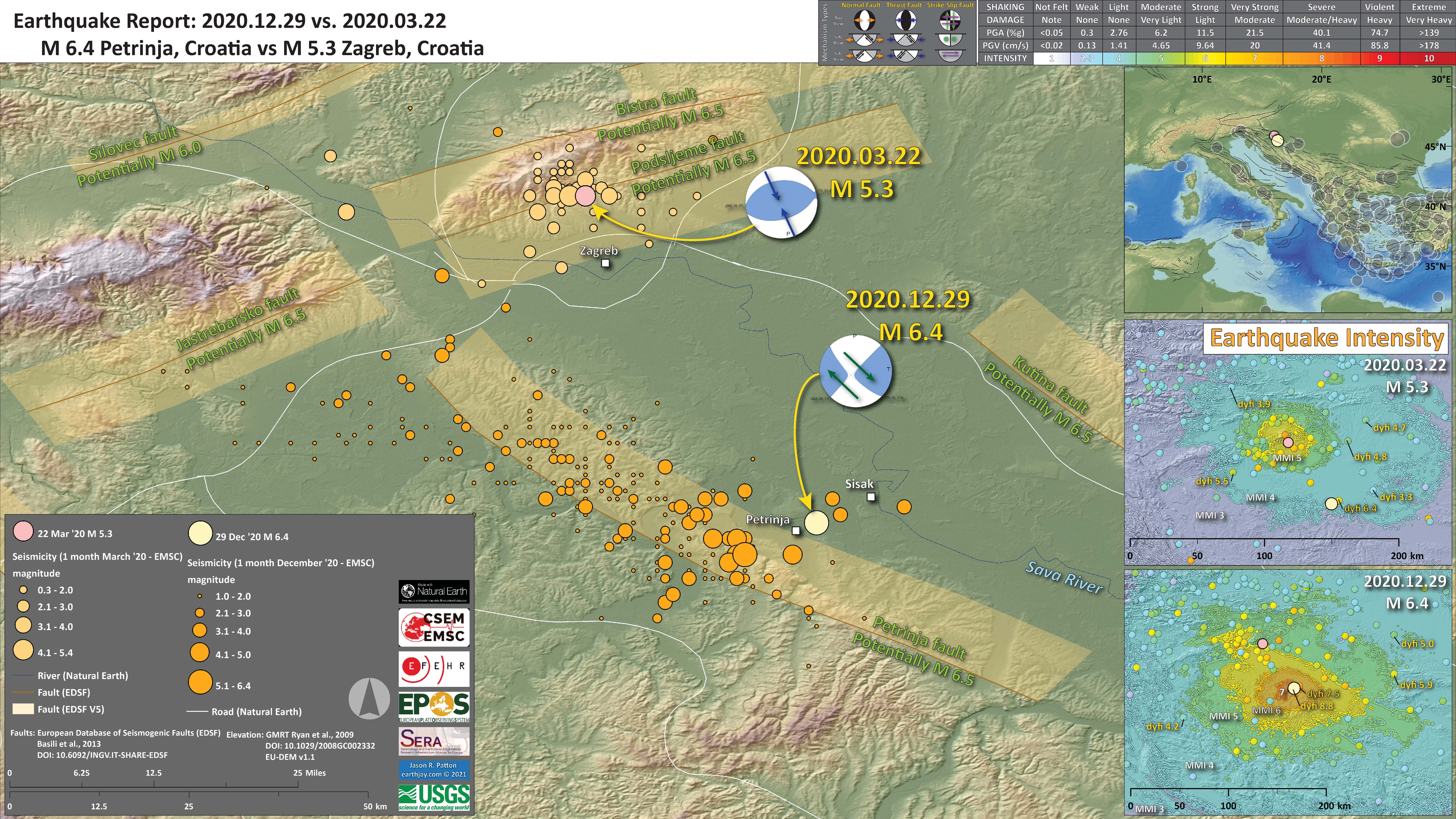
- Here are the database entries for the faults plotted in the above interpretive poster.
- http://diss.rm.ingv.it/share-edsf/sharedata/SHHTML/SICS022INF.html
- http://diss.rm.ingv.it/share-edsf/sharedata/SHHTML/HRCS022INF.html
- http://diss.rm.ingv.it/share-edsf/sharedata/SHHTML/HRCS37INF.html
- http://diss.rm.ingv.it/share-edsf/sharedata/SHHTML/HRCS030INF.html
- http://diss.rm.ingv.it/share-edsf/sharedata/SHHTML/HRCS027INF.html
- http://diss.rm.ingv.it/share-edsf/sharedata/SHHTML/HRCS038INF.html
Shaking Intensity and Potential for Ground Failure
- Below are a series of maps that show the shaking intensity and potential for landslides and liquefaction. These are all USGS data products.
- Below is the liquefaction susceptibility and landslide probability map (Jessee et al., 2017; Zhu et al., 2017). Please head over to that report for more information about the USGS Ground Failure products (landslides and liquefaction). Basically, earthquakes shake the ground and this ground shaking can cause landslides. We can see that there is a low probability for landslides. However, we have already seen photographic evidence for landslides and the lower limit for earthquake triggered landslides is magnitude M 5.5 (from Keefer 1984)
- I use the same color scheme that the USGS uses on their website. Note how the areas that are more likely to have experienced earthquake induced liquefaction are in the valleys. Learn more about how the USGS prepares these model results here.
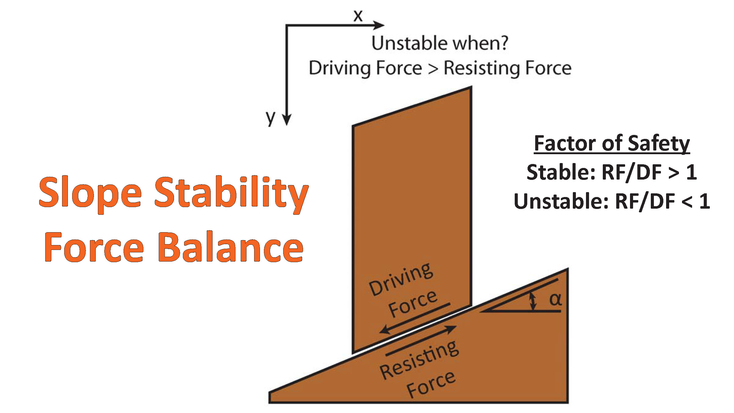
There are many different ways in which a landslide can be triggered. The first order relations behind slope failure (landslides) is that the “resisting” forces that are preventing slope failure (e.g. the strength of the bedrock or soil) are overcome by the “driving” forces that are pushing this land downwards (e.g. gravity). The ratio of resisting forces to driving forces is called the Factor of Safety (FOS). We can write this ratio like this:
FOS = Resisting Force / Driving Force
When FOS > 1, the slope is stable and when FOS < 1, the slope fails and we get a landslide. The illustration below shows these relations. Note how the slope angle α can take part in this ratio (the steeper the slope, the greater impact of the mass of the slope can contribute to driving forces). The real world is more complicated than the simplified illustration below.
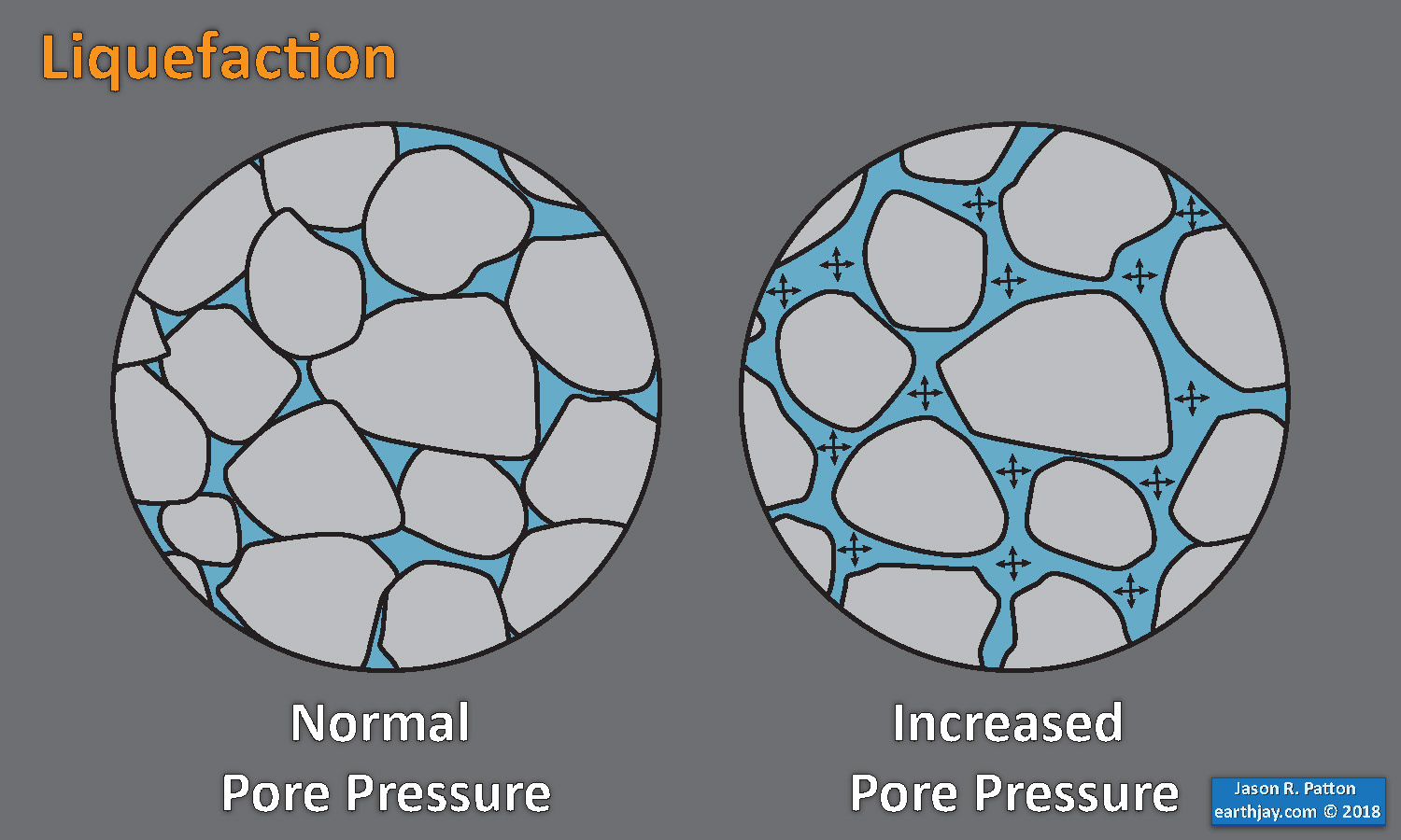
Landslide ground shaking can change the Factor of Safety in several ways that might increase the driving force or decrease the resisting force. Keefer (1984) studied a global data set of earthquake triggered landslides and found that larger earthquakes trigger larger and more numerous landslides across a larger area than do smaller earthquakes. Earthquakes can cause landslides because the seismic waves can cause the driving force to increase (the earthquake motions can “push” the land downwards), leading to a landslide. In addition, ground shaking can change the strength of these earth materials (a form of resisting force) with a process called liquefaction.
Sediment or soil strength is based upon the ability for sediment particles to push against each other without moving. This is a combination of friction and the forces exerted between these particles. This is loosely what we call the “angle of internal friction.” Liquefaction is a process by which pore pressure increases cause water to push out against the sediment particles so that they are no longer touching.
An analogy that some may be familiar with relates to a visit to the beach. When one is walking on the wet sand near the shoreline, the sand may hold the weight of our body generally pretty well. However, if we stop and vibrate our feet back and forth, this causes pore pressure to increase and we sink into the sand as the sand liquefies. Or, at least our feet sink into the sand.
Below is a diagram showing how an increase in pore pressure can push against the sediment particles so that they are not touching any more. This allows the particles to move around and this is why our feet sink in the sand in the analogy above. This is also what changes the strength of earth materials such that a landslide can be triggered.
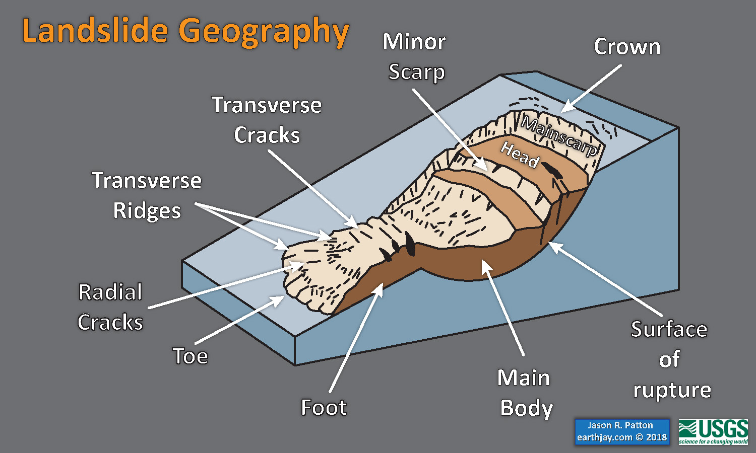
Below is a diagram based upon a publication designed to educate the public about landslides and the processes that trigger them (USGS, 2004). Additional background information about landslide types can be found in Highland et al. (2008). There was a variety of landslide types that can be observed surrounding the earthquake region. So, this illustration can help people when they observing the landscape response to the earthquake whether they are using aerial imagery, photos in newspaper or website articles, or videos on social media. Will you be able to locate a landslide scarp or the toe of a landslide? This figure shows a rotational landslide, one where the land rotates along a curvilinear failure surface.

Seismic Hazard and Seismic Risk
- As a reminder, this region is in the most seismically hazardous region of the Mediterranean. Here is the 50% probability of exceedance map (for 50 yrs) from Giardini et al. (2013).

- I put together this figure that shows the seismic hazard and seismic risk for Europe.
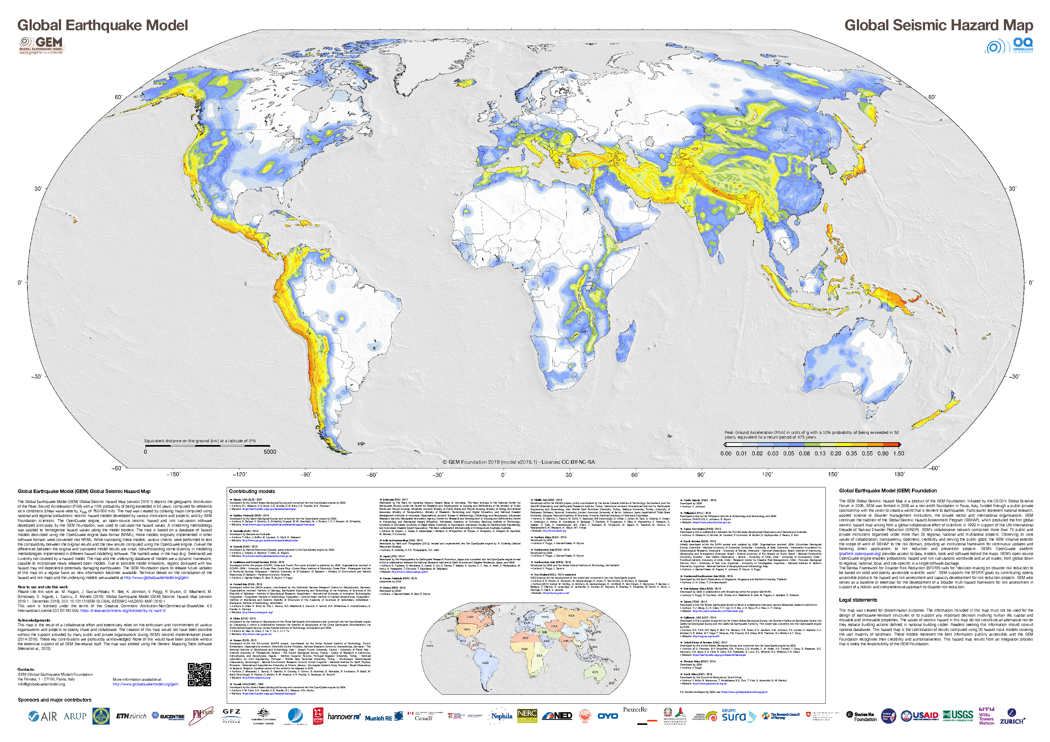
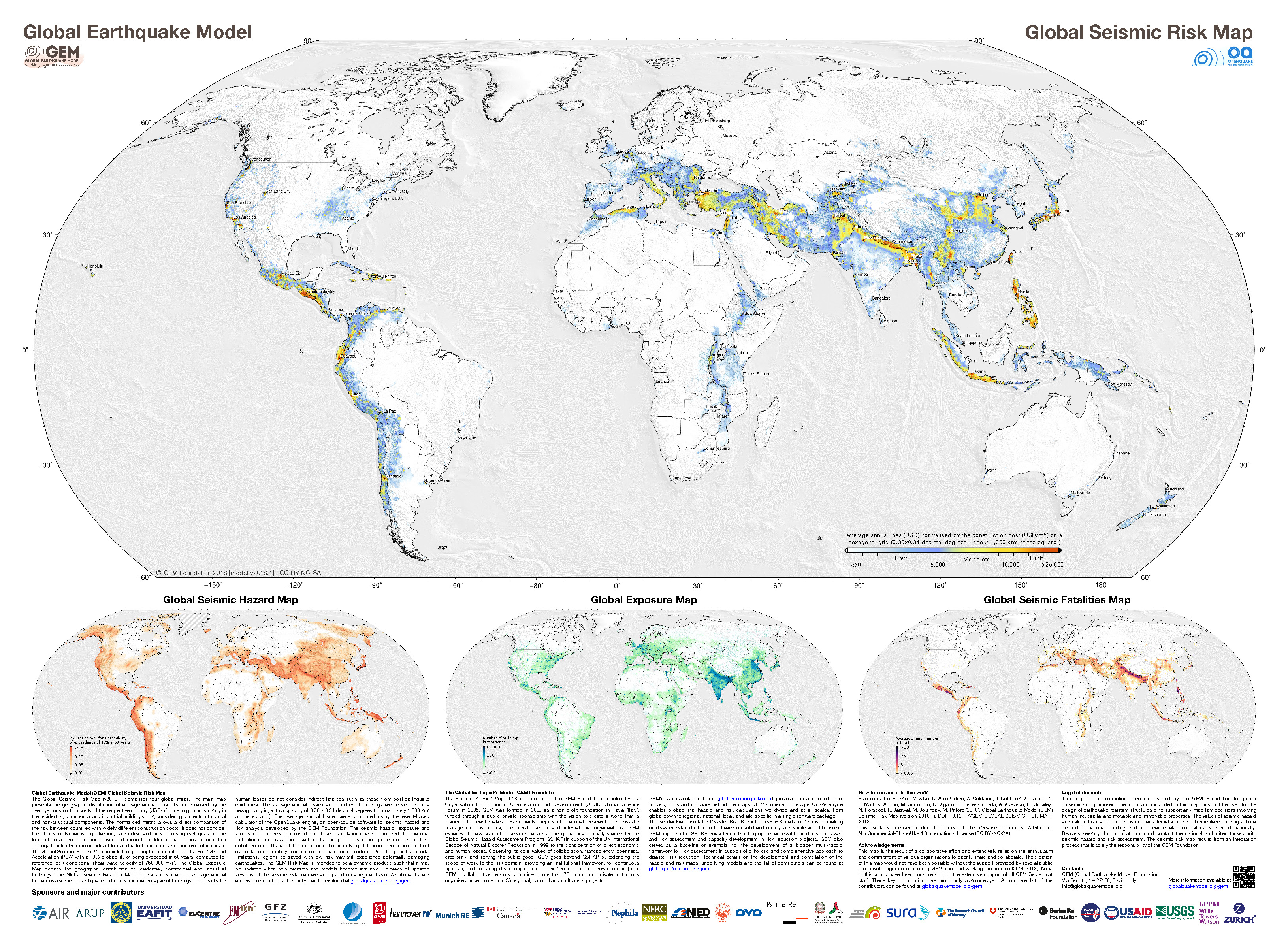
- The GEM Seismic Hazard and the GEM Seismic Risk maps from Pagani et al. (2018) and Silva et al. (2018).
- I list the general range of values for hazard (pga) and risk (construction cost). The USGS shaking models suggest that there were ground accelerations exceeding 50% g (gravity at sea level). This is higher than the hazard map suggests, but this is just a model.

- The GEM Seismic Hazard Map:
- The Global Earthquake Model (GEM) Global Seismic Hazard Map (version 2018.1) depicts the geographic distribution of the Peak Ground Acceleration (PGA) with a 10% probability of being exceeded in 50 years, computed for reference rock conditions (shear wave velocity, VS30, of 760-800 m/s). The map was created by collating maps computed using national and regional probabilistic seismic hazard models developed by various institutions and projects, and by GEM Foundation scientists. The OpenQuake engine, an open-source seismic hazard and risk calculation software developed principally by the GEM Foundation, was used to calculate the hazard values. A smoothing methodology was applied to homogenise hazard values along the model borders. The map is based on a database of hazard models described using the OpenQuake engine data format (NRML); those models originally implemented in other software formats were converted into NRML. While translating these models, various checks were performed to test the compatibility between the original results and the new results computed using the OpenQuake engine. Overall the differences between the original and translated model results are small, notwithstanding some diversity in modelling methodologies implemented in different hazard modelling software. The hashed areas in the map (e.g. Greenland) are currently not covered by a hazard model. The map and the underlying database of models are a dynamic framework, capable to incorporate newly released open models. Due to possible model limitations, regions portrayed with low hazard may still experience potentially damaging earthquakes.

- The GEM Seismic Risk Map:
- The Global Seismic Risk Map (v2018.1) presents the geographic distribution of average annual loss (USD) normalised by the average construction costs of the respective country (USD/m2) due to ground shaking in the residential, commercial and industrial building stock, considering contents, structural and non-structural components. The normalised metric allows a direct comparison of the risk between countries with widely different construction costs. It does not consider the effects of tsunamis, liquefaction, landslides, and fires following earthquakes. The loss estimates are from direct physical damage to buildings due to shaking, and thus damage to infrastructure or indirect losses due to business interruption are not included. The average annual losses are presented on a hexagonal grid, with a spacing of 0.30 x 0.34 decimal degrees (approximately 1,000 km2 at the equator). The average annual losses were computed using the event-based calculator of the OpenQuake engine, an open-source software for seismic hazard and risk analysis developed by the GEM Foundation. The seismic hazard, exposure and vulnerability models employed in these calculations were provided by national institutions, or developed within the scope of regional programs or bilateral collaborations. This global map and the underlying databases are based on best available and publicly accessible datasets and models. Due to possible model limitations, regions portrayed with low risk may still experience potentially damaging earthquakes.
Human Impact
- Copernicus is an organization that is part of the European Union that has many programs devoted to helping people mitigate, prepare, and respond to natural disasters.
- Below is a poster that summarizes the impacts from the M 6.4 earthquake as of 30 December 2020.

Some Relevant Discussion and Figures
- This is the Wouldloper (2009) tectonic map of the Mediterranean Sea.
- Here is another map of the region showing the compression in this region (Burchfiel et al., 2008 ). I include the figure caption below in blockquote.
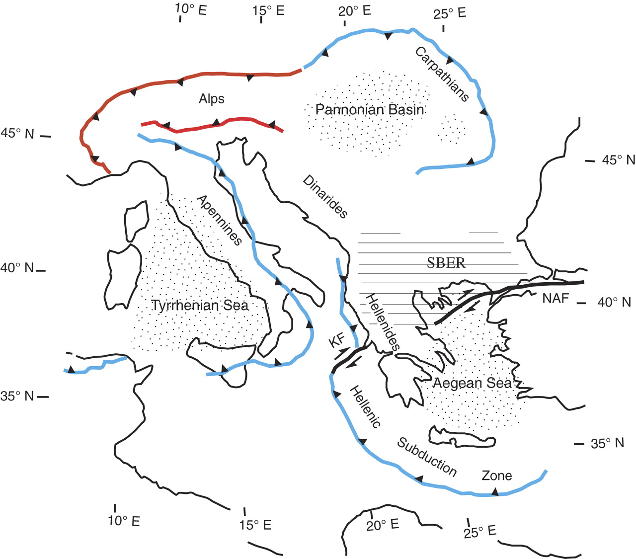
Location of the South Balkan extensional system (SBER) withing the eastern European region. The system today is within the southern Balkan region north of the North Anatolian fault (NAF), shown by the horizontal line patter. Retreating subduction zones and related backarc extensional areas for the Mediterranean region are shown in blue , and advancing subduction zones an related are a of backarc shortening are shown in red). Backarc extensional regions are shown by dotted pattern. KF = Kefalonia fault zone.
- Here is a map showing the active faults in Croatia (Markušić and Herak_1998). They prepared thsi figure to help explain how they subdivided Croatia for seismic hazard zoning.

Map of the most important seismogenic faults
- The area impacted by the M 6.4 is in the western part of a large sedimentary basin called the Pannononian Basin. The geographic name for this place is the Great Hungarian Plain. The map below shows Zagreb in the lower left part of the map. The fault involved with yesterday’s M 6.4 are at the boundary of the Pannononian Basin and the Dinarides Mountains (Horváth et al., 2015).
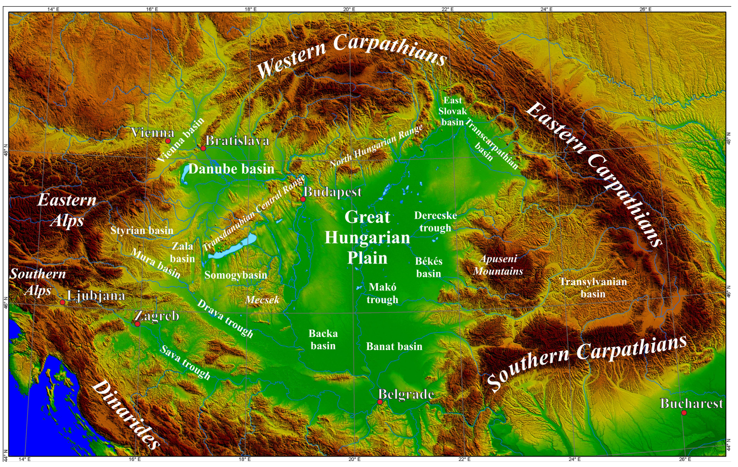
Digital terrain model of the Pannonian basin to show its position within the Alpine mountain belt and the location of different subunits.
- Here is a low angle oblique view of a tectonic model for this region (Horváth et al., 2015). Their paper describes the tectonic history that led to the development of the Pannononian Basin.
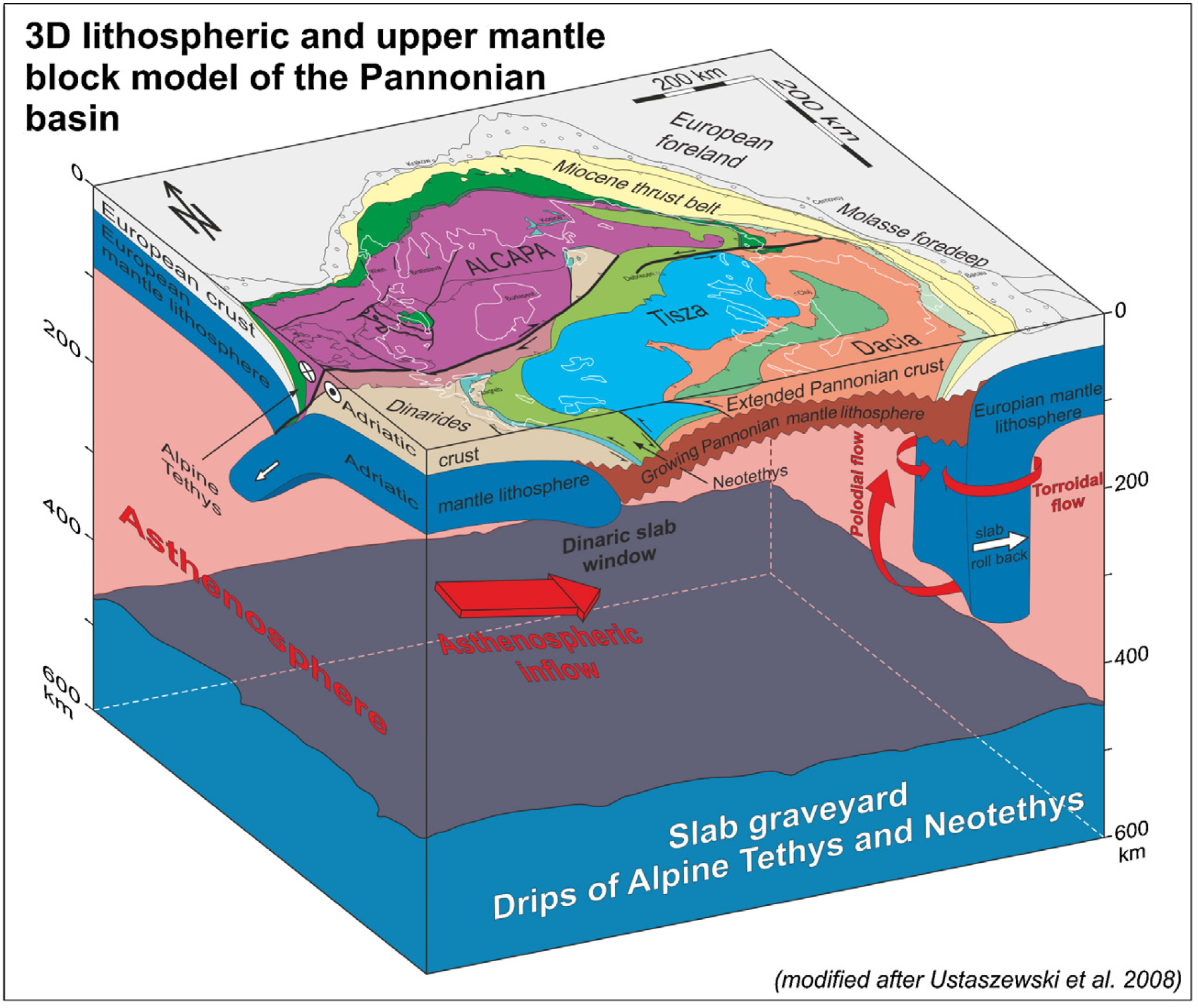
Block model depicting the present position of the Alcapa and Tisza-Dacia terranes in the Carpathian embayment and the associated lithospheric and asthenosphericprocesses down to the upper mantle transition zone (inspired after Ustaszewski et al., 2008).
- This is a map that shows the Neogene-Quaternary (time periods) sedimentary basin deposits, and how thick they are (Dolton, 2006). The river that runs between Zagreb, Sisak, and Petrinja is the blue line in the southwest of the basin (outlined in a red line). Note that there are thick (over 4km) sedimentary deposits here.

Map of the Neogene Pannonian Basin, showing depocenters of the subbasins. The associated Transylvanian (TR) and Vienna (V) basins are shown. Modified from Horvath (1985a).
- Here is a similar map that shows the main fault systems where there are regions of tectonic subsidence (we need subsidence to create space for sediments to deposit, called accommodation space). Note the area of subsidence that straddles the sedimentary basin deposits and river in the previous map. Also, note that the faults bounding this subsiding area are strike-slip faults (note the arrows).
- Sedimentary basins can amplify ground shaking, thus leading to increased liquefaction susceptibility. Note how the higher liquefaction susceptibility areas for the M 6.4 are associated with the mapped sedimentary deposits and the region of subsidence.

Tectonic map of the Pannonian Basin and surrounding regions showing the main extensional faults of Neogene age. After Rumpler and Horvath (1988). Area of Pannonian Basin Tertiary rocks within the Alpine-Carpathian fold belts shown as white.
- To understand the tectonic stresses that cause earthquakes in this region, Bada et al. (1998) prepared a numerical model. The next several figures help us walk through the basics of their modeling.
- This first figure shows their configuration, with the boundary conditions and relative plate motions that cause the tectonic stresses.
- These two panels compare two versions of their model results, showing the orientation of maximum stress compared with their calculations of maximum stress. The region south of Zagreb is in an area with north-south compression, in the western part of the Pannanonian Basin.
- This is a map showing the major faults in the region and how their tectonic stresses are oriented relative to these faults (the gray arrows at the boundary of the model).
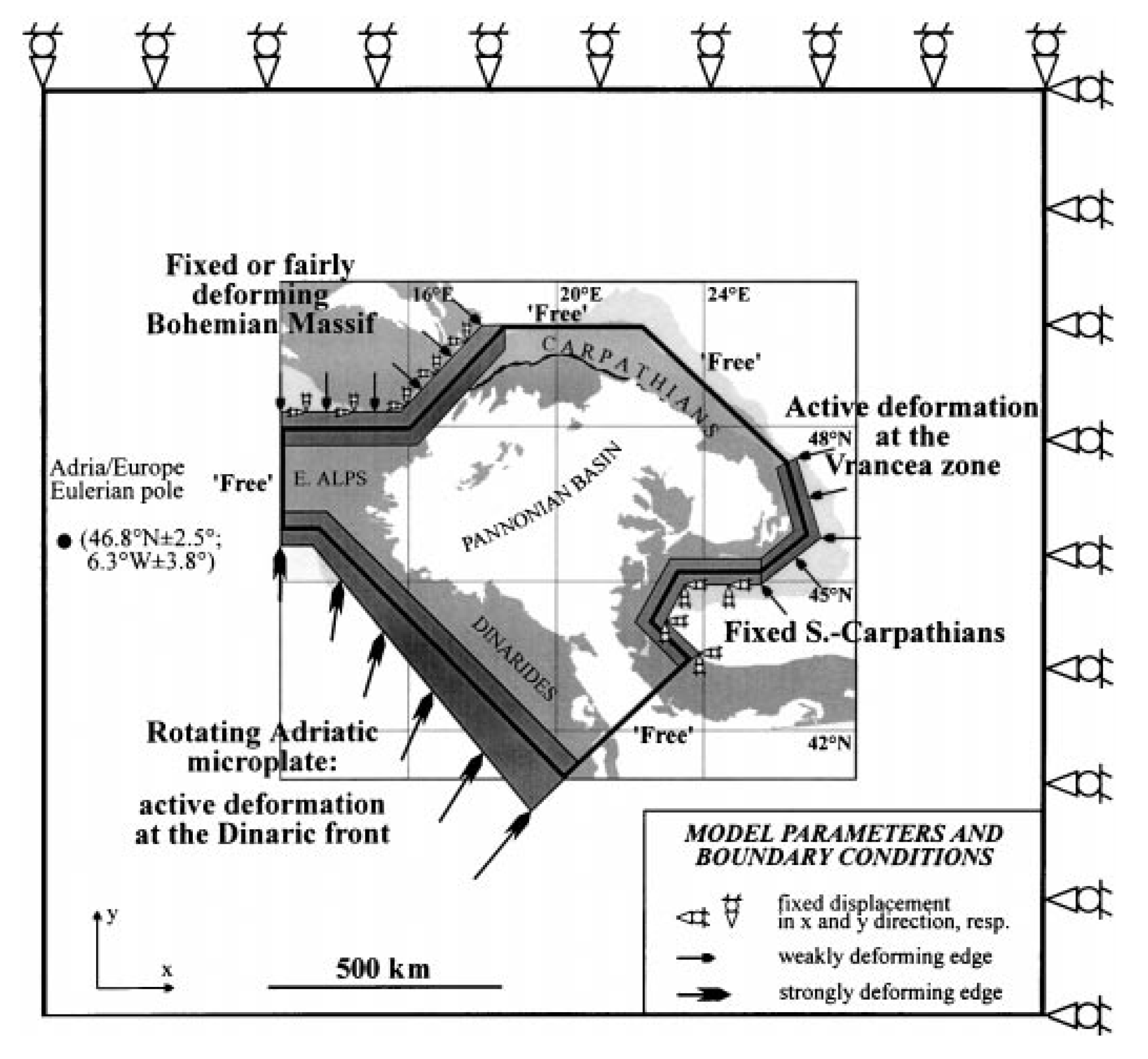
Model geometry and boundary conditions used in the finite element procedure. Note that a larger framework was created to minimize edge effects and errors. As a result, the ‘free’ edges are buffered but can be deformed on a small scale. For further discussion see text. The Adria–Europe rotation pole was taken from Ward (1994).

Best-fitting resultant stress pattern reflecting the combined effects of the applied boundary conditions (see insets), changing crustal thickness and two predefined weakness zones. (a), ( b) The edge at the Bohemian Massif is fixed and slightly deforming, respectively. In order to make direct comparison possible, the smoothed (observed) and calculated stress directions are superimposed.
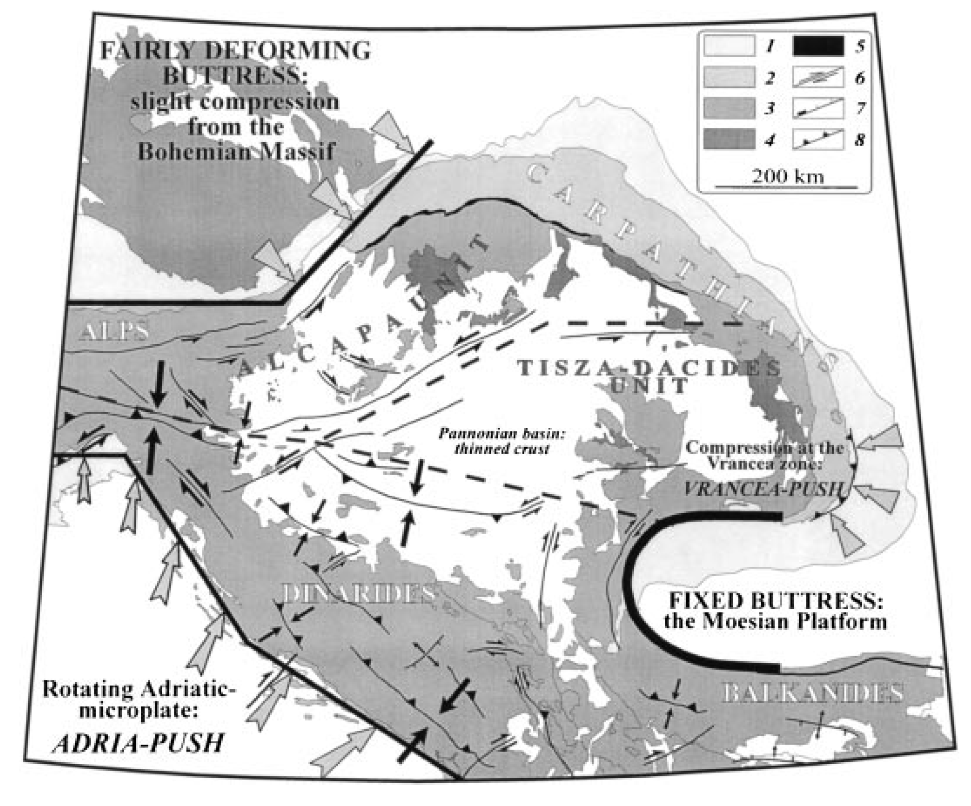
Cartoon summarizing the main stress sources in the Alpine–Carpathian–Pannonian–Dinaric system applied in our finite element models. Buttresses are rigid crustal blocks indenting or blocking their surroundings. Dashed lines represent faults that were included during modelling. The kinematics of some major faults showing present-day activity are also shown (after Gerner et al. 1997) 1: Molasse belt; 2: Flysch belt; 3: internal units; 4: Neogene and Quaternary
volcanites; 5: Pieniny Klippen Belt; 6: strike-slip faults; 7: normal faults; 8: thrust faults.
- 2020.12.30 M 6.4 Croatia
- 2020.10.30 M 7.0 Turkey
- 2020.05.02 M 6.6 Crete, Greece
- 2020.01.24 M 6.7 Turkey
- 2019.11.26 M 6.4 Albania
- 2018.10.25 M 6.8 Greece
- 2017.07.20 M 6.7 Turkey
- 2017.06.12 M 6.3 Turkey/Greece
- 2016.10.30 M 6.6 Italy
- 2016.10.30 M 6.6 Italy Update #1
- 2016.10.28 M 5.8 Tyrrhenian Sea
- 2016.10.26 M 6.1 Italy
- 2016.10.16 M 5.3 Greece/Albania
- 2016.08.23 M 6.2 Italy
- 2016.01.24 M 6.1 Mediterranean
- 2015.11.17 M 6.5 Greece
- 2015.04.16 M 6.0 Crete
- Frisch, W., Meschede, M., Blakey, R., 2011. Plate Tectonics, Springer-Verlag, London, 213 pp.
- Hayes, G., 2018, Slab2 – A Comprehensive Subduction Zone Geometry Model: U.S. Geological Survey data release, https://doi.org/10.5066/F7PV6JNV.
- Holt, W. E., C. Kreemer, A. J. Haines, L. Estey, C. Meertens, G. Blewitt, and D. Lavallee (2005), Project helps constrain continental dynamics and seismic hazards, Eos Trans. AGU, 86(41), 383–387, , https://doi.org/10.1029/2005EO410002. /li>
- Jessee, M.A.N., Hamburger, M. W., Allstadt, K., Wald, D. J., Robeson, S. M., Tanyas, H., et al. (2018). A global empirical model for near-real-time assessment of seismically induced landslides. Journal of Geophysical Research: Earth Surface, 123, 1835–1859. https://doi.org/10.1029/2017JF004494
- Kreemer, C., J. Haines, W. Holt, G. Blewitt, and D. Lavallee (2000), On the determination of a global strain rate model, Geophys. J. Int., 52(10), 765–770.
- Kreemer, C., W. E. Holt, and A. J. Haines (2003), An integrated global model of present-day plate motions and plate boundary deformation, Geophys. J. Int., 154(1), 8–34, , https://doi.org/10.1046/j.1365-246X.2003.01917.x.
- Kreemer, C., G. Blewitt, E.C. Klein, 2014. A geodetic plate motion and Global Strain Rate Model in Geochemistry, Geophysics, Geosystems, v. 15, p. 3849-3889, https://doi.org/10.1002/2014GC005407.
- Meyer, B., Saltus, R., Chulliat, a., 2017. EMAG2: Earth Magnetic Anomaly Grid (2-arc-minute resolution) Version 3. National Centers for Environmental Information, NOAA. Model. https://doi.org/10.7289/V5H70CVX
- Müller, R.D., Sdrolias, M., Gaina, C. and Roest, W.R., 2008, Age spreading rates and spreading asymmetry of the world’s ocean crust in Geochemistry, Geophysics, Geosystems, 9, Q04006, https://doi.org/10.1029/2007GC001743
- Pagani,M. , J. Garcia-Pelaez, R. Gee, K. Johnson, V. Poggi, R. Styron, G. Weatherill, M. Simionato, D. Viganò, L. Danciu, D. Monelli (2018). Global Earthquake Model (GEM) Seismic Hazard Map (version 2018.1 – December 2018), DOI: 10.13117/GEM-GLOBAL-SEISMIC-HAZARD-MAP-2018.1
- Silva, V ., D Amo-Oduro, A Calderon, J Dabbeek, V Despotaki, L Martins, A Rao, M Simionato, D Viganò, C Yepes, A Acevedo, N Horspool, H Crowley, K Jaiswal, M Journeay, M Pittore, 2018. Global Earthquake Model (GEM) Seismic Risk Map (version 2018.1). https://doi.org/10.13117/GEM-GLOBAL-SEISMIC-RISK-MAP-2018.1
- Zhu, J., Baise, L. G., Thompson, E. M., 2017, An Updated Geospatial Liquefaction Model for Global Application, Bulletin of the Seismological Society of America, 107, p 1365-1385, https://doi.org/0.1785/0120160198
- Bada, G., Cloetingh, S., Gerner, P., and Horvath, F., 1998. Sources of recent tectonic stress in the Pannonian region: inferences from finite element modelling in GJI, v. 134, p. 87-101
- Benetatos, C., Kiratzi, A., 2006. Finite-fault slip models for the 15 April 1979 (Mw 7.1) Montenegro
earthquake and its strongest aftershock of 24 May 1979 (Mw 6.2) in Tectonophysics, v. 421, p. 129-143, http://dx.doi.org/10.1016/j.tecto.2006.04.009 - Burchfiel, B.C., et al., 2008. Evolution and dynamics of the Cenozoic tectonics of the South Balkan extensional system in Geosphere, v. 4, p. 919-938.
- Dilek, Y., 2006. Collision tectonics of the Mediterranean region: Causes and consequences in Dilek, Y., and Pavlides, S., eds., Postcollisional tectonics and magmatism in the Mediterranean region and Asia: Geological Society of America Special Paper 409, p. 1–13
- Dilek, Y. and Sandvol, E., 2006. Collision tectonics of the Mediterranean region: Causes and consequences in Dilek, Y., and Pavlides, S., eds., Postcollisional tectonics and magmatism in the Mediterranean region and Asia: Geological Society of America Special Paper 409, p. 1–13
- DISS Working Group (2015). Database of Individual Seismogenic Sources (DISS), Version 3.2.0: A compilation of potential sources for earthquakes larger than M 5.5 in Italy and surrounding areas. http://diss.rm.ingv.it/diss/, Istituto Nazionale di Geofisica e Vulcanologia; DOI:10.6092/INGV.IT-DISS3.2.0.
- Dolton, G.L., 2006, Pannonian Basin Province, Central Europe (Province 4808)—Petroleum geology, total petroleum systems, and petroleum resource assessment: U.S. Geological Survey Bulletin 2204–B, 47 p.
- Ganas, A., and T. Parsons (2009), Three-dimensional model of Hellenic Arc deformation and origin of the Cretan uplift, J. Geophys. Res., 114, B06404, doi:10.1029/2008JB005599
- Ganas, A., Oikonomou, I.A., and Tsimi, C., 2013. NOAFAULTS: A Digital Database for Active Faults in Greece in Bulletin of the Geological Society of Greece, v. XLVII, Proceedings of the 13th International Congress, Chania, Sept, 2013
- Horváth, F., Mustiz, B., Balazs, A., Vegh, A., Uhrin, A., Nador, A., Koroknai, B., Pap, N., Toth, T., and Worum, G., 2015. Evolution of the Pannonian basin and its geothermal resources in Geothermics, v. 53, p. 328-352
- Jolivet, L., et al., 2013. Aegean tectonics: Strain localisation, slab tearing and trench retreat in Tectonophysics, v. 597-598, p. 1-33
- Kokkalas, S., et al., 2006. Postcollisional contractional and extensional deformation in the Aegean region in GSA Special Papers, v. 409, p. 97-123.
- Markušić, S. and Herak, M., 1998. Seismic Zoning of Croatia in Natural Hazards, v. 18, p. 269-285.
- Picha, F. J., 2002. Late Orogenic Strike-Slip Faulting and Escape Tectonics in Frontal Dinarides-Hellenides, Croatia, Yugoslavia, Albania, and Greece, AAPG Bull., v. 86, p. 1659–1671.
- Taymaz, T., Yilmaz, Y., and Dilek, Y., 2007. The geodynamics of the Aegean and Anatolia: introduction in Geological Society Special Publications, v. 291, p. 1-16.
- Woudloper, 2009. Tectonic map of southern Europe and the Middle East, showing tectonic structures of the western Alpide mountain belt. Only Alpine (tertiary) structures are shown.
- Sorted by Magnitude
- Sorted by Year
- Sorted by Day of the Year
- Sorted By Region
Europe
General Overview
Earthquake Reports
Social Media
#EarthquakeReport poster for M6.4 strike-slip #Earthquake in #Croatia https://t.co/nWCoPdKZ68
high chance for liquefaction
likely ruptured the Petrinja fault, thought to be capable of M6.5 eventshttps://t.co/4Agp4cBnrz pic.twitter.com/TLJkADieQZ
— Jason "Jay" R. Patton (@patton_cascadia) December 30, 2020
today's epicenter of the earthquake pic.twitter.com/OTZN5jrRWJ
— Tomislav Kelekovic (@tkelekovic) December 29, 2020
Here is some more liquefaction on video https://t.co/EPOygT9shI
— Marko (@Marko61511524) December 29, 2020
Photo of a sand boil(?) (indicating subsurface liquefaction) from the M6.4 #CroatiaEarthquake near #Petrinja. Seismic shaking increases pressure in water-filled pores between sand grains until the lose contact w/ each other, start acting like liquid (Photo from @LastQuake app) pic.twitter.com/09aoP2Hl03
— Brian Olson (@mrbrianolson) December 29, 2020
Preliminary automatic scenario of expected permanent deformations for the M 6.4 #Croatia #Earthquake.
Focal mechanism from GFZ Geofon (https://t.co/6E9hLx3oaI), both planes are considered.Waiting for other solutions and, of course, InSAR data.
With @antandre71 pic.twitter.com/I78q9lpJ1Z
— Simone Atzori (@SimoneAtzori73) December 29, 2020
#ERCC #DailyMap: 2020-12-30 ⦙ <p>Croatia | 6.4M Earthquake of 29 December</p> ▸https://t.co/OWf76WHpXL pic.twitter.com/Y4YsXLxEIy
— Copernicus EMS (@CopernicusEMS) December 30, 2020
Best candidate fault structure for today's M6.4 #earthquake near Petrinja & Sisak, Croatia; NW-SE trending Petrinja fault zone (red arrows – HRCS027 in SHARE db) clearly visible in the terrain morphology. Epicenters (yellow) from @EMSC, foc mechs from GFZ. pic.twitter.com/dgeCep2ZUF
— Sotiris Valkaniotis (@SotisValkan) December 29, 2020
This video compilation of footage from the M6.3 in Croatia has quite a number of remarkable perspectives, including
*on a lake*
*inside a church*
*on a street with bricks toppling*
*across from a damaged barn crumbling*
and … on a cooking show?https://t.co/TvihBKsdov— Austin Elliott (@TTremblingEarth) December 30, 2020
Sentinel-1 coseismic interferogram of the M6.3 Petrinja/Sisak earthquake #potres from ascending track @SotisValkan @EricFielding @gfun @LastQuake @JosipStipcevic pic.twitter.com/wreomZH1QG
— Marin Govorcin (@Govorcin) December 30, 2020
M6.4 Petrinja, Croatia (2020.12.29)https://t.co/J82bValkmu
Sentinel path 146 (2020.12.24-2020.12.30) pic.twitter.com/NfLG80tLWJ
— gCent (@gCentBulletin) December 30, 2020
#EarthquakeReport for M6.4 #Earthquake in #Croatia #CroatiaEarthquake
videos confirm liquefaction as suggested by USGS #liquefaction susceptibility model
EQ Intensity exceed MMI 8tectonic background here:https://t.co/ie8S2LGJeT pic.twitter.com/01ZKZD5bAI
— Jason "Jay" R. Patton (@patton_cascadia) December 31, 2020
Magnitude 6.4 Earthquake in Croatia Kills at Least 7, Cuts Power and Water for Tens of Thousands https://t.co/Zaxkke9Dyg
— Democracy Now! (@democracynow) December 31, 2020
#Sentinel-1 co-seismic deformation map and 3D displacement view (exaggerated) of 29.12.2020 M 6.4 #Petrinja, #Croatia #earthquake. Positive values (blue) indicate upward displacements. InSAR data obtained from COMET-LiCS database. pic.twitter.com/rGCO2otqHG
— Reza Saber (@Geo_Reza) December 31, 2020
Today's 2020-12-29 M6.4 #Croatia #earthquake waves as seen from #Europe's #seismograph network via Ground Motion Visualization.
The video does not reflect the actual speed of the waves. Time is shown at the bottom right.
Code by @IRIS_EPO, with some preprocessing. @EGU_Seismo pic.twitter.com/EJAtqyqAFb
— Giuseppe Petricca (@gmrpetricca) December 29, 2020
Enough with pain, loss and disasters in 2020.
Petrinja, Croatia – one day after a destructive and deadly earthquake.#CroatiaEarthquake
📷 Antonio Bronic pic.twitter.com/aNzfueKWO1— Asieh Namdar (@asiehnamdar) December 30, 2020
#30Dicembre #30December #December30 2020
Earthquake Mw 6.4
Petrinja, Croatia 🇭🇷
Local time 12:19:54 2020-12-29Shakemovie – Animations of seismic wave propagation on the earth's surface (source INGV Italy)#earthquake #potres #terremoto #Petrinja #Croatia #Croazia #Hrvatska pic.twitter.com/4UeO74zwkT
— geocappiello (@geocappiello) December 30, 2020
The largest onshore earthquake rupture in Europe since Norcia 2016. Copernicus #Sentinel1 co-seismic interferogram (ascending) for the M6.4 Petrinja, Croatia #earthquake. Shallow NW-SE 15-20km rupture along the fault scarp just west of Petrinja. pic.twitter.com/kB5bTuFV5X
— Sotiris Valkaniotis (@SotisValkan) December 30, 2020
A number of large #landslides were triggered (with a few cm of displacement) by the M6.4 Petrinja, Croatia #earthquake – identifiable in the #Sentinel1 interferogram in distances as far as 30km from the earthquake rupture. pic.twitter.com/BBR8lgjwCH
— Sotiris Valkaniotis (@SotisValkan) December 31, 2020
A damaging M6.4 #earthquake rattled #Croatia today, centered near Petrinja. It appears to have struck on a strike slip fault. This quake came a day after a M5.2 quake struck just to the northwest. Today’s quake was felt throughout the region. https://t.co/Zhezg7qu4U
— temblor (@temblor) December 29, 2020
Efforts to assess the damage from yesterday’s magnitude-6.4 earthquake in Central Croatia continue. https://t.co/tMTXrys1RH
— temblor (@temblor) December 30, 2020
— Marin Govorcin (@Govorcin) December 31, 2020
Here is a newly received picture following #CroatiaEarthquake It is liquefaction. Please read previous tweets for explanations pic.twitter.com/2iTjSse1Co
— EMSC (@LastQuake) January 1, 2021
Earthquake caught on live camera during interview about earthquakes at Trending Views
#EarthquakeReport update for #Croatia #CroatiaEarthquake #Earthquake
see aftershocks and intensities for both 22 March '20 M 5.3 and 29 Dec '20 M 6.4 events
potential magnitudes from eg https://t.co/4Agp4cBnrzthe rest of the original report:https://t.co/ie8S2LGJeT pic.twitter.com/JnVzX7xmzI
— Jason "Jay" R. Patton (@patton_cascadia) January 3, 2021
[Update] We're studying the evolution of the #Croatia #seimic sequence after the #earthuqake a few days ago, and thought it could be worthwhle to share.
[Data source @EMSC; elaborations @robBaras] pic.twitter.com/VOMpUKCevx— iunio iervolino (@iuniervo) January 2, 2021
A bit of #MondayDataViz.
Temporal evolution of the foreshock and aftershock sequences associated with last week's magnitude 6.4 Croatia earthquake. pic.twitter.com/F68nSP4QOg— Dr Stephen Hicks 🇪🇺 (@seismo_steve) January 4, 2021
Report on the M6.4 Petrinja #earthquake, Croatia (29/12/2020), by the Geological Survey of Croatia https://t.co/L3gRZztvZm pic.twitter.com/NLmJukz4m3
— Stéphane Baize (@stef92320) January 4, 2021
Aftershocks of this week’s damaging M6.4 #Petrinja #earthquake are migrating onto a mapped fault that cuts through the capital city of #Zagreb. https://t.co/bA9j0UARKp
— temblor (@temblor) January 2, 2021
🗺 New map: [#EMSR491] Petrinja Town: Grading Product, version 1, release 1, Vector Package [v1, 1:]
🔗 https://t.co/4JoOJLRoIm — #earthquake #grading in #Croatia#Copernicus #CEMS #RapidMapping #EUCivPro— Copernicus EMS (@CopernicusEMS) December 31, 2020
References:
Basic & General References
Specific References
Return to the Earthquake Reports page.