Well, yesterday I was preparing some updates to the Ridgecrest Earthquake following my field work with my colleagues at the California Geological Survey (where I work) and the U.S. Geological Survey. We spent the week documenting surface ruptures associated with the M 6.4 and M 7.1 Ridgecrest Earthquake Sequence. (it is currently named the Searles Valley Earthquake Sequence, but I am calling it the Ridgecrest Earthquake)
I was just about done with these new maps and getting ready to start writing them up in an updated earthquake report when I noticed that there was an interesting earthquake, with few historic analogues, along the Western Australia Shear Zone offshore of northwestern Australia. I probably won’t get to that earthquake, but I started downloading some material and reviewing my literature for the region. I considered doing both of these tasks on Sunday (today). That was not to be as I awakened to an email about this magnitude M 7.3 earthquake in Halmahera, Indonesia. I have several earthquake reports for the Molucca Strait, west of Halmahera. So, I have some background literature and knowledge about this region already.
There was an earthquake along Molucca Strait that I could not work on due to my field work. So I will briefly mention that quake here. There was also a recent earthquake to the south, in the Banda Sea (here is my earthquake report for that event). The June earthquake had the same magnitude as today’s shaker, M = 7.3. However, the earlier quake was too deep to cause a tsunami (unlike today’s temblor). Earthquakes along the Molucca Strait have generated tsunami with wave heights of over 9 meters (30 feet) according toe Harris and Major, 2016.
https://earthquake.usgs.gov/earthquakes/eventpage/us70004jyv/executive
The Molucca Strait is a north-south oriented seaway formed by opposing subduction zone / thrust faults (convergent plate boundaries). See the “Geologic Fundamentals” section below for an explanation of different fault types. On the west of the Molucca Strait is a thrust fault that dips downwards to the west. On the east, there is a thrust fault that dips down to the east (beneath the island of Halmahera).
There is a major east-west trending (striking) strike-slip fault that comes into the region from the east, called the Sorong fault. There are multiple strands of this system. A splay of this Sorong fault splays northwards through the island of Halmahera. There may be additional details about how this splay relates to the Sorong fault, but I was unable to locate any references (or read the details) today. According to BMKG, the fault that is associated with this earthquake is the Sorong-Bacan fault.
Today’s M 7.3 Halmahera earthquake is a strike-slip earthquake (the plates move side-by-side, like the San Andreas or North Anatolia faults). Often people don’t think of tsunami when a strike-slip earthquake happens because there is often little vertical ground motion. Many people are otherwise familiar with thrust or subduction zone earthquakes, which can produce significant uplift and subsidence (vertical land motion), that can lead to significant tsunami.
However, there is abundant evidence that strike-slip earthquakes do cause tsunami, though often of much smaller size than their thrust/subduction siblings. The main difference is that these strike-slip generated tsunami are much smaller in size.
For example, the 1999 Izmit and 2012 Wharton Basin earthquakes provided empirical evidence of strike-slip earthquake triggered tsunami. More recently, the 28 September 2018 magnitude M 7.5 Dongalla-Palu earthquake caused a tsunami in Palu Bay, Sulawesi, Indonesia that exceeded 10 meters (33 feet) in wave height (wave run up elevation)!!! I just got an email from Dr. Lori Dengler who is an a conference where people claim that the earthquake is possibly singlehandedly responsible for this large wave. Previously people thought that there may have been submarine landslides that contributed to the size.
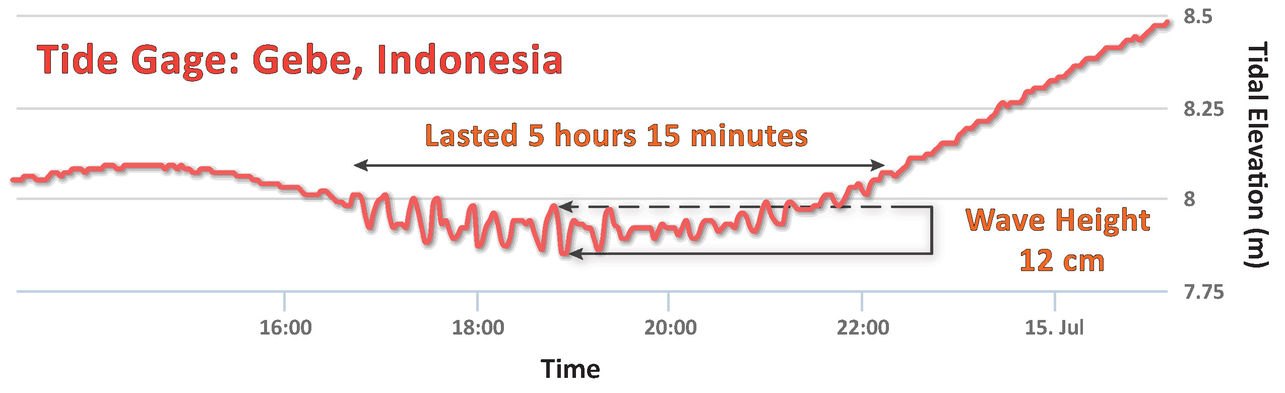
Here is the tide gage record from a gage near today’s M 7.3 earthquake. The earthquake epicenter appears to be on land, so the tsunami is possibly smaller because of this. Indonesia operates a network of tide gages throughout the region here. The gage data below are from the island of Gebe, about 50 miles to the east of the M 7.3 epicenter.
Here is a quote from the Meteorology, Climatology and Geophysics Agency (BMKG) website:
Impact of Earthquake
Based on community reports, it was shown that shocks were felt in Bitung and Manado with the intensity of IV-V MMI (felt by almost all residents, many people built), and in Ternate III-IV MMI (felt by many people in the house). Until now there have been no reports of damage due to a strong earthquake shock in northern Maluku last night. The impact of the North Maluku earthquake only caused a tremendous panic among the people. In the city of Manado, some of the houses of the walls had cracks in the building walls of the building with very light categories.
Now I can get back to working on a Ridgecrest update… stay tuned. (the maps are already made)
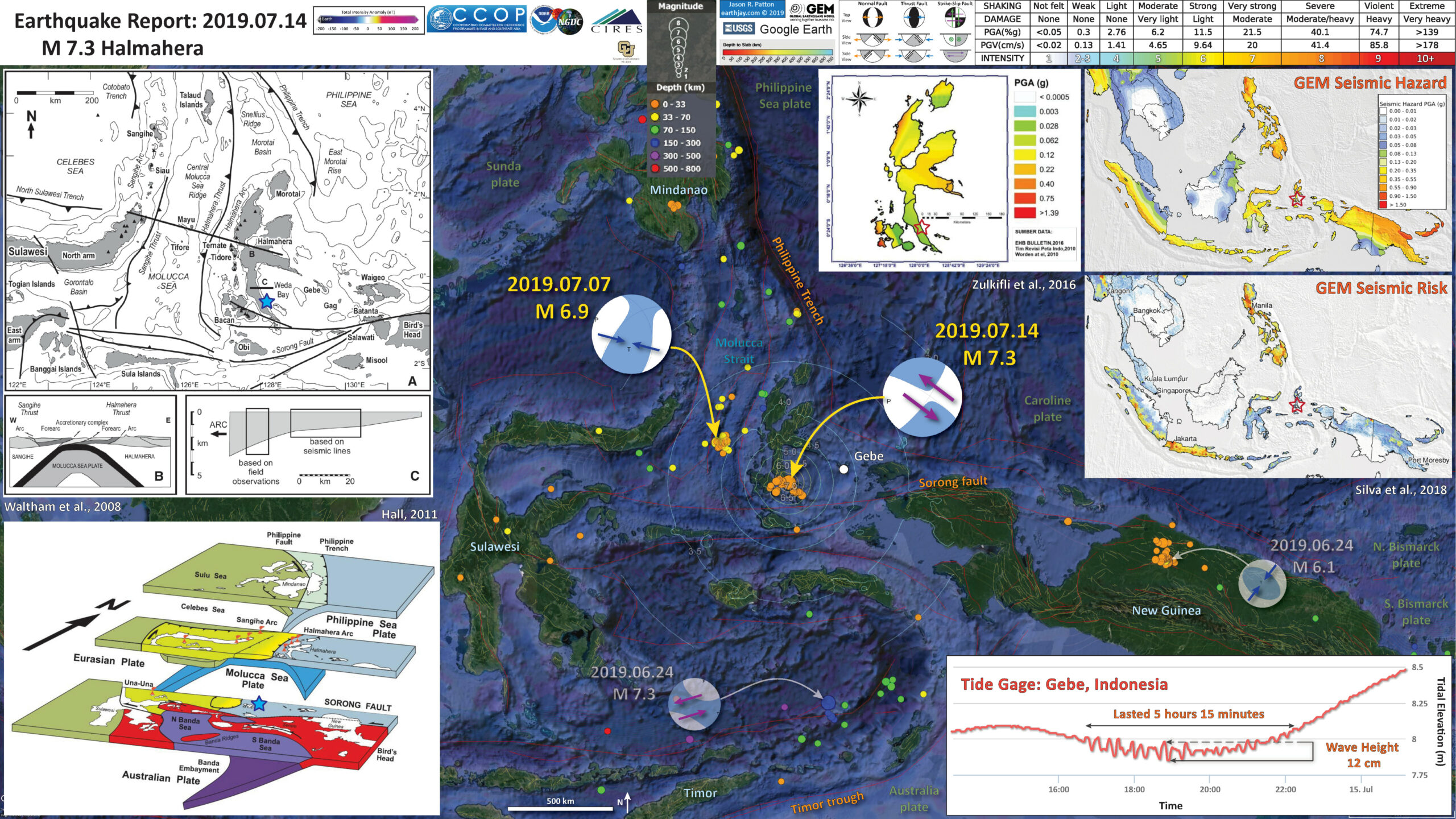
Below is my interpretive poster for this earthquake
I plot the seismicity from the past month, with color representing depth and diameter representing magnitude (see legend).
I plot the USGS fault plane solutions (moment tensors in blue and focal mechanisms in orange). Due to the high rate of seismicity in this region, I do not have an historic seismicity poster for this event.
- I placed a moment tensor / focal mechanism legend on the poster. There is more material from the USGS web sites about moment tensors and focal mechanisms (the beach ball symbols). Both moment tensors and focal mechanisms are solutions to seismologic data that reveal two possible interpretations for fault orientation and sense of motion. One must use other information, like the regional tectonics, to interpret which of the two possibilities is more likely.
- I also include the shaking intensity contours transparently on the map. These use the Modified Mercalli Intensity Scale (MMI; see the legend on the map). This is based upon a computer model estimate of ground motions, different from the “Did You Feel It?” estimate of ground motions that is actually based on real observations. The MMI is a qualitative measure of shaking intensity. More on the MMI scale can be found here and here. This is based upon a computer model estimate of ground motions, different from the “Did You Feel It?” estimate of ground motions that is actually based on real observations.
- I include the slab 2.0 contours plotted transparently (Hayes, 2018), which are contours that represent the depth to the subduction zone fault. These are mostly based upon seismicity. The depths of the earthquakes have considerable error and do not all occur along the subduction zone faults, so these slab contours are simply the best estimate for the location of the fault.
- In the map below, I include a transparent overlay of the magnetic anomaly data from EMAG2 (Meyer et al., 2017). As oceanic crust is formed, it inherits the magnetic field at the time. At different points through time, the magnetic polarity (north vs. south) flips, the North Pole becomes the South Pole. These changes in polarity can be seen when measuring the magnetic field above oceanic plates. This is one of the fundamental evidences for plate spreading at oceanic spreading ridges (like the Gorda rise).
- Regions with magnetic fields aligned like today’s magnetic polarity are colored red in the EMAG2 data, while reversed polarity regions are colored blue. Regions of intermediate magnetic field are colored light purple.
Magnetic Anomalies
- In the upper left corner is a plate tectonic map showing major fault lines for the Molucca Strait and Halmahera region (Waltham et al., 2008). I place a blue star in the general location of today’s M 7.3 earthquake.
- In the lower left corner is a low angle oblique view of the tectonic plates in this region (Hall, 2011). The view is from the southeast looking into the Earth towards the northwest.
- In the lower right corner are the tide gage data from the tide gage at Pulau Gebe. These data were provided by the Indonesian Government here. These appear to be tsunami waves, they lasted over 5 hours and had a small wave height of 12 centimeters..
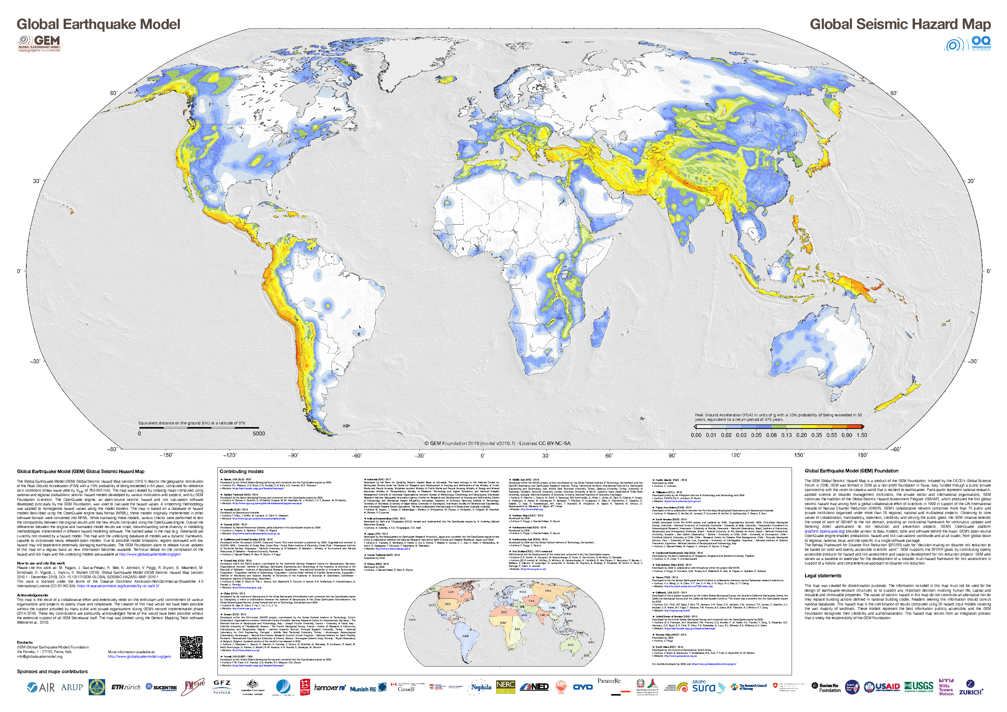
- In the upper right corner is a part of the Global Earthquake Model (GEM) seismic hazard map that uses cool colors to represent a lower level of shaking intensity than warm colors (Silva et al., 2018). The units are in g (gravitational acceleration). 1 g = Earth’s gravity, so hypothetically, “rocks can get thrown in the air at 1g.” This map is prepared based on the chance an area will have earthquakes of a given size based on a combination of many different seismic hazard models. The region where today’s earthquake happened is colored yellow and has a 10% chance of shaking that 0.2g to 0.35 g (or stronger) over the next 50 years.
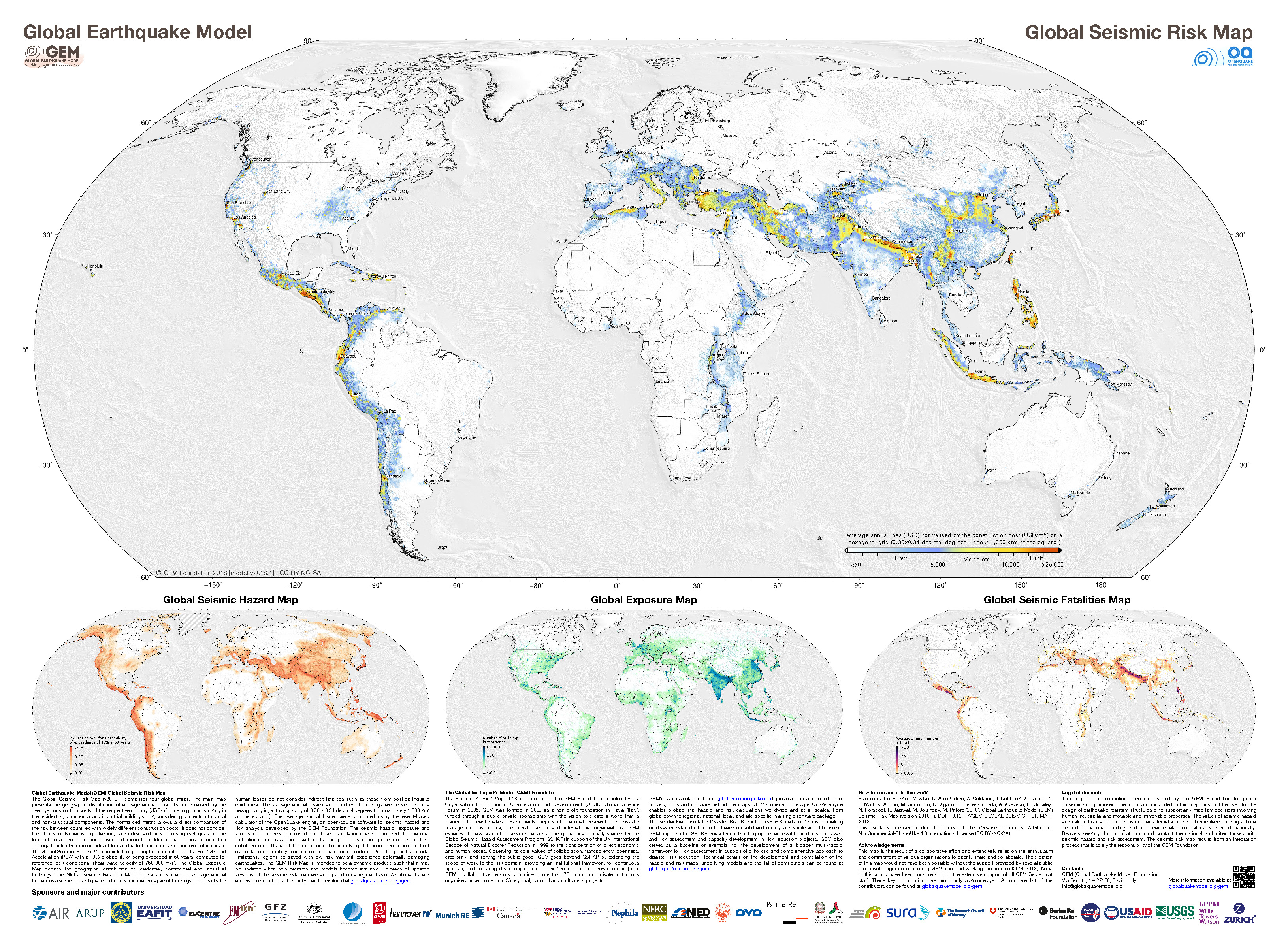
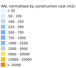
- Below the hazard map is the GEM seismic risk map presents the geographic distribution of average annual loss (USD) due to ground shaking in the residential, commercial and industrial building stock, considering contents, structural and non-structural components. Warmer colors represent larger loss over time. Risk is the overlap of hazard and population. If there are no people, but there is seismic hazard, there is no seismic risk.
- To the left of the GEM maps is a map of Halmahera and some surrounding islands. The color shows the level of seismic hazard for these islands (Zulkifli et al.,l 2017). The color shows the estimated Peak level of ground shaking for a period of 500 years (i.e. 10% probability of exceedance in 50 years). The units are the same (g). The M 7.3 earthquake generated up to ~.25 g, which is higher than the model would suggest (between 0.03 and 0.06 g).
I include some inset figures. Some of the same figures are located in different places on the larger scale map below.
- Here is the map with a month’s seismicity plotted.

- Here is the map with a century’s seismicity plotted. In the future I hope to get around to plotting earthquake mechanisms on this map. Yellow fault lines are from the Coordinating Committee Geoscience East-Southeast Asia consortium (CCOF). Red fault lines are from the Global Earthquake Model (GEM) Foundation.

Other Report Pages
Shaking Intensity and Potential for Ground Failure
- Below are a series of maps that show the shaking intensity and potential for landslides and liquefaction. These are all USGS data products.
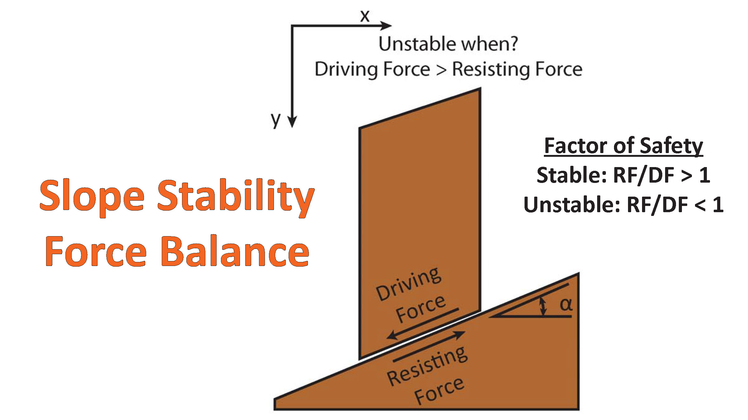
There are many different ways in which a landslide can be triggered. The first order relations behind slope failure (landslides) is that the “resisting” forces that are preventing slope failure (e.g. the strength of the bedrock or soil) are overcome by the “driving” forces that are pushing this land downwards (e.g. gravity). The ratio of resisting forces to driving forces is called the Factor of Safety (FOS). We can write this ratio like this:
FOS = Resisting Force / Driving Force
When FOS > 1, the slope is stable and when FOS < 1, the slope fails and we get a landslide. The illustration below shows these relations. Note how the slope angle α can take part in this ratio (the steeper the slope, the greater impact of the mass of the slope can contribute to driving forces). The real world is more complicated than the simplified illustration below.
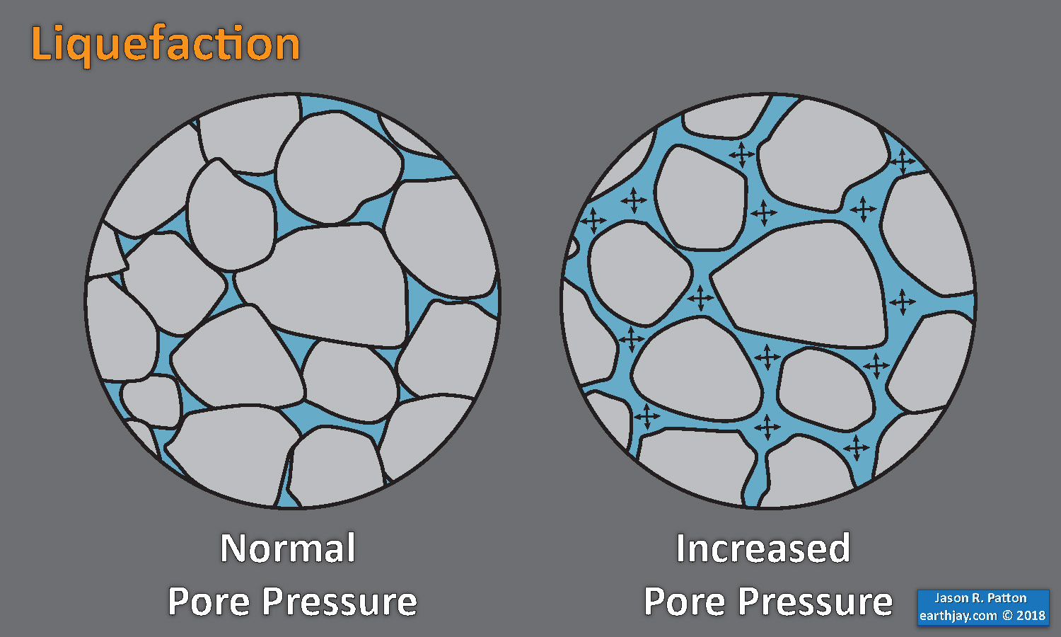
Landslide ground shaking can change the Factor of Safety in several ways that might increase the driving force or decrease the resisting force. Keefer (1984) studied a global data set of earthquake triggered landslides and found that larger earthquakes trigger larger and more numerous landslides across a larger area than do smaller earthquakes. Earthquakes can cause landslides because the seismic waves can cause the driving force to increase (the earthquake motions can “push” the land downwards), leading to a landslide. In addition, ground shaking can change the strength of these earth materials (a form of resisting force) with a process called liquefaction.
Sediment or soil strength is based upon the ability for sediment particles to push against each other without moving. This is a combination of friction and the forces exerted between these particles. This is loosely what we call the “angle of internal friction.” Liquefaction is a process by which pore pressure increases cause water to push out against the sediment particles so that they are no longer touching.
An analogy that some may be familiar with relates to a visit to the beach. When one is walking on the wet sand near the shoreline, the sand may hold the weight of our body generally pretty well. However, if we stop and vibrate our feet back and forth, this causes pore pressure to increase and we sink into the sand as the sand liquefies. Or, at least our feet sink into the sand.
Below is a diagram showing how an increase in pore pressure can push against the sediment particles so that they are not touching any more. This allows the particles to move around and this is why our feet sink in the sand in the analogy above. This is also what changes the strength of earth materials such that a landslide can be triggered.
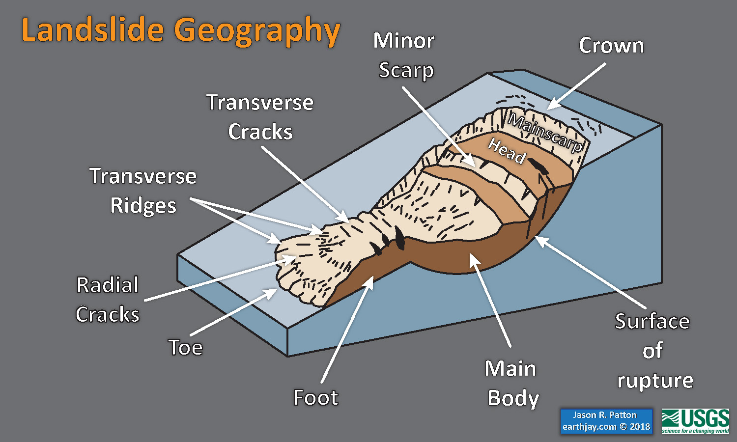
Below is a diagram based upon a publication designed to educate the public about landslides and the processes that trigger them (USGS, 2004). Additional background information about landslide types can be found in Highland et al. (2008). There was a variety of landslide types that can be observed surrounding the earthquake region. So, this illustration can help people when they observing the landscape response to the earthquake whether they are using aerial imagery, photos in newspaper or website articles, or videos on social media. Will you be able to locate a landslide scarp or the toe of a landslide? This figure shows a rotational landslide, one where the land rotates along a curvilinear failure surface.
Here is a map with landslide probability on it (Jessee et al., 2017). Please head over to that report for more information about the USGS Ground Failure products (landslides and liquefaction). Basically, earthquakes shake the ground and this ground shaking can cause landslides. We can see that there is a low probability for landslides. However, we have already seen photographic evidence for landslides and the lower limit for earthquake triggered landslides is magnitude M 5.5 (from Keefer 1984)

Nowicki Jessee and others (2018) is the preferred model for earthquake-triggered landslide hazard. Our primary landslide model is the empirical model of Nowicki Jessee and others (2018). The model was developed by relating 23 inventories of landslides triggered by past earthquakes with different combinations of predictor variables using logistic regression. The output resolution is ~250 m. The model inputs are described below. More details about the model can be found in the original publication. We modify the published model by excluding areas with slopes <5° and changing the coefficient for the lithology layer "unconsolidated sediments" from -3.22 to -1.36, the coefficient for "mixed sedimentary rocks" to better reflect that this unit is expected to be weak (more negative coefficient indicates stronger rock).To exclude areas of insignificantly small probabilities in the computation of aggregate statistics for this model, we use a probability threshold of 0.002.
Here is an excellent educational video from IRIS and a variety of organizations. The video helps us learn about how earthquake intensity gets smaller with distance from an earthquake. The concept of liquefaction is reviewed and we learn how different types of bedrock and underlying earth materials can affect the severity of ground shaking in a given location. The intensity map above is based on a model that relates intensity with distance to the earthquake, but does not incorporate changes in material properties as the video below mentions is an important factor that can increase intensity in places.
Here is a map showing liquefaction susceptibility (Zhu et al., 2017).

Zhu and others (2017) is the preferred model for liquefaction hazard. The model was developed by relating 27 inventories of liquefaction triggered by past earthquakes to globally-available geospatial proxies (summarized below) using logistic regression. We have implemented the global version of the model and have added additional modifications proposed by Baise and Rashidian (2017), including a peak ground acceleration (PGA) threshold of 0.1 g and linear interpolation of the input layers. We also exclude areas with slopes >5°. We linearly interpolate the original input layers of ~1 km resolution to 500 m resolution. The model inputs are described below. More details about the model can be found in the original publication.
Here is a map that shows a comparison of modeled shaking intensity for both the M 6.9 Molucca Strait (the left panel) and M 7.3 Halmahera (the right panel) earthquakes. The legend shows the MMI scale, which I discuss above.

- These are the two maps shown in the map above, the GEM Seismic Hazard and the GEM Seismic Risk maps from Pagani et al. (2018) and Silva et al. (2018).
- The GEM Seismic Hazard Map:
- The Global Earthquake Model (GEM) Global Seismic Hazard Map (version 2018.1) depicts the geographic distribution of the Peak Ground Acceleration (PGA) with a 10% probability of being exceeded in 50 years, computed for reference rock conditions (shear wave velocity, VS30, of 760-800 m/s). The map was created by collating maps computed using national and regional probabilistic seismic hazard models developed by various institutions and projects, and by GEM Foundation scientists. The OpenQuake engine, an open-source seismic hazard and risk calculation software developed principally by the GEM Foundation, was used to calculate the hazard values. A smoothing methodology was applied to homogenise hazard values along the model borders. The map is based on a database of hazard models described using the OpenQuake engine data format (NRML); those models originally implemented in other software formats were converted into NRML. While translating these models, various checks were performed to test the compatibility between the original results and the new results computed using the OpenQuake engine. Overall the differences between the original and translated model results are small, notwithstanding some diversity in modelling methodologies implemented in different hazard modelling software. The hashed areas in the map (e.g. Greenland) are currently not covered by a hazard model. The map and the underlying database of models are a dynamic framework, capable to incorporate newly released open models. Due to possible model limitations, regions portrayed with low hazard may still experience potentially damaging earthquakes.
- The GEM Seismic Risk Map:
- The Global Seismic Risk Map (v2018.1) presents the geographic distribution of average annual loss (USD) normalised by the average construction costs of the respective country (USD/m2) due to ground shaking in the residential, commercial and industrial building stock, considering contents, structural and non-structural components. The normalised metric allows a direct comparison of the risk between countries with widely different construction costs. It does not consider the effects of tsunamis, liquefaction, landslides, and fires following earthquakes. The loss estimates are from direct physical damage to buildings due to shaking, and thus damage to infrastructure or indirect losses due to business interruption are not included. The average annual losses are presented on a hexagonal grid, with a spacing of 0.30 x 0.34 decimal degrees (approximately 1,000 km2 at the equator). The average annual losses were computed using the event-based calculator of the OpenQuake engine, an open-source software for seismic hazard and risk analysis developed by the GEM Foundation. The seismic hazard, exposure and vulnerability models employed in these calculations were provided by national institutions, or developed within the scope of regional programs or bilateral collaborations. This global map and the underlying databases are based on best available and publicly accessible datasets and models. Due to possible model limitations, regions portrayed with low risk may still experience potentially damaging earthquakes.
Seismic Hazard and Seismic Risk

Tsunami Hazard
- Here are two maps that show the results of probabilistic tsunami modeling for the nation of Indonesia (Horspool et al., 2014). These results are similar to results from seismic hazards analysis and maps. The color represents the chance that a given area will experience a certain size tsunami (or larger).
- The first map shows the annual chance of a tsunami with a height of at least 0.5 m (1.5 feet). The second map shows the chance that there will be a tsunami at least 3 meters (10 feet) high at the coast.
Annual probability of experiencing a tsunami with a height at the coast of (a) 0.5m (a tsunami warning) and (b) 3m (a major tsunami warning).
Some Relevant Discussion and Figures
- Here is a tectonic map for this part of the world from Zahirovic et al., 2014. They show a fracture zone where the M 7.3 earthquake happened. I left out all the acronym definitions (you’re welcome), but they are listed in the paper.

Regional tectonic setting with plate boundaries (MORs/transforms = black, subduction zones = teethed red) from Bird (2003) and ophiolite belts representing sutures modified from Hutchison (1975) and Baldwin et al. (2012). West Sulawesi basalts are from Polvé et al. (1997), fracture zones are from Matthews et al. (2011) and basin outlines are from Hearn et al. (2003).
- Here are maps showing the regional tectonics (Smoczyk et al., 2013).

Along its western margin, the Philippine Sea plate is associated with a zone of oblique convergence with the Sunda plate. This highly active convergent plate boundary extends along both sides the Philippine Islands, from Luzon in the north to Sulawesi in the south. The tectonic setting of the Philippines is unusual in several respects: it is characterized by opposite-facing subduction systems on its east and west sides; the archipelago is cut by a major transform fault, the Philippine Fault; and the arc complex itself is marked by volcanism, faulting, and high seismic activity. Subduction of the Philippine Sea plate occurs at the eastern margin of the archipelago along the Philippine Trench and its northern extension, the East Luzon Trough. The East Luzon Trough is thought to be an unusual example of a subduction zone in the process of formation, as the Philippine Trench system gradually extends northward (Hamburger and others, 1983).
- This shows Global Positioning System (GPS) velocities at various locations. These plate motions are represented as vectors in mm/yr. (see legend) Here note how the vector labeled phil/eura (for the motion of the PSP relative to the Eurasia plate) is oblique to the plate margin along the Philippine trench (i.e. the PSP is not subducting perpendicular to the megathrust fault). The oblique relative motion seems to lead to strain partitioning, leading to a forearc sliver fault (the Philippine fault, shown in maps above). Below I include the text from the original figure caption in blockquote.

Topographic and tectonic map of the Indonesian archipelago and surrounding region. Labeled, shaded arrows show motion (NUVEL-1A model) of the first-named tectonic plate relative to the second. Solid arrows are velocity vectors derived from GPS surveys from 1991 through 2001, in ITRF2000. For clarity, only a few of the vectors for Sumatra are included. The detailed velocity field for Sumatra is shown in Figure 5. Velocity vector ellipses indicate 2-D 95% confidence levels based on the formal (white noise only) uncertainty estimates. NGT, ew Guinea Trench; NST, North Sulawesi Trench; SF, Sumatran Fault; TAF, Tarera-Aiduna Fault. Bathymetry [Smith and Sandwell, 1997] in this and all subsequent figures contoured at 2 km intervals
- This is one of my favorite figures of all time (Hall, 2011). Read below for more details.

3D cartoon of plate boundaries in the Molucca Sea region modified from Hall et al. (1995). Although seismicity identifies a number of plates there are no continuous boundaries, and the Cotobato, North Sulawesi and Philippine Trenches are all intraplate features. The apparent distinction between different crust types, such as Australian continental crust and oceanic crust of the Philippine and Molucca Sea, is partly a boundary inactive since the Early Miocene (east Sulawesi) and partly a younger but now probably inactive boundary of the Sorong Fault. The upper crust of this entire region is deforming in a much more continuous way than suggested by this cartoon.
- Here is a map and cross section presented by Waltham et al. (2008). They use a variety of data sources as a basis for their interpretations (seismic reflection data, gravity data). Note how the Molucca Sea plate subducts both to the west and to the east. Below I include the text from the original figure caption in blockquote.
(A) Location and major tectonic features of the Molucca Sea region. Small, black-fi lled triangles are modern volcanoes. Bathymetric contours are at 200, 2000, 4000, and 6000 m. Large barbed lines are subduction zones, and small barbed lines are thrusts. (B) Cross section across the Halmahera and Sangihe Arcs on section line B. Thrusts on each side of the Molucca Sea are directed outward toward the adjacent arcs, although the subducting Molucca Sea plate dips east beneath Halmahera and west below the Sangihe Arc. (C) Inset is the restored cross section of the Miocene–Pliocene Weda Bay Basin of SW Halmahera on section line C, fl attened to the Pliocene unconformity, showing estimated thickness of the section
- Early work done in the region was presented by McCaffrey et al. (1980). Here is a map showing seismic refraction lines that they used to constrain the structures in this region. Below I include the text from the original figure caption in blockquote.
- Here is a cross section that shows the gravity model they used to interpret this region.

Map of the Molucca Sea, eastern Indonesia, showing I~tions of seismic refraction lines (solid straight lines) and gravity traverses (duhed-dotted lines). Thrust faults are shown with teeth on hanging wall. Triangles represent active volcanoes defining the Sangihe and Halmahera magmatic arcs. Isobath interval is 1 km from Mammericks et al. [1976].

Gravity model for the central Molucca Sea. (II) Crustal model with layers designated by their density contrasts and refraction control points by open circles and vertical bars. (b) Mantle structure used in modeling the gravity profiles in the central Molucca Sea. Figure 124 fits into the small box at the apex of the inverted-V-ehaped lithosphere. Slab dimensions are controlled by earthquake foci (dots) from Hlltherton 11M Dickinaon [1969J, and mantle densities are taken from Grow 11M Rowin [1975J. The column at the left shows assumed densities for the range of depths between the tick marks. The small v pattern represents oceanic crust, and island arc crust is designated by a short parallel line pattern. East is to the right of the figure.
- Here is another tectonic map showing the Sorong fault and some splay faults (dashed lines running along Halmahera), one of which may be involved in today’s earthquake.

Location map and active faults of the Molucca Sea region. Fault colours: blue, convergence; red, transvergence; yellow, divergence; grey, uncertain motion. Fault abbreviations: CF, Catabato Fault; GF, Gorontalo Fault; NST, North Sulawesi Trench; PKF, Palu-Koro Fault; SF, Sorong Fault.
- This is a geologic map for the islands in the region (Hall et al., 1988).

Sketch geological map of Halmahera based on Apandi & Sudana (1980), Silitonga et al. (1981), Supriatna (1980) & Yasin (1980) and modified after our own observations. Note in particular the absence of thrusting in the NE arm and the major NE-SW fault (the Subaim Fault) running parallel to the south side of Kau Bay.
Geologic Fundamentals
- For more on the graphical representation of moment tensors and focal mechanisms, check this IRIS video out:
- Here is a fantastic infographic from Frisch et al. (2011). This figure shows some examples of earthquakes in different plate tectonic settings, and what their fault plane solutions are. There is a cross section showing these focal mechanisms for a thrust or reverse earthquake. The upper right corner includes my favorite figure of all time. This shows the first motion (up or down) for each of the four quadrants. This figure also shows how the amplitude of the seismic waves are greatest (generally) in the middle of the quadrant and decrease to zero at the nodal planes (the boundary of each quadrant).
- Here is another way to look at these beach balls.
The two beach balls show the stike-slip fault motions for the M6.4 (left) and M6.0 (right) earthquakes. Helena Buurman's primer on reading those symbols is here. pic.twitter.com/aWrrb8I9tj
— AK Earthquake Center (@AKearthquake) August 15, 2018
- There are three types of earthquakes, strike-slip, compressional (reverse or thrust, depending upon the dip of the fault), and extensional (normal). Here is are some animations of these three types of earthquake faults. The following three animations are from IRIS.
Strike Slip:
Compressional:
Extensional:
- This is an image from the USGS that shows how, when an oceanic plate moves over a hotspot, the volcanoes formed over the hotspot form a series of volcanoes that increase in age in the direction of plate motion. The presumption is that the hotspot is stable and stays in one location. Torsvik et al. (2017) use various methods to evaluate why this is a false presumption for the Hawaii Hotspot.
- Here is a map from Torsvik et al. (2017) that shows the age of volcanic rocks at different locations along the Hawaii-Emperor Seamount Chain.
- Here is a great tweet that discusses the different parts of a seismogram and how the internal structures of the Earth help control seismic waves as they propagate in the Earth.
A cutaway view along the Hawaiian island chain showing the inferred mantle plume that has fed the Hawaiian hot spot on the overriding Pacific Plate. The geologic ages of the oldest volcano on each island (Ma = millions of years ago) are progressively older to the northwest, consistent with the hot spot model for the origin of the Hawaiian Ridge-Emperor Seamount Chain. (Modified from image of Joel E. Robinson, USGS, in “This Dynamic Planet” map of Simkin and others, 2006.)
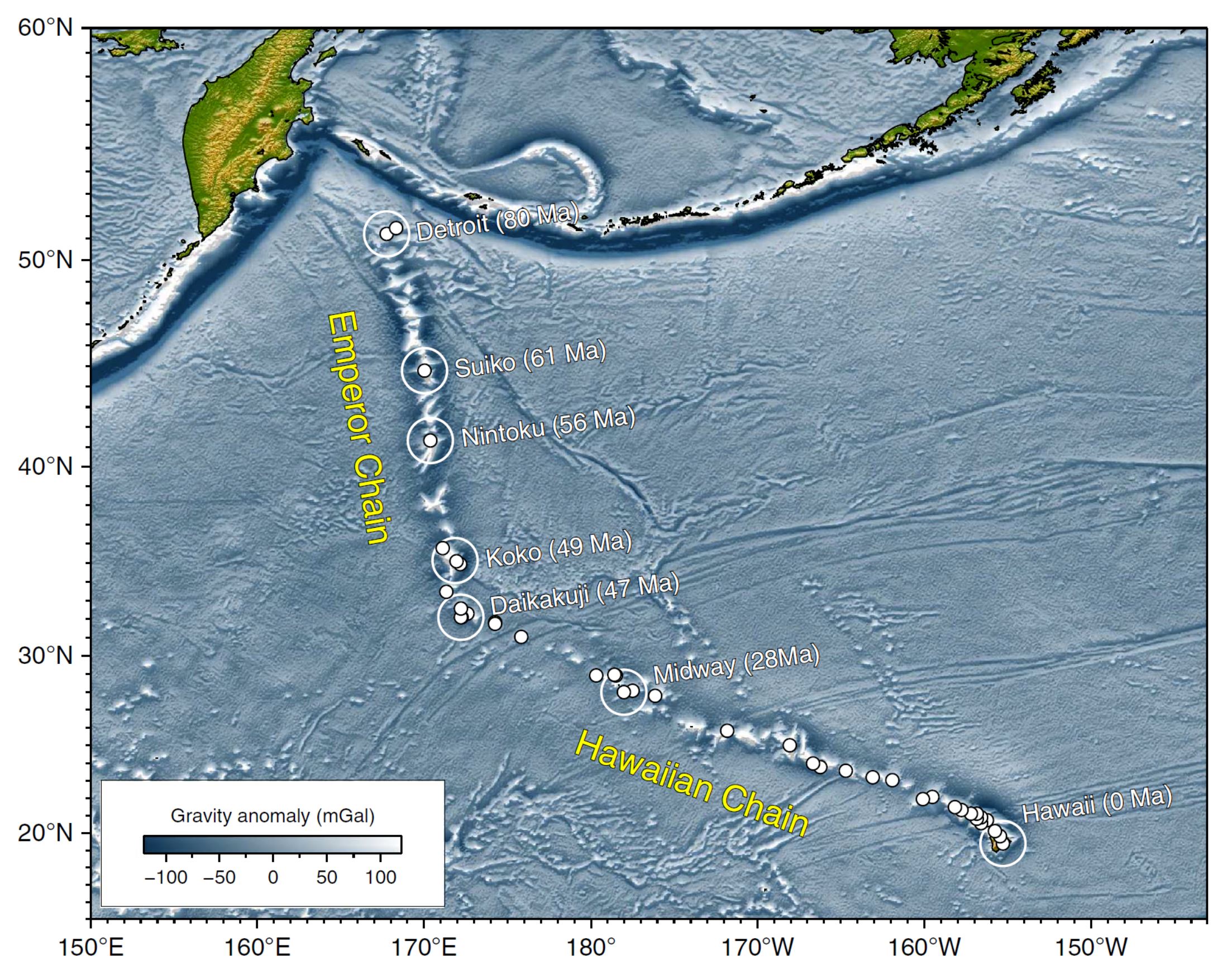
Hawaiian-Emperor Chain. White dots are the locations of radiometrically dated seamounts, atolls and islands, based on compilations of Doubrovine et al. and O’Connor et al. Features encircled with larger white circles are discussed in the text and Fig. 2. Marine gravity anomaly map is from Sandwell and Smith.
Today, on #SeismogramSaturday: what are all those strangely-named seismic phases described in seismograms from distant earthquakes? And what do they tell us about Earth’s interior? pic.twitter.com/VJ9pXJFdCy
— Jackie Caplan-Auerbach (@geophysichick) February 23, 2019
- 2019.07.14 M 7.3 Halmahera
- 2018.12.29 M 7.0 Philippines
- 2017.12.08 M 6.5 Caroline Ridge
- 2017.12.09 M 6.5 Caroline Ridge Update #1
- 2017.08.11 M 6.2 Philippines
- 2017.04.28 M 6.9 Philippines
- 2017.04.08 M 5.9 Philippines
- 2017.01.10 M 7.3 Celebes Sea
- 2016.07.29 M 7.7 Mariana
- 2015.03.17 M 6.2 Molucca Sea
- 2014.11.26 M 6.8 Molucca Sea
- 2014.11.21 M 6.5 Molucca Sea
- 2014.11.15 M 7.1 Molucca Sea
Philippines | Western Pacific
Earthquake Reports
Social Media
Updated #aftershocks of the yesterday Mw 7.3 Halmahera #earthquake, seems the EQ has low aftershocks productivity. The Mc is quite large (~3.5) in this region due to the lack of local (distance <100 km) seismic station, but the regional coverage is good. #seismology #gempa pic.twitter.com/wEzwn9fJvR
— Dimas Sianipar (@SianiparDimas) July 15, 2019
Mw=7.4, HALMAHERA, INDONESIA (Depth: 17 km), 2019/07/14 09:10:50 UTC – Full details here: https://t.co/dNG7xZttM4 pic.twitter.com/BrD8FJ8ofn
— Earthquakes (@geoscope_ipgp) July 14, 2019
Explore the complex region where the M7.3 #Indonesia #earthquake occurred using the IRIS Interactive Earthquake Browser. The size of the dot indicates the magnitude & the color indicates the depth. You can even look at eq hypocenter locations in 3D! https://t.co/Gs3ykBEp0y pic.twitter.com/wEK4g6srok
— IRIS Earthquake Sci (@IRIS_EPO) July 14, 2019
potential #tsunami after #Halmahera #earthquake. Tsunami impact highly depends on a still very uncertain rupture mechanism. Recorded wave amplitude of 10 cm near #Gebe.
Run-up of ~1 m possible around epicenter @ShakingEarth pic.twitter.com/uUHBuf3QkY— CATnews | Andreas M. Schäfer (@CATnewsDE) July 14, 2019
potentially expected #aftershocks for today's #Halmahera #earthquake, #Indonesia @ShakingEarth pic.twitter.com/R9RUghePs2
— CATnews | Andreas M. Schäfer (@CATnewsDE) July 14, 2019
BMKG: Halmahera Selatan Masuk Wilayah Seismik Aktif dan Kompleks https://t.co/8XcNfJMQEy
— Indonesiainside.id (@indoinsidenews) July 15, 2019
- Frisch, W., Meschede, M., Blakey, R., 2011. Plate Tectonics, Springer-Verlag, London, 213 pp.
- Hall, R., 2011. Australia-SE Asia collision: plate tectonics and crustal flow in Geological Society, London, Special Publications 2011; v. 355; p. 75-109 doi: 10.1144/SP355.5
- Hall., R., Audley-Charles, M.G., Banner, F.T., Hidayat, S., Tobing, S.L., 1988. Basement rocks of the Halmahera region, eastern Indonesia: a Late Cretaceous-early Tertiary arc and fore-arc in Journal of the Geological Society, v. 145, p. 65-84
- Harris, R. and Major, J., 2016. Waves of destruction in the East Indies: the Wichmann catalogue of earthquakes and tsunami in the Indonesian region from 1538 to 1877 in Cummins, P. R. & Meilano, I. (eds) Geohazards in Indonesia: Earth Science for Disaster Risk Reduction. Geological Society, London, Special Publications, 441, http://doi.org/10.1144/SP441.2
- Hayes, G., 2018, Slab2 – A Comprehensive Subduction Zone Geometry Model: U.S. Geological Survey data release, https://doi.org/10.5066/F7PV6JNV.
- Highland, L.M., and Bobrowsky, P., 2008. The landslide handbook—A guide to understanding landslides, Reston, Virginia, U.S. Geological Survey Circular 1325, 129 p.
- Holt, W. E., C. Kreemer, A. J. Haines, L. Estey, C. Meertens, G. Blewitt, and D. Lavallee (2005), Project helps constrain continental dynamics and seismic hazards, Eos Trans. AGU, 86(41), 383–387, , https://doi.org/10.1029/2005EO410002. /li>
- Horspool, N., Pranantyo, I., Griffin, J., Latief, H., Natawidjaja, D. H., Kongko, W., Cipta, A., Bustaman, B., Anugrah, S. D., and Thio, H. K., 2014. A probabilistic tsunami hazard assessment for Indonesia, Nat. Hazards Earth Syst. Sci., 14, 3105-3122, https://doi.org/10.5194/nhess-14-3105-2014, 2014.
- Jessee, M.A.N., Hamburger, M. W., Allstadt, K., Wald, D. J., Robeson, S. M., Tanyas, H., et al. (2018). A global empirical model for near-real-time assessment of seismically induced landslides. Journal of Geophysical Research: Earth Surface, 123, 1835–1859. https://doi.org/10.1029/2017JF004494
- Keefer, D.K., 1984. Landslides Caused by Earthquakes in GSA Bulletin, v. 95, p. 406-421
- Kreemer, C., J. Haines, W. Holt, G. Blewitt, and D. Lavallee (2000), On the determination of a global strain rate model, Geophys. J. Int., 52(10), 765–770.
- Kreemer, C., W. E. Holt, and A. J. Haines (2003), An integrated global model of present-day plate motions and plate boundary deformation, Geophys. J. Int., 154(1), 8–34, , https://doi.org/10.1046/j.1365-246X.2003.01917.x.
- Kreemer, C., G. Blewitt, E.C. Klein, 2014. A geodetic plate motion and Global Strain Rate Model in Geochemistry, Geophysics, Geosystems, v. 15, p. 3849-3889, https://doi.org/10.1002/2014GC005407.
- McCaffrey, R., Silver, E.A., and Raitt, R.W., 1980. Crustal Structure of the Molucca Sea Collision Zone, Indonesia in The Tectonic and Geologic Evolution of Southeast Asian Seas and Islands-Geophysical Monograph 23, p. 161-177.
- Meyer, B., Saltus, R., Chulliat, a., 2017. EMAG2: Earth Magnetic Anomaly Grid (2-arc-minute resolution) Version 3. National Centers for Environmental Information, NOAA. Model. https://doi.org/10.7289/V5H70CVX
- Müller, R.D., Sdrolias, M., Gaina, C. and Roest, W.R., 2008, Age spreading rates and spreading asymmetry of the world’s ocean crust in Geochemistry, Geophysics, Geosystems, 9, Q04006, https://doi.org/10.1029/2007GC001743
- Pagani,M. , J. Garcia-Pelaez, R. Gee, K. Johnson, V. Poggi, R. Styron, G. Weatherill, M. Simionato, D. Viganò, L. Danciu, D. Monelli (2018). Global Earthquake Model (GEM) Seismic Hazard Map (version 2018.1 – December 2018), DOI: 10.13117/GEM-GLOBAL-SEISMIC-HAZARD-MAP-2018.1
- Silva, V ., D Amo-Oduro, A Calderon, J Dabbeek, V Despotaki, L Martins, A Rao, M Simionato, D Viganò, C Yepes, A Acevedo, N Horspool, H Crowley, K Jaiswal, M Journeay, M Pittore, 2018. Global Earthquake Model (GEM) Seismic Risk Map (version 2018.1). https://doi.org/10.13117/GEM-GLOBAL-SEISMIC-RISK-MAP-2018.1
- Smoczyk, G.M., Hayes, G.P., Hamburger, M.W., Benz, H.M., Villaseñor, Antonio, and Furlong, K.P., 2013. Seismicity of the Earth 1900–2012 Philippine Sea plate and vicinity: U.S. Geological Survey Open-File Report 2010–1083-M, 1 sheet, scale 1:10,000,000.
- Waltham et al., 2008. Basin formation by volcanic arc loading in GSA Special Papers 2008, v. 436, p. 11-26.
- Zahirovic et al., 2014. The Cretaceous and Cenozoic tectonic evolution of Southeast Asia in Solid Earth, v. 5, p. 227-273, doi:10.5194/se-5-227-2014.
- Zulkifli, M., Rudyanto, A., and Sakti, A.P., 2016. The View of Seismic Hazard in The Halmahera Region in proceedings from International Symposium on Earth Hazard and Disaster Mitigation (ISEDM) 2016 AIP Conf. Proc. 1857, 050004-1–050004-7; doi:10.1063/1.4987082
References:
Return to the Earthquake Reports page.