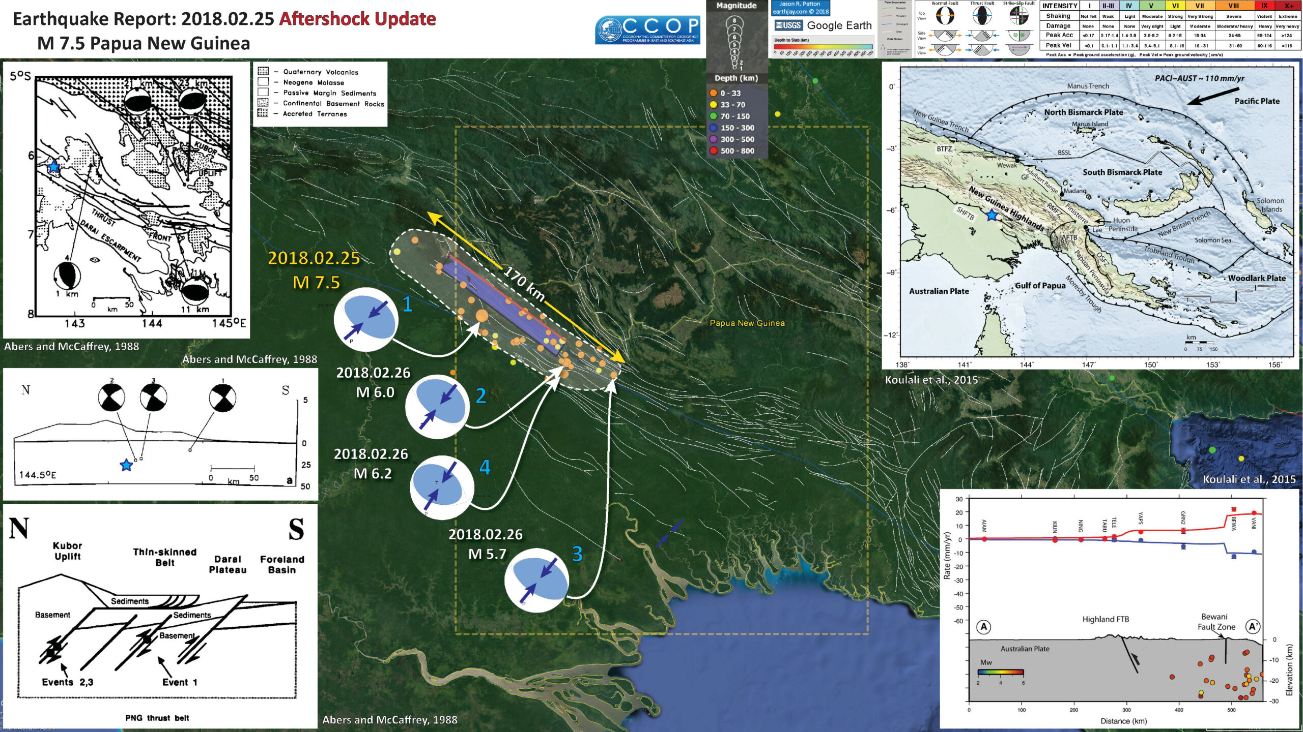
The aftershocks are still coming in! We can use these aftershocks to define where the fault may have slipped during this M 7.5 earthquake. As I mentioned yesterday in the original report, it turns out the fault dimension matches pretty well with empirical relations between fault length and magnitude from Wells and Coppersmith (1994).
The mapped faults in the region, as well as interpreted seismic lines, show an imbricate fold and thrust belt that dominates the geomorphology here (as well as some volcanoes, which are probably related to the slab gap produced by crust delamination; see Cloos et al., 2005 for more on this). I found a fault data set and include this in the aftershock update interpretive poster (from the Coordinating Committee for Geoscience Programmes in East and Southeast Asia, CCOP).
I initially thought that this M 7.5 earthquake was on a fault in the Papuan Fold and Thrust Belt (PFTB). Mark Allen pointed out on twitter that the ~35km hypocentral depth is probably too deep to be on one of these “thin skinned” faults (see Social Media below). Abers and McCaffrey (1988) used focal mechanism data to hypothesize that there are deeper crustal faults that are also capable of generating the earthquakes in this region. So, I now align myself with this hypothesis (that the M 7.5 slipped on a crustal fault, beneath the thin skin deformation associated with the PFTB. (thanks Mark! I had downloaded the Abers paper but had not digested it fully.)
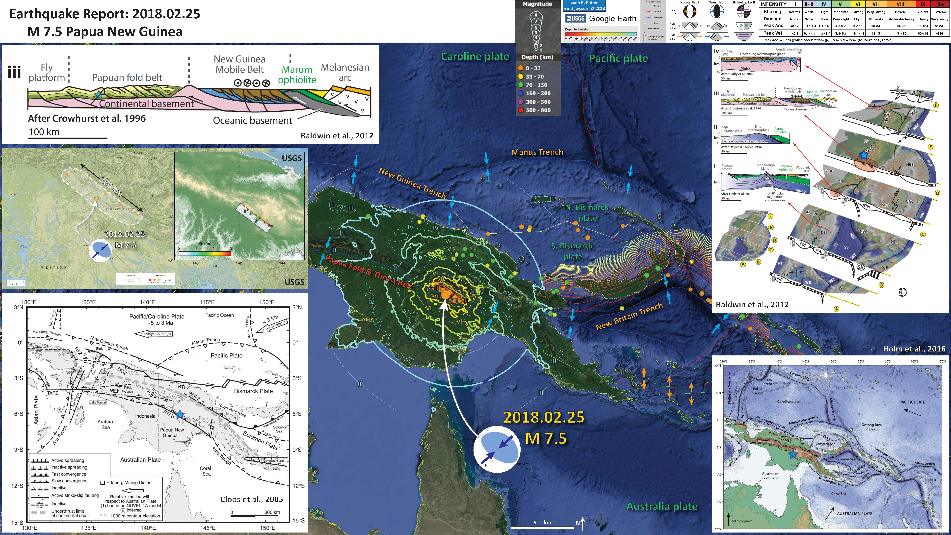
Below is my interpretive poster for this earthquake
I plot the seismicity from the past month, with color representing depth and diameter representing magnitude (see legend).
I plot the USGS fault plane solutions (moment tensors in blue and focal mechanisms in orange) for the M 7.5 earthquake, in addition to some relevant historic earthquakes.
- I placed a moment tensor / focal mechanism legend on the poster. There is more material from the USGS web sites about moment tensors and focal mechanisms (the beach ball symbols). Both moment tensors and focal mechanisms are solutions to seismologic data that reveal two possible interpretations for fault orientation and sense of motion. One must use other information, like the regional tectonics, to interpret which of the two possibilities is more likely.
- I also include the shaking intensity contours on the map. These use the Modified Mercalli Intensity Scale (MMI; see the legend on the map). This is based upon a computer model estimate of ground motions, different from the “Did You Feel It?” estimate of ground motions that is actually based on real observations. The MMI is a qualitative measure of shaking intensity. More on the MMI scale can be found here and here. This is based upon a computer model estimate of ground motions, different from the “Did You Feel It?” estimate of ground motions that is actually based on real observations.
- I include the slab contours plotted (Hayes et al., 2012), which are contours that represent the depth to the subduction zone fault. These are mostly based upon seismicity. The depths of the earthquakes have considerable error and do not all occur along the subduction zone faults, so these slab contours are simply the best estimate for the location of the fault.
-
I include some inset figures.
- In the upper right corner is a general overview of the plate boundaries and mapped faults in the region. I place a blue star in the general location of the M 7.5 epicenter. The fault lines on this figure also come from CCOP.
- In the lower right corner is a plot showing vertical land motion for GPS sites along a north-south profile. Basically, this shows that the sites north of the FTB are currently uplifting at about 5 mm.yr and the sites north of the Bewani fault zone are uplifting an additional 10 mm/yr. This means that the crustal shortening associated with the collision of Australia with the Pacific/Caroline plates is partly being accumulated as elastic strain in the crust and is localized on these fault systems. While this profile is several tens of kilometers to the west of the M 7.5, this process is likely also happening where the M 7.5 occurred.
- On the left are three figures from Abers and McCaffrey (1988).
- The upper panel shows the extent of a portion of their analysis that is cogent for the M 7.5 sequence. The extent of this box is also outlined in a dashed yellow rectangle on the main map. The blue star represents the general location of the M 7.5 earthquake. There are no backthrusts mapped on this figure (the hypothesis for the M 7.5 source fault promoted in my original report and on social media).
- This is a north-south cross section showing the focal mechanisms for 3 of the earthquakes in the map. This shows a south vergent fault as a possible source for the M ~5.x earthquakes studied by Abers and McCaffrey (1988). I am starting to favor an interpretation that the M 7.5 fault is south vergent.
- The lowest panel shows the interpretation from Abers that these deeper crustal faults are responsible for the seismicity they studied (and I thank mark again that I may posit that these faults are responsible for the current seismicity).

- Here is the original interpretive poster from my initial report here.
- The same map without historic seismicity.
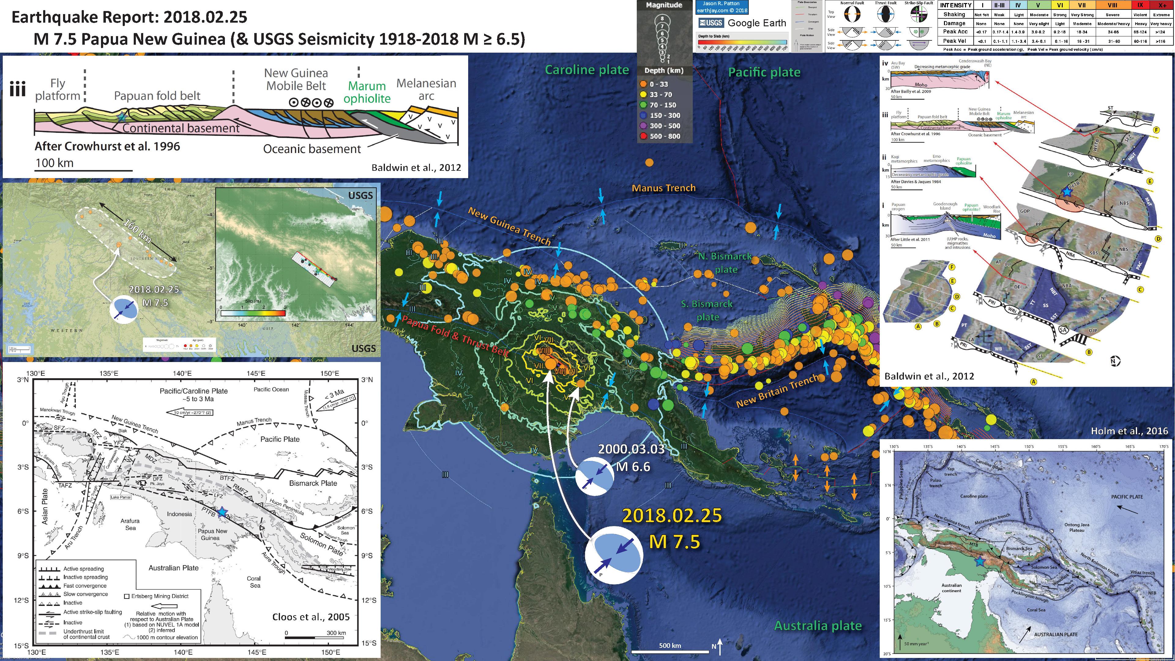
Some Relevant Discussion and Figures
- Here is the tectonic map from Loulali et al. (2015).

Tectonic setting of the Papua New Guinea region. Topography and bathymetry are from SRTM(http://topex.ucsd.edu/www_html/srtm30_plus.html). Faults are mostly from the East and Southeast Asia (CCOP) 1:2000000 geological map (downloaded from http://www.orrbodies.com/resources/item/orr0052). AFTB, Aure Fold-and-Thrust Belt; OSZF, Owen Stainly fault zone; GF, Gogol fault; BTFZ, Bewani-Torricelli fault zone; RMFZ, Ramu-Markham fault zone; BSSL, Bismarck Sea Seismic Lineation.
- Here is a map from Abers and McCaffrey (1988) that shows all the earthquakes included in their study (and the focal mechanisms). Inset “a” is the region shown on the aftershock poster above.
- Here are all the 3 cross sections from Abers and McCaffrey (1988). The upper section is a and the lower section is c (from the above map).
- This is the money shot, showing their interpretation (Abers and McCaffrey, 1988).

Map of focal mechanisms determined here, locations of cross sections in Figure 11, and shallow seismicity. Focal mechanisms are shown as lower hemisphere projections with the compressional quadrants shaded, and the P and T axes shown as solid and open circles, respectively. The sizes of the focal spheres are scaled to log (MO), according to the scale in the upper right, and are labeled by the event numbers in Table 1. Seismicity is from the ISC catalog, 1964-1984, and includes all events listed as being shallower than 70 km recorded by 25 or more stations, with M b • 5.0, and with standard deviations in latitude, longitude, or depth each not exceeding 20 km. Inset in lower left shows all large (M • 7.0), shallow (! 70 km) earthquakes in the period 1900-1985, from the catalog compiled by Everingham [1974] for events before 1971 and from Ganse and Nelson [1981, with supplement] for more recent events. Faults are labelled on Figure 1.

Cross sections of seismicity and topography: a, b, and c refer to the profile locations on Figure 2. Vertical exaggeration is 10x for topography and lx for seismicity, as indicated by the vertical scale bars on right. Horizontal scale, indicated on profile a, is the same for all profiles. Focal spheres are plotted as back hemisphere projections, and compressional quadrants are filled.
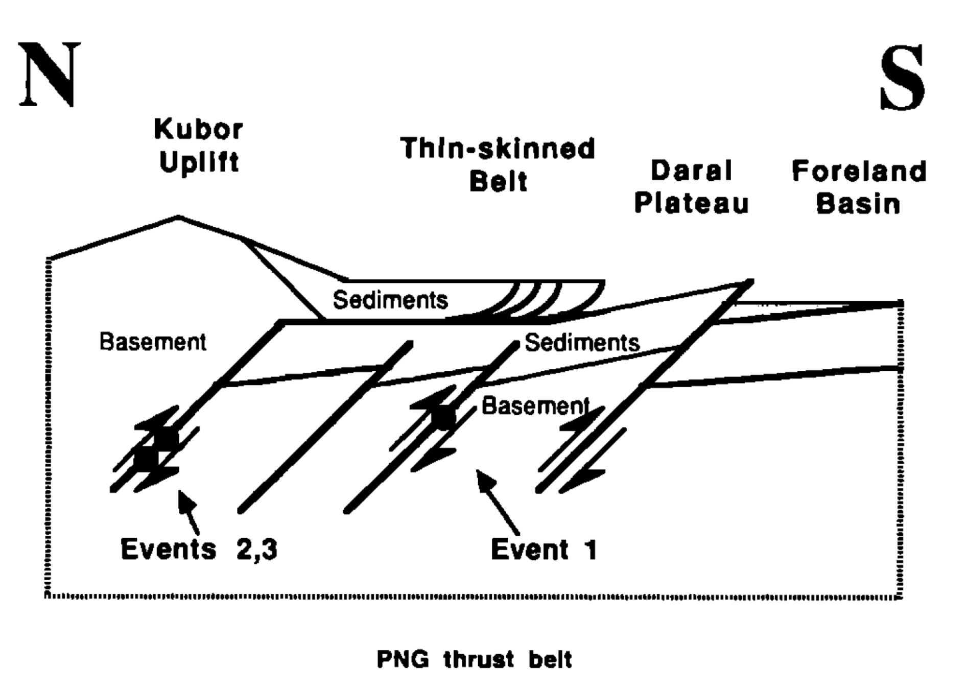
Cartoon showing how thin-skinned faulting mapped in PNG might be related to faulting in the basement, inferred from the earthquakes and other evidence discussed in the text. See Figure 11a for comparison to actual topography and earthquake mechanisms.
- Here is a comparison of the proposed fault length shown on the poster with fault scaling relations from Wells and Coppersmith (1994). The upper panel is figure 9 and the lower panel is figure 17. I include figure captions for these figures below. Presuming a fault length of 170 km, the magnitude would be between 7.5 and 8.
- 2018.02.25 M 7.5 Papua New Guinea
- 2018.02.26 M 7.5 Papua New Guinea Update #1
- 2017.11.07 M 6.5 Papua New Guinea
- 2017.11.04 M 6.8 Tonga
- 2017.10.31 M 6.8 Loyalty Islands
- 2017.08.27 M 6.4 N. Bismarck plate
- 2017.05.09 M 6.8 Vanuatu
- 2017.03.19 M 6.0 Solomon Islands
- 2017.03.05 M 6.5 New Britain
- 2017.01.22 M 7.9 Bougainville
- 2017.01.03 M 6.9 Fiji
- 2016.12.17 M 7.9 Bougainville
- 2016.12.08 M 7.8 Solomons
- 2016.10.17 M 6.9 New Britain
- 2016.10.15 M 6.4 South Bismarck Sea
- 2016.09.14 M 6.0 Solomon Islands
- 2016.08.31 M 6.7 New Britain
- 2016.08.12 M 7.2 New Hebrides Update #2
- 2016.08.12 M 7.2 New Hebrides Update #1
- 2016.08.12 M 7.2 New Hebrides
- 2016.04.06 M 6.9 Vanuatu Update #1
- 2016.04.03 M 6.9 Vanuatu
- 2015.03.30 M 7.5 New Britain (Update #5)
- 2015.03.30 M 7.5 New Britain (Update #4)
- 2015.03.29 M 7.5 New Britain (Update #3)
- 2015.03.29 M 7.5 New Britain (Update #2)
- 2015.03.29 M 7.5 New Britain (Update #1)
- 2015.03.29 M 7.5 New Britain
- 2015.11.18 M 6.8 Solomon Islands
- 2015.05.24 M 6.8, 6.8, 6.9 Santa Cruz Islands
- 2015.05.05 M 7.5 New Britain
- Abers, G. and McCaffrey, R., 1988. Active Deformation in the New Guinea Fold-and-Thrust Belt: Seismological Evidence for Strike-Slip Faulting and Basement-Involved Thrusting in JGR, v. 93, no. B11, p. 13,332-13,354
- Baldwin, S.L., Monteleone, B.D., Webb, L.E., Fitzgerald, P.G., Grove, M., and Hill, E.J., 2004. Pliocene eclogite exhumation at plate tectonic rates in eastern Papua New Guinea in Nature, v. 431, p/ 263-267, doi:10.1038/nature02846.
- Baldwin, S.L., Fitzgerald, P.G., and Webb, L.E., 2012. Tectonics of the New Guinea Region, Annu. Rev. Earth Planet. Sci., v. 40, pp. 495-520.
- Cloos, M., Sapiie, B., Quarles van Ufford, A., Weiland, R.J., Warren, P.Q., and McMahon, T.P., 2005, Collisional delamination in New Guinea: The geotectonics of subducting slab breakoff: Geological Society of America Special Paper 400, 51 p., doi: 10.1130/2005.2400.
- Hamilton, W.B., 1979. Tectonics of the Indonesian Region, USGS Professional Paper 1078.
- Hayes, G. P., D. J. Wald, and R. L. Johnson (2012), Slab1.0: A three-dimensional model of global subduction zone geometries, J. Geophys. Res., 117, B01302, doi:10.1029/2011JB008524.
- Holm, R. and Richards, S.W., 2013. A re-evaluation of arc-continent collision and along-arc variation in the Bismarck Sea region, Papua New Guinea in Australian Journal of Earth Sciences, v. 60, p. 605-619.
- Holm, R.J., Richards, S.W., Rosenbaum, G., and Spandler, C., 2015. Disparate Tectonic Settings for Mineralisation in an Active Arc, Eastern Papua New Guinea and the Solomon Islands in proceedings from PACRIM 2015 Congress, Hong Kong ,18-21 March, 2015, pp. 7.
- Holm, R.J., Rosenbaum, G., Richards, S.W., 2016. Post 8 Ma reconstruction of Papua New Guinea and Solomon Islands: Microplate tectonics in a convergent plate boundary setting in Eartth Science Reviews, v. 156, p. 66-81.
- Johnson, R.W., 1976, Late Cainozoic volcanism and plate tectonics at the southern margin of the Bismarck Sea, Papua New Guinea, in Johnson, R.W., ed., 1976, Volcanism in Australia: Amsterdam, Elsevier, p. 101-116
- Koulali, A., tregoning, P., McClusky, S., Stanaway, R., Wallace, L., and Lister, G., 2015. New Insights into the present-day kinematics of the central and western Papua New Guinea from GPS in GJI, v. 202, p. 993-1004, doi: 10.1093/gji/ggv200
- Sapiie, B., and Cloos, M., 2004. Strike-slip faulting in the core of the Central Range of west New Guinea: Ertsberg Mining District, Indonesia in GSA Bulletin, v. 116; no. 3/4; p. 277–293
- Tregoning, P., McQueen, H., Lambeck, K., Jackson, R. Little, T., Saunders, S., and Rosa, R., 2000. Present-day crustal motion in Papua New Guinea, Earth Planets and Space, v. 52, pp. 727-730.
- Wells, D., l., and Coppersmith, K.J., 1994. New Empirical Relationships among Magnitude, Rupture Length, Rupture Width, Rupture Area, and Surface Displacement in BSSA, vol. 84, no. 4, pp. 974-1002
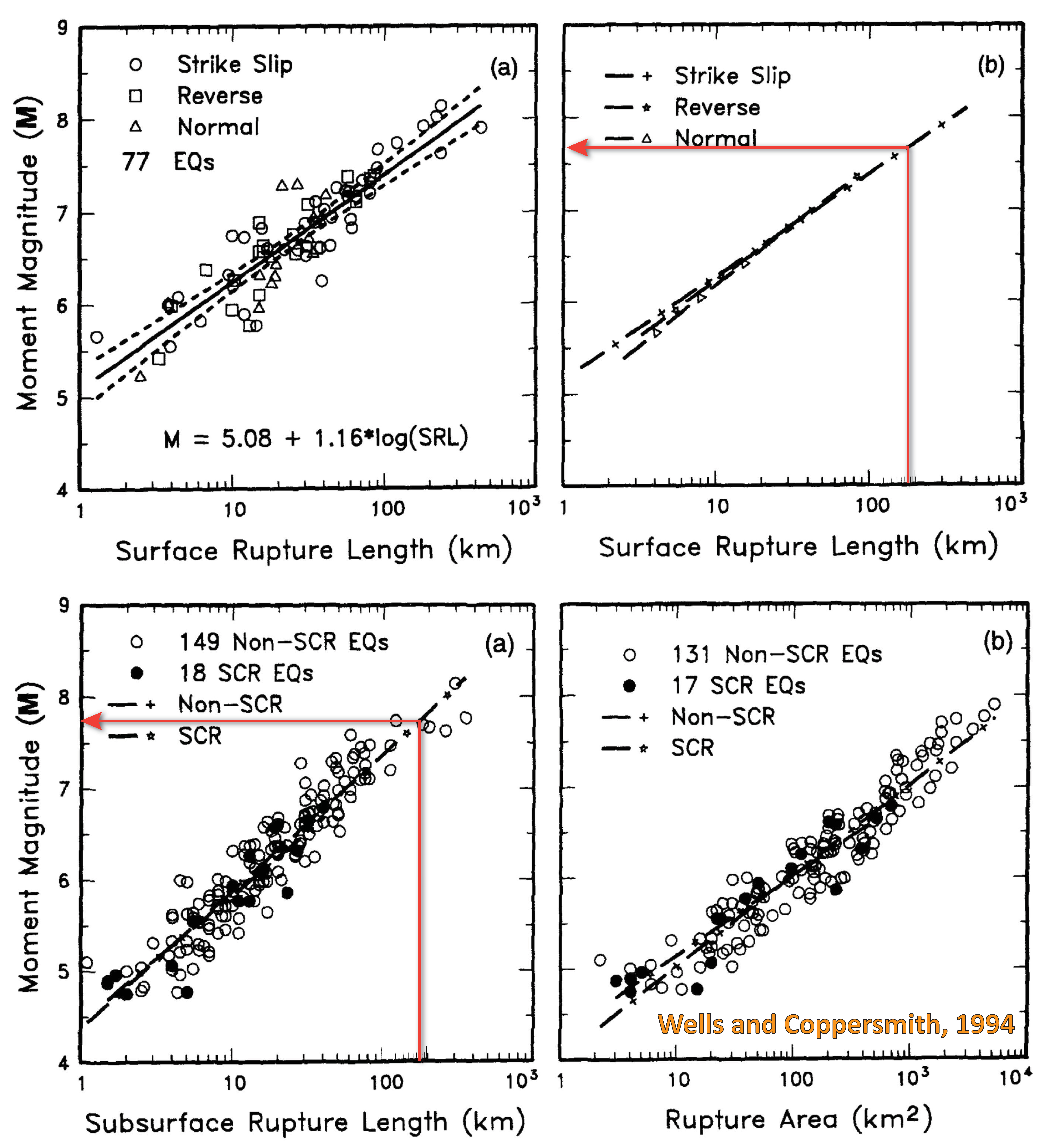
Figure 9. (a) Regression of surface rupture length on magnitude (M). Regression line shown for all-slip-type relationship. Short dashed line indicates 95% confidence interval. (b) Regression lines for strike-slip, reverse, and normal-slip relationships. See Table 2 for regression coefficients. Length of regression lines shows the range of data for each relationship.
Social Media
17 km depth puts it in the basement – ie below regional detachments commonly shown for this and other fold-and-thrust belts. Similarities to Zagros seismicity. https://t.co/EMtgOz4Tv2
— Mark Allen (@mb_allen) February 26, 2018
Tectonic context of yesterday Mw7.5 #earthquake in Papua New Guinea, thrust faulting linked to Papuan fold & thrust belt structure.
( figures after Baldwin et al. 2012, doi: 10.1146/annurev-earth-040809-152540 ) pic.twitter.com/AtE4GEogAM— Robin Lacassin (@RLacassin) February 26, 2018
Exxon shuts facilities that feed Papua New Guinea #LNG plant after earthquake https://t.co/dcoWK6NqAg via @markets pic.twitter.com/2zeYdQ9RdY
— Rob Verdonck (@RobVerdonck) February 26, 2018
ExxonMobil and Oil Search have shut down their liquefied natural gas (LNG) operations and facilities in Papua New Guinea after a 7.5 magnitude earthquake hit the country’s Highlands this morning. https://t.co/AJXzlEPjDu pic.twitter.com/z8Za1wX4cN
— 2018 PNG Industrial & Mining Resources Exhibition (@PNGminingexpo) February 26, 2018
Media contact for Papua New Guinea 🇵🇬 earthquake: Udaya Regmi, head of country for #RedCross +675 75436368. #png pic.twitter.com/Myedl3iuFJ
— IFRC Asia Pacific (@IFRCAsiaPacific) February 26, 2018
#SIDS are very vulnerable need special attention of international community.Aftershocks feared as troops respond to major earthquake in Papua New Guinea https://t.co/VfL2lX1afg @AdamRogers2030 @carlvmercer @ScheuerJo @RKalapurakal @martinfredras @AOSISChair
— Riad Meddeb (@riadmeddeb) February 26, 2018
Magnitude 7.5 earthquake strikes Papua New Guinea https://t.co/DRaW4YcvY8
— HuffPost (@HuffPost) February 25, 2018
Large earthquakes rattle Papua New Guinea | https://t.co/1twVj9F84q https://t.co/qRueNHqwJa via @temblor
— temblor (@temblor) February 26, 2018
Officials in Papua New Guinea fear dozens dead or injured after major quake, but damage hindering access to affected areas. https://t.co/M0FTqtEBPr
— The Associated Press (@AP) February 27, 2018
UPDATE 2018.02.27
BBC News – Papua New Guinea earthquake: At least 14 killed amid landslides https://t.co/AAS4O9GmBm
— Anthony Lomax 🌍 (@ALomaxNet) February 27, 2018
Some more detail on the landslides triggered by the Mw=7.5 #PNGearthquake two days ago:- https://t.co/lFDT6qOwpE pic.twitter.com/LfONDmr5kn
— Dave Petley (@davepetley) February 27, 2018
Initial Papua New Guinea Earthquake mapping project is posted: https://t.co/YSEZgDkWgy pic.twitter.com/x4lTqv7xW3
— HOTOSM (@hotosm) February 26, 2018
Recent Earthquake Teachable Moment for M7.5 Papua New Guinea #earthquake | Contains interpreted @USGS maps/summaries, computer animations, seismograms, AP photos, and other event-specific information. Perfect for classroom use! (Photo: USGS)https://t.co/qgP9OV341A pic.twitter.com/UHc5xsRIkq
— IRIS Earthquake Sci (@IRIS_EPO) February 27, 2018
Mw=6.4, NEW GUINEA, PAPUA NEW GUINEA (Depth: 6 km), 2018/02/28 02:45:44 UTC – Full details here: https://t.co/EpJloOvOPj pic.twitter.com/XyCvRfCMTs
— Earthquakes (@geoscope_ipgp) February 28, 2018
Follow @EricTlozek for updates on #PNGearthquake From Highlands:
At least 11 dead in #PNG #earthquake, authorities confirm https://t.co/aVKuJrXzw8
A number of big aftershocks
— Dylan Quinnell (@DylanQuinnell) February 28, 2018
People killed & others buried in rubble after #PNG quake. Also damage to mine & gas pipelines #PNGearthquake https://t.co/o0u6gQJQHk
— SomeThoughts (@dissent4ever) February 27, 2018
UPDATE 2018.02.28
M7.5 PNG #earthquake occurred close to oil facilities and especially the PNG LNG pipeline, which crosses several active faults on its trace to the ocean (orange dots on map). Online report here: https://t.co/XzqpMyZosn pic.twitter.com/PomIlHw2c3
— Stéphane Baize (@stef92320) February 28, 2018
Papua New Guinea has experienced a 7.5 magnitude earthquake and serious landslides. @planetlabs “before and after” below – more at https://t.co/hJPeRECVCe #disasterresponse pic.twitter.com/4luq1vNQe6
— Andrew Zolli (@andrew_zolli) February 28, 2018
#USGS estimate of landslide distribution resulting from Papua New Guinea earthquake https://t.co/iT43YdLFsh pic.twitter.com/lG8M7I5aOg
— Ryan Gold (@runr447) February 28, 2018
ALOS-2 InSAR for #PNGearthquake. Deformation area extends with the length of ~170 km in NW-SE direction. The largest deformation occurred at SE part, around Lake Kutubu. https://t.co/jHqNQJVHFi pic.twitter.com/2vvDhNqQq0
— Yu Morishita (@Yu__Morishita) February 28, 2018
Satellite image company @planetlabs have now managed to capture an image of the whole of the Pasir Panjang landslide, which killed 18 people in Indonesia:- https://t.co/CUNR8z7b4g pic.twitter.com/JcGGNuZG6D
— Dave Petley (@davepetley) March 1, 2018
UPDATE 2018.023.01
Deadly landslide(s) during #PNG #earthquake https://t.co/VQfMmIYCdA
— Stéphane Baize (@stef92320) March 1, 2018
UPDATE 2018.023.02
"…there are at least four landslide dams on the Heggio River, some of which appear to be large. The level of hazard, and the vulnerability of people and other assets downstream, in unclear at present."
By @davepetley via #AGUblogshttps://t.co/L4D5JY8Hch— Am Geophysical Union (@theAGU) March 3, 2018