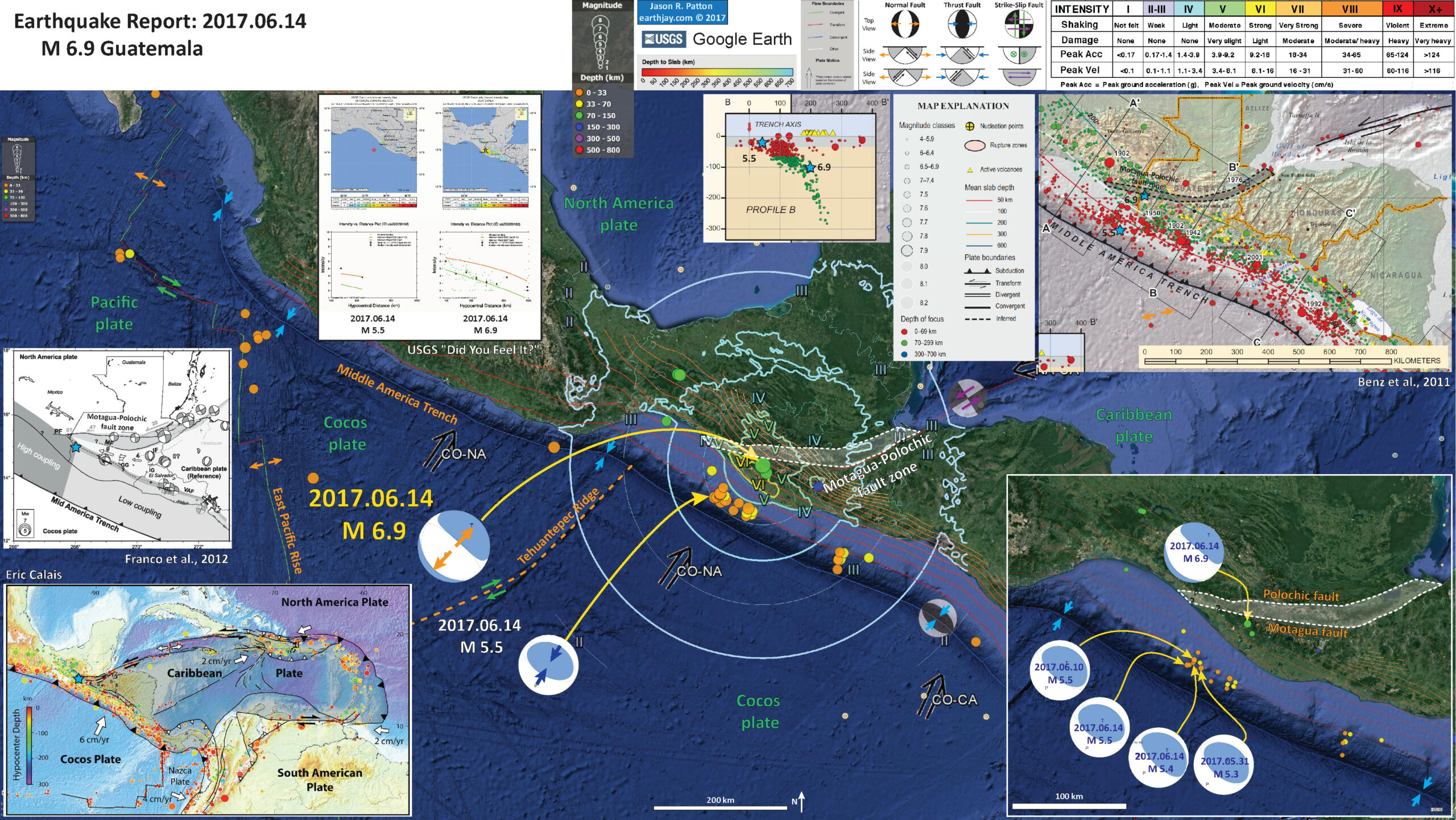
There was a fascinating earthquake sequence a few days ago on and offshore of Guatemala. Offshore of Guatemala in the Pacific Ocean, the Cocos plate subducts beneath the North America and Caribbean plates (NAP & CP).
The transform plate boundary between the NAP and CP forms the Motagua-Polochic fault zone onshore, which bisects Guatemala.
From late May 2017 through mid June there were several earthquakes with the largest magnitude M = 5.5. These earthquake hypocenters have depths that are deeper and shallower than the estimated depth for the subduction zone fault (Hayes et al., 2012), but many of the earthquakes simply have a default depth of 10 km. So it is difficult to say if these are all near the megathrust or are on upper plate faults (e.g. in the accretionary prism). These earthquakes have compressional fault plane solutions. Either way, they appear to have loaded some faults down-dip along the subducting slab. This may or may not be the case, but there was a deep extensional magnitude M 6.9 earthquake (with an aftershock of M = 5.1 nearby). These along dip earthquakes are probably related.
Below is my interpretive poster for this earthquake.
I plot the seismicity from the past month, with color representing depth and diameter representing magnitude (see legend).
- I placed a moment tensor / focal mechanism legend on the poster. There is more material from the USGS web sites about moment tensors and focal mechanisms (the beach ball symbols). Both moment tensors and focal mechanisms are solutions to seismologic data that reveal two possible interpretations for fault orientation and sense of motion. One must use other information, like the regional tectonics, to interpret which of the two possibilities is more likely.
- I also include the shaking intensity contours on the map. These use the Modified Mercalli Intensity Scale (MMI; see the legend on the map). This is based upon a computer model estimate of ground motions, different from the “Did You Feel It?” estimate of ground motions that is actually based on real observations. The MMI is a qualitative measure of shaking intensity. More on the MMI scale can be found here and here. This is based upon a computer model estimate of ground motions, different from the “Did You Feel It?” estimate of ground motions that is actually based on real observations.
- I include the slab contours plotted (Hayes et al., 2012), which are contours that represent the depth to the subduction zone fault. These are mostly based upon seismicity. The depths of the earthquakes have considerable error and do not all occur along the subduction zone faults, so these slab contours are simply the best estimate for the location of the fault. The hypocentral depth of the M 5.5 plots this close to the location of the fault as mapped by Hayes et al. (2012).
- In the upper right corner, I include a subset of figures from Benz et al. (2011). There is a map that shows USGS epicenters with dots colored by depth and magnitude represented by circle diameter. There is also plotted a cross section that is adjacent (southeast) to this earthquake sequence. Cross section B-B’ shows the earthquake hypocenters along a profile displayed on the map. Note how the subduction zone dip steepens to the northeast. On the map and the cross section, I place a blue stars in the location for the M 6.9 and the 6/14 M 5.5 earthquakes.
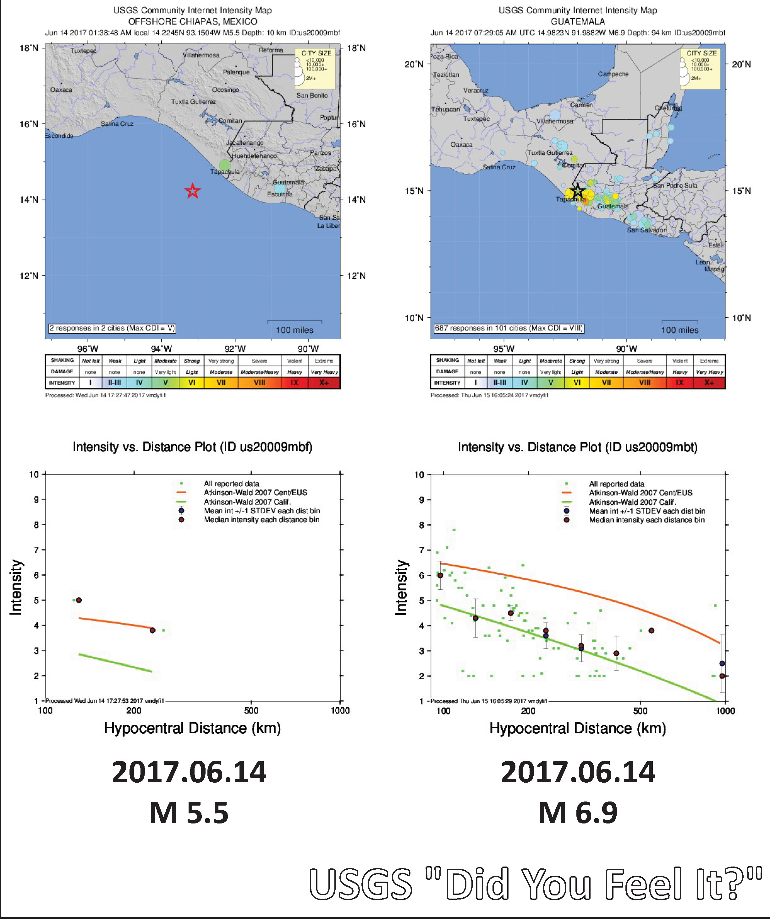
- To the left of these figures is a comparison map and plot, showing the responses from real people who reported their observations during these two earthquakes. Below each map are plotted the reports from the Did You Feel It? USGS website for each earthquake. These reports are plotted as green dots with intensity on the vertical axes and distance on the horizontal axes. There are comparisons with Ground Motion Prediction Equation (attenuation relations) results (the orange model uses empirical data from central and eastern US earthquakes; the green model uses empirical data from earthquakes in California). The M 5.5 earthquake seems to fit the Central-Eastern US regression much better than the California regression. However, there are very few observations. The M 6.9 earthquake seems to fit the California regression better.
- In the lower left corner is a map that shows the plate tectonic setting for this region of Middle America (Eric Calias). Earthquake epicenters are plotted with color representing depth and circle diameter representing magnitude. Dr. Calais shaded the Caribbean plate a little darker than the surrounding plates. Relative plate motions are plotted as white arrows. I place a blue star in the general location of the M 6.9 earthquake.
- Above the tectonic figure, is a figure that shows how Franco et al. (2012) hypothesize that the amount that the subducting fault is locked (“coupling” or the proportion of the plate convergence rate that is stored along the fault that would eventually slip during earthquakes). Note that this earthquake sequence mostly occurred in the segment of the subduction zone that has high coupling. I place a blue star in the general location of the M 6.9 earthquake.
- In the lower right corner I plot most all the available moment tensors for the earthquakes in this sequence. I label the Polochic and Motagua faults that delineate the Motagua-Polochic fault zone, left lateral strike-slip faults that form the boundary between the Caribbean and North America plates.
I include some inset figures in the poster.

Here are the USGS webpages for the earthquakes with moment tensors plotted above
- 2017-05-30 21:53 M 5.3
- 2017-05-31 05:17 M 5.3
- 2017-06-10 18:47 M 5.5
- 2017-06-14 06:38 M 5.5
- 2017-06-14 07:23 M 5.4
- 2017-06-14 07:29 M 6.9
- Here is the USGS Did You Feel It comparison.
- 2017.06.14 M 6.9 Guatemala
- 2017.05.12 M 6.2 El Salvador
- 2017.03.29 M 5.7 Gulf of California
- 2016.11.24 M 7.0 El Salvador
- 2016.04.29 M 6.6 East Pacific Rise / MAT
- 2016.01.21 M 6.6 Mexico
- 2015.09.13 M 6.6 Gulf California
- 2015.09.13 M 6.6 Gulf California Update #1
- 2014.10.14 M 7.3 El Salvador
- 2013.10.20 M 6.4 Gulf California
Mexico | Central America
Earthquake Reports
References
- Benz, H.M., Tarr, A.C., Hayes, G.P., Villaseñor, Antonio, Furlong, K.P., Dart, R.L., and Rhea, Susan, 2011. Seismicity of the Earth 1900–2010 Caribbean plate and vicinity: U.S. Geological Survey Open-File Report 2010–1083-A, scale 1:8,000,000.
- Eric Calias, Purdue University
- Franco, A., C. Lasserre H. Lyon-Caen V. Kostoglodov E. Molina M. Guzman-Speziale D. Monterosso V. Robles C. Figueroa W. Amaya E. Barrier L. Chiquin S. Moran O. Flores J. Romero J. A. Santiago M. Manea V. C. Manea, 2012. Fault kinematics in northern Central America and coupling along the subduction interface of the Cocos Plate, from GPS data in Chiapas (Mexico), Guatemala and El Salvador in Geophysical Journal International., v. 189, no. 3, p. 1223-1236. DOI: https://doi.org/10.1111/j.1365-246X.2012.05390.x
- Hayes, G. P., D. J. Wald, and R. L. Johnson, 2012. Slab1.0: A three-dimensional model of global subduction zone geometries, J. Geophys. Res., 117, B01302, doi:10.1029/2011JB008524.