This morning (my time) there was a magnitude M 6.4 earthquake offshore of Chile. While it was in the correct location to possibly cause a tsunami, the magnitude was too small.
https://earthquake.usgs.gov/earthquakes/eventpage/us600040ja/executive
The major plate boundary here is the megathrust subduction zone that forms the Peru-Chile trench. Here, the Nazca plate dives eastwards beneath the South America plate.
Many people are familiar with subduction zone earthquakes which are responsible for the largest size temblors possible, as well as tsunami capable of travelling across the entire Pacific Ocean. The largest earthquake recorded on modern instruments is the 22 May 1960 M 9.5 Chile earthquake. There have been 2 large transoceanic tsunami caused by subduction zone earthquakes in 2010 and 2015. At the bottom of this report is a list of other earthquakes in this region.
A few months ago, there was an earthquake with a magnitude of M 6.7. However, this earthquake was an extensional earthquake, instead of a compressional earthquake that we typically associate with subduction zones.
This M 6.7 was down-dip (east) of today’s quake. It is possible that the M 6.7 terremoto caused “static coulomb” stress changes in the surrounding region that may have led to today’s earthquake. Someone would need to conduct some numerical analyses to test this hypothesis (I don’t currently have a matlab license, so cannot run Coulomb software to do this analysis myself). I wrote about the M 6.7 earthquake in an earthquake report, as well as for a Temblor article.
There have been several sequences in this same area of the subduction zone that people have used to suggest other types of stress changes from earlier quakes that led to later quakes (e.g. a sequence in 1997, e.g. Leyton et al., 2009 and Gardi et al., 2006).
There are a number of examples at other subduction zones where extensional and compressional earthquakes in different regions can trigger earthquakes of the opposite type. In 2009 earthquakes along the Kuril subduction zone and in 2011 earthquakes east of Japan are good examples.
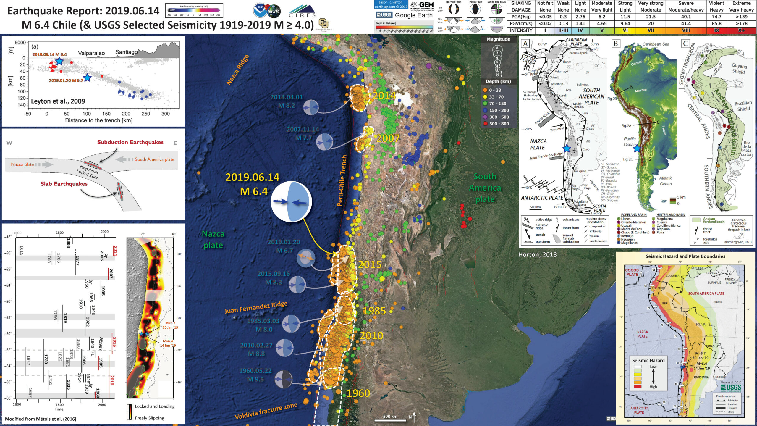
Below is my interpretive poster for this earthquake
I plot the seismicity from the past year, with color representing depth and diameter representing magnitude (see legend), for earthquakes M ≥ 4.0. I include earthquake epicenters from some specific historic earthquakes with magnitudes M ≥ 4.0 in one version.
I plot the USGS fault plane solutions (moment tensors in blue and focal mechanisms in orange), possibly in addition to some relevant historic earthquakes.
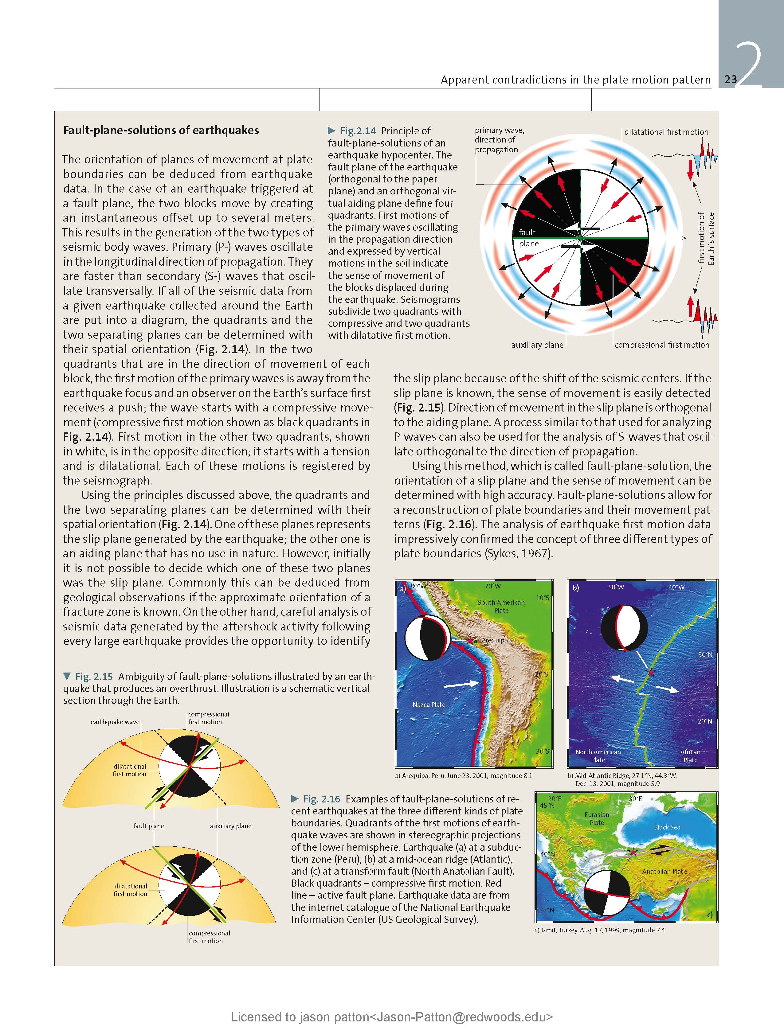
- I placed a moment tensor / focal mechanism legend on the poster. There is more material from the USGS web sites about moment tensors and focal mechanisms (the beach ball symbols). Both moment tensors and focal mechanisms are solutions to seismologic data that reveal two possible interpretations for fault orientation and sense of motion. One must use other information, like the regional tectonics, to interpret which of the two possibilities is more likely.
- I also include the shaking intensity contours on the map. These use the Modified Mercalli Intensity Scale (MMI; see the legend on the map). This is based upon a computer model estimate of ground motions, different from the “Did You Feel It?” estimate of ground motions that is actually based on real observations. The MMI is a qualitative measure of shaking intensity. More on the MMI scale can be found here and here. This is based upon a computer model estimate of ground motions, different from the “Did You Feel It?” estimate of ground motions that is actually based on real observations.
- I include the slab 2.0 contours plotted (Hayes, 2018), which are contours that represent the depth to the subduction zone fault. These are mostly based upon seismicity. The depths of the earthquakes have considerable error and do not all occur along the subduction zone faults, so these slab contours are simply the best estimate for the location of the fault.
- In one map below, I include a transparent overlay of the magnetic anomaly data from EMAG2 (Meyer et al., 2017). As oceanic crust is formed, it inherits the magnetic field at the time. At different points through time, the magnetic polarity (north vs. south) flips, the North Pole becomes the South Pole. These changes in polarity can be seen when measuring the magnetic field above oceanic plates. This is one of the fundamental evidences for plate spreading at oceanic spreading ridges (like the Gorda rise).
- Regions with magnetic fields aligned like today’s magnetic polarity are colored red in the EMAG2 data, while reversed polarity regions are colored blue. Regions of intermediate magnetic field are colored light purple.
- We can see the roughly northwest-southeast trends of these red and blue stripes. These lines are parallel to the ocean spreading ridges from where they were formed. The stripes disappear at the subduction zone because the oceanic crust with these anomalies is diving deep beneath the South America plate, so the magnetic anomalies from the overlying Sunda plate mask the evidence for the Nazca plate.
Magnetic Anomalies
- In the upper right corner I include a figure that includes a variety of interesting information (Horton, 2018). From left to right are (a) the tectonic features, (b) the topography, and (c) features the South America plate that reflect the response to changes in the subduction zone over time. I include a blue star in the general location of today’s earthquake.
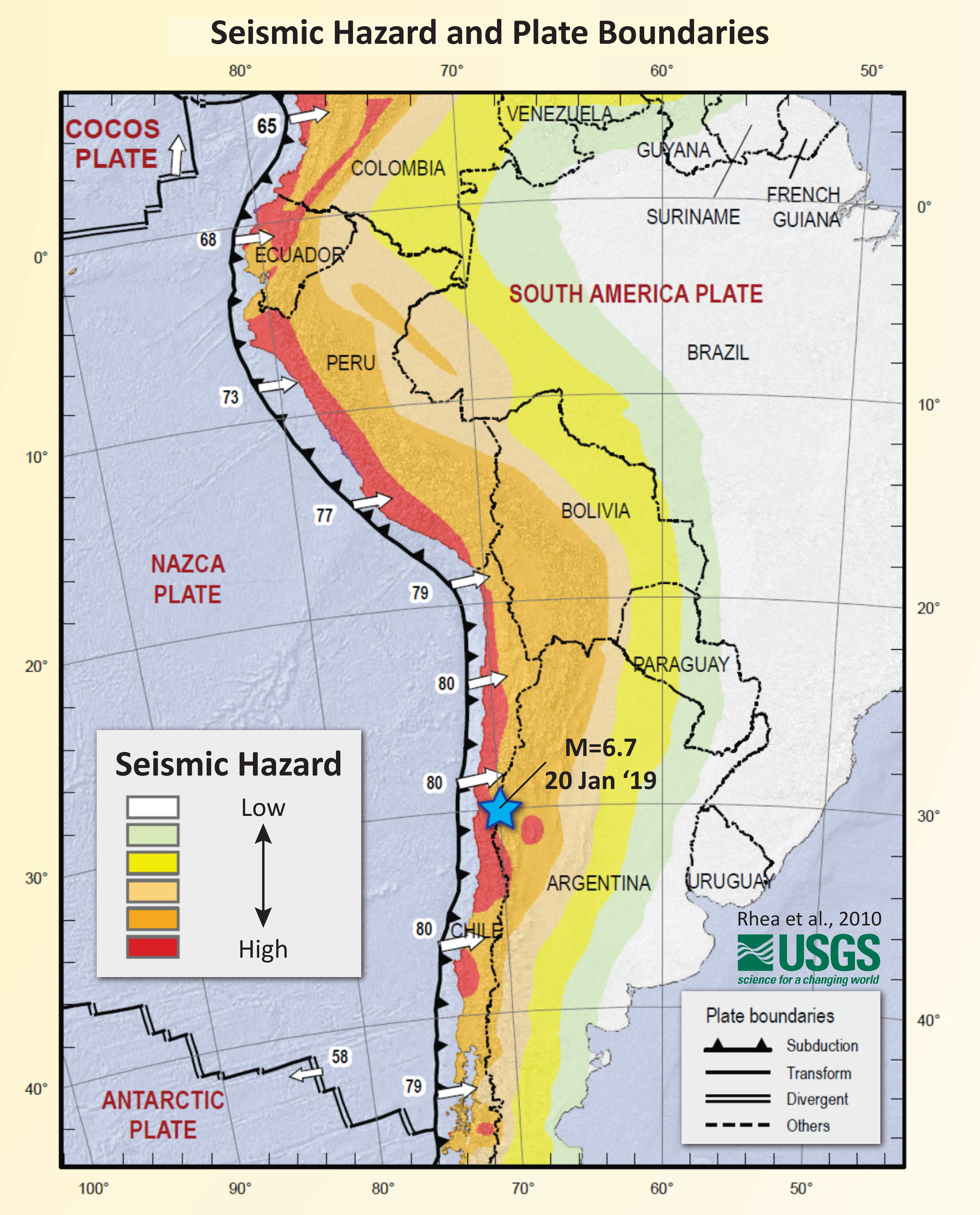
- In the lower right corner is a map that shows the relative seismic hazard for this plate boundary (Rhea et al., 2010). I plot both 2019 earthquakes.< The numbers (“80”) indicate the rate at which the Nazca Plate is subducting beneath South America. 80 mm/yr = 3 in/yr.
- In the upper left corner is a profile slicing into the Earth showing earthquakes as they get deeper as the Nazca plate dives deeper beneath the South America plate (Leyton et al., 2009). This cross section is located just to the south of today’s earthquake. I plot both M 6.7 and M 6.4 earthquakes on this section.
- This is an illustration showing some locations where earthquakes may happen along subduction zones in general. The M 6.4 earthquake is probably a megathrust subduction zone earthquake, while the M 6.7 is probably in the downgoing oceanic crust of the Nazca plate.
- This is a composite figure from several figures from Metois et al., 2016. On the left is a panel that shows the latitudinal range of earthquake ruptures (I fixed it in places as the original figure did not extend the 2010 rupture sufficiently to the north). The panel on the right shows how much the subduction zone fault is “locked” (or, seismically coupled). Darker colors represent parts of the fault that are storing more energy over time and are possibly places where the fault will slip (compared to parts of the fault that are white or yellow, which may be places where the fault is currently slipping and would not generate earthquakes in the future). This is simply a model and there is not way to really know where an earthquake will happen until there is an earthquake.
I include some inset figures. Some of the same figures are located in different places on the larger scale map below.
- Here is the map with a years’s seismicity plotted.

- Here is the map with a seismicity plotted that is associated with specific earthquakes. I plot earthquakes for the 3 months following the mainshock listed for these example earthquakes (e.g. 1960, 1985, 2007, 2014, and 2015.

Other Report Pages
Some Relevant Discussion and Figures
- Here is the overview figure from Horton, 2018.

Maps of (A) tectonic framework, (B) topography, and (C) sedimentary basin configuration of South America. (A) Map of plate boundaries, Andean magmatic arc (including the northern, central, and southern volcanic zones), regions of flat slab subduction, modern stress orientations from earthquake focal mechanisms, eastern front of Andean fold-thrust belt, and key segments of the retroarc foreland basin system. Plate velocities are shown relative to stable South American plate (DeMets et al., 2010). (B) DEM topographic map showing the Andes mountains and adjacent foreland region, including the Amazon, Parana, Orinoco, and Magdalena (Mag) river systems. (C) Map of Andean retroarc basins, showing isopach thicknesses (in km) of Cretaceous-Cenozoic basin fill, forebulge axis (from Chase et al., 2009), and locations of 13 sites (8 foreland basins, 5 hinterland basins) considered in this synthesis
- Here is the seismic hazard map is from Rhea et al. (2010).
- Here is the seismicity map and space time diagram from Métois et al. (2016). The subduction zone fault in the region of Coquimbo, Chile changes geometry, probably because of the Juan Fernandez Ridge (this structure controls the shape of the subduction zone). This figure shows a map and cross section for two parts of the subduction zone (Marot et al., 2014). The example on the left is the in the region of both the M 6.7 and M 6.4 earthquakes. Note how the subduction zone flattens out with depth here. The M=6.7 quake was shallower than this, but the shape of the downgoing slab does affect the amount of slab pull (tension in the down-dip direction) is exerted along the plate.
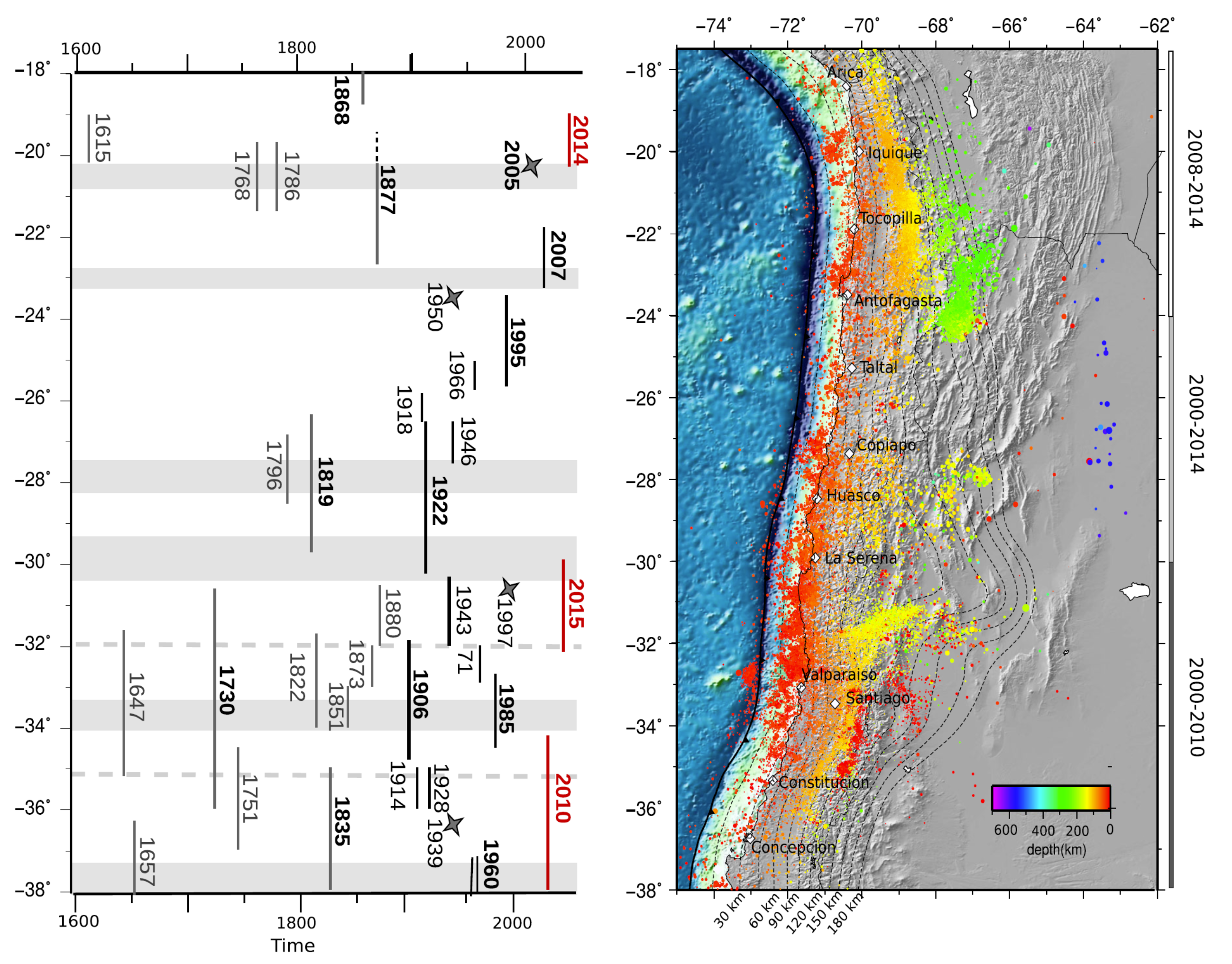
Left estimated extent of large historical or instrumental ruptures along the Chilean margin adapted from ME´ TOIS et al. (2012). Gray stars mark major intra-slab events. The recent Mw[8 earthquakes are indicated in red. Gray shaded areas correspond to LCZs defined in Fig. 3. Right seismicity recorded by the Centro Sismologico Nacional (CSN) during
interseismic period, color-coded depending on the event’s depth. Three zones have been defined to avoid including aftershocks and preshocks associated with major events: (1) in North Chile, we plot the seismicity from 2008 to january 2014, i.e., between the Tocopilla and Iquique earthquakes; (2) in Central Chile, we plot the seismicity on the entire 2000–2014 period; (3) in South-Central Chile, we selected events that occurred between 2000 and 2010, i.e., before the Maule earthquake.
- This figure is the 3 panel figure in the interpretive poster showing how seismicity is distributed along the margin, how historic earthquake slip was distributed, and how the fault may be locked (or slipping) along the megathrust fault.

a Histogram depicts the rate of Mw>3 earthquakes registered by the CSN catalog during the interseismic period defined for each zone (see Fig. 2) on the subduction interface, on 0.2° of latitude sliding windows. Stars are swarm-like sequences detected by HOLTKAMP et al. (2011) depending on their occurrence date. Swarms located in the Iquique LCZ and Camarones segment are from RUIZ et al. (2014). Empty squares are significant intraplate earthquakes. b Red curve variations of the average coupling coefficient on the first 60 km of depth calculated on 0.2° of latitude sliding windows for our best model including an Andean sliver motion. Dashed pink curves are alternative models with different smoothing options that fit the data with nRMS better than 2 (see supplementary figure 6): the pink shaded envelope around our best model stands for the variability of the coupling along strike. Green curves coseismic distribution for Maule (VIGNY et al. 2011), Iquique (LAY et al. 2014) and Illapel earthquakes (RUIZ et al. 2016). Gray shaded areas stand for the identified low coupling zones (LCZs). LCZs and high coupling segments are named on the left. The apparent decrease in the average coupling North of 30°S is considered as an artifact of the Andean sliver motion (see Sect. 5.2). c Best coupling distribution obtained inverting for Andean sliver motion and coupling amount simultaneously. The rupture zones for the three major earthquakes are indicated as green ellipses. White shaded areas are zones where we lack resolution.
- This is a figure that shows details about the coupling compared to some slip models for the 2010, 2014, and 2015 earthquakes. Today’s M=6.4 earthquake happened near the city of La Serena. Notice the location of this city compared to the slip on the subduction zone during the 20015 M=8.4 [8.43] earthquake.

Left coupling maps (color coded) versus coseismic slip distributions (gray shaded contours in cm) for the last three major Chilean earthquakes (epicenters are marked by white stars). From top to bottom Iquique area, white squares are pre-seismic swarm event in the month before the main shock, green star is the 2005, Tarapaca´ intraslab earthquake epicenter, blue star is the Mw 6.7 Iquique aftershock; Illapel area, green squares show the seismicity associated with the 1997 swarm following the Punitaqui intraslab earthquake (green star); Maule area, green star is the epicenter of the 1939 Chillan intraslab earthquake. Right interseismic background seismicity in the shallow part of the subduction zone (shallower than 60 km depth) for each region (red dots) together with 80 and 90 % coupling contours. White dots are events identified as mainshock after a declustering procedure following GARDNER and KNOPOFF (1974). Yellow areas extent of swarm sequences identified by HOLTKAMP et al. (2011) for South and Central Chile, and RUIZ et al. (2014) for North Chile.
- This is the fault locking figure from Saillard et al. (2017), showing the percent coupling (how much of the plate convergence contributes to deformation of the plate boundary, which may tell us places on the fault that might slip during an earthquake. We are still learning about why this is important and what it means.

Comparison between the uplift rates, interseismic coupling, major bathymetric features, and peninsulas along the Andean margin (10°S–40°S). (a) Uplift rates of marine terraces reported in the literature (we present the average rate since terrace abandonment; Table S1 in the supporting information [Jara-Muñoz et al., 2015]). Each color corresponds to a marine terrace assigned to a marine isotopic stage (MIS). Gray dots are the uplift rates of the central Andean rasa estimated from a numerical model of landscape evolution [Melnick, 2016]. (b) Major bathymetric features and peninsulas and pattern of interseismic coupling of the Andean margin from GPS data inversion (this study). Gray shaded areas correspond to the areas where the spatial resolution of inversion is low due to the poor density of GPS observations (see text and supporting information for more details). The Peru-Chile trench (thick black line), the coastline (thin black line), and the convergence direction (black arrows) are indicated. We superimposed the curve obtained by shifting the trench geometry eastward by 110 km (trench-coast distance of 110 km; blue line) with the curve reflecting the 40 km isodepth of the subducting slab (red line; Slab1.0 from Hayes and Wald [2009]), a depth which corresponds approximately with the downdip end of the locked portion of the Andean seismogenic zone (±10 km) [Ruff and Tichelaar, 1996; Khazaradze and Klotz, 2003; Chlieh et al., 2011; Ruegg et al., 2009; Moreno et al., 2011; Métois et al., 2012]. The two curves are spatially similar in the erosive part of the Chile margin (north of 34°S), whereas they diverge along the shallower slab geometry in the accretionary part of the Chile margin (south of 34°S), where the downdip end of the locked zone may be shallower (Figure 4b). Red arrows indicate the low interseismic coupling associated with peninsulas and marine terraces and evidence of aseismic afterslip (after Perfettini et al. [2010] below the Pisco-Nazca Peninsula; Pritchard and Simons [2006], Victor et al. [2011], Shirzaei et al. [2012], Bejar-Pizarro et al. [2013], and Métois et al. [2013] for the Mejillones Peninsula; Métois et al. [2012, 2014] below the Tongoy Peninsula; and Métois et al. [2012] and Lin et al. [2013] for the Arauco Peninsula). FZ: Fracture zone. Horizontal blue bands are the areas where coastline is less than 110 km (light blue) or 90 km (dark blue) from the trench (see Figure 1).
- The following figures from Leyton et al. (2009) are great analogies, showing examples of interplate earthquakes (e.g. subduction zone megathrust events) and intraplate earthquakes (e.g. slab quakes, or events within the downgoing plate). The first figures are maps showing these earthquakes, then there are some seismicity cross sections.

Maps showing the location of the study and the events used ((a)–(c)). In red we present interplate earthquakes, while in blue, the intermediate depth, intraplate ones. We used beach balls to plot those events with known focal and circles for those without. White triangles mark the position of the Chilean Seismological Network used to locate the events; those with names represent stations used in the waveform analysis (either accelerometers or broadbands with known instrumental response). Labels over beach balls correspond to CMT codes.
- Here are 2 cross sections showing the earthquakes plotted in the maps above (Leyton et al., 2009).

Cross-section at (a) 33.5◦S and (b) 36.5◦S showing the events used in this study. In red we present interplate earthquakes, while in blue, the intermediate depth, intraplate ones.We used beach balls (vertical projection) to plot those events with knownfocal and circles for those without. In light gray is shown the background seismicity recorded from 2000 to 2006 by the Chilean Seismological Service
Geologic Fundamentals
- For more on the graphical representation of moment tensors and focal mechanisms, check this IRIS video out:
- Here is a fantastic infographic from Frisch et al. (2011). This figure shows some examples of earthquakes in different plate tectonic settings, and what their fault plane solutions are. There is a cross section showing these focal mechanisms for a thrust or reverse earthquake. The upper right corner includes my favorite figure of all time. This shows the first motion (up or down) for each of the four quadrants. This figure also shows how the amplitude of the seismic waves are greatest (generally) in the middle of the quadrant and decrease to zero at the nodal planes (the boundary of each quadrant).
- Here is another way to look at these beach balls.
The two beach balls show the stike-slip fault motions for the M6.4 (left) and M6.0 (right) earthquakes. Helena Buurman's primer on reading those symbols is here. pic.twitter.com/aWrrb8I9tj
— AK Earthquake Center (@AKearthquake) August 15, 2018
- There are three types of earthquakes, strike-slip, compressional (reverse or thrust, depending upon the dip of the fault), and extensional (normal). Here is are some animations of these three types of earthquake faults. The following three animations are from IRIS.
Strike Slip:
Compressional:
Extensional:
- This is an image from the USGS that shows how, when an oceanic plate moves over a hotspot, the volcanoes formed over the hotspot form a series of volcanoes that increase in age in the direction of plate motion. The presumption is that the hotspot is stable and stays in one location. Torsvik et al. (2017) use various methods to evaluate why this is a false presumption for the Hawaii Hotspot.
- Here is a map from Torsvik et al. (2017) that shows the age of volcanic rocks at different locations along the Hawaii-Emperor Seamount Chain.
- Here is a great tweet that discusses the different parts of a seismogram and how the internal structures of the Earth help control seismic waves as they propagate in the Earth.
A cutaway view along the Hawaiian island chain showing the inferred mantle plume that has fed the Hawaiian hot spot on the overriding Pacific Plate. The geologic ages of the oldest volcano on each island (Ma = millions of years ago) are progressively older to the northwest, consistent with the hot spot model for the origin of the Hawaiian Ridge-Emperor Seamount Chain. (Modified from image of Joel E. Robinson, USGS, in “This Dynamic Planet” map of Simkin and others, 2006.)
Hawaiian-Emperor Chain. White dots are the locations of radiometrically dated seamounts, atolls and islands, based on compilations of Doubrovine et al. and O’Connor et al. Features encircled with larger white circles are discussed in the text and Fig. 2. Marine gravity anomaly map is from Sandwell and Smith.
Today, on #SeismogramSaturday: what are all those strangely-named seismic phases described in seismograms from distant earthquakes? And what do they tell us about Earth’s interior? pic.twitter.com/VJ9pXJFdCy
— Jackie Caplan-Auerbach (@geophysichick) February 23, 2019
- 2010.02.27 M 8.8 Earthquake Review
- 2019.06.14 M 6.4 Chile
- 2019.05.26 M 8.0 Peru
- 2019.05.12 M 6.1 Panama
- 2019.03.01 M 7.0 Peru
- 2019.02.22 M 7.5 Ecuador
- 2019.01.20 M 6.7 Chile
- 2018.08.21 M 7.3 Venezuela
- 2018.08.24 M 7.1 Peru
- 2018.04.02 M 6.8 Bolivia
- 2018.01.14 M 7.1 Peru
- 2018.01.15 M 7.1 Peru Update #1
- 2017.06.30 M 6.0 Ecuador
- 2017.04.24 M 6.9 Chile
- 2017.04.23 M 5.9 Chile
- 2016.12.25 M 7.6 Chile
- 2016.11.24 M 7.0 El Salvador
- 2016.11.04 M 6.4 Maule, Chile
- 2016.04.16 M 7.8 Ecuador
- 2016.04.16 M 7.8 Ecuador Update #1
- 2015.11.29 M 5.9 Argentina
- 2015.11.11 M 6.9 Chile
- 2015.11.24 M 7.6 Peru
- 2015.11.26 M 7.6 Peru Update
- 2015.09.16 M 8.3 Chile
- 2014.04.01 M 8.2 Chile
- 2010.02.27 M 8.8 Chile
- 1960.05.22 M 9.5 Chile
Chile | South America
General Overview
Earthquake Reports
Social Media
- Beck, S., Barrientos, S., Kausel, E., and Reyes, M., 1998. Source Characteristics of Historic Earthquakes along the Central Chile Subduction Zone in Journal of South American Earth Sciences, v. 11, no. 2, p. 115-129, https://doi.org/10.1016/S0895-9811(98)00005-4
- Frisch, W., Meschede, M., Blakey, R., 2011. Plate Tectonics, Springer-Verlag, London, 213 pp.
- Gardi, A., A. Lemoine, R. Madariaga, and J. Campos (2006), Modeling of stress transfer in the Coquimbo region of central Chile, J. Geophys. Res., 111, B04307, https://doi.org/10.1029/2004JB003440
- Hayes, G., 2018, Slab2 – A Comprehensive Subduction Zone Geometry Model: U.S. Geological Survey data release, https://doi.org/10.5066/F7PV6JNV.
- Horton, B.K., 2018. Sedimentary record of Andean mountain building< in Earth-Science Reviews, v. 178, p. 279-309, https://doi.org/10.1016/j.earscirev.2017.11.025
- Kreemer, C., G. Blewitt, E.C. Klein, 2014. A geodetic plate motion and Global Strain Rate Model in Geochemistry, Geophysics, Geosystems, v. 15, p. 3849-3889, https://doi.org/10.1002/2014GC005407.
- Leyton, F., Ruiz, J., Campos, J., and Kausel, E., 2009. Intraplate and interplate earthquakes in Chilean subduction zone:
A theoretical and observational comparison in Physics of the Earth and Planetary Interiors, v. 175, p. 37-46, https://doi.org/10.1016/j.pepi.2008.03.017 - Marot, M., Monfret, T., Gerbault, M.,. Nolet, G., Ranalli, G., and Pardo, M., 2014. Flat versus normal subduction zones: a comparison based on 3-D regional traveltime tomography and petrological modelling of central Chile and western Argentina (29◦–35◦S) in GJI, v. 199, p. 1633-164, https://doi.org/10.1093/gji/ggu355
- Métois, M., Vigny, C., and Socquet, A., 2016. Interseismic Coupling, Megathrust Earthquakes and Seismic Swarms Along the Chilean Subduction Zone (38°–18°S) in Pure Applied Geophysics, https://doi.org/10.1007/s00024-016-1280-5
- Meyer, B., Saltus, R., Chulliat, a., 2017. EMAG2: Earth Magnetic Anomaly Grid (2-arc-minute resolution) Version 3. National Centers for Environmental Information, NOAA. Model. https://doi:10.7289/V5H70CVX
- Müller, R.D., Sdrolias, M., Gaina, C. and Roest, W.R., 2008, Age spreading rates and spreading asymmetry of the world’s ocean crust in Geochemistry, Geophysics, Geosystems, 9, Q04006, https://doi.org/10.1029/2007GC001743
- Rhea, S., Hayes, G., Villaseñor, A., Furlong, K.P., Tarr, A.C., and Benz, H.M., 2010. Seismicity of the earth 1900–2007, Nazca Plate and South America: U.S. Geological Survey Open-File Report 2010–1083-E, 1 sheet, scale 1:12,000,000.
- Ruiz, S. and Madariaga, R., 2018. Historical and recent large megathrust earthquakes in Chile in Tectonophysics, v. 733, p. 37-56, https://doi.org/10.1016/j.tecto.2018.01.015
- Saillard, M., L. Audin, B. Rousset, J.-P. Avouac, M. Chlieh, S. R. Hall, L. Husson, and D. L. Farber, 2017. From the seismic cycle to long-term deformation: linking seismic coupling and Quaternary coastal geomorphology along the Andean megathrust in Tectonics, 36, https://doi:10.1002/2016TC004156.
References:
Return to the Earthquake Reports page.