There was a large magnitude earthquake in Afghanistan today (M = 7.5). There have been reported thousands of deaths so far.
-
Here the USGS websites for the largest earthquakes so far:
- 2015/10/26 M 7.5
- 2015/10/26 M 4.8
- 2015/10/26 M 4.4
- 2015/10/26 M 4.7
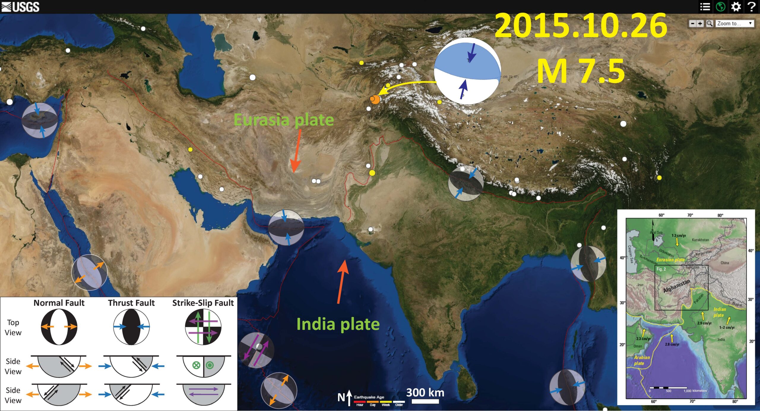
Here is a map showing the region and today’s earthquake epicenters. I placed the moment tensor for the M = 7.5 earthquake on the map. The moment tensor shows a pure thrust/reverse mechanism. I placed a general tectonic map from the USGS Open File Report 1103.
I placed a moment tensor / focal mechanism legend in the upper right corner of the map. There is more material from the USGS web sites about moment tensors and focal mechanisms (the beach ball symbols). Both moment tensors and focal mechanisms are solutions to seismologic data that reveal two possible interpretations for fault orientation and sense of motion. One must use other information, like the regional tectonics, to interpret which of the two possibilities is more likely.

This is a local map, the three small orange circles are the earthquakes with a M = 4 range listed above. From left to right, M = 4.8, 4.4, 4.7. The large orange circle is the M = 7.5
Here is a more detailed tectonic map of the region from Molnar (2001).
This map, from the USGS OFR 1103 shows the tectonic domains of Afghanistan. Todays seismicity occurred in the Hindu Kush.
This map shows historic earthquakes in the region, with magnitudes greater than or equal to M = 7.0, from 1900 until today. These are the queries that I used to make this map (kml) (csv). I also include the MMI contours. Here is the USGS event kmz file.
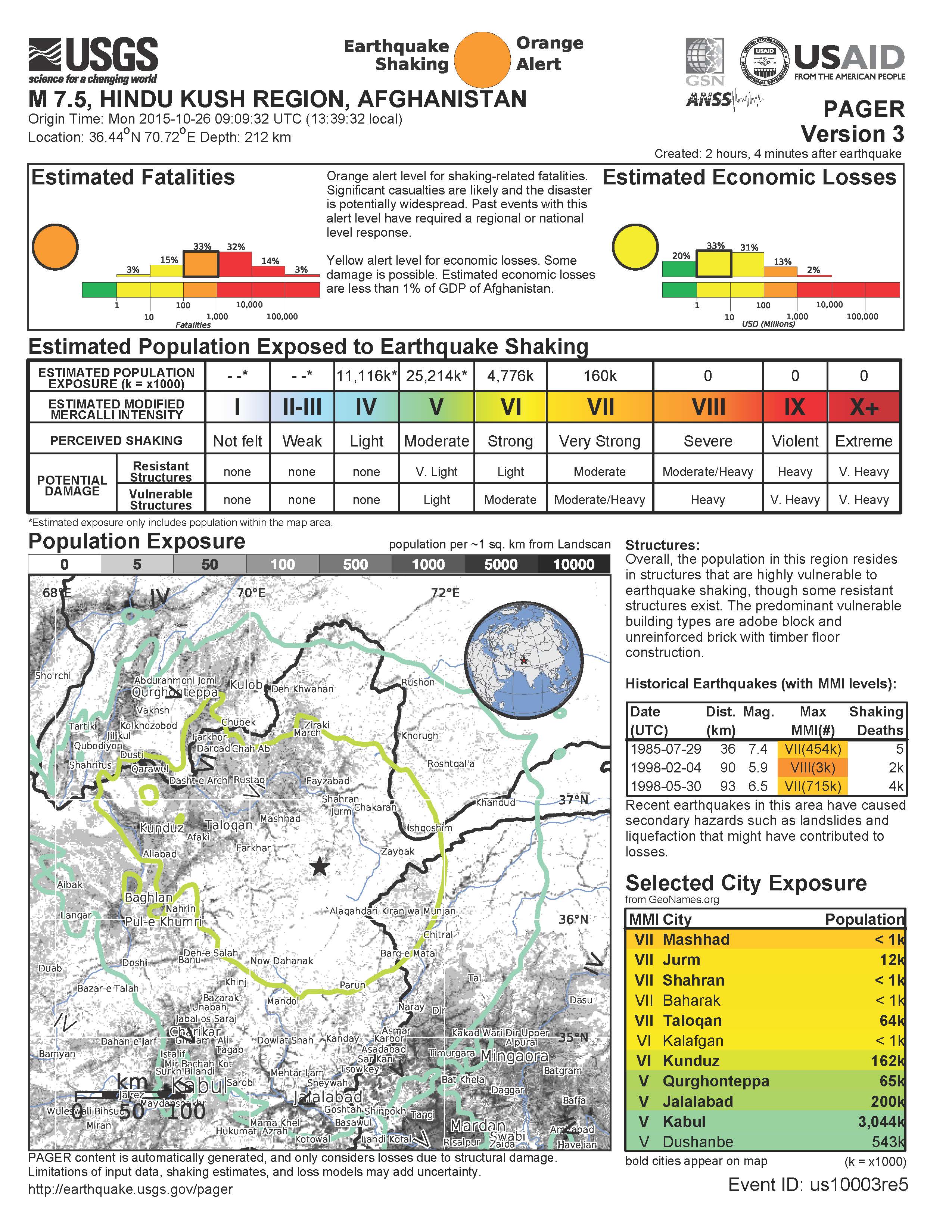
The PAGER report, which is a model based estimate of casualties and damage, suggest that there is a 32% probability that between 1,000 and 10,000 people will suffer death.
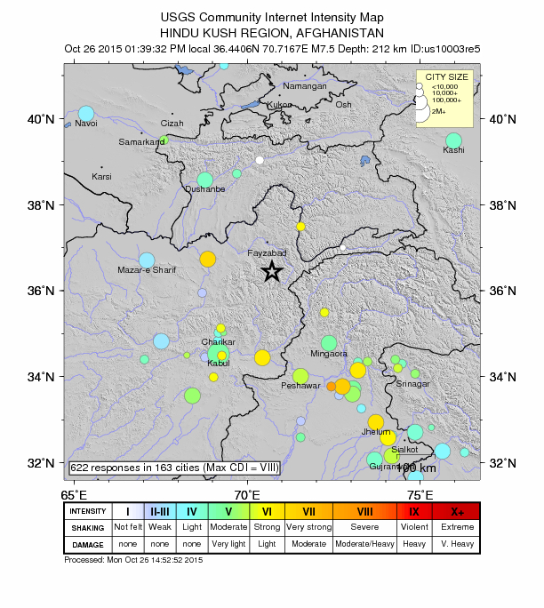
This is the “Did You Feel It?” map, showing observations of felt shaking intensity, using the Modified Mercalli Shaking Intensity Scale.
This is another version of the DYFI data, showing how it compares to the MMI estimates that are based on a computer model.
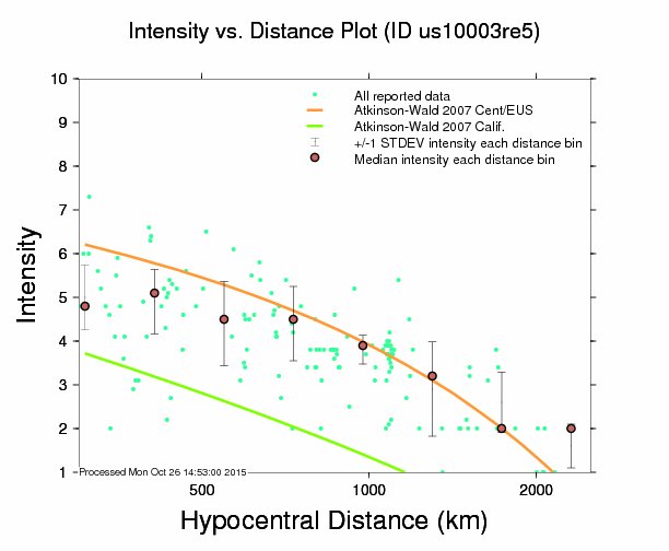
Here is an interesting plot that shows how the shaking intensity and ground motions decay (attenuate) with distance. The orange and green lines are the modeled data (using regressions from the eastern US and California, respectively). Interestingly, the observational data (green dots) match more closely the eastern US regressions, but also generally lie between the two models. The PAGER alert is based upon these models, while the “DYFI” map is based on real observations.
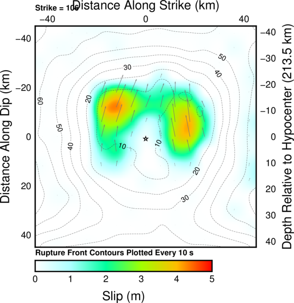
The USGS finite fault plane solution shows that there were two major slip patches in this earthquake.
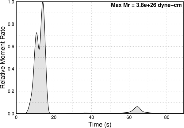
The moment rate plot (shows the energy released during the earthquake with time) shows a bimodal release. This matches the slip model above.
-
Jascha Polet has produced some excellent seismicity plots, including moment tensors. Below are two maps and a cross section prepared in GMT. Dr. Polet is a Seismologist and Professor of Geophysics at Cal Poly Pomona.
- Small Scale Regional Map
- Large Scale Local Map
- Cross Section
- Ruleman, C.A., et al., 2007. Map and Database of Probable and Possible Quaternary Faults in Afghanistan, U.S. Geological Survey Open File Report 2007-1103, 45 pp.
- Molnar, P., 2001. From Plate Tectonics to Continental Tectonics, An Evolving Perspective of Important Research, from a Graduate Student to an Evolving Curmudgeon.


nice. thanks J
More later. Have class to prepare.
nice work / summary