It took me a couple days to catch up with things, so I missed posting about this earthquake until now.
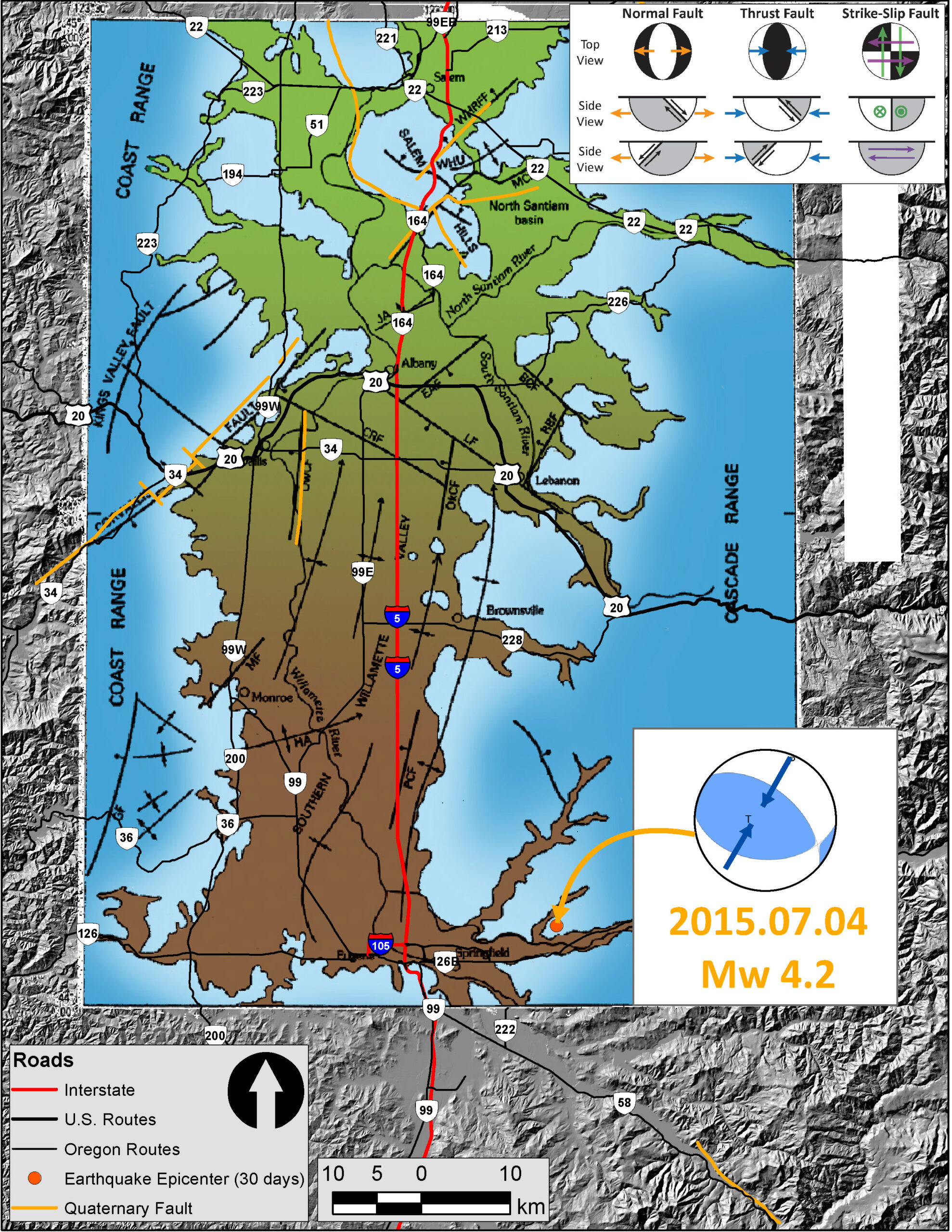
We had a Mw = 4.2 earthquake northeast of Eugene on the morning of 2015.07.04. Here is the USGS web page for this earthquake. The hypocentral depth is 9.9 km, well above the Cascadia subduction zone fault (which is at approximately 52 km depth in this location, based upon McCrory et al., 2012).
Here is a map that shows the faulting in and around the Willamette River Valley. Eugene and Springfield are in the southern portion of the map and Salem is in the northernmost portion of the map. I rubbersheeted (georeferenced) this map from the Bob Yeats text, Living with Earthquakes in the Pacific Northwest (Yeats, 2004). The entire text from Yeat’s book is online and available as a pdf. There is a Quaternary fault (active in at least the last 2.5 million years) called the Upper Willamette River fault (UWRF) that strikes northwest and aligns sub-parallel to hwy 58 (the orange line in the southeast/lower-right part of the map). The epicenter is plotted as an orange dot. I placed the moment tensor for this earthquake, along with a legend showing how to interpret the moment tensor. There are blue arrows showing a northeast-southwest oriented maximum stress orientation (compression in the direction of the blue arrows). The UWRF points directly at the epicenter, so it may be that the UWRF extends further to the northwest.

This is the “Did You Feel It?” map that uses the Modified Mercalli Intensity Scale to display the relative ground shaking across the region. This earthquake was broadly felt. These data are based upon the results from observations made by people as reported to the USGS on this web page.

This plot shows how the ground motions attenuate with distance from the earthquake. The green line (and orange line, which is difficult to see) is based upon empirical models of ground shaking based upon seismologic records from thousands of earthquakes in California. The blue dots are observations from real people and the orange dots are the median observed intensities for different distance bins (with bars that show the uncertainty to +-1 standard deviation). The take away is that the further away from the epicenter, the lower the ground motions. Secondly, that the empirical relations fit the data pretty well, but not perfectly. Note the large variation in ground motions at any given Hypocentral Distance (in km).

Here is a figure from McCaffrey et al. (2007) that shows how the North America plate is possibly chopped up into blocks. Each “block” has a structural affinity to itself (positions within each block move together in a similar direction/orientation that are statistically different than the motions of positions on adjacent blocks). The upper map shows the motions of these positions as they move related to “stable” North America. Each arrow is a vector that show the direction and magnitude of the rate of movement (mm/yr) at that position. The middle panel shows the relative northward motion of these positions at latitudes of 40, 42.5, and 45 degrees north (transects are shown in color on the upper panel/map). The steps in the rates show the boundaries of the blocks as modeled by McCaffrey et al. (2007). The lowest panel shows a schematic of these blocks as they relate to each other. I am not yet sure how the UWRF fits into this block model, but it is a part of the tectonics in this region.

-
References:
- McCaffrey, R., Qamar, A., King, R. W., Wells, R. W., Khazaradze, G., Williams, C., Stevens, C., Vollick, J. J., and Zwick, P. C., 2007. Fault locking, block rotation and crustal deformation in the Pacific Northwest: Geophysical Journal International, doi: 10.1111/j.1365-246X.2007.03371.x.
- McCrory, P. A., Blair, J. L., Oppenheimer, D. H., and Walter, S. R., 2006. Depth to the Juan de Fuca slab beneath the Cascadia subduction margin; a 3-D model for sorting earthquakes: U. S. Geological Survey.
- Yeats, R., 2004. Living with Earthquakes in the Pacific Northwest (2nd ed.), Oregon State University Press, Corvallis, OR, 402 pp.
