Earthquake Report: East Pacific Rise and Middle America Trench

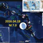
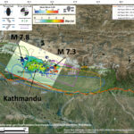
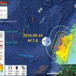
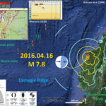
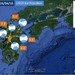
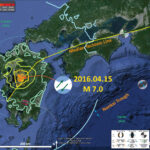
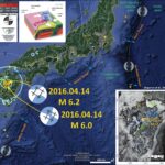
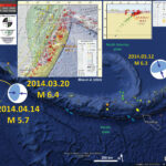
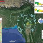
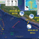
Yesterday we had an earthquake along the Clipperton fracture zone (CFZ), a transform plate boundary that offsets the northern East Pacific Rise (EPR). I was busy grading so did not get to this until today.

    Here are the four large earthquakes shown on the poster below.

  • 2016.04.15 M 6.1
  • 2016.04.25 M 5.6
  • 2016.04.27 M 5.8
  • 2016.04.29 M 6.6

Below is my poster for this and the earlier earthquakes.
Siqueiros, Rivera, and Orozco were the “Tres Grandes,” 20th century political activists in Mexico who led the muralist movement. Their murals have inspired, and continue to inspire, political activists globally (as well as the Mexican muralism movement). Check out more about them here. I am fascinated that there are fracture zones named for Siqueiros and Rivera in this region.

    I include some inset figures.

  • Key et al. (2013) shows the fracture zones in this region. See the description below.
  • Mann (2007) shows the magnetic anomalies and tectonic plate boundaries in this region. I include this map below with a figure caption.

There is a legend that shows how moment tensors can be interpreted. Moment tensors are graphical solutions of seismic data that show two possible fault plane solutions. One must use local tectonics, along with other data, to be able to interpret which of the two possible solutions is correct. The legend shows how these two solutions are oriented for each example (Normal/Extensional, Thrust/Compressional, and Strike-Slip/Shear). There is more about moment tensors and focal mechanisms at the USGS.
Based upon the location of the Clipperton fracture zone compared with the M 6.6 epicenter, I interpret this earthquake to have left-lateral slip on a strike-slip fault. The cool part about this earthquake suite is that there are examples of all types of earthquakes (extensional, compressional, and shear). The 4/15 M 6.1 appears to possibly have triggered the 4/25 & 4/27 M 5.6 and M 5.8 earthquakes. Then, two days later, we had the M 6.6 earthquake. This earthquake is too far to be affected by changes in coulomb stress, however it sure seems like it is more than a coincidence. I have not run a coulomb stress modeling analysis, but this is just based upon modeling others have done in different regions. While the earthquakes along the Middle America Trench (MAT) would have resulted in the Cocos plate extending slightly to the northeast, and that there is the Tehuantepec fracture zone that appears to bend and link the Clipperton fracture zone to the region near the MAT (so we want to link these earthquakes), there probably is no linkage.
The red-orange-yellow lines are slab contour lines from Hayes et al. (2012). These lines are a best estimate for the depth to the subduction zone fault. These are based largely upon seismicity and there is currently an effort to update these contours to integrate other data types. The hypocentral depth for this earthquake is consistent with being along the subduction zone interface.


For more on the graphical representation of moment tensors and focal mechnisms, check this IRIS video out:

Here is a great low angle oblique image showing the topography of the EPR and the two fracture zones in this region (Ryan et al., 2009).


Here is the Mann (2007) map. I include their figure caption below as a blockquote.

Present setting of Central America showing plates, Cocos crust produced at East Pacific Rise (EPR), and Cocos-Nazca spreading center (CNS), triple-junction trace (heavy dotted line), volcanoes (open triangles), Middle America Trench (MAT), and rates of relative plate motion (DeMets et al., 2000; DeMets, 2001). East Pacific Rise half spreading rates from Wilson (1996) and Barckhausen et al. (2001).

Here is the Lay et al. (2013) map. I include their figure caption below as a blockquote.

Location of the magnetotelluric survey across the fast spreading East Pacific Rise. Twenty-nine sea-floor magnetotelluric stations (white circles) were deployed across the ridge axis at 9 deg 30′ N, about 1,000 km southwest of Central America (inset; study area boxed in red). The Pacific and Cocos plates diverge symmetrically (black arrows) while the entire ridge system migrates to the northwest relative to a fixed hotspot reference frame 16 (grey arrow). The Clipperton and Siqueiros transform faults (TF) bound this ridge segment to the north and south. Slow seismic P-wave velocity contours (velocities, 7.6 km s-1) found by seismic tomography of the uppermost few kilometres of mantle follow the ridge crest along most of the segment, but deviate to the east near the magnetotelluric profile. The colour scale shows seafloor topography and the 100-km scale bar indicates the half-aperture of the magnetotelluric array.

Earlier this year, in January, there was a series of earthquakes along the Rivera fracture zone. Here is my report for that time. Below is my interpretation poster.


In September 2015, there were some earthquakes yet further to the north. Here is my Earthquake Report from that time.


This map shows the magnetic anomalies and the geologic map for the land and the youngest oceanic crust.


This map shows a more broad view of the magnetic anomalies through time.


This is an animation from Tanya Atwater. Click on this link to take you to yt (if the embedded video below does not work).

Here is an animation from IRIS. This link takes you to yt (if you cannot view the embedded version below). Here is a link to download the 21 MB mp4 vile file.


This is a link to a tectonic summary map from the USGS (Benz et al., 2011). Click on the map below to download the 20 MB pdf file.

Earthquake Report: Vanuatu!

We just had a large earthquake in the Vanuatu region, just south of a series of earthquakes from a couple weeks ago. Here is the USGS website for today’s M 7.0 earthquake. I include some figures and animations that I posted earlier.

    Here are my two reports from earlier in April, 2016:

  • 2016.04.06 M 6.9
  • 2016.04.06 M 6.9 update # 1

Below is my preliminary interpretive poster. I have posted the moment tensor for this earthquake, along with some inset maps. The Cleveland et al. (2014) maps are explained below. I also include an inset showing the shaking intensity that uses the Modified Mercalli Intensity Scale (MMI). The MMI is a qualitative measure of shaking intensity. More on the MMI scale can be found here and here.
I placed a moment tensor / focal mechanism legend on the poster. There is more material from the USGS web sites about moment tensors and focal mechanisms (the beach ball symbols). Both moment tensors and focal mechanisms are solutions to seismologic data that reveal two possible interpretations for fault orientation and sense of motion. One must use other information, like the regional tectonics, to interpret which of the two possibilities is more likely.

    Here is an animation that shows the seismicity for this region from 1960 – 2016 for earthquakes with magnitudes greater than or equal to 7.0.

  • I include some figures mentioned in the posters above, in addition to a plot from Cleveland et al. (2014). In the upper right corner, Cleveland et al. (2014) on the left plot a map showing earthquake epicenters for the time period listed below the plot on the right. On the right is a plot of earthquakes (diameter = magnitude) of earthquakes with latitude on the vertical axis and time on the horizontal axis. Cleveland et al (2014) discuss these short periods of seismicity that span a certain range of fault length along the New Hebrides Trench in this area. Above is a screen shot image and below is the video.

  • Here is a link to the embedded video below (6 MB mp4)
    Here are the two figures from Cleveland et al. (2014).

  • Figure 1. I include the figure caption below as a blockquote.

  • (left) Seismicity of the northern Vanuatu subduction zone, displaying all USGS-NEIC earthquake hypocenters since 1973. The Australian plate subducts beneath the Pacific in nearly trench-orthogonal convergence along the Vanuatu subduction zone. The largest events are displayed with dotted outlines of the magnitude-scaled circle. Convergence rates are calculated using the MORVEL model for Australia Plate relative to Pacific Plate [DeMets et al., 2010]. (right) All GCMT moment tensor solutions and centroids for Mw ≥ 5 since 1976, scaled with moment. This region experiences abundant moderate and large earthquakes but lacks any events with Mw >8 since at least 1900.

  • Figure 17. I include the figure caption below as a blockquote.

  • One hundred day aftershock distributions of all earthquakes listed in the ISC catalog for the 1966 sequence and in the USGS-NEIC catalog for the 1980, 1997, 2009, and 2013 sequences in northern Vanuatu. The 1966 main shocks are plotted at locations listed by Tajima et al. [1990]. Events of the 1997 and 2009 sequences were relocated using the double difference method [Waldhauser and Ellsworth, 2000] for P wave first arrivals based on EDR picks. The event symbol areas are scaled relative to the earthquake magnitudes based on a method developed by Utsu and Seki [1954]. Hypocenters of most aftershock events occurred at <50 km depth.

  • Figure 17. I include the figure caption below as a blockquote.

  • (right) Space-time plot of shallow (≤ 70 km) seismicity M ≥ 5.0 in northern Vanuatu recorded in the NEIC catalog as a function of distance south of 10°N, 165.25°E. (left) The location of the seismicity on a map rotated to orient the trench vertically.

Earthquake Anniversary: M 7.8 Gorkha (Nepal) Earthquake

An anniversary is for the Gorkha (Nepal) Earthquake from 1 year ago. I have several Earthquake Reports listed below. These include a variety of observations and comparisons with historic and prehistoric earthquakes that I compiled.
USGS slip models: http://earthjay.com/?p=2478
First Report: http://earthjay.com/?p=2357
Comparison with historic EQs http://earthjay.com/?p=2361
USGS Intensity Reports http://earthjay.com/?p=2387
Surface Displacement and Ground Motion Models http://earthjay.com/?p=2391
More historic comparisons http://earthjay.com/?p=2396
Coseismic Surface Deformation Model http://earthjay.com/?p=2410
Aftershock Report http://earthjay.com/?p=2437
Mainshock & Aftershock Update #1 http://earthjay.com/?p=2439
Mainshock & Aftershock Update #2 http://earthjay.com/?p=2450
Mainshock & Aftershock Update #3 (and interview with Ian Pierce and Steven Angster) http://earthjay.com/?p=2466
Here is a summary of the observations:
Mw 7.8 Earthquake Finite Fault Plane Solution from the USGS.


Mw 7.3 Earthquake Finite Fault Plane Solution.


Here is the map that I put together. I have placed the USGS epicenters with two color schemes. The size of the yellow dots represents earthquake magnitude. The degree of redness designates the time (earlier-April = pink & later-May = red). Note how there are some pink colored epicenters in the region of the M 7.3 earthquake. These pink colored earthquakes all occurred in April. The red ones are from May. These epicenters may not be plotted with the greatest certainty, though any uncertainty is possibly shared between them. So, there relative positions are possibly good.


Here is an updated regional map that incorporates Hough and Bilham (2008 ) and today’s seismicity. The historic and prehistoric earthquake slip patches are also shown. The three other data sets now include Bilham (2004), Bettinelli et al (2006), and Berryman et al. (2009). I provide information about how I compiled these data sets on this page.


Here is the updated DYFI map. Note how broadly this earthquake was felt.


Here are two visualizations of the seismic waves as they propagate through the Earth. These are records from the USArray Transportable Array. Your tax dollars at work, unless congress defunds these projects. This first video shows vertical motion as red and blue.


This second video shows horizontal motion with magnitude and direction.

Earthquake Report: Ecuador Update #1

Here is an update to my preliminary report about the M 7.8 subduction zone earthquake in Ecuador. Here is my first report. More information about this earthquake is on that report page. Here is the USGS website for the M 7.8 earthquake.

    The updates are as follows.

  • The major update is the change in estimate for ground motions. I plot this map with the revised shakemap that uses Modified Mercalli Intensity (MMI) scale. The USGS calculated a fault plane and applied slip on that fault plane to get this new estimate of ground motions. These new estimates led to a new PAGER report, which produced revised estimates of probability of damage to people and their belongings.
  • A second update here is the singular tsunami observation.
  • A third update is that I have included a figure from Chlieh et al. (2014) on this poster. I took his rupture lengths and plotted them on the map as green lines with white balls at their termini. I have labeled these slip patches with their year and magnitude. These are also shown in the Chlieh inset figure.
  • A fourth update is that I include the revised shakemap as an inset because this shows the outline of the USGS fault slip model.
  • A fifth update is a map of historic focal mechanisms posted to twitter by Jascha Polet, a seismologist at Cal Poly Pomona.
  • Finally, I prepared an animation that shows the seismicity of this region from 1900-2016 for earthquakes with a magnitude greater than or equal to M 6.0. Here is the kml file that I used to prepare this animation.


Here is a comparison of the attenuation relations. Version 1 is from reports that were made less than an hour after the earthquake. Version 2 (my numbers) incorporate additional reports.

    For better viewing, I include the Chlieh et al. (2014) figure below. There are other figures on the first report page. Chlieh et al. (2014) use GPS data to infer the spatial variation and degree to which the subduction zone megathrust is seismogenically coupled. They consider plate motion rates and estimate the moment (earthquake energy) deficit along this fault (how much strain that plate convergence has imparted upon the fault over time). Then they compare this moment deficit to regions of the fault that have slipped historically.

  • Moment deficit along strike and historic earthquake locations. Today’s earthquake may have occurred in the region marked “gap” in these figures.

  • (A) Along-strike variations of the annual moment deficit for all the interseismic models shown in Fig.5. (B)Maximum ISC model and (C)Minimum ISC model. (A)The blue, green and red lines correspond to the along-strike variation of the annual moment deficit rate respectively for models with smoothing coefficient λ1 =1.0, 0.25 and 0.1. (B) Smoother solution of Fig.5 ith a maximum moment deficit rate of 4.5 ×10¹⁸N m/yr. (C)Rougher solution of Fig.5 with a minimum moment deficit rate of 2.5 ×10¹⁸N m/yr. Yellow stars are the epicenters of subduction earthquakes with magnitude Mw>6.0 from the last 400 yr catalogue (Beauval et al., 2013). (For interpretation of the references to color in this figure legend, the reader is referred to the web version of this article.)

    Tsunami Observations:

  • Below are the current observations of tsunamis from this earthquake. This report is from the Pacific Tsunami Warning Center (PTWC). Note the small maximum tsunami height. This is good for those in Ecuador.

    These were posted by Jascha Polet on Twitter.

  • Here is a map that shows historic focal mechanisms with color representing depth.

  • Here is a a cross section that shows historic focal mechanisms with color representing depth.

Earthquake Report: Ecuador!

We just had a large earthquake along the coast of Ecuador. Here is the USGS website for the M 7.8 earthquake.

Below is my Earthquake Report Poster. I plot the USGS moment tensor for this earthquake, along with the Modified Mercalli Intensity Scale contours, and the subduction zone slab contours (Hayes et al., 2012).The MMI is a qualitative measure of shaking intensity. More on the MMI scale can be found here and here.

There is a legend that shows how moment tensors can be interpreted. Moment tensors are graphical solutions of seismic data that show two possible fault plane solutions. One must use local tectonics, along with other data, to be able to interpret which of the two possible solutions is correct. The legend shows how these two solutions are oriented for each example (Normal/Extensional, Thrust/Compressional, and Strike-Slip/Shear). There is more about moment tensors and focal mechanisms at the USGS.

The red-orange-yellow lines are slab contour lines from Hayes et al. (2012). These lines are a best estimate for the depth to the subduction zone fault. These are based largely upon seismicity and there is currently an effort to update these contours to integrate other data types. The hypocentral depth for this earthquake is consistent with being along the subduction zone interface.

Don’t forget to check out the second report, an updated report to this one here.

    I include a number of inset figures and maps.

  • In the upper left corner I include a clipping of the map and cross section from the USGS Open File Report for the historic seismicity of this region (Rhea et al., 2010).
  • In the upper right corner, I include a map that shows the regional tectonics as published by Gutscher et al. (1999). I also include a 3-D low angle oblique view of the structure of the donwgoing Nazca plate (Gutscher et al., 1999). These authors pose that the Carnegie Ridge exerts a control for the segmentation of the subduction zone.
  • In the lower right corner, I include a preliminary shakemap. More about shakemaps can be found here.


This looks like it will be a damaging earthquake to people and their belongings. Below is the Rapid Assessment of an Earthquake’s Impact (PAGER) report. More on the PAGER program can be found here. An explanation of a PAGER report can be found here. PAGER reports are modeled estimates of damage. On the left is a histogram showing estimated casualties and on the right is an estimate of possible economic losses.


Here is an explanation of the PAGER report.


Below is the tectonic setting map from Gutscher et al. (1999). I include their figure caption as a blockquote.


Tectonic setting of the study area showing major faults, relative plate motions according to GPS data [7] and the NUVEL-1 global kinematic model [8], magnetic anomalies [13] and active volcanoes [50]. Here and in Fig. 4, the locations of the 1906 (Mw D 8:8, very large open circle) and from south to north, the 1953, 1901, 1942, 1958 and 1979 (M  7:8, large open circles) earthquakes are shown. GG D Gulf of Guayaquil; DGM D Dolores–Guayaquil Megashear.

Below is a low angle oblique view of the structures in the downgoing Nazca plate, from Gutscher et al. (1999). I include their figure caption as a blockquote.

3-D view of the two-tear model for the Carnegie Ridge collision featuring: a steep ESE-dipping slab beneath central Colombia; a steep NE-dipping slab from 1ºS to 2ºS; the Peru flat slab segment south of 2ºS; a northern tear along the prolongation of the Malpelo fossil spreading center; a southern tear along the Grijalva FZ; a proposed Carnegie flat slab segment (C.F.S.) supported by the prolongation of Carnegie Ridge.

    Today’s earthquake is near two historic earthquakes with similar magnitudes. Below I plot a map showing the seismicity from 1900-2016 for earthquakes with magnitudes greater than or equal to M 6.0. Here is the USGS query that I used to make this map.

  • 1906.01.31 M 8.3 occurred ~100 km to the northeast.
  • 1942.05.14 M 7.8 occurred <50 km to the southwest.

    Here are the parts of the USGS Open File Report that are included above, as well as their legends.

  • Map

  • Map Legend

  • Cross Section

  • Cross Section Legend

  • The entire poster (55 MB pdf)

UPDATE 1

    Here are a couple maps from Chlieh et al. (2014). I include their figure captions below. Chlieh et al. (2014) use GPS data to infer the spatial variation and degree to which the subduction zone megathrust is seismogenically coupled. They consider plate motion rates and estimate the moment (earthquake energy) deficit along this fault (how much strain that plate convergence has imparted upon the fault over time). Then they compare this moment deficit to regions of the fault that have slipped historically.

  • Tectonics and GPS motion rates.

  • Seismotectonic setting of the oceanic Nazca plate, South America Craton (SoAm) and two slivers: the North Andean Sliver (NAS) and the Inca Sliver (IS). The relative Nazca/SoAm plate convergence rate in Ecuador is about 55mm/yr (Kendrick et al., 2003). Black arrows indicate the diverging forearc slivers motions relative to stable SoAm are computed from the pole solutions of Nocquet et al.(2014). The NAS indicates a northeastward long-term rigid motion of about 8.5 ±1mm/yr. The ellipse indicates the approximate rupture of the great 1906 Mw=8.8 Colombia–Ecuador megathrust earthquake. The Carnegie Ridge intersects the trench in central Ecuador and coincides with the southern limit of the great 1906 event. Plate limits (thick red lines) are from Bird(2003). DGFZ =Dolores–Guayaquil Fault Zone; GG =Gulf of Guayaquil; GR =Grijalva Ridge; AR =Alvarado Ridge; SR =Sarmiento Ridge. (For interpretation of the references to color in this figure legend, the reader is referred to the web version of this article.)

  • GPS velocities along with historic earthquake patches.

  • Interseismic GPS velocity field in the North Andean Sliver reference frame. The relative Nazca/NAS convergence rate is 46 mm/yr. The highest GPS velocity of 26 mm/yr is found on La Plata Island that is the closest point to the trench axis. The GPS network adequately covers the rupture areas of the 1998 Mw=7.1, 1942 Mw=7.8and 1958 Mw=7.7 earthquakes but only 1/4th of the 1979 Mw=8.2 and 2/3rd of the great 1906 Mw=8.8 rupture area. The black star is the epicenter of the great 1906 event and white stars are the epicenters of the Mw>7.01942–1998 seismic sequence. Grey shaded ellipses are the high slip region of the 1942, 1958, 1979 and 1998 seismic sources (Beck and Ruff, 1984;Segovia, 2001; Swenson and Beck, 1996). Red dashed contours are the relocated aftershocks areas of the 1942, 1958 and 1979 events (Mendoza and Dewey, 1984). (For interpretation of the references to color in this figure legend, the reader is referred to the web version of this article.)

  • Moment deficit along strike and historic earthquake locations. Today’s earthquake may have occurred in the region marked “gap” in these figures.

  • (A) Along-strike variations of the annual moment deficit for all the interseismic models shown in Fig.5. (B)Maximum ISC model and (C)Minimum ISC model. (A)The blue, green and red lines correspond to the along-strike variation of the annual moment deficit rate respectively for models with smoothing coefficient λ1 =1.0, 0.25 and 0.1. (B) Smoother solution of Fig.5 ith a maximum moment deficit rate of 4.5 ×10¹⁸N m/yr. (C)Rougher solution of Fig.5 with a minimum moment deficit rate of 2.5 ×10¹⁸N m/yr. Yellow stars are the epicenters of subduction earthquakes with magnitude Mw>6.0 from the last 400 yr catalogue (Beauval et al., 2013). (For interpretation of the references to color in this figure legend, the reader is referred to the web version of this article.)

UPDATE 2

    Tsunami Observations:

  • Below are the current observations of tsunamis from this earthquake. Note the small maximum tsunami height. This is good for those in Ecuador.

Earthquake Report: Japan Update #2

Here is an update to the seismicity from the past couple of days in Kyushu Japan. On 2016/04/14 there was an earthquake with magnitude M 6.2 that initiated this series of earthquakes. The largest aftershock was a magnitude M 6.0. The following day, there was a M 7.0 earthquake. These earthquakes have ruptured a series of faults in the region of Kumamoto, Kyushu, Japan.
Here is a page that helps people connect and help those in Japan.

    Here are the USGS websites for the larger earthquakes in this region for today and yesterday.

  • 2016.04.14 12:26 UTC M 6.2
  • 2016.04.14 15:03 UTC M 6.0
  • 2016.04.14 15:06 UTC M 5.3
  • 2016.04.15 16:25 UTC M 7.0
  • 2016.04.15 18:55 UTC M 5.5
  • 2016.04.15 22:11 UTC M 5.1
    Here are my initial reports.

  • 2016.04.14 M 6.2
  • 2016.04.15 M 7.0
  • Here is a fantastic animated gif of the seismicity in this region. The gif has a large file size and one may download it here. Below I include a figure caption as a blockquote.

  • [ For the officials ] we made this kind of animation . In terms of image for this time of seismic activity I hope to reference . (Temporal movement of the epicenters of Kumamoto Earthquakes)
    Time series epicenter plot GIF
    https://drive.google.com/file/d/0B8MRNE4IXrmSZW5fV3k0M3RfeVU/view?pref=2&pli=1
    Credit: JMA hypocenter · Hinet automatic processing epicenter · ALOS World 3D DSM ( land terrain ) · J-EGG500 ( bathymetry ) AIST seamless geological map ( fault ) · GSHHS ( coastline )

    Here are the two maps from the first two Earthquake Reports. Please visit those pages for an explanation.

  • Initial Report 2016.04.14 M 6.2

  • Update # 1 Report 2016.04.15 M 7.0

This area is near the southern terminus of the Median Tectonic Line (MTL), a large dextral strike-slip fault system. Below is a map that shows the major faults in Japan.

  • Here is the figure showing the tectonic setting (Kurikami et al., 2009). I include their figure caption as a blockquote.

  • Current tectonic situation of Japan and key tectonic features.

Jascha Polet, Seismologist at Cal Poly Pomona, posted this map that shows the aftershocks from the past 24 hours. She prepared this map from the Hi-Net Hypocenter Map tool. They clearly align with the mapped faults in the region, that are also align with the MTL.

    Ross Stein and Volkan Sevilgen hypothesize that the M 6.1 earthquake loaded stress upon the fault that ruptured as the M 7.0 earthquake. This short lived increased stress caused the M 7.0 and other earthquakes. They post the figure from below on their website for this earthquake series. They run a website called Tremblor. Below is a figure that shows how slip from the M 6.2 (labeled M 6.1, with the epicenter located by a yellow star) increased stress upon faults to the northeast and to the southwest of the epicenter.

    Changes

  • The USGS constructed an earthquake slip model. Below is a plot of this slip model in relation to the region.

  • Shakemap: Once the USGS constructed a slip model for this earthquake, they ran a new ground motion model with this fault slip model as a source of ground motions. Below is a comparison between these two shakemaps.

  • PAGER Report: With these new estimates of ground shaking, the USGS then makes a new estimate of damage to people and their belongings. Below is a comparison of these two PAGER alert pages.

  • These plots show two things, both relating how ground motions (shaking intensity) attenuate with distance (energy gets absorbed by the Earth). The two colored lines represent the empirical model outputs that drive the shakemap and PAGER models. These empirical models are called Ground Motion Prediction Equations (GMPE). The green line assumes an Earth like that in California (accreted terranes, low seismic Q). The orange line assumes an earth line the central and eastern USA (craton/stable continent, higher seismic Q). The green dots are data from reported observations and the blue dots show the mean and standard deviation of the ground motions for a series of binned distances. The models than produce the green and orange lines are based on seismological measurements from thousands of earthquakes. Note how the observations match the California GMPE plot.

Earthquake Report: Kyushu, Japan!

As I was preparing an aftershock map for yesterday’s earthquake, an earthquake with a magnitude of M = 7.0 happened. This turns all other earthquakes into foreshocks, though this terminology may not really be important (foreshock vs aftershock). The M 7.0 will be much more damaging since it is a much larger earthquake. A M 7.0 earthquake releases ~32 times as much energy as a M 6.0, or about 26 times as much energy as a M 6.2. Here is my report from yesterday’s earthquake.

    Here are the USGS websites for the larger earthquakes in this region for today and yesterday.

  • 2016.04.15 M 7.0
  • 2016.04.14 M 6.2
  • 2016.04.14 M 6.0
  • 2016.04.14 M 5.3

Here is the poster for today’s earthquake. Much of the material is explained on the report from yesterday. I plot the moment tensor for the M 7.0 earthquake. Based upon the proximity to the Median Tectonic Line (MTL), I interpret these earthquakes to be northeast striking right lateral earthquakes. This may be incorrect. There is also a left-lateral strike-slip fault system to the south (see map).
I also include the Modified Mercalli Intensity (MMI) contours. The MMI is a qualitative measure of shaking intensity. More on the MMI scale can be found here and here.
There is a legend that shows how moment tensors can be interpreted. Moment tensors are graphical solutions of seismic data that show two possible fault plane solutions. One must use local tectonics, along with other data, to be able to interpret which of the two possible solutions is correct. The legend shows how these two solutions are oriented for each example (Normal/Extensional, Thrust/Compressional, and Strike-Slip/Shear). There is more about moment tensors and focal mechanisms at the USGS.

    I include some inset maps.

  • In the upper left corner is a map from the Japan Seismic Hazard Information Station. This shows the 2% probability of exceedance for ground motions exceeding the JMA ground shaking intensity scale at any given location. Basically, the warmer (red) colors mean that, in the next 50 years, these areas are likely to shake stronger than the lighter colors (yellow).
  • In the lower right corner is a map showing the plate tectonics of the region. Note the Median Tectonic Line (MTL), a right-lateral (dextral) strike slip fault system. Todays earthquakes appear aligned with this fault system (Kurikami et al., 2009). I plot the epicenter in the approximate location as a blue dot.
  • In the upper right corner is a map that shows the mapped faults in the region (Chapman et al., 2009). The faults are color coded by sense of movement (green = dextral; blue = normal, red = reverse, yellow = sinistral). I plot the epicenter in the approximate location as a blue dot.


    This earthquake will be more damaging that the M 6.2. Below is a comparison of the shakemaps for these two earthquakes. Here is the USGS web page that explains the process that leads to these shakemaps.

  • M 6.2

  • M 7.0

Here is the PAGER report, which is an estimate of damages to people and their belongings (infrastructure, like buildings and roads). The PAGER report for this M 7.0 shows a higher probability for greater damage than the M 6.2 earthquake. Here is the USGS web page that explains the PAGER program and how these estimates are made.


This poster below explains the PAGER alert page.

  • Here is the figure showing the tectonic setting (Kurikami et al., 2009). I include their figure caption as a blockquote.

  • Current tectonic situation of Japan and key tectonic features.

Here is a plot of historic earthquakes and focal mechanisms for this region from Jacha Polet, a seismologist at Cal Poly Pomona. Color refers to depth in km.

Earthquake Report: Kyushu, Japan!

We just had a shallow depth earthquake in Japan along a strike-slip fault.

    Here are the USGS websites for the larger earthquakes in this region for today.

  • 2016.04.14 M 6.2
  • 2016.04.14 M 6.0
  • 2016.04.14 M 5.3

Below is the Earthquake Report Poster for this series of earthquakes. I plot the moment tensors for the M 6.2 and M 6.0 earthquakes. I also include the Modified Mercalli Intensity (MMI) contours. The MMI is a qualitative measure of shaking intensity. More on the MMI scale can be found here and here.
There is a legend that shows how moment tensors can be interpreted. Moment tensors are graphical solutions of seismic data that show two possible fault plane solutions. One must use local tectonics, along with other data, to be able to interpret which of the two possible solutions is correct. The legend shows how these two solutions are oriented for each example (Normal/Extensional, Thrust/Compressional, and Strike-Slip/Shear). There is more about moment tensors and focal mechanisms at the USGS.

    I include some inset maps.

  • In the upper right corner is a figure from a report from Nuclear Waste Management Organization of Japan (NUMO). This report is entitled “Development of Methodologies for the Identification of Volcanic and Tectonic Hazards to Potential HLW Repository Sites in Japan –The Kyushu Case Study-” (Chapman et al., 2009). This figure shows historic focal mechanisms for earthquakes in this region. I plot the moment tensor from the M 6.2 earthquake in the approximate location.
  • In the lower right corner is a map showing the plate tectonics of the region. Note the Median Tectonic Line (MTL), a right-lateral (dextral) strike slip fault system. Todays earthquakes appear aligned with this fault system (Kurikami et al., 2009). I plot the epicenter in the approximate location as a blue dot.
  • To the left of that tectonic map is a map that shows the mapped faults in the region (Chapman et al., 2009). The faults are color coded by sense of movement (green = dextral; blue = normal, red = reverse, yellow = sinistral). I plot the epicenter in the approximate location as a blue dot.

I interpret these earthquakes to be right-lateral strike-slip earthquakes because of the proximity to the MTL. There is also a left lateral strike-slip fault system along the south east part of Kyushu, so this is also possible.

  • Here is the figure showing the tectonic setting (Kurikami et al., 2009). I include their figure caption as a blockquote.

  • Current tectonic situation of Japan and key tectonic features.

  • Here is the figure showing the historical moment tensors for this region (Chapman et al., 2009). I include their figure caption as a blockquote.

  • Focal mechanism plots for earthquakes in southwest Japan from 1997-2006. Based on CMT solutions from the JMA catalogue (data from http://www.fnet.bosai.go.jp).

  • Here is the figure showing the mapped faults for this region (Chapman et al., 2009). I include their figure caption as a blockquote.

  • Active faults in southwest Japan from the Active Fault Research Centre’s active fault database (http://www.aist.go.jp/RIODB/activefault/cgi-bin/index.cgi). The faults are color coded by sense of movement (green = dextral; blue = normal, red = reverse, yellow = sinistral).

  • Here is the figure showing the tectonic setting (Chapman et al., 2009). I include their figure caption as a blockquote.

  • Active faults in southwest Japan from the Active Fault Research Centre’s active fault database (http://www.aist.go.jp/RIODB/activefault/cgi-bin/index.cgi). The faults are color coded by sense of movement (green = dextral; blue = normal, red = reverse, yellow = sinistral).

I put together an animation that shows the earthquake epicenters in Japan from 1900-2016/04/01. I include earthquakes with magnitude ≥ 6.0. Below is a screenshot of all these earthquakes, followed by the video. Here is the kml that I made using a USGS earthquake query. Here is the query that I used. The animation has an additional cross section showing the Japan trench, where the 2011/03/11 Tohoku-Oki M 9.0 subduction zone earthquake occurred. Here is a summary of the observations made following that 2011 earthquake.

Here is the USGS Seismicity Summary Poster for this region (Rhea et al., 2010).

UDATE

The epicenters appear to be aligned with the MTL, suggesting that the NE striking fault plan is the correct solution.

Earthquake Report: Kamchatka!

A couple weeks ago, there was an earthquake with a magnitude of M 6.4 and today there was an earthquake with a magnitude of M 5.7. I had not put together a report for the M 6.4, so this report serves both earthquakes.

    Here are the USGS websites for these earthquakes.

  • 2014.03.20 M 6.4
  • 2014.04.14 M 5.7

Below is a the earthquake poster. I include seismicity from the last month, moment tensors from the Kamchatka earthquakes listed above, moment tensors for two representative earthquakes along the Aleutian trench, and some other figures.
I also plot the Modified Mercalli Intensity contours for the Kamchatka earthquakes. The MMI scale is a qualitative scale of the ground motions. There is more about the MMI here.
I placed a moment tensor / focal mechanism legend on the poster. There is more material from the USGS web sites about moment tensors and focal mechanisms (the beach ball symbols). Both moment tensors and focal mechanisms are solutions to seismologic data that reveal two possible interpretations for fault orientation and sense of motion. One must use other information, like the regional tectonics, to interpret which of the two possibilities is more likely.

    I have included a few inset maps.

  • Along the top of the poster I include a map and cross section from the USGS Open File report (Rhea et al., 2010) that explains the historic seismicity for this region. I also plot the epicenter (blue dot) on the map and the hypocenter (blue dot) on the cross section. These are approximate locations and show that this M 5.78 earthquake plot very close to the location of the 1923.02.03 M 8.4 earthquake.
  • In the lower right corner, I include a figure from Portnyagin and Manea (2008 ) that shows a low angle oblique view of the downgoing Pacific plate slab. I post this figure and their figure caption below.


    Here are my Earthquake Reports for the Aleutian trench earthquakes in March, 2016.

  • 2014.03.12 M 6.3 first report
  • 2014.03.19 M 6.3 second report
  • 2014.03.27 M 5.7 first report
  • Here is my Earthquake Report for an earthquake with a magnitude of M 7.2 in Kamchatka on 2016.01.30. The earthquakes plotted above may be related to this M 7.2 earthquake.

  • 2016.01.30 M 7.2

This is the Earthquake Report Poster from the 2016.01.30 M 7.2 Kamchatka earthquake.


This is the Earthquake Report Poster from the 2016.03.12 M 6.3 Aleutian trench earthquake.


This is the Earthquake Report Poster from the 2016.03.27 M 5.7 Aleutian trench earthquake.


Here is a list of earthquakes plotted on the USGS OFR poster (Rhea et al., 2010). Note the 1923 earthquake.


Here is the low-angle oblique map from Portnyagin and Manea (2008). I include the figure caption as a blockquote below.

Kamchatka subduction zone. A: Major geologic structures at the Kamchatka–Aleutian Arc junction. Thin dashed lines show isodepths to subducting Pacific plate (Gorbatov et al., 1997). Inset illustrates major volcanic zones in Kamchatka: EVB—Eastern Volcanic Belt; CKD—Central Kamchatka Depression (rift-like tectonic structure, which accommodates the northern end of EVB); SR—Sredinny Range. Distribution of Quater nary volcanic rocks in EVB and SR is shown in orange and green, respectively. Small dots are active vol canoes. Large circles denote CKD volcanoes: T—Tolbachik; K l — K l y u c h e v s k o y ; Z—Zarechny; Kh—Kharchinsky; Sh—Shiveluch; Shs—Shisheisky Complex; N—Nachikinsky. Location of profiles shown in Figures 2 and 3 is indicated. B: Three dimensional visualization of the Kamchatka subduction zone from the north. Surface relief is shown as semi-transparent layer. Labeled dashed lines and color (blue to red) gradation of subducting plate denote depths to the plate from the earth surface (in km). Bold arrow shows direction of Pacific Plate movement.

Earthquake Report: Burma!

Here is my preliminary earthquake report. There was an earthquake with a magnitude of M 6.9 in Burma. Here is the USGS web page for this earthquake. Based upon the modeling, this appears to likely be a very damaging earthquake to people and their belongings.
Here is the poster. I will update this later today.


There was an earthquake with a magnitude M 6.7 in January. Here is my report for that earthquake.
Below is the earthquake poster for that report. The M 6.7 earthquake (here is the USGS web page for this earthquake) possibly occurred along the Churachandpur-Mao fault (Wang et al., 2014). Based upon our knowledge of the regional tectonics I interpret this earthquake to have a right-lateral oblique sense of motion.


Here is the Curray (2005) plate tectonic map.


Here is a map from Maurin and Rangin (2009) that shows the regional tectonics at a larger scale. They show how the Burma and Sunda plates are configured, along with the major plate boundary faults and tectonic features (ninetyeast ridge). The plate motion vectors for India vs Sunda (I/S) and India vs Burma (I/B) are shown in the middle of the map. Note the Sunda trench is a subduction zone, and the IBW is also a zone of convergence. There is still some debate about the sense of motion of the plate boundary between these two systems. This map shows it as strike slip, though there is evidence that this region slipped as a subduction zone (not strike-slip) during the 2004 Sumatra-Andaman subduction zone earthquake. I include their figure caption as a blockquote below.

Structural fabric of the Bay of Bengal with its present kinematic setting. Shaded background is the gravity map from Sandwell and Smith [1997]. Fractures and magnetic anomalies in black color are from Desa et al.[2006]. Dashed black lines are inferred oceanic fracture zones which directions are deduced from Desa et al. in the Bay of Bengal and from the gravity map east of the 90E Ridge. We have flagged particularly the 90E and the 85E ridges (thick black lines). Gray arrow shows the Indo-Burmese Wedge (indicated as a white and blue hatched area) growth direction discussed in this paper. For kinematics, black arrows show the motion of the India Plate with respect to the Burma Plate and to the Sunda Plate (I/B and I/S, respectively). The Eurasia, Burma, and Sunda plates are represented in green, blue, and red, respectively.

Wang et al. (2014) also have a very detailed map showing historic earthquakes along the major fault systems in this region. They also interpret the plate boundary into different sections, with different ratios of convergence:shear. I include their figure caption as a blockquote below.

Simplified neotectonic map of the Myanmar region. Black lines encompass the six neotectonic domains that we have defined. Green and Yellow dots show epicenters of the major twentieth century earthquakes (source: Engdahl and Villasenor [2002]). Green and yellow beach balls are focal mechanisms of significant modern earthquakes (source: GCMT database since 1976). Pink arrows show the relative plate motion between the Indian and Burma plates modified from several plate motion models [Kreemer et al., 2003a; Socquet et al., 2006; DeMets et al., 2010]. The major faults west of the eastern Himalayan syntax are adapted from Leloup et al. [1995] and Tapponnier et al. [2001]. Yellow triangle shows the uncertainty of Indian-Burma plate-motion direction.

Here is a map from Wang et al. (2014) that shows even more details about the faulting in the IBW. Today’s fault occurred nearby the CMf label. I include their figure caption as a blockquote below. Wang et al. (2014) found evidence for active faulting in the form of shutter ridges and an offset alluvial fan. Shutter ridges are mountain ridges that get offset during a strike-slip earthquake and look like window shutters. This geologic evidence is consistent with the moment tensor from today’s earthquake. There is a cross section (C-C’) that is plotted at about 22 degrees North (we can compare this with the Maurin and Rangin (2009) cross section if we like).

Figure 6. (a) Active faults and anticlines of the Dhaka domain superimposed on SRTM topography. Most of the active anticlines lie within 120 km of the deformation front. Red lines are structures that we interpret to be active. Black lines are structures that we consider to be inactive. CT = Comilla Tract. White boxes contain the dates and magnitudes of earthquakes mentioned in the text. CMf = Churachandpur-Mao fault; SM = St. Martin’s island antilcline; Da = Dakshin Nila anticline; M= Maheshkhali anticline; J = Jaldi anticline; P = Patiya anticline; Si = Sitakund anticline; SW= Sandwip anticline; L = Lalmai anticline; H = Habiganj anticline; R = Rashidpur anticline; F = Fenchunganj anticline; Ha = Hararganj anticline; Pa = Patharia anticline. (b) Profile from SRTM topography of Sandwip Island.

Here is the Wang et al. (2014) cross section. I include their figure caption as a blockquote below.

Schematic cross sections through two domains of the northern Sunda megathrust show the geometry of the megathrust and hanging wall structures. Symbols as in Figure 18. (a) The megathrust along the Dhaka domain dips very shallowly and has secondary active thrust faults within 120 km of the deformation front. See Figures 2 and 6 for profile location.