I was in the San Francisco Bay area last weekend to see Phil Lesh (the bassist for the Grateful Dead) and many others at the 4th Sunday Daydream at McNears Park along the bay. Phil came down ill so was…
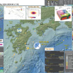
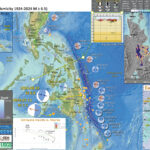
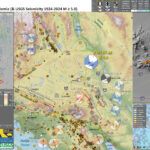
The Center, Body, and Range of Technically Defensible Interpretations. The CBD of TDI.