Today there was an earthquake in the state of Delaware, a region that does not have many mapped surface faults (I could not find any active faults in a couple hours of lit review). This area also does not have much historic seismicity, however there is an Open File Report from the Delaware Geological Survey, published in 2001. Today’s M 4.1 earthquake matches the record for the largest earthquake of record. There was a M 4.1 in the Wilmington, Delaware region on 1871.10.09 (see OFR42 linked above). The Wilmington region seems to be the most seismically active part of Delaware. Today’s earthquake, to the northeast of Dover, Delaware, happened in a place that has only had a single earthquake in the historic record (M 3.3 on 1879.03.26).
The earthquake happened along the coast plain, where the surficial geology is mapped as marsh deposits (underlain by Quaternary sediments, then by Tertiary sediments). I include a geological map below, along with a cross section. There does not appear to be any structural control for today’s earthquake (but I have only spent a couple hours on this, and the cross section is not very deep). To the south, in Maryland, there is an impact structure (from a Bolide impact). But the structures from this probably don’t extend this far north. There is probably some structures related to the active tectonics of the past (as mapped in the Appalachans to the west), and this earthquake is probably reactivating one of those structures.
Also, there is a possible chance that this is a foreshock. But we won’t know until later if this is the case.
Here is the USGS website for this 2017.11.30 M 4.1 earthquake.
Below is my interpretive poster for this earthquake.
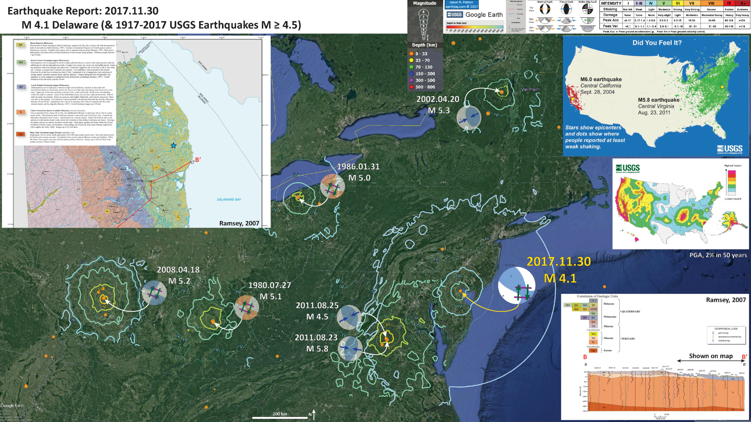
I plot the seismicity from the past month, with color representing depth and diameter representing magnitude (see legend). I include earthquake epicenters from 1917-2017 with magnitudes M > 4.5. I include fault plane solutions (moment tensors in blue and focal mechanisms in orange) for the larger earthquakes in the eastern USA.
- I placed a moment tensor / focal mechanism legend on the poster. There is more material from the USGS web sites about moment tensors and focal mechanisms (the beach ball symbols). Both moment tensors and focal mechanisms are solutions to seismologic data that reveal two possible interpretations for fault orientation and sense of motion. One must use other information, like the regional tectonics, to interpret which of the two possibilities is more likely. The structural grain of the Appalachians are oriented in a north-northeastern orientation, so the left-lateral northeast striking solution is slightly favored. However, more analysis will need to be done (or more lit review).
- I also include the shaking intensity contours on the map. These use the Modified Mercalli Intensity Scale (MMI; see the legend on the map). This is based upon a computer model estimate of ground motions, different from the “Did You Feel It?” estimate of ground motions that is actually based on real observations. The MMI is a qualitative measure of shaking intensity. More on the MMI scale can be found here and here. This is based upon a computer model estimate of ground motions, different from the “Did You Feel It?” estimate of ground motions that is actually based on real observations. I include MMI contours for the earthquakes with fault plane solutions plotted (except, I do not include the MMI contours for the 2011.08.25 M 4.5 earthquake, an aftershock of the Mineral, Virginia M 5.8 earthquake.
-
I include some inset figures.
- In the upper left corner I include an inset of the Geological Map of Kent County, Delaware (Ramsey, 2007). I include the legend for the relevant geological units on the map and on the cross section below. I place a blue star in the general location of the M 4.1 epicenter. Note that there are no mapped faults on this map (the geologic contacts are depositional contacts). Here is a link to a pdf of the map (19 MB pdf).
- In the lower right corner I include the cross section B-B’ that shows the subsurface geology in this region (Ramsey, 2007). This cross section is constructed from well log data. The location of the cross section is shown on the geologic map as a red line. The well log locations are the vertices (labeled dots) along this red line. Only the easternmost portion of the cross section is represented on the map in the interpretive poster.
- In the upper right corner is a plot showing “Did You Feel It?” (DYFI) responses for two earthquakes. This shows how earthquakes on the west coast attenuate faster than earthquakes on the east coast. Basically, on the west coast, due to the geology there, seismic waves are absorbed by the Earth with distance. While, on the east coast, they do so to a lesser degree. The result is that earthquakes on the east coast are felt from a greater distance than those on the west coast. This comparison is for between the 2004.09.28 M 6.0 Parkfield Earthquake in California and the 2011.08.23 M 5.8 Mineral Virginia Earthquake.
- Below the DYFI comparison figure is a map from the 2014 USGS National Seismic Hazard Map project. This shows a simplified view of seismic hazard for the USA. “The 2014 U.S. Geological Survey (USGS) National Seismic Hazard Maps display earthquake ground motions for various probability levels across the United States and are applied in seismic provisions of building codes, insurance rate structures, risk assessments, and other public policy.” Today’s earthquake happened in a region of low seismic hazard (due to the lack of active faults in the region and the low background seismicity).

- Here is the geologic map for the Dover, Delaware region (Ramsey, 2007) that is included in the interpretive poster above.
- Here is cross section B-B’ for the Dover, Delaware region (Ramsey, 2007) that is included in the interpretive poster above. Note the petrophysical logs that the correlations are made with. The Tch unit is well correlated, especially in the western region of this section. The unit Tc has more variability within the unit, but it represents more time and geologic thickness. Note that there are no faults in this cross section (albeit a shallow cross section, only about 100 meters deep).


- The Ramapo fault system is one of the best known fault systems in the Mid-Atlantic region. Today’s M 4.1 is not related to this fault system. Below is a map showing this fault system reltaed to the topography in the region. Todays’ M 4.1 earthquake is located behind the legend of this map, just to the south of the “g” in the word Furlong.

- Here is a figure that shows a comparison between several earthquakes in this region. I plot intensity maps above and empirical relations between shaking and distance to the earthquake below. It is important to note that these maps are just models of ground shaking; the “Did You Feel It?” maps are better to show the actual felt intensities as they are based upon reports from real people. The solid and dashed lines represent the mean and 2 sigma range of the empirical relations between shaking and distance. Basically, thousands of earthquakes have been measured by seismometers. These measurements have been entered into a database and filtered by various factors. The filtered data have been regressed and the equation for these regression lines are used to estimate ground shaking at locations relative to their distance from the earthquake. In most cases, for earthquakes of smaller magnitude, the distance is measured as a point source from the epicentral location (which is not realistic). However, for larger earthquakes, where a fault can be resolved from the seismologic data (source inversions), the rectilinear fault is used as a source to model the intensities.
- There was an aftershock to the 2011.08.23 M 5.8 Mineral, VA earthquake, an M 4.5 earthquake. This M 4.5 earthquake is more comparable to today’s M 4.1 earthquake. The maps are at different scales (unfortunately). However, the regressions are at the same scale. Note that the M 4.1 and M 4.5 have similar regression lines (due to their similar magnitude).

- Here is the DYFI comparison map from the USGS. More can be found about the 2011.08.23 M 5.8 earthquake at the USGS website here.

Earthquakes in the central and eastern U.S., although less frequent than in the western U.S., are typically felt over a much broader region. East of the Rockies, an earthquake can be felt over an area as much as ten times larger than a similar magnitude earthquake on the west coast. A magnitude 4.0 eastern U.S. earthquake typically can be felt at many places as far as 100 km (60 mi) from where it occurred, and it infrequently causes damage near its source. A magnitude 5.5 eastern U.S. earthquake usually can be felt as far as 500 km (300 mi) from where it occurred, and sometimes causes damage as far away as 40 km (25 mi).
- Here is a great video from IRIS that helps explain Earthquake Instensity.
- Here is the generalized 2014 Seismic Hazard map for the USA.

The 2014 U.S. Geological Survey (USGS) National Seismic Hazard Maps display earthquake ground motions for various probability levels across the United States and are applied in seismic provisions of building codes, insurance rate structures, risk assessments, and other public policy. The updated maps represent an assessment of the best available science in earthquake hazards and incorporate new findings on earthquake ground shaking, faults, seismicity, and geodesy. The USGS National Seismic Hazard Mapping Project developed these maps by incorporating information on potential earthquakes and associated ground shaking obtained from interaction in science and engineering workshops involving hundreds of participants, review by several science organizations and State surveys, and advice from expert panels and a Steering Committee. The new probabilistic hazard maps represent an update of the seismic hazard maps; previous versions were developed by Petersen and others (2008) and Frankel and others (2002), using the methodology developed Frankel and others (1996). Algermissen and Perkins (1976) published the first probabilistic seismic hazard map of the United States which was updated in Algermissen and others (1990).
The National Seismic Hazard Maps are derived from seismic hazard curves calculated on a grid of sites across the United States that describe the annual frequency of exceeding a set of ground motions. Data and maps from the 2014 U.S. Geological Survey National Seismic Hazard Mapping Project are available for download below. Maps for available periods (0.2 s, 1 s, PGA) and specified annual frequencies of exceedance can be calculated from the hazard curves. Figures depict probabilistic ground motions with a 2 percent probability of exceedance. Spectral accelerations are calculated for 5 percent damped linear elastic oscillators. All ground motions are calculated for site conditions with Vs30=760 m/s, corresponding to NEHRP B/C site class boundary.
- 2017.11.30 M 4.1 Delaware
- 2016.09.03 M 5.6 Oklahoma
Central & Eastern USA
General Overview
Earthquake Reports
- Ramsey, K.W., 2007. Geologic Map of Kent County, Delaware, Delaware Geologic Survey, Geologic Map Series No. 14.