Oklahoma is OK! Albeit a little shaken up. Early this morning there was an earthquake that started off their Labor Day Weekend. Here is the USGS website for this M 5.6 earthquake. There have been earthquakes of similar magnitude in OK in 1952 and 2011.
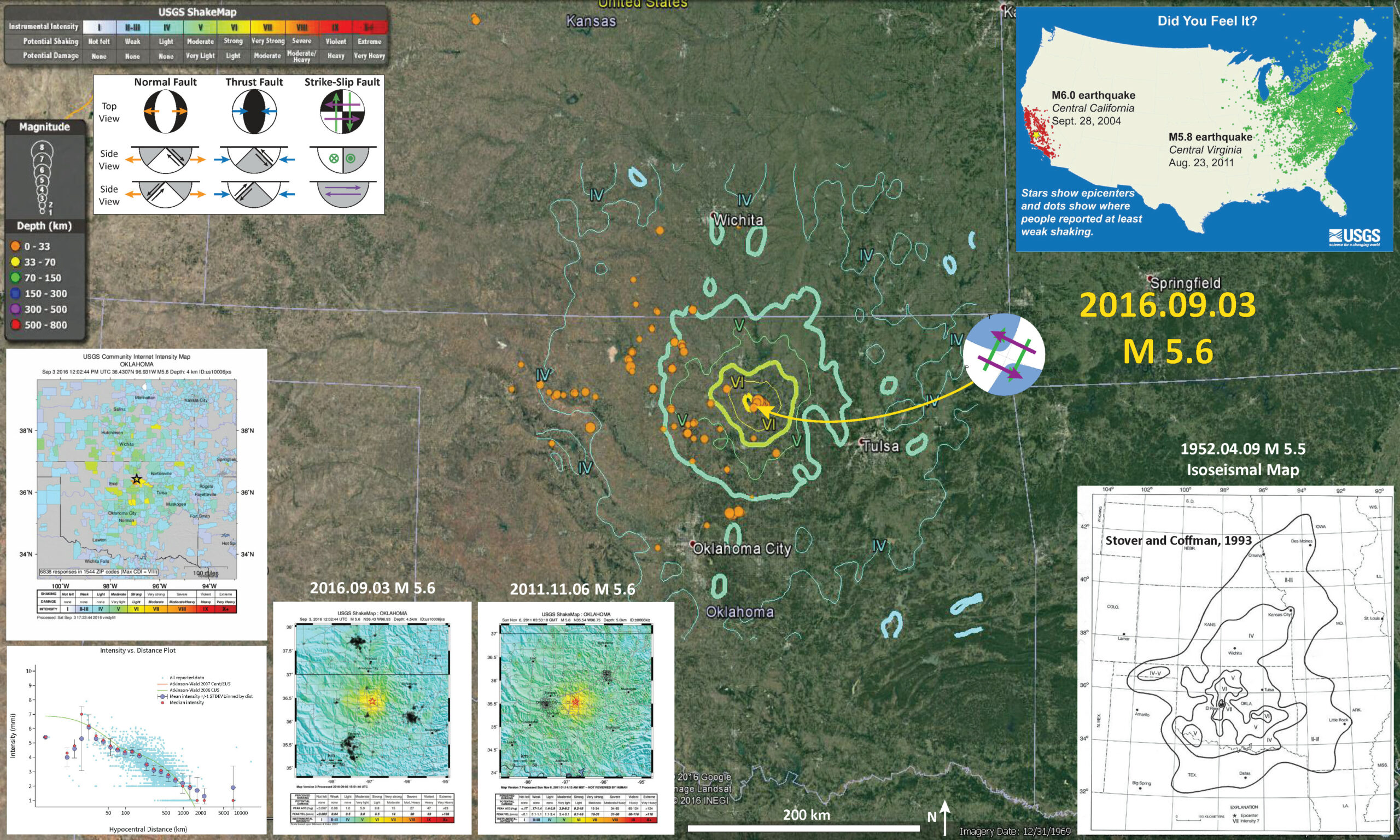
Below is my interpretive map that shows the epicenter, along with the shaking intensity contours. These contours use the Modified Mercalli Intensity (MMI) scale. The MMI is a qualitative measure of shaking intensity. More on the MMI scale can be found here and here. This is based upon a computer model estimate of ground motions, different from the “Did You Feel It?” estimate of ground motions that is actually based on real observations.
I placed a moment tensor / focal mechanism legend on the poster. There is more material from the USGS web sites about moment tensors and focal mechanisms (the beach ball symbols). Both moment tensors and focal mechanisms are solutions to seismologic data that reveal two possible interpretations for fault orientation and sense of motion. One must use other information, like the regional tectonics, to interpret which of the two possibilities is more likely. This earthquake could be either a northeast striking left lateral earthquake or a northwest striking left-lateral strike-slip earthquake. Based upon the seismicity for this region of the past week or so, it appears aligned along a northwest trend.
-
I include some inset figures.
- In the upper right corner is a plot showing “Did You Feel It?” (DYFI) responses for two earthquakes. This shows how earthquakes on the west coast attenuate faster than earthquakes on the east coast. Basically, on the west coast, due to the geology there, seismic waves are absorbed by the Earth with distance. While, on the east coast, they do so to a lesser degree. The result is that earthquakes on the east coast are felt from a greater distance than those on the west coast. This comparison is for between the 2004.09.28 M 6.0 Parkfield Earthquake in California and the 2011.08.23 M 5.8 Mineral Virginia Earthquake.
- In the lower right corner is an isoseismal map from the 1952 Oklahoma earthquake. The black lines are isoseismal lines, which means that along those lines, there were ground motions of equal intensity. The scale used on this map is similar (but different from) the MMI scale discussed above and plotted on the main map.
- In the lower left corner are two panels. The upper panel is a map that shows the responses from “DYFI?” reports. When this map was made, there were 51,680 responses. The lower panel shows how ground motions attenuate with distance, based upon these DYFI reports. The small blue dots are individual reports. The large blue and red dots are the mean and median intensity, respectively. The green line is based upon a Ground Motion Prediction Equation (GMPE) numerical model. GMPE models are empirical relations developed using thousands of earthquake seismologic observations. This model is based upon earthquakes from the central and eastern USA.
- To the right of those panels are two shaking intensity maps. These maps are generated using the GMPE models. The map on the left is from this 2016.09.03 M 5.6 earthquake. The map on the right is from the 2011.11.06 M 5.6 earthquake.

-
I created an animation showing the uptake in seismicity in this region in the past decade or so. This animation shows seismicity from 1974 through this morning. I queried the USGS earthquake website extending the date range to 1900, but the earliest earthquake records for this region are in 1974. This increased seismicity has made Oklahoma the new earthquake capital of the lower 48 (Alaska is the earthquake king up north and Puerto Rico wins an award for number of earthquakes per unit area, down south). The increased seismicity, has been linked to the injection of waste water into the ground. Individual earthquakes are difficult to link to individual actions. However, when waste water injection is halted, seismicity is reduced. Do not confuse waste water injection with fracking. Sure, the waste water comes from the fracking industry, but the induced seismicity is largely from the waste water injection. There is some induced seismicity from fracking, but it is typically of much smaller magnitude than that for induced seismicity resulting from waste water injection.
- First I show a map with all the earthquakes shown in the animation, then I present the animation. The map and animation include the MMI contours from today’s M 5.6 earthquake.
- Here is a link to the embedded video below (3 MB mp4)

-
Here are some resources about induced seismicity:
- USGS Myths and Misconceptions about induced seismicity.
- Keranen et al., 2014. Sharp increase in central Oklahoma seismicity since 2008 induced by massive wastewater injection
- Weingarten et al., 2015. High-rate injection is associated with the increase in U.S. mid-continent seismicity
- USGS Induced Earthquakes Raise Chances of Damaging Shaking in 2016
- Rubinstein and Mahani, 2015. Myths and Facts on Wastewater Injection, Hydraulic Fracturing, Enhanced Oil Recovery, and Induced Seismicity
-
Here is a map from the USGS link above that shows seismicity since 1980. There are polygons drawn where these earthquakes are suggested to be induced by humans.

UPDATES:
-
Update: 2016.09.03 14:30 PST
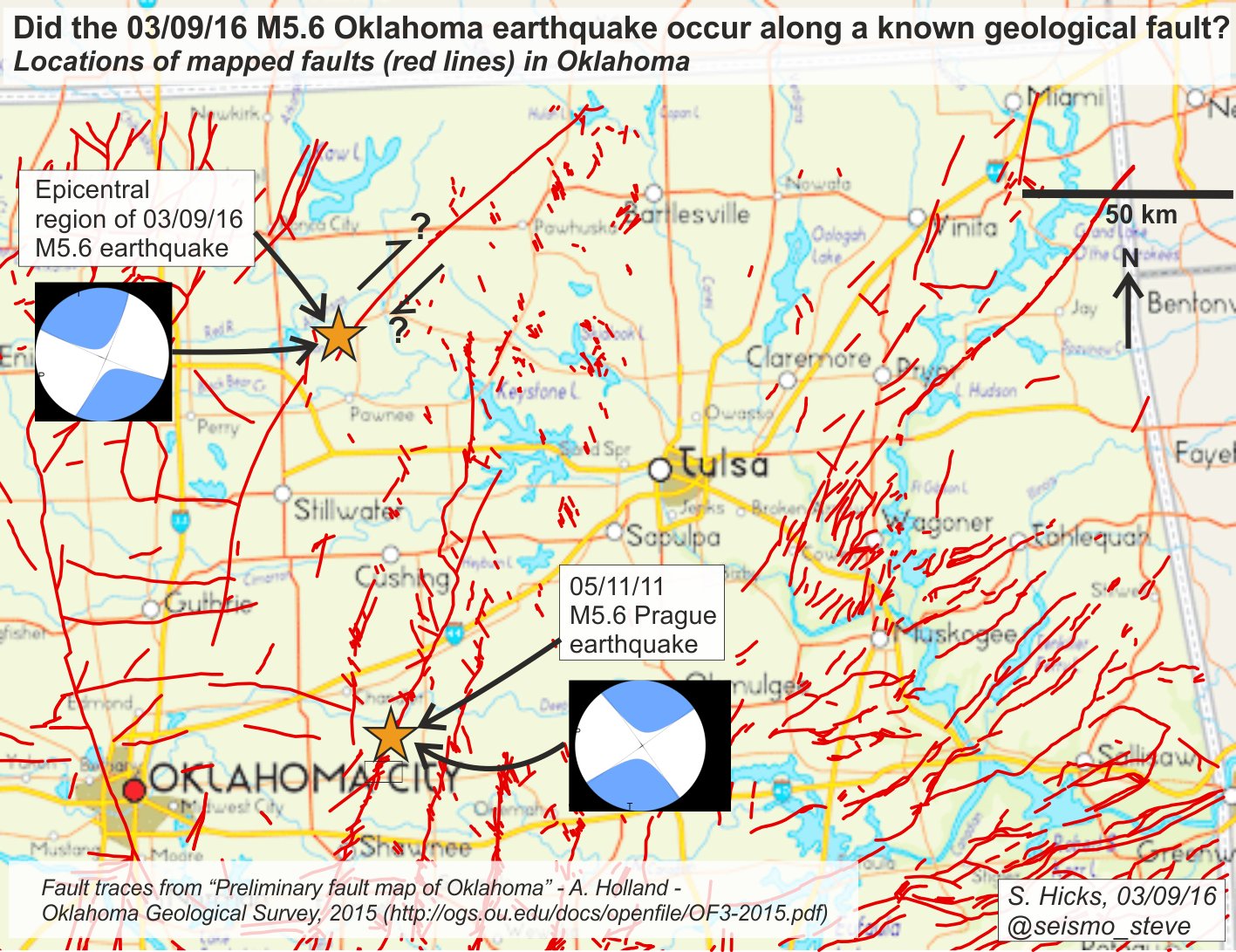
- Steve Hicks, from the University of Liverpool, (@seismo_steve) used some published faults from OK, compared to the epicenters of the 2011 Prague and 2016 Pawnee earthquakes, to interpret the fault plane solution for the moment tensors. This is a reasonable interpretation, given the fault maps. However, I remember doing this for the 2012 earthquakes offshore Sumatra.
- Daniel McNamara, from the USGS, (@DanielMcNamara) later plotted the aftershocks. These aftershocks appear to align along a possible fault that is oblique to some of the previously mapped faults. Perhaps this is a better interpretation.

-
References:
- Rubinstein, J.L. and Mahani, A.B., 2015. Myths and Facts on Wastewater Injection, Hydraulic Fracturing, Enhanced Oil Recovery, and Induced Seismicity in Seismological Research Letters, v. 86, no. 4., 8 pp.
- Stover, C.W. and Coffman, J.L., 1993. Seismicity of the United States, 1568-1989 (Revised), U.S. Geological Survey Professional Paper 1527, United States Government Printing Office, Washington: 1993
the same magnitude as here..
I wonder why there is so much more effect there than here.
Different earths crust
I think they are def. more crusty in OK–Reddest state in the country
Some 2014 comments about Oklahoma, by head of OGS, and a source in SoCal: http://www.news9.com/story/25371136/seismologists-say-theyre-forecasting-earthquakes
i wish the title for this news piece was written differently. as Dr. Jordan states, they are not forecasting when these earthquakes will occur.